Remember Need For Speed? Someone built a real-life Mini Map from the game to use in your car

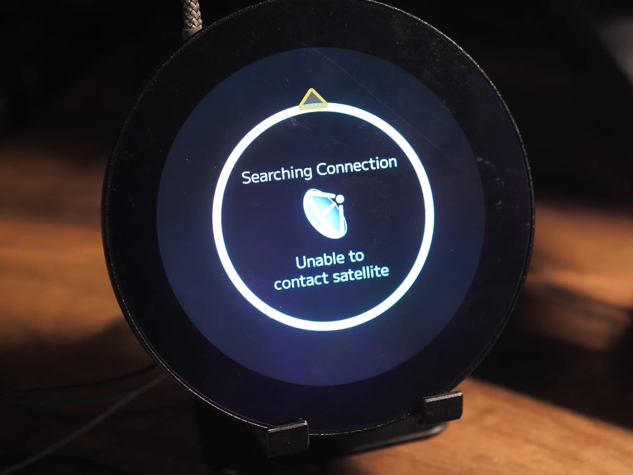
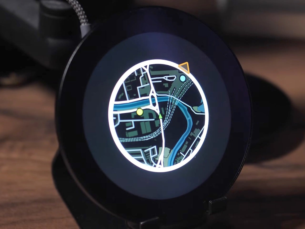
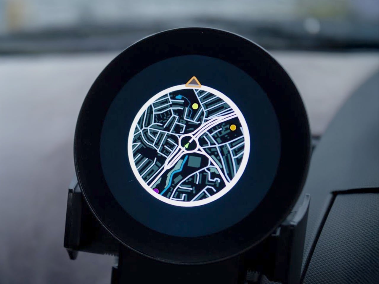
The mini map has been a staple of racing and open-world games for decades, teaching us to navigate virtual cities with quick glances at a corner of the screen. A developer has now made that experience tangible, building a GPS-based mini map system for actual driving that recreates the look and feel of Need for Speed Underground 2. What everyone said was impossible on an ESP32 microcontroller is now working smoothly in a real car, tracking position, displaying waypoints, and making everyday drives feel unexpectedly game-like.

Getting this to work on a $20 microcontroller meant processing the entire UK into 2.5 million map tiles, totaling 236GB of data stored on an SD card. The ESP32 loads them dynamically based on your heading, only pulling in new tiles from the direction you’re traveling because each one takes a tenth of a second to load. We’re talking weeks of optimization just to get map tiles loading fast enough, clever tricks to avoid tanking the frame rate, and some creative compromises that make the whole thing feel polished despite running on hardware that costs less than takeaway for two. What’s particularly cool is that all the code is open-source, meaning you could theoretically generate tiles for your own city styled after whatever game you’re nostalgic for.

Designer: Garage Tinkering

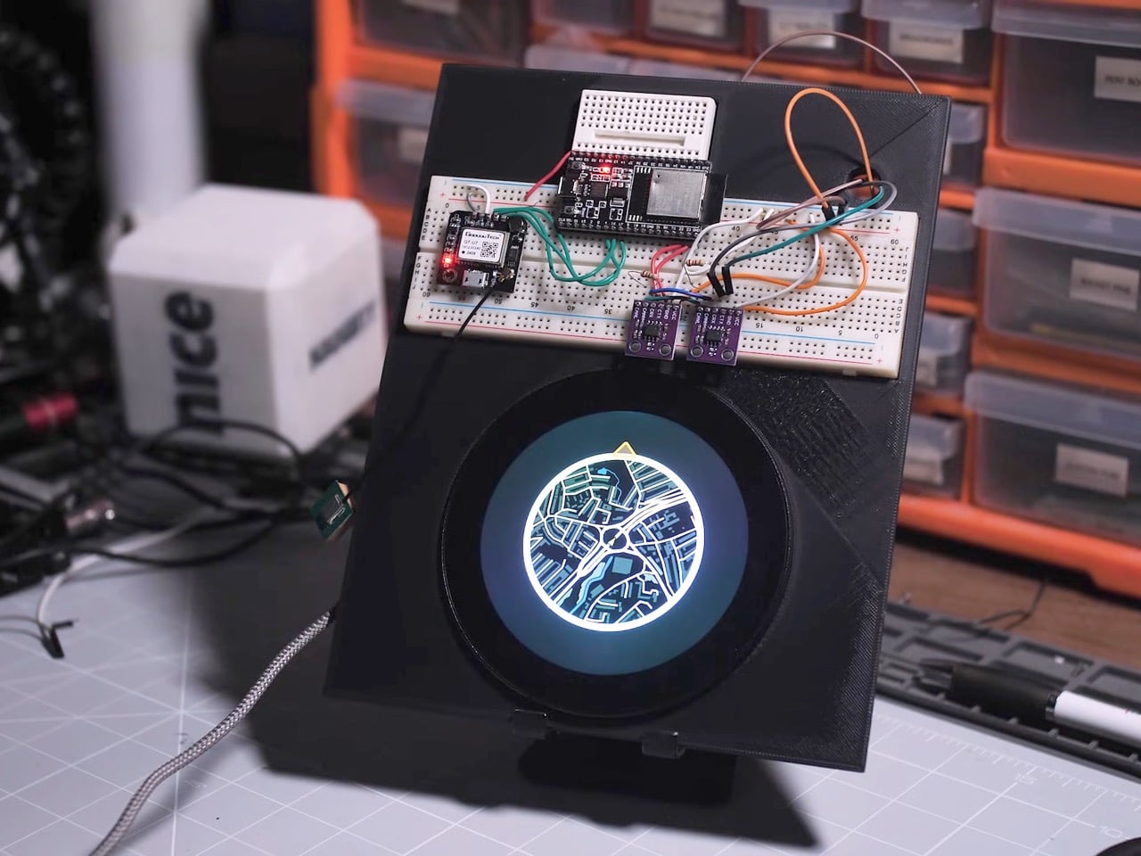
The project runs on an ESP32-P4, the flagship chip in the ESP32 family, paired with a 3.4-inch 800×800 pixel WaveShare display. If it couldn’t work on this combination, it wasn’t going to work on any ESP32, which is exactly why the developer chose it. The alternative would have been admitting defeat before even starting, and where’s the fun in that?

The map generation process alone is wonderfully excessive. Using QGIS, a geospatial mapping tool, the developer pulled road data from Ordnance Survey, transportation waypoints from the UK Department of Transportation, and petrol stations from Open Street Maps via a custom Python script that parsed through a 2GB dataset looking for anything tagged with “amenity=fuel.” The result was 2.5 million map tiles covering the entire UK at zoom level 16, totaling 236GB of data. Processing took 35 hours. Converting those tiles to a format the ESP32 could read took another 18 hours. Transferring everything to an SD card took 22 more hours. This is the kind of project where you start things running before bed and hope they’re done by morning.

Getting smooth performance meant rethinking how traditional GPS navigation works. Each tile takes roughly 0.1 seconds to load from the SD card, which sounds fast until you realize how many tiles you’d need if you loaded everything around you constantly. The solution was directional loading. If you’re heading north, only load new tiles coming in from the top. The tiles on the sides and bottom don’t need refreshing because you’re moving away from them. Just shuffle the existing data around in memory and you’ve saved yourself a bunch of unnecessary SD card reads.

The other big performance win came from abandoning authenticity. The original plan was to rotate the entire map grid so it moved like it does in Need for Speed, with the car always pointing up. Turns out rotating large image grids on an ESP32 makes everything stuttery and unpleasant. The fix was keeping the map oriented north and rotating just the car icon to show your heading. It’s less true to the game but infinitely smoother in practice, which matters more when you’re actually using the thing.

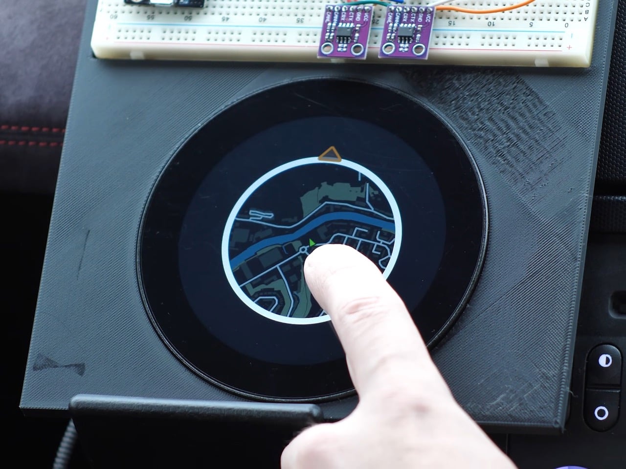
The current prototype isn’t exactly plug-and-play elegant though. The GPS module sits on a breadboard outside the main device, creating a larger footprint than the sleek circular display suggests. It’s functional but definitely looks like a dev setup rather than a finished product. Still, the developer plans to integrate everything into a full Need for Speed inspired dashboard for their Nissan 350Z, which should clean up the form factor considerably. And since all the code is open-source and free to use, anyone with the patience for multi-day processing times can adapt it for their own area and preferred game aesthetic.

The post Remember Need For Speed? Someone built a real-life Mini Map from the game to use in your car first appeared on Yanko Design.

Toyota IMV Origin rethinks modular truck design with a vehicle that arrives unfinished

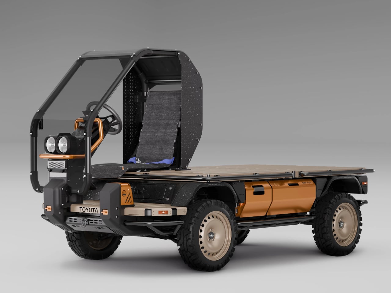
The Toyota IMV Origin arrived at the 2025 Japan Mobility Show stripped down to almost nothing, and that was entirely intentional. Where conventional vehicle concepts arrive polished and production ready, the IMV Origin presented itself as a skeletal flatbed with an open air single seat cab, barely recognizable as a truck at all. Toyota’s approach here inverts the typical automaker logic: instead of delivering a finished product, the company ships a foundation, a canvas, a system of parts that local communities complete on their own terms. The concept draws from Toyota’s long running Innovative International Multi-purpose Vehicle platform, which already emphasizes flexibility and regional adaptation. Revealed during the same press conference that showcased flashier vehicles and premium brand expansions, the IMV Origin quietly proposed something more radical: a vehicle that gains value and identity only after it leaves the factory.

Designer: Toyota

Koji Sato, Toyota’s president and CEO, described the underlying philosophy in direct terms during the Japan Mobility Show presentation. The first idea, he explained, was to ship the vehicle unfinished, allowing the local people who receive it to assemble and complete it themselves. The second idea extended that premise further: customers would define the vehicle on their own terms even after assembly, choosing whether it carries people or cargo, boxes or something else entirely. Toyota builds the base, and from there each user completes the vehicle to fit specific needs. This framing positions the IMV Origin not as a truck but as a design system, a physical framework for distributed creativity that shifts final authorship away from the factory floor and into the hands of communities scattered across emerging markets.

Designing a Vehicle That Arrives Unfinished

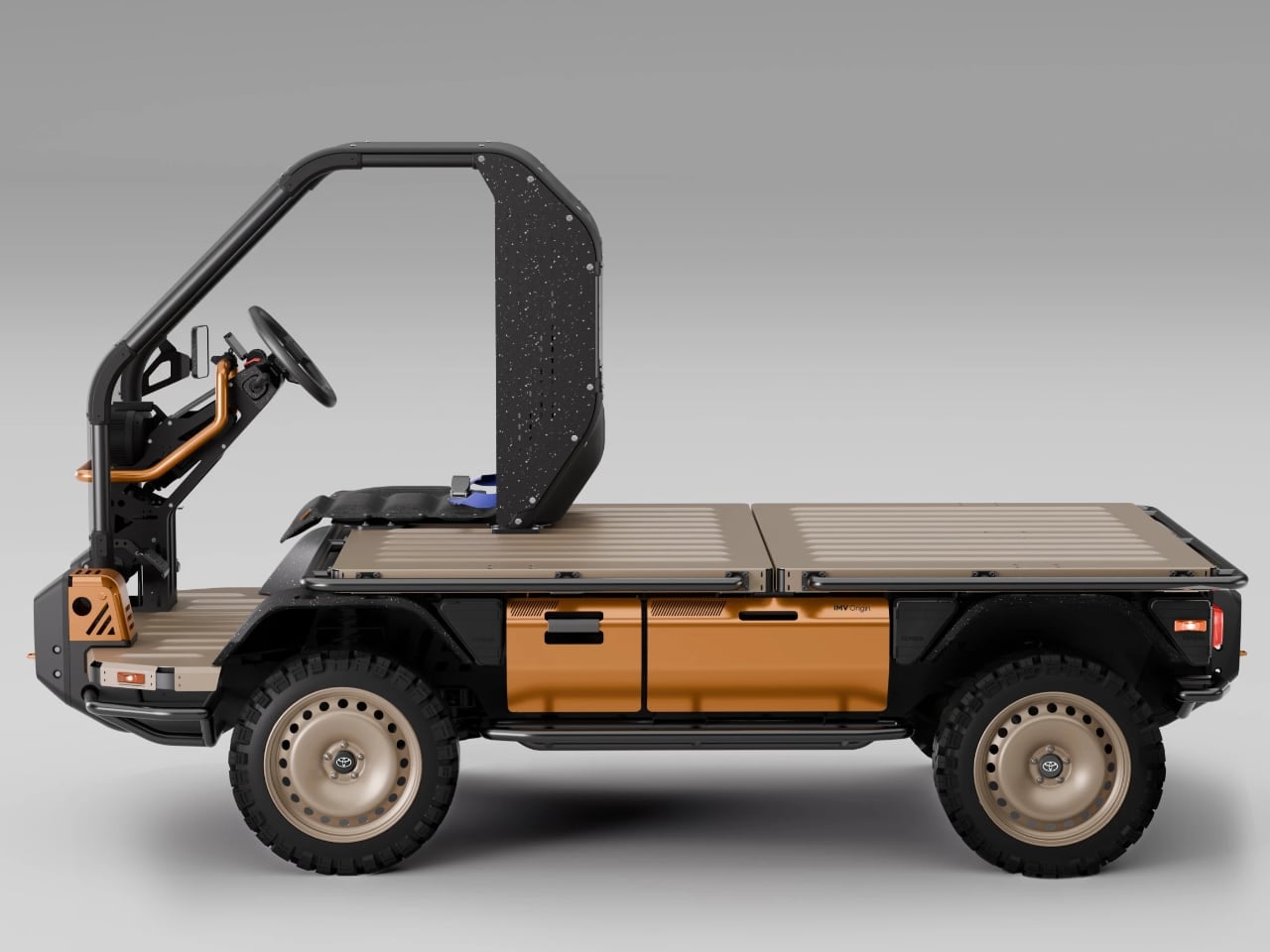
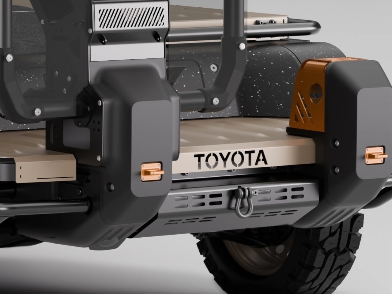
That philosophy becomes visible in the physical form itself. The Toyota IMV Origin reads less like a finished vehicle and more like a piece of industrial furniture waiting for context. A flat chassis defines the primary surface, interrupted only by a minimal open cab structure designed for a single occupant. There is no enclosed cabin, no rear bed walls, no cargo box, no secondary seating. The silhouette suggests a factory cart or a stripped down work platform rather than anything destined for public roads. This visual starkness serves a functional purpose: every absent panel, every missing enclosure represents space for local fabrication and adaptation.
Toyota’s shipping model borrows imagery from flat pack furniture, a comparison Sato made explicit during the Japan Mobility Show press conference. The idea is that the IMV Origin ships as a crate of assemble yourself components, packed efficiently enough to slide into a standard shipping container. Buyers receive the rolling chassis, the cab frame, the essential mechanical systems, and presumably a set of instructions and basic tools. Assembly happens on arrival, requiring some combination of included hardware and locally sourced equipment. The furniture analogy carries weight here: just as a bookshelf arrives as panels and fasteners awaiting configuration, the IMV Origin arrives as a vehicle skeleton awaiting completion. This approach compresses shipping volume, reduces transport costs, and distributes final assembly labor to regions where that labor already exists and seeks work.

The open cab structure reveals how Toyota communicates modularity through form. By leaving the driver’s area exposed rather than enclosed, the company signals that even this fundamental zone remains open to interpretation. A buyer might add a windscreen, side panels, a full roof, or leave the cab skeletal for maximum airflow in hot climates. The single seat default suggests solo commercial use, but the surrounding space invites expansion to two seats or more. Every surface of the IMV Origin exists as a potential attachment point, a mounting location, a starting place for fabrication. The form does not dictate function; it invites negotiation.
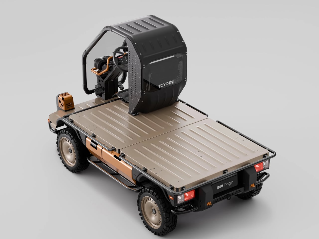
The visual openness of the chassis functions almost like an instruction diagram for local builders. Exposed rails, visible mounting surfaces, and unobstructed structural geometry signal exactly where modules can attach. A fabricator examining the modular truck concept does not need a manual to understand where a cargo box might bolt or where a cab enclosure could fasten. The stripped form communicates its own logic, revealing load paths and connection points through the simple act of leaving them visible. Toyota’s decision to ship the vehicle unfinished becomes, in this light, a form of design communication: the geometry itself teaches the user how to complete it.

How Local Assembly Shapes Everyday Use

The design logic extends directly into how people actually use the vehicle. The user experience of the Toyota IMV Origin begins not with driving but with building. A farmer in rural Africa might receive the crated components, unpack them with neighbors, and spend a day or a week assembling the base vehicle. The process itself becomes a form of ownership, a hands on introduction to every mechanical connection and structural joint. By the time the owner starts the engine for the first time, they already understand how the vehicle fits together, which fasteners hold the cab frame, where the chassis accepts additional load. This knowledge carries forward into repair and modification, lowering the barrier to maintenance and customization.
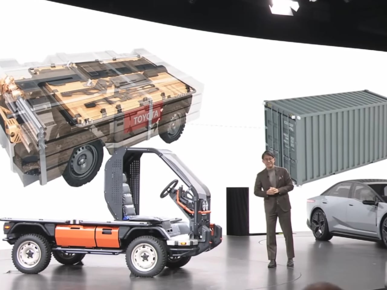
Toyota showed several example configurations at the Japan Mobility Show press conference, including a produce delivery truck with a tall cargo box and a logging truck with open stake sides. These illustrations suggest the range of possibilities without defining limits. A community workshop in a small agricultural town might fabricate a cargo bed with fold down sides, bolted directly to the exposed chassis rails, for transporting harvested crops over uneven dirt roads. Another shop could build a modular fire response carrier, using the visible mounting surfaces to secure water tanks and equipment racks for rapid deployment across scattered villages. A regional upfitter with welding equipment might create a lightweight camper module, fastening a sleeping platform and basic storage to the flatbed’s open connection points, transforming the IMV Origin into a mobile shelter for seasonal workers or traveling repair crews. Each scenario draws on locally available materials, locally developed skills, and locally understood needs.

The modularity extends beyond the initial build, allowing role changes across seasons without requiring a new vehicle purchase. A single IMV Origin might serve as a produce hauler during harvest season, then swap its cargo box for a flatbed configuration to transport building materials during construction months, then add a canopy and seating for passenger transport during community events. This flexibility mirrors the way rural economies actually function, where a single asset often serves multiple purposes across different seasons and circumstances. The design anticipates that reality rather than ignoring it.

Sustainability Through Local Fabrication and Modular Updates

These same structural choices carry environmental consequences that compound over time. Shipping a compact crate of components rather than a fully assembled vehicle reduces the volumetric footprint of each unit in transit. Fewer shipping containers, smaller cargo holds, and more efficient packing translate directly into lower fuel consumption and reduced emissions during international transport. The sustainability benefit begins before the vehicle ever reaches its destination, embedded in the logistics strategy rather than added as an afterthought.
Local assembly creates additional environmental value by distributing expertise and reducing dependence on distant supply chains. When communities build and maintain their own vehicles, they develop skills that support long term durability. A locally fabricated cargo box can be repaired with locally sourced materials when it sustains damage. A cab enclosure built by a regional shop can be modified or replaced without importing new parts from distant factories. In regions where replacement parts are expensive or difficult to obtain, this local capability becomes a practical necessity as much as an environmental virtue.

The IMV Origin’s intentional incompleteness encourages a culture of repair over replacement, extending the useful life of the base platform and reducing the frequency of full vehicle turnover. Rather than discarding an entire vehicle when needs change, owners upgrade or swap individual components. A farmer who expands operations might add a second seat to the cab rather than purchasing a larger truck. A delivery service that shifts from dry goods to refrigerated cargo might install an insulated box module rather than acquiring a purpose built refrigerated vehicle. Each modular intervention preserves the embedded energy and material value of the existing platform while adapting it to new requirements.

Durability emerges not from overengineering but from accessibility: the vehicle lasts longer because owners can fix it, adapt it, and extend its usefulness without specialized tools or imported components. Toyota’s willingness to leave the product unfinished becomes, paradoxically, a strategy for longevity.

Where the IMV Origin Fits in Toyota’s Modular Platform Roadmap

This approach did not emerge in isolation. The Toyota IMV Origin sits at the most stripped down end of a spectrum that already includes the IMV 0 concept and the production Hilux Champ. The IMV 0, revealed in 2022, offered a simplified small truck platform with strong modularity but still arrived as a recognizable vehicle. The Hilux Champ, which debuted in Thailand in 2023, translated that modularity into a production reality, spawning mini motorhomes, delivery trucks, food trucks, and overland campers through partnerships with regional body shops. Indonesia’s version, the Hilux Rangga, inspired a design competition that produced fire trucks, police tactical vehicles, agricultural transporters, and recreational campers. The IMV Origin steps further back along this trajectory, offering even less finished hardware and even more open ended potential.
This positioning reveals something about Toyota’s strategy for global mobility within the broader IMV platform family. Rather than designing a single truck and adapting it for different markets through factory options, the company designs a platform that markets adapt themselves. The factory provides the mechanical core, the structural integrity, the safety critical systems. Everything else becomes a canvas for regional creativity. This approach acknowledges that Toyota cannot anticipate every use case, cannot understand every local need, cannot predict how a vehicle will serve a community it has never visited. By stepping back from finished product design, the company creates space for distributed innovation.

The IMV Origin also signals a willingness to rethink what a vehicle manufacturer actually provides. Traditional automakers sell cars and trucks. Toyota, through this concept, proposes selling capability frameworks: mechanical systems and structural platforms that enable local economies to generate their own transportation solutions. The value proposition shifts from finished goods to enabling infrastructure. Whether this model scales into production remains to be seen, but the conceptual territory it explores challenges assumptions about how vehicles reach the people who need them.

Why the IMV Origin Acts as a Platform Rather Than a Product

What emerges from these choices is a rare form of restraint. By shipping a deliberately incomplete vehicle, Toyota acknowledges that the factory cannot know best, that distant engineers cannot anticipate the specific needs of a farming community in rural Africa or a delivery network in Southeast Asia. The concept trusts local fabricators to complete the design, trusts regional workshops to maintain and modify the platform, trusts communities to define what a truck should be in their specific context. This trust becomes a design decision as much as any chassis dimension or cab geometry.

The furniture shipping model, the open cab structure, the flatbed awaiting cargo solutions: all of these choices point toward a vehicle that exists as potential rather than product. As Koji Sato noted during the presentation, not finishing this vehicle was frustrating from a carmaker’s perspective, but not finishing it is what makes it a vehicle built for actual users, because people have different needs in their daily life and work. The IMV Origin does not try to be everything. It tries to be a starting point, a foundation, a system that gains identity through use and modification. Toyota builds the base. The world completes the truck.

The post Toyota IMV Origin rethinks modular truck design with a vehicle that arrives unfinished first appeared on Yanko Design.
This $10 Measuring Tape Is Built for LEGO Bricks and Nothing Else

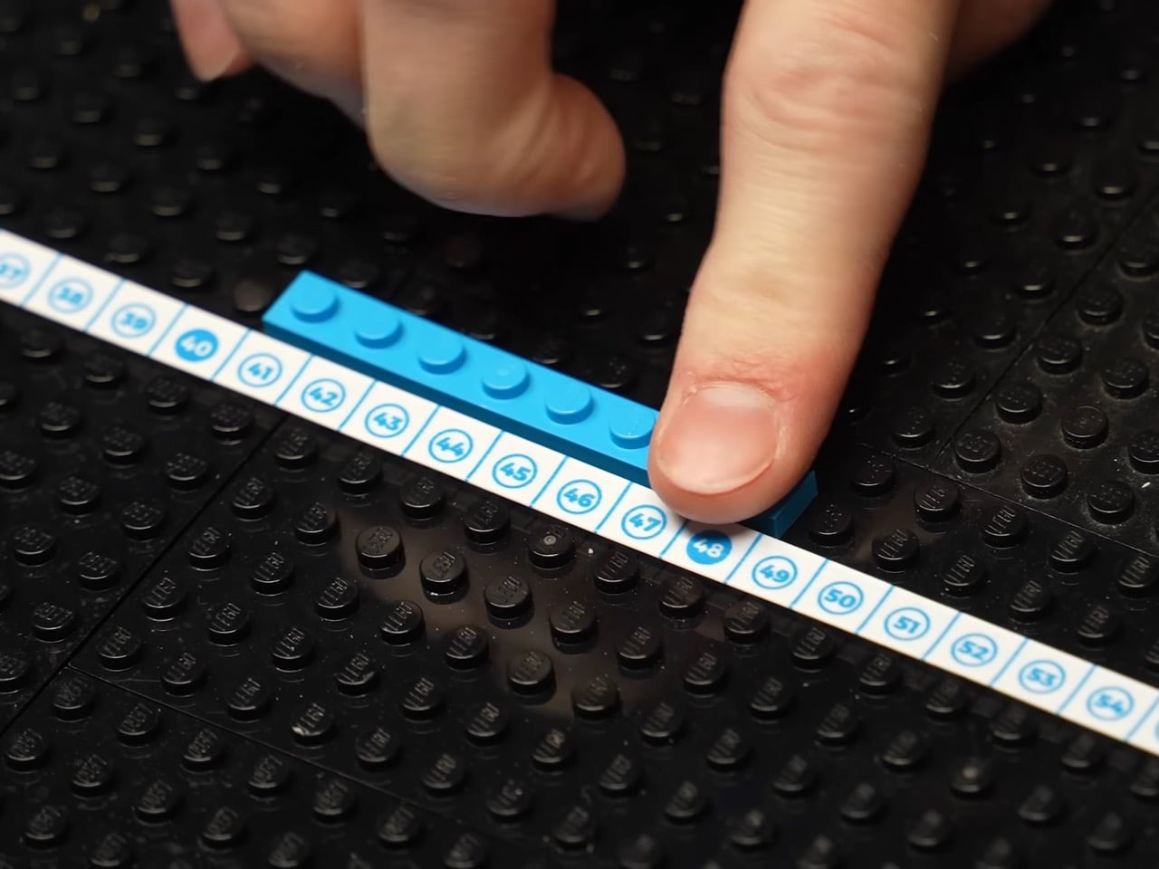
Every LEGO fan knows the brick separator, but far fewer have a dedicated way to measure their creations. The Stud Measure steps into that gap with a compact case, a flexible tape, and markings that translate directly into the geometry of the LEGO system. It is designed for anyone who has ever counted studs by hand across a long baseplate and wished there were a faster way.

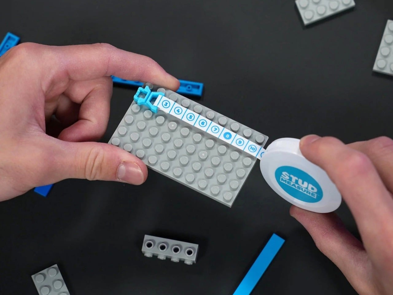
Instead of dangling a metal hook over your build, you snap a bright blue clip straight into the studs. From there, the tape glides across the surface or up the side of a wall while the numbers tick by in studs, bricks, and plates. Whether you are mocking up a city block, planning a train layout, or scaling a real world object into LEGO form, the Stud Measure turns measuring into part of the creative process.

Designer: Brick Science

Riley from Brick Science, a channel with over 2 million subscribers, developed the tool and launched it through a dedicated shop at $9.99. That pricing puts it squarely in impulse buy territory, which feels about right for something this niche. The tape extends to 190 studs, which translates to roughly 60 inches or 152 centimeters in real world terms. For context, that covers the length of most standard LEGO train layouts and easily spans the width of a modular building display. You could measure an entire tabletop setup without retracting and repositioning, which matters when you are trying to keep alignment tight across multiple sections.

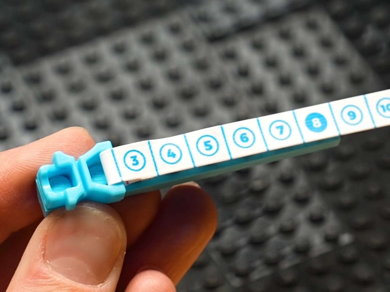
That little clip is the real piece of engineering genius here. A standard tape measure hook is designed for grabbing the edge of a two-by-four; it has no real purchase on the curved, precise landscape of a LEGO plate. The Stud Measure’s end piece, however, is molded to fit snugly between the studs, using the system’s own clutch power to anchor itself. This means your zero point is always perfectly centered and locked in place, leaving your hands free. It’s a simple, elegant solution to a problem that has plagued serious builders for decades, finally treating the LEGO grid with the same respect a machinist would treat a piece of milled aluminum.

Once anchored, the tape itself does the rest of the work. One side is marked out to 190 studs, a respectable length for even large scale projects. Flip it over, and you get a vertical scale marked in brick heights, with fine red lines indicating the one-third increments of a single plate. This dual-sided approach is what elevates it from a novelty to a legitimate design tool. You can instantly verify that two separate towers in a diorama are the exact same height, or plan a complex wall structure with openings that are a precise number of bricks wide and tall. It removes the tedious counting and guesswork, letting you focus on the actual build.

The Stud Measure is fundamentally a translation device, converting the abstract dimensions of the real world into the concrete, tangible units of the LEGO system. You can measure a shelf and know instantly you have a 120-stud canvas to build on. It closes the loop between imagination and execution, making ambitious, scaled projects feel far more achievable for builders who want to move beyond the instruction booklet. This is not a toy, despite its bright colors and its association with one. It is a piece of workshop equipment, just like a good set of calipers or a reliable square, designed to remove friction from the creative process.

Ultimately, it is a ten dollar gadget that solves a hundred dollar headache. The real value is not just in the time saved, but in the uninterrupted focus it allows. Every moment a builder spends recounting studs or converting inches to bricks is a moment they are pulled out of the design flow. By making the act of measuring so seamless and integrated, the Stud Measure lets you stay in that creative headspace longer. It is a tiny, ingenious piece of plastic that respects the builder’s time and effort, and that kind of thoughtful design is always worth a closer look.

The post This $10 Measuring Tape Is Built for LEGO Bricks and Nothing Else first appeared on Yanko Design.

Badgeware Turns Conference Badges into Wearable Tiny Computers

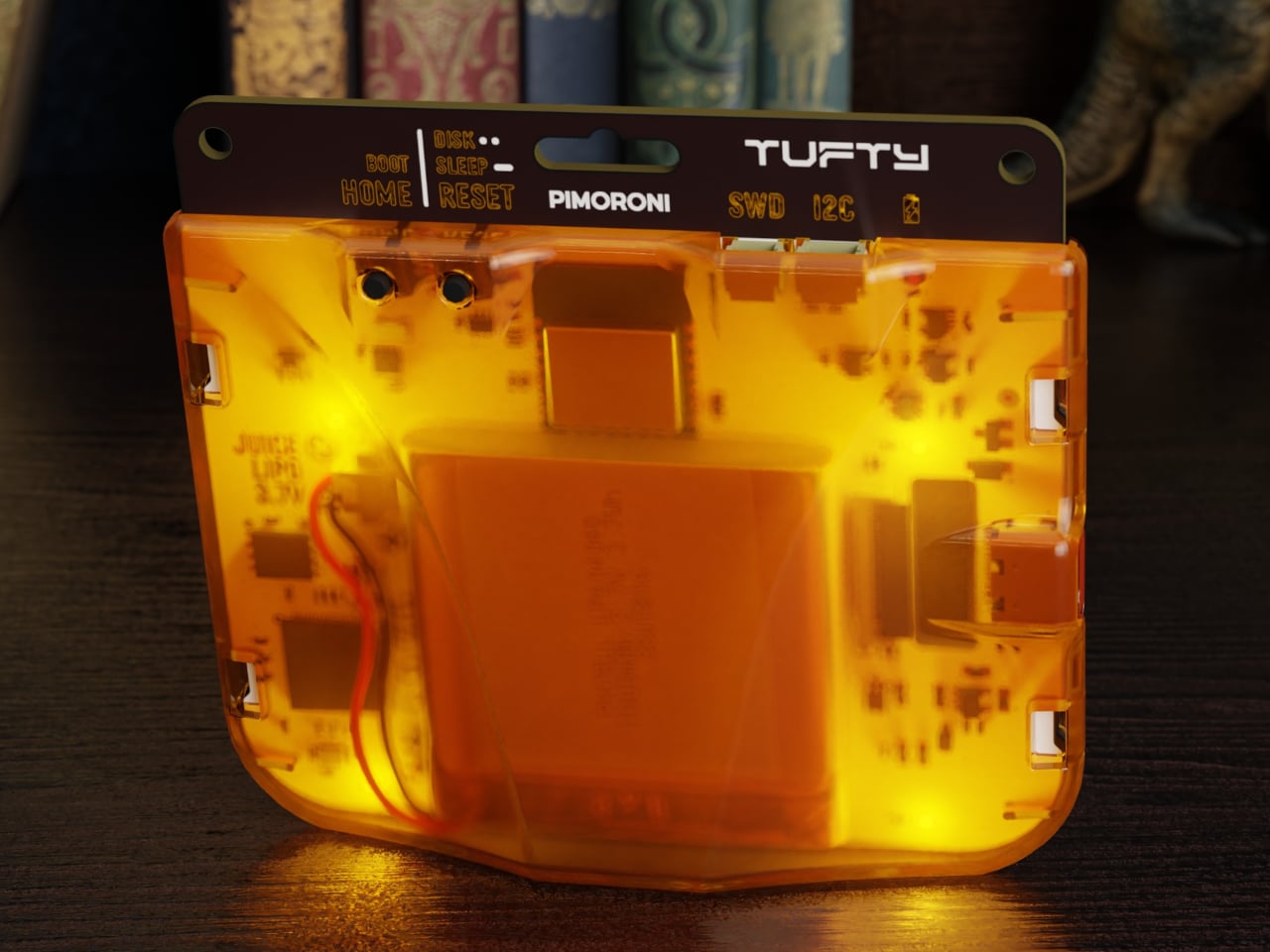
Conference badges are usually flimsy cardboard, a lanyard, maybe a QR code, and they end up in a drawer once the event wraps up. In the maker world, people already strap LEDs and e‑paper to their jackets for fun, but those tend to be one‑off hacks held together with tape and hope. Pimoroni’s Badgeware line asks a simpler question, what if the badge itself was a tiny, finished computer you actually wanted to keep wearing.

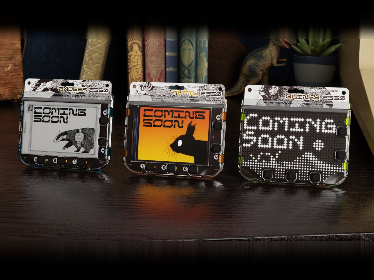
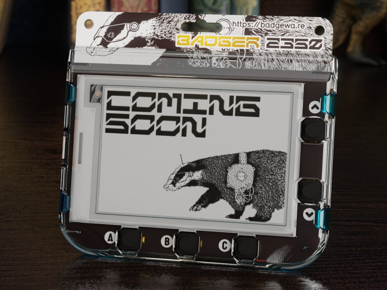
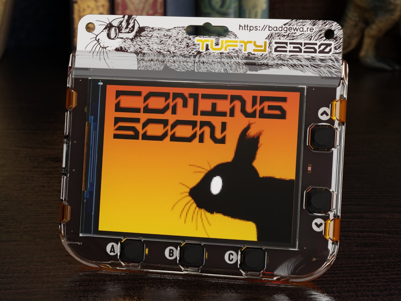
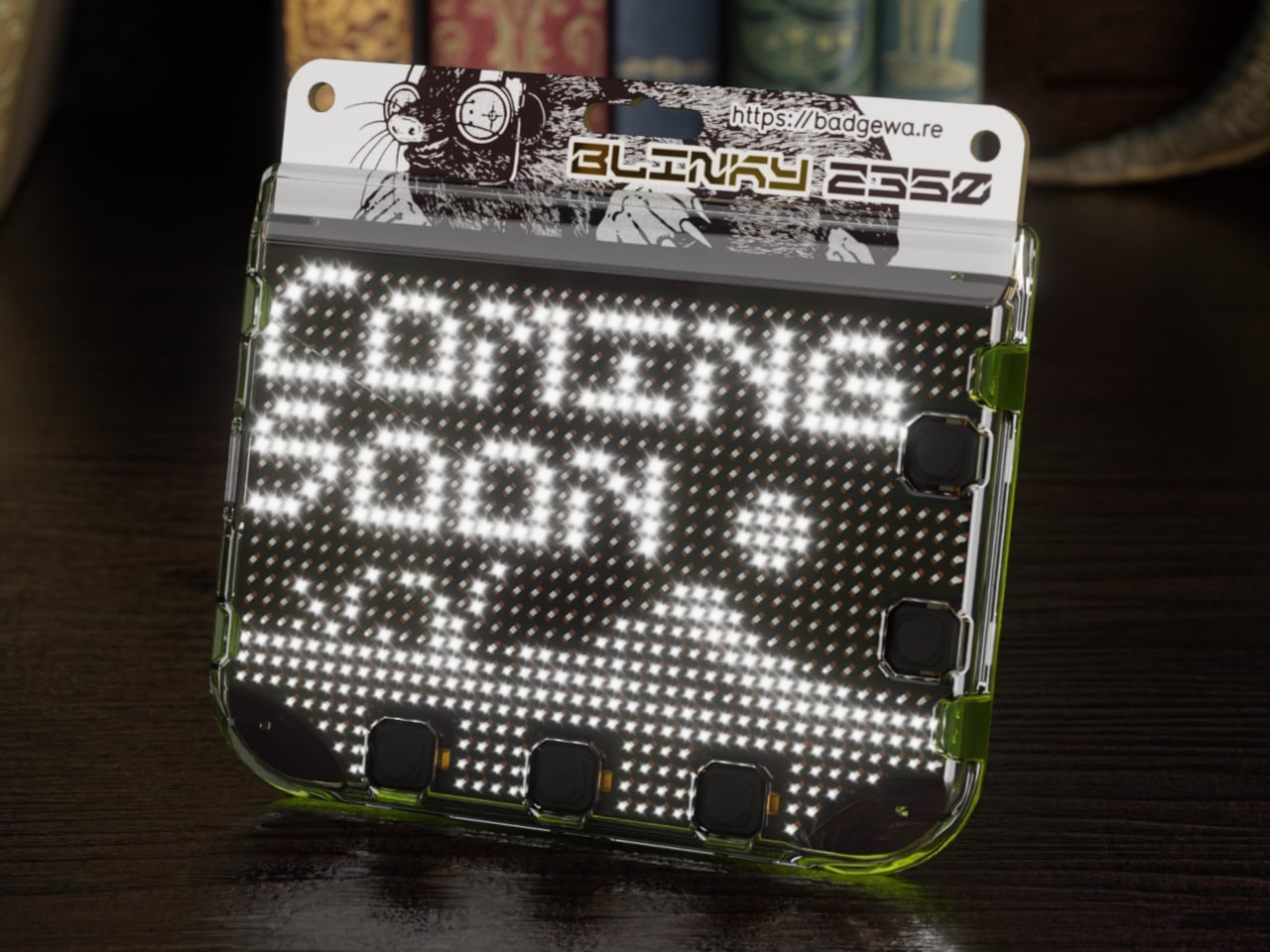
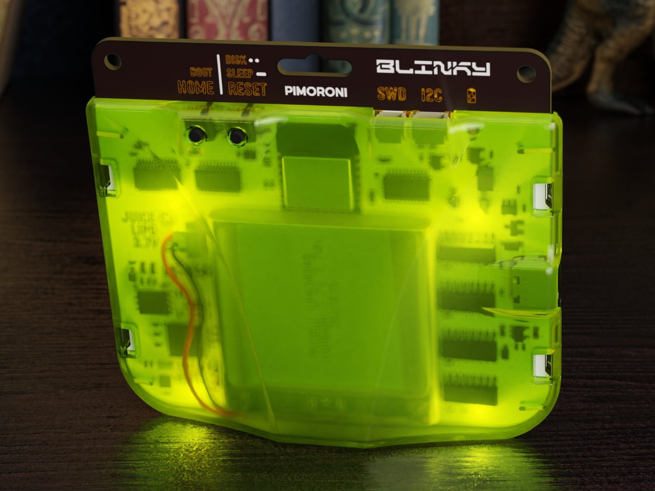
Badgeware is a family of wearable, programmable displays powered by Raspberry Pi’s new RP2350 chip. The trio gets names and personalities, Badger with a 2.7 inch e‑paper screen, Tufty with a 2.8 inch full colour IPS display, and Blinky with a 3.6 inch grid of 872 white LEDs. Translucent polycarbonate shells in teal, orange, and lime glow softly when the rear lighting kicks in, making them look like finished toys instead of bare dev boards.

Designer: Pimoroni

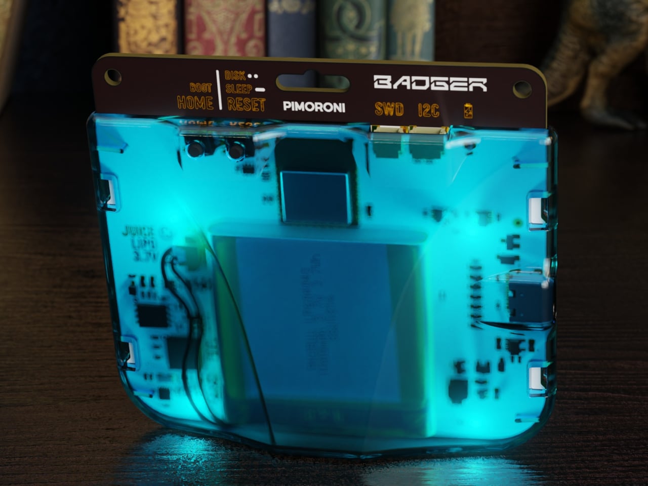
The shared hardware is serious for something pocket sized. An RP2350 running at 200 megahertz with 16 megabytes of flash and 8 megabytes of PSRAM, Wi‑Fi and Bluetooth 5.2, USB C, and a built in 1,000 milliamp hour LiPo with onboard charging. The Qw/ST expansion port on the back lets you plug in sensors and add ons without soldering, while user and system buttons plus four zone rear lighting give each badge its own under glow.

Badger is the quiet one, four shade e‑paper that sips power and holds static content like names, pronouns, and tiny dashboards for days. Tufty is the show off, full colour IPS and smooth animation for mini games, widgets, and scrolling text. Blinky is the extrovert, a dense LED matrix that spells messages and patterns bright enough to read across a room. Together they cover calm, expressive, and loud without changing the basic wearable form factor.

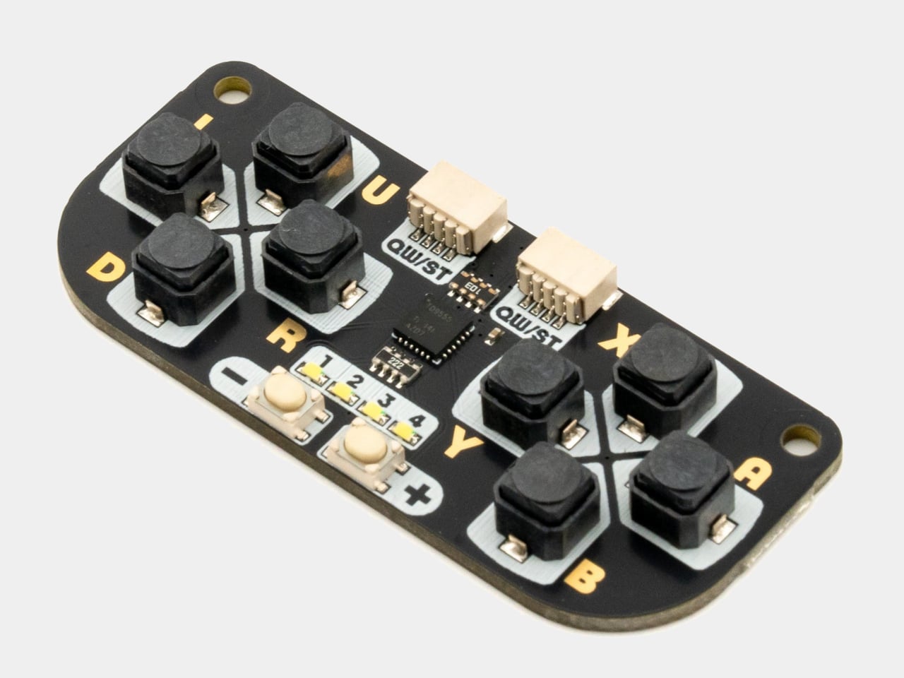
All three come pre loaded with a launcher and a bunch of open source apps, from silly games like Plucky Cluck to utilities like clocks and ISS trackers. Everything runs in MicroPython with Pimoroni’s libraries, and the optional STEM kit adds a multi sensor stick and a gamepad so badges can react to temperature, light, motion, and multiplayer button mashing, turning them into wearable sensors or tiny game consoles.

Double tapping reset drops the badge into disk mode so it shows up as a USB drive, letting you edit Python files directly without juggling tools or serial consoles. The cases have lanyard holes and can free stand on a desk, so they work as both wearable name tags and tiny desk dashboards. The clear shells and rear lighting make the electronics part of the aesthetic instead of something to hide.

Badgeware turns the throwaway conference badge into a reusable platform. Instead of printing your name once and tossing it, you get a little object that evolves from ID tag to art piece to sensor display as your code and curiosity grow. For people who like their gadgets small, expressive, and open ended, Badger, Tufty, and Blinky feel like digital jewellery that actually earns its lanyard space, whether you wear it to a meetup or keep it glowing on your desk.

The post Badgeware Turns Conference Badges into Wearable Tiny Computers first appeared on Yanko Design.

Timeless rotary phone reborn as modern AI-powered companion that plays music

Who can forget the charm of rotary phones that were a lifeline in the early ’90s and ’80s? Their iconic mechanical dialling wheel with finger holes, solid build quality, and the unique clicking sound. Everything inside the machine was mechanical and wired on the inside to make communication possible. Even after their technical innovation was surpassed by mobile phones, the appeal of these robust dialers was not forgotten.

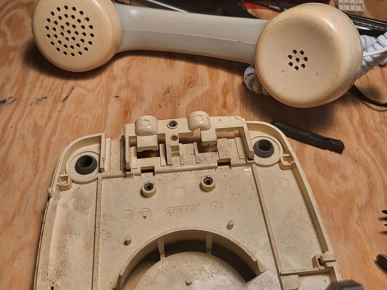
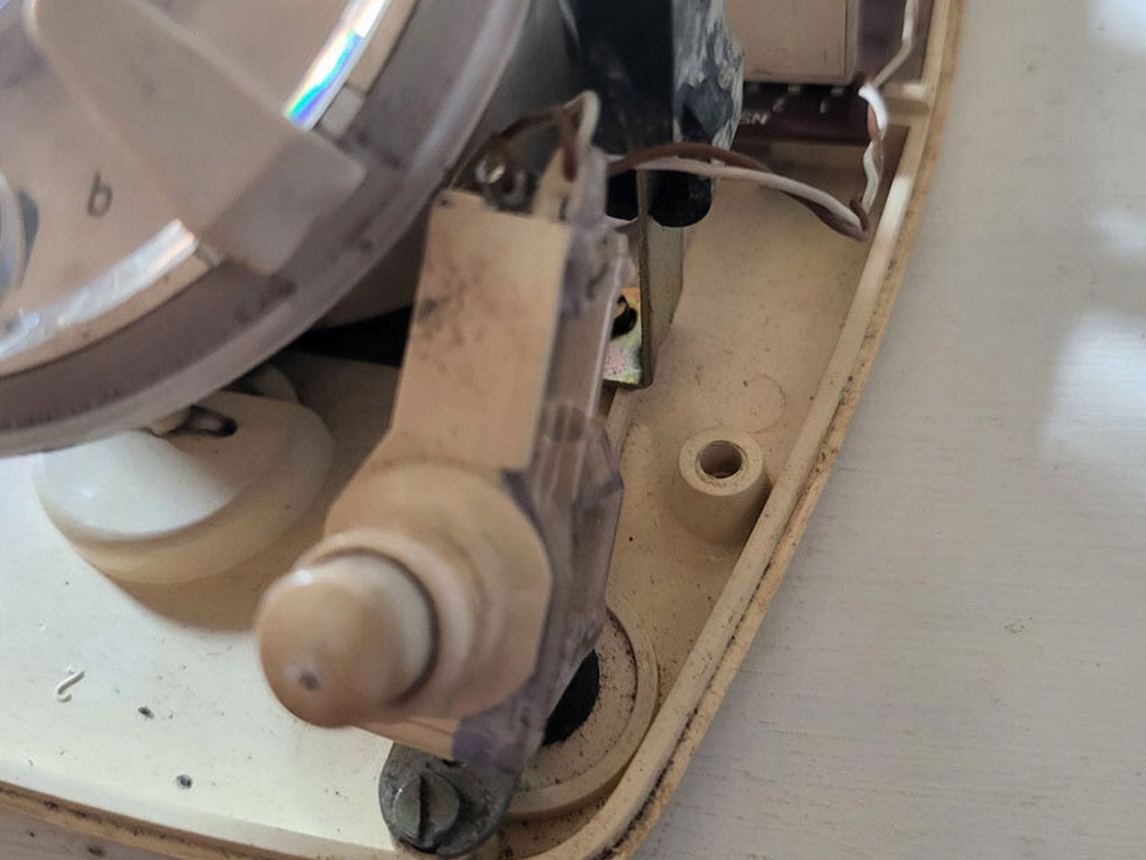
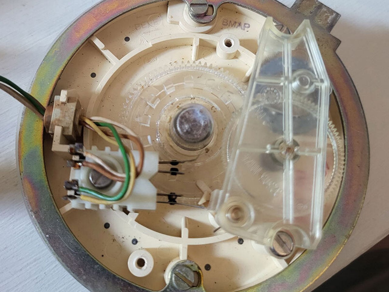
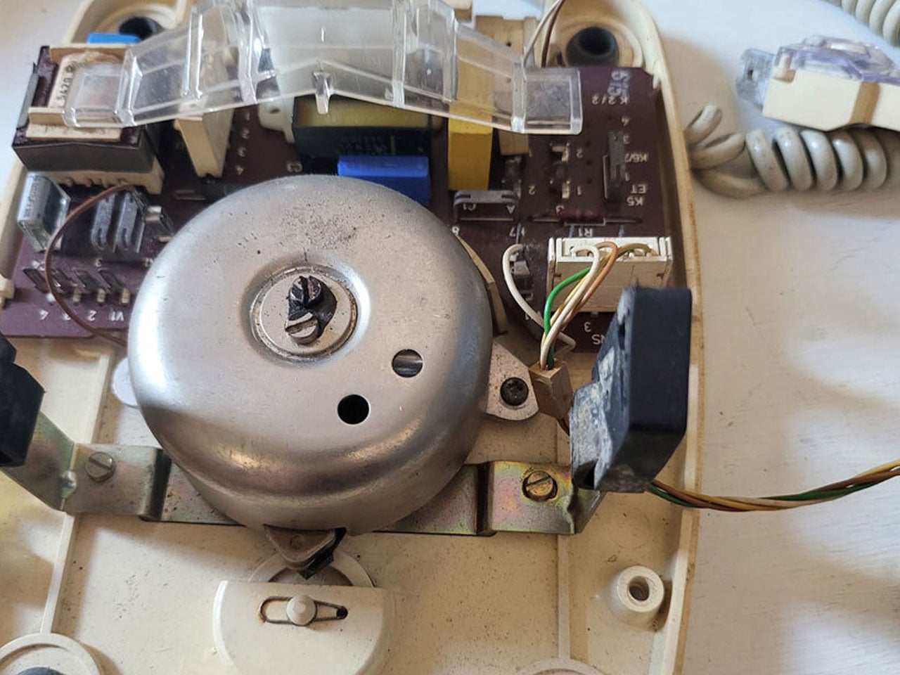
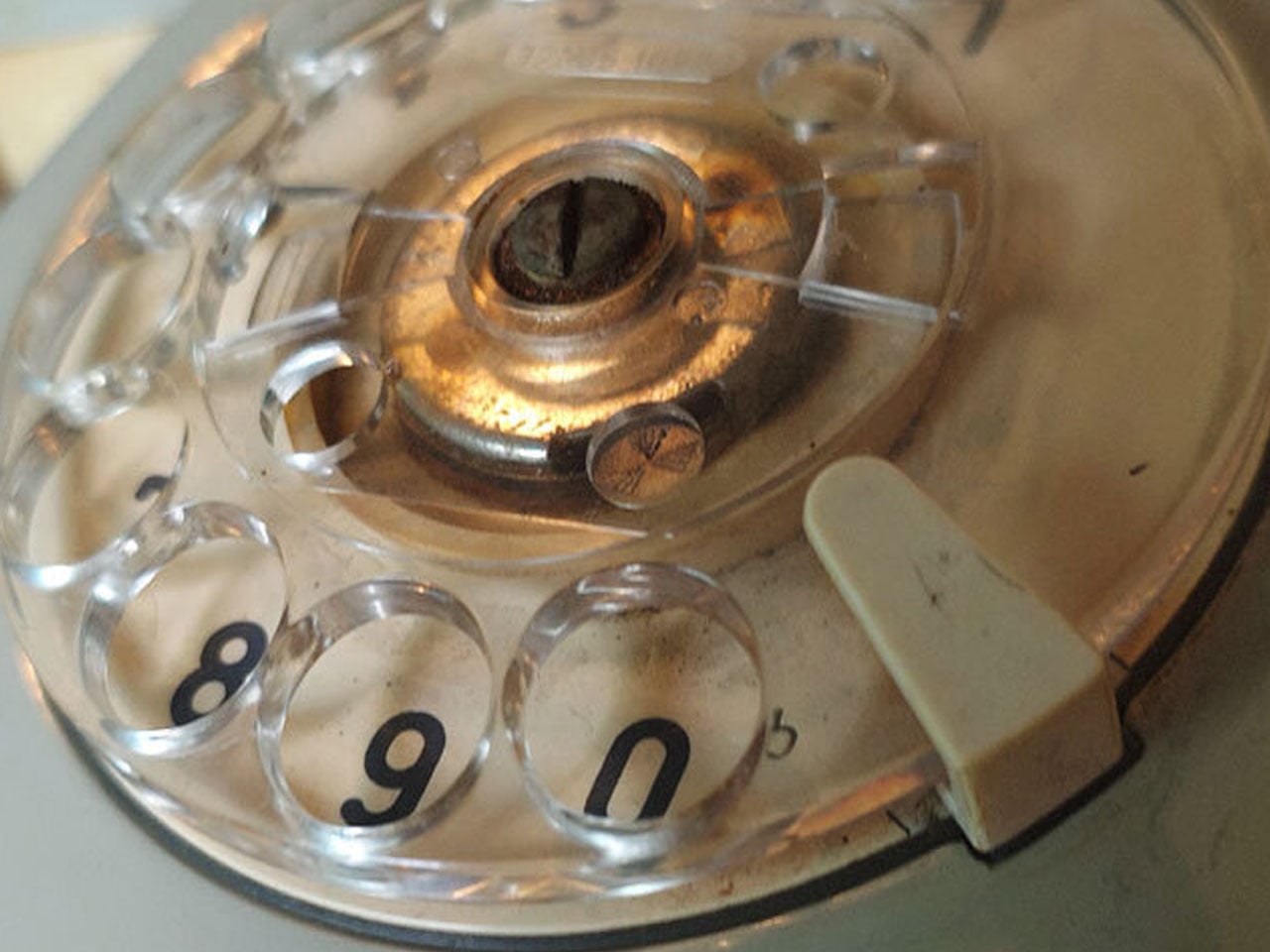
A recent re-imagining of this nostalgic device by designer Nico Tangara, who’s impressed us with the Self-Snoozing Alarm Clock shows how enduring designs can bridge analog heritage and modern digital convenience. Tangara’s project revives a vintage rotary telephone, carefully restoring original components while removing outdated elements such as the high-voltage bell and corroded wiring, to make space for low-voltage digital hardware.

Designer: Nico Tangara

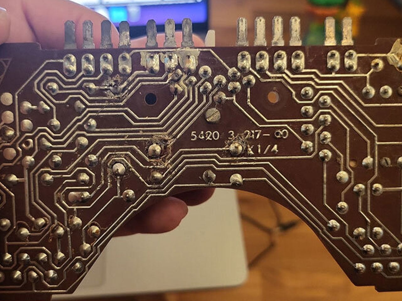
At the heart of the redesign is the original rotary dial, preserved as the primary input mechanism. Rather than simply dialing phone numbers, each pulse created by turning the dial is translated into a digital signal. This allows the dial’s mechanical action to control contemporary digital functions. The transformed device blends vintage form with modern intelligence. On the inside, a small single-board computer, which was initially a Raspberry Pi 4, was later swapped for a Raspberry Pi 2 for lighter loads, handles the digital processing. The original speaker and microphone are replaced with improved audio components connected via a USB sound card, ensuring clearer playback and compatibility with the new system.

Beyond its physical transformation, the device gains new functionality: it operates as both a music player and an AI-powered voice interface. By integrating a voice-based model (e.g., ChatGPT), speech-to-text transcription (via Whisper), and text-to-speech output (via Google TTS), the retro telephone can respond to voice commands, play music, and offer interactive voice chat. Interestingly, it can do it all while preserving the tactile nostalgia of rotary dialing phones.

The project demonstrates how old objects can find new life when design respects their identity while embracing innovation. By retaining the rotary dial, handset cradle logic, and the device’s physical essence while embedding modern electronics, the hybrid telephone becomes more than a novelty. It becomes a functional link between eras, and I’m sure people will absolutely love the idea.

In doing so, the designer’s work suggests that the past need not be discarded. Instead, elements of design that once felt obsolete can offer fresh value when rethought for contemporary contexts. The resulting hybrid device stands as a tribute to the charm of mechanical telephony and an example of how thoughtful design can merge tradition with modern technology. Perhaps the ideal starting point for budding DIYers who want to create something out of the ordinary.

The post Timeless rotary phone reborn as modern AI-powered companion that plays music first appeared on Yanko Design.
Jolla Phone Returns with a Physical Switch to Cut Off Mics and Tracking

The mobile OS graveyard is crowded. Symbian, MeeGo, Firefox OS, Windows Phone, all killed by iOS and Android’s duopoly. Most people quietly accepted that those two won and moved on. Jolla started from Nokia’s MeeGo ashes in 2013, shipped the original Jolla Phone, and somehow kept Sailfish OS alive for twelve years in the wilderness. The new Jolla Phone feels less like a comeback and more like a refusal to die.

Jolla frames it as Europe’s independent smartphone, a 5G Sailfish OS 5 device built around the pitch that every Android and iPhone phones home to California. The announcement post says this is about digital sovereignty and choice rather than nationalism, but the subtext is clear: Europe needs its own mobile platform, or it stays perpetually dependent on US and China infrastructure. It is a Linux phone you are meant to daily drive, not a dev kit or novelty.

Designer: Jolla

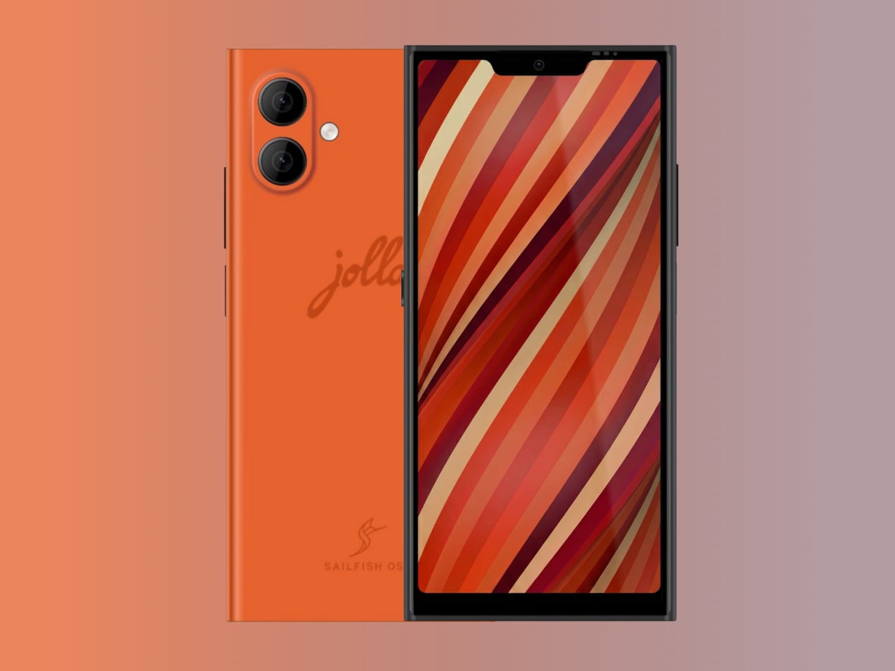
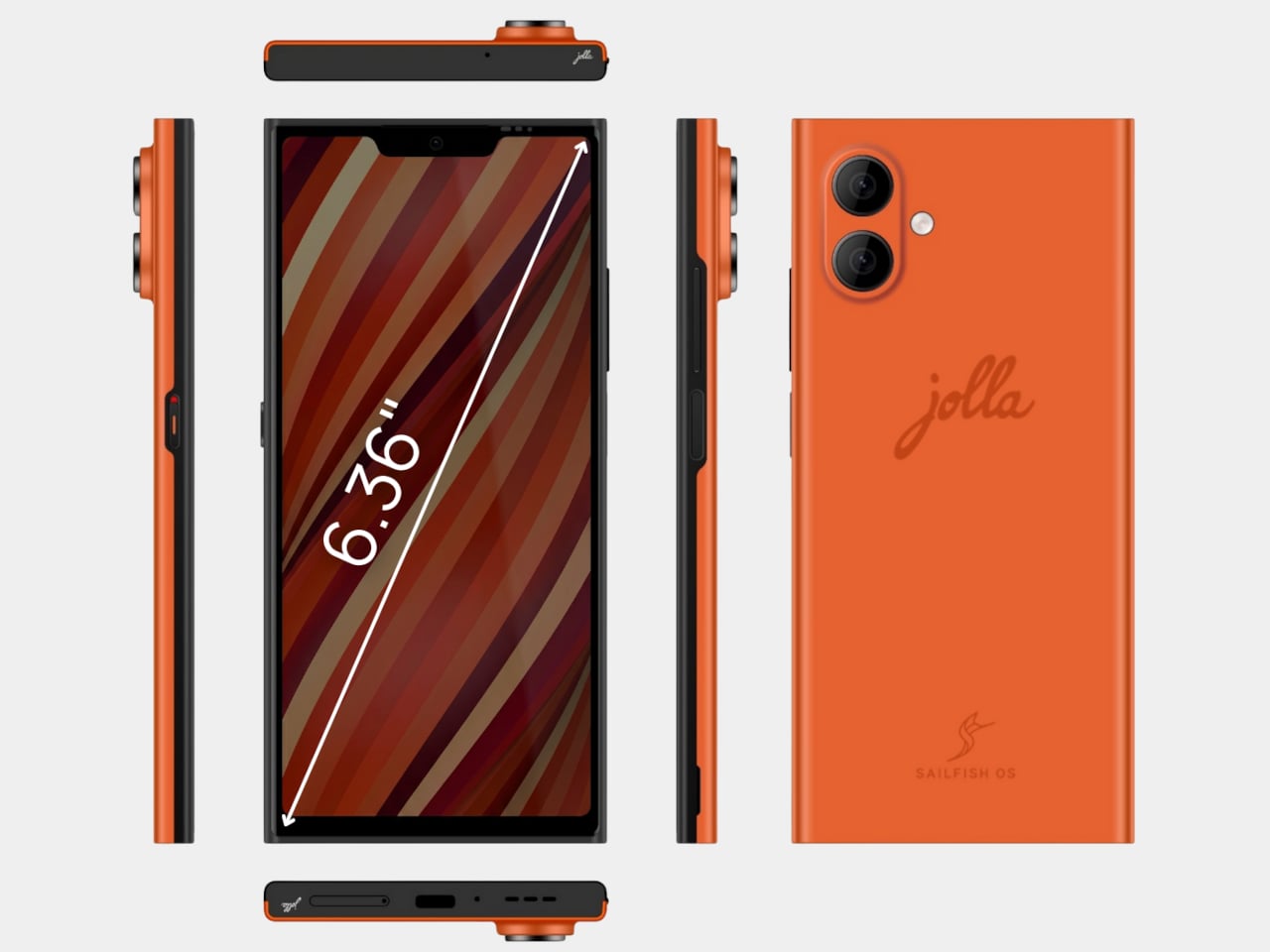
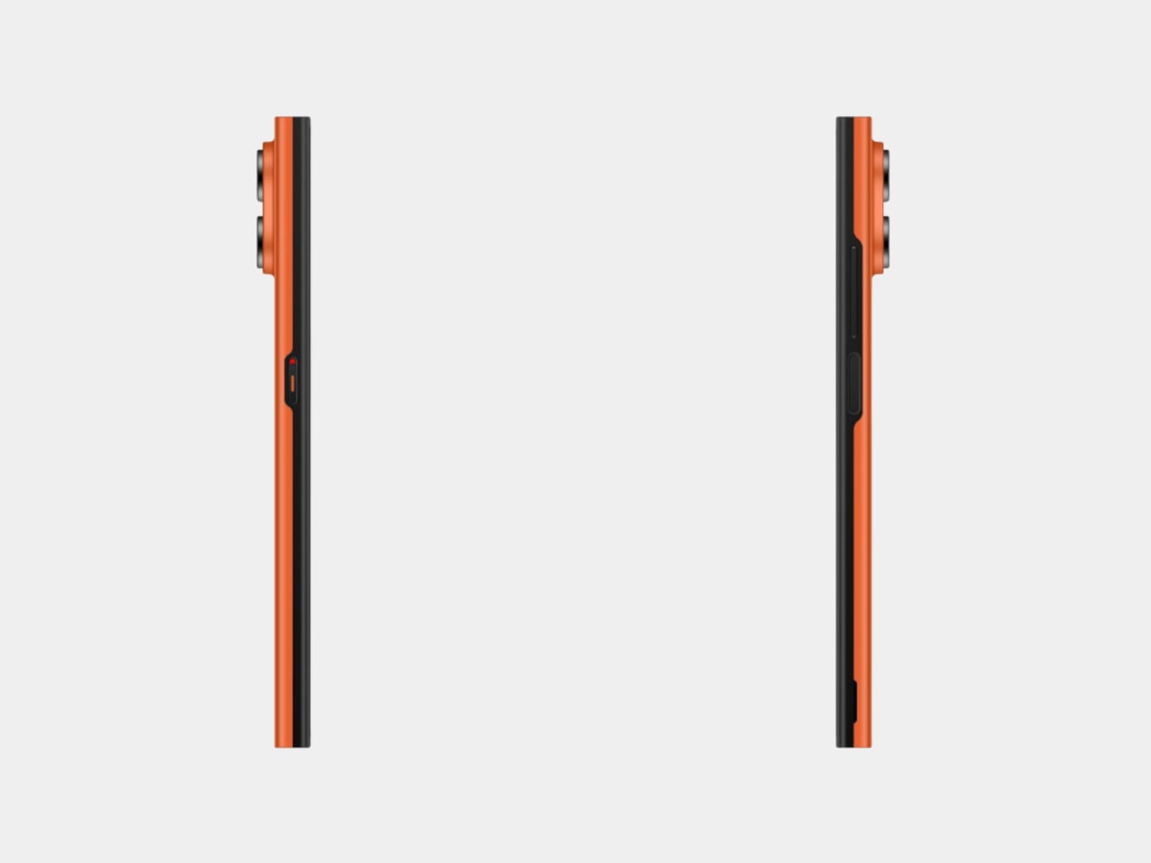
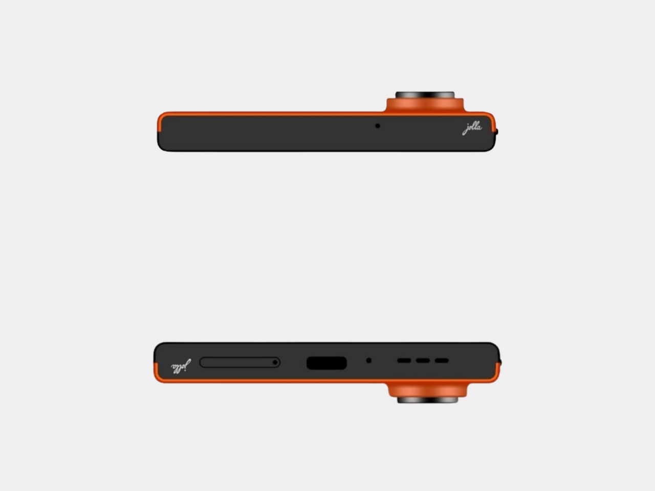
The core specs sit in upper mid-range territory. A 6.36-inch FullHD AMOLED screen, a Mediatek 5G platform, 12GB of RAM, 256GB of storage with microSD expansion up to two terabytes, dual SIM, and a 5,500 mAh battery. The flat-sided Scandinavian design offers replaceable back covers in Snow White, Kaamos Black, and The Orange, a nod to the original Jolla’s signature color. It includes a side fingerprint reader and an RGB notification LED.

The privacy hardware choices feel almost retro. A physical privacy switch can be configured to cut off the mic, Bluetooth, Android apps, or other subsystems. The battery and back cover are user-replaceable, which feels unusual in a world of sealed slabs. Those choices align with the idea of owning your device instead of renting it, and they support Sailfish OS’s pitch as “private by design,” with no tracking or hidden analytics happening in the background.

Sailfish OS 5 is a Linux-based, gesture-heavy mobile OS that Jolla promises will get at least five years of updates without forced obsolescence. App ecosystems matter, so the phone includes Android app support via Jolla AppSupport, without Google Play Services. That means many Android apps will run, but you are not feeding data into Google’s backend every time you unlock your phone or letting services siphon usage patterns while sitting idle.

The funding model is a 99 euro fully refundable pre-order voucher toward a 499 euro final price, with production only happening if at least two thousand units are reserved. The community voted on key specs and features, and the campaign already passed its goal. The phone becomes a Do It Together project where early adopters literally decide whether it exists, and pre-order customers get a special edition back cover as a thank you.

The new Jolla Phone represents a rare, stubbornly optimistic alternative in a market that settled on two platforms years ago. It will not replace iOS or Android for most people, and there are risks around timelines and app compatibility. But for anyone who wants a phone that treats privacy, longevity, and independence as design constraints instead of afterthoughts, Jolla’s return feels like proof that small, opinionated hardware can still find oxygen if the community wants it badly enough.

The post Jolla Phone Returns with a Physical Switch to Cut Off Mics and Tracking first appeared on Yanko Design.
7 Best Gifts for Him That Sold Out In 24 Hours Last Year

Last year’s holiday season revealed something about modern gift-giving. Men want tools that work, look exceptional, and tell stories worth sharing. The gifts that vanished fastest weren’t trendy gadgets destined for drawer exile. They were thoughtfully engineered pieces that balanced aesthetic sophistication with genuine utility. These weren’t impulse purchases. They were calculated acquisitions by people who understood quality.

The seven products that sold out within 24 hours shared common DNA. Japanese design principles met practical engineering. Everyday carry essentials elevated to conversation pieces. Emergency preparedness disguised as premium lifestyle goods. Each item justified desk space, pocket real estate, or shelf prominence through consistent daily value. These weren’t gifts that prompted polite thank-yous. They sparked genuine excitement and immediate use.

1. RetroWave 7-in-1 Radio

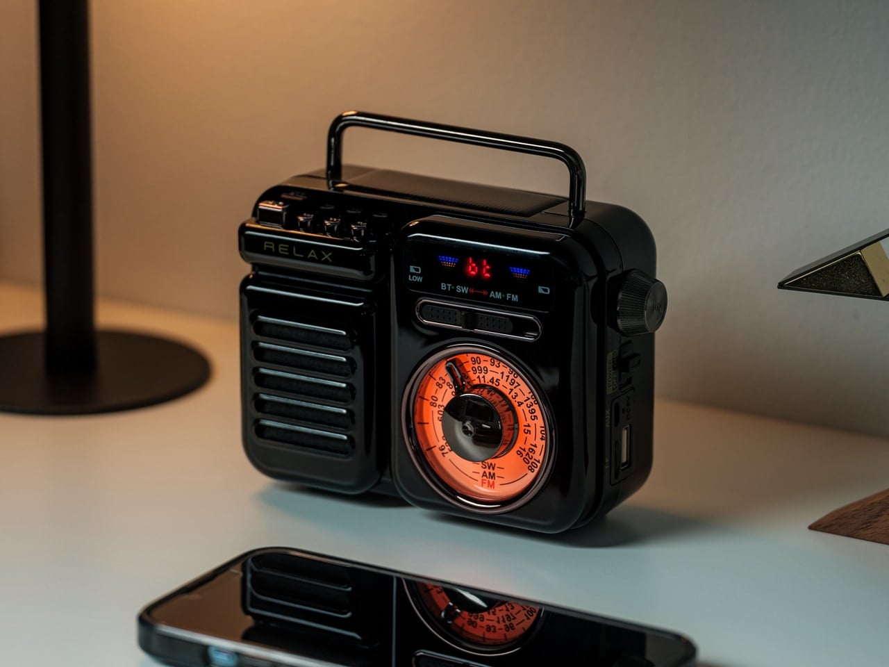
The RetroWave 7-in-1 Radio disappeared from inventory because it solved the preparedness paradox. Most emergency equipment looks utilitarian enough that people hide it away, defeating the purpose when actual emergencies strike. This radio’s retro Japanese aesthetic meant it belonged on display, ensuring availability when needed. The tactile tuning dial provided satisfying analog interaction in an increasingly touchscreen world. Seven functions consolidated into one compact unit addressed multiple needs without creating equipment sprawl across living spaces.

The engineering deserved attention beyond the vintage styling. Hand-crank charging and solar panel meant this radio functioned independently of grid infrastructure. The 2000mAh battery transformed it into a power bank for charging phones during outages. AM, FM, and shortwave reception covered local broadcasts through international stations. Bluetooth streaming and MP3 playback via USB or microSD bridged analog nostalgia with modern convenience. The built-in LED flashlight and SOS alarm addressed genuine safety concerns. Up to 20 hours of radio time or 6 hours of emergency lighting on full charge provided meaningful backup during extended power failures.

Click Here to Buy Now: $89.00

What we like

  • The combination of hand-crank, solar, and USB charging eliminates single points of failure in emergencies.
  • Retro Japanese design creates a display-worthy aesthetic that ensures the radio stays accessible rather than stored away.

What we dislike

  • The 2000mAh battery capacity provides phone charging in emergencies, but won’t fully charge modern smartphones multiple times.
  • Seven functions in one device mean compromises compared to dedicated equipment in each category.

2. StillFrame Headphones

StillFrame Headphones occupy the neglected middle ground between in-ears and over-ears. At 103 grams, they felt nearly weightless during extended wear sessions. The 40mm drivers created open soundstages that made quiet tracks feel expansive. Designer Tatsufumi Funayama’s “MUSIC IN EVERY WAY” philosophy manifested through exposed circuit boards and magnetic fabric ear cushions that snapped on with satisfying precision. The stainless steel headband balanced strength with flexibility. This wasn’t audio equipment trying to disappear. It was technology presented as part of the experience.

The practical engineering matched the aesthetic ambition. Active noise cancelling silenced distractions when focus mattered. Transparency mode maintained environmental awareness during commutes or shared spaces. Twenty-four hours of battery life eliminated charging anxiety during long work sessions or international flights. Bluetooth 5.4 provided fluid wireless streaming, while a USB-C wired connection enabled high-resolution, low-latency playback for critical listening. Dual microphones with noise cancelling kept voice calls clear even in chaotic environments. Each white model included light gray and turquoise magnetic cushions for mood-based customization. The geometric fusion of circular and square housing created visual interest that elevated these beyond commodity audio gear.

Click Here to Buy Now: $245.00

What we like

  • The 103-gram weight and 24-hour battery life enable all-day wear without physical fatigue or charging interruptions.
  • Magnetic ear cushion swaps with included color options provide personalization without replacing entire headphones.

What we dislike

  • The exposed circuit board aesthetic appeals to design enthusiasts but may concern users worried about component durability.
  • The middle position between in-ears and over-ears won’t satisfy purists seeking either maximum isolation or complete openness.

3. AromaCraft Clothes Brush

The AromaCraft Clothes Brush transforms mundane garment maintenance into sensory ritual. Miyakawa Hake Brush Workshop’s century-old legacy manifested through the traditional Tsubokiri method, where each bristle received individual hand-planting by master artisans. The white boar hair bristles lifted dust and pollen from deep within fabric fibers without causing damage. The walnut wood handle finished with shea butter created tactile satisfaction during use. The innovative aromatic paper insert accepted essential oils for customizable fragrance, leaving clothes subtly scented with each brushstroke. This wasn’t clothing care. It was daily luxury ritual.

The engineering behind the aesthetics mattered for longevity. Hand-planted bristles prevented shedding that plagued mass-produced brushes, extending lifespan significantly. Boar bristles provided ideal firmness for effective cleaning while remaining gentle enough for delicate fabrics. The aromatic paper system enabled personalization through essential oil selection, adapting to seasonal preferences or mood. Each brush carried over a century of refinement from a family-owned workshop established in 1921. The walnut handle’s shea butter finish improved grip while developing rich patina through years of use. This brush treated wardrobe maintenance with the reverence typically reserved for fine woodworking or culinary tools.

Click Here to Buy Now: $149.00

What we like

  • The century-old Tsubokiri hand-planting method prevents bristle shedding and creates genuinely longer-lasting brush construction.
  • Customizable aromatic paper insert transforms functional garment care into personalized sensory experience through essential oil selection.

What we dislike

  • The premium hand-crafted construction commands prices far beyond standard lint rollers or basic clothing brushes.
  • The aromatic paper system requires ongoing essential oil purchases and maintenance to deliver the scent customization feature.

4. BlackoutBeam Tactical Flashlight

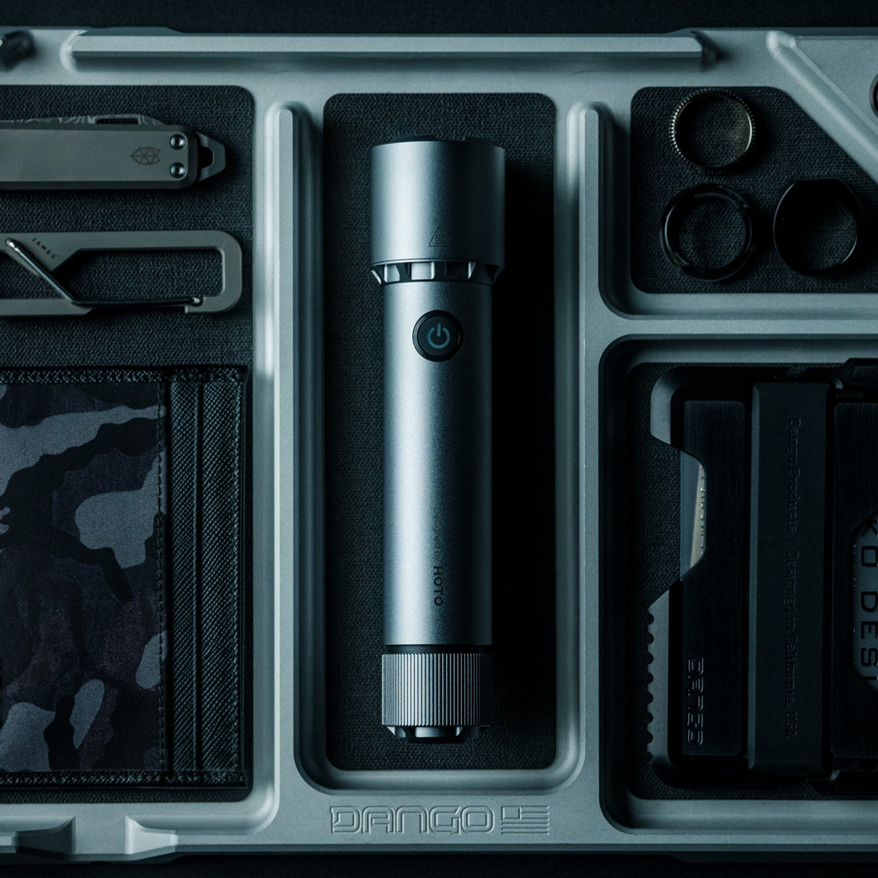
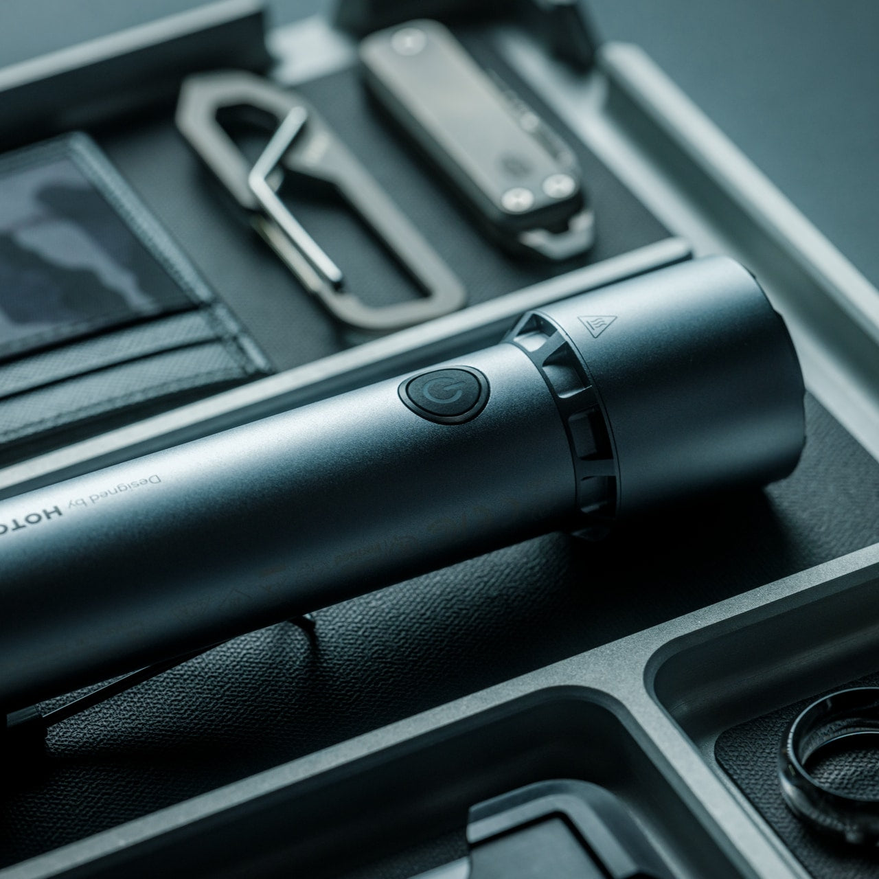
BlackoutBeam Tactical Flashlight delivers tactical performance without tactical aesthetics. The 2300-lumen output and 300-meter throw rivaled professional equipment while maintaining industrial design suitable for nightstand placement. Waterproof aluminum construction achieved an IP68 rating for dust and water resistance without adding bulk. The 0.2-second response time eliminated lag between activation and illumination. HOTO’s 100+ international design awards created brand credibility. This was a serious capability packaged for people who valued both preparedness and design coherence.

The engineering specifics mattered during actual use. Three brightness levels plus strobe and pinpoint modes are adapted to different situations. The 3100mAh lithium-ion battery recharged via USB but accepted two CR123A batteries as backup when outlets weren’t accessible. Six thousand five hundred Kelvin light temperature mimicked daylight for enhanced visibility and color accuracy. One-handed operation worked even while wearing gloves. The aluminum body survived impacts that would crack plastic housings. Power outages, roadside emergencies, and outdoor navigation all benefited from having 2300 lumens available instantly. The industrial design meant it looked intentional on shelves rather than apologetically hidden in drawers.

Click Here to Buy Now: $89.00

What we like

  • The 2300-lumen output and 300-meter throw provide professional-grade performance at consumer-friendly pricing.
  • IP68 waterproof rating and dual power options (USB rechargeable plus CR123A backup) eliminate common flashlight failure points.

What we dislike

  • The tactical-grade brightness drains battery faster during extended use compared to lower-output everyday flashlights.
  • The 6500K daylight temperature provides excellent visibility but may feel harsh for ambient lighting situations.

5. Auger PrecisionFlex Razor

The Auger PrecisionFlex Razor displays Kai Corporation’s 116 years of Japanese blade-making expertise, creating genuinely innovative shaving technology. The world-first 30-degree adjustable head angle changed blade positioning mid-shave without disrupting flow. The industry-leading 3D pivoting head and independent suspension mechanism delivered the widest range of motion available. Five re-engineered blades provided ultra-close shaves while reducing irritation. The raised anti-contact head design prevented blades from touching surfaces, maintaining sanitary storage and edge sharpness. This wasn’t an incremental improvement. It was a fundamental reimagining of how razors should function.

The ergonomic handle balanced sculptural minimalism with a textured elastomer grip. The all-black silhouette maintained visual coherence while ensuring secure handling during use. Shaping beard lines, defining mustache edges, and achieving smooth, even shaves all benefited from the adjustable head angle. The lever-activated 30-degree adjustment enabled seamless transitions between forward shaving and reverse detail work. Kai’s highest-specification blade technology delivered lasting sharpness that reduced replacement frequency. The magnetic attachment system made blade changes effortless. This razor treated daily grooming as a ritual worthy of precision engineering rather than a commodity consumable to endure.

Click Here to Buy Now: $45.00

What we like

  • The world-first 30-degree adjustable head angle provides unprecedented control for detailed beard shaping and reverse shaving.
  • Kai Corporation’s 116-year blade-making heritage and highest-spec five-blade system deliver professional performance for home use.

What we dislike

  • The premium blade technology and complex pivot mechanism create higher replacement cartridge costs than standard razors.
  • The all-black aesthetic and textured grip may show water spots and require more frequent cleaning to maintain appearance.

6. Levitating Pen 2.0 Cosmic Meteorite Edition

The Levitating Pen 2.0 Cosmic Meteorite Edition vanished immediately because it combined genuine meteorite material with gravity-defying desk sculpture. Each pen featured an authentic Muonionalusta meteorite, the oldest known meteorite on Earth, sourced through the International Meteorite Collectors Association. Acid-etching revealed unique patterns formed over 4.5 billion years, ensuring no two pens shared identical appearances. The numbered certificate of authenticity elevated these from mere writing instruments to collector’s pieces. The 23.5-degree levitation angle created conversation-starting desk presence. This was functional art that happened to be written.

The engineering matched the cosmic materials. Aircraft-grade aluminum unibody construction created a seamless form with a satin finish texture. The magnetic cap snapped into place with satisfying tactile feedback. A simple twist set the pen spinning gracefully for up to 20 seconds, providing a fidget-friendly mental reset during intense work. German-engineered Schmidt ink cartridges delivered smooth, precise writing without smudges or skips. The magnetic pedestal drew inspiration from the USS Enterprise design, creating the signature floating effect through precision engineering. Compatibility with standard D1-sized refills meant the pen functioned indefinitely beyond initial cartridge depletion. The balance of spacecraft aesthetics, genuine space material, and everyday writing utility justified the premium positioning.

Click Here to Buy Now: $399.00

What we like

  • Genuine Muonionalusta meteorite tip connects each pen to 4.5 billion years of cosmic history with acid-etched unique patterns.
  • The 23.5-degree magnetic levitation and 20-second spin function create a mesmerizing desk presence that sparks conversation.

What we dislike

  • The $248 price positions this firmly in luxury gift territory rather than the practical everyday writing tool category.
  • The magnetic levitation base requires desk space and careful positioning, limiting portability compared to conventional pens.

7. CraftMaster EDC Utility Knife

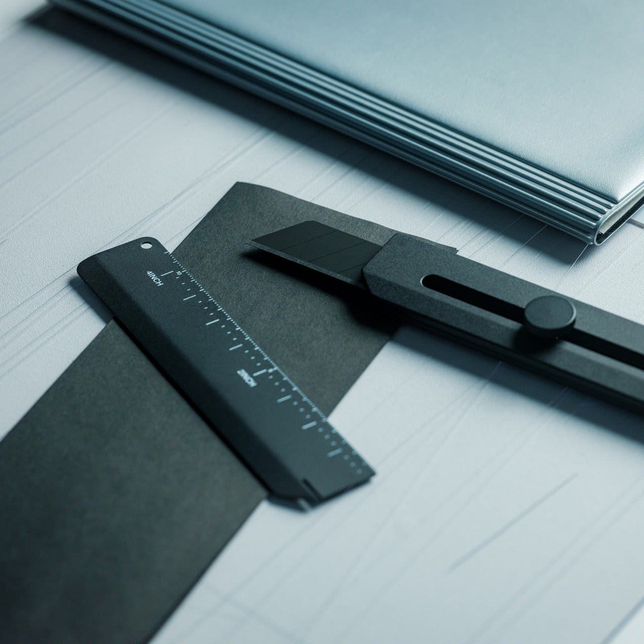
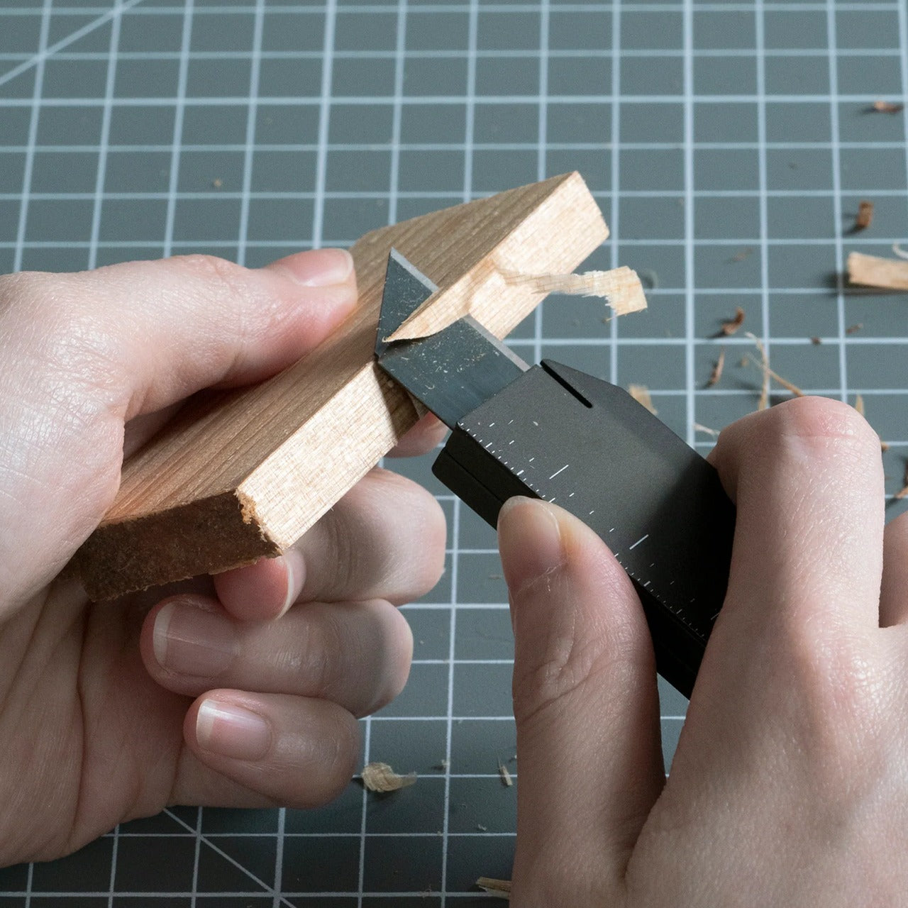
The CraftMaster EDC Utility Knife treats a utility knife design as a minimalist sculpture rather than a disposable commodity. The metal exterior created a hefty, reliable hand feel. At merely 0.3 inches thick and 4.72 inches long, it slipped into pockets without printing through fabric. The tactile rotating knob deployed OLFA blades through satisfying mechanical interaction. The magnetic back docked the knife to any metal surface for convenient access. The companion metal scale featured both metric and imperial markings, raised edges for easy lifting, and an integrated blade-breaker for snapping off dulled segments. This was everyday carry gear that looked intentional on desks or workbenches.

The thoughtful details elevated utility beyond basic box-cutting. The 15-degree curvature on the ruler prevented finger cuts during close work. The 45-degree inclination protected the package contents when opening boxes. The magnetic docking system meant the knife stayed within reach during projects requiring repeated cutting. OLFA blade compatibility ensured long-term usability through readily available replacements. The dual-scale ruler consolidated measurement and cutting into one pocket-sized tool set. The metallic aesthetic worked equally well in workshops, studios, or minimalist desk setups. This knife treated utility work as a craft deserving proper tools rather than tasks to suffer through with whatever’s handy.

Click Here to Buy Now: $79.00

What we like

  • The 0.3-inch profile and magnetic back create a genuine pocket-friendly EDC that docks conveniently on metal surfaces.
  • The companion ruler with blade-breaker consolidates measurement and blade maintenance into an integrated tool system.

What we dislike

  • The premium metallic construction and specialty features command higher prices than basic utility knives at hardware stores.
  • The magnetic docking system requires metal surfaces nearby, limiting organizational options in non-metallic environments.

Understanding the Pattern

These seven products shared fundamental characteristics that drove their rapid sellouts. Japanese design principles prioritized lasting quality over disposable convenience. Engineering innovation solved real problems rather than creating solutions searching for uses. Aesthetic sophistication meant these tools earned display placement instead of storage exile. Price points reflected genuine material quality and manufacturing expertise rather than artificial premium positioning. Each item delivered immediate utility while building long-term value through durability and timeless design.

The sellout speed revealed changing expectations for men’s gifts. Recipients wanted tools that worked beautifully and beautiful objects that worked practically. They sought products that sparked conversations about engineering philosophy and material choices. They valued everyday carry items worthy of daily interaction rather than occasional emergency deployment. These gifts succeeded because they treated the recipients as discerning adults who appreciated thoughtful design, not teenage boys impressed by aggressive styling. Quality recognition happened instantly when people encountered legitimate craftsmanship and innovative thinking.

The post 7 Best Gifts for Him That Sold Out In 24 Hours Last Year first appeared on Yanko Design.

SKEGIC MagCable Snaps Into a Coil, Never Tangles in Your Bag Again

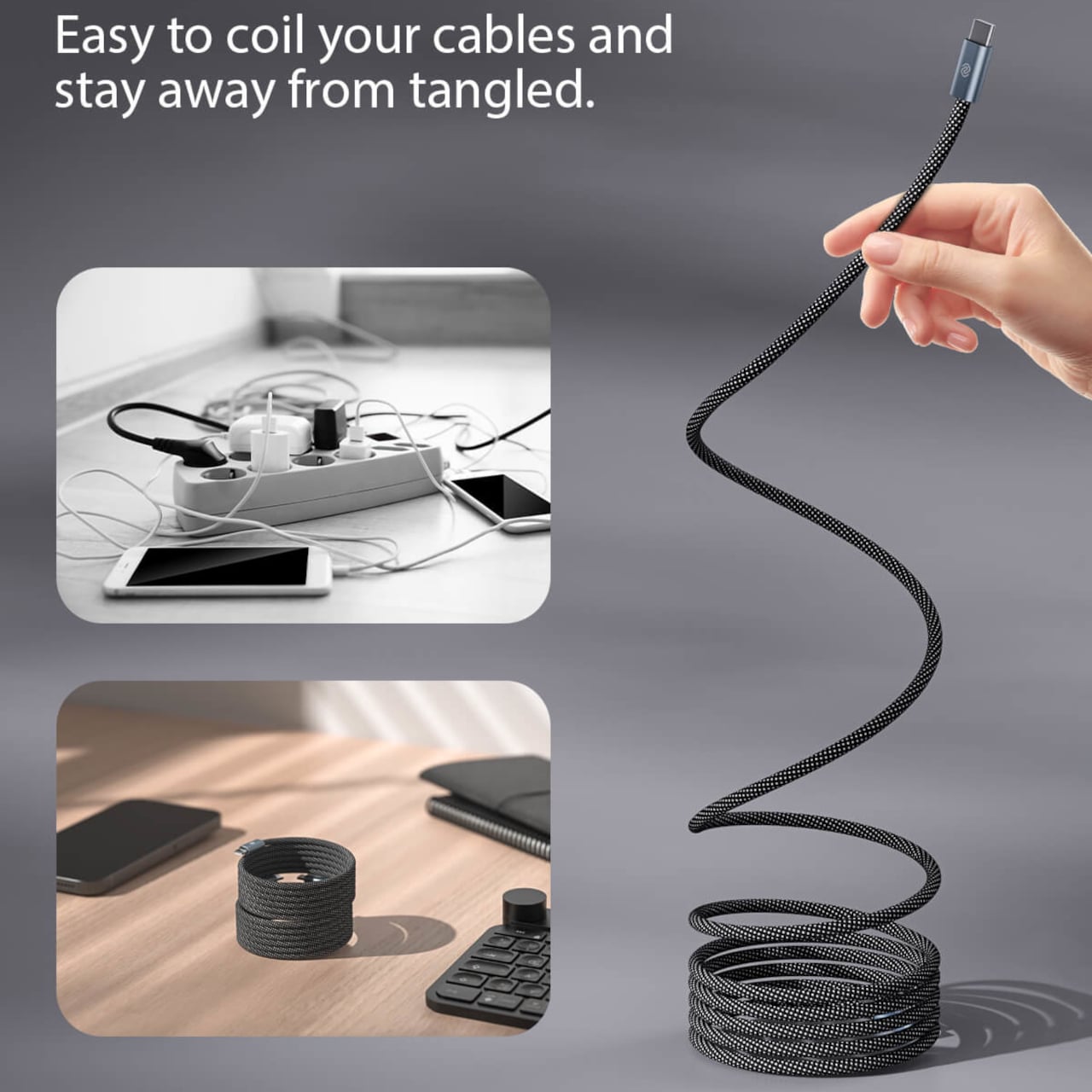
Charging cables snake across desks, tangle in bags, and turn car consoles into nests of rubber that wrap around shifters and cupholders. We buy nicer desks, stands, and chargers, but the cable itself usually remains the same cheap afterthought that sprawls everywhere. If anything deserves a design rethink, it is the thing we touch every time we plug in, yet most solutions still involve separate clips or Velcro ties you have to remember to use.

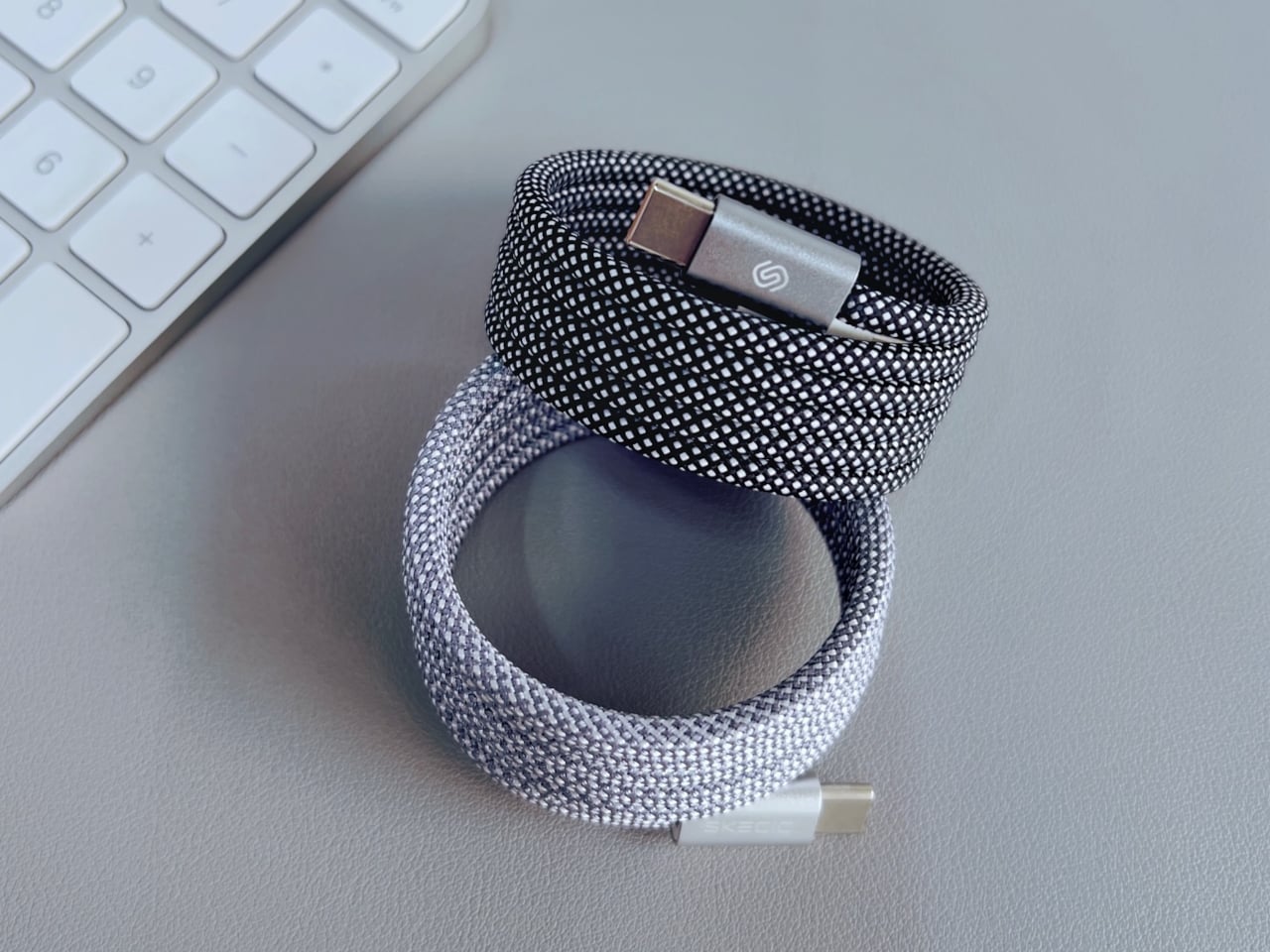
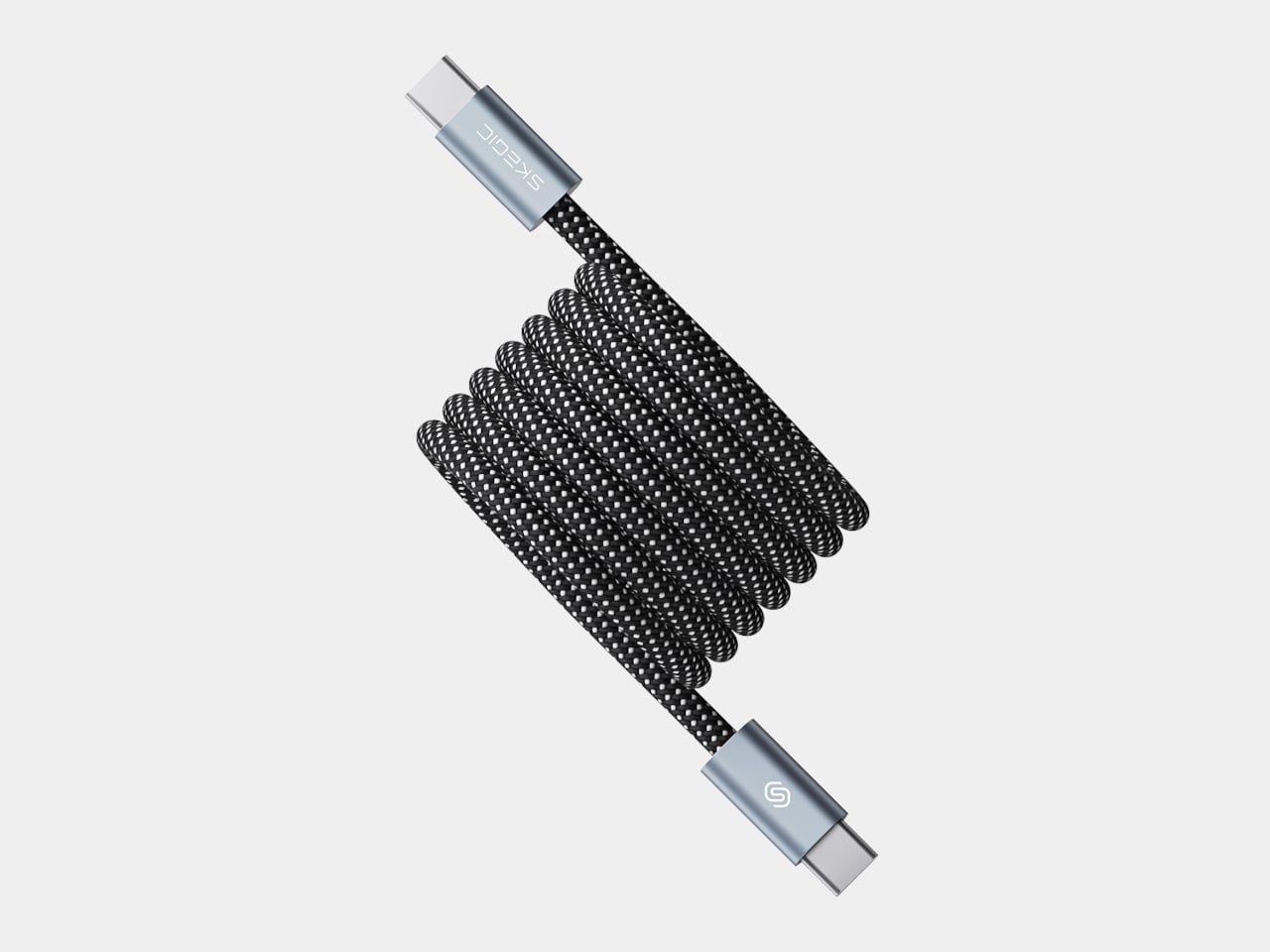
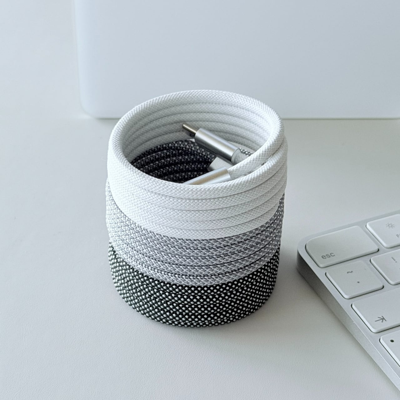
SKEGIC’s MagCable tries to solve that mess from the inside out. It is a USB-C to USB-C cable that hides magnets along its length, so it can coil itself neatly and snap into a compact ring or stack instead of sprawling. It still behaves like a proper 100W charging cable with data transfer up to 480 Mbps and support for CarPlay, which means it works for phones, tablets, and smaller laptops without compromising on spec.

Designer: SKEGIC

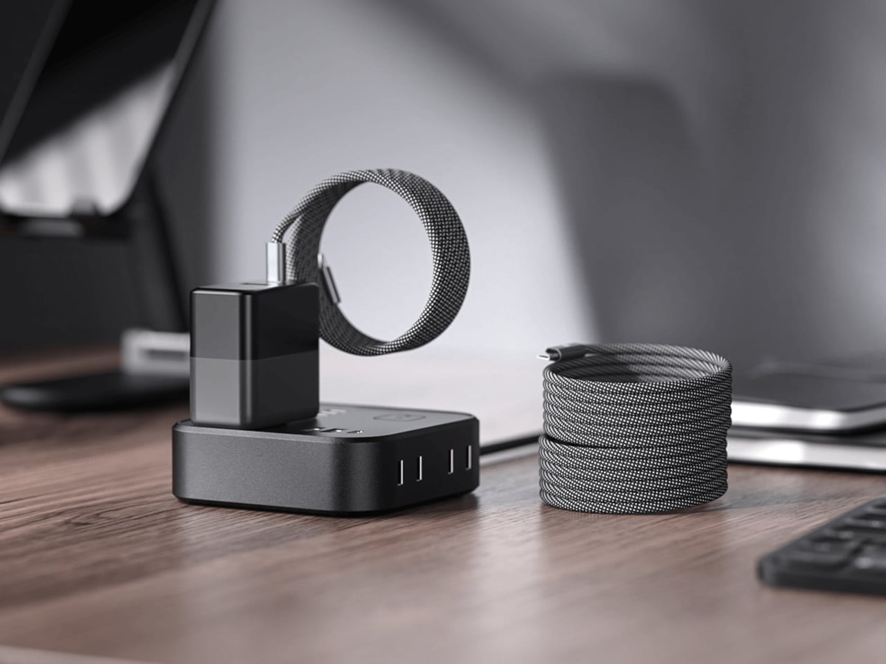
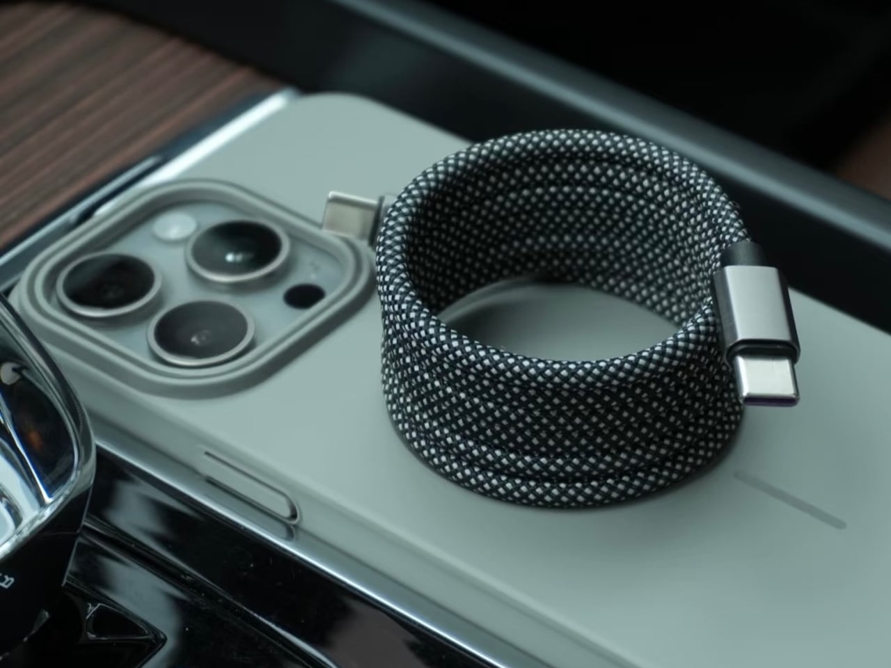
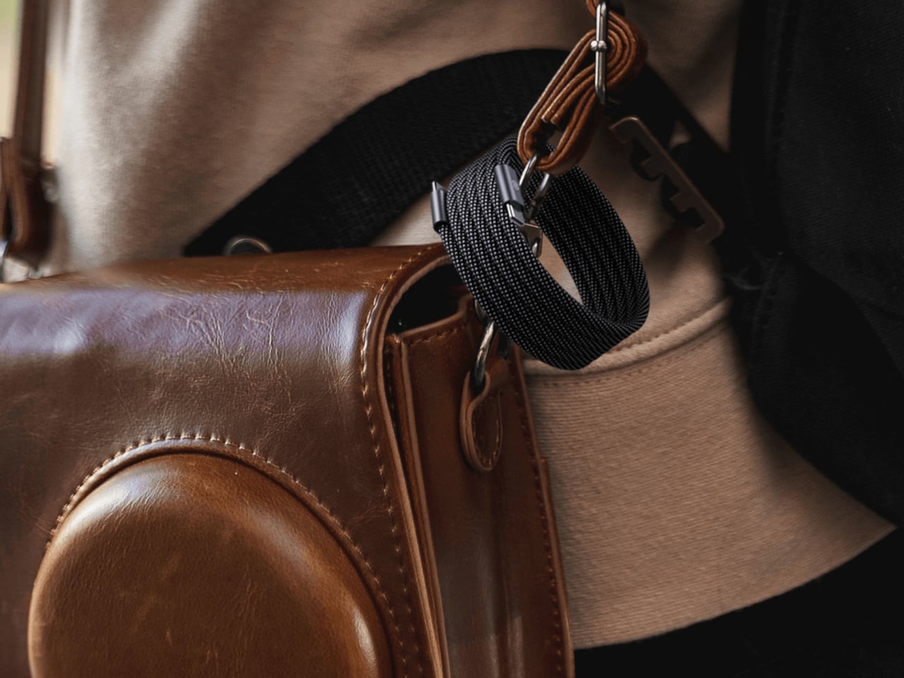
The embedded magnets let the cable hold a shape, whether that is a tight coil on a desk or a loop clipped to a bag. You are not adding clips or Velcro; the cable itself becomes the organizer. SKEGIC calls it a “magnetic anti-tangle design,” and it makes it easy to pull out just the length you need while the rest stays coiled. When you are done, a quick wrap snaps it back into place without hunting for a tie.

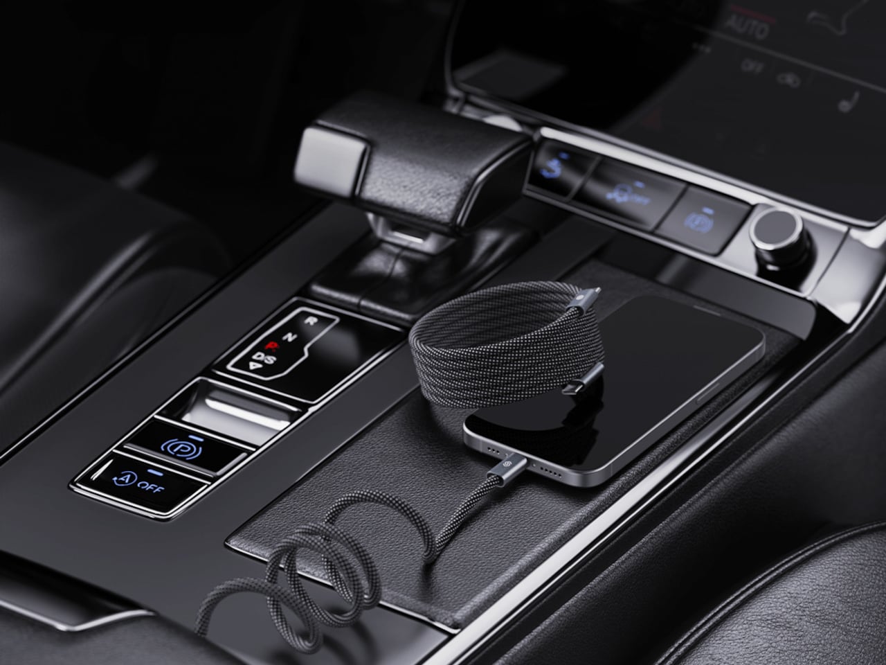
On a desk, the MagCable lives next to a charger as a tidy stack until you unroll a few loops to reach a laptop or phone. In a car, the same cable avoids wrapping around the shifter and still keeps a phone connected for CarPlay without the usual tangle behind the console. For travel, it can sit in a pocket or hang from a bag strap without turning into a knot by the time you reach your destination.

SKEGIC uses reinforced nylon braiding, which helps the cable withstand wear and gives it a more textile feel than glossy plastic cords. The metal USB-C housings carry the SKEGIC logo and make it feel closer to a piece of gear than a disposable accessory. At one meter long, it is rated for universal charging of mobile devices, from phones to tablets and smaller laptops within the 100W envelope.

The trade-offs are modest. This is still a one-meter cable, not a retractable reel, and the magnets add a bit of stiffness and weight compared to a basic cord. Data transfer is rated up to 480 Mbps, which handles syncing phones and accessories but is not aimed at heavy file shuffling to fast external drives. It is a quality-of-life upgrade rather than a spec breakthrough, meant to keep things neat rather than push performance boundaries.

MagCable is the kind of quiet design fix that makes sense once you live with it, the difference between a desk that always looks slightly chaotic and one that feels finished. For people who care about how their workspace, car, or bag looks and functions, a cable that organizes itself starts to feel less like a gimmick and more like how these things should have worked all along, one less small annoyance to manage while everything else demands attention.

The post SKEGIC MagCable Snaps Into a Coil, Never Tangles in Your Bag Again first appeared on Yanko Design.
Titaner Titanium EDC Ratchet Swings at 4° for Impossibly Tight Spaces

There’s a particular kind of frustration that comes with a stubborn screw buried deep inside a chassis or tucked behind a piece of furniture. You finally wedge a ratchet into the gap, but every swing sends the screw back to where you started, undoing your progress in tiny, maddening increments. The problem isn’t skill or strength; it’s that most ratchets need too much arc to advance the fastener.

The Titaner EDC Ratchet System was built precisely for this challenge, engineered around an impressive tight 4-degree swing arc. At the heart is a tiny ratchet mechanism, just under thirty grams, that can click forward with minimal movement. In cramped spaces where you can barely tilt your hand, that tight swing means you still get crisp confirmation that the fastener is turning.

Designer: Titaner

Click Here to Buy Now: $159 $295 ($135 off). Hurry, only 66/1900 left! Raised over $479,000.

Traditional thinking says that more precision means more fragility, and more strength means more mass. Titaner’s core weighs just 29.8 grams yet uses a dual-lock gear mechanism engineered to handle serious torque. When fully engaged, it feels like every bit of effort goes straight into the screw without the mushy slop you expect from small ratchets. The core is light enough to carry every day but built to take on rusted bolts without flinching.

Direction control works through a flip-based design instead of a small thumb lever. One side of the core locks for tightening, the other releases for loosening, with engraved markers making it obvious at a glance. Flipping the core in your fingers becomes a natural gesture, and removing that fragile switch simplifies the structure while shaving off weight and potential failure points.

The modular system lets the same core adapt to very different tasks. Snap extension bars into the side ports, and it becomes a T-shaped handle for maximum leverage, letting both hands and your upper body share the load. Reconfigure into an L-shape to work around a chassis brace or wall, or keep it in a slim I-shape when you need to reach deep into a narrow opening.

Of course, controlling force at the moment of maximum torque is where the optional Gyro-Stabilizer cap comes in. It separates downward pressure from twisting motion, so your palm can press straight down while the ratchet turns freely underneath. That helps keep bits seated, reducing cam-out and stripped fasteners. For delicate work on plastics or electronics, the side port configuration gives more linear feedback, making it easier to stop at just the right tightness.

The titanium core, four extension bars, and a set of hardened S2 steel bits all nest into a small aluminum vault case. A clever magnetic structure locks each piece in place with a satisfying snap, so nothing rattles. In a bag or pocket, it feels more like a compact object than a toolbox, yet it unfolds into a capable setup when you need it.

GR5 titanium resists sweat, rain, and seawater, while M390 steel gear teeth handle repeated engagement without rounding off. The outer case is milled from 7075 aluminum, with chamfered edges and smooth surfaces that feel deliberately finished. Spin the core between your fingers, and the fine clicks of the 4-degree mechanism turn precision into something you can hear and feel, a tactile reward for the engineering underneath.

The system comes in two versions. The basic edition offers just the ratchet core with a standard interface, meant for people who already have their own bits and extensions they trust. The pro edition includes the full modular ecosystem with bars, bits, a vault case, and all the configuration options for T, L, and I shapes, turning it into a complete pocket toolkit built around a single titanium heart.

The Titaner EDC ratchet system treats turning a screw as an opportunity for thoughtful engineering and satisfying interaction. It’s built to live in a pocket, ready for the awkward angle or hidden fastener that shows up without warning, and to make those moments feel a little less like a fight and a little more like a solved puzzle with the right tool in hand.

Click Here to Buy Now: $159 $295 ($135 off). Hurry, only 66/1900 left! Raised over $479,000.

The post Titaner Titanium EDC Ratchet Swings at 4° for Impossibly Tight Spaces first appeared on Yanko Design.
This Wooden Aromatherapy Piece Turns Cultural Memory Into a Multisensory Sanctuary

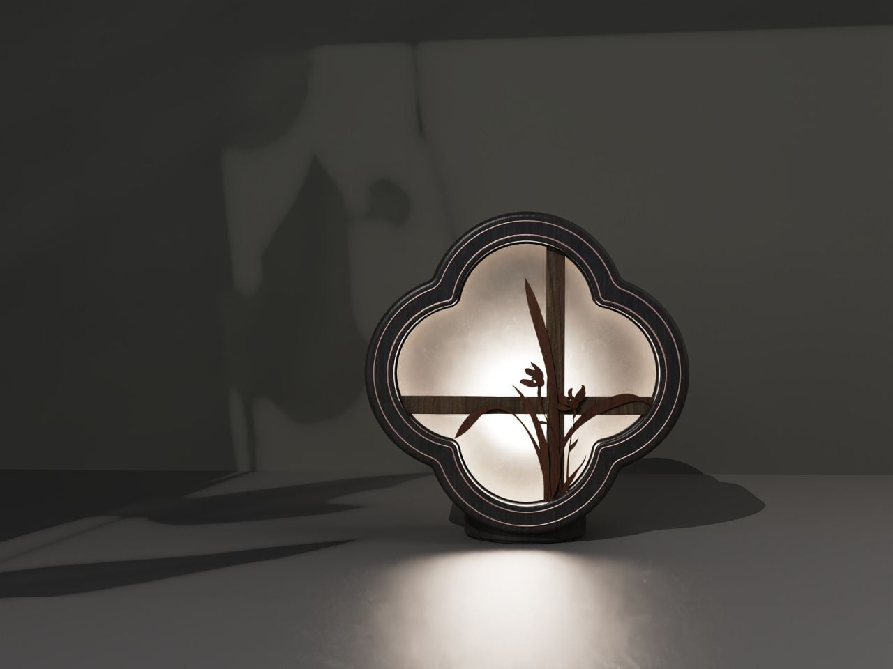
In contemporary product design, a growing interest in cultural memory, sensory ritual, and emotional well-being is shifting the way objects are conceived for domestic space. This aromatherapy piece stands as a compelling exploration of that movement, drawing from traditional Chinese aesthetics while speaking fluently to a modern lifestyle. Rather than merely referencing visual motifs, it attempts to translate centuries-old spatial philosophies into a multisensory experience.

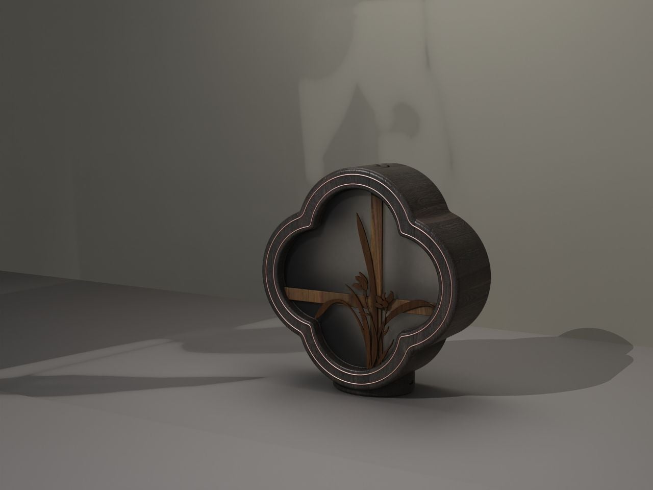
At the heart of the design is the orchid, a motif deeply embedded in Chinese literati culture. Beyond botanical elegance, orchids in classical painting and poetry symbolize moral integrity, modesty, and quiet refinement. They are often depicted growing in mountains or hidden valleys, admired not for spectacle but for restraint. By embedding orchid elements into the interior of the object, the designer is not simply decorating; they are activating a cultural code. The orchid becomes a messenger of ideals, humility, introspection, and the pursuit of spiritual clarity, values increasingly resonant in a world overwhelmed by speed and digital noise.

Designer: Chris233

The silhouette draws inspiration from the “flower window” of traditional Chinese gardens and classical architecture. These windows, often carved in quatrefoil or geometric forms, frame selective views: a corridor leading to a bamboo grove, a sliver of sky reflected in water, or the blurred outline of stones. The design adopts a four-petal window motif, re-engraving that elegant architectural language into a compact household object. This is an intentional exercise in spatial thinking, borrowing scenery into the device. In miniature, it replicates the feeling of standing before a classical garden window, where sight, imagination, and interpretation all meet.

Materiality plays a central role. The use of wood deliberately mimics the warmth, softness, and moisture of traditional furniture and artifacts. In a design world dominated by polished metal and synthetic finishes, the choice of wood feels almost meditative. Its texture has historical memory; its scent, even before aromatherapy is added, suggests calm. It carries the tactile familiarity of objects that age with time, inviting touch, presence, and slowness.

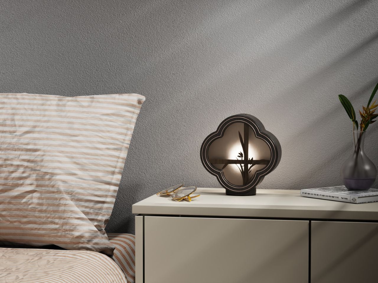
What differentiates this product from typical aromatherapy diffusers is its philosophical approach to light. The designer uses a soft, light-transmitting structure, allowing illumination to filter through the flower window and orchid shapes. The result is a choreography of shadow, a gentle diffusion that transforms functional lighting into ambience. When fragrance begins to rise, scent interacts with this shadow play, creating a layered sensory environment. The visual quietness enhances olfactory comfort, offering a subtle ritual of healing for body and mind.

In this way, the design functions as both an object and an atmosphere. It reinvents oriental aesthetics in a distinctly contemporary voice, neither imitative nor nostalgic. It chooses not to replicate historical forms, but to reinterpret them through lifestyle relevance: how people seek serenity at home, how scent supports emotional well-being, and how small objects can shape mental space.

More broadly, this project reflects a movement in design toward cultural integration rather than symbolic quotation. It suggests that traditional Chinese culture can coexist with modern sensibilities when approached through meaning rather than ornament. The piece becomes a device of calm, introspection, and everyday spirituality, a quiet reminder that design does not need to shout to be profound. In a time when wellness routines are increasingly commodified, this aromatherapy object offers something different: a return to thoughtful ritual, poetic simplicity, and the ancient art of living with beauty.

The post This Wooden Aromatherapy Piece Turns Cultural Memory Into a Multisensory Sanctuary first appeared on Yanko Design.