
Does turning off Bluetooth actually make Wi-Fi better?
Does turning off Bluetooth actually make Wi-Fi better?
The original Tamagotchi was a plastic egg about 50 mm tall that you clipped to your bag and tried not to kill. Thirty years later, Bandai has announced a version you wear on your finger, the 39th entry in the main series, and by far the smallest one yet. The Tamagotchi Ring houses a 0.56-inch color LCD in a body 28 mm tall, roughly half the size of that 1996 keychain, and it took Bandai two years to figure out how to make it work.
Miniaturizing something this far doesn’t happen by shrinking the parts. It requires rethinking the entire internal layout. The Tamagotchi Ring contains 64 total components, 52 electronic and 12 plastic, crammed into a body measuring 28mm x 23mm x 35mm. The 0.56-inch display is the smallest color LCD ever fitted to a Tamagotchi, and the battery, now rechargeable rather than a replaceable coin cell, charges via an included case because there simply wasn’t room for anything else.
Designer: Bandai
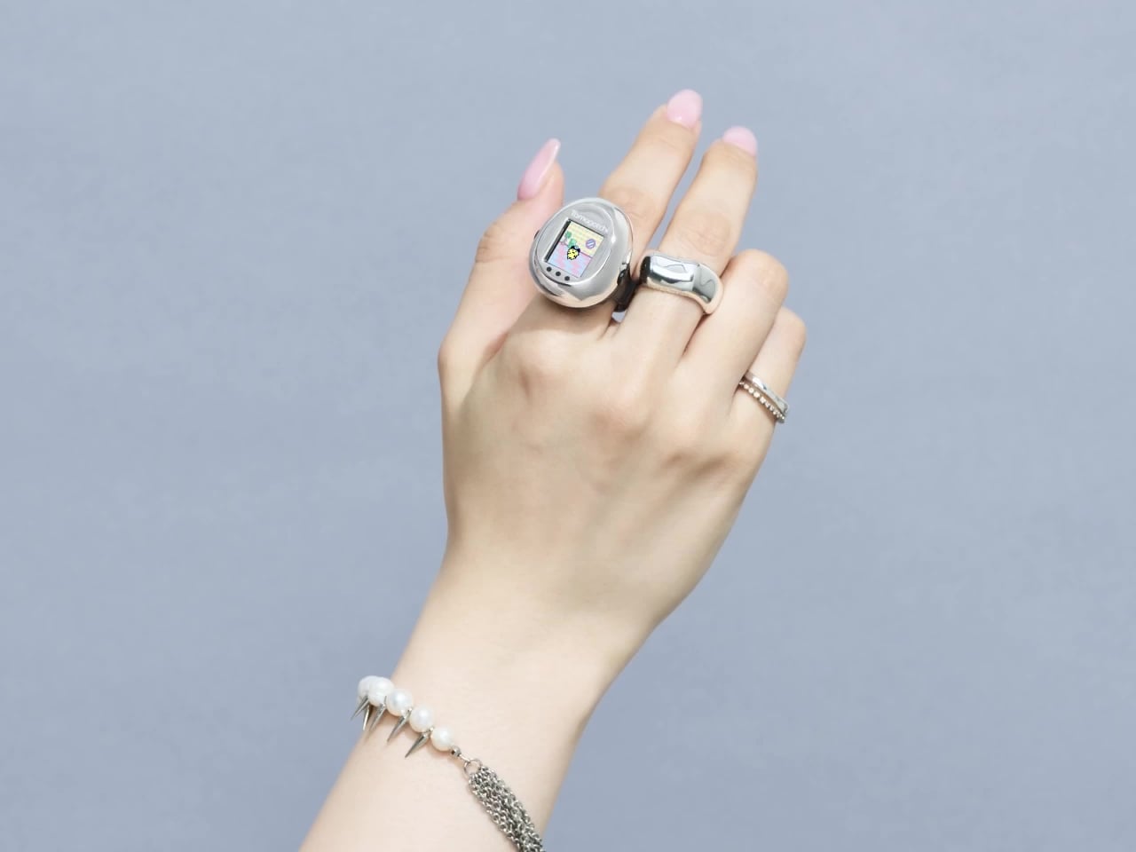
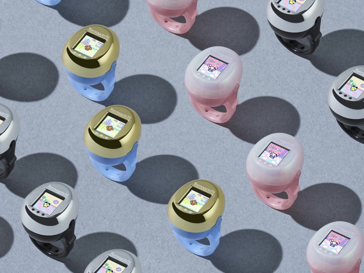
What it does despite that size is the part worth paying attention to. Thirty raiseable characters are in there, along with minigames and a room customization feature. It’s a complete Tamagotchi experience, not a reduced one, running on hardware small enough that Bandai could mount it on a ring band. The design sits on the finger like a small wearable sculpture rather than a piece of consumer electronics.
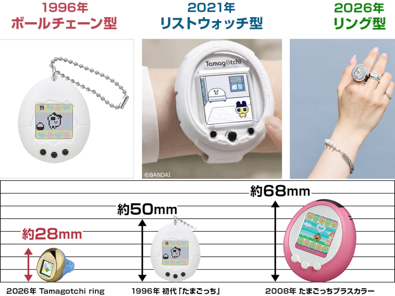
The announcement arrived on August 27, 2026, timed to mark the franchise’s 30th anniversary. That timing isn’t incidental. The Tamagotchi has been through enough reinventions to know when a milestone deserves something genuinely new rather than a color variant. A ring-form virtual pet is a different object than a keychain pet, even if the creature inside behaves the same way. It changes where the Tamagotchi lives in your day and how visibly you’re tending to it.

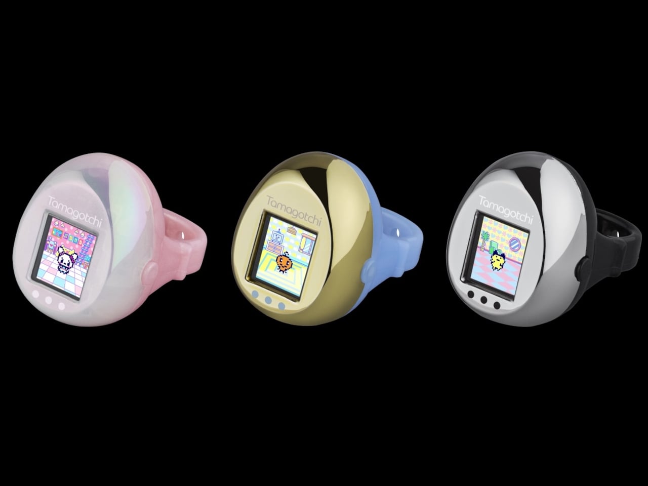
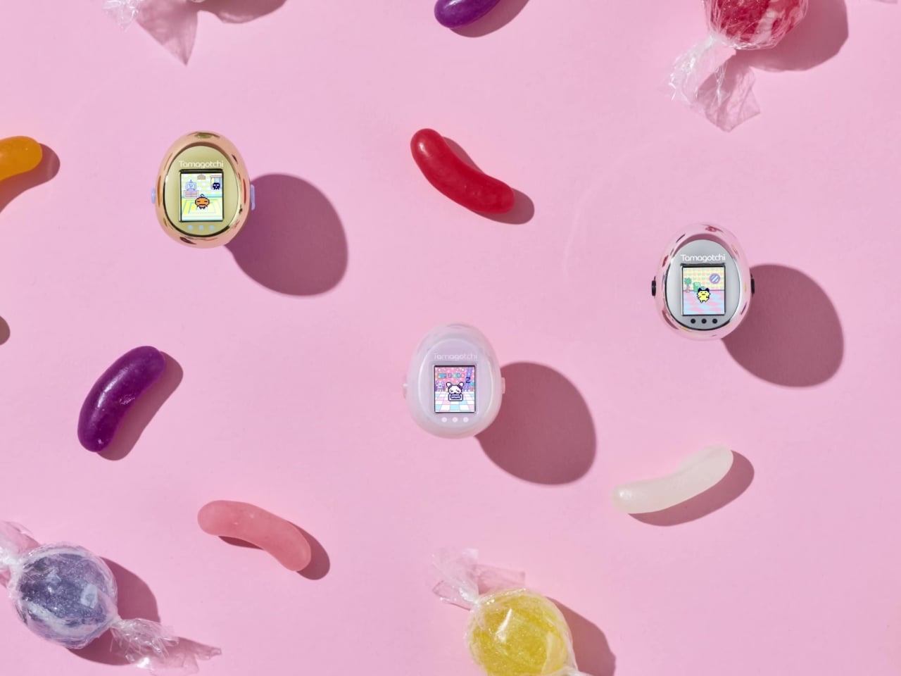
The ring comes in three colorways: Black x Metallic Silver, Light Blue x Metallic Gold, and Pink x Pearl White. It’s designed for Japanese ring size 14, which sits at approximately 17.3 mm inner diameter, with an included adapter to bring it down to size 10. That translates roughly to US ring sizes 7 and 5.5, respectively, covering a reasonable range without requiring multiple SKUs.
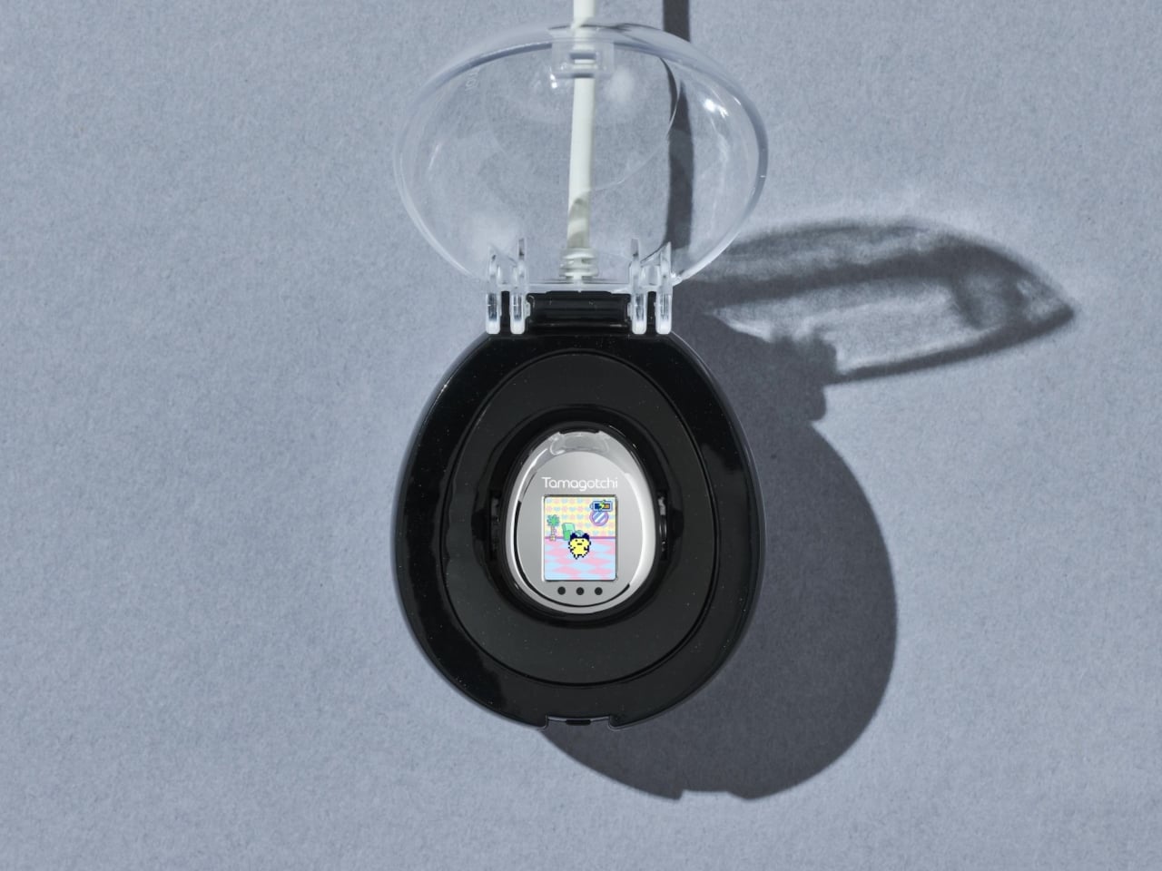
Battery life hasn’t been specified, which is the honest gap in what Bandai has disclosed. The rechargeable approach means you won’t be swapping coin cells in the middle of the day, but runtime under actual gameplay conditions is still unknown. The charging case is included in the box, which at least solves the problem of where to stow it when it needs power.

Bandai hasn’t announced plans for a direct international launch, so international buyers are looking at third-party import channels for now. Shipping doesn’t start until February 2027, which is a long lead time for a preorder opened in August. It suggests the manufacturing challenge here is real and that Bandai isn’t rushing it to market. For 64 components in a ring, that patience probably counts for something.
The post 30 Years After the Keychain, Bandai Just Made the Tamagotchi a Ring first appeared on Yanko Design.
Handing over a business card is, in most professional settings, a fairly unremarkable moment. You produce it, they take it, everyone moves on. Bandai Spirits, the company behind some of the most precisely engineered collectible robots in the world, has decided this moment deserves better. The Mobile Stationery Automatic Transformation Business Card Case deploys your card at the press of a button, rotating 180 degrees with a mechanical flourish that nobody is going to forget.
This is the debut product of Bandai’s new Mobile Stationery line, which is exactly what it sounds like: office stationery built with the engineering sensibility of a collectible mecha toy. The series name in Japanese is 機動文具, which intentionally borrows the kanji for “mobile suit” from Gundam’s full title. That’s not accidental branding. It signals that the same precision manufacturing techniques behind Bandai’s Chogokin die-cast figures went into making a business card holder.
Designer: Bandai
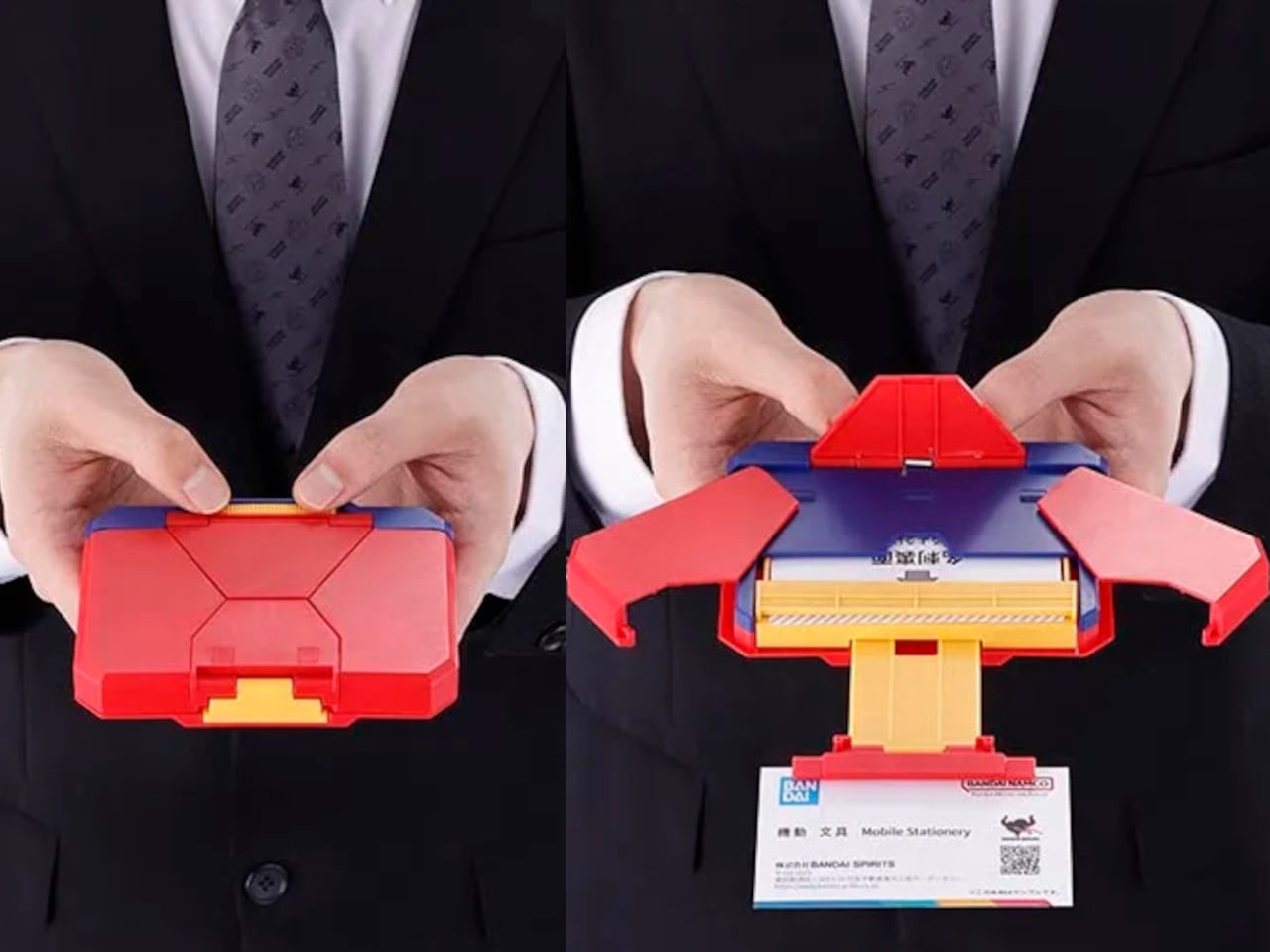
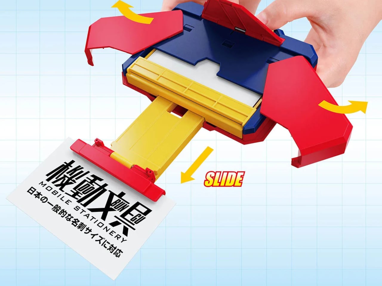
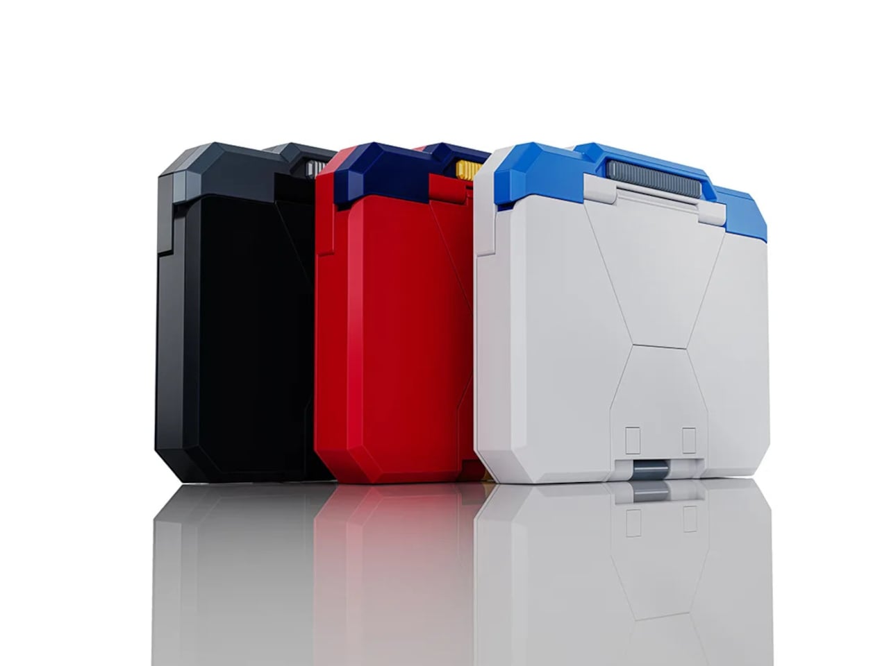
The mechanism itself is the product. When the case is closed, it sits flat and compact at approximately 125mm x 95mm x 25 mm, which is thin enough to slip into a jacket pocket without much bulk. Press the button, and it automatically opens with a 180-degree rotation that presents your card as if a small piece of machinery just woke up. The action is fast, repeatable, and genuinely surprising to anyone who hasn’t seen it before.
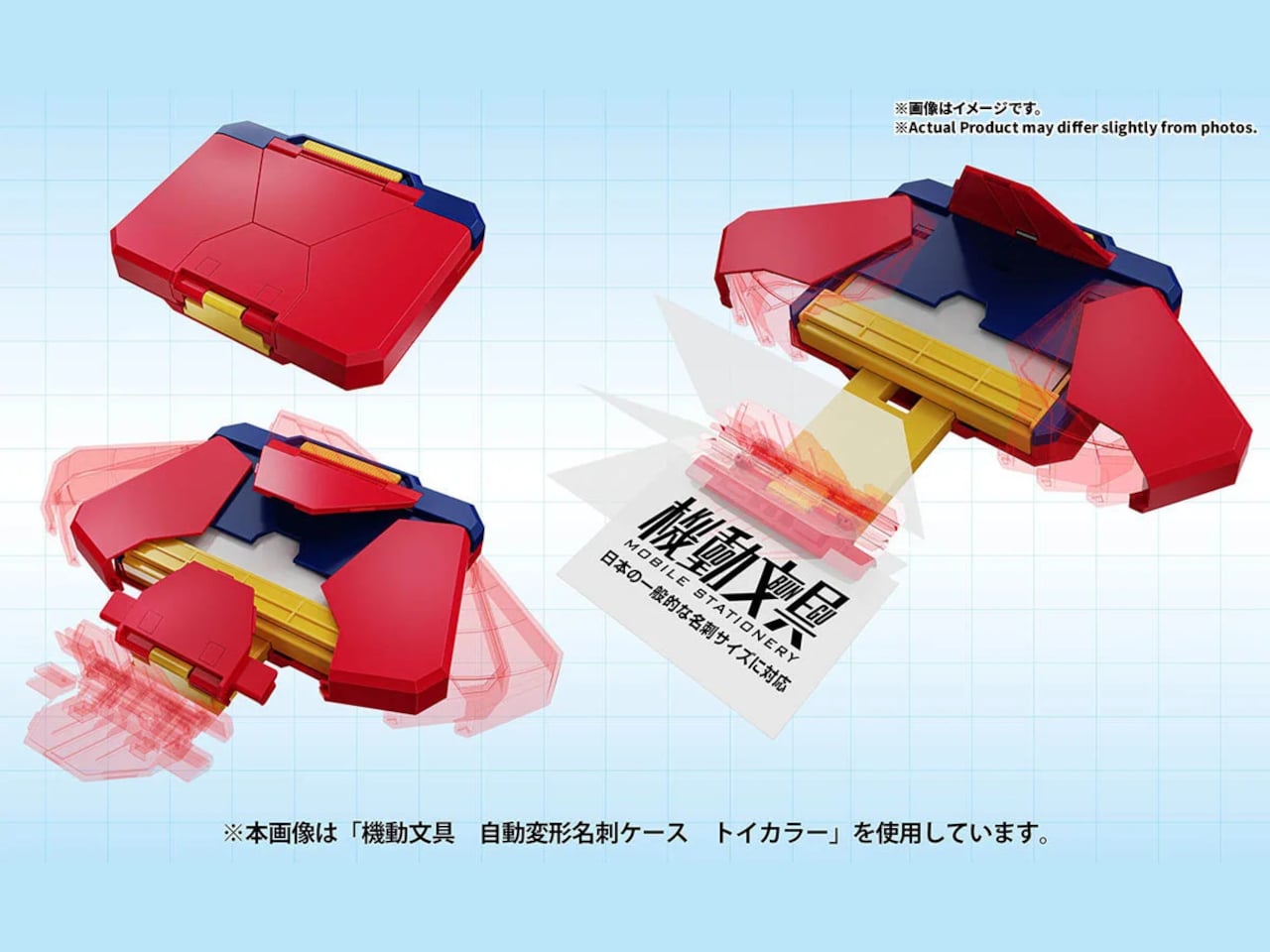
It’s made from ABS, the same material used across Bandai’s figure line, and sized to accept standard Japanese No. 4 business cards at 55mm x 91mm and a recommended paper thickness of 0.24mm. The fit matters here because a loose card in an automated case would undermine the entire presentation. The case holds the card securely in the closed position and positions it cleanly during deployment.
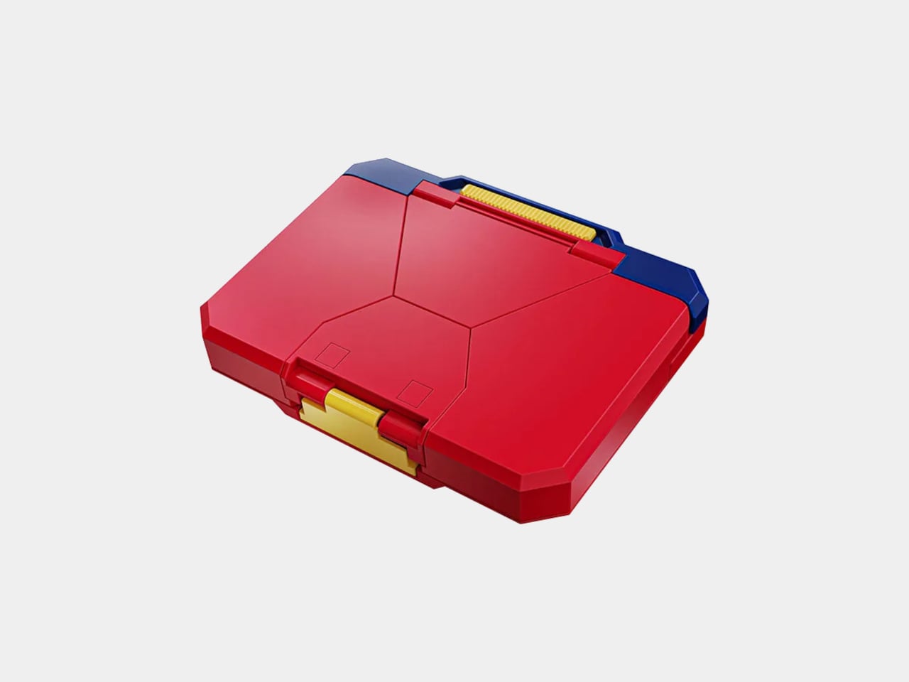
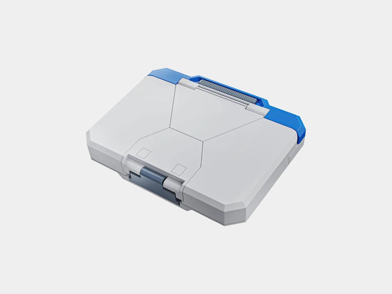
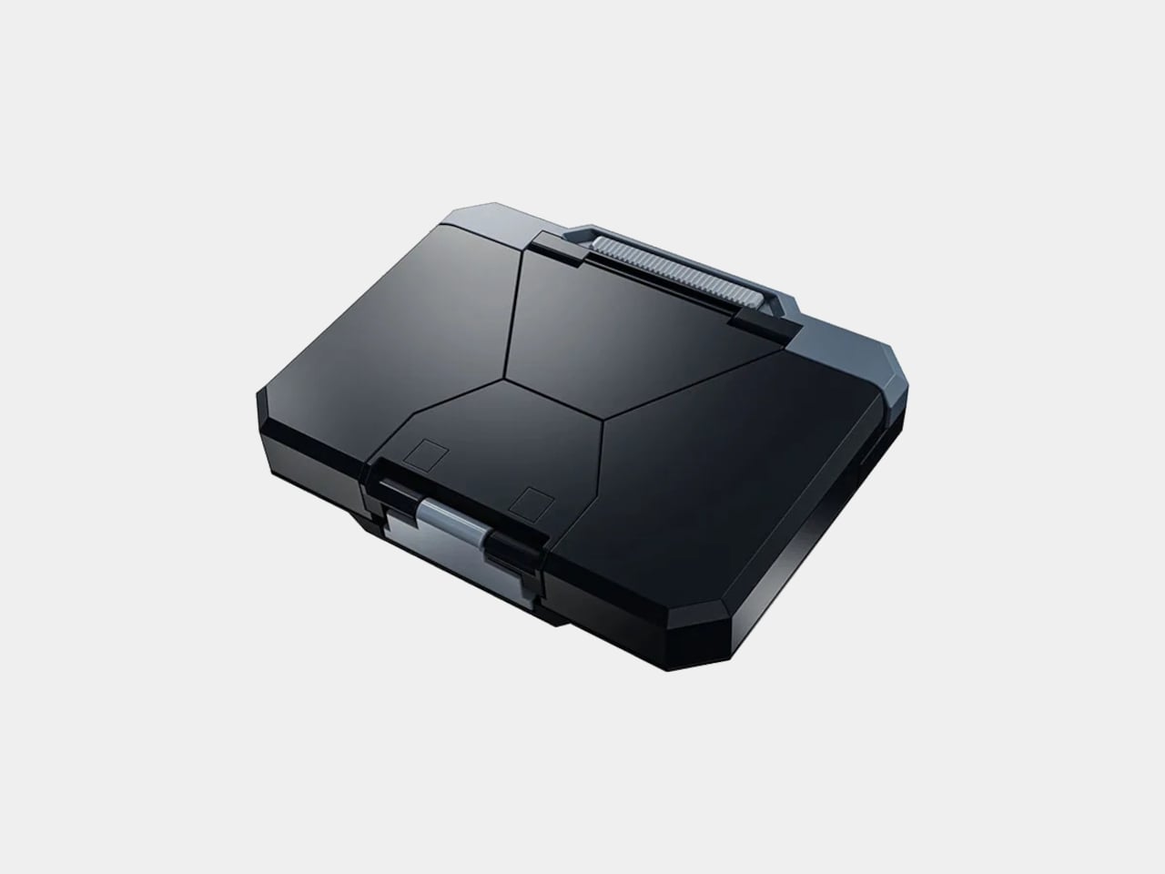
Three colorways are available, each aiming at a different kind of professional. The Toy Color is exactly what it sounds like, a vibrant, primary-palette version that makes no attempt to pass for a conventional office accessory and leans directly into the Gundam aesthetic. The Standard Color is subtler and more desk-neutral. The Black Color is the one you’d bring to a meeting where you still want the mechanism to surprise people without the case itself making a statement before it even opens.
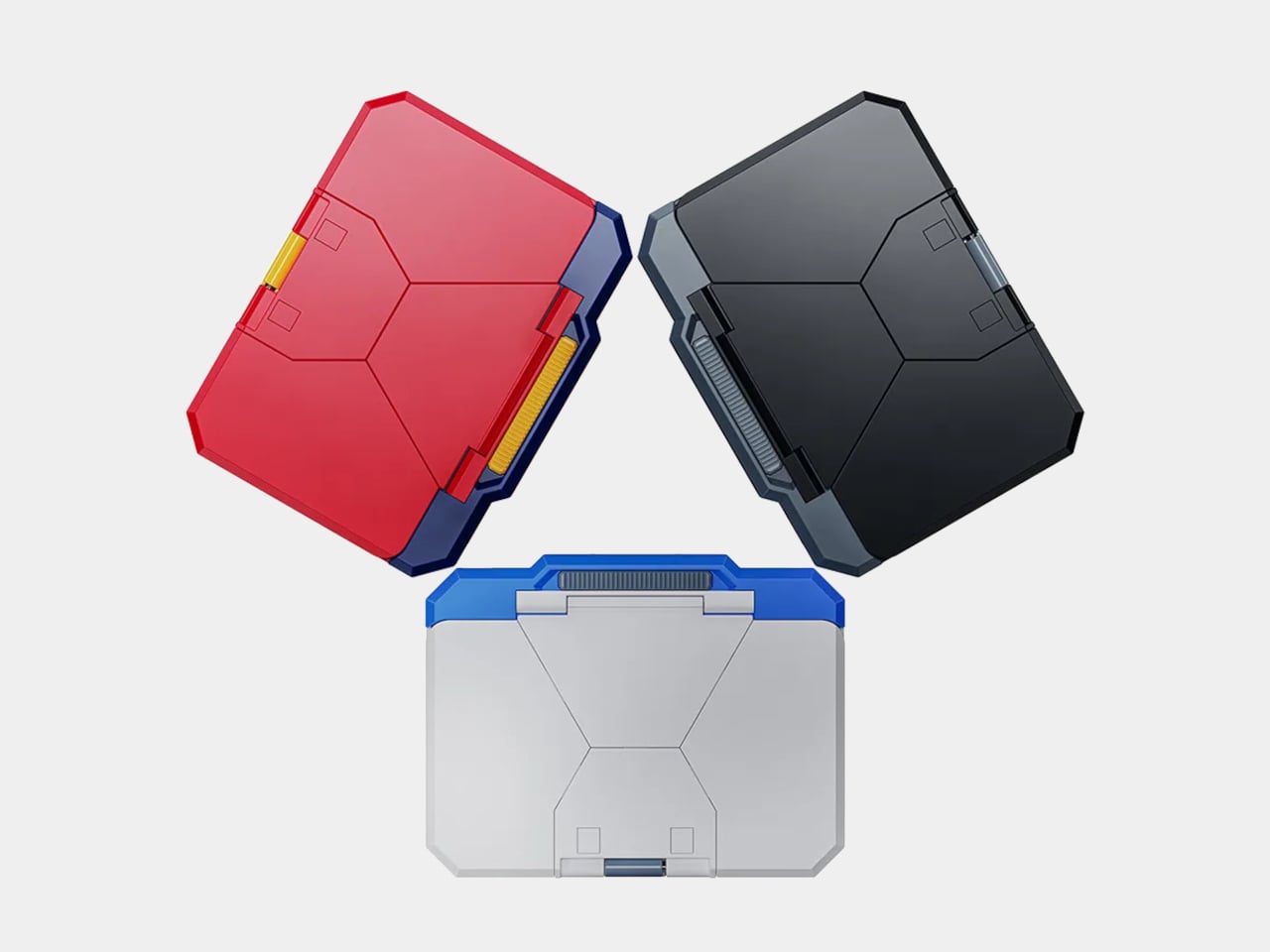
The practical argument for something like this is harder to articulate than it might seem, which is part of what makes it interesting. Business card rituals in Japan carry real social weight, and the act of presenting a card is meant to be deliberate and memorable. A case that automates the drama of that moment, that turns the exchange into a small performance, fits surprisingly neatly into that context rather than clashing with it.
The Mobile Stationery line is Bandai’s first move into office accessories, and this particular opening product is doing a lot of work to establish what that line is. It’s a functional object that holds business cards. It’s also a small transformer that deploys them theatrically. Both things are true, and the case doesn’t apologize for either one.
The post Business Cards Were Forgettable, so Bandai Built a $22 Mecha Case first appeared on Yanko Design.
The Apple Pencil on a standard iPad screen is a competent stylus. It isn’t, however, anything like writing on paper, and for a lot of artists and note-takers, that distinction matters enough to do something about it. Rock Paper Pencil has been the go-to solution for this since version one, and version 4.0, at $49.99, adds something earlier versions couldn’t offer: a choice of how drawing actually feels.
The setup is a two-part system. A removable screen protector attaches to the iPad’s display without adhesive, using NanoCling technology that leaves no residue when peeled off. Its microscopic texture adds enough controlled friction to the surface that the Apple Pencil moves across it the way a pencil moves across paper, with resistance that makes strokes feel intentional rather than frictionless.
Designer: Astropad
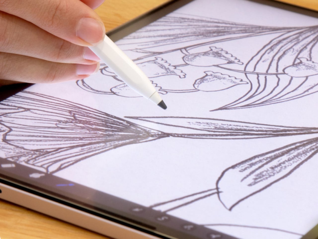
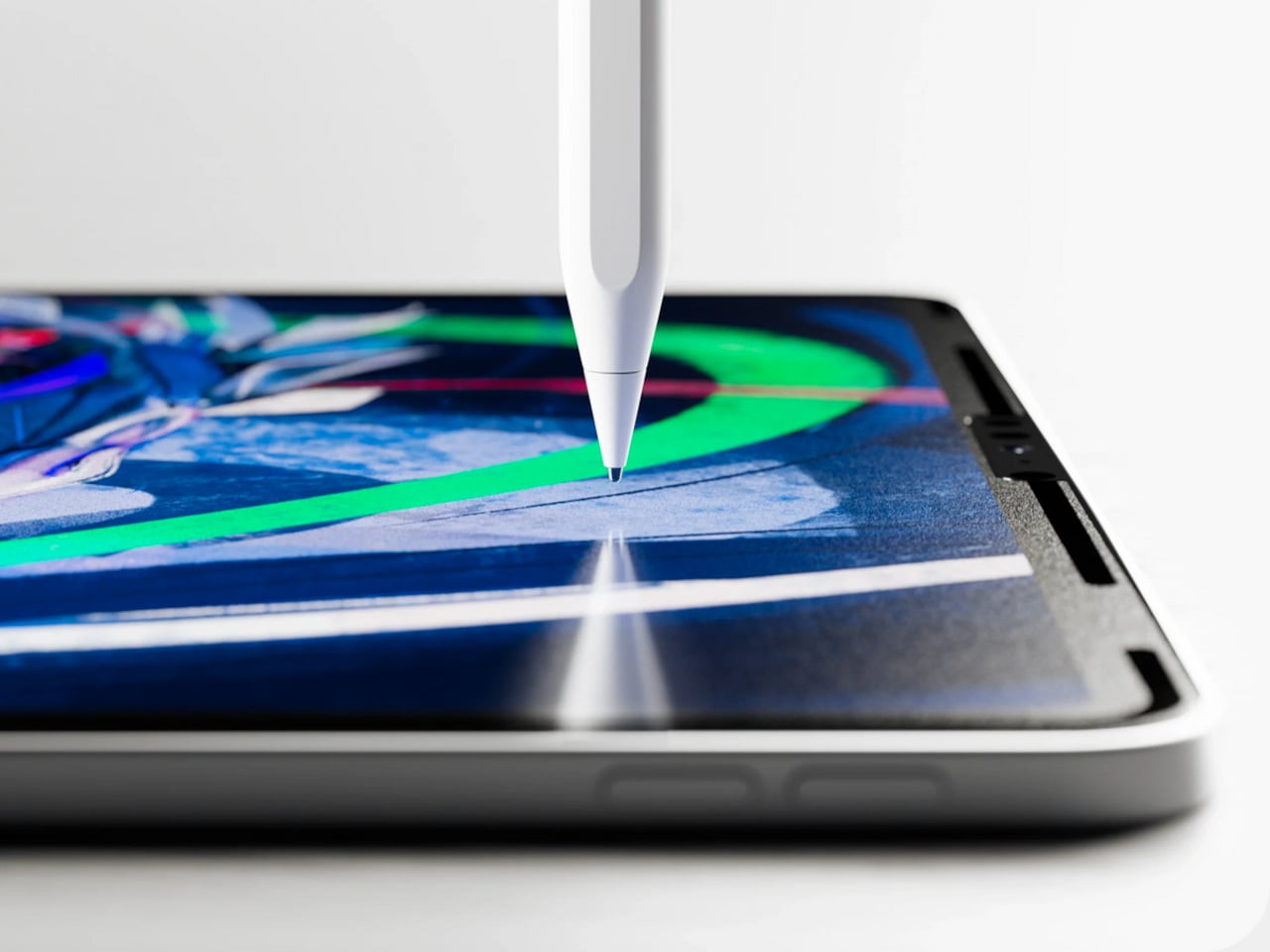
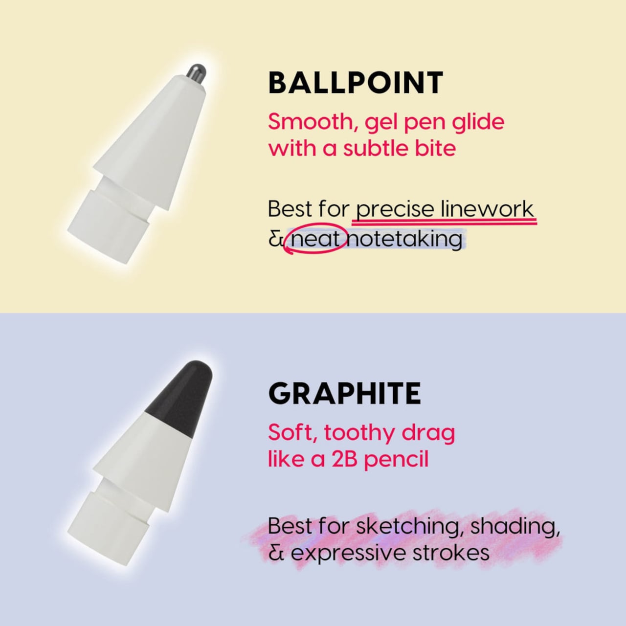
The four included tips are the version 4.0 update. Two are ballpoint, the same smooth steel-tip design from previous versions, and two are graphite, a new addition made from POM material and modeled after a 2B pencil. The graphite tips have a softer, toothier drag that catches the screen protector’s texture more noticeably, delivering the kind of feedback artists reach for when sketching, shading, or building up layered strokes.
Switching between the two feels like the difference between reaching for a pen and reaching for a pencil, which is precisely the point. Writers and quick note-takers tend to prefer the ballpoint’s smoother glide. Illustrators working on expressive, pressure-sensitive line work often want more grip. Neither one is wrong, and having both in the same kit means you don’t have to commit to one style of input permanently.
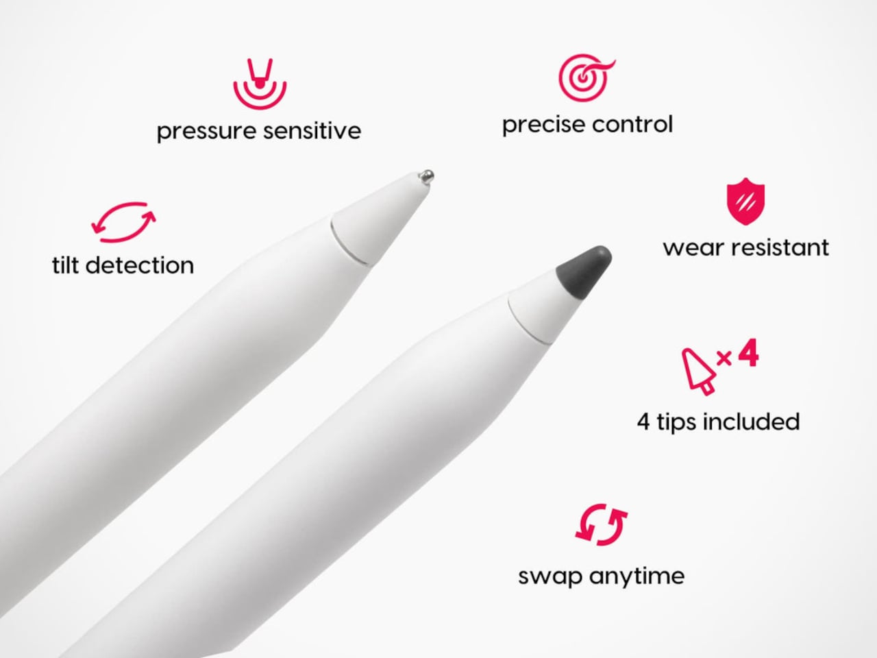
What makes this system work as well as it does is that the tips and the protector are engineered together rather than as separate products. The custom tips are designed specifically to interact with the nano-texture protector surface, so the friction you feel isn’t random. It’s calibrated. The tips work with every Apple Pencil model, including the Apple Pencil Pro, so upgrading your stylus doesn’t require replacing the tips you’re used to.
The screen protector itself attaches in seconds and stores in an included protective sleeve when it’s not on the iPad. The removable design is one of the things that separates Rock Paper Pencil from Apple’s own nano-texture glass option, which is a permanent surface applied at purchase on select high-end iPad Pro configurations. Rock Paper Pencil achieves a comparable paper-like feel without locking you into it, and without the price premium that comes with Apple’s version.

Compatibility covers most iPads in active circulation, from the iPad mini to the full-size iPad Pro, with model-specific screen protectors ordered for the right fit. The tips, by contrast, are universal across Apple Pencil generations. Each Rock Paper Pencil 4.0 kit ships with the screen protector, the protective sleeve, and all four tips: two ballpoint and two graphite.
The $49.99 price keeps the entry point low enough that it doesn’t feel like a commitment. The protector comes off clean, the tips swap in seconds, and the graphite option adds a dimension to iPad drawing that wasn’t there before. It’s a small change to the physical layer that produces a noticeably different experience.

The post Rock Paper Pencil 4.0 Adds the Paper Feel the Apple Pencil Never Had first appeared on Yanko Design.
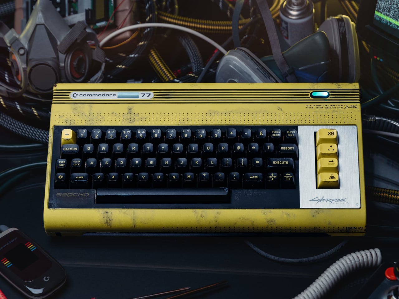
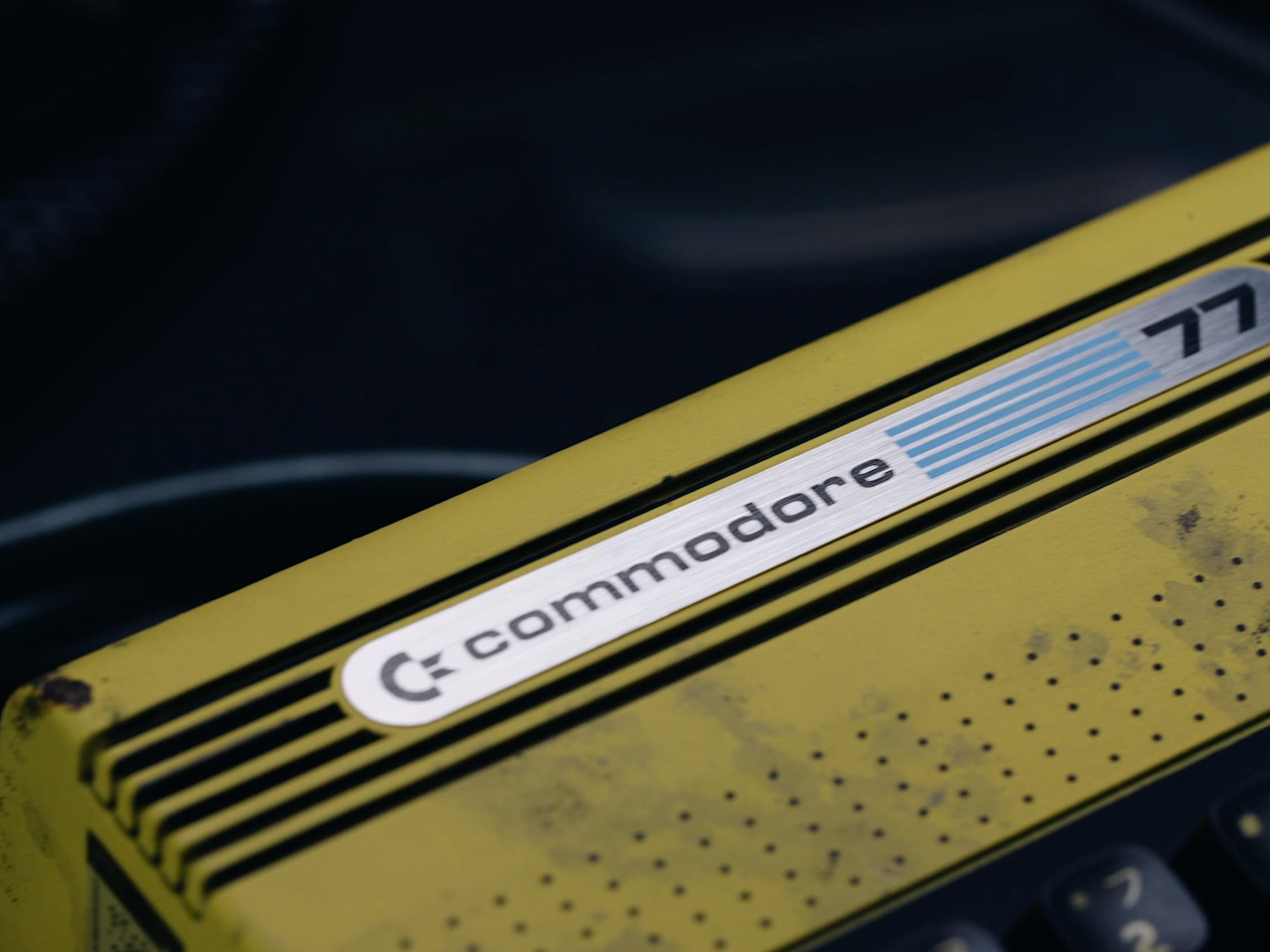
The original Commodore 64 launched in 1982. Cyberpunk 2077, the game, is set in 2077. The gap between those two years is roughly the entire history of the personal computer, which makes the Commodore 77 either the most absurd collaboration in gaming hardware history or the most logical one, depending on how you look at it. At $377, it’s clearly betting on the latter.
The 77 is a special edition of the Commodore 64 Ultimate, the FPGA-based revival that earned a 10/10 from IGN when it launched in 2025. FPGA recreations matter because they reproduce the original hardware’s behavior at the circuit level rather than running it through conventional software emulation. The practical result is compatibility with 99.9% of the 10,000-plus game and peripheral library built up over four decades.
Designer: Commodore
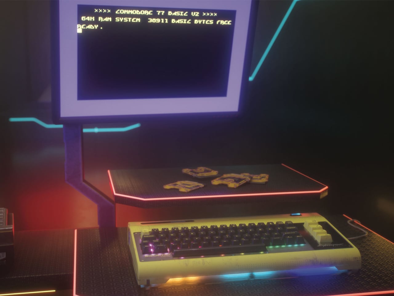
Under the hood, this edition upgrades the processor from the AMD Artix XC7A50T to the more powerful XC7A100T, pushing the ceiling from the Commodore 64 Ultimate’s speed to 77MHz. That’s a long way from the original machine’s 1 MHz, though the number was clearly chosen as much for the name as for the engineering. It also connects to modern TVs via HDMI and supports Wi-Fi and USB, covering the practical bases without compromising what the platform does.
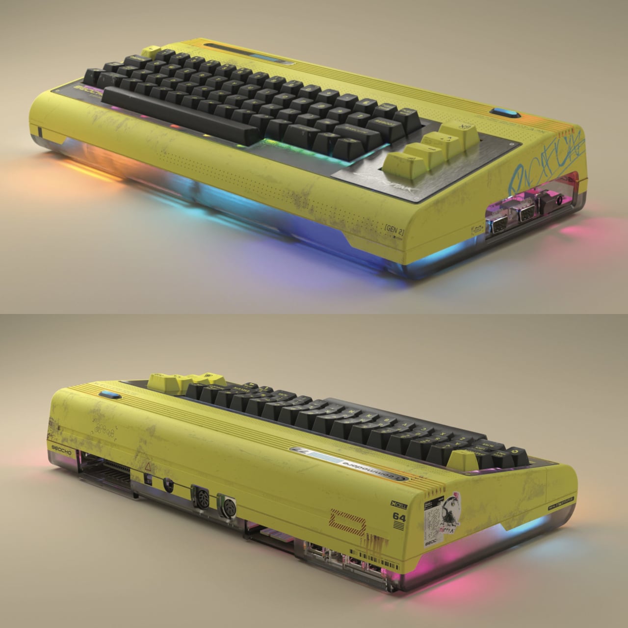
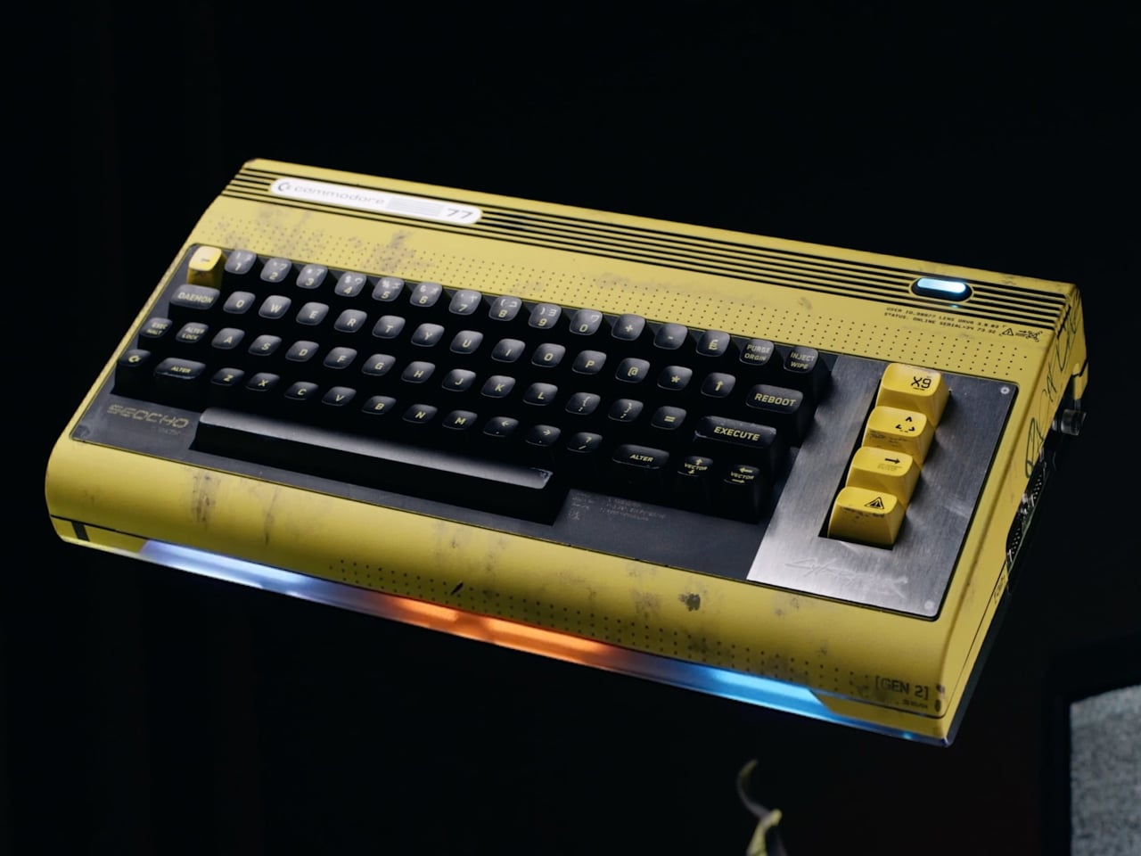
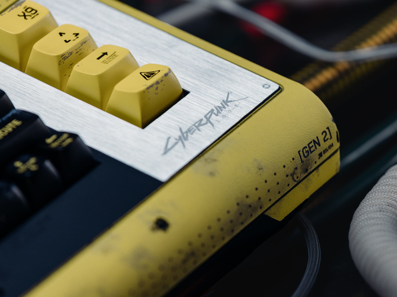
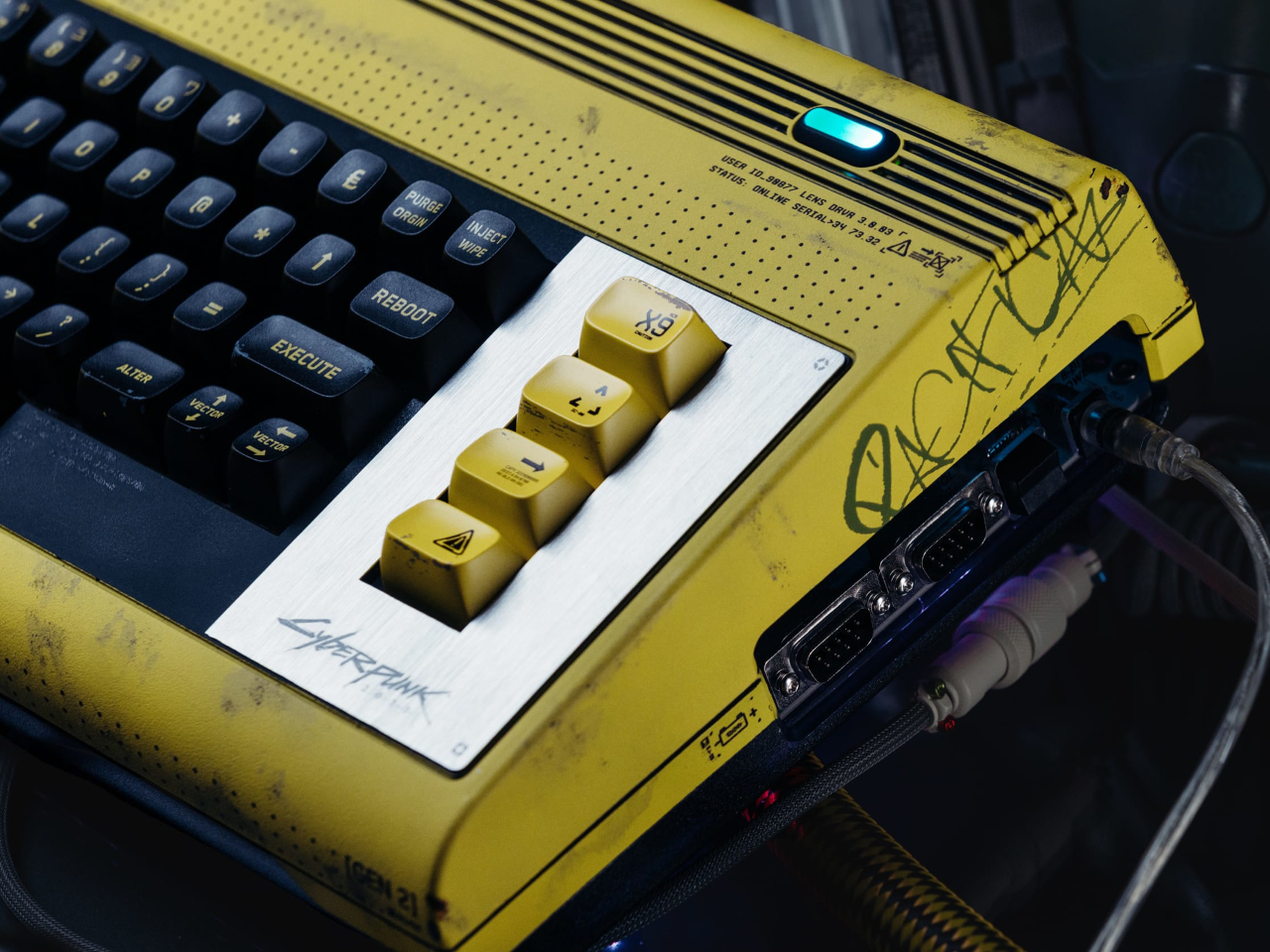
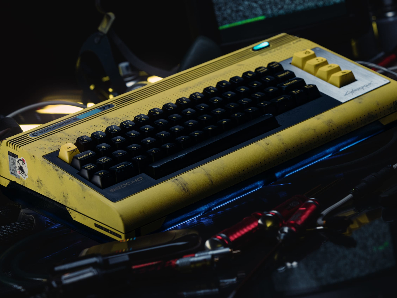
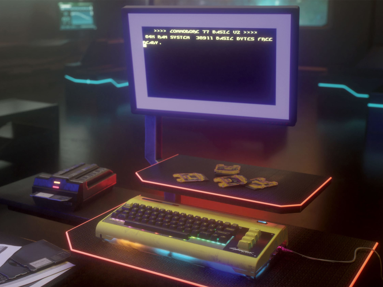
The design is where Cyberpunk 2077 fully takes over. The main body is a distressed, weathered yellow with graffiti tags, a brushed-metal plate, and a teal power indicator. The bottom of the shell is smoked-gray translucent, with multicolor LEDs glowing through from beneath. It boots into a custom BASIC 2.0 startup screen themed around Seocho Electronics, a fictional Night City manufacturer, which separates this from a sticker job.
The most compelling piece of the package is the demo. Called “The Shard,” it ships on an exclusive cartridge designed to look like the data chips from Cyberpunk 2077 and was created by Arise, a long-running Polish C64 demo group with a serious reputation in the scene. It’s a non-interactive 8-bit audiovisual experience, not a playable game, with a 24-channel stereo SID soundtrack by chiptune artist LukHash. For anyone who follows the C64 demo scene, Arise and LukHash together is a meaningful combination.
The spiral-bound user guide is another thing entirely. It comes packed with Cyberpunk 2077 lore alongside type-in BASIC programs that you can key into the machine yourself, which is about as 1982 as anything in the box. It’s the kind of detail that only makes sense if you understand what a Commodore 64 actually meant to the people who grew up with one, and it suggests whoever put this together understood the audience fairly well.
This is Commodore’s first franchise hardware collaboration in 68 years of existence. That’s worth pausing on. The Commodore 64 became a cultural landmark not through corporate restraint but through the things people built on it, the games, the demos, the music, the code. The Commodore 77 is a collector’s object, but the BASIC programs in that guide are an open invitation to do something with it rather than just admire it.
The post Cyberpunk 2077 Just Got a Commodore Collab That’s Absurd and Logical first appeared on Yanko Design.
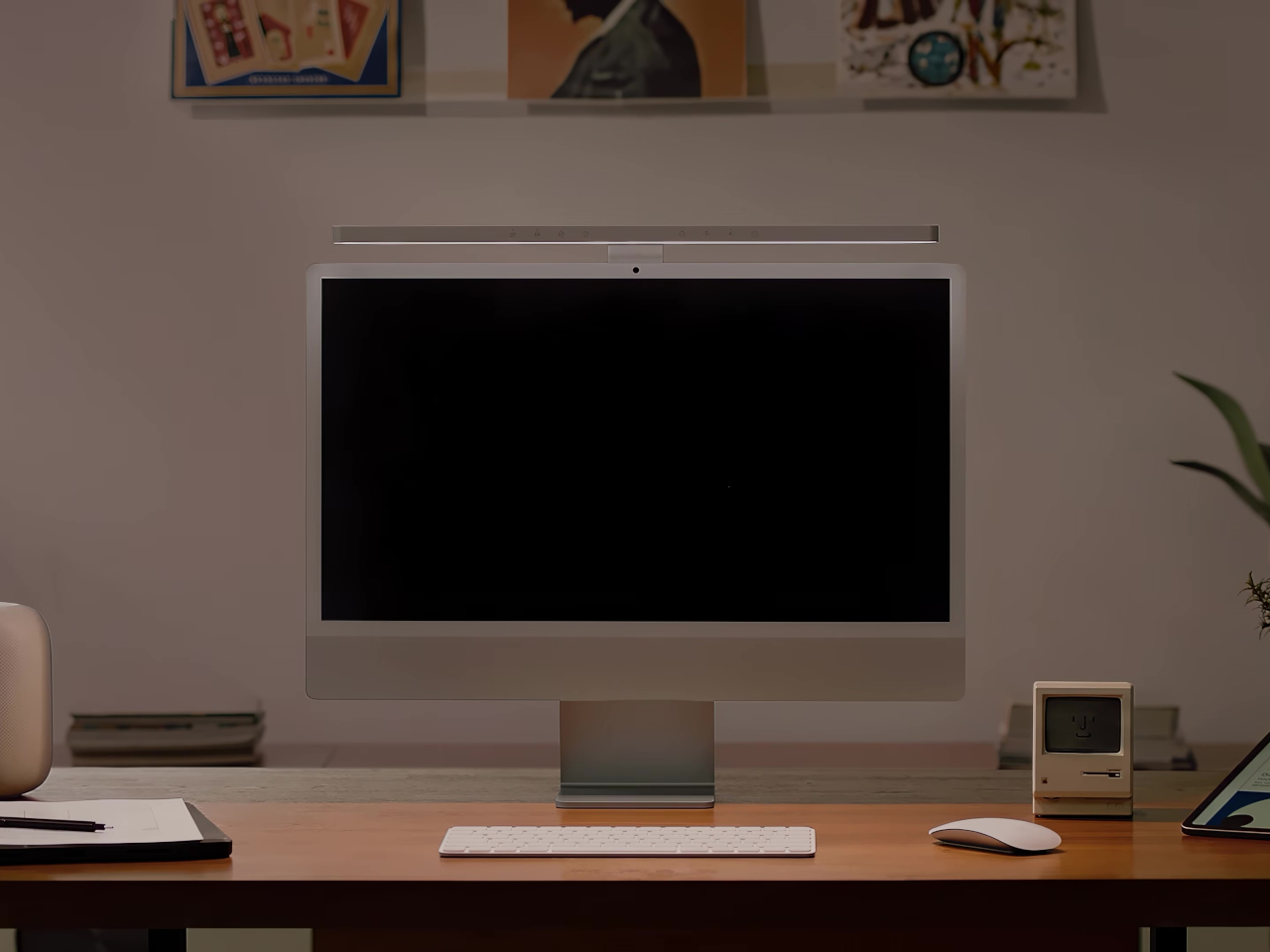
The iMac has always had a light bar problem. You could put any number of BenQ ScreenBars on top of one, but they’d cover the camera, block the microphone, or clip over the Apple logo on the back. None of them were made for it. The BenQ iScreenBar is the first that actually is, and it arrives at $189, looking like it was designed by the same people who designed the computer it sits on.
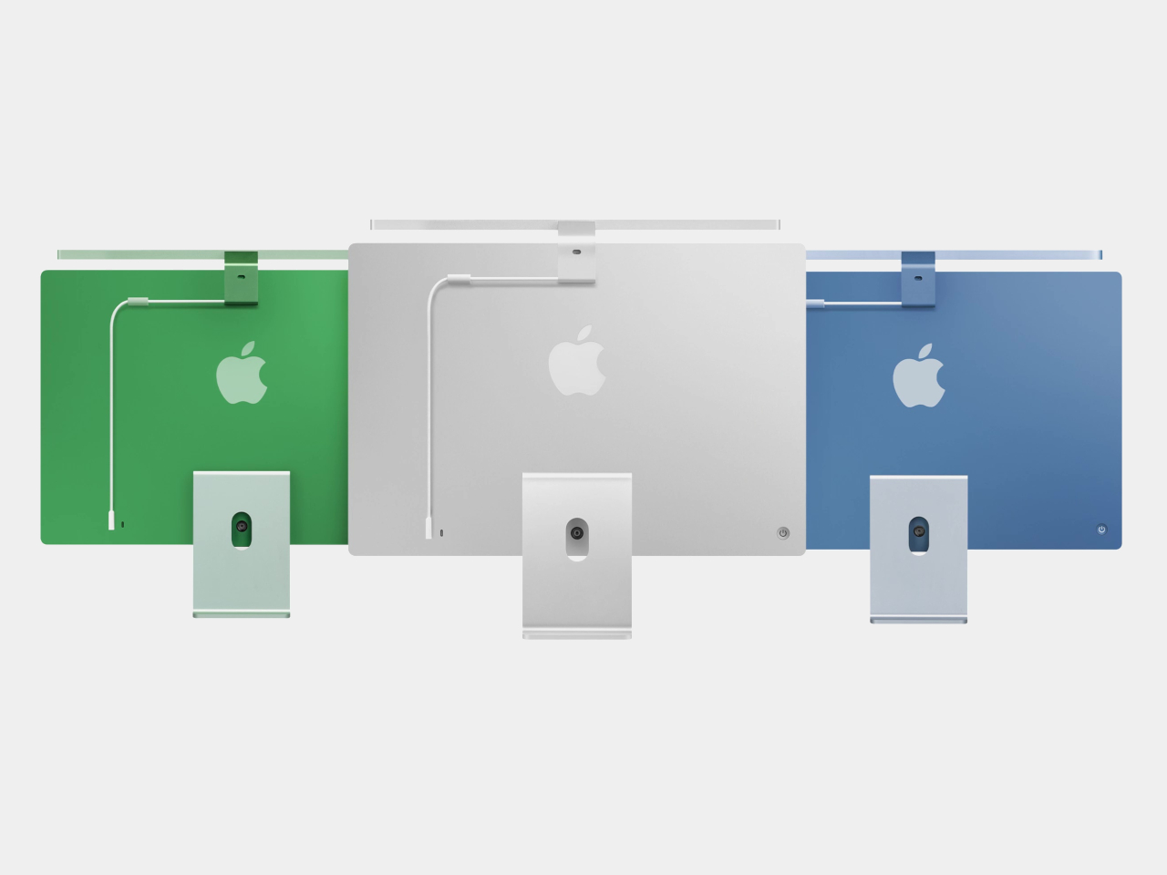
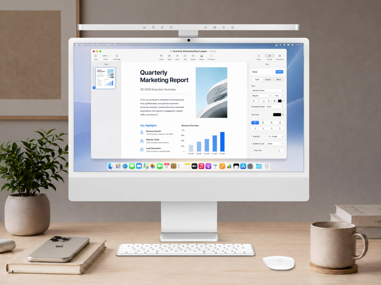
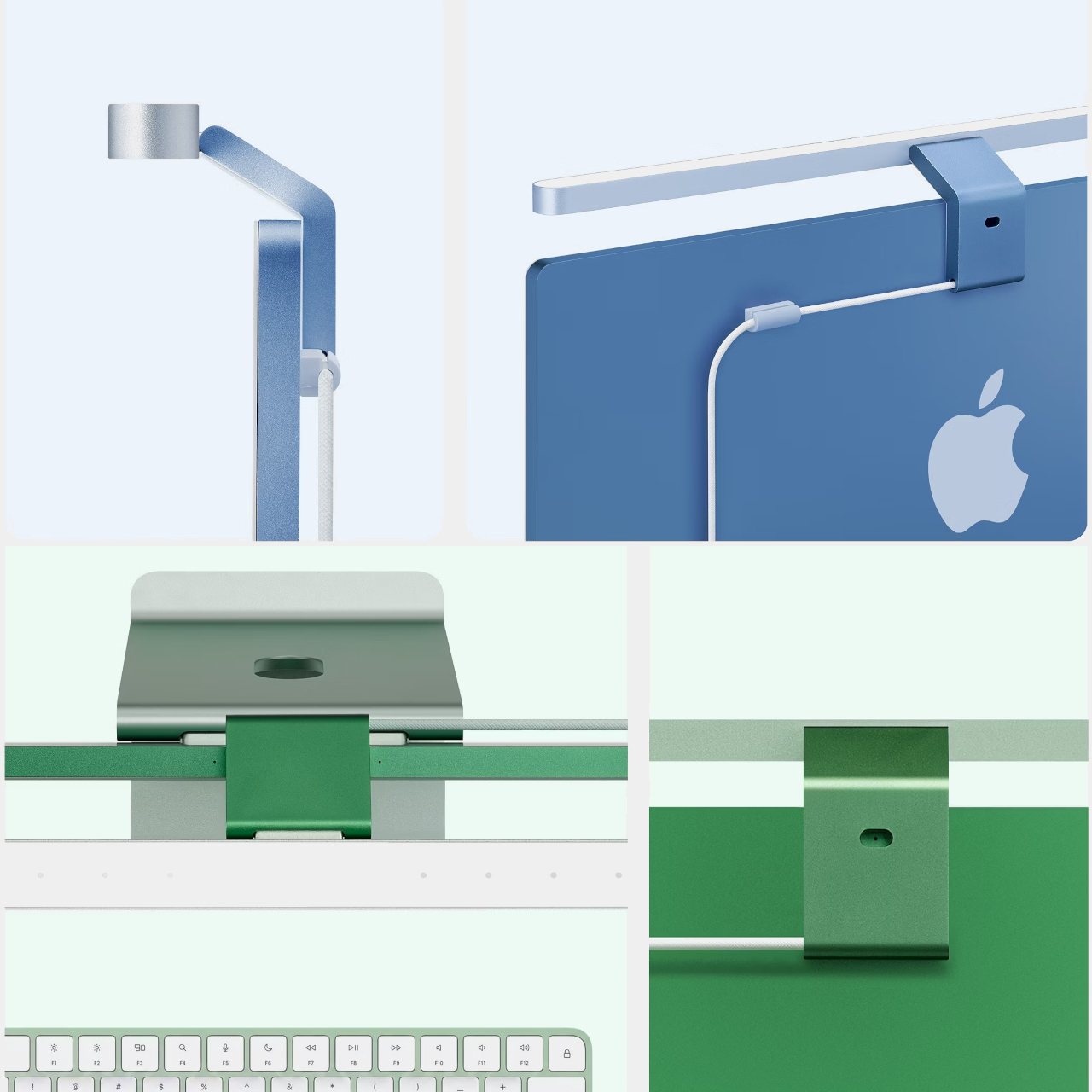
The construction makes the case immediately. Unibody aluminum with a glass touch panel, finished in Silver to match the iMac directly, mounting via a custom magnetic clamp on the back rather than a standard monitor clip. A magnetic cable clip routes the USB-C power cord out of view. The rear logo, the camera, and the microphone all remain unobstructed. It’s the kind of detail that should have been obvious from the start but apparently wasn’t until now.
Designer: BenQ
Compatibility is specifically tuned to the 24-inch iMac from 2021 onward. That USB-C connection does more than just carry power. It lets the iScreenBar communicate with the iMac directly, enabling a dedicated macOS app for software control of brightness and color temperature. It also means the light bar knows when the camera is active, which feeds into one of the more useful features here.


That feature is Video Mode. When the iMac’s built-in webcam turns on, the iScreenBar automatically shifts its output to reduce bright spots on the user’s face, giving calls and recordings a more balanced, flattering light rather than the harsh overhead glow that most desk setups produce. Nobody wants to look like they’re being interrogated from below during a team call, and Video Mode addresses that without any manual intervention.
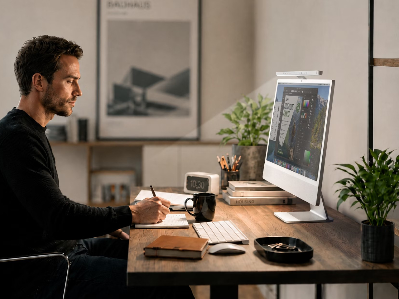
The light itself uses BenQ’s ASYM-Light optical design, which angles illumination downward toward the desk rather than toward the screen. That means no glare, no hotspots reflecting back from the display, and lighting that reaches an area of roughly 33.5in x 19.7in at 500 lux. The glass touch panel on the bar handles brightness and color temperature adjustments directly, and auto-dimming keeps the workspace at a consistent level as conditions change.
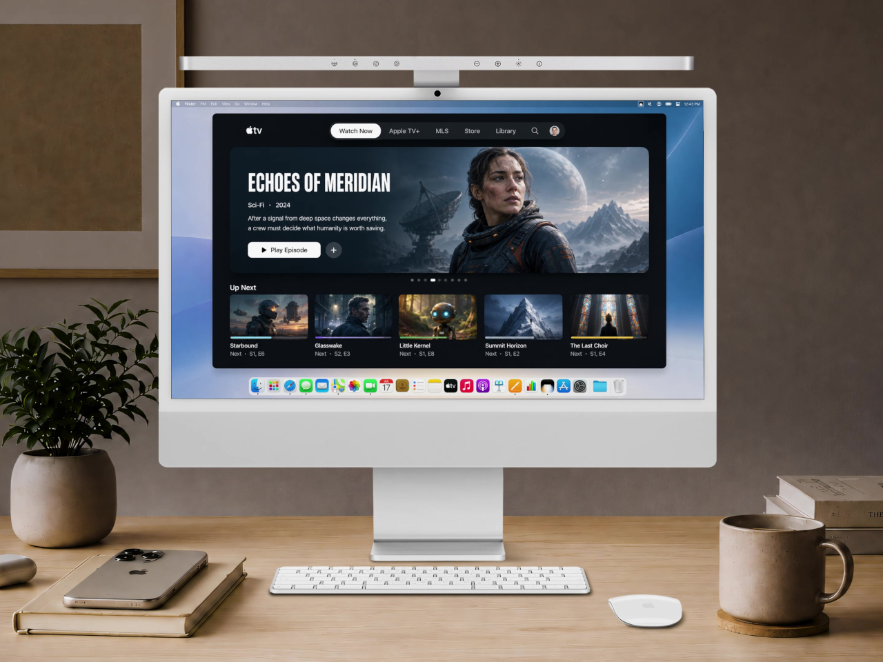
Blue and Green colorways, two of the iMac’s most popular colors, are planned for late 2026. The Silver version is the only one available at launch, which is also the most versatile option since it matches every iMac color reasonably well. For buyers committed to a Blue or Green iMac, the wait might be worth it for a more cohesive result, but the Silver still looks deliberately matched rather than generically attached.
BenQ’s existing ScreenBar lineup has been a reference point in desk lighting for years, with options ranging from $109 for the standard bar to $179 for the Halo 2 and $289 for the new ScreenBar Max built for dual-monitor setups. The iScreenBar slots in at $189, making it competitive with the premium end of that range while offering something none of the others can: a mount that actually fits the iMac the way it was intended, rather than sitting on top of it like an afterthought.

The post BenQ Just Made a $189 iMac Light Bar That Looks Like Apple Designed It first appeared on Yanko Design.
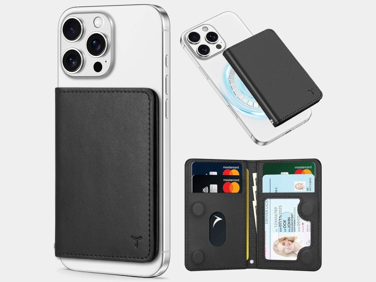
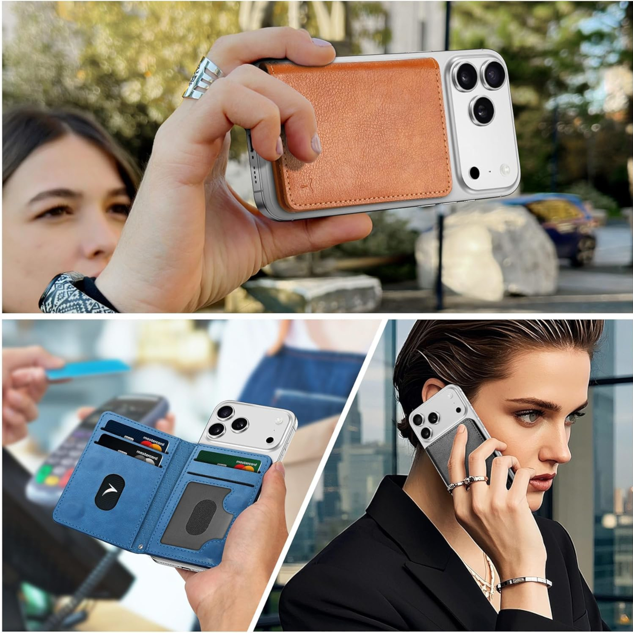
The TUCCH PU Leather Mag Wallet does something most MagSafe wallets don’t bother with: it folds closed. Rather than leaving your cards exposed in an open slot on the back of your iPhone, this one shuts like a traditional bi-fold and stays that way thanks to internal magnets. At $23.99, it holds six cards, blocks RFID signals, and includes a clear window for your ID.
The problem with most MagSafe wallets is that they’re really just an open pocket attached to your phone. Your cards sit loose, there’s nothing stopping them from sliding out when you dig into your bag, and pulling the wallet off doesn’t make it any more secure. If you’ve ever watched a card quietly escape an open MagSafe slot mid-commute, you already understand why a wallet that actually closes is a more useful object.
Designer: TUCCH
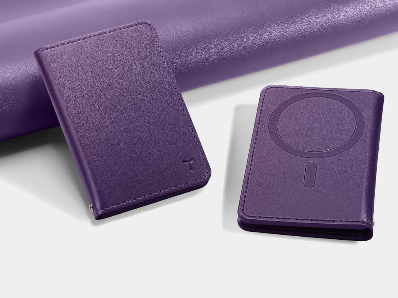
The folding design here means the same magnets doing the MagSafe work also keep the wallet shut when it’s off the phone. Pop it off your iPhone before going through airport security, tuck it into your jacket pocket, and your cards stay in place rather than fanning out freely. It’s a small shift in how the accessory behaves, but it makes the difference between something that feels like a wallet and something that just holds cards.
Six slots is more than most MagSafe wallets offer, and the layout is more thoughtful than a generic card stack. One slot is a dedicated clear window for your ID or driver’s license, something the category almost universally skips. Two of the remaining slots have cutout openings for the cards you grab most, so you’re not pulling out a chunk of plastic to find your transit card or gym membership every time.
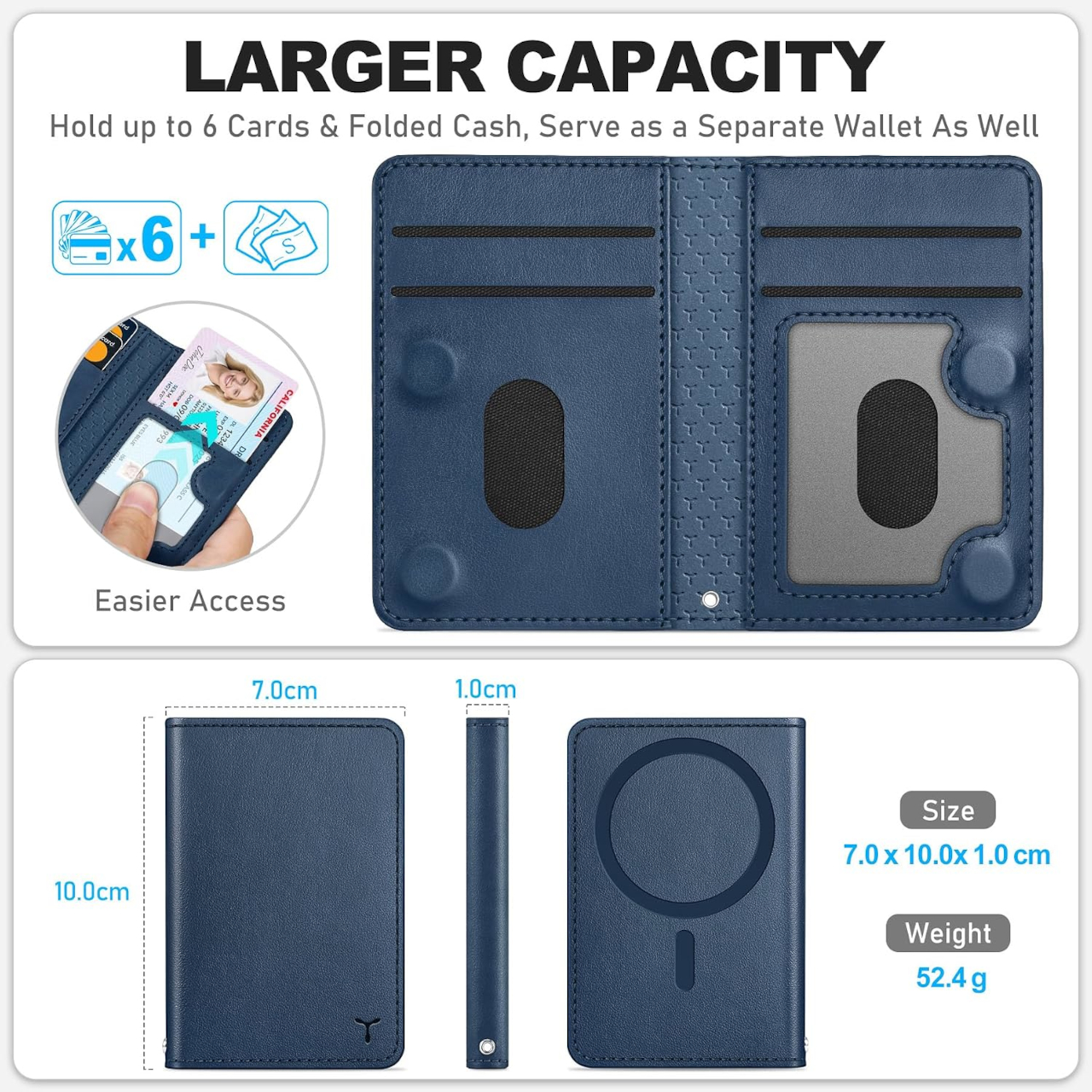
RFID blocking is built into the PU leather shell, which is worth having without having to think about it. Contactless card skimming isn’t something most people worry about until it happens, and having that protection passive rather than optional means one less thing to consider. The wallet handles it quietly, in the same way that the best security features tend to stay out of your way entirely.
Magnetic strength is strong enough to hold through a firm shake of the phone, which is about what you’d expect from a well-built MagSafe wallet at this price point. Compatibility extends beyond TUCCH’s own cases as well. Any MagSafe-compatible case from another brand works just as well, which matters if you’re already committed to a case you like and don’t want to switch just to add a wallet.
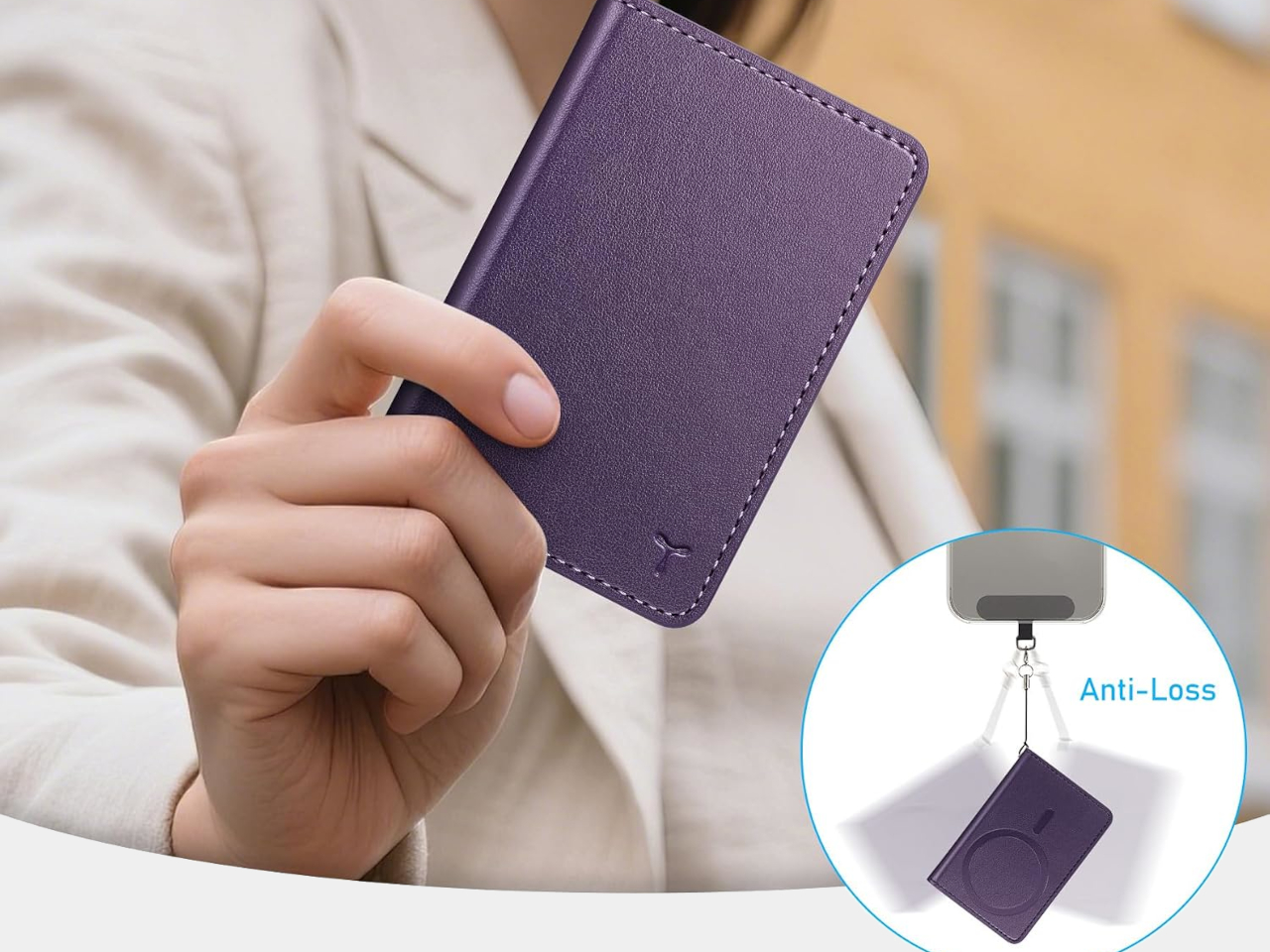
The wallet stays flat even when all six card slots are filled, which isn’t guaranteed with wallet accessories in general. A lot of them start to bow under a full card load, adding enough thickness to make a slim phone feel bulky. At approximately 0.4 inches thick fully loaded, the TUCCH keeps things compact enough that adding it doesn’t noticeably change how the phone sits in your hand or your pocket.
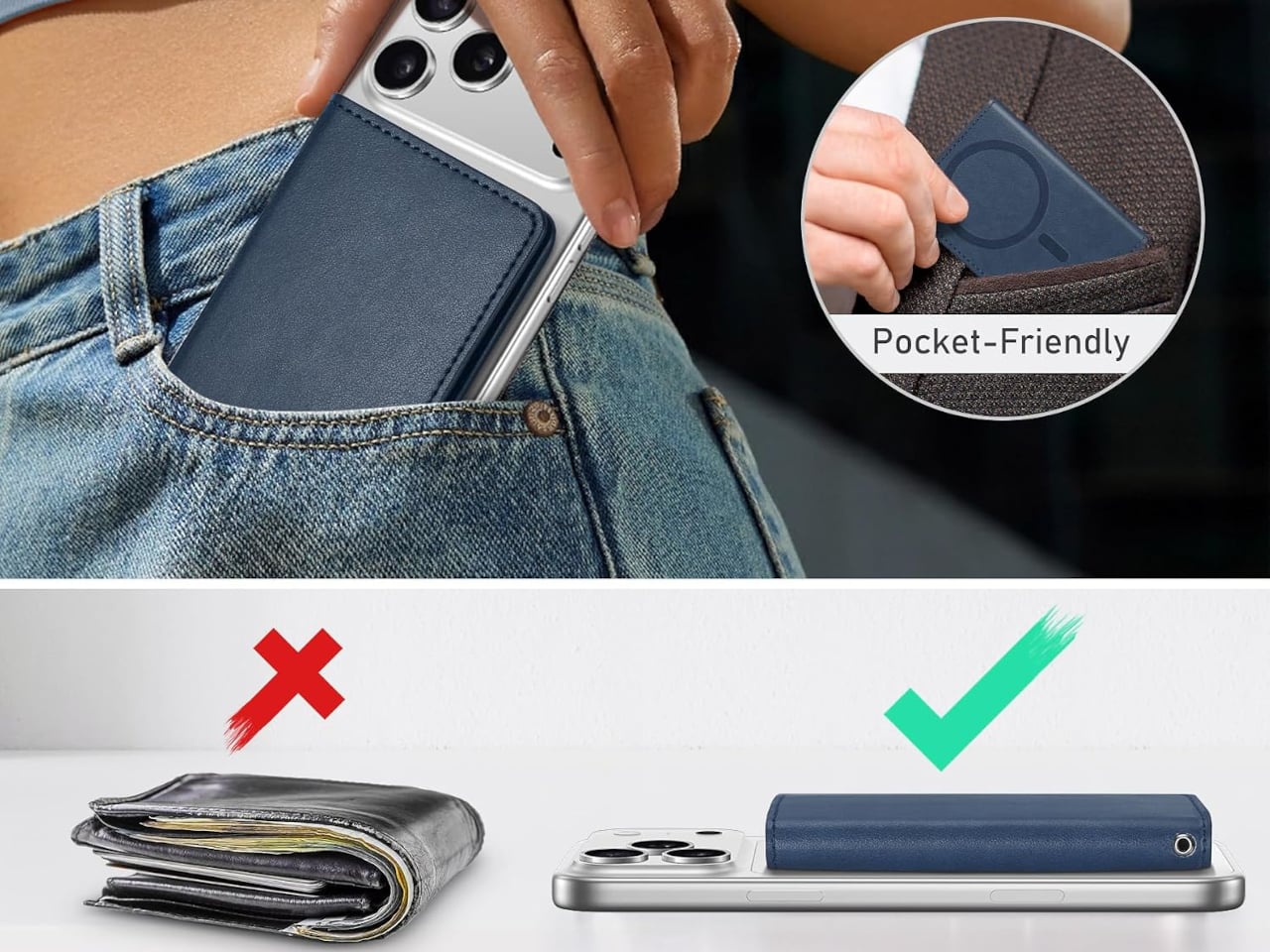
Compatibility covers the iPhone 12 series through the current lineup, excluding Mini models and cases without MagSafe support. The $23.99 price puts it well below what most leather MagSafe wallets ask without trimming the features that make this one worth buying. A MagSafe wallet that closes, organizes, and works as a standalone is simply a more complete object than the category norm.
The post MagSafe Wallets Leave Your Cards Exposed but This $24 One Closes first appeared on Yanko Design.

One Piece is an enduring piece of pop culture that has transcended manga, anime, and of course, the Netflix live-action adaptation. Since its debut in Weekly Shōnen Jump in 1997, Eiichiro Oda’s epic adventure has grown into the best-selling manga series of all time, with over 500 million copies in circulation worldwide. There are plenty of apparel, merchandise, and brand collaborations out there that can show off your love for the characters and the series. But if you’re also a fan of Nike, then this latest collection is a must-have, especially if you’re looking for cool sneakers to add to your wardrobe.
The Nike x One Piece collection brings this universe to life with footwear and apparel that makes the legendary Devil Fruits part of your everyday fashion. Rather than just slapping some character photos onto Nike items, the collaboration reimagines the iconic Air Max Plus into sneakers that embody the extraordinary powers of the series. As Nike puts it, the creative team was “inspired by the superhuman abilities that are unleashed when One Piece characters eat the Devil Fruits, much like the feeling an athlete has when they put on a pair of Nikes.” That’s a crossover worth lacing up for.
Designer: Nike x One Piece

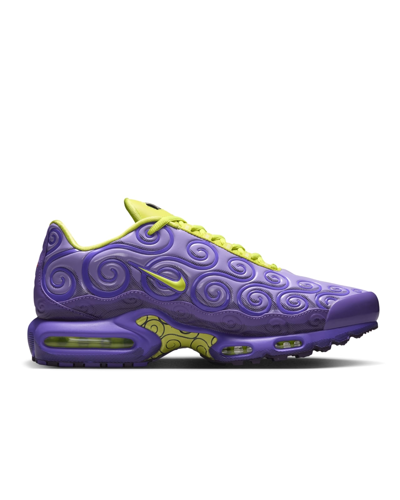
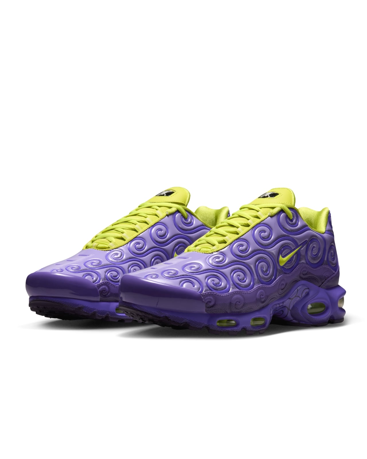
In case you’re unfamiliar, Devil Fruits are rare, mysterious fruits scattered across the One Piece world that grant incredible superpowers to whoever eats them, although they also remove the user’s ability to swim in return. It’s a classic trade-off that has defined many of the series’ most beloved characters. So this collaboration brings Straw Hat fans these extraordinary abilities, fashion-wise. The stars of the collection are three Air Max Plus colorways, each inspired by a different Devil Fruit.

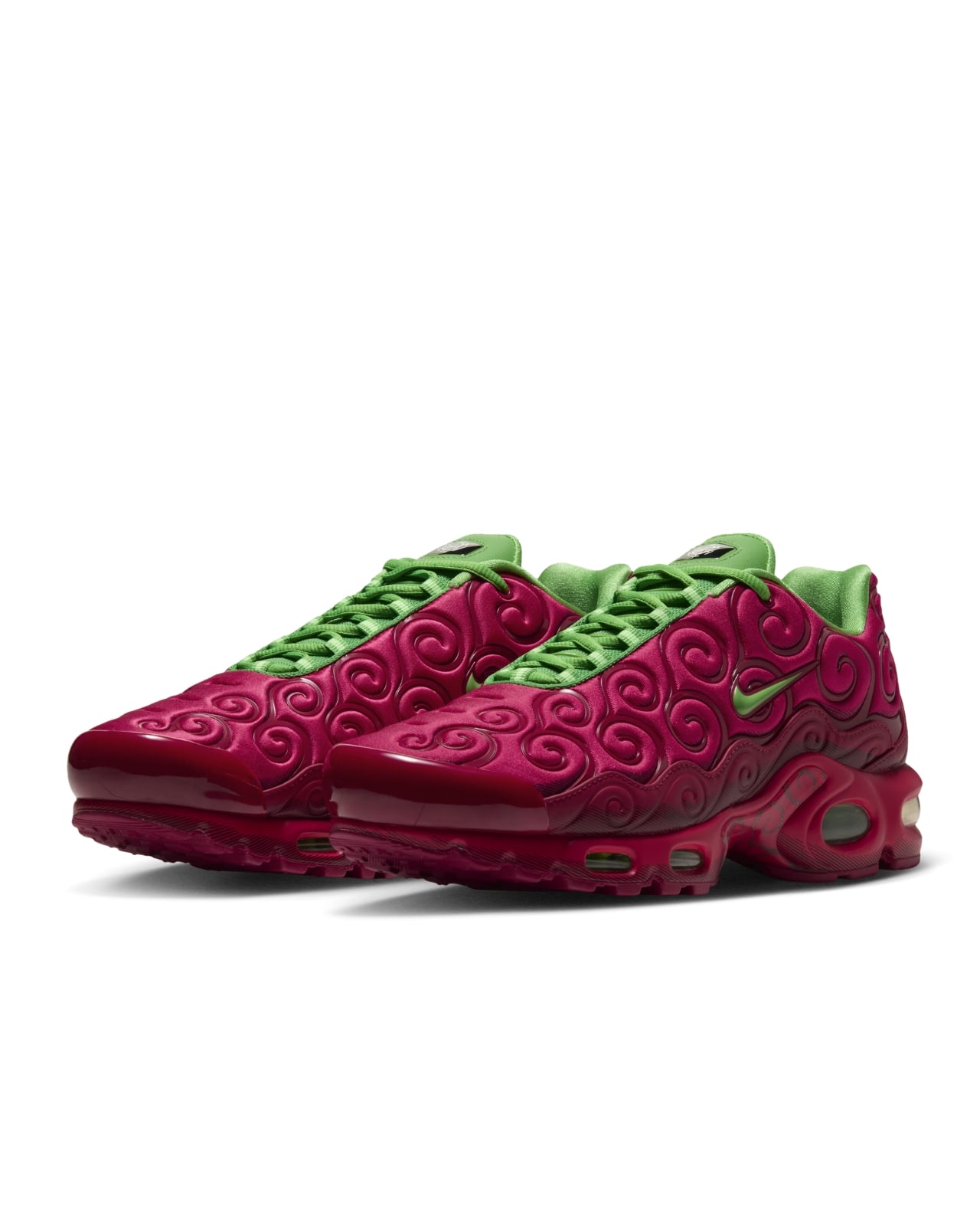
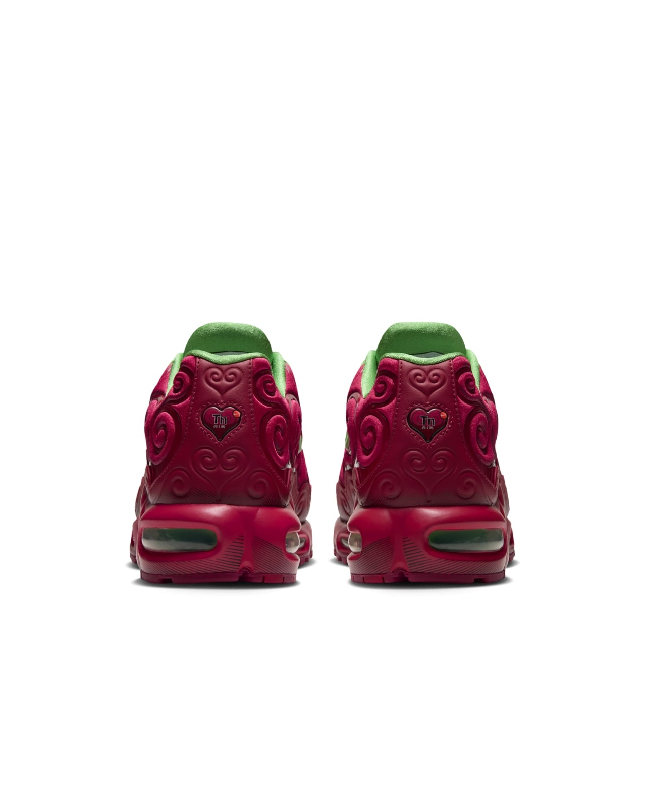
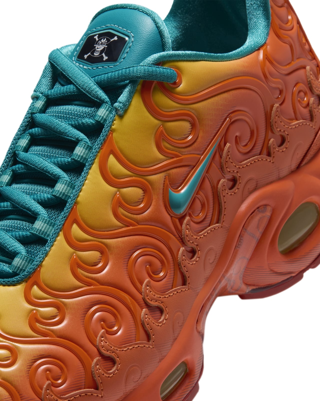
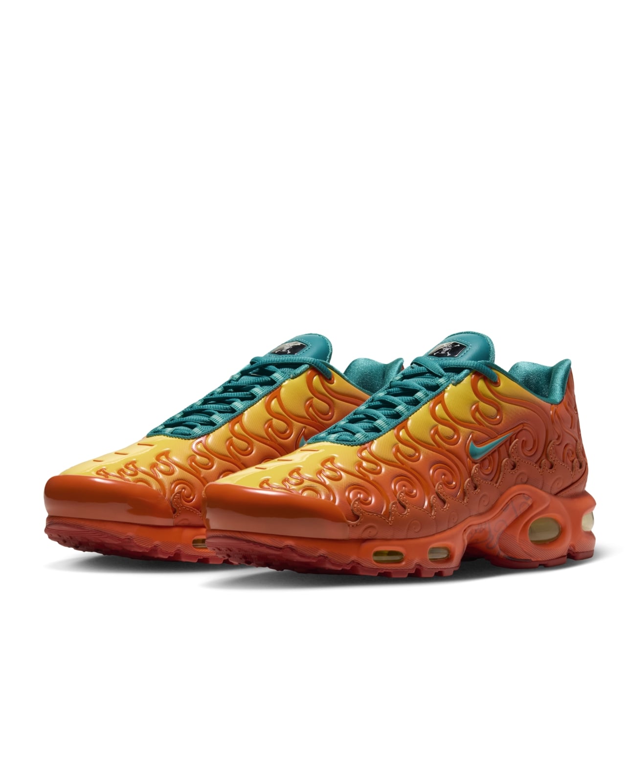
The Gomu Gomu no Mi, which was famously eaten by Monkey D. Luffy, comes in a purple-dominant colorway. In the manga, this fruit transformed Luffy’s body into rubber, giving him his signature stretchy abilities and setting him on his path to become King of the Pirates. The Ope Ope no Mi, Trafalgar Law’s fruit which grants its user surgical-like control over everything within a defined spherical space, takes on a red and green-themed look, while the Mera Mera no Mi, once wielded by Luffy’s fiery older brother Portgas D. Ace, is fittingly orange-dominant. Each pair features TPU-textured uppers exclusive to this collection, paired with contrasting tongues and shoelaces.

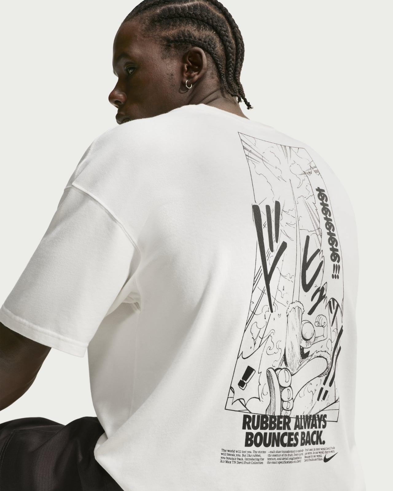
If you want to complete your One Piece outfit, the collection also includes jerseys, caps, and T-shirts with actual manga illustrations printed on them, reimagined in the style of classic Nike ads. There’s also a special vest that nods directly to the side effects of eating a Devil Fruit: once you gain your powers, you become “hated by the sea” and lose the ability to swim forever. It’s one of those clever, deep-cut design choices that die-hard fans will absolutely love. The entire line also features a special Nike x One Piece collaboration logo created exclusively for this collection.
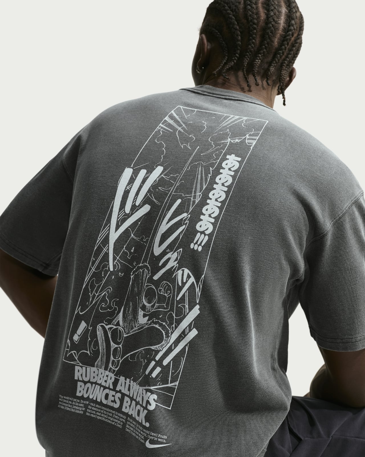

The collection is rolling out globally through a series of pop-up events and select retailers. Tokyo kicks things off on September 4, followed by regional drops across cities like Seoul, Hong Kong, and Jakarta. The Ope Ope no Mi pair arrives exclusively at select US and European retailers on September 19, while the full worldwide launch on SNKRS is set for September 25. Each sneaker is priced at $180.
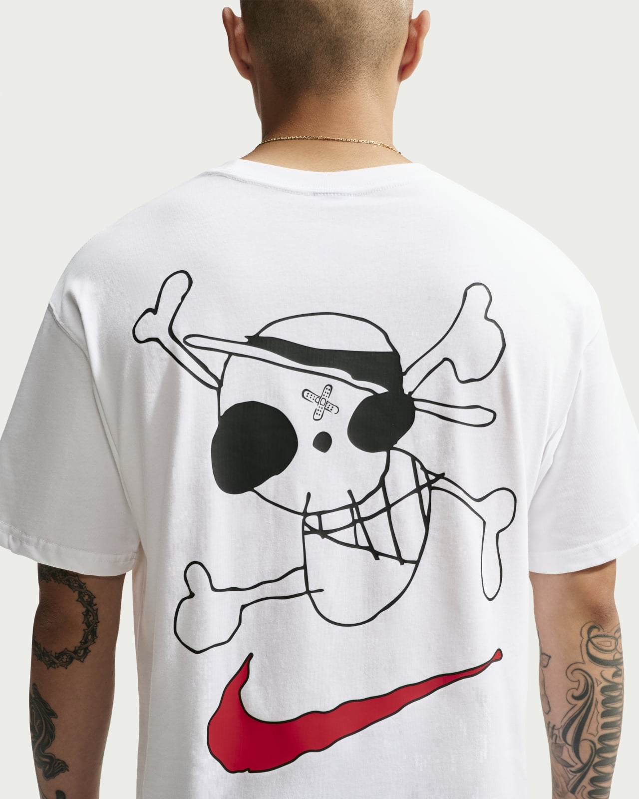
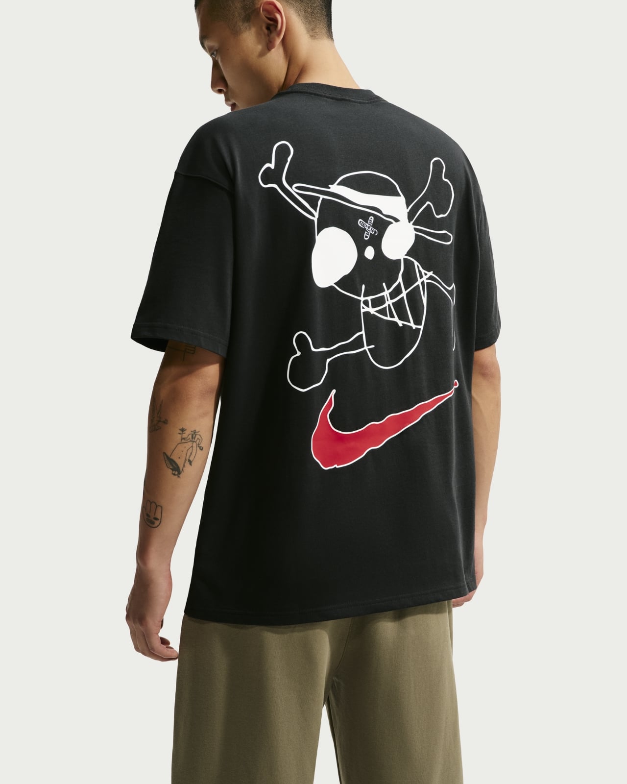
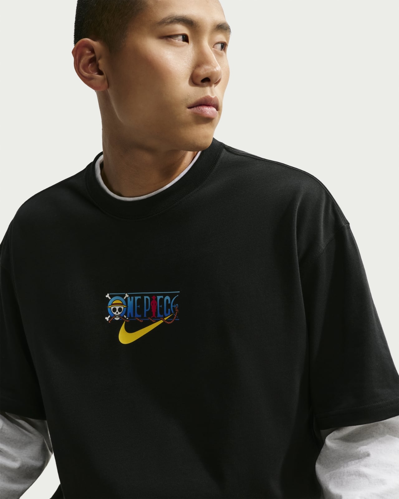
Whether you’re a lifelong One Piece fan who has been sailing with the Straw Hats since the very beginning or a sneakerhead who appreciates thoughtful, story-driven design, the Nike x One Piece collection delivers on both fronts. It’s rare for a collaboration to feel this intentional, where the creative vision of two very different worlds genuinely speaks to each other. Much like Luffy’s unwavering dream of becoming King of the Pirates, this collection is a reminder that the best adventures are always worth gearing up for. Set sail, and grab your pair before the tide goes out.


The post Nike Just Turned One Piece’s Devil Fruits Into $180 Sneakers first appeared on Yanko Design.