PROS:
- Wire-free RTK and VSLAM 2.0 navigation holds its line under tree canopy
- True 24/7 cutting via binocular daylight and iToF night-vision cameras
- Floating dual-disc deck delivers clean, even stripes on uneven terrain
- 70 percent slope rating clears embankments that defeat wheeled rivals
- Quiet 60 dB(A) operation and hose-down IPX5 cleaning ease ownership
CONS:
- Premium price keeps it out of reach for budget buyers
- Anti-theft and RTK extras add subscription costs over time
RATINGS:
SUSTAINABILITY / REPAIRABILITY
EDITOR'S QUOTE:
The X7 Gen 2 takes the flagship's brain and cutting hardware down to the model that fits most yards, and after a week on my worst terrain it earned the trust to run unwatched.
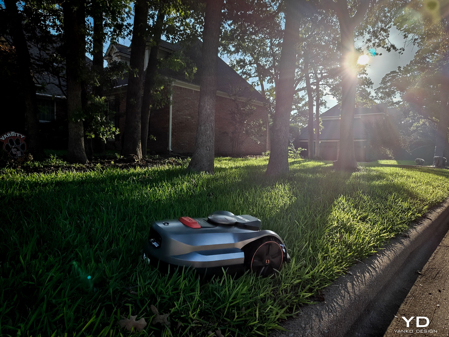
I’ve spent the past week running the Sunseeker Elite X7 Gen 2 across a property that breaks every rule in the robot mower playbook: mature oaks that block GPS, side slopes that send wheeled mowers sliding, and a front lawn that looks serene but hides enough root systems to trip a goat.
The X7 isn’t a stripped-down machine and it isn’t an overbuilt one. It’s the model that hands most yards the full Gen 2 toolkit without charging for acreage they’ll never touch, and that’s exactly why it matters.
Click Here to Buy Now.
Most buyers don’t need coverage they’ll never use or a cellular module that adds a subscription to the ownership cost. They need a machine that can handle real terrain, cut at night, and not turn a weekend into a wire-burial project. The Elite X7 Gen 2 delivers the Gen 2 platform’s best navigation, vision, and cutting hardware in the model built for the yard most people actually have.
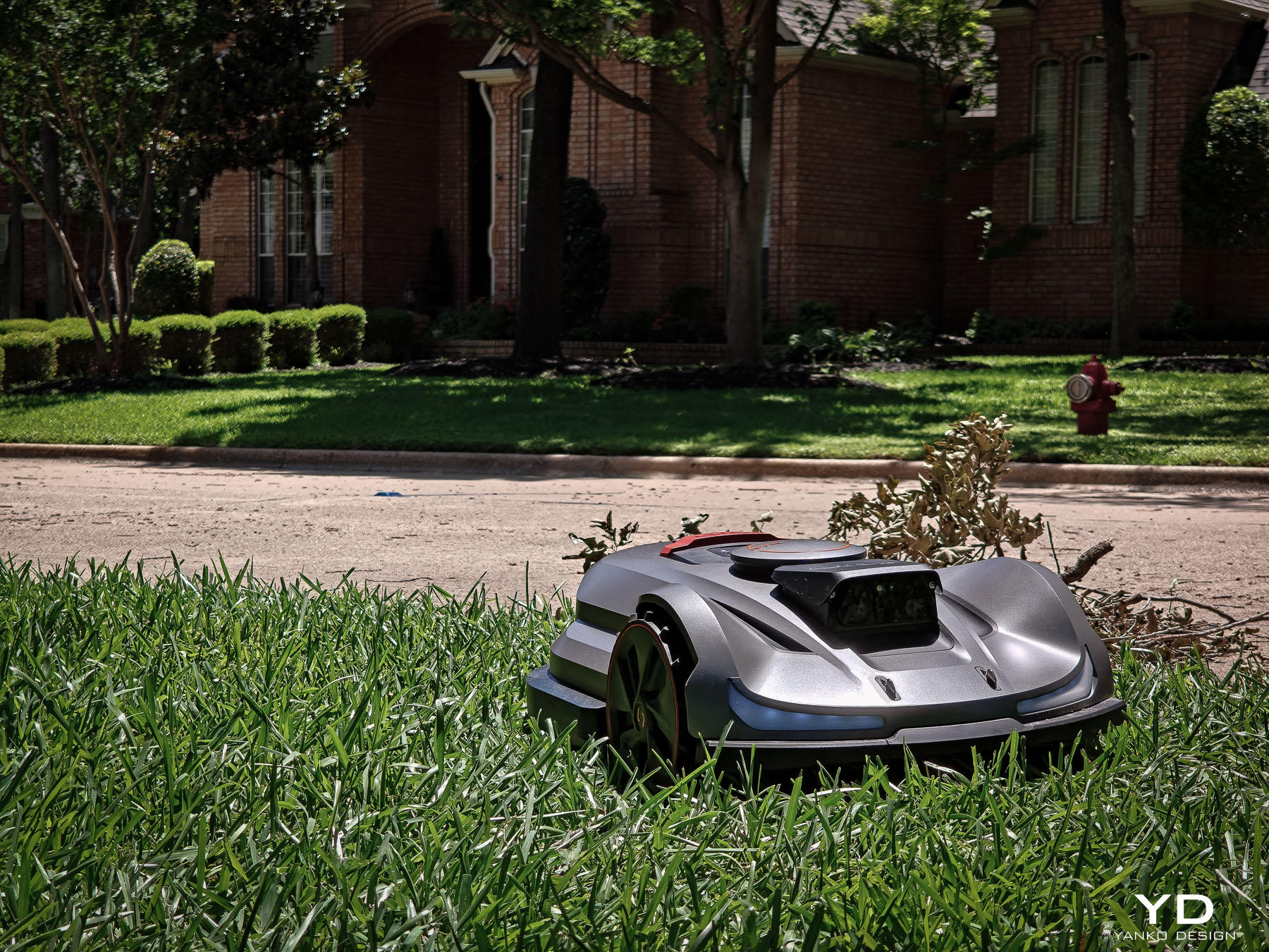
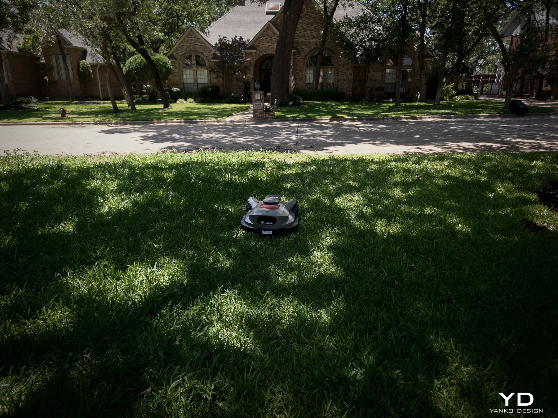
My yard is the kind of place reviewers quietly avoid. It’s 6,777 square feet in central Texas, carved up by 32 mature oaks that throw GPS shadows across half the lawn, threaded with surface roots, and planted in St. Augustine that grows thick and clumps when it’s wet.
The tank-tread mower I tested earlier this year got through it on raw torque and rubber grip. The X7 Gen 2 takes the opposite approach, and watching a wheeled mower solve the same yard with vision and steering geometry instead of brute force is the real story here.
How I’m Testing
This is a hands-on review, not a spec readout. I ran the X7 Gen 2 as my only mower for a full week, cutting the whole property on a normal schedule rather than staging one clean demo pass.
Over those seven days I mapped the yard wire-free, set no-go zones around the beds, and ran both day and night cycles so I could watch the binocular and iToF cameras work in each. I aimed it at the parts of my lawn that punish robot mowers: the GPS-shadowed back half under the oaks, the side slopes and the back embankment, the narrow run between the house and the fence, and the thick St. Augustine on damp Texas mornings. Everything below comes from that week of real cutting.
Design + Ergonomics
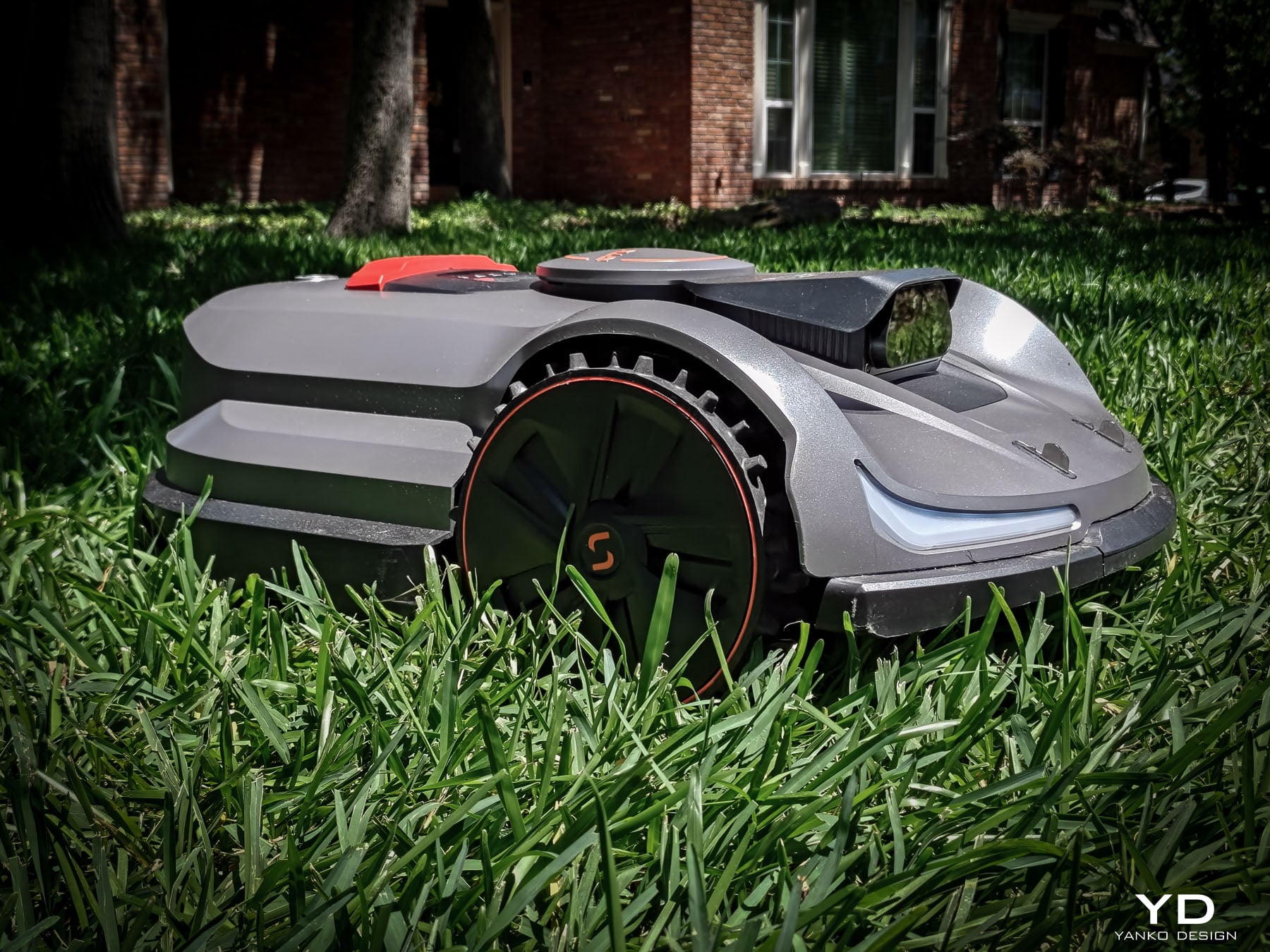
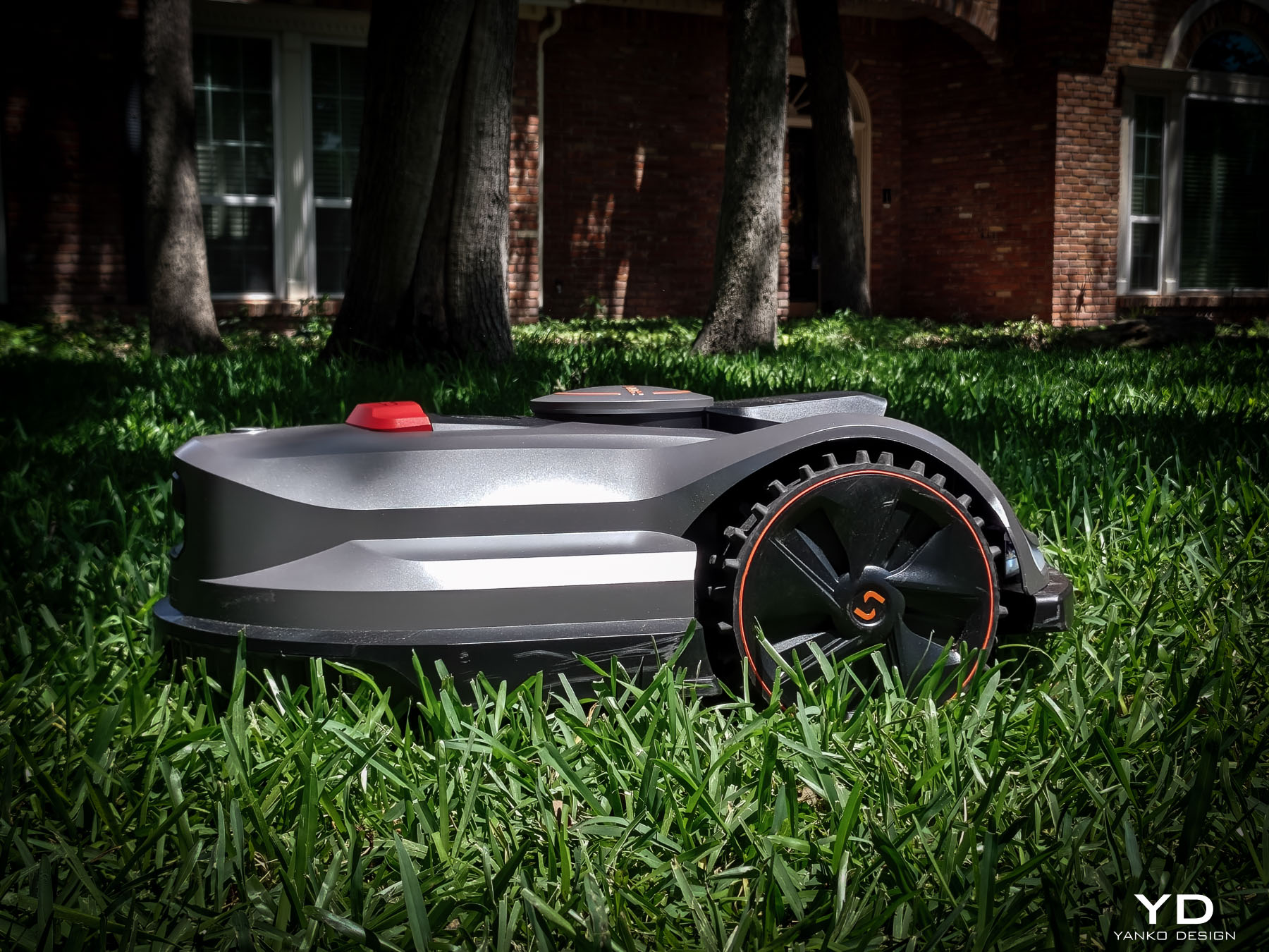
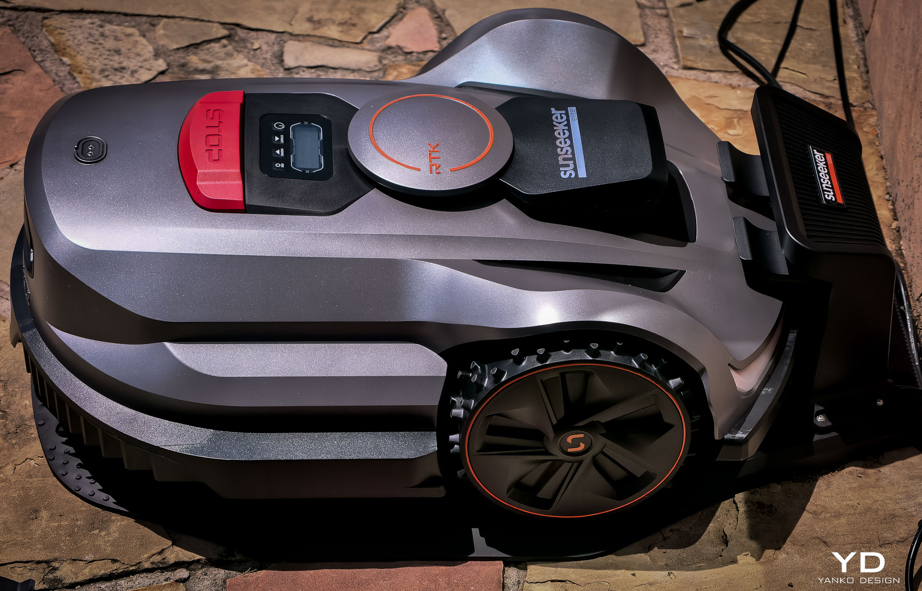
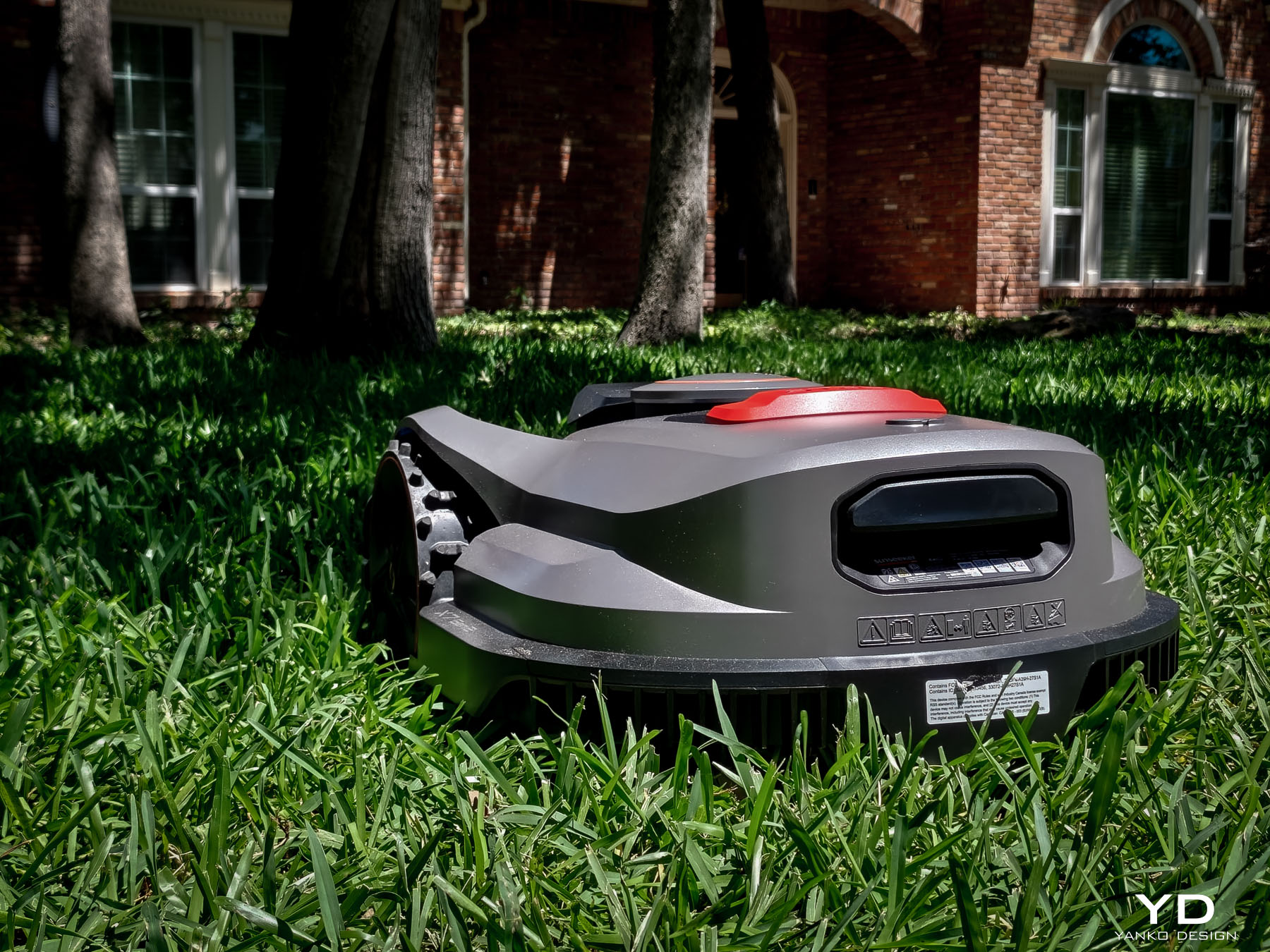
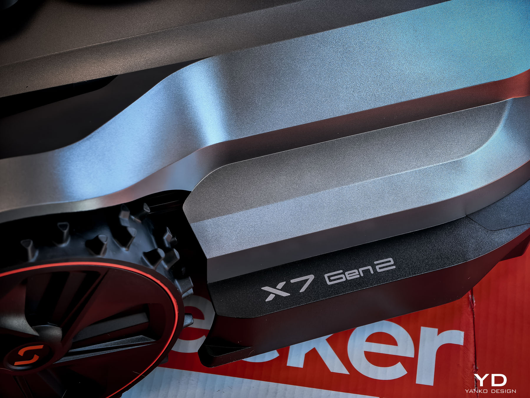
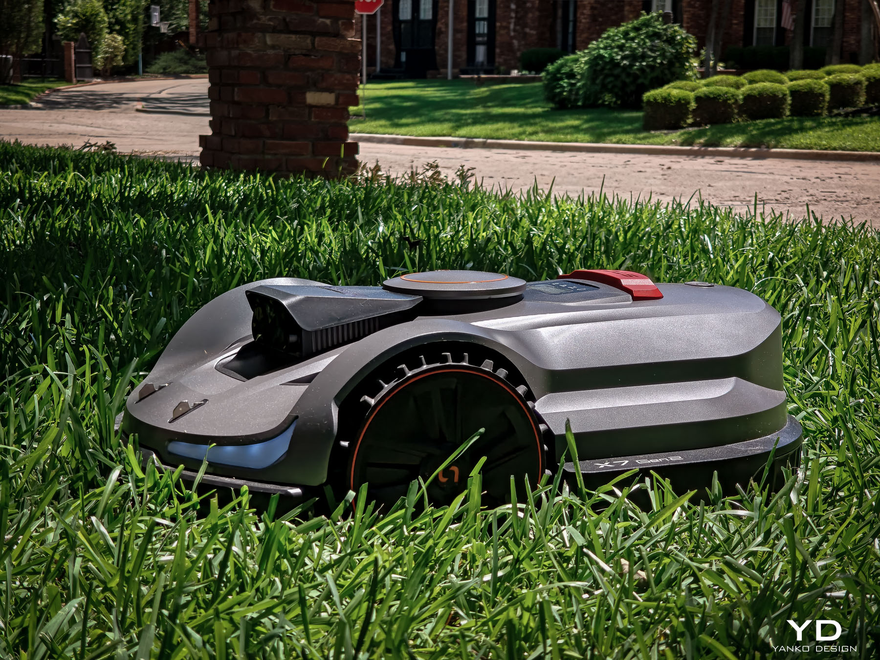
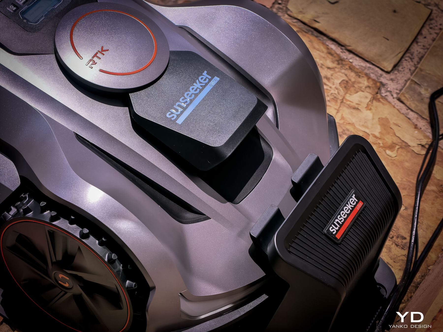
Set the X7 Gen 2 next to a first-generation X7 and the family resemblance is obvious, but the details have moved. The deck carries dual 14-inch cutting discs instead of a single narrow rotor, which widens the body and gives the machine a planted, low stance rather than the toy-like silhouette most robot mowers settle for.

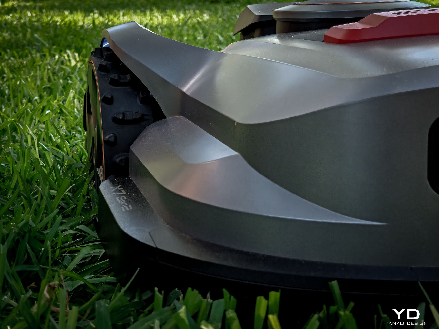
The 8.7-inch all-terrain wheels sit at the corners in a tread pattern gentle enough on turf to spare my softer St. Augustine patches the scarring a heavier wheel would leave. A front independent suspension system lets the chassis articulate over my exposed oak roots without lifting a drive wheel off the ground, and a floating cut disc rides the contour underneath, so the blades hold a consistent height even when the body is pitching over uneven soil.
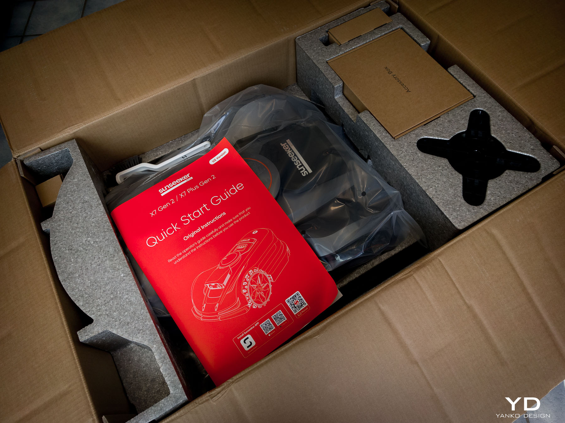
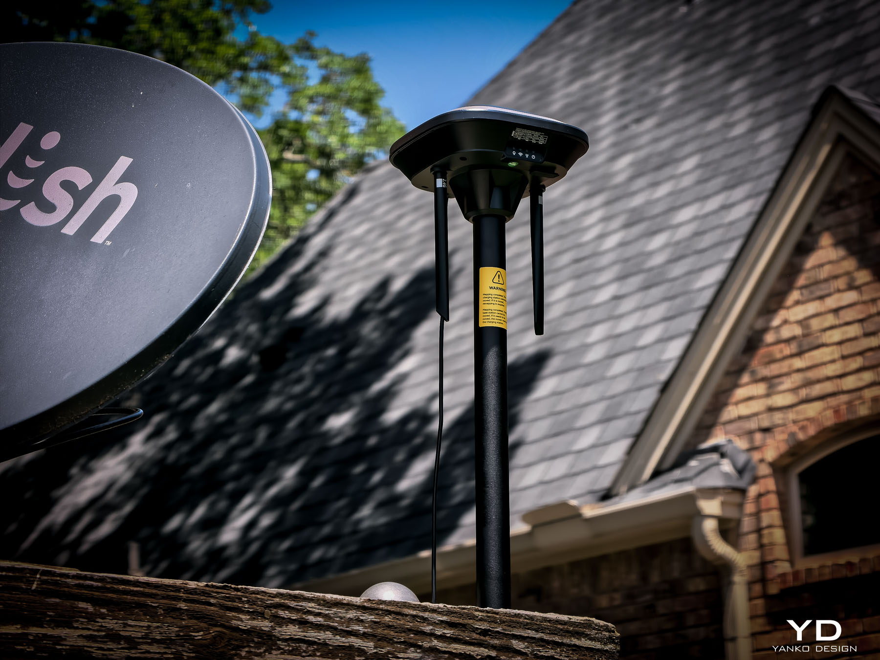
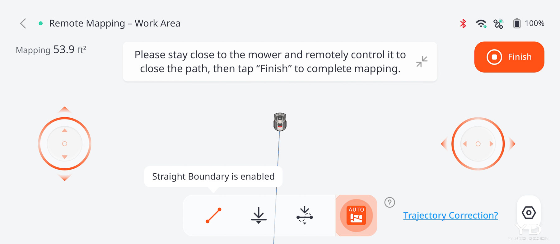
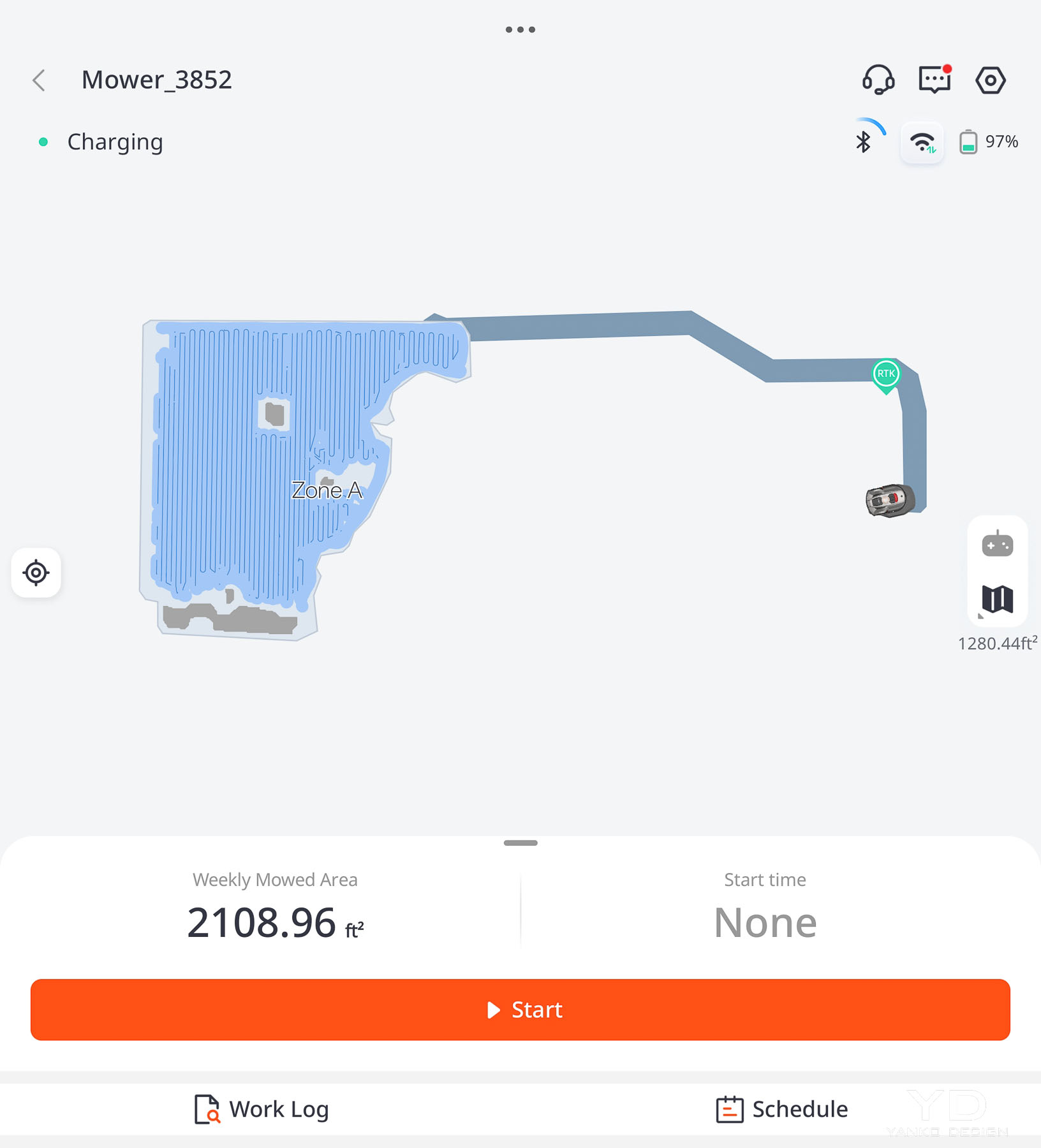
Setup is where the design philosophy shows. There’s no perimeter wire to bury, which on my property would’ve meant a weekend trenching around flower beds and tree rings. Instead I drove the mower along the boundary like an RC car through the app, dropped no-go zones around the planting islands of trees and shrubs, plus the soft mulch beds, and let AONavi commit the map to memory.
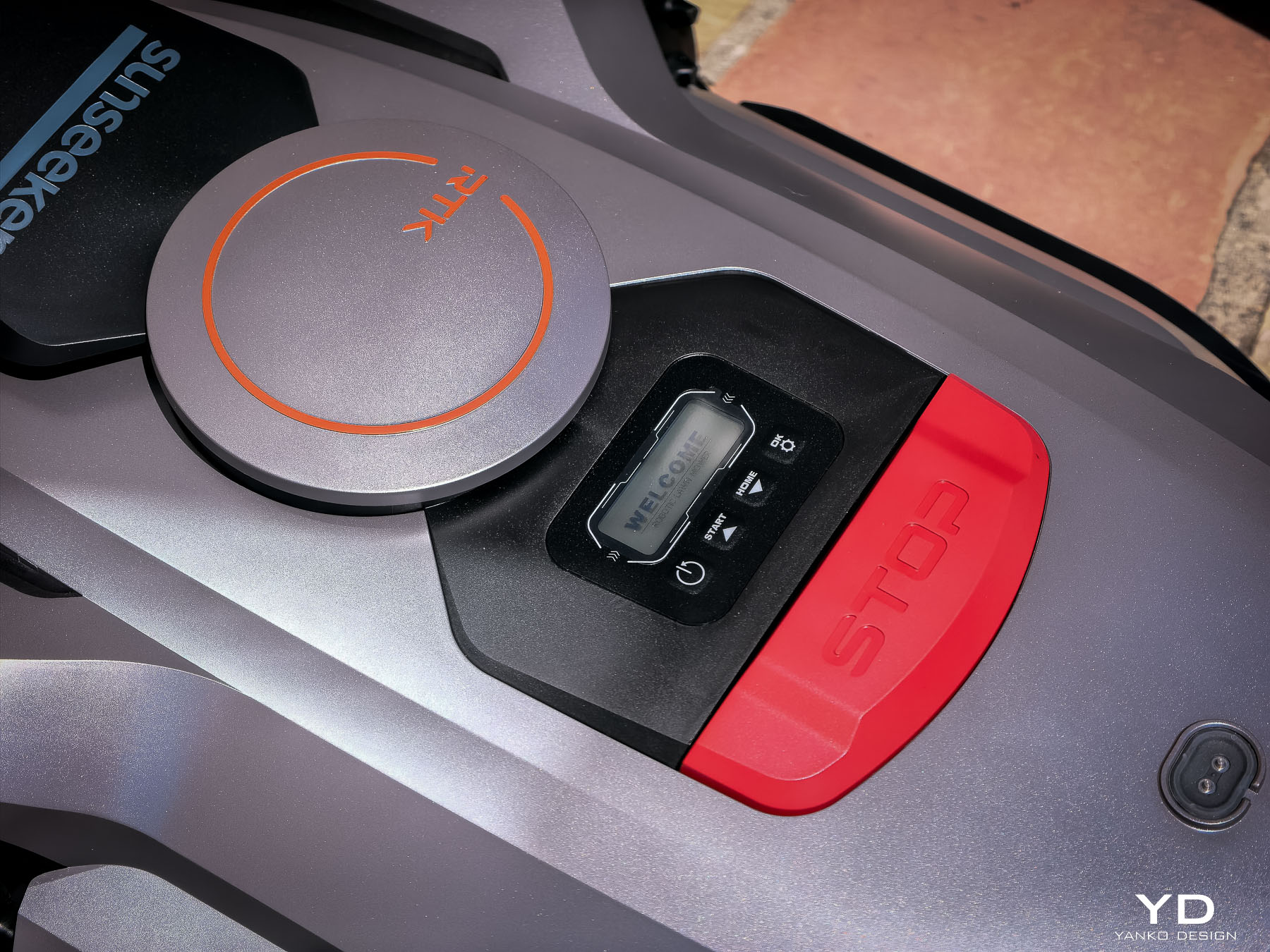
The new smart LCD screen on top reads battery, connection, and mode at a glance, a practical step up from the simple LED indicator on the Gen 1 series. Cleaning is a hose-down job thanks to the IPX5 rating, and a small wheel brush sweeps clippings and grit out of the treads as it drives, the kind of quiet maintenance fix that only earns its keep after a few weeks of real use.
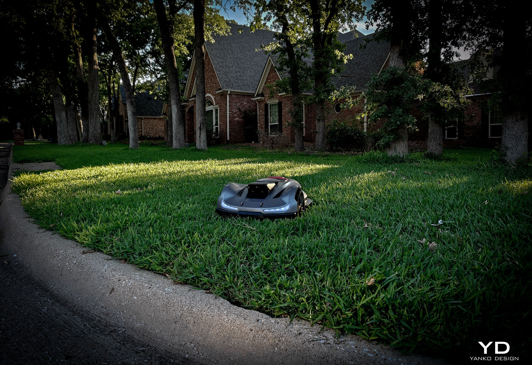
At 60 dB(A) it’s quiet enough to run a pre-dawn cycle without a neighbor noticing, and the 28-inch narrow-passage clearance let it thread the gap between my house and the fence line that a wider deck would’ve refused.
Tech + Performance
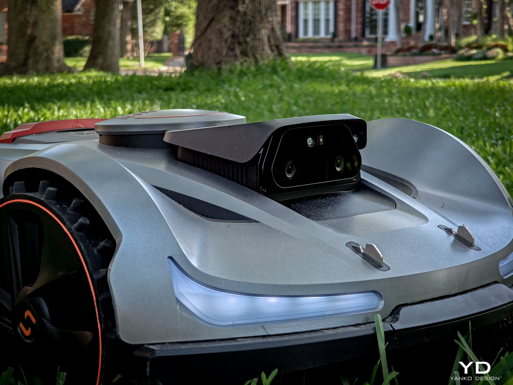
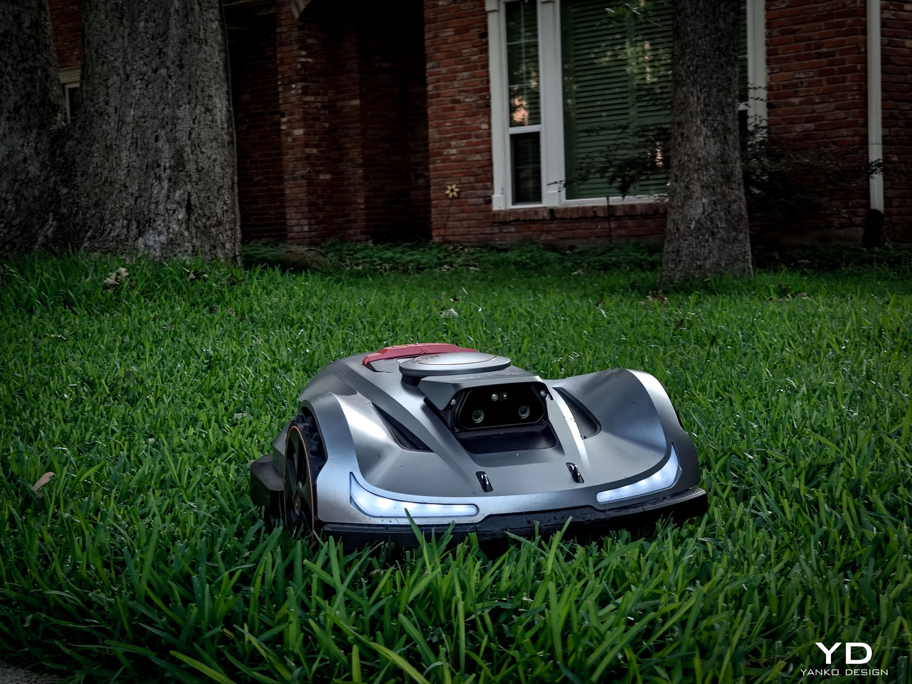
The hardest thing you can ask a robot mower to do on my property is hold its position under the oaks, and this is where the Gen 2 navigation earns its place. AONavi fuses RTK satellite positioning with VSLAM 2.0 vision, so when the canopy swallows the satellite signal across the back half of the yard, the mower leans on its cameras instead of stalling or drifting. Sunseeker rates VSLAM 2.0 for up to an hour of signal-denied operation, and in practice that’s the difference between a machine that finishes the shaded zone and one that parks itself waiting for satellites.
A 10 TOPS compute chip, double the 5 TOPS silicon in the Gen 1, runs the perception in real time, and the responsiveness shows in how early the mower reacts to an obstacle rather than nosing into it first.
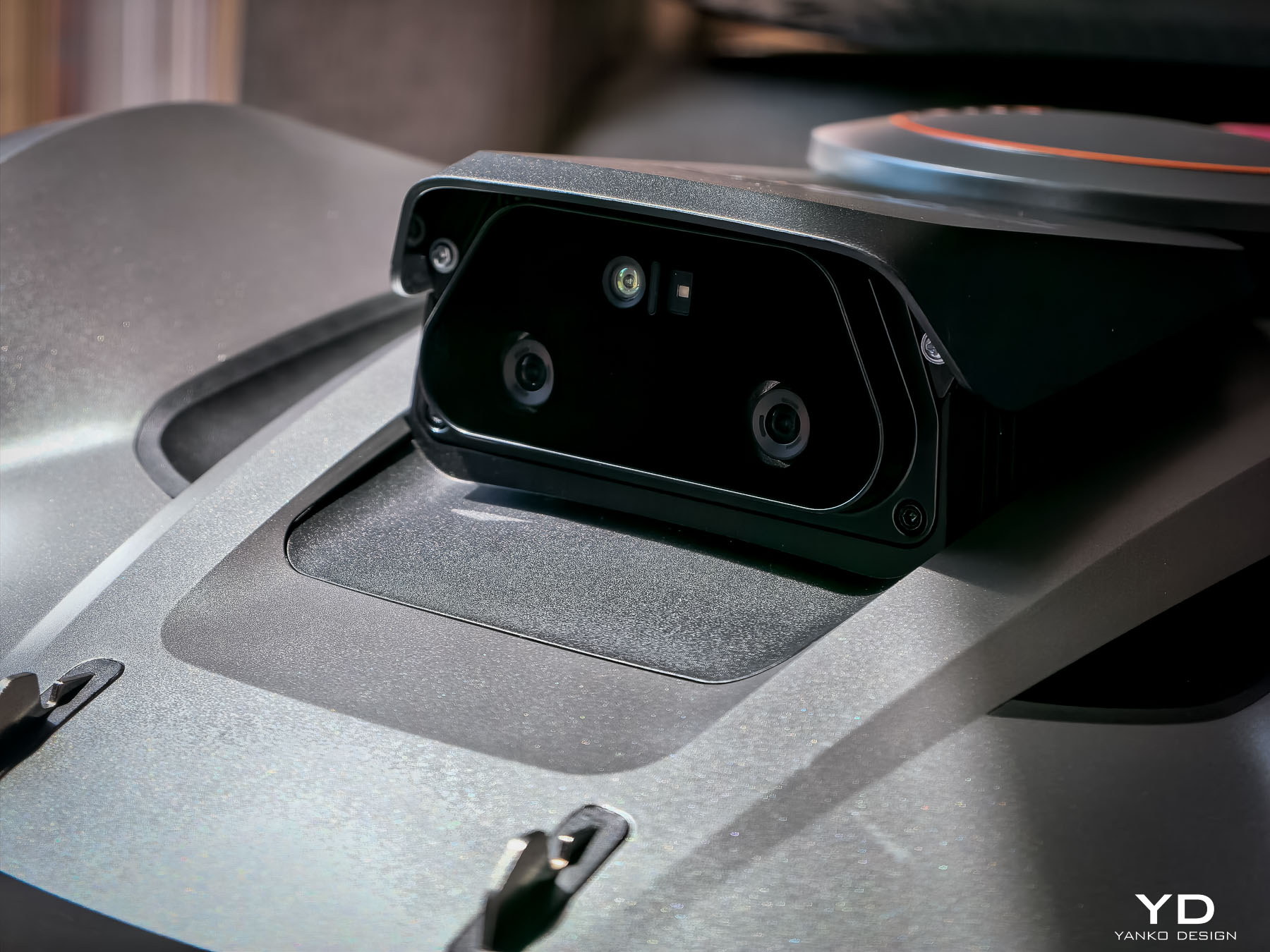
Vision AI 2.0 splits the work between a binocular camera for daylight and an iToF camera for night, adding up to a 24/7 perception system that recognizes more than 200 obstacle categories, from garden hoses and sprinkler heads to the squirrels that treat my yard as a thoroughfare, and cliff sensing keeps it from walking off my retaining-wall edge.
That mix is what lets me leave it running unattended. It holds the virtual boundary and reads its own drop-offs, so I’m not stuck watching for it to roll off the curb or wander off into the street while I’m inside. Lift, tilt, and collision sensors back that up, cutting the blades the moment the machine is raised or knocked off level.
The night camera is the rare piece here. Running a cut after dark and watching it track edges and step around a coiled hose in near-total darkness is something most mowers in this class can’t do at all, and it changes when you schedule the yard, not only how.
Cutting runs on twin 14-inch discs spinning at 2,600 to 2,800 RPM with six blades per disc, and the electronic height adjustment spans 0.8 to 4.0 inches without any manual shimming. Target Height Management lets you set a goal height on overgrown stretches and have the mower step down across several passes instead of scalping the lawn in one aggressive cut.
On the thick St. Augustine near my oaks, that metered approach keeps the finish even instead of scalping it, the trade a single high-torque cyclone pass tends to make on dense growth. Two engineering answers to the same problem: power through the grass, or step down to it.
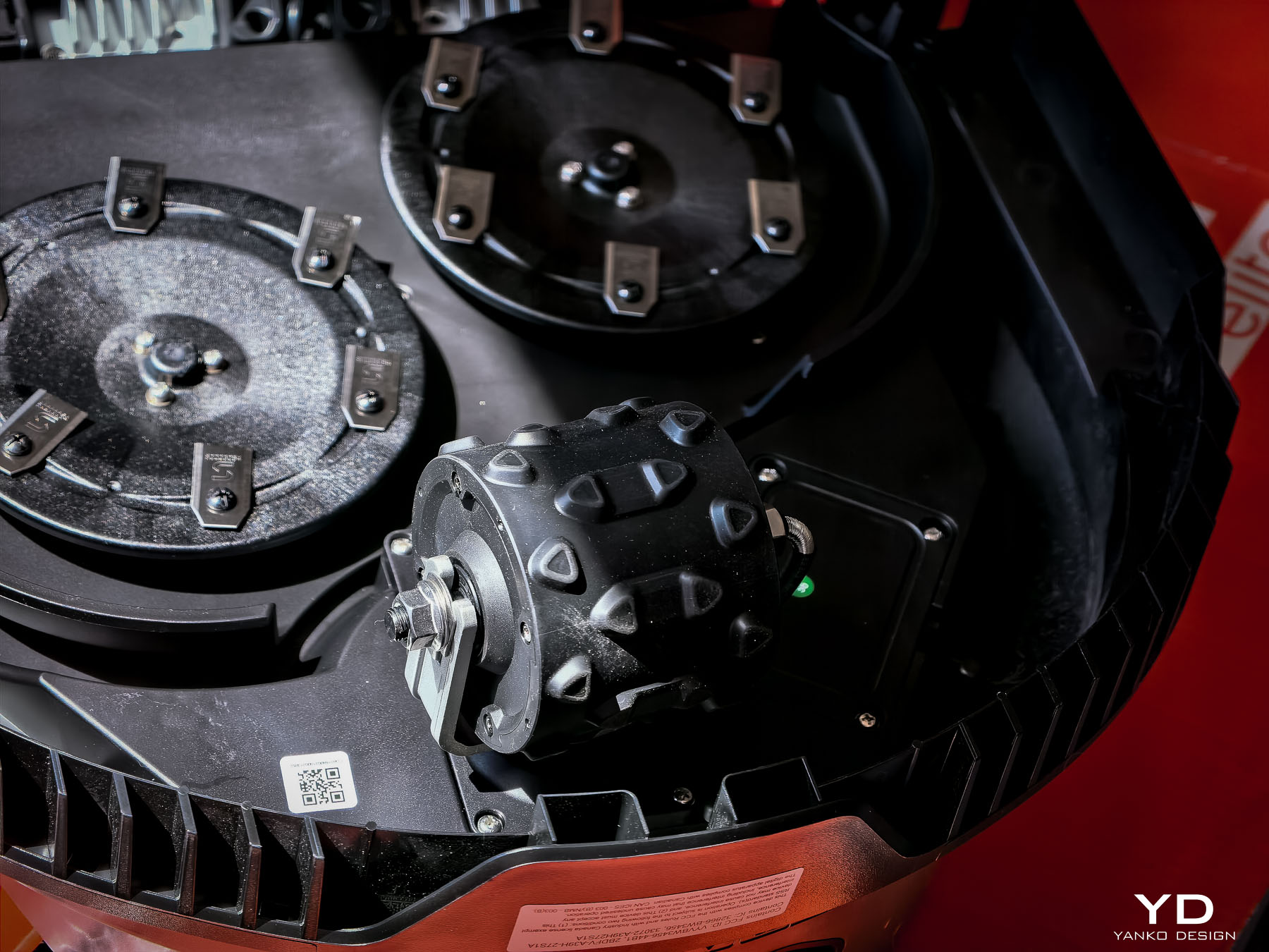
The cut-before-turn geometry is the design choice that does the most quiet work. The rear active steering motor lets the X7 mow through a line first and then pivot, where rear-wheel-steer competitors crush a strip of grass flat during the turn and leave uncut patches behind.
On my lawn that means straighter lines and fewer missed seams between passes, helped by a hill-hold system that holds a straight track across my side slopes instead of sliding downhill the way wheeled mowers usually do. All of it rides on the ATC all-wheel-drive system rated for 70 percent grades and 35 degrees, which cleared the embankment along my back fence that I’d written off as a hand-trimming chore.
The finish is the part that matters most on a mower like this, and after a full week the lawn reads as clean parallel stripes instead of the random scribble of a typical robot pattern. The straight passes come from the RTK lines, but the even tone across the whole yard comes from the floating discs tracking the ground. Where the lawn dips near the oaks and rolls along the side slopes, the cut stays level rather than gouging the high spots or leaving shaggy tufts in the dips.
My St. Augustine clumps the moment it gets damp, and the floating deck keeps the blades cutting clean through it instead of matting it down or leaving windrows. Changing height is an app slider, so I drop it for the spring flush and raise it through the Texas summer without touching the machine. It also rides close enough to my bed edges and the driveway to keep one wheel on the hard surface, which means far less cleanup with the string trimmer afterward, and because it docks itself at the first sign of rain, I’m not fighting the torn, clumpy finish wet grass usually leaves.
On my setup, RTK initialization settled within a couple of minutes per session and the map held its shape across the full week of testing. The Elite X7 Gen 2 cleans its boundaries with a dedicated Edge-Following mode and a separate Ride-On cutting mode, and Spot Cutting picks up any patch it routes around an obstacle without re-running the whole yard. The edges stayed crisp and the map never drifted, exactly what you want from a wire-free system you’re trusting to run on its own.
On connectivity the Elite X7 Gen 2 leans on 3rd Super Wi-Fi, to stay tied to its RTK base, so 4G rides along as an optional anti-theft add-on rather than a requirement, which is one less subscription-shaped worry.
Multi-zone and multi-angle scheduling let me run the front and back on different patterns and cutting heights, the return modes range from a tidy edge-hugging path to a straight-line rapid return below 30 percent battery, with an intelligent route option that varies the path home to spare the turf, and auto rain detection pulls it back to the dock in wet weather.
Alexa and Google Assistant cover voice control, and OTA updates keep the feature set moving. Sunseeker’s Lawn Art pattern printing is live and delivered via OTA update, so it’s ready to use once your mower pulls the latest firmware.
Sustainability
Longevity is the part of a robot mower a single week can’t fully judge, so here I’m reading the design intent as much as the early results. The Elite X7 Gen 2 runs a 10 Ah battery off a 5A charger, and Sunseeker Elite positions the blade modules as consumables you swap without tearing down the deck, which matches the maintenance rhythm I’ve lived with on other premium mowers: inspect and replace blades, hose down the deck, check the RTK base and the charging contacts.
The self-cleaning wheel brush and the IPX5 rating cut the routine work, and OTA updates keep the software side maintaining itself.
The wire-free design has a quieter sustainability angle that’s easy to miss: there’s no several-hundred-foot run of buried boundary wire to install, damage, and eventually send to a landfill, and reshaping a zone is a software edit rather than a dig.
Paired with 60 dB(A) operation that keeps odd-hour cutting neighborly, it makes a reasonable case on the ownership math, provided Sunseeker Elite confirms the battery holds up across the years the rest of the machine clearly will.
Value
Price is where the sweet-spot argument either holds or falls apart. The Elite X7 Gen 2 is priced at $2,499 for the 0.75-acre model, and the value question isn’t really about the number; it’s about what the number buys. Wire-free setup, night cutting, dual-disc cutting hardware, electronic height adjustment, a 70 percent slope rating, and navigation that holds its line under a tree canopy are what that number buys, and for a yard under three-quarters of an acre, you’re paying for capability you’ll actually use.
Unless your lawn pushes past 0.75 acres, none of those step-ups change how the grass gets cut, which is the whole argument for the Elite X7 Gen 2 landing where it does.
Against the broader category, the Elite X7 Gen 2’s case is about what you give up to get wheels and vision. Tank-tread rivals answer difficult terrain with raw grip and bigger batteries, the better tool for a torn-up acre but more than a tidy three-quarter-acre lawn needs. Other wheeled RTK mowers match the navigation approach but tend to run larger decks at higher prices, and the established wire-based systems still ask you to bury a perimeter loop, the exact friction the Elite X7 Gen 2 erases.
For a design-literate buyer who wants wire-free setup, night cutting, and slope confidence without paying for headroom they don’t need, the Elite X7 Gen 2 is the one I’d point to. If your yard runs past 0.75 acres, the X7 Plus scales up without changing the formula; if the terrain turns brutal, look to a tank-tread machine built for it.
FAQ
Does the X7 Gen 2 need a perimeter wire?
No. It maps your lawn with AONavi, fusing RTK satellite positioning and VSLAM 2.0 vision, so you set virtual boundaries in the app instead of burying a wire.
Can it mow at night?
Yes. A binocular camera handles daylight and an iToF camera handles darkness, giving a 24/7 perception system that tracks edges and steps around obstacles after dark.
How steep a slope can it handle?
It’s rated for 70 percent grades and 35 degrees, and the hill-hold system keeps it tracking straight across side slopes rather than sliding downhill.
Will it work under trees where GPS drops out?
Yes. When the canopy blocks the satellite signal, VSLAM 2.0 keeps the mower running on vision for up to an hour, against 10 minutes on the previous version.
What’s the difference between the X7 and the X7 Plus?
They share the same cutting and navigation hardware. The Elite X7 Gen 2 covers 0.75 acres with the 4G anti-theft module optional, while the Plus covers 1.5 acres and bundles that module as standard.
Is the 4G anti-theft module worth adding?
It adds real-time tracking, geofencing, and boundary alerts, so it earns its place if theft is a worry. Otherwise the third-generation LoRa link, branded Super Wi-Fi, keeps the mower tied to its base without a cellular plan.
After a week of handing this machine the worst my yard could throw at it, the verdict comes down to one thing: the X7 Gen 2 takes the navigation, vision, and cutting hardware that used to sit at the top of the range and puts it in the model most people will actually buy. It mapped a tree-choked, root-laced, sloped lot with no buried wire, held its line under the oaks, cut clean stripes by day and after dark, and stayed inside its own boundaries without me hovering. If your lawn fits inside three-quarters of an acre, this is the one I’d live with, and the rest of the lineup only matters once the grass runs past where the Elite X7 Gen 2 stops.
Click Here to Buy Now.
The post Sunseeker Elite X7 Gen 2 Review: 24/7 Cutting with iToF Night Vision first appeared on Yanko Design.