PROS:
- Stunning metal unibody design
- Alert slider
- Impressive battery performance
- Long-term support package
- Fast 100W wired fast charging capability
CONS:
- No wireless charging
- Modest 8MP ultrawide camera
- Limited availability
RATINGS:
SUSTAINABILITY / REPAIRABILITY
EDITOR'S QUOTE:
Whether for its striking aesthetics, impressive battery life, or rapid charging capabilities, the OnePlus Nord 4 offers great value for users seeking a reliable and feature-rich smartphone experience.
Positioning itself as OnePlus’s midrange smartphone, each iteration of the Nord series has delivered great value, balancing price and performance. However, design has often taken a back seat in OnePlus’s Nord lineup, where aesthetics have been serviceable but not standout. With the latest Nord series, this perception is set to change. The company took on a great design challenge in the era of 5G – OnePlus is bringing back metal and went with a metal unibody design with Nord 4.
In terms of specifications, the OnePlus Nord 4 features a 6.74-inch Super Fluid AMOLED display with Ultra HDR support, a dual camera system, a 5,500 mAh battery with 100W wired charging capability, and is powered by Snapdragon 7+ Gen 3 chipset. Is the Nord 4 merely a visually appealing device, or does it offer substance beneath its sleek exterior? We put the phone to the test to uncover the answer.
Designer: OnePlus
Aesthetics
Being the only metal unibody 5G smartphone, according to OnePlus, Nord 4 has a captivating aesthetics. Metal back panels have been more common in the past, but they have become increasingly rare due to the adoption of 5G technology, which requires materials that do not interfere with reception. This shift has led to the predominance of materials like glass, plastic, ceramic, and vegan leather for back panels. OnePlus, with its “Never Settle” spirit, has boldly challenged this norm and created a metal unibody 5G phone by introducing a unique antenna arrangement and U-shaped antenna positioned at the bottom of the device.
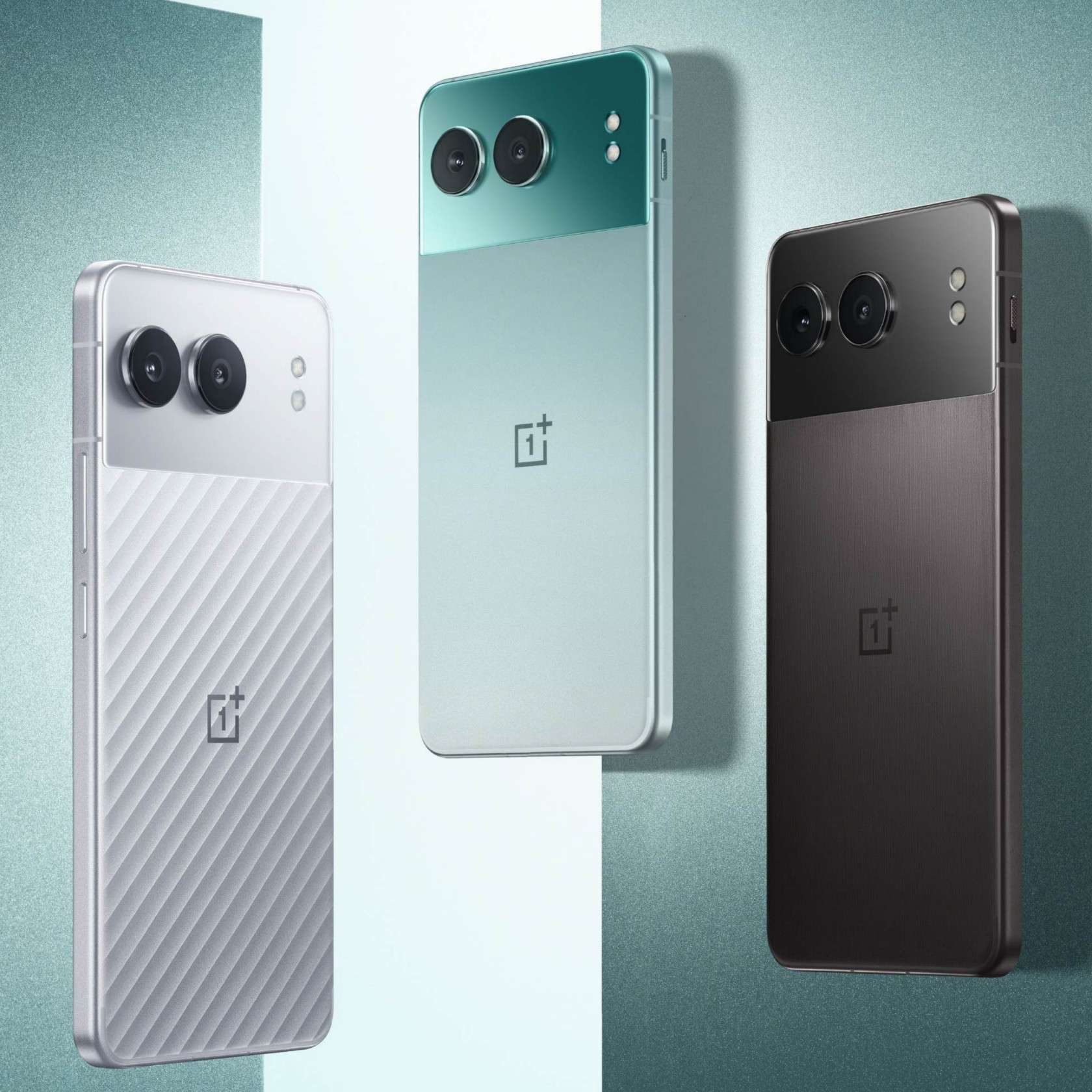
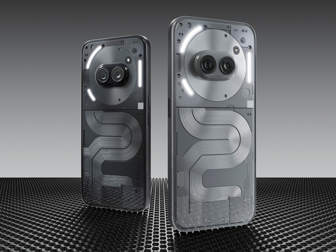
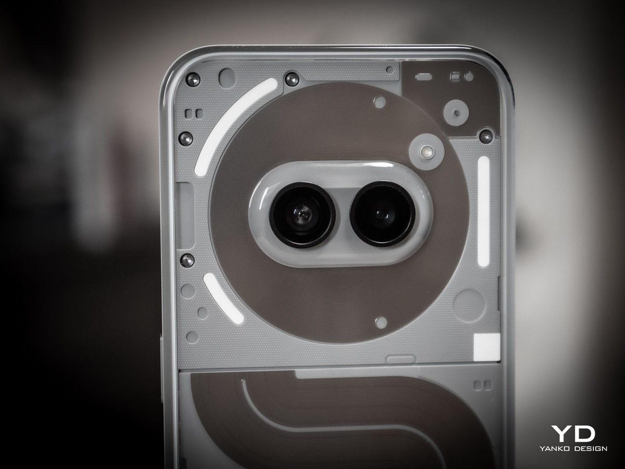
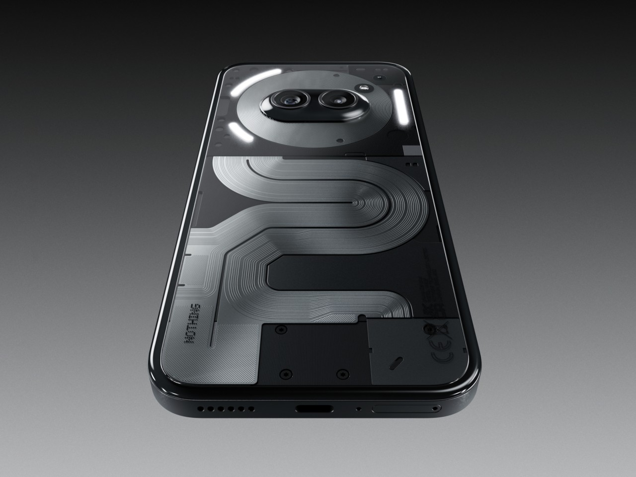
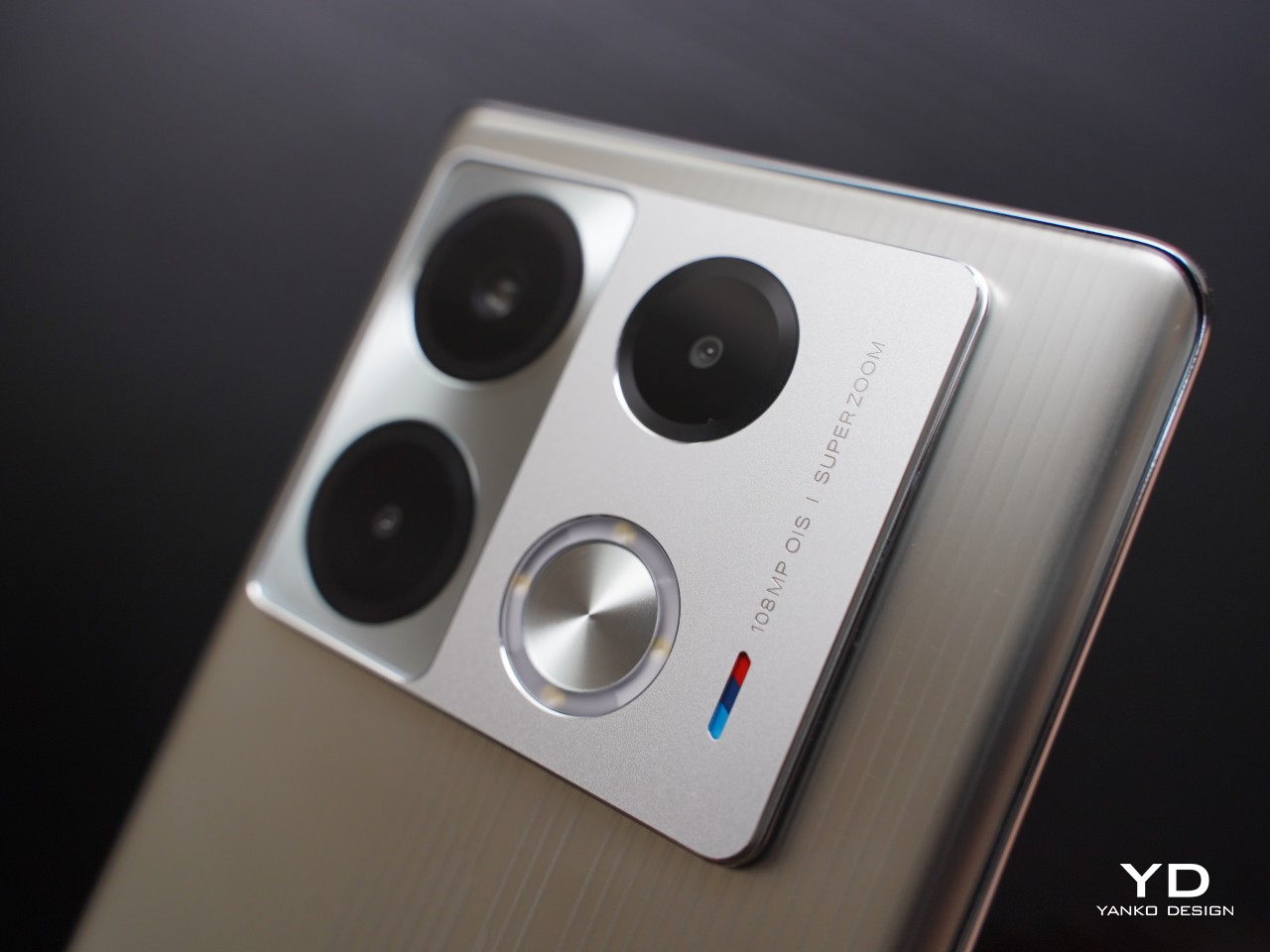
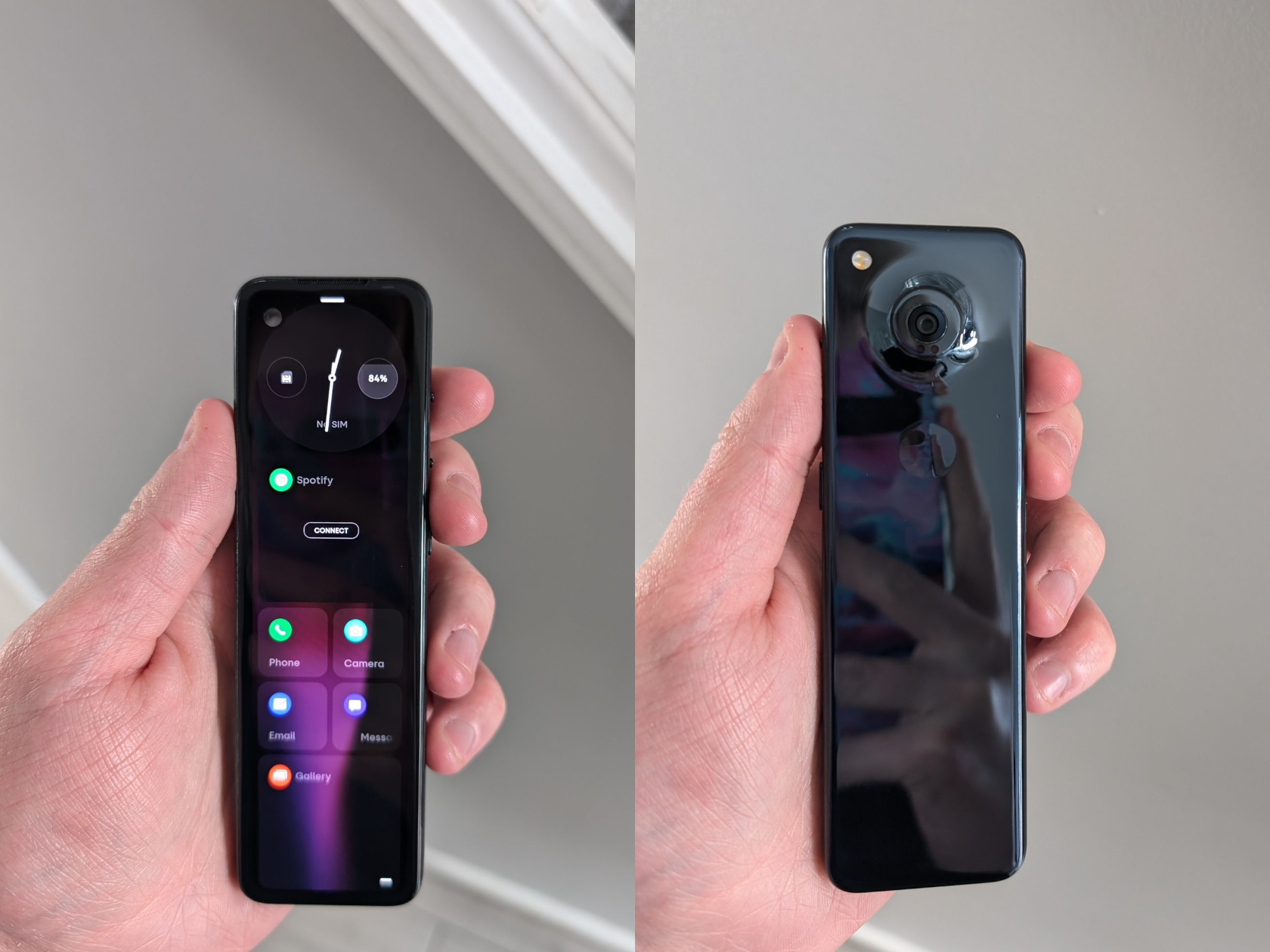
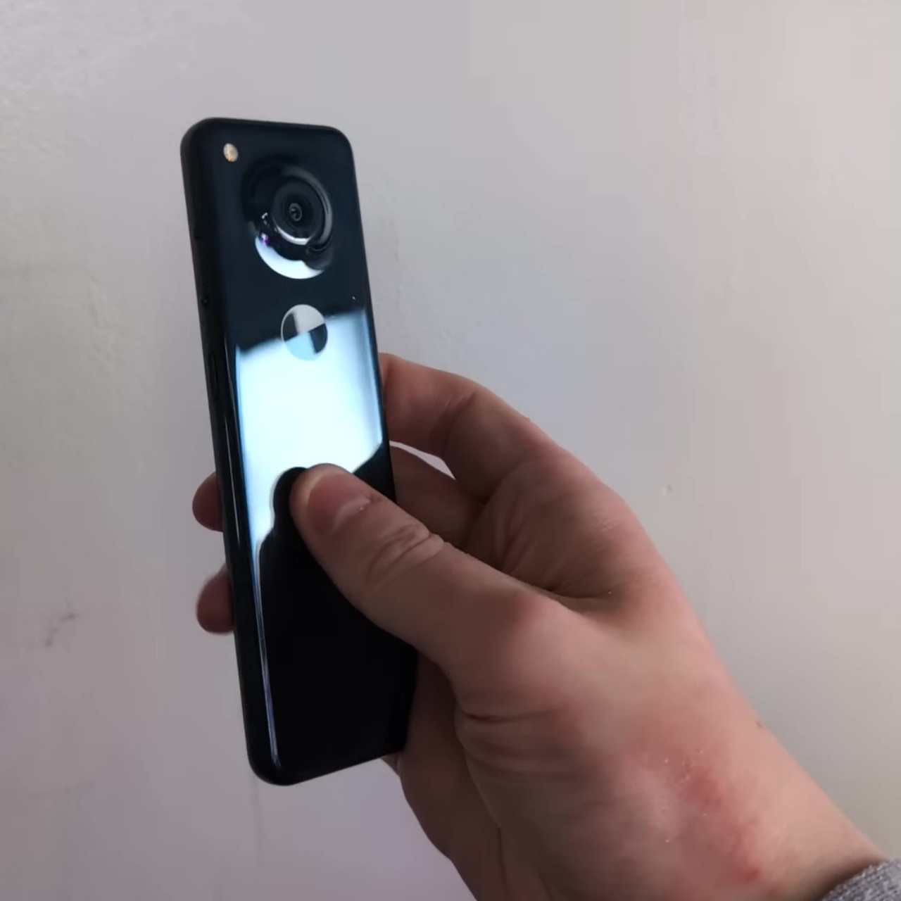
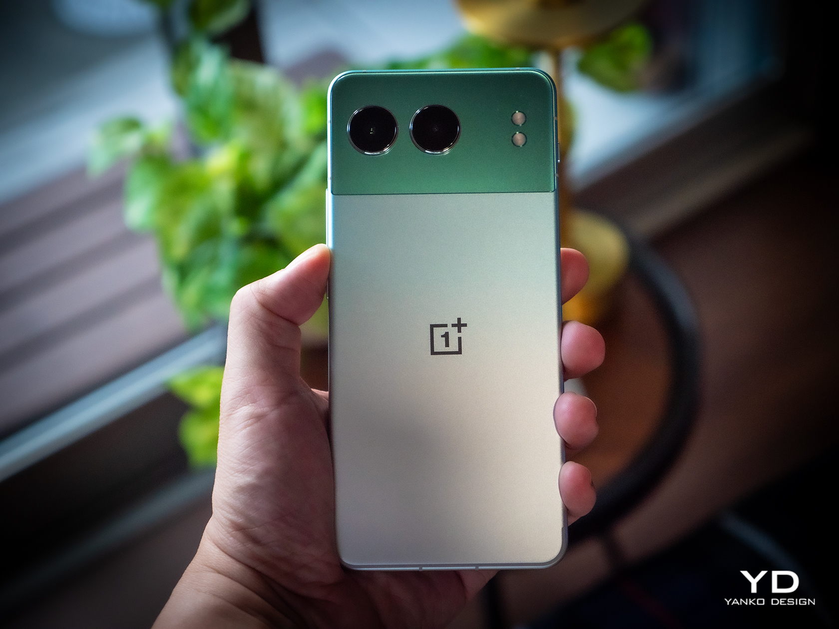
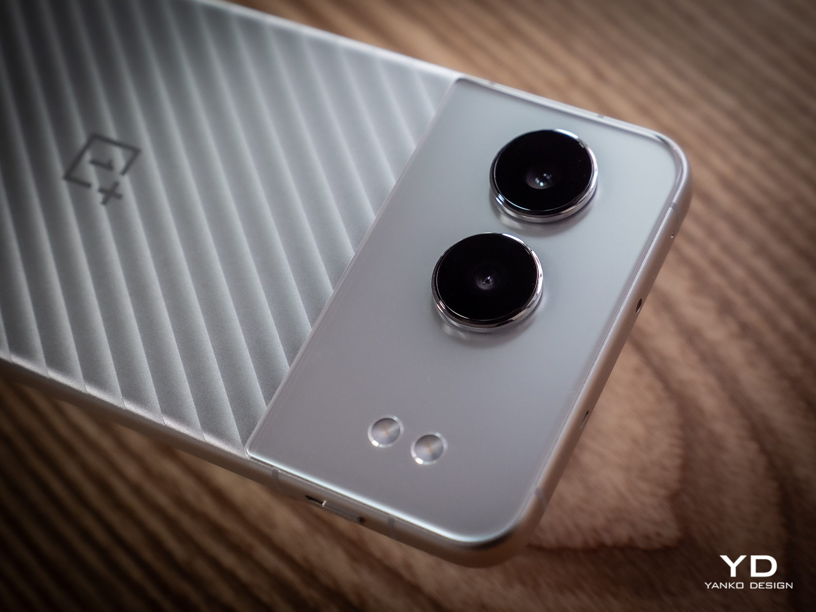
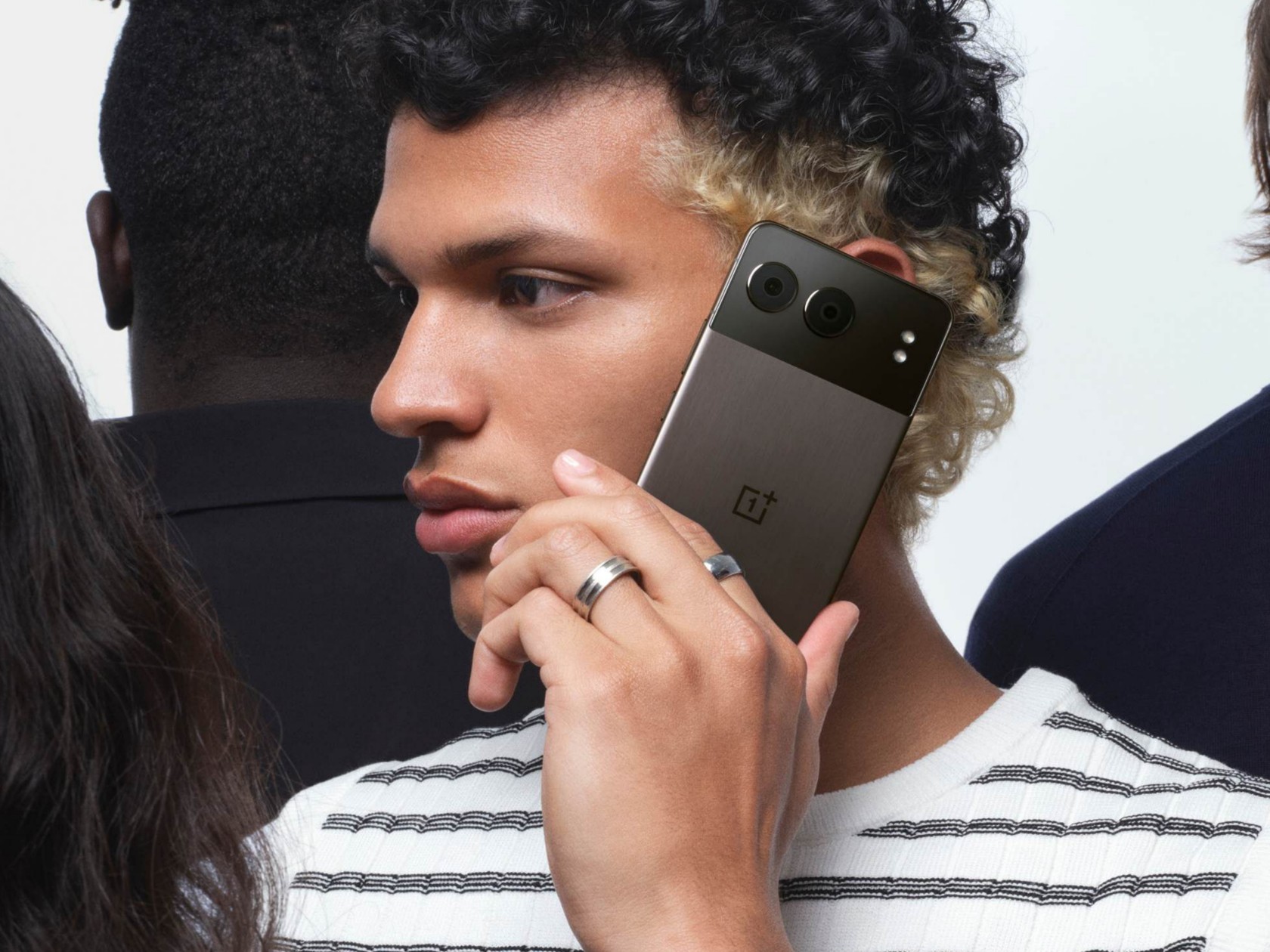
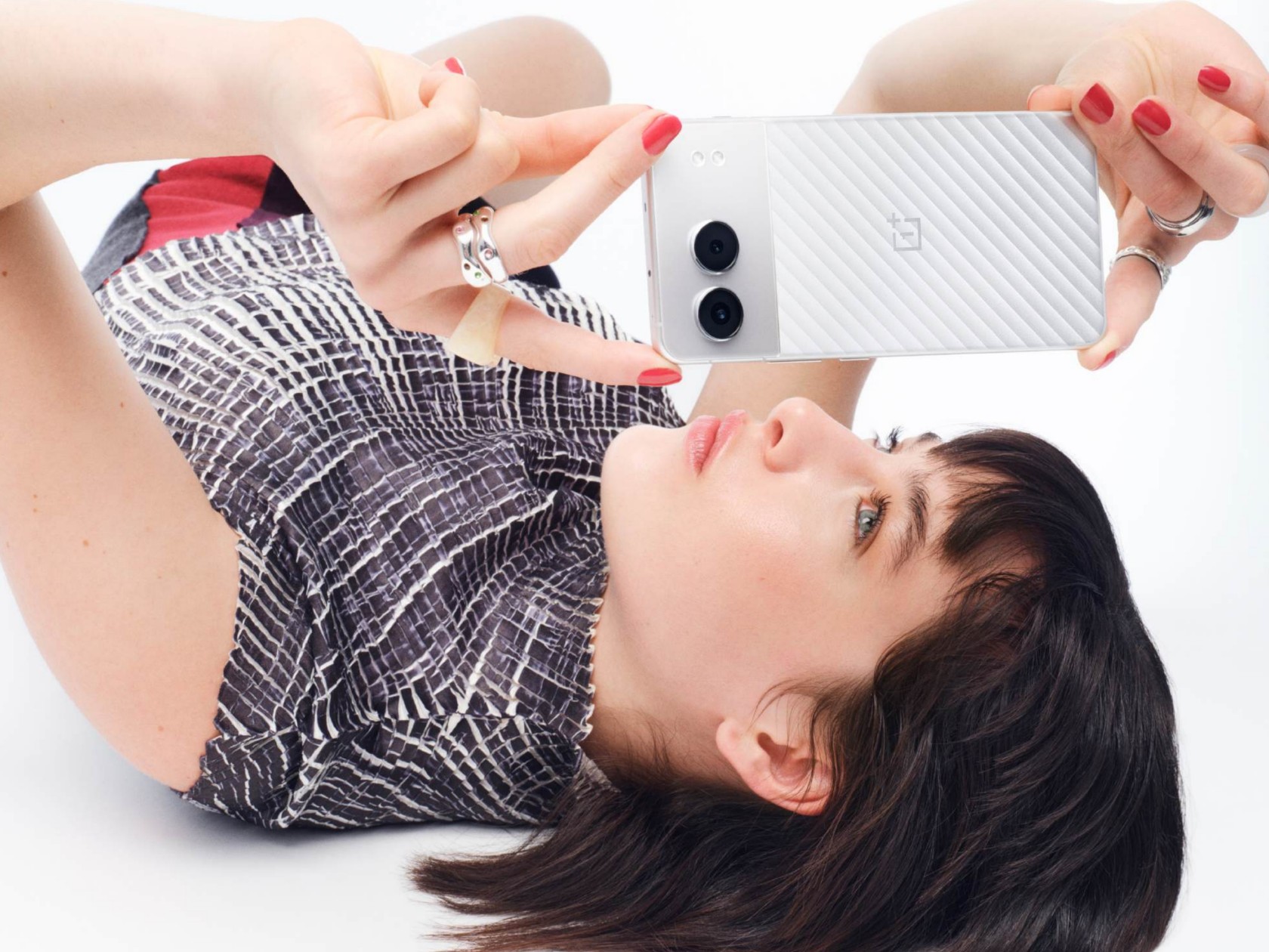
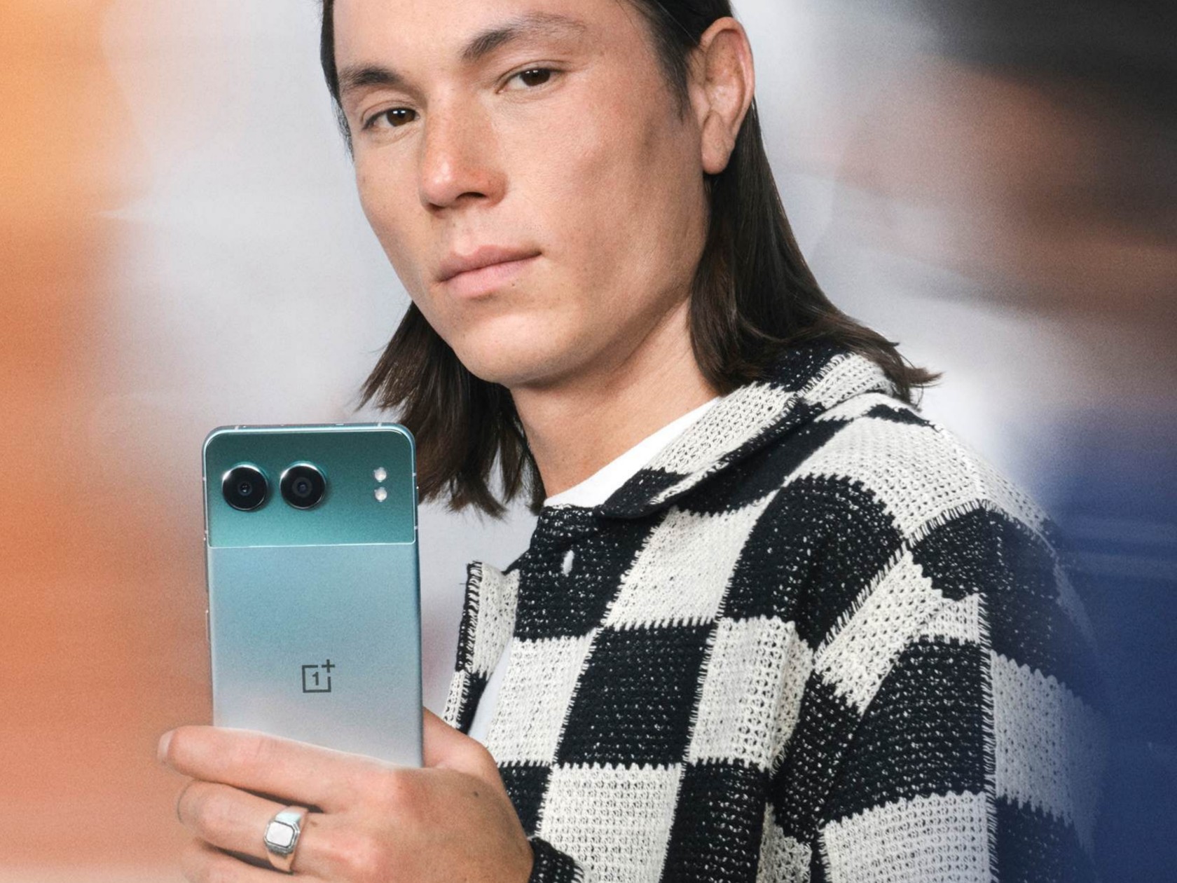
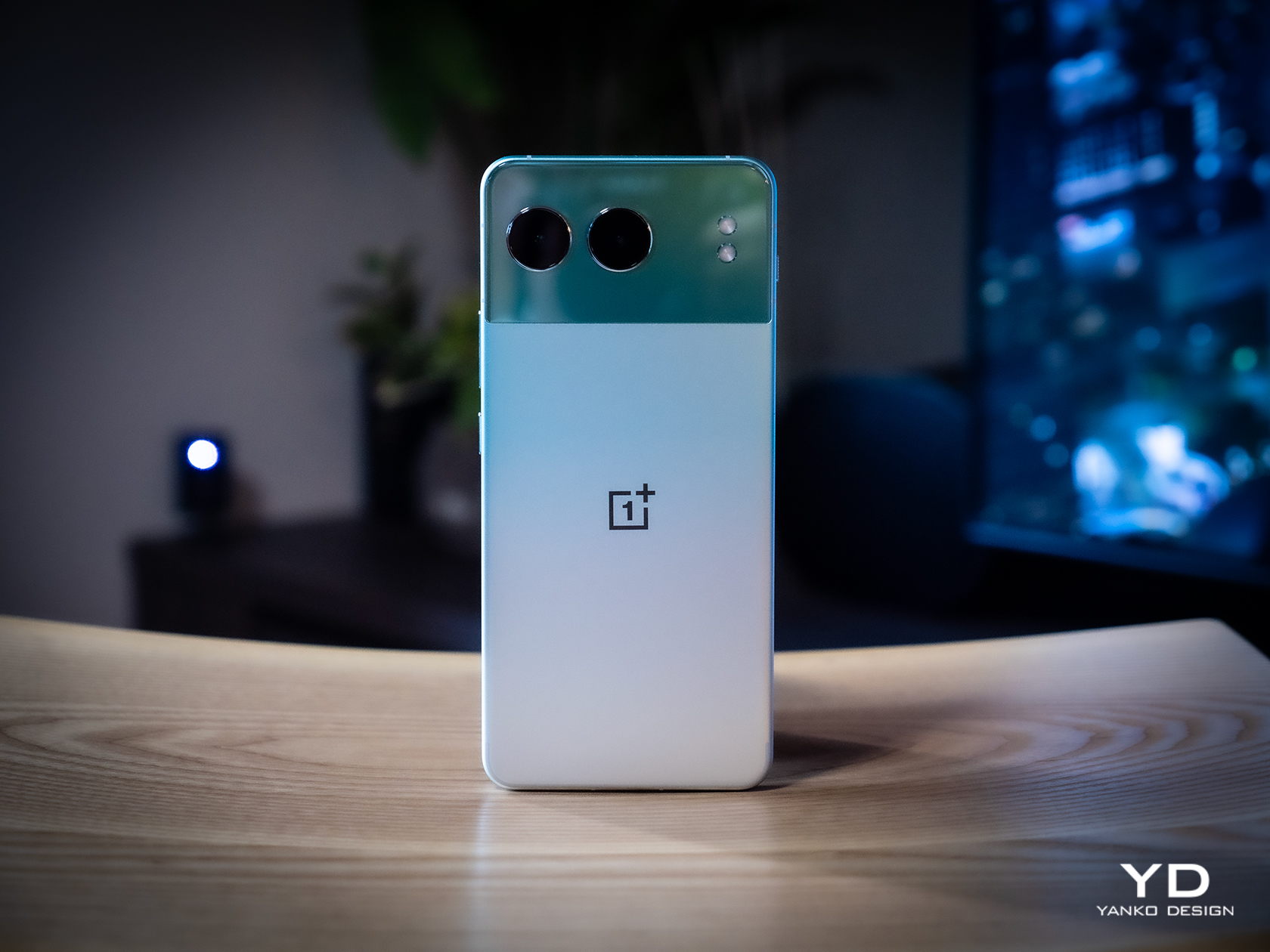
The phone is offered in three color options: Obsidian Midnight, Mercurial Silver, and Oasis Green. Each variant showcases a distinctive two-tone design on the back panel, with a glossy plastic covering the upper quarter and a metal lower three-quarters. The plastic section accommodates two horizontally arranged circular cameras and two vertically aligned LED flashlights.
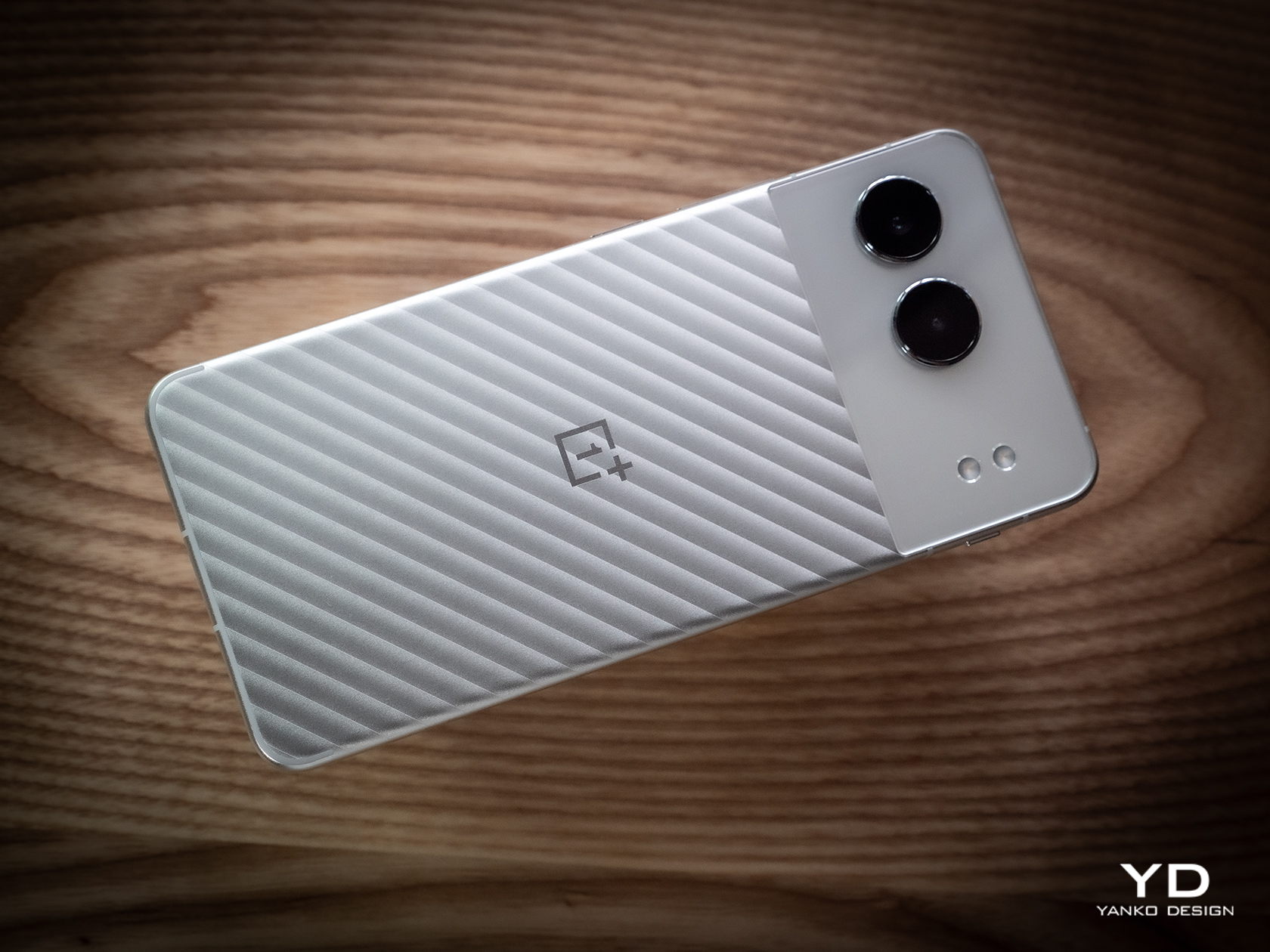
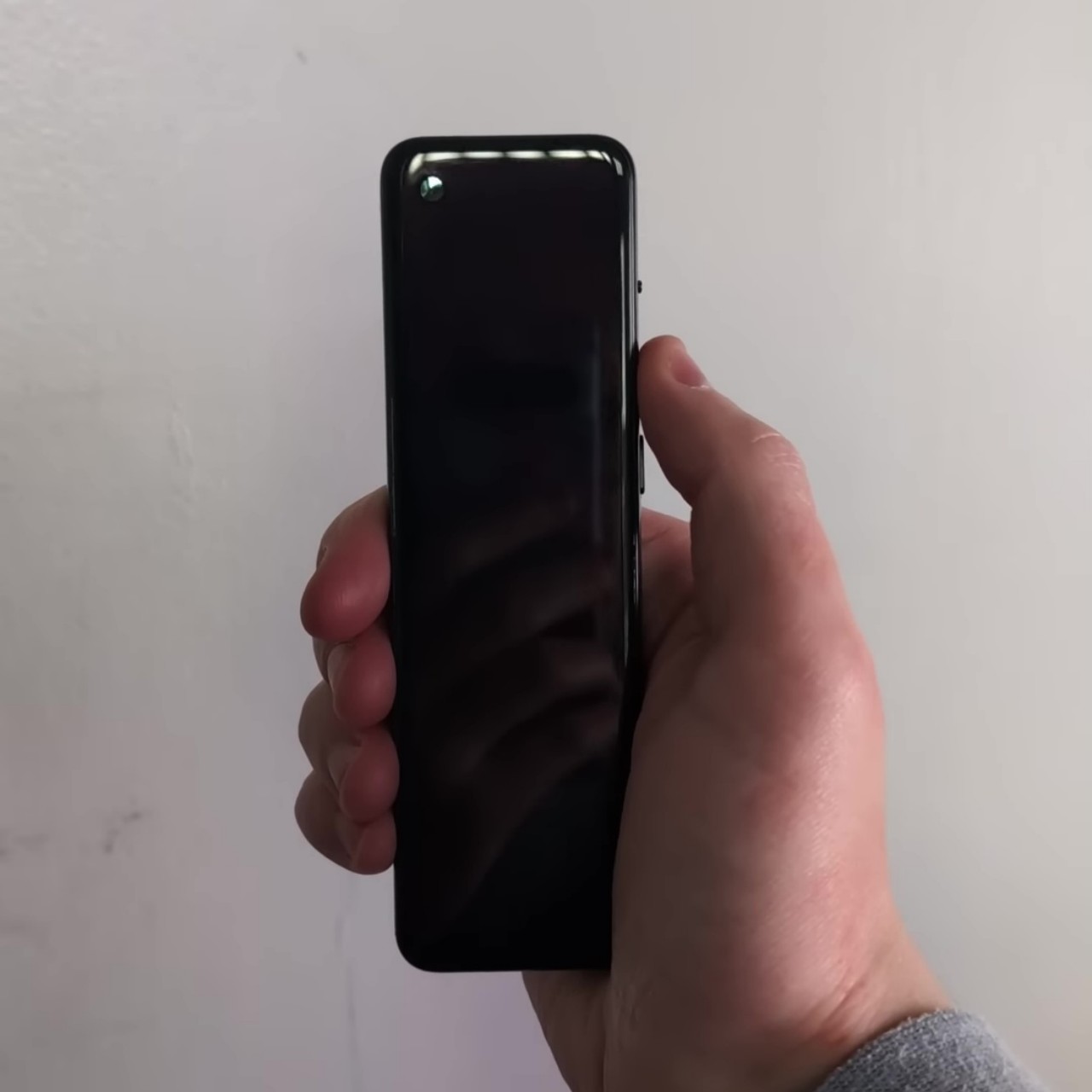
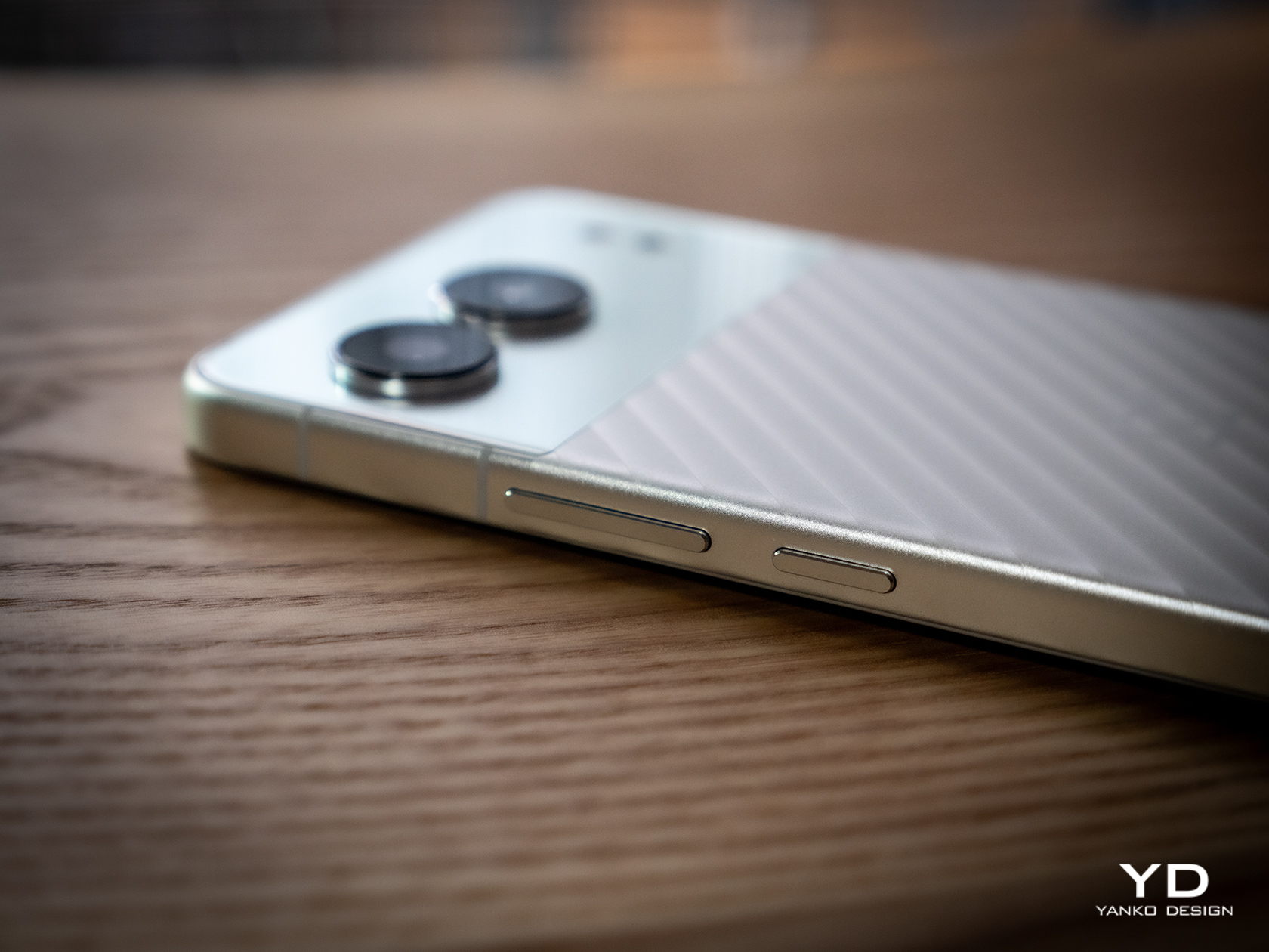
We received the device in Mercurial Silver, and it is one of the most aesthetically pleasing smartphones I’ve ever held so far. The silver variant features beautiful diagonal patterns that create an illusion of depth on the metal section of the back panel, accentuated by a shiny OnePlus logo at the center. According to OnePlus, each Mercurial Silver rear casing goes through a meticulous process with over 28,000 nano-laser cuts, which takes about 12 minutes to finish. The resulting silky texture of the back panel not only delights the eyes but also offers a pleasing tactile experience. While the metal unibody made from aluminum remains largely free of fingerprints, the glossy plastic part is more prone to smudges.
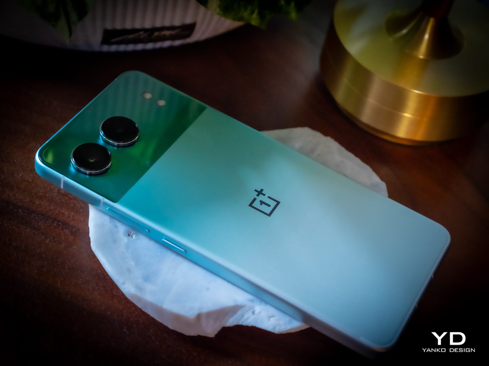
The Obsidian Midnight variant features a brushed gunmetal finish, while the Oasis Green variant pays homage to the OnePlus community’s favorite OnePlus Nord LE design. Whether you opt for Mercurial Silver, Obsidian Midnight, or Oasis Green, you are set to be impressed with Nord 4’s aesthetics.
Ergonomics
Thanks to the metal unibody design, the Nord 4 showcases excellent build quality and feels premium to hold. By seamlessly integrating the sides with the back, the design eliminates any awkward transitions combined with the curved back edge design, ensuring that the phone sits comfortably in the palm.
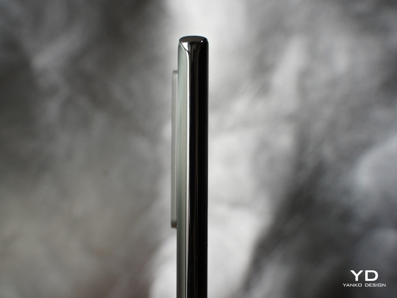
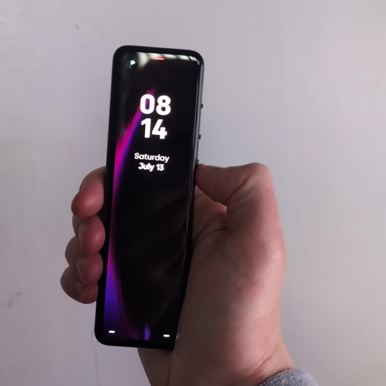
Being the thinnest Nord ever, the device measures 162.6mm x 75.0mm x 8.9mm. At 199.5g, it’s not the lightest phone, yet its balanced weight distribution ensures it feels comfortable to hold without being overly heavy. The slim profile and well-distributed weight, along with the textured back panel, offer a reassuring feel in hand.
However, the same cannot be said when it comes to unlocking the phone with the fingerprint. The placement of the under-display fingerprint reader is close to the bottom edge of the screen, meaning you need to extend your thumb and probably reposition your grip. Fortunately, the device also supports face recognition for unlocking the phone.
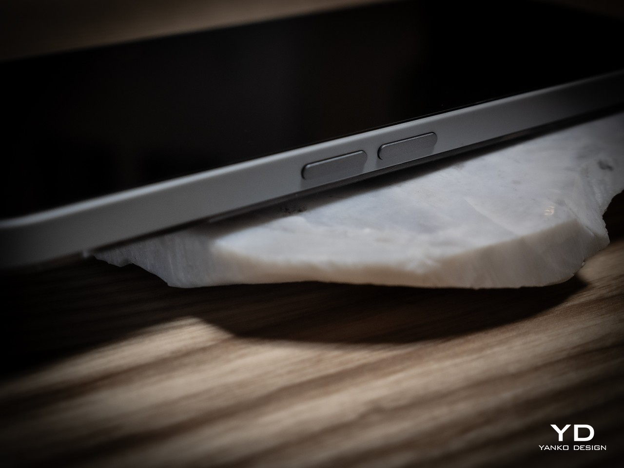
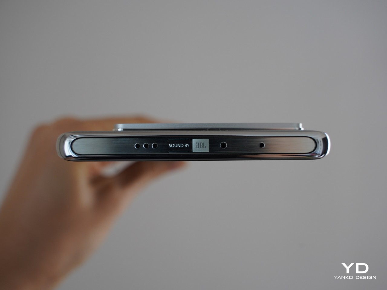
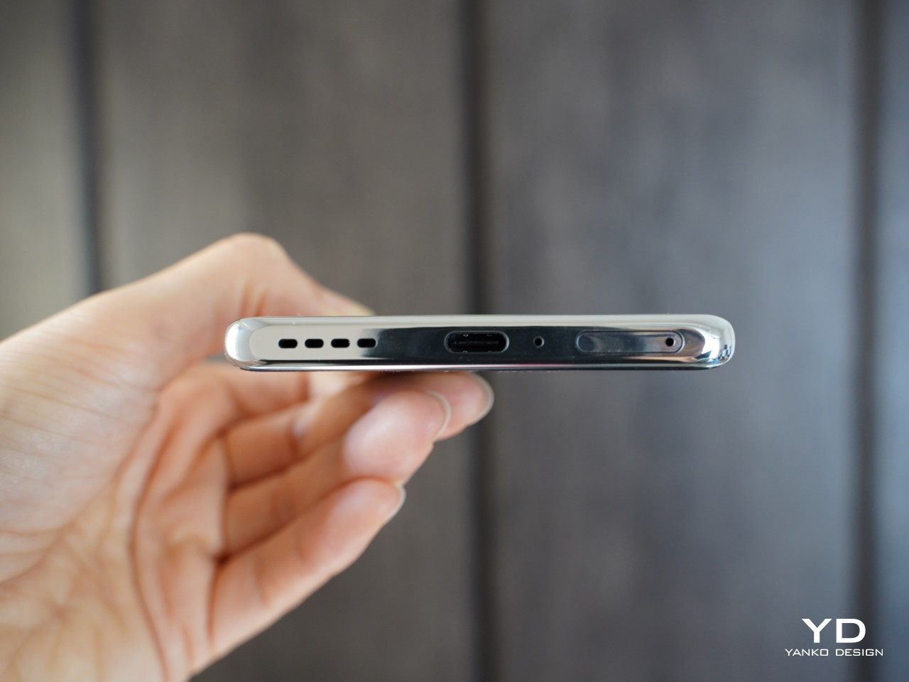
As for the placement of buttons and whatnot, the right side of the phone houses the power button along with the volume rockers on top of it. On the left side, you will find OnePlus’s familiar Alert Slider. The top of the phone houses the earpiece that doubles as a speaker and IR-blaster while the bottom houses the dual SIM slot, primary microphone, USB Type-C port, and speaker.
Performance
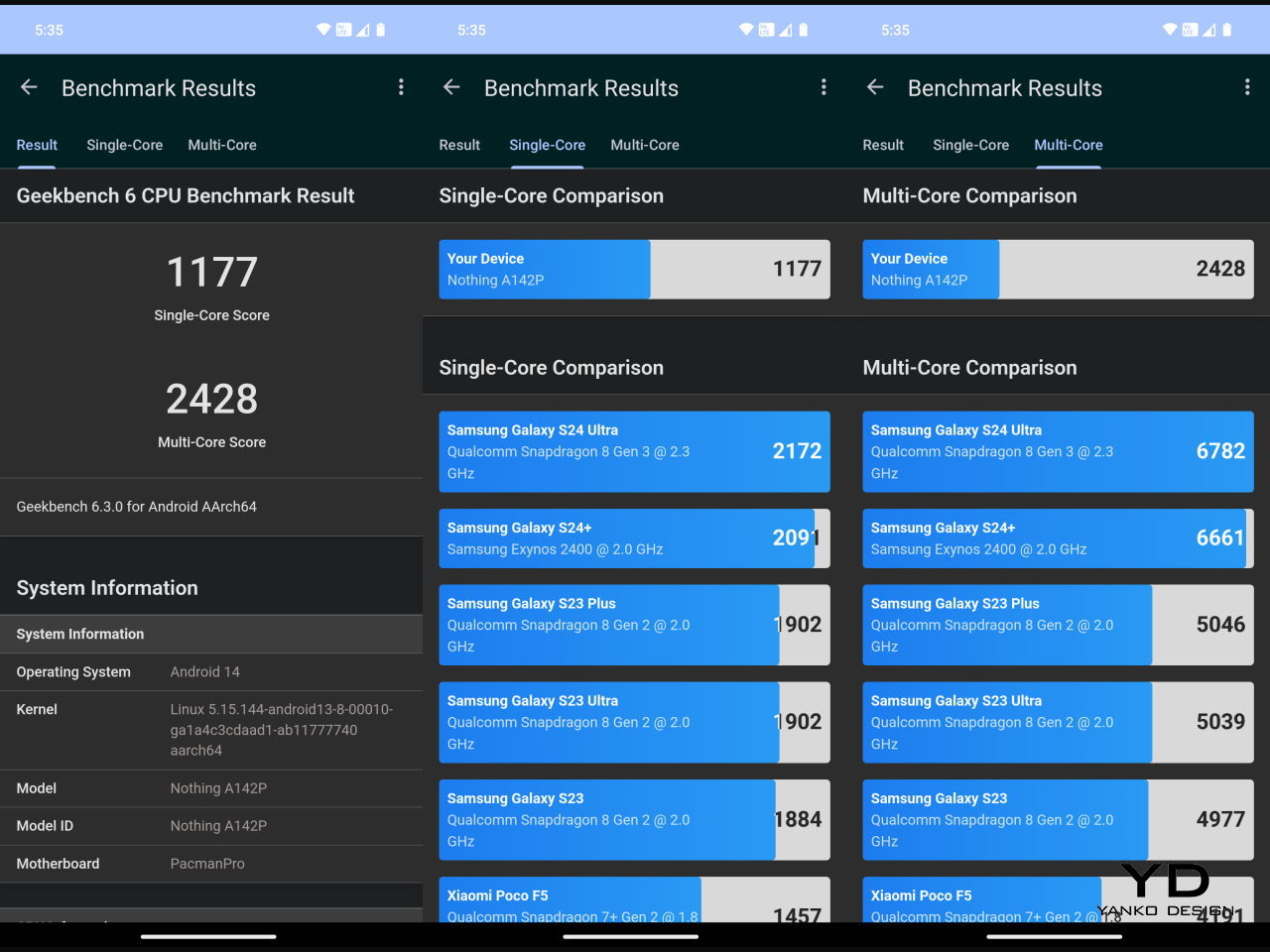
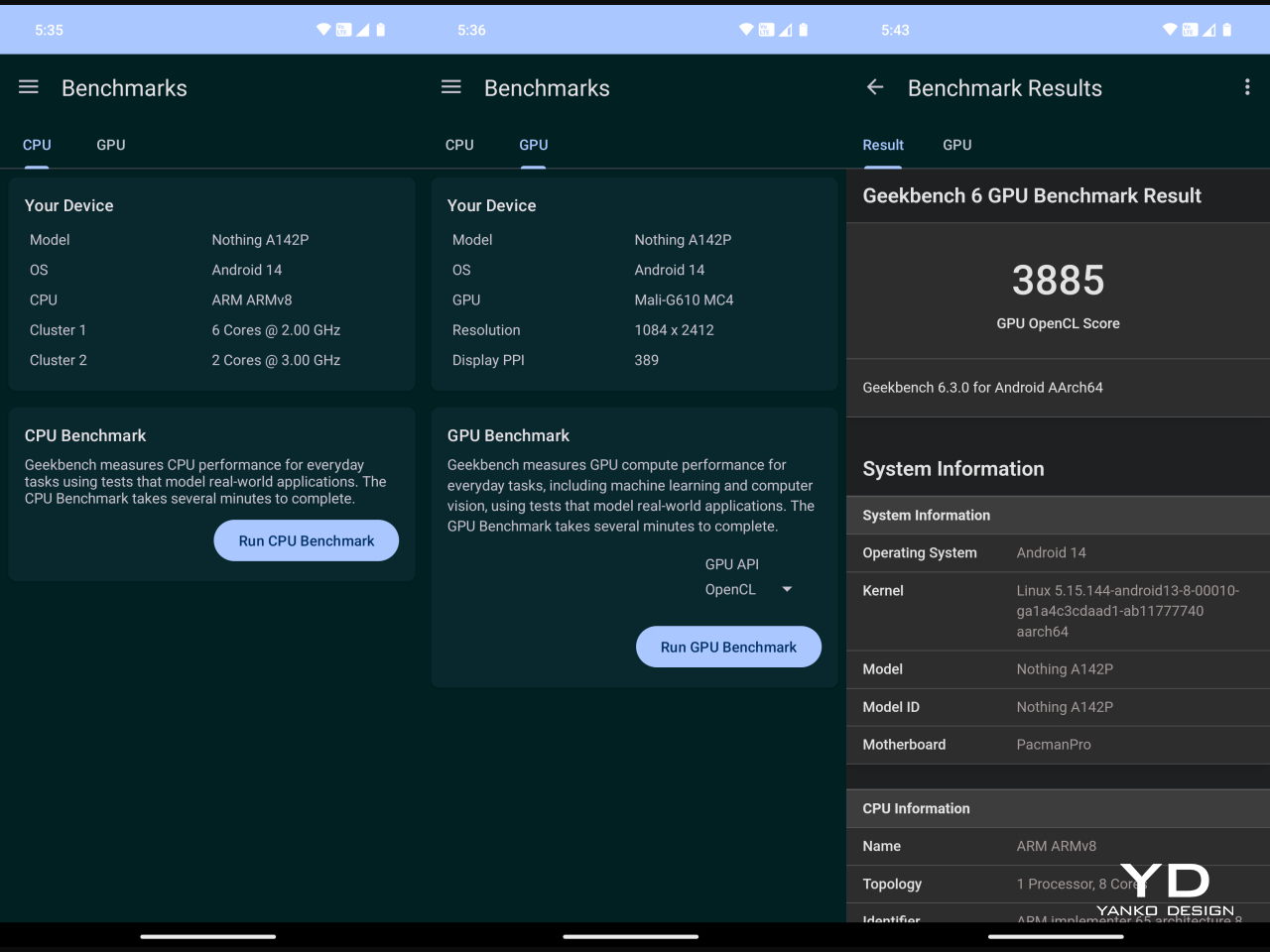
Out of the box, the OnePlus Nord 4 runs on OxygenOS 14.1 based on Android 14. Powered by Snapdragon 7+ Gen 3 paired with 8, 12, or 16GB of LPDDRX 5 RAM and 256GB or 512GB of storage, the phone can handle tasks smoothly even graphic intense mobile games as you’d expect from OnePlus phones.
Nord 4 packs a massive 5,500 mAh battery, and its performance is admirable. It can easily last a day even under heavy use. The charging speed is fast with 100W SuperVOOC charging support. According to OnePlus, with 100 W SuperVOOC the empty 5,500 mAh battery can be charged to full in 28 minutes. It’s worth noting that the SuperVOOC charger brick is not included with the phone, so to take advantage of this rapid charging capability, you’ll need to purchase a 100W SuperVOOC charger separately.
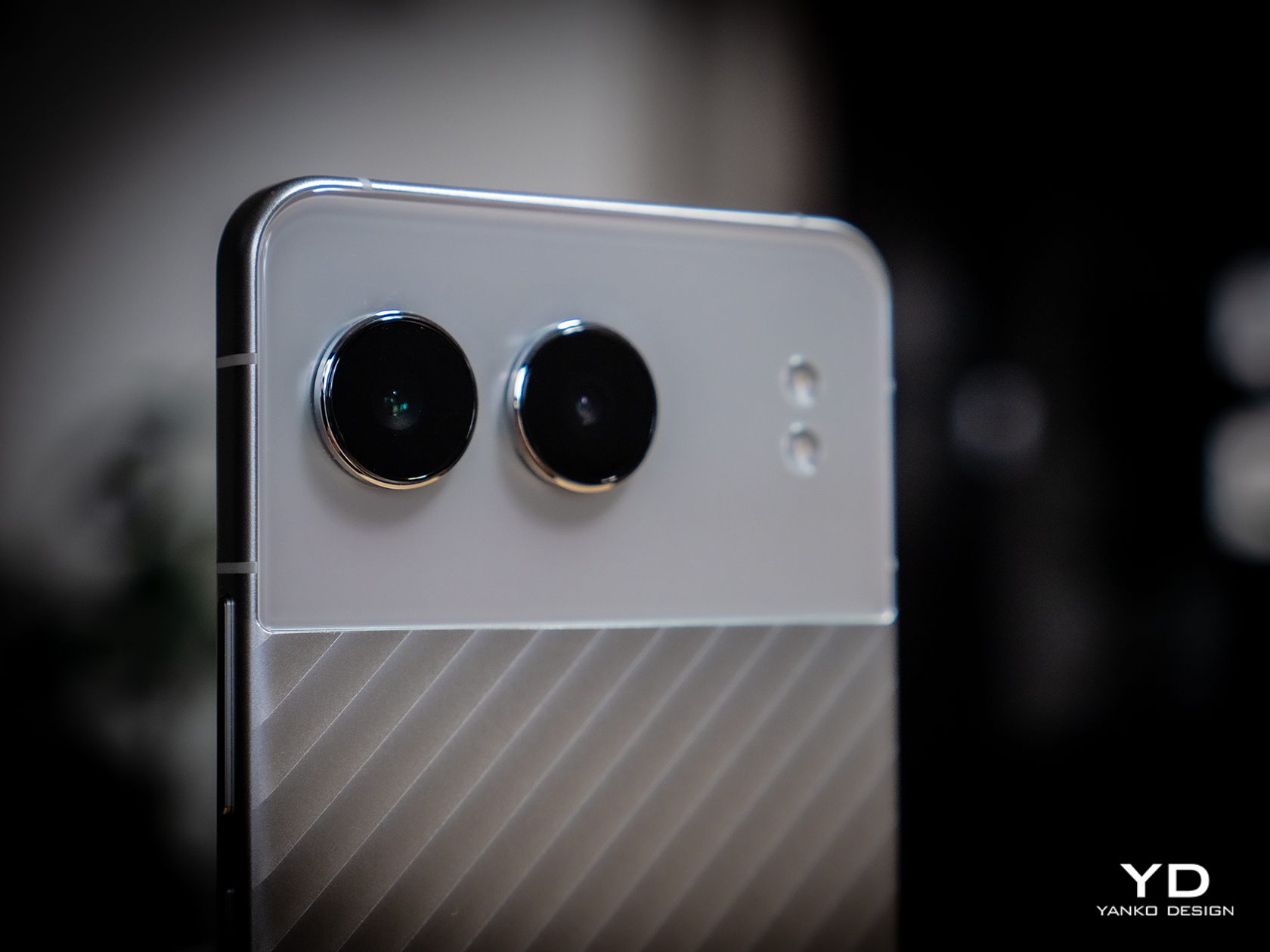
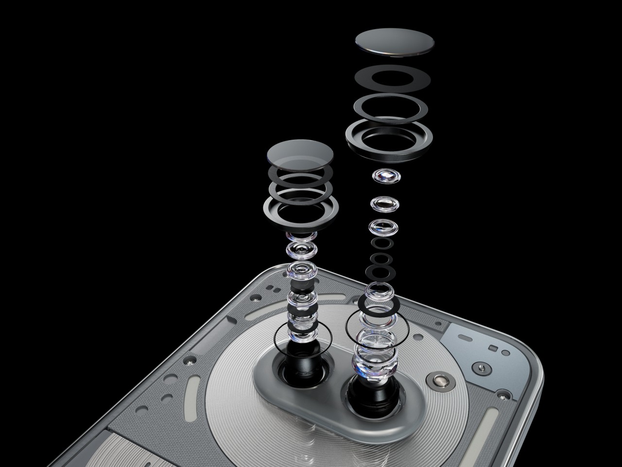
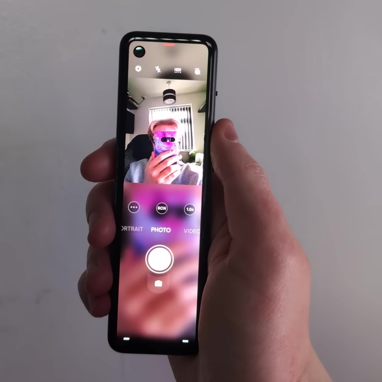
Nord 4 sports two cameras on its back and a front-facing camera on the top center of the screen. The main 50MP uses a 1/1.95-inch Sony LYT-600 sensor with an f/1.8 aperture and OIS. The ultrawide is a modest 8MP camera using Sony IMX355 with a 1/1.4-inch sensor and an f/2.2 aperture. And, the front-facing camera is a 16MP camera using Sony IMX 471 with a 1/3.0-inch sensor, f/2.4 aperture, and autofocus capability.
The daylight shots captured with the main camera are pretty good, producing sharp and detailed images. The photos with 2x zoom are also good, sadly the photos beyond 2x zoom, the image quality diminishes, making them barely usable. In low-light conditions, the Night mode automatically kicks in which can be inconvenient, but it takes pretty nice images. The photos taken with the ultrawide camera are satisfactory, though they tend to lean towards warmer tones.
The main can take 4k 60fps videos while the ultrawide camera and front-facing camera are limited to 1080p at 30fps. The 4k videos taken with the main under poorly lit conditions came out surprisingly well.
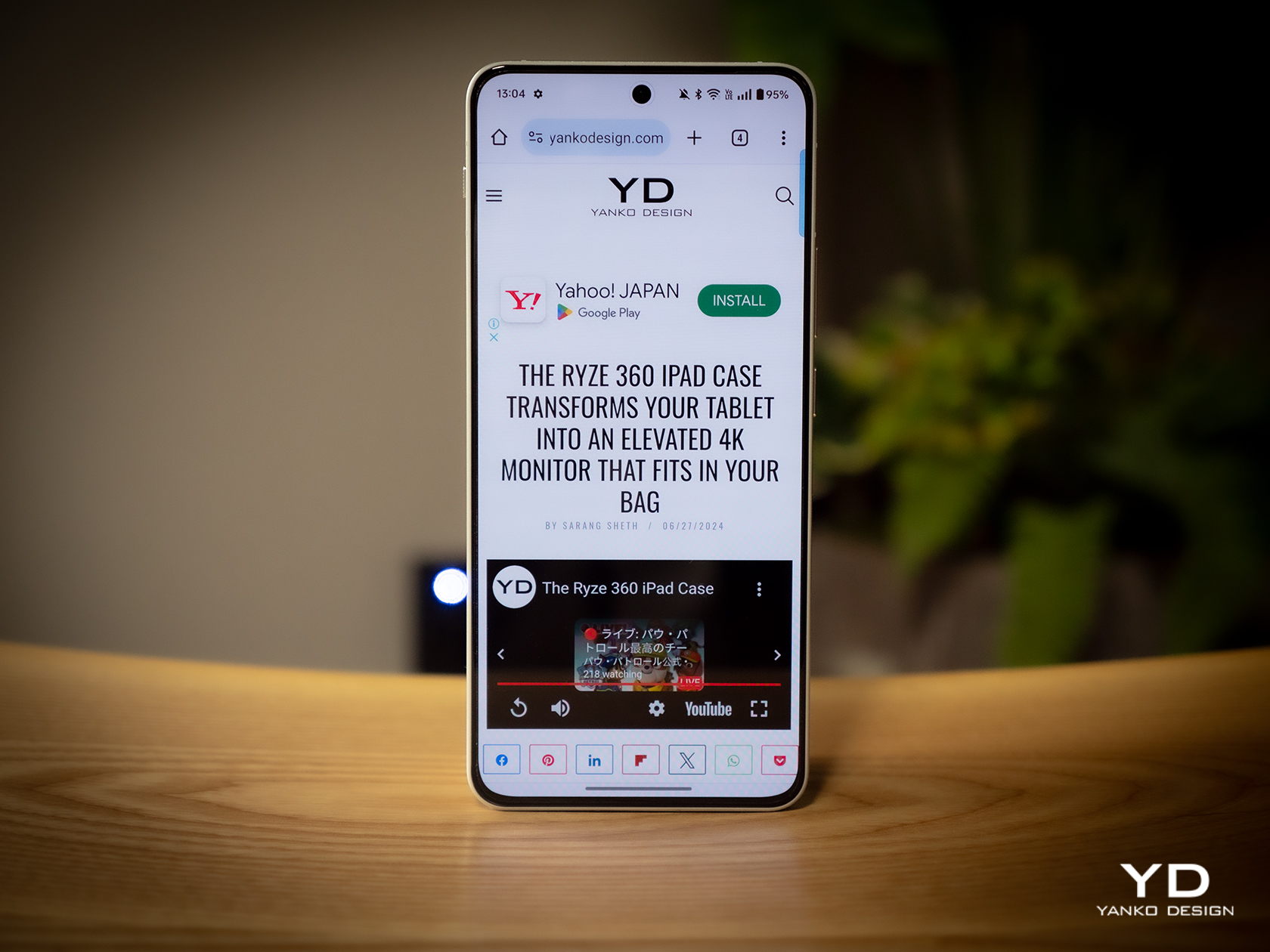
The 6.74-inch AMOLED display with 450 PPI is bright and vibrant. With AquaTouch technology implemented, drops of water on the display won’t be an issue when using the phone.
Sustainability/Repairability
Known for its durability, the phone made out of metal should withstand long periods of usage and tough handling. Additionally, the phone is IP65 rated, so it is fully protected against dust and can survive water splashes. On the software front, OnePlus offers its longest-ever support with four years of Android updates and six years of security updates for the Nord 4. Complementing its durable build and IP rating, the Nord 4 is certified TUV SUD Fluency 72 Month A, promising sustained performance even after six years of heavy use. With rugged hardware, assured sustained performance, and long-term software support, OnePlus ensures that users can enjoy this gorgeous device for years to come.
However, the metal unibody design may pose challenges for repairability, particularly when it comes to replacing the battery, as it typically requires opening the back panel, which is integrated due to the unibody construction.
Value
The OnePlus Nord 4 is priced competitively starting at 499 Euros (approximately $545), making it a compelling choice in the fiercely competitive midrange smartphone market. While it may not boast the best camera capabilities within its segment, the Nord 4 excels in achieving a fine balance between price and performance. Its striking aesthetics, impressive battery life, and rapid charging capabilities are standout features that add to its allure.
In a landscape where midrange options abound, the Nord 4 stands out for its blend of affordability and functionality. Despite its competitive price point, it doesn’t compromise on key aspects such as design appeal, enduring battery performance, and swift charging speeds. These attributes make the Nord 4 a noteworthy contender for anyone seeking a stylish and efficient smartphone without breaking the bank.
Verdict
The OnePlus Nord 4 exemplifies OnePlus’s commitment to delivering exceptional value in the midrange smartphone market. With each iteration of the Nord series, OnePlus has consistently balanced price and performance, and the Nord 4 is no exception. Unlike its predecessors, the Nord 4 marks a significant shift by reintroducing a metal unibody design, setting it apart in the 5G era with a blend of durability and aesthetic appeal.
Snapdragon 7+ Gen 3 chipset, a vibrant 6.74-inch Super Fluid AMOLED display with Ultra HDR support, and a robust camera setup. While its main 50MP camera produces sharp daylight shots and capable low-light images with Night mode, there are limitations with zoom photography and ultrawide shots tend to lean towards warmer tones. Nevertheless, its performance is bolstered by a substantial 5,500 mAh battery and blazing-fast 100W SuperVOOC charging, ensuring long-lasting power and quick refueling.
Whether for its striking aesthetics, impressive battery life, or rapid charging capabilities, the OnePlus Nord 4 offers great value for users seeking a reliable and feature-rich smartphone experience.
The post OnePlus Nord 4 Review: A Game-Changer with Metal Unibody Design first appeared on Yanko Design.