Lexus LS Concept First-Look: The Six-Wheel Flagship Turning Heads at Milan Design Week 2026

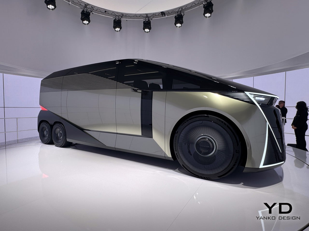
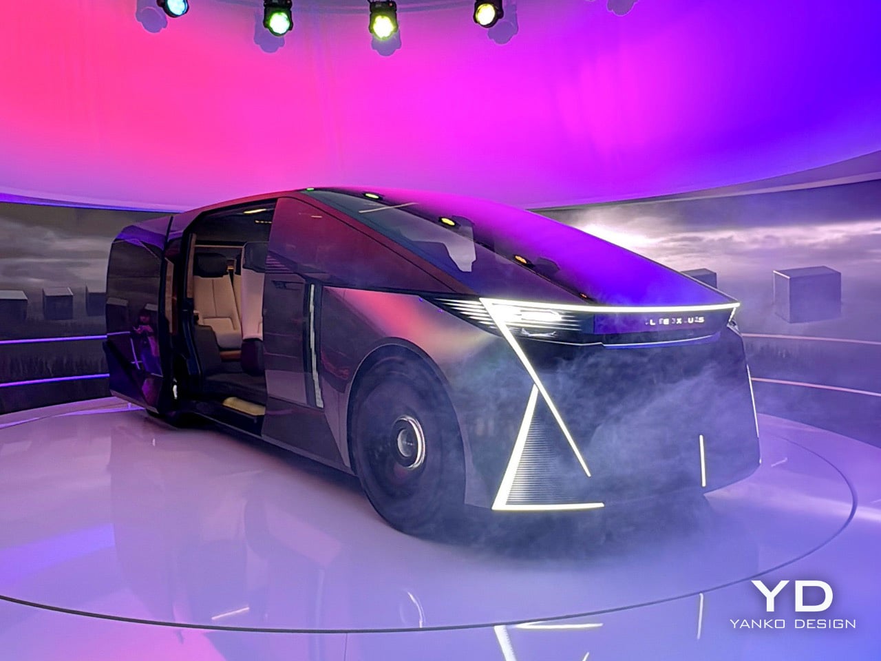
Six wheels on a Lexus, at a furniture fair in Milan, sounds like either a provocation or a punchline. At this year’s Milan Design Week, Lexus is betting it’s the former. The brand rolled into Superstudio Più in the Tortona district with its LS Concept, a long-body, flat-roofed, twin rear-axle machine that first appeared at the Japan Mobility Show in 2025. It’s a chauffeur-driven vehicle built entirely around the passenger, and it’s Lexus’s clearest statement yet about where its flagships are going. In fact, Chief Branding Officer Simon Humphries said it plainly: the “S” in LS no longer stands for Sedan. It stands for Space.

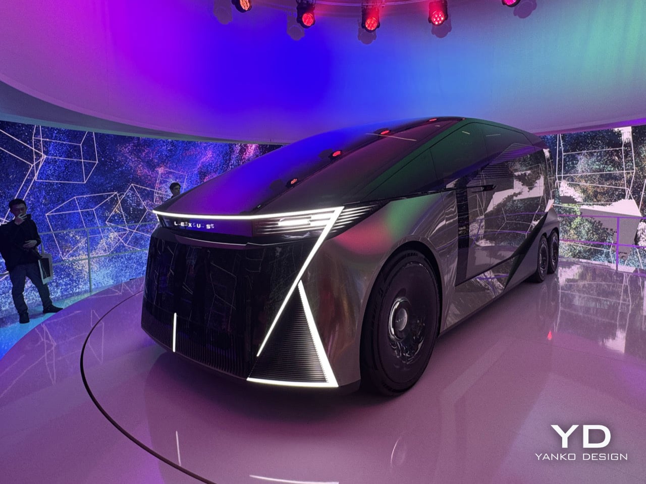
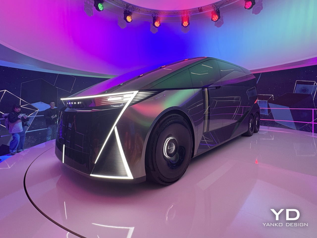
The car sits inside an installation called SPACE, a fittingly simple name for a big idea. The LS Concept is wrapped in a cylindrical LED screen that’s always moving, cycling through textures and color palettes that wash over the car’s matte metallic finish. The whole thing sits on a low turntable, rotating slowly so you can take in every angle while the screen behind it blurs the line between the vehicle and its environment. From the back, the body is dark and geometric, with red light cleanly tracing the corners and the LEXUS wordmark centered like a final statement. The front has no grille at all, just a wide bar of white light, a dark glassy face, and some sharp diagonal cuts at the lower corners. The side profile is what really sells the scale of it all; the greenhouse is so long and flat it forces you to rethink what a luxury car is supposed to look like.

Designer: Lexus
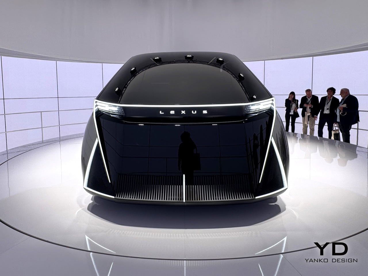
You’ll notice those sharp diagonal white light signatures at the corners of both the front and back, and they do a great job of anchoring your eye so you don’t get lost in all that surface area. The front is an exercise in restraint, especially for Lexus. There are no intakes, no heritage cues, and definitely no spindle grille, which defined the brand’s look for fifteen years. Instead, a single, clean bar of white light carries the Lexus name across the top, and below it, dark glass sweeps down like a theater curtain. The back is just as clean, with black geometric planes and red light tracing the corners so precisely it feels more like sculpture than taillights. There’s also a louvered panel on the rear quarter that looks both cool and functional, the kind of detail you have to go back and look at a second time.
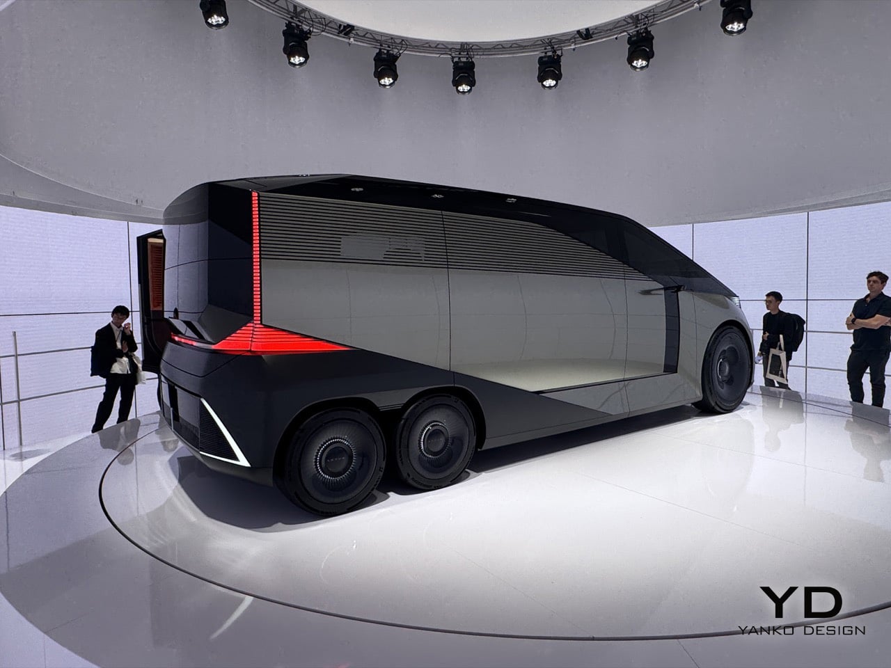
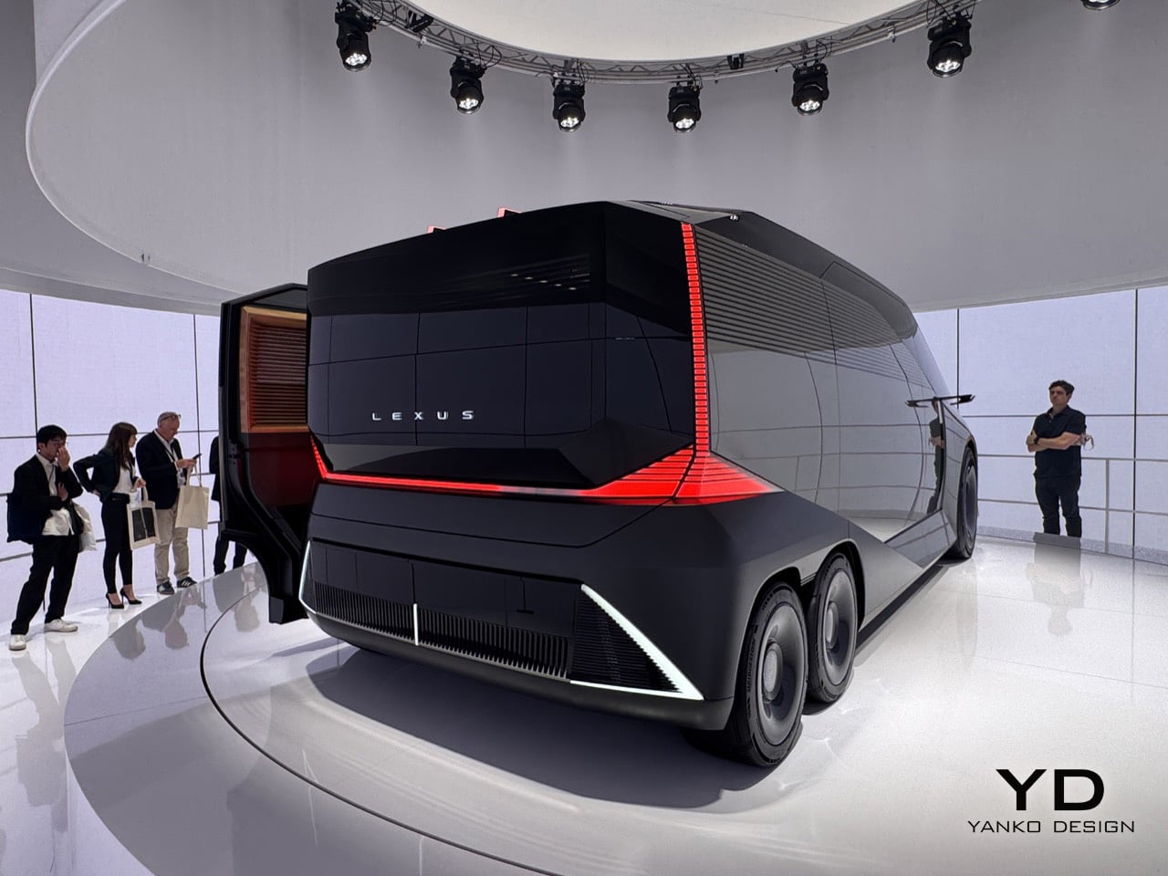
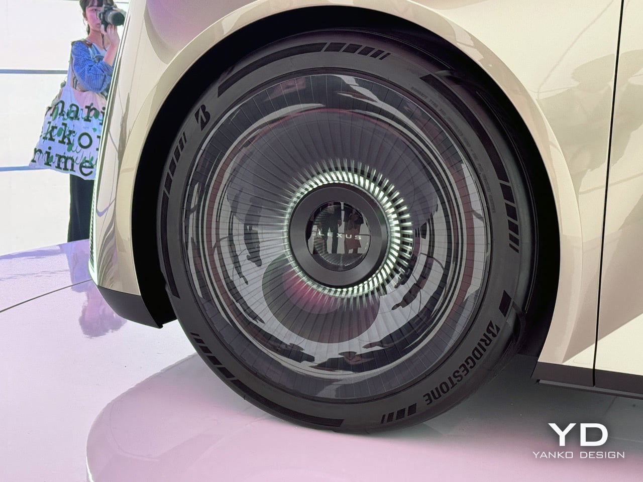
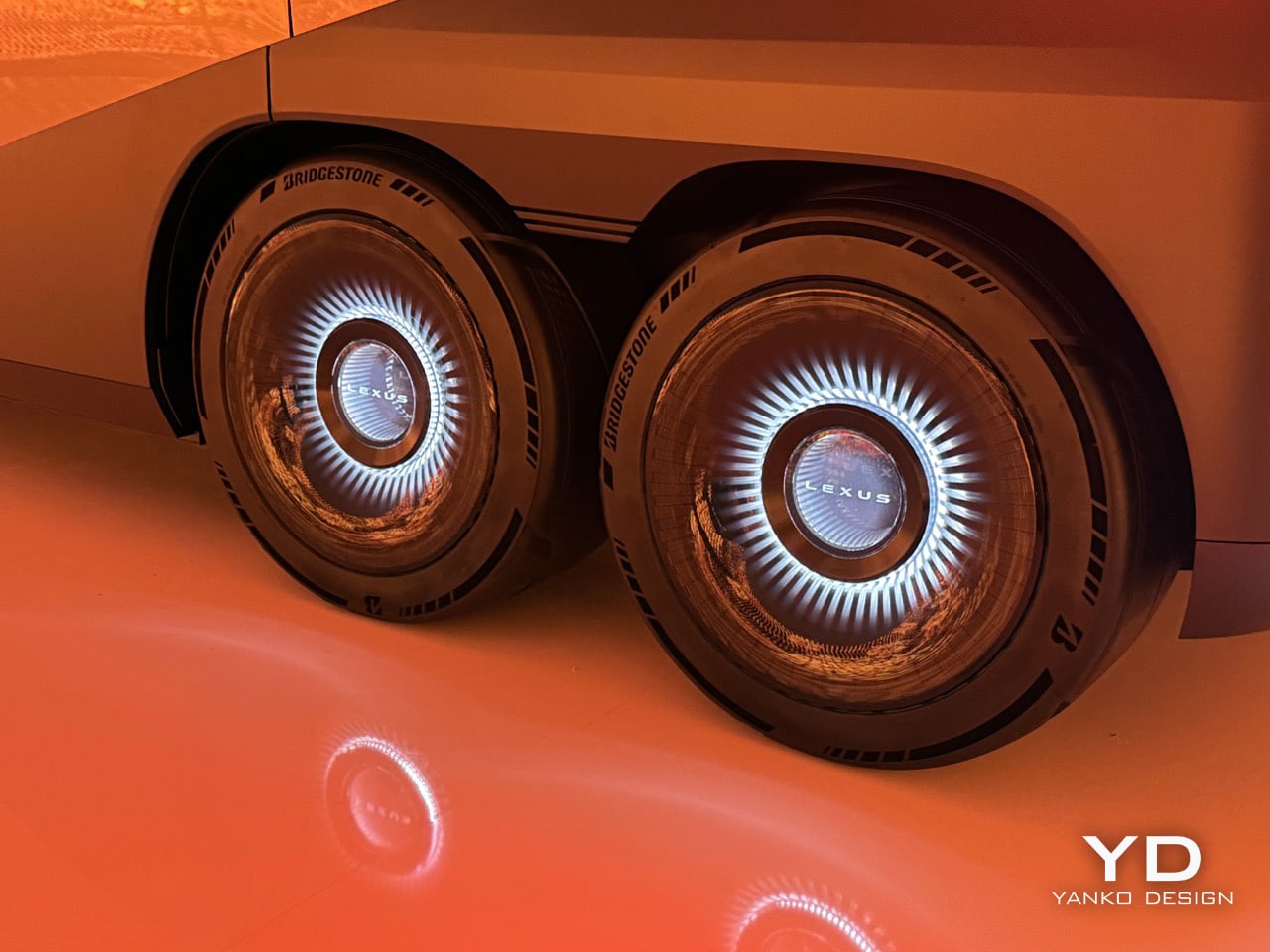
The twin rear wheels are probably the first thing that throws you off, but the more you look at them, the more they make sense. A six-wheel layout, something you usually see on overland vehicles or high-end coaches, lets Lexus pack in a huge amount of interior volume without the big wheel arches that eat up space in most long cars. The turbine-style wheel covers keep the look clean, where normal spokes would have ruined the effect. When you see it from the side, the lower body looks like a single sculpted piece, and the way it tucks under itself makes the whole thing feel like it’s floating. Lexus is basically saying that a vehicle with the footprint of a small bus can be the next word in luxury, and after a few minutes, you start to believe them.
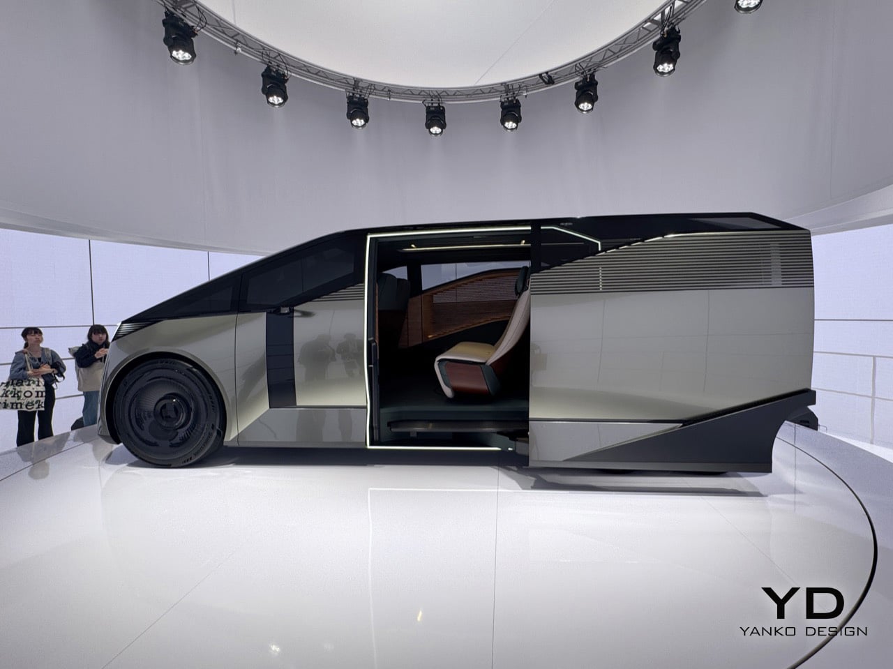
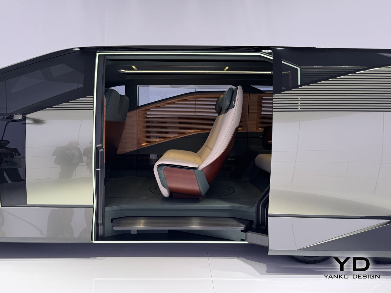
Step through the door, framed in a bright white light, and you see what they mean by hospitality. A slatted wood panel runs up the entire wall of the cabin, a single rear seat is finished in cream and burgundy leather, and the floor is so open you get the sense it was designed for standing as much as sitting. The real achievement here is how Lexus managed to package so much genuine room inside; it feels more like a small, well-designed living space than a stretched-out car. Whether any of this makes it to production is anyone’s guess, and Lexus seems happy to leave that question hanging in the air.
What Lexus is showing here is a clear signal of where its design thinking is headed, and that alone makes it one of the most interesting things you can see in Milan this year. If you want to see it for yourself, you can experience the SPACE installation and the Lexus LS Concept at the Daylight Hall in Superstudio Più, located in the Tortona district, from April 21st to the 26th.
The post Lexus LS Concept First-Look: The Six-Wheel Flagship Turning Heads at Milan Design Week 2026 first appeared on Yanko Design.
What Streaming Took From Music, Samsung Design Just Gave Back

Music used to take up space in the most satisfying way. There was a record sleeve to pull from a shelf, a cassette to slot into a deck, a disc to slide into a tray. Each was a small, deliberate act that made listening feel like a choice rather than a background default. Streaming replaced all of that with convenience, and something tactile and visual quietly disappeared along the way.

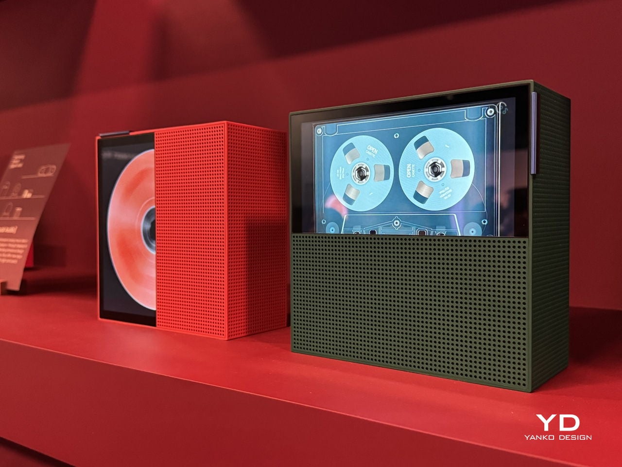
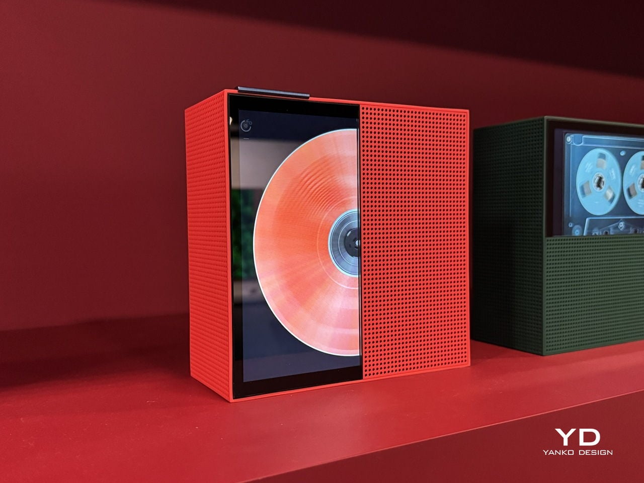
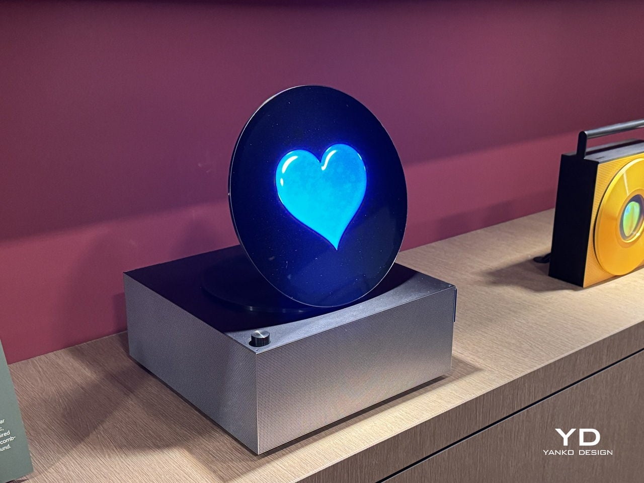
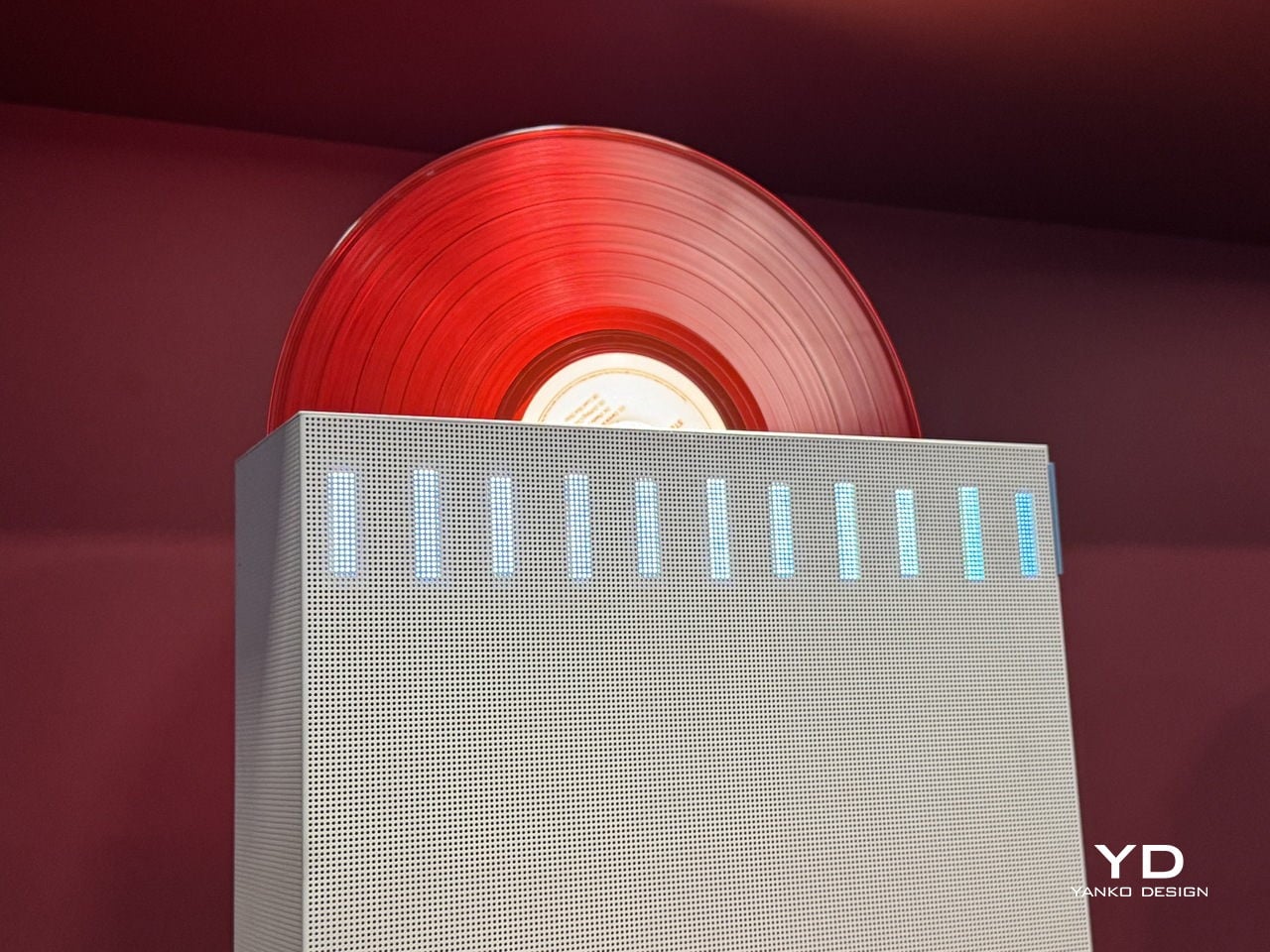
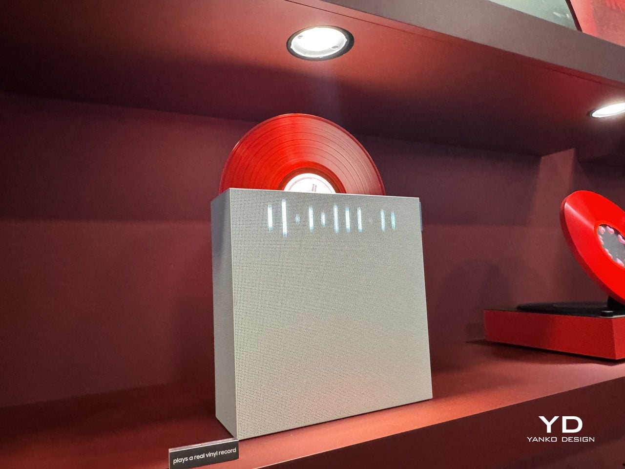
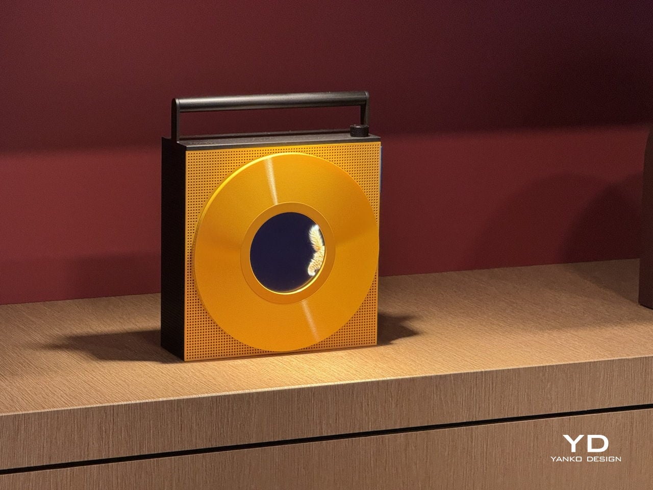
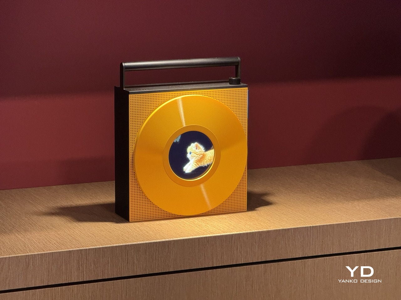
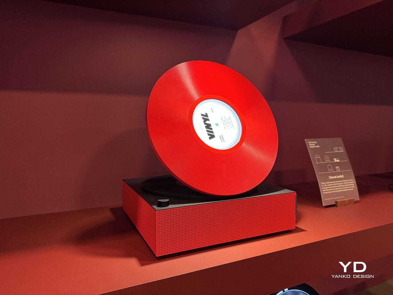
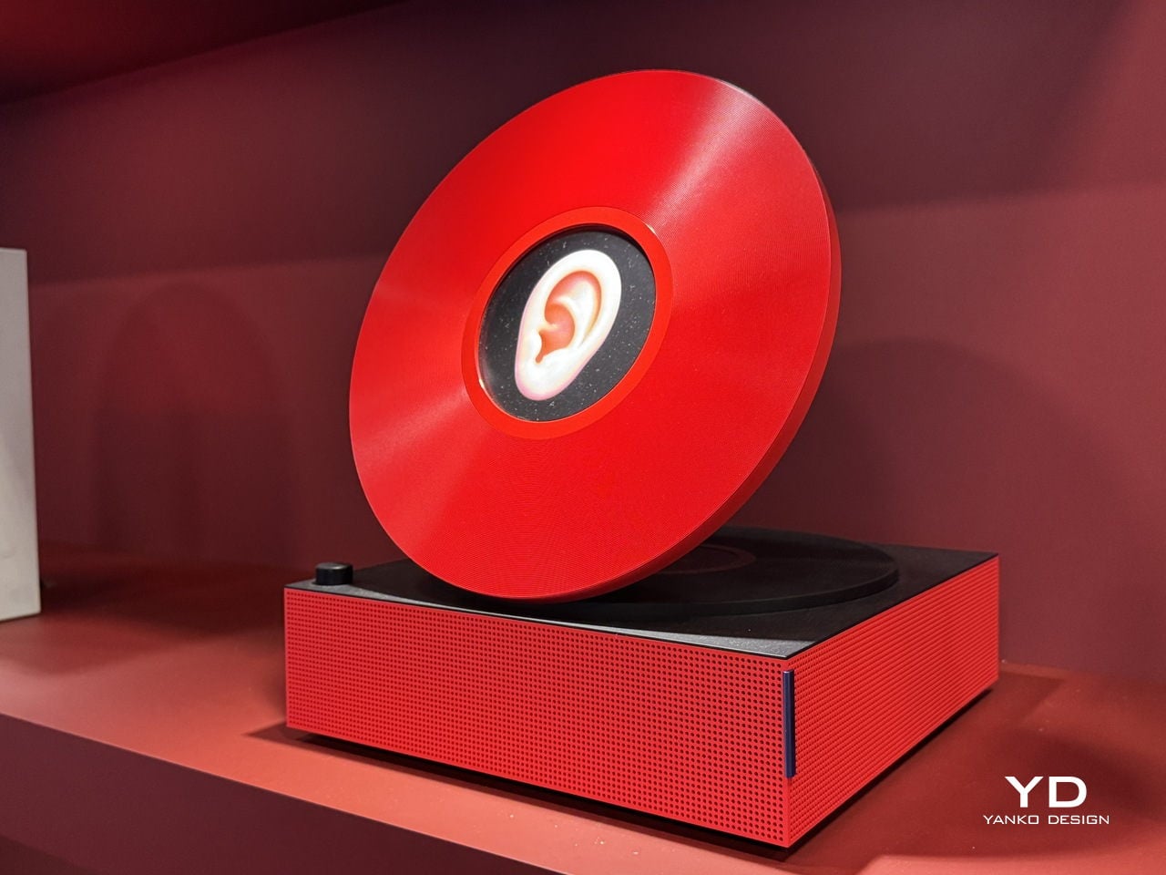
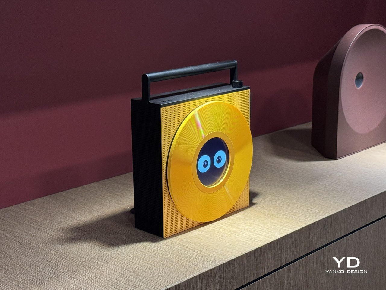
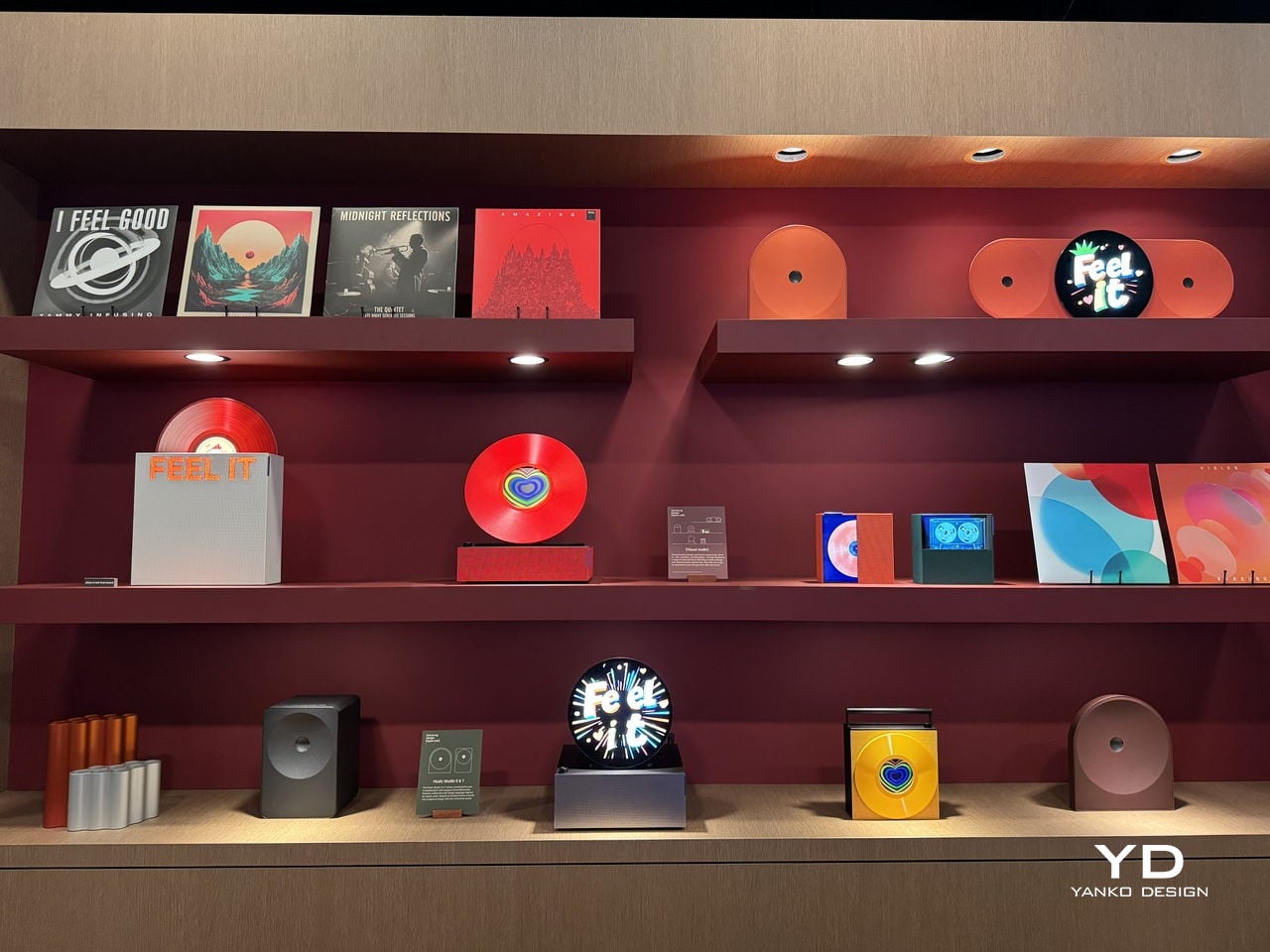
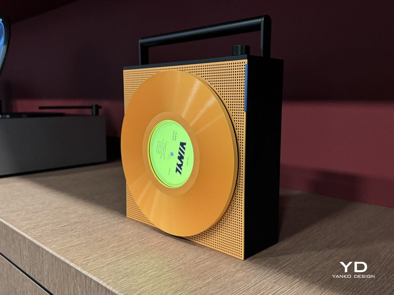
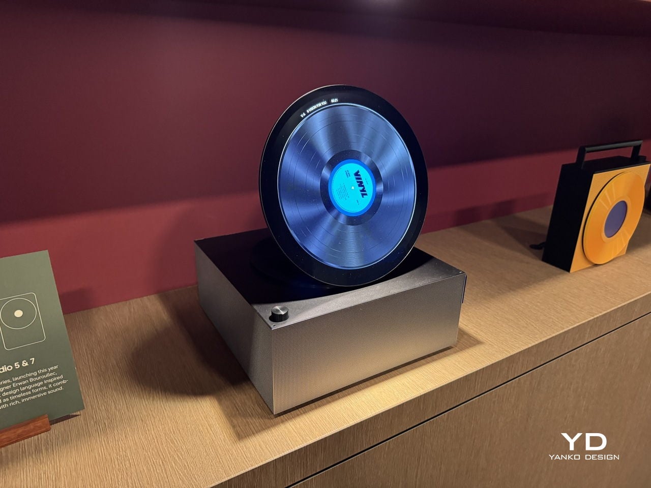
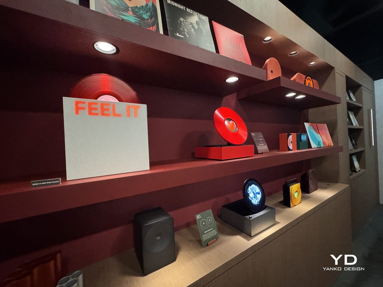
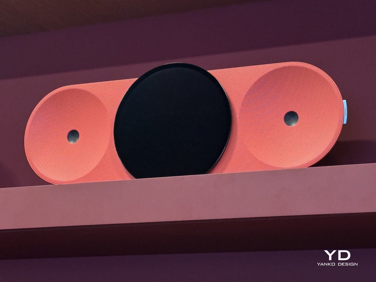
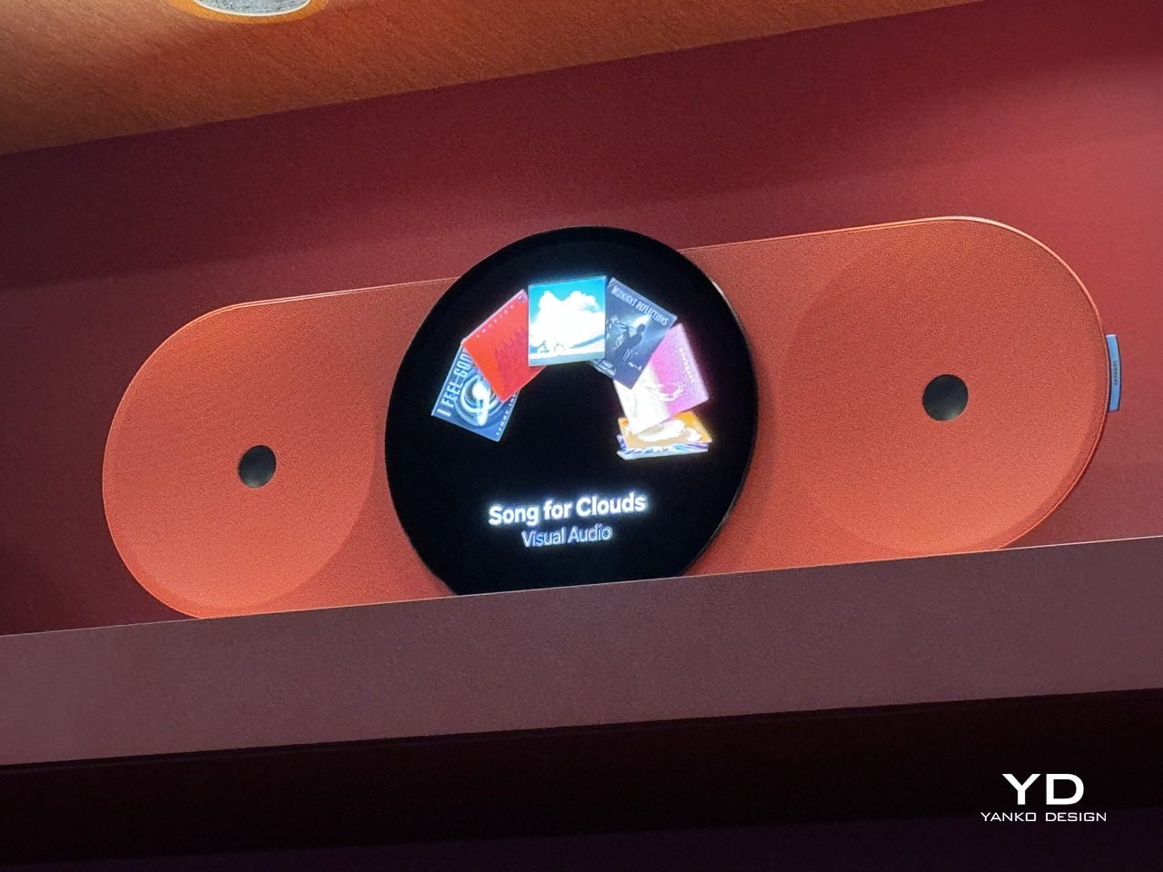
Samsung Design seems to think that loss is worth addressing. At Milan Design Week 2026, it presented Visual Audio, a collection of music player concepts that reinterpret the forms of LPs, cassettes, and CD players through tailored displays. Rather than smart speakers with screens bolted on, they’re objects designed to make listening visible again, giving digital music a presence that largely disappeared with the vinyl era.

Designer: Samsung Audio

The appeal of analog formats was never really about fidelity. It was about having something to look at while the music played, a record spinning on a platter, tape reels turning inside their housing, a disc glowing in a transparent tray. Each gave listening a visual rhythm you could follow without thinking. Streaming quietly removed all of that, leaving the experience invisible in a way that’s only grown more obvious.

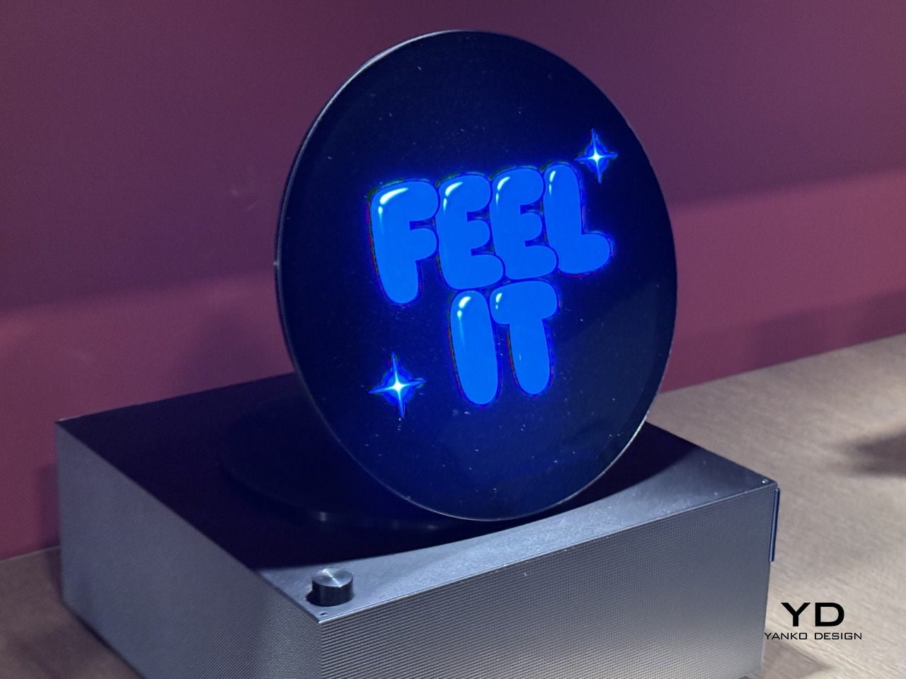
Visual Audio addresses this with objects that are clearly players but also clearly more. One recalls the boxy silhouette of a cassette deck, its screen animating spinning reels as the music plays. Another takes the form of a circular piece that simulates vinyl in motion, with a rotating label at the center. Each has a visual identity tied to the analog format it evokes, and that’s very much the point.

What these objects do differently from regular speakers or streaming devices is make playback legible. When something is playing, you see it happening. The interface isn’t a generic progress bar on an app; it’s a reel turning, a record label spinning, album art presented in a way that matches the physical form of the device. That makes sitting down to listen feel more like an occasion than a habit.

There’s also how these pieces actually live in a room. A speaker that looks like a cassette deck or a miniature turntable doesn’t need to be tucked in a corner; it contributes to the space around it, the way a record collection or a well-placed audio rack once did. Keep one on a desk, and it quietly communicates something about taste and how seriously you take the act of listening.

None of the Visual Audio concepts are headed for retail, and Samsung Design is upfront about that. They’re experiments, open questions about what music players could look like if they treated the emotional intelligence of analog formats as a design priority. The interesting thing is how specific and considered they are for objects not going anywhere near a store, which suggests this line of thinking goes beyond the exhibition itself.

The post What Streaming Took From Music, Samsung Design Just Gave Back first appeared on Yanko Design.

Samsung Design’s Milan 2026 AI Sphere Lifts Its Face Like It’s Alive

Smart home devices have come a long way from the plain white boxes we once hid behind sofas. Voice assistants sit openly on shelves now, and small robotic helpers are slowly making their way into living spaces. For all their usefulness, though, most still feel more like appliances than companions. They respond when spoken to, perform tasks, then go quiet, making the whole relationship feel transactional rather than warm.

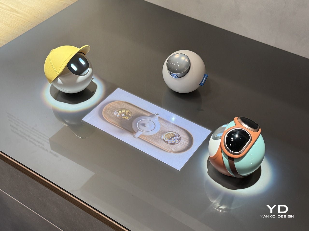
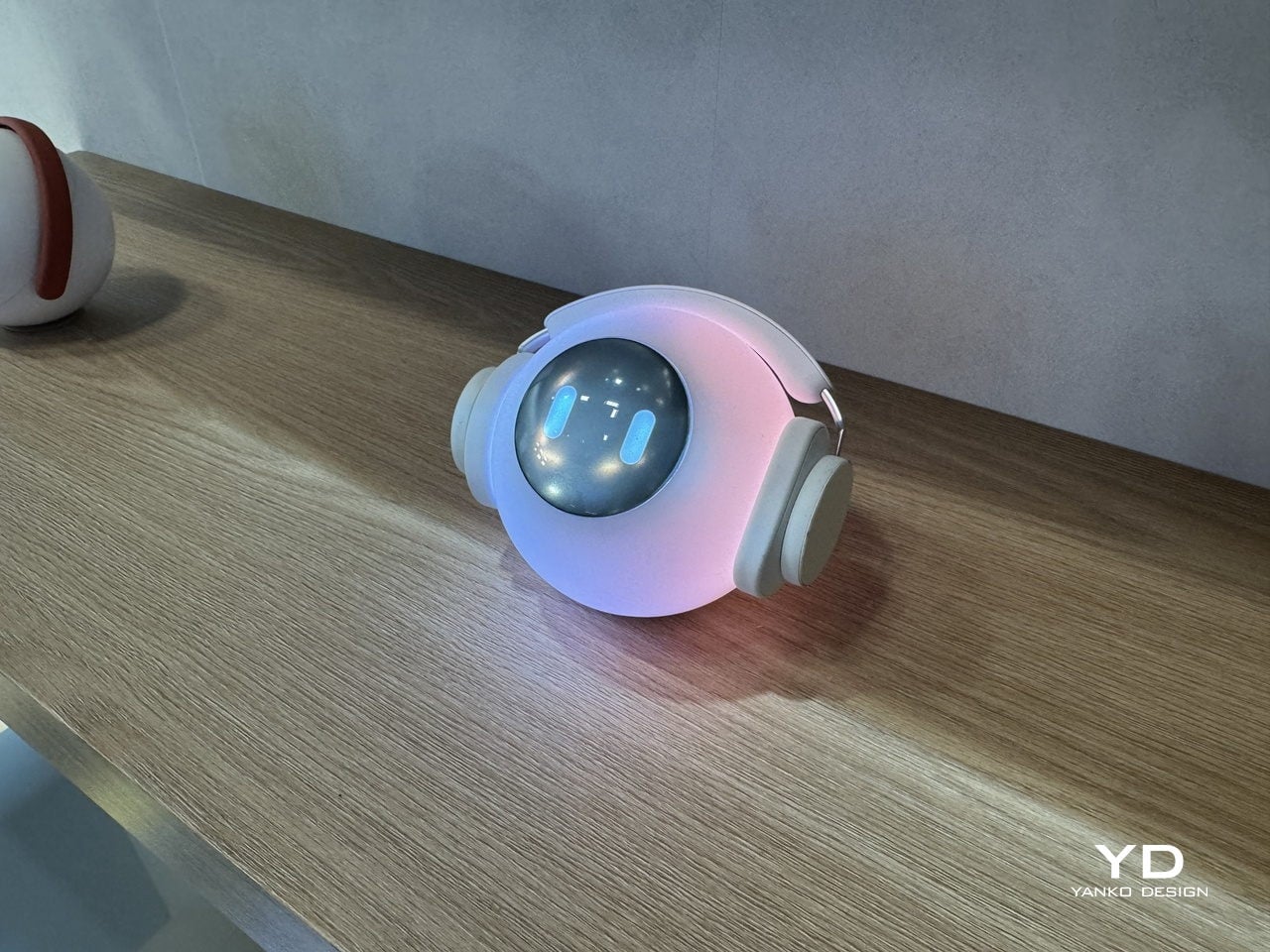
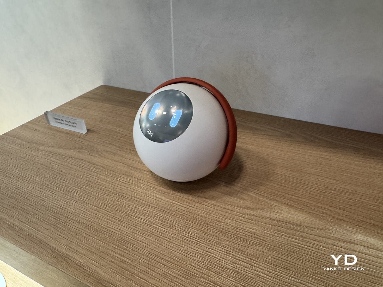
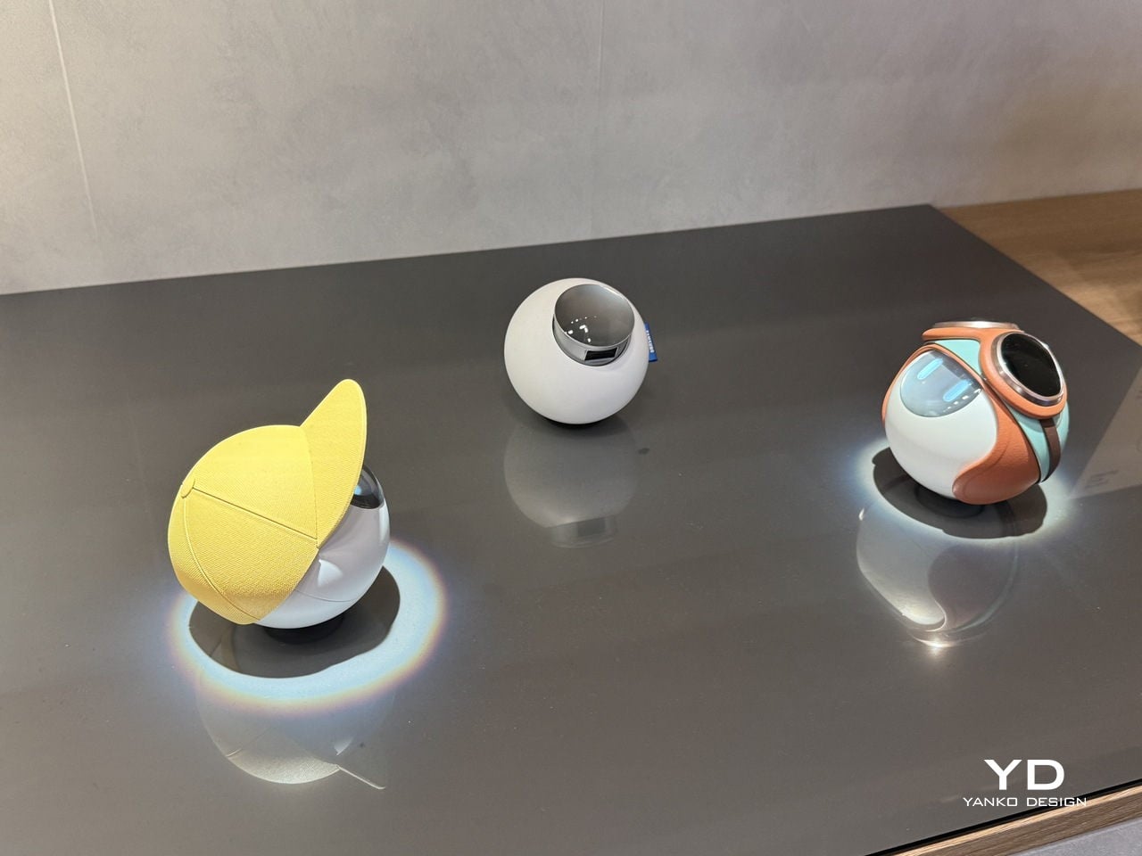
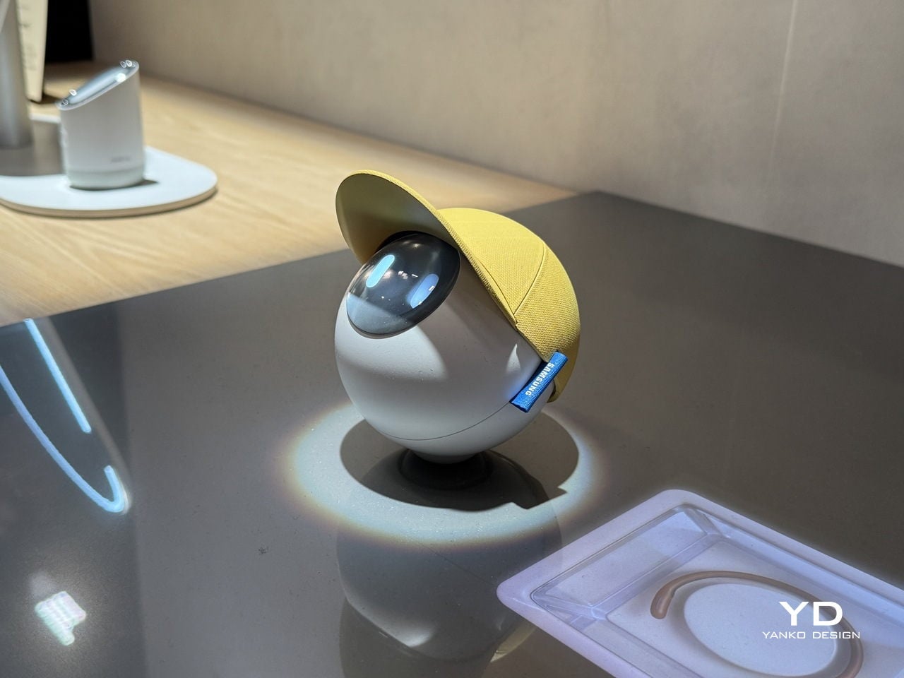
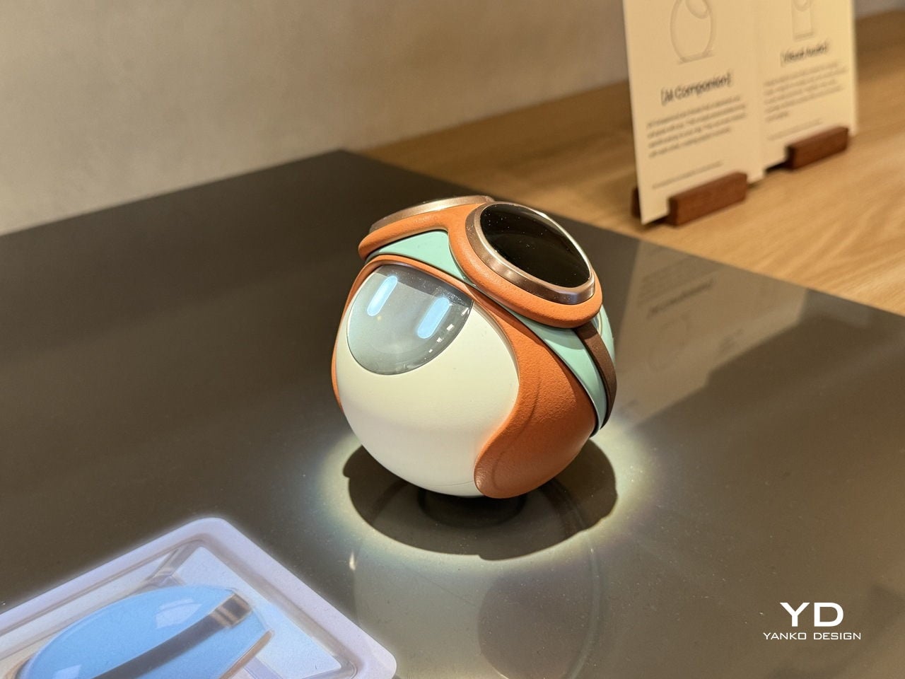
Samsung Design seems to think there’s a better way. At Milan Design Week 2026, its Open Lab unveiled the AI Companion, a small spherical robot designed to feel less like a gadget and more like a genuine presence. The concept frames these companions as friends that “understand you and grow with you,” bringing delight and warmth to daily life rather than simply waiting for the next voice prompt.

Designer: Samsung Design

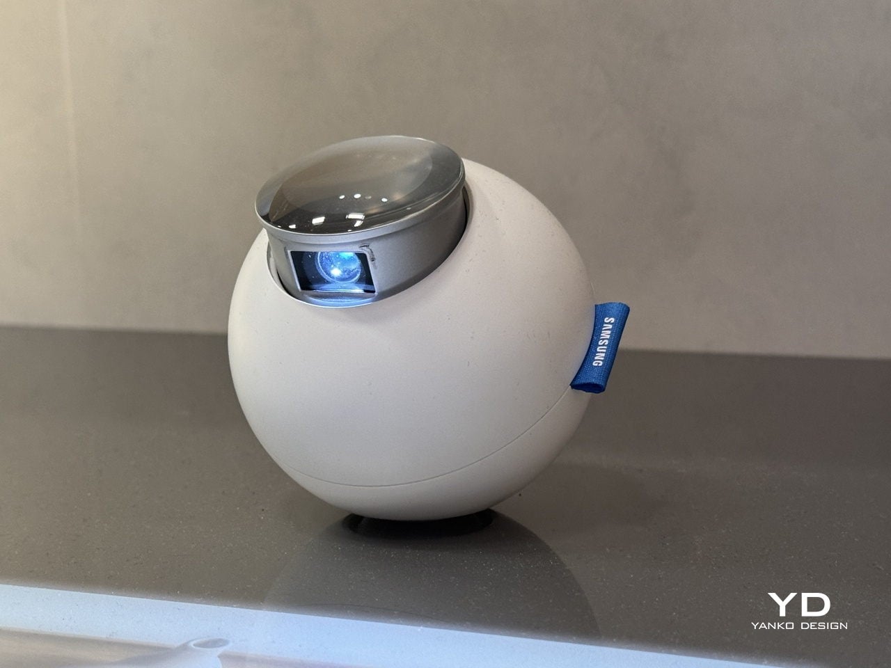
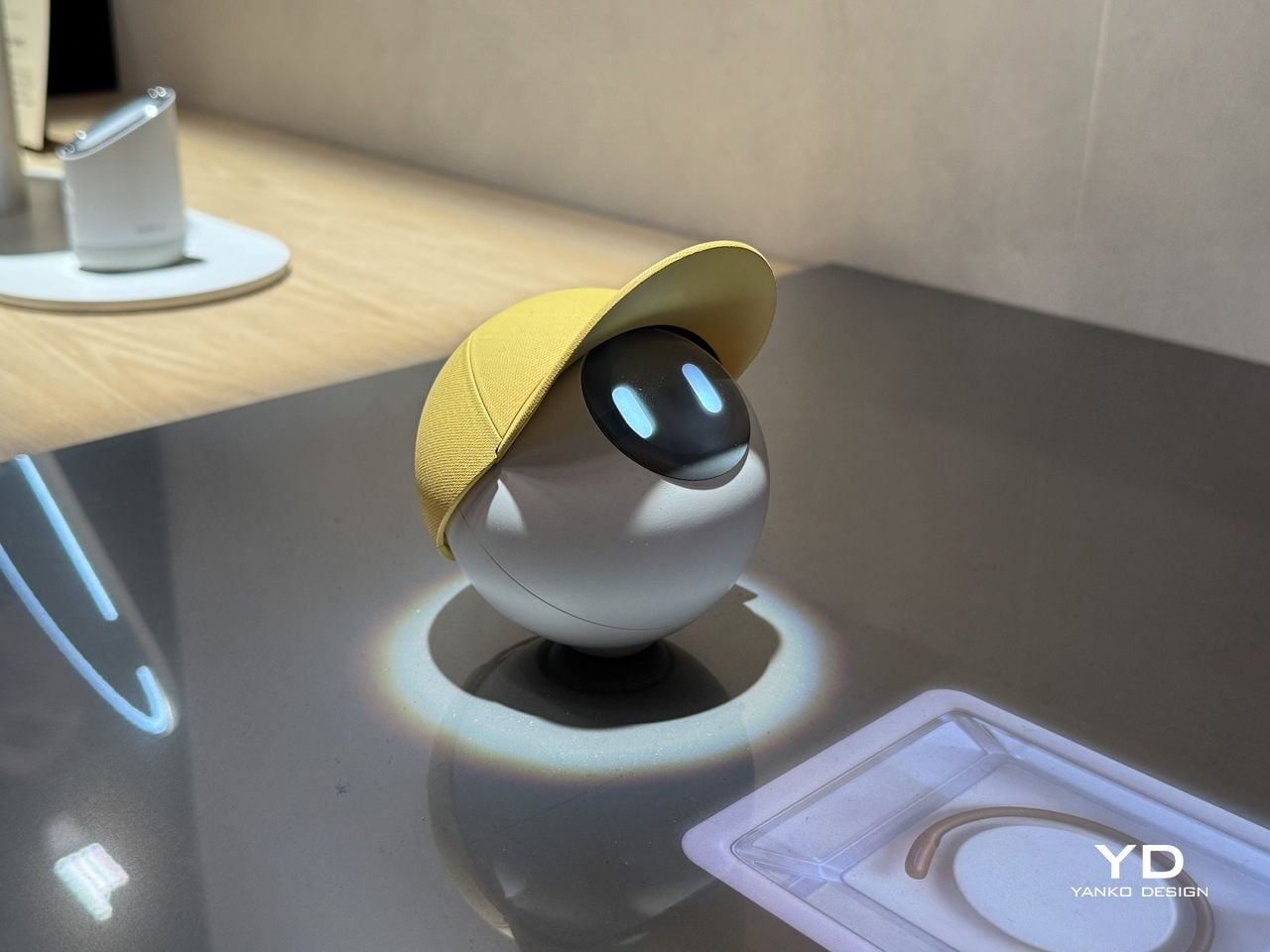
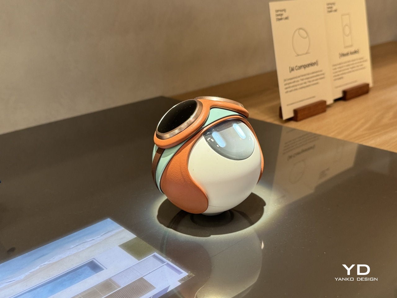
The AI Companion’s form is its first deliberate statement. It’s a near-perfect orb, compact and smooth, with a presence that feels more like a creature than a consumer device. There are no sharp edges, glowing rings, or intake vents, none of the usual signals of smart home hardware. What it has instead is a small circular screen that reads as expressive eyes, giving it a quiet, almost attentive quality.

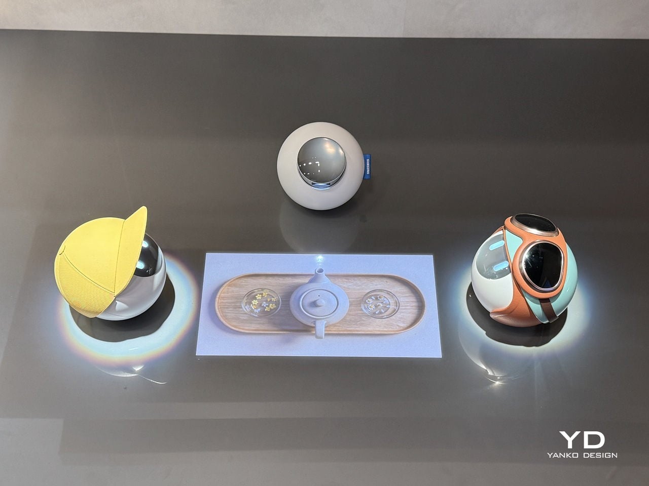
That face is where the design becomes truly surprising. The upper section of the sphere lifts open, almost like a creature raising its head, to reveal a compact projector tucked inside. It’s a small mechanical gesture that carries outsized meaning. The transition from sealed orb to open, projecting device doesn’t feel like pressing a button; it feels like watching something wake up and decide to share a moment with you.

With that projector now exposed, the AI Companion can cast games, animations, and interactive content directly onto the surface in front of it. The experience shifts from a one-on-one interaction to something more communal, turning a tabletop into a small shared stage. It’s the kind of feature that makes the device feel genuinely social, designed for moments between people rather than a single user quietly issuing voice commands.

Part of what makes the AI Companion feel so considered is how personality has been worked into its physical design. It comes in distinct variants, each with its own visual character, from a minimal white orb to one with a yellow cap-like shell to another wrapped in teal and rust-orange. These aren’t cosmetic afterthoughts; they suggest that each companion is meant to reflect the personality of whoever it lives with.

Samsung Design also sees these companions as inherently social. They can interact with each other, creating the kinds of playful exchanges that make them feel more like characters sharing a space than devices sitting on a shelf. The AI Companion is explicitly a concept and isn’t headed for retail, but it lays out a compelling vision for home AI that’s designed to be felt, not just heard.

The post Samsung Design’s Milan 2026 AI Sphere Lifts Its Face Like It’s Alive first appeared on Yanko Design.

Electrolux Wants Your Kitchen to Feel Like Nature: First-Look at Milan Design Week 2026

For roughly six months of the year, Sweden is cold enough to keep its people reliably indoors. That is long enough to matter, and long enough to shape how a Swedish design team thinks about what a kitchen surface, a kitchen color, or a kitchen appliance should feel like when it is the primary thing a person looks at during the months when the outdoors is largely inaccessible. Electrolux, drawing on research conducted across European markets, found that nature is the single most common answer when people are asked where they go for emotional restoration. The brand’s response to that finding, expressed through a design philosophy called Lagom, the Swedish concept of balance and just enough, arrived in Milan this week at Via Melzo 12 in the Porta Venezia district.

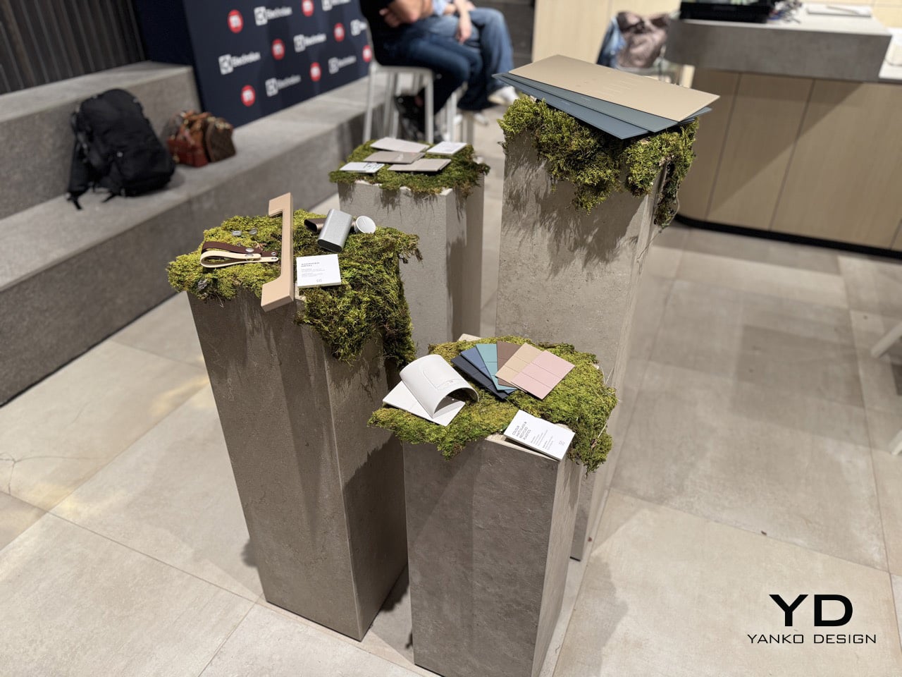
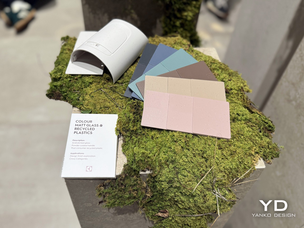
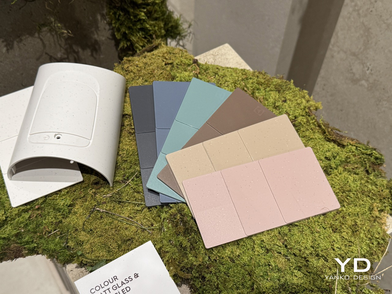
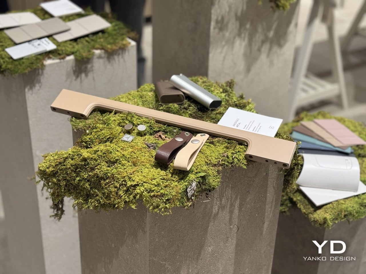
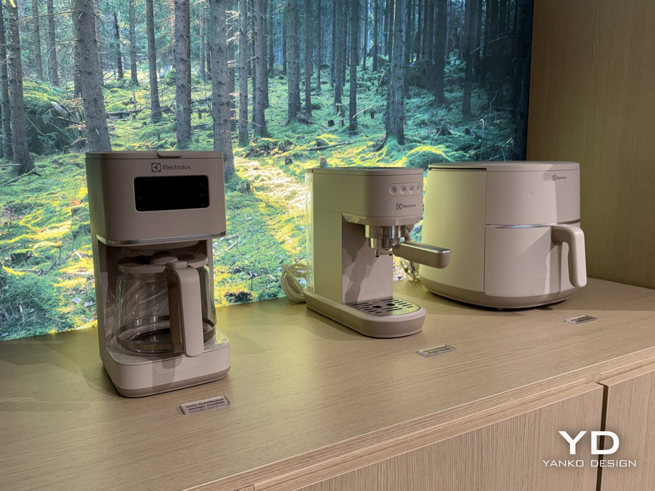
The space was staged as an argument made physical. Concrete plinths topped with living moss carried CMF swatches in muted blush, warm sand, dusty teal, and speckled stone-effect recycled plastic. A pine and wood scent developed by studio Koyia moved through the air. A breathing exercise was built into the programme, alongside a cross-country pizza competition that Turkey ultimately won. The sequence of it, material samples resting on moss, scent designed to recall a forest, appliances displayed in front of a photographic print of Scandinavian woodland, was too consistent to be coincidence. Electrolux arrived at Milan Design Week 2026 with a single, well-developed idea: that the kitchen is an emotional environment, and that the most sophisticated thing its design language can do is bring the outside in.

Designer: Electrolux

Rafael Alonso, who leads Electrolux’s Taste Design team, describes the modern kitchen plainly: a crowded space where people live, cook, manage family life, and absorb the friction of daily routine. Designing for that room means designing for that reality. Lagom, in his framing, is the response: meaningful solutions built around purpose and balance rather than specification and performance alone. The philosophy travels well beyond Sweden. Everybody needs a bit more balance in their lives, and the kitchen, as the room that absorbs the most daily activity, is where that balance is most frequently lost and most worth recovering.

Amelia Chong, based in Electrolux’s Stockholm office and leading Color, Material, Finish Design for the taste category, traces the palette back to something more concrete than trend cycles or stylistic preference. When Electrolux surveyed users across Europe about where they find emotional restoration, nature came back as the most consistent answer. For Chong’s team, that finding becomes a set of material conditions. Scandinavian light is lower in contrast and more diffused than much of Europe, and the colour preferences that emerge from living within that light tend toward the muted and the gentle. The goal is to establish colour and material in a long-lasting, timeless relationship rather than a short-term one.

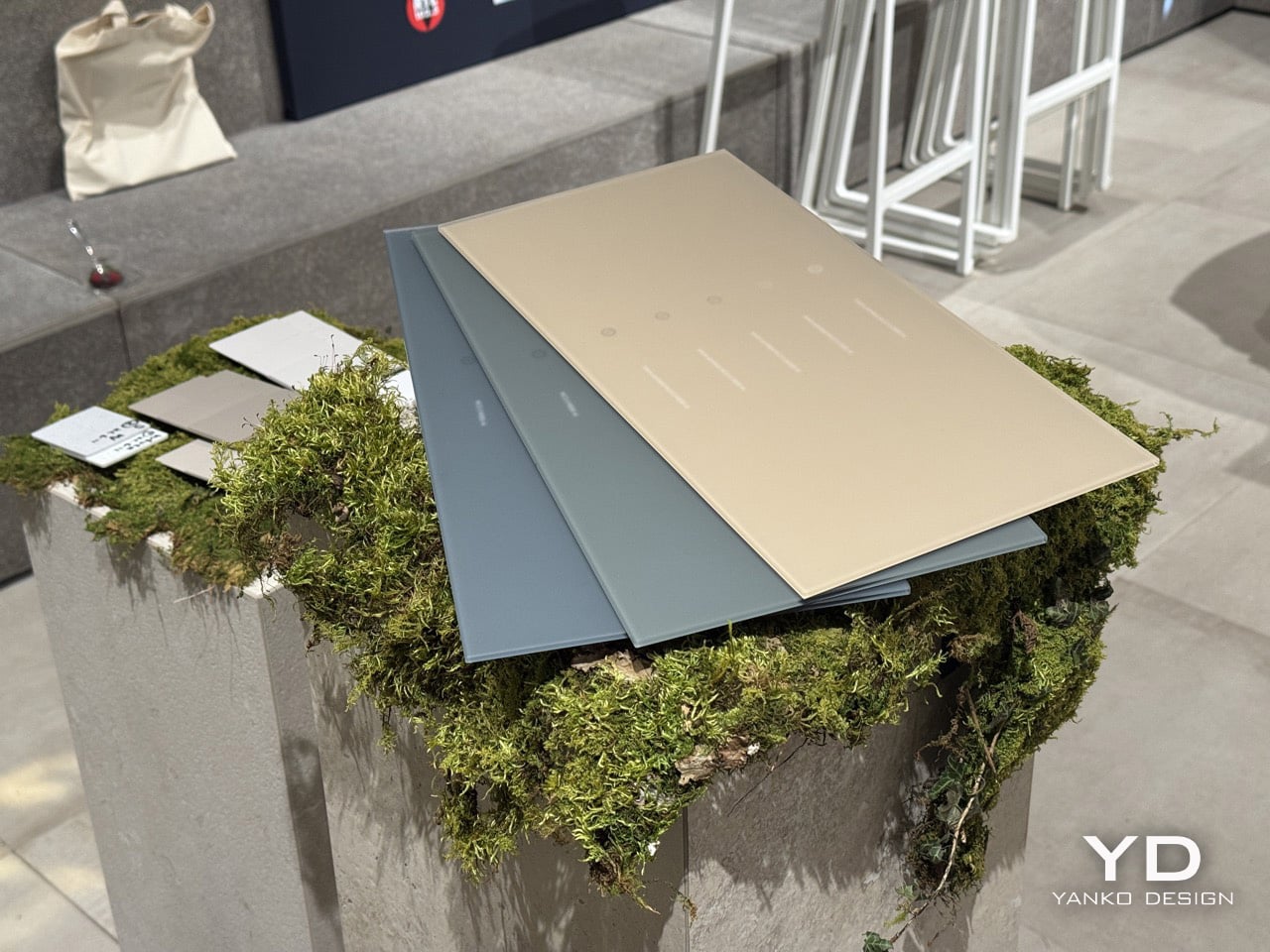
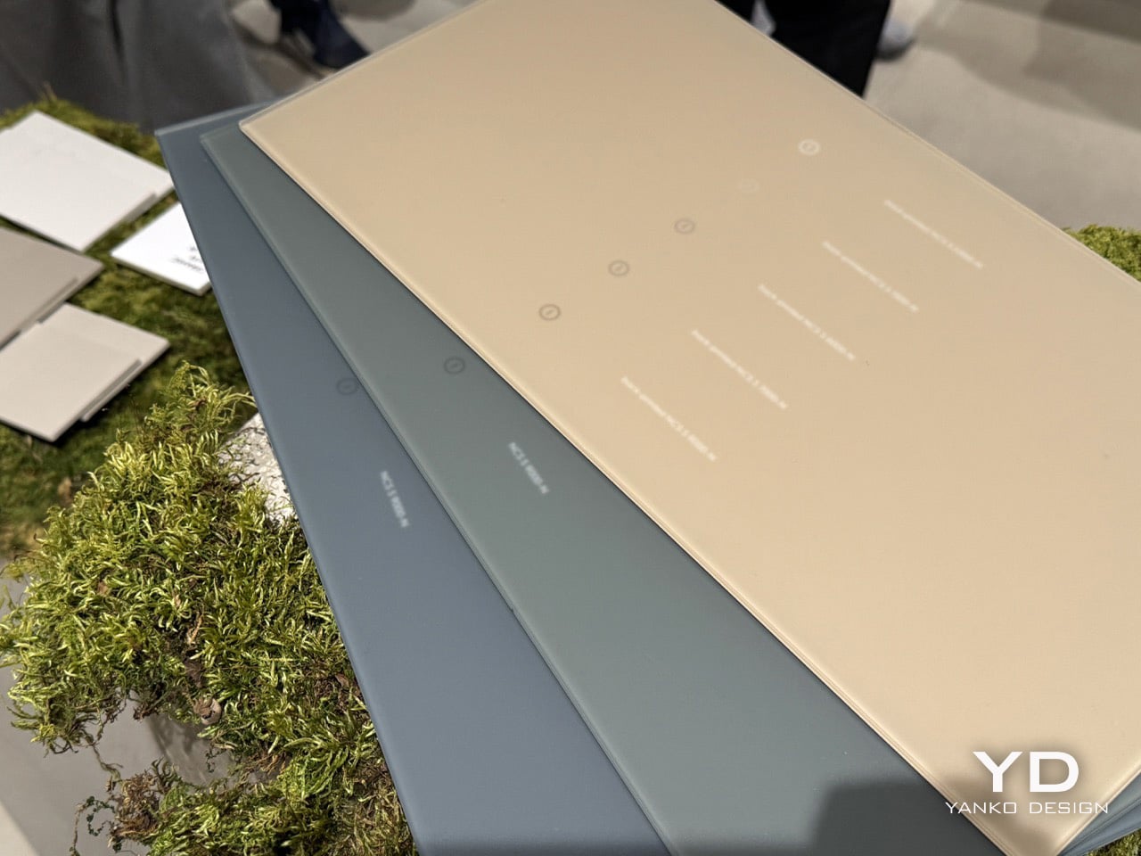
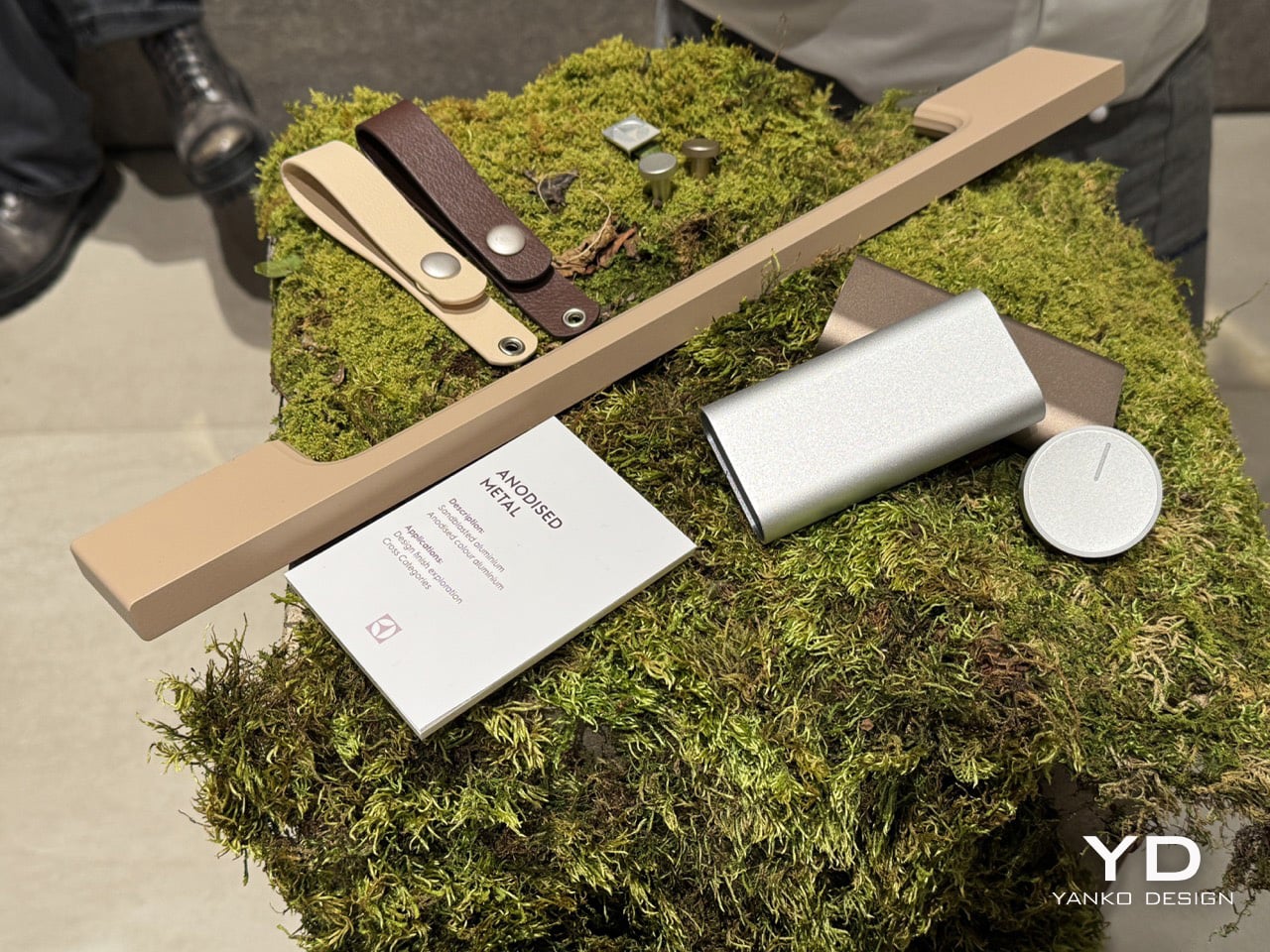
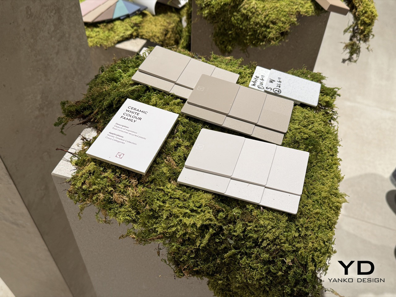
The swatches at Electrolux’s showcase make that intention legible. Across the Ceramic White Colour Family, the Colour Matt Glass and Recycled Plastics range, and the anodised metal samples, the palette holds a consistent register: warm sand and dusty teal, soft blush and speckled stone-effect off-white, warm bronze and low-sheen aluminium. Several finishes are built from post-consumer recycled plastic, and the acid-etched glass surfaces carry none of the glossy visual aggression that has dominated premium kitchen aesthetics for the better part of a decade. Chrome is absent. Matte black, another recent default for high-end appliances, does not appear either. What replaces both is a surface language that reads as organic, with textures referencing stone, compressed earth, and raw ceramic.

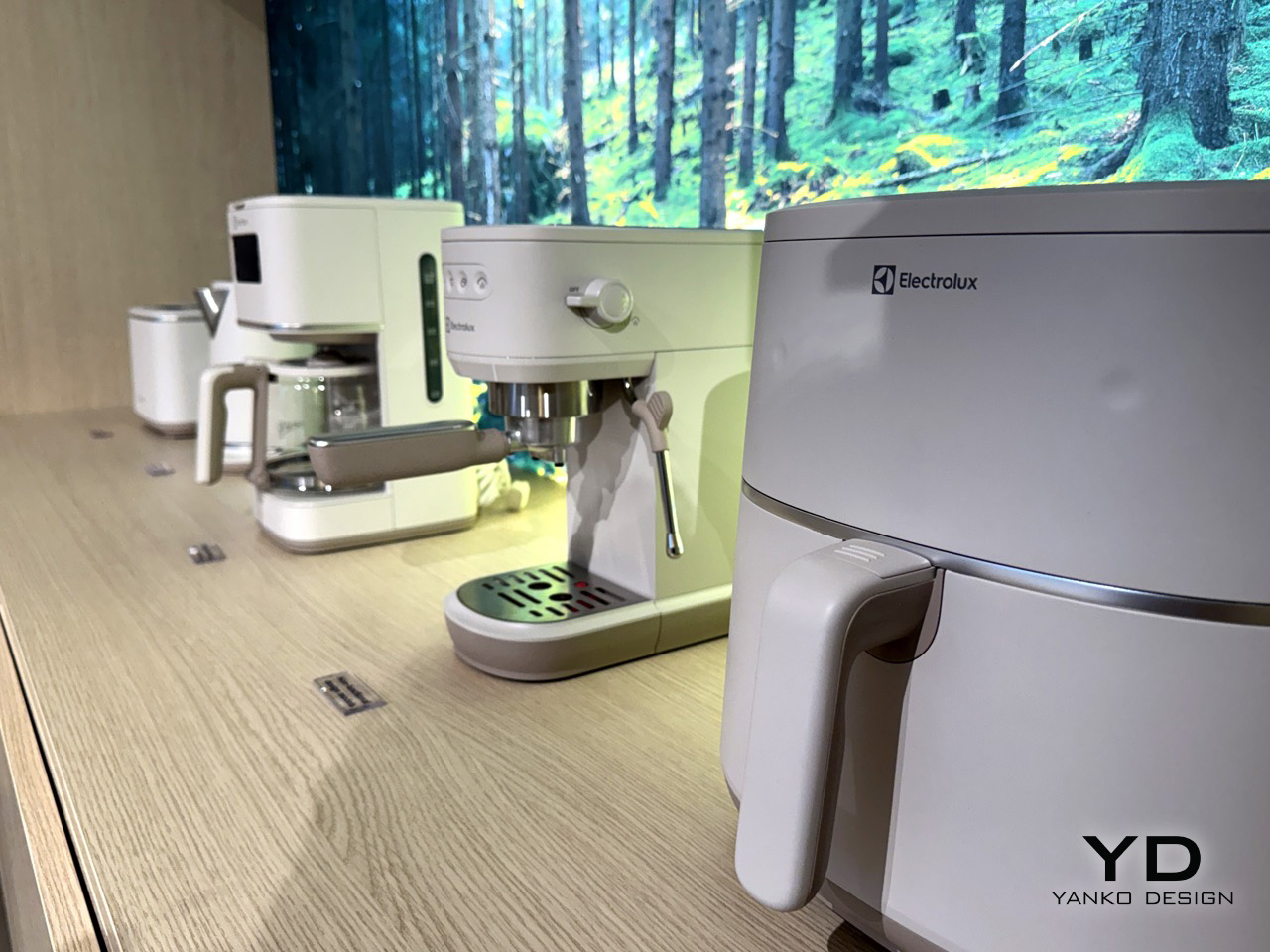
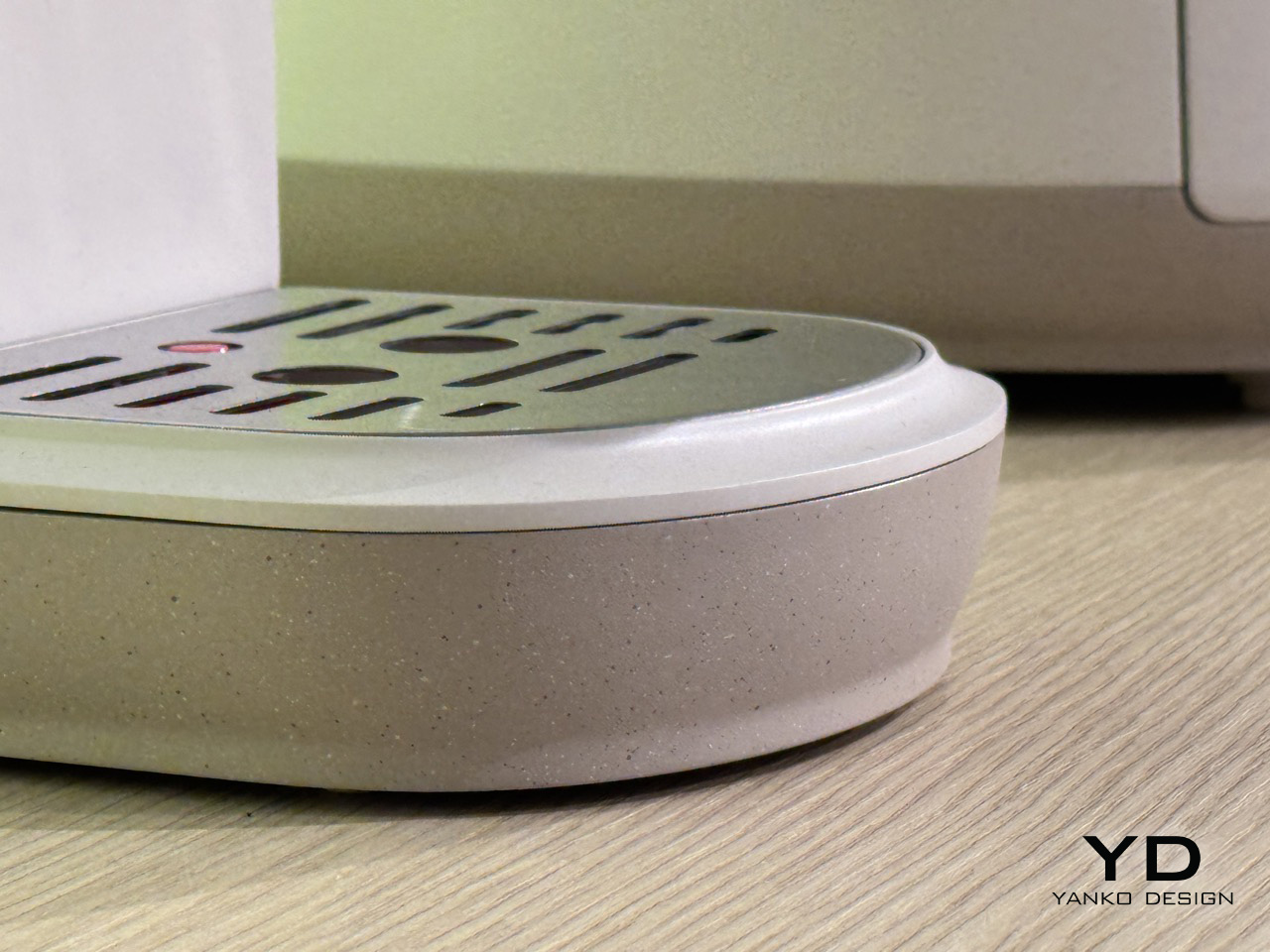
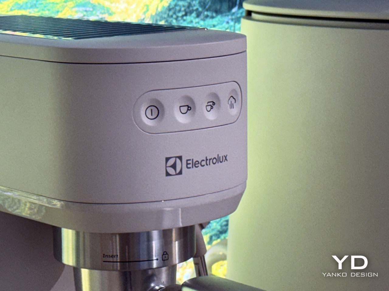
That material thinking finds its form in a new family of conceptual small appliances. A toaster, electric kettle, coffee machine, espresso machine, and air fryer were all presented with a unified design language that feels both calm and confident. Each product shares a primary body finished in a soft, linen-like white, but the most distinctive feature is the base. A warm, speckled finish, reminiscent of granite or raw ceramic, grounds each appliance, giving it a visual and textural weight that connects it to the natural materials referenced in the CMF library. The effect is cohesive and deeply considered; the appliances feel less like industrial objects placed on a countertop and more like a collection of stoneware that has grown out of it.

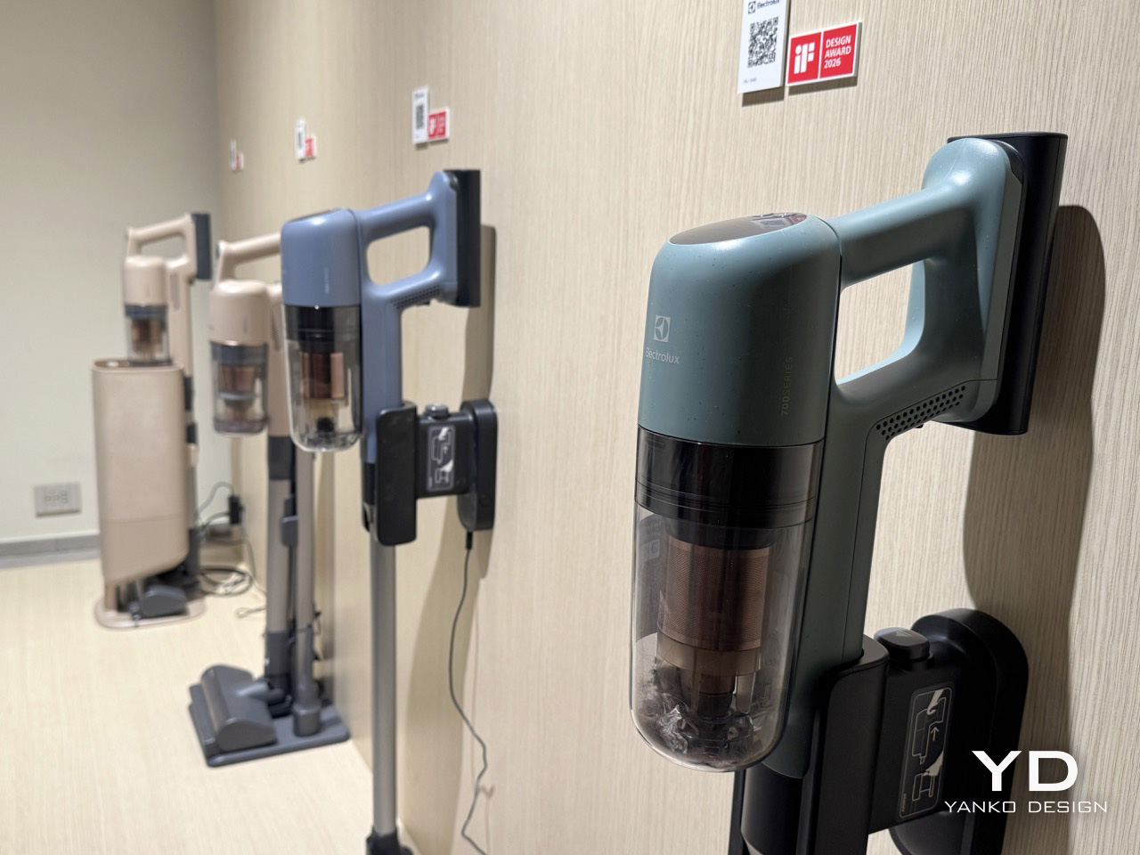
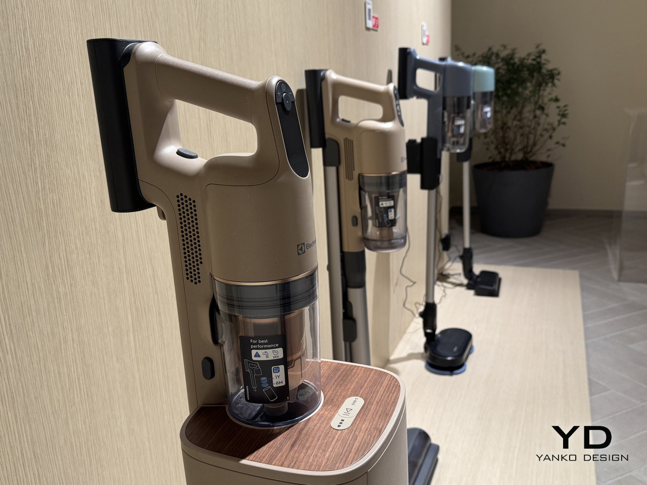
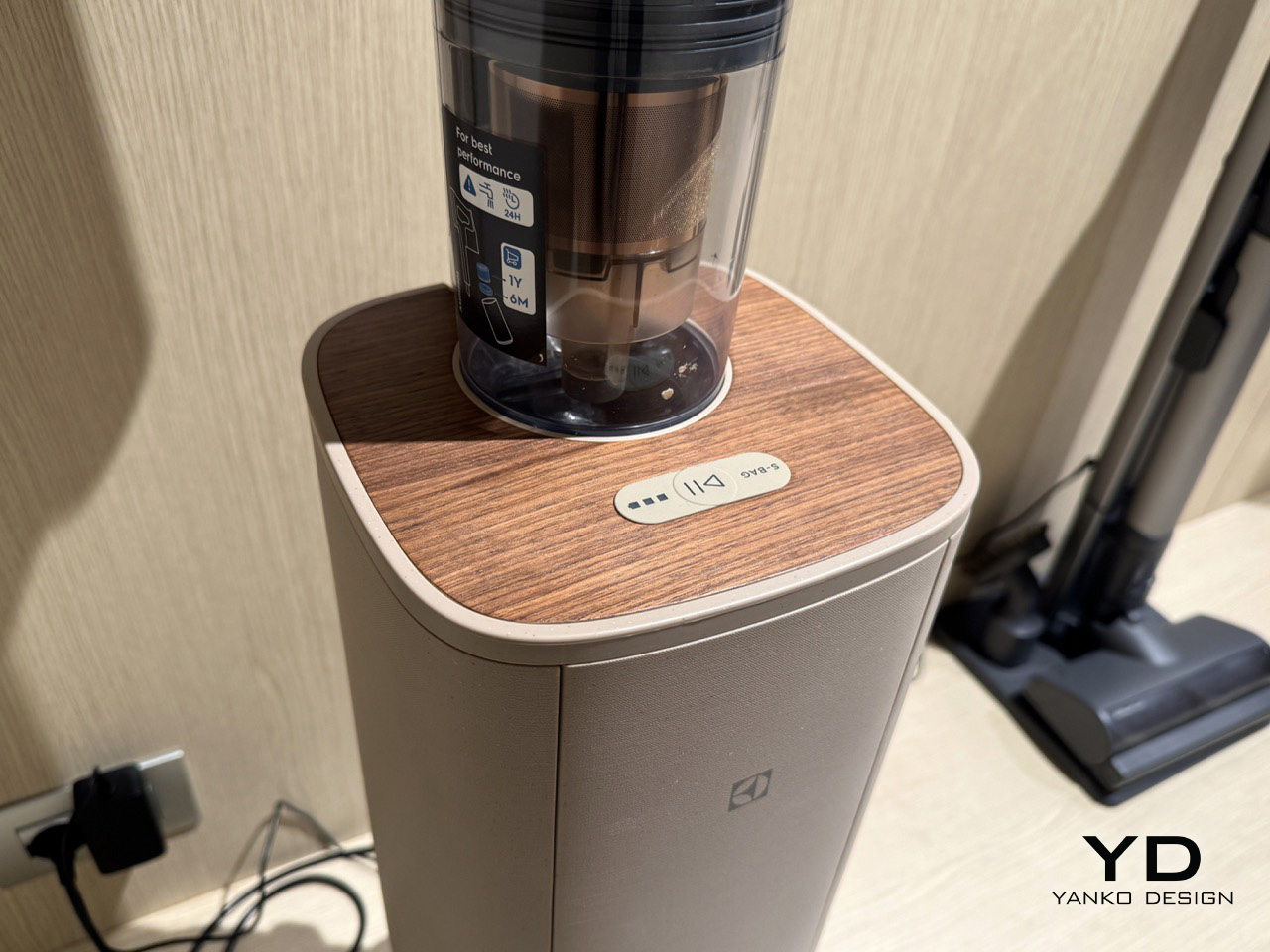
This approach is not confined to the kitchen. A vacuum cleaner, displayed with the same attention to sensory detail, extends the Lagom philosophy into the broader home. Its body carries the same muted, gentle tone as the kitchen concepts, but its top surface is finished with a warm, walnut-panel wood trim. It is a simple but effective move that transforms a utility object into something closer to furniture. The design choice suggests that balance, and the deliberate presence of natural textures in everyday objects, belongs to the whole home, softening the technological footprint of our tools and integrating them more harmoniously into our living spaces.

The neuroaesthetic research informing Chong’s approach is concrete: considered colour selection can reduce perceived stress by as much as 35%, a figure that reframes what a hob surface or a coffee machine body is quietly doing in a room. They contribute actively to the sensory quality of the spaces we inhabit. In a field where brands largely compete on technology, connectivity, and performance metrics, that may be the most quietly confident thing Electrolux brought to Milan: the conviction that calm, deliberately designed, is a specification worth meeting, and that the palette which carries it was drawn from the landscape just outside the window.

The post Electrolux Wants Your Kitchen to Feel Like Nature: First-Look at Milan Design Week 2026 first appeared on Yanko Design.
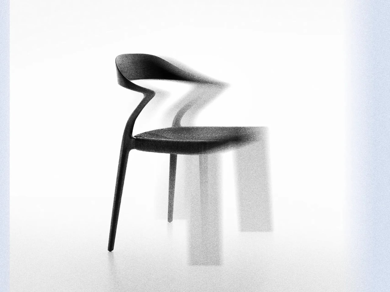
The Zig-Zag Chair That Shows Rimadesio at Its Most Expressive

Every April, you could spend an entire week in Milan chasing novelty. Salone del Mobile is full of it: the flashy, the concept-heavy, the beautifully photographed pieces that look better in a press release than they ever would in a real room. That’s what makes the Ori chair by Giuseppe Bavuso for Rimadesio so easy to stop at. It looks just as interesting on paper as it probably does in person, and against everything else being shown this week, that’s already a significant thing.

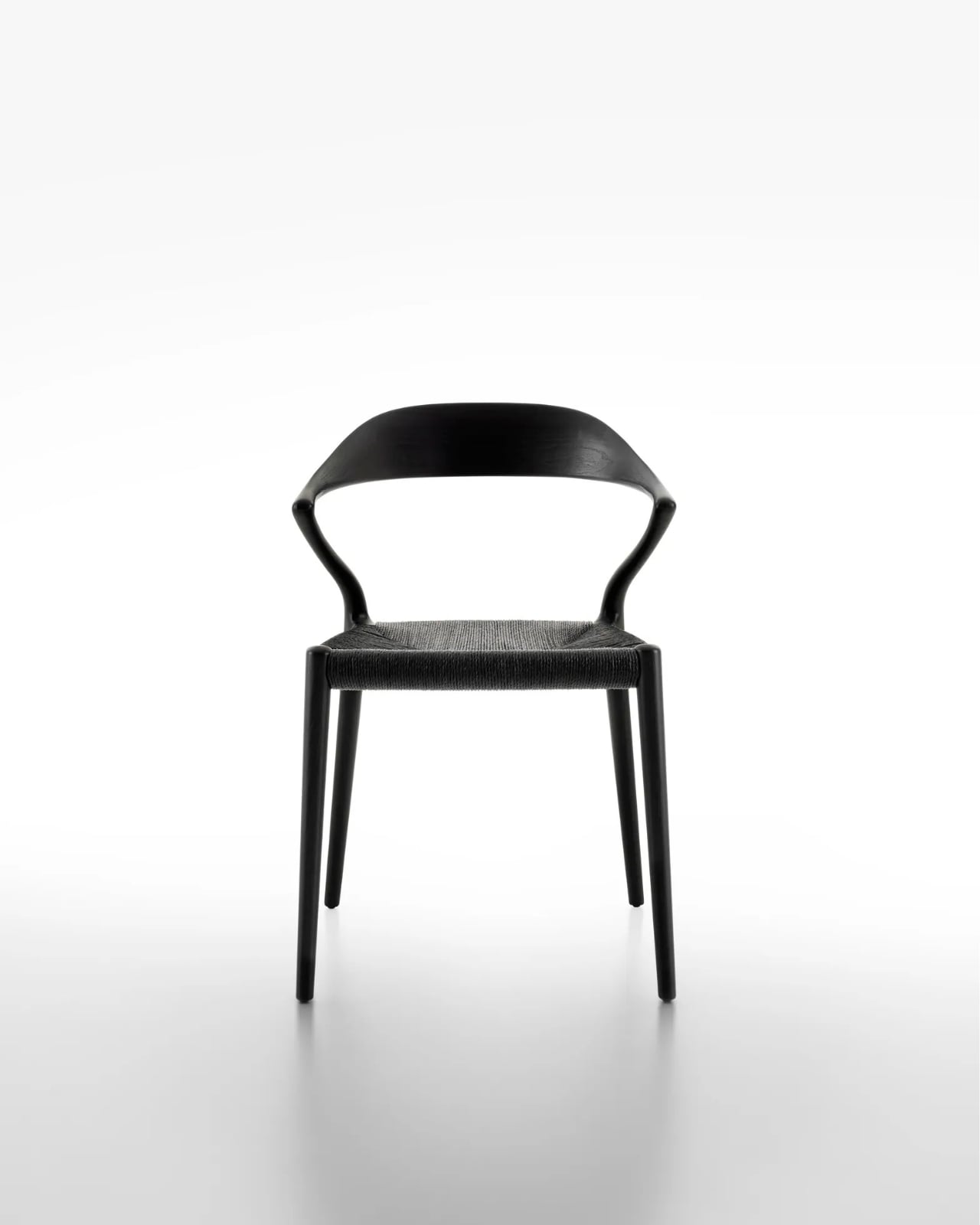
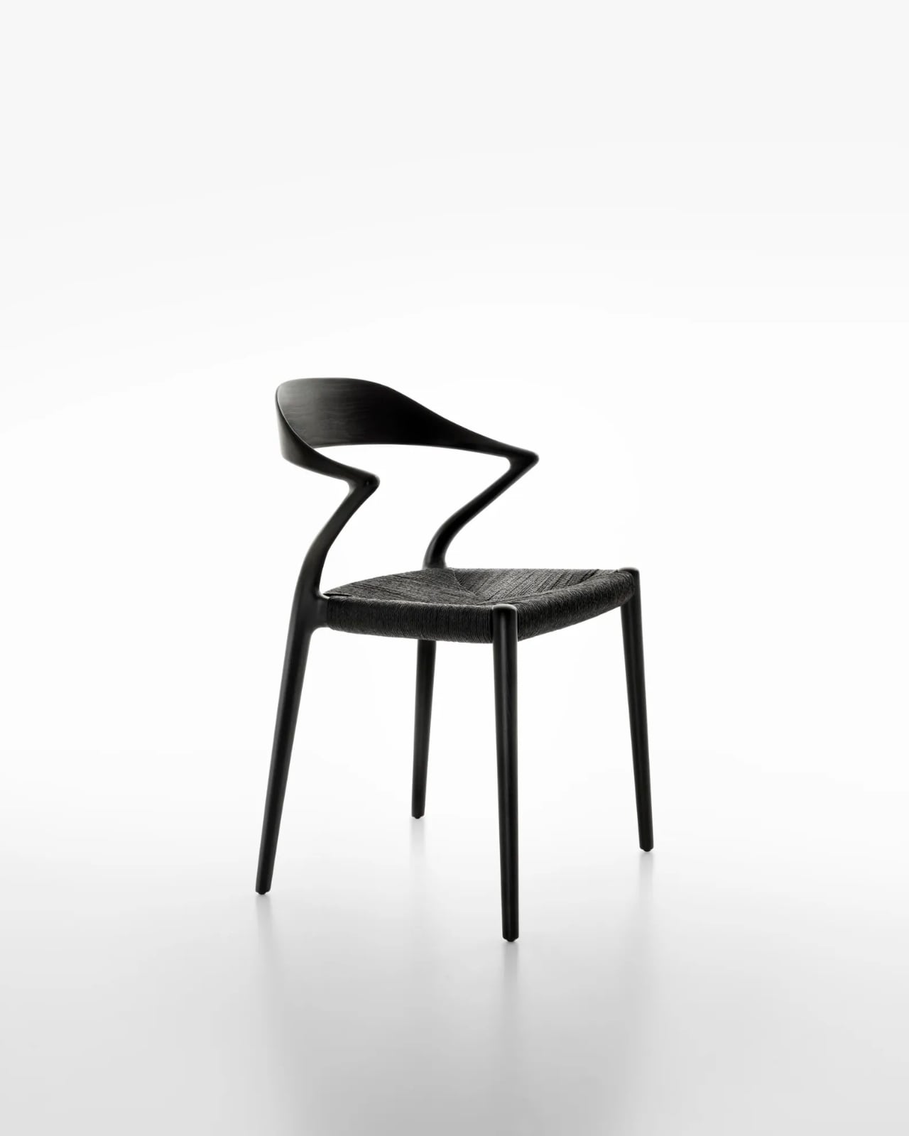
At its core, it’s a solid ash chair with a backrest. Except the backrest doesn’t go straight. It zigs. It zags. And somehow, it works with a kind of quiet conviction that makes you want to understand why.

Designer: Giuseppe Bavuso for Rimadesio

Rimadesio is not exactly a newcomer to this conversation. Founded in 1956 in the Brianza district north of Milan, the Italian brand has built its reputation around precision manufacturing and architectural intelligence. For decades, it has been the brand that architects reach for when they need sliding panels, modular shelving, or doors that close with the kind of satisfying weight that makes you feel like you live in a well-designed life. Furniture, in the traditional sense, has always played a supporting role. Ori feels like a shift.

Giuseppe Bavuso has been Rimadesio’s designer and art director for years, and the long-term relationship is visible in the collection’s consistency. There’s a particular design language at Rimadesio, one that values restraint without ever feeling cold. But Ori does something slightly different. The zig-zagging backrest introduces a kind of visual energy that isn’t typical of the brand. It feels expressive in a way Rimadesio rarely allows itself to be, turning the brand’s famous manufacturing precision toward something more overtly sculptural.

The choice of material matters here. Solid ash is warm, tactile, honest. It doesn’t pretend to be anything it isn’t, which makes it the right call for a piece that’s already making a visual argument with its form. Against the angular drama of the backrest, the naturalness of the wood acts as a stabilizer. The chair doesn’t feel aggressive or purely decorative. It feels considered. Like a piece that was worked out over a long time before anyone was allowed to see it.

The timing is also interesting. Rimadesio is celebrating its 70th anniversary at Salone del Mobile 2026 under the concept BECOMING, a theme that brings together design, architecture, art, and relationships. Introducing a chair as expressive as Ori at this particular moment feels intentional. Seventy years is long enough to have a strong point of view. It’s also long enough to know when to surprise people.

I think about this whenever I see brands with deep institutional histories try to evolve. It doesn’t always land. Sometimes it reads as a brand chasing relevance instead of generating it, making louder and louder declarations in the hope that someone notices. But Ori doesn’t feel like that. It feels like a designer who has been sitting with an idea for a while, one that has been refined until it became undeniable.

Design, at its best, has an opinion. It makes a choice and defends it without apology. The Ori chair’s backrest could have been straight. It wasn’t. That single decision, seemingly small, changes the entire character of the piece. It makes a chair worth looking at twice, which is harder to achieve than it sounds when you’re working in a material as familiar as wood. Whether or not you’d put it in your home is almost beside the point. Ori is the kind of piece that expands the conversation about what a chair can be, especially within the vocabulary of a brand that has spent seven decades being impeccably precise rather than openly expressive. The fact that both qualities now exist side by side in this chair is what makes it compelling.

Milan Design Week runs April 20 to 26, and if you’re in the area and you’re curious to see Ori in person, you should go. Some pieces change when you’re standing in front of them. I have a feeling this is one of them.

The post The Zig-Zag Chair That Shows Rimadesio at Its Most Expressive first appeared on Yanko Design.
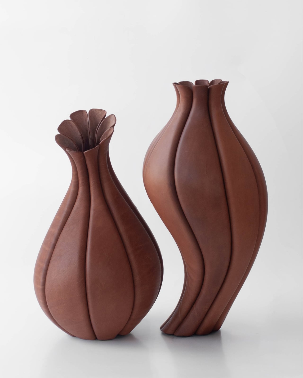
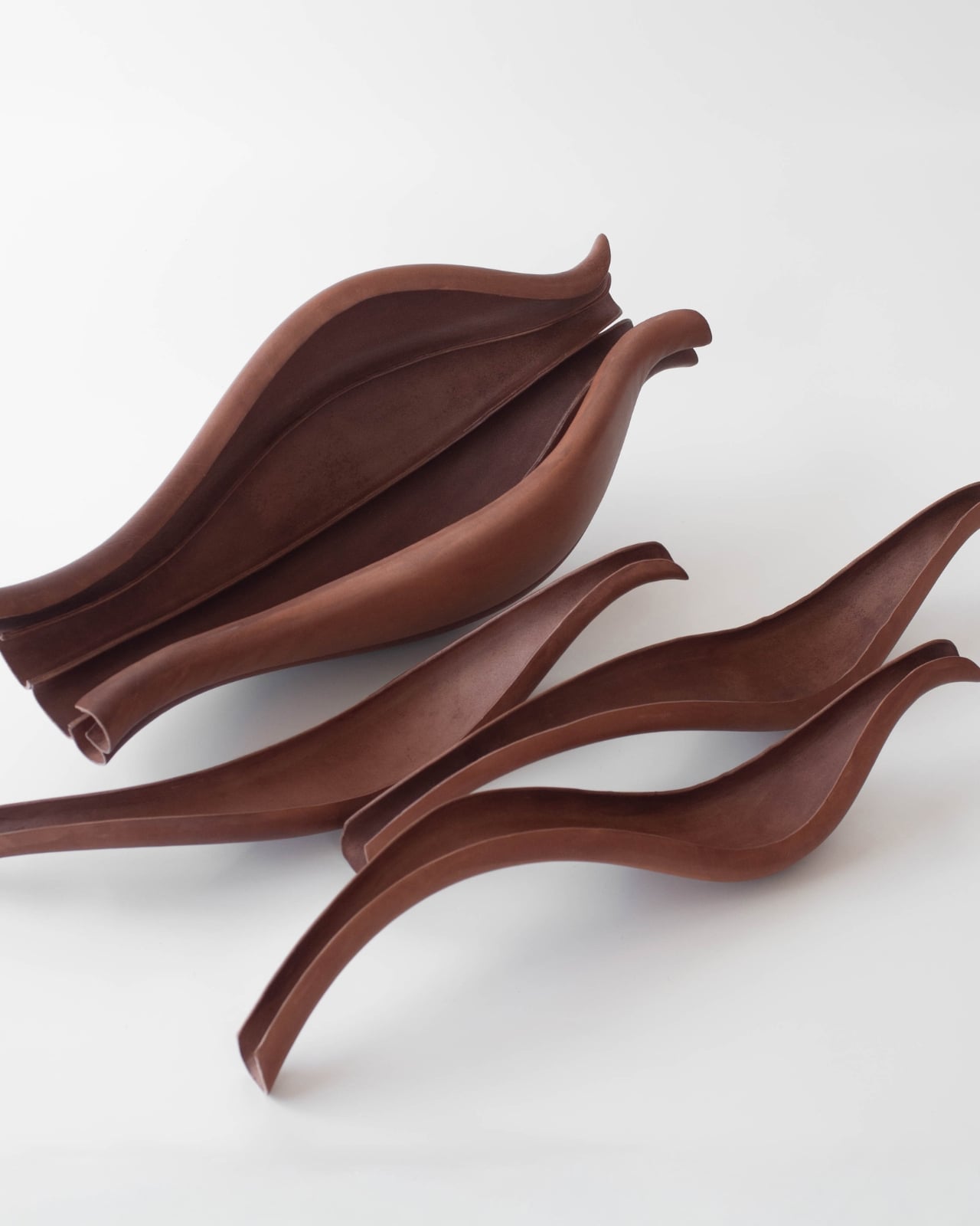
The Leather Vessels at Milan 2026 That Feel Like They’re Breathing

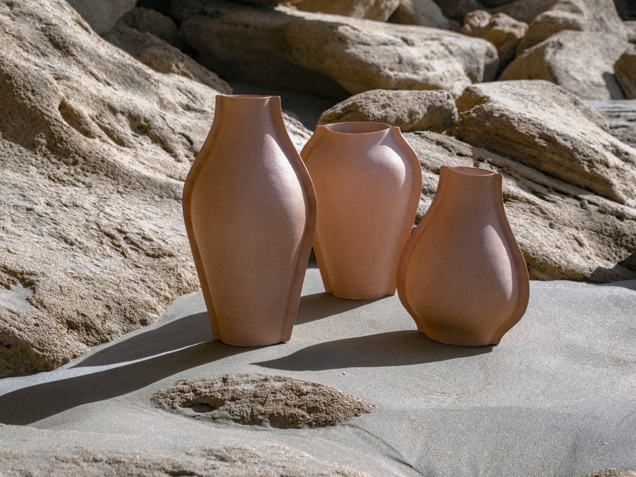
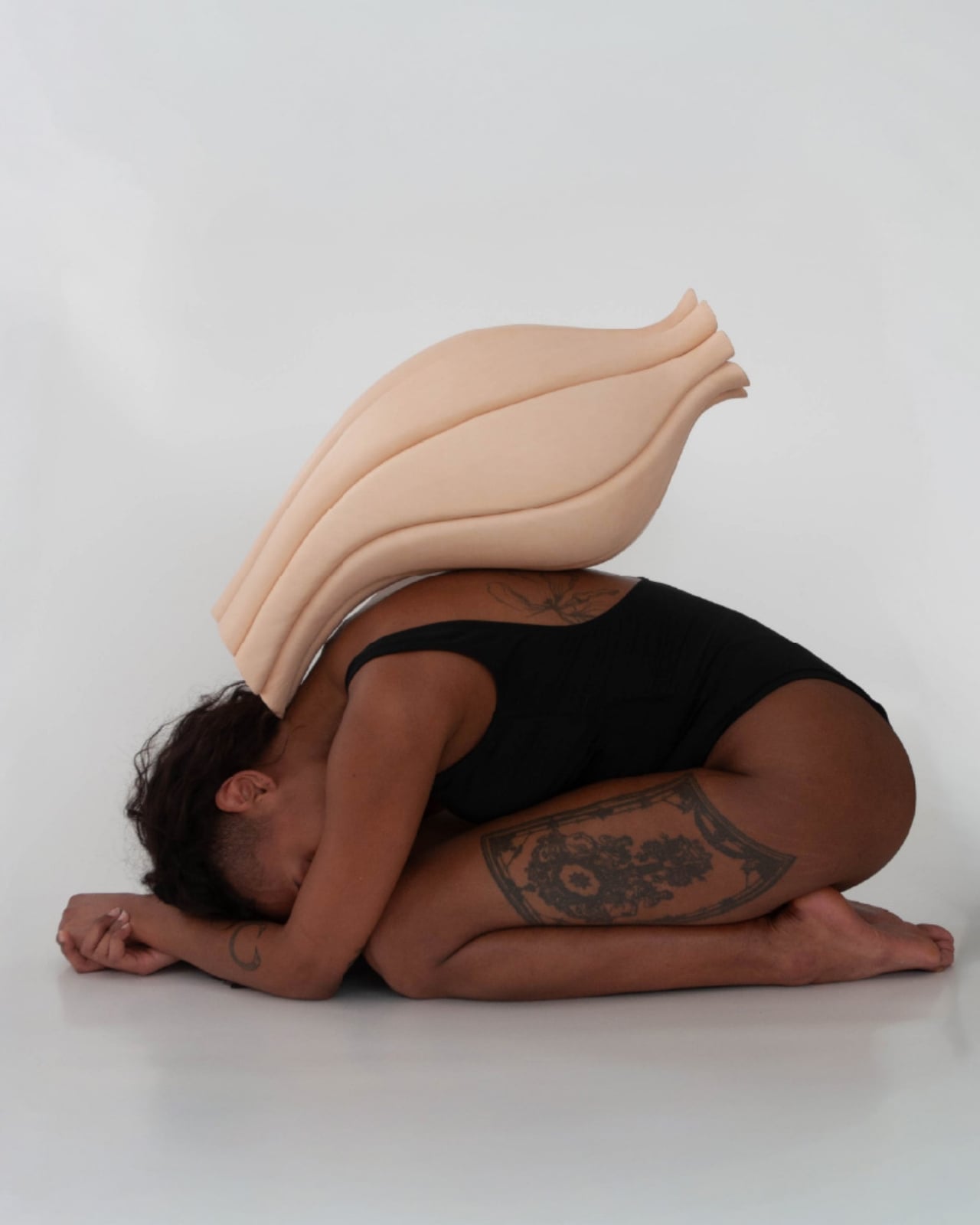
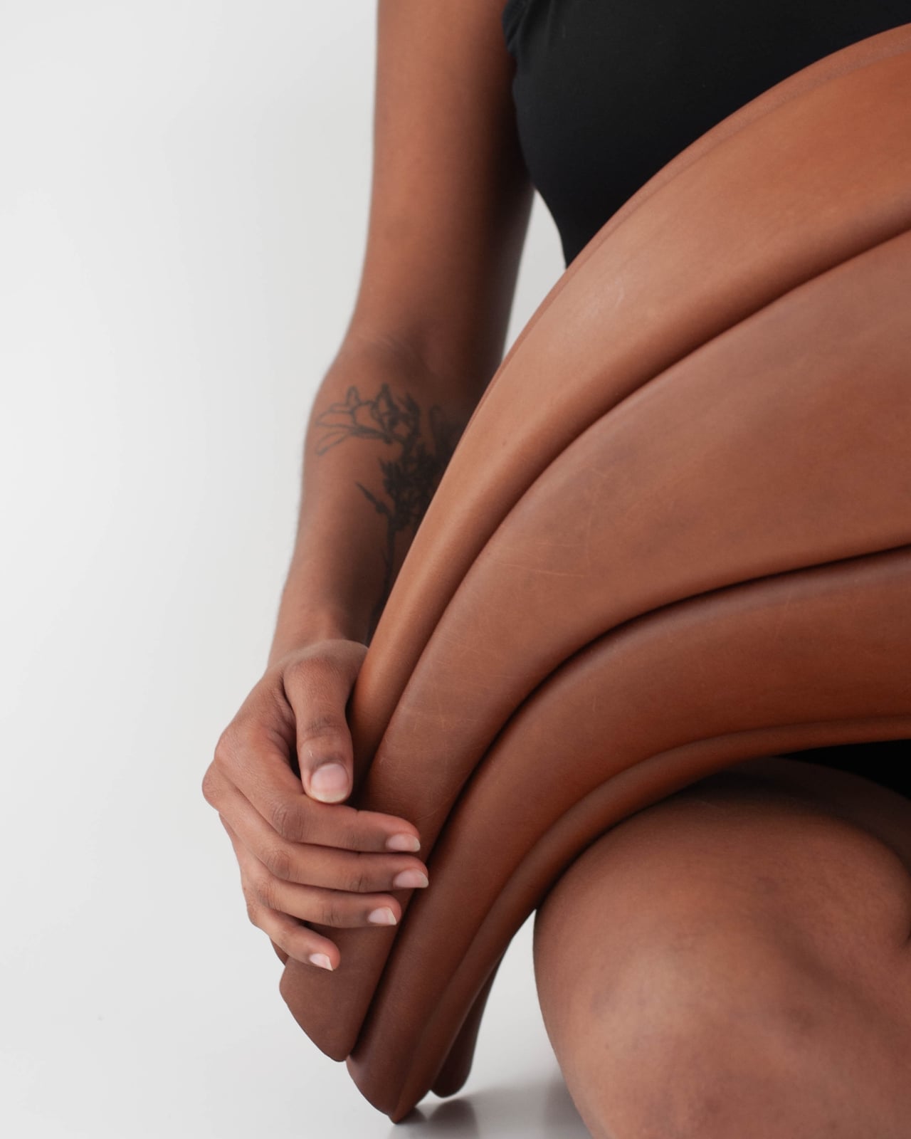
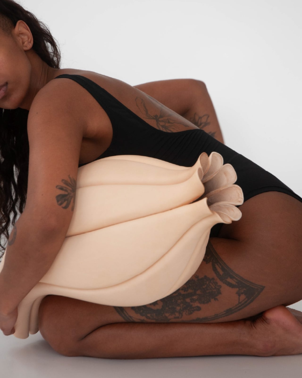
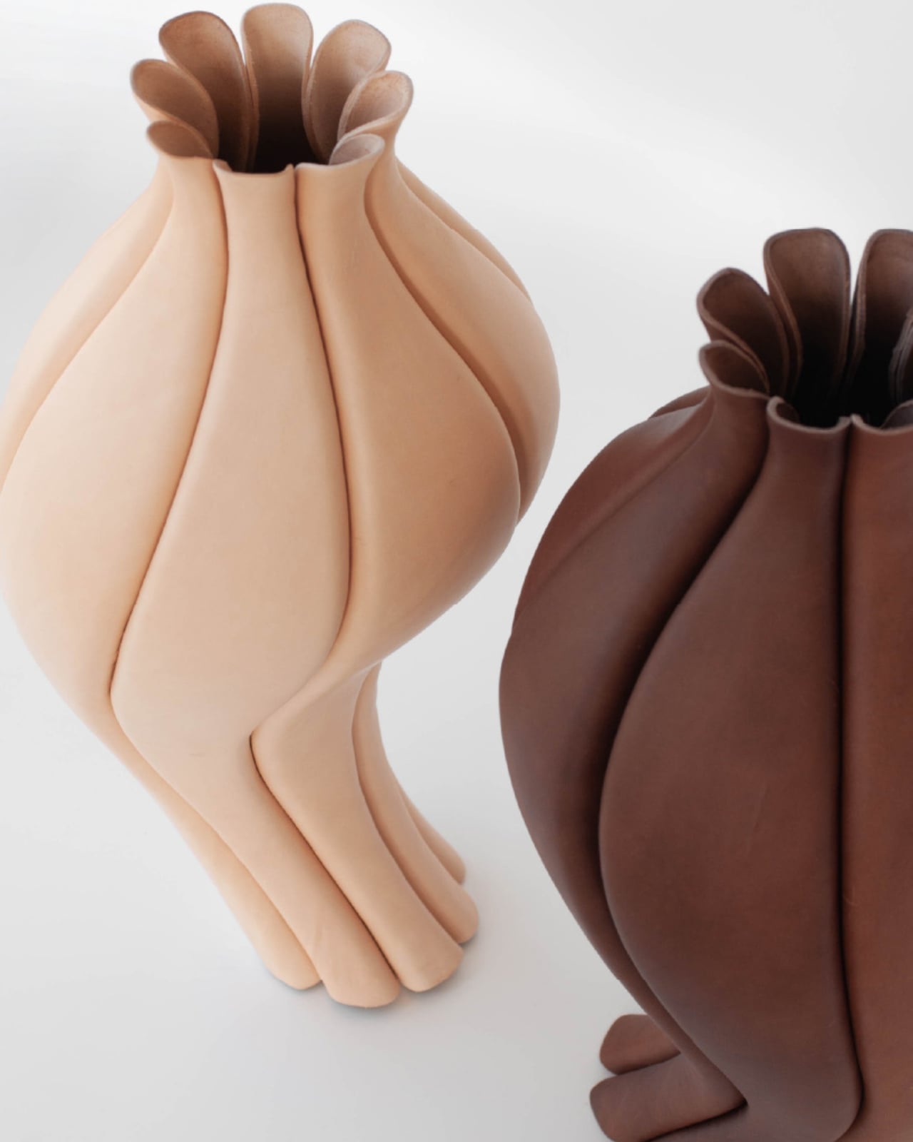
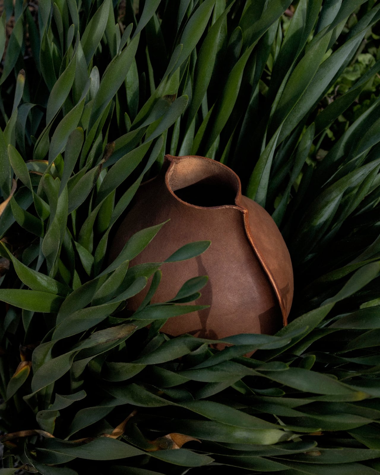
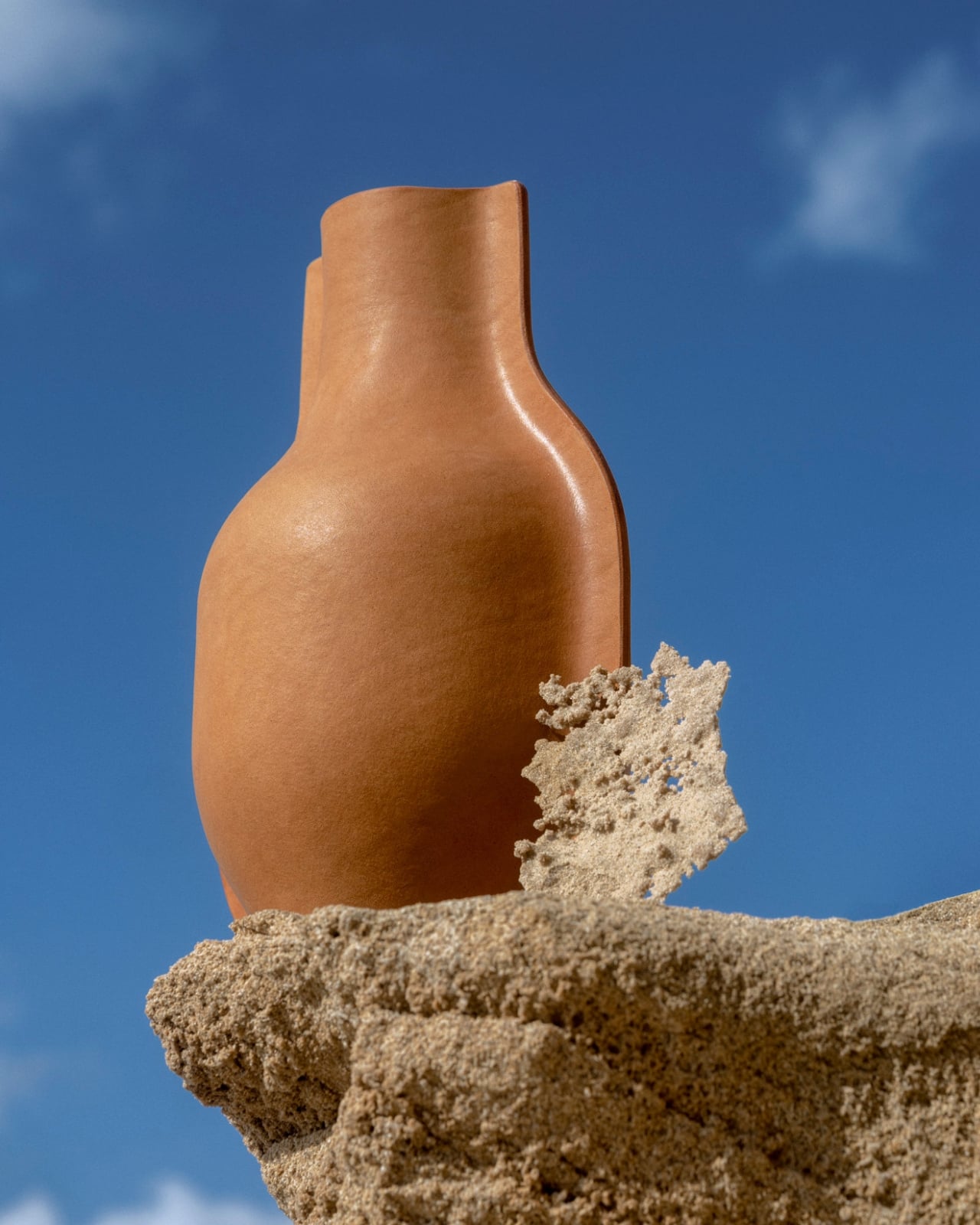
When I first came across Talia Luvaton’s work, I genuinely paused. Not because it was unexpected to see leather used in design, but because nothing about these pieces looked like leather was supposed to look. The forms were full, curved, almost muscular, more closely related to the human body than to anything you’d find in a saddle shop or a fashion house. They looked, oddly, like they were breathing.

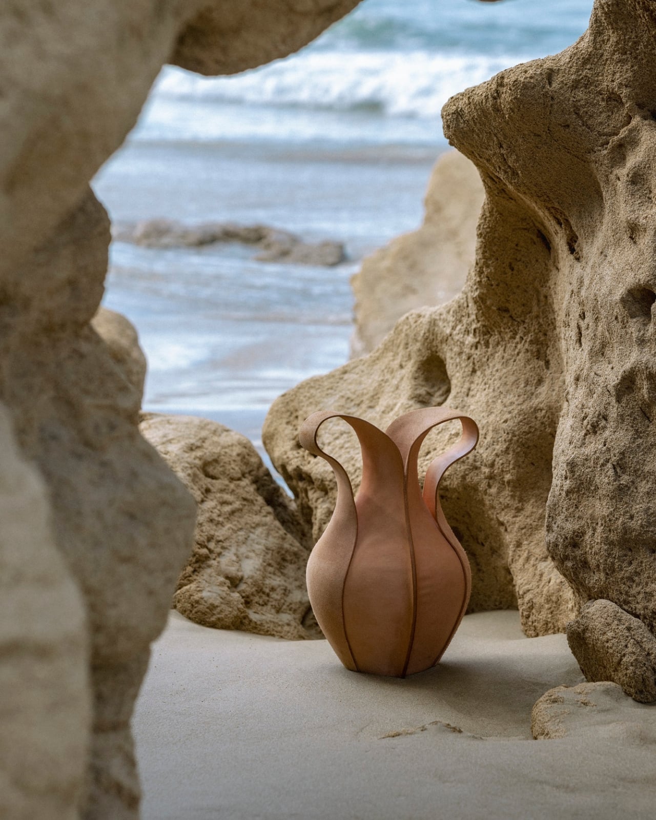
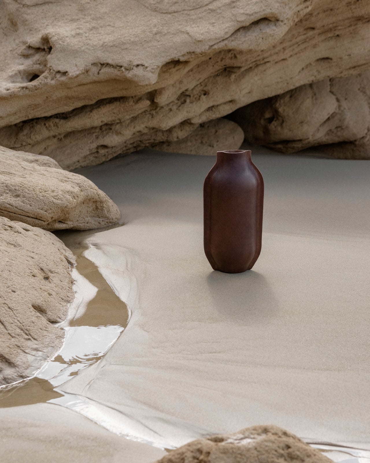
Luvaton is a Tel Aviv-based designer and leather craft artist, and her work is rooted in what she describes as a material-driven approach, which basically means the leather tells her where to go as much as she tells it. She works exclusively with sustainable vegetable-tanned leather, shaped by hand using wet-forming techniques and custom molds. The process involves pressure, moisture, and time, three variables that make each piece genuinely impossible to replicate exactly. That’s not a marketing claim. It’s a physical fact of the material.

Designer: Talia Luvaton

Her newest project, TRACE, makes its world debut at Milan Design Week 2026, opening April 20, and it might be the most personal thing she has made so far. It began with observational drawings of the human body. Fluid, organic shapes. Lines extracted from those drawings were then translated into three-dimensional form, the leather holding onto the gesture of the body the way a cast holds the memory of what shaped it. The pieces balance tension and softness in a way that feels almost contradictory, rigid enough to hold their form, yielding enough to feel warm.

I think that tension is entirely the point. Leather, as a material, carries its own contradictions. It’s strong but supple, ancient but endlessly contemporary. Luvaton leans into all of it, refusing to let the material play just one role. TRACE reads as sculpture, as vessel, as portrait. There’s no single correct way to categorize it, and that’s not a flaw. That’s the work.

What makes Luvaton’s practice feel particularly resonant right now is how personal the foundation of it is. Both of her parents are jewelers. Her grandfather was a shoemaker, and although she never met him, she still works with some of his original tools today. That detail gets me every time. To hold a tool that someone else held, someone whose hands shaped the same kind of material, is a profound form of continuity. The making is inherited. The language of craft passes down not just through instruction but through objects, through the weight of a tool in your hand.

This depth of lineage shows up across the broader body of work she’ll present in Milan. Alongside TRACE, visitors will see TOHA, her first vessel collection; SLICE; REBLOOM; and HEALED, a series of tattooed vessels created in collaboration with professional tattoo artists who work directly onto the leather surface using electric needles. Tattooed leather vessels. The idea feels both completely logical and completely radical, and that combination is exactly the kind of design thinking worth paying attention to.

For those of us who follow craft and design closely, Luvaton’s presence at Milan feels significant for reasons beyond the work itself. This is her first time at the event, and she’s arriving not with a polished commercial line but with a practice, a set of values, and a very specific way of understanding what a material can do. At a moment when the design conversation is increasingly dominated by AI-generated forms and rapid prototyping, there’s real weight in watching someone slow everything down, put their hands in wet leather, and wait for it to tell them something.

TRACE, as a title, does exactly what it promises. It traces movement back to its origin. It traces craft back through a family. It traces the line between the body and the object, and asks you to reconsider where one ends and the other begins. That’s the kind of design work that stays with you long after you’ve left the room.

The post The Leather Vessels at Milan 2026 That Feel Like They’re Breathing first appeared on Yanko Design.
Preciosa To Make Light Feel Like a Living Thing at Milan 2026

Light has always been design’s most underrated material. We talk endlessly about furniture, textiles, and surfaces, but light? It usually plays the supporting role, the thing that makes everything else look good. Preciosa Lighting is quietly changing that conversation, and their latest collection, Drifting Lights, might be the most convincing argument they’ve made yet.

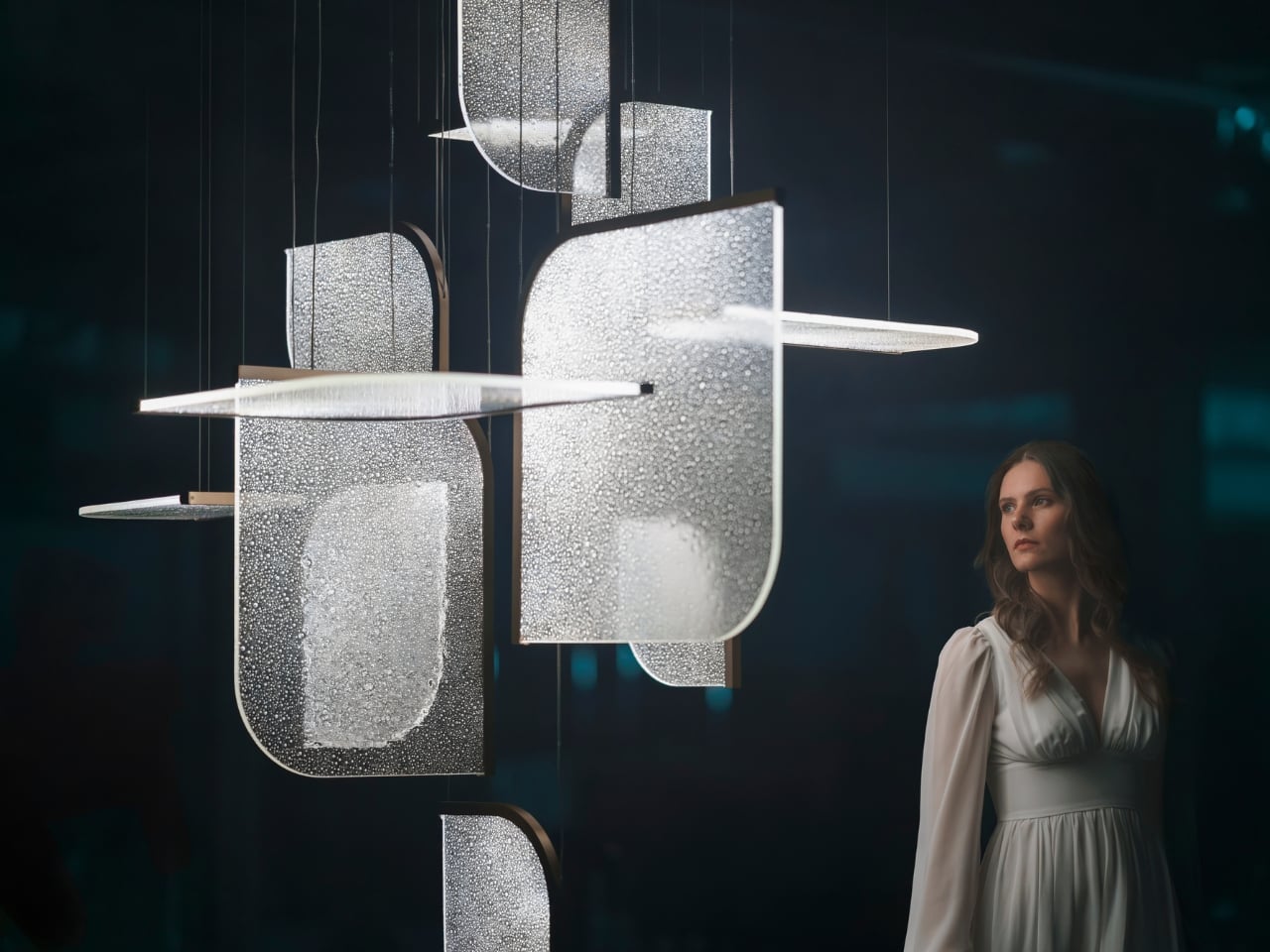
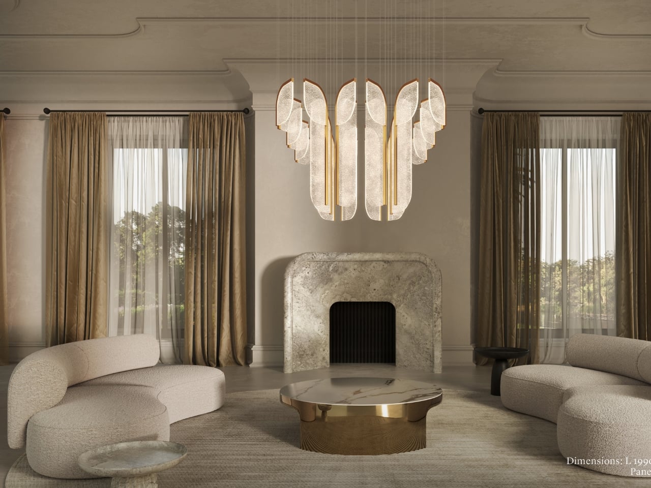
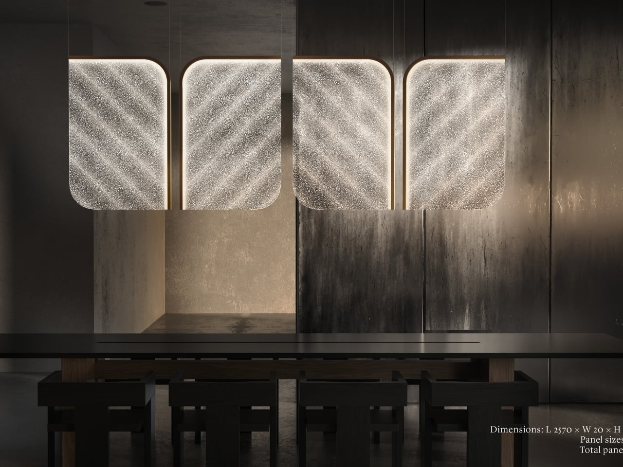
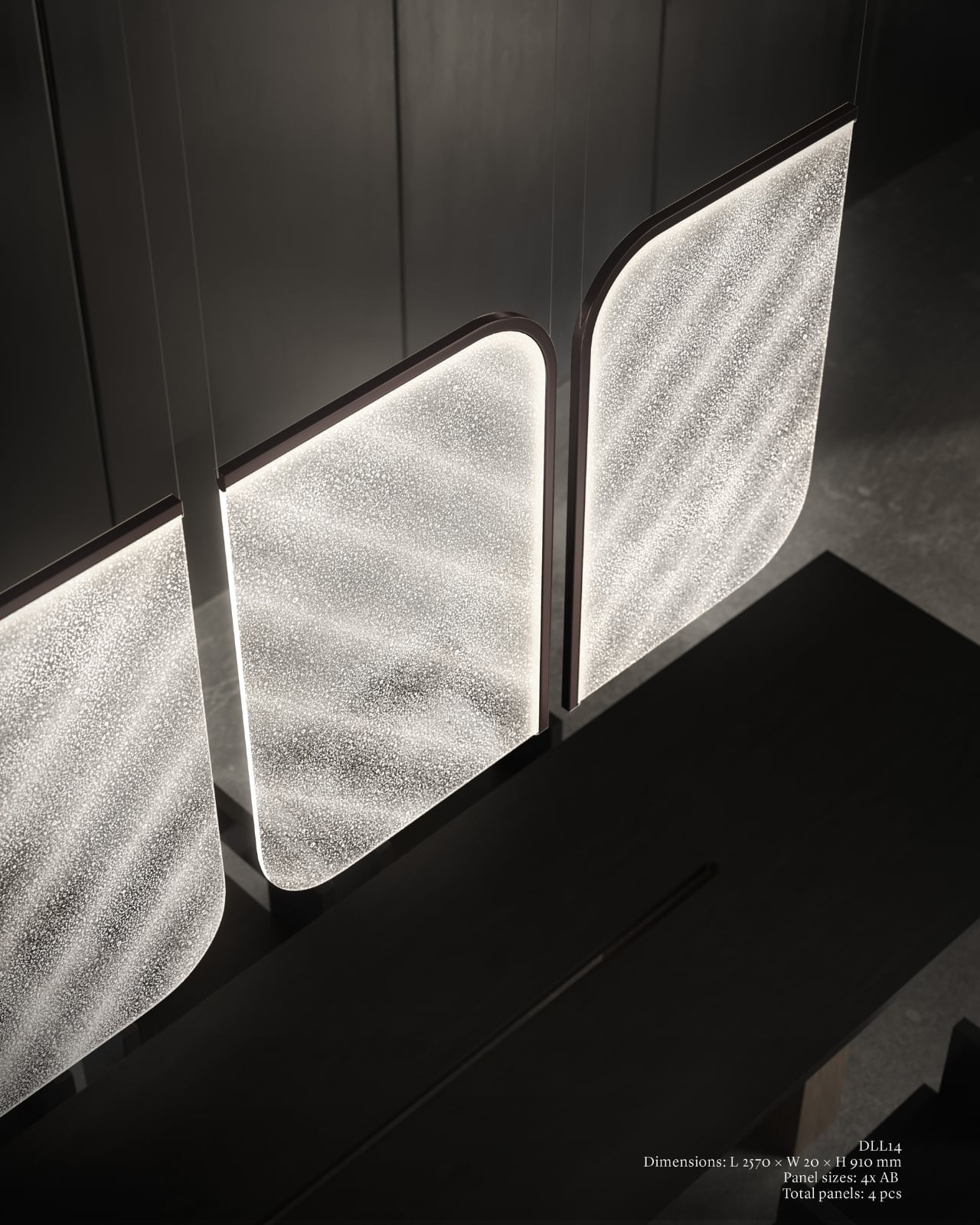
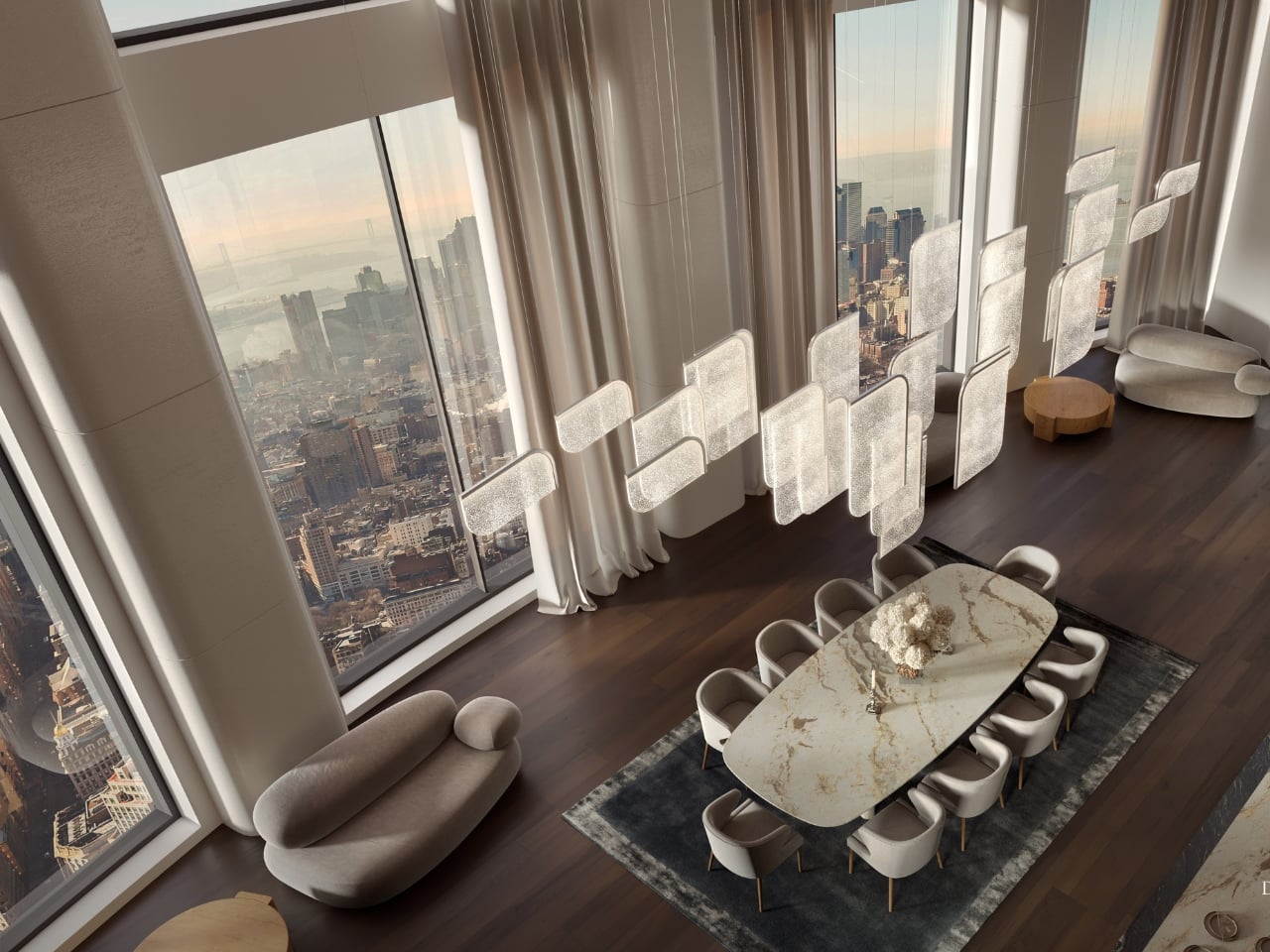
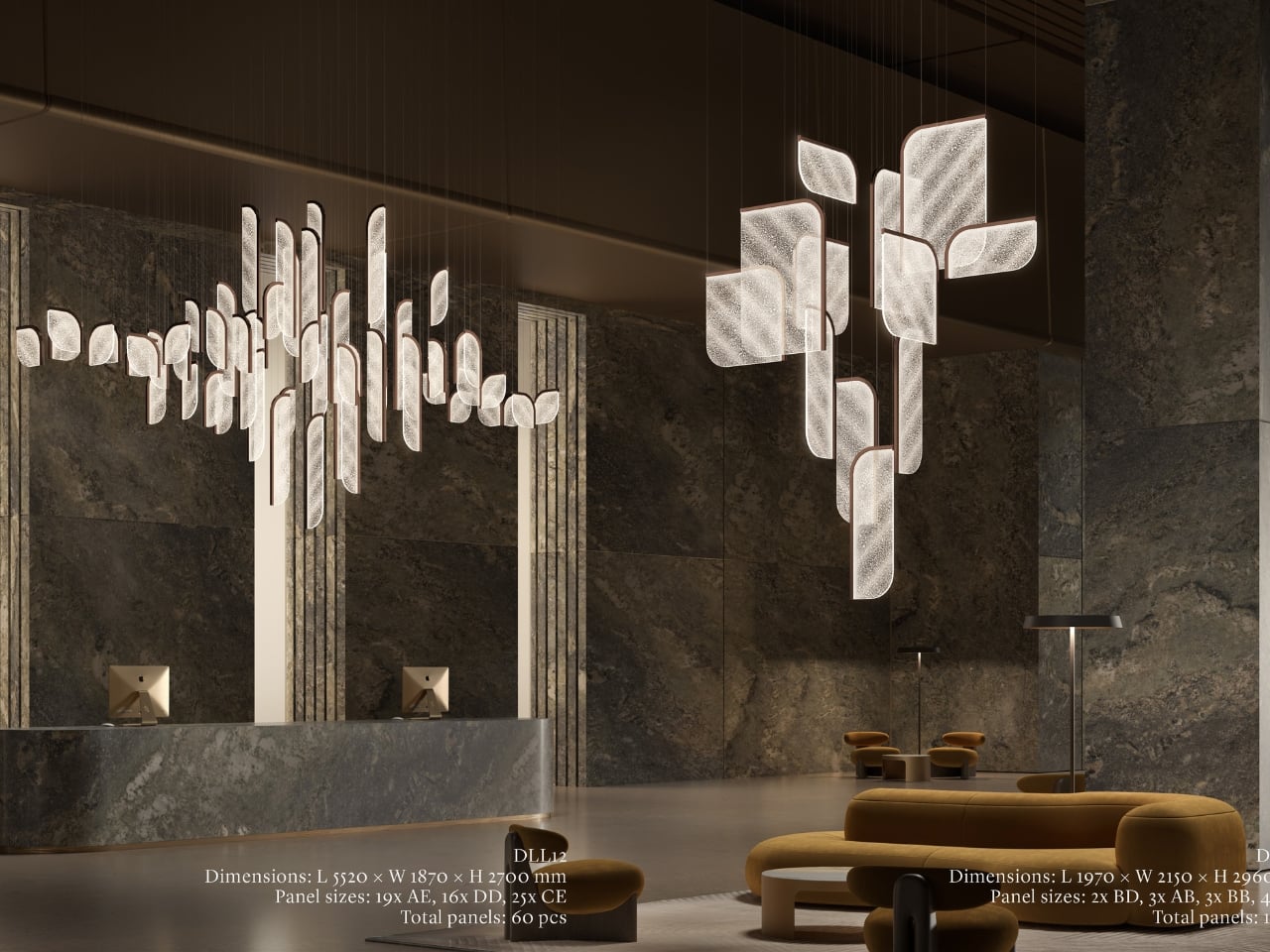
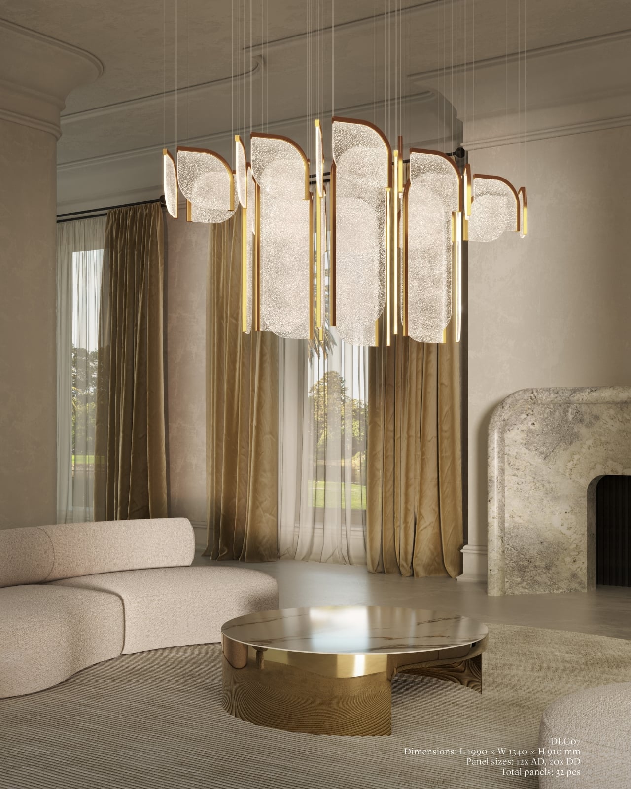
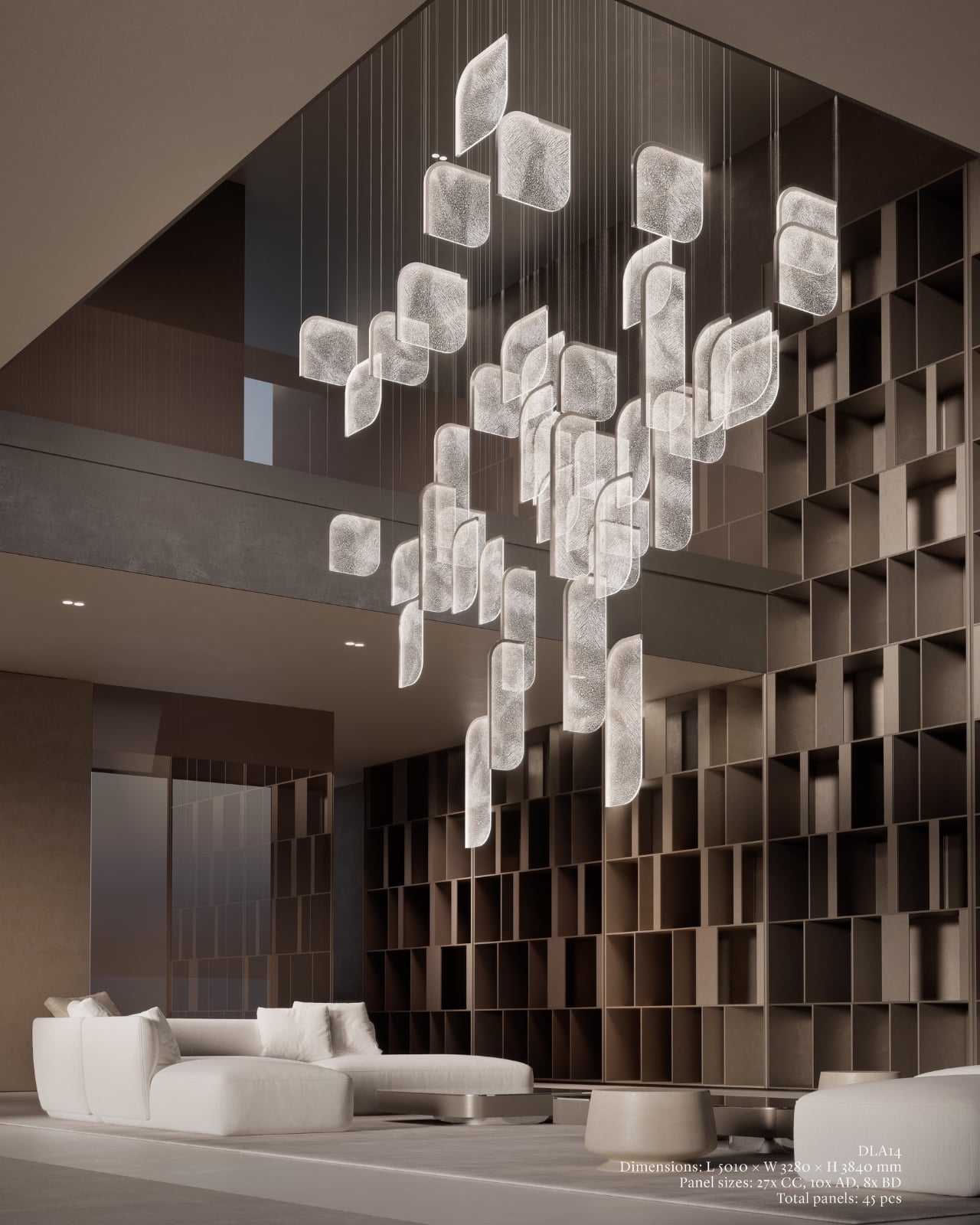
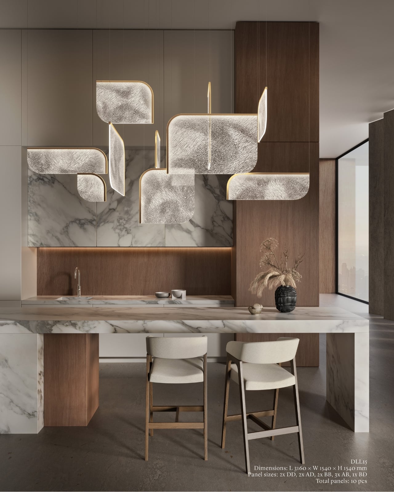
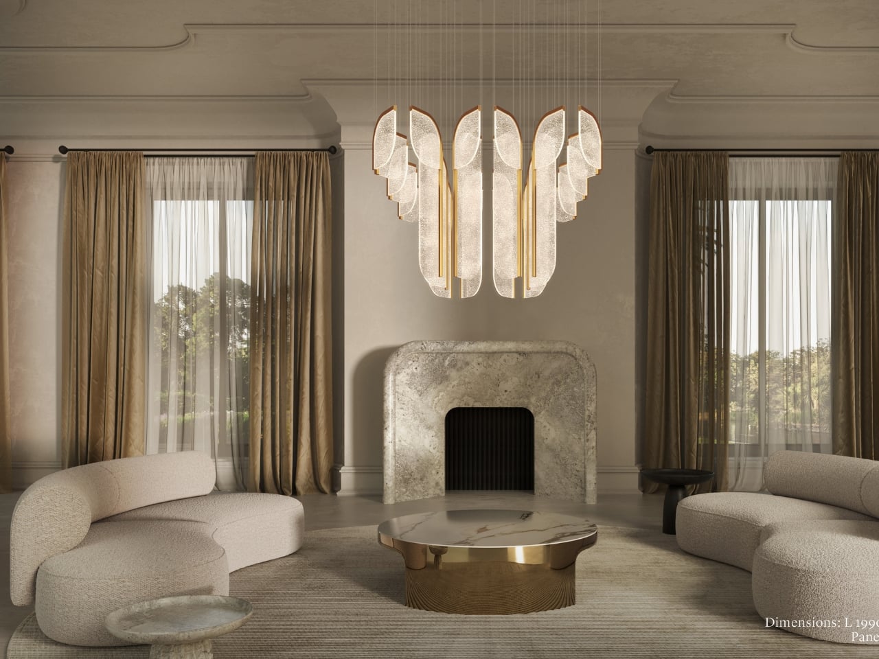
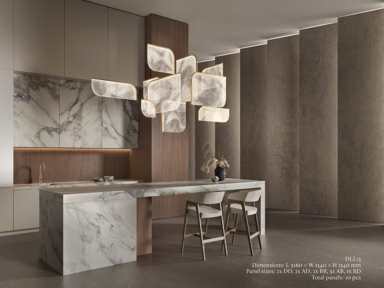
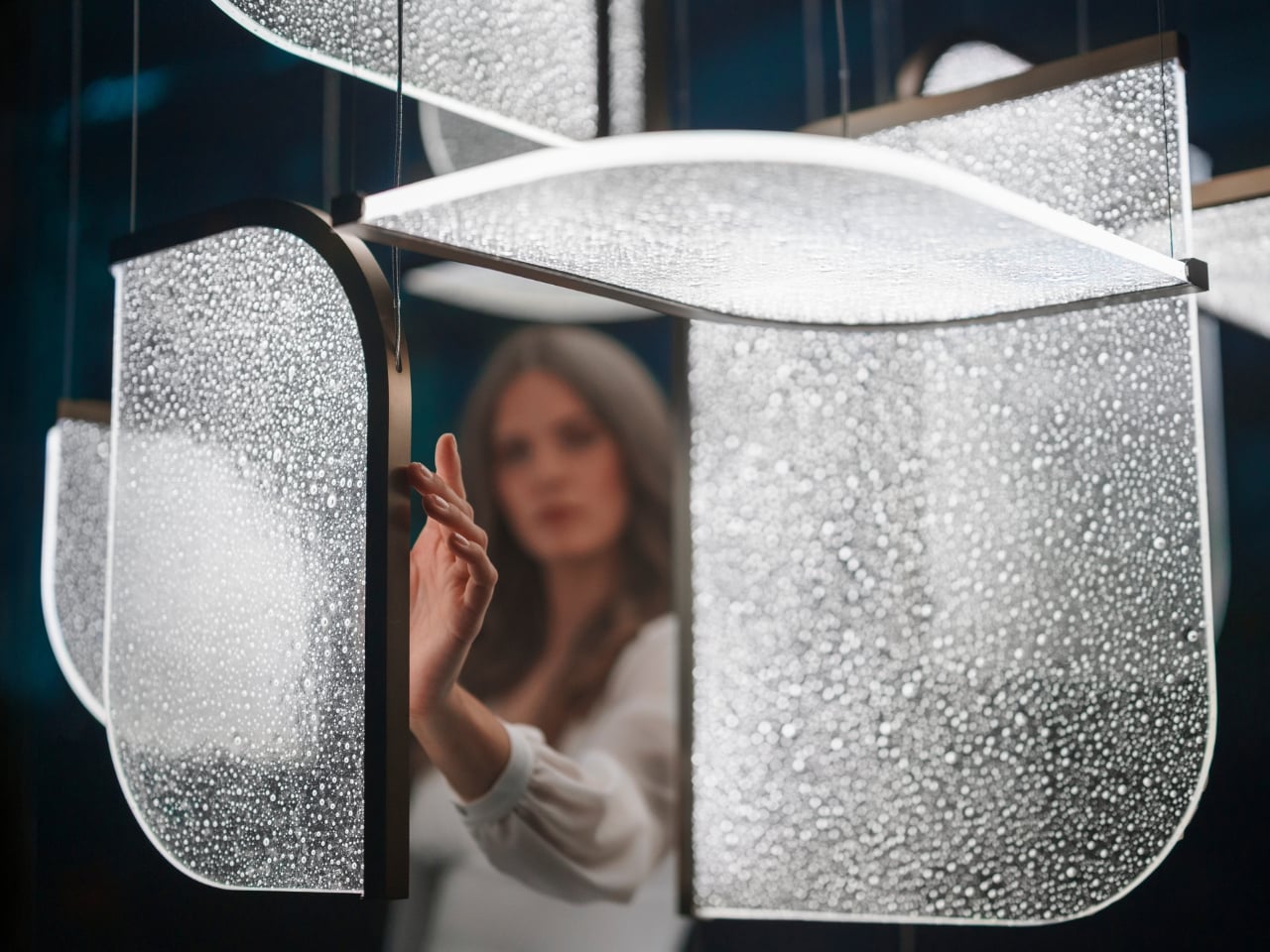
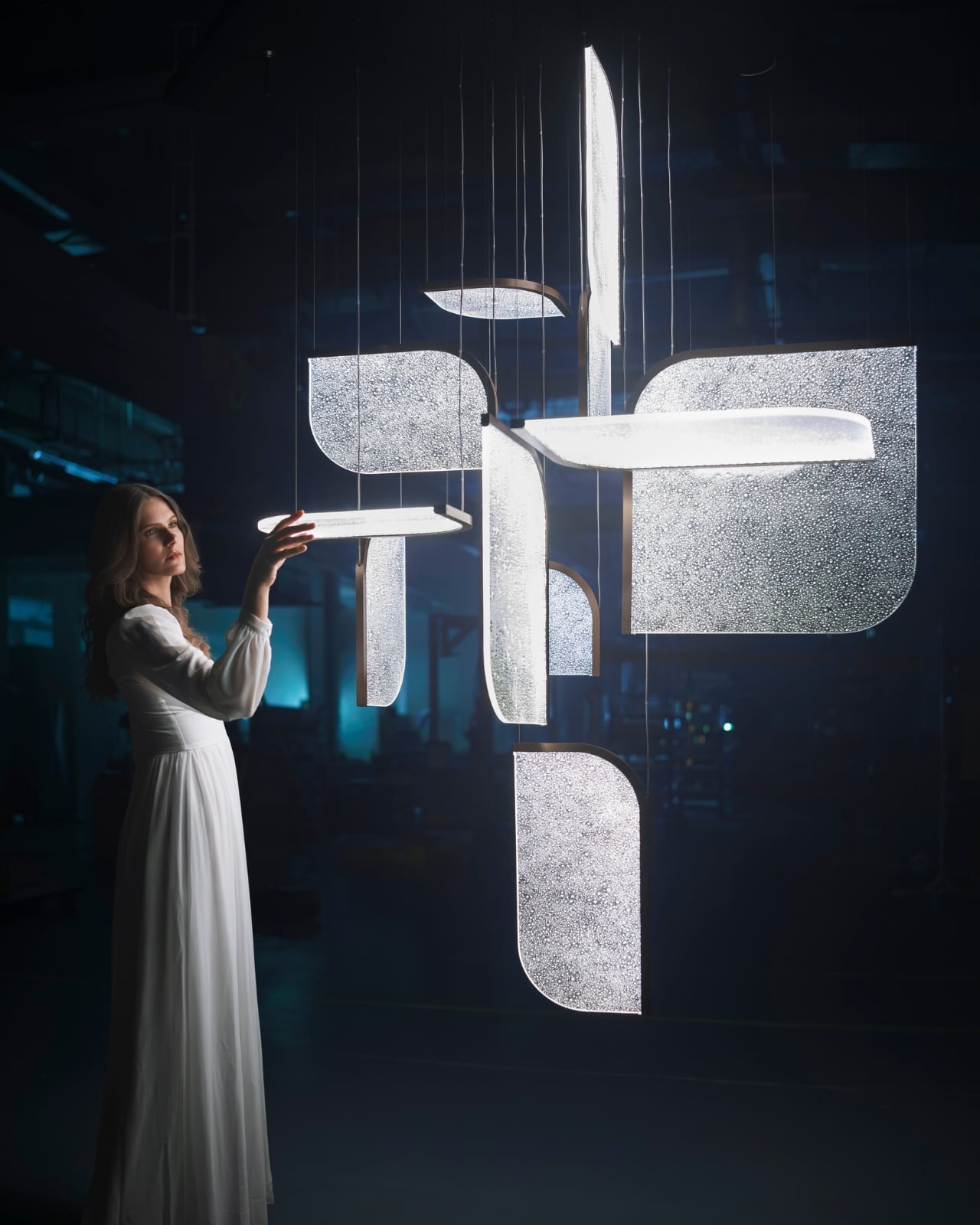
The Czech brand has been doing this long enough to know the difference between novelty and genuine craft. Their heritage is rooted in traditional glassmaking, but what they’ve built with Drifting Lights feels like a very deliberate step forward. Each piece is made up of oblong and square glass panels slotted into a stainless-steel frame that discreetly conceals an LED strip. Inside each panel, the glass has been infused with countless tiny air bubbles. When light passes through, it doesn’t just illuminate the glass. It gets lost in it, scattering through those bubbles in a way that looks less like electricity and more like light deciding where it wants to go.

Designer: Preciousa Lighting

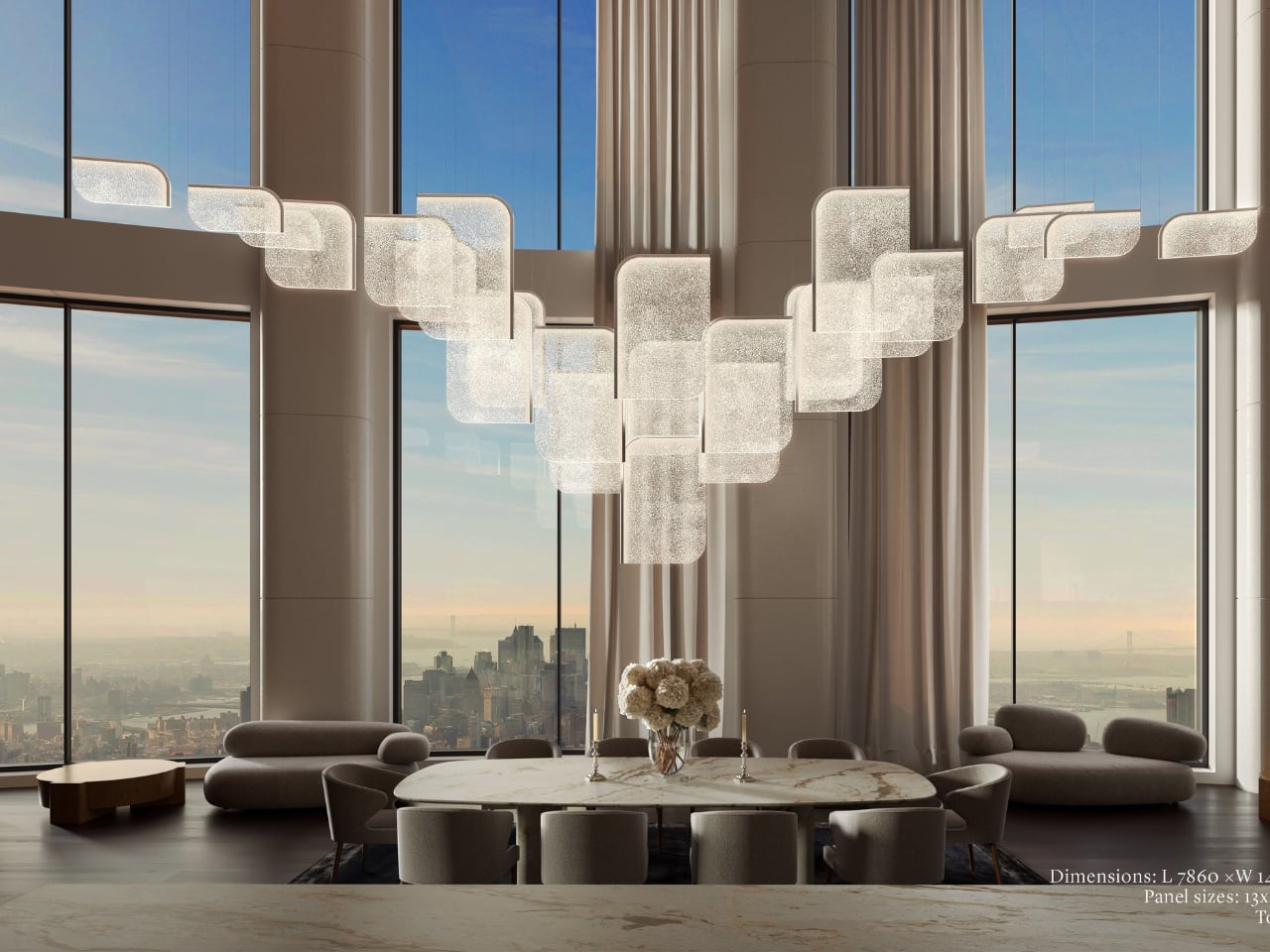
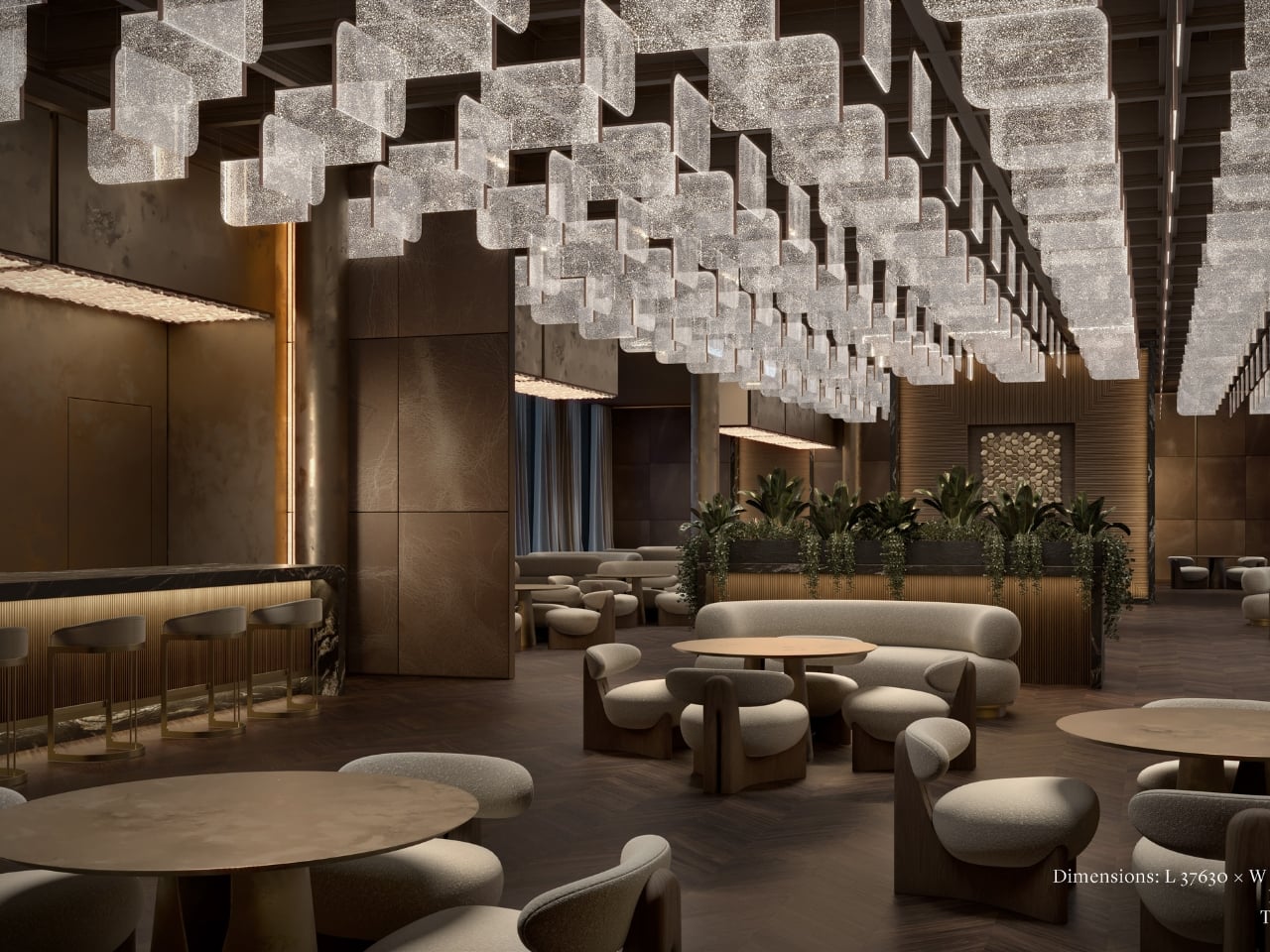
For Milan Design Week 2026, Preciosa is bringing the full Drifting Lights experience to the Tempesta Art Gallery in Brera, and the scale alone is worth paying attention to. The installation spans approximately 30 square metres and features 60 glass panels suspended vertically and horizontally, forming a structure measuring 8.7 by 3.2 by 3 metres. Set against a dark interior, the panels will be animated using 3D spatial mapping and RGBW technology, cycling through colour sequences from red to pink to green. Co-Creative Directors Michael Vasku and Andreas Klug put it plainly: the installation aims at “creating space to slow down, pause and wonder.”
I appreciate that framing, because Milan Design Week is genuinely relentless. Every brand is competing for the loudest moment, the most shareable installation, the boldest statement. There is a real temptation to optimise for the 15-second video clip rather than the actual experience of standing in a room. Preciosa is betting on the opposite, and I think that’s the smarter play. The colour sequence from red to pink to green reads like an emotional arc rather than a tech demo, referencing love, passion, and inner peace. Whether or not you buy the symbolism, you can’t argue with the atmosphere it creates.
A design object earns its place when it works just as well outside a gallery as inside one, and Drifting Lights has clearly been thought through on that level. The panels come in ten sizes, with different metal frame finishes and the option to orient them vertically or horizontally. The same collection can fill a grand hotel lobby or anchor a living room without losing its character. For bespoke projects, Preciosa can apply a painting technique that introduces pigment bubbles into the glass, giving each panel a layer of quiet individuality. The bubbled glass can also be enhanced with their Fused Veil pattern, which shifts the direction of light and adds even more visual complexity.

Under static illumination, Drifting Lights is calm and composed. Switch to dynamic mode and the panels come alive, with light moving from one to the next like ink dispersing through water. The gradients bloom, soften, and recombine. It’s the kind of effect that makes you stay in a room longer than you planned, which is, ultimately, what great lighting is supposed to do.

Preciosa has had a strong run at Fuorisalone in recent years, with recognised installations at Zona Tortona and Euroluce. The move to Tempesta on Foro Buonaparte suits the work well: a contemporary art gallery setting that lets the installation breathe without competing with showroom furniture. It’s a confident choice for a collection that clearly doesn’t need much help making a room feel different. If you’re heading to Milan, the installation runs April 20 to 26 at the Tempesta Art Gallery on Foro Buonaparte, and this one is worth the detour.

The post Preciosa To Make Light Feel Like a Living Thing at Milan 2026 first appeared on Yanko Design.