
China becomes the second country to recover a rocket booster
China made a breakthrough in its space program with the successful capture of a Long March 10B rocket booster.


The bag at the gate tells you everything about the trip someone is about to take. Most carry-ons bear the evidence of decisions made at midnight before an early flight: a tangle of cables, three chargers each handling one job, headphones shoved in without a case. This list is an argument for doing it differently. Nine products, each designed with enough care that the airport is just the first room you move through.
The criteria here are stricter than a standard gear roundup. Every product had to pass through security without a conversation, photograph well enough to earn the second look it deserves, and be genuinely useful before you reached your seat. Beautiful objects that fail to travel are half-finished ideas. The nine below have no such problem. They were built to move, and the summer gives them every reason to.
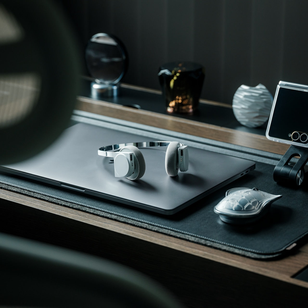
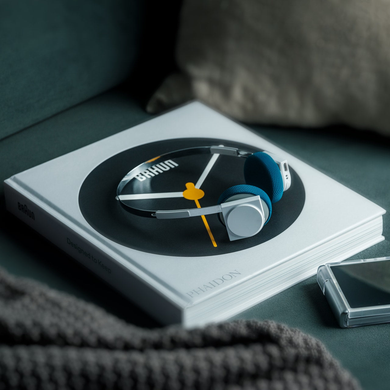
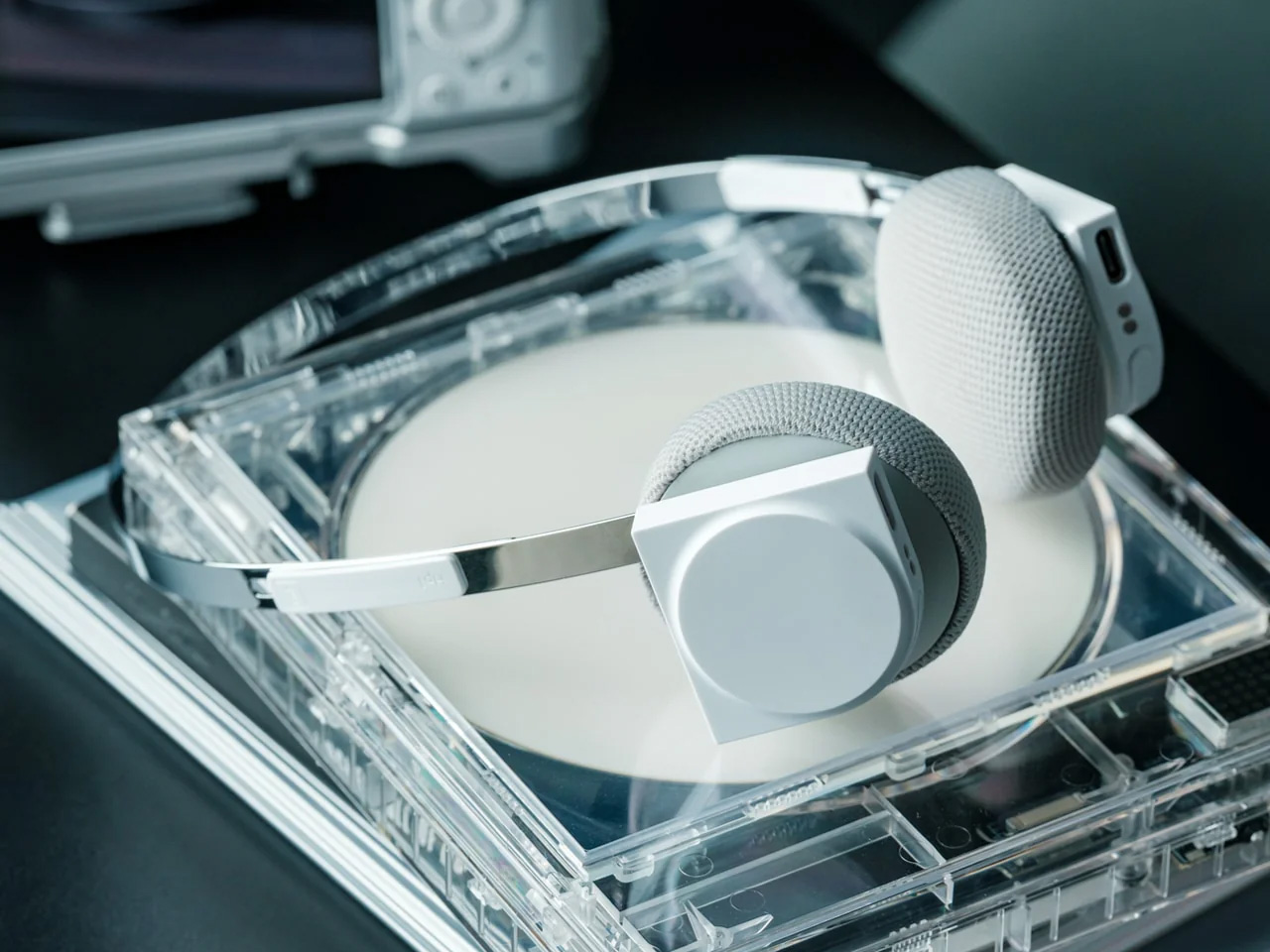
There is a particular moment on a long flight when you adjust your headphones for the fourth time and understand that the pair was never really designed for more than an hour of wear. The Stillframe headphones start from a different premise entirely. The design language reads functional first: no exaggerated cups, no status-signaling color range, no materials that prioritize the unboxing over the sixth hour in the air. These were made for the kind of listening that actually happens in transit, across a full day of movement.
At $245, they sit in the territory where the decision stops being casual. What earns the price is the coherence of the object itself. This is not a pair of headphones that optimizes for one feature and hopes the rest resolves itself. The sustained-wear focus addresses the gap between audio gear that performs on a spec sheet and gear you actually want to wear at every leg of a journey. A gate, a connection, a hotel room where you need to reset before morning: the Stillframe was designed for all three.
Click Here to Buy Now: $245.00
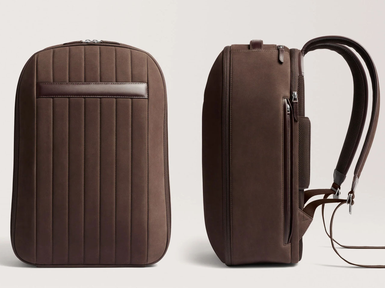
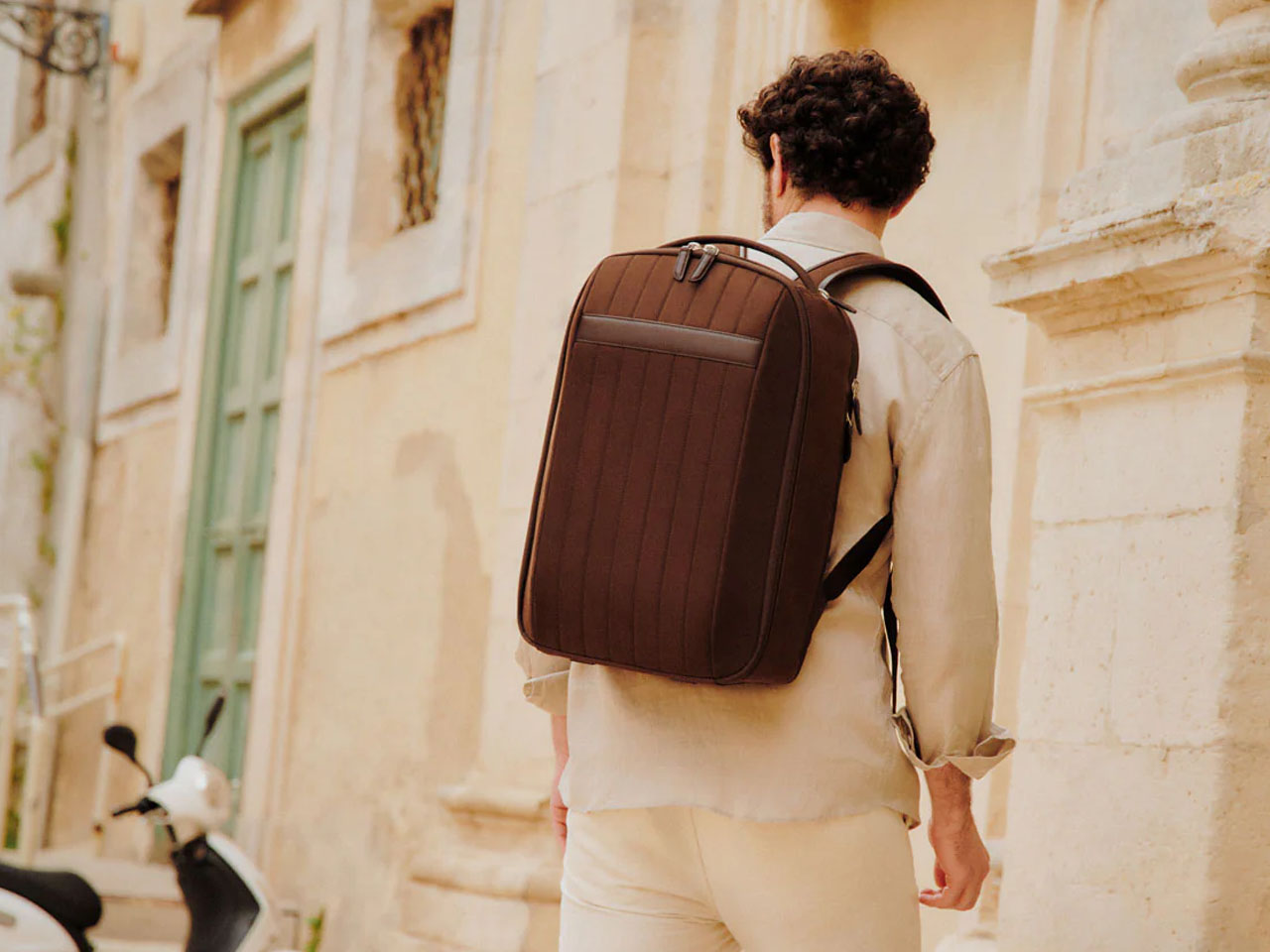
Most travel bags solve the wrong problem. They maximize capacity, add organizational pockets until the zipper count exceeds any practical utility, and end up shaped for the product page rather than the airport floor. The Carl Friedrik 72-Hour Backpack starts from a different question: what does three days of real movement actually require? The answer is a clamshell bag that opens flat, shows everything at once, and closes without the repacking ritual that top-load alternatives demand at security checkpoints.
The 72-hour designation is the most honest thing about this bag, and that specificity is exactly how you know it was properly thought through. It holds a laptop, a change of clothes, chargers, and documents without expanding beyond what carry-on overhead bins tolerate. The premium materials age into something that looks better used than new, which is the long-term argument for spending more on a travel bag than instinct usually recommends. For a summer of early connections and improvised schedules, the bag you stop thinking about entirely is the right one.
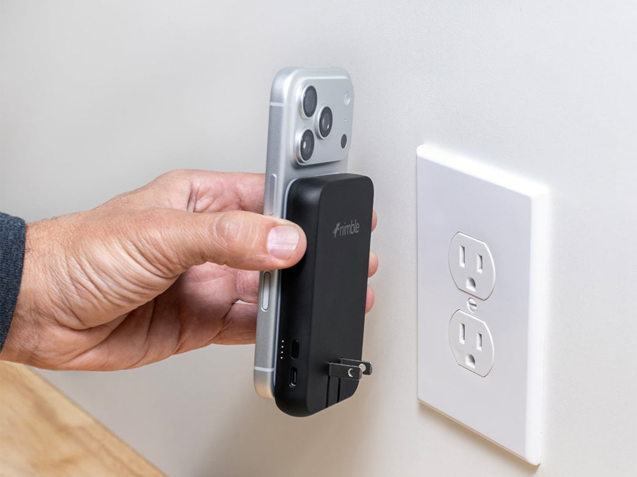
Most people travel with three charging accessories and use each one just enough to feel justified bringing all three. A wall charger takes one outlet. The power bank takes bag space. The wireless pad needs its own cable. Nimble’s WALLY Pro Wireless is a single device, 0.61 inches thick when not plugged in, that handles all three at once. Plug it into the wall, and it charges the internal 5,000mAh battery and your phone simultaneously. Pull it off, and it switches to bank mode without pause.
TSA-approved, ETL-certified, and built to run on 100 to 240 volts without a separate adapter, this is the charging solution that works before you leave the country and keeps working after you land. Qi2 wireless output runs at up to 15W, the USB-C port at up to 20W, and four LED indicators along the side give a clear battery readout before you leave the room. The housing is 100 percent post-consumer recycled plastic with a carbon-neutral designation. At $49.95, it quietly removes three items from the packing list without replacing them with anything.
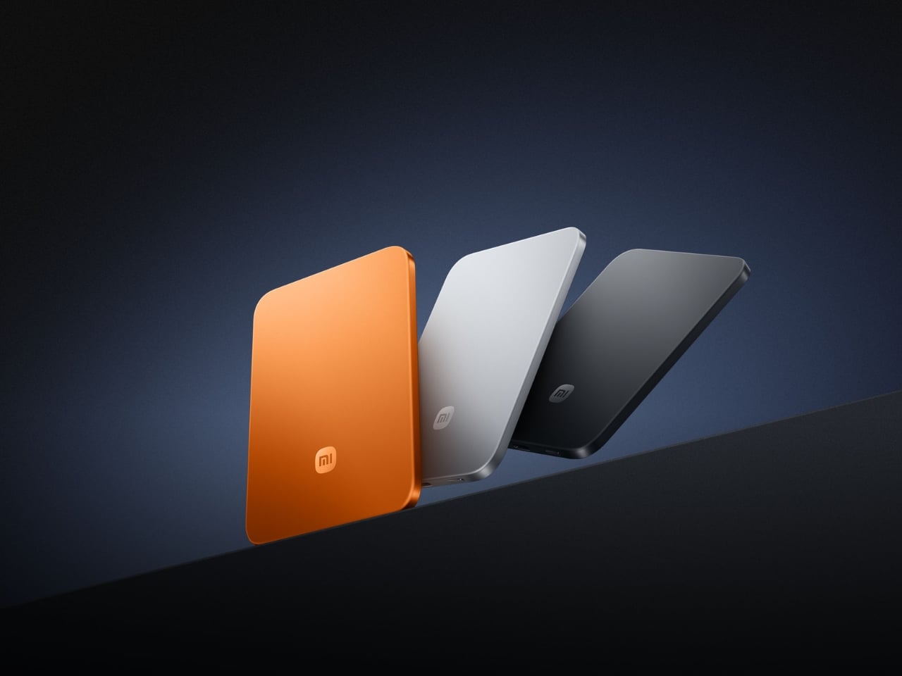
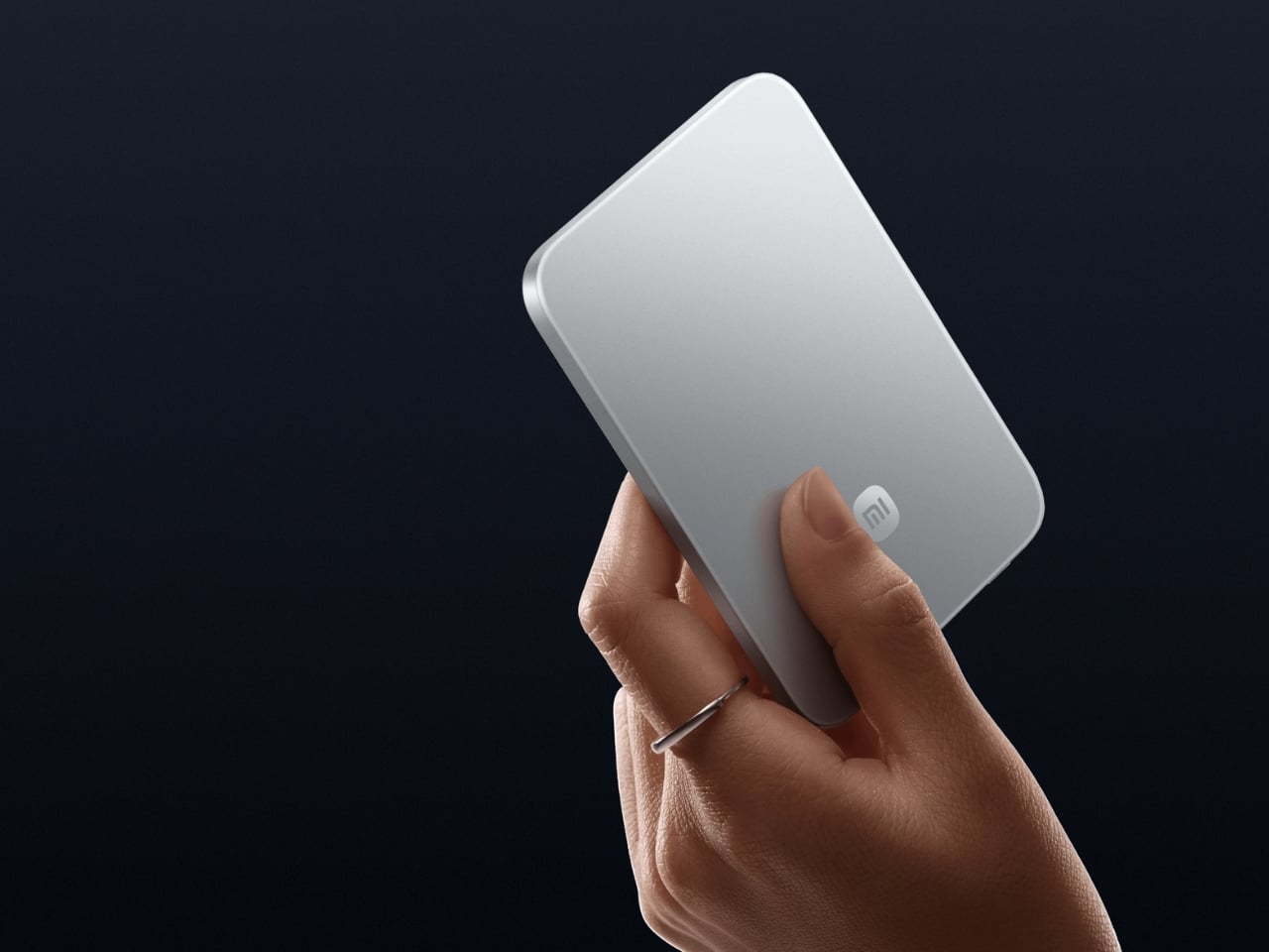
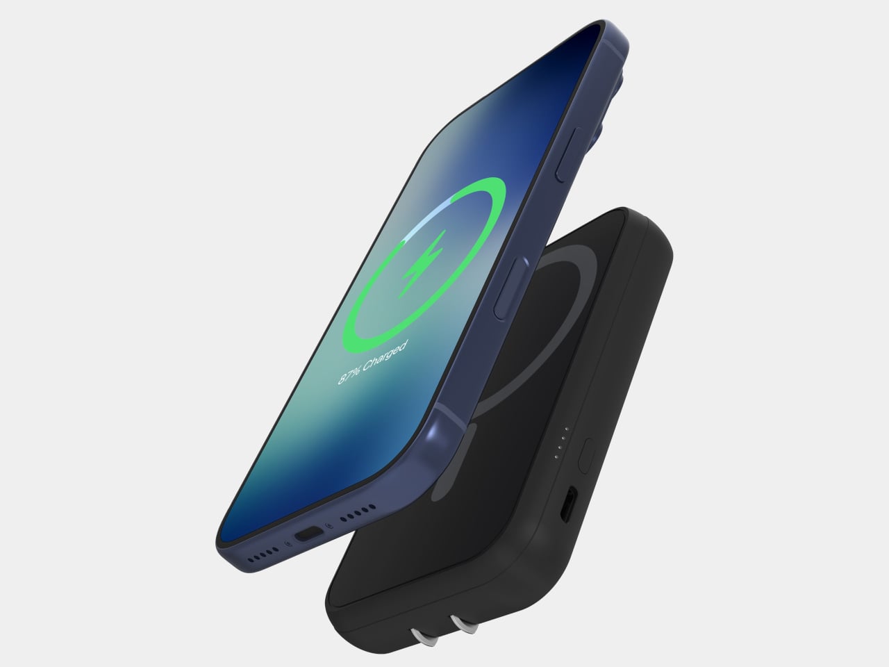
A 6mm power bank sounds like a specification claim until you hold one and register that it is thinner than the phone it is about to charge. Xiaomi’s UltraThin Magnetic Power Bank weighs 98 grams and delivers 5,000mAh through silicon-carbon battery chemistry at 16 percent silicon content, which is the engineering that makes the profile possible without sacrificing capacity. The aluminum alloy shell carries a photolithographically etched logo, the kind of finishing detail that signals someone cared about making the object rather than just shipping it. It was showcased at MWC 2026 in Barcelona.
Snap it magnetically to the back of your phone and forget it is there. Xiaomi 17 series users get up to 15W wireless output; iPhones land at 7.5W due to Apple’s own MagSafe ceiling rather than anything specific to this product. A USB-C port handles 22.5W wired, and the bank charges two devices simultaneously when needed. Ten layers of protection and a 4,369mm² graphite sheet for thermal management complete the picture. The power bank category spent years making capacity the headline. Xiaomi made the story the object itself.
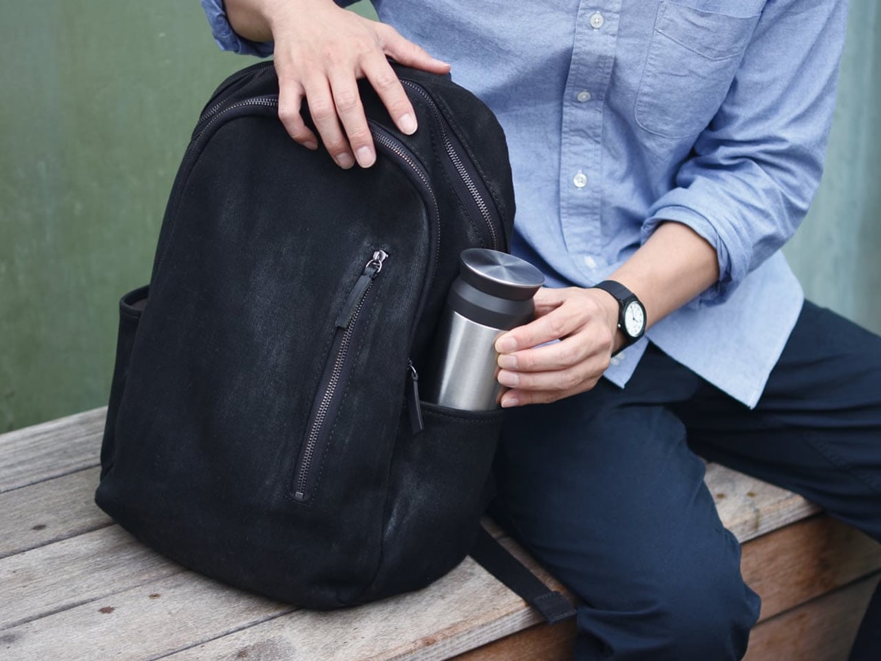

KINTO has been making drinkware in Japan since 1972, and the Travel Tumbler is the product that explains why the brand has a following among people who pay attention to objects. Matte stainless steel, a one-handed screw lid with a silicone seal, and an opening wide enough to drink from without tipping your head back. No rubber gasket on the exterior. No branding beyond a debossed stamp. It disappears into your morning routine and becomes the object that is genuinely difficult to travel without after the first time you do.
The 500ml capacity is where the most precise design thinking lands. Large enough for a real drink, small enough to fit the outer pocket of most travel bags without negotiation. It keeps liquids at temperature for six hours in either direction. For a summer of early trains and long afternoons in cities you are still learning, this is the thing you reach for more consistently than anything else in the bag. The Kinto tumbler does not perform its quality. It simply is quality, in a form refined enough to earn daily use across every kind of travel day.
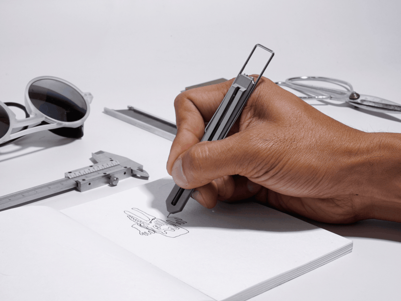

CW&T is a small New York studio that produces objects in limited runs for people who pay close attention to manufacturing. The Pen Type-C Ultra gnuhr Edition is Grade 5 titanium, hollowed and precision-milled to a skeletal profile that removes every gram that does not need to exist. It weighs almost nothing, looks like it belongs in a design archive next to aerospace hardware, and takes a standard ballpoint refill. There is no performance compromise to accept in exchange for the material or the form.
Traveling with this pen converts the act of writing into something you notice. Filling in a form at a hotel desk, signing a receipt, sketching a street corner while your coffee cools: these are the moments when an object of this quality distinguishes itself from everything else in your pocket. It fits on a keychain or in the spine of a notebook, both of which are positions where nothing else this well-made would reasonably fit. For a summer of movement, something is clarifying about carrying a pen built to outlast every passport you will ever own.
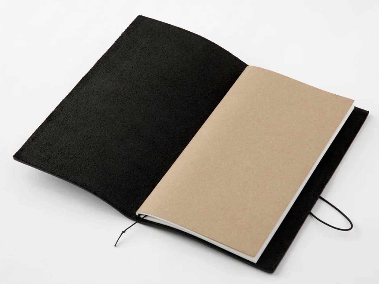
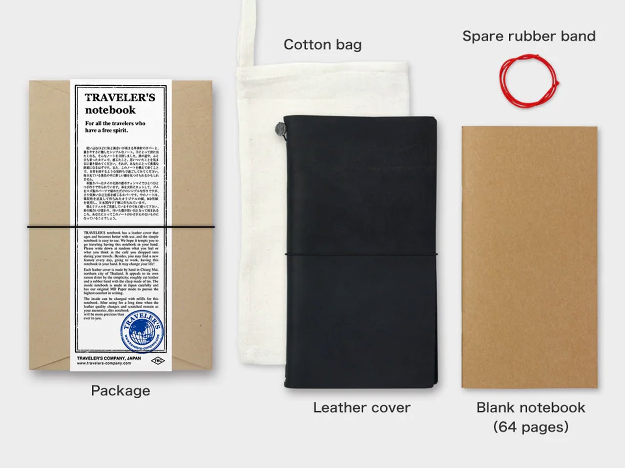
The Traveler’s Notebook has been in continuous production since 2006 and has changed almost nothing about itself, which is one of the more credible endorsements any product can carry. The black edition is oiled buffalo leather over a brass clip and elastic cord that ages into something genuinely lived-in after a single trip. The passport size fits a shirt pocket. The cream-colored MD paper inside is fountain-pen-friendly stock that resists bleed-through quietly and without making a feature of it, which is exactly the right approach.
In a list that sits mostly on the technology end of the travel object spectrum, this earns its place by doing nothing digital. It captures the parts of a trip that photographs miss: the quality of light at seven in the morning on an unfamiliar street, the menu item worth remembering, the address someone wrote down for you on a napkin now tucked into the inner fold. The refillable insert system means the leather accumulates character across years while the interior renews for each new destination. Handwritten travel, in a book that costs less than a dinner, has a relationship to memory that nothing else has yet replaced.
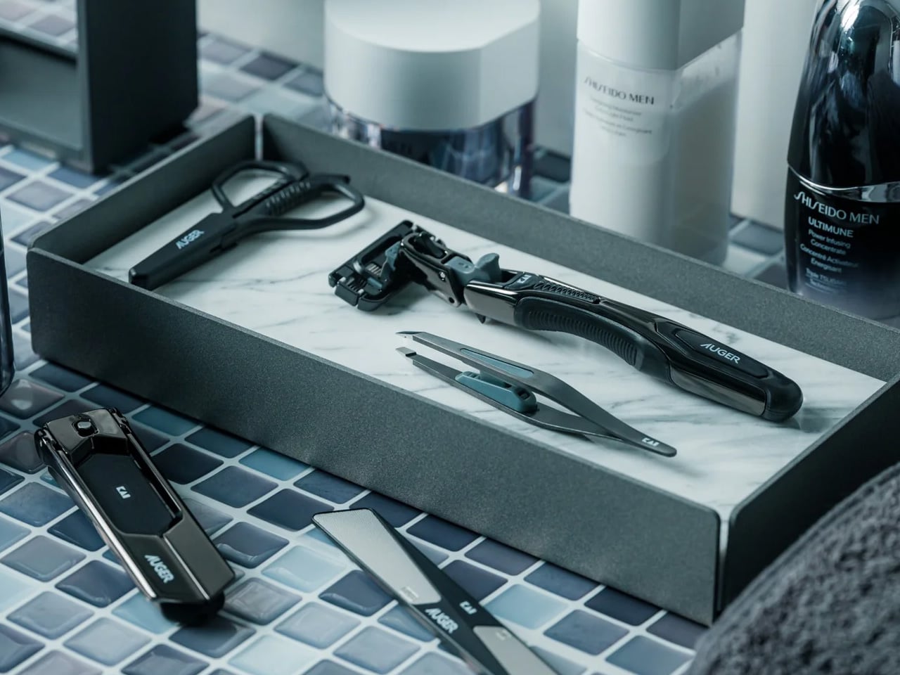
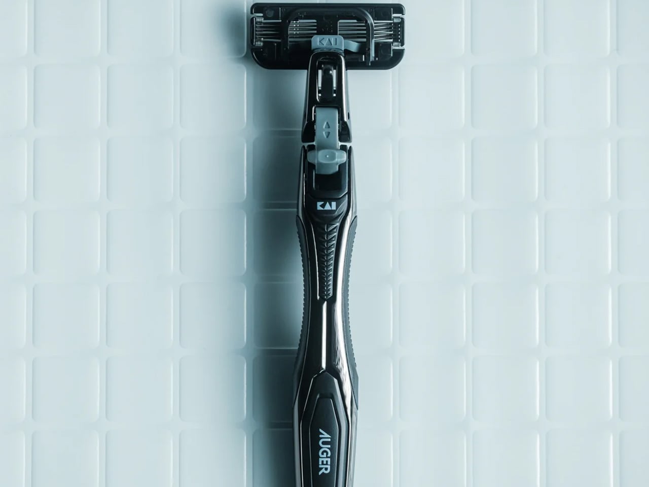
A grooming kit earns its place in a travel bag by doing two things at once: packing small and performing properly. Most travel grooming sets manage one or the other. The ones that pack small feel like toy versions of real tools. The ones that perform well require a hard case that adds more weight than it saves. The Auger PrecisionMaster Grooming Set approaches both as a single design problem rather than a trade-off between them, built around precision as the organizing principle rather than portability treated as an afterthought.
At $150, this is not a stripped-down version of a better kit scaled for a carry-on. It is the kit you actually want to use, built to the same performance standard whether you are at home or checking in somewhere new for the third week running. For anyone who travels frequently enough that grooming across time zones and hotel mirrors is a real logistical consideration, having tools that perform consistently rather than adapting to whatever the bathroom provides is a meaningful daily quality-of-life upgrade. The PrecisionMaster travels with you rather than waiting for you to return.
Click Here to Buy Now: $150.00
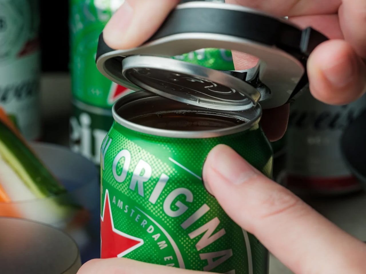
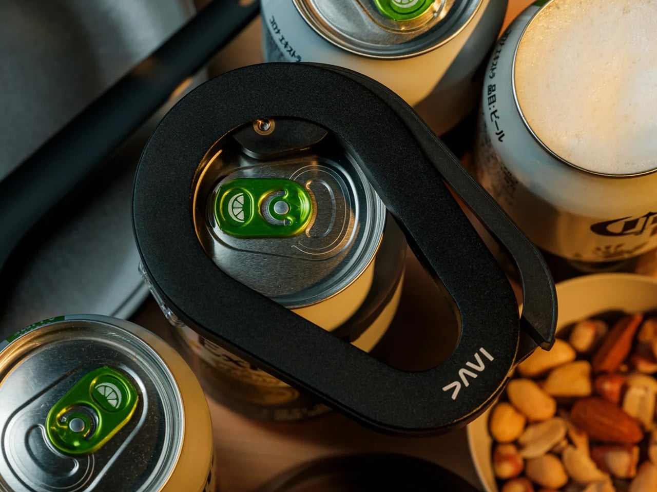
The traveler who stays in apartments and rented kitchens rather than hotels quickly discovers which tools the average rental does not stock. A can opener is at the top of that list with remarkable consistency, and the one left behind by a previous guest is consistently not the one you would choose. The DraftPro Top Can Opener addresses the problem from a design standpoint: a compact, considered tool built around clean removal and a form that earns its place in a travel kit rather than just excusing itself there on grounds of utility alone.
Top can openers remove the full lid rather than cutting the inner edge, which eliminates the sharp rim that traditional openers leave behind. The result is a lid you can replace as a cover, a can you can eat directly from without concern, and a tool you can rinse and pack without a second thought. For the kind of summer travel that involves self-catering, weekly rentals, and cooking wherever the accommodation allows, this is the object that makes the kitchen feel like yours from the first evening rather than the third day after you have figured out what is missing from every drawer.
The best version of a travel kit is the one you stop thinking about. Every item does its job quietly enough that attention goes to the trip itself rather than to the logistics of surviving it. These nine products reach that standard in different ways: some through comfort, some through visual coherence, some through the small rituals that make a long transit day feel like something worth doing rather than something to get through before the trip begins.
Summer is the hardest test for any piece of gear. The heat, the packed transit, the compressed schedules, the improvised plans: they all expose the difference between objects designed for how travel actually works and objects designed for how it looks in a product shot. Everything here holds up under that pressure. Pack them well, move through security without a second thought, and pay attention once you arrive. That is the whole brief.
The post 9 Best Travel Gadgets for Summer 2026 That Survive Both Airport Security and Instagram first appeared on Yanko Design.
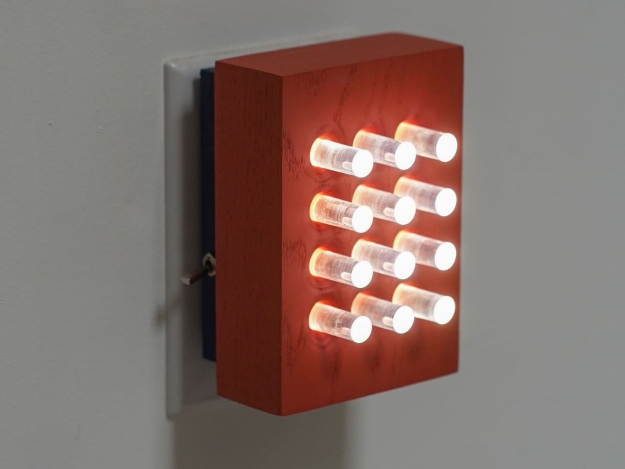
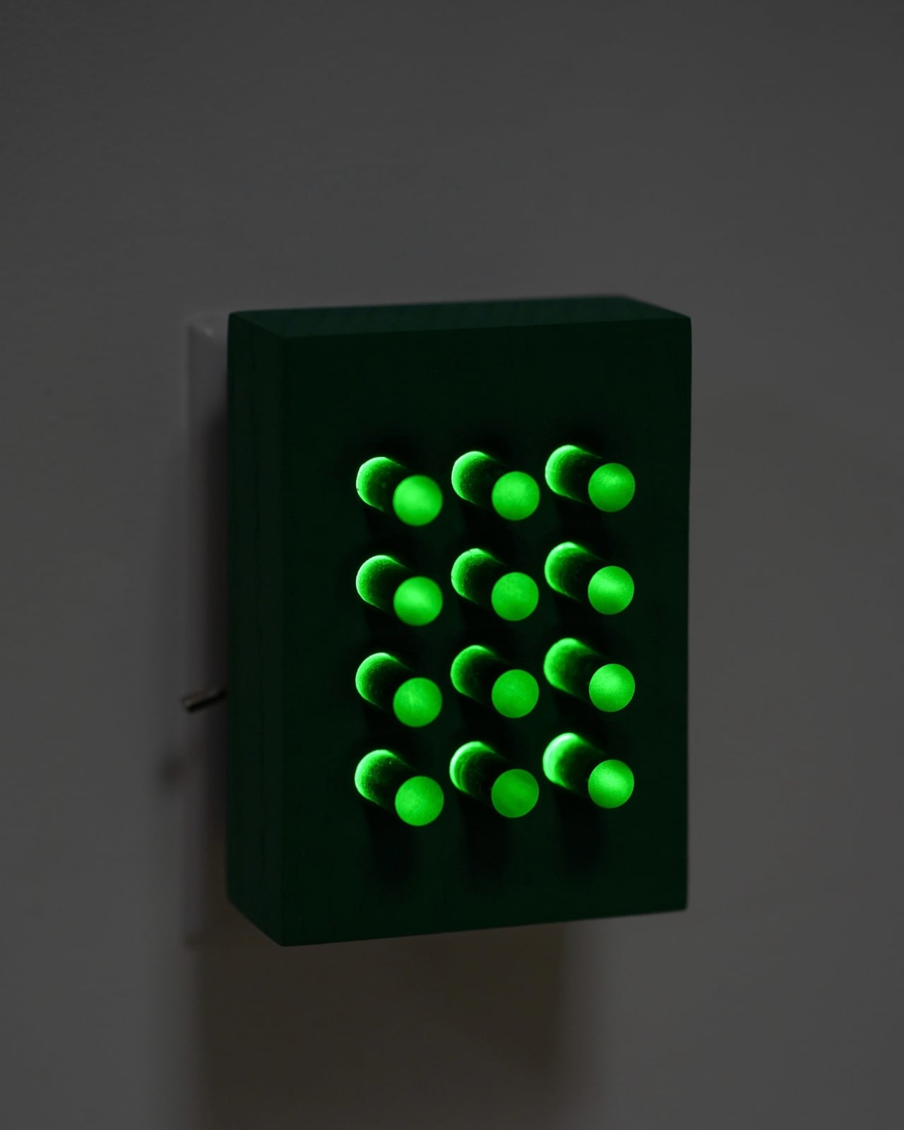
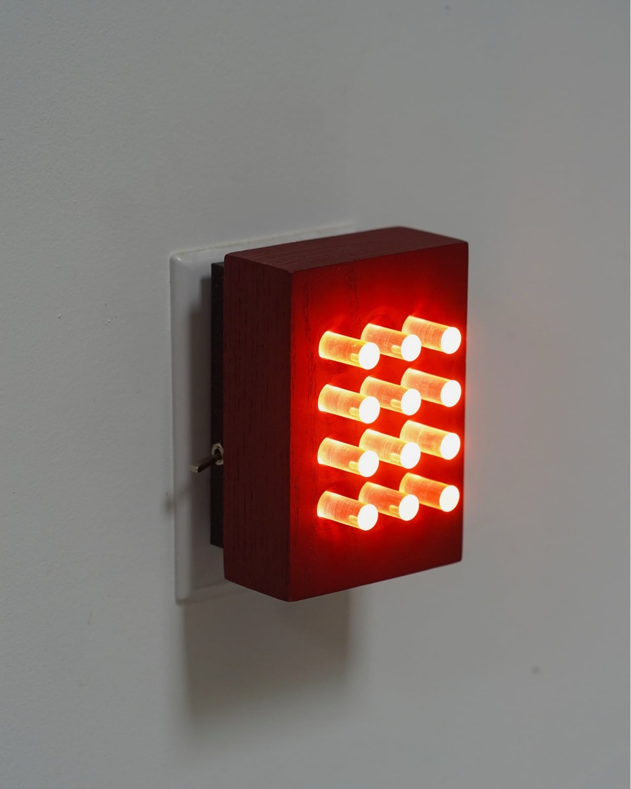
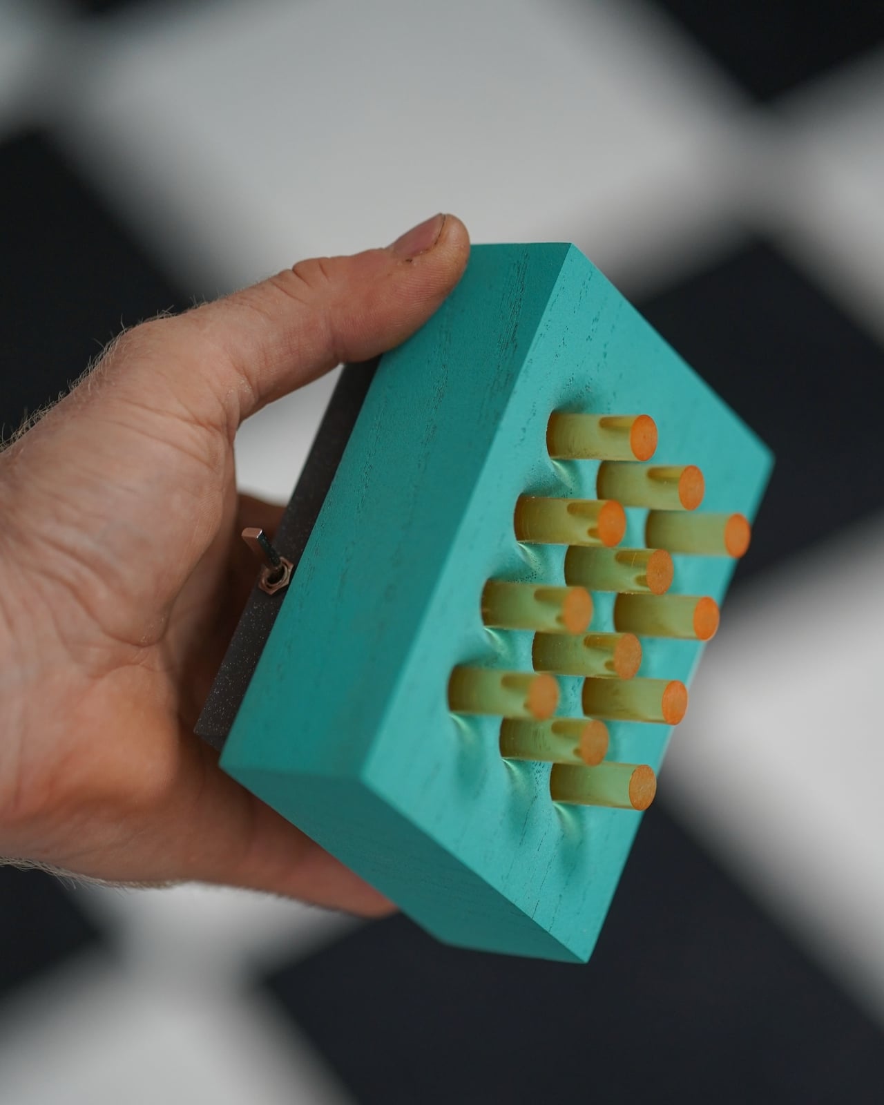
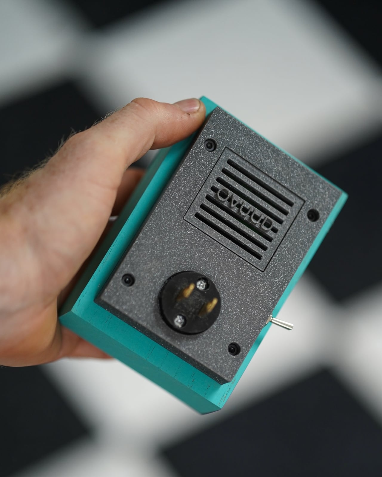
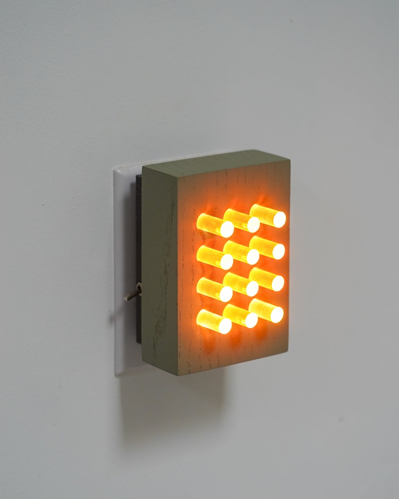
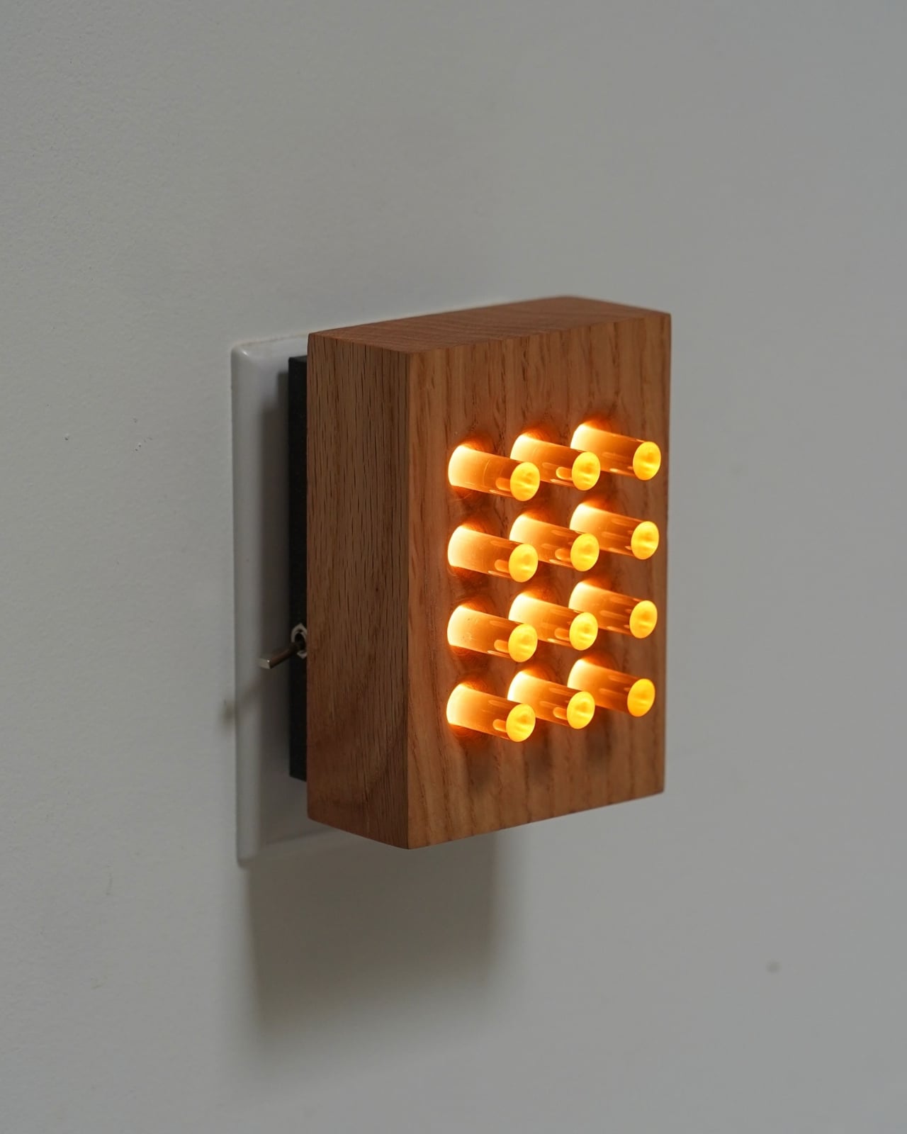
Most nightlights are afterthoughts. A dim plug-in tucked behind a dresser, maybe something shaped like a mushroom from a big-box store. They exist to serve a single function: keep you from stubbing your toe at 2 a.m. Nobody really talks about them. Nobody really considers them. That changed for me when I came across Benjamin Gillespie’s latest from his Philadelphia-based studio, Ovuud, and suddenly I found myself genuinely excited about a nightlight.
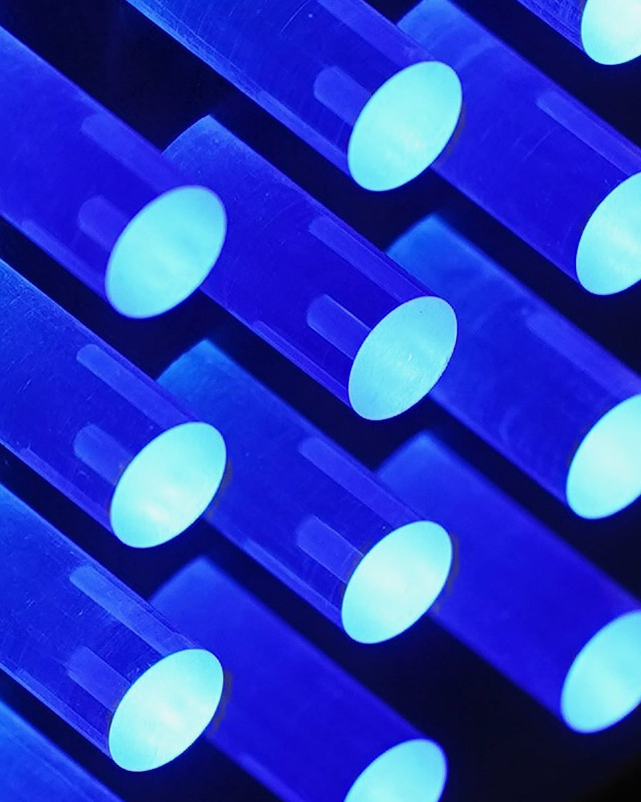
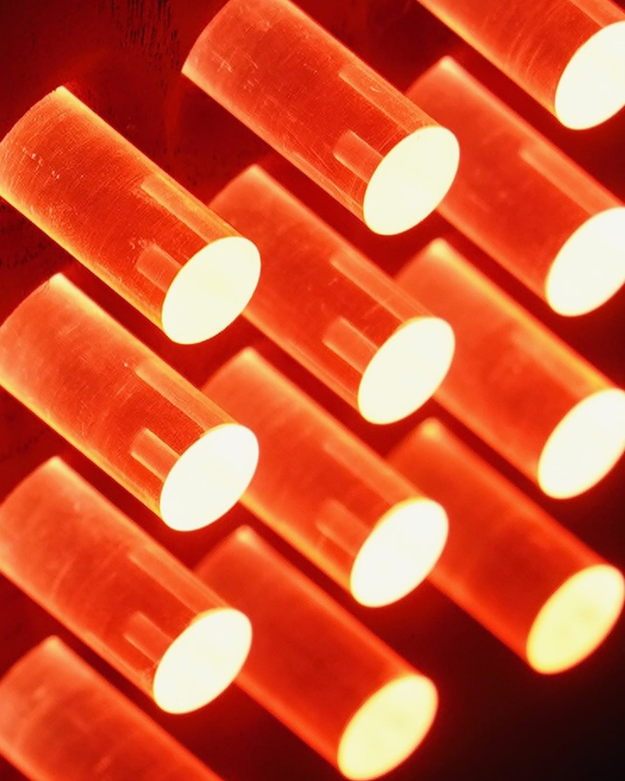
The piece is called Reactor, and it’s now available in a color series that’s worth paying attention to. Gillespie, who runs Ovuud as a one-man operation out of Philadelphia, designs and builds every piece by hand using locally sourced wood. His background is an unusual combination of engineering, woodworking, and a deep architectural sensibility, and you can feel all three of those things at once when you look at his work. The LED is hidden, the wood glows, and everything feels considered without feeling precious.
Designer: Ovuud
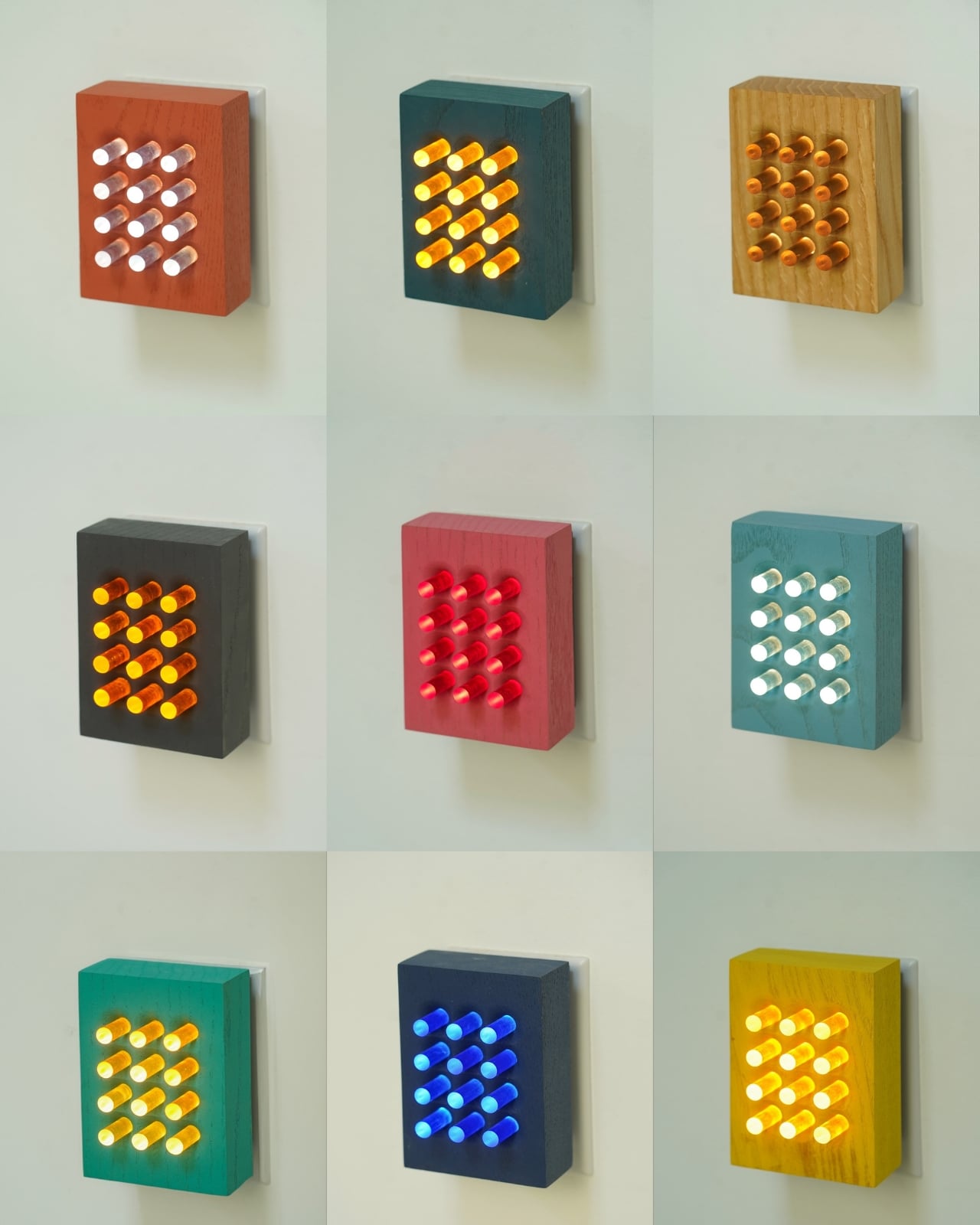
What the Reactor does differently is how it handles the relationship between function and mood. It pairs a warm white task light with a mood light, and the two can be independently controlled depending on what you need at any given moment. The color series expands on this by offering different colored light options, each creating a distinct atmosphere from the same compact wooden form. A pink glow reads like warmth. A deeper red reads like atmosphere. The shift from one to the other is not dramatic in the way smart bulb color changes tend to be. It’s quieter than that, and more intentional.

I keep thinking about the name. Reactor. It’s not passive. A nightlight is usually passive by definition. It just sits there. But a reactor implies a response, a relationship between the object and whoever is using it. Gillespie even described the pink version as “a hug in the dark,” which is such a specific and unexpectedly tender way to talk about a light source. That sensibility carries through the design. These are not decorative pieces pretending to be functional. They’re functional pieces that happen to be beautiful.
Ovuud has been building a quiet reputation in design circles for a while now. Featured in Dwell Magazine’s 2022 list of rising international designers, Gillespie’s work has always been about finding that balance between material limits, desired function, and aesthetic harmony. The Reactor color series feels like that philosophy at its most distilled. The form is small enough to sit on a nightstand without demanding attention during the day. At night, it changes the temperature of the entire room without you having to do anything complicated.

The wood-and-plexiglass combination Gillespie uses throughout his work is particularly effective here. The wood grounds it, gives it warmth and texture and the kind of object permanence that makes you want to keep a thing rather than replace it. The plexi diffuses the light in a way that feels organic, not clinical. Together, they make something that feels genuinely handmade without looking rustic or unfinished. That’s harder to achieve than it sounds.
A design object like the Reactor matters because it doesn’t ask you to choose between living well and buying well. A lot of design right now sits in one of two camps: either it’s priced and positioned for collectors, beautiful but untouchable, or it’s mass-produced and optimized for a market that doesn’t particularly care about craft. Gillespie exists somewhere outside both of those camps, making things by hand in his studio that are accessible enough to actually use and thoughtful enough to actually keep.
The Reactor color series is the kind of thing you discover on Instagram and then find yourself thinking about for days. Not because it’s flashy or trend-driven or algorithmically designed to stop your scroll, but because it’s quietly doing something right. It’s a nightlight. It lights up your night. And somehow, against all odds, it makes that feel like enough.
The post Ovuud’s Reactor Is the Nightlight Designers Actually Want first appeared on Yanko Design.

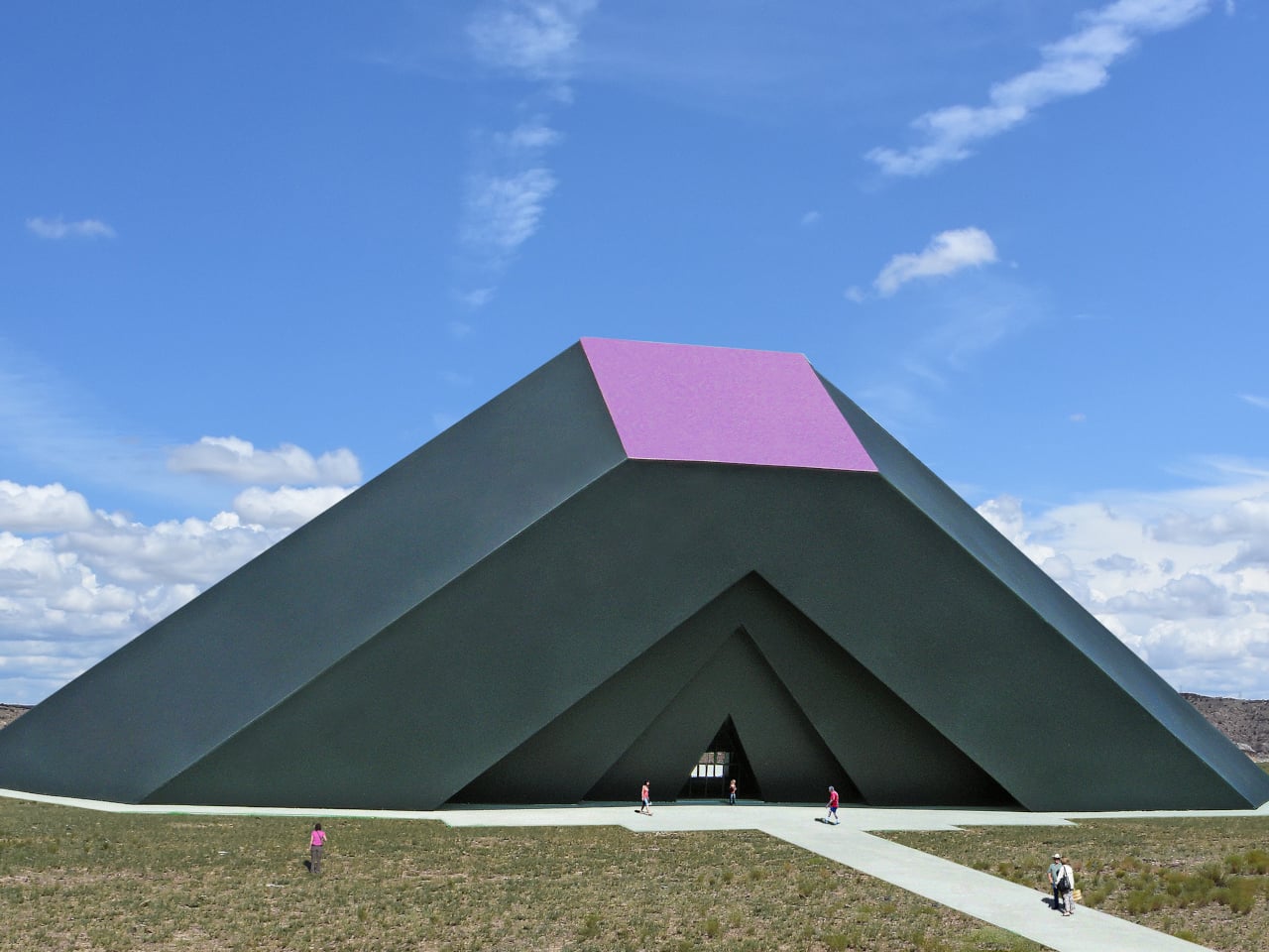
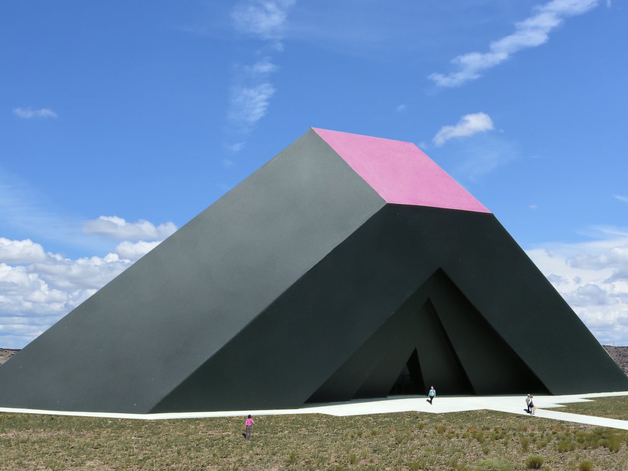
Architecture has always had to reckon with the sun. Buildings are oriented, shaded, and glazed in response to it, and solar panels are bolted onto them afterward. In most cases, the sun’s behavior is accommodated rather than consulted. The resulting forms come from a designer’s intentions and a structural engineer’s calculations, with sunlight as something to manage rather than the thing that generates the shape itself.
The Sun Shadow Pavilion starts from a different premise. Before any walls were drawn or a floor plan drafted, a scale model of a large square array of photovoltaic solar panels was placed above a flat white surface facing south. The sun then did the rest. The shadows it cast on that surface, traced every hour for eight hours as it crossed the sky, became the raw material for the entire structure.
Designer: Michael Jantzen
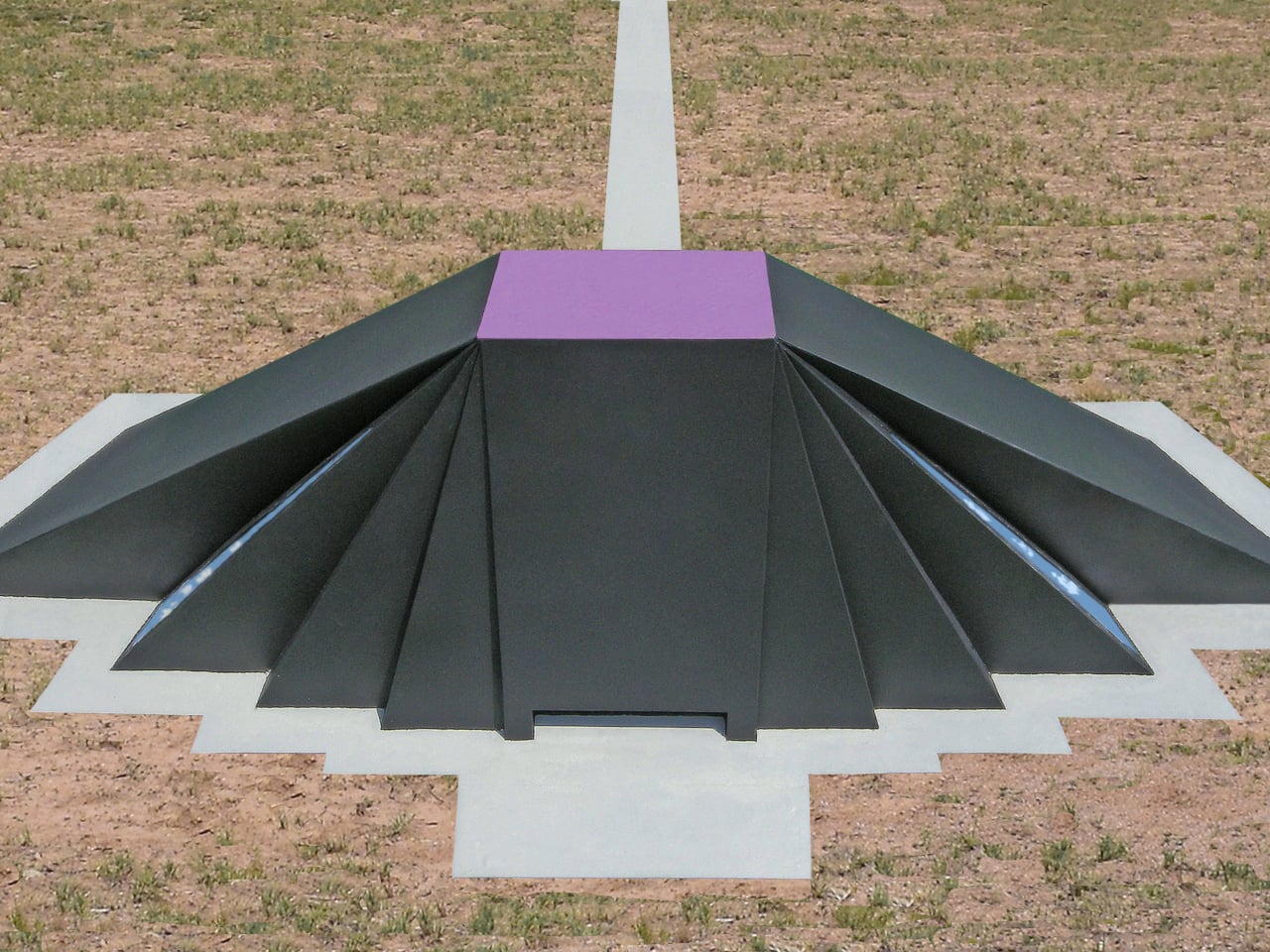
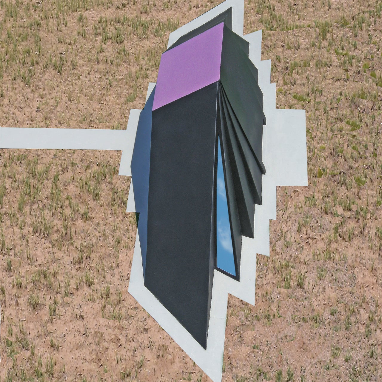
Eight shadow outlines, each representing a different hour of the day, were converted into three-dimensional forms. Solid planes were inserted from the edges of each shadow up to the edges of the solar panels above, creating a set of inclined surfaces that defined the interior volume. That enclosed space, shaped by accumulated light and time rather than a stylist’s instinct, became the pavilion.

The design is also inherently site-specific and date-specific. If built, the shadows used to generate its form would be traced on the actual opening day, at the exact build location. A pavilion in the American Southwest, traced on a different opening date, would look different from one in northern Europe, or from the same structure inaugurated a decade earlier or later. Each built version would be unrepeatable.

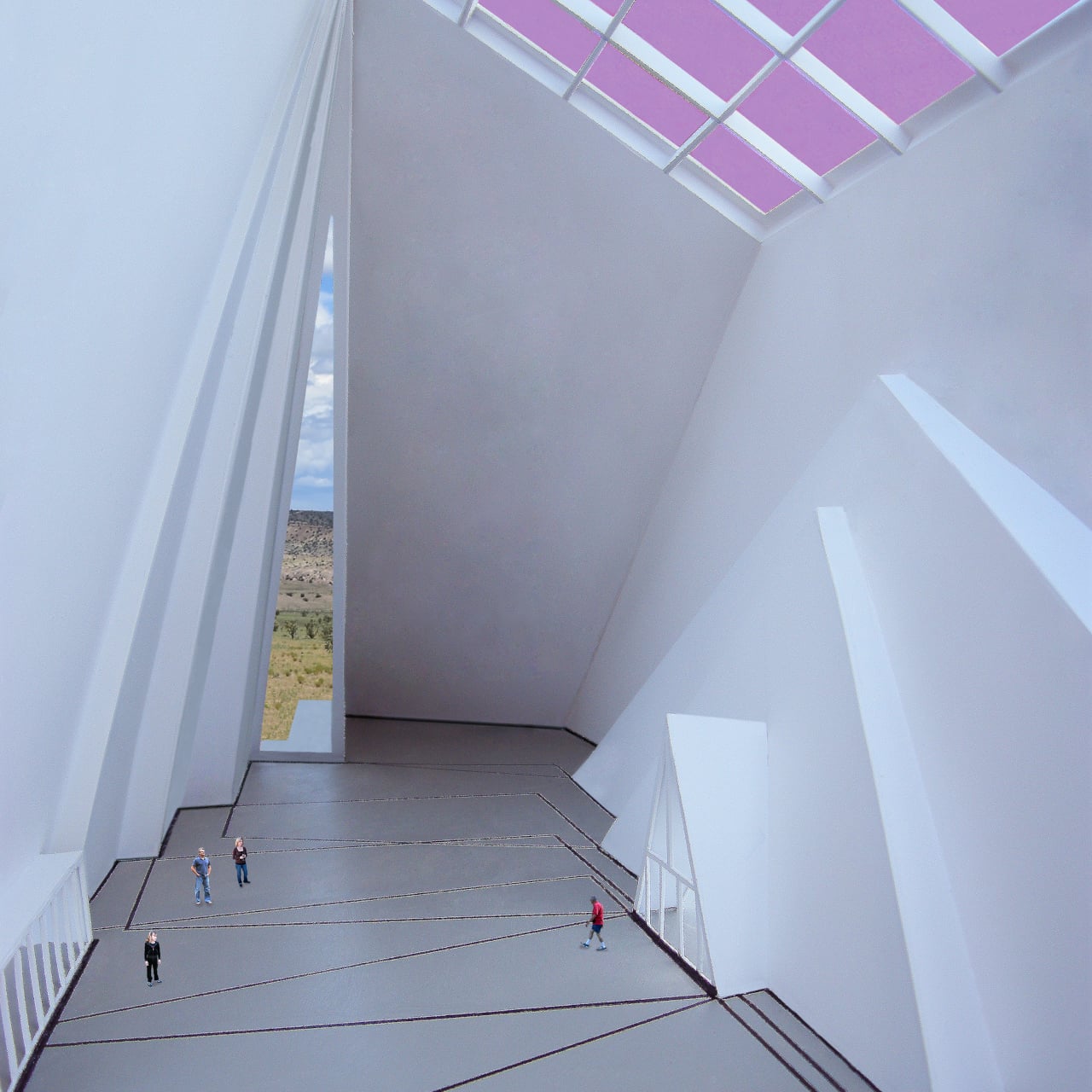
The exterior form that results from this particular study is dramatic and unmistakably asymmetric, a cluster of dark, angled, sloping planes radiating outward from the flat solar array at the top. The interior is a complete reversal. The translucent solar cells that generate all of the pavilion’s power also filter light through the roof, keeping the space naturally bright during the public hours the shadow tracings were drawn to represent.
Walking through, the floor carries painted outlines of all eight shadow positions, so the exact geometry that produced the walls above can be read directly underfoot. The building’s origin story isn’t hidden in a design brief or a notebook; it’s painted on the ground you’re standing on. The structure explains itself to anyone willing to look down as well as up.
Beyond the solar panels, the structure handles its own climate without mechanical systems. The dark outer surface absorbs heat, and a double-skin wall construction moves warm or cool air into and away from the interior as needed. Rainwater collected from the exterior surfaces feeds underground storage tanks for use on-site. The pavilion’s stated purpose, to display advances in alternative energy technology, is also its operating model.
There’s an honesty to the whole approach that’s relatively rare in landmark building design. Most structures acquire their form through aesthetic decisions, historical references, or personal sensibility. This one derived its shape from a physical process that would have happened regardless of any design intention. The sun was going to cast those shadows anyway. The design simply had the sense to use them.
The post Get Ready for the Pavilion That Was Designed by the Sun Itself first appeared on Yanko Design.