OnePlus Mini Tablet Leak: Snapdragon 8 Gen 5, OLED Display, and a Real Shot at the iPad Mini

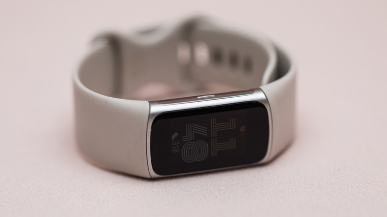
The Oppo Pad Mini (exclusive to China) serves as a template for what OnePlus’ mini tablet will look like.

Apple, a company that charges a premium for premium display technology, has somehow never put an OLED screen in its most pocket-friendly tablet. The iPad mini sits there in 2025 with a Liquid Retina LCD while the iPad Pro ships with a tandem OLED panel that costs as much as a laptop. That inconsistency has nagged at iPad mini fans for years, the sense that Apple’s smallest tablet is perpetually treated as a second-class citizen in its own lineup. It sells well enough to survive, but never well enough, apparently, to earn the display upgrade it deserves.

OnePlus may be about to make Apple look even more stubborn on that front. A leak from tipster Abhishek Yadav describes a compact OnePlus tablet with an 8.8-inch OLED display, 144Hz refresh rate, and Snapdragon 8 Gen 5 under the hood, paired with LPDDR5X RAM and UFS 4.1 storage. If those specs hold, OnePlus would be shipping a compact Android tablet with a display technology the iPad mini still does not have. A global launch is reportedly targeting Q3 2026, with India expected to be among the first markets. The hardware pitch is unusually straightforward: better screen, flagship guts, same general size class.

Designer: OnePlus

The spec sheet here reads like OnePlus raided the OnePlus Pad 4’s parts bin and asked engineering to compress it. That larger tablet runs a 13.2-inch IPS LCD with Snapdragon 8 Elite Gen 5, which is a fine machine for productivity but firmly in “bag required” territory. This rumored compact model flips the script entirely, pairing flagship silicon with a form factor you can actually hold one-handed on a commute. The 8,000mAh battery and 67W charging round out a package that looks, on paper, like the small Android tablet the market has been waiting for since the Nexus 7 quietly aged out of relevance over a decade ago.

The honest caveat here is that this hardware almost certainly has a prior life. The spec profile aligns closely with the Oppo Pad Mini, a China-exclusive device that has been doing exactly this job domestically without making a dent in the global conversation. LPDDR5X and UFS 4.1 mean fast memory and storage throughput, the kind of internals that keep a tablet feeling snappy for years rather than sluggish after two software updates. A OnePlus label, a global distribution push, and software support that extends beyond China would transform what is essentially proven hardware into a legitimate mainstream contender.

Pricing remains the missing piece. OnePlus has historically been disciplined about value positioning, which is precisely what makes this device interesting beyond the spec sheet. The iPad mini 7 starts at $499. If OnePlus lands this anywhere south of that number with an OLED panel and Snapdragon 8 Gen 5 inside, the conversation around compact tablets changes in a way it genuinely has not since Apple invented the category.

The post OnePlus Mini Tablet Leak: Snapdragon 8 Gen 5, OLED Display, and a Real Shot at the iPad Mini first appeared on Yanko Design.

Your Home’s Newest Resident Is a Tiny Blue Butler

Furniture, as a category, is not usually meant to make you smile. It holds things, supports things, stores things. Function dictates form, and form gets built around the assumption that your chair or side table should have as little personality as possible. That is the design orthodoxy, at least. The longstanding idea that objects in service of a purpose should quietly disappear into the background, noticed only when they are missing. Liam de la Bedoyere disagrees. And Mini Monsieur is his very persuasive argument.

This concept piece, developed as a personal project at boredeye.design, rethinks the stool and side table as something altogether more alive. Mini Monsieur is a squat, rounded body rendered in an irresistible cobalt blue, with two arms posed differently: one curled against its torso, the other raised high and balancing a flat circular tray. Two swirling embossed brows sit just below the flat crown of its head, giving it the air of a patient, quietly distinguished little servant. If you have ever thought your furniture should have more opinions, this piece has exactly enough.

Designer: Liam de la Bedoyere (boredeye.design)

The butler concept is where the design gets genuinely clever. De la Bedoyere is not just making something cute, though it absolutely is that. The character premise actually explains the function. A butler exists to be present without being intrusive. It waits. It holds things for you. It serves without asking why. Translating that relationship into furniture means the form earns its personality rather than wearing it purely as decoration. The raised tray arm is not a quirky detail; it is a job description made physical.

Functionally, Mini Monsieur works as both a stool and a side table, which makes it surprisingly practical for something that looks like it wandered off a Pixar set. The tray holds a glass, a phone, a book, whatever needs to be within arm’s reach without claiming additional floor space. A scaled render with a seated figure confirms it holds its own proportionally, compact without being precious, sized to actual human use rather than just optimized to photograph beautifully. You could genuinely use this every day.

Where the design earns its real credibility is in the restraint around how far the character goes. No mouth. No eyes. Just those two curled brows and the asymmetrical arms. De la Bedoyere stops exactly where he should, giving Mini Monsieur enough personality to register as a character without crossing into novelty-item territory. That balance is harder to strike than it looks, and it is the reason this concept holds its own in conversation with serious design references. The Dieter Rams book staged on the tray in the renders is not accidental. It is a knowing nod to the idea that rigorous design intent and genuine warmth do not have to occupy separate spaces.

The all-over cobalt blue is also worth pausing on. Monochromatic execution is one of those choices that either elevates a form completely or exposes every weakness in it. Here, it does the former. The single-color treatment lets the silhouette read with full clarity, makes the curves feel more deliberate, and keeps the tray-as-arm reading as part of one cohesive body rather than a tacked-on accessory. One render includes a lone orange version surrounded by a field of blue, the kind of detail that signals a designer already thinking in colorways, editions, and how pieces behave as a family. That level of forward thinking is encouraging.

Whether Mini Monsieur moves from concept to production remains the open question, and frankly it is the only thing standing between this design and a very good home. My genuine hope is that it does, because the market for furniture that takes itself seriously while still being joyful is more underserved than we tend to acknowledge. Not everything needs to be a neutral linen cube or a Scandinavian plank. Sometimes a room benefits from something with a recognizable presence, a little dignity, and one arm already raised to take your drink. Mini Monsieur is already at its post, ready and waiting.

The post Your Home’s Newest Resident Is a Tiny Blue Butler first appeared on Yanko Design.

WWDC 2026: iOS 27, macOS 27 and the New Siri App — What to Expect June 8

Steve Jobs built Apple on the idea that hardware and software had to be designed as one thing, inseparable and mutually reinforcing. Tim Cook, who took over in 2011 with the company at roughly $350 billion in value, honored that philosophy while adding an operational layer Jobs never had the patience for: supply chains so resilient they made Apple virtually recession-proof, a services ecosystem generating over $100 billion a year, and a trillion-dollar valuation that eventually became three. Cook’s Apple was not the scrappy insurgent of the Jobs era. It was a machine, and WWDC 2026, opening June 8 at Apple Park, is the last keynote he delivers as CEO before stepping aside for John Ternus on September 1st.

Ternus running hardware engineering means he is the person responsible for Apple Silicon, the M-series chip architecture that gave Apple the on-device processing headroom to even attempt building a serious AI assistant. The timing of the leadership transition is its own kind of design decision: Cook presents the software at WWDC, and Ternus inherits it just in time to strap it to the iPhone 18, the rumored iPhone Fold, and whatever Mac hardware lands in the fall. iOS 27’s rebuilt Siri, a standalone app with Dynamic Island integration and a Google Gemini foundation licensed for a reported billion dollars a year, is the software story Cook leaves behind for Ternus to ship.

The Siri situation has been Apple’s most visible embarrassment in the AI era, and Cook knows it. While Google rebuilt Assistant into Gemini and OpenAI shipped ChatGPT to a billion users, Siri kept responding to complex queries with “I found some results on the web.” iOS 27 is the architectural correction. The rebuilt assistant ships as a dedicated app with conversation history, image and document input, and a chatbot-style interface that makes it feel, for the first time, like something a designer actually thought about. Activation drops a pill-shaped glow into the Dynamic Island with a “Search or Ask” prompt, and a swipe down from the top of the screen triggers it system-wide, effectively replacing Spotlight with something that can actually reason. The Gemini model underneath, accessed through Apple’s Private Cloud Compute infrastructure so user data never touches Google’s servers, is reportedly a custom 1.2 trillion parameter build licensed for around a billion dollars annually.

What makes iOS 27 structurally interesting, beyond the Siri cosmetics, is the Extensions framework. Apple is opening the platform to Claude, Gemini, and other third-party agents as swappable AI backends, accessible through a dedicated App Store section. A long-press on the Siri search bar lets you switch models entirely. That is a significant philosophical departure for a company that has spent fifteen years treating openness as a security vulnerability rather than a feature. Whether developers actually build compelling Extensions or whether the system becomes another neglected API graveyard is the real question, but the architecture at least acknowledges that Apple cannot win the AI race alone.

The rest of the OS lineup fills in around the Siri centerpiece. Wallet gets a “Create a Pass” feature that digitizes physical tickets and membership cards from a QR scan. Visual Intelligence gains the ability to read food nutrition labels and feed data directly into the Health app. Safari will auto-name tab groups. The keyboard gets a smarter autocorrect that suggests full rewrites rather than single-word swaps. macOS 27, meanwhile, is quietly laying software groundwork for touch-enabled Mac hardware that Ternus will presumably announce when he is ready. Apple treating macOS 27 as a Snow Leopard-style consolidation release, stable and foundational rather than showy, is exactly the kind of move that makes sense when you know a new CEO with a hardware background is about to take over.

Cook’s WWDC26 artwork says more than the tagline “Coming Bright Up” lets on. The Swift logo rendered in iridescent chrome and bloom light, the same visual language as iOS 26’s Liquid Glass design system taken to a more extreme register, telegraphs a platform doubling down on its own aesthetic identity even as it opens its AI layer to outside competition. It is a confident piece of visual communication from a company that built three trillion dollars of market value on the conviction that how things look and how things work are the same question. Ternus gets to answer what comes next.

The post WWDC 2026: iOS 27, macOS 27 and the New Siri App — What to Expect June 8 first appeared on Yanko Design.

This Extra Wide Tiny Home Ditches the Loft and It’s Better for It

The loft bedroom is tiny home design’s most accepted cliché. Most designs in this space stack a sleeping loft above the living area and call it efficient. The Rose, a custom build by Vancouver Island-based Rewild Homes, takes a different position entirely, one that’s turning heads for all the right reasons.

Named after the client’s beloved donkey, the Rose measures 30 feet long by 10’6″ wide, making it extra wide by tiny home standards. That additional footprint isn’t just a spec sheet flex. It’s what makes the entire layout feel less like a compromise and more like a considered place to actually live. The interior opens up in a way that standard narrow builds simply can’t achieve, bright, breathable, and genuinely functional across a single floor.

Designer: Rewild Homes

The standout move here is the ground-floor bedroom. Rather than tucking a sleeping area into a loft accessed by ladder, Rewild Homes kept everything at eye level, sliding behind a private door with its own separate exterior entrance. Beneath the bed, storage is built in. Closet space is tucked neatly alongside. It’s the kind of thinking that makes a small home feel resolved rather than resigned. The small loft above the bathroom, meanwhile, has been repurposed entirely as a storage zone, a practical pivot that frees the rest of the home from clutter. High ceilings throughout give taller inhabitants room to breathe, a detail that rarely gets enough credit in this category.

The kitchen and open living room flow naturally into each other, with the bathroom and bedroom each accessed via sliding doors that keep traffic patterns clean without sacrificing privacy. Utility requirements are simplified through propane-powered water heating and cooking, allowing the home to run on a 50-amp electrical connection, lean by design, not by accident.

Outside, the Rose wears its West Coast origins confidently. A combination of metal and cedar siding gives the exterior a durable, low-maintenance finish that still has warmth and character. A metal roof rounds out the build, built to handle whatever the Pacific climate throws at it.

Rewild Homes operates out of Cobble Hill, British Columbia, building fully custom tiny homes with a focus on high-quality local materials. The Rose is a strong example of what that philosophy looks like in practice, a home that doesn’t ask you to sacrifice comfort for square footage, but rather rethinks what square footage can do.

The post This Extra Wide Tiny Home Ditches the Loft and It’s Better for It first appeared on Yanko Design.
Fin Fixes Five Tape Dispenser Problems You’ve Accepted as Normal

The tape dispenser has been sitting on desks for decades without anyone seriously reconsidering it. It slips when you pull, it tips unless you hold it down, and it leaves tape edges ragged enough that finding the end again becomes a small recurring ritual. For something used constantly in homes, classrooms, and offices worldwide, it carries a surprisingly stubborn set of unresolved frustrations.

One designer decided to document those frustrations rather than assume them. He observed 49 people all performing the same simple task and cataloged five recurring problems with standard dispensers. The result is Fin, a concept built around solving each one through deliberate engineering. There’s nothing here for decoration. Every choice traces back to something that was genuinely broken and worth fixing properly.

Designer: Abhishek Sharma

The most immediate change is at the cutting blade. Rather than lying flat, Fin’s blade tilts at 10 degrees. That angle concentrates pressure to a single point, so even when tape is pulled straight down, the cut starts cleanly, and the break travels through without resistance. The ragged edge that forces you to stop and peel back the tape before using it simply stops happening.

Slipping is addressed without adding bulk. Fin concentrates ballast at the rear through uneven weight distribution, creating a pivot point that resists horizontal movement when you pull tape. The front stays light, so repositioning is still easy when needed. Stability is selective, which turns out to be a more elegant answer than just making the whole dispenser heavier and harder to move.

Two more irritants disappear just as quietly. Angled supports inside the tape cradle automatically stabilize narrow rolls so they don’t wobble regardless of tape width. A retention bar holds the tape edge after every cut, so the next time you reach for it, the end is right where you left it. That small predictability adds up across a day of repeated use.

The research also revealed that tape is rarely used alone. Scissors come out, pens get grabbed, and clips end up nearby. Sharma designed a storage compartment into the base, turning the dispenser into a compact workspace hub rather than a standalone tool. Replacement blades sit inside the cutting mechanism itself, where they’ll be found when inevitably needed rather than lost somewhere in a desk drawer.

The tapered form that gives Fin its name isn’t incidental. Narrowing toward the front reduces grip surfaces and gently nudges users toward one-handed operation, discouraging the two-handed approach that keeps standard dispensers tipping. The shape wasn’t decided until every functional requirement had already settled it. What you’re left with is an object that looks like a design statement but is really just engineering made visible.

Fin is still a concept, not a product you can put on your desk yet. As a design exercise, it makes a solid argument for what happens when someone watches a problem carefully before trying to solve it. Tape dispensers have gone largely unexamined for a very long time, and this concept makes it genuinely difficult to use the one on your desk the same way.

The post Fin Fixes Five Tape Dispenser Problems You’ve Accepted as Normal first appeared on Yanko Design.
Addax Basecamp V3 features pull-out kitchen and rooftop tent, turns Jeep into off-grid adventure rig

I am a fan of off-grid trailers that move light and open up in all directions when camped. The new overland micro trailer from Addax is one such camping solution that thrives on the build quality and the success of the original Addax overland trailer designed for Jeep in 2022. The new guy is called the 2026 Basecamp V3 and is, as you’d expect from Addax, a robust and dependable trailer that rolls out with the option to install camping hardware when and where you need it.
Designed for adaptability in adventures with your Jeep, this co-branded trailer, by virtue of its construction, boasts military-grade toughness and typical off-roading ability. Jeep is synonymous with adventure. The owners of a Wrangler are those who live to push boundaries, and the Basecamp is one of the toughest, purpose-built outdoor trailers – designed to complement that lifestyle.

Designer: Addax

If you have been religiously following the coverage here on Yanko Design, you would have, from the frequency of our related coverage, figured out that heavy-duty expedition trailers are creating a market buzz. But the Addax Basecamp begs to differ from the crowd. Weighing 1800 pounds, the trailer features specialized suspension, tires, and chassis, specifically tailored for off-road travel and gear-hauling capacity. Thanks to its payload capacity of 1,450 lbs.

Jeep and Addax struck a partnership to share branding in the latter’s Gladiator trailer series. This collaboration also included Mopar for service and customer support. There’s still uncertainty if Basecamp is licensed under the partnership, but the branding definitely screams the obvious. Alongside the banding, 2026 Basecamp V3 features rugged construction, the company is famous for, including the steel-on-steel body, 3/16-inch steel chassis, and deep-lugged 29-inch tires.

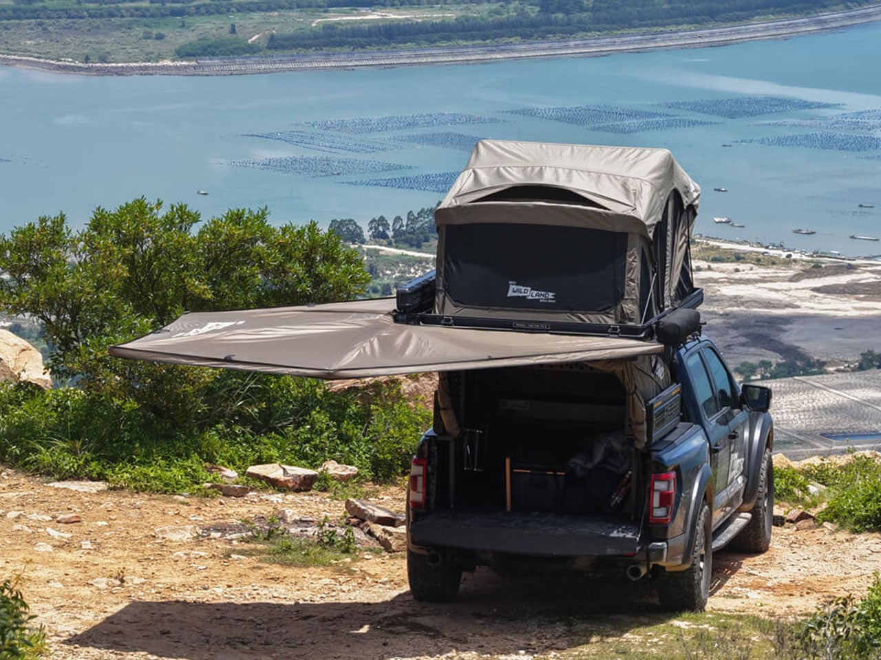
The trailer with a 6 x 6-foot form factor has a 26-inch x 40-inch front removable deck for additional space. Talking of space, when docked, the camp with its pre-installed OVS 270-degree batwing awning and pull-outs can instantly create a livable basecamp at grounds beyond the campsites as well. The 22L water tank, a functional 7-foot pull-out kitchen with a sink and 53-liter sliding fridge, and four power outlets add to convenience.

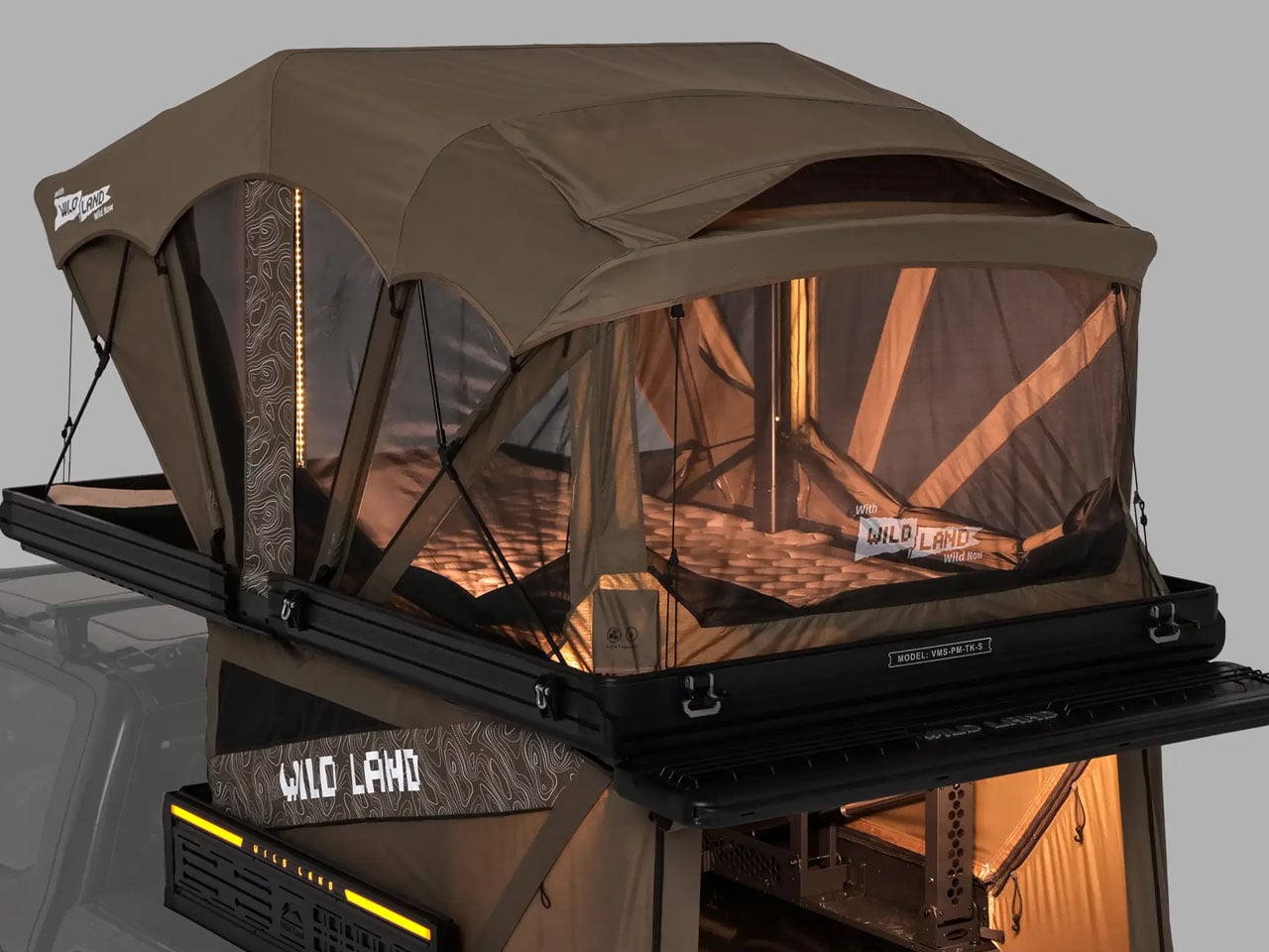
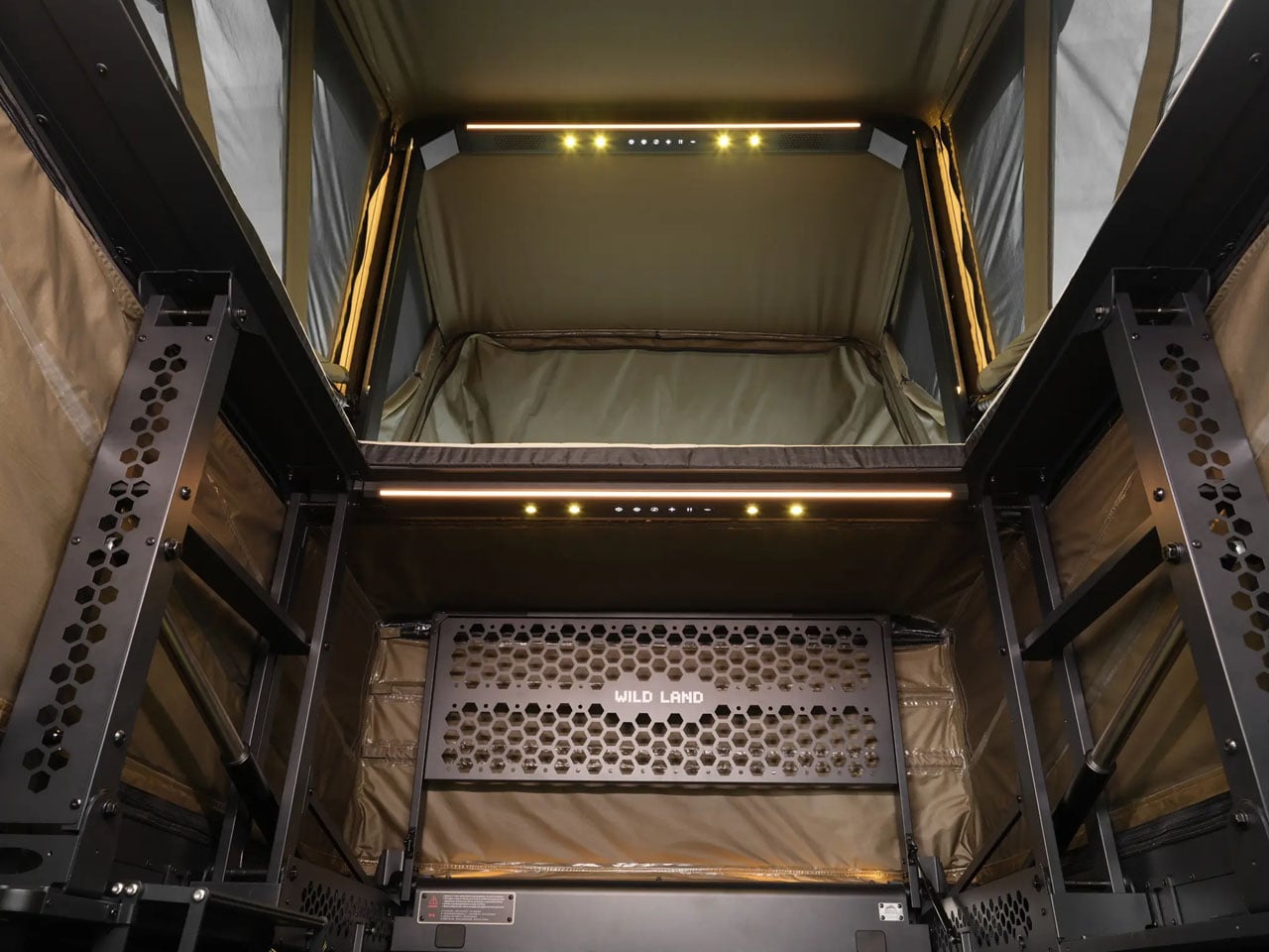
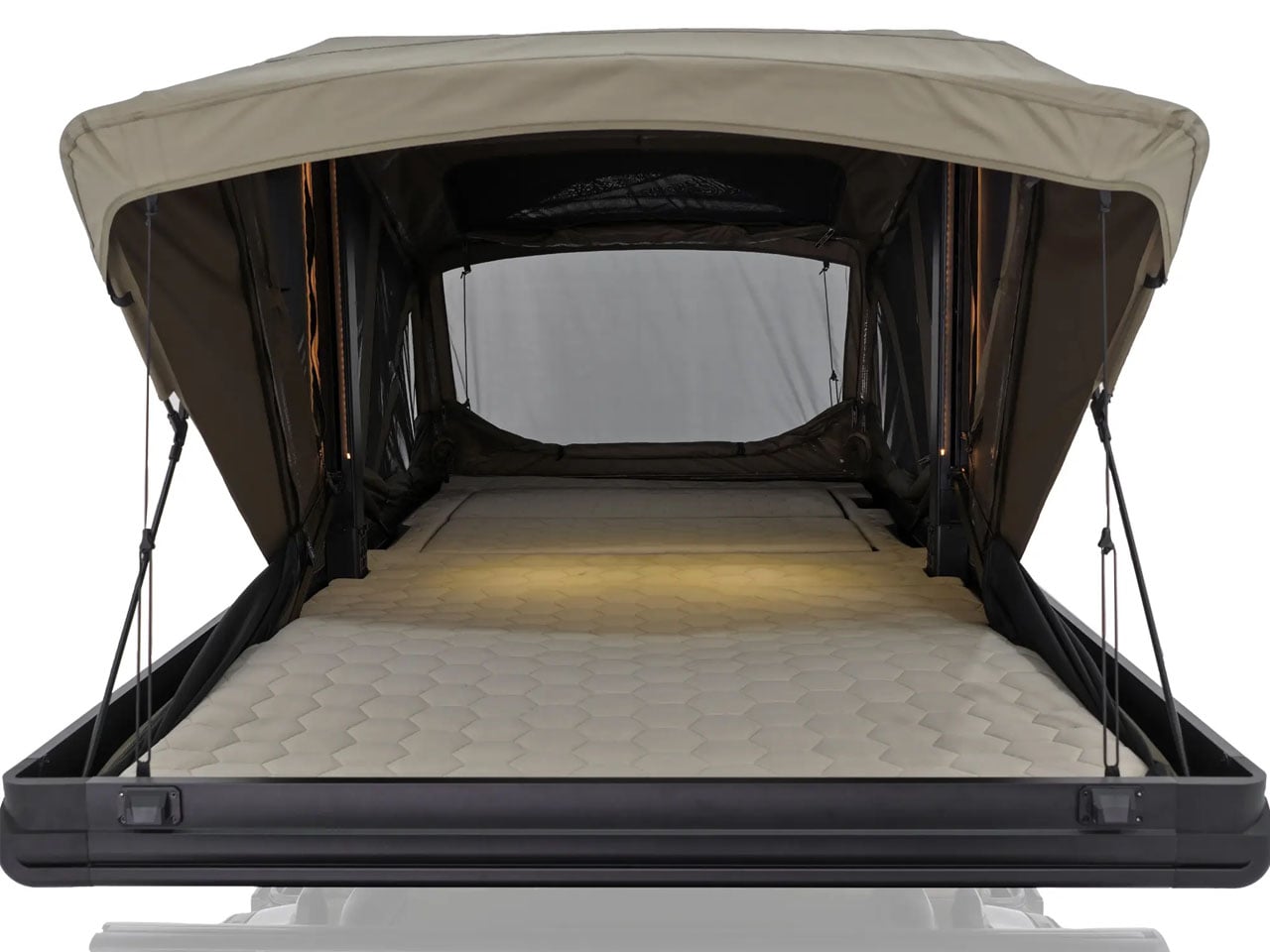
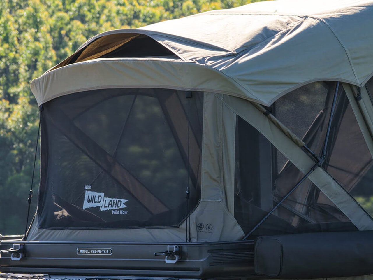
The power support is managed by an onboard 100 amp-hour slimline battery. It can draw renewable power from an optional 220W solar panel and also comes with a 1500W inverter for backup. Addax, does not offer a sleeping area inside of the trailer, so an additional Centori Outdoors aluminum hard-shell rooftop tent comes preinstalled for sleeping arrangements. The incredibly feature-packed Basecamp is an embodiment of its name, which is further supported by both internal and external MOLLE panel shelves. The attachment points here also allow you to carry a range of accessories/gear you would want on the Jeep trip into the wilderness. Basecamp V3 in its barebones starts at $19,000.

The post Addax Basecamp V3 features pull-out kitchen and rooftop tent, turns Jeep into off-grid adventure rig first appeared on Yanko Design.