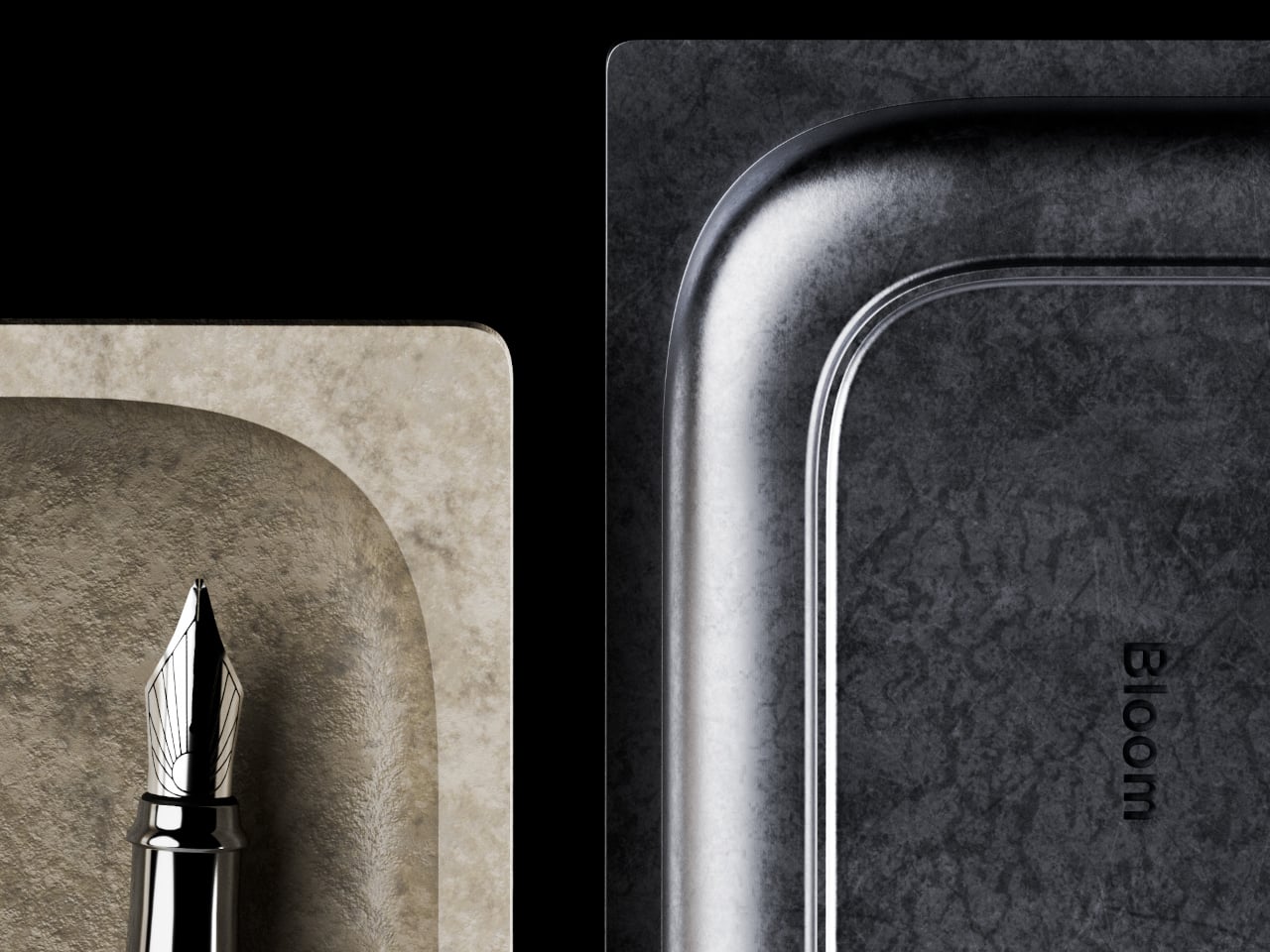
Pocket pens usually ask for compromise. Full size fountain pens usually ask for commitment. Lumink tries to bridge that divide with a titanium body that collapses to pocket size and unfolds into a full-length pen in seconds. The silhouette is crisp and faceted, with a restrained metallic finish that reads as precision tool before it reads as stationery. It is a concept that feels immediately relevant in a world where everyday tools are expected to be portable, tactile, and visually disciplined.
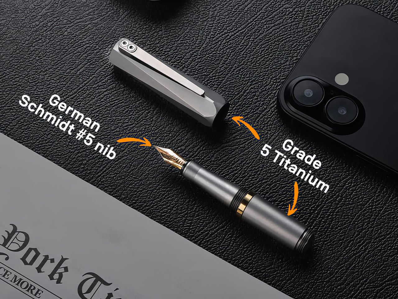
Much of its appeal comes from how clearly the design serves the use case. The faceted barrel prevents rolling and sharpens the pen’s visual identity, the milled titanium clip reinforces its EDC credentials, and the airtight chamber speaks directly to the realities of carrying a fountain pen on the move. Grade 5 titanium gives the body a durability-to-weight ratio that very few materials can match at this scale. Paired with a German Schmidt nib, the whole package feels engineered around readiness and repeat use. Those choices position Lumink at the intersection of EDC gear and serious writing instruments, which is a tighter niche than it sounds.
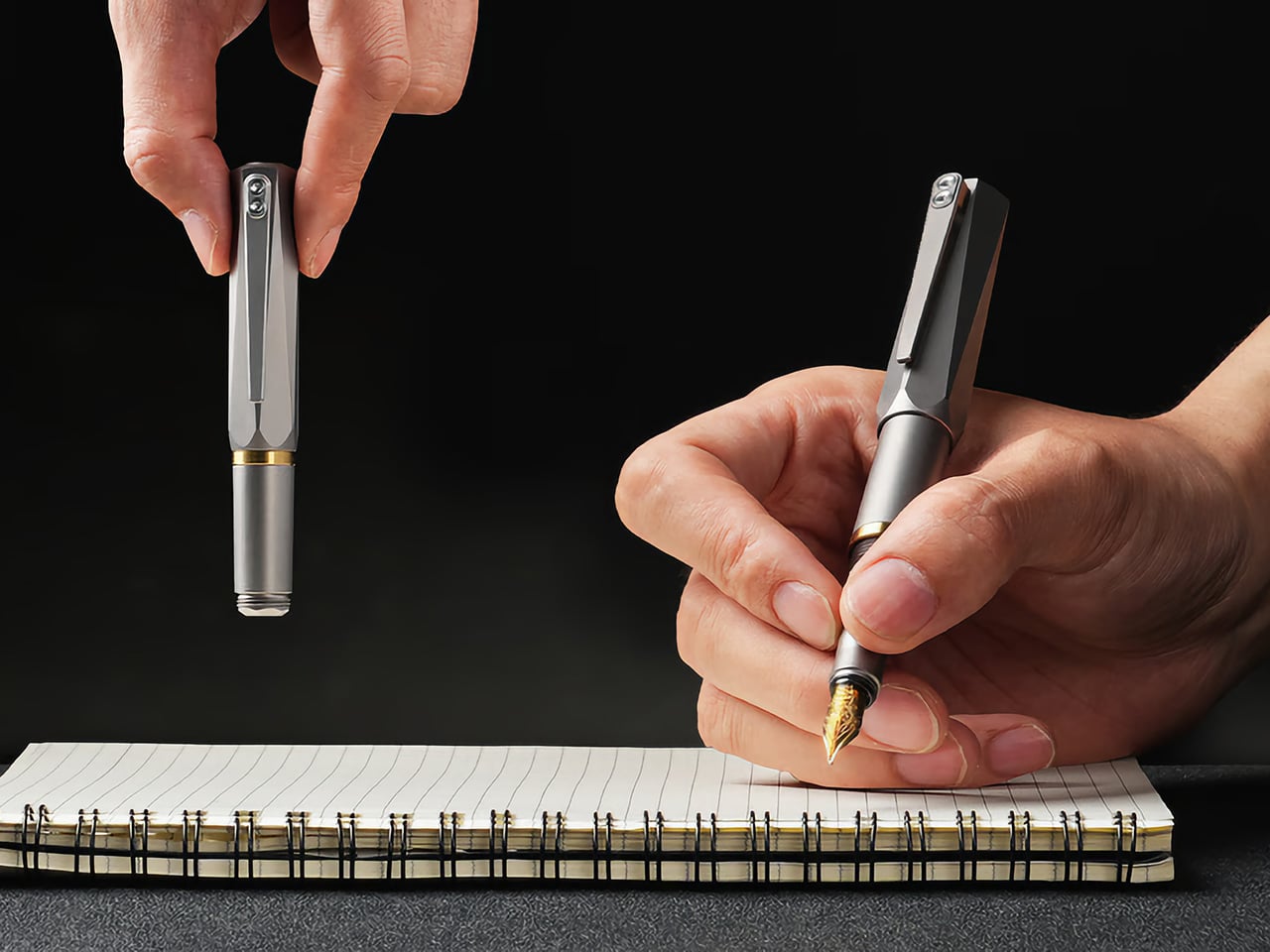
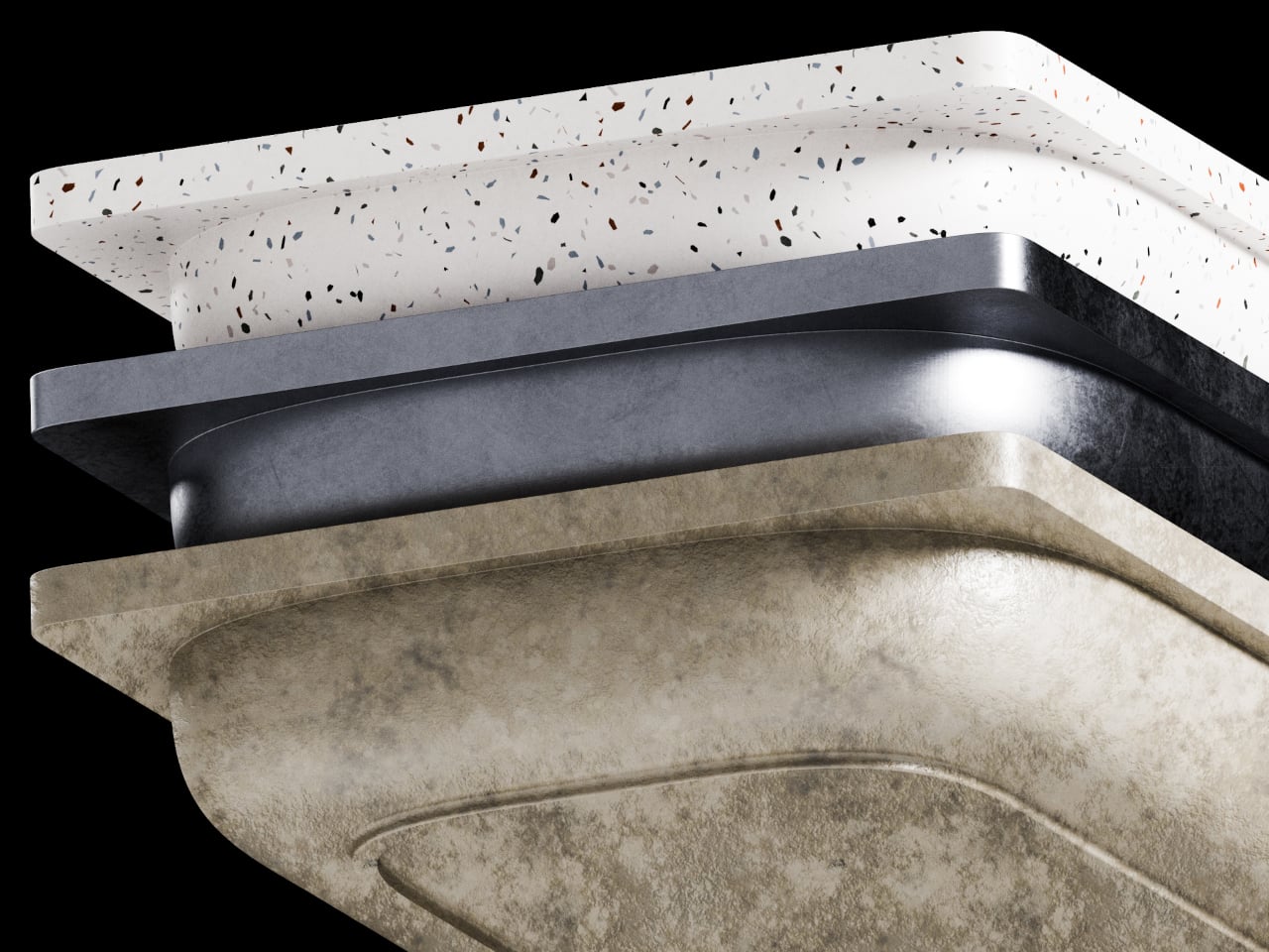
The folding mechanism itself is the main event. It’s not a simple cap that posts on the back; the rear section threads onto the pen, extending the body from a stubby 3.8 inches (96mm) to a very comfortable 5.51 inches (140mm). That pivot point, accented with a brass ring, creates a satisfying mechanical action that feels both precise and robust. This kind of transformability is what draws people to well-made gear. It turns the simple act of preparing to write into a small, tactile ritual, giving the object a character that a static pen, however beautiful, just can’t replicate.
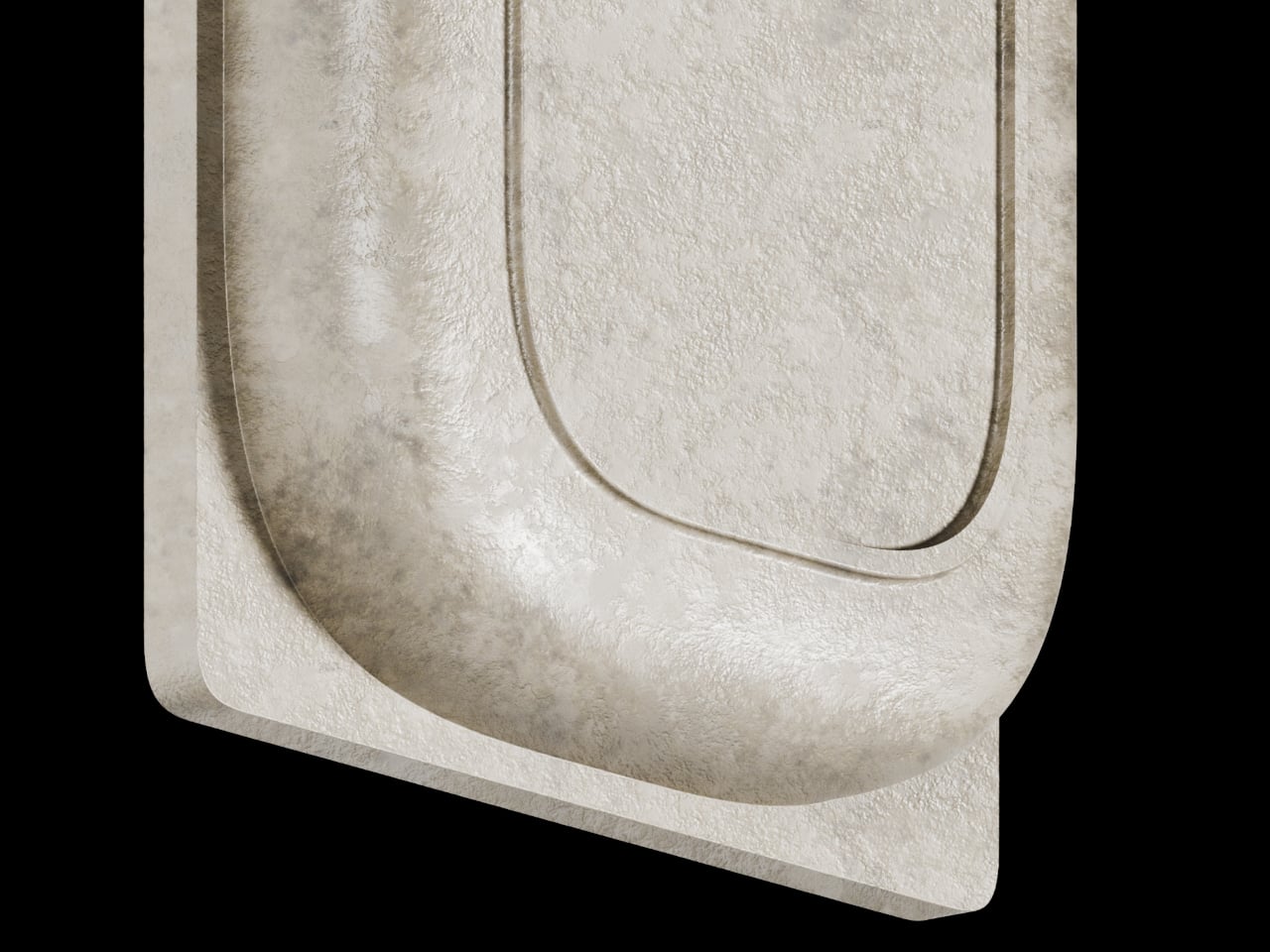
Grade 5 titanium, formally Ti-6Al-4V, produces tensile strength around 950 MPa at a density of 4.43 g/cm3. For non-nerds, it means that it’s harder than steel, while being roughly 40-45% lighter. Aerospace and orthopedic implant manufacturers rely on the same alloy, which tells you the performance tier. Applied to a pen, that combination should produce a carry object that feels substantive in hand without adding real burden to a pocket. Besides, Aluminum dents easily, Titanium resists any form of damage. EyeQ says the Lumink should last you a 100 years. The material, the mechanism, the craftsmanship, it’s all designed to withstand a century of sustained use.
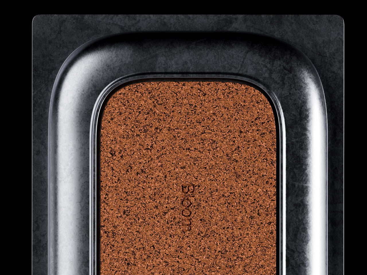
Carrying a fountain pen daily has historically meant accepting certain risks: leaked ink, dried-out nibs, and the grim experience of a pressure-driven blowout mid-flight. Lumink’s threaded isolation system addresses those by sealing the nib section from the reservoir during transport, creating an airtight chamber. The logic is sound: threaded seals operate in environments far more demanding than a shirt pocket. The entire pen is made from metal – not a single plastic part, no glue, nothing that even hints at cost-cutting.
Even the clip uses metal, and features a construction that’s about as carefully considered as the design itself. The clip sits perfectly straight, aligning vertically with the pen to the point of obsessiveness. The reason? Absolute balance. The pen shouldn’t look or feel un-balanced – it should project the confidence that it expects from you, as you use it to write or sign documents. A ball-shaped ceramic insert in the pen clip holds onto book covers, pads, or shirt pockets confidently too, without damaging anything. Slide it into your pocket and the ceramic insert glides smoothly along the fabric, without creasing or damaging it. Meanwhile the clip itself is made from the same titanium as the pen, which means it’ll never bend, warp, or break.
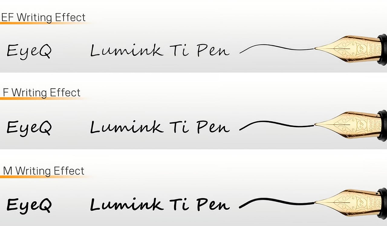
A fancy body is nothing if the writing experience falls flat, so anchoring the pen with a German Schmidt nib was a solid decision. Schmidt is a known quantity in the pen world, a reliable manufacturer whose nibs are used in countless pens far more expensive than this one. It’s the equivalent of a boutique car builder using a proven, well-regarded engine. The nibs are standard, replaceable, and available independently… which means even after a 100 years, you should find yourself with access to more nibs that you can swap in or out whenever you need. The pen’s designed to resist aging.
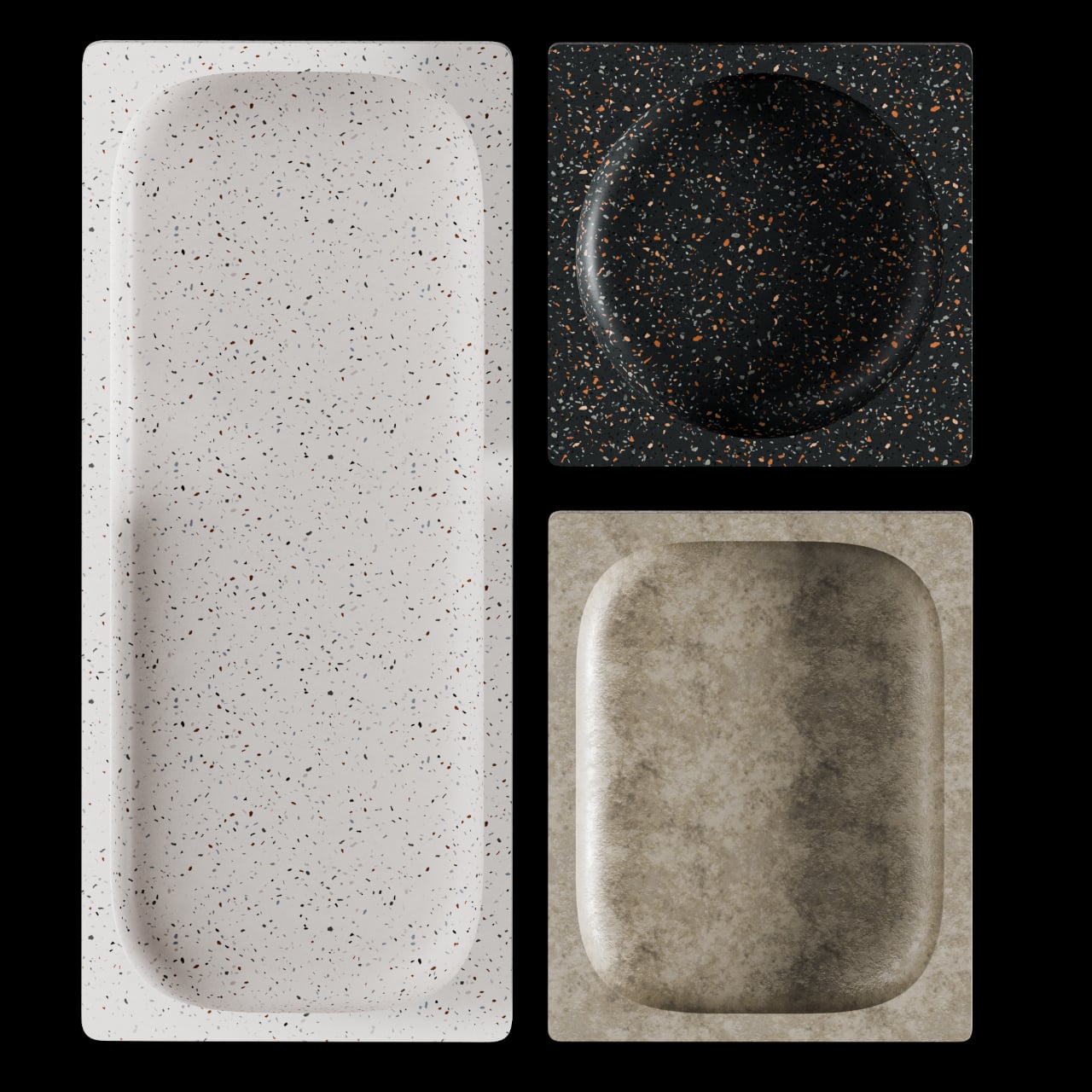
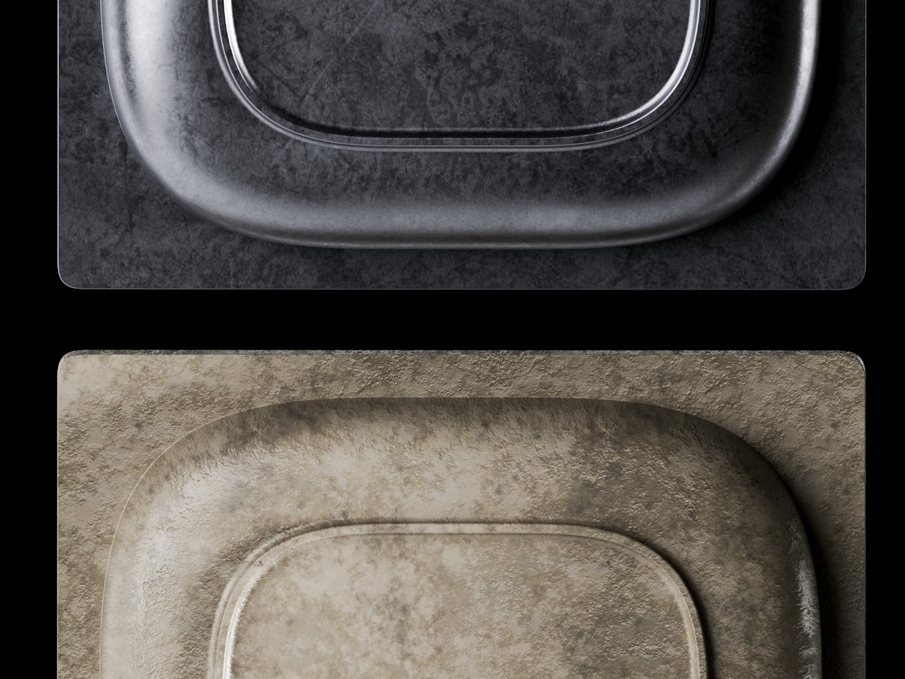
The three available finishes each cater to a different aesthetic: a raw Sandblasted Titanium for purists, a warm Anodized Gold, and a stealthy PVD Matte Black. The Physical Vapor Deposition coating on the black variant is notably harder than the titanium itself, offering serious scratch resistance, while the sandblasted finish is designed to develop a natural patina with use over time. Early bird pledge tiers started around the $65 mark. You are, after all, paying for Grade 5 Titanium along with Schmidt refills, beyond just the fact that this pen is designed and engineered to perfection. The $65 package includes the pen itself, the Schmidt nib, and a Schneider ink cartridge. You could spring extra for custom engraving, or opt for EyeQ’s leather sleeve for the pen. Personally, a pen that gorgeous shouldn’t be sheathed. It should be flaunted, fidgeted with, and frankly, turned into a heirloom for the next few generations.
Pocket pens usually ask for compromise. Full size fountain pens usually ask for commitment. Lumink tries to bridge that divide with a titanium body that collapses to pocket size and unfolds into a full-length pen in seconds. The silhouette is crisp and faceted, with a restrained metallic finish that reads as precision tool before it reads as stationery. It is a concept that feels immediately relevant in a world where everyday tools are expected to be portable, tactile, and visually disciplined.
Much of its appeal comes from how clearly the design serves the use case. The faceted barrel prevents rolling and sharpens the pen’s visual identity, the milled titanium clip reinforces its EDC credentials, and the airtight chamber speaks directly to the realities of carrying a fountain pen on the move. Grade 5 titanium gives the body a durability-to-weight ratio that very few materials can match at this scale. Paired with a German Schmidt nib, the whole package feels engineered around readiness and repeat use. Those choices position Lumink at the intersection of EDC gear and serious writing instruments, which is a tighter niche than it sounds.
The folding mechanism itself is the main event. It’s not a simple cap that posts on the back; the rear section threads onto the pen, extending the body from a stubby 3.8 inches (96mm) to a very comfortable 5.51 inches (140mm). That pivot point, accented with a brass ring, creates a satisfying mechanical action that feels both precise and robust. This kind of transformability is what draws people to well-made gear. It turns the simple act of preparing to write into a small, tactile ritual, giving the object a character that a static pen, however beautiful, just can’t replicate.
Grade 5 titanium, formally Ti-6Al-4V, produces tensile strength around 950 MPa at a density of 4.43 g/cm3. For non-nerds, it means that it’s harder than steel, while being roughly 40-45% lighter. Aerospace and orthopedic implant manufacturers rely on the same alloy, which tells you the performance tier. Applied to a pen, that combination should produce a carry object that feels substantive in hand without adding real burden to a pocket. Besides, Aluminum dents easily, Titanium resists any form of damage. EyeQ says the Lumink should last you a 100 years. The material, the mechanism, the craftsmanship, it’s all designed to withstand a century of sustained use.
Carrying a fountain pen daily has historically meant accepting certain risks: leaked ink, dried-out nibs, and the grim experience of a pressure-driven blowout mid-flight. Lumink’s threaded isolation system addresses those by sealing the nib section from the reservoir during transport, creating an airtight chamber. The logic is sound: threaded seals operate in environments far more demanding than a shirt pocket. The entire pen is made from metal – not a single plastic part, no glue, nothing that even hints at cost-cutting.
Even the clip uses metal, and features a construction that’s about as carefully considered as the design itself. The clip sits perfectly straight, aligning vertically with the pen to the point of obsessiveness. The reason? Absolute balance. The pen shouldn’t look or feel un-balanced – it should project the confidence that it expects from you, as you use it to write or sign documents. A ball-shaped ceramic insert in the pen clip holds onto book covers, pads, or shirt pockets confidently too, without damaging anything. Slide it into your pocket and the ceramic insert glides smoothly along the fabric, without creasing or damaging it. Meanwhile the clip itself is made from the same titanium as the pen, which means it’ll never bend, warp, or break.
A fancy body is nothing if the writing experience falls flat, so anchoring the pen with a German Schmidt nib was a solid decision. Schmidt is a known quantity in the pen world, a reliable manufacturer whose nibs are used in countless pens far more expensive than this one. It’s the equivalent of a boutique car builder using a proven, well-regarded engine. The nibs are standard, replaceable, and available independently… which means even after a 100 years, you should find yourself with access to more nibs that you can swap in or out whenever you need. The pen’s designed to resist aging.
The three available finishes each cater to a different aesthetic: a raw Sandblasted Titanium for purists, a warm Anodized Gold, and a stealthy PVD Matte Black. The Physical Vapor Deposition coating on the black variant is notably harder than the titanium itself, offering serious scratch resistance, while the sandblasted finish is designed to develop a natural patina with use over time. Early bird pledge tiers started around the $65 mark. You are, after all, paying for Grade 5 Titanium along with Schmidt refills, beyond just the fact that this pen is designed and engineered to perfection. The $65 package includes the pen itself, the Schmidt nib, and a Schneider ink cartridge. You could spring extra for custom engraving, or opt for EyeQ’s leather sleeve for the pen. Personally, a pen that gorgeous shouldn’t be sheathed. It should be flaunted, fidgeted with, and frankly, turned into a heirloom for the next few generations.
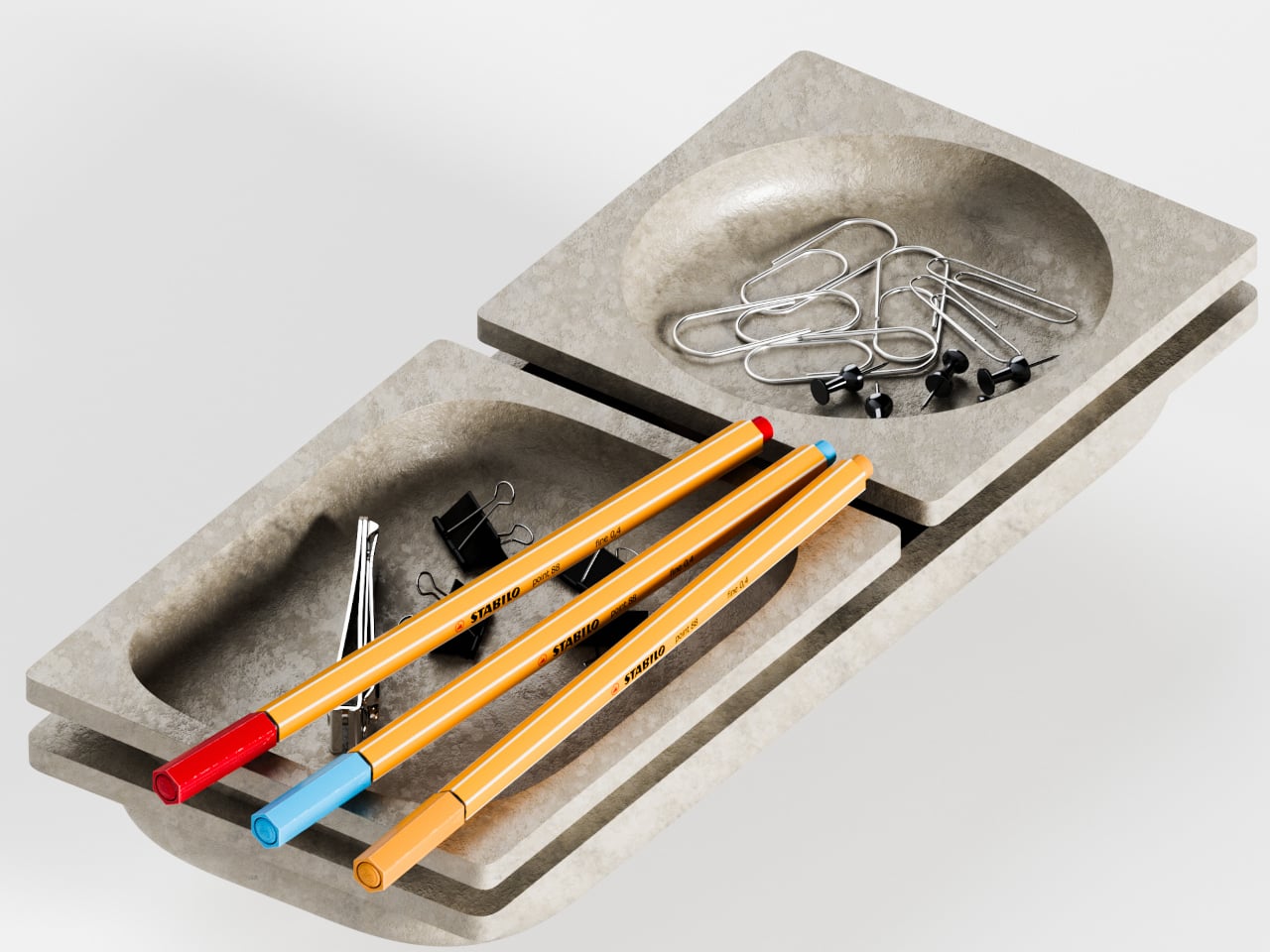
A messy desk is one of those problems that feels minor right up until it isn’t. You reach for a pen, knock over a cup, lose a paperclip into some void between your keyboard and monitor, and suddenly, five minutes are gone. Most organizers solve this with dividers and compartments, which is fine, but they tend to sit on your desk like afterthoughts, plastic trays that slide around and rarely match anything else in the room.
BloomCase approaches the problem from a different angle. Made from concrete, metal, and stone, it is heavy enough to stay put without any grip pads or rubber feet, and that weight is load-bearing in a more literal sense, too. The concrete body gives it a raw, architectural presence that feels deliberate rather than decorative, the kind of object that reads as intentional rather than incidental on a desk that already has some thought behind it.
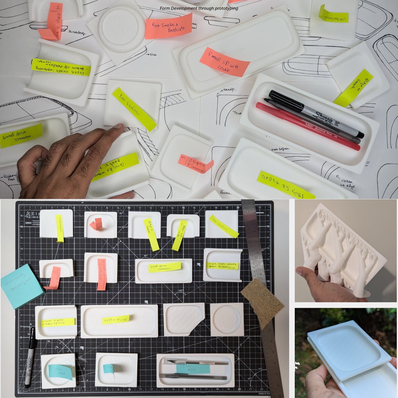
The form itself is where things get interesting. Circular basins sit alongside parallel rectangular bays, each with a specific job. The basins are contoured to cradle small loose items, thumbtacks, paperclips, and the miscellaneous hardware that scatters across every flat surface it touches. The bays run parallel and are angled to hold pens and pencils upright and accessible, so what you reach for most is what you find fastest. There is a satisfying logic to that division, one that needs no instructions to grasp.
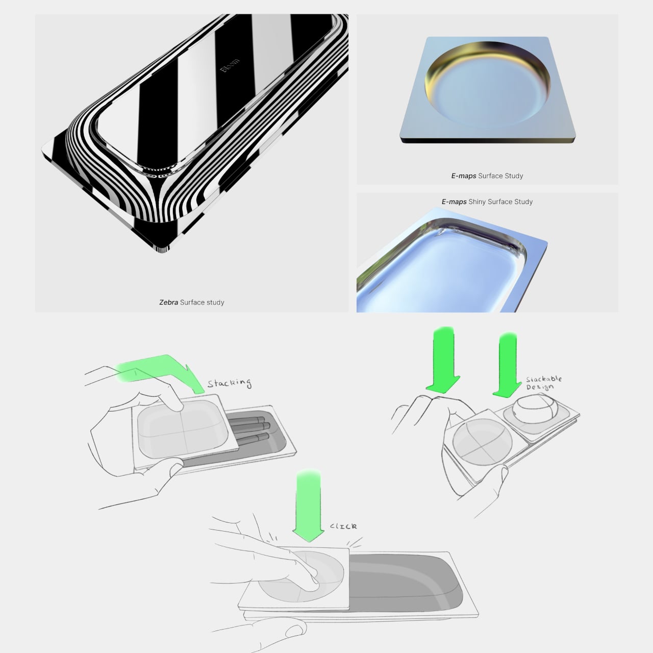
What separates BloomCase from a standard tray is the interlocking system. Two or more units snap together so that separate pieces merge into a single continuous footprint. The connection is designed to feel secure and repositionable, which matters when your desk layout shifts with a project, or when you realize three months in that you needed more pen space all along. The name comes from this behavior, units blooming outward across the workspace as organizational needs grow.
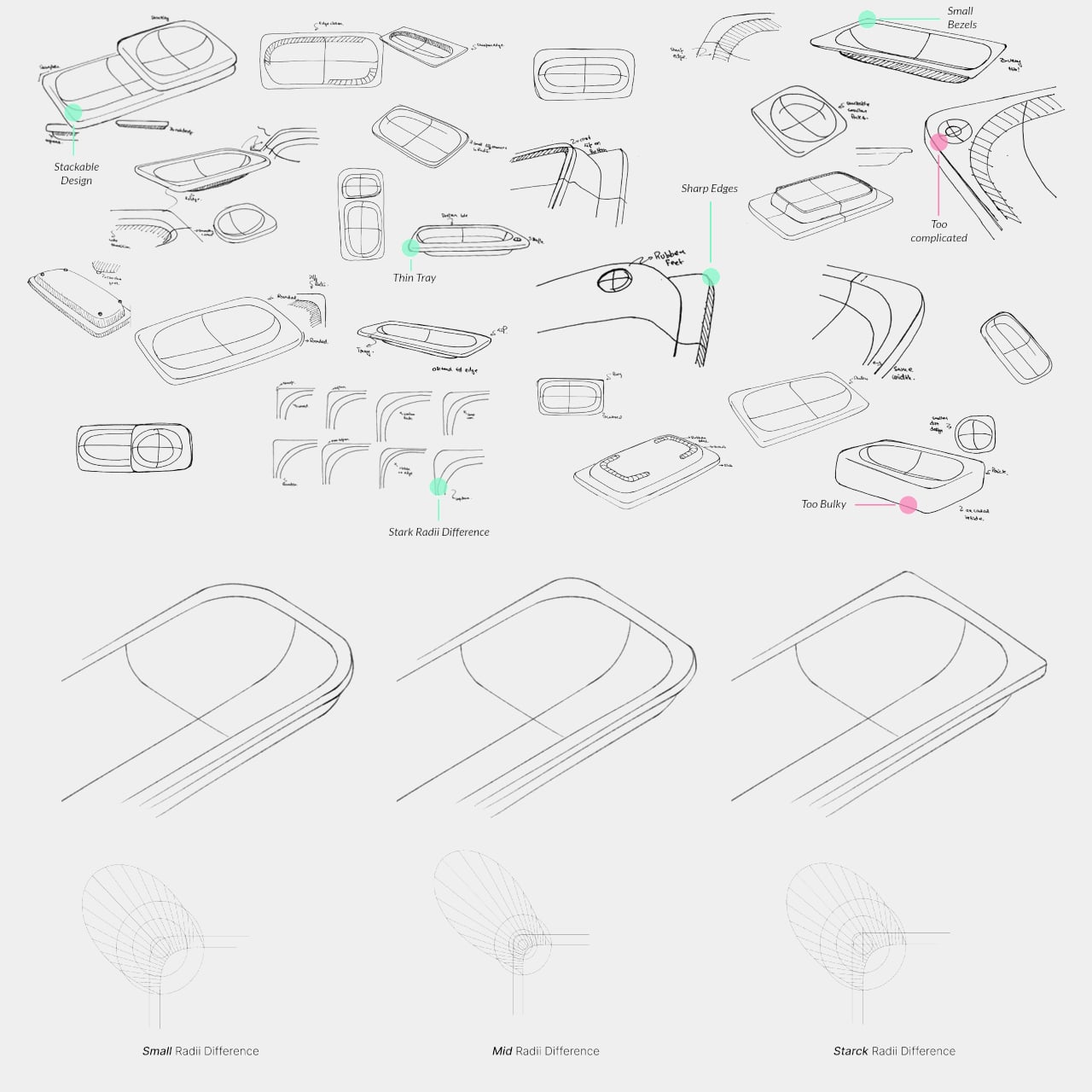
The aesthetic sits at an interesting intersection. Concrete and geometric curves do not usually share a design brief, but the combination here avoids the coldness that brutalist objects can carry in domestic or office settings. The raw material quality of the concrete against the softer basin profiles creates enough contrast to hold visual interest without tipping into decorative territory. It looks like a tool that was designed carefully, which is a harder thing to pull off than it sounds.
The modular logic is a genuinely smart idea, but it only makes practical sense if you actually need more than one unit. A desk covered in connected concrete trays starts to raise honest questions about how much surface you are willing to trade for organization. There is also the matter of audience: heavy raw materials appeal most to designers and architects who already have a taste for that kind of object on their desks, which is a narrower group than the broader market for desk tidiness.
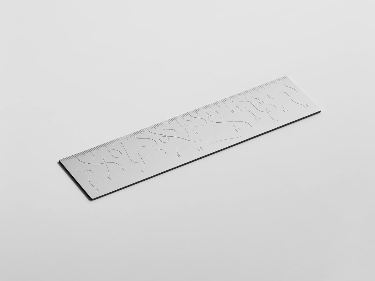
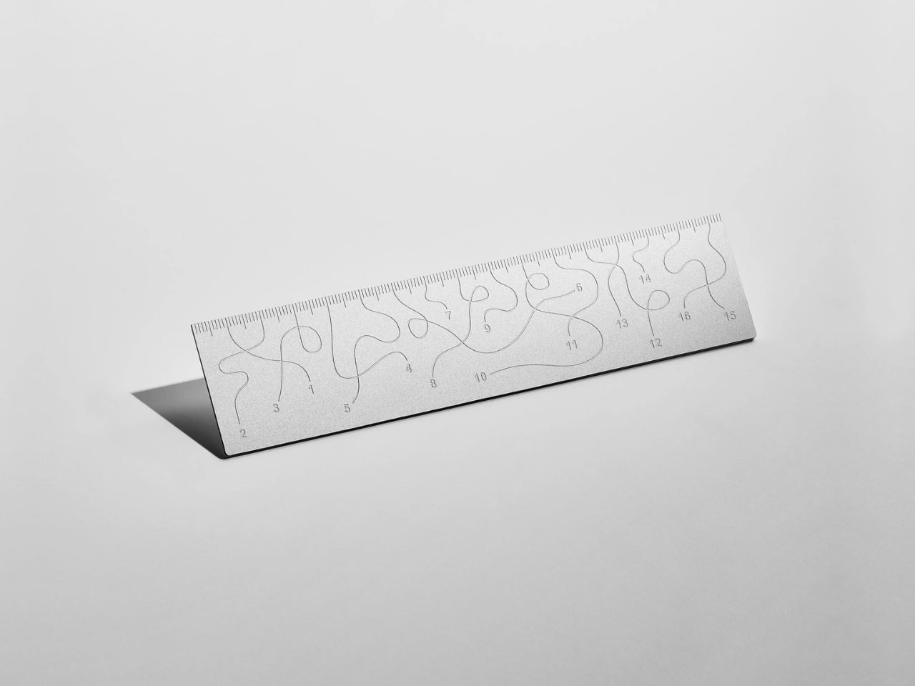
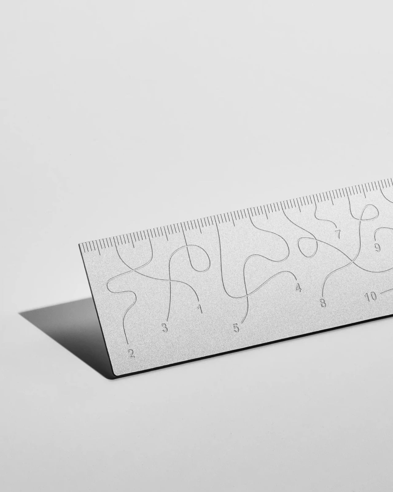
Pick up the WAY ruler and the first thing you notice is that it feels exactly right. It’s small, made from anodized aluminum, and has the kind of weight and finish that signals intention without announcing itself. It’s the sort of object that sits comfortably in a shirt pocket or on the edge of a desk and looks like it belongs in both places. Then you look closer at the markings, and something shifts.
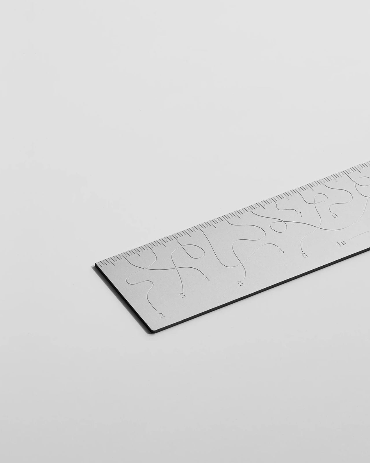
The inscriptions on the WAY don’t run in a clean, predictable line the way ruler markings are supposed to. They wind. They curve and drift across the surface of the aluminum like a path traced through a landscape, referencing, quite literally, the idea of small winding roads and the wandering nature of travel and discovery. The numbers and measurements are there, engraved directly into the material with digital precision, but they’re arranged in a way that asks you to slow down and actually read them rather than glance and move on. It’s legible. Just not immediately.
The engraving itself is worth paying attention to. Kral chose to cut the inscriptions directly into the anodized aluminum rather than printing or applying them as a secondary layer. That decision gives the markings a permanence and a tactility that you don’t get with most production objects at this scale. You can feel the grooves if you run a finger across the surface. The graphic quality of the lettering is considered without being decorative for its own sake. It reads as design that knows exactly what it’s doing, which is what makes the playfulness land rather than feel arbitrary.
The object is small enough to be considered an accessory as much as a tool. Kral has always worked at a scale that pays attention to how things actually live in your hands and in your space, and the WAY is consistent with that. It doesn’t try to be a statement piece in the way that some design objects do, where the visual drama is the whole point. The WAY is quieter than that. The drama is embedded in the detail, in that moment when you realize the markings are doing something unexpected and you have to orient yourself before you can use it.
That slight disorientation is the concept, and it’s a sharp one. There’s a real tension running through modern product design right now, one where the drive to make something visually striking starts to work against the thing it was actually built to do. We’ve all used something that looked incredible but made us work harder than we needed to. Packaging that’s beautiful but impossible to open. Interfaces that prioritize visual elegance over intuitive use. Apps designed to delight that end up frustrating. The WAY ruler doesn’t rail against any of that. It just holds up a small, well-made mirror to it. It’s more of a wink than a manifesto.
The difference between a provocation and a critique matters here. Kral isn’t punishing you for picking up the WAY. The experience of using it is still pleasant. The aluminum feels considered, the engraving is precise, and the object as a whole is genuinely lovely. He’s not making something bad on purpose to prove a point. He’s making something that’s slightly impractical in a very deliberate, very elegant way, and letting you sit with that paradox.
And he followed through on it. The WAY isn’t a prototype or a one-off shown at a design fair and then retired to a shelf. Kral produced a batch and sells them directly through his studio’s website. That matters. It means the object gets to exist in the world the way all good design should, in someone’s hand, on someone’s desk, doing its quiet, considered, slightly inconvenient thing in real life.
At a time when so much product design either chases pure utility or drifts so far toward aesthetics that it forgets what it was originally supposed to do, the WAY ruler manages to be a little bit about both. It’s funny, it’s beautiful, and it makes you think. A ruler, of all things. Leave it to Tomas Kral.
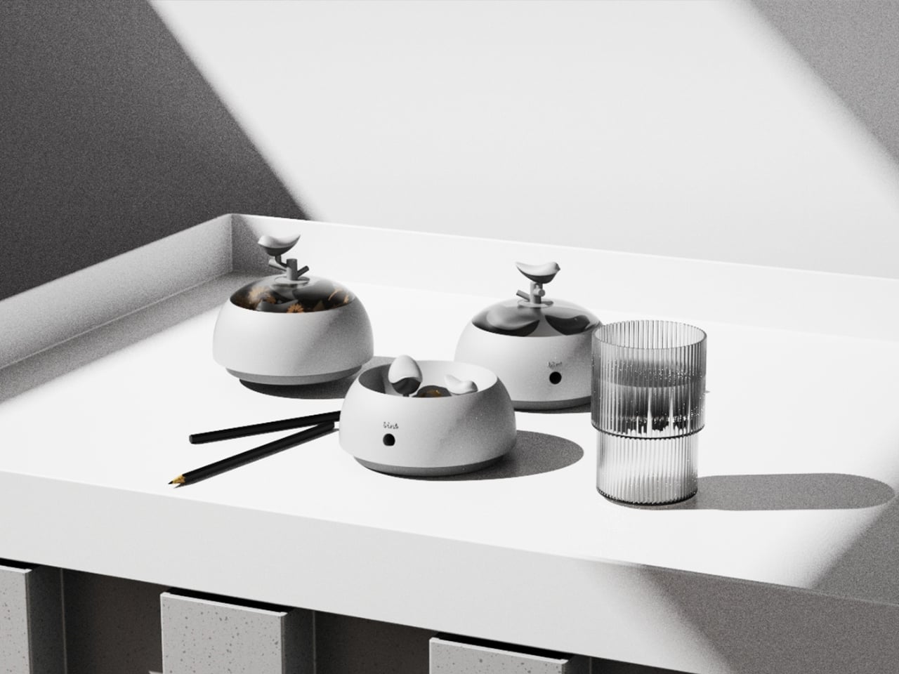
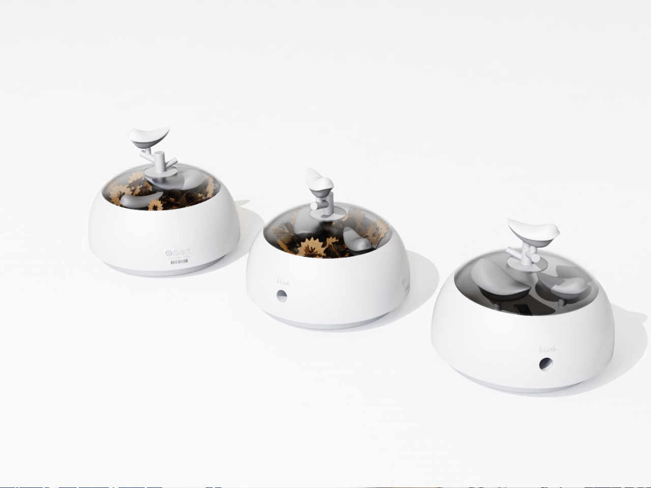
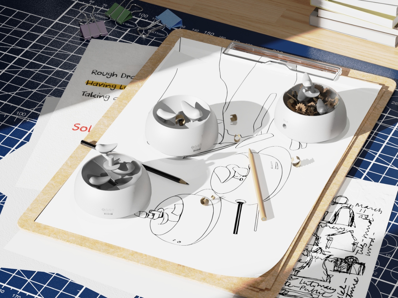
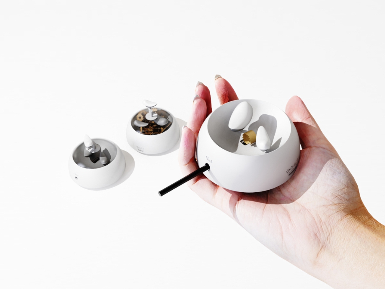
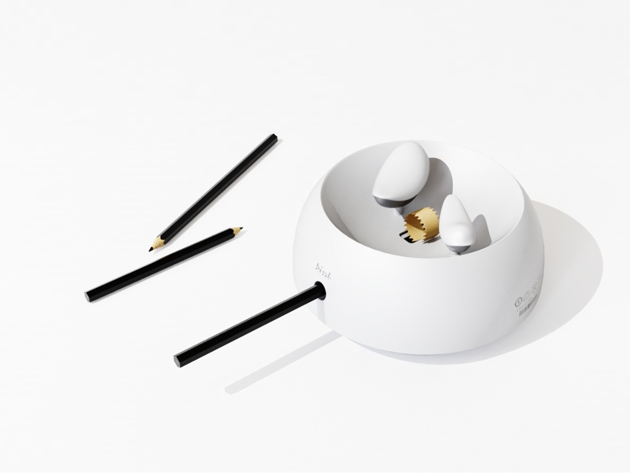
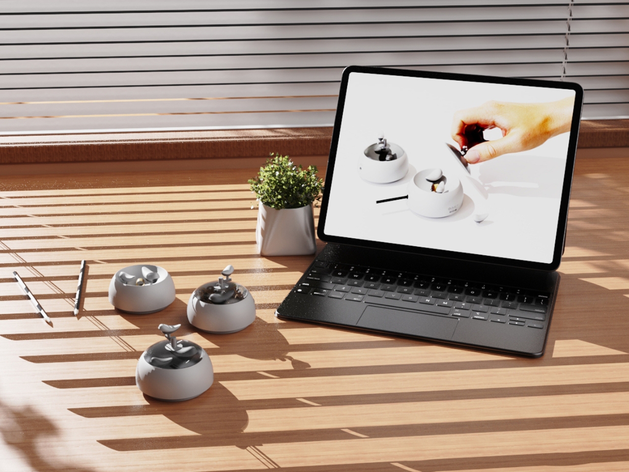
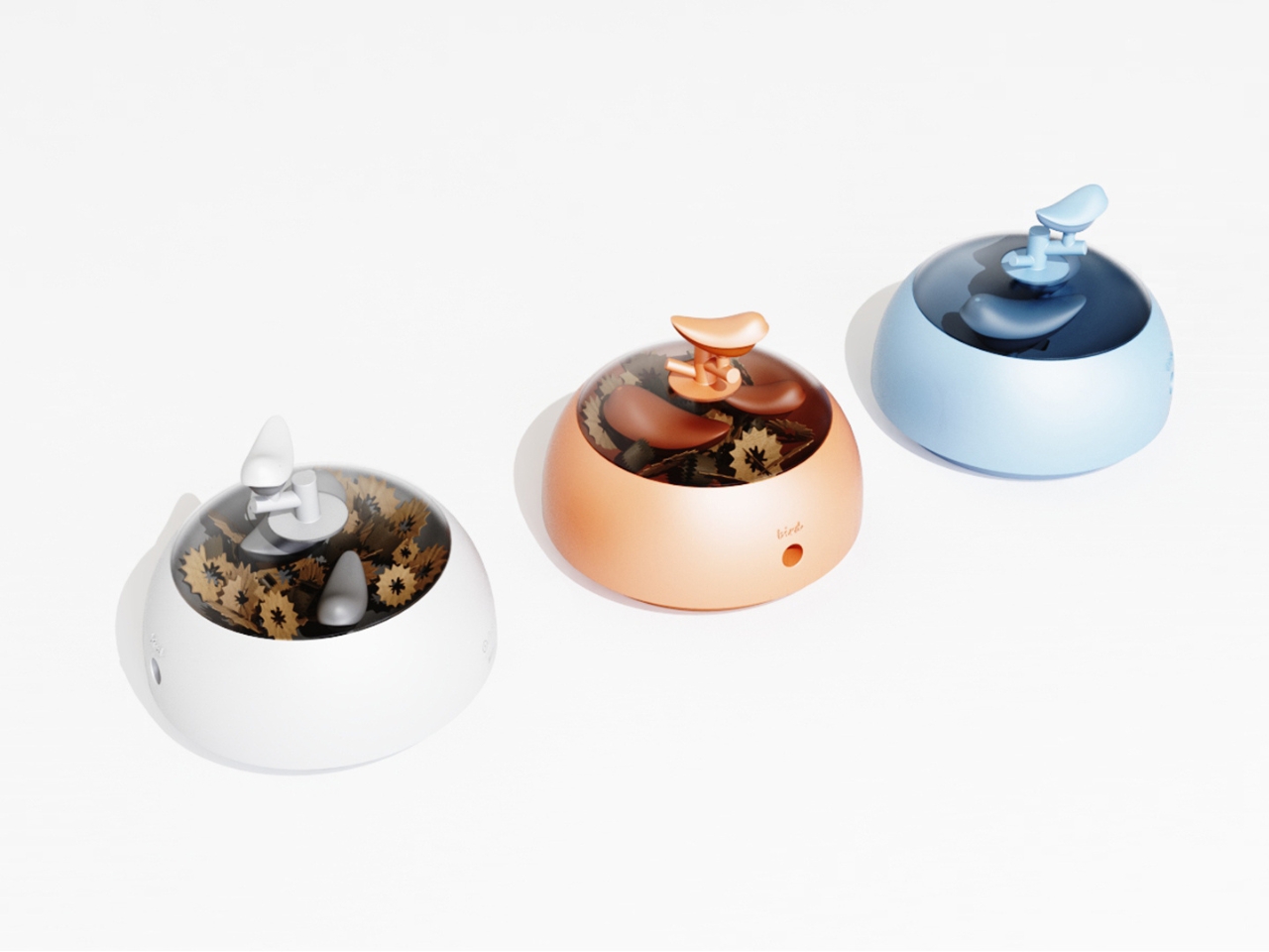
Most desk objects get ignored. They sit there doing their one job, collecting dust around the edges, and we never really think about them again. NEST, a conceptual pencil sharpener designed by a team of five students from TUST, UNNC, and CAU, is a direct challenge to that dynamic. It recently took home the winner prize at the 2025 European Product Design Award in the Conceptual Work & Office Product Design category, and the reason it won feels obvious the moment you understand what it actually does.
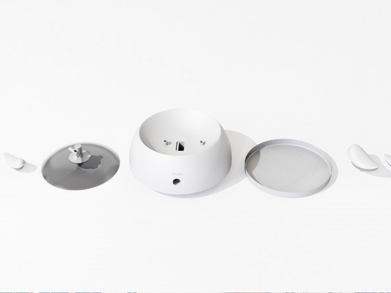
The concept is deceptively simple. A small bird figurine sits inside a rounded, bowl-shaped container. As you sharpen your pencil, the curling wood shavings collect beneath the bird, gradually building up like the gathered material of a real nest. By the time the container needs emptying, the little bird looks as if it has been nesting all along, settled into a soft, spiraling bed of wood ribbons. It is a beautifully accidental image that the design deliberately engineers into being, and once you picture it, it is very hard to unsee.
The real strength of NEST is the intelligence of its metaphor. Lead designer Zebin Qiao and the team didn’t just borrow a visual from nature and paste it onto a product. They found a genuine structural parallel between the act of using the sharpener and the act of nest-building, then made sure the user experiences that parallel in real time. That is not an easy thing to pull off. Most product design that reaches for nature ends up with surface decoration or an illustrative graphic on a box. NEST earns its metaphor because the metaphor lives in the function, not on top of it.
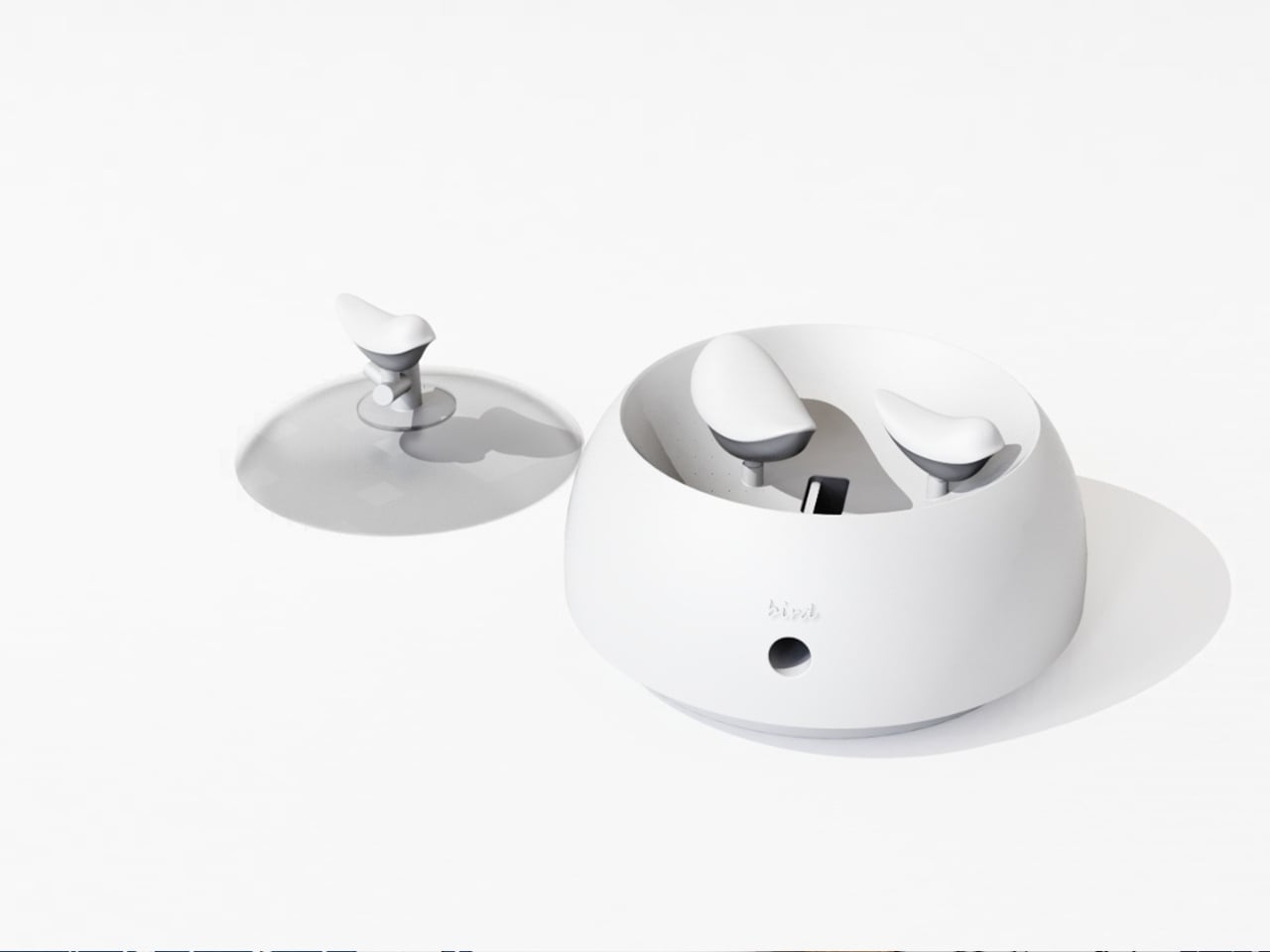
The second layer of the design is the lid. It doubles as a perch, fitted with a minimal branch element. When you are not sharpening, the tiny bird figurine can be lifted out of the interior and placed on the branch, transforming the whole object into a quiet desktop ornament. This dual-state approach means the product shifts personality depending on how you use it. It is a working tool when you need it, and a miniature sculpture the rest of the time. I genuinely appreciate designs that respect both modes of being at a desk, the productive and the contemplative.
I will admit my first instinct when I encounter “award-winning conceptual product” is mild skepticism. Conceptual work can drift toward spectacle and lose interest in whether the thing would actually function. NEST sidesteps that problem by grounding every design choice in real, physical behavior. The shavings accumulate because that is what shavings do. The bird sits because the container holds it. Nothing is forced or artificially staged. The charm is a byproduct of the function, which is exactly the right way around. It gives the design an integrity that a lot of more expensive, more elaborate objects simply do not have.
The color variants are worth noting too. The design comes in white, a warm terracotta tone, and a soft powder blue, each with a matching bird. It is a small decision that makes the object feel personal rather than clinical, and it opens the door to something close to a collecting impulse. You are not just buying a sharpener. You are picking a companion for your desk, which is a particular kind of intimacy that few office products ever manage to create.
At its core, NEST is making an argument that utility does not have to be neutral. That the objects we interact with daily can carry meaning, invite attention, and reward a small amount of patience. A student design team from three Chinese universities made that argument with a pencil sharpener, and they made it convincingly enough to win a major European award. That is not nothing. If anything, it is the kind of design thinking we need more of, the sort that finds poetry in the ordinary without making you feel like you are trying too hard to appreciate it.
Japanese stationery operates on a different set of assumptions. Where most of the world treats pens, notebooks, and desk accessories as afterthoughts, Japan treats them as design problems worth solving with the same precision applied to architecture or automotive engineering. The difference shows up in the details: magnetic closures calibrated to be silent, paper engineered for a specific ink behavior, and leather cut from a single hide. Hence, the grain tells a continuous story.
We have been collecting our favorites for a while now, and this batch feels particularly well-considered. These are not gimmicks dressed in minimalist packaging. Each product here earns its place through a specific, clever solution to a friction most people have accepted as normal. From a pencil that never needs sharpening to a wooden postcard case that borrows its form from ceramic storage traditions, this is stationery that makes the rest of the world’s offerings feel like rough drafts.
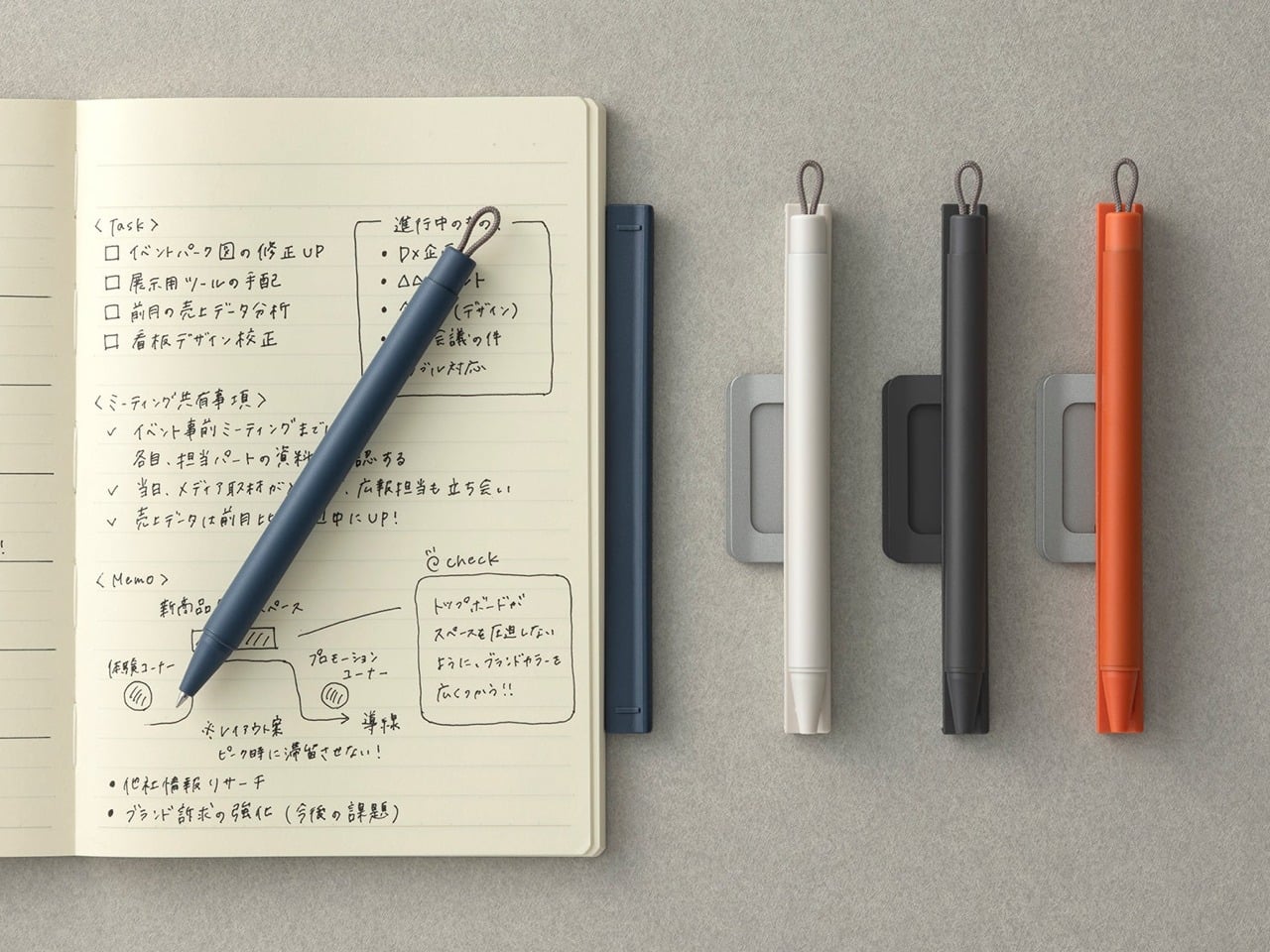
1. Inseparable Notebook Pen
Most pens exist independently of the surface they write on. The Inseparable Notebook Pen rejects that premise entirely, using a magnetic clip to lock itself to your notebook cover. A built-in silencer dampens the attachment, so there is no click or rattle, just a quiet lock into place. The barrel is minimalist, comfortable during long sessions, and the ink flow is smooth and immediate.
Japanese stationery brands have long understood that the gap between reaching for a pen and writing is a moment of lost momentum. This pen eliminates that friction. The form is understated, almost invisible against a notebook cover, which is the point. Tools that disappear into your workflow tend to be the ones that last the longest.
The magnetic clip holds firm during transit but releases with zero effort when needed.
The silencer turns a mundane attachment into something tactile and deliberate.
What we dislike
The minimalist barrel may feel too slim for those who prefer wider-grip pens.
Ink cartridge options are limited, restricting personalization for specific ink preferences.
2. Stalogy Editor’s Series 365-day Notebook (A6)
Stalogy’s 365 Days Notebook packs 368 pages of ultra-thin paper into an A6 form factor that still fits a coat pocket. Each page carries minimal printed detail: dates, days, a faint grid, and time indicators. Ignore them or use them. The paper writes with a smoothness that recalls Hobonichi Techo’s Tomoe River stock, letting ink glide without feathering or bleed-through.
The real strength is flexibility. This notebook works equally well with bullet journaling, daily planning, freeform sketching, or straightforward notes, all without forcing a single organizational method. Most planners assume they know how a day should be structured. This one steps back and lets the user decide, which is a rarer quality than it should be.
What we like
Thin paper keeps 368 pages from becoming a brick, maintaining genuine pocketability.
Minimal page markings make it equally useful for structured planning and unstructured creative work.
What we dislike
Date and time markings are printed extremely small, making them difficult to read in low light.
Heavy fountain pen inks will ghost through the thin paper, limiting compatibility with certain instruments.
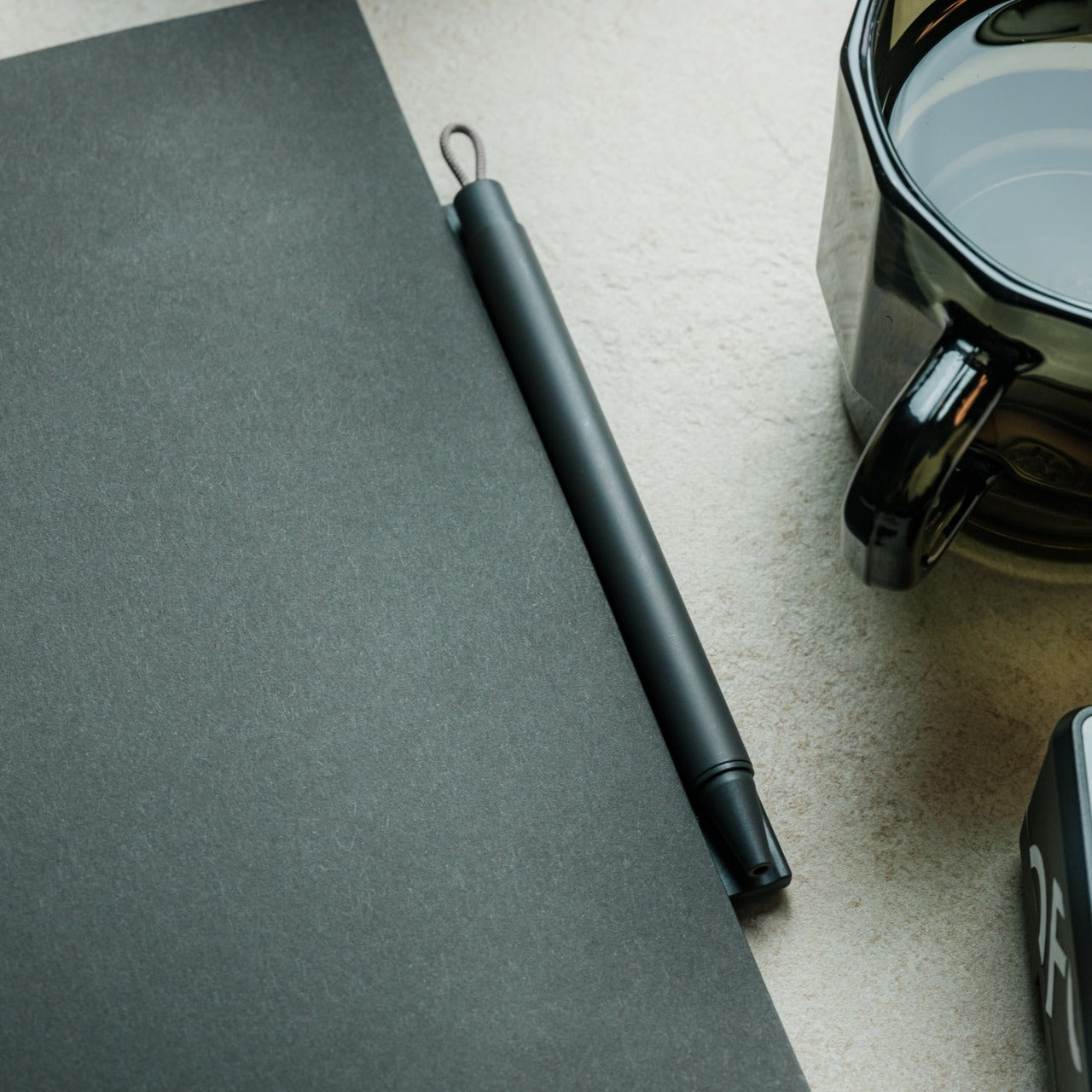
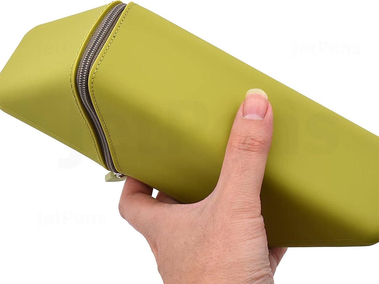
3. FoldLine Pen Roll
Cut from a single piece of Italian leather, the FoldLine Pen Roll converts from a carrying case to a functional desk tray in under two seconds using origami-inspired folding geometry: no stitched partitions, no zippers. The natural wrap of the fold separates and protects each pen, and metal-bodied instruments stay scratch-free without dedicated slots.
Unfolded, it creates a defined rectangular workspace on any surface: a cafe table, an airplane tray, a hotel desk. That containment matters. Scattered pens create micro-distractions, and a tray eliminates the chaos without occupying permanent desk space. The leather develops a patina over time, improving with age rather than deteriorating.
The two-step unfolding mechanism feels intuitive enough to be fast and intentional enough to feel like a ritual.
Single-piece leather construction means no stitching to fail and no partitions to limit capacity.
What we dislike
Without individual pen slots, instruments can shift during aggressive bag movement.
Italian leather at this quality carries a price premium well outside impulse-purchase territory.
4. Memento Business Card Log
Business cards are collected, shoved into wallets, and forgotten. The Memento Business Card Log, designed by Japanese brand Re+g, rejects that cycle. It stores up to 120 cards using a two-point slit system that keeps each card secure, and the facing page offers dedicated space for handwritten notes about the person: a conversation detail, a follow-up date, a distinguishing trait.
Re+g’s proprietary binding allows pages to be reordered by category, importance, or any logic that makes sense. The paper stock has a warm, tactile quality. Writing a note by hand about someone forces a level of attention that tapping a phone screen cannot replicate. The log becomes a record not just of who was met, but of how those meetings felt.
The proprietary binding allows page reordering, so the system evolves with the user.
Dedicated note space alongside each card slot turns passive storage into active relationship memory.
What we dislike
At 120 cards, heavy networkers will fill the log fast, requiring a second volume.
The analog format means no search function, so finding a specific card requires manual browsing.
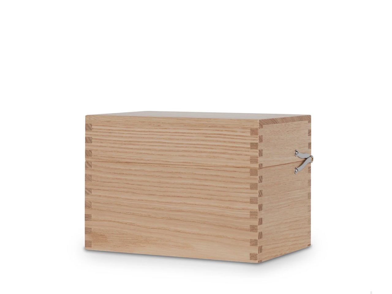
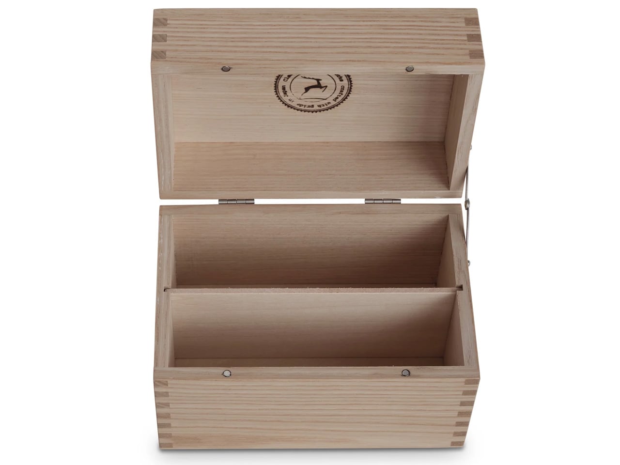
5. Classiky Chestnut Postcard Case
Classiky’s Chestnut Postcard Case borrows its design language from the wooden boxes used in Japan to store precious ceramics. Varnished Japanese chestnut wood gives it a warmth and grain that plastic or metal storage cannot approach. The proportions (17.6 x 11.6 x 12.4 cm) are calibrated for standard postcards, with two removable separators and a magnetic closure that shuts with clean, weighted precision.
This is a storage object built to outlast its contents. The chestnut deepens in color over years of handling rather than fading, and the removable separators allow flexible configuration depending on collection size. For collectors, letter writers, or anyone who values the physical artifact of a postcard, this case turns storage into curation.
What we like
Varnished Japanese chestnut ages beautifully, growing richer in tone over the years of handling.
Removable separators allow for a flexible internal configuration across different collection sizes.
What we dislike
Dimensions are postcard-specific, so the case cannot accommodate larger formats, such as A5 prints.
The craftsmanship and material quality place it at a premium that limits its appeal for casual purchases.
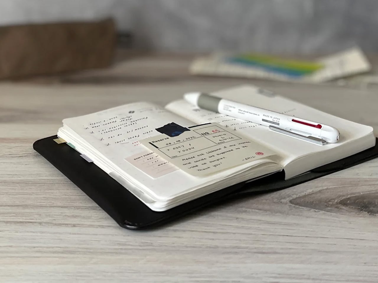
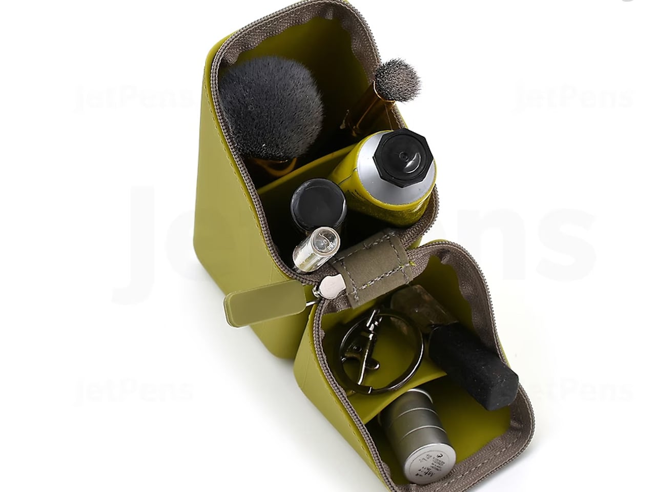
6. Sonic Kakusta
The Sonic Kakusta starts as a soft pen case and transforms into a triangular desk stand that props pens at a 60-degree angle for easy visibility and access. A built-in divider splits the interior into two sections, while a second divider in the lid creates a small shelf for erasers and sticky notes. Strong magnets hold the folded lid in place, preventing the stand from collapsing mid-use.
That 60-degree angle is the smartest detail. Steep enough to display pen tops for identification, shallow enough that pens slide in and out without tipping the case. For anyone working between home, office, and library, the Kakusta eliminates the need to carry both a case and a desk cup. One object handles both roles without appearing to be a compromise.
What we like
The magnetic lid holds the stand shape on uneven surfaces without collapsing.
The lid divider doubles as a shelf for small items, adding utility most pen cases ignore.
What we dislike
Soft material offers limited protection against crushing in an overpacked bag.
The triangular footprint is wider than a flat case, occupying more bag space than a traditional pouch.
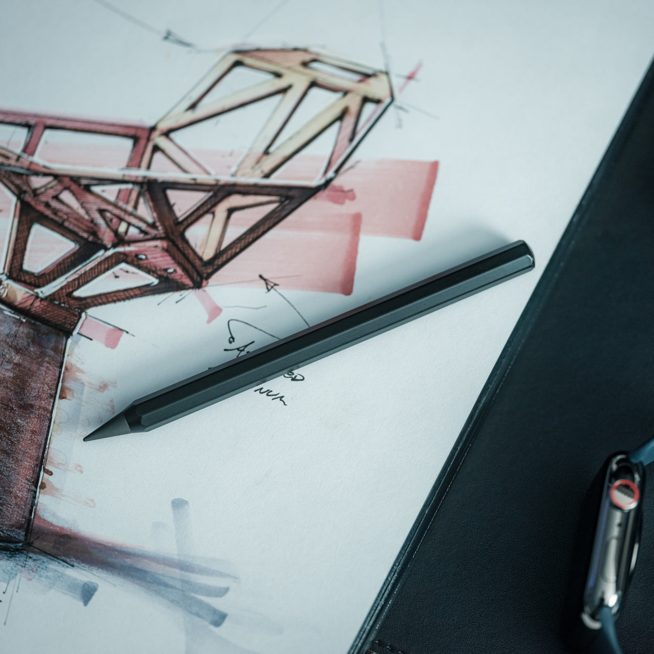
7. Pocket Everlasting All-Metal Pencil
The Pocket Everlasting All-Metal Pencil uses a graphite and metal alloy tip that deposits marks through friction rather than material loss. The core does not shorten. The point does not dull. The manufacturer claims roughly 10 miles of writing, and the marks are erasable with a standard eraser. At 4.7 inches with a cap, it slips into a shirt pocket without protest.
Traditional pencils generate shavings, require sharpeners, and degrade in humid conditions. This pencil sidesteps all three. The all-metal body has a substantial heft without being heavy, and the graphite-alloy line plays well with watercolor and wet media because it does not bleed when painted over. For field note-takers who need a tool that never fails at the wrong moment, this is a quietly radical solution.
The graphite-alloy tip eliminates sharpening, shavings, and the risk of a dull point at the worst time.
Compatibility with watercolor and wet media makes it versatile for mixed-media sketching.
What we dislike
Line weight is fixed, so artists needing variable stroke thickness will find it limiting.
The metallic graphite tone differs subtly from traditional pencil graphite, which may bother purists.
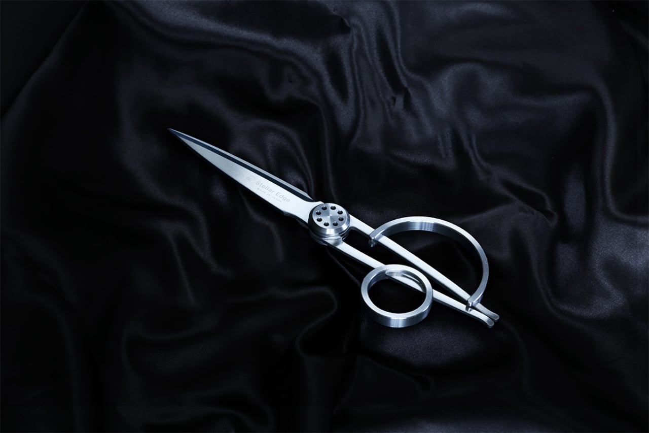
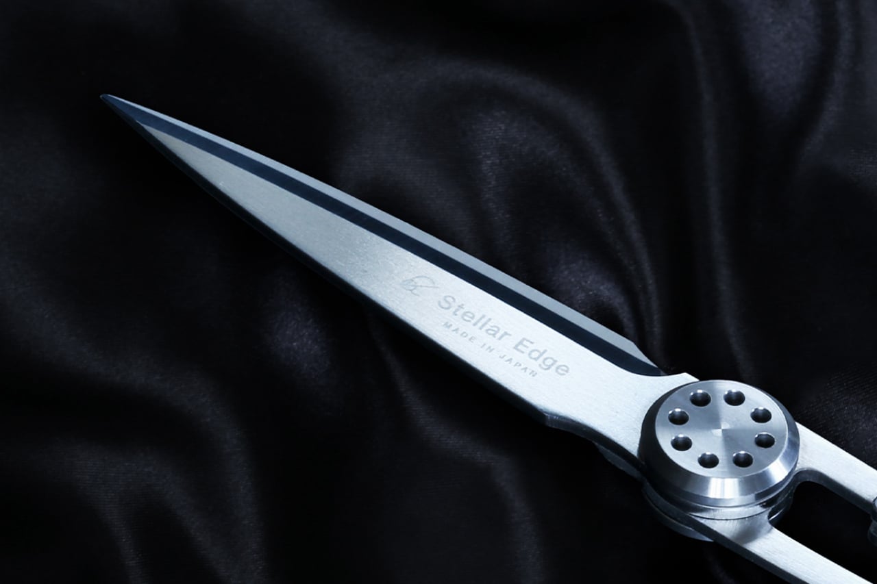
8. Stellar Edge Scissors
Scissors are the most overlooked object on a desk. The Stellar Edge Scissors argue that this neglect is a design failure. Crafted from Japanese stainless steel, the blades hold their edge far longer than standard office scissors, and the polished, seamless handles distribute weight so evenly that extended cutting sessions produce no hand fatigue. Every curve has been considered, from the finger loop radius to the pivot tension.
Each snip has a clean, controlled resistance that comes from precise blade geometry and tight manufacturing tolerances. The polished finish reduces friction against tape and adhesive paper, which tend to gum up matte or coated blades. The ergonomic shaping fits both left and right hands without the usual ambidextrous compromise. For anyone who uses scissors more than once a week, these make the ordinary feel considered.
What we like
Japanese stainless steel holds a sharp edge far longer than standard office scissor alloys.
Weight distribution across the handles eliminates fatigue during extended cutting sessions.
What we dislike
The premium material and finish come at a price point difficult to justify for occasional use.
The polished surface shows fingerprints easily, so it requires regular wiping to maintain a clean aesthetic.
Where this leaves us
Eight products, and the common thread is not aesthetics or branding. It is the refusal to accept that everyday tools should be disposable, forgettable, or merely functional. Japanese stationery design starts from the assumption that the interaction between a person and a tool is worth engineering down to the last magnetic click, the last gram of weight distribution, the last millimeter of paper thickness.
The rest of the world makes stationery. Japan makes instruments. The difference is not in the materials alone, though those matter. It is in the insistence that a pen’s relationship to a notebook, a scissors’ resistance against paper, or a wooden box’s aging behavior are all design problems that deserve solutions. These eight products are proof that once experienced, going back feels like a downgrade.
Model-making has a rhythm, and it is surprisingly easy to break out of the zone. You pull out the tape measure, get your reading, set it down, hunt for the caliper, check a dimension, reach for the cutter, and by the time you’ve touched four separate objects, you’ve lost track of where you were in the build. It’s a minor friction, but it compounds quickly across a studio session into something genuinely disruptive.
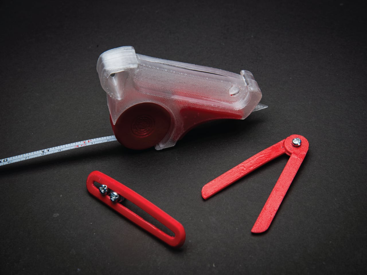
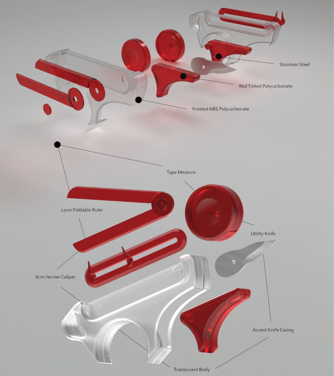
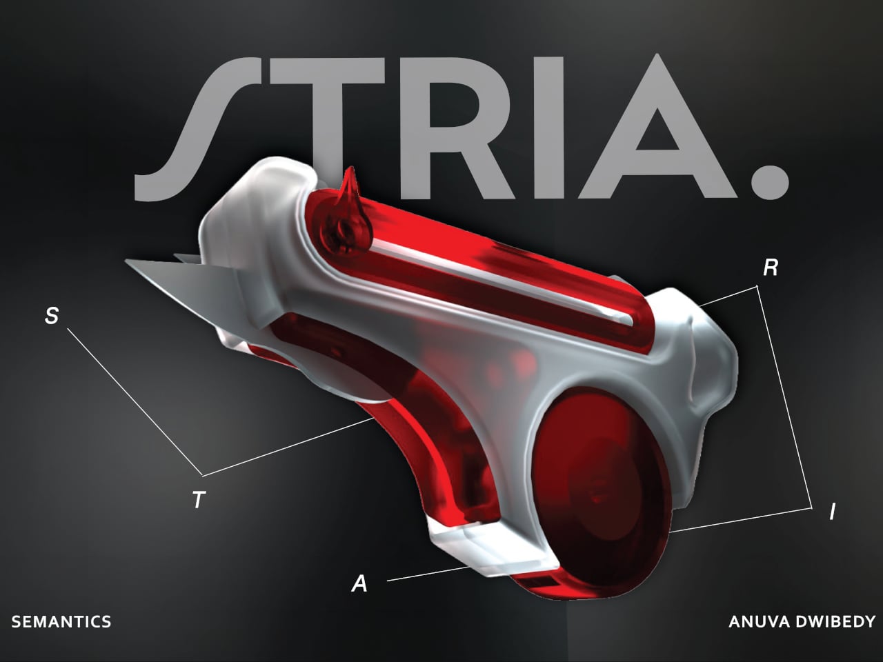
That friction is the exact problem STRIA was designed to address. The concept starts from a straightforward observation: the actions that make up physical prototyping, measuring, checking dimensions, and cutting materials, are tightly connected in practice but spread across a handful of unrelated objects. It combines four of the most essential tools that designers and architects reach for, creating a Swiss Army knife for any kind of physical creative work.
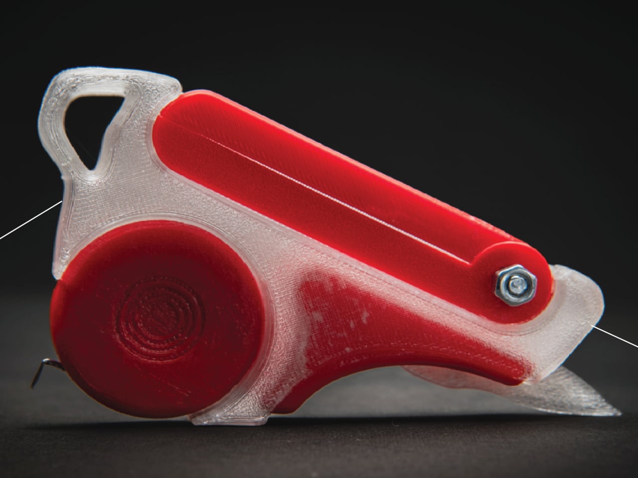
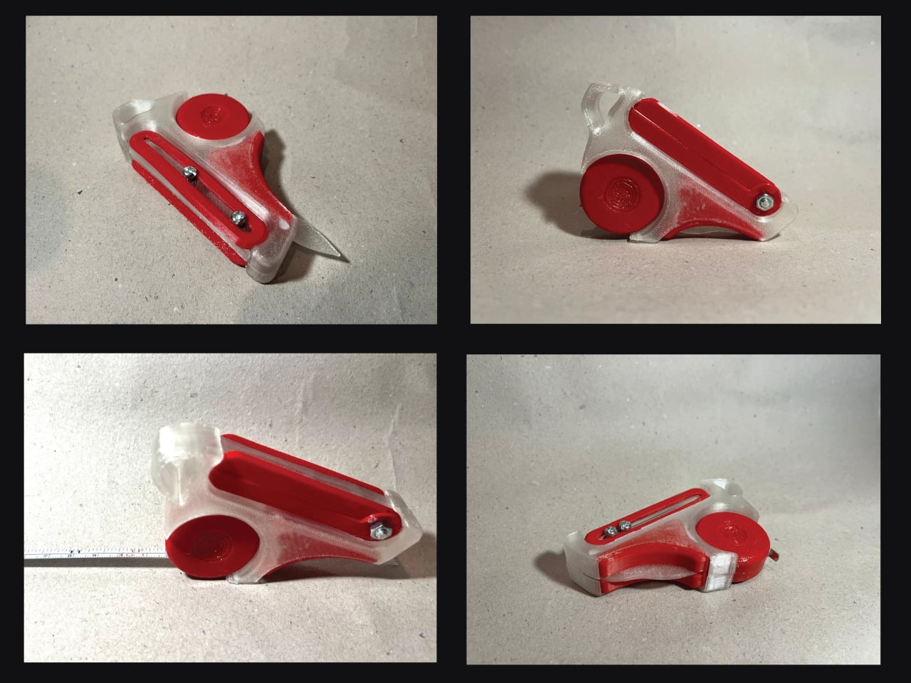
Those four are a tape measure, a 12 cm foldable ruler, a 6 cm vernier caliper, and a utility knife, all integrated into a single handheld device. The body is frosted ABS polycarbonate, with red-tinted polycarbonate accents and stainless steel for the blade and hardware. The translucent construction lets you see the internal components at a glance, which feels appropriate for a tool aimed at designers who spend a lot of time thinking about how things fit together.
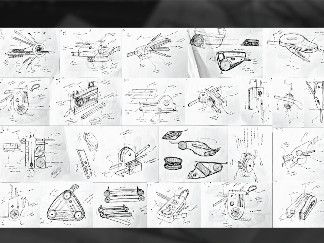
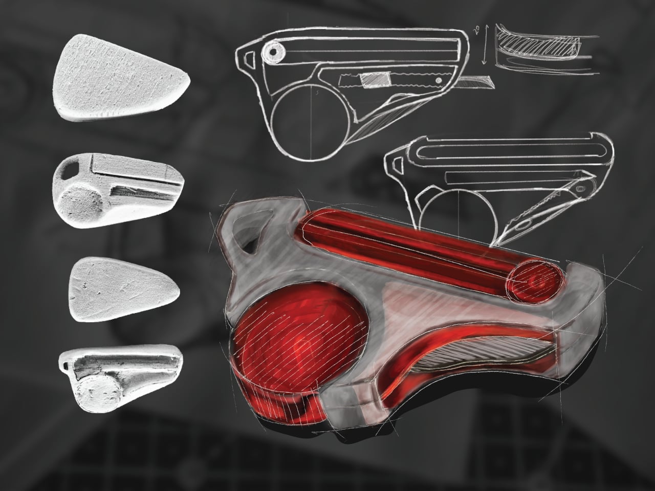
The form went through extensive iteration, with dozens of sketched directions and physical grip studies preceding the final shape. That process matters because fitting four tools into something pocket-sized is a mechanical problem as much as a visual one. Each function needs a deployment mechanism that doesn’t compromise the others, and the grip has to stay comfortable when you’re switching between them repeatedly during a long session.
What STRIA gets right in concept is treating workflow continuity as a design constraint rather than an afterthought. Its five stated goals, compact, precise, durable, ergonomic, and integrated, read less like marketing language and more like a checklist for something that needs to survive a studio environment. A 3D printed prototype has already been produced, so the integration challenges aren’t purely theoretical at this stage.
Whether every mechanism holds up to the repetitive, sometimes rough handling that model-making actually demands is what a finished version would need to prove. And there’s a subtler question underneath that: consolidating tools changes how you reach for them, and it’s worth asking whether that’s always an improvement or occasionally a trade-off.