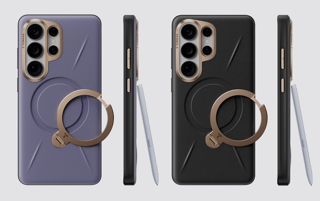
Galaxy S26 Ultra users tend to fall into a specific category. They’re the people who picked the Ultra not because they needed the absolute maximum specs, but because they actually use those specs. The 200MP camera system gets put to work, the S Pen stays in regular rotation, and the phone handles everything from spreadsheet edits to client presentations. Cases for these users need to solve real problems, which makes the TORRAS Ostand Q3 Vegskin feel purpose-built rather than mass-marketed.
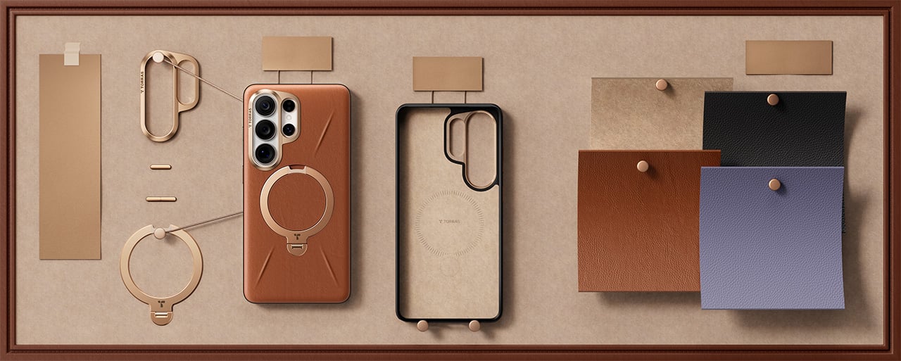
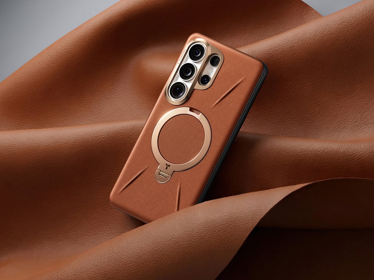
Vegskin covers the back panel with organic silicone fabric that mimics the texture of quality calfskin leather, complete with Italian-inspired embossing that delivers a matte, slightly velvety surface. The material resists oil and water stains while offering antibacterial and anti-mold protection, staying clean through daily handling without constant maintenance. Inside, a beige microfiber lining guards the S26’s glass back from scratches and scuffs. The combination of materials creates a case that works in business settings without looking sterile, pairs well with casual use without feeling too relaxed, and handles outdoor situations without compromise.
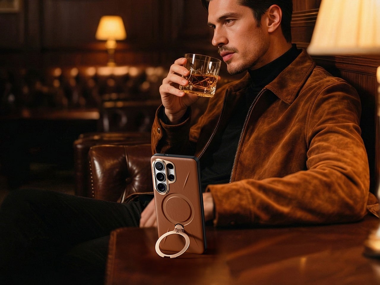
The Ostand has been arguably TORRAS’ most clever invention, providing an ultra-slim yet robust O-shaped ring/stand that rotates on a 360° pivot point for flexible gripping as well as docking (while sitting flush against the case when shut). The Tora-Hold perfects on that technology by packing components that are slimmer, stronger, and somehow smoother in their motion and use too. Eight layers of intricate components (down to micrometers in thickness) deliver the 360-degree rotation with stable angle-locking at any position you choose. The stand measures 2.7mm thick, integrating seamlessly into the backplate when closed, which matters because most kickstand cases add noticeable bulk that ruins the phone’s profile. Flip it open and the hinge operates silently, tuned for smooth reliable motion through over 30,000 rotations according to durability testing. The aerospace-grade aluminum construction went through more than 400 trials refining texture, tone, and color, which explains why the champagne gold finish feels considered rather than flashy.
Four quick-stop positions at 90°, 180°, 270°, and 360° let you snap the stand into place for fast setup, but the mechanism also locks smoothly at any angle between those points – a feature I’ve come to absolutely fall in love with on TORRAS’ Ostand cases. The magnetic ring doubles as a stand and a mounting solution, delivering 15N of magnetic force that holds firmly to car mounts, refrigerators, whiteboards, or any magnetic surface you encounter. That force rating means the phone stays put during workouts or bumpy commutes, which makes the stand viable for actual use rather than occasional convenience. The one-click locking and hidden hinge design keeps the mechanism from feeling like an afterthought bolted onto the case. And, your S26 Ultra will be wireless charging capable with this case on.
The lens guard deserves its own mention because TORRAS designed it specifically for the S26’s camera layout. A precision raised frame wraps around the camera module, following Samsung’s left-high, right-low runway-and-pillar design that keeps the lenses elevated above flat surfaces. The protection works without blocking the flash, the 10MP telephoto cameras, or the radar sensors Samsung packed into that corner, so every shooting function stays fully operational. Camera bump designs change with every phone generation, and cases that ignore those specifics end up causing problems with focus or flash washout. TORRAS clearly mapped the S26’s exact sensor placement, which matters when you’re spending flagship money on computational photography.
The sides use concave TPU that curves to fit your hand naturally, creating a secure hold without adding aggressive texture or rubber grips that collect lint. Soft-touch TPU increases friction just enough to prevent slips while keeping the case comfortable during extended handling, which matters when you’re scrolling through long documents or editing photos. The metal buttons deliver precise tactile feedback with every press, maintaining the satisfying click of the S26’s physical controls instead of mushing them into spongy approximations. Samsung brought back the S Pen slot for the Ultra, and TORRAS built an ergonomic cutout that makes removal effortless with one press for smooth extraction. Little details like that separate cases designed around a specific phone from universal designs adapted to fit whatever Samsung releases.
TORRAS prices the Ostand Q3 Vegskin at $54.99, positioning it in premium territory alongside first-party Samsung cases and established accessory brands. Three colors cover different aesthetic preferences: Amber Brown for warmth and character, Obsidian Black for understated professionalism, and Amethyst Purple for users who want their tech to show some personality. The case works exclusively with the S26 Ultra, designed around that specific body and camera configuration. If you’re investing in the Vegskin, might as well grab one of TORRAS’s 9H hardness screen protectors too, since a premium phone with a scratched display isn’t particularly pleasing to the eye or the pocket.
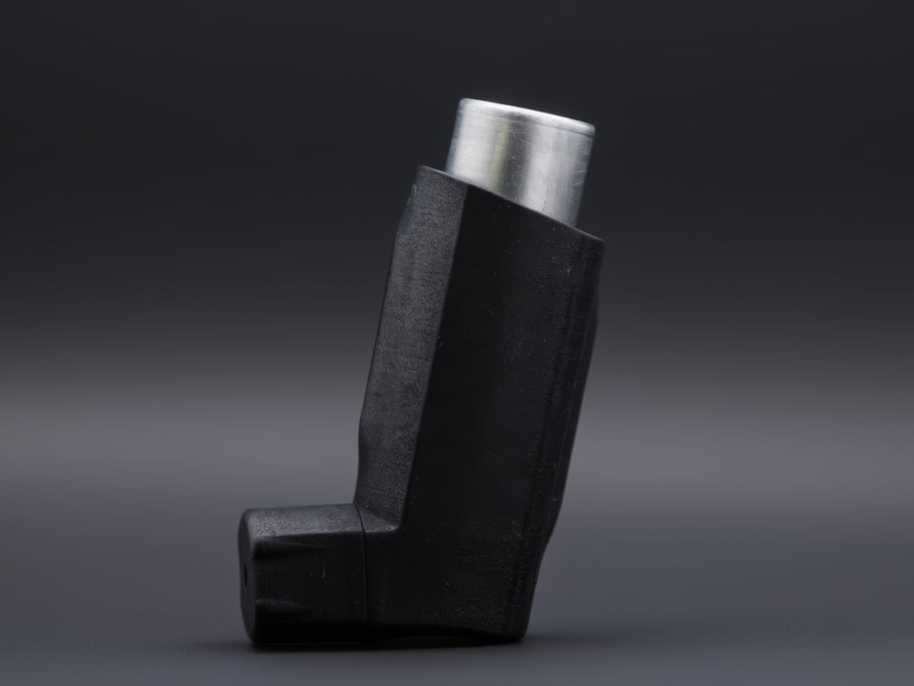
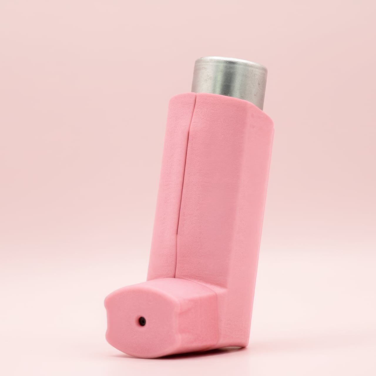
Inhalers are one of those everyday objects that millions of people carry around without ever thinking about how they look or feel. They roll around in bags, get shoved into pockets, and come out in public with all the elegance of a used tissue. Nobody designed them to be personal, and it shows. The hale Flow, a colored SLS nylon case made in the UK, wants to change that by treating an inhaler less like a clinical tool and more like something you’d actually want to pull out of your bag.
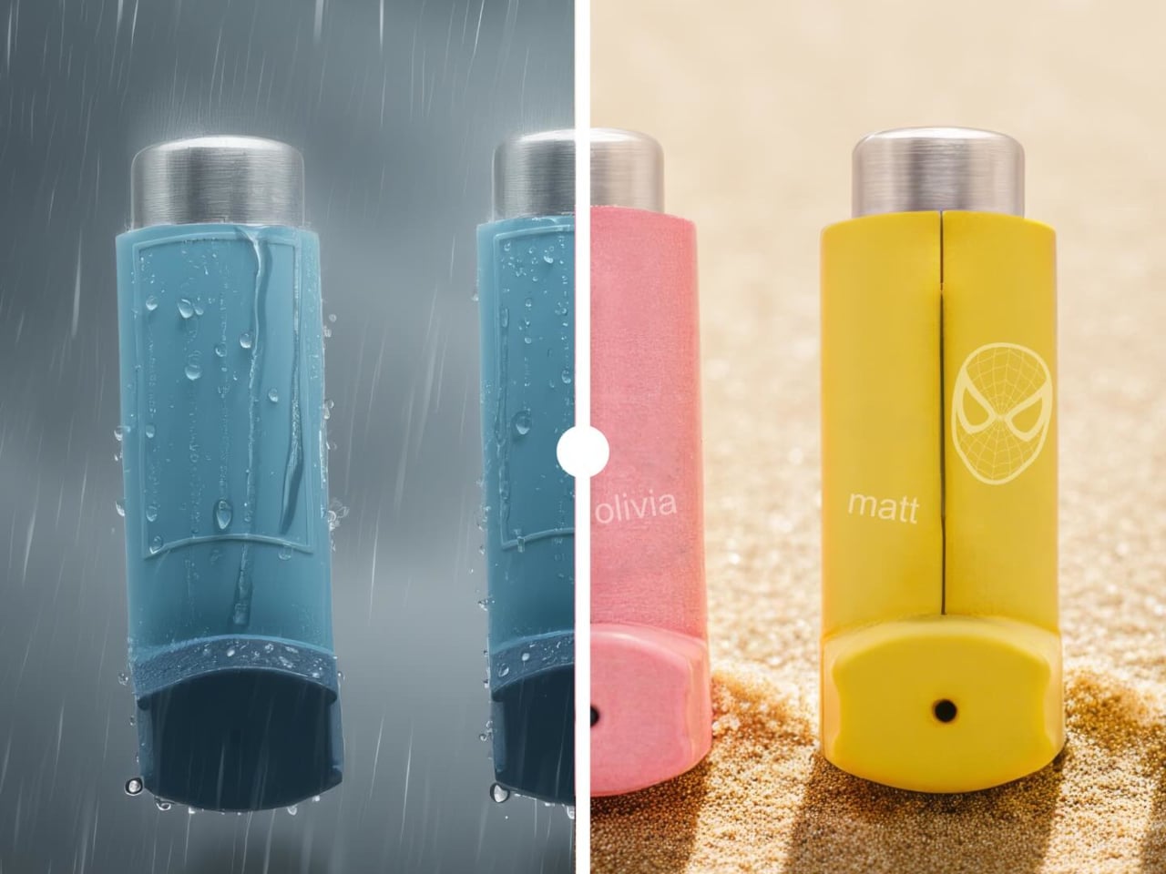
The person behind it is Matthew Conlon, who built hale from his own experience living with asthma. That starting point matters because the material choice isn’t just cosmetic. The case is made from PA12 nylon through selective laser sintering, a polymer grade found in aerospace and medical implant applications. At just 1mm of wall thickness, it wraps tightly around the Ventolin Evohaler without adding bulk, and the slightly grainy, matte surface gives it a tactile quality that immediately separates it from the cheap silicone sleeves floating around online.
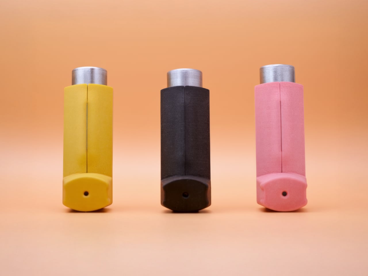
Two halves snap together through concealed magnets, each only 0.85mm thick, so there are no visible clips or latches breaking up the surface. The mouthpiece cap bonds with a small dot of adhesive, the one permanent step in an otherwise reversible setup. Subtle contours across the grip area help with one-handed use, which is the kind of detail you appreciate when you’re having a mid-asthma episode and fumbling isn’t really an option. Three colorways are available (Lemon, Pink, and Black) at £29, sitting comfortably between throwaway accessories and hale’s own aluminum Classic at £59.
What genuinely sets the Flow apart, though, is laser engraving. You can add a name or even upload a custom image, like a pet illustration, etched permanently into the nylon. For a parent buying one for a child with asthma, that turns a medical necessity into something personal, something a kid might actually feel proud pulling out of a backpack. No other inhaler accessory on the market currently offers that level of personalization at this price, which is surprising given how large the potential audience is.
The honest caveat here is compatibility. The hale Flow works exclusively with the Ventolin Evohaler, and while salbutamol remains one of the most dispensed bronchodilators in the UK, with over 22 million units in 2020 alone, millions of asthma patients rely on entirely different devices. Hale says it is exploring additional models, but for now, the design promise stops at one inhaler.
At £29, manufactured in the UK by a single founder who actually lives with the condition he’s designing for, the hale Flow sits in a category that barely existed before it showed up. Whether it can grow beyond that single compatible inhaler will determine if it remains a thoughtful niche product or turns into something with a much wider reach.
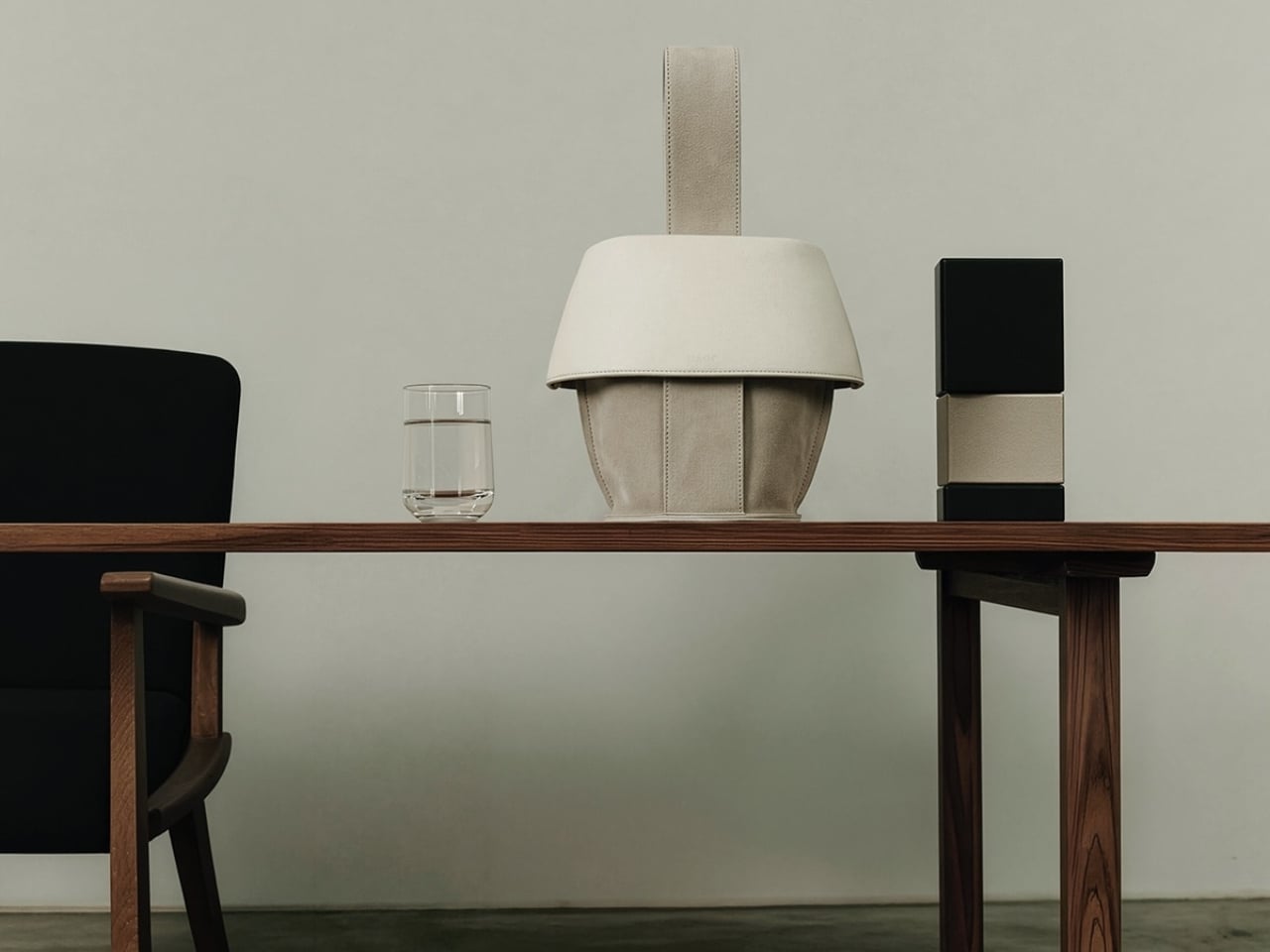
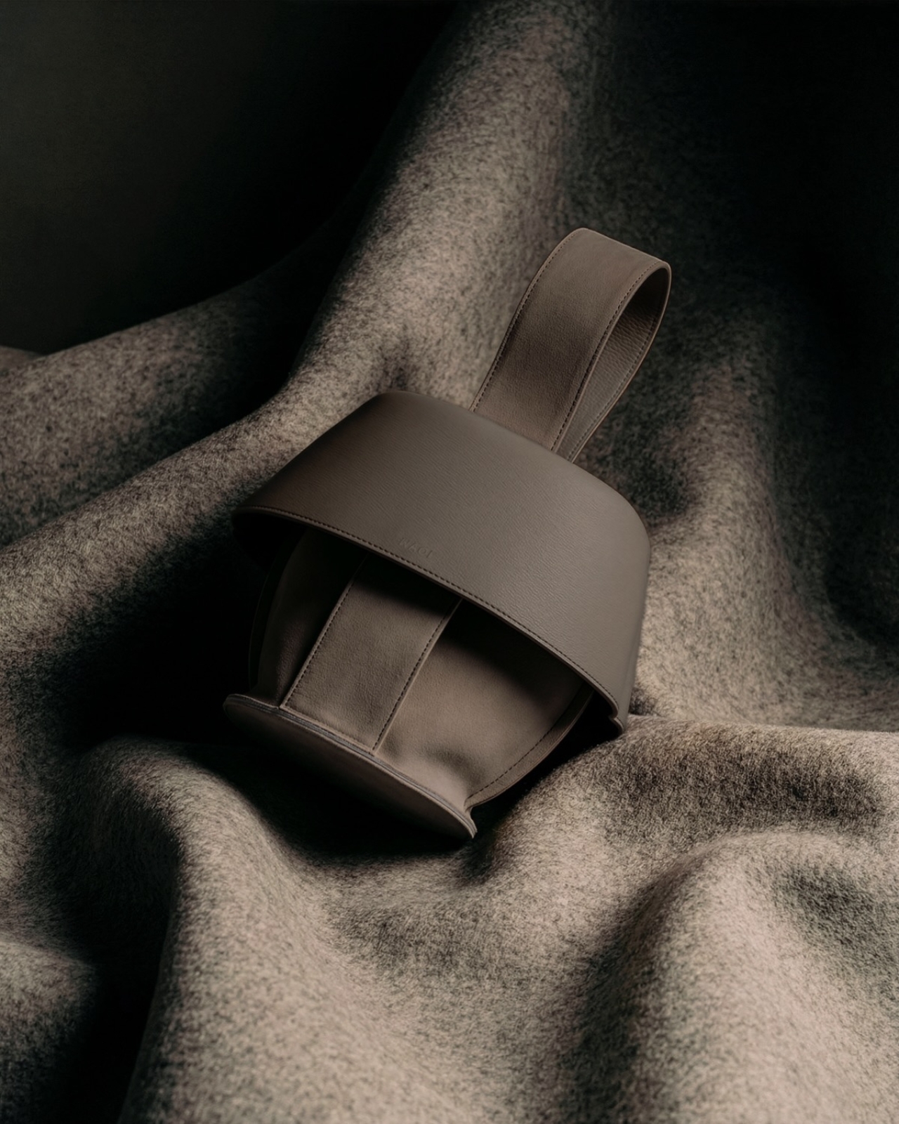
The first thing you notice about MAQL is how deliberately sculptural it looks. The handbag sits with an almost architectural presence, its curved body and rolled edges creating a form that feels more like a ceramic vessel than a typical leather accessory. That impression isn’t accidental. This is a bag designed to be looked at as much as it’s meant to be used.
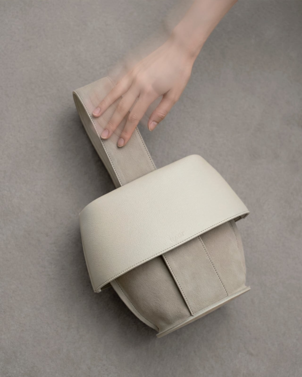
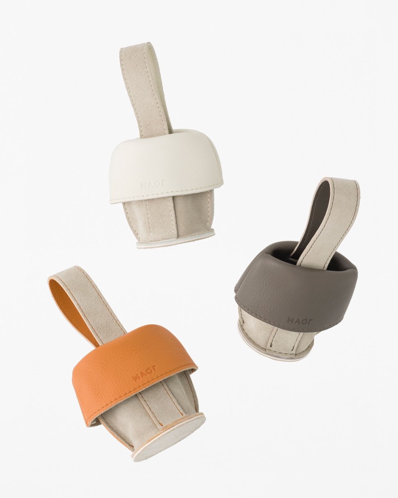
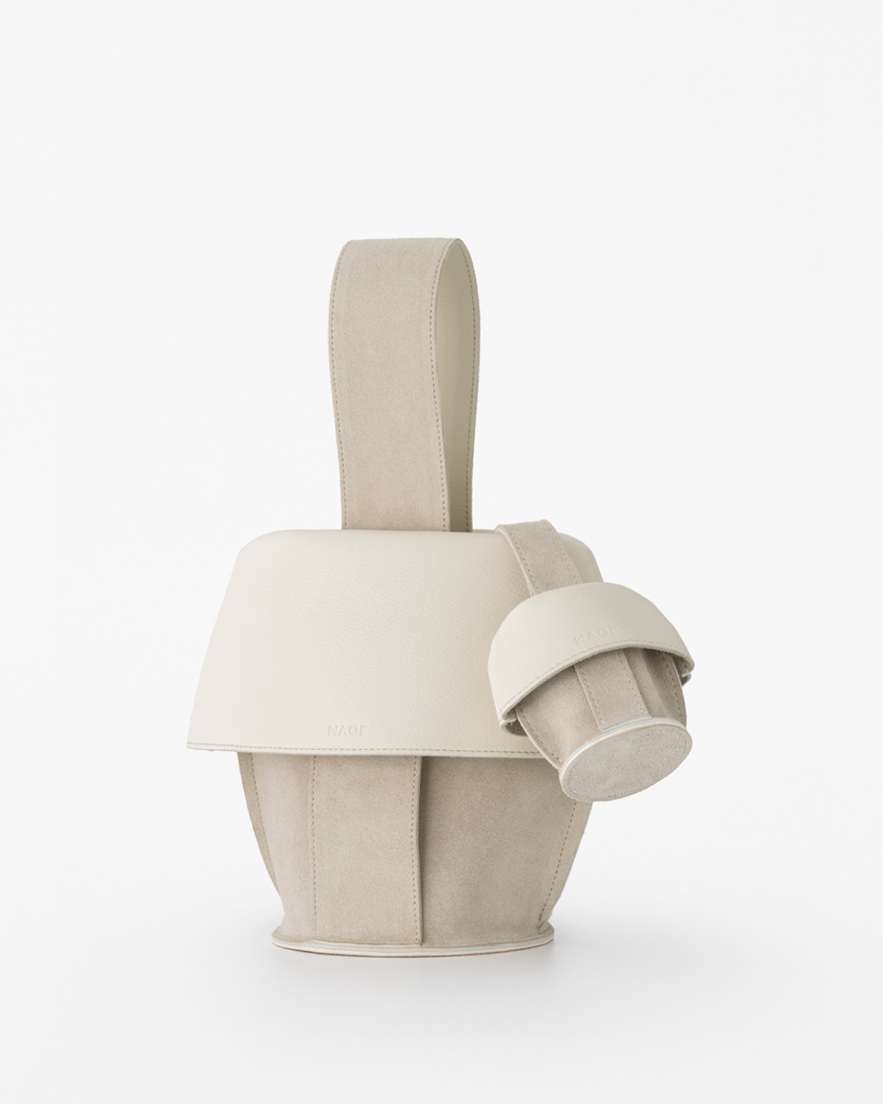
Created through a collaboration between Tokyo-based design studio Nendo and leather artisans Bag Makers Tokyo, MAQL is constructed from a single laminated piece of leather with grain leather on one side and suede on the other. The entire structure emerges from a process of strategic folding and peeling, where the rim is turned back on itself to gradually reveal what becomes the exterior surface and handles. It’s a bit like watching origami in reverse, where the final form contains evidence of every fold that brought it into being.
The name comes from makuru, meaning “to peel, to reveal” in Japanese, and that action is visible in every part of the bag’s construction. Where the leather rolls back, you see both textures at once: the smooth, structured grain leather meeting the softer suede underneath. The handles aren’t attached separately. They’re continuous with the body, formed by the same peeling motion that creates the bag’s opening. There are no hidden seams trying to disguise how this was made. The stitching is exposed where it needs to be, marking the transitions between surfaces.
What makes the design compelling is how it plays with the idea of inside versus outside. Traditionally, a bag’s interior is something you only see when you open it, a hidden space with different materials and construction than what’s visible to the world. MAQL eliminates that boundary. The suede that would typically be tucked away as lining becomes part of the exterior surface. The grain leather that forms the outer body curves inward to create the interior walls. You’re constantly seeing both sides at once, which changes how you relate to the object.
This isn’t just conceptual posturing. There’s a practical elegance to the construction. Because the bag is formed from a continuous piece of material rather than multiple panels stitched together, it has a structural integrity that feels substantial in your hands. The rounded bottom gives it stability when set down. The rolled edges create a soft, almost cushioned grip. And because both leather surfaces are visible, you’re touching different textures depending on how you hold it, smooth grain on one side, soft suede on the other.
Nendo, the studio founded by Oki Sato in 2002, has built its reputation on creating these kinds of quiet surprises, designs that reveal themselves through use rather than immediate visual impact. MAQL fits that approach perfectly. It’s minimalist without being stark, sculptural without being impractical.
The design also taps into something deeper in Japanese aesthetics, this long-standing appreciation for craftsmanship that doesn’t need to announce itself. Think of the way a kimono’s lining might be more elaborate than its exterior, seen only in glimpses, valued by those who know to look. MAQL takes that same philosophy but inverts it, bringing hidden construction to the surface where it becomes part of the design language.
The bag comes in a muted palette, mostly earth tones and soft neutrals that let the form and texture do the talking. There’s a larger version that works as a proper handbag and smaller iterations that function almost like pouches. Each size maintains the same folded construction, the same interplay between grain and suede, the same sense of a form that emerged organically from the material itself rather than being imposed upon it.
In a market saturated with bags that compete on logos and brand recognition, MAQL stands out by offering something different: visible craftsmanship, thoughtful construction, and a form that asks you to pay attention to how things are made. It’s not trying to signal anything beyond its own careful execution. For people who care about design, that’s more than enough.
Your hands are restless by design. Even when you’re sitting still and supposedly focused, they want to press something, rotate something, click something into place. This tendency has been pathologized and productized in equal measure, first by disapproving teachers, then by the fidget spinner industry. But before any of that, there was just the pen. The clicking ballpoint. The cap you’d snap and unsnap. The barrel you’d roll between your knuckles during a long phone call. Pens have always had a secondary life as objects of physical preoccupation, and most people who’ve ever worked at a desk know exactly what that feels like.
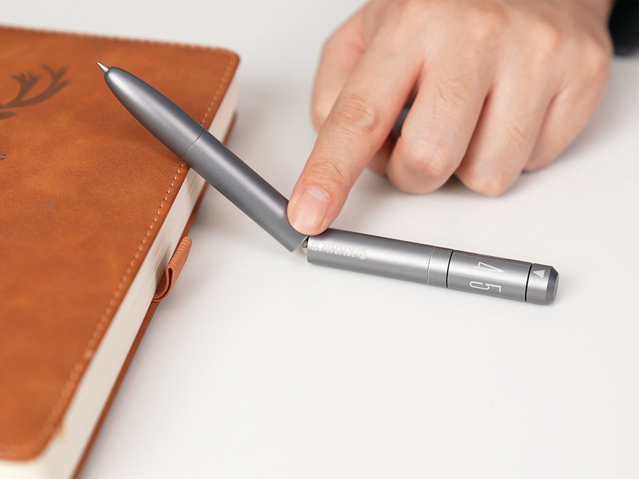
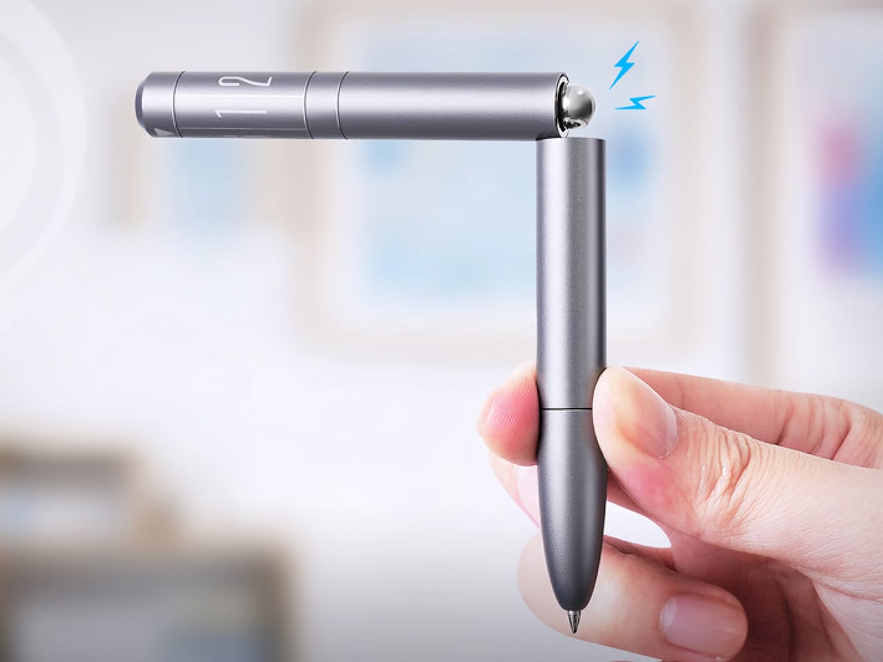
SPINNX takes that secondary life and makes it the whole point. Built by WEIWIN out of aerospace-grade titanium and held together by magnets, the pen separates into three modules that each deliver a distinct tactile sensation. Snap them together and there’s a crisp magnetic click. Press the spring-loaded ball in the middle and it gives you another one. Spin the dice top and it rotates through a series of rhythmic mechanical detents. The pen tip deploys with a twist rather than a click, because even the functional part of the experience has been thought through. Three years of development, ten design revisions, and one very specific goal: a pen that writes and delights.
The three-part system allows you to reconfigure the pen’s entire sensory output. You can flip the middle module to put the spring-loaded ball on top for a different kind of thumb-actuated click. Each combination changes the weight distribution and the way the pen feels in motion, which creates a surprisingly deep rabbit hole of tactile experiences. The team claims over fifty different ways to spin and fidget with the thing, and that number feels plausible once you start playing with it. The design provides a whole palette of physical feedback, letting you find the specific sensation your brain needs at that moment to stay locked in.
The snap of two modules connecting sounds like a well-tuned mechanical keyboard switch, something the designers obsessed over to ensure the end-product has a strong audio-visual-tactile experience. WEIWIN engineered the acoustic and tactile response of each magnetic separation and reconnection as an intentional product feature, treating the sound with the same design attention as the geometry… sort of like how luxury car designers obsess over how the doors sound when they close. Most clicking pens produce their click as a mechanical consequence, with nobody sitting in a room deciding whether it needs to be crisper or more controlled. With SPINNX, somebody clearly did sit in that room, and the result is a snap that feels sound-designed for sheer satisfaction.
The dice module functions like a high-quality EDC spinner, rotating with a series of crisp, audible clicks that feel like running your thumb over the crown of a well-made watch. Its ceramic bearing ensures the rotation is smooth and completely unaffected by the precision-engineered magnets holding the pen together. Choosing a non-metallic bearing is the kind of small, deliberate decision that separates a durable tool from a simple toy. Beyond the satisfying spin, it serves as a simple decision-making device. When you’re stuck between two choices, a quick roll gives you an answer, which is a surprisingly effective way to get past minor mental roadblocks.
Choosing aerospace-grade titanium for the body does more than just add a premium feel. The material provides a specific heft and durability that aluminum or steel can’t quite match, giving the pen a reassuring presence in the hand without being overly heavy. This balance is critical for an object designed for constant manipulation. The pen tip itself deploys with a smooth twist mechanism, which feels more deliberate and controlled than a standard clicker. WEIWIN also engineered its own proprietary “Super Refill,” which they claim has up to six times the writing life of a standard refill. Sure, it won’t work with standard refills, but standard refills only last 1/6th as long as the one that comes with the SPINNX.
There’s an optional Maglev Pen Stand that completes the package for anyone who spends most of their day at a desk. The stand uses magnetic levitation to balance the pen perfectly upright, letting it float and glide with a gentle touch. It turns the pen into a kinetic sculpture when you’re not using it, a piece of interactive art that settles back to its center with precision. This stand isn’t just for storage; it’s an extension of the pen’s core philosophy. It’s another way to engage your hands and mind with a simple, satisfying physical interaction, turning a moment of pause into something quietly delightful.
The standard SPINNX comes in four finishes. The base model is a silver-colored aluminum for $59, while the premium versions are offered in natural titanium, matte black titanium, and a striking brass-colored titanium for $69. For those who want the complete experience, a $99 Professional Kit bundles the pen with a leather pouch and other accessories. There are also several add-ons available separately, including extra refills, a calfskin leather pouch for protection, a spiral module to swap with the dice cap for a different visual flow, and the magnetic fidget sticks for more desk-based play. The Maglev Pen Stand is also available as a standalone $35 purchase. All SPINNX variants ship worldwide starting April 2026.
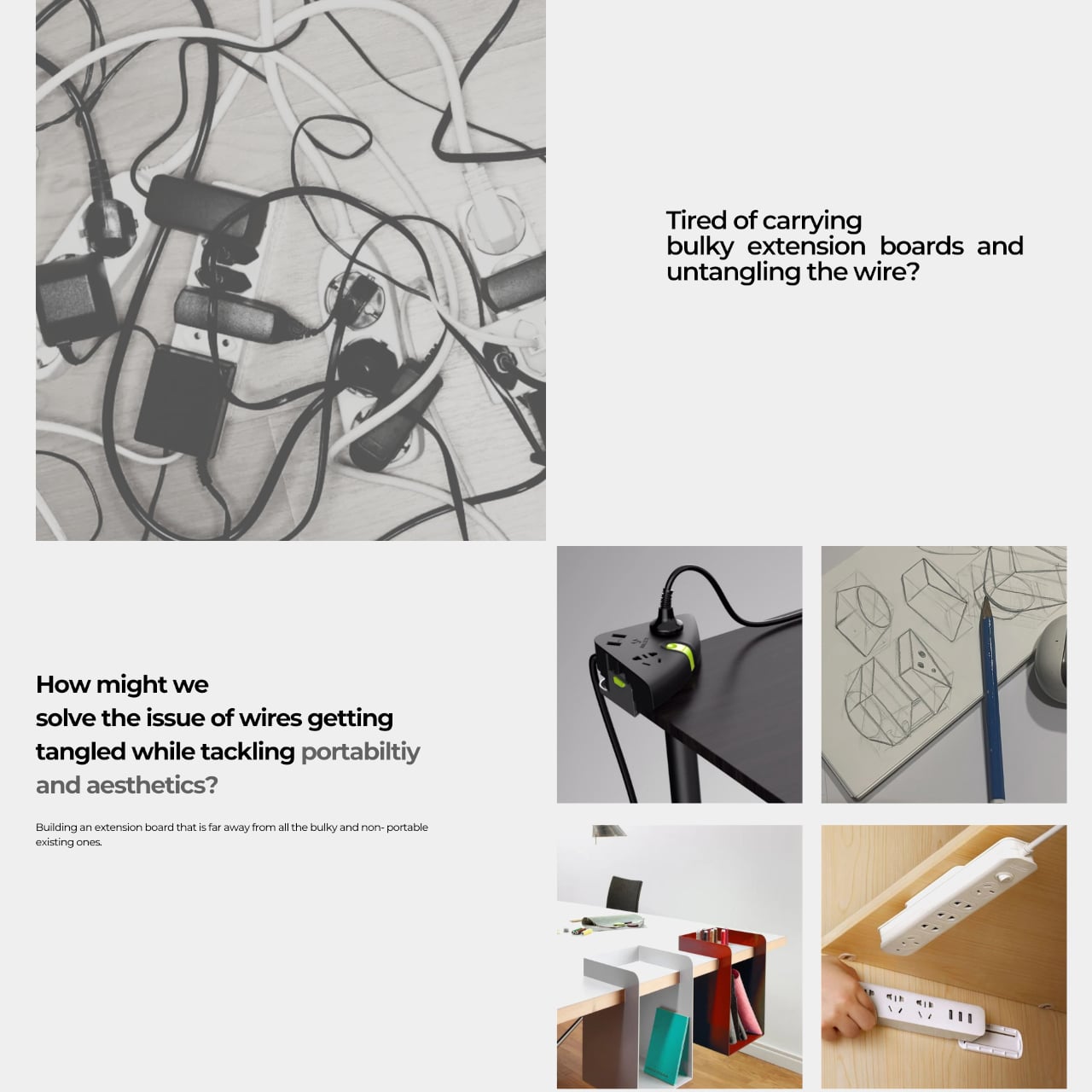
Working from wherever you can find a seat means accepting certain frustrations, and outlet hunting is near the top of the list. Extension boards solve that at home, but they’re designed for rooms rather than bags, and dragging one to a café or shared studio means arriving with a coil of cable that becomes someone else’s problem. Power infrastructure hasn’t caught up with how people actually work.
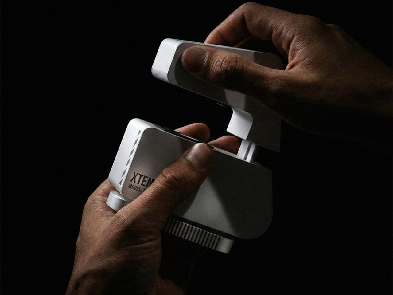
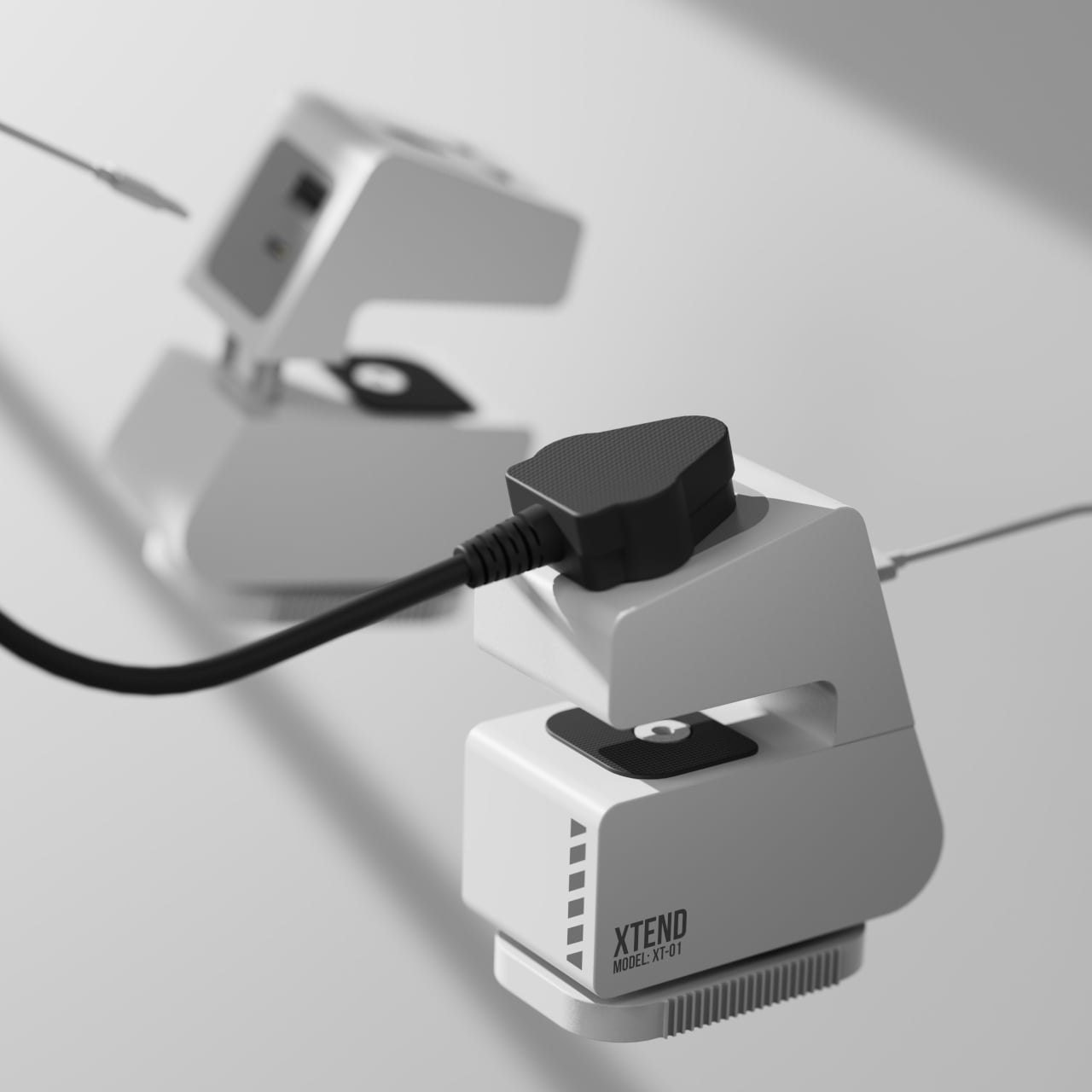
Xtend is a personal charging extension concept built around one challenge: making power access portable without making it awkward. The guiding claim is “Power access shouldn’t be bulky,” which is fair when most extension boards still feel designed for a fixed office and are never reconsidered. The concept answers with a compact, desk-edge device you carry rather than leave behind.
Rather than a strip on the floor where cables become trip hazards, Xtend clamps to the table edge and creates an elevated power zone right where you’re working. That’s the main behavioral shift, and it matters. It keeps cables off the ground, reduces accidental unplugging when someone shifts their chair, and gives the whole setup a predictable home, whether you’re there for twenty minutes or a few hours.
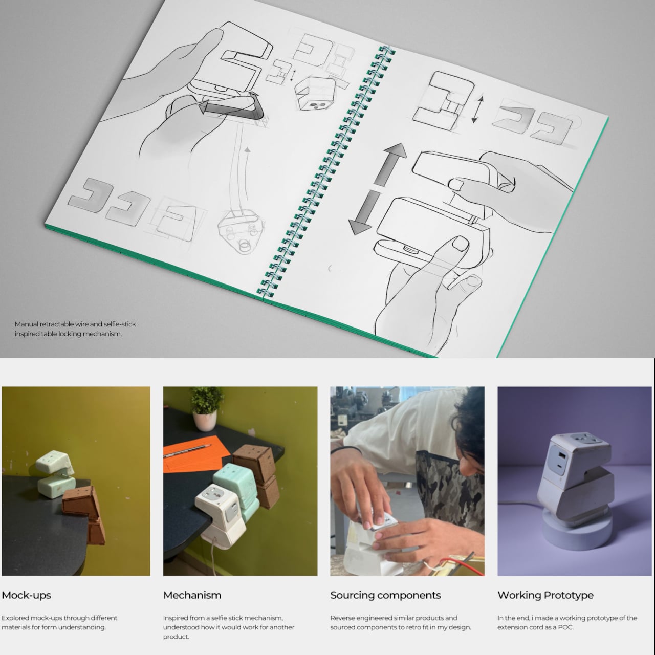
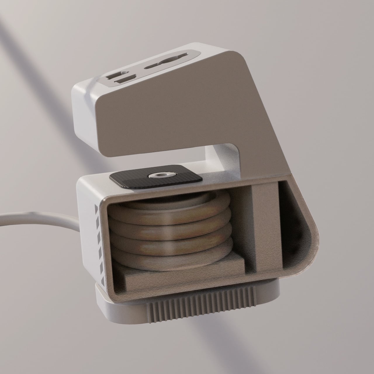
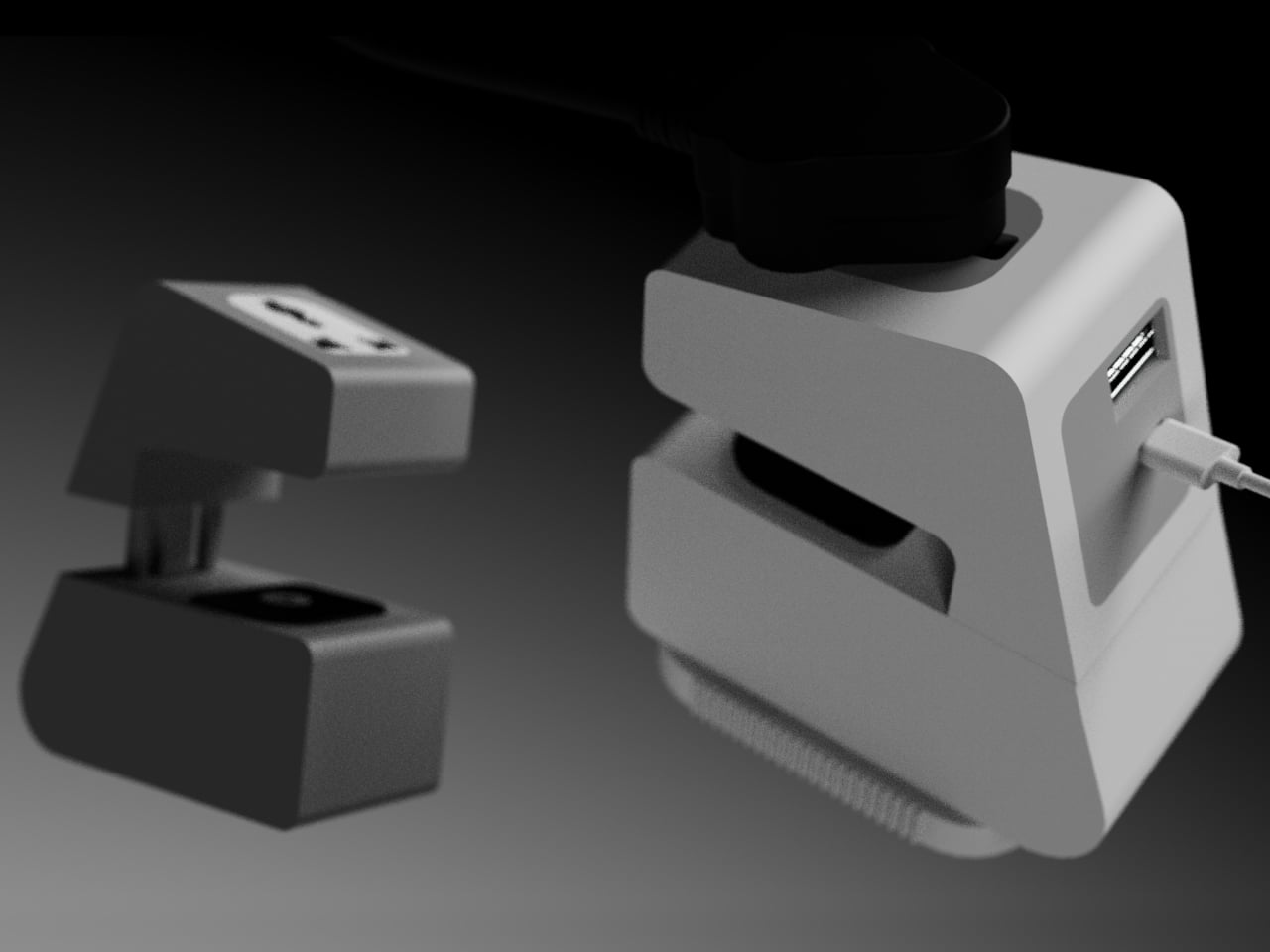
A manual retractable wire manages the cable when you pack up, addressing tangles at the source rather than relying on cable ties or zip pouches. The table attachment uses a selfie-stick-inspired locking mechanism for adjusting and securing the device to different desk edge profiles. That’s not a small detail, because portability only works if setup and stow are both quick.
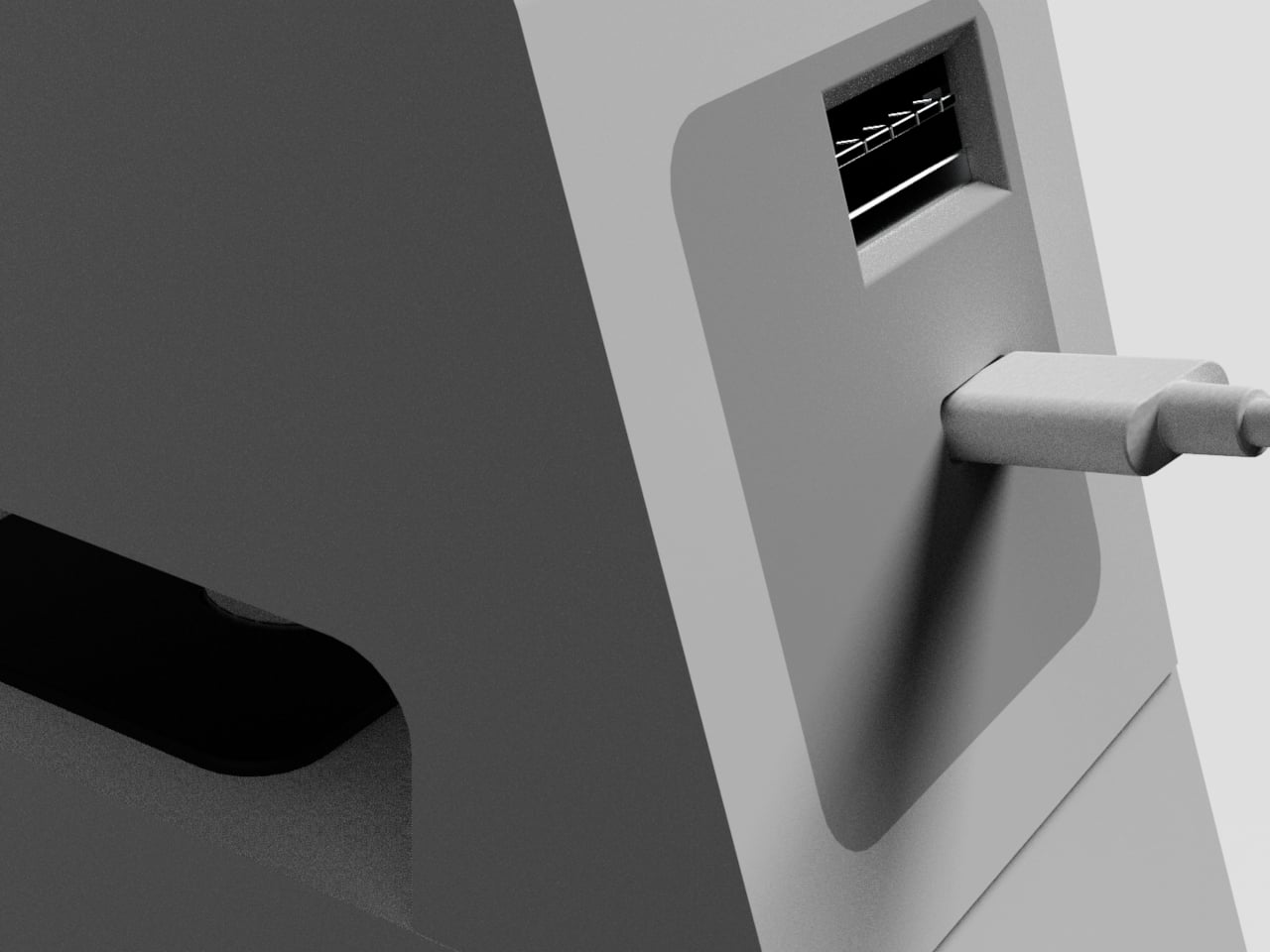
Of course, attaching to a desk edge only matters if it handles what you’re actually charging. Xtend is set up for three devices at once, a top-facing outlet for a laptop charger, and USB ports on the side for phones or smaller devices. That mix reflects how people actually charge at a shared desk, one large draw and a couple of smaller ones, rather than forcing everyone to compete for a single wall strip.
Xtend treats power the way people already treat other portable tools, as something that belongs in a bag and works anywhere. Extension boards have been a room infrastructure for decades, but how people work has changed. A small device that attaches to a desk edge, charges three things, and retracts its own cable before you leave suggests that the power strip category is ready for a rethink.
Working on the move means accepting a certain amount of small friction. You can have a great laptop and still spend the first five minutes of a café session digging through a bag for a mouse, or realizing you left it on your desk at home. Accessories are the first things to get lost because they don’t have a natural home when you’re packing up in a hurry, and no amount of good habits fully solves that.
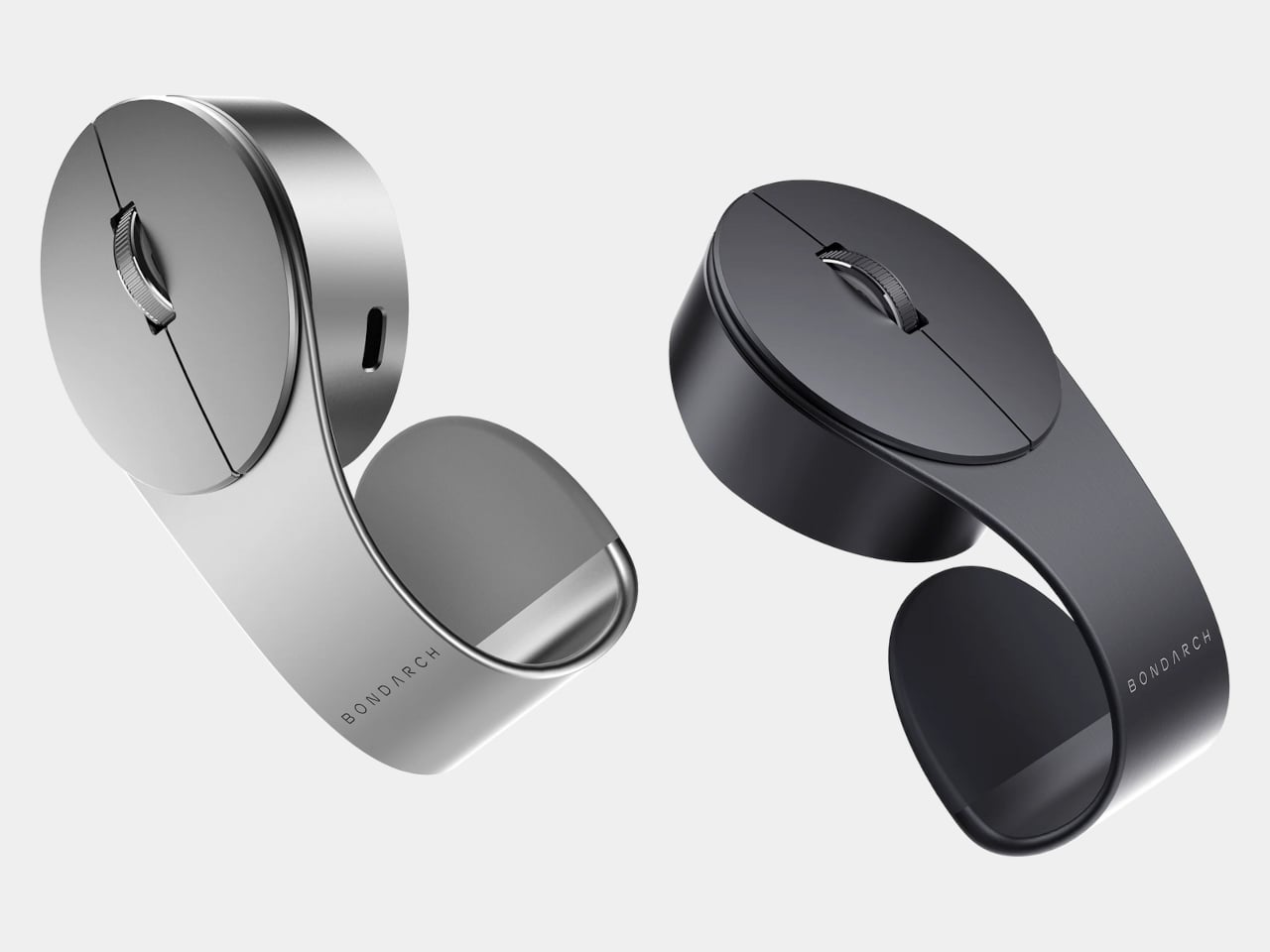
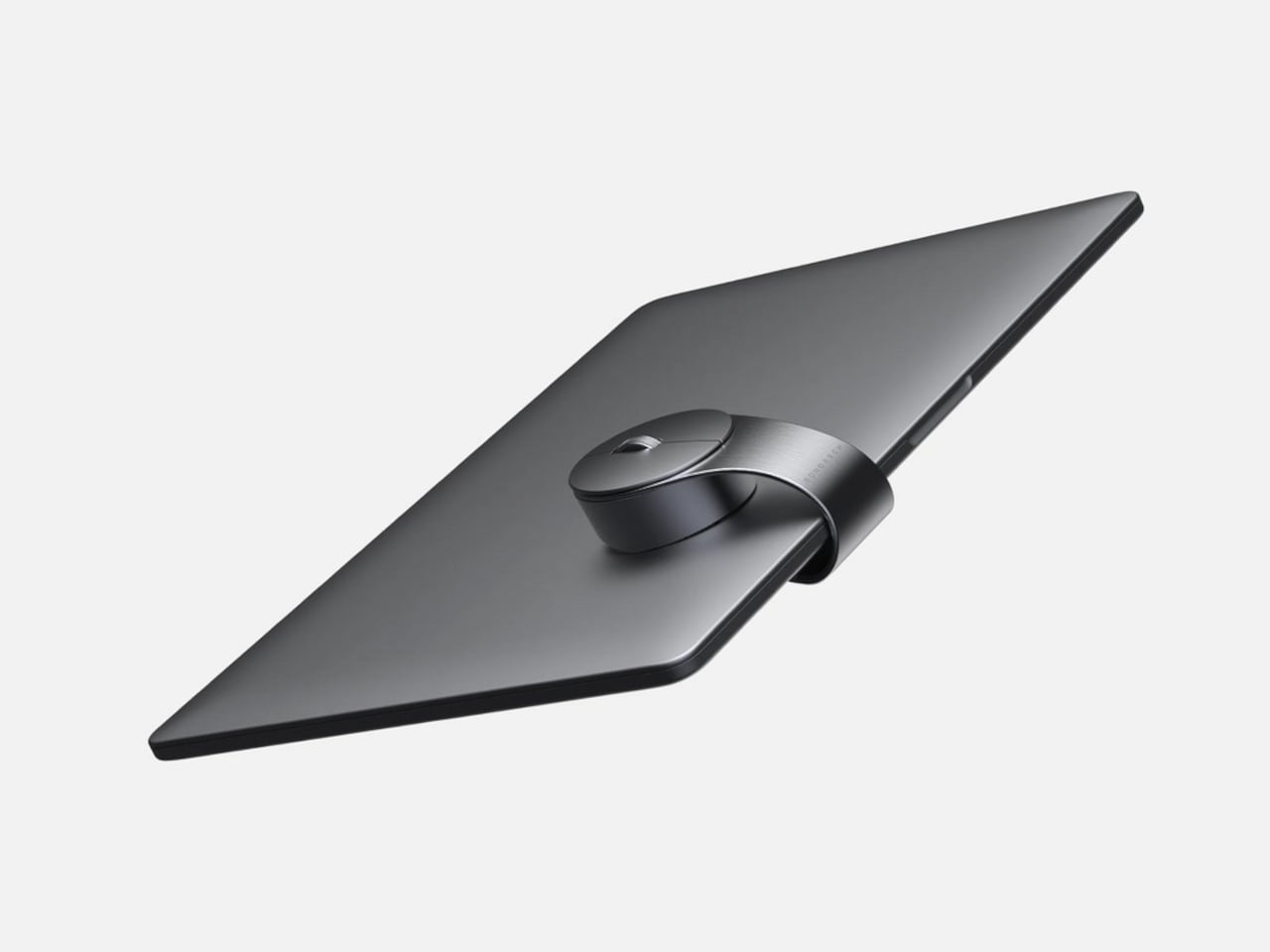
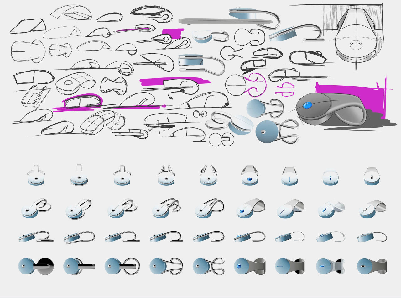
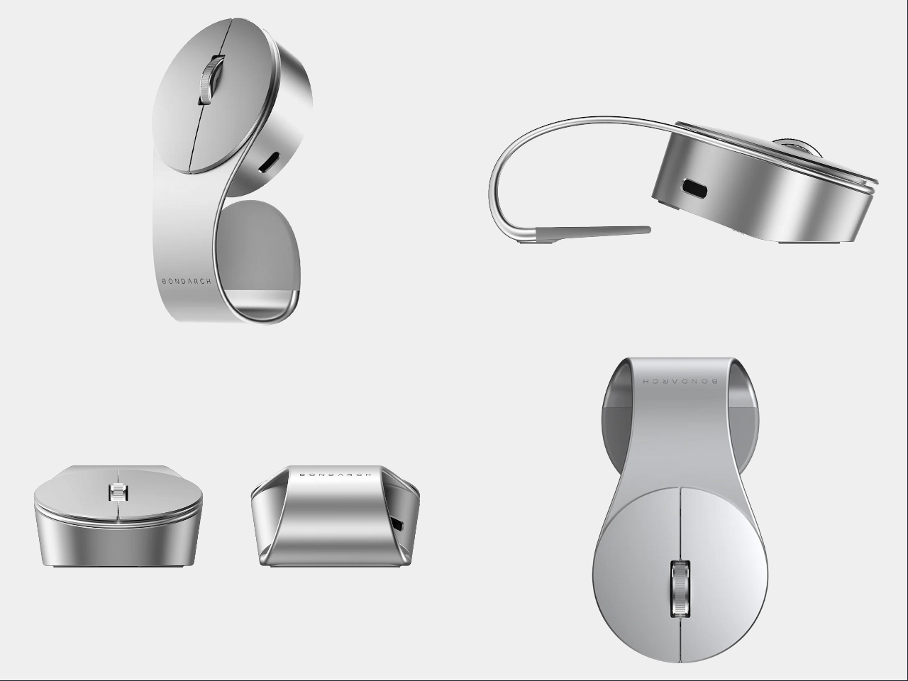
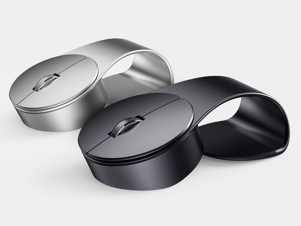
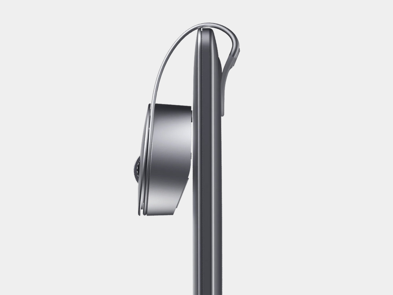
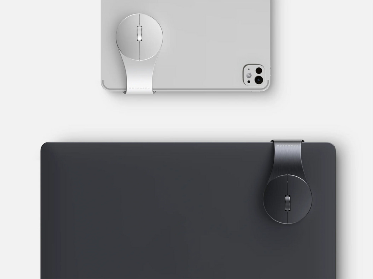
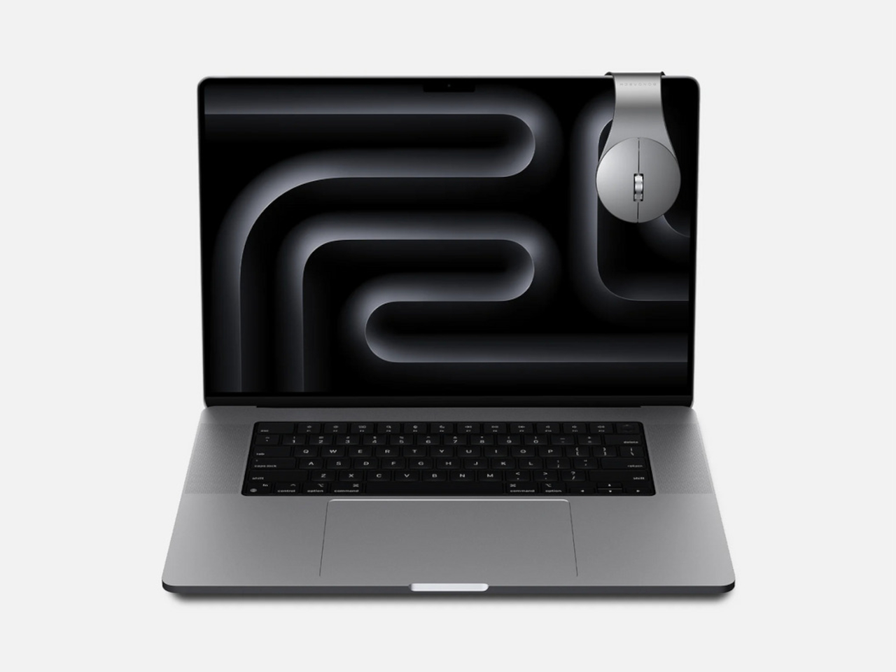
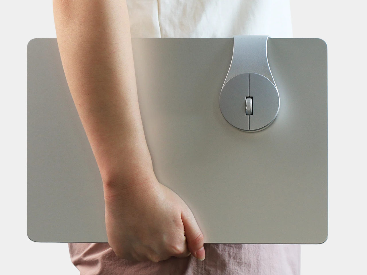
BondClip by BondArch is a wireless mouse engineered to clip onto the edge of a laptop or tablet, so it travels with the device instead of floating loose. The G-shaped architecture is the whole idea, a flowing aluminum loop that forms a natural clip and keeps the mouse attached to the device like a tool rather than stored like a separate accessory you have to keep track of.
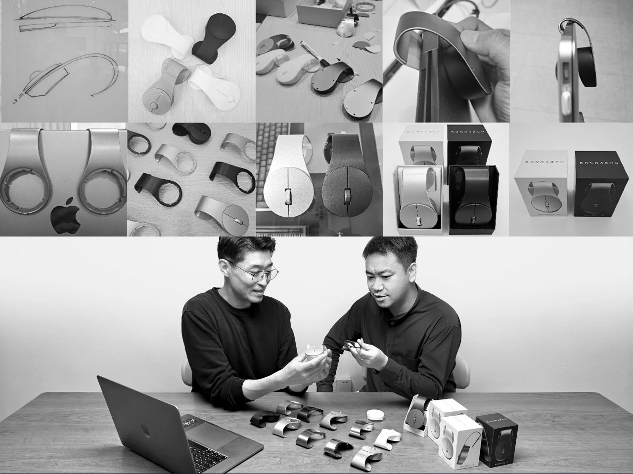
Designers: Sangmin Yu and Rinchar Ren (HNDESIGN) for BondArch
The clip itself relies on geometry and friction rather than a clamp or spring mechanism. A silicone pad on the underside of the loop increases contact friction, helping BondClip grip the laptop’s edge firmly during travel without digging into the surface or requiring the kind of force that would mark a premium finish. The silicone also absorbs minor vibrations, so it doesn’t rattle around in a bag with the laptop.
The weight comes in at 72g and dimensions at 110.6mm x 60mm x 36.2 mm, which puts it in compact travel mouse territory. The more meaningful shift is behavioral. When you open the laptop, the mouse is already there, clipped to the edge and ready to go. That changes the rhythm of setting up in a meeting room or café, removing one physical search from the start of every work session.
Connectivity covers 2.4GHz wireless and Bluetooth 5.4, switchable via a mode button on the underside, so you can pair it to a laptop and tablet independently and switch between them without re-pairing. Adjustable DPI runs from 600 to 3600, covering slow, precise cursor work and faster general browsing without needing software to set it up.
The 25 mAh rechargeable battery is rated for 130 hours of use on a single charge, with USB-C for recharging. At that battery life, it’s the kind of peripheral you plug in occasionally rather than manage carefully, which matters when you’re already keeping an eye on a laptop, phone, and earbuds.
The body is precision-bent aluminum alloy, with polycarbonate and silicone components, in Silver and Midnight finishes. BondArch calls it “office luxury,” which isn’t an empty claim when the sandblasted matte finish is clearly aimed at the same visual register as a modern MacBook. It’s a mouse that gives itself a place to live on the device it works with, which turns out to be a more useful idea than another wireless range number.
Spring cleaning has a way of exposing how tired a room can feel. Swapping out a duvet cover or rearranging furniture only goes so far. What actually shifts a space is the accumulation of small, considered objects, the kind that carry weight in both design and meaning. Japan has been refining that philosophy for centuries, and right now, its makers are producing pieces that feel less like accessories and more like answers.
The eight pieces below come from workshops and studios rooted deeply in Japanese craft traditions, from the granite quarries of Kagawa to the porcelain villages of Nagasaki. Each one brings something entirely distinct to a room: texture, scent, sound, light or a quiet kind of order. None of them demands visual attention. That restraint is precisely what makes them so effective at resetting a space, slowly and convincingly, for spring.
1. Miniature Bonfire Wood Diffuser Set
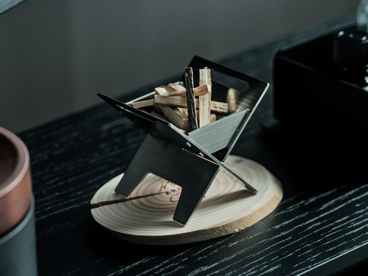
The first thing you notice about the Miniature Bonfire Wood Diffuser Set is that it shouldn’t work as well as it does. A stainless steel campfire, sized for a shelf, capturing the scent of mountain forests through bundled miniature firewood. Yet everything about it, the tying knot, the proportions, the way the essential oil disperses, feels entirely intentional. It pulls the atmosphere of Mt. Hakusan into whatever room you place it in, with the same gentleness as a forest breeze moving through cedar.
For spring, this diffuser does something conventional reed diffusers rarely manage: it gives the scent a visual story. The trivet feature makes it genuinely dual-purpose, transforming into a pocket stove for an indoor camping ritual that bridges the gap between winter’s coziness and spring’s restlessness. Built from rust-resistant stainless steel, it holds up to repeated use without losing its clean, sculptural presence. As a centerpiece on a coffee table or entryway shelf, it reframes the whole room around calm.
Mt. Hakusan essential oil brings a real, named place into the room.
The trivet conversion makes it an experience, not just a decorative object.
What We Dislike
Scent radius may fall short in larger, open-plan spaces.
Mt. Hakusan oil refills are specialty items, difficult to source outside Japan.
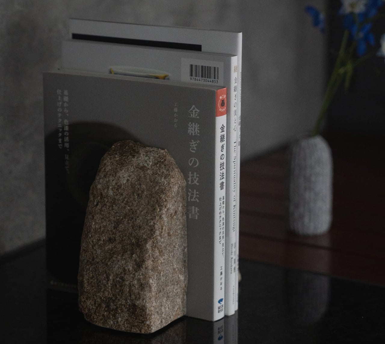
2. Aji Stone Book End Large
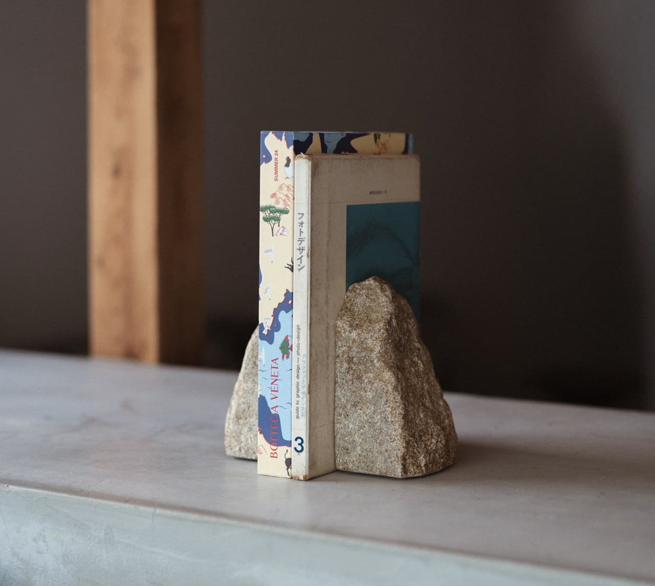
Aji Stone is known in Japan as the diamond of granite, quarried exclusively from the northeastern region of Takamatsu City in Kagawa Prefecture, where its exceptional density and refined grain make it unlike any other decorative stone. The Aji Stone Book End Large is perfectly split from a single stone. It holds large books without shifting and carries a physical presence that mass-produced bookends simply cannot replicate.
What makes this bookend particularly suited for a spring refresh is its restraint. It doesn’t decorate; it anchors. A shelf of books held between two blocks of Aji stone immediately reads as curated rather than accumulated, which is a subtle but significant shift for any living space. Its low moisture absorption and resistance to weathering mean it can sit near a window or in an entryway without degrading over time. Spring cleaning often calls for removal. This is the rare piece worth adding.
What We Like
Each piece carries natural individuality that no factory process can reproduce.
Dense enough to hold the heaviest books without shifting.
What We Dislike
At $240, it asks for real confidence in its long-term design value.
Significant weight makes repositioning effortful once placed.
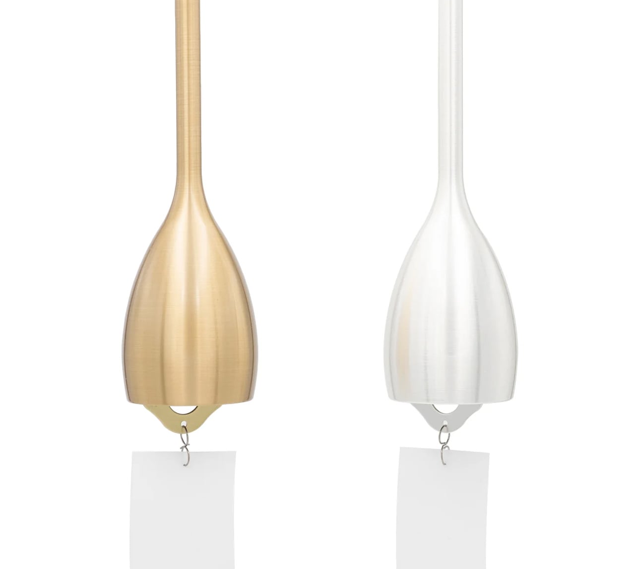
3. Nousaku Slim Wind Chime
Wind chimes occupy a strange, undervalued category in home design: they’re atmospheric tools more than decorative objects, and the Nousaku Slim Wind Chime understands that completely. This chime features a deliberately narrowed opening that concentrates sound into a sharp, transparent tone with a slightly lower pitch than a standard wind chime. It’s the sonic equivalent of a cool spring breeze arriving through an open window, producing a calm, focused resonance that a wider opening simply cannot achieve.
In spring, when windows stay open and air starts moving freely again, this chime becomes a functional part of a room’s ambiance rather than a decorative afterthought. Its slim, elongated form is considered as its sound, clean lines that integrate into the architecture of a space rather than competing for visual attention. Pair it with the Nousaku Wind Chime Onion model and the two produce a layered, resonant harmony that no single chime can generate on its own.
What We Like
The narrowed opening produces a precise, lower-pitched tone that feels intentional.
Pairs with the Nousaku Wind Chime Onion for a harmony no single chime achieves.
What We Dislike
Focused tonal range may feel too controlled for those who prefer a fuller sound.
Largely silent in poorly ventilated spaces or rooms with closed windows.
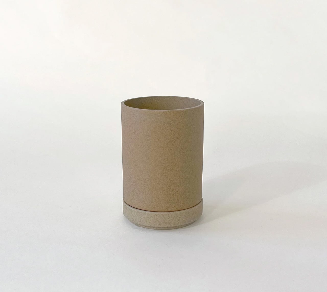
4. Hasami Porcelain Planter
The Hasami Porcelain Planter is the product of a village, not a factory. Made in Hasami, a porcelain-producing town in Nagasaki Prefecture with a craft tradition stretching back to the Edo period of 1603, each piece passes through the hands of artisans who specialize in specific stages of production before it reaches the market. That distributed labor creates a quality that is difficult to manufacture any other way. The result is a planter that feels entirely resolved in both form and finish.
Designer Takuhiro Shinomoto drew the collection’s proportions from the Jubako, Japan’s traditional stacking lacquerware box, and that heritage shows in every curve. The planter’s clean lines and stackable form mean it works as beautifully in a cluster as it does alone. The natural finish, neither matte black nor clear glaze but the raw, textured surface of the porcelain itself, makes it ideal for spring: honest materials, seasonal planting, and a connection to earth that feels earned rather than styled.
What We Like
Village craft passed down since the Edo dynasty lives in every piece.
The Jubako-proportioned stackable form unlocks genuine multifunctionality.
What We Dislike
Unfinished porcelain surface shows marks more readily than a glazed alternative.
Specialty retail distribution makes expanding or replacing pieces difficult.
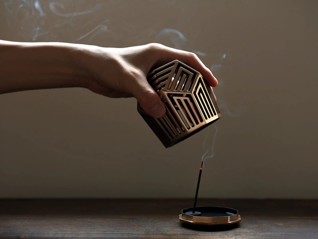
5. Genji-Kō Inspired Incense Burner
Kōdō, the Japanese art of incense appreciation, is one of the country’s oldest sensory practices, and the Genji-Kō Inspired Incense Burner gives it a visual form genuinely worth owning. The design draws from the Genji-kō diagram, a pattern developed to map the chapters of The Tale of Genji through five vertical lines forming 52 distinct configurations. Each configuration represents a chapter of Japan’s most revered literary work, and the burner translates that literary architecture into an object that functions as beautifully as it references.
For spring in particular, incense shifts a room in a way that no visual rearrangement can replicate: it changes the air itself. This burner earns a place on any shelf through the quality of its conceptual design alone, but its relationship to The Tale of Genji, Japan’s eleventh-century literary masterpiece, gives it a cultural resonance that elevates the daily ritual of lighting incense into something more intentional. Place it on a low shelf near an open window and let the morning light and season do the rest.
What We Like
The Genji-kō diagram ties a daily ritual to one of Japan’s greatest literary traditions.
Incense changes the air itself, and this piece makes that shift feel entirely deliberate.
What We Dislike
The design’s depth lands best with some familiarity with Kōdō and The Tale of Genji.
Limited published specifications make it harder to assess physical fit before purchasing.
6. Rustic Ceramic Trivet with Antique Nail Design
The Rustic Ceramic Trivet with Antique Nail Design sits at the intersection of kitchen utility and tabletop art. A stunning ceramic piece whose surface carries a pattern that mimics the texture of aged iron nails, it is a tool for creating grounding earth energy and mindful dining rituals, which sounds like marketing until you place it on a table and recognize how meaningfully it shifts the mood of a meal. It earns its place through presence alone.
The antique nail pattern gives it a tactility that glazed ceramics rarely offer, and the warm earth tones pair naturally with the organic materials, linen, wood, and stone, that define spring table settings. A trivet is typically invisible in the design sense, a purely functional object that disappears the moment the pot is set down. This one refuses that role without tipping into decorative excess. It protects surfaces while adding a quiet, aged presence to the table that earns it a permanent position rather than seasonal rotation.
What We Like
The antique nail pattern reads as a considered tabletop object even when not in use.
Earns its space through function first, with aesthetics following naturally from the craft.
What We Dislike
Textured surfaces can collect residue and require more careful cleaning than smooth ceramics.
An earthy aesthetic may not suit very clean, contemporary kitchen settings.
7. Pop-Up Book Vase
The Pop-Up Book Vase is a banger in a soft and unassuming form: it takes one of the most familiar objects in a home and completely recontextualizes it. Open the cover and a 3D vase cutout rises from the pages, holding flowers the way a stage set holds a performance. Three different pop-up designs offer enough variety to keep the presentation fresh across weeks of seasonal blooms. Made entirely from 100% natural pulp with a water-resistant coating, it’s approachably practical and surprisingly robust for its form.
For a spring refresh, this vase works particularly well because it asks almost nothing of its context. Set it on a dining table, a windowsill, or a bookshelf, and the pop-up structure creates its own visual event regardless of the surrounding decor. Flip the book upside down,n and the arrangement transforms entirely, offering a new perspective on the same flowers. It rewards curiosity, which in a home setting is a rarer quality than most design objects manage to carry through to everyday use.
Three built-in pop-up designs keep the display fresh without a new purchase.
Water-resistant pulp construction handles flowers without compromising form.
What We Dislike
Limited water capacity suits single stems better than full bouquets.
May not fully replace a conventional vase for everyday, high-volume use.
8. Riki Alarm Clock
Riki Watanabe was one of Japan’s most celebrated modernist designers, and the Riki Alarm Clock is proof of why his legacy endures. Produced by Lemnos, this analog clock earned the Good Design Award through choices that look deceptively simple: oversized, legible numerals designed to read clearly from across a room, a completely silent movement that eliminates any audible tick, and a single button that consolidates the alarm, snooze function, and built-in internal light into one seamless, unhurried control.
Spring is the season when the phone starts creeping back into the bedroom. The Riki Clock offers a direct, aesthetically grounded alternative. Its timeless analog face, silent enough not to disturb light sleep, replaces the notification-laden device on your nightstand with an object that is simply, reliably there. Morning waking becomes a softer experience, one shaped by the warm quality of the clock’s internal light rather than the cold glow of a screen. For the bedroom’s spring reset, this is exactly where to start.
What We Like
Silent movement removes the most common complaint about analog clocks entirely.
Good Design Award credentials and Riki Watanabe’s legacy make it genuinely worth owning.
What We Dislike
A single-button interface may need a brief adjustment period for new users.
Low-light time checks require activating the internal light, adding one extra step.
These 8 Japanese Pieces Don’t Refresh Your Space. They Reset It.
Spring doesn’t need a renovation. It needs intention. The eight pieces gathered here don’t make noise about what they are: they simply show up in a room and shift the register of everything around them. A stone bookend earns permanence. A ceramic trivet slows a meal. A wind chime marks the exact moment a new season arrives. Japanese design has long understood that the smallest objects carry the longest meaning.
The through line across all eight is craft, objects made by people who understand their materials and know when restraint is the right answer. That clarity translates directly into a home. You don’t need all eight. Adding even one to your spring refresh will do more than any repainting ever could. That is the quiet confidence of Japanese design: it doesn’t ask for your attention, but it almost always earns it.
The modern office is wherever you can find a Wi-Fi signal and a flat surface. This freedom to work from anywhere, however, comes with its own set of challenges. Your laptop’s limited ports become a bottleneck when you need to connect a monitor, mouse, and charge your device simultaneously. At the same time, you need immediate access to large project files, and relying on slow coffee shop internet to pull them from the cloud is a recipe for missed deadlines. This constant juggle between connectivity and data access is the primary source of friction for today’s mobile professional.
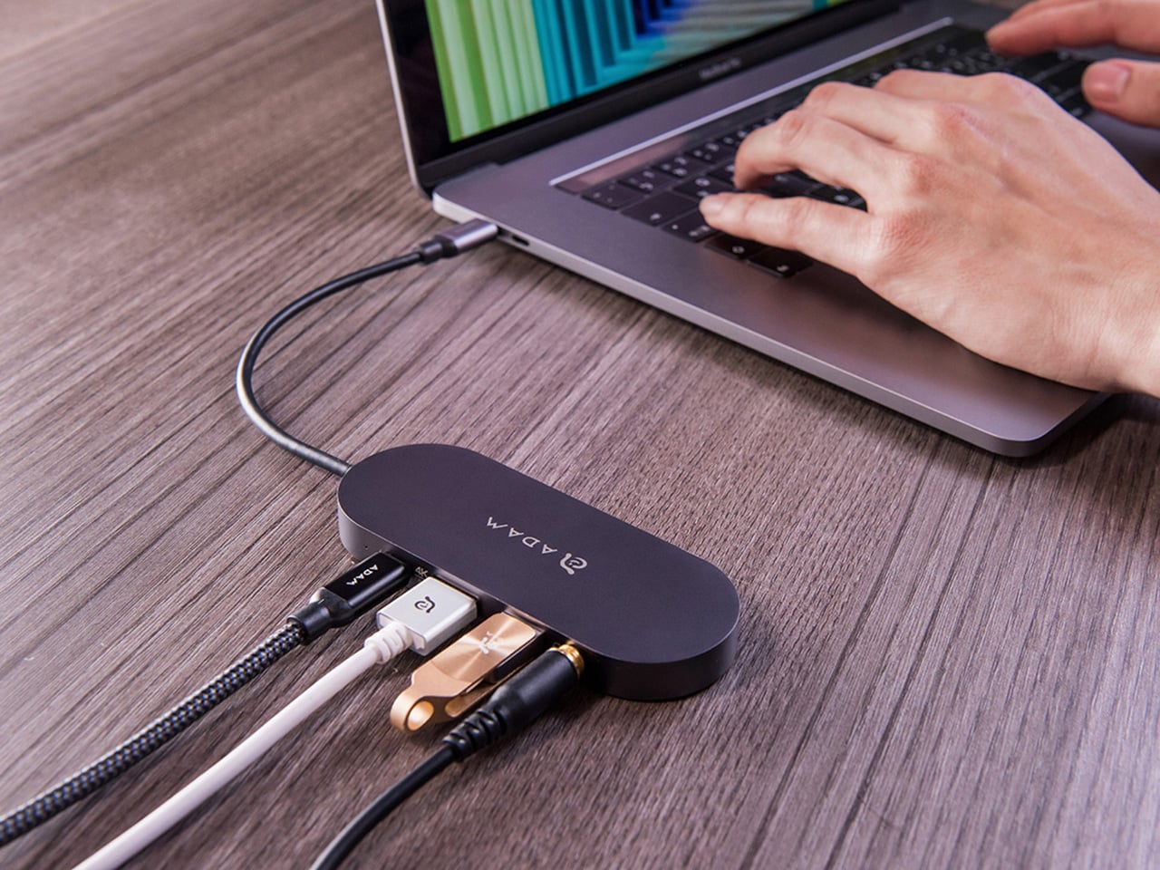
The CASA Hub S is engineered specifically to eliminate that friction. It acts as a single, reliable bridge between your portable setup and a full-featured workstation. With its integrated SSD, your essential assets are stored locally, ready at speeds that cloud storage can’t match, while its collection of ports handles everything from 4K video output to peripherals and power delivery. It’s a device that understands the demands of a flexible work life, providing both the expanded digital real estate and the high-speed local storage needed to be productive, whether you’re at your home desk or miles away from it.
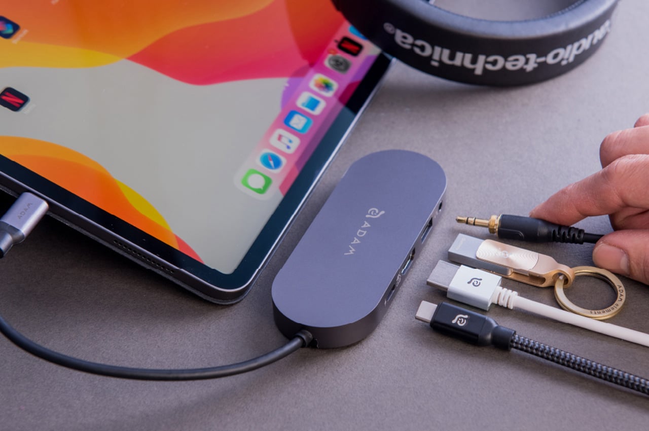
ADAM elements has been quietly building a reputation for accessories that actually think through the problem instead of just checking feature boxes. The CASA Hub S is probably their clearest example of this philosophy. You get 240GB, 480GB, or 960GB of NVMe SSD storage built directly into what would otherwise be a standard USB-C hub. The read speeds hit 520 MBps and writes clock in at 456 MBps, which puts it squarely in the territory of “actually usable as a working drive” rather than just backup storage. I’ve used plenty of external SSDs that claim similar numbers but choke when you’re actively editing 4K footage or working with massive Photoshop files. The performance here is consistent enough that the 480GB model is specifically recommended for Time Machine backups, which tells you they’re confident it won’t become a bottleneck.
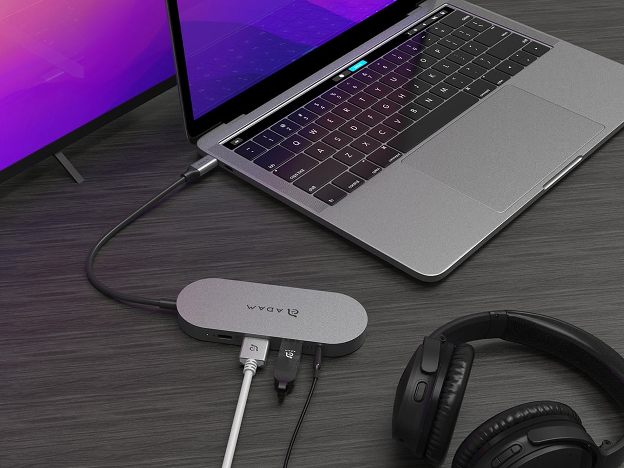
The port selection feels well considered too. You get a USB-A 3.1 Gen 1 port running at 5 Gbps, a USB-C port with 60W Power Delivery passthrough, 4K HDMI output at 30Hz, and a 3.5mm audio jack. That HDMI port supports HDCP 2.2, which matters more than you’d think because it means you can actually stream Netflix in 4K without the annoying “this content is protected” error that cheaper hubs trigger. The audio jack outputs at 48kHz, 16-bit, which is perfectly adequate for most headphones and won’t introduce the weird ground loop hum that some hubs seem to love creating.
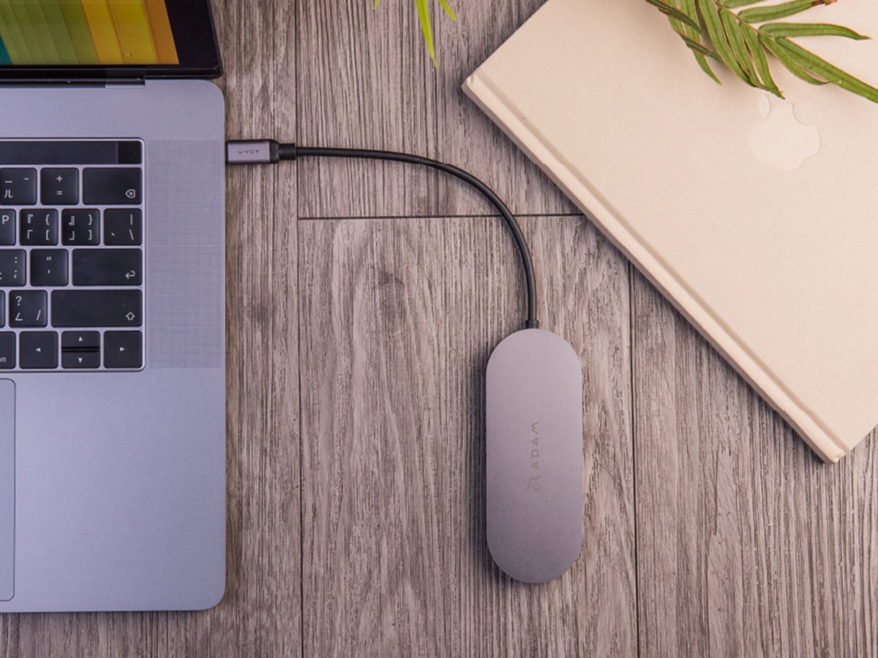
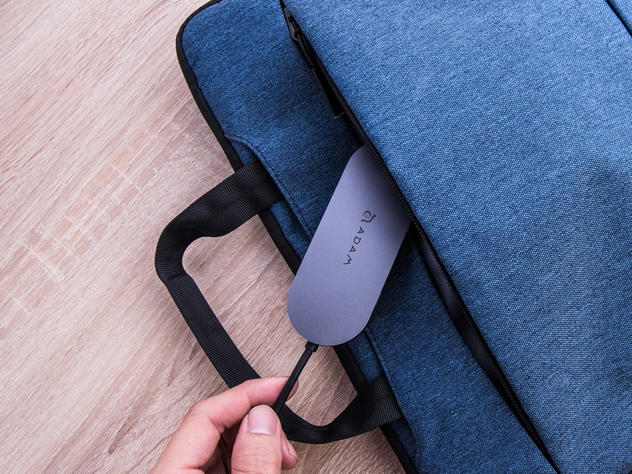
Looking at the physical design you realize how ADAM elements clearly designed this with iPad Pro users in mind. That 16cm cable length seems arbitrary until you realize it’s the exact sweet spot that lets the hub lay flat on a desk instead of dangling awkwardly off the side of your tablet. It’s a small detail, but it’s the kind of thing that separates products designed by people who actually use them from products designed by people staring at CAD files. The whole thing weighs 70 grams and comes with a flannel carrying pouch, which again, small detail, but it shows someone thought about how this thing actually travels.
The aluminum chassis is a perfect blend of sleek, lightweight, and heat-dissipating, that makes it an ideal pick for something as portable and productivity-boosting as this hub. ADAM elements went with a Space Gray finish that matches the MacBook aesthetic without being obnoxiously matchy-matchy. The device is plug and play across macOS, iOS 13 and later, iPadOS, Windows 8/10, and Chrome OS. No driver installation, no proprietary software, no account creation. You plug it in and it works, which in 2026 somehow still feels like a minor miracle.
The pricing structure spans three capacities, with the 240GB model landing at $69.30, the 480GB at $132.30, and the 960GB at $209.30 through the end of February using code 30YANKOHUBS. That puts the middle option at roughly the combined cost of a decent standalone SSD and a quality hub bought separately, which makes the value proposition pretty straightforward for anyone who was planning to grab both anyway. The real win here is eliminating one device from your bag and one cable from your setup, which for mobile workers translates to actual daily convenience rather than just saving a few dollars. ADAM elements backs it with a three-year warranty, and the hub is available now directly from their site, which means you skip the Amazon reseller lottery and get support directly from people who actually designed the thing.
There are collaborations that make you nod and think, “that makes sense.” And then there are collaborations that make you stop mid-scroll, squint at your screen, and laugh out loud before you inevitably want the thing. Lidl and Nik Bentel’s new Trolley Bag is firmly in the second category.
If you missed the chaos last year, here’s a quick recap: Nik Bentel is a New York-based designer who has built a career turning completely ordinary objects into pieces that live somewhere between fashion, sculpture, and a really good joke you can carry. His portfolio includes pasta boxes reimagined as bags, a lopsided coffee mug, and a steel musical ball. So when Lidl, the German budget supermarket chain, came calling for a second collaboration, it was never going to be boring. Their first project in 2024 was the Croissant Bag, a leather handbag shaped like a croissant tucked inside a replica of a Lidl bakery bag. It sold out in two minutes. Two minutes.
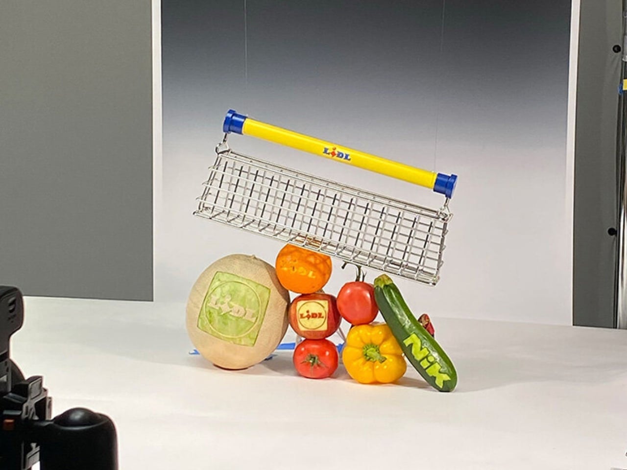
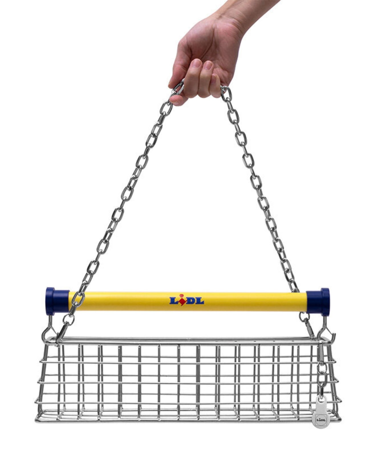
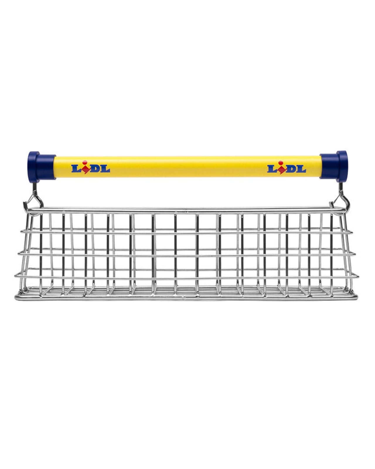
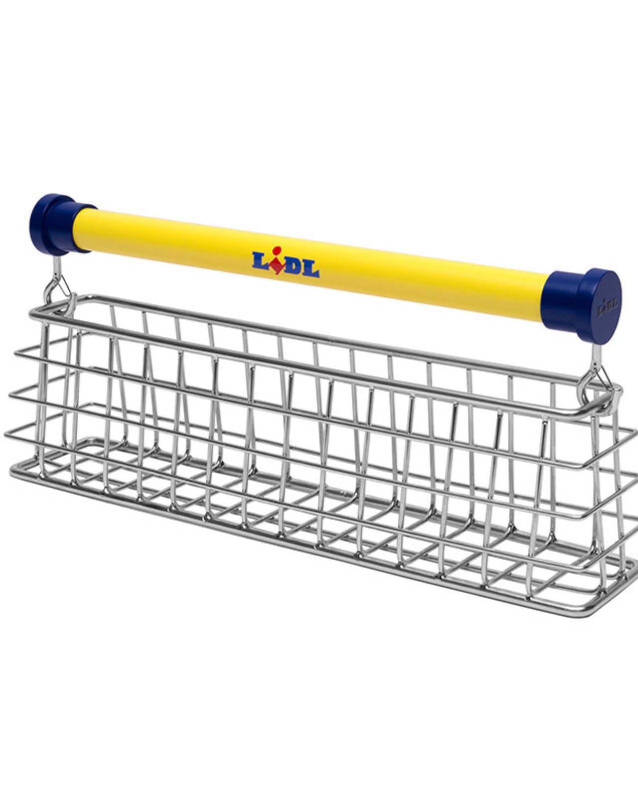
So the question everyone has been asking since is: what does the second act look like? The answer is the Trolley Bag, and it’s exactly what it sounds like. Fabricated from industrial stainless steel, the bag is a miniaturized, wearable version of the Lidl shopping trolley. It keeps the cart’s recognizable grid structure, the tubular handlebar finished in Lidl’s signature yellow and blue, and even comes with a trolley coin keychain fob that actually works on real Lidl shopping carts in store. A detachable chain strap lets you wear it over the shoulder. It comes packaged with a dust bag and a gift box. It’s ridiculous. It’s brilliant. It’s possibly both at the same time.
What makes this collaboration land is the way Bentel thinks about the objects he chooses to reinterpret. He isn’t just slapping a designer name on something random for the sake of going viral. The shopping trolley caught his attention for a specific reason: the metal grid, the wheels, the child seat. It’s instantly recognizable anywhere in the world, purely utilitarian, never designed to be beautiful but accidentally achieving it anyway. When something is that optimized for function, it becomes timeless. That’s not the thinking of someone chasing a moment. That’s an actual design philosophy.
Lidl, for its part, seems to genuinely understand the assignment. Joanna Gomer, Lidl’s Marketing Director, described the Trolley Bag as “a reimagination of an everyday shopping essential designed for working not just the runway, but the aisles too.” There’s a knowing wink in everything about this collaboration, and yet it never tips over into being dismissive of its own concept. It takes the absurdity seriously, which is exactly what makes it work.
The bag made its debut around London Fashion Week, unveiled at a special Lidl Fresh Drop pop-up at 19 D’Arblay Street in Soho. The event ran on February 20 and 21, and to score the bag, attendees had to try their luck on a custom-built fruit machine. Because of course they did. A ballot opened on February 26 via Nik Bentel’s website for anyone who couldn’t make it in person, though entering doesn’t guarantee you one. And here’s the detail that makes the whole thing even more surreal: the bag is free. You read that right. One of the season’s most talked-about accessories comes at no cost, which may be the most Lidl thing about any of this.
It’s worth stepping back and appreciating what Lidl is pulling off here. Budget supermarkets getting in on fashion season used to be a novelty stunt. Now it feels like a legitimate creative strategy. Bentel’s work gives the brand a credibility that no amount of traditional advertising could buy, because the objects themselves start conversations. You see someone carrying a stainless steel shopping cart on their shoulder and you have to ask about it. That’s the real magic of the Trolley Bag. It doesn’t just sit at the intersection of design and everyday life. It points at that intersection and asks why we ever thought the two were separate in the first place.
Reddit doesn’t do polite recommendations. When the camping subreddits discover something genuinely worth packing, it appears in threads, trip reports, and upvoted comment chains until it becomes the kind of gear knowledge everyone assumes you already possess. In 2026, that process has surfaced seven accessories that earned their distinction not through sponsored posts but through real field use, honest reviews, and the kind of repeat praise that only comes from gear that actually holds up when it matters.
The common thread running through this year’s most talked-about picks is a sense of intentionality. Each product was designed to do more with less, whether that means collapsing five tools into one handle, brewing barista-quality espresso from a jacket pocket, or setting up a king-size sleeping space in under a minute. These are the products worth understanding before your next trip, and the community has already done the field-testing for you.
1. All-in-One Grill
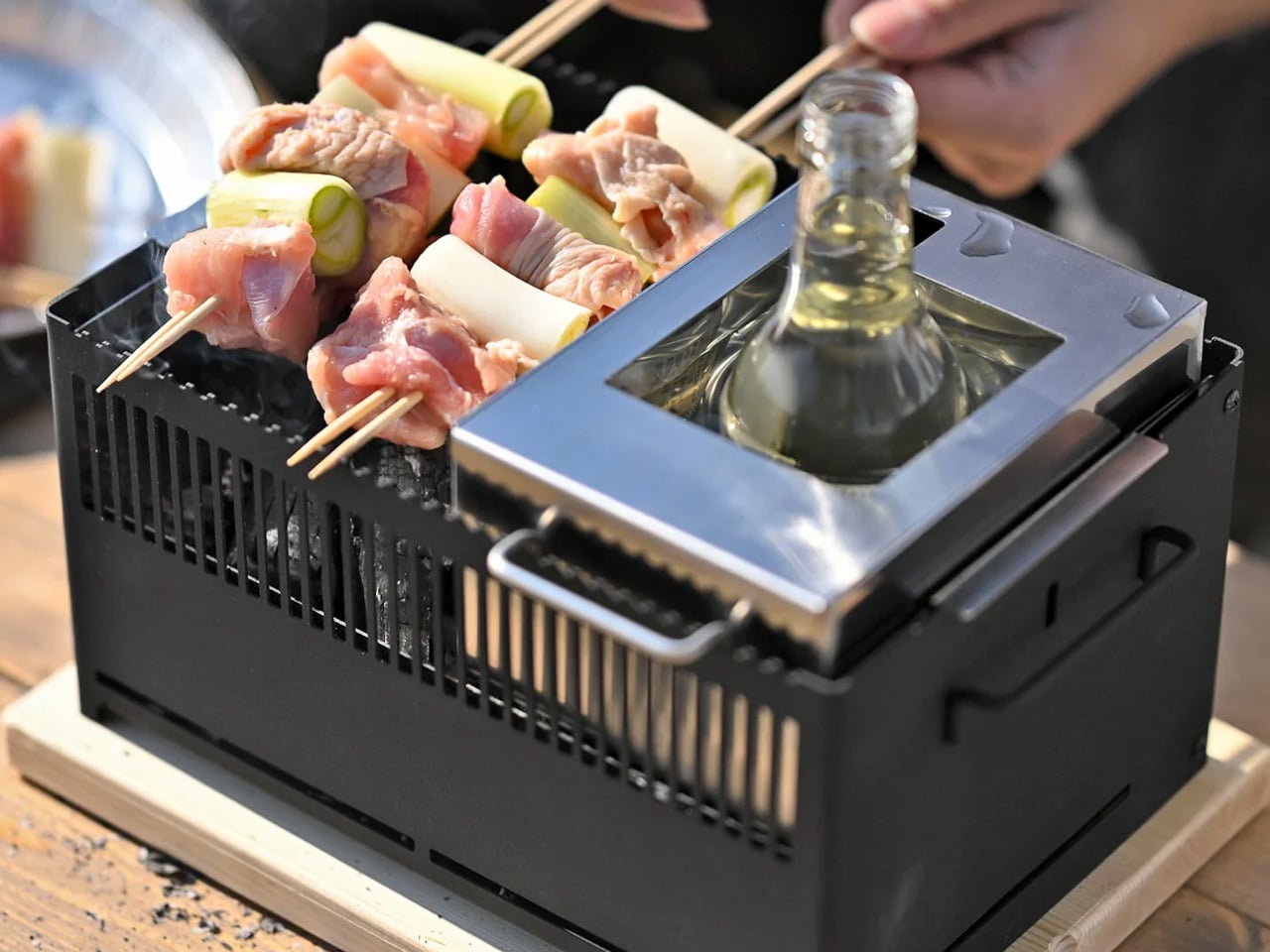
Camp cooking tends to settle into one of two extremes: either you are eating something rehydrated from a bag, or you have packed so much kitchen hardware that a second bag became necessary somewhere between the car and the trailhead. The All-in-One Modular Grill from Yanko Design sits in the productive middle ground. A compact tabletop system with interchangeable modules, it supports six distinct cooking methods — barbecuing, frying, grilling, steaming, smoking, and stewing — from one cleanly designed base. The parts swap in and out without fuss, and the included module for warming bottles upright is the kind of considered detail that makes a cold evening at camp considerably more comfortable. All of that in a footprint that still fits on any camp table without taking it over.
The real value becomes apparent when you start accounting for what this grill replaces in your kit. A separate grill, a pan, a pot, a steamer, a warming setup — the modular system consolidates that list into one object you can disassemble after dinner and rinse down in minutes. The ability to cook genuinely varied meals from the same compact base, without dedicating half your boot space to kitchen gear, changes what feels realistic on a camping trip. It makes more ambitious meals accessible and cleanup manageable, which is ultimately what keeps people cooking properly at the campsite instead of defaulting to trail snacks three nights running.
Six interchangeable cooking modules cover every camp meal scenario without adding meaningful bulk to your kit.
The upright bottle-warming module is a practical feature most camp kitchen systems overlook entirely.
What We Dislike
As a tabletop unit, it requires a stable flat surface, which is not always available at backcountry sites.
Multiple components mean more to track when packing down in low light or deteriorating weather.
2. FLEXTAIL TINY PUMP 2X
There are plenty of gadgets that promise to simplify camp life and manage to complicate it instead. The FLEXTAIL Tiny Pump 2X is a legitimate exception. Weighing just 96 grams and sized to fit comfortably in a closed fist, this 3-in-1 tool inflates, deflates, and functions as a portable lantern, covering three distinct camp needs from a single object that barely registers in your pack. The AIRVORTECH technology powering it pushes air at 180 liters per minute, fast enough to fully inflate a sleeping pad or air mattress in seconds. Five nozzle attachments ensure compatibility with nearly every inflatable you’d bring along, and the built-in magnetic surface allows for hands-free operation while the rest of your camp gets sorted out around it.
What makes the Tiny Pump 2X a Reddit staple rather than a novelty is the moment of recognition it creates on your first night out with it. The integrated lantern removes a separate light from your kit entirely. The one-button operation works without thought after a long drive, when dealing with instructions is the last thing you want. The deflation function cuts pack-down time significantly the following morning.
What We Like
The 180L/min airflow inflates sleeping pads and air mattresses in seconds, not minutes.
The integrated lantern removes the need for a separate light source at camp setup.
What We Dislike
The 30-minute maximum runtime means pre-trip charging is non-negotiable before a longer outing.
At 4KPa of air pressure, it is optimized for camping inflatables rather than high-pressure tasks like bike tires.
3. iKamper Skycamp 3.0
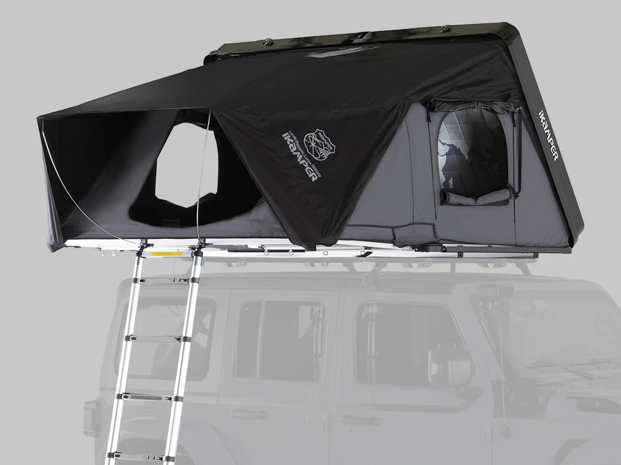
The rooftop tent category has grown crowded enough that standing out in it requires more than a solid shell and a folding ladder. The iKamper Skycamp 3.0 manages it through a combination of genuine quality and a setup experience that still catches first-time users off guard. It opens in under 60 seconds, sleeps three to four people comfortably, and rests on a king-size 9-zone insulated mattress that puts many fixed-site sleeping arrangements to shame. The blackout poly-cotton canvas keeps early morning light out reliably, and the aerodynamic FRP hardshell handles highway speeds without lift, noise, or movement. For campers who operate across multiple seasons, the quilted, insulated interior manages temperature whether you are parked through a June heat wave or a December cold snap.
What separates the Skycamp 3.0 from its predecessors and competitors is the degree to which it was developed alongside real adventurers rather than simply refreshed from a spec sheet. The result is a tent where thoughtful details accumulate in the right places: bedding storage built directly into the shell, a design that does not penalize you for imprecise parking, and a packdown that takes no longer than the setup.
What We Like
Sub-60-second setup makes spontaneous overnight stops entirely viable without added stress.
The 9-zone insulated mattress delivers genuine multi-night sleeping comfort across all four seasons.
What We Dislike
At 163 lbs, installation requires additional hands and a roof rack rated for significant dynamic weight load.
The price point presents a real barrier for casual campers heading out only a few times a year.
4. COFFEEJACK
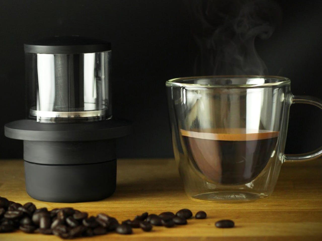
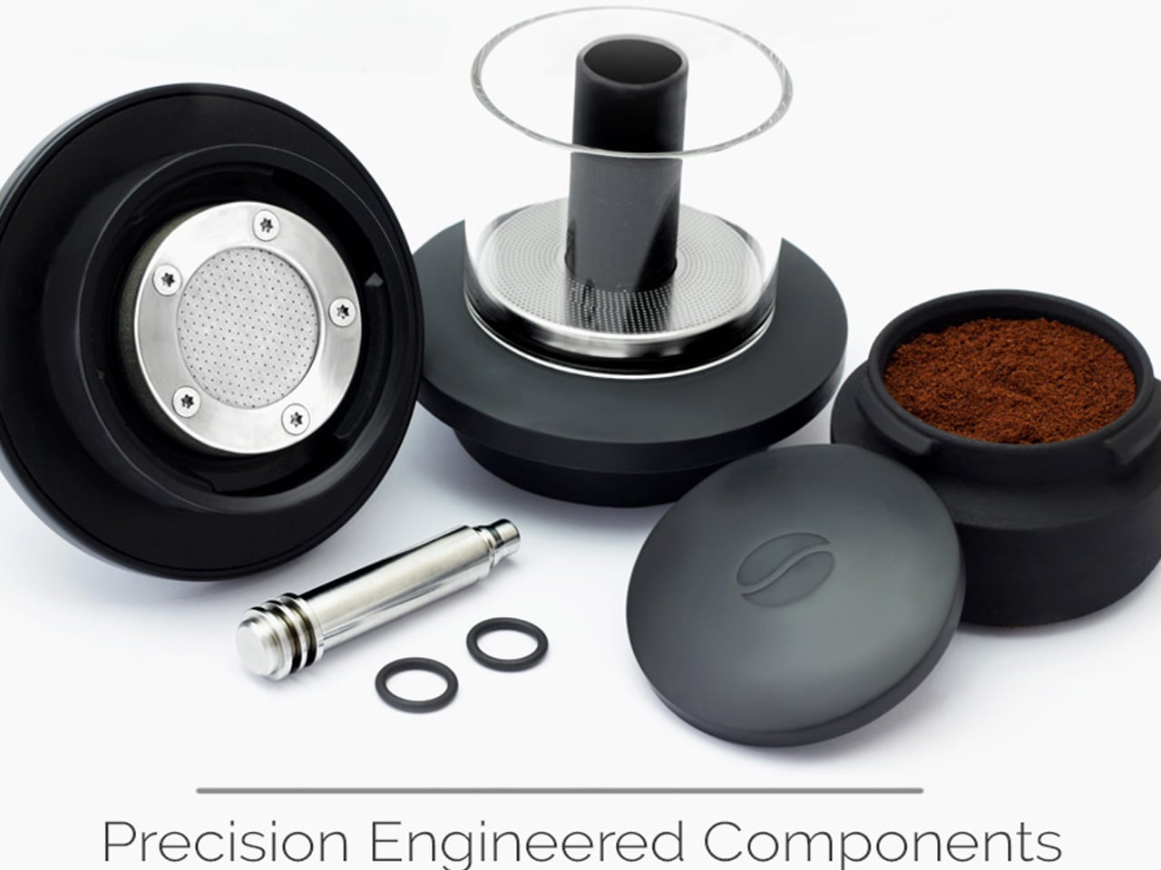
Bad camp coffee is not a character-building experience. It is just bad coffee, and COFFEEJACK was designed to make it unnecessary. Built by Hribarcain, a team with a strong track record in the EDC space, this pocket-sized espresso maker generates 9-10 bars of pressure through a manual hydraulic pump, matching the extraction output of professional café equipment. The lower chamber holds your ground coffee, and a built-in tamper levels and packs the grounds automatically. Add hot water to the upper chamber, work the pump, and you are pulling a crema-topped espresso in the field with the same pressure specs as the machine at your local café. It works with any coffee grind, requires no pods, and has no dependence on electricity or proprietary cartridges of any kind.
The engineering comparison is worth spelling out. A French press operates at under 1 bar of pressure. An Aeropress or Moka pot peaks at roughly 3-4 bars. COFFEEJACK reaches 9-10 consistently, manually, without a power source. That gap is what separates a serviceable camp coffee from the real thing. The entire device is made from 100% recycled plastic, making it a more considered alternative to pod-based systems that generate significant single-use waste with every cup. It is a product that rewards how seriously you take your morning coffee, which, after a cold night in a tent, tends to be very serious indeed.
What We Like
The 9-10 bar hydraulic pump delivers genuine barista-quality espresso with real crema, entirely without electricity.
Made from 100% recycled plastic, it is an environmentally responsible choice that does not compromise on performance.
What We Dislike
It requires pre-ground or freshly ground coffee, adding a preparation step for those who prefer a simpler system.
The manual pump demands real effort per cup, though most dedicated users consider the ritual part of the appeal.
5. Adventure Mate V3
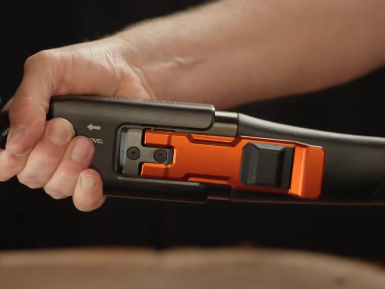
The standard knock against multitools is that they do many things adequately and nothing particularly well. The Adventure Mate V3 was built to directly challenge that assumption. This 6-in-1 system combines a full-size axe, saw, shovel with entrenching rotation, hammer, and hook into a single kit that weighs under 6 lbs — lighter than carrying each tool separately into the backcountry. The construction pairs hardened tool steel with aerospace-grade aluminum, and a 16-inch fiber composite handle with a reinforced steel collar attaches to the modular tool heads to form each full-size tool. What you end up holding is a kit that does not perform like a multitool compromise. It performs like the individual tools it replaces, which is the distinction that matters most when you are actually using it in the field.
The CAM locking system is the engineering detail that makes the AM-V3 trustworthy under serious conditions. When each tool head is locked in, the collar expands and clamps it with enough force to eliminate rattle and flex, creating what genuinely feels like a single-piece tool when you are chopping wood or digging out a fire pit. The full kit packs into a fully waterproof holster no thicker than a laptop bag, and a lifetime guarantee backs the build throughout. With essentially one moving part, mud, sand, and ice rinse away, and work continues without interruption or mechanical drama.
What We Like
The CAM locking mechanism delivers a rattle-free, one-piece feel across all six full-size tool configurations.
A fully waterproof holster and lifetime guarantee make it a credible long-term investment for serious outdoor use.
What We Dislike
The sub-6 lb total weight is impressive for what it replaces, but may still be too heavy for strict ultralight packing philosophies.
Switching between tool heads in wet or cold field conditions takes a moment of adjustment until the process becomes second nature.
6. The Muncher
The Muncher is the kind of object that makes you reconsider how much redundancy most people carry into the backcountry without thinking twice about it. Full Windsor’s titanium multi-utensil weighs just 20 grams and compresses ten functions into the silhouette of a spork: fork, spoon, knife edge, peeler, slicer, can opener, bottle opener, flathead screwdriver, and a flint stick for fire-starting. A 20-gram utensil that opens your tinned food, feeds you dinner, and starts the fire for the following morning is a genuinely clever consolidation of function, and seasoned campers tend to refer to it as a permanent kit item: once it is in your pack, leaving it behind starts to feel careless.
Titanium is the only material choice that makes sense here, and Full Windsor clearly understood why. It produces blades that hold their edge through extended use without demanding constant maintenance. It does not impart any metallic taste to food the way stainless steel can, which makes a measurable difference when you are eating every meal from the same utensil for days on end. It resists rust and staining entirely, making field cleanup a matter of seconds.
What We Like
Titanium construction means no rust, no metallic taste, and a blade edge that holds up across extended multi-day trips.
Ten functions at 20 grams is a utility-to-weight ratio that very few pieces of camping gear come close to matching.
What We Dislike
The flint stick is functional but compact, and a dedicated ferro rod will outperform it in serious fire-starting conditions.
Some functions require practice to use comfortably, given the compact form factor, particularly the cutting edge under field conditions.
7. VSSL Camp Supplies
The idea of a flashlight that doubles as a survival kit sounds like the kind of claim that unravels the moment you actually need it. VSSL Camp Supplies is the version that holds up. Built from military-grade aluminum in a waterproof, impact-resistant shell, it houses over 70 pieces of essential outdoor gear across a lineup that covers fire, water, first aid, food, navigation, and emergency signaling — all packed inside a form factor that weighs under a pound and fits in a standard pack pocket without ceremony. At one end, an LED flashlight with up to 40 hours of SOS runtime. At the other, a compass. Everything else lives in the cylinder between them, organized and ready without requiring you to dig through a bag to find it under pressure.
The Camp Supplies kit solves that organizational problem by design. A Canadian beeswax candle, a mini first aid kit, water purification tablets with a 1-liter Whirl-Pack bag, a firestarter kit with weatherproof matches and Tinder Quik, a fishing kit, a 60-lb working strength wire saw, a whistle, a P38 can opener, and a mini sewing kit — none of it improvised or low-quality filler. It is a complete backcountry contingency plan inside an object you would have packed anyway for the light.
What We Like
Over 70 pieces of genuine, field-appropriate gear are organized inside a sub-one-pound waterproof shell backed by a lifetime warranty.
The compass-and-flashlight end caps make VSSL immediately functional as a standalone tool before you even open it.
What We Dislike
The cylindrical format means contents must be accessed sequentially, which can be inconvenient when you need a specific item quickly.
As a pre-packed kit, it offers limited flexibility for campers who prefer to curate their own emergency loadout from scratch.
Worth Every Gram You Pack
The best camping gear of 2026 earns its place through repetition, not reputation. Every product on this list has been through the real test: bought, packed, used across multiple trips in varied conditions, and recommended again by people with no particular incentive beyond having found something that genuinely works. That is the hardest kind of endorsement to manufacture and the most reliable one to act on. No marketing campaign replicates it. It takes time, field use, and the kind of honest feedback that Reddit’s camping communities deliver without softening the edges.
Building a kit that functions as well as it travels is ultimately a process of considered editing. The right pump replaces three separate items. The right multitool replaces an entire bag of hardware. The right cup of espresso at dawn replaces a compromise you had been quietly accepting for years. These are not luxury additions to a camping setup. They are the deliberate choices that separate a trip you get through from one you start planning a return to before you have finished packing up camp.
 perfects on that technology by packing components that are slimmer, stronger, and somehow smoother in their motion and use too. Eight layers of intricate components (down to micrometers in thickness) deliver the 360-degree rotation with stable angle-locking at any position you choose. The stand measures 2.7mm thick, integrating seamlessly into the backplate when closed, which matters because most kickstand cases add noticeable bulk that ruins the phone’s profile. Flip it open and the hinge operates silently, tuned for smooth reliable motion through over 30,000 rotations according to durability testing. The aerospace-grade aluminum construction went through more than 400 trials refining texture, tone, and color, which explains why the champagne gold finish feels considered rather than flashy.