This $70 Japanese Candle Burns From the Inside Out & Lights a Room Better Than Anything Else on Your Shelf

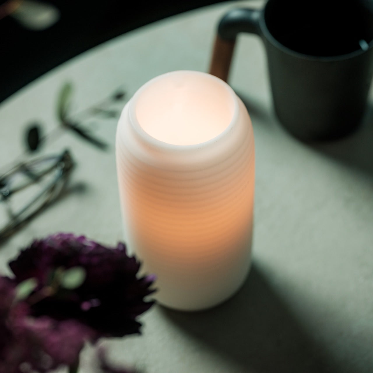
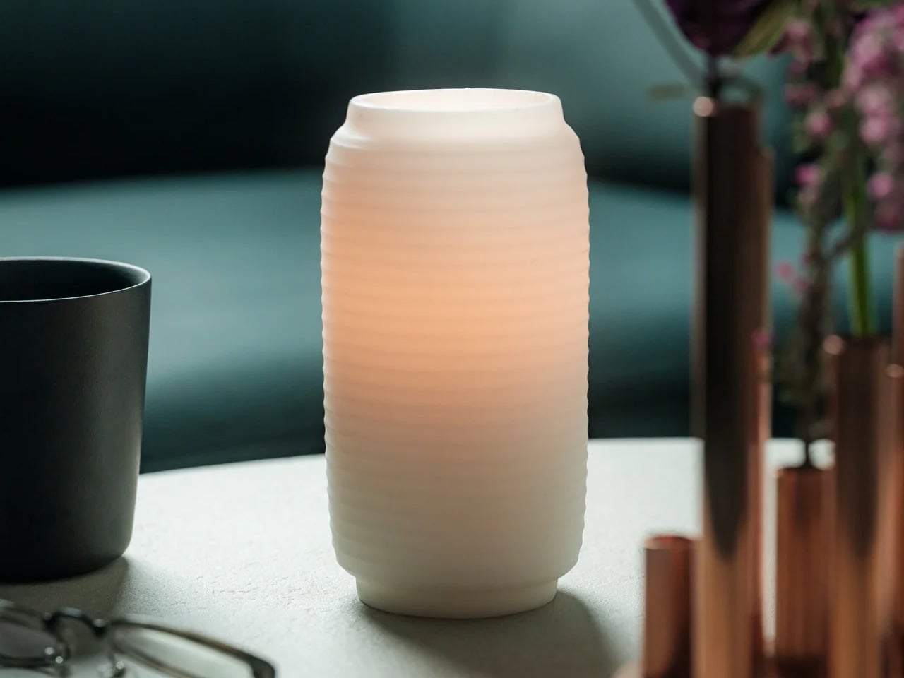
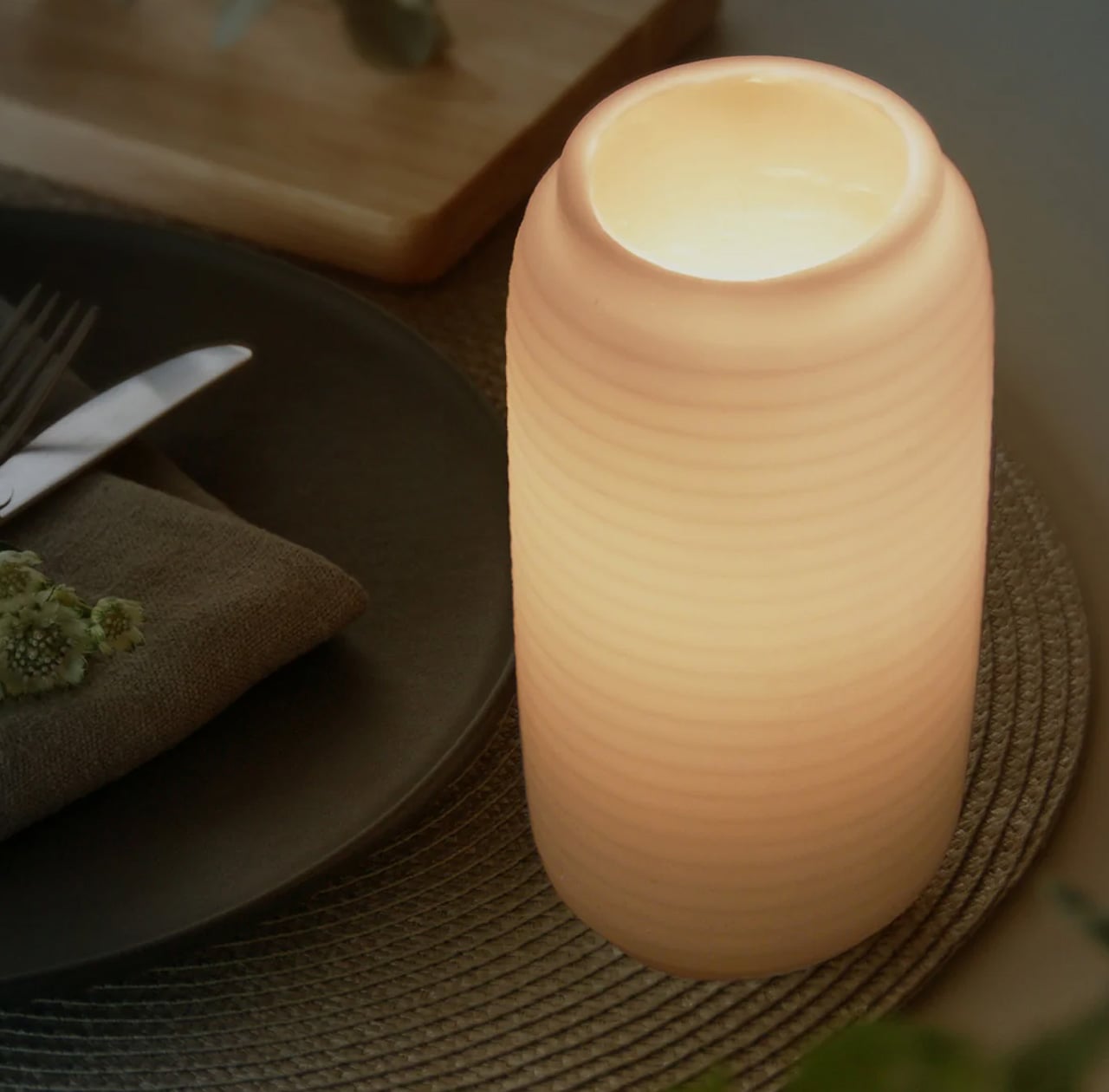
Most candles do one thing: burn down and disappear. The wax melts, the light fades, and what you are left with is an empty vessel and a faint smell of something vaguely floral. The Japanese Lantern Candle does not follow that logic. Rooted in the design of the chouchin, the traditional paper lanterns that once lit up festival streets and the doorways of old izakayas, this candle holder holds its shape while the flame quietly does its work inside. The outer wax never melts. The light does.

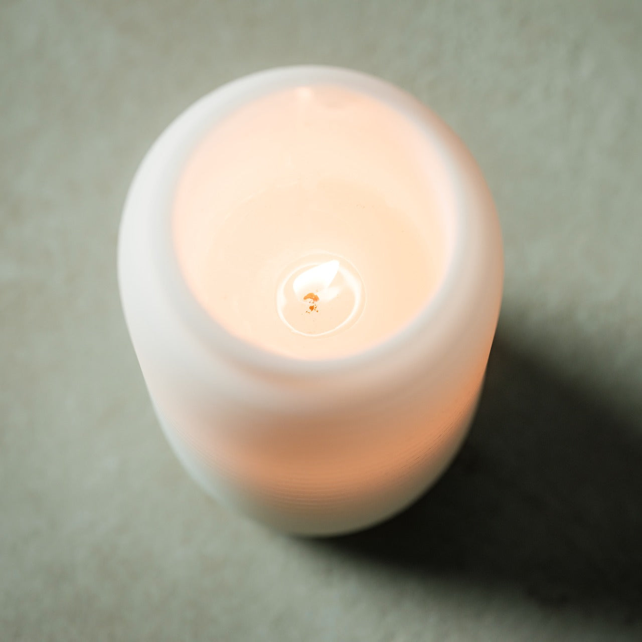
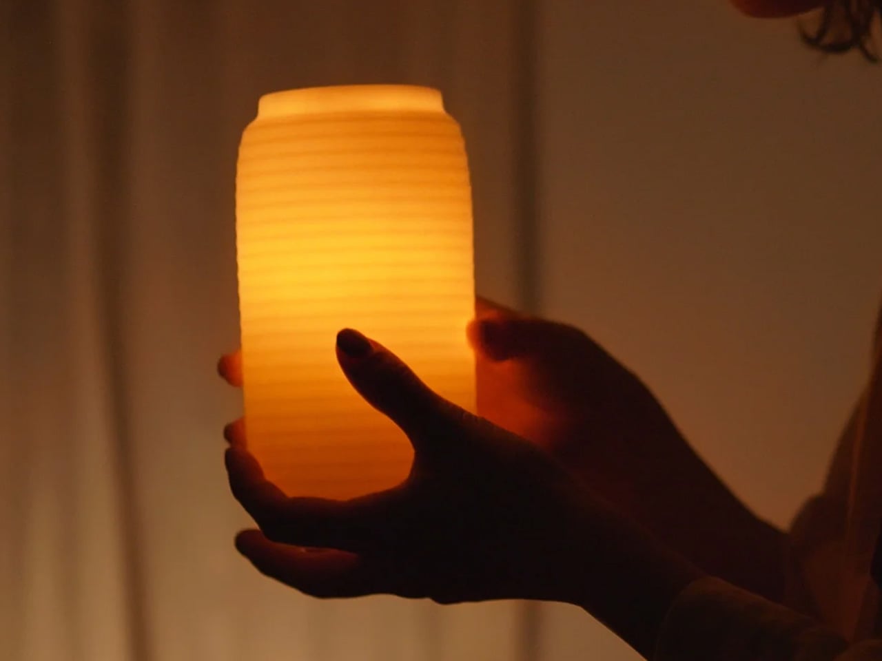
What changes as the candle burns is the experience. The inner candle gradually hollows out, and as it does, the light begins filtering through the undulating surface of the outer shell in a slow, shifting pattern that is difficult to look away from. Handmade by craftsmen in Kurashiki, Japan, it carries the kind of quiet specificity that separates an object made with intention from one made for convenience. That distinction is easy to feel the moment it is lit.
Click Here to Buy Now: $70.00

The Light That Stays

The patented technology behind the outer shell is what makes this candle worth understanding. Conventional candles collapse inward as the wax disappears, which means the design and the light disappear with them. Here, the outer layer holds its form throughout the life of the candle. The undulating surface was not designed purely for aesthetics, though it earns its place on that front as well. As the inner flame burns lower, the light catches and bends through the curves of the shell in a way that shifts with the burn, giving the candle a different quality of light at the end of its life than at the beginning. It is a slow reveal rather than a slow fade.
Crafted in Kurashiki, Designed for Stillness

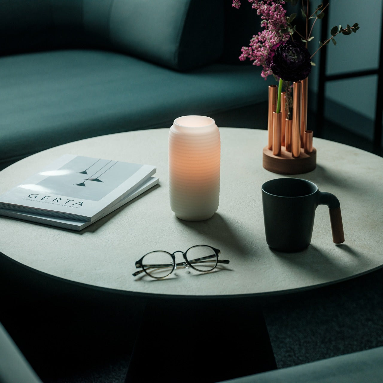
Kurashiki is a city in Okayama Prefecture with a long history of textile craft and traditional artisanship. The candles made there carry that lineage in the way they are finished. Each one is handmade, which means no two are entirely identical, and the minimalist exterior reflects a restrained design philosophy that integrates into most interior spaces without demanding attention. It works on a bedside table, a bathroom shelf, or the center of a dining surface. The intention behind it, a calming ritual to mark the end of the day, is built into the form itself. You do not need to think about how to use it. You simply light it.
What We Like

  • Patented outer shell technology: the wax casing holds its structure as the inner candle burns, preserving the lantern form and the quality of the glow through the entire life of the candle
  • Handcrafted in Kurashiki, Japan: made by artisans in a city with a genuine tradition of craft, which shows in the finish and the material consistency
  • Undulating surface design: as the inner flame burns through, the light catches and moves across the curved surface in a way that no flat-sided candle can replicate
  • Minimalist aesthetic: the design integrates into contemporary and traditional interiors equally, without the visual noise of decorative candles that prioritize appearance over atmosphere

What We Dislike

  • No replacement candle system specified: the product does not make clear whether inner candles can be sourced and replaced once the original burns out, which affects the long-term value of the outer shell
  • Limited availability: with only a small number left in stock and no confirmed restock date, it is the kind of object that disappears before most people know it exists

A Ritual Worth Keeping

There is a particular kind of object that earns a permanent place in a room not because it demands to be noticed but because the room feels different without it. The Japanese Lantern Candle belongs to that category. It does not perform. It simply holds the light in a way that slows the room down, which is the point of the chouchin tradition it draws from, and the point of any ritual worth building around the end of a day.

If the candles currently on your shelf burn flat and leave nothing behind, this is the straightforward upgrade. At $70.00, it is the cost of something made by hand, in one place, for one purpose. Pick it up before the remaining stock is gone.
The post This $70 Japanese Candle Burns From the Inside Out & Lights a Room Better Than Anything Else on Your Shelf first appeared on Yanko Design.
This Tiny Home Is a Wine-On-Tap, Off-Grid Luxury Retreat in the Australian Bush

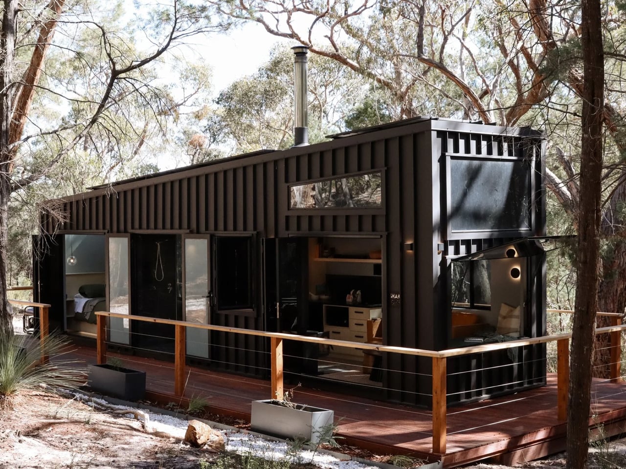
There are tiny homes, and then there is the SHAK. Built by Gold Coast-based Removed Tiny Homes as a bespoke one-off commission, it won “Best Weekender” at the 2025 Tiny House Industry Awards — and once you see it, the reason is immediately obvious. Tucked into the Grampians of Victoria, Australia, it reads less like a transportable dwelling and more like a piece of architecture that grew out of the landscape itself.

The exterior sets the tone. Dark vertical cladding, an angular stepped roofline, and a wraparound timber deck give SHAK a sculptural presence that most permanent homes never achieve. It runs completely off-grid, fully self-sufficient with no power line in sight, and that sense of self-reliance is woven into every design decision inside it.

Designer: Removed Tiny Homes

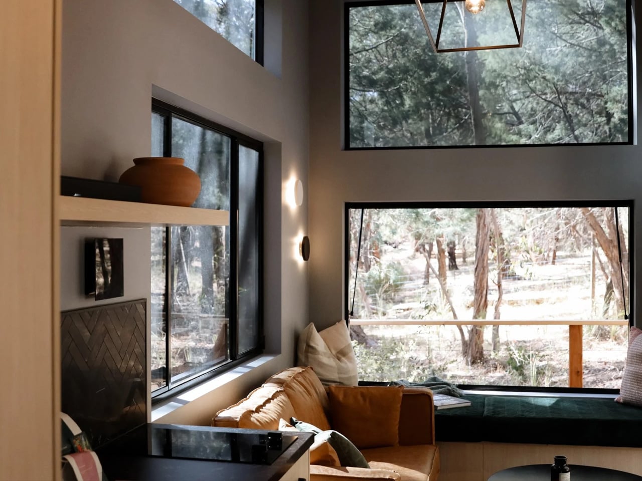
The living space is compact but deliberate. A tan leather sofa and a built-in green velvet window seat sit beneath stacked picture and clerestory windows that frame the surrounding gum trees like a moving painting. A sculptural brass pendant and floating timber shelves warm the dark interior palette, turning what could feel confined into something genuinely calm. It is the kind of room you settle into, not just pass through.

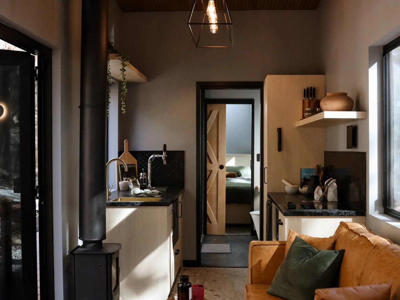
The kitchen is where SHAK makes its most memorable statement. Dark stone benchtops, timber cabinetry, a black herringbone-tile splashback, and brass tapware already read as high-end — but the detail that everyone remembers is the wine on tap, plumbed straight to the bench. A black wood-burning fireplace anchors the living end and keeps the retreat warm without a single grid connection. A timber barn door slides closed to separate the bedroom beyond, and the whole space feels more like a carefully styled bar than a tiny-house galley.

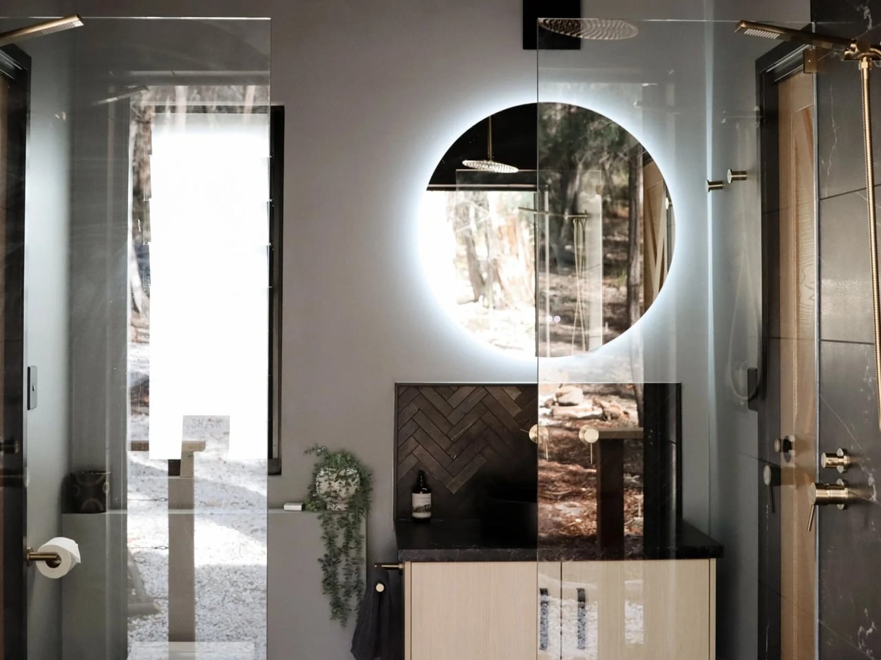
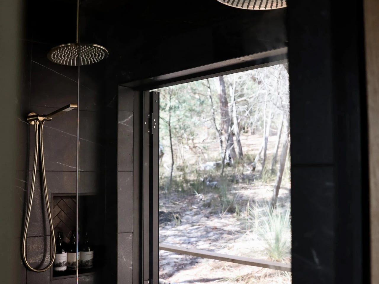
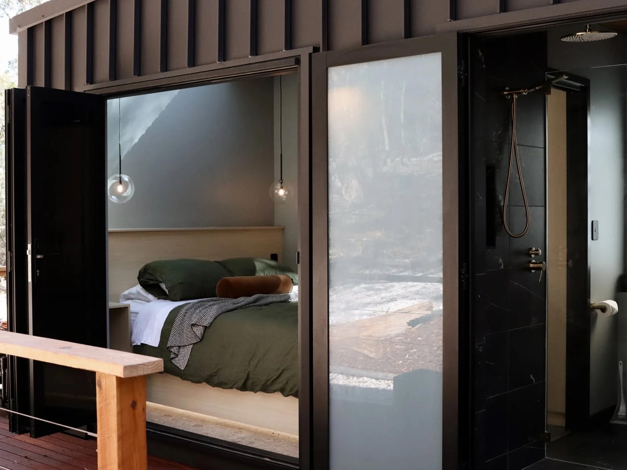
The bathroom earns its own category. Two brass rainfall heads hang from a timber-lined ceiling over a dark marble-tiled double shower. A full-height glass door swings open directly onto the bush, turning a morning shower into an open-air ritual with nothing but trees in view. The round backlit mirror, the vessel basin, the dark stone vanity top — it is spa-grade specification in a footprint most architects would dismiss as impossible.

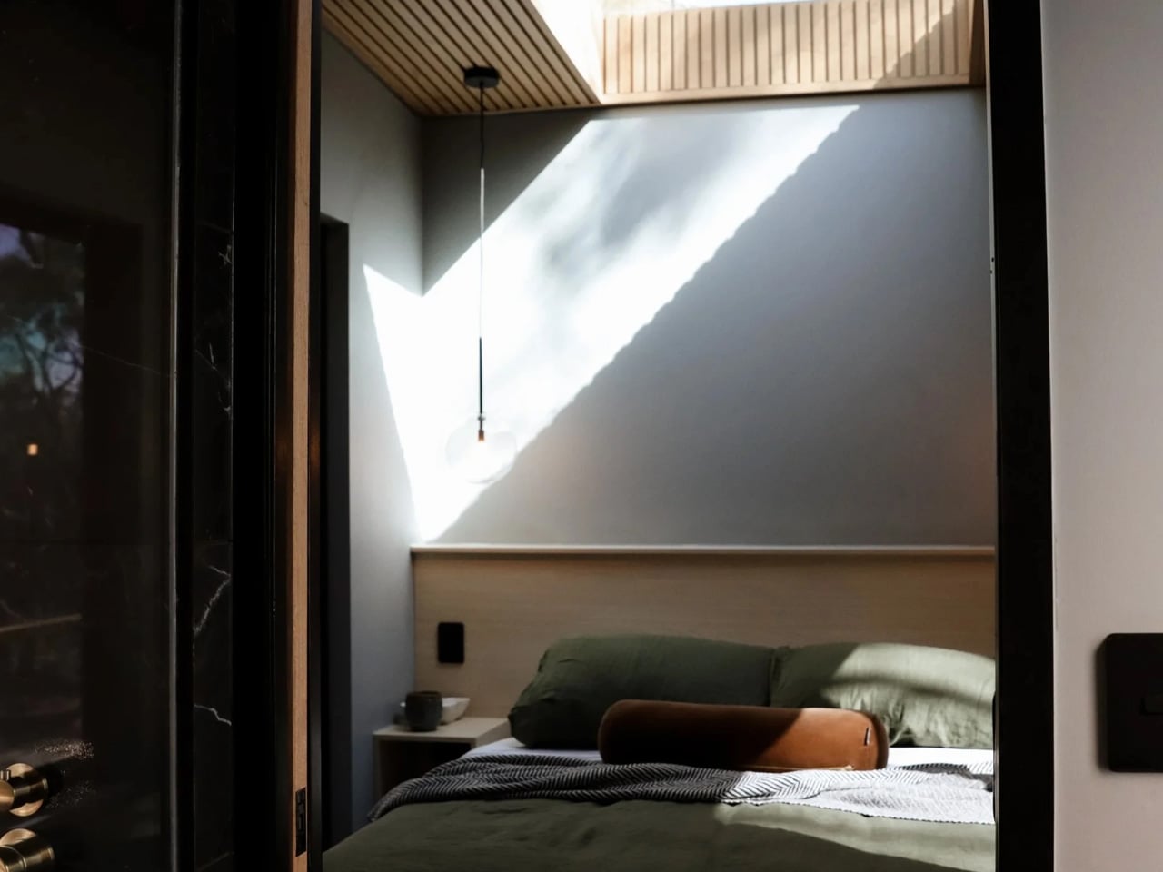
Behind the bathroom, the bedroom keeps the mood: a queen bed dressed in olive-green linen beneath a timber-slat ceiling and a large skylight that pours daylight across the room throughout the day. Removed describes SHAK as “a showcase of what’s possible when you design for experience, not just square metreage.” That framing is exactly right. SHAK does not feel like a compromise. It feels like a choice.

The post This Tiny Home Is a Wine-On-Tap, Off-Grid Luxury Retreat in the Australian Bush first appeared on Yanko Design.

SAM Might Be the Most Human Thing Samsung Has Finally Built

Most conversations about aging and technology eventually circle back to the same frustrating gap: the tools we build for older people rarely feel like they were designed with older people in mind. They’re functional, clinical, and often carry the visual language of a hospital supply catalog. SAM, a concept robotic mobility aid designed by David Webber for Samsung, feels like a direct response to that problem, and it’s the kind of design thinking I genuinely want more of.

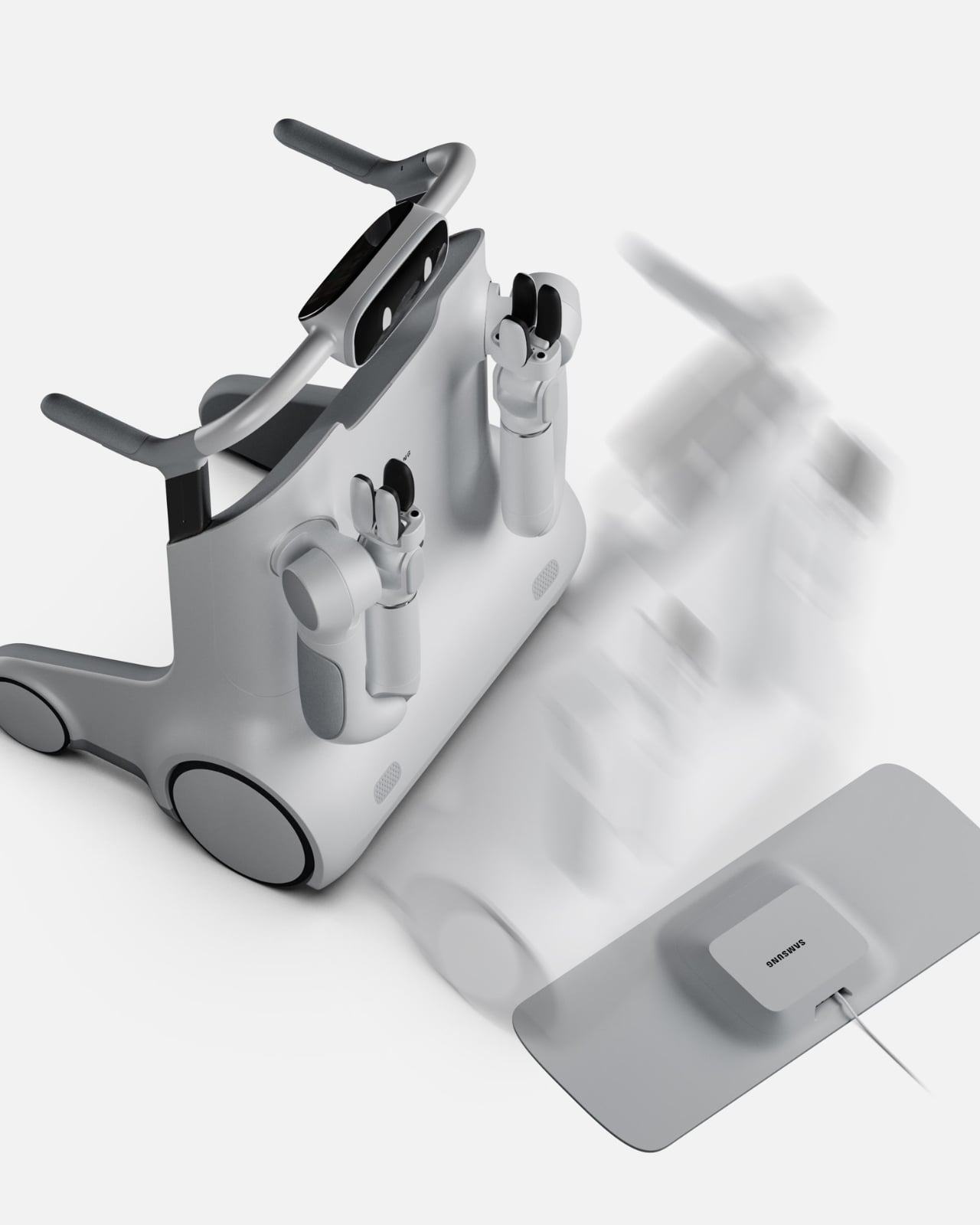
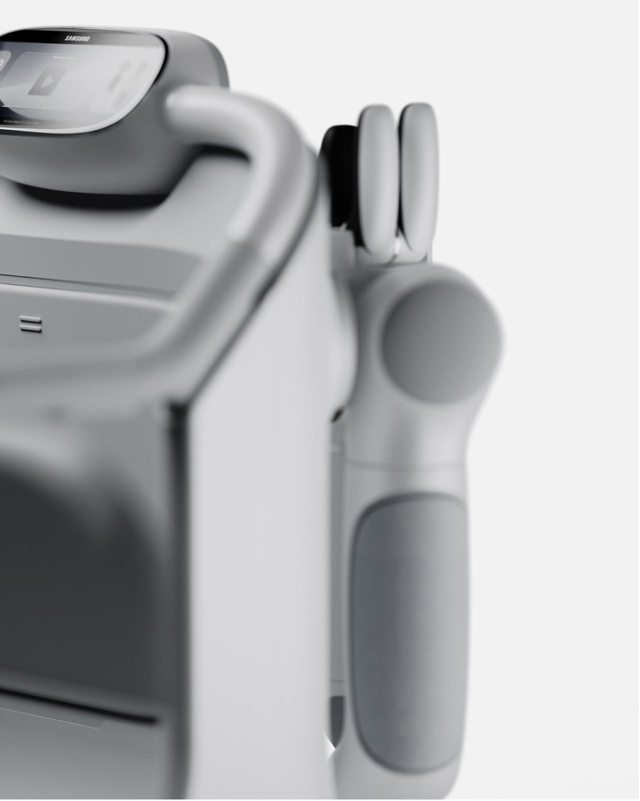
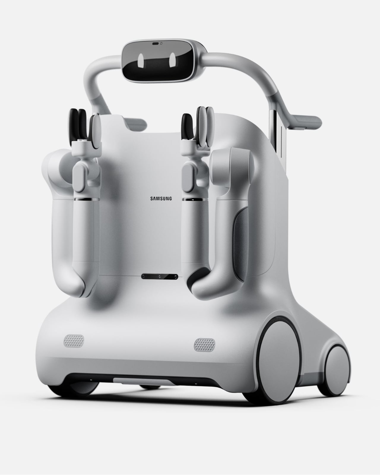
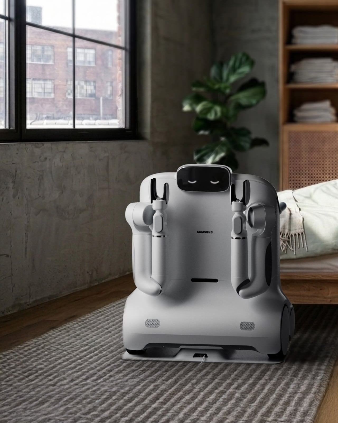
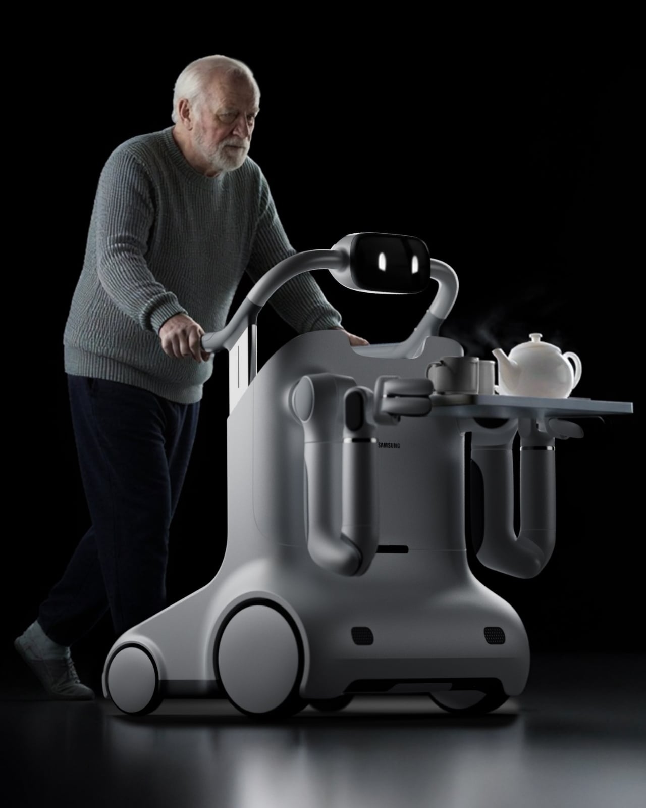
At first glance, SAM looks like it belongs on a near-future film set. The rounded, cloud-white body, the articulating arms, the small expressive face-like display on top. But spend a little more time with it and the aesthetics start to make sense in a very deliberate way. Webber didn’t want SAM to read as medical equipment. He wanted it to feel like a companion, something you’d actually invite into your home and not hide in a corner when company comes over.

Designer: David Webber for Samsung

What SAM does differently from most mobility aids is where the real story lives. A standard walker or rollator solves one problem: moving from point A to point B. SAM looks at the fuller picture of what daily independence actually requires. Picking up a dropped object from the floor. Carrying groceries from the door to the kitchen. Helping someone rise from a chair safely. These are the small, invisible tasks that quietly determine whether an older adult can continue living alone or not, and they are almost entirely absent from the current conversation around mobility technology.

The concept is built around the idea of physical AI, the notion that artificial intelligence should operate in the physical world in a way that supports human capability rather than overriding it. SAM doesn’t take over. It doesn’t assume. The user stays in control, and the technology fills in the gaps, which is a harder design problem than it sounds. Building something that assists without patronizing, that helps without making a person feel like they’ve surrendered something, requires a kind of empathy that most tech doesn’t bother with.

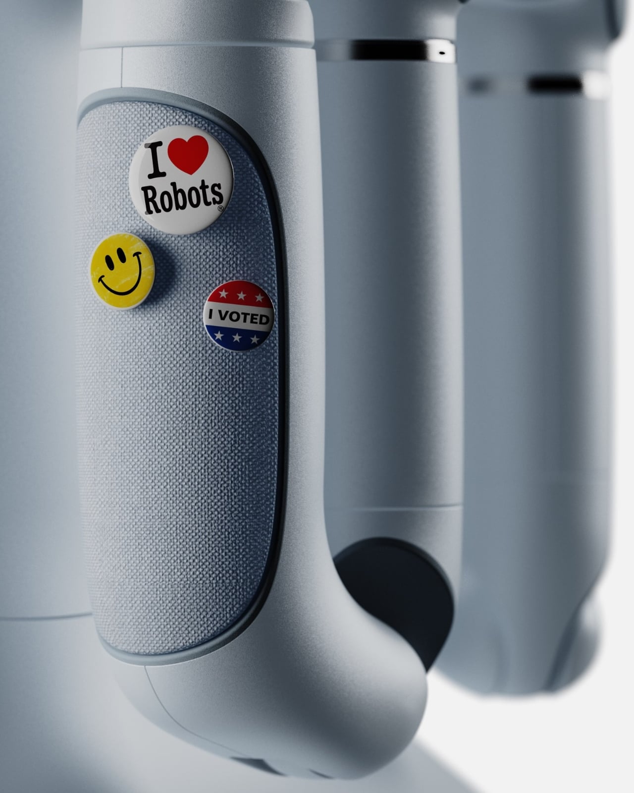
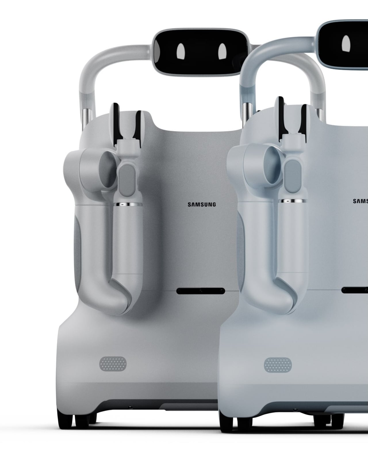
I’ll be direct: the design of SAM is one of the more thoughtful things I’ve seen come out of a Samsung concept in a while. The color options, soft greys and muted sage greens, feel intentional. They’re domestic. They say “living room” rather than “rehab facility,” and that distinction matters enormously for user dignity and adoption. Nobody wants to use a tool that announces their limitations to every visitor who walks through the door. SAM seems to understand that.

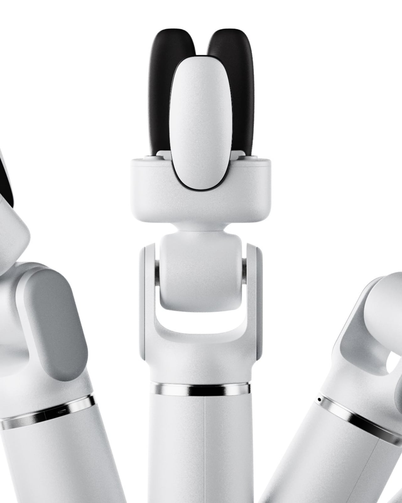
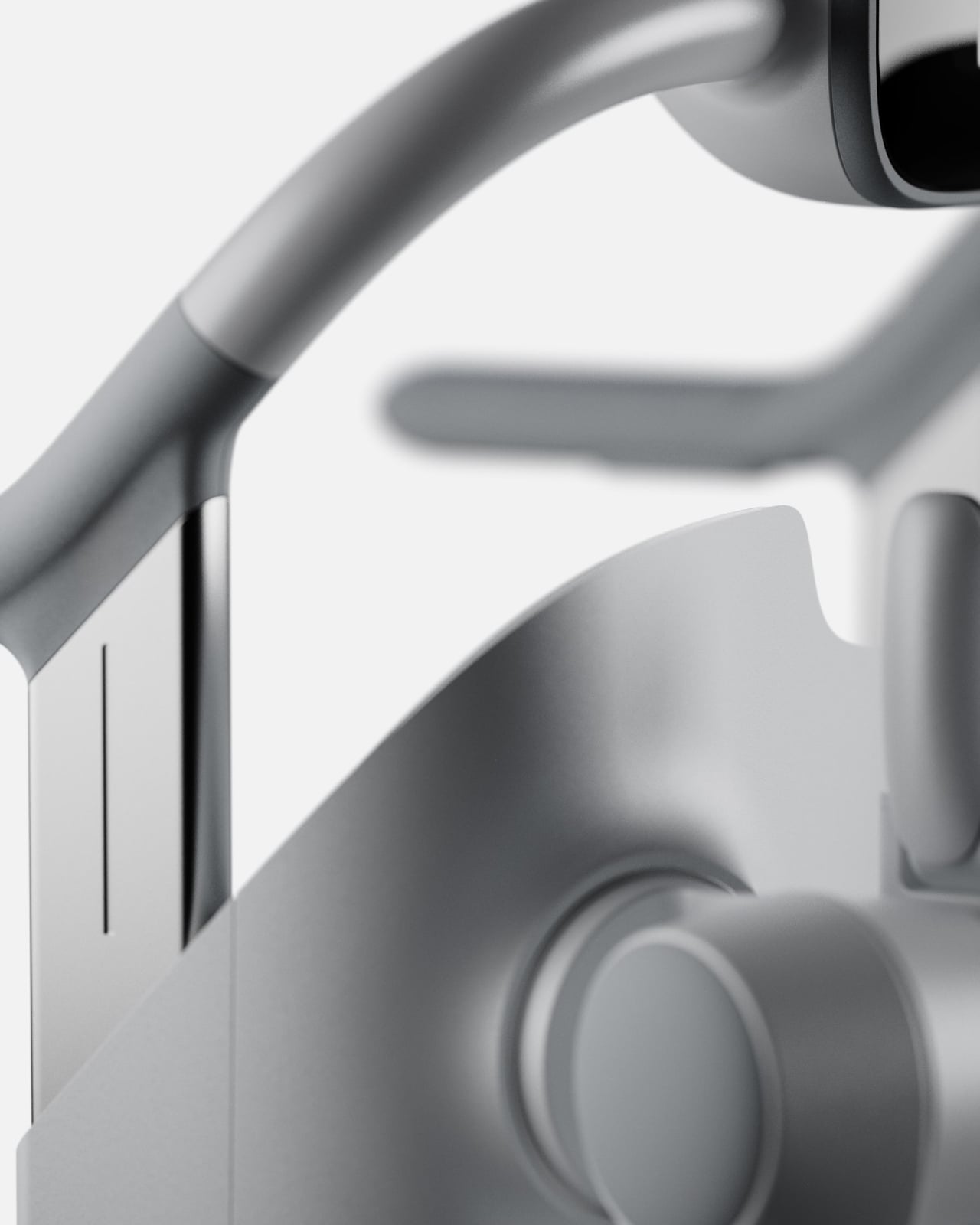
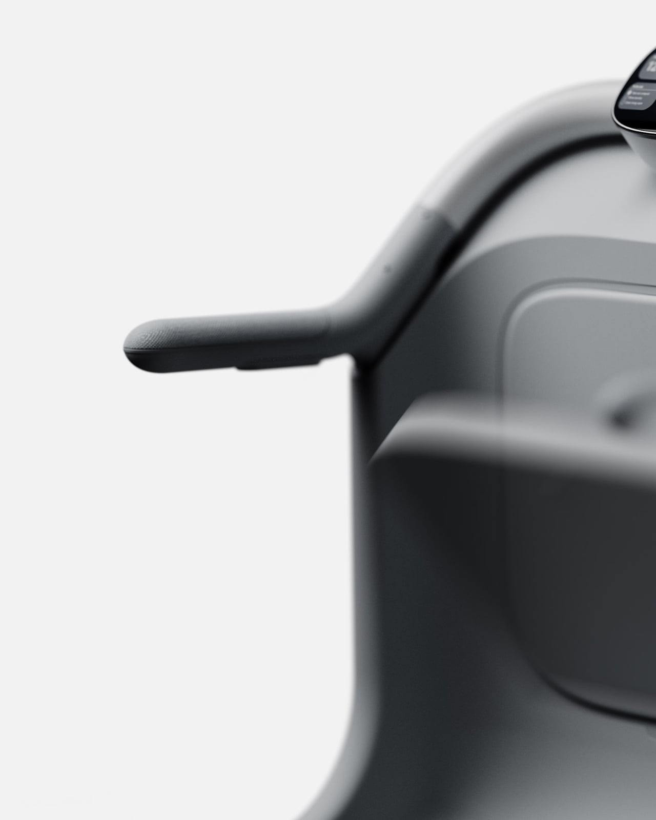
The arms and end-effectors are worth a close look too. The gripper design is specific enough to handle real objects but rounded and soft-looking enough not to feel threatening. The integrated display sits at a natural eye level when someone stands and grips the handles, showing simple information like time, a to-do list, and device status. It’s thoughtful UX layered into an already thoughtful form.

Is SAM a product you can buy right now? No. It’s a concept, a vision piece, and it should be taken as one. But the best concept designs do something important: they shift where the conversation is pointed. Right now, too much of the assistive tech space is focused on reactive solutions, devices that help after a fall, after a diagnosis, after independence has already started to erode. SAM is proposing something more proactive. It’s asking what support looks like before the crisis, and that’s a question the industry desperately needs to sit with.

What I hope designers, healthcare companies, and tech brands take from SAM is not the specific form but the underlying philosophy. That independence isn’t just about mobility. That dignity is a design requirement, not a bonus feature. That the people who need the most thoughtful design often receive the least considered version of it. If SAM pushes even one conversation in that direction, David Webber has done something genuinely worth paying attention to.

The post SAM Might Be the Most Human Thing Samsung Has Finally Built first appeared on Yanko Design.

Tesla Dropped a $225 Kids Bike That’s Already Worth $8,000

When Tesla drops something new, the internet tends to spiral. Sometimes that’s deserved, sometimes it’s a little much. But I’ll say this: the Tesla Balance Bike for Kids landed last week and the reaction makes complete sense to me, even if the bike itself is a little absurd.

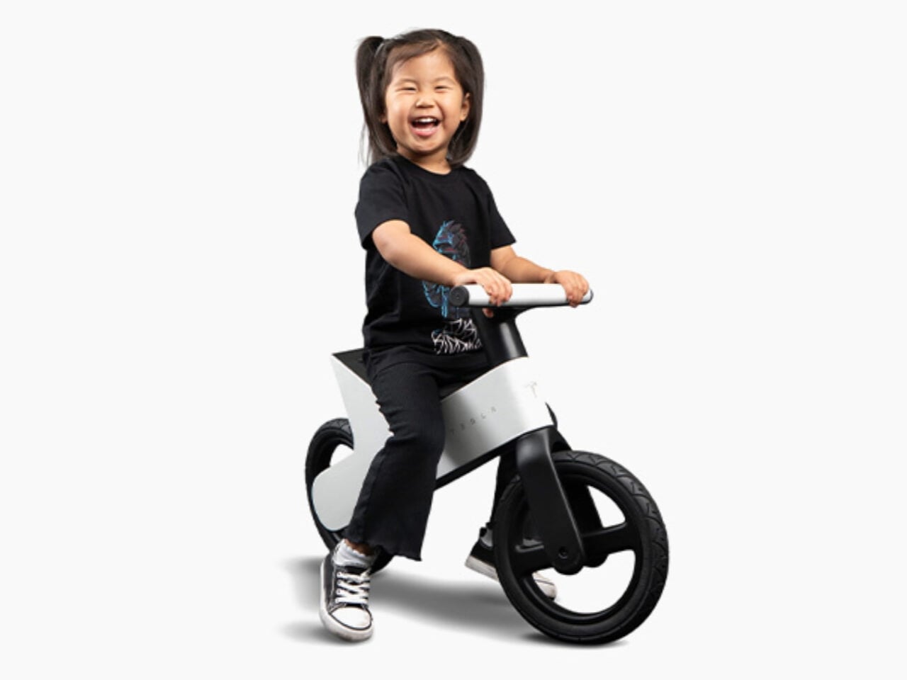
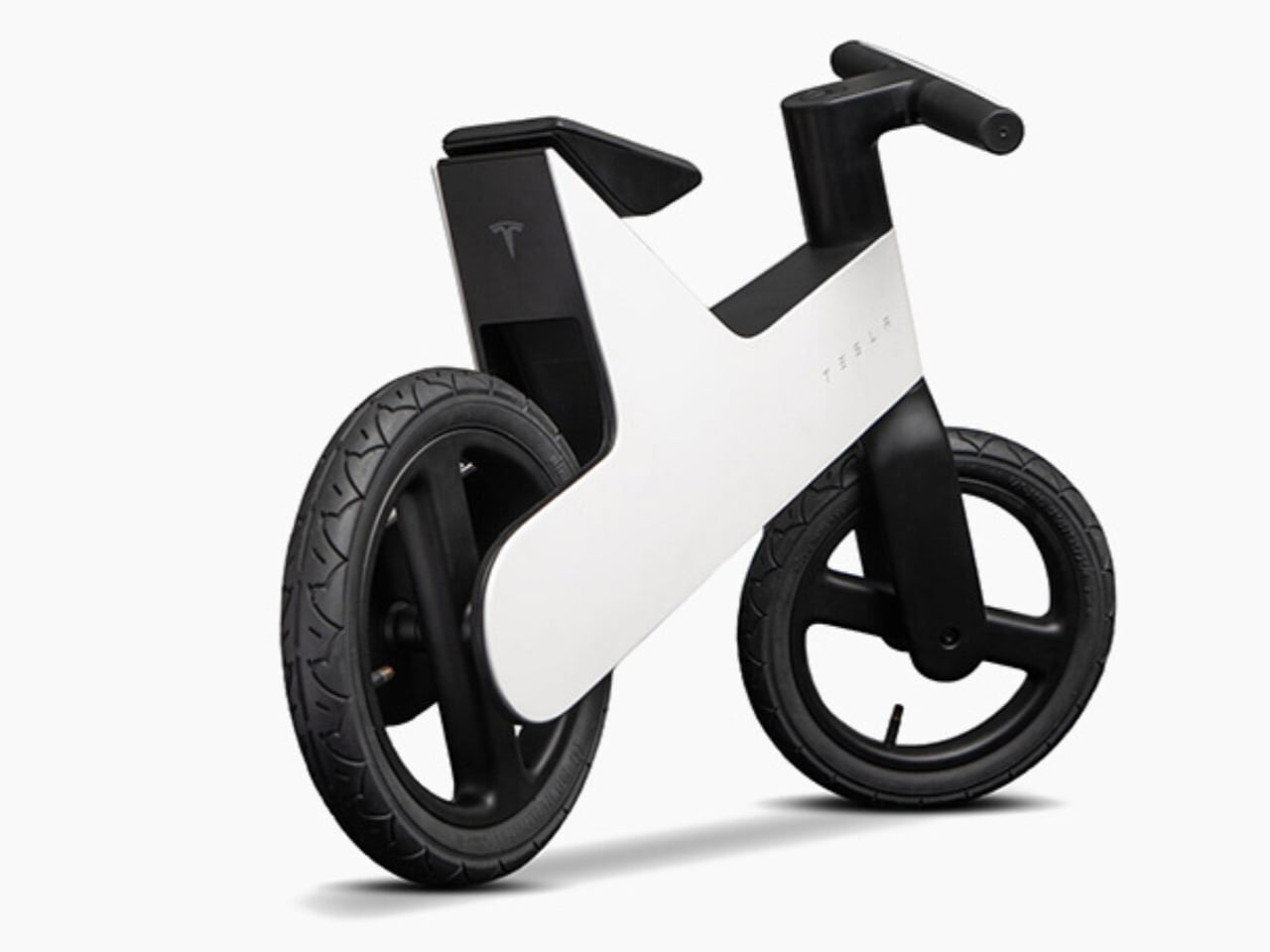
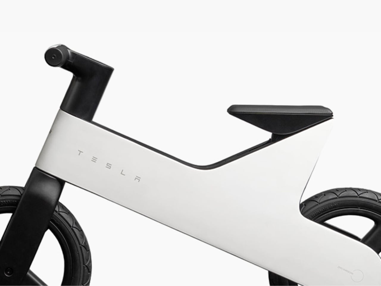
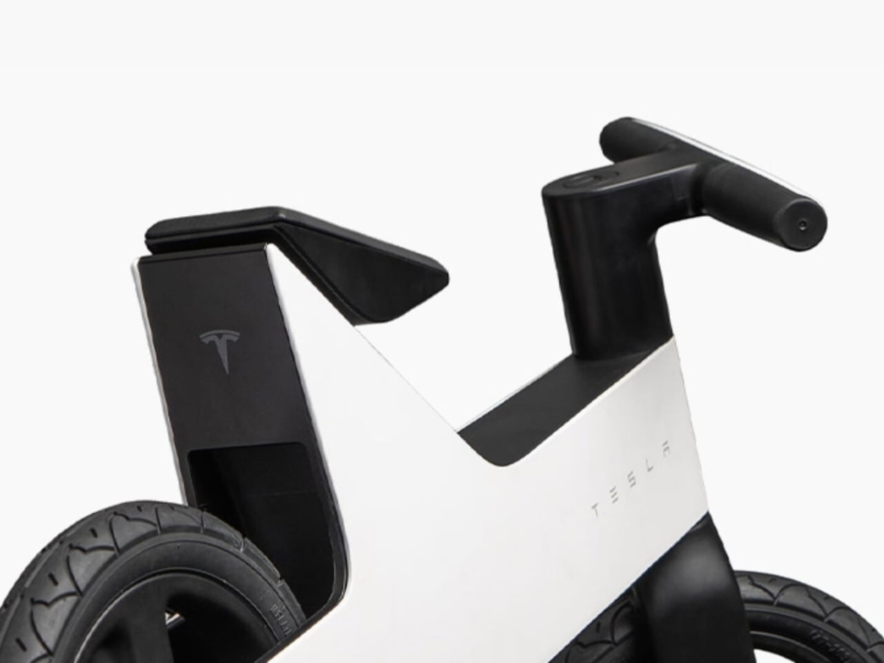
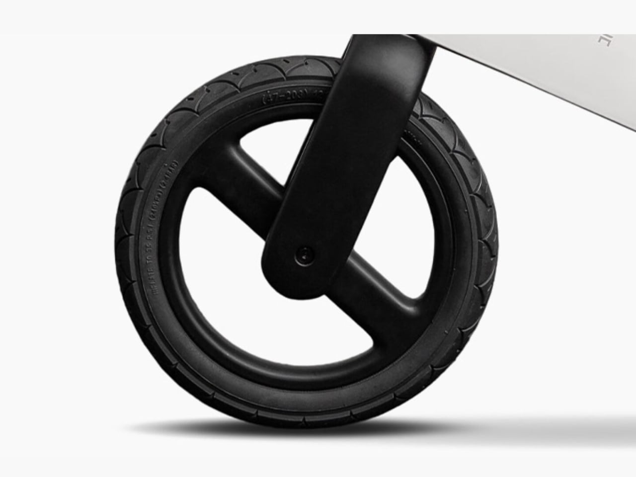
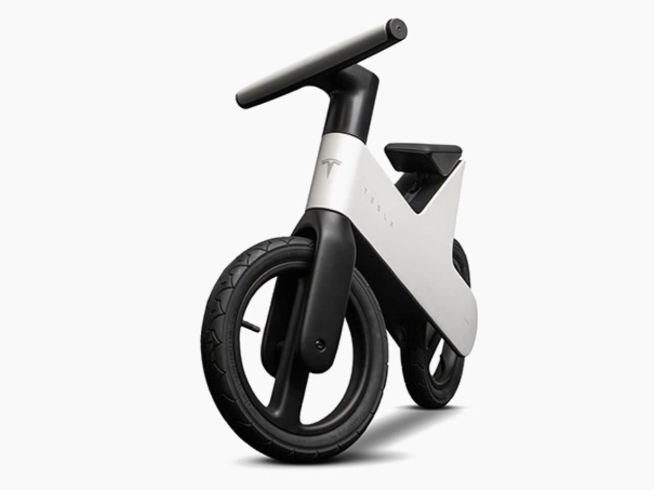
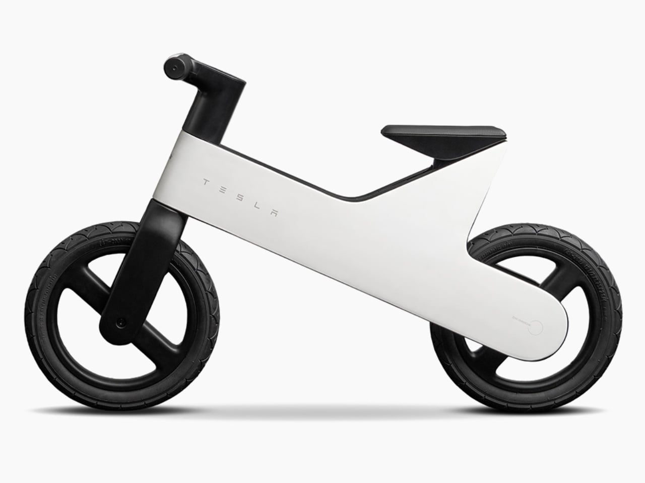
Let’s set the scene. On July 16, Tesla quietly added a balance bike to its official shop, priced at $225. It’s designed for children between two and five years old, features a lightweight magnesium frame, five adjustable seat heights, and the Tesla wordmark stamped on the side with the signature “T” logo on the front. No pedals. No motor. No battery. Just a very sleek, very branded piece of equipment for a toddler to scoot around on. It was sold out within days, and eBay listings are already floating around for as much as $8,265. Yes. Eight thousand dollars. For a children’s balance bike.

Designer: Tesla

I want to be clear that the bike itself is not a bad product. A magnesium frame is genuinely impressive at this price point and for this type of product. Magnesium is lighter than both aluminum and steel while still being structurally solid, which actually matters a lot when a two-year-old is trying to figure out how gravity works. Balance bikes work because children push themselves forward with their feet and learn to steer and stabilize before ever touching a pedal. Weight is the enemy of that process. A lighter frame means less frustration and a faster learning curve, so using magnesium here is not just a styling choice; it is a practical one.

The five adjustable seat heights are another smart detail. The bike is supposed to grow with the child across those early years rather than becoming obsolete the moment your kid hits a growth spurt. At $225, you’d expect it to last at least a few seasons, and the design accommodates that.

But here’s where I start to have mixed feelings. The design language is unmistakably Tesla. Clean, minimal, slightly futuristic, and built around the brand as much as the product itself. That’s fine for adults who’ve chosen to invest in the Tesla ecosystem. For a toddler, the “T” logo on the front doesn’t mean much yet. So who is this bike really for? I’d argue it’s mostly for the parents. It’s a lifestyle object dressed up as a children’s product, which isn’t necessarily wrong, but it’s worth naming. That’s also the reason it sold out so fast and why resellers are already treating it like a limited sneaker drop. The product value isn’t just in the magnesium frame or the adjustable seat. It’s in the logo. And a lot of people clearly want that. That’s not a criticism. Brand value is real, even when it takes the shape of a toddler’s first bike.

For $225, the bike lands at a premium relative to average balance bikes on the market, which typically run anywhere from $50 to $150. You’re paying a significant markup for the branding, and I don’t think Tesla is hiding that. The product doesn’t pretend to be competing with generic options. It knows its buyer. That kind of confidence is either admirable or a little audacious depending on where you’re standing. If you’re a Tesla owner, or even just a Tesla fan, this bike makes total sense as a purchase. The design is clean, the materials are quality, and it’s the kind of thing that photographs beautifully next to a Model Y in the driveway. That’s part of the pitch, whether or not it’s stated outright.

For everyone else, I’d say the bike is a perfectly fine product at a price you’re paying partly for aesthetics and partly for the story of handing your two-year-old something built by the same brand as their parent’s car. Is that worth $225 to you? That’s a personal call. Shipping is expected to begin in late August. If you missed the initial drop, you’ll either have to wait for a restock or politely decline to spend eight thousand dollars on eBay.

The post Tesla Dropped a $225 Kids Bike That’s Already Worth $8,000 first appeared on Yanko Design.
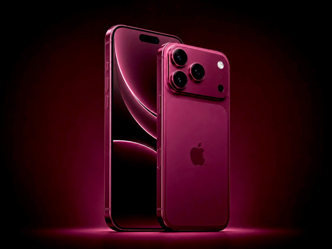
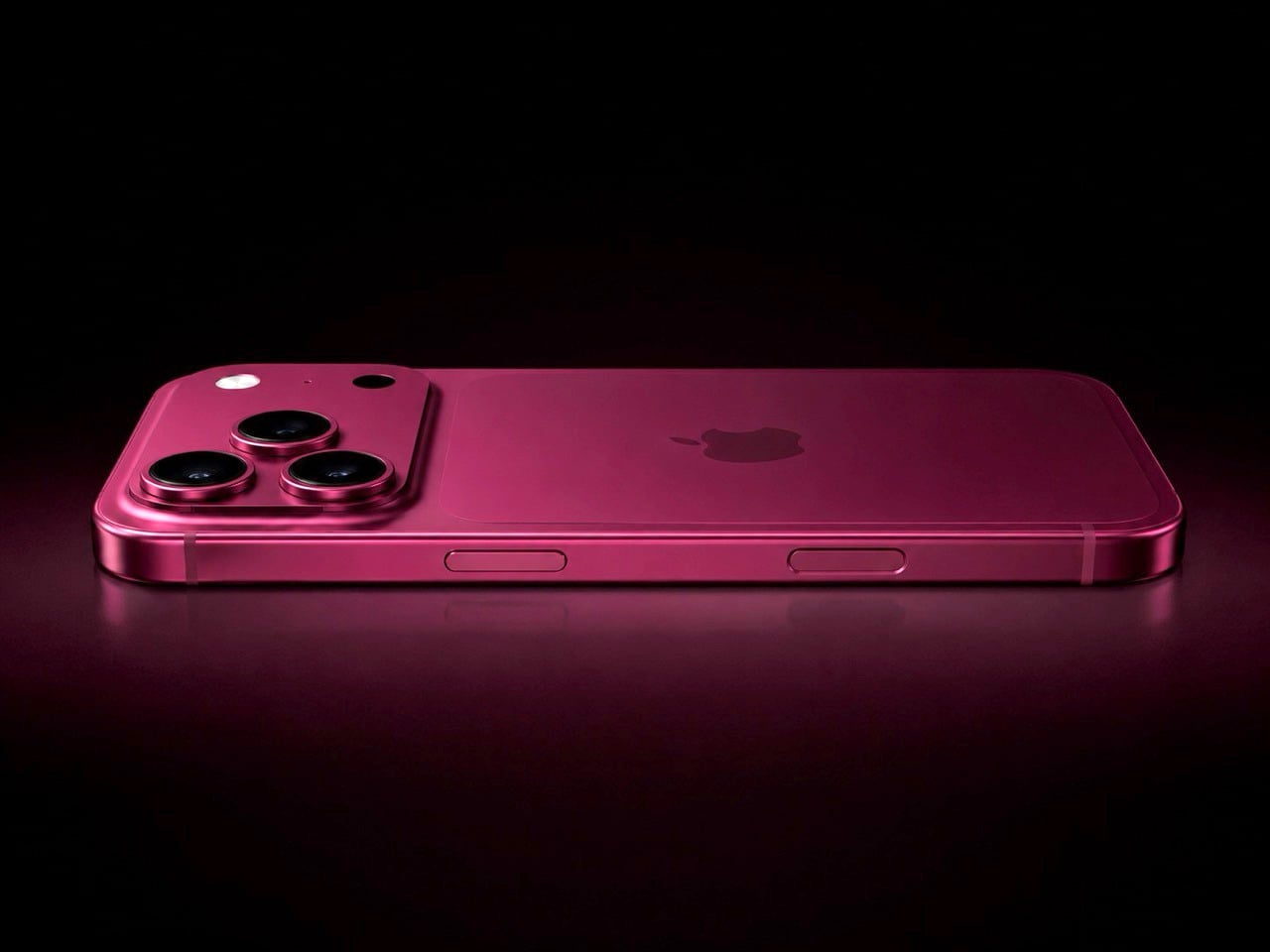
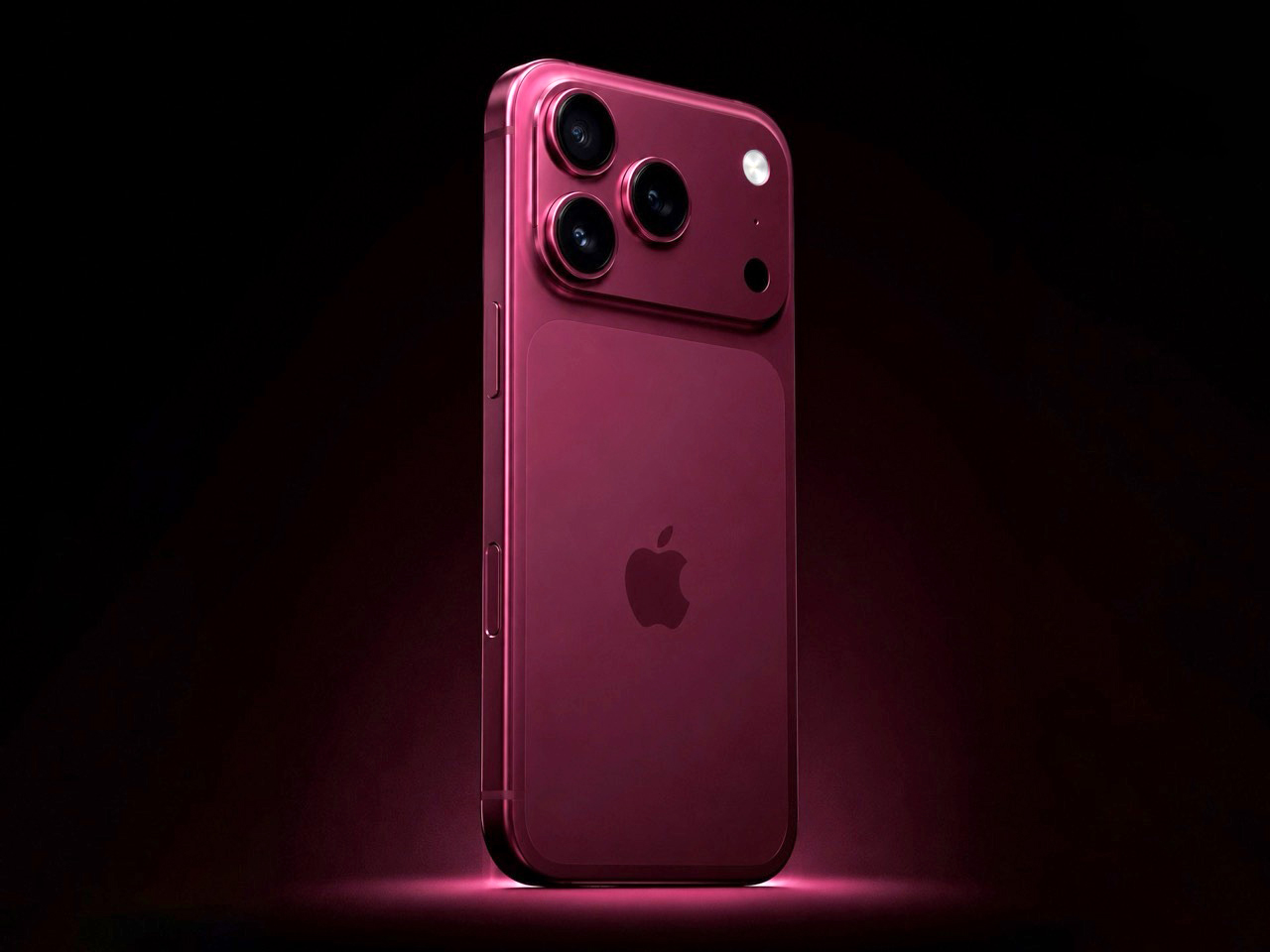
iPhone 18 Just Slipped to 2027 — Apple Splits the Launch

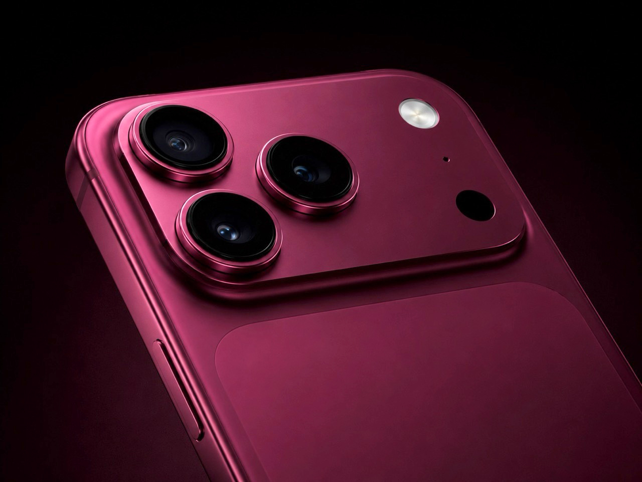
Nineteen years is a long time to run the same play. Every September, Apple walked out with the full iPhone lineup, shook the room, and watched the world queue up. That rhythm now looks set to break. The latest round of supply-chain reporting suggests Apple will split the iPhone 18 cycle in two, with the iPhone 18 Pro, Pro Max, and a first-gen foldable arriving in fall 2026, while the standard iPhone 18, iPhone 18e, and possibly a second Air model slip to spring 2027. Analyst Ming-Chi Kuo has outlined the broad two-phase roadmap, and recent reports have tied the spring delay to comments from Largan Precision chairman Tony Chen, who referenced a major U.S. customer moving one launch into early 2027.

MacRumors, PhoneArena, and Mashable have all converged around that same basic timeline, even if the reporting still traces back to the same analyst and supply-chain trail. The broad picture is consistent: Apple’s premium iPhones go first, the cheaper and higher-volume models come later. If that holds, it would mark the biggest shake-up to Apple’s iPhone calendar in years, especially for a company that has spent nearly two decades training customers to expect the full lineup in one September burst. The standard iPhone 18’s absence from that fall event would instantly become part of the reveal.

The practical explanation is easy enough to understand. A foldable iPhone adds complexity, premium models are easier to prioritize early, and Apple has increasingly used its top-end devices to debut the newest silicon, camera systems, and AI experiences. But the timing also fits Apple’s business logic almost perfectly. The Pro line delivers stronger margins, and it is also the tier best positioned to carry Apple Intelligence in its fullest form if memory, chip performance, and feature access continue to separate the lineup. A split launch gives Apple an entire holiday cycle where the newest iPhones on shelves are also the most expensive ones.

That is where the psychology starts to matter. Most people do not treat an iPhone launch like a spreadsheet exercise. They upgrade when the keynote is fresh, when trade-in offers are active, and when the new devices are physically available. In that environment, the standard iPhone 18 becomes the phone for people willing to sit out the excitement and return months later. The majority will not. They will buy what is new, visible, and available, which means the Pro line absorbs buyers who might otherwise have chosen the standard model if both had launched together.

A foldable above the Pro Max only sharpens that effect. Once Apple places a much more expensive device at the top of the ladder, the Pro starts to feel comparatively attainable. That is a powerful piece of pricing psychology, especially in a lineup where the base model is temporarily missing from the conversation. So yes, the headline is that the iPhone 18 may have slipped to 2027. The more interesting story is what that slip does for the rest of the lineup, because splitting the launch would change more than Apple’s calendar. It would change the role of the standard iPhone itself.

The post iPhone 18 Just Slipped to 2027 — Apple Splits the Launch first appeared on Yanko Design.