Somewhere between 2018 and now, the charcuterie board became the defining food aesthetic of the internet age. What started as a French butcher’s tradition evolved into a Pinterest obsession, a TikTok flex, and eventually a full-blown cultural phenomenon where the arrangement of cured meats and artisan cheeses became a legitimate form of self-expression. Food stylists built careers around it. Restaurants started charging thirty dollars for what is essentially a very pretty plate of snacks. And somewhere along the way, the humble wooden board became a canvas.
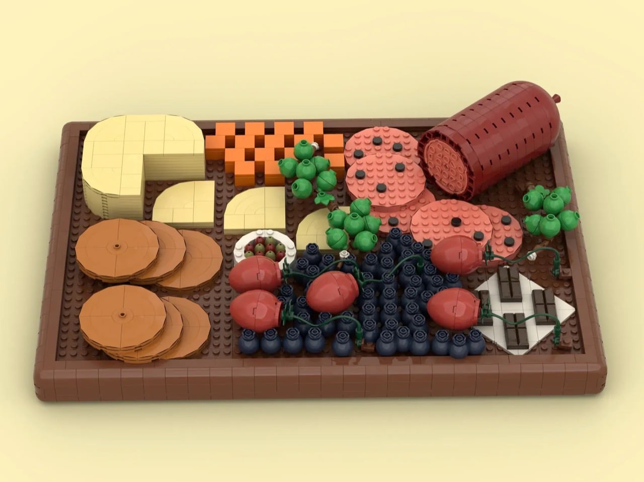
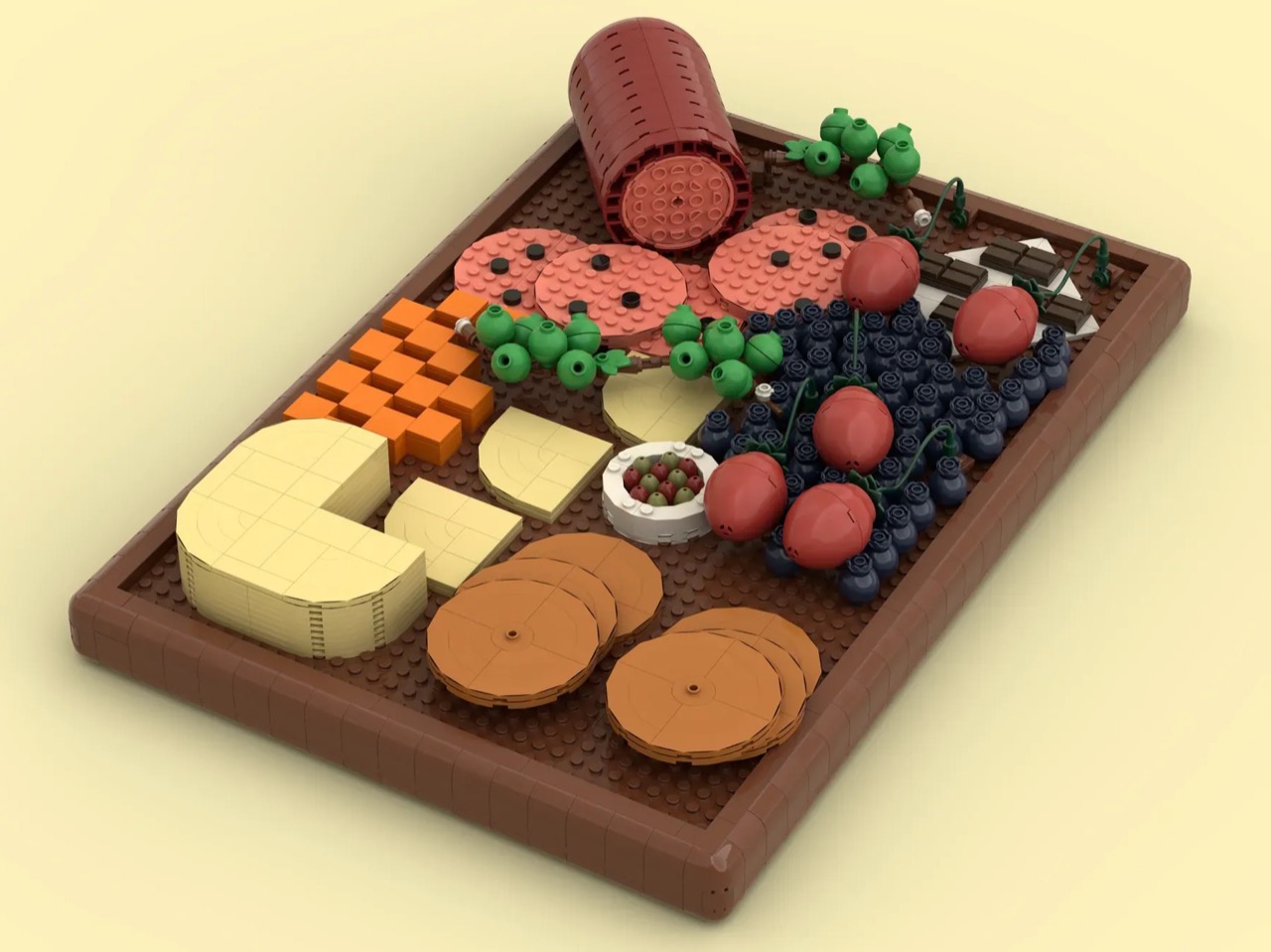
LEGO builder BiologyBuilder seems to have taken that idea completely literally. Their 1,079-piece MOC (My Own Creation) recreates a fully loaded charcuterie spread in brick form, and the results are genuinely disarming. Salami, brie, cheddar, crackers, strawberries, grapes, blueberries, olives, and dark chocolate all find their place on a rich brown board that looks ready for a dinner party you were definitely not invited to.
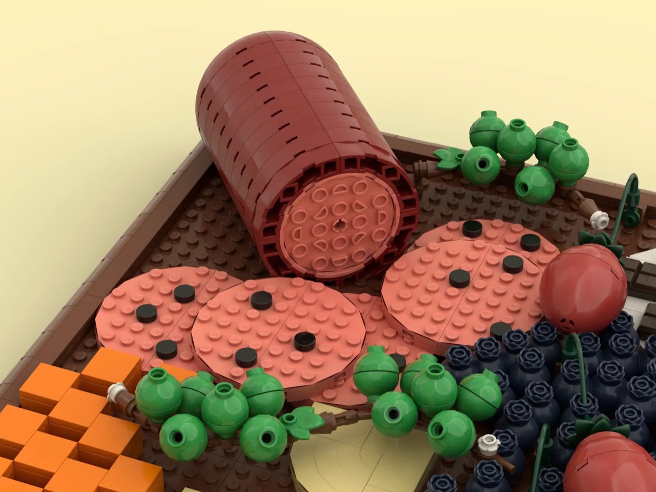
The Charcuterie LEGO board’s composition is meticulous to the point of perfection. Proteins in one corner, cheeses anchoring the middle, fruit cascading across the center, and a square of dark chocolate tucked onto a white napkin in the far corner like an afterthought that was actually planned twenty minutes in advance. The dark reddish-brown salami log, tipped casually on its side, spills into a fan of salmon-pink sliced rounds, each one dotted with tiny black round tiles standing in for peppercorns. It is immediately, almost absurdly, readable as salami. The fact that it works at all says something real about BiologyBuilder’s parts selection instincts.
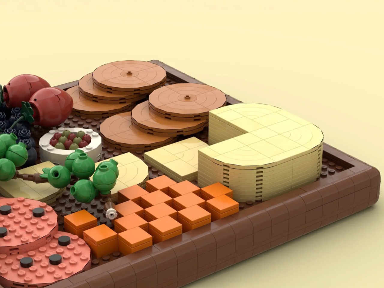
Each cheese is meticulously detailed. The brie is rendered in cream-colored round plates and tiles, with a wedge already pulled free from the wheel, which is exactly the kind of real-world detail that separates a good food build from a great one. Adjacent to it, the cheddar arrives as a stack of bright orange 2×2 bricks, loose and informal, the way cheddar cubes always look on an actual board. Two varieties, two totally different building approaches, both immediately convincing. The crackers are built from overlapping warm tan round plates, stacked in casual piles that nail the texture and color of a thin water cracker without a single flat tile out of place.
My favorite detail, though, is the olive dish sitting in the center of the board. A small white circular dish holds a mix of green and kalamata olives built from minifigure egg elements in contrasting colors. It is tiny, almost easy to miss, and entirely unnecessary in the best possible way. Nobody needed that level of commitment to the bit. BiologyBuilder did it anyway.
LEGO Ideas is the fan-driven platform where community builders submit original creations and gather votes toward the 10,000 supporter threshold required for official LEGO review. Hit that mark, and the build gets evaluated by LEGO’s internal team for potential production as a retail set. BiologyBuilder’s charcuterie board is currently in the early stages of that journey, sitting at 343 supporters with plenty of runway ahead. If you want to see this end up on a shelf alongside the other LEGO food sets that have made it through, head to the LEGO Ideas page and cast your vote here.
The youngest person at BEYOND Expo 2026’s AI Hack Day was nine years old. That little fact, shared by co-founder Dr Lu Gang, actually says more about the state of AI than any big product launch. It means the tools are getting simple enough that you don’t need a PhD to build something interesting; you just need a good idea. The rest of the expo in Macao seemed to prove his point. You had 30,000 people and almost 800 companies all focused on a single question: what happens when AI stops being just software and gets built into actual, physical things?
It turns out the answer is a mix of things we expected and some we definitely did not. BEYOND Expo 2026 ended up giving us a pretty clear map of where this is all heading, with seven key ideas showing up over and over again. We saw everything from humanoid robots that are finally ready for production to underwater drones that can get around without GPS. Some of this was easy to see coming, but other parts showed that the tech has crossed a real line. These are the ideas that give us a solid picture of an AI that now has weight, form, and real-world impact.
1. Humanoid Robots Are Finally Getting Real
The most obvious trend on the floor was the sheer number of robots walking around. This wasn’t just one or two companies showing off a flashy prototype. The BEYOND Best of Innovation awards list was packed with names like AI² Robotics, DEEPRobotics, LimX Dynamics, and Pudu Robotics. Seeing that many different companies all get recognized for building functional, legged robots at the same event is a major signal. The hardware is clearly getting to a point where it’s reliable enough to be taken seriously.
What’s interesting is that the conversation is shifting from engineering to application. Companies were talking about humanoids for specific jobs in industry, retail, and even in the home. This tells you the focus is moving past the basic challenge of just making them walk without falling over. The new problem to solve is what they should actually do all day. BEYOND Expo made it feel like we’re at the very beginning of a real manufacturing race, not just a science fair.
2. Smart Glasses Found a Form Factor That Works
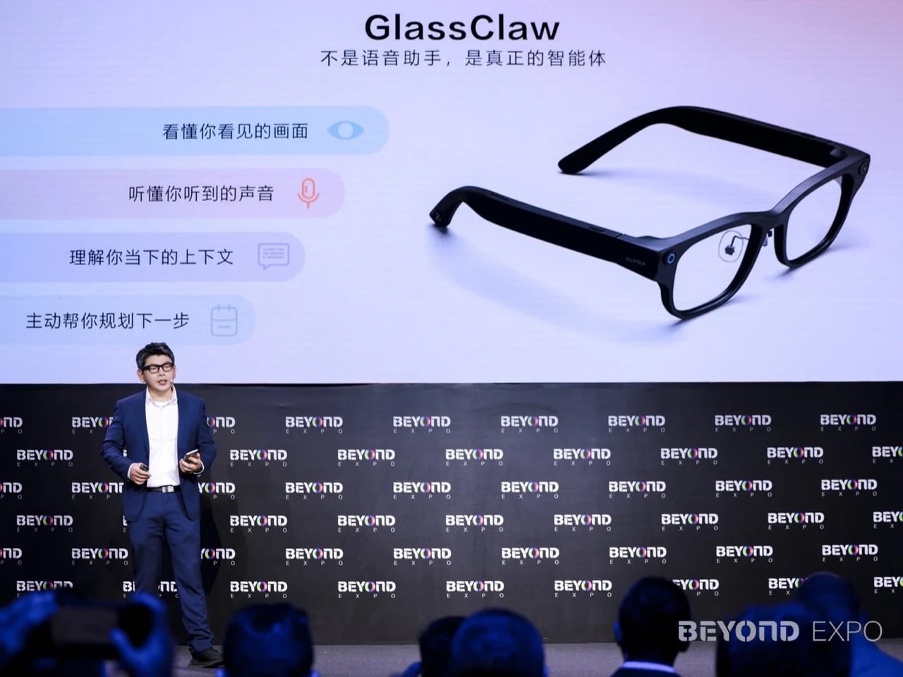
Smart glasses have been the “next big thing” for about a decade, but this year felt different. We saw new AI-powered glasses from iFlyTek and METLEN, and companies like Even Realities, Mobvoi, and XREAL all picked up innovation awards for their own takes on wearable displays. The key here is convergence. While each product has its own features, they’re all starting to look and feel like something a normal person might actually wear. They are lighter, the displays are better, and the battery life is getting there.
This isn’t another Google Glass moment where the tech was impressive but the product was awkward and socially weird. The new wave of smart glasses is being designed with more specific uses in mind, from on-the-fly translation to providing subtle notifications or acting as a personal design agent. The on-device AI is powerful enough to handle these tasks without being constantly tethered to a phone, which is the breakthrough that might finally make them stick.
3. Flying Vehicles Are Becoming Actual Products
For years, eVTOLs, or electric vertical take-off and landing aircraft, have been staples of futuristic concept videos. At BEYOND Expo, they started to look like real products. Aerofugia showed up with what it called its first production aircraft and, just as importantly, a production eVTOL battery. Wefly also got an innovation award, adding to the sense that this category is moving out of the lab and onto the launchpad.
The word “production” is what matters here. It signals a shift from speculative design to engineering with a supply chain. AI is the invisible engine driving this progress, handling the incredibly complex calculations needed for flight stability, power management, and autonomous navigation. This is the part of the “digital to physical” story where AI isn’t just a feature; it’s the core technology that makes a whole new category of hardware possible.
4. AI Is Getting Personal and Medical
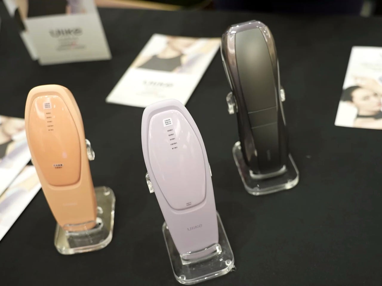
While robots and flying cars grabbed a lot of attention, some of the most interesting AI was designed to be much closer to home, and even part of the body. The expo featured things like Zdeer’s bone conduction hearing aid and Ulike’s optical beauty devices. In the startup competition, one of the finalists was an “emotion-sensitive hugging bear,” and others included smart jewelry and wearables designed to be stylish.
This points to a quieter, more intimate side of the AI hardware boom. These aren’t just gadgets; they’re devices that interact with our bodies and our health. A hearing aid that uses AI can learn and adapt to a person’s specific hearing profile in different environments. A wearable that senses emotion is a step toward technology that responds to our mental state. It’s a reminder that the most impactful physical AI might be the kind that disappears completely into our daily lives.
5. The One-Person Company Is the New Unicorn Hunt
One of the most forward-thinking ideas came from Dr Lu Gang himself. He said that this year, the expo deliberately focused on “one-person companies” and individual programmers. He believes these tiny operations have the potential to become unicorns because AI tools have become such a powerful force multiplier. When the youngest hacker at your event is nine, it proves that the barrier to entry for building something real has dropped through the floor.
This is a structural shift in how tech companies might get built. The old model of needing a big team and millions in venture capital just to get a product off the ground is being challenged. With powerful AI handling coding, design, and operational tasks, a single motivated person can now build and launch something that would have taken a whole department just a few years ago. It suggests a future where the startup landscape is much more dynamic and accessible.
6. Knowing How to Tell a Story Is a Technical Skill
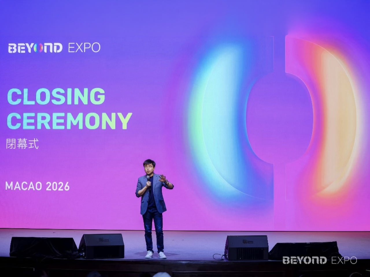
With 800 companies all showing off impressive technology, just having a good product wasn’t enough. Kun Gao, the founder of Crunchyroll, made this point at the closing ceremony. He advised founders that they have to learn how to tell a compelling story to win over investors and partners. This wasn’t just abstract advice; it was happening live at the “Fund at First Pitch” competition, where over 300 startups were trying to get noticed.
This is a crucial idea for anyone in design or product development. In a crowded market, the clarity of your vision is just as important as the quality of your code or the cleverness of your engineering. Being able to explain who your product is for, what problem it solves, and why it matters is a design skill. It’s what separates a cool piece of tech from a real business, and BEYOND Expo put that challenge front and center.
7. AI Is Going Underwater, Literally
Probably the most unexpected idea at the expo was seeing AI get good at swimming. Zero Zero Robotics, known for its flying drones, launched the HOVERAir AQUA, an underwater drone. Another company, OrcaTech, also won an innovation award for its marine technology. This might seem like a niche category, but the technical challenge is enormous and says a lot about how capable AI has become.
Underwater is one of the hardest environments for autonomous tech to operate in. GPS doesn’t work, visibility is often terrible, and communication is extremely limited. For a drone to navigate, identify objects, and perform tasks on its own down there, its onboard AI has to be incredibly sophisticated. It proves that physical AI is not just conquering our cities and skies; it’s expanding into the most remote and difficult parts of our world.
There is a different kind of that happens in late June. Your feed fills with gear photographed in good light, linked before the image has finished loading, and gone from stock by the time you circle back. Some of it is noise. Some of it quietly solves a problem you have been working around for years without naming it. The ten products here belong to the second category, and every one of them is genuinely worth the attention.
They cover the full arc of a summer day, from the first outdoor coffee to the last photograph before the light drops. Not one of them asks you to sacrifice design quality for function, or function for form. These are the products that spread because they earn it, objects that change something specific about the next few months. Whether you find three of them or all ten, your summer bag has room for the upgrade.
1. Camera (1)
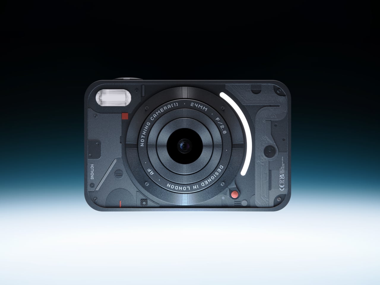
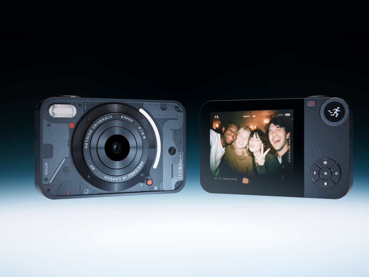
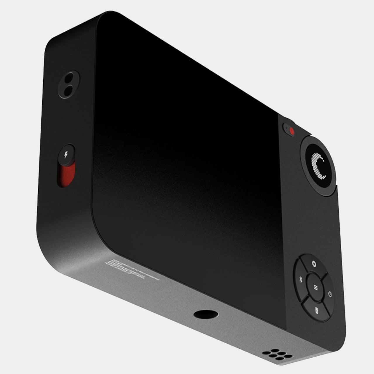
Most photographs live inside phones now, buried between notifications, grouped by algorithm, and rarely looked at twice. A growing number of people have started picking up older digital cameras to make shooting feel like a separate, deliberate act. Camera (1) is a concept design by Rishikesh Puthukudy that explores what a modern compact could feel like if built around physical controls and tactile feedback rather than software layers and touchscreen menus. All main controls sit on one edge, placing the shutter, a mode dial with a small glyph display, and a D-pad within reach of thumb and index finger without shifting grip or touching a screen.
The concept draws its design language from Nothing’s transparent, hardware-forward aesthetic. A curved light strip around the lens pulses during the self-timer, confirms focus lock, and signals when video is being recorded. The engraved lens ring, marked with focal length and aperture, turns zoom and focus into a physical twist rather than a digital pinch. A bead-blasted metal shell, circuit-like relief panel, and small red accents give it a technical, considered character.
What We Like
Physical edge controls and glyph-based mode dial put the entire interaction in the hand rather than on a screen, which is exactly what compact camera design has been missing
Bead-blasted metal body and red accent details communicate material intent and quality without relying on branding
What We Dislike
A concept with no confirmed production path means you are left admiring the idea rather than buying the object
The design draws heavily from Nothing’s visual language, which will feel derivative to those who follow that brand closely
2. Shark ChillPill
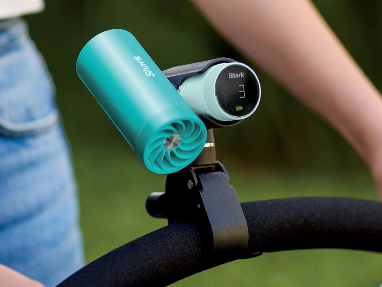
Most personal cooling devices ask you to make a simple trade: accept bulk, noise, or mediocre performance in exchange for staying cool. The Shark ChillPill declines the trade. Its three-function body is compact enough to clip to a bag strap, a wristlet, or a stroller bar, and each mode does something genuinely distinct. A bladeless fan with ten adjustable speed settings delivers steady airflow at up to 25 feet per second. An evaporative mist system produces what SharkNinja calls a dry-touch effect, refreshing skin without the soaked-fabric sensation most spray fans leave behind.
The third function sets it apart. The InstaChill cooling plate, a cryo-inspired metal surface, reduces skin temperature by up to 16 degrees Fahrenheit within seconds when pressed against a pulse point on the neck or wrist. Battery life reaches eleven hours on the lowest fan setting, with USB-C charging returning it to full in roughly three and a half hours. Priced at $149.99 and available in seven colorways including Glacier, Matcha, and Rose Gold, it is the rare piece of personal tech that adapts to the activity rather than defining it.
What We Like
Three distinct cooling modes in one portable body that clips, sits, or wears across any outdoor context
Eleven-hour battery on low covers a full outdoor day without any recharging anxiety
What We Dislike
Maximum fan output reduces runtime to around ninety minutes, requiring some planning on longer days
The premium price over single-function portable fans requires commitment before knowing how much all three modes get used
3. All-in-One Grill
Outdoor cooking has always had a logistics problem. Bring a single-function grill and eat variations of the same thing all weekend. Haul a full kit and spend the first hour on setup rather than cooking. The All-in-One Grill, made by a small family-owned Japanese factory specializing in sheet metal fabrication, takes a third position. Interchangeable cooking modules cover barbecuing, frying, grilling, steaming, smoking, and stew cooking from a single portable tabletop base designed to maximize limited space without dominating any camp table it lands on.
A dedicated upright module warms bottles directly, mulled wine included, a specific practical detail that most outdoor cooking systems treat as someone else’s problem. The modular construction that makes it versatile also simplifies cleanup: each component can be handled independently rather than breaking the whole unit down at once. One device handles what most setups need four for, and it packs into a footprint that leaves room for everything else.
Six cooking methods from one portable base without multiple fuel sources or separate devices
Dedicated bottle-warming module covers a specific outdoor ritual that most cooking systems overlook entirely
What We Dislike
Modular systems accumulate small components that are easy to misplace in the field
Tabletop-only design limits cooking capacity for groups larger than four or five people
4. DraftPro Top Can Opener
Drinking from a can is convenient. Actually tasting what is inside it requires something better. Designed by award-winning Japanese designer Shu Kanno and built in Japan, the DraftPro Top Can Opener removes the entire lid of a standard can to create a wide-mouth, glass-like opening that changes the experience immediately. The aroma lifts the moment the top comes off. The first sip feels more direct, more open, more intentional. A smooth-edged finish removes the safety concern that has historically made full-removal openers feel like a rough trade rather than an upgrade.
The function extends well past beer. With the top removed, ice drops in directly. A mixer or citrus can be added without needing a separate cup. The can itself becomes a cocktail vessel that requires no additional tools. It works with domestic and international can sizes, making it as useful at a campsite abroad as in a backyard.
Full top removal releases aroma and creates a draft-style drinking experience that a standard can opening physically cannot deliver
The can-as-vessel format allows ice, mixers, and garnishes without reaching for additional cups or shakers
What We Dislike
Single-function design earns its place only if canned drinks appear regularly in your outdoor routine
No published specification for how the cutting mechanism holds up across extended use over time
5. TMB: The Modular Bottle
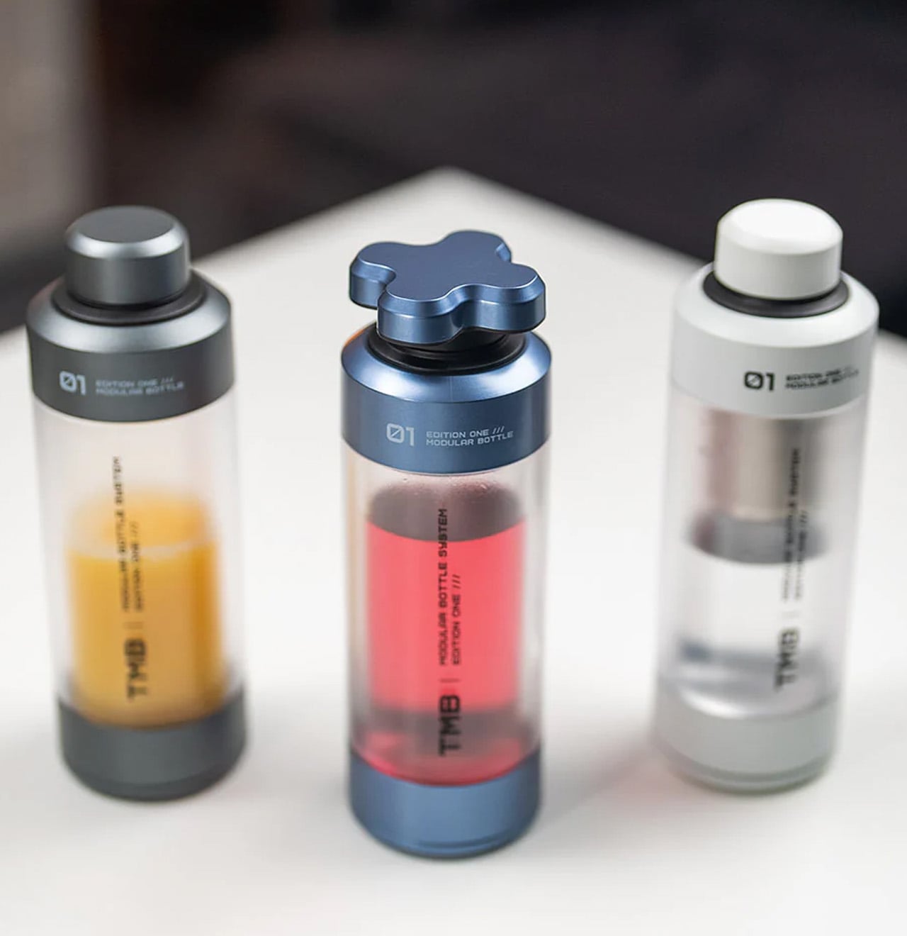
Most bottles make one implicit promise: hold liquid without leaking. The TMB Modular Bottle starts from that baseline and keeps going. The borosilicate glass interior keeps every drink tasting like itself rather than the container, a material property that separates it decisively from the steel and plastic alternatives dominating this category. A translucent mid-section gives a real-time view of remaining liquid without removing the lid. Modular tops include a tea infuser, a shaker ball, and interchangeable caps, shifting configuration based on what the day or activity requires.
A built-in secret compartment handles small EDC items, supplements, or snack portions. The glass interior cleans thoroughly without the residual odor buildup that makes most reusable bottles unpleasant after weeks of regular use. For summer travel, the modularity earns its weight because the same bottle that starts a morning with loose-leaf tea covers an afternoon of plain water and an evening cocktail shaker setup without adding anything else to the bag.
What We Like
Borosilicate glass interior preserves drink flavor without absorbing taste or odor regardless of what you put in it
Modular tops cover tea brewing, protein shaking, and standard hydration from a single body without any additional vessels
What We Dislike
Glass interior carries more breakage risk than steel alternatives under rough outdoor handling or travel
Modular assembly adds cleaning complexity compared to a straightforward single-piece bottle
6. MokaMax
The campsite coffee situation has always been a negotiation between quality and effort. Every solution asks you to accept some version of the compromise: gritty grounds, a cold mug, a disposable capsule, a second bag of kit. The MokaMax resolves it by integrating a full pressure brewer into a ridged stainless steel travel mug, delivering espresso-style coffee in under three minutes using boiling water from any source. The brewer, the vessel, and the lid, which doubles as a cup, are a single sealed system with no loose components to lose between campsites or cities.
At 400 grams fully loaded, it fits in the front pocket of most travel backpacks and carries nothing superfluous. The ridged stainless exterior gives it a visual identity distinct from every other travel mug on a shelf, communicating outdoor utility without the rubberized bulk that most portable coffee gear defaults to. For summer mornings at a campsite, a hotel room in a new city, or a long train ride through somewhere worth paying attention to, the MokaMax handles the coffee ritual with equipment that fits the occasion without requiring a word of explanation.
What We Like
Pressure brewer and carrying vessel integrated into one sealed body means no separate components and no compromises across a summer of movement
Ridged stainless form integrates visually with quality outdoor gear rather than looking out of place beside it
What We Dislike
Cleaning the pressure chamber thoroughly on the road requires a sink and a few uninterrupted minutes that travel rarely provides on schedule
Espresso-style output will not satisfy those who prefer larger-volume filter coffee while camping or traveling
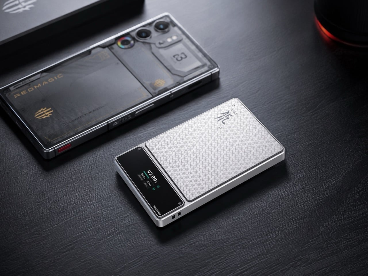
7. RedMagic Deuterium Power Card Pro
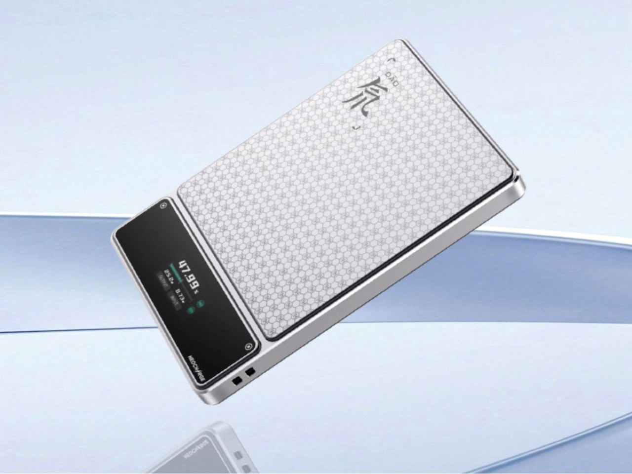
Aviation rules around lithium batteries keep tightening, and most power bank manufacturers have responded by adding a line to the FAQ. RedMagic responded by adding a dedicated hardware button to the device. The Deuterium Power Card Pro includes a one-touch flight mode that cuts wireless transmission immediately at the press of a single control, addressing the airline regulations that have turned gate-side power bank checks into a genuine inconvenience. The H21 honeycomb pattern engraved into the anodized aerospace aluminum body gives it a texture that reads as premium hardware rather than commodity carry gear.
A 25W wireless charging pad and 45W wired output handle most modern smartphones at full speed. An AI-assisted thermal management system monitors a five-layer heat dissipation stack in real time, keeping surface temperatures controlled during wireless charging where cheaper alternatives tend to run noticeably warm. A rectangular status display shows exact battery percentage rather than the single LED indicator dot that most power banks still ship with. Available in 5,000 and 10,000 mAh configurations, with pricing and a confirmed release date still pending at the time of publishing.
What We Like
One-touch flight mode solves the airline power bank regulation problem that every other manufacturer currently treats as the passenger’s responsibility
Rectangular display showing exact battery percentage is a small but genuinely useful upgrade over the LED dots most competitors use
What We Dislike
Pricing and release date remain unconfirmed, making it the most compelling item on this list that cannot yet be added to a cart
The RedMagic brand identity is built around gaming hardware, which may feel tonally mismatched for travelers whose gear skews toward neutral aesthetics
8. Benro Theta Tripod
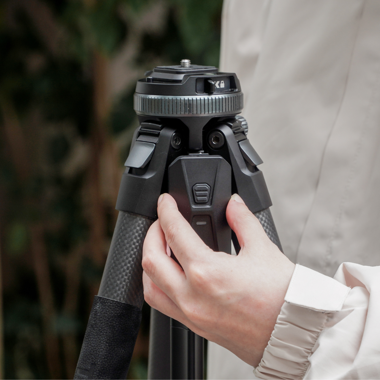
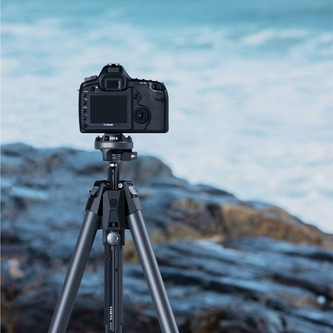
A level horizon used to be a manual discipline. You twisted the head, watched a bubble, made small corrections, twisted again, repeated. The Benro Theta removes that entire sequence with a motorized auto-leveling system that reads the surface, adjusts the head, and confirms the camera is plumb before you look through the viewfinder. Benro positions it as the world’s first smart modular travel tripod, and the auto-leveling claim holds, particularly for photographers who regularly set up on uneven terrain and have run out of patience for repeating the process twice every time.
The body weighs 331 grams and runs on a 2500 mAh battery that delivers up to three hours of motorized operation. Arca standard compatibility keeps it immediately compatible with existing head and plate systems without requiring new accessories to bridge the gap. The modular construction adapts the Theta across shooting configurations without needing a separate travel head. For the summer photographer who sets up quickly and moves rather than spending the golden hour leveling equipment, the auto-leveling feature alone covers the cost of the upgrade. Available from Benro directly at benrousa.com.
What We Like
Motorized auto-leveling removes the most time-consuming manual step in tripod setup, especially on uneven outdoor terrain
Arca standard compatibility integrates immediately with existing accessories without requiring additional purchase
What We Dislike
Three-hour battery means extended shooting sessions require either a recharge mid-day or a backup power source
Premium construction and motorized system place it above conventional travel tripods at the same weight class
9. Battery-Free Amplifying iSpeakers
The pitch is simple enough to sound too good: set your phone in the slot, and Duralumin, the aircraft-grade aluminum alloy used in aerospace construction, does the amplification. No Bluetooth pairing. No battery charging. No setup at all. The metal body channels and amplifies your phone’s speaker output through material physics rather than electronics, adding warmth and volume with zero power draw. Golden ratio proportions give it a visual presence that reads as a considered object on a surface, not another piece of audio hardware waiting to be plugged in.
For summer specifically, the always-ready quality matters in a way that becomes obvious the first time you do not have to think about it. There is no battery level to check before heading outside, no cable to remember, no update that delays the morning. Set the phone in and music plays. Optional Bloom and Jet modular accessories let you direct the sound output if the environment calls for more control.
No battery, no power, and no setup required means it is always immediately ready without any preparation
Aircraft-grade Duralumin construction shaped to golden ratio proportions is a genuine material and design achievement at any price
What We Dislike
Amplification quality depends entirely on the phone’s own built-in speaker, so the result varies significantly by device
Sound-directing modular accessories are sold separately at additional cost
10. Canon Gimbal Camera
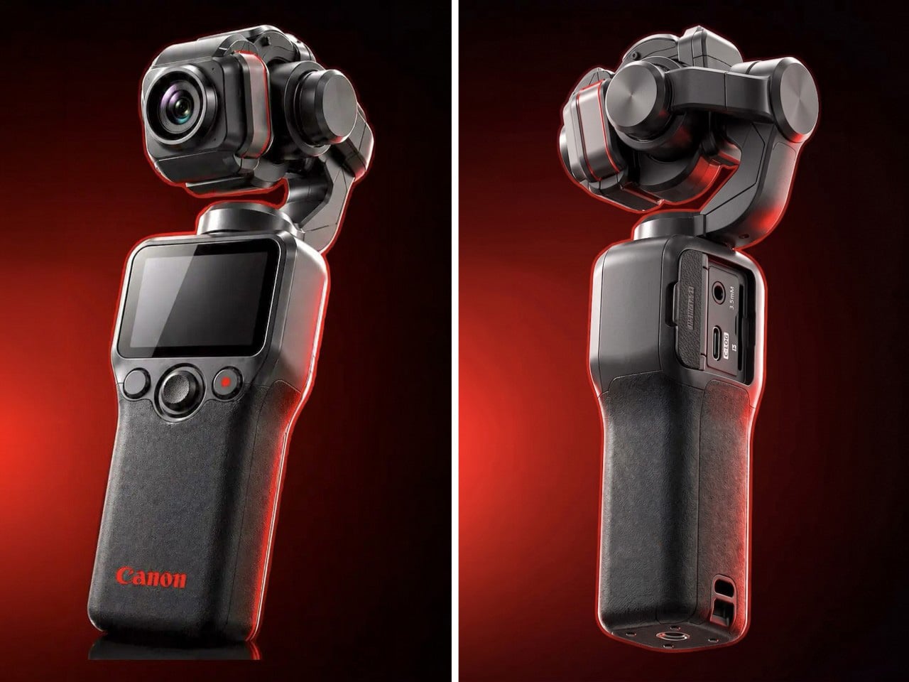
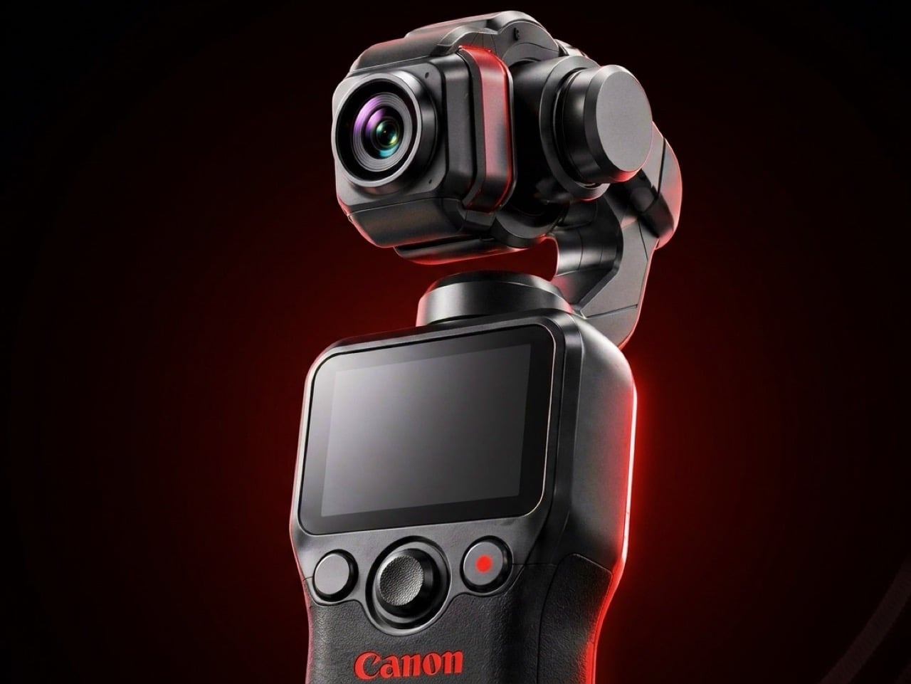
Canon has filed three gimbal camera patents since 2021, each one more practically minded than the last. The April 2026 filing describes a compact handheld body with a fixed lens, three-axis stabilization, a grip-mounted screen, and a folding mechanism that guides the gimbal head into a safe resting position before cutting motor power. That shutdown sequence is the engineering detail most readers will pass over, and the one that signals the most serious product thinking. Mechanical wear from limp-motor shutdowns is the quiet failure mode that causes cameras in this category to age faster than their owners expect.
DJI launched the Osmo Pocket 4 in April 2026 with a 1-inch sensor and 4K at 240fps. Insta360 followed closely. Canon is entering the category with five years of increasingly precise engineering, a fixed-lens form factor that prioritizes portability over interchangeable versatility, and a color science reputation that outdoor and travel shooting consistently validates. No release date has been confirmed and no pricing announced. Based on the patent arc from 2021 through 2026, this reads like a company that has done the homework carefully and is nearly ready to deliver.
What We Like
Smart folding shutdown mechanism addresses a real mechanical failure point that the rest of the pocket gimbal category has consistently ignored
Five-year patent arc spanning increasingly specific engineering detail signals a product shaped by sustained development rather than a reactive market response
What We Dislike
Remains a patent with no confirmed launch date or price, making it the most compelling item on this list and still out of reach
Canon’s track record in premium compact formats suggests a launch price that will require serious consideration before committing
The Right Gear Stays in the Bag Past August
Summer tends to reveal what gear actually holds up. The items that stay in the bag past August are the ones that solve something specific without creating new problems to manage. Not every product on this list is purchasable today. The Canon Gimbal and Camera (1) both exist in the space between a promise and a product. The RedMagic Power Card Pro is close. Everything else is available now and worth the decision.
The best summer kit is not the most comprehensive one. It is the one built around the things you actually reach for. Three of these will make more difference than ten purchased out of obligation. Pick the gaps your current setup has never filled properly, and start there. Everything on this list was designed by someone who looked at a specific problem and decided it deserved a real answer. Summer is a good time to find out which answers fit yours.
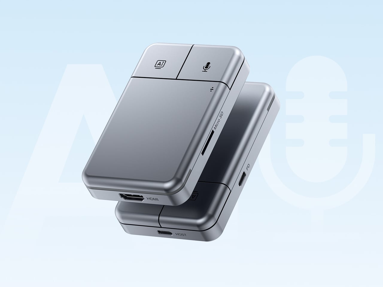
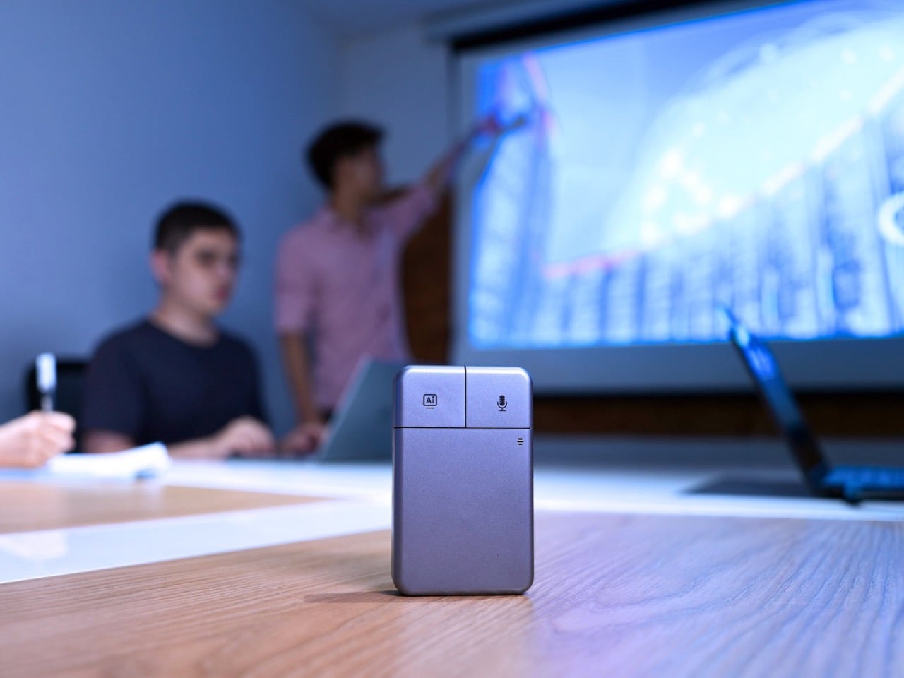
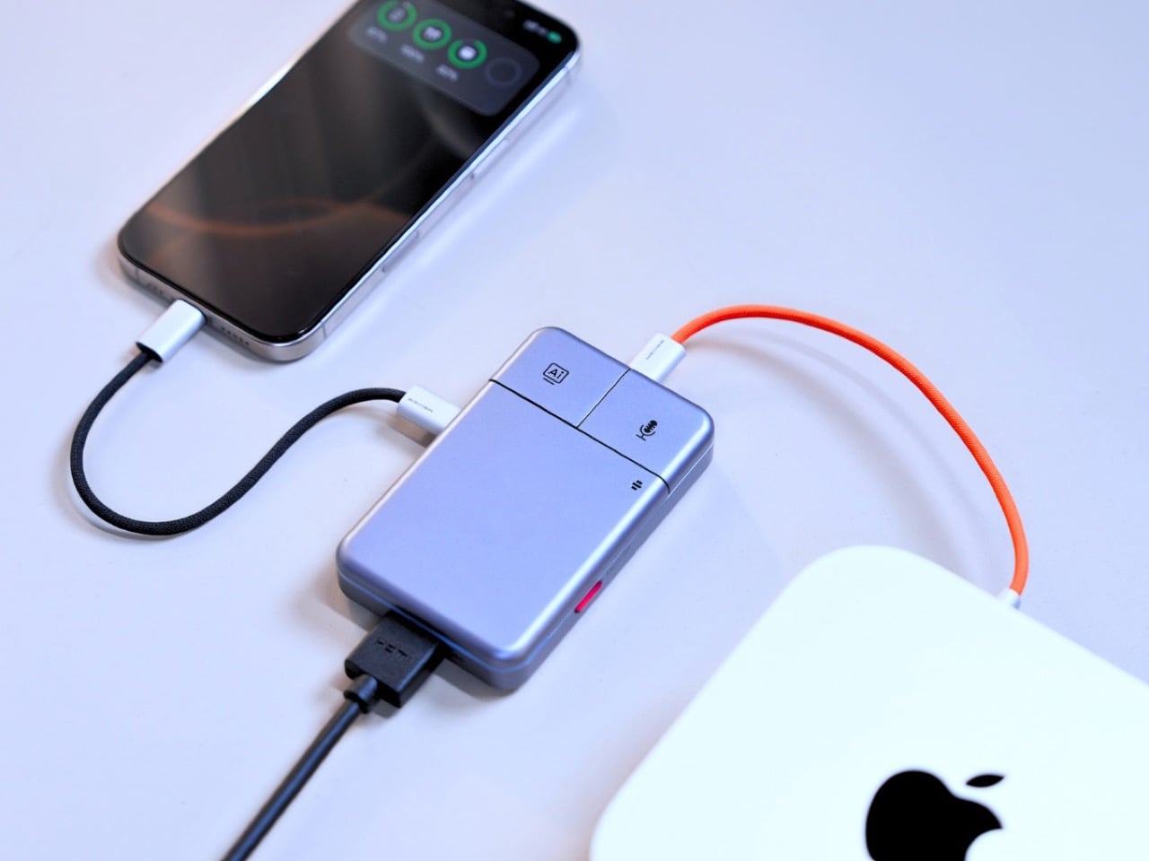
Put the DockOrb A1 on a conference table without context and someone will reach for it expecting a scroll wheel. The gray brushed-aluminum slab, the gently rounded corners, and two physical buttons in familiar left-right symmetry on the top face read entirely as peripheral hardware. What the device actually does is listen, think, and report. Powered by OpenAI GPT-5, Google Gemini 2.5 Pro, and Anthropic Claude Sonnet 4, DockOrb A1 is a professional AI meeting and desktop assistant. The label on the box says meeting assistant; the object in the hand says otherwise.
The category it operates in has been filling up quickly. Plaud built a card-thin wearable that magnetically clips to your phone. HiDock shaped a USB-C hub into a ChatGPT-powered meeting stenographer, and we covered that launch here at YD. DockOrb’s A1 lands somewhere between those two worlds, combining a fully functional multiport dock with a multi-model AI engine, 100W PD, and 4K@60Hz HDMI output. Unlike either of those predecessors, it handles display output and power delivery in the same housing, making the desk real estate argument for a single device considerably more loaded.
The mouse silhouette is instantly familiar, and anyone who’s ever used a computer will be able to navigate the DockOrb intuitively. Two buttons arranged horizontally on a flat top surface is the correct solution for a device that needs to be operated with a single press in a meeting context, no fumbling, no menus, no distraction. With a dedicated AI button and real-time processing, DockOrb A1 analyzes ongoing discussions and provides actionable suggestions and insights, helping teams improve collaboration and make decisions more efficiently without interrupting the meeting flow. LED status is handled by a single indicator, white for idle and blue for active capture, readable from across a conference table without breaking eye contact with whoever is speaking. The problem is that all of this correct ergonomic logic is housed inside a form that the product world has spent two decades teaching people to recognize as a pointing device.
Rather than anchoring to a single AI model, the A1 integrates with Esteno, an advanced AI fusion-processing software platform. Esteno integrates multiple advanced AI models, including OpenAI GPT-5, Google Gemini 2.5 Pro, and Anthropic Claude Sonnet 4. Each model is optimized for tasks such as speech-to-text, summarization, contextual reasoning, and insight generation. By intelligently routing tasks to the most suitable model, the system delivers efficient, flexible, and high-quality meeting intelligence across different use cases. That architectural approach is genuinely unusual in this category, where most competitors commit to a single backbone and build their entire brand identity around it.
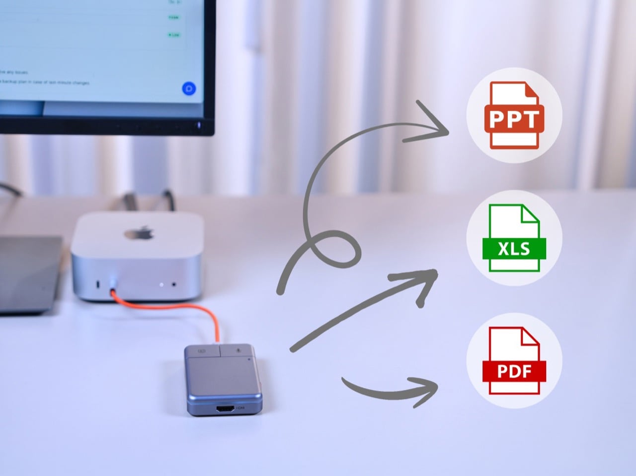
Plaud’s card-thin approach to meeting intelligence, at 2.9mm thick and MagSafe-compatible, is built on the premise that the recorder travels everywhere with you, riding on the back of your phone. The A1 has no such intention, operating through USB power without a built-in battery, with a compact design, dedicated recording button, and AI activation key for stable and simple meeting operation. In exchange for that fixed-desk commitment, it handles 4K video output at 60Hz over HDMI and 100W power delivery over USB-C, turning the dock into the single device your entire workstation routes through. After transcription and analysis, DockOrb A1 automatically generates structured meeting reports highlighting key decisions, action items, and follow-up tasks, which can be exported directly in PDF, Excel, or PowerPoint formats. Getting a properly formatted, structured report out of a recorded conversation without manual reformatting is a genuine subtraction from the post-meeting to-do list, and it’s the kind of output that separates a real workflow tool from a novelty recorder.
Following ISO and SOC data protection standards, DockOrb A1 secures recorded audio and AI-generated content through encrypted storage and processing, allowing users to export, archive, or delete files at any time while ensuring full control over their data. That’s pointed positioning in a market where corporate IT departments are increasingly skeptical about meeting audio being routed through third-party AI servers without accountability. Recordings, transcripts, summaries, and reports from multiple meetings can be stored and organized within a centralized memory archive, with AI-powered indexing and searchable meeting names, content, or dates, so teams can quickly retrieve past discussions, track long-term decisions, and build a continuously growing knowledge base. Built on a platform-independent architecture, DockOrb A1 processes audio from Zoom, Teams, Google Meet, mobile devices, and more, delivering consistent transcription, analysis, and structured outputs. Retrieving a specific discussion from three months prior becomes a search query rather than a manual scroll through unlabeled audio files.
The Kickstarter campaign prices the A1 at $89 for the Super Early Bird tier against an MSRP of $149. Shipping is targeted for August 2026, with production beginning the month prior. Plaud’s Note Pro retails at $169 on the market and handles no dock hardware whatsoever, making the A1’s value calculation sharper for anyone already planning to put a USB-C hub on their desk. The Esteno software platform tiers at $8 per month for Basic, covering 600 minutes of monthly transcription, and $15 per month for Pro, which adds 2,400 minutes, unlimited AI features, and priority processing. That’s a fully loaded meeting intelligence setup, dock and display output included, for a first-year cost that lands well under what most enterprise-grade transcription tools charge for software alone.
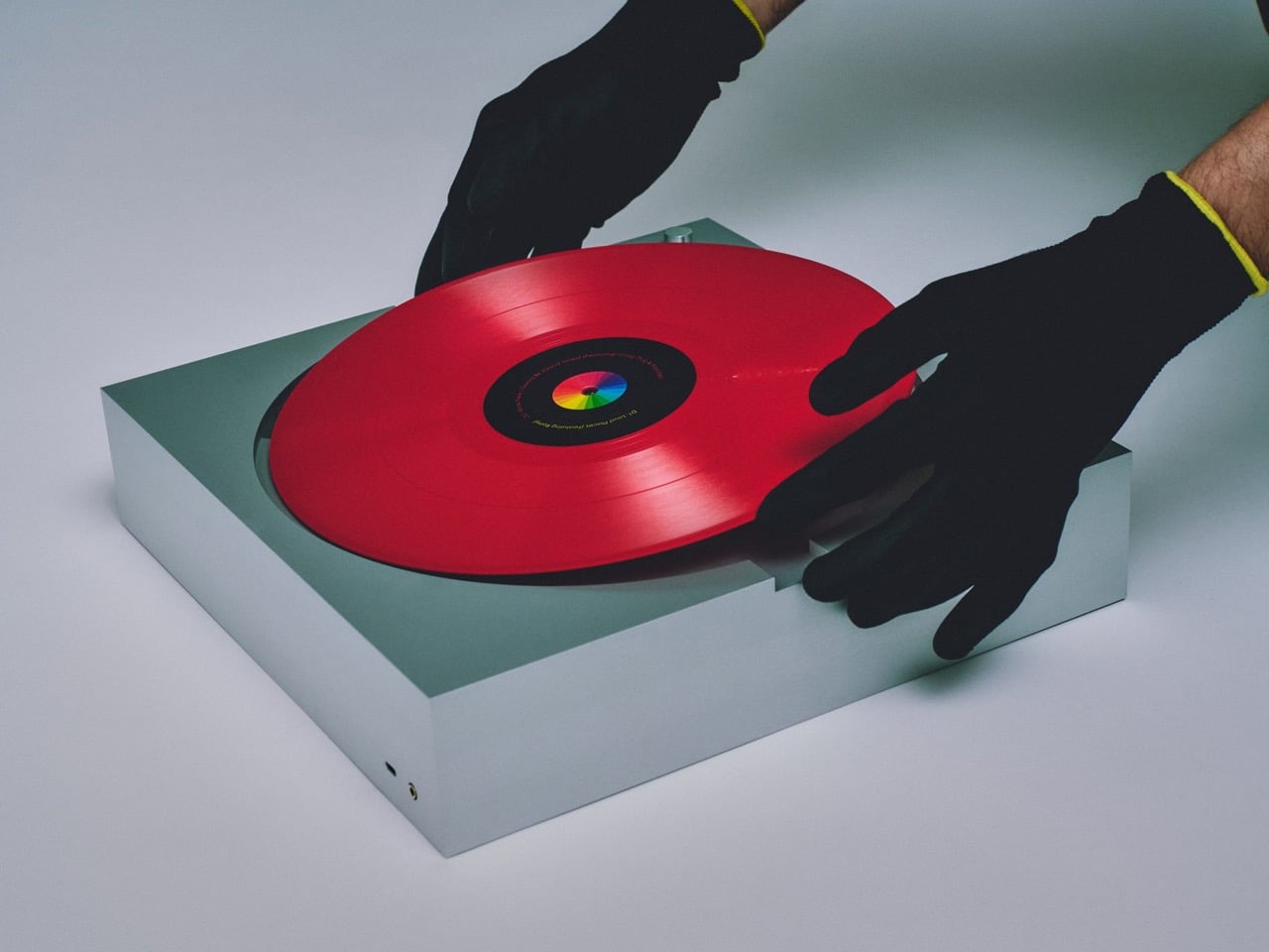
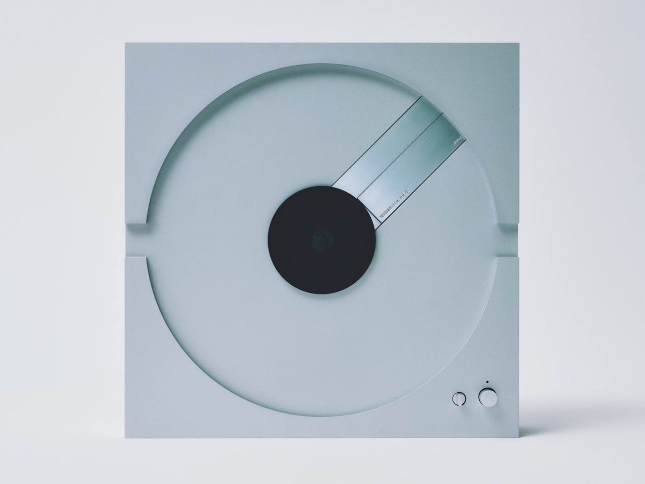
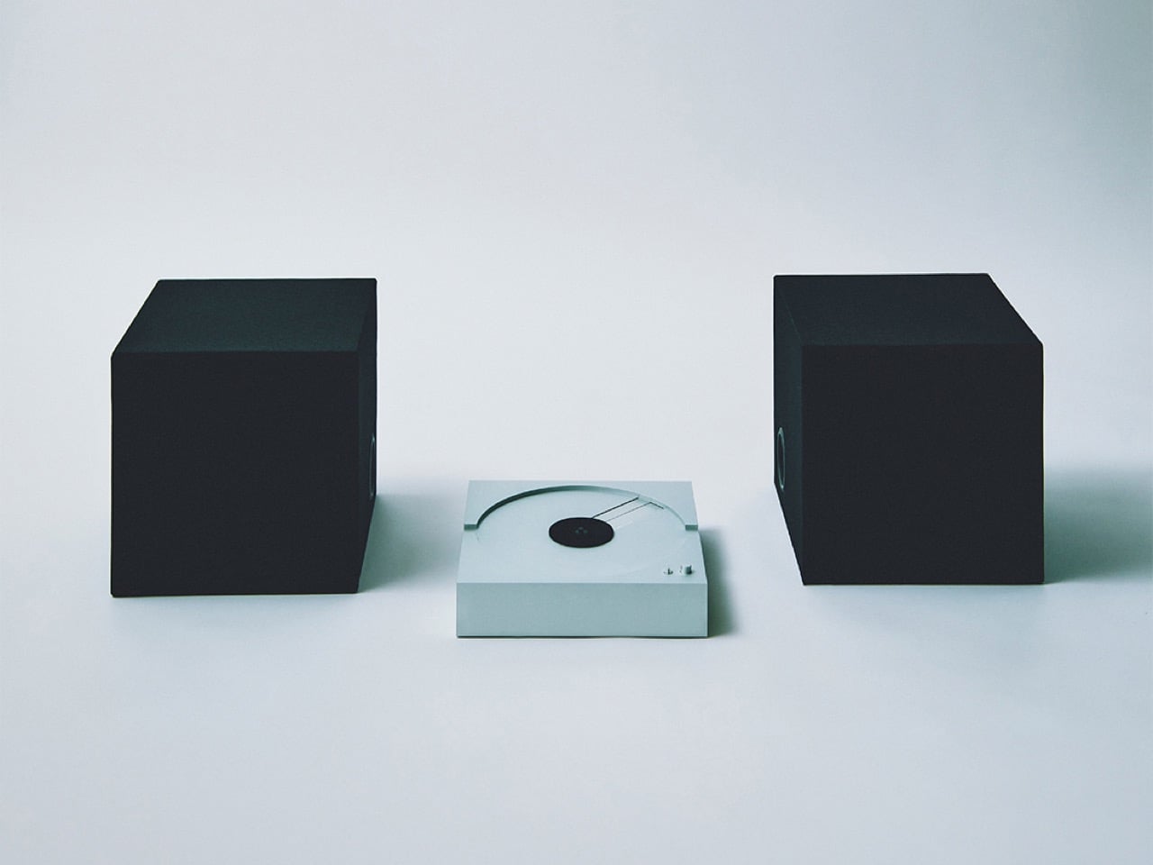
For something built to play vinyl, the PP-1 barely behaves like a turntable at all. There’s no tonearm visually staking its claim across the platter, no exposed hardware reminding you this is an analog ritual machine. Instead, it looks like someone took the clean, self-contained logic of a CD player, scaled it up to 12-inch proportions, and cut a perfect circle into a block of aluminum. The result feels less like retro audio gear and more like a playback object from a timeline where physical media never split into “old” and “new.”
That is what makes the PP-1 so compelling from a design standpoint. Most modern record players still rely on nostalgia, warm wood finishes, visible mechanics, and a kind of ceremonial analog theater. This one strips all of that away and replaces it with something colder, flatter, and far more architectural. The record becomes the only familiar visual cue, while the machine itself recedes into a monolithic slab that feels closer to a giant CD deck than a classic turntable. Instead of celebrating vinyl as a vintage artifact, the PP-1 imagines what the format might have looked like if it had evolved with the same minimalist confidence as the best consumer electronics.
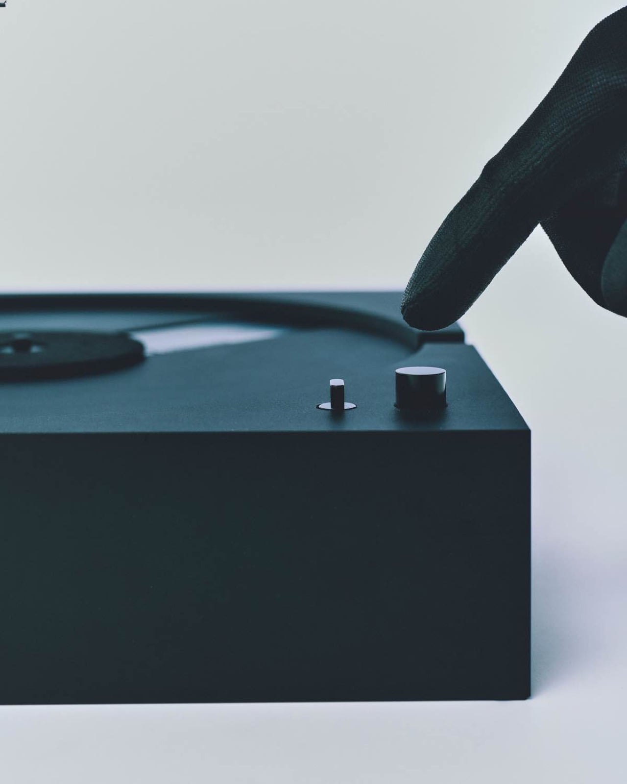
The record goes in upside down, and from there the PP-1 takes over entirely. A reading mechanism built into the platter operates from beneath the vinyl surface rather than above it, which is how the tonearm vanishes without taking the music with it. A built-in sensor automatically detects whether the record spins at 33 or 45 RPM and adjusts accordingly, eliminating the last manual decision from the process. An integrated phono preamp and headphone amplifier live inside the body, so headphone listening requires nothing additional. The interaction reduces to its absolute minimum: place the record, press one of two small buttons on the face, and listen.
The body itself is milled from a solid block of aluminum, not pressed or assembled from parts, which gives the PP-1 a physical density that conventionally built decks cannot replicate. That mass serves a genuine acoustic purpose, as solid aluminum controls resonance and vibration more effectively than the hollowed wood plinths that most turntables rely on. The PP-1 can also stand and play upright, the record spinning horizontally against a vertical body, and Waiting For Ideas leans into this configuration in their product photography for obvious reasons. In that orientation, the turntable sheds the last visual connection to hi-fi equipment. It looks like a wall piece, a square of brushed metal with a circle cut into it.
Most of the vinyl revival has traded on nostalgia, warm wood finishes, visible cartridges, and retro typography that signals the ritual of analog listening as much as the listening itself. The PP-1 belongs to a different tradition entirely, closer to the restrained, function-forward product language of Dieter Rams at Braun and Bang & Olufsen at its mid-century peak, where the object earns its presence through formal clarity rather than decorative signaling. It launches at €5,800 (roughly $6,050), made to order, placing it in genuine high-end turntable territory alongside decks from Rega, Pro-Ject, and Clearaudio, all of which look considerably more conventional by comparison. Whether audiophiles make peace with the tonearm-free setup is a legitimate debate. The design argument the PP-1 makes is considerably harder to dismiss.
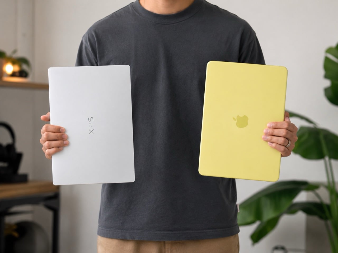
When Apple priced the MacBook Neo at $599 earlier this year, the reaction from the Windows side of the industry was roughly equivalent to a student showing up to a spelling bee having never studied. Manufacturers who had been selling mediocre plastic laptops at $700 and $800 suddenly had a very visible, very beautiful problem: a computer with premium aluminum construction, Apple Silicon efficiency, and a brand name that makes people line up outside stores, available for less than most of them were charging for hardware that couldn’t compete on any meaningful dimension. The demand that followed was so staggering that, as we covered recently, Tim Cook himself admitted Apple fundamentally misjudged how many people were waiting for exactly this moment, with production targets doubling and shipping estimates stretching to weeks. The scramble across the Windows world was predictable in direction if not in execution. What nobody quite predicted was that Dell, of all companies, would be the first to show up with a credible answer, and that it would look this good.
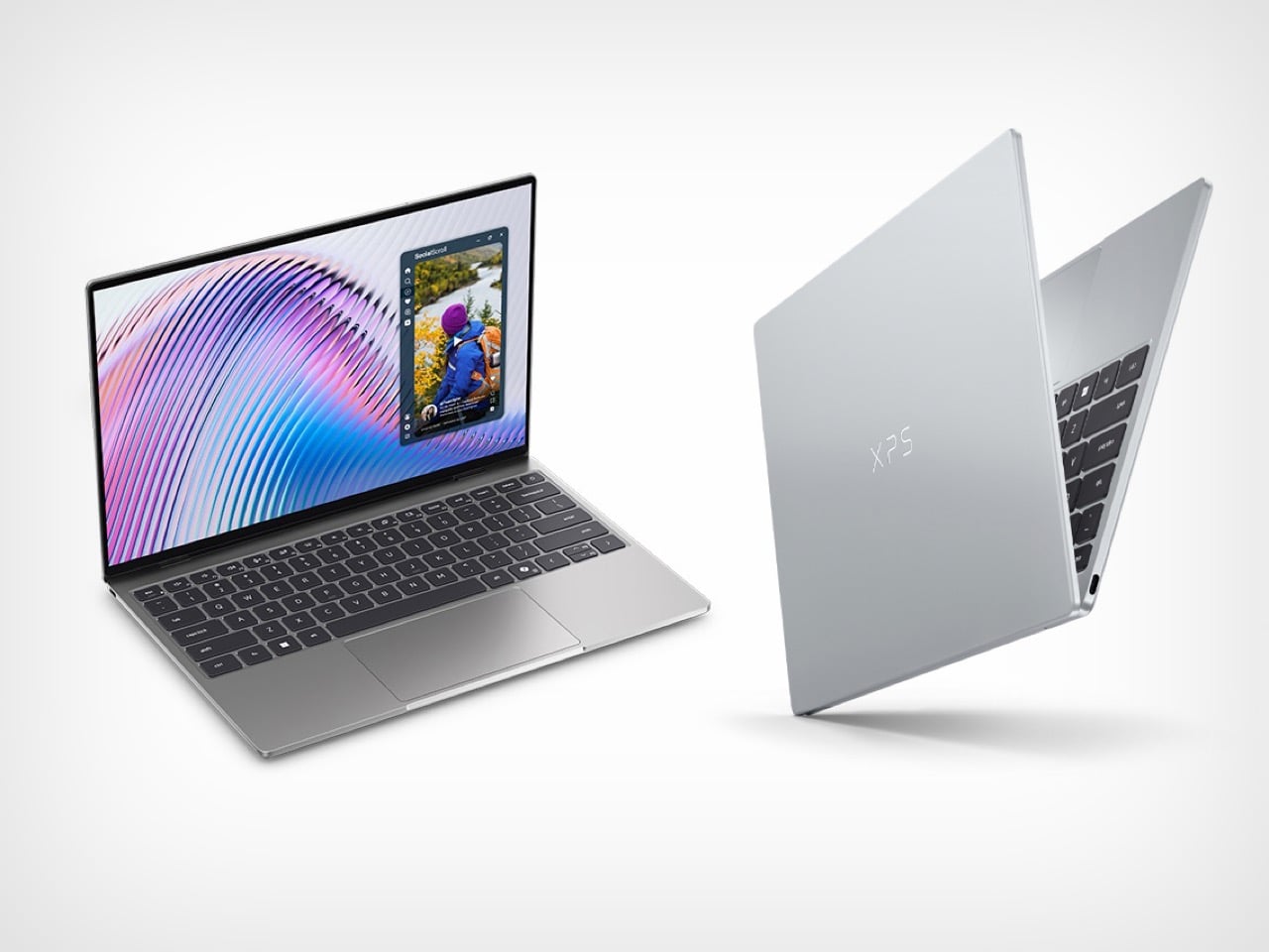
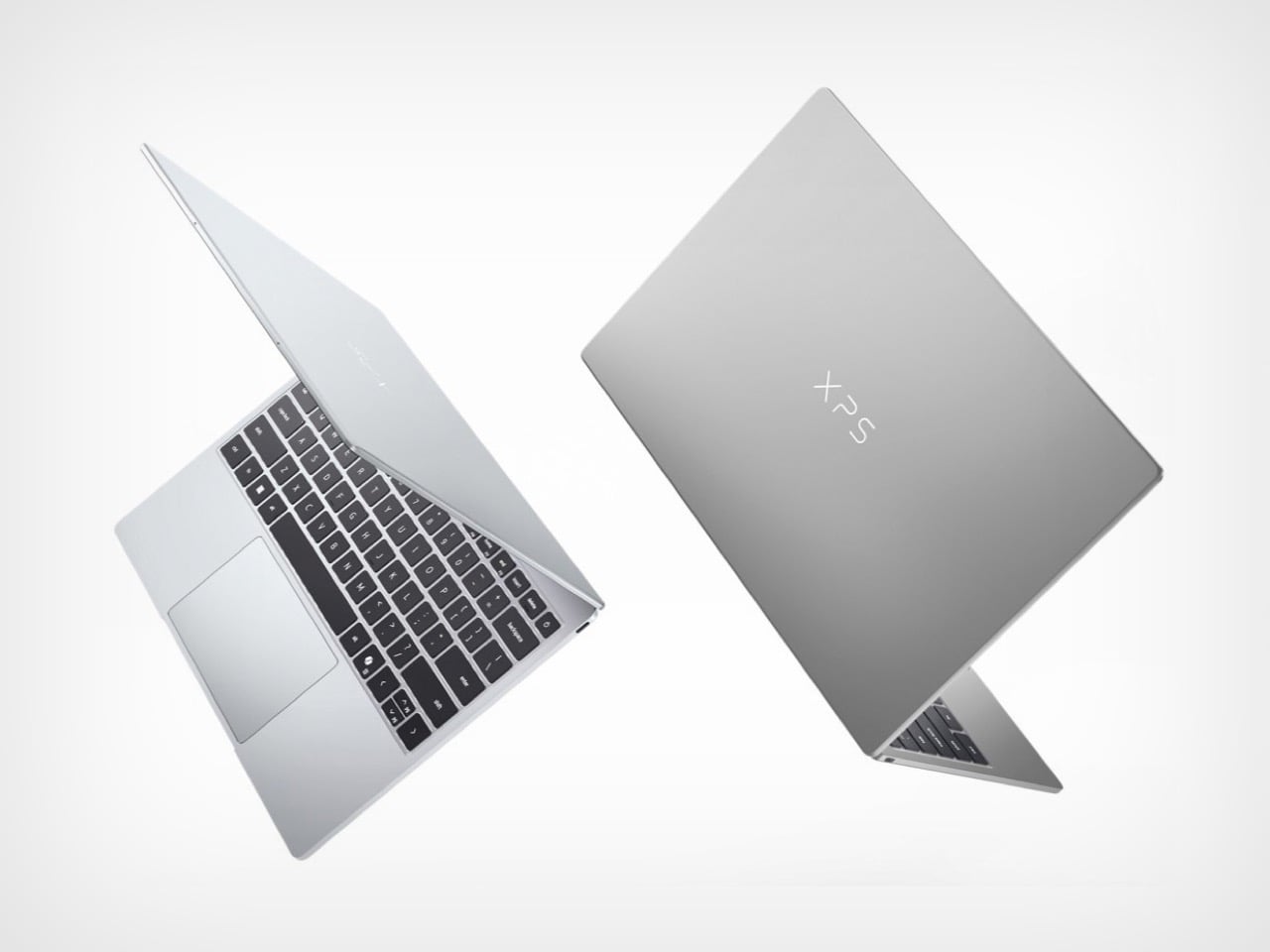
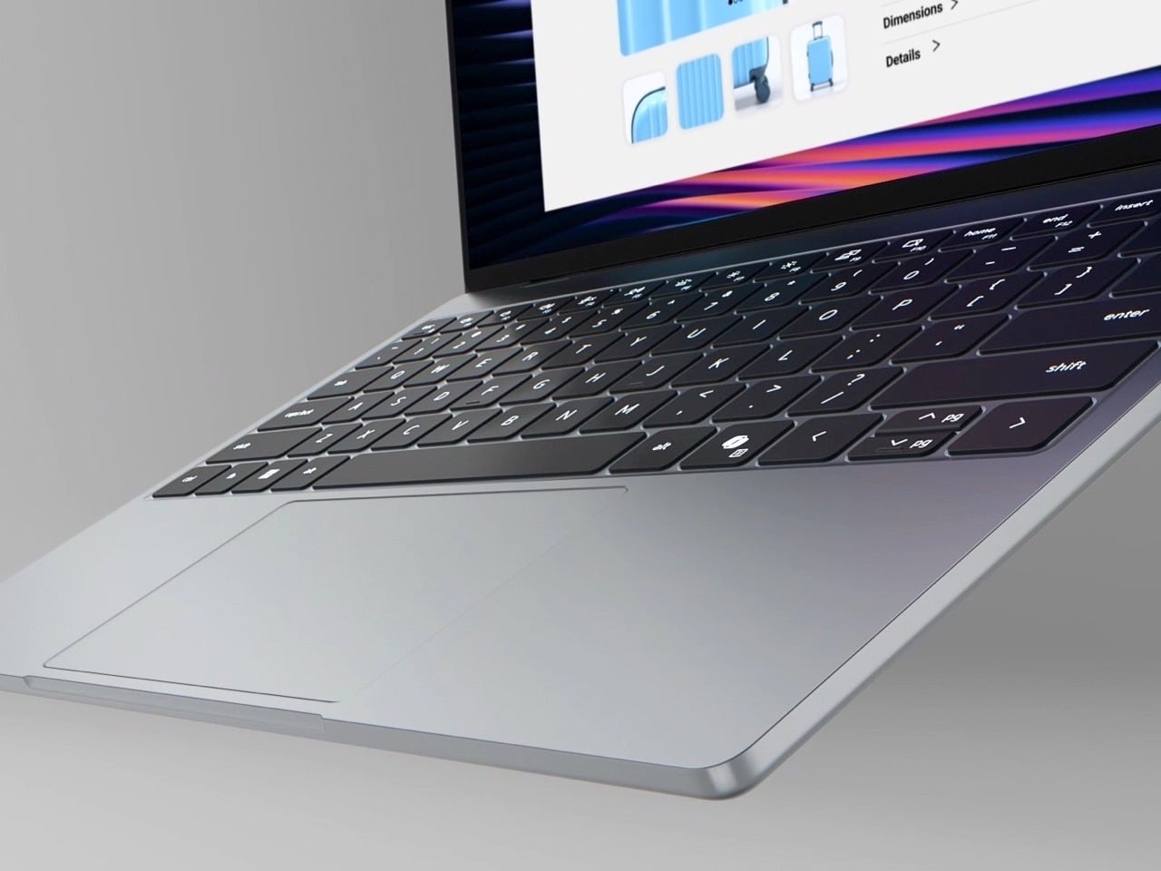
The new XPS 13, announced at Computex 2026, starts at $699 for general buyers and $599 for students, making it a direct price competitor to the Neo, and it arrives throwing considerably more hardware at the comparison. The display alone reframes the conversation: a 2.5K touchscreen running at up to 120Hz with HDR and Dolby Vision support, against the Neo’s non-touch panel that tops out at 60Hz. The chassis is CNC aluminum, the keyboard is backlit with chiclet keys, and the whole machine weighs 2.2 pounds at 12.7mm thin, lighter and slimmer than the Neo by a meaningful margin. Dell COO Jeff Clarke told journalists the company wasn’t chasing a pricing war but a value argument, and through the lens of pure hardware, that argument holds up convincingly right up until you hit the one decision that threatens to unravel all of it.
Designer: Dell
Let’s address the naming first, because it tells you everything about Dell’s thinking here. XPS stands for Xtreme Performance System, a designation Dell has historically reserved for its most capable consumer hardware, machines that justified the premium with raw processing muscle and build quality that could take on Apple’s best. Dropping that badge on a $699 laptop with a cut-down Intel Wildcat Lake processor and entry-level specs represents a deliberate repositioning of what the XPS identity means. Dell is essentially retiring the “extreme performance” promise and replacing it with “extreme value,” which is either a bold strategic pivot or a quiet brand dilution, depending on how the product actually performs in the real world. The hardware design team clearly delivered. The question is whether the product team followed through with the same conviction.
The base model ships with Intel’s new Wildcat Lake Core 5 320, a chip that shares its architecture with the Panther Lake lineup but is trimmed specifically for efficiency and lower price points. Paired to that processor is where the baffling decision lives: 8GB of LPDDR5x RAM in single-channel configuration, with 16GB as the upgrade option. On macOS, 8GB is a workable baseline, because Apple’s unified memory architecture and the efficiency of Apple Silicon mean the system manages that headroom with genuine intelligence. Windows in 2026 operates under an entirely different reality. Microsoft itself has publicly stated that 16GB is the recommended baseline for Windows going forward, and anyone who has watched a single Chrome tab push a Windows machine toward its memory ceiling knows this concern is grounded in daily experience. The XPS 13 can be configured up to 32GB, which is a meaningful long-term advantage over the Neo’s fixed 8GB ceiling, but that flexibility means very little if the entry configuration ships users straight into a frustrating afternoon.
One other cut worth flagging: there is no headphone jack on the XPS 13, while the cheaper MacBook Neo actually keeps one. In isolation this would barely register as a footnote, but alongside the RAM situation it starts to sketch a picture of a product team that obsessed over every physical surface while trimming in places that affect daily use. The build quality is genuinely exceptional, the display beats the Neo’s on paper in almost every measurable way, and the backlit keyboard is something Neo owners have been asking Apple to include since launch. These are real advantages. They just deserve a foundation that doesn’t wobble under the weight of a normal workday.
The broader industry moment here is genuinely exciting, and the XPS 13 deserves credit for existing at all. We’ve also been watching with cautious optimism (and maybe some slop-skepticism) the rumors around Google’s Googlebook, and which could represent Google finally waking up to the fact that the MacBook Neo is eating the lunch that Chromebooks spent a decade carefully building. Google essentially invented the affordable premium laptop category for education and casual users, then wandered away from it, and Apple walked straight through the door they left open. If the Googlebook turns out to be a real product with genuine ambition, this sub-$700 category suddenly has three serious players fighting for the same buyer, and that competition is exactly what consumers at this price point have deserved for years.
For now, the XPS 13 is the most compelling Windows laptop at this price in years, possibly ever. Spec up to 16GB of RAM and the value argument becomes genuinely hard to refute: a superior display, a backlit keyboard, Windows Hello biometrics, and CNC aluminum construction for the same money as a fully optioned Neo. But the base configuration, the one that captures the headline price and draws the comparison, asks buyers to trust that 8GB on Windows will be fine in 2026. That is a considerable ask, and Dell knew it when they made the call. The XPS may stand for Xtreme Performance System, but right now its most extreme feature is the optimism it takes to ship that memory configuration and call it done.
Product design has always been part craft, part communication. Getting a concept from sketch to client approval demands a level of visual storytelling that most designers simply haven’t had the budget or tools to manage on their own. Video production, in particular, has long been the step that gets quietly skipped, not because the ideas aren’t there, but because the process is expensive, slow, and complicated.
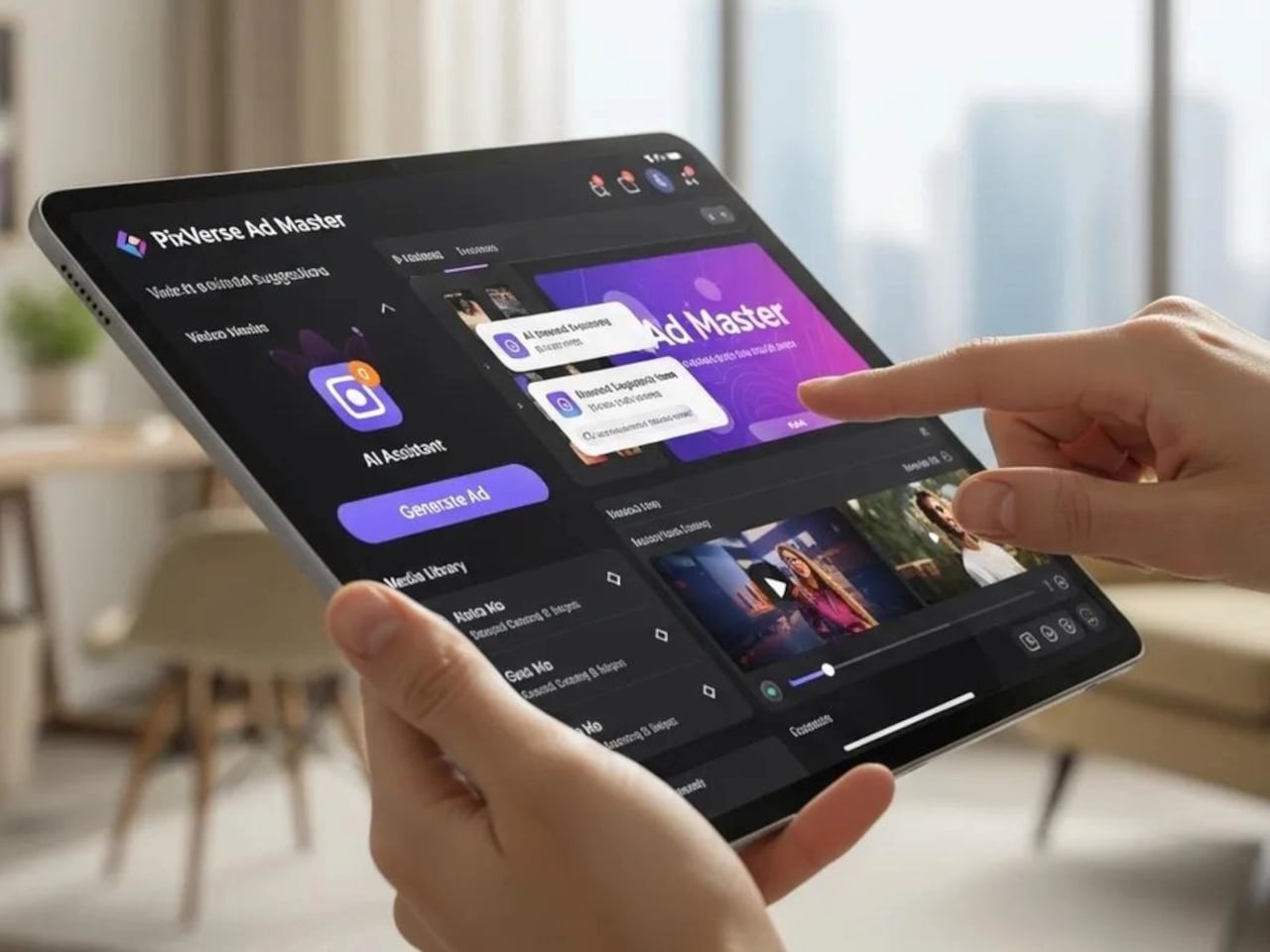
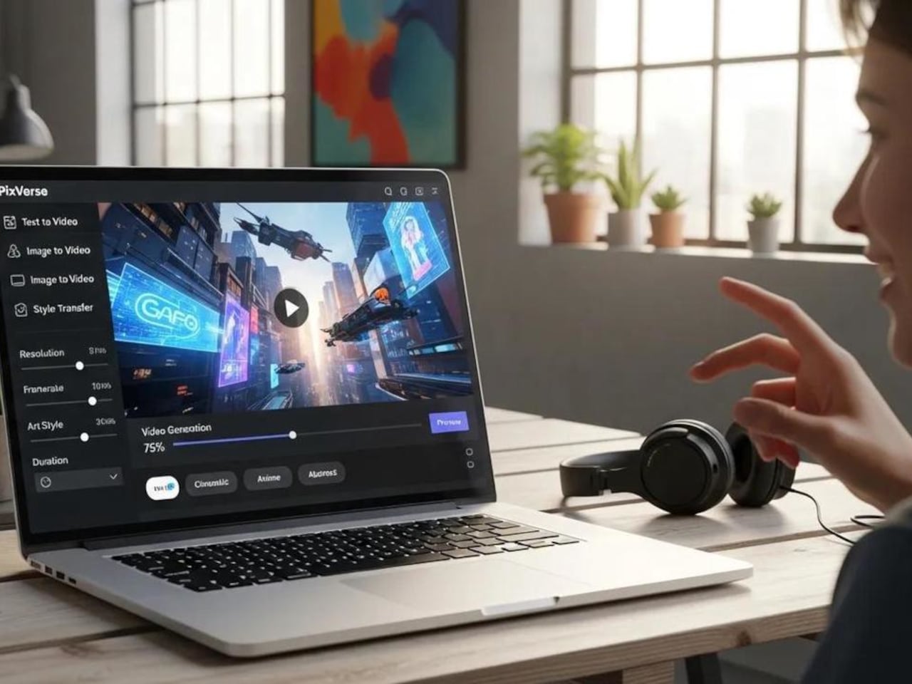
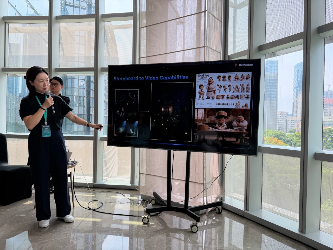
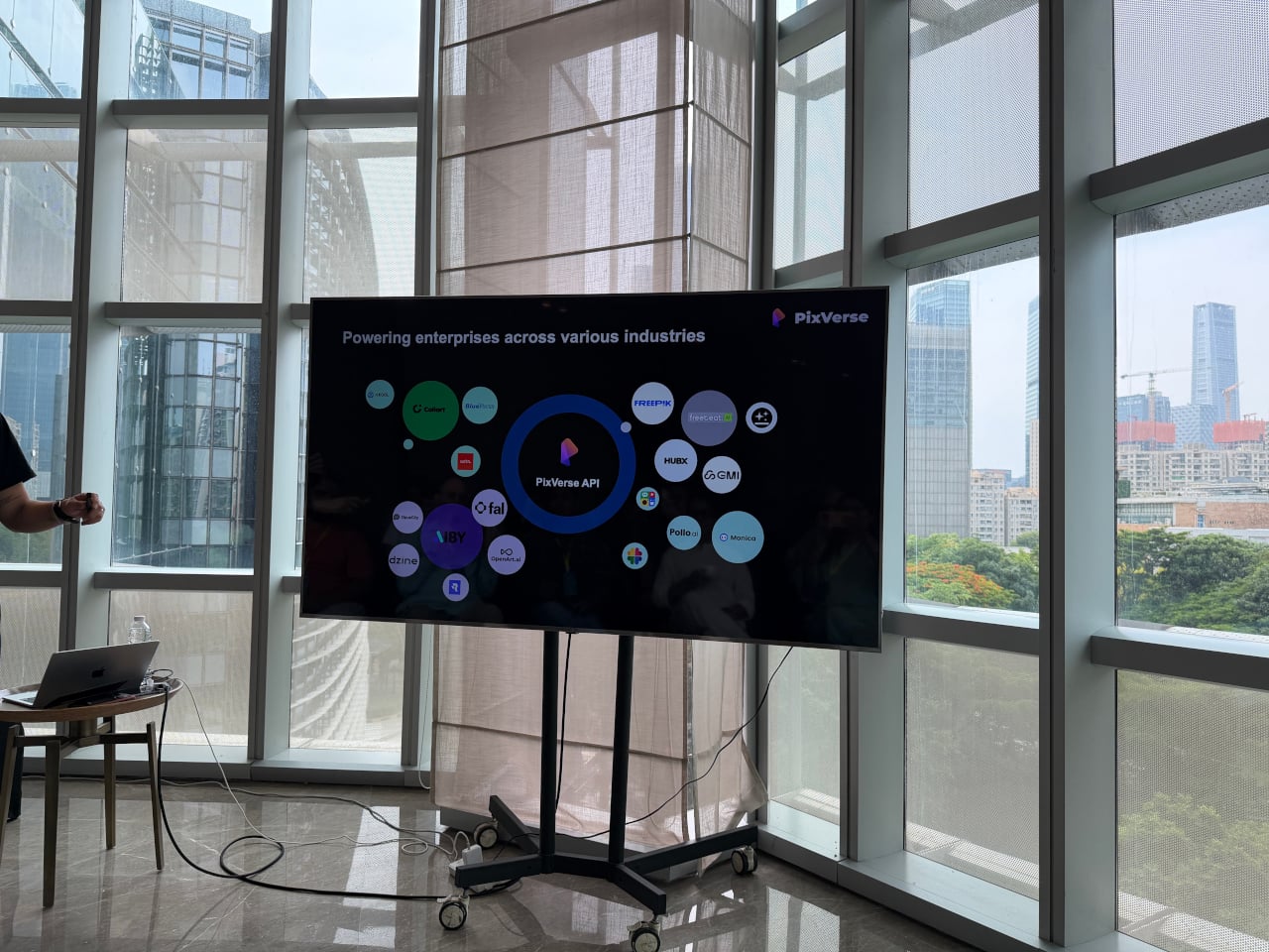
That’s a gap PixVerse has been working to close. Founded in 2023, the platform has grown to over 100 million users across 177 countries, powered entirely by proprietary models it builds in-house. At the iMpact Global Connect Show 2026, the company’s team walked through three distinct products that together make a compelling case for AI-generated video as a practical part of the design process.
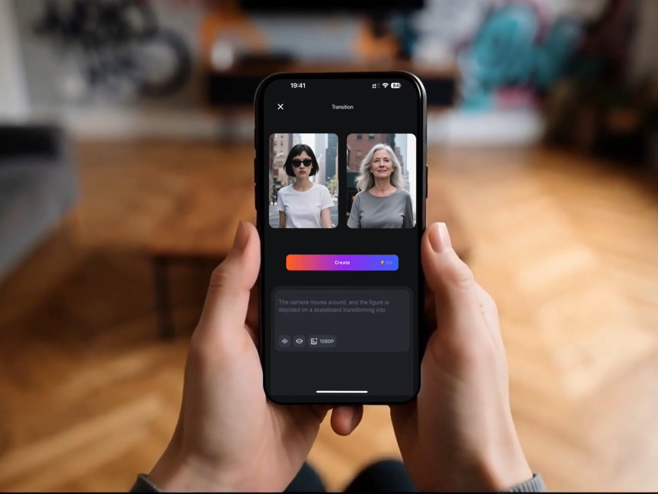
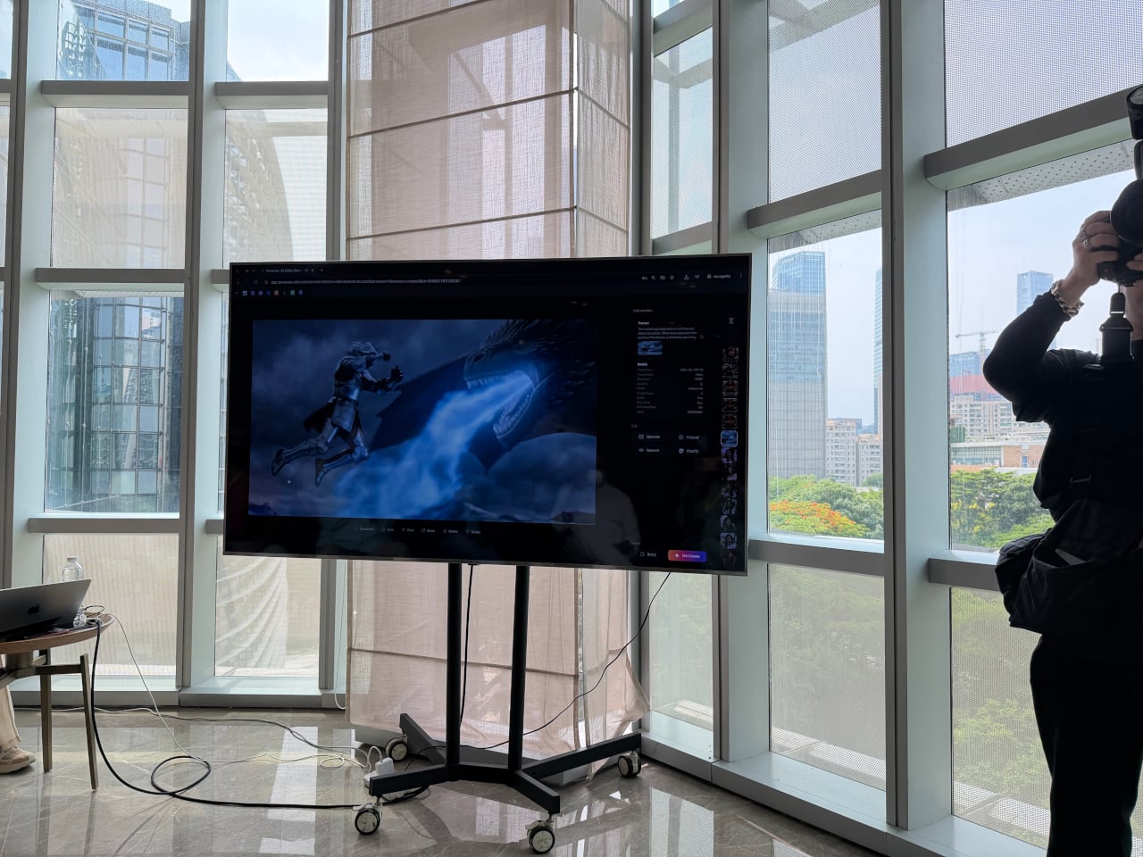
The most immediately useful of the three, at least for most designers, is V6. It’s the platform’s flagship model, and the latest update improves camera movement, character performance across scenes, and physical object interaction in noticeable ways. More significantly, V6 can now generate a complete multi-shot short film with native audio from a single prompt, without any separate editing or sound production steps involved.
Think about what that actually means for a product designer. A 30-second product video typically means writing a brief, hiring a videographer, sourcing music, shooting, and editing over several days or weeks. With V6, a designer who can clearly articulate how a product should look, move, and feel in context can produce that same result from a prompt and a reference image in considerably less time.
That kind of speed has obvious advantages for solo designers and small studios. A freelancer can arrive at a pitch with three distinct video directions instead of three mood boards. A startup preparing a crowdfunding campaign doesn’t need a separate production budget for a launch video. An in-house team can test how a product reads in a real context before committing to a full-scale shoot.
The second product, C1, goes further by targeting actual film production pipelines. It combines a cinematic visual effects system, an industrial-grade action engine, and a storyboard-to-video feature in a single workflow, letting production teams convert static panel layouts directly into continuous video sequences. Reference-guided generation also keeps characters and scenes consistent across shots, which has historically been one of the harder problems for AI video to solve.
For designers, that matters most when a concept already lives as a sequence of moments rather than a single frame. A transportation designer communicating a user journey, a consumer electronics team mapping how a device gets picked up, handled, and put down, or a lifestyle brand building a product narrative around daily routines, all of them are telling stories that C1 is built to handle.
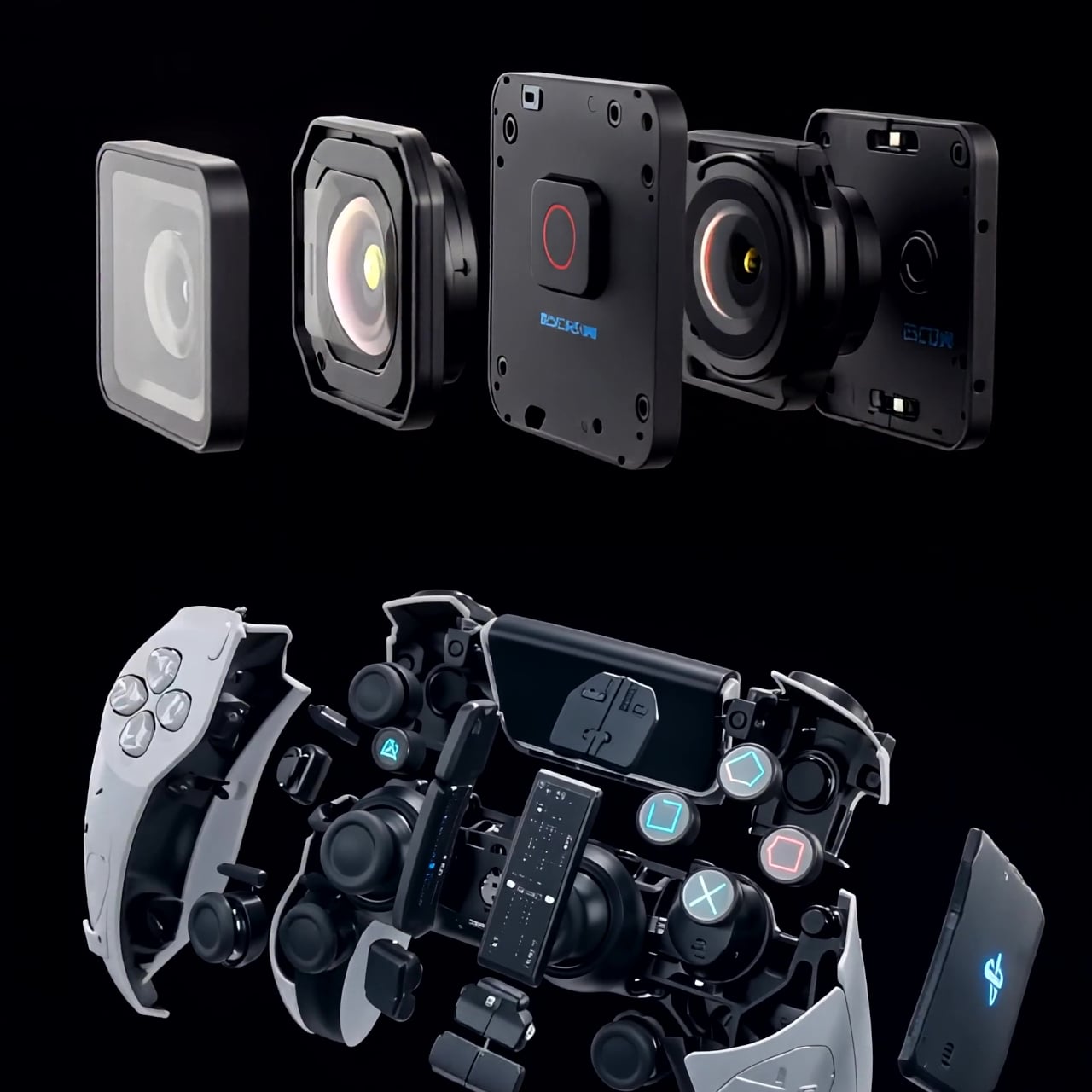
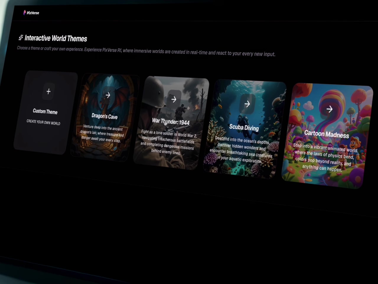
Then there’s R1, which doesn’t behave quite like any other AI video tool currently available. Rather than producing a fixed clip with a clear beginning and end, R1 generates a continuous, interactive visual environment that responds to user input as it runs. It’s less like watching a video and more like navigating a space that exists, evolves, and reacts, one that you can steer and share.
Users can build a personalized digital avatar from photos and enter these generated worlds alongside others in real time. During the demo, a shared environment called “Cat Takes Charge” had 118 users inside it at the same time, running continuously for over nine hours. Each participant could submit prompts into a live feed, with the AI realizing them as video within the shared space as they appeared.
For product designers, R1 opens up possibilities that a rendered video simply can’t replicate. Imagine walking a client through a simulated retail environment built around a new appliance, or letting a stakeholder explore a furniture concept in a living, reactive interior before a prototype even exists. It’s the kind of tool that starts to make spatial storytelling feel accessible at the concept stage, not just post-production.
What all three tools share is that they reward the same skill designers already rely on: clarity of intent. A well-constructed prompt isn’t a technical exercise; it’s a creative direction, not unlike a solid design brief. Companies integrating PixVerse into their workflows reportedly cut costs by 68% and finish work 57% faster than conventional production methods, a significant gain for teams of any size.
None of that requires a production background, and it doesn’t even require familiarity with video editing software. What it does require is the ability to describe a vision precisely, which is something designers do every single day across briefs, sketches, and presentations. PixVerse just moved video closer to the beginning of that process, somewhere between the first concept and the final approval, rather than as an afterthought at the very end.
The home office has become the most personal room in the house — and somehow still the hardest room to shop for. He already has the monitor arm, the mechanical keyboard, the cable organizer that never actually organized anything. The things worth giving now aren’t upgrades to what he owns. They’re objects that introduce something genuinely new to how a desk feels, functions, and performs — gifts that earn a permanent spot rather than a polite shelf appearance.
The best home office gifts of 2026 share one quality: they’re genuinely hard to explain without handling them. A pen that never needs ink. A lamp that works anywhere without a single cord. A speaker bar that makes RGB feel like a design choice rather than a gamer’s checkbox. These aren’t novelties with a short shelf life. They’re tools and objects with real staying power — the kind of things you’d buy for yourself if someone hadn’t already beaten you to it.
1. Mosaic
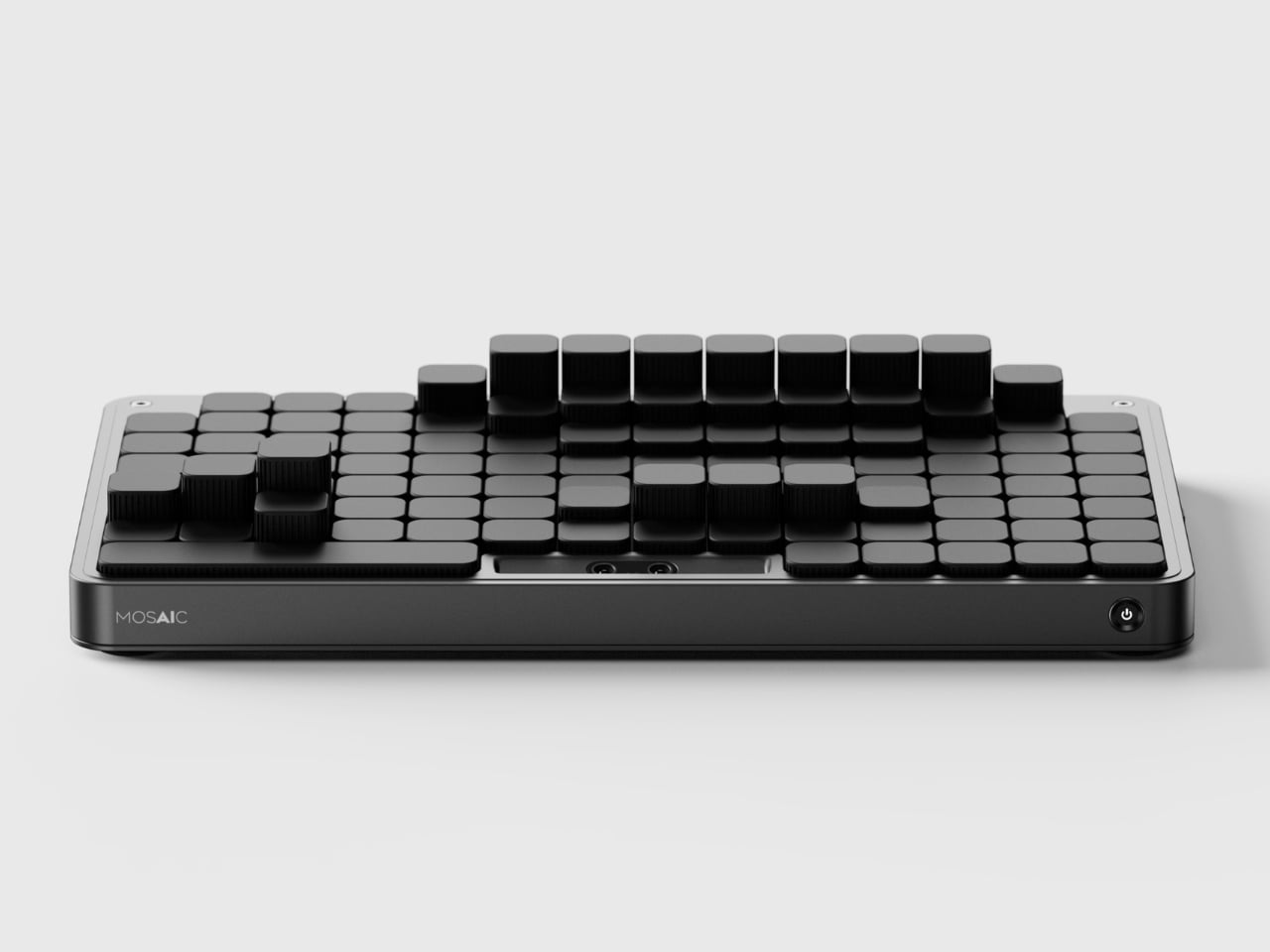
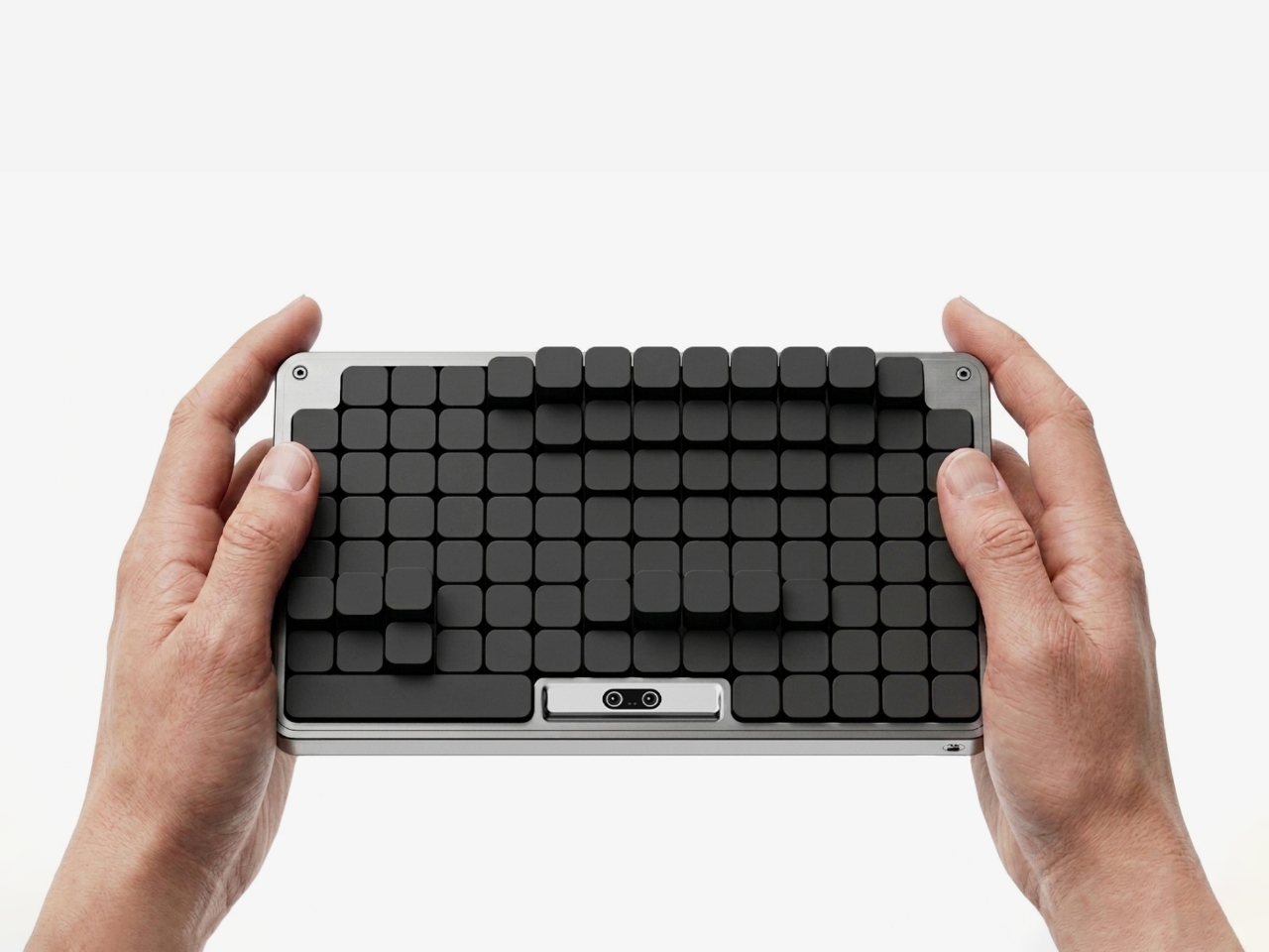
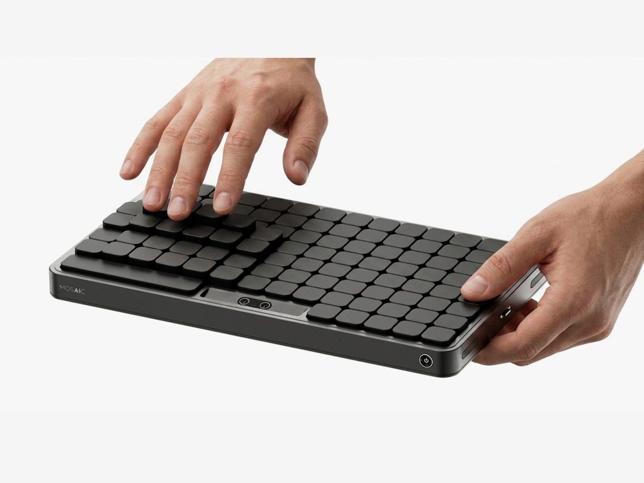
The most striking thing about the Mosaic isn’t what it does — it’s what it undoes. Most desk organizers arrive with a fixed grid of compartments and expect you to adapt, which is exactly why most of them end up abandoned in a drawer within weeks. The Mosaic flips the dynamic entirely, using AI to learn how objects get arranged and rearranged on a real desk over time, then reshaping its modular surface to match those habits rather than a designer’s assumptions about them.
What that looks like in practice is a tray that never quite looks finished — and that’s entirely the point. As a setup evolves, it moves with you, accommodating a new phone dock here, a relocated notebook there, without requiring a full reset. The dark modular surface carries a kind of purposeful architecture that reads as considered rather than cluttered. For anyone who has bought a beautiful organizer only to abandon it two weeks later, the Mosaic is the version that actually earns its permanent place.
What We Like
Learns and adapts to actual desk behavior instead of imposing a fixed layout
Modular surface reads as architectural on the desk — purposeful rather than busy
What We Dislike
AI calibration takes time before it fully understands desk patterns and adjusts accordingly
Darker aesthetic may not suit lighter or more minimal setups
2. Precision Sakura Metal Puzzle
The Precision Sakura Metal Puzzle is the kind of object that earns its spot on a desk by doing almost nothing visible — until you pick it up. Machined to a 0.004mm tolerance, it captures the shape of Japan’s most iconic flower in a set of pieces so similar to each other that distinguishing them becomes its own discipline. No solution is included. The intent was never to finish it quickly. The intent is to spend sustained, satisfying time with something that genuinely demands your attention.
For the person who says he has everything, this is a rare thing: an object that introduces something entirely new to the desk. It works as a precision puzzle and a sculptural display piece simultaneously, the polished metal finish clean enough to hold its own against far more expensive objects. Even unsolved, it belongs on the desk. When you finally do close it, the satisfaction is the kind no app or productivity widget has ever come close to delivering.
0.004mm machining tolerance makes every piece feel intentional and genuinely premium
Functions as desk sculpture whether actively mid-solve or sitting completed
What We Dislike
No solution included — a real test of patience for anyone expecting a guided experience
Small scale means pieces are easy to lose on a desk that isn’t kept clear
3. Pininfarina Aero Ethergraf
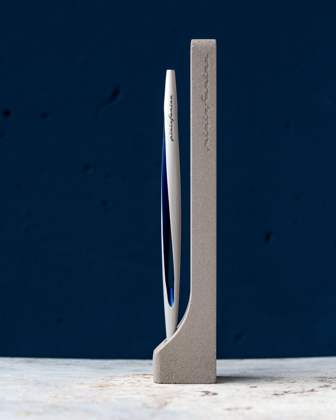
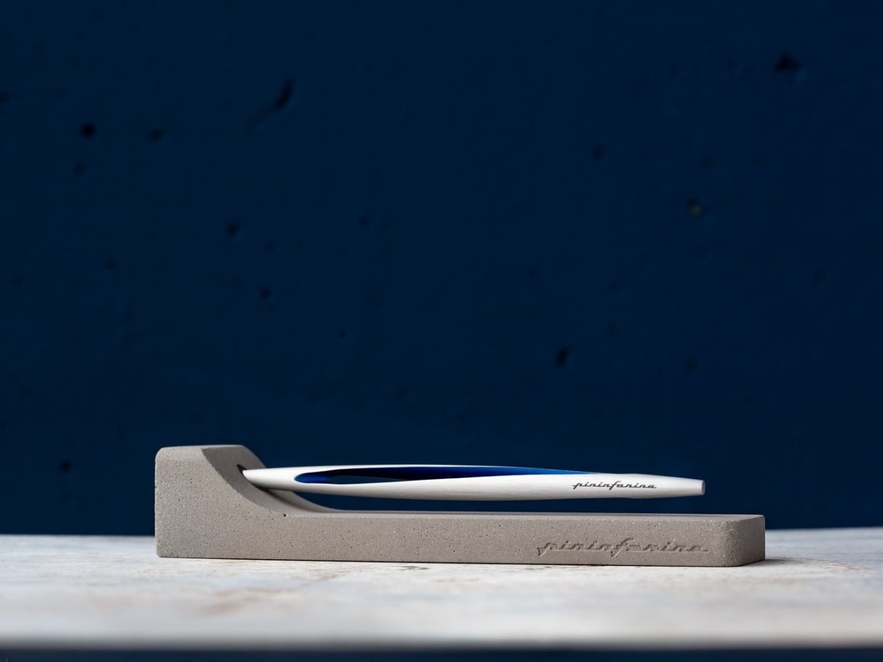
Pininfarina’s name lives in the curves of Ferraris and Maseratis, but the Aero Ethergraf makes a more interesting argument — that restraint is the harder design problem. Made from aerospace-grade aluminum, it weighs 17 grams and measures 160mm, numbers that don’t fully prepare you for how it sits in the hand. The tip is Ethergraf, a patented metal alloy that writes through oxidation, leaving a permanent mark on paper without a single drop of ink. No cartridges. No refills. No maintenance, ever.
It ships paired with a raw concrete stand — a deliberate material contrast that, on a desk, reads as sculpture rather than office supply. Handcrafted in Italy and rooted in a technique older than the modern ballpoint, the Aero makes every other writing instrument on the desk feel temporary by comparison. For a man who already has everything, it’s a quiet, permanent counterargument. Because nothing else quite like it exists on any desk, anywhere.
What We Like
Ethergraf tip writes indefinitely through oxidation — zero maintenance, zero refills, ever
Concrete stand creates genuine material tension that turns the pen into desk sculpture
What We Dislike
Performs best on dedicated paper — not every standard notebook will reveal the tip’s quality clearly
Concrete stand adds bulk that may feel heavy in a stripped-back minimal setup
4. Anywhere-Use Lamp
The Anywhere-Use Lamp starts from one honest premise: good light shouldn’t be tethered to a wall. Running on four AA batteries, it removes every cord and cable from the equation, making it as functional in a hotel room, on a bookshelf, or in an outdoor corner as it is on a permanent desk. Six high color rendering LEDs produce warm, soft output that settles naturally into a space without announcing itself as the room’s loudest design decision. The result is light that feels like it always belonged where you put it.
Available in black, white, and an Industrial edition with a scratch-detailed metal base that treats surface wear as character rather than damage, it holds across every desk aesthetic without effort. Pressing any edge of the cap cycles through four brightness levels with a haptic click that makes even that small interaction feel considered. Modular construction means it breaks down flat for a bag. At $149, the Anywhere-Use Lamp is one of the most versatile objects on this list — earning its price through location freedom alone, before you’ve even switched it on.
AA battery power removes all cord dependency and gives it genuine, unconditional location freedom
Industrial edition’s scratch-detailed base treats material wear as intentional character, not a flaw
What We Dislike
AA batteries mean ongoing replacement costs compared to a rechargeable alternative
Four brightness levels may feel limited for those who prefer more granular control over output
5. Edifier Melo Bar
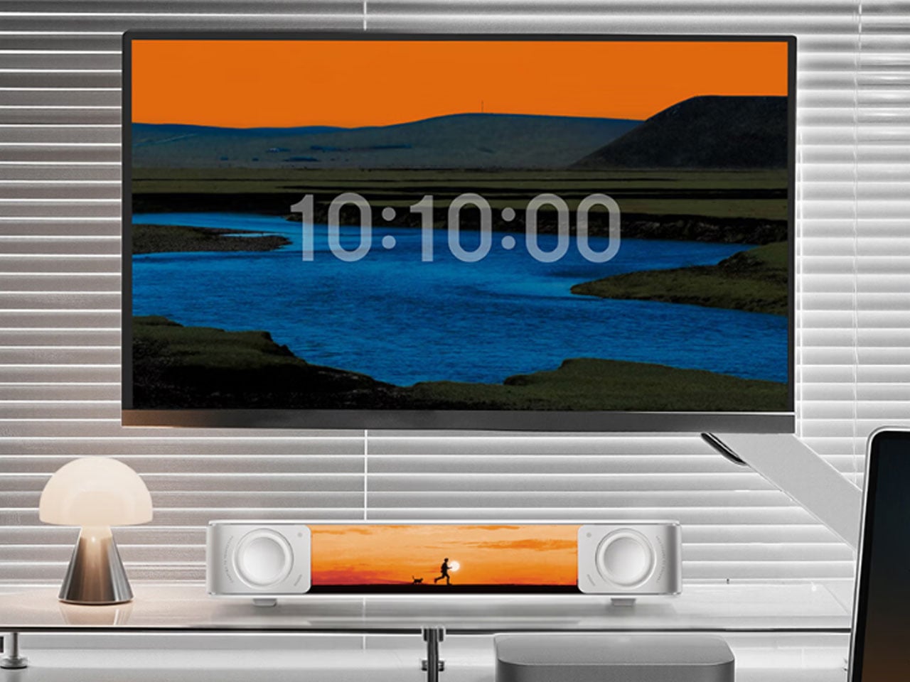
The Edifier Melo Bar does the thing most desk speaker bars never quite pull off — it makes RGB feel like a design decision rather than a hardware checkbox. Three distinct audio modes handle music, gaming, and movie listening, each tuned differently and each backed by near-field sound clear enough to remind you how much you’ve been tolerating laptop audio. The interchangeable front panels are the detail that separates it from every other bar on the market, letting the object adapt to the desk instead of demanding the desk adapt around it.
The light output is deliberately understated for something that supports 16.8 million colors and 15 carefully tuned lighting themes. It frames a setup rather than overwhelming one — adding ambient depth without demanding that the desk revolve around it. For a home office that already has the monitor, the keyboard, and the cable routing handled, this is the piece that completes the sensory experience rather than complicating it. Sound and light are treated as a single designed object. That’s harder to achieve than it sounds, and the Melo Bar gets it consistently right.
What We Like
Interchangeable front panels let the speaker blend into or intentionally accent any desk aesthetic
Three dedicated audio modes handle every use case without asking for a compromise
What We Dislike
RGB-heavy profile may feel redundant on setups that already favor a completely dark aesthetic
Near-field performance is strongest close to the desk — less effective across a larger open room
The Right Desk Tells You Something About the Person Behind It
Each of these five objects earns its place for reasons that go further than specs. The Mosaic learns. The Sakura puzzle challenges. The Aero Ethergraf lasts forever. The Anywhere-Use Lamp untethers. The Melo Bar performs and illuminates. None of them exist because a spec sheet demanded them — they exist because someone asked what a desk should actually feel like and then had the discipline to build the answer without compromise.
The man who says he has everything doesn’t need another gadget. He needs the object he didn’t know was missing — and all five of these are exactly that. Each carries intention, permanence, and the kind of quiet confidence that makes a desk feel genuinely complete rather than just assembled. Buy one, and it earns its keep. Buy all five, and you’ve given someone the most considered setup they’ve ever worked from.
Every time you open an umbrella, you’re deploying a canopy of wasted real estate. That dark stretched fabric sits between you and the sun, absorbing heat, blocking light, doing absolutely nothing with the energy raining down on it. For a surface that spends its entire working life pointed directly at the sky, that feels like a missed opportunity of the highest order.
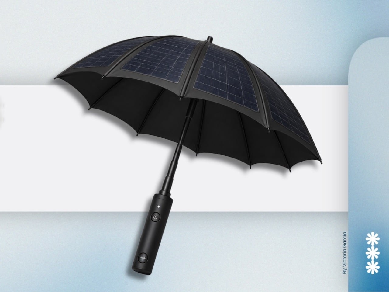
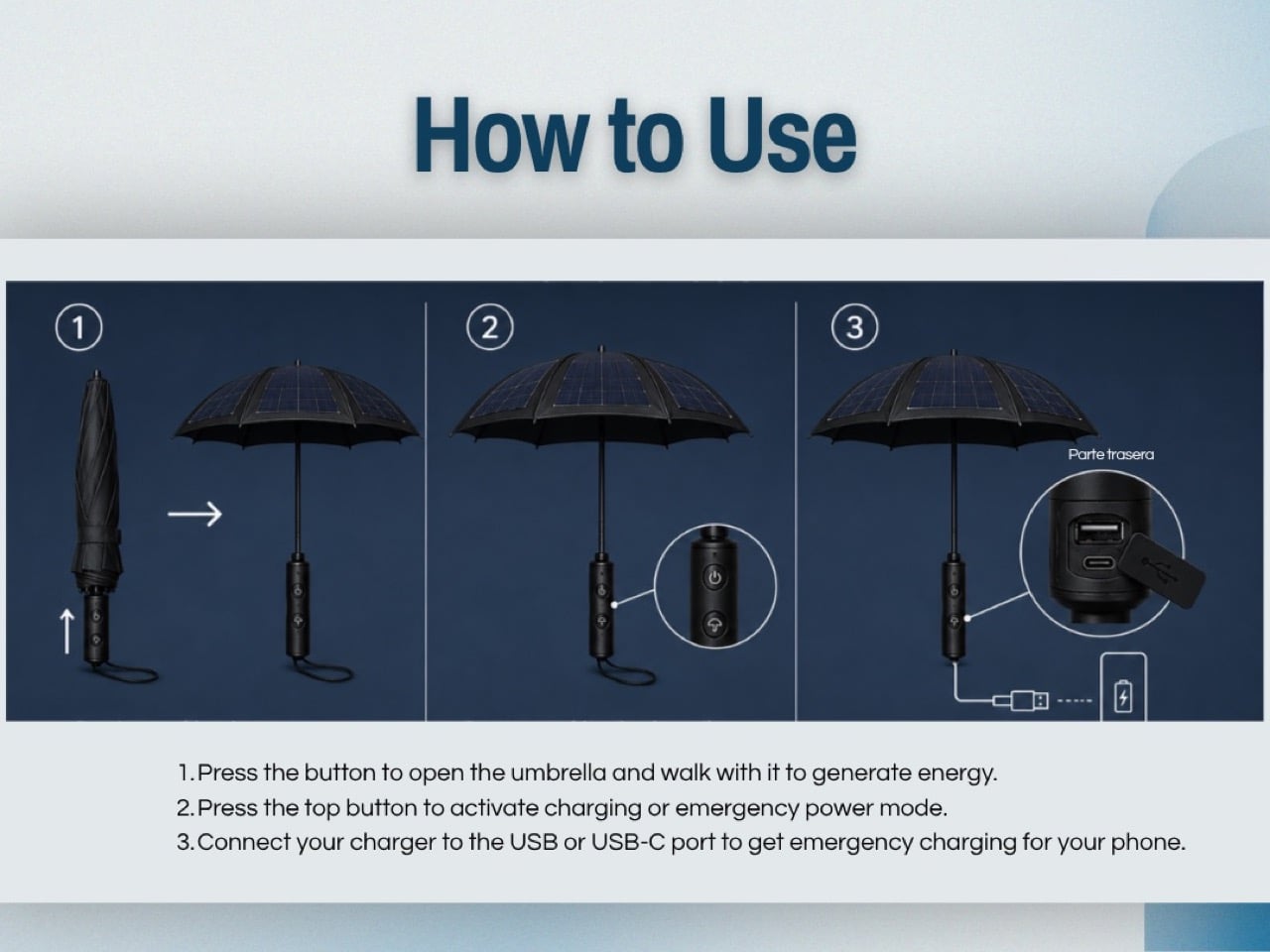
Victoria García Moreno, a student at Universidad Casa Blanca in Mexico, decided to do something about it. Her James Dyson Award entry takes the umbrella’s canopy and lines it with waterproof solar panels, routing that captured energy down through the shaft and into an internal power bank housed in the handle. USB and USB-C ports let you plug your phone in while you walk. Sun protection and emergency charging, packaged into one familiar object.
Designer: Victoria García Moreno
The material logic here is sound, even if the execution remains at concept stage. Solar panels have been conformal and flexible enough for curved surfaces since the early 2000s, and the umbrella canopy offers a genuinely generous collection area compared to most portable solar products on the market. Foldable solar chargers sold today typically max out at panels smaller than a laptop screen. A full umbrella canopy, by comparison, gives you something closer to the kind of surface area that actually moves the needle on solar harvest. The panels García Moreno specifies are waterproof, which solves the obvious problem of a device that lives outdoors and frequently encounters rain.
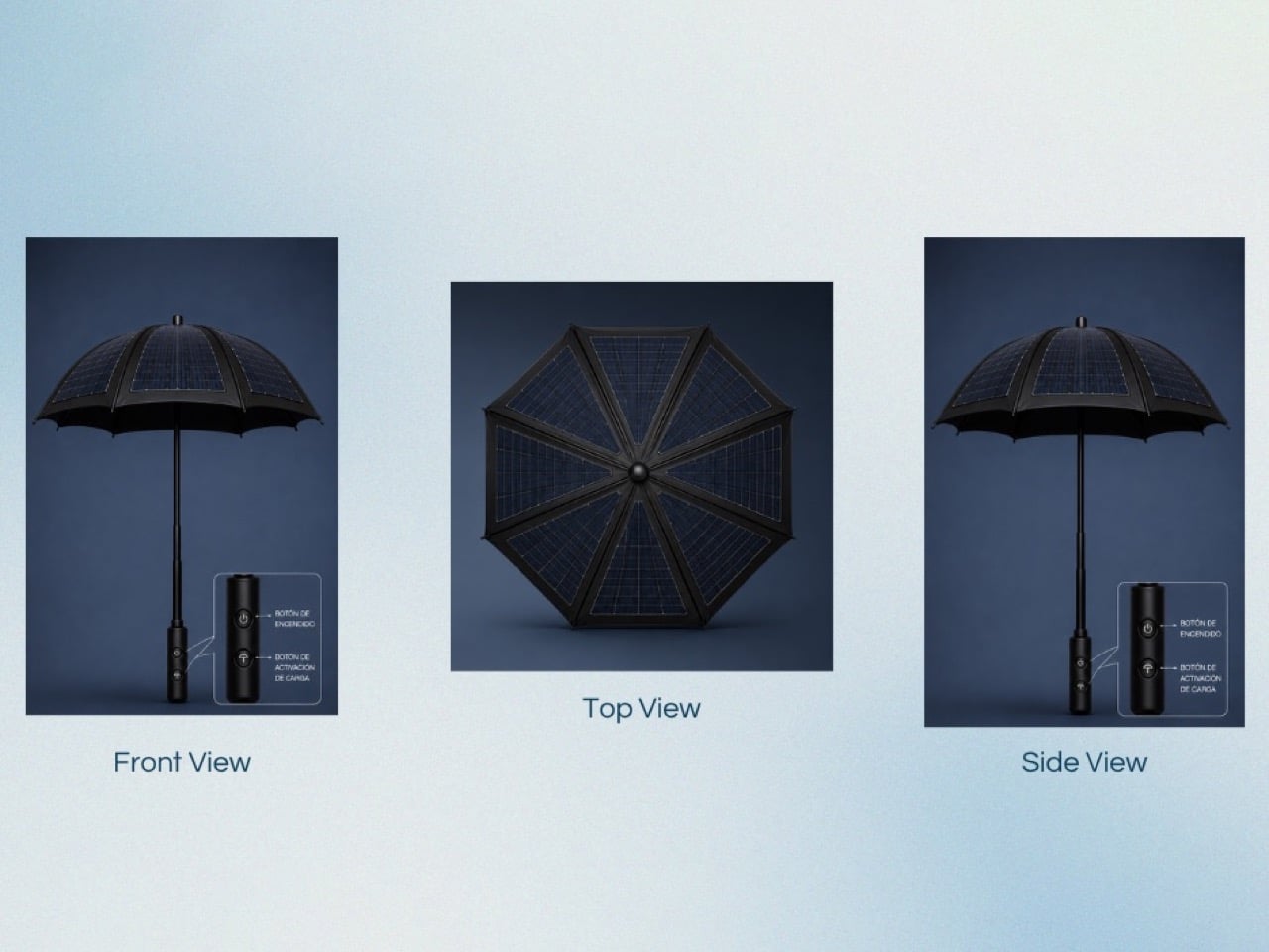
All the electronics, the power bank, the activation circuitry, the output ports, sit inside the grip in a cylindrical housing that keeps the umbrella’s overall silhouette completely conventional. Two buttons sit on the front face: one to power the system, one to activate charging output. The USB and USB-C ports are recessed into the rear of the handle, keeping them protected when not in use. From the front, this reads as a slightly premium umbrella. The technology announces itself only when you need it to.
The honest limitation García Moreno’s concept faces is the gap between solar panel flexibility and the mechanical demands of a folding umbrella. Current flexible panel technology can handle curves, but repeated folding and unfolding introduces stress concentrations that standard rigid cells handle poorly. That’s a solvable engineering problem, and the James Dyson Award has a history of surfacing student concepts that identify the right problem before the manufacturing world catches up with a solution. For now, the Portable Outdoor Emergency Charger makes its case as a provocation worth taking seriously. The umbrella canopy has been wasted real estate for far too long, and someone had to say it.
The Nest Audio came out in September 2020. If you bought one that fall, you were probably still navigating pandemic grocery runs and wondering when offices would reopen. Nearly six years later, Google has finally shipped something new to put on your kitchen counter. The Google Home Speaker, now landing in June 2026 after a “Spring 2026” promise that tested the meaning of the word spring, is the company’s first new standalone smart speaker in half a decade. Six years is a long time in consumer electronics. Apple refreshed AirPods three times. Sonos launched and then partially broke its app and still found time to make new speakers. Google, meanwhile, treated the entire category like a parked car, leaving the Nest Audio to quietly collect dust while the company sprinted elsewhere.
Where was Google sprinting? Toward Gemini, mostly. The AI model has been grafted onto Search, Maps, Workspace, Android, Chrome, YouTube, and practically every other product in the portfolio with enough surface area to carry a chatbot. Google even announced the Googlebook at I/O 2026, a new category of premium Android laptops billed as the successor to the Chromebook and the Pixelbook, built, predictably, around Gemini Intelligence. When Google finally announced the new Home Speaker at its Made by Google event in October 2025, the device was framed almost entirely around its role as a Gemini endpoint. The speaker came back because Gemini needed somewhere new to live, and the kitchen seemed underserved.
Designer: Google
There was a time when the company’s smart home pitch felt like a real platform strategy, ambient computing, voice everywhere, helpful devices fading into the background. The original Google Home arrived in 2016 with a sense of ambition. It was a bet that Google could own the center of the connected home by making voice control feel natural, useful, and quietly omnipresent. Then came the Mini, the Max, the Hub, the Nest rebrand, and eventually the Nest Audio. After that, the energy drained out of the room. The category was never formally abandoned, but it entered that peculiarly Google state where a product remains alive enough to avoid a funeral and neglected enough to make users wonder whether anyone still remembers where the light switches are.
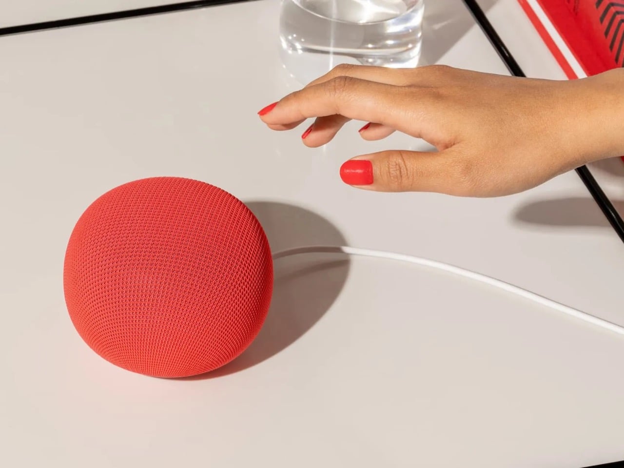
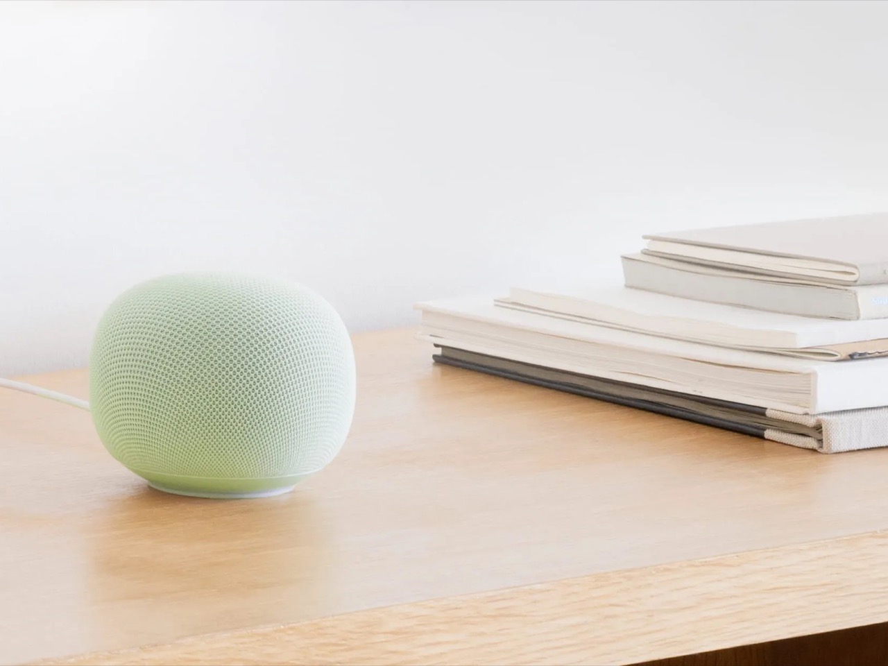
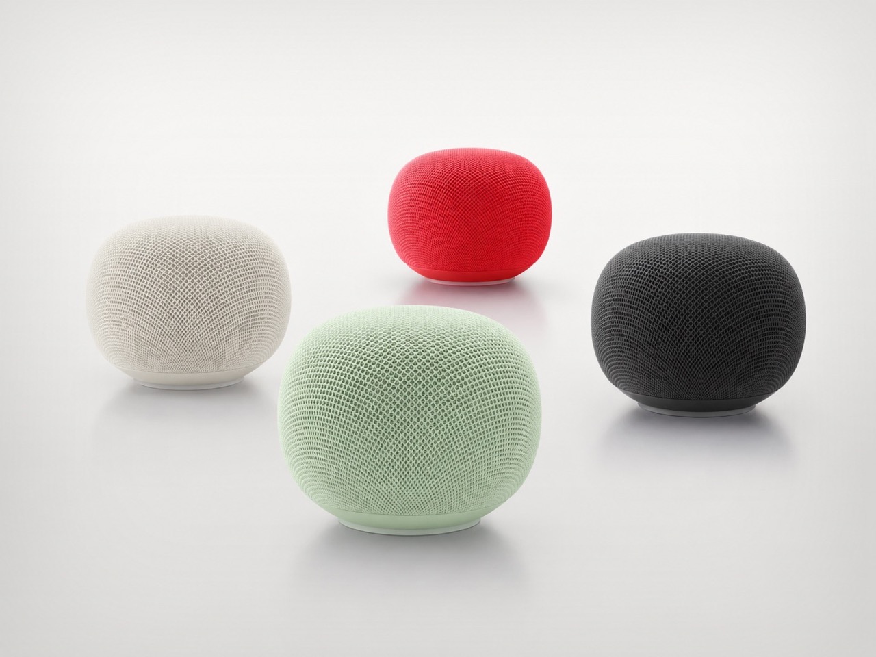
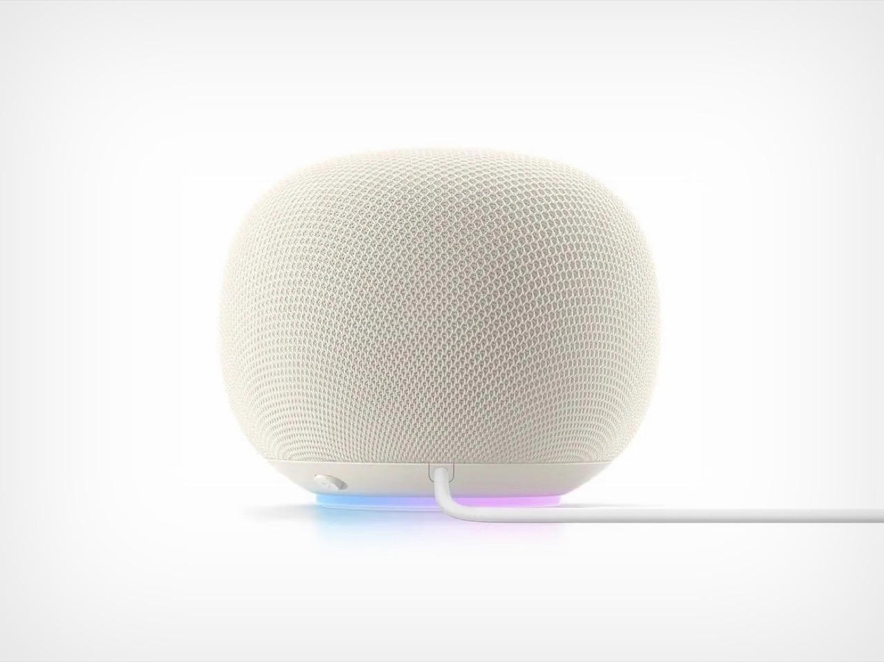
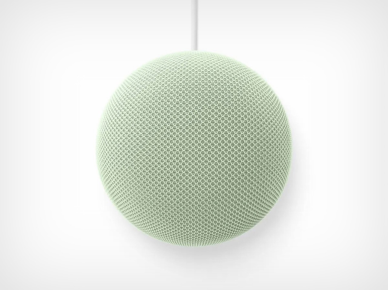
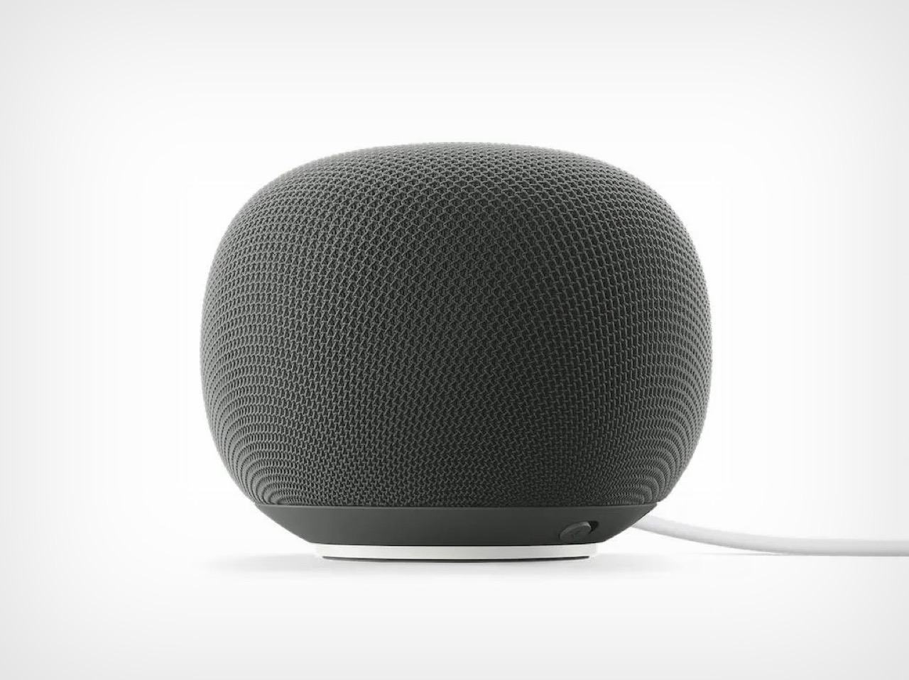
The new speaker itself looks perfectly pleasant. It is small, rounded, soft, and available in the sort of colors Google hardware teams always seem to get right, the kind that make every room look slightly more curated than it probably is. Google says it has 360 degree audio, faster processing for more fluid conversations, and a new light ring that signals when Gemini is listening, thinking, or responding. Fine. Great, even. The problem is that none of this arrives in a vacuum. Google has trained people to see its hardware launches through a second lens, one that asks a less flattering question: for how long is this category going to matter to the company?
That question hangs over almost every Google device that is not a Pixel phone. The company loves a fresh start, a new naming scheme, a reset button disguised as a vision statement. It also has a long history of treating hardware categories like experiments that can be deprioritized the minute a more interesting internal narrative comes along. Smart speakers spent years as a central piece of Google’s ambient computing story. Then Gemini became the story, full stop. Once that happened, every product had to justify itself in AI terms. Phones became Gemini phones. Search became Gemini search. The smart home became Gemini for Home. Laptops became Googlebooks. And now, after years of silence, the speaker has returned as a vessel for the new corporate religion.
There is a certain irony in that. Smart speakers were already one of the clearest examples of what AI in the home was supposed to feel like: conversational, contextual, present without demanding attention. Google had the hardware footprint. It had the installed base. It had a brand that, for a while, was practically synonymous with talking to your house. If the company had kept iterating steadily, this new moment could have felt like a natural evolution. Instead, it feels like a rediscovery. Google wandered away from the category long enough that its return carries a faint air of surprise, as if someone opened a closet at Mountain View headquarters and found an entire product line under a sheet.
Maybe the Google Home Speaker will be excellent. Maybe Gemini will finally make the smart speaker feel smarter than a kitchen timer with good branding. But this launch still lands as a reminder of how erratic Google’s hardware attention span can be. The company did not so much nurture this category back to health as remember it was still on the org chart. After nearly six years, Google has a new smart speaker, and the most Google part of that sentence is that it only happened once the device could be recast as AI infrastructure. The speaker is back on the counter. Whether Google stays in the room this time is the harder question.