KFC’s Pickle Puffer Is Fashion’s Weirdest Power Move

At some point, the line between fashion and performance art quietly dissolved, and I think we need to have a serious conversation about who’s holding the needle. Because KFC just debuted a puffer jacket filled with real sliced gherkins and acid-green brine, and it is fully, sincerely, unapologetically real.

The Pickle Puffer is exactly what it sounds like. A clear plastic puffer jacket, entirely see-through, packed with floating slices of pickled cucumber and brine so vividly green it almost looks radioactive. The insulation is gone, replaced with hundreds of actual pickles that shift and float with every movement.

Designer: KFC

Picture a standard puffer silhouette, the kind you’d wear on a cold commute, except every quilted chamber is sealed, transparent, and filled with floating pickle slices suspended in green liquid. The jacket moves the way a lava lamp moves. Tilt left and the gherkins drift. A hydration hose runs along the chest like something from a trail runner’s kit, except it feeds into a reservoir of pickle juice. The zipper pull is shaped like a pickle. The whole thing is lurid and weirdly beautiful in the way that only objects with absolutely no interest in being subtle can be.

I genuinely don’t know whether to call this genius or absurdist theatre, and I’m starting to think the distinction doesn’t matter anymore. What makes the Pickle Puffer particularly fascinating is its origin story. It didn’t start in a brand meeting or a creative studio. It started with an AI-generated video on TikTok of a man handing out gherkin slices from a pickle-filled puffer jacket. The video had barely a hundred likes. A hundred. And yet something about it triggered that very specific brand instinct that says: we should make this real.

The fact that KFC actually followed through says a lot about where we are right now. We’ve officially entered an era where a low-engagement AI fantasy can become a physical product, and the feedback loop between online imagination and real-world manufacturing has compressed to almost nothing. KFC UK brand manager James Channon was refreshingly candid, calling it “a bit unhinged, but that’s the point.”

And it is unhinged. But it’s also timed to perfection. The jacket dropped alongside KFC’s new Pickle Mania Menu in the UK, which includes Pickle Loaded Fries and a Pickle Pepsi, riding the wave of a full-blown cultural obsession. The #pickles hashtag on TikTok has racked up billions of views, and apparently the correct brand response is to wear that moment on your body, literally soaked in brine.

Now, this is a one-off. You can’t buy it. You have to win it through an Instagram giveaway, which is its own kind of genius because the scarcity makes it collectible and the competition makes it content. KFC isn’t really selling a jacket. They’re selling a news story, a talking point, and a social media moment that will keep circulating long after the pickles start to turn. That’s the actual product here.

It also puts the Pickle Puffer in the company of a growing category of fashion-as-marketing stunts increasingly committed to the bit. Aldi’s Jacket Potato Jacket came before it. Lidl has played in this space too. There’s a whole lane developing for grocery and fast-food brands to use absurdist outerwear as their loudest advertising medium, and it’s clearly working. I’m writing about a pickle jacket right now, so there’s your proof.

What I keep coming back to is how genuinely well it’s designed for what it’s supposed to do. The translucency is intentional. The floating pickles are the visual. The hydration hose is the punchline that also happens to be functional. Every element is deliberate and considered, even if the whole thing is engineered to make you laugh first and think second. Plenty of brands try for weird and land on confusing. KFC landed on weird and made it covetable. Fashion has always been partly spectacle. The Pickle Puffer just has better snacks.

The post KFC’s Pickle Puffer Is Fashion’s Weirdest Power Move first appeared on Yanko Design.
Samsung and DOMINNICO made a leather bag that doubles as a Galaxy gadget case

Fashion accessories and tech gadgets have always occupied separate drawers, figuratively and literally. The phone goes in a pocket, the earbuds get buried somewhere in the bag, and the bag itself has nothing to do with either of them. It is a small daily inconvenience that nobody really complains about, mostly because nobody has ever offered a better alternative. Samsung and Spanish fashion brand DOMINNICO have decided that the arrangement is worth rethinking.

The collaboration produced a handcrafted leather bag that treats the Galaxy S26 Ultra and Galaxy Buds4 Pro as design references rather than just contents. It follows a baguette silhouette in off-white leather, produced in limited quantities under a slow fashion approach. The construction stays deliberately restrained: a zip closure bearing the brand logo, an interior pocket, and silver accents distributed carefully across the piece without overcrowding it.

Designer: DOMINNICO x Samsung

The most direct hardware reference runs along the handles. Silver eyelets line them in a pattern that mirrors the camera module rings on the Galaxy S26 Ultra, pulling one of the phone’s most recognizable physical details into a fashion context. It is the kind of detail that reads as decorative until you recognize where it came from, at which point it becomes something more like a private joke between the bag and the phone sitting inside it.

The exterior front pocket is sized specifically for the Galaxy S26 Ultra, secured with three buckles that make it a visual centerpiece rather than a plain utility slot. The design concept ties back to the phone’s built-in Privacy Display feature: the pocket keeps the device accessible while screening it from view when not needed. Whether that connection feels meaningful or just convenient as a marketing angle is a fair question, though the pocket itself is a genuinely practical addition.

Galaxy Buds4 Pro owners get their own dedicated carry solution through three keyrings attached to the bag. Two are extendable, each fitted with a small mirror that doubles as a functional charm. The third holds a soft pouch sized for the Galaxy Buds4 or Galaxy Buds4 Pro case. A fixed keyring with the DOMINNICO logo in silver completes the set. All three hang visibly from the bag rather than disappearing inside it, which keeps the tech ecosystem part of the aesthetic rather than hidden from it.

The bag was unveiled at CUPRA City Garage in Madrid as part of the Madrid es Moda program, a setting that positioned it squarely within fashion week territory rather than a product launch event. That framing matters because it signals who Samsung is trying to reach here: not the Galaxy power user looking for a rugged carry solution, but the fashion-conscious Galaxy owner who wants their accessories to cohere visually.

Available for preorder through DOMINNICO’s website at €420, the bag sits closer to a fashion collectible than a mass-market accessory. The limited production run and handcrafted construction support that positioning. What remains genuinely open is whether a piece this specific, built around two particular Samsung devices, holds its appeal once the Galaxy S26 Ultra is no longer the current flagship and the collaboration’s novelty has worn off.

The post Samsung and DOMINNICO made a leather bag that doubles as a Galaxy gadget case first appeared on Yanko Design.
This Concept Shoe Looks Like a Sports Car Melted Onto Your Foot

Car brands dabble in lifestyle merchandise all the time, and most of it follows a predictable formula: slap a logo on a jacket, maybe a watch, and call it brand extension. Footwear collaborations exist, too, but they rarely go further than embroidering a grille badge onto an existing sneaker. This Alfa Romeo-inspired concept shoe takes a different approach, asking what happens when automotive design is treated not as decoration but as a structural principle.

The answer turns out to look a bit like a futuristic slipper, which is either its most interesting quality or its most confounding one, depending on your expectations. The upper is a soft, seamless white shell that pulls over the foot more like a sock than a traditional shoe, with almost no visible fastenings, stitching, or hardware. That minimal surface exists to let the midsole do all the work visually, and the midsole is doing quite a lot.

Designer: Haamed Ansari

That red base is the conceptual core of the whole project. Rendered in high-gloss red, it wraps from heel to toe in a continuous form that borrows the surface logic of automotive body panels, where lines are load-bearing transitions between volumes, not decorative additions. A single glossy band sweeps diagonally across the lateral side before tapering into the toe, much like a racing stripe that has been folded into three-dimensional geometry.

Where the red midsole meets the white upper, a narrow grey seam line functions almost like a panel gap. Car designers use exactly this kind of negative space to separate body sections and give each component its own visual weight. Without it, the shoe would read as a simple two-tone colorblock. With it, the shoe looks assembled from distinct parts that happen to meet with precision, which is a different thing entirely and a far more considered one.

Seen head-on, the silhouette edges surprisingly close to a Japanese tabi shoe, the way the upper pulls cleanly away from a defined sole structure and wraps the foot rather than lacing or strapping around it. The proportions are quite different, but the underlying logic feels shared. Where the tabi’s separation is rooted in traditional craft and function, this concept’s version is purely formal, a visual argument about soft material against rigid geometry.

The ideation sketches make clear that the final form is a significant restraint from where the concept began. Earlier iterations pushed into armored, aggressive territory with angular protrusions and forms that read more like racing boots from a science fiction film. The decision to pare that down into something closer to a loafer-boot hybrid is either a maturation of the idea or a softening of it, and whether that calm reads as confidence or compromise is the question the final render quietly leaves open.

The post This Concept Shoe Looks Like a Sports Car Melted Onto Your Foot first appeared on Yanko Design.

This Seoul Concept Just Ditched the Hair Dryer Handle

The hair dryer hasn’t really changed. Not fundamentally. You grip a barrel, aim at your head, and hold that position until your arm gives out or your hair is dry, whichever comes first. For something people use nearly every day, the hair dryer has been remarkably resistant to design rethinking. We’ve gotten quieter motors and better ionic technology and, yes, even a Dyson that costs more than a weekend getaway. But the form factor? The handle? The whole gun-shaped logic of it? That’s been largely untouched.

Seoul-based designer Giha Woo of UGLY DUCKLING ID apparently decided that was worth fixing. VOID, the studio’s 2026 concept, starts from a completely different question: what if we removed the handle entirely? Not just slimmed it down or repositioned it, but actually erased it and started over. The result is a geometric ring, a hollow torus-shaped dryer that sits in a freestanding cradle when not in use and can be held, angled, or used completely hands-free. The name is not accidental. The void in the design is literal: it is the absence of the handle that defines everything about this object.

Designer: Giha Woo (UGLY DUCKLING ID)

What I find genuinely exciting about this is not just the visual novelty, which is considerable. It’s the design logic behind it. Giha Woo describes the concept as “breaking away from the familiar, discovering new usability,” and that phrase is doing real work here. Most product redesigns tinker at the edges. VOID goes to the center of what makes a hair dryer a hair dryer and questions whether that thing needs to exist at all. The ring structure doesn’t force a single way of holding. You can grip it at different points, set it in the stand and step back, or orient it however the airflow needs to go. That kind of flexibility isn’t just ergonomically interesting; it’s philosophically interesting. It’s a product that doesn’t tell you how to use it.

UGLY DUCKLING ID has always operated at that intersection of wit and precision. Founded by Giha Woo in Seoul in 2010, the studio has developed a portfolio that reads less like a product catalog and more like a cabinet of curiosities. They’ve made a piglet-shaped VR device and a phone controller that looks like a gun. They’ve worked with Samsung. The name UGLY DUCKLING is deliberate: these are designs that don’t look like what you’d expect, and that’s the whole point. VOID is a natural extension of that sensibility, except it’s arguably their most commercially plausible concept to date.

There’s also the question of who this is really for. Hands-free drying isn’t just a convenience play. For people with limited mobility, shoulder injuries, or conditions that make sustained arm-raised postures difficult, a freestanding drying system is genuinely functional rather than merely aesthetic. Design that improves daily life for a wider range of bodies tends to be better design overall, and VOID seems to understand that without making it the centerpiece of its branding.

The textured inner ring, compact motor strategy, and directional outlet placement show real system thinking behind the design. This isn’t a rendering exercise dressed up as a product. Whether VOID ever reaches production is another question entirely. As a concept, it already does what good design concepts are supposed to do: it makes you look at a familiar object and wonder why it was ever made differently in the first place.

That said, I’ll admit the idea of aiming a ring of air at your head takes some imagination to warm up to. The muscle memory of gripping a dryer handle is real, and habits are stubborn. But every now and then a concept arrives that makes the existing solution feel like the strange one. VOID does that. After seeing it, the traditional hair dryer starts to look slightly absurd, a pistol grip that was developed by historical accident and never really questioned. That, to me, is the clearest sign of a good design idea: it makes the old normal look a little weird.

The post This Seoul Concept Just Ditched the Hair Dryer Handle first appeared on Yanko Design.
This Miniature Chair Is Jonathan Anderson’s Smartest Dior Move

The fashion show invitation has been quietly dying for years. What was once a piece of paper, then a gilded box, then a USB drive shaped like a perfume bottle, has steadily been reduced to an email attachment with an RSVP link and a virtual front row. So when Jonathan Anderson sent physical invitations for his Spring/Summer 2026 Dior debut, that alone was already worth noting. That the invitation turned out to be a miniature replica of the iconic green metal chairs from the Jardin des Tuileries made it something else entirely.

If you’ve been to Paris, you know the chair. That specific shade of green, the wrought iron frame, the slightly uncomfortable curve of the seat that you’d still happily sit on for hours just to watch pigeons and people drift by. The chairs of the Tuileries aren’t precious objects. They’re not behind glass. They’re public furniture, casually scattered across one of the most photographed gardens in the world, and anyone can pull one up. That’s precisely the point Anderson seems to be making.

Designer: Jonathan Anderson

Fashion invitations, at their best, are previews. They’re a designer’s handshake, the first line of the story they want to tell. At their worst, they’re just complicated garbage. Anderson’s chair manages to be neither. It sits somewhere far more interesting: a symbol loaded with Parisian identity but freed from elitism. The Tuileries chair belongs to everyone. Tourists sit in it, locals nap in it, lovers drag two of them together and angle them toward the Seine. For Anderson to choose this as his introductory gesture for one of fashion’s most storied houses reads as a very clear statement of intent.

Anderson is, by now, well-established as a designer who treats objects with the seriousness of a curator. His years at Loewe were defined by a fascination with craft, provenance, and the weight of things. He built a house culture around the idea that what surrounds us matters, that design exists at every scale, from the cut of a coat to the shape of a vase. That sensibility didn’t stay at Loewe when he left. It packed its bags and followed him to the Avenue Montaigne.

What I find genuinely compelling about this invitation is the restraint of it. Anderson could have arrived at Dior with something maximalist and declaratory. He is, after all, the first designer since Christian Dior himself to oversee all of the house’s fashion lines, a pressure point that would send most people reaching for something grand and unmistakable. Instead, he picked a chair. A chair that says: I see Paris clearly. I know what it actually is, not just what it looks like in campaign shots. And I’m asking you to sit down.

The Spring/Summer 2026 ready-to-wear show itself was held at the Tuileries, the very garden where those chairs live, which is a detail worth pausing on. That circularity feels entirely deliberate. The invitation wasn’t just a keepsake or a branding exercise. It was a spatial cue, a way of pulling guests into the landscape before they ever arrived. By the time editors and buyers took their seats in the show space, the chair in their mailbox had already done its work. The object had already oriented them toward something.

There’s a broader conversation happening right now about what fashion shows are for, who they’re for, and whether the spectacle has eclipsed the clothes. Anderson seems to be navigating that tension with real purpose. His debut was notable for beginning with a documentary short by Adam Curtis recapping the entire history of the house, an act that felt less like tribute and more like confidence: here is everything that came before me, and now watch what I do with it.

The chair invitation belongs to that same mode of thinking. It’s not a gimmick. It’s a gesture that understands the difference between noise and meaning. Fashion has plenty of the former. Anderson, at Dior, looks committed to the latter.

The post This Miniature Chair Is Jonathan Anderson’s Smartest Dior Move first appeared on Yanko Design.
Issey Miyake Just Made Sunglasses With Eight Lenses

Most sunglasses get two lenses. That’s the standard, the baseline, the thing nobody questions because why would you? Two lenses. Two eyes. Done. But Issey Miyake Eyes just released UROKO, a pair of sunglasses with eight lenses, and it made me stop and genuinely reconsider what we accept as default in design.

UROKO is part of the IM MEN Spring Summer 2026 collection, titled “Dancing Texture,” and the name alone tells you this isn’t a collection built on safe choices. The eight-lens design draws inspiration from the ceramic works of Shoji Kamoda, a celebrated Japanese potter known for his distinctive scale-like surface patterns. In Japanese, “uroko” literally means scale, and the connection between the pottery and the eyewear is direct, visible, and surprisingly earned. This isn’t one of those cases where a brand name-drops an artist and calls it a day.

Designer: Issey Miyake Eyes

Four lenses sit on each side of the frame, arranged in sequence to mimic the overlapping scale motifs found in Kamoda’s pottery. Each lens features a concave cut, meaning they curve inward rather than outward. That engineering decision is clever. By pulling the lenses inward, they can sit close together without the whole structure ballooning into something unwearable. It’s a practical solution wrapped inside an aesthetic one, and I appreciate when design works that way. Function hiding inside form, each decision earning its place.

The 3D-printed frame goes through a finishing process that intentionally leaves slight surface variations intact. No two pieces are perfectly uniform. That part matters because it mirrors the very thing Kamoda was known for in his ceramics: surfaces that resisted smooth perfection. What could have been a production quirk becomes a design language, a deliberate echo of the source material. It’s the kind of detail you don’t notice immediately but can’t unsee once you do.

Made in collaboration with Kaneko Optical and crafted entirely in Japan, the frame is lightweight titanium, which strikes me as both the right material and the obvious one. Eight lenses on your face need a frame that won’t drag you down by the end of the afternoon. The brushed finish shifts subtly depending on how light falls on it, giving it that quality where the object looks different from one moment to the next. That feels intentional rather than accidental, which again speaks to how much thought went into this.

Seeing UROKO from a distance, I understand why one description floated around: it looks like a necklace before it looks like sunglasses. Only when you get close enough to see the hinges fold and the scale-shapes settle into the familiar form of a pair of frames does the full picture land. That delay, that moment of working out what you’re looking at, is actually the design doing its job. Not all eyewear needs to announce itself from ten feet away.

I’ll admit there’s a part of me that wants to ask whether eight lenses actually changes how you see. The short answer is probably no, not in any technical sense. But I don’t think that’s the point. UROKO isn’t positioning itself as an optical innovation. It’s positioning itself as a wearable object that carries a conversation between contemporary manufacturing and Japanese craft tradition, between function and sculpture, between an artist who shaped clay in the twentieth century and a design house still finding new ways to reference that legacy.

Available in Dark Gray and Brown, and offered in both optical and sunglass versions, UROKO is priced at ¥99,000 JPY, approximately $632 USD. It’s not a casual purchase, but it’s not trying to be. It sits firmly in the category of considered design objects, the kind you buy because you’ve decided to live with something that makes you think a little, even on an ordinary Tuesday.

The real takeaway isn’t about the lenses. It’s about what happens when a design team takes a constraint, in this case the question of how to honor a ceramic artist’s vision through eyewear, and decides not to answer it predictably. Eight lenses is a strange answer. It’s also, once you see UROKO in person, kind of the only answer.

The post Issey Miyake Just Made Sunglasses With Eight Lenses first appeared on Yanko Design.

Swiss Brand ‘On’ Just Built a $280 Running Shoe Using Robots in 3 Minutes

Most running shoes are Frankenstein jobs. Twenty, thirty pieces of fabric cut, stitched, layered, and glued together by human hands on a factory line. It’s been done that way for decades, and for the most part, nobody questioned it. On just did.

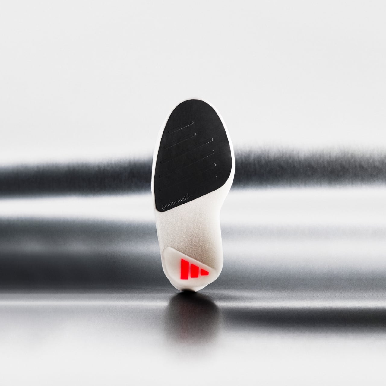
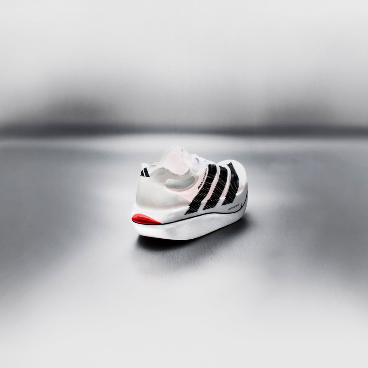
The Swiss brand’s new LightSpray Cloudmonster 3 Hyper doesn’t have a traditional upper. Instead, a robotic arm sprays a single continuous filament onto a foot-shaped mold, and in about three minutes, the entire upper is formed. No seams. No laces. No glue. The result bonds directly to the midsole through thermal fusing, and the whole shoe is made from just eight components. For context, a typical performance runner uses somewhere between 30 and 50. That’s not an incremental improvement. That’s a fundamentally different way to build a shoe.

Designer: On

On first debuted LightSpray in 2024, when marathon runner Hellen Obiri wore a prototype to win the Boston Marathon. Back then it was a single robotic unit in Zurich, a proof of concept more than a production method. Now the brand has opened a second factory near Busan, South Korea, housing 32 robots and boosting production capacity 30 times over. The technology has gone from lab curiosity to something you can actually buy, and that shift matters more than the shoe itself.

What makes the Cloudmonster 3 Hyper interesting as a design object is the tension between its upper and its sole. On top, you get this gossamer, almost skeletal spray-on structure that looks like it was grown rather than assembled. Below, there’s a massive stack of Helion HF hyper foam sitting on CloudTec cushioning geometry. Minimal above, maximal below. It’s a deliberate contrast, and it works visually in a way that most performance shoes don’t even attempt.

On co-founder Caspar Coppetti has said it’s what a shoe from Apple would look like, and while that comparison gets thrown around too loosely in consumer products, here it actually tracks. The Limelight/Bloom colorway, with its white upper, black branding, and yellow tooling, has that same kind of restrained confidence.

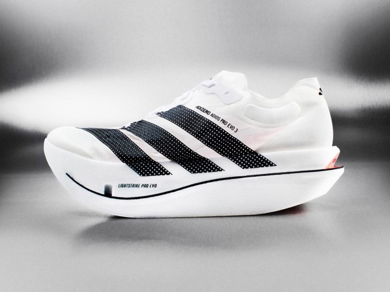
There are real performance implications, too. At 205 grams for a men’s US 8.5, it’s roughly 90 grams lighter than the standard Cloudmonster 3. That’s a significant gap for a max-cushion trainer. On deliberately skipped a carbon plate in the midsole, which is a choice that goes against the current arms race in performance footwear. The reasoning is sound: plates are great for race-day propulsion, but for training shoes built around long runs and high mileage, they can actually fatigue legs faster. The plateless design, combined with enhanced rocker geometry, is meant to keep your legs fresher over sustained efforts. It’s a shoe that asks you to trust the foam instead of the hardware.

The sustainability angle is worth noting without overstating. Eight components instead of dozens means less material waste and a simpler path to recyclability. On claims up to 75% lower CO₂ emissions for the upper compared to its other racing shoes. No running shoe is carbon-neutral, but the LightSpray approach at least moves in the right direction by simplifying what needs to be disassembled and reclaimed at end of life.

I do think there are legitimate questions about the laceless design. A form-fitting sprayed upper is a beautiful engineering solution, but it puts enormous pressure on the sock system and the structure itself to keep the foot locked down during dynamic movement. On includes an Elite Run Sock High Hyper with each pair, which is a smart acknowledgment that the shoe and sock need to function as a system. But runners with wider feet or higher arches should probably try these on before committing $280.

That price point is notable. It’s $90 more than the standard Cloudmonster 3 and $60 above the Cloudmonster 3 Hyper. You’re paying a premium for the LightSpray construction, and whether that premium is justified depends on how much you value the weight savings and the novelty of the technology. For some runners, that will be an easy yes. For others, the standard Hyper at $220 might be the smarter buy.

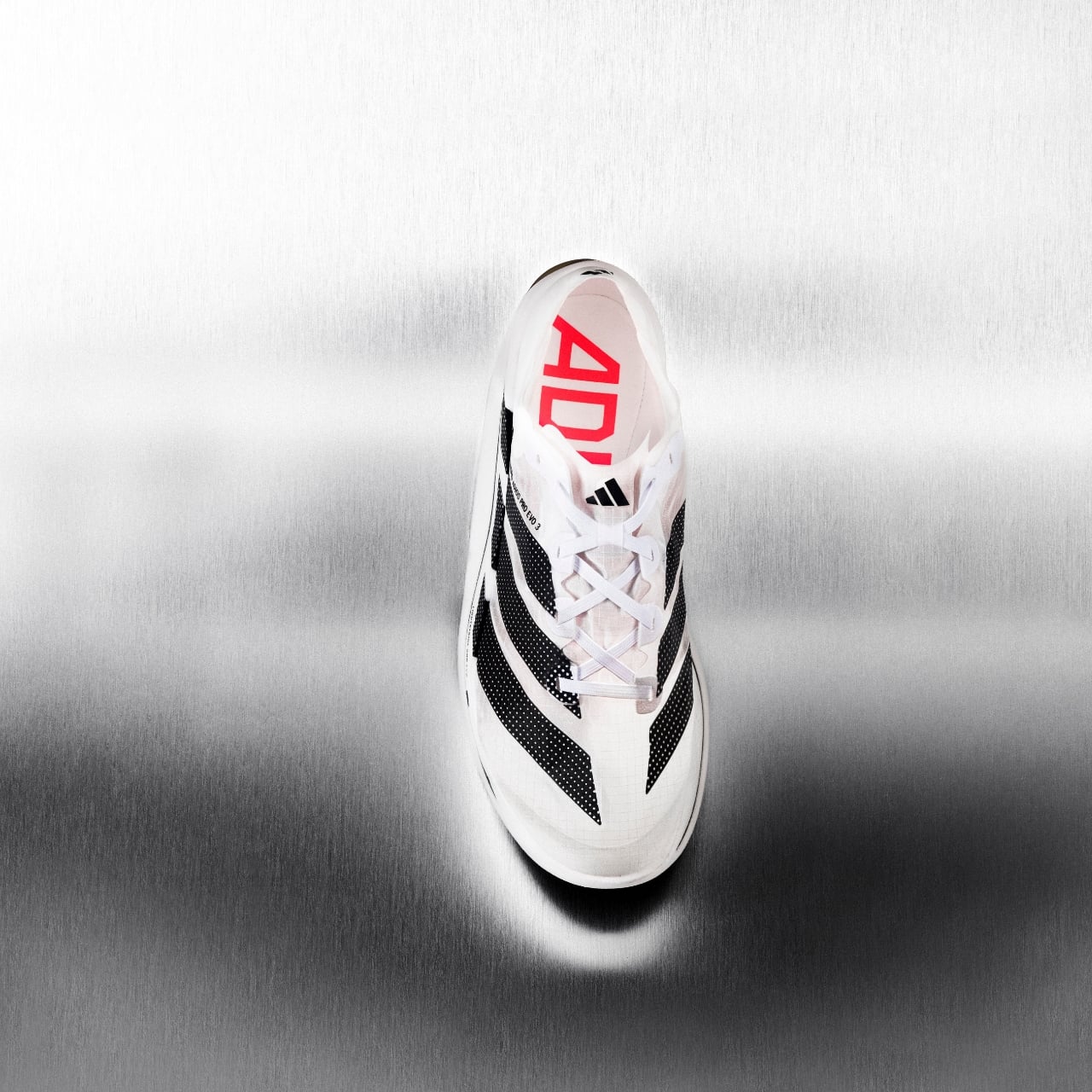
What excites me about this release isn’t really the shoe, though. It’s what it represents. The footwear industry has spent years competing on foam compounds and plate configurations, essentially tweaking the same fundamental construction methods. On is asking a different question entirely: what if the way we build the shoe is the innovation? A robot, a mold, three minutes, eight pieces. That’s a compelling answer, and I suspect the rest of the industry is paying very close attention.

The LightSpray Cloudmonster 3 Hyper drops March 5 in North America through On’s website and retail stores, with a global release following on April 16. It’s priced at $280.

The post Swiss Brand ‘On’ Just Built a $280 Running Shoe Using Robots in 3 Minutes first appeared on Yanko Design.

Stanley’s First-Ever Bag Has a Pocket Just for Your Tumbler

During the pandemic, the rise of the Stanley Cup moms was splashed all over social media. Most influencers and content creators were either sipping from their tumbler or had one sitting proudly in the background. There are other brands of reusable mugs and tumblers, of course, but Stanley was the go-to for a lot of people, particularly women. It wasn’t just about staying hydrated. It became a lifestyle statement, a collector’s obsession, and for many, a whole personality.

Now the brand is looking to expand its market with its first-ever bag, the Stanley 1913 Vitalize™ Macro Method Tote. While the main selling point of this bag is that it can carry your tumbler, it’s built to carry much more than just a water container. Think of it as a home for pretty much everything else you need to get through your day. The way it’s designed means it can match any lifestyle, whether you’re heading to the office, the gym, or just running your errands.

Designer: Stanley

The whole idea behind reusable tumblers is to always have water (or your favorite beverage) with you wherever you go. But sometimes, the bags we use aren’t sturdy enough to carry them around, so we just leave them at home. This bag from Stanley solves that particular problem with a tumbler securing belt and pocket, which is compatible with the 40-ounce Quencher® ProTour or Vitalize™ Shaker and gives you easy access to them whenever you need a sip. You could probably use other brands or models as well, but if you’re buying the Stanley bag, chances are you’re already a Stanley person anyway.

Other than that, there’s plenty to like about this bag, especially if you’re the type who prefers just one carrier for all your essentials. It has a zippered main compartment that provides secure and spacious storage for all the bigger items you need to haul around. There’s also an interior laptop sleeve to keep your laptop and other gadgets safe and scratch-free. You’ll also find an easy-access zippered front pocket for things you may need to grab on the go, like your keys, lip balm, or earbuds. And if that’s still not enough, there’s a foldaway interior Vitalize™ Macro Container pocket for when you need even more organization.

For something that’s meant to carry a hefty 40-ounce tumbler, the bag is naturally made from durable materials. Even better, it uses 100% recycled fabrics, so you can keep your carbon footprint low without compromising on style or durability. You can carry it as a handbag or a shoulder bag since it comes with both hand and shoulder carry straps. It holds nearly 28 quarts of capacity but sits at a slim 5.12″ depth, so it won’t get too bulky or cumbersome which is a nice balance for everyday use.

There are, of course, plenty of other bags on the market that offer similar features, but if you’re already a Stanley loyalist, this feels like a pretty natural next purchase. The minimalist design will also appeal to those who prefer their bags to be clean and unfussy. It comes in three colors: Black, Rose Quartz, and Sage Grey. This keeps things simple and versatile, easy to pair with just about anything in your wardrobe. It’s not trying to be flashy, and honestly, it doesn’t need to be.

At $110, the Stanley 1913 Vitalize™ Macro Method Tote is more than just a bag. It’s the natural next step in the Stanley lifestyle. Whether you’re a long-time collector who’s been following the brand since the tumbler craze first took over your feed, or someone who’s just discovering what all the fuss is about, this tote feels like a thoughtful extension of everything Stanley stands for: durability, functionality, and just the right amount of style. It’s the kind of bag you’ll reach for every single day, and if you’re anything like us, you’ll probably want one in every color.

The post Stanley’s First-Ever Bag Has a Pocket Just for Your Tumbler first appeared on Yanko Design.
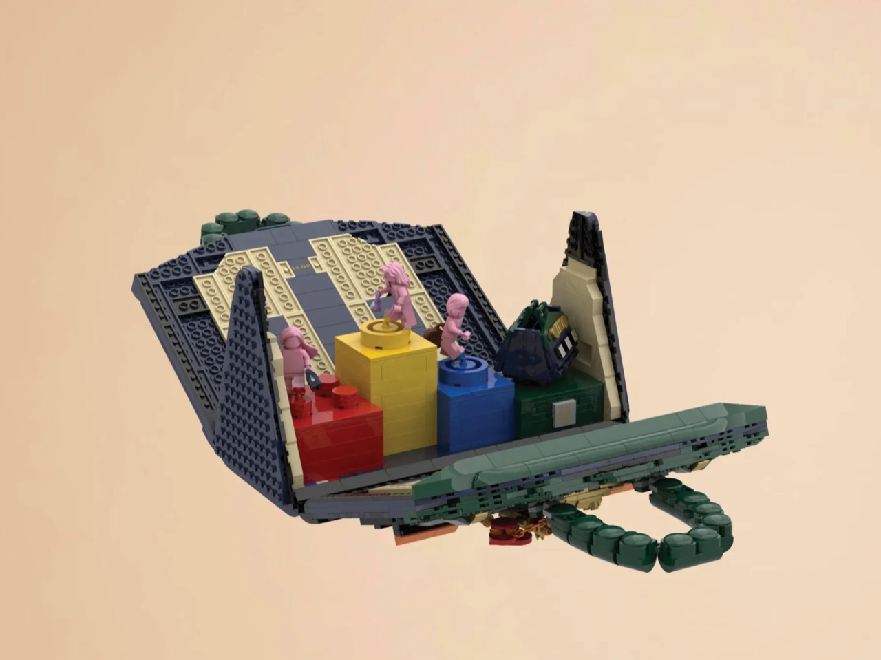
What Happens When a Bag’s Inside Becomes Its Outside

The first thing you notice about MAQL is how deliberately sculptural it looks. The handbag sits with an almost architectural presence, its curved body and rolled edges creating a form that feels more like a ceramic vessel than a typical leather accessory. That impression isn’t accidental. This is a bag designed to be looked at as much as it’s meant to be used.

Created through a collaboration between Tokyo-based design studio Nendo and leather artisans Bag Makers Tokyo, MAQL is constructed from a single laminated piece of leather with grain leather on one side and suede on the other. The entire structure emerges from a process of strategic folding and peeling, where the rim is turned back on itself to gradually reveal what becomes the exterior surface and handles. It’s a bit like watching origami in reverse, where the final form contains evidence of every fold that brought it into being.

Designers: Nendo and Bag Makers Tokyo

The name comes from makuru, meaning “to peel, to reveal” in Japanese, and that action is visible in every part of the bag’s construction. Where the leather rolls back, you see both textures at once: the smooth, structured grain leather meeting the softer suede underneath. The handles aren’t attached separately. They’re continuous with the body, formed by the same peeling motion that creates the bag’s opening. There are no hidden seams trying to disguise how this was made. The stitching is exposed where it needs to be, marking the transitions between surfaces.

What makes the design compelling is how it plays with the idea of inside versus outside. Traditionally, a bag’s interior is something you only see when you open it, a hidden space with different materials and construction than what’s visible to the world. MAQL eliminates that boundary. The suede that would typically be tucked away as lining becomes part of the exterior surface. The grain leather that forms the outer body curves inward to create the interior walls. You’re constantly seeing both sides at once, which changes how you relate to the object.

This isn’t just conceptual posturing. There’s a practical elegance to the construction. Because the bag is formed from a continuous piece of material rather than multiple panels stitched together, it has a structural integrity that feels substantial in your hands. The rounded bottom gives it stability when set down. The rolled edges create a soft, almost cushioned grip. And because both leather surfaces are visible, you’re touching different textures depending on how you hold it, smooth grain on one side, soft suede on the other.

Nendo, the studio founded by Oki Sato in 2002, has built its reputation on creating these kinds of quiet surprises, designs that reveal themselves through use rather than immediate visual impact. MAQL fits that approach perfectly. It’s minimalist without being stark, sculptural without being impractical.

The design also taps into something deeper in Japanese aesthetics, this long-standing appreciation for craftsmanship that doesn’t need to announce itself. Think of the way a kimono’s lining might be more elaborate than its exterior, seen only in glimpses, valued by those who know to look. MAQL takes that same philosophy but inverts it, bringing hidden construction to the surface where it becomes part of the design language.

The bag comes in a muted palette, mostly earth tones and soft neutrals that let the form and texture do the talking. There’s a larger version that works as a proper handbag and smaller iterations that function almost like pouches. Each size maintains the same folded construction, the same interplay between grain and suede, the same sense of a form that emerged organically from the material itself rather than being imposed upon it.

In a market saturated with bags that compete on logos and brand recognition, MAQL stands out by offering something different: visible craftsmanship, thoughtful construction, and a form that asks you to pay attention to how things are made. It’s not trying to signal anything beyond its own careful execution. For people who care about design, that’s more than enough.

The post What Happens When a Bag’s Inside Becomes Its Outside first appeared on Yanko Design.
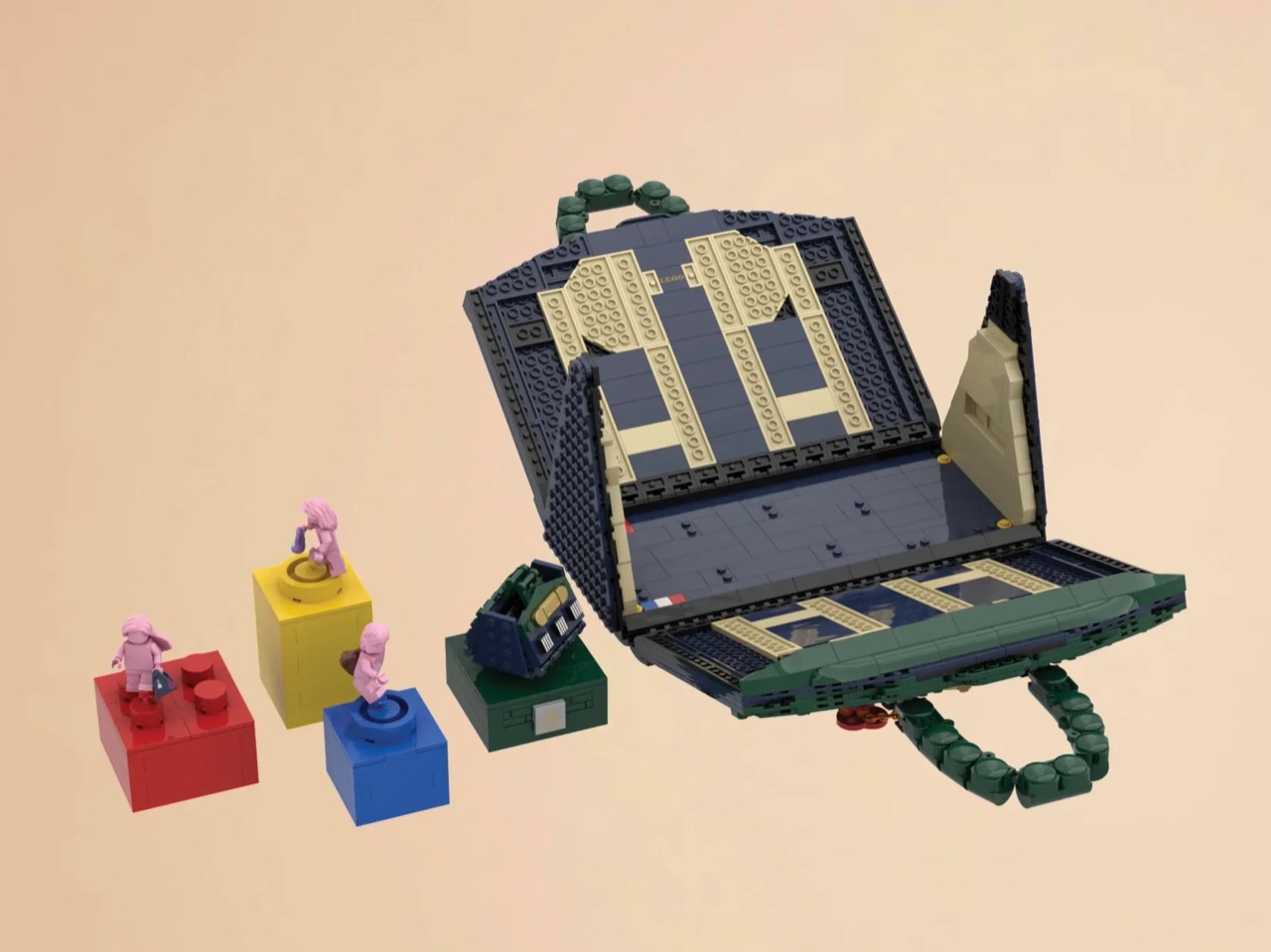
This Free Lidl Handbag Is Actually a Wearable Shopping Trolley

There are collaborations that make you nod and think, “that makes sense.” And then there are collaborations that make you stop mid-scroll, squint at your screen, and laugh out loud before you inevitably want the thing. Lidl and Nik Bentel’s new Trolley Bag is firmly in the second category.
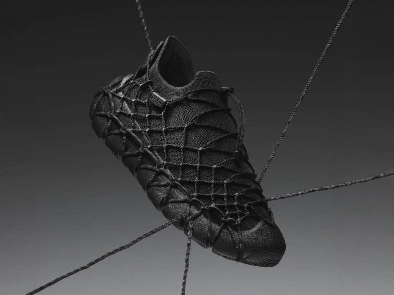
If you missed the chaos last year, here’s a quick recap: Nik Bentel is a New York-based designer who has built a career turning completely ordinary objects into pieces that live somewhere between fashion, sculpture, and a really good joke you can carry. His portfolio includes pasta boxes reimagined as bags, a lopsided coffee mug, and a steel musical ball. So when Lidl, the German budget supermarket chain, came calling for a second collaboration, it was never going to be boring. Their first project in 2024 was the Croissant Bag, a leather handbag shaped like a croissant tucked inside a replica of a Lidl bakery bag. It sold out in two minutes. Two minutes.

Designers; Nik Bentel x Lidl

So the question everyone has been asking since is: what does the second act look like? The answer is the Trolley Bag, and it’s exactly what it sounds like. Fabricated from industrial stainless steel, the bag is a miniaturized, wearable version of the Lidl shopping trolley. It keeps the cart’s recognizable grid structure, the tubular handlebar finished in Lidl’s signature yellow and blue, and even comes with a trolley coin keychain fob that actually works on real Lidl shopping carts in store. A detachable chain strap lets you wear it over the shoulder. It comes packaged with a dust bag and a gift box. It’s ridiculous. It’s brilliant. It’s possibly both at the same time.

What makes this collaboration land is the way Bentel thinks about the objects he chooses to reinterpret. He isn’t just slapping a designer name on something random for the sake of going viral. The shopping trolley caught his attention for a specific reason: the metal grid, the wheels, the child seat. It’s instantly recognizable anywhere in the world, purely utilitarian, never designed to be beautiful but accidentally achieving it anyway. When something is that optimized for function, it becomes timeless. That’s not the thinking of someone chasing a moment. That’s an actual design philosophy.

Lidl, for its part, seems to genuinely understand the assignment. Joanna Gomer, Lidl’s Marketing Director, described the Trolley Bag as “a reimagination of an everyday shopping essential designed for working not just the runway, but the aisles too.” There’s a knowing wink in everything about this collaboration, and yet it never tips over into being dismissive of its own concept. It takes the absurdity seriously, which is exactly what makes it work.

The bag made its debut around London Fashion Week, unveiled at a special Lidl Fresh Drop pop-up at 19 D’Arblay Street in Soho. The event ran on February 20 and 21, and to score the bag, attendees had to try their luck on a custom-built fruit machine. Because of course they did. A ballot opened on February 26 via Nik Bentel’s website for anyone who couldn’t make it in person, though entering doesn’t guarantee you one. And here’s the detail that makes the whole thing even more surreal: the bag is free. You read that right. One of the season’s most talked-about accessories comes at no cost, which may be the most Lidl thing about any of this.

It’s worth stepping back and appreciating what Lidl is pulling off here. Budget supermarkets getting in on fashion season used to be a novelty stunt. Now it feels like a legitimate creative strategy. Bentel’s work gives the brand a credibility that no amount of traditional advertising could buy, because the objects themselves start conversations. You see someone carrying a stainless steel shopping cart on their shoulder and you have to ask about it. That’s the real magic of the Trolley Bag. It doesn’t just sit at the intersection of design and everyday life. It points at that intersection and asks why we ever thought the two were separate in the first place.

The post This Free Lidl Handbag Is Actually a Wearable Shopping Trolley first appeared on Yanko Design.