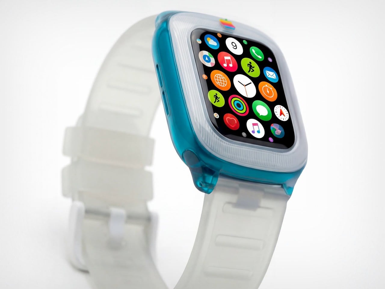
The iMac G3 was discontinued in 2003, around the same time Apple began pivoting to its clean, color-free aesthetic. Cut to a few years later and Apple transitioned entirely to aluminum for its devices, ushering in an era of sleek, and a few more years later, Apple built a computer small enough for your wrist. That means there was a little over a decade between Apple’s era of color, and the Apple Watch. Sadly, the two didn’t coexist in the same timeline, but that doesn’t mean a guy can’t imagine, right?
Saffy Creatives’ Apple Watch G3 concept brings the two together in what I can only describe as sheer nostalgic dream-come-true. The two design worlds collide perfectly – the body of a Watch with the soul of Apple’s G3 devices (tbh even the MacBook was absolute eye-candy). The results don’t just look fantastic, they honestly look wearable – like I would absolutely like to be caught with this piece of hand-candy across my wrist, even if its vibrant colors feel less serious than the cool metallic finish of your standard Watch.
Designer: Saffy Creatives
It’s worth noting that this isn’t just an existing watch with a plastic body. There are a few changes to the design itself to make it stand true to its inspiration. For starters, the watch has a chonky bezel, quite like the G3 iMac did. The bezel separates itself from the body by being made of an entirely separate plastic component. This is further reinforced by the watch’s two-tone colorway. The bezel adopts a clear white plastic design, while the body itself goes for the transparent tinted plastic that G3 fans know too well. The watch ditches all perceivable metal components, barring probably the crown, which looks like metal anodized to match the body’s color. The power button on the side is clear plastic, as are the lugs, and even the strap!
The G3 trend even carries to the Apple’s colored logo, which features on the bezel of the watch. It’s rare for the watch to have a logo on the front, but then again, it’s entirely inconceivable for Apple to make a plastic watch. But, like I said, a guy can dream! The colorful logo sits on the front, right above the standard touchscreen display with its curved glass almost perfectly mirroring the iMac G3’s CRT display.
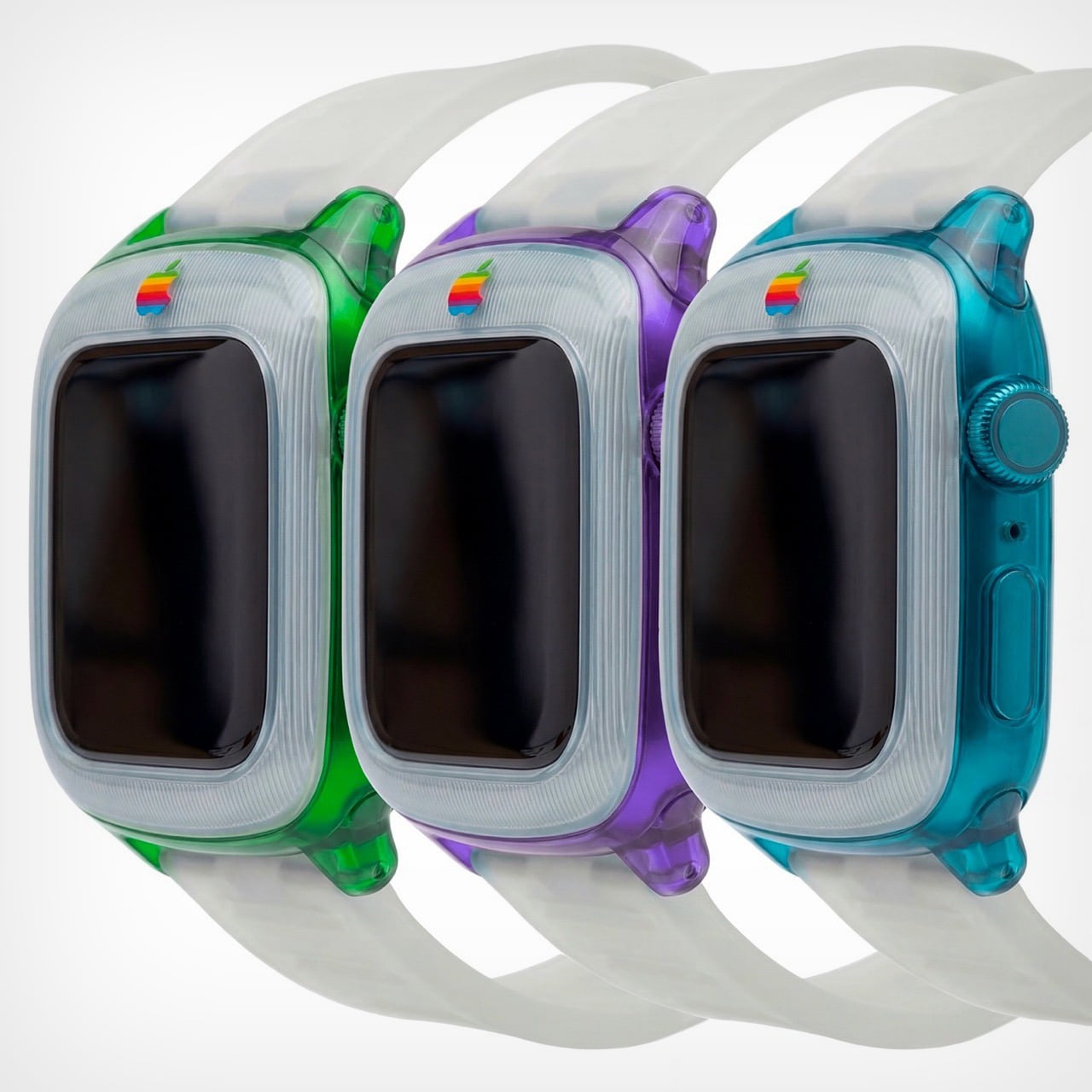
The watch comes in a variety of colors, all celebrating that short but iconic era. You’ve got the truly legendary Bondi Blue, along with the Strawberry, Lime, Tangerine, and Grape variants. Like I said, this is, for most parts, an entire redesign of the watch itself. It isn’t really possible to make a watch case that captures the retro beauty of this watch – unless you expand the design outwards to give the watch a true bezel, or cut into the watch’s screen to keep the exact proportions as shown here. That being said, I’d like to see Spigen or any other company try giving the Apple Watch a retro flavor. That being said, this iMac G3-inspired Watch Charger from Spigen is perhaps the closest we’ll ever come to seeing anything!
LEGO’s Speed Champions line has given us countless Ferraris, Porsches, and McLarens. Meanwhile, one of America’s most ambitious supercar projects sits conspicuously absent from the brick-built garage. The Saleen S7 deserves better than obscurity, and builder Nytedance has created a 1,200-piece proposal that makes the case beautifully. This isn’t a quick parts-bin creation but a thoughtfully detailed tribute to a car that once proved American manufacturers could play in the supercar sandbox.
The build captures everything that made the S7 special: those dramatic scissor doors, the trio of diagonal side vents that channeled air to the mid-mounted engine, and the low-slung stance that telegraphed serious performance intentions. Nytedance included opening hood and engine bay access alongside a detailed interior, giving the model the same display-worthy presence the real S7 commanded on showroom floors. At a time when automotive design often feels derivative, this MOC celebrates a machine that carved its own identity through pure American audacity and engineering ambition.
Designer: Nytedance
Here’s the thing about the S7 that most people forget: it was legitimately fast. Like, 2000-era supercar fast when that still meant something. The naturally aspirated version put out 550 horsepower from a 7.0-liter V8, which sounds almost quaint now until you remember the whole car weighed 2,865 pounds. Then in 2005 they strapped turbos to it because why not. Steve Saleen had spent years building hot rod Mustangs, so when he decided to build a proper supercar, he didn’t half-ass it. Carbon fiber monocoque, mid-engine layout, the whole European playbook executed by a company in Irvine, California. And somehow this car gets forgotten while we endlessly rehash which Ferrari from that era was best.
Those proportions are tricky because the car sits so low and wide, but the MOC nails that aggressive wedge shape without looking like a doorstop. The side intakes are the hero detail here, three diagonal slashes that became the car’s signature move. They’re rendered in white against black internals, creating the contrast you need for them to read properly at this scale. The scissor doors actually function, which feels mandatory given that half the reason anyone remembers the S7 involves those doors opening at car shows. Look at the rear haunches and how they flare out over the wheels. That’s not easy to pull off with LEGO’s predominantly rectangular vocabulary, but it works. The builder used curved slopes intelligently instead of trying to force angles that would look chunky.
The white color is clean enough to let you study the form without distraction, plus it matches one of the more common S7 liveries. Those red taillights pop against the white body, four circles arranged in a quad pattern that anyone who spent time with Need for Speed games will recognize instantly. The wheels use those multi-spoke pieces that suggest performance without going full boy racer. At 1,200 pieces, this sits in an interesting spot between impulse purchase and serious investment. You’re committed enough to display it properly but you’re not dropping Technic Bugatti money.
LEGO Ideas is basically democracy for brick nerds. You submit a design, people vote, and if you hit 10,000 supporters, LEGO actually reviews it for potential production. Get approved and your MOC becomes a real set with your name on the box and royalties in your pocket. Nytedance’s Saleen S7 is live on the platform now, so if you think American supercar history deserves shelf space next to all those Prancing Horse sets, go vote for it. The S7 spent too long in obscurity already.
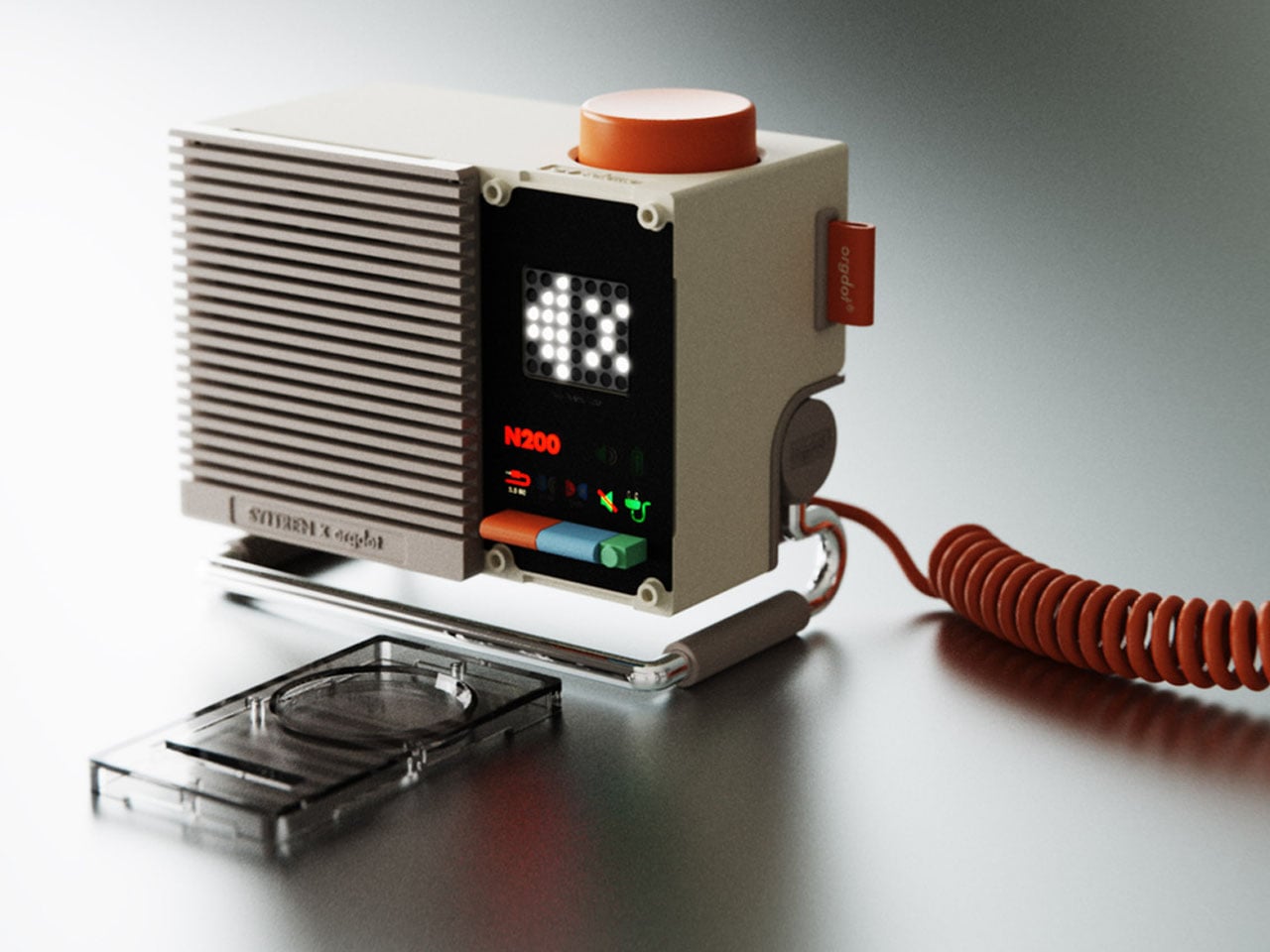
Desktop Bluetooth speakers are plentiful, and the one you choose for your desk setup purely depends on the desired audio signature and your design affinity. While the commercially available desktop speakers from numerous brands go for the tried and tested designs with some trendy innovations in the mix, some unique desk speaker designs do catch our attention.
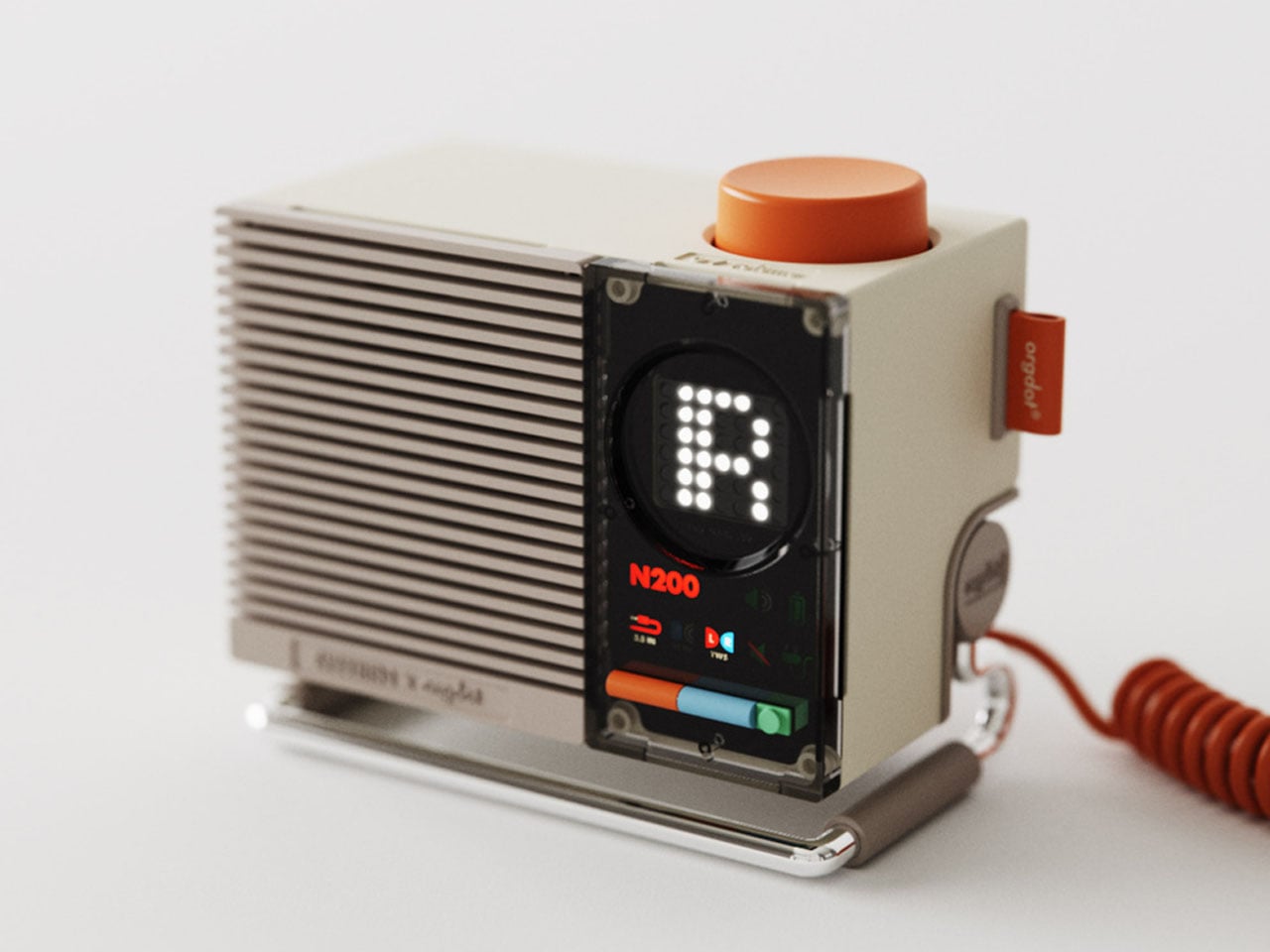
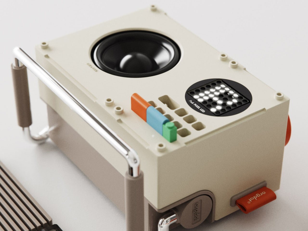
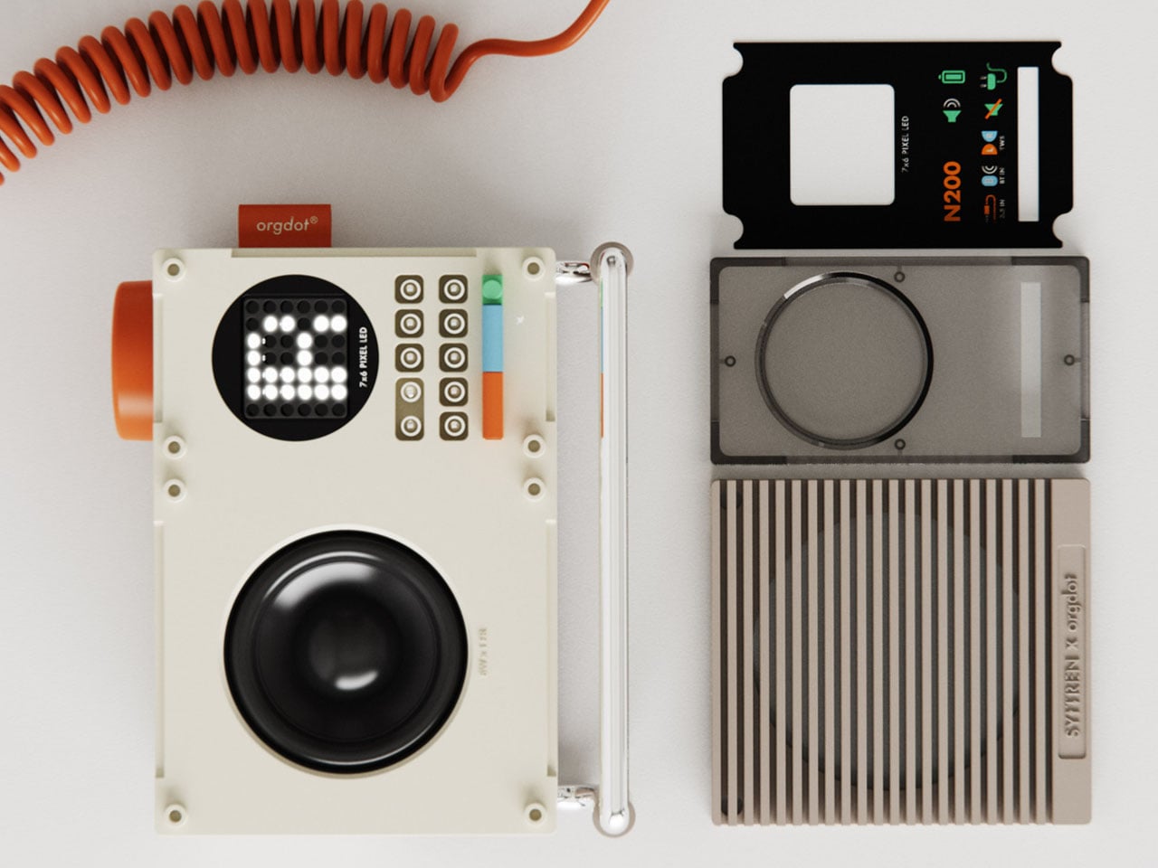
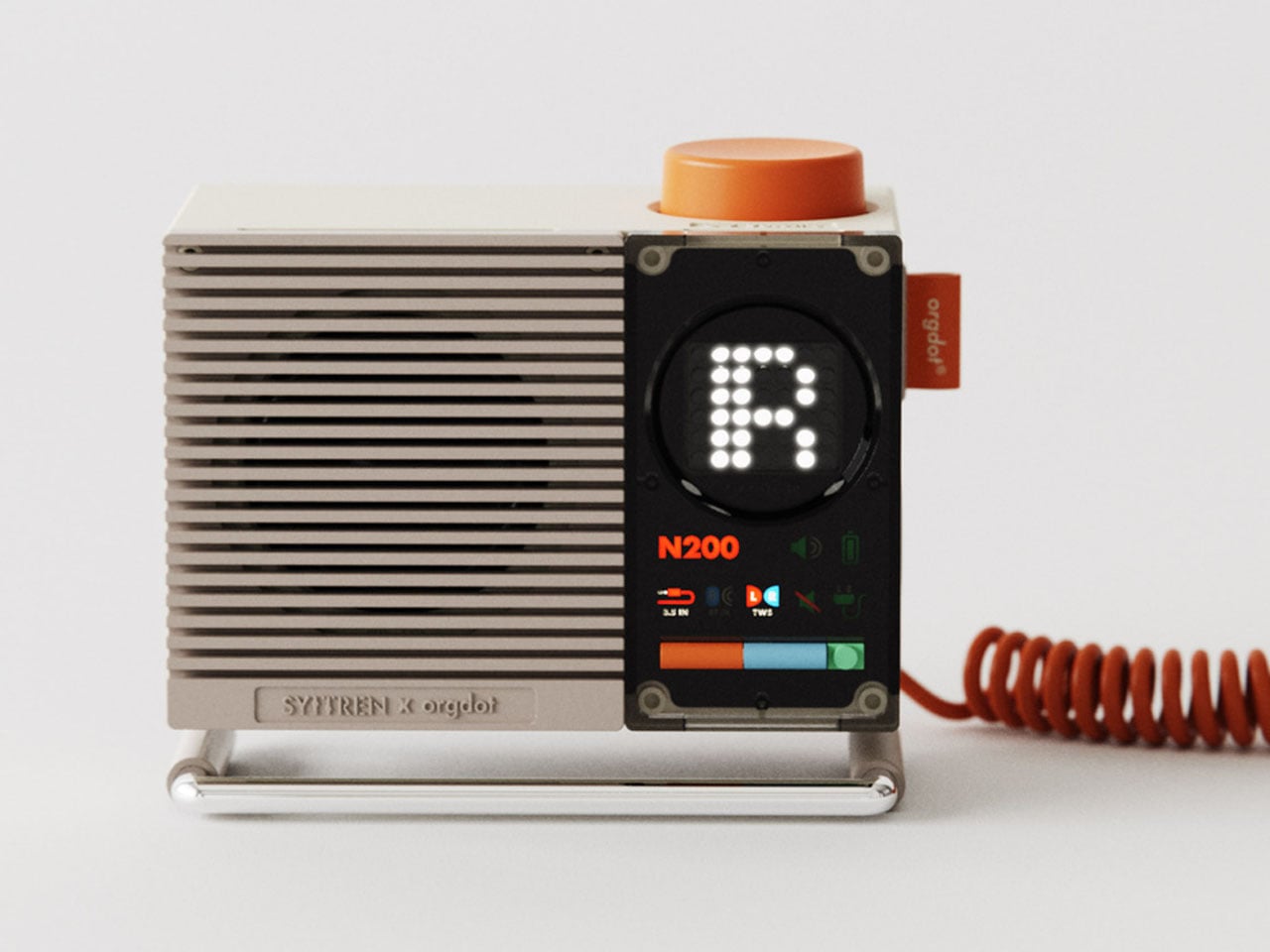
This is the Orgdot N200 Bluetooth desktop speaker that bears a tell-tale industrial design influence and a pinch of steampunk vibe. Designed by Shu Zhang and his team, the wireless speaker is mindful of the design sense of modern users. The primary motive is to create a relaxing and immersive atmosphere for the user, while keeping the practical functionality intact. The retro-modern form of the speaker takes you back in time when muted colors were beautifully fused with the vibrant hues to instantly pep up any desk space.
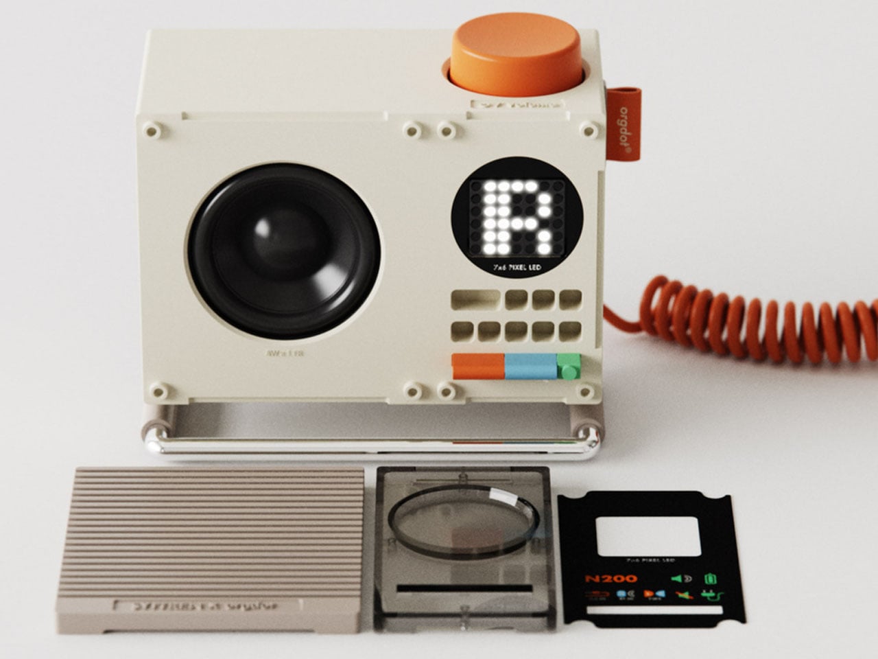
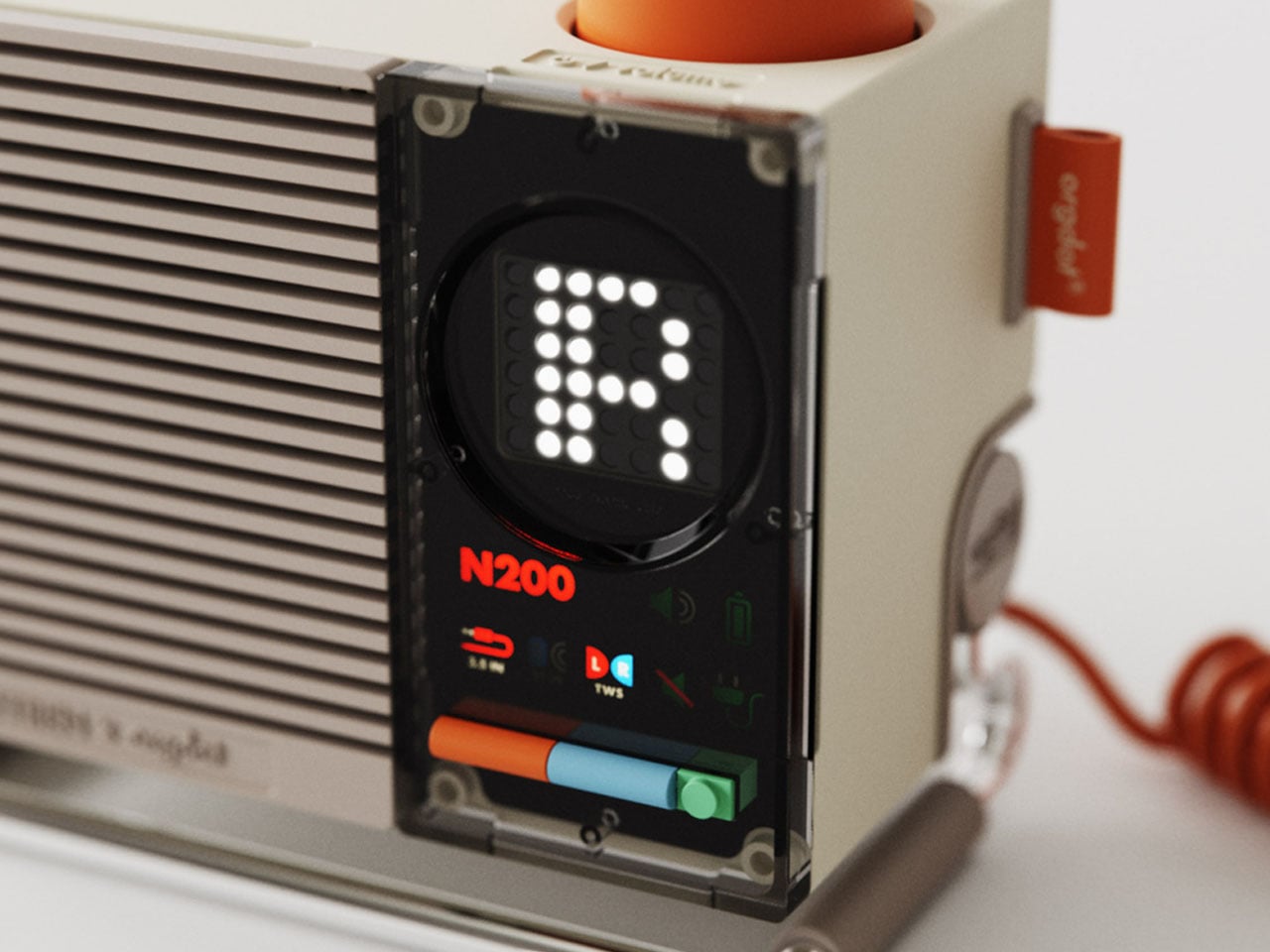
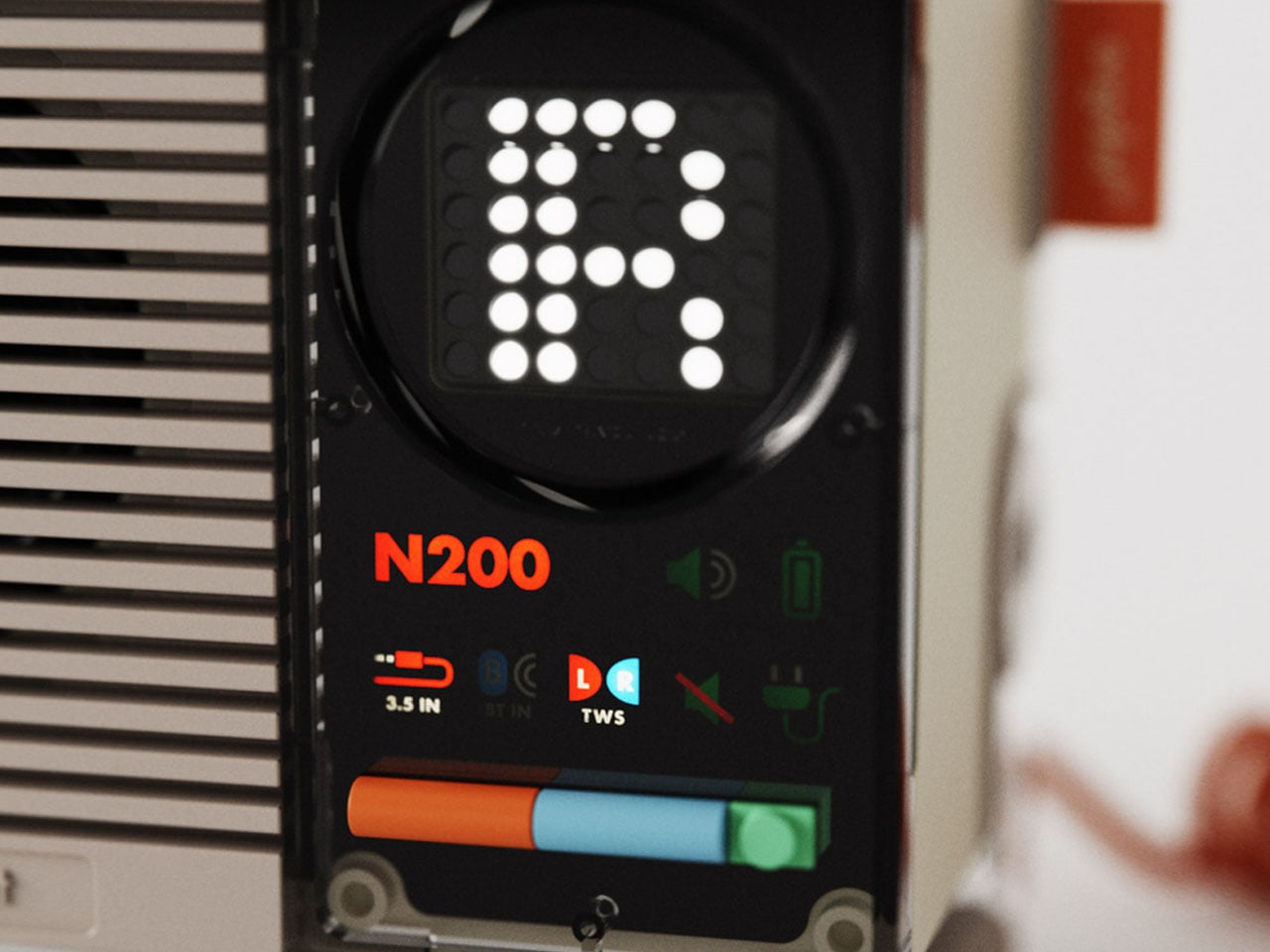
The Orgdot Bluetooth speaker draws inspiration from the modular design of the LEGO bricks, thereby having a swappable front panel, physical buttons, indicator lights, and a dot-matrix display. First look at this thing, and I presumed it was a Teenage Engineering-inspired product, but it turned out otherwise. This makes the audio accessory much more than just a possession to listen to your favorite tunes. It’s more like a playable and explorable sound companion for your desk. I can already imagine this one sitting on my geeky desk with the future garage or lo-fi tunes playing for hours on end as I dive deep into my productive sessions.
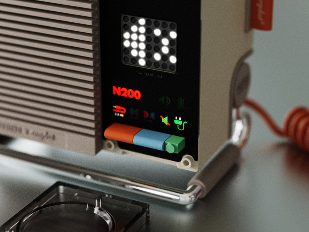
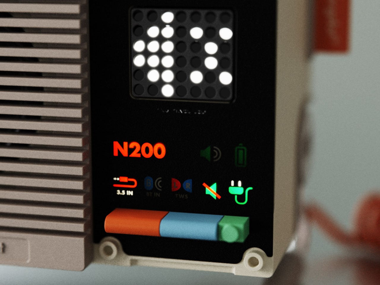
For Shu, the guiding principle in crafting the speaker is “Form Follows Function.” Keeping intact the brand’s signature design ethos, the portable speaker has a simple geometric shape for visual consistency. Coming back to the choice of colors, the low-saturation beige for the body frame brings an element of tranquil aesthetic, while the bright orange denotes the interactive components like the volume dial. To put stress to a minimum on the new users, the physical button colors correspond to the corresponding icons. To put the speaker on the desk sturdily and have a distinct appeal, the integrated metal stand adds to the nostalgic charm. The design of the stand enables multi-level adjustment to adjust the elevation depending on the desktop layout.
The 8Watt speaker is made out of plastic, metal, and rubber with strategically placed functional zones for the best tactile experience. It comes with support for TWS pairing, wherein you can connect two N200s for an even more immersive soundscape. The pixel display shows all the current playback vitals and the preloaded emoticons, which is cool. On the back, there are aux-in and USB-C connectivity options as well, so that you can connect the BT speaker to physical hardware.
Desktop Bluetooth speakers are plentiful, and the one you choose for your desk setup purely depends on the desired audio signature and your design affinity. While the commercially available desktop speakers from numerous brands go for the tried and tested designs with some trendy innovations in the mix, some unique desk speaker designs do catch our attention.
This is the Orgdot N200 Bluetooth desktop speaker that bears a tell-tale industrial design influence and a pinch of steampunk vibe. Designed by Shu Zhang and his team, the wireless speaker is mindful of the design sense of modern users. The primary motive is to create a relaxing and immersive atmosphere for the user, while keeping the practical functionality intact. The retro-modern form of the speaker takes you back in time when muted colors were beautifully fused with the vibrant hues to instantly pep up any desk space.
The Orgdot Bluetooth speaker draws inspiration from the modular design of the LEGO bricks, thereby having a swappable front panel, physical buttons, indicator lights, and a dot-matrix display. First look at this thing, and I presumed it was a Teenage Engineering-inspired product, but it turned out otherwise. This makes the audio accessory much more than just a possession to listen to your favorite tunes. It’s more like a playable and explorable sound companion for your desk. I can already imagine this one sitting on my geeky desk with the future garage or lo-fi tunes playing for hours on end as I dive deep into my productive sessions.
For Shu, the guiding principle in crafting the speaker is “Form Follows Function.” Keeping intact the brand’s signature design ethos, the portable speaker has a simple geometric shape for visual consistency. Coming back to the choice of colors, the low-saturation beige for the body frame brings an element of tranquil aesthetic, while the bright orange denotes the interactive components like the volume dial. To put stress to a minimum on the new users, the physical button colors correspond to the corresponding icons. To put the speaker on the desk sturdily and have a distinct appeal, the integrated metal stand adds to the nostalgic charm. The design of the stand enables multi-level adjustment to adjust the elevation depending on the desktop layout.
The 8Watt speaker is made out of plastic, metal, and rubber with strategically placed functional zones for the best tactile experience. It comes with support for TWS pairing, wherein you can connect two N200s for an even more immersive soundscape. The pixel display shows all the current playback vitals and the preloaded emoticons, which is cool. On the back, there are aux-in and USB-C connectivity options as well, so that you can connect the BT speaker to physical hardware.
LEGO transformed from a childhood toy to a design phenomenon this year, releasing sets that blur the line between construction kit and sculptural art. The Danish company pushed beyond simple nostalgia, creating builds that demand interaction, celebrate cultural touchstones, and challenge what plastic bricks can become. From mechanized aquariums to Broadway stages, these releases prove LEGO understands what adult collectors actually want.
The 2025 lineup reads like a designer’s fever dream come to life. These aren’t sets you build once and forget. They’re conversation pieces that reward closer inspection, mechanical marvels that turn cranks into storytelling devices, and cultural time capsules that capture moments before they fade completely. Each represents a different approach to what LEGO can accomplish when designers stop thinking about toys and start thinking about experiences worth displaying.
1. LEGO Ministry of Silly Walks
Monty Python’s most absurd sketch has finally received the brick-built treatment it deserves. John Cleese’s Mr. Teabag materializes in LEGO form, complete with exaggerated proportions that capture every ridiculous knee-flinging motion from the original performance. The Technic joints aren’t just decorative additions. They allow for an impressive range of articulation, letting you recreate those impossibly precise movements that made the sketch legendary. The build manages something difficult: translating physical comedy into a static medium while maintaining every ounce of visual humor.
The facial expression deserves special mention. Sculptors working on this captured Mr. Teabag’s deadpan seriousness with the kind of attention usually reserved for museum-quality reproductions. The silhouette reads instantly from across a room, making it perfect for display alongside more traditional LEGO architecture. The bowler hat and umbrella complete the bureaucratic aesthetic, turning this into a celebration of British absurdist comedy that works whether you’re a Python fanatic or appreciate builds with genuine personality and wit.
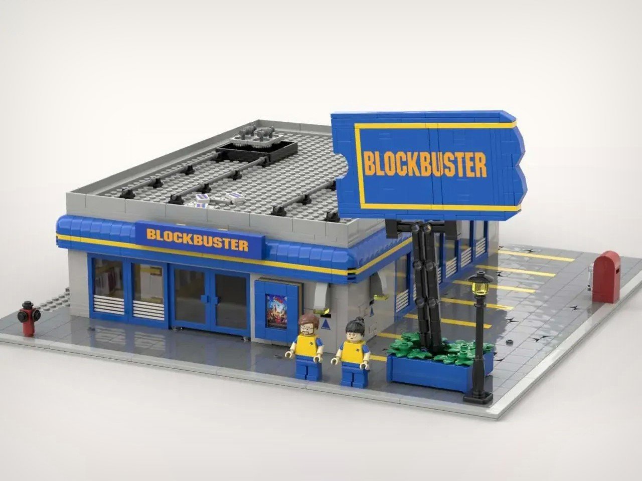
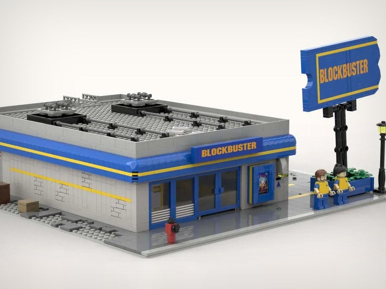
2. LEGO Blockbuster Video Store
Nostalgia crashes into modular building design with this recreation of America’s defunct rental empire. The blue-and-yellow storefront transports you straight back to Friday nights spent racing through aisles of VHS tapes, desperately searching for anything decent before someone else grabbed it. The modular structure integrates seamlessly into existing LEGO cityscapes, though it commands attention standing alone. Tiny VHS cases line the shelves with impressive detail, while that ticket-shaped sign captures the exact aesthetic that defined a pre-streaming era when entertainment required physical effort and late fees.
The exterior nails every architectural element that made Blockbuster immediately identifiable. Flat roof, oversized glass windows, and that unmistakable color palette all receive faithful treatment. The parking lot addition shows a real understanding of the complete Blockbuster experience. Saturday nights meant circling for spots while your friend waited inside, holding the last copy of whatever blockbuster justified the trip. The set becomes a time machine built from ABS plastic, preserving a retail experience that vanished almost overnight when Netflix rewrote entertainment distribution and made movie night something you do from your couch.
3. LEGO Hudson Class Steam Locomotive
ALCo’s 1937 J-3a Hudson-class locomotive roars back to life in 1,350 meticulously placed pieces. The New York Central 5405 once hauled luxury passengers between New York and Chicago at speeds exceeding 90 mph, making it one of the fastest steam locomotives of its era. That legacy translates beautifully into LEGO form, capturing the streamlined aesthetic that defined American railway design. The 4-6-4 wheel arrangement receives accurate treatment, with those massive driving wheels creating an impressive profile whether displayed static on a shelf or rolling along classic LEGO train tracks.
Full motorization separates this from static display models. Watching this steam locomotive glide under its own power delivers something magical that photography can’t quite capture. The design nails the sleek Hudson-class look, from the smooth boiler and sloped smokebox to the intricately detailed side rods that mimic genuine locomotive motion. The tender faithfully recreates the coal and water carrier that made long-distance runs possible. The real 5405 was scrapped in 1956, but this gorgeous amalgamation of plastic bricks ensures the legend continues rolling for future generations of railway enthusiasts.
4. LEGO Bob’s Burgers Restaurant
The Belcher family’s combined home and restaurant arrives in an ambitious 2,991-piece set that recreates both floors with remarkable precision. The ground floor captures the setting of countless episodes where Bob frets over his latest burger creation. The chalkboard “Burger of the Day” sits lovingly recreated in brick form. The dining area maintains that no-frills charm fans recognize immediately, sitting alongside the cramped bathroom and bustling kitchen where the show’s humor and heart collide. These spaces transcend simple scenery, becoming environments that feel genuinely lived-in and authentic to the animated source material.
The upstairs apartments shine even brighter through personality-driven details. Tina’s corner includes her “Friend Fiction” notebook for capturing awkward brilliance. Gene’s keyboard and megaphone stand ready for his next musical misadventure, while Louise’s trusty Kuchi Kopi nightlight guards her space with its eerie green glow. These thoughtful inclusions make each room feel alive, as though the characters themselves consulted on the design. The build proves that animated sitcoms translate remarkably well into LEGO form when designers understand that props and environments carry as much narrative weight as the characters themselves.
5. LEGO Hamilton Musical Stage
Lin-Manuel Miranda’s revolutionary musical gets the brick treatment it deserves with this meticulously detailed recreation of the Richard Rodgers Theatre stage. The submission captures everything that made Hamilton culturally transformative, from the dual staircases flanking the performance space to that iconic rotating floor that actually turns in the model. The designer nailed the spatial dynamics that director Thomas Kail used to bring America’s founding to life through hip-hop and R&B. Every architectural element serves both form and function, making this a display piece that tells stories through choreography frozen in plastic bricks.
The upper mezzanine receives equal attention, complete with golden rope rings used throughout the show’s elaborate choreography. This 2,000-piece concept doesn’t skip on historical or theatrical accuracy. The attention to staging details reveals someone who truly understands how theater design creates narrative flow. From cabinet rap battles to dramatic duels, this build captures the essence of a show that redefined Broadway for a new generation. The rotating stage mechanism alone justifies the complexity, turning this from a static diorama into something that hints at the kinetic energy that made the original production so revolutionary and culturally significant.
6. LEGO Subaru Impreza WRC
TOMOELL’s fan design resurrects Colin McRae’s championship-winning rally car in stunning detail. The deep blue body adorned with “555” livery-inspired graphics immediately transports enthusiasts back to the 1990s golden age of rally racing. Gold rally wheels, aggressive hood scoop, race-bred front bumper, and that unmistakable rear wing all channel the spirit of Prodrive’s engineering masterpiece. The builder spent countless hours perfecting contours and angles, ensuring the brick model faithfully represents the high-octane machine that dominated rally stages and defined a generation of motorsport gaming memories.
The real Impreza WRC represented a triumph of engineering philosophy. Prodrive made the car 160mm shorter than its predecessor, with a 60mm shorter wheelbase for improved agility on tight rally stages. Colin McRae’s 1995 World Rally Championship win made him the youngest champion in WRC history at that time, cementing both driver and car as legends. The combination of turbocharged power, symmetrical all-wheel drive, and relentless durability made it unstoppable on gravel, snow, and tarmac. This LEGO recreation preserves not just a car but an entire era when rally racing captured imaginations worldwide.
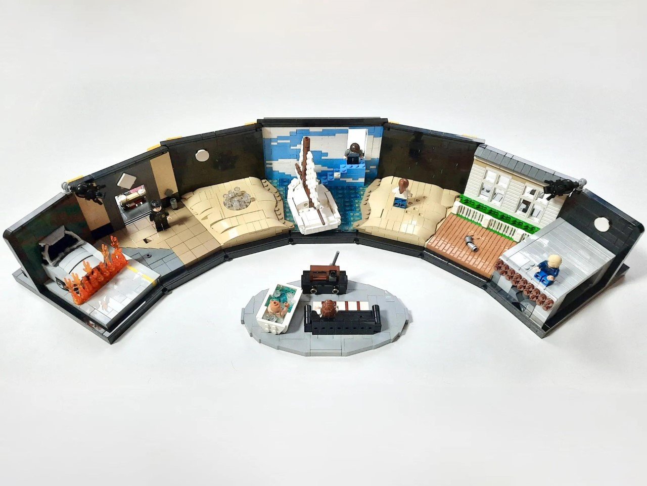
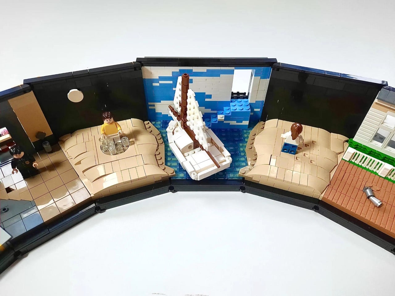
7. LEGO The Truman Show Diorama
This detailed tribute to the 1998 film centers on the massive amphitheater-like arc that encased Truman’s manufactured life. The curved exterior suggests the illusion of endless sky, but inside reveals a stark reality. Seven of the movie’s most memorable scenes are tucked within its walls, turning the structure into both a stage and a prison. The climactic moment sits at the heart of everything: that door to the real world camouflaged against painted clouds, waiting for Truman to step through. The visual encapsulates the film’s core message about control, freedom, and pursuing truth despite comfortable lies.
The movie feels unnervingly prophetic now. What seemed like strange dystopian fiction in 1998 reads as a documentary in 2025, with devices constantly surveilling our lives for content and data. Builder Trojada understood that the sets themselves told the story as powerfully as the script. The diorama format works perfectly for a film about manufactured reality and hidden cameras. Each carefully placed scene reminds us that privacy disappeared while we were distracted by convenience. The build succeeds because it captures not just iconic moments but the claustrophobic architecture of surveillance that Truman spent his entire life trying to escape.
8. LEGO Tropical Aquarium
LEGO entered kinetic sculpture territory with the Icons Tropical Aquarium, a 4,154-piece meditation on movement and marine life. This isn’t another static display gathering dust. Four hand-cranked mechanisms transform passive viewing into active participation, creating an interactive experience that rewards repeated engagement. Dials control a seahorse emerging from coral, a hermit crab scuttling across the sand, a hidden octopus revealing itself, and a turtle gliding through kelp forests. The design language speaks to Victorian-era mechanical theaters and curiosity cabinets, where engagement meant touching, turning, and discovering secrets through tactile exploration.
Each crank turns deliberately. Each rotation creates observable change through visible mechanics that teach basic physics through clever engineering. Turn this gear and watch that element respond with cause and effect made tangible. The mechanics aren’t hidden inside mysterious black boxes. They’re legible, educational, and satisfying in ways that battery-powered gimmicks never achieve. At $479.99, it’s positioned as a premium home sculpture rather than a traditional LEGO set. The November 13 launch signals LEGO’s confidence that adult collectors want mechanical interaction and living design rather than one-time assembly satisfaction followed by permanent shelf placement.
9. LEGO Louis Vuitton Train Case
Louis Vuitton pioneered rectangular travel cases in an era when dome-topped designs dominated. Born in 1821, Vuitton chased efficiency while adding fashionable distinction. Dome tops shed water like umbrellas but made stacking impossible on trains, steamboats, and carriages. His reinforced corners and air-tight rectangular designs became so famous that the Empress herself chose them exclusively, beginning a legacy that would define luxury travel for generations. Terauma’s LEGO Train Case reimagines the company’s iconic design, manufactured since 1980, preserving heritage even though nobody buying authentic LV gear travels by train anymore.
The builder managed remarkable detail within LEGO’s limitations. Reinforced corners, handle, stackable inner compartments, and that famous monogram all receive faithful treatment. This remains pure concept work since Louis Vuitton’s legal team would likely intervene before any official production. If LEGO made this fan design a reality, extensive brand partnerships and prerequisite permissions would be necessary. The build succeeds as an exercise in translating luxury goods into brick form, proving that fashion and travel heritage translate surprisingly well when designers respect both the source material and the medium’s capabilities and constraints.
10. LEGO Willy Wonka Chocolate Factory
Pure imagination meets engineering excellence in this official 2,025-piece LEGO Ideas masterpiece, bringing Roald Dahl’s magical world to life. Activate that dial and watch chocolate cascade down the waterfall in genuine flowing motion. This transcends building and displaying, becoming an experience that captures what made the original story so captivating. The Wonkatania boat sits ready for adventure while candy-themed flora creates an environment that feels genuinely enchanted throughout every detail. Gene Wilder’s iconic performance gets honored through a newly created ochre hair piece that perfectly captures his unforgettable look.
At 20.5 inches wide and 7.5 inches tall, this build commands serious shelf real estate, but every inch justifies itself through incredible detail work. Nine minifigures bring the story to life, from Wonka himself to the questionable parents and doomed children who learned valuable lessons through confectionery chaos. The $219.99 price point positions it as an investment for serious collectors who understand that watching chocolate flow while surrounded by candy gardens delivers value beyond simple brick count. The set proves LEGO Ideas continues producing culturally significant builds that honor source material while pushing mechanical innovation forward.
The Future of LEGO Design
These ten sets represent something larger than individual releases. LEGO recognized that adult collectors crave cultural authenticity, mechanical interaction, and architectural ambition beyond childhood nostalgia. The 2025 lineup spans comedy sketches, defunct retail, theatrical productions, automotive legends, film sets, luxury fashion, and kinetic sculpture. That diversity signals confidence in serving varied collector interests rather than chasing mass appeal through safe choices.
The emphasis on movement and mechanism marks a philosophical shift. Static display no longer satisfies when hand-cranked gears and motorized elements create ongoing engagement. These builds reward returning to them repeatedly, discovering new details, and experiencing different interactions. LEGO redefined what building blocks become when designers prioritize sculpture, theater, and experiential design over simple construction toys. The future looks exceptionally creative for anyone willing to invest in plastic bricks that transcend their humble origins.
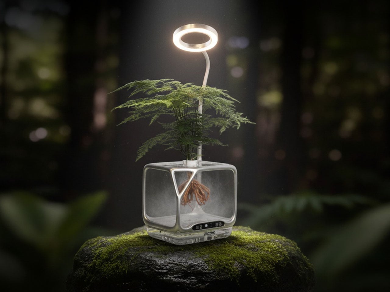
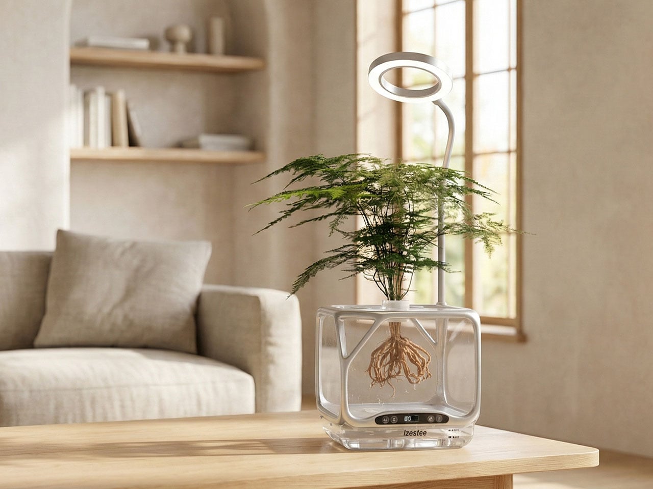
Biophilic interiors, where people are more connected to nature, are becoming really popular. Just everyone wants plants on the work desk and leafy green sprouting out right in their kitchen. I haven’t really jumped onto the bandwagon primarily for two reasons: The mess of dealing with mud and fertilizers and the constant need for watering. Now, with the world’s first desktop aeroponic plant ecosystem that could stand to change for me, and for many like me, who have been holding themselves back for some reason, err… laziness.
With the new smart mist planter, growing plants becomes something you can constantly see, touch, and truly enjoy day in a day out, while the plants grow right in front for your eyes. The system comprises a transparent chamber, a planting panel, and an adjustable light. It permits the plant to grow floating in mid-air, without soil or water; just with nutrient-rich mist, keeping the roots hydrated to grow life beautifully, right at your desk, without you having to even move a muscle.
Dubbed the Izestee, this is a no-soil, no-pest, no-mess planter which grows plants, works as a passive humidifier, and functions as a desktop lamp. The 3-in-one desktop aeroponic plant cultivator is designed to use ultra-fine mist instead of soil and automatically control every stage of growth – from seed to bloom – as it happens with its smart and automatic scheduling.
Each Izestee comes with seven planting baskets, designed to seed and provide a structured place for germination. Beneath, a see-through chamber provides a nice view of the roots growing in real time. It’s here that the roots are hydrated with mist and they grow dramatically healthier. The mist, along with nurturing the roots gently, escapes the unit and humidifies the room it’s placed in.
The system comprises three lighting modes, with different brightness levels, which can adapt to the different moods, moments and spaces. The lights can change color and brightness levels from a rotating effect during the day to a single color by night. The different light modes inside the chamber are controlled using a tactile button on the façade of the Izestee, just above its base.
In addition to nutrients and light, the chamber of the planter is also provided with a built-in heating system, which has a maximum temperature of 45 degrees. The heating system maintains a constant temperature, which is visible on the LED display for real-time temperature monitoring. The small digital display sits in the middle of the control panel and features the temperature controller to its left.
When the plant has grown above the planting panels, the adjustable light takes over. The full-spectrum light can bend and tilt at any angle or height required and mimics the sun’s light for indoor growth of the plants. In addition to plant lighting, this adjustable light with adjustable brightness levels can be used as a desk lamp or night light.
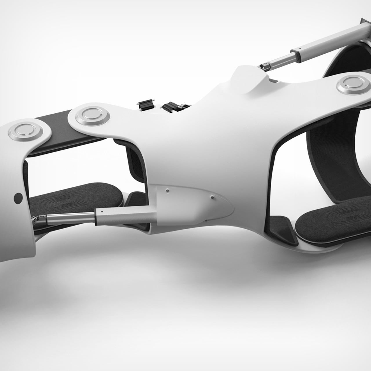
Watching a dog struggle to walk is quietly heartbreaking. Movement, for animals, is not just mobility. It is freedom, confidence, and joy. The Pet Power Assistive Exoskeleton was born from this understanding, blending emotional insight with advanced engineering to create a rehabilitation solution that truly listens to the animal it supports.
The project’s inspiration traces back to a news report on prosthetic limbs designed for disabled pets. While well-intentioned, many of these solutions revealed clear shortcomings. They were passive, rigid, and often uncomfortable, offering limited support beyond basic mobility. This realization became deeply personal when the designer cared for their own dog after a hindlimb injury. Seeing firsthand how difficult recovery could be for an animal exposed a larger issue. Modern rehabilitation technology has evolved rapidly for humans, yet animal care continues to rely on simplified, often outdated aids. This gap sparked a mission to extend intelligent, humane rehabilitation into veterinary practice.
Designer: Leijing Zhou
Instead of forcing movement, the Pet Power Assistive Exoskeleton focuses on understanding intention. Borrowing principles from active exoskeleton systems used in stroke rehabilitation, the device uses surface electromyographic sensors to read muscle signals from a dog’s healthy forelimb. As the dog initiates movement, these signals are analyzed in real time to predict how the impaired hindlimb should move. The system then activates precise mechanical assistance, synchronizing the injured leg with the dog’s natural gait.
This approach transforms rehabilitation into a cooperative process rather than a mechanical correction. The dog leads, and the technology follows, creating movement that feels natural, fluid, and instinctive. By aligning assistance with intention, the exoskeleton reduces strain, encourages correct gait patterns, and supports faster, more confident recovery.
Personalization is central to the design philosophy. Every dog has a unique body, posture, and injury profile, so the exoskeleton is created using advanced 3D printing based on individual body scans. This ensures a tailored fit that distributes weight evenly and avoids discomfort. Carefully selected materials such as lightweight structural components, soft memory foam padding, and non slip contact surfaces prioritize comfort, stability, and long term wearability. This makes the device suitable not only for clinical rehabilitation but also for everyday use.
Developed between 2023 and March 2025 in Hangzhou, the project required extensive research and experimentation. One of the greatest challenges was interpreting muscle signals in animals, an area with little existing data or standardized methods. Translating raw biological signals into reliable movement predictions demanded repeated field testing, iterative modeling, and close observation of real canine behavior. Equally complex was balancing strength and comfort, designing a structure robust enough to assist movement while remaining gentle and non restrictive.
Ultimately, the Pet Power Assistive Exoskeleton represents more than a technical innovation. It reflects a shift in how we think about animal care, recognizing pets not as passive recipients of aid, but as active participants in their own recovery. By merging empathy with intelligent technology, this project restores more than mobility. It protects dignity, independence, and the simple joy of movement.
I finished 23 books in 2025, after a few years of stalling out in the single digits. Most of those were physical books because I still love paper more than screens. The big shift was not suddenly having more free time, it was quietly building a set of reading ritual essentials that made sitting down with a book feel easier and more inviting than picking up my phone.
Instead of treating it as a willpower problem, I treated it as a design problem. I fixed how my books stayed open, how my space was lit, how comfortable long sessions felt, and how I handled travel, bathtime, and commutes. These seven reading ritual essentials did not turn me into a speed reader, they simply made reading the most pleasant option in more moments, and that is how I reached 23 finished books.
1. Bookish Bookmark
The Bookish Bookmark ended up being the quiet hero of my reading year. I read a lot of hardcovers and chunky paperbacks, and they used to fight me on every surface, snapping shut or demanding one hand just to hold them open. This clear acrylic piece became one of the first essentials in my reading ritual and changed that completely by sitting across the pages with a gentle curve and enough weight to hold everything flat without stressing the spine.
Because it is transparent, I can read straight through it while my hands stay free for coffee, breakfast, or note taking. It feels more like a small design object than a mere tool, and it looks beautiful left on a table between sessions. I reached for it during more than half of the 23 books I finished this year, especially the thicker novels and reference titles, and it turned physical reading from a small wrestling match into something smooth and effortless.
The Bookish Bookmark ended up being the quiet hero of my reading year. I read a lot of hardcovers and chunky paperbacks, and they used to fight me on every surface, snapping shut or demanding one hand just to hold them open. This clear acrylic piece became one of the first essentials in my reading ritual and changed that completely by sitting across the pages with a gentle curve and enough weight to hold everything flat without stressing the spine. Because it is transparent, I can read straight through it while my hands stay free for coffee, breakfast, or note taking. It feels more like a small design object than a mere tool, and it looks beautiful left on a table between sessions. I reached for it during more than half of the 23 books I finished this year, especially the thicker novels and reference titles, and it turned physical reading from a small wrestling match into something smooth and effortless.
Sculptural, minimalist design looks good and feels premium in the hand.
What I dislike
Performs best on flat surfaces, so it is less ideal if you mostly read fully reclined or on your side.
2. Anywhere-Use Lamp
Once I solved the problem of books fighting me, I turned to the light around them. The Anywhere-Use Lamp became the anchor of my reading spaces at home, from the sofa to the bedroom to a quiet corner of the dining table. It is a cordless, minimalist lamp with a soft diffused LED that feels more like candlelight than a harsh task light, and a clean cylindrical form that blends into almost any interior.
Touch controls on the body keep the silhouette free of visible switches and make it easy to tap the lamp on and adjust brightness without hunting in the dark. Because it is fully rechargeable and wireless, I stopped being constrained by outlets and cords and could place it exactly where reading wanted to happen. For most of my evening sessions this lamp was beside me, and it quickly stopped feeling like a generic light and started feeling like a core reading ritual essential that quietly supported the majority of those 23 books.
Cordless, rechargeable design lets you create a reading nook anywhere.
Soft, diffused LED creates a cosy, book friendly atmosphere.
What I dislike
Runs on 4 AA batteries, so you either go through disposables or need to charge rechargeable batteries.
3. LightMan Bendable Book Light
Not every reading moment happens in a perfectly styled corner, and that is where the LightMan by RayMay comes in. It looks playful at first glance, like a tiny figure with a glowing head and bendable limbs, but that personality hides a very functional little reading companion. I can clip it to the top of a book, wrap it around a headboard, or stand it on a shelf and then twist its arms and legs until the beam falls exactly where I need it. When I travel, it has become my secret weapon on long flights, because the built in overhead reading light on planes tends to wash a much wider area and I always feel like I am lighting up my neighbour’s space as well as my own.
The beam is bright enough for comfortable reading but soft enough that it never feels like a spotlight in my eyes. It is so compact it disappears into a carry on pocket until I need it. It became my go to solution for late night chapters and travel, quietly helping a handful of those 23 books get finished instead of abandoned, and it now feels like a non negotiable part of my travel reading ritual.
What We Like
Compact and lightweight, so it is easy to pack.
Playful character shape adds charm.
What We Dislike
Runs on coin cell batteries, which you need to replace rather than simply recharging via cable.
Light output is tuned for close range reading and is not strong enough to light an wide area.
4. Book Darts
As my reading picked up, I realised I needed something better than a normal bookmark. Book Darts became my favourite functional essential because they mark the exact line, not just the page. They are tiny metal arrows that slide onto the edge of a page and point precisely where you stopped, with a profile so thin that even a heavily marked book still closes neatly.
With a traditional bookmark, I often felt it was not worth opening a book unless I had time for a full section, because I knew I would only be able to save the page, not the last sentence I read. With Book Darts, I can drop one right at the final word, close the book, and know I will land exactly there next time, even if I only had time for a paragraph. I also use the different metal finishes as a simple code, with one colour for quotes I love, one for ideas I want to act on, and another for things I want to revisit later, so the edge of the book becomes a tiny, elegant index of what matters most to me.
What I Liked
Line level marking makes micro reading feel worthwhile.
Reusable metal construction is more sustainable and durable than disposable tabs or sticky notes.
What I disliked
Small size makes them easy to misplace if you are not disciplined about where you store them.
5. Thermo Mug x Paul Smith Double Mag
For my reading ritual, the thermo mug x Paul Smith Double Mag works because it gets both function and design right at the same time. It is a double walled stainless steel mug, so it keeps drinks warm or cold far longer than a regular ceramic cup. On cold days, I love settling in with a hot drink and a book, and this mug keeps my tea or coffee properly hot through a full chapter instead of turning lukewarm halfway through.
The insulation also makes it useful in warmer weather, because iced drinks stay cold without sweating all over my table or leaving rings on the surface. The stainless body feels solid without being heavy, and the Paul Smith detailing gives it a clean, characterful look that feels like it belongs in a considered reading setup rather than just being a generic travel mug. It did not directly add more pages to my 23 book total, but it made those cold weather reading sessions feel cosy and deliberate, which is exactly what I want from a reading ritual essential.
What I Like
Double walled stainless construction keeps hot drinks warm or cold drinks chilled for much longer.
Paul Smith detailing adds a clean, characterful look.
What I dislike
Not leak proof.
Limited regional availability.
6. Minature Bonfire Wood Diffuser
Once the light and the mug were in place, the last layer I wanted to add to my reading ritual was scent. The Miniature Bonfire Wood Diffuser Set became the little object that finished the scene and made my reading corner feel like its own tiny world. It looks like a miniature campfire on your table, with a rust resistant stainless steel base and bundled wood pieces that absorb essential oil, so it feels more like a design sculpture than a typical spa diffuser.
You do not actually light it, which makes it much calmer to use around books and textiles. Instead you add a few drops of oil to the wood and let the scent slowly drift into the room. You can choose between “Hakusan,” which evokes a Japanese mountain forest, or “Cedar,” which feels more like a cosy log cabin, and both create the illusion that you are reading in nature rather than in a city apartment. It made my reading corner feel like a retreat, which makes it much easier to choose a book over a screen.
Miniature bonfire form creates a strong visual focal point.
No open flame required, so it is safer and more relaxed to use near books, blankets, and paper stacks.
What I disliked
Scent throw is gentle, which is lovely for reading but may feel too subtle if you expect a very strong fragrance.
7. Kindle Paperwhite Signature Edition
The Kindle Paperwhite Signature Edition was not the main engine of my reading year, but it became the situational essential I relied on in very specific contexts. I still prefer physical books, yet the Kindle quietly took over bathtime, travel days, and some bedtime reading when I did not want to juggle a heavy hardcover or risk splashing a favourite edition. Its seven inch E Ink Carta 1300 display feels close to paper, with darker blacks and snappy page turns that make those edge case moments feel like proper reading rather than a compromise.
I keep it loaded with a mix of lighter reads and travel friendly titles that I am happy to enjoy in steamy bathrooms or cramped airplane seats. The glare free screen stays comfortable under bright airplane windows and in dim hotel rooms, and the auto adjusting warm front light lets me read in bed without blasting the whole room. Wireless charging and long battery life mean it is always ready to toss into a bag, and while it only accounted for a handful of the 23 books I finished, those would almost certainly have been lost opportunities without this particular ritual essential.
What I Liked
Auto adjusting warm front light is perfect for bedtime.
Waterproof design adds real peace of mind for reading near water.
Excellent battery life and wireless charging.
What I disliked
Wireless charging only works with ccompatible Qi chargers.
8. Bose QuietComfort Ultra Earbuds 2nd Gen
For my reading ritual on the move, the Bose QuietComfort Ultra Earbuds 2nd Gen are all about turning chaos into a private reading bubble. I have tried a few different pairs over the years, and these are genuinely among the best noise cancelling earbuds I have used, which matters a lot on planes, trains, or in loud cafés. I use them both for audiobooks and for playing light background music while I read in noisy environments, and in both cases the noise cancelling lets the sound sit close and clear without being drowned out.
Battery life reaches up to six hours of playback on a charge, with the wireless case holding around three extra full charges, so a full workweek of listening felt effortless. I pair them with my phone, queue up an audiobook, or a soft playlist for reading in busy spaces, and suddenly those otherwise noisy hours become quiet, story filled pockets of time. They did not replace my physical reading, but they probably added three or four extra finishes to my 23 book total and rescued many sessions that would have been impossible without that level of noise control.
What I Like
Class leading noise cancellation.
Multipoint connectivity lets you switch between devices without constant reconnecting.
Comes in five color variations.
What I disliked
Touch controls can feel sensitive until you get used to it
How These Reading Ritual Essentials Added Up to 23 Books
Looking back, the pattern feels simple and honest. The pieces that touched the book and the light around it did most of the quiet work, from keeping pages open comfortably to making whatever seat I chose feel like a proper reading spot. The smaller details layered on top, like a bendable light for flights, line level markers for tiny pockets of time, a mug that kept drinks at the right temperature, and a diffuser that made the room smell like a forest or cabin, helped my reading corner feel less like an accident and more like a place I had designed on purpose.
The digital and audio pieces then extended that same ritual into situations where paper struggled. Baths, flights, hotel rooms, noisy cafés, commutes, and airport waits all became bonus reading windows, whether through a waterproof e reader or a pair of earbuds that could carve out a quiet bubble for audiobooks or soft background music. None of these objects are magic on their own, but together they removed enough friction that finishing 23 books in a year felt natural instead of aspirational, and that is the real value of building a reading ritual that actually fits your life.
If Part 1 of this list proved that nostalgia is having a moment, Part 2 is here to show you that 2025 wasn’t only about looking backward. Sure, we are obsessed with what came before, but the best designs this year didn’t just resurrect the past, they remixed it with enough modern intelligence to feel genuinely new. This is where things get interesting: when designers stop treating retro as a costume and start using it as raw material. The result is products that feel familiar enough to trust but fresh enough to justify their existence in a world already drowning in stuff.
So here are the next 10 designs that made 2025 unforgettable. Some lean hard into nostalgia. Others push so far forward they feel like prototypes from 2030. A few manage to do both at once, which might be the most 2025 thing possible. Whether you spent this year glued to design blogs or just trying to keep your head above water, these picks represent the moments when form, function, and cultural timing aligned perfectly. Let’s dig into the second half of what made this year worth paying attention to.
1. Poke-Nade Monster Ball by Takara Tomy & The Pokémon Company
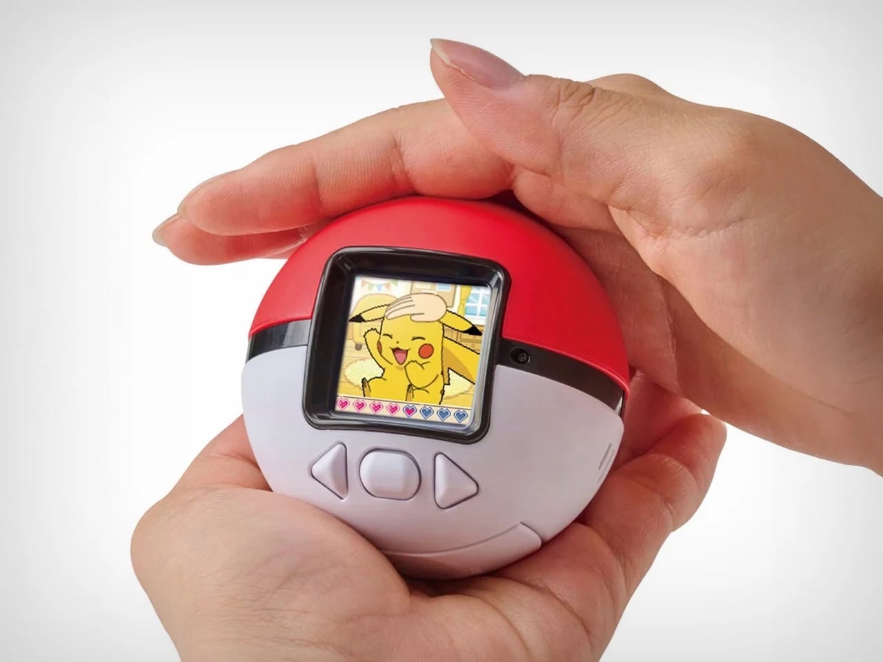
Nostalgia is a fickle mistress! She shows up when you least expect her, whispers about the good old days, and convinces you to spend money on things that have no business existing in 2025. Case in point: Pokemon just dropped the Poke-Nade Monster Ball, which is essentially a Tamagotchi disguised as a Pokéball, and millennials are losing their collective minds over it. This is not groundbreaking technology. This is not solving any real problems. This is pure, weaponized nostalgia, and it is working exactly as intended.
The device takes everything we loved about late-90s virtual pets and wraps it in Pokemon branding so potent you can practically hear the theme song playing. A color LCD screen sits inside a touch-sensitive shell shaped like an actual Pokéball, letting you stroke, tap, and physically interact with your digital companion. Pet it gently and it reacts with happiness. Tap persistently and it falls asleep. The gestures unlock deeper animations as your friendship level grows, which is a clever evolution of the old Tamagotchi button-mashing routine. But let’s be honest, the innovation here is minimal. What they are really selling is the emotional real estate Pokemon and Tamagotchi occupied in our childhoods, repackaged with a slightly better screen and some capacitive touch sensors. And you know what? That is enough. Because nostalgia does not need to innovate. It just needs to remind you of a time when feeding a pixelated creature between math classes felt like the most important responsibility in your life. Pokemon knows this. They counted on it. And judging by how fast these things are selling out, they were absolutely right.
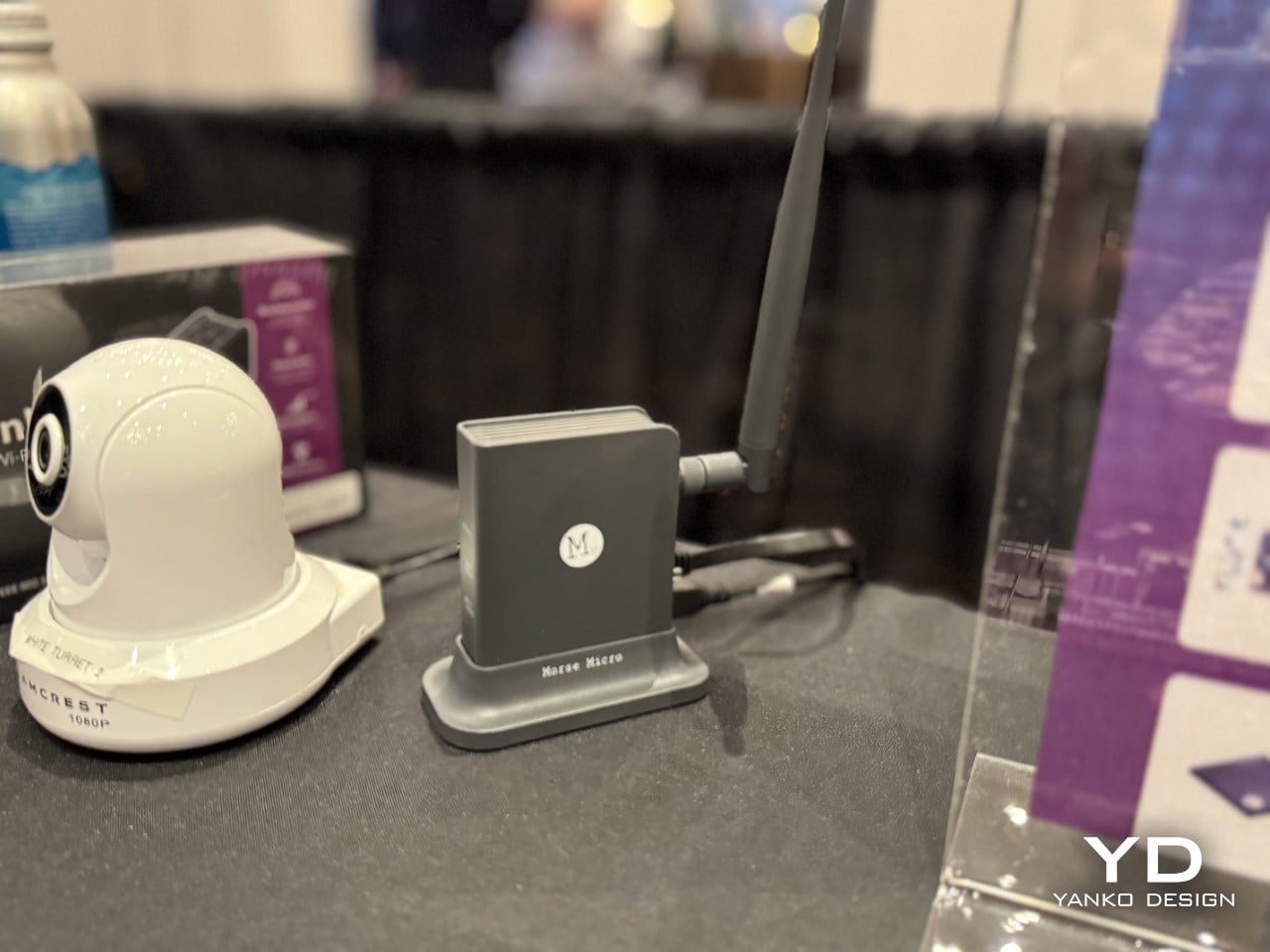
2. Wi-Fi HaLow (with 9.9 mile connectivity) by Morse Micro
And to counteract that, here’s some serious tech innovation from the beginning of the year that grabbed eyeballs. While most brands relied hard on nostalgia, Morse Micro decided to solve a problem that has plagued connectivity since WiFi was invented: range. The Wi-Fi HaLow system delivers connectivity across a 9.9-mile radius using sub-GHz radio waves, which means it can punch through walls, penetrate obstacles, and maintain signal strength over distances that would make standard Wi-Fi routers give up and go home. Traditional Wi-Fi operates on crowded high-frequency bands that struggle beyond a few dozen meters and get blocked by anything denser than drywall. HaLow operates at lower frequencies with significantly better propagation characteristics, turning your home network into something closer to a neighborhood utility than a room-specific convenience.
The implications go way beyond streaming Netflix from your driveway. You could theoretically connect to your home network from the grocery store, maintain smart home control from miles away, or create IoT networks that span entire campuses without repeaters or mesh nodes cluttering every hallway. Industrial applications become viable where they were previously impossible, rural connectivity suddenly looks feasible without expensive cellular infrastructure, and the whole concept of what a local network means gets redefined. This is not retro. This is not nostalgic. This is pure forward momentum, the kind of innovation that makes you wonder why we spent decades optimizing the wrong frequencies when the solution was sitting in a less congested part of the spectrum the whole time. If 2025 taught us anything, it is that sometimes the best way forward has nothing to do with where we have been.
3. Nintendo Wii U Revival by Brenden Sullivan
The Wii U was Nintendo’s most spectacular failure in recent memory, a console so confusing in its messaging and underwhelming in its execution that even hardcore fans pretend it never happened. Yet here comes a concept that asks: what if we took the one genuinely clever idea from the Wii U, the gamepad with the built-in screen, and rebuilt it for the Switch 2 era? This Wii U revival concept imagines a companion device that pairs with Nintendo’s next console, offering dual-screen gameplay, touch controls, and the asymmetric multiplayer experiences that made the Wii U interesting for about five minutes before everyone forgot it existed. It is nostalgia for hardware that barely had time to build nostalgia in the first place, which makes it either brilliantly contrarian or deeply misguided depending on how charitable you are feeling.
What makes this concept work as a 2025 artifact is that it refuses to let a good idea die just because the original execution flopped. The Wii U’s tablet controller was ahead of its time in some ways and catastrophically behind in others, but the core premise, that asymmetric information and split-screen interactions could create new gameplay dynamics, never got a fair shot. This concept takes that kernel and strips away everything that made the original clunky: the limited range, the single-controller restriction, the confusion about whether it was a handheld or a console accessory. By positioning it as an optional sidekick to the Switch 2 rather than the main event, it fixes the branding disaster while keeping the innovation. It is nostalgia weaponized correctly, not as pure recreation but as salvage operation, pulling the worthwhile parts from the wreckage and giving them a second chance in a context that might actually appreciate them.
4. No.1/1000 Titanium Fractal Vise by Titaner
Most tools are designed to disappear into workshops, utilitarian objects that do their job without demanding attention. Titaner’s titanium fractal vise does the opposite. It announces itself as both precision instrument and sculptural object, with a body machined from solid titanium and a fractal pattern that serves actual structural purposes rather than just looking cool. The geometry distributes clamping force efficiently while reducing material weight, which means the mathematical beauty is not decorative, it is load-bearing. Limited to a small production run, each vise is CNC-machined to tolerances that make it as much a collector’s item as a working tool, the kind of thing that sits on a workbench and makes visitors ask questions before they realize it actually functions.
What makes this a 2025 design rather than just expensive engineering porn is the way it represents a larger shift in how we think about tools and objects. We are moving past the idea that functional items need to be aesthetically neutral, that beauty and utility occupy separate categories. This vise proves you can have museum-grade craftsmanship in something designed to grip metal and take abuse. It is the intersection of maker culture, precision manufacturing, and the growing appreciation for objects that justify their cost through both performance and presence. There is no nostalgia here, no retro callback, just an argument that everyday tools can be extraordinary if we stop accepting mediocrity as the baseline. It is innovation in the form of asking why more things are not built this well, and then actually building one to prove the point.
5. WP200 Pro Modular Smartphone by OUKITEL
Modular smartphones have been promised, prototyped, and abandoned so many times that most people stopped believing they would ever work. Then the rugged WP200 Pro from OUKITEL shows up with a detachable display that does not just disconnect, it transforms into entirely different devices. The screen pulls away from the phone body and can be reconfigured as either a smartwatch strapped to your wrist or an earbud clipped to your ear. The phone itself continues functioning with a secondary display underneath, so you are not sacrificing core functionality when you repurpose the main screen. It is the kind of absurdly ambitious design that sounds like vaporware until you see the mechanical hinges and magnetic connections that make it plausible.
This is innovation trying to solve a problem nobody asked for but might actually appreciate once it exists: the fact that we carry multiple screens doing similar jobs when one good screen could rotate between contexts. Why own a phone, smartwatch, and wireless earbuds when one modular system could cover all three? The rugged construction suggests this is built for field work, outdoor use, or situations where carrying multiple fragile devices makes no sense. It is the opposite of nostalgia, there is no retro aesthetic here, no callback to simpler times, just aggressive forward-thinking that asks whether our current device ecosystem is as optimized as we assume. Whether it ever ships is anyone’s guess, but as a statement of intent, it proves that some designers are still more interested in what comes next than what came before.
6. Kangourou Tiny Home by Quadrapol
Tiny homes have been sold as this romantic solution to housing affordability and minimalist living, but they come with one universal design flaw that nobody wants to admit: climbing a ladder to your bed every night gets old fast. Especially if you have kids, aging parents, mobility issues, or just a baseline desire to not break your neck at 3am during a bathroom trip. This family-friendly tiny home named Kangourou redesigns the entire layout to put every sleeping space on the ground floor, which sounds simple until you realize how much spatial gymnastics that requires in a structure measuring under 400 square feet. The designers pulled it off using sliding partitions, convertible furniture, and clever vertical storage that keeps the ceiling height usable without forcing anyone to sleep in what amounts to an attic crawlspace.
What makes this relevant to 2025 is that it represents tiny home design finally maturing past the Instagram aesthetic phase. For years, tiny homes prioritized looking good in photos over actually functioning as long-term residences, which is why so many ended up as glorified vacation rentals rather than permanent housing solutions. This design prioritizes livability, accessibility, and the reality that families need private sleeping spaces that do not require ladder proficiency. It is not flashy. It is not trying to reinvent architecture. It is just solving a known problem with enough intelligence that it stops being a problem, which might be the most underrated form of innovation. If the tiny home movement wants to be taken seriously as housing rather than lifestyle content, this is the direction it needs to go: less emphasis on clever lofts, more focus on whether you would actually want to live there past the honeymoon phase.
7. Pexar Starlight 15.6″ Picture Frame by Lexar
Wizarding photographs in Harry Potter had one feature that always felt unfair: they moved, waved back, captured the full motion of a moment instead of freezing it into stillness. Muggles have been trying to close that gap ever since, and digital picture frames are basically our best attempt at making photos feel alive without actual magic. The Pexar Starlight takes that idea and adds ambient backlighting, turning a 15.6-inch display into something that sits between traditional frame and mood lighting. Photos cycle through with adjustable brightness that shifts based on time of day, so your memories glow softly in the evening and stay crisp during daylight hours. It is designed to blend into home decor rather than scream “tech gadget,” which is harder than it sounds when you are essentially mounting a screen on the wall.
What separates this from the dozens of other digital frames cluttering the market is the execution of details most brands ignore. The matte finish reduces glare without killing color vibrancy. The frame itself comes in multiple finishes so it does not look like every other black-bezeled rectangle. Setup happens through a companion app that actually works instead of requiring a computer science degree to navigate, and photo uploads can be automated from cloud storage so you are not manually curating every week. The backlight feature is the real differentiator, creating depth and warmth that makes photos feel more like displayed art than screensaver content. It is not trying to replace your phone’s photo library. It is trying to give your best shots the kind of presence they deserve, somewhere between nostalgia object and functional decor, which is exactly where digital frames should have been aiming all along.
8. CAMIO Wearable by BQEYZ
Meta’s smart glasses cost several hundred dollars and lock you into their ecosystem, their frames, their design language, and their gradual feature rollout that always feels like paying for a beta test. Meet CAMIO, a $79 snap-on module from an upstart competitor that takes a different approach: it clips onto any pair of glasses you already own and turns them into recording devices with a tiny camera, built-in storage, and wireless connectivity. You keep your prescription lenses, your favorite frame style, your existing investment in eyewear. The module just adds the capture functionality without forcing you to replace everything. It records video, snaps photos, and syncs to your phone over Bluetooth, handling the basics without trying to be a full augmented reality platform or AI assistant.
The genius here is recognizing that most people do not want to replace their glasses, they just want their glasses to do more. Meta’s approach requires buying into their hardware completely, which is a tough sell when you have frames you like or prescriptions that need specific lenses. This module treats smart features as an add-on rather than a replacement, which dramatically lowers the barrier to entry both financially and practically. It is not going to match Meta’s polish or integration depth, but it does not need to. It just needs to capture moments hands-free and stay out of the way when you are not using it. For seventy-nine dollars, that is a value proposition that makes sense in a way premium smart glasses still struggle to justify. Sometimes the best innovation is not building something entirely new, it is building something that works with what people already have.
9. Small House On A Corner Lot by KOMINORU Design
Tokyo real estate operates on a completely different logic than most cities. Space is so expensive and scarce that architects have spent decades perfecting the art of making tiny footprints feel livable, even generous. This Japanese tiny home takes those spatial compression techniques and pushes them further, creating a dwelling that maximizes every cubic inch without feeling claustrophobic or compromised. The design uses vertical layering, multifunctional furniture, and strategic transparency to make a structure barely wider than a parking space feel like a complete home rather than an elaborate closet with plumbing.
What sets this apart from typical tiny home design is the cultural context. Japanese architecture has been optimizing small spaces for centuries, long before minimalism became a lifestyle trend or tiny homes became YouTube content. This design pulls from that tradition: sliding shoji-inspired partitions that reconfigure rooms on demand, sunken floors that create separation without walls, storage integrated into every surface so nothing feels like dead space. Natural light floods in through carefully positioned windows that also provide ventilation and visual connection to the exterior. The result is a home that feels intentional rather than constrained, where every design choice serves multiple purposes and nothing exists just for show. It is a masterclass in efficiency that does not sacrifice comfort, proving that small spaces stop being a limitation once you design specifically for them instead of trying to cram traditional layouts into compressed square footage. If urban density is the future, this is the blueprint for making it actually desirable.
10. Saros Z70 by Roborock
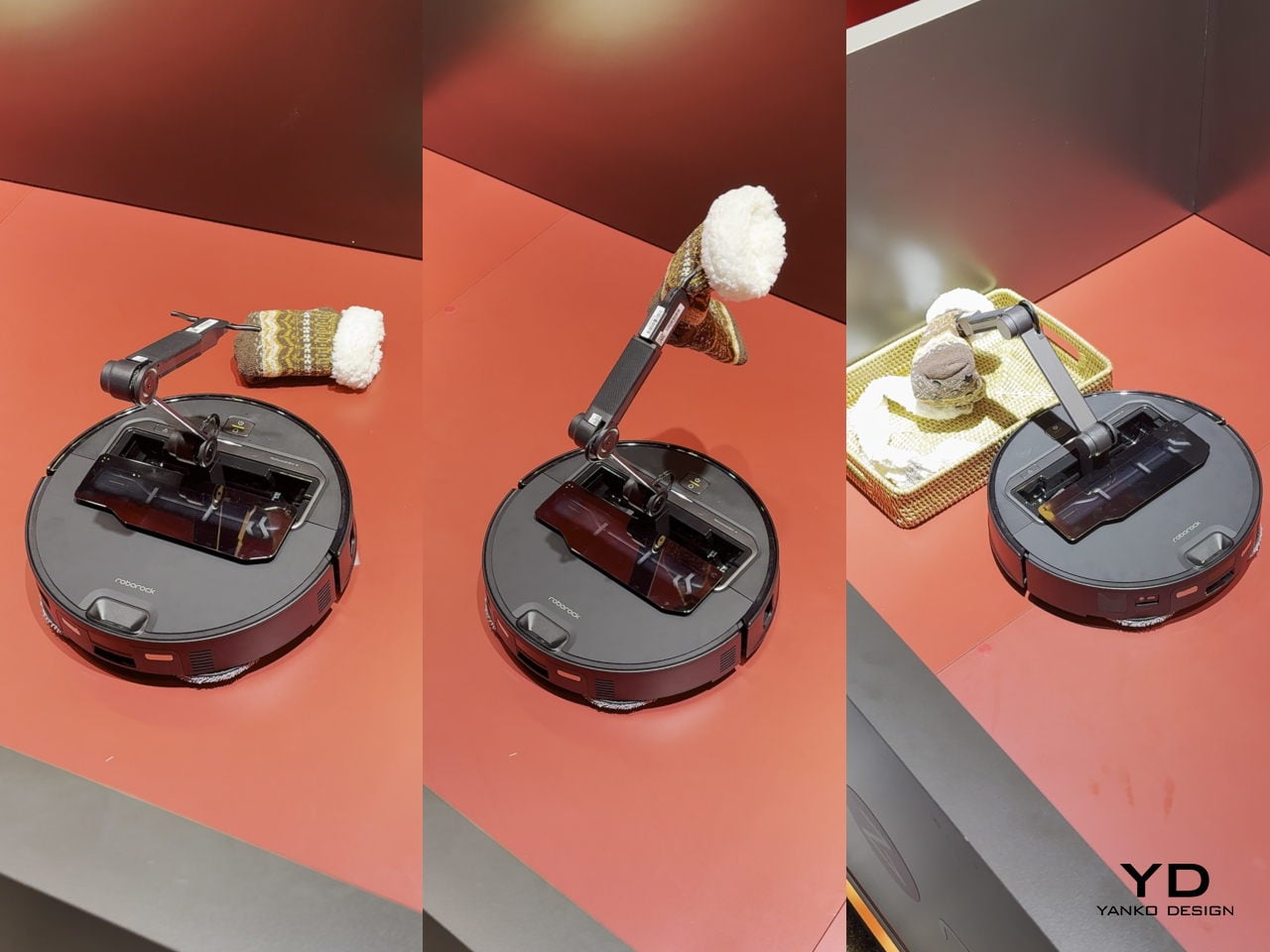
Robot vacuums have gotten really good at one thing: vacuuming. They map your floors, avoid obstacles, empty themselves, and generally handle the task they were designed for with increasing competence. But they have always had one glaring limitation: if there is a sock on the floor, a charging cable, a kid’s toy, anything that is not flat dirt or debris, the vacuum just routes around it or gets tangled and calls for help. The Roborock Saros Z70 fixes this with the most obvious solution nobody thought to mass-produce until now: it adds a robotic arm. A literal articulated arm that extends from the vacuum’s body, grabs objects off the floor, and moves them out of the way so it can continue cleaning underneath. Socks, shoes, small towels, cables, anything under a certain weight gets picked up and relocated to a designated drop zone.
This is innovation that feels overdue the moment you see it. We have had the mechanical capability to build grabber arms into consumer robots for years, but nobody committed to the engineering challenge until Roborock decided the robot vacuum category had gotten boring enough to need disruption. The arm uses vision recognition to identify objects, assess their weight and shape, and determine whether they are safe to grab, which prevents it from trying to lift furniture or drag your laptop across the room. It is not perfect, weight limits and object recognition will have edge cases, but it represents a fundamental expansion of what a cleaning robot can do. Instead of just reacting to obstacles, it actively manipulates its environment to complete its job. That is a step change in capability that makes every previous robot vacuum feel like it was solving only half the problem. If this actually ships at a reasonable price point and the arm proves reliable, it will instantly make the entire existing market feel outdated, which is exactly what genuine innovation is supposed to do.
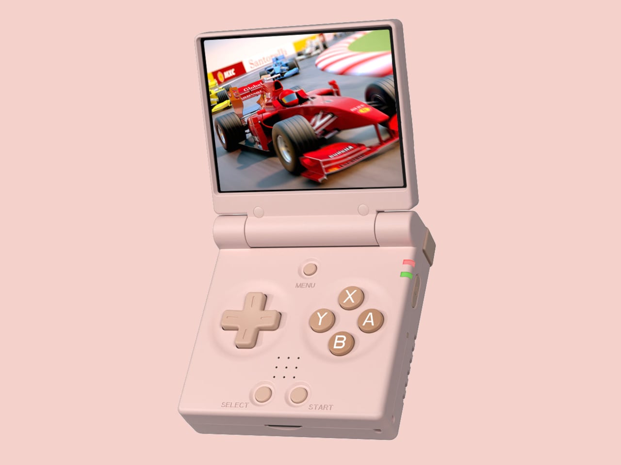
Retro handhelds have exploded in the last few years, from chunky bricks to tiny keychain consoles, and a lot of them still feel like little Linux boxes with buttons bolted on. The Game Boy Advance SP’s clamshell still lives rent-free in people’s heads, that satisfying snap when you close it, and the way it fits into a pocket without scratching the screen. The Miyoo Mini Flip is a modern answer to that memory, scaled for pockets and commutes.
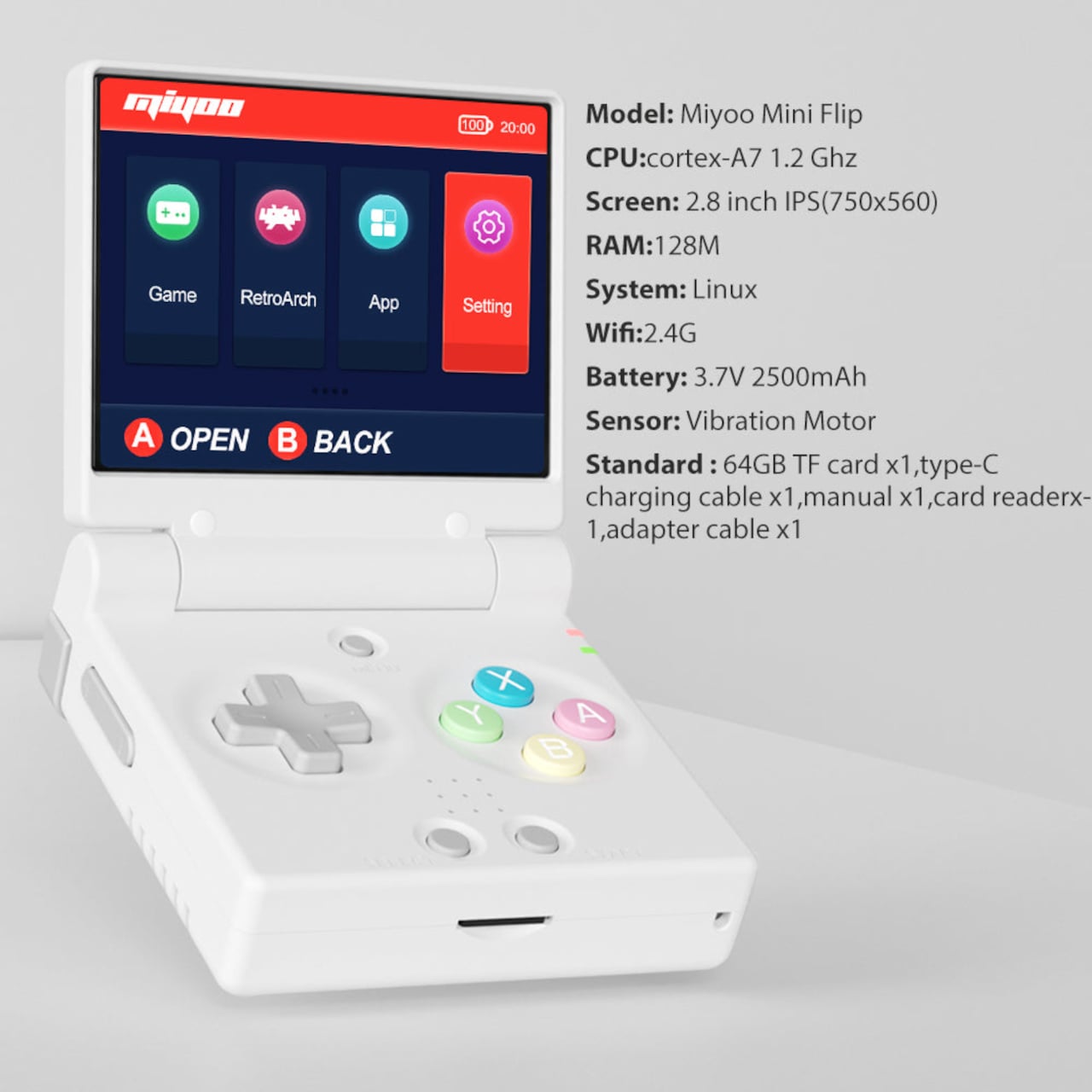
The Miyoo Mini Flip is a folding version of Miyoo’s tiny emulation handheld, now with an upgraded hinge for better durability. Closed, it is a 2.68‑inch square about 0.79 inch thick, small enough to disappear into a jeans pocket or bag. Open it up, and you get a full control deck and a 2.8‑inch screen, turning idle minutes into quick sessions of 8‑bit and 16‑bit comfort food without needing to commit to a full setup.
The 2.8‑inch IPS panel runs at 750 × 560 with a 4:3 aspect ratio, which lines up nicely with most classic consoles. The marketing calls it “3× pixel perfect,” hinting at clean integer scaling for certain systems, so sprites and tiles look crisp instead of smeared. Wide viewing angles and decent colour make pixel art and old racing games feel surprisingly alive on such a small canvas, bright enough to play outdoors or on a dimly lit train.
The control scheme mixes classic D-pad, ABXY face buttons, Select and Start, a Menu key, and L/L2 and R/R2 shoulder buttons tucked along the back edge. Volume and power live on the sides, with a front speaker and a TF card slot underneath. The layout feels like a mashup of modern controllers and old handhelds, giving thumbs familiar landmarks without overcomplicating a device that is meant to be grabbed and played.
The hardware is a Cortex‑A7 at 1.2 GHz, 128 MB of RAM, Linux under the hood, 2.4 GHz Wi‑Fi, and a 3.7 V 2500 mAh battery. It is tuned for NES, SNES, GBA, PS1, and similar eras, not chasing Switch-level performance. The bundle usually includes a 64 GB microSD card and USB‑C cable, so you are not hunting for storage or adapters before you can start tinkering with ROMs and emulator settings.
The hinge‑enhanced durability callout addresses early batches where people worried about wobble and wear. Closed, the Flip feels like a small, dense square you can toss into a pocket, backpack, or travel pouch without babying it. Marketing leans into travel, outdoor, waiting, and “back childhood” scenarios, which is exactly where a device like this shines, filling dead time with a few more runs of your favourite platformer or racer.
The Miyoo Mini Flip stands out beyond the emulator list. The clamshell form, upgraded hinge, sharp 4:3 IPS screen, and toy-like colours make it feel like a considered object, not another PCB in a shell. Retro games live as a small ritual in a pocket rather than a full setup on a desk, and this little folding square hits a very specific, very charming note without demanding much more than a microSD card and a willingness to revisit Super Mario World one more time.