If you’ve ever watched a fern unfurl or zoomed into the edge of a snowflake, you already understand fractals, even if you’ve never called them that. They’re the patterns nature repeats at every scale, small details that echo the whole. Xubai Li took that idea and built furniture out of it, and the result is one of the more quietly radical pieces of design I’ve come across in a while.
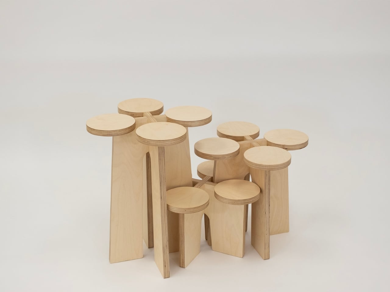
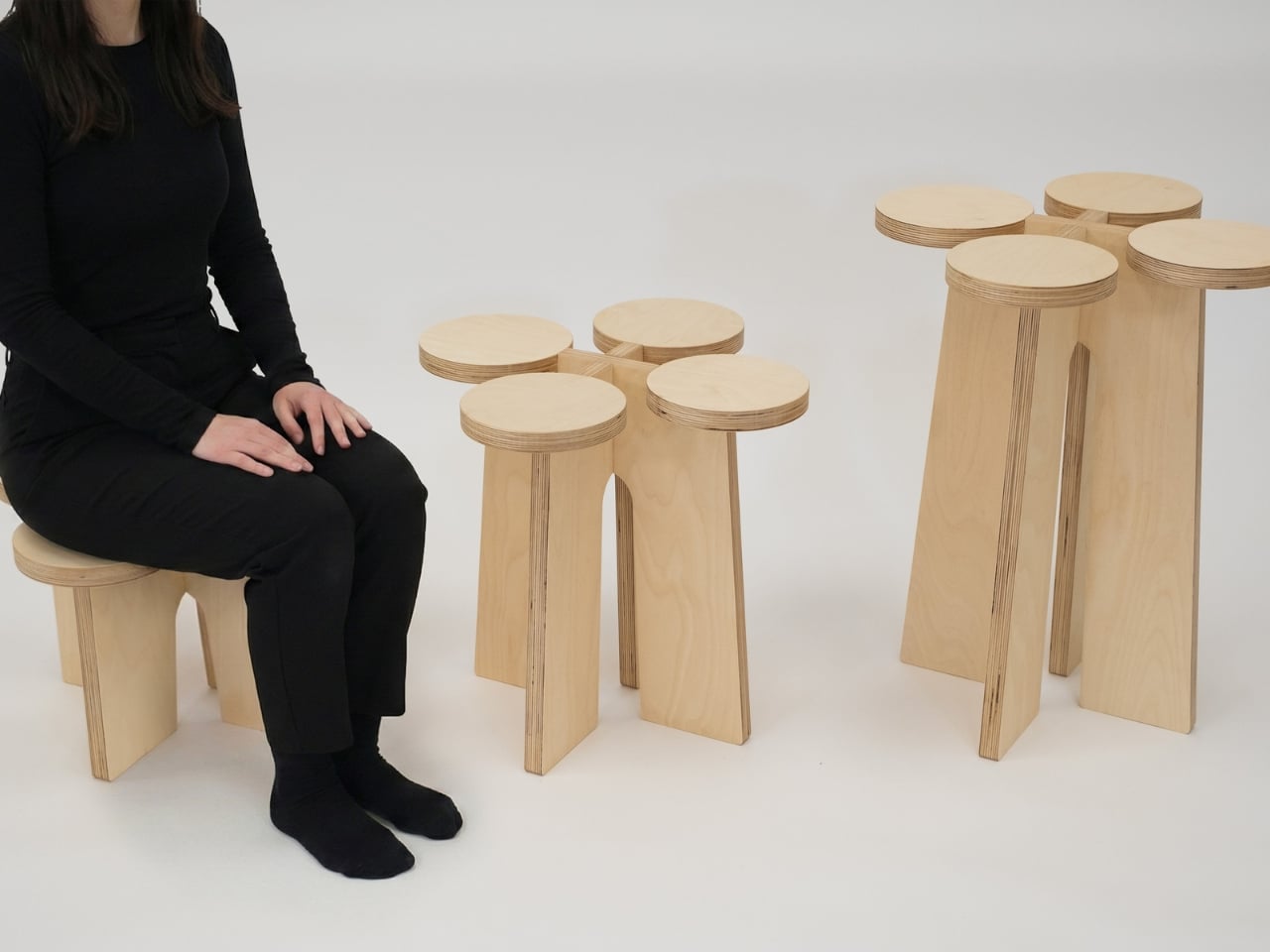
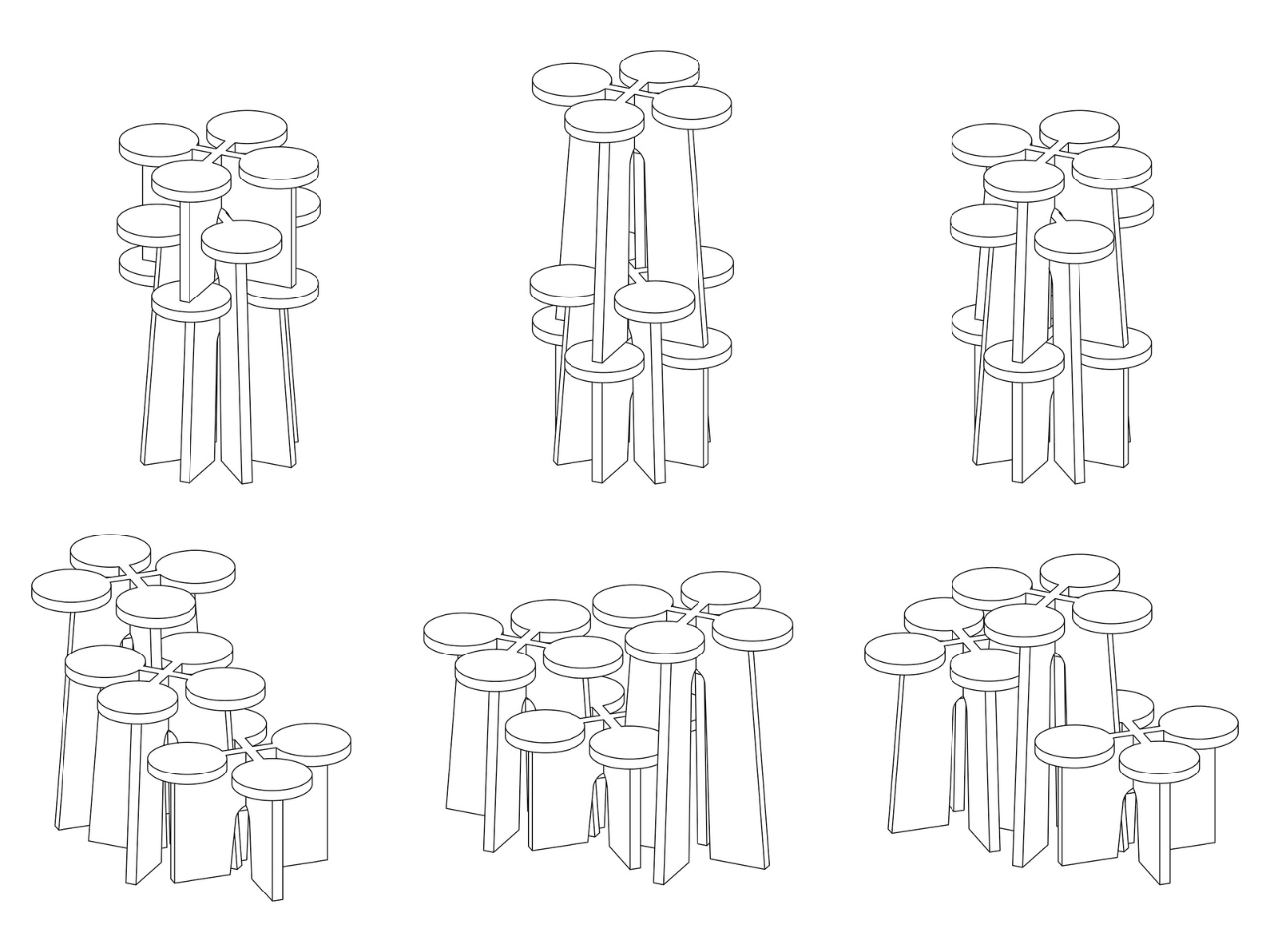
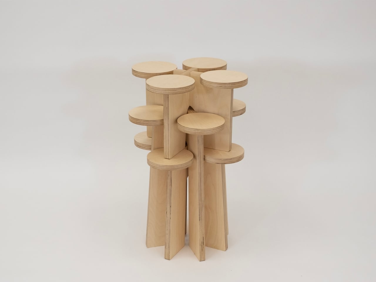
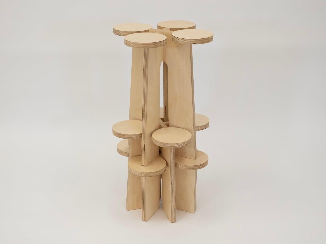
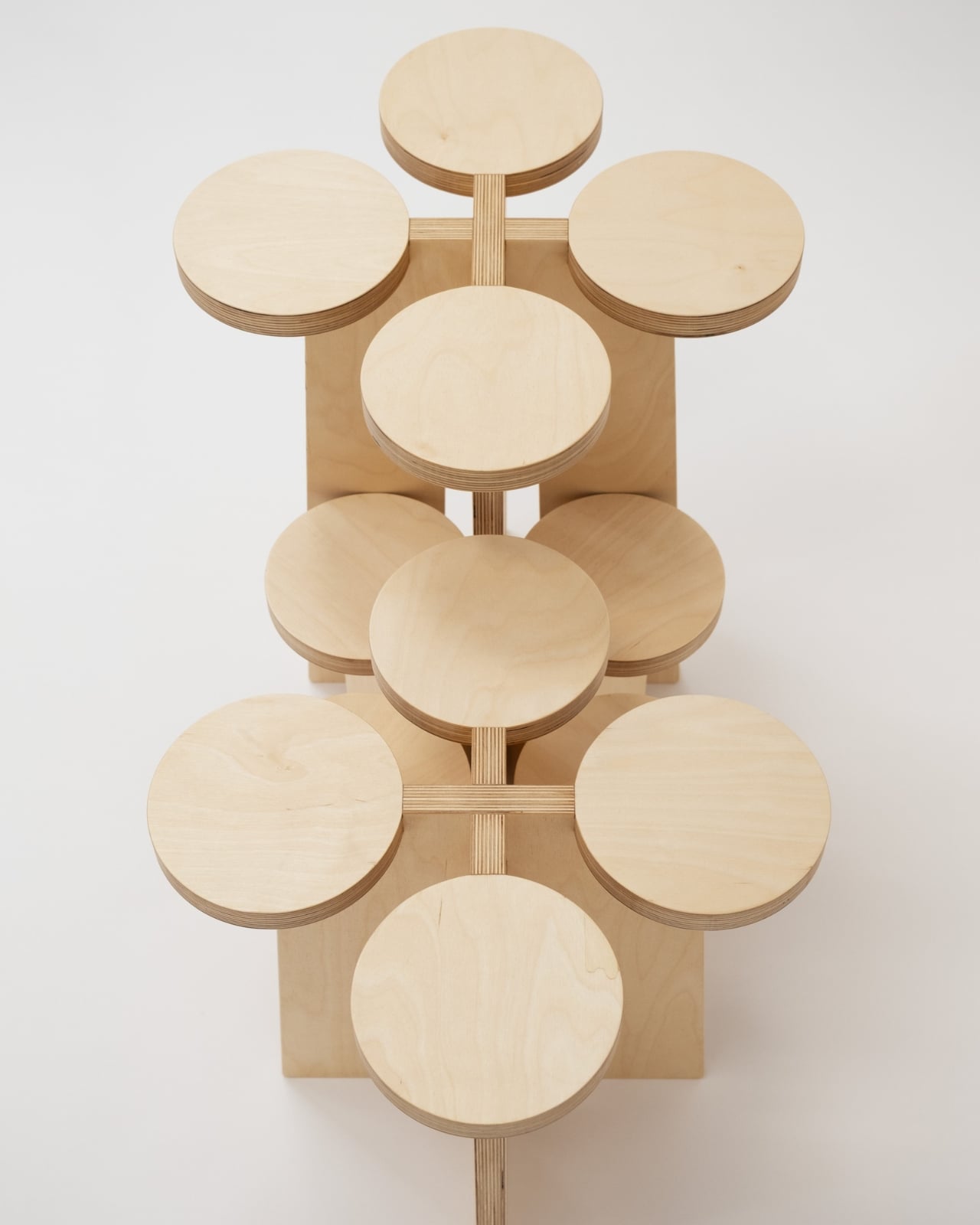
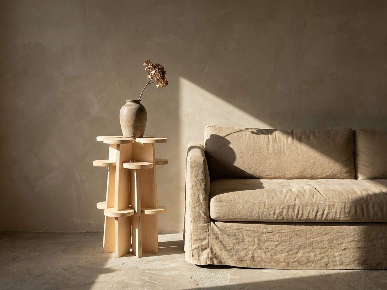
The Fractal System is a set of modular, nestable plywood objects that can function as stools, shelves, or stands, depending entirely on how you choose to arrange them. Each piece is non-directional, meaning there’s no designated top, bottom, or front. You can rotate them, stack them, slot them together, or spread them across a room. The configuration changes, and with it, so does the furniture’s entire personality. A tight cluster becomes a sculptural display unit. A single piece on its own reads as a clean, minimal stool. A sprawling arrangement along a wall becomes something that looks closer to an art installation than anything you’d find at a typical furniture store.
Designer: Xubai Li
Li, who holds an MFA in Furniture Design from the Rhode Island School of Design, was a featured designer at ICFF, and the Fractal System has since earned Silver recognition at both the NY Product Design Awards and the MUSE Design Awards. That’s the kind of trajectory that usually signals a designer to watch, not just a one-off project.
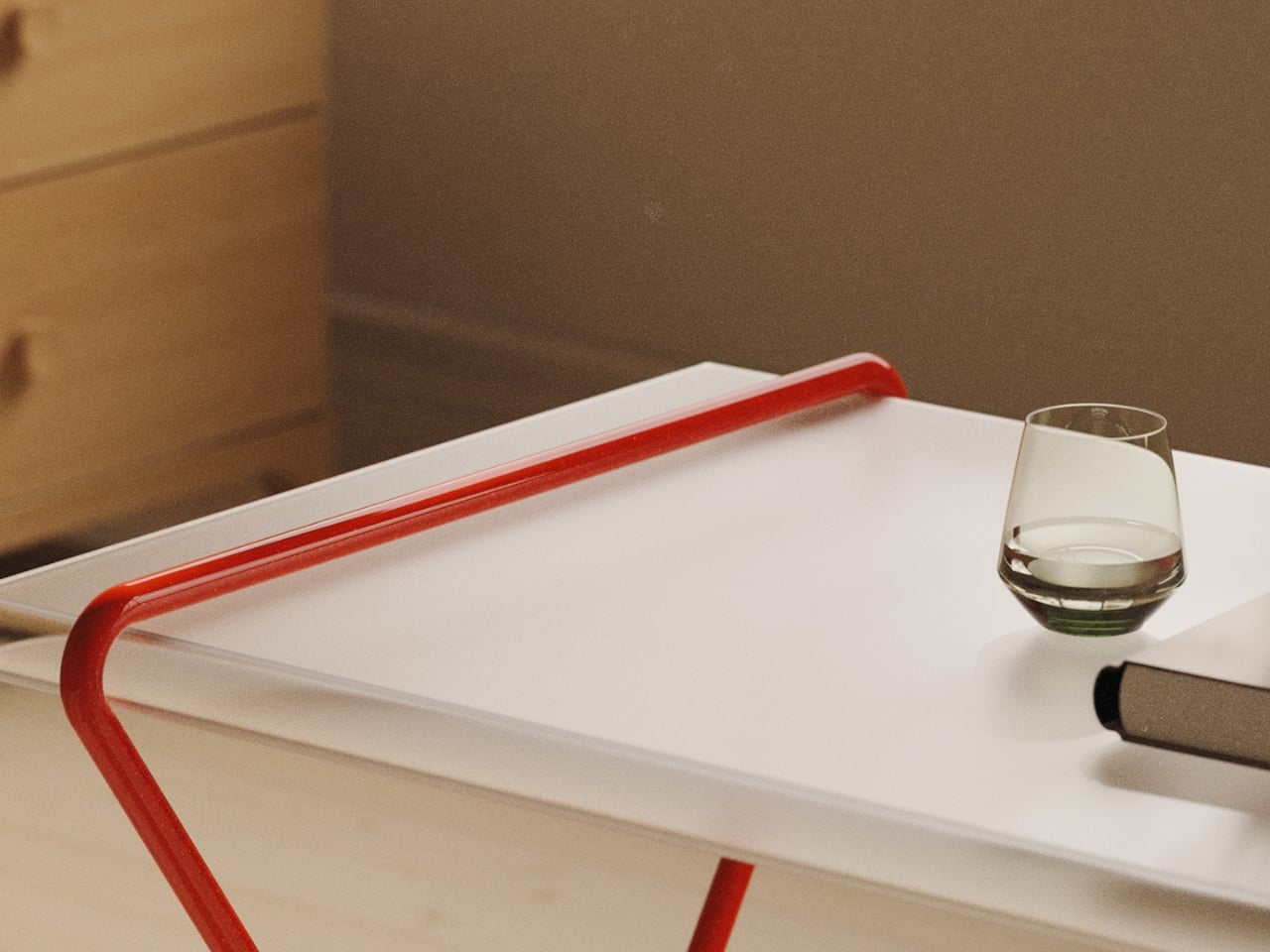
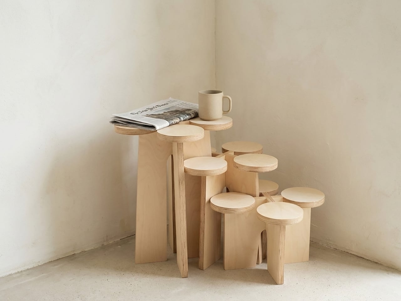
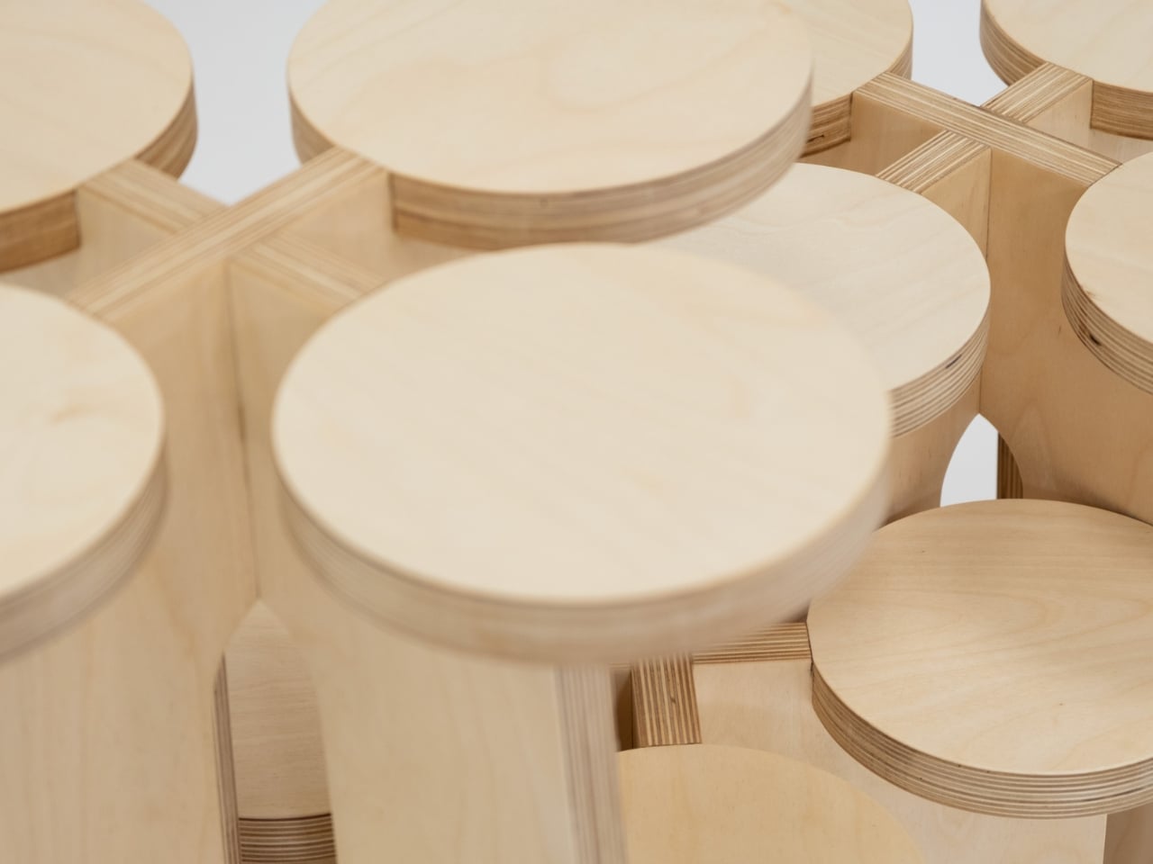
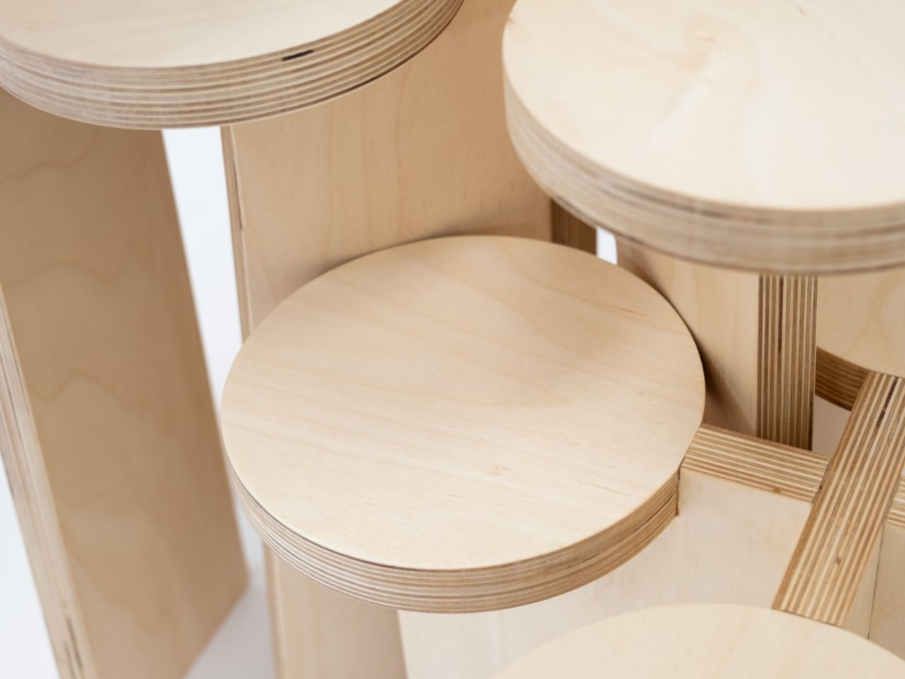
The design’s real appeal, to my eye, isn’t purely aesthetic, though the warm blond plywood with its exposed laminate layers is exactly the kind of material choice that ages well. It’s the philosophy underneath it. Most furniture is prescriptive. It tells you where to sit, where to put your coffee, how to organize your books. The Fractal System does the opposite. It hands you a set of components and essentially says, figure it out. That level of user agency is still surprisingly rare in furniture design, where modularity often comes dressed up in rigid systems and complicated instructions.
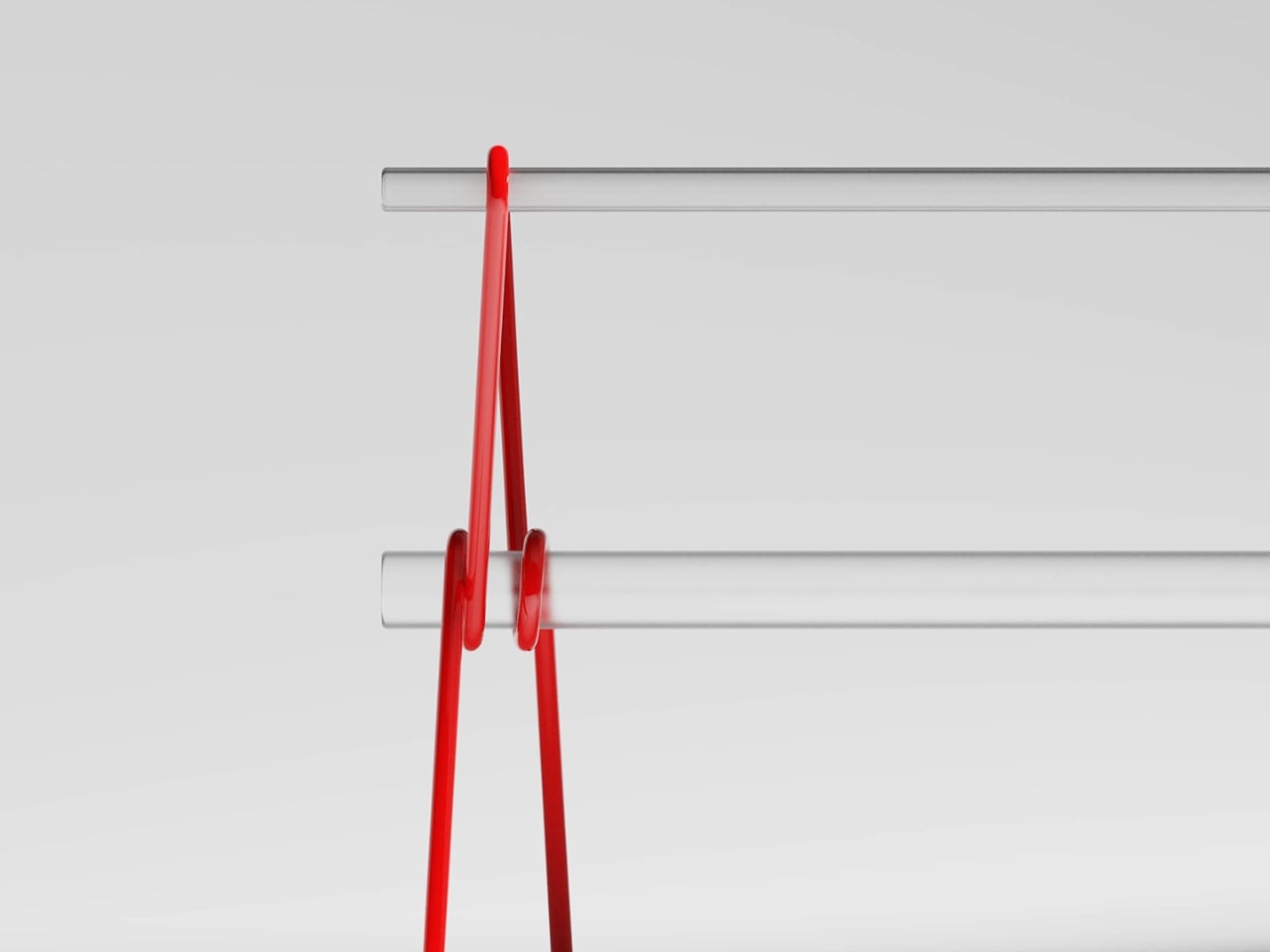
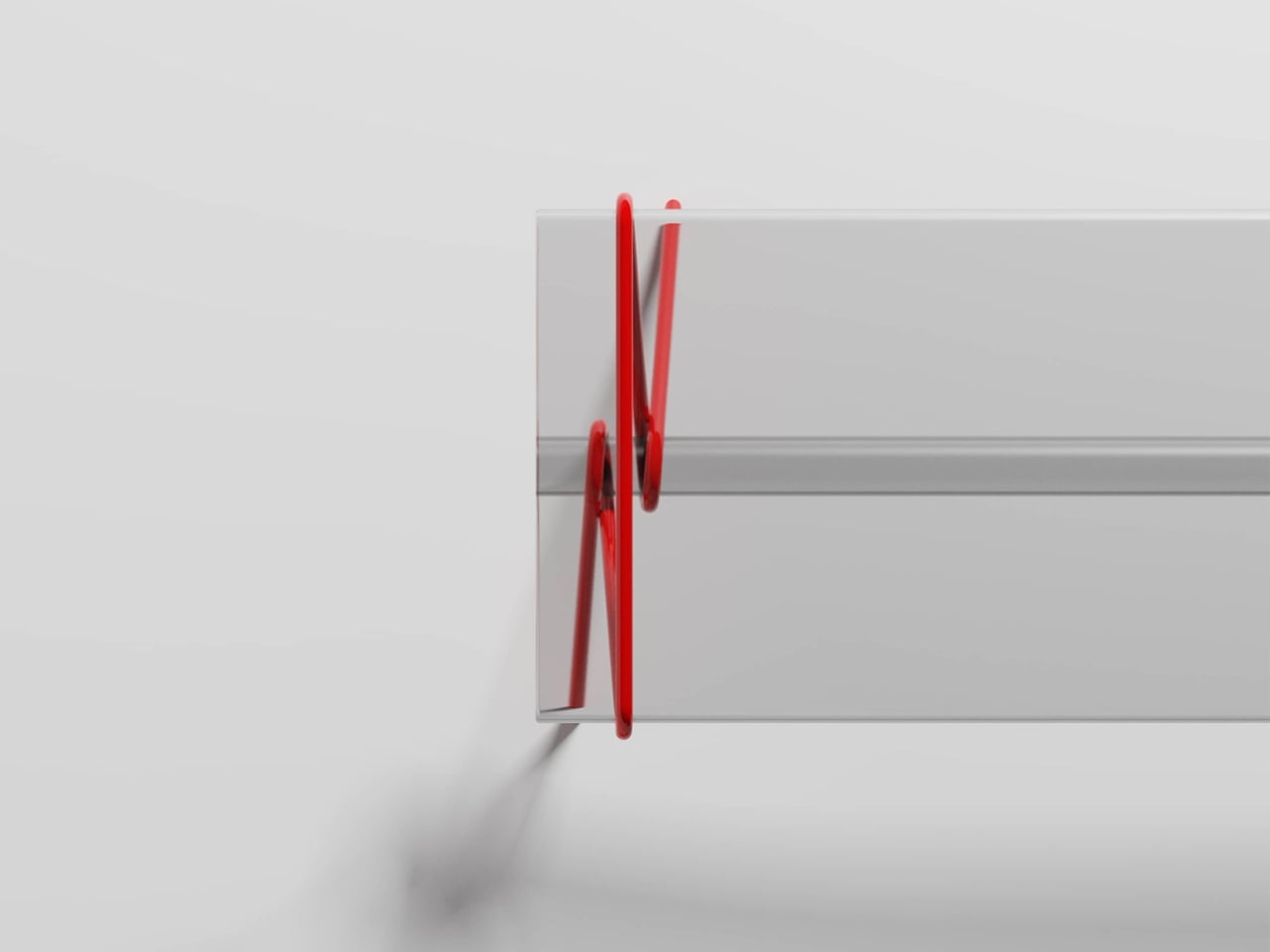
The fractal reference isn’t just a clever name, either. Fractals are defined by self-similarity, where the same pattern recurs regardless of scale. Li applies that principle structurally: the more units you add, the more the configuration begins to mirror the logic of a single unit, just expanded. You can see it clearly in the diagrammatic sketches, where each arrangement reads like a variation on the same underlying grammar. It’s rigorous without feeling academic, which is a genuinely difficult balance to strike.
I also think the timing matters. Right now, the design conversation is heavily focused on adaptability. Smaller living spaces, changing households, a collective skepticism toward buying things that only do one thing. The Fractal System fits into that shift without pandering to it. Li wasn’t designing for trends; the work clearly came from a place of genuine conceptual inquiry. The fact that it also happens to answer a real practical need is almost incidental, and that’s often the sign of the best kind of design.
From a collector’s standpoint, this is the sort of piece that rewards attention over time. It doesn’t announce itself loudly. Photographed in a corner with morning light and a ceramic mug balanced on one of the platforms, it looks like the kind of thing someone discovered in a Kyoto studio decades ago. Grouped tightly in a gallery setting, it reads as contemporary sculpture. That range of registers is genuinely hard to manufacture.
Xubai Li’s Fractal System is one of those designs that quietly shifts how you think about the objects around you. Not because it makes a statement, but because it asks a question: why does a piece of furniture only ever have to be one thing? I don’t have a neat answer to that. But I’m glad someone built the question into plywood and let the rest of us sit with it.
The post The Furniture That Grows Like a Fractal first appeared on Yanko Design.