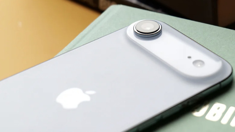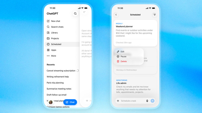
The Fastest Way to Free Up iPhone Storage Without Losing Your Photos

The Fastest Way to Free Up iPhone Storage Without Losing Your Photos The iPhone storage settings screen showing a breakdown of space used by apps and media.

Running out of storage on your iPhone can be a common and frustrating issue, but it’s one that can be resolved with the right approach. Over time, your device accumulates photos, apps, messages, and cached data, leaving little room for new files or updates. By understanding how your storage is being used and taking proactive […]

The post The Fastest Way to Free Up iPhone Storage Without Losing Your Photos appeared first on Geeky Gadgets.

Posted in Uncategorized

4 Best Wireless Audio Gadgets for Creators, Now Up to 20% Off For Prime Day

Most creator setups get built backwards. The camera comes first, the lighting comes second, and audio ends up being whatever fits in the bag. That compromise has a cost, and anyone who has sat through a well-shot video ruined by hollow, wind-wrecked, or flat dialogue knows exactly what it sounds like. The gap between professional-grade audio and genuinely portable gear has narrowed considerably in the last two years, and a lot of that credit goes to AI noise processing that actually delivers rather than just advertises.

BOYA has put forward Prime Day options that cover nearly every recording scenario a working creator runs into, at discounts that make this a reasonable time to close that gap. The five products span a wide range, from a thumb-sized lapel that disappears on clothing to a transformable four-mode wireless system to a button-sized transmitter that scales for multi-device team shoots. One of them, BOYA Notra, breaks from the creator audio format entirely and lands in the meeting room, turning live conversations into organized transcripts, summaries, and to-do lists in over 140 languages.

BOYA mini 2: the Ultra-Compact Everyday Mic

Where the BOYA Magic is built around transformation, the BOYA mini 2 is built around invisibility. Weighing only 5 grams, the transmitter is the lightest in this roundup, designed to be a set-it-and-forget-it solution for mobile creators, vloggers, and anyone who needs clean audio without the bulk. Its thumb-sized form factor clips onto clothing without pulling or weighing down fabric, making it ideal for casual shoots, social media content, and on-the-go recording where a larger microphone would be too conspicuous. The focus here is pure portability and ease of use, delivering a significant audio upgrade over a phone’s internal microphone in a package that is small enough to live in a pocket.

Despite its size, the mini 2 shares much of the same audio DNA as its larger counterparts. It features the same 48 kHz / 24-bit audio resolution and AI noise cancellation, with a “Strong” mode for loud environments and a “Light” mode to preserve natural room tone. The companion BOYA Central app allows for quick adjustments to volume, EQ, and noise cancellation levels directly from a smartphone. With a 30-hour battery life via its charging case and a robust 328-foot wireless range, the mini 2 is a surprisingly capable microphone that prioritizes convenience and discretion above all else.

Click Here To Buy Now: $47.99 with Coupon Code YD22

BOYA Magic: the 4-in-1 Transformable Creator Mic

BOYA Magic directly addresses the problem of carrying multiple microphones for different shooting styles. Instead of asking creators to choose between a lavalier, a handheld, a desktop, or an on-camera mic, it combines all four into one compact kit. The core of the system is a 7-gram transmitter that can be used as a discreet clip-on, but it also docks into a handheld grip for street interviews, mounts on a desktop stand for podcasts, and slides into a cold shoe adapter for on-camera use. This transformable design makes it the most physically versatile option in the lineup, built for creators who move between formats and do not want their gear to dictate their workflow.

The technical specifications are strong enough to support that flexibility. The system captures 48 kHz / 24-bit audio and uses AI noise cancellation to reduce ambient sound by up to 40 dB, which is more than enough to clean up dialogue in busy environments. It also includes thoughtful professional features like a smart limiter and a safety track to prevent audio clipping, an 80 dB signal-to-noise ratio, and up to 30 hours of total recording time with the charging case. For a creator who wants one kit that adapts to nearly any situation, from a desk recording to a field interview, the Magic is engineered to be a clever, all-in-one solution.

Click Here To Buy Now: $73.5 with Coupon Code YD24

BOYALINK 3: the Scalable Multi-Device Mic System

While mics like the mini 2 and Air SE are perfect for solo creators, the BOYALINK 3 is designed for more complex productions. This is the system for small teams, interviewers, and creators who need to feed audio to multiple devices at once. Its key feature is a 2TX-4RX expansion capability, which allows the system to scale up to support eight devices recording simultaneously. This makes it possible to run a two-person interview while sending clean audio to two different cameras and a backup recorder, all from one compact kit. It is a button-sized system that brings a level of workflow flexibility usually found in much larger, more expensive setups.

The BOYALINK 3 reinforces its professional credentials with a higher 85 dB signal-to-noise ratio for cleaner recordings and includes essential tools like automatic gain control, a limiter, and a safety track to protect against distortion. Each transmitter weighs just 9 grams and features a dustproof grille, making it durable enough for field use. With EQ tuning, real-time monitoring, and up to 30 hours of total battery life, the Link 3 is positioned as the upgrade for creators who are moving beyond basic setups and need a reliable, scalable audio hub for more demanding shoots.

Click Here To Buy Now: $77.2 with Coupon Code YD23

BOYA Notra: the AI Note Taker for Total Recall

The final product in the lineup takes the AI audio technology seen in the microphones and applies it to a completely different problem: remembering conversations. The BOYA Notra is not a creator tool, it is a dedicated AI note-taking device designed for professionals, students, and anyone who needs to capture meetings, lectures, or calls without losing focus. It records conversations from three sources, ambient room audio, phone calls, and Bluetooth earbuds, and then turns the raw audio into structured, usable information. This is a device built for productivity and memory relief, not for content production.

The Notra’s intelligence lies in its post-recording processing. It transcribes speech in over 140 languages, automatically identifies different speakers, and generates summaries, to-do lists, and mind maps from the conversation. All recordings are stored on its 64 GB of local storage with a private cloud backup. With up to 24 hours of continuous recording and a slim, magnetic design, the Notra is a powerful tool for anyone who has ever wished they had a perfect record of a conversation. It turns every discussion into organized, searchable knowledge, ensuring that no key details are ever missed.

Click Here To Buy Now: $119 with Coupon Code YD21

The post 4 Best Wireless Audio Gadgets for Creators, Now Up to 20% Off For Prime Day first appeared on Yanko Design.

This might be the most bad-ass Mercedes-Benz Concept Car of all time…

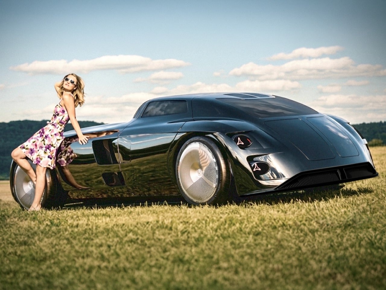
Design school thesis projects rarely get permission to be reckless. Most are built to please a panel of professors, sanded down until every surface looks defensible on a resume. Jaeun Park ignored that instinct entirely with his MA thesis project, a Mercedes concept he calls Vision Timeless, framed around a simple tension he labels modernity over heritage. Rather than softening Mercedes’ most aggressive vintage design cues, Park amplified them until the result looks more predator than luxury sedan. The question driving the whole project seems to be how far you can push a heritage grille before it stops referencing the past and starts threatening the present.

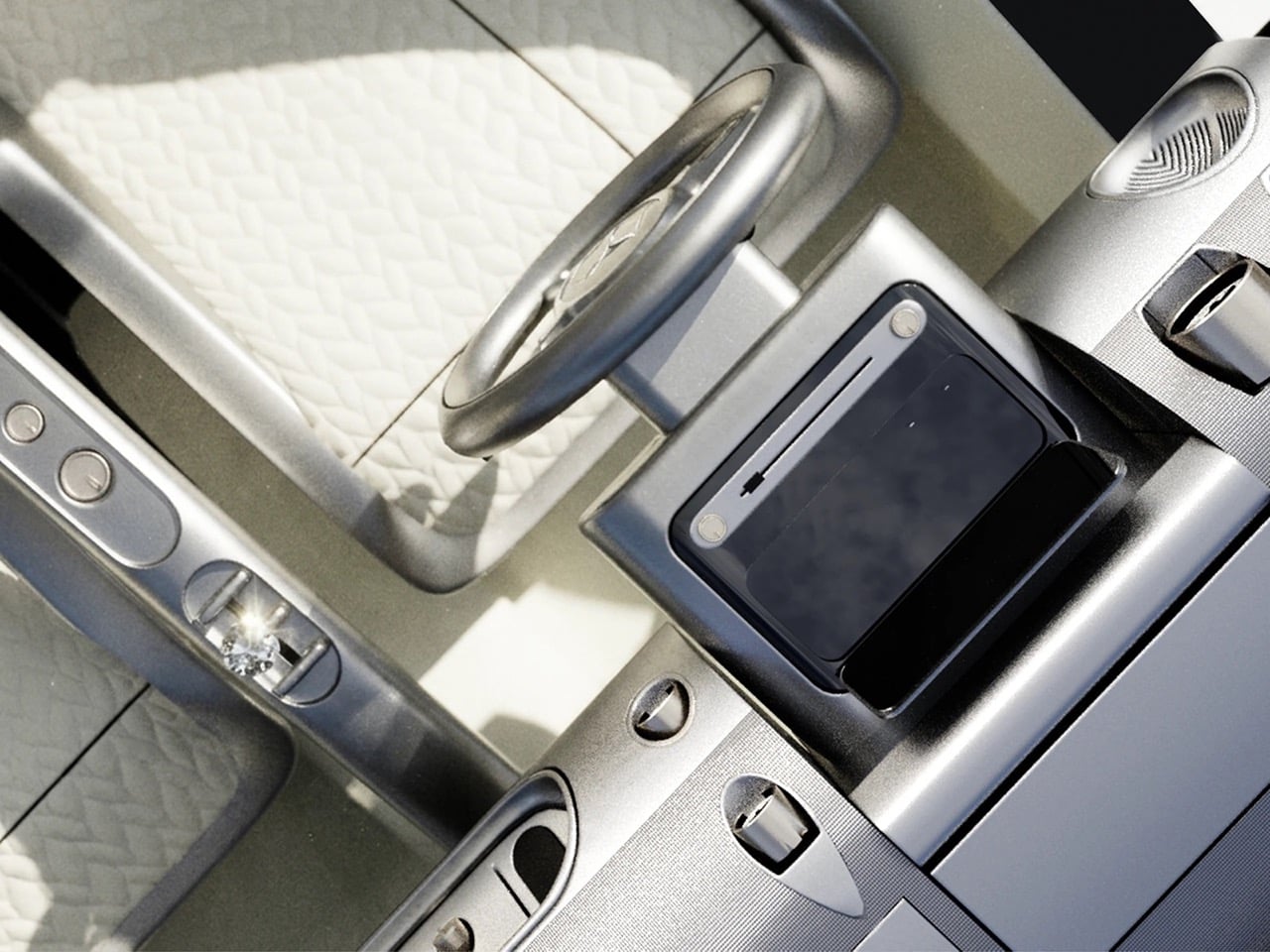
Built entirely in Blender by Park himself, the concept reimagines the brand’s vertical slat grilles from the 300 SL and W100 Pullman as one continuous trapezoidal mesh that consumes the three pointed star into its own structure. The proportions lean long and low, with a stretched hood, a teardrop fastback roofline, and gullwing doors that nod directly to Mercedes’ most iconic body style. Around back, the badge reappears as fractured triangular taillights rendered in red, a graphic flourish that turns a regulatory necessity into a design statement. Park rendered the body in multiple finishes, cycling between mirror chrome, gunmetal black, and an iridescent maroon that shifts hue under different lighting setups. Inside, a crystal shift knob and brushed metal trim suggest he was thinking about jewelry as much as ergonomics. This is heritage design with the brakes cut.

Designer: Jaeun Park

Park stacked dozens of vertical slats into a single trapezoidal block that narrows slightly at the base, a shape lifted from the W100 600 Pullman’s upright nose and stretched until it covers most of the front fascia. Thin LED strips run along either side instead of sitting in separate housings, so the face reads as one continuous slab rather than a stack of parts. The three pointed star gets folded into the lattice itself instead of sitting centered and isolated the way it does on every other Mercedes, visible only as a faint outline depending on the angle. The Pullman used this grille shape to signal formality and state car presence. Park uses the same vertical rhythm to signal something closer to a predator’s grille.

The hood runs long and flat in the classic front engine GT layout, while the cabin sits pushed back into a teardrop greenhouse that tapers almost to a point at the tail. Gullwing doors hinge upward the way they did on the original 300 SL, which tracks given how directly this project pulls from that car. The surfacing skips hard character lines almost entirely, relying on continuous curvature instead. Park rendered the body in several finishes: a polished silver, a near black gunmetal against raw concrete, and a maroon that shifts toward violet depending on the light. Each finish changes how the car reads, from industrial to something more expensive looking.

Park breaks the three pointed star apart at the rear instead of folding it into a single shape, splitting the badge into triangular red taillight clusters that look like shards. A Kamm style cutoff gives the tail a clean edge rather than letting the teardrop roofline trail off. The rear glass sits nearly flush with the body, with no spoiler or wing breaking up the surface, so the fractured taillight graphic stays the focal point. Most Mercedes badges sit centered and symmetrical at the back. This one looks like it got hit with a hammer, and that’s clearly the intent.

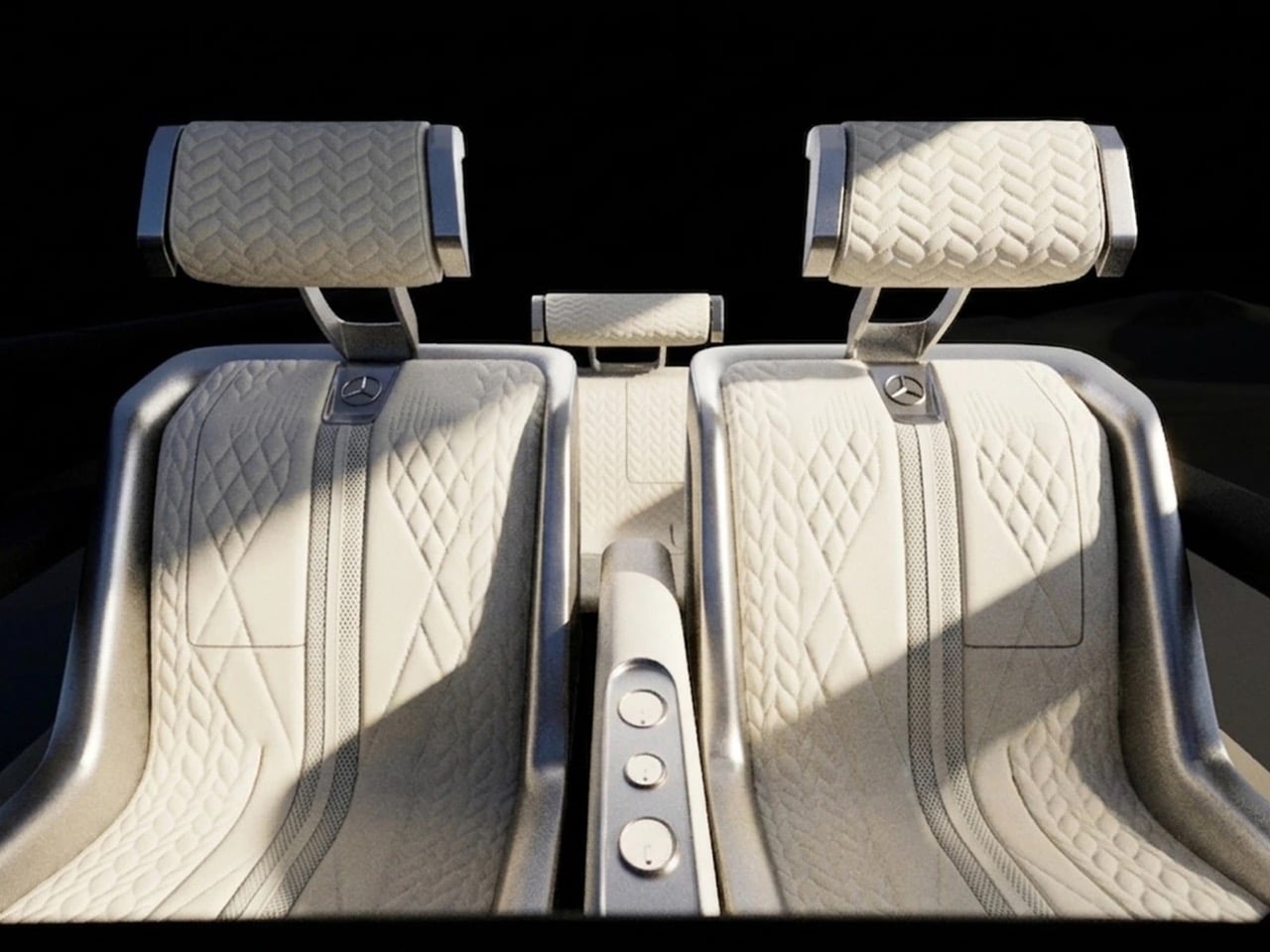
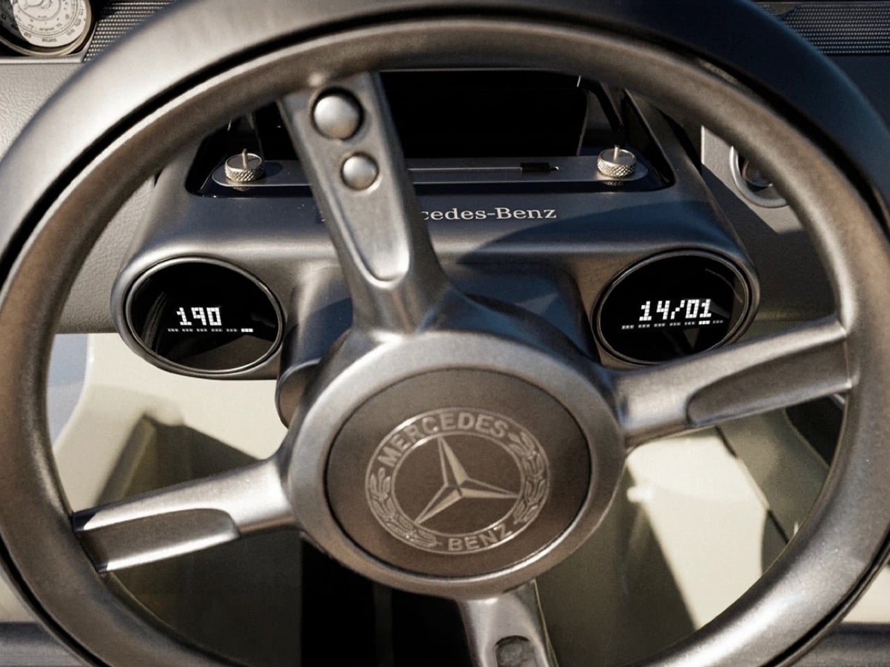
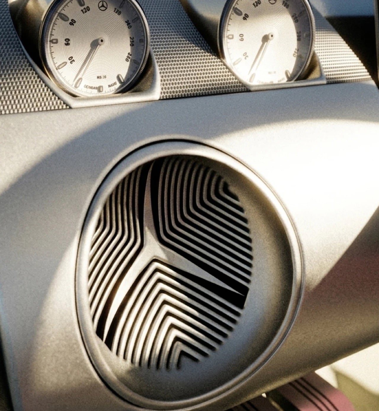
Inside, a twin dial gauge cluster sits behind a small, low steering wheel with the Mercedes badge centered at the hub, next to a strip of brushed metal toggle switches that look pulled from a vintage aircraft panel. A faceted shift knob rises from the center console, catching light the same way the exterior’s chrome finishes do. Quilted cream leather covers the seats and door panels, the only soft material in a cabin built mostly from metal and glass. Park pairs a 1950s instrument layout with materials that lean closer to a wristwatch than a dashboard. It reads more like a cockpit than a passenger cabin.

None of this comes from Mercedes, which is worth being clear about. Vision Timeless is Park’s MA thesis, modeled entirely in Blender 3D out of his studio in Paris, part of a growing pool of independent automotive renders, alongside work like Gabriel Naretto’s Uhlenhaut Shooting Brake, that look close enough to factory output to get mistaken for it. The render quality holds up under scrutiny: lighting, reflections, and material transitions are handled at a level that wouldn’t look out of place in an actual Mercedes press kit. Naretto’s Uhlenhaut leaned nostalgic. Park’s leans aggressive. Same heritage cues, two very different takes on what to do with them.

A grille this dense would be expensive to stamp or mold at scale, and a glass heavy cabin with doors this long would need real engineering before it met crash standards. That’s not really the point of a thesis project. Park set out to see how far a heritage shape could be pushed before it stopped looking respectful and started looking aggressive, and Vision Timeless answers that cleanly. The modernity over heritage framing he built this around reads less like an academic exercise and more like a real design position once you see the finished renders. Mercedes has used its own concepts, like the Vision Iconic, as farewell statements rather than production previews. Park doesn’t have that institutional backing, and the project doesn’t need it to land.

The post This might be the most bad-ass Mercedes-Benz Concept Car of all time… first appeared on Yanko Design.

This Bright Yellow Kinetic Sculpture in London Is Meant to Be Walked Through

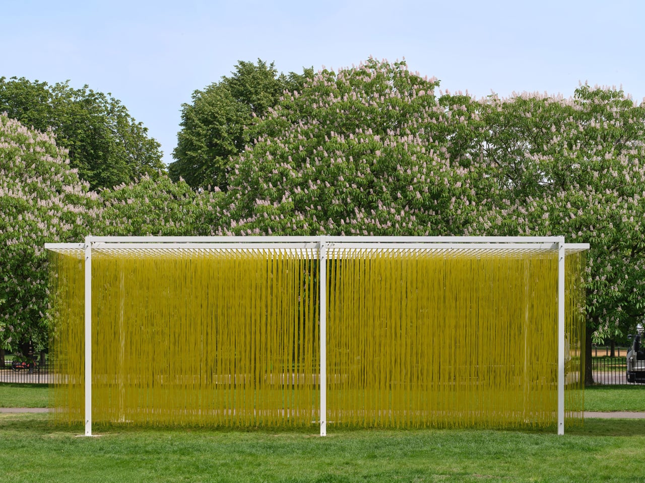
There are artworks you look at, and there are artworks you walk through. Jesús Rafael Soto understood the difference better than almost anyone. The Venezuelan kinetic artist spent his career dismantling the passive relationship between viewer and object, and nowhere is that ambition more fully realized than in his ‘Pénétrable’ series — sculptures built not to be observed, but to be entered. ‘Pénétrable BBL Jaune’, originally conceived in 1999, remains the purest expression of that idea.

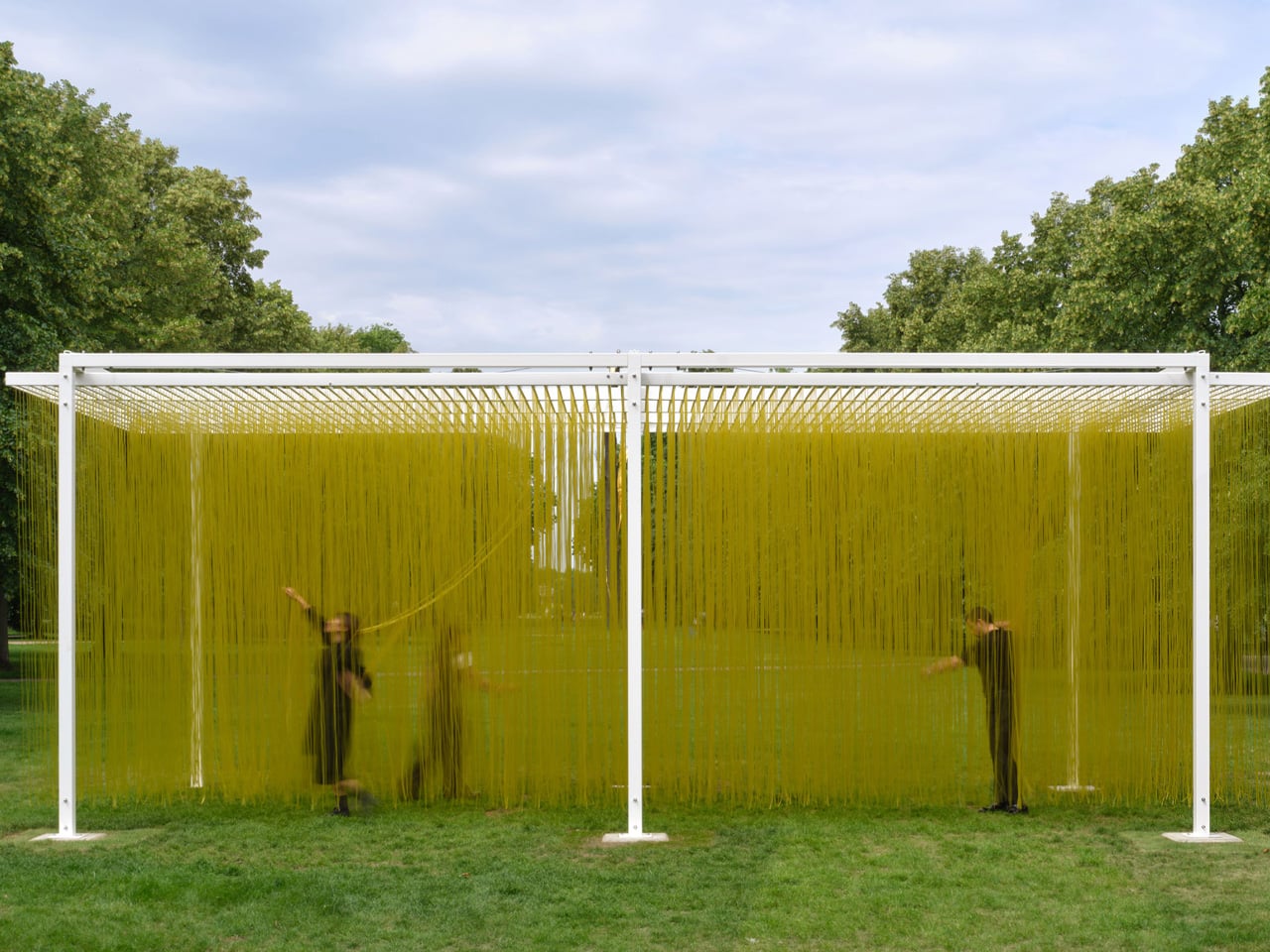
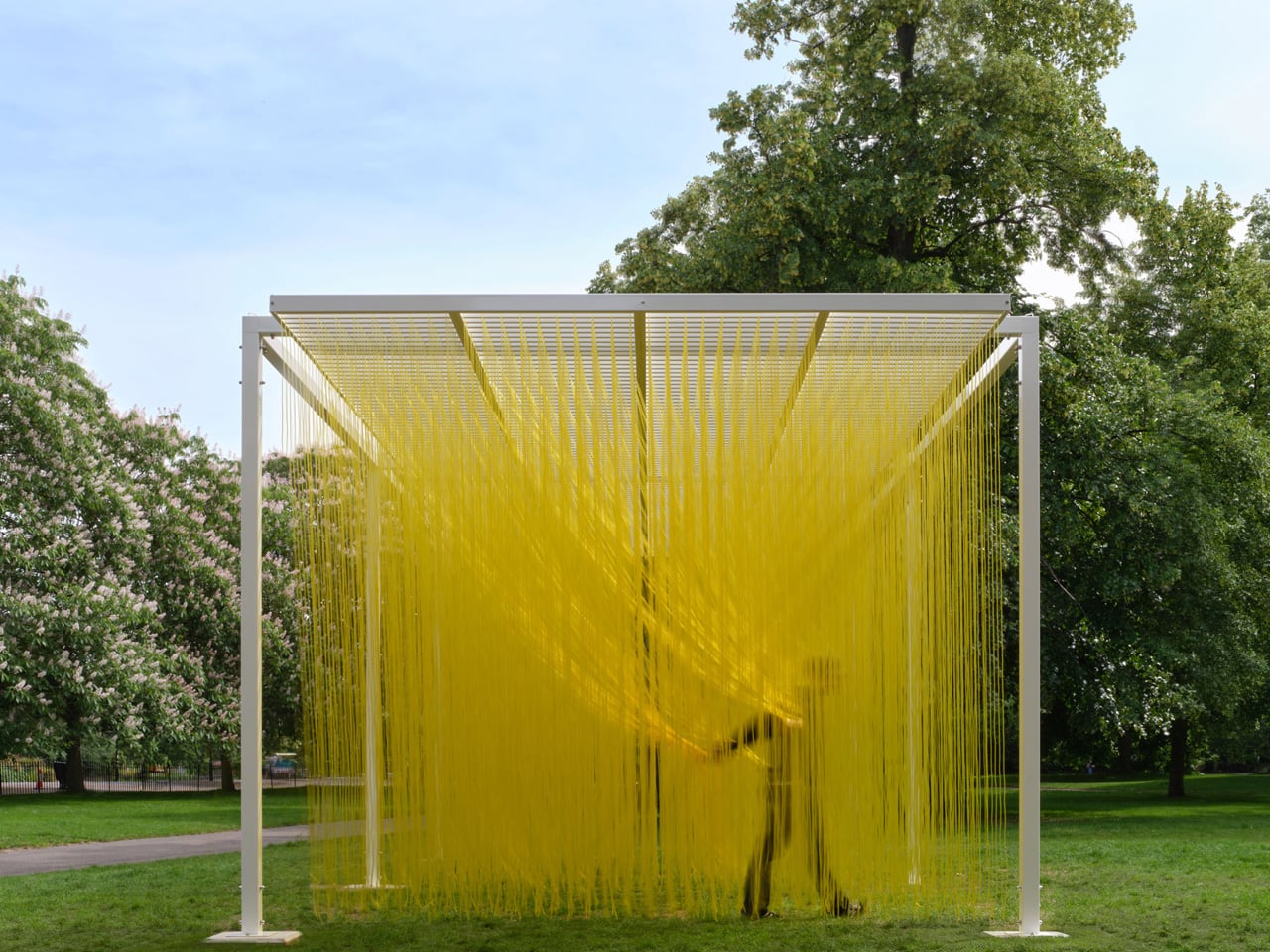
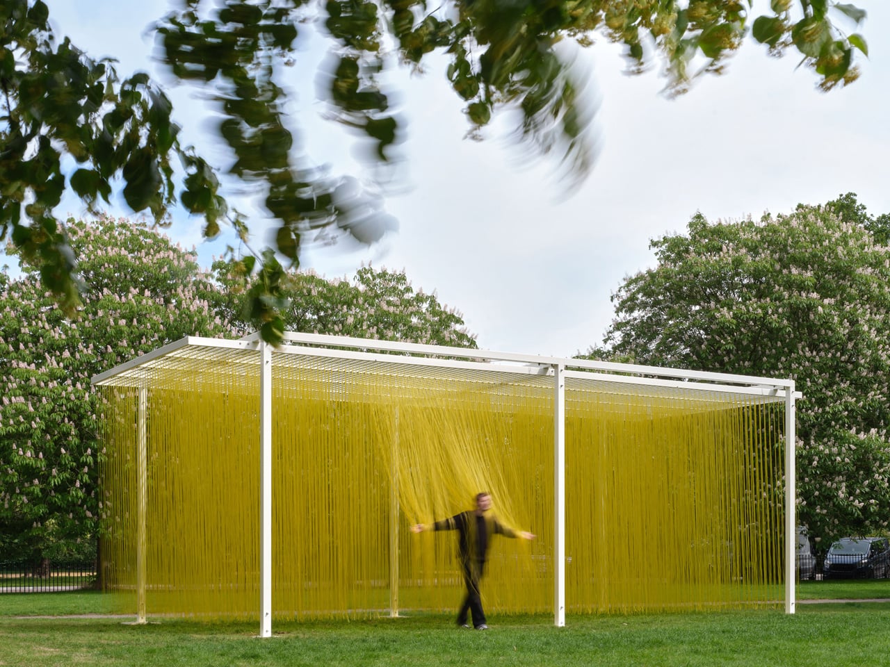
The work is deceptively simple in form. A white steel frame suspends thousands of yellow PVC tubes — around 4,000 in total — that hang in a dense, luminous field. At a distance, it reads almost like a monolithic block of color, a solid presence that the eye cannot immediately parse. Move closer, and the illusion shifts. Step inside, and it dissolves entirely. The tubes brush against your arms, your shoulders, your face. The sculpture is no longer in front of you — you are inside it, and it is responding to you. That exchange, that collapse of separation between the work and the person experiencing it, was Soto’s lifelong obsession.

Designer: Jesús Rafael Soto

Soto was born in Ciudad Bolívar, Venezuela, in 1923, and spent much of his career in Paris, where he became central to the kinetic and Op Art movements of the 1950s and 60s. He died in 2005, but his estate relaunched ‘Pénétrable BBL Jaune’ in 2023 to mark the centenary of his birth, ensuring the work would find new audiences in new contexts. In 2026, that context became London. The Serpentine Galleries installed the piece outside Serpentine South as part of their summer art programme — the first work by Soto ever shown outdoors in the UK.

Serpentine artistic director Hans Ulrich Obrist, who helped select the work, described Soto’s ‘Pénétrable’ as a genuine invention — a shift from object to relation. “It goes from an object to a relation,” Obrist noted, “and we felt that would be amazing as part of our public art projects.” That framing feels precise. The yellow tubes are not decorative. They are a mechanism for recalibrating how a body moves through space, how a crowd becomes a participant, how color becomes atmosphere rather than surface.

What makes ‘Pénétrable BBL Jaune’ endure is its refusal to age into mere spectacle. In a cultural moment saturated with immersive experiences engineered for the camera, Soto’s work asks something different — not that you photograph it, but that you feel it. The tubes sway. The light shifts. The boundary between you and the artwork, for a moment, disappears entirely.

The post This Bright Yellow Kinetic Sculpture in London Is Meant to Be Walked Through first appeared on Yanko Design.

How Pasta Became Interior Design’s Most Playful Muse

There is something wonderfully unserious, and yet oddly elegant, about pasta-inspired decor. What began as an April Fools’ joke by luxury stone and tile company Artistic Tile has now become part of a broader design movement that treats pasta as form, memory, geometry, and material inspiration.

In April, Artistic Tile posted its newest “product line” on Instagram: mosaics featuring macaroni and farfalle shapes arranged like pasta in sauce. The collection, cheekily called Al Dente, immediately caught attention. Followers loved the concept, with many joking that Italian restaurants should take the idea seriously. The only problem? It was posted on April 1. The tiles were never originally meant to be real. But the joke had too much flavor to stay fictional.

Designer: Studio Yellowdot
The idea first emerged while Artistic Tile’s president and chief product officer, Zach Epstein, was reviewing another design with a boomerang-like shape. The curve suggested something more familiar and playful: macaroni. After the enthusiastic online response, Artistic Tile decided to bring the concept to life through its Tailored To program, which allows for custom designs. What started with macaroni and farfalle expanded into vodka rigatoni made from limestone and Rosa Perlino, and butter noodles made with Limone Marmi marble. Beneath the humor, the pattern works because it is recognizable, abstract, and decorative without feeling too literal.

That balance between wit and refinement is exactly why pasta has become such an appealing muse for designers. Pasta is familiar, playful, sculptural, and deeply emotional. It carries family memories, comfort, culture, and craft, while offering an endless library of shapes: ridges, curls, tubes, shells, folds, ribbons, and spirals.

Pasta-inspired design does not need to belong only in Italian restaurants or food-focused spaces. Its value lies in its ability to spark conversation anywhere. A pasta-shaped pull on a cabinet, a lasagna-inspired chair, or a macaroni mosaic creates a moment of recognition. People pause, smile, and look closer. That small moment of surprise adds emotional value to an interior. It makes a space feel more human, less predictable, and more open to storytelling.

In an age where many interiors can feel overly polished or algorithmically similar, pasta brings a charming disruption. It introduces humor without making the space feel childish. It creates nostalgia without becoming overly sentimental. Because nearly everyone has some relationship with pasta, through family dinners, grocery aisles, childhood meals, or comfort food memories, the motif carries an easy emotional resonance. It becomes a shared reference point, allowing design to feel more approachable and social.

Canadian Italian artist and industrial designer Chris Fusaro’s work shows how pasta can operate as a design language. His bronze objects appear to be built from hyperrealistic pasta pieces, transforming bowls, strainers, trivets, lamps, pendants, and chairs into playful studies of repetition and form. In this context, pasta becomes a modular system. Its many shapes allow the idea to expand across different scales and objects without feeling immediately exhausted.

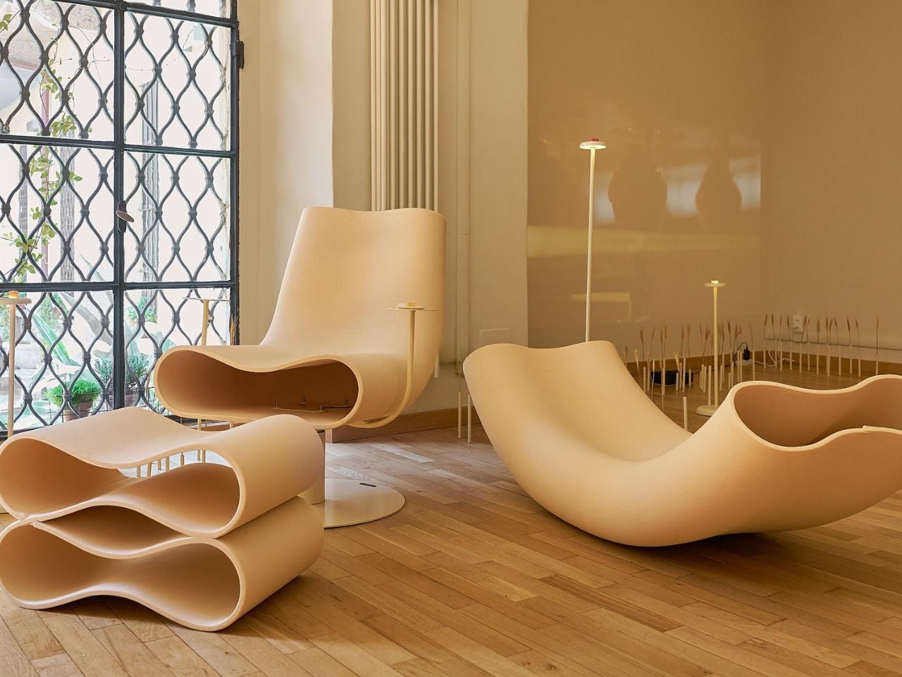
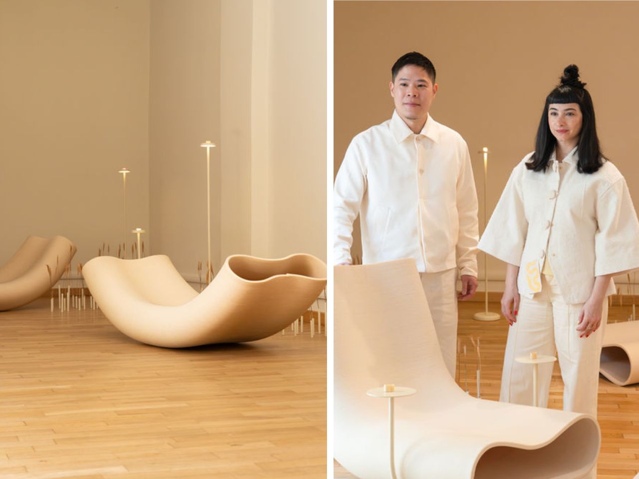
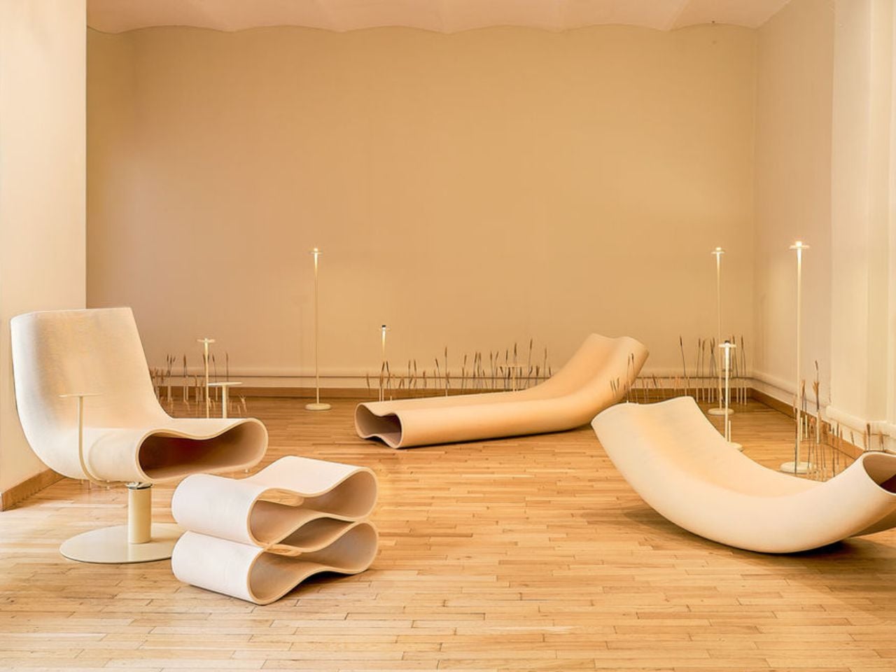
At Milan Design Week, pasta moved into an even larger spatial language through Edible Reveries, an exhibition by Artisia, a Barilla-owned company specializing in 3D-printed dry pasta, and Studio Yellowdot. Alongside tastings, visitors encountered pasta-inspired furniture, including a lounge seat, rocking chair, and ottoman shaped like enlarged dry noodles. The furniture was also 3D-printed, using a wood-composite material that echoed the process of shaping pasta dough. The result was surreal yet functional: soft and noodle-like in appearance, stable and architectural as furniture.

Other designers are exploring pasta at a more intimate scale. Australian hardware brand Lo & Co Interiors released its own Al Dente collection, featuring orecchiette-inspired knobs and lasagne-like pulls. These pieces bring a subtle wink to furniture and cabinetry. Their appeal lies in the way they feel familiar and sophisticated. A pasta-inspired drawer pull can be humorous, and when treated with the right material, finish, and proportion, it becomes unexpectedly elegant.

This trend feels timely because contemporary interiors are moving away from overly disciplined, sterile perfection and toward objects with personality, tactility, and a stronger sense of handcraft. Pasta forms naturally offer irregularity and charm. They feel shaped rather than engineered. They carry presence without becoming intimidating.
San Francisco designer Caleb Ferris found inspiration in pasta while observing the range of shapes found in grocery store aisles during the pandemic. The variety of pasta forms revealed itself as a kind of mass-produced design library. His lasagna chair, made in a ruffled black satin silhouette, brought tongue-in-cheek humor into furniture and went on to win the 2023 ICFF Editors Award for Seating. In a moment when people were craving lightness, pasta offered comedy, craft, and a break from overly serious design language.

New York interior designer Tara McCauley has leaned into the theatrical side of pasta. Her lamp, made with real linguine, faux parsley, and a clam shell base, plays with the line between decorative object and edible absurdity. The piece creates a moment of surprise: at first glance, it reads as a whimsical design object, but up close, the use of real pasta turns it into something stranger and more memorable.

Pasta-inspired design works because it is funny without feeling disposable. It adds value to interior spaces by being memorable. It gives people something to notice, talk about, and connect with. Whether placed in a home, boutique hotel, retail space, gallery, or restaurant, it can soften the atmosphere and make the environment feel more personal.

Pasta has always carried the logic of design. It is engineered to hold sauce, shaped for texture, scaled for the hand and mouth, and tied to ritual. Now, designers are moving it from the kitchen table into the wider world of interiors. The result is a little ridiculous, surprisingly refined, and very hard not to love.

The post How Pasta Became Interior Design’s Most Playful Muse first appeared on Yanko Design.

Bowers & Wilkins Spent 60 Years on These Speakers. It Shows.

Most brands celebrate a 60th anniversary with a retrospective book or a limited-edition colorway. Bowers & Wilkins celebrated theirs by unveiling what may genuinely be the most advanced loudspeaker range they have ever made. The 800 Series Diamond D5 arrived with that kind of quiet confidence that doesn’t need fanfare to make its point, even if it was announced to considerable fanfare.

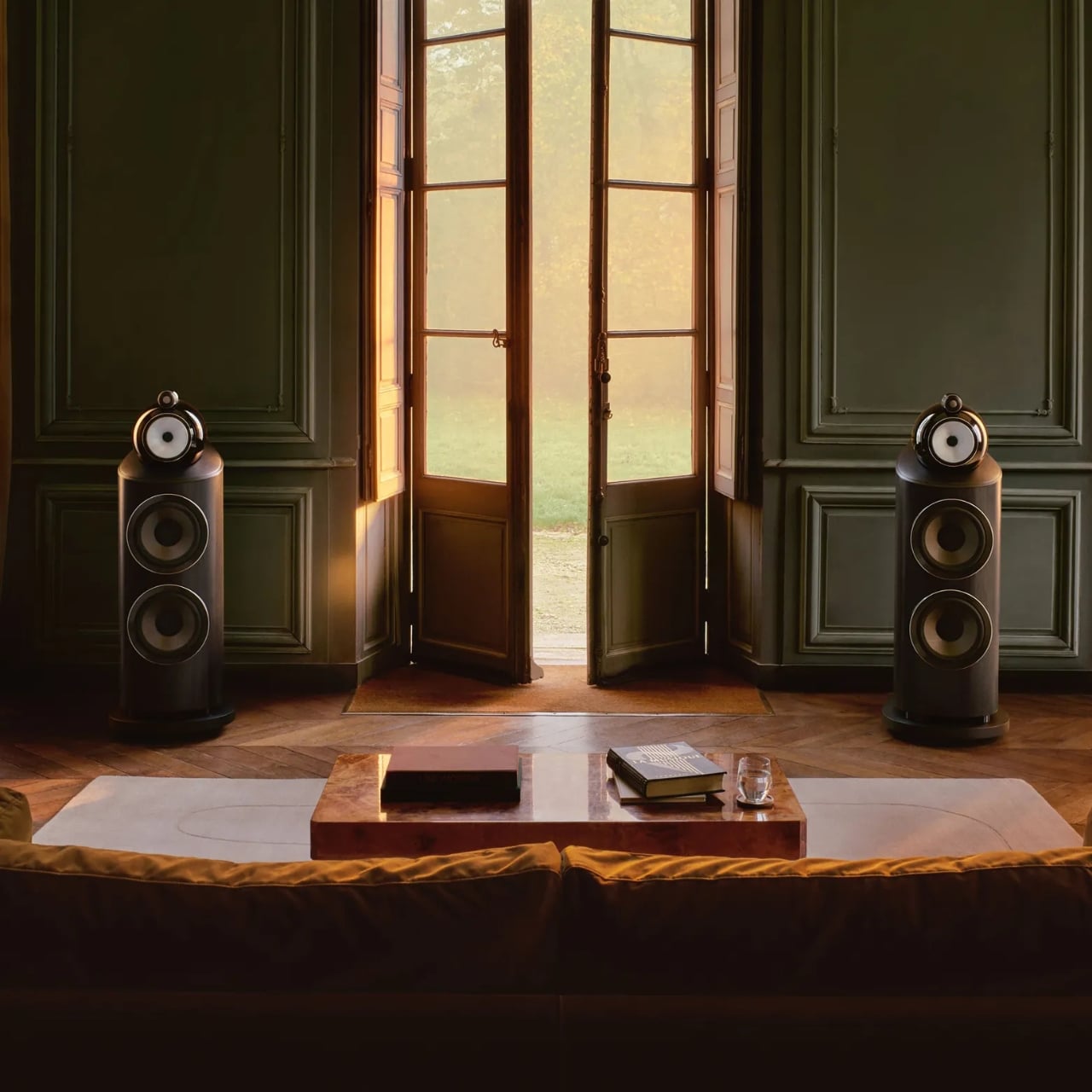
I’ve always believed that truly great audio equipment occupies a strange place between technology and sculpture. The 800 Series has lived in that space for decades. It’s the kind of speaker you find in professional recording studios around the world, at Skywalker Ranch where teams have mixed and mastered legendary film soundtracks, and also in the living room of the person who just needs the room to sound exactly right. That dual citizenship, professional and deeply personal, tells you everything about what Bowers & Wilkins has been building toward.

Designer: Bowers & Wilkins

The D5 is the fifth generation of the Diamond series, and the tagline “60 years in the making” isn’t marketing hyperbole. It’s a mission statement rooted in John Bowers’ original True Sound philosophy: nothing added, nothing taken away. Every generation of 800 Series starts from the same question: what stands in the way of the music? The answers keep evolving. The ambition stays constant.

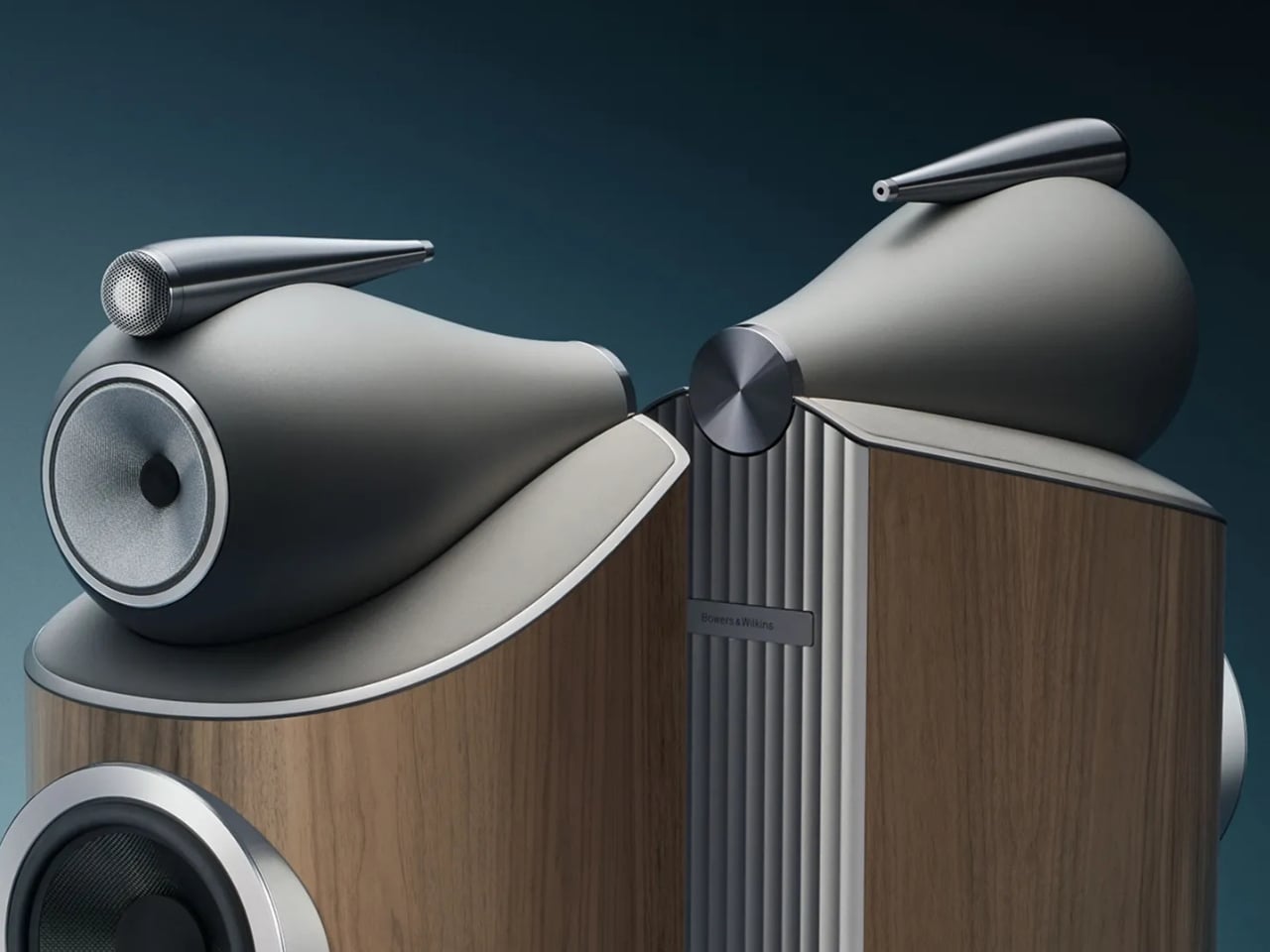
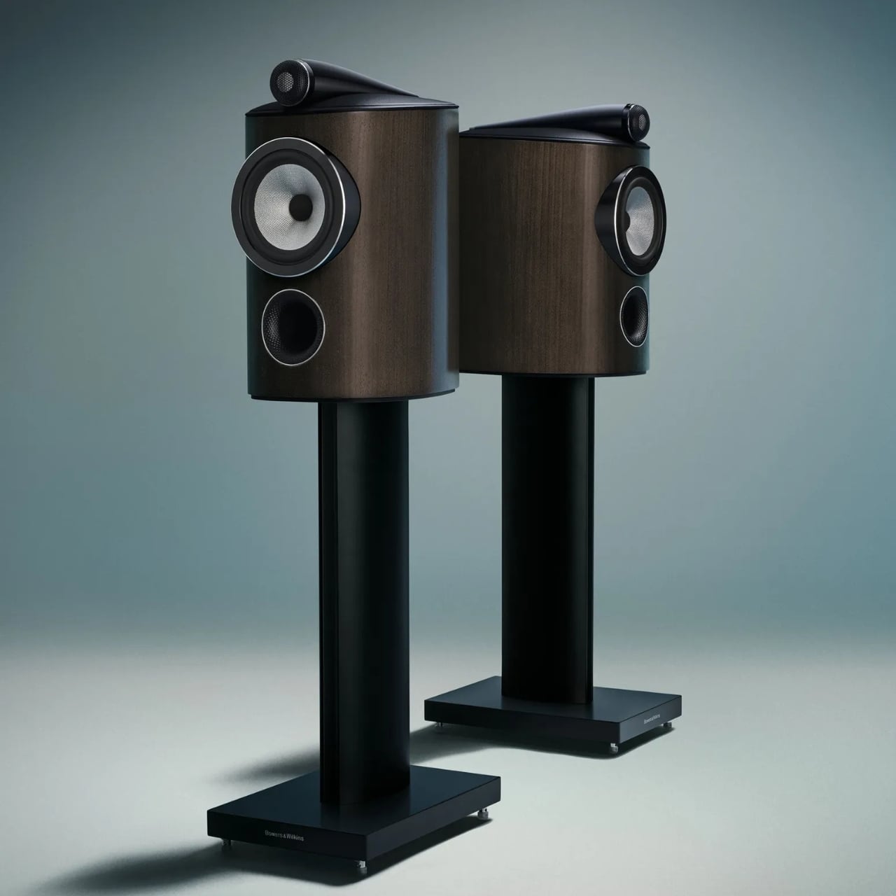
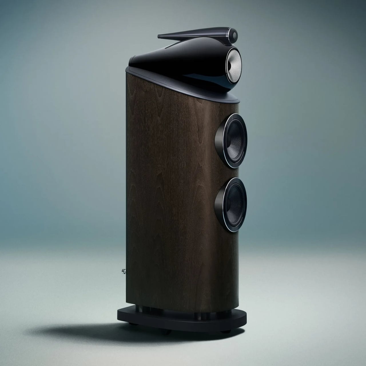
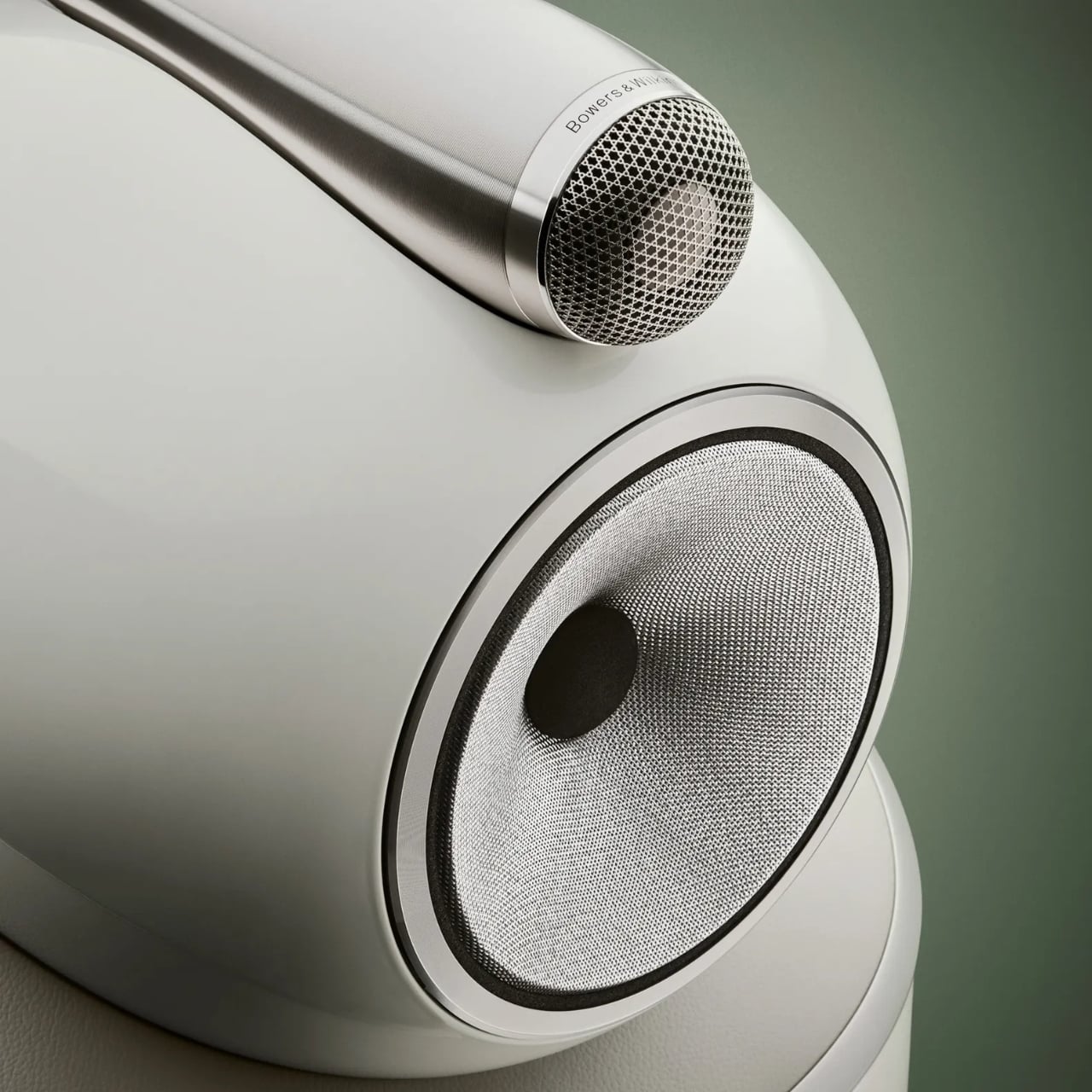
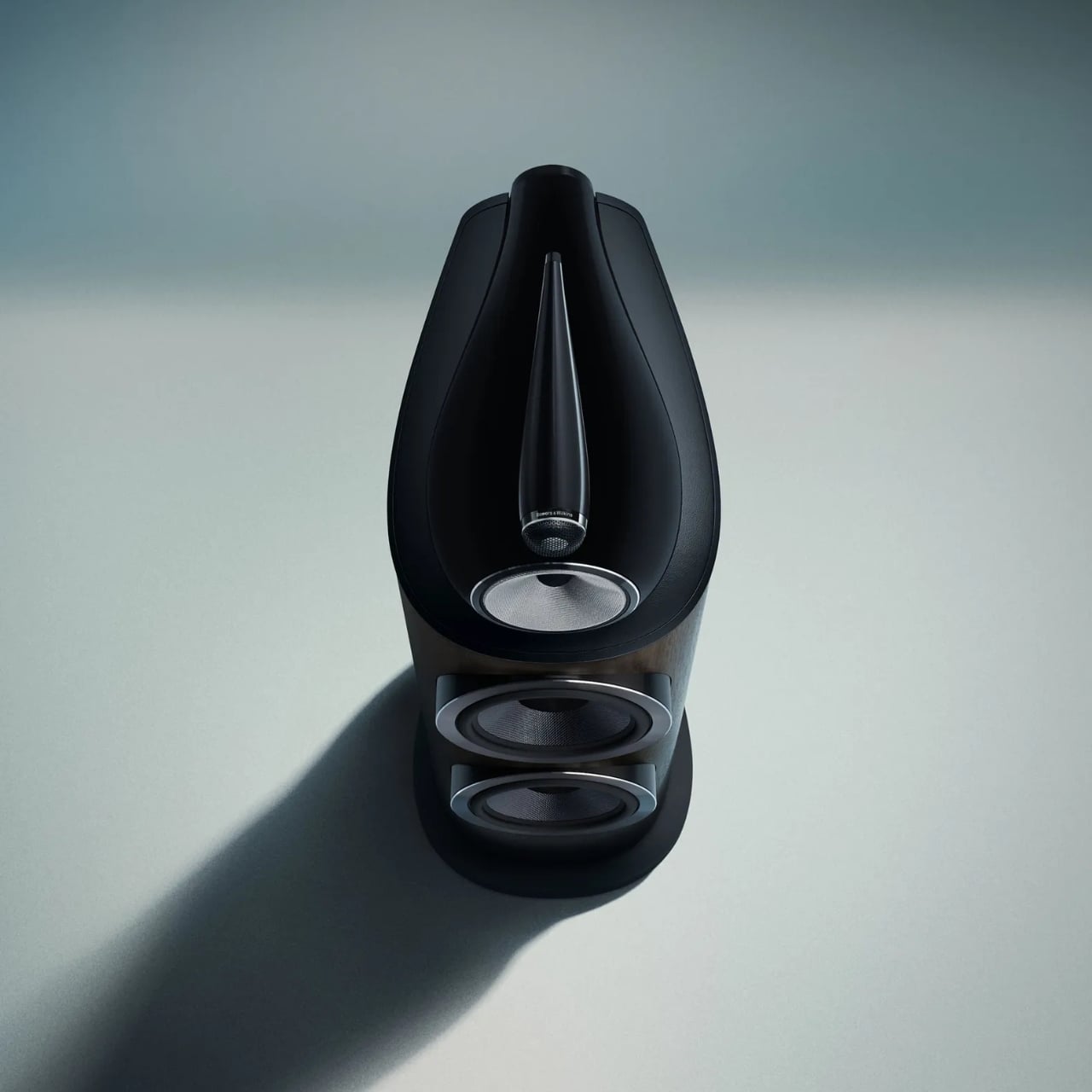
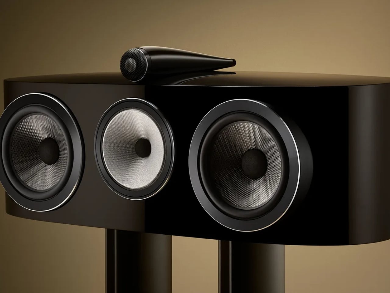
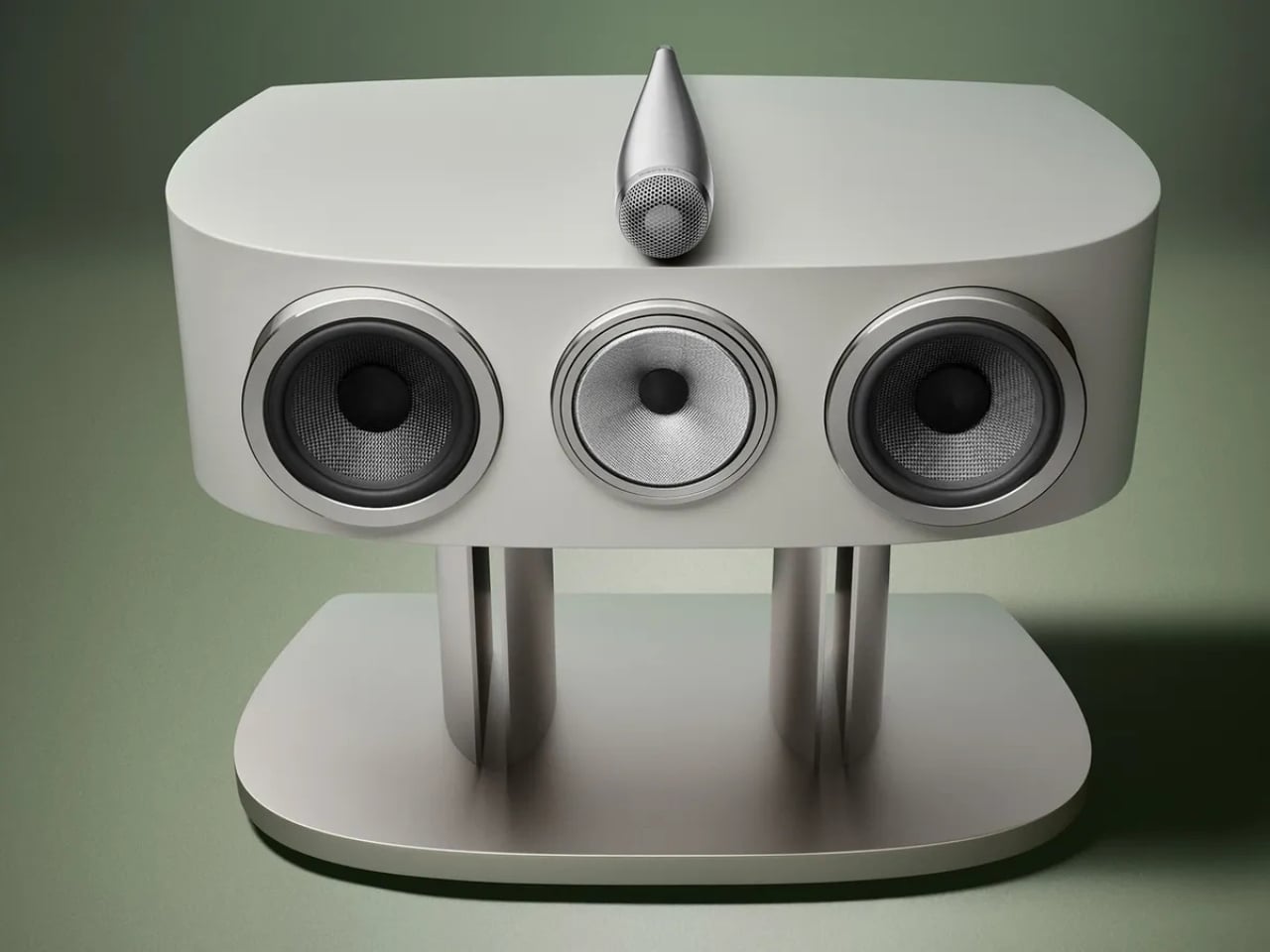
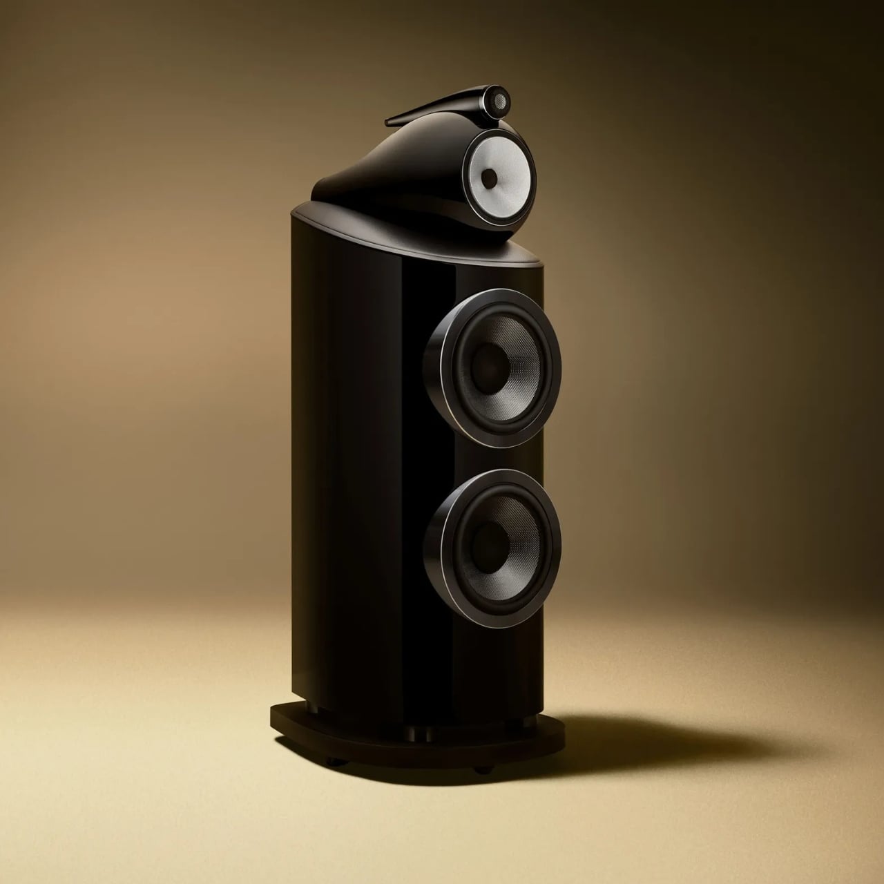
The range includes seven models, from the compact 805 D5 stand-mount to the flagship 801 D5 with its twin 10-inch bass drivers. The iconic Turbine Head, that distinctive aluminum sphere housing the midrange driver in complete acoustic isolation from the bass section, remains one of the most recognizable silhouettes in audio design. It was bold when it debuted, and it’s still striking today. It’s been refined here, not rethought, and I think that’s the right call. Some shapes earn the right to stay.

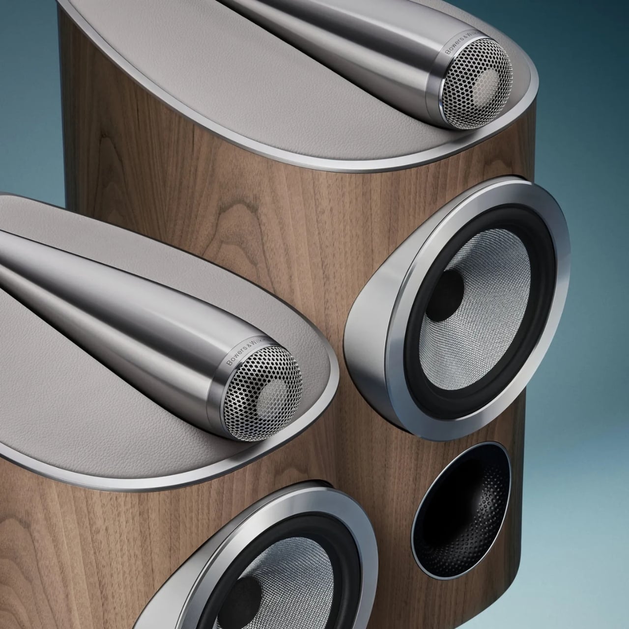
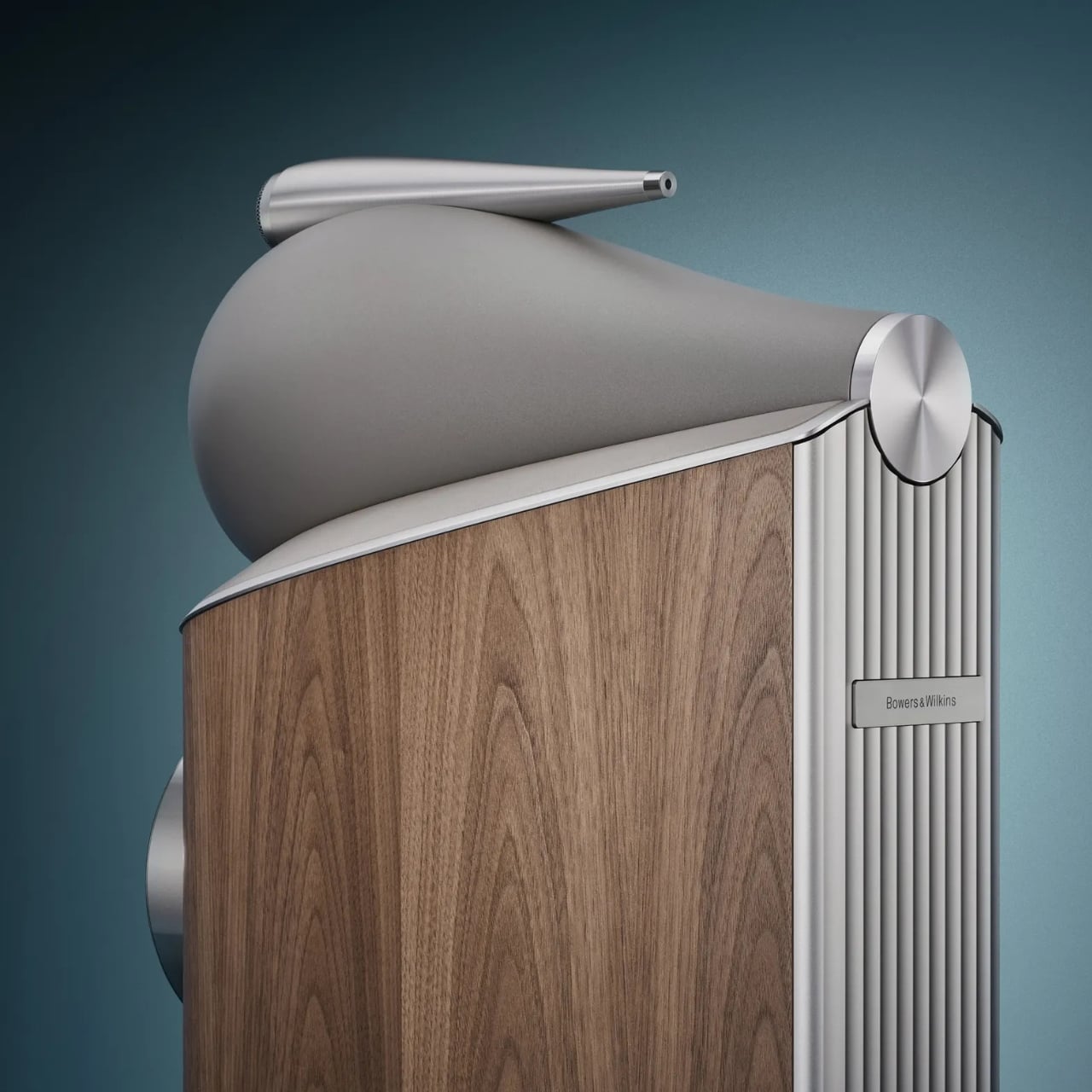
What’s new in D5 runs much deeper than the surface. The Space Frame Bracing system introduces parallel aluminum rails bolted directly to the rear Matrix cabinet bracing, making the enclosure significantly stiffer and mechanically quieter than its predecessor. A revised aluminum top plate, with thicker ribbing and updated decoupling mounts, better supports the Turbine Head and Solid-Body-Tweeter assemblies. The crossover components have been moved entirely outside the cabinet, mounted on aluminum rails at the rear, which eliminates internal air pressure fluctuations from affecting crossover behavior. As an added benefit, natural convection keeps those components running cooler during extended listening.

The Diamond Dome tweeter gets a new grille mesh, first developed for the acclaimed 801 D4 Signature, that’s more acoustically transparent while still protecting the dome. The result is better off-axis performance and noticeably improved resolution. Every midrange and bass driver across the range has also been upgraded with lower-distortion motor systems derived from Signature-grade components. That’s not a minor tune-up; that’s serious trickle-down engineering from the very top of the catalog.

Aesthetically, the D5 introduces four new finishes: Stealth Black, Warm White, Light Walnut, and Dark Walnut. The paint has been upgraded for greater depth and durability, and the design detailing across every surface, from the spine to the plinth to the drive unit pods, has been refined. These are speakers handcrafted in Worthing, UK, and they carry that provenance visibly. Luxurious isn’t too generous a word.

Where I land on all of this is that the 800 Series Diamond D5 represents something genuinely uncommon in a market crowded with premium pricing and thin justification: a product that earns its position through accumulated expertise and genuine craft. There’s real, demonstrable engineering here, the kind that takes decades to develop, and Bowers & Wilkins isn’t shy about showing their work. The D5 range is scheduled to ship in fall 2026, and the anticipation feels entirely warranted.

Sixty years of obsessive refinement, applied to a speaker that takes the living room as seriously as a professional studio, will do that. When the engineering is this thorough and the design this considered, the only question left is how loud you want to play it.

The post Bowers & Wilkins Spent 60 Years on These Speakers. It Shows. first appeared on Yanko Design.

Why the $1,099 MacBook Air M5 beats the MacBook Neo for macOS 27

Apple’s 2026 laptop lineup presents a clean, almost philosophical choice. On one side sits the MacBook Neo, a machine built around the powerful idea of access. It lowers the barrier to entry, putting a capable Apple notebook within reach of more people than ever. It is a compelling argument rooted in the present, designed to solve an immediate need for a good, affordable computer. For a few hundred dollars more, the M5 MacBook Air makes a different promise, one that is less about immediate savings and more about long-term value and capability.

For months, that choice felt ambiguous, a simple trade-off between price and power. The arrival of macOS 27, however, brought a new clarity to the decision. Apple’s vision for the next generation of its operating system, with its heavy reliance on sophisticated on-device AI, reframed the entire lineup. The question is no longer just about what you need today, but about which machine is properly equipped for the software you will be using tomorrow. The Neo gets you in the door; the M5 Air gets you a seat at the table.


Designer: Apple

The M5 chip is what separates these two machines, and that difference stands out far more now than it did at launch. Apple announced the M5 MacBook Air in March with doubled base storage and modest performance gains, framing it as a solid evolutionary update. The M5 features a 10-core CPU and up to a 10-core GPU, but the real story lives inside those GPU cores. Each one includes a Neural Accelerator, a dedicated AI processing unit that dramatically increases the machine’s ability to handle on-device machine learning tasks. Apple explicitly positioned the M5 Air as capable of delivering up to 4x faster performance for AI tasks than the M4 Air, and up to 9.5x faster than the M1 generation. Those numbers were abstract in March. After WWDC, they became a requirement.

macOS 27 Golden Gate leans heavily on Apple Intelligence, the company’s suite of AI-powered features that process data locally rather than relying on cloud servers. Visual Intelligence, enhanced Spotlight with conversational AI capabilities, and system-wide machine learning workflows all depend on silicon that can handle the computational load without slowing down everyday tasks. The M5’s architecture was designed specifically to support this kind of workload at scale, making it the baseline for an uncompromised experience. Apple described the M5 Air as capable for Apple Intelligence across apps and system experiences, as well as for running large language models on device in enterprise environments. The Neo, with older silicon, may technically run macOS 27, but the gap between eligibility and capability is the entire value argument for spending more.

The storage equation also tilts decisively toward the M5 Air. Apple doubled the base configuration to 512GB, up from the 256GB that previous generations started with. That increase addresses one of the most persistent criticisms of Apple’s entry-level pricing strategy, particularly as on-device AI models require significant local storage to function properly. Larger machine learning models, extensive photo libraries processed with AI features, and the general expectation that a 2026 laptop should have breathing room all make 512GB feel like the real starting point. The $100 price increase over the previous M4 Air generation is easier to justify when half of it is effectively the cost of storage you would have upgraded to anyway. The Neo’s storage configuration was not surfaced in available reporting, but if it follows typical budget laptop patterns, it likely sits closer to the older 256GB baseline, which immediately creates friction for users planning to lean into Apple’s AI-forward software vision.

The M5 Air launched in March to a relatively muted reception, with early reviews treating it as a competent, predictable update rather than a transformational product. That framing was accurate at the time, because the machine’s value was not yet fully apparent. WWDC changed the story by revealing what the M5 was actually designed to do. The real product was never just the laptop; it was the laptop as a vessel for a more intelligent operating system. The Neo, by contrast, remains a strong value for users whose needs are defined by today’s software, but it starts to look underpowered the moment you project forward even a year.

The MacBook Air M5 is where Apple’s 2026 Mac story begins to feel aligned with its software ambitions. It is not the cheapest way into the ecosystem, but it may be the cheapest way to avoid compromise as macOS 27 arrives this fall. The Neo has its place, but for anyone planning to live on this machine for the next three to five years, the M5 Air is the safer, smarter, and ultimately more cost-effective choice. You can preorder both machines now through Apple’s website, but only one of them feels like it was built for the operating system Apple just announced.

The post Why the $1,099 MacBook Air M5 beats the MacBook Neo for macOS 27 first appeared on Yanko Design.