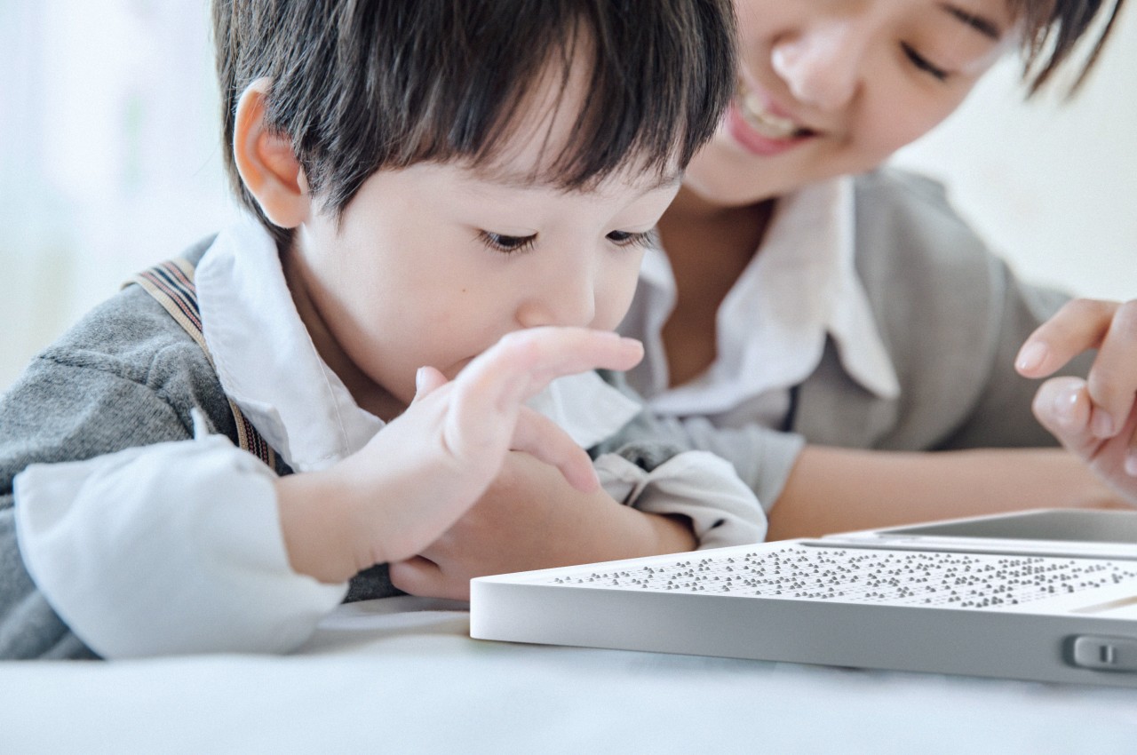
For most people, making a morning cup of tea or coffee is an almost automatic routine. But for someone who can’t see, the same steps involve a level of risk that kitchenware has never really been built to handle. Hot liquids, unfamiliar controls, and the constant need to pour from one vessel to another can turn a simple habit into a genuine obstacle.
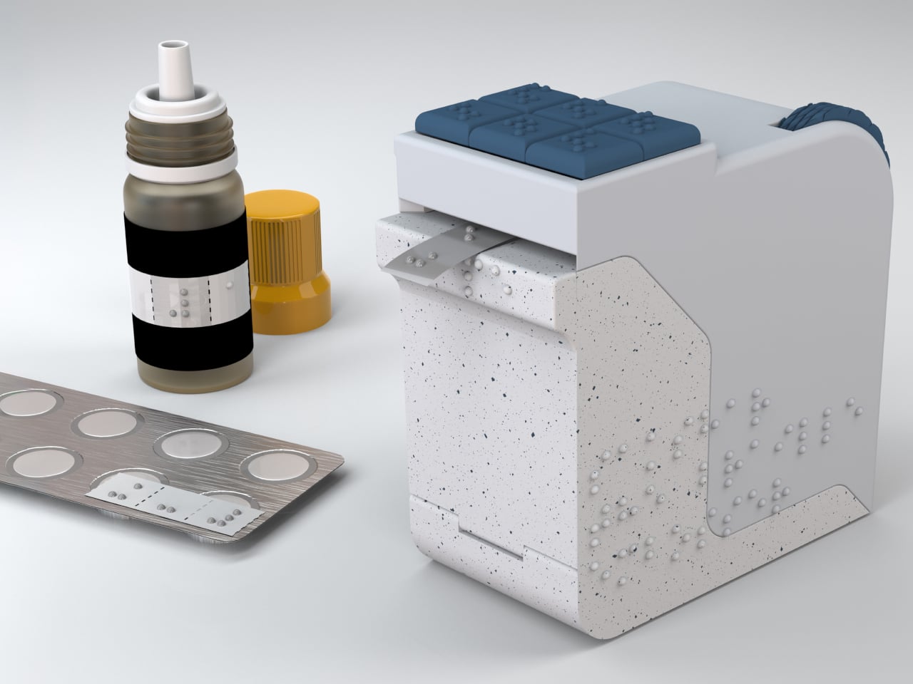
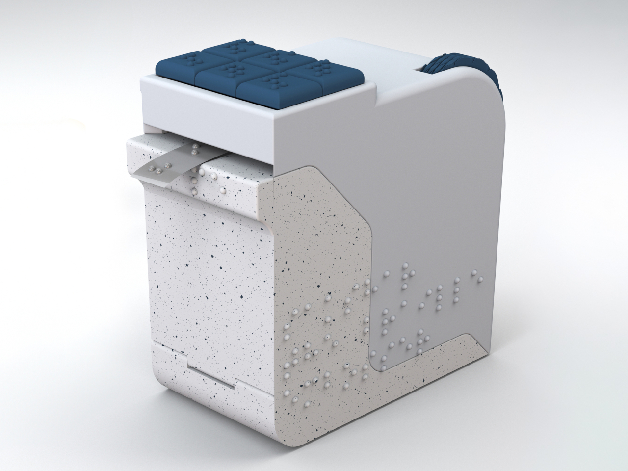
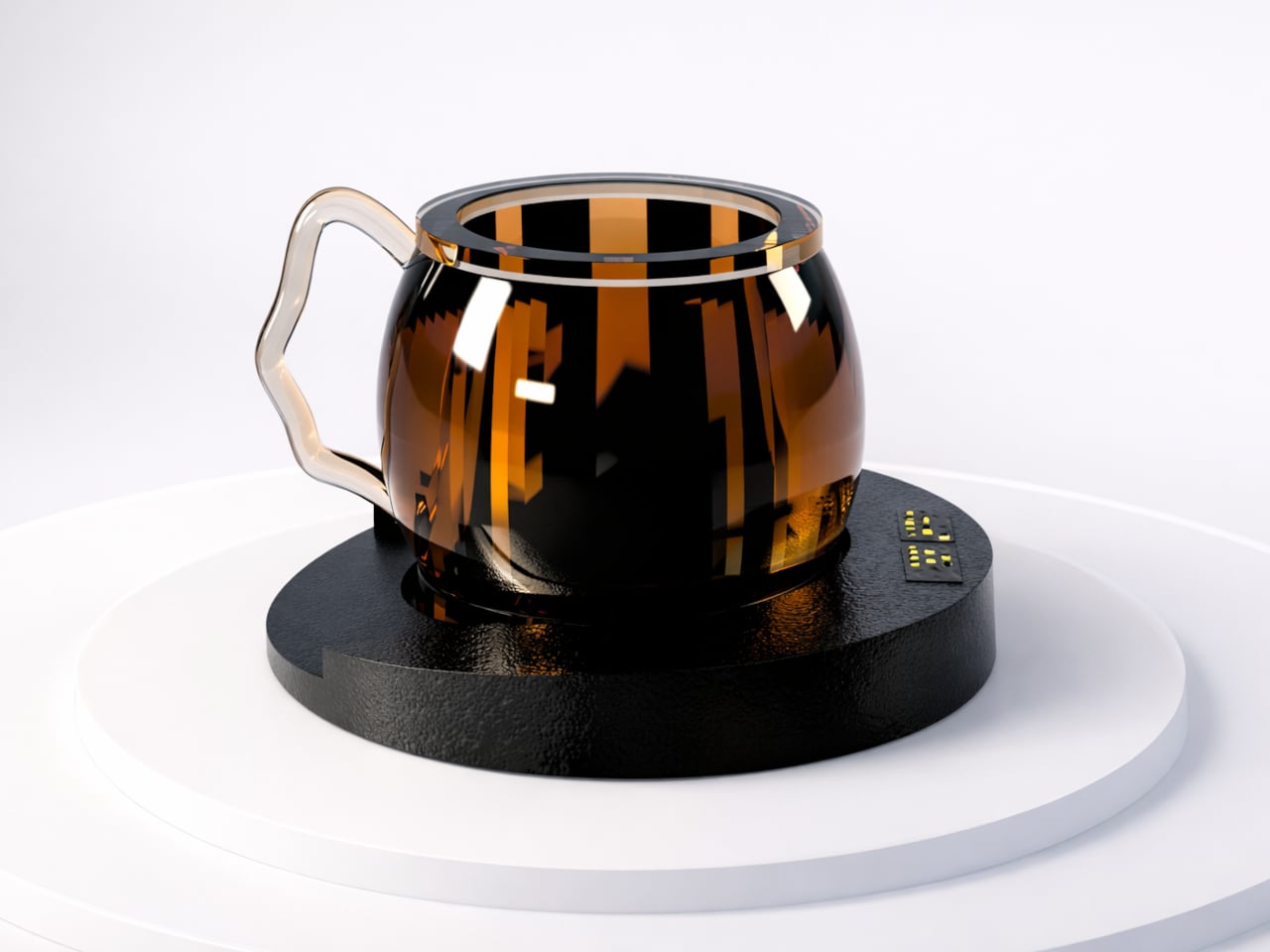
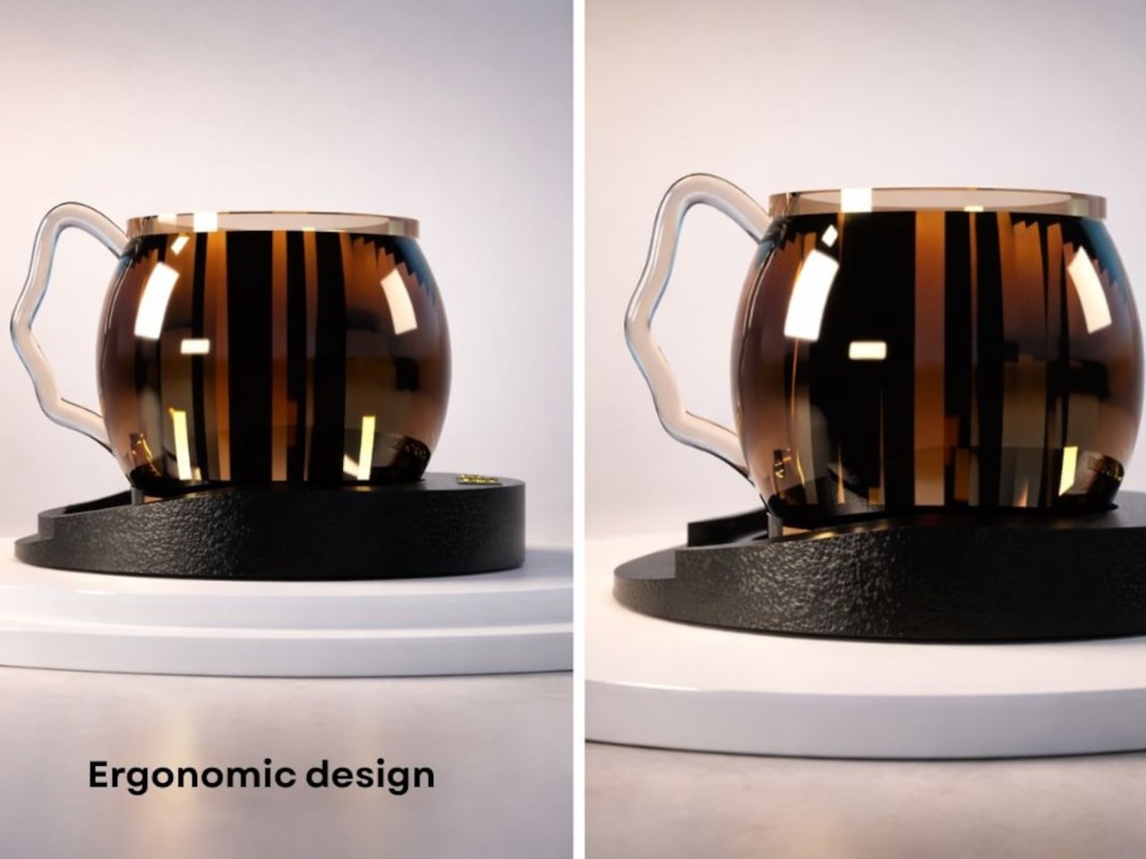
Designer Ivana Nedeljkovska’s Smart Cup for Visually Impaired Users tackles that problem head-on. Built from scratch with blind and visually impaired users as the primary audience, it combines the roles of a kettle, a teapot, and a drinking cup into one integrated form designed to be navigated entirely by touch, so there’s no need to move hot liquid between containers at any point.
Designer: Ivana Nedeljkovska
The challenge isn’t a small one. Conventional kitchen tools, from kettles to electric water heaters, were all designed for someone who can see them. They offer no tactile feedback on whether they’re on or off, no way to safely judge when water is ready, and no guidance on where to set things down. For visually impaired users, the kitchen is full of small ambiguities that add up to real risk.
That matters because every transfer of liquid is a risk. Pouring boiling water from a kettle into a separate cup is the kind of step that can go wrong for anyone, but for a blind user, the consequences are far more serious. Keeping the entire heating and drinking process within one vessel removes those moments before they can become a problem.
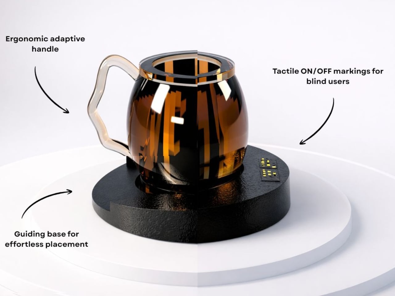
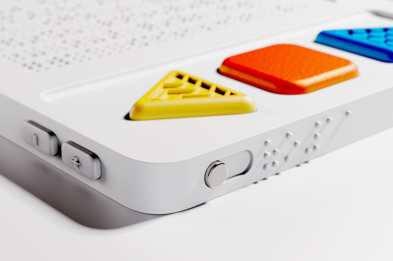
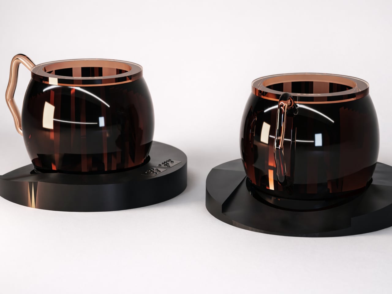
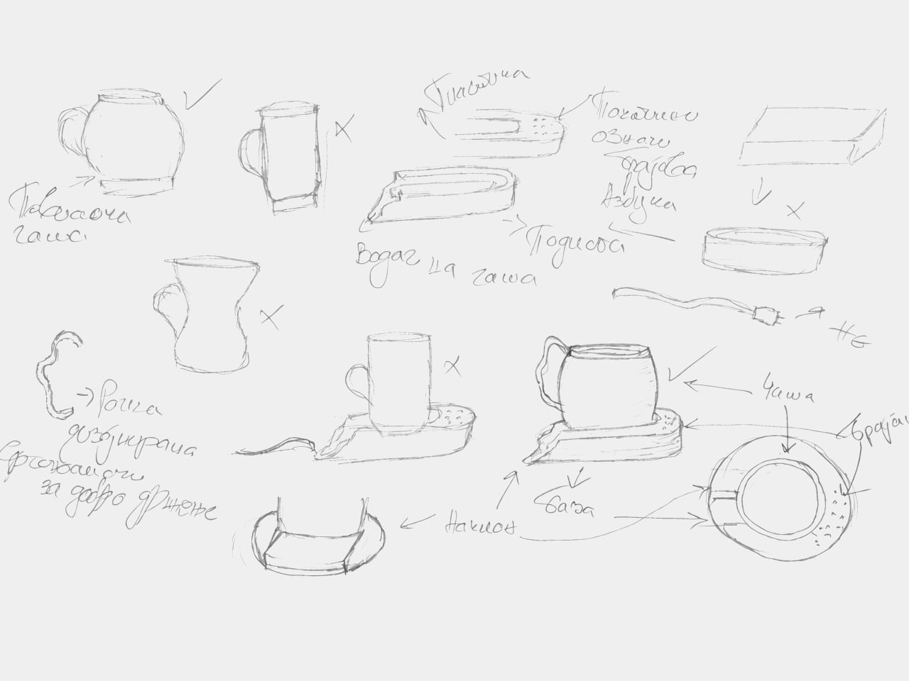
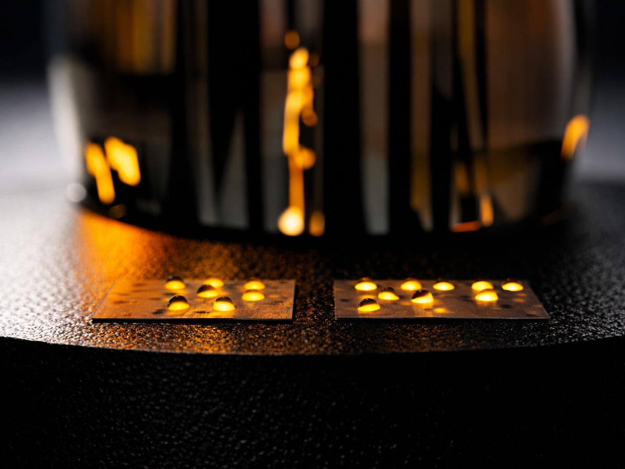
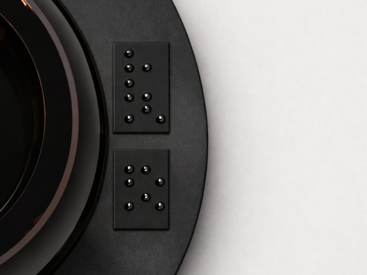
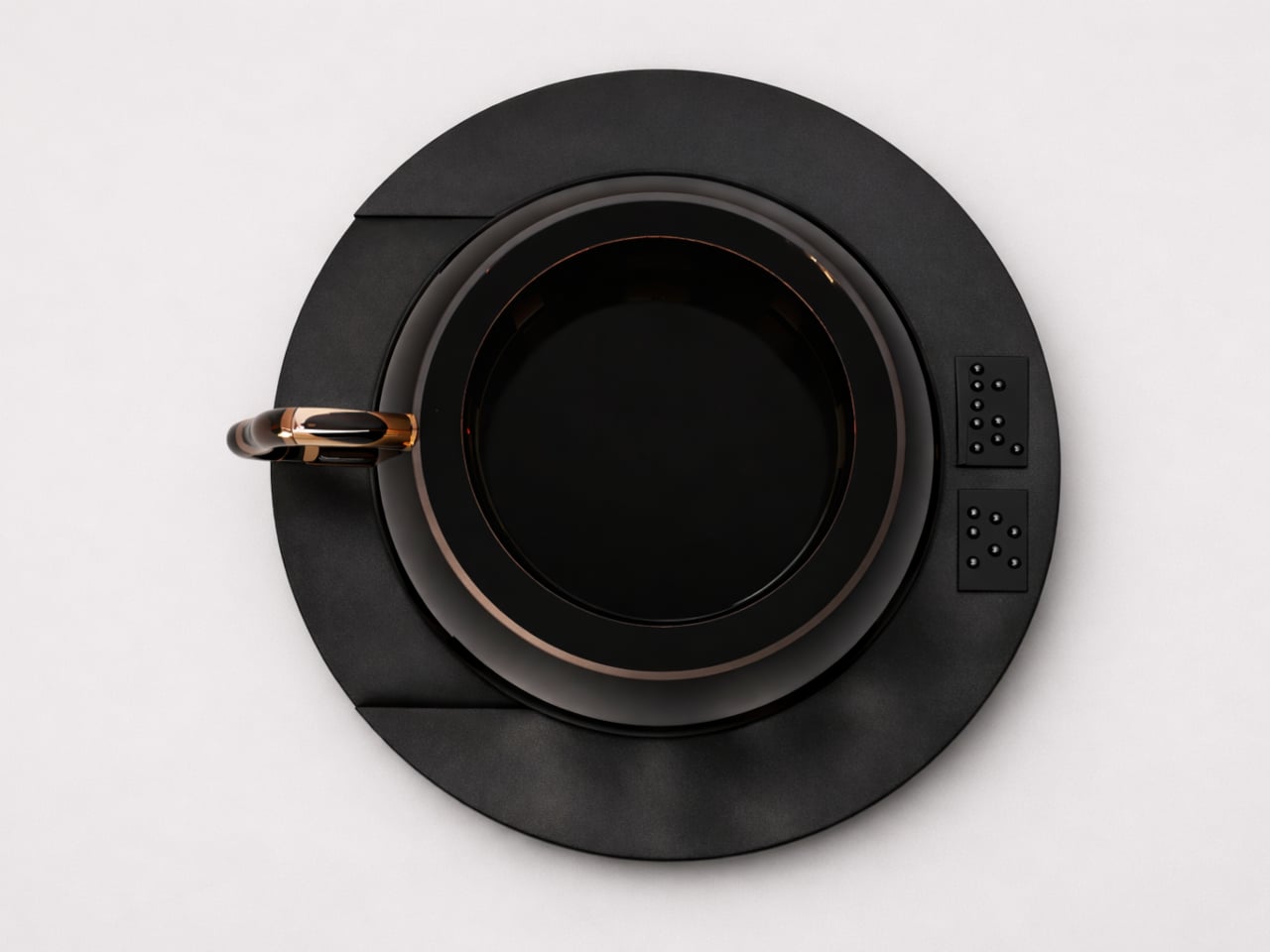
Every tactile detail carries that same logic through the design. A circular base guides the cup into the correct position when placed down, taking the guesswork out of a step that most products never consider. Raised Braille ON/OFF markings let the user activate and control the heating function entirely on their own, with no visual feedback or anyone else’s input required.
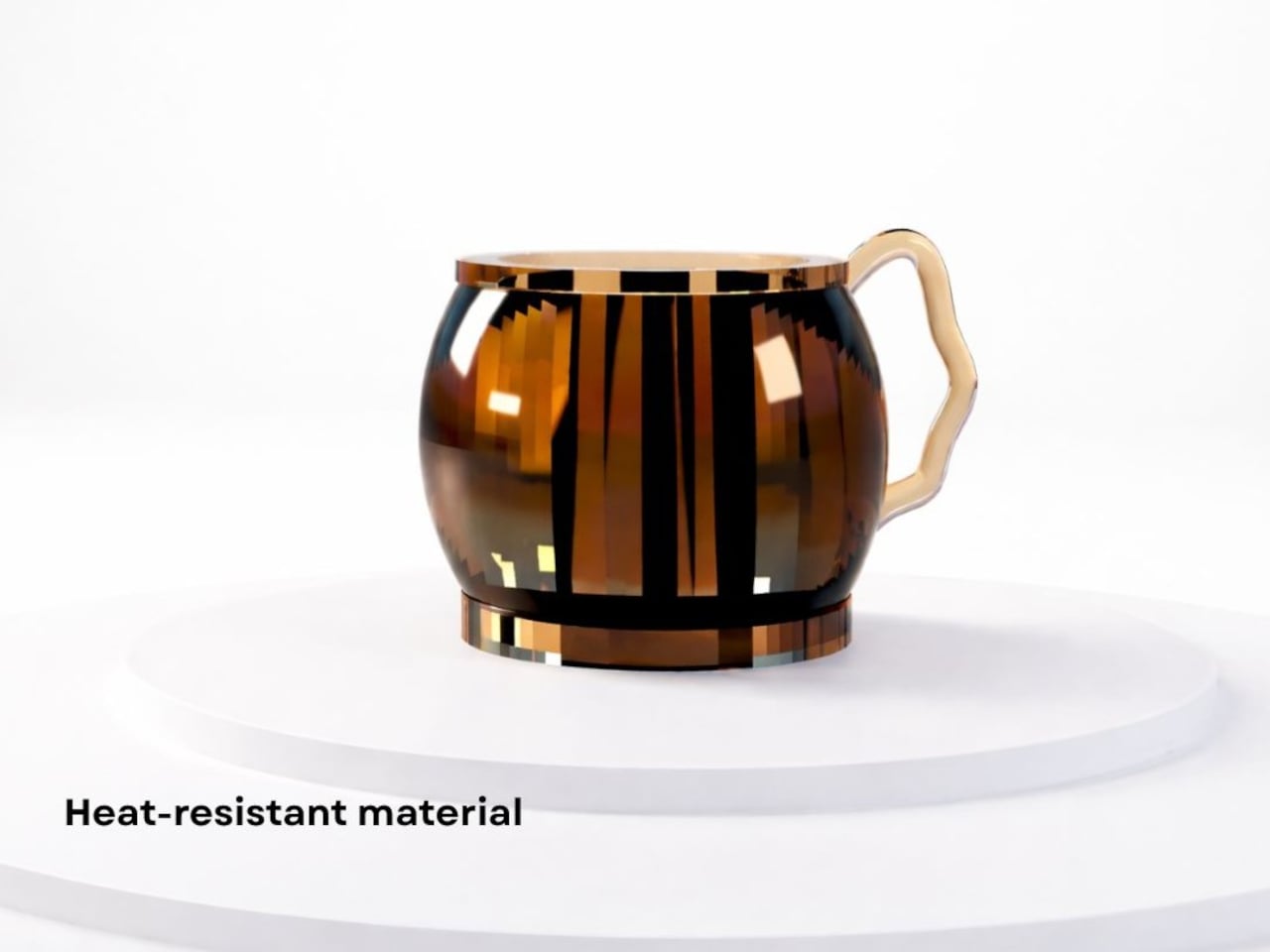
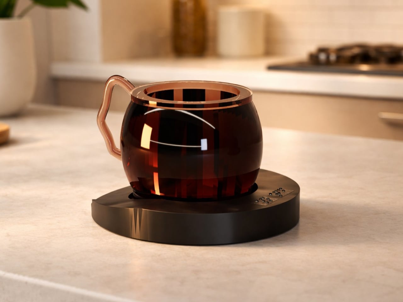
As for the cup itself, the same thinking applies. Its rounded, barrel-like body fits comfortably in the hand, and the handle’s adaptive shape ensures a secure grip without needing to search for the right position. The heat-resistant material keeps the exterior manageable even at full temperature, a detail that matters quite a lot when touch is the primary way of reading what’s inside.
Taken together, these choices reflect something that product design rarely gets around to prioritizing: dignity. Blind and visually impaired users shouldn’t have to depend on others or work around tools that were never built with them in mind just to make a hot drink. The Smart Cup treats independent use not as a bonus feature but as the foundational premise of the entire design.
It’s also worth noting that aesthetics aren’t treated as secondary here. The warm-toned form and sculpted handle give the cup a polished quality that would feel at home on any kitchen counter, not just in a specialized or assistive context. Accessible design has long leaned on utilitarian looks, as if beauty and function were incompatible, and this concept quietly pushes back against that assumption.
The post This Cup Replaces the Kettle So Visually Impaired Users Make Tea Alone first appeared on Yanko Design.