Your keyboard connects to your computer via a 2.4GHz wireless dongle. This keycap designed to slot onto your keyboard was formed at the bottom of a Jurassic sea roughly 200 million years ago. Both of these facts are simultaneously true, and together they produce one of the more pleasingly absurd objects in recent design memory. These might be the only keycaps on Earth that existed before the dinosaurs did…
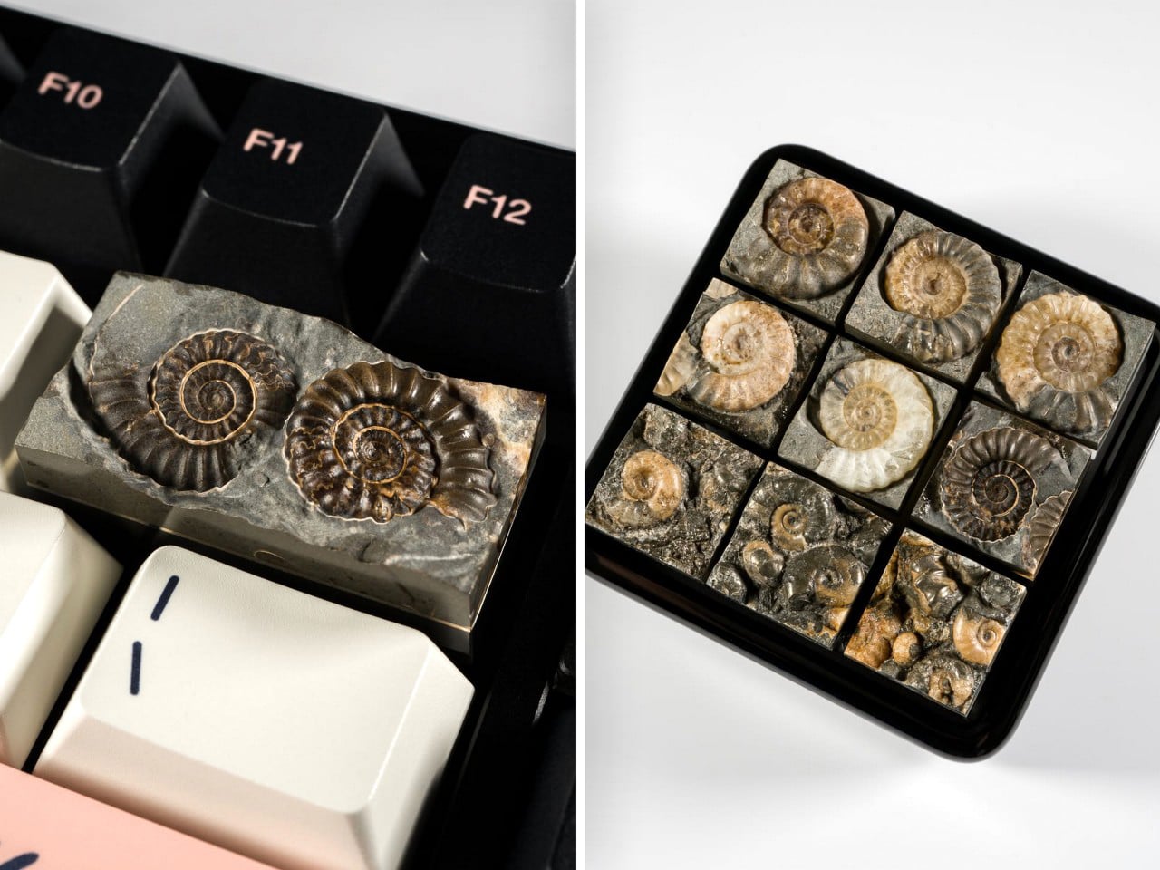
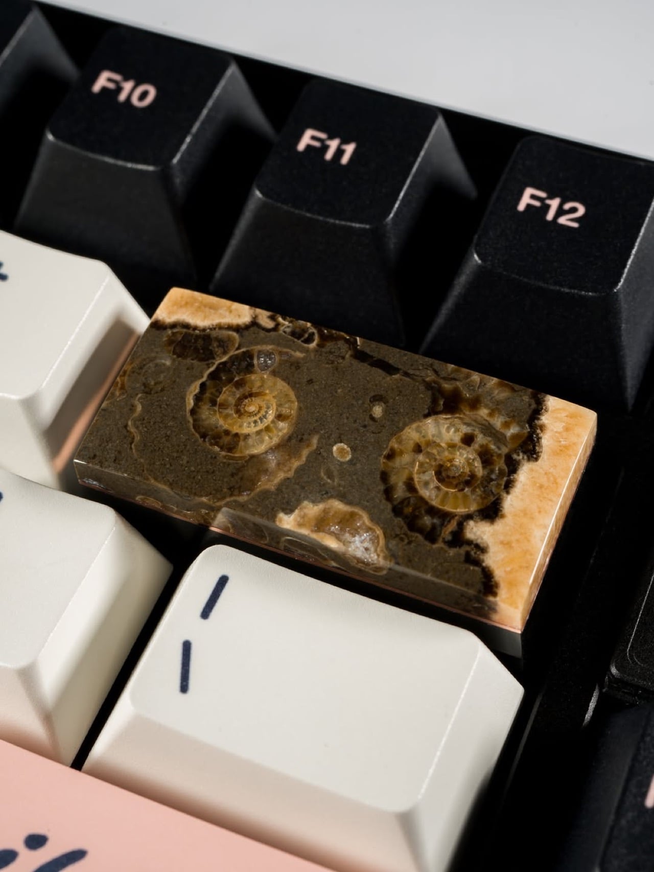
Keycap Quarry’s ammonite fossil keycaps are Carter Stay’s answer to the question nobody thought to ask: what happens when lapidary craft meets keyboard modding? Stay sources actual prehistoric ammonite specimens from England’s Jurassic Coast and the fossil-dense limestone beds of Somerset, then cuts, grinds, and polishes each one down to a functional keycap with a Cherry MX stem. The Marston Marble pieces carry clusters of tiny spiral fossils embedded in dark stone. The Charmouth calcite pieces are translucent enough that Stay hollows them from behind, letting the keyboard’s backlight pour straight through 200 million years of geological history.
Designer: Carter Stay (Keycap Quarry)
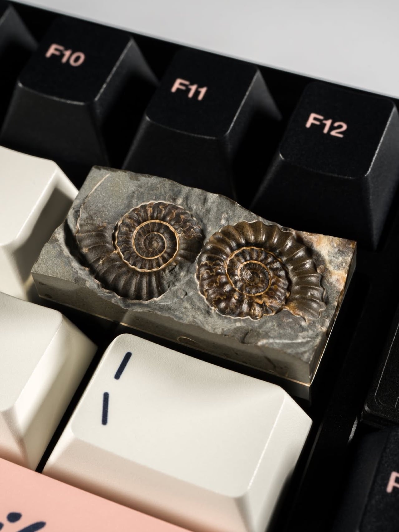
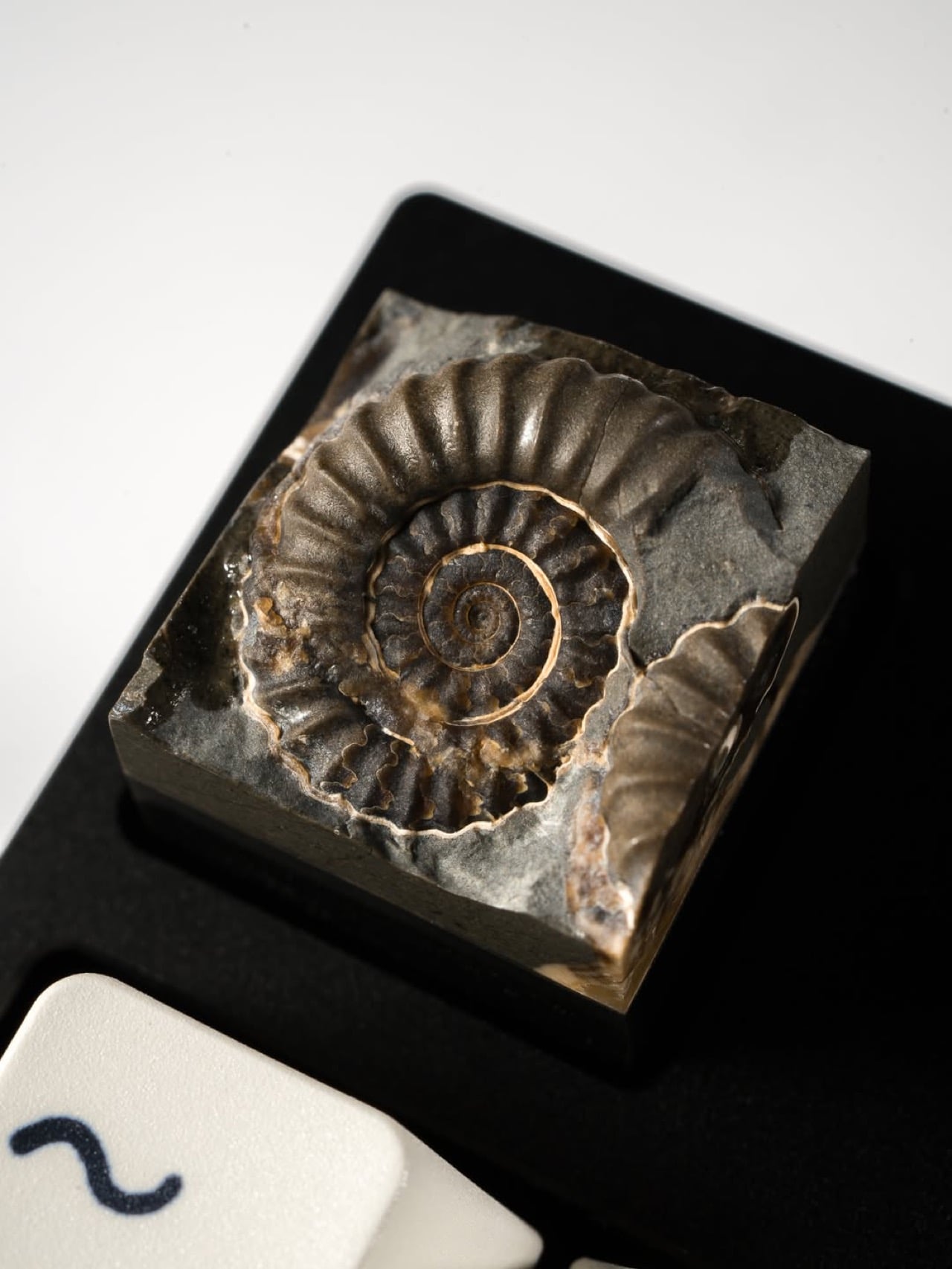
Quarried from Marston Magna in Somerset, Marston Marble is a fossiliferous limestone dense with Promicroceras marstonense ammonites from the Lower Jurassic, roughly 195 to 200 million years old. When polished, the dark grey matrix throws the cream and amber fossil spirals into sharp relief, producing a surface that looks simultaneously geological and deliberate, like a texture a product designer might spend weeks trying to simulate in resin and never quite nail. Each slab is unique because the distribution of fossils across the stone is entirely nature’s doing, meaning two Marston Marble keycaps will never look the same. The material is also becoming increasingly rare at the source, which gives these pieces a provenance weight that purely manufactured artisan caps simply cannot claim.
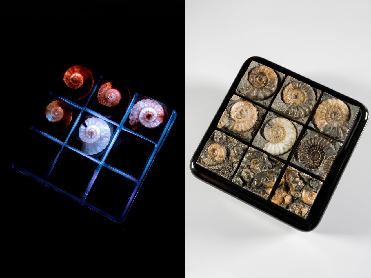
The Charmouth calcite ammonites come from the Black Ven Marls along the Jurassic Coast in Dorset, where mineral-rich water has replaced the original shell material with translucent calcite over geological time. Stay carves out the rear of each fossil to exploit that translucency, turning the keyboard’s own RGB into a light source that illuminates the internal chamber structure of a 200-million-year-old cephalopod. Under UV, the calcite glows with a cold blue-white that makes each keycap look less like a desk accessory and more like a biopsy slide from a natural history museum. It is the same optical trick that makes backlit calcite specimens prized in the collector market, now deployed on a 1U footprint between your F-row keys.
Dwarf Factory and the wider resin artisan world build narrative through sculpting and hand-painting, layering fiction onto a manufactured substrate. Stay works in the opposite direction, subtracting everything unnecessary from a material that already contains the narrative. No manufacturing process replicates what 200 million years of geological compression and mineralization produces, and no hand-painter can fake the variance in a Marston Marble slab or the internal chamber glow of a backlit calcite fossil.
Unlike most keycaps we’ve covered on this site, these Ammonite ones aren’t easy to replicate. They’re difficult to come across, and every single one looks different, so images don’t really reflect what newer stock will look like. Keycap Quarry’s been selling these (along with a bunch of other) keycaps on their website, and while the ammonite ones are sold out, they’re roughly in the $180 range per cap, making them fairly expensive but equally elusive and priceless.
The post These Actual Ammonite Fossil Keycaps Put 200 Million Years of Natural History on Your Keyboard first appeared on Yanko Design.