World’s Tiniest E-Reader Is The Size Of An AirPods Case – And It Makes You Read More

There was a period in the early 2000s when having your entire music library in your pocket felt like a miracle. The iPod did not invent portable music, but it made the experience so frictionless and so pleasurable that it genuinely changed how people related to listening. Nobody predicted that a click wheel and a hard drive would rewire an entire generation’s relationship with an art form. Paul Lagier has built something that carries a similar energy, except the art form is reading, and the device is roughly the size of a large stick of gum.

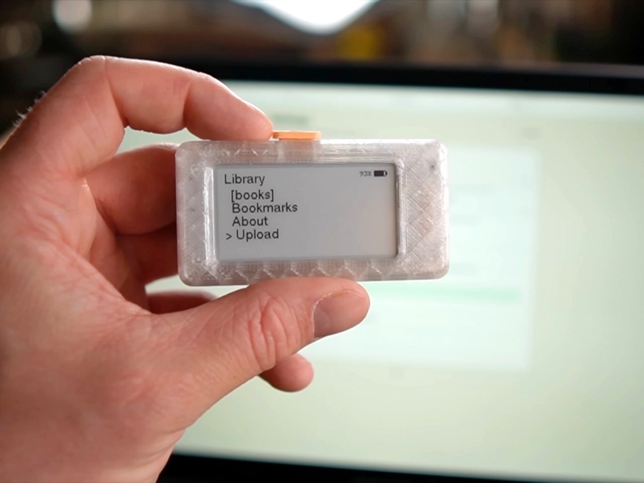
The Pala One is a fully functional e-reader that fits in a closed fist. Lagier 3D-printed the case, built the firmware around an ESP32 microcontroller, and designed the whole interaction model around a single physical button. The screen is small, the library caps out at six to ten books, and the interface is deliberately minimal. What it trades in screen real estate it returns in portability so complete that the device clips to a keychain and disappears into daily life. Lagier rebuilt it from scratch after the first version went viral in maker communities, and version two firmware adds folder support, list-making, faster load times, and a properly printable case. He has read over a thousand pages on it personally, and credits the Pala One’s size for making that possible.

Designer: Paul Lagier
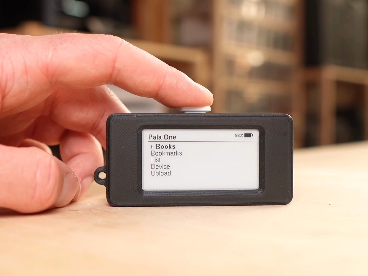
The case snaps together using one sliding piece on one side and screws on the other, a redesign driven entirely by community feedback after builders reported that the original pin system was unreliable on cheaper printers. M2 threaded inserts are optional but give the finished object a product-grade solidity that the first version lacked. A small loop on the chassis lets you run a lanyard or keychain through it, which sounds like a minor detail until you realise it is actually the whole point. A device that lives on your keys or your bag strap is a device that is genuinely always available, and availability is the entire thesis of the Pala One.


Lagier discovered, embarrassingly late by his own admission, that the ESP32’s 8 MB of onboard flash was being allocated so inefficiently that only 1.5 MB was actually available for books. By repartitioning the storage and adding automatic compression on upload, he pushed usable book storage up to around 5.5 MB. A typical 300 to 400 page book compresses down to roughly 0.5 MB, which means the device comfortably holds a small personal library. A storage indicator in the web interface keeps the math visible. Books load instantly even from deep within the text, bookmarks sync reliably, and a new position-jump feature handled through the web viewer means you are never stranded inside a long chapter with no way to navigate.


Lagier added a dedicated list section to version two, letting you create to-do lists, shopping lists, or anything else in the web interface and check items off directly on the device. Combined with folders for organising your library and bulk bookmark export for pulling your annotations out all at once, the Pala One starts to feel less like a gadget and more like a considered companion object. The single button controls everything, cycling through menus and pages with a logic that becomes muscle memory within minutes. There is something almost meditative about an interface with exactly one input.

The Kindle is a genuinely good product. So is the Kobo. Both are vastly more capable than the Pala One in every measurable specification, and neither of them has gotten me to read more. The Pala One’s entire argument is that the best reading device is the one that is physically present when the impulse to read strikes, and a device the size of an AirPods case wins that argument by default. Lagier has made the files available on his Ko-fi page, with a one-time purchase granting access to all future updates. If you own a 3D printer and have an afternoon free, the most compelling reading device of 2025 costs you almost nothing to build.
The post World’s Tiniest E-Reader Is The Size Of An AirPods Case – And It Makes You Read More first appeared on Yanko Design.

This Tiny Titanium EDC Knife’s Hawk-Talon Blade Profile Makes It Ruthlessly Effective

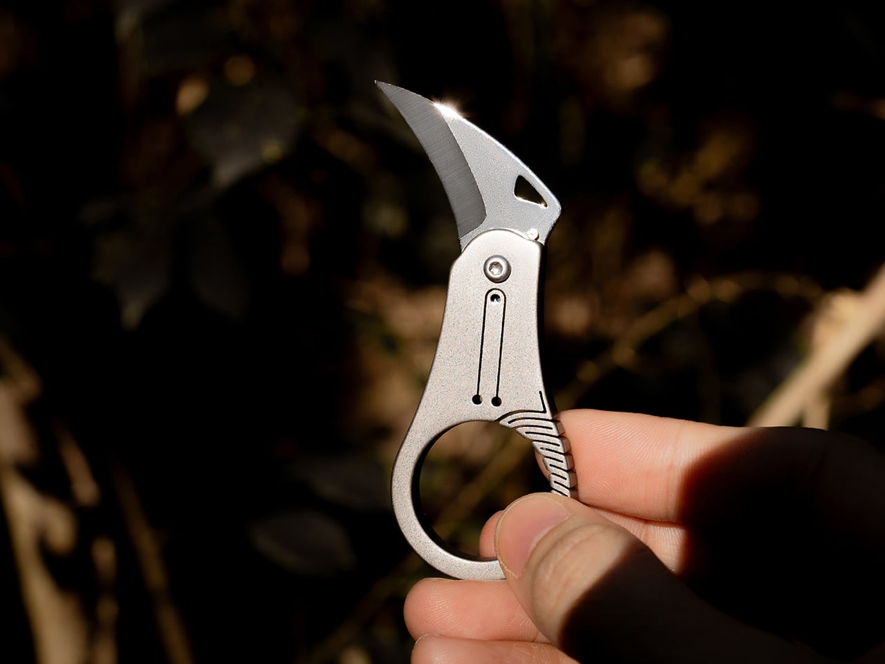
Hawks don’t cut with force. They grip with precision, using curved talons that naturally guide prey into the cutting path while the arc of the claw does the work. That geometry has been proven in harvesting tools, marine rigging knives, and rope work for centuries, but the EDC market keeps defaulting to straight blades that demand downward pressure rather than working with natural hand motion. Curved blades slice with less effort, grip flexible materials without slipping, and concentrate force at the point of contact in ways a straight edge simply cannot replicate. The form factor exists in karambits and hawkbills, but those tools tend to be aggressive, oversized, and built for hard use rather than keychain carry.

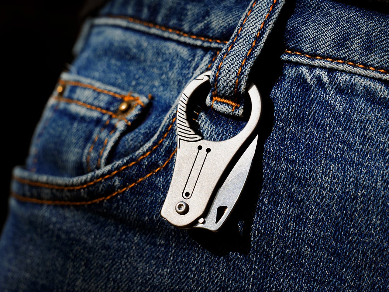
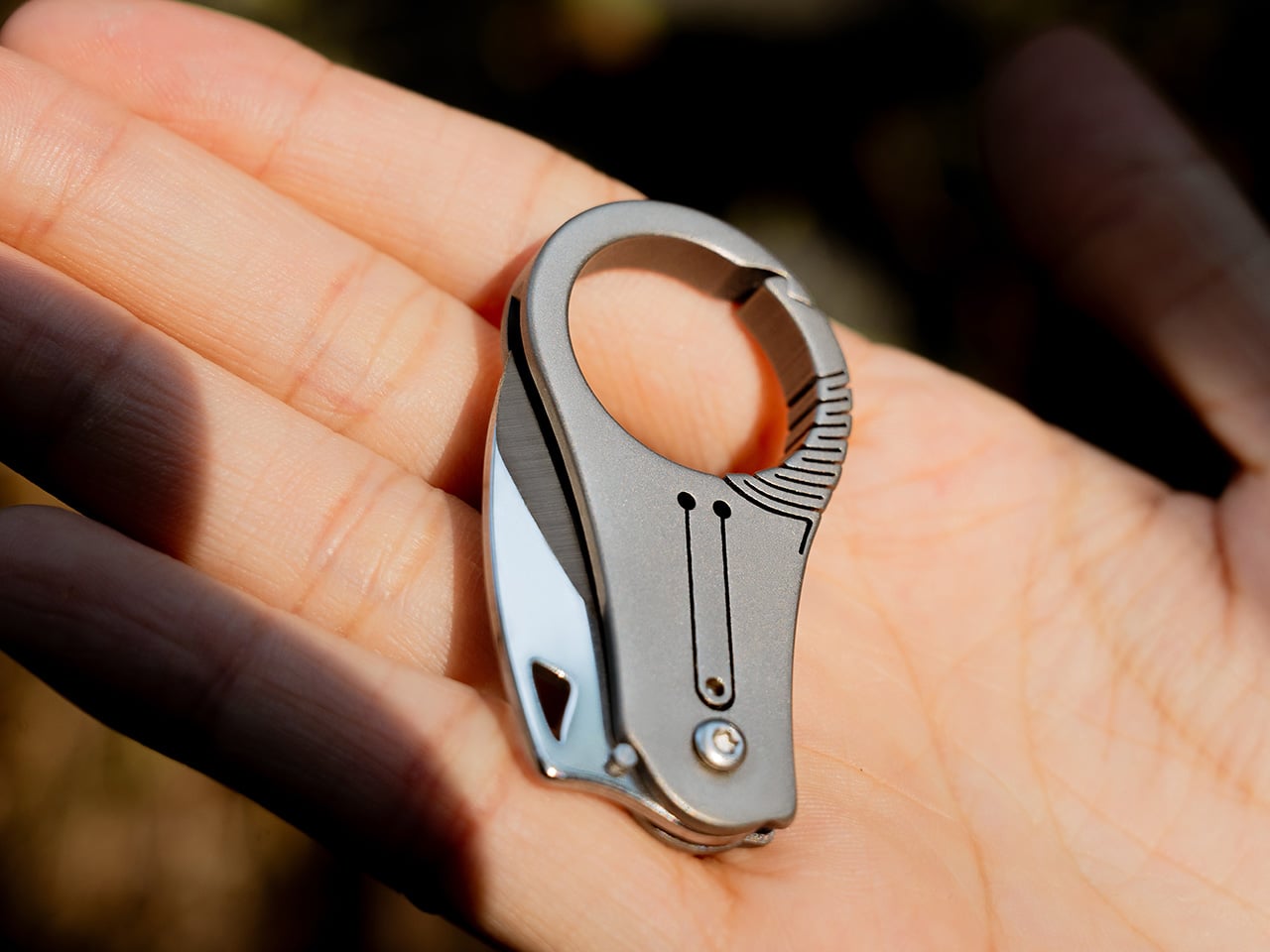
Edgelet’s SpearEdge takes that talon geometry and compresses it into a 66.3mm titanium folder designed for controlled pull cuts in everyday tasks. The curved spine and sharp tip follow the motion your hand already makes when you pull a blade through packaging, cordage, or tape. The finger ring adds stability points to prevent slips, the detent system provides tactile feedback during deployment, and the whole thing weighs almost nothing on a keychain. The blade is 7Cr steel, the handle is titanium, and the open keyring slot at the tail allows instant attachment without tools. Early bird pricing on Kickstarter starts at $29, with free shipping on all rewards.

Designer: Edgelet

Click Here to Buy Now: $32 $50 (35% off). Hurry, only a few left!

Edgelet’s previous knife, the ScytheBlade, earned a spot in Yanko Design’s Best EDC Knives of 2025 for its curved talon profile and 46mm frame, but users consistently reported the handle felt too small during extended use. The SpearEdge addresses that directly by stretching to 66.3mm open (up from 46mm) and adding a finger ring grip system that gives your thumb and forefinger actual purchase on the tool. Closed length measures 47.7mm with a 5mm thickness, with a blade geometry tailormade for pull cuts rather than straight-edge slicing. The 7Cr steel blade can be touched up with any basic sharpener, which separates it from tungsten-tipped competitors like the BITZ that hold an edge longer but can’t be resharpened in the field.

The cutting sequence happens in two phases. The sharp tip pierces materials first, allowing precise entry when you’re opening packages without damaging contents or cutting cordage without fraying the ends. Once the tip penetrates, the curved edge guides the cut in a smooth arc that reduces resistance and grips flexible materials to prevent slipping, which straight blades cannot replicate. The micro-curved spine follows natural hand motion during a pull cut, turning geometry into mechanical advantage. Edgelet tested this extensively on tape, rope, and packaging materials, all of which resist straight blades by pushing away from the edge rather than staying engaged during the cut. The talon profile keeps constant contact with the material as you pull, which is why hawkbill and karambit geometries have dominated rope work and marine rigging for centuries.

The finger ring creates a stability point that prevents the tool from rotating or slipping during use, critical when operating a blade this small with only thumb and forefinger pressure. You can apply controlled force without worrying about misalignment, and the ring doubles as a secondary grip surface when repositioning mid-cut. Titanium handle construction keeps weight minimal and corrosion-resistance high, while the pivot tension and detent system provide audible clicks when the blade locks into open or closed positions. That tactile feedback confirms the blade has seated properly, reducing accidental deployment or closure during carry. The detent ball engages a notch in the blade tang, creating enough resistance to keep the knife shut in your pocket but light enough to deploy with a thumbnail flick on the jimped wheel.

The open keyring slot at the tail threads directly onto keys, carabiners, or lanyards without split rings or additional hardware. Titanium construction keeps the knife light enough to genuinely disappear on a keychain rather than creating a bulge or hotspot against your leg. The folded profile stays slim at 5mm, comparable to two stacked house keys. Edgelet designed this for people who have tried carrying full-sized EDC knives and found them too heavy, too bulky, or legally questionable depending on local blade-length restrictions. Urban carry, travel, and office environments all favor tools that stay under the radar while remaining functional. The curved blade geometry also suits anyone cutting packaging, cordage, or flexible materials where straight blades tend to push rather than slice.

The SpearEdge is currently live on Kickstarter with early bird pricing starting at $29, with standard pricing at $32 for a single unit. All rewards include free shipping worldwide. Add-ons are available, including replacement blades for $9.90, a titanium bottle and can opener for $14.99, and an EDC carry pouch for $5.99. The SpearEdge ships globally starting June 2026. The SpearEdge works as a primary carry for minimalists or as a backup blade for those already carrying a larger folder but wanting something lighter on a secondary keychain or bag loop. If you’ve used the ScytheBlade and wished for more cutting edge and better grip, this delivers both without adding meaningful bulk.

Click Here to Buy Now: $32 $50 (35% off). Hurry, only a few left!

The post This Tiny Titanium EDC Knife’s Hawk-Talon Blade Profile Makes It Ruthlessly Effective first appeared on Yanko Design.

McLaren F1 Concept Shows What the Iconic Supercar Could Look Like in 2026

What does a McLaren F1 look like when you strip away the constraints of 1990s manufacturing technology but keep the design philosophy intact? That was the challenge Kevin Andersson set for himself when he began reimagining the iconic supercar as a personal design study. The original F1 was the product of specific limitations: Gordon Murray’s engineering team worked with the tools, materials, and aerodynamic understanding available in the early 1990s, and the car’s form emerged from that context. Andersson’s concept operates in a different world, one where carbon fiber monocoques are routine, where Formula 1 suspension systems inform road car design, and where Blender can generate photoreal renders that communicate design intent with startling clarity.

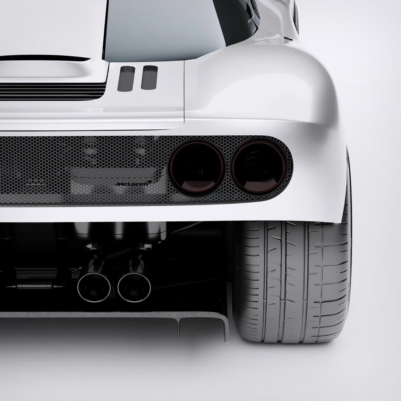
The reimagined F1 maintains the sacred proportions of the original while evolving its surface language into something more contemporary. The long hood remains, a visual reminder that this car houses a naturally aspirated engine positioned just behind the driver. The greenhouse retains the cab-forward stance that made the original F1 look like it was moving even when parked. The rear haunches are muscular without being cartoonish, and the whole package reads as a single, cohesive form rather than an assembly of disparate parts. Andersson’s renders, shot in both glossy white and menacing dark gray, show a car that could plausibly emerge from McLaren’s design studio today if the brand decided to revisit its analog past.

Designer: Kevin Andersson

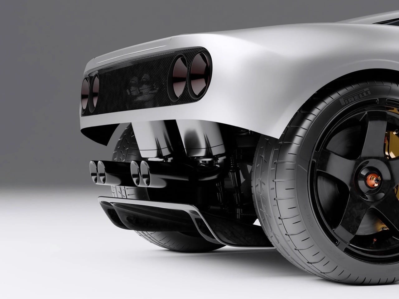
Andersson began with the monocoque, the structural skeleton that defines a car’s fundamental character. His design uses an exposed carbon fiber tub that references contemporary Formula 1 construction, with integrated mounting points for pushrod suspension components visible in the cutaway renders. The suspension itself draws directly from modern F1 technology, using inboard-mounted dampers and pullrod geometry at the front, pushrod at the rear. Gold-anodized brake calipers grip carbon-ceramic rotors, a functional nod to the original F1’s gold-lined engine bay. The exhaust system, rendered in titanium with a purple-blue heat patina, exits through centrally mounted tips that echo the original car’s triple-pipe signature.

The exterior form language walks a careful line between heritage and modernity. Andersson retained the original F1’s defining visual cues: the teardrop cabin, the prominent side air intakes, the dihedral doors (he kept the distinctive upward-swinging doors rather than the gullwing configuration). The headlights are recessed horizontal units that recall the original’s pop-up lights without literally reproducing them. The front splitter and rear diffuser are far more aggressive than anything Gordon Murray would have approved in 1993, a reflection of three decades of aerodynamic development in motorsport. The rear wing deploys from a recess in the engine cover, maintaining clean lines when retracted but providing genuine downforce when needed.

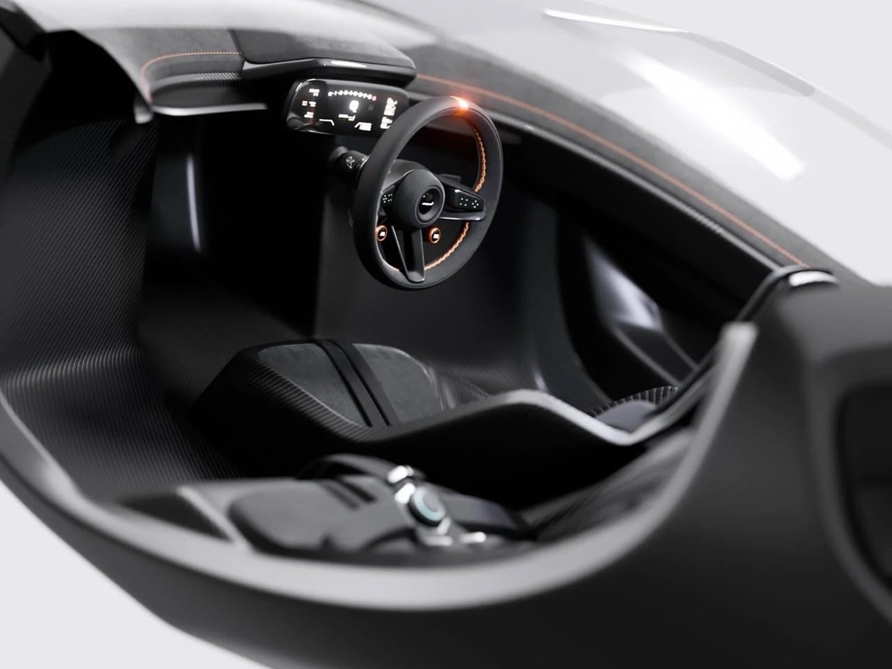
Inside, the central driving position remains sacred. Andersson designed a minimalist cockpit wrapped entirely in carbon fiber, with two flanking passenger seats positioned slightly rearward in the classic McLaren F1 three-seat configuration. The steering wheel is a flat-bottomed carbon unit with integrated controls and orange anodized paddle shifters. The instrument cluster is a single curved digital display that spans the width of the dash, showing speed, revs, and telemetry data with the clarity of a modern race car. Orange contrast stitching runs throughout the black leather trim, providing visual warmth without compromising the cockpit’s focused, technical atmosphere. The six-point harnesses are mounted directly to the carbon tub, reinforcing the competition intent.

Andersson’s eight-month journey from initial concept to final renders demonstrates what’s possible when a talented designer commits to a genuinely thoughtful reinterpretation rather than a superficial homage. His McLaren F1 Reimagined preserves the original’s analog soul while embracing the materials, manufacturing techniques, and aerodynamic understanding that define contemporary hypercar development. The renders communicate a car that Gordon Murray might actually approve of, a genuine evolution of his original vision rather than a pastiche. Whether McLaren itself will ever revisit the F1’s central-seat, naturally aspirated philosophy remains unlikely, but Andersson has shown what that future could look like if they did.

The post McLaren F1 Concept Shows What the Iconic Supercar Could Look Like in 2026 first appeared on Yanko Design.

CMF Phone 3 Concept Keeps the Screws and Colors, Adds iPhone-Style Triple Camera

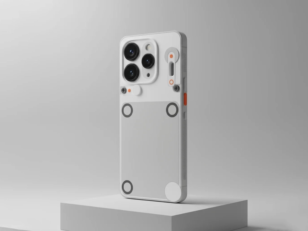
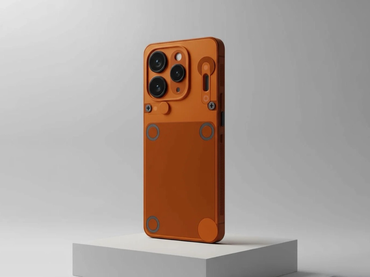
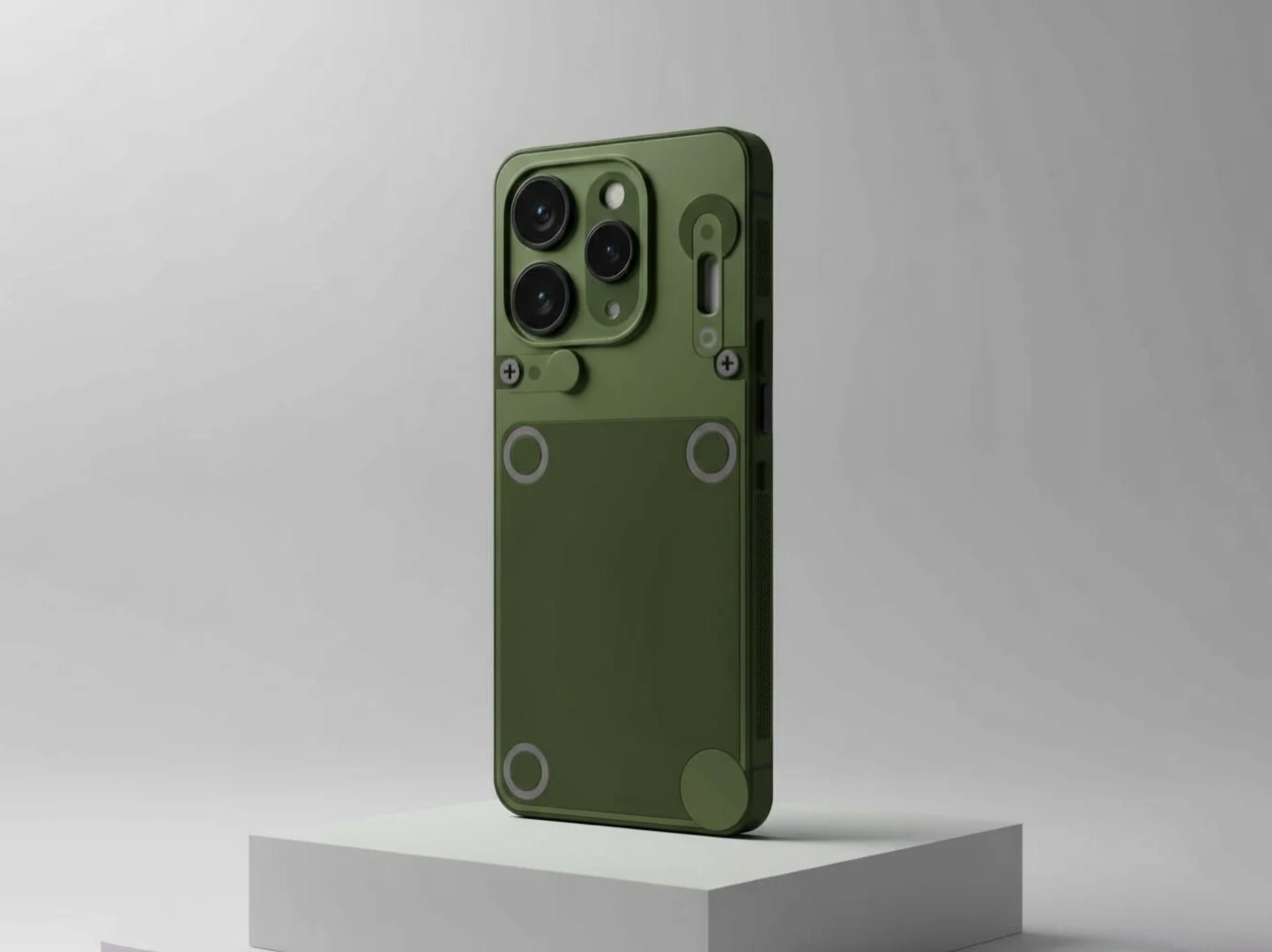
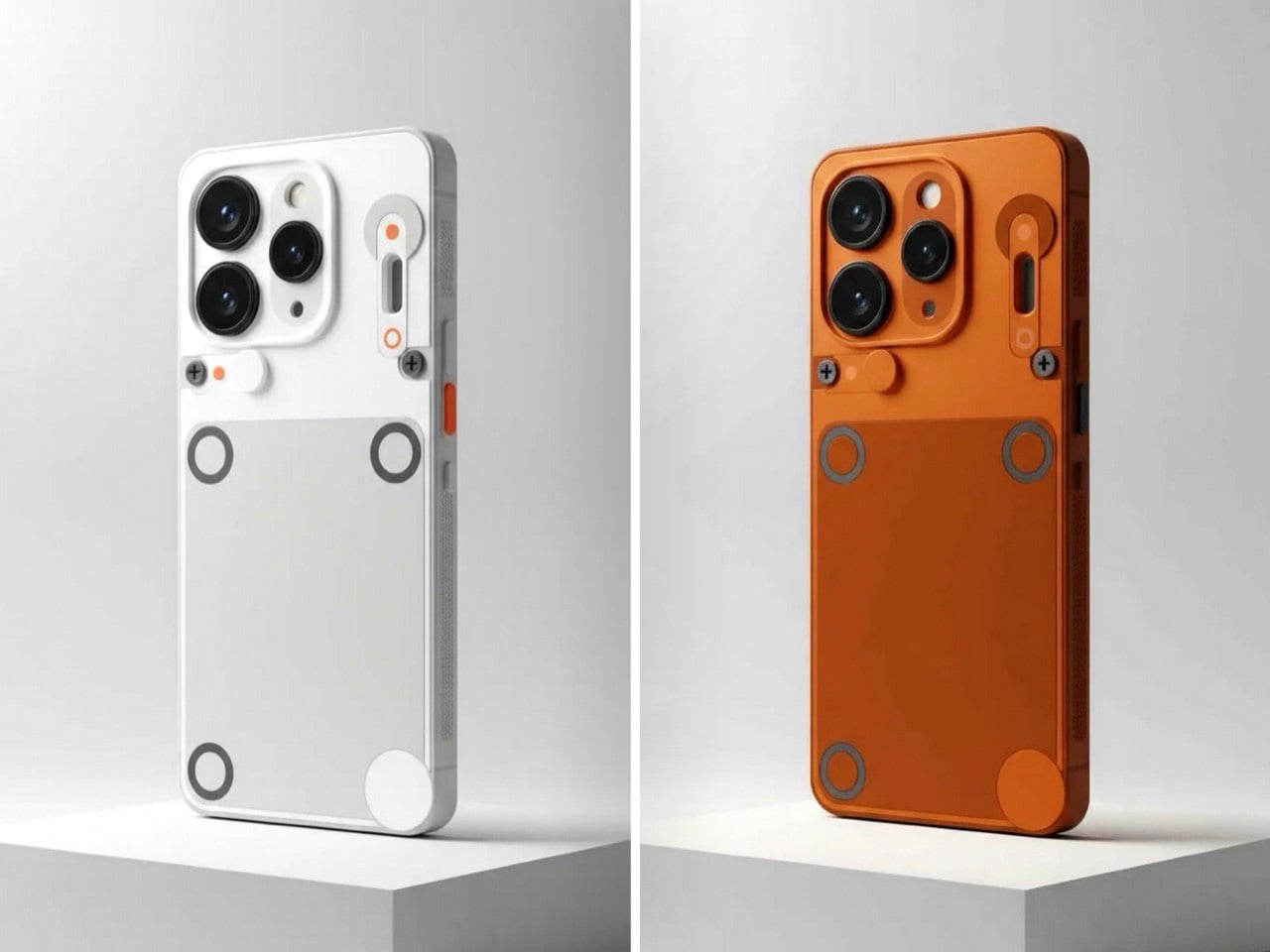
Nothing’s CMF sub-brand exists because someone at the company realized that modularity and affordability could coexist, and that a phone doesn’t need to cost 800 dollars to feel thoughtfully designed. A Reddit user just took that philosophy and ran with it, crafting a CMF Phone 3 concept that feels like a natural progression from the Phone 1 and Phone 2 Pro. The renders keep the modular accessory system intact, preserve the visible screws that signal user serviceability, and lean into CMF’s signature color palette with options in orange, olive green, white, and black. The triple camera layout might look familiar (it echoes the iPhone Pro design), but Nothing’s never been shy about using proven form factors when they make sense.

The concept introduces a few new ideas, most notably a side-mounted accessory point that looks like a strap or handle attachment. Whether that’s useful or gimmicky depends entirely on execution, but it signals an interesting direction: expanding CMF’s modularity beyond the back plate and into the frame itself. The textured side rails add grip and visual interest, and the overall form factor stays clean and contemporary without trying too hard to be different. The real test for any CMF Phone 3 will be whether it expands the accessory ecosystem in meaningful ways while keeping prices accessible.

Designer: Glum_Good_6414

Nothing has kept quiet about a CMF Phone 3, which means this concept exists in a vacuum of official information. The CMF Phone 2 Pro launched with a MediaTek Dimensity 7300 chip, 8GB of RAM, and a 50MP main camera, all for around 209 dollars. Any successor would need to justify its existence by either pushing specs higher or doubling down on modularity, and this concept seems to bet on both. The triple camera setup suggests CMF might be ready to play in mid-range camera territory, while the expanded accessory mounting points hint at a deeper commitment to customization.

The color choices feel quintessentially CMF. Orange has been a brand signature since the Phone 1, and the olive green adds an earthy, utilitarian vibe that fits the repairable, modular ethos. The white-and-orange combo keeps things clean and approachable, while the dark variant with coral accents offers something moodier for users who want subtlety with a pop of personality. These aren’t experimental colors, they’re practical ones that CMF has already proven people will buy.

Whether Nothing actually builds a Phone 3 that looks anything like this remains unknown, but the concept does something valuable: it shows what fans expect. They want the screws, the modularity, the playful colors, and the accessible price. They’re okay with familiar camera layouts if it means better photo quality. They want CMF to evolve without losing what made it compelling in the first place. This concept delivers on that brief, and that’s probably the best compliment you can give fan-made speculation.

The post CMF Phone 3 Concept Keeps the Screws and Colors, Adds iPhone-Style Triple Camera first appeared on Yanko Design.

CMF Phone 3 Concept Keeps the Screws and Colors, Adds iPhone-Style Triple Camera

Nothing’s CMF sub-brand exists because someone at the company realized that modularity and affordability could coexist, and that a phone doesn’t need to cost 800 dollars to feel thoughtfully designed. A Reddit user just took that philosophy and ran with it, crafting a CMF Phone 3 concept that feels like a natural progression from the Phone 1 and Phone 2 Pro. The renders keep the modular accessory system intact, preserve the visible screws that signal user serviceability, and lean into CMF’s signature color palette with options in orange, olive green, white, and black. The triple camera layout might look familiar (it echoes the iPhone Pro design), but Nothing’s never been shy about using proven form factors when they make sense.

The concept introduces a few new ideas, most notably a side-mounted accessory point that looks like a strap or handle attachment. Whether that’s useful or gimmicky depends entirely on execution, but it signals an interesting direction: expanding CMF’s modularity beyond the back plate and into the frame itself. The textured side rails add grip and visual interest, and the overall form factor stays clean and contemporary without trying too hard to be different. The real test for any CMF Phone 3 will be whether it expands the accessory ecosystem in meaningful ways while keeping prices accessible.

Designer: Glum_Good_6414

Nothing has kept quiet about a CMF Phone 3, which means this concept exists in a vacuum of official information. The CMF Phone 2 Pro launched with a MediaTek Dimensity 7300 chip, 8GB of RAM, and a 50MP main camera, all for around 209 dollars. Any successor would need to justify its existence by either pushing specs higher or doubling down on modularity, and this concept seems to bet on both. The triple camera setup suggests CMF might be ready to play in mid-range camera territory, while the expanded accessory mounting points hint at a deeper commitment to customization.

The color choices feel quintessentially CMF. Orange has been a brand signature since the Phone 1, and the olive green adds an earthy, utilitarian vibe that fits the repairable, modular ethos. The white-and-orange combo keeps things clean and approachable, while the dark variant with coral accents offers something moodier for users who want subtlety with a pop of personality. These aren’t experimental colors, they’re practical ones that CMF has already proven people will buy.

Whether Nothing actually builds a Phone 3 that looks anything like this remains unknown, but the concept does something valuable: it shows what fans expect. They want the screws, the modularity, the playful colors, and the accessible price. They’re okay with familiar camera layouts if it means better photo quality. They want CMF to evolve without losing what made it compelling in the first place. This concept delivers on that brief, and that’s probably the best compliment you can give fan-made speculation.

The post CMF Phone 3 Concept Keeps the Screws and Colors, Adds iPhone-Style Triple Camera first appeared on Yanko Design.

Bugatti Type Sigma Concept Ditches the Chiron’s Maximalist Design for Pure Sculptural Form

Bugatti built the Type 57SC Atlantic in the 1930s using a technique called riveted construction, where aluminum panels were joined with raised seams that became the car’s defining visual feature. That central spine running from nose to tail was both structural necessity and sculptural flourish, a detail so elegant it’s been referenced in automotive design for nearly a century.

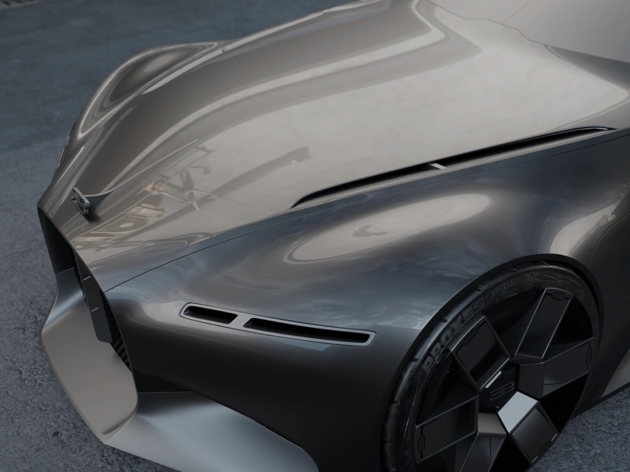
Edouard Suzeau’s Type Sigma concept channels that same philosophy but inverts the execution. Where the Atlantic celebrated its construction method, the Type Sigma hides every seam, every panel gap, every hint of how it might actually be built. The body looks like a single piece of fabric pulled taut over a frame, finished in matte gray that emphasizes form over finish. The surface is so clean, so deliberately unadorned, that it forces you to focus on proportion and gesture rather than details and embellishments.

Designer: Edouard Suzeau

The design carries Bugatti’s genetic code but translates it through a contemporary filter. The horseshoe grille sits vertically integrated into the nose, maintaining brand identity without dominating the composition. The C-shaped rear pillar flows from cabin to tail as a surface rather than a graphic, tracing lineage back to the Atlantic while pushing the language forward. The long hood and fastback roofline recall the grand tourers Ettore Bugatti built for covering continents, cars that prioritized elegance and comfort alongside speed. Suzeau’s concept explores what Bugatti’s design language looks like when stripped of the Chiron’s dual-tone drama and the Tourbillon’s hyper-complex surfacing. The Type Sigma proves that sometimes the most challenging design exercise is knowing what to leave out, and the result is a car that feels both historically grounded and refreshingly modern.

The matte metallic finish is pretty new to Bugatti, which has relied on glossy finishes like blue and black in the past. Where gloss black or bare carbon fiber would create hard reflections that break up the surface into geometric shards, this matte gray lets light pool and stretch like mercury on glass. Reflections become soft gradients that emphasize the underlying form, making the car read as a single sculptural mass rather than an assembly of panels. The choice to avoid dual-tone treatment is equally deliberate. Recent Bugattis have relied on contrasting materials to create visual drama, splitting the body into upper and lower sections or using exposed carbon to telegraph performance intent. The Type Sigma abandons that strategy entirely, trusting that the purity of the form will carry enough visual weight on its own.

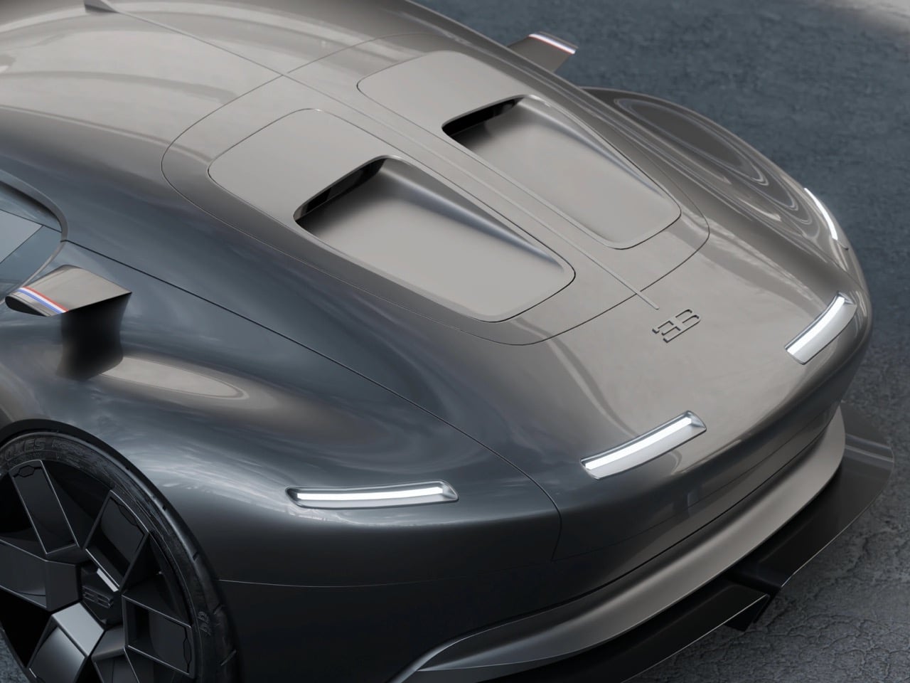
The proportions position this firmly in grand tourer territory rather than mid-engine hypercar land. The hood stretches forward in the classic front-engine GT tradition, creating that long, muscular stance that defined Bugatti’s pre-war icons. The cabin sits far back on the wheelbase, with a greenhouse that tapers gently rearward into the fastback deck. The roofline has an almost shooting-brake quality to it, extending further back than a traditional coupe but stopping short of full estate proportions. This creates a unique silhouette that feels both familiar and fresh within Bugatti’s portfolio.

The wheels appear to be modern interpretations of classic Bugatti spoke patterns, possibly referencing the Type 35’s iconic wheels but rendered with contemporary multi-spoke turbine detailing. The fender arches are muscular but smooth, defined by surface curvature rather than hard character lines. Side vents behind the front wheels are so subtly integrated they’re almost invisible in this matte finish, revealed only by shadow and surface transition rather than chrome trim or aggressive surfacing. The horizontal DRL bars sit flush with the front fascia, clean and minimal, avoiding the overwrought lighting signatures that plague most modern concept cars.

A full-width lighting signature spans the tail, likely incorporating Bugatti script or the EB logo as part of the illuminated graphic. Below, the diffuser is aggressive but integrated, its fins and channels carved into the lower body rather than appearing as tacked-on aerodynamic furniture. The way the C-shaped pillar terminates at the rear deck is particularly elegant, flowing seamlessly into the tail rather than stopping abruptly or requiring a visual full stop. Horizontal slats in the rear glass echo the Chiron’s central spine but abstracted into functional venting, maintaining visual continuity with the current lineup while pushing the aesthetic somewhere quieter.

Production viability was clearly never the point here. Suzeau’s renders show a car with shut lines that would be impossible to engineer, glass areas that would never pass certification, and aerodynamic surfaces that exist purely to please the eye rather than cheat the wind. The Type Sigma lives in the same realm as the Atlantic did when it debuted in 1936, a piece of rolling sculpture built to prove that a car could be art. Only four Atlantics were ever made, and they remain among the most valuable automobiles ever auctioned. The Type Sigma will never be built at all, but it accomplishes something harder than production feasibility. It makes you reconsider what a modern Bugatti could look like if the brand decided to prioritize elegance over aggression, sculpture over decoration, whisper over shout.

The post Bugatti Type Sigma Concept Ditches the Chiron’s Maximalist Design for Pure Sculptural Form first appeared on Yanko Design.
You Can Now Own the Actual Motherboard from the First iPhone, Sealed Inside The 17 Pro

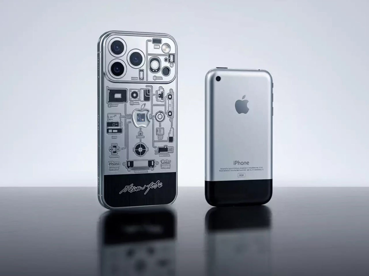
Caviar’s Apple 50th anniversary collection has been moving faster than the company’s own PR team can keep up with. We covered the Steve Jobs turtleneck edition earlier this month, nine units of a titanium iPhone 17 Pro carrying an authenticated Issey Miyake fabric fragment inside the Apple logo, and by the time most readers had processed whether it was brilliant or absurd, Caviar had already sold out. I’ll admit I did not see that coming. The lesson appears to be that the intersection of Apple mythology and physical relics is a more powerful commercial force than any reasonable person would predict.

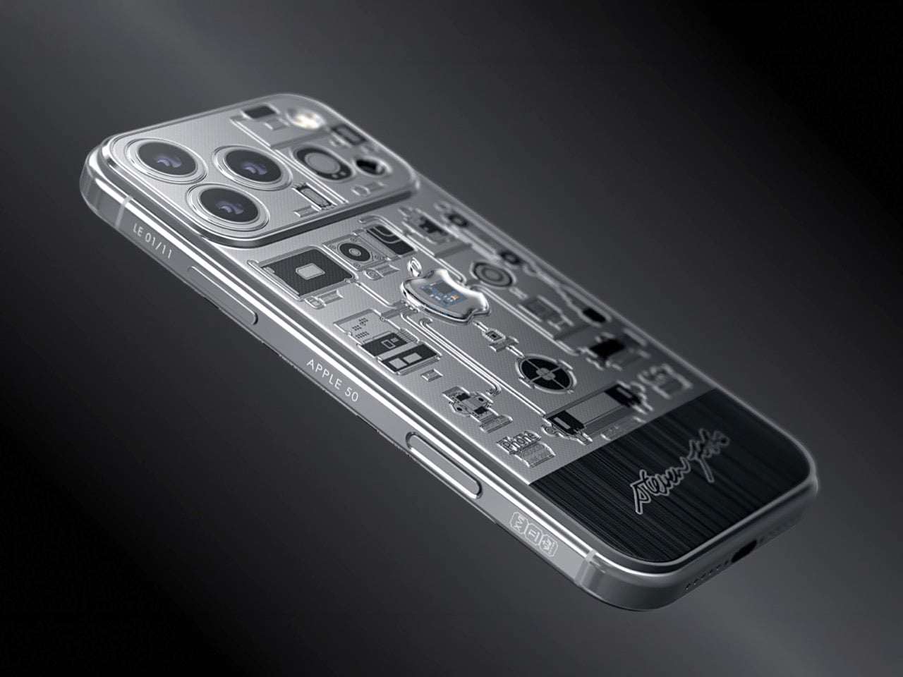
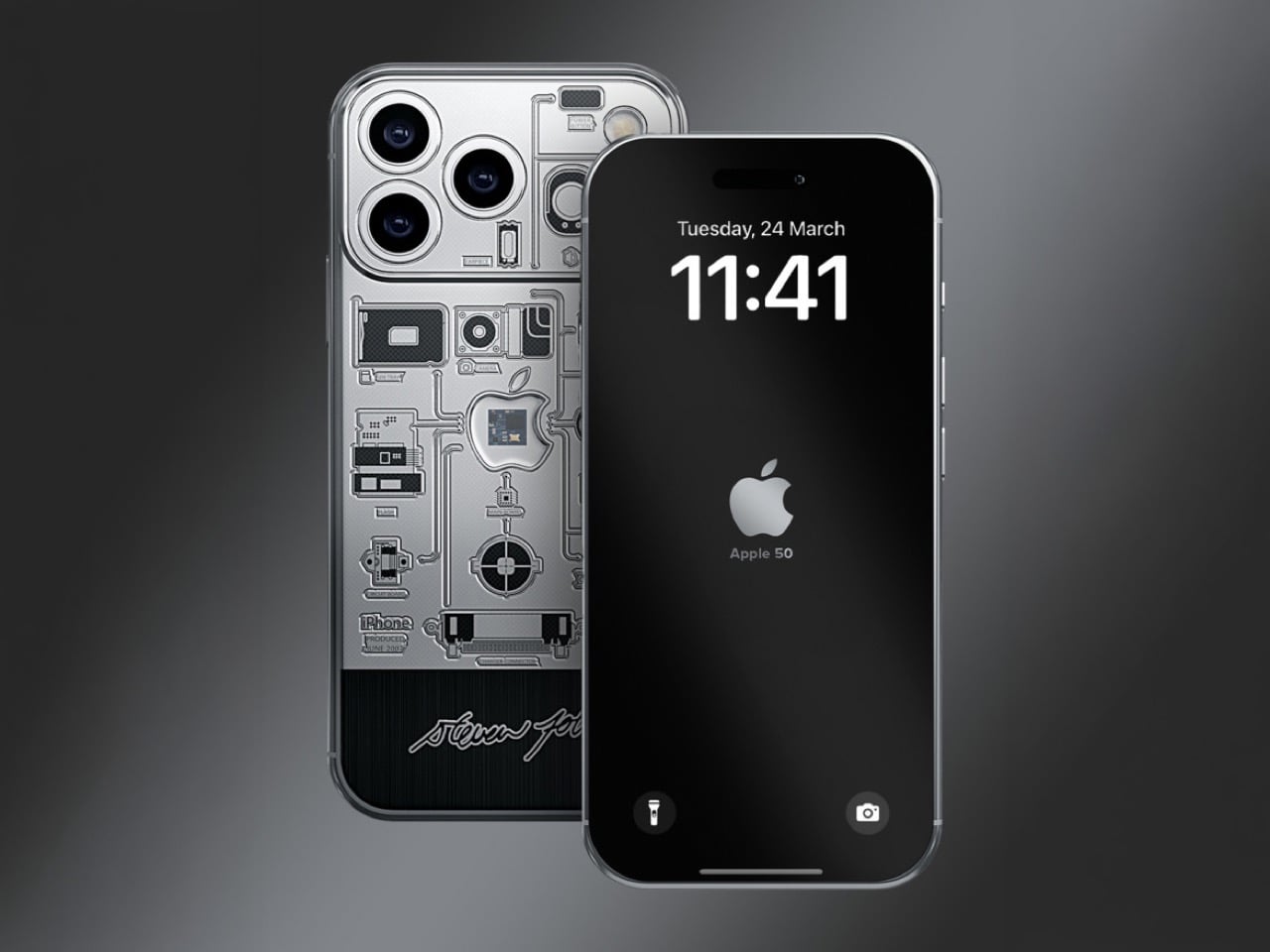
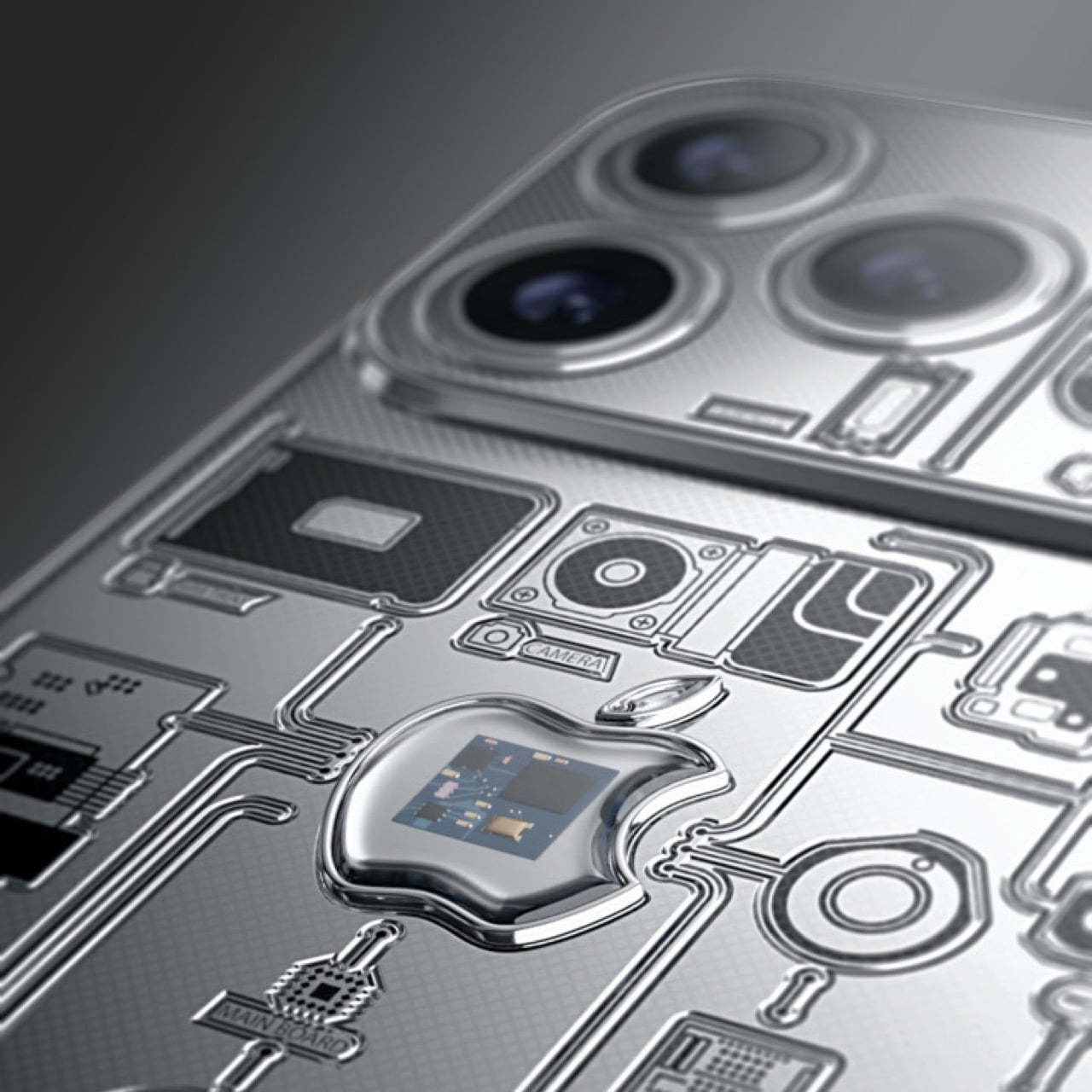
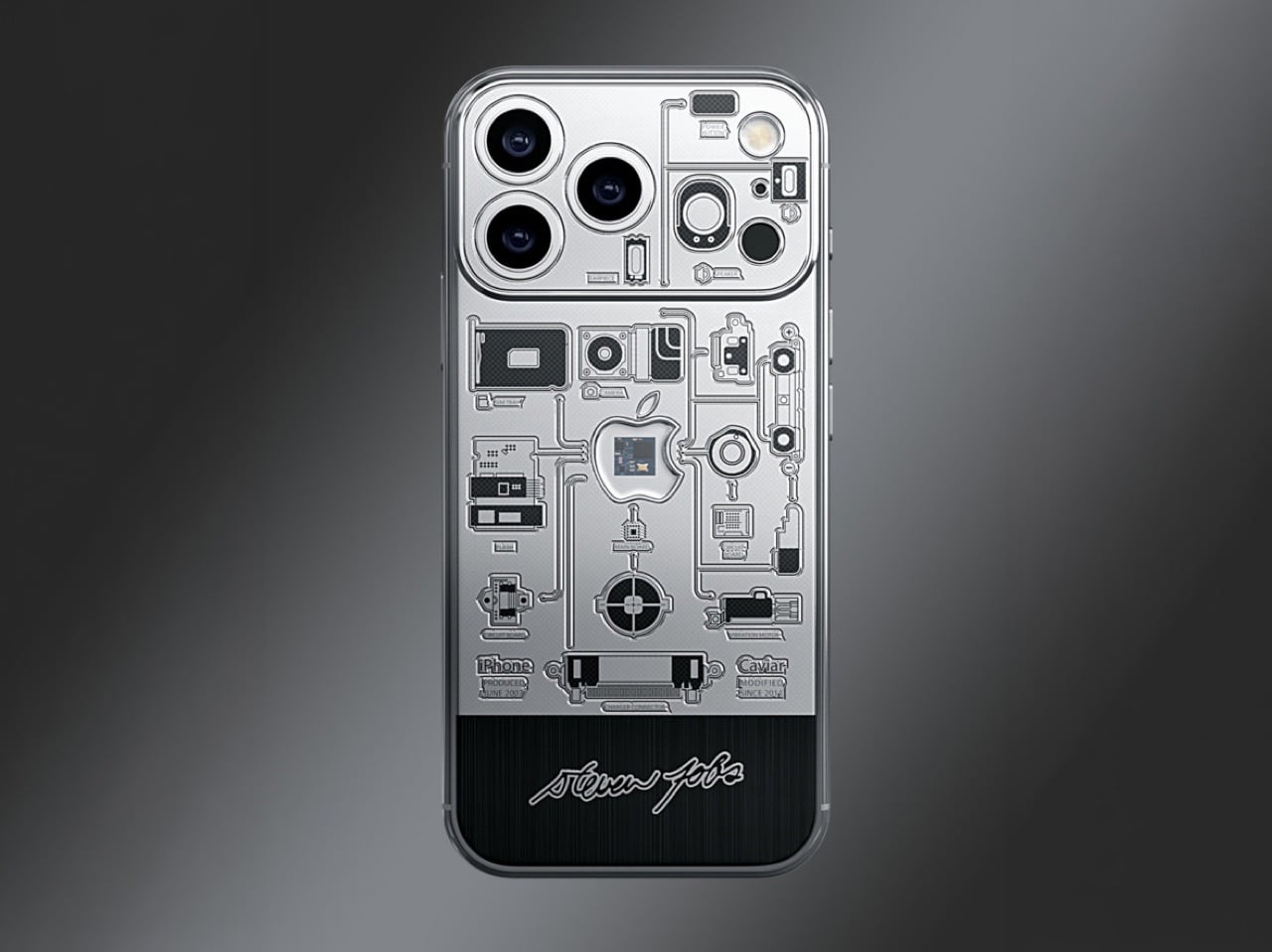
So Caviar has returned with an even more loaded artifact for the second release in this anniversary series. The iPhone 2007 embeds a verified fragment of the original iPhone 2G motherboard into the rear panel of an iPhone 17 Pro, sealed beneath an Apple-logo-shaped capsule, ringed by engravings tracing the circuitry of the phone that launched in January 2007. Production is limited to 11 units. Pricing starts at $10,770 for the 256GB Pro and climbs to $12,700 for the 2TB Pro Max, with each phone shipping alongside a 999 fine gold commemorative coin and a signature Caviar key.

Designer: Caviar

The chassis is titanium with a black PVD coating, and the color story it tells is deliberate. Black and silver, offset logo placement, minimalist engraving: Caviar is visually quoting the 2007 original without cosplaying as a replica, which is the smarter move. The motherboard fragment anchors the rear panel at dead center, with circuit-trace engravings fanning outward from it like a schematic that never quite finished rendering. Jobs’ signature runs along the frame. The whole composition functions as a timeline compressed into a single object, 2007 hardware embedded inside 2025 hardware, separated by a few millimeters of machined titanium.

A PCB fragment from a specific hardware generation is an unusually specific kind of artifact. Original iPhone 2G boards have identifiable components, documented manufacturing runs, a physical particularity that places them firmly in a category alongside signed guitars and moon rocks rather than alongside phone cases. Caviar ships each unit with an authentication certificate, and unlike fabric or paper memorabilia, a motherboard fragment from a consumer electronics device has enough physical specificity to make that certificate mean something. At eleven grand, that distinction matters to the kind of buyer who actually reads the certificate rather than frames it.

The original iPhone is one of a very small number of consumer products whose design was so resolved on arrival that the industry spent the following decade catching up to it. Eleven units of the iPhone 2007 will exist in the world, each carrying a physical fragment of that hardware inside Apple’s current best. For the collector who thinks about objects that way, the website link is at the bottom of this page.

The post You Can Now Own the Actual Motherboard from the First iPhone, Sealed Inside The 17 Pro first appeared on Yanko Design.
As 3D Printing Filament Prices Surge 59%, Creality Turns Plastic Scrap Into New Supply

I’ve been watching filament spool prices creep upward for two years, but the last six weeks turned that creep into a sprint. A kilogram of basic PLA that cost $18 in February now runs closer to $28 if you can find it in stock. Specialty materials like carbon-fiber composite or flexible TPU have crossed $60 per roll in some markets. The cause traces back to disruptions to the oil supply which have also affected the petrochemicals industry pretty hard. Makers who print regularly are now calculating cost per gram the way road trippers calculate fuel economy. Creality launched the Filament Maker M1 and Shredder R1 into exactly that environment, and the crowdfunding response was immediate.

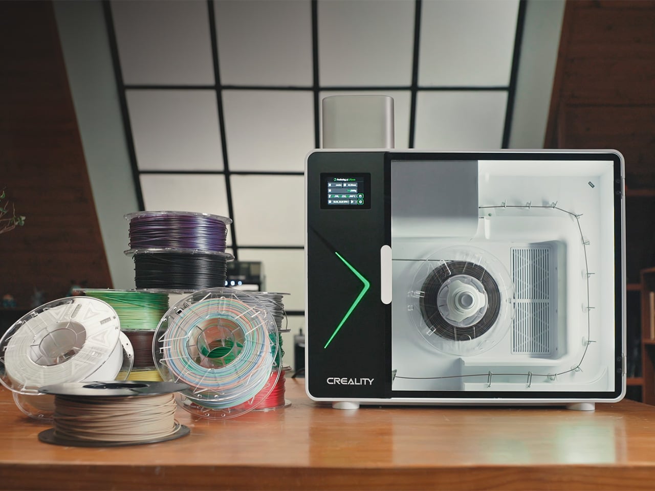
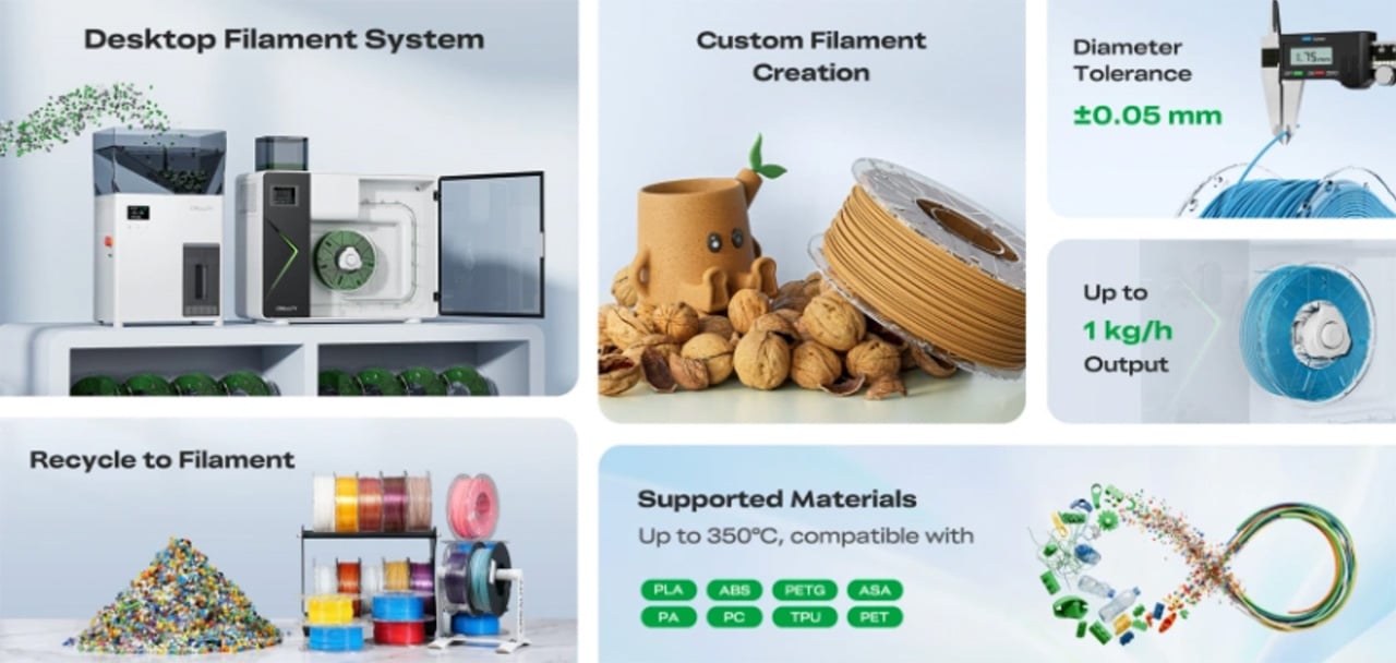
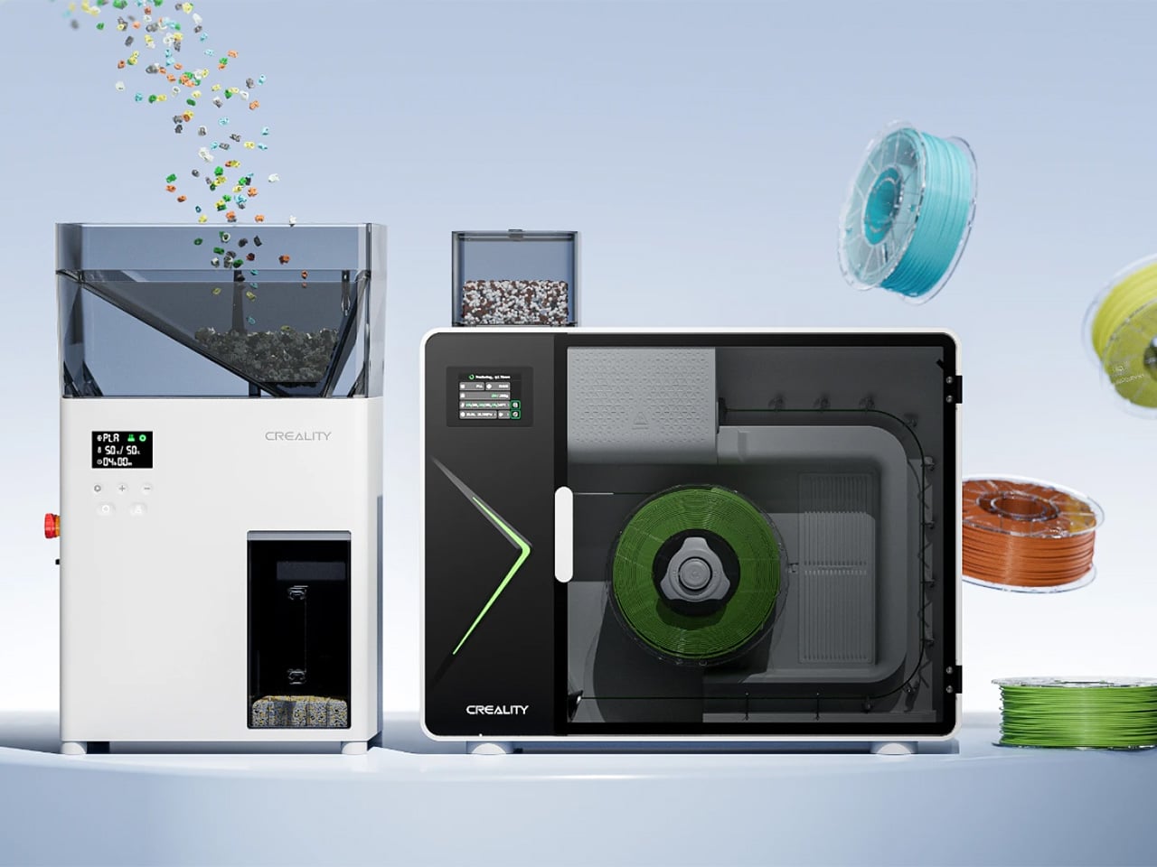
The M1 extrudes finished filament from pellets or recycled print waste at continuous output speeds up to 1 kg per hour, holding diameter tolerances between 1.70mm and 1.80mm with virgin material. The R1 shreds failed prints and support structures into 4mm pellets at up to 3 kg per hour, then dries them internally with a 100W PTC heater before feeding them into the M1’s hopper. Super Early Bird backers on Indiegogo locked the M1 at $799 and the R1 at $499, with shipments starting in June 2026. Creality estimates production cost per recycled roll at roughly $5, compared to current retail prices hovering near $28 and climbing.

Designer: Creality

Click Here to Buy Now: $799 $1149 (30% off). Hurry, only a few left! Raised over $5.4 million.

The R1 breaks down your print waste into clean, consistent pellets, the M1 melts and extrudes them into finished filament, and the entire loop happens on your desk without external dehydrators or assembly stations. Most shredders create pellets you then need to dry separately, but the R1 handles both in one unit by shredding waste and drying the regrinds internally. A 650W motor paired with a 60 Nm reducer drives dual-shaft blades at low speed, keeping noise levels appropriate for home workshops while outputting up to 3 kg per hour of uniform pellets measuring 4mm or smaller. The R1 currently works with rigid plastics like PLA and PETG, with ABS, ASA, and PC support coming soon, and it processes failed prints, purge strands, tree supports, and sheet supports. You run one material type at a time, pre-cut pieces to fit the hopper, and the machine turns waste into feedstock without requiring you to buy another appliance.

The M1 gives creators full authority over their medium, allowing custom color, scent, and texture to converge in a single workflow so that every spool becomes a personal formula. Add coffee grounds, lavender, or rose petal powder to your filament recipe, and the M1 blends that character into every layer, producing printed objects with a distinct aroma and a more memorable sensory experience. Blend walnut shell powder for a rich matte finish or fine wood dust for organic grain patterns, formulating natural-texture filaments that look and feel less like standard plastic and more like crafted objects. Need a specific brand red that no manufacturer sells? Blend your own using multiple masterbatch pellets for precise color matching and smooth gradient transitions, then produce small-batch, high-variety color runs on demand. The customization angle transforms the M1 from a cost-saving appliance into a material science workbench.

Recycled plastics and reinforced composites demand serious torque, and the M1’s 210mm extrusion screw and 100W FOC servo motor deliver it by maintaining a uniform melt pool and defect-free output even with challenging feedstock. Three independent heat zones give you granular temperature control up to 350 degrees Celsius, unlocking 8+ material types including PLA, PETG, ABS, PA, PC, PET, ASA, TPU, and carbon or glass fiber composites, while the three-stage distribution eliminates cold spots to ensure unwavering heat uniformity throughout the melt path. Eight 7W turbo fans cool your filament in a rapid multi-stage sequence, locking in diameter accuracy and molecular structure immediately after the nozzle to produce perfectly circular, stable filament ready to print right off the spool. The entire production line fits into a 15 kg desktop unit measuring 555 x 245 x 570mm, with extrusion, active cooling, precision pulling, and automatic spooling all happening inside one machine with no separate stations or assembly line required. Industrial filament makers occupy entire rooms and cost tens of thousands of dollars. Creality compressed that into something the size of a large microwave.

Different ratios of recycled and virgin material result in varying levels of precision and throughput, with a 100% recycled blend delivering up to 500g per hour at filament diameters ranging from 1.65mm to 1.80mm, while a 50/50 ratio pushes output to 600g per hour and utilizing 100% virgin pellets unlocks the machine’s peak potential at 1kg per hour with a tightened 1.70mm to 1.80mm diameter. That $5 per roll production cost assumes you’re feeding recycled scrap back through the system. If you’re after superior structural strength paired with a premium surface finish, add carbon fiber or glass fiber reinforcement directly in the M1, where carbon fiber infusion bolsters rigidity while delivering a sophisticated tactile experience and skipping the specialty markup to produce engineering-grade material from your desk. Carbon-fiber filament retails at $40 to $80 per kilogram commercially. Running it through your own extruder at material cost changes the calculation entirely when you’re prototyping functional parts or fulfilling client orders at volume.

The Filament Maker M1 retails at $799 during the Super Early Bird campaign window, the Shredder R1 at $499, or $1,199 for the combined system with a starter gift pack that includes 2kg of premium PLA pellets and an empty spool. Add-ons ship free to US, EU, and UK backers and include additional PLA pellets at $39 per 3kg, PETG pellets at $35 per 3kg, PLA-CF pellets at $59 per 3kg, five-color masterbatch sets at $19 per kilogram, and a SpacePi X4L four-spool filament dryer at $99. Creality is scheduled to begin shipping in June 2026, with delivery times varying by region but supported by a network of local warehouses around the world for fast fulfillment. Shipping reaches most countries worldwide, though costs outside the free-shipping zones (US, EU, UK) can run high due to product weight, with Creality absorbing a portion to make access more affordable. You can back the campaign on Indiegogo through May 14, 2026.

Click Here to Buy Now: $799 $1149 (30% off). Hurry, only a few left! Raised over $5.4 million.

The post As 3D Printing Filament Prices Surge 59%, Creality Turns Plastic Scrap Into New Supply first appeared on Yanko Design.
World’s Most Affordable Foldable Phone Costs $320. That’s Less Than an Apple Watch

The moment Motorola resurrected the Razr as a foldable in 2020, every industrial designer I know had the same thought: the flip form factor was always the right one, the market just needed to catch up. Five years later, the category has matured enough that Samsung, Motorola, Oppo, Honor, and a dozen Chinese brands all compete for the same $800-to-$1,200 buyer, nudging specs up and prices sideways with each generation. Nobody was competing seriously for the buyer who wants the flip experience at a fraction of that figure, because the assumption was that buyer did not exist at scale. Ai+ has decided to test that assumption directly.

The Nova Flip, unveiled at Ai+’s April 2026 launch event in India alongside the Nova 2 series and a tablet, carries a sticker price of Rs 29,999, roughly $320. The inner display measures 6.9 inches across an AMOLED panel resolving at 2790 x 1188 pixels, complemented by a 3.1-inch AMOLED cover screen. A MediaTek Dimensity 7300 handles processing duties, paired with 8GB of LPDDR4X RAM and 256GB of internal storage. The camera array consists of a 50-megapixel primary sensor, a 2-megapixel depth lens, and a 32-megapixel front camera. Battery capacity clocks in at a surprisingly healthy 4325mAh, with 33W wired charging, 5G, NFC, and IP64 rounding out the headline features.

Designer: Ai+

Let’s talk about that battery for a moment, because 4325mAh in a flip phone is genuinely unusual. The Samsung Galaxy Z Flip 6 packs a 4000mAh cell, and Motorola’s Razr Plus 2024 manages just 4000mAh as well, both at prices three times higher than the Nova Flip. Fitting a larger-than-average cell into a folding chassis requires either a very clever internal layout or an acceptance of added thickness, and Ai+ has not published the device’s folded dimensions yet. The 33W charging speed is adequate without being exciting, sitting well below the 65W and 80W speeds that Chinese flagship foldables now routinely offer. For a $320 device, though, adequate is a perfectly reasonable baseline.

The Dimensity 7300 helps keep the cost within its ultra-affordable bracket. MediaTek’s chip powers a range of competent mid-range phones in the $200-to-$400 segment, including several from Oppo and Vivo, where it handles everyday tasks, social media, and casual gaming without complaint. It does not belong in the same conversation as the Snapdragon 8 Elite powering the Galaxy Z Flip 6, and Ai+ is clearly not pretending otherwise. The 8GB of LPDDR4X RAM is similarly mid-range, a generation behind the LPDDR5X specification that flagship devices now ship with. None of this is disqualifying at this price point, but buyers upgrading from a previous-generation Galaxy or Razr will feel the performance delta in sustained workloads and camera processing speeds.

At that price, the fact that the phone comes IP64 rated is frankly surprising. Splash and dust resistance in a folding device requires careful engineering around the hinge mechanism, where gaps and moving parts create obvious ingress points. Many foldables at twice the price ship without any IP certification whatsoever (it also costs money to get the certification), so Ai+ clearing that bar at Rs 29,999 signals a level of build ambition that the spec sheet alone does not fully communicate. The side-mounted fingerprint sensor, dual SIM 5G support, NFC, and USB-C port complete a feature list that would have looked respectable on a $600 phone two years ago.

The real question the Nova Flip poses has nothing to do with its own specifications. It asks whether the Indian market, and potentially the broader emerging market landscape, is ready to embrace foldables as a mainstream form factor rather than a luxury signifier. Samsung has spent five years building the foldable as an aspirational object, priced and marketed accordingly. If Ai+ can deliver a hinge that survives 18 months of daily use, a display that resists visible creasing, and software that stays coherent across the cover screen and inner display, the Nova Flip could do to the foldable category what budget-tier 5G phones did to 5G adoption: accelerate it by years. The Glacier White colorway goes on sale in May 2026, and that month’s sales figures will tell us far more about the future of affordable foldables than any spec sheet ever could.

The post World’s Most Affordable Foldable Phone Costs $320. That’s Less Than an Apple Watch first appeared on Yanko Design.
The Volvo Cosmic Surfer Has Gravity-Adaptive Wheels Designed For Smooth Driving On The Moon

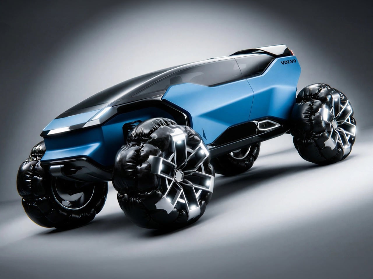
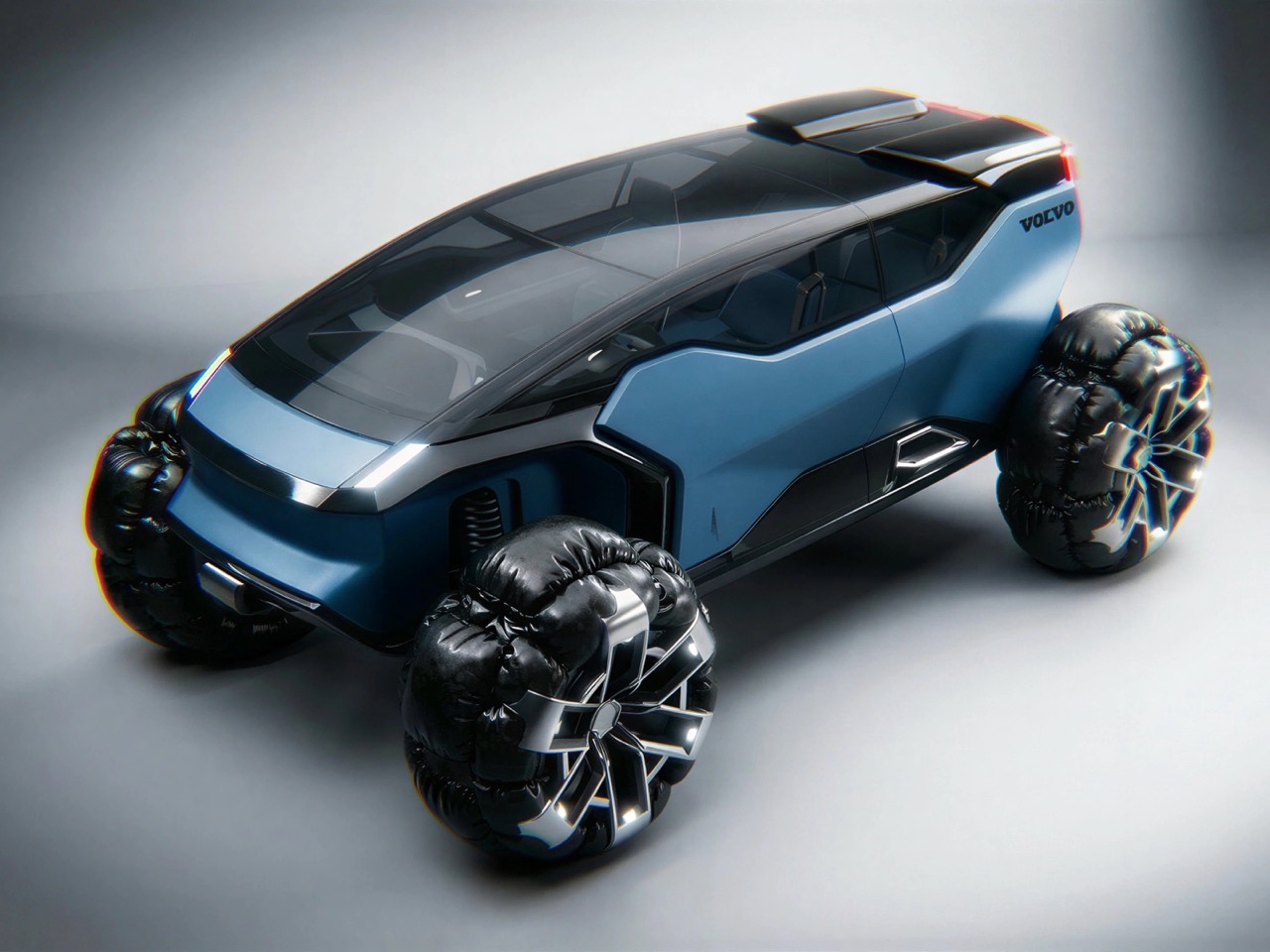
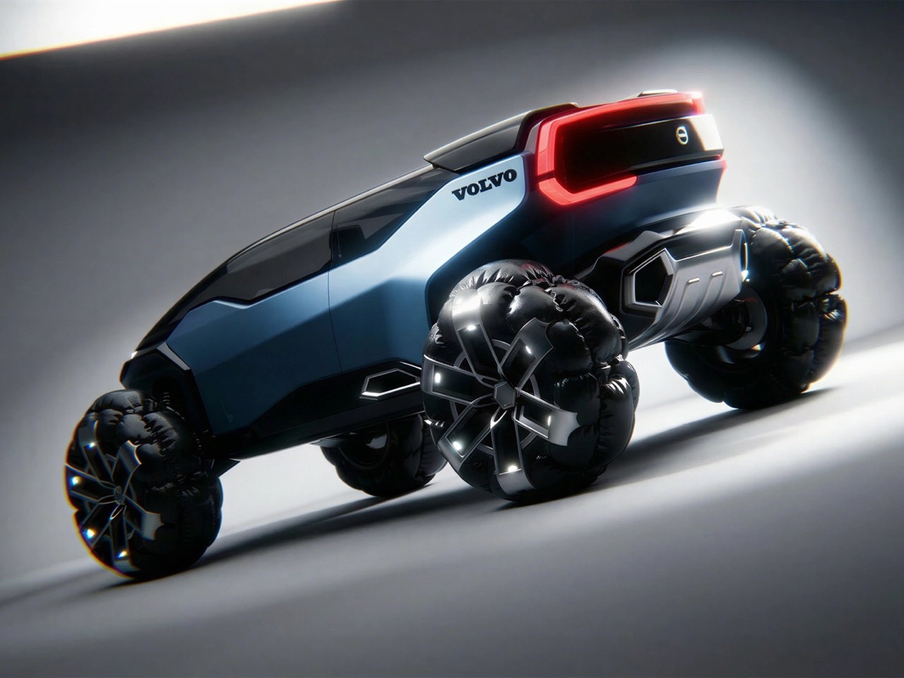
Volvo has spent the better part of a century building its reputation on one foundational promise: keep the people inside the car alive, no matter what the road throws at them. That philosophy produced crumple zones, three-point seatbelts, and side-impact protection systems that the rest of the industry eventually copied wholesale. The logical endpoint of that thinking, taken to its most extreme conclusion, produces a vehicle engineered for terrain that would destroy any conventional automobile outright. Designer Sampad Chaulia arrived at exactly that conclusion with the Volvo Cosmic Surfer, a concept submitted for the Volvo Design Competition 2026 that imagines the Swedish brand’s DNA transplanted onto a lunar-grade off-road platform co-badged with The North Face.

The Cosmic Surfer’s central design provocation is its wheel system, a gravity-adaptive, inflatable assembly that swells and compresses in response to surface conditions, conforming around boulders and craters the way a hand closes around a stone. The body sits low and wide over those massive multi-lobe wheels, draped in Volvo’s signature steel blue with The North Face branding stenciled across the flanks in expedition-ready block lettering. Chaulia frames the vehicle’s intended era as 2040, an interplanetary expedition machine for galactic explorers, built from Scandinavian minimalist principles and wrapped in the visual language of gorpcore punk. The result lands somewhere between a NASA lunar rover and a concept car that wandered off the Geneva Motor Show floor and kept going until it hit the Moon.

Designer: Sampad Chaulia

The wheel remains perhaps the most interesting element on the vehicle, evoking the same jaw-drop that I had when I first saw NASA’s chainmail wheel back in 2017. Chaulia modeled and rendered it entirely in Blender 3D, and the result looks less like a tire and more like a living organism that happens to roll. Each assembly pairs a geometric star-shaped alloy core, all sharp angles and polished facets, with a ring of inflatable outer lobes that bulge around the rim like an over-pressured deep-sea creature. The engineering logic is genuinely elegant: rather than relying solely on suspension travel to absorb terrain irregularities, the inflatable lobes compress and deform on contact with rocks and surface obstacles, conforming to the ground rather than demanding the ground conform to them. At low gravity, where surface textures are extreme and suspension dynamics behave very differently than on Earth, that compliance-first approach to traction makes far more sense than anything pneumatic rubber could offer.

The body language above those wheels is angular and deliberate, a form study in what Chaulia calls “Scandinavian soul” filtered through techwear aesthetics. The flanks are wide and planted, with faceted surfacing that catches studio light in sharp, graphic planes rather than soft automotive highlights. A dark greenhouse tapers rearward and sits flush with the bodywork, keeping the silhouette monolithic and uninterrupted from nose to tail. At the rear, a broad red light bar stretches the full width of the vehicle, reading less like a regulatory tail lamp and more like a distress beacon, which, given the concept’s intended operating environment, seems entirely appropriate. The Volvo wordmark sits cleanly on the upper body, and The North Face logo claims the flanks, a co-branding pairing that frames the vehicle as high-performance technical apparel on wheels.

The gorpcore punk framing Chaulia wraps around the Cosmic Surfer is more than an aesthetic mood board. It locates the vehicle within a specific cultural conversation about what extreme outdoor equipment looks like when the outdoors in question has no atmosphere, no roads, and gravity running at roughly one sixth of what your suspension was tuned for. The North Face partnership makes genuine design sense here because both brands share the same foundational brief: build something that keeps the person inside it functioning when the environment outside it is actively trying to kill them. That shared DNA produces a concept where the co-branding reads as a logical merger of two survival philosophies rather than a marketing exercise.

Volvo’s production lineup in 2026 is focused squarely on Scandinavian refinement and urban electric mobility, the EX30, EX40, and EX90 forming a coherent family of composed, safety-first EVs for city intersections and motorway cruising. The Cosmic Surfer asks what happens when that same foundational commitment to occupant protection gets aimed not at pedestrian detection systems and crumple zones but at the lunar highlands, where the obstacles are the size of houses and the nearest service center is 238,000 miles away. Chaulia produced this entire concept in a single day, which makes its conceptual coherence remarkable. The central idea, a vehicle whose wheel technology borrows the compliance logic of outdoor gear rather than automotive convention, arrived fully formed and persuasive on the first pass, which is more than most studio teams manage in a month.

The post The Volvo Cosmic Surfer Has Gravity-Adaptive Wheels Designed For Smooth Driving On The Moon first appeared on Yanko Design.