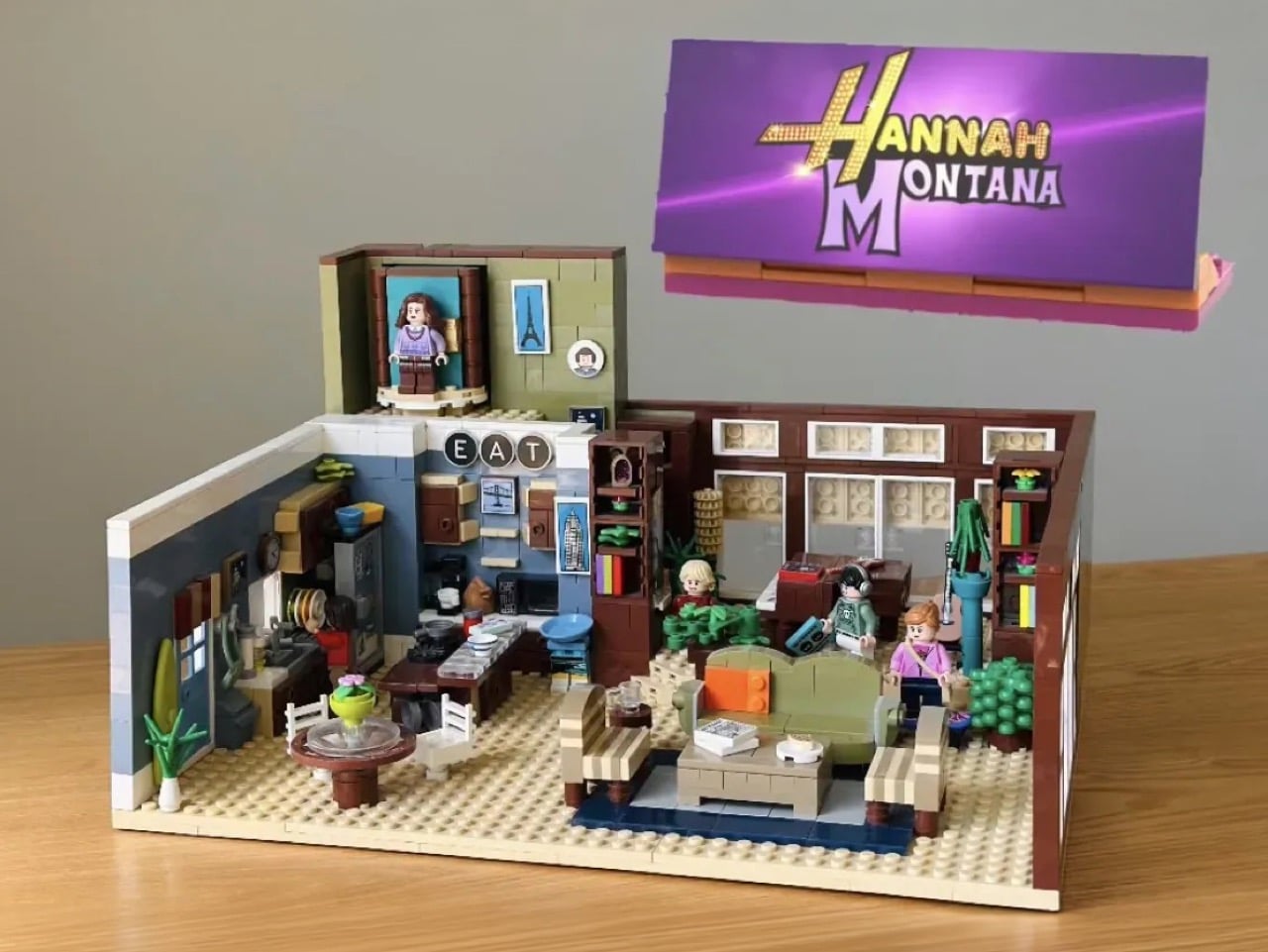
This LEGO Hannah Montana House Has a Rotating Miley-to-Hannah Transformation and Fans Need It

Twenty years after Hannah Montana premiered on Disney Channel, Miley Cyrus stepped back onto a replica of the Stewart family living room for a Disney+ anniversary special that sent millennials and Gen Z into a collective spiral. The show, which ran from 2006 to 2011, quickly snowballed from a children’s series about a girl living a double life into something much bigger: sold-out tours, chart-topping hits, a blockbuster movie, and the making of a generation-defining superstar. Cyrus had famously declared Hannah dead back in 2013, and spent the better part of a decade distancing herself from the blonde wig. Coming back, then, felt like something. The artist has come full circle, at peace with her past and embracing it as an important part of who she is.

Riding that wave of perfectly timed nostalgia, LEGO Ideas builder KnightVibrantKnees100 has submitted a brick-built recreation of the Stewart family home that is, frankly, just as detailed as anything Miley walked back into. The MOC (My Own Creation) covers the living room, the kitchen, and a transformation mechanism that actually rotates a Miley minifigure into Hannah Montana, which is either the most delightful play feature of the year or the most emotionally loaded one, depending on how much of your childhood this show occupied.

Designer: KnightVibrantKnees100
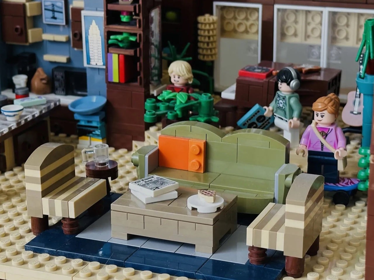
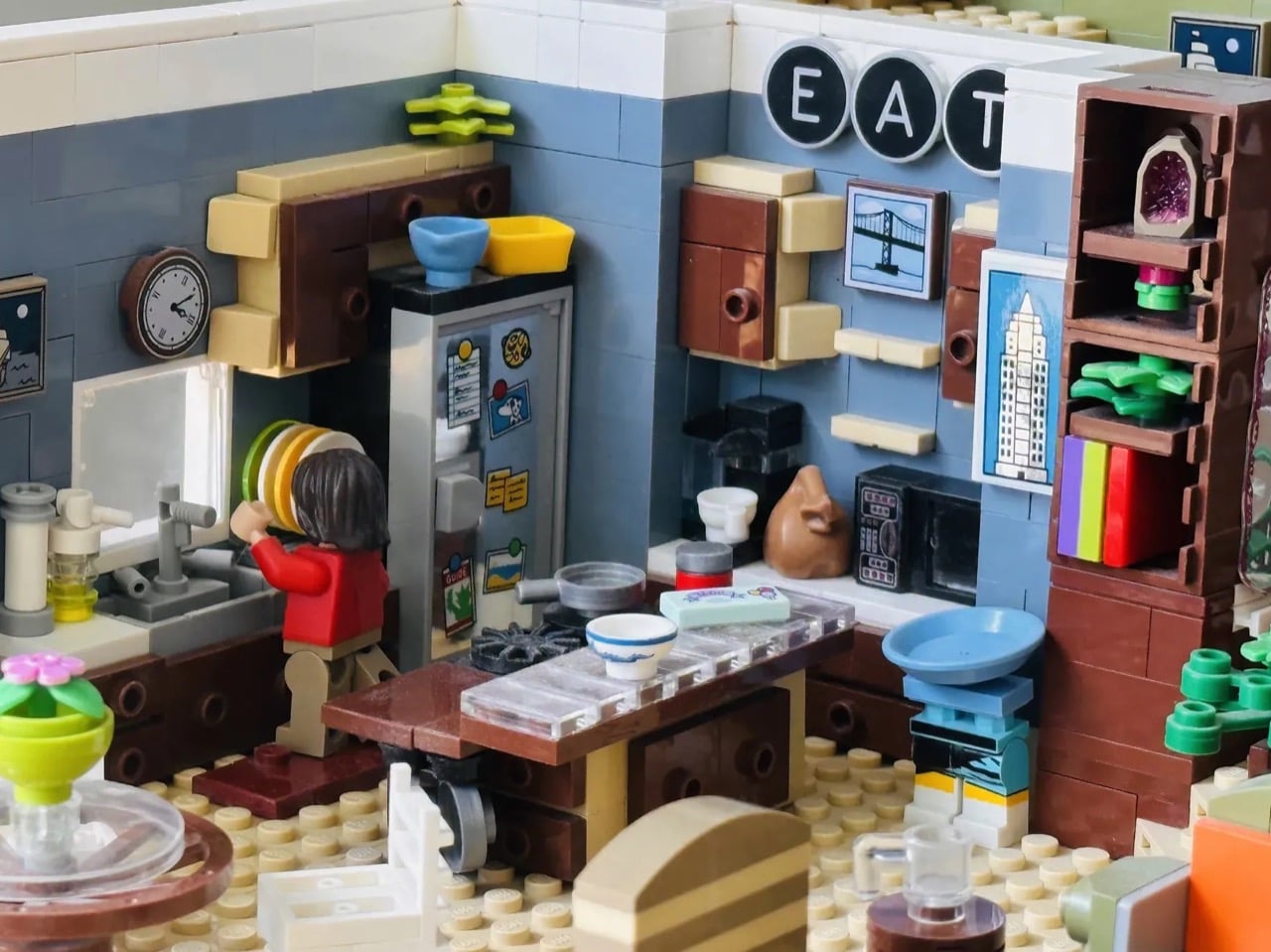
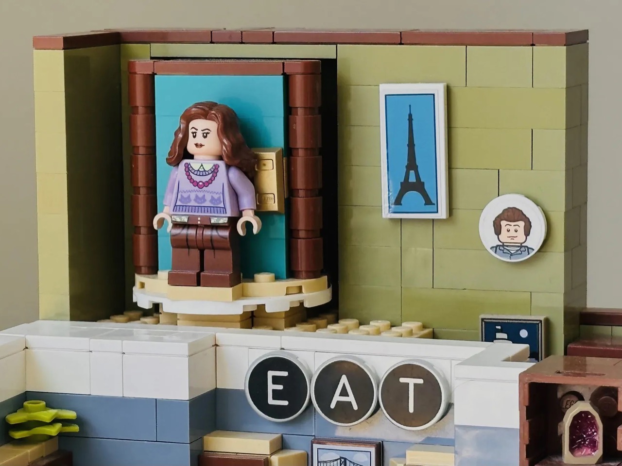
The build is an open-plan interior display, and the amount crammed into it is impressive. The living room anchors the right side of the model with the green sofa, a pair of striped armchairs, a coffee table scattered with magazine tiles, and a red boombox sitting on the shelf behind. A guitar leans in the corner. Bookshelves with colorful spines run along the back wall. Plants are everywhere, which feels accurate to the show’s slightly overstuffed, lived-in aesthetic. The kitchen on the left is even more packed: a stickered fridge covered in magnets, a stovetop, a wall clock, a sink with a minifig doing dishes, and the “EAT” sign spelled out in round letter tiles on the wall above, exactly as it appeared on screen. The warm browns, tans, and muted blues hold together as a color palette in a way that genuinely evokes the show’s production design rather than just approximating it.
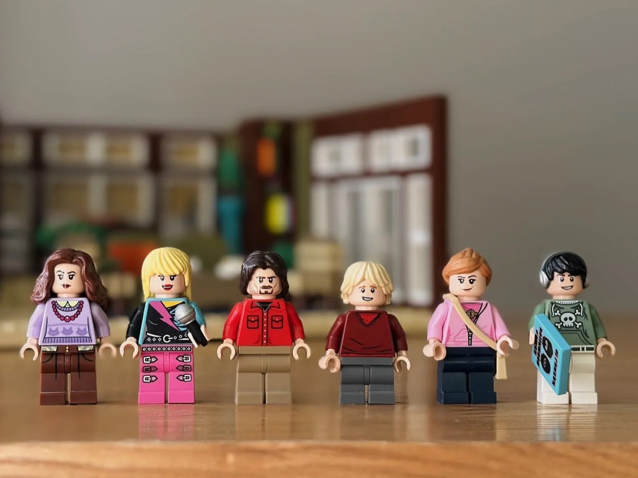
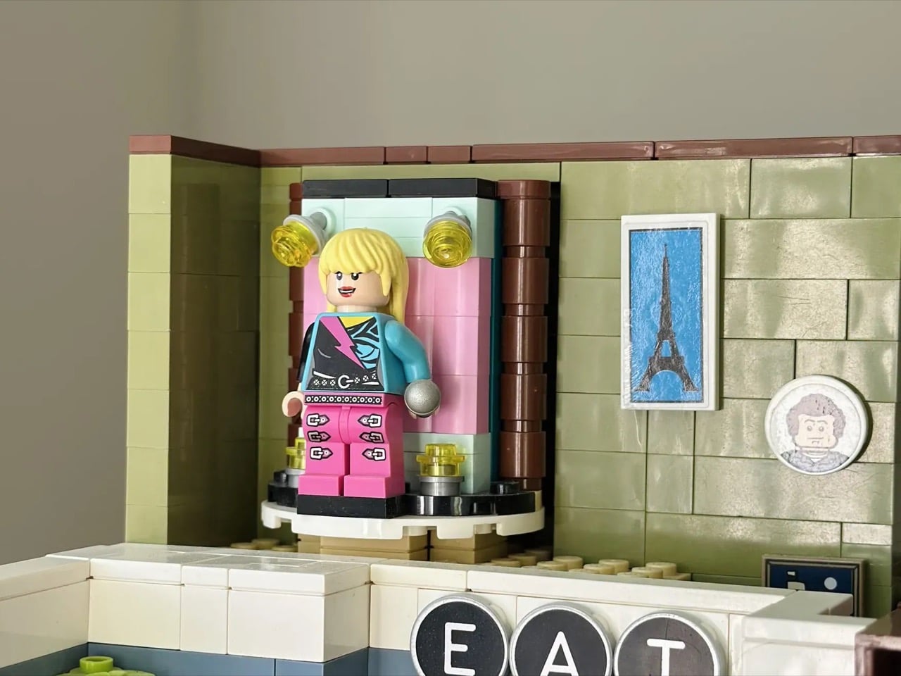
The minifigure lineup covers the full Stewart household and then some. Miley, Robby Ray, and Jackson are all present, alongside Lily (complete with crossbody bag and skateboard) and Oliver, decked out in his green hoodie and headphones and carrying a boombox tile. Hannah Montana gets her own separate minifigure in full pink-and-teal pop star gear, microphone in hand.
My favorite detail, though, is the transformation mechanism. Tucked into the upper level of the build, a rotating turntable platform sits inside a pink-lined doorframe niche flanked by small yellow globe lights, like a backstage dressing room that doubles as a stage entrance. Miley stands on it as her everyday self, and a simple rotation reveals Hannah in her place. It is a genuinely clever building solution, and it captures the show’s central gimmick with more wit than you’d expect from a handful of plastic bricks.
The build currently has 621 supporters on the LEGO Ideas platform, with 418 days left to reach the 10,000-vote threshold that would put it in front of LEGO’s internal review team. If you grew up watching Miley Stewart fumble her way through a double life in that Malibu living room, this one is worth your vote. Head to the LEGO Ideas page and cast it here!

The post This LEGO Hannah Montana House Has a Rotating Miley-to-Hannah Transformation and Fans Need It first appeared on Yanko Design.
This Finnish Privacy-focused Linux Phone Wants You to Forget Google Exists

Finland gave us Nokia, the company that taught an entire generation what a mobile phone could be before the iPhone rewrote the rules. That legacy didn’t vanish when Microsoft bought Nokia’s devices division in 2013. It splintered into smaller, fiercer projects, including Jolla, a company founded by ex-Nokia engineers who refused to let European mobile technology die quietly. Jolla launched its first phone in 2013 running Sailfish OS, a Linux-based alternative to Android and iOS, and while that device never broke into the mainstream, it proved something vital: you could build a commercial-grade mobile OS outside the American duopoly. Thirteen years later, Jolla is back with new hardware, 10,000 pre-orders, and a renewed argument that Europe deserves its own smartphone ecosystem.

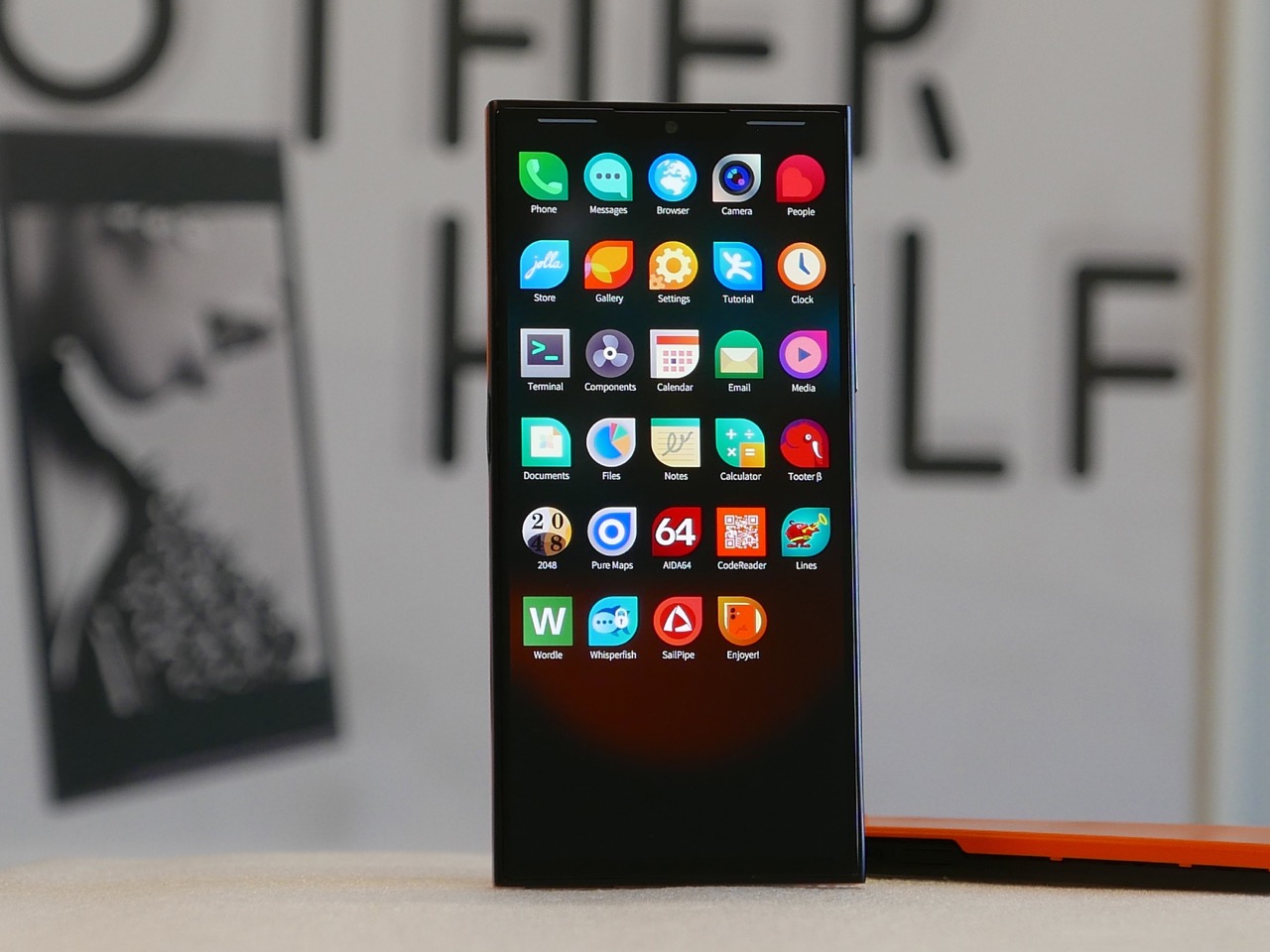
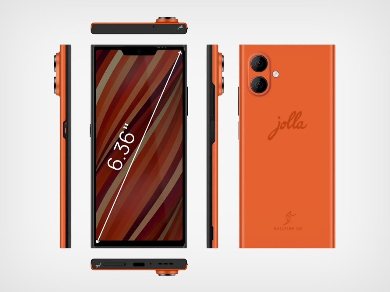
The new Jolla Phone costs €649 and ships in two waves, the first batch leaving Finland at the end of June 2026, with a second limited run of 2,000 units arriving in September. It runs Sailfish OS 5, the latest iteration of Jolla’s Linux-based platform, and it supports Android apps through an emulation layer that strips out Google’s surveillance infrastructure. The hardware sits comfortably in mid-range territory: a 6.36-inch Full HD+ AMOLED display, MediaTek Dimensity 7100 5G chipset, 8GB of RAM (expandable to 12GB), and 128GB of storage (upgradable to 256GB). Final assembly happens in Salo, Finland, the same city where Nokia used to manufacture millions of handsets per year, and every unit ships with a physical privacy switch that kills the microphones, cameras, and Bluetooth when you flip it.

Designer: Jolla Phone

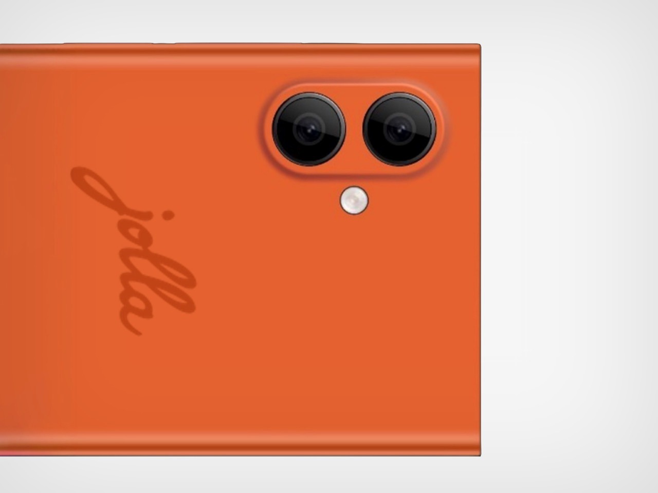
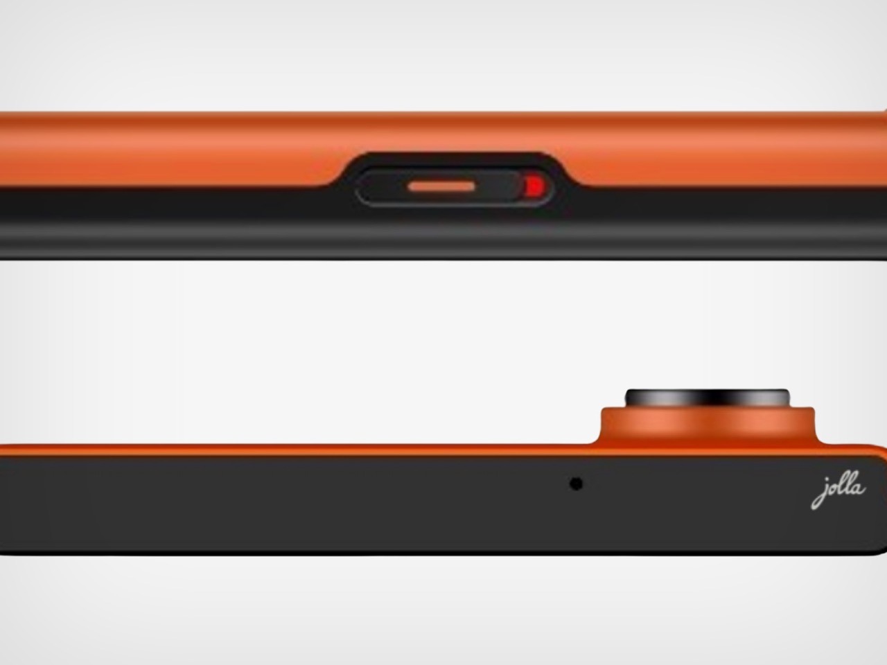
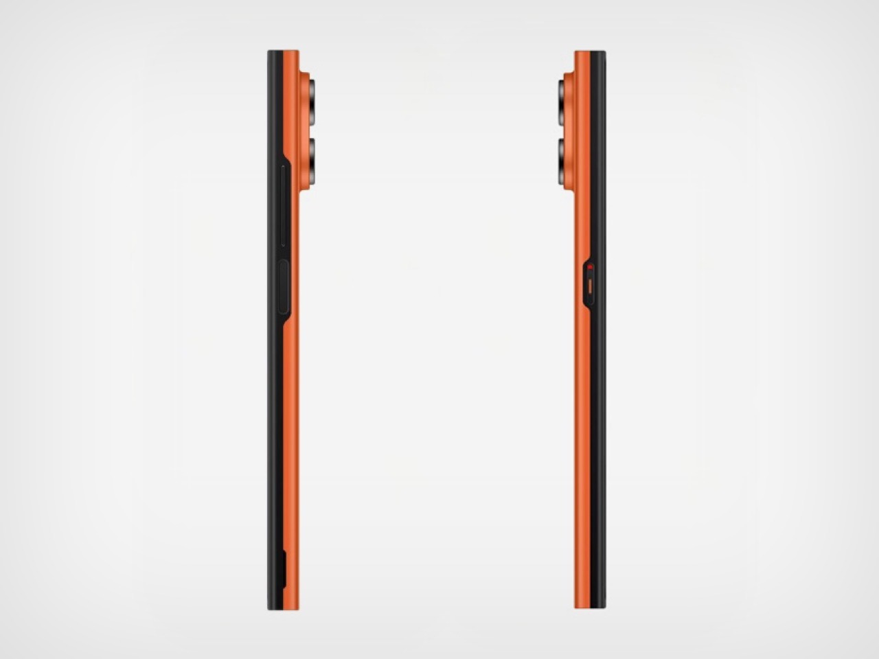
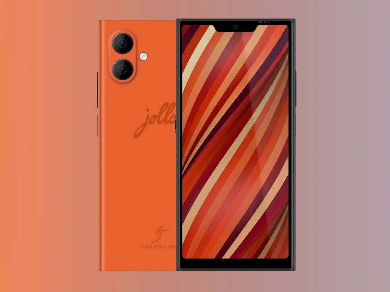
The design language leans heavily into Scandinavian minimalism with a splash of nostalgia. The Orange colorway (one of three finishes alongside Snow White and Kaamos Black) features a vibrant coral hue that recalls the bold plastics Nokia used on devices like the Lumia 920. The rear panel is smooth and removable, emblazoned with a script “jolla” wordmark and the Sailfish OS logo at the bottom. Two camera lenses sit in the top-left corner in a vertical arrangement, and the overall footprint is boxy and utilitarian rather than chasing the curved-edge aesthetic that dominates Android flagships. Physical buttons line the right edge, the top houses what appears to be a modular accessory port, and the bottom edge packs a USB-C port flanked by speaker grilles. The front is all screen with minimal bezels, no notch, and no hole-punch cutout, giving the display a clean, uninterrupted canvas.

Jolla’s privacy commitments go deeper than marketing copy. The physical privacy switch, located on the side of the device, cuts power to the microphones, cameras, and Bluetooth radios entirely, a hardware-level kill switch that software toggles can’t replicate. Sailfish OS doesn’t require a Google account, doesn’t collect location data for advertising, and doesn’t send telemetry back to corporate servers. The operating system compiles from source code in-house, and Jolla installs it manually in Finland rather than relying on third-party ODMs. The battery is user-replaceable, a feature that disappeared from flagship phones over a decade ago, and one that extends the device’s practical lifespan well beyond the typical two-year upgrade cycle.

The modular back panel revives the “Other Half” concept from the original Jolla Phone, which allowed users to swap colorful rear covers that could also carry NFC chips to trigger UI themes and functionality changes. This time around, Jolla is opening the platform to third-party designers and hardware hackers, with potential add-ons including secondary e-ink displays, physical keyboards, and extended batteries. Android app compatibility comes courtesy of Jolla’s AppSupport layer, which emulates the Android runtime without Google Play Services, meaning banking apps, messaging platforms, and productivity tools run normally but without the tracking apparatus baked into standard Android. It’s a pragmatic compromise: you get access to the app ecosystem that makes a smartphone functional in 2026, but you don’t hand over behavioral data in exchange.

Jolla CEO Sami Pienimäki positioned the phone explicitly as a statement of technological sovereignty, arguing that Europe’s dependence on American mobile infrastructure represents both a privacy liability and a strategic weakness. Only four commercial-grade mobile operating systems exist today: iOS and Android from the United States, HarmonyOS from China, and Sailfish OS from Finland. Antti Saarnio, chairman of the Jolla Group, acknowledges the phone will remain a niche product in the near term but frames it as infrastructure for what comes next, particularly as AI reshapes the form factors and interaction models we use to access computing. Whether Jolla scales beyond enthusiasts and privacy advocates depends on how well Sailfish OS holds up in daily use and whether the company can sustain hardware production beyond these initial batches.

The Jolla Phone is available now for pre-order in EU countries, the UK, Norway, and Switzerland, priced at €649 with a €99 deposit required upfront. The September 2026 batch is capped at 2,000 units, and given that the first wave of pre-orders moved 10,000 devices in just three months, that inventory won’t last long. A U.S. launch is under consideration but has no confirmed timeline, and while the phone should theoretically work with major American carriers, it lacks FCC approval. If you’ve been waiting for a legitimate alternative to the iOS-Android duopoly, this is the closest thing Europe has built in over a decade.

The post This Finnish Privacy-focused Linux Phone Wants You to Forget Google Exists first appeared on Yanko Design.
These Solid Copper & Brass Mechanical Pencils Were Designed to Outlast Their Owners By Centuries

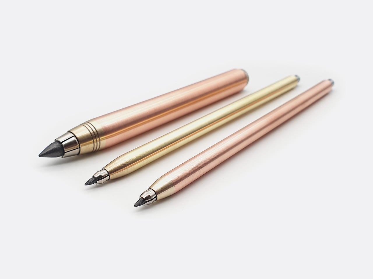
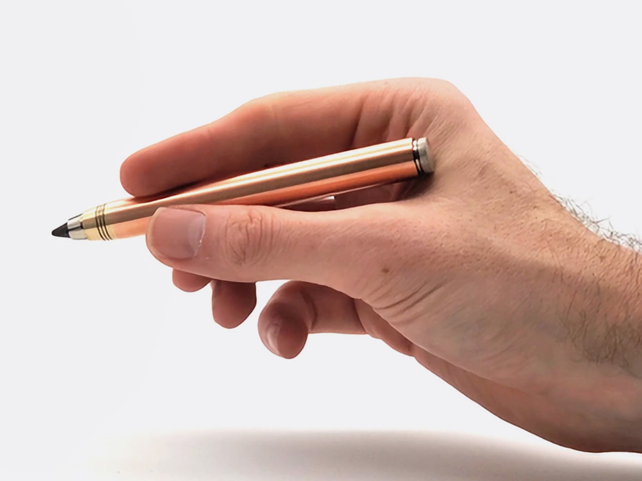
Copper weighs 8.96 grams per cubic centimeter. Brass comes in at around 8.5. Those densities mean something when you’re holding a pencil for hours at a time, and Nicholas Hemingway has built an entire design philosophy around that fact. His clutch pencils are machined from solid metal bar stock rather than hollowed-out tubes or plastic barrels wrapped in metallic finishes. The result is a tool that sits differently in your hand, one that uses its own mass to reduce the pressure you need to apply to the page. Hemingway calls it a “gravity-feed” approach, where the weight of the copper body does the work, allowing for longer, more comfortable creative sessions without the hand fatigue that comes from gripping too hard or pressing too firmly.

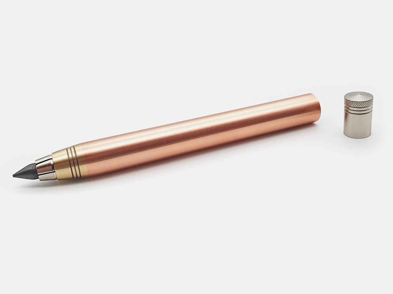
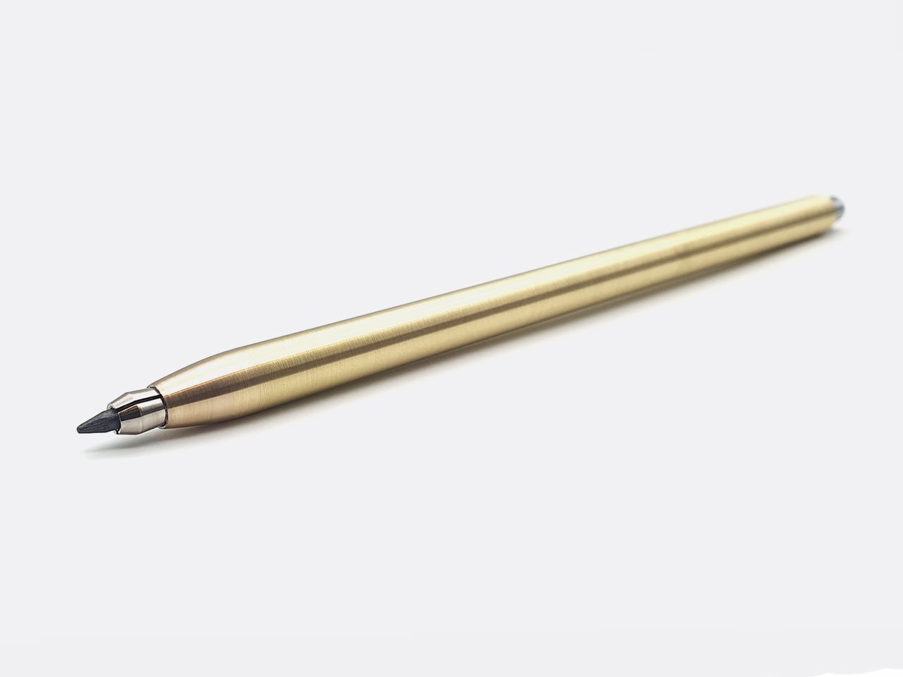
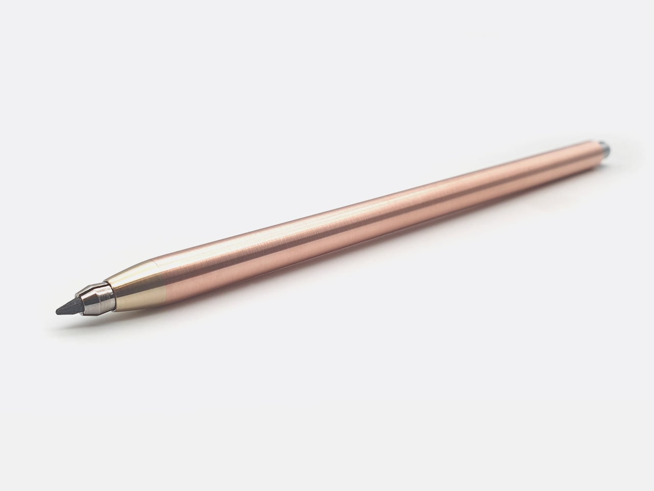
The 10th anniversary collection includes three pencils, each one a celebration of a decade spent refining manual lathe craftsmanship. The 5.6mm Copper and Brass Hybrid is the heaviest at 58 grams, designed for shading and life drawing, with a built-in lead sharpener in the push button. The 2mm Precision series comes in brass or copper, each weighing around 30 grams, and is aimed at technical drafting and fine-line illustration. Hemingway ships the brass version with an HB lead and the copper version with a 2B lead (the 5.6mm version gets the darkest 5B lead), a pairing he uses in his own studio to avoid having to swap leads mid-workflow. Both are standard clutch formats, fully compatible with any lead brand you prefer.

Designer: Nicholas Hemingway

Click Here to Buy Now: $79 $115 (31% off). Hurry, only 15/50 left!

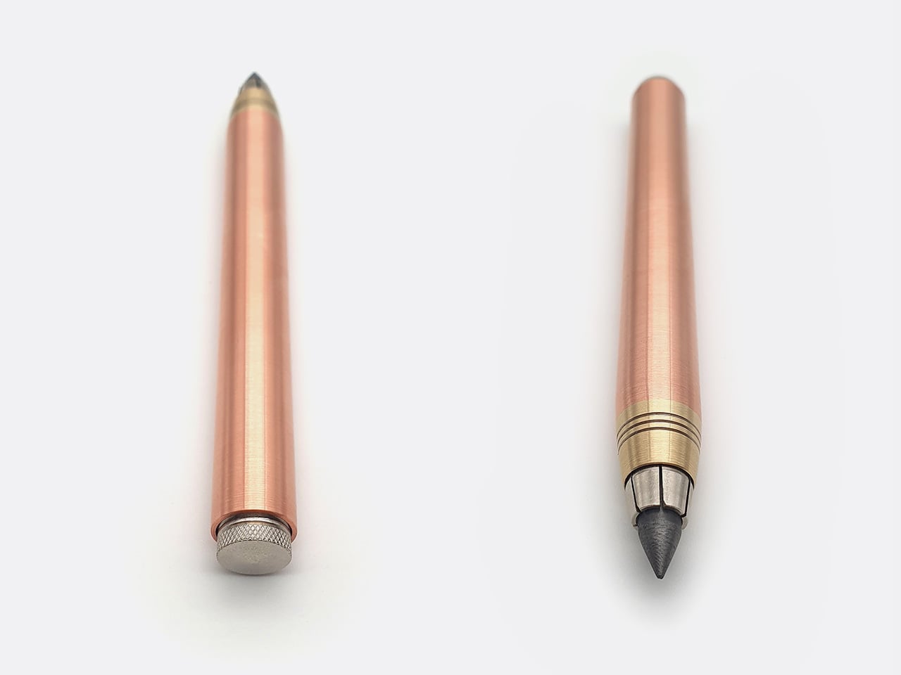
The clutch mechanism is simple, proven, and deliberately old-fashioned. Press the top button to release the jaws, advance or retract the lead, then release the button to lock it in place. There are no springs to fatigue, no ratcheting internals to gum up with graphite dust, and no plastic components to crack under pressure. The 5.6mm version includes a sharpening chamber machined directly into the push button, a detail that keeps the pencil self-sufficient without requiring a separate pocket sharpener. The mechanism works identically whether you’re using the factory-supplied HB or a softer 6B lead you’ve swapped in yourself. Hemingway designed these pencils to accept any standard 2mm or 5.6mm lead on the market, which means you can dial in exactly the hardness and texture you prefer without being locked into proprietary refills.

The 5.6mm Copper & Brass Clutch

The material choice drives the entire experience and stands as a direct antidote to disposable culture. C101 copper is a high-conductivity grade typically used in electrical applications, chosen here for its density, workability, and willingness to develop a rich patina over time. The 360 brass, a free-machining alloy, delivers a brighter, more clinical aesthetic and holds its finish longer before tarnishing. Hemingway leaves both materials raw, with no lacquer, no powder coating, and no protective sealant. The copper will darken and mottle as it reacts to the oils in your skin and the humidity of your studio. The brass will develop a warmer, more subdued tone, though it resists the transformation longer than copper does. This is slow design in practice, where the aging process becomes part of the design language, carrying the visible marks of its owner’s journey rather than something to prevent or hide.

The 2mm Brass

The 2mm Copper & Brass

Dimensionally, the 5.6mm Copper and Brass Hybrid measures 115mm in length with a 12mm diameter barrel, while the 2mm Precision series comes in at 140mm long with a 7mm diameter. The 2mm pencils are slimmer and longer, built for precision linework and extended drafting sessions where fine motor control matters. The 5.6mm version is shorter and thicker, designed to sit further back in your hand for broader, more gestural strokes. At 58 grams, the 5.6mm Hybrid has real heft, the kind of weight that anchors your hand to the page and makes you slow down, think about each mark, and commit to your lines. The balance has been engineered around the nib, shifting the center of gravity forward so the pencil glides across the paper rather than requiring constant pressure from your wrist.

Hemingway machines every pencil in-house at his London workshop on a manual lathe, hand-finishing each piece and inspecting it personally before it ships. The production model is bespoke and made-to-order, which eliminates the supply chain drama that plagues most crowdfunded EDC launches. If 100 people order a pencil, Hemingway machines 100 pencils. There are no minimum order quantities with overseas factories, no shipping containers stuck in customs, and no quality control surprises three months into fulfillment. Every tool is built to the same standard Hemingway uses for his own work, and the track record backs that up. This is his 17th Kickstarter campaign, and all 16 previous projects delivered on time. These are engineered to be the last drawing tools a creative will ever need to buy, true heirlooms designed for a lifetime of use and capable of being passed down.

Whether you opt for the copper or brass variant, or even the 5.6mm or 2mm model, Hemingway’s set the pricing at £59 ($79 USD), discounted off its £85 MSRP. Each pencil comes with its own lead, along with a hand-written note in a wonderful gift box. International shipping starts July 2026, and Hemingway packages everything in recycled cardboard with zero single-use plastics. All waste metal from the workshop gets collected and sent back to be melted down and reused, keeping the production cycle as tight and sustainable as the pencils themselves.

Click Here to Buy Now: $79 $115 (31% off). Hurry, only 15/50 left!

The post These Solid Copper & Brass Mechanical Pencils Were Designed to Outlast Their Owners By Centuries first appeared on Yanko Design.
The PlayStation Portable Gets an Incredibly Detailed LEGO Remake Complete with Working Disc Tray

Before smartphones killed the dedicated handheld, before the Switch made portability synonymous with Nintendo again, there was a brief window where Sony owned mobile gaming’s premium tier. The PSP launched in 2004 as a technical powerhouse wrapped in sleek industrial design, a device that felt expensive in your hands and looked like it belonged in a gadget enthusiast’s bag. It ran PlayStation 2-era games, played movies, supported WiFi multiplayer, and became the go-to modding platform for tinkerers who wanted every emulator ever made on one device. The PSP’s legacy is complicated, but its design has aged remarkably well.

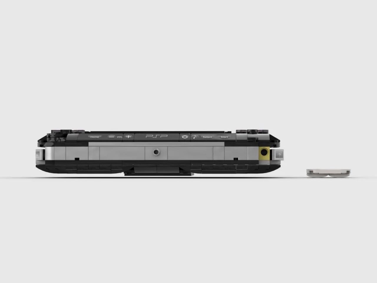
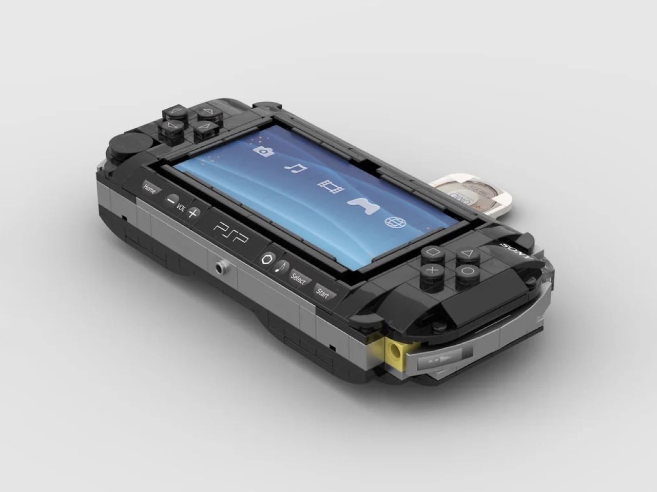
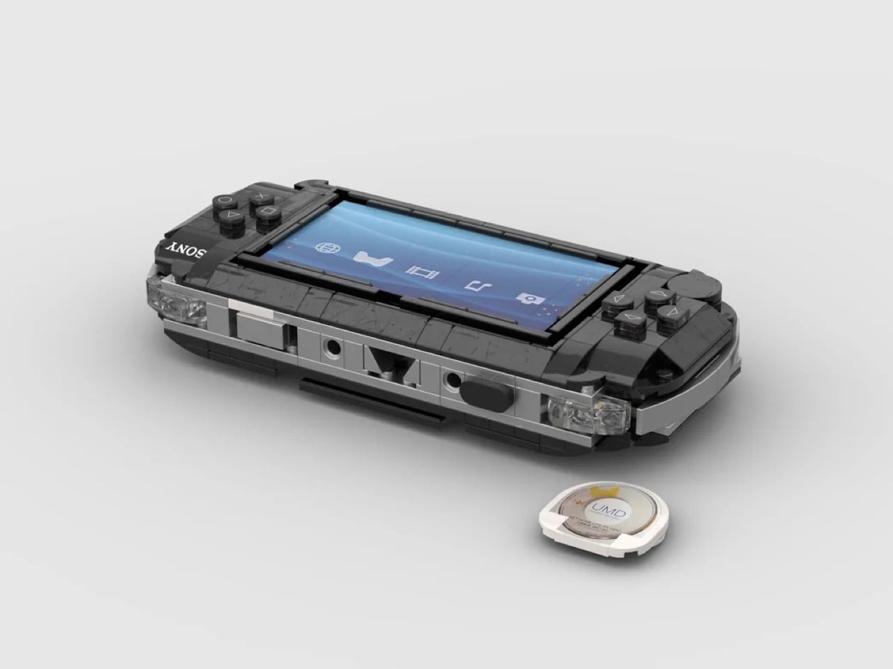
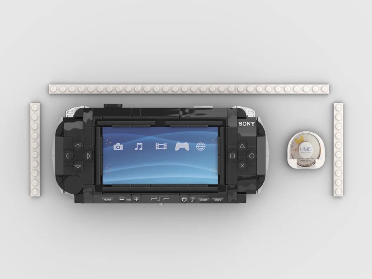
This LEGO interpretation, shared on Reddit, proves that good hardware design translates across mediums. Reddit user Embarrassed_Map1072 has captured the PSP’s essential character using bricks: the wide landscape format, the glossy black shell, the satisfying asymmetry of controls flanking a dominant screen. The printed XMB interface behind transparent elements brings the build to life, while the removable UMD disc adds a playful interactivity that feels right for a gaming device. Small touches like the curved edges, the recessed shoulder buttons, and the memory stick door’s yellow tab demonstrate real attention to the source material. This thing looks like it could slide into a PSP case and nobody would notice until they tried to boot up Lumines.

Designer: Embarrassed_Map1072

The build’s proportions are spot-on, capturing that distinctive wide-bodied stance that made the PSP feel substantial without being bulky. The face buttons render Sony’s iconic shapes (circle, cross, square, triangle) in rounded LEGO elements, while the D-pad on the left maintains its classic cruciform layout. The analog nub sits where your thumb expects it, a small circular detail that any PSP veteran will immediately recognize. Up top, smooth tiles create the volume controls and power switch, with printed detailing that suggests the original’s labeling. The headphone jack makes an appearance at the bottom edge, because what’s a portable gaming device without a way to plug in your earbuds during a commute?

My favorite detail is the UMD disc itself. The builder recreated the distinctive white-and-gold casing that held your games, complete with the circular window that let you glimpse the tiny disc inside. It slides into the back of the unit just like the real thing, a mechanical function that elevates this from display model to something tactile and engaging. The memory stick slot retains that pop of yellow that broke up the PSP’s otherwise monochrome palette, a small design flourish that Sony used to signal where your saves lived. This is LEGO building that understands its subject, translating not just shapes but the experience of holding and using the actual hardware.

The post The PlayStation Portable Gets an Incredibly Detailed LEGO Remake Complete with Working Disc Tray first appeared on Yanko Design.
Sakura-Inspired Racing Bulls F1 Simulator Is the Most Beautiful Thing to Come Out of the 2026 Japanese GP

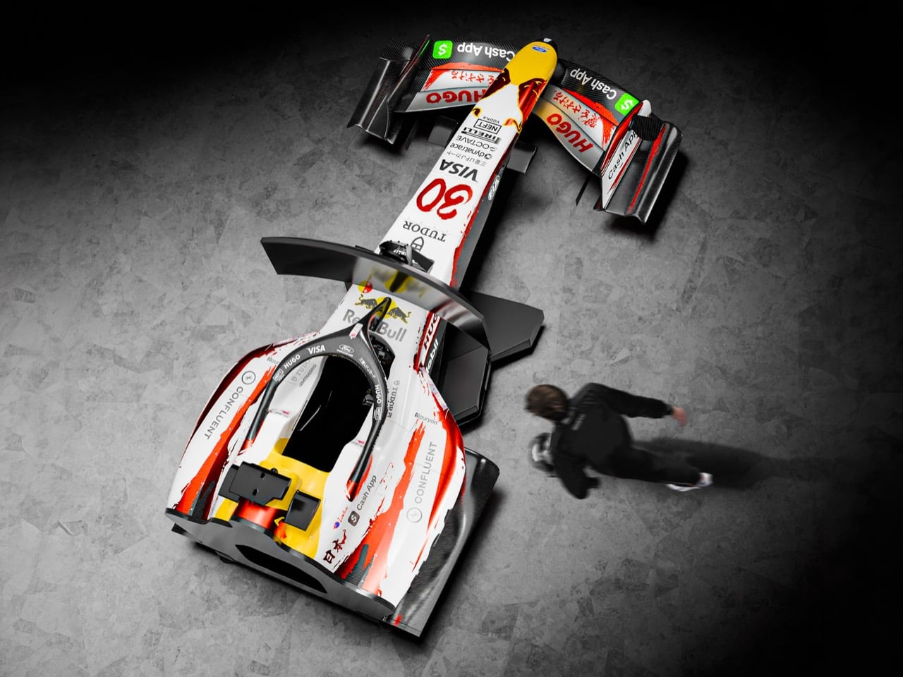
Racing Bulls arrived at the 2026 Japanese Grand Prix wearing a livery that had nothing to do with sponsor placement optimization or brand color refresh cycles, and everything to do with sakura. Designed by Bisen Aoyagi, one of Japan’s most accomplished calligraphers, the Cherry Edition wrapped Lawson and Lindblad’s cars in white, red, and silver calligraphy that treated the F1 car as a medium for cultural expression rather than a rolling billboard. The team introduced it to Tokyo at Red Bull Tokyo Drift in Shibuya before the Suzuka weekend, generating the kind of organic enthusiasm online that no marketing campaign can manufacture, and the cars then backed the visual statement with a double points finish in the race.

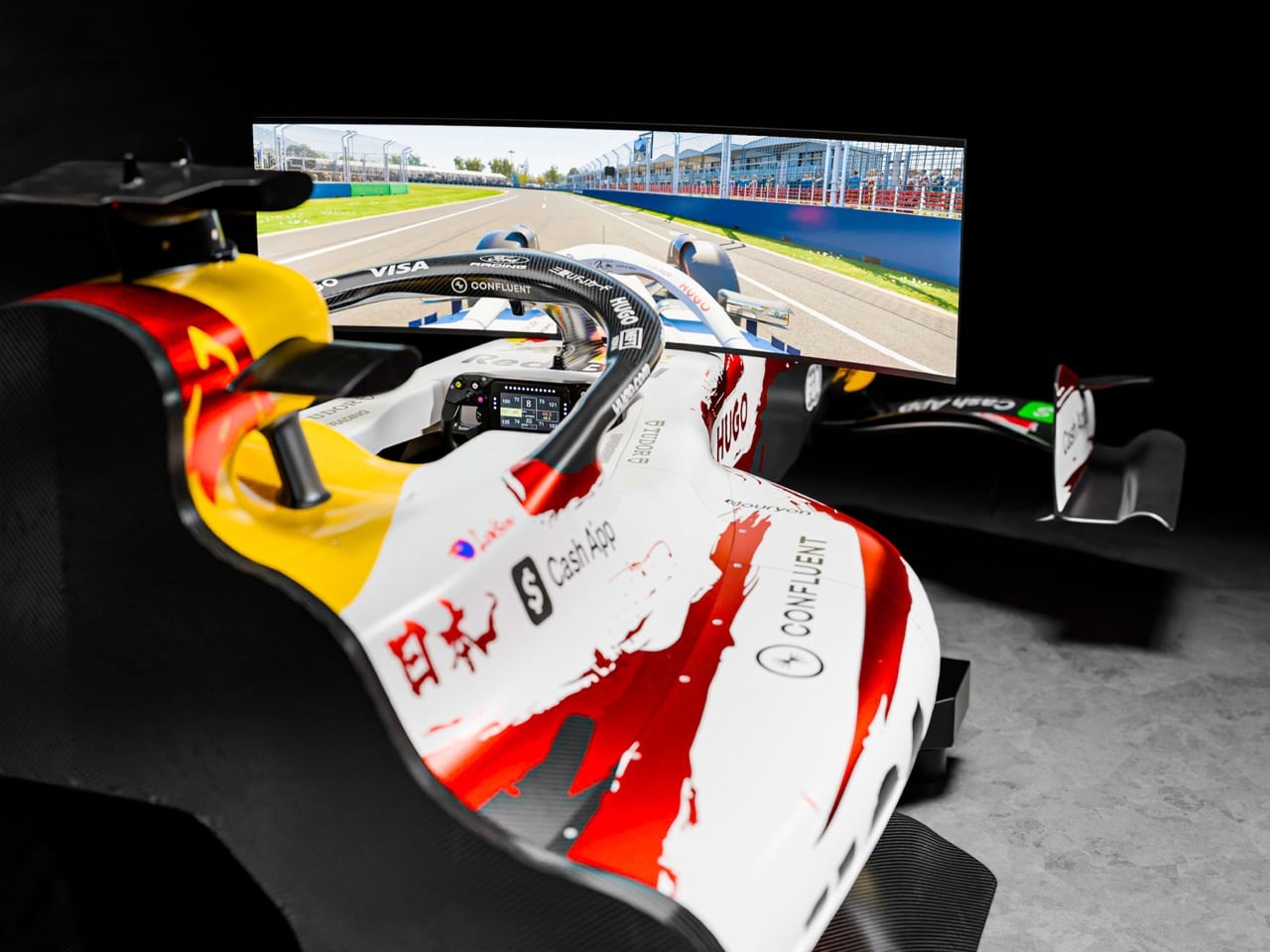
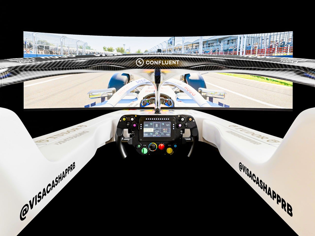
That specific convergence of art, culture, and competitive result is what F1 Authentics and Memento Exclusives have captured in a limited edition motion simulator now available at f1authentics.com. The simulator replicates the Cherry Edition livery from official team data, ensuring the calligraphy and colorwork match what appeared on the actual cars at Suzuka, while haptic actuators, front pivot configuration, and rumble feedback handle the physical side of the experience. Racing Bulls CEO Peter Bayer framed the Cherry Edition as part of a broader commitment to engaging meaningfully with the cultures that host each race, which makes the simulator less a piece of merchandise and more a physical artifact of that philosophy in action.

Designer: Bisen Aoyagi

The livery itself deserves more than a passing description. Aoyagi’s calligraphy does something that most F1 livery design cannot, which is carry genuine visual weight at both highway speed and standing still. The white base gives the red and silver calligraphic strokes room to breathe, and the result reads differently depending on your distance from the car. At speed through Suzuka’s Esses, the Cherry Edition reads as a bold, high-contrast graphic. Parked in the Shibuya streets during Tokyo Drift, it operated as something closer to a gallery installation on wheels. That duality, between kinetic graphic and considered artwork, is exactly what makes the livery a strong candidate for the simulator treatment, because you actually want to sit inside it and study the surfaces around you.

The simulator itself is built by Memento Exclusives’ in-house team of engineers and mechanics, people who have spent decades working in professional motorsport environments and understand the difference between a product that looks like an F1 simulator and one that behaves like one. The haptic actuator system and front pivot configuration work in tandem to replicate the physical signature of cornering forces, while the haptic rumble feedback layer communicates road surface texture and kerb strikes with enough fidelity to make the experience genuinely instructive rather than merely theatrical.

Memento Exclusives has built simulators for other F1 teams through the F1 Authentics platform before, and the Racing Bulls Cherry Edition continues that technical standard while raising the aesthetic bar considerably.

For the sim racing community, which has already made the Cherry Edition one of the most discussed liveries of the early 2026 season across forums and social channels, the simulator represents an opportunity to own the physical version of something they have already been racing virtually. For collectors with a longer view, it represents a documented moment: a calligrapher’s interpretation of Japanese spring, painted onto an F1 car, raced at one of the sport’s most mythologized circuits, and preserved in a numbered, limited run that will not be repeated. Available now at f1authentics.com, and given the trajectory of interest since Suzuka, the window to secure one is likely shorter than a sakura season.

The post Sakura-Inspired Racing Bulls F1 Simulator Is the Most Beautiful Thing to Come Out of the 2026 Japanese GP first appeared on Yanko Design.
Leaked iPhone 18 Pro Screen Protector Shows A 35% Smaller Dynamic Island

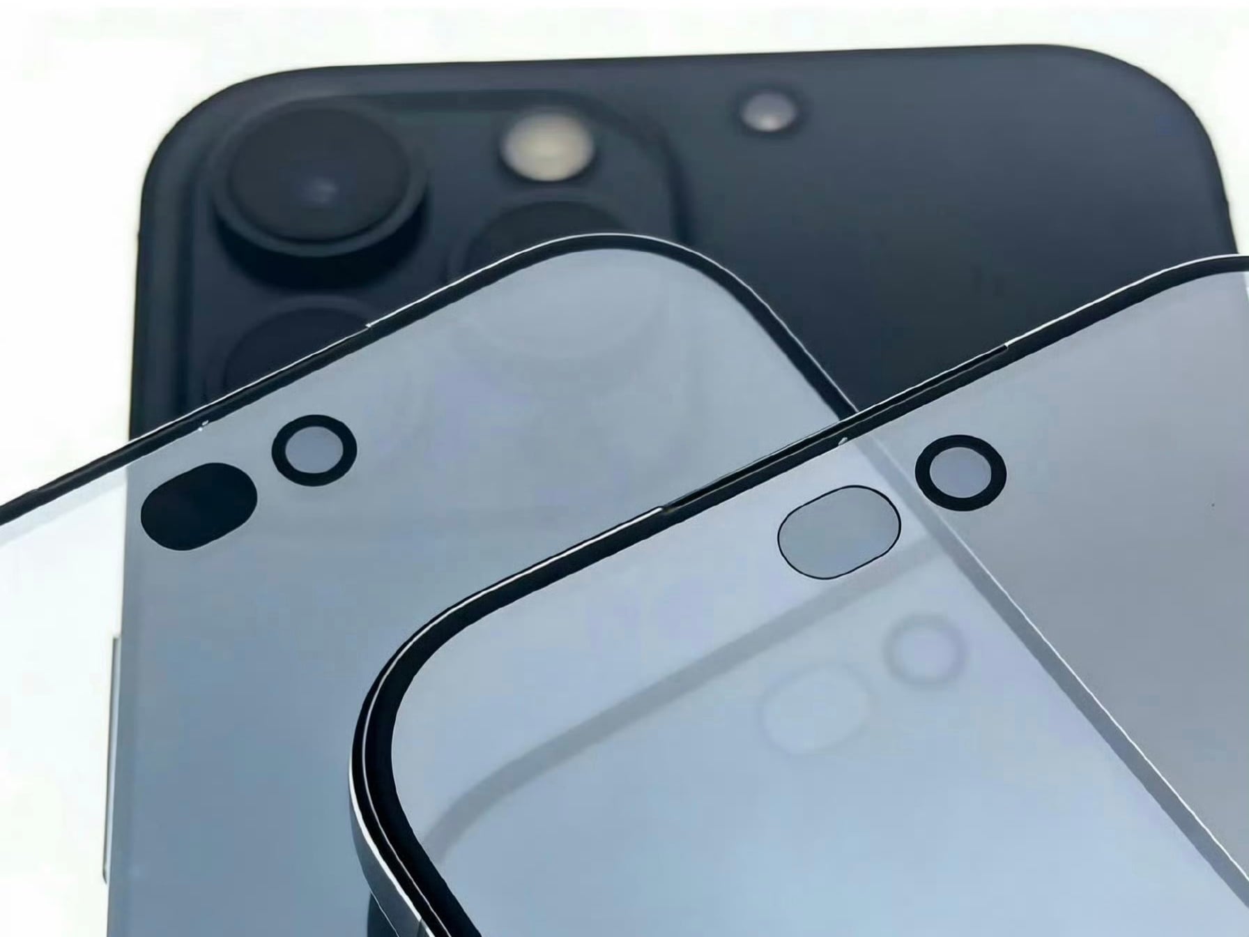
Four years is a long time in smartphone design, long enough for entire product categories to rise, peak, and fade. Samsung has cycled through multiple foldable generations. Google has rebooted its Pixel lineup twice. Nothing has gone from startup curiosity to legitimate contender. Apple, meanwhile, has kept the Dynamic Island exactly where it was when it debuted with the iPhone 14 Pro, same width, same height, same visual footprint. Leaked screen protectors for the iPhone 18 Pro, sourced from Weibo, suggest that Apple has finally decided four years is long enough.

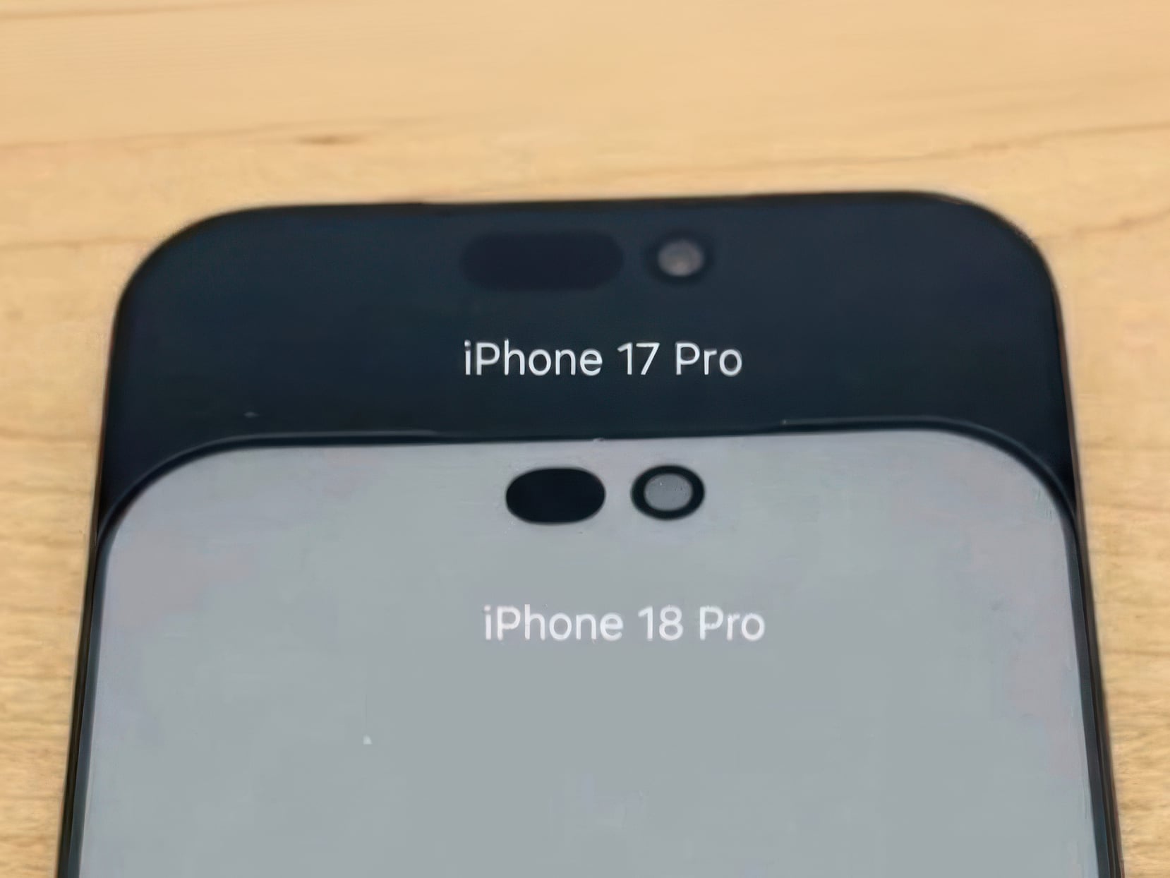
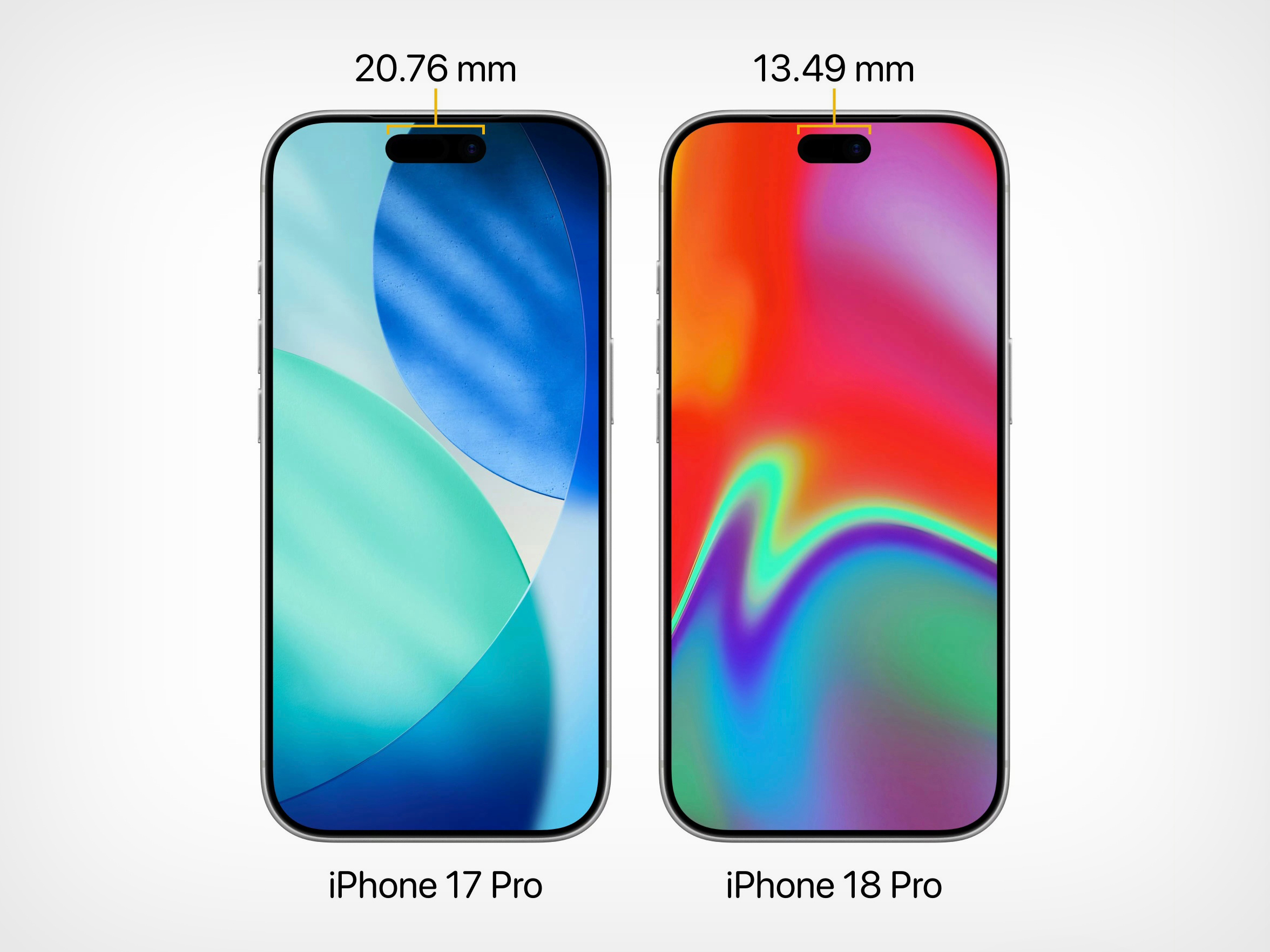
According to the leak, the infrared flood illuminator that powers Face ID is moving under the display on the iPhone 18 Pro, leaving only the infrared camera requiring a physical cutout alongside the front-facing lens. The result is a Dynamic Island roughly 35% smaller than what ships on the iPhone 17 Pro today. Apple is also expected to pair this with its first 2nm chip, the A20 Pro, along with a variable aperture system on the main camera. The 20th anniversary iPhone in 2027 is widely expected to go further with a fully clean display, but the 18 Pro represents the clearest signal yet that Apple is working its way there on a deliberate schedule.

Image Credits: Weibo

The size reduction is more significant than the percentage suggests when you look at the two side by side. The iPhone 17 Pro’s Island is a wide, commanding presence even at rest. The 18 Pro’s leaked cutout reads almost delicate by comparison, a narrow pill sitting unobtrusively at the top of the screen. Apple will still need to revisit four years of Live Activities design and the entire interaction vocabulary built around the existing Island’s dimensions, which is a reasonable explanation for why this transition is taking as long as it is.

Android manufacturers have shipped under-display cameras for years, with visible quality tradeoffs that Apple’s user base simply would not accept on a thousand-dollar phone. Holding the line until the technology meets the standard, rather than shipping it to win a spec sheet argument, is the kind of call that frustrates people in the short term and builds loyalty over time. The iPhone 18 Pro may read as a modest update on paper. That smaller pill tells a different story.

The post Leaked iPhone 18 Pro Screen Protector Shows A 35% Smaller Dynamic Island first appeared on Yanko Design.
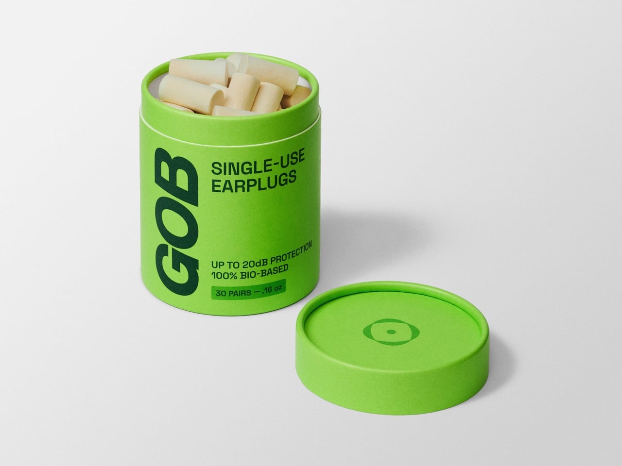
Biodegradable Noise-Cancelling Mycelium Earplugs Are Solving A Decades-Long Plastics Problem

For half a century, the humble foam earplug has been a masterpiece of single-purpose design. It is a small cylinder of polyurethane, expertly engineered to expand in your ear canal and dampen the world. Its simplicity is its genius, and its disposability is its convenience. We use them by the billion to sleep on airplanes, to protect our hearing at concerts, and to find a moment of quiet in a loud world. Then, we throw them away without a second thought, adding to a global accumulation of petroleum-based plastic that will outlive us all by centuries. The product works perfectly for our ears, but it fails the planet spectacularly.

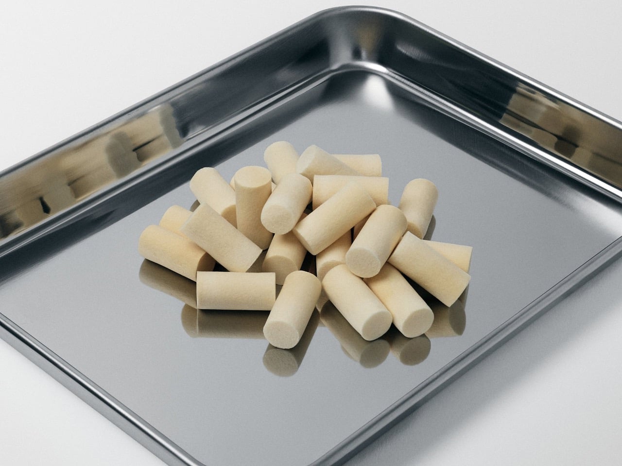
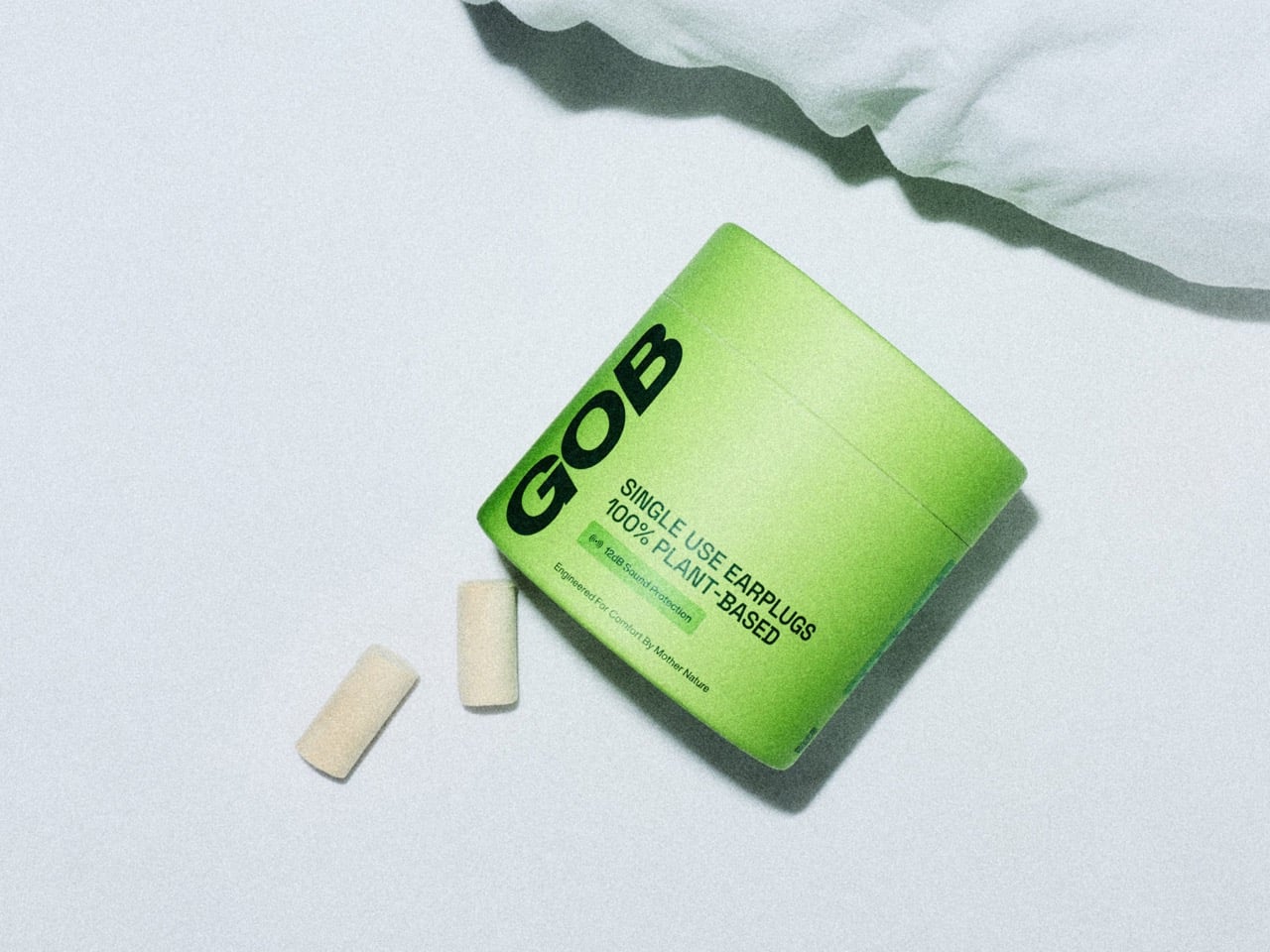
A company called GOB looked at this quiet, persistent pollution and decided the solution was not to reinvent the earplug but to regrow it. They turned to mycelium, the intricate root network of fungi, to create a material that provides the same acoustic barrier as foam but with a profoundly different lifecycle. Instead of being manufactured in a factory, GOB’s earplugs are cultivated. They are a product of biology, not chemistry, offering a compostable alternative that returns to the earth as nutrients. It’s a clever piece of bio-engineering that solves a problem we have been ignoring for decades.

Designer: GOB

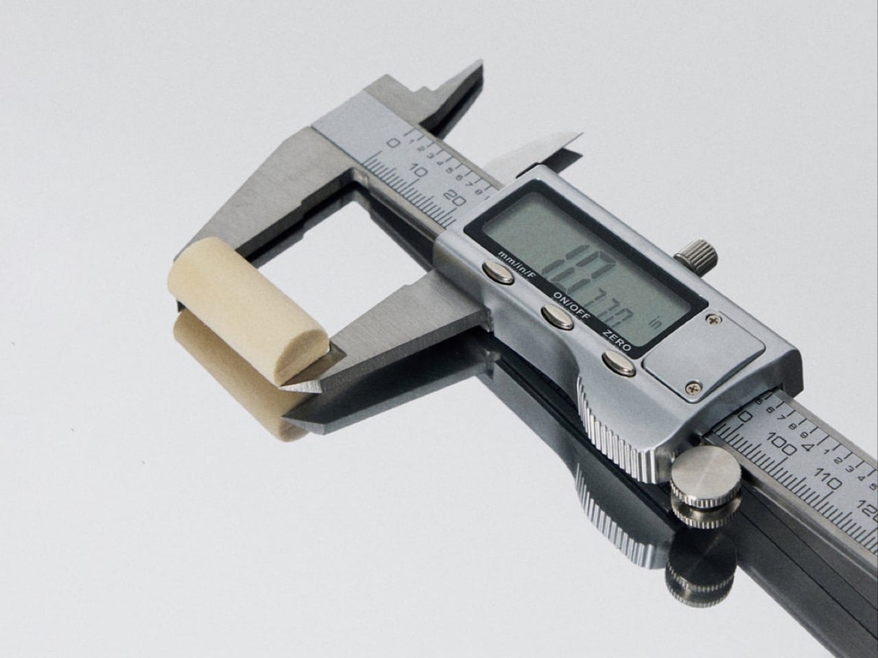
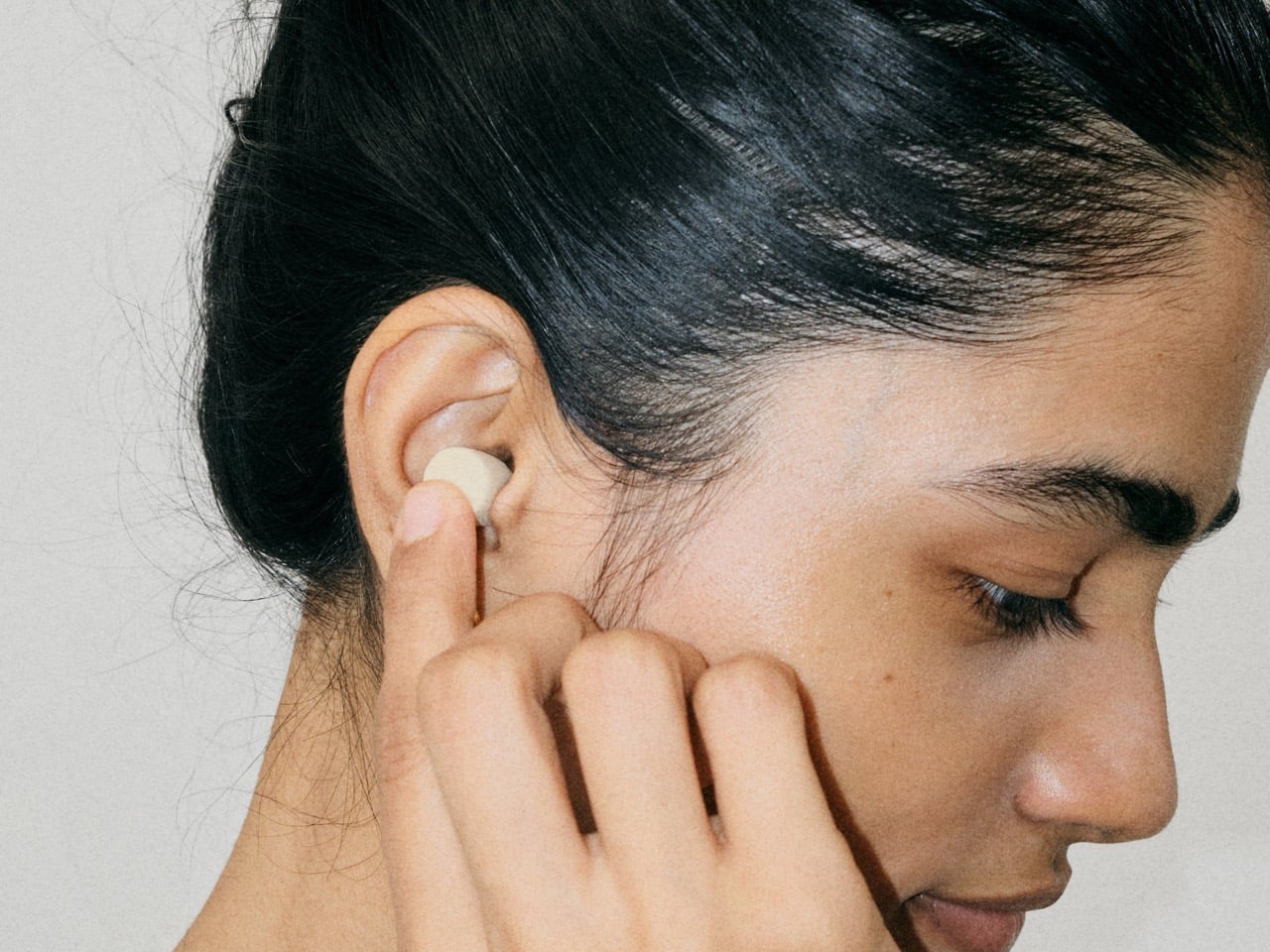
This application of mycelium is what makes GOB so interesting from a materials standpoint. We have seen this stuff used for packaging and even as experimental building blocks, but scaling it down to a personal, disposable item is a sharp move. The company claims a frequency protection range between 12 and 25 decibels, which puts it right in the sweet spot for general use cases like concerts or loud transit. They call it a biofabricated, single-ingredient foam, which means there are no weird binders or synthetic additives. It is just pure, farm-grown aerial mycelium. The material itself is soft and porous, which allows it to conform to the ear canal without the aggressive expansion pressure of memory foam.

Their go-to-market strategy is just as intelligently designed as the product itself. Instead of fighting for shelf space at a pharmacy, GOB partnered with live event giants like AEG Live and Bowery Presents. This move puts the earplugs directly at the point of highest demand, offering a sustainable alternative right where billions of plastic plugs are currently used and discarded. It completely sidesteps the need for a massive consumer education campaign by simply replacing the existing product at the source. It acknowledges that user behavior is hard to change, so they changed the material instead. This is a product that meets people exactly where they are, offering a frictionless upgrade.

The post Biodegradable Noise-Cancelling Mycelium Earplugs Are Solving A Decades-Long Plastics Problem first appeared on Yanko Design.
Biomimetic Architecture Reaches New Heights With This Bird-of-Paradise Yoga Space

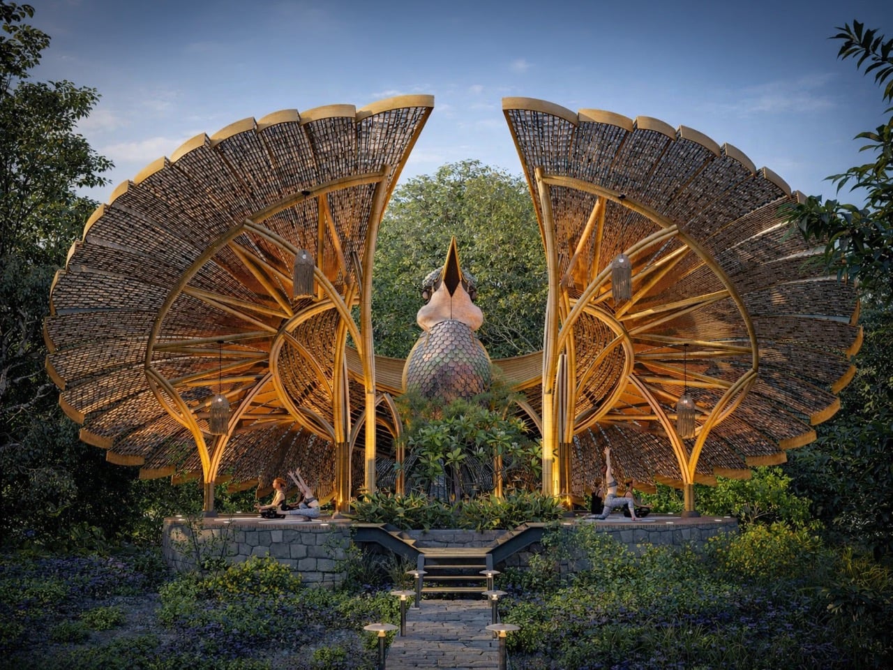
Biomimicry in architecture usually means borrowing structural logic from nature. Honeycomb patterns for strength, lotus leaves for water repellency, termite mounds for passive cooling. Thilina Liyanage takes a different approach. He’s interested in the moment when an animal does something so visually arresting that the form itself becomes a kind of language. His latest project, the Rifle Bird Yogashala, translates the courtship display of the Victoria’s riflebird into a bamboo yoga pavilion that looks like the bird caught mid-performance.

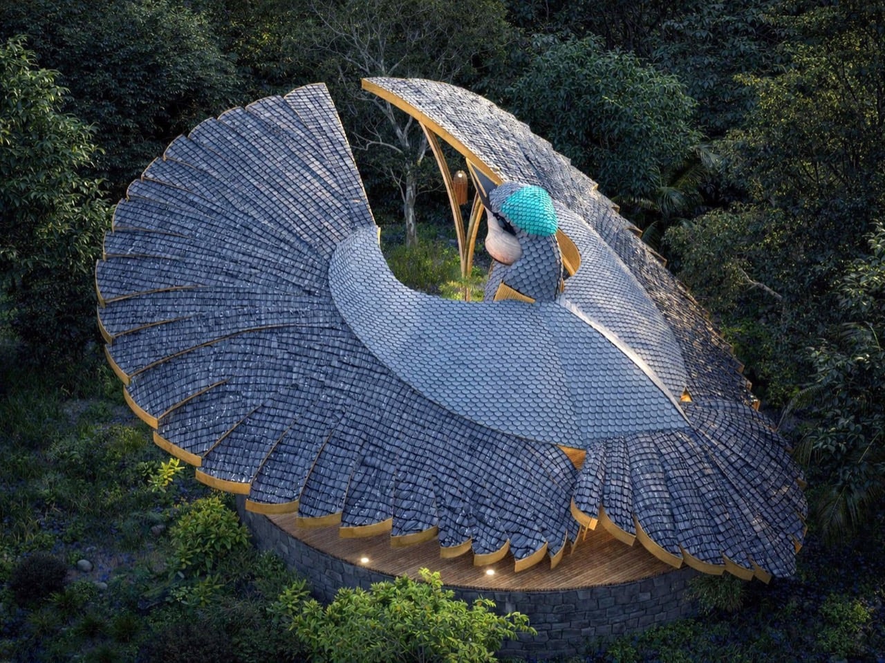
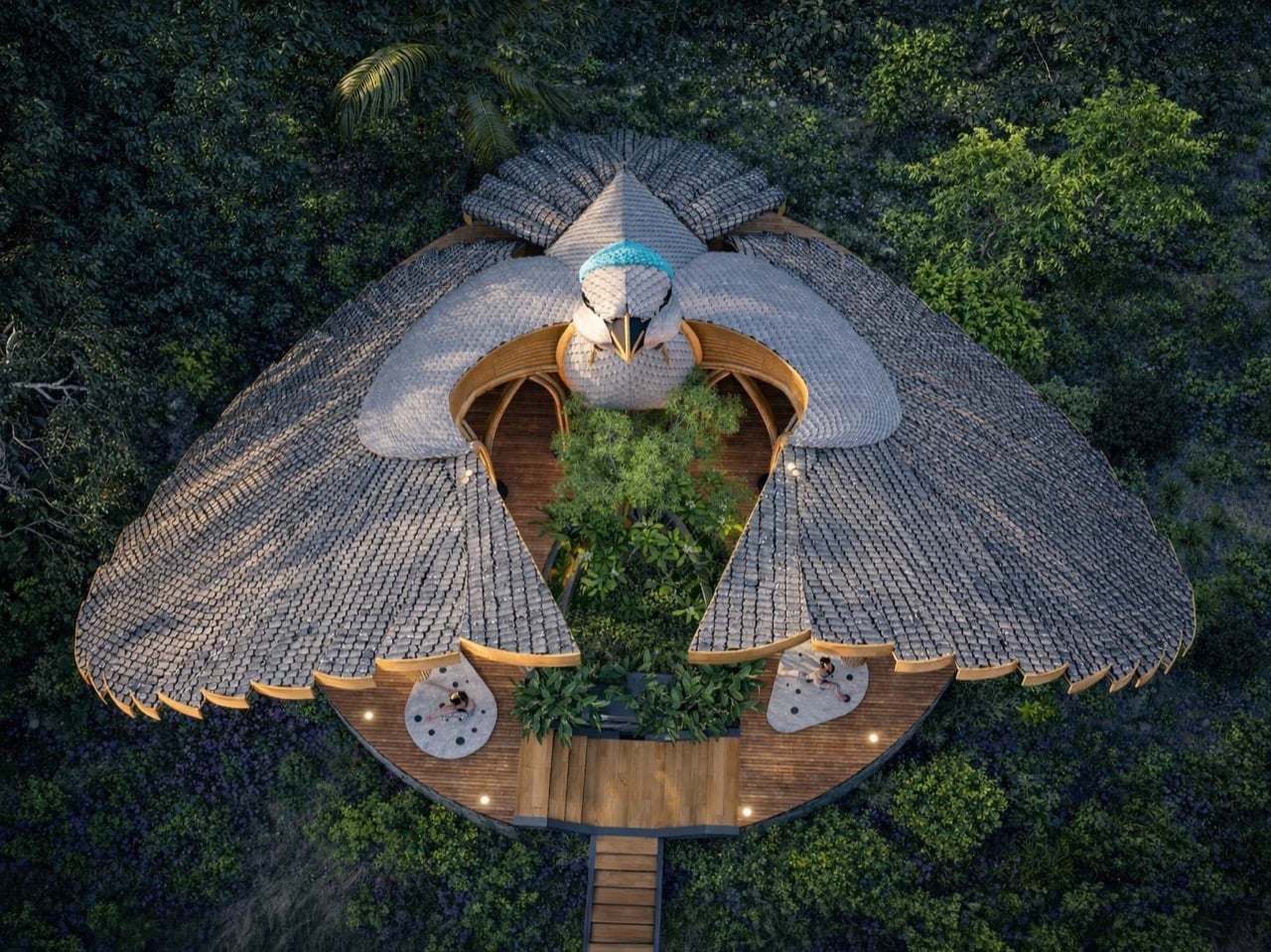
The riflebird, a bird-of-paradise endemic to northeastern Queensland, performs one of nature’s most dramatic mating displays. Males curve their wings into semi-circular arcs above their bodies, creating a dark cape of feathers that frames an iridescent throat patch. They sway, bob their heads, and scrape their beaks against wing feathers to produce a percussive rhythm. Liyanage’s yogashala mirrors that gesture with two sweeping bamboo canopies that arch skyward from a central sculptural element, their layered surfaces reading like individual feathers arranged in radial patterns. The building doesn’t just reference the bird. It performs the same gesture at architectural scale.

Designer: Thilina Liyanage

Liyanage has been doing this for years now. We’ve covered his manta ray yacht club, his deer observation deck for Yala National Park, his moose-head viewing platform in Alaska, his orchid-shaped villa, and most recently his rhino safari deck at Kifaru Point. The pattern is consistent: he finds an animal or plant with a visually distinctive form, usually something mid-gesture or mid-bloom, and translates that exact shape into a functional building using bamboo and timber. What separates this from novelty architecture is how seriously he treats the biomimicry. The proportions stay true. The radial geometry of the riflebird’s fanned wings translates directly into the roof structure here, with individual bamboo ribs following the same outward-spreading pattern you’d see in the actual feathers. The canopies tilt at the same angle the bird holds its wings during display, roughly 60 degrees from vertical based on the renders. Each layered section of the roof mimics a cluster of feathers, creating a texture that catches light the way the bird’s plumage would in dappled forest sunlight.

The central element between the two wing canopies reads as the bird’s body and head, complete with what looks like a sculptural interpretation of the throat and beak pointing skyward. It’s a bold move because it commits fully to the metaphor instead of softening it. You’re looking at a building shaped like a bird in the middle of a courtship display, and Liyanage doesn’t hedge. The yoga platform sits at the base on a raised stone deck accessed by stairs, giving practitioners an elevated view of the surrounding forest. The structure appears to be around 15 feet tall at the wing peaks based on the human figures in the renders, which puts it at a scale that’s monumental without being absurd. A real Victoria’s riflebird measures about 24 centimeters. This version scales that gesture up roughly 20 times while keeping the anatomical relationships intact.

Bamboo’s role in this design exists beyond aesthetics. The material bends without breaking, which is critical when you’re trying to replicate the curved ribs of a wing structure. It’s also native to Sri Lanka where Liyanage is based, and it handles moisture well, which matters in a forest setting. The layered roof sections appear to use bamboo slats or woven panels clad over a bent bamboo frame, creating the feathered texture while maintaining structural integrity. You can see the individual ribs in the renders, each one following the arc from the central support out to the wing edge. The underside of the canopies shows the same radial pattern, so anyone practicing yoga beneath them gets the full effect of looking up into the bird’s wing architecture. That’s where the concept justifies itself. You’re not just in a bird-shaped building. You’re occupying the exact spatial position a female riflebird would during courtship, looking up at a display designed to be overwhelming.

The post Biomimetic Architecture Reaches New Heights With This Bird-of-Paradise Yoga Space first appeared on Yanko Design.
Bang & Olufsen Clads Its Flagship Speaker in 1,800 Aluminum Pearls and Rosewood Slats For 100th Anniversary

The Beolab 90 has spent the better part of a decade as Bang & Olufsen’s technological flagship, a speaker so absurdly capable that it can beam-form sound to different parts of a room simultaneously. For the company’s centenary, the design team decided the speaker’s technical mastery deserved equally ambitious surface treatments.

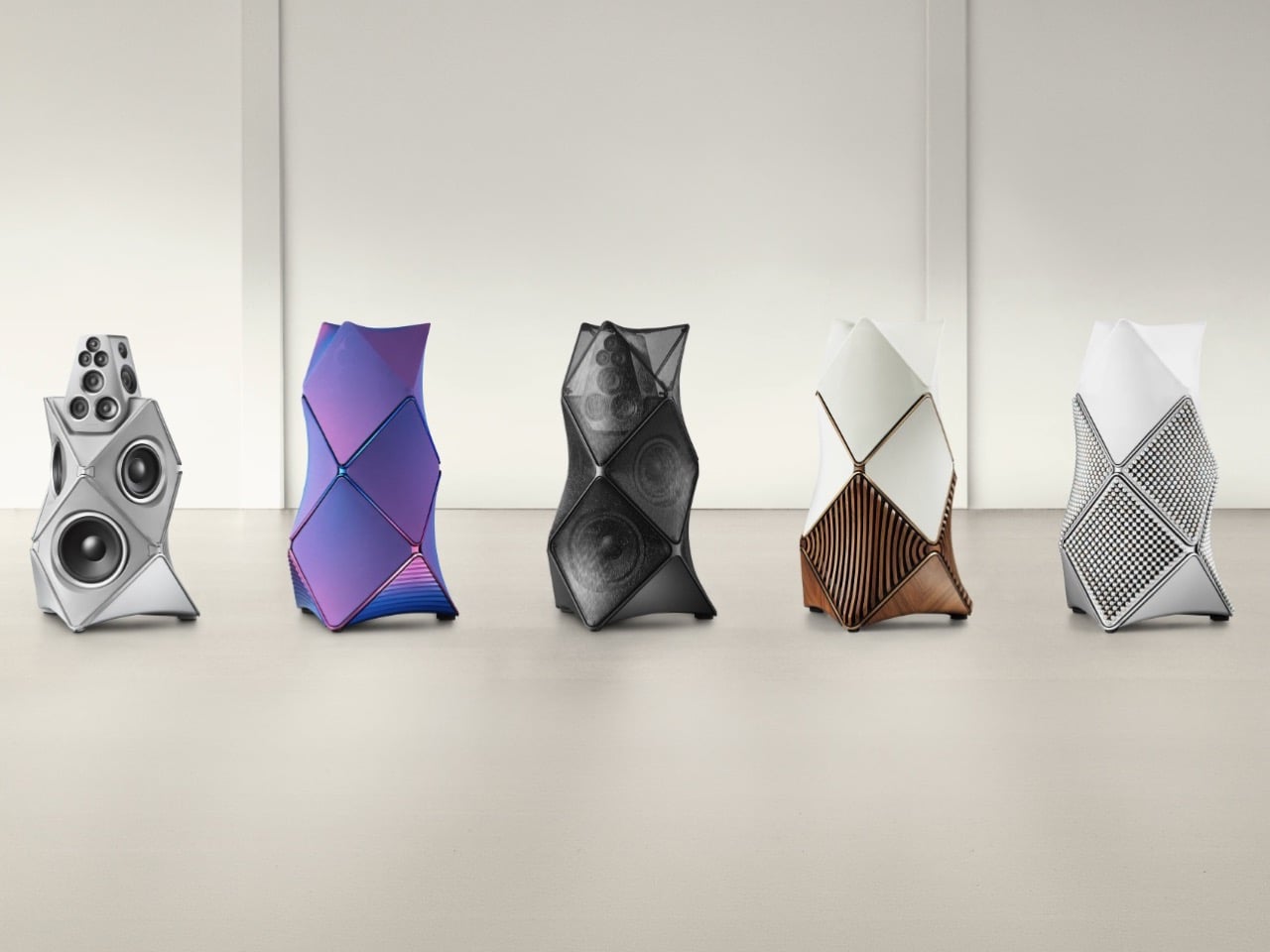
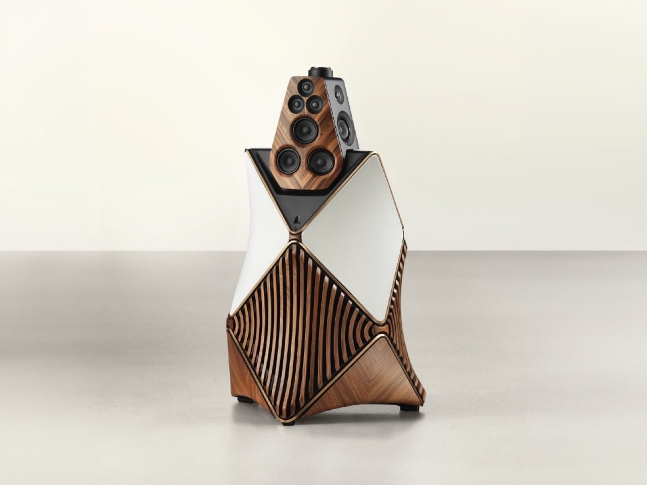
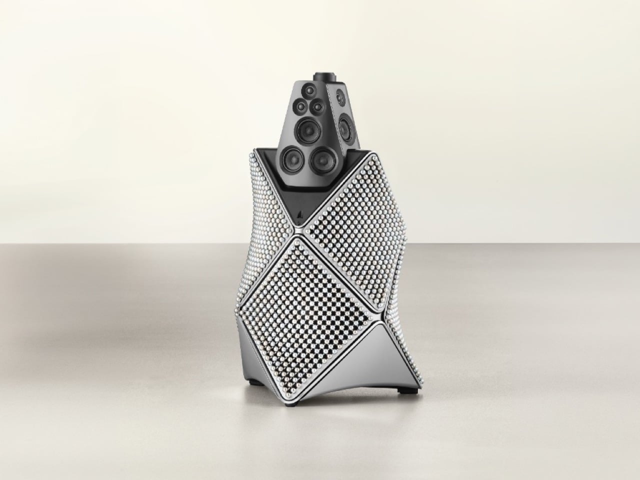
The result is a five-edition Atelier series where each version explores a different corner of B&O’s manufacturing expertise. The Monarch and Zenith Editions, revealed today as the series finale, take wood and metal to places you wouldn’t normally associate with speaker cabinets. Angled rosewood lamellas flow across the Monarch’s aluminum body in a continuous sculptural gesture, while the Zenith Edition gets covered in nearly 1,800 individual aluminum spheres hand-assembled across six curved panels. Ten pairs of each, certificates of authenticity, miniature sculptures in matching finishes. The works.

Designer: Bang & Olufsen

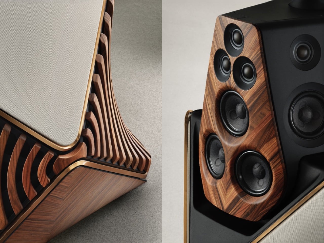
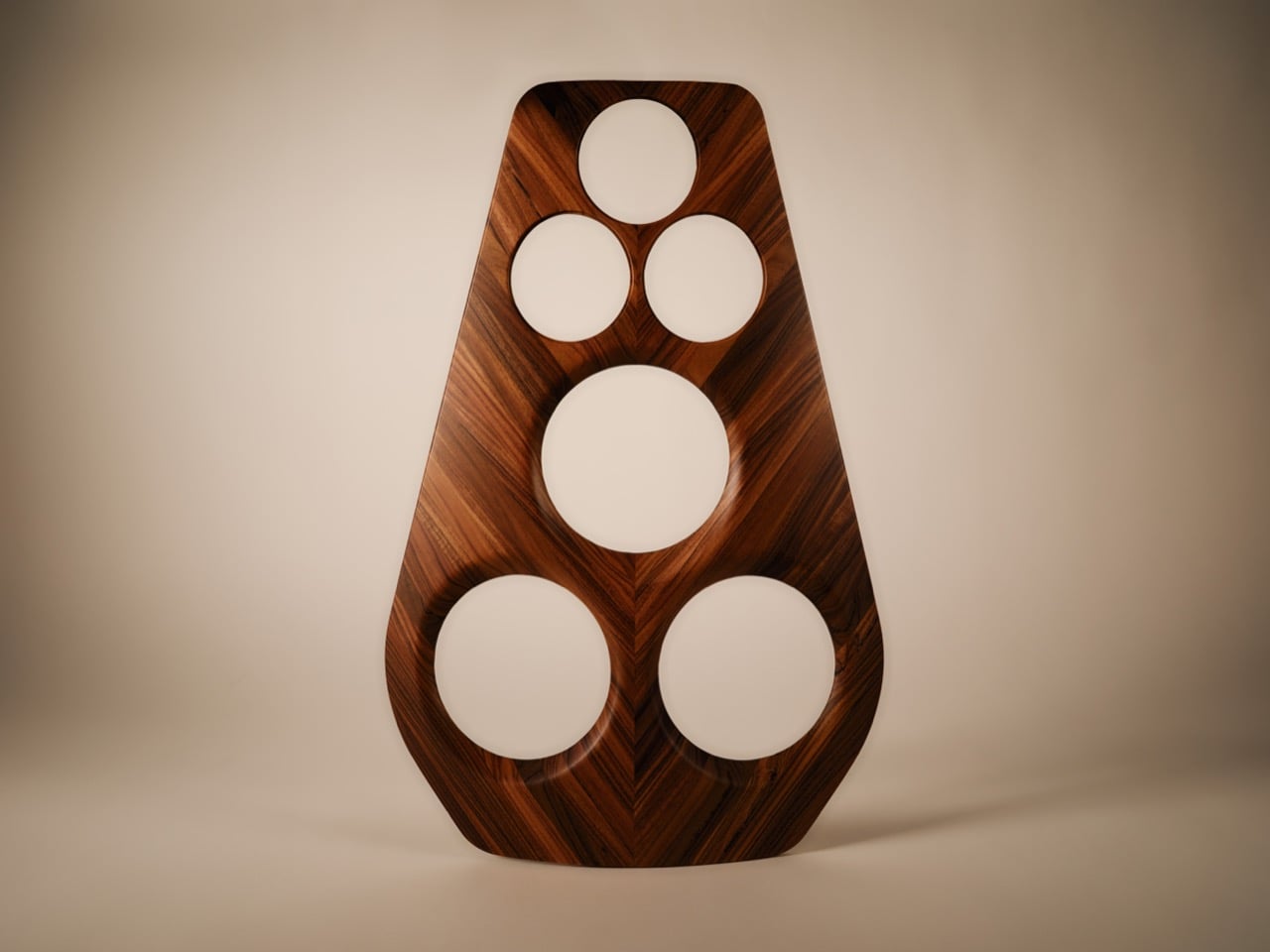
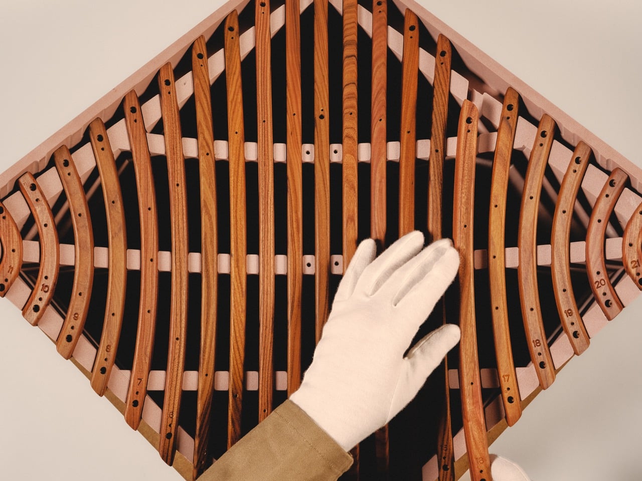
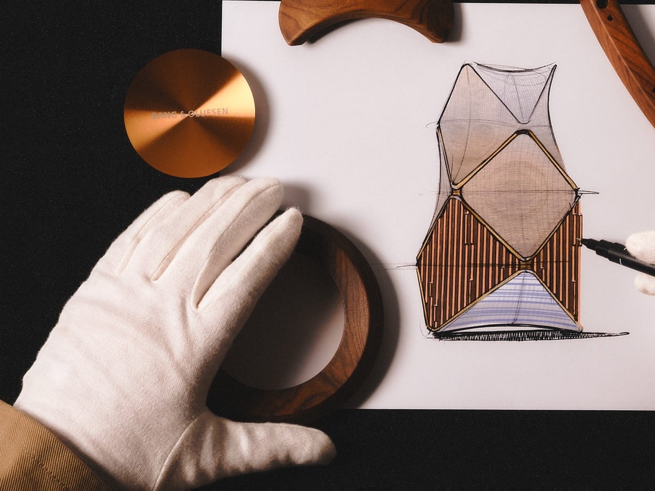
The Monarch Edition reads like someone at B&O looked at classic Danish furniture, specifically the kind with slatted wood panels that wrap around curved frames, and decided a 150-pound loudspeaker needed the same treatment. Angled rosewood lamellas follow the contours of the aluminum cabinet in a 360-degree rhythm that echoes fabric speaker covers while introducing actual tactile depth. Six wooden knots connect the lamellas at strategic points, with the front knot featuring a light-through-wood stripe that breaks up what could have been a monotonous pattern. A solid rosewood top ring frames the speaker head while lower base panels continue the lamella motif, creating visual continuity from top to bottom. The ochre-colored aluminum crowns contrast with the warm rosewood in a way that feels deliberate rather than accidental, and semi-transparent fabric sections offer glimpses of the acoustic drivers hiding behind the wood. We covered the Titan Edition back in November, the one where B&O stripped the housing entirely and sandblasted the exposed aluminum with crushed volcanic rock. The Monarch takes the opposite approach, adding layers instead of removing them.

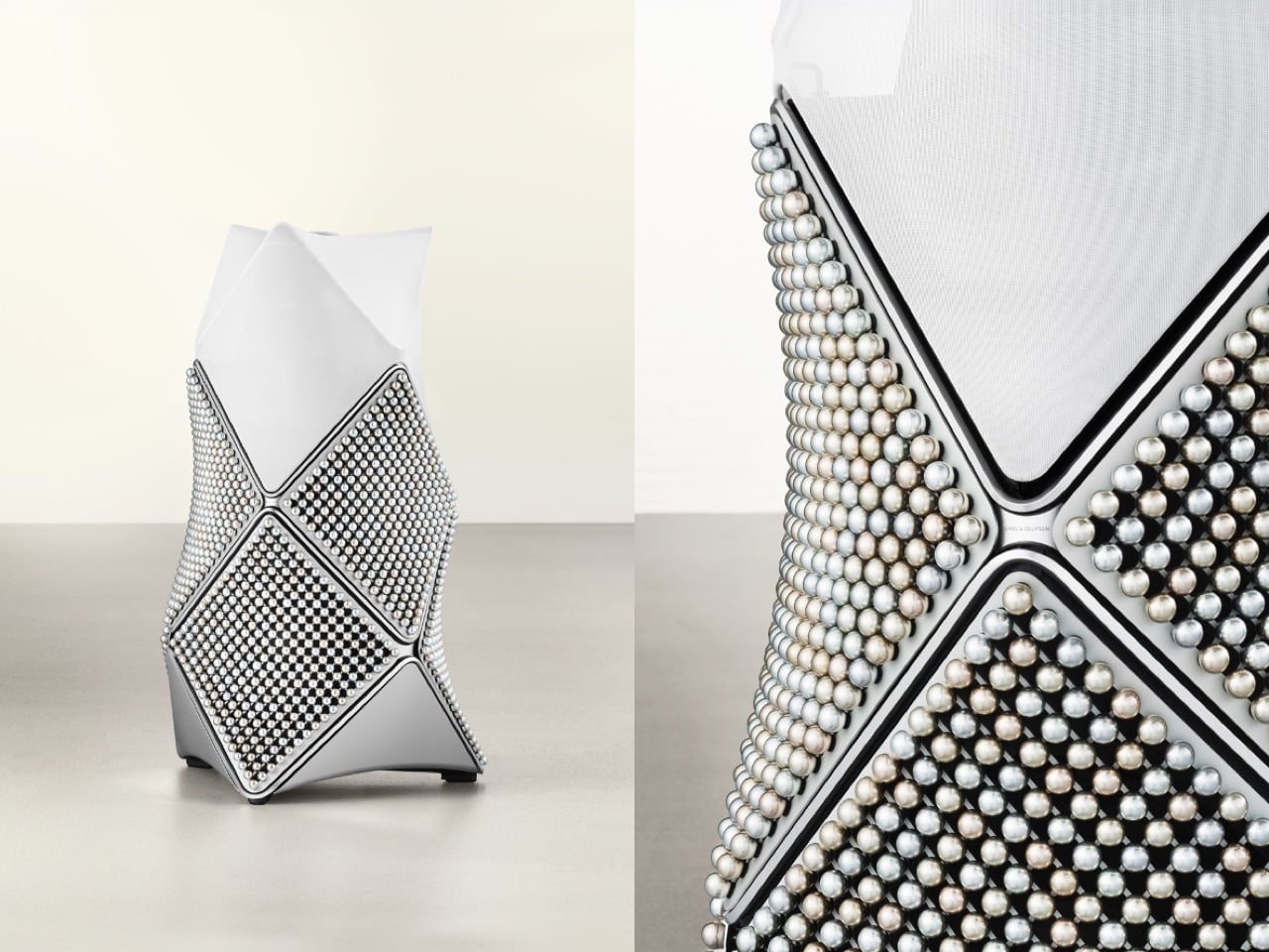
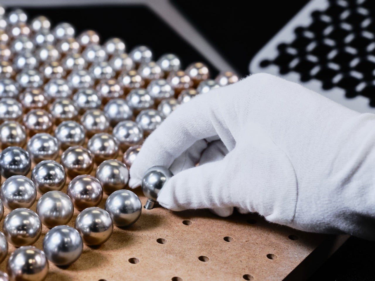
The Zenith Edition abandons wood entirely and commits to a single absurd idea: what if we covered this thing in pearls? Not actual pearls, obviously, but 1,734 anodized aluminum spheres arranged across six panels in seven bespoke pearl-inspired colors. Each panel holds 289 spheres, and the whole assembly is curved to follow the cabinet’s architectural form. The machined aluminum facemask gets pearl-blasted and anodized in dark grey to resemble an oyster shell, because apparently we’re taking the pearl metaphor all the way. A circular mother-of-pearl inlay sits on top, matching the diameter of the aluminum spheres and serving as a luminous focal point that ties the composition together. The effect is weirdly organic for something made entirely from metal, with the layered surfaces and interplay of polished and matte finishes catching light differently throughout the day. I keep thinking about the Mirage Edition we covered in December, the one with hand-applied gradient anodization that shifted from blue to magenta depending on viewing angle. The Zenith pulls a similar trick but through physical texture rather than color gradients.

Both editions preserve the Beolab 90’s core acoustic performance, which remains borderline ridiculous even by 2026 standards. Eighteen bespoke drivers, advanced beam-forming technology that can steer sound to specific parts of a room, enough digital signal processing to make most studio monitors jealous. The original Beolab 90 launched at $185,000 for a pair, and these limited editions will almost certainly exceed that figure, though B&O hasn’t published pricing yet. When you order a set, you get a miniature aluminum Beolab 90 sculpture in the corresponding edition finish, presented in a custom aluminum delivery box, which feels like the kind of detail that matters when you’re spending what a luxury sedan costs on speakers.

The five-edition Atelier series, Shadow and Mirage and Titan and now Monarch and Zenith, reads as Bang & Olufsen methodically working through its material catalog. Each variant explores a different manufacturing technique pushed to its technical limit, whether that’s volcanic sandblasting or gradient anodization or curved wood lamination or hand-assembled metal spheres. The speakers debut at B&O’s San Francisco Culture Store, the brand’s largest showroom globally, before touring to other locations. Limited to ten pairs per edition means most people will never see these in person, let alone own them, but that seems to be the point. A century of operation earns you the right to build things simply because you can.

The post Bang & Olufsen Clads Its Flagship Speaker in 1,800 Aluminum Pearls and Rosewood Slats For 100th Anniversary first appeared on Yanko Design.
Forget the Steam Deck, This Custom-Built Handheld Runs a Full Linux Desktop in Your Palms

Before the iPhone arrived in 2007 and quietly buried the category, handheld PCs were shaping up to be something genuinely exciting. Devices like the Sony Vaio UX and OQO Model 2 promised a full desktop OS in your jacket pocket, and for a brief window, that felt like the obvious future of personal computing. Smartphones won that argument decisively, and the handheld PC faded into a footnote. A YouTuber who goes by Wisce decided that footnote deserved a second chapter, and built one himself from scratch.

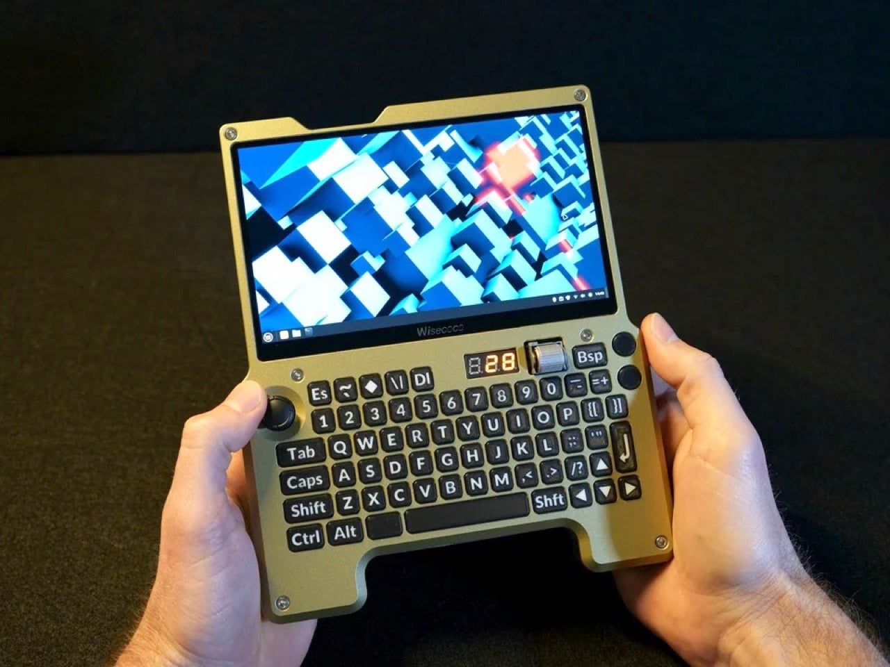
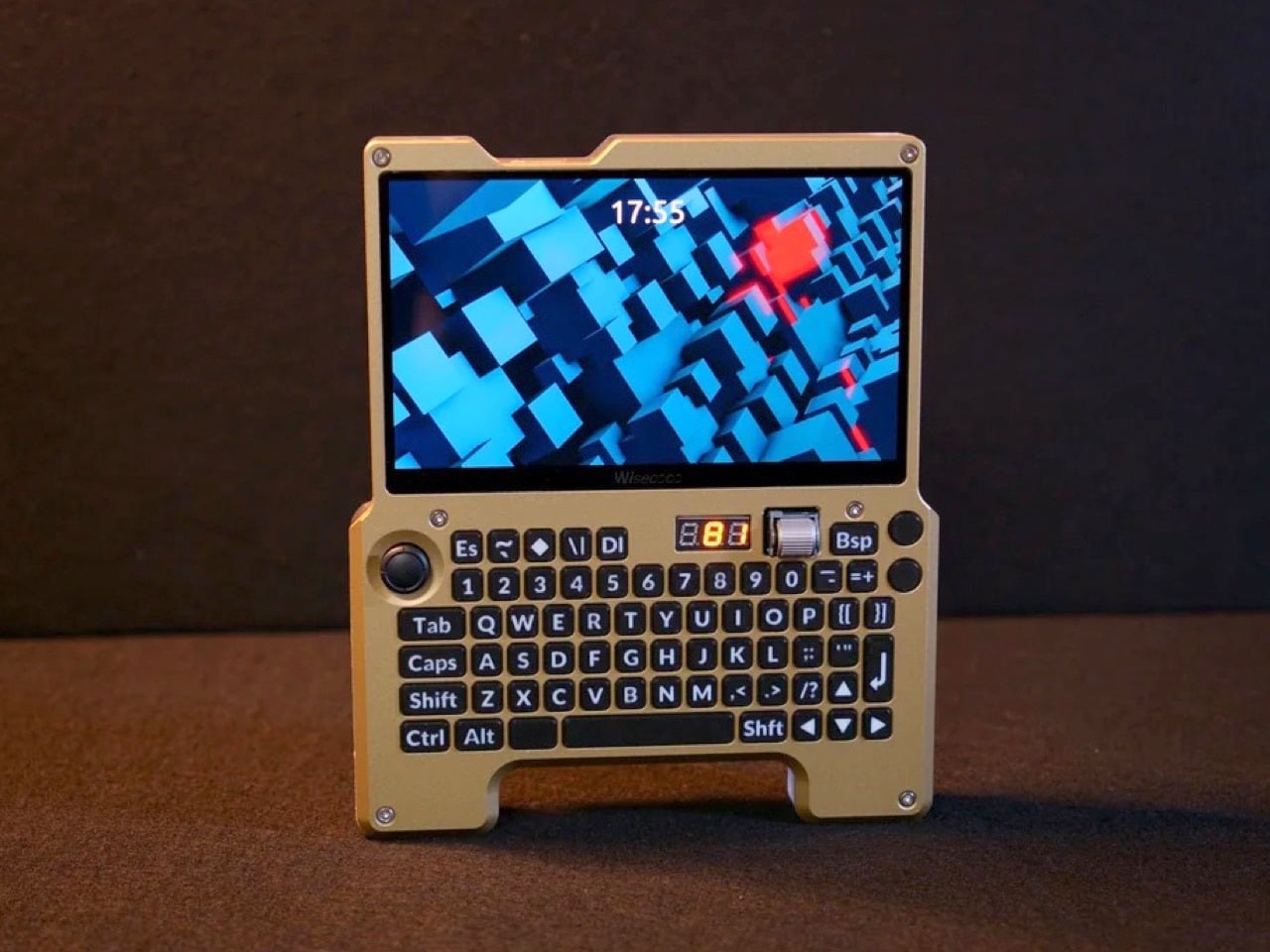
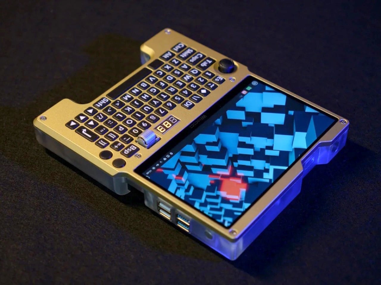
The result is a fully custom x86 handheld computer built around the LattePanda Mu single-board computer, running Linux Mint on a 7-inch 1920×1080 120Hz display. It has a full QWERTY ortholinear thumb keyboard with custom-printed keycaps, a Joy-Con thumbstick repurposed as a mouse, a horizontal scroll wheel, four USB ports, a full-size HDMI output, USB-C charging, and a 4,500mAh battery pack with a three-digit readout that tells you exactly how much juice is left. Every single component was designed, sourced, or fabricated by hand.

Designer: Wisce

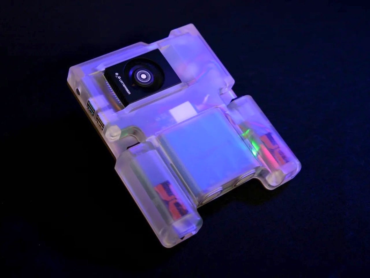
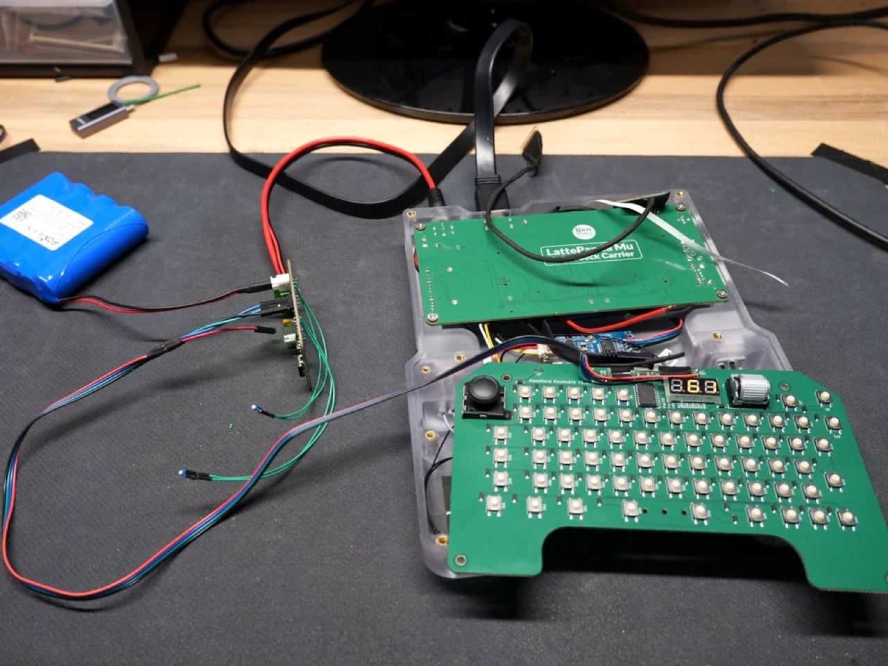
The LattePanda Mu is an x86 SBC that outperforms even the Raspberry Pi 5 by a notable margin, and Wisce built a custom carrier board for it rather than using an off-the-shelf solution. That board delivers four full-size USB ports, a full-size HDMI port, M.2 SSD and Wi-Fi slots, and internal USB connectors for the keyboard and audio subsystem. A 1TB SSD and a budget Wi-Fi card complete the internals. The operating system is Linux Mint, chosen partly on merit and partly because Wisce’s previous builds attracted considerable audience displeasure when they shipped with Windows 11. Linux also strips out the background process bloat that Windows tends to accumulate, giving the Mu’s x86 architecture more room to breathe.

The display decision alone took multiple iterations to land. Wisce initially planned to use a 1024×600 60Hz panel from DF Robot, the parent company behind the LattePanda line, but rejected it for its low resolution, large bezel, and limited refresh rate. The replacement is a 1920×1080 120Hz eDP panel with a much thinner bezel, connected directly to the Mu’s native eDP output via a custom PCB that reroutes a pin mismatch between the two connectors. That kind of problem-solving shows up everywhere in this build: when a straightforward solution didn’t exist, Wisce designed one.

The keyboard runs on a custom PCB with an RP2040 microcontroller integrated directly into the board, bypassing the need for a separate Arduino or Pi Pico. The switches are surface-mount tactile types rated for around two million presses, sized small enough to fit a full QWERTY layout without sacrificing the thumb-typing ergonomics the ortholinear arrangement was chosen to support. Keycaps were modeled in Fusion 360 and printed on an FDM machine using a 0.2mm nozzle and multi-material filament to get legible, sharp legends on each key. The Joy-Con thumbstick on the left handles cursor movement via a QMK profile that maps it as a mouse, and the horizontal rotary encoder scroll wheel on the right is, by Wisce’s own admission, one of his favorite things about the finished device.

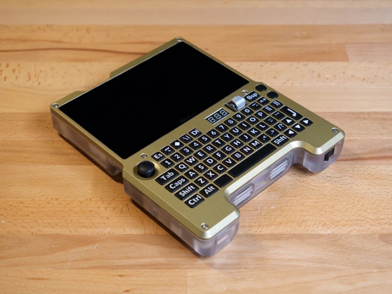
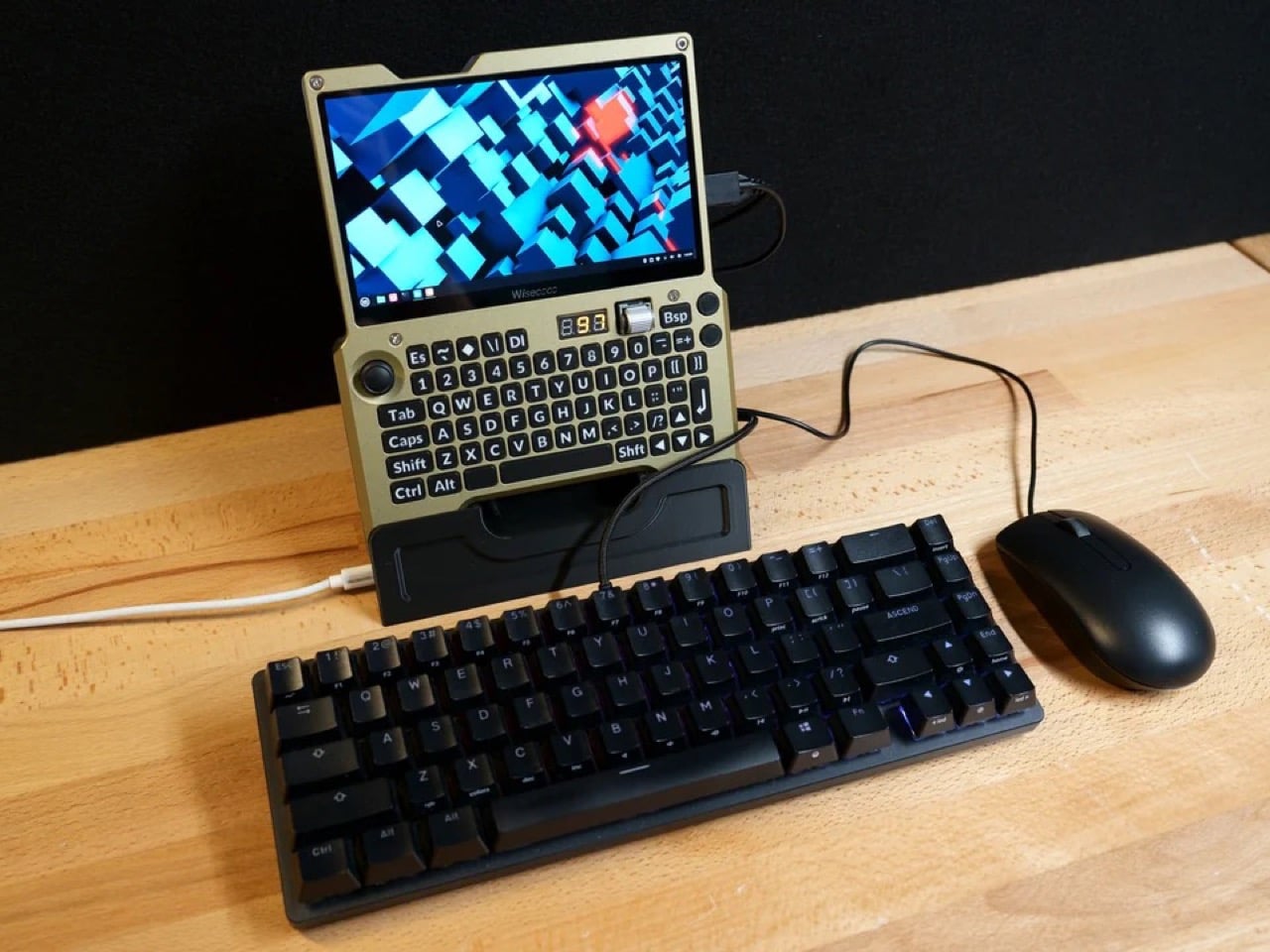
The enclosure is a two-part construction: a translucent resin rear shell that keeps the internal geometry visible, and an aluminum front plate that was CNC machined, anodized, then repainted by hand after the factory “champagne” finish came out looking closer to a flesh tone than the golden bronze Wisce had rendered. The finished device is 36mm thick at its deepest point and weighs approximately one kilogram, which puts it in a different category from a Game Boy but well within the range of something you’d actually carry. A 3D-printed dock props it upright on a desk with the HDMI port and USB-C charging accessible, turning the handheld into a functional desktop workstation when paired with an external keyboard and mouse.

What makes this build genuinely compelling, beyond the craftsmanship, is how clearly it articulates a design philosophy that commercial manufacturers keep fumbling. Devices like the GPD Win 5 chase gaming performance and end up compromising portability or pricing out most buyers. The Steam Deck nails the gaming use case and handles general computing as an afterthought. Wisce’s machine is neither of those things. It’s a full x86 desktop OS in a form factor that fits in two hands, with physical controls that were chosen specifically for the way humans hold objects, a battery system that actually communicates with its user, and a screen bright and sharp enough to make the whole proposition feel current. The handheld PC category failed twenty years ago because the hardware wasn’t ready. This build suggests the hardware has been ready for a while, and we’ve just been waiting for someone stubborn enough to put it together properly.

The post Forget the Steam Deck, This Custom-Built Handheld Runs a Full Linux Desktop in Your Palms first appeared on Yanko Design.