For most people, getting serious audio at home eventually turns into a tradeoff. Multi-speaker surround setups demand wiring, dedicated gear, and more floor space than a typical room can spare. Smart speakers simplified things, but the best-sounding options tend to carry steep price tags, and the more affordable ones rarely fill a room with the kind of sound that actually does the music justice. That gap has stayed stubbornly open.
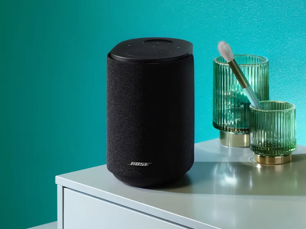
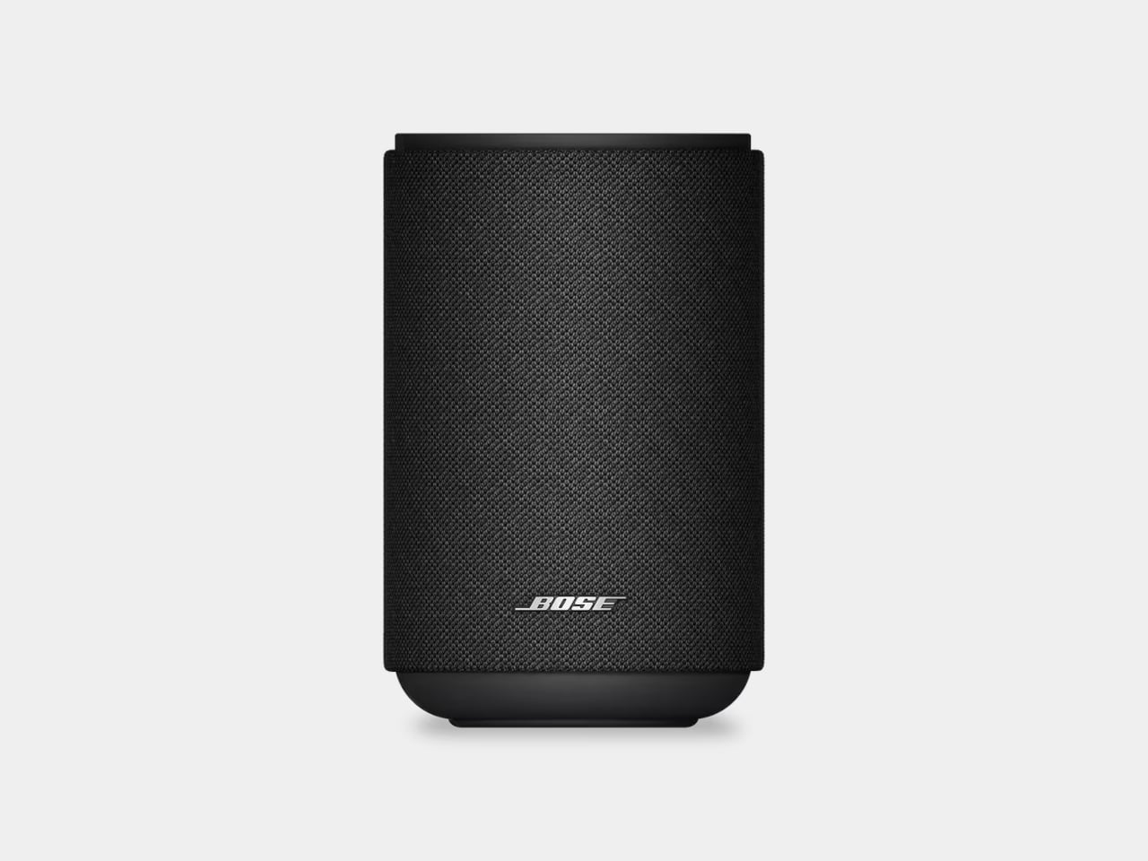
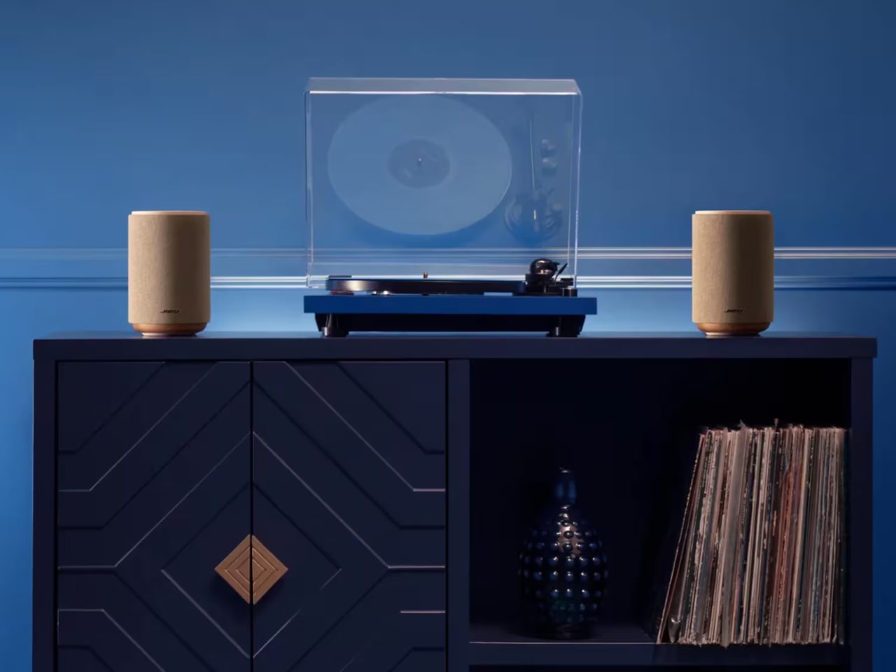
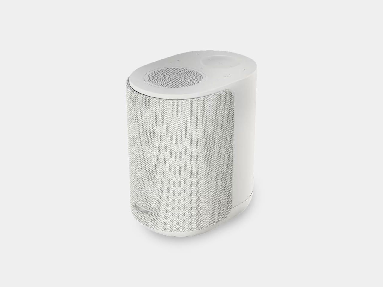
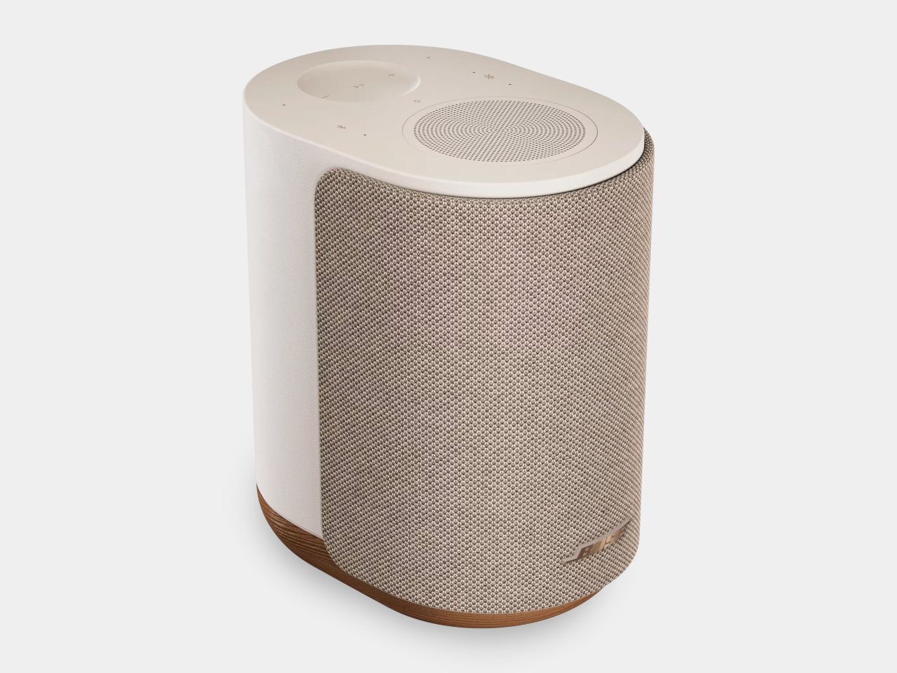
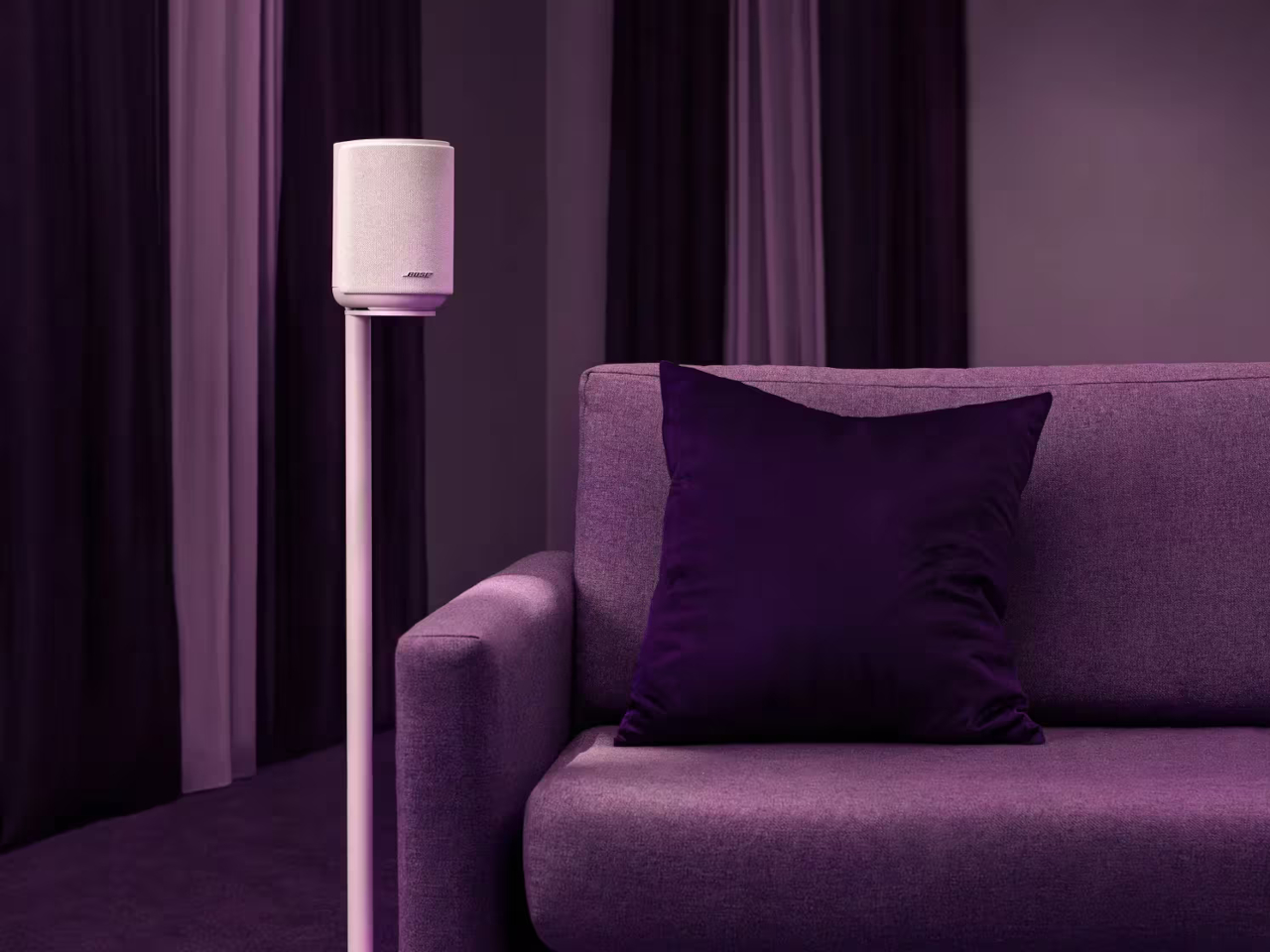
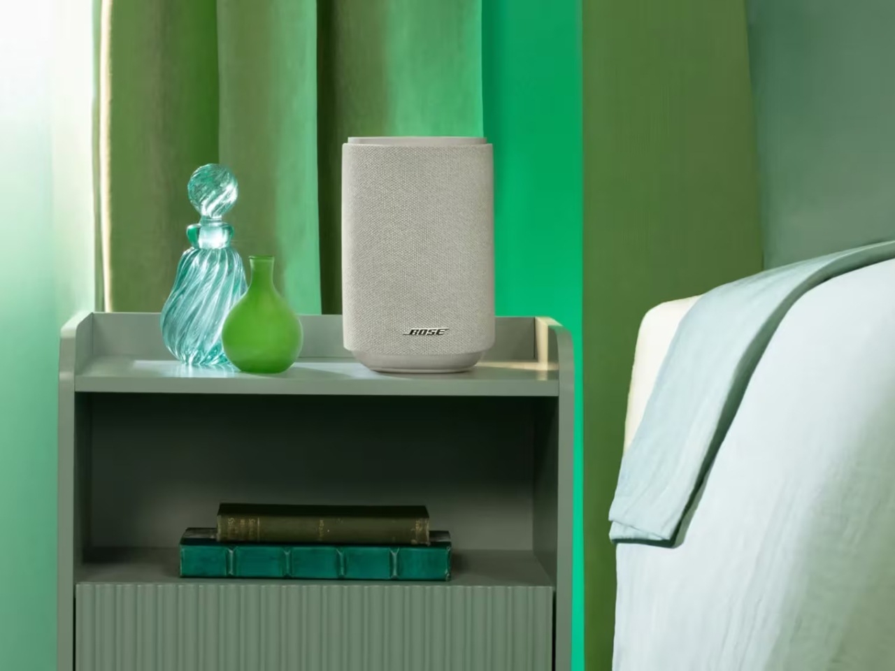
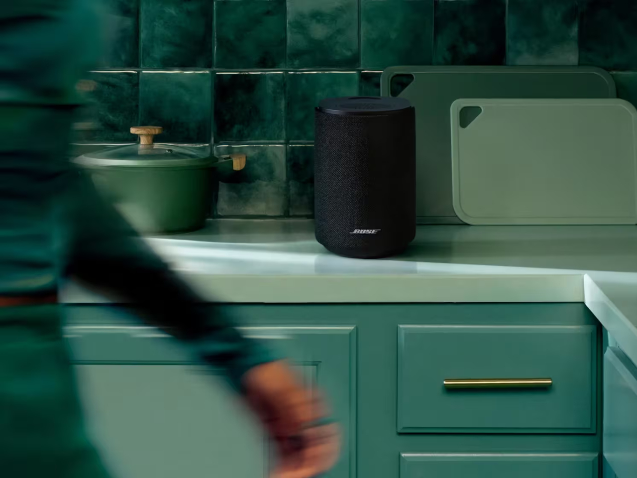
Bose thinks it has the answer, and it’s reviving a celebrated name to prove it. The Lifestyle brand, first introduced in 1990 and discontinued in 2022, is back with a collection that treats audio quality and refined design as inseparable. Leading that return is the Lifestyle Ultra Speaker, a compact wireless unit wrapped in knit fabric that sits unobtrusively on any shelf while delivering sound that’s anything but understated.
Designer: Bose
The secret to that sound lies in the speaker’s three-driver configuration. Two front-facing drivers handle the direct output, while a third fires upward, bouncing sound off the ceiling to create a sense of height and space that a single forward-pointing speaker simply can’t achieve. Bose calls this TrueSpatial Technology, and it works alongside CleanBass, which uses QuietPort acoustics to produce bass that’s deep, controlled, and free of distortion.
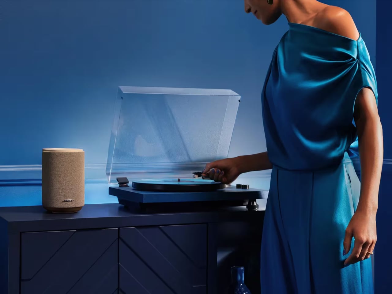
That flexibility extends to how the speaker fits into different setups. On its own, it works as a capable standalone smart speaker. Pair two of them together, and you’ve got a genuine stereo setup. Add the Lifestyle Ultra Soundbar and Lifestyle Ultra Subwoofer, also part of the new collection, and it takes on rear-channel duties in what becomes a full 7.1.4 surround system, no wires snaking across the floor required.
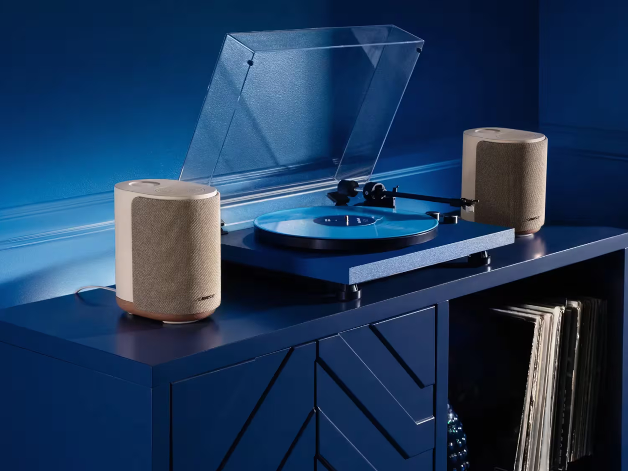
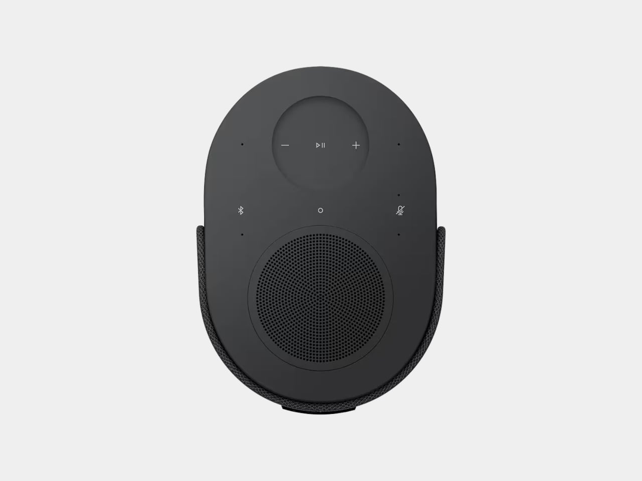
Getting music onto it isn’t complicated. The speaker supports Apple AirPlay 2, Google Cast, and Spotify Connect, so you can stick with whatever app you already use without adapting to a proprietary system. Bluetooth 5.3 is also on board, and a 3.5mm aux input handles wired sources like a turntable. Alexa+ serves as the built-in voice assistant, with on-device touch controls and a radial volume slider for quick adjustments.
One of the more practical touches is CustomTune, a calibration feature that uses your phone’s microphone to listen to the acoustics of whichever room the speaker is in. It accounts for furniture placement and room size, automatically adjusting the output without requiring any manual tweaking on your end. For even more placement options, an optional wall bracket priced at $69 and a floor stand at $149 are both available separately.
The Lifestyle Ultra Speaker starts at $299 in Black or White Smoke, with the limited-edition Driftwood Sand colorway priced at $349. The full Lifestyle Collection, including the Ultra Soundbar at $1,099 and Ultra Subwoofer at $899, is available to preorder now and ships on May 15. It can start small on a single shelf and gradually take over your entire home audio setup without ever looking like it doesn’t belong.
The post Bose Just Revived Its Lifestyle Speaker for $299, Minus the Wires first appeared on Yanko Design.