AeroPress Made a Coffee Grinder That Fits Inside the Plunger

Manual grinders designed for travel usually give up something important to stay portable. Compact versions use cheaper burrs that grind unevenly, producing bitter coffee no matter how carefully you brew it. Premium grinders with Italian burrs deliver consistent results but end up too bulky for backpacks, forcing you to choose between bringing mediocre equipment or leaving the grinder at home and buying pre-ground beans that taste stale before the bag even opens.

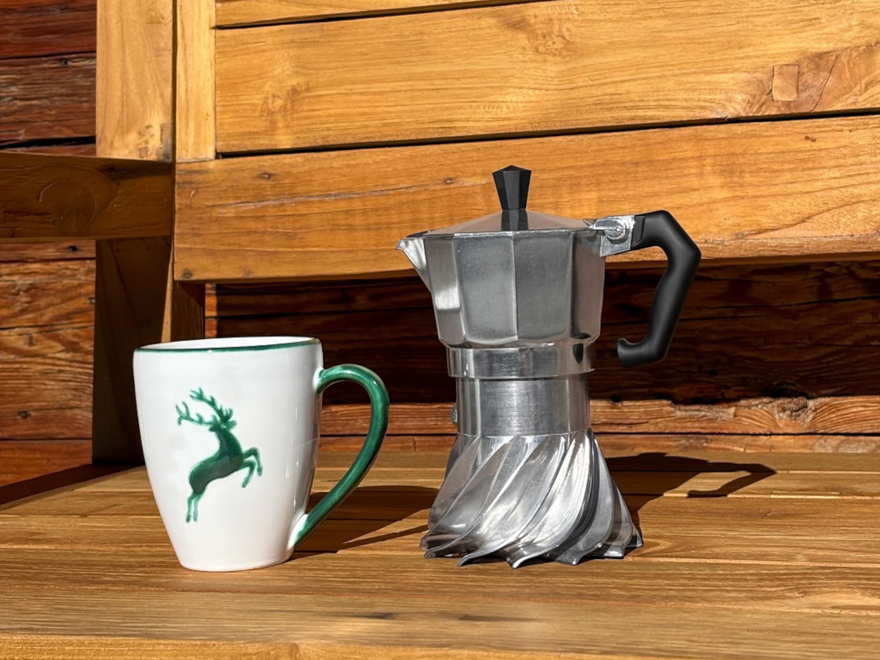
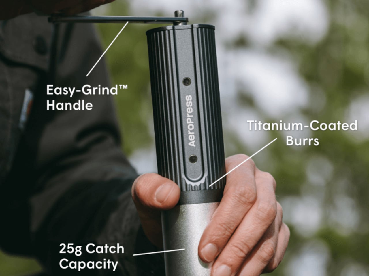
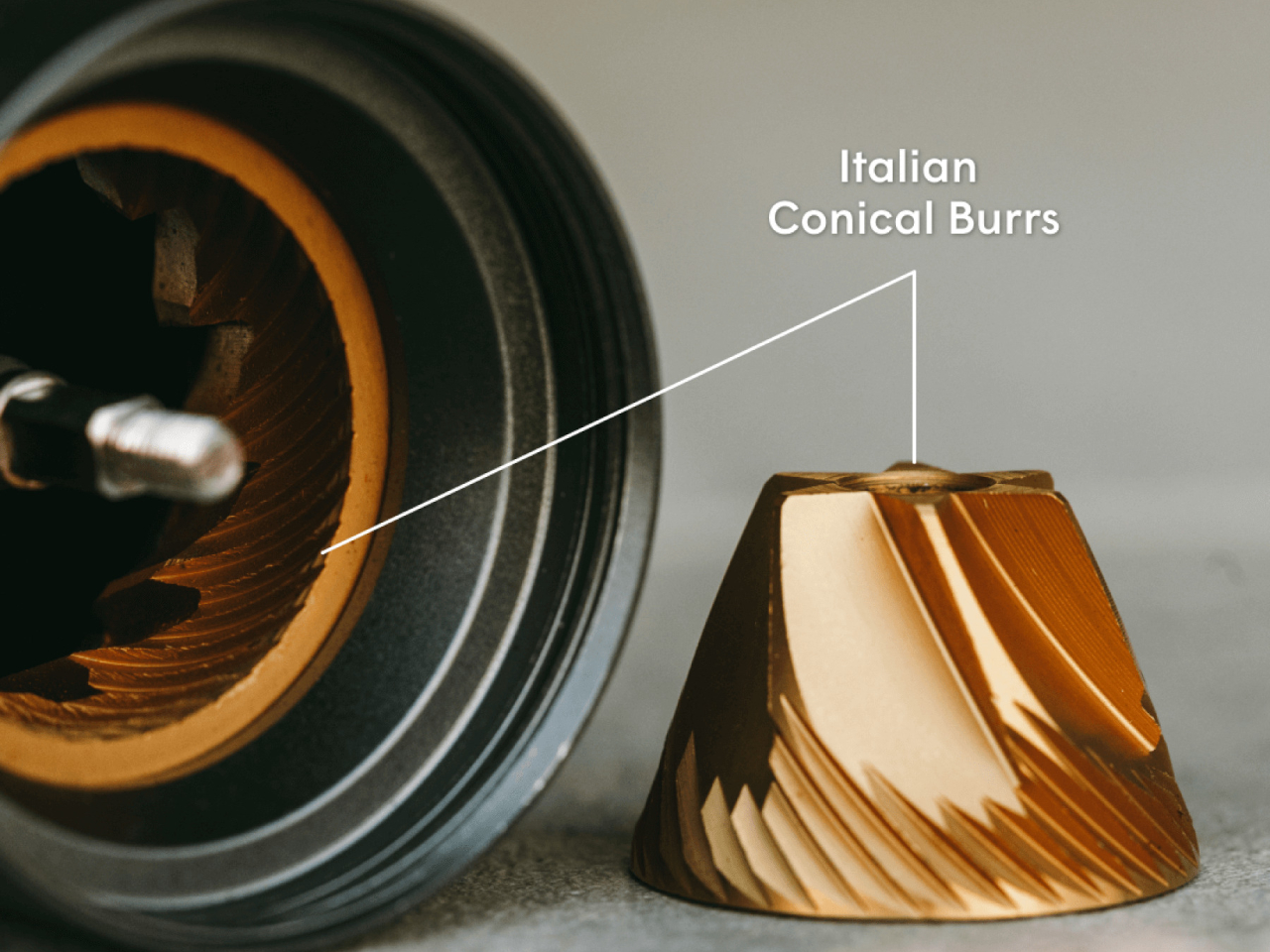
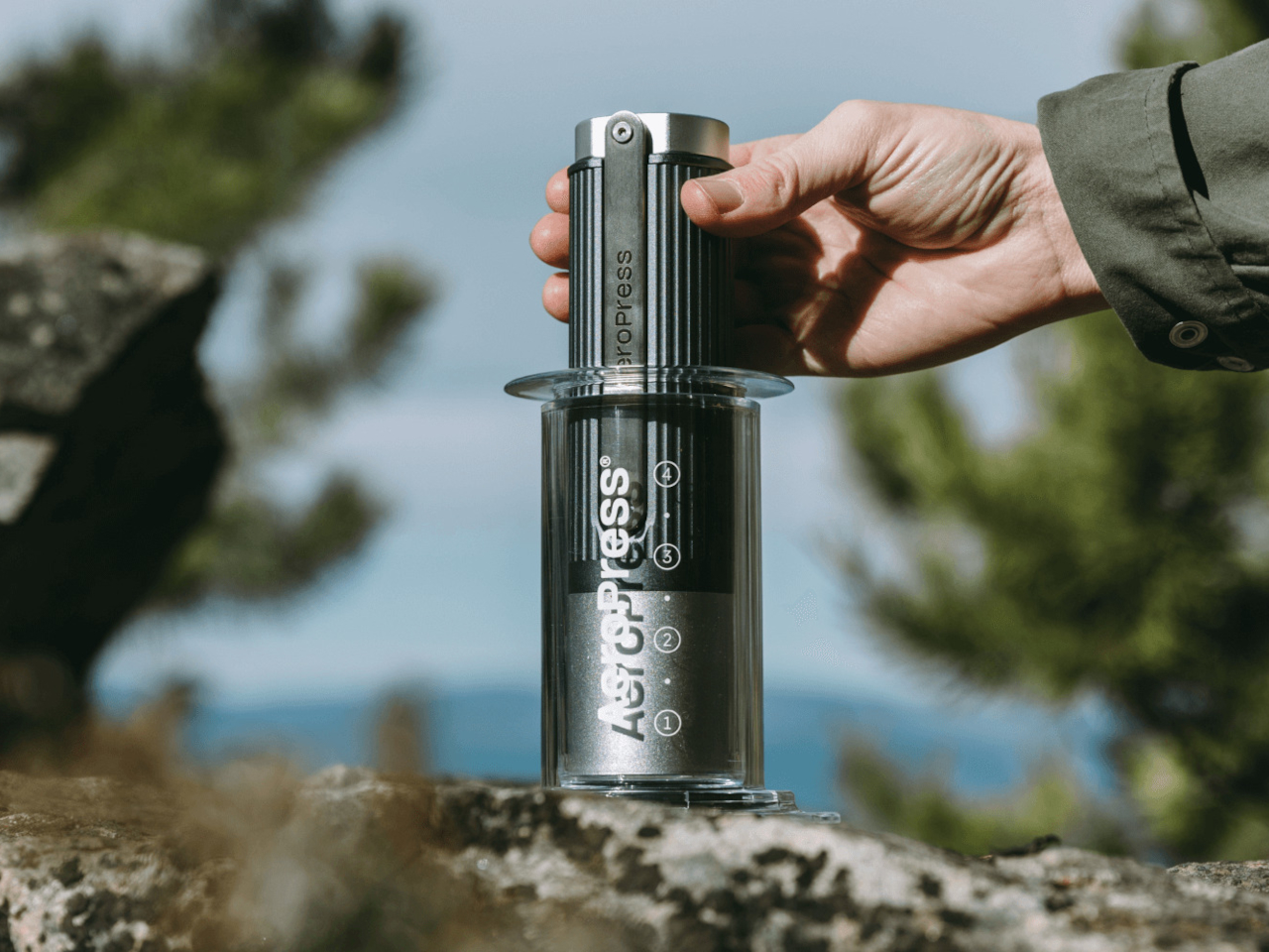
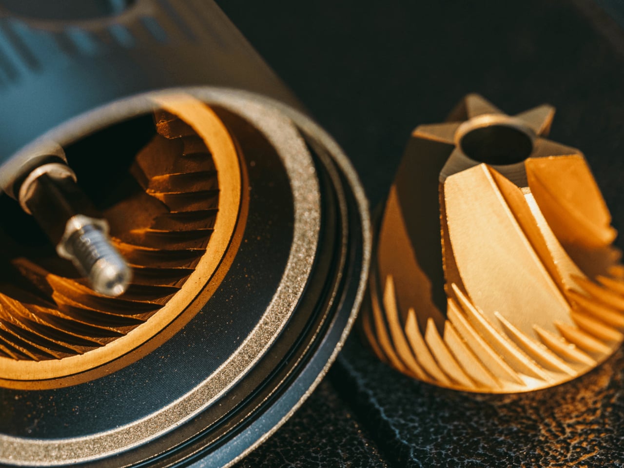
AeroPress’s new manual grinder fits completely inside the AeroPress plunger without any parts sticking out or requiring disassembly beyond detaching the magnetic handle. Italian titanium-coated burrs handle everything from espresso-fine to French press coarse across sixty distinct settings. The all-metal construction weighs enough to feel serious without becoming awkward to pack alongside other camping gear or travel essentials that compete for limited bag space.
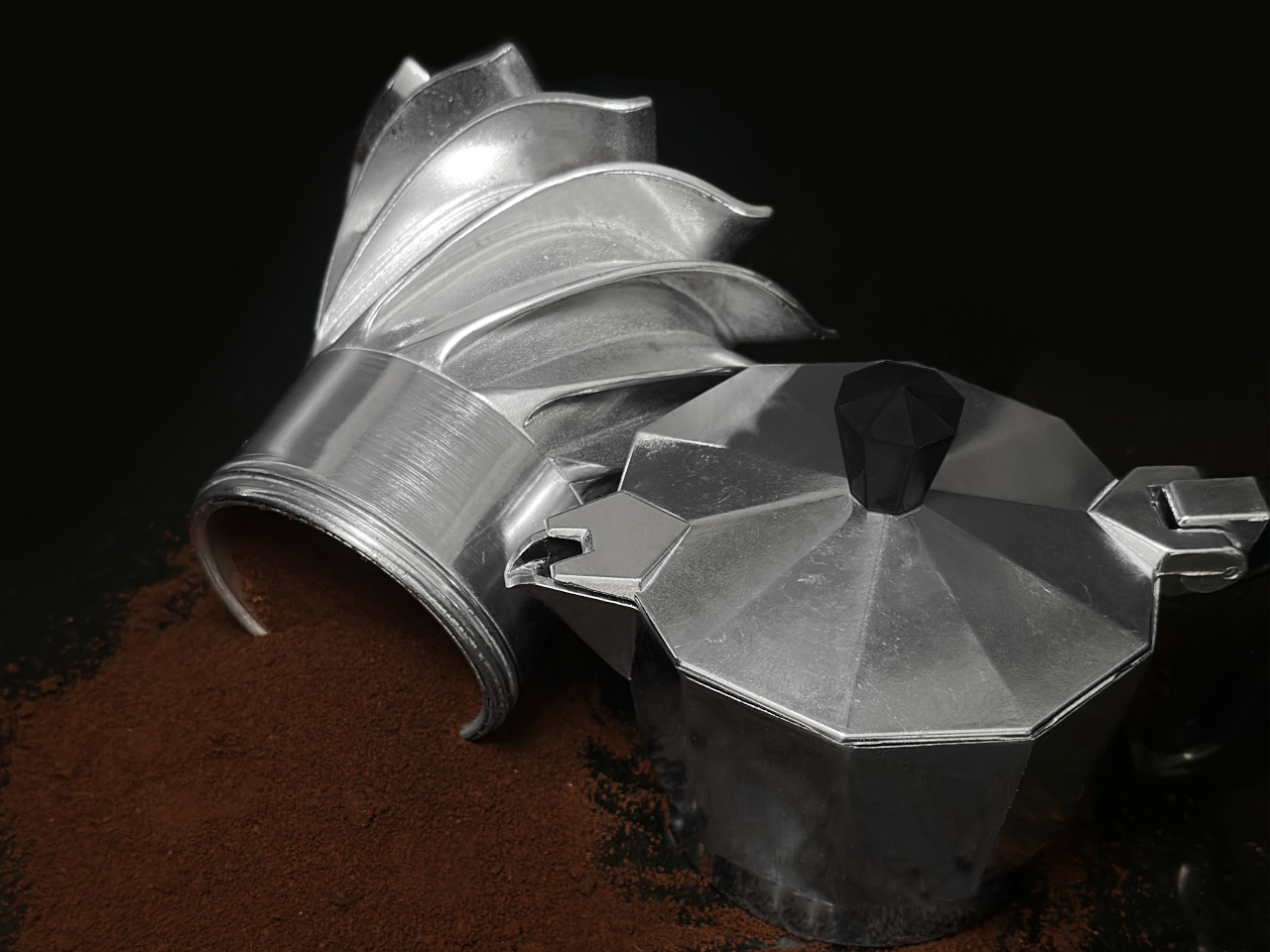
Designer: AeroPress

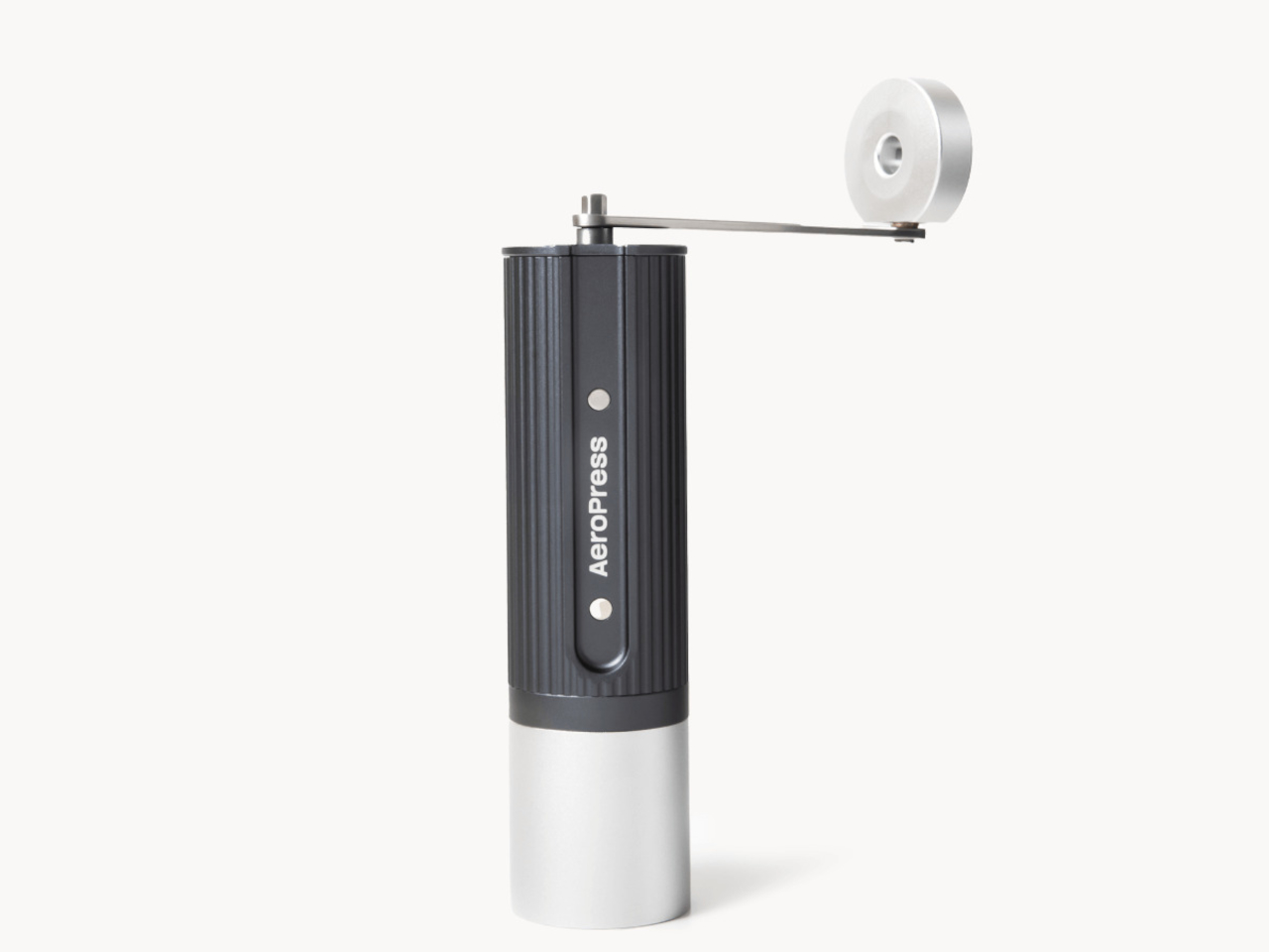
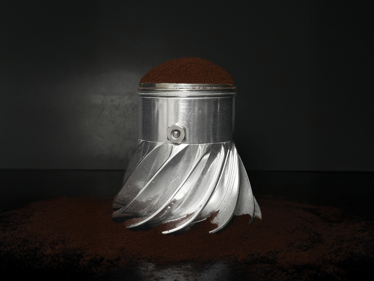
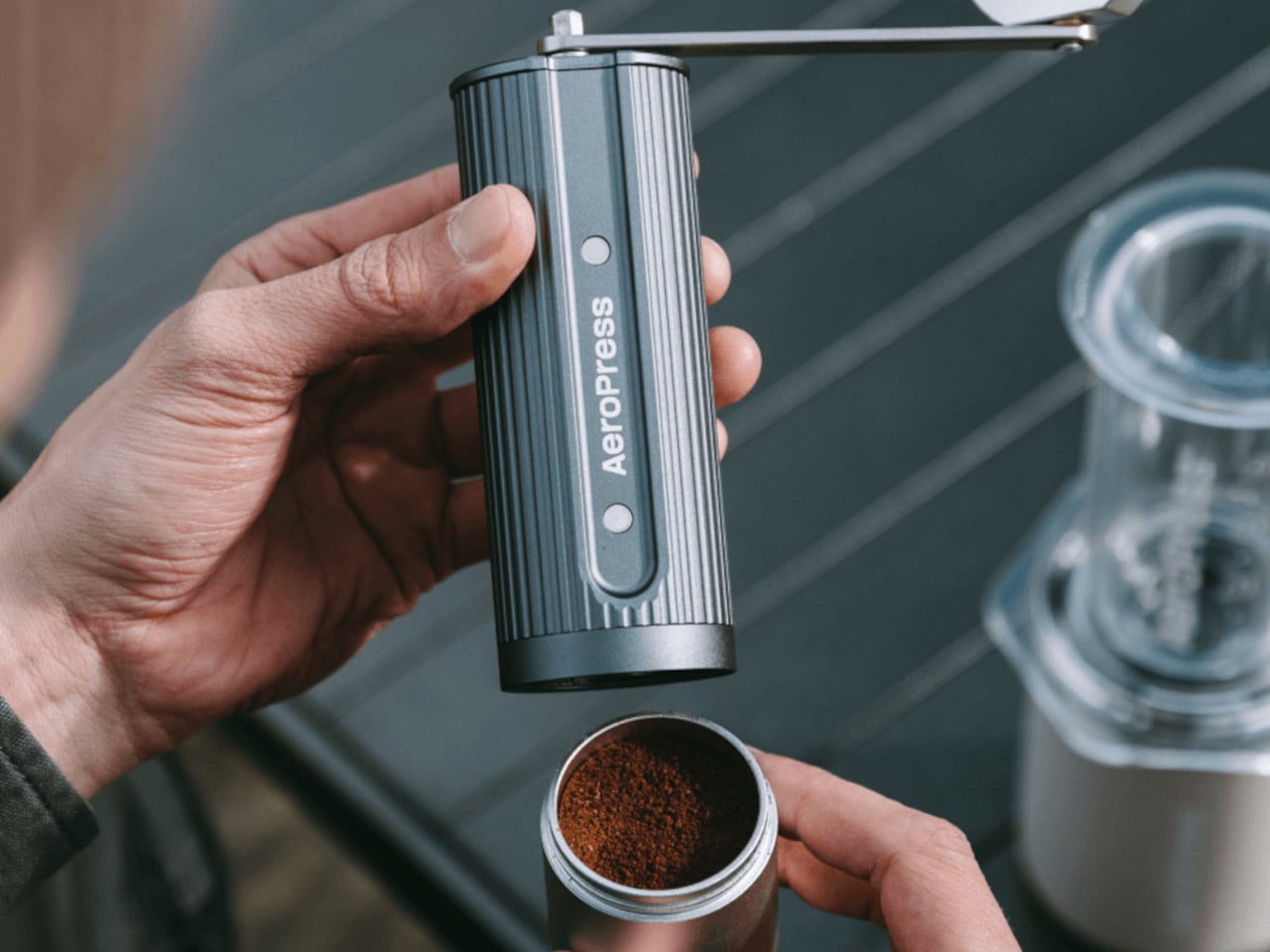
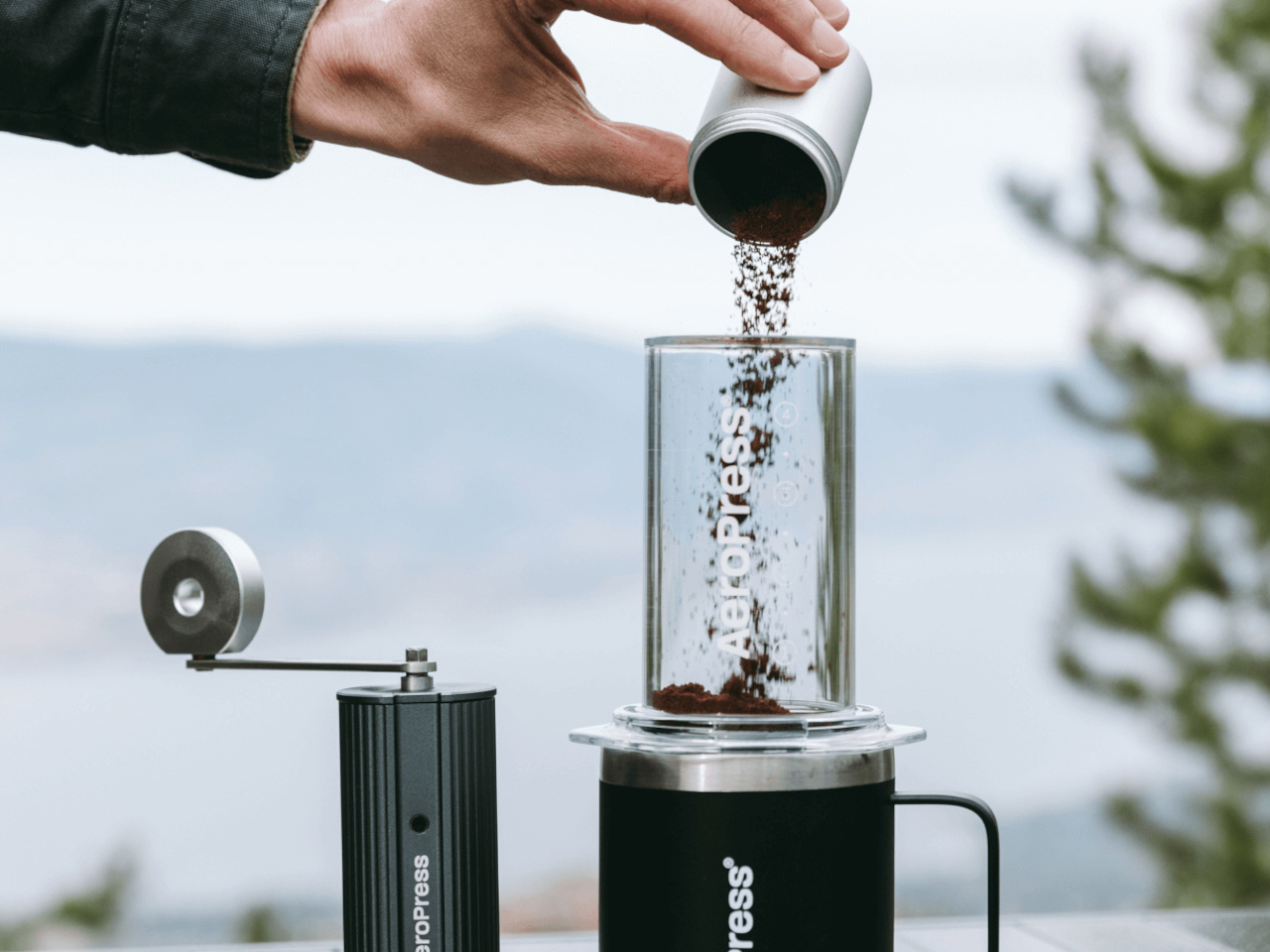
The body uses knurled aluminum with vertical ridges that provide grip when your hands are cold or slightly damp from washing beans. Dark gray metal keeps it looking professional instead of cheap. The catch holds twenty-five grams, which matches single-dose brewing perfectly and eliminates the waste that comes from grinding more coffee than you actually need for one cup or pot.

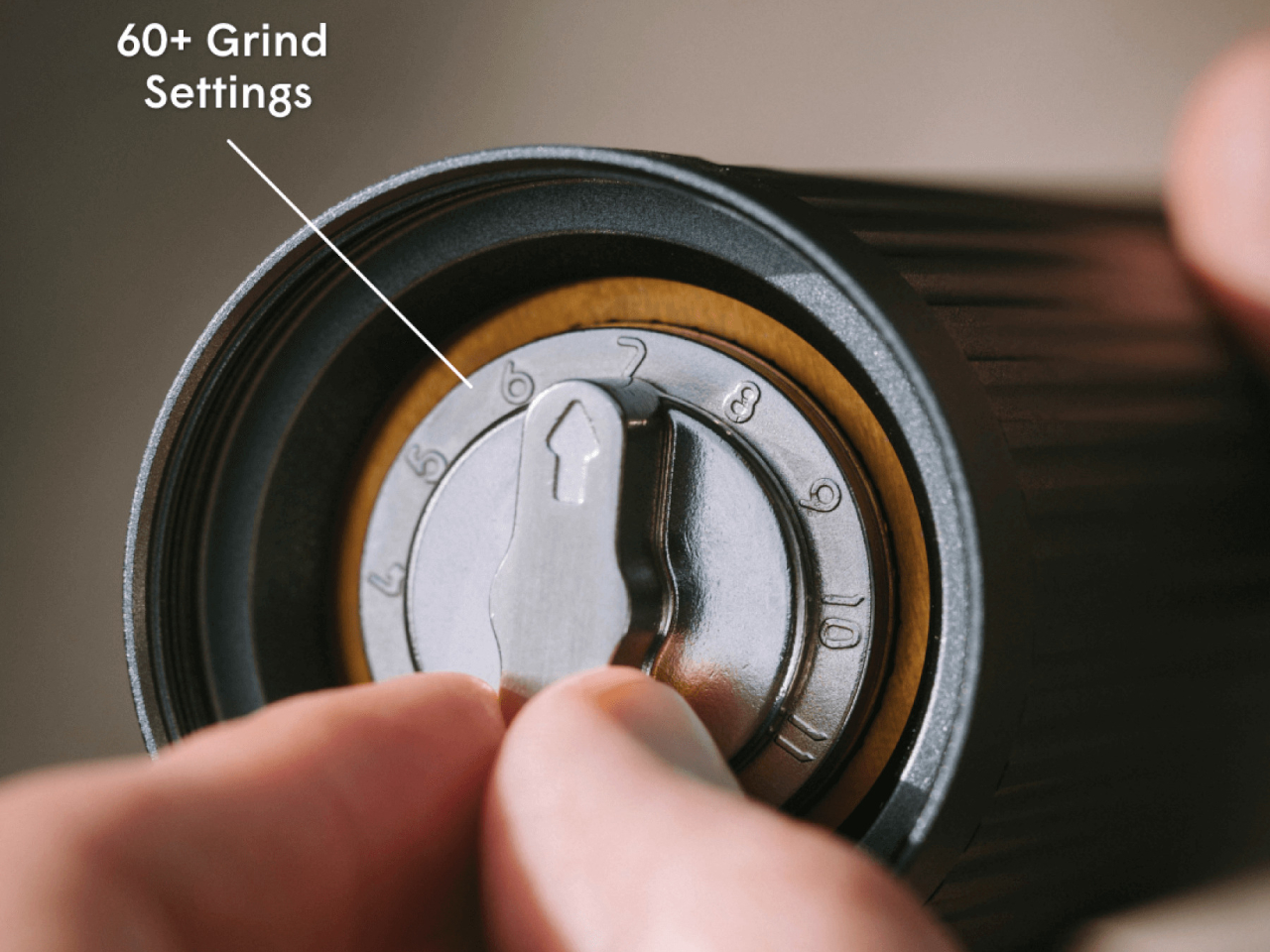
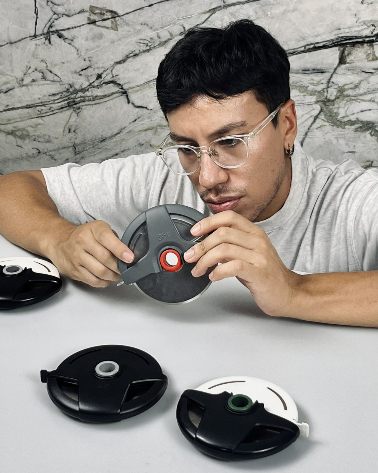
Grind adjustment happens through a numbered dial that clicks between sixty settings spanning the full range from powder-fine espresso to chunky cold brew. The grinder ships preset to medium-fine, which works immediately for AeroPress without fiddling with settings first. Twist coarser for French press. Dial finer for moka pot or espresso. The changes happen quickly without tools or confusing calibration steps that make adjusting grind size feel like solving a puzzle.

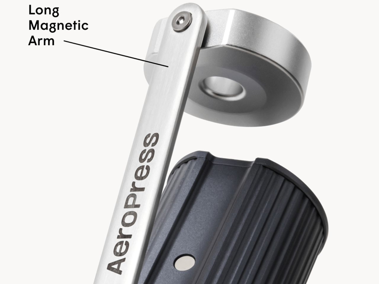
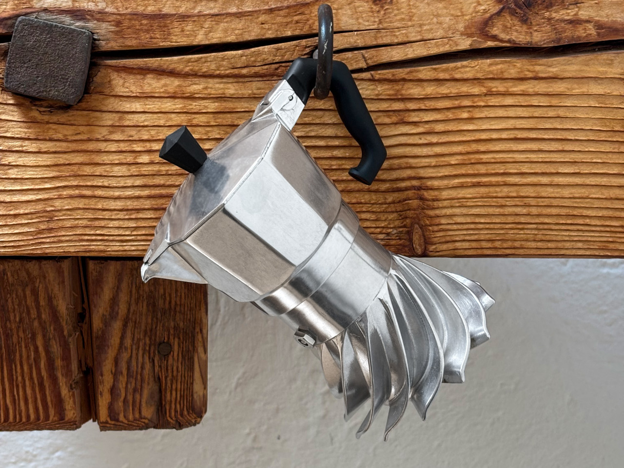
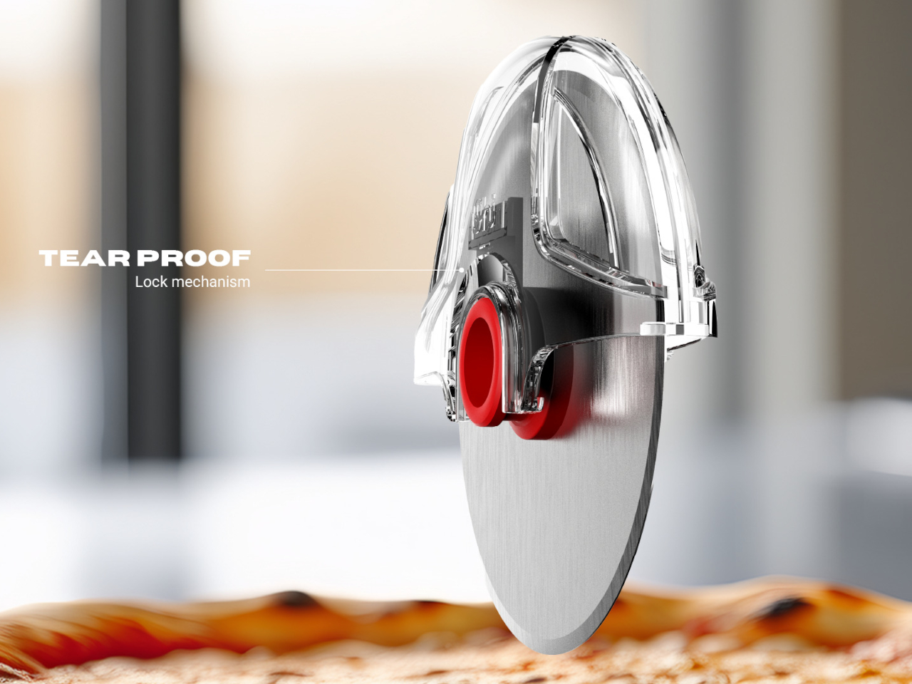
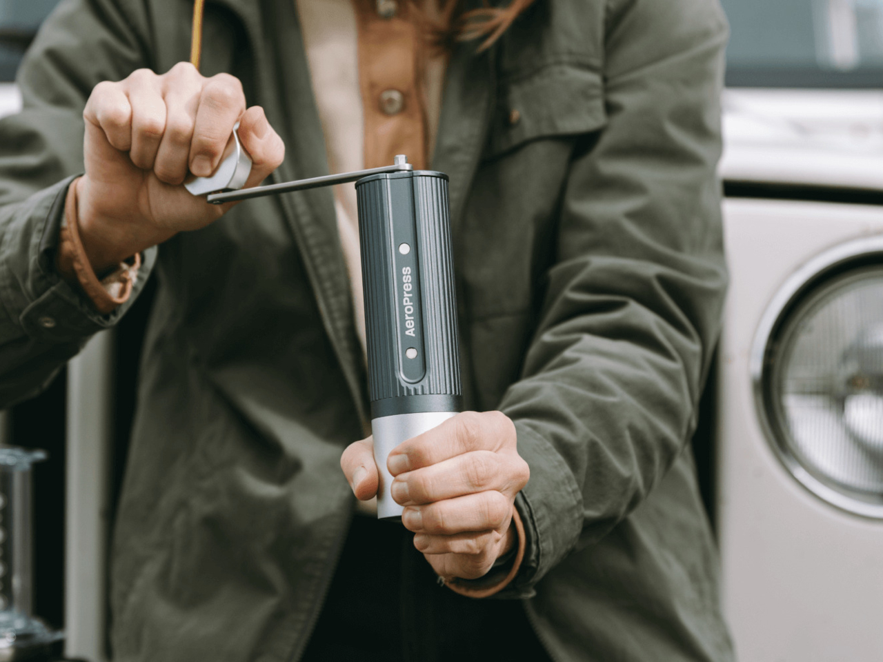
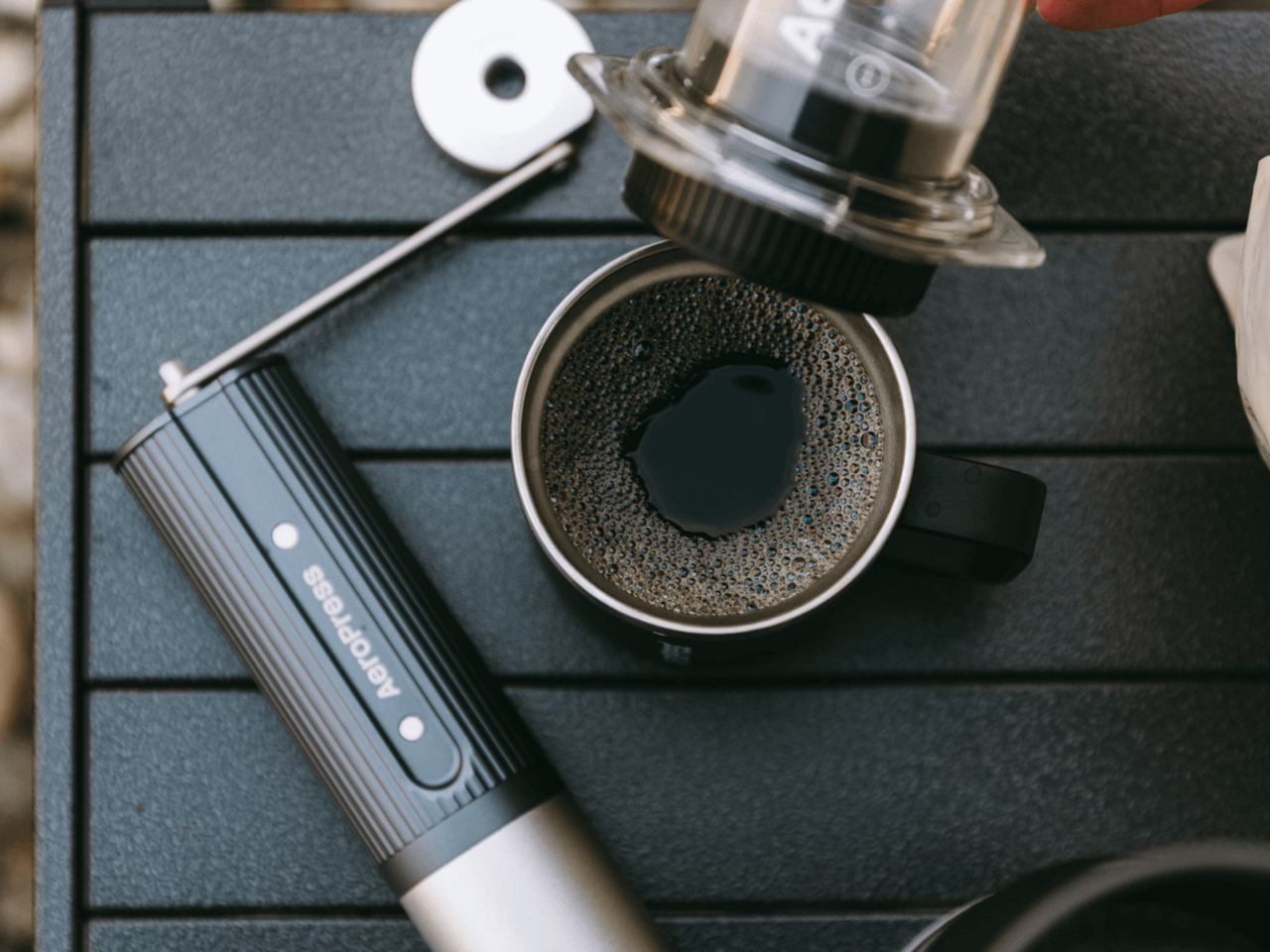
The handle attaches magnetically when you’re grinding and slides into a groove along the body when you’re done, where magnets hold it flat against the metal surface. This lets the entire grinder collapse into a cylinder that fits inside the AeroPress plunger without anything jutting out awkwardly. Pull it out, snap the handle on, grind your beans, and brew using two pieces of gear that nest together the whole trip.

Dual bearings inside the crank mechanism keep grinding smoothly enough that your arm doesn’t tire halfway through processing a full dose. The long handle provides leverage that makes each rotation easier compared to compact grinders with short cranks that require more effort and more turns to process the same amount of beans. This matters early mornings when you’re not fully awake yet or outdoors when cold air makes everything feel harder.

Cleaning requires no tools beyond the included brushes that sweep out residual grounds from the burr chamber and catch. The all-metal construction handles temperature swings and outdoor conditions better than grinders with plastic parts that crack when cold or warp inside hot cars. The lifetime warranty on the burr set suggests AeroPress expects this grinder to last years of regular use without degrading performance.

The grinder extends what AeroPress does well into the grinding stage, giving users who already trust the company’s brewers a matching tool that shares the same design priorities around portability, build quality, and making excellent coffee. The combination of premium burrs, thoughtful engineering, and genuine compactness makes it one of the few manual grinders that actually delivers on portability claims without compromising the grind consistency serious coffee brewing demands daily.

The post AeroPress Made a Coffee Grinder That Fits Inside the Plunger first appeared on Yanko Design.

Samsung Movingstyle Screens Roll From Room to Room on Wheels

TVs stay bolted to walls where they were installed years ago. Monitors sit on desks connected to power outlets and computers through cables that limit how far they can go. Tablets work anywhere, but shrink everything down to sizes that feel cramped during longer sessions. Most screens plant themselves in one spot and expect you to come to them instead of moving to where you actually need them.

Samsung’s Movingstyle lineup builds screens meant to follow you around instead of staying put. The twenty-seven-inch touchscreen and thirty-two-inch M7 monitor both roll on stands with wheels hidden underneath, so moving them between rooms takes minimal effort. The smaller version also detaches from its stand completely and runs on battery for three hours when you carry it by the handle built into the kickstand.

Designer: Samsung

The touchscreen model weighs enough to feel substantial but not so much that carrying it around feels like a workout. The white finish and slim bezels keep it looking clean rather than gadget-heavy. The kickstand holds the battery and all the internal components in one integrated module, which means fewer parts that could fail over time compared to designs that scatter everything separately.

Touch response works smoothly for tapping through menus, swiping between apps, or sketching directly on screen when ideas need capturing quickly. The same screen works just as well from across the room when you’re using the remote to browse shows. This dual approach handles both close-up work and relaxed viewing without requiring different devices for different situations.

The M7 grows to thirty-two inches with 4K resolution, positioning itself more as a rolling workstation. The stand adjusts height and tilts the screen to whatever angle works best. Wheels roll quietly across floors, whether you’re moving over hardwood or carpet. The power cable runs through the stand’s column to keep everything tidy instead of trailing along the floor waiting to get tripped over.

Both screens run Tizen OS with access to Samsung TV Plus for streaming without subscriptions, Gaming Hub for playing console games through cloud services, and the Art Store displaying museum-quality pieces when the screen sits idle. User profiles keep recommendations separated, so everyone in the house gets content matched to what they actually watch instead of a jumbled mix.

The smaller Movingstyle might start in the kitchen, showing recipes during breakfast prep, roll to the living room for afternoon video calls, then end up in the bedroom for late-night shows. The M7 could sit in the home office all week for work, then roll out to the patio for weekend movie nights or into the workout space for following along with fitness videos.

Ports sit centered on the back panel instead of scattered along edges, which keeps cables organized and the rear view clean when the screen sits visible from multiple angles. Both models switch between landscape and portrait orientation smoothly, useful for vertical content or using the Movingstyle as a presentation tool during meetings.

The Movingstyle lineup treats screens as objects that should follow your routines instead of forcing you to build schedules around where they happen to be installed permanently. The combination of touchscreen interaction, battery-powered portability, and rolling mobility brings genuine flexibility to spaces where fixed installations would limit how and when you actually use them. Samsung’s approach feels overdue for technology meant to serve daily life.

The post Samsung Movingstyle Screens Roll From Room to Room on Wheels first appeared on Yanko Design.

Water Bottle Inspired by Japanese Kintsugi Celebrates Cracks

Water bottles rarely carry meaning beyond their function. Most exist purely to hold liquid, stay cold, and survive daily wear without much thought given to what they represent or how they make you feel. They’re tools that disappear into routines, useful but forgettable, designed for efficiency rather than connection. Few products in this category attempt to add narrative or emotional weight to something as ordinary as staying hydrated throughout the day.

The Takeya Kintsugi Collection draws from the Japanese art of repairing broken ceramics with gold, a practice that treats fractures as features worth highlighting rather than flaws to hide. Instead of concealing damage, Kintsugi transforms cracks into golden seams that tell stories of resilience and renewal. The collection applies this philosophy to water bottles through gold-accented crackle patterns that wrap around the surface, turning each one into a small meditation on strength found through imperfection.

Designer: Takeya

Gold lines branch across the matte finish in patterns that catch light differently depending on angle and movement. The effect feels deliberate rather than decorative, like each bottle carries its own history of breaks and repairs even though they arrive new. The visual reference works because it doesn’t just borrow aesthetics but commits to the underlying philosophy.

Four colorways offer different personalities while maintaining the same gold crackle treatment. Blanc presents soft and minimal. Rose adds warmth through its blush tones. Bleu Marine brings depth and boldness. Noire creates dramatic contrast where gold lines feel most pronounced against the matte black surface. Each color changes how the Kintsugi pattern reads visually, giving the same design language multiple emotional registers depending on what resonates personally.

The bottles hold meaning beyond their appearance through how they’re built to withstand actual use. Triple-wall insulation keeps water cold for thirty-six hours, which matters during long days when refilling isn’t convenient. The silicone bumper protects against drops and impacts that inevitably happen when objects get carried everywhere. These protective features align with the Kintsugi metaphor perfectly, the bottle is designed to endure damage gracefully rather than pretend damage won’t occur.

Using the bottle becomes a small daily ritual that carries more weight than typical hydration. The gold lines serve as visual reminders that imperfection doesn’t diminish value but can enhance it when embraced intentionally. Every scratch or ding the bottle accumulates over time adds to its story rather than detracting from its appearance, which inverts how we typically think about wear and aging in consumer products.

The Kintsugi Collection makes hydration feel less mechanical and more mindful by connecting a simple daily act to a philosophy that’s survived centuries. The bottles function as practical tools while serving as small, portable reminders that strength often comes from what we repair and carry forward rather than what remains pristine and untouched.

The post Water Bottle Inspired by Japanese Kintsugi Celebrates Cracks first appeared on Yanko Design.

Phone-sized 138g E-Reader Answers Questions About What You’re Reading

E-readers typically force a trade-off between portability and capability. Compact models fit easily in bags but often lack processing power or features beyond basic reading. Larger tablets offer more functionality but become awkward to carry daily. Most devices focus on storage capacity and screen size while ignoring the need for smarter tools that support active reading and deeper engagement with content rather than just passive consumption.

The Viwoods AIPaper Reader measures roughly six inches diagonally and weighs just one hundred thirty-eight grams, making it slim enough to slip into coat pockets or small bags without adding noticeable bulk. Running Android 16 with 4G cellular support, the device combines traditional E Ink reading comfort with AI-powered features that answer questions, highlight key passages, and help build personal knowledge bases directly from whatever you’re reading at the moment.

Designer: Viwoods

The device’s profile measures 6.7mm thin, which makes it feel more like carrying a smartphone than a dedicated reading device. The minimalist design uses slim bezels around the 6.13-inch Carta 1300 E Ink display, keeping the footprint compact while maintaining enough screen real estate for comfortable reading without constant page turns. Available in black and white or color display versions, the aesthetic stays clean and understated throughout.

The three hundred PPI resolution keeps text crisp across different font sizes and formats, while the adjustable front light means reading happens comfortably whether you’re outside in daylight or in bed at midnight. The E Ink display eliminates the eye strain that comes from staring at backlit phone or tablet screens for extended periods, which matters during long reading sessions or when your eyes already feel tired.

Integrated AI runs through ChatGPT-5, Gemini, or DeepSeek, depending on preference, offering instant answers to questions about content without leaving the page or opening separate apps. Highlight a passage and ask for clarification. The AI responds contextually based on what you’re reading. Save interesting excerpts to the knowledge basement feature, which organizes captured passages into a searchable personal library that builds over time.

The octa-core processor and 4GB of RAM keep navigation smooth despite E Ink’s inherent display refresh limitations. Multiple refresh modes adjust speed versus clarity depending on whether you’re reading static text or navigating menus. The device handles PDF, EPUB, MOBI, and other common formats without requiring conversion software or workarounds before loading files onto the reader.

4G cellular connectivity separates this from most E Ink devices, enabling cloud library access, book downloads, and AI features anywhere cell service reaches without hunting for Wi-Fi networks. The 2580mAh battery supports weeks of typical reading between charges, given E Ink’s minimal power consumption when displaying static pages. Android 16 and Google Play support mean standard reading apps install alongside specialized ones, giving users flexibility beyond proprietary ecosystems that lock you into specific bookstores or formats.

The Viwoods AIPaper Reader sits between simple e-readers that only display text and full tablets that introduce too many distractions through notifications and competing apps demanding attention. It delivers AI-assisted reading, organized knowledge capture, cellular connectivity for anywhere access, and genuine portability within a form factor slim enough to disappear into daily carry routines without demanding the pocket space or mental bandwidth that smartphones and larger tablets constantly require.

The post Phone-sized 138g E-Reader Answers Questions About What You’re Reading first appeared on Yanko Design.

1.3mm Tracker Card Charges via USB-C, Trumps AirTag and Tile Slim

Losing your wallet, passport, or bag is a universal frustration that can turn a busy day or a big trip into a scramble of retracing steps and hoping for a miracle to happen in your favor. Most tracking cards promise peace of mind, but end up bulking up your wallet like a small pebble wedged between your cards or running out of battery just when you need them most during critical moments when losing something could ruin your plans.

The Slimca HERE 2 is a rethink of what a tracker card can be for modern life and daily carry needs. At just 1.3mm thick, it’s as slim as a credit card, bends without breaking under pressure, and works with both Apple Find My and Android Find Hub seamlessly across platforms. It’s a tracker designed to disappear into your daily life completely until you need it, then spring into action when it matters most.

Designer: Jerry & Minami

Click Here to Buy Now: $29.4 $42 (30% off). Hurry, only 629/1200 left! Raised $88,000.

Imagine rushing through airport security, your mind on deadlines and gate changes, when you realize your wallet isn’t in your pocket anymore. That sinking feeling hits, but your phone buzzes with an alert from the Slimca HERE 2, telling you exactly where you left it. No panic, no frantic backtracking through three terminals—just a quick glance at your phone and a confident walk back to the checkpoint where you set it down.

Slimca HERE 2 is crafted from mirror-finish 304 stainless steel, giving it a premium look and the resilience to flex up to 15 degrees without snapping under pressure from daily use. Slip it into a wallet slot next to your debit cards, tuck it behind your passport in a travel pouch, or drop it in a bag’s hidden pocket, and it vanishes completely without a trace. No bulge, no awkward fit, just seamless integration with your essentials.

Unlike plastic trackers that crack or warp over time from repeated stress, HERE 2’s steel body shrugs off pressure from sitting on hard surfaces, bending when you squeeze into tight spaces, or getting jostled in crowded subways during rush hour. The minimalist face features a single button for playing a sound when you need to locate it, a charging light for battery status, and subtle gold or silver branding that keeps the look clean and timeless.

One of the biggest innovations of the Slimca HERE 2 is the USB-C port ingeniously integrated into its 1.3mm frame, allowing for easy, direct charging with any standard cable you already own for other devices. A single charge lasts up to five months, and the battery supports 100 cycles. The rechargeable design and stainless steel construction make Slimca HERE 2 a sustainable choice for conscious consumers who care about reducing waste while ensuring that their tracker is always ready for the next adventure.

Slimca HERE 2 is one of the only tracker cards to support both Apple Find My and Android Find Hub networks, so you’re covered no matter what phone you use or switch to in the future. Pair it with your device in seconds, and you’ll get instant notifications if you leave your wallet or bag behind at a coffee shop, plus the ability to play a sound to help you find it when it’s nearby but hidden.

For travelers who’ve had their luggage separated from them, students who lose their wallets between classes, and anyone who values peace of mind without carrying bulky gadgets, HERE 2’s blend of durability and discretion solves real problems elegantly. The tracker becomes invisible until the moment you need it, then delivers exactly what you need without fuss or complicated apps. And when you do need to bring it out, the HERE 2’s mirror-polished steel and impossibly slim profile make it as much a design object as a tech accessory worth showing off.

Click Here to Buy Now: $29.4 $42 (30% off). Hurry, only 629/1200 left! Raised $88,000.

The post 1.3mm Tracker Card Charges via USB-C, Trumps AirTag and Tile Slim first appeared on Yanko Design.

Someone Made a Brick Phone Power Bank with a Working Walkie Talkie

Portable chargers occupy that weird space between essential and forgettable, living in bags until phones hit red battery warnings. Most focus exclusively on capacity and charging speed while looking like every other rectangular black slab available. They serve their purpose well enough, keeping devices alive through long days, but they offer nothing beyond that single function and tend to blend into the background of everyday carry items.

The Trozk Walkie Talkie Power Bank combines a 20,000mAh battery with a built-in walkie-talkie and wraps everything in a design that recreates the iconic Motorola DynaTAC brick phone from the 1980s. The result is a charger that handles modern fast charging while enabling actual radio communication between units, all while looking deliberately bold and retro enough to spark conversations wherever it appears.

Designer: Trozk

The brick phone form commits completely to the reference, including a removable antenna, tactile buttons arranged like a vintage keypad, and a red LED display showing battery percentage in real time. Available in white with black and red accents, the power bank is substantially larger and more visually striking than typical portable chargers, which makes it feel more like a statement piece than a forgettable accessory that hides in pockets.

Two USB-C ports and one USB-A port allow simultaneous charging of three devices at a maximum combined output of 165W, while a single port can deliver 140W through PD3.1 fast charging for power-hungry laptops. The device distributes power intelligently based on what’s connected, automatically adjusting output to match requirements without needing manual settings or complicated menus to navigate through before charging starts.

The walkie-talkie function enables direct voice communication between two units through built-in radio frequency, working across multiple regions including the United States, Europe, Australia, Japan, Taiwan, and China. Press the walkie-talkie button and speak, and the other unit receives immediately. This becomes genuinely useful during camping trips, hiking with separated groups, or anywhere cell reception fails but coordination still matters for safety or convenience.

A voice recorder mode captures memos or conversations directly onto the device in retro style, adding another function beyond charging and communication that makes the power bank more versatile. The LED display cycles between battery percentage, voltage readings, and current draw depending on which button gets pressed, providing real-time information about how devices are charging and how much power remains available.

Four electric-vehicle grade battery cells provide the 20,000mAh capacity while ensuring durability that outlasts cheaper cells prone to faster degradation over charge cycles. The power bank meets airline safety regulations for carry-on luggage, making it suitable for air travel without concerns. The tactile buttons and clear LED display remove the need to check charging status through phone apps or complicated interfaces.

The Trozk Walkie Talkie Power Bank handles practical charging requirements while looking deliberately different from standard portable batteries. It brings retro aesthetics, built-in communication, and high-capacity fast charging together in ways that make keeping devices alive during travel, outdoor activities, or daily routines feel slightly more interesting than plugging into yet another anonymous black rectangle.

The post Someone Made a Brick Phone Power Bank with a Working Walkie Talkie first appeared on Yanko Design.

Hand-Cast Moka Pot Looks Like a Turbine and Brews 20% Faster

Moka pots have stayed remarkably consistent since their invention, maintaining the same octagonal silhouette and brewing method across generations. They produce rich, concentrated coffee reliably, but the process demands patience while water heats slowly and pressure builds gradually. Most models sit on stovetops for several minutes burning gas or electricity, which adds up over daily use and feels inefficient for such a simple task.

Turbo Moka by Matteo Frontini keeps the familiar moka pot experience while addressing the energy and time issues through a redesigned base. A helical spiral wraps around the lower chamber, increasing the surface area exposed to heat and allowing water to reach brewing temperature faster. The design maintains the ritual and flavor people expect from moka coffee while cutting brew time by roughly twenty percent and reducing energy consumption proportionally.

Designer: Matteo Frontini

The spiral base looks almost like turbine fins or the fluting on a classical column, creating visual movement even when the pot sits still. This geometry serves practical purposes beyond aesthetics, channeling heat more efficiently through the aluminum body and distributing it evenly around the water chamber. The increased contact area with the stovetop means less waiting and less wasted heat escaping into the kitchen air instead of brewing coffee.

Each pot gets cast individually using the traditional lost-wax method, where molds are created one at a time and molten aluminum pours in carefully. This artisanal process leaves subtle surface variations that the manufacturer calls beauty marks, small imperfections that signal handmade production rather than industrial stamping. No two pots look completely identical, which adds character that mass production deliberately eliminates for the sake of uniformity.

The upper chamber maintains the classic faceted, polygonal geometry that moka pots have used for decades. The lid and knob are angular rather than rounded, providing secure grip points for lifting safely. The black ergonomic handle curves away from the body at a pronounced angle, staying cool enough to touch even when the aluminum runs hot from direct flame or electric heat.

Aluminum conducts heat quickly while keeping the pot light enough to handle easily when full. The reflective metallic finish shows the material honestly without additional coatings or treatments. The spiral base catches light differently depending on viewing angle, creating shadows that emphasize the three-dimensional form and make the pot visually interesting from multiple positions on counters or shelves.

Brewing follows the standard moka process of filling the base with water, adding ground coffee to the filter basket, and screwing the chambers together before heating. The spiral simply accelerates everything without changing the fundamental method or requiring new techniques. Coffee emerges with the same concentrated richness traditional moka pots deliver, just faster and with less energy spent getting there.

Turbo Moka fits kitchens where performance and appearance both matter, turning daily coffee into something more intentional without demanding extra effort. The spiral base delivers faster brewing and lower energy use while looking sculptural enough to justify permanent counter space. The handcrafted character and improved efficiency make it compelling for anyone who values both good design and properly made coffee.

The post Hand-Cast Moka Pot Looks Like a Turbine and Brews 20% Faster first appeared on Yanko Design.

This Pizza Cutter Looks Like a Tiny Circular Saw

Most pizza cutters feel flimsy when you need them to work hardest. The blade dulls after a few uses, the handle slips when your hands are greasy, and cleaning caked cheese out of the mechanism becomes its own kitchen project. Cheap versions wobble through thick crusts instead of cutting cleanly. Better ones exist but often sacrifice grip comfort or end up too bulky for drawer storage.

The UHIYEE Wheel Pizza Cutter addresses these problems by borrowing design language from power tools rather than typical kitchen gadgets. The arched handle and exposed blade resemble a compact circular saw, which might seem excessive for slicing pizza until you realize how much more confidence that visual cue provides. The wheel-shaped form suggests capability before you’ve even used it, setting expectations that the design then delivers on.

Designer: Javier Naranjo/WE MAKE PRODUCT for UHIYEE

The handle uses injection-molded ABS with textured surfaces that maintain grip even when hands are wet or oily. The palm-filling shape distributes pressure evenly, preventing the hand fatigue that happens with thin handles requiring tight grips. Finger placement feels natural rather than forced. The geometry accommodates different hand sizes without requiring conscious adjustment to where you’re holding it.

A large 304 stainless steel blade cuts through thick crusts, deep dish edges, and layered toppings without requiring multiple passes or sawing motions. The diameter gives the blade enough surface contact to slice decisively rather than dragging. The edge profile stays sharp longer than typical pizza cutter blades, which matters when you’re cutting regularly rather than occasionally.

Push pins on either side of the handle release the blade assembly for cleaning. The whole mechanism separates into a few parts that rinse clean quickly instead of trapping cheese and sauce in unreachable crevices. Reassembly happens just as easily, with parts that align obviously rather than requiring guesswork about which direction components face.

The transparent polycarbonate blade cover locks over the cutting edge when the tool goes back in the drawer. A simple sliding mechanism unlocks it for use. This removes the anxiety about reaching into a drawer and grabbing the sharp side accidentally. The cover also keeps the blade clean between uses and prevents it from dulling against other utensils.

That power tool resemblance works both functionally and aesthetically. The black, red, and silver color scheme reinforces the industrial quality. The wheel shape makes storage more compact than traditional pizza cutters with long handles. What could feel gimmicky instead reads as purposeful, turning pizza cutting into something that feels more deliberate and satisfying.

The UHIYEE Wheel Pizza Cutter brings industrial design thinking to a kitchen task that rarely receives this level of engineering attention. It handles thick crusts and deep dish edges confidently while looking appropriate next to other well-designed kitchen tools. The power tool resemblance stops feeling unusual once you’ve used it, making pizza night more satisfying for anyone who appreciates objects that actually work.

The post This Pizza Cutter Looks Like a Tiny Circular Saw first appeared on Yanko Design.

This Foldable iPhone Never Actually Folds, and That’s Genius

Foldable phones promise devices that shrink for portability and expand for productivity, but they consistently run into the same problems. Hinges wear out or develop resistance over time. Screens crease visibly where they bend. The devices end up thicker than standard phones, even when folded. Most foldables also force users to accept awkward seams running through their primary displays, creating visual interruptions that never quite disappear.

Mechanical Pixel’s iPhone Fold concept sidesteps these issues by keeping the phone itself rigid and adding a separate foldable screen to the back. The main iPhone body stays conventional, maintaining the familiar feel and dimensions people expect. A thin, flexible display sits raised on a platform above the rear panel, almost like it was stuck there as an afterthought. When needed, that screen unfolds outward to create a larger, squarish tablet surface.

Designer: Mechanical Pixel

The raised platform is visible when viewing the device from the side, creating a layered appearance that signals something unusual is happening on the back. This isn’t a flush integration where the foldable screen hides seamlessly. The screen clearly sits above the phone’s rear panel, which gives the concept an experimental, modular quality. The camera module remains in its typical position, unaffected by the additional display layer.

Unfolding the screen pulls it away from the phone’s back and opens like a book. The result resembles a small tablet with nearly square proportions rather than the typical elongated phone-to-tablet transformation most foldables offer. The phone’s primary display can continue functioning normally, while the flexible screen adds surface area when tasks require it. The main body never bends or flexes during this process.

This approach solves several foldable phone complaints. Hinge durability becomes less critical because the phone’s structural integrity doesn’t depend on a folding mechanism. Screen creasing affects only the secondary display, leaving the primary screen untouched and pristine. Daily phone use feels identical to a standard iPhone because that’s essentially what it remains when the extra screen stays folded.

New problems emerge with this design. The raised platform adds bulk to the back, making the phone thicker overall and potentially awkward to hold or pocket. Wireless charging might struggle with the raised section interfering with coil alignment. Camera usage in tablet mode is nearly impossible because the unfolded display covers the lenses.

The concept exists as speculation rather than serious product development. Naturally, Apple hasn’t officially endorsed this design, and manufacturing challenges make actual production unlikely. It addresses real durability concerns while introducing new ergonomic and practical challenges. The raised platform aesthetic makes the experimental nature visible rather than hidden, which feels honest about what this design represents as a thought experiment.

The post This Foldable iPhone Never Actually Folds, and That’s Genius first appeared on Yanko Design.

Award-Winning Sculptural Device Makes Water From Air, Not Your Tap

Water quality and sustainability are growing concerns for modern households, but most purifiers still rely on tap water with inconsistent quality, bulky filter systems, and plastic jugs that clutter up the kitchen and generate waste. For anyone who wants pure hydration without the hassle, plastic waste, or aesthetic compromises, traditional systems can feel like choosing between wellness, the planet’s well-being, and the visual harmony of your carefully curated space.

Kara Pure 2 offers a new vision for home hydration that eliminates these trade-offs entirely. By pulling water straight from the air, mineralizing it with essential nutrients, and presenting it in a sculptural stainless steel form, it changes the simple act of pouring a glass of water into a daily wellness ritual that’s as beautiful as it is sustainable and convenient.

Designer: Cody Soodeen

Click Here to Buy Now: $3899 $5999 ($2100 off). Hurry, only 10/20 left! Raised over $260,000.

Kara Pure 2’s tall, brushed steel silhouette and oval pouring window bring a sculptural presence to any kitchen or office space. The sleek, minimalist design, with clean lines and premium materials, fits seamlessly into modern interiors without dominating valuable counter space. The 7-inch touchscreen is 40 percent larger than the original model, offering intuitive control over water temperature, filter status, and system settings with smooth, responsive interaction.

Inspired by the Stenocara beetle from the Namib Desert, which harvests water from air using specialized shell structures, Kara Pure 2 uses advanced desiccant technology to extract up to 10 liters of water from ambient air each day. Every drop is filtered through a new ultrafiltration system that removes 99.99 percent of impurities, microplastics, and bacteria before being enriched with essential minerals for optimal health.

The water is balanced to a 9.2 pH alkaline level and enriched with calcium, magnesium, potassium, zinc, sodium, and silica for smooth, great-tasting hydration that supports overall wellness and proper body function. The commercial-grade EPA air filter purifies intake air before it becomes water, offering dual benefits by improving both your drinking water quality and indoor air quality simultaneously.

Kara Water’s air-to-water innovation has earned recognition that few companies achieve: two TIME “Best Inventions” awards and two CES Innovation Awards, placing it alongside just 14 other companies in history like Apple, Tesla, and Samsung. The technology has already found homes in prestigious venues including House of Sound NYC, the luxury Gotham Hotel, and Hilton’s Conrad Hotel, proving that design-conscious hospitality and wellness spaces trust Kara Pure for both performance and presence.

There’s no plumbing installation, no refilling large tanks, and no waiting for delivery trucks to bring heavy bottled water to your door every week. Just plug in Kara Pure 2 and enjoy bottleless hydration on demand without lifting heavy jugs, storing bulky containers, or dealing with the environmental impact of single-use plastics piling up in recycling bins, or worse.

The 20 percent larger pouring area accommodates pitchers and bottles up to 64 ounces, making it easy to fill larger containers for family meals, workout sessions, or office meetings. Adjustable temperature settings provide instant hot water for morning coffee and tea or refreshing cold water down to 45 degrees Fahrenheit for afternoon hydration, all controlled through the intuitive touchscreen interface.

Kara Pure 2’s thermoelectric cooling technology is significantly more energy-efficient than traditional compressor systems and uses no harmful refrigerants, reducing both electricity bills and environmental impact for eco-conscious households. The upgraded recirculating system eliminates quarterly descaling maintenance, while the easier filter change design and single removable tank make upkeep straightforward and quick without requiring professional service.

The whisper-quiet 32 decibel operation means Kara Pure 2 can sit comfortably in bedrooms, home offices, or open-plan living spaces without disrupting conversations, sleep, or focused work throughout the day. Families with young children appreciate the instant access to clean, mineralized water for bottles and snacks, while busy professionals enjoy having both hot and cold hydration ready throughout long workdays.

Kara Pure 2 reimagines hydration as a centerpiece of modern living, combining air-to-water innovation, health-conscious mineralization, and sustainable design in a device that makes drinking water feel intentional, satisfying, and effortless. For homes that value both performance and presentation equally, it offers a refreshing alternative to the hidden appliances and plastic-dependent systems most people simply accept as unavoidable compromises in daily life.

Click Here to Buy Now: $3899 $5999 ($2100 off). Hurry, only 10/20 left! Raised over $260,000.

The post Award-Winning Sculptural Device Makes Water From Air, Not Your Tap first appeared on Yanko Design.