When One Camera Just Isn’t Enough: The Moon Walker Multi Cam

Remember those old flip books where you’d thumb through pages to watch a stick figure run? Or maybe you’ve seen those mesmerizing bullet-time shots from The Matrix where everything freezes except the camera swooping around the action. Now imagine capturing that kind of magic with a wooden camera that looks like it walked straight out of a steampunk fantasy. That’s exactly what Woodlabo has created with the Moon Walker Multi Cam, and it’s got photographers and design nerds equally captivated.

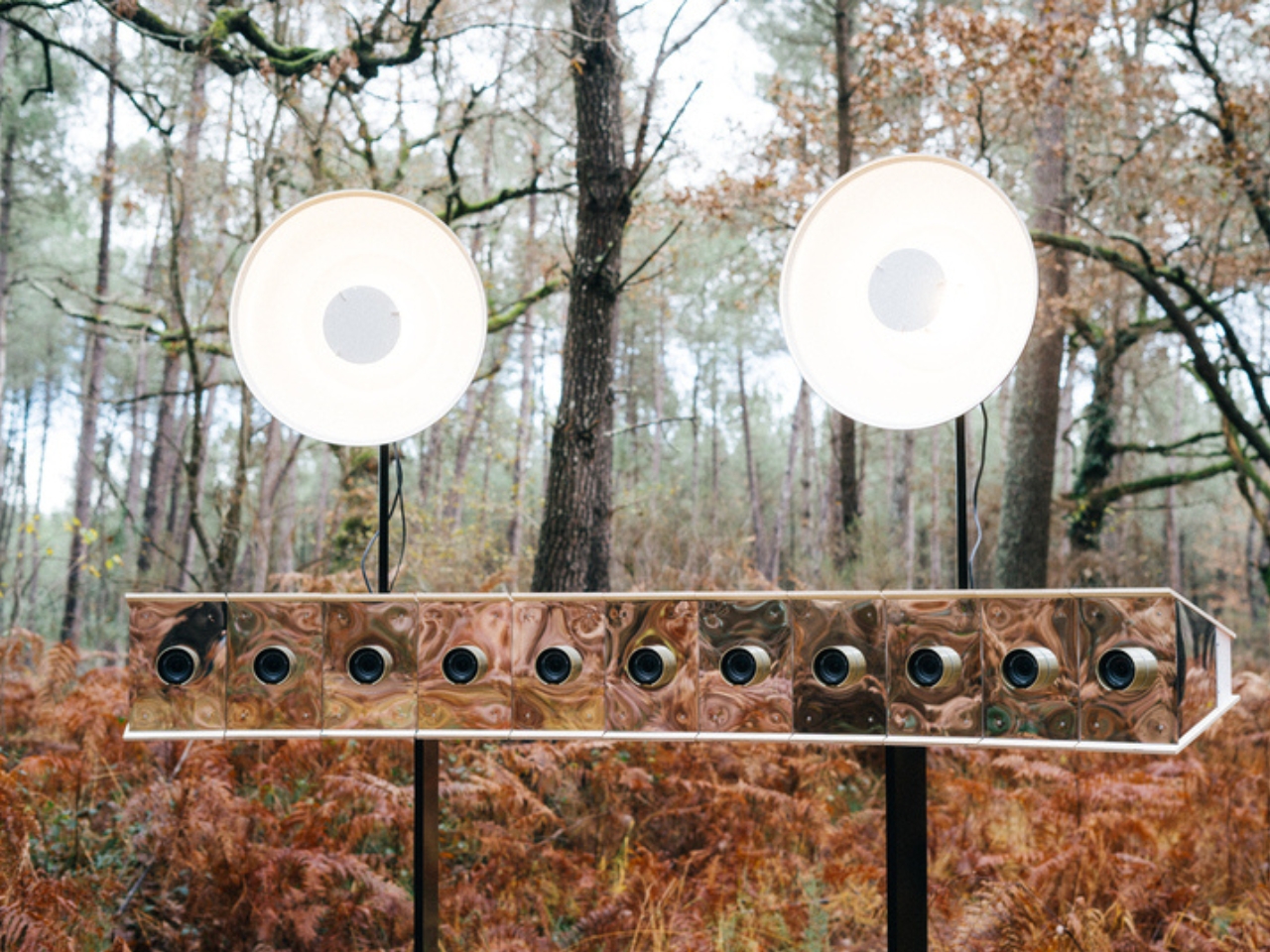
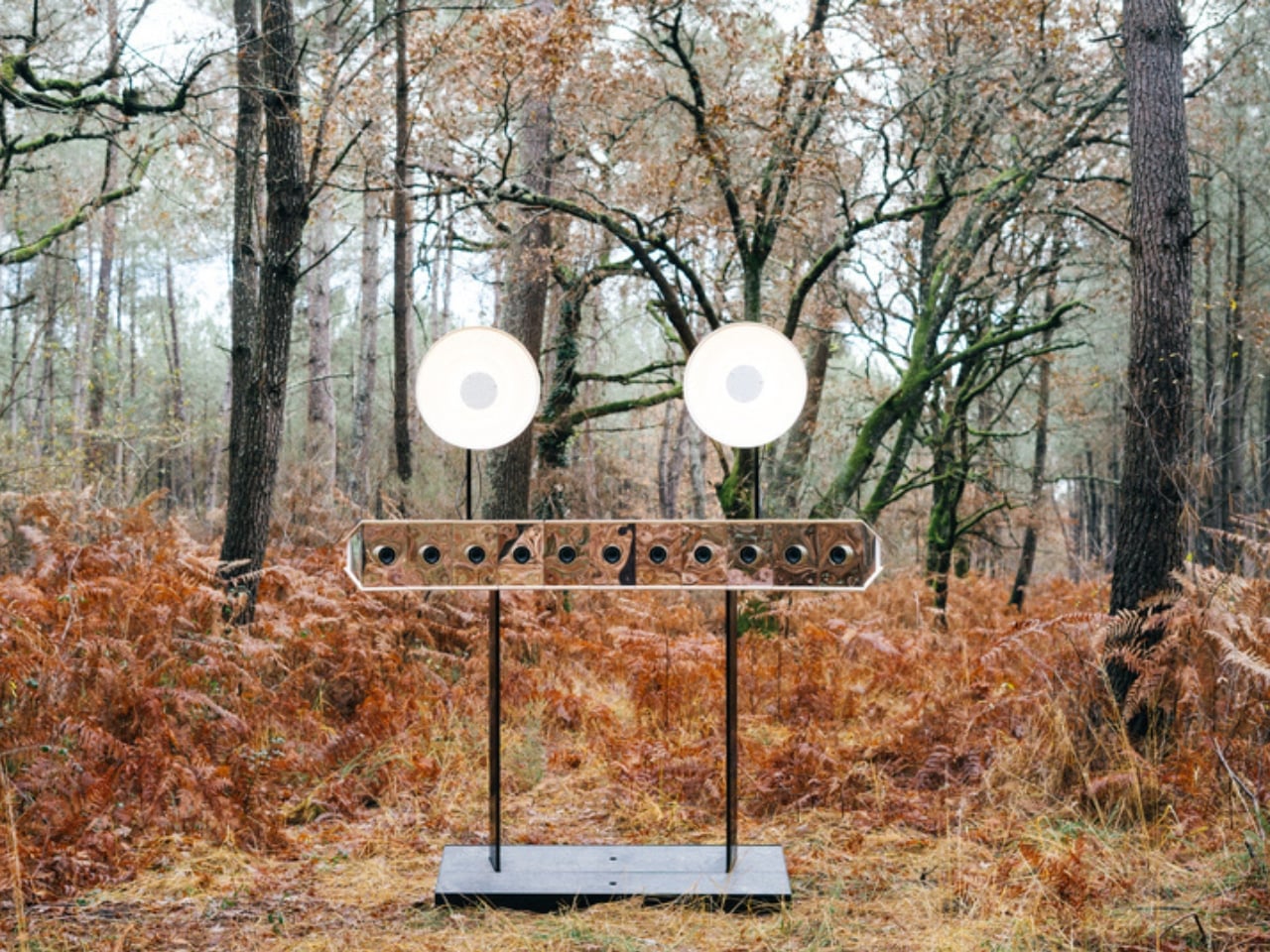
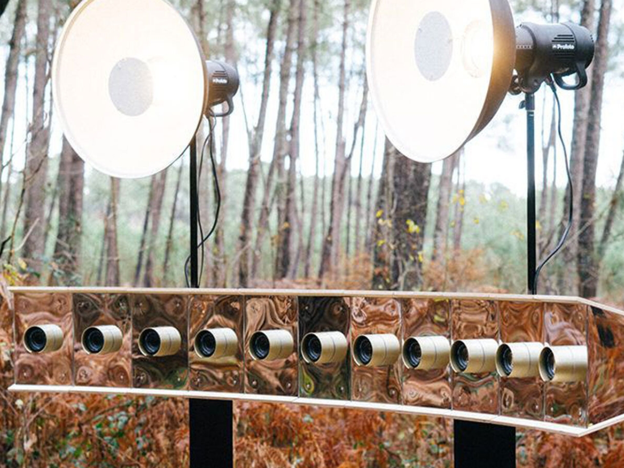
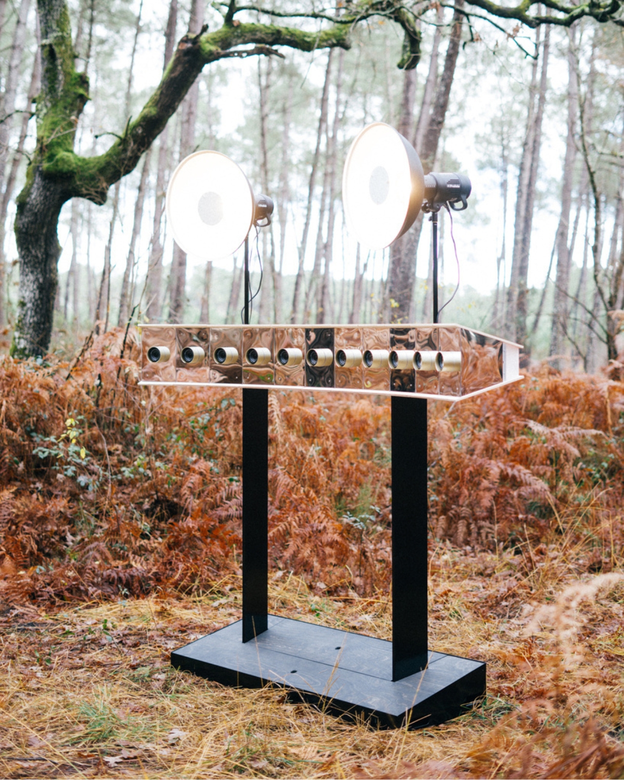
At first glance, the Moon Walker looks like something a Victorian inventor might have dreamed up after a few too many glasses of absinthe. This isn’t your sleek, minimalist smartphone camera or even a traditional DSLR. Instead, it’s a sculptural wooden installation equipped with eleven separate lenses arranged in a curved arc, all working together to capture the same moment from different angles simultaneously.‎‎‎‎‎‎‎‎‎‎‎‎

Designer: Woodlabo

‏‏‏‏‎‎‎‎‎‎‎‏‏‏‏‏‎‎‎‎‎‎‎‏‏‏‏‏‎‎‎‎‎‎‎‏‏‏‏‏⁠

The genius here lies in what happens after the shutter clicks. Those eleven simultaneous shots can be sequenced together to create animated sequences that show movement through space rather than time. It’s like having eleven photographers standing in different spots all pressing their shutters at the exact same instant. The result is something between a photograph and a short film, a kind of dimensional flip that makes you see familiar subjects in completely new ways.
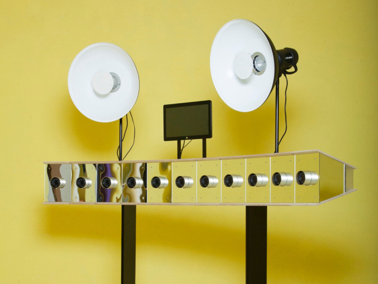
Woodlabo, the creative force behind this project, clearly has a thing for merging old-world craftsmanship with contemporary photographic concepts. The wood construction isn’t just aesthetic posturing. There’s something deliberately nostalgic about using timber to house cutting-edge multi-perspective photography technology. It creates this fascinating tension between the handmade and the high-tech, the analog and the digital.
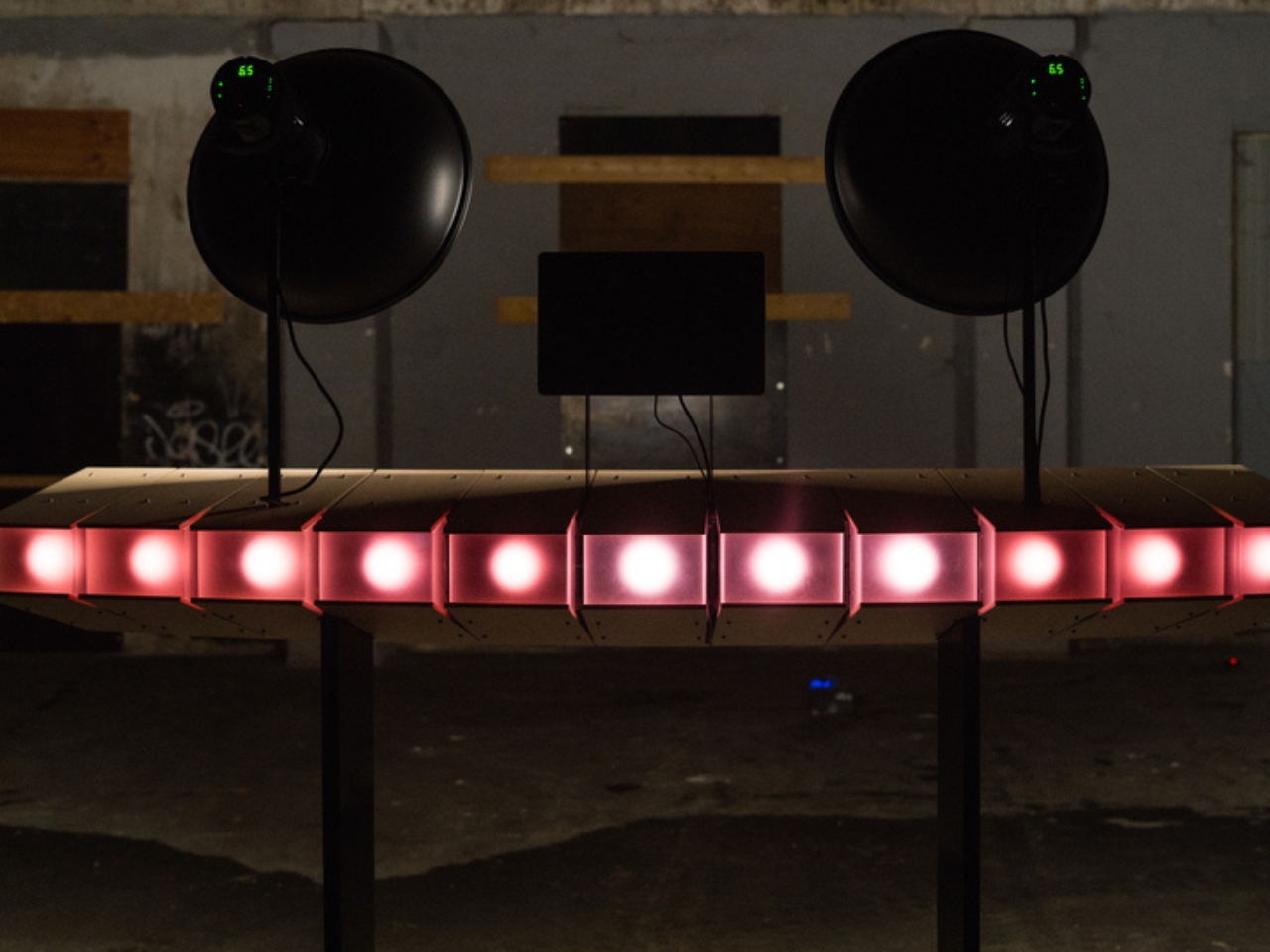
What makes the Moon Walker particularly interesting in today’s photography landscape is how it challenges our relationship with image-making. We’re living in an era where everyone has a powerful camera in their pocket, where we can shoot hundreds of photos in seconds, apply AI filters, and share them globally before lunch. Yet here’s a device that’s intentionally cumbersome, deliberately complex, and requires actual physical space and setup. It’s the photographic equivalent of listening to vinyl records in the age of streaming.
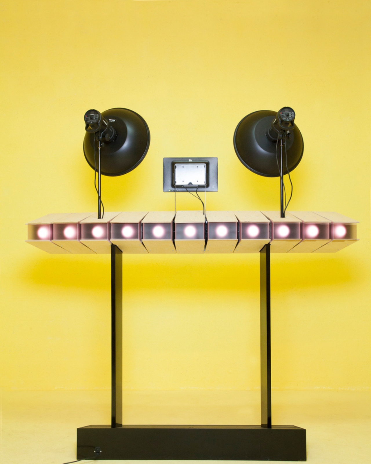
The multi-angle approach also taps into something we’ve been obsessed with since Eadweard Muybridge strapped cameras to horses to capture motion in the 1870s. We’ve always been fascinated by seeing things we can’t normally see, by breaking down movement, by viewing the same subject from impossible perspectives. The Moon Walker is essentially a modern riff on that same impulse, updated for an Instagram age that’s hungry for content that looks genuinely different.
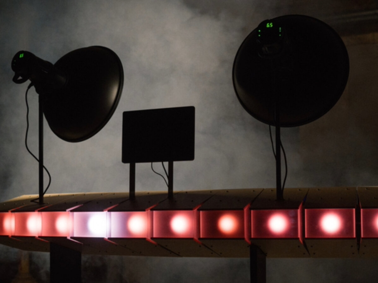
For designers and artists, the Moon Walker represents an interesting commentary on how we create images. It’s both camera and sculpture, functional tool and art object. You could mount it on a wall when you’re not using it, and it would hold its own as a piece of design. That dual nature makes it more than just another photographic gadget. It’s a statement about the value of intentional, considered image-making in a world drowning in throwaway snapshots.
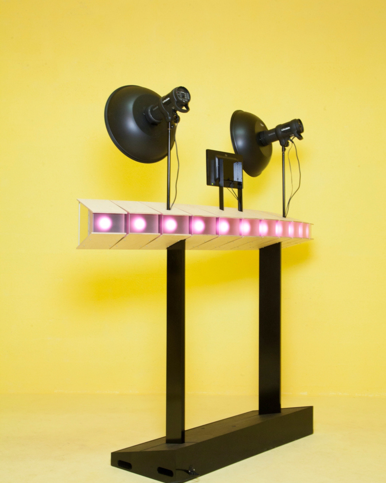
The practical applications are pretty wild too. Imagine capturing products for e-commerce from multiple angles in one shot, creating dynamic motion graphics for social media without complex video editing, or developing entirely new forms of visual storytelling that exist somewhere between still photography and animation. For creatives willing to experiment, the Moon Walker opens up possibilities that standard cameras simply can’t achieve.
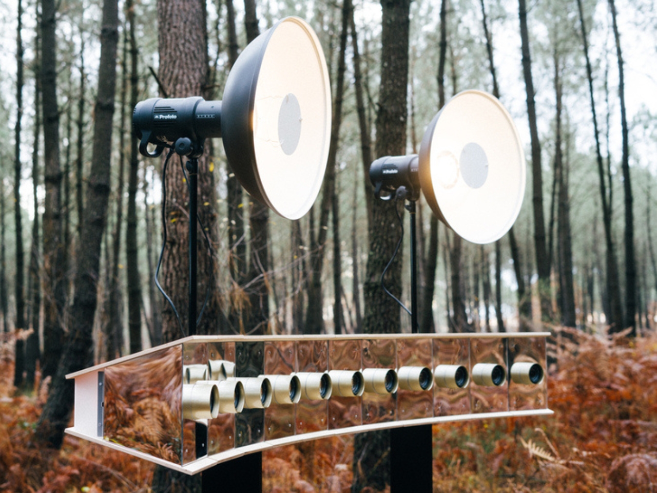
Will you see Moon Walker Multi Cams at your local camera shop anytime soon? Probably not. This is more art project than consumer product, more proof-of-concept than mass-market solution. But that’s exactly what makes it worth paying attention to. The most interesting developments in design and technology often start as these quirky, impractical experiments that make us rethink what’s possible. Today it’s eleven lenses on a wooden arc. Tomorrow it might be the standard way we capture the world.
The post When One Camera Just Isn’t Enough: The Moon Walker Multi Cam first appeared on Yanko Design.
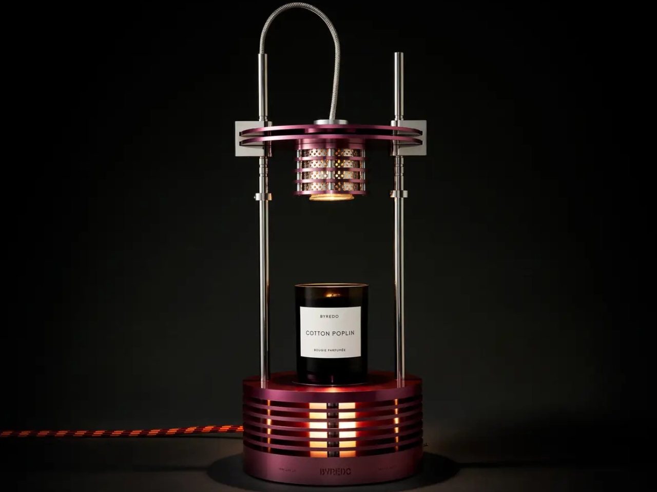
Byredo Just Built a Lamp That Melts Candles While It Glows

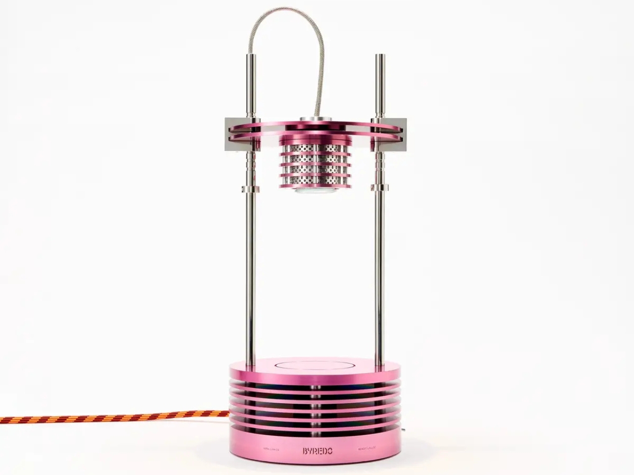
There’s something magnetic about objects that refuse to stay in their lane. Byredo and designer Benoit Lalloz have created exactly that kind of rule-breaker with Infra Luna 2.0, a desk lamp that doubles as a candle warmer, triples as a sculptural statement piece, and somehow manages to look like it landed here from a more aesthetically interesting future.

This is the second collaboration between Byredo founder Ben Gorham and Lalloz, and it’s clear they’ve hit their creative stride. The concept sounds almost too clever: a halogen lamp that uses its own heat to melt a candle placed beneath it, releasing fragrance while casting ambient light. It’s part science lab experiment, part art installation, and entirely functional. Hybrids like this don’t just mutate, they evolve into something that makes you rethink what everyday objects can be.

Designer: Benoit Lalloz x Byredo

Lalloz brings serious design credentials to the table. Originally specializing in architectural projects, he’s expanded into creating his own objects that reflect what he calls a personal quest for design that melds the innovative with craftsmanship and the industrial with poetic narration. Translation: he makes things that look futuristic but feel human, technical but somehow soulful. The Infra Luna 2.0 embodies exactly that philosophy.

The inspiration behind the lamp’s striking aesthetic comes from an unexpected place: the insect world. Before you think that sounds unappealing, consider the visual universe of entomofauna, the technical term for bug life. It’s a realm of vibrant, almost unnatural color where iridescents and fluorescents completely redefine our perception of what nature actually looks like. Think of the metallic sheen on a beetle’s back, the holographic shimmer of dragonfly wings, or the electric blue of certain butterflies. Nature’s own color palette offers a kaleidoscope of vivid metallics that most human-made objects can’t touch.

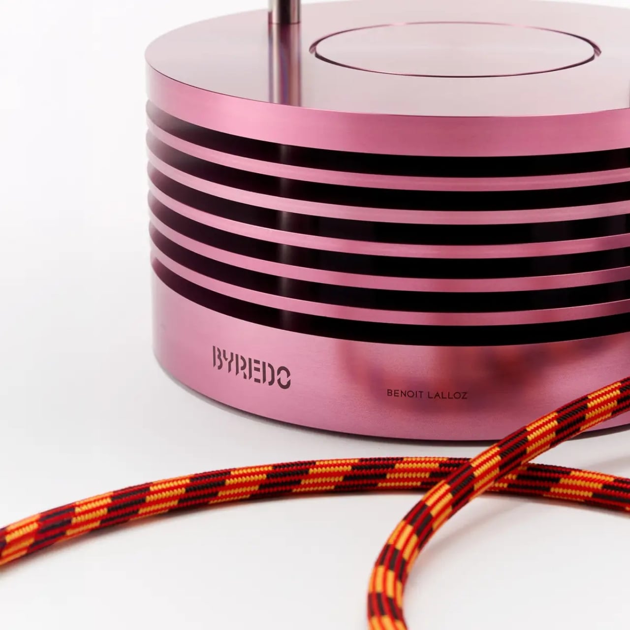
The Infra Luna 2.0 takes its codes from these dynamic opalescent shades and shimmering insect bodies, translating them into bold industrial design. The result is a lamp finished in metallic pink that catches light like an exoskeleton, shifting and glowing depending on your angle. But there’s also a natural finish available, giving you options depending on whether you want statement piece or subtle sophistication.

Even the details tell a story. The striped cable isn’t just decorative; it references how stripes function in nature as both warning and camouflage. A wasp’s yellow and black bands signal danger, while a tiger’s stripes help it disappear into tall grass. Here, the stripes bring the design to life both metaphorically and literally, as the cable becomes an integrated element of the overall aesthetic rather than something you try to hide behind furniture.

The silhouette maintains a technical, raw identity that feels industrial and purposeful, but nature writes this story just as much as engineering does. It’s this tension between the manufactured and the organic, between form and function, that makes the piece so compelling. You can see the halogen bulb, understand the mechanism, appreciate the transparency of how it works, yet it never feels cold or purely utilitarian.

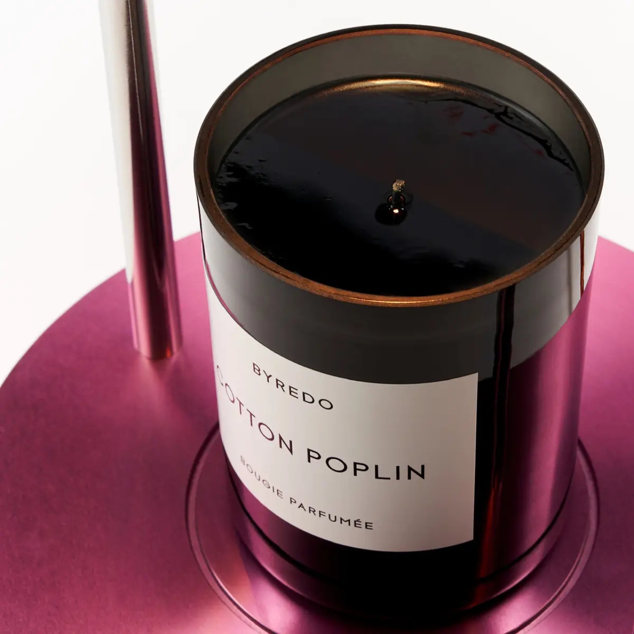
Using temperature to release fragrance creates what Byredo describes as a gentle halo of light paired with an additional halo of scent. Place one of their candles on the base, and as the halogen bulb warms the wax, your space becomes enveloped in fragrance without a flame. For anyone who loves candles but worries about open flames or wants a more even scent distribution, this solves that problem while looking impossibly cool doing it.

The surprise here is both visual and olfactory. It’s one thing to create a beautiful object; it’s another to create one that engages multiple senses and actually improves your daily rituals. This isn’t design for design’s sake. It’s thoughtful, intentional, and genuinely useful, which feels increasingly rare in a world full of objects that prioritize aesthetics over everything else.

Infra Luna 2.0 represents where Byredo is heading as a brand: beyond traditional perfumery into territories where scent intersects with other sensory experiences and design disciplines. It’s inventive, intriguing, and exactly the kind of hybrid object that makes sense for how we live now, wanting fewer things but better things, objects that earn their place through beauty and utility combined.

If you’re interested, the lamp is available online and at select Byredo stores including Soho, Wooster, South Coast Plaza, and Melrose, but quantities are very limited. Available in both that eye-catching metallic pink and a more understated natural finish, it’s the kind of piece that transforms a space simply by existing in it.

The post Byredo Just Built a Lamp That Melts Candles While It Glows first appeared on Yanko Design.
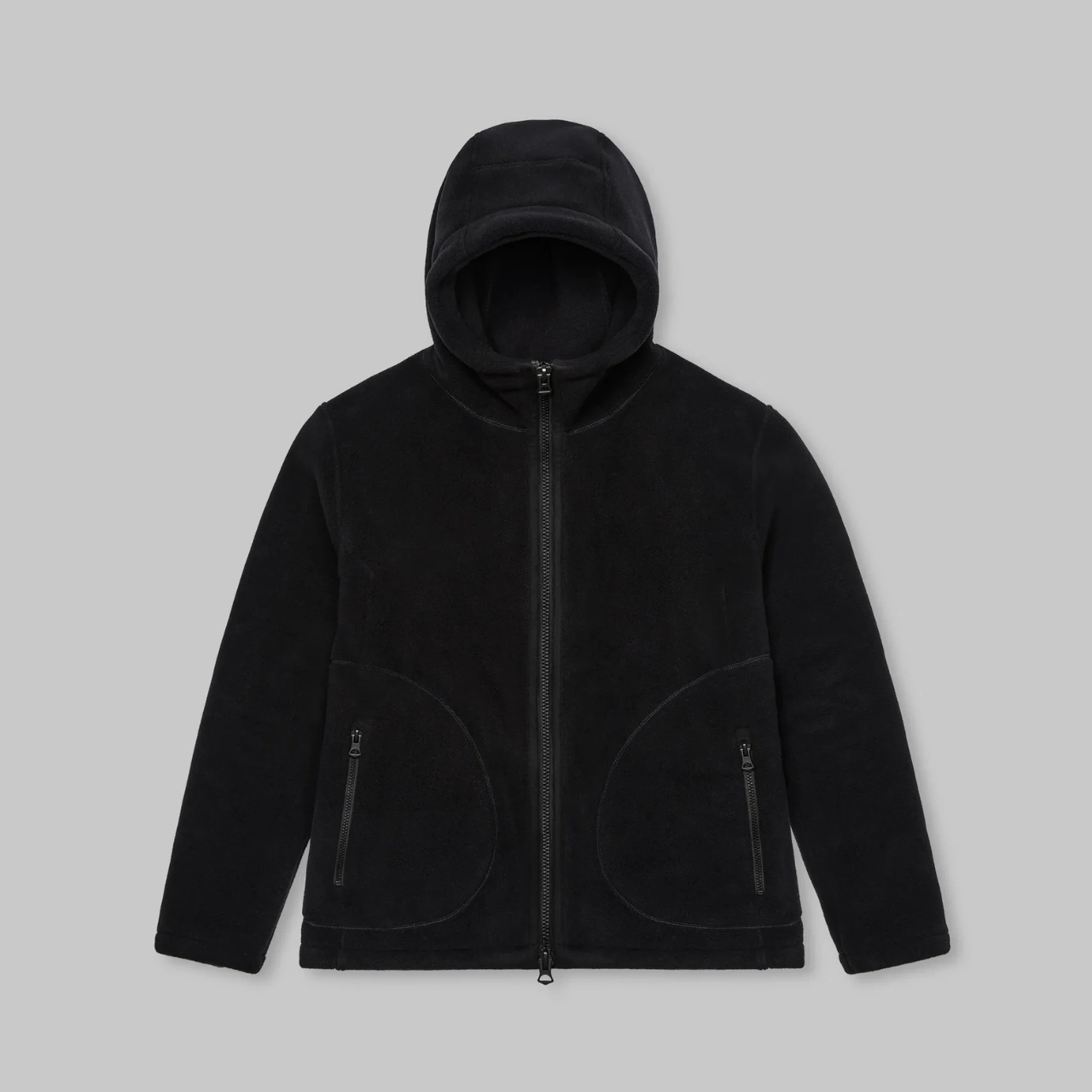
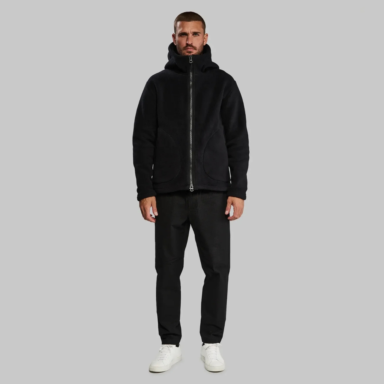
Vollebak’s Densest Fleece Yet: 539g Military Hoodie From the Abyss

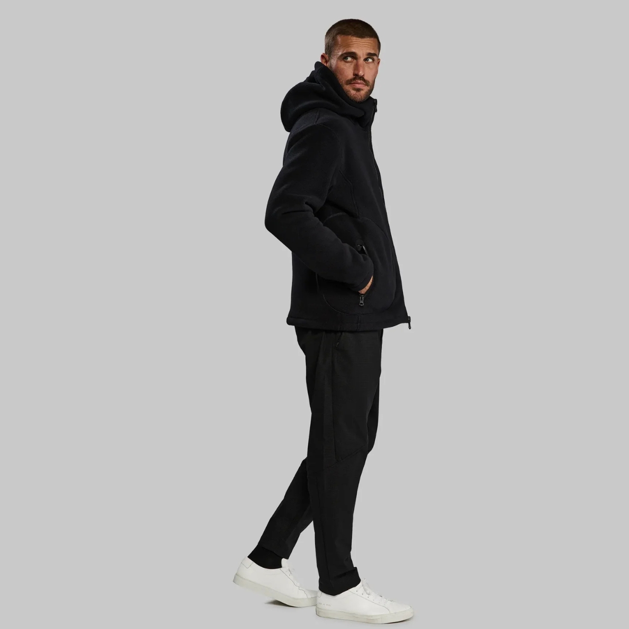
You know those people who claim their jacket is “military-grade” because it has a lot of pockets? Yeah, forget them. The Vollebak Deep Sea Diver Hoodie actually is military-grade, and not in the marketing nonsense way. This thing was built using the same technology that keeps British Special Forces alive when they’re dealing with subzero water temperatures. Let that sink in for a second. We’re talking about gear designed for people whose job description includes “don’t die in the freezing ocean.”

The star of the show here is the material itself. At 539 grams per square meter, this is officially the densest fleece Vollebak has ever made. To put that in perspective, most hoodies you’re wearing right now probably clock in somewhere between 200 and 300 grams per square meter. This is nearly double that weight, which translates to an insane amount of trapped heat without turning you into a walking sauna. The fabric is Polartec Power Stretch, a blend of 91% polyester and 9% elastane, and it’s the same stuff used in drysuit insulation layers that divers wear beneath their wetsuits.

Designer: Vollebak

What makes this material genuinely impressive is how it manages to be thick without being stupid. We’ve all owned those chunky fleeces that keep you warm but make you feel like the Michelin Man, right? This one has four-way stretch built into its DNA, meaning it bends, stretches, and rebounds in literally any direction you move. You get the warmth of something designed to survive the North Sea, but you can still, you know, move your arms and actually do things.

The technical specs read like something out of a performance gear catalog. The fleece breathes, wicks moisture away from your skin, dries fast, and resists odors. But here’s the kicker: it stays warm even when damp. That’s not a feature most regular hoodies can claim. Most cotton-blend sweatshirts turn into sad, soggy heat vampires the second they get wet. This one was literally designed for an environment where staying dry isn’t always an option, so it keeps insulating even when conditions aren’t perfect.

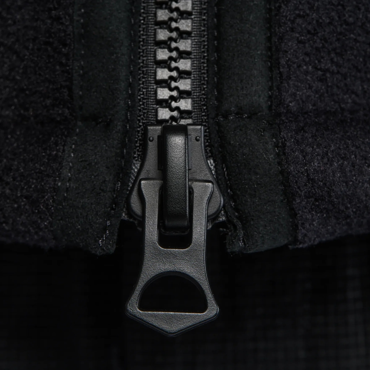
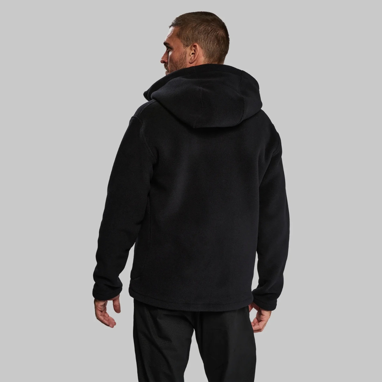
Every detail on this hoodie serves a purpose beyond looking cool (though it does look pretty cool). The double-lined snorkel hood creates what Vollebak calls a “microclimate” around your head. It’s basically a cocoon of trapped warmth that seals out wind and cold. The egg-shaped pockets aren’t just a design quirk; they’re cover-stitched onto the shell for durability and positioned to keep your hands warm without adding bulk. There’s a two-way front zip with moleskin and faux-suede tape where the zipper meets your chin, because metal on skin when it’s freezing outside is nobody’s idea of a good time.

The construction is equally obsessive. Flatlock seams ensure the whole thing holds together under stress while giving you total freedom of movement. There’s a woven back yoke with a faux-suede hanger loop, because even extreme performance gear needs somewhere to hang. At 1,200 grams total, it’s got serious heft without feeling unwieldy, and it’s all constructed in Portugal using manufacturing standards that would make your average fast-fashion brand break out in hives.

The origin story here matters. This fleece technology wasn’t developed in some boardroom brainstorming session about “outdoor lifestyle vibes.” It was engineered for military divers working in some of the harshest conditions on Earth. The North Sea doesn’t care about your brand positioning. It’s cold, it’s brutal, and survival gear either works or it doesn’t. Vollebak took that proven technology and adapted it for civilian life, which is a much better approach than designing something that looks tactical but performs like garbage.

At $795, this isn’t an impulse purchase. But when you break down what you’re actually getting, the price starts making sense. This is legitimately Special Forces-grade insulation technology, the densest fleece the brand has ever produced, and construction quality that’s built to last years, not seasons. You’re not paying for a logo or hype; you’re paying for materials and engineering that were literally tested in life-or-death scenarios.

For anyone into design, tech, or just genuinely well-made things, the Deep Sea Diver Hoodie represents something rare: a product where the performance actually backs up the story. It’s a bridge between underwater survival technology and everyday wear, and it does both without compromise.

The post Vollebak’s Densest Fleece Yet: 539g Military Hoodie From the Abyss first appeared on Yanko Design.

This Designer Just Built Furniture That Blooms When You Sit

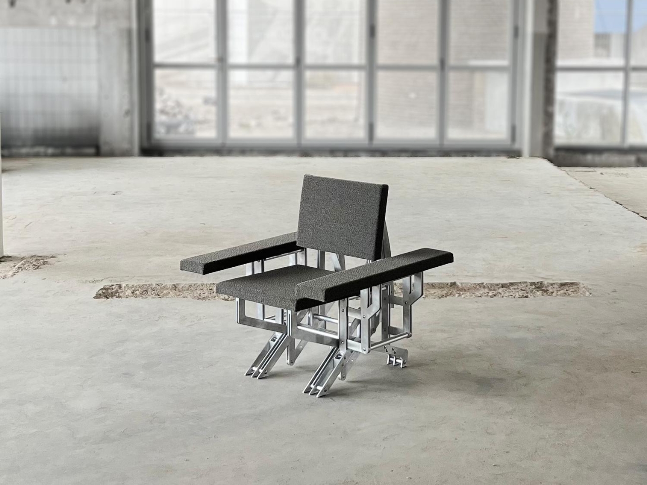
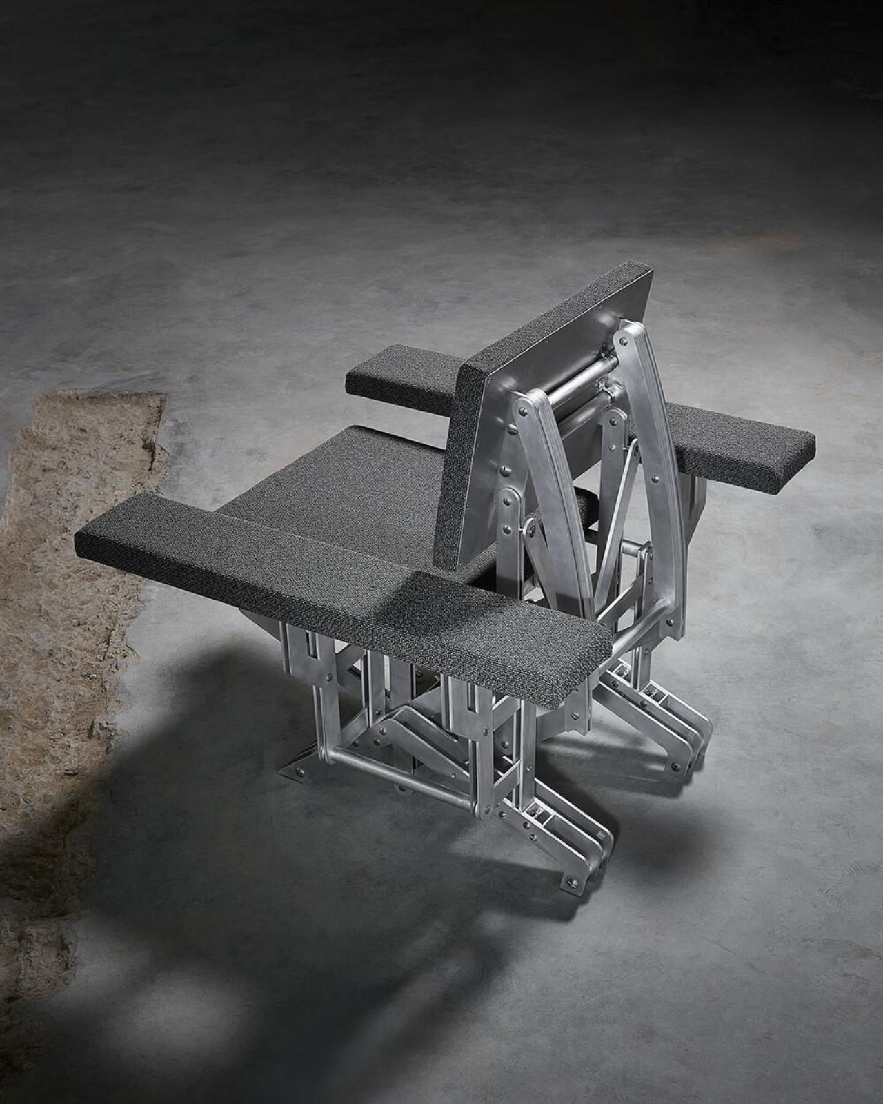
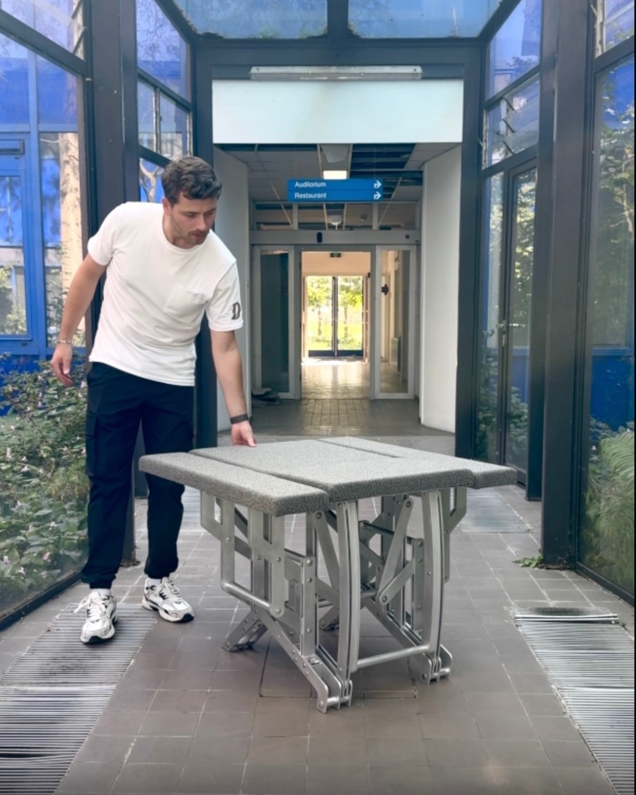
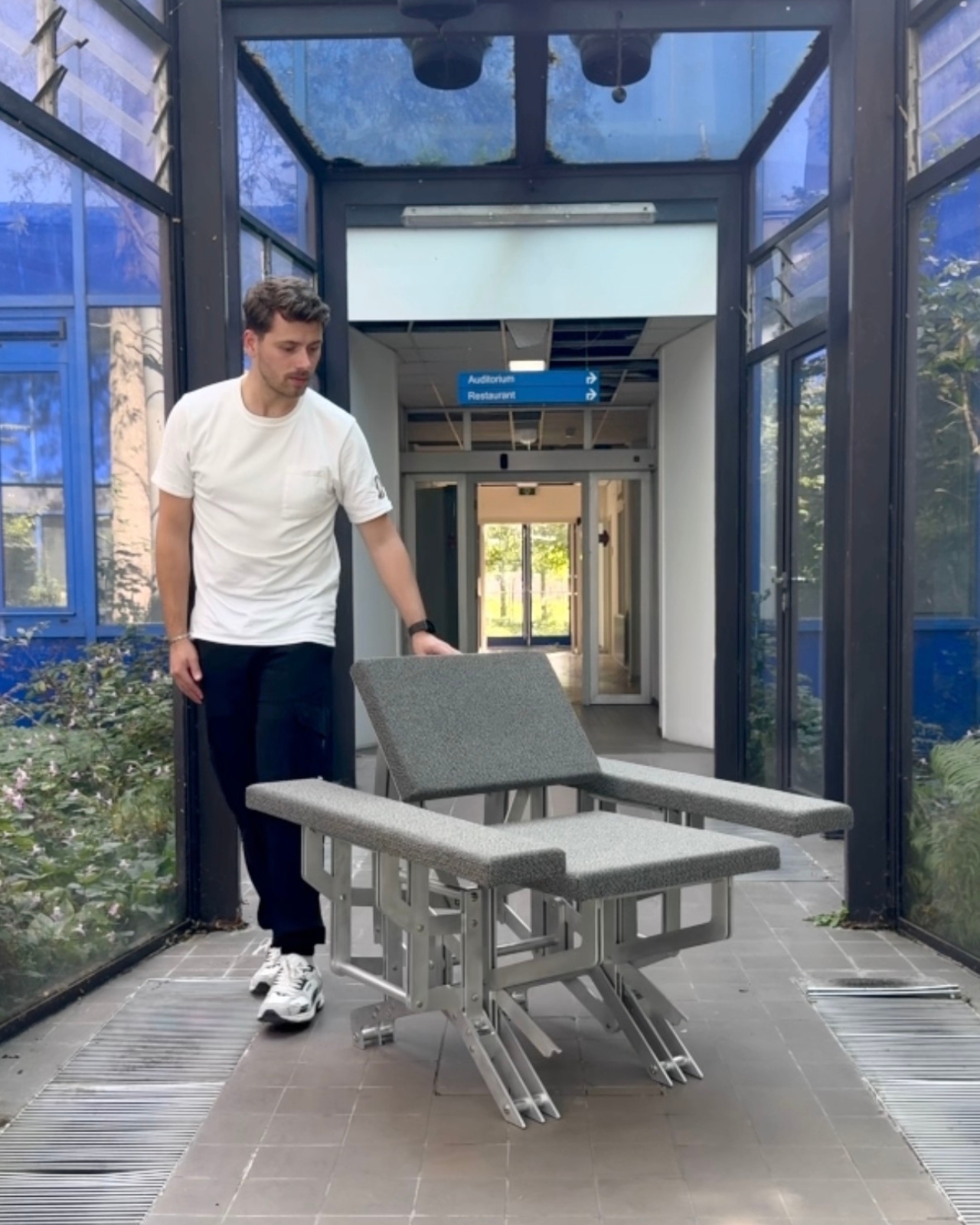
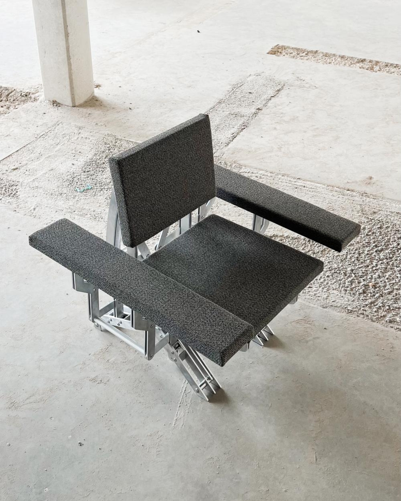
Picture this: you walk into a room, spot what looks like a sleek wooden ottoman, and press down on it. Suddenly, petals of wood bloom outward, transforming the compact stool into a full armchair that seems to welcome you with open arms. It sounds like something from a sci-fi movie, but it’s very real, and it’s the brainchild of recent Eindhoven graduate Aaron Preyer.

His project, called Blooming Furniture, is exactly what it sounds like. These aren’t your grandmother’s heirloom chairs or that boring IKEA bookshelf everyone owns. This is furniture with personality, furniture that responds to you, furniture that literally moves and transforms when you interact with it.

Designer: Aaron Preyer

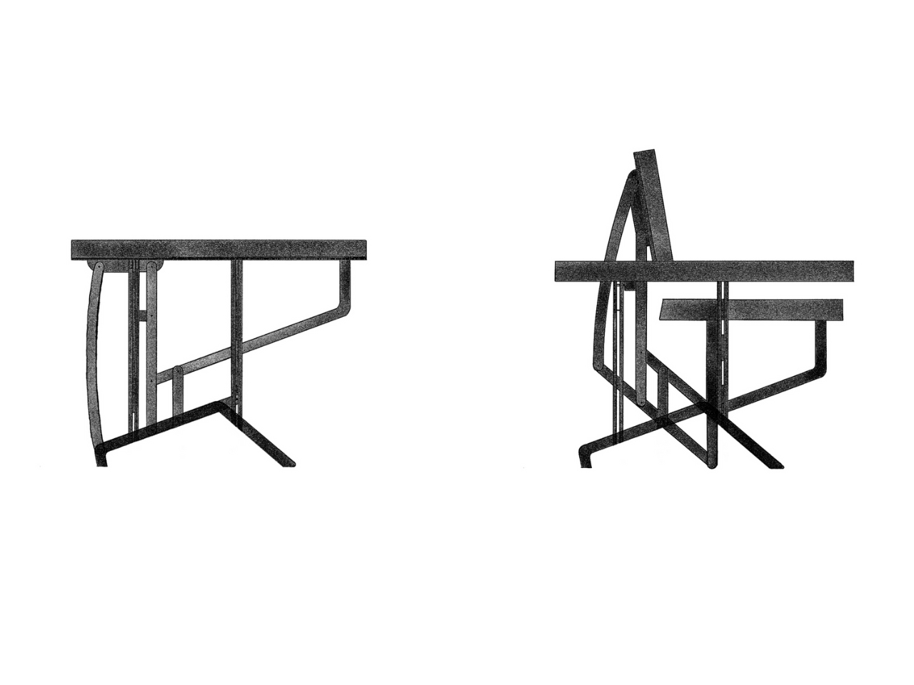
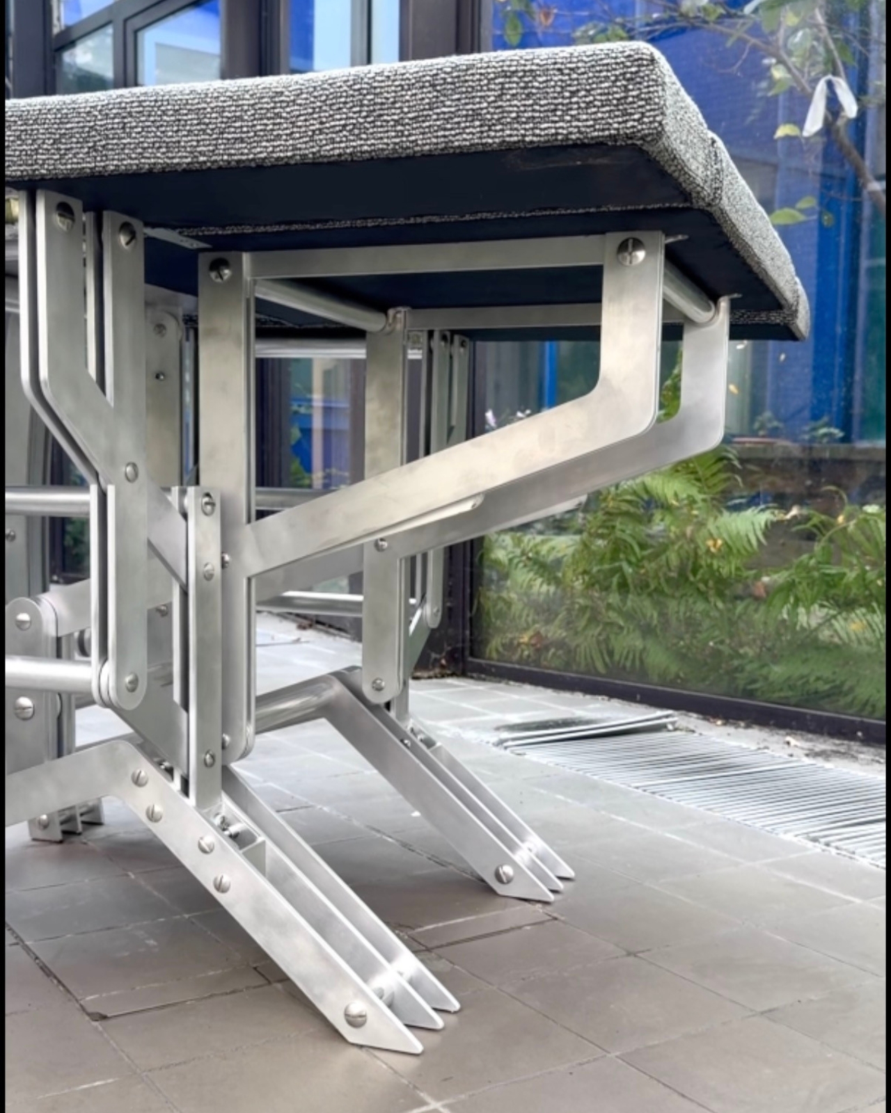
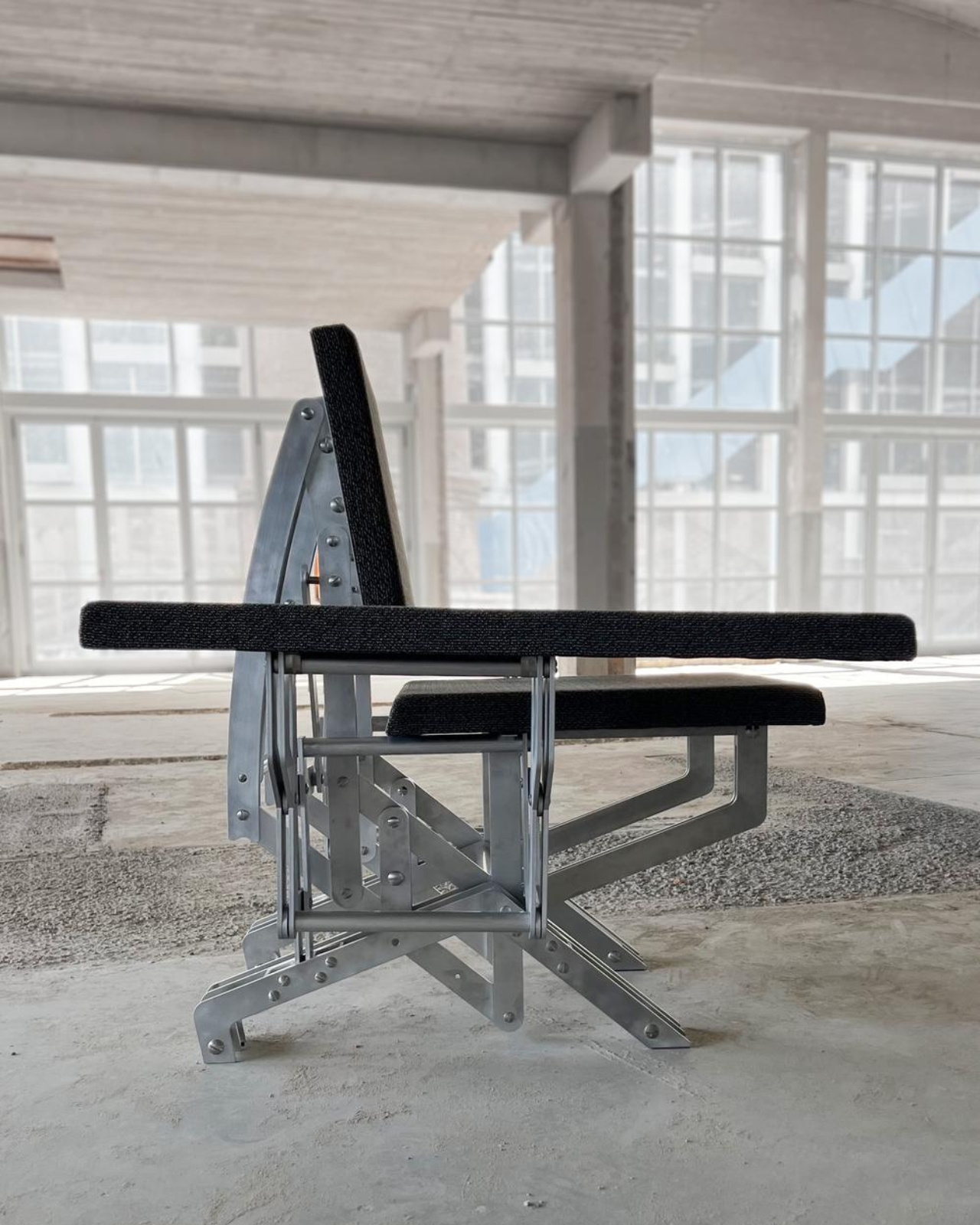
Preyer describes himself as someone fascinated by movement and transformation, and boy, does it show. The Blooming collection features several kinetic pieces that react to touch and weight through pressure-sensitive mechanisms cleverly embedded in metal bases. The magic happens when you apply pressure. Wooden segments that were neatly folded away suddenly fan out like a flower opening at dawn, creating entirely new shapes and functions.

What makes this project so compelling isn’t just the cool factor (though let’s be honest, watching furniture transform never gets old). It’s the way Preyer has thought about how we actually use furniture in our daily lives. We lean on things, we perch on edges, we need surfaces to adapt to different moments throughout the day. Instead of buying multiple pieces to serve different purposes, what if one piece could shift to meet your changing needs?

The technical execution is impressive too. Each piece demonstrates how movement and functionality come together in what Preyer calls “a playful and innovative design”. The mechanisms need to be smooth enough to feel intuitive, strong enough to support weight, and reliable enough to withstand repeated use. It’s one thing to create a transforming object as an art piece; it’s another entirely to make it functional furniture.

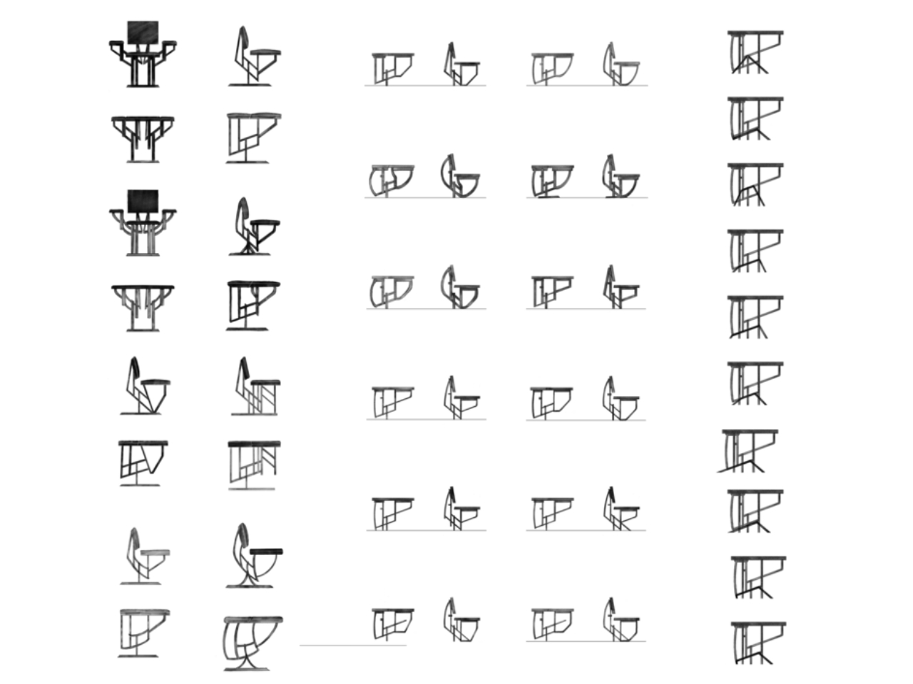
The project emerged from extensive research into moving mechanisms within furniture and objects. Preyer wasn’t just playing around in a workshop. He was systematically exploring questions about how furniture could be more responsive, more adaptable, more alive. The result is a collection where each piece has its own character, its own way of opening up to you. There’s something almost emotional about furniture that responds to your presence. In our world of smart homes and connected devices, we’ve gotten used to technology responding to us through screens and voice commands. But physical objects that change shape when we touch them? That hits differently. It’s tactile, immediate, visceral in a way that digital interactions just aren’t.

Some designers at Dutch Design Week 2025 noted that Preyer’s work explores the intersection between living systems and domestic design. That’s a fancy way of saying these pieces feel oddly organic, almost biological. They breathe and stretch like living things, even though they’re made from wood and metal. The practical applications are obvious. In our era of tiny apartments and multi-functional spaces, furniture that can transform from one thing to another is incredibly valuable. That ottoman that becomes a chair could also potentially shift into a side table or storage unit. We’re living in smaller spaces, working from home more, and constantly rearranging our lives. Why shouldn’t our furniture keep up?

But beyond practicality, there’s something delightful about objects that surprise us. In a world where most furniture is static and predictable, Blooming Furniture offers a sense of wonder. It reminds us that everyday objects don’t have to be boring. They can be playful, responsive, even magical. Preyer’s work sits at this fascinating intersection of craft, engineering, and experience design. It’s not just about making furniture move. It’s about creating moments of connection between people and objects, about reimagining what it means for something to be functional, beautiful, and interactive all at once.

The post This Designer Just Built Furniture That Blooms When You Sit first appeared on Yanko Design.

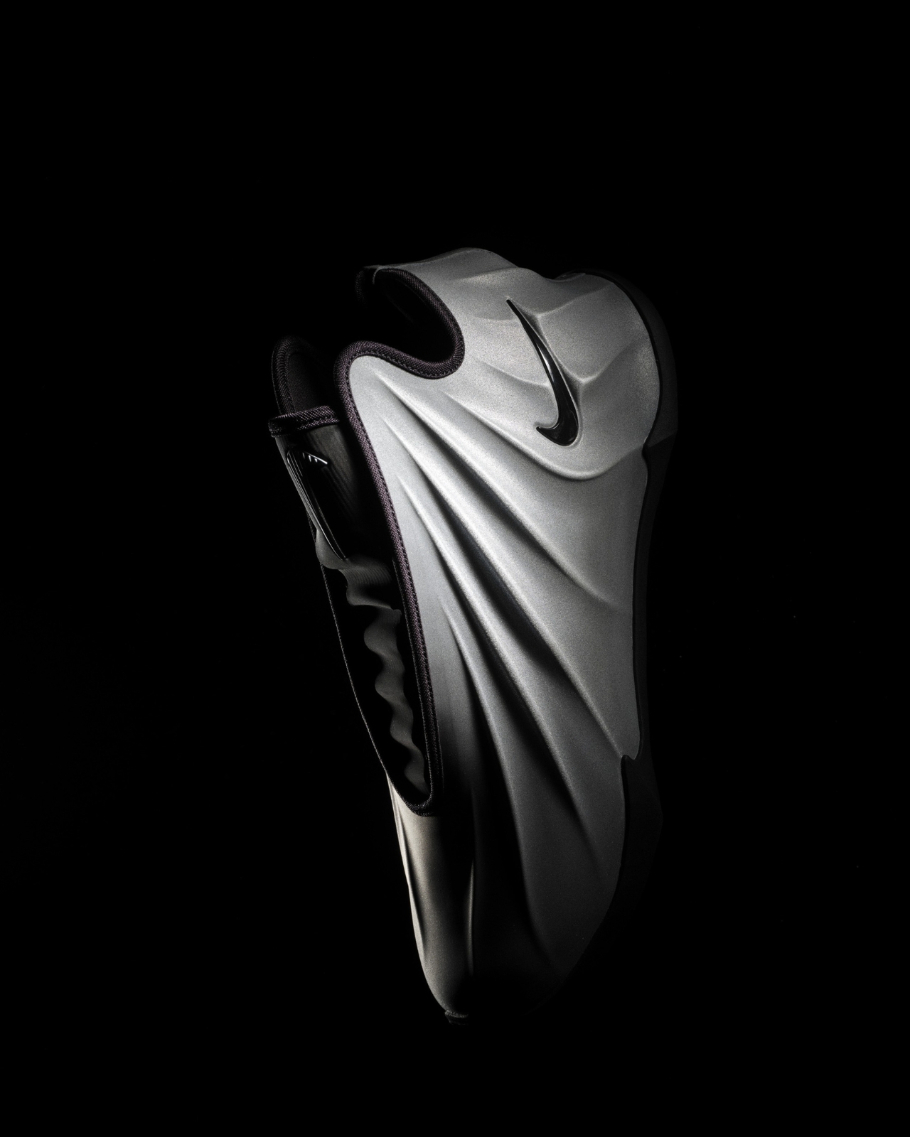
Nike’s $210 G.T. Cut 4 Claims to Have the Most Responsive Cushion Ever

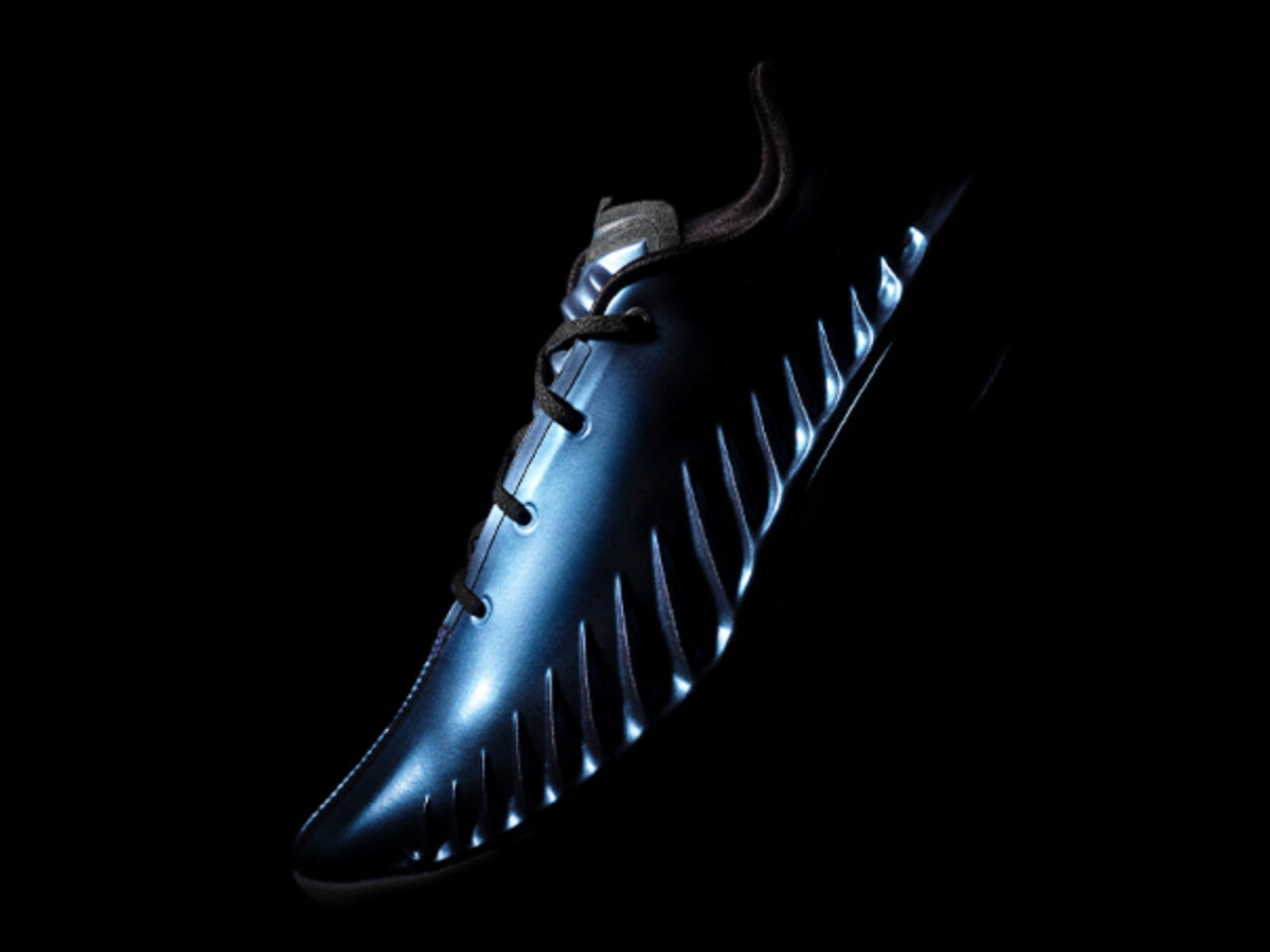
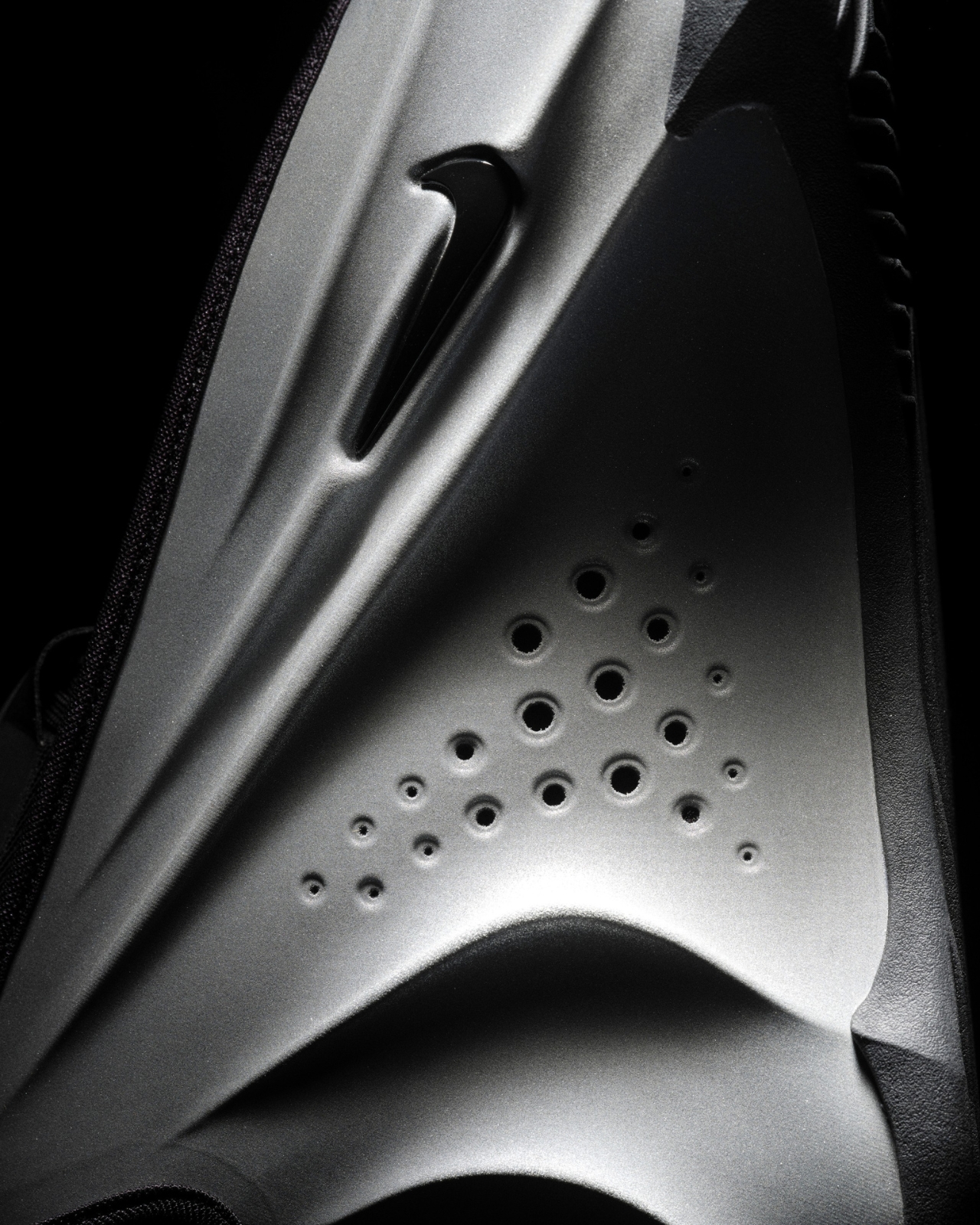
There’s something almost sci-fi about the way Nike’s latest basketball shoe looks. The G.T. Cut 4 feels like the kind of sneaker you’d see in a movie about athletes competing on another planet, with its sleek, low-profile silhouette and those distinctive vents running along the side panels. But here’s the thing: this isn’t just about looking cool (though it absolutely does). Nike really went all-in on making what they’re calling their most responsive basketball shoe yet, and honestly, the tech behind it is pretty wild.

This is the fourth iteration in Nike’s Greater Than series, a line that’s been carving out its own space in the basketball world since 2021. Unlike some signature shoes that lean heavily on athlete branding, the G.T. Cut series has always been about the tech and the feel. It’s built for the players who make things happen through movement: the ones constantly creating space, cutting hard, and changing direction on a dime. The original G.T. Cut made waves with React cushioning, while the third version went lighter with full-length ZoomX foam. Now, with the G.T. Cut 4, Nike’s doubled down on everything players loved and pushed it further.

Designer: Nike

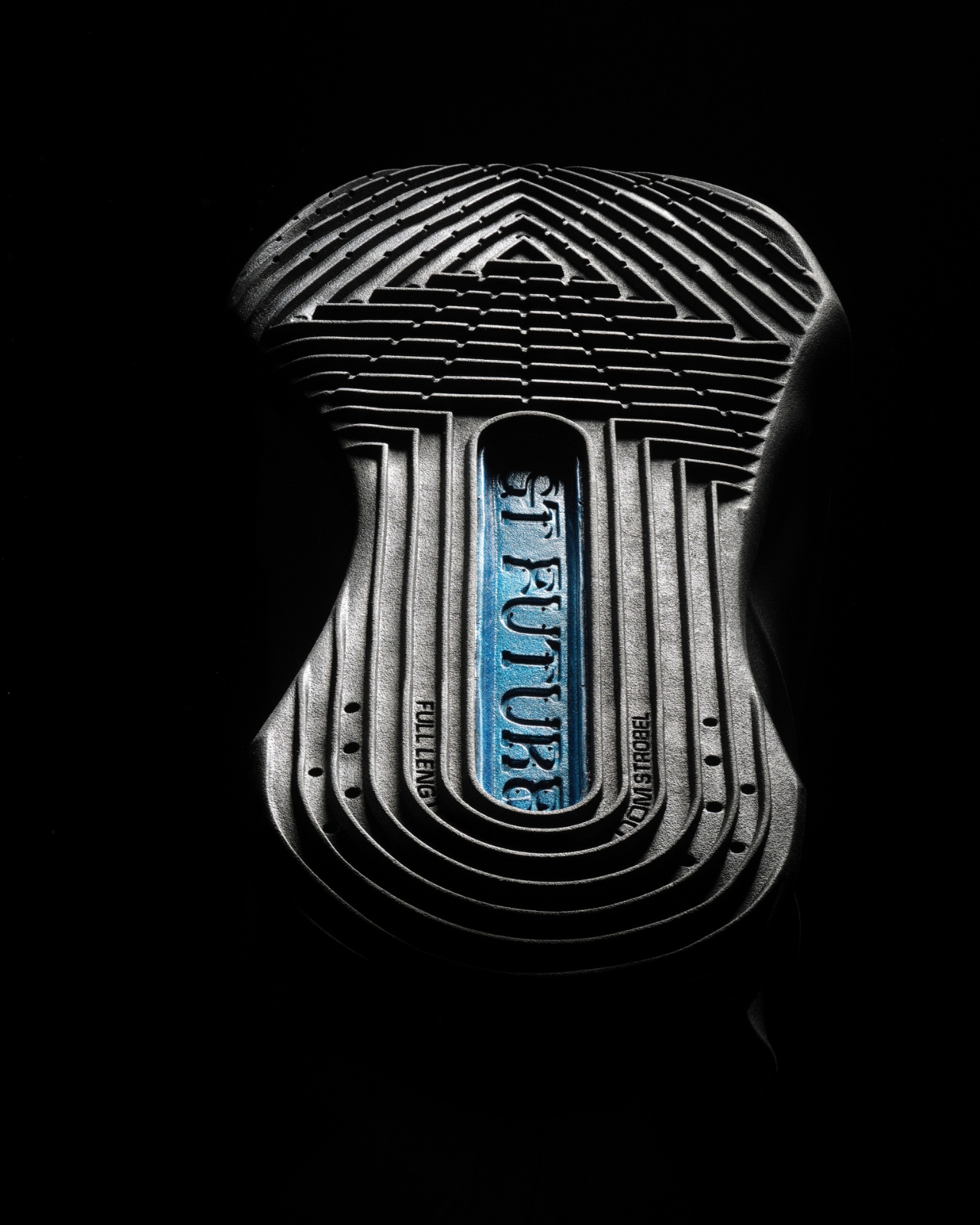
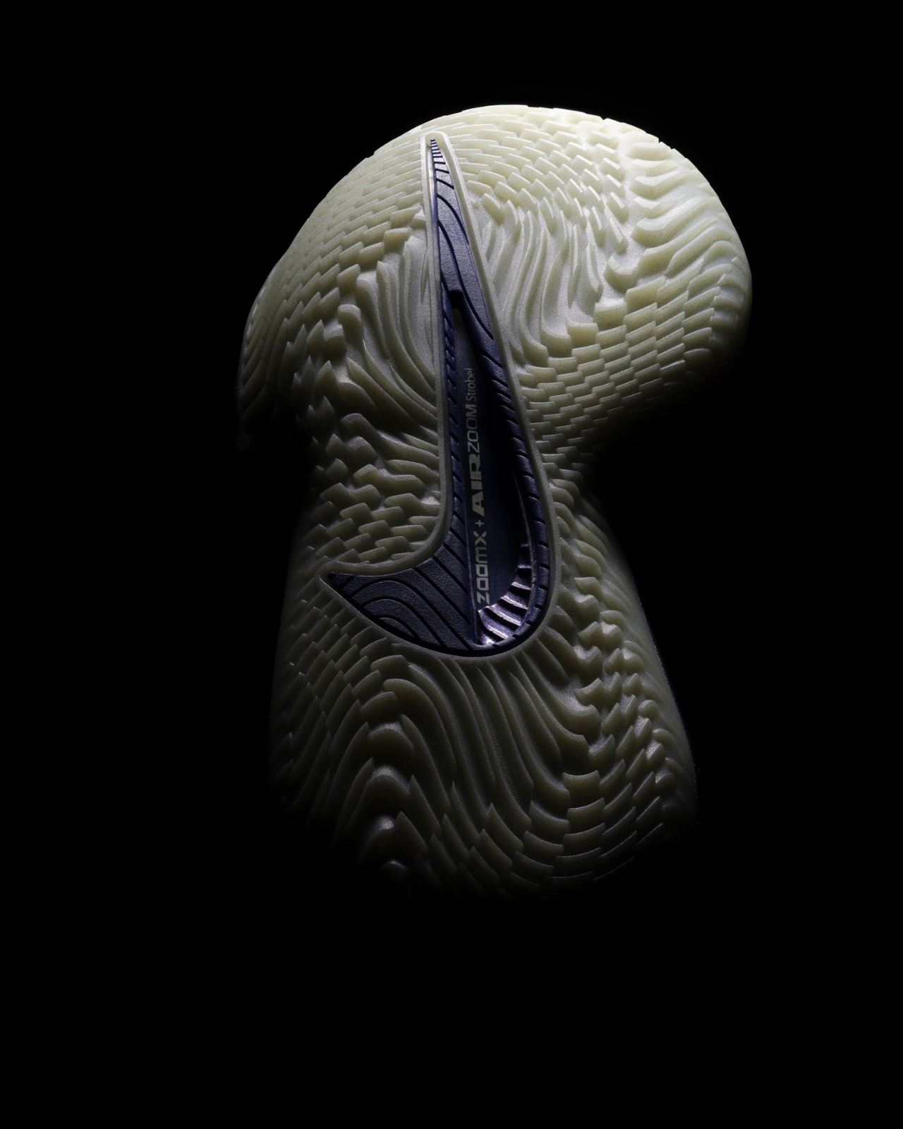
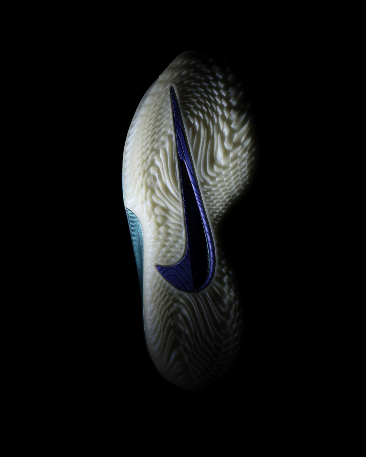
Let’s talk about what’s actually happening underfoot, because that’s where things get interesting. Nike packed this shoe with ZoomX 3.0 foam in the midsole, which is their softest and most responsive cushioning technology. This stuff is usually reserved for elite running shoes, so seeing it adapted for the hardwood is a big deal. But they didn’t stop there. The ZoomX 3.0 works alongside a parabolic Zoom Strobel, RBR-X foam for stability, and a Cushlon carrier for support. It sounds like a lot, but what all these layers do together is create a setup that doesn’t just absorb impact when you land. It actually gives energy back, which translates to more explosive movements and quicker first steps off the dribble.

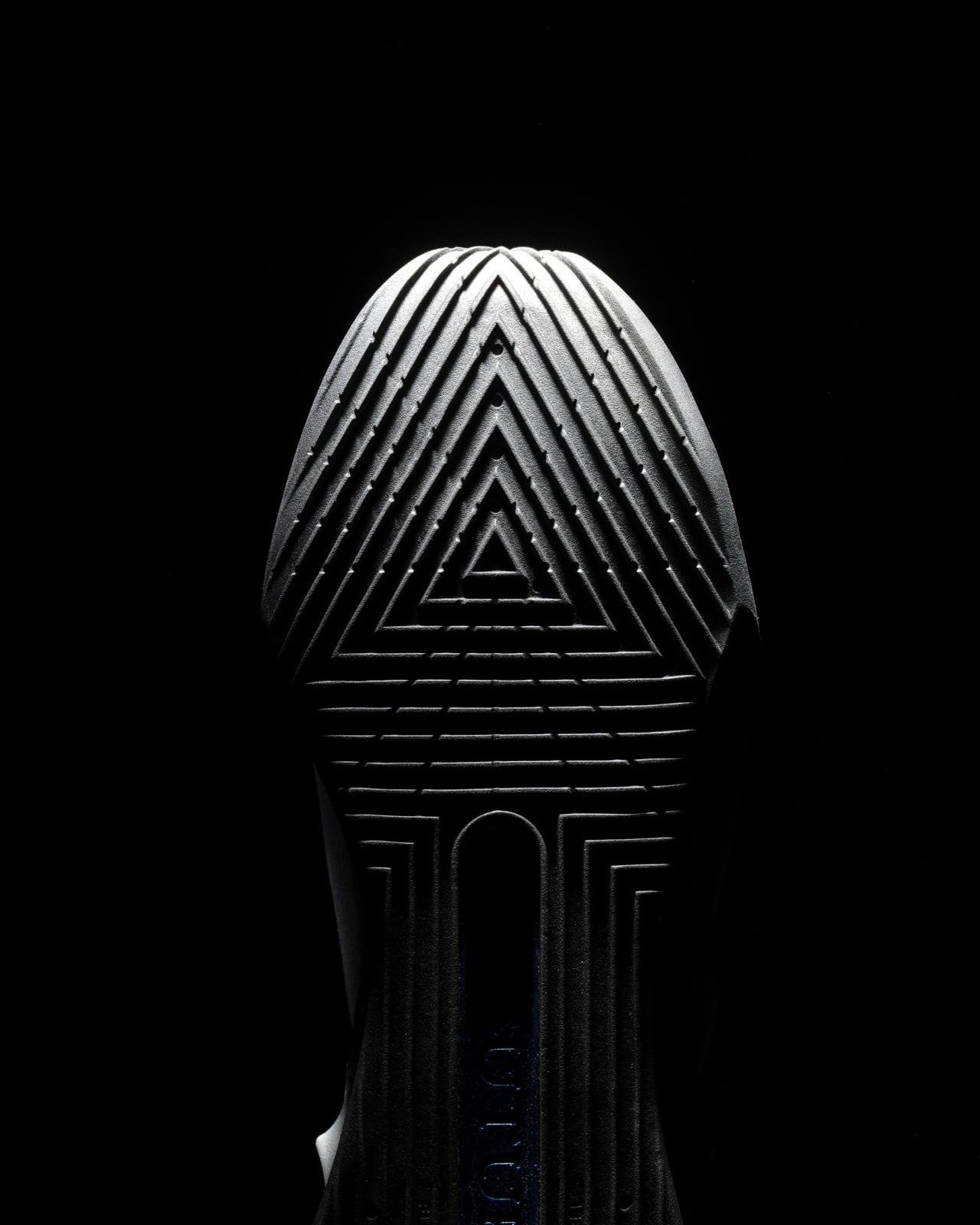
The traction pattern is another standout feature. Nike developed a new generative design that’s informed by biomechanics research, which is a fancy way of saying they studied how players actually move on the court and created a sole that responds to those movements. For anyone who’s ever slipped during a crucial cut or felt their shoe lag behind their intention, this kind of attention to traction matters a lot.

Then there’s the fit. Nike went with a 3D-molded collar, a molded vamp tongue, and what they call an exoskeleton-casted containment upper. Translation: the shoe wraps around your foot in a way that locks you in without feeling restrictive. There are only four lace loops, which keeps the profile clean and minimal. The whole design philosophy here seems to be about making the shoe feel like an extension of your body rather than something you’re wearing. Ross Klein, Nike Basketball’s VP and Creative Director, said they took insights from players around the world to create a shoe for the future of basketball, and you can see that player-informed approach in every detail.

The debut colorway, called “Preheat,” is genuinely eye-catching. It features an iridescent metallic finish in Persian Violet and Glacier Blue with black and chrome accents. WNBA star Paige Bueckers was spotted wearing them during All-Star Weekend, and the photos definitely turned heads. The colorway fits perfectly with the shoe’s futuristic vibe, looking like something that could be at home on a runway as much as on the court.

At $210, the G.T. Cut 4 sits in that premium basketball shoe territory, but considering the level of innovation Nike crammed into this design, it’s not an unreasonable price point for serious players or collectors. The shoe drops in January 2026 on Nike’s website and at select retailers, with more colorways expected to roll out throughout the year.

What’s really cool about the G.T. Cut 4 is how it represents where basketball shoe design is heading. The game itself is evolving, with faster transitions, sharper cuts, and more positionless play. Nike’s response isn’t just to tweak last year’s model. They’re actively rethinking what a basketball shoe needs to do, pulling from athlete feedback and biomechanics data to create something that feels genuinely new. It’s performance gear that happens to look like the future, and that combination is always exciting to see.

The post Nike’s $210 G.T. Cut 4 Claims to Have the Most Responsive Cushion Ever first appeared on Yanko Design.

Kengo Kuma’s Wave-Inspired Tower Rises in Busan

There’s something mesmerizing about watching waves crash against a harbor, the way they ripple and fold into themselves with an effortless rhythm. Japanese architect Kengo Kuma must have spent some time observing this when designing the Busan Lotte Tower, because he’s managed to bottle that exact energy and stack it into the sky.

Rising from the former City Hall site in South Korea’s bustling coastal city, this skyscraper isn’t your typical glass-and-steel rectangle reaching skyward. Instead, Kengo Kuma and Associates have created something that feels alive, like the building itself is caught in a gentle oceanic current.

Designer: Kengo Kuma and Associates

The tower’s design captures the wake patterns left by ships moving through Busan’s busy harbor. Think about those moments when you watch a boat glide through calm water, leaving behind those beautiful, undulating trails. That’s exactly what Kuma’s team translated into architecture. The facade features horizontal bands that ripple across the exterior, creating a continuous line that wraps around the entire structure.

What makes this approach so clever is how it blurs the usual architectural boundaries. The glass shifts seamlessly from transparent to gently tinted, mirroring the changing colors of Busan’s coastal sky throughout the day. It’s not trying to dominate the landscape but rather reflect and celebrate it. This is pure Kuma, who’s known for his philosophy of creating buildings that harmonize with their surroundings rather than fight against them. The structure itself is conceived as a stack of curved transparent volumes, each layer subtly offset to suggest motion. This creates an interplay of concave and convex surfaces that echo, you guessed it, more waves. It’s architecture as poetry, where form doesn’t just follow function but captures feeling.

At ground level, the experience shifts. Those curved glass volumes frame glimpses of the activity happening inside, connecting the rhythm of urban life with the broader cadence of the harbor nearby. It’s like the building is breathing with the city, offering passersby windows into the life happening within while simultaneously pulling in the energy of the port. When evening arrives, the tower transforms again. Soft interior lighting brings those horizontal lines into subtle relief, creating the impression of an illuminated current rising through the building. Imagine standing at the waterfront at dusk, watching this glowing structure that looks less like a conventional skyscraper and more like captured light moving upward through water.

The project, which began construction in August 2023 under Lotte Construction with structural engineering by Arup and CNP, is expected to complete by 2028. It’s been ongoing under Kuma’s direction, and if you’re familiar with his body of work, this fits perfectly into his architectural language. This is the same designer who gave us Tokyo’s Olympic Stadium and the Nagasaki Prefectural Art Museum, projects that similarly prioritize integration with their contexts over architectural ego.

What sets Kuma apart in contemporary architecture is his resistance to creating monuments to himself. While many starchitects chase dramatic, instantly recognizable signatures, Kuma seems more interested in creating buildings that feel inevitable in their settings, as if they grew there naturally. The Busan Lotte Tower embodies this approach perfectly. It’s bold without being brash, distinctive without being disconnected from its environment.

For a city like Busan, which lives and breathes its maritime identity, having a landmark that doesn’t just acknowledge but celebrates that connection feels right. The tower doesn’t sit on the harbor pretending to be anywhere else. Instead, it amplifies what makes Busan special, turning the patterns of ships and waves into something permanent yet fluid. This project shows us what happens when an architect truly listens to a place. The result isn’t just another tall building competing for attention in an increasingly crowded skyline. It’s a vertical landscape that captures the essence of where land meets sea, where urban energy meets ocean rhythm, where glass and steel somehow manage to feel as natural as water itself.

The post Kengo Kuma’s Wave-Inspired Tower Rises in Busan first appeared on Yanko Design.

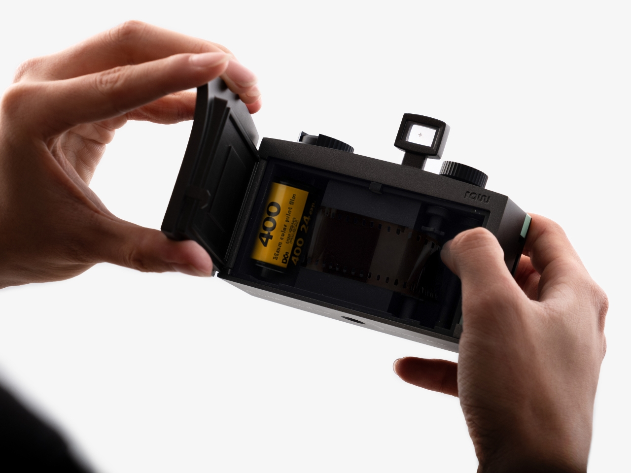
When Slower Actually Means Better: The RAW Camera Concept

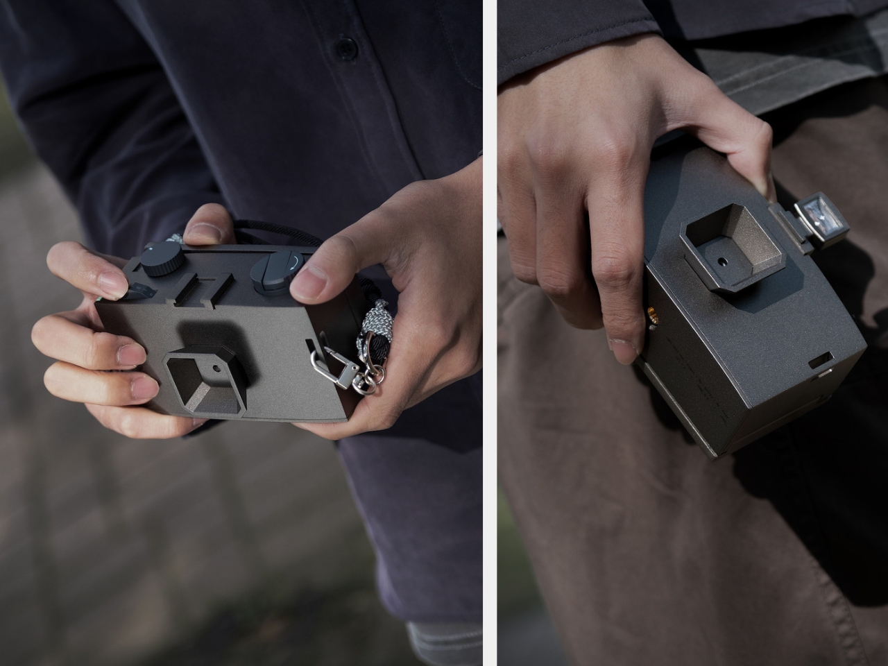
We take thousands of photos on our phones without thinking twice. Snap, scroll, forget, repeat. But here’s a wild thought: what if a camera literally forced you to slow down? That’s exactly what designer Seulgi Kim is exploring with RAW, a pinhole camera concept that’s part time machine, part meditation device, and entirely about reclaiming something we’ve lost in the digital age.

The name RAW works on two levels. First, it means “unrefined,” which perfectly captures the camera’s back-to-basics philosophy. Second, it references RAW image files in photography, those unprocessed originals that contain all the data before any digital manipulation happens. It’s a clever double meaning that sets up everything this concept is about: stripping away the excess to get back to what photography actually is.

Designer: Seulgi Kim

Create your own Aesthetic Render: Download KeyShot Studio Right Now!

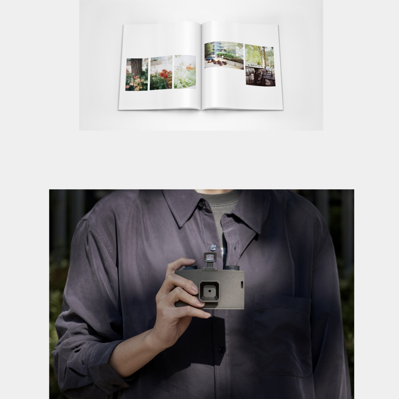
Normally we can shoot a hundred photos in seconds with our phones but RAW does something almost rebellious. It uses a pinhole aperture instead of a lens, which means each exposure takes several seconds or even minutes to complete. You can’t rapid-fire shots. You can’t casually capture every moment. Instead, you have to stand there with your subject, waiting, observing, really seeing what’s in front of you. It’s the photographic equivalent of choosing to walk instead of drive, not because you have to, but because you want to notice things along the way.

What makes RAW fascinating beyond its function is how Kim translated traditional Korean architecture into its design language. This isn’t just aesthetic borrowing; it’s a thoughtful connection between two forms of slowness and intentionality. Traditional Korean architecture embodies what Kim calls “the aesthetics of slowness,” where every element reflects careful consideration of space, time, and human presence. Those principles shaped buildings that have stood for centuries, and now they’re informing how we might think about capturing a single photograph.

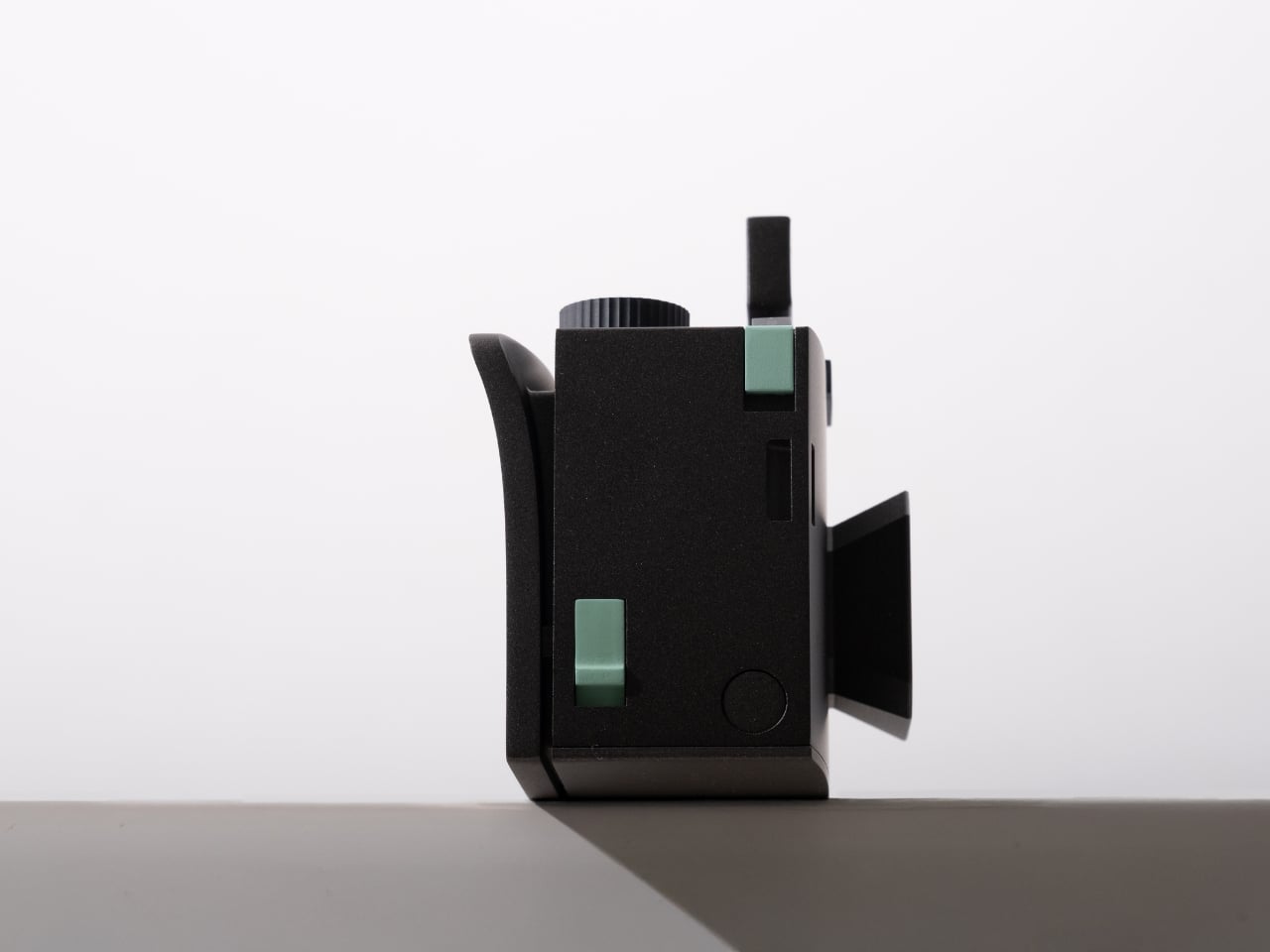
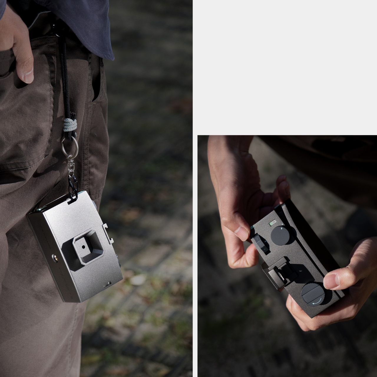
Look at the curved panel on the camera’s side. It’s directly inspired by the gentle curves of traditional Korean roof tiles, which were designed to protect houses from rain and wind. But here, that curve serves a completely modern purpose: it prevents slipping and creates a comfortable, stable grip. It’s functional heritage design at its best, where historical wisdom solves contemporary problems.

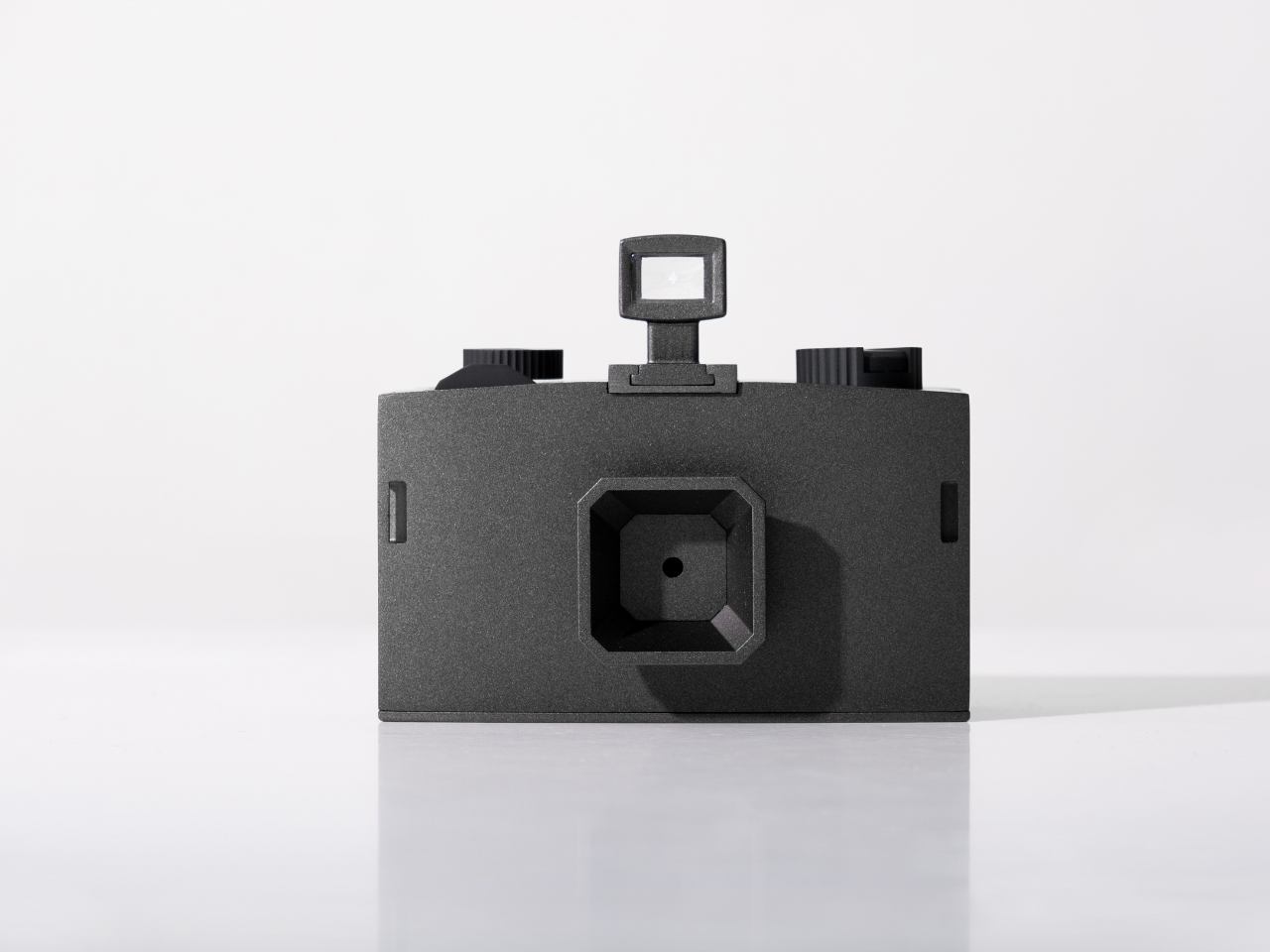
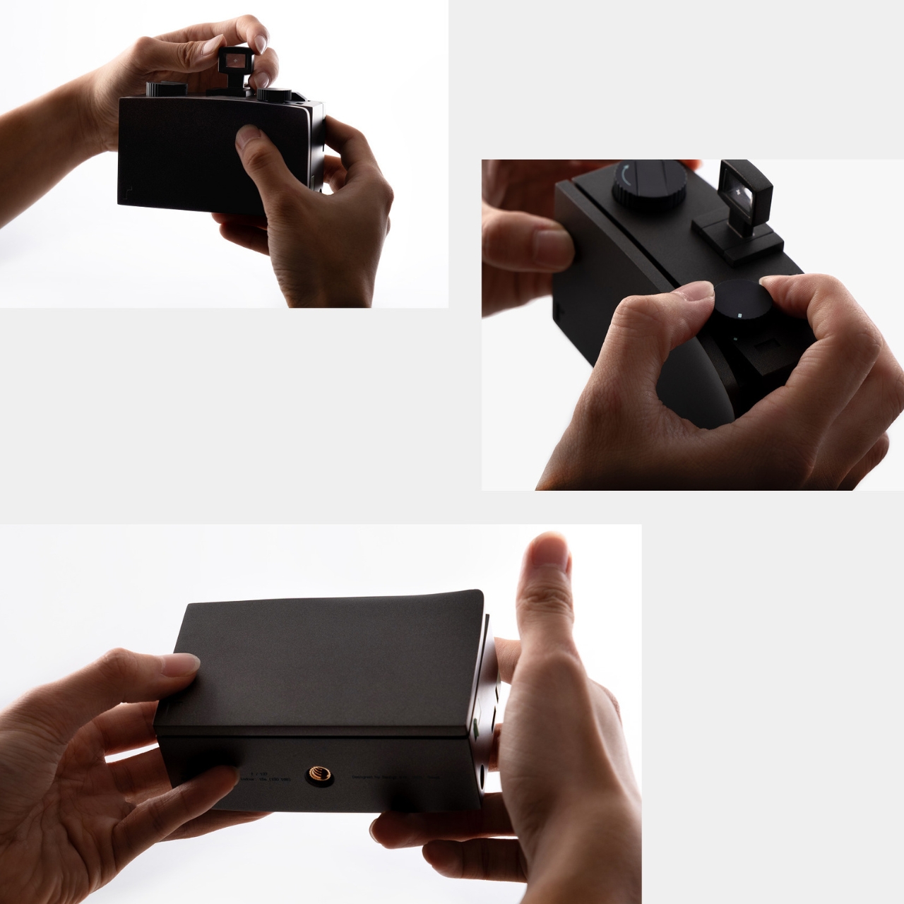
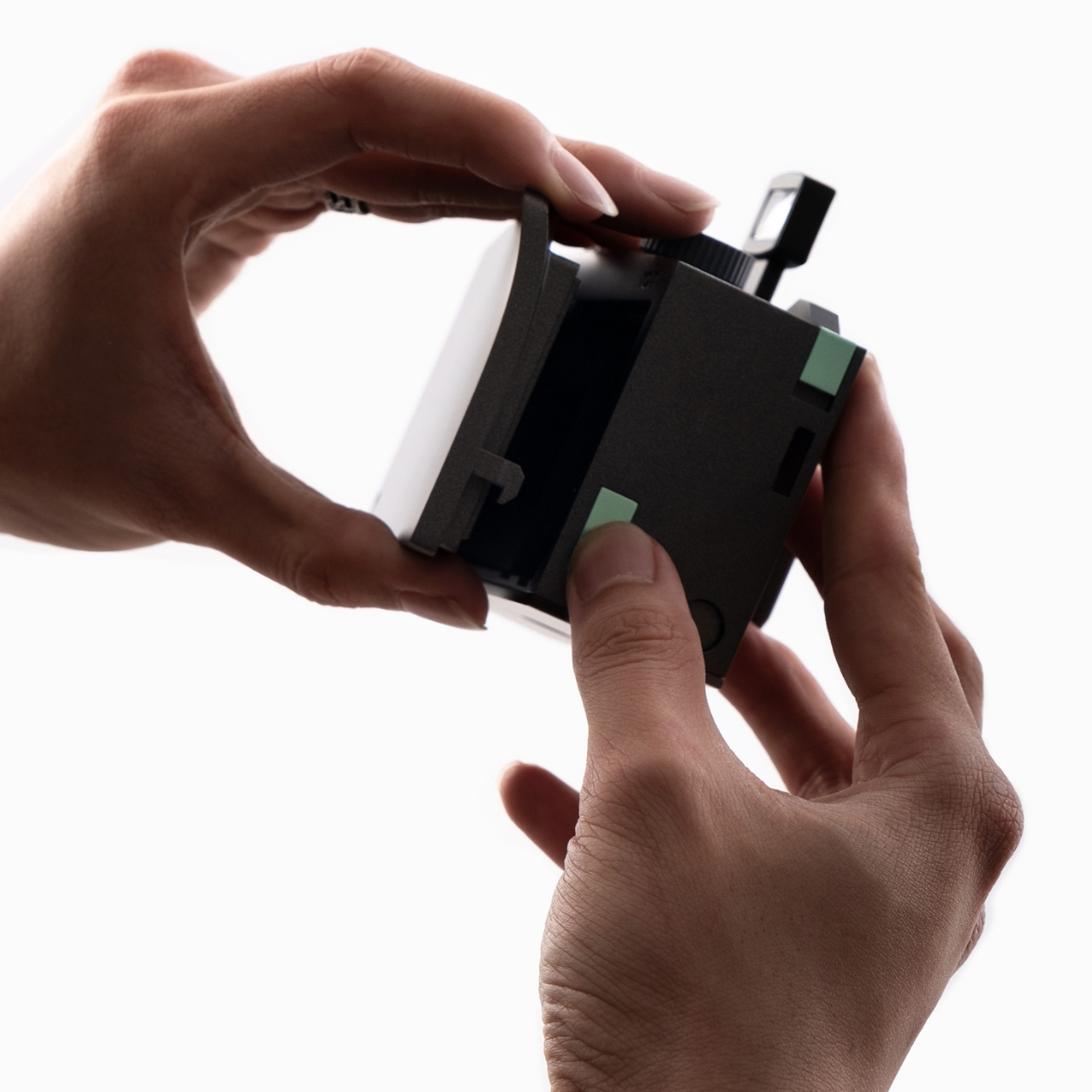
Then there’s the twelve-sided dial on top of the camera, which controls exposure time. In traditional Korean architecture, polygonal structures weren’t decorative flourishes; they provided stability and balance. Kim applies that same geometric logic to the timer dial, creating something that ranges from B (Bulb mode) through various seconds up to 30 minutes. That dodecagonal shape makes it intuitive to read and adjust your exposure settings at a glance. The design literally transforms time into something you can touch and see.

At the camera’s front, an octagonal hood acts as the window for incoming light. It’s not just there to look cool (though it does). The hood directs light rays evenly into the body and minimizes glare, ensuring balanced exposures. Every geometric choice serves both form and function, creating what Kim describes as “harmonious balance” between mechanical precision and traditional aesthetics.

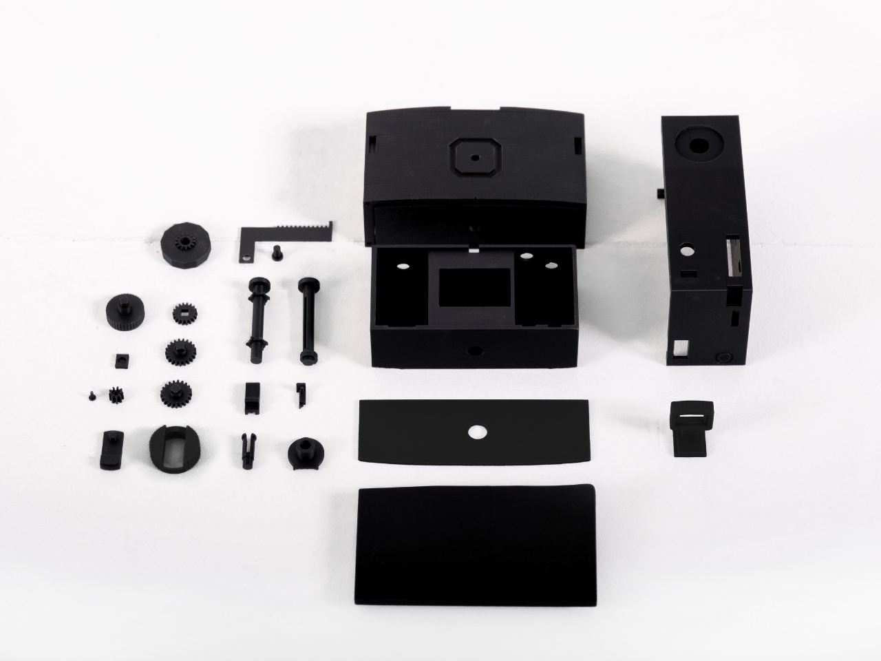
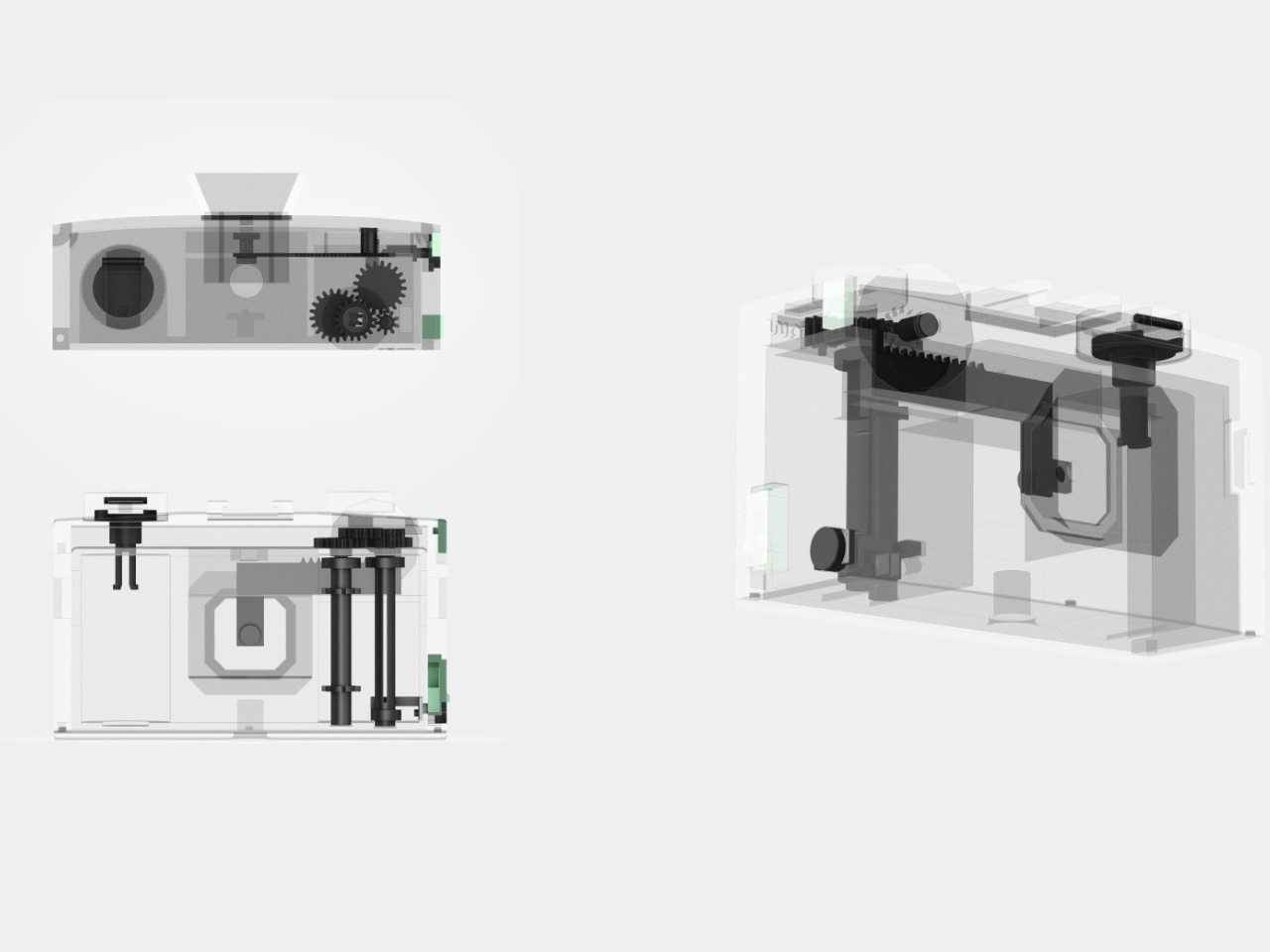
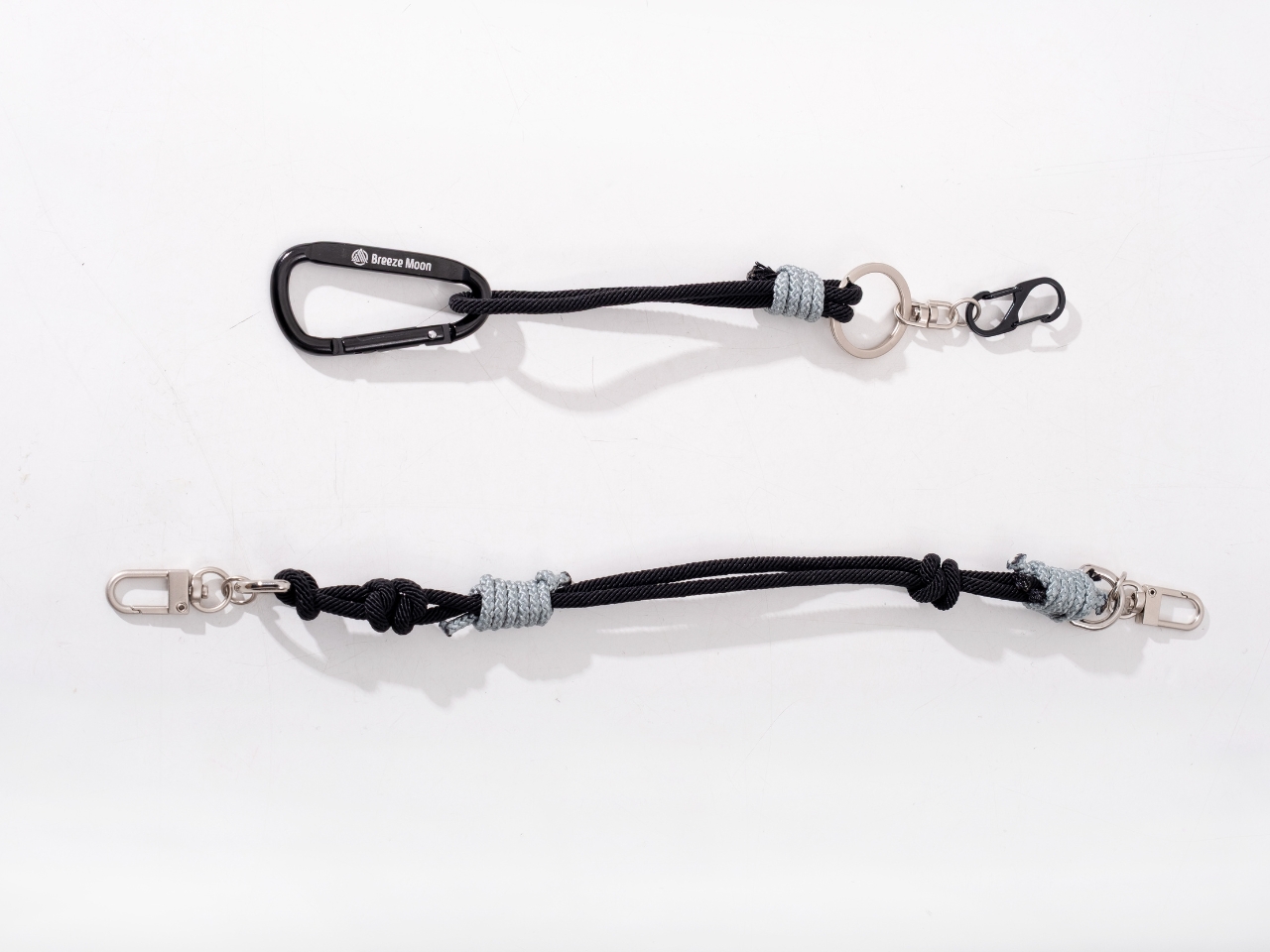
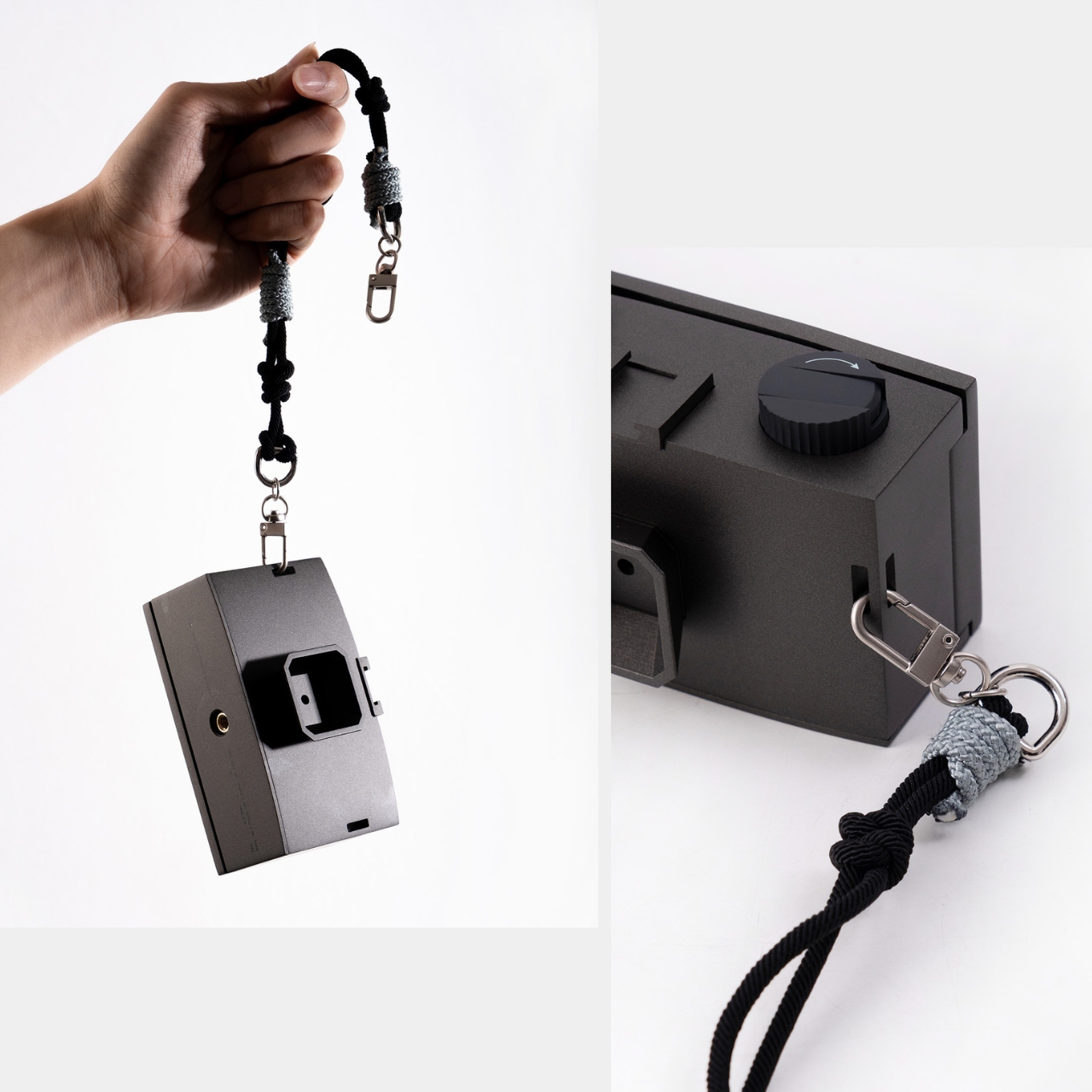
The whole package comes in matte black with subtle mint-green accents on the shutter button and side controls. There’s a minimalist viewfinder on top and a woven camera strap that adds tactile warmth to the technical precision. When you see the camera disassembled in one of the concept photos, all those gears and components laid out like an exploded diagram, it drives home just how much mechanical thought went into something designed to be analog in a digital world.

What’s really striking about RAW is how it challenges our relationship with image-making in 2025. We’ve reached a point where our phones can computationally enhance photos before we even press the shutter. AI can generate entire images from text prompts. Photography has become almost too easy, too fast, too disposable. Kim isn’t saying technology is bad; she’s asking what we lose when everything becomes instant.

The pinhole camera format forces a different kind of presence. When you need minutes to capture a single frame, you can’t be casual about it. You have to choose your subject carefully, consider the light, commit to the moment. That extended exposure time becomes a form of meditation, a way of connecting with what you’re photographing that simply isn’t possible when you’re machine-gunning through dozens of shots. RAW proves that sometimes the most innovative design move is stepping backward. By reaching into centuries-old architectural wisdom and combining it with one of photography’s oldest techniques, Kim has created something that feels genuinely fresh. It’s a camera that doesn’t just take pictures. It changes how you see.

The post When Slower Actually Means Better: The RAW Camera Concept first appeared on Yanko Design.

World’s First Robot-Made Ceramic Tiles Change Color With Sunlight

There’s something deeply satisfying about watching a potter’s wheel spin, the way human hands coax wet clay into form. But what happens when you hand that craft over to a robot? Designers Yutao Chen and Yiwen Gu asked that question, and their answer is CeraShingle, a façade system that’s reimagining what ceramic can do for architecture.

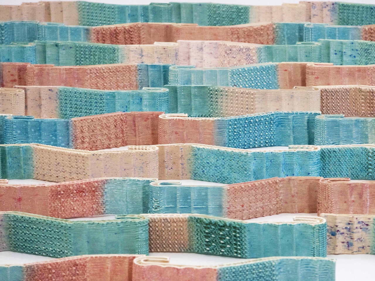
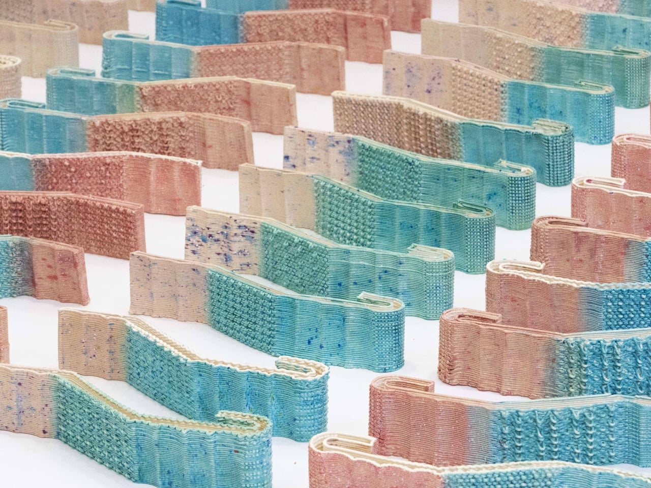
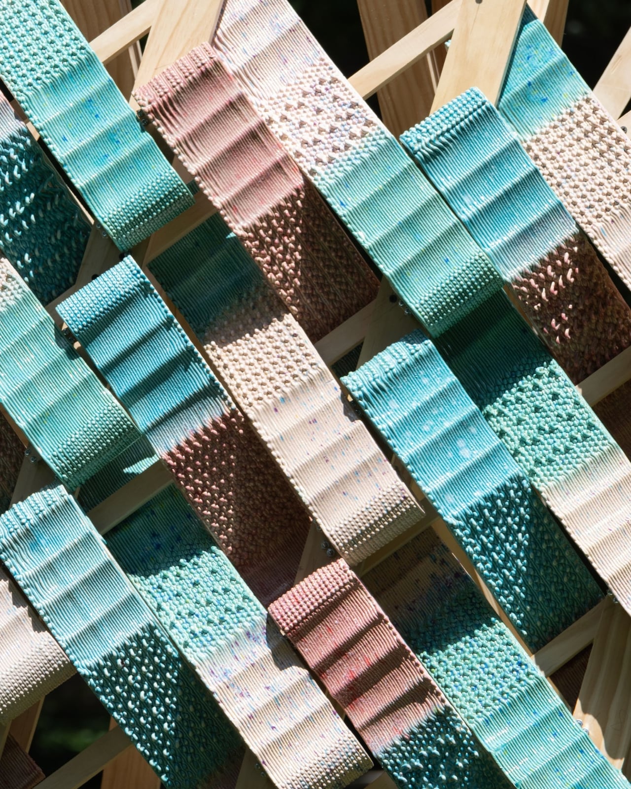
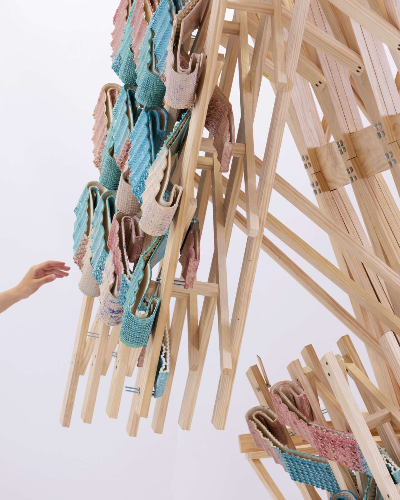
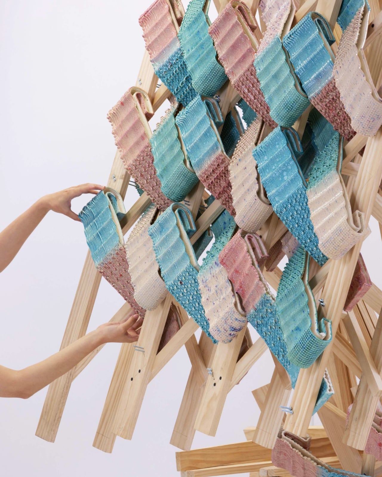
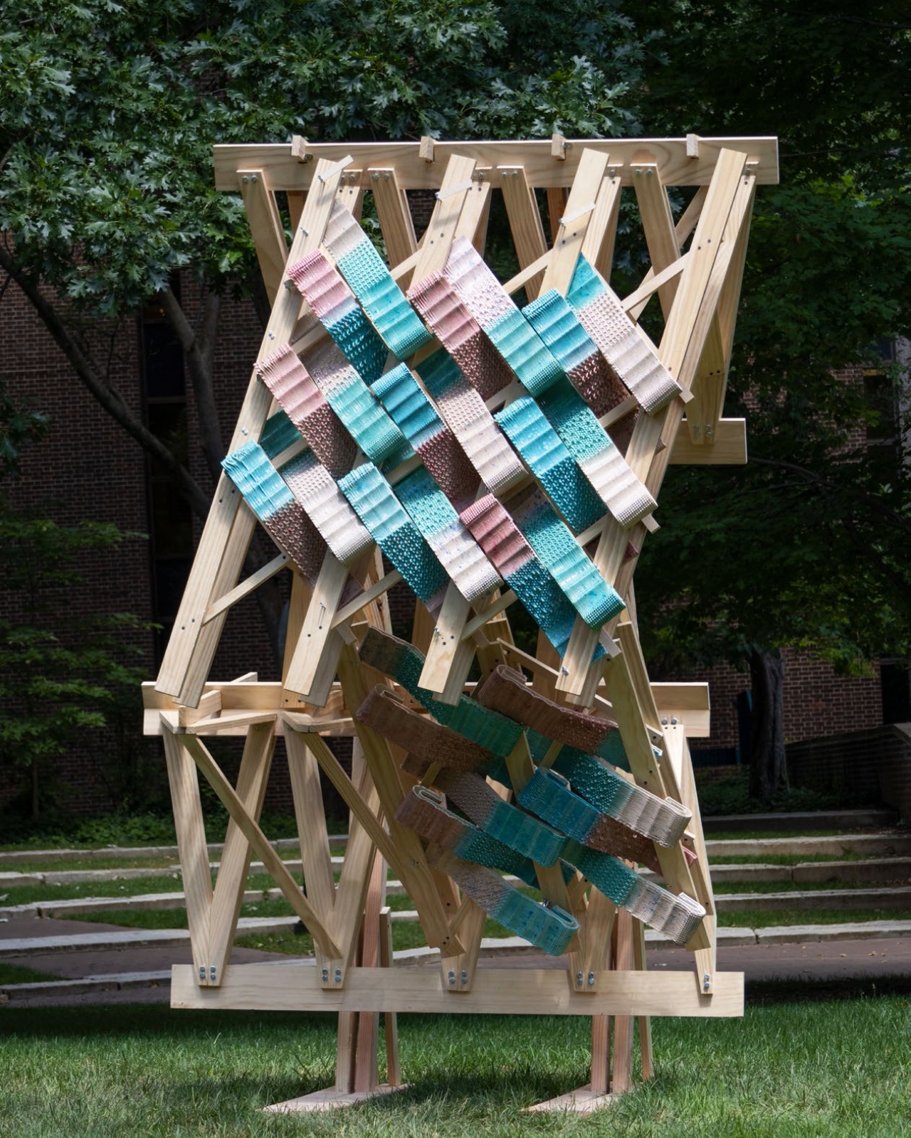
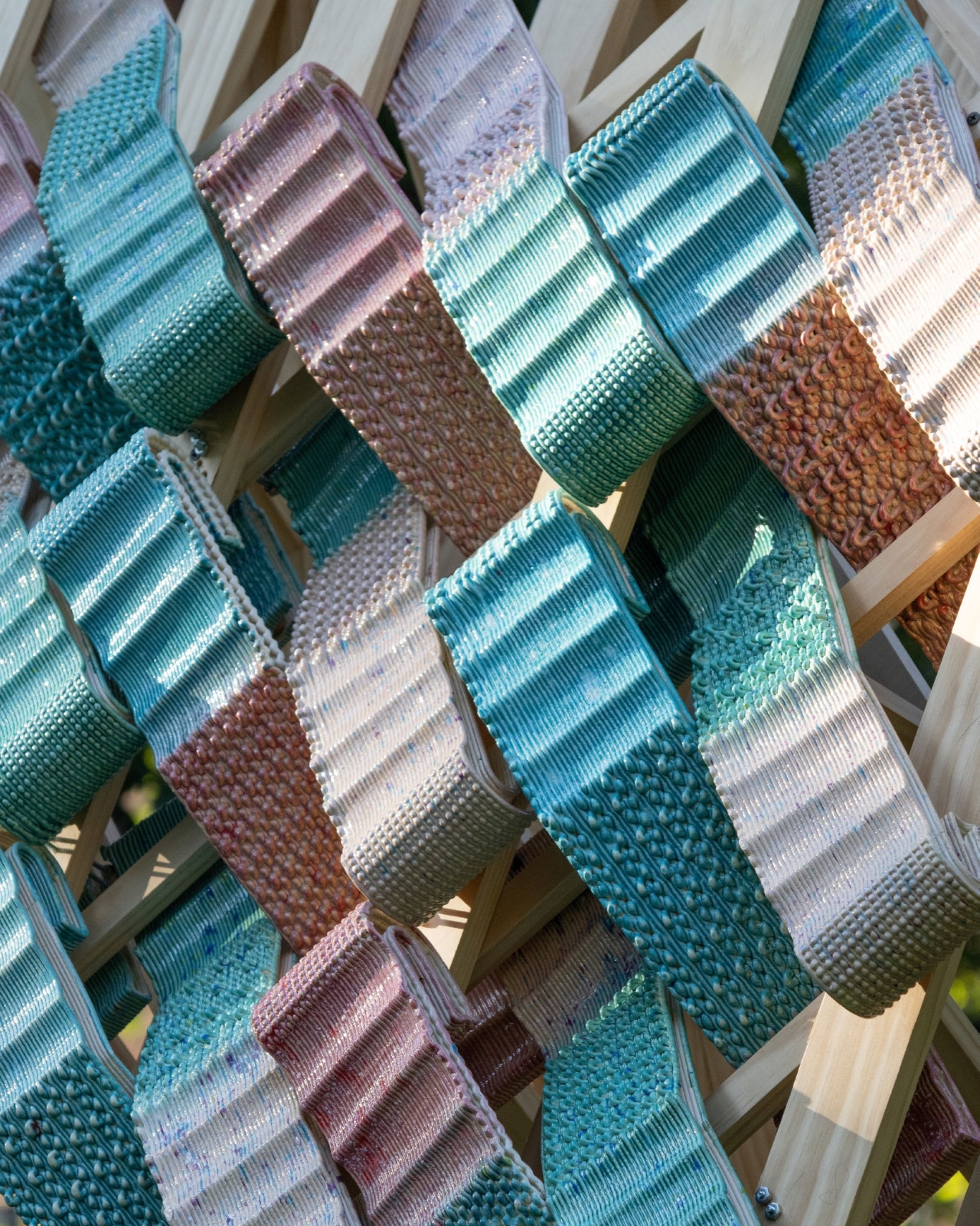
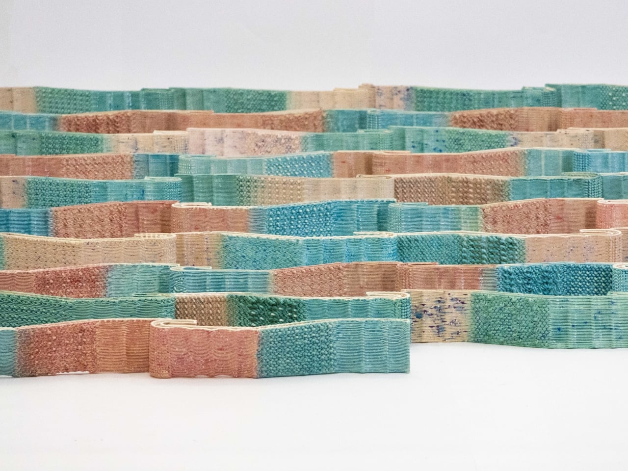
Picture a building wrapped in ceramic tiles, but not the flat, uniform squares you’re used to. CeraShingle modules are 3D-printed clay shingles with intricate textures, delicate perforations, and color gradients that flow across the surface like watercolor on paper. Each piece measures roughly 400 by 130 millimeters and weighs just over a kilogram, light enough to handle but substantial enough to feel real. When you install them with calculated overlap, they create a skin that seems to breathe with the light, shifting appearance as the sun moves and as you change your viewing angle.

Designers: Yutao Chen, Yiwen Gu

The magic happens in the making. Robotic arms deposit clay layer by layer, building up surface details that would be impossible with traditional molds. Think micro-ribs that catch shadows, patterns that emerge only at certain times of day, gentle curves that couldn’t be pressed or cast. It’s precision meets poetry. The parametric design workflow means each shingle can be unique while still fitting together on site, varying in thickness, texture, and shape within families of compatible parts.

What strikes me most about CeraShingle is how it refuses the usual digital-versus-handmade debate. Instead of replacing the warmth of craft with cold precision, it uses computational tools to amplify what makes ceramics special. The robot doesn’t erase the human touch; it extends what human hands can achieve. You get the intimacy of clay with possibilities that would make traditional ceramicists weep with joy.

The environmental story is equally compelling. The 3D printing process deposits material only where it’s needed, cutting waste dramatically compared to subtractive methods. Chen and Gu specify locally sourced clay and low-temperature glazes, reducing both transportation costs and firing energy. When a module gets damaged, you replace just that piece rather than a whole panel, extending the façade’s lifespan and keeping embodied carbon low. In an era when construction is responsible for nearly 40 percent of global carbon emissions, these details matter.

But CeraShingle isn’t just solving problems; it’s proposing a new aesthetic language. Contemporary cladding tends toward two extremes: either sleek industrial materials like glass and metal, or nostalgic brick and stone that look backward. CeraShingle occupies a third space. It’s clearly contemporary, born from digital tools and computational thinking, yet it carries ceramic’s ancient warmth. It’s sculptural without being precious, technical without being cold. The system scales beautifully. You could use it for a small architectural installation, an accent wall, or an entire building envelope. The modular logic means projects can grow organically, and repairs stay simple. For architects tired of choosing between innovation and practicality, that flexibility is powerful.

Set to launch in 2026, CeraShingle arrives at an interesting moment. We’re seeing renewed interest in craft and materiality after decades of smooth minimalism. People are hungry for texture, for surfaces that respond to light and touch, for buildings that feel less like sealed boxes and more like living things. At the same time, climate concerns are pushing architecture toward lighter, more efficient assemblies. CeraShingle threads that needle. It gives you the sensory richness of traditional materials with the performance and adaptability of contemporary systems. It’s a building skin that can think, that can vary and respond while staying grounded in earth and fire.

What Chen and Gu have created isn’t just a clever product; it’s a provocation. It asks what happens when we stop treating digital fabrication as a replacement for craft and start seeing it as craft’s next chapter. The answer, wrapped around a building and catching the afternoon light, might just be the future of how we clad our world.

The post World’s First Robot-Made Ceramic Tiles Change Color With Sunlight first appeared on Yanko Design.

This Dutch Studio Just Built a Room Divider From Old T-Shirts

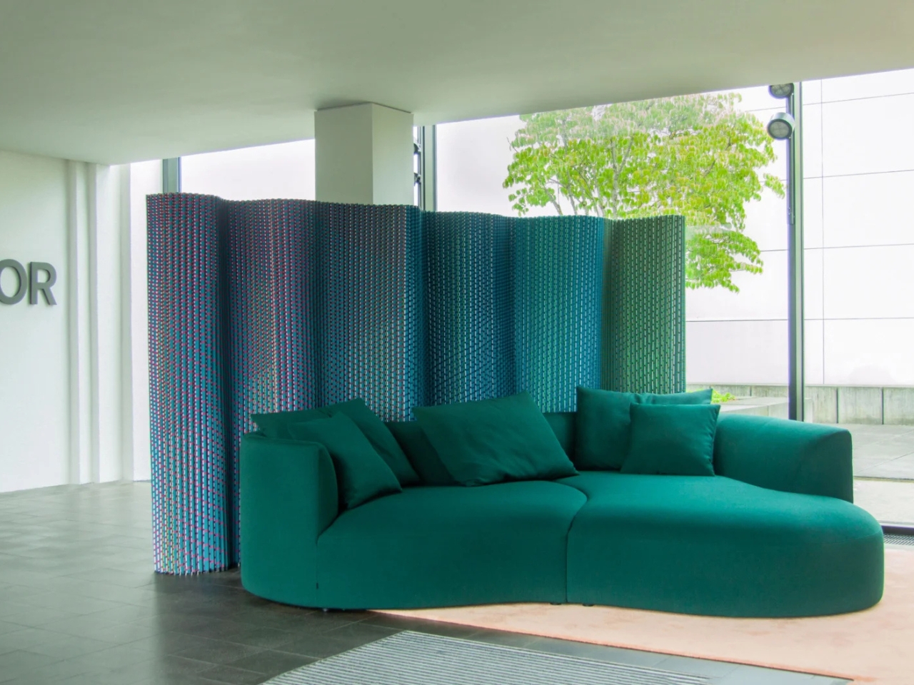
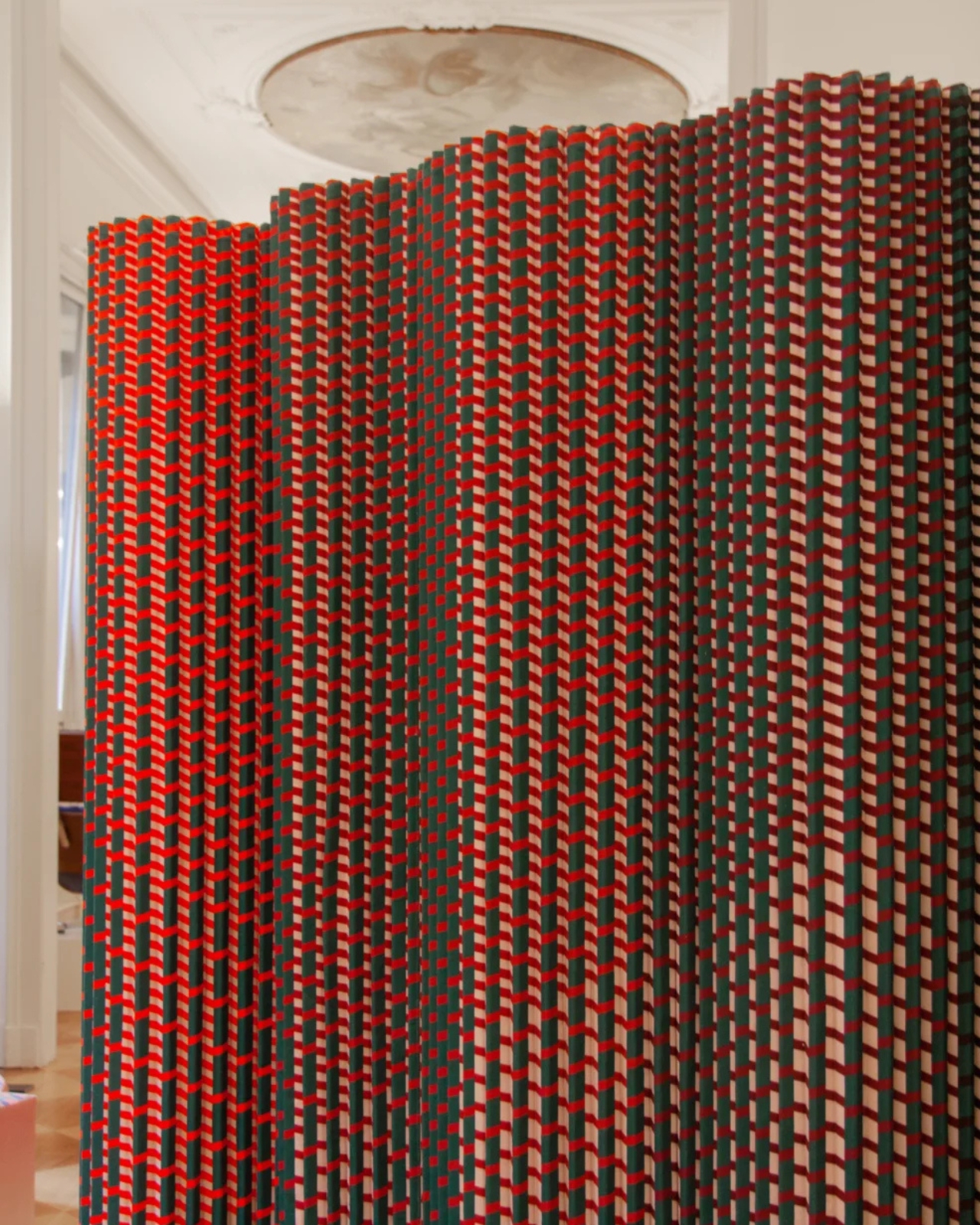
Have you ever looked at a piece of fabric and wondered what would happen if you gave it superpowers? That’s essentially what Dutch design studio Luis Marie did with their latest creation, Plissade, a room divider that’s turning heads for being completely, wonderfully, all about textiles.

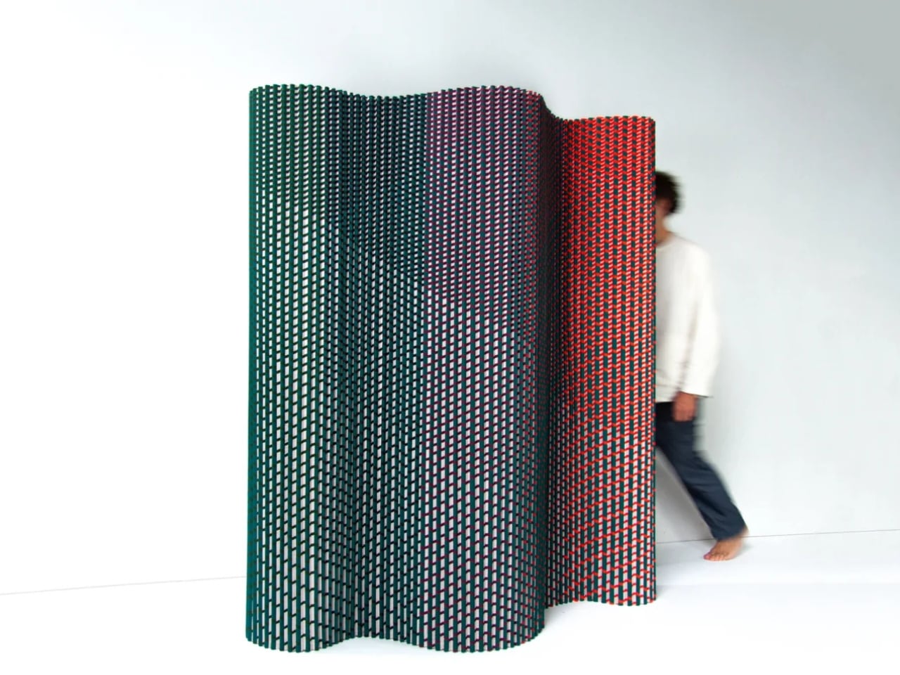
Here’s the thing about room dividers: they’re usually pretty predictable. You’ve got your folding screens, your sliding panels, your wooden frames with some fabric stretched across them. They do the job, sure, but they’re not exactly exciting. Plissade, on the other hand, ditches the traditional playbook entirely. Instead of relying on rigid frames or heavy materials, this sculptural partition stands on its own through the power of pleating alone.

Designer: Luis Marie

The designers behind this clever piece, Fenna van der Klei and Patricio Nusselder, drew inspiration from the traditional craft of textile pleating, where fabric is carefully folded to create different shapes and volumes. It’s the same technique that gives your favorite pleated skirt its structure or adds dimension to fancy curtains. But here, pleating isn’t just decorative. It’s doing all the heavy lifting, quite literally. The folds are engineered in a way that gives the divider enough rigidity to stand upright without any additional support, which is pretty remarkable when you think about it.

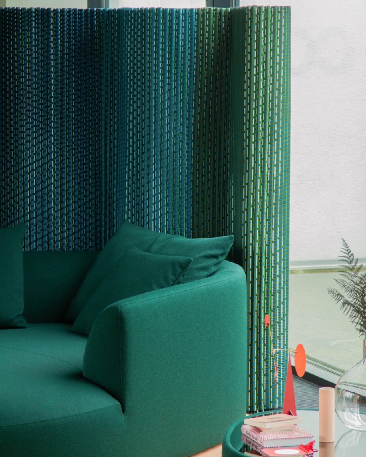
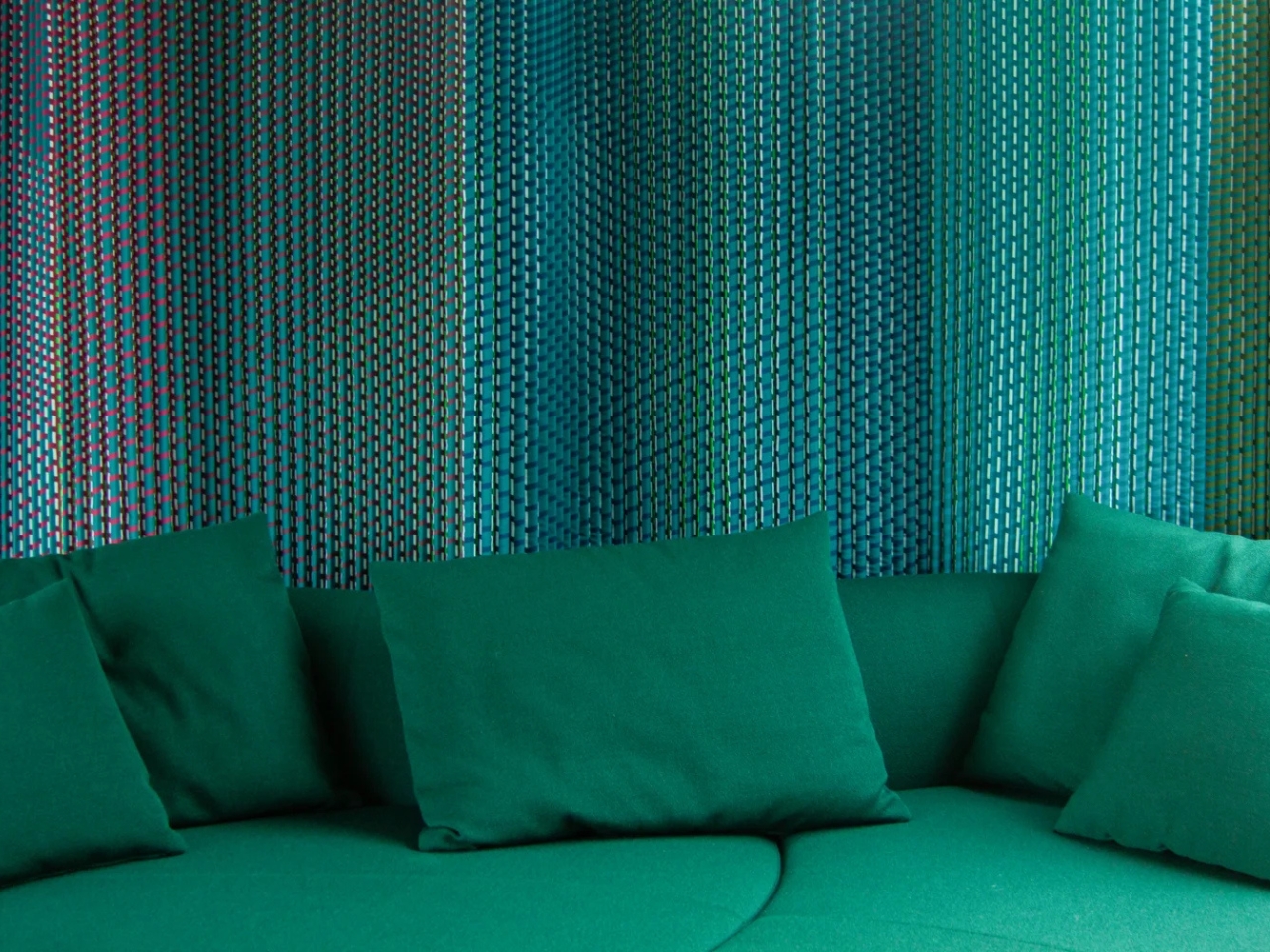
What makes Plissade even more interesting is what it’s made from. The inner layer consists of felt created from recycled post-consumer polyester clothing. Yes, that means your old t-shirts and jeans could theoretically have a second life as sound-absorbing room dividers. The outer layer features woven textile made from recycled polyester yarns. So not only is this piece solving the age-old problem of dividing space in style, it’s also addressing our growing waste problem in a tangible way.

The acoustic properties are another bonus feature that makes Plissade particularly relevant for our modern living situations. With more people working from home and living in open-plan spaces, the need for flexible sound management has never been greater. Those pleated layers of textile don’t just look sculptural, they actually absorb sound, creating little pockets of acoustic privacy without the permanence of walls.

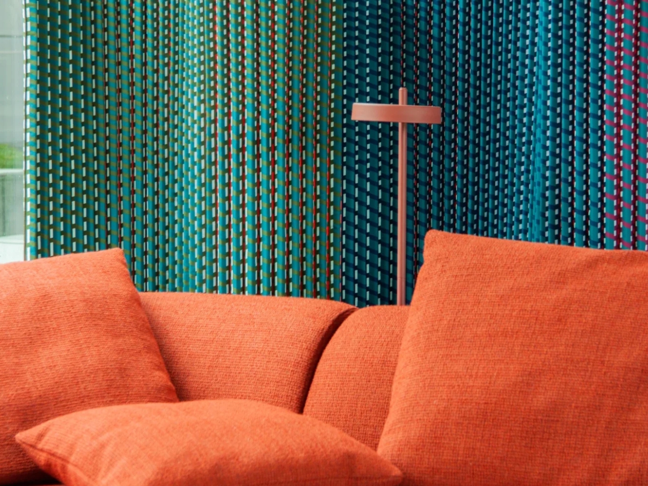
And then there’s the visual impact. Luis Marie offers Plissade in vibrant colors that create optical illusions reminiscent of gem facets. The way light plays across those pleated surfaces changes depending on your viewing angle, making the divider feel alive and dynamic. It’s the kind of design detail that transforms a functional object into something you actually want to look at. In a world where so much of our stuff is just background noise, having a piece that demands attention in the best way possible feels refreshing.

What Luis Marie has really done here is challenge our assumptions about what textiles can do. We’re used to thinking of fabric as something that needs support, something that drapes and folds because it’s soft and pliable. But Plissade proves that with the right engineering and understanding of material properties, textiles can be structural, functional, and beautiful all at once. For anyone who loves the intersection of old techniques and new applications, this room divider is a fascinating case study. It takes centuries-old pleating knowledge and applies it to solve very current problems: flexible space division, sound absorption, sustainable material use, and visual interest in our homes and workspaces.

Whether you’re dealing with a studio apartment that needs better zoning, an office that could use some acoustic help, or you simply appreciate design that makes you think twice about material possibilities, Plissade offers something genuinely fresh. It’s a reminder that sometimes the most innovative solutions come from looking at traditional crafts through a contemporary lens and asking, “What if we pushed this further?”

The post This Dutch Studio Just Built a Room Divider From Old T-Shirts first appeared on Yanko Design.
This Minimalist Oven Concept Redefines Kitchen Style

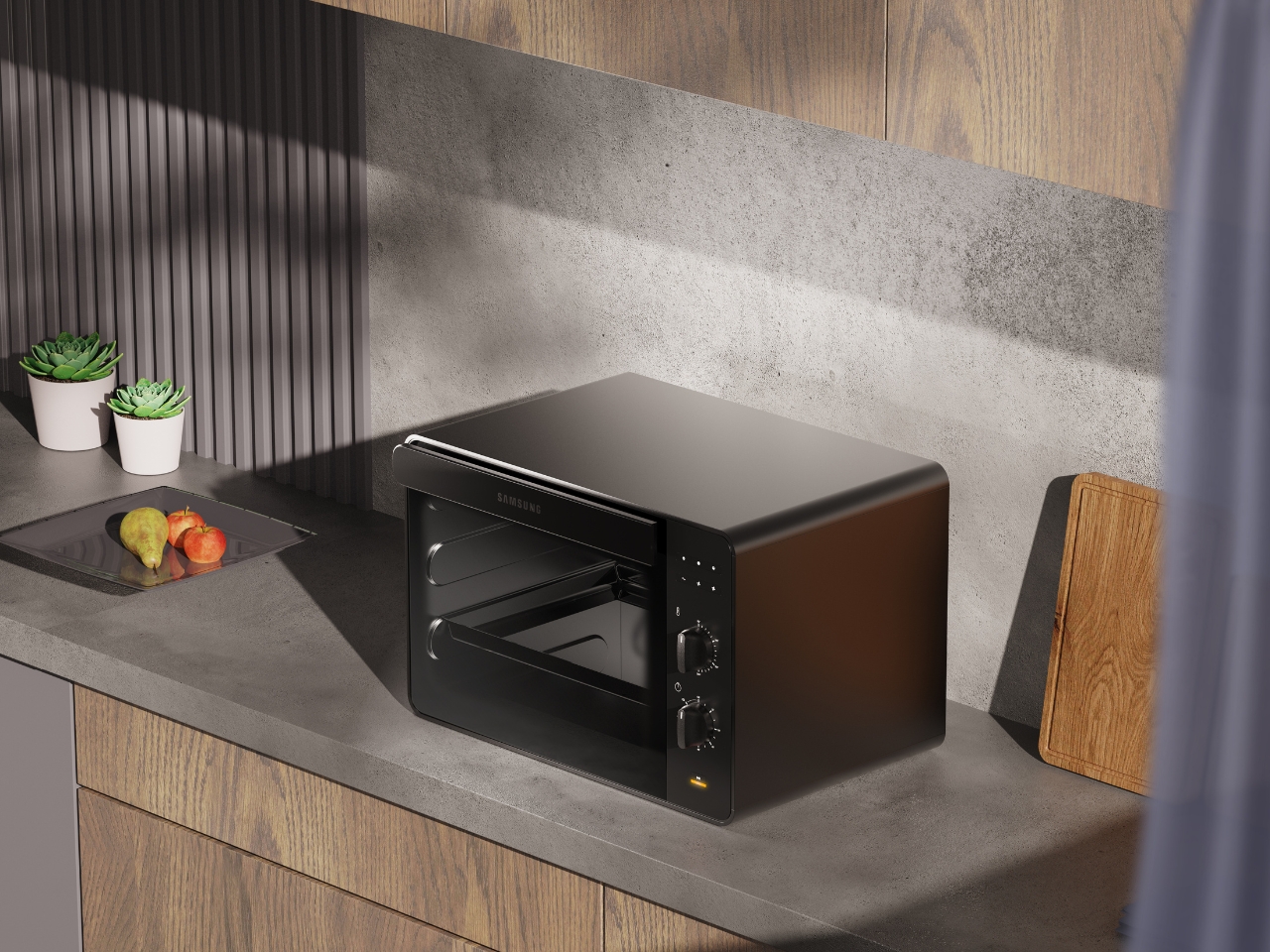
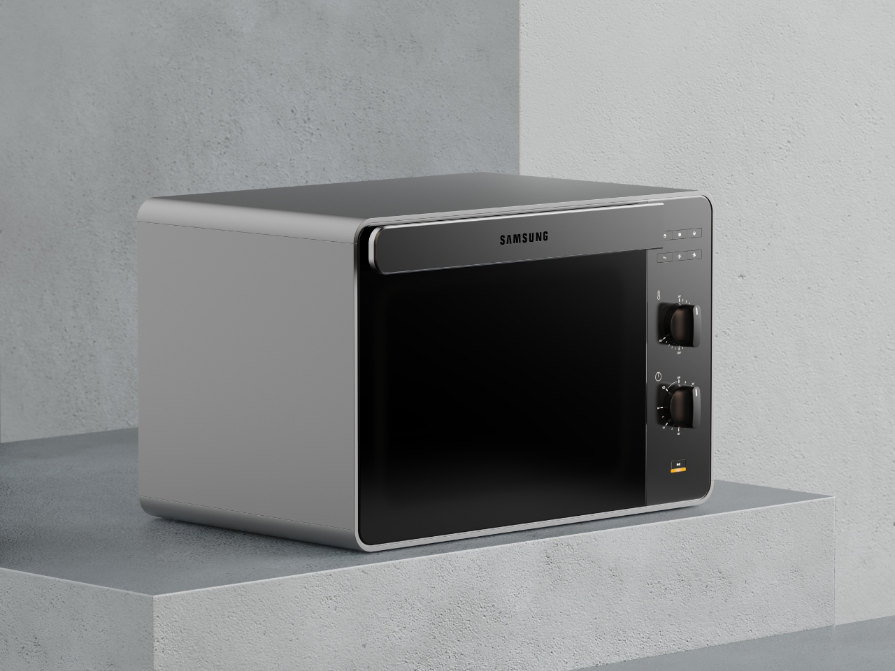
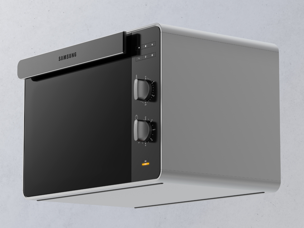
There’s something refreshing about a kitchen appliance that doesn’t try too hard. The Samsung Bake Ultra concept by Octavio Leon Villareal proves that minimalism, when done right, can be anything but boring. This compact electric oven manages to look like a premium piece of tech while maintaining the kind of simplicity that actually makes sense in real life.

At first glance, the Bake Ultra’s two-tone design catches your eye without demanding attention. The soft gray body paired with a black glass front creates a visual balance that feels both contemporary and timeless. It’s the kind of aesthetic choice that works whether your kitchen leans industrial-chic or warm-and-cozy. The rounded edges soften what could have been an overly boxy silhouette, giving it an approachable quality that invites you to actually use it rather than just admire it from afar.

Designer: Octavio Leon Villareal

Create your own Aesthetic Render: Download KeyShot Studio Right Now!

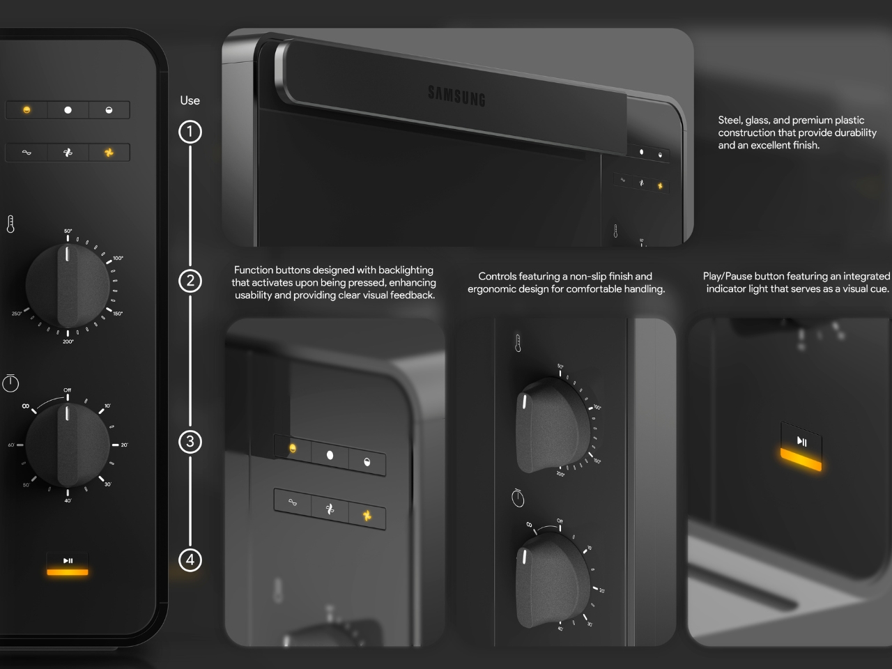
What really sets this concept apart is how thoughtfully the details have been considered. Take the control panel, for instance. While many modern appliances chase touchscreen interfaces and digital everything, the Bake Ultra embraces tactile controls with two substantial dial knobs. There’s something inherently satisfying about turning a physical dial, getting that immediate feedback in your hand as you adjust temperature or time. It’s intuitive in a way that doesn’t require you to remember which icon does what or whether you need to hold or tap.

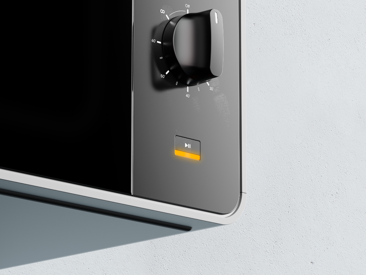
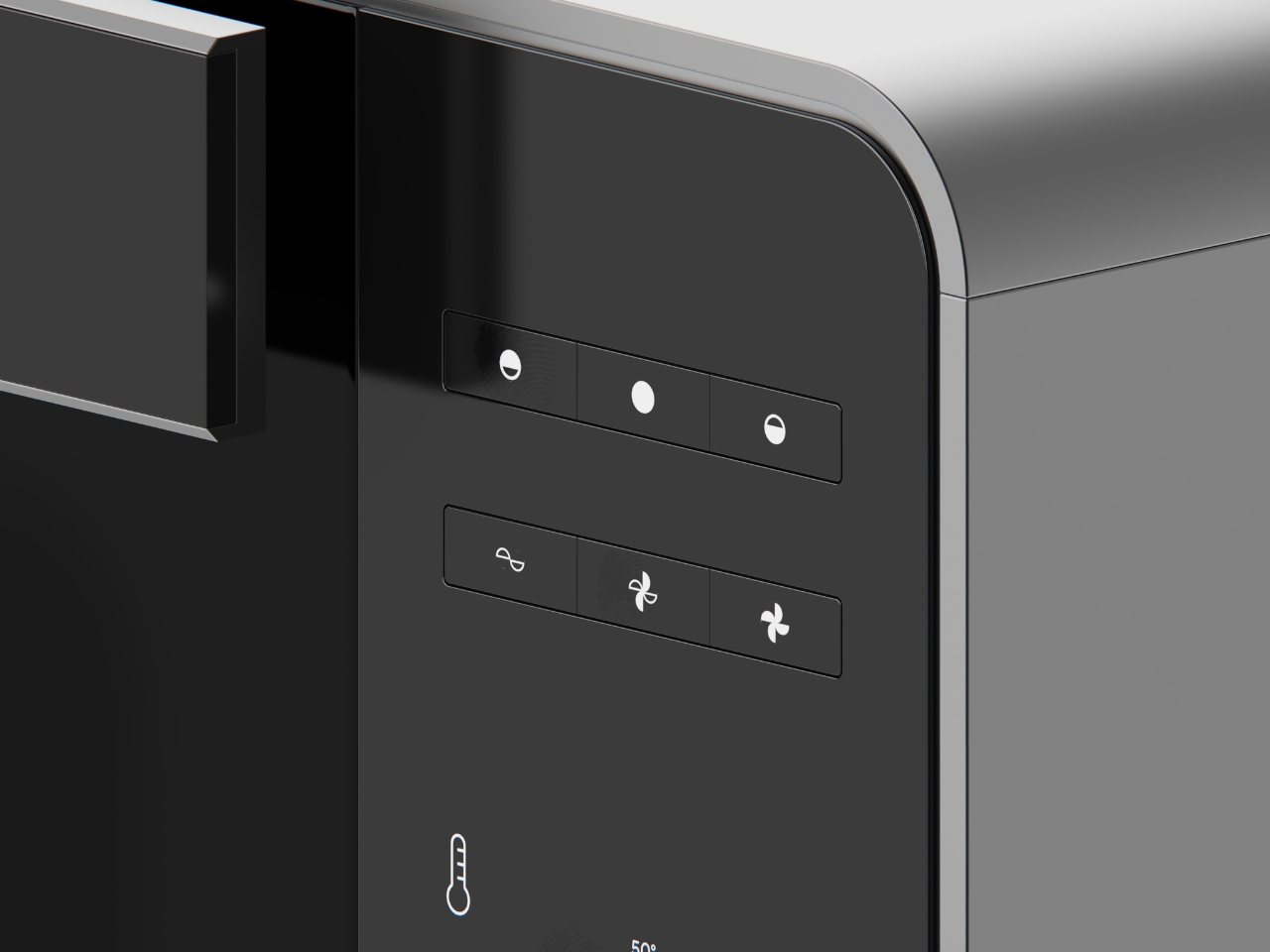
The function buttons sit flush against the black panel, their minimalist pictograms becoming visible when backlit. This clever detail means the interface stays clean and uncluttered when the oven is off, but provides clear visual feedback when you need it. No squinting at faded labels or wondering if you’ve actually pressed the right button. The yellow accent on the play/pause indicator adds a pop of warmth to the otherwise monochromatic palette, serving as both a functional cue and a subtle design element.

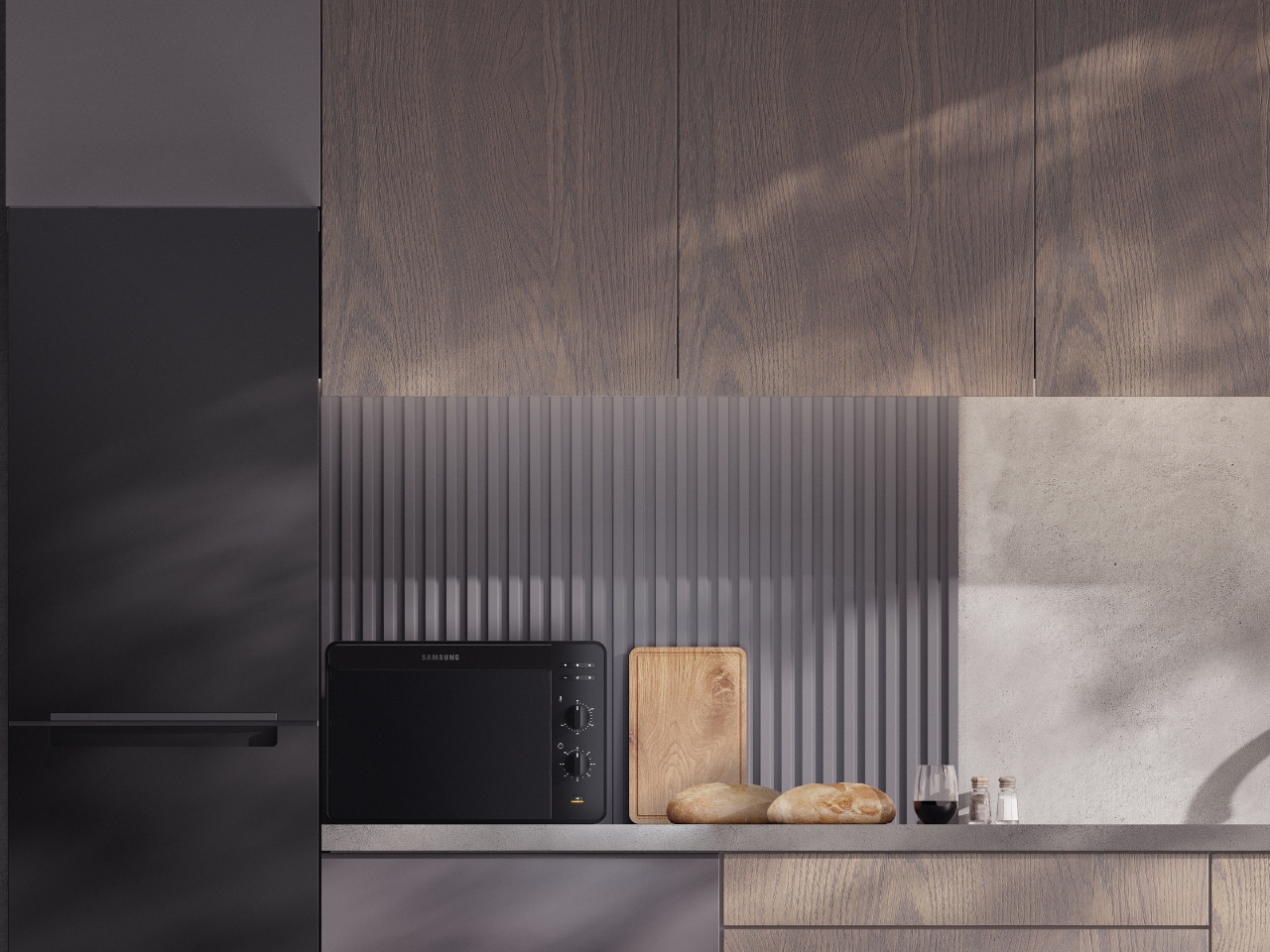
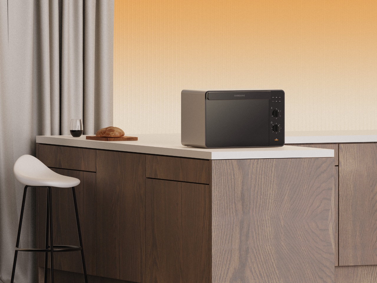
The compact footprint makes this particularly relevant for how many of us actually live. Not everyone has the space or budget for a full kitchen renovation with built-in everything. The Bake Ultra sits comfortably on a countertop, fitting into small apartments, office kitchens, or as a supplementary oven for larger spaces. The renders show it in various settings, from minimalist concrete-and-wood kitchens to warmer spaces with traditional cabinetry, and it holds its own in each environment. That versatility is the hallmark of genuinely good design.
Looking at the ergonomics, the controls are positioned on the right side panel at a comfortable height for standing operation. The knobs have a non-slip finish and substantial presence that suggests quality and ease of use. These aren’t flimsy plastic dials that will wear out after a year. They look like they mean business, with clear temperature markings and a tactile response that gives you confidence in what you’re setting.

What makes this concept compelling is how it aligns with Samsung’s broader design identity while still feeling fresh. You can see echoes of their smartphone and television aesthetics in the clean lines and premium materials, creating a cohesive ecosystem for people who appreciate that kind of design continuity across their tech and appliances. It’s the difference between a collection of random stuff and a curated space.

Will we ever see the Bake Ultra on store shelves exactly as rendered here? Maybe, maybe not. But that’s not really the point of concept design. Projects like this push the conversation forward about what our kitchen appliances could be. They challenge manufacturers to think beyond the status quo and remind us that functional objects can also be beautiful, that technology can feel human, and that minimalism doesn’t have to mean cold or boring.

The post This Minimalist Oven Concept Redefines Kitchen Style first appeared on Yanko Design.