This Solar Bench Just Turned Every City Street Into a Charging Hub

Picture this: you’re exhausted from walking through the city, desperately need to charge your phone, and suddenly spot the perfect bench bathed in soft light. You sit down, plug in, and realize this isn’t just any piece of street furniture. It’s actually harvesting energy from the sun and transforming the urban landscape around you. Welcome to Perovia, a design project that’s making us rethink what public spaces can be.

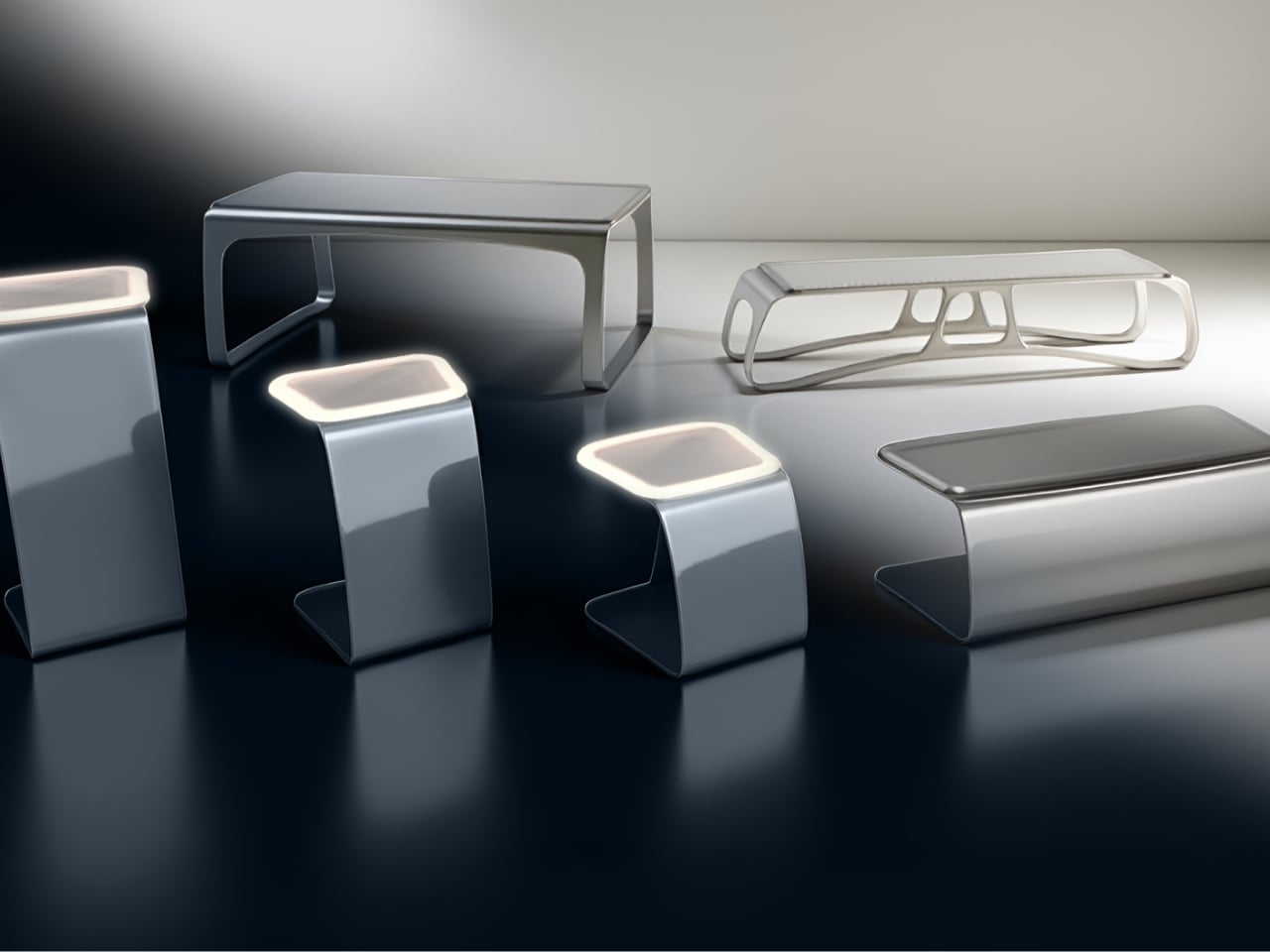
Created by TAIWA, a contemporary design laboratory that lives at the crossroads of technology, sustainability, and spatial aesthetics, Perovia is essentially an urban bench on steroids. But calling it just a bench feels like calling a smartphone just a phone. It’s so much more than that.

Designer: TAIWA
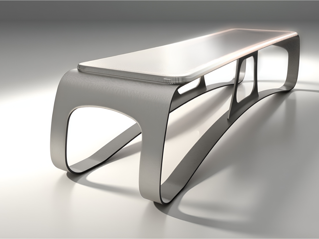
The name itself is a clever nod to perovskite, a revolutionary solar material that’s been causing quite a stir in renewable energy circles. Unlike traditional bulky solar panels, perovskite cells are flexible, efficient, and can be integrated into all sorts of surfaces. TAIWA took this cutting-edge tech and asked a simple question: what if our city furniture could work as hard as we do?
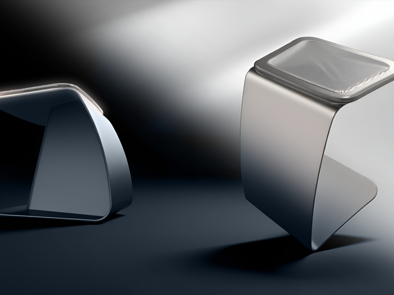
The result is something that looks like it rolled out of a sci-fi movie set. Perovia functions as what the designers call “a node of light in the urban circuit.” During the day, it quietly soaks up solar energy through its integrated perovskite cells. As evening falls, it transforms into a glowing beacon, providing ambient lighting that makes public spaces feel safer and more inviting. But it doesn’t stop there. The bench also features USB charging ports, because let’s be honest, in 2025, a dead phone battery is basically a modern emergency.
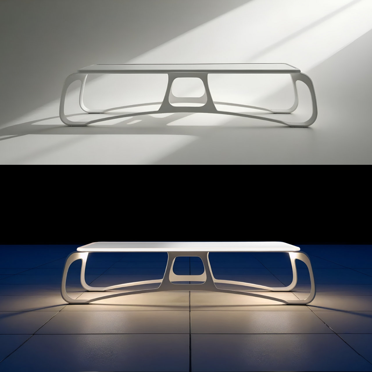
What makes this design particularly brilliant is how it addresses multiple urban challenges simultaneously. Cities everywhere are wrestling with sustainability goals, trying to reduce their carbon footprints while making public spaces more livable. Street lighting gobbles up enormous amounts of electricity, and providing public charging stations requires complex infrastructure. Perovia tackles both issues in one sleek package.
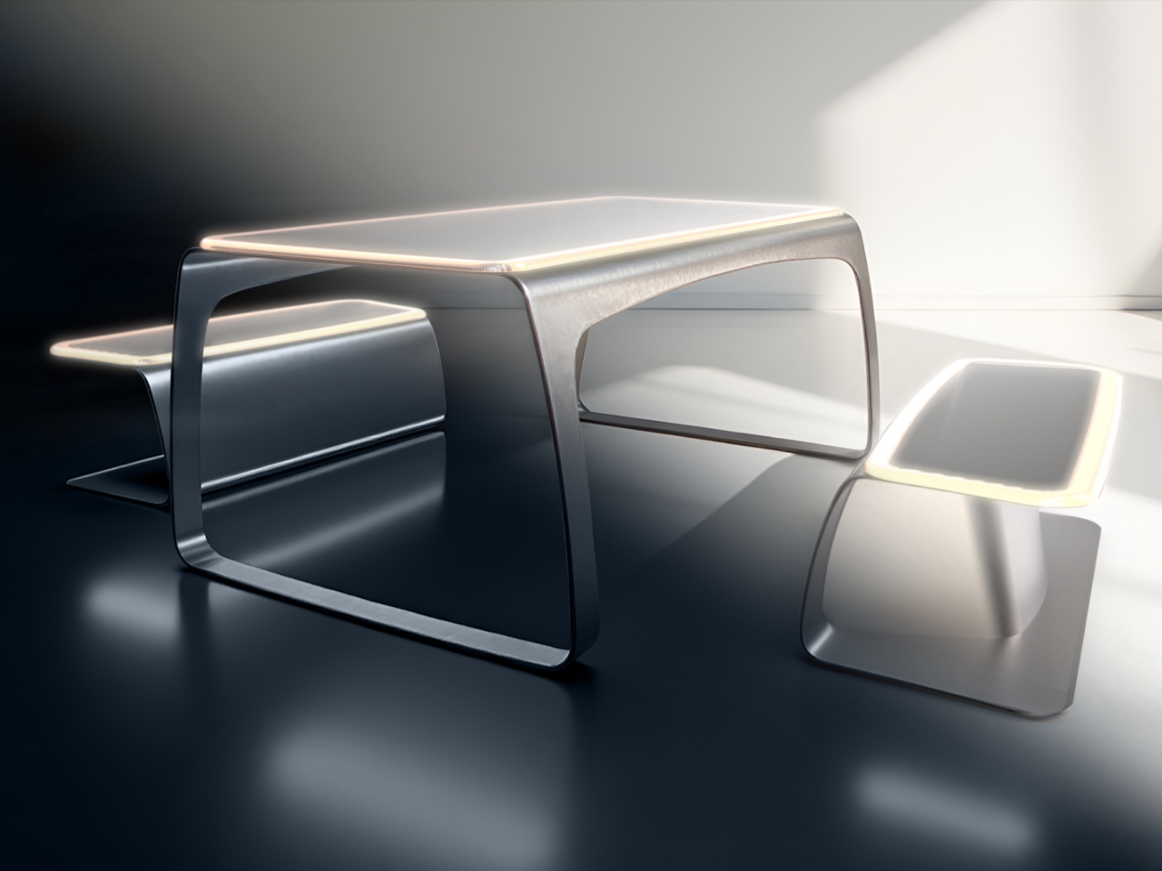
But beyond the recognition and the tech specs, what’s really exciting about Perovia is its philosophy. TAIWA describes being inspired by “the silent rhythm of cities,” and you can feel that in the design. Cities have their own pulse, their own flow of energy and movement. Most street furniture just sits there passively, but Perovia actively participates in that urban metabolism. It takes energy when the sun is high, gives light when darkness falls, and serves people whenever they need it.
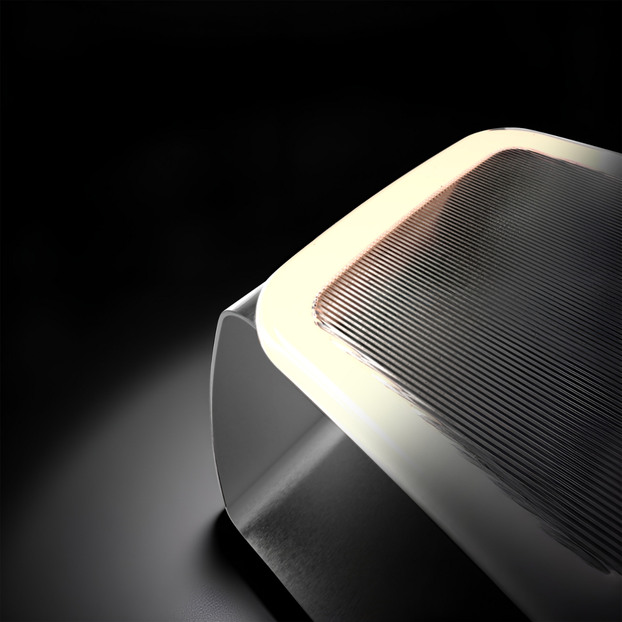
This kind of thinking represents a fundamental shift in how we approach urban design. For too long, sustainability features have been add-ons, afterthoughts bolted onto existing infrastructure. Perovia shows what happens when you bake sustainability into the core concept from the beginning. The result doesn’t just work better, it looks better too. The bench manages to be both futuristic and inviting, high-tech without feeling cold or intimidating.
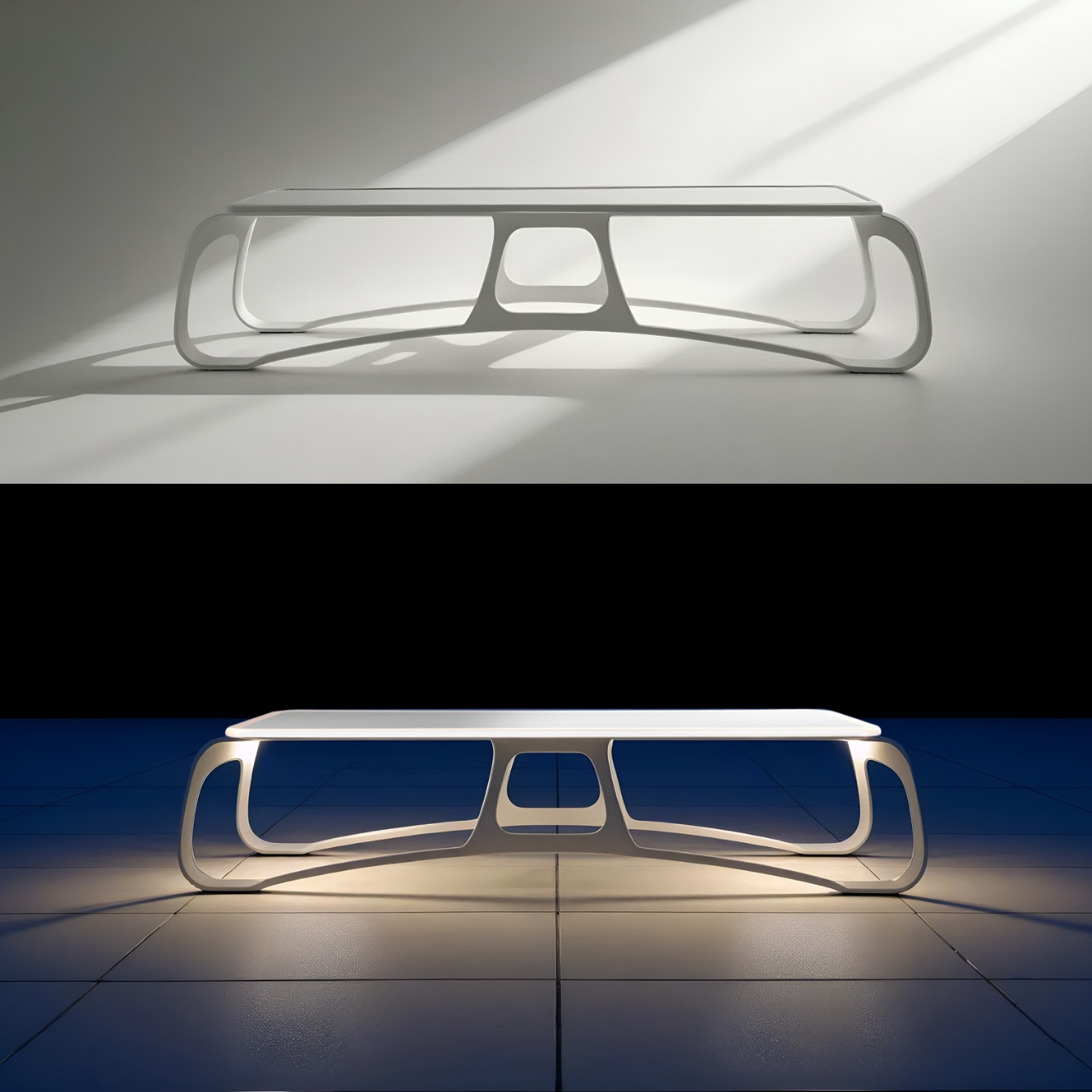
Of course, the real test will be seeing these benches roll out in actual cities, weathering real conditions and serving real communities. Will the technology hold up? Can it scale affordably? These are questions that only time will answer. But as a proof of concept and a vision of what’s possible, Perovia absolutely delivers.
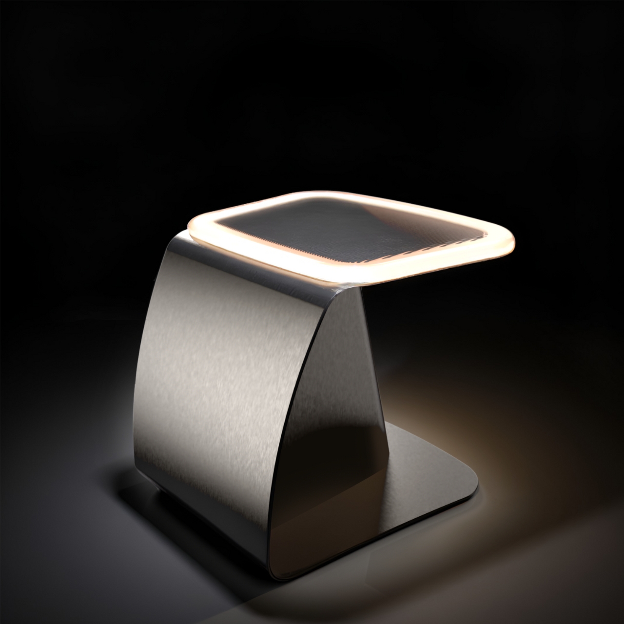
We live in a world where climate change dominates headlines and cities struggle to reinvent themselves for a sustainable future. So we need designs that don’t make us choose between functionality and environmental responsibility. Perovia suggests we can have both, wrapped up in a package that actually makes our cities more beautiful and livable. That’s the kind of design innovation worth getting excited about.
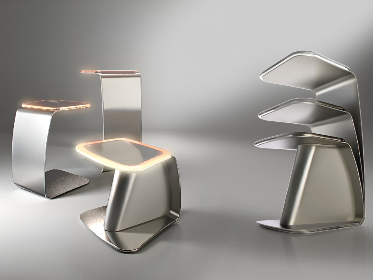
The post This Solar Bench Just Turned Every City Street Into a Charging Hub first appeared on Yanko Design.

Your Desk Lamp Just Got Smarter (And Took Notes from Inception)

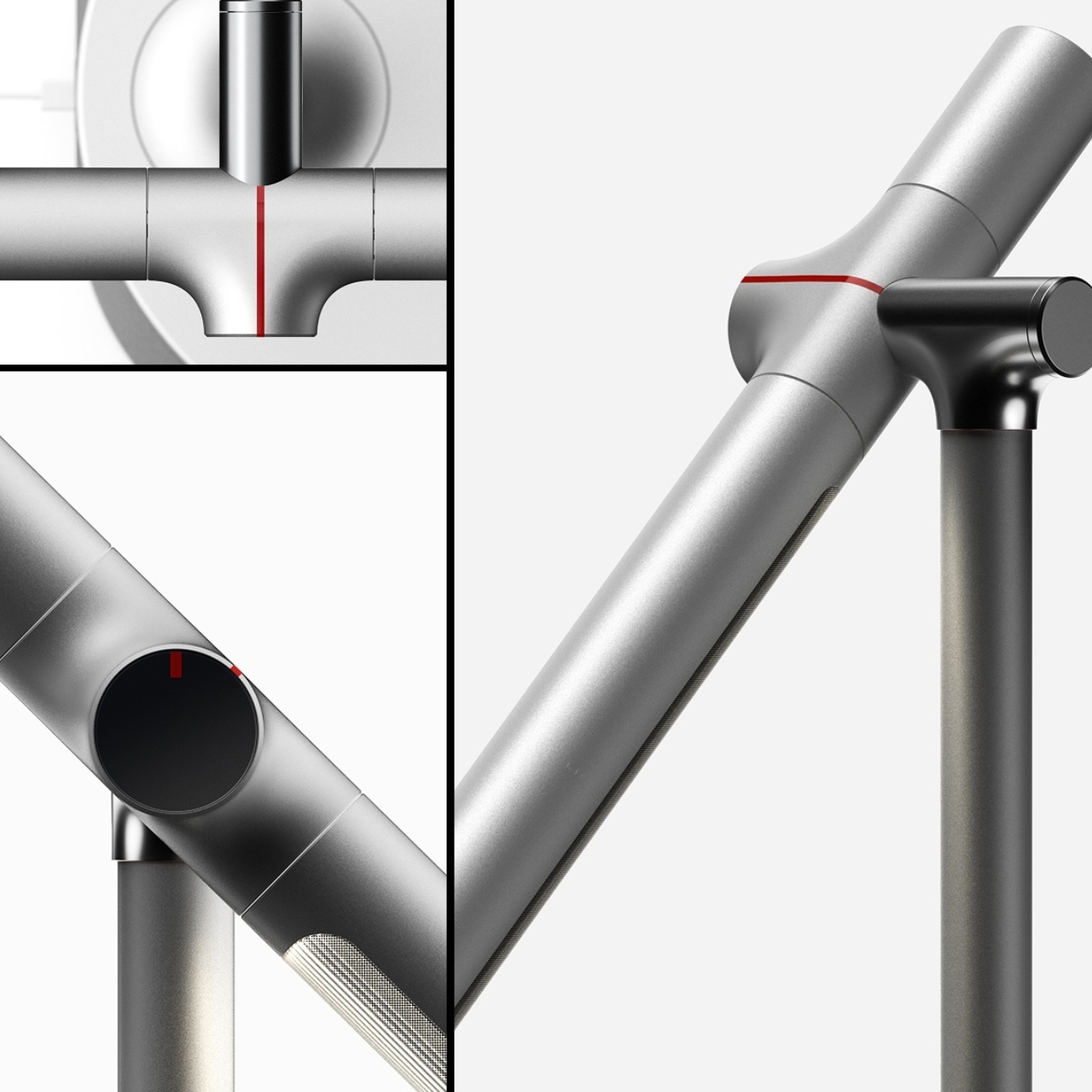
Remember that spinning top from Inception? The one that determined whether you were in a dream or reality? Well, a design team called SUPD took that iconic object and asked themselves a pretty interesting question: what if a product could help you enter a state of deep focus the same way that totem granted entry into the dream world? The result is DEEP, an AI-powered desk stand that’s making me rethink everything I thought I knew about workspace lighting.

Let’s be real for a second. We’re all drowning in distractions. Between notifications pinging, emails flooding in, and the constant pull of social media, achieving genuine focus feels like a superpower these days. And if you’ve ever tried to create the perfect work environment, you know the drill. You need your desk lamp positioned just right, white noise playing at the perfect volume, maybe some aromatherapy going, and oh yeah, all those tangled cables creating visual chaos that breaks your concentration every time you glance at them. DEEP tackles this modern problem with a surprisingly elegant solution: why scatter your focus tools across multiple devices when you could integrate them into one sleek package?

Designer: SUPD

The product itself looks like it stepped out of a near-future sci-fi film. It’s a desk lamp, sure, but it’s also packing a camera, speakers, and AI capabilities that work together to create what the designers call “optimized immersion environments.” The best part? Getting started is wonderfully simple. You turn the main power button, which is designed to mimic that spinning top from Inception (a detail that definitely made me smile), and then you just talk to it. Tell DEEP what you’re about to do, whether that’s studying, coding, reading, or creative work, and it automatically adjusts your environment to match.

Think about that for a moment. No more fiddling with multiple apps, no more adjusting three different devices, no more breaking your concentration before you’ve even started working. You speak, it listens, and your workspace transforms itself.

But DEEP doesn’t stop at automation. The designers clearly thought about the reality of personal preferences. Those side buttons let you fine-tune the lighting and sound to your exact specifications, and here’s where it gets smart: the system asks if you want to save your adjustments. Over time, DEEP learns your preferences for different activities, becoming more personalized the more you use it. The camera positioned at eye level isn’t just there for show. It’s analyzing you, checking your immersion status, and providing feedback to help maintain your focus. It’s like having a productivity coach built into your desk lamp, minus the awkward small talk.

I’m particularly taken with the attention to physical design details. Those red lines running along the top and front of the product aren’t just aesthetic choices. They help you maintain your preferred angles after adjusting the lamp’s position, creating a visual reference that makes it easier to remember your ideal setup. It’s the kind of thoughtful detail that separates good design from great design. The four-directional speakers at the base create spatial audio for immersion, whether that’s white noise, nature sounds, or whatever helps you slip into that flow state. And that integrated approach means no more cable spaghetti cluttering your desk, no more hunting for the right device, no more mental overhead just to start working.

What strikes me most about DEEP is how it recognizes that deep focus isn’t a luxury anymore. It’s a core skill, maybe even a competitive advantage in our attention-fractured world. The difference between weak concentration and strong concentration directly translates to productivity, creativity, and the quality of our work. DEEP doesn’t just acknowledge this reality; it builds an entire product philosophy around supporting it.

Is this the future of workspace design? Possibly. At minimum, it’s a fascinating glimpse at how AI integration can solve real problems without adding complexity. Sometimes the best technology is the kind that gets out of your way and just lets you work.

The post Your Desk Lamp Just Got Smarter (And Took Notes from Inception) first appeared on Yanko Design.

This Moving Furniture Just Solved The Co-Living Friendship Problem

Here’s a scenario you might know too well: You’re living in a co-living space with a bunch of strangers. You pass someone in the kitchen, make awkward eye contact, mumble “hey,” and retreat to your room. Sound familiar? Designers Ye Jin Lee, Jung A Park, and Yujin Lee definitely think so, because they created FURNY to solve exactly this problem.

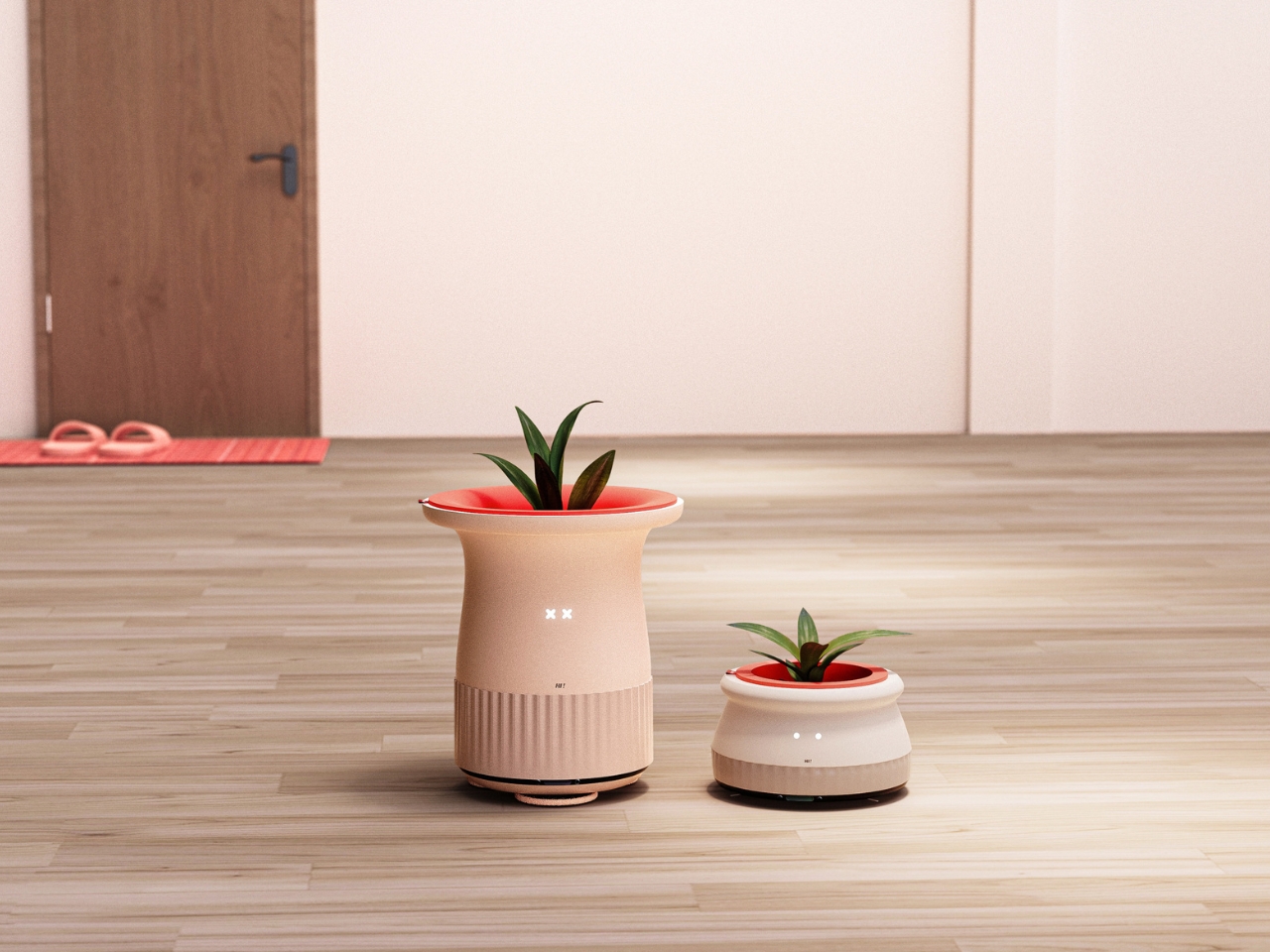
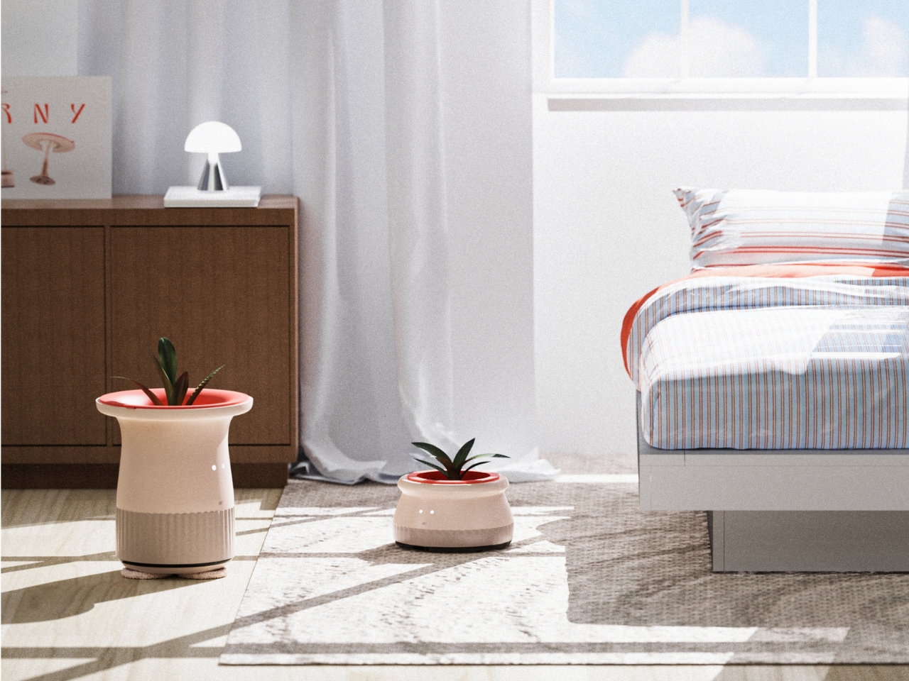
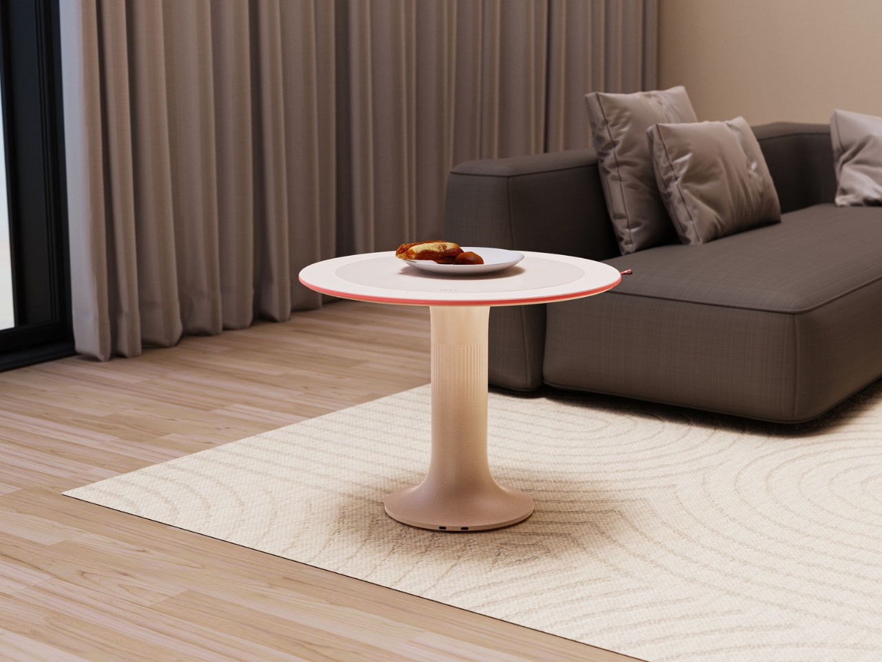
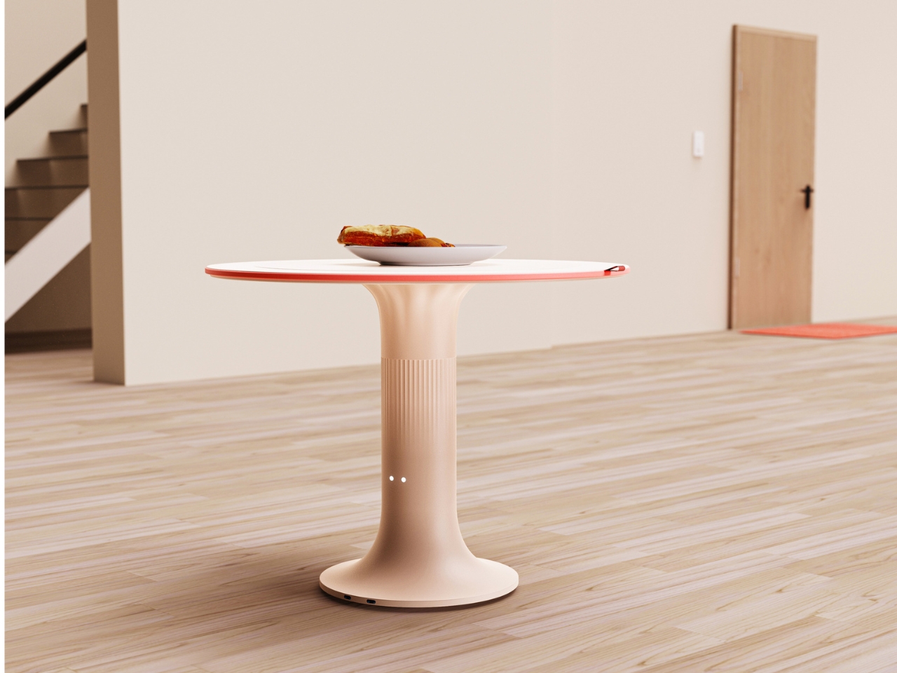
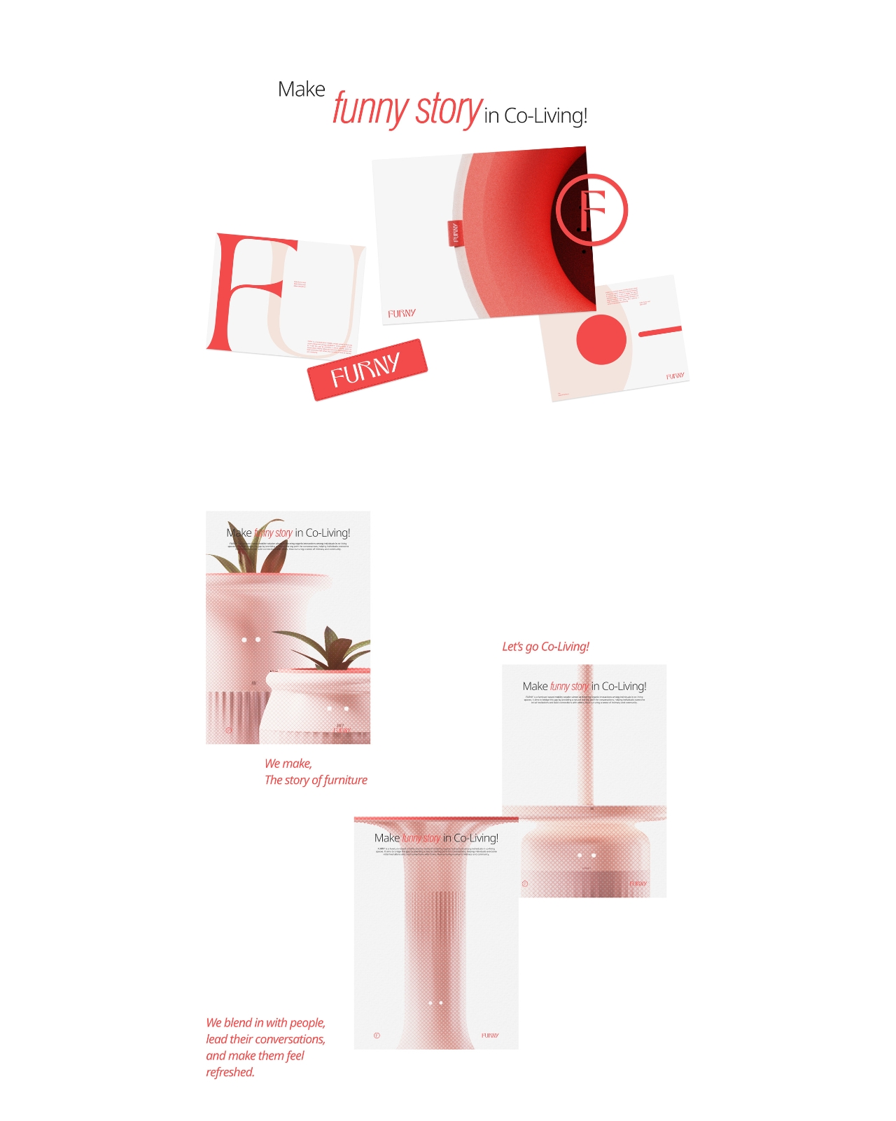
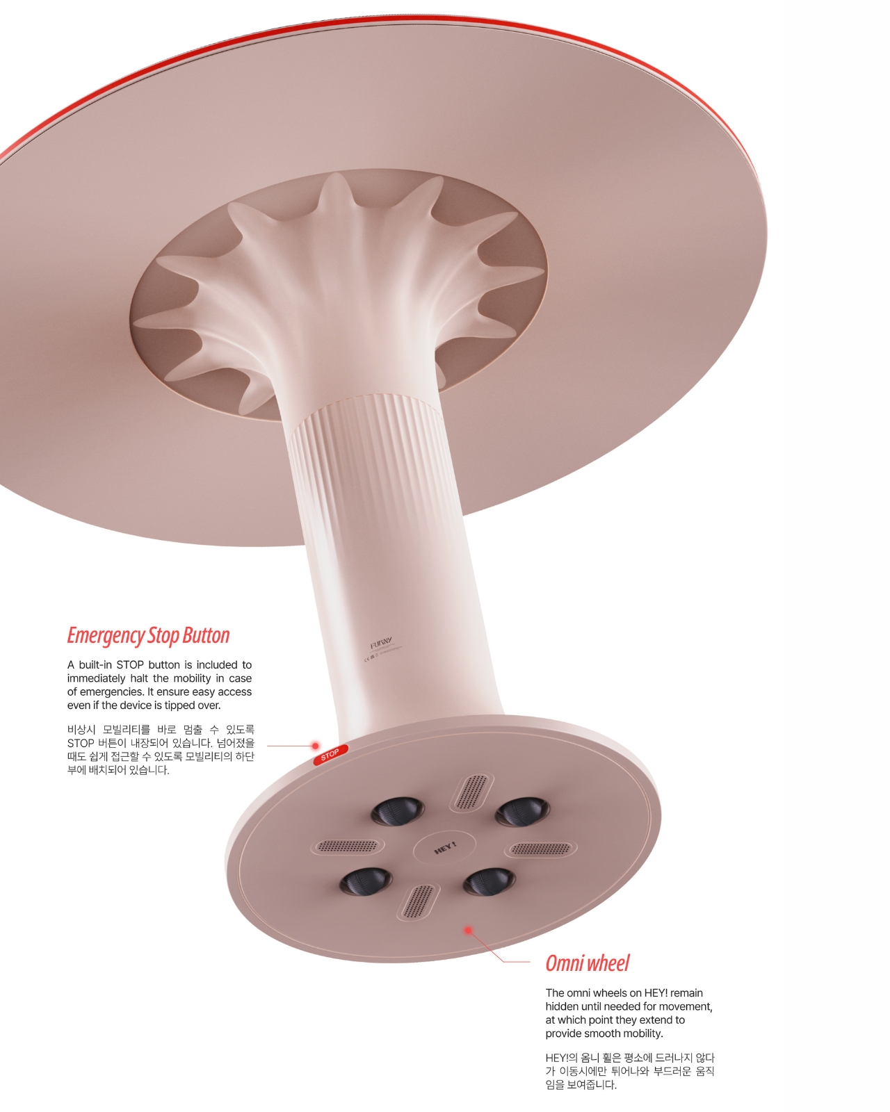
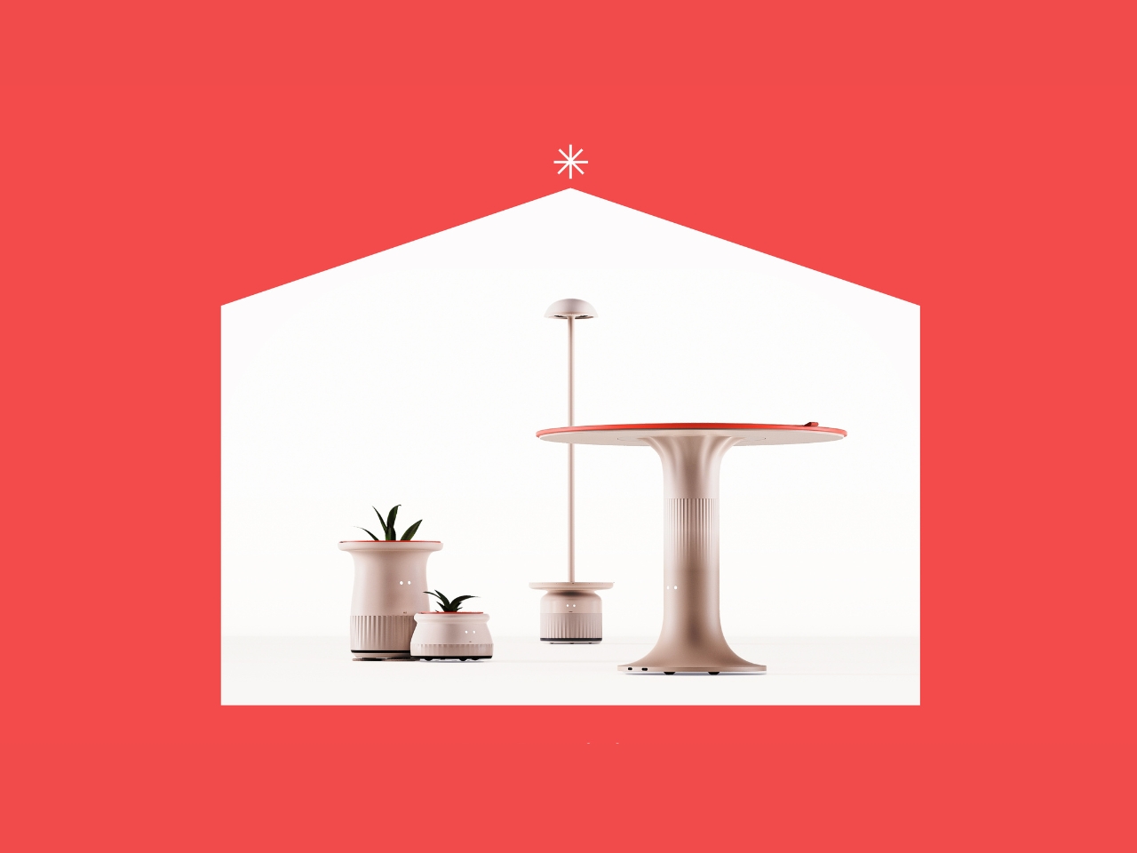
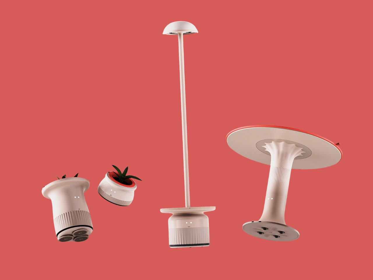
FURNY isn’t your typical furniture design project. It’s a mobile furniture system specifically built for co-living spaces, and its entire purpose is to help people start conversations without that painful awkwardness we’ve all experienced. The concept is simple but clever: what if furniture could be the friendly person who breaks the ice first?

Designers: Ye Jin Lee, Jung A Park, and Yujin Lee

Create your own Aesthetic Render: Download KeyShot Studio Right Now!

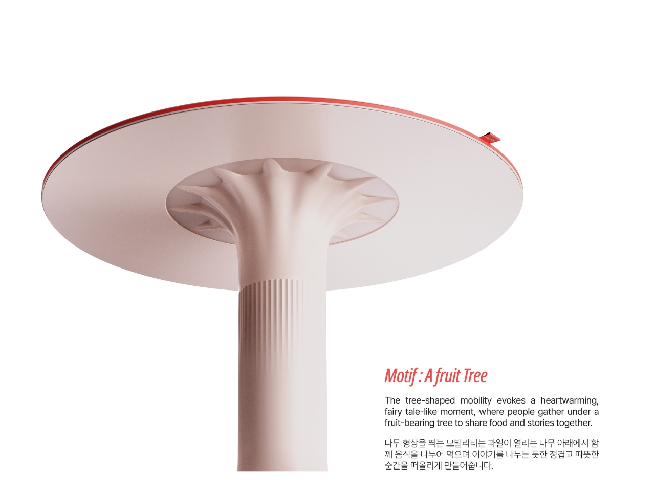
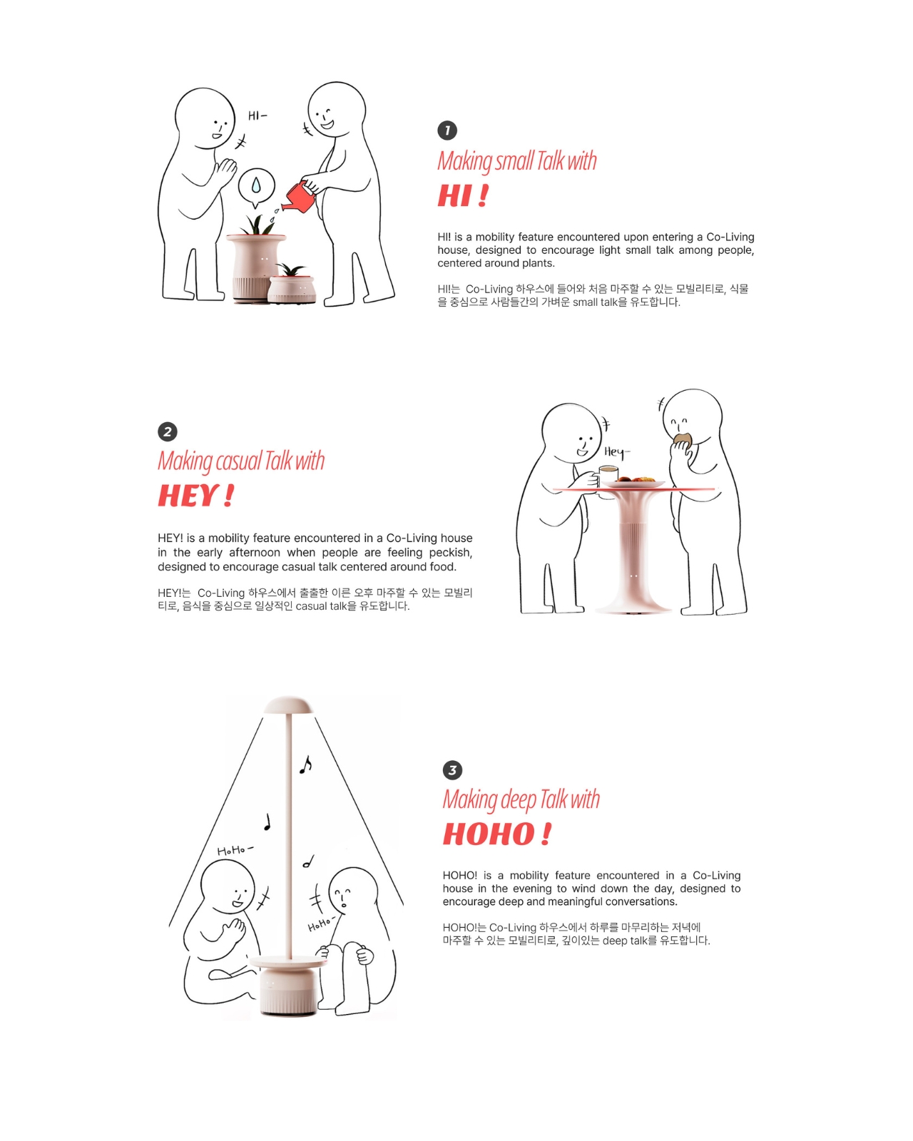
Think about it. Co-living spaces are designed to foster community, with all those shared kitchens and common areas. But having the space doesn’t automatically make connection happen. Most of us know the struggle of wanting to meet our housemates but not knowing how to start a conversation without seeming weird or intrusive. That “too long distance” between strangers in a shared space can feel impossible to cross. FURNY tackles this by being furniture that moves with purpose throughout the day, creating natural gathering points that give people an excuse to interact. The genius is in how it adapts to different times and moods, offering three distinct “conversation modes” that match the rhythm of daily life.

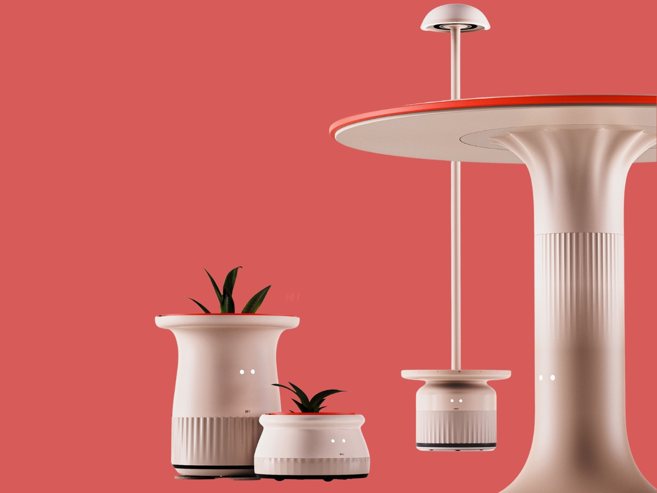
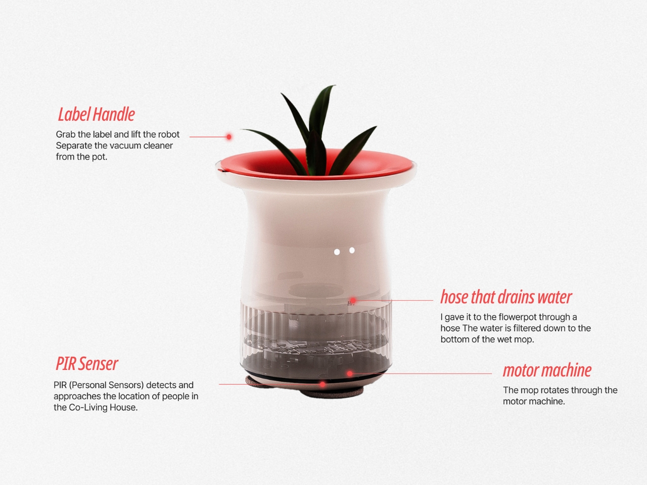
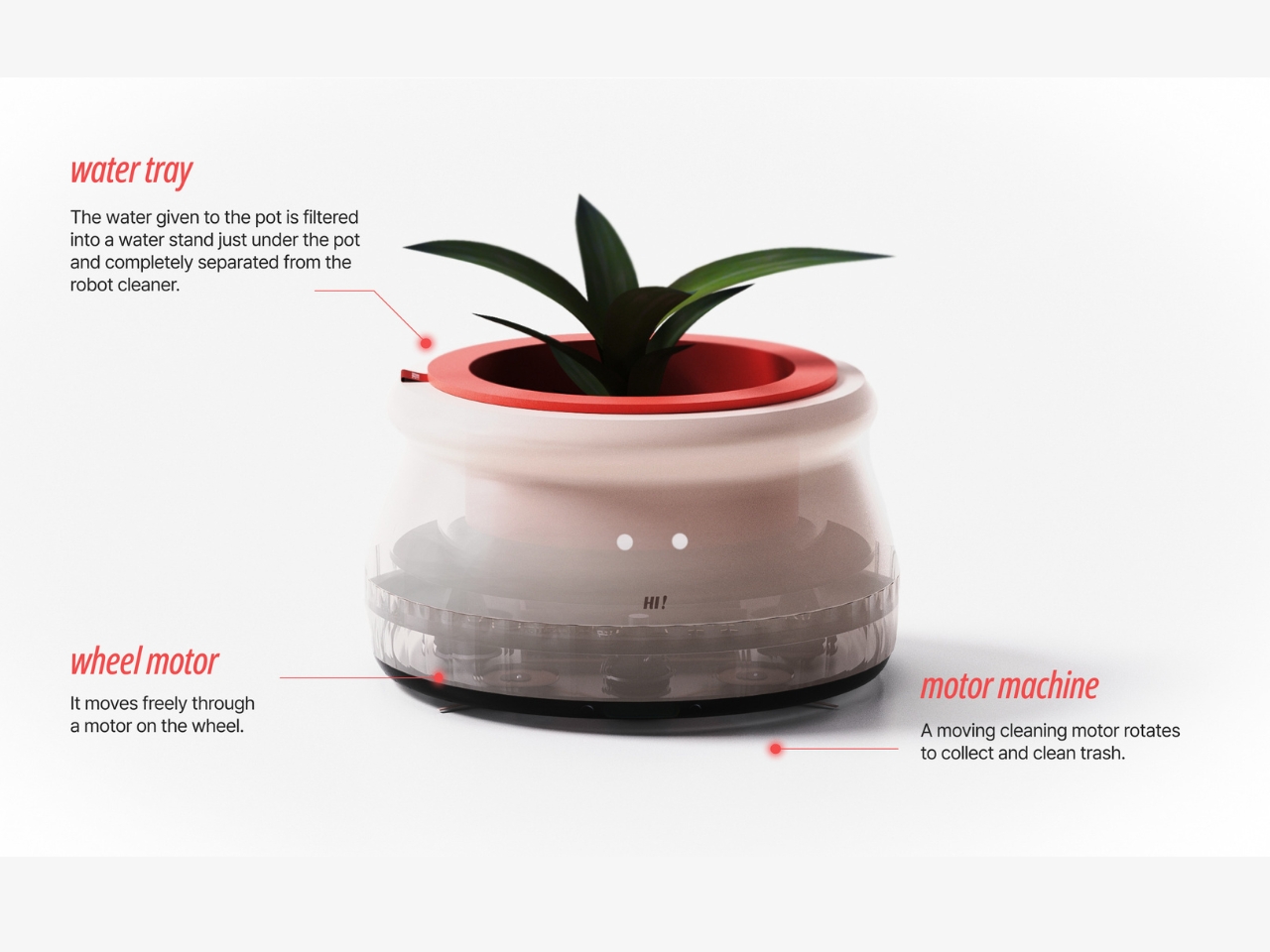
In the morning, when someone enters a common space, FURNY becomes “HI!” mode. It positions itself as a welcoming presence, often incorporating plants as a focal point. Plants are perfect ice breakers, right? Everyone can comment on how the succulent is doing or share watering tips. It’s the kind of small talk that feels natural and unforced, the kind that happens when you’re both just existing in the same space doing normal things.

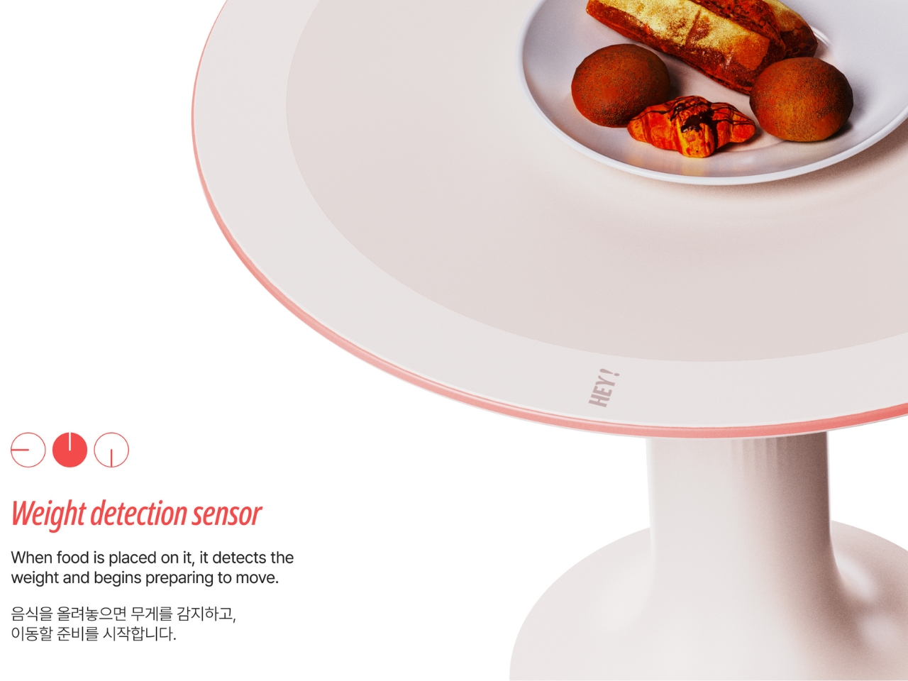
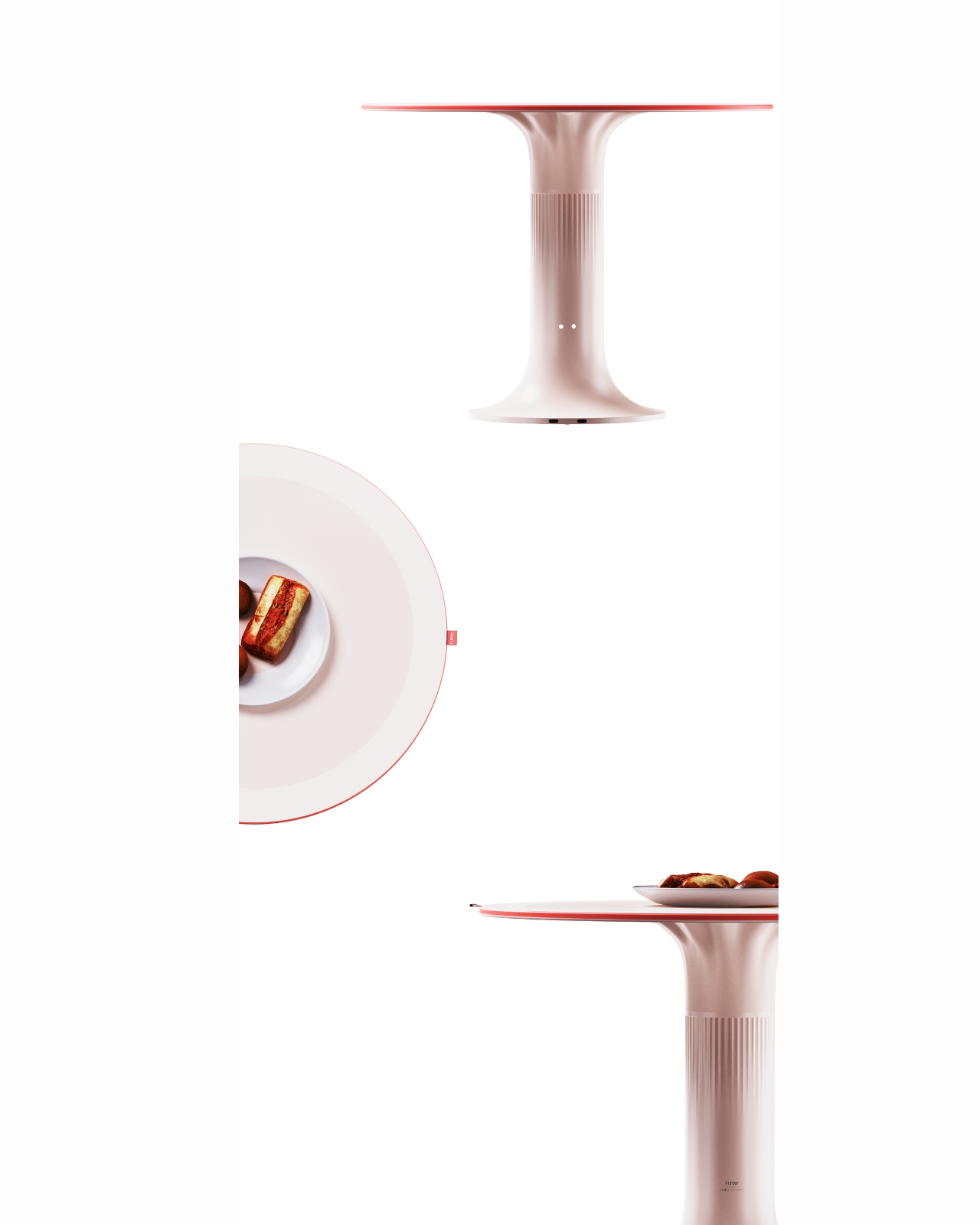
By early afternoon, when people start getting peckish and wandering toward the kitchen, FURNY shifts into “HEY!” mode. Now it becomes a casual gathering spot centered around food. Food is basically a universal conversation starter. Whether someone’s cooking something that smells amazing or you’re both scrounging for snacks, having a mobile piece of furniture that facilitates these food-centered interactions makes everything feel more communal and less like you’re awkwardly hovering.

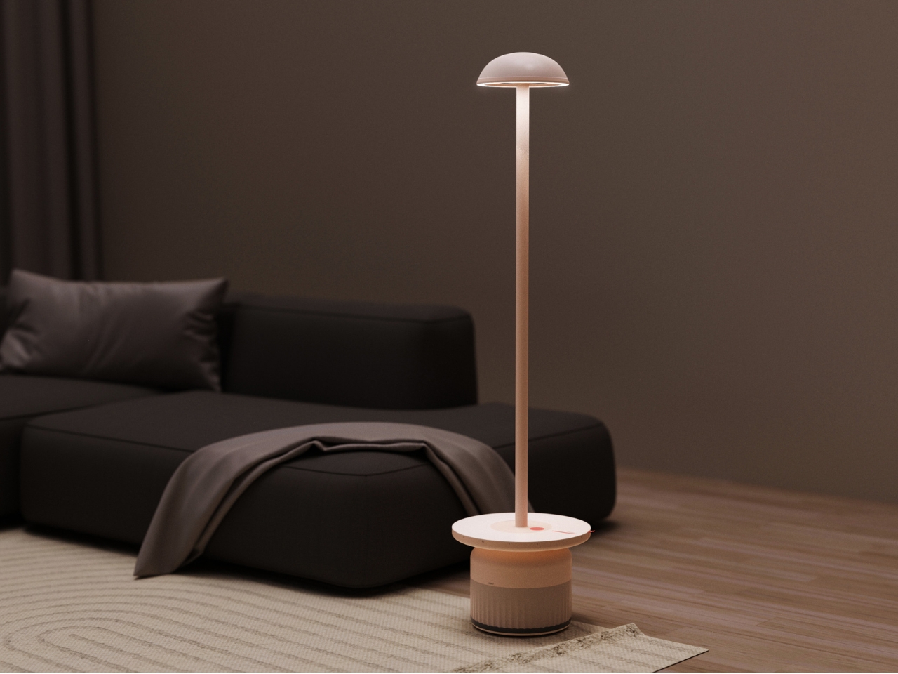
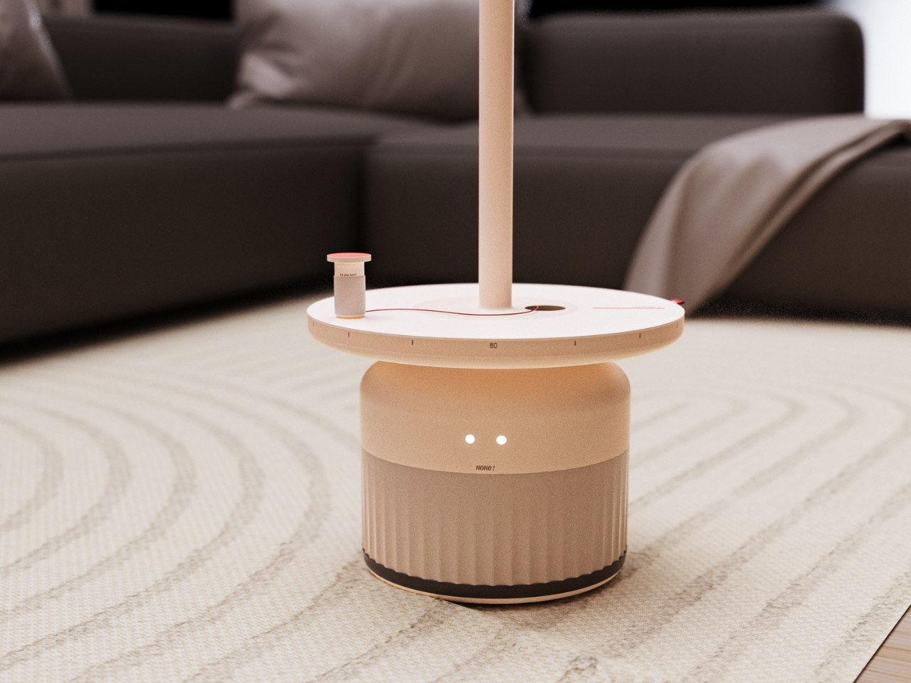
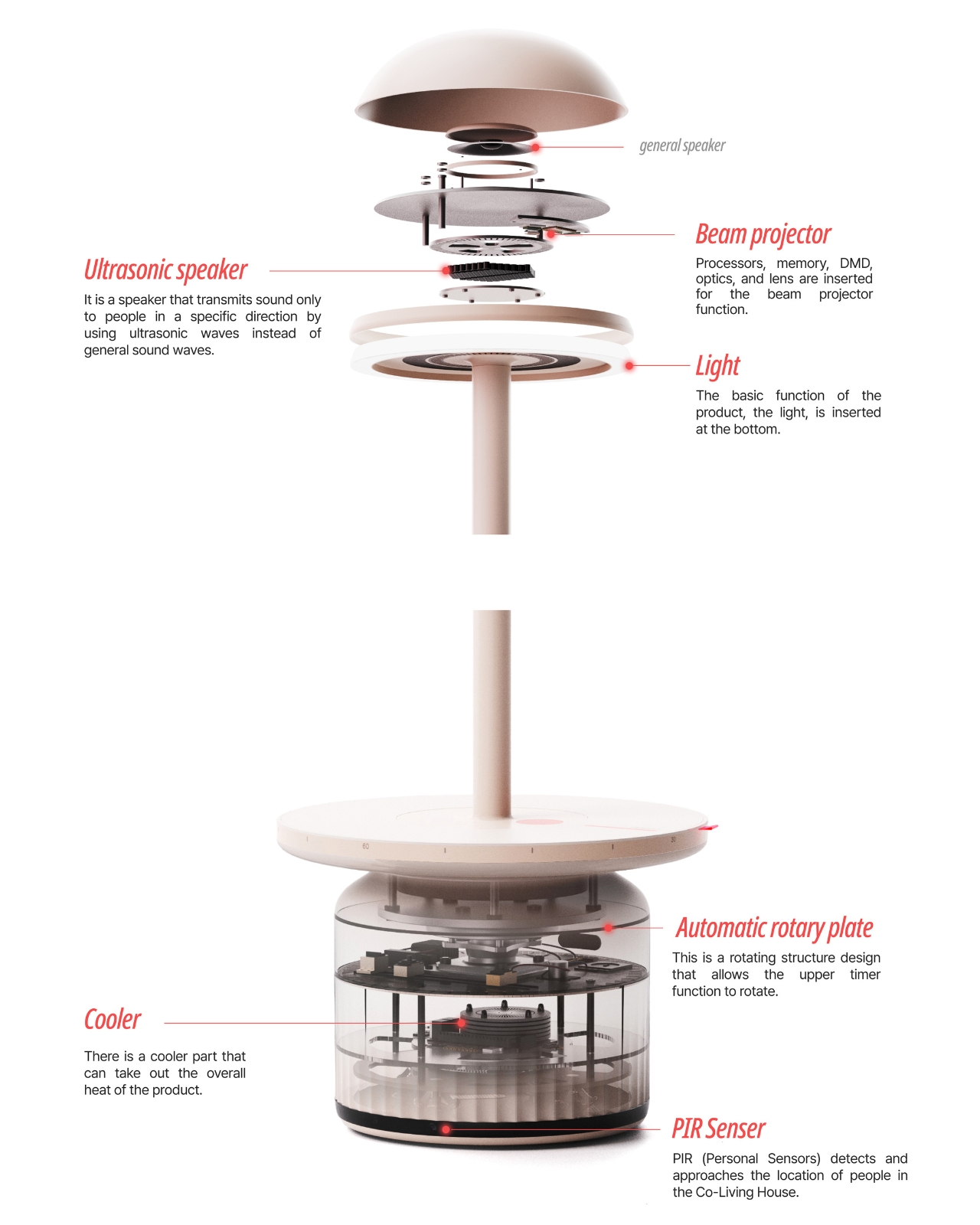
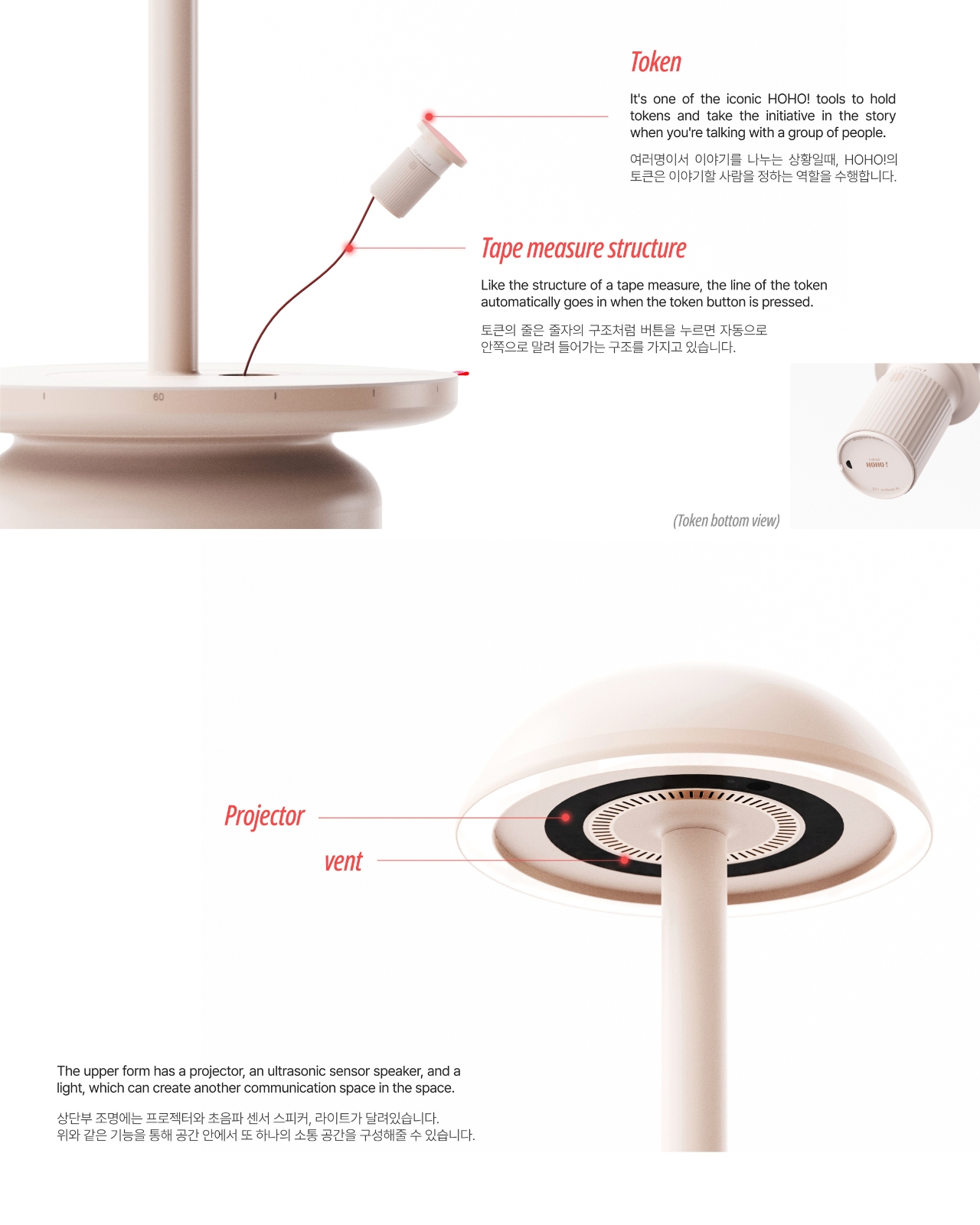
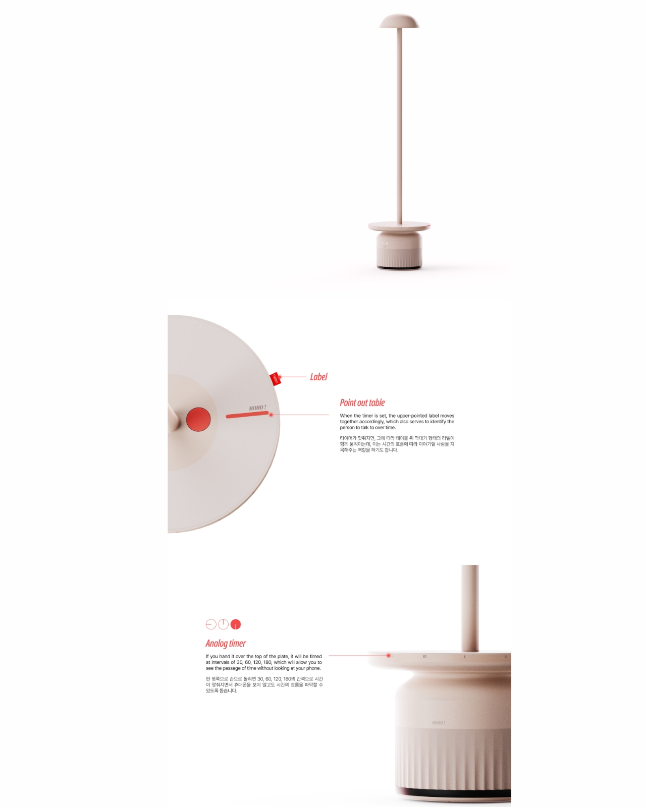
Then evening rolls around, and FURNY transforms into “HOHO!” mode. This is where the magic really happens. After a long day, people are more ready to wind down and have real conversations. FURNY creates an ambient, comfortable setting that encourages those deeper talks, the kind where you actually get to know your housemates beyond surface level.

The mobility aspect is crucial here. FURNY isn’t stuck in one spot forcing interactions. It moves to where conversations naturally want to happen, adapting to how people actually use shared spaces throughout the day. When it’s not being used, the wheels tuck away so it blends seamlessly into the environment. It’s there when you need it, invisible when you don’t. The design itself reflects this approachable philosophy. The team chose ivory and beige as the main colors, keeping things neutral and calming. But they added red as an accent color to bring that lively energy without overwhelming the space. It’s furniture that wants to be part of the background until it needs to step forward and facilitate connection.

What makes this project particularly relevant right now is how many people are turning to co-living arrangements. Whether it’s for affordability, location, or the promise of built-in community, shared living is becoming increasingly common, especially in cities. But the reality often doesn’t match the dream. You move in hoping for friendships and end up with a bunch of people who live parallel lives under the same roof. FURNY addresses the fundamental problem: the gap between wanting community and knowing how to create it. By being that “friendly someone” who creates the atmosphere first, it gives people permission to join in without the anxiety of initiating. You’re not bothering someone, you’re just gravitating toward where things are already happening.

For anyone interested in how design can solve social problems, FURNY is a fascinating case study. It’s not trying to force interaction or manufacture community. Instead, it’s removing barriers and creating conditions where connection can happen organically. The furniture becomes infrastructure for friendship, a framework that supports the natural human desire to connect while respecting the equally natural hesitation we feel around strangers. In co-living spaces everywhere, furniture just sits there. FURNY asks: what if it did more?

The post This Moving Furniture Just Solved The Co-Living Friendship Problem first appeared on Yanko Design.
This North Face x Bialetti Collab Is Peak Coffee Culture

There’s something beautifully absurd about combining outdoor gear with coffee culture, and the new collaboration between The North Face and Bialetti hits that sweet spot perfectly. It’s the kind of partnership that makes you wonder why it didn’t happen sooner, bringing together two iconic brands that have been fueling adventures in their own ways for decades.

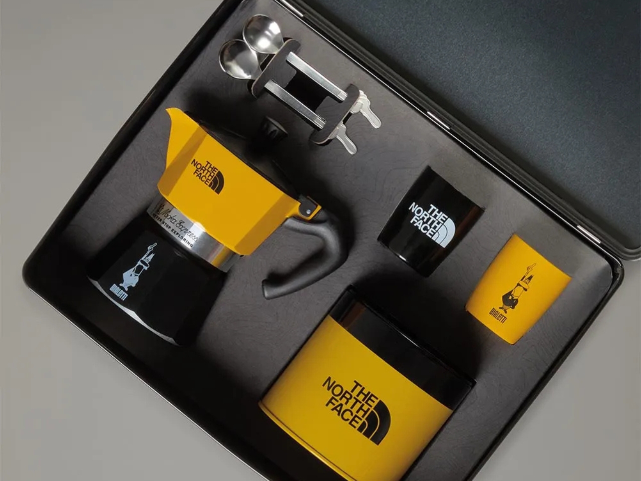
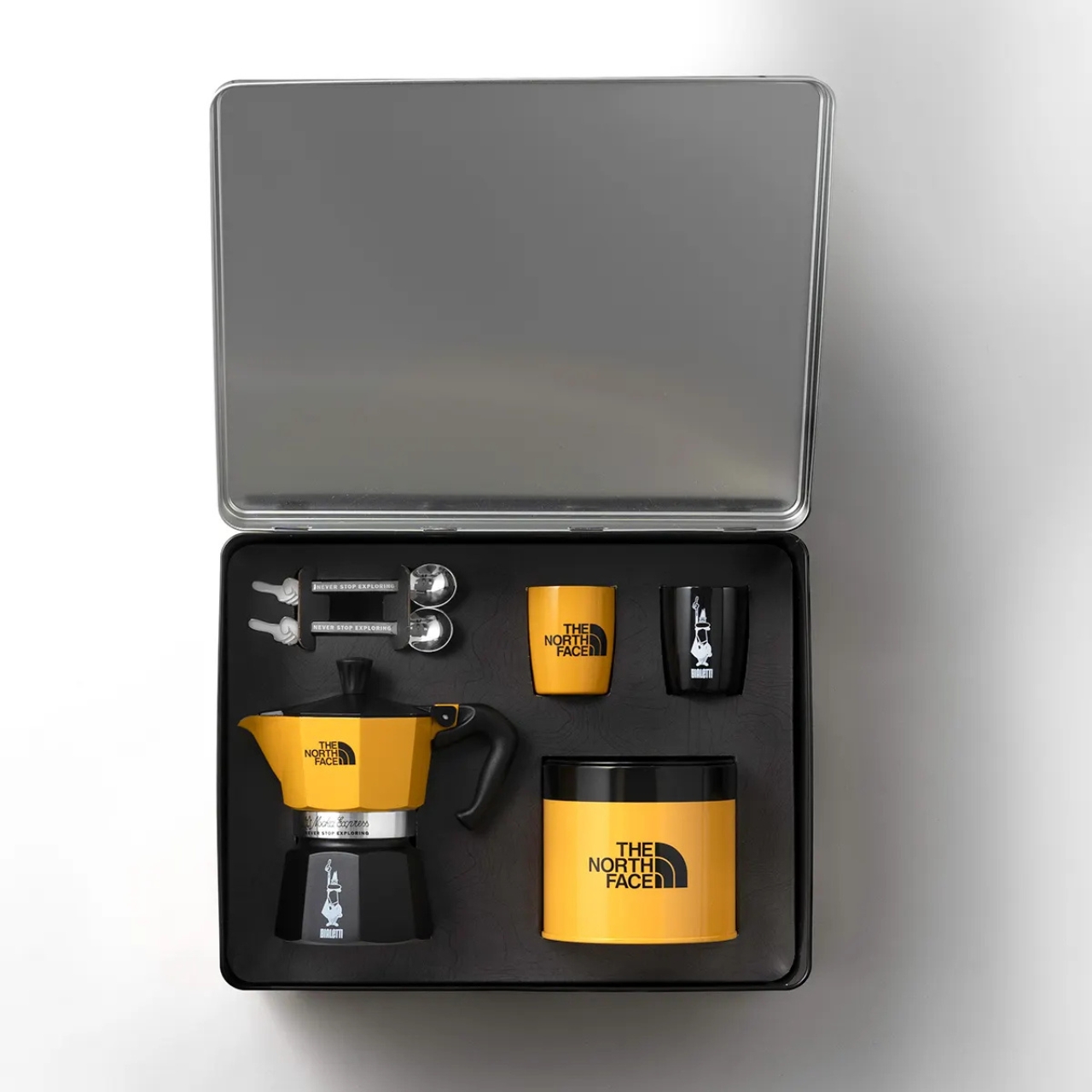
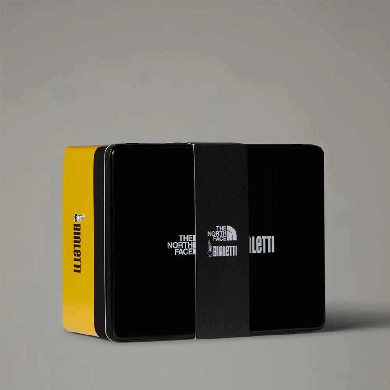
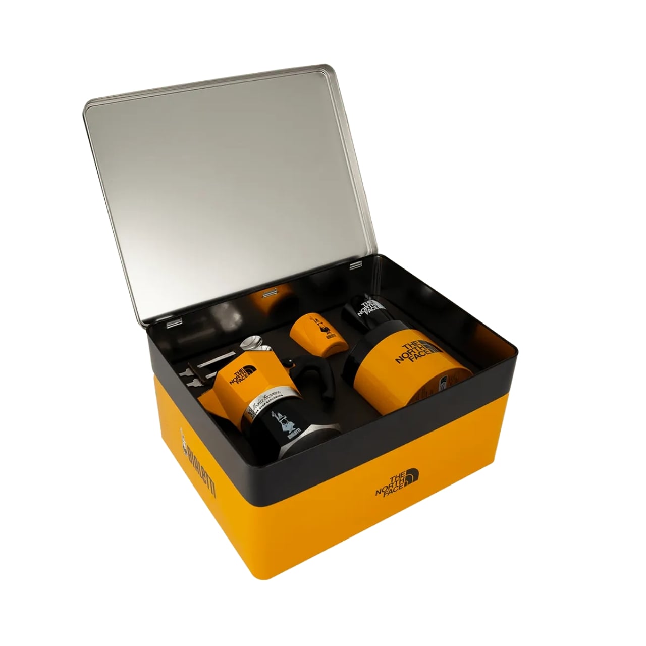
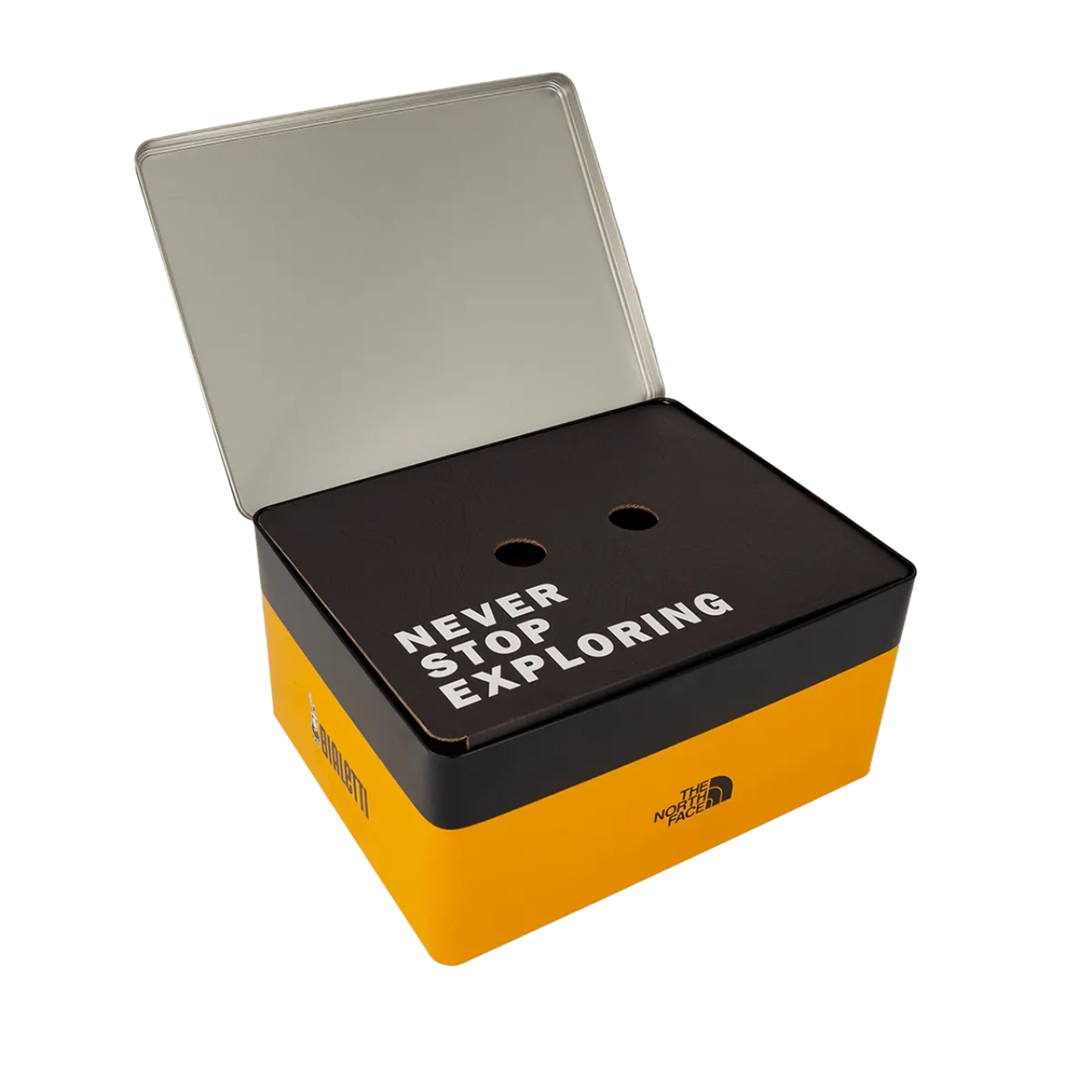
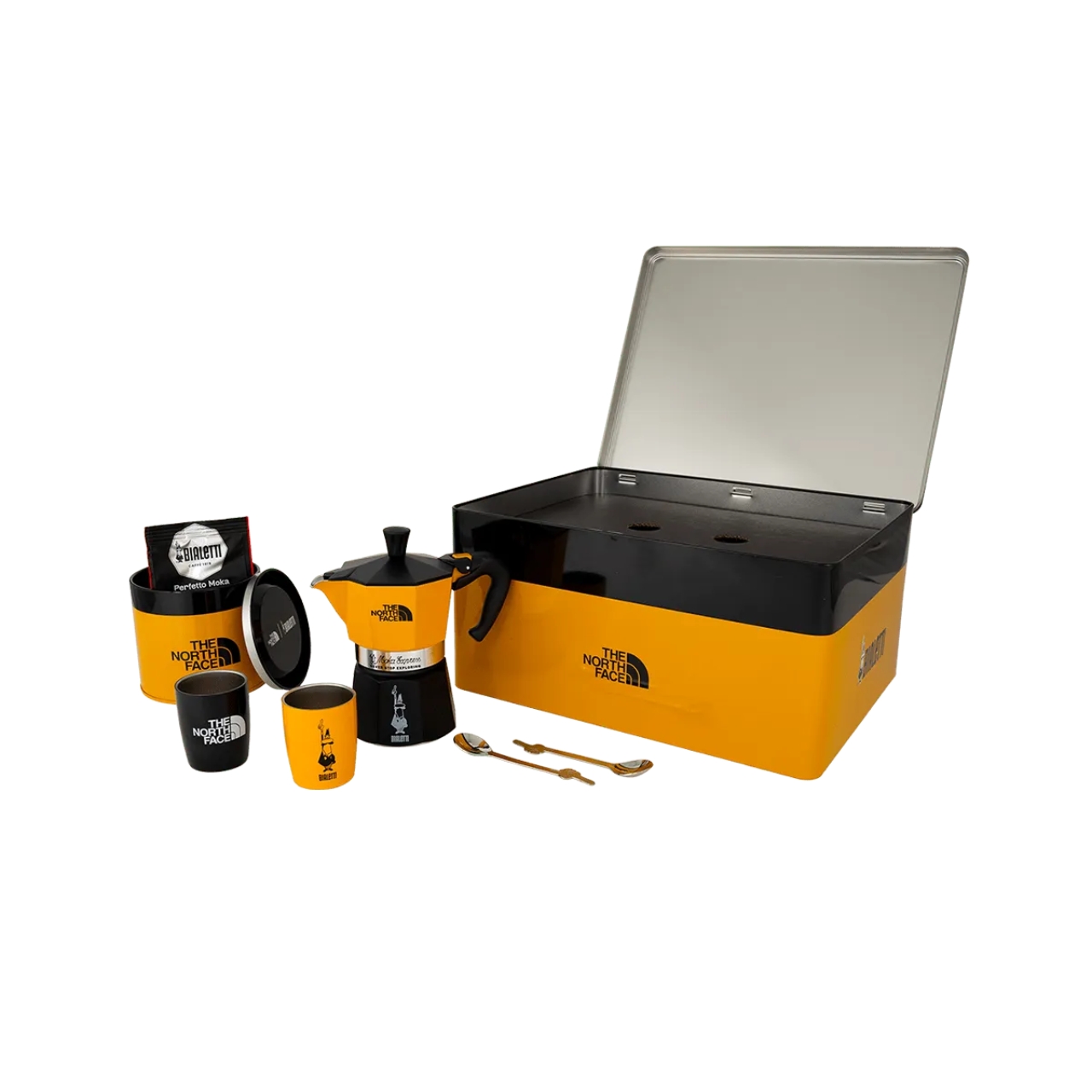
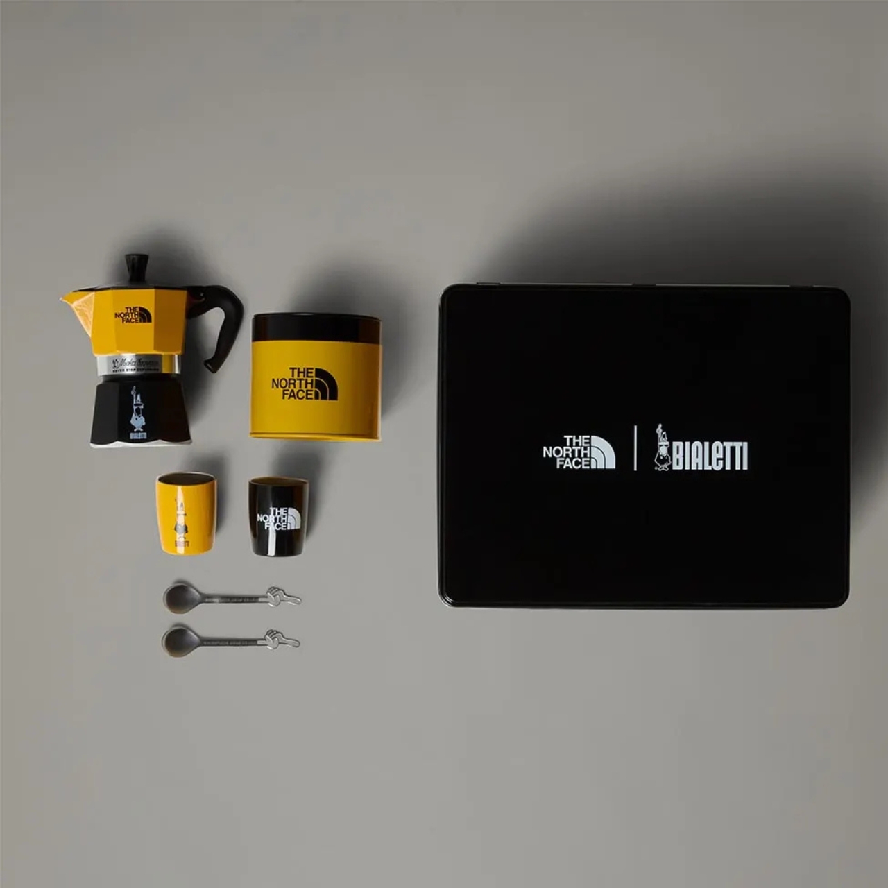
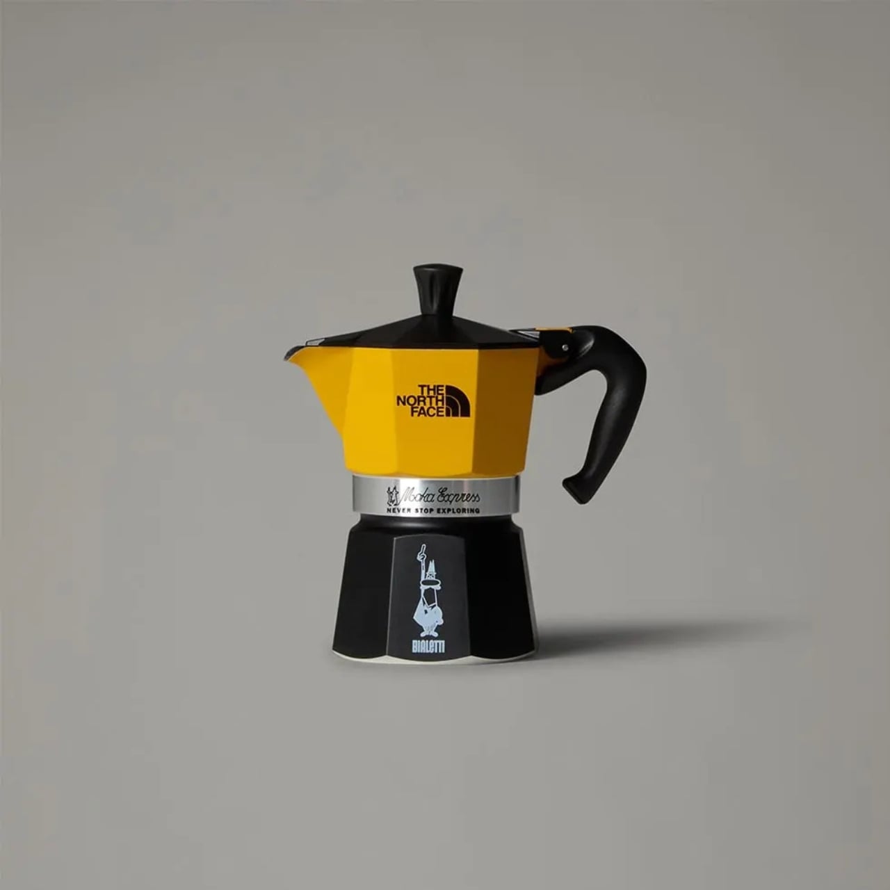
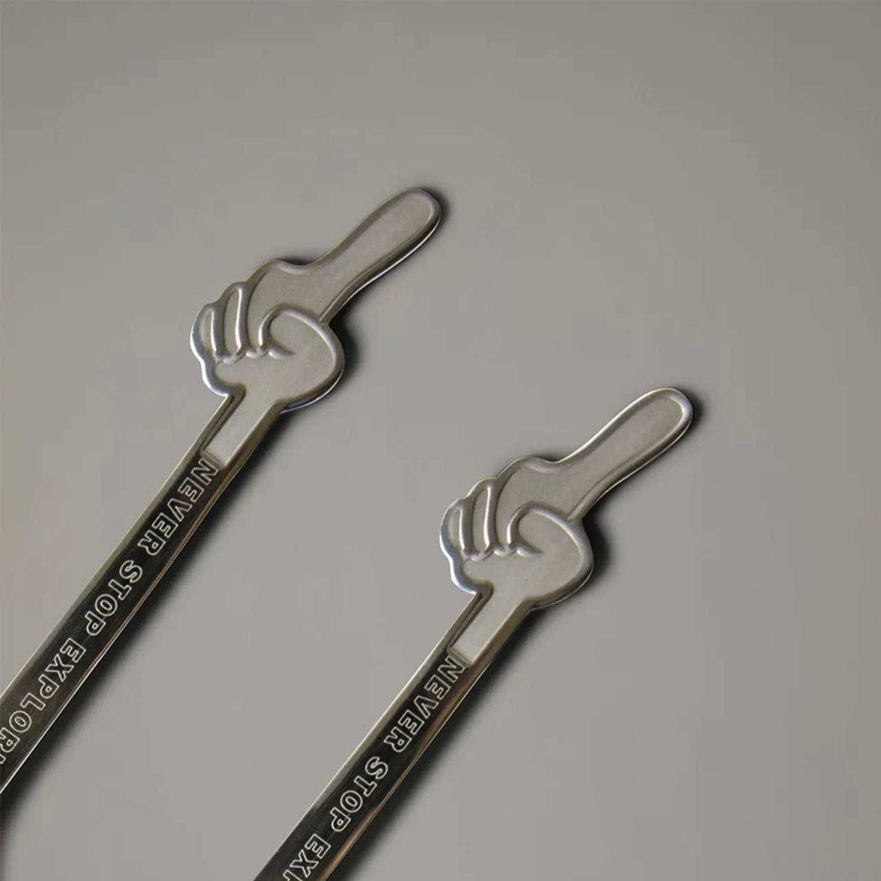
The TNF x Bialetti Moka Set is exactly what it sounds like: a limited-edition coffee kit that packages Italian espresso tradition in North Face’s signature Summit Gold and black colorway. At the heart of the set is a three-cup Moka Express, the classic aluminum stovetop coffee maker that’s been gracing Italian kitchens since 1933. This version comes emblazoned with both brands’ logos and The North Face’s “Never Stop Exploring” slogan, because apparently your morning caffeine ritual is now an expedition.

Designer: The North Face x Bialetti

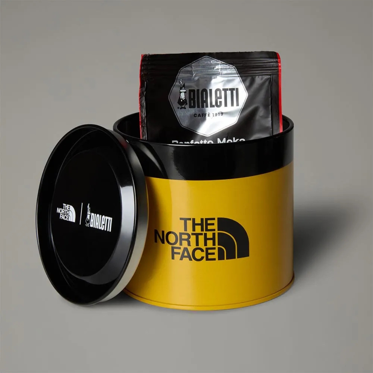
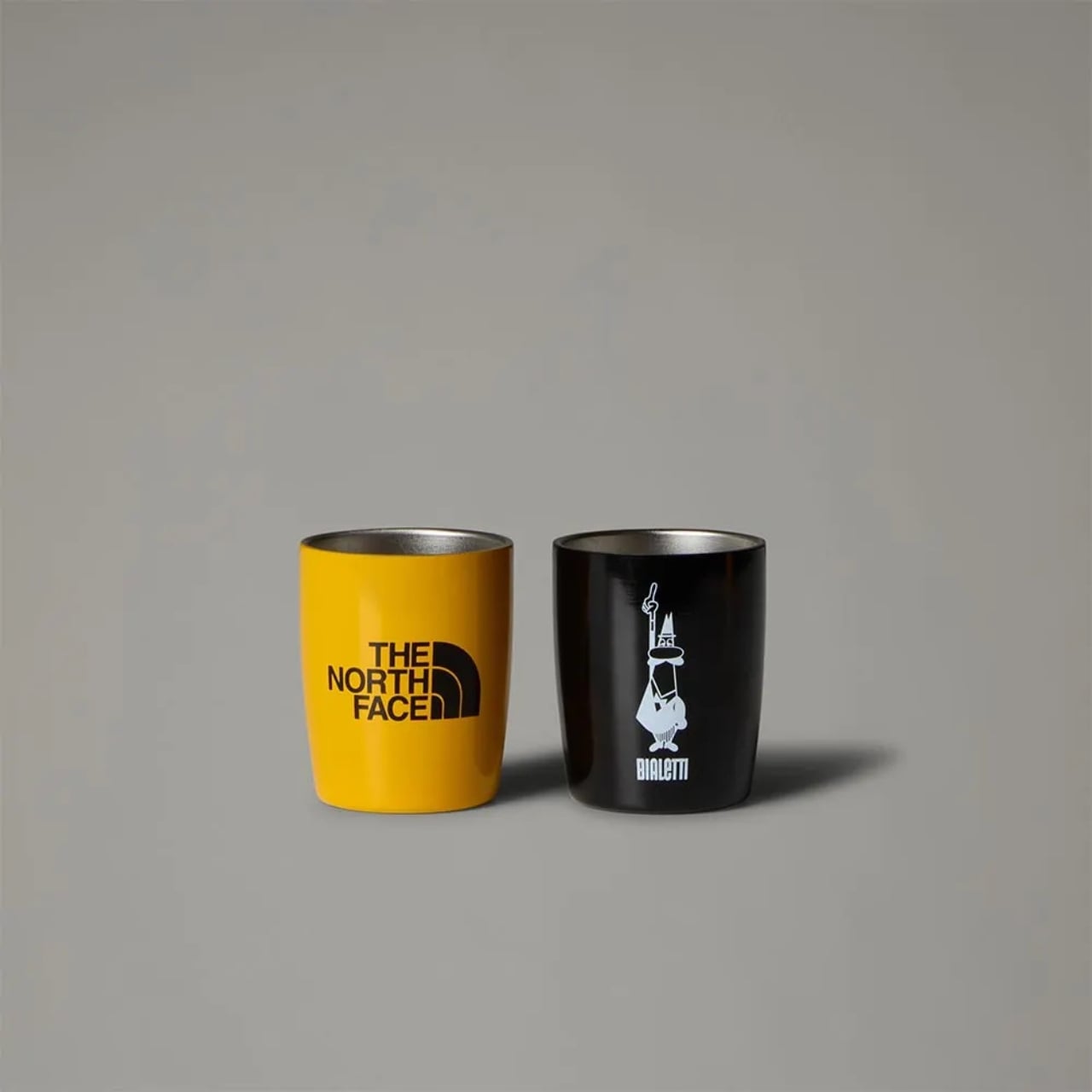
But here’s the thing about this collaboration, it’s not trying to be some ultralight backpacking essential. Despite the marketing suggesting it’s built for explorers and designed to be taken on the road or trail, this is really more about bringing style to your coffee routine than revolutionizing camp cooking. The set comes in a fairly large box and includes two stainless steel cups (one in Summit Gold, one in Bialetti black), matching spoons, and a 100-gram tin of pre-ground Bialetti coffee. It’s comprehensive, coordinated, and honestly quite handsome, even if the portable claims are a bit optimistic.

What makes this collaboration interesting isn’t its practicality for wilderness expeditions. It’s the cultural collision it represents. Bialetti’s Moka Express is a design icon in its own right, as recognizable in Italy as The North Face’s logo is on college campuses worldwide. Both brands carry serious nostalgia and street cred in their respective spheres. Bialetti revolutionized home espresso making with a design so perfect it hasn’t fundamentally changed in nearly a century. The North Face turned technical mountaineering gear into everyday fashion statements. Together, they’ve created something that speaks to coffee nerds, design enthusiasts, and brand collectors equally.

The color scheme is where this collab really shines. That Summit Gold is instantly recognizable if you’ve ever owned or lusted after a vintage North Face jacket, and seeing it on a Moka pot feels both surprising and completely right. The black and gold combination gives the entire set a premium, cohesive look that transcends either brand’s individual aesthetic.

Now let’s address the elephant in the room: the price. At $220, this isn’t exactly an impulse purchase. You can get a standard Moka Express for a fraction of that cost. But you’re not just buying a coffee maker here. You’re buying into a collaboration between two heritage brands, complete with the matching cups, spoons, and that perfectly branded tin. It’s collectible merch that happens to make excellent coffee, or an excellent coffee setup that happens to be collectible merch, depending on how you look at it.

The reality is that this set probably makes more sense sitting on your apartment’s kitchen counter or at your glamping setup than it does in your actual hiking pack. And that’s perfectly okay. Not every outdoor-branded product needs to summit Everest. Sometimes it’s enough to add a little adventure aesthetic to your morning routine, to have that moment of enjoying rich Italian espresso while wearing your Nuptse jacket and dreaming about trails you’ll hike someday.

This collaboration taps into something broader happening in design culture right now: the blurring of boundaries between function and lifestyle, between genuine outdoor gear and urban fashion, between coffee equipment and collectible objects. It’s the same impulse that puts Supreme on Coleman coolers or sees luxury brands creating camping gear. We want our everyday objects to tell stories about who we are or who we want to be.

Whether the TNF x Bialetti Moka Set is worth the investment depends on how much you value that intersection of coffee culture, design heritage, and brand storytelling. If you’re someone who gets excited about limited-edition collaborations and appreciates when iconic designs get reimagined, this might be calling your name. Just don’t expect it to revolutionize your backpacking coffee game.

The post This North Face x Bialetti Collab Is Peak Coffee Culture first appeared on Yanko Design.

Nike’s Cherry Blossom Air Force 1 Is Peak Spring Mood

There’s something about cherry blossom season that makes you stop in your tracks. Maybe it’s the pink petals floating through the air like confetti celebrating nature’s comeback, or the way entire neighborhoods transform into Instagram-worthy backdrops overnight. Nike gets it, and their latest Air Force 1 ’07 PRM “Cherry Blossom” turns that fleeting springtime magic into something you can actually wear.

Dropping in spring 2026, this isn’t your standard AF1 colorway. Nike’s taking the iconic silhouette and giving it a dual personality. The sneaker features a removable cherry blossom shroud that drapes over the entire shoe, laser-cut with delicate floral petals that mimic the way sakura flowers blanket the ground during peak bloom. It’s like wearing a piece of that magical moment when Washington D.C.’s Tidal Basin or Tokyo’s parks become pink wonderlands.

Designer: Nike (photos from snkr_collector123c)

But here’s where it gets interesting. This is essentially two sneakers in one. Remove that floral overlay, and you’re left with a completely different vibe: a soft hairy suede base in a two-tone color story mixing light grey and pale pink. The toebox and side panels get that blush pink treatment, while the toe, lace panel, heel, and tongue rock the grey. A crisp white leather Swoosh and steel grey midsole keep things grounded. The color palette reads like a spring sunset: Malt, Light Soft Pink, Particle Rose, and Mauve Grey. These aren’t your basic bubblegum pinks. They’re sophisticated, almost dusty tones that feel elevated rather than loud. The kind of colors that work just as well with vintage denim as they do with a flowing midi skirt or tailored joggers.

Nike’s been on this nature kick lately, and honestly, it’s working. This Cherry Blossom release follows their “Autumn Leaves” (also called Leaf Camo) edition that used the same removable shroud concept but with fall foliage. It’s part of a larger narrative Nike’s building around turning their heritage models into wearable seasonal art. The Air Force 1, which has been a street style staple since 1982, keeps proving it can evolve without losing that essential cool factor that made it iconic in the first place.

What makes this release particularly smart is the cultural resonance. Cherry blossoms carry deep symbolism around renewal, beauty, and the transient nature of life. In Japanese culture, hanami (flower viewing) is an entire tradition built around appreciating cherry blossoms. By tapping into this imagery, Nike’s doing more than just making a pretty shoe. They’re connecting to something bigger, a cross-cultural appreciation of nature’s cycles that transcends geography.

The construction stays true to what makes Air Force 1s workhorses. You still get that padded collar and cushioned midsole that made them basketball legends before they became streetwear essentials. The perforations on the toe box keep breathability in check. These aren’t just for show; they’re built to be worn daily, which is crucial because the last thing anyone wants is a beautiful sneaker that sits in a box.

At $130, the price point sits in that sweet spot where it feels premium without requiring you to enter raffles or battle bots on release day. It’s Nike acknowledging that great design should be accessible, especially when you’re celebrating something as universally appreciated as spring’s arrival. The removable shroud feature is genius from a practical standpoint too. Start your day with the full floral drama, then strip it down to the suede base for a more subtle evening look. It’s versatility baked right into the design, giving you styling options without needing multiple pairs of kicks cluttering your closet.

Nike’s turning seasonal transitions into collectible moments, and the Cherry Blossom Air Force 1 might be their most poetic attempt yet. It captures that brief window when everything feels possible, when winter’s weight finally lifts and the world remembers how to bloom. That’s a lot of meaning to pack into a sneaker, but when it looks this good, who’s complaining?

The post Nike’s Cherry Blossom Air Force 1 Is Peak Spring Mood first appeared on Yanko Design.

This Seoul Studio Just Grew a Building From Mushrooms


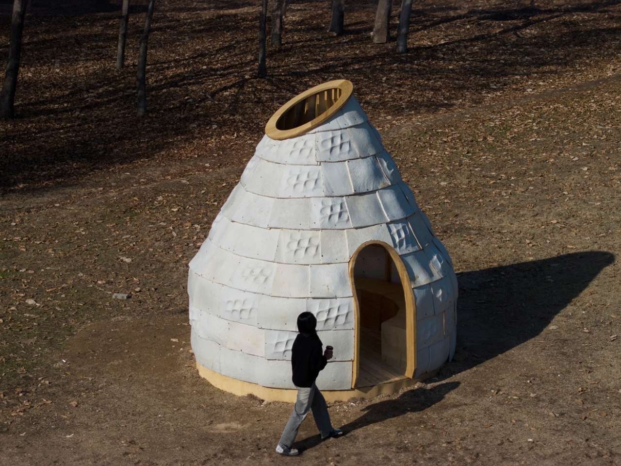
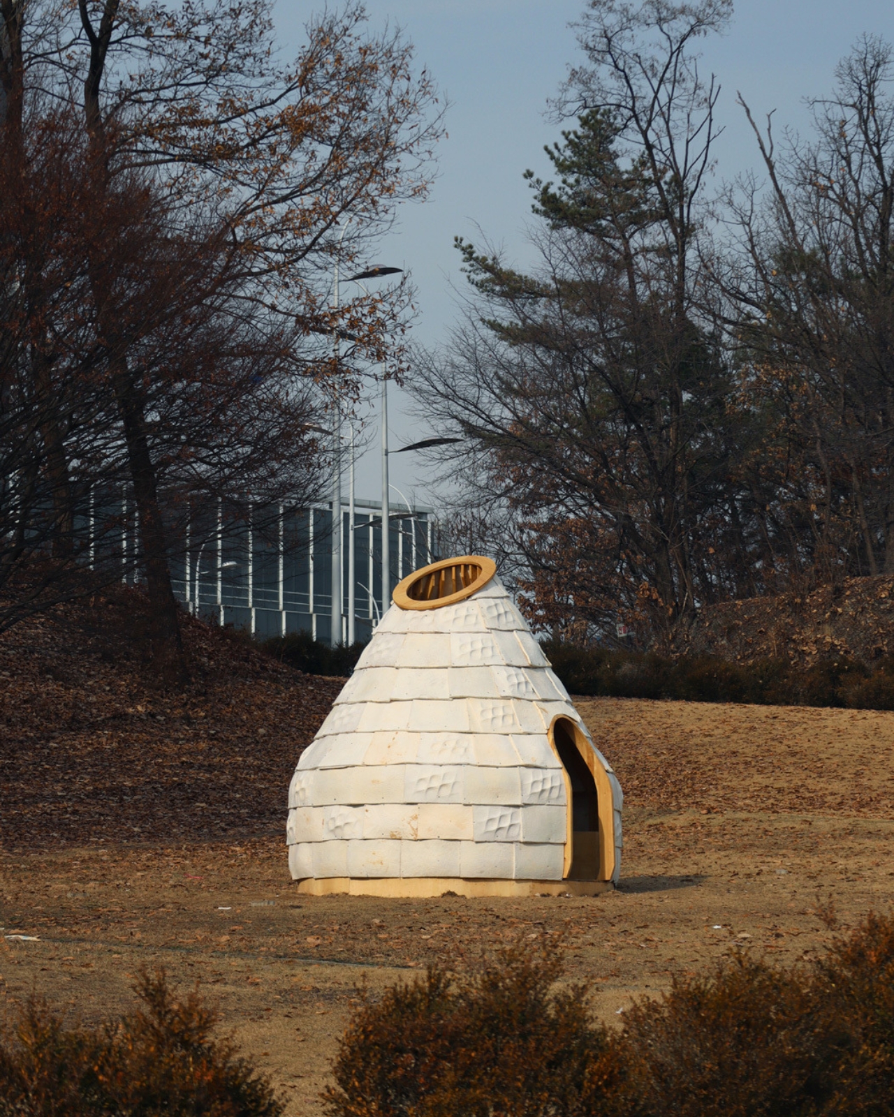
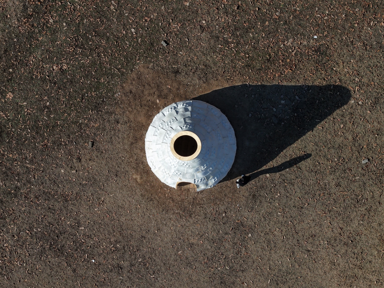
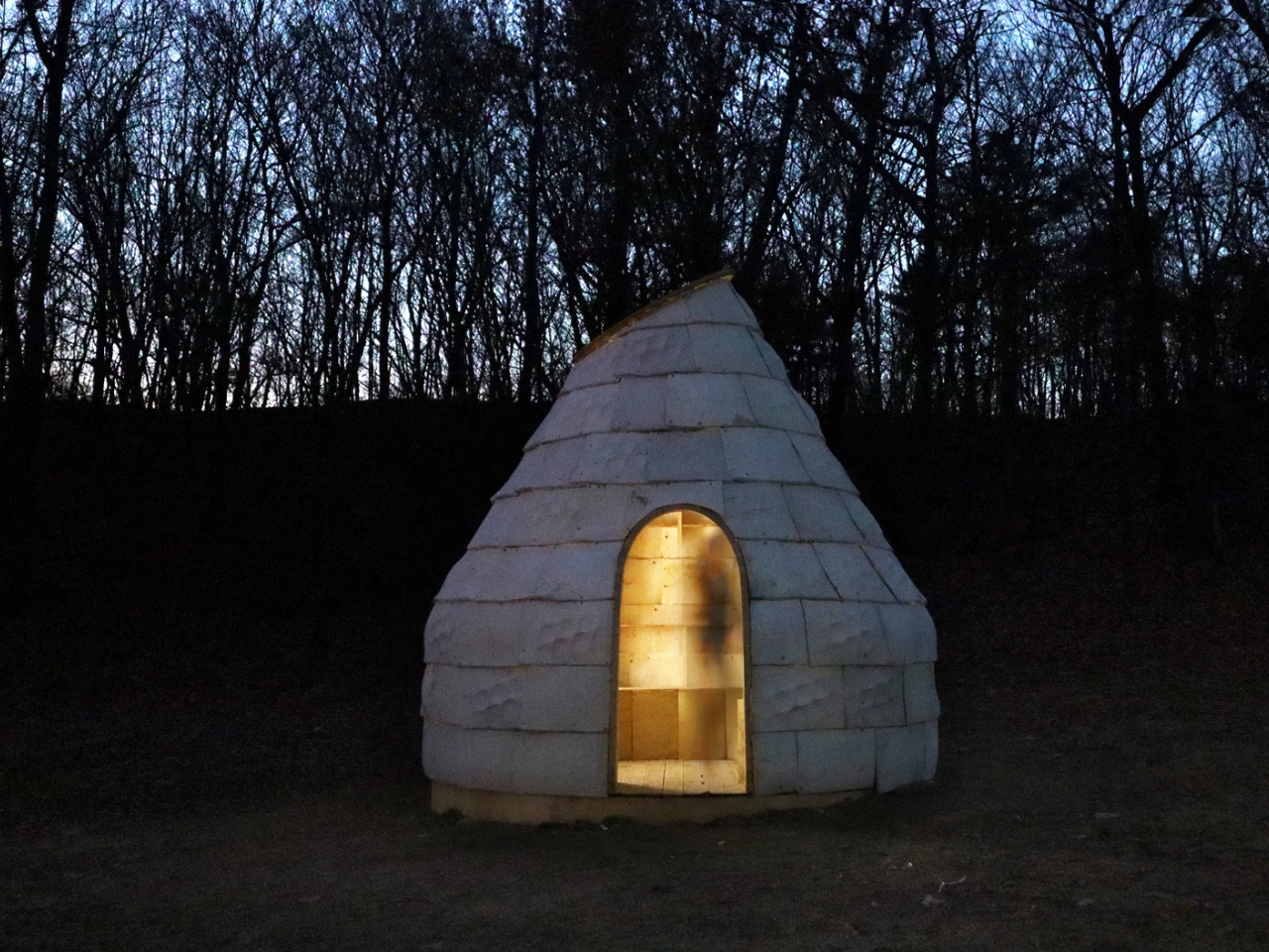
Picture a world where buildings aren’t just constructed but cultivated, where walls grow in custom molds and construction materials come from nature’s own filtration system. It sounds like science fiction, but on the campus of Seoul National University of Science and Technology, that vision became reality in 2024 with the Mycelial Hut.

Designed by Yong Ju Lee Architecture, this project arrives at a critical juncture. The architecture and construction sector currently accounts for the highest carbon emissions among all global industries. After 10,000 years of evolution alongside humanity, architecture entered the 20th century prioritizing efficiency and economy above all else, adopting concrete and steel as its near-exclusive materials. This pursuit of industrial optimization, while enabling rapid development, detached architecture from its ecological roots and intensified the environmental burden of the built environment.

Designer: Yong Ju Lee Architecture

Following the era of environmental crisis and the pandemic, a new approach has emerged to redefine sustainability itself. Organism-based composite materials present fresh possibilities for architecture, challenging the non-recyclable and non-degradable nature of inorganic construction materials. The Mycelial Hut experiments with mycelium, the fungal network that serves as nature’s filter, to reinterpret what eco-friendly architecture can be.

But here’s where it gets really interesting. This isn’t about simply replacing one material with another. The project explores bio-integrated fabrication methods that align growth, decay, and design within a single process. Think of it as architecture that understands its own lifecycle from the moment it begins taking shape.

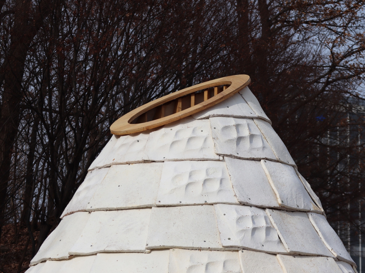
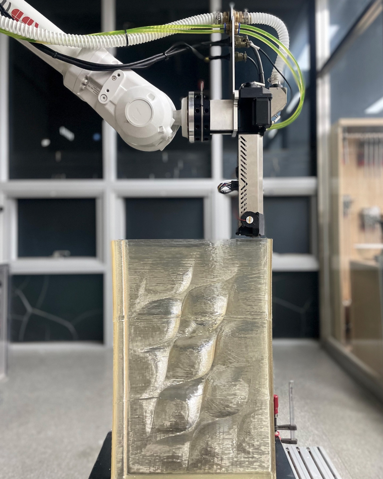
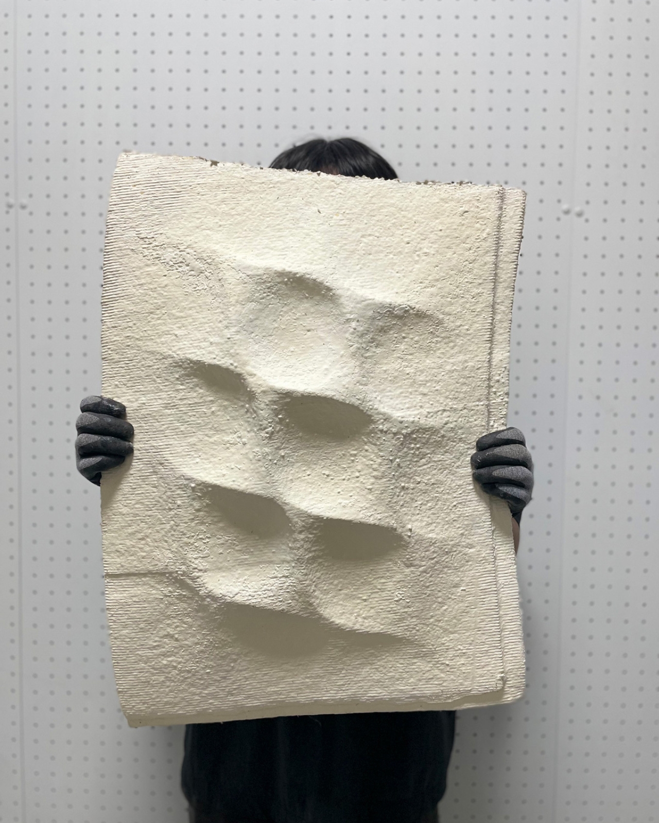
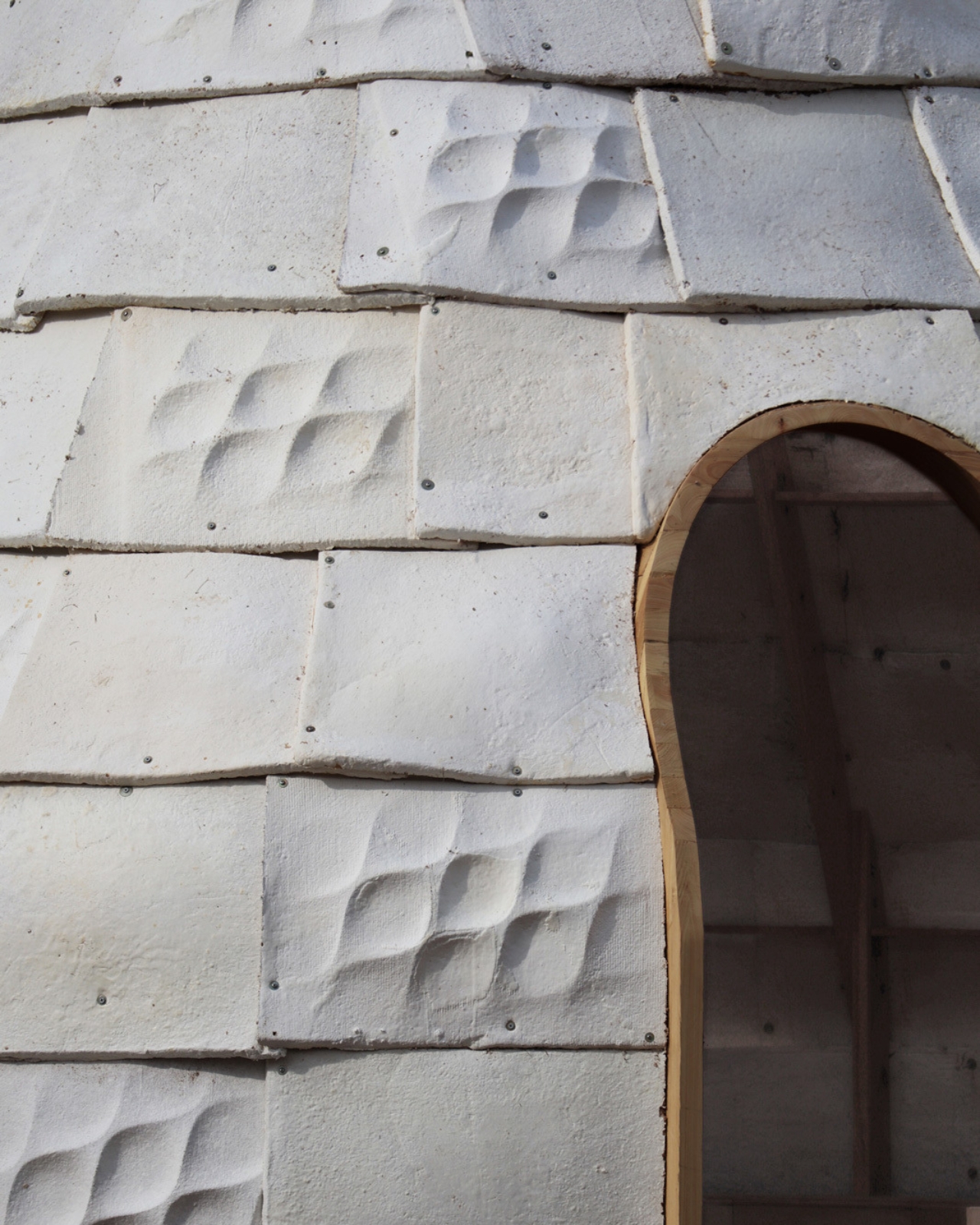
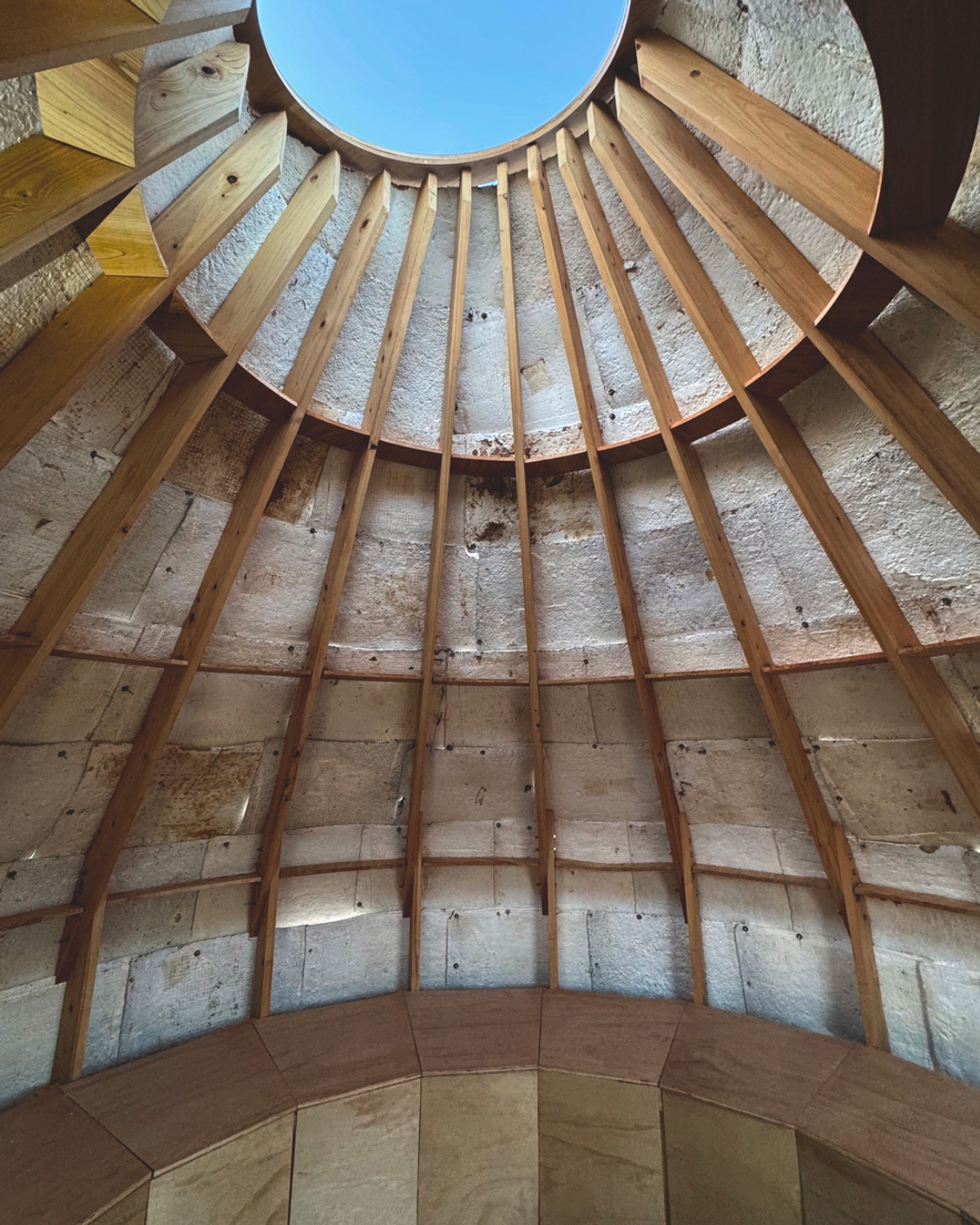
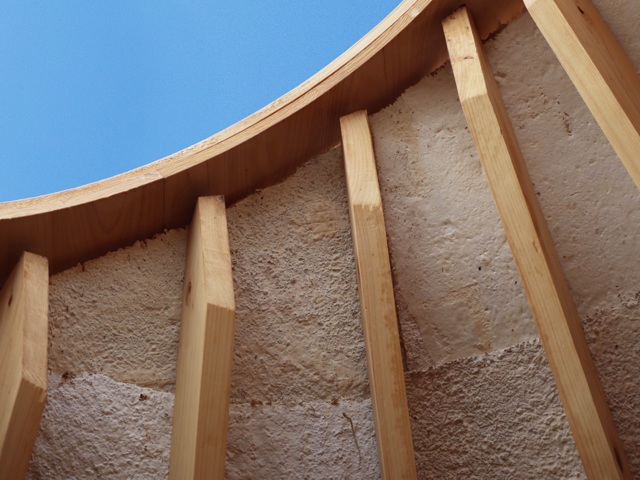
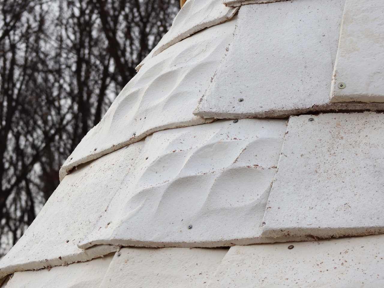
The Mycelial Hut demonstrates large-scale application of mycelium as a building material through customized molds fabricated by robotic 3D printing. This design-based research produces a bio-hybrid pavilion where a wooden frame serves as the structural backbone while customized mycelium panels form the external envelope. It’s a marriage of old and new, natural and digital, strength and adaptability.

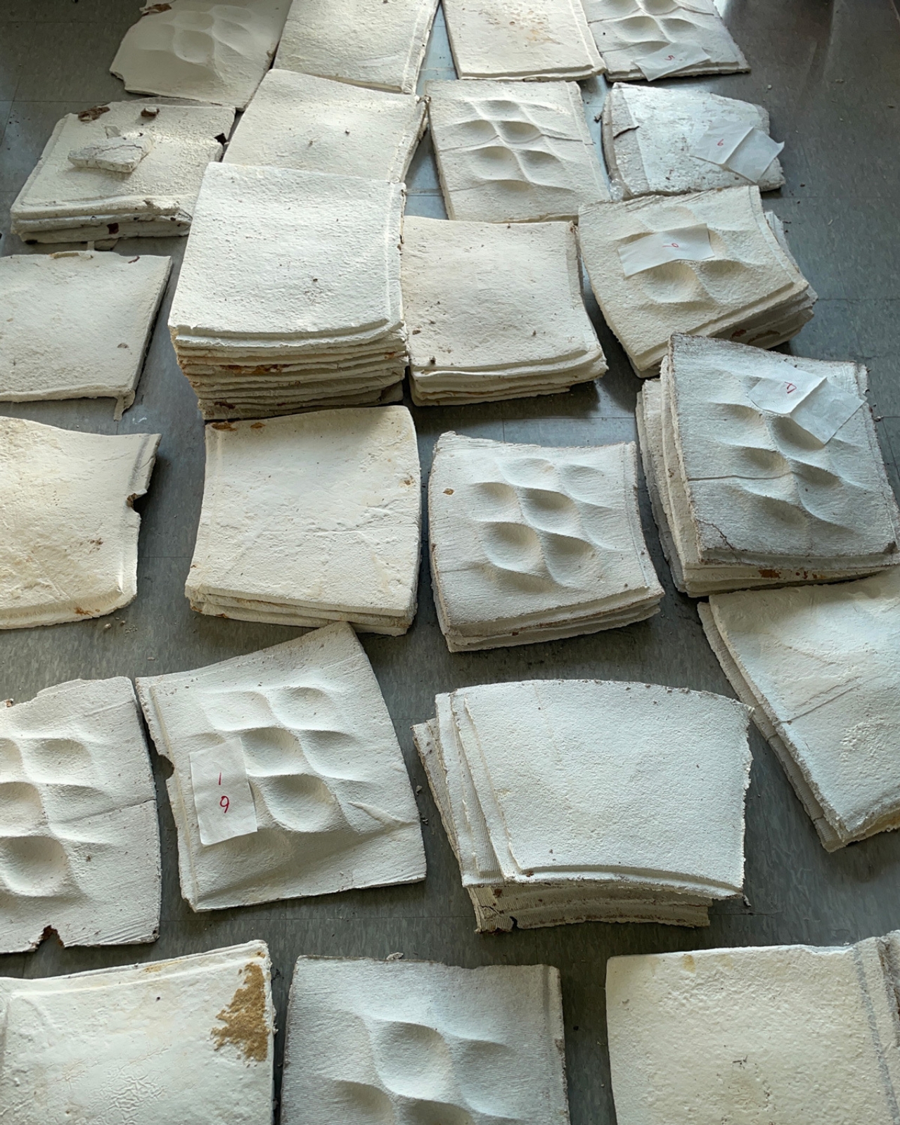
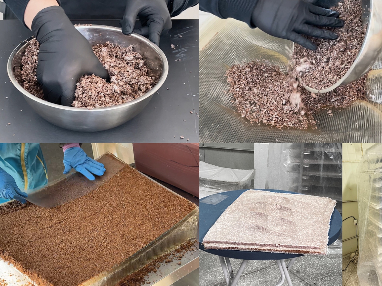
The process itself reads like an experimental recipe. In the initial phase, various types of mycelium substrates were tested to evaluate their workability, growth, and strength. Based on these results, specific molds were fabricated using 3D printing. Then came the innovation that makes this project particularly fascinating: a new workflow combining industrial robotic arms was established to merge digital processes with natural growth systems. The result is a large-scale structure that embodies the coexistence of computation and biology. Robots and fungi working together. Algorithms guiding organic growth. It’s the kind of collaboration that wouldn’t have made sense even a decade ago, but now feels inevitable.

What makes the Mycelial Hut more than just an interesting experiment is how it addresses the real challenges of fungal material application. Mycelium is structurally weak compared to concrete or steel. It grows unpredictably. It needs specific conditions to thrive. These aren’t bugs in the system but features that demand smarter design thinking. By using geometry, custom molds, and a supportive wooden frame, the project demonstrates the feasibility of bio-composites for architectural construction without pretending the material is something it’s not.

The location matters too. Situated on a university campus, this bold installation makes the concept of sustainable architecture tangible and accessible in everyday life. It’s not hidden away in a research lab or showcased only at industry conferences. Students walk past it. Visitors encounter it. The project invites everyone to imagine a future where buildings respond to their environment because they’re fundamentally made from it.

We’re watching a shift in architectural thinking that goes beyond sustainability buzzwords. When your building materials can be composted after use, when construction happens through cultivation rather than extraction, when robots program molds for fungus to fill, you’re not just reducing environmental impact. You’re reimagining what construction can be. The Mycelial Hut suggests that the next revolution in architecture won’t come from stronger concrete or lighter steel but from learning to work with living systems. By combining digital fabrication with biological growth, Yong Ju Lee Architecture has created something that’s both cutting-edge and ancient, high-tech and earthy, experimental and surprisingly practical.

The real question isn’t whether we can build with mushrooms. The Mycelial Hut proves we can. The question is whether we’re ready to rethink our entire relationship with materials, growth, and the built environment. On a university campus in Seoul, that conversation has already begun.

The post This Seoul Studio Just Grew a Building From Mushrooms first appeared on Yanko Design.
This $100 Alarm Clock Finally Wakes You Up Without the Rage

There are people who set their alarms every 15 minutes to make sure that they actually wake up but oftentimes they still hit the snooze button several times. I am one of those people. When I still lived with other people, it became a joke that the whole house wakes up from my alarms except me. And even now, this abrupt disruption to my beauty sleep doesn’t really help me adjust to a morning routine. What if there was a device, aside from a clock and my mobile phone, that can help me wake up better and healthier?

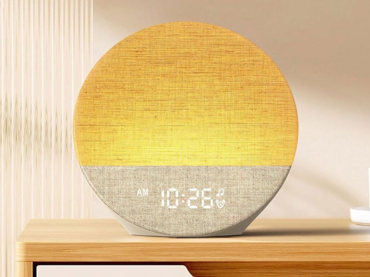
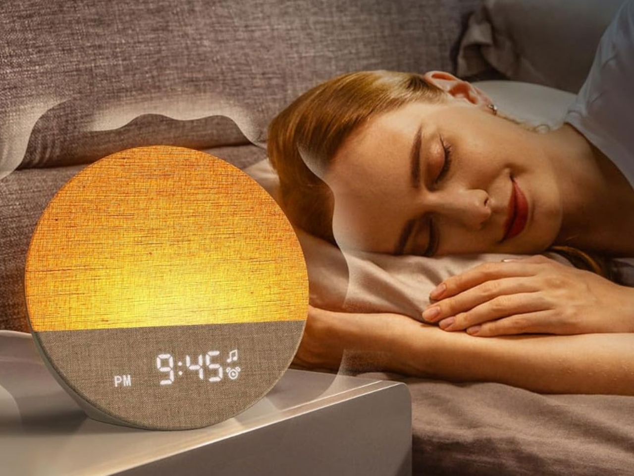
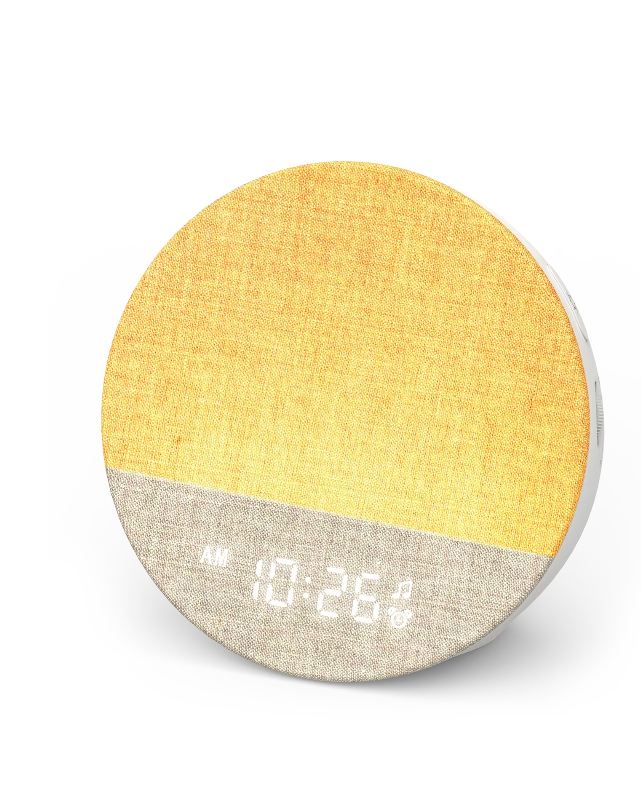
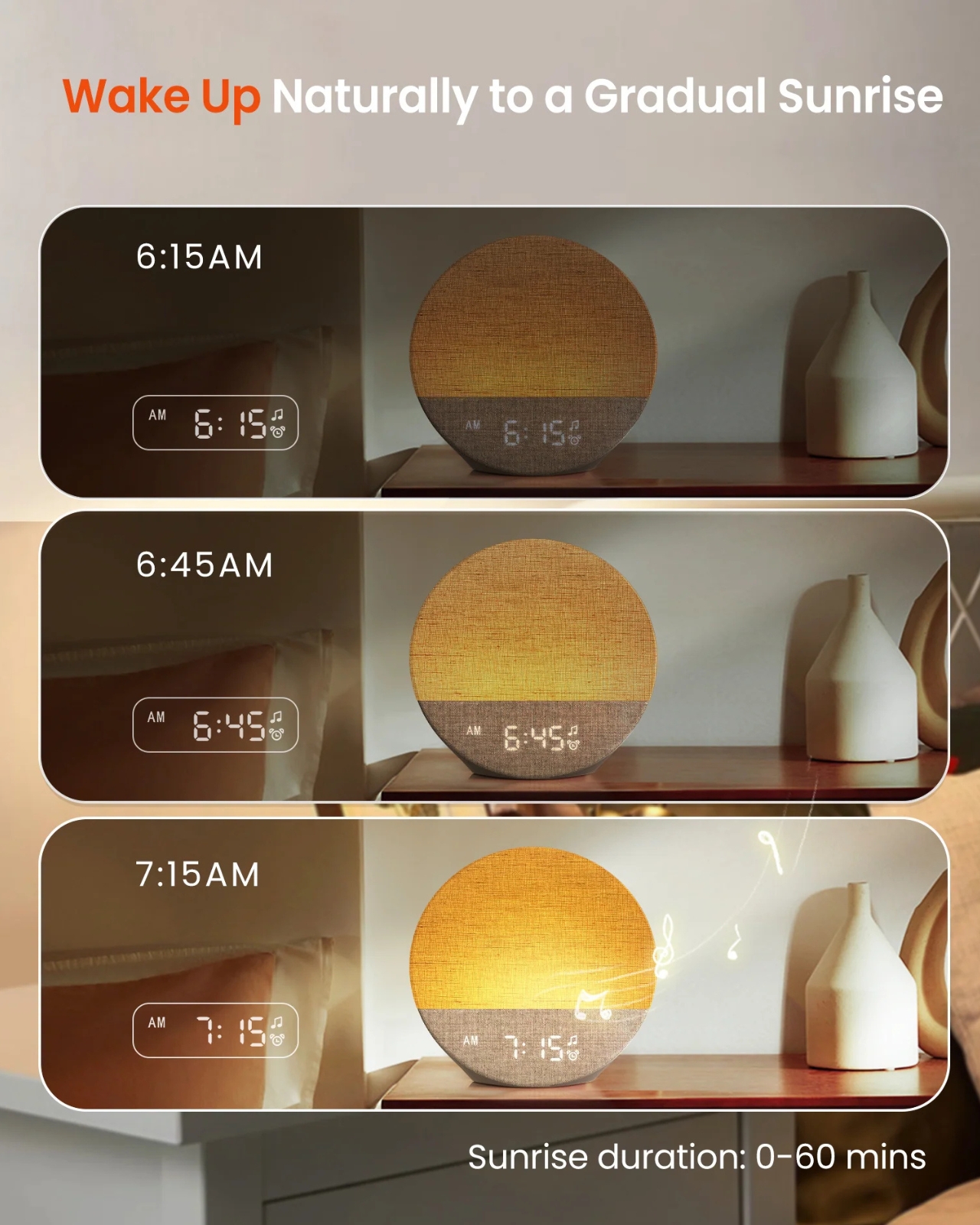
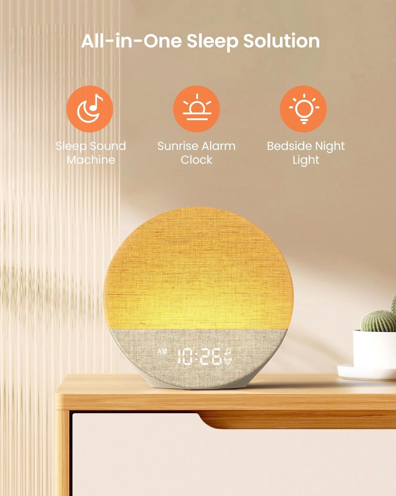
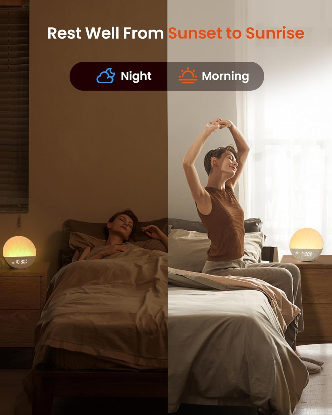
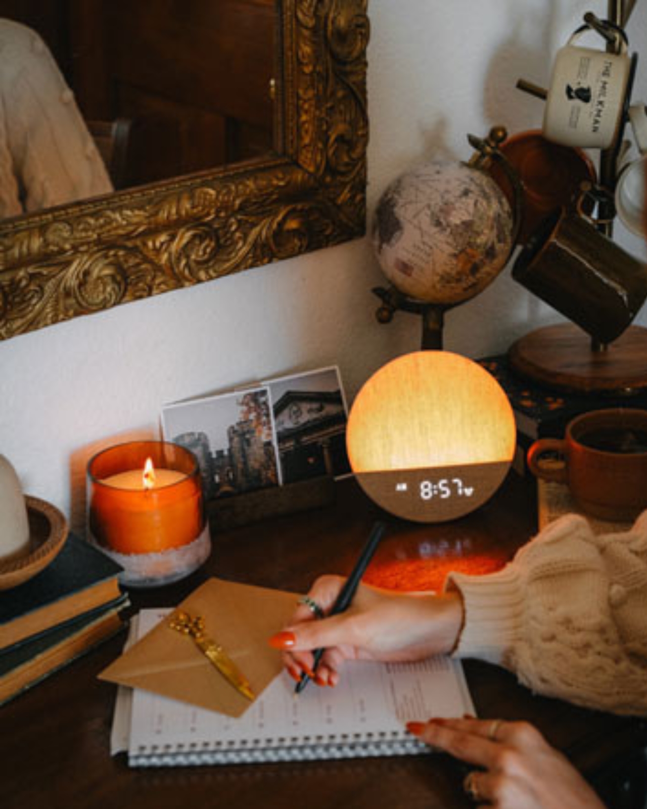
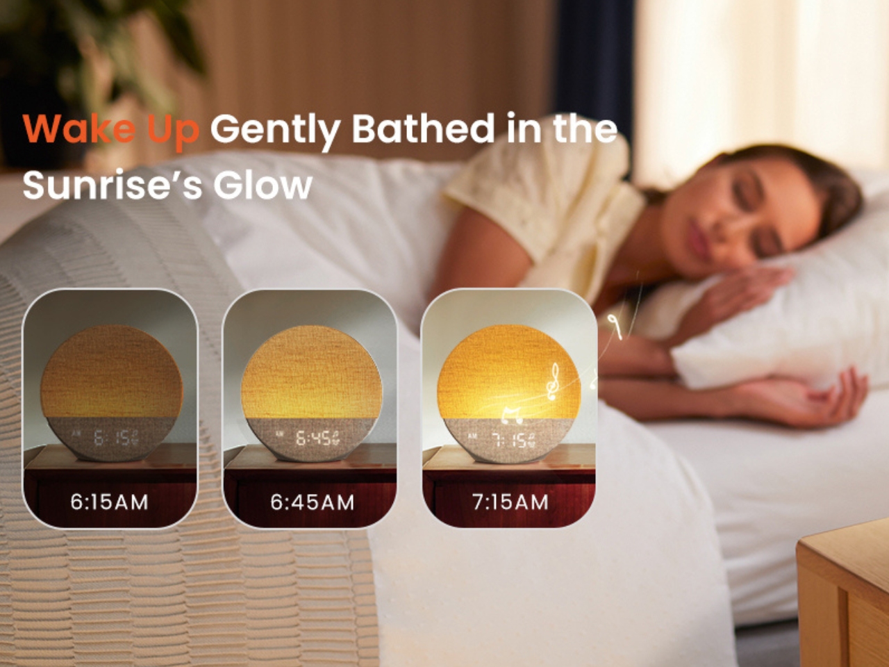
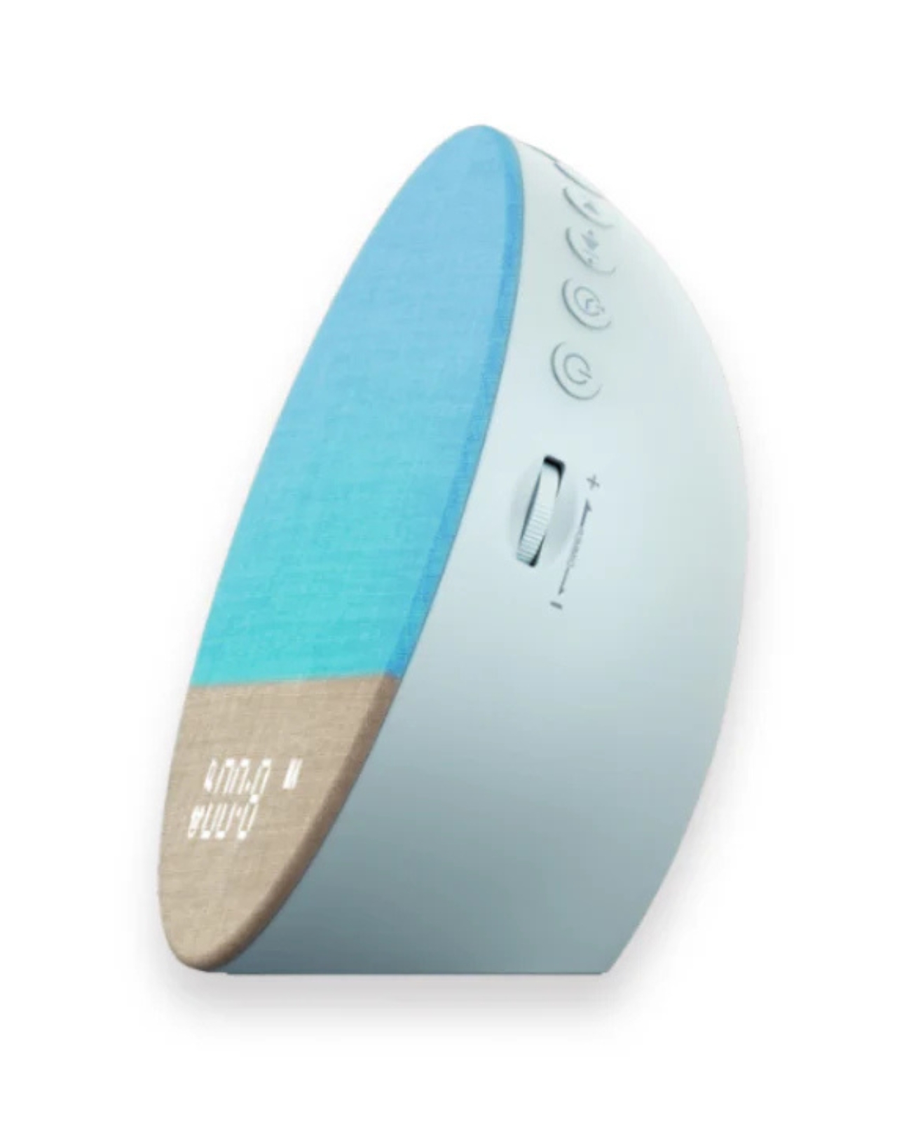
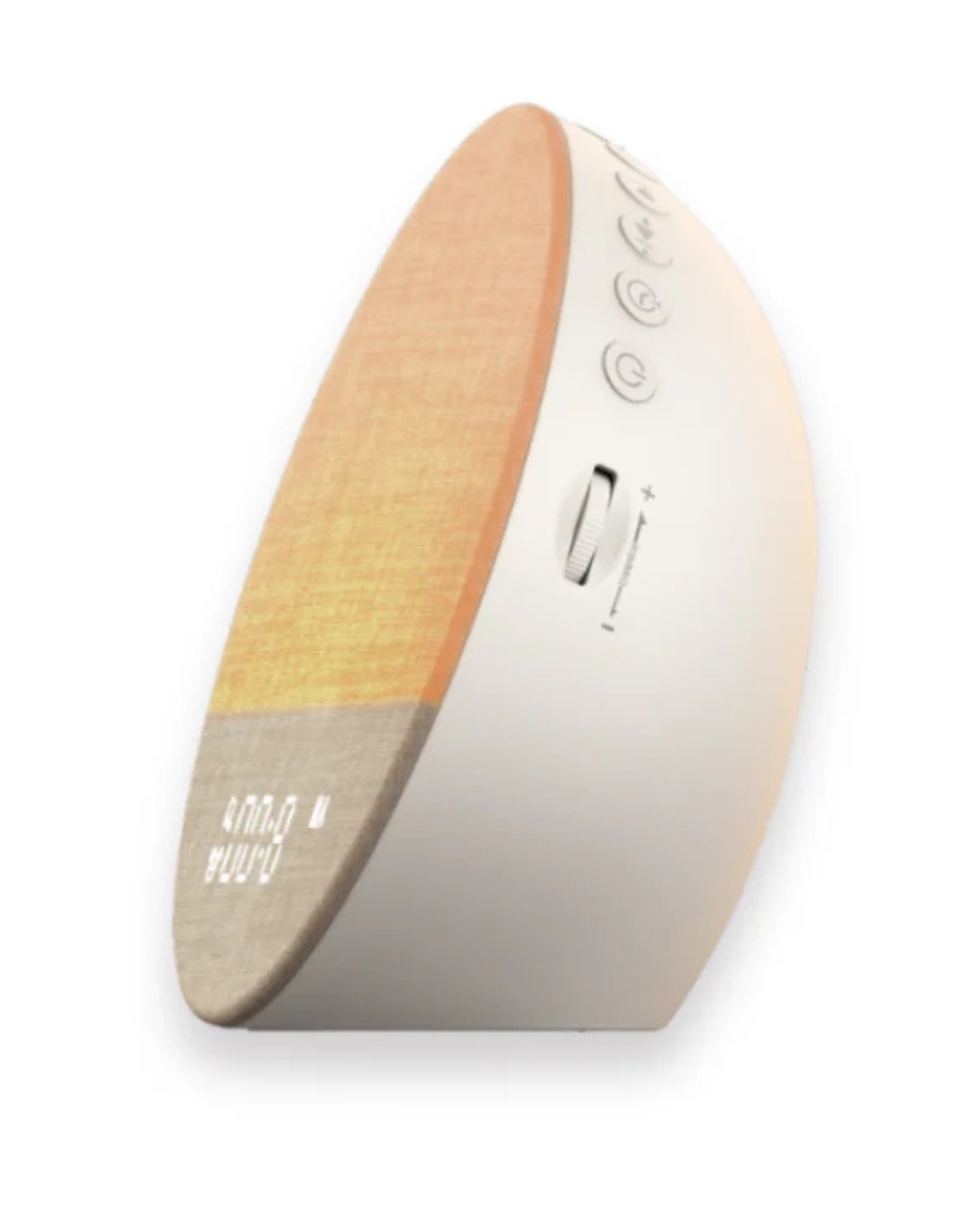
That’s the idea behind the Sunrise 1 device by Dreamegg. Not only does it look so much better than regular alarm clocks, but it is actually a 4-in-1 multifunctional device that serves as your sunrise alarm, sound machine, bedside light, and dimmable clock. The most important feature of this is that it is able to simulate a natural sunrise glow so that your circadian rhythm is not so abruptly interrupted and you wake up naturally and gently. We are not meant to be jarred out of our sleep and so this device is a wonderful option to get a more restful morning routine.

Designer: Dreamegg

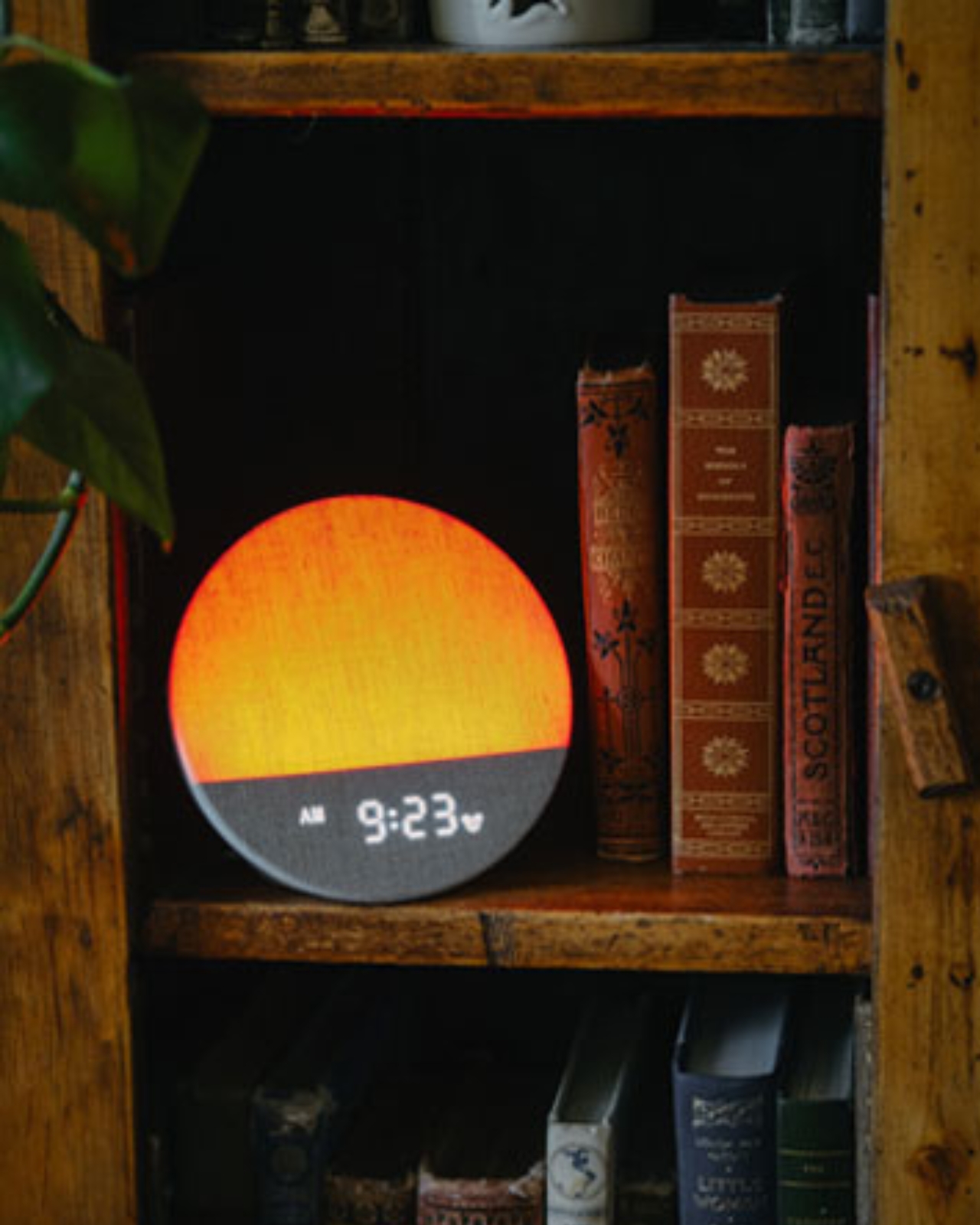
The Sunrise 1 is able to simulate the sunrise so you can gradually wake up over 15, 30, 45, or 60 minutes. The light emitted from the device goes from 0% to 100% brightness before your scheduled alarm goes off. And even when you’re supposed to wake up, you can choose other sounds rather than the annoying sounds that break through our slumber. There are 29 soothing sounds to choose from: 8 nature sounds, 5 baby sounds, 2 meditation sounds, 2 brown noise, 2 white noise, 3 pink noise, and 7 fan sounds. You can also choose from 15, 30, 45, or 60 minute timer options. The sounds can also be used to help you sleep at night, to relax in the middle of the day, or to drown out unwanted noise.

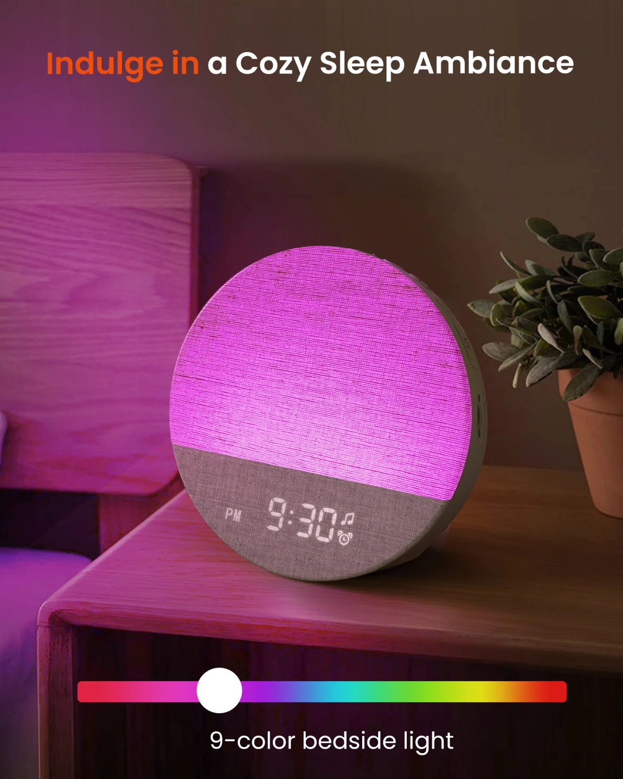
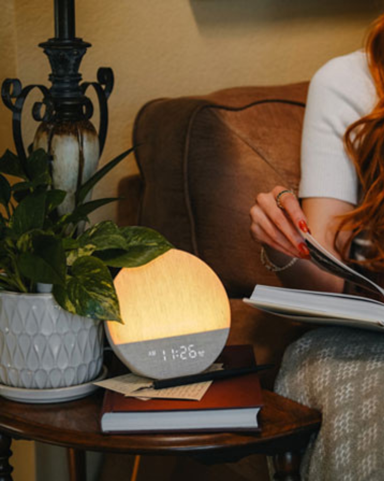
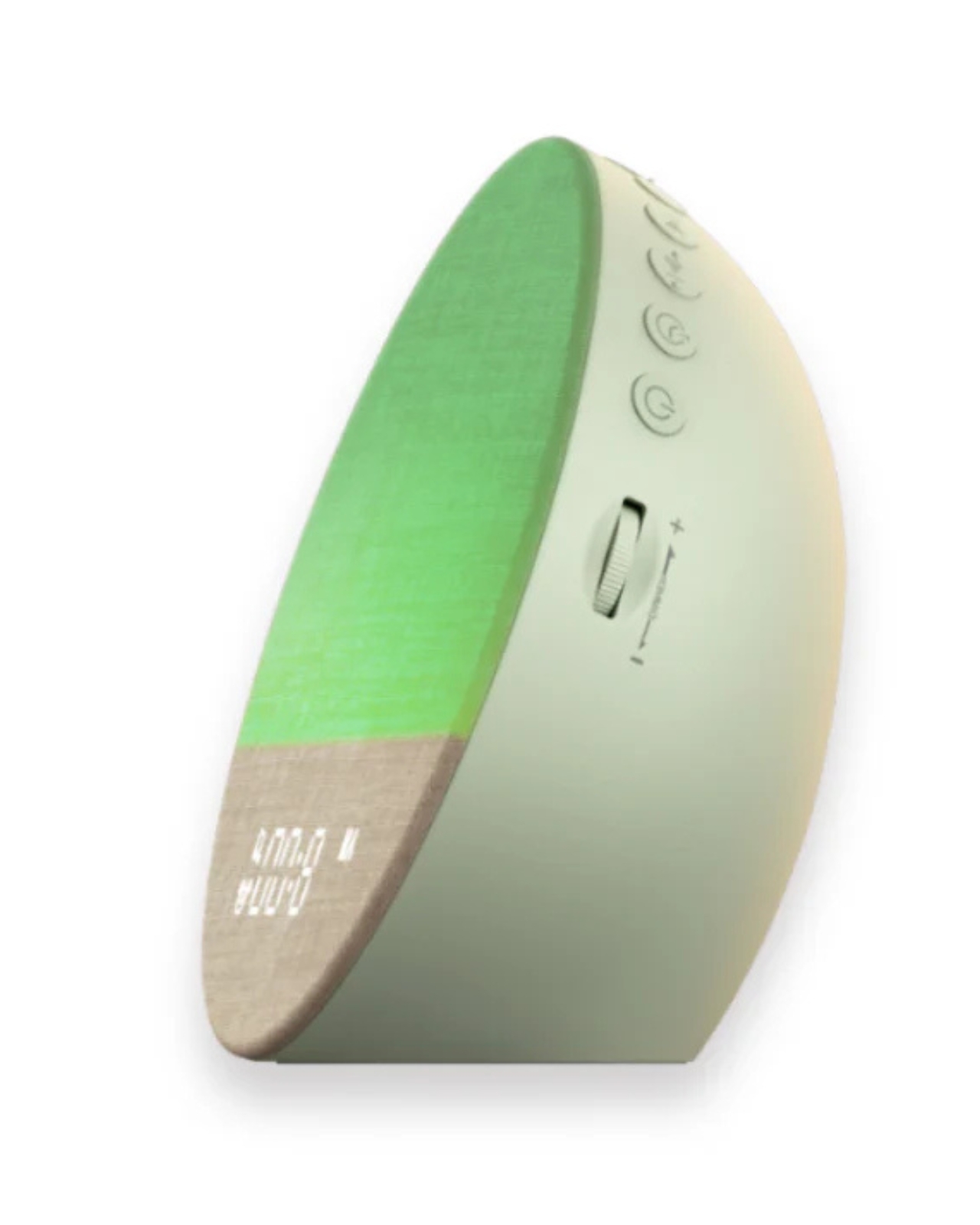
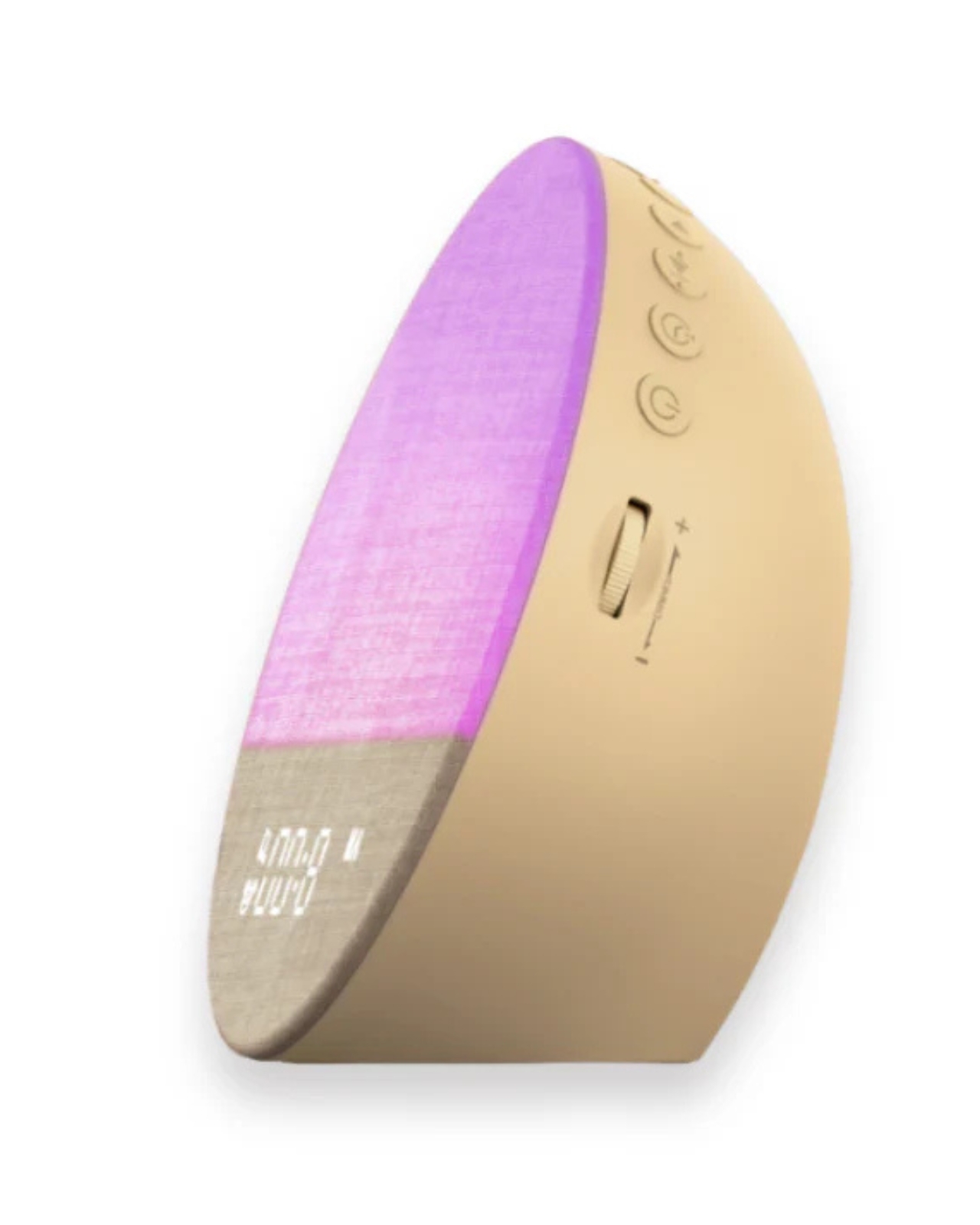
The device can also serve as your dimmable night light as you get 9 color options that range from warm amber tones to cooler shades. You can independently control it if you don’t want to use it as a sound machine at the same time. It also serves as an actual clock with an easy-to-read clock face and adjustable brightness as well. Setting it up is pretty easy as you don’t need to connect it to your phone or another gadget. You are also able to customize both your morning wake-up routine and your night sleep routine just the way you want it.

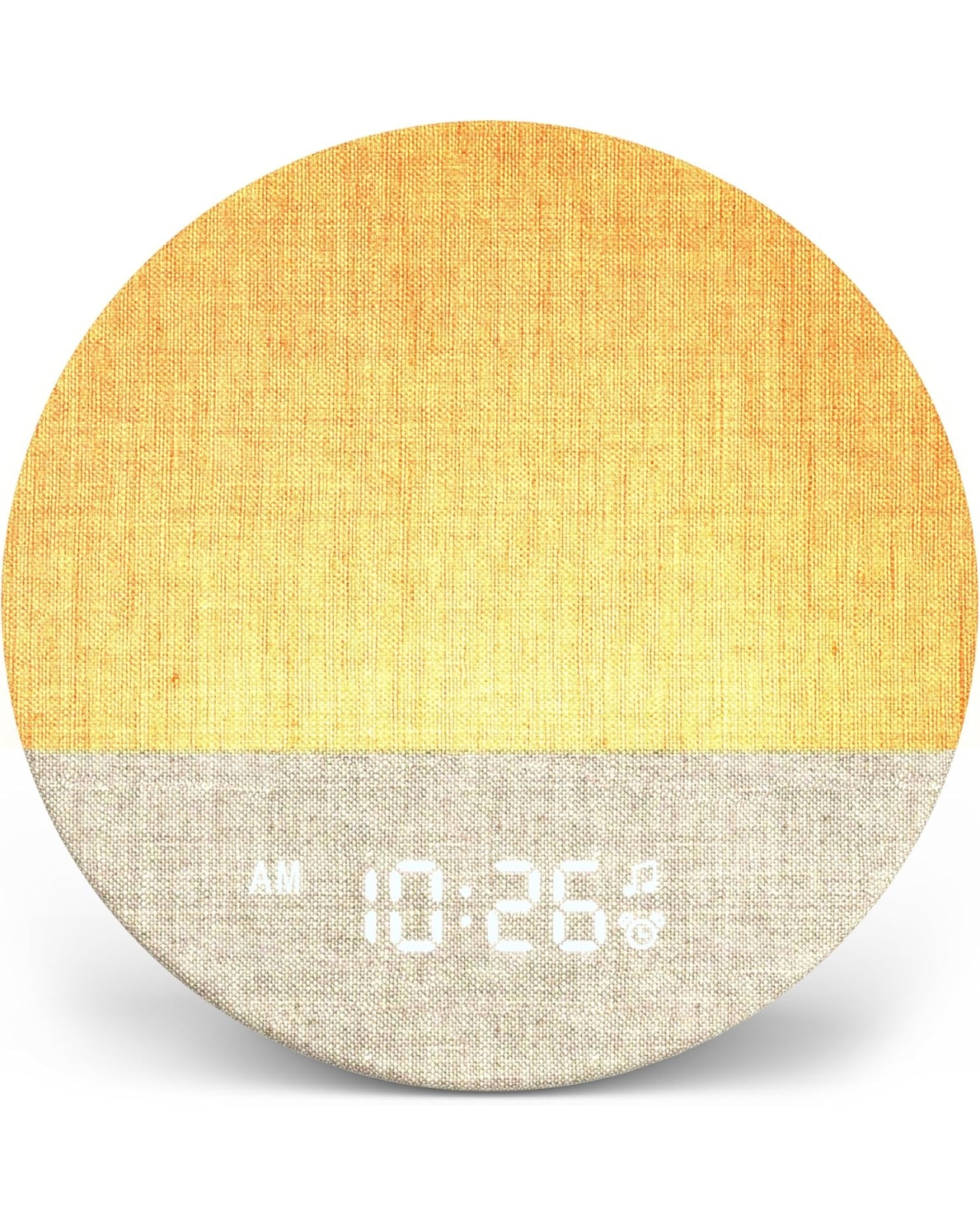
Design-wise, it’s also an aesthetic bedside piece that beats your typical plastic gadgets. It is crafted with cotton-linen fabric which is pretty soft and gentle on the skin, in keeping with its gentle wake-up call. The sleek, rounded design can fit in with the usual bedroom decor. Because it is only 2.87 inches thick and 5.91 inches in diameter, which is around the size of an adult palm, you can actually bring it with you when you travel so you can still wake up and sleep the way you want to even outside of your house.

The way that the Sunrise 1 is designed and the features that come with it will make you feel like you’re on vacation every day and not always in a hurry to start work, school, or your chores. Our usual jarring wake up routines may be a reason why we start off our day grumpy or already tired. Having a device like this may slowly turn you into a morning person if you aren’t already. I mean, sure, you may still wake up reluctantly, but at least not angrily.

The post This $100 Alarm Clock Finally Wakes You Up Without the Rage first appeared on Yanko Design.
This Tiny Red Shelter in the Alps Blurs Art and Architecture

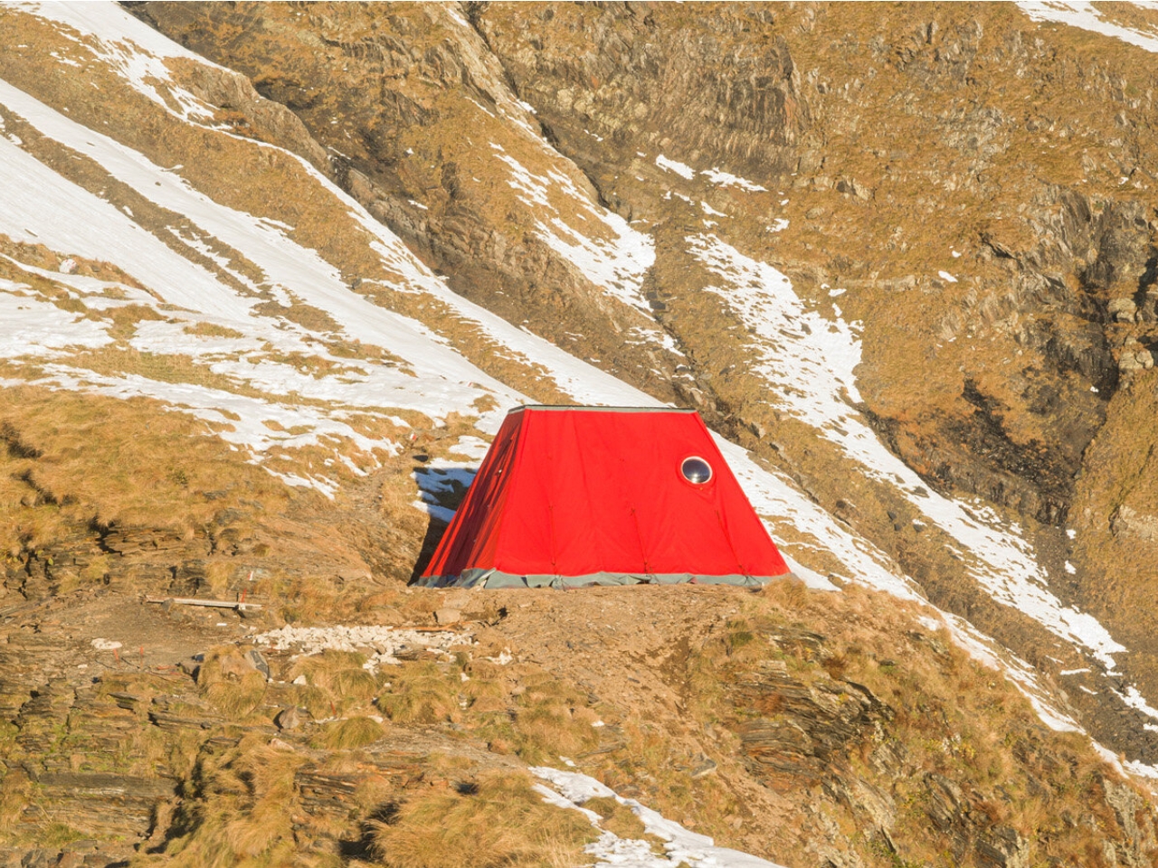
Picture this: a bright red pod perched at 2,300 meters in the Italian Alps, measuring just 4 by 2 meters, designed to shelter nine climbers in an emergency while also serving as a cultural outpost for a contemporary art gallery. If that sounds like a wild concept, well, that’s because it is.

The Aldo Frattini Bivouac, designed by the research and design studio EX., is part of something called “Thinking Like a Mountain,” a biennial program organized by GAMeC (Bergamo’s Gallery of Modern and Contemporary Art) that explores the relationship between art, landscape, and ecology. But unlike your typical art project, this one involves helicopters, emergency shelter protocols, and a whole lot of mountain weather.

Designer: EX. (photos by Tomaso Clavarino)

Located along the Alta Via delle Orobie Bergamasche in Val Seriana, the structure replaces a decaying asbestos shed that was no longer safe for climbers. The design team, led by Andrea Cassi and Michele Versaci, approached this project with a humility that’s refreshing in contemporary architecture. They weren’t trying to create some iconic landmark that screams “look at me” from across the valley.

Instead, the bivouac takes its visual cues from classic alpine tents, those temporary shelters that early mountaineers relied on during their high-altitude adventures. The exterior is wrapped in a lightweight fabric skin made by Ferrino, a Turin-based company known for mountaineering equipment. This rippling, shimmering material gives the structure a sense of impermanence, almost like it’s acknowledging its own fragility against the backdrop of ancient mountains.

The construction process was its own kind of adventure. Because the site sits at such a high altitude and is accessible only to experienced climbers, traditional building methods were out of the question. The solution? Prefabricate the entire thing in three parts, weighing about 2,000 kilograms total, and have a helicopter drop it into place during a brief weather window before snowstorms rolled in. It’s the kind of logistical puzzle that makes you appreciate the careful planning behind what looks like a simple structure.

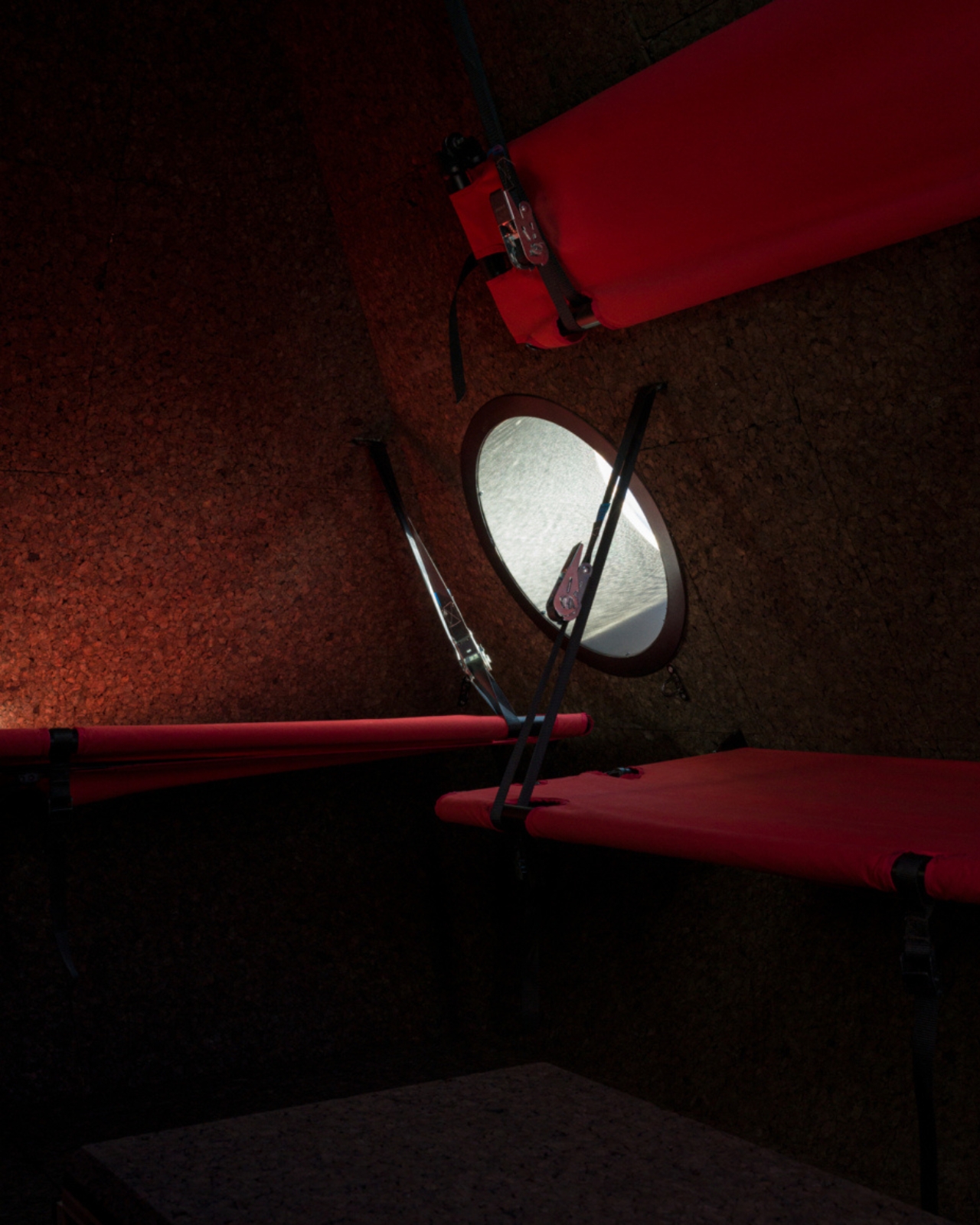
Inside, natural cork lining provides both thermal and acoustic insulation, creating a surprisingly cozy refuge against harsh alpine conditions. The space is engineered to accommodate up to nine people through a carefully choreographed arrangement of beds that unfold from the walls when needed. Most of the time, it might sit empty or shelter just one or two climbers. But in emergency situations, every inch of that compact interior becomes crucial.

What makes this project fascinating is its dual identity. Yes, it’s a functioning emergency shelter that serves a vital practical purpose for alpinists. But it’s also an extension of GAMeC’s cultural reach into the alpine environment. The gallery isn’t trying to stage exhibitions up there or host events. Instead, the bivouac serves as what they call an “observatory,” a place for gathering data, images, and environmental monitoring that helps create connections between Bergamo’s urban context and the mountainous terrain to the north.

This approach represents a kind of anti-artwashing, if you will. Rather than imposing bold artistic statements onto a landscape, the project tries to listen to and learn from the culture of the Alps. The architecture becomes a medium for presence and observation rather than display, a subtle but significant shift in how we think about bringing art and design into remote natural spaces.

The red fabric exterior is deliberately vulnerable looking. It flutters in the wind, showing creases and movement rather than presenting some pristine, unchanging surface. EX. describes it as “embracing fragility as an aesthetic,” a rejection of the idea that mountain architecture needs to be sleek and immaculate. In a way, that fabric skin becomes a kind of truth-telling, acknowledging that all human structures in the mountains are provisional and temporary when measured against geological time.

Supported by Fondazione Cariplo and Fondazione della Comunità Bergamasca, the Aldo Frattini Bivouac might just be one of the smallest buildings you’ll read about this year, but it punches well above its weight in terms of ambition and thoughtfulness. It’s a reminder that good design isn’t always about scale or spectacle. Sometimes it’s about finding elegant solutions to complex problems while respecting the environment you’re working in, even when that environment is barely accessible and completely unforgiving.

The post This Tiny Red Shelter in the Alps Blurs Art and Architecture first appeared on Yanko Design.
3 Rammed Earth Homes in Brazil Just Solved Sustainable Living

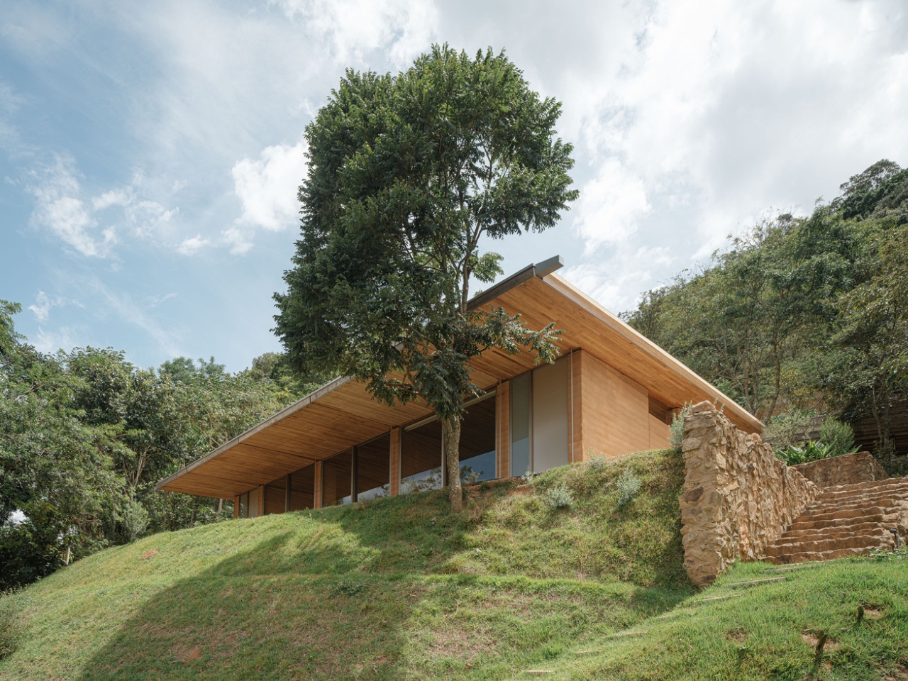
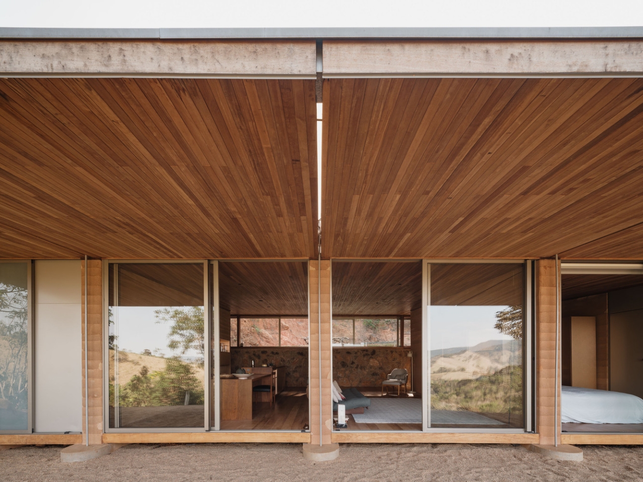
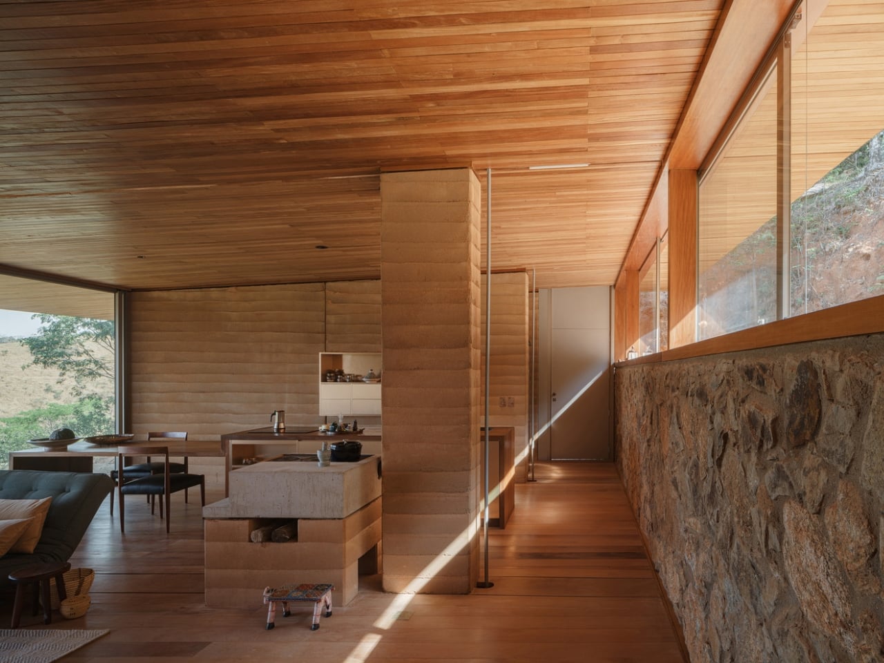
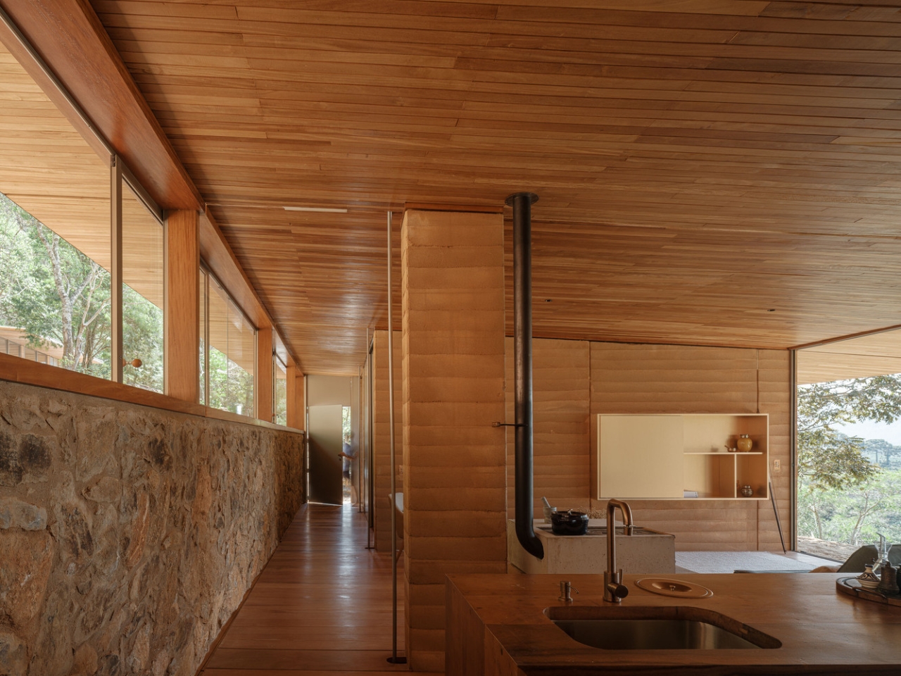
Picture this: walls made of compressed earth, windows that frame the Brazilian hillside, and a roof that collects rainwater like nature always intended. It sounds like something from a utopian novel, but Arquipélago Arquitetos just turned it into reality with the Piracaia Eco-Village, and honestly, it might be the coolest thing happening in sustainable architecture right now.

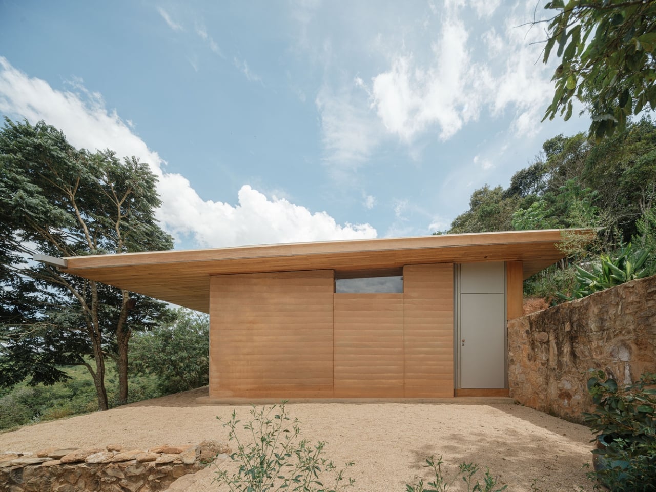
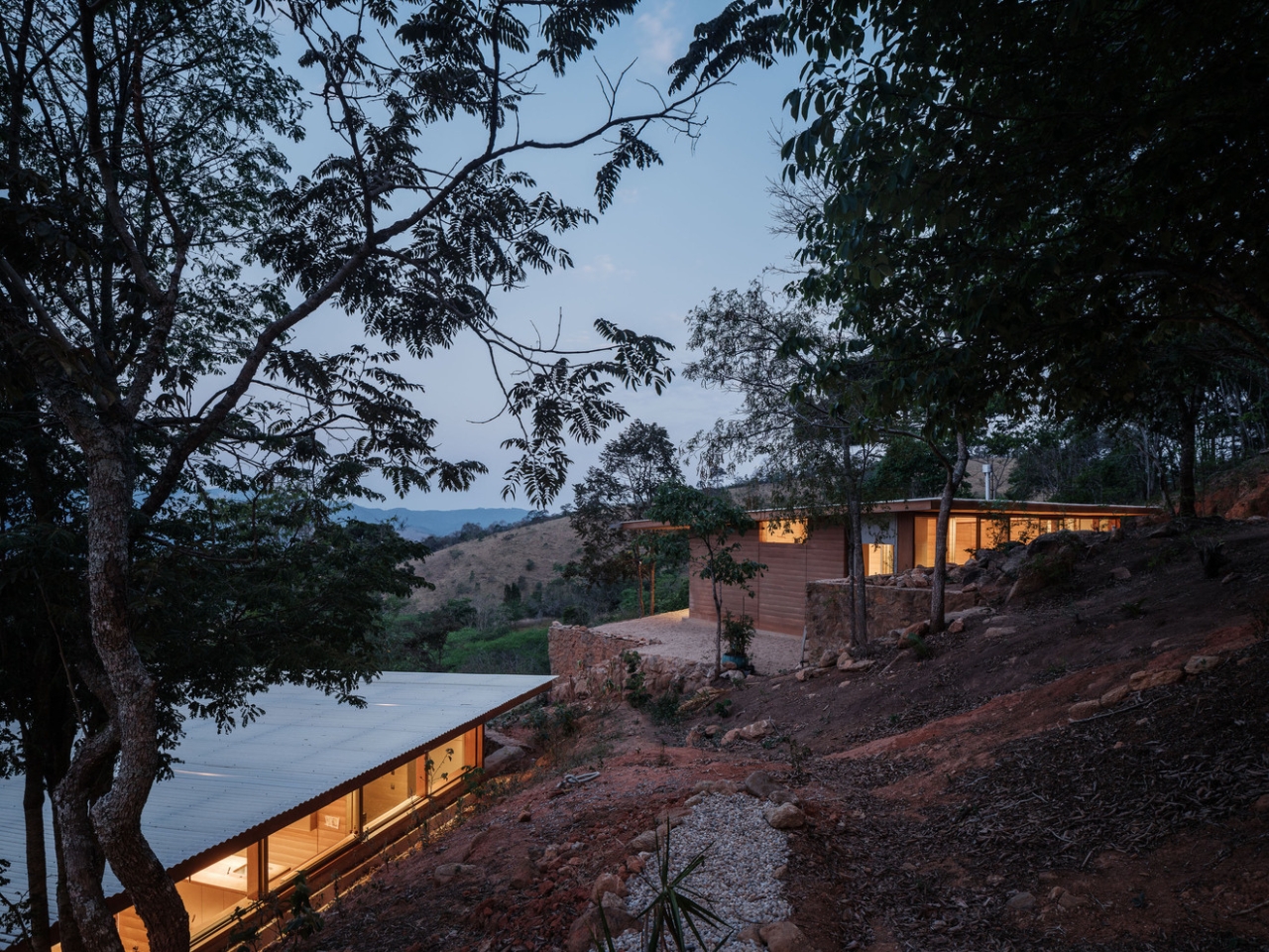
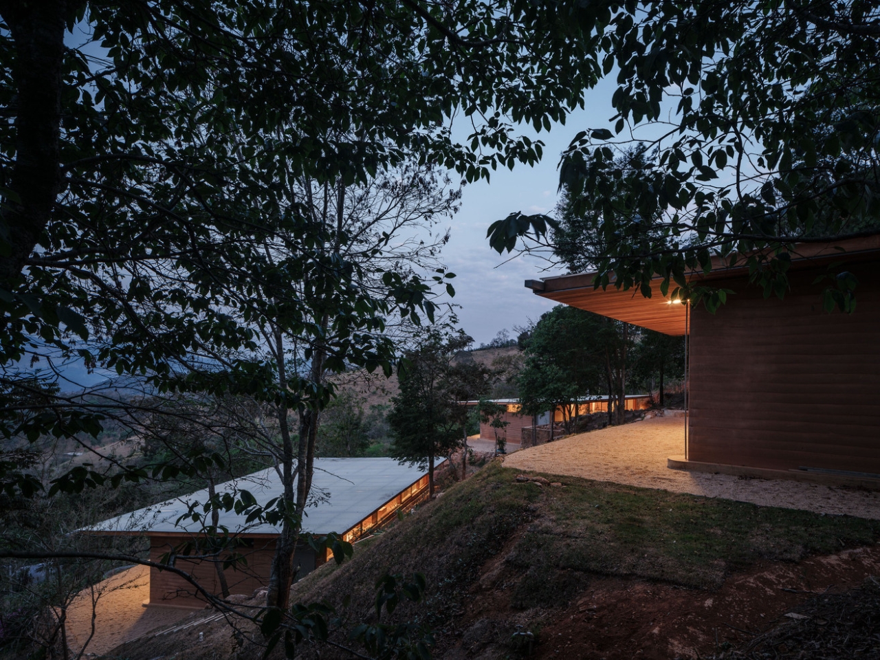
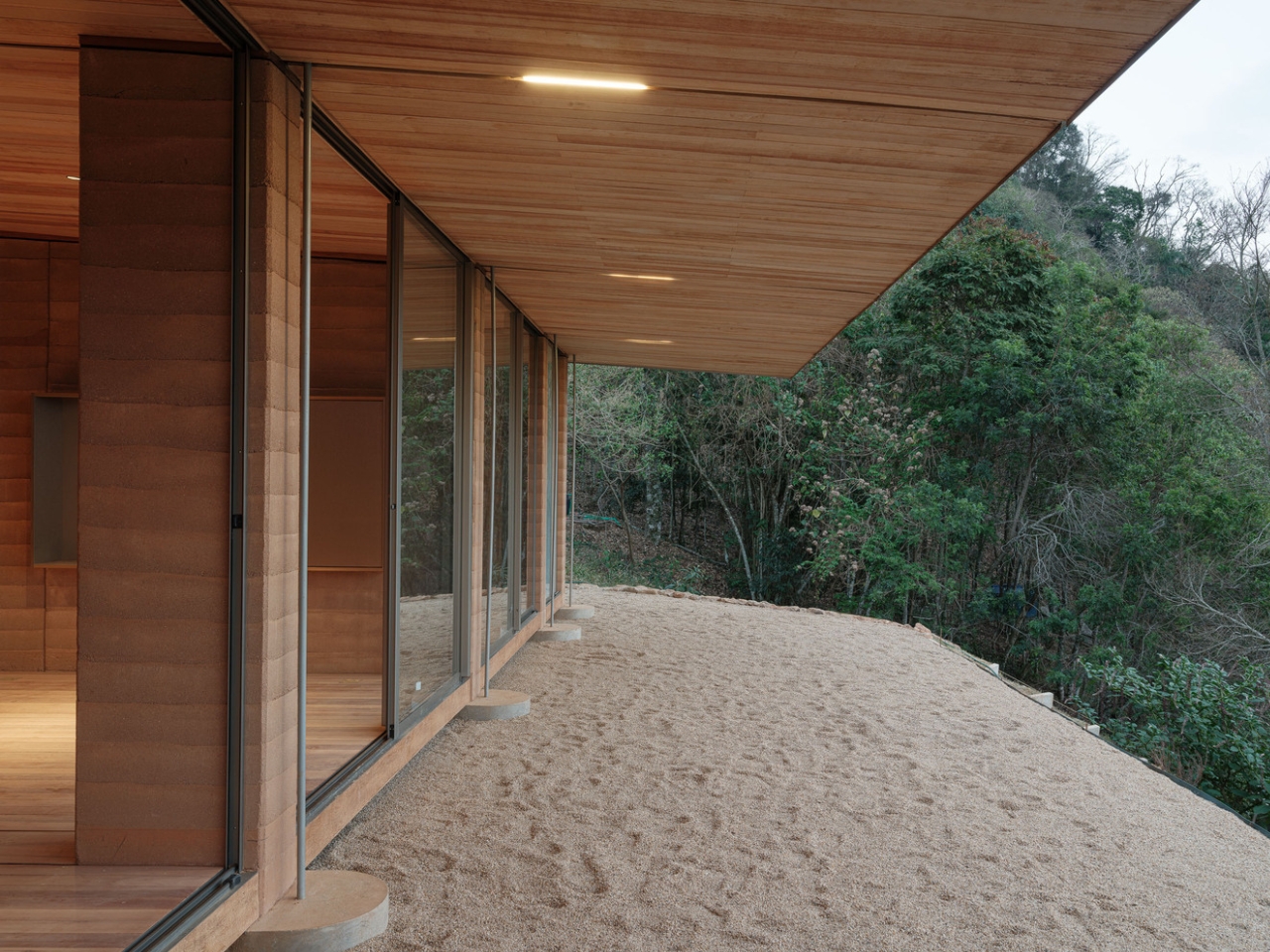
Located about two hours from São Paulo in the village of Piracaia, this project isn’t just another eco-home talking the talk. It’s three distinct residences built using rammed earth construction, a building technique so old it’s new again. We’re talking walls made by literally compressing soil into wooden frames, creating structures that are both load-bearing and breathtakingly beautiful.

Designer: Arquipélago Arquitetos

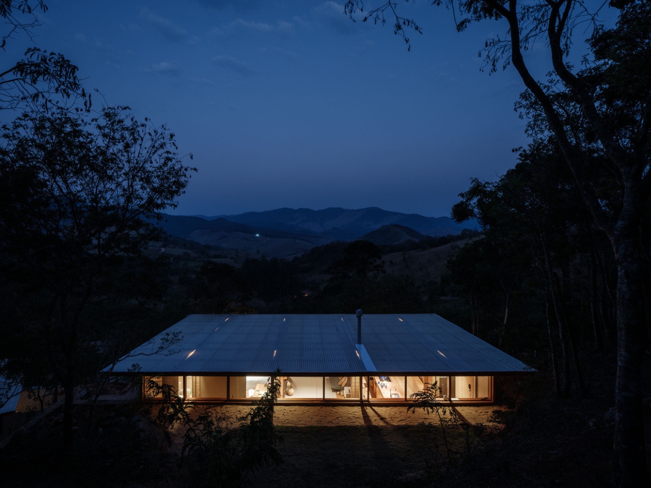
The genius behind this approach comes from Arquipélago Arquitetos, who developed a modular system that makes sustainable building actually scalable. They created three different home sizes (a studio at 538 square feet, a one-bedroom at 1,076 square feet, and a two-bedroom at 1,245 square feet) using the same basic building blocks. Think of it like architectural Lego, except instead of plastic bricks, you’re working with earth and wood.

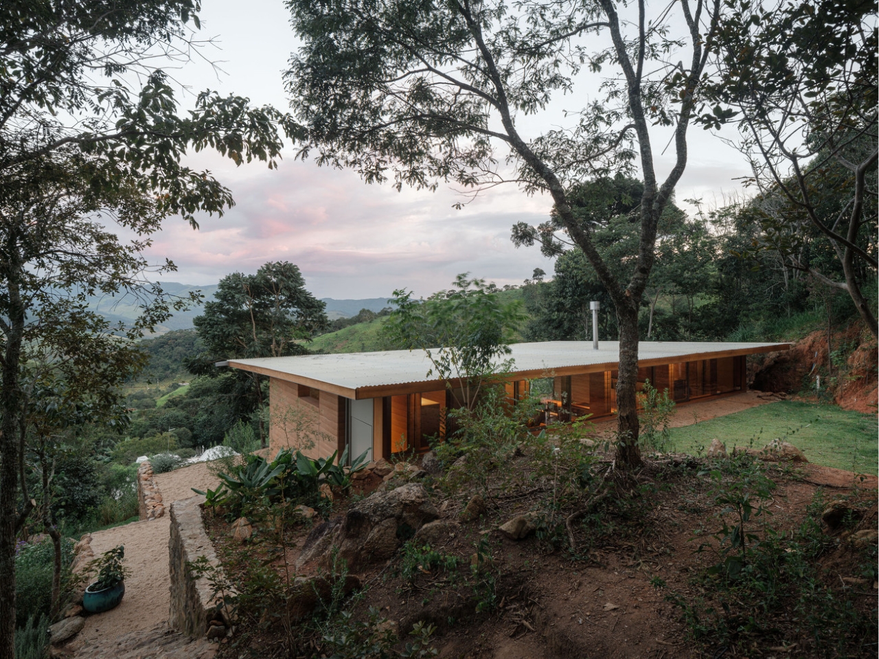
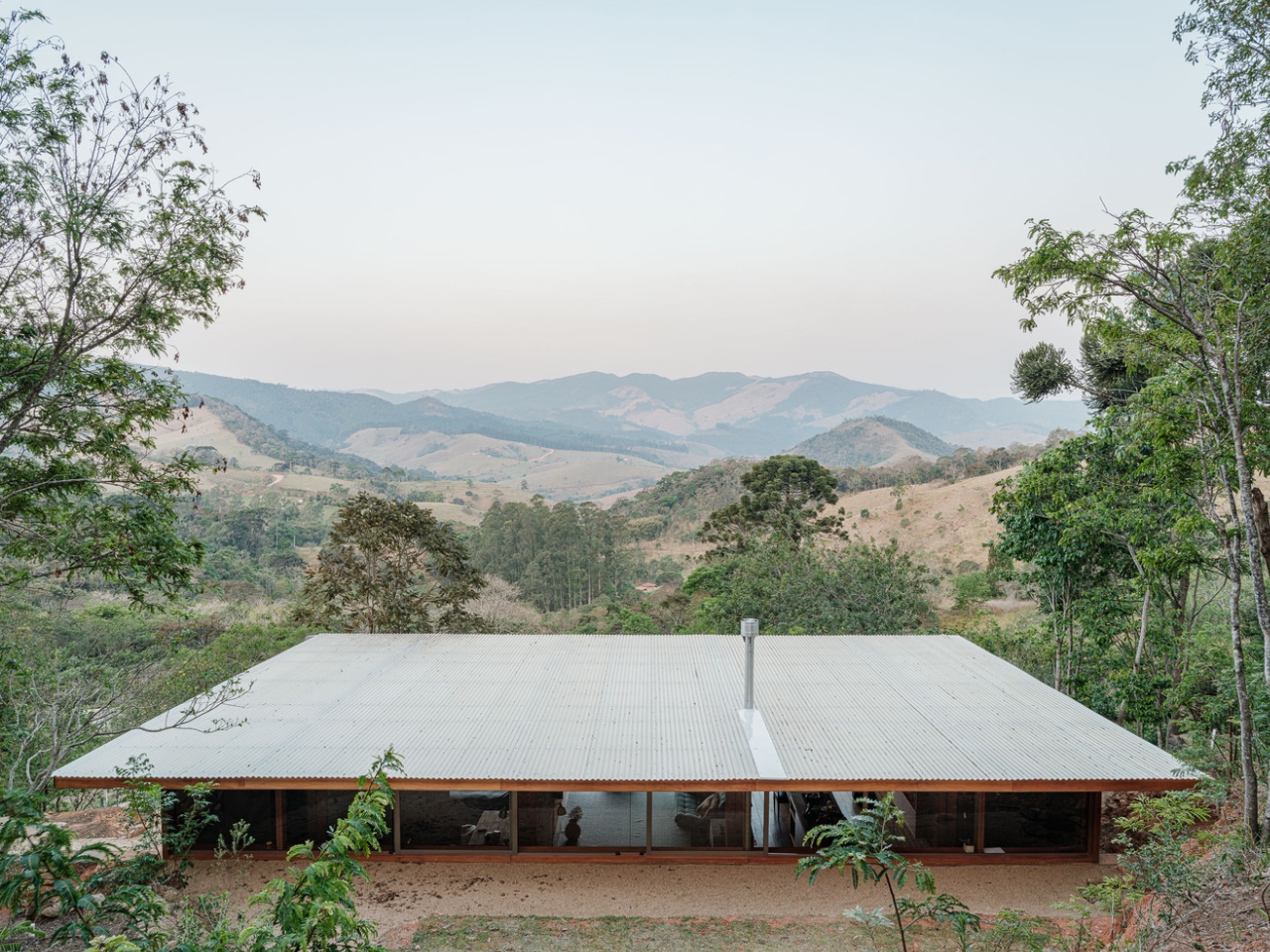
What makes these homes special isn’t just the eco-friendly materials. The architecture firm cracked the code on making rammed earth construction repeatable and adaptable. They use wooden frames repeatedly to build foundations and walls, then grow the number of rooms with each consecutive plan. The rammed earth walls aren’t just pretty; they’re the primary load-bearing elements supporting wooden roof panels through compression. Steel tie rods connect the roof to the footings, balancing all those forces to keep everything stable.

The homes nestle into the hillside with a row of clerestory windows at the back, letting in natural light while maintaining privacy. The aluminum roofs do double duty, collecting rainwater that the homes use throughout. It’s that kind of thoughtful design where form and function aren’t just friends; they’re best friends who finish each other’s sentences.

This project had a pretty interesting start. A psychologist named Lia, living alone in São Paulo, watched a Netflix documentary about rammed earth houses and thought, “That’s it. That’s what I want.” She wasn’t just looking to escape the city; she wanted a home that connected her to nature in a meaningful way. After experiences with psychedelics that deepened her understanding of how humans relate to the natural world, she sought a living space that embodied that connection. Lia built one home for herself and two others to sell to people who share her vision, creating an actual ecovillage rather than just a single sustainable home. There’s something powerful about that; building community around shared values instead of just personal retreat.

The construction process itself is fascinating. Artesania Engenharia and engineer Alain Briatte consulted on the rammed earth work, bringing specialized knowledge to compress local soil into walls that will last generations. The wooden structures came from Stamade Estruturas, with detailed installations by Jarreta Projetos. Photography by Pedro Kok captures how these earthy structures seem to grow organically from the landscape rather than imposing on it.

What’s striking about Piracaia Eco-Village is how it challenges our assumptions about sustainable living. We often think going green means sacrificing aesthetics or comfort, but these homes prove you can have both. The natural materials create spaces that feel warm and lived-in, not sterile or performative. The modular design means this approach could theoretically be replicated anywhere with suitable soil conditions.

Projects like this feel important since we’re living in a time of climate anxiety and housing crises. They show us that sustainable architecture doesn’t have to be expensive, complicated, or ugly. Sometimes the answer is literally beneath our feet: good old dirt, thoughtfully compressed and beautifully arranged. Arquipélago Arquitetos took an ancient building technique, applied modern engineering, and created something that feels both timeless and urgently necessary.

The post 3 Rammed Earth Homes in Brazil Just Solved Sustainable Living first appeared on Yanko Design.
This Chinese Greenhouse Folds Open Into a Community Kitchen

You know that feeling when you stumble upon something that makes you reconsider everything you thought you knew about a space? That’s exactly what happened when I discovered this incredible project in Guangzhou, China. Office for Roundtable and JXY Studio have created something that refuses to fit into neat categories, and honestly, that’s what makes it so compelling.

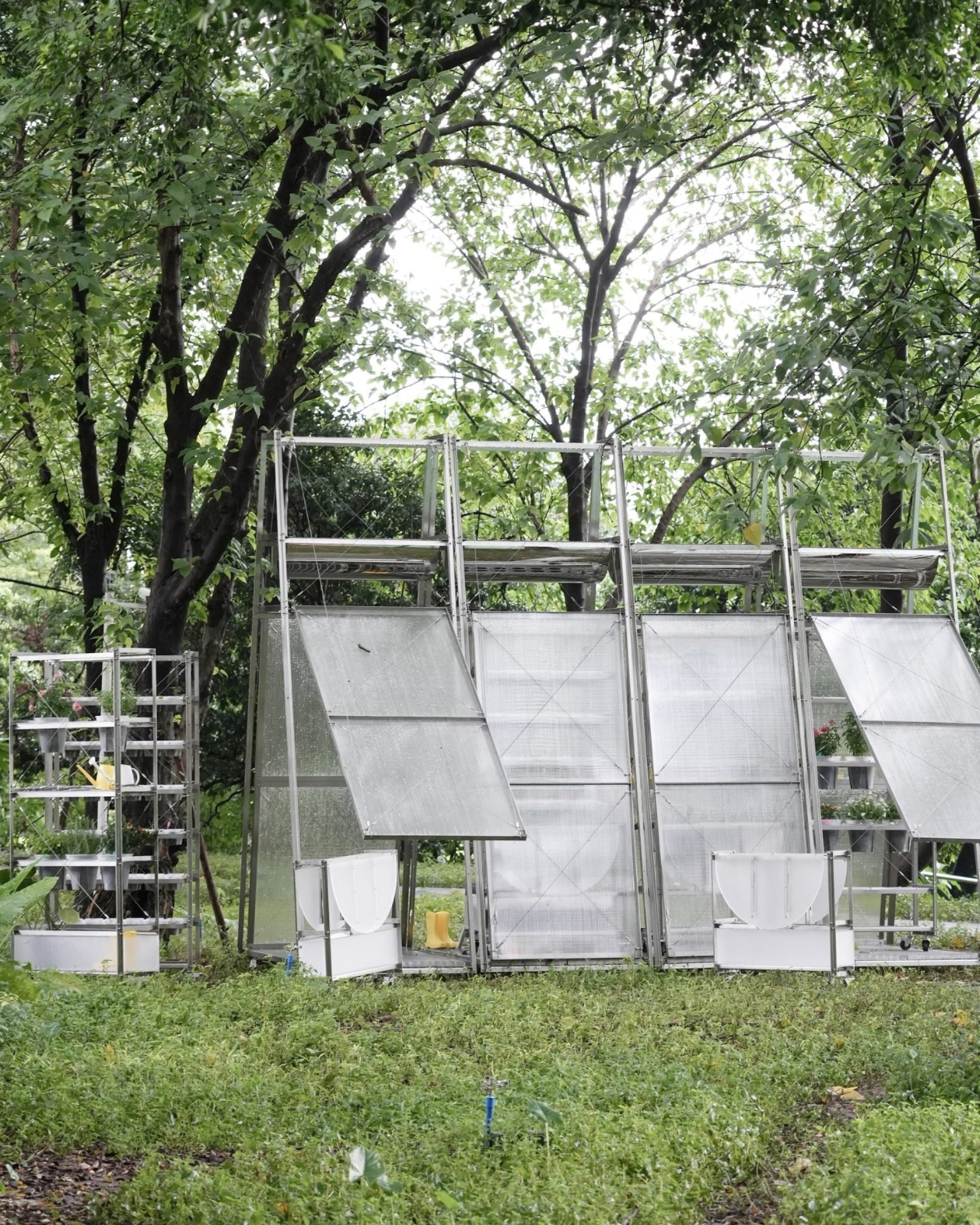
The project is called “Your Greenhouse Is Your Kitchen Is Your Living Room,” and yes, that title is doing exactly what it promises. This isn’t just a clever name. It’s a modular pavilion that literally transforms from a functioning greenhouse into an open pavilion for community gatherings, and it does so in the most satisfying way possible.

Designers: Office for Roundtable and JXY Studio (photography by Leyuan Li)

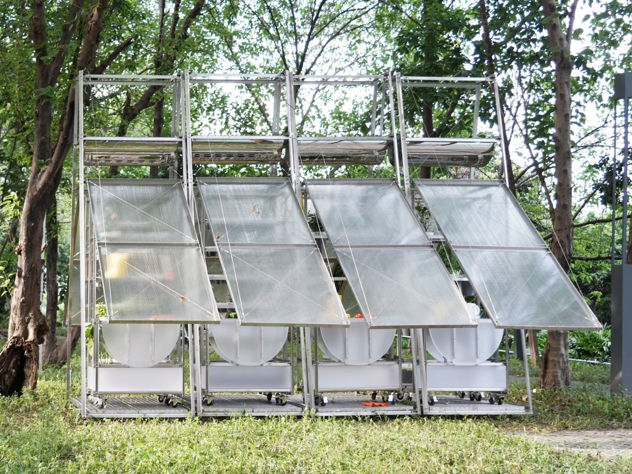
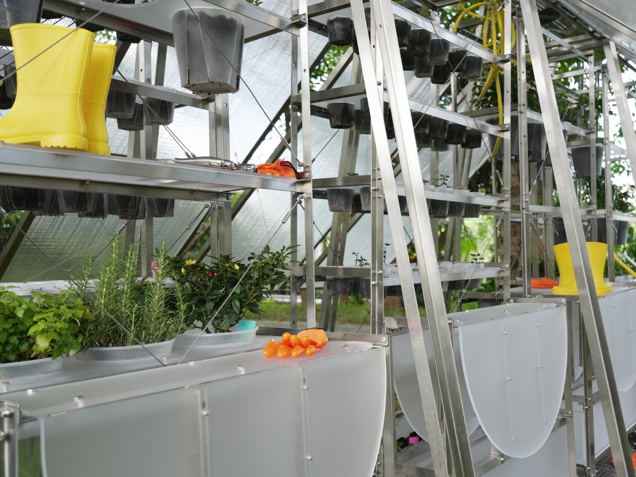
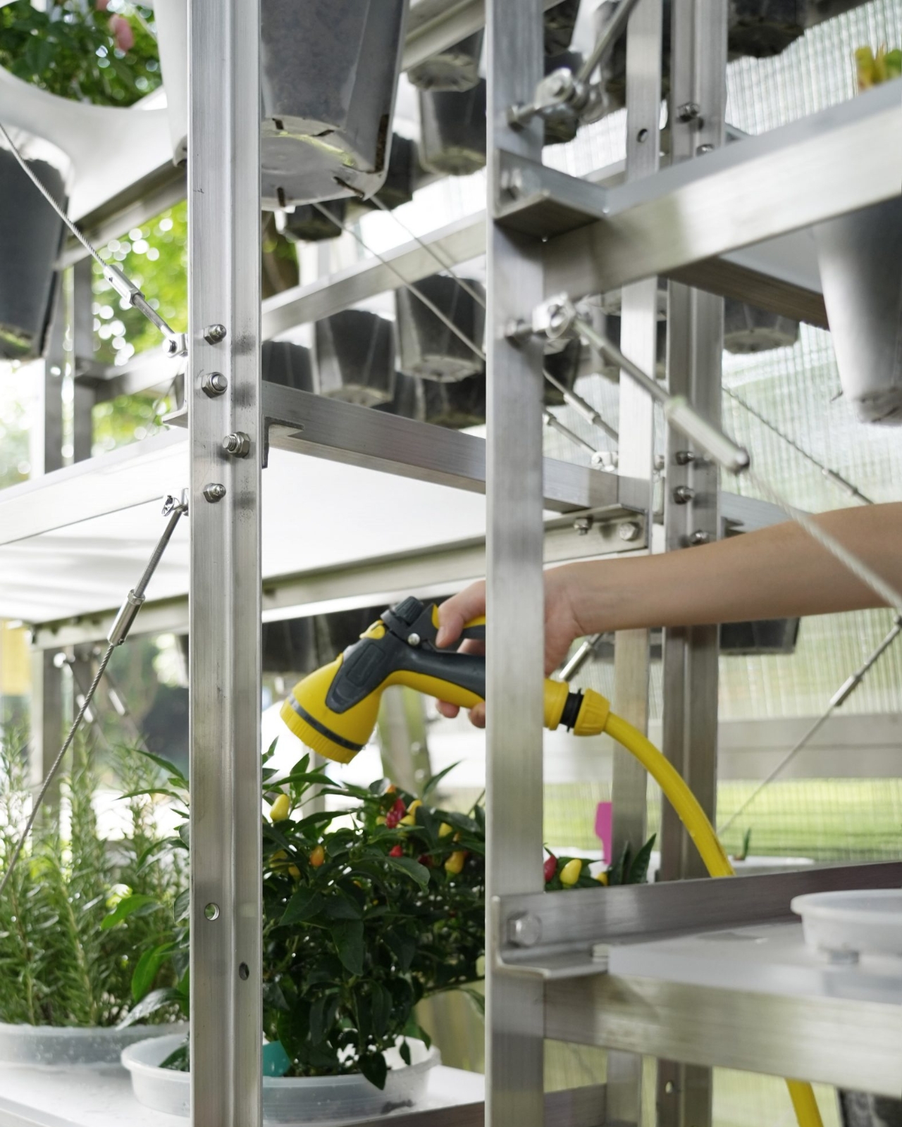
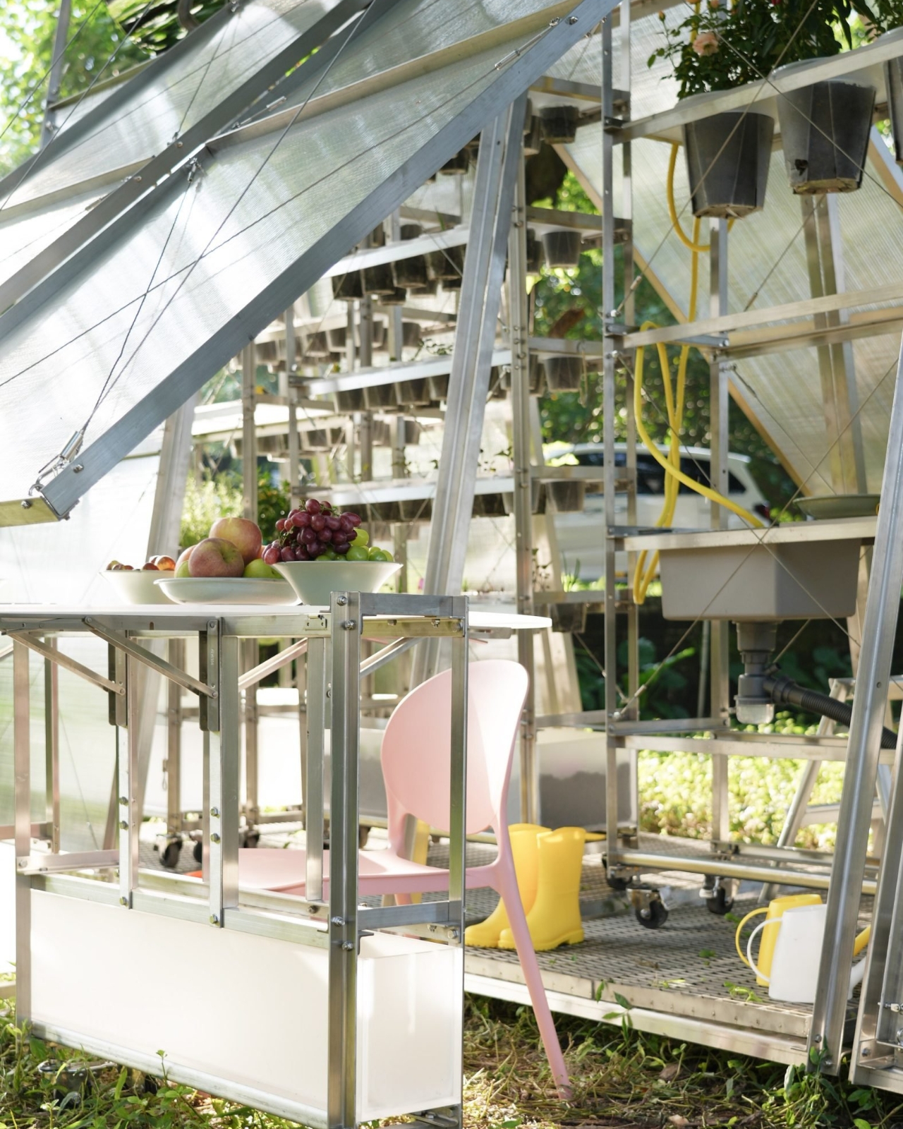
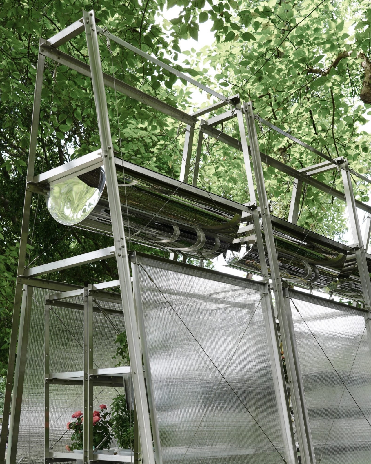
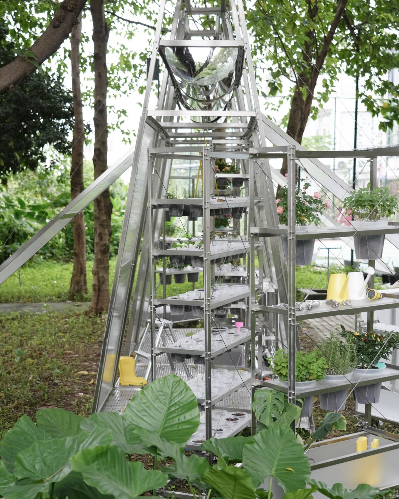
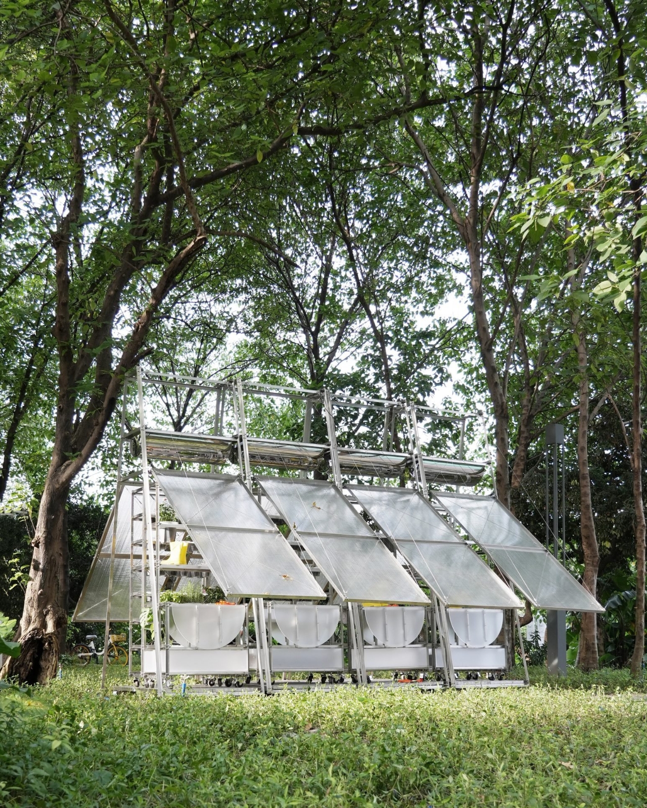
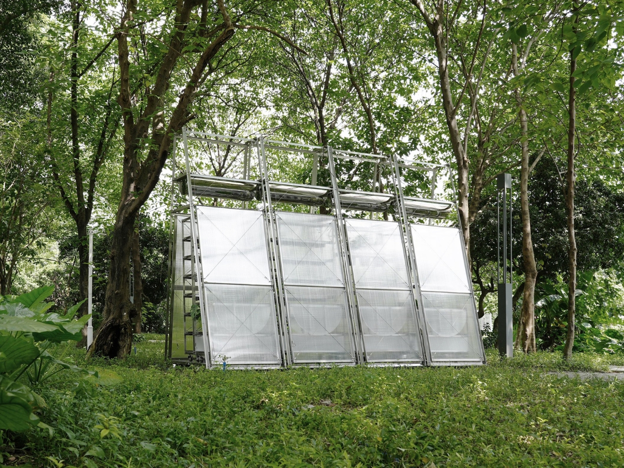
Picture this: a steel A-frame structure wrapped in polycarbonate panels that can hinge open using tension cables suspended from the top of the frame. When the sides are closed, you have a microclimate perfect for growing potatoes, green peppers, lettuce, bok choi, and various herbs. When you pull those cables and the walls lift up, suddenly you’ve got an airy pavilion ready to host a dinner party or a community workshop.

What I love about this design is how it emerged from a very specific moment in time. Designer Leyuan Li secured a grant from Hong Kong’s Design Trust to explore the small-scale, community-based farming projects that popped up during the COVID-19 pandemic. You remember those, right? When everyone suddenly became obsessed with sourdough starters and backyard gardens because we were all grappling with questions about food security and supply chains.

But instead of just documenting that cultural moment, Li and the teams at Office for Roundtable and JXY Studio decided to create something that pushes the conversation forward. The pavilion, installed at Guangzhou’s Fei Arts museum, is their answer to a bigger question: what if we could challenge the entire system of centralized food production by creating spaces that make growing, cooking, and sharing food feel more accessible and communal?

The technical details are pretty clever too. Those polycarbonate sheets aren’t just randomly placed. The designers carefully positioned gaps between the panels to allow for passive cooling, which is essential in Guangzhou’s subtropical climate. Nobody wants to be stuck in a sweltering greenhouse when they’re trying to tend their herbs or host a gathering. Inside, metal shelving racks hold the vegetables and herbs, creating a practical growing system that doesn’t sacrifice aesthetics. The whole structure is lightweight and modular, which means it can be adapted, moved, or reconfigured based on what the community needs.

This flexibility feels important. The design doesn’t dictate how people should use the space. Instead, it offers possibilities. Maybe today it’s a greenhouse where neighbors learn about urban farming techniques. Tomorrow it could transform into an outdoor kitchen where everyone gathers to cook what they’ve grown. Next week, it might become a living room for community conversations about food systems and sustainability.

What Office for Roundtable describes as an “architectural device that amalgamates the roles of a greenhouse, an outdoor kitchen, and a living room” is really about something deeper than just multipurpose design. It’s about reimagining our relationship with food, land, and each other in urban environments.
The truth is we’re increasingly disconnected from where our food comes from so this project offers a refreshingly tangible alternative. It proposes new forms of what the designers call “domesticity and collectivity” by literally breaking down the walls between growing food, preparing it, and gathering around it. The beauty of this installation is that it doesn’t preach or demand. It simply exists as an invitation. Want to grow something? Here’s the space. Want to cook together? The pavilion opens up. Want to talk about how we can build more resilient, community-centered food systems? Pull up a chair.
That’s the kind of design that sticks with you. Not because it’s flashy or complicated, but because it’s thoughtful enough to adapt to real human needs while being bold enough to suggest we might want to rethink some pretty fundamental assumptions about how we live, eat, and come together.

The post This Chinese Greenhouse Folds Open Into a Community Kitchen first appeared on Yanko Design.