The Arnardo Desk Looks Like It Time-Traveled From 2084

There’s something deeply satisfying about furniture that refuses to play by the rules. You know the kind I’m talking about: pieces that make you stop mid-scroll and think, “Wait, is that even real?” The Arnardo Desk by Paddy Pike Studio is exactly that kind of design unicorn, and honestly, I’m not sure whether to sit at it or frame it on a museum wall.

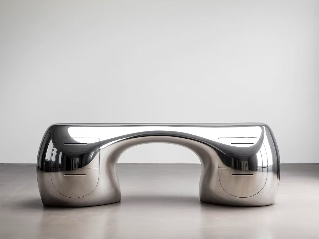
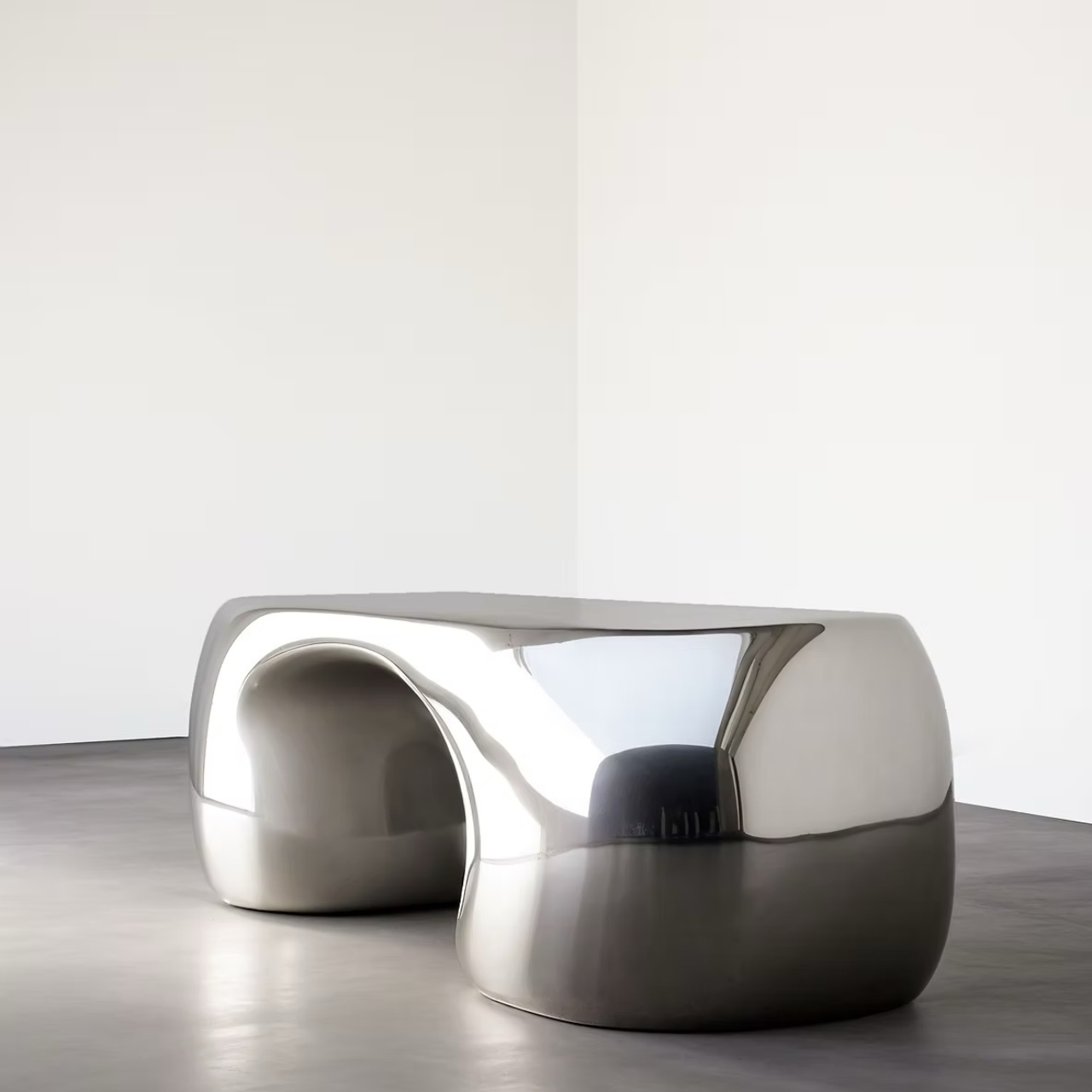
At first glance, this desk looks like someone melted the future and poured it into a mold. The high-polish metallic finish catches light like liquid mercury, creating reflections that shift and distort depending on where you’re standing. It’s the kind of visual trickery that keeps you staring, trying to figure out where one curve ends and another begins. The whole thing reads like a single continuous surface, even though it’s clearly a complex piece of engineering.

Designer: Paddy Pike Studio
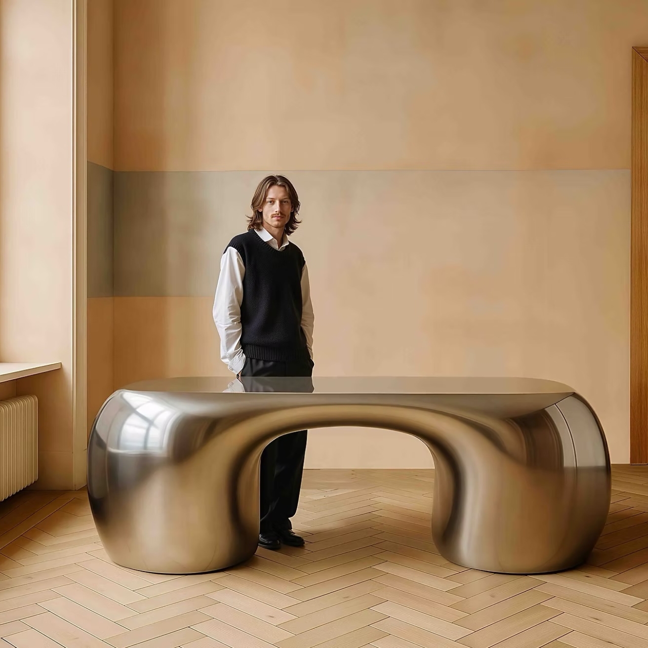
What makes the Arnardo Desk so compelling is how it balances sculpture with function. This isn’t just a pretty object meant to gather dust in a collector’s home (though it would certainly earn its keep there). The design integrates storage drawers seamlessly into those bulbous, almost pod-like pedestals. These aren’t slapped-on afterthoughts either. The drawer fronts follow the same flowing lines as the rest of the piece, maintaining that unbroken visual rhythm that makes the desk feel like it was grown rather than built.
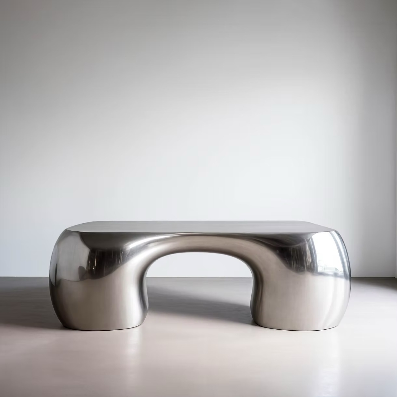
The form itself is wonderfully ambiguous. From certain angles, it almost looks biological, like some kind of metallic organism frozen mid-movement. From others, it channels retro-futurism vibes, the kind of aesthetic you’d expect in a 1960s vision of what the year 2000 would look like. And depending on the light, it can read as sleek and minimal or dramatically sculptural. That versatility is part of its magic.

Paddy Pike Studio has clearly spent time thinking about how people interact with their workspace. The curved desktop surface isn’t just a stylistic choice. It creates distinct zones without the need for physical dividers. You can imagine spreading out projects across that generous surface, using the natural flow of the form to organize your work. The height and proportions suggest careful consideration of ergonomics, even as the overall aesthetic screams art installation.
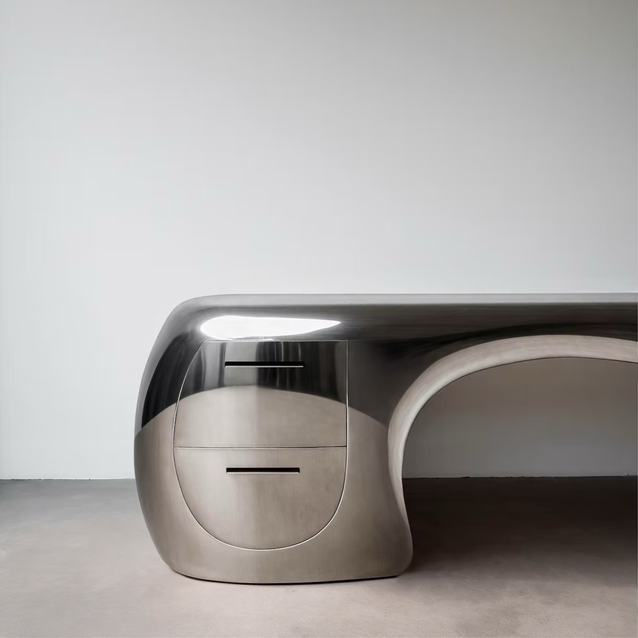
What’s particularly interesting is how this piece positions itself in the current design landscape. We’re living through a moment where maximalism is having a serious comeback, where bold statement pieces are replacing the stark minimalism that dominated the 2010s. The Arnardo Desk fits perfectly into this shift. It’s unapologetically dramatic, refuses to blend into the background, and makes a space feel intentional rather than default.

The material choice matters here too. That mirror-like metallic finish isn’t just about looks (though it certainly delivers on visual impact). It’s a callback to the Space Age furniture of designers like Eero Aarnio and Joe Colombo, who experimented with then-novel plastics and metals to create pieces that felt radically different from traditional wood furniture. Pike is working in that same experimental tradition, pushing against our expectations of what a desk should look like.
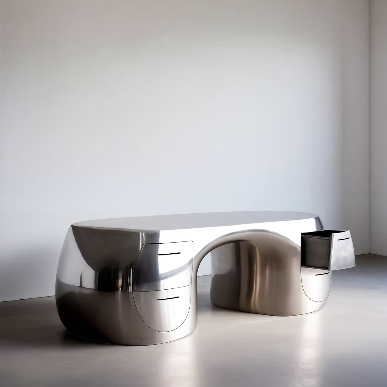
There’s also something delightfully impractical about this desk, and I mean that as the highest compliment. In a world obsessed with optimization and efficiency, where every object needs to justify its existence through maximum utility, the Arnardo Desk dares to be extra. It takes up space. It demands attention. It makes you rethink your entire room just to give it the stage it deserves. That kind of boldness feels refreshing.
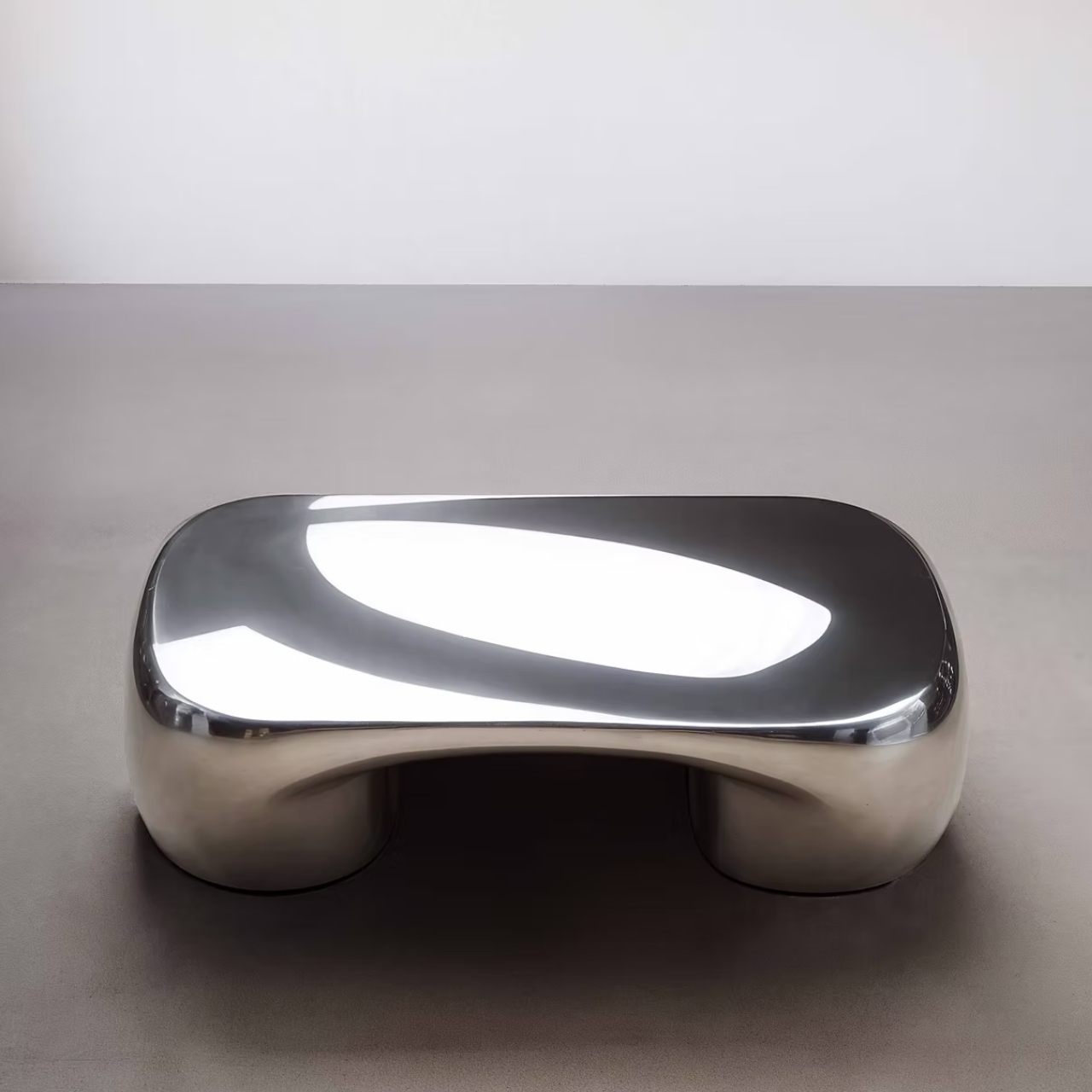
Of course, this is collectible design, which means it exists in that fascinating space between art and furniture. It’s fully functional, but it’s also limited and clearly positioned as an investment piece for serious collectors. That doesn’t make it less relevant to the rest of us, though. Pieces like this push the conversation forward. They remind us that furniture doesn’t have to be boring, that our everyday objects can inspire genuine emotion and spark conversations.
The post The Arnardo Desk Looks Like It Time-Traveled From 2084 first appeared on Yanko Design.
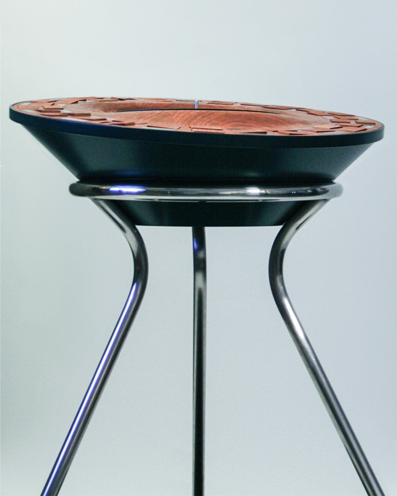
Orbit Kinetic Turntable: See Your Music Move with Flipping Wooden Tiles

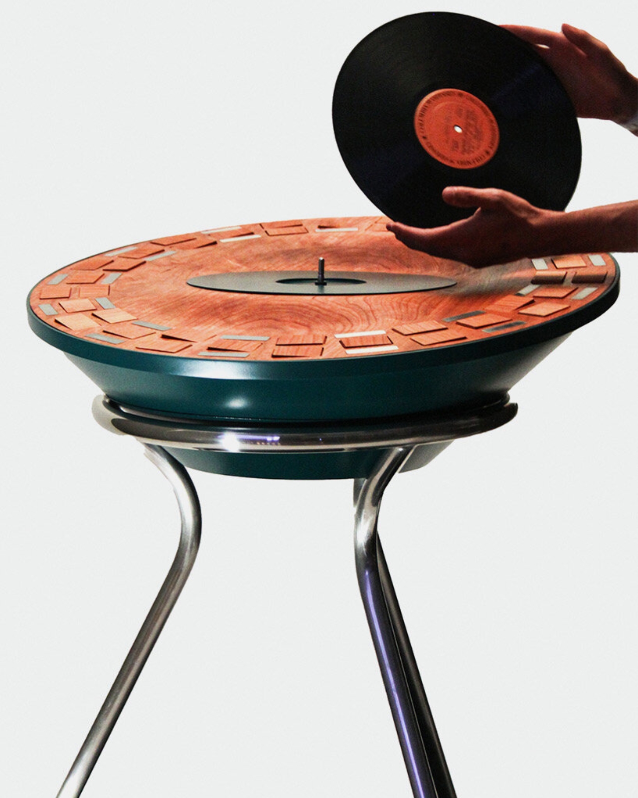
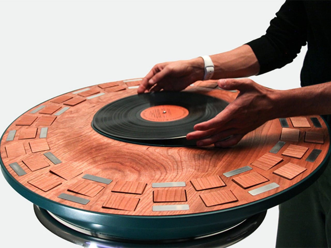
Remember when music was something you could actually see? Not just album art or a Spotify playlist, but something physical that moved and breathed with the beat? Designer Lillian Brown is bringing that tangible connection back with Orbit, a kinetic turntable that literally flips the script on how we experience sound.

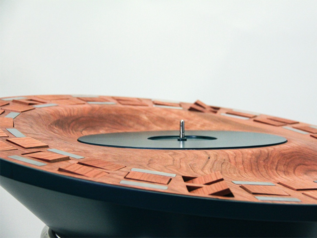
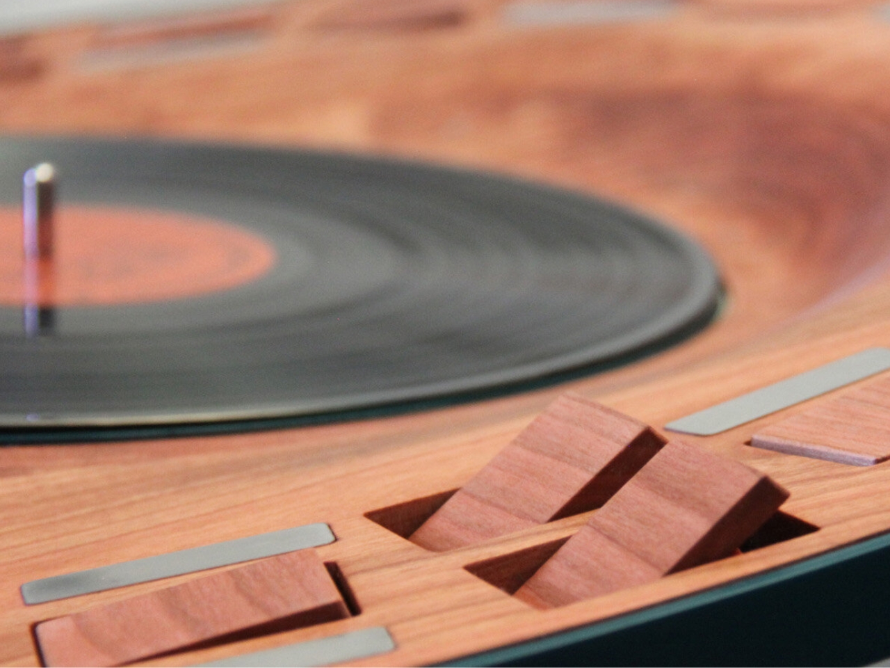
What started as Brown’s senior thesis at the Savannah College of Art and Design has evolved into something genuinely captivating. Orbit isn’t just a turntable; it’s a performance piece that translates every beat, every note, every rhythm into visible motion through a mesmerizing display of flipping wooden tiles.

Designer: Lillian Brown

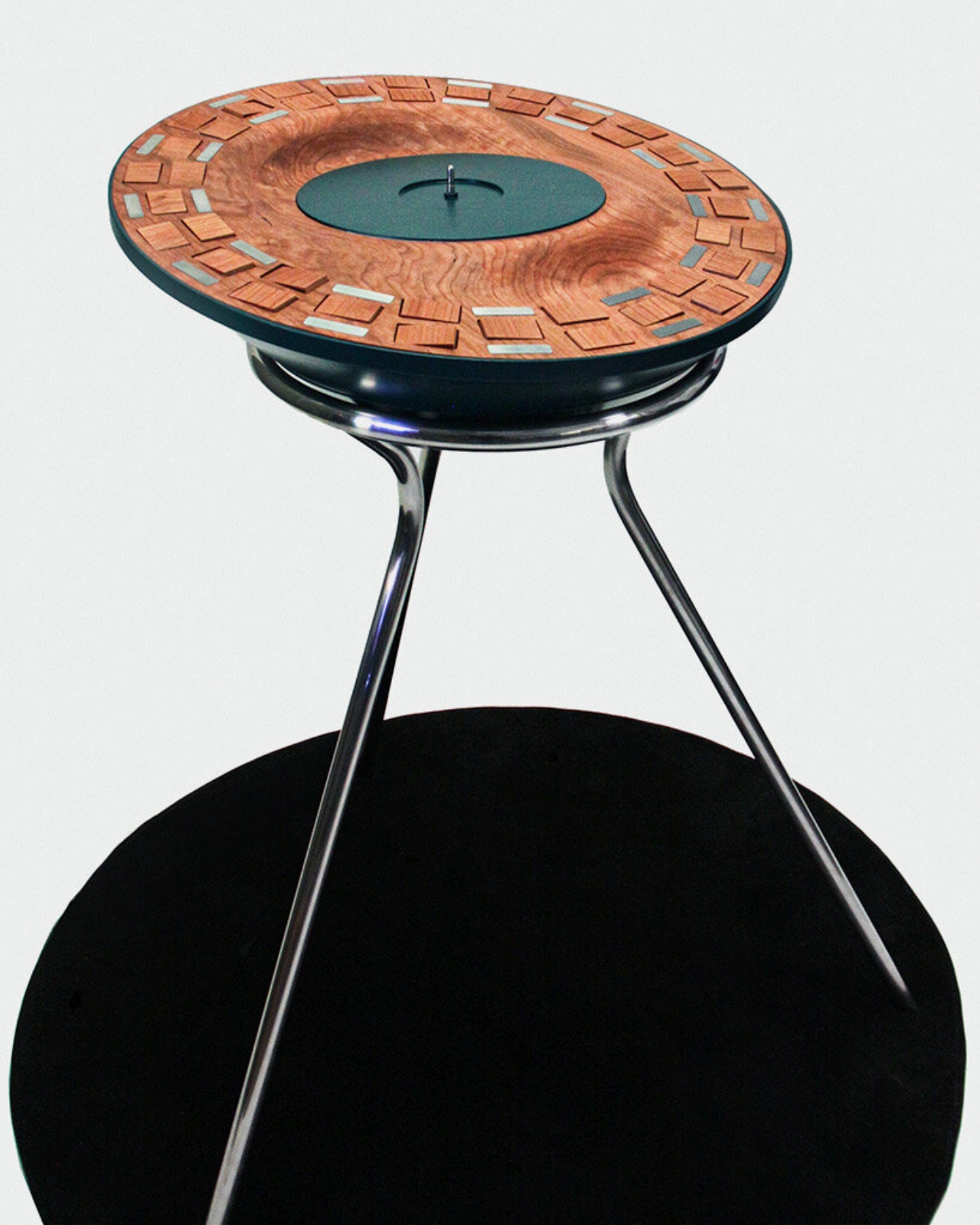
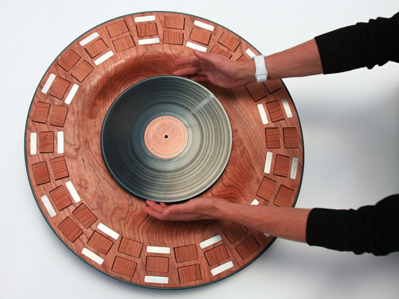
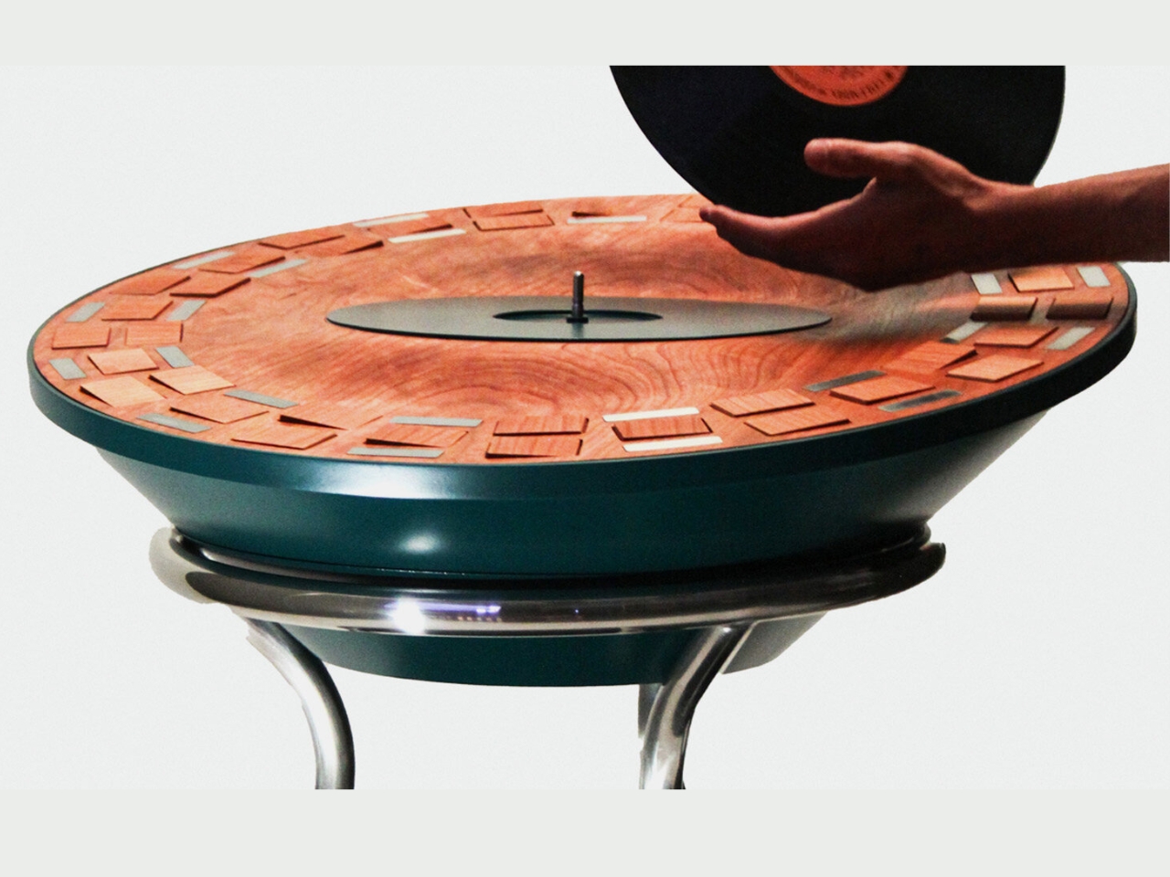
The concept is beautifully simple yet surprisingly complex in execution. Picture a classic vinyl turntable, then imagine surrounding the record with 39 handcrafted wooden tiles arranged in concentric circles. As your favorite album spins, these tiles respond to the music’s frequency and amplitude, flipping and rotating to create constantly shifting patterns of light and shadow. It’s like watching your music dance.

What makes Orbit particularly special is how it bridges the gap between vintage nostalgia and contemporary design innovation. In an era where most of us stream music through invisible algorithms and wireless speakers, there’s something deeply satisfying about watching music become a physical, visual experience. Brown has essentially created a hybrid object that transforms passive listening into an active sensory moment, where you’re not just hearing the music but witnessing it unfold in real time.

The wooden tiles themselves are a thoughtful material choice. Each one is carefully crafted and balanced, allowing them to respond with precision to the audio signals they receive. As the music plays, different frequencies trigger different tiles, creating organic patterns that shift with every song. A bass-heavy track might trigger the outer rings more intensely, while high notes could activate the inner tiles. The result is an ever-changing visual symphony that’s unique to each recording.

There’s also something wonderfully analog about the whole concept. While the mechanism that translates sound into motion likely involves some modern electronics, the physical expression is entirely mechanical. No screens, no digital displays, just wood, motion, and light playing together in space. It’s the kind of design that makes you slow down and actually pay attention to your music again.

Brown’s work taps into a growing desire for meaningful interaction with the objects in our lives. As more of our experiences become digital and ephemeral, pieces like Orbit remind us of the joy that comes from tangible, physical engagement with art and technology. It’s not just furniture and not quite sculpture; it exists in that fascinating in-between space where functional objects become art. The timing feels right for something like this. Vinyl has already made a remarkable comeback, with younger generations discovering the ritual of carefully selecting a record, placing it on the turntable, and actually sitting with an album from start to finish. Orbit takes that ritual one step further, adding a visual dimension that makes the experience even more immersive and meditative.

Imagine hosting friends and dropping the needle on a new album as everyone gathers around to watch the tiles respond and shift with the music. Or picture yourself unwinding after a long day, watching the hypnotic patterns emerge from your favorite tracks. It transforms listening from background noise into a focused, contemplative practice. What Brown has created with Orbit goes beyond clever design or technical innovation. It’s a reminder that some of the best ideas come from asking simple questions: What if we could see music? What if listening became watching? What if technology enhanced rather than replaced the analog experiences we value? In answering these questions, she’s created something that feels both nostalgic and refreshingly new, proving that great design doesn’t have to choose between the past and the future. It can honor both.

The post Orbit Kinetic Turntable: See Your Music Move with Flipping Wooden Tiles first appeared on Yanko Design.
This AI Music Sketchbook Captures Ideas Before They Disappear

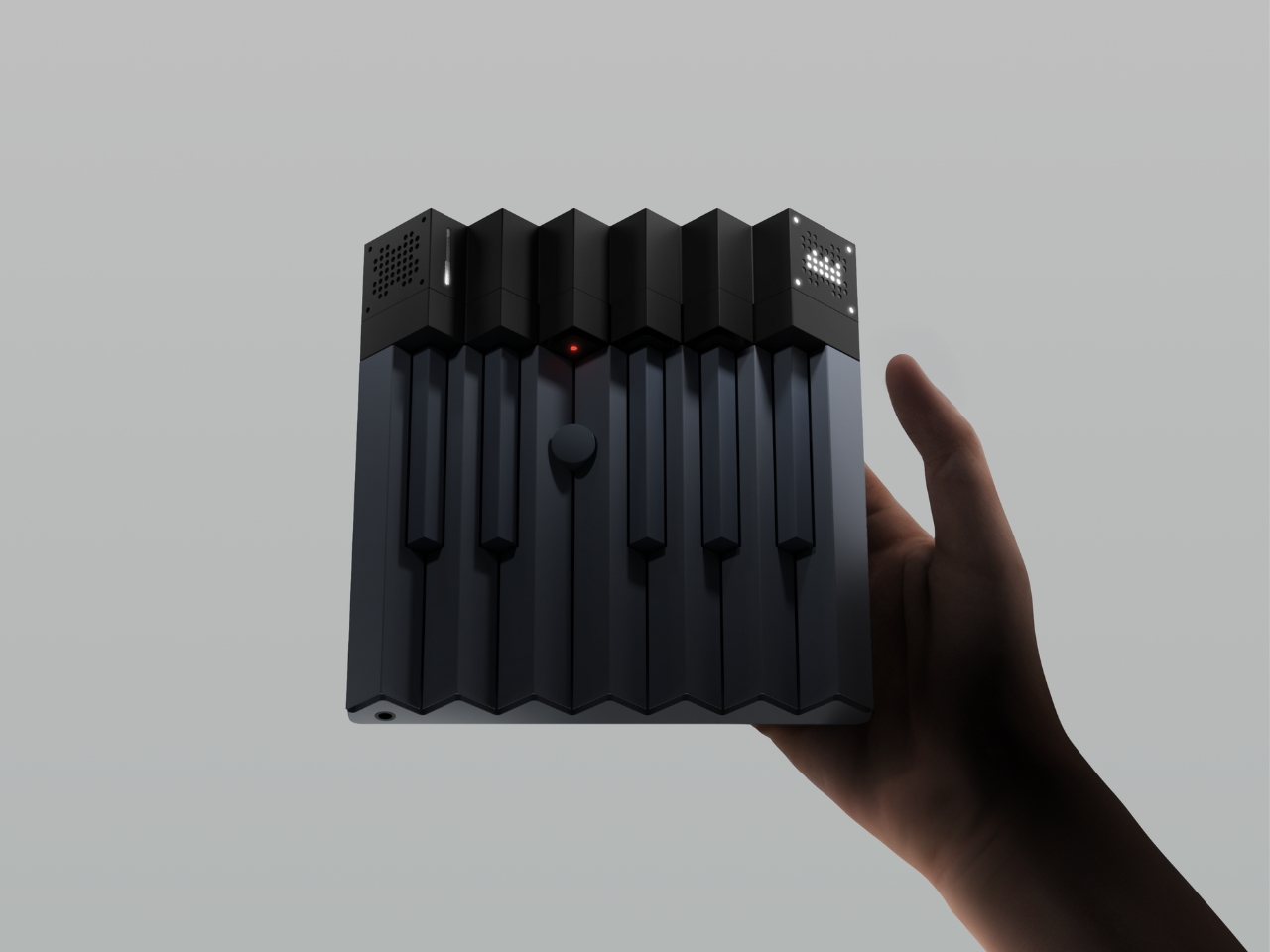
You know that feeling when a melody pops into your head while you’re walking down the street, but by the time you pull out your phone to record it, the magic’s already gone? Or when you’re hit with a musical idea but don’t have the technical skills to translate it into something real? That frustrating gap between inspiration and creation is exactly what designer Woojin Jang is trying to bridge with their concept project, Everglow.

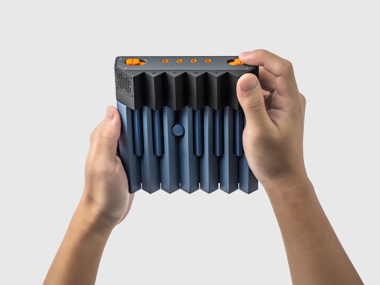
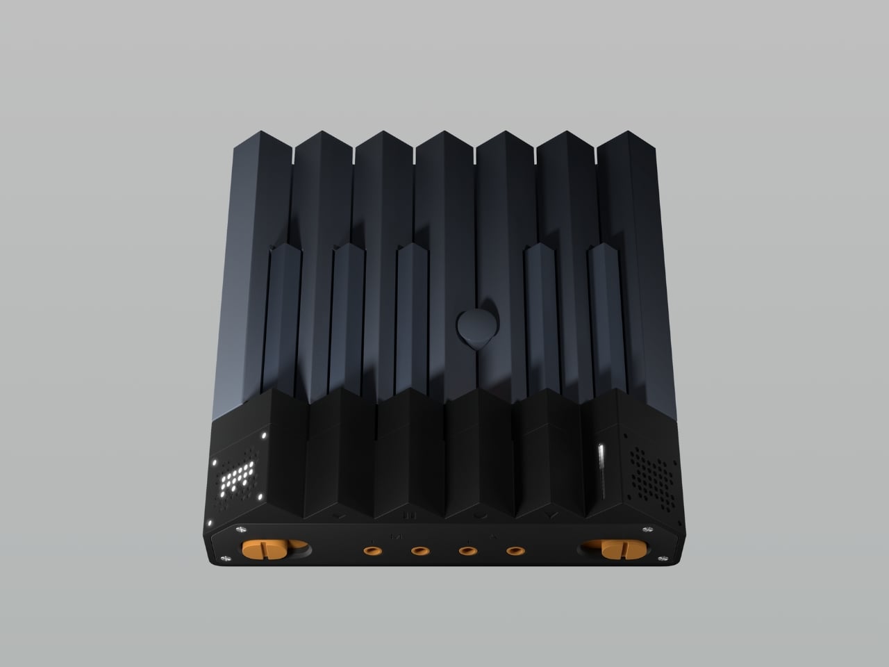
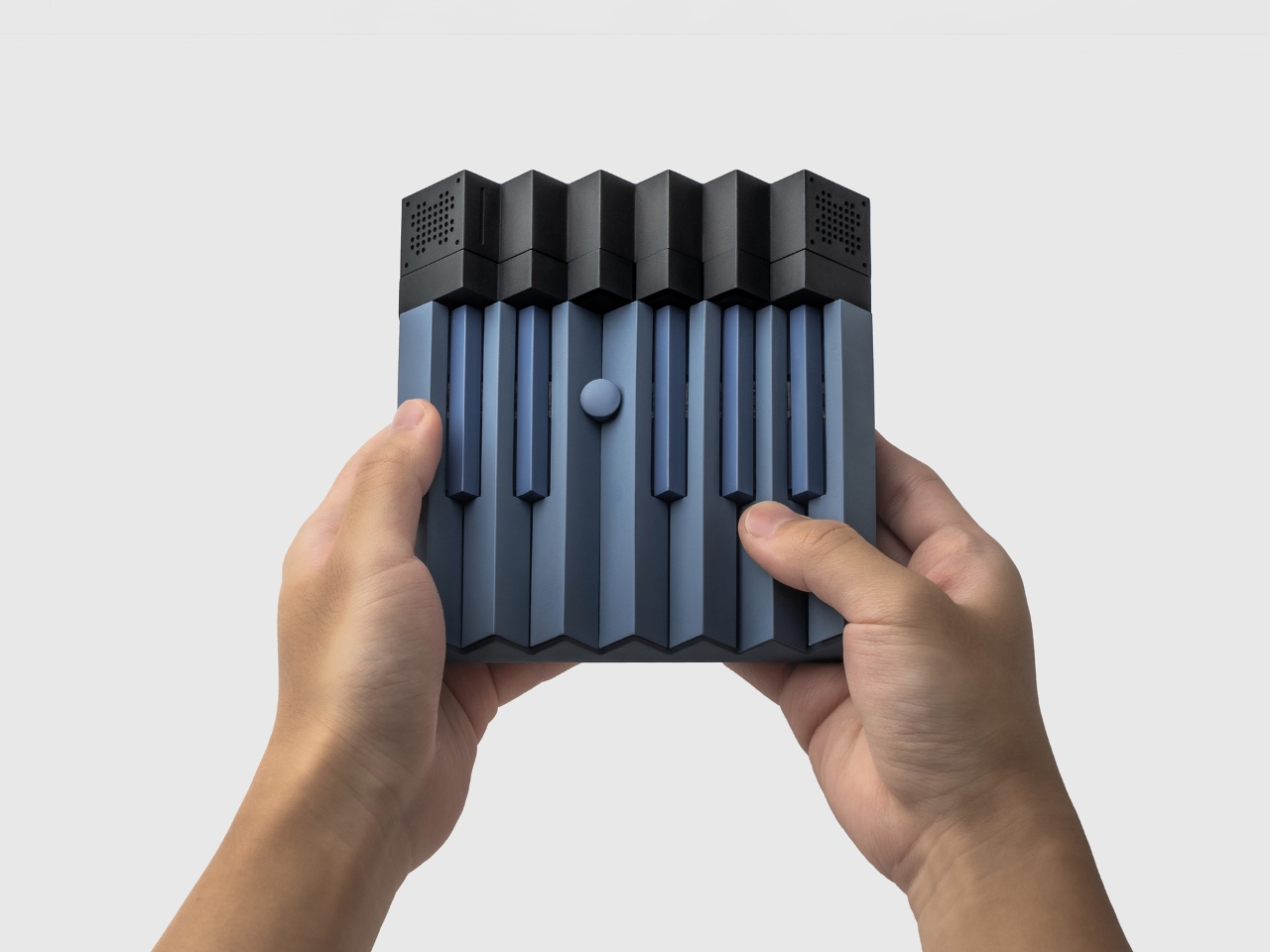
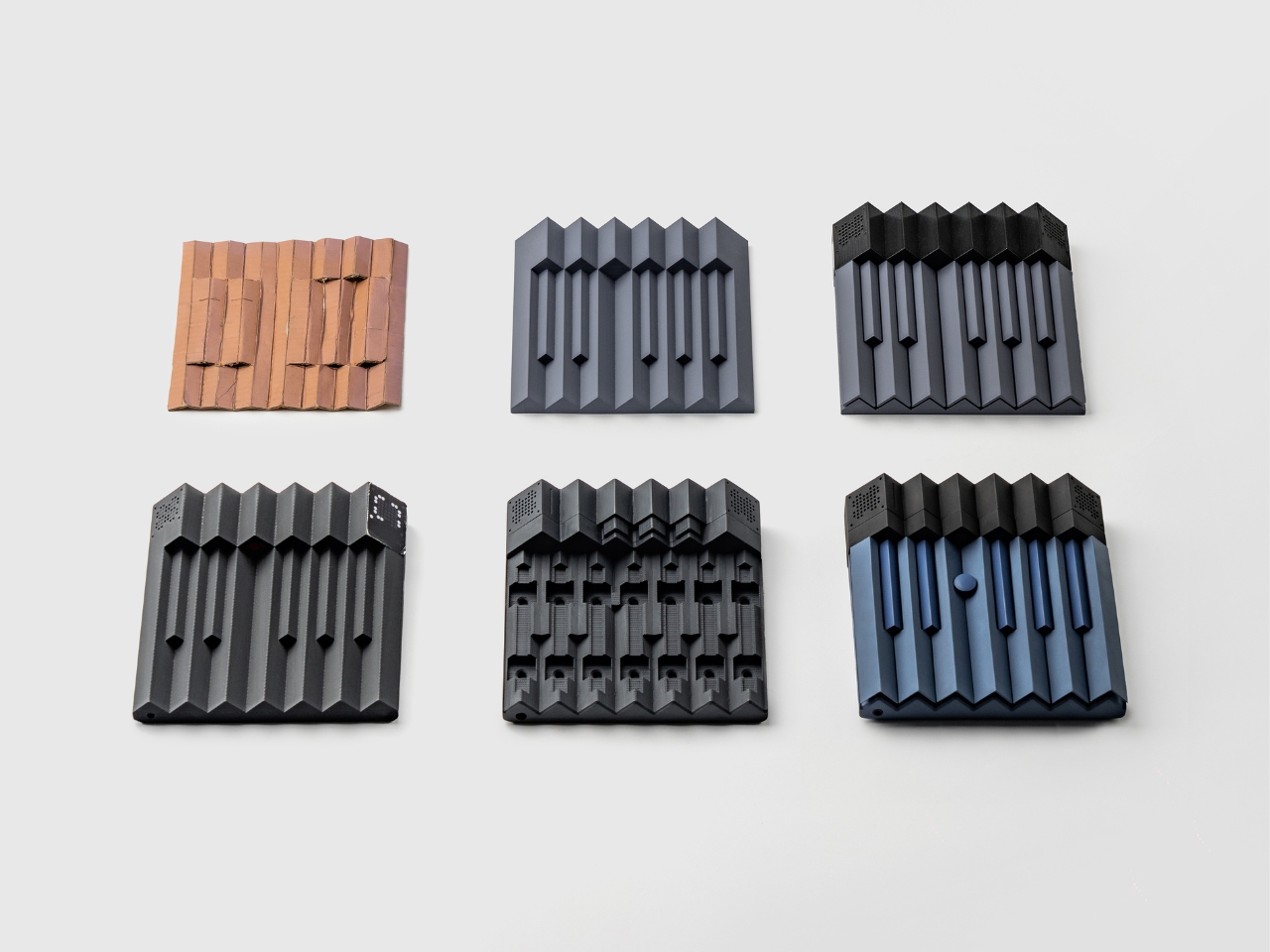
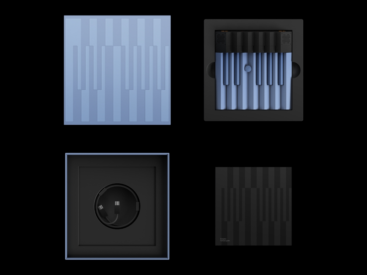
Think of it as a sketchbook, but for sound. Just like artists carry notebooks to capture visual ideas before they fade, Everglow is designed to help musicians and creators capture sonic inspiration in real time. The concept combines a physical hardware interface with generative AI technology, creating something that feels both wonderfully tactile and futuristic at the same time.

Designer: Woojin Jang

What makes this particularly interesting is how it rethinks the relationship between humans and music-making tools. Traditional instruments require years of practice, and digital audio workstations can feel overwhelming with their endless menus and options. Everglow sits somewhere in between (hence the design name “InBetween”), offering immediate access to sound creation without the steep learning curve.

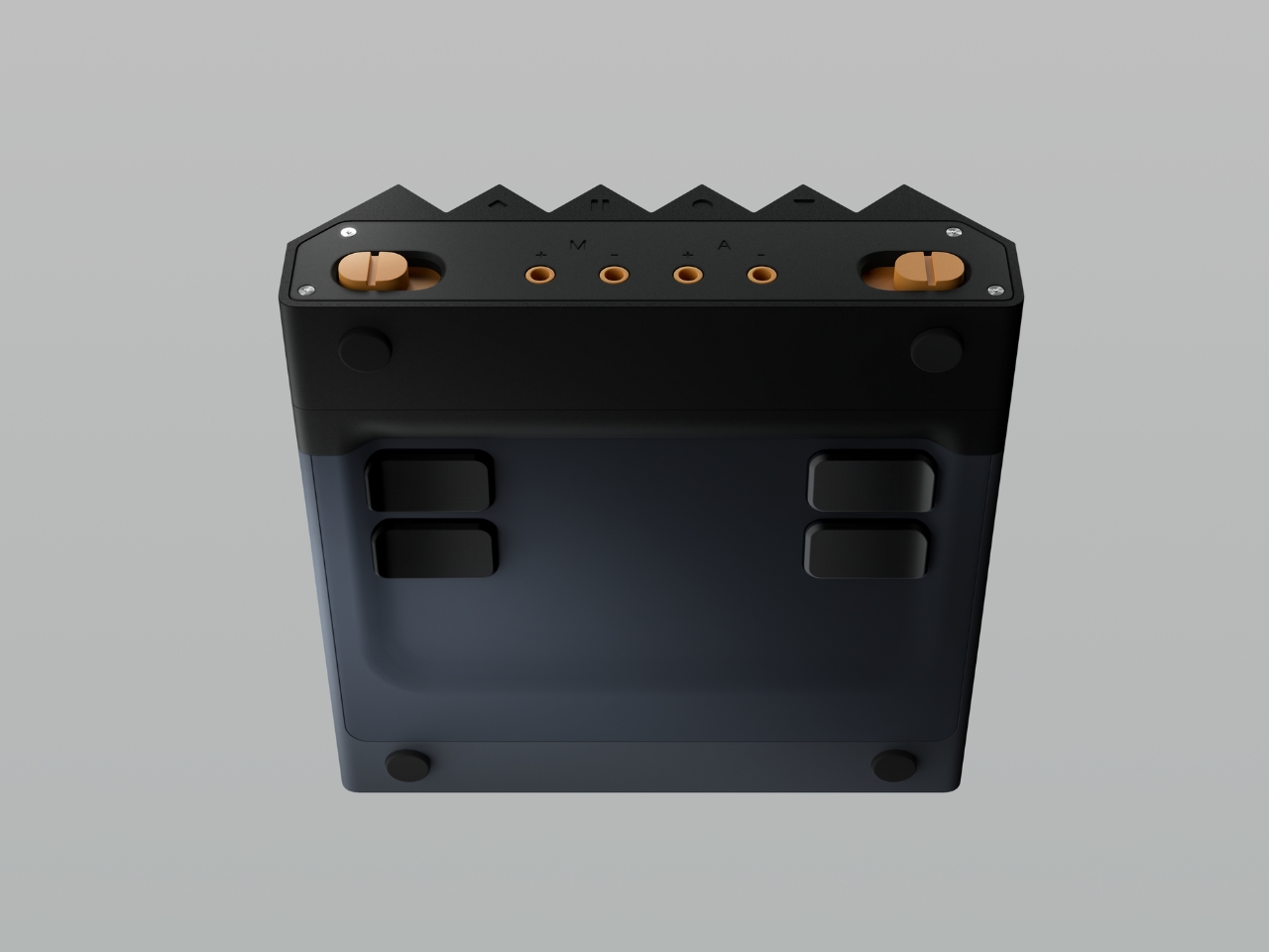
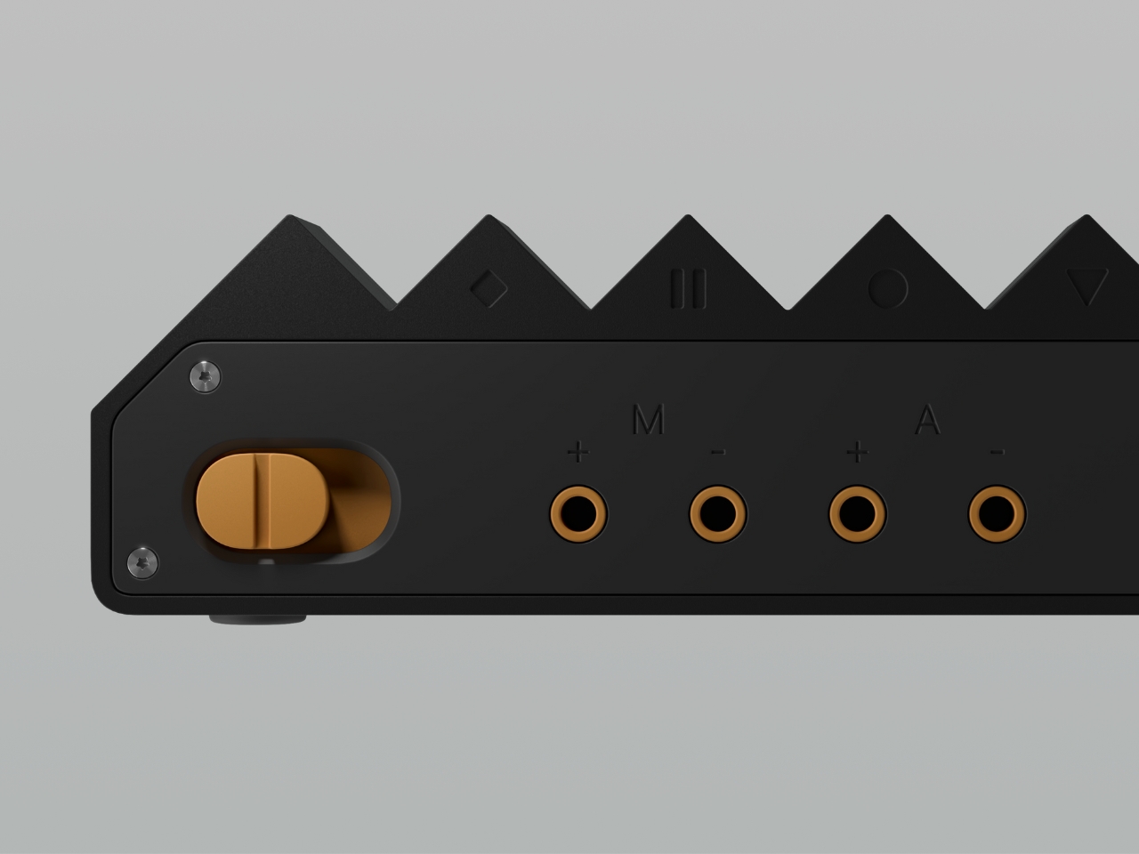
The hardware interface is key here. Instead of clicking around on a screen or fumbling with software, you’d interact with physical controls that respond to your touch and gestures. This tactile element matters more than you might think. There’s something about physically manipulating sound that connects you to the creative process in a way that mousing around never quite achieves. It’s the difference between typing a description of a drawing and actually sketching it with your hands.

But the real innovation happens when you pair that physical expressiveness with AI-generated sound. The generative system doesn’t just play preset sounds or samples. Instead, it responds to your input by creating and shaping audio in real time, almost like having a collaborative partner who instantly understands where you’re trying to go musically. You guide it with your gestures and adjustments, and it fills in the gaps, suggesting possibilities you might not have considered. This approach democratizes music creation in a fascinating way. You don’t need to know music theory or have mastered an instrument to explore sonic ideas. The concept suggests a world where musical literacy isn’t a prerequisite for musical expression, where the barrier between “I hear something in my head” and “here’s what it sounds like” becomes paper-thin.

Of course, as a concept, Everglow exists in that exciting space where possibility meets imagination. We’re not looking at a finished product you can buy tomorrow, but rather a vision of what music-making tools could become. That’s what makes design concepts so valuable. They push our thinking forward, challenge assumptions about how things should work, and inspire both creators and technologists to pursue new directions.

The timing feels right, too. We’re living in an era where AI is rapidly transforming creative tools, from image generation to writing assistance. Music has been part of this evolution, but often in ways that feel disconnected from the physical, intuitive experience of making sound. Everglow suggests a different path, one where AI enhances rather than replaces the human touch, where technology becomes invisible enough that you can focus on the creative flow rather than the technical obstacles.

Whether or not Everglow itself becomes a reality, the questions it raises are worth sitting with. How do we design tools that capture the fleeting nature of inspiration? What’s the right balance between human control and AI assistance in creative work? And how can we make music creation feel as natural and immediate as doodling in a notebook? For anyone who’s ever had a musical idea slip away before they could catch it, concepts like this offer a glimpse of a more intuitive future. One where the tools get out of the way, and the space between imagination and creation becomes just a little bit smaller.

The post This AI Music Sketchbook Captures Ideas Before They Disappear first appeared on Yanko Design.
This Looped Umbrella Stand Soaks Up Rain and Looks Like Art

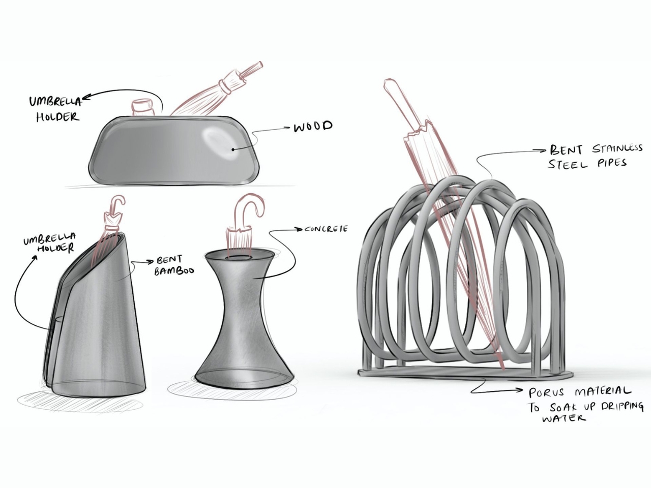
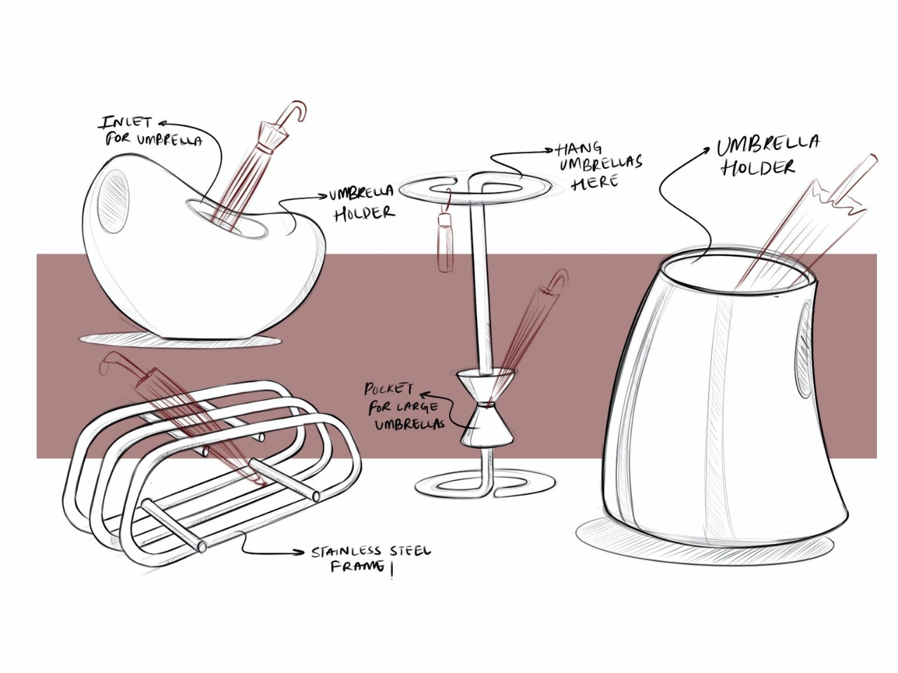
There’s something quietly revolutionary happening in the world of everyday objects, and it starts with something as humble as where you put your umbrella. Arihant Israni and Anoushka Braganza have created InBetween, a piece that challenges our assumptions about what functional design can be. It’s not just a place to stash wet umbrellas. It’s a whole vibe.

Let’s be honest: most umbrella stands are afterthoughts. They’re plastic cylinders hiding in corners, collecting dust and forgotten receipts. But what if that neglected corner could hold something beautiful? What if the act of coming home on a rainy day could feel a little more intentional, a little more like a ritual worth noticing?

Designers: Arihant Israni and Anoushka Braganza

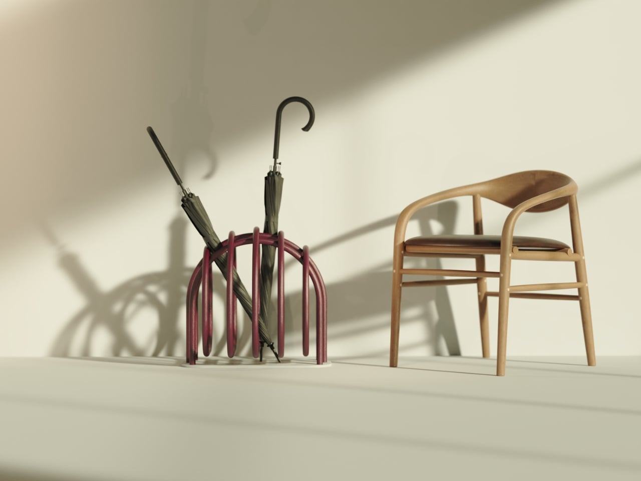
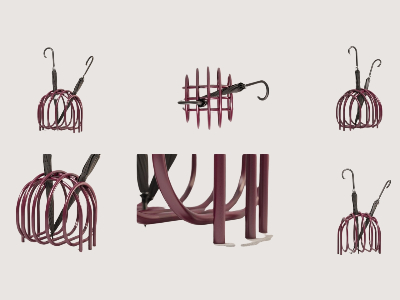
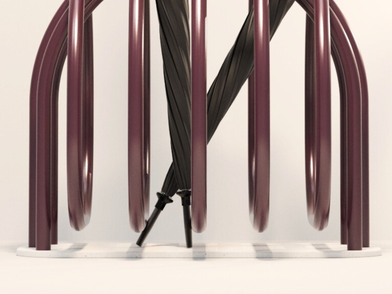
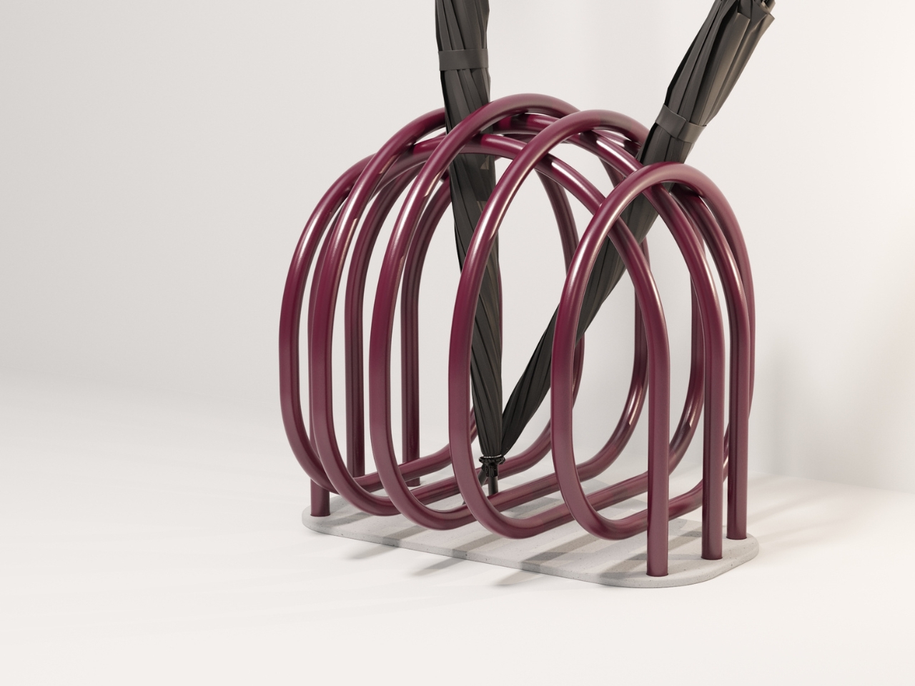
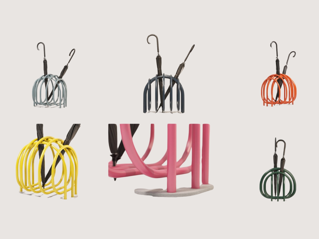
That’s where InBetween comes in. The design is built around flowing loops that curve and connect, creating this continuous rhythm that feels almost hypnotic. It’s sculptural in a way that makes you stop and look twice. The loops aren’t just aesthetic choices, they’re functional, too, each one cradling an umbrella while creating negative space that gives the whole piece a sense of movement. Even when it’s sitting still, it feels alive.

The designers say the form is inspired by the idea of transitions, those moments between leaving and arriving, between chaos and calm. And honestly? You can see it. There’s something about the way the curves flow into each other that captures that feeling of moving through your day, of pausing to shake off the rain before stepping into your space. It’s design that understands that our homes aren’t just backdrops. They’re where we reset, where we breathe.

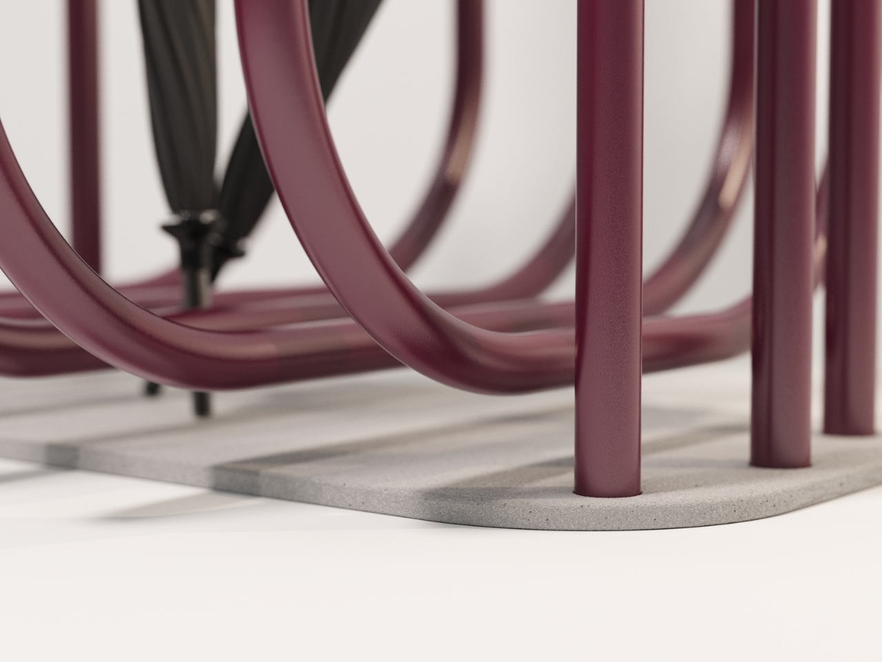
Now let’s talk about the base, because this is where things get really interesting. It’s made from Diatomaceous Earth, which sounds incredibly science-y but is actually just fossilized algae. And here’s the genius part: it’s naturally porous and absorbent, which means it soaks up all that rainwater dripping off your umbrella without you having to do anything. No puddles, no mess, no gross waterlogged mats that smell like mildew after a week. The material is also antimicrobial, so it resists mold and odor naturally. It dries fast, stays clean, and if it ever needs refreshing, you just give it a light wipe or a gentle sanding. That’s it. In a world where everything seems to require constant maintenance and upkeep, there’s something deeply satisfying about a product that just works quietly in the background.

But beyond the practical magic, there’s a conceptual layer here that makes InBetween feel special. The base becomes this mediator between outside and inside, between the storm you just walked through and the calm you’re entering. It’s material intelligence meeting emotional design, and it works on both levels.

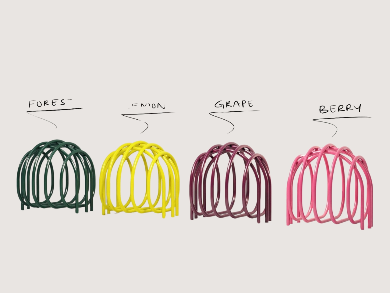
Visually, the stand fits into almost any space. The minimalist aesthetic and organic geometry mean it doesn’t scream for attention, but it definitely holds its own. Whether you’re living in a sleek modern apartment, a cozy studio, or something in between (pun intended), it adapts. The deep, muted burgundy tones in the images give it warmth without being loud. It’s the kind of piece that elevates a space just by existing in it.

What really gets me about InBetween is how it reframes something we barely think about. We’re so used to design being about big statements, about the couch or the coffee table or the art on the wall. But what about all the little moments? What about the act of setting down your umbrella when you get home, shaking off the rain, taking a breath before you move further into your day? InBetween turns that mundane gesture into something worth noticing. It’s a reminder that thoughtful design doesn’t have to be loud or expensive or complicated. Sometimes it’s just about paying attention to the details, about understanding that every object in our lives has the potential to be more than just functional.

In a culture obsessed with productivity and optimization, there’s something radical about slowing down enough to appreciate the poetry of an umbrella stand. InBetween proves that even the most ordinary objects can become opportunities for beauty, mindfulness, and a little bit of wonder. And honestly? We could all use more of that.

The post This Looped Umbrella Stand Soaks Up Rain and Looks Like Art first appeared on Yanko Design.
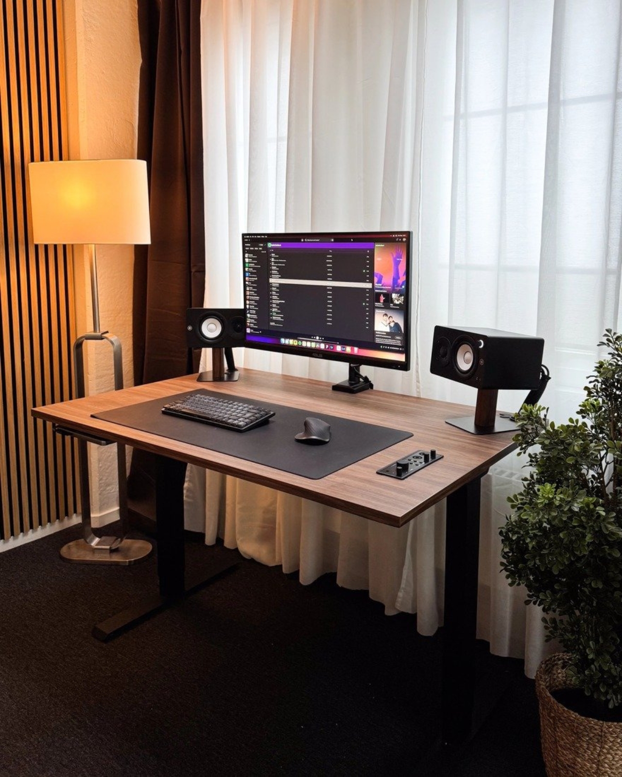
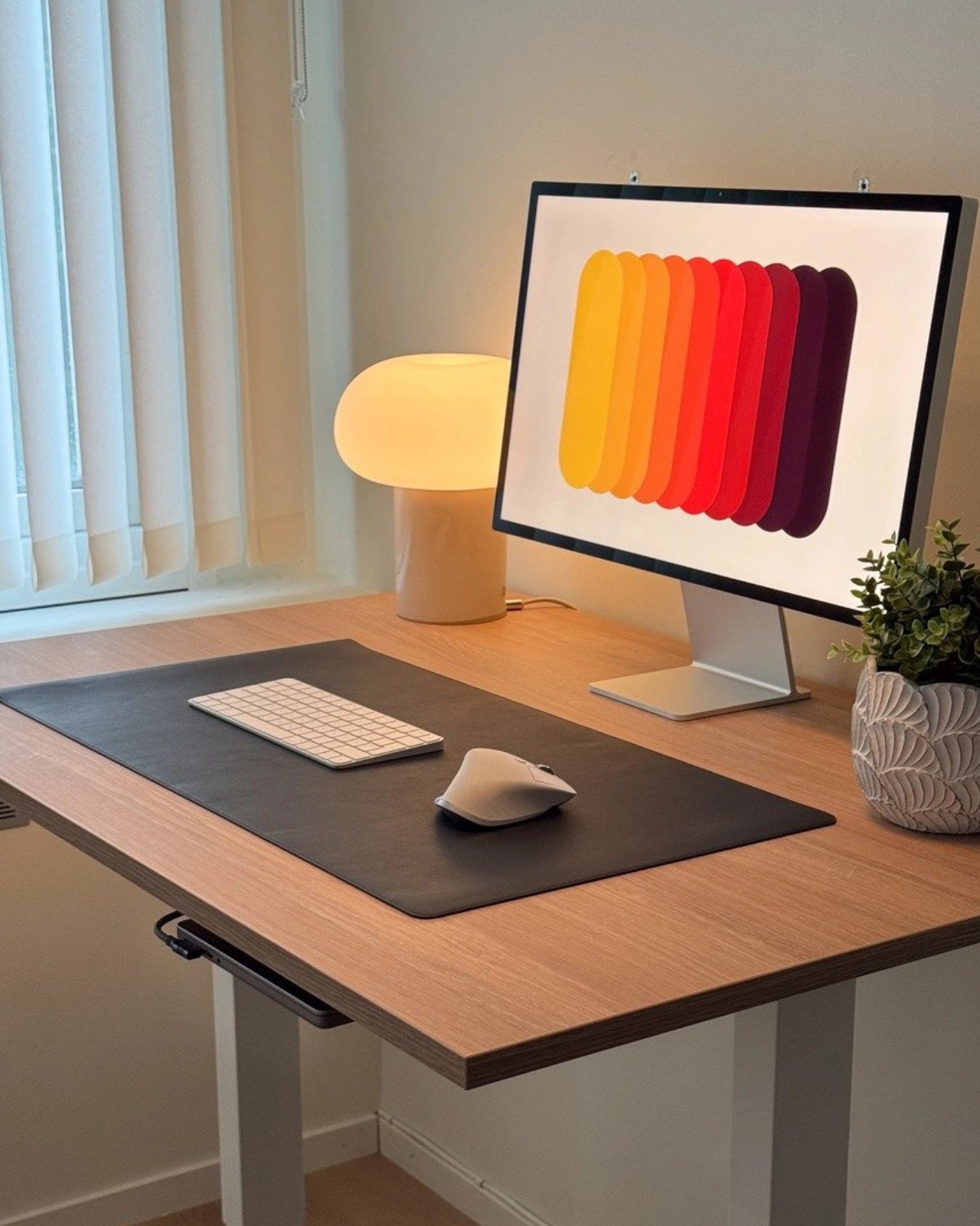
How to Fix Your Beautiful But Cluttered Desk

You know that feeling when you sit down at your desk and immediately feel overwhelmed? It’s not you. It’s your desk. More specifically, it’s the fact that modern desks have basically turned into minimalist slabs with zero storage solutions. Sure, they look sleek in furniture showrooms, but try working on one every day and you’ll quickly realize something crucial is missing.

Enter Tidy Desk and their Desk Dock System, a collection of add-on storage solutions that feel less like accessories and more like the missing pieces modern workspaces desperately need. The brand has essentially created what I’d call “remedial design” for the era of beautiful but impractical furniture. And honestly, it’s about time someone did.

Designer: Tidy Desk

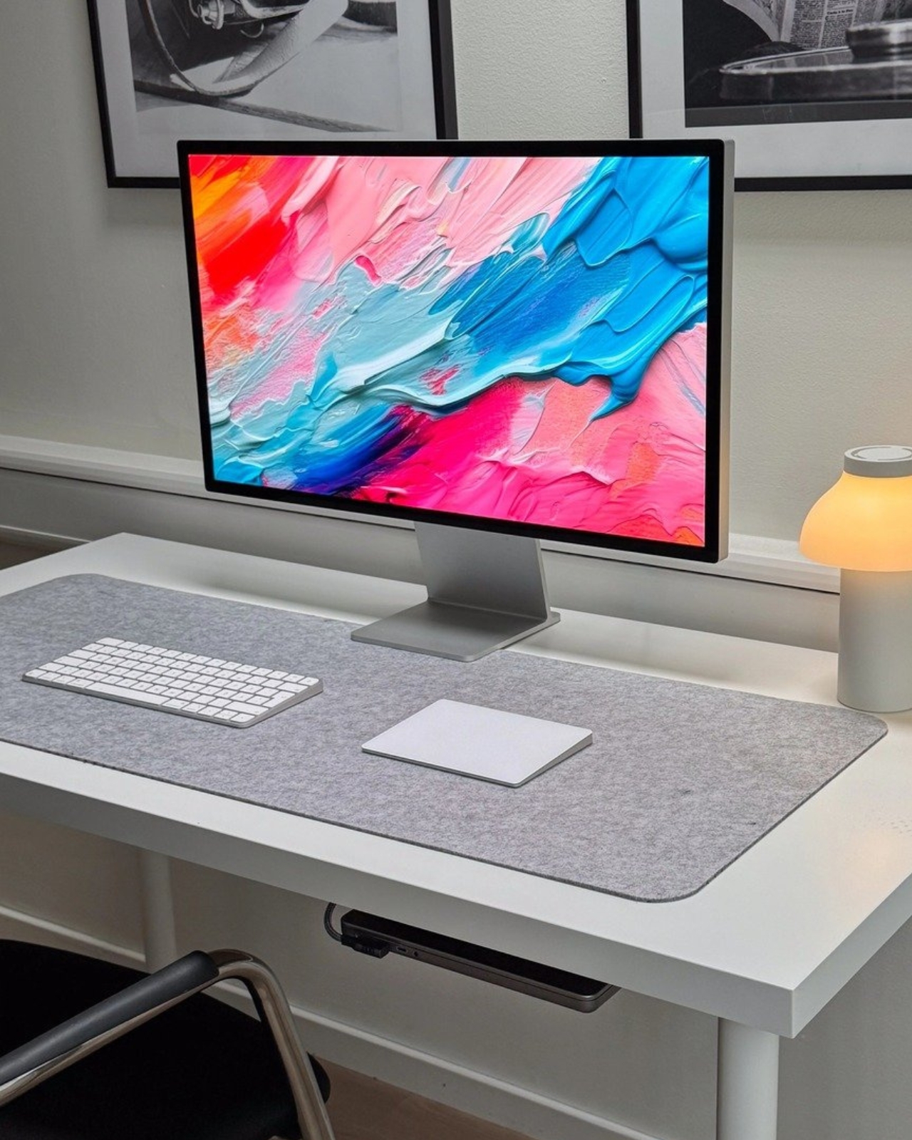
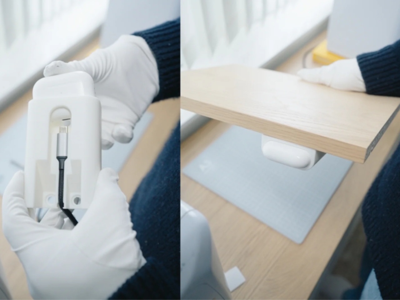
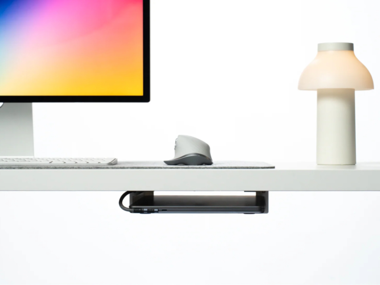
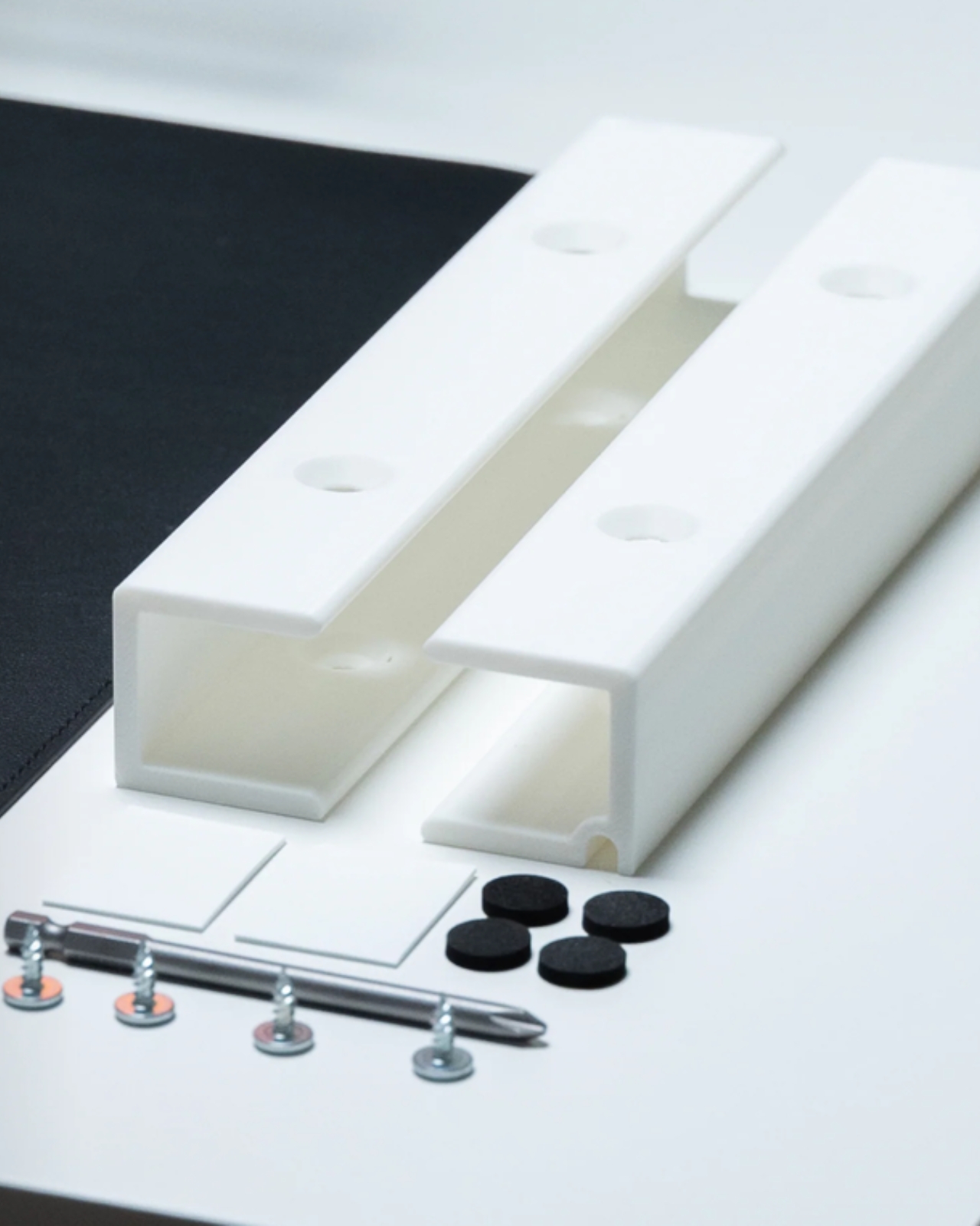
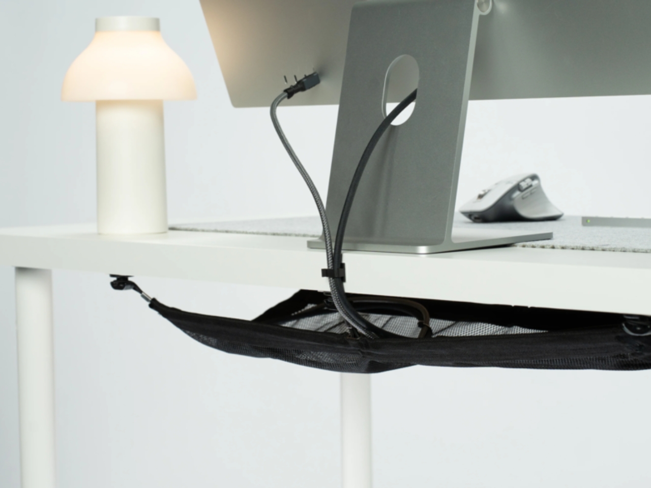
The star of the show is the Invisible Laptop Dock, which does exactly what the name suggests. It hides your laptop under your desk while keeping it accessible and properly ventilated. Think about it: your laptop just sits there taking up premium real estate on your desk surface, surrounded by a tangle of charging cables and dongles. The Invisible Laptop Dock mounts underneath, giving you full access to all ports from both sides, so whether you’re using a single USB-C dock or plugging in multiple cables, everything stays organized and out of sight. What makes this particularly clever is that it doesn’t just hide your laptop. It actually improves your workflow. One customer put it perfectly when they said, “Finally got my laptop out of the way. Desk looks cleaner and somehow I just focus better now.” That connection between visual clutter and mental clarity isn’t just aesthetic preference. It’s psychology at work.

But Tidy Desk didn’t stop at laptops. They’ve expanded the Desk Dock System to include custom solutions for specific tech gear. The Focusrite 2i2 Dock is designed specifically for the popular audio interface, keeping it locked in place and accessible without eating up desk space. There’s also a Fast Connect LaCie Dock for external hard drives, featuring USB-C with 10 Gbps data transfer speeds and multiple ports. These aren’t generic cable management clips. They’re thoughtfully designed docks that treat each piece of equipment as if it deserves its own intentional home.

The whole system operates on a simple premise: why should we adapt to poorly designed furniture when we can just fix the problem? The rise of sit-stand desks and aesthetic-focused workspace design has given us gorgeous offices, but at the cost of practicality. Drawers disappeared. Cable management became an afterthought. And suddenly everyone was posting photos of their “clean desk setup” while their actual workspace looked like a rat’s nest of wires and adapters. What Tidy Desk understands is that minimalism isn’t about having less stuff. It’s about having the right systems to manage your stuff invisibly. Their tagline says it all: “Craft Your Perfect Workspace.” From cable management to laptop docks, the system aims to keep you focused, organized, and actually proud of your setup.

The products are surprisingly affordable too, with most items ranging from $35 to $37. That’s less than what many people spend on decorative desk accessories that don’t actually solve any problems. And the modular approach means you only buy what you need. Got a laptop and a Focusrite interface? Get those two docks. Just need cable management? Grab that piece. The system grows with your needs.

There’s something refreshing about design that acknowledges real-world messiness instead of pretending we all live in impossibly tidy showrooms. Another user review captures this perfectly: “Didn’t think hiding a few cables would do much, but damn it actually helps. Feels like my mind’s clearer when my desk is too.” Since we’re living at a time where we’re obsessed with standing desks, ergonomic chairs, and expensive monitors, it’s oddly satisfying to see someone focus on the unglamorous stuff that actually makes daily work better. Because at the end of the day, your desk should work for you, not against you.

The post How to Fix Your Beautiful But Cluttered Desk first appeared on Yanko Design.
Moleskine Just Turned Issey Miyake’s Iconic Pleats Into Paper

Even though I’ve spent most of my life in the digital space, I’m still a firm believer that the analog world is just as relevant and that the two can work together. I’ve built a career in digital marketing and content creation but I’m also a paper and stationery person who prefers to journal and take notes on actual pen and paper. So when new, interesting paper products come out, I always get giddy and see how it can fit into my productivity and lifestyle.

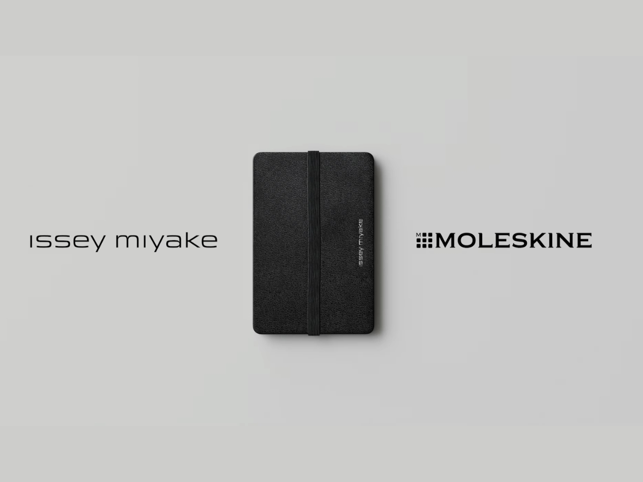
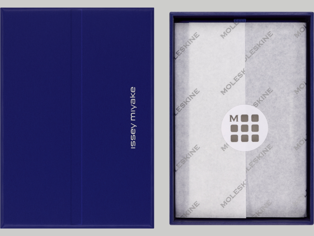
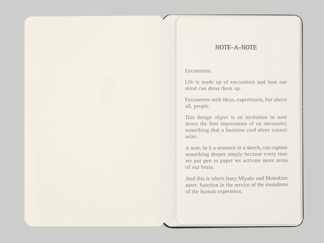
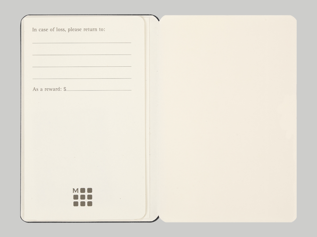
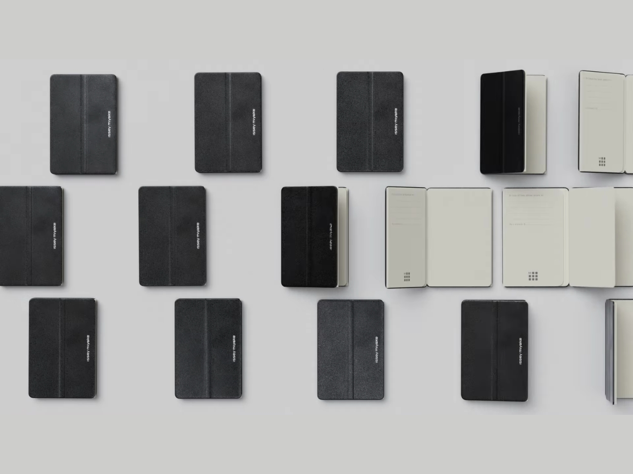
Moleskine has teamed up with Issey Miyake, specifically Miyake Design Studio to come up with NOTE-A-NOTE, a piece that marries the utility of a notebook with the sophistication of a card case. Since people still do carry around business cards, we need a way to keep them organized while at the same time add to our productivity flow.

Designer: Moleskine x Issey Miyake

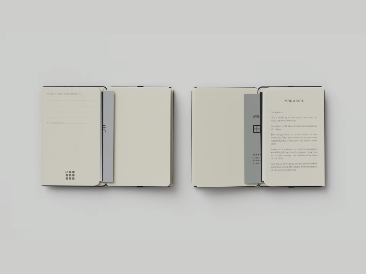
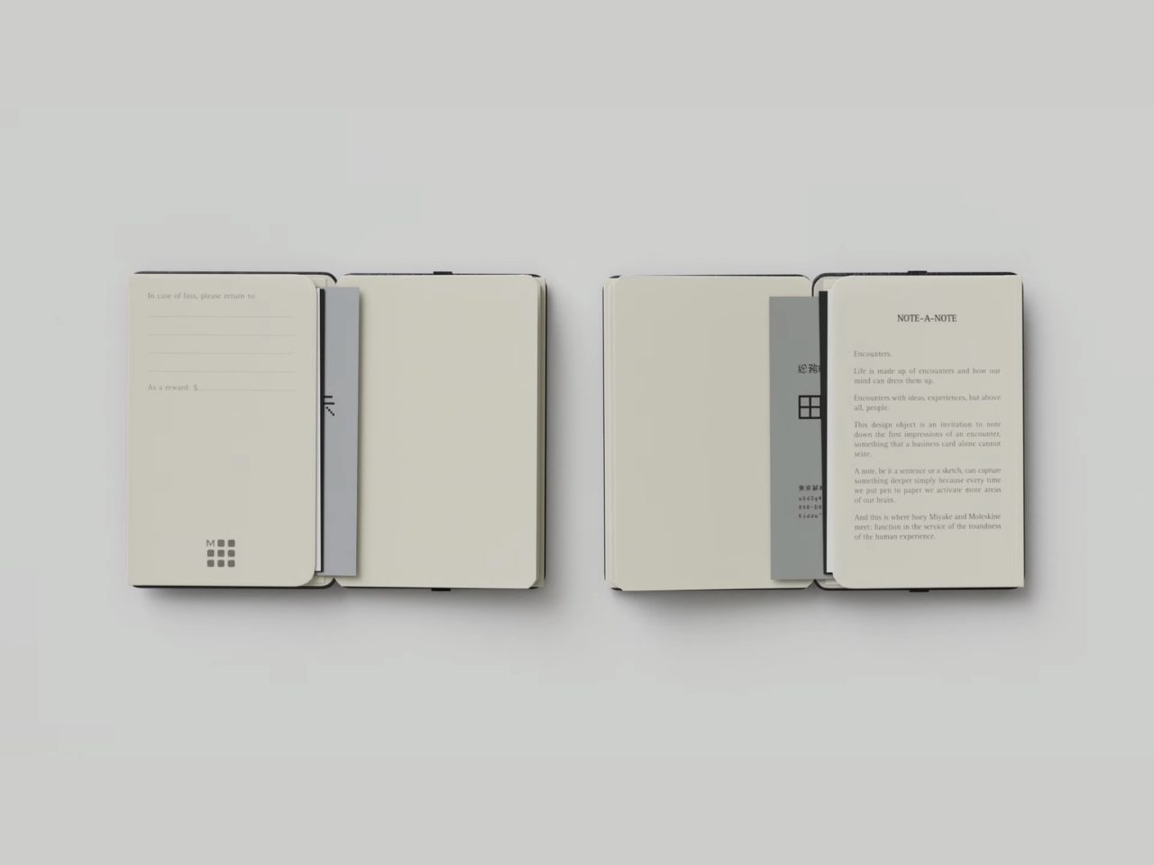
With this hybrid piece, you don’t know if it’s a business card holder that has a notebook or if it’s a notebook that has a business card holder. This pocket-sized item has a hard cover with rounded corners and inside you get two expandable pockets that can house up to 24 business cards. Or if you want to use it as a wallet, you can put your cards and bills inside as well. It is able to open flat to 180 degrees. It also comes with a color-matched box that can also be used as a storage case as it can be attached to the holder with an elastic band.

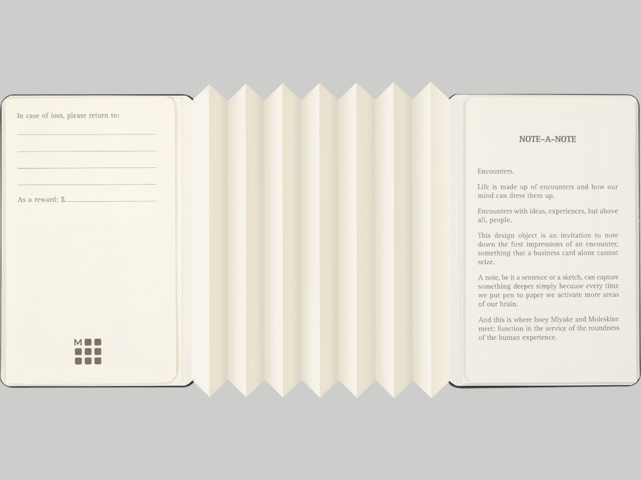
Normally, notebooks are made up of many pages but NOTE-A-NOTE actually uses just one long, folded single piece of paper. It’s basically a folded insert in the business card holder that has 14 accordion-style pages. It actually echoes the signature pleating technique that Issey Miyake is known for, bringing their iconic textile innovation to paper form. The acid-free paper is ivory-colored and uses FSC™-certified paper from managed forests. The signature Moleskine elastic band elegantly secures the case with a striking gesture across its central embossed line, making it instantly recognizable as a collaboration between these two design powerhouses.

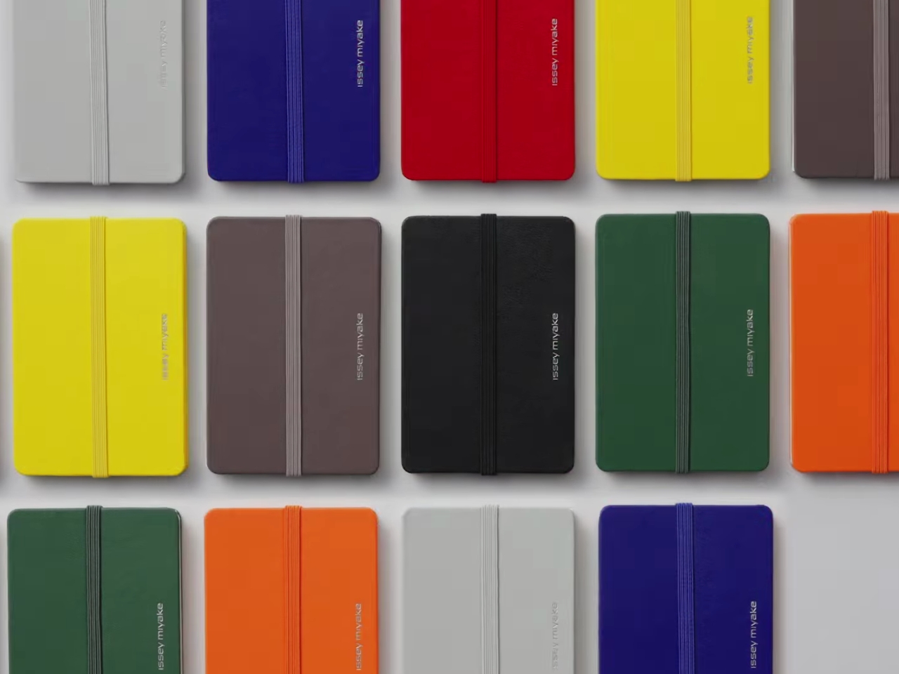
It comes in eight different colors that can match your aesthetic: Black, Scarlet Red, Myrtle Green, Grey, Blue, Earth Brown, Orange, and Dandelion Yellow. The goal of having this card holder and notebook in one is to have something handy to write down ideas, thoughts, and important details while keeping the exchange of business cards close to you as well. The clean and thoughtful structure actually takes inspiration from traditional Japanese emakimono scrolls.

I can see this being perfect for creative professionals who attend networking events, conferences, or client meetings. It’s compact enough to slip into a clutch or small bag, yet substantial enough to make an impression when you pull it out. The variety of colors means you can choose one that reflects your personal brand or collect multiple for different occasions. For stationery collectors like myself, this is definitely a piece worth adding to your collection—it’s not just functional, it’s a conversation starter that showcases your appreciation for thoughtful design.

The XS size makes it incredibly portable, fitting comfortably in your hand or pocket. Imagine being at a networking event and jotting down a quick note about a conversation right after exchanging business cards with someone. That immediate capture of thoughts and context is invaluable in our fast-paced professional lives.

The NOTE-A-NOTE collection is available now on the Moleskine website for $46 USD, with shipping in 4-8 working days. Released in October 2025, this limited edition collection represents a meeting of minds between two brands that understand the power of tactile experiences in our increasingly digital world.

This collaboration beautifully merges two iconic brands: Moleskine’s legendary notebook craftsmanship with Issey Miyake’s revolutionary approach to pleating and folding, creating a functional accessory perfect for professionals who value both aesthetics and utility.

The post Moleskine Just Turned Issey Miyake’s Iconic Pleats Into Paper first appeared on Yanko Design.
This $330 LEGO Goonies Set Is Pure Halloween Treasure

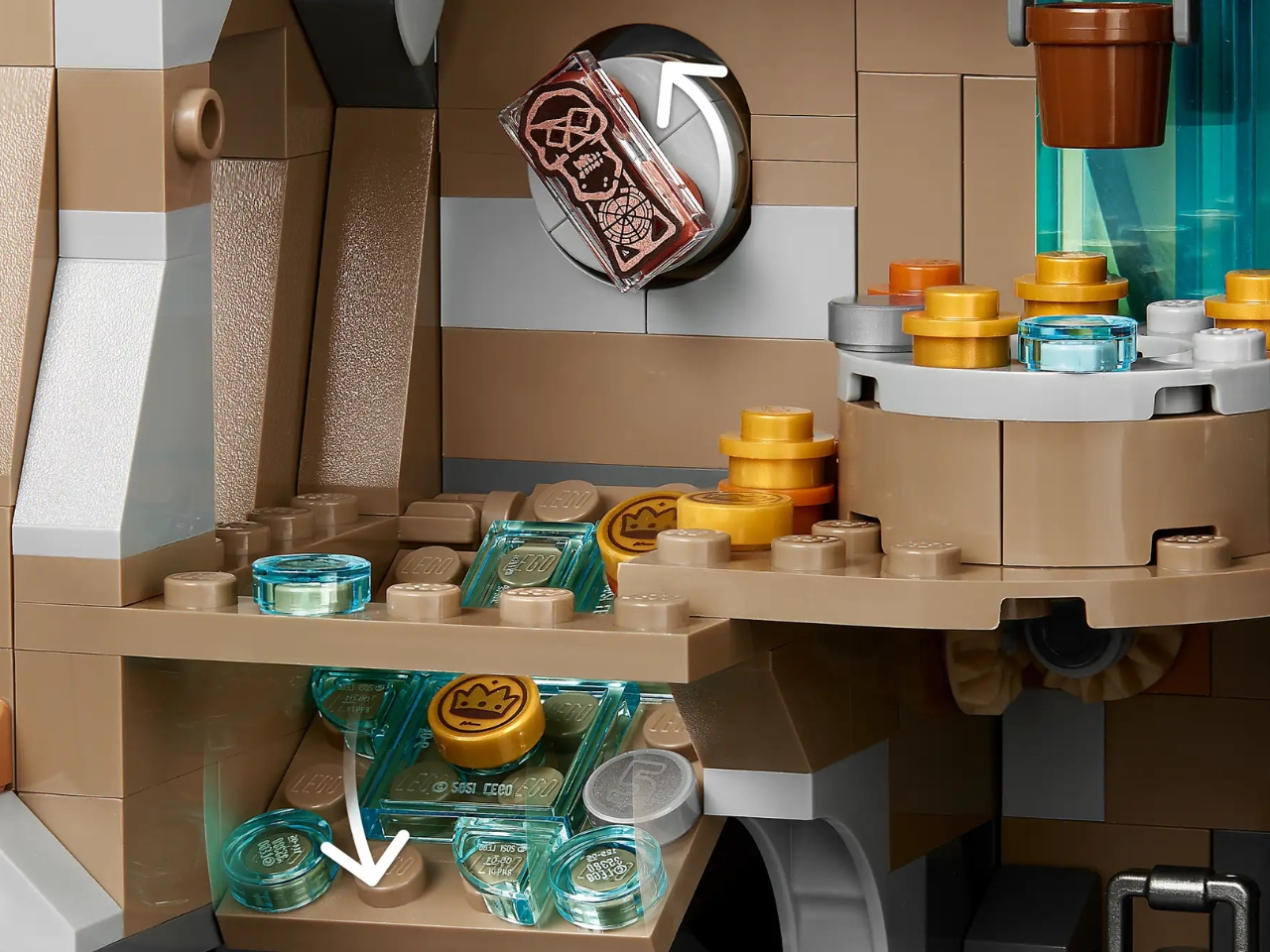
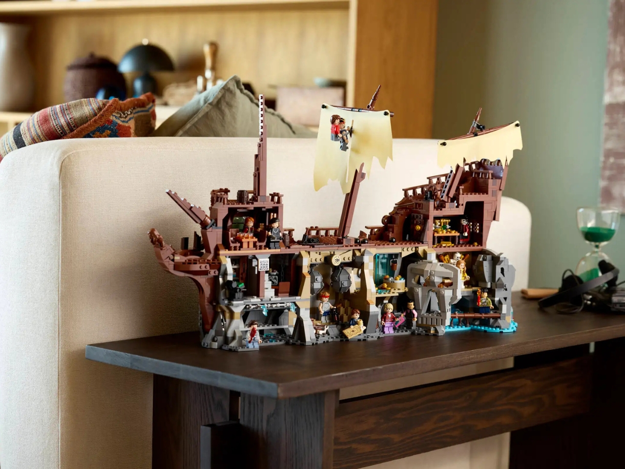
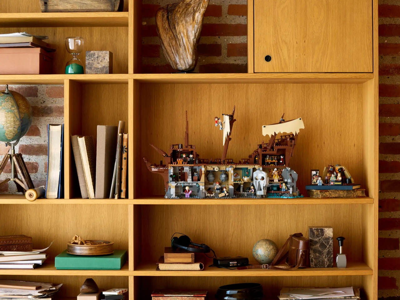
If you’ve ever dreamed about finding pirate treasure in underground caves or sliding down secret passages to escape the bad guys, you’re about to lose your mind over what LEGO just dropped. And with Halloween just around the corner, the timing couldn’t be more perfect for The Goonies set (21363), a 2,912-piece tribute to skeletons, pirates, and underground adventures that practically screams spooky season.

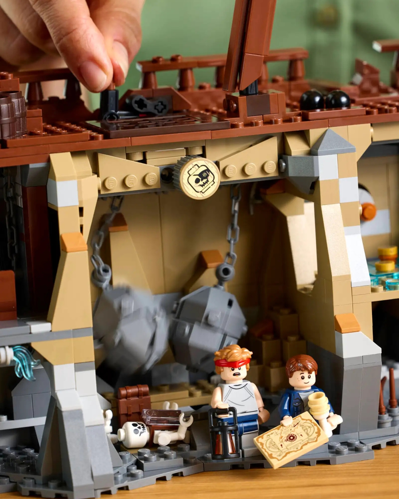
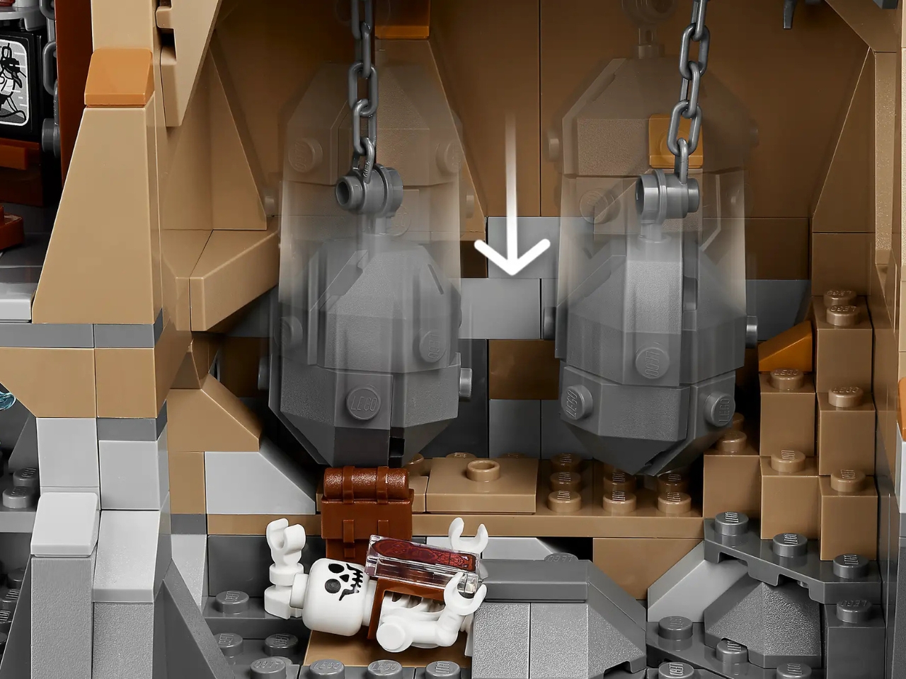
Here’s the thing that gets me about this release. It’s not just a model you build and stick on a shelf. This is a full-blown tribute to one of the most beloved adventure movies ever made, with actual thought put into recreating those iconic moments that blend adventure with just the right amount of creepy. We’re talking about the Fratelli hideout (basically a haunted house for criminals), the terrifying boulder trap, skeleton-filled caves, and yes, One-Eyed Willy’s legendary pirate ship, the Inferno, complete with sails, treasure, and plenty of bones.

Designer: LEGO

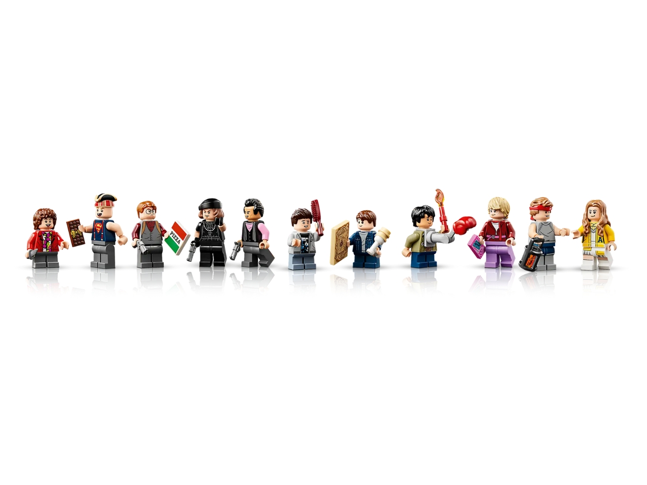
What really makes this set special are the minifigures. All twelve of them. You get the whole gang: Mikey, Mouth, Data, Chunk, Brand, Andy, and Stef, plus Sloth in his Superman shirt, Mama Fratelli, Francis, Jake, and even One-Eyed Willy’s skeleton. Speaking of which, how perfect is it to have an actual skeleton pirate minifigure just in time for Halloween? LEGO actually created brand new elements specifically for this set, like Sloth’s pirate hat and Mama Fratelli’s hair and beret combo, which shows you the level of detail they’re committed to.

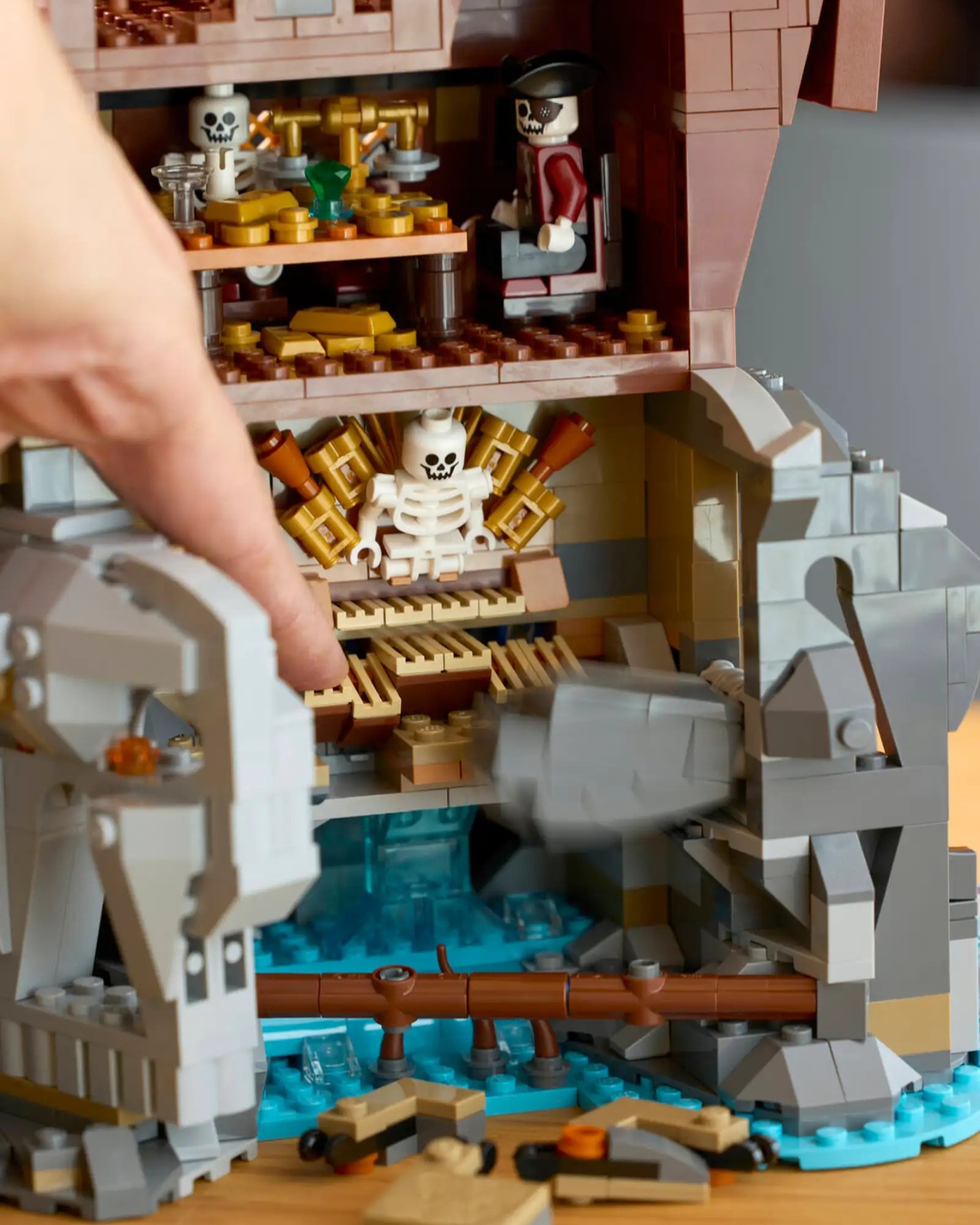
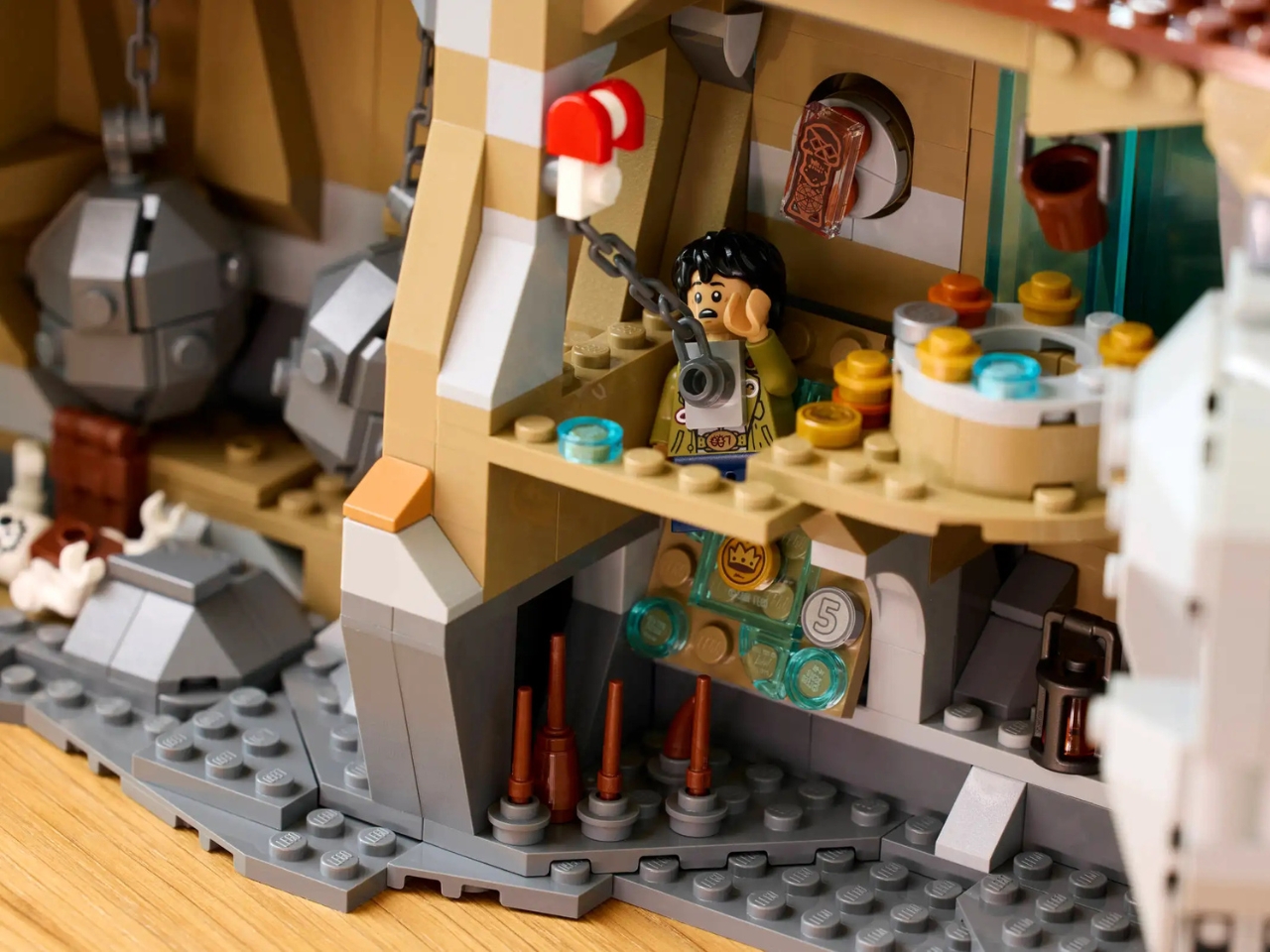
The build itself is pure genius in how it captures the movie’s spooky underground energy. One side shows the Inferno in all its glory with full sails, looking exactly like the moment when the Goonies discover it in that eerie cavern. Flip it around, and you’ve got an interactive play area with all the booby traps and secret passages that could easily double as Halloween decorations. There’s the skeleton organ where if you hit the wrong note, your minifigure falls through the floor (talk about a Halloween party trick). There’s a trap door for Data to avoid, and even a slide to the octopus from a deleted scene that superfans will totally appreciate.

At $329.99, this is definitely an investment piece. But you’re getting nearly 3,000 pieces and enough spooky detail to keep you discovering new Easter eggs every time you look at it. Think truffle shuffle references, the treasure map that started it all, and little callbacks scattered throughout the build. The underground cave aesthetic with its dark corners and hidden dangers fits perfectly with Halloween vibes, making it an ideal conversation piece for your seasonal decor.

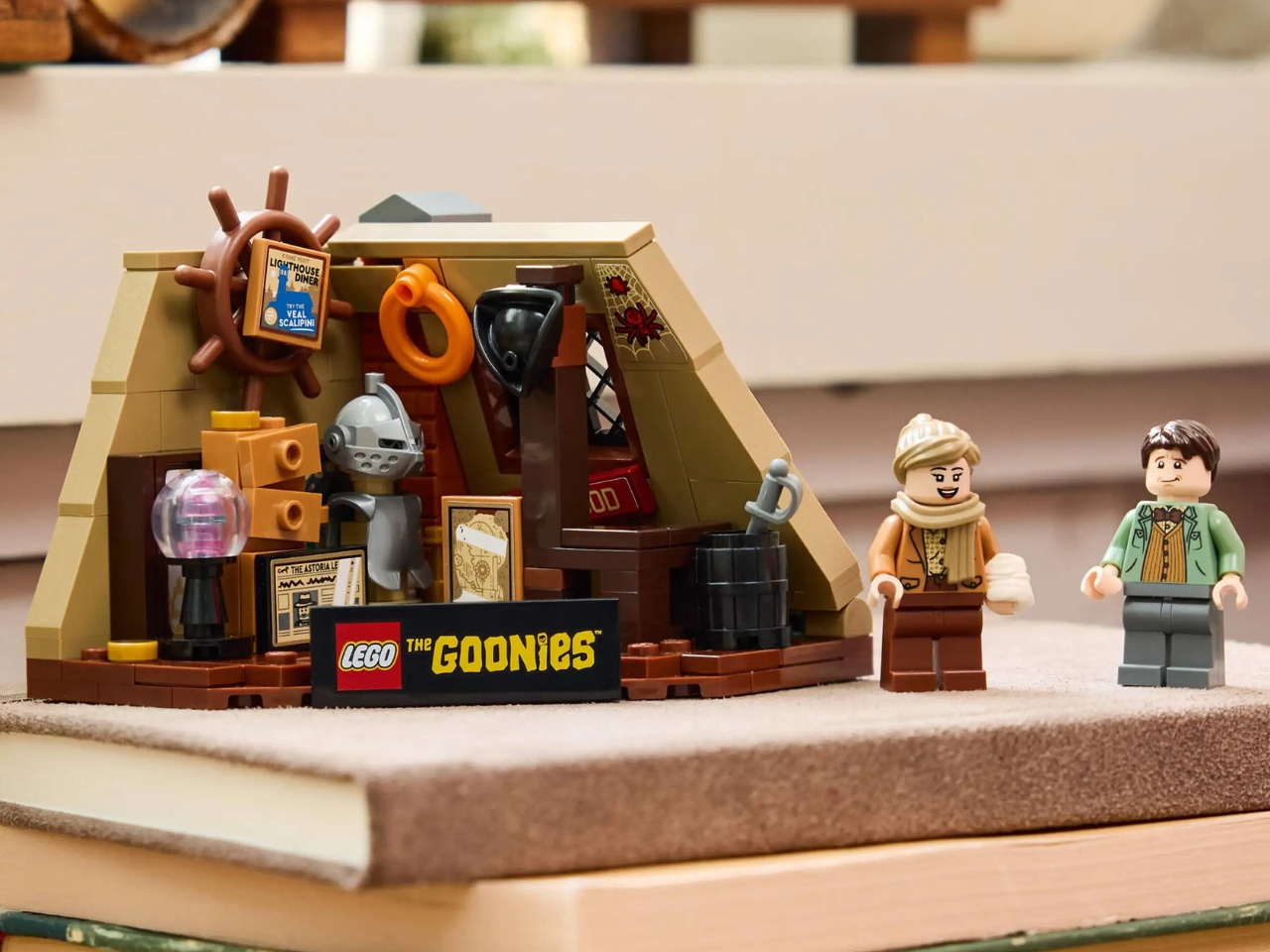
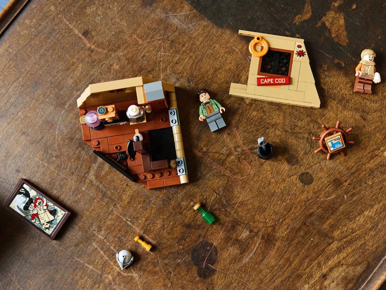
Now here’s where it gets even better. If you’re quick and grab this set between November 1st and 7th, you’ll also score a free gift with purchase: The Walshes’ Attic set (40773). This 179-piece bonus includes minifigures of Mikey’s parents, Irving and Irene Walsh, plus a brick-built recreation of that cluttered, slightly creepy attic where the whole adventure began. You know, the scene with the dusty suit of armor, random nautical stuff everywhere, cobwebs implied, and that fateful moment when the kids discovered the treasure map behind a painting? It’s the perfect companion piece that sets up the entire story and adds another layer of atmospheric Halloween fun to your display.

What I love most about this release is how it captures that perfect blend of adventure and spookiness that makes The Goonies such a timeless film. Based on a fan submission by Delusion Brick, it shows that LEGO is actually listening to what fans want. This is the 10th and final LEGO Ideas set of 2025, and honestly, what a way to close out the year, especially launching right at the beginning of November when Halloween decorations are still fresh in everyone’s minds.

The set launches November 1st for LEGO Insiders members, with general availability starting November 4th. And yeah, it’s going to look incredible displayed on your shelf, whether you keep it up year-round or bring it out as part of your Halloween rotation. Part of the charm is in all the interactive elements: sending Sloth sliding down the mast, activating the boulder trap, playing with the skeleton organ. These aren’t just static display pieces meant to gather dust.

For anyone who grew up in the 80s or simply loves adventure movies with heart and a hint of danger, this is more than a LEGO set. It’s a trip back to that feeling of infinite possibility, of exploring dark caves with nothing but a flashlight and your courage, of believing that treasure maps really do lead somewhere magical. Goonies never say die, and clearly, neither does our love for pirates, skeletons, and Halloween adventures.

The post This $330 LEGO Goonies Set Is Pure Halloween Treasure first appeared on Yanko Design.
3D Printed Bricks That Help Baby Trees Survive Climate Change

Sometimes the best innovations look backward before they move forward. That’s exactly what’s happening with TreeSoil, a project that takes ancient farming wisdom and reimagines it with robots, 3D printers, and a whole lot of computational horsepower.

TreeSoil is a robotic 3D printed earthen shelter designed to create microclimates that support the early growth of young trees, developed at the Technion’s Material Topology Research Lab (MTRL) in collaboration with the Tree Lab at the Weizmann Institute of Science. If that sounds like a lot of fancy institutions working together, that’s because this project sits right at the intersection of architecture, material science, and plant biology. It’s the kind of cross-pollination that leads to genuinely exciting breakthroughs.

Designer: Technion’s Material Topology Research Lab (MTRL) x Tree Lab at the Weizmann Institute of Science

The concept is beautifully simple. The project draws on ancient agricultural techniques used in arid landscapes, where stone or earthen enclosures shield crops and saplings from wind, sun, and evaporation. Farmers have been doing this for thousands of years because it works. Young plants are vulnerable, and giving them even a small buffer against harsh conditions can mean the difference between thriving and dying. TreeSoil takes that time-tested principle and asks: what if we could make these protective structures smarter, more efficient, and tailored to each specific sapling and location?

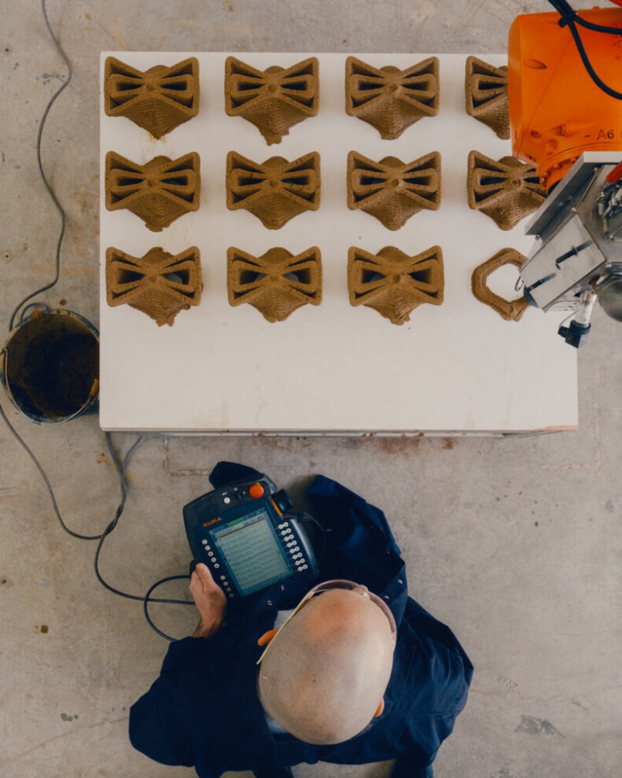
That’s where the robots come in. Each structure is composed of modular bricks produced through large-scale robotic extrusion. Picture a industrial robotic arm equipped with a specialized extruder, methodically building up layers of earthen material into interlocking brick units. These aren’t your standard construction bricks though. Each TreeSoil prototype is informed by local climatic data, optimizing airflow, solar radiation, and moisture retention, with interlocking brick geometry that enables modularity, structural integrity, and efficient on-site assembly.

The material itself is fascinating. The composition is based on locally sourced soil, enhanced with waste-derived fertilizers and bio-based binders, engineered to respond both to the site’s climate conditions and the nutritional needs of the sapling. So the shelter isn’t just a passive structure. It’s actively designed to support the tree it protects, using materials that come from the same ground where the tree will eventually take root.

And here’s where it gets even more interesting. Fully biodegradable, TreeSoil gradually disintegrates into the earth, enriching it as the tree it protects matures. The shelter doesn’t stick around forever as waste or clutter. As the tree grows stronger and develops its own natural defenses against wind and sun, the protective structure breaks down and becomes nutrients for the very tree it was designed to help. It’s a perfect closed loop.

This approach feels especially relevant now, as we’re collectively grappling with how to restore degraded landscapes and support reforestation efforts in increasingly challenging climates. Young trees planted in areas affected by drought, deforestation, or climate change face brutal odds. Traditional reforestation projects often see high mortality rates because saplings just can’t handle the environmental stress.

TreeSoil suggests a path forward that doesn’t require massive infrastructure or ongoing maintenance. The project transforms soil into a modular, interlocking system that mediates between technology and ecology. The bricks can be fabricated on-site or nearby using local materials, assembled relatively quickly, and then left to do their job while naturally returning to the earth over time.

What makes this project particularly compelling is how it refuses to choose sides in the usual nature versus technology debate. Instead, it treats advanced computational design and robotic fabrication as tools that can work in service of ecological goals. The high-tech elements enable precision and optimization that would be impossible to achieve manually, while the low-tech earthen materials and biodegradable design ensure the solution remains grounded in natural systems.

As climate change makes successful reforestation more difficult, innovations like TreeSoil offer a glimpse at how design, technology, and biology might collaborate to give nature a fighting chance. Sometimes helping trees grow isn’t about working harder. It’s about working smarter, with a robotic assist and a respect for the ancient wisdom that got us here in the first place.

The post 3D Printed Bricks That Help Baby Trees Survive Climate Change first appeared on Yanko Design.
3D Printed Bricks That Help Baby Trees Survive Climate Change

Sometimes the best innovations look backward before they move forward. That’s exactly what’s happening with TreeSoil, a project that takes ancient farming wisdom and reimagines it with robots, 3D printers, and a whole lot of computational horsepower.

TreeSoil is a robotic 3D printed earthen shelter designed to create microclimates that support the early growth of young trees, developed at the Technion’s Material Topology Research Lab (MTRL) in collaboration with the Tree Lab at the Weizmann Institute of Science. If that sounds like a lot of fancy institutions working together, that’s because this project sits right at the intersection of architecture, material science, and plant biology. It’s the kind of cross-pollination that leads to genuinely exciting breakthroughs.

Designer: Technion’s Material Topology Research Lab (MTRL) x Tree Lab at the Weizmann Institute of Science

The concept is beautifully simple. The project draws on ancient agricultural techniques used in arid landscapes, where stone or earthen enclosures shield crops and saplings from wind, sun, and evaporation. Farmers have been doing this for thousands of years because it works. Young plants are vulnerable, and giving them even a small buffer against harsh conditions can mean the difference between thriving and dying. TreeSoil takes that time-tested principle and asks: what if we could make these protective structures smarter, more efficient, and tailored to each specific sapling and location?

That’s where the robots come in. Each structure is composed of modular bricks produced through large-scale robotic extrusion. Picture a industrial robotic arm equipped with a specialized extruder, methodically building up layers of earthen material into interlocking brick units. These aren’t your standard construction bricks though. Each TreeSoil prototype is informed by local climatic data, optimizing airflow, solar radiation, and moisture retention, with interlocking brick geometry that enables modularity, structural integrity, and efficient on-site assembly.

The material itself is fascinating. The composition is based on locally sourced soil, enhanced with waste-derived fertilizers and bio-based binders, engineered to respond both to the site’s climate conditions and the nutritional needs of the sapling. So the shelter isn’t just a passive structure. It’s actively designed to support the tree it protects, using materials that come from the same ground where the tree will eventually take root.

And here’s where it gets even more interesting. Fully biodegradable, TreeSoil gradually disintegrates into the earth, enriching it as the tree it protects matures. The shelter doesn’t stick around forever as waste or clutter. As the tree grows stronger and develops its own natural defenses against wind and sun, the protective structure breaks down and becomes nutrients for the very tree it was designed to help. It’s a perfect closed loop.

This approach feels especially relevant now, as we’re collectively grappling with how to restore degraded landscapes and support reforestation efforts in increasingly challenging climates. Young trees planted in areas affected by drought, deforestation, or climate change face brutal odds. Traditional reforestation projects often see high mortality rates because saplings just can’t handle the environmental stress.

TreeSoil suggests a path forward that doesn’t require massive infrastructure or ongoing maintenance. The project transforms soil into a modular, interlocking system that mediates between technology and ecology. The bricks can be fabricated on-site or nearby using local materials, assembled relatively quickly, and then left to do their job while naturally returning to the earth over time.

What makes this project particularly compelling is how it refuses to choose sides in the usual nature versus technology debate. Instead, it treats advanced computational design and robotic fabrication as tools that can work in service of ecological goals. The high-tech elements enable precision and optimization that would be impossible to achieve manually, while the low-tech earthen materials and biodegradable design ensure the solution remains grounded in natural systems.

As climate change makes successful reforestation more difficult, innovations like TreeSoil offer a glimpse at how design, technology, and biology might collaborate to give nature a fighting chance. Sometimes helping trees grow isn’t about working harder. It’s about working smarter, with a robotic assist and a respect for the ancient wisdom that got us here in the first place.

The post 3D Printed Bricks That Help Baby Trees Survive Climate Change first appeared on Yanko Design.
Dreamfarm’s Genius Measuring Cup Squeegees Itself Clean Every Time

You know that moment when you’re trying to measure out peanut butter and half of it stays stubbornly stuck to the measuring cup? Or when you’re spooning honey and it seems like no matter how much you scrape, there’s always that last bit clinging to the sides, taunting you? Yeah, we’ve all been there. It’s one of those tiny kitchen frustrations that feels like it should have been solved decades ago.
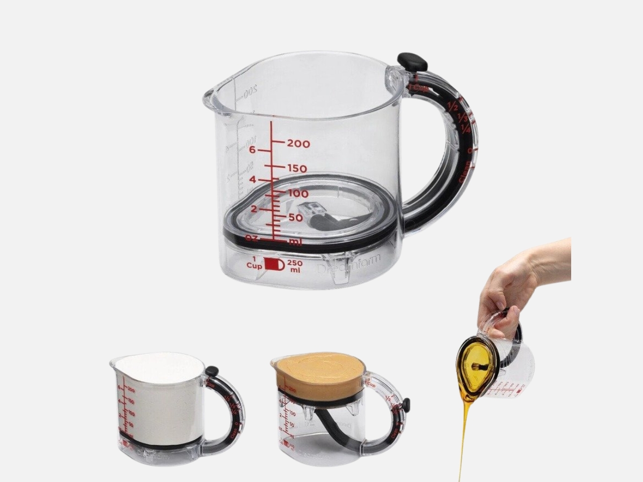
Well, Australian design company Dreamfarm finally decided to do something about it. Their UpCup is a 4-in-1 adjustable measuring cup that scrapes itself clean for wet, dry, and sticky ingredients. And honestly, it’s one of those designs that makes you wonder why nobody thought of it sooner.


Designer: Dreamfarm

Click Here to Buy Now

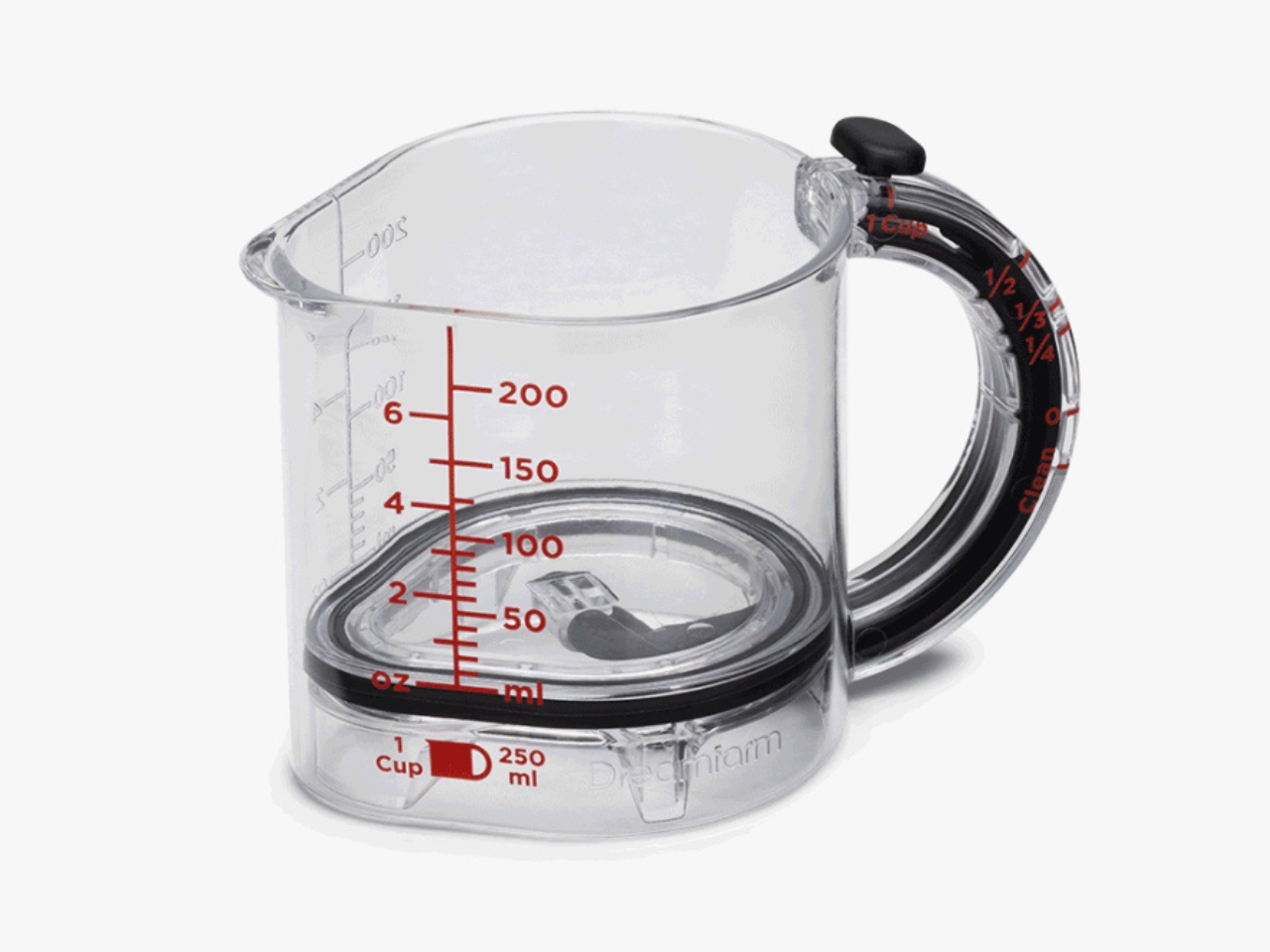
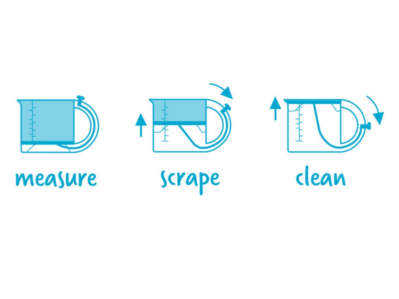
Here’s how it works. The UpCup’s adjustable base raises to create 1 cup, ½ cup, ⅓ cup, and ¼ cup measuring cups, all in a single cup. So instead of cluttering your kitchen drawer with four different measuring cups, you just need this one clever little device. You choose your measurement on the handle, fill it up, and then press the slider down to push everything out.

But here’s where it gets really clever. A watertight seal around the adjustable base squeegees the UpCup clean as it moves, making it perfect for peanut butter, mayonnaise, honey, and other sticky ingredients. As the base rises up through the cup, it acts like a built-in squeegee, pushing every last drop of whatever you’re measuring straight into your bowl. No waste, no scraping with a spatula, no wrestling with stubborn ingredients. Think about all those times you’ve measured sticky ingredients. Maple syrup that pools at the bottom. Tahini that refuses to let go. Coconut oil that somehow gets everywhere except where you want it. The UpCup handles all of it with the same simple push mechanism. The base extends fully to push out every last drop, and can be removed for thorough, dishwasher-safe cleaning.

The design is refreshingly straightforward. It’s made from clear, BPA-free Tritan plastic, so you can see exactly what you’re measuring. The measurements are both printed in red and embossed directly into the plastic, which means they’ll never wear off no matter how many times you run it through the dishwasher. And speaking of heat, it can handle temperatures up to 212°F, so you can use it for hot ingredients too.

What’s particularly smart about this design is how Dreamfarm thought about the entire user experience. Since it’s self-cleaning, you can use it for all your ingredients and then toss it in the dishwasher for an overall cleaning afterwards. Need to measure out flour, then peanut butter, then honey for the same recipe? Just push the slider between each ingredient and you’re good to go. No need to wash it three times in the middle of cooking. It’s also perfect for those recipes where precision matters. When you’re baking and need exactly a third of a cup of oil, you can actually get exactly that amount into your mixing bowl instead of losing some to the measuring cup. Those small losses add up, and they can actually affect your final results, especially in baking where ratios really matter.

The UpCup is one of those kitchen tools that feels obvious once you see it. It solves a problem we’ve all just accepted as part of cooking, and it does it in a way that’s simple, functional, and honestly pretty satisfying to use. There’s something deeply pleasing about watching that base rise up and push every single drop of sticky ingredient exactly where you want it. Dreamfarm has built a reputation for rethinking everyday kitchen tools, and the UpCup is a perfect example of their approach. They didn’t just make another measuring cup. They looked at how people actually use measuring cups, identified the frustrations, and designed a solution that makes the whole process better.

Is it revolutionary? Maybe not. But it’s the kind of thoughtful, problem-solving design that makes everyday tasks just a little bit easier. And in the kitchen, where we’re constantly juggling multiple ingredients and timing everything perfectly, those little improvements really do matter. No more scraping, no more waste, and no more measuring cup drawer overflowing with nested cups. Just one smart tool that actually works the way you wish all measuring cups did.

Click Here to Buy Now

The post Dreamfarm’s Genius Measuring Cup Squeegees Itself Clean Every Time first appeared on Yanko Design.