The original Hario V60 is the kind of object that earns its own mythology. Released in 2004, it became the face of the third-wave coffee movement: a simple cone of heat-resistant glass (or ceramic, or plastic, depending on how serious you are) that turned the morning cup into a ritual of patience and precision. Baristas loved it. Coffee nerds obsessed over it. And somewhere along the way, it became as recognizable as a kitchen object can get without appearing on a museum shelf.
That legacy makes the V60 Dripper NEO an interesting proposition. Hario could have left well enough alone. Instead, they spent two years quietly engineering a redesign that touches the one part of the V60 nobody talks about but everyone deals with: the ribs.
Designer: Hario
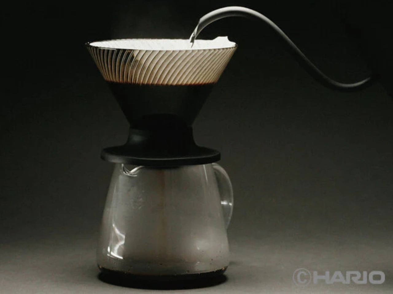
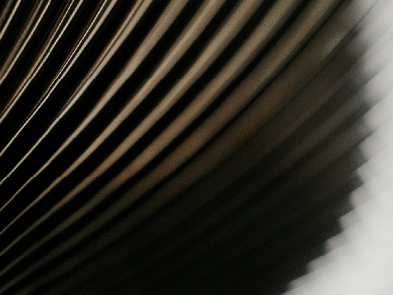
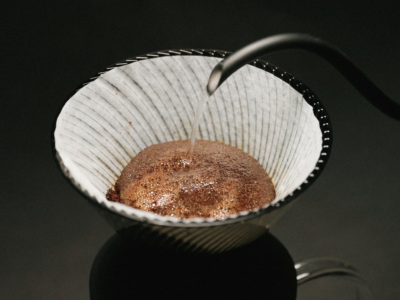
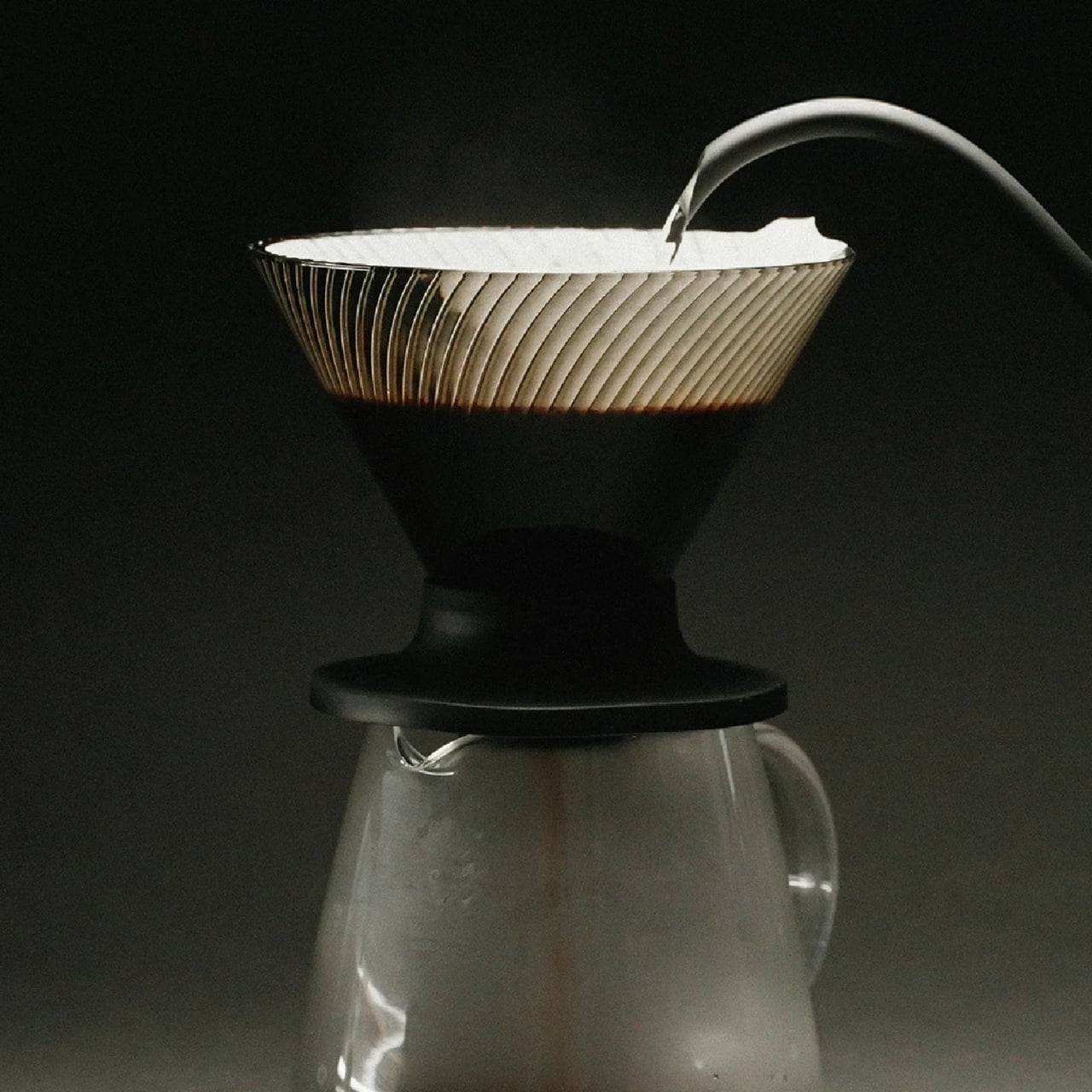
The original V60’s spiral ribs are the reason it works the way it does. They create space between the paper filter and the cone wall, allowing air to escape as water flows through. The result is a controlled extraction, but one that demands attention. Get your grind wrong, pour too fast, let your focus wander, and the brew either stalls or races past the point of no return. The V60 has always been a beautiful, slightly unforgiving thing.
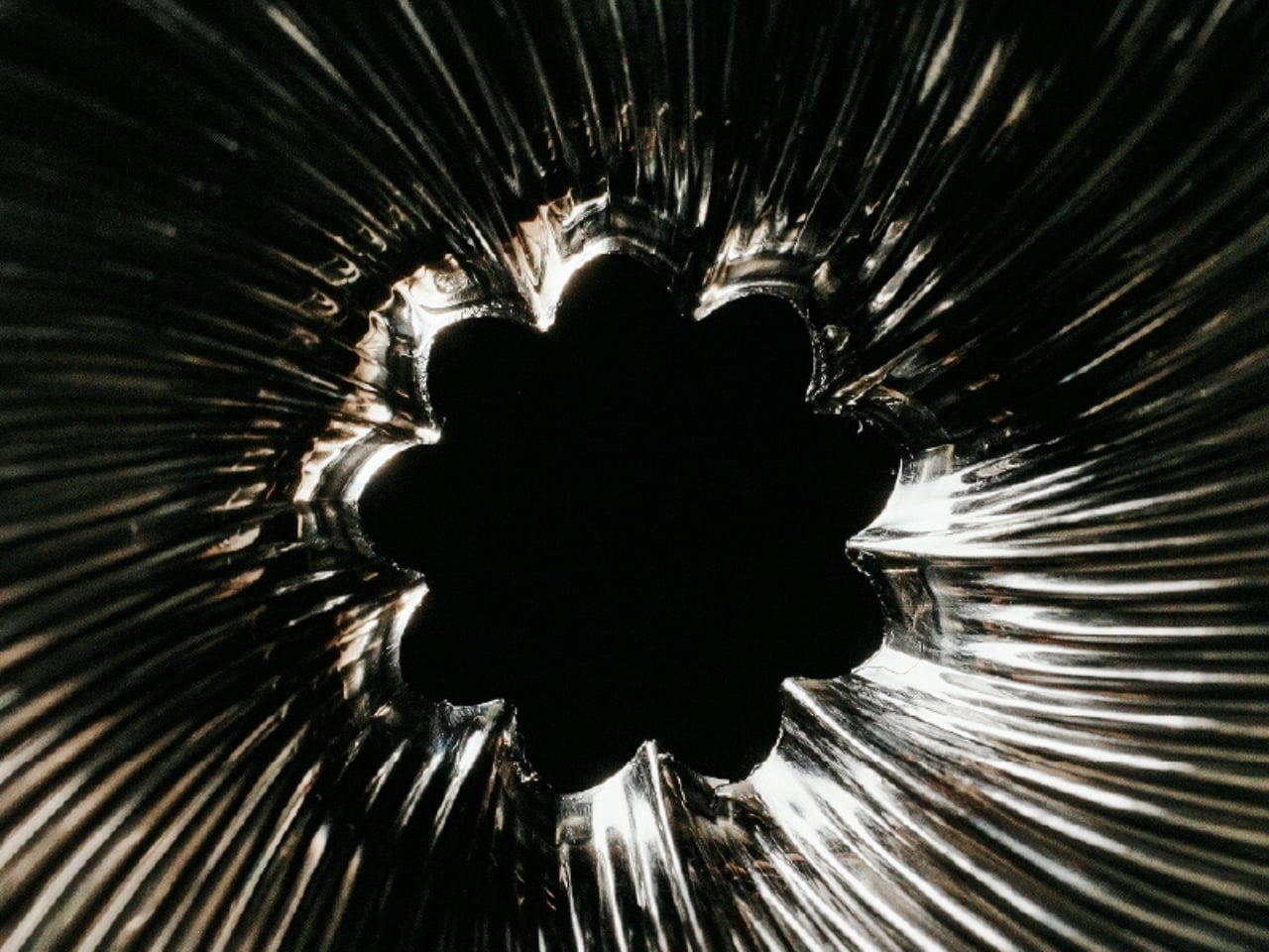
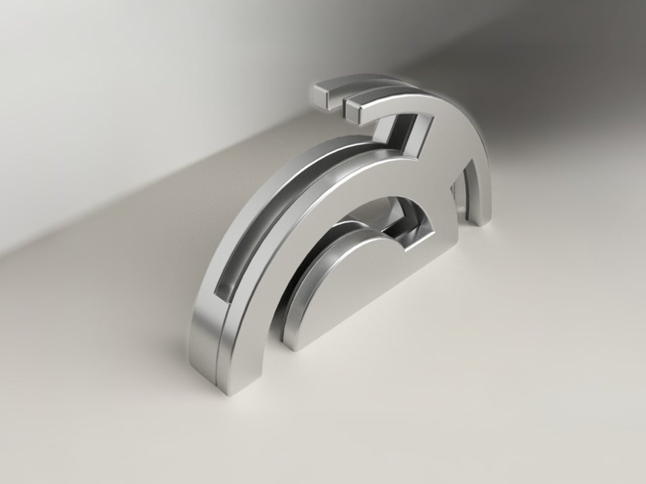
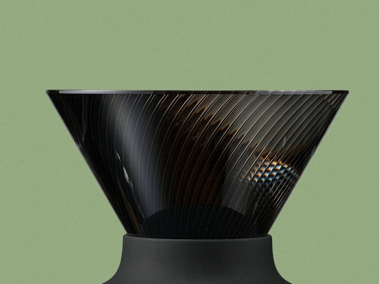
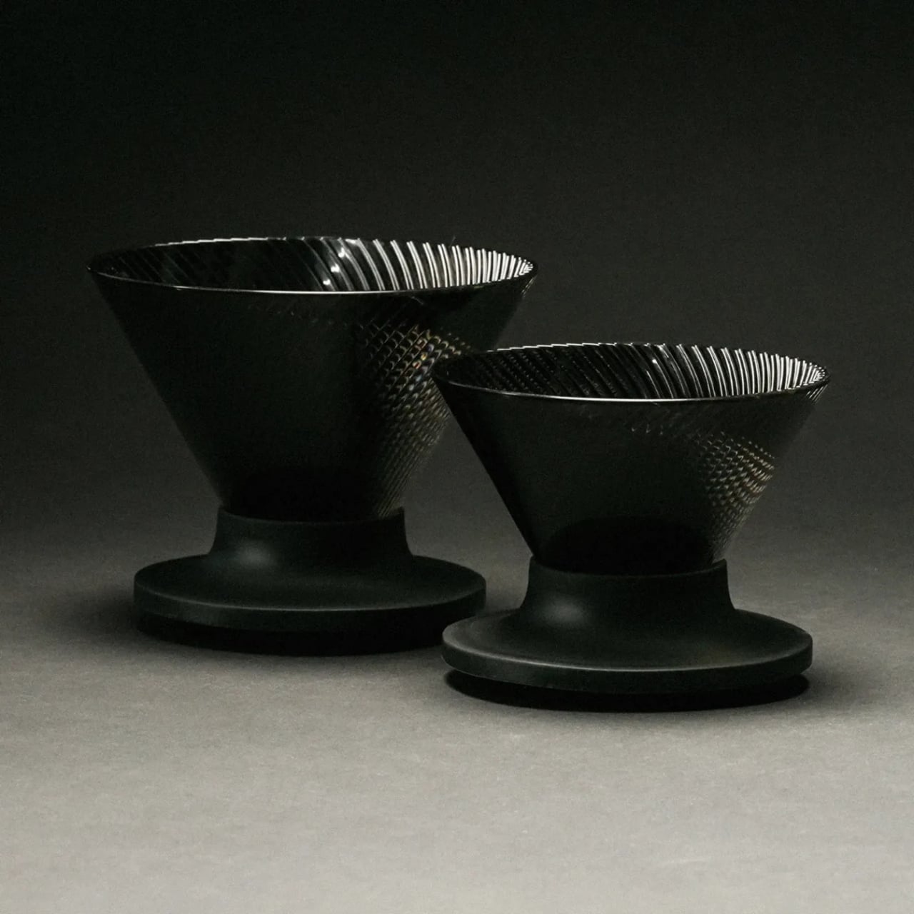
The NEO changes that equation with a genuinely clever structural update. Instead of a single spiral rib pattern, it introduces 72 ultra-fine vertical ribs along the upper walls of the cone, which then converge into 9 deeper ribs near the base. This dual-zone design guides water evenly down the entire wall before accelerating it through the outlet. The effect is a faster, more uniform extraction that minimizes bitterness from water lingering too long in contact with the grounds. The cup you get out the other end is cleaner, sweeter, and more vibrant, with a balanced acidity that doesn’t tip into sourness.

Two years of testing went into getting this right. Hario’s engineers ran exhaustive trials on rib counts, angles, and flow dynamics before landing on this configuration. The fact that they filed a utility model patent on the structure suggests they believe it is genuinely novel, not just cosmetically different.
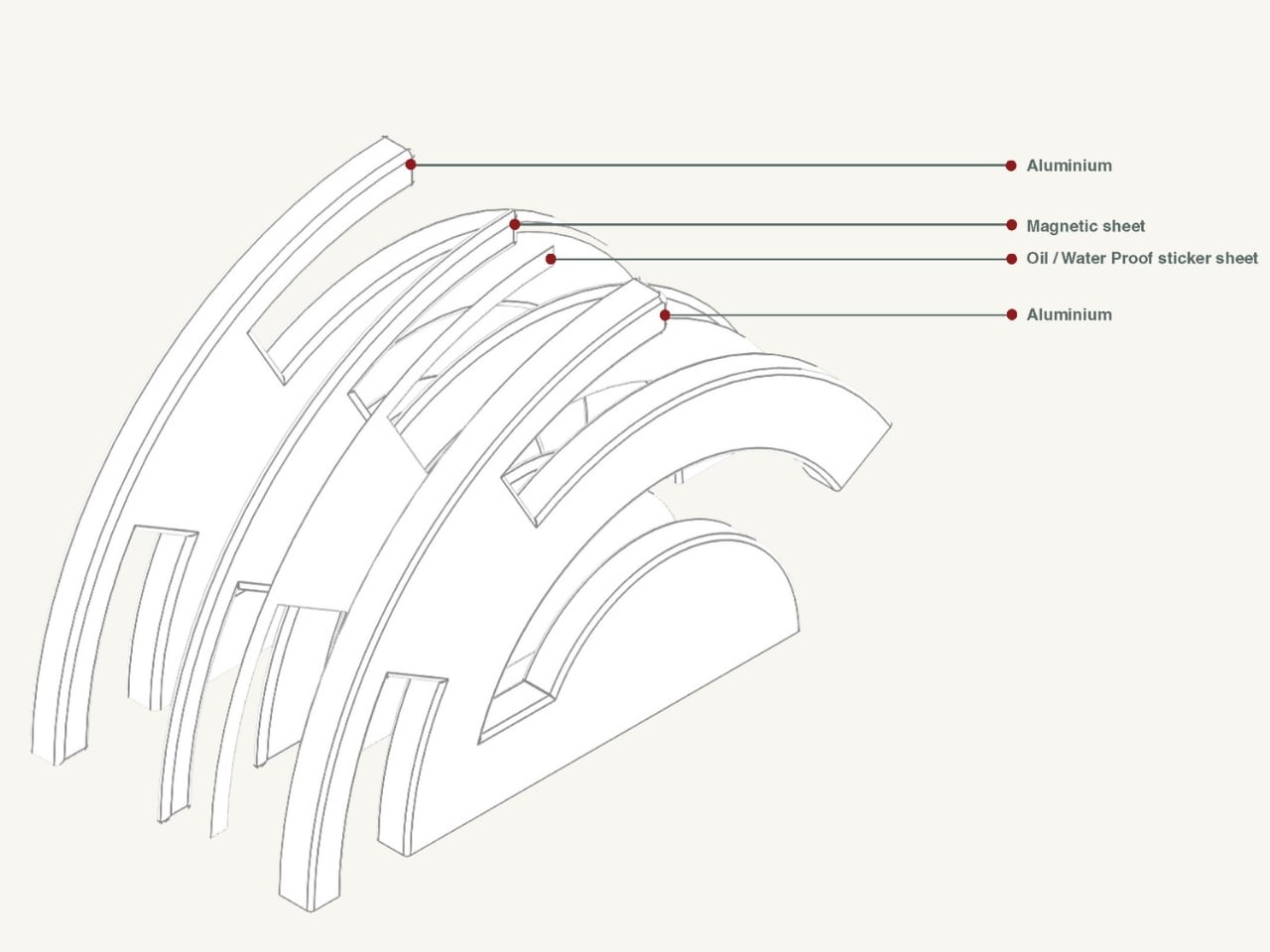
The material choice is also worth noting. The NEO is made from Tritan resin, a lightweight, high-clarity plastic that handles heat retention better than standard plastic alternatives. It keeps the brewing temperature more stable from the first pour to the last, which matters more than people think. Temperature consistency is one of those variables that separates a good cup from a great one, and the NEO addresses it without requiring you to do anything differently.
For anyone already embedded in the V60 ecosystem, the compatibility factor is a quiet win. The NEO works with all existing V60 switch bases, so you don’t have to rebuild your setup from scratch. It comes in two sizes, both made in Japan, and retails for around $23.50, which is an accessible price point for a piece of equipment that functions this thoughtfully.
Not everyone is convinced, though. Since hitting the market, the NEO has sparked a genuinely divided response from the coffee community. Users describe the brew as cleaner and more tea-like, which sounds appealing until you realize that some people loved the original V60 precisely for its acidic punch and intensity. One Reddit user put it plainly: the NEO presents coffee “differently,” not necessarily better. For experienced brewers who spent years dialing in their pour technique to coax specific flavors from the classic cone, the NEO’s smoother, more forgiving nature feels less like an upgrade and more like a personality change. That’s a fair criticism. Hario didn’t make a bad V60. They made a different one, and that distinction is exactly what has the coffee internet divided.
Pour-over coffee has always had a slight gatekeeping problem. The ritual appeals to people who love it precisely because it requires care, but that same learning curve turns off anyone who just wants a good cup without turning their kitchen into a science experiment. The V60 NEO doesn’t eliminate that ritual. It just makes the margin for error a little more forgiving, which means more people get to enjoy the result without years of practice behind them.
The original V60 deserved its legacy. The NEO earns its own, just a slightly different one.
The post Hario’s V60 Gets Its First Real Upgrade in 20 Years for $23 first appeared on Yanko Design.