Your Phone Has 12 Calendar Apps. None of Them Look Like This

We are living through a slow, quiet rebellion against digital everything. Vinyl record sales have been climbing for years. Film cameras are back on shelves. People are buying paper planners again. And now, a wooden perpetual wall calendar made in France in the 1970s is having a moment through a Korean design shop called Wertwerk, and I am completely on board.

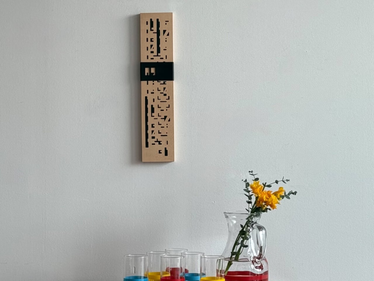
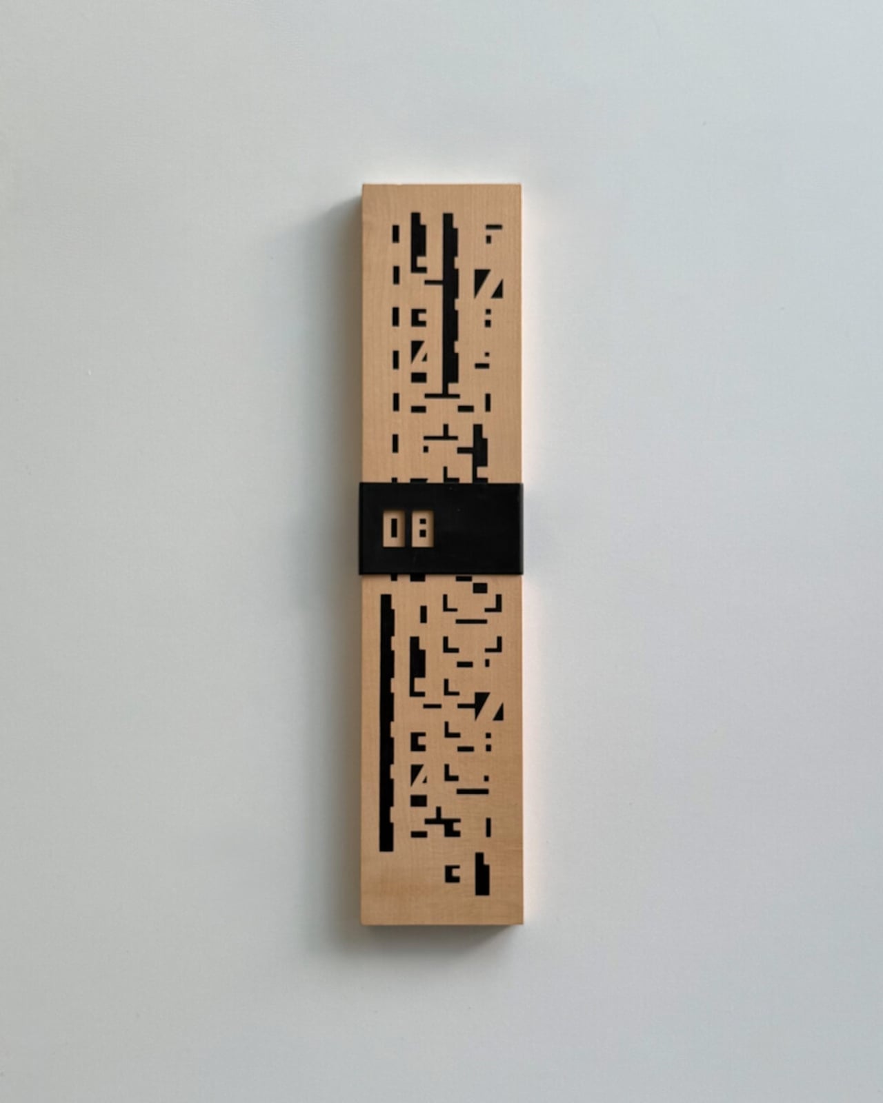
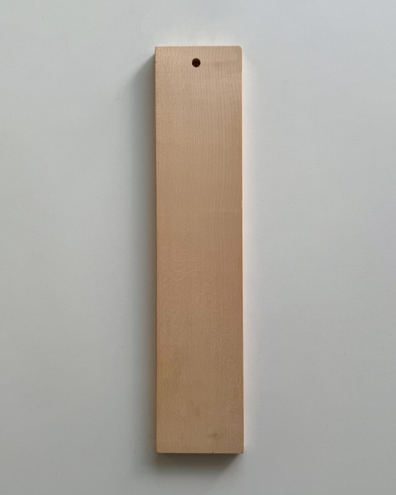
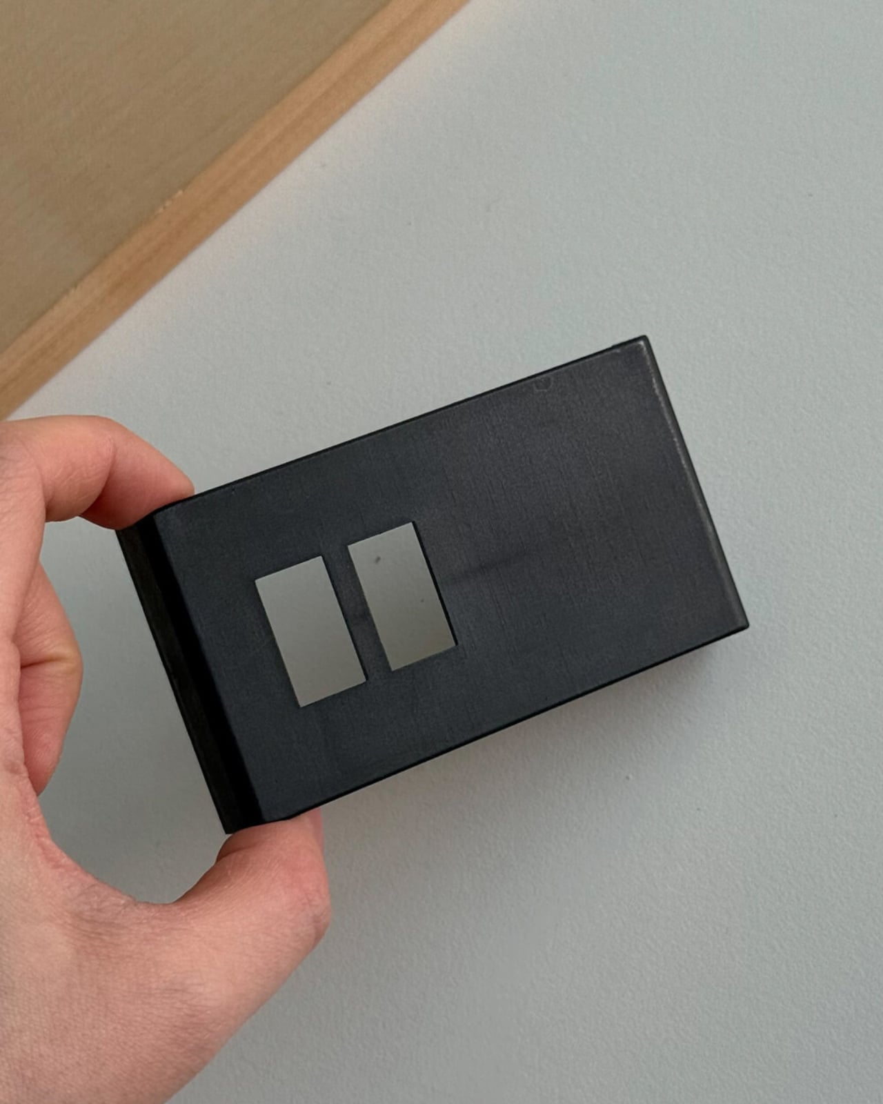
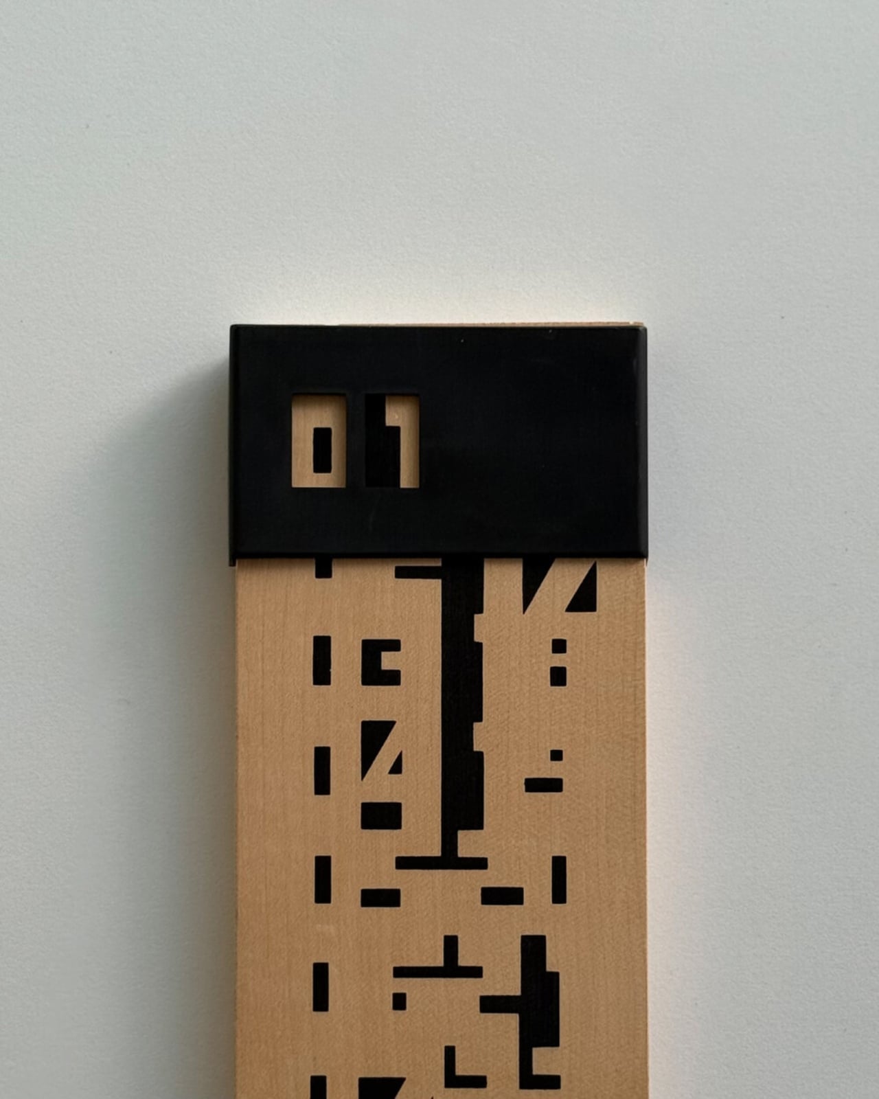
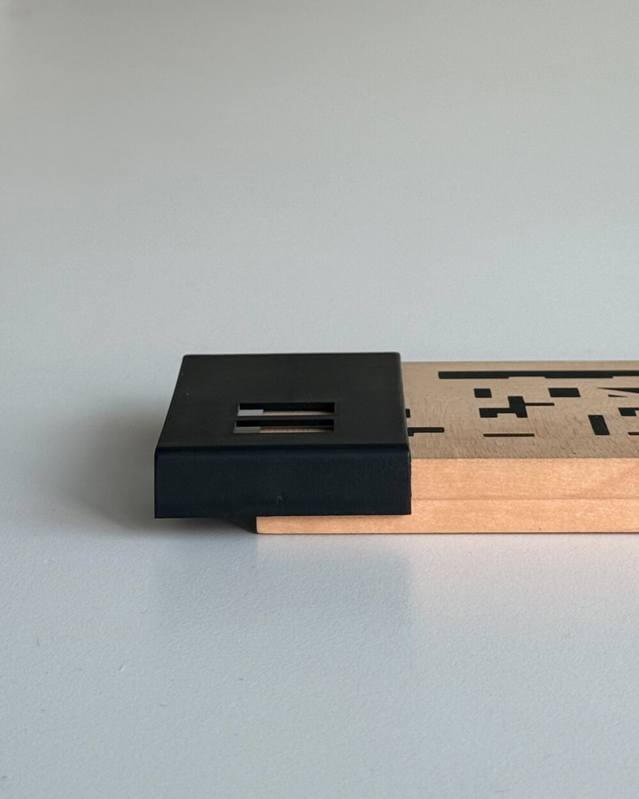
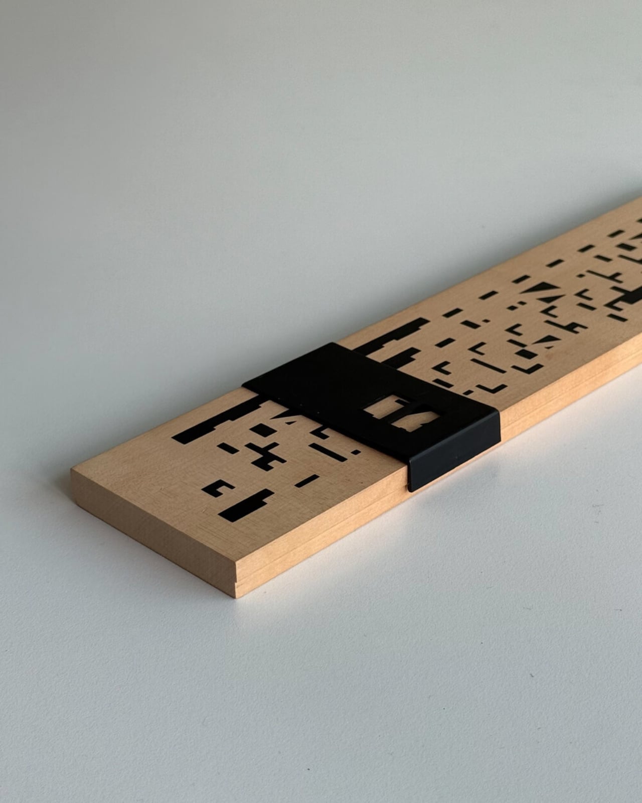
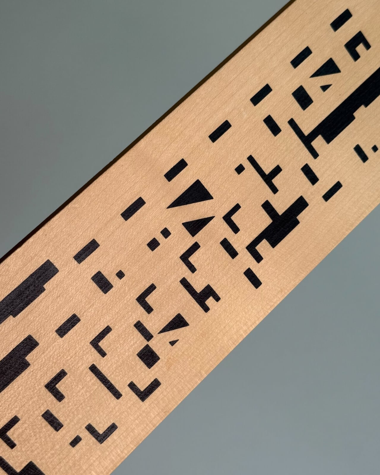
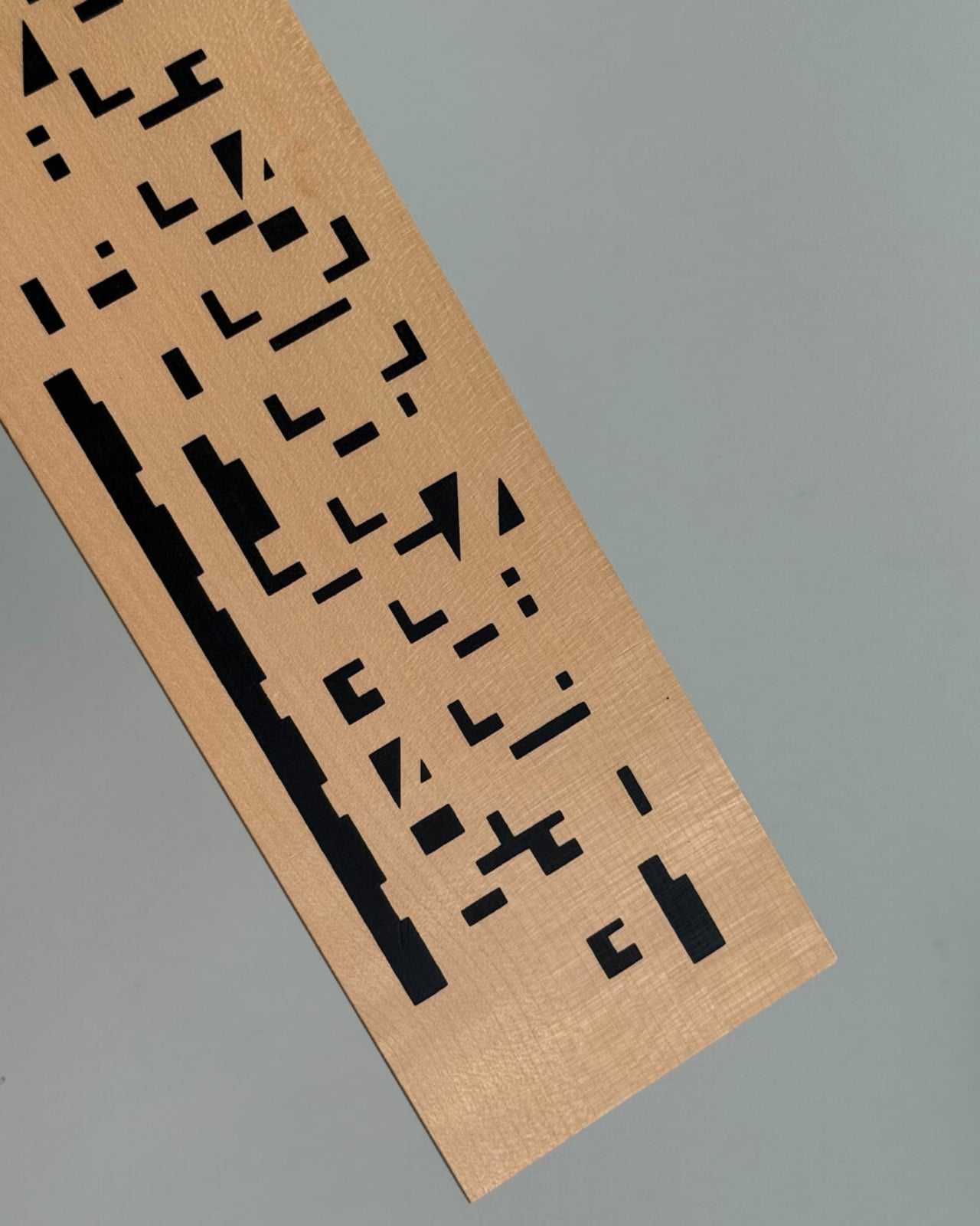
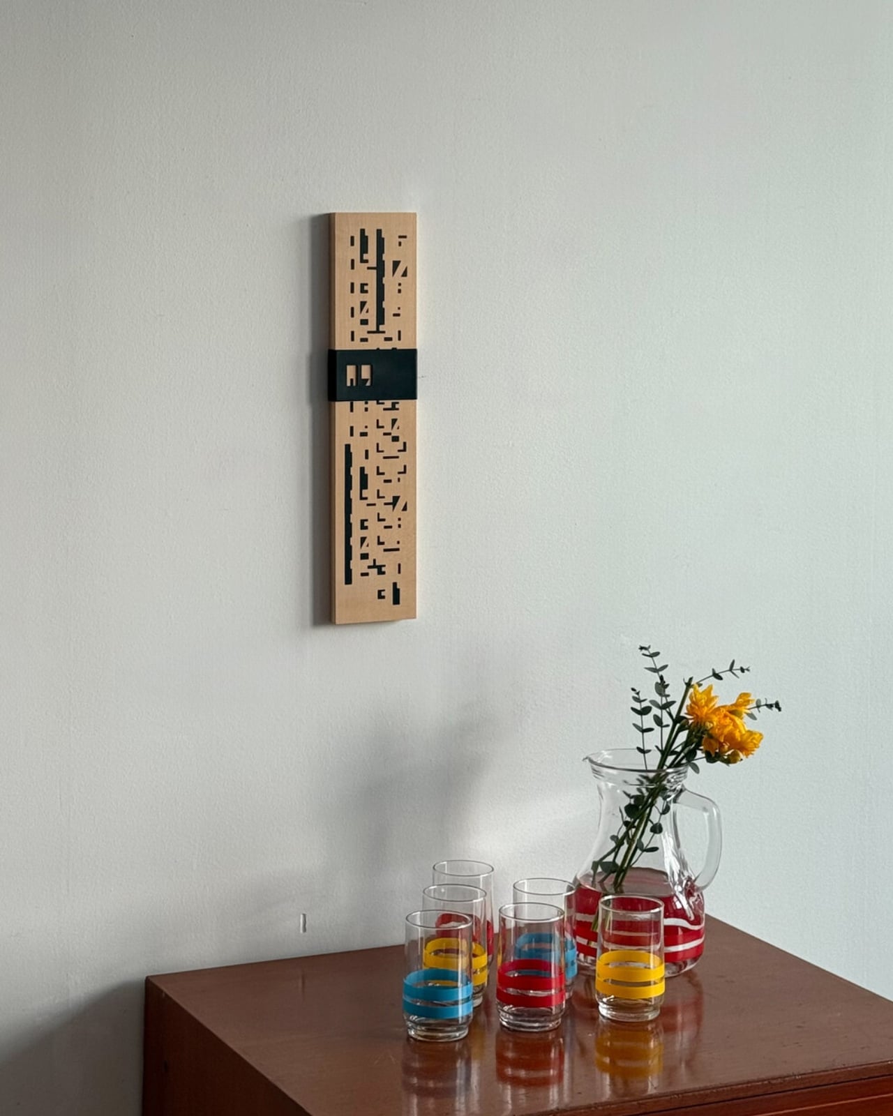
The piece is exactly what it sounds like: a wall-mounted calendar built from a warm wood base, with a row of plastic sliders numbered 1 through 31 that you manually shift to mark the date. No batteries. No notifications. No algorithm nudging you toward anything. Just wood, a little plastic, and the deliberate act of moving a slider every morning. That’s the whole thing. And yet, it manages to do something almost no digital tool can: make you stop and actually notice what day it is.

Designer Name: Wertwerk

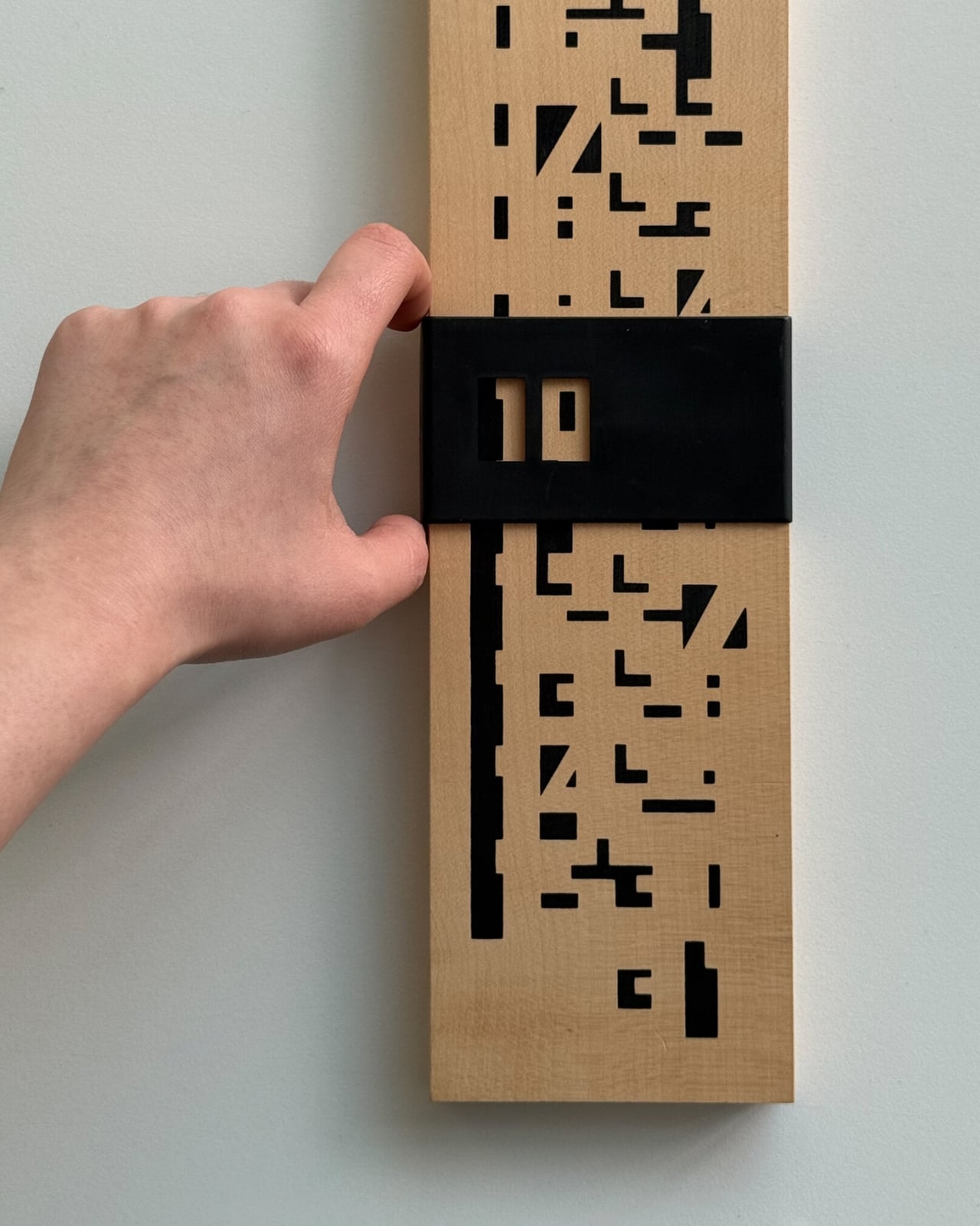
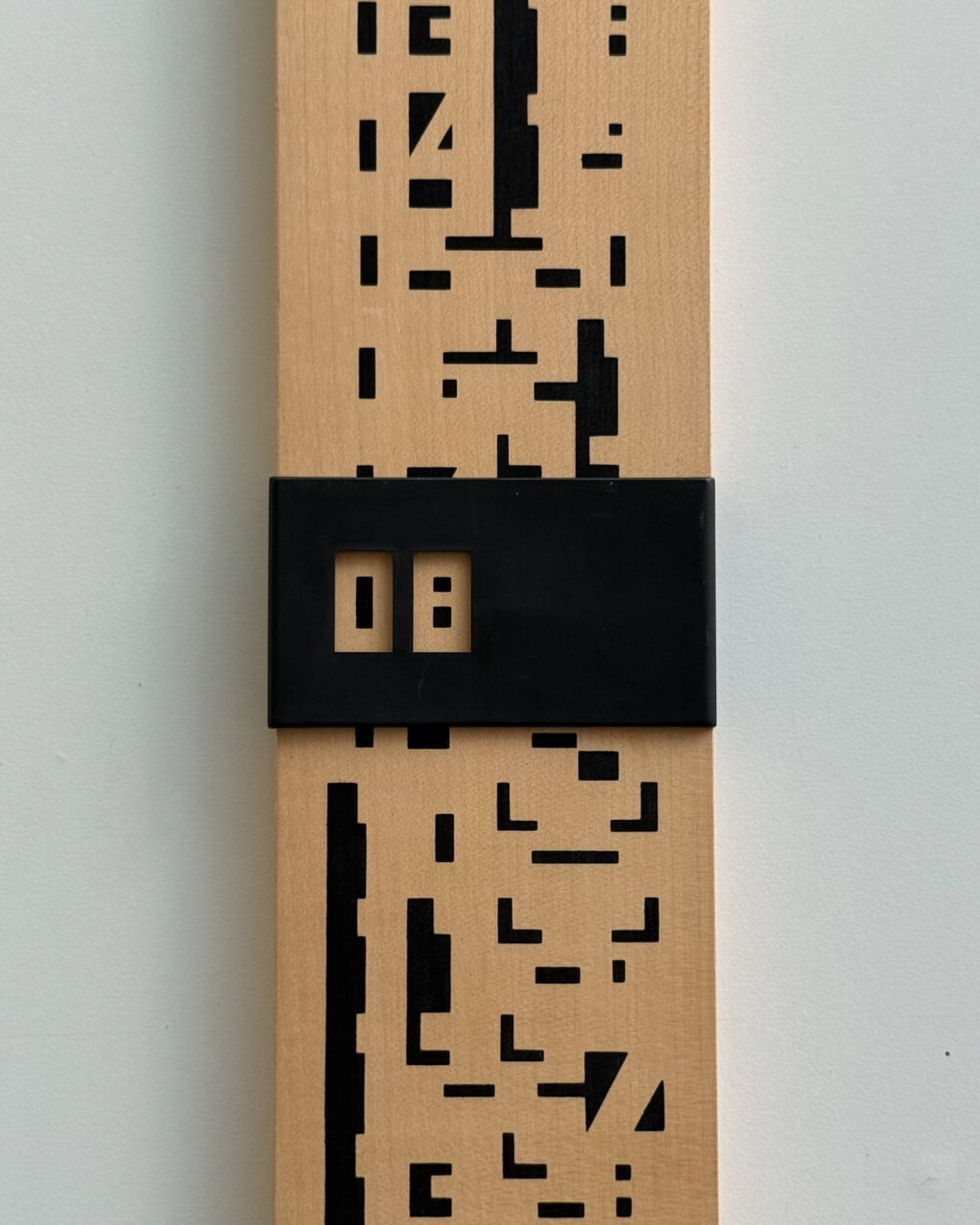
What makes this particular object so interesting is the decade it comes from. The 1970s were a sweet spot in product design, especially in France, where makers were beginning to marry natural materials like wood with the new optimism of plastic. The result was objects that felt warm and industrial at the same time, organic and modern, useful and beautiful. A wooden calendar with plastic sliders is a textbook example of that tension. It doesn’t feel like a throwback. It feels like a design decision that simply worked the first time and never needed revisiting.

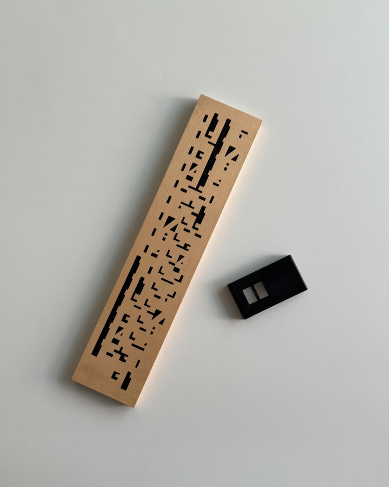
The word “perpetual” is doing a lot of heavy lifting here, and it deserves a moment. A perpetual calendar doesn’t expire. It doesn’t have a year printed on it. It covers every day and every month indefinitely, because those numbers don’t change; only the arrangement does. You can hang this on your wall and it will be just as functional in 2045 as it was in 1975. Compare that to your phone’s calendar app, which will feel dated in five years and be incompatible with something in ten. The perpetual calendar was designed with an understanding that good things don’t need to be replaced, just updated slightly, by hand, once a day.

Wertwerk is the Seoul-based shop behind this particular find, and they deserve full credit for the eye. Their name pulls from the German words for “worth” and “work,” and that philosophy runs through everything they source. They’ve built a devoted following by seeking out vintage objects that carry actual value beyond nostalgia. Their pieces sell out fast, sometimes within hours. They’re not selling aesthetics for aesthetics’ sake. They’re making a case that a well-made object from fifty years ago can do something a new one cannot: carry the evidence of its own history.

I’ll admit I’m biased toward objects that reward you for paying attention to them. The wooden perpetual calendar does exactly that. Each time you slide the date, you’re reminded that time is something you track, not something that tracks you. It’s a small distinction, but it adds up over days and months. Moving a physical date marker is categorically different from glancing at a lock screen, and not in a pretentious way. It’s just more deliberate.

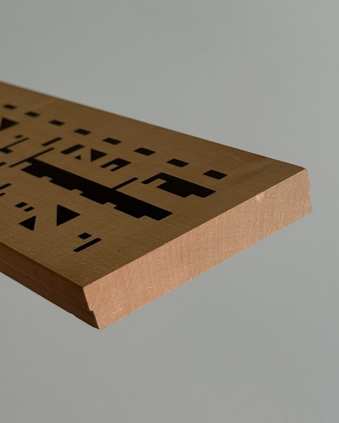
The design also photographs beautifully, which is partly why it’s gaining traction in design communities. The wood grain set against the geometric order of numbered sliders reads as both nostalgic and contemporary. It’s the kind of object that looks intentional in a space, not decorative for decoration’s sake, but genuinely considered.

If you’ve ever bought something because it made you feel a certain way before you even used it, this is that kind of object. It quietly tells anyone who notices it that you care about how things are made and how long they last. Not everyone reads a wall calendar that way. But for those who do, this one from Wertwerk is worth finding before it disappears, and based on how fast their inventory moves, that won’t take long.

The post Your Phone Has 12 Calendar Apps. None of Them Look Like This first appeared on Yanko Design.

Genji Kyoto Is a Hotel You Read Like a 1,000-Year-Old Book

Most hotels ask you to check in. Genji Kyoto asks you to pay attention. Nestled along the Kamo River in Kyoto, Japan, this 19-room boutique hotel is the kind of place that architects talk about in hushed, reverent tones. And for good reason. It was designed by Geoffrey P. Moussas of Design 1st, a New York-born, MIT-trained architect who has called Kyoto home since 1994. That detail matters more than it might seem.

Moussas didn’t fly in with a mood board and a deadline. He has spent over three decades restoring and redesigning more than 40 traditional Japanese structures: machiya townhouses, tearooms, kura storehouses, and even a 400-year-old Buddhist temple. His work has been featured in the Financial Times, CNN, and NHK, and exhibited at Kiyomizu Temple and Nijo Castle. When someone like that builds a hotel, you’re not just booking a room. You’re stepping into a lifetime of accumulated understanding.

Designer: Geoffrey P. Moussas of Design 1st

The concept behind Genji Kyoto traces back to an 11th-century Japanese novel, The Tale of Genji, widely considered one of the world’s first novels. When the design team discovered that the hotel’s site was historically tied to the story’s actual locations in Kyoto, the whole project shifted. The design moved away from a simple machiya prototype and toward the aesthetic world of the Heian period, over a thousand years ago. But Moussas wasn’t interested in imitation. His approach was to distill the spirit of Heian architecture, specifically the Shinden Zukuri style, characterized by pavilions woven through interconnected gardens, rather than recreate its surface. That distinction is everything. It’s the difference between a themed restaurant and a genuinely good one.

The guiding philosophy here is a Japanese concept called Teioku Ichinyo, which translates roughly to “building and garden are one.” Every spatial decision at Genji Kyoto flows from this idea. Gardens aren’t decorative; they’re structural. They guide movement, frame views, and carry what the Japanese call ki, the life force that animates a space. Even the small tsubo pocket gardens tucked around the guest rooms, a tradition dating back to Heian palace residences, do serious work, turning what could be a blank interior wall into a living, breathing view.

The materials are just as considered. Cedar-imprinted concrete shows up throughout the hotel, hard surfaces pressed with the warmth of wood grain, creating a tension that reads as both ancient and completely new. Large-scale washi paper panels function as architectural elements, not just decoration. Guest rooms have solid cherry wood floors, tatami mats made from natural rush, and furniture entirely handmade by Kyoto craftsmen. Jun Tomita, who handled interior design alongside Moussas, drew motifs directly from The Tale of Genji for every custom piece. And then there’s the detail I keep coming back to: during construction, a heritage water basin and a small shrine were discovered on-site. Rather than remove them, the team built the garden around them. That kind of decision tells you everything about where the priorities were.

There are 19 rooms in total, each one different. River views, city views, garden views. No two stays are the same, and that’s by design. Each room also features an original painting by a Kyoto artist, with every piece drawing on a different theme from The Tale of Genji, so even the art tells a chapter of the same story. Moussas has said he wanted guests to have a different experience every time they return, and the hotel is built to make that true. The rooftop garden and bar take it further still, offering panoramic views that make the hotel feel like it belongs to the entire city, not just its footprint.

Genji Kyoto’s real achievement isn’t any single detail. It’s the commitment to depth over spectacle. A lot of contemporary design is about the first impression, the photograph, the wow moment. This hotel asks for more time than that. It reveals itself in layers, the way a good book does. You have to slow down. You have to look twice. That’s a rare ask in hospitality. And it’s a rarer thing to pull off.

The post Genji Kyoto Is a Hotel You Read Like a 1,000-Year-Old Book first appeared on Yanko Design.

BằNG Just Dropped a Lamp That Looks Like a Living Cloud

Most lamps exist to be useful. A few exist to be beautiful. Almost none manage to feel like they’ve captured an actual atmospheric phenomenon and suspended it inside a room. BằNG’s Dreamy Lớp lands very firmly in that last category, and I haven’t been able to stop thinking about it since I first saw it.

BằNG is a Vietnamese furniture and lighting brand, and Dreamy Lớp is the newest chapter of its already award-winning Lớp sculptural lighting collection. The collection was conceived by co-founder and creative director Thomas Bình-Minh Vincent around a deceptively simple idea: a sphere floating within layers. It sounds almost zen when you say it out loud, and the visual result is exactly that kind of quiet, can’t-look-away quality that makes you realize how rarely furniture actually earns your attention. The Dreamy series is the latest evolution of that original concept, pushing it further with new material choices and a striking new visual language.

Designer: BằNG

The Dreamy iteration introduces dichroic acrylic into the mix, and that single material choice changes everything. The lamp is built from precise layers of translucent acrylic sheets separated by polished inox spacers, creating consistent gaps that give the piece its signature rhythm and depth. At the center sits a matte opal glass sphere. When light hits the dichroic acrylic, the colors shift depending on your angle and the ambient light around it. One moment it reads as a cool blue. Move slightly and it blooms into warm gold or a soft green. The lamp isn’t just emitting light, it’s refracting it, filtering it, playing with it in a way that feels almost alive.

The design reference point is cloud iridescence, that rare atmospheric effect where sunlight diffracts through high-altitude ice crystals or water droplets and scatters into shifting, painterly color. It’s the kind of thing you catch in the sky for thirty seconds before it’s gone, and you’re left wondering if anyone else saw it. Vincent’s goal was to translate that fleeting, almost-too-beautiful-to-be-real quality into a controlled lighting object you can actually live with. From what I can see, it works. The lamp doesn’t try to replicate nature literally. It just borrows its logic, and that restraint is where the real design thinking lives.

Five design awards say other people agree. Dreamy Lớp carries recognition from the Archiproducts Design Award, the German Design Award, and MoMA’s historic Prize Design Award, among others. That’s not a small list. Awards in design can sometimes feel like insider industry congratulations, a round of applause from people who already understand the language, but in this case the recognition reflects something genuinely visible in the object. The craftsmanship is precise. The concept is tight. The execution doesn’t overcomplicate itself, which is much harder to pull off than it looks.

Practicality is worth noting too, because beautiful objects that are impossible to actually live with are a particular kind of frustrating. Dreamy Lớp was designed for multiple orientations and scales, meaning it can adapt to homes, cafés, and galleries without demanding that any of them rearrange themselves around it. It’s also repairable, which matters more than most lighting brands want to discuss. The entire piece is rooted in BằNG’s workshop-driven philosophy, where form comes directly from materials and fabrication processes rather than starting with a slick rendering and working backward.

What I keep coming back to is how rare it is for a lamp to feel like a genuine conversation piece without trying too hard to be one. Dreamy Lớp has the confidence of something that knows exactly what it is. It doesn’t need to be loud. The shifting color does the talking on its own, casting unexpected shadows in natural sunlight and projecting soft hues into whatever room it inhabits. It turns a corner of your home into something slightly otherworldly, and it does it without ever announcing itself. Good design tends to make you feel something before you understand why. This lamp is exactly that.

The post BằNG Just Dropped a Lamp That Looks Like a Living Cloud first appeared on Yanko Design.

BEAMS Just Turned a $60 Floppy Disk Into Your Next Wallet

If you grew up in the ’90s or early 2000s, the floppy disk was basically part of your personality. You carried those little squares everywhere. You stressed over how many kilobytes were left on them. You wrote your name on the paper label with a Sharpie because it was, obviously, yours. And if you lost one that contains important information and documents, then you might as well say goodbye to it.

Now, BEAMS and Nik Bentel Studio have gone ahead and turned that deeply specific nostalgia into a leather wallet, and I genuinely cannot decide if that’s the most ridiculous thing I’ve heard all week or the most inspired. It’s probably both, and that’s exactly the point.

Designers: BEAMS x Nik Bentel Studio

The Floppy Disk Wallet is, in the most literal sense, a wallet shaped like a 3.5-inch floppy disk. The Brooklyn-based Nik Bentel Studio took the original form apart, component by component, and restructured it in leather, modifying the actual design by only 5%. That means the square shape is intact, the label window is still there, and the hardware detailing reads exactly like the real thing. Except instead of storing a few hundred kilobytes of data, it stores your cash, cards, and whatever else you can fit into its single interior compartment. The metal door lifts off and doubles as a money clip, which is either the cleverest detail of the year or just the most on-brand way possible to carry loose bills. Probably both, again.

It comes in black, beige, and orange. At $60 a piece, it’s priced like a thoughtful design object rather than a novelty tchotchke you’d find at a museum gift shop. That distinction matters to me. This wallet sits in that rare category of things that are both genuinely funny and genuinely well-made, and it pulls that balance off without seeming like it’s trying too hard.

What makes the whole thing more interesting than the obvious nostalgia play is who made it. Nik Bentel Studio isn’t a brand that slaps retro imagery on products and calls it a day. Bentel has described his work as storytelling through objects, and that philosophy shows up consistently across everything his studio releases. He’s the same designer who turned a Barilla pasta box into a handbag, reimagined the Mendl’s patisserie box from Wes Anderson’s Grand Budapest Hotel as a carry-all, and built a purse that’s actually a remote-controlled car. Every piece has a concept baked into it from the start, not layered on afterward for aesthetics. The floppy disk wallet isn’t just fun to look at. It’s a meditation on how beautifully designed everyday objects can be when they’re shaped entirely by their constraints.

The BEAMS partnership amplifies that story in a way that feels earned. The Japanese retailer has long operated at the intersection of fashion, culture, and considered design through its bPr line. Bringing Nik Bentel Studio into that fold doesn’t feel like a brand collab for collab’s sake. It feels like two creative sensibilities that already speak the same language finding a natural reason to collaborate.

I’ll be honest: I have complicated feelings about nostalgia as a design strategy. It gets used so lazily and so often that it’s hard not to be skeptical when something leans into it. Cassette tapes on tote bags. Pixelated graphics on hoodies. That kind of thing loses its meaning fast. But the Floppy Disk Wallet sidesteps that trap because it isn’t just referencing an old object. It is the object, rebuilt in a better material. The nostalgia isn’t decorative; it’s structural. You’re not looking at a picture of a floppy disk. You’re holding one, in your pocket, every single day.

Whether you’ll use it as your primary wallet is a separate conversation. It’s compact by design, and minimal in terms of storage. If you carry a thick stack of loyalty cards and old receipts, this isn’t for you. But for someone who keeps things lean and wants their everyday carry to actually say something about them, this one says quite a lot. The black and orange colorways are already sold out on the studio’s site. That probably tells you everything you need to know.

The post BEAMS Just Turned a $60 Floppy Disk Into Your Next Wallet first appeared on Yanko Design.

A Stool With Six Legs Just Made Four Feel Outdated

The humble stool has barely changed in centuries. Four legs, a flat seat, done. It exists in every cafe, classroom, kitchen island, and co-working space on the planet, reliably doing its one job and nothing else. So when a designer comes along and asks what happens if you add just one more leg, the answer should probably be “nothing interesting.” And yet here we are, talking about SQOOL.

SQOOL is a 2025 personal project by Liam de la Bedoyere of Bored Eye Design, a UK-based independent studio that describes itself as creating work that’s anything but boring. At first glance, the stool reads almost like a creature. Six curved legs splayed outward with little rounded feet, a compact circular seat on top, and that one rogue arm reaching upward and curling into a hook. It looks like a cheerful yellow squid that decided to get into the furniture business, and I mean that entirely as a compliment. The photographs make it look alive. Depending on the angle, it shifts between dog, bug, and some friendly unnamed species you’d encounter in an animated film.

Designer: Liam de la Bedoyere (Bored Eye Design)

The concept is deceptively simple. Five legs provide complete stability, the same geometric logic you’d get from a traditional four-legged stool, just with an added sense of security and visual rhythm. The sixth leg is the interesting one. Freed from any load-bearing duty, it becomes something else entirely: a handle for carrying the stool, a hook for a bag or jacket, a rest for your coffee cup, a cradle for a book. The images show it doing all of these things casually, as if the stool has always known it could.

What makes SQOOL feel genuinely considered rather than just whimsical is how that extra function was thought through. The sixth arm doesn’t just stick out awkwardly. It curves deliberately, creating a shape that invites the hand to reach for it. People apparently do this instinctively, discovering its utility through touch rather than any printed instruction. That kind of design, where the object teaches you how to use it without saying a word, is harder to pull off than it looks.

The stacking detail is also worth noting. Getting six legs to nest cleanly on top of each other is a real engineering puzzle, and de la Bedoyere solved it by shaping each leg with enough taper and spacing to allow the stools to slide into each other gracefully. Seen stacked in a column, they look spectacular. Like a sculpture you’d walk past in a gallery and immediately photograph. Which means SQOOL is doing double duty even when no one is sitting on it.

The color choices lean fully into the stool’s playful register. The saturated yellow is hard to miss, and a soft lavender variant appears in some renders, equally confident. These aren’t accent tones chosen to recede politely into a neutral interior. They’re chosen to assert presence. SQOOL isn’t trying to disappear into a corner. It wants to be part of the room, part of the conversation, maybe even part of your grid. That’s not a criticism at all. Personality in furniture is genuinely underrated, and design objects that commit fully to their own character tend to age better than the ones trying to be neutral.

Bored Eye Design’s portfolio shows a consistent interest in objects that are curious and approachable, things that reward a second look and feel good to handle. SQOOL fits neatly into that sensibility. It’s playful without being infantile, practical without being dull, and memorable without leaning on novelty for novelty’s sake. The name alone, a blend of “stool” and something else entirely, already tells you what kind of designer de la Bedoyere is.

The question with any concept project is always whether it would survive production. I think SQOOL could. The logic holds up. The form has already been thought through with stackability in mind, which is usually where playful concepts fall apart. A stool this considered, this expressive, and this genuinely useful deserves more than a render portfolio. It deserves a production run.

The post A Stool With Six Legs Just Made Four Feel Outdated first appeared on Yanko Design.

Alessi Just Built an Espresso Maker Shaped Like a Screw

The trash or scrapyard is probably the last place you would look for inspiration when trying to come up with a design for food or drink-related products. But apparently, the new Vite espresso maker from Alessi did just that. Designer Philippe Malouin used his Scrapyard Works process to develop the concept for this coffee maker, drawing inspiration from an unexpected item: the screw. In fact, this approach is completely unprecedented in the history of Alessi, making the Vite one of the most conceptually bold things the brand has released in years.

Vite literally means “screw” in Italian, and the coffee maker looks exactly like what it’s named after. It is apparently what caught Malouin’s attention as he sifted through metal fragments, pieces that could be brought to new life through recomposition and reinterpretation. What you get is a coffee maker with a distinct industrial feel that can still deliver one of the best cups of fresh espresso you can get from a stovetop brewer.

Designer: Philippe Malouin

London-based industrial designer Philippe Malouin is no stranger to turning bold concepts into beautifully functional objects. Born in Laval in 1982, he founded his studio in 2008 and has since built a reputation for work spanning furniture, lighting, objects, and installations. He has taught at prestigious institutions like the Royal College of Art in London and ECAL in Lausanne, earning international recognition through awards from Wallpaper*, Archiproducts, and Dezeen. With the Vite, he brings that same thoughtful, concept-driven approach to your morning coffee ritual, and honestly, your kitchen counter will never look the same.

The Vite is made from die-cast aluminum, which gives your espresso a rich, rounded, full-bodied flavor. That choice of material is not just aesthetic, as aluminum has long been favored in traditional Italian coffee making for exactly this reason. The boiler is shaped to echo the form of a screw, a nod not only to the name but also to the physical gesture of twisting or screwing the two halves of the device together to brew your perfect cup. It’s a rare case where the name, the form, and the function all tell exactly the same story.

The small flared base of the boiler mirrors the head of a screw, keeping the theme consistent from top to bottom. This section is crafted from thermoplastic resin, and the color variants were actually sampled directly from the machinery and tools inside the Alessi workshop, meaning what sits on your stovetop is literally a piece of Alessi’s factory floor translated into design. Available shades include Sage Green and Brown, among other workshop-inspired options. It’s a small detail, but it’s exactly the kind of thoughtful decision that Alessi collectors tend to fall in love with. If you’d prefer a cleaner, more minimalist look, there’s also an exclusive natural aluminum version available only on alessi.com and in select Alessi stores.

Beyond its striking looks, the Vite is impressively practical. It brews three cups of espresso at a time and is compatible with all types of cooktops, including induction. That’s a major win for anyone who has had to retire a beloved moka pot simply because of a kitchen upgrade. At just 17 cm tall and 10 cm in diameter, it’s compact enough to tuck away but distinctive enough that you’ll probably want to leave it on permanent display.

And that’s really what sets the Vite apart in a crowded market of coffee makers: it’s as much a collectible as it is an appliance. Alessi has always walked the line between industrial design and art, and the Vite is a near-perfect example of that philosophy in action. Whether you’re a design collector, a devoted espresso lover, or simply someone who believes your kitchen deserves beautiful things, this screw-shaped little brewer is worth every bit of the attention it’s getting. Sometimes, the best ideas really do come from the scrapyard, and this one just happens to make a really great cup of coffee too.

The post Alessi Just Built an Espresso Maker Shaped Like a Screw first appeared on Yanko Design.

The Anello Chair Is 3 Design Eras in One Piece of Wood

The Anello chair by Kiritsu Mokko does not shout for attention. It sits quietly with a circular backrest that seems to float around a sculpted wooden seat, looking like a piece slightly out of time. Not in a dated way. More like it arrived from a place where three very different design traditions decided, once and for all, to stop competing and just become one thing.

Kiritsu Mokko has been making furniture in Shizuoka Prefecture, Japan, since 1949. That is a long time to study wood. And the Anello, which loosely translates to “ring” in Italian, is a direct expression of that accumulated knowledge. The circular back is not a simple ring slapped onto a base. It is constructed by carefully joining pieces of solid wood, with the grain matched so deliberately that the joints nearly disappear into the form. The result is a curve that looks almost impossible in wood, as though someone forgot to tell the material what it could and could not do.

Designer: Kiritsu Mokko

The design language is genuinely hard to place, and I think that is the entire point. From certain angles, the Anello looks like it belongs in a 1960s living room, all rounded forms and quiet futurism, the kind of chair Kubrick might have placed in a scene just for its shape. From another angle, it reads as straightforwardly Danish Modern, with clean proportions, warm wood tones, and that particular kind of seated elegance that Scandinavian design spent decades perfecting. And then you look at the joinery, the patience baked into every curve, and it becomes unmistakably Japanese. Not Japanese in a superficial, “inspired by” way, but in the deeper sense of a culture that treats materials with a respect that borders on reverence.

The seat swivels. That detail is easy to miss because Kiritsu Mokko was careful to hide the mechanism, keeping the chair’s silhouette completely uninterrupted. No visible hardware, no break in the form. You can rotate in place and the chair still reads as a single, continuous object. That kind of restraint is its own design philosophy, the idea that if a feature does not serve the visual integrity of a piece, it should be invisible. This is not a new concept in Japanese design, but seeing it executed this cleanly is always a reminder of how much the rest of the furniture world is leaving on the table.

It comes in walnut and oak, which matters more than it might seem. These are not just material options. They are two entirely different emotional experiences of the same chair. The walnut version has a richness that pulls the Anello toward something more intimate and sculptural. The oak reads lighter, more architectural, almost Scandinavian by default. Either way, the solid wood construction means this is not a piece designed to be replaced in five years. It is made with the assumption that you will still have it in thirty.

I will admit that the Anello is the kind of chair that makes me think about how little faith the mainstream furniture market has in its customers. Most of what fills showrooms today operates on a kind of planned impermanence, pieces designed to look good in a photograph before you buy them and mediocre in a room after you do. The Anello is the opposite of that. It is a chair that probably photographs well but is genuinely intended to be lived with.

A piece of furniture that synthesizes Space Age optimism, Scandinavian warmth, and Japanese precision without feeling like a design school exercise is genuinely rare. The Anello pulls it off not because it was trying to be three things at once, but because Kiritsu Mokko has been doing this long enough to trust the materials to speak for themselves.

The post The Anello Chair Is 3 Design Eras in One Piece of Wood first appeared on Yanko Design.

The French Tiny House That Put the Bedroom on the Ground Floor

The tiny house world has a habit of recycling the same design logic: loft bedroom up top, living area below, ladder in between. It works, and nobody really argues with it. But every once in a while, a designer asks “what if we did this completely differently?” and the result is something you can’t stop thinking about.

That’s the Véronique, a compact towable home crafted by France’s Lou Tiny House, and its most quietly radical choice is this: the bedroom is on the ground floor, and the loft is the living space. Upside down by tiny house convention, but somehow, on second thought, completely obvious.

Designer: Lou Tiny House

At just 5.80 meters (19 feet) long and set on a double-axle trailer, the Véronique is small by any standard, tiny house included. It’s clad in spruce wood on the outside and topped with a metal roof, which gives it a clean, almost Scandinavian edge despite its French origins. The whole thing was built for a musician named Véronique, yes, the house is named after its owner, who planned to park it in the mountain region of Cantal, a place known more for rough winters than beachside ease. Lou Tiny House, whose workshop sits at the foothills of the Pyrenees, knows that climate well, and it shows in how thoughtfully the home was built to handle it, including a passive heating system designed to keep things comfortable without running up an energy bill.

The decision to flip the layout isn’t just an aesthetic quirk, it’s a practical one. In a conventional tiny house, climbing into a loft bedroom is fine when you’re in your twenties and don’t mind a ladder at midnight. But it’s a different story when the space needs to work long-term, or when you simply want to get in and out of bed like a normal person. Putting the bedroom on the ground floor solves that problem entirely. The bedroom gets a double bed, a generous row of windows for light and air, and a sense of calm that feels genuinely restful rather than squeezed-in.

The loft, meanwhile, becomes the social hub: a sofa, a coffee table, some greenery, and enough breathing room to feel like a real living space rather than an afterthought. It’s the kind of setup that could just as easily serve as a reading nook or a quiet place to work. The design also handles storage needs through the custom loft layout, which matters more than ever now that so many people are working from wherever they happen to be parked.

I’ll admit I have a personal bias toward tiny house designs that treat the bedroom as a sanctuary rather than a sleeping shelf. The climbing-a-ladder-in-the-dark routine has always felt more like a dorm room compromise than a deliberate design choice, and the Véronique is a refreshing pushback against that. The upside-down layout reframes the whole idea of what “small” can feel like. It doesn’t feel like a sacrifice. It feels considered.

Lou Tiny House has built a reputation for custom, handcrafted interiors that lean into natural materials and honest craftsmanship, and the Véronique carries that aesthetic throughout. The warm wood interior, the raw textures, the way everything seems to have been placed with intention rather than squeezed in as an afterthought: it all reads as deeply French in the best possible way. There’s a quiet refusal to apologize for the size of the space, and instead a firm insistence that good design can make even 19 feet feel generous.

The tiny house movement has always been as much about philosophy as it is about square footage. The Véronique fits that spirit, but it brings something extra: a willingness to question conventions that have become so standard in the space that most people don’t even realize they’re conventions anymore. It was built for one specific musician in one specific climate, and that specificity is exactly what makes it feel universal. Good design usually works that way.

The post The French Tiny House That Put the Bedroom on the Ground Floor first appeared on Yanko Design.

Konel Just Built a Bag That Slows Your Heart Rate While You Wear It

We are all carrying more than just our belongings these days. The mental load, the relentless calendar, the low-grade hum of stress that follows you from your morning commute to your desk to your couch at night. Wearable tech was supposed to help with that. Instead, most of it just gives you more numbers to feel bad about, more data to scroll through while your cortisol levels do exactly what they want anyway.

That’s what makes the Pulse Pack, a translucent wearable bag by Japanese creative company Konel, feel like such a refreshing left turn. It debuted at Milan Design Week 2026, and the concept alone is worth pausing on. The bag measures your heartbeat in real time and then responds with a physical pulse of its own, timed at exactly half the frequency of what it detects. When your heart is racing, it hums back at you slowly and steadily. And over time, your body follows.

Designer: Konel

The science behind it is called entrainment, the process by which the nervous system synchronizes with a steady external rhythm when that rhythm is slower and more regular than its own. You’ve probably experienced it without realizing it. A slow drumbeat at a concert that settles you into your seat. A rocking motion on a long train ride. A repeated vibration against your palm. These things pull you down, not because they distract you from stress, but because the body literally adjusts its own pace to match them. Konel built the Pulse Pack around that mechanism entirely, and it’s a smarter premise than most wellness gadgets can claim.

What makes the design clever, beyond the concept itself, is where the haptic pulse actually lands on the body. Most wearable devices place their feedback at the wrist or fingertips, the places we are constantly paying attention to. The Pulse Pack positions its pulse against the spine and shoulder blades instead, areas that are far less consciously monitored. That feels intentional in the best possible way. Konel suggests that contact with the back is less intrusive and more grounding than stimulation at the extremities, and that logic holds up when you think about how a hand placed firmly on someone’s back can calm them in a way that a tap on the wrist rarely does.

Konel is also the company behind the ZZZN, a puffer jacket that doubles as a sleeping system with a built-in headpiece and red light therapy, designed for napping pretty much anywhere. So if you’re sensing a theme, you’re reading it correctly. This is a studio genuinely interested in designing objects that support the body’s quieter needs: rest, calm, recovery, rather than feeding the dopamine loop that most consumer tech seems structurally incapable of resisting. It’s an interesting design niche, and a necessary one.

The Pulse Pack is still a prototype. The version on display at Via Palermo 11 during Milan Design Week is not something you can order yet, and it’s fair to wonder how the technology translates into an actual production piece. The translucent material is striking in photos, beautiful and a little otherworldly, but bags live a rough life. The gap between a design week prototype and a durable everyday object is real and wide, and that’s a challenge Konel will have to solve if this ever ships.

Still, I keep coming back to the core premise. We have spent years watching tech companies try to solve stress by throwing more information at us. More graphs, more scores, more nudges, more optimizations. The Pulse Pack takes the opposite approach completely. It doesn’t tell you anything. It doesn’t suggest anything. It just slows itself down and quietly invites your body to do the same. Whether or not the Pulse Pack ever makes it to your back, it shifts the conversation about what wearable technology could actually be doing. Not louder. Not smarter. Just calmer. That’s a design philosophy I’d like to see a lot more studios take seriously.

The post Konel Just Built a Bag That Slows Your Heart Rate While You Wear It first appeared on Yanko Design.

The Tray That Knows You Eat in Bed

Most of us don’t eat at the dining table anymore. Not really. The pandemic accelerated something that was already quietly happening: meals migrating from the kitchen to the living room, the bedroom, the desk, the floor. We eat while watching something, while scrolling something, while half-working and half-resting. The dining table still exists, sure, but as a concept, it has become more aspirational than actual.

And yet, the tools we use to manage the air around our food haven’t moved with us. Range hoods are bolted to the ceiling above a stove. Portable air purifiers sit in corners, doing their best from across the room. Even the newer tabletop options ask you to position them just right, or carry them separately, adding friction to something that should feel effortless. For a culture that has fully embraced eating anywhere, the air solutions available to us are still very much designed for eating in one place.

Designer: Junho Han

Junho Han’s Notrace:Null addresses this with a level of clarity that makes you wonder why no one thought of it sooner. The concept is simple: instead of building a separate device that you need to carry alongside your food, the air purification system is built directly into the tray. You pick up your food, and the solution comes with it. No extra steps, no reconfiguration, no reminder to bring the device. The tray is the device.

Visually, Notrace:Null makes almost no noise about what it does. The design is quiet and off-white, with a flat surface that opens to reveal an internal filter system underneath. A small button sits flush against the side, the only visible sign that this tray does anything beyond hold a bowl of ramen. The fine venting grid along the underside is equally understated. That restraint feels deliberate, and it is the right call. The best-designed things tend to look like they were always supposed to exist, and Notrace:Null has that quality.

What strikes me about this concept is that it doesn’t try to change behavior. It slots into the routine that already exists. You grab the tray, put your food on it, carry it to wherever you’ve decided to eat tonight, and that’s it. The air filtration happens as a byproduct of your usual movement. Han describes this as “the most natural solution,” and the framing holds up. Good design doesn’t demand that users adapt to it. It adapts to users instead.

The project also makes a quiet cultural observation worth sitting with. The rise of single-person households, convenience foods, and personalized streaming content has fundamentally changed where and how people eat. We don’t just eat in the kitchen anymore. We eat throughout the entire home, and that shift has real consequences for air quality. Food odors that once stayed contained now travel freely. Bedrooms carry the memory of last night’s dinner. Living rooms hold the ghost of lunch. Notrace:Null is designed around this reality rather than around the home we’re told we should have.

It’s still a concept, and that’s worth noting. As a Behance project, Notrace:Null exists in that productive space between idea and product, where the thinking is fully formed but the execution remains hypothetical. The concept feels mature enough to be producible, though. The form factor is practical, the use case is real, and the need is clearly there. If it ever makes it to market, it would fill a gap in the air quality space that nobody has managed to articulate this well before.

Design concepts like this remind me why speculative design matters. Not everything needs to ship immediately to be valuable. Sometimes a well-considered idea just needs to exist, to put the question on the table and make it harder to ignore. Notrace:Null asks a simple question: if how we eat has changed, shouldn’t the tools that support it change too? The answer is obvious. The solution, it turns out, was hiding in a tray.

The post The Tray That Knows You Eat in Bed first appeared on Yanko Design.