If you’ve ever owned an air purifier, you know the drill. You unbox it, it works great, and then you spend the next three years sliding it from corner to corner because no matter where it lands, it looks completely out of place. It hums quietly beside your bookshelf looking vaguely medical. It sits in your bedroom like it belongs in a waiting room. The technology is fine. The design? Almost always an afterthought.
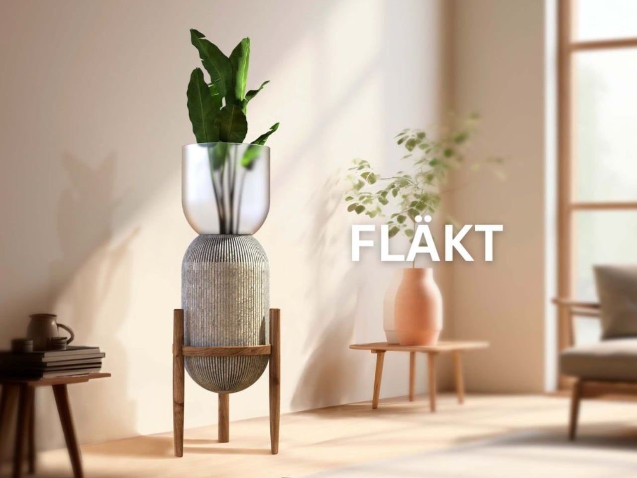
That’s what makes Fläkt, designed by Laura Chaves at the Savannah College of Art and Design and a winner at the 2025 European Product Design Award, feel like such a breath of fresh air (pun very much intended). It approaches air purification not as an appliance problem to solve, but as a living space problem, and that distinction completely changes the result.
Designer: Laura Chaves
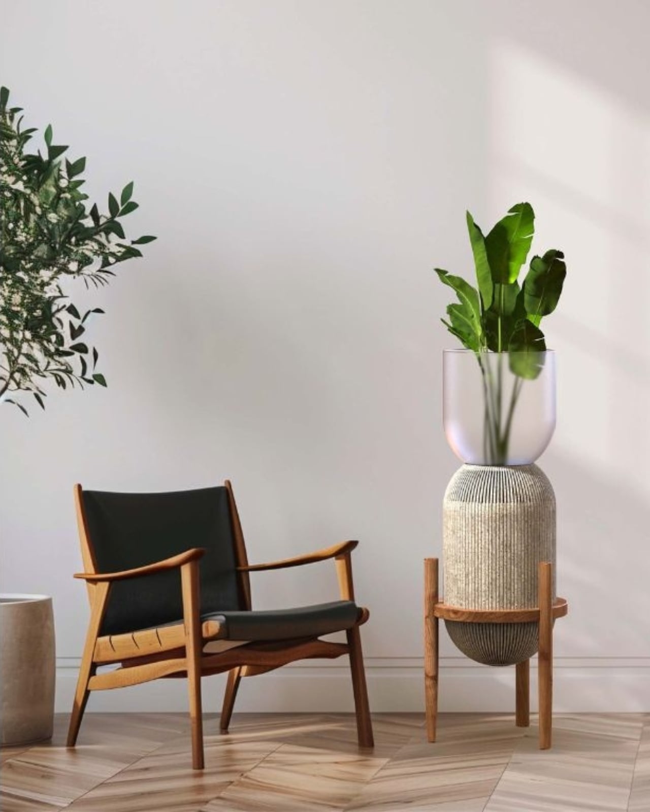
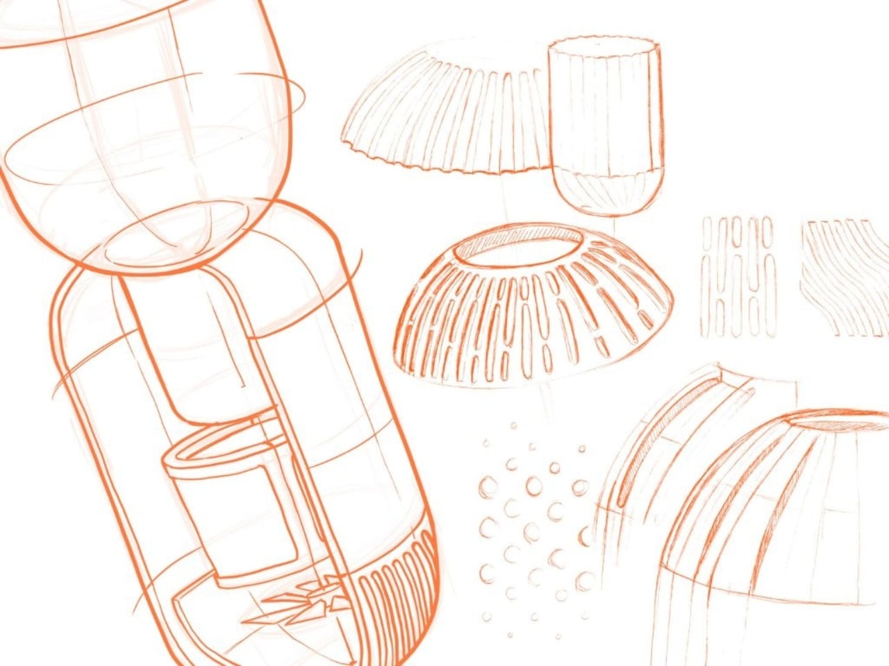
The first thing you notice is that it doesn’t look like an air purifier at all. It looks like a considered piece of furniture. The structure sits on a handmade walnut elevated stand, the kind of thing you’d see cradling a ceramic vessel in a curated Scandinavian living room. The body is encased in geopolymer concrete, a lightweight, sustainable alternative to traditional concrete, which gives it that raw, tactile quality that’s very much at home in contemporary interiors. And perched at the top is a smooth, translucent sandblasted glass vase holding a live air-purifying plant. It’s an elegant full-circle idea: the machine that cleans your air is literally growing something that cleans your air.
That layering of concept and material is the kind of design thinking that deserves real attention. Chaves didn’t just dress up a functional product and call it a day. The form, the materials, and the purpose are all pulling in the same direction, and you can feel that intentionality in every part of the object. Geopolymer concrete instead of plastic. Walnut instead of injection-molded legs. A glass vase that holds a living element rather than a decorative panel that hides the mechanics.
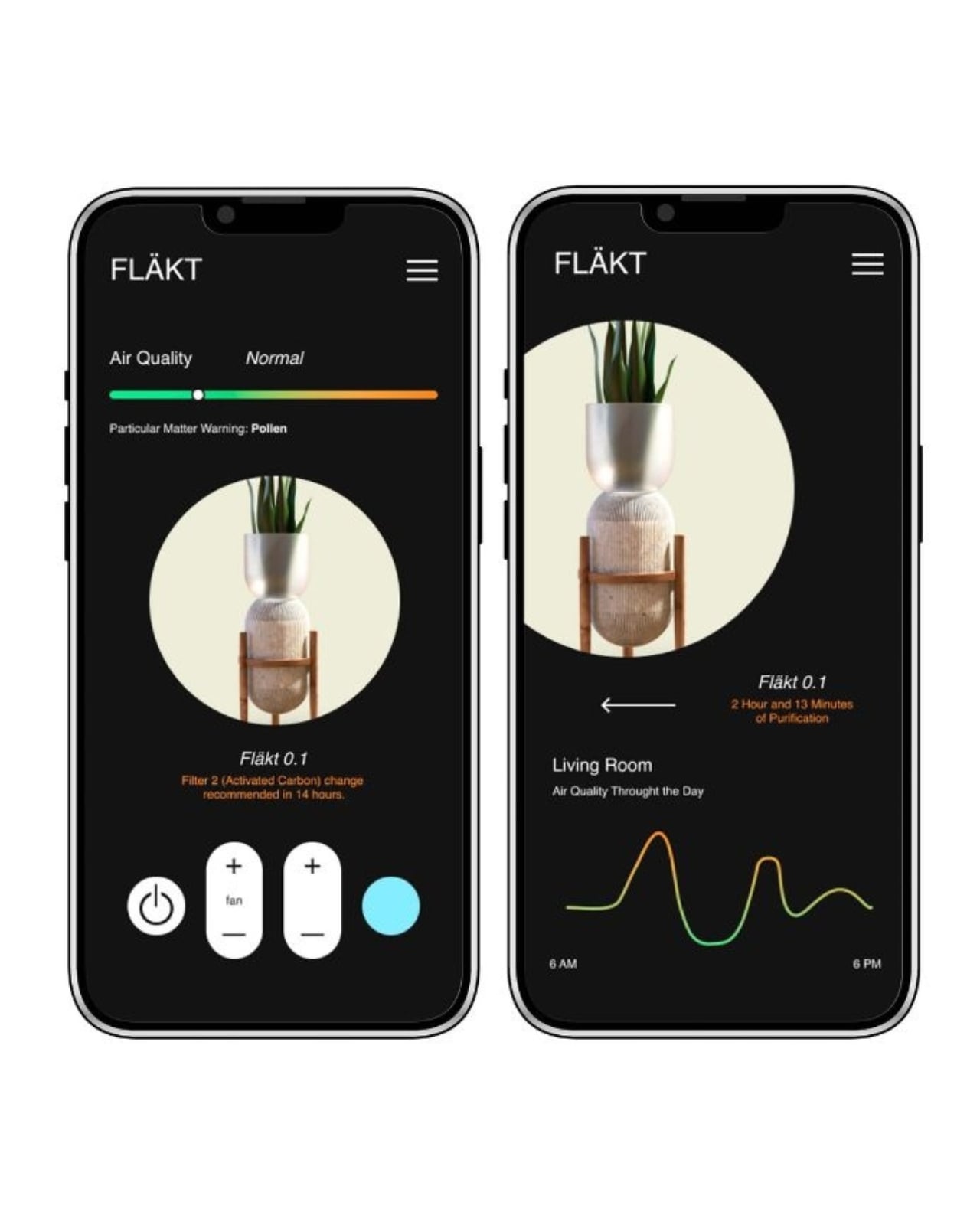
The companion app extends that same level of thoughtfulness into how you actually use it. Fläkt monitors air quality around the clock and activates autonomously when it detects pollutants or particulate matter, whether that’s pollen, dust, or anything else drifting through your space. The app surfaces this data clearly, tracking air quality throughout the day in clean, readable graphs, with timely notifications for filter changes. It’s the kind of transparency that most smart home products promise and rarely deliver with this much clarity. You’re not just handed a number and left to guess what it means. You’re given context, and that matters.
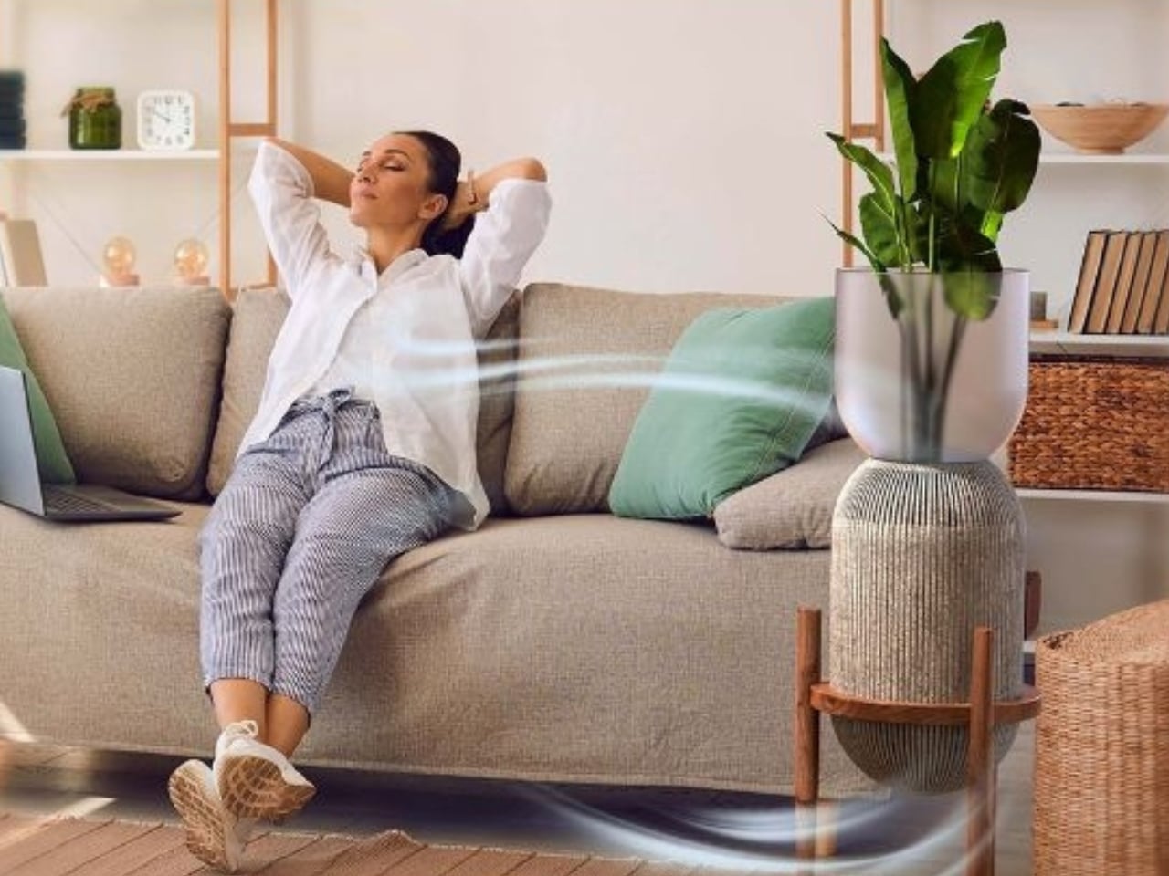
My honest take is that the air purifier category has been coasting on function alone for too long. We accept ugly hardware in our homes because we’ve been told utility and beauty are separate concerns, that you pick one or the other. Fläkt pushes back against that logic, and it does so without feeling precious or trying too hard. The design is grounded and warm, not performative. It belongs in a real room with real furniture and real life happening around it.
The decision to incorporate a live plant isn’t just a styling choice, either. It’s a statement about how design can reconnect us to something organic in spaces increasingly filled with screens and synthetic materials. A quiet confidence runs through that idea, and it makes Fläkt feel less like a tech product and more like a living object.
Whether or not Fläkt makes it to full production, it already does something useful: it raises the bar for what air purifiers are allowed to be. For a design that came out of a student project, that’s not a small thing. It’s the kind of work that tends to show up in mood boards before it shows up in stores, and that’s usually a pretty good sign.
The post Fläkt Just Redesigned the Air Purifier as Furniture first appeared on Yanko Design.