This Bedside Lamp Remembers Everything You Forget at 6 AM

We’ve all been there. You’re running late, grab your keys, rush out the door, and three blocks later realize your phone is still sitting on the nightstand. Or maybe you left every light in your apartment blazing because your brain was already at work before your body made it out the door.

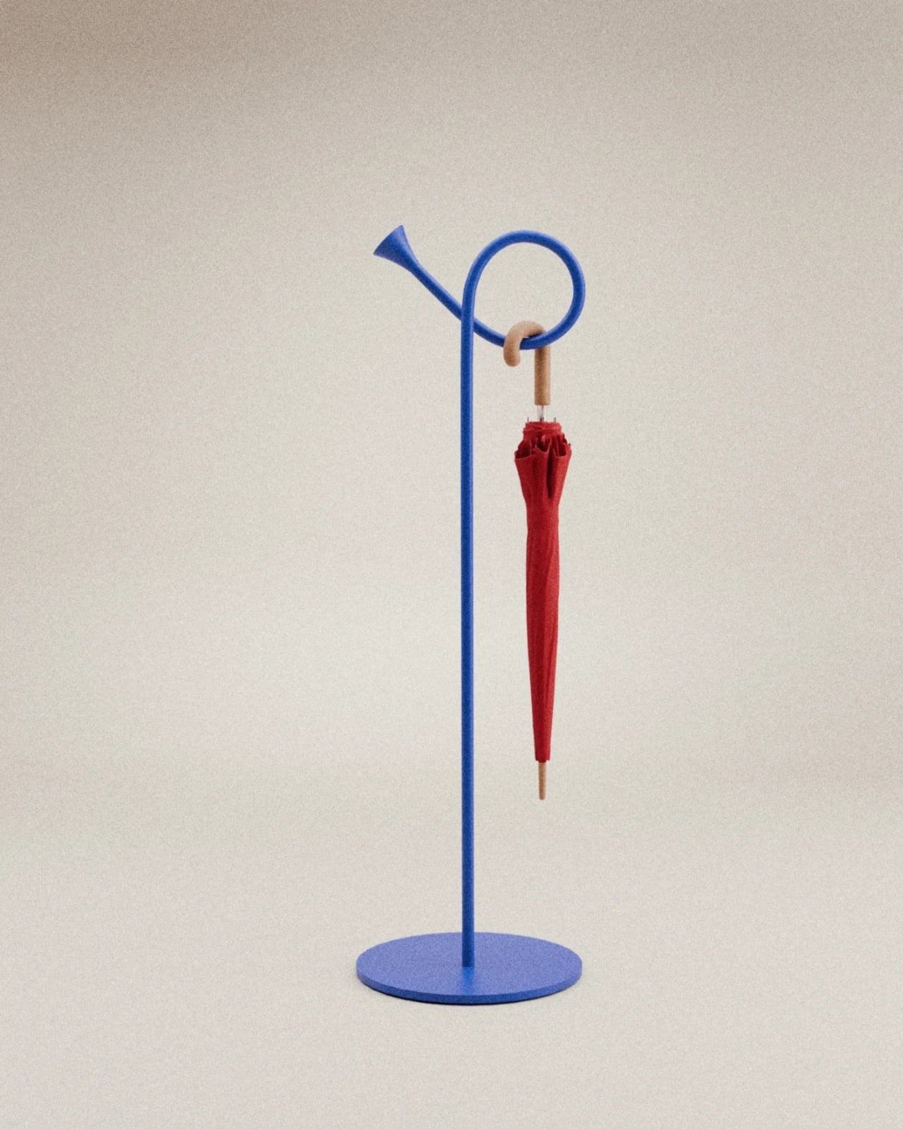
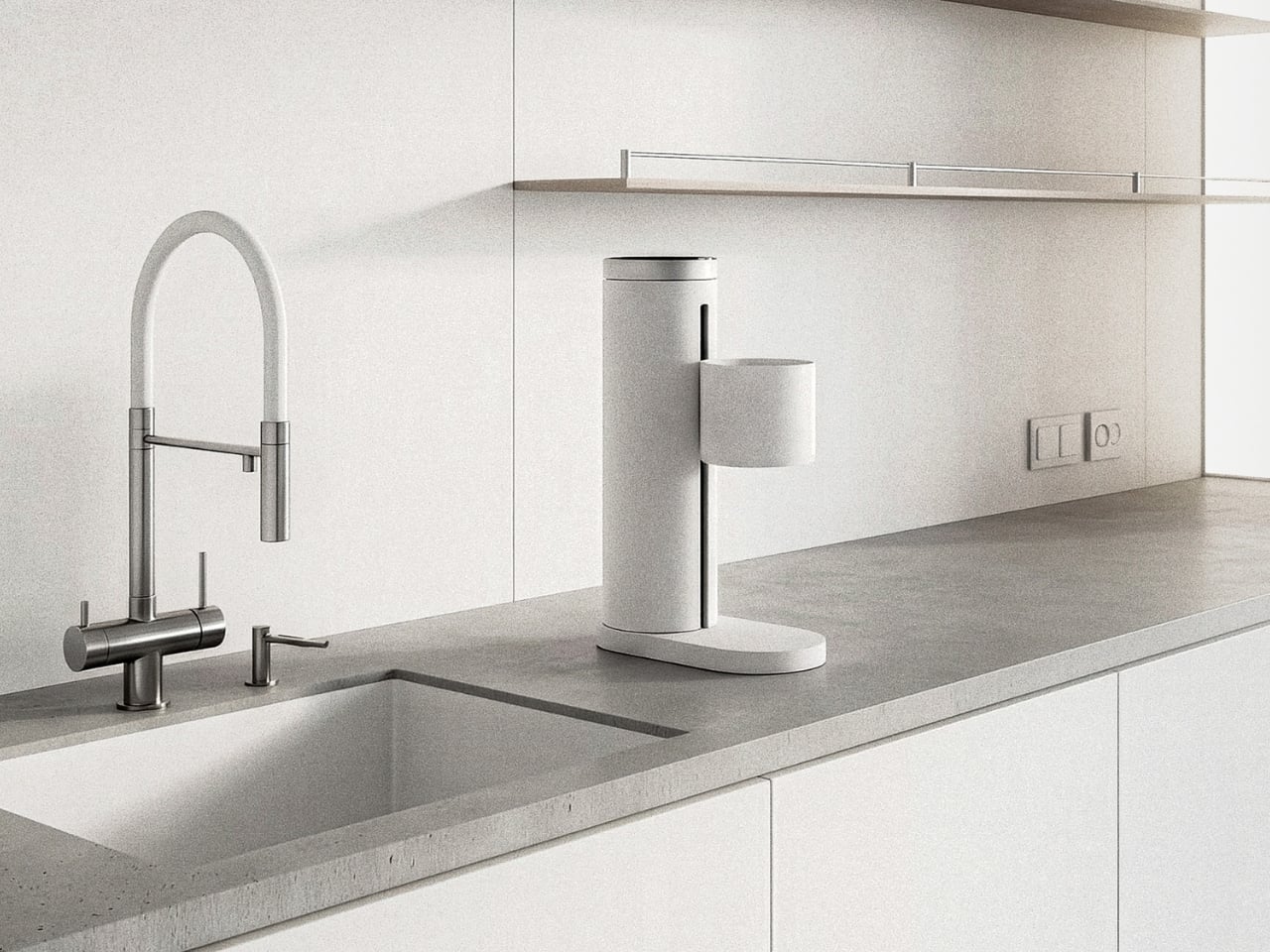
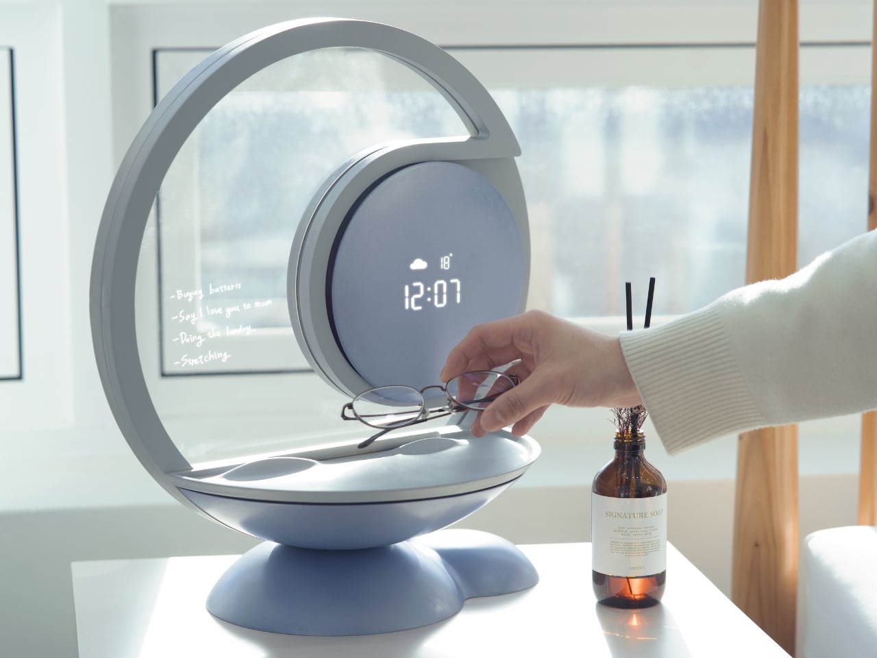
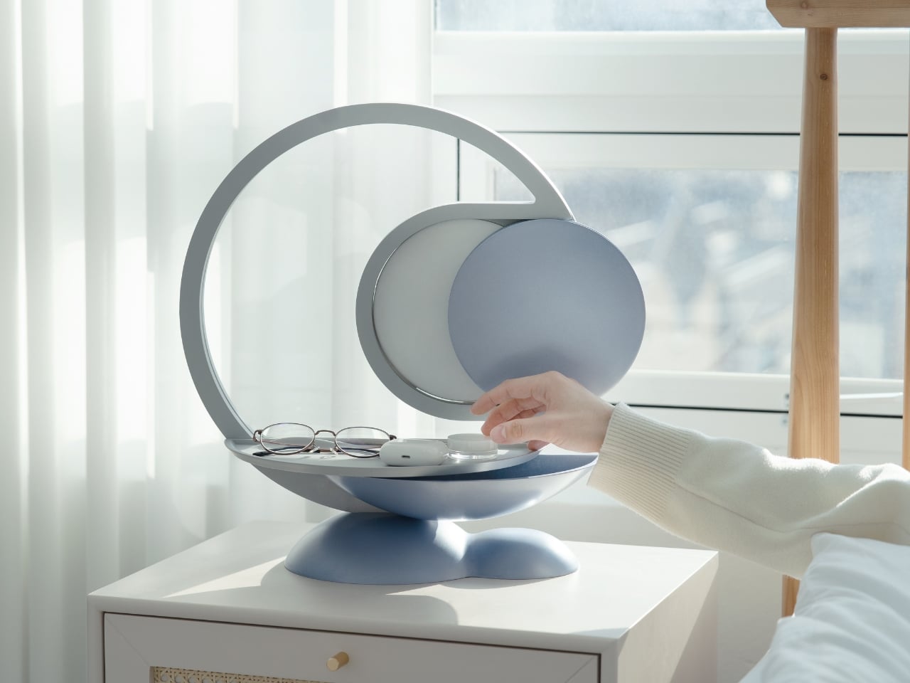
Designer YeEun Kim gets it. Her concept project, Darling, tackles the scattered morning routine with a smart bedside organizer that’s equal parts lamp, tray, and very gentle personal assistant. The design speaks to anyone who’s ever retraced their steps back home, cursing under their breath about that one essential item left behind.
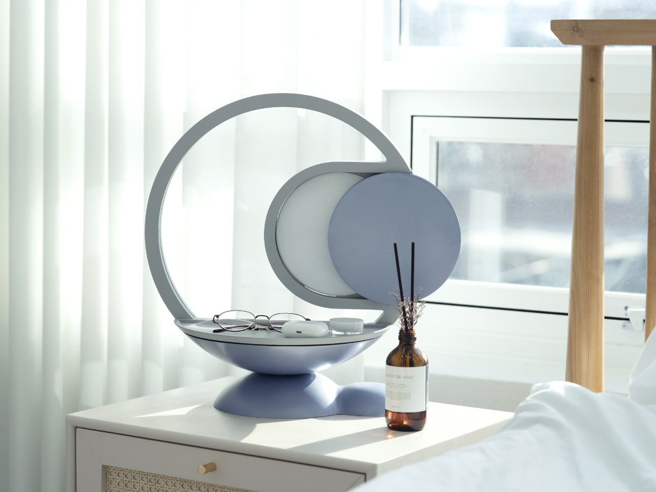
Designer: YeEun Kim

The concept addresses a surprisingly common problem. According to Kim’s research, modern forgetfulness often stems from irregular sleep patterns, excessive screen time, and the kind of stress that comes with overpacked schedules. The typical advice is to take walks, get better sleep, or generally relax more. But if you’re the type of person who needs this advice, you’re probably also the type who doesn’t have time to follow it.

So Darling takes a different approach. Instead of trying to fix your entire lifestyle, it focuses on building small, sustainable habits. The kind that actually stick because they’re simple enough to do even when you’re running on four hours of sleep and too much coffee.

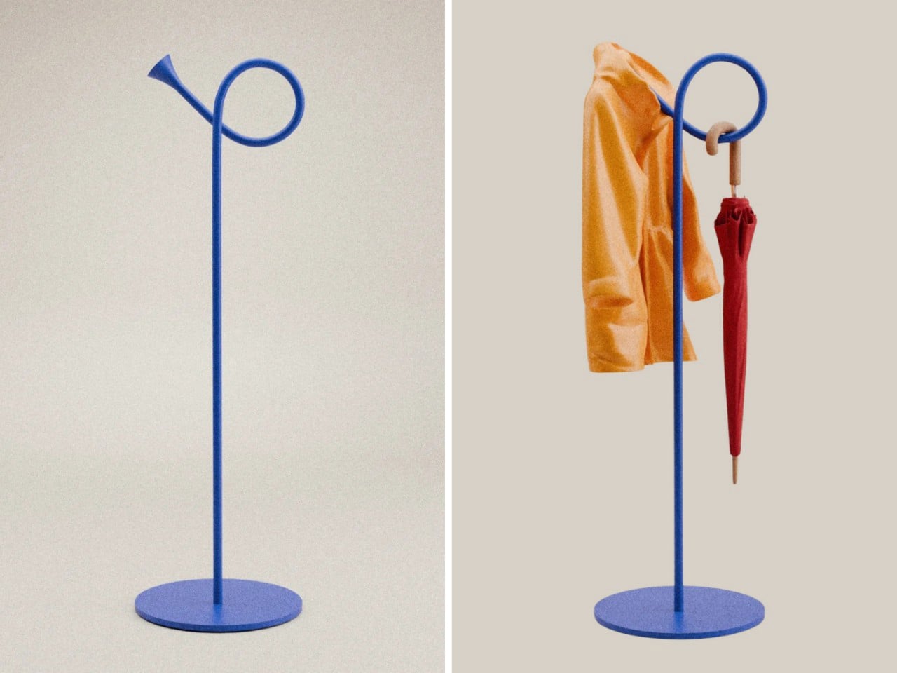
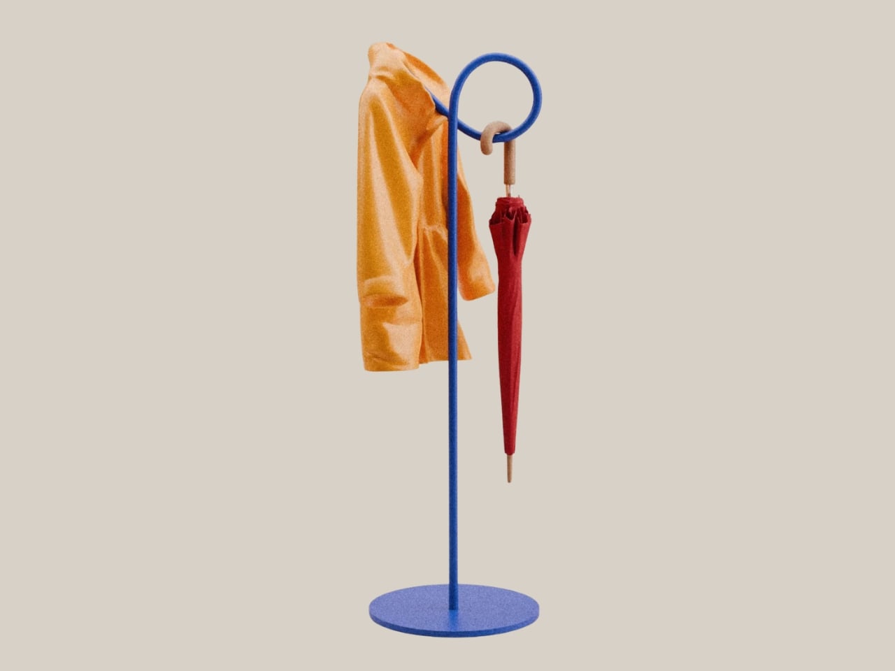
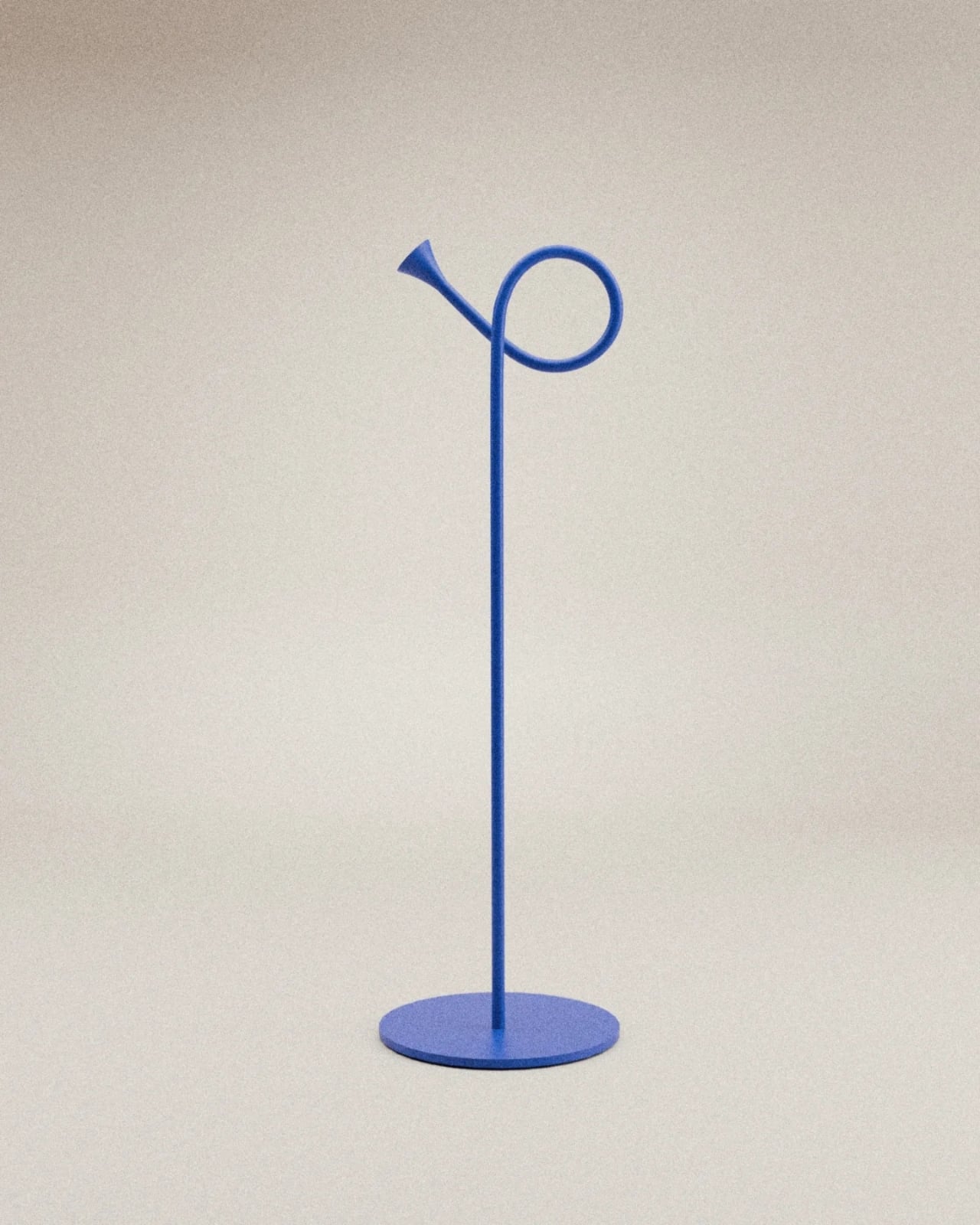
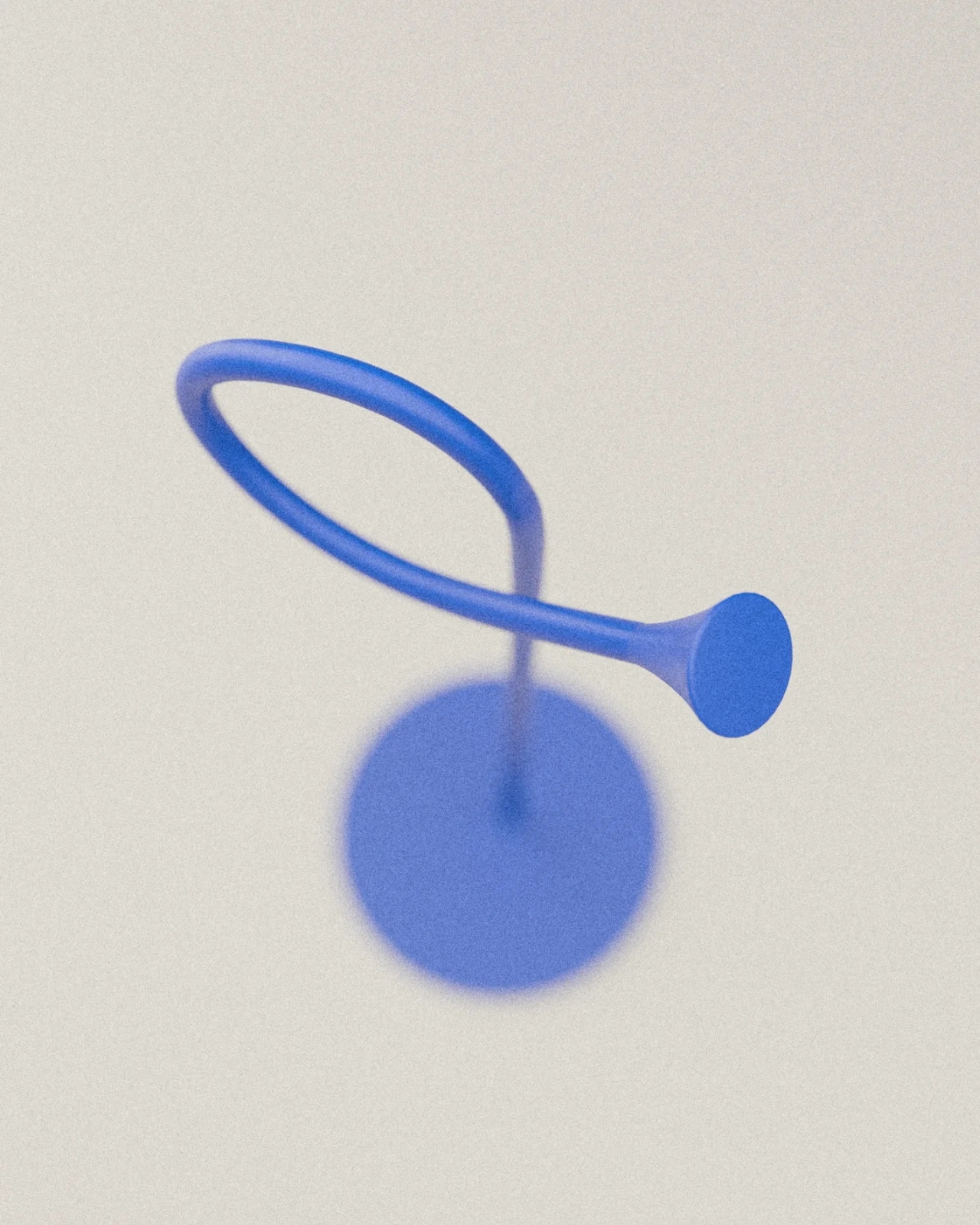
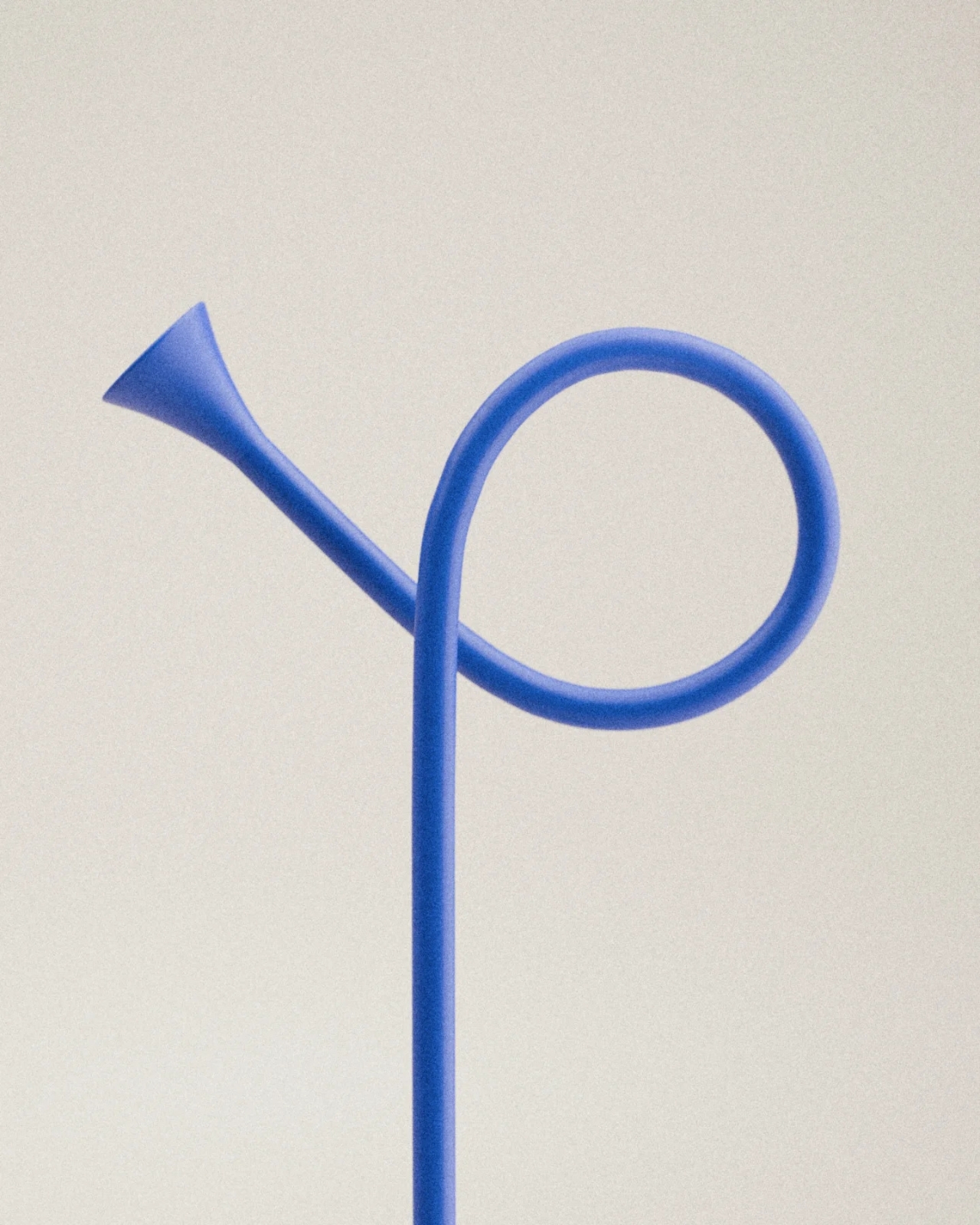
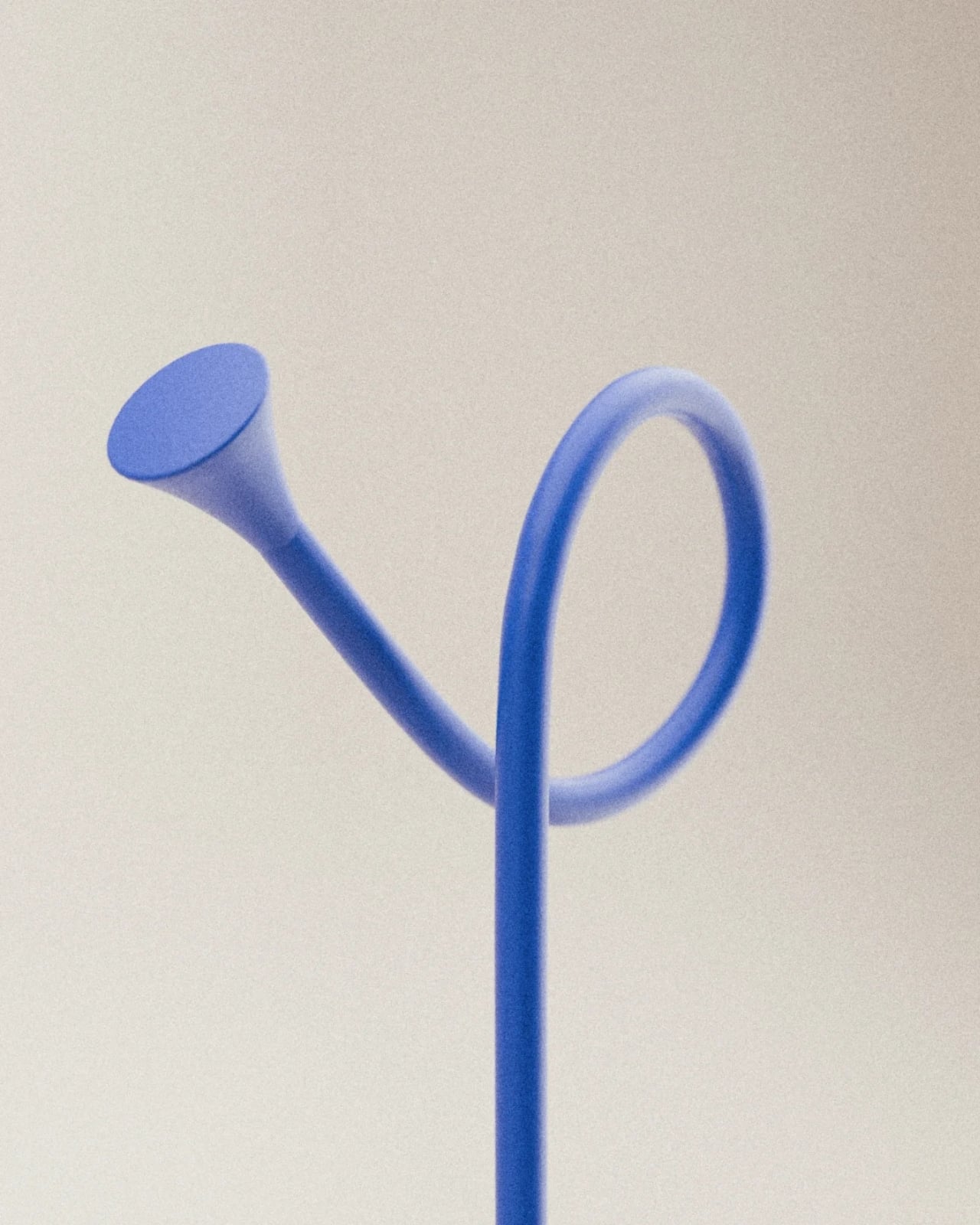
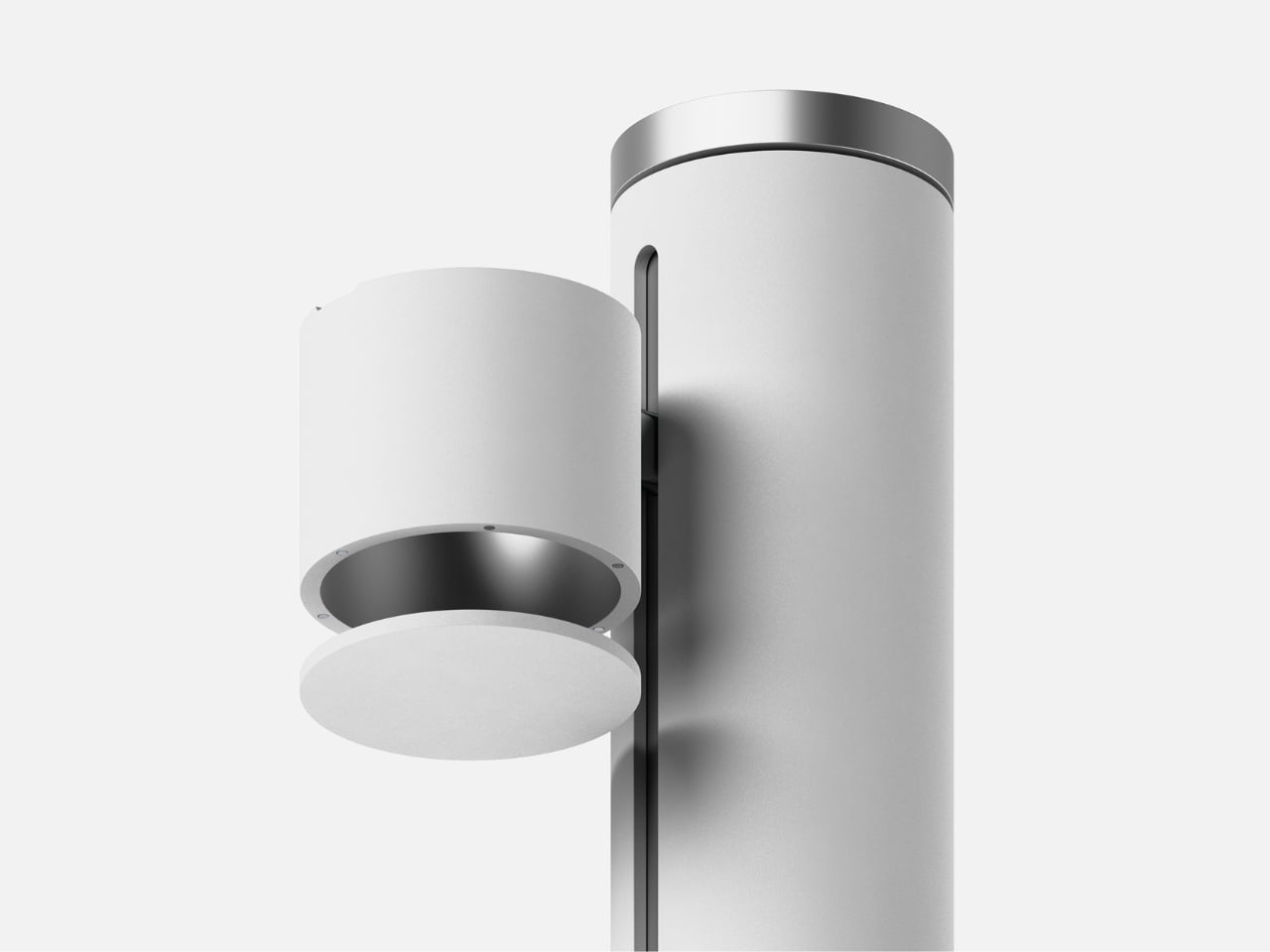
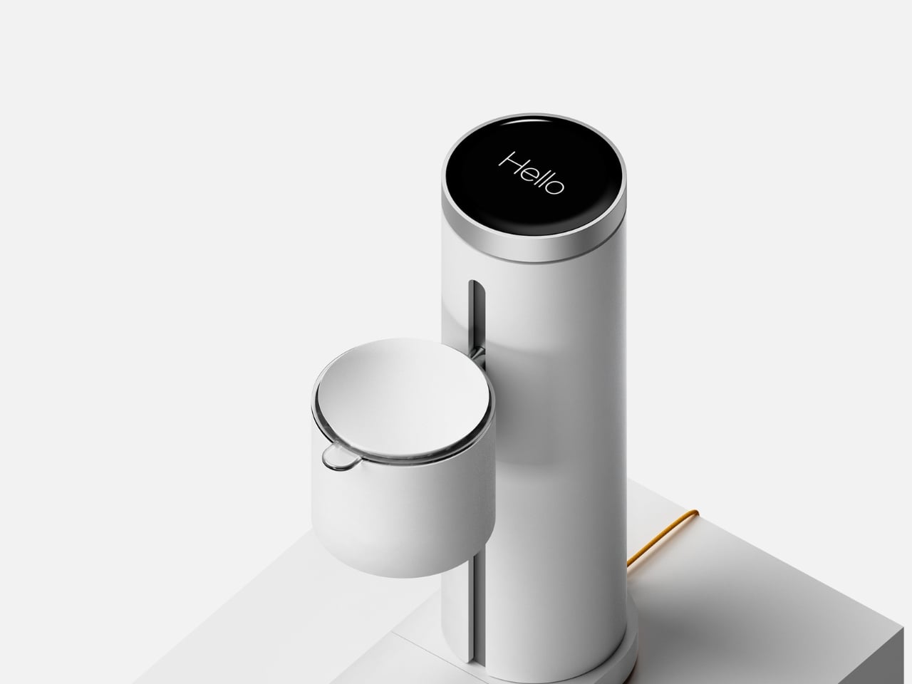
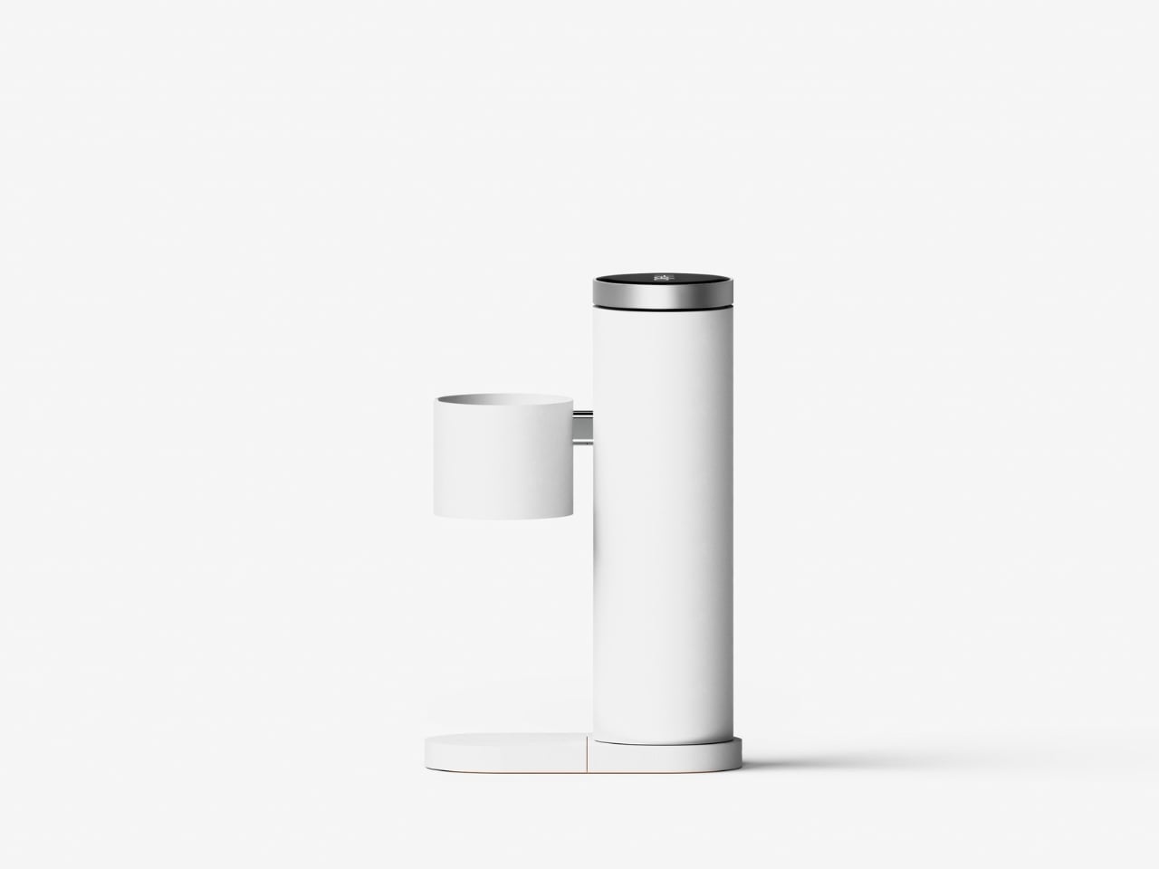
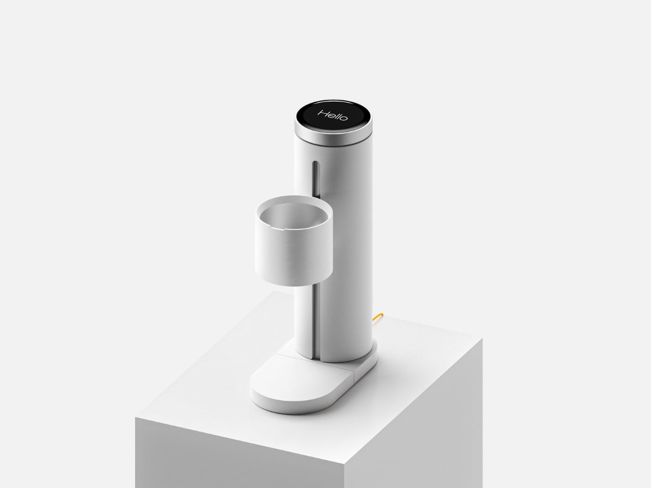
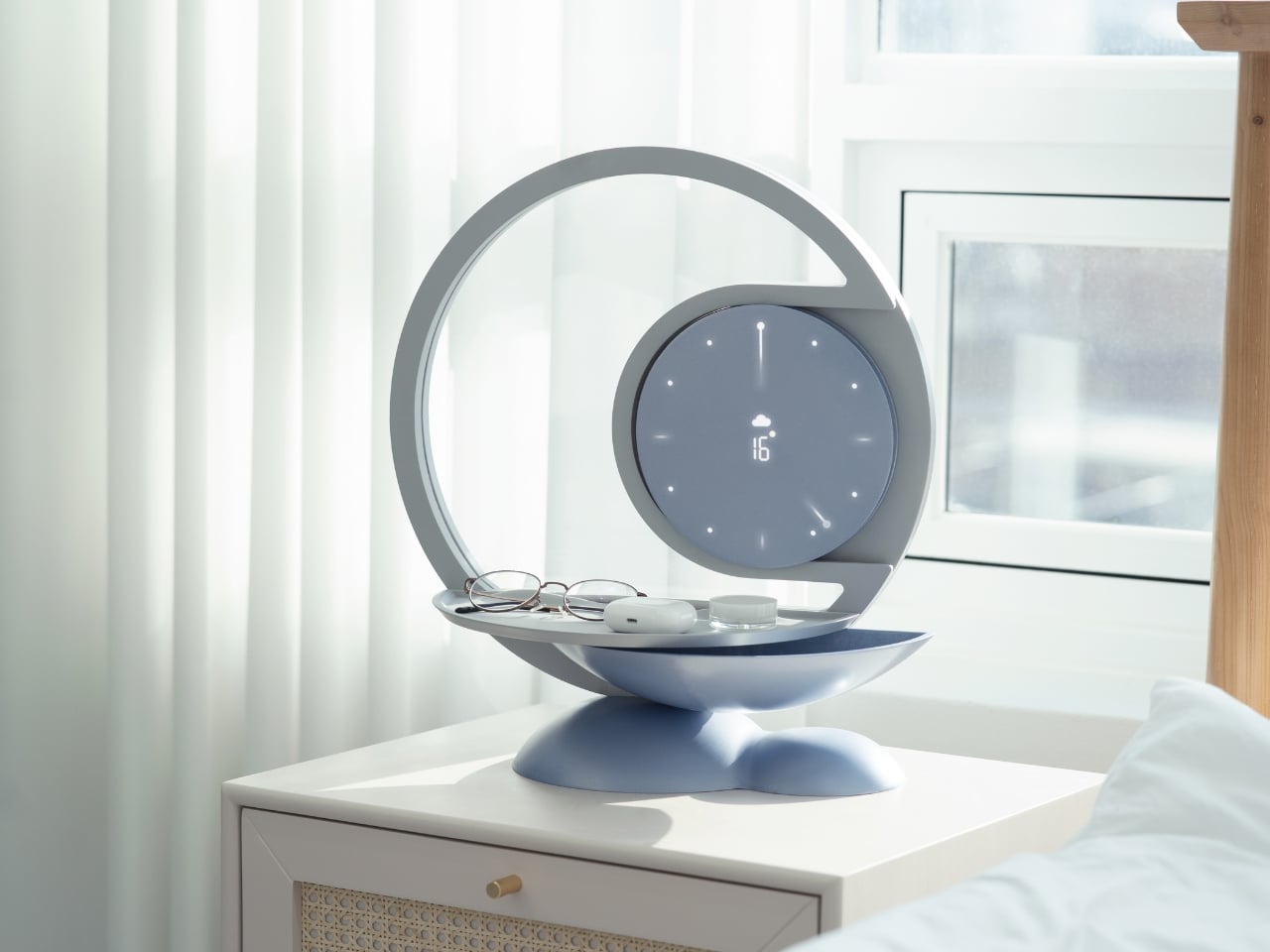
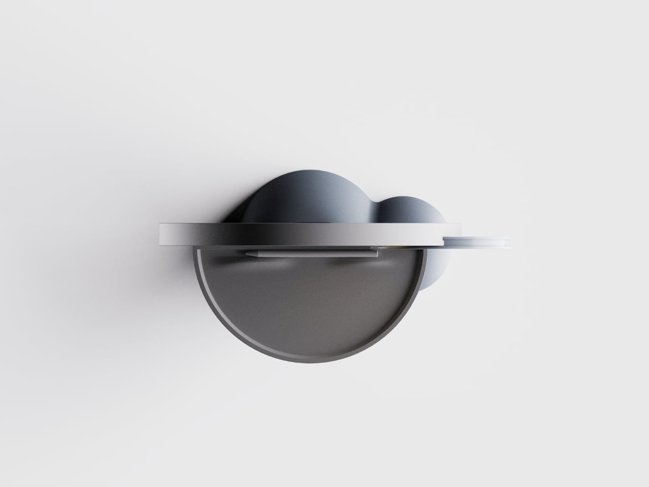
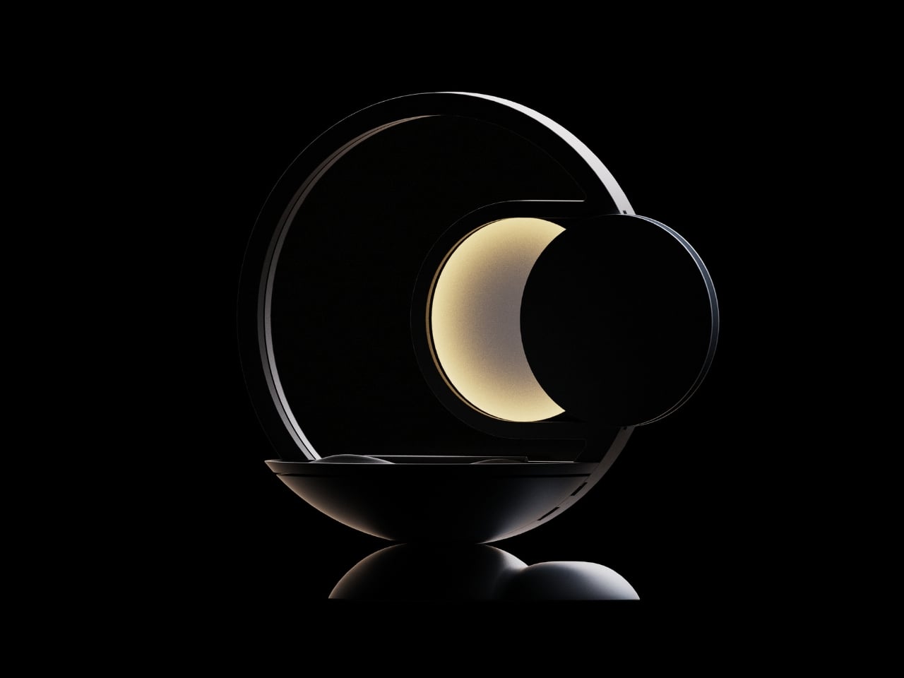
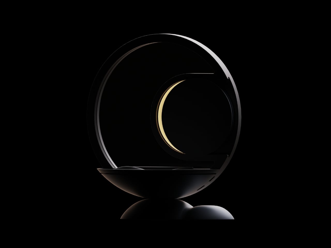
The design itself is remarkably soothing to look at. Kim built the entire aesthetic around soft curves and circular forms, which makes sense for something meant to bookend your day. The last thing you want on your nightstand is aggressive angles and harsh lines staring at you before bed or first thing in the morning. The lamp component arches over a shallow tray, creating this balanced, almost zen-like silhouette that wouldn’t look out of place in a boutique hotel or a carefully curated Instagram feed.

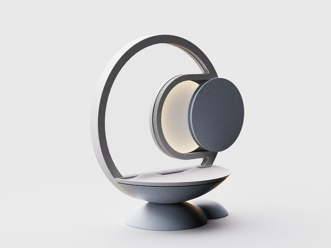
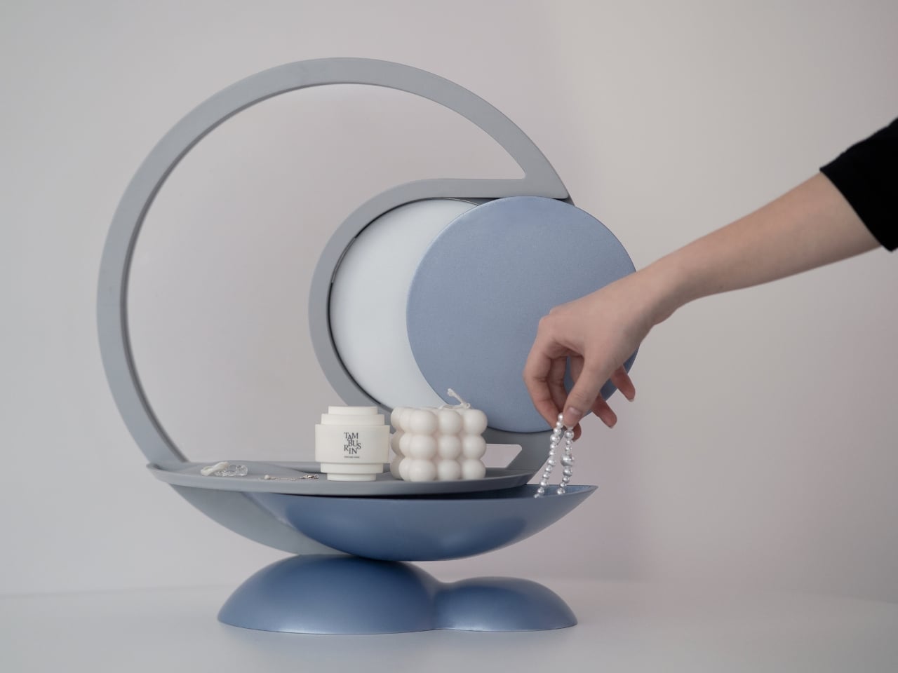
But the real cleverness is in how it works. Darling connects to your schedule and uses light cues to help you remember things. Place your everyday essentials in the tray before bed, and when it’s time to leave in the morning, the device uses flickering lights to remind you to grab what you need. It’s a subtle nudge rather than an alarm or notification, which feels refreshingly analog in our current era of constant pings and alerts.

The psychology behind it is solid too. Memory experts have long advocated for designated spots for frequently used items. When your keys always go in the same place, your brain doesn’t have to work as hard to remember where they are. Darling just makes that designated spot beautiful and adds a gentle technological reminder system to back up your muscle memory.

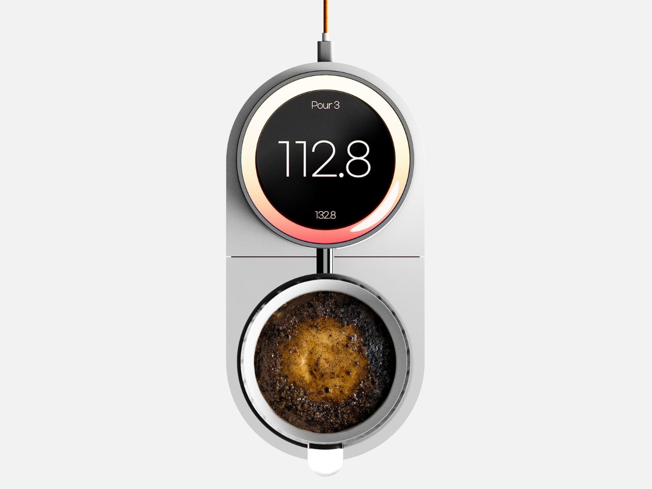
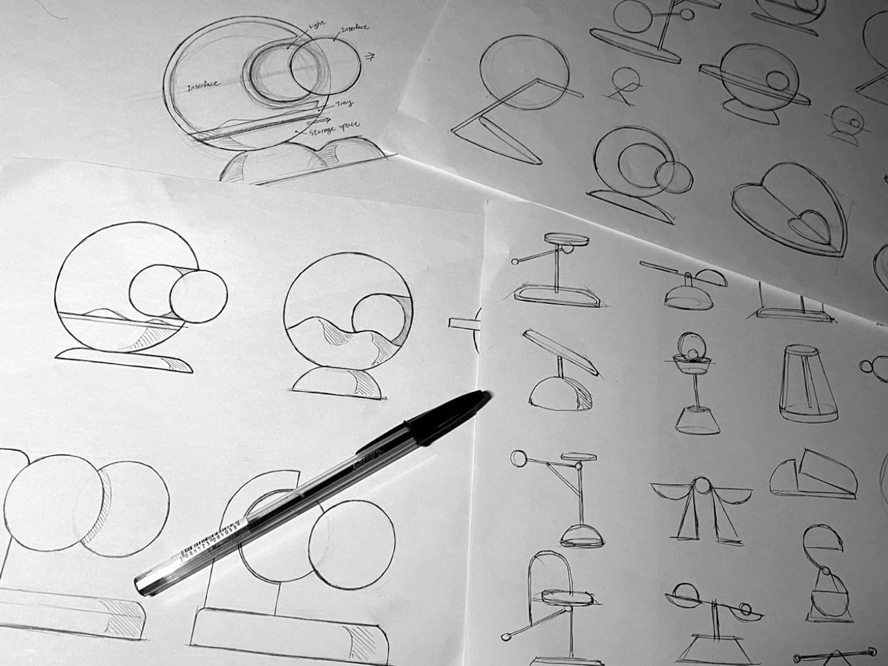
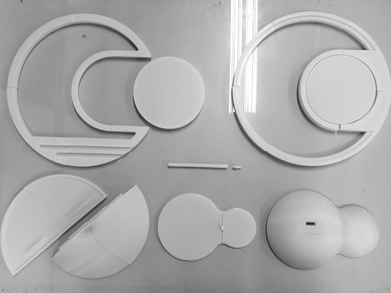
Looking at Kim’s development process, you can see the thoughtfulness that went into refining the concept. The sketches show dozens of iterations, each exploring different configurations of the circular theme. The prototyping photos reveal careful attention to how hands interact with the object, how the tray needs to be positioned, and how the lamp should cast light without being obtrusive.

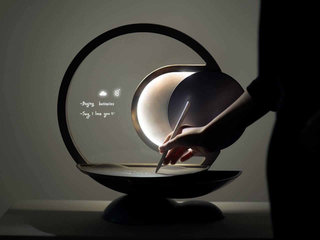
What makes Darling particularly interesting in the broader design landscape is how it pushes back against the “smarter is better” mentality. We’re surrounded by devices that want to do everything, track everything, and connect to everything. Darling does exactly three things: it holds your stuff, it lights your space, and it reminds you not to forget. That restraint feels almost radical.

The concept also reflects a larger conversation happening in design circles about how technology should integrate into our most personal spaces. Bedrooms have become battlegrounds for sleep trackers, smart speakers, and charging stations for multiple devices. Darling suggests that maybe what we need isn’t more capability but more calm. A piece that helps us be slightly more organized without demanding we learn a new app or wade through settings menus.

Whether Darling makes it from concept to production remains to be seen. But as a design statement, it’s already doing important work. It reminds us that solving everyday problems doesn’t always require complex solutions. Sometimes you just need something beautiful that flickers at the right moment.

The post This Bedside Lamp Remembers Everything You Forget at 6 AM first appeared on Yanko Design.

This Bugle-Shaped Coat Rack Solves Your Tiny Entryway Problem

If you live in an apartment or a home with a narrow entryway, you know the struggle. Coats pile up on dining chairs. Umbrellas lean precariously against walls. Traditional coat racks with their sprawling arms take up precious floor space you simply don’t have. You need something that actually works without turning your entry into an obstacle course.

Enter The Bugle by Design by Joffey, a coat and umbrella stand that rethinks the entire concept by borrowing its form from an unlikely source: a brass musical instrument. This isn’t just clever design for the sake of being clever. It’s a genuinely smart solution to a problem that plagues anyone living in tight quarters.

Designer: Design by Joffey

The beauty of this piece is in its vertical footprint. Where most coat stands spread outward with multiple arms jutting in different directions, The Bugle stays contained within a slim, elegant silhouette. A single curved loop rises from a slender pole, mimicking the distinctive shape of a bugle, complete with a flared bell detail at the top. Everything sits on a simple circular base that keeps it stable without hogging floor space.

That curved loop is where the magic happens. It’s perfectly sized to drape a jacket or hang a scarf, while a smaller ring positioned within the larger curve holds umbrellas upright. Two storage solutions in one compact design, occupying roughly the same footprint as a single dining chair but infinitely more functional and better looking.

The proportions feel just right because they’re borrowed from something that was already thoughtfully designed. Musical instruments like bugles have curves that exist for acoustic and ergonomic reasons. Those shapes have been refined over centuries to feel balanced and purposeful. By translating that form into furniture, Joffey taps into proportions that our eyes instinctively recognize as harmonious.

What really sets The Bugle apart is its ability to be both functional and sculptural. In a small entryway, every object needs to pull double duty. This piece stores your essentials while also acting as a visual anchor that defines the space. The saturated periwinkle blue gives it presence without overwhelming the room. That matte finish adds a contemporary softness that works with almost any decorating style, from Scandinavian minimalism to eclectic maximalism.

There’s something playful about the design that makes coming home a bit more enjoyable. Instead of generic IKEA-standard furniture, you get a conversation starter. Guests notice it immediately. The bugle reference is clear enough to be charming but abstract enough to feel sophisticated. It nods to vintage Americana, summer camps, and military ceremonies without being literal or kitschy about it.

From a practical standpoint, the compact design means you can tuck it into corners or narrow spaces where a traditional coat rack would never fit. Got a skinny hallway? A weird alcove by the door? A studio apartment where every inch counts? This works. And because it stays vertical rather than horizontal, it doesn’t interfere with foot traffic or make your entryway feel cluttered.

The restraint in this design is what makes it successful. There are no unnecessary embellishments, no gimmicks, no trying-too-hard details. Just a pure, confident form that solves a real problem beautifully. In an era where product design often veers toward the overly complex, The Bugle proves that simple ideas executed well will always win.

What I love most is that it demonstrates how everyday objects can be better. Your coat rack doesn’t have to be an eyesore you tolerate. It can be something you actively enjoy looking at, something that makes your tiny entryway feel more intentional and curated rather than cramped and chaotic.

Design by Joffey gets it. Small spaces need smart solutions, and smart solutions can also be delightful. The Bugle delivers on both fronts, turning a mundane necessity into a little moment of joy every time you walk through your door. And in a tiny apartment, those moments matter more than you’d think.

The post This Bugle-Shaped Coat Rack Solves Your Tiny Entryway Problem first appeared on Yanko Design.

Camprit Just Solved Camping’s Bulkiest Problem With 5 Titanium Pieces

There’s something oddly satisfying about watching outdoor gear shed its bulk. We’ve seen tents collapse into impossibly small pouches and sleeping bags compress into cylinders the size of water bottles. Now, Camprit is applying that same minimalist philosophy to camp stoves with their TiStove, and the results are kind of brilliant.

The concept is deceptively simple. Take five titanium pieces (two foldable legs and three cooking panels), make them pack completely flat, and keep the whole setup under 1.5 pounds. But what makes this more interesting than just another ultralight camping gadget is how Camprit rethought what a portable stove should actually do.

Designer: Camprit

Most camp stoves force you into a specific cooking method. You’re either boiling water for freeze-dried meals or you’re lugging around a full camping kitchen. TiStove splits the difference by giving you three interchangeable panels that transform the cooking surface. The base panel handles your standard boiling needs. Swap in the grill panel and you can cook directly on the grates. Want to sear something? There’s a panel for that too. It’s modular cooking without the usual camping compromise of eating yet another packet of instant noodles.

The titanium construction isn’t just about keeping weight down, though that’s obviously a factor when you’re counting grams in your pack. Titanium brings that combination of strength and heat resistance that makes it ideal for something that needs to withstand direct flame while remaining stable on uneven ground. The material also means the stove won’t corrode when it inevitably gets wet, smoky, or covered in whatever wilderness conditions you throw at it.

What’s particularly clever is the no-assembly approach. Anyone who’s fumbled with camping gear in fading daylight knows that “some assembly required” translates to “good luck finding that tiny connector piece you just dropped in the dirt.” TiStove unfolds rather than requiring construction, which means you’re cooking faster and cursing less.

The fuel flexibility adds another practical layer. Unlike canister stoves that leave you dependent on finding the right fuel cartridge, this system burns wood, twigs, branches, basically whatever dry combustibles you can scavenge. That’s not just convenient but also more sustainable than constantly buying and disposing of fuel canisters. Plus, there’s something primal and satisfying about cooking over actual fire rather than a blue gas flame.

Camprit isn’t new to this space. They previously launched FireNest, which followed a similar modular, flat-pack titanium philosophy. With TiStove, they’ve refined the concept into something that feels more like a complete cooking system than a single-purpose stove.

The flat-pack design also addresses one of camping’s most annoying realities: pack space is precious. When your stove collapses to basically the thickness of a laptop, it slides into spaces that bulkier gear could never occupy. That means more room for the things that actually matter, like extra food or that book you’re definitely going to read by the campfire.

There’s a broader trend here worth noting. Outdoor gear has been shedding the old “rugged means bulky” mentality for years now, but projects like TiStove show how far that evolution has come. This isn’t about sacrificing functionality for portability. It’s about questioning whether those trade-offs were ever necessary in the first place.

The Hong Kong-based company seems to understand that good design isn’t about adding features but about removing friction. Every aspect of TiStove, from the material choice to the panel system to the folding mechanism, eliminates a pain point. Can’t find fuel? Burn sticks. Pack too heavy? Here’s titanium. Tired of one-note camping meals? Swap the cooking surface.

Whether you’re a weekend warrior or someone who just appreciates clever product design, TiStove represents the kind of functional innovation that makes you wonder why it took this long. It’s not reinventing fire, just making it easier to cook over one. And sometimes, that’s exactly what good design should do.

The post Camprit Just Solved Camping’s Bulkiest Problem With 5 Titanium Pieces first appeared on Yanko Design.

Timbercraft Built a Tiny Home That Actually Feels Like Your Cozy Space

There’s something refreshing about a tiny house that doesn’t try to be everything to everyone. The Ynez by Timbercraft Tiny Homes embraces exactly what it is: a compact, beautifully crafted cottage on wheels that proves you don’t need square footage to have style.

At just 20 feet long and 8.5 feet wide, the Ynez represents a departure from Timbercraft’s usual lineup of larger, more luxurious models. But what it lacks in size, it more than makes up for in thoughtful design and rustic charm. This is the kind of tiny house that makes you reconsider what you actually need versus what you think you need.

Designer: Timbercraft Tiny Homes

The exterior strikes that sweet spot between understated and eye-catching. Engineered wood siding in a warm beige tone wraps the structure, punctuated by crisp white trim and crimson red windows that add just enough personality without veering into quirky territory. A metal roof tops it all off, giving the home a cottage-like appearance that feels both timeless and practical. There’s even a small front porch area and an exterior storage box, because even in 150 square feet, outdoor space matters.

Step inside and you’re greeted by shiplap walls and pine flooring that immediately establish the home’s rustic credentials. The Alabama-based builders clearly understand that in a space this compact, material choices carry extra weight. Every surface counts, and the warm wood tones create a cohesive look that feels intentional rather than cramped.

The layout follows a straightforward approach that works. The kitchen occupies a decent portion of the floor plan, featuring upper cabinets and a large sink that suggests this isn’t just a space for reheating takeout. Small appliances keep things functional without overwhelming the room, and there’s enough counter space to actually prepare a meal. It’s a kitchen designed for people who cook, just on a smaller scale.

Adjacent to the kitchen, the living area provides room for a small couch or a couple of chairs. It’s not a sprawling entertainment space, but it doesn’t need to be. This is where the Ynez’s philosophy becomes clear: it’s designed for people who want to live simply without feeling deprived. You can have friends over. You can curl up with a book. You just can’t host a dinner party for twelve, and that’s perfectly fine.

The bathroom deserves special mention because tiny house bathrooms can be hit or miss. This one includes a ceramic tile shower and a standard flushing toilet, housed in what is admittedly a snug space. But there’s something to be said for a real shower with real tile, rather than the cramped plastic stalls you sometimes see in tiny homes. A built-in closet on the main floor handles storage needs without eating into precious square footage.

Upstairs, the single loft bedroom accessed by ladder provides sleeping space for two with room for a double bed. The ceiling is low, as it always is in tiny house lofts, but that’s the trade-off for keeping the home easy to tow and park. This isn’t a space where you’ll be doing yoga in the morning, but it serves its purpose as a cozy sleeping nook.

What makes the Ynez particularly interesting is its positioning in the tiny house market. With a base price around $52,000, it represents a more accessible entry point compared to larger models that can easily climb past six figures. It’s small enough to tow with many standard trucks, making it practical for people who actually want to move their tiny house around rather than park it permanently.

The Ynez doesn’t reinvent tiny house living or introduce groundbreaking features. Instead, it demonstrates that solid craftsmanship and thoughtful design can create a compelling home within serious space constraints. It’s a reminder that bigger isn’t always better, and that sometimes the most interesting design solutions come from working within tight parameters rather than against them.

For anyone considering tiny house living, the Ynez offers a realistic preview of what downsizing actually looks like. It’s not about sacrifice. It’s about editing your life down to what matters most and finding a space that accommodates that vision. At 150 square feet, that’s exactly what this little cottage on wheels delivers.

The post Timbercraft Built a Tiny Home That Actually Feels Like Your Cozy Space first appeared on Yanko Design.

Nike Just Turned Air Into Team USA’s Smartest Olympic Jacket

Remember when Nike introduced the Air Milano jacket a few months back? The inflatable jacket that promised to solve the age-old runner’s dilemma of overheating mid-run? Well, it just made its official debut at the 2026 Winter Olympics in Milan, and Nike’s chief design officer Martin Lotti is making it clear: this isn’t some novelty stunt.

The jacket’s now being worn by Team USA athletes during medal ceremonies, which is pretty much the ultimate endorsement for any piece of sportswear. But beyond the Olympic spotlight, there are some fascinating new details emerging about why this jacket matters more than you might think.

Designer: Nike

Lotti explained that Nike has been working with air as a cushioning technology in footwear for half a century, but they’ve barely scratched the surface of what air can do. The interesting twist? From a design perspective, they’re working with a medium that’s completely invisible. You can’t see air, you can’t touch it in the traditional sense, yet it’s proving to be one of the most versatile materials in their arsenal.

The real game changer here is how the jacket addresses temperature regulation. According to Lotti, runners face this problem constantly. You start your morning run when it’s cold, you warm up as you go, and then what? Most of us just tie the jacket around our waist without thinking about it. It’s such an automatic response that we don’t even realize we’re settling for an imperfect solution.

With the Air Milano, that problem disappears. The jacket inflates with a small battery-powered fan through a valve on the front, and it takes about 20 seconds to go from windbreaker to mid-weight puffer. Need to cool down? Press the same valve and gradually release the air. The whole process happens while you’re moving, which means you can adjust your warmth on the fly without breaking stride or stopping to fuss with layers.

One of the most compelling arguments for this technology is the weight-to-warmth ratio. Traditional down puffers have a fatal flaw: when they get wet, they lose their insulating properties. The feathers clump together, the jacket gets heavy, and suddenly you’re wearing a soggy, useless shell. Because the Air Milano uses actual air as insulation, water doesn’t compromise its performance. It stays light, it stays warm, and it doesn’t wet out.

Nike also revealed that this jacket showcases what they’re calling A.I.R. Technology, which stands for Adapt, Inflate, Regulate. The whole design is informed by body mapping data from Nike’s Sport Research Lab and uses computational design to create those sculptural baffles you see on the surface. It’s not just about making something that looks cool; it’s about strategically placing air where your body needs warmth most.

The Team USA version comes with some exclusive touches that weren’t part of the original announcement. There are sculpted design elements, a custom ACG pump (instead of the generic battery-powered fan initially mentioned), metallic twill branding, and an interior lining graphic depicting the Garden of the Gods in Colorado Springs, where Team USA trains. More importantly, Nike built in accessibility features like interior thumb loops on the bottom hem and a magnetic zipper specifically designed to help Paralympic athletes put on and close the jacket independently.

What’s particularly interesting is that this isn’t Nike’s first rodeo with inflatable outerwear. They’ve been experimenting with this concept for 20 years, starting with the ACG Airvantage jacket and continuing with the ISPA Adapt Sense Air. But the Air Milano represents a major evolution in both technology and wearability. It’s lighter, faster to inflate, and actually solves a practical problem instead of just being a technical curiosity.

Lotti’s perspective on this is refreshing. He’s adamant that the Air Milano isn’t a gimmick because it addresses a real issue that athletes face every single time they go for a run. That’s the difference between innovation for innovation’s sake and design that actually improves how people move through the world.

The jacket is positioned as part of Nike’s broader FIT system of apparel, which includes Therma-FIT insulation, Aero-FIT cooling, Dri-FIT moisture-wicking, and Storm-FIT weather protection. It’s not meant to replace every jacket you own, but rather to fill a specific need for adaptive warmth in changing conditions.

Seeing Team USA athletes wearing these jackets on the podium in Milan gives the whole project a very different context. It’s not just a prototype or a concept piece anymore. It’s performance gear that’s being tested at the highest levels of athletic competition, which means Nike has confidence it can handle real-world demands.

The post Nike Just Turned Air Into Team USA’s Smartest Olympic Jacket first appeared on Yanko Design.

FlowSence Just Built the Coffee Scale That Teaches You to Brew

Making good pour-over coffee feels like being asked to juggle while blindfolded. You’re managing water temperature, grind size, pouring rhythm, and extraction time all at once, but you can’t actually see what any of those variables are doing to your final cup. You taste the result, shrug, and wonder if you should have poured slower or used hotter water. Then you try again tomorrow with a completely different outcome.

FlowSence, designed by Hyeokin Kwon, is built around a simple insight: brewing doesn’t have to stay invisible. Most of us learn coffee through trial and error because we lack the sensory training to connect what we taste with what we did. We might know our coffee tastes weak or bitter, but translating that into actionable changes requires experience we haven’t built yet. Tools like TDS meters offer numbers, but numbers without context just add another layer of confusion.

Designer: Hyeokin Kwon

What makes FlowSence different is that it refuses to automate your brewing. Instead, it acts like a patient coach standing beside you, translating the invisible parts of extraction into something you can actually see and understand. While you pour, it measures weight, temperature, and flow in real time, then visualizes those changes on a 4-inch round OLED display. You stay in control of the kettle, but now you can watch your pouring rhythm, notice when your flow rate drops, and start connecting your physical movements to what’s happening in the cup.

The interface starts with a rotary dial that lets you input the basics: coffee origin, roast level, grind size, water temperature, and dose. Turn to adjust, press to confirm. Once you’ve set your parameters, an AI-generated recipe appears, giving you a suggested approach based on what you’ve told it about your beans. From there, brewing begins, and the screen shifts into feedback mode.

This is where the learning happens. Instead of just showing you a timer and a weight, FlowSence tracks your pouring behavior and presents it visually. You can see whether you’re pouring steadily or in uneven bursts. You can spot the moment your water temperature drops too much. You start to notice patterns in your technique, which means you can actually correct them. Over time, your pours become more consistent, not because the machine took over, but because you’ve learned what consistency looks like.

The physical design supports this learning-centered philosophy. The machine is compact and vertical, built from aluminum alloy and heat-resistant composite materials. A cylindrical body houses the measurement tech, with a side-mounted cradle holding your brewing vessel and a weighted base that keeps everything stable. That pop of orange on the base isn’t just aesthetic, it’s a visual anchor that makes the tool feel approachable rather than clinical. The whole thing connects via Wi-Fi and Bluetooth, runs on USB-C power, and draws less than 10 watts. It’s not trying to dominate your counter or complicate your setup.

The packaging reflects the same clarity. When you open the box, the side profile of FlowSence is immediately visible, showing you its structure before you’ve even lifted it out. Components are arranged in sequence, so the unboxing process doubles as an introduction to how everything fits together.

What FlowSence really offers is a shift in how we think about coffee tools. Most brewing gadgets either do everything for you or leave you completely on your own. FlowSence lives in the middle. It gives you real-time information and visual feedback, but it doesn’t take the kettle out of your hand. The goal isn’t a perfect robotic pour. The goal is helping you understand what a good pour feels like so that eventually, you don’t need the screen anymore.

For people who’ve felt stuck in their coffee routine or intimidated by the complexity of manual brewing, that’s a meaningful difference. You’re not just making coffee. You’re learning a skill that actually sticks, supported by a tool designed to make the invisible visible. And maybe that’s the kind of coffee gadget we’ve been missing all along.

The post FlowSence Just Built the Coffee Scale That Teaches You to Brew first appeared on Yanko Design.

The Umbrella Stand That Refuses to Be Grey or Boring

There’s something quietly rebellious about a product that announces its refusal to blend into the background right there in its name. Meet notgrey, an umbrella stand from designer Joffey that’s basically the antithesis of every sad, utilitarian coat rack you’ve ever ignored in a hotel lobby.

At first glance, it looks almost like a piece of kinetic sculpture that wandered out of a modern art museum and decided to make itself useful. A slender black metal frame rises from a bold blue base, punctuated by a cone-shaped holder in that perfect burnt orange-red that interior designers are always calling “terracotta” but really just makes you think of summer sunsets and Spanish roof tiles. Perched on one of the extending arms is a warm orange dish that could easily pass for a decorative accent if it weren’t so brilliantly practical.

Designer: Design by Joffey

The genius of notgrey is how it takes something most of us barely think about and turns it into a conversation piece. Umbrella stands traditionally occupy that weird category of household objects we know we probably need but can never quite get excited about. They’re the sensible shoes of home furnishings. But Joffey has created something that makes you actually want to display your rainy day clutter.

Let’s talk about what it actually does, because this isn’t just pretty geometry. The cone holder catches your dripping umbrella without taking up much floor space. The extending arm supports a coat hook that can handle your wet jacket. That orange dish? Perfect for corralling keys, sunglasses, your phone, or whatever else you’re juggling when you stumble through the door. And at the base, there’s room to kick off your shoes, keeping everything you need for coming and going in one tidy vertical arrangement.

What makes this design particularly smart is how it maximizes vertical space. Small entryways are notoriously tricky to organize, you need storage but you can’t sacrifice precious square footage. Notgrey solves this by building up instead of out. The slender profile means it tucks nicely beside a door without creating an obstacle course, while still offering multiple functions stacked on that single pole.

The color choices feel intentional in a way that goes beyond just being eye-catching. That blue base grounds the whole piece, literally and visually. The red cone creates a focal point that draws your eye without overwhelming the space. And the orange dish adds warmth that keeps the primary colors from feeling too stark or toy-like. Together, they create a palette that feels both playful and sophisticated, which is a surprisingly tricky balance to strike.

There’s also something refreshing about a functional object that doesn’t apologize for taking up visual space. So much contemporary design is obsessed with disappearing, with being invisible and unobtrusive. Everything’s supposed to be minimalist and neutral and blend seamlessly into your carefully curated aesthetic. But notgrey takes the opposite approach. It says, if I’m going to be in your home, if I’m going to serve a purpose, I might as well look interesting while I’m at it.

This is exactly the kind of design that makes mundane routines feel a little more special. Coming home on a grey, drizzly day and having somewhere cheerful and organized to stash your soggy belongings is the kind of small pleasure that accumulates over time. It’s not going to change your life, but it might change how you feel about your entryway, which is more than most umbrella stands can claim.

For anyone who’s been looking at their cluttered doorway and thinking there has to be a better solution than a pile of wet coats on the floor and umbrellas propped against the wall, notgrey offers an answer that’s both practical and genuinely delightful to look at. It’s proof that even the most ordinary household problems deserve solutions with a little personality.

In a market saturated with beige and white and “goes with everything” neutrals, here’s a design that confidently announces its presence. And really, isn’t that exactly what you want from something whose literal name is a rejection of dullness?

The post The Umbrella Stand That Refuses to Be Grey or Boring first appeared on Yanko Design.

Gustaf Westman’s Curling Bowl Turns Olympic Gold Into Your Snack

There’s something delightfully unexpected about watching a designer take a winter sport and turn it into a snack vessel. But that’s exactly what Swedish designer Gustaf Westman has done with his latest creation, the Curling Bowl, and it might be the most charming thing to come out of the Milano Cortina 2026 Winter Olympics.

Westman, who has built a reputation for his inflated, chunky aesthetic that makes everything look like it’s been puffed up with joy, found his inspiration in an unlikely place. When his fellow Swedes, siblings Rasmus and Isabella Wranå, took gold in the mixed doubles curling event against Team USA, Westman did what any designer would do: he celebrated by creating something new. The result is a glossy, sky-blue bowl that perfectly captures the rounded silhouette of a curling stone, complete with that distinctive elevated handle.

Designer: Gustaf Westman

The Curling Bowl isn’t just a literal translation of sports equipment into home decor. It’s smarter than that. Cast in high-gloss pastel blue, the piece softens the compact mass of a traditional curling stone into something that feels approachable, almost huggable. The handle, which on a real curling stone helps players grip and release with precision, here doubles as both a functional grip and a built-in tray. It’s the kind of thoughtful design twist that makes you wonder why no one thought of it before.

What makes this piece particularly clever is how Westman transforms the essence of the sport itself. Curling is all about precision, friction, and those hypnotic sweeping gestures that look like someone’s desperately trying to convince the ice to cooperate. Westman takes that same energy and translates it into the domestic ritual of snacking. Reaching for popcorn from the Curling Bowl mimics that poised grip before a slide. It’s sport as metaphor for hosting, and it works surprisingly well.

This isn’t Westman’s first rodeo with playful design. Since establishing his Stockholm-based studio in 2020, he’s developed a signature style that’s immediately recognizable. His work features tactile curves, surprising color combinations, and shapes that look almost cartoonish in their exaggerated proportions. Whether it’s his wavy mirrors, chunky desks, or blob sofas, there’s a consistent thread of joy running through everything he creates. His pieces don’t just sit in a room; they announce themselves with cheerful confidence.

The collaboration with IKEA last year for a holiday collection showed Westman’s range. Working with pastel pinks, dusty blues, cherry reds, and emerald greens, he created tableware and home objects that challenged conventional holiday aesthetics. The collection was playful without being childish, bold without being overwhelming. It’s that same sensibility that makes the Curling Bowl work. It’s fun, but it’s also genuinely functional.

The timing of the Curling Bowl’s release feels intentional. Dropping it during the Winter Olympics taps into that collective sports enthusiasm that sweeps through social media every few years. But unlike official Olympic merchandise that often feels corporate and forgettable, this piece has staying power. It’s the kind of object that will still feel relevant long after the closing ceremonies, because it’s not really about the Olympics at all. It’s about taking something ordinary (a snack bowl) and making it extraordinary through thoughtful design and a healthy dose of whimsy.

What’s particularly refreshing about Westman’s approach is his willingness to be unserious in a design world that can sometimes take itself too seriously. There’s a playfulness here that feels genuinely joyful rather than forced. The Curling Bowl doesn’t pretend to be solving major design problems or revolutionizing how we think about tableware. It’s just a really well-designed bowl that happens to look like a curling stone and makes you smile when you use it.

For anyone who’s been following Westman’s work, the Curling Bowl feels like a natural evolution. It has his signature inflated geometry, his love of glossy finishes, and his ability to take everyday objects and inject them with personality. For those discovering him for the first time, it’s a perfect introduction to a designer who understands that good design doesn’t have to be austere or minimal to be meaningful. Sometimes it can just be fun, functional, and finished in the perfect shade of pastel blue.

The post Gustaf Westman’s Curling Bowl Turns Olympic Gold Into Your Snack first appeared on Yanko Design.

This Volcanic Stone Shelter in Sicily Reimagines 3,000-Year-Old Homes

Along Sicily’s Anapo river, more than 4,000 rock-cut tombs puncture limestone cliffs like open mouths, silent witnesses to a civilization that thrived over a millennium before Christ. These tombs at Pantalica tell us exactly where the dead were laid to rest, but offer almost nothing about the homes, the kitchens, the everyday places where life actually happened.

Leopold Banchini saw this gap and decided to fill it, not with archaeological certainty but with speculation grounded in place. His installation, Asympta, doesn’t pretend to know what was. Instead, it imagines what might have been, building a temporary shelter that speaks to the provisional, organic nature of structures that left no trace.

Designer: Leopold Banchini (photos by Simone Bossi)

Installed first in Ortigia in 2025 and traveling to Pantalica for the 2026 COSMO festival, Asympta is a deliberate act of architectural conjecture. While we have permanent records of death carved into stone, the domestic lives of those who carved them remain largely invisible. The structure acknowledges this absence by embracing impermanence.

Materials matter here, chosen not for aesthetics alone but for their connection to the geological and cultural heritage of eastern Sicily. Lava stone from Mount Etna forms the roof, its porous grey surface echoing volcanic origins. Local wood, sealed with fire using ancient techniques, creates a framework of charred beams that cast rhythmic shadows. Pietra Pece limestone and sheep wool felt round out the palette, each material rooted in the craft traditions of the region.

The form itself carries meaning in its curves. One arc references Mount Etna, the volcano that dominates the Sicilian horizon, while the other echoes the hollowed geometry of the latomie, those ancient stone quarries where limestone was extracted to build cities and monuments. This dual gesture creates what Banchini calls an asymptotic form, a visual bridge between sky and earth, between the forces above and the voids below.

But Asympta refuses to play the role of the mythical Primitive Hut, that Enlightenment fantasy of architecture’s origin story. Instead of positioning itself as some universal beginning point, it offers something more honest: a shaded gathering space that acknowledges its relationship to a specific landscape, with all its complexities. The structure doesn’t wall off the world. It frames it, creating a focal point that reorients how visitors perceive their surroundings.

There’s a vulnerability in this openness. Some materials are meant to endure, others to weather and decay. This choice reflects the fleeting quality Banchini imagines characterized the domestic architecture along the Anapo river. Early inhabitants likely used light construction techniques and organic materials that simply didn’t survive millennia of wind, rain, and time. Their shelters were provisional by necessity, adapted to the resources at hand.

The installation functions as an ephemeral landmark within the Syracusa-Pantalica UNESCO World Heritage site, a designation that typically celebrates what has survived. Asympta celebrates what hasn’t, what can’t, what was never meant to. It explores how cosmologies and architectures might emerge directly from a landscape, attuned to topography and available resources rather than imported ideals.

This approach feels particularly urgent now, when so much contemporary architecture could exist anywhere, when materials arrive from global supply chains with no relationship to place. Banchini’s project is a quiet argument for specificity, for letting landscape and history shape what we build.

Walking into the shaded interior, visitors encounter limestone seating, the play of light through scorched timber, the weight of lava stone overhead. It’s a space for gathering and reflection that doesn’t demand reverence so much as attention. The installation asks us to notice absence, to think about all the ordinary human spaces history forgot to preserve.

Because here’s the truth: we remember monuments. We remember tombs. We remember the grand gestures civilizations made toward permanence. But the places where people cooked meals, told stories, sheltered from storms? Those slip away, leaving us to wonder and imagine. Asympta gives form to that wondering, turning speculation into something you can walk through and touch.

The post This Volcanic Stone Shelter in Sicily Reimagines 3,000-Year-Old Homes first appeared on Yanko Design.

3 Designers Built the Knee Recovery Tool 40% of Seniors Need

There’s something quietly radical about designing for pain. Not the dramatic, cinematic kind, but the daily grind of chronic discomfort that shapes how millions of people move through their lives. That’s exactly what Madhav Binu, Kriti V, and Himvall Sindhu set out to tackle with Revive, a home-based rehabilitation device for knee osteoarthritis patients.

The numbers tell a sobering story. Forty percent of India’s elderly population lives with knee osteoarthritis, a condition that doesn’t just hurt but fundamentally changes how people interact with their own bodies. Between 1990 and 2019, cases in India jumped from 23.46 million to 62.35 million. Even more striking? The prevalence is 15 times higher than in Western nations, driven by lifestyle and genetic factors that make this a uniquely urgent problem.

Designers: Madhav Binu, Kriti V, Himvall Sindhu

What really caught my attention about this project isn’t just the statistics, though. It’s how the design team approached the psychology of recovery. When you dig into their research, you see they identified three core issues: limited mobility, fear of movement, and reduced independence. That fear piece is crucial. When your knee hurts, your instinct is to protect it, to move less, to withdraw. But that’s exactly what makes recovery harder.

The team didn’t just sketch concepts in a studio and call it a day. They conducted hands-on primary research, interviewing patients, observing clinical sessions, and spending time with physiotherapists. This grounded approach shows in every aspect of the final design. You can see the wall of sketched ideas in their process documentation, hundreds of concepts systematically mapped and filtered based on technical feasibility, user practicality, and rehabilitation relevance. It’s the kind of rigorous ideation that separates student work from genuinely thoughtful design.

What emerged from all that research is a sleek, minimalist device that looks more like a piece of modern home tech than medical equipment. The form factor matters here. Recovery is already mentally taxing without having intimidating, clinical-looking equipment staring at you from the corner of your bedroom. Revive’s understated aesthetic makes it feel less like a constant reminder of limitation and more like a tool for progress.

The real intelligence of the project lies in how it positions itself within the rehabilitation landscape. The team’s market research revealed a clear gap: most existing solutions are either completely automatic (requiring minimal user effort but offering less engagement) or fully manual (demanding too much from people already dealing with pain). Revive sits in the guided category, balancing lower operational effort with higher product intelligence. It’s smart enough to direct your recovery without making you feel like a passive participant in your own healing.

Working with physiotherapists Dr. Ankit Patel and Dr. Hetal Patel from Ahmedabad, the designers refined the concept through multiple iterations. The collaboration brought professional credibility to the project while keeping it grounded in real therapeutic needs. As Dr. Hetal Patel noted, the strength of the product lies in its flexibility for different stages of therapy. That adaptability is key for a four-week rehabilitation program where needs change as patients progress.

The core insight driving Revive is deceptively simple: recovery happens when users relearn movement by starting small, increasing load gradually, and engaging consistently in daily life. Long-term improvement depends on integrating these movements into everyday routines. It’s not about heroic physiotherapy sessions twice a week. It’s about making rehabilitation feel manageable enough that people actually do it.

The design process itself reflects contemporary product development at its best. Prototype, share, gather feedback, refine, repeat. Ideas were continuously tested against real use, refined through iteration, and grounded in feasibility. The final form exploration shows dozens of variations, each tweaking the relationship between the device and the human body it’s meant to support. What makes this project particularly relevant right now is how it addresses home healthcare. As medical care increasingly shifts toward decentralized, patient-directed models, products like Revive become essential infrastructure. The device offers intelligent guidance while allowing people to maintain independence and dignity in their own space.

Revive represents the kind of design work that doesn’t just solve problems but fundamentally reframes them. Instead of asking how to make physiotherapy more effective in clinical settings, the team asked how to make recovery feel less isolating and more integrated into normal life. That shift in perspective, backed by rigorous research and thoughtful iteration, is what transforms a good concept into genuinely impactful design.

The post 3 Designers Built the Knee Recovery Tool 40% of Seniors Need first appeared on Yanko Design.