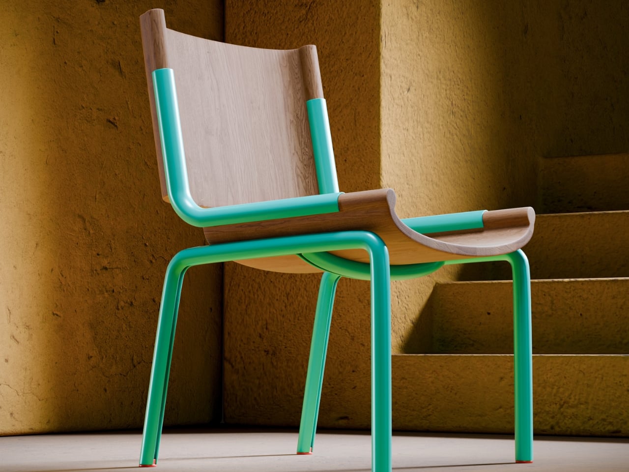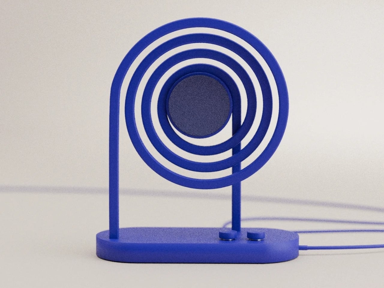
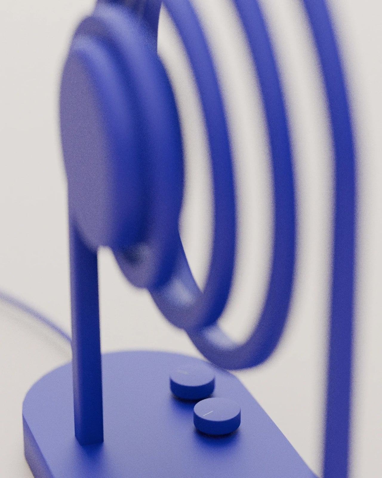
There’s something deeply satisfying about a product that looks exactly like what it does. You know the feeling: when form follows function so perfectly that you can’t imagine it any other way. That’s the immediate reaction to Loopen, a sculptural speaker concept from Design by Joffrey that transforms the invisible phenomenon of sound into a striking visual statement.
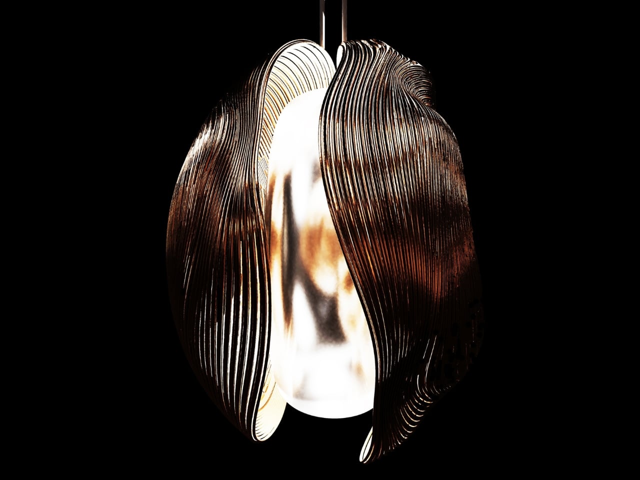
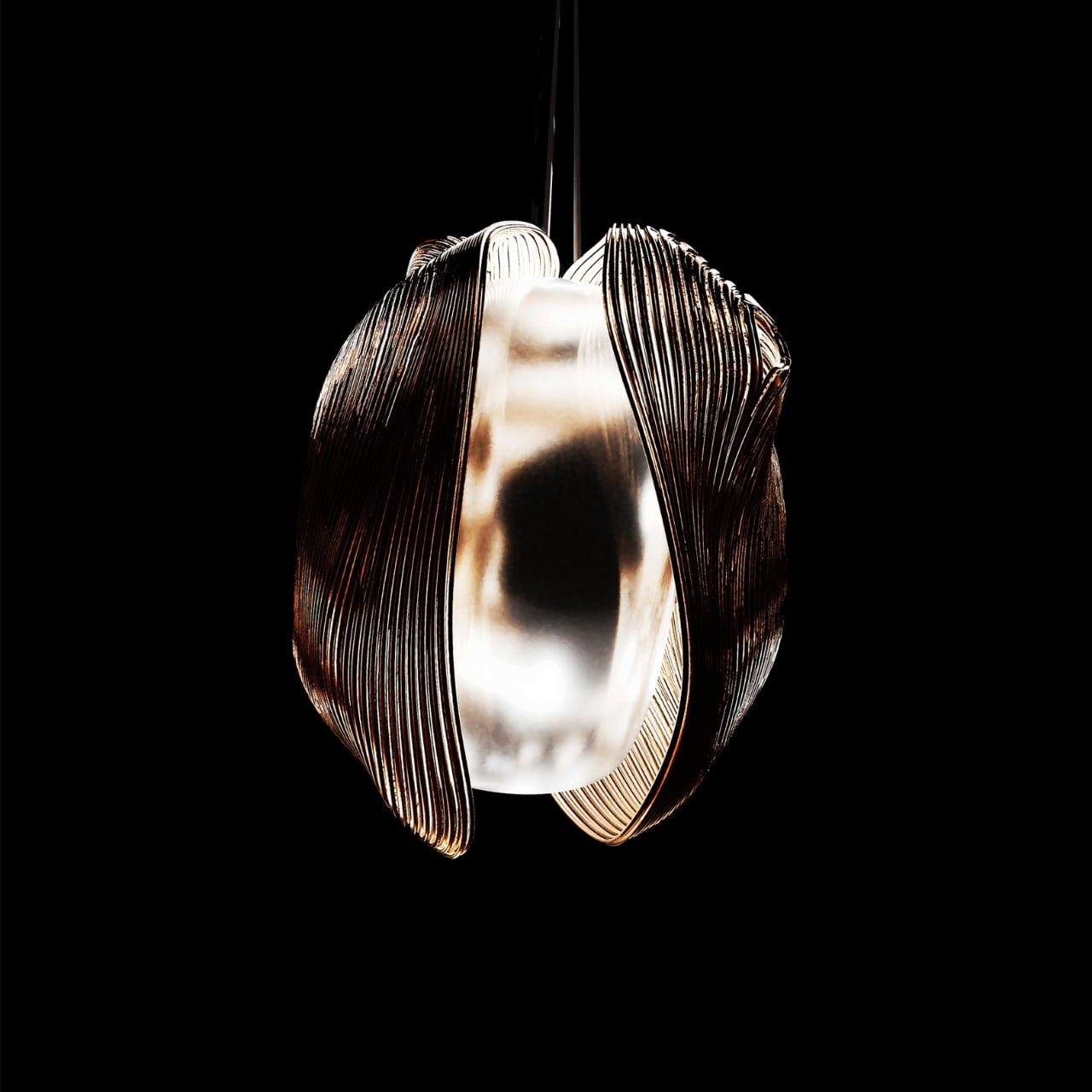
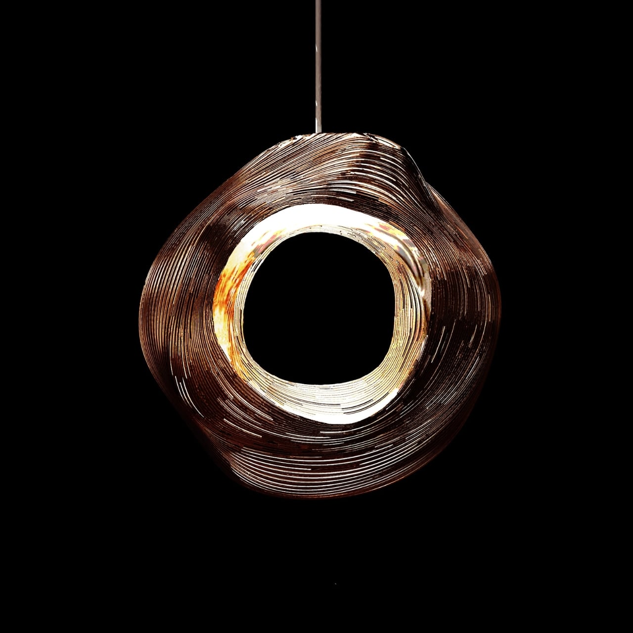
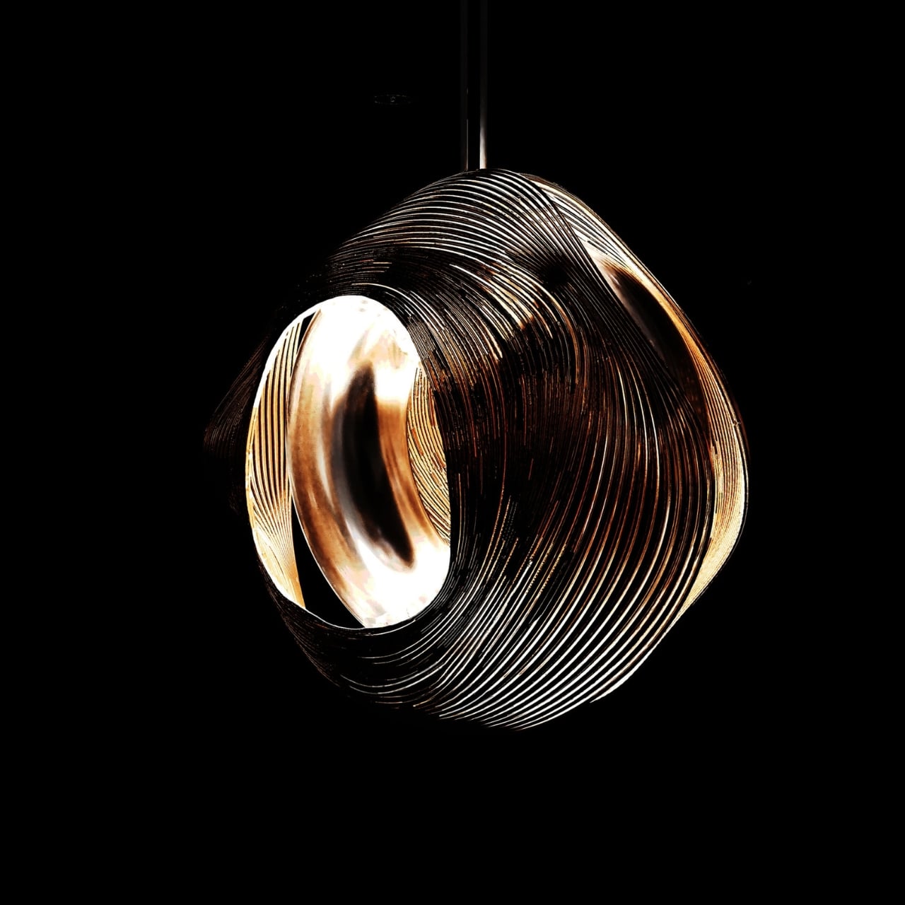
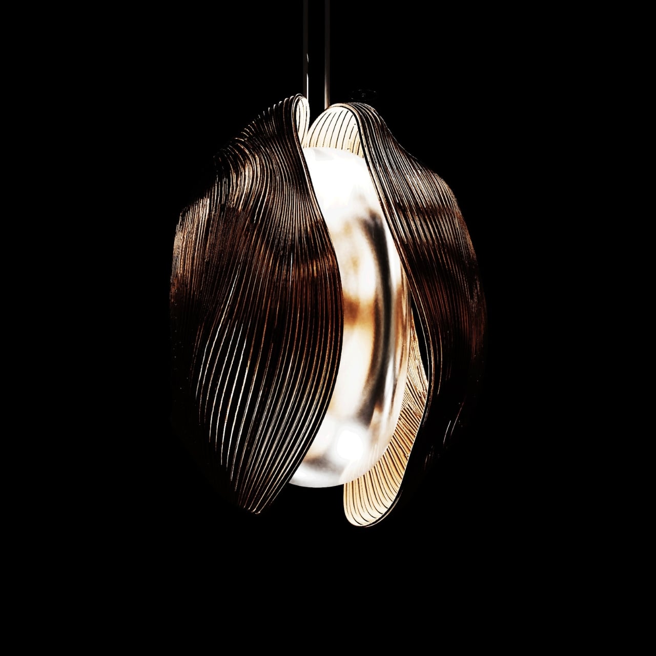
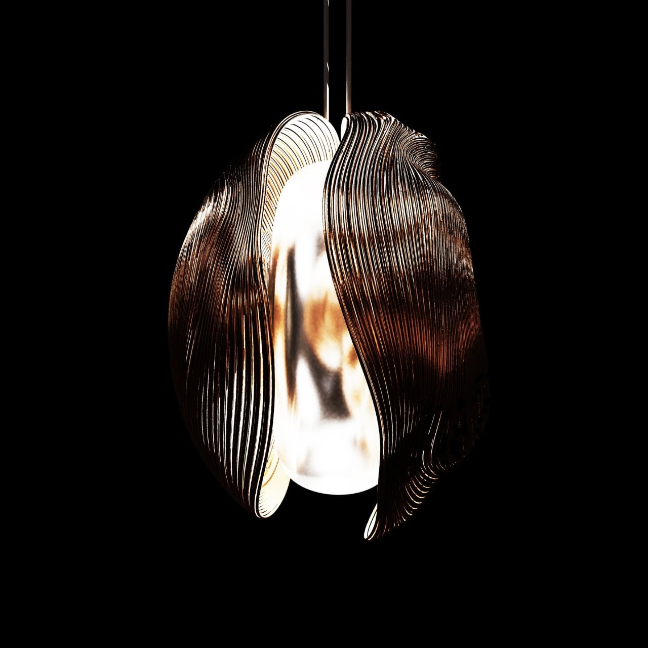
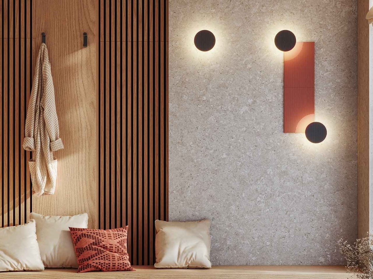
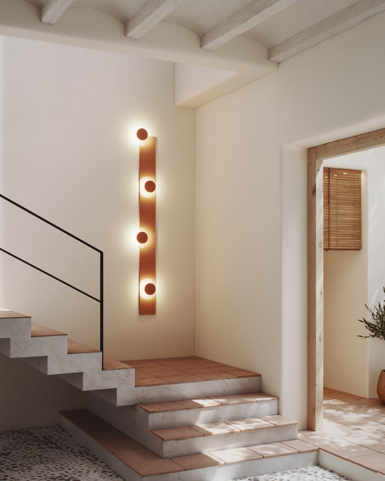
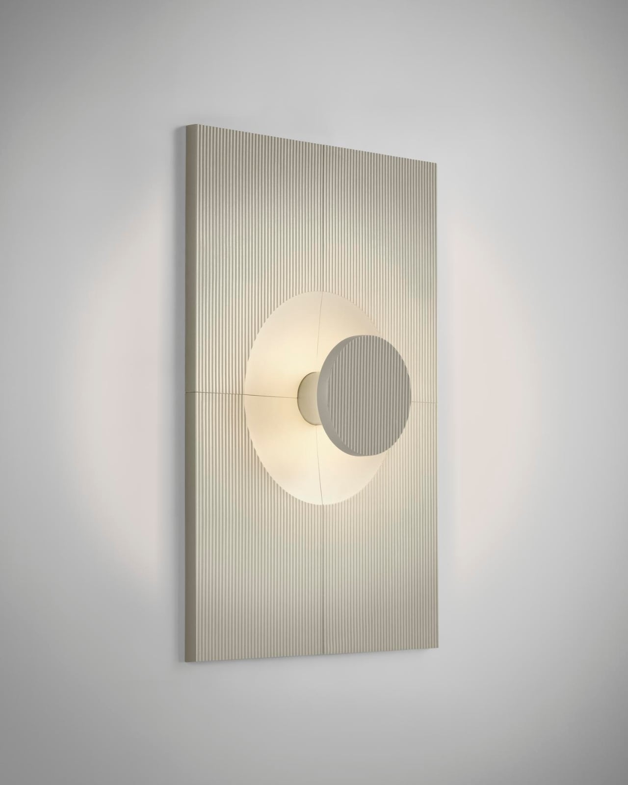
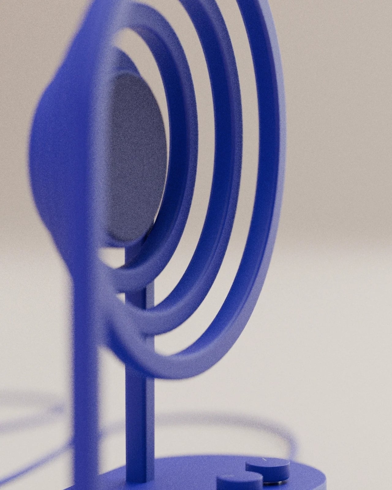
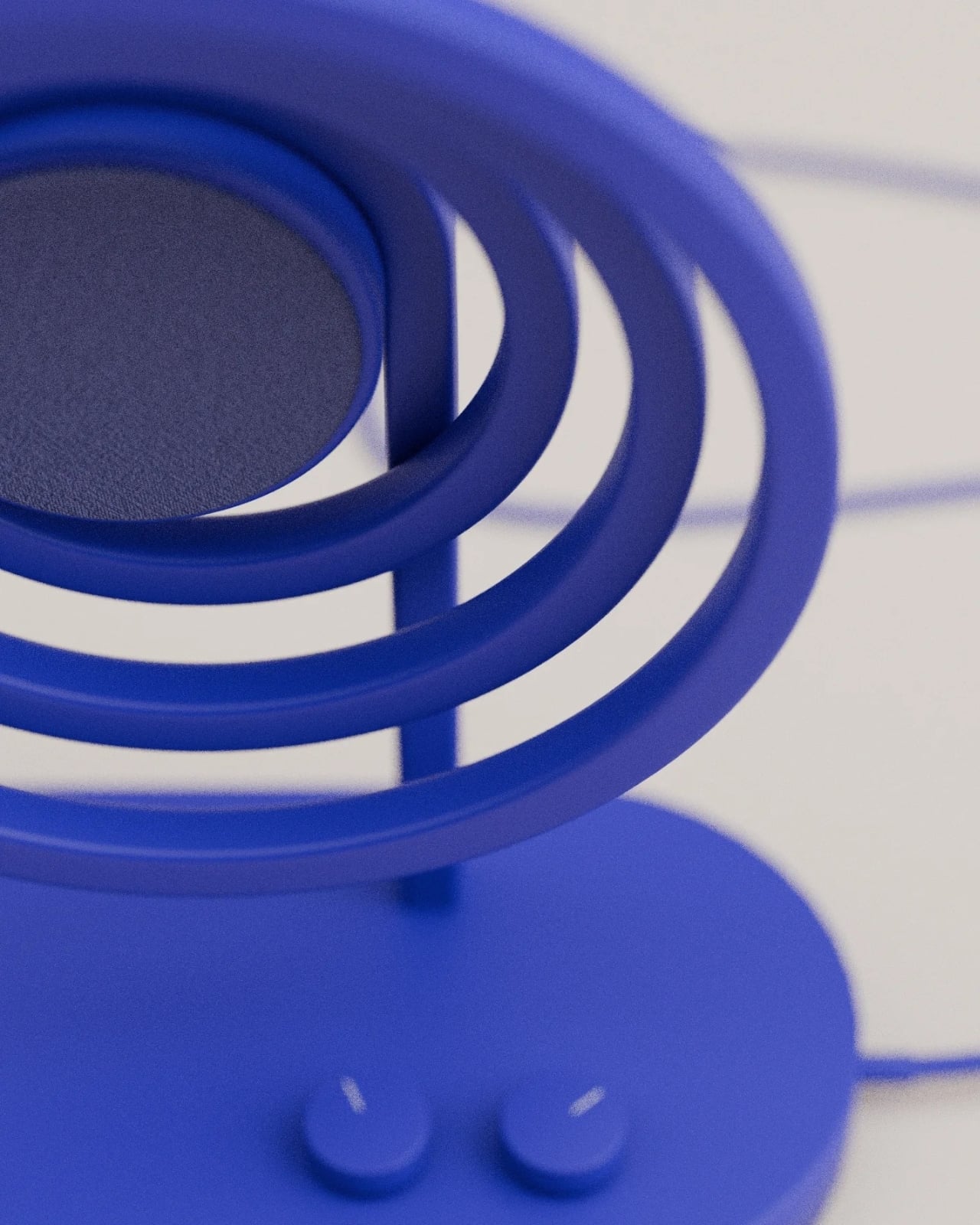
At first glance, Loopen reads as pure art. Rendered in a bold cobalt blue, the design features concentric circular loops that radiate outward from a central speaker driver, creating a mesmerizing pattern that looks like you’ve frozen sound waves mid-journey through space. But this isn’t just aesthetic cleverness for its own sake. Those loops are the actual framework holding everything together, turning the metaphor into structure.
Designer: Design by Joffrey
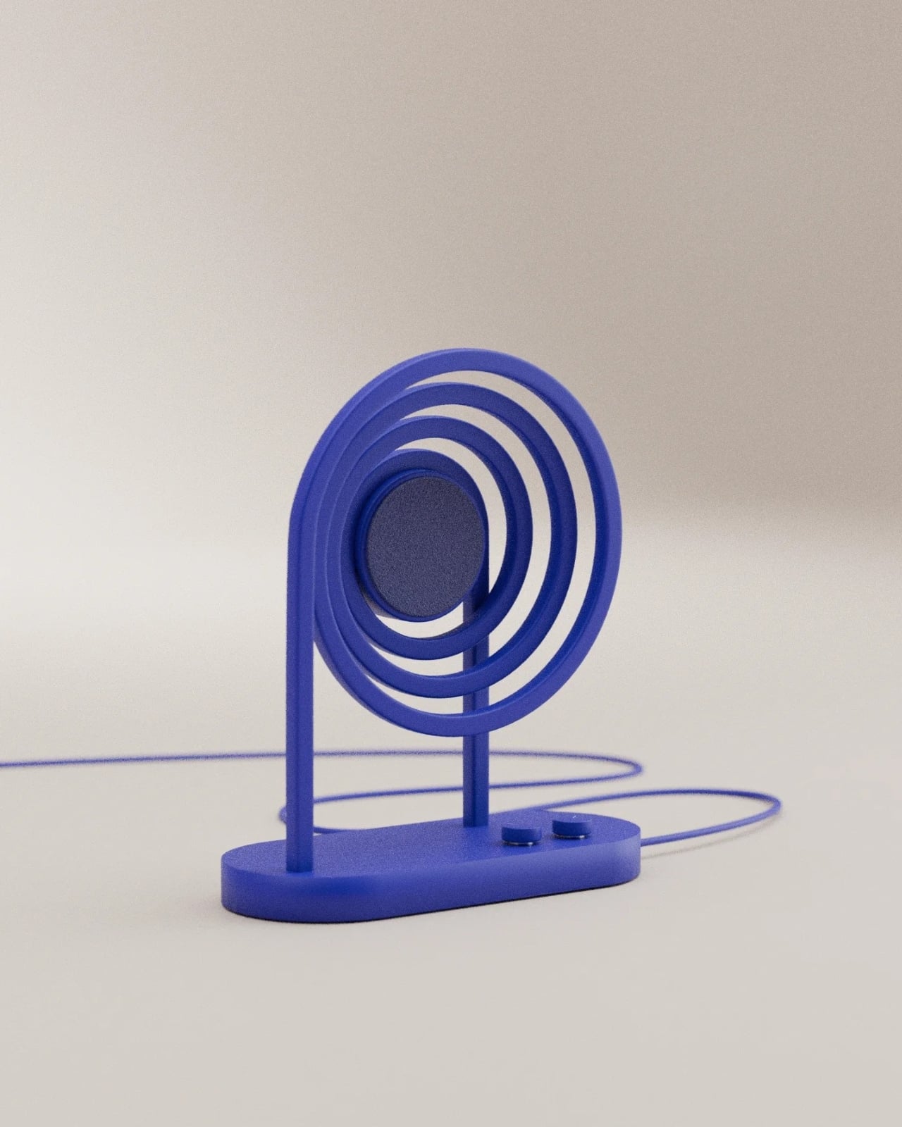
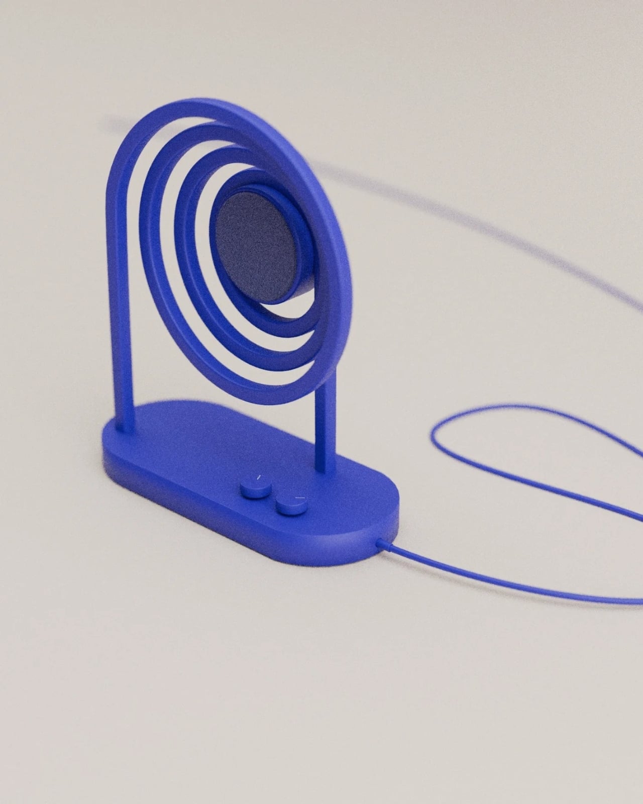
The genius here is in the restraint. Design by Joffrey could have gone wild with this concept, adding unnecessary embellishments or overcomplicating the form. Instead, Loopen strips everything back to its essential elements. The circular ripples emerge from an oval base, supported by two slim uprights that keep the whole composition feeling light and airy despite its sculptural presence. Two simple control buttons sit flush on the base alongside the power cable, maintaining the clean lines without disrupting the visual flow.
What makes this design particularly clever is how it plays with our perception of sound itself. We can’t see sound waves, but we’ve all seen the visualizations: those undulating sine waves in audio software, the ripples spreading across water when you drop a stone, the circular patterns speakers create when you place them face-down on a surface covered in sand. Loopen takes that universal visual language and makes it literal, giving physical form to something we usually only experience through our ears.
The color choice deserves attention too. That saturated blue isn’t trying to blend into your minimalist white walls or disappear on a dark shelf. It demands to be noticed, which feels right for a piece that’s as much sculpture as it is functional tech. The matte finish gives it a contemporary, almost toy-like quality that keeps the design from feeling too serious or precious. This is a speaker you could actually live with, not just admire from across the room.
There’s also something refreshing about seeing a concept that doesn’t try to hide its technology. So many modern speakers aim for invisibility, disguising themselves as wooden boxes or fabric cylinders that could be mistaken for home decor. Loopen takes the opposite approach: it celebrates what it is. The speaker driver sits proudly at the center, cradled by those wave-like loops, making no apologies for being a piece of audio equipment.
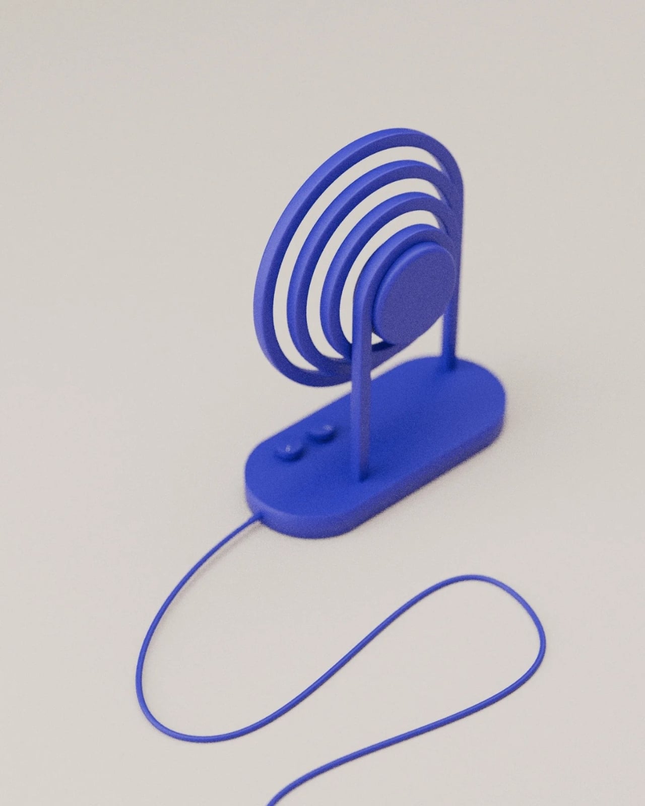
The compact size suggests this is likely a Bluetooth speaker meant for personal spaces rather than filling an entire room with sound. That feels appropriate. This is the kind of object you’d want on your desk or bedside table, where you can appreciate the form up close. The wired connection visible in the images hints at this being a design concept or prototype, but it’s easy to imagine a production version with wireless charging or a more concealed power solution.
What really stands out about Loopen is how it bridges that often awkward gap between tech and design. Too often, products are either functional but boring, or beautiful but impractical. This manages to be both visually compelling and immediately understandable in its purpose. You don’t need an explanation to know what it does. The form tells you everything. Design by Joffrey has created something that fits perfectly into our current moment, where the boundaries between art, design, and technology keep getting blurrier. We want our objects to be more than just tools. We want them to spark joy, start conversations, and add visual interest to our spaces. Loopen delivers on all fronts.
Whether this remains a concept or eventually makes it to production, Loopen represents the kind of thoughtful, playful design that makes you reconsider what everyday tech products could look like. It’s a reminder that functionality and beauty aren’t opposing forces. Sometimes, when you let the core idea of what something does guide how it looks, you end up with magic. In this case, that magic sounds pretty good too.
The post This Speaker Turns Sound Waves Into Sculptural Art first appeared on Yanko Design.