This $219 Screen Runs 6 Months Per Charge and Wants Nothing From You

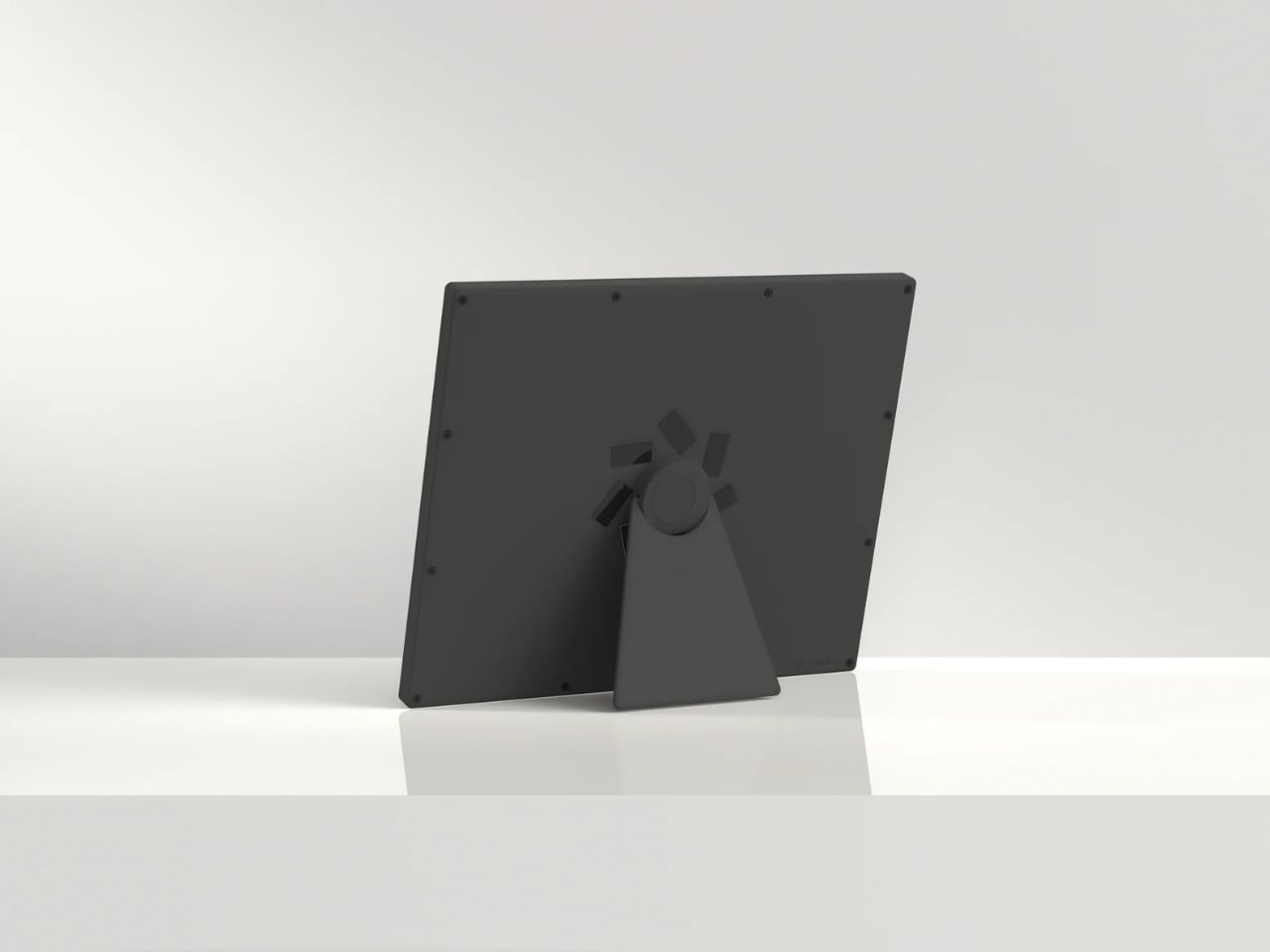
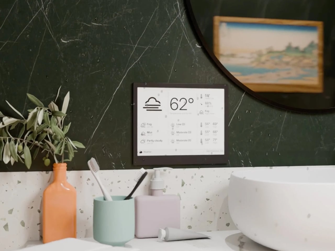
Most of the screens that you encounter everyday is always fighting for your attention, always buzzing, glowing, pulsing with red notification badges designed to hijack your focus. The TRMNL X, a 10.3-inch e-ink smart display priced at $219, takes the opposite approach entirely. It just sits there, calm and papery, waiting for you to glance over when you’re ready. And that restraint might be the most radical design choice in consumer tech right now.

TRMNL’s original model was deliberately lo-fi, a smaller 7.5-inch 1-bit screen with no touchscreen and no backlight. It was almost stubbornly analog in spirit. It appealed to developers, minimalists, and those of us tired of all the bright screens. The TRMNL X is the company’s answer to users who loved the philosophy but wanted more screen real estate and polish. And it delivers on both counts without losing what made the original special.

Designer: TRMNL
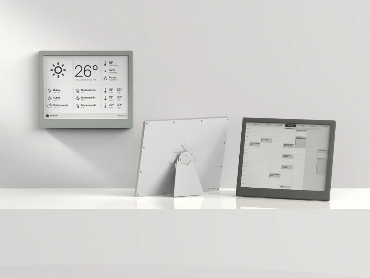
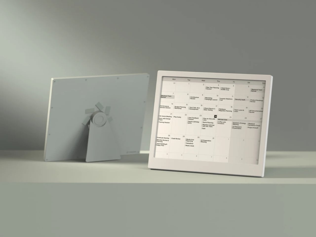
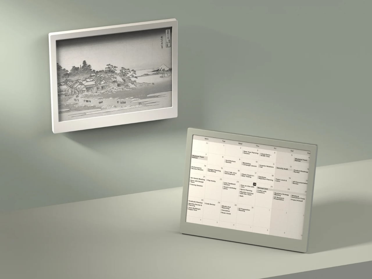
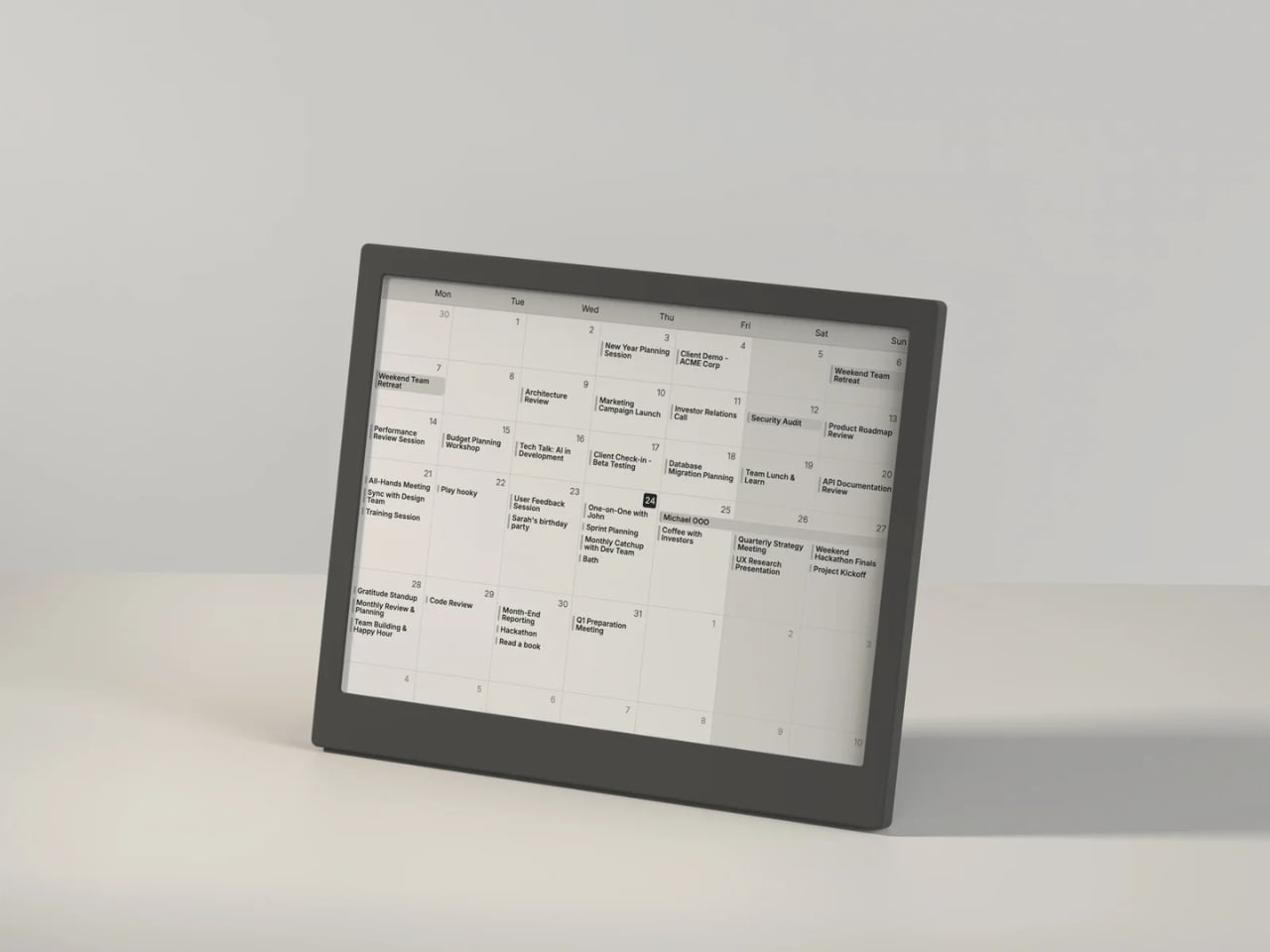
The display itself is gorgeous in the understated way that only e-ink can be. At 1872 x 1404 resolution with 16 shades of gray, it renders calendars, weather dashboards, news headlines, and artwork with a crispness that feels more like a printed page than a screen. Partial refreshes happen in under 200 milliseconds, which is fast enough that the display doesn’t feel sluggish when cycling through your content. It’s the kind of screen you can stare at for hours without your eyes complaining, which is something no LCD or OLED can honestly claim.
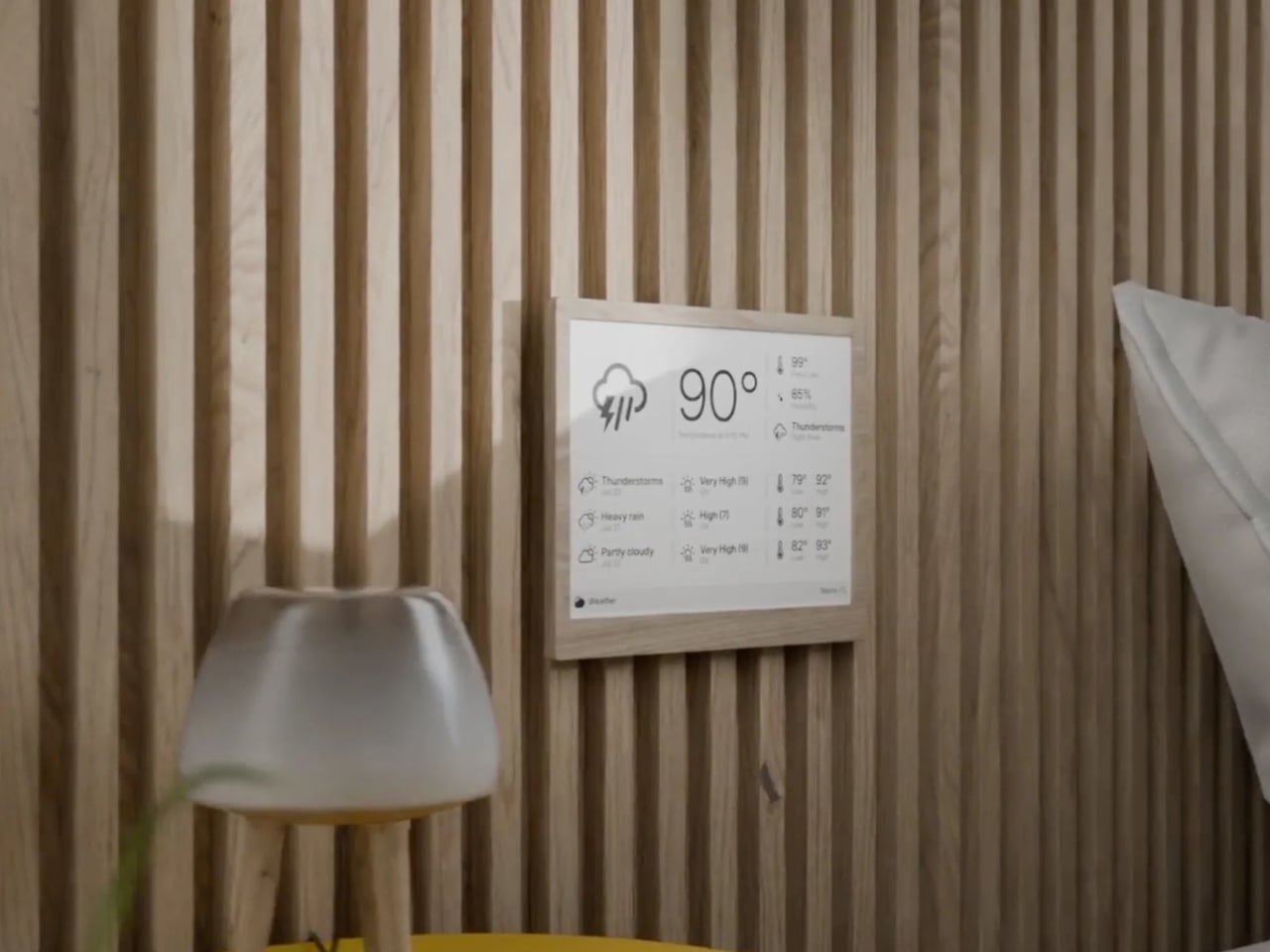
What I find most compelling about the TRMNL X is how much it trusts you. There’s no algorithm deciding what you should see. You configure your own dashboard with plugins pulled from a library of over 850 options, everything from Google Calendar and Reddit feeds to ChatGPT summaries and YouTube subscriber counts. You arrange them in one of eight layout templates, set your refresh interval, and walk away. The device wakes up periodically, pulls a new image from the server, displays it, and goes back to sleep. That’s it. No infinite scroll. No dopamine trap. No dark patterns. Just information you asked for, presented when you want it.
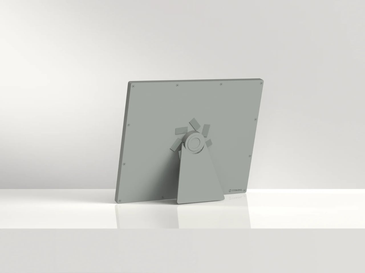
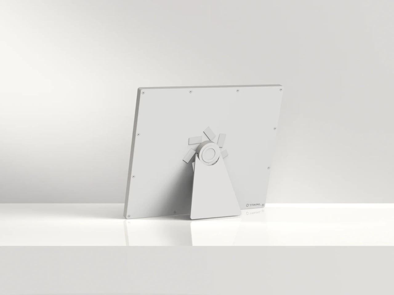
The hardware reflects this same philosophy of quiet confidence. The frame comes in six finishes, from black and white to sage and faux wood, and the front is completely clean with no visible branding. There’s a magnetic USB-C charging connector, a built-in accelerometer for auto-rotation, and a touch gesture bar for quick navigation. Battery life stretches anywhere from two to six months depending on your refresh rate, which means you can genuinely forget it needs power at all. The enclosure is also waterproof and dust-proof, so it can live in a bathroom or a workshop without issue.
But the real personality of the TRMNL X shows in its hacker-friendly DNA. The firmware is fully open source. The case has actual screws, not glue, so you can open it up, swap components, and tinker to your heart’s content. There’s a Qwiic connector for attaching external sensors, and the community on Discord has already built custom integrations for Home Assistant and all sorts of niche projects. In an era when most gadgets are sealed shut and locked down, this level of openness feels almost rebellious.
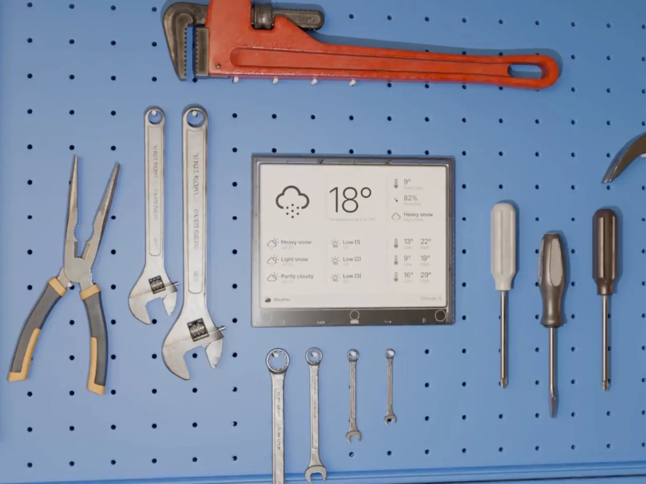
At $219, the TRMNL X isn’t an impulse buy. But it’s also not competing with tablets or smart home hubs. It occupies a category that barely existed a few years ago: the passive information display. Something you put on your desk or mount on a wall that keeps you informed without pulling you into a screen-time spiral. The fact that it runs for months on a charge and requires almost zero maintenance makes it feel less like a gadget and more like a piece of furniture.
There’s a growing appetite for technology that respects boundaries, that does its job and then gets out of the way. The TRMNL X is a beautifully considered expression of that idea, a screen that proves sometimes the most powerful design choice is simply knowing when to stay quiet.
The post This $219 Screen Runs 6 Months Per Charge and Wants Nothing From You first appeared on Yanko Design.
A 24-Sided Lamp That Reveals Hidden Colors When You Turn It On

There’s a moment when you look at a well-designed object and feel something shift quietly inside you. Not a gasp, not a dramatic reaction, just a quiet recognition that someone thought deeply about what they were making and why. That’s exactly how I felt when I came across Aoi, a pleated lighting fixture by designer Ingrid Ng of InOutGrid, and I haven’t stopped thinking about it since.

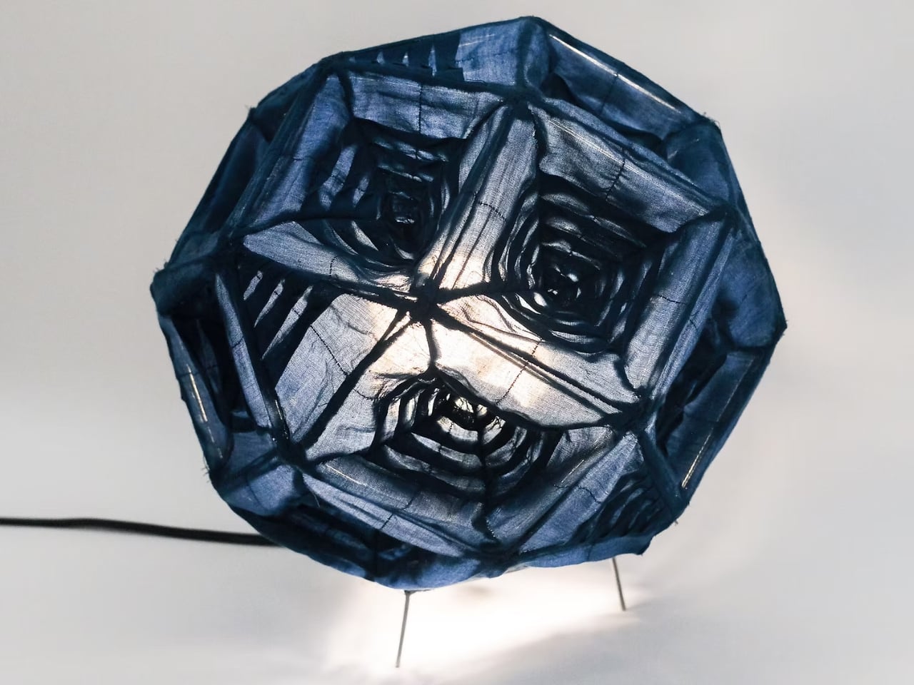
At first glance, Aoi looks like geometry made soft. The lampshade is built in the shape of a twenty-four-sided icositetragon, which sounds like something out of a math textbook but translates visually into something surprisingly graceful. It sits somewhere between origami and architecture, structured enough to feel intentional but tactile enough to feel human. And that tension, that careful balance between rigor and warmth, is really what makes the piece worth paying attention to.

Designer: Ingrid Ng / InOutGrid

Ng’s approach centers on traditional pleating techniques applied to sheer layered fabrics. Pleating, of course, is one of the oldest forms of textile manipulation we have. It’s been used in clothing, in paper crafts, in Japanese lanterns for centuries. What Ng does with Aoi is take that heritage and redirect it toward function and light in a way that feels both reverent and completely fresh. The design draws from the proportions and framing logic of traditional Japanese lanterns, and you can feel that lineage in the piece without it ever feeling like a costume or a direct reference.

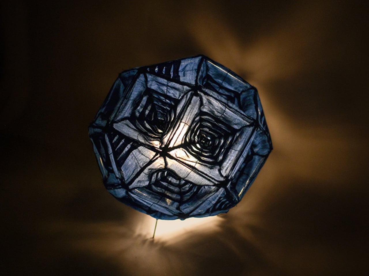
What’s genuinely clever about Aoi is what happens when you turn it on. In its unlit state, the exterior reads as mostly monochromatic, clean and composed. But the moment light is introduced, the superimposed sheer fabric layers begin to interact with each other in ways you wouldn’t predict from looking at it cold. Layered shades of blue emerge, arranged in geometric configurations. Shadows shift in calibrated patterns across surrounding surfaces. The lamp doesn’t just illuminate a room, it performs in it. And I mean that as a compliment, not a critique. There’s a meaningful difference between performance that’s gratuitous and performance that reveals something true about an object’s construction.

The internal structure is worth mentioning too. A wire armature supports the pleated fabric envelope, keeping everything stable without visually intruding on the lightness of the textile. It’s the kind of detail that rarely gets appreciated because when it works, you simply don’t notice it. The fabric appears to float and hold its shape simultaneously, which sounds contradictory until you see it and understand that the whole point was to let the material speak for itself, without interference.

What I appreciate most about Aoi is that it doesn’t overcomplicate its own thesis. So much of contemporary product design is about stacking features or making an aesthetic statement loud enough to be photographed. Ng does the opposite. The idea here is elegant in its restraint: fabric can be structural. Fabric can modulate light. Fabric, when handled with precision and care, can become a medium as rigorous as steel or glass. That argument doesn’t need a manifesto. The lamp makes it entirely on its own.

There’s also something meaningful about rooting contemporary work in craft traditions that predate digital tools by centuries. In an era where generative design and algorithmic aesthetics dominate so many design conversations, Aoi is a gentle but firm reminder that the fold, the pleat, the carefully stitched edge, these are not primitive precursors to modern design thinking. They are sophisticated techniques with as much to offer today as they ever did, perhaps more so, precisely because they require patience and physical understanding that no software can replicate or shortcut.

Aoi isn’t trying to reinvent lighting design. It’s doing something more interesting than that. It’s asking what happens when you apply genuine craft curiosity to a very ordinary object, and it keeps proving that the answer can be quietly extraordinary. Not every design needs to shout. Some of the best ones just glow.

The post A 24-Sided Lamp That Reveals Hidden Colors When You Turn It On first appeared on Yanko Design.
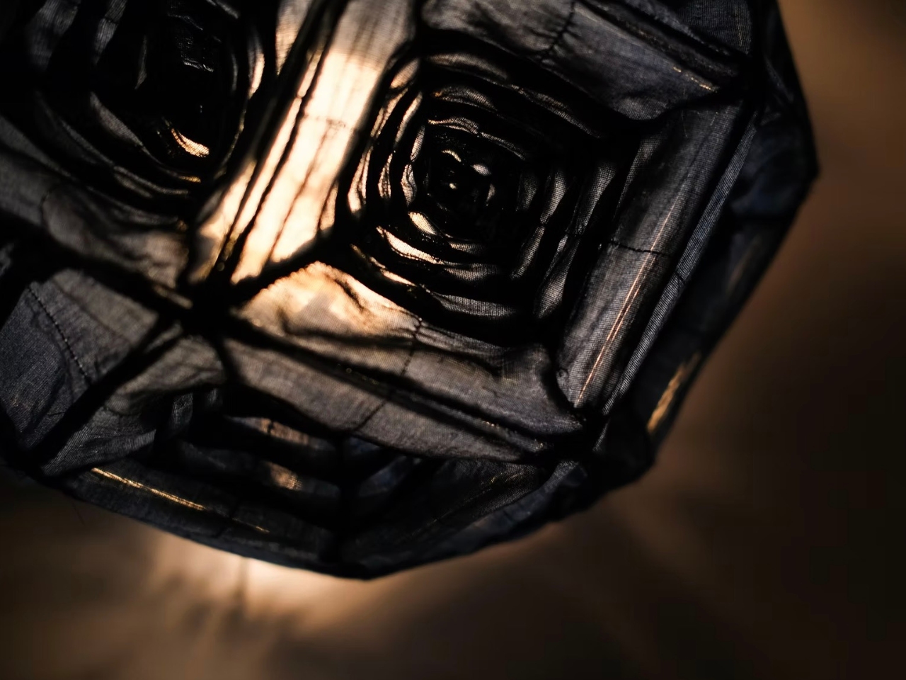
This 40-Pound Robot Dog Can Carry 143 Pounds of Cargo

Robot dogs have been having a moment for a few years now. From Boston Dynamics’ Spot strutting through construction sites to viral videos of four-legged machines dancing to pop songs, the quadruped robot has gone from fringe sci-fi concept to a fixture of the modern tech conversation. But most of what we’ve seen has felt like proof of concept, interesting to watch but not quite ready to show up and do real work. Unitree’s new As2 feels like the machine that finally closes that gap.

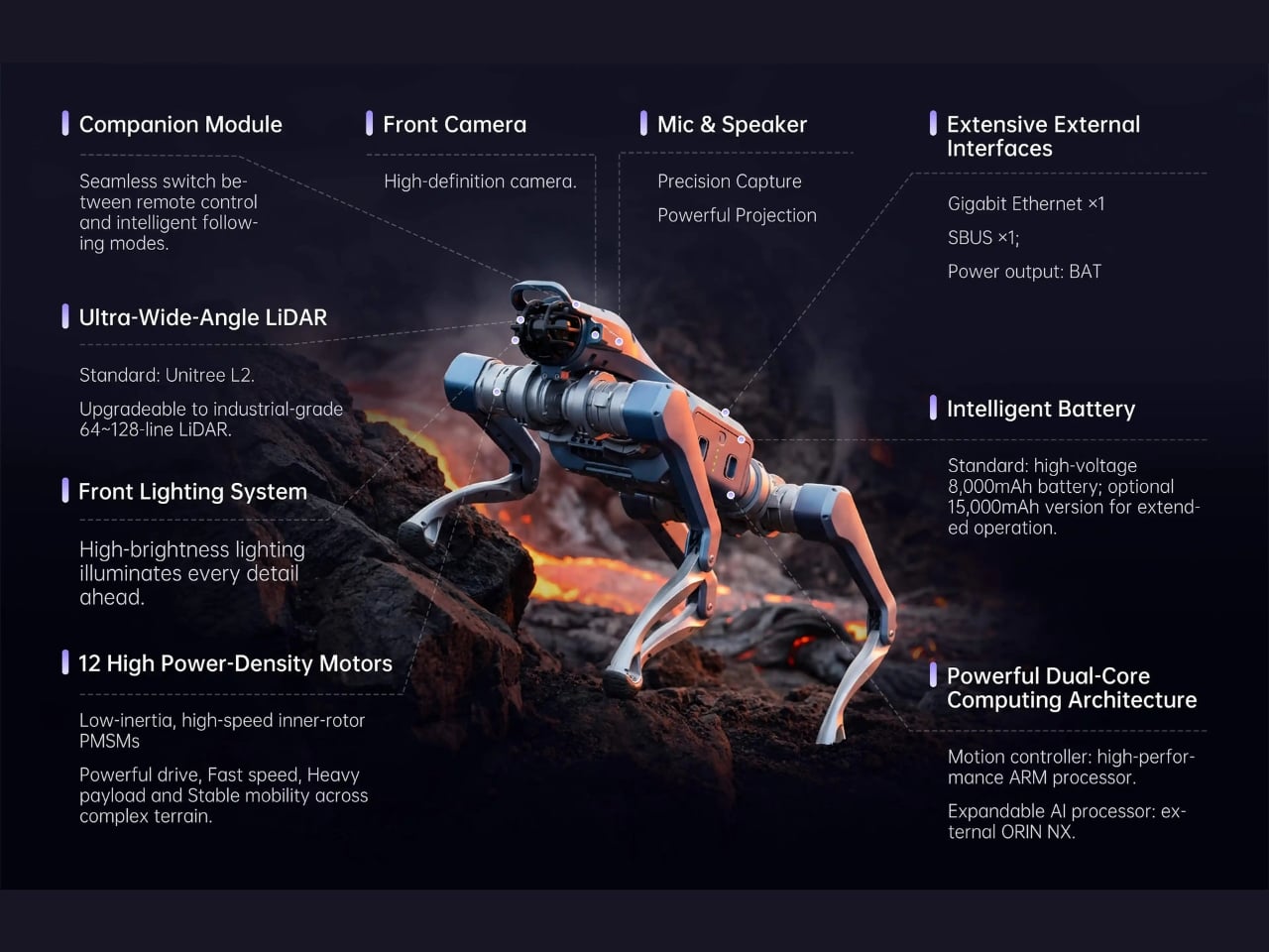
Unitree, the Chinese robotics firm behind the popular Go2 robot dog, just unveiled the As2, and the spec sheet alone is enough to make you stop scrolling. At about 18 kilograms, roughly 40 pounds with its battery included, the As2 is compact enough to move through tight spaces, yet built to handle a standing payload of up to 65 kilograms. That’s more than 143 pounds sitting on top of a 40-pound robot, which is genuinely impressive and a little hard to picture until you actually see it in action. For continuous walking with a load, it handles up to 15 kilograms and keeps going for over 13 kilometers. Its battery, a 648Wh, 15,000mAh unit, gives the As2 more than four hours of runtime when unloaded, covering over 20 kilometers. For an industrial robot, that’s a serious range.

Designer: Unitree

Speed-wise, it hits over 5 meters per second, roughly 11 miles per hour, which is faster than most people jog. It can climb stairs up to 25 centimeters high, tackle slopes at 40 degrees, and mount vertical platforms as high as 50 centimeters. The torque output sits at approximately 90 N·m with a torque-to-weight ratio of about 5 N·m/kg, driven by low-inertia inner rotor motors paired with industrial-grade crossed roller bearings. The engineering here is dense and deliberate. This isn’t a toy built to look capable; it’s a machine built to actually be capable.

What I find most interesting about the As2, though, is how Unitree is positioning it. The tagline is “Compact Size, Industrial Capability,” but the word they keep coming back to is “companion.” That’s a deliberate choice, and it tells you something about where the company sees this going. The robot dog market has largely split into two camps: big industrial machines that feel cold and utilitarian, and smaller consumer products that are more novelty than anything else. The As2 seems to be genuinely trying to live in the middle, built tough enough for real environments with an IP54 weatherproofing rating and an operating range from -20°C to 50°C, but designed with a level of approachability that suggests Unitree has a broader audience in mind.

The platform is also open, which matters more than it might seem. The As2 supports large AI models for what Unitree calls “embodied AI interaction,” essentially giving developers the tools to build autonomous behavior on top of the hardware. The EDU model can even be expanded with an NVIDIA Jetson Orin NX, which opens the door to more complex AI applications. GPS and 4G are built in, though disabled by default. It runs on an 8-core CPU and comes in three configurations, AIR, PRO, and EDU, each scaled for different use cases from general exploration to full industrial deployment.

What strikes me about the As2 is that it represents a shift in tone for robot dogs as a category. The conversation around this technology has often leaned either dystopian, think surveillance and military use, or dismissive, as if legged robots are just expensive novelties. The As2 doesn’t entirely escape those conversations, but it does reframe them a bit. A machine this capable, this portable, and this open as a development platform has real potential in search and rescue, agriculture, infrastructure inspection, and logistics. The vision of a robot companion that is genuinely useful rather than just impressive is within reach, and the As2 is one of the better arguments for it.

Whether Unitree can translate this hardware into widespread, practical adoption is a different question entirely. But as a statement of where robot dogs are heading, the As2 is worth paying attention to.

The post This 40-Pound Robot Dog Can Carry 143 Pounds of Cargo first appeared on Yanko Design.
This Dark Timber House Disappears Into a Norwegian Forest

There’s a particular kind of restraint that’s genuinely hard to pull off in architecture. Anyone can build something that commands attention. Far fewer can build something that quietly earns it. The Solem Forest House in Oslo, Norway, designed by MORFEUS arkitekter, belongs firmly in the second category, and it’s the kind of project that stops you mid-scroll and makes you think about what good design actually is.

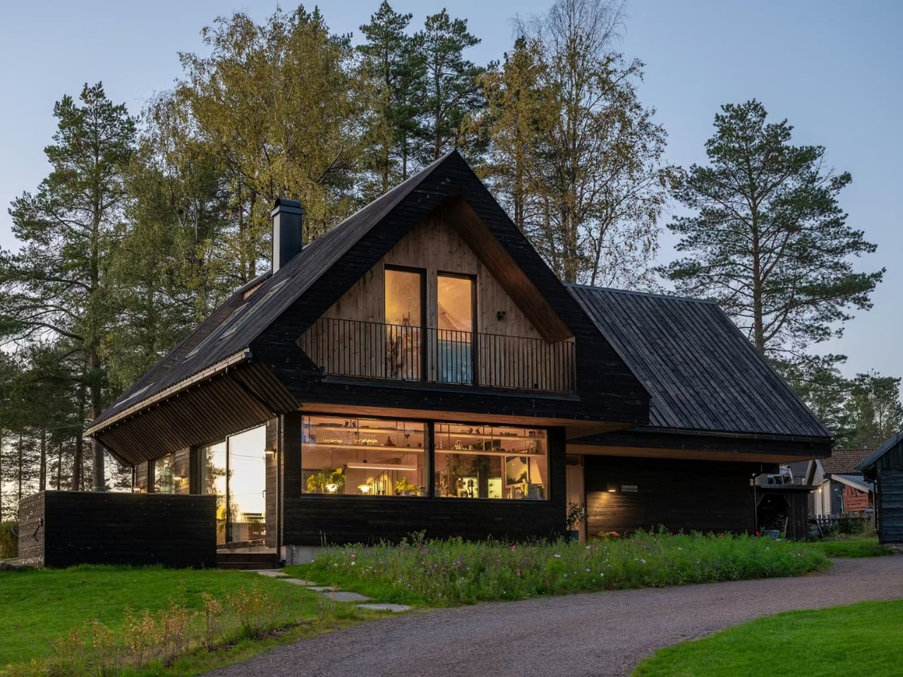
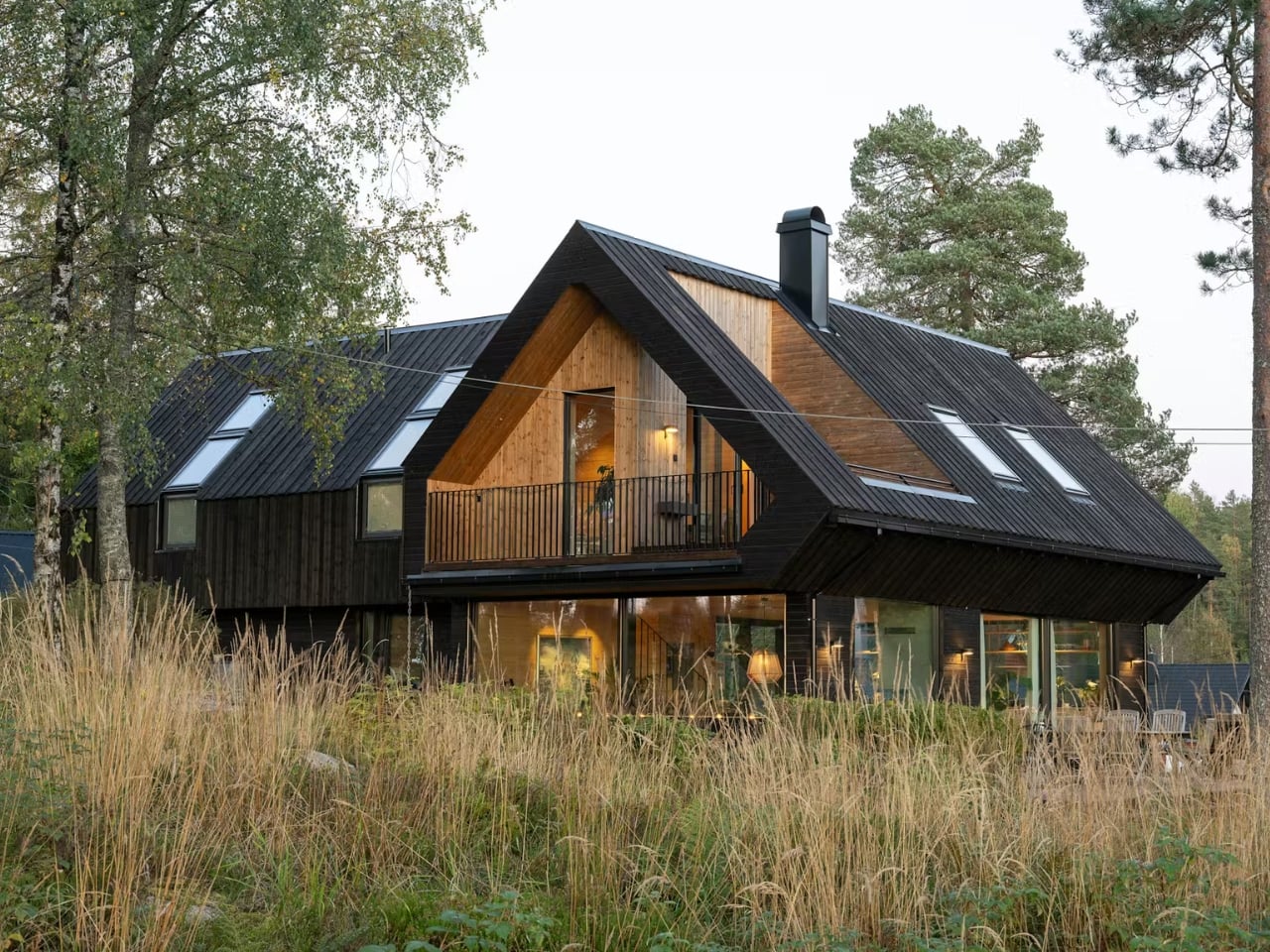
The house sits on a gently sloping ridge just east of Maridalsvannet, Oslo’s main water supply, in a small residential area surrounded by tall pine trees and deep forest. It’s not a massive project. At 170 square meters, it’s modest by most standards. But what MORFEUS arkitekter did with that footprint, and more importantly, what they chose not to do, is what makes it worth talking about.

Designer: Morfeus Arkitekter

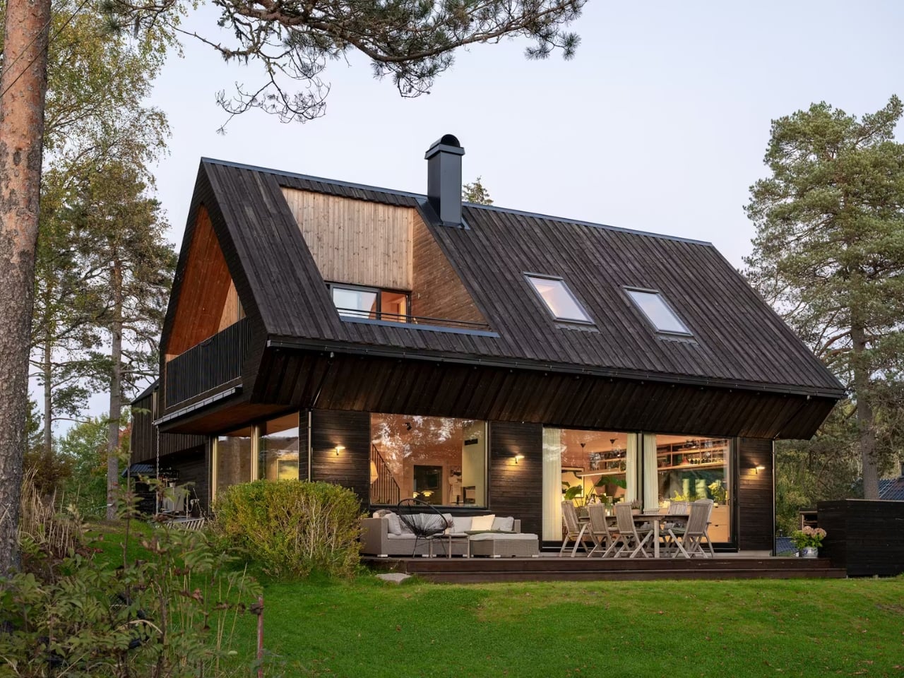
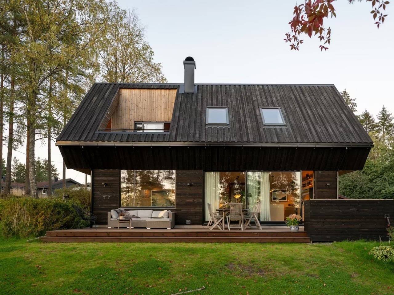
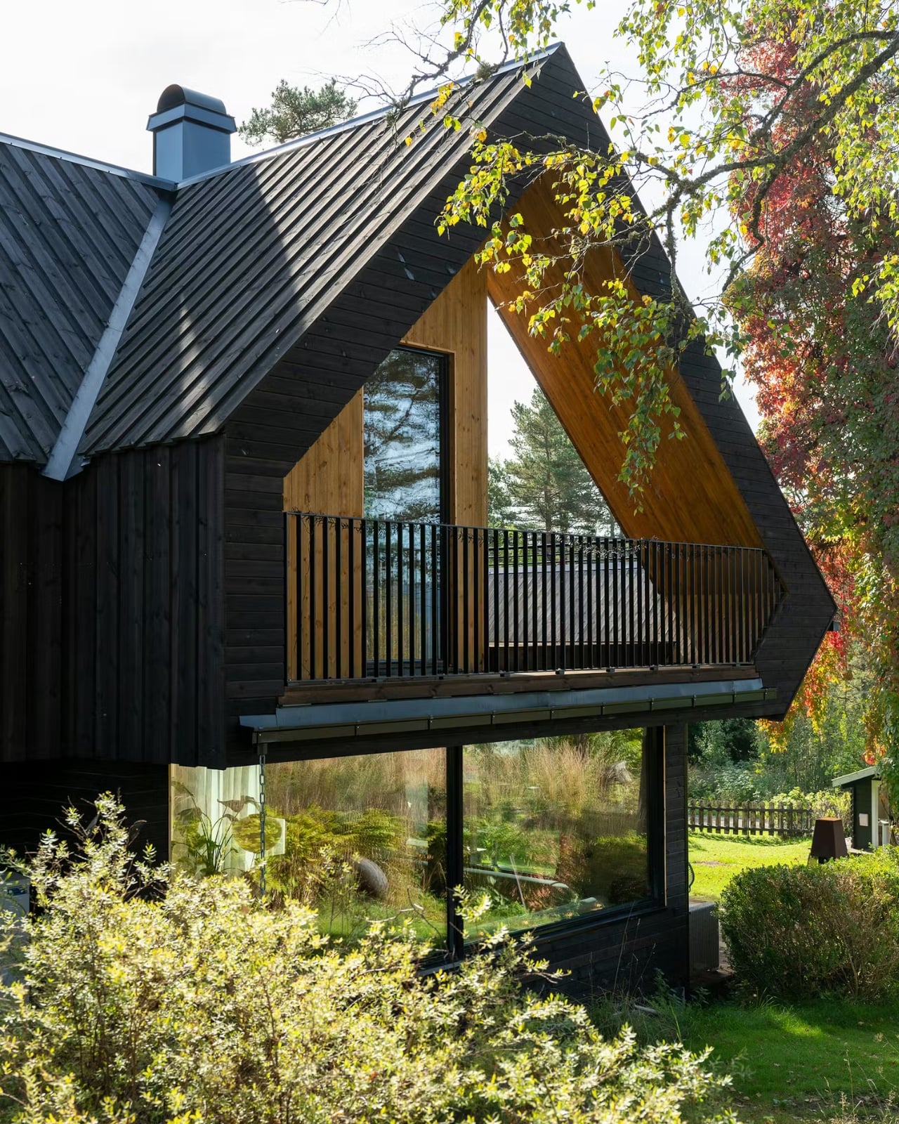
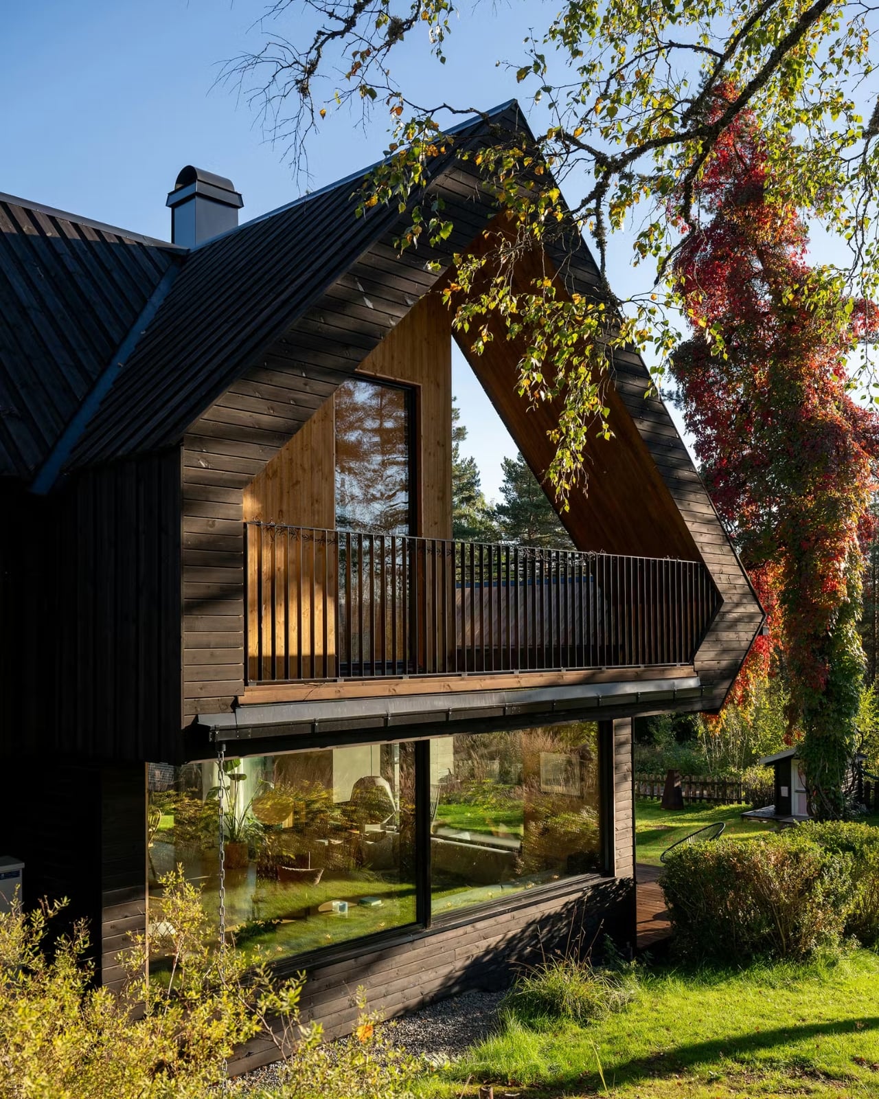
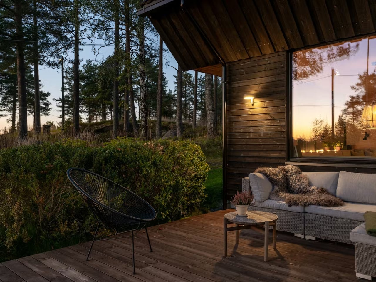
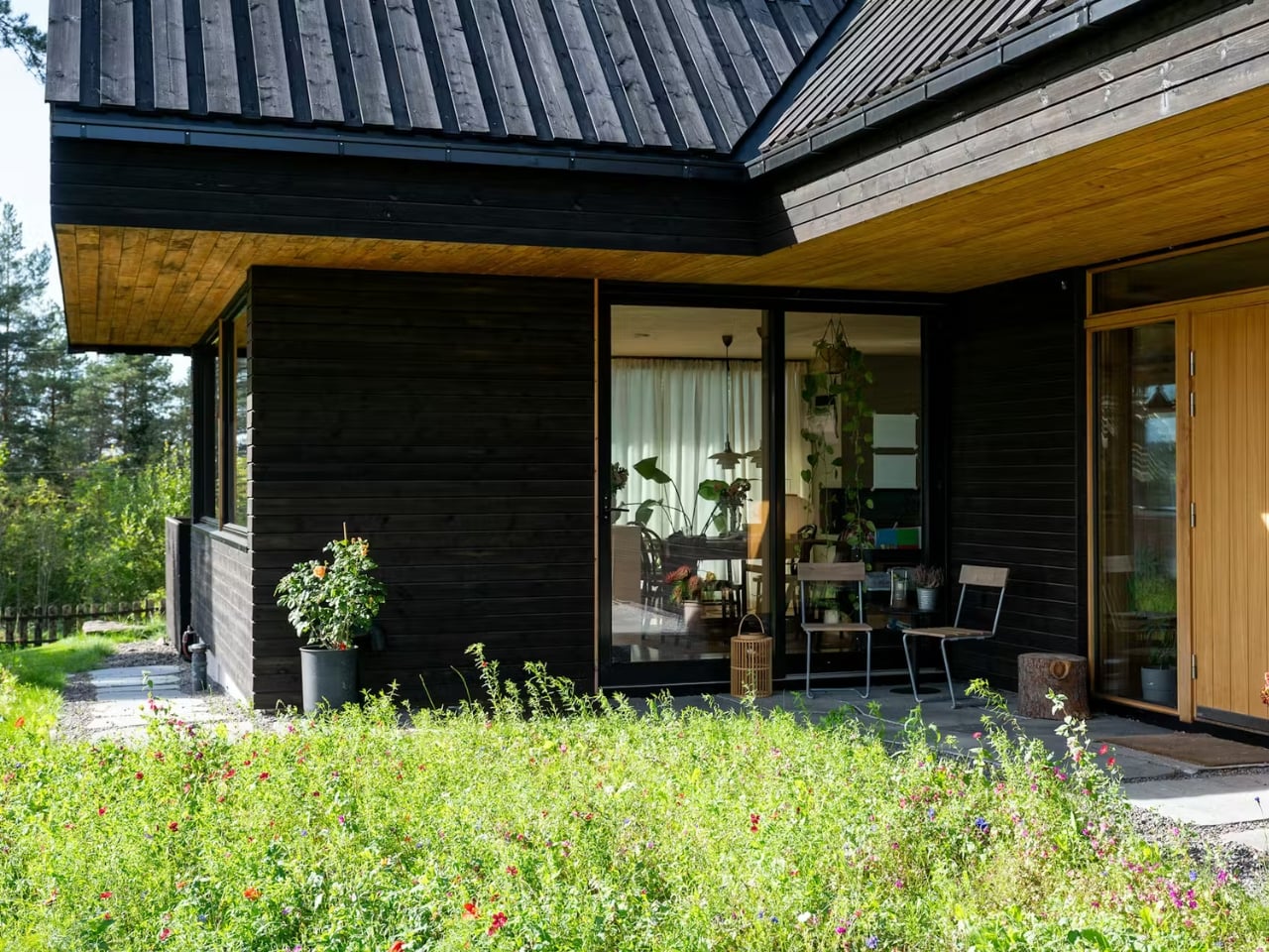
The most striking feature from the outside is the dark vertical timber cladding. It’s the kind of exterior that reads as almost austere in photographs until you place it in context. Against the trunks of surrounding pine trees, it doesn’t contrast. It converses. The dark tones echo the bark, the vertical lines mirror the trees, and the result is a home that feels like it grew out of the ridge rather than landed on it. Dwell described it as “a continuation of the forest rather than an imposition on it,” which isn’t just poetic writing. It’s an accurate description of the design intent made physical.

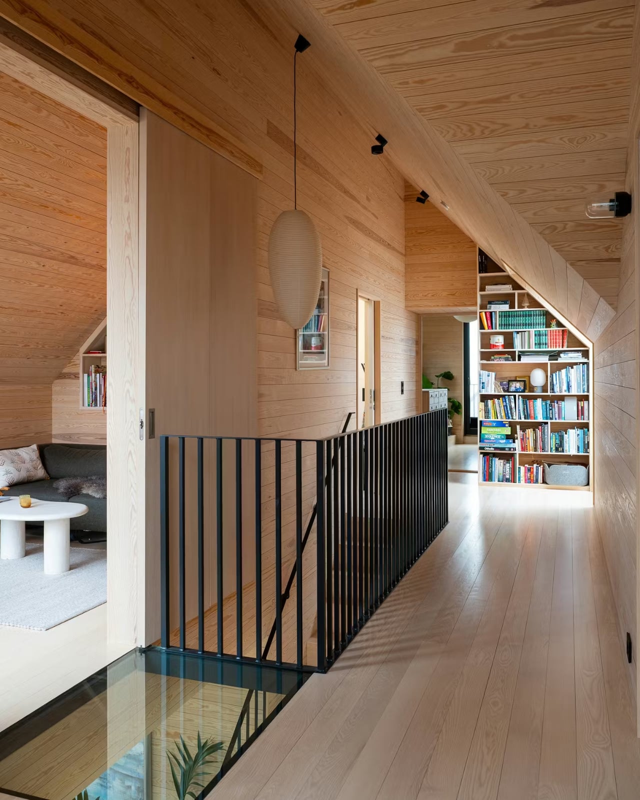
The roof is another story entirely. A large cross-gabled form defines the home’s architectural identity, and it does something genuinely clever: the second floor is partially embedded within the roof volume. What that means in practice is that you get rooms with character, with angles and nooks and a sense of shelter that flat-ceilinged spaces simply can’t replicate. The title of the Dwell feature on the project is “The Roof at This Norwegian Retreat Holds a Surprisingly Roomy Second Level,” and that element of surprise is very much the point. From the outside, the home reads compact and contained. Inside, the geometry works entirely in your favor.

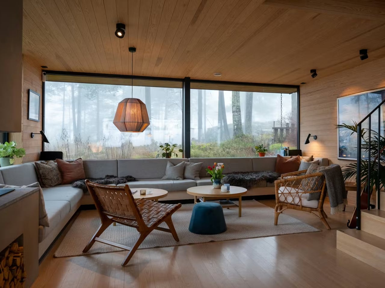
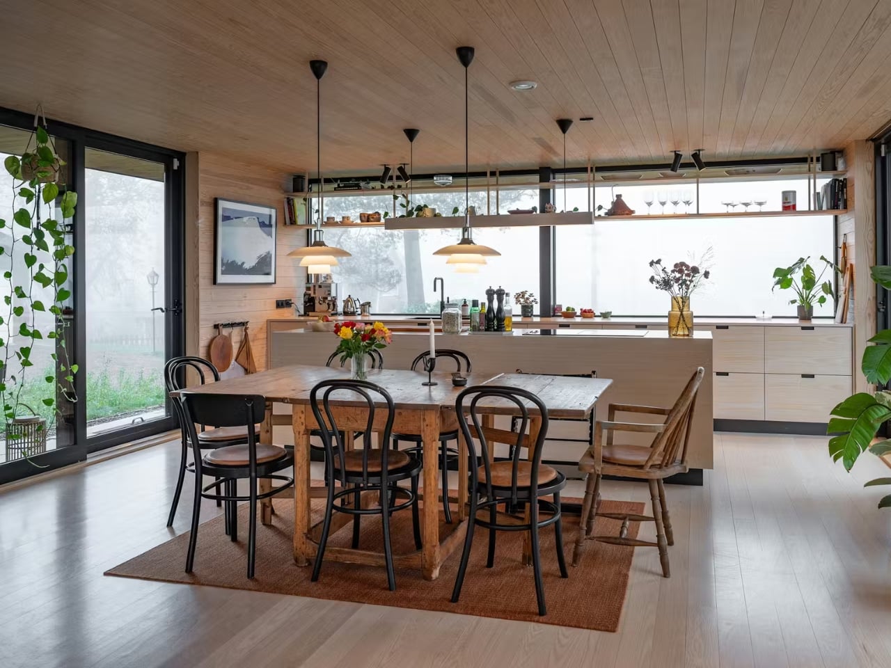
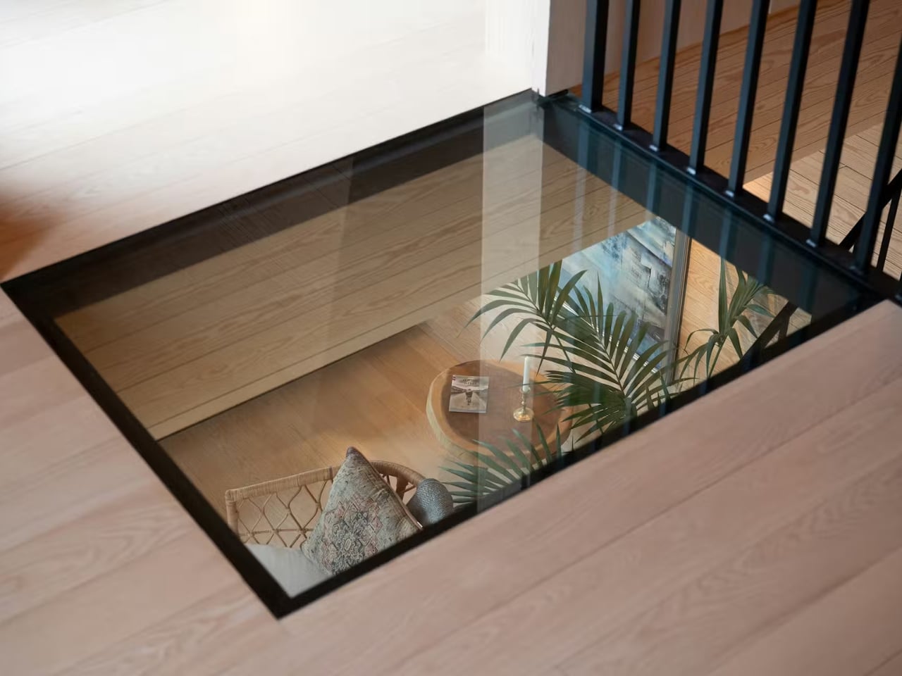
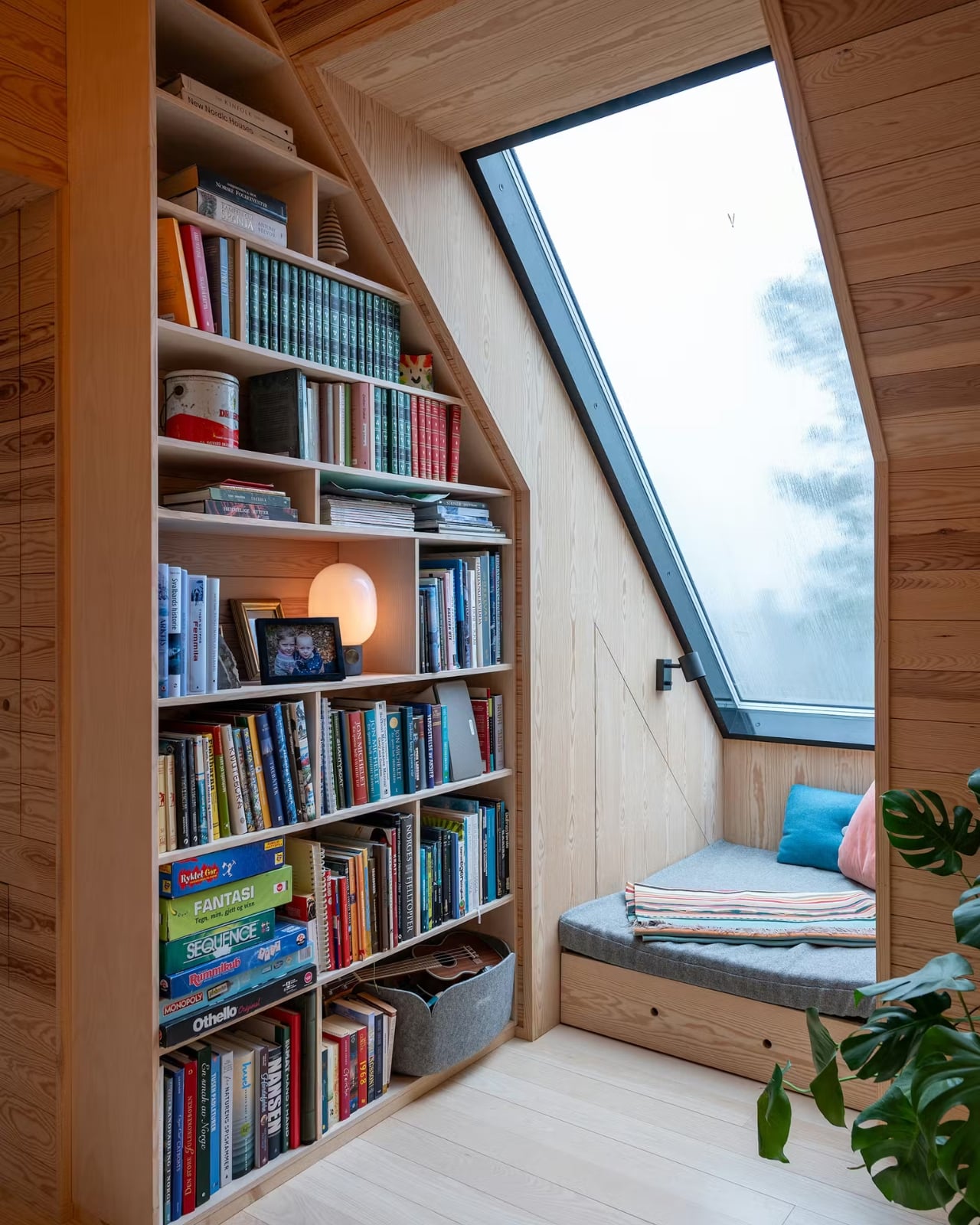
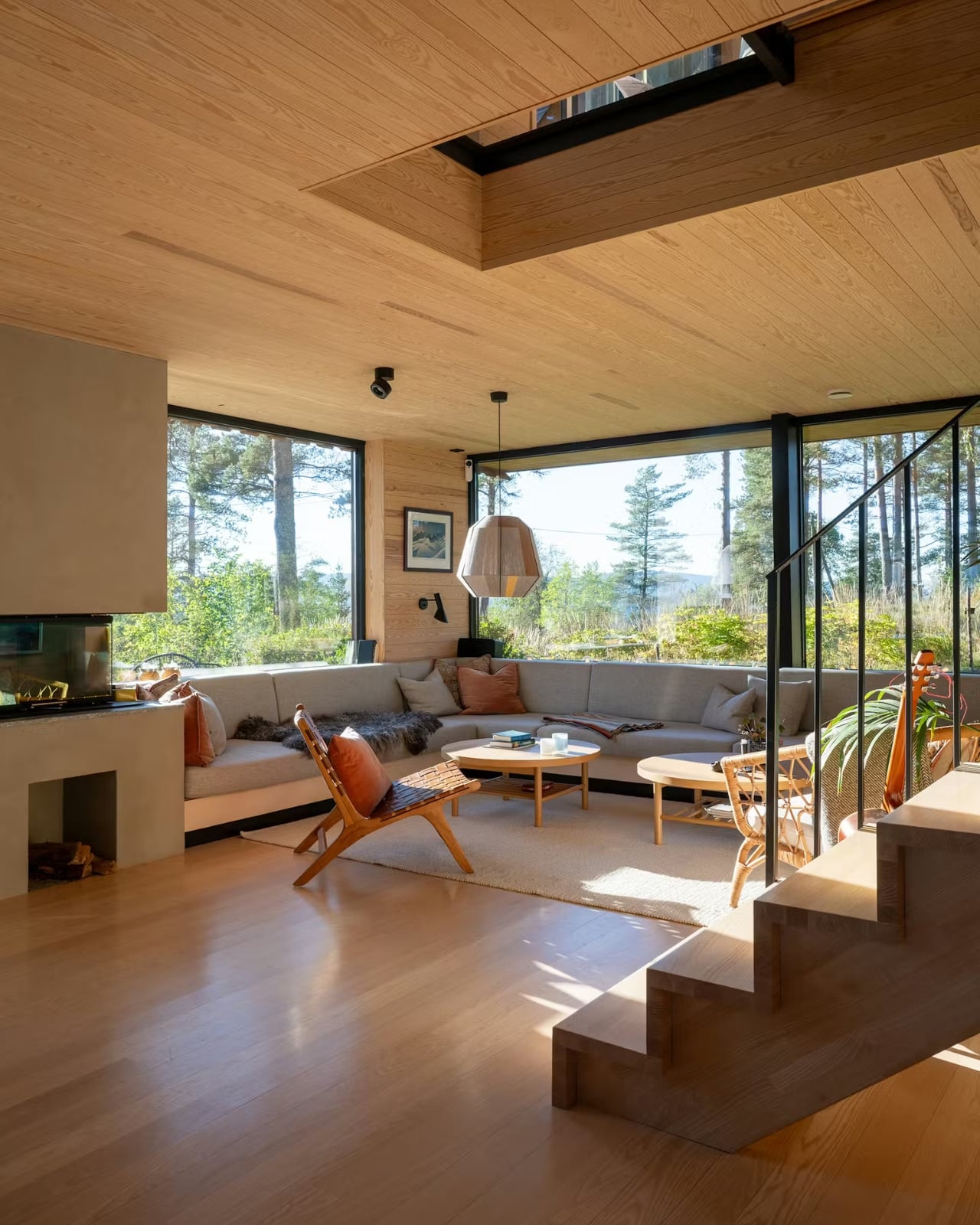
That interior warmth carries through in the materials. Solid wood finishes, a fireplace anchoring the living room, large picture windows framing forest views, custom bookshelves tucked along the upper hallway. There’s even a glass floor detail that lets light and sightlines move through the structure in ways that feel both unexpected and completely natural at once. These are the kinds of details that age beautifully and that no amount of trend-chasing can replicate.

What I find most compelling about the project, though, is what happened before a single new board was nailed. The original structure on the site dated back to 1946, and rather than tear everything out, MORFEUS arkitekter worked with the existing foundation walls. The site’s natural profile, the topsoil, the exposed rock, and the existing trees and undergrowth were all largely preserved. Every external surface is permeable, and rainwater infiltrates locally, keeping the water cycle intact in an area that sits within Oslo’s strictly regulated water supply catchment zone.

That level of site sensitivity isn’t just admirable from an environmental standpoint. It changes how the architecture feels. A home that respects what was already there carries a different kind of weight than one that simply imposes its will on a plot of land. There’s humility in it, and that humility reads through the final result.

MORFEUS arkitekter, founded in Oslo by architects Caroline Støvring and Cecilie Wille, has built a reputation on exactly this kind of approach: intuition balanced with rationality, traditional Scandinavian craft paired with contemporary methods, and a consistent commitment to letting the site lead. Their work has earned multiple architecture prizes over two decades, including the Nordnorsk Architecture Prize and an Oslo City Architecture Prize nomination. But what stays with you after looking through the Solem Forest House isn’t the awards. It’s the feeling that the building belongs exactly where it is, and that someone spent a long time making sure it did.

The post This Dark Timber House Disappears Into a Norwegian Forest first appeared on Yanko Design.

Stanley’s First-Ever Bag Has a Pocket Just for Your Tumbler

During the pandemic, the rise of the Stanley Cup moms was splashed all over social media. Most influencers and content creators were either sipping from their tumbler or had one sitting proudly in the background. There are other brands of reusable mugs and tumblers, of course, but Stanley was the go-to for a lot of people, particularly women. It wasn’t just about staying hydrated. It became a lifestyle statement, a collector’s obsession, and for many, a whole personality.

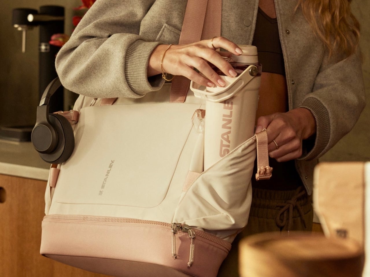
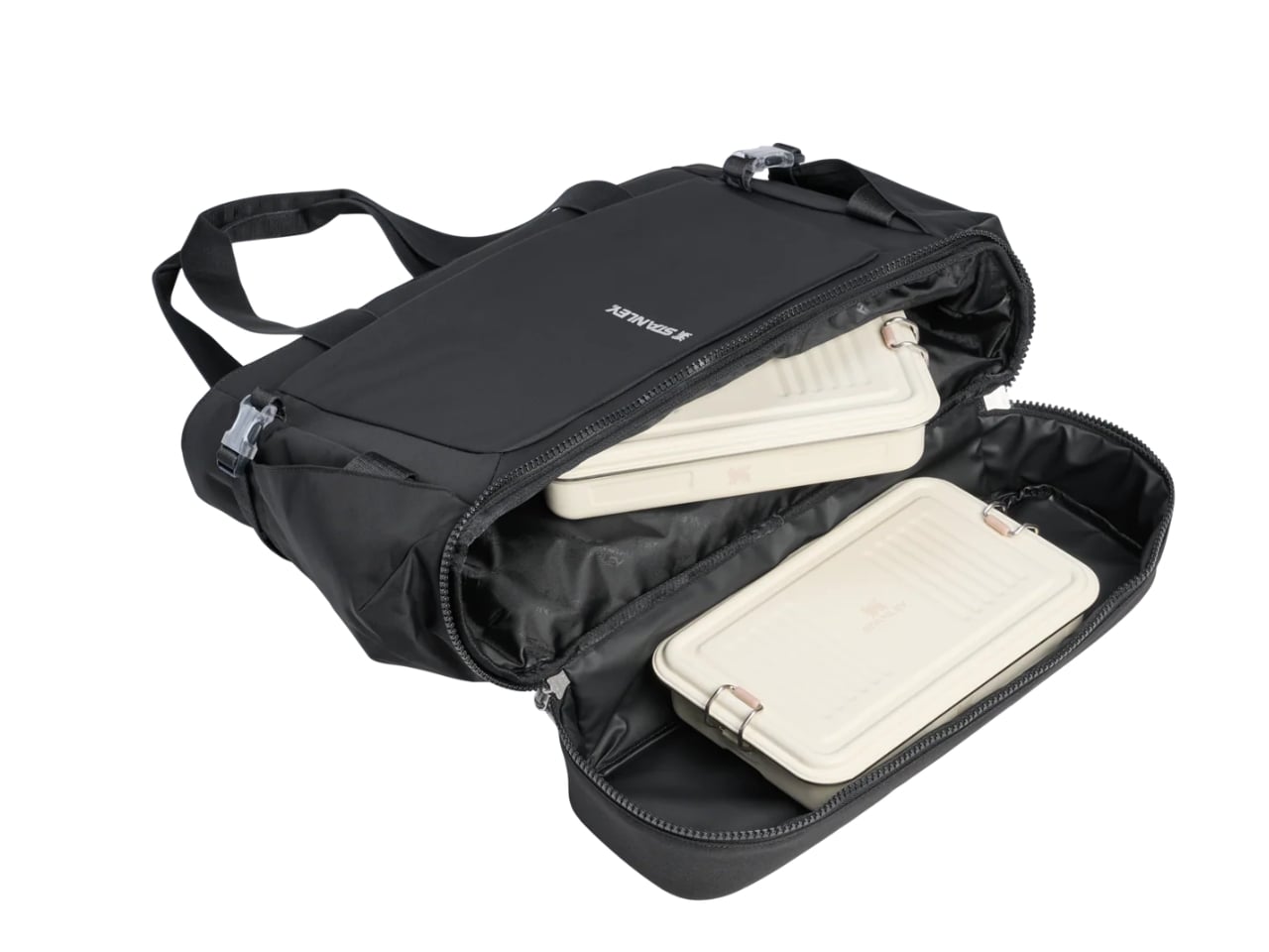
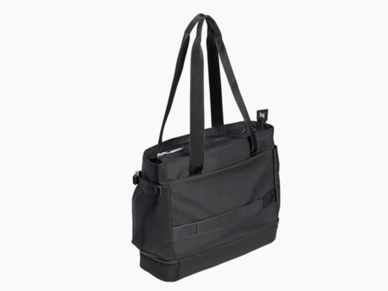
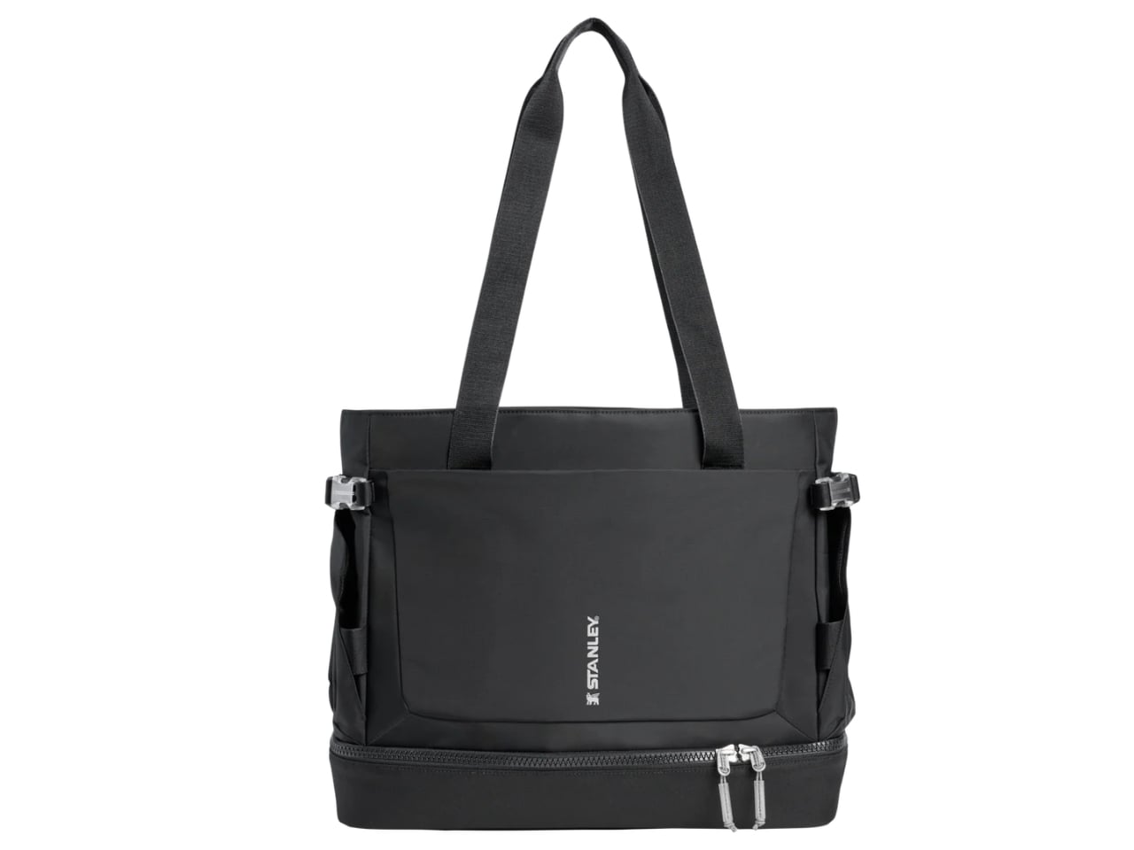
Now the brand is looking to expand its market with its first-ever bag, the Stanley 1913 Vitalize™ Macro Method Tote. While the main selling point of this bag is that it can carry your tumbler, it’s built to carry much more than just a water container. Think of it as a home for pretty much everything else you need to get through your day. The way it’s designed means it can match any lifestyle, whether you’re heading to the office, the gym, or just running your errands.

Designer: Stanley

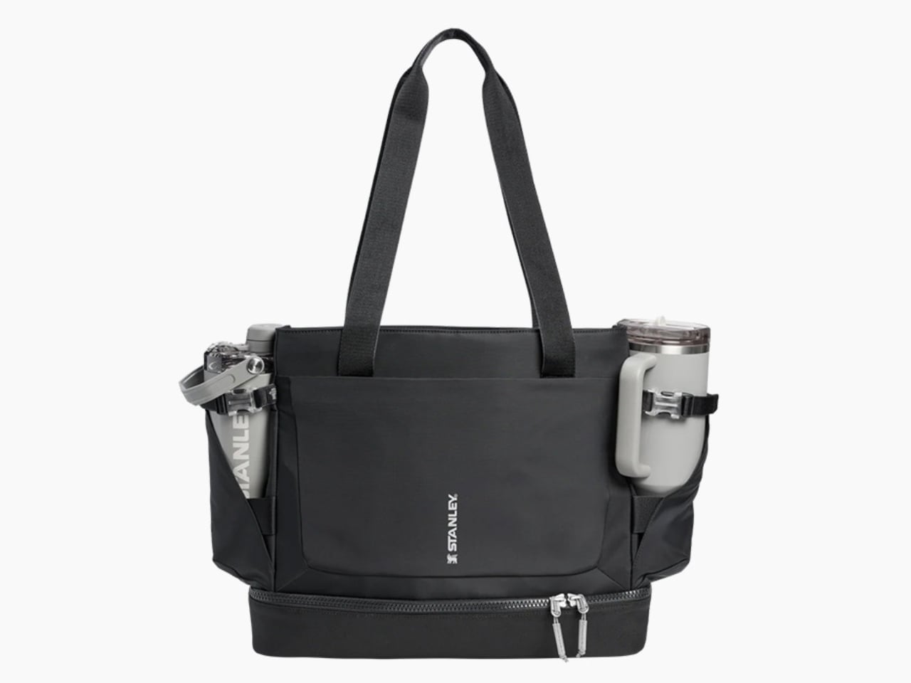
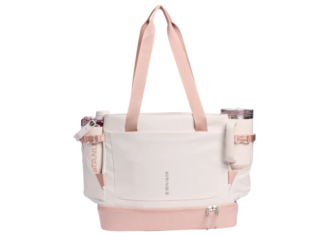
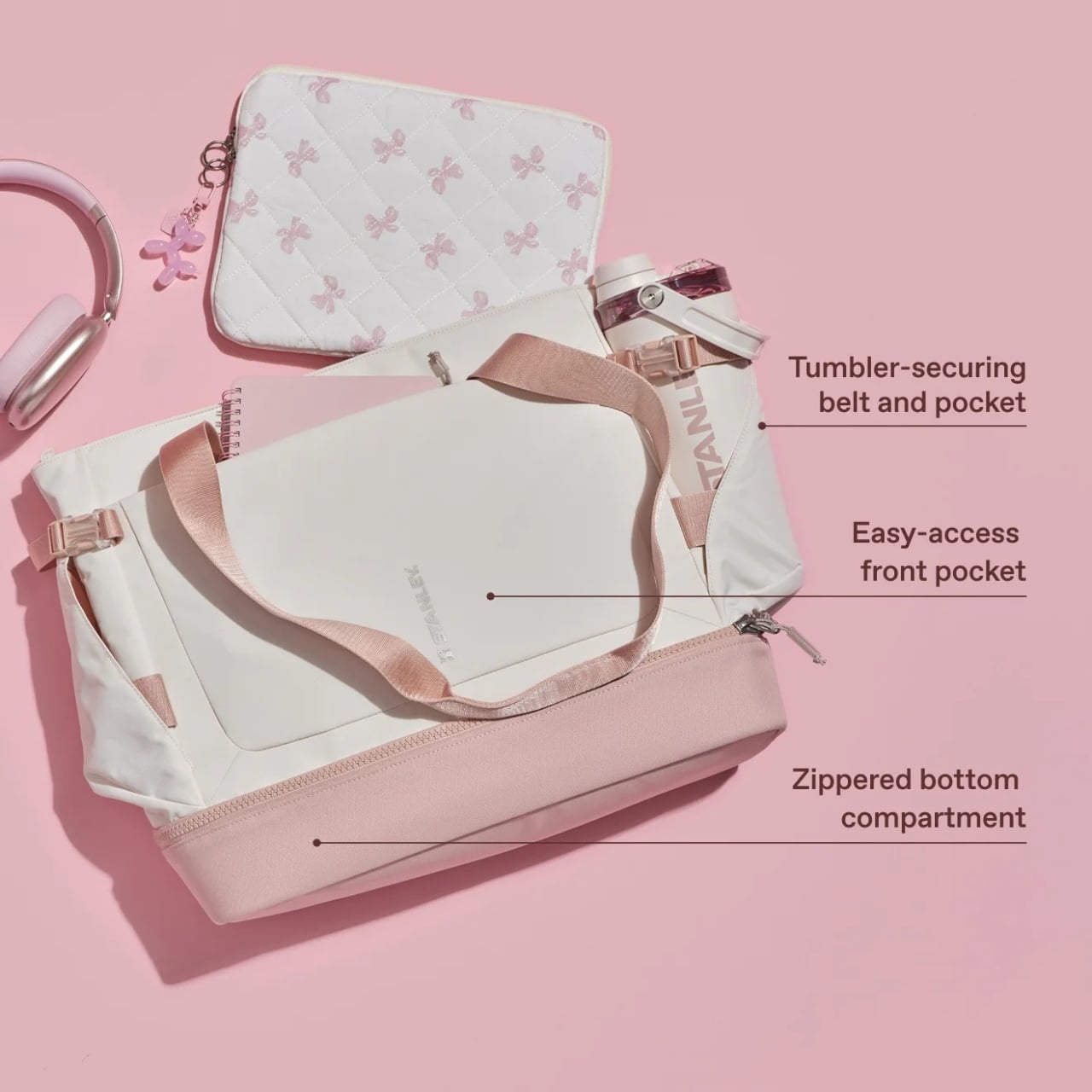
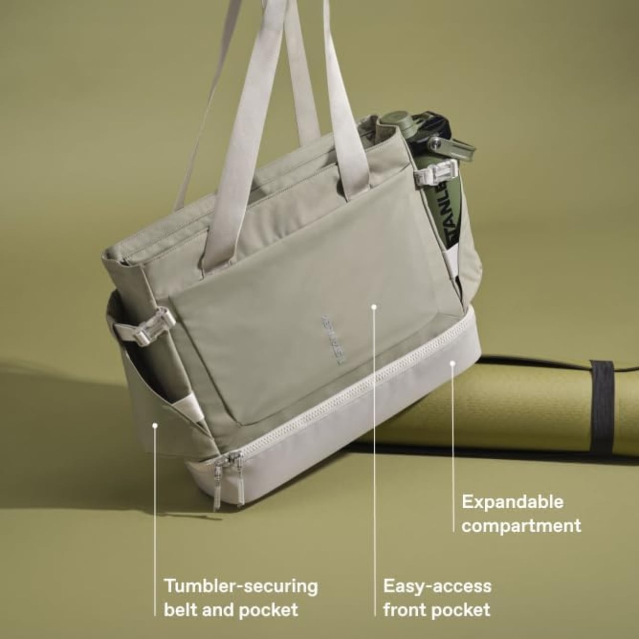
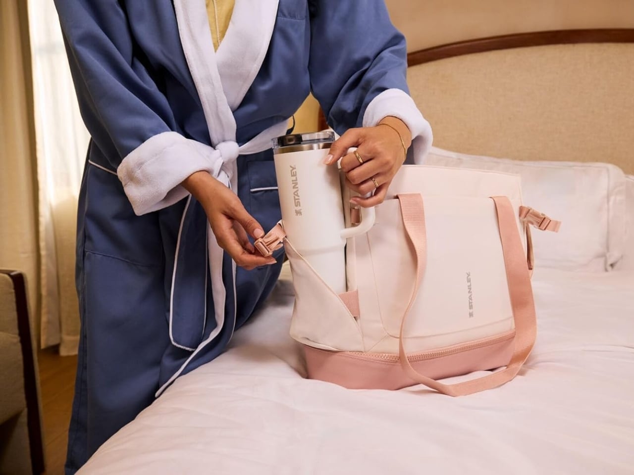
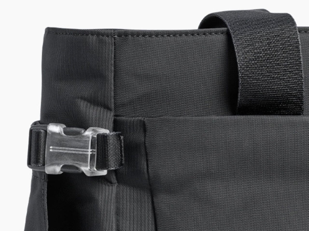
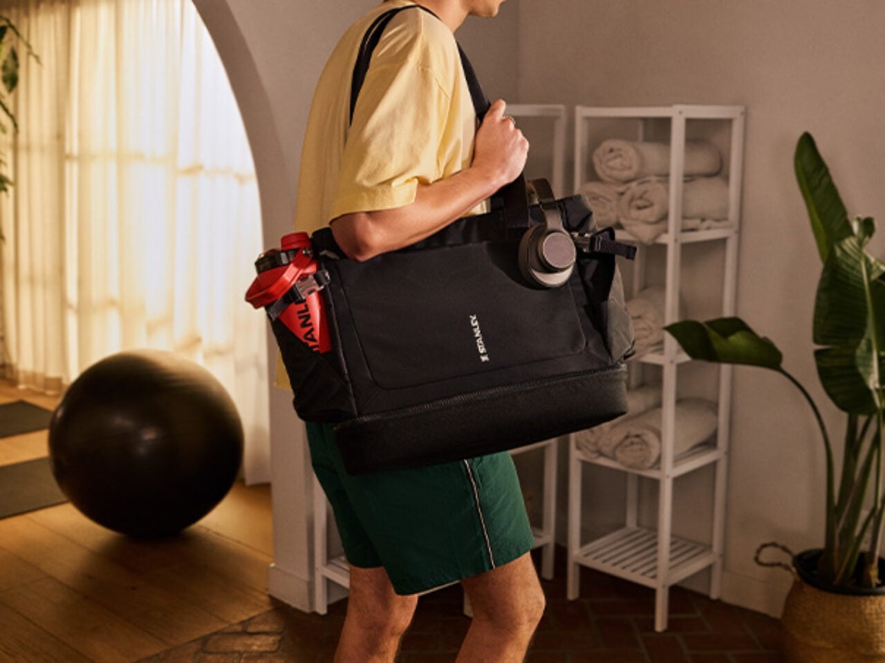
The whole idea behind reusable tumblers is to always have water (or your favorite beverage) with you wherever you go. But sometimes, the bags we use aren’t sturdy enough to carry them around, so we just leave them at home. This bag from Stanley solves that particular problem with a tumbler securing belt and pocket, which is compatible with the 40-ounce Quencher® ProTour or Vitalize™ Shaker and gives you easy access to them whenever you need a sip. You could probably use other brands or models as well, but if you’re buying the Stanley bag, chances are you’re already a Stanley person anyway.

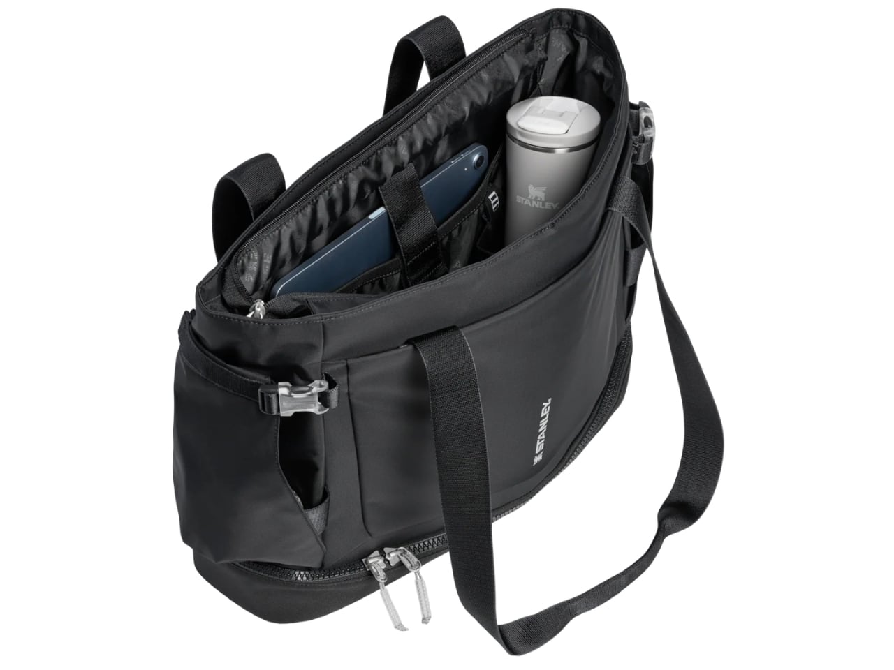
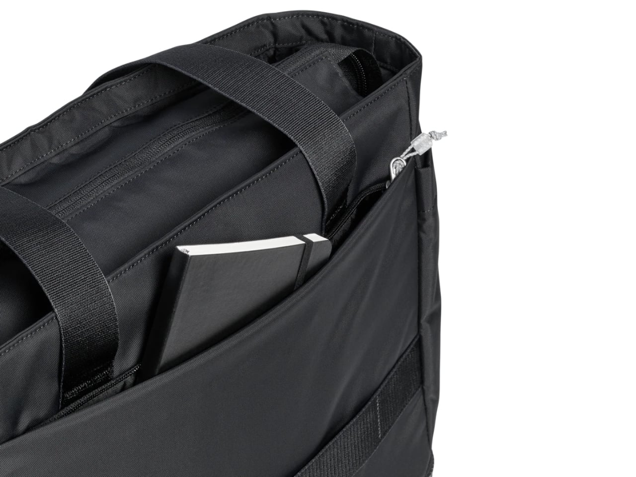
Other than that, there’s plenty to like about this bag, especially if you’re the type who prefers just one carrier for all your essentials. It has a zippered main compartment that provides secure and spacious storage for all the bigger items you need to haul around. There’s also an interior laptop sleeve to keep your laptop and other gadgets safe and scratch-free. You’ll also find an easy-access zippered front pocket for things you may need to grab on the go, like your keys, lip balm, or earbuds. And if that’s still not enough, there’s a foldaway interior Vitalize™ Macro Container pocket for when you need even more organization.

For something that’s meant to carry a hefty 40-ounce tumbler, the bag is naturally made from durable materials. Even better, it uses 100% recycled fabrics, so you can keep your carbon footprint low without compromising on style or durability. You can carry it as a handbag or a shoulder bag since it comes with both hand and shoulder carry straps. It holds nearly 28 quarts of capacity but sits at a slim 5.12″ depth, so it won’t get too bulky or cumbersome which is a nice balance for everyday use.

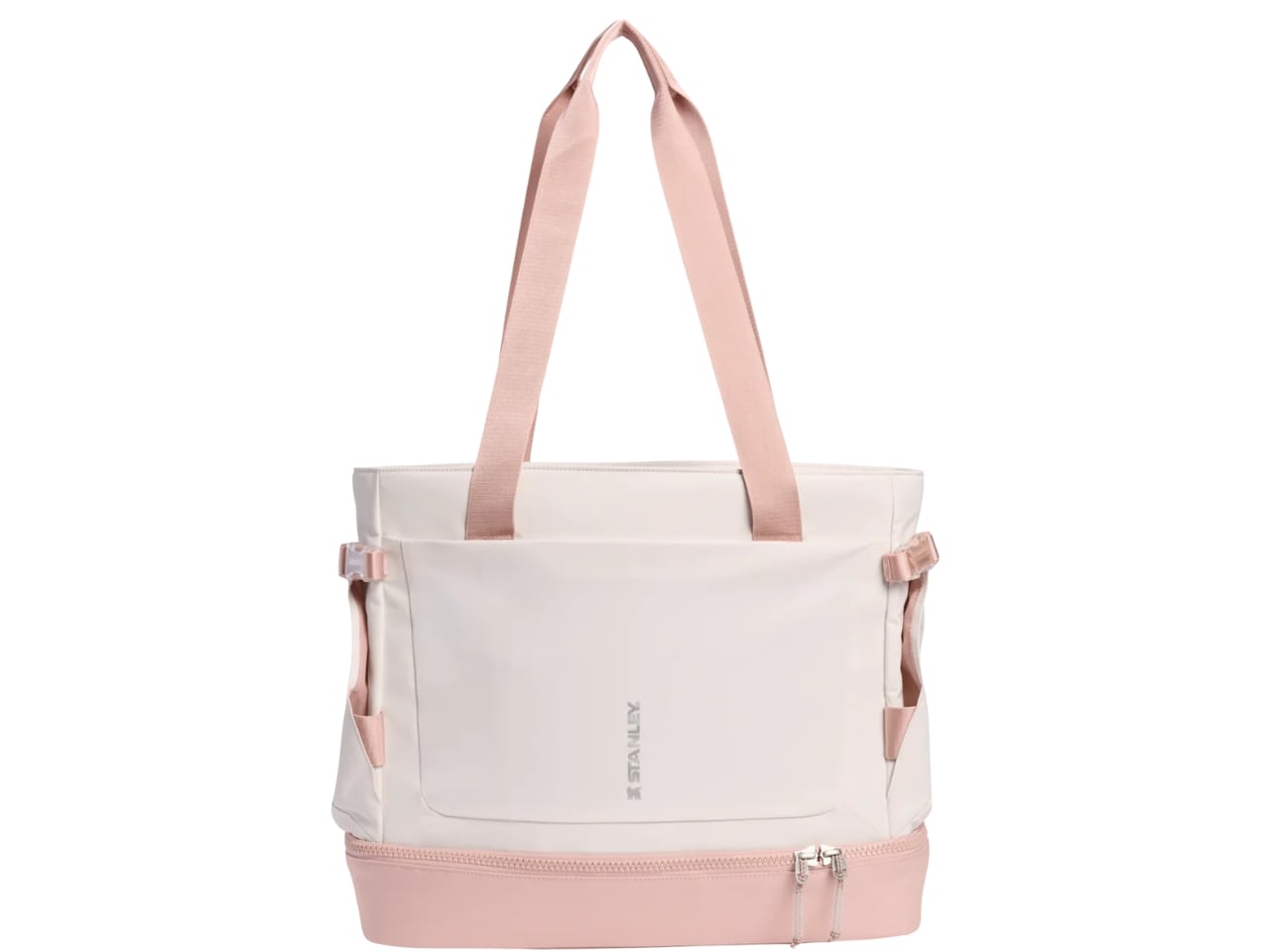
There are, of course, plenty of other bags on the market that offer similar features, but if you’re already a Stanley loyalist, this feels like a pretty natural next purchase. The minimalist design will also appeal to those who prefer their bags to be clean and unfussy. It comes in three colors: Black, Rose Quartz, and Sage Grey. This keeps things simple and versatile, easy to pair with just about anything in your wardrobe. It’s not trying to be flashy, and honestly, it doesn’t need to be.

At $110, the Stanley 1913 Vitalize™ Macro Method Tote is more than just a bag. It’s the natural next step in the Stanley lifestyle. Whether you’re a long-time collector who’s been following the brand since the tumbler craze first took over your feed, or someone who’s just discovering what all the fuss is about, this tote feels like a thoughtful extension of everything Stanley stands for: durability, functionality, and just the right amount of style. It’s the kind of bag you’ll reach for every single day, and if you’re anything like us, you’ll probably want one in every color.

The post Stanley’s First-Ever Bag Has a Pocket Just for Your Tumbler first appeared on Yanko Design.

A 400-Year-Old Japanese Candleholder, Upgraded Again

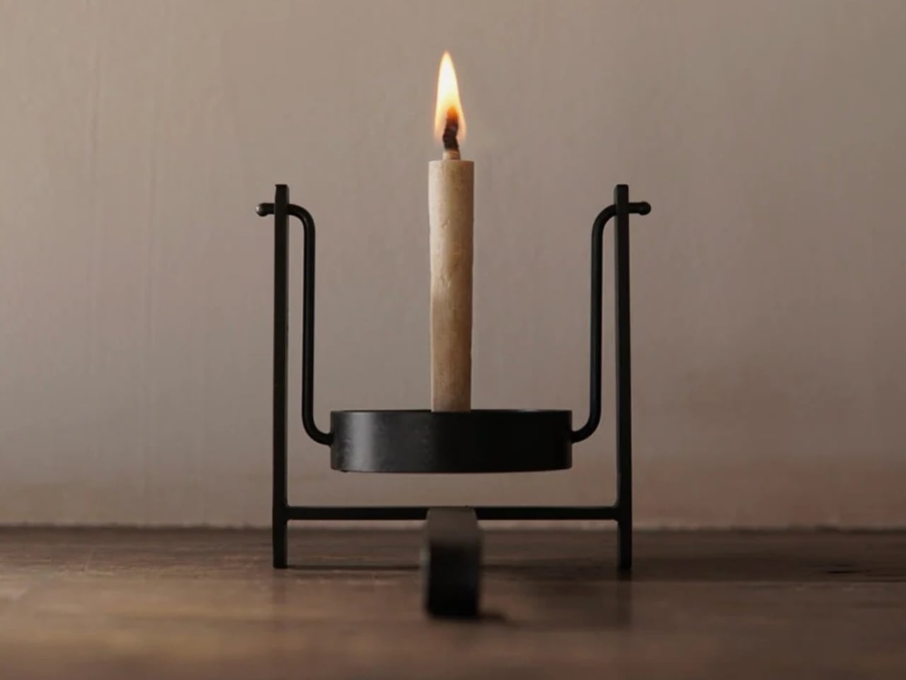
There’s something quietly satisfying about a design that doesn’t try to reinvent the wheel. Dai Furuwatari’s Pendulum Candleholder isn’t trying to be radical. It’s not minimalist for minimalism’s sake, and it doesn’t come loaded with a big brand story about disruption. It’s just a very thoughtful update to something that was already good, and that, to me, is the most interesting kind of design work there is.

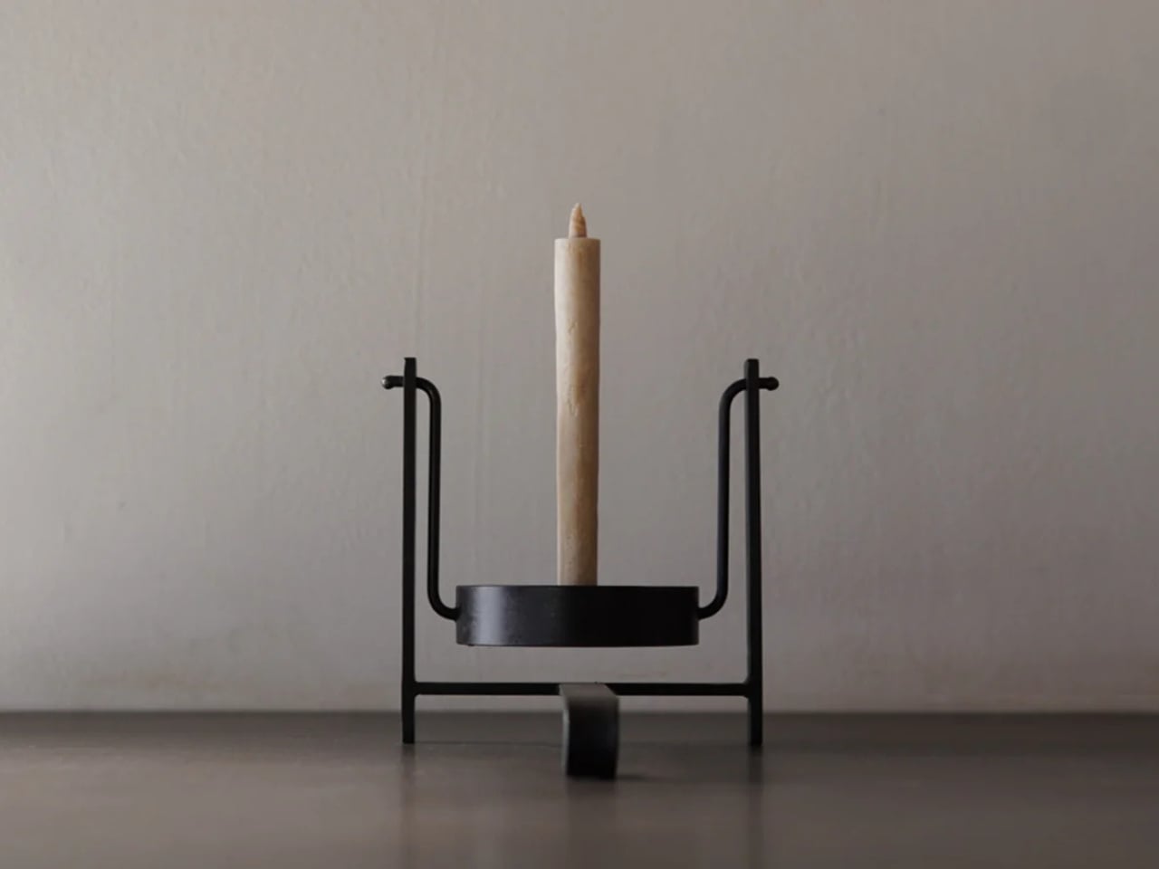
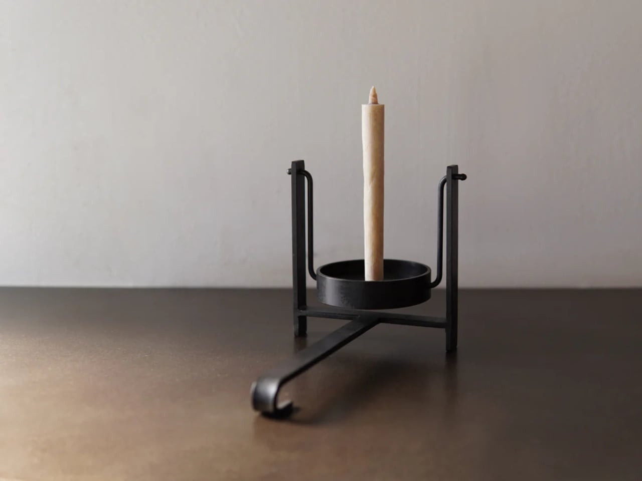
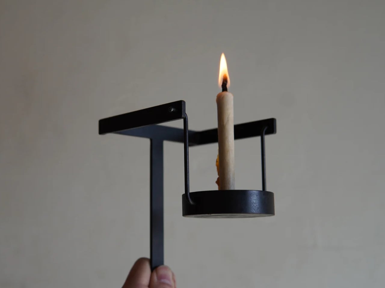
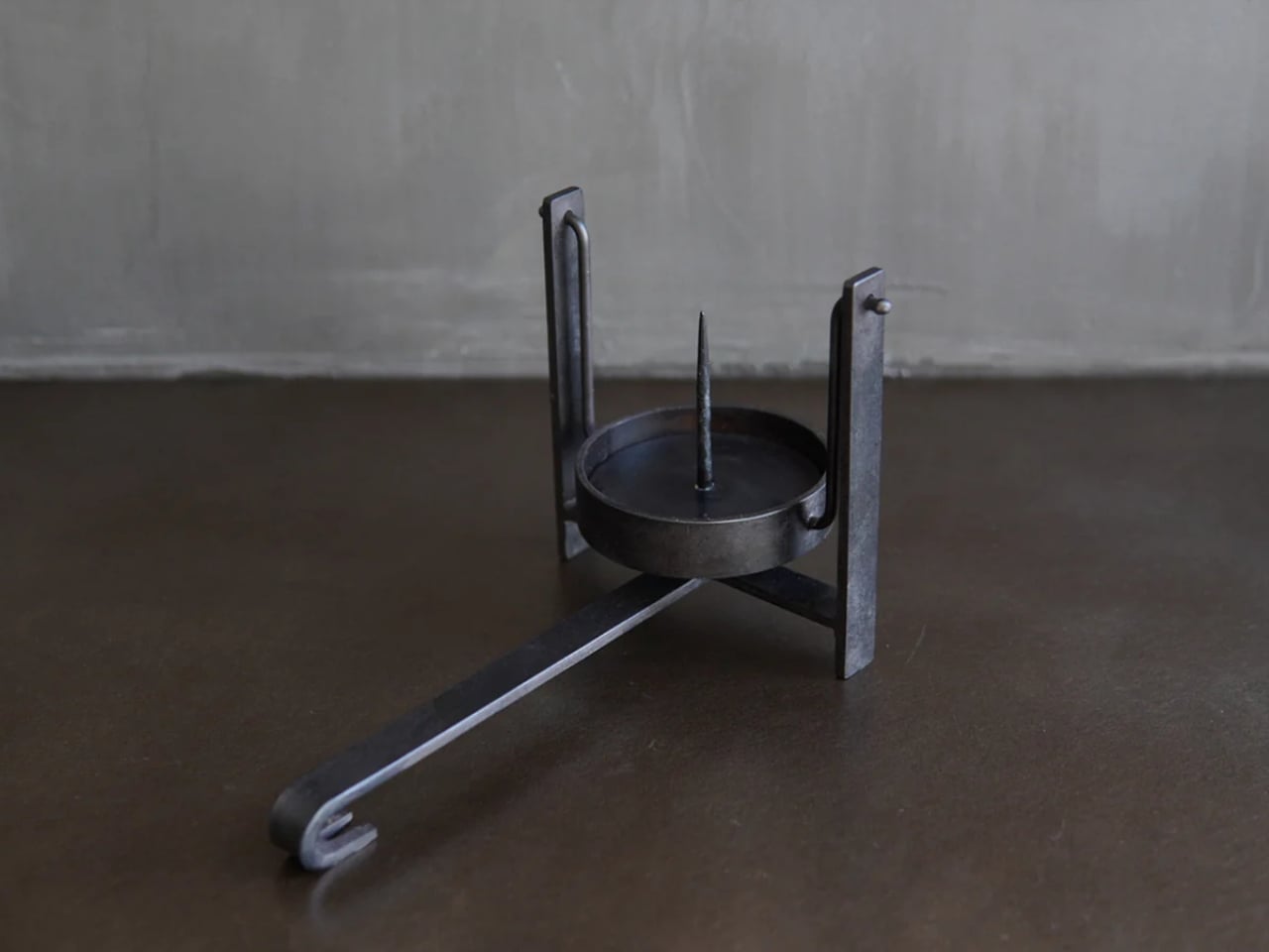
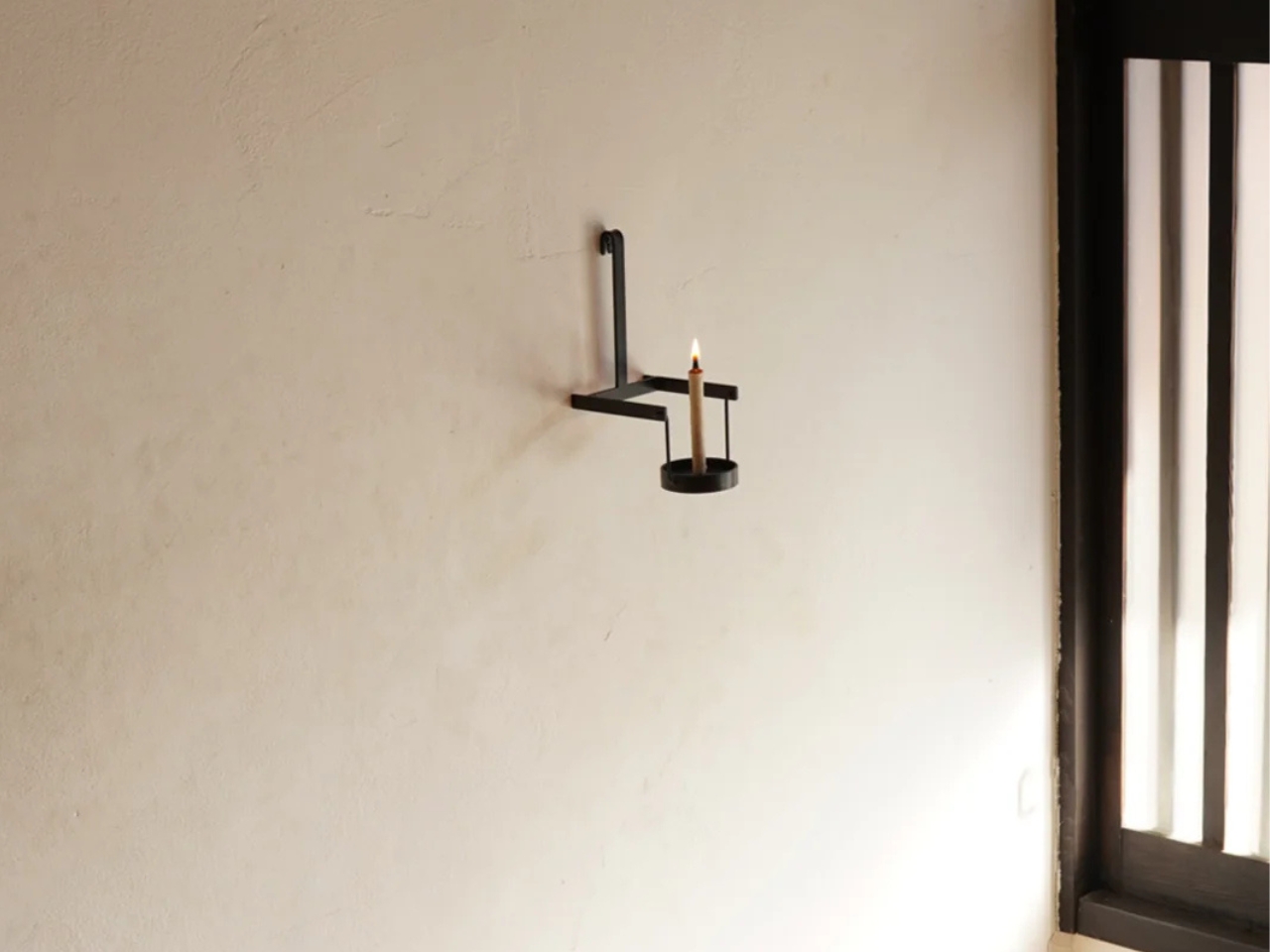
The backstory matters here. The piece is rooted in a traditional Japanese portable candleholder called a teshoku. Back in the 1600s, the teshoku was a luxury item, the kind of thing you’d find in the homes of the wealthy or inside temple halls. Candles were expensive, and the ability to carry light from room to room was a privilege. At some point, an unknown craftsman solved a simple but obvious problem: the teshoku got a long, horizontal leg that doubled as a handle, making it easier to pick up and carry without getting too close to the flame. It was a small addition that changed the whole experience of using it.

Designer: Dai Furuwatari

By the 1800s, paraffin candles made the whole thing more affordable, and the teshoku eventually found its way into everyday life. The design stayed more or less the same for centuries, which says something, because designs that stick around that long usually earn it.

Furuwatari, a product designer who transitioned into ironwork, picked up the teshoku and asked what could still be better. His answer came in the form of two specific, considered improvements that feel less like features and more like realizations.

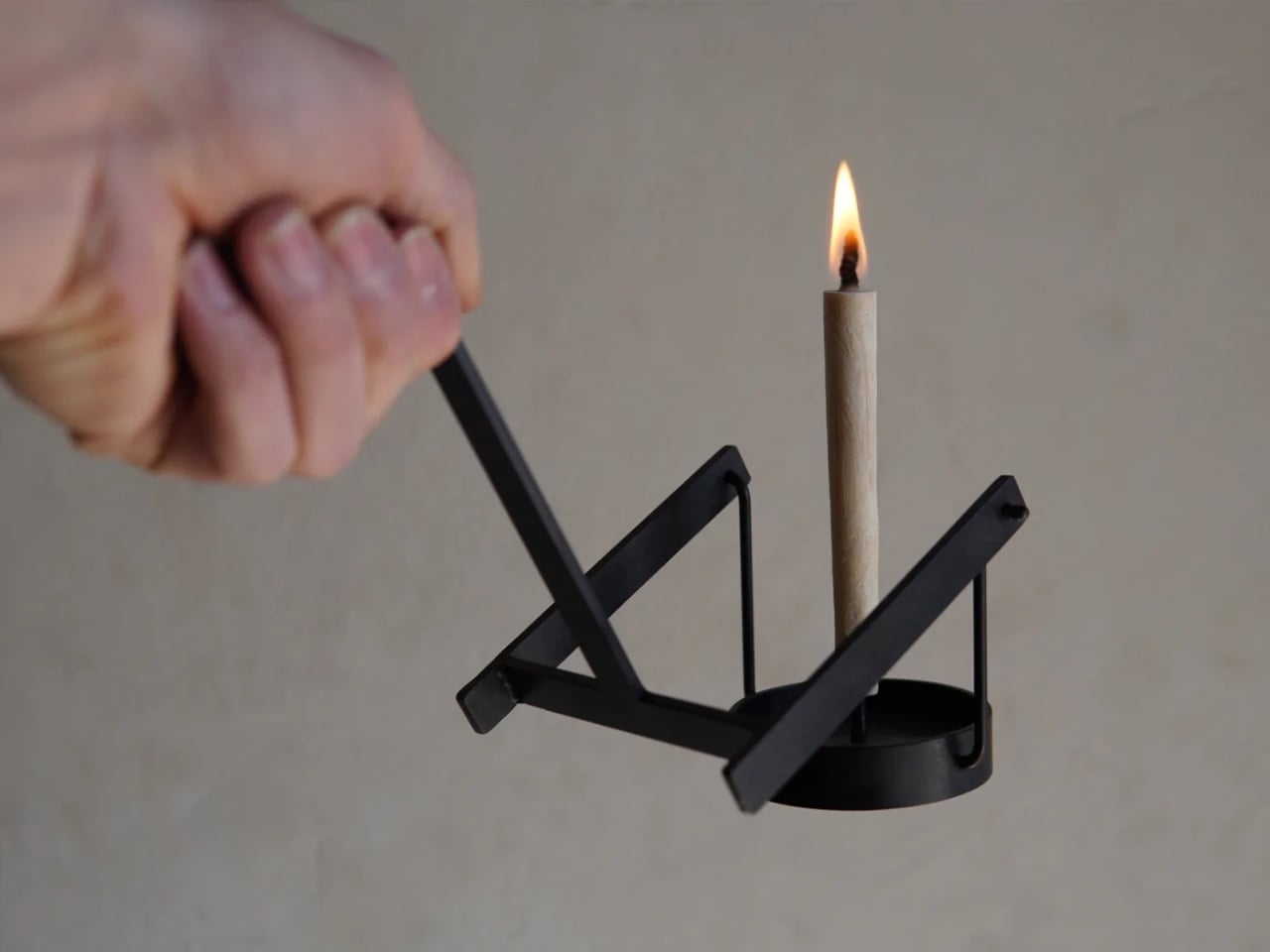
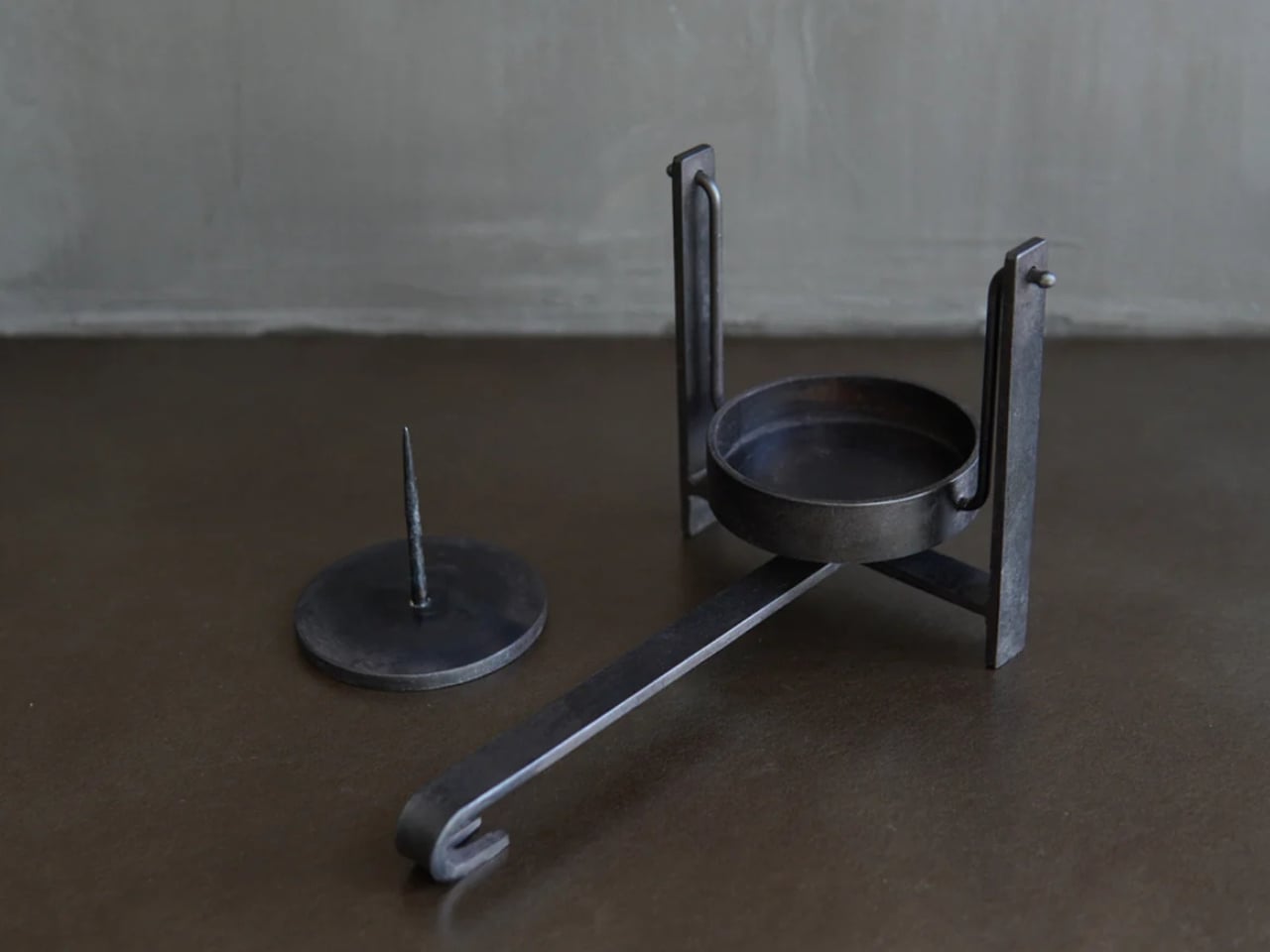
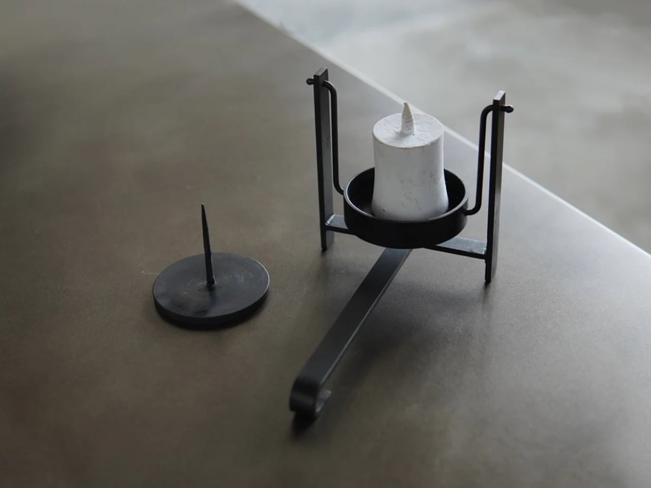
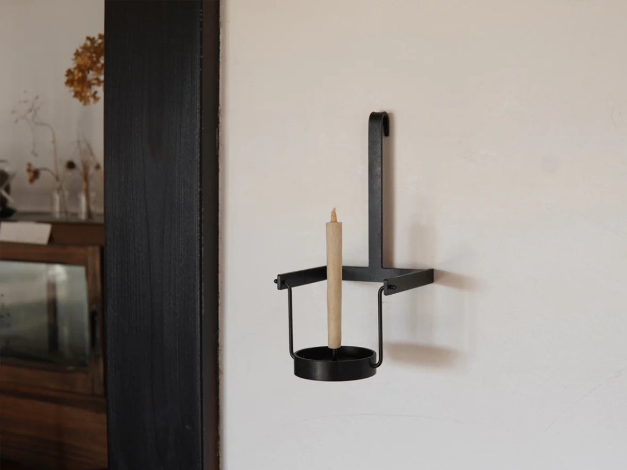
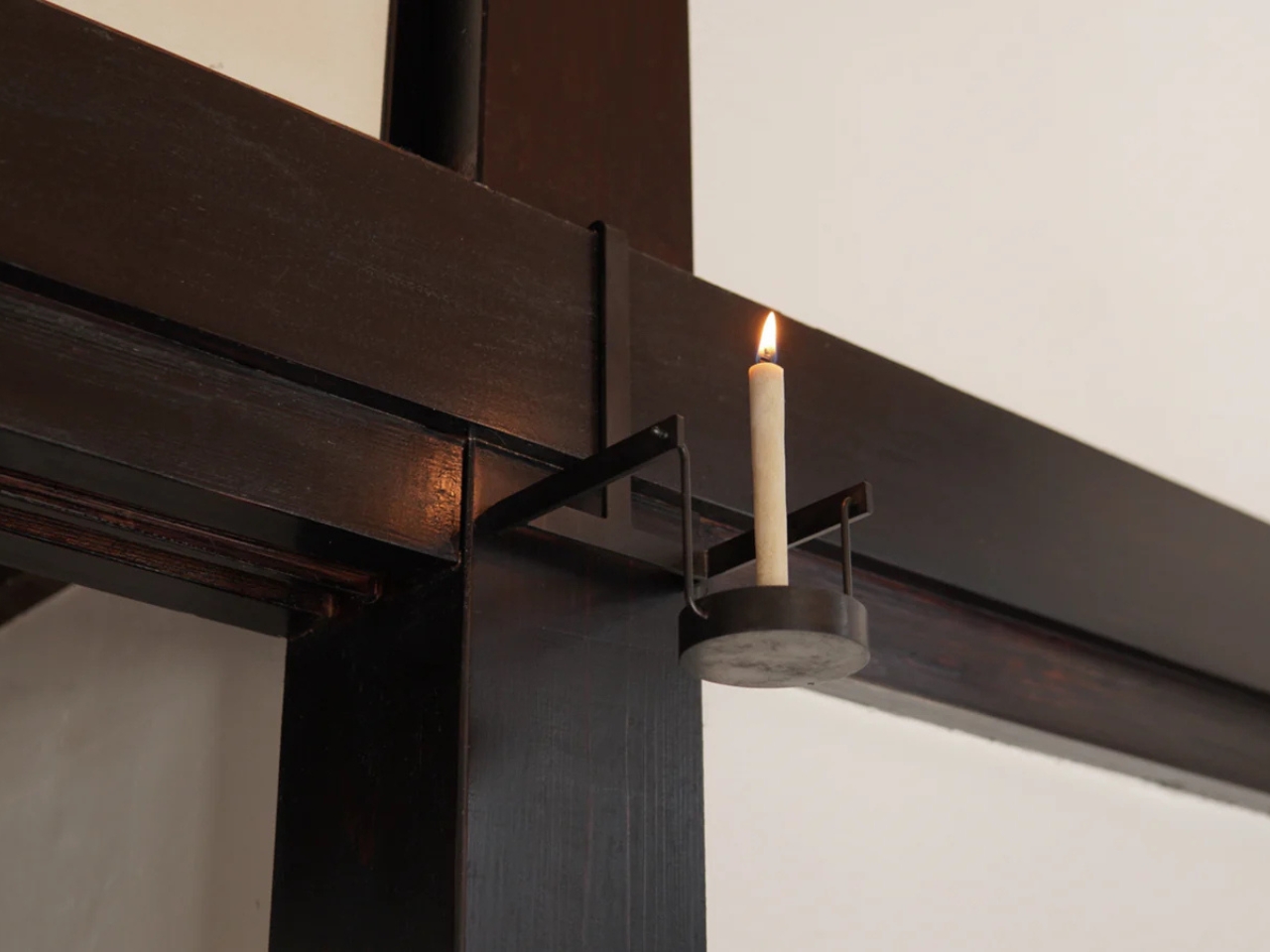
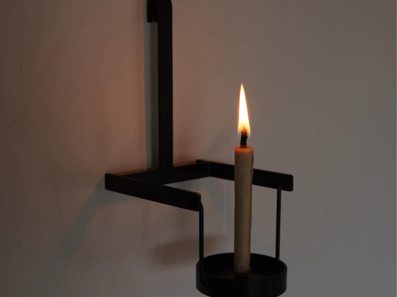
The first is that the long horizontal leg, that original carrying handle, now doubles as a hanging hook. It’s such an obvious extension of what was already there that you almost wonder why no one thought of it sooner. Being able to mount the candleholder on a wall opens up a completely different use case. Suddenly it’s not just portable, it’s also fixed lighting when you want it to be, which makes it far more versatile in how and where it can live.

The second improvement is a pivot mechanism built into the piece. This allows the candle mount to be held at different angles depending on how you’re carrying it, which is genuinely useful. Carrying a lit candle without wax dripping everywhere is its own small skill, and a pivot that lets you adjust the angle takes a lot of the anxiety out of it. The candle mount is also removable, which makes cleaning it much easier.

What I appreciate most about this piece is that both changes are extensions of the original logic of the teshoku. They don’t override the design or force it to become something it isn’t. They follow the same thinking that shaped the object centuries ago: what is this person actually doing with this thing, and how can we make that experience a little less complicated? That’s user experience design at its most sincere, and it shows up in objects just as much as in apps or interfaces.

The Pendulum Candleholder is made to order by Furuwatari’s iron products company, To-Tetsu, and retails for $158. Each piece is handmade by a craftsman, which means delivery can take one to two months depending on order status. Iron is the material, and it will develop rust over time, which can be maintained and even enriched with periodic applications of linseed oil or beeswax. That aging process is part of the appeal if you’re into objects that change with use.

Is it practical in 2026? Not in the way a smart lamp is practical. But there’s a different kind of value in objects that connect you to a longer timeline of human ingenuity. Lighting a candle and carrying it across a room is a small act that people have been doing for centuries. Furuwatari’s version just makes it a little more graceful, and a little more considered, which is more than enough.

The post A 400-Year-Old Japanese Candleholder, Upgraded Again first appeared on Yanko Design.

What Happens When a Bag’s Inside Becomes Its Outside

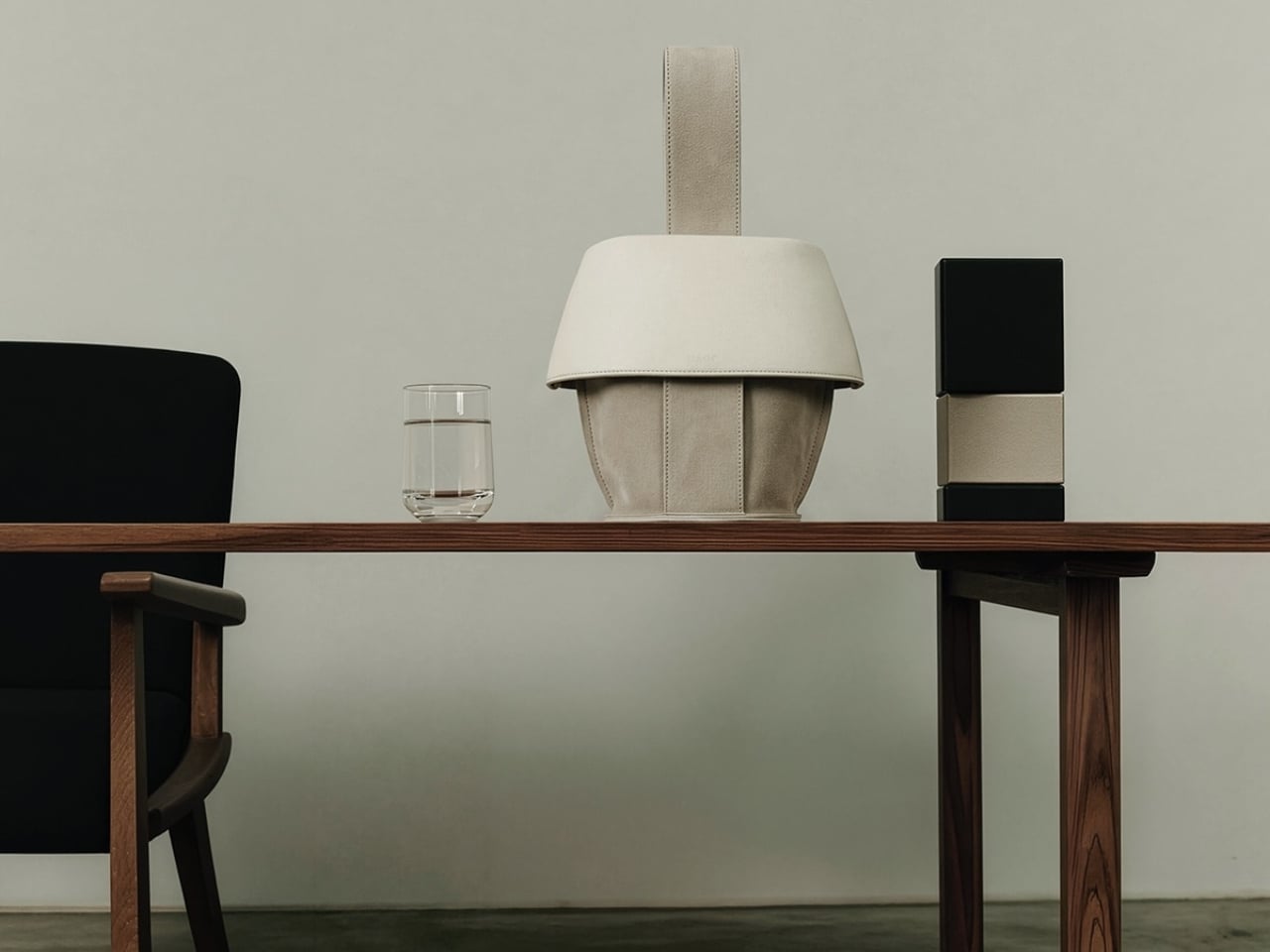
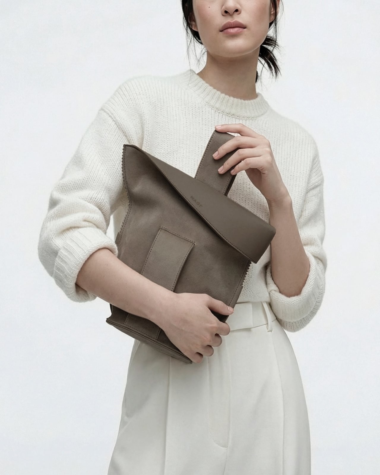
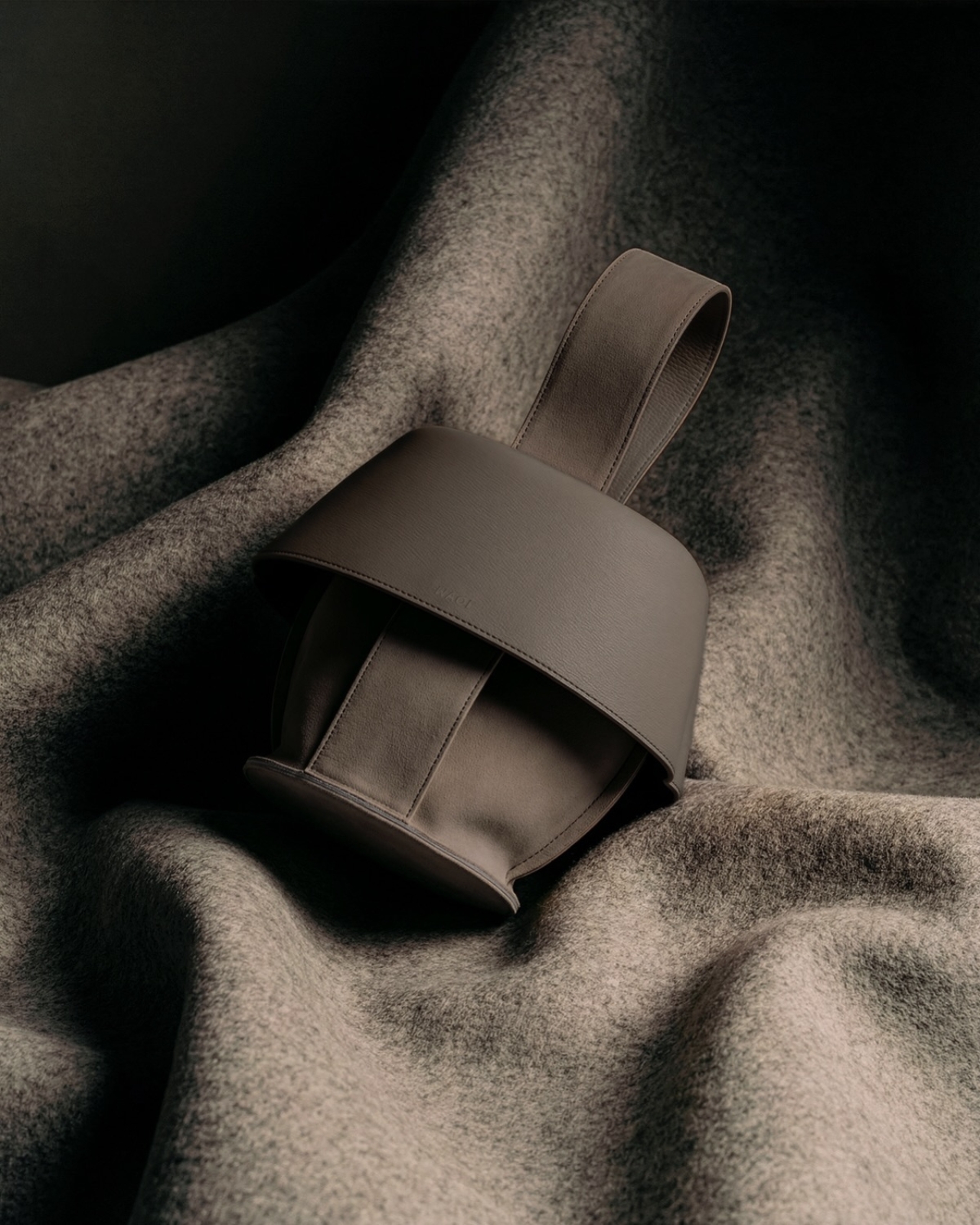
The first thing you notice about MAQL is how deliberately sculptural it looks. The handbag sits with an almost architectural presence, its curved body and rolled edges creating a form that feels more like a ceramic vessel than a typical leather accessory. That impression isn’t accidental. This is a bag designed to be looked at as much as it’s meant to be used.

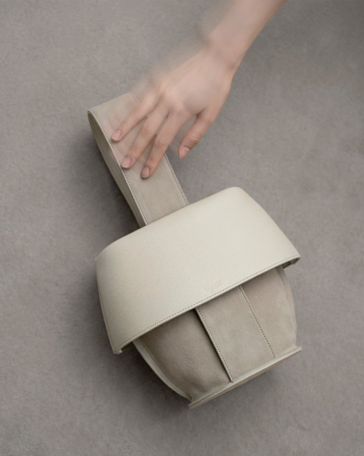
Created through a collaboration between Tokyo-based design studio Nendo and leather artisans Bag Makers Tokyo, MAQL is constructed from a single laminated piece of leather with grain leather on one side and suede on the other. The entire structure emerges from a process of strategic folding and peeling, where the rim is turned back on itself to gradually reveal what becomes the exterior surface and handles. It’s a bit like watching origami in reverse, where the final form contains evidence of every fold that brought it into being.

Designers: Nendo and Bag Makers Tokyo

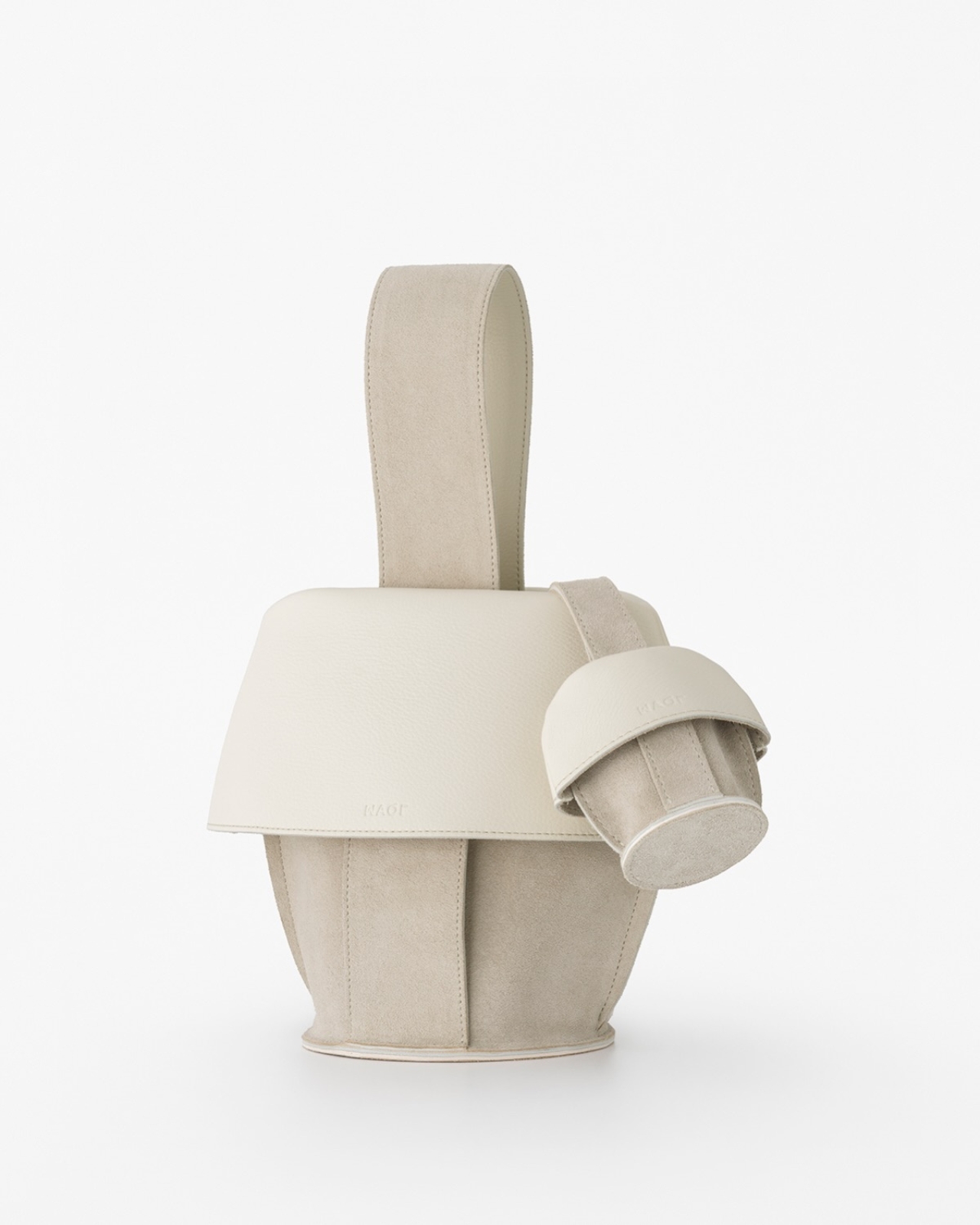
The name comes from makuru, meaning “to peel, to reveal” in Japanese, and that action is visible in every part of the bag’s construction. Where the leather rolls back, you see both textures at once: the smooth, structured grain leather meeting the softer suede underneath. The handles aren’t attached separately. They’re continuous with the body, formed by the same peeling motion that creates the bag’s opening. There are no hidden seams trying to disguise how this was made. The stitching is exposed where it needs to be, marking the transitions between surfaces.

What makes the design compelling is how it plays with the idea of inside versus outside. Traditionally, a bag’s interior is something you only see when you open it, a hidden space with different materials and construction than what’s visible to the world. MAQL eliminates that boundary. The suede that would typically be tucked away as lining becomes part of the exterior surface. The grain leather that forms the outer body curves inward to create the interior walls. You’re constantly seeing both sides at once, which changes how you relate to the object.

This isn’t just conceptual posturing. There’s a practical elegance to the construction. Because the bag is formed from a continuous piece of material rather than multiple panels stitched together, it has a structural integrity that feels substantial in your hands. The rounded bottom gives it stability when set down. The rolled edges create a soft, almost cushioned grip. And because both leather surfaces are visible, you’re touching different textures depending on how you hold it, smooth grain on one side, soft suede on the other.

Nendo, the studio founded by Oki Sato in 2002, has built its reputation on creating these kinds of quiet surprises, designs that reveal themselves through use rather than immediate visual impact. MAQL fits that approach perfectly. It’s minimalist without being stark, sculptural without being impractical.

The design also taps into something deeper in Japanese aesthetics, this long-standing appreciation for craftsmanship that doesn’t need to announce itself. Think of the way a kimono’s lining might be more elaborate than its exterior, seen only in glimpses, valued by those who know to look. MAQL takes that same philosophy but inverts it, bringing hidden construction to the surface where it becomes part of the design language.

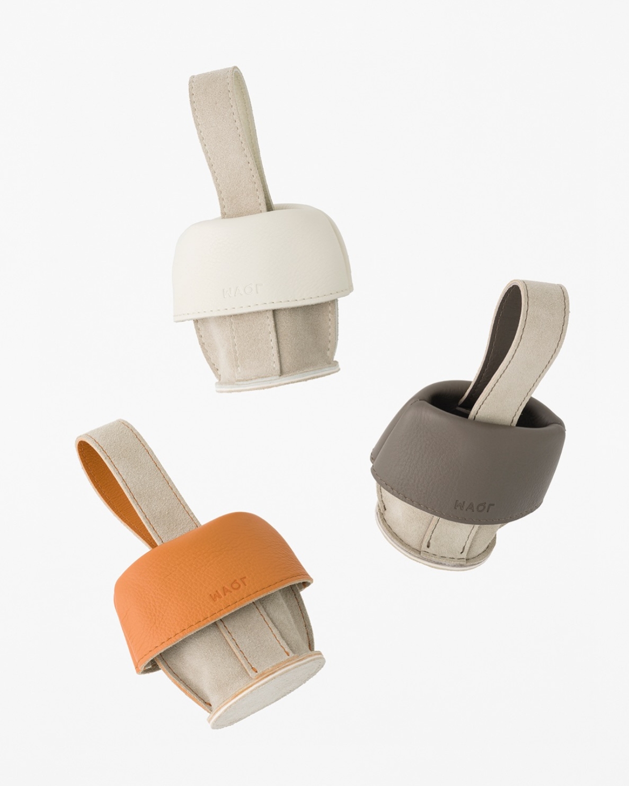
The bag comes in a muted palette, mostly earth tones and soft neutrals that let the form and texture do the talking. There’s a larger version that works as a proper handbag and smaller iterations that function almost like pouches. Each size maintains the same folded construction, the same interplay between grain and suede, the same sense of a form that emerged organically from the material itself rather than being imposed upon it.

In a market saturated with bags that compete on logos and brand recognition, MAQL stands out by offering something different: visible craftsmanship, thoughtful construction, and a form that asks you to pay attention to how things are made. It’s not trying to signal anything beyond its own careful execution. For people who care about design, that’s more than enough.

The post What Happens When a Bag’s Inside Becomes Its Outside first appeared on Yanko Design.

The Furniture That Looks Like It’s About to Walk Away

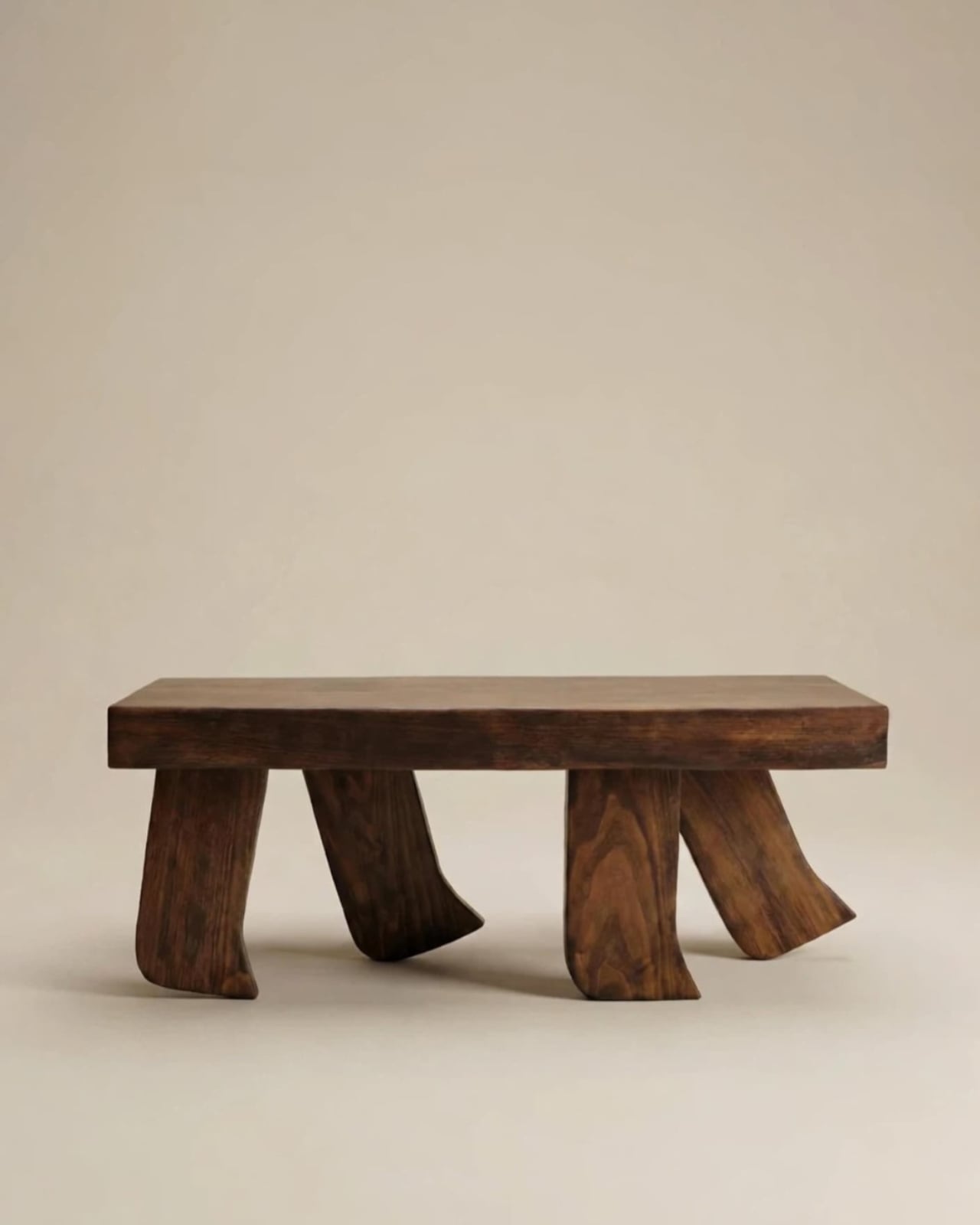
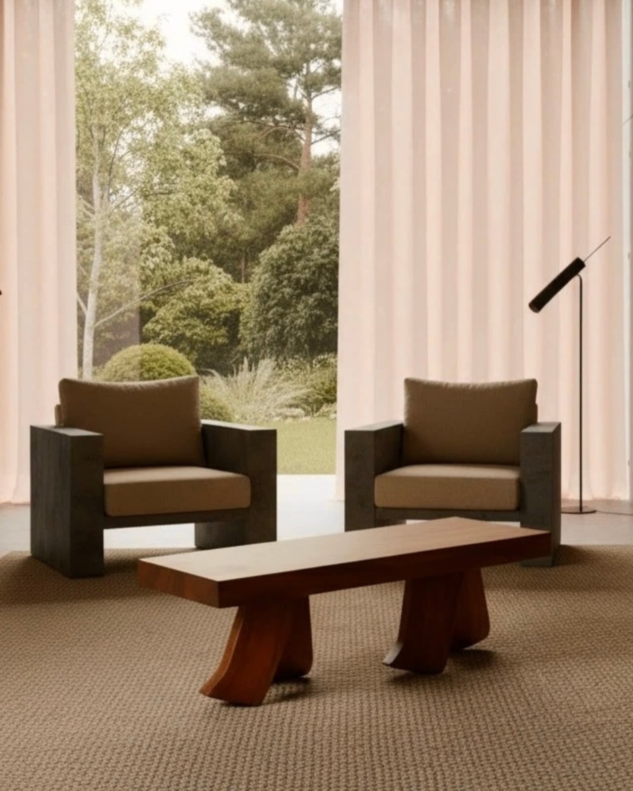
There’s a particular kind of design that stops you mid-scroll and makes you think: wait, what exactly am I looking at? That’s exactly what happened when I first came across the Barefoot Collection by Jorge Suárez Kilzi. At first, you register dark, richly grained wood. Beautiful, but expected. Then your eyes drift downward to the legs, and something shifts. They’re not straight. They’re not tapered. They’re curved, splayed, mid-stride, like a large foot caught in the quiet moment between lifting and landing. It’s subtle enough to feel elegant. It’s strange enough to feel unforgettable. That, to me, is the sweet spot.

Jorge Suárez Kilzi, who signs his work under his mother’s Syrian surname as a personal tribute, is a Barcelona-based architect and designer whose story is inseparable from what he makes. Born in Venezuela to a Spanish father and Syrian mother, he spent his childhood in constant movement, crossing cultures and countries, learning early on that the objects you carry with you carry meaning far beyond their function. That nomadic upbringing, he has said, taught him to see life from more than one angle, and that perspective filters directly into the furniture he creates. He also spent time in Japan working with SANAA and architect Junya Ishigami, and you can feel that influence in how restrained and quietly deliberate his work is.

Designer: Jorge Suárez Kilzi

The Barefoot Collection grew out of a single idea: a coffee table designed to look like it was walking. The legs, built from solid wood and shaped to simulate the arc and flex of a bare foot mid-step, give the piece an uncanny sense of momentum. The top surface stays completely calm and rectilinear. That contrast is the whole point. Stillness above. Motion below. It’s a tension that shouldn’t work as well as it does, and yet here we are.

What I find genuinely compelling about this collection is that it resists the urge to explain itself too loudly. A lot of conceptual furniture falls into the trap of being more interesting to talk about than to actually live with. Barefoot doesn’t do that. You could sit a cup of coffee on it and forget it was ever supposed to mean something. Then a guest walks in, does a double-take, and suddenly you’re having a conversation about impermanence and what it means for a home to change over time. The piece earns that conversation by earning its place in the room first.

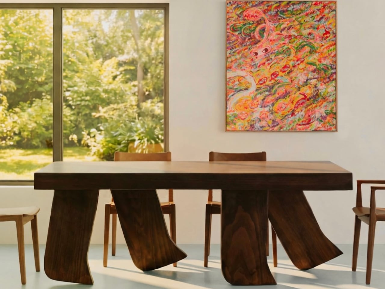
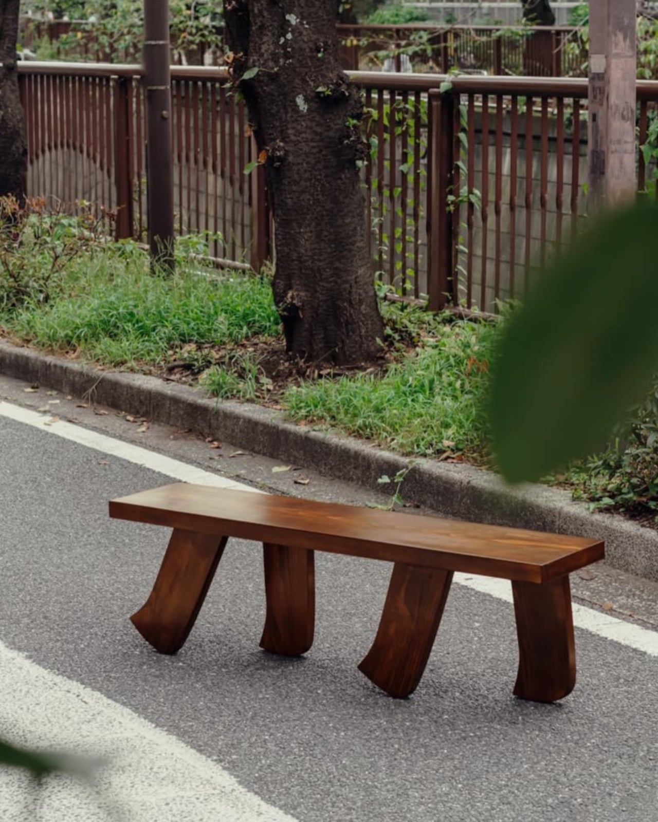
The collection has since expanded beyond the original coffee table to include a dining table and a bench, each carrying the same foot-like base into a different scale and context. The dining table version, in particular, has a presence that borders on sculptural. Placed beneath a colorful, painterly work, it holds its own without competing. The bench, spotted in one campaign image walking alongside a tree-lined street in what looks like Tokyo, has a lightness to it that almost reads as humor. Almost. The craft is too careful for it to be purely a joke, and Kilzi clearly intends both readings to coexist.

There’s also something worth noting about how the collection is built to adapt. The design can be reinterpreted across dimensions and formats to suit different interior projects, which is a practical flexibility that a lot of collectible furniture doesn’t bother offering. It acknowledges that real spaces have real constraints, and that a beautiful object with no room to negotiate isn’t as beautiful as it could be.

Kilzi has described his studio as one driven by the desire to create honest objects that coexist naturally with the body and space, not as decorative gestures but as presences that remain. The Barefoot Collection feels like the clearest expression of that to date. It doesn’t demand your attention. It just stays, quietly, on its four walking feet, reminding you that the room you’ve always lived in is still capable of surprising you. That’s a rare thing for a table to pull off.

The post The Furniture That Looks Like It’s About to Walk Away first appeared on Yanko Design.
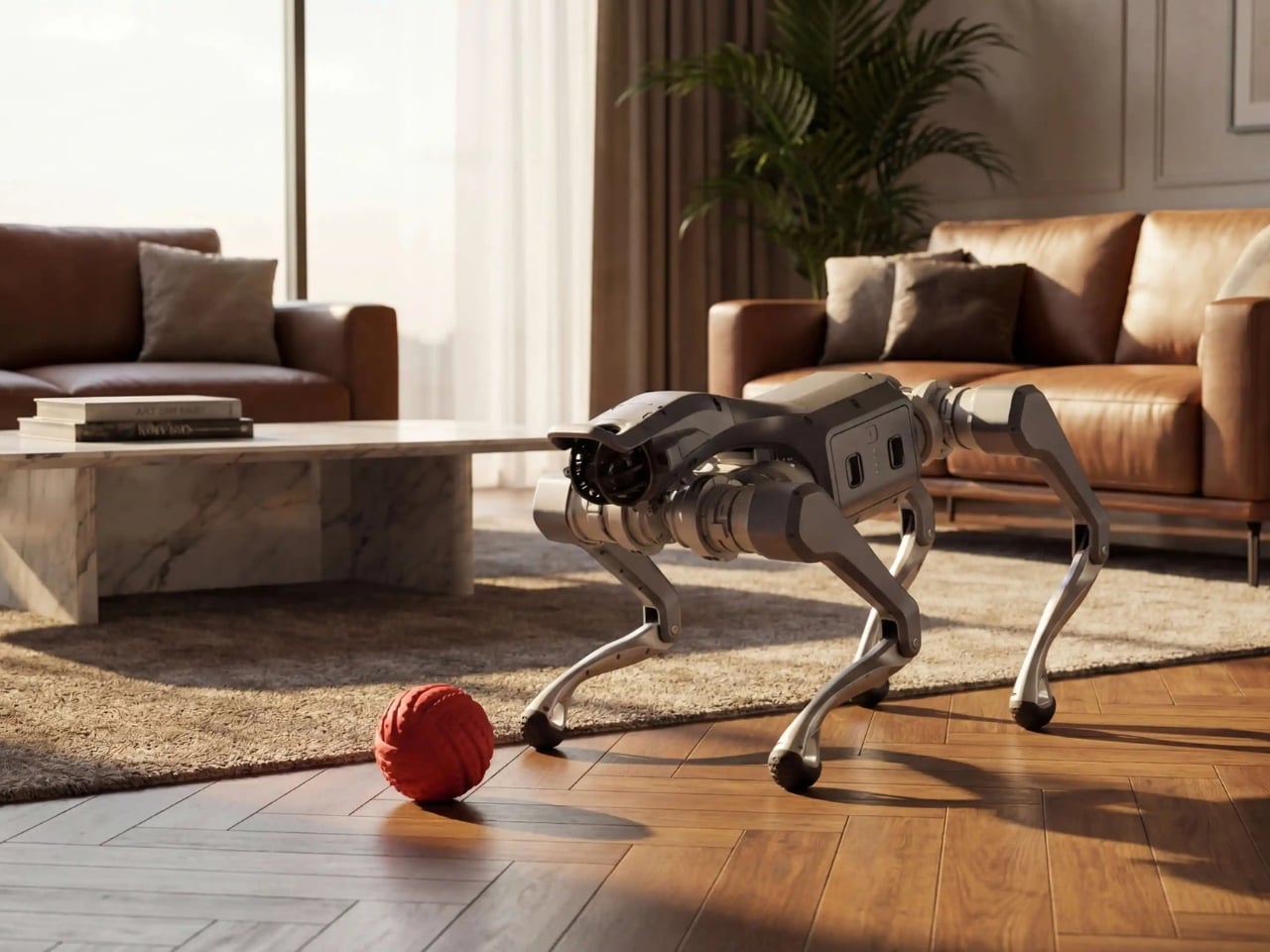
The Boop Chair Looks Inflated But It’s Completely Solid

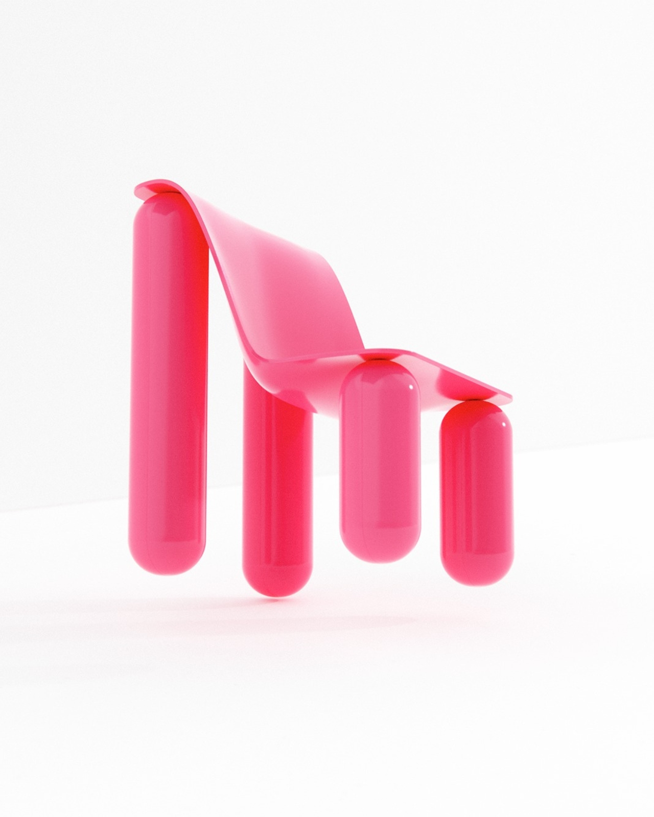
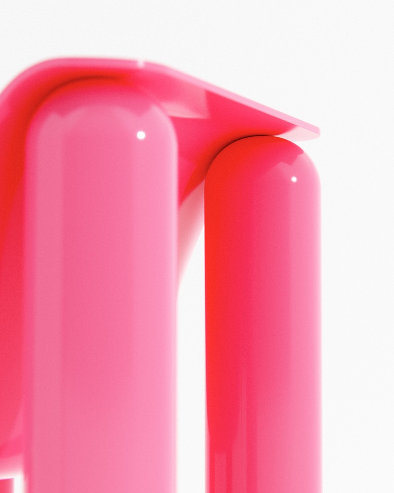
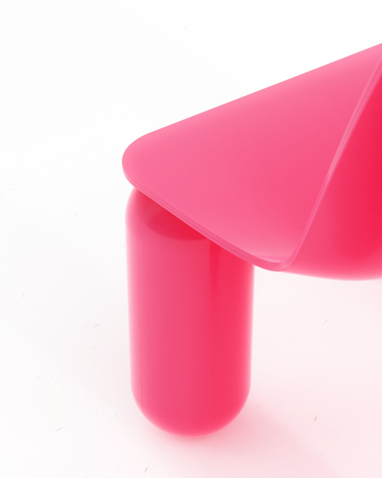
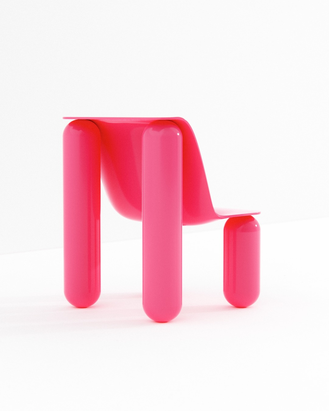
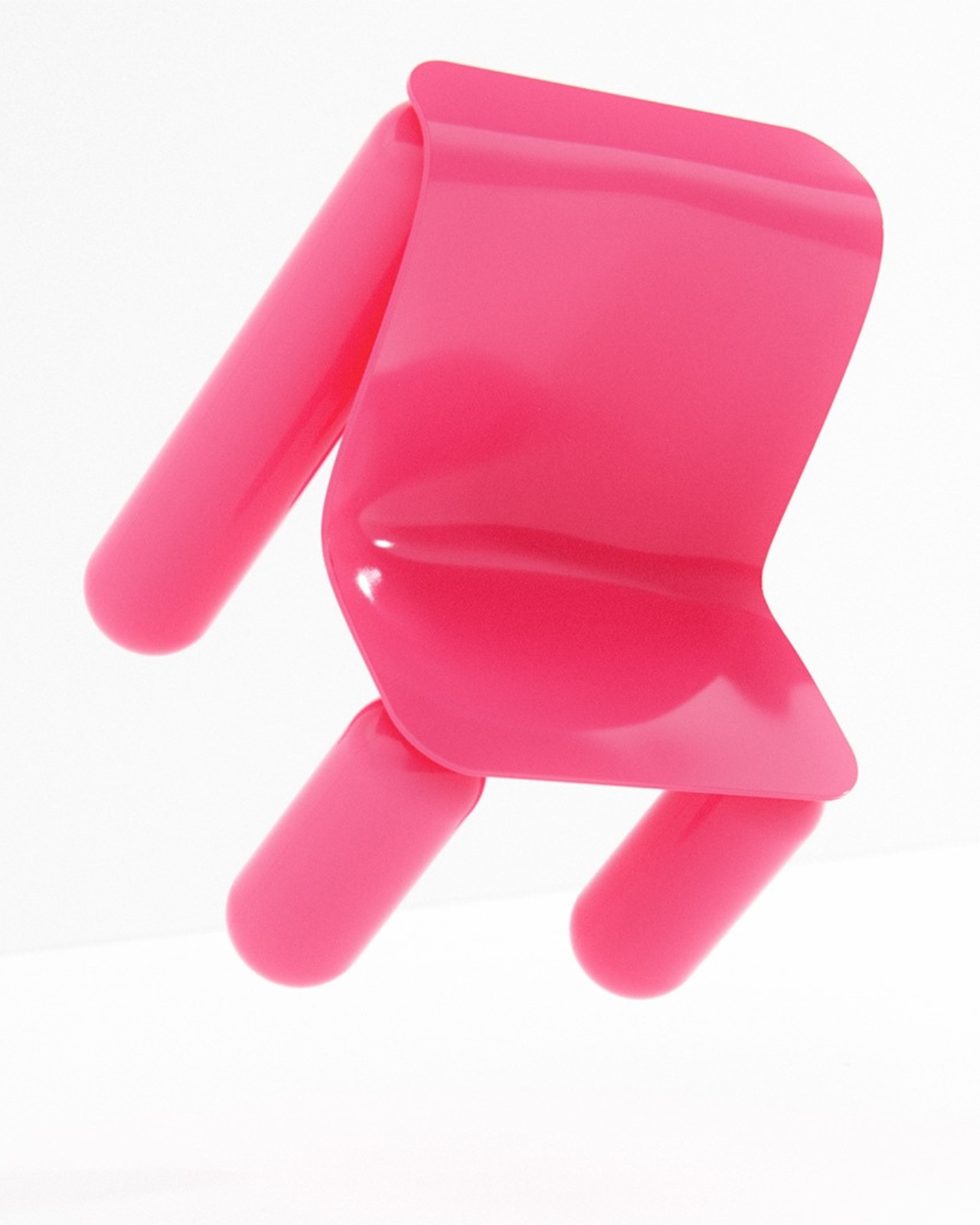
There’s something about a really good design idea that makes you wonder why nobody thought of it sooner. The Boop Chair by Bored Eye Design is one of those things. It’s hot pink, it looks like it was inflated rather than built, and the entire concept was born at a child’s birthday party. Of all the places great furniture design could originate, that might be my favorite origin story yet.

The designer describes Boop as a chair “inspired by the balloons at my daughter’s birthday party, exploring ideas of inflation and softness through a solid design form.” That one sentence is doing a lot of heavy lifting, because what it really describes is a fundamental design paradox: something that looks soft but is rigid, something that evokes weightlessness but is undeniably structural. That contradiction is exactly where the Boop Chair earns its place in a conversation about serious design.

Designer: Bored Eye Design

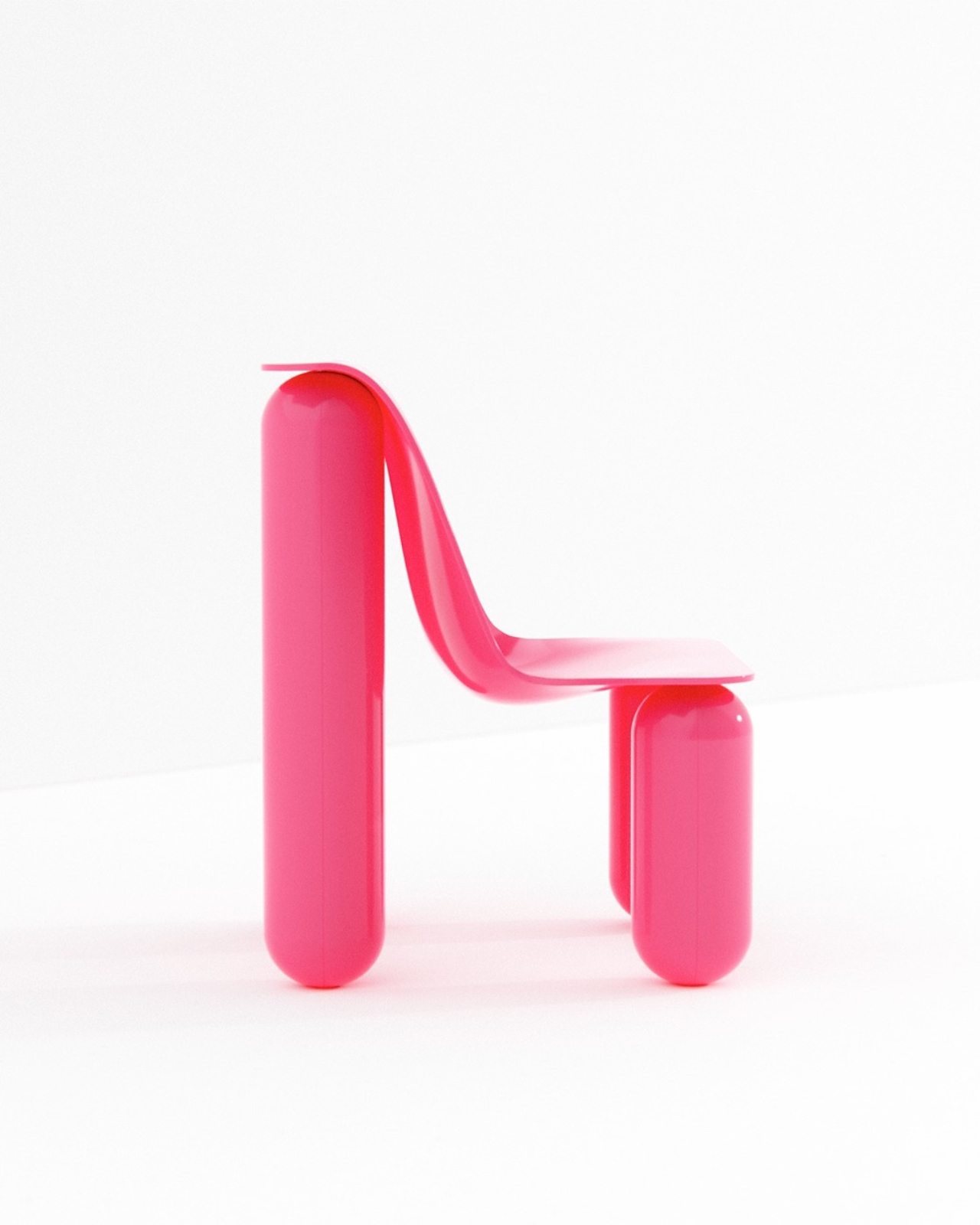
Looking at the photos, the first thing that hits you is the color. That specific shade of hot pink, somewhere between magenta and neon, has a glossy finish that reads almost wet. It’s the kind of color that demands attention and refuses to apologize for it. But once you get past the color, the form starts to do its own talking. The legs are thick, rounded cylinders with perfectly domed ends, like oversized capsule pills or, yes, tied-off latex balloons. The seat and backrest are thin, curved planes that flow into each other, creating that familiar seat-to-back transition in a way that looks draped rather than engineered. The contrast between the chunky, inflated legs and the almost paper-thin seat is where this chair gets genuinely interesting.

What Bored Eye Design is tapping into here is a visual language that our brains have spent decades associating with joy, celebration, and the unself-conscious fun of childhood. Balloons don’t carry weight, at least not literally. They float, they bounce, they squeak under your fingers. Translating that feeling into something you can actually sit on takes a certain kind of design confidence. The chair doesn’t just reference balloons aesthetically. It commits to the bit entirely, and because of that commitment, it actually works.

It also fits into a broader cultural moment that design has been circling for a few years now. The puffy, inflated aesthetic has been showing up everywhere from high fashion to tech product design, a pushback against the years of ultra-minimal, razor-edged everything. There’s something genuinely appealing about rounded forms right now, forms that feel approachable and almost tactile even before you touch them. Boop lands squarely in that conversation, but with a personal story underneath it that gives the piece more grounding than a trend exercise would.

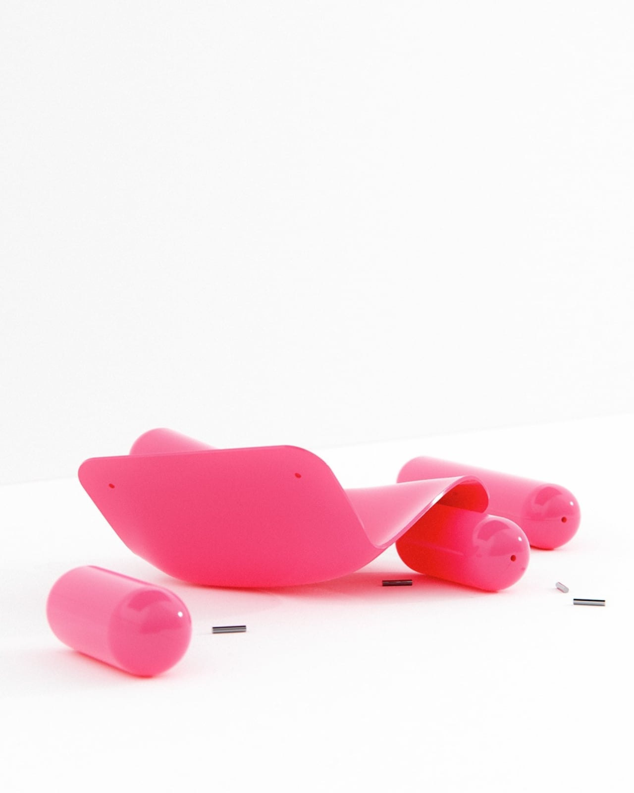
The disassembled shot is worth mentioning too. Seeing the chair broken down into its parts, the curved body laid flat and the capsule legs scattered around it alongside small metal pins, makes the whole thing feel even more considered. Those legs could be balloon animals. That seat could be a folded ribbon. It’s playful but precise, which is a genuinely hard combination to pull off.

I’ll admit my first reaction was something close to delight, which isn’t always my first reaction to furniture. Usually there’s more evaluation, more asking whether I’d actually want it in my home. With Boop, I found myself skipping past that entirely and just enjoying the thing. Whether or not it’s comfortable (and given the rigid seat, that’s a reasonable question), it functions as a piece of design that communicates something specific and does it with total conviction. Not every chair needs to be practical. Sometimes a chair just needs to make you feel something.

That this started because someone was watching balloons at a kid’s birthday party and let that moment become a full design concept is the part that sticks with me most. The best creative ideas often come from paying attention to ordinary moments. Bored Eye Design clearly paid attention.

The post The Boop Chair Looks Inflated But It’s Completely Solid first appeared on Yanko Design.

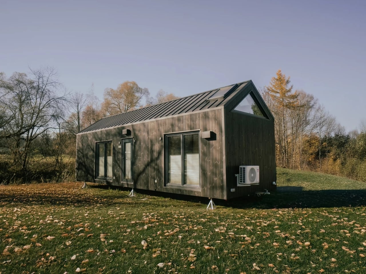
A 473-Square-Foot Tiny House That Actually Fits a Family of Four

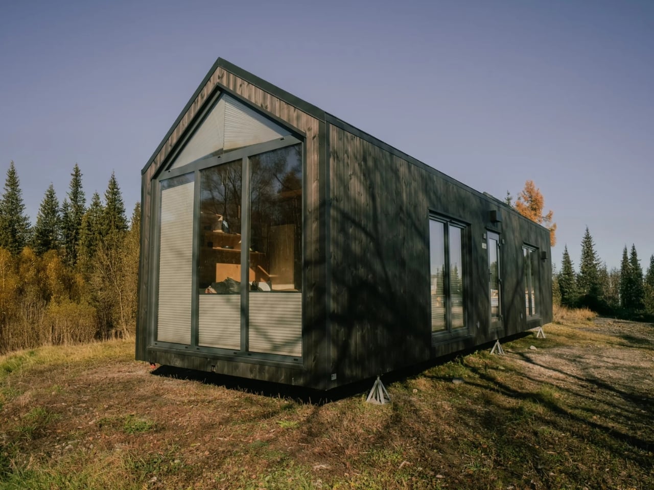
Most people picture a tiny house as a romantic retreat for one or two people with very few belongings and an even smaller grocery budget. The Zenith by Vagabond Haven is here to argue otherwise. Built by the Sweden-based design studio behind some of the most thoughtfully crafted small homes in Europe, the Zenith is a non-towable tiny house that takes aim at a demographic the tiny house movement has largely ignored: families. Not just couples, not just digital nomads, but actual families with kids, toys, and the basic human need for a door that closes.
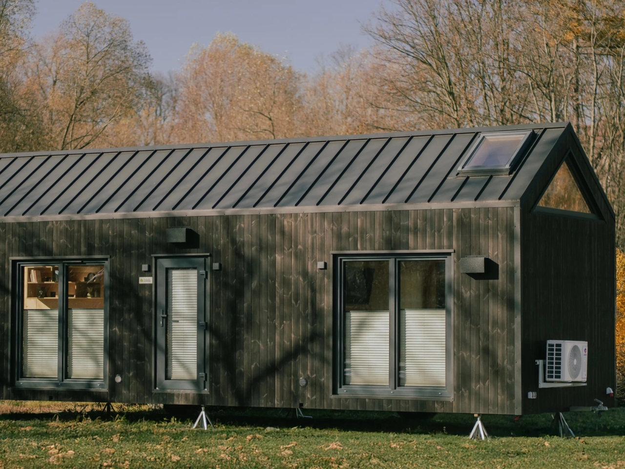
At 11 meters long and 3.45 meters wide (about 36 by 11 feet), the Zenith stretches the definition of “tiny” just far enough to make it livable for more than one person. The total living area clocks in at 44 square meters, or roughly 473 square feet. That’s generous for a tiny house, and the layout makes every inch count.

Designer: Vagabond Haven

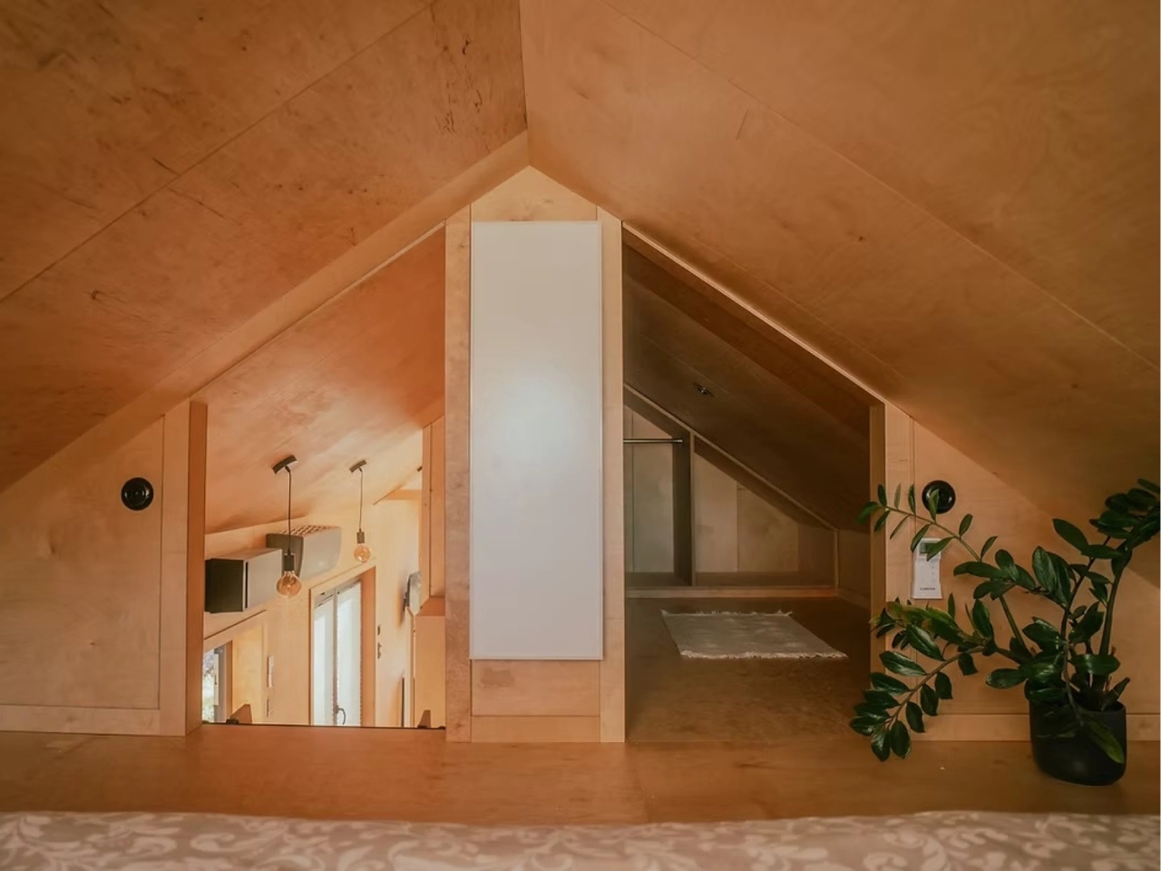
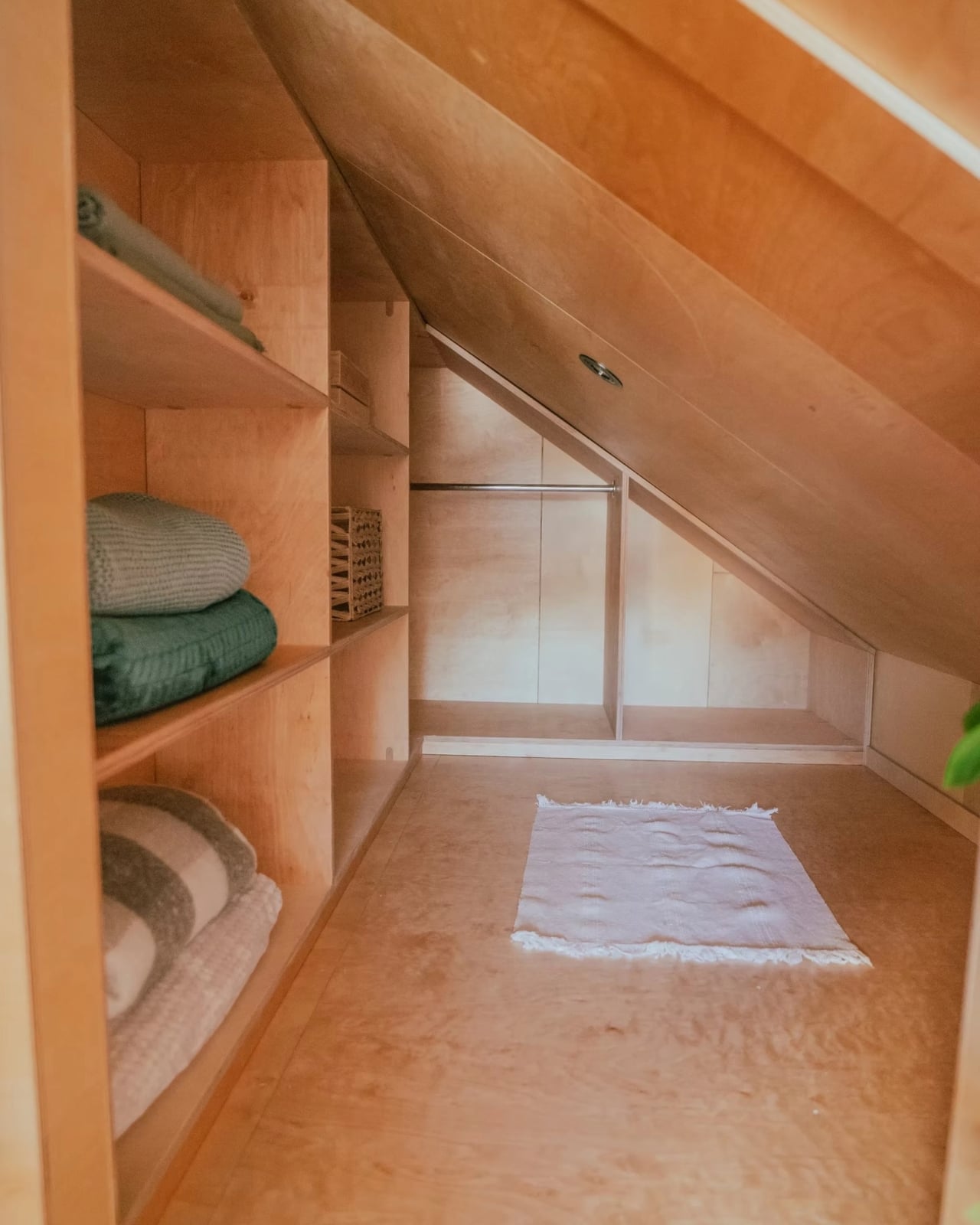
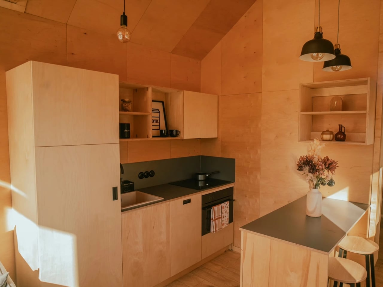
The Zenith is an evolution of Vagabond Haven’s earlier Sky model. Where the Sky kept things minimal, the Zenith brings in a second sleeping space in the form of an overhead loft, a dedicated flex room that can serve as a walk-in closet or a child’s bedroom, and a larger kitchen designed for actual cooking rather than survivalist meal prep. These aren’t small upgrades. They’re the kind of design decisions that signal a shift in who the tiny house market is really meant to serve.

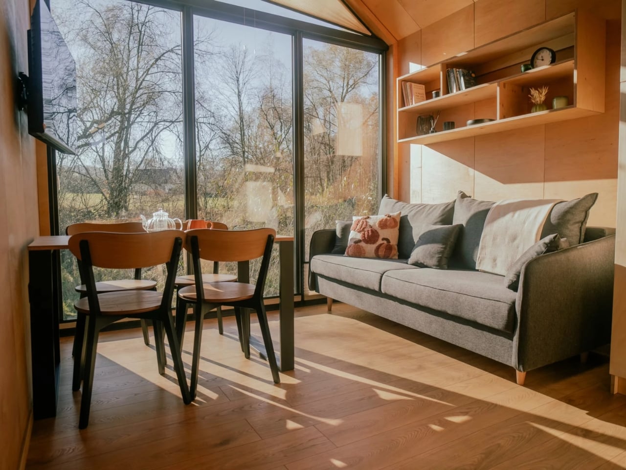
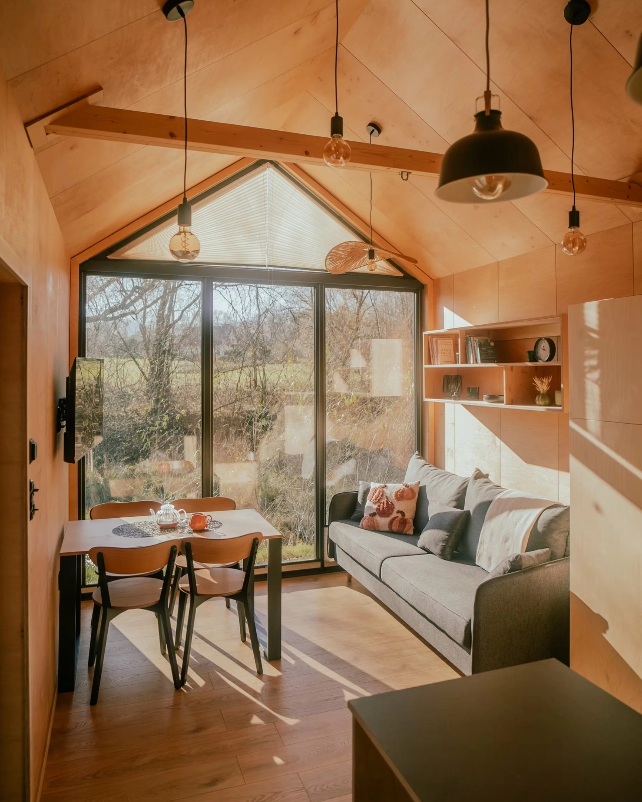
The exterior is finished in engineered wood with an aluminum roof, which gives it a clean, modern aesthetic without the sterile coldness of a shipping container conversion. Big windows and skylights run throughout the interior, keeping the space feeling open even when square footage isn’t exactly on your side. Natural light is doing a lot of heavy lifting here, and it shows.

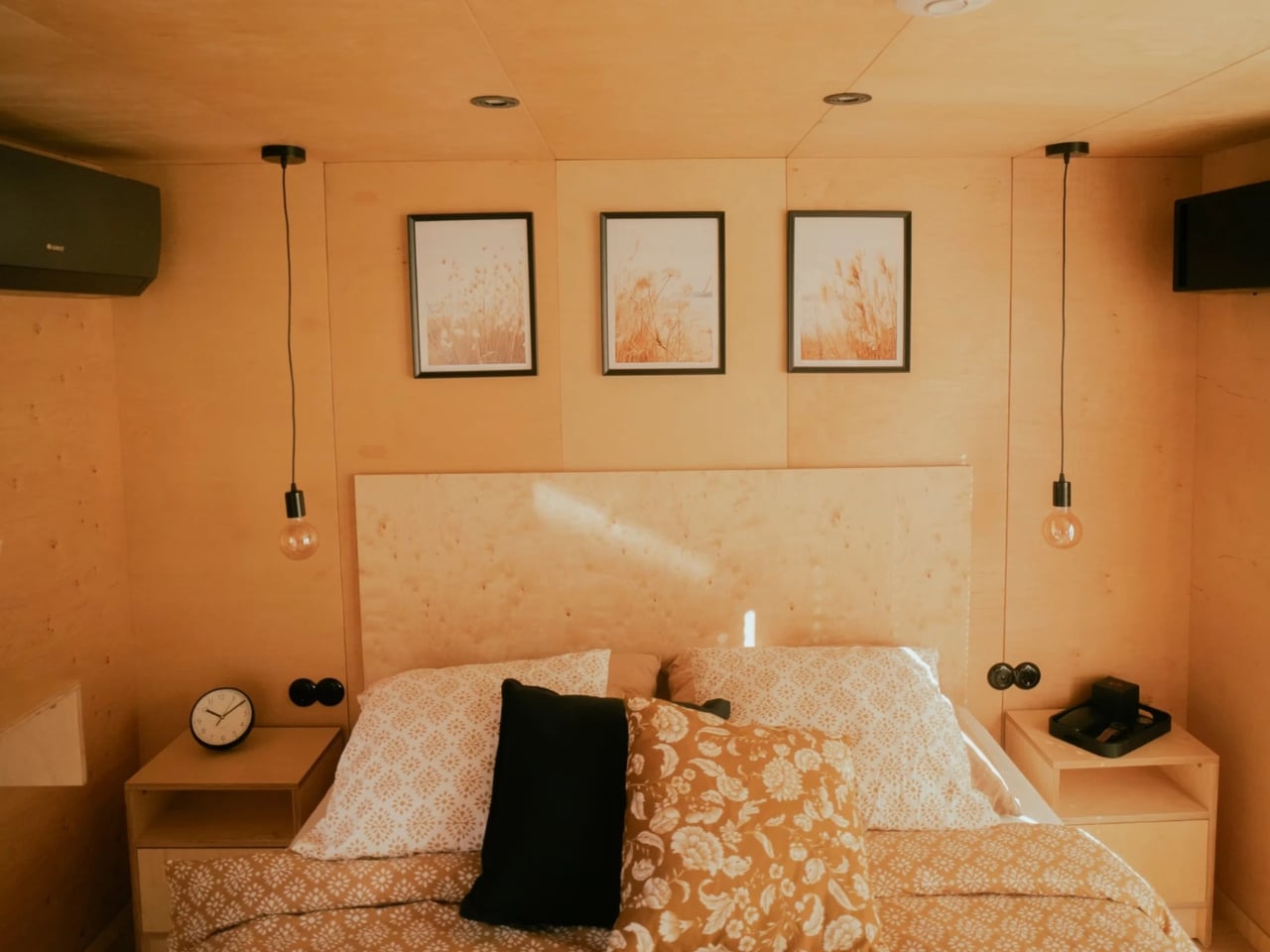
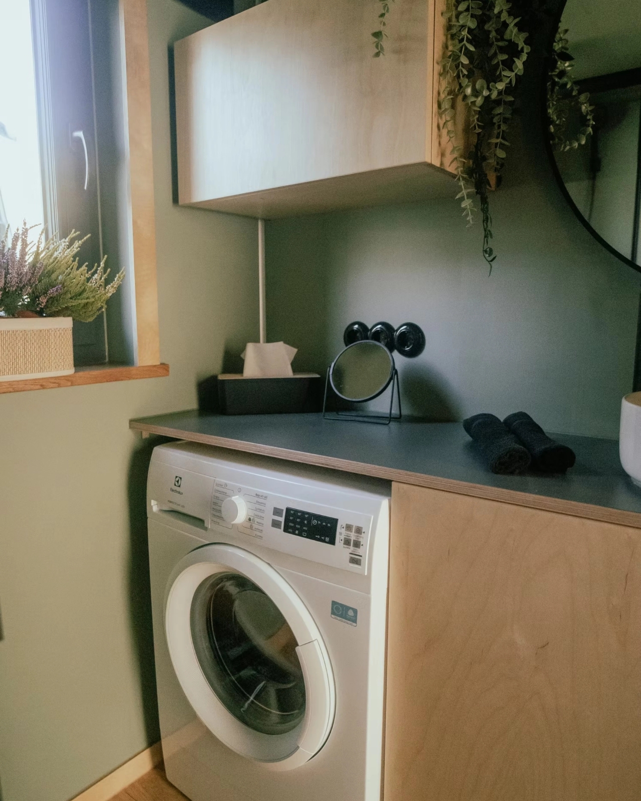
Inside, the main bedroom sits on the ground floor, which is a meaningful detail for anyone who’s ever tried to navigate a steep loft ladder at 2 a.m. The bathroom doesn’t cut corners either. It features wet room-approved walls from Fibo panels, a glass shower cabin, a generous countertop, and space under the vanity for a washing machine. Vagabond Haven also gives buyers a choice between flush, composting, Separett, or incinerating toilets, which speaks to the range of customers they’re designing for, from sustainability-minded homeowners to those building on remote land without conventional hookups.

Storage is woven into the design at every turn rather than treated as an afterthought. The floor plan has a logical flow to it, the kind that only comes from spending real time thinking about how people actually move through a home. The flex room in particular is one of the smarter elements, giving the layout breathing room for families at different stages of life.

On the utilities side, the Zenith can be configured with a solar system, a rainwater harvesting setup, a heat recovery ventilator, and electric or gas hot water heating. It’s a house that can run largely off the grid if that’s what you’re after, or connect to standard services if you’d rather keep things conventional. Vagabond Haven offers eurowide delivery, which means this isn’t just a Scandinavian fantasy but a genuinely accessible option for buyers across the continent.

Pricing starts at around €53,380 before VAT, which puts it well below the cost of a traditional home in most European cities and in the same ballpark as a high-end campervan, except with considerably more dignity and a door that locks from the inside.

The tiny house movement has spent years proving that you can live with less. The Zenith makes a slightly different case: that you can live with less space without actually giving up the things that make a house feel like a home. For families who’ve been watching the tiny house trend from the sidelines and wondering if there’s something in it for them too, the Zenith might finally be the answer they’ve been waiting for.

The post A 473-Square-Foot Tiny House That Actually Fits a Family of Four first appeared on Yanko Design.