Android 16 updates include AI-powered notification summaries and built-in parental controls

Android 16 first came out in June but, in a change from its usual yearly update schedule, a second iteration is now on the way. Android has announced new features ranging from AI-powered notification summaries to built-in parental controls. As usual, the update will roll out to eligible Pixel devices first. 

Anyone who has used Apple Intelligence, will find some of these Android 16 features familiar. Such is the case for new notification tools, like AI-powered message summaries and a notification organizer. Other updates also align with existing Apple tools like built-in parental controls, for things like screen time and app usage. 

Android 16's second release has additional new features, including custom icon shapes, themed icons and an expanded dark theme. The company claims the latter should improve battery life. 

Outside of Android 16's second go around, the company is also rolling out a series of general updates. There's Circle To Search, which uses an AI Overview to find out if a message is likely to be spam — and gives advice on next steps. Similarly, Google Messages will now send an alert any time an unknown number sends a group invite. It will offer a one-tap option to leave, block and report. 

In what could be helpful or get annoying really fast, Android is beta testing something titled Call Reason. It allows Android users to mark their call as "urgent" when calling a saved contact. It will not only show as urgent on the call screen, but keeps the note if they miss the call. Pinned Tabs are also now available on Chrome for Android, staying saved and upfront, just like in Chrome on desktop. Plus, a feature called Expressive Captions is coming that should shine a light on a person's emotion in a video, despite the sound being turned off. 

These Expressive Captions are also coming to YouTube as part of Android's new accessibility updates. Additional features include Fast Pair for hearing aids and Guided Frame with Gemini, which gives a description of what's in view on the Pixel camera app. Learn more about all of Android's accessibility updates here

This article originally appeared on Engadget at https://www.engadget.com/mobile/android-16-updates-include-ai-powered-notification-summaries-and-built-in-parental-controls-190057208.html?src=rss

Android is getting a slew of new accessibility features

Google has announced a slew of new accessibility features coming to Android ahead of International Day of Persons with Disabilities on Wednesday. Advanced voice dictation, expanded support for an external mouse and improved expressive captions are just some of the features aiming to make Android a more accessible mobile experience.

A more advanced dark theme is now available for devices running Android 16 that will automatically darken most apps even when those apps lack their own native dark modes. Exclusive to Android 16, users can now select between "Standard" and "Expanded" when setting up Dark theme.

For those using a connected mouse with an Android device but who might find the action of clicking difficult, AutoClick now has an improved dwell cursor experience. This feature means the cursor will automatically click after it has paused over something for a certain amount of time, as set by the user. The type of click itself can also be customized, with a user's choice of left-click, right-click, double-click, long press, scroll or drag.

Hands-free use is a cornerstone of accessibility for mobile devices, and now Gemini-powered voice dictation within TalkBack will enable typing and text editing using natural commands. Users can start dictating in Gboard with a two-finger double-tap, after which Smart Dictation with Gemini empowers users to say things like "replace Monday with Tuesday" to fix a mistake or even ask Gemini to make their message shorter. Google says TalkBack is "launching soon."

Google has also added new functionality to Guided Frame, which helps blind or low-vision users take photos in the Pixel camera app. The tool can now describe the scene to the user as well as let them know when there's a face in frame.

Voice Access has also been made easier to use in a totally hands-free way. Instead of having to physically tap the phone's screen to start using the feature, users can now say "Hey Google, start Voice Access" to gain hands-free control. The feature does need to be enabled first for this to work.

Android devices can now pair to Bluetooth LE Audio-enabled hearing aids with a single tap. This expanded use of Fast Pair is compatible with Demant hearing aids and support for Starkey products is coming in early 2026.

Finally, Google is also building on expressive captions, the AI powered tool released last year that tries to imbue more feeling into captions. On Android, expressive captions can now "detect and display the emotional tone of speech" from the audio playing on your device. Captions will be tagged with emotions like joy or sadness. The feature is also coming to YouTube where captions will now convey the intensity of speech by using all caps, and writing out sounds like sighs and gasps. This will be live for all videos in English uploaded after October.

With the exception of TalkBack, which is launching soon, these new accessibility features are live now. As with most Google updates, it may take some time for the updates to hit every device.

This article originally appeared on Engadget at https://www.engadget.com/mobile/smartphones/android-is-getting-a-slew-of-new-accessibility-features-190016358.html?src=rss

Yelp’s 2026 Design Forecast: The Trends Reshaping How We Live

The numbers tell a story that design magazines have been hinting at for months. Yelp’s latest trend report, analyzing millions of consumer searches between 2023 and 2024, confirms what forward-thinking designers already suspected: the home is becoming a deliberate statement of values, not just a collection of furniture.

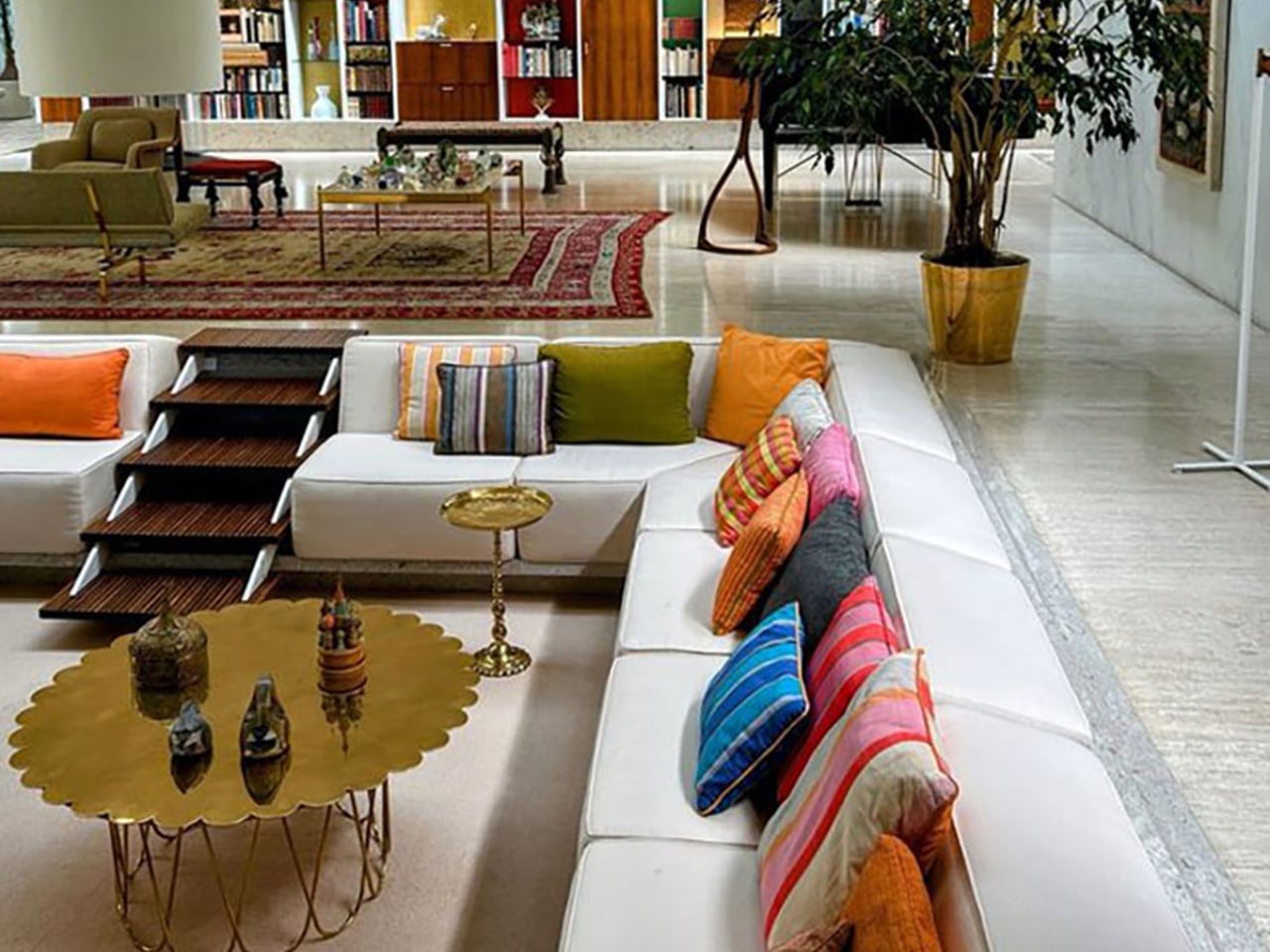
Conversation pits are leading the charge. Searches for these sunken living areas surged 369%, signaling a fundamental rejection of the open-plan uniformity that dominated the 2010s. People want intimacy again. They want spaces that pull them together rather than spreading them across vast, undifferentiated square footage. The mid-century roots of this trend run deep, with searches for mid-century furniture climbing 319% and curved furniture up 124%. These aren’t isolated preferences. They represent a cohesive design philosophy centered on human-scale spaces that encourage actual conversation.

The Texture Revolution

Flat walls are dying. Roman clay finishes saw searches explode by 312%, while lime paint climbed 162%. Fabric wallpaper rose 123%, and wall stencils increased 68%. This collective movement toward tactile surfaces reveals a deeper truth about contemporary design priorities.
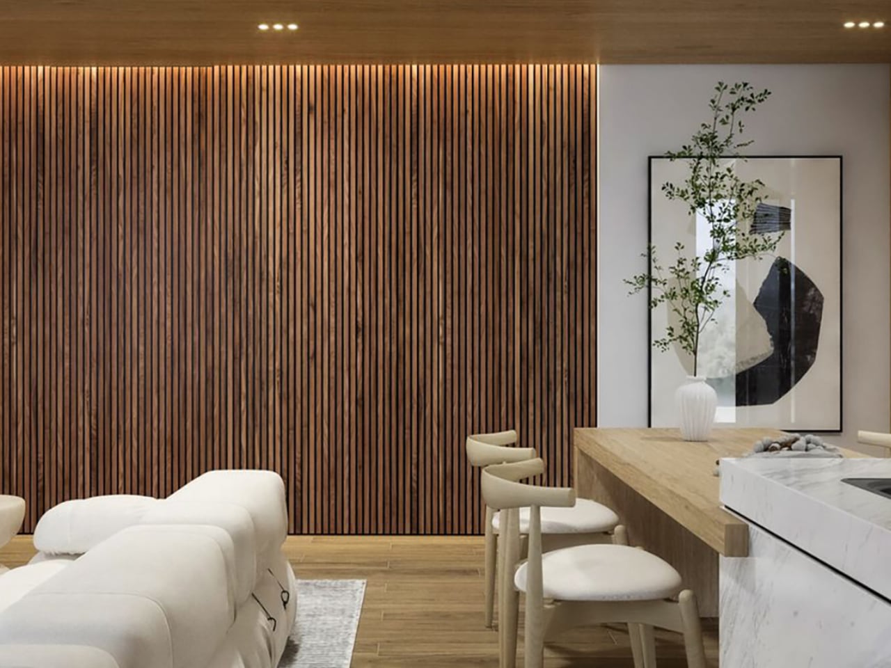
People have spent years staring at screens. Their homes responded by becoming increasingly smooth, minimal, and digital-friendly. Now the pendulum swings. Hands want something to touch. Eyes want variation and depth. The Roman clay trend is particularly telling because it demands imperfection. Each application creates unique texture, mottled color, and surfaces that change with light throughout the day. This is the opposite of the perfectly smooth drywall that builders have standardized for decades.

The avocado bathroom deserves attention here too. Searches for ’70s bathrooms jumped 124%, with green countertops following at the same rate. Bathroom remodeling searches increased 84%. But this isn’t nostalgia for nostalgia’s sake. Modern interpretations use nuanced jade and sage tones with contemporary fixtures. The color brings warmth. The execution stays current.

Japandi’s Second Wave

The fusion of Japanese and Scandinavian minimalism refuses to fade. Japandi searches climbed 105%, but the supporting data reveals where this trend is evolving. Fluted panels exploded by 459%. Natural stone rose 51%. Biophilic design increased 124%, alongside woven window shades at the same rate and jute rugs at 60%.
This second wave of Japandi moves beyond the surface aesthetics that defined its first popularity cycle. The emphasis shifts toward materiality and texture rather than mere visual simplicity. Fluted panels create rhythm and shadow play. Natural stone introduces geological time into domestic spaces. Woven materials connect interiors to craft traditions that predate industrial manufacturing. The philosophy remains minimalist, but the execution has matured. Spaces built on these principles feel grounded rather than sparse, considered rather than empty.

Travel plays a role in this evolution. As more people visit Japan and experience its design sensibilities firsthand, they return with refined understanding of how restraint and material quality work together. Tourism shapes taste, and taste shapes the search bar.

The Invisible Technology Thesis

Smart home technology is going underground. Searches for smart windows rose 49%, smart lighting increased 32%, and smart appliances climbed 40%. But the real story lies in the concealment searches. Built-in bookshelves surged 124%. Invisible kitchens with hidden storage jumped 68%.
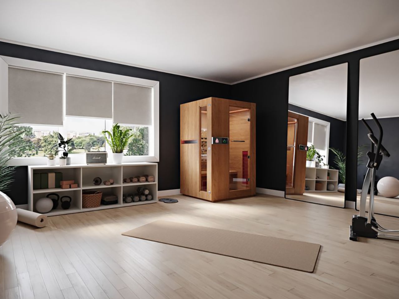
The design community spent years debating whether technology should be celebrated or hidden. The data suggests resolution: people want capability without visual intrusion. They want lights that respond to voice commands from fixtures that look like ordinary fixtures. They want kitchens that function as high-tech command centers but photograph like serene minimalist spaces. Jennifer Aniston’s illuminated onyx sink basin represents the apex of this thinking. The surface glows. The technology disappears.

This invisible technology trend connects directly to the broader texture movement. When appliances hide and screens retract, walls become the primary visual element. Those walls better be interesting. Roman clay and fluted panels fill the visual space that technology once occupied. The home becomes a gallery of surfaces rather than a showroom of gadgets.

Black as Design Strategy

Black countertops rose 123%. Black furniture increased 12%. These numbers underscore a shift toward intentional contrast as a design strategy rather than an afterthought.
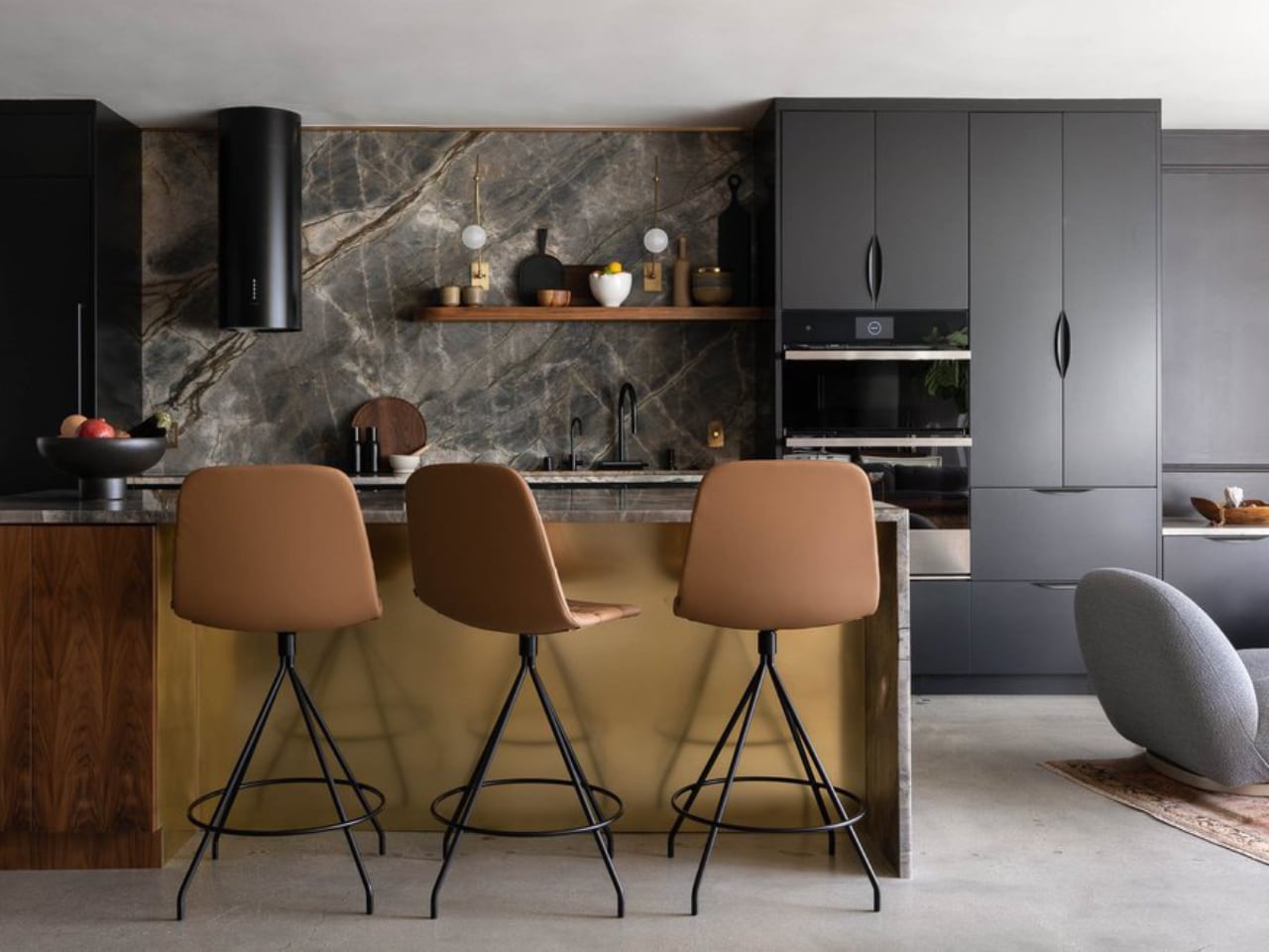
Interior design expert Taylor Simon’s “unexpected red theory” has influenced how designers think about strategic color deployment. Black operates on similar principles. A black countertop against light cabinetry creates visual anchor points. Black furniture pieces become sculptural elements that organize surrounding space. The approach requires restraint. Too much black collapses into monotony. Applied surgically, it transforms ordinary rooms into composed environments where the eye knows where to rest.

The contrast philosophy extends beyond color. It manifests in the juxtaposition of textured and smooth, natural and manufactured, vintage and contemporary. Curved mid-century furniture against rectilinear architecture. Woven jute against polished concrete. The design language emerging from this data prioritizes tension and dialogue between elements rather than uniform harmony.

Memory as Material

Shadowbox searches increased 34%. Film lab searches rose 88%. Film developing climbed 54%. Together, these numbers reveal a design trend that treats personal history as raw material.
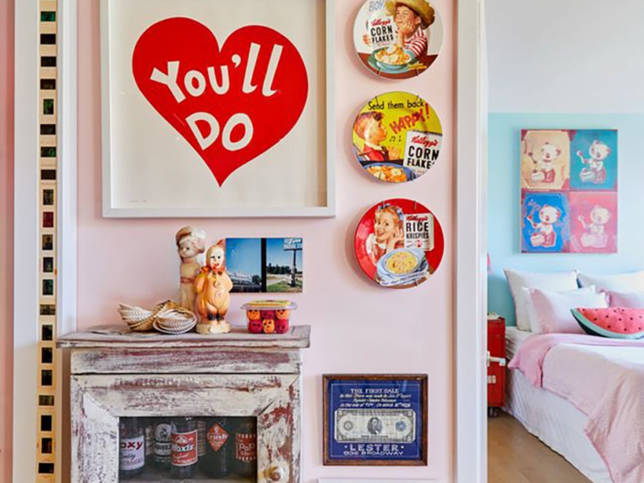
Custom framing services report growing demand for memory displays that transform scrapbook contents into wall art. Travel mementos, film photographs from analog cameras, keepsakes from significant moments. These aren’t arranged in albums anymore. They’re composed into visual statements that hang alongside purchased art.

This trend intersects with the broader rejection of generic decor. Mass-produced wall art serves a function, but it doesn’t tell a story. A framed collection of Polaroids from a specific trip, ticket stubs from meaningful concerts, pressed flowers from important occasions: these objects carry narrative weight that manufactured decor cannot replicate. The home becomes autobiography.

Where This Leaves Us

The throughline connecting these trends points toward a single thesis: design in 2026 will prioritize meaning over minimalism, texture over sleekness, and personal narrative over trend compliance.
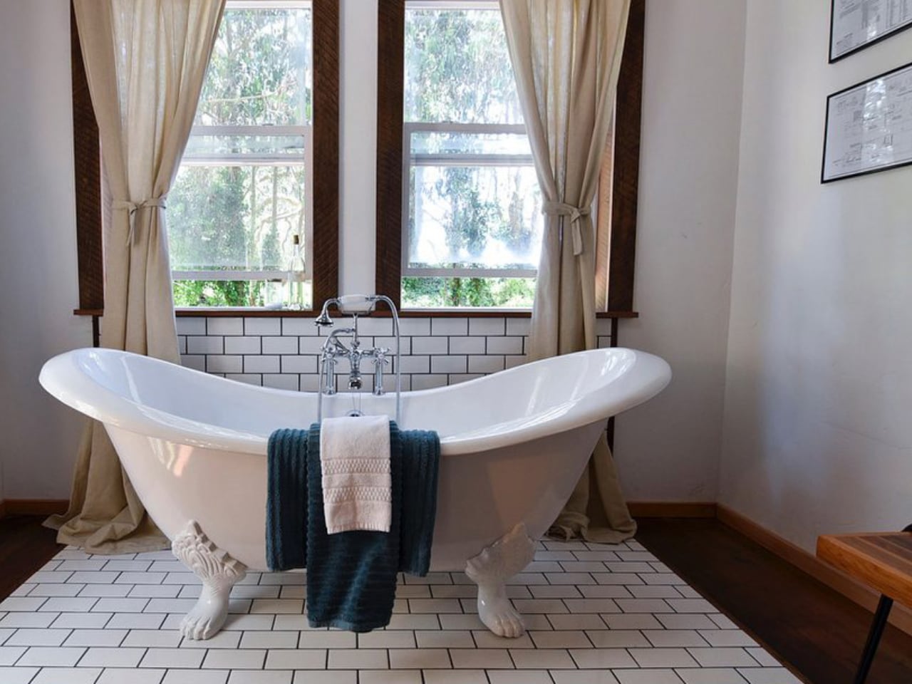
The conversation pit revival matters because it privileges human connection over architectural showmanship. The texture movement matters because it restores sensory richness to spaces flattened by digital life. Japandi’s evolution matters because it demonstrates how design philosophies mature beyond their initial aesthetic expressions. Hidden technology matters because it resolves the long tension between capability and beauty. Strategic contrast matters because it treats composition as seriously as color.

None of these trends exist in isolation. They form a coherent vision of domestic space as refuge, as expression, as carefully curated environment that reflects inhabitant values rather than developer defaults. The search data quantifies what designers intuit. People want homes that feel like themselves, not like everyone else’s Pinterest board. The numbers say they’re willing to invest, to research, to seek professional help in achieving that goal.

The 2026 home will have texture you can feel, spaces that pull people together, technology that serves without announcing itself, and walls decorated with personal history. It will reference the past without copying it. It will embrace natural materials while leveraging smart systems. It will be, in short, deliberately designed rather than passively accumulated. The data says so.

The post Yelp’s 2026 Design Forecast: The Trends Reshaping How We Live first appeared on Yanko Design.

Ball x Pit is evolving with a string of free updates in 2026

Ball x Pit is a fiendishly good time. The frenetic blend of Breakout and Vampire Survivors is easily one of the best games of the year. It’s immensely replayable. However, one reaches a point (after 36 hours in my case) where there isn’t much left to do other than run through New Game+ modes and so it becomes time to step away.

But this darned game is about to dig its hooks into me again in 2026, as developer Kenny Sun and his collaborators have lined up three free updates for Ball x Pit. The updates will drop in January, April and July and each will add fresh balls, evolutions, buildings, characters and “more” — which hopefully includes new levels and lore.

The trailer didn’t reveal too many specifics for each update, though more info on the first one is coming soon. I’m excited to discover more killer combos of characters and balls, and to unleash extra chaos. I’m glad there will be more buildings as well, because there’s a lot of empty space to fill in my version of New Ballbylon.

Publisher Devolver Digital said the game has now sold more than 1 million copies (Ball x Pit is on Game Pass too). According to the narrator of a video announcing that milestone and the updates, “if we want to keep this ball rolling, we need more people to buy Ball x Pit, so it sells another ‘balljillion’ copies, so Kenny has to make more Ball x Pit, so more people buy Ball x Pit, so he has to make more more more Ball x Pit.” Be right back, I’m gonna go buy Ball x Pit on the platforms where I don’t already have it so I can have even more Ball x Pit in the future. Ball x Pit is available on Steam, PS5, Xbox Series X/S, the Xbox PC app, Nintendo Switch and Switch 2.

This article originally appeared on Engadget at https://www.engadget.com/gaming/ball-x-pit-is-evolving-with-a-string-of-free-updates-in-2026-181947946.html?src=rss

Smart Healing: A Concept For AI Powered Burn Treatment

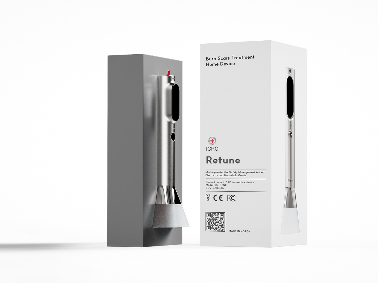
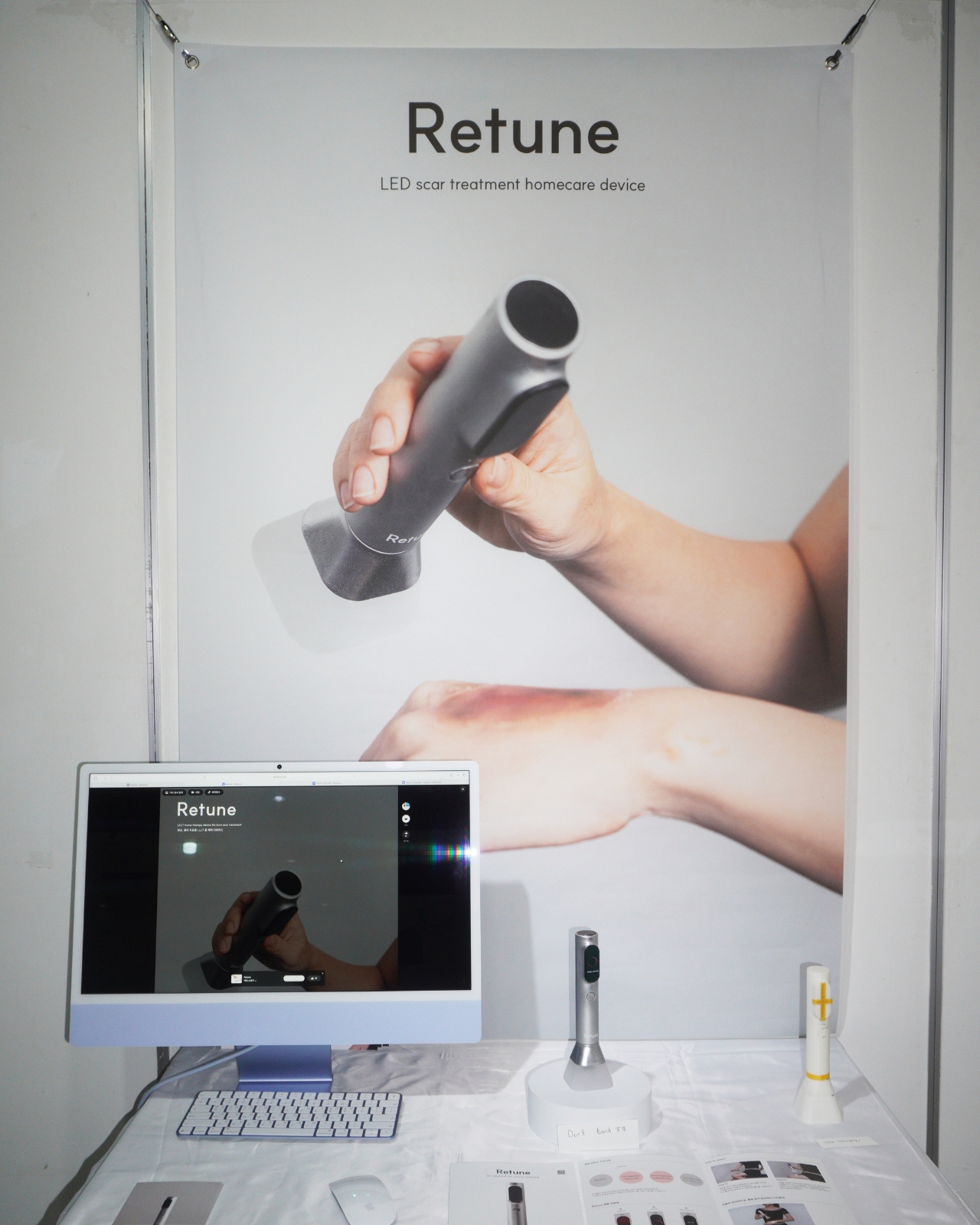
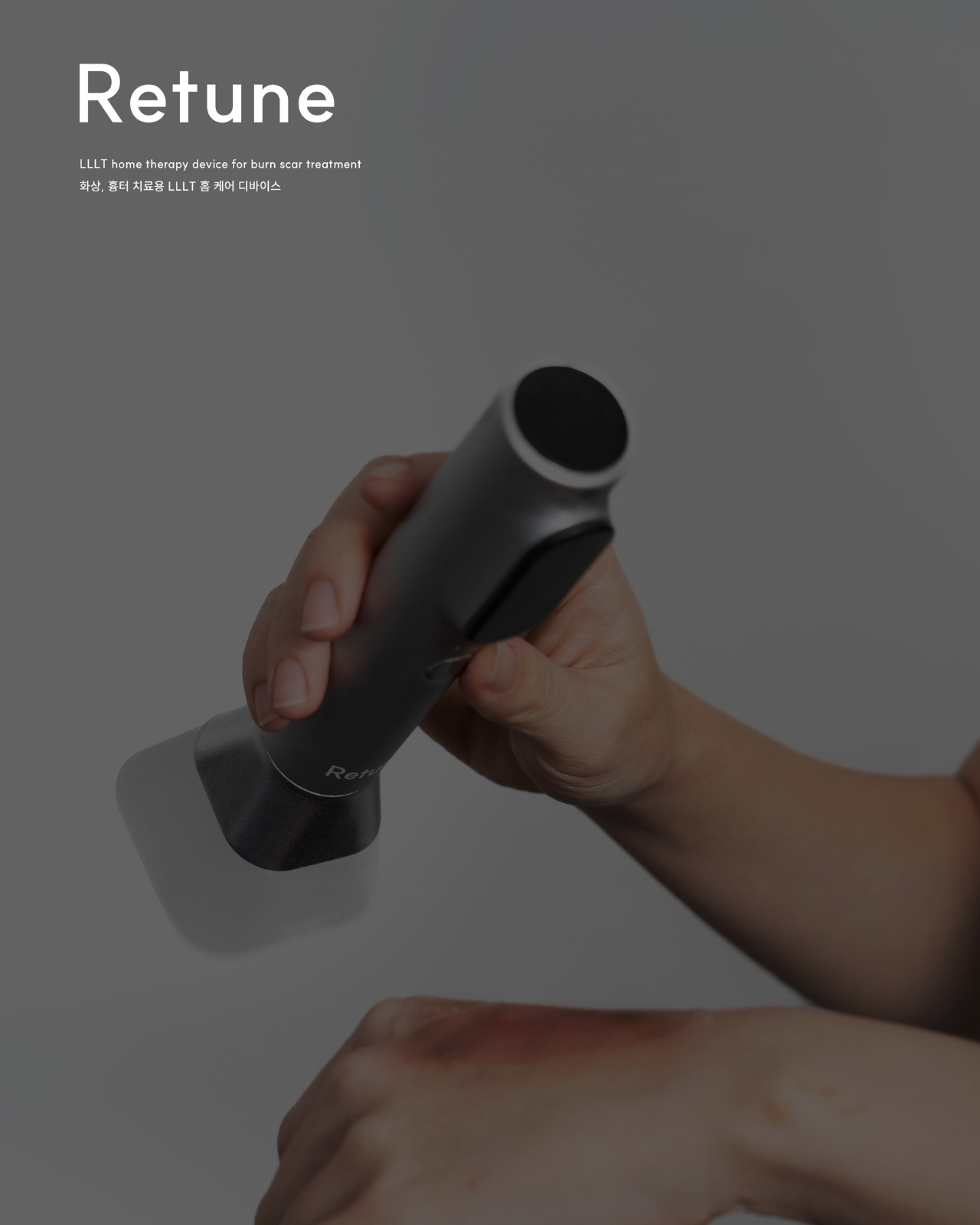
We’ve reached that fascinating point where medical care is starting to look less like a hospital trip and more like a beautifully designed tech accessory you’d actually want sitting on your bathroom counter. Enter Retune, a concept device from designer Yewon Lee that imagines what could happen when wound care meets sophisticated technology.

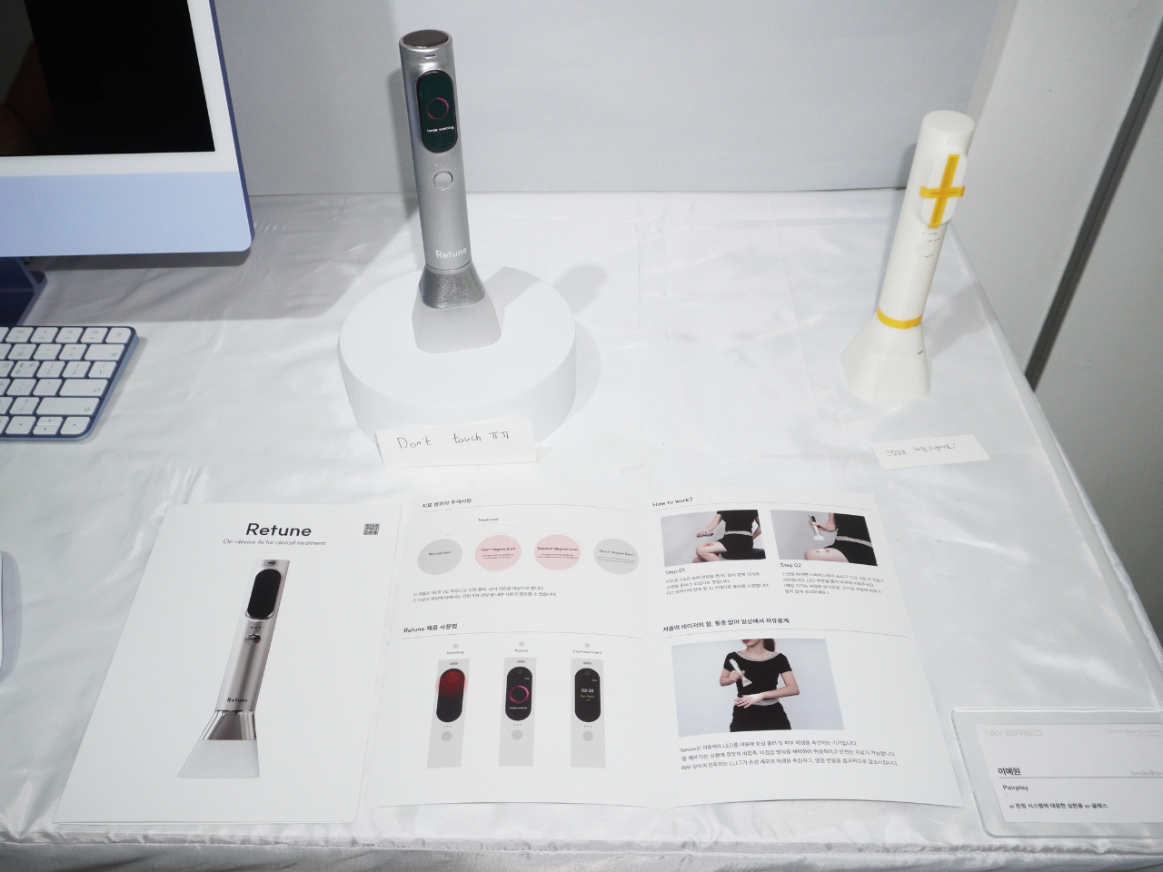
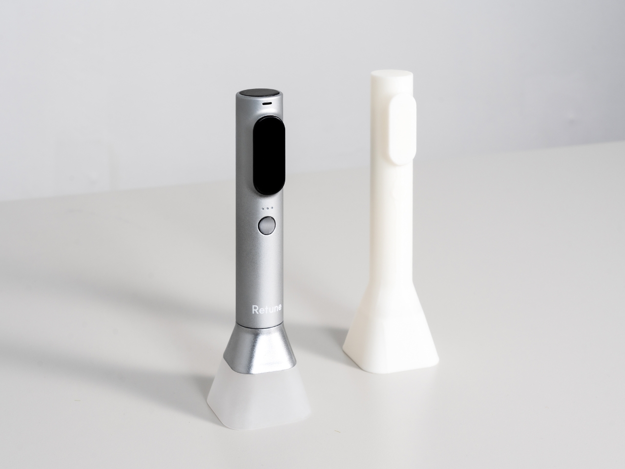
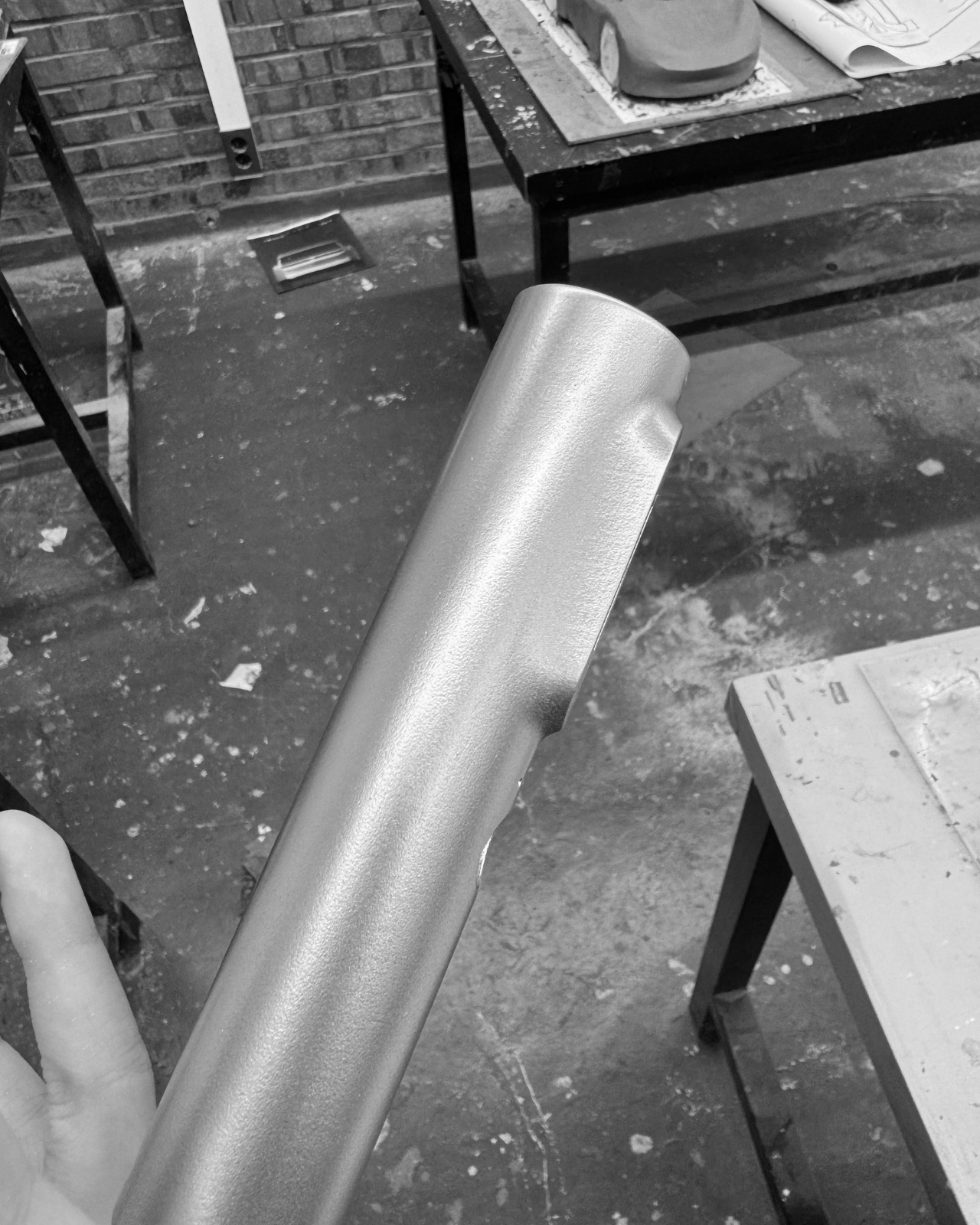
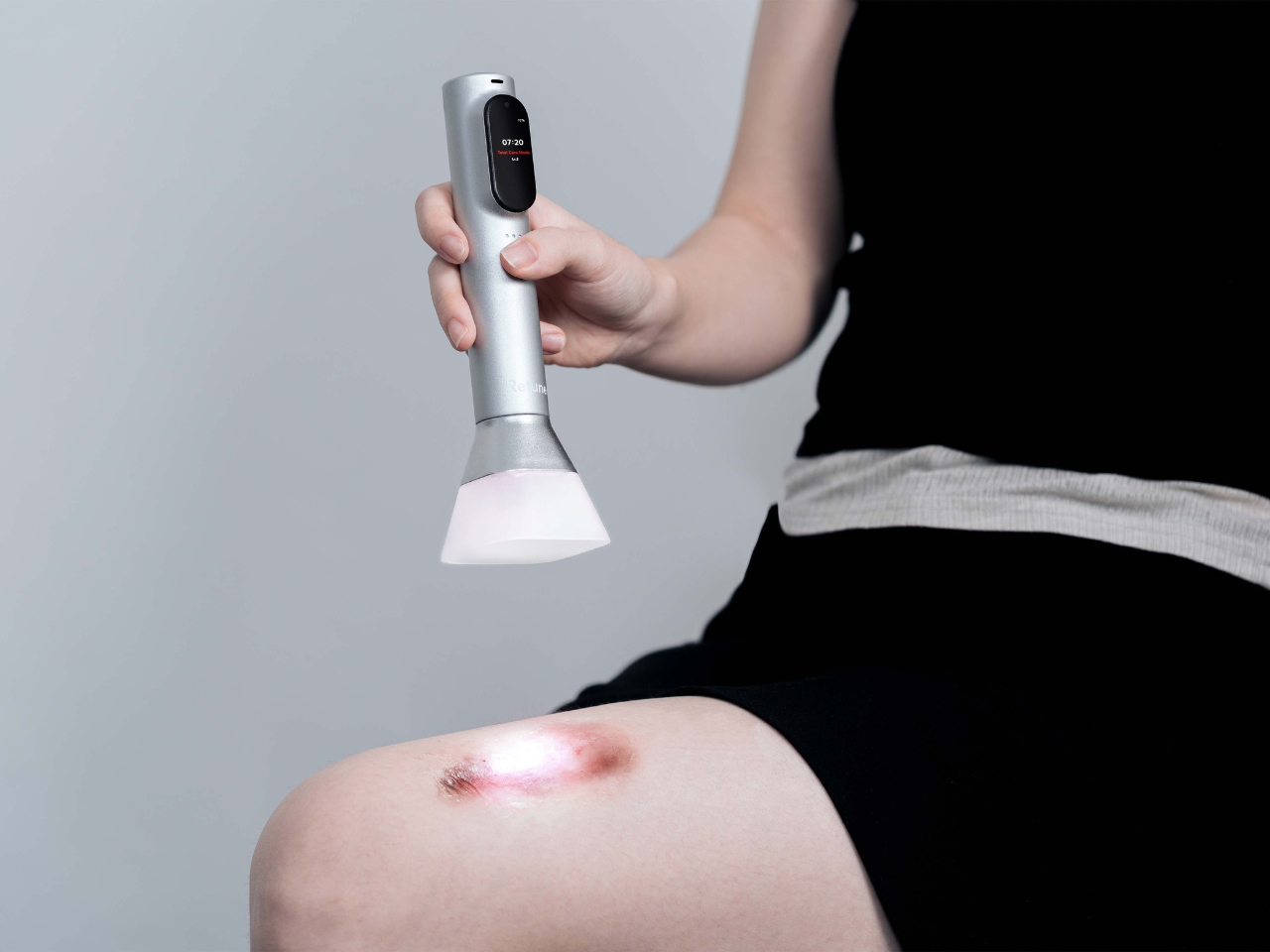
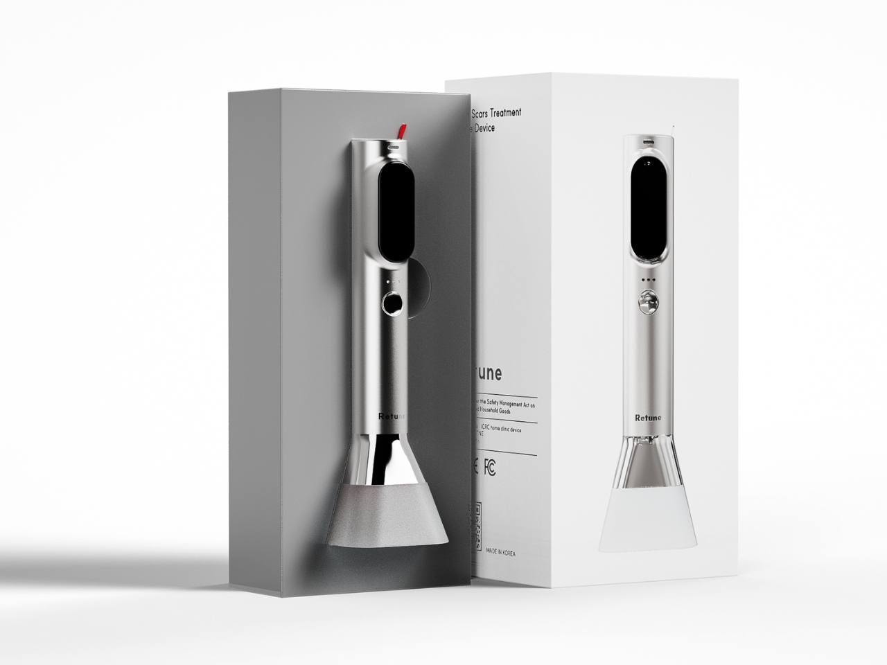
At first glance, Retune looks like it could be a high-end electric toothbrush or maybe one of those fancy skincare tools that influencers rave about. The minimalist silver cylinder sits elegantly on a white charging base, giving off serious Apple Store vibes. But this concept isn’t about vanity. It’s about envisioning how legitimate medical treatment could integrate into your daily routine without the hassle of clinic visits or the anxiety of wondering if you’re doing it right.

Designer: Yewon Lee

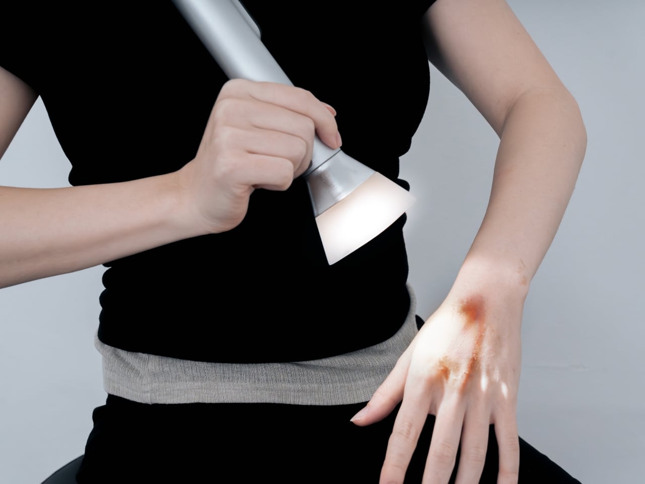
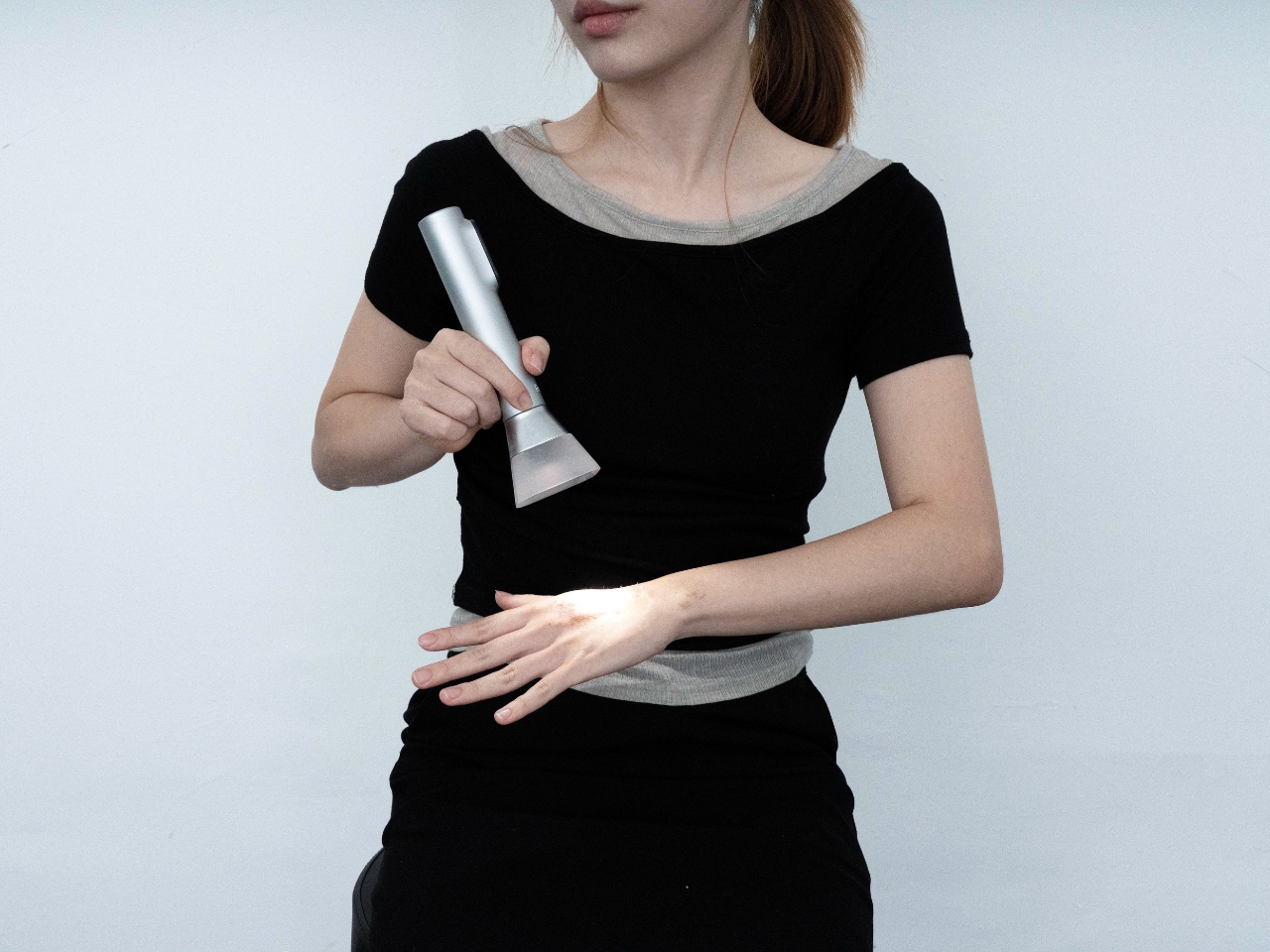
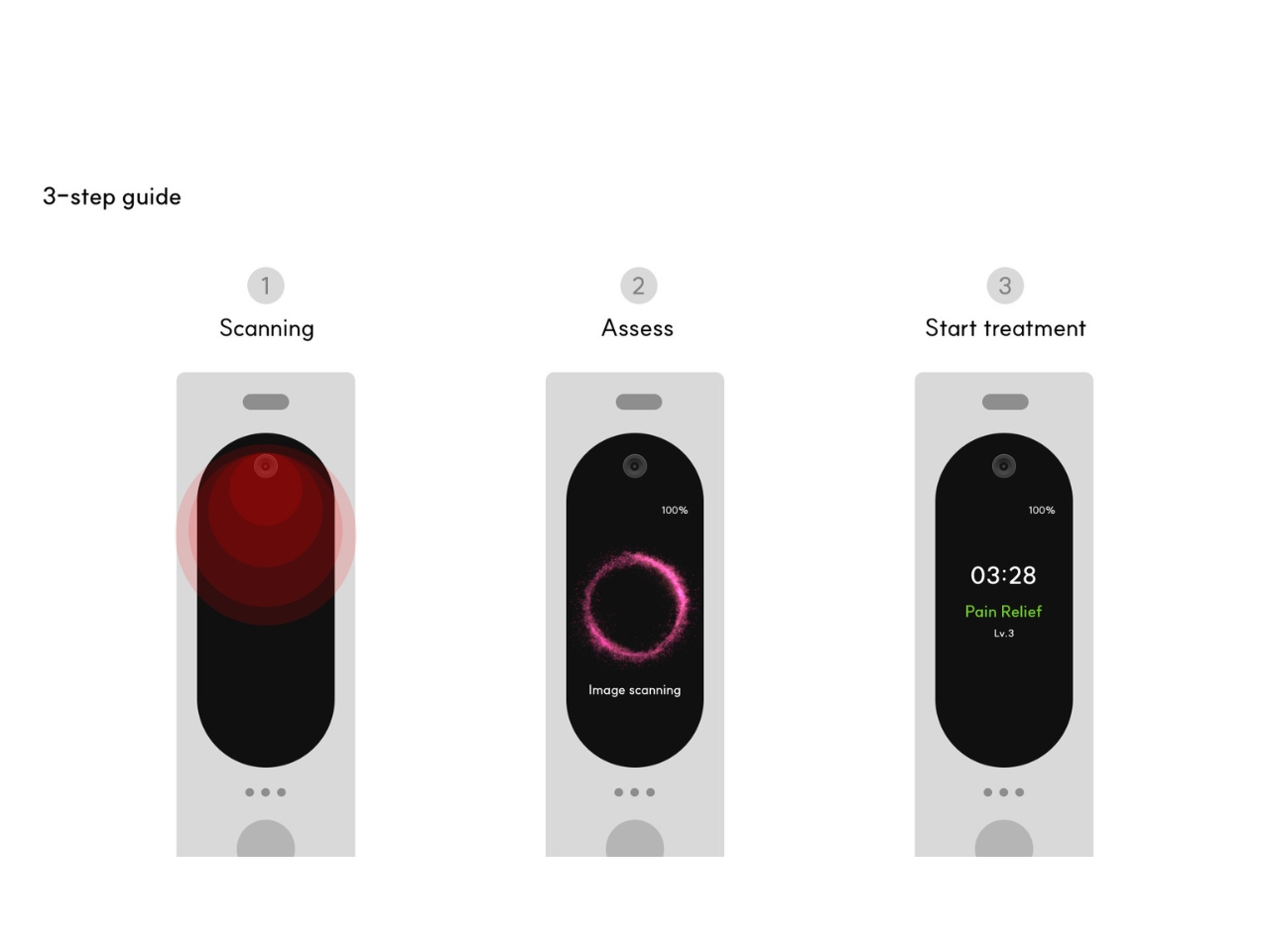
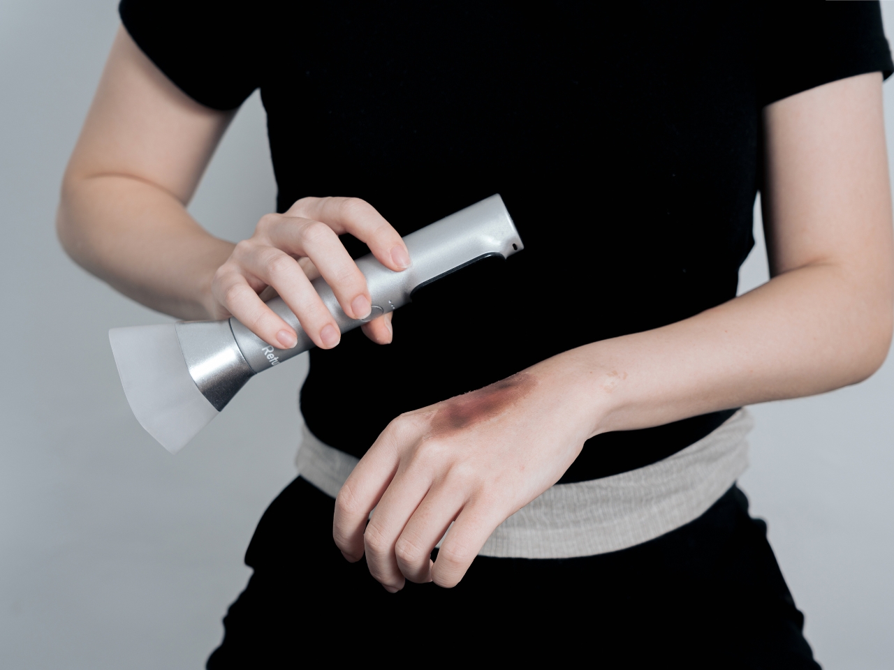
Here’s the thing that makes this concept genuinely interesting. The proposed device would use an AI-powered camera to actually scan your burn or scar, assess what’s going on, and then deliver customized LED light therapy based on what it finds. We’re not talking about guesswork or one-size-fits-all settings. The system would analyze the severity of scarring and inflammation in real time, then adjust the treatment accordingly. It’s like imagining a dermatologist’s diagnostic skills packed into something you can hold in one hand.

The envisioned process is refreshingly simple. You’d scan the affected area with the AI camera, wait for the device to analyze what it sees, and then it would provide the appropriate treatment. No complicated menus to navigate, no wondering if you’ve selected the right setting. The intelligence would be baked right into the device itself, working without needing constant connectivity or cloud processing. Your wound data stays on the device, which is honestly a relief in an era where everything seems to require an app and an internet connection.

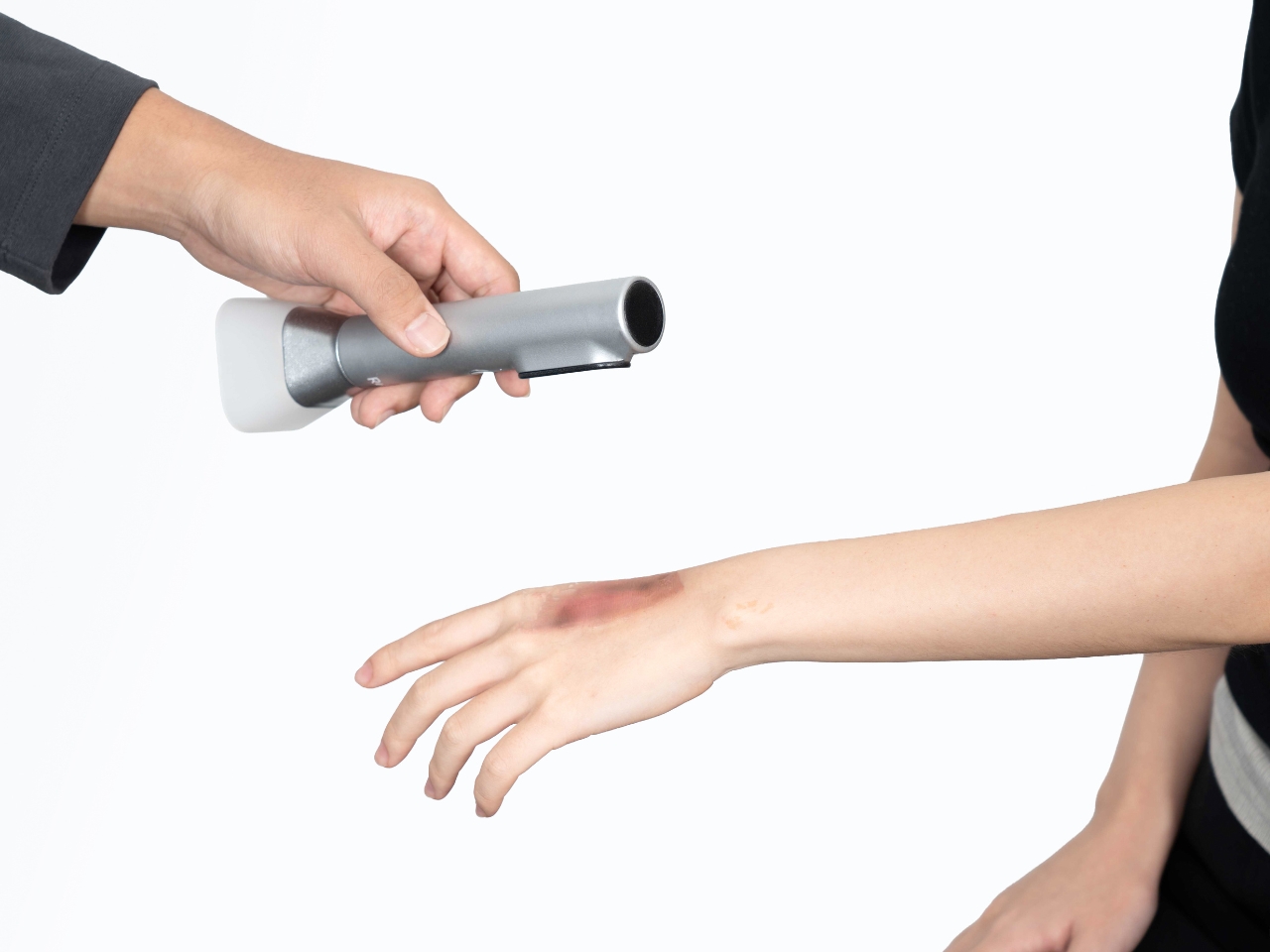
What really sets this concept apart is its non-contact approach. The device would hover above your skin during treatment, never actually touching the wound. This is brilliant design thinking because it eliminates the risk of secondary infection, which is often a major concern with burn care. You’re already dealing with damaged skin. The last thing you need is introducing bacteria or irritating the area further with direct contact. LED light therapy works perfectly for this kind of application because light doesn’t need to touch to be effective.

The concept addresses first and second-degree burns, inflammation, and scar treatment. We’re talking about kitchen accidents, sun exposure gone wrong, that curling iron mishap, or those persistent scars you’ve been trying to fade. It’s not meant for severe third-degree burns, which absolutely require professional medical attention. But for the everyday injuries that would normally have you making multiple trips to a clinic for follow-up care, Retune proposes a compelling alternative.

There’s something quietly revolutionary about the idea that regular treatment could happen anywhere, anytime. Maybe you’re dealing with a healing burn and you’re traveling for work. Maybe you have limited mobility and getting to appointments is genuinely difficult. Maybe you just want to treat your scar while watching Netflix instead of sitting in a waiting room flipping through outdated magazines. This concept makes all of that feel possible.

The design language here speaks to a larger trend we’re seeing in how designers envision future healthcare devices. There’s a growing understanding that medical tools don’t have to look clinical and intimidating. They can be objects you’re comfortable having in your living space, devices that feel more like wellness tools than medical equipment. Yewon Lee clearly understands this shift. Retune looks like it belongs in a contemporary home, not a hospital supply closet.

LED therapy itself has been gaining serious traction in both medical and cosmetic applications. Different wavelengths of light can reduce inflammation, promote healing, and improve the appearance of scars. It’s non-invasive, painless, and backed by legitimate research. Pairing this proven technology with AI assessment creates a concept that feels genuinely forward-thinking rather than gimmicky.

As a design concept, Retune points toward an intriguing future where personalized medical care happens increasingly at home, guided by intelligent devices that can actually see what’s happening and respond accordingly. Whether this exact vision becomes reality or not, it’s the kind of thoughtful speculation that makes you rethink what’s possible when design, technology, and healthcare converge. And honestly, that’s exactly what great concept design should do.

The post Smart Healing: A Concept For AI Powered Burn Treatment first appeared on Yanko Design.

Fast & Furious director Justin Lin is making the Helldivers movie

We've known there was a film adaptation of Helldivers coming for a while, but we now have a director and writer. Justin Lin will helm the movie and Gary Dauberman is writing the script, according to The Hollywood Reporter.

Justin Lin is a great choice here. He directed many of the more beloved Fast & Furious entries and helmed the criminally underrated Star Trek Beyond. Helldivers is kind of a mix of both. It has outer space stuff, but also stylish action that occasionally borders on satire. Lin hasn't made that many movies in recent years, but did sign on to adapt the Keanu Reeves comic BRZRKR for Netflix.

However, he's been all over TV screens. Lin has become a prolific TV producer, with credits on shows like S.W.A.T., Scorpion, Magnum P.I. and Warrior.

As for the script, Dauberman penned both It and It Chapter Two. He also wrote Annabelle and both of its follow-ups, along with The Nun and a recent adaptation of Salem's Lot. He's mostly a horror guy, so we'll have to see how he does with over-the-top action.

For the uninitiated, Helldivers is a co-op shooter franchise that's heavily inspired by the movie Starship Troopers. The games are set in a hyper-patriotic dystopia called Super Earth. Helldivers 2 dropped in 2024, but just came out for Xbox earlier this year. Sony has yet to announce a release date for the film adaptation, so it might be a while.

As an aside, Helldivers 2 developer Arrowhead Game Studios just dropped a nifty update for the PC build. It brings the file size down to 23GB from 154GB. That's a massive reduction of 131GB. We aren't sure what kind of compression wizardry went into that. 

This article originally appeared on Engadget at https://www.engadget.com/entertainment/tv-movies/fast--furious-director-justin-lin-is-making-the-helldivers-movie-173429140.html?src=rss

This Wheelchair Dryer Just Made Rainy Days Way Less Awkward

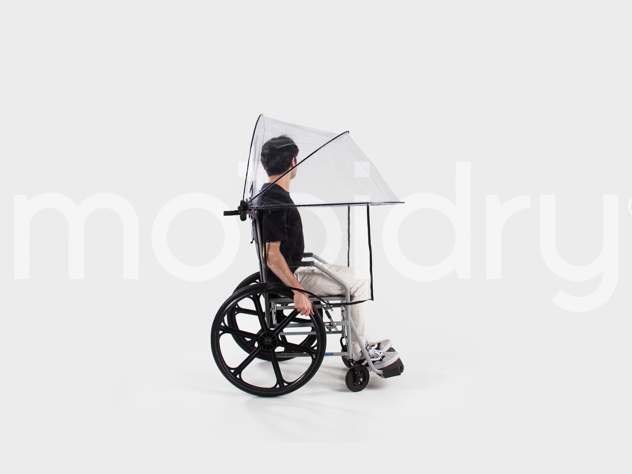
Look, here’s a design problem that most people never think about: what happens when wheelchair users get caught in the rain? Traditional umbrellas require a free hand, ponchos bunch up awkwardly, and standard rain gear just wasn’t designed with wheelchair ergonomics in mind. Nicolas Odorizi’s Mobidry tackles this overlooked challenge with a solution that’s both elegantly simple and surprisingly sophisticated.

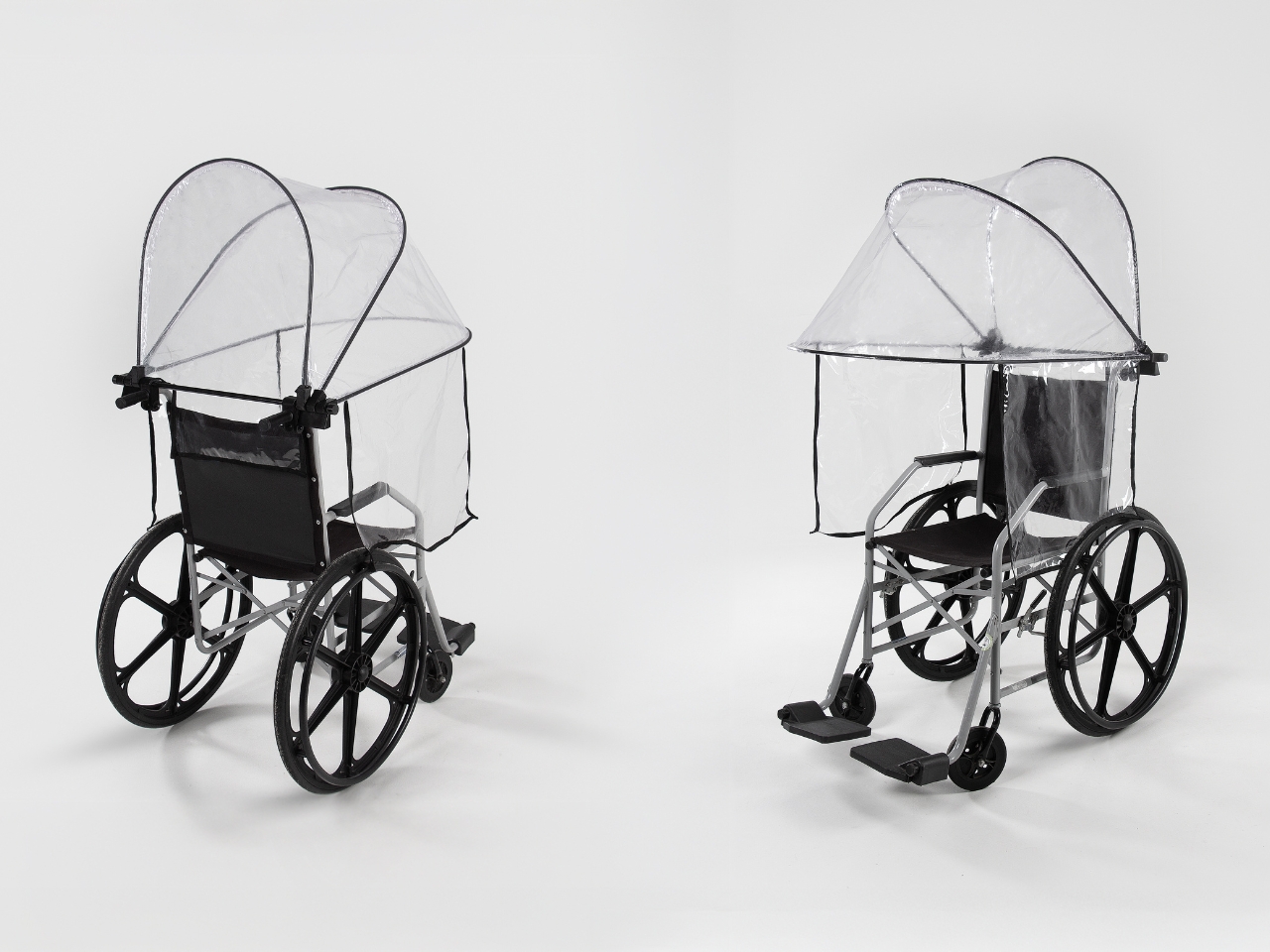
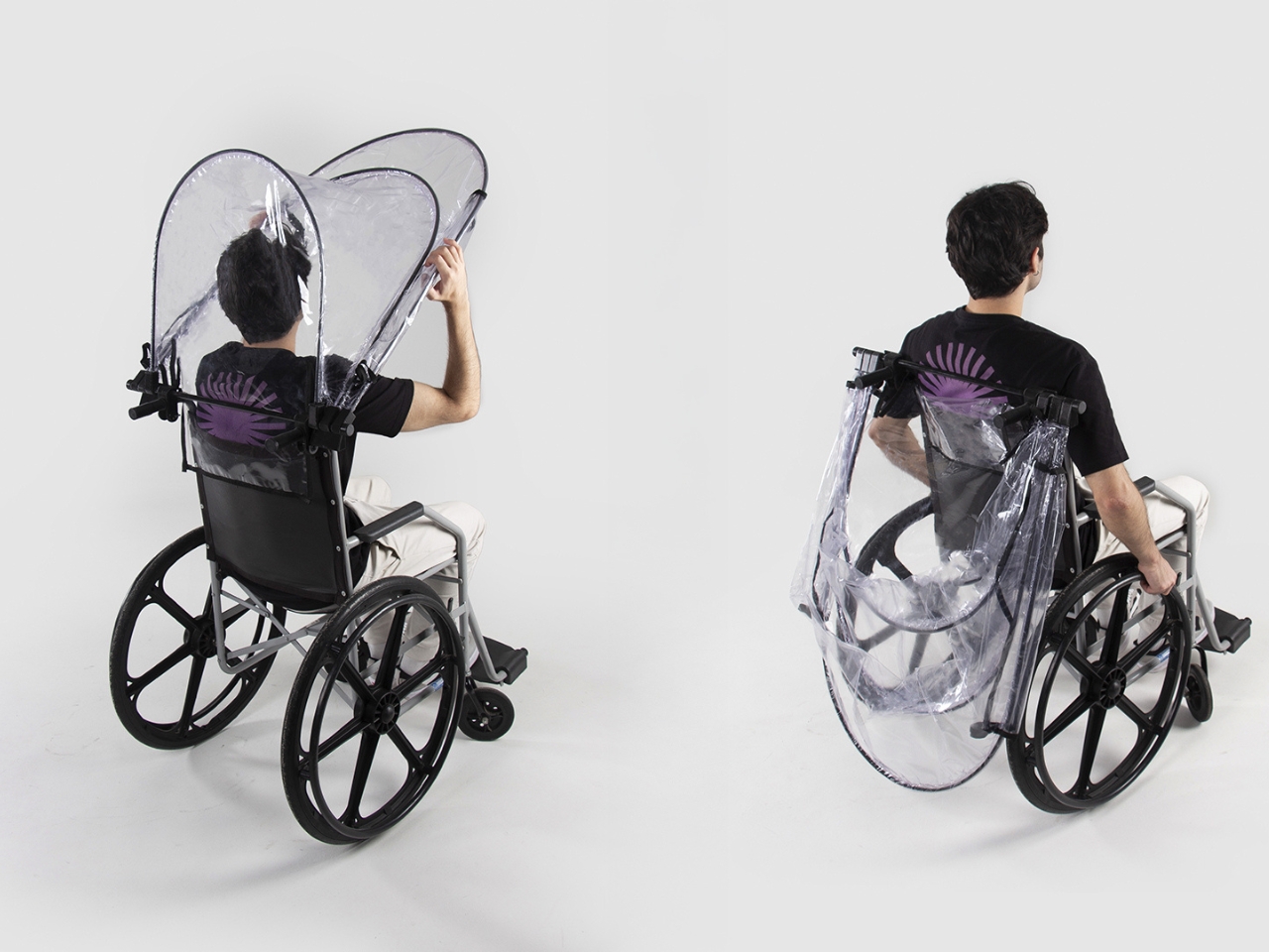
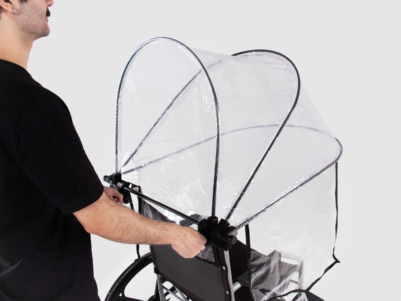
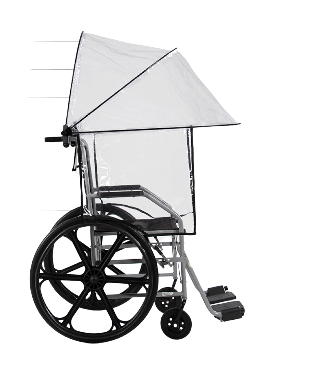
At first glance, Mobidry looks almost futuristic. A transparent dome-like canopy wraps around the wheelchair and user, supported by a minimal aluminum frame. But what makes this design genuinely clever isn’t just how it looks. It’s how thoroughly Odorizi thought through every detail of the user experience. The frame itself is lightweight aluminum, which matters more than you might think. Wheelchair users are already managing equipment weight with every push and transfer. Adding bulky protective gear to that equation creates real physical strain. The aluminum structure keeps things light while maintaining enough rigidity to hold the canopy securely in place, even when wind tries to turn it into a sail.

Designer: Nicolas Odorizi

The canopy material is transparent and waterproof, which solves two problems simultaneously. Waterproofing is obvious, but transparency is crucial for maintaining visibility and reducing that closed-in feeling that opaque covers create. You can see the careful seaming along the edges where the material curves around the frame, following the wheelchair’s contours rather than fighting against them. This isn’t just fabric draped over a frame. It’s a precisely engineered shape.

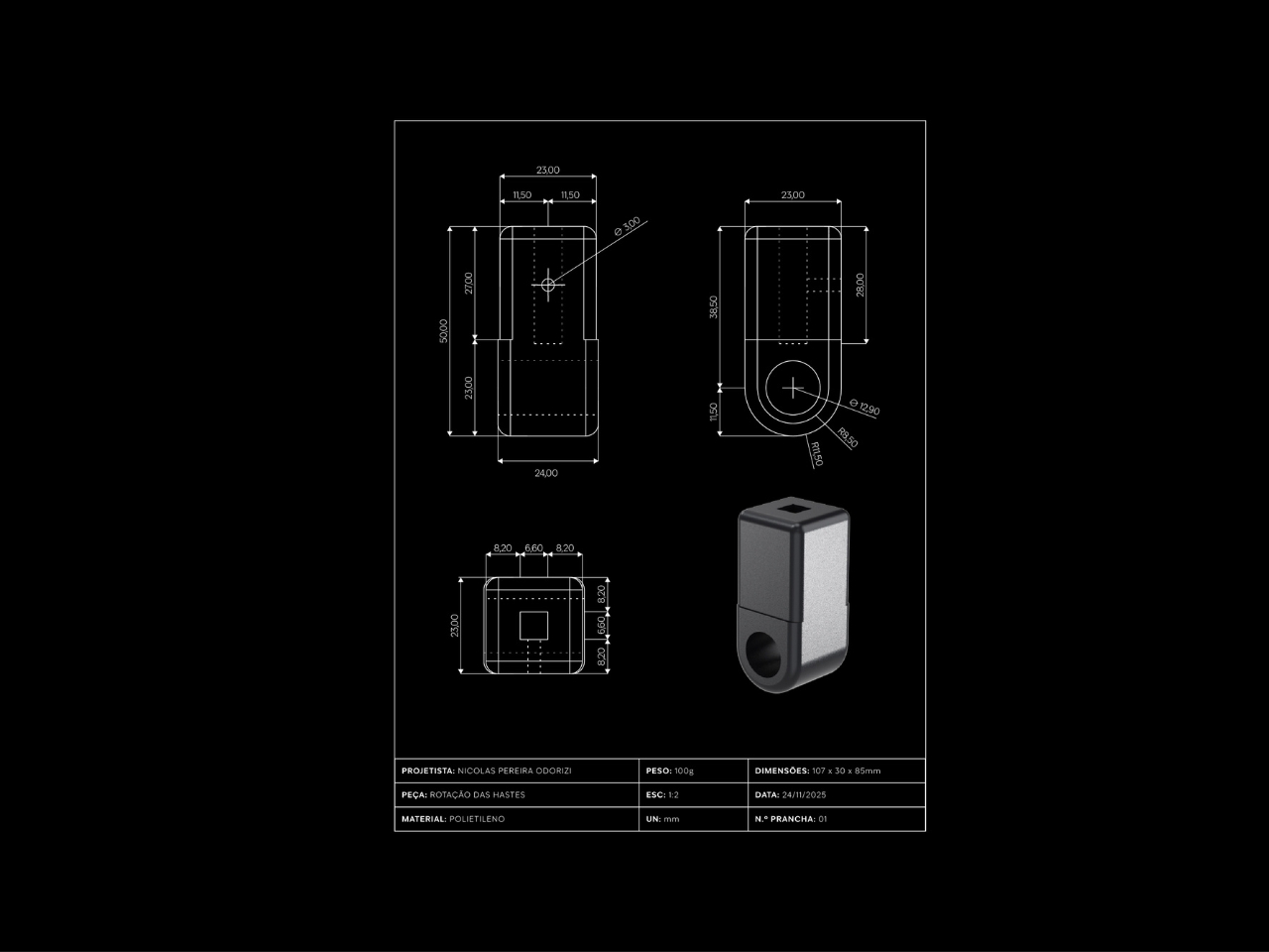
One of the standout features is the rotation and fixation system. The entire canopy structure can pivot and lock into position, which means users can adjust coverage based on wind direction or simply fold it back when the rain stops. This kind of flexibility transforms Mobidry from a single-purpose rain shield into something more versatile. The mounting mechanism appears robust but unobtrusive, integrating with the wheelchair frame without requiring permanent modifications.

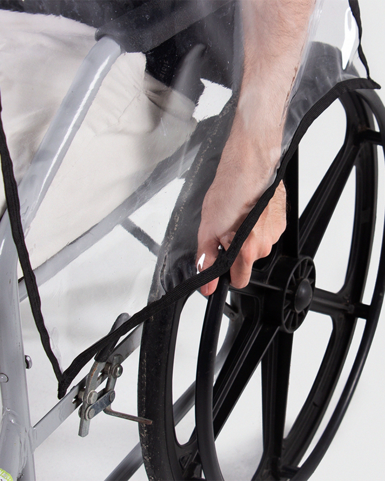
The coverage itself is comprehensive. Top, front, sides, and rear protection work together to create an enclosed protective zone. But look closely at how the design handles the transition points. Where the canopy meets the wheelchair frame, there’s a bias-tape finish that contours around the wheels. This detail prevents the material from catching on moving parts while maintaining a weather-tight seal. It’s the kind of thoughtful touch that separates good design from great design.

What really strikes me about this project is how it balances protection with dignity. Accessibility products often veer into two extremes: either aggressively medical-looking or trying too hard to be “inspirational.” Mobidry just looks like well-designed gear. The transparent material and clean lines give it an almost architectural quality, like a tiny modern pavilion that happens to travel with you.

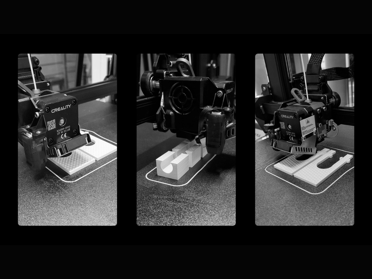
The project documentation shows Odorizi worked through multiple prototypes, refining the form and testing the mechanics. You can see evidence of 3D printing used for component development, suggesting an iterative design process that prioritized function over flash. The technical drawings reveal careful attention to dimensions and clearances, ensuring the canopy provides adequate coverage without restricting arm movement or visibility. There’s a quote in the project materials that really captures why this matters: “Rain affects our independence and autonomy to go places.” That’s the core insight driving this entire design. It’s not about staying dry for comfort’s sake. It’s about maintaining the freedom to move through the world on your own terms, regardless of weather.

From a broader design perspective, Mobidry represents a shift in how we think about accessibility products. Rather than adapting existing solutions poorly or creating specialized equipment that screams “medical device,” it asks what a purpose-built solution could look like when designed from the ground up with wheelchair users in mind. The result respects both the technical requirements and the aesthetic expectations of its users.

Nicolas Odorizi, working from Porto Alegre, Brazil, has created something genuinely useful here. Not revolutionary in the sense of reinventing wheelchairs, but revolutionary in addressing a specific, frustrating gap in the market with intelligence and style. Sometimes the best design isn’t about grand gestures. It’s about solving real problems with grace and precision. Mobidry does exactly that.

The post This Wheelchair Dryer Just Made Rainy Days Way Less Awkward first appeared on Yanko Design.

A ‘Sonic universe’ movie will hit theaters in 2028

The Sonic the Hedgehog movies have been a success for Paramount and Sega, and the pair are looking to build on that with a spin-off movie. An expansion of the Sonic cinematic universe, if you will. The companies haven’t revealed more details about this “Sonic universe feature,” as Deadline described it, but the flick is set to hit theaters on December 22, 2028.

There have been rumors for a while that a film focused on Shadow the Hedgehog is in development, so that might be the direction Paramount and Sega take here. Keanu Reeves voices Shadow in the film series. There have also been suggestions that a movie starring Amy Rose is in the pipeline. I’m hoping there’s one centered on my fave, Tails, in the works too, even though it took me decades to realize that his full name, Miles Prower, is a pun on “miles per hour”.

This Sonic universe film will arrive after Sonic the Hedgehog 4, which is scheduled to arrive in theaters on March 19, 2027. A Knuckles spin-off series arrived on Paramount+ last year. Meanwhile, just before the Sonic spin-off movie, Paramount will bring a hybrid live-action Teenage Mutant Ninja Turtles film to theaters on November 17, 2028.

This article originally appeared on Engadget at https://www.engadget.com/entertainment/tv-movies/a-sonic-universe-movie-will-hit-theaters-in-2028-163424265.html?src=rss

This Car Key Fob Doubles as a Retro Gaming Console

Remember the pure, unfiltered joy of steering a remote-control car around your living room as a kid? That magical feeling of control, the anticipation as you pressed the buttons, watching your tiny vehicle zoom across the floor? Designer Ishwari Patil remembers too, and she’s asking a pretty wild question: what if you could feel that same rush with your actual, full-sized car?

Enter Playfob, a concept that’s here to shake up one of the most overlooked objects in our daily lives. Think about it. We obsess over our phone cases, carefully curate our accessories, and treat our watches as extensions of our personality. But car key fobs? They’ve been stuck in design purgatory, purely functional gray blobs we shove into pockets and forget about. Patil saw this gap and decided to do something about it.

Designer: Ishwari Patil

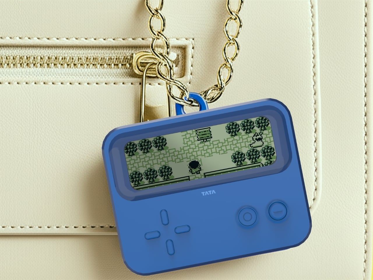
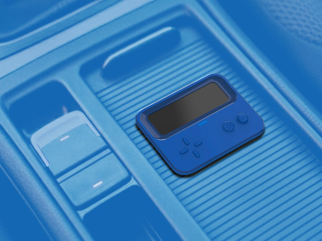
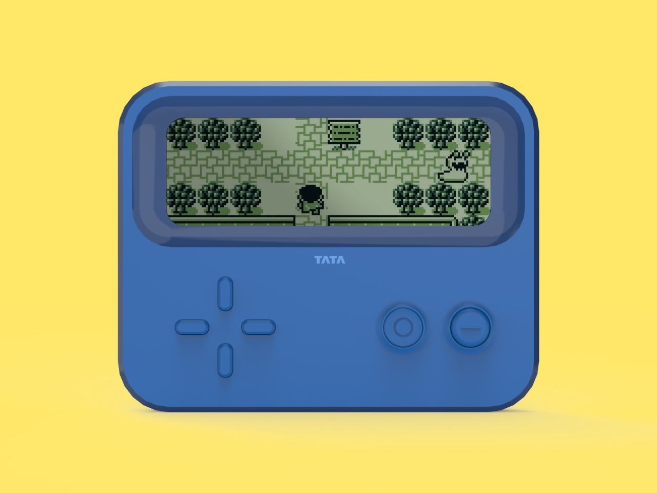
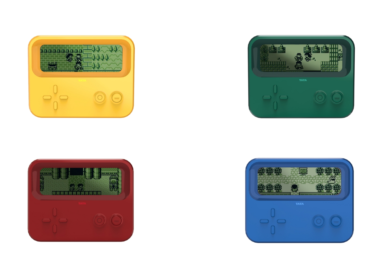
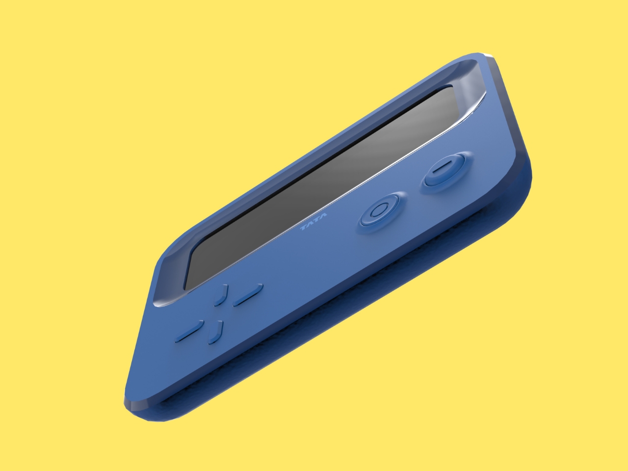
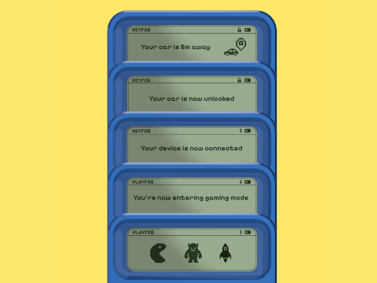
The genius of Playfob lies in its refusal to play it safe. This isn’t just a key fob with a few extra features slapped on. It’s a complete reimagining of what this everyday object could be. The device transforms into a compact gaming console, complete with that glorious Game Boy-inspired aesthetic, bright nostalgic colors, and a monochrome screen that immediately transports you back to simpler times. When you dock it in your car, it connects to the vehicle’s screen, turning waiting time into playtime.

But here’s where it gets really interesting. Playfob taps into something designers call the “kidult” trend, where adults aren’t just tolerating nostalgic design but actively seeking it out. We want objects that bring comfort and joy, that remind us of times when things felt less complicated. It’s why we see grown adults collecting toys, why retro gaming is having such a massive moment, and why anything that evokes childhood gets us reaching for our wallets.

Of course, a key fob still needs to be, you know, a key fob. Playfob doesn’t sacrifice functionality for fun. It includes Bluetooth connectivity, on-screen feedback when you lock or unlock your car, and GPS-enabled parking assist for those moments when you’ve wandered through three parking garage levels and have absolutely no idea where you left your vehicle. These features bring the humble fob into the modern age without losing sight of its core purpose.

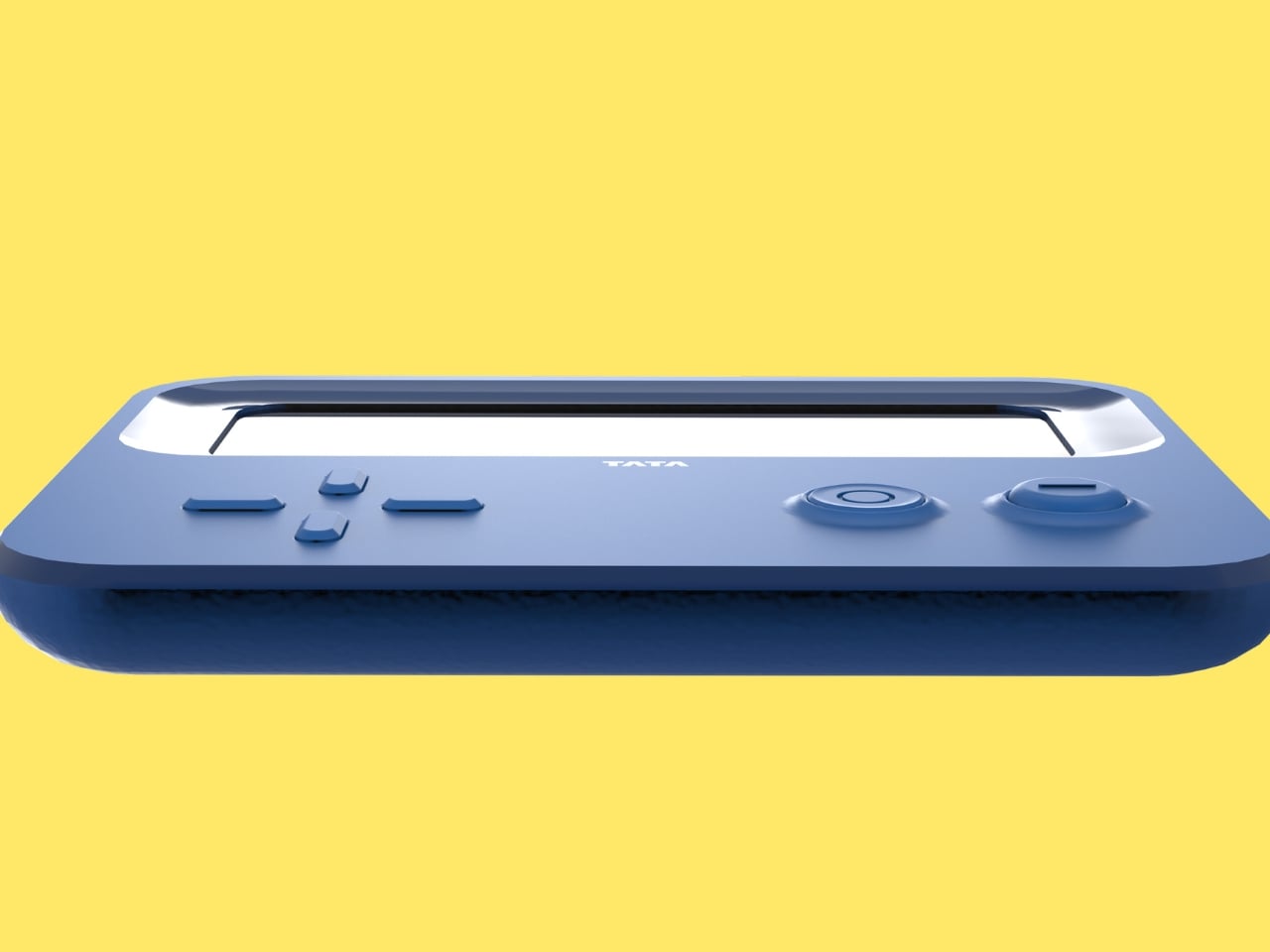
Then there’s the feature that really brings the remote-control car fantasy full circle. Using the built-in D-pad (yes, just like your old Nintendo controller), you can actually move your car remotely in tight spaces. Squeezed into a parking spot with barely enough room to breathe? No problem. Navigate your car out from the comfort of the sidewalk. It’s practical, sure, but it’s also just incredibly cool.

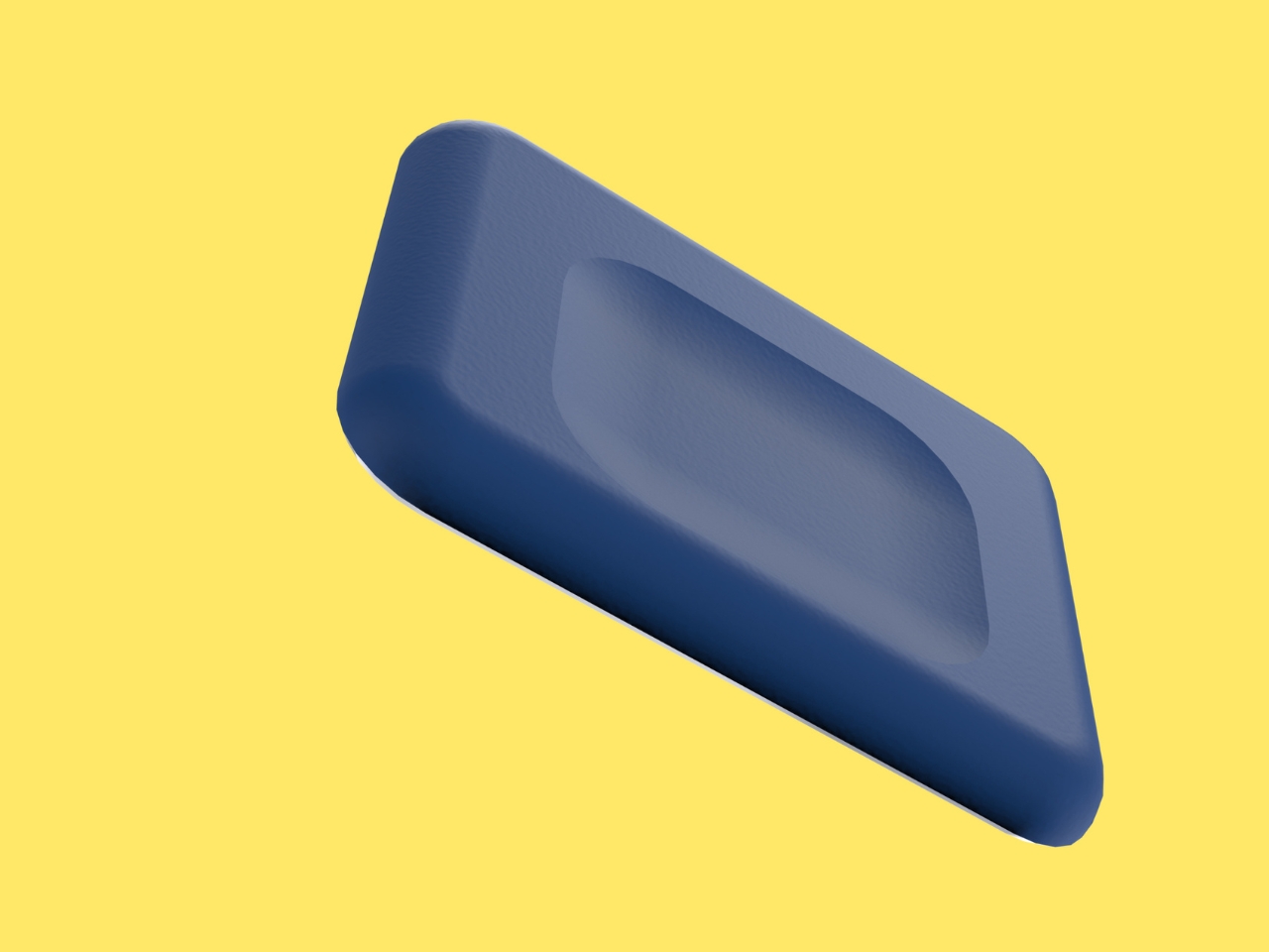
The design itself is deliberately larger than typical key fobs, and that’s entirely the point. While most fobs are designed to disappear, Playfob wants to be seen. It features a rubberized grip that feels good in your hand, intuitive button layouts that make sense without needing a manual, and those vibrant colors that make it feel less like a tech accessory and more like a statement piece. It’s meant to dangle from your bag, to spark conversations, to be an object you actually enjoy carrying around.

What makes this concept so compelling is how it challenges our assumptions about automotive design. Cars have become increasingly personalized over the years, with customizable interiors, ambient lighting, and infotainment systems that sync with our digital lives. Yet somehow, the thing that literally gives us access to all of this remained stubbornly utilitarian. Playfob suggests that every touchpoint matters, that even the smallest interaction with our vehicles could be an opportunity for delight rather than drudgery.

Patil developed this concept during a summer internship at Tata Motors, which makes you wonder what else might be possible when young designers are given the freedom to question conventions. Playfob might be a personal project, but it represents something bigger: a shift toward designing objects that don’t just work well but feel good to use, that acknowledge our emotional needs alongside our practical ones.

Whether or not we’ll ever see Playfob in production remains to be seen. But as a design statement, it’s already succeeded in making us reconsider what a car key could be. And honestly? It makes every boring black fob in existence look just a little bit sadder by comparison.

The post This Car Key Fob Doubles as a Retro Gaming Console first appeared on Yanko Design.

December Game Pass additions include Mortal Kombat 1 and Dome Keeper

It's that time of the month again. Xbox just announced some new games that are heading to Game Pass in December. Let's take a look.

The most renowned of the bunch is absolutely Mortal Kombat 1, which drops on December 10 for Ultimate and Premium subscribers. This is the latest game in the long-running fighting franchise that cut its teeth in darkened arcades throughout the 1990s.

Mortal Kombat 1 boasts an updated fighting system and plenty of new game modes. However, it's still basically the same gorefest we grew up with. Players can still access bloodsoaked fatalities and turn their opponents into cute little babies.

The long-gestating sci-fi horror game Routine is finally coming out on December 4, and it's a Game Pass day one release for Ultimate subscribers. This was first announced all the way back in 2012. It looks pretty fun, with a distinctly retro vibe.

Dome Keeper drops on December 9 for Premium and Ultimate Subscribers. This is a fun little roguelike that I've spent an unhealthy amount of time on. It's a fast-paced mining simulator with some light tower defense mechanics. You'll be saying "just one more run" long into the night with this one.

Lost Records: Bloom & Rage is available right now for Premium and Ultimate subscribers. This is the latest narrative adventure from the folks behind Life is Strange. It's set in the 1990s, so throw on some plaid or whatever.

A bunch of cool games are also spreading their wings and becoming available for Premium subscribers after being Ultimate exclusives. There are some real blockbusters here, like Indiana Jones and the Great Circle, Monster Train 2, 33 Immortals and Spray Paint Simulator.

This article originally appeared on Engadget at https://www.engadget.com/gaming/xbox/december-game-pass-additions-include-mortal-kombat-1-and-dome-keeper-161232292.html?src=rss