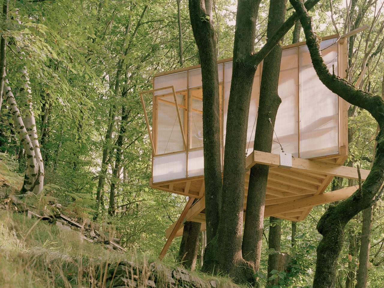
Perched among the towering oaks of Switzerland’s Onsernone Valley, the Casetta Tessino emerges as an unconventional solution to a common problem. When a Swiss artist and climate activist sought additional living space on their property, local building regulations stood firmly in the way. Traditional extensions were off the table. Foundation work was forbidden. What remained was the possibility of building upward, anchored not to earth but to the forest itself.
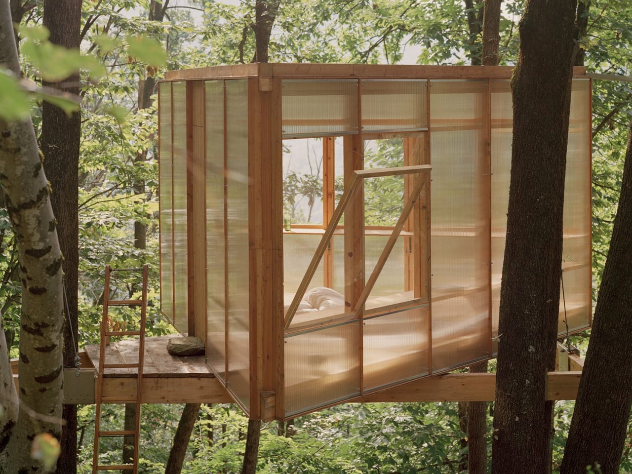
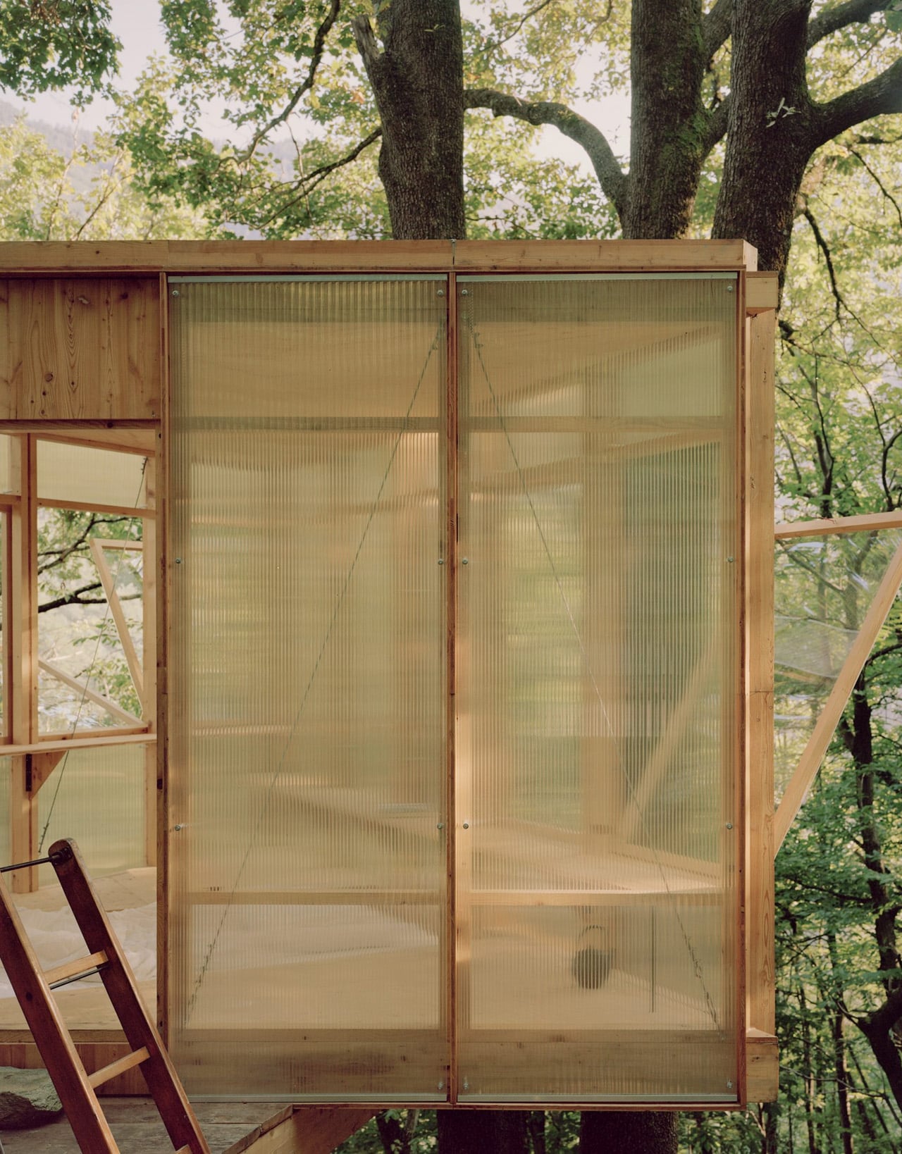
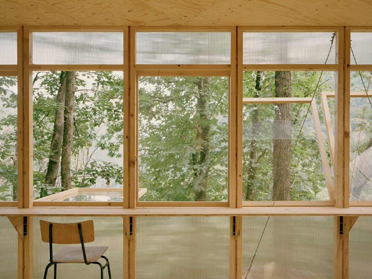
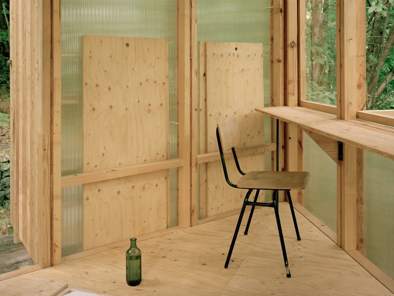
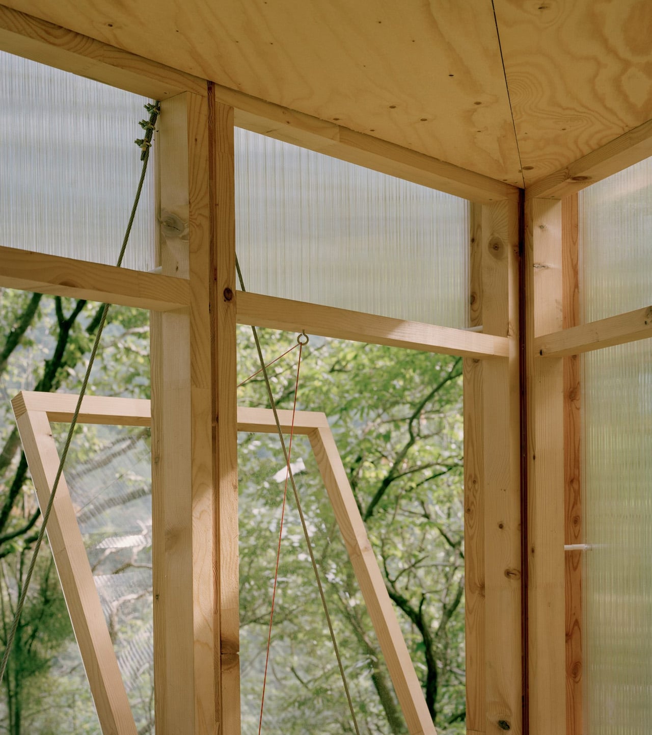
Architect Olin Petzold embraced the constraints. The resulting structure balances on three trees, its triangular form rising from the woodland floor like a geometric bird’s nest. Wood and translucent polycarbonate panels wrap the exterior, filtering dappled light into the compact interior. Located roughly 150 meters from the main house, the treehouse functions as a writing studio, guest room, and personal retreat.
Designer: Olin Petzold
The design deliberately references Henry David Thoreau’s Walden, channeling the same spirit of simple living and immersion in nature that defined the American naturalist’s woodland experiment. This philosophical foundation informed every decision, from material selection to spatial organization, creating a structure that prioritizes contemplation and creative work over conventional comfort.
The self-build aspect shaped every design decision. Petzold knew machinery couldn’t navigate the remote site, so each component needed to be light enough for human hands to lift and maneuver. Details were simplified to accommodate untrained builders. The client took on the entire construction themselves, transforming architectural drawings into physical reality through careful, patient work. This wasn’t just about budget or preference. The treehouse’s isolation demanded it.
Inside, the triangular footprint maximizes limited square footage. The client’s main house already combines living area, kitchen, and bedroom into one large room, making the need for a separate, quiet space essential. The treehouse delivers that solitude. Its triangular base rests on the three anchor trees, then rotates upward into an inverted equilateral triangle, with corners threading between trunks. The geometry creates distinct zones for sleeping, sitting, and writing within a minimal envelope.
The cabin remains available to other creatives, turning occupation of the space into an ongoing experiment. Each visitor tests how design shapes daily rhythms and creative practice. The structure challenges both architectural norms and lifestyle expectations, proving that meaningful space doesn’t require sprawling square footage or conventional construction methods. Casetta Tessino represents architecture stripped to its essence. Three trees provide the foundation. Simple materials form the shelter. Human hands assemble the pieces. What emerges is more than a building. It’s a meditation on living lightly, working deliberately, and finding refuge in the company of trees. Thoreau would recognize the impulse. The forest certainly does.
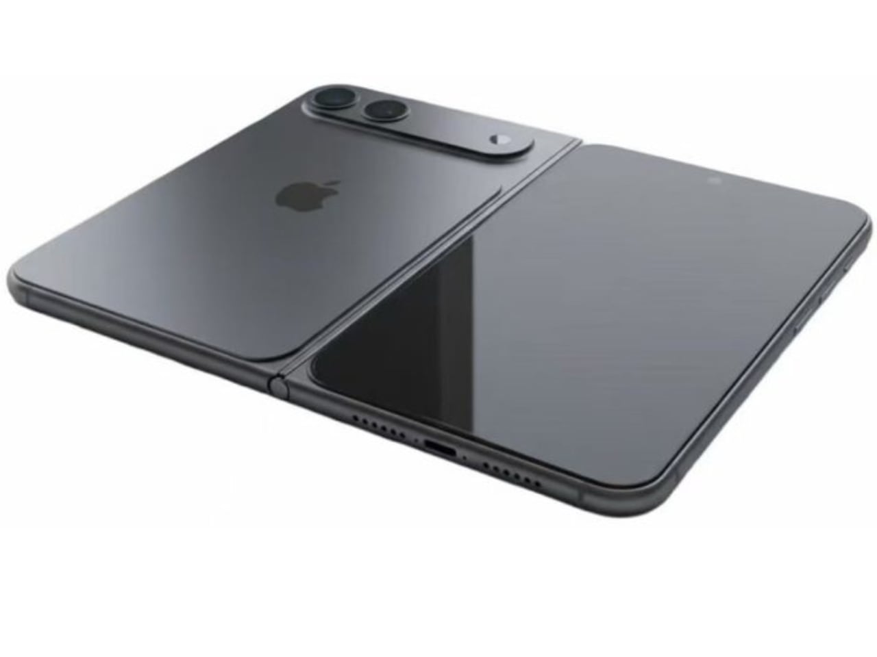
Every foldable phone currently on the market carries the same visible compromise: a crease running down the center of the internal display. You notice it immediately when light catches the fold at certain angles. Samsung has iterated through six generations of the Galaxy Z Fold line, refining hinge mechanisms, adjusting UTG formulations (the ultrathin glass layers that cover foldable displays), and experimenting with display stack configurations. The crease persists. Google’s Pixel Fold carries it. Motorola’s razr carries it. The crease has become an accepted industry tax, a visual and tactile reminder that folding glass remains an unsolved materials engineering challenge.
What we know: Jon Prosser leaked renders on December 24, 2025 depicting a book style foldable iPhone alongside the iPhone 18 series, targeted for Fall 2026, with reported pricing between $2,000 and $2,500. What remains unverified: The central claim of zero visible crease, which cannot be confirmed until production hardware is tested.
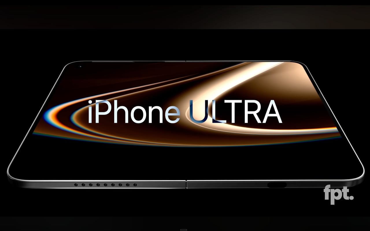
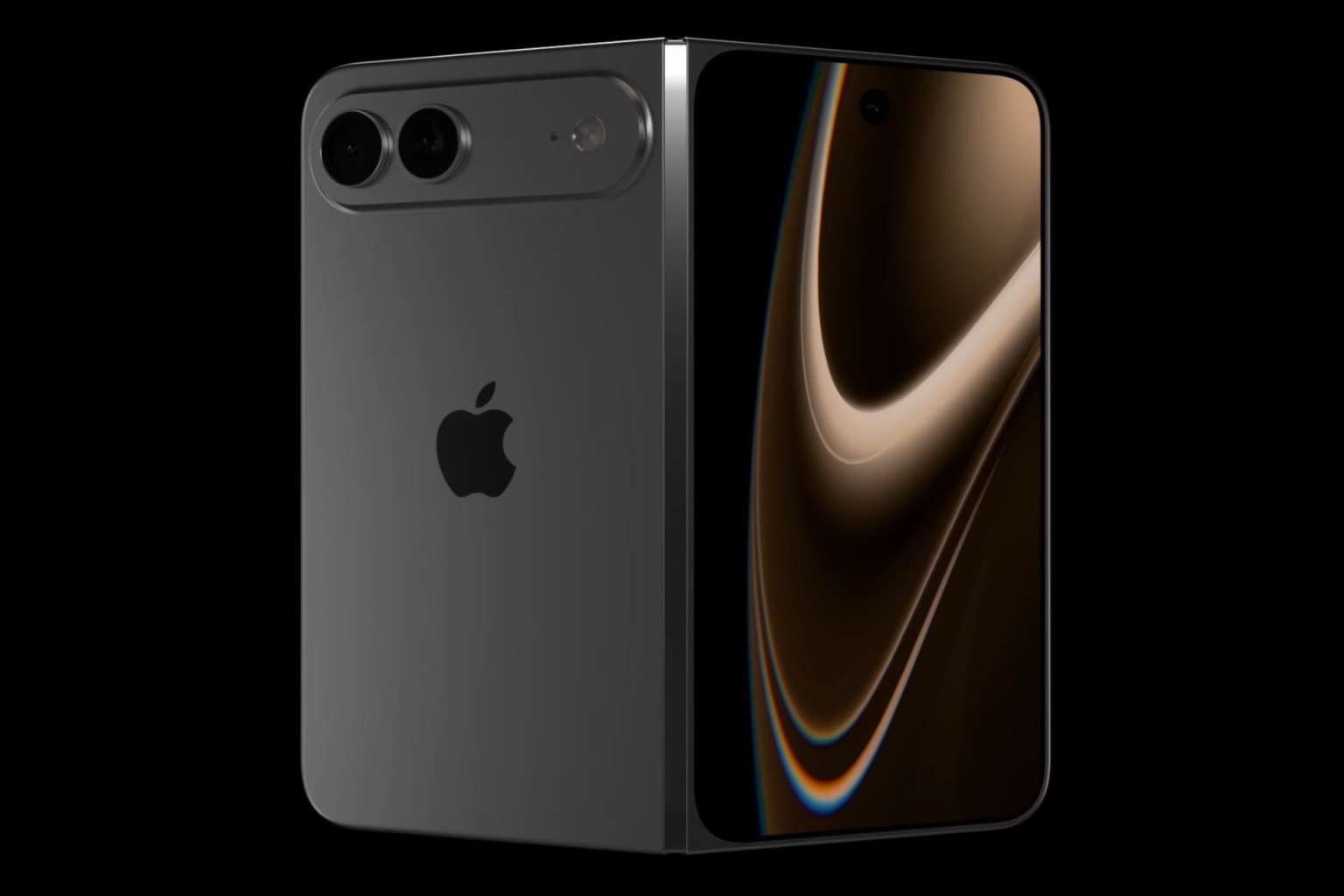
Recent leaks from Prosser suggest Apple intends to eliminate this compromise entirely. The renders depict a book style foldable iPhone expected alongside the iPhone 18 series in Fall 2026. Zero visible crease on the internal display. If accurate, this represents not an incremental refinement but a fundamental breakthrough in foldable display architecture.
The Engineering Challenge Behind the Crease
Understanding why the crease exists requires examining the layer stack of a flexible OLED panel, and the answer lies in material behavior rather than design oversight. Traditional rigid OLEDs use glass substrates that provide structural stability and optical clarity, creating a surface that feels seamless under the finger and reflects light uniformly across its entire area. Foldable displays replace this glass with plastic substrates, typically polyimide (PI), which can flex repeatedly without fracturing but responds to mechanical stress in ways that accumulate over time, and the plastic remembers each fold. Each fold leaves a trace, invisible at first, then gradually visible as the substrate fatigues along the bend axis. Samsung’s UTG approach adds a thin glass layer for improved feel and scratch resistance, but that glass develops micro-fractures along the bend radius that compound the problem over time.
When a foldable display bends along its hinge axis, the material on the outer curve stretches while the material on the inner curve compresses. This differential stress accumulates at the fold line, creating permanent deformation in the plastic substrate. The encapsulation layers, touch sensor films, and polarizer sheets all respond differently to this stress, compounding the visible crease into something you can both see and feel. If you run your fingertip slowly across the center of any current foldable, that slight bump tells the story of mechanical compromise.
The bend radius matters enormously, because tighter radii create more stress concentration while wider radii reduce stress but increase device thickness when closed. Every foldable manufacturer has navigated this tradeoff differently, but none has eliminated the fundamental physics that creates the crease.
Apple’s Alleged Solution: Metal Dispersion and Liquid Metal Hinges
Prosser’s leak describes two key engineering innovations, and the approach is clever in its simplicity. The first involves a metal plate positioned beneath the display that disperses bending pressure across a wider area rather than concentrating it along a single axis.
The dispersion plate concept addresses the stress concentration problem directly, representing a fundamental rethinking of how force should travel through a folding display stack. Rather than allowing the display to experience maximum strain along a narrow fold line, the metal plate would distribute that mechanical load across a broader zone. This approach resembles structural engineering principles used in suspension bridges, where forces spread across multiple support points rather than concentrated at single anchors. The geometry of such a plate would need to be precisely calculated, balancing flexibility with rigidity, weight with durability. Whether Apple has developed a plate configuration that achieves this without adding prohibitive thickness or weight remains the critical engineering question.
The second innovation involves a liquid metal hinge mechanism, likely referencing Apple’s existing work with Liquidmetal, a zirconium-based amorphous alloy the company has explored in various applications since acquiring licensing rights in August 2010. Amorphous metal alloys can be molded into complex geometries with extremely tight tolerances, potentially enabling hinge designs that control the bend profile more precisely than machined components allow. The material’s natural lubricity and resistance to fatigue could improve long-term reliability, addressing the mechanical feel of traditional hinges with something that operates more fluidly.
Form Factor Analysis: What the Dimensions Reveal
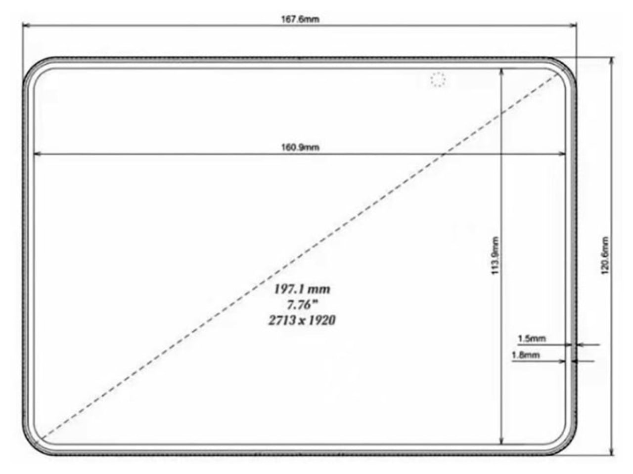
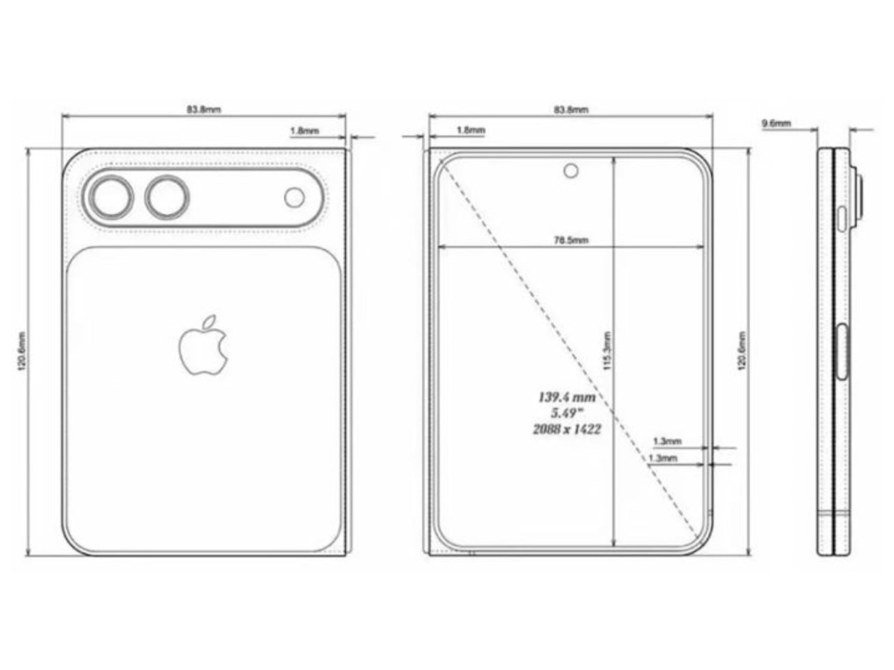
The leaked dimensions reveal Apple’s engineering priorities with unusual clarity. The device measures 9mm thick when closed, splitting to approximately 4.5mm per half, making the unfolded thickness sit at just 4.5mm. The iPhone 15 Pro measures 8.25mm. Apple’s foldable, closed, would be only marginally thicker than current flagship iPhones while delivering a 7.8-inch internal display.
These dimensions suggest aggressive component miniaturization and careful thermal management. Apple reportedly uses its second generation modem developed internally (C2) and high-density battery cells enabled by a slimmer display driver. The shift from Face ID to Touch ID in the power button represents another space-saving decision, eliminating the TrueDepth camera array that occupies significant volume in current iPhone designs.
The Production Reality Gap
Renders exist in a frictionless conceptual space. Every surface appears seamless. Every material performs to theoretical maximum.
Production hardware operates under different constraints, and the question of whether Apple has genuinely solved the crease problem cannot be answered until someone folds and unfolds a production unit under varied lighting conditions, at different temperatures, after thousands of cycles. The crease typically worsens with age as wear accumulates. A render cannot show what happens at month six. Previous reports suggested Apple figured out how to minimize the crease; Prosser’s leak suggests it might be eliminated entirely. These statements describe meaningfully different engineering achievements: minimization implies a visible crease less pronounced than competitors, while elimination implies none at all.
Material Considerations and Manufacturing Scale
Assuming Apple has developed a crease-free folding mechanism, the question becomes whether it can be manufactured at iPhone scale. Apple ships iPhones at a scale that dwarfs the entire foldable category. Every component must be producible in quantities that dwarf what Samsung delivers for its foldable line, where foldable shipments represent a small fraction of overall smartphone volumes.
The dispersion plate, if it uses exotic geometries or materials, could present manufacturing bottlenecks that slow initial production to a trickle. Liquid metal components require specialized casting and forming processes that Apple has used only in limited applications: SIM tray ejector tools, Apple Watch Series 9 buttons. Scaling to display-size components at flagship volumes would require substantial production infrastructure investment. Display panel supply presents another constraint. Samsung Display currently dominates flexible OLED production, and Apple has worked with LG Display and BOE to diversify its supplier base, but building capacity for an entirely new flexible panel format would require years of development and billions in capital expenditure from panel makers. The supply chain alone could determine whether this device ships in millions or hundreds of thousands.
Pricing and Market Position
The expected price tells its own story. Prosser suggests pricing between $2,000 and $2,500, though he hedges on the exact figure.
This range positions the foldable iPhone above the Galaxy Z Fold 6, which starts at $1,899, while falling short of the most extreme luxury phone territory. For Apple, this represents uncharted pricing for a mainstream product line. The iPhone Air’s reported sales struggles, if accurate, suggest limits to what consumers will pay for form factor innovation alone. The foldable iPhone will test whether Apple’s brand premium extends to a new device category or whether the foldable market itself has a price ceiling that even Apple cannot exceed.
Color options limited to black and white reflect Apple’s tendency to constrain initial product launches, signaling a cautious market entry rather than a mass market push. Premium positioning with limited variants allows Apple to manage supply constraints while testing demand at the high end of the price spectrum.
The strategic bet is clear, and Apple appears confident enough buyers exist at this price point to justify years of R&D and tooling investment, even if the initial addressable market remains narrow.
The Broader Display Technology Implications
If Apple has genuinely solved the crease problem, the implications ripple far beyond smartphones, touching every device category that could benefit from flexible displays. Foldable tablets, laptops with folding displays, and rollable screen formats all face similar material constraints, and a breakthrough in stress distribution or substrate engineering would have applications across the entire flexible display industry. The solution, whatever form it takes, would likely be protected by extensive patent filings. This could create licensing opportunities or, more likely given Apple’s historical tendencies, a proprietary advantage that competitors cannot easily replicate.
Samsung has built its foldable ecosystem partly on component sales. An Apple breakthrough using internally developed technology would disrupt that supply chain dynamic. Other manufacturers would need to license Apple’s approach or develop their own solutions from scratch.
The timing of a Fall 2026 launch, if accurate, gives Apple nearly two years to refine manufacturing, build component inventory, and develop the software experiences that justify a foldable form factor. iOS adaptations for larger internal displays, multitasking paradigms, and app developer frameworks would all require substantial engineering investment beyond the hardware itself. The display breakthrough means nothing without software that makes the larger screen worth having.
What Remains Unknown
The crease claim stands as the most important detail and the least verifiable. Prosser has accurately predicted some Apple announcements and missed on others. His track record provides some credibility but not certainty. Until production hardware reaches independent reviewers, the fundamental promise of Apple’s foldable remains speculative.
The legal context adds intrigue, and the question of source reliability becomes harder to untangle when litigation enters the picture. Apple sued Prosser in July 2025 for leaking iOS 26 and Liquid Glass design details, and his response appears to be leaking even more. Whether this reflects confidence in his sources or defiance toward Apple’s legal pressure is difficult to assess from outside. For the foldable display industry, the claim itself matters regardless of accuracy: if Apple believes a crease-free folding display is achievable, the engineering resources the company can deploy dwarf what any competitor has invested. Even if the initial implementation falls short of the leaked renders’ promise, Apple’s entry would accelerate development across the entire foldable ecosystem. The question that defines this product will not be answered by renders or leaks. It will be answered by light catching, or not catching, a fold line at certain angles. By fingertips feeling, or not feeling, a ridge when swiping across the center of a 7.8-inch display. Fall 2026 will provide the answer.
Specifications
The leaked specifications paint a picture of aggressive engineering tradeoffs. Apple appears to have prioritized thinness and internal display size over external screen real estate, betting that users will spend most of their time with the device unfolded. The choice of Touch ID over Face ID represents a meaningful departure from Apple’s biometric strategy of the past decade, suggesting the engineering constraints of fitting a foldable mechanism left no room for the TrueDepth camera array.
Specification
Details
External Display
5.5 inches
Internal Display
7.8 inches
Closed Thickness
9mm
Unfolded Thickness
4.5mm
Hinge Type
Liquid metal mechanism with dispersion plate (reported)
Biometrics
Touch ID (power button)
Modem
Apple C2, reported as second generation internal modem
Colors
Black, White
Expected Price
$2,000 to $2,500
Expected Launch
Fall 2026
These numbers remain unverified until production hardware surfaces. Prosser’s track record includes both accurate predictions and notable misses, so treating any single specification as confirmed would be premature. The fall 2026 timeline, if accurate, gives Apple roughly eighteen months from now to finalize these details.
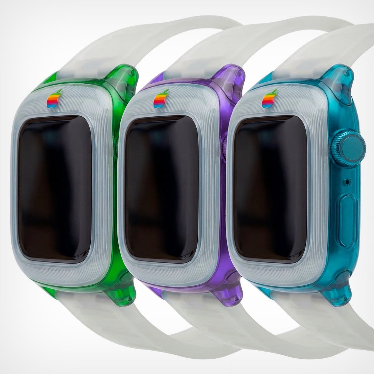
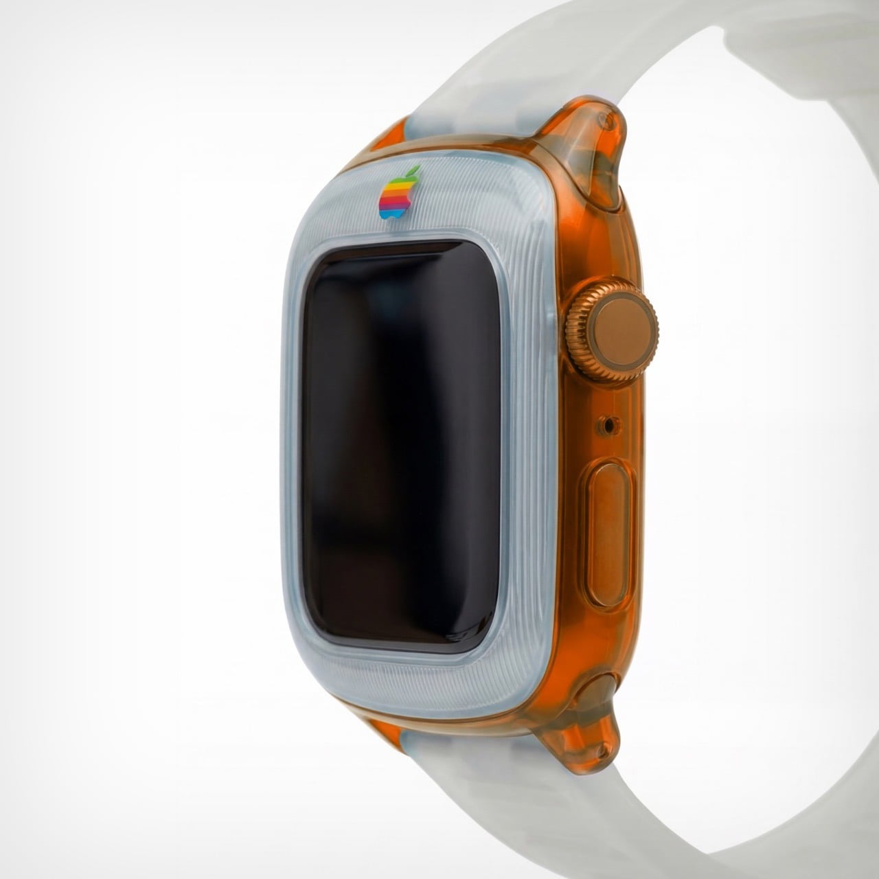
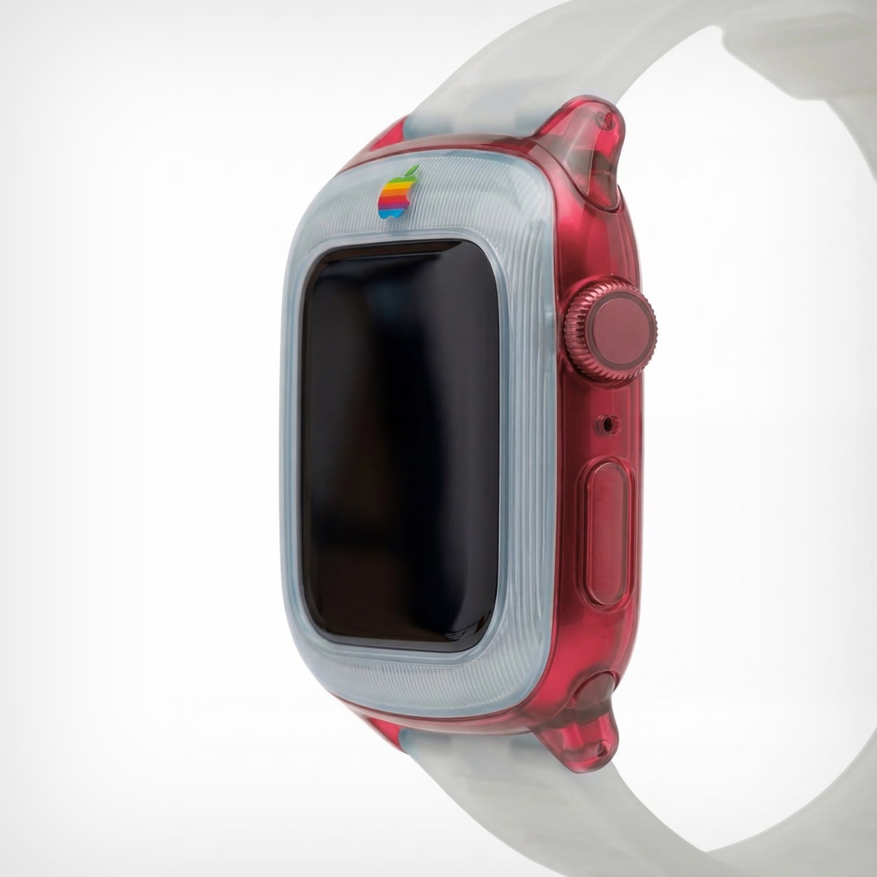
The iMac G3 was discontinued in 2003, around the same time Apple began pivoting to its clean, color-free aesthetic. Cut to a few years later and Apple transitioned entirely to aluminum for its devices, ushering in an era of sleek, and a few more years later, Apple built a computer small enough for your wrist. That means there was a little over a decade between Apple’s era of color, and the Apple Watch. Sadly, the two didn’t coexist in the same timeline, but that doesn’t mean a guy can’t imagine, right?
Saffy Creatives’ Apple Watch G3 concept brings the two together in what I can only describe as sheer nostalgic dream-come-true. The two design worlds collide perfectly – the body of a Watch with the soul of Apple’s G3 devices (tbh even the MacBook was absolute eye-candy). The results don’t just look fantastic, they honestly look wearable – like I would absolutely like to be caught with this piece of hand-candy across my wrist, even if its vibrant colors feel less serious than the cool metallic finish of your standard Watch.
Designer: Saffy Creatives
It’s worth noting that this isn’t just an existing watch with a plastic body. There are a few changes to the design itself to make it stand true to its inspiration. For starters, the watch has a chonky bezel, quite like the G3 iMac did. The bezel separates itself from the body by being made of an entirely separate plastic component. This is further reinforced by the watch’s two-tone colorway. The bezel adopts a clear white plastic design, while the body itself goes for the transparent tinted plastic that G3 fans know too well. The watch ditches all perceivable metal components, barring probably the crown, which looks like metal anodized to match the body’s color. The power button on the side is clear plastic, as are the lugs, and even the strap!
The G3 trend even carries to the Apple’s colored logo, which features on the bezel of the watch. It’s rare for the watch to have a logo on the front, but then again, it’s entirely inconceivable for Apple to make a plastic watch. But, like I said, a guy can dream! The colorful logo sits on the front, right above the standard touchscreen display with its curved glass almost perfectly mirroring the iMac G3’s CRT display.
The watch comes in a variety of colors, all celebrating that short but iconic era. You’ve got the truly legendary Bondi Blue, along with the Strawberry, Lime, Tangerine, and Grape variants. Like I said, this is, for most parts, an entire redesign of the watch itself. It isn’t really possible to make a watch case that captures the retro beauty of this watch – unless you expand the design outwards to give the watch a true bezel, or cut into the watch’s screen to keep the exact proportions as shown here. That being said, I’d like to see Spigen or any other company try giving the Apple Watch a retro flavor. That being said, this iMac G3-inspired Watch Charger from Spigen is perhaps the closest we’ll ever come to seeing anything!
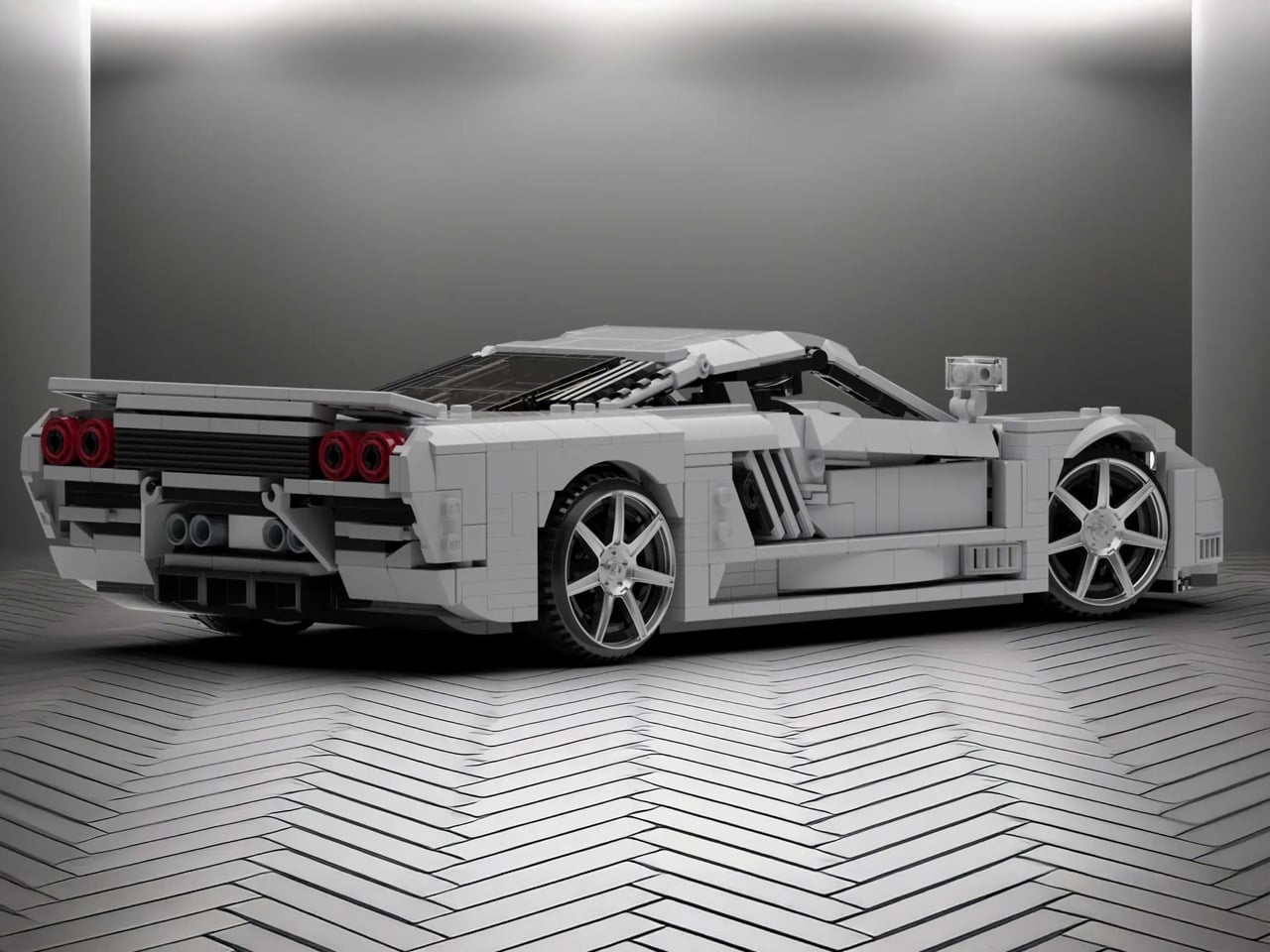
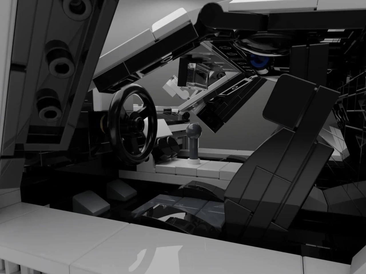
LEGO’s Speed Champions line has given us countless Ferraris, Porsches, and McLarens. Meanwhile, one of America’s most ambitious supercar projects sits conspicuously absent from the brick-built garage. The Saleen S7 deserves better than obscurity, and builder Nytedance has created a 1,200-piece proposal that makes the case beautifully. This isn’t a quick parts-bin creation but a thoughtfully detailed tribute to a car that once proved American manufacturers could play in the supercar sandbox.
The build captures everything that made the S7 special: those dramatic scissor doors, the trio of diagonal side vents that channeled air to the mid-mounted engine, and the low-slung stance that telegraphed serious performance intentions. Nytedance included opening hood and engine bay access alongside a detailed interior, giving the model the same display-worthy presence the real S7 commanded on showroom floors. At a time when automotive design often feels derivative, this MOC celebrates a machine that carved its own identity through pure American audacity and engineering ambition.
Designer: Nytedance
Here’s the thing about the S7 that most people forget: it was legitimately fast. Like, 2000-era supercar fast when that still meant something. The naturally aspirated version put out 550 horsepower from a 7.0-liter V8, which sounds almost quaint now until you remember the whole car weighed 2,865 pounds. Then in 2005 they strapped turbos to it because why not. Steve Saleen had spent years building hot rod Mustangs, so when he decided to build a proper supercar, he didn’t half-ass it. Carbon fiber monocoque, mid-engine layout, the whole European playbook executed by a company in Irvine, California. And somehow this car gets forgotten while we endlessly rehash which Ferrari from that era was best.
Those proportions are tricky because the car sits so low and wide, but the MOC nails that aggressive wedge shape without looking like a doorstop. The side intakes are the hero detail here, three diagonal slashes that became the car’s signature move. They’re rendered in white against black internals, creating the contrast you need for them to read properly at this scale. The scissor doors actually function, which feels mandatory given that half the reason anyone remembers the S7 involves those doors opening at car shows. Look at the rear haunches and how they flare out over the wheels. That’s not easy to pull off with LEGO’s predominantly rectangular vocabulary, but it works. The builder used curved slopes intelligently instead of trying to force angles that would look chunky.
The white color is clean enough to let you study the form without distraction, plus it matches one of the more common S7 liveries. Those red taillights pop against the white body, four circles arranged in a quad pattern that anyone who spent time with Need for Speed games will recognize instantly. The wheels use those multi-spoke pieces that suggest performance without going full boy racer. At 1,200 pieces, this sits in an interesting spot between impulse purchase and serious investment. You’re committed enough to display it properly but you’re not dropping Technic Bugatti money.
LEGO Ideas is basically democracy for brick nerds. You submit a design, people vote, and if you hit 10,000 supporters, LEGO actually reviews it for potential production. Get approved and your MOC becomes a real set with your name on the box and royalties in your pocket. Nytedance’s Saleen S7 is live on the platform now, so if you think American supercar history deserves shelf space next to all those Prancing Horse sets, go vote for it. The S7 spent too long in obscurity already.
After a rudderless year and an exodus of around 4,000 employees due to Trump administration cuts, NASA got what may be its first piece of good news recently. On December 17, the Senate confirmed billionaire Jared Isaacman as the agency's new administrator. He now holds the power to rehabilitate a battered engine of scientific research, or steer it towards even more disruption.
Considering the caliber of President Trump's other appointees, Isaacman is probably the best candidate for the job. Outside of being a successful entrepreneur, he has flown fighter jets and been to space twice as part of the Inspiration4 and Polaris Dawn private missions. One of those flights saw him complete the first commercial space walk, and travel farther from Earth than any human since the end of the Apollo program.
"Perfect is the enemy of the good. Isaacman checks a lot of boxes," says Keith Cowing, a former NASA employee and the founder of NASA Watch, a blog dedicated to the agency. "He's passed every requirement to fly in a spacecraft that American astronauts at NASA are required to pass. He also went out of his way to have a diverse crew, and shove as much science as he could in those missions."
And yet if you're a NASA employee or just someone who cares about the agency's work, there are still plenty of reasons to be concerned for its future. When Trump first nominated Isaacman in the spring, the billionaire wrote a 62-page document detailing his vision for NASA. In November, Politicoobtained a copy of that plan, titled Project Athena.
To some insiders, Project Athena painted a picture of someone who, at least at the time when it was written, fundamentally misunderstood how NASA works and how scientific discovery is funded in the US and elsewhere. It also suggests Isaacman may be more open to Trump's NASA agenda than would appear at first glance.
When asked about the plan by Politico, one former NASA official characterized it as "bizarre and careless." Another called it “presumptuous," given many of the proposed changes to the agency's structure would require Congressional approval. In one section, Isaacman recommended taking “NASA out of the taxpayer funded climate science business and [leaving] it for academia to determine.” In another section, he promised to evaluate the “relevance and ongoing necessity” of every agency center, particularly NASA's iconic Jet Propulsion Laboratory, saying the facility and others must increase the “output and time to science KPI.”
A lot has changed since Isaacman first wrote that document. It came before the workforce cuts, before the future of Goddard Space Flight Center became uncertain and before Trump surprised everyone by renominating Isaacman. But during his Senate testimony earlier this month, the billionaire said “I do stand behind everything in the document, even though it was written seven months ago. I think it was all directionally correct.”
He did appear to distance himself from some viewpoints expressed in or inferred by Project Athena, however. Isaacman stated that “anything suggesting that I am anti-science or want to outsource that responsibility is simply untrue.” He also came out against the administration's plan to cut NASA's science budget nearly in half, claiming the proposals would not lead to "an optimal outcome."
One thing is clear, Isaacman is not your typical bureaucrat. "One of the pitfalls of some prior NASA administrators has been that they've shown too much reverence for the internal processes and bureaucratic structure of the agency to the detriment of decision-making and performance," said Casey Drier, chief of space policy at The Planetary Society, a nonprofit that advocates for the exploration and study of space. "Isaacman has positioned himself as the opposite of that. Clearly, that's something that could lead to a lot of political and congressional challenges if taken too far."
Even if Isaacman doesn't follow through on any of the proposals made in Project Athena, there's only so much a NASA administrator — even one sympathetic to civil servants working under them — can do.
"Once a budget request goes out publicly, everyone in the administration has to defend it. Anything he does will have to be internal and private," Drier explains. "He never explicitly criticized the administration during his hearing. He's also coming relatively late in the budget process."
A lot of NASA's future will depend on the White House Office of Management and Budget (OMB), which is responsible for implementing the president's agenda across the executive branch. As a direct result of guidance the OMB issued over the summer, NASA awarded 25 percent fewer new grants in 2025 than it did on average between 2020 and 2024.
"The OMB has added layers of requirements that scientists now have to go through to spend the money they've already been allocated. The administration has worked against its own stated goals of efficiency," Drier said. "Isaacman can't solve that himself. He can't tell the OMB what to do. That's going to be a serious challenge."
Looming over everything is the fact NASA still does not have a full-year budget for 2026. Congress has until January 30 to fund NASA and the rest of the federal government before the short-term funding bill it passed on November 12 runs out. "On paper, the official policy of the administration is still to terminate a third of NASA's scientific capability," Drier points out.
There are reasons to be cautiously optimistic. Publicly, both the House and Senate have come out against Trump's funding cuts. And some science missions that were slated to be cancelled, such as OSIRIS-APEX, have been approved for another full year of operations.
What NASA needs now is someone who will, as Drier puts it, "vigorously advocate" for the agency in whatever way they can. It remains to be seen if that's Jared Isaacman.
This article originally appeared on Engadget at https://www.engadget.com/science/space/nasa-finally-has-a-leader-but-its-future-is-no-more-certain-201109072.html?src=rss
For years, LG has opened CES press day with the first event of the morning. Though arch-rival Samsung getting the jump on its fellow Korean rival by giving its presentation the evening before, LG will be hitting the podium at breakfast time with the theme "Innovation in Tune with You."
As with many tech-focused events nowadays, AI is expected to serve as the unifying thread of LG's CES 2026 presentation. That said, LG — much like Apple — has its own take on the acronym, referring to it as "Affectionate Intelligence." The company will share "its vision for elevating daily life through Affectionate Intelligence — delivering harmonized and seamlessly connected customer experiences." The irony, though, is that LG has already shown its cards, thanks to a long string of pre-show press releases offering details about a litany of new products (see below).
How to watch LG's CES 2026 presentation
The event will stream live from Las Vegas on Monday, January 5 at 11AM ET. You've got a few options for tuning in — watch the livestream on the LG website, the LG Global X channel or the LG Global YouTube channel (embedded below).
What to expect
Here's what LG has already confirmed it will be showcasing at CES 2026:
LG will debut its first Micro RGB TV, a display with a cutting-edge screen technology with multicolor backlights that should one-up mini LED displays. The size options are 100 inches, 86 inches and 75 inches.
The company is countering Samsung's Frame TVs with its new LG Gallery TV, arriving in 55- and 65-inch screen sizes.
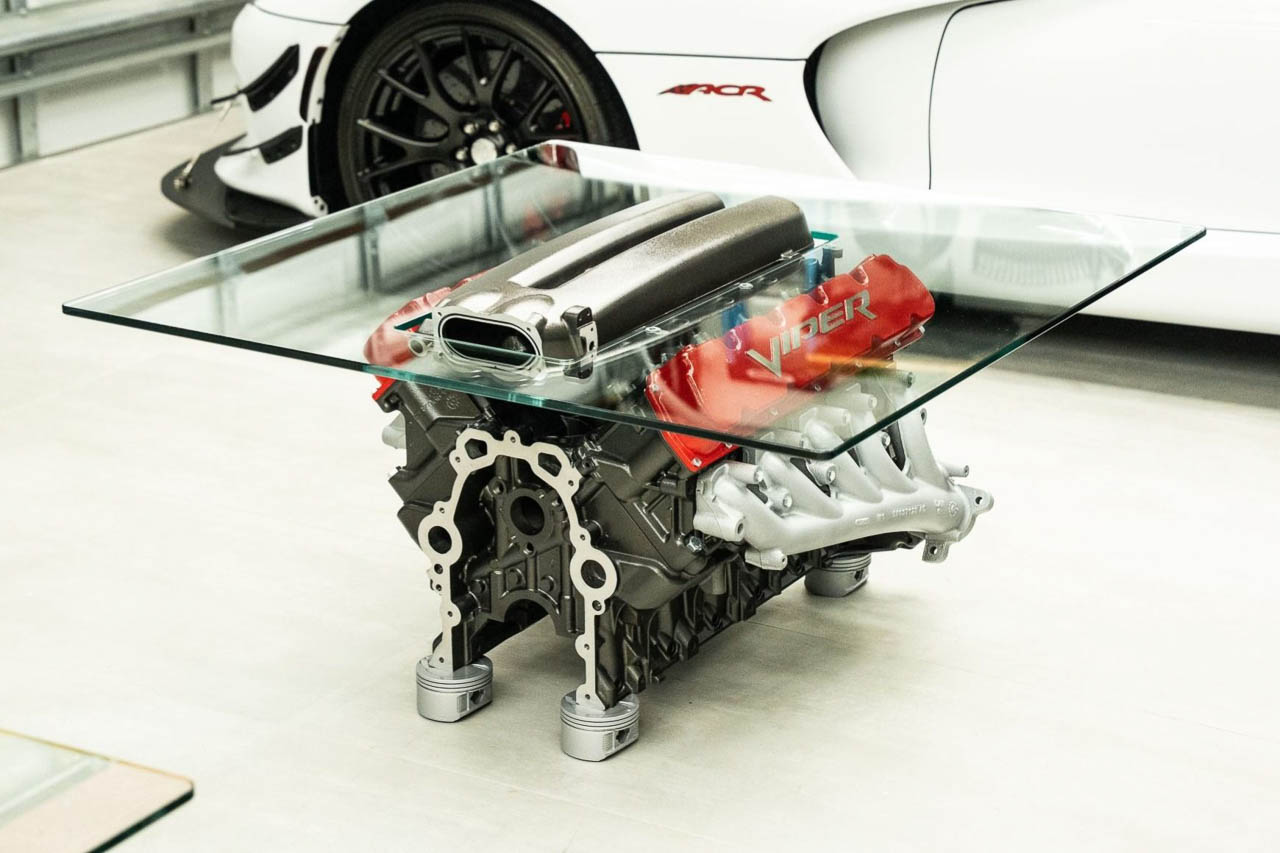
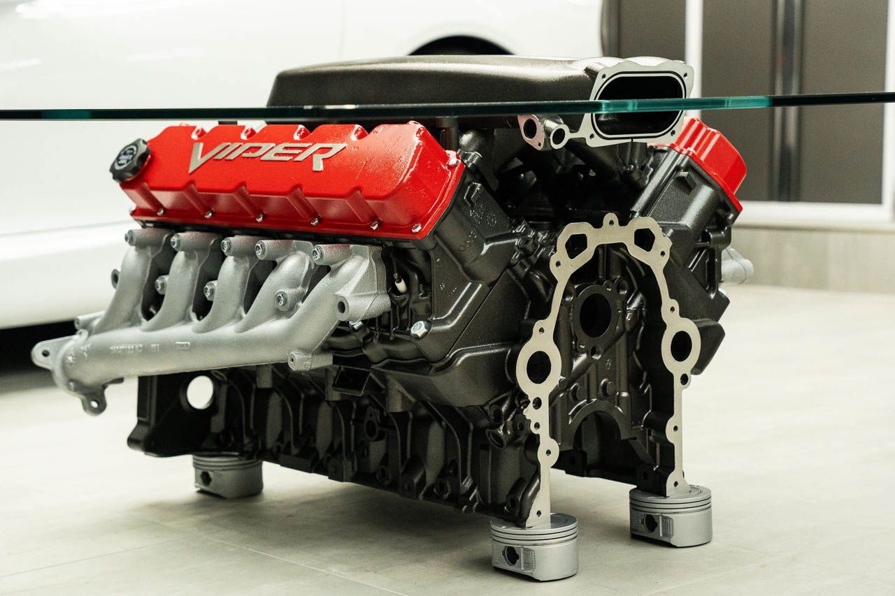
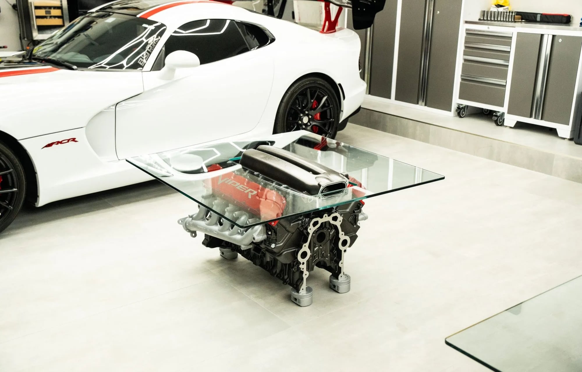
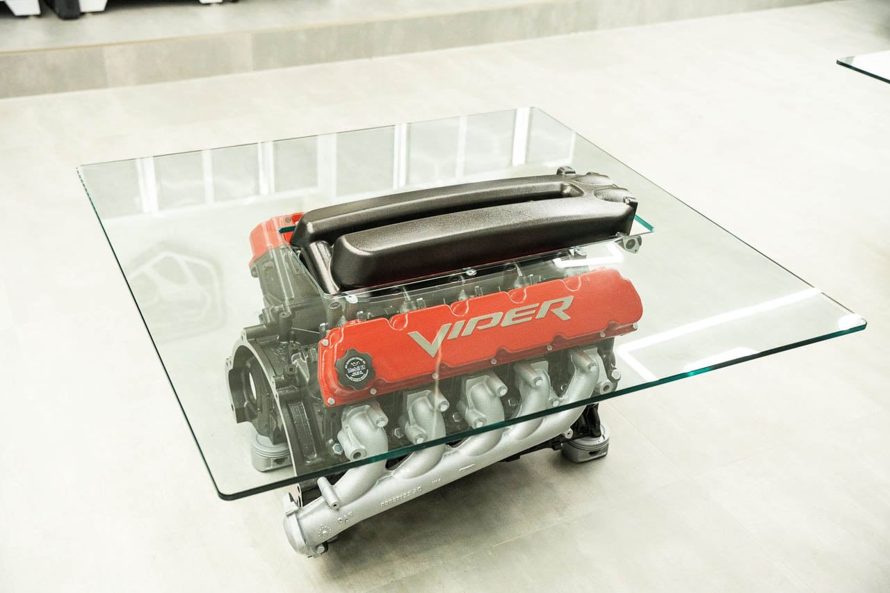
A V10 engine block possesses a particular kind of architectural presence that most furniture actively avoids. The cast aluminum surfaces carry tooling marks from industrial machining. The bolt patterns follow functional logic rather than decorative intent. The mass distribution reflects combustion dynamics, not ergonomic considerations. When this assemblage becomes a coffee table, the object enters a different conversation entirely: one about what happens when mechanical purpose gives way to spatial presence, and whether the transformation honors or obscures the original form.
The piece that sold on Bring a Trailer for $6,350 approaches this question with unusual directness. JcCustoms finished a pieced-together V10 powertrain in black, capped it with red valve covers bearing Viper script, and placed the entire assembly beneath glass at conventional coffee table height. The result reads as neither automotive memorabilia nor standard furniture, but as something closer to an industrial artifact placed deliberately in domestic context. The 350-pound mass anchors itself to the floor with repurposed pistons serving as feet, completing a material vocabulary that runs consistently from base to crown. Every surface announces its origin. Every bolt pattern declares that this object once served a purpose far removed from supporting coffee cups and design magazines.
Form Language and Color Strategy
The color palette operates through deliberate contrast rather than subtlety. The black engine block and black intake manifold establish a dark, absorptive core that reads as negative space beneath the glass surface. Red valve covers provide the primary chromatic accent, positioned to catch light and draw attention to the components that would matter most in a functioning engine. Silver exhaust manifolds sit outboard, reflecting ambient illumination and creating a metallic counterpoint to the matte aluminum and gloss-painted surfaces at center.
This arrangement follows a logic rooted in automotive presentation rather than interior design convention. Performance vehicles use red accents to signal aggression. Black components suggest technical seriousness. Silver hardware implies precision engineering. The table inherits these associations without requiring explanation, communicating through a visual language that anyone who has walked past a car dealership will recognize on some level. The meaning transfers even when the machinery no longer functions.
The Manifold Penetration
The most consequential design decision involves the intake manifold’s relationship to the glass top. Rather than sealing the engine beneath a continuous surface, the builder cut a central aperture that allows the manifold to pass through the plane of the glass and emerge into the user’s space above. This gesture transforms the table from a display case into something more spatially assertive: the manifold becomes a vertical element, almost sculptural, rising from the mechanical base like an industrial totem.
The penetration creates several simultaneous effects. It breaks the expected boundary between object and surface. It introduces vertical rhythm to a horizontal form. It makes the table physically difficult to use as a conventional surface, since the manifold occupies prime real estate at center. Most significantly, it declares that the engine’s form matters more than the table’s function, that the manifold’s sculptural presence justifies the functional compromise of a smaller usable area around its edges.
Materiality and Construction Logic
The glass top measures approximately 44 inches square and positions the overall height at roughly 21.5 inches from floor to upper surface. These dimensions place the object within conventional coffee table parameters, suggesting that whoever built it understood the constraints of living with furniture even while prioritizing visual impact over utility. The footprint works in most residential configurations. The height allows seated users to reach across the surface. The proportions read as intentional rather than accidental. Standard furniture dimensions applied to non-standard furniture content creates a productive tension: the object fits spatially while refusing to fit conceptually. This deliberate mismatch between expected form and unexpected content drives much of the piece’s visual interest, forcing viewers to reconcile the familiar coffee table silhouette with the unfamiliar mechanical presence beneath the glass.
Below the glass, the engine assembly reveals its pieced-together origins. Commenters on the auction identified components that appear more consistent with Ram SRT-10 truck applications than pure Viper specification, and noted that certain valve covers may have been installed in reversed orientation. These observations matter for collectors concerned with authenticity, but they matter differently for design evaluation. The object never claimed mechanical integrity. It claimed visual coherence, and the assembled components deliver that coherence regardless of their original applications.
The pistons repurposed as feet extend the material language vertically and provide stable support for the substantial mass. This detail demonstrates the builder’s commitment to vocabulary consistency: rather than hiding the base beneath generic leveling feet, the design incorporates additional engine components to maintain the automotive reference from every viewing angle. The gesture costs nothing functionally while reinforcing the object’s identity at every point of contact with the floor.
Spatial Implications
Placing this object in a room reorganizes the space around it. The 350-pound mass cannot be casually repositioned. The visual intensity demands clear sightlines from seating areas. The scale requires sufficient floor area to breathe, ideally with circulation paths that allow viewers to approach from multiple angles. The table functions best in spaces designed around its presence rather than spaces that accommodate it as an afterthought.
This inversion of the typical furniture-space relationship aligns the piece with sculptural installation logic. A Brancusi or a Serra reorganizes the gallery around itself. This engine table, at a different scale and in a different context, performs a similar operation on domestic space. The living room becomes a setting for the object rather than the object becoming a component of the living room. Whether this constitutes design success depends entirely on whether the owner wants a room that serves the furniture or furniture that serves the room. The answer varies by temperament. Some inhabitants will thrive with an anchor piece that organizes everything else around it. Others will find the gravitational pull exhausting.
The Transformation Question
What distinguishes this execution from cruder automotive furniture attempts is the clarity of the design position. Many engine tables bury the machinery beneath excessive glass, padding the visual impact with transparency until the mechanical forms become background texture. Others over-restore the components, chasing a showroom cleanliness that erases the industrial character. JcCustoms found a middle register: finished enough to read as intentional, raw enough to preserve the material authenticity that makes the object interesting in the first place.
The black-and-red palette references Viper identity without reproducing it literally. The aperture asserts sculptural ambition without abandoning table function entirely. Each decision reflects restraint as much as assertion, suggesting a builder who understood that engine tables succeed or fail based on what they choose not to do as much as what they add. Knowing when to stop matters as much as knowing what to include. JcCustoms stopped at the right moment.
Object Status After Function
The $6,350 hammer price establishes this piece as serious furniture for a narrow audience, but the design implications extend beyond market validation. This table represents one answer to a question that contemporary culture increasingly confronts: what happens to mechanical objects when their original purpose ends? Engines fail. Vehicles get scrapped. Components enter a liminal state between artifact and waste. Someone chose transformation over dissolution, preservation through reimagining rather than preservation through stasis.
One response treats these objects as raw material for recycling, melting the aluminum back into commodity feedstock. Another response preserves them as static memorabilia, freezing the machinery in museum context. This table proposes a third path: transformation into new objects that acknowledge their origins while serving different functions. The engine remains recognizable as an engine. It also becomes furniture. Both identities coexist in the finished piece, neither fully displacing the other.
The buyer who claimed this object now owns something that occupies multiple categories simultaneously. It functions as a table, barely. It functions as sculpture, more convincingly. It functions as automotive artifact, somewhat ambiguously given the mixed-source components. It functions as conversation anchor, inevitably and permanently. The object will outlast the buyer’s patience for explaining it, will survive the inevitable scratches on its glass, will persist through changes in interior design fashion, will remain exactly what it is regardless of how the surrounding room evolves around it. Mechanical objects built for permanence tend to achieve it, even when their original function disappears.
Michał Kiciński, co-founder of CD Projekt, has acquired total ownership of the DRM-free video game storefront GOG. The digital video game platform was started by CD Projekt in 2008 with a stated mission to preserve "Good Old Games" (hence the GOG acronym). CD Projekt is known for its game studio CD Projekt Red, the developers The Witcher series and Cyberpunk 2077.
GOG said Kiciński bought 100 percent of its shares for PLN 90.7 million ($25 million). The acquisition was fully financed through committed funding secured at the sale’s closing and did not involve the sale of any of Kiciński’s CD Projekt shares.
The storefront will continue to operate independently under its new owner, sticking with its DRM-free philosophy and ongoing work to keep classic titles playable on modern PCs. After the sale, CD Projekt and GOG signed a distribution agreement that will see CD Projekt Red games continue to be listed on GOG.
While the press release for the sale did not list a reason, a report posted Monday under the Regulatory Announcements section of the CD Projekt website states "the sale of shares in GOG is consistent with the CD PROJEKT Group growth strategy, which assumes focusing on the core business of the Company, i.e., developing and publishing video games and related projects based on the owned and new franchises." The report also describes a "competitive sale process," implying that Kiciński may not have been the only bidder.
While it seems Kiciński will have a hands-on role in GOG after its acquisition, his current involvement at CD Projekt is less clear. He remains a significant shareholder but is not listed on the company's Management board or its Supervisory board.
This article originally appeared on Engadget at https://www.engadget.com/gaming/pc/co-founder-of-cd-projekt-micha%C5%82-kicinski-has-acquired-gog-the-companys-game-storefront-174853415.html?src=rss
If cleaning up your digital life is on your New Year's resolution list, we've got good news: 1Password is offering half off its subscription plans (both the Individual and Families plans). That brings the price of the Individual plan down to $24 for a year and the Families plan down to $36 for a year.
The plans are nearly identical, but the Families plan accommodates five additional people. These discounts are only available to new customers and the prices expire after the year, so set a reminder to cancel or reassess. And you'll need to act fast, because the offer expires today — Tuesday, December 30.
This provider topped our list of the best password managers, and for good reason. We appreciated the intuitive interface and the fact that it's available on most platforms, so you'll never be left out in the cold. These include Chrome, Firefox, Safari, Edge, macOS, iOS, Windows, Android and more.
Subscriptions include industry standard encryption and a "secret key" that only you know on top of a master password. There's also two-factor authentication and the platform issues alerts when credentials have potentially been compromised.
1Password recently raised prices across the board, but this is still looking to be the best deal for our favorite password manager going into the new year. The only downside here is the one that accompanies many password managers: There is no free version.
Update, December 30 2025, 11:43AM ET: This story has been updated to fix broken links, and to note that this is the final day of the sale.
This article originally appeared on Engadget at https://www.engadget.com/deals/1password-deal-last-chance-to-save-50-percent-on-our-favorite-password-manager-162844256.html?src=rss
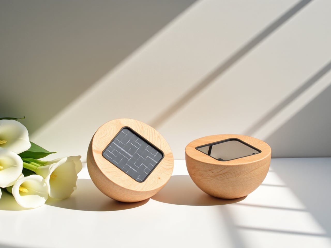
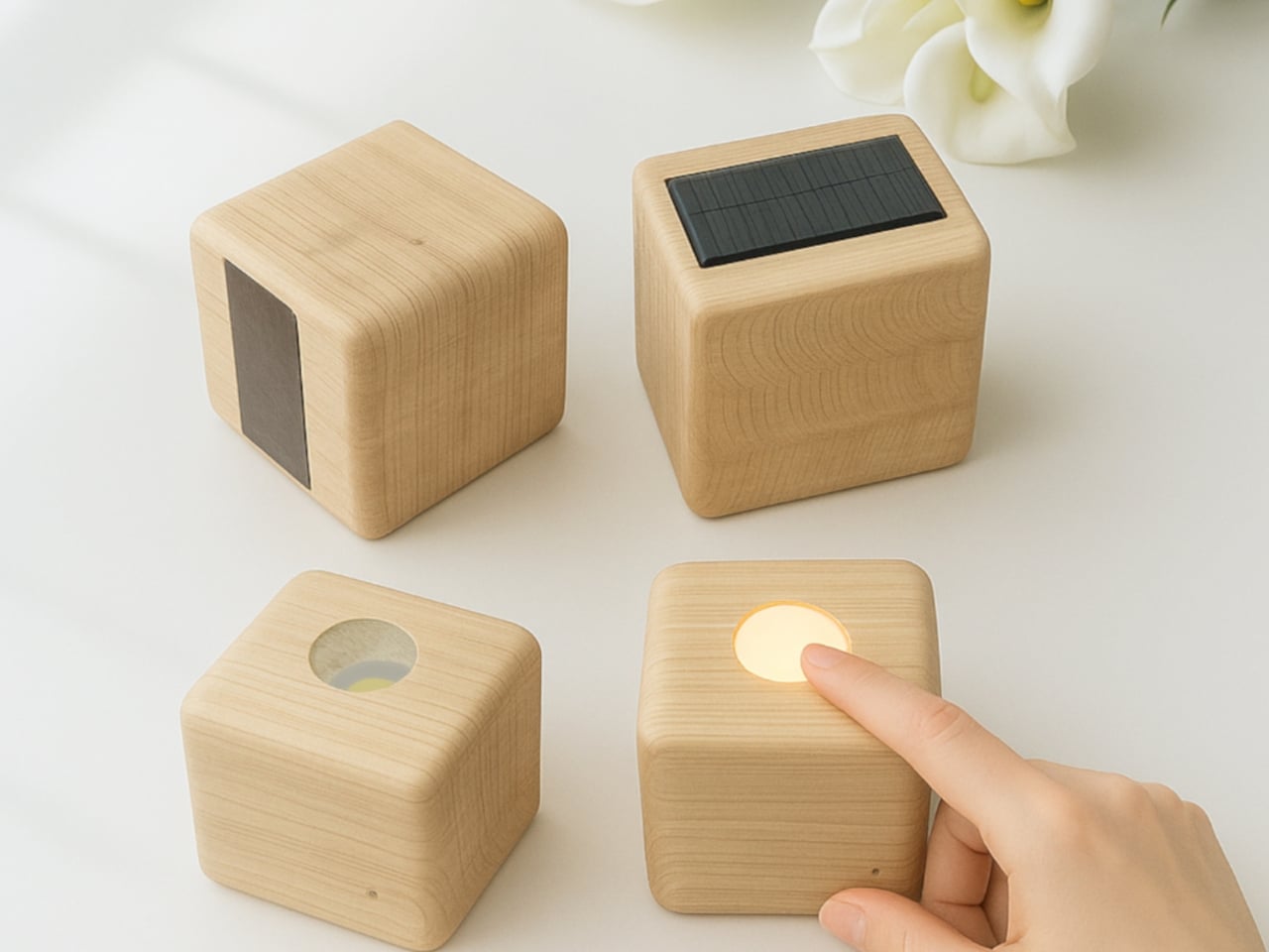
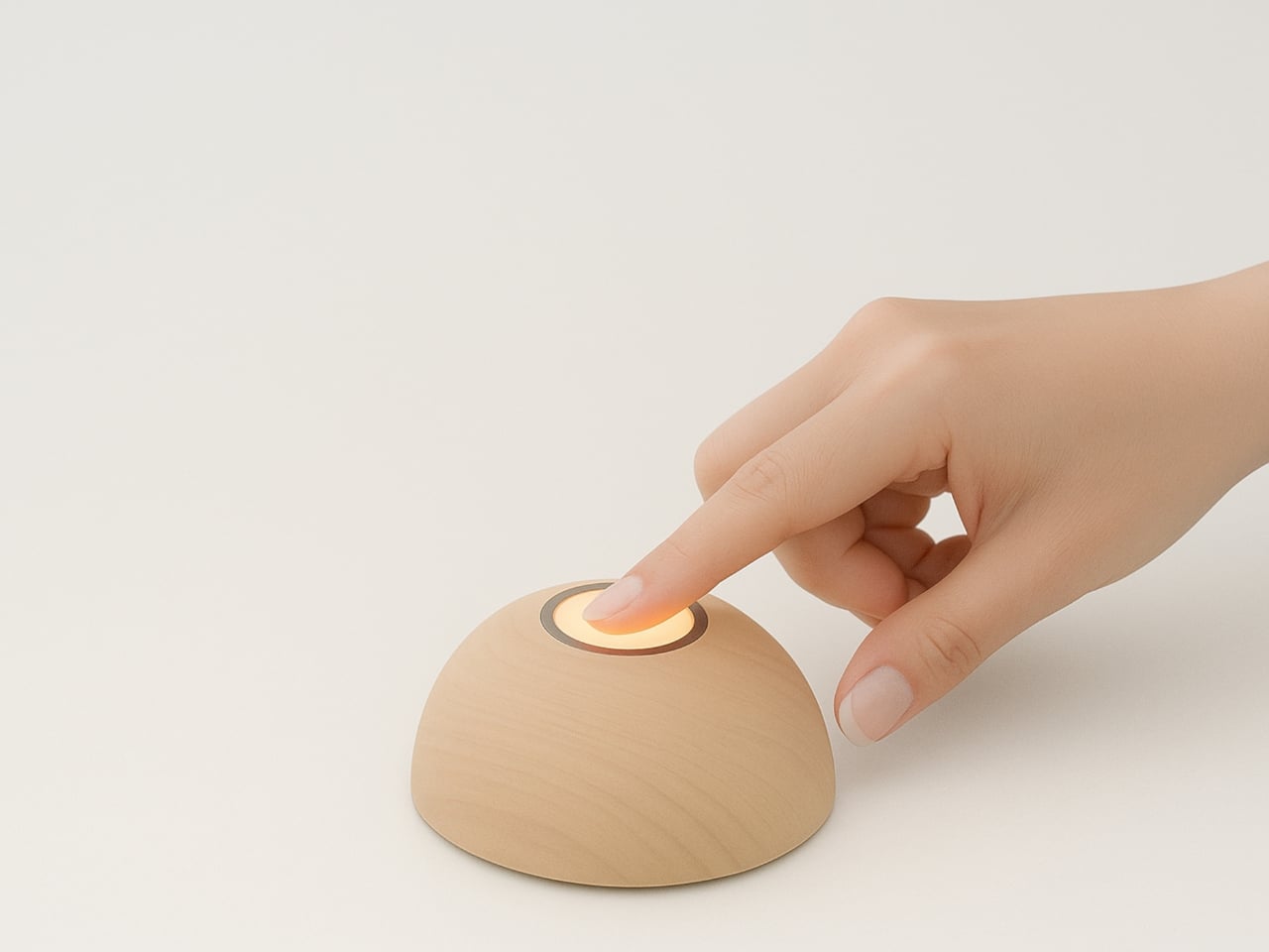
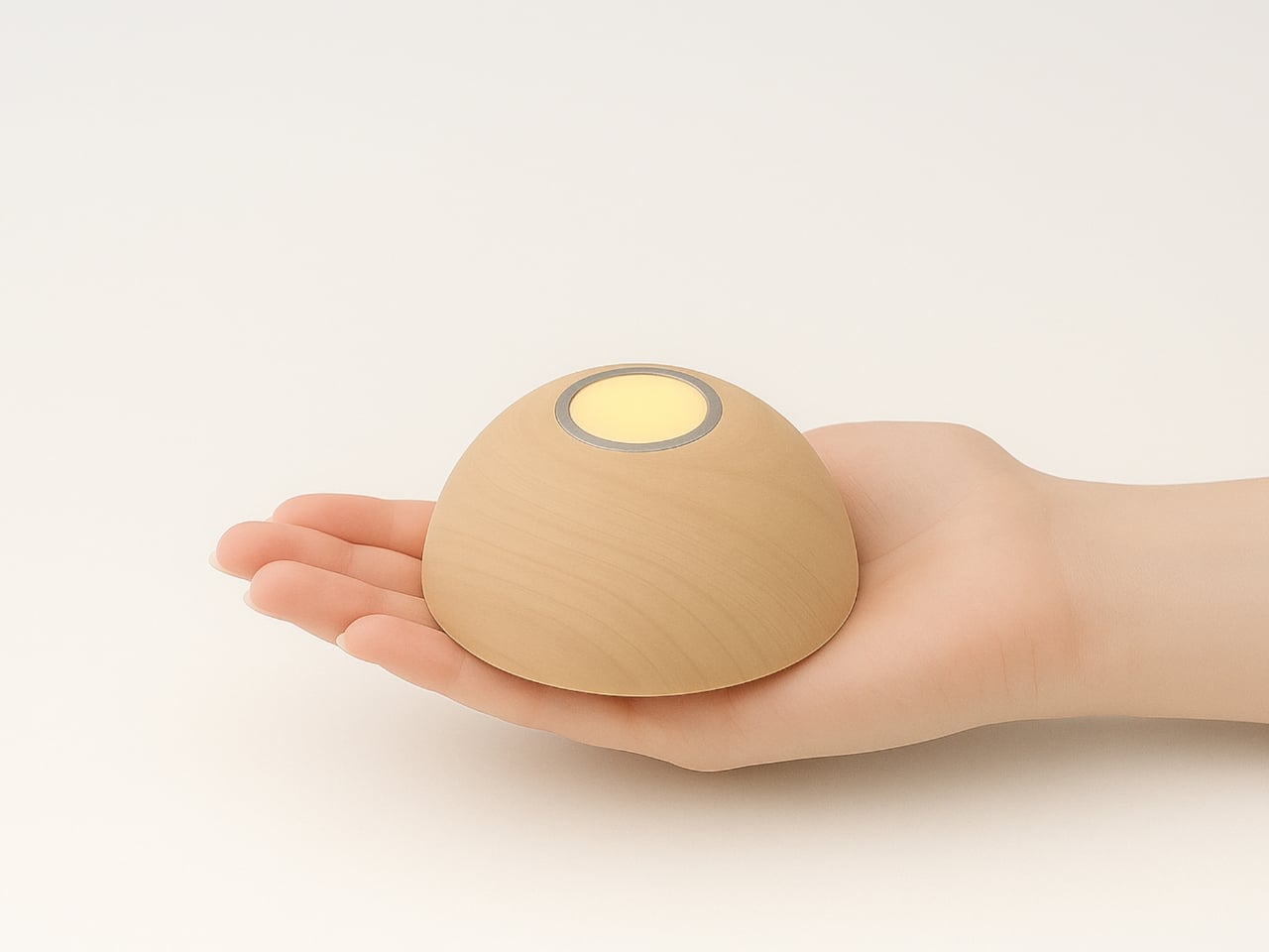
There’s something quietly revolutionary happening in the world of ambient lighting, and it looks like a smooth wooden pebble you’d want to hold in your palm. Meet Sula, a solar touch light designed by Maryam Mozafari that’s making the case for sustainable design without sacrificing an ounce of beauty or simplicity.
At first glance, Sula resembles a decorative candle that’s been reimagined for the 21st century. Its organic, rounded form sits comfortably in your hand, and the warm wood finish gives it that luxurious, handcrafted quality that makes you want to keep it on display even when it’s not lit. But flip it over or lay it on its side, and you’ll discover its secret: a hidden solar panel that soaks up sunlight and stores energy in its lithium battery.
Designer: Maryam Mozafari
The genius of Sula lies in how effortlessly it integrates sustainability into everyday life. We’re living in an era where solar panels still feel like clunky additions to our homes, awkward compromises between function and form. Sula challenges that assumption entirely. Instead of treating the solar panel as an eyesore to hide, Mozafari designed the entire object around the idea that charging should be as natural as setting something down. Want to power up your light? Just flip it upside down on a sunny windowsill. That’s it. No cords, no outlets, no apps to download.
This simplicity extends to how you actually use the light. A gentle touch activates the soft glow, creating that intimate, relaxing atmosphere we usually associate with candlelight but without the fire hazard or melting wax. There’s something deeply satisfying about touch activation. It makes you feel more connected to the object, more intentional about the mood you’re creating in your space.
The design comes in different forms too, giving it versatility that most ambient lights lack. The classic dome shape looks like a smooth river stone, while the cubic version brings a more contemporary, architectural vibe. Both variations share that same philosophy: beautiful objects that happen to be functional, rather than functional objects trying to look beautiful. It’s a subtle but crucial distinction that separates good design from great design.
What makes Sula particularly relevant right now is how it addresses our complicated relationship with technology and sustainability. We want to make better choices for the environment, but we don’t want those choices to feel like sacrifices. Solar power often comes with baggage: it’s expensive, it’s complicated, it requires installation. Sula strips all that away. It’s a light that charges itself using the sun, and the whole process is so seamless you barely think about it.
The ergonomics deserve attention too. The light is sized perfectly to be portable, to move from room to room as you need it. Imagine bringing a cluster of them to an outdoor dinner as the sun sets, or keeping one on your nightstand for gentle reading light that won’t blast you awake like your phone screen. The soft illumination creates pockets of warmth without overwhelming a space, which is exactly what good ambient lighting should do.
There’s also something wonderfully analog about Sula in our increasingly connected world. It doesn’t ping you with notifications, it doesn’t need updates, and it won’t become obsolete when a new model comes out. It’s just a light that runs on sunshine and responds to your touch. In a market saturated with smart home devices that promise to make life easier but often just add complexity, Sula’s straightforward approach feels refreshingly honest.
Mozafari’s design proves that sustainability doesn’t have to announce itself loudly to be effective. Sula isn’t covered in green leaves or covered with “eco-friendly” labels. It’s simply a beautifully crafted object that happens to run on renewable energy. That quiet confidence is what makes it work. It fits into modern homes not because it’s making a statement about sustainability, but because it’s genuinely lovely to look at and use.
For anyone who’s ever fumbled for a light switch in the dark or dealt with the anxiety of leaving candles burning overnight, Sula offers something better. It’s proof that the future of sustainable design isn’t about compromise. It’s about creating objects so well-designed that their environmental benefits become just one more reason to love them.