A Trash Bin That Actually Belongs in Your Living Room

I’ve spent more time choosing a lamp than I care to admit, then put a plastic trash can beside the sofa because it was the only one that fit. That feels like a familiar design compromise: we want a bin close enough to use, but not so visible that it becomes part of the room. ExtLine approaches the problem from the other direction. Rather than decorating a conventional trash can, it strips away the clues that announce what it is.

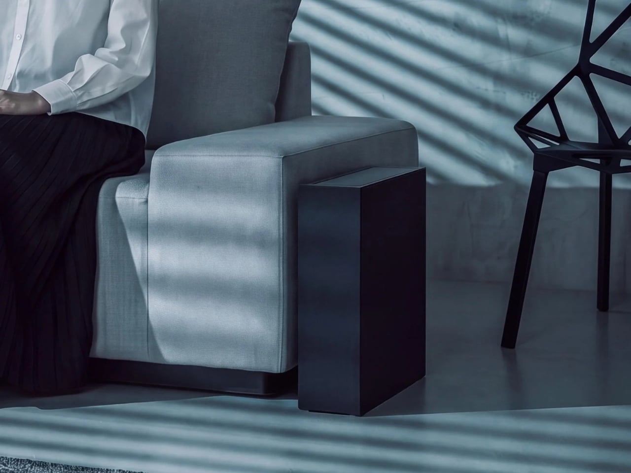
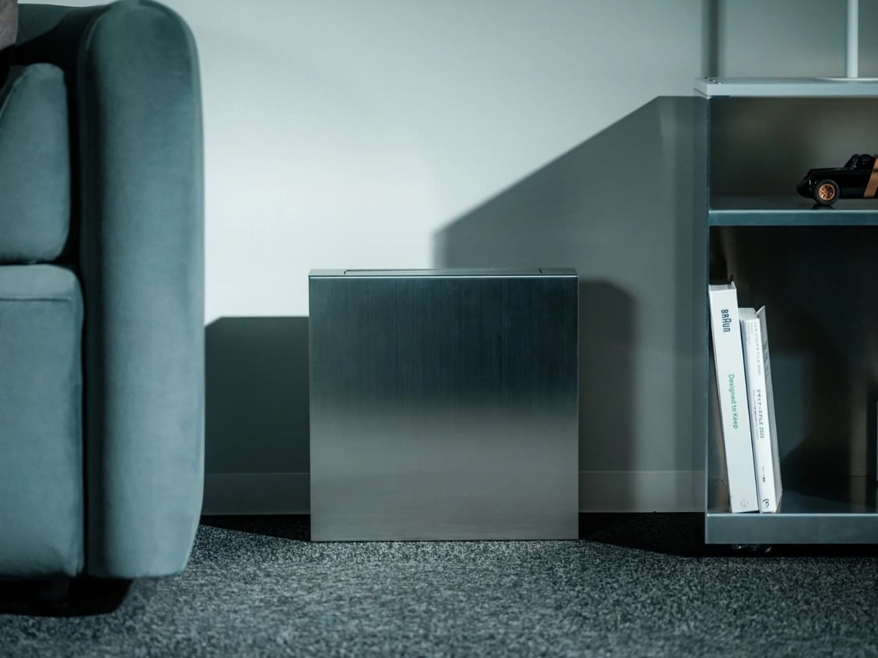
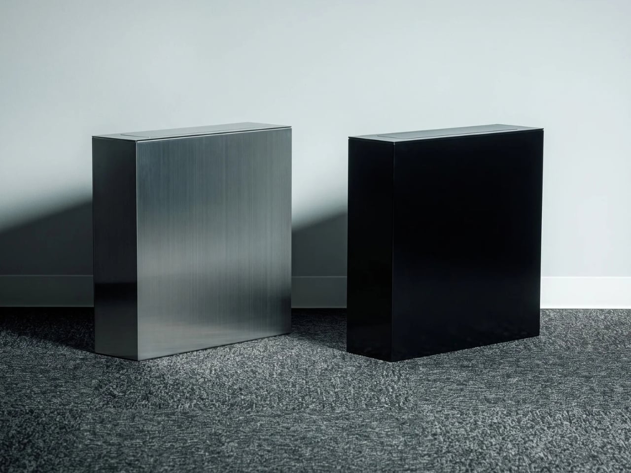
At first glance, it looks like a slim metal block with a narrow detail across the top. The bag isn’t spilling over the rim, and there’s no open mouth offering a view of yesterday’s receipts. Press one side of the center-pivot lid and it rotates to create an opening; close it and the waste disappears again. It’s a small interaction, but an important one. ExtLine doesn’t ask you to admire your trash bin. It lets you forget you’re looking at one.

Click Here to Buy Now: $490

Its proportions do much of the work. At 4.3 inches wide, ExtLine can sit against a wall or alongside a sofa without claiming the space a round bin might. The straight sides matter, too. A tapered can often leaves an awkward gap behind it, while this one appears comfortable right up against the surface beside it. In the product images, it sits among the furniture rather than looking like something someone forgot to put away.

That placement changes how I imagine using it. Beside a desk, it could catch the paper and packaging that otherwise accumulate on the tabletop. Next to a sofa, it gives the usual small bits of daily life somewhere to go without adding another piece of visual clutter. I wouldn’t mistake its narrow profile for an invitation to fill it with a kitchen’s worth of garbage. Its appeal is more specific: keeping a bin within reach in the places where you usually wish it weren’t visible.
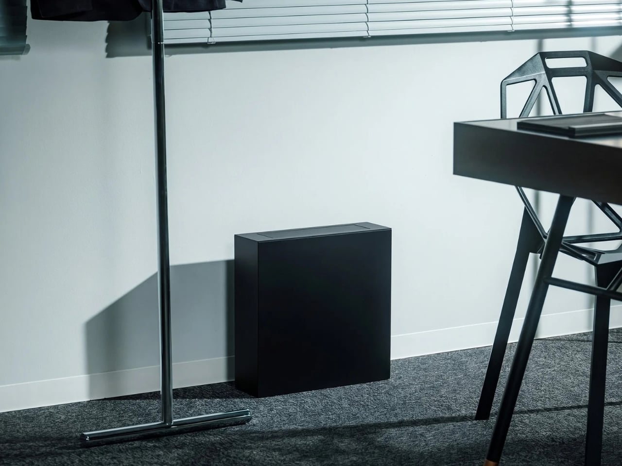
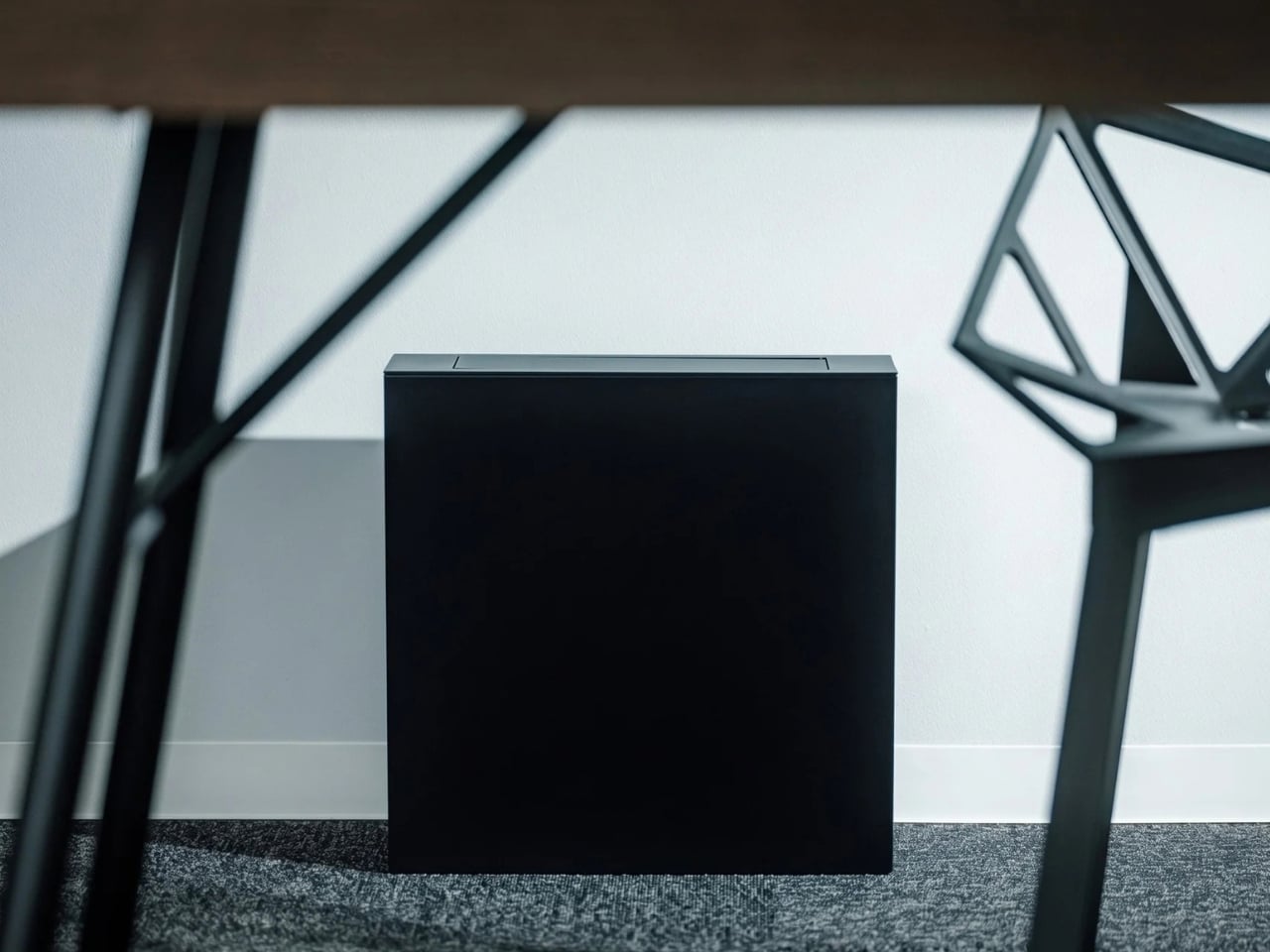
The finish makes that idea feel intentional rather than severe. Black gives ExtLine the presence of a graphic object, especially against a pale wall. Silver catches the light and seems better suited to a room with metal shelving or other cool-toned details. Its surface is also treated so fingerprints and marks are easier to wipe away. I’d choose based less on which color looks striking in isolation and more on which one would feel at home beside my own furniture.

There are already good-looking trash cans, of course. Simplehuman’s slim step can, for example, is designed for tight spaces and uses a liner rim to hide the bag. Its foot pedal makes hands-free opening practical, especially when your hands are full. ExtLine solves a different problem. It gives up the familiar pedal-and-lid silhouette in favor of a discreet opening and a form that reads almost like furniture. For kitchen duty, I’d lean toward the step can; for a living room, ExtLine makes a more convincing case.
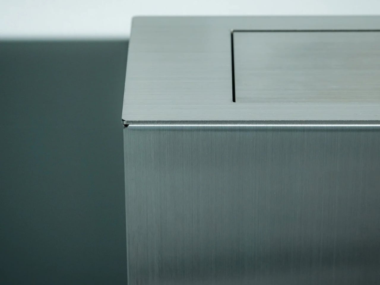
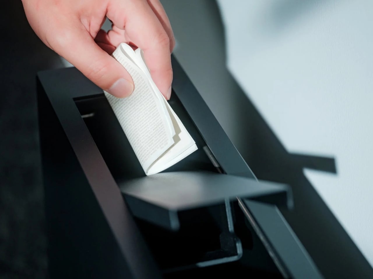
That restraint depends on unusually precise manufacturing. Designer Yuji Tsukamoto worked with Osaka-based Gendai Kogyo, which uses a technique called Shikaru bending to create the bin’s sharp edges. A groove is made in the metal before it’s folded, producing a crisper corner than a conventional bend. It sounds like a detail only a designer would notice, until you see how little else is going on. With no decorative flourishes to distract the eye, the edges have to carry the whole object.

I like that ExtLine treats an everyday annoyance as a design question, not a reason to add technology. There’s no sensor to wave at or feature to learn. You put it where a bin would be useful, press the lid and drop something in. The payoff comes afterward, when you look across the room and see a clean-lined object instead of a plastic bag. Good design doesn’t always need to make a routine exciting. Sometimes it just removes the part that bothered you.

ExtLine Trash Bin won’t replace every trash can in a home, and it doesn’t need to. Its real achievement is making room for one in a space where you’ve already considered every other object. I can imagine setting it beside a carefully chosen sofa and never feeling the urge to move it out of sight before guests arrive.
The post A Trash Bin That Actually Belongs in Your Living Room first appeared on Yanko Design.


CLPR-01 Does for Calipers What Swiss Army Did for Knives

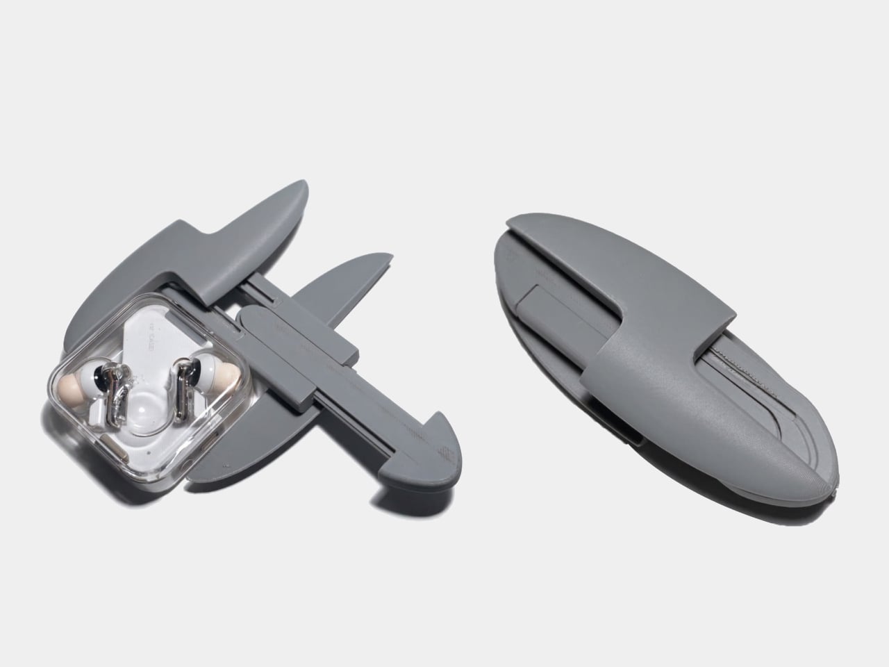
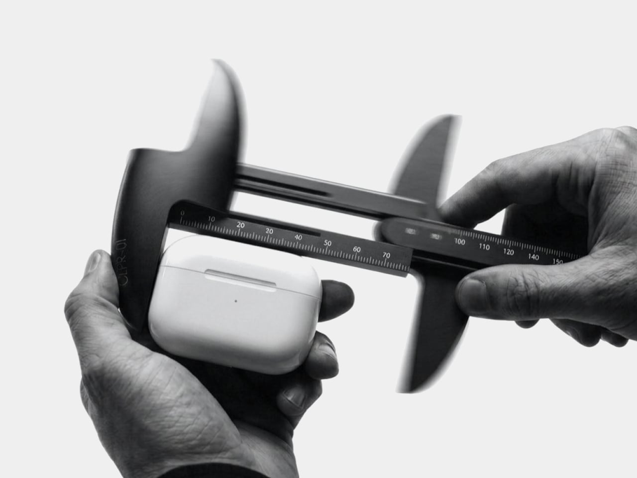
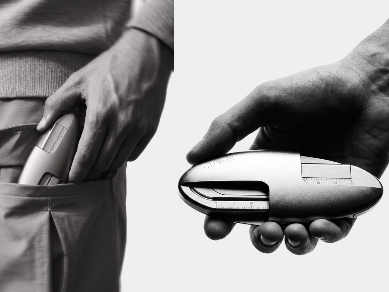
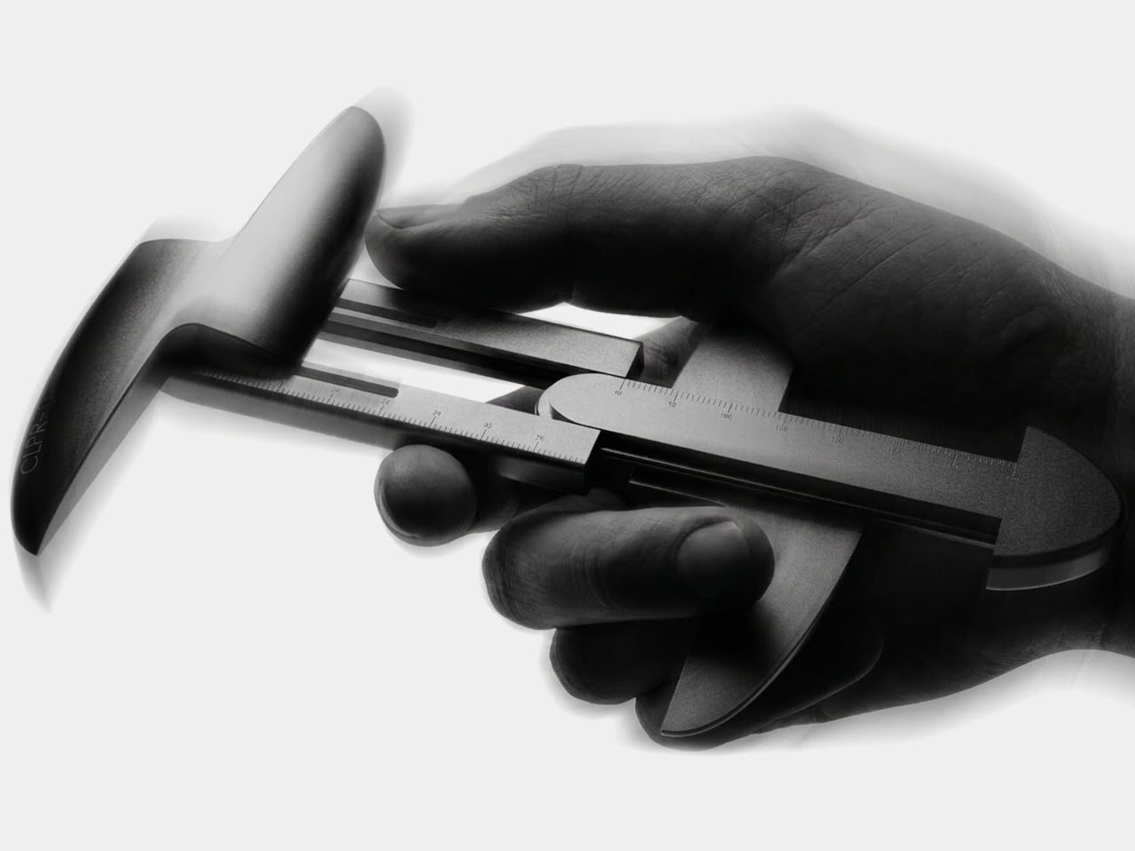
Most of us don’t carry a caliper around, even when a ruler isn’t quite up to the job. Try checking the width of a replacement part at a store, and a quick guess can become another trip. CLPR-01 brings the sliding jaws of a measuring tool into a smooth, pocketable shape, so taking a more careful measurement doesn’t require bringing half the workshop along.

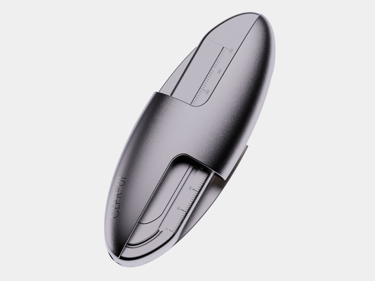
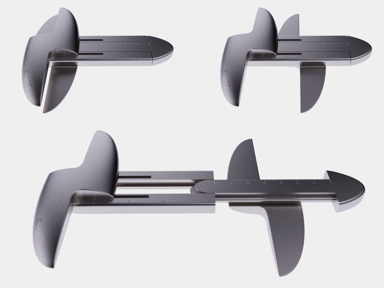
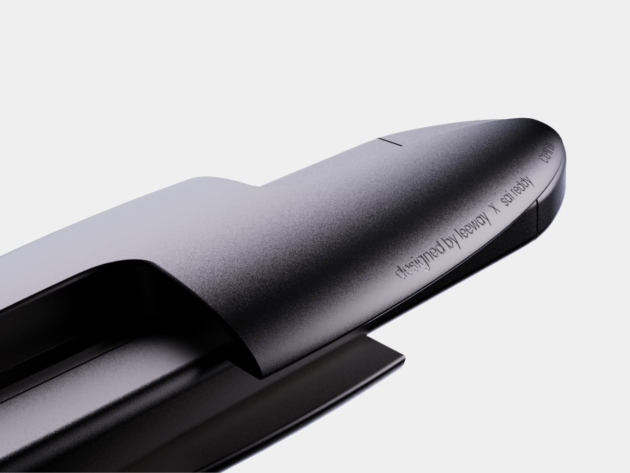
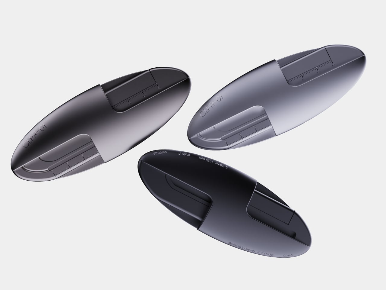
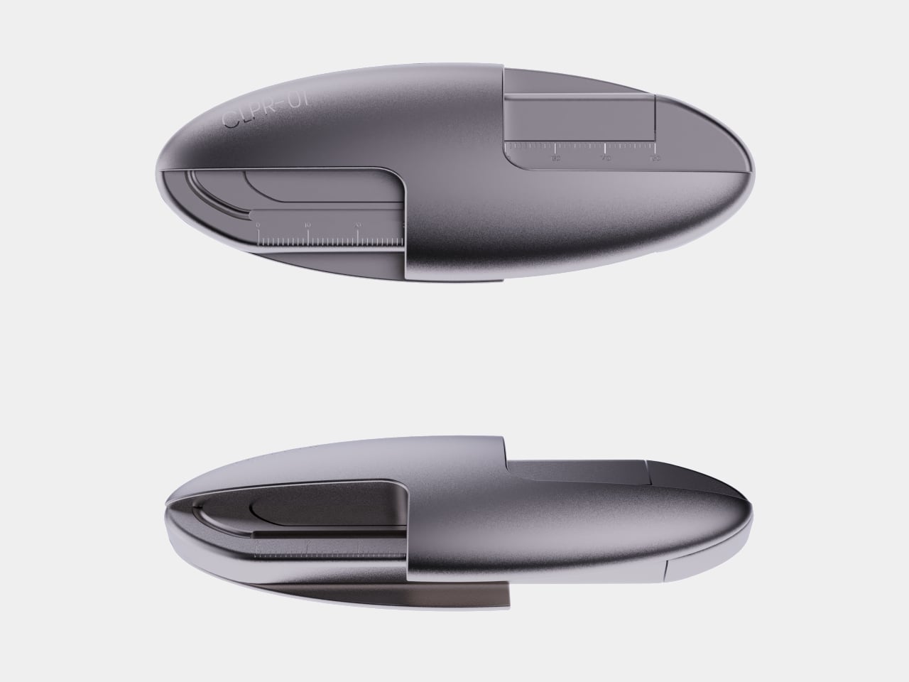
Closed, it has the rounded outline of an everyday object rather than the exposed points and long beam of a conventional caliper. The jaws tuck into the body, leaving an oval that looks comfortable to hold and less likely to catch on the contents of a pocket. Open it, and the familiar relationship between a fixed jaw and a sliding one comes back.

Designers: Arun Kumar, Sai Reddy

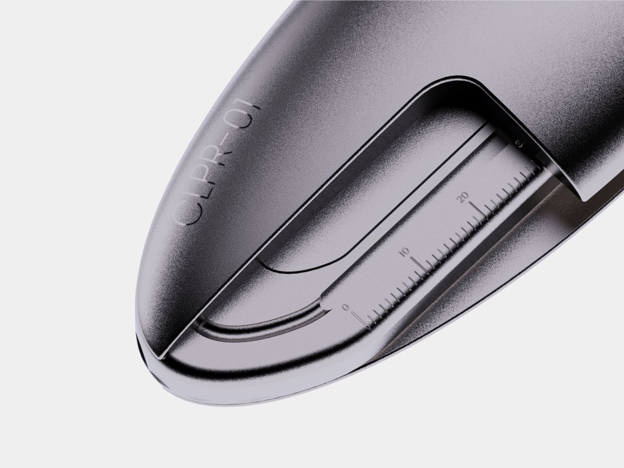
Opening it is the clever part. A ruler can tell you roughly how wide something is, but it won’t hold opposite sides in place while you check. CLPR-01 lets you bring the jaws against an object, then read the markings along the sliding beam. The tool makes the movement of measuring feel deliberate, without putting a digital display between your hand and the object.

Say you’re at a shop looking for a case that will fit earbuds, or sorting through small parts for a weekend repair. You can take a measurement before buying something that almost fits. The compact body makes that possible away from a workbench, where a full-size tool would probably have stayed at home.

The curves also change how the tool behaves when you aren’t measuring anything. Traditional calipers leave their jaws sticking out, which is fine in a drawer but awkward beside keys or a phone. CLPR-01 pulls those protrusions back into its shell and gives your fingers a broad surface to grip. Its markings remain visible when you need them, rather than becoming decoration.

Of course, a slick profile doesn’t tell us how accurately the jaws would measure a tiny component over time. The presentation doesn’t include independent accuracy testing, and it doesn’t establish a price or release date. It’s a design concept with physical prototypes, not a proven substitute for the caliper a machinist trusts.

Still, there’s something appealing about a measuring tool that doesn’t demand a place in the toolbox. Close the jaws, put it away, and it’s there when you discover that the spare part in your hand might be the wrong size. CLPR-01 treats carrying the tool as part of the measuring problem, giving an old workshop instrument an everyday place to live.

The post CLPR-01 Does for Calipers What Swiss Army Did for Knives first appeared on Yanko Design.
The Desk Lamp Designed for Desks That Have No Room Left for One

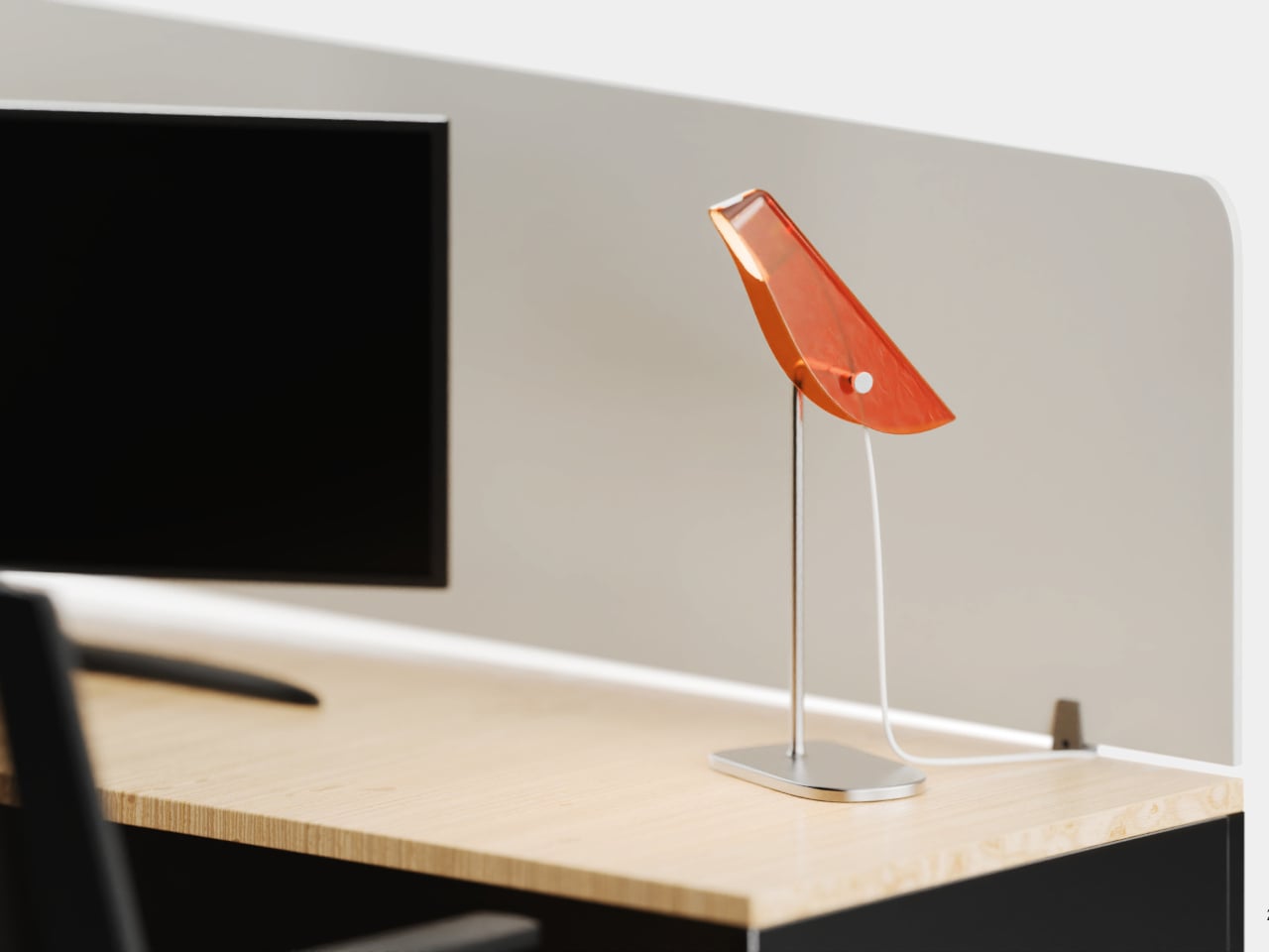
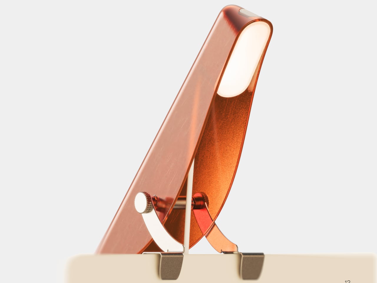
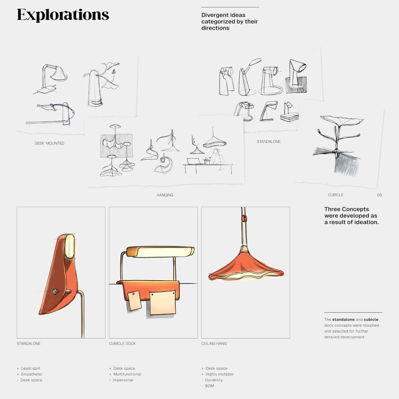
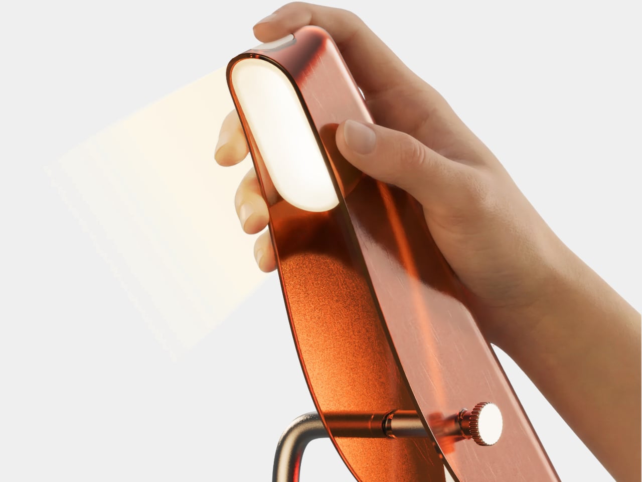
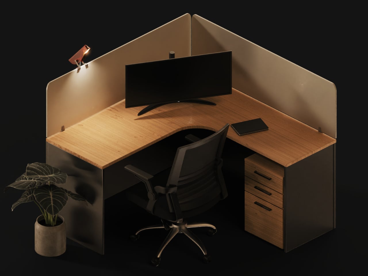
Office lighting rarely cares whether you’re reading a document or squinting at a monitor. A desk lamp can help, but its sprawling base and arm often claim space that your keyboard and notes already need. Avia takes a lighter approach, shaping a compact task light like a bird that can perch beside your work or settle on top of a cubicle partition.

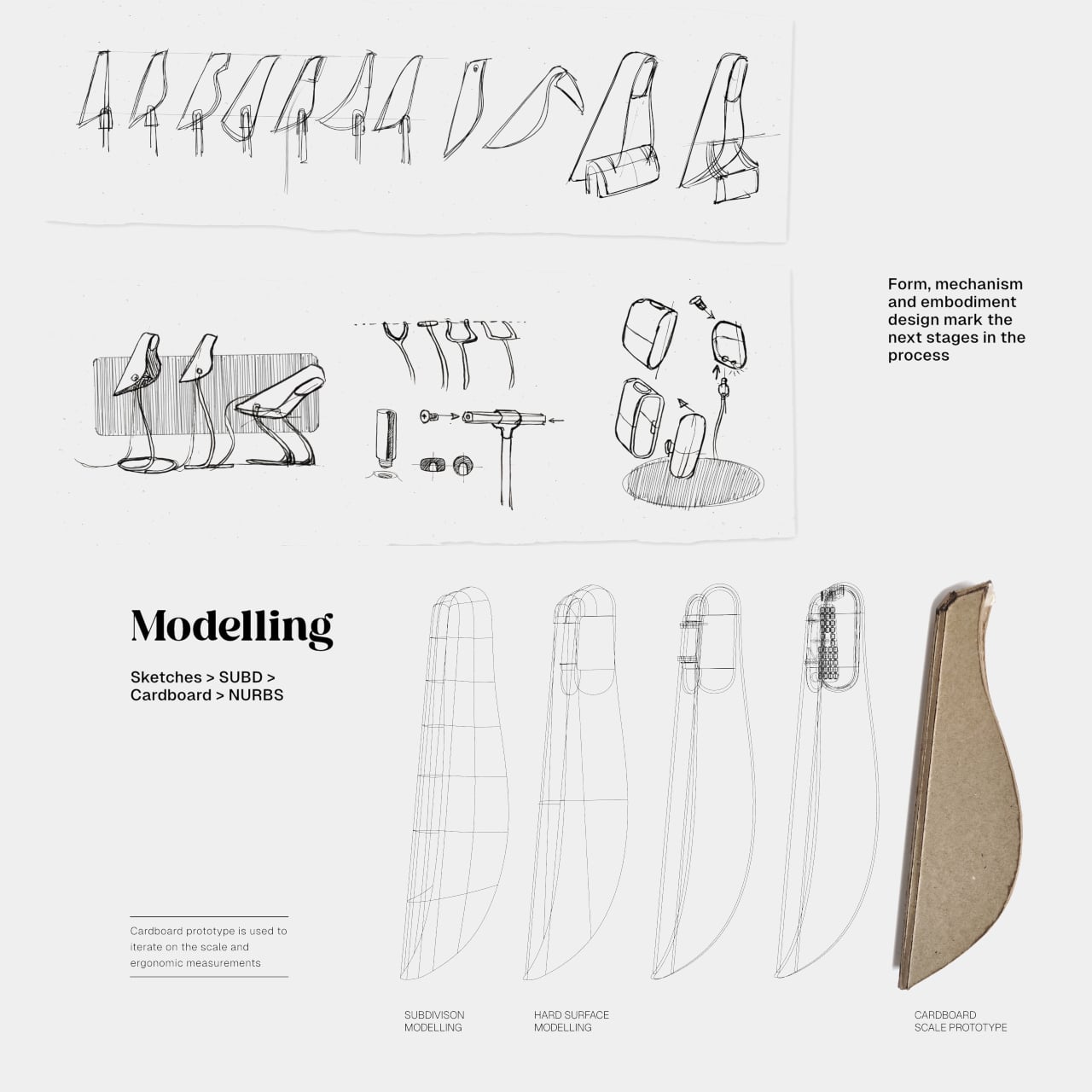
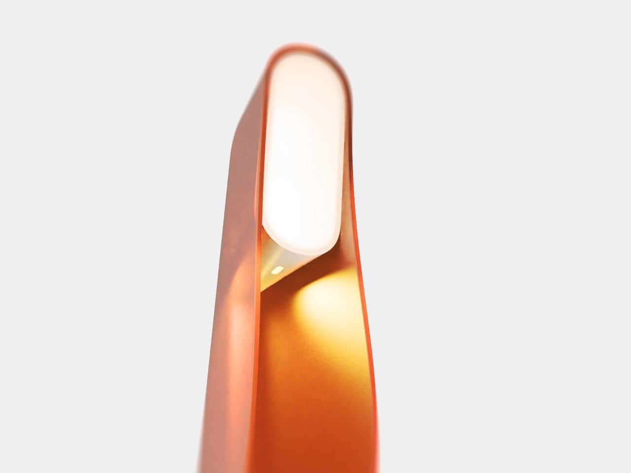
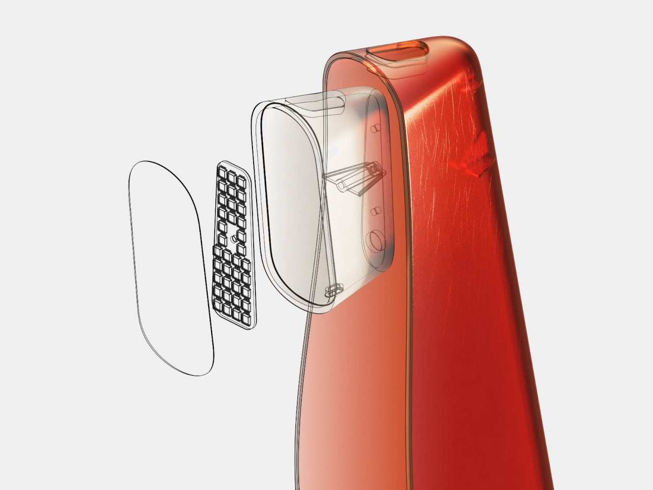
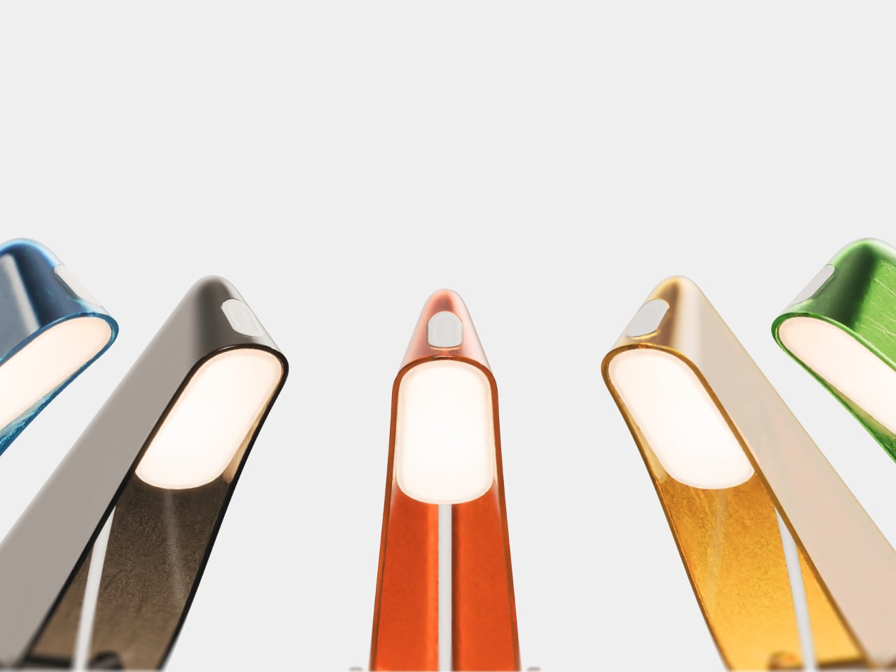
The resemblance isn’t a matter of adding wings or a painted face. Its narrow, curved body rises toward a softly glowing tip, with two folded surfaces lending it the quiet poise of a bird at rest. A translucent shell gives the form color without making it feel heavy. It’s a bit of nature on a desk that usually has no room for decoration.

Designer: Advait Pathak

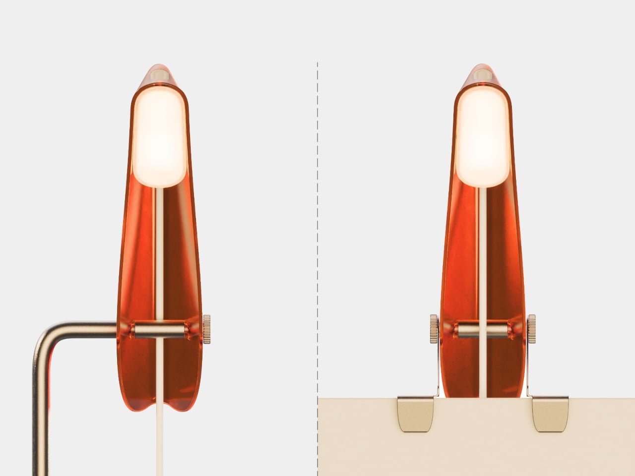
On a desk, Avia stands on a small base rather than spreading across the surface like a conventional articulated lamp. Move it to a cubicle, and it can dock on the partition instead, like a bird choosing a higher perch. That change frees up room for paperwork and a coffee cup, while keeping the light close to the place you’re using it.

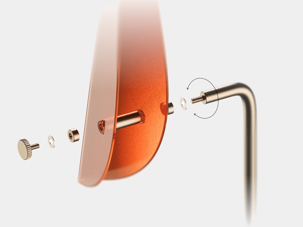
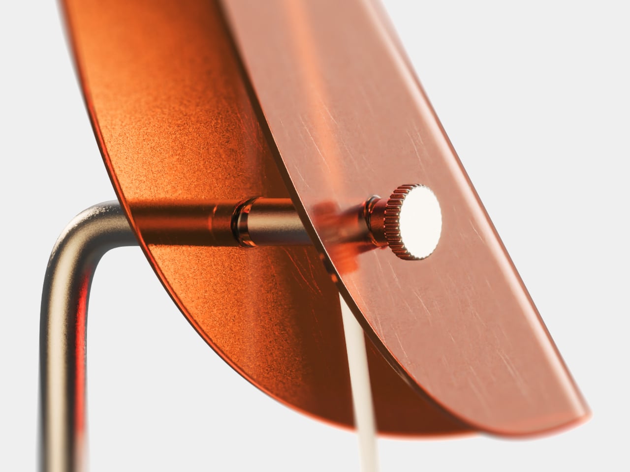
Birds can turn their heads without dragging the whole body along, and Avia borrows that logic. A friction hinge lets you angle the light toward a page instead of your monitor, with a thumb screw intended to hold the position. The idea is to illuminate your immediate task without bothering the next desk over, although the project offers no measured glare results.

The birdlike form also gives the lamp a way to communicate without asking you to watch another screen. A button on its head would handle power, brightness, and pairing, while its translucent body could flash colored reminders from a connected device. A meeting, a focus period, or a break for water could register at the edge of your vision instead of interrupting your work.

Of course, a friendly silhouette alone won’t make a better workplace lamp. Its proposed molded housing and replaceable diffuser suggest attention to assembly and repair. Avia’s blue, orange, green, amber, and smoky finishes give workers a choice beyond office gray, helping make a cubicle feel like someone’s space instead of a temporary station, especially when the lamp is perched above the partition.

There’s something appealing about a lamp that can change perches when your desk runs out of space. Avia doesn’t need a cartoon beak to make that connection; its folded body, poised head, and movable support do the work. For now, it offers a vision of workplace lighting that feels less like a fixture assigned to you and more like a companion at hand.

The post The Desk Lamp Designed for Desks That Have No Room Left for One first appeared on Yanko Design.
The Corner-Bound Notebook Without the Wrist-Digging Problem

As a certified stationery hoarder (if there were an actual certification for that), I own all kinds of notebooks: hardcover, softcover, A5, A6, dotted, lined, unlined, Hobonichi, Midori, Moleskine, etc., etc. One kind of notebook I rarely own is spiral-bound. Sure, they seem to be popular and sometimes more convenient, but I can’t seem to find a comfortable way to write in one. At some point, the spiral digs into my hand, and I end up shifting the notebook around just to finish a page.

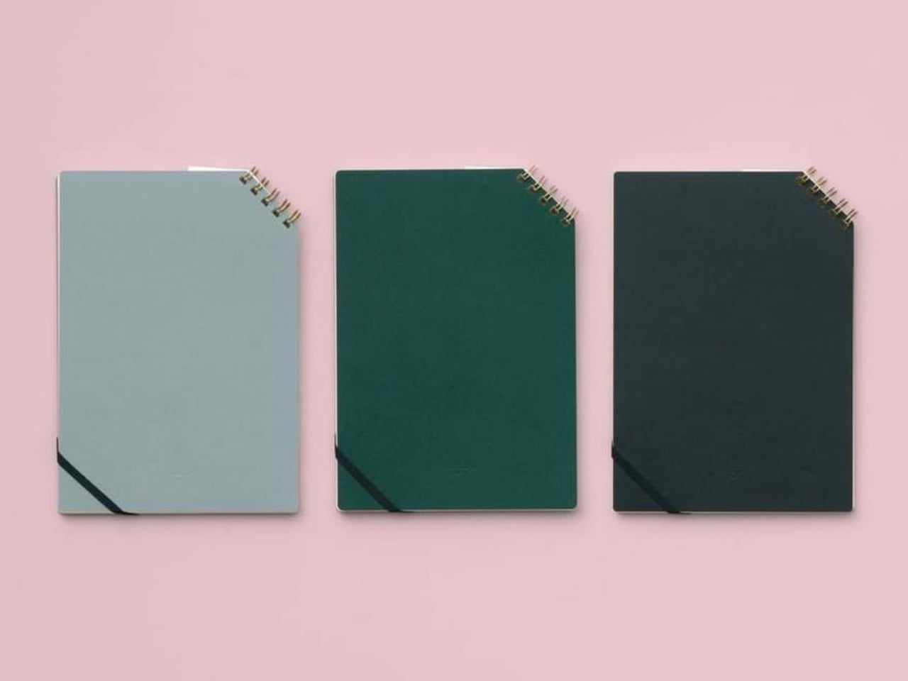
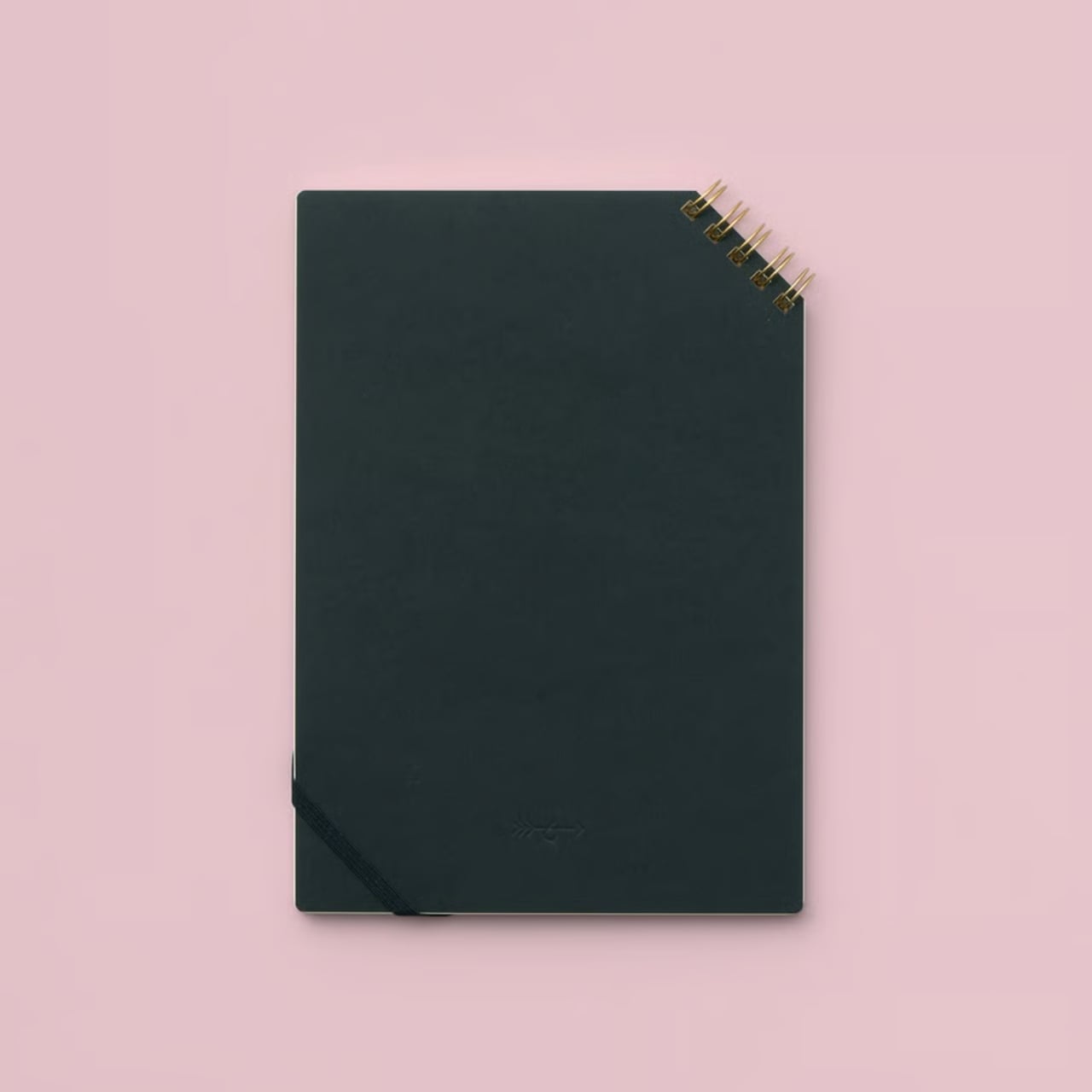
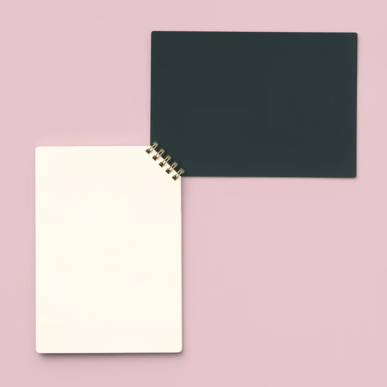
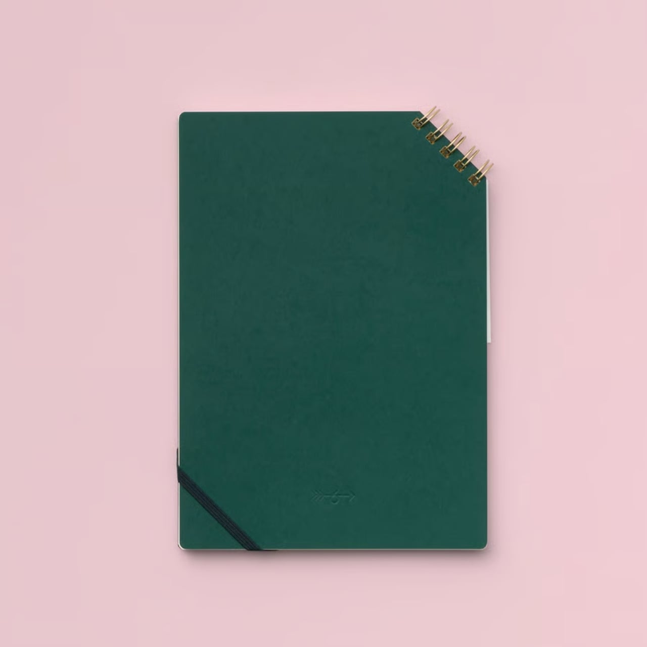
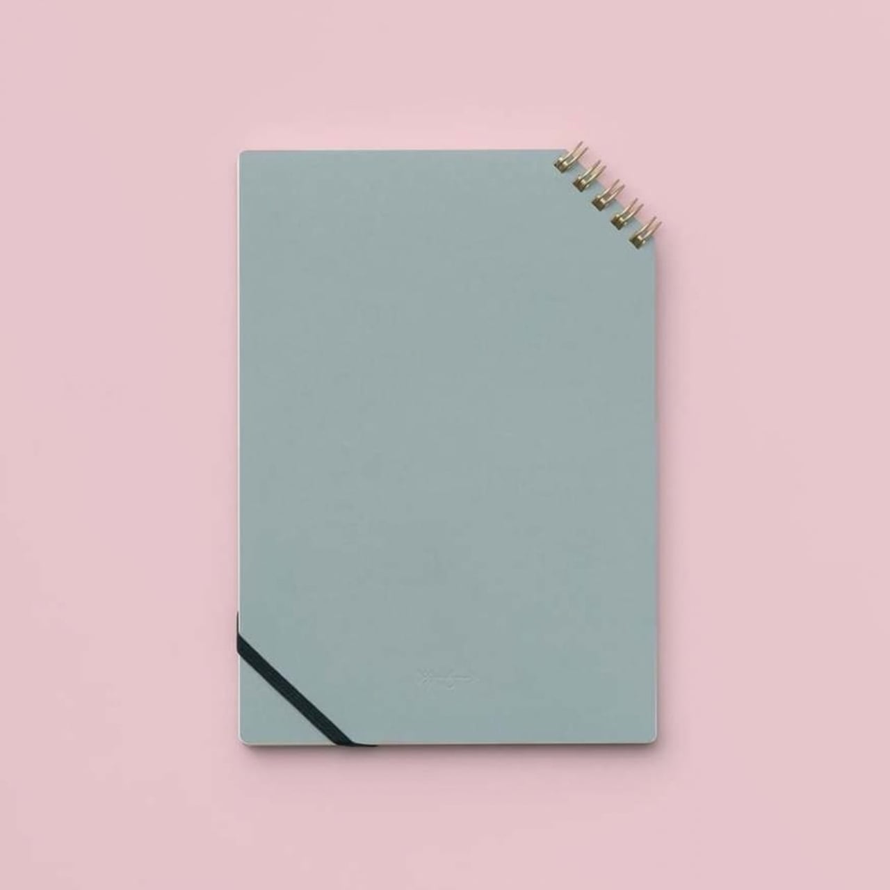
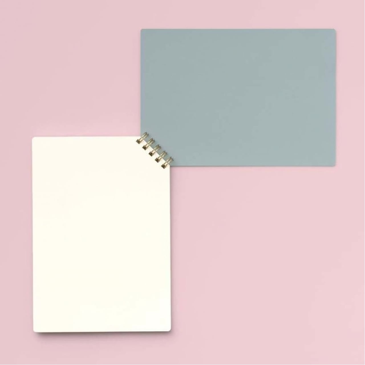
Japanese stationery brand Inkaren has found a way around this common problem with its Diagonal Ring Notebooks. Instead of putting the binding along the long or short edge, Inkaren placed the rings at the upper-right corner. This could make writing more comfortable for those who take notes or journal often. At the same time, you get a unique-looking notebook to carry around—one that might make another stationery lover stop and ask where you found it.

Designer: Inkaren

The brand says it designed the notebook by breaking free from the “unconscious limitations” of where rings are usually placed. Most spiral-bound notebooks have them along the side, while others put them at the top, like a notepad. This time, Inkaren put them diagonally across the upper-right corner, giving the notebook a different look and feel. You might expect the binding to be on the upper left, but many Japanese books open from the right. That detail gives Western users something interesting to notice, although it may take a moment to get used to opening the notebook the other way.

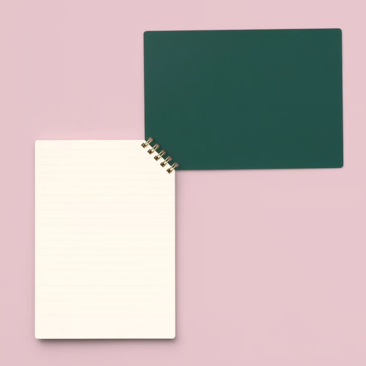
Aside from keeping the rings away from your hand while you write, the corner placement is meant to let the pages turn smoothly. It also leaves the long edges free of binding, which could be useful for bullet journalers, note-takers, and sketchers who prefer an uninterrupted writing area. The shorter binding uses less material than a spiral running the full length of the notebook, too. There’s an elastic band that holds the notebook closed in your bag, helping prevent the pages from getting bent or caught on everything else you’re carrying. As someone who tends to throw a notebook in with my pens, keys, and whatever else fits, I appreciate that small detail.

The notebooks come with blank, lined, or dot-grid pages, so you can pick the format that works best for you. Blank pages give you room to sketch, lined pages keep written notes tidy, and dot-grid pages offer a little guidance without getting in the way of drawings or layouts. The covers have a simple, understated look that lets the unusual binding be the main design feature. Inkaren also makes a notepad version if you’d rather have something for shorter notes.

The details beyond the binding are worth a look, too. The A5 notebook has 50 sheets and a sturdy cover made from paper with a leather-like texture. According to the brand, the interior paper was chosen for writing comfort. That combination makes it feel like more than a novelty item: the unusual shape may catch your eye, but the cover, paper, and elastic band are the features you’ll notice every time you use it. The A5 size also gives you space to write without making the notebook feel oversized.

Of course, a corner-bound notebook won’t be the perfect replacement for everyone’s favorite spiral. If you prefer a familiar left-opening layout or need a much thicker notebook for a long project, you’ll want to consider whether this format suits the way you work. And while the binding keeps the rings away from most of the writing area, comfort will still depend on how you hold and use the notebook.

For me, that’s what makes Inkaren’s design appealing. It doesn’t try to reinvent note-taking; it rethinks one small part of the notebook that has always bothered me. If you’ve ever avoided an otherwise useful spiral-bound notebook because its rings got in your way, this is a clever alternative worth considering.

The post The Corner-Bound Notebook Without the Wrist-Digging Problem first appeared on Yanko Design.