A Wind-Powered Tumbleweed That Heals the Desert as It Rolls

I have to be upfront: I did not expect a tumbleweed to be one of the most exciting design concepts I’d encounter this year. Tumbleweeds, in the cultural imagination, belong to Westerns and dusty ghost towns. They’re the kind of thing that drifts across an empty street right before a showdown, the universal shorthand for desolation. So when I first came across the Wasteland Nomads: Bionic Tumbleweed Sower System by Yizhuo Guo, I laughed a little. But as I looked closer, I started getting impressed.

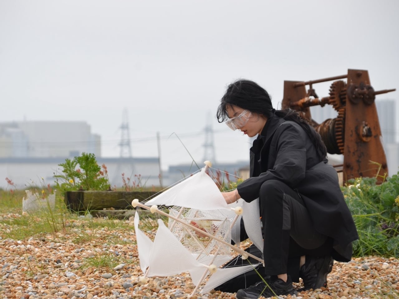
Guo is a multidisciplinary designer with a master’s degree in Material Futures from Central Saint Martins, and she has previously collaborated with Google DeepMind. Her work appeared at Milan Design Week 2024. She is, in other words, someone who operates at the intersection of cutting-edge materials science and ecological design thinking. With Wasteland Nomads, developed alongside Daheng Chu through the University of the Arts London and Imperial College London, she took the one plant most associated with barren landscapes and used it as a blueprint for restoring them. The logic is almost poetic. The tumbleweed doesn’t fight the desert. It works with it. It uses wind as its engine and travels wherever the landscape allows. Guo’s question, essentially, was: what if we could engineer something that did exactly the same thing, but deliberately seeded the ground as it went?

Designer: yizhuo guo

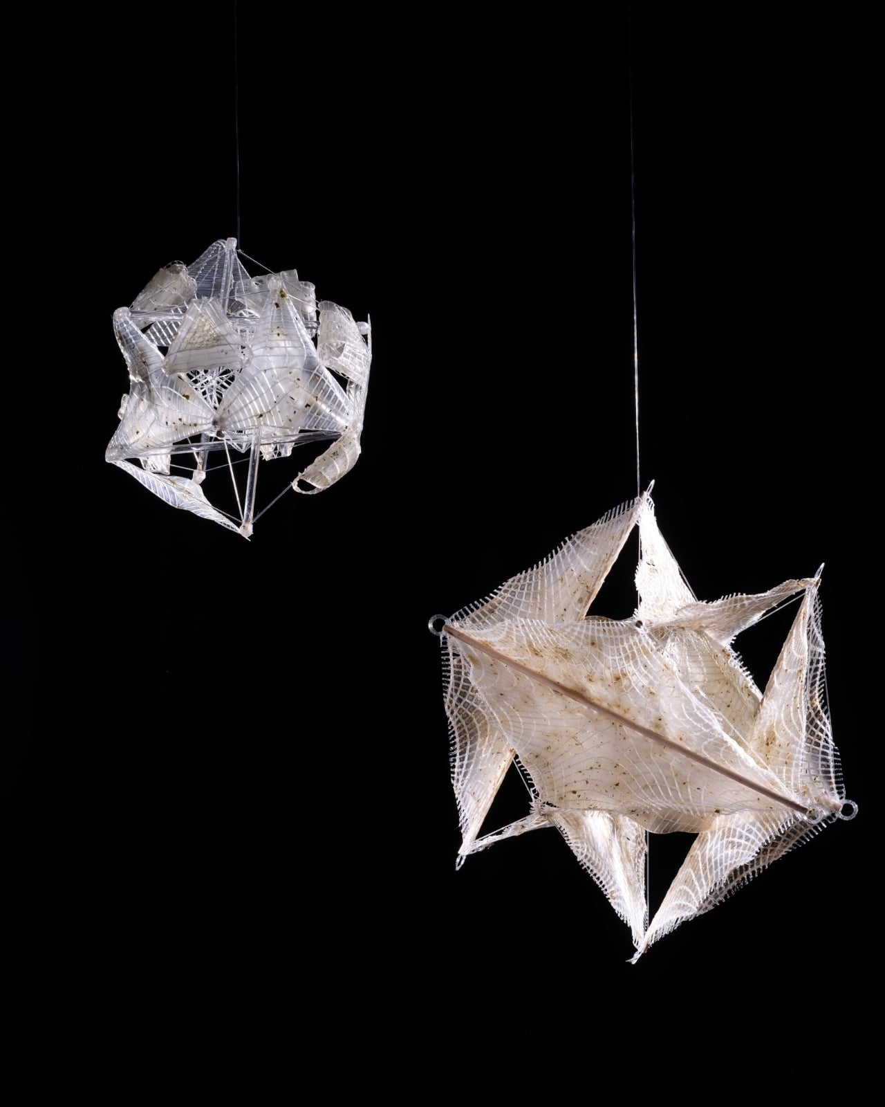
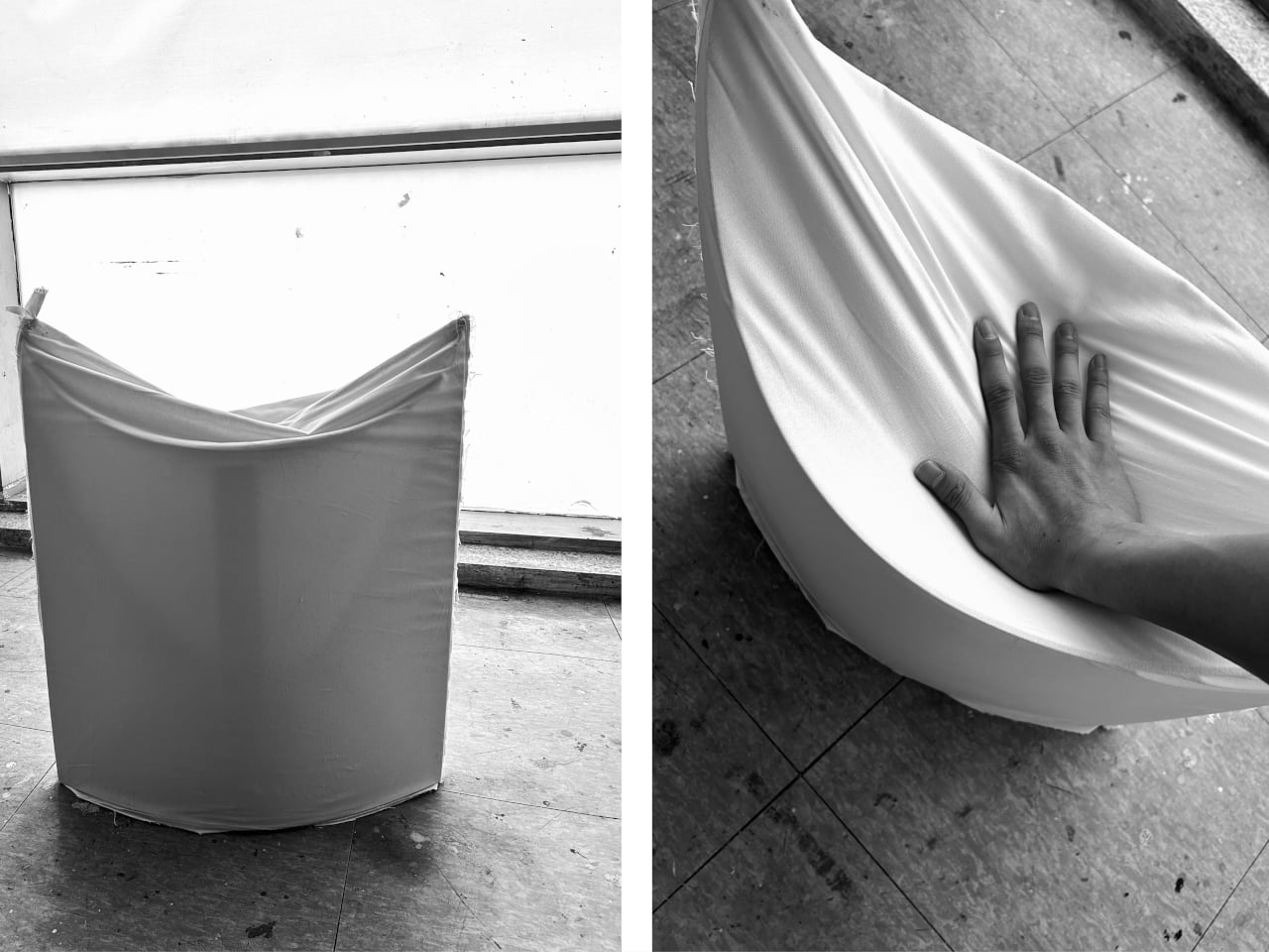
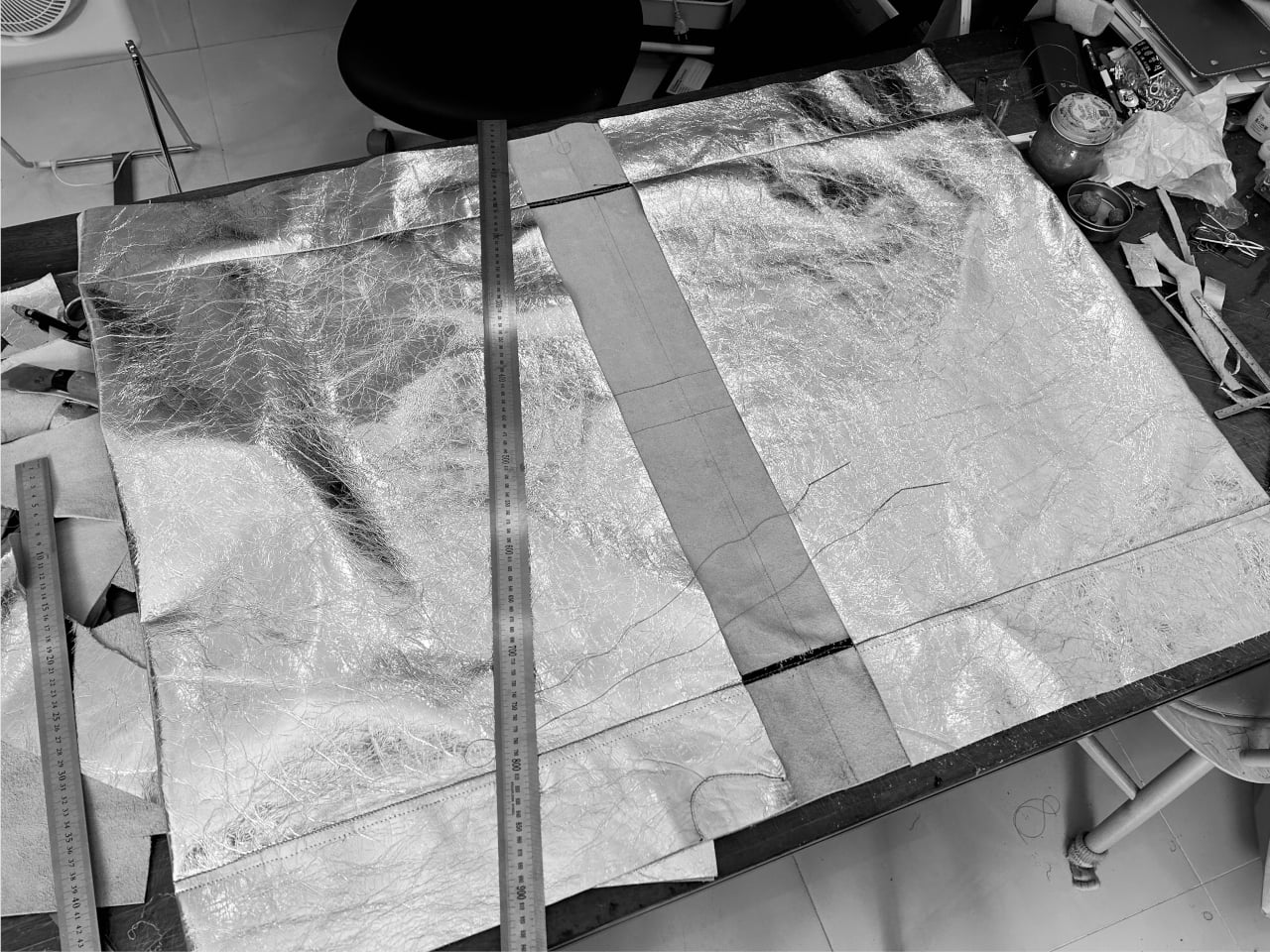
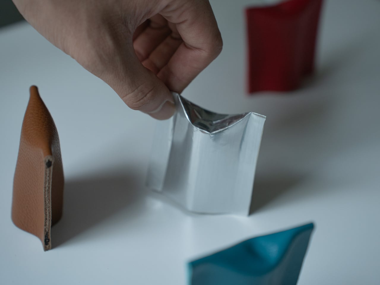
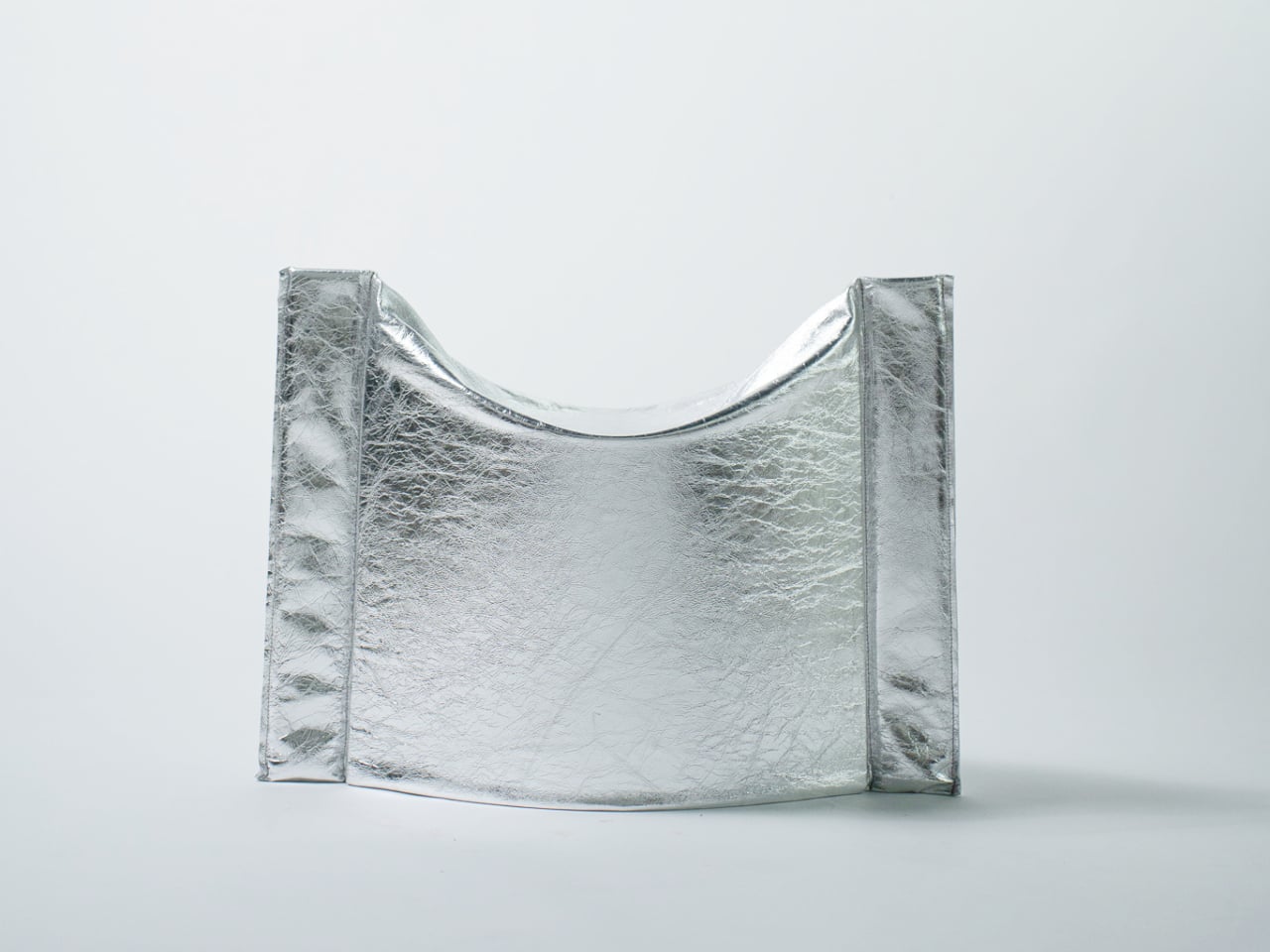
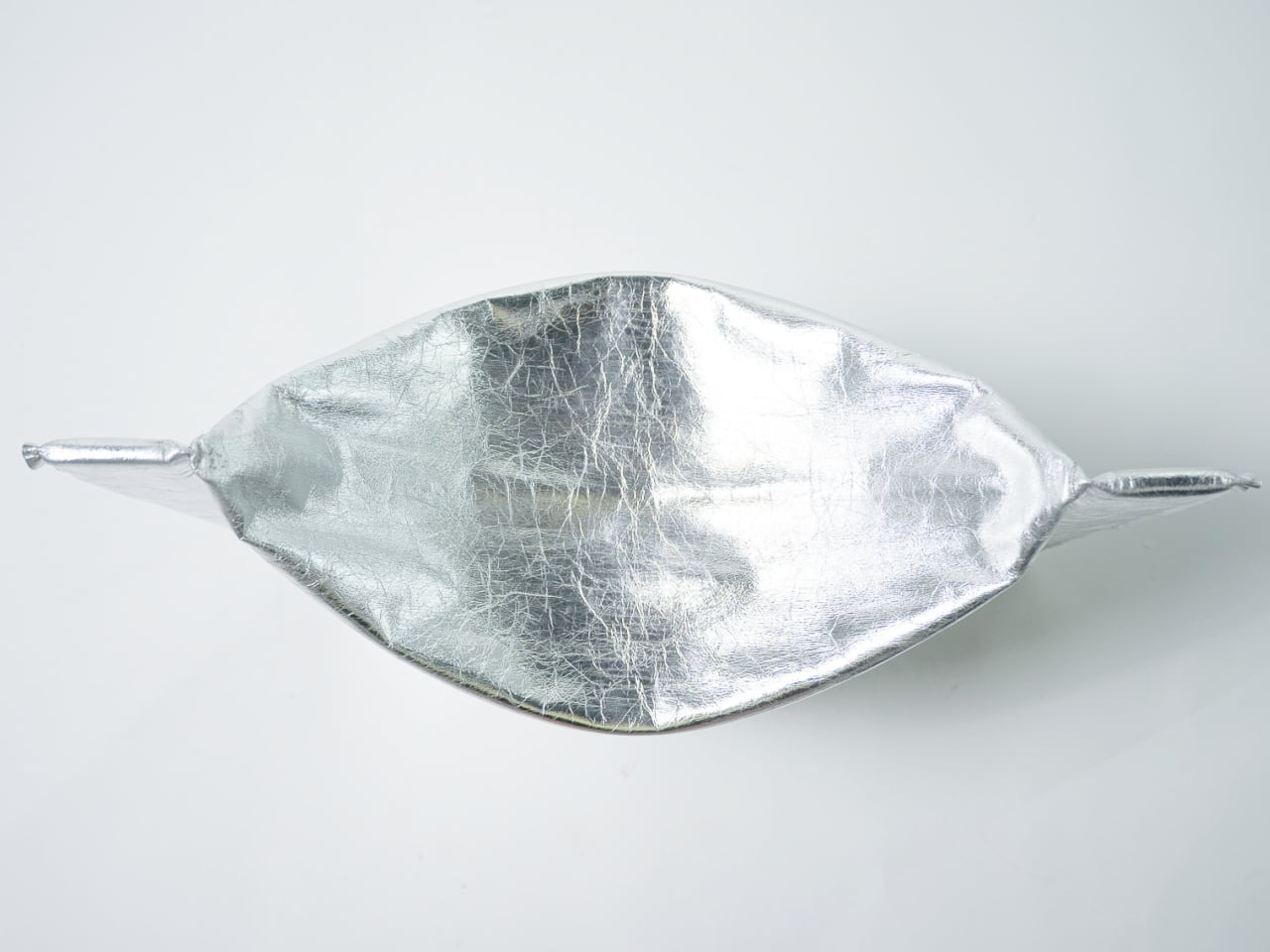
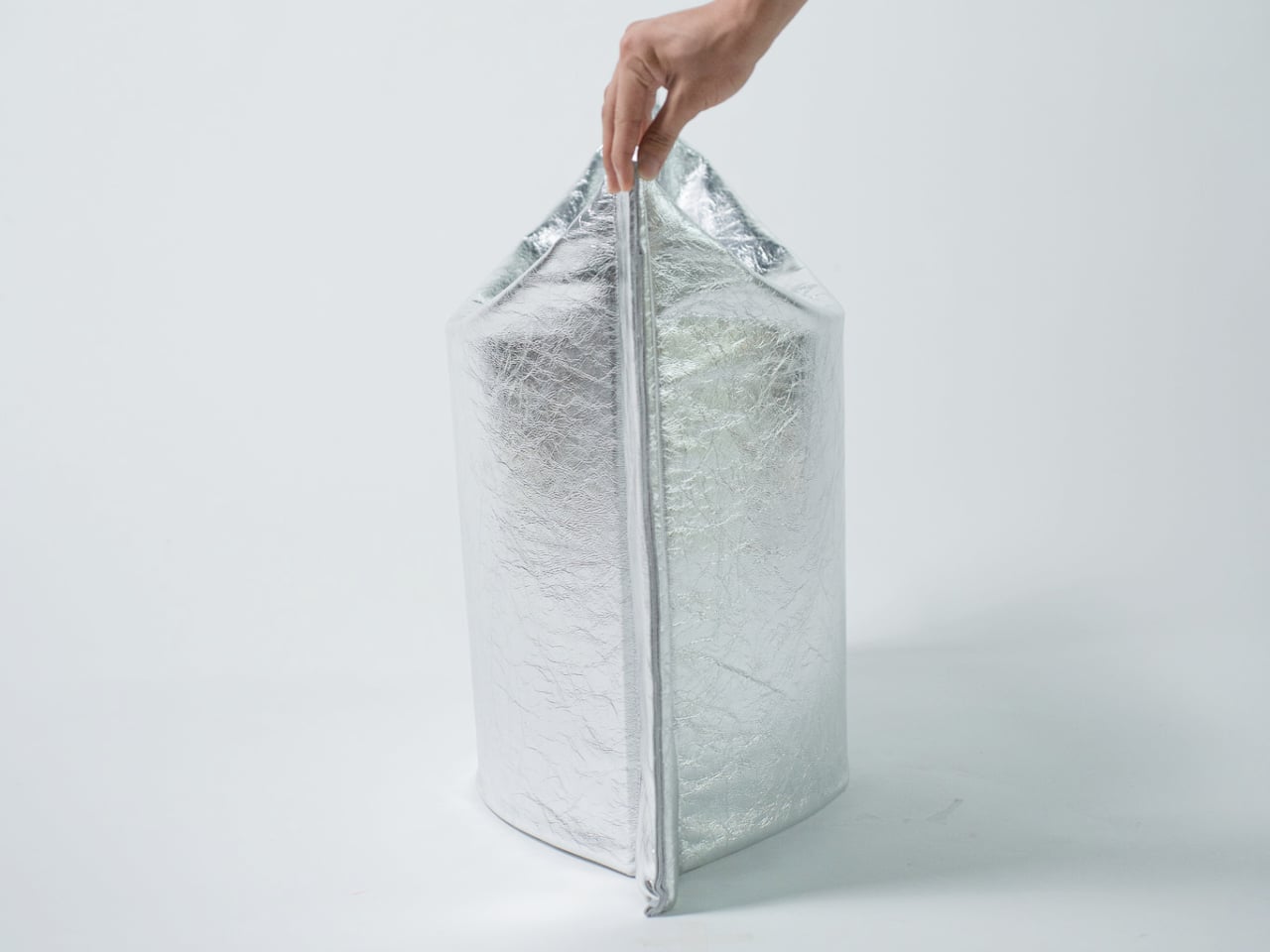
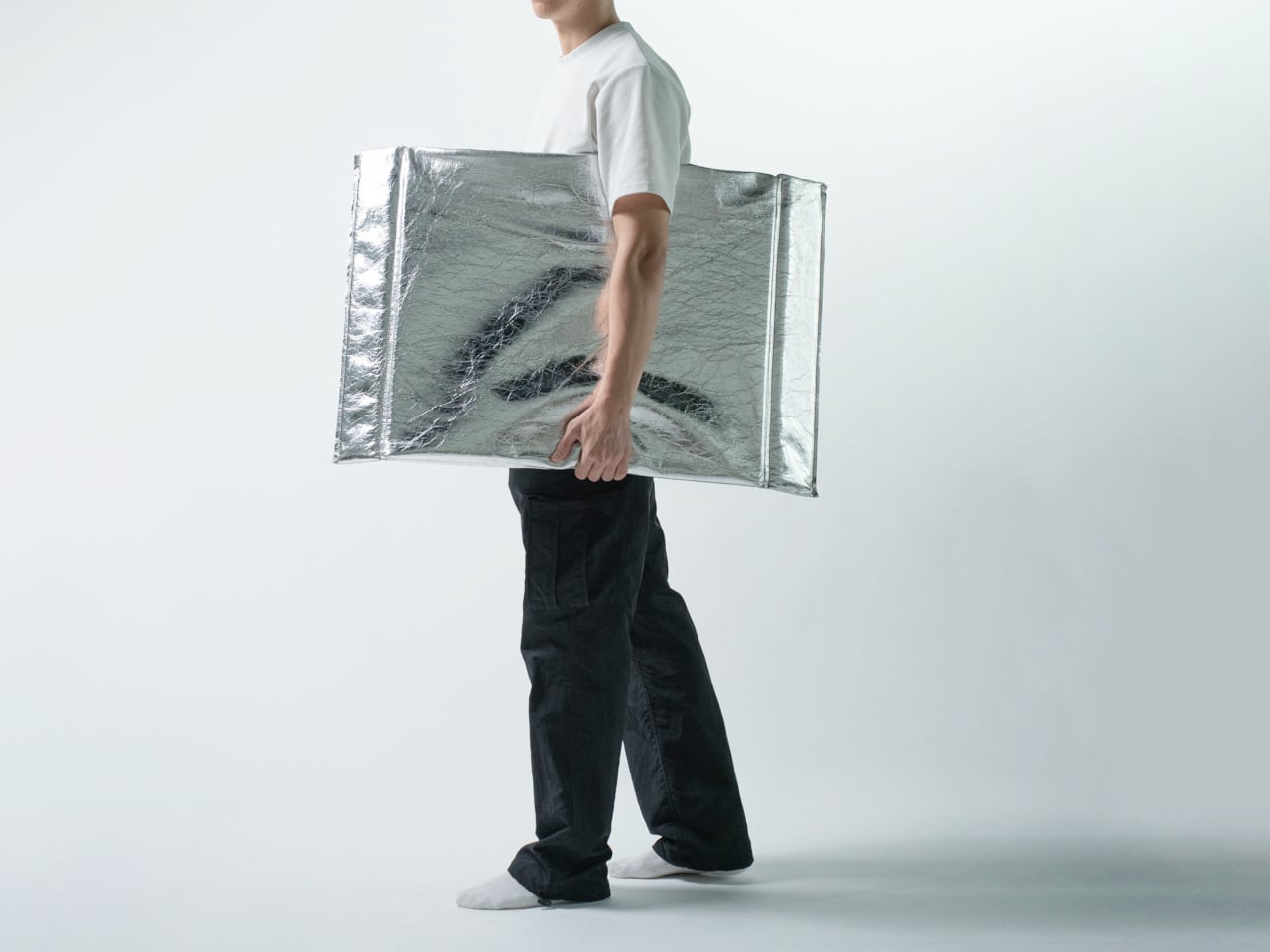
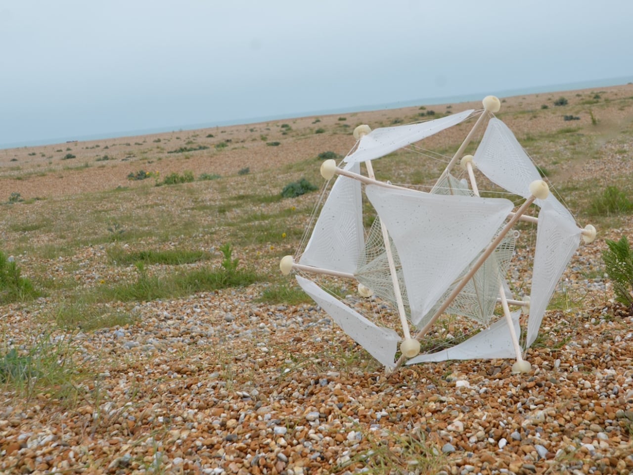
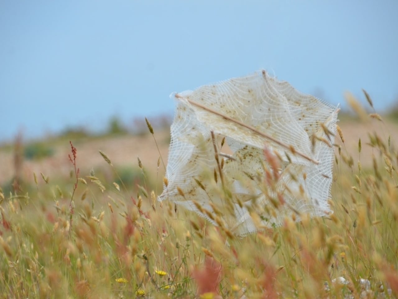
The result is a biomimetic seeding device built entirely on the principles of passive robotics. No batteries, no circuits, no external power source required. Lightweight biodegradable support rods form a tensile, hollow spherical structure that mirrors the tumbleweed’s own elastic form. The outer skin is made from a moisture-responsive biodegradable composite, and seeds are housed within it. When the device rolls into an environment where humidity conditions are right, the skin begins to break down and disperse those seeds directly into the soil. It boosts soil oxygen, contributes to carbon sequestration, and by the very end of its journey, the device has fully merged with the ground it was trying to restore. No waste. No remnants. Just land.

That last part is the detail I keep returning to. Most ecological technology, even the well-intentioned kind, still leaves something behind. A plastic housing. A metal component. A depleted battery that needs to go somewhere. This dissolves into the very ecosystem it is trying to rebuild. The design does not just mimic nature. It eventually becomes nature. That is a fundamentally different relationship between technology and environment than what we are used to seeing, and it matters more than it might initially seem.

The project took home a 2025 European Product Design Award in the Eco Design Products category, which feels well deserved, though I suspect this is only the beginning of the conversation around it. Guo has already accumulated a striking list of recognitions, including the iF Design Award in Germany and multiple honors from Chinese design institutions. She is clearly a designer who thinks at the systems level, not just asking what something looks like, but how it lives, decays, and eventually reintegrates.

Climate design can sometimes feel exhausting in its abstraction. We have all scrolled past enough speculative renderings of glowing, utopian landscapes to develop a healthy skepticism toward the genre. Wasteland Nomads doesn’t do that. It starts with a specific, urgent problem, the accelerating degradation of viable land across arid regions of the planet, and it finds the answer not in some new synthetic innovation but in a plant that has been quietly solving the same problem for millions of years. The tumbleweed has been moving seeds across hostile terrain since long before we were here to watch it. We just never thought to pay close enough attention.

That, I think, is what makes this design genuinely moving. Biomimicry at its most honest is not about clever engineering. It’s about being willing to slow down long enough to watch how the world already works, and being humble enough to follow what you find. Guo was clearly paying attention. Now let’s see where it rolls.

The post A Wind-Powered Tumbleweed That Heals the Desert as It Rolls first appeared on Yanko Design.

This Fan Made the Sony-Nintendo Handheld the Companies Never Would

The retro handheld market has a strange problem. The hardware keeps getting better, the screens get sharper, the processors get faster, and yet most of these devices land looking like prototypes someone forgot to finish. Generic shells, forgettable proportions, and LED lighting as a substitute for actual design thinking. For a category built entirely on nostalgia, very few of these devices actually look like they belong to any era at all.

That tension is what one Reddit user decided to address. Starting with a Retroid Pocket 5, a $199 Android handheld running a Snapdragon 865 and a 5.5-inch AMOLED display, the mod layers Sony and Nintendo branding onto the same shell. Vinyl decals, translucent polycarbonate, a 3D-printed volume rocker from Etsy, and a cable replaced in PS2 color. The result looks less like a sticker job and more like a concept render from an alternate 1999.

Designer: Mitchieyan

The translucent shell is doing most of the work. It pulls from the visual language of the N64’s Funtastic series, those clear and atomic-purple controllers Nintendo released in the late 1990s, where showing the circuitry was the design choice rather than concealing it. Over a piano-black grip body with PlayStation-colored face buttons, the frosted polycarbonate shifts from grey to near-white depending on the light. It shouldn’t feel considered. It does.

The branding placement is where intent becomes clear. The Sony wordmark sits centered on the upper face, exactly where it appeared on a PSOne. Below it, the PlayStation four-color logo. At the bottom bezel, the Nintendo badge mirrors its position on a Game Boy Advance SP. None of it is licensed, of course. These are adhesive vinyls placed by someone who grew up with both systems and wanted their coexistence on one device to feel inevitable rather than absurd.

Not everything here reaches backward. The analog sticks are translucent caps over hall-effect sensors, lit teal on the left and purple on the right, owing nothing to 1999. That generation didn’t have RGB anything. The lighting reads as a concession to the present; the one feature announcing this is still an Android device in 2025, not a prototype from some alternate Sony-Nintendo licensing meeting. Whether it sits comfortably alongside the retro shell is a fair question.

The rear view shifts the frame again. A large dual-grip body in smooth black rubber dominates the back, a clear plastic hinge connecting the screen to grip in full view, structural and unapologetic. The 3D-printed volume rocker at the top edge puts a physical control where fingers naturally land. The back half feels closer to a DualShock than a Game Boy, which is either the point or the problem, depending on what you wanted this thing to be.

Flip to the front screen, and the emulator grid makes the whole thing literal. DuckStation for PS1, Dolphin for GameCube, PPSSPP for PSP, melonDS for Nintendo DS, and a live PS2 wallpaper cycling behind all of it. This device runs both companies’ libraries simultaneously without asking permission from either. The branding on the shell, in that context, stops being a novelty and starts reading as a plain statement of what the hardware already does.

The retro handheld category is large enough now that sameness has become its default. The Retroid Pocket 6, the current flagship from the same manufacturer, drew community criticism for being indistinguishable from competitors: glass front, LED sticks, rounded edges, and no particular character. A fan mod building identity out of borrowed logos is one response to a problem the manufacturers haven’t solved. It’s also just someone enjoying a hobby and being honest about what they want.

The hardware to play PS1, PS2, GameCube, and Game Boy Advance all on one screen already exists and costs under $200. What the market hasn’t resolved is what that device should actually look like, or whose name should go on it. This mod doesn’t answer either question. It just makes the gap between what’s technically possible and what anyone has bothered to design feel a little harder to dismiss.

The post This Fan Made the Sony-Nintendo Handheld the Companies Never Would first appeared on Yanko Design.

This Origami Stool Has No Legs, No Bolts, and Opens With One Press

Furniture storage is one of those problems that design has mostly surrendered to square footage. You either have room for a stool, or you don’t, and folding alternatives have historically resolved that with compromise: wobbly joints, hard edges, the kind of utilitarian resignation that makes it obvious the piece exists to disappear rather than be used. The Press Stool starts from a different premise, borrowing its structural logic not from joinery or hardware but from the physics of folded paper.

The concept begins with a simple observation: a flat sheet of paper has no load-bearing strength on its own, but folding it generates rigidity. Crease a sheet, and the forces redistribute across the form. Press the folds, and the geometry resists compression. This is the same principle behind accordion-style bellows folding in classic cameras, where pressing the structure generates mechanical force. Here, that same force is redirected toward something you can sit on.

Designer: Jaehyun Bae

In its flat state, the stool collapses into a wide, deflated oval roughly 610 mm wide and 520 mm deep, with gently curved sides and pinched, gathered ends where the material compresses to a narrow tip. The metallic silver material has a pronounced crinkled texture that lands somewhere between industrial foil and fabric. It ships flat. It weighs little.

Pressing the form open deploys it into a three-dimensional stool standing 530 mm tall, with two flanking vertical panels and a concave seat formed by the inward curve at the top. No latches, no assembly. The structural resistance comes entirely from the geometry of the fold itself, the way a creased sheet can bear more than expected when compressed along its axis. The fold-generated tension does the structural work that legs and frames usually handle.

That argument holds up as a concept, though the prototype leaves practical questions open. Material identity isn’t explicitly documented, load capacity is unspecified, and the crinkle finish that gives the piece its visual identity is also the surface most exposed to wear. A stool takes more daily abuse than most objects that look like they belong in a gallery, and the long-term resilience of the material composite is untested in any published form.

What’s clear is the conceptual economy. Form follows mechanism follows idea, without detour. Flat objects that become structural through pressing rather than assembly represent a genuinely interesting class of design problem, and the Press Stool makes that problem visible and tangible. How far the logic scales beyond a prototype is the question that follows it out of the studio.

The post This Origami Stool Has No Legs, No Bolts, and Opens With One Press first appeared on Yanko Design.

What If Google’s Server Heat Became Its Most Prominent Design Feature?

Most conversations about Big Tech and sustainability follow a familiar script: a company announces a carbon pledge, releases an environmental report full of impressive-sounding numbers, and everyone moves on. What rarely gets discussed is the messy, unglamorous reality sitting right at the center of it all: the data server room. That’s exactly where two design students decided to start, and the result is one of the most visually striking workplace concepts I’ve seen in years.

Lia Hur and Michell Hur, both from the Savannah College of Art and Design, began with a straightforward question: what do you do with all the heat that data servers constantly produce? The answer they arrived at wasn’t purely mechanical. It was spatial, experiential, and genuinely beautiful. Their Google Sustainable Headquarters concept won two awards at the European Product Design Award 2025, covering both Architectural and Building Design and Interior Design categories, and it’s easy to see why.

Designeres: Lia Hur, Michell Hur

The first thing that strikes you when you look at the concept renderings is the ocean. Not metaphorically. The entire design language of the building is built around the visual world of the deep sea. Curved panoramic screens wrap around rooms showing beluga whales gliding through blue water. Children sit on the floor of an immersive theater-like space, completely surrounded by marine life projected at scale. In the server corridor, where rack upon rack of hardware lines both sides of a narrow hallway, the ceiling opens up into a curved screen of swimming fish, as if the infrastructure beneath the ocean surface and the ocean itself had somehow merged into a single space.

It’s an unexpected choice, and it works precisely because it’s unexpected. Data centers and ocean imagery have no obvious connection, until you start thinking about cooling systems, water usage, and the thermal logic that governs how these buildings function. The Hurs don’t explain the metaphor didactically. They just build the world and let you inhabit it.

The interior language carries this through every zone of the building. The reception lobby, viewed through an oversized organic lattice structure that reads like coral or a cross-section of a neural network, features terrazzo-style desks in deep ocean blue and warm wooden disc pendants floating overhead. A café break area has a single rounded square window framing an underwater manta ray, glowing white against dark walls. A mother’s room has the same window format, this time showing a humpback whale drifting slowly past, turning what could have been a purely functional space into something quietly meditative.

The workspace pods are where the concept gets most sculptural. Spherical forms covered in live moss float through an open floor plan, each one glowing from a lit band around its middle, like a planet seen from space. Workers tuck themselves inside. The ceiling above them ripples with projected water. It feels less like an office and more like an ecosystem you happen to work inside.

What I find most compelling is the section diagram the designers included. Stripped down to its basic geometry, the building reads as a stacked series of layers: a textured structural dome at the top, a living green layer beneath it, a dark water layer below that, and then human occupation at the base. It’s a quietly radical idea. The building isn’t sustainable because it has a green roof or offsets its emissions. It’s sustainable because it’s organized around natural systems at a structural level, with heat, water, and living material all functioning together as a closed loop.

The exterior pulls all of it together. A large dome structure sits directly on water, its skin formed from interlocking bubble-like cells that glow from within. Smaller spherical pods float on the surface around it. Looking at it under a sky of northern lights, it reads more like a research station on another planet than a corporate headquarters.

That’s not a criticism. It’s a sign that Lia and Michell Hur weren’t trying to design a building that looks sustainable. They were trying to design one that makes you feel what sustainability could actually mean, and that’s a much harder thing to do. They pulled it off.

The post What If Google’s Server Heat Became Its Most Prominent Design Feature? first appeared on Yanko Design.

This Baby Walker Grows With Your Child for 6 Years in 4 Different Ways

Most baby walkers have a shelf life measured in months. A 7-month-old wobbles through the living room gripping the handle, and by the time that same child turns two, the walker is already in a closet somewhere. The furniture cycle in a home with small children tends to follow that rhythm: buy, use briefly, replace with something else entirely.

The Safari Multifunctional Kids Furniture concept tries to interrupt that pattern by designing one piece that stays useful across the first six years of a child’s life. The name “Step-N-Play” gives away two of its functions without mentioning the third or fourth. It is, depending on the child’s age and the day’s agenda, a walker, a climbing unit, a play table and chair, and a toy storage solution.

Designer: Bharti Upadhyay

At its earliest stage, the walker is built for children between 6 and 18 months, with a frame measuring approximately 600 x 400 x 500 mm. The structure combines wood, ABS plastic, and soft silicone grips, with a 95-degree backrest angle designed for infants who are not yet seated with full stability. An anti-tip base and anti-pinch safety gaps cover the more obvious hazards of putting a barely mobile child in contact with a moving object.

As the child grows into the 1-to-3 age window, the same structure becomes a climbable stair unit. From ages 2 to 6, it transitions again into a play table and chair. A built-in storage compartment for toys and books operates across all configurations. The manufacturing approach pairs CNC-cut wood with injection-molded ABS plastic, a combination suited to years of contact with small hands and the occasional harder object.

The safari animal inspiration shows up in organic silhouettes and surface language rather than in literal animal sculptures attached to the frame. Smooth curves, generous fillets, and chamfered grooves define the form. The pastel color palette, wooden handles, and textured sensory balls read as a considered aesthetic choice rather than an afterthought, which matters in a living space where parents also have to look at the thing.

Safari is a student concept at this stage, so the harder questions remain open. How the ergonomics hold across such a wide age range, how the mechanical transitions between configurations actually work in practice, and whether a single object can genuinely serve a 7-month-old and a 6-year-old with equal competence rather than adequacy are things a physical prototype would need to answer.

The post This Baby Walker Grows With Your Child for 6 Years in 4 Different Ways first appeared on Yanko Design.

A Student Built a Pocket Planet Tracker That Works Without Your Phone

Most of us have looked up at the night sky at some point and felt that brief, humbling recognition that there is an enormous universe out there, and we have no idea what is happening in it. Then a notification comes in, and the moment passes. Lumen Orbit, a student concept from CEPT University, is a small handheld accessory designed to keep that awareness alive without requiring a telescope, a star chart, or a dedicated app.

The device is disc-shaped and roughly palm-sized, with a two-part body split along its equator by a copper-toned accent band. The upper half is a polished silver-gray cap; the lower sits wider and shallower in a dark matte gunmetal finish. A woven braided lanyard with a hexagonal metal clasp attaches to the body, making it something you can loop around a wrist, hook to a bag, or hang using a built-in fold-out carabiner.

Designer: Kinshuk Agarwal

The primary face carries a circular display showing real-time planetary positions: which planet is currently visible, where it sits in the sky relative to your location, and when it rises and sets. Flip the device over, and a second, smaller screen on the reverse offers a close-up planetary render. The UI uses pixel-art-style graphics for its planet illustrations, landing somewhere between retro charm and deliberate restraint.

The interaction model is equally considered. A flip gesture switches between the two display modes, squeezing the body cycles through planets, and haptic vibration signals astronomical events such as meteor showers, eclipses, and alignments. The idea is that information about the cosmos arrives the same way a text message does, as a quiet nudge rather than something you have to actively seek out.

What the concept is really proposing is a dedicated single-purpose ambient device for astronomical awareness. Smartphones can technically do all of this through apps, but a specialized physical object changes the relationship to the information entirely. Carrying something whose only purpose is to connect you to the solar system is a genuinely different proposition than opening an app between emails.

The open questions are substantial. How the real-time tracking handles connectivity, how the device charges, and how positional accuracy works without confirmed GPS integration are things the concept leaves unspecified. The form is confident, and the interaction logic is coherent. The more interesting problem is whether a working version could fit into a jacket pocket for easy access.

The post A Student Built a Pocket Planet Tracker That Works Without Your Phone first appeared on Yanko Design.

Board Game Concept Teaches Toddlers Before Anyone Rolls a Die

Most children’s board games follow the same unspoken contract: open the box, unfold the board, arrange the pieces, and then, finally, play. The setup is just a chore you get through before the real experience begins. Toddler Plus, a concept by designer Adesh Jadhav, breaks that contract entirely. Here, the game begins the moment you pick it up.

The idea is deceptively simple but genuinely clever. Before any piece slides along a pathway, a player lifts the board using its sculpted in-scoop grip and gives it a gentle oscillating motion. That motion randomizes the colored pegs across the surface, scrambling what was once an orderly arrangement into a colorful puzzle waiting to be solved. What would normally be a mundane setup step becomes a physical ritual, a small moment of anticipation before the challenge even starts. I find it refreshing that the designer thought to make that moment matter.

Designer: Adesh Jadhav

Designed for children aged four to six, Toddler Plus is built around a developmental sweet spot. Kids at this stage are refining their hand coordination, starting to understand basic rules, and learning that actions have consequences. The game speaks directly to all of that. Players slide colored pegs along guided pathways on the board, navigating around obstacles to return each color to its designated corner. When a route is blocked, another piece has to move first. It is a gentle, tactile introduction to sequencing and cause-and-effect thinking, and it teaches these things through movement rather than instruction.

That distinction matters more than it might seem. A lot of educational toys announce their purpose a little too loudly. You can sense the lesson underneath the fun, and kids sense it too. Toddler Plus feels like it trusts children more than that. The learning is embedded in the mechanics, not layered on top of them. A four-year-old working through a blocked path is doing real problem-solving, but they are not being tested. They are just playing.

The structure also adapts to how children actually exist in the world, which is sometimes alone and sometimes not. A single player can work through the puzzle independently, restoring all four colors to their corners at their own pace. With two or four players, the board becomes a shared space where turns are taken and strategies have to account for what everyone else is doing. Both modes feel natural rather than forced, which is harder to achieve than it sounds in a single object.

Visually, the design earns its place on a coffee table, not just a playroom floor. The board’s organic, softly rounded form sits somewhere between a pebble and a pillow. The vibrant pegs in red, yellow, green, and blue sit against a muted body in sage, blush, sky blue, or sand, depending on the colorway. It is a palette that manages to feel cheerful without being overstimulating, which is a genuine design achievement in the children’s product space. Looking at the exploded view of the construction, it is also clearly considered from a structural standpoint, with layered components and a soft silicone skid pad on the base that keeps the board grounded during play.

What I appreciate most about Toddler Plus is that it does not try to compete with screens. It does not need to. It offers something fundamentally different: a physical, tactile, repeatable experience that changes every single round because the starting position is always randomized. The oscillation step is not a gimmick. It is the reason each game feels fresh.

Good toy design tends to look obvious in retrospect, as if the idea was always there waiting to be found. Toddler Plus has that quality. The moment you understand that shaking the board is part of the game, the whole concept clicks into place. It is intuitive, it is physical, and it is thoughtfully designed for the age group it serves. I would genuinely love to see this one make it to production.

The post Board Game Concept Teaches Toddlers Before Anyone Rolls a Die first appeared on Yanko Design.

This Panda-Faced Action Camera Might Finally Get Kids Off Their Tablets

Kids are natural documentarians. Long before anyone hands them a camera, they’re narrating adventures out loud, pointing at bugs, dragging adults toward things worth seeing. The problem is that nothing currently bridges that instinct and an actual usable device. Smartphones are too distracting. Adult action cameras have interfaces that assume familiarity with exposure menus. Yashas Verma’s Cubix concept starts not with specs, but with a face.

The panda reference is obvious and, more importantly, immediately likable. Two large “squircle” apertures dominate the front, one housing the lens and the other a screen, arranged side by side like a pair of wide-set eyes. The body is white with a matte finish, and the front panel is glossy black. That contrast reads less like a colorway decision and more like a character, which is entirely the point.

Designer: Yashas Verma

Verma’s design moodboard places the concept on a spectrum between “tech” and “cute,” and the finished form lands firmly in the middle. Minimal enough to avoid looking like a toy, warm enough not to feel clinical. The rounded-square geometry carries through from the front apertures to the body corners, giving the whole object a visual consistency that student concept work often skips over in favor of surface polish.

The dual-screen setup solves a genuine behavioral problem. Action cameras for adults assume a single rear screen because operators rarely need to see themselves. Kids, who tend toward vlogging more than action sports, want to check the frame constantly. The front screen handles selfie framing, the rear touch screen manages settings and playback. Removing that guesswork is the single most child-appropriate decision in the entire design.

The body is sized for smaller hands, with one-handed operation as the stated goal. That matters when the other hand is holding a bike grip, a climbing hold, or a very interesting stick. Waterproofing and durability are mentioned in the concept brief, though no specific ratings are given. A child’s definition of waterproof tends to involve full submersion and zero warning, and the gap between those expectations and a modest splash rating has disappointed parents before.

The packaging carries the panda-eye graphic, the same black-and-white palette, and the tagline “Climb. Roll. Capture.” The box also shows an age rating of 10+, which quietly shifts the target older than the concept language implies. A ten-year-old and a seven-year-old are very different grip sizes, and the design’s success depends heavily on which end of that range it was actually built for.

The post This Panda-Faced Action Camera Might Finally Get Kids Off Their Tablets first appeared on Yanko Design.

Chess Hasn’t Looked Like This in a Thousand Years

Chess has been redesigned hundreds of times. Most attempts stay within the same visual vocabulary: carved figures, medieval references, stylized horses and crowns. The king still wears his crown, even when the designer strips everything else away. That iconography is stubborn. It follows the game everywhere it goes. Seoul-based designer Lee Jinwook decided not to follow it.

His Chess Matt Edition doesn’t borrow from that history. It doesn’t nod to it, deconstruct it, or pay ironic homage to it. Each piece is reduced to its essential geometric form, differentiated only by the minimal cuts and angles that distinguish one from another. The king wears a notched crown-like geometry, but it reads more like a Brutalist building than a monarch. The bishop has a diagonal slice through its block. The knight, traditionally the most ornamental piece on any board, is just a rectangle with a curved indent. You’d know each piece by its shape, and you’d know each shape by nothing but itself.

Designer: Lee Jinwook

That restraint is genuinely hard to achieve, and it’s rarer than it looks. Plenty of minimal chess sets still carry the weight of nostalgia by leaning on proportions that echo traditional forms. Lee’s approach feels more rigorous, like the design equivalent of starting with a blank document and refusing to import anything from a previous draft.

The Matt Edition is part of a series, each version produced in a different material. This one uses powder-coated pieces with brushed metal accents along the base. The contrast between the matte surface and the slim metallic band at the bottom of each piece is subtle, but it matters. It gives the set a quiet luxury without announcing it. The board itself doubles as the case cover when flipped, and the entire set packs down into a 115mm cube. That last detail sounds like a footnote but it’s actually the whole point. It means you can take it somewhere. It means the design serves life, not the other way around.

When the pieces are set up and no one is playing, the board looks like a miniature city. A grid of black and white geometric forms at different heights, each one casting its own small shadow. The intention was for the set to read as sculpture between moves, and it absolutely does. The photograph of it mid-game is more compelling than most things sold specifically as decorative objects.

I’ll admit I’m skeptical of design objects that prioritize aesthetics at the cost of function. A beautiful chair that isn’t comfortable is just a sculpture with pretensions. But this set doesn’t ask you to choose. The geometric forms are readable. The scale feels right for actual play. The packaging is considered down to the way the board flips over. The aesthetics and the utility are working in the same direction, which is what good design is supposed to do, and which a lot of objects in this category fail to deliver.

What Lee has also built, whether intentionally or not, is a quiet argument about chess itself. The game doesn’t need its medieval costume to function. Strip away the kings and queens and rooks and what remains is a grid, a set of movement rules, and the cognitive pleasure of solving something in real time. The Chess Matt Edition reminds you of that. It separates the game from its accumulated mythology and puts the focus back on the act of playing.

That’s worth paying attention to right now. The design world is saturated with products that perform a cultural identity rather than express one. This chess set doesn’t perform anything. It just is what it is: precise, considered, and fully confident in its own logic. When you see it sitting on a shelf, black pieces against a white board, matte surface catching a little natural light, it earns the space it occupies. Everything fits into a 115mm cube. The whole set sits in your hand. Not everything that fits in your hand deserves to be considered art, but this one comes close.

The post Chess Hasn’t Looked Like This in a Thousand Years first appeared on Yanko Design.

This Concept Shoe Looks Like a Sports Car Melted Onto Your Foot

Car brands dabble in lifestyle merchandise all the time, and most of it follows a predictable formula: slap a logo on a jacket, maybe a watch, and call it brand extension. Footwear collaborations exist, too, but they rarely go further than embroidering a grille badge onto an existing sneaker. This Alfa Romeo-inspired concept shoe takes a different approach, asking what happens when automotive design is treated not as decoration but as a structural principle.

The answer turns out to look a bit like a futuristic slipper, which is either its most interesting quality or its most confounding one, depending on your expectations. The upper is a soft, seamless white shell that pulls over the foot more like a sock than a traditional shoe, with almost no visible fastenings, stitching, or hardware. That minimal surface exists to let the midsole do all the work visually, and the midsole is doing quite a lot.

Designer: Haamed Ansari

That red base is the conceptual core of the whole project. Rendered in high-gloss red, it wraps from heel to toe in a continuous form that borrows the surface logic of automotive body panels, where lines are load-bearing transitions between volumes, not decorative additions. A single glossy band sweeps diagonally across the lateral side before tapering into the toe, much like a racing stripe that has been folded into three-dimensional geometry.

Where the red midsole meets the white upper, a narrow grey seam line functions almost like a panel gap. Car designers use exactly this kind of negative space to separate body sections and give each component its own visual weight. Without it, the shoe would read as a simple two-tone colorblock. With it, the shoe looks assembled from distinct parts that happen to meet with precision, which is a different thing entirely and a far more considered one.

Seen head-on, the silhouette edges surprisingly close to a Japanese tabi shoe, the way the upper pulls cleanly away from a defined sole structure and wraps the foot rather than lacing or strapping around it. The proportions are quite different, but the underlying logic feels shared. Where the tabi’s separation is rooted in traditional craft and function, this concept’s version is purely formal, a visual argument about soft material against rigid geometry.

The ideation sketches make clear that the final form is a significant restraint from where the concept began. Earlier iterations pushed into armored, aggressive territory with angular protrusions and forms that read more like racing boots from a science fiction film. The decision to pare that down into something closer to a loafer-boot hybrid is either a maturation of the idea or a softening of it, and whether that calm reads as confidence or compromise is the question the final render quietly leaves open.

The post This Concept Shoe Looks Like a Sports Car Melted Onto Your Foot first appeared on Yanko Design.