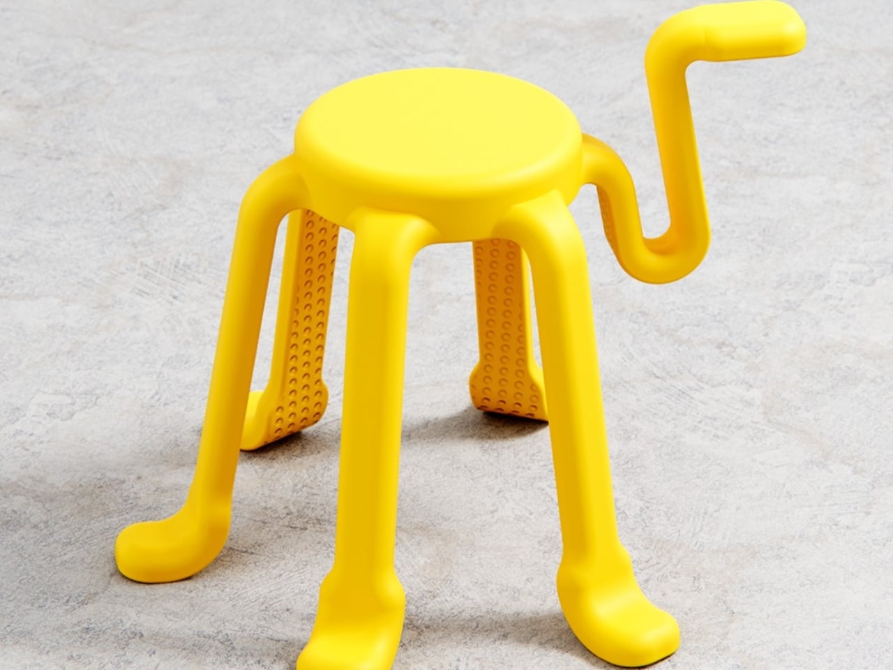
The humble stool has barely changed in centuries. Four legs, a flat seat, done. It exists in every cafe, classroom, kitchen island, and co-working space on the planet, reliably doing its one job and nothing else. So when a designer comes along and asks what happens if you add just one more leg, the answer should probably be “nothing interesting.” And yet here we are, talking about SQOOL.
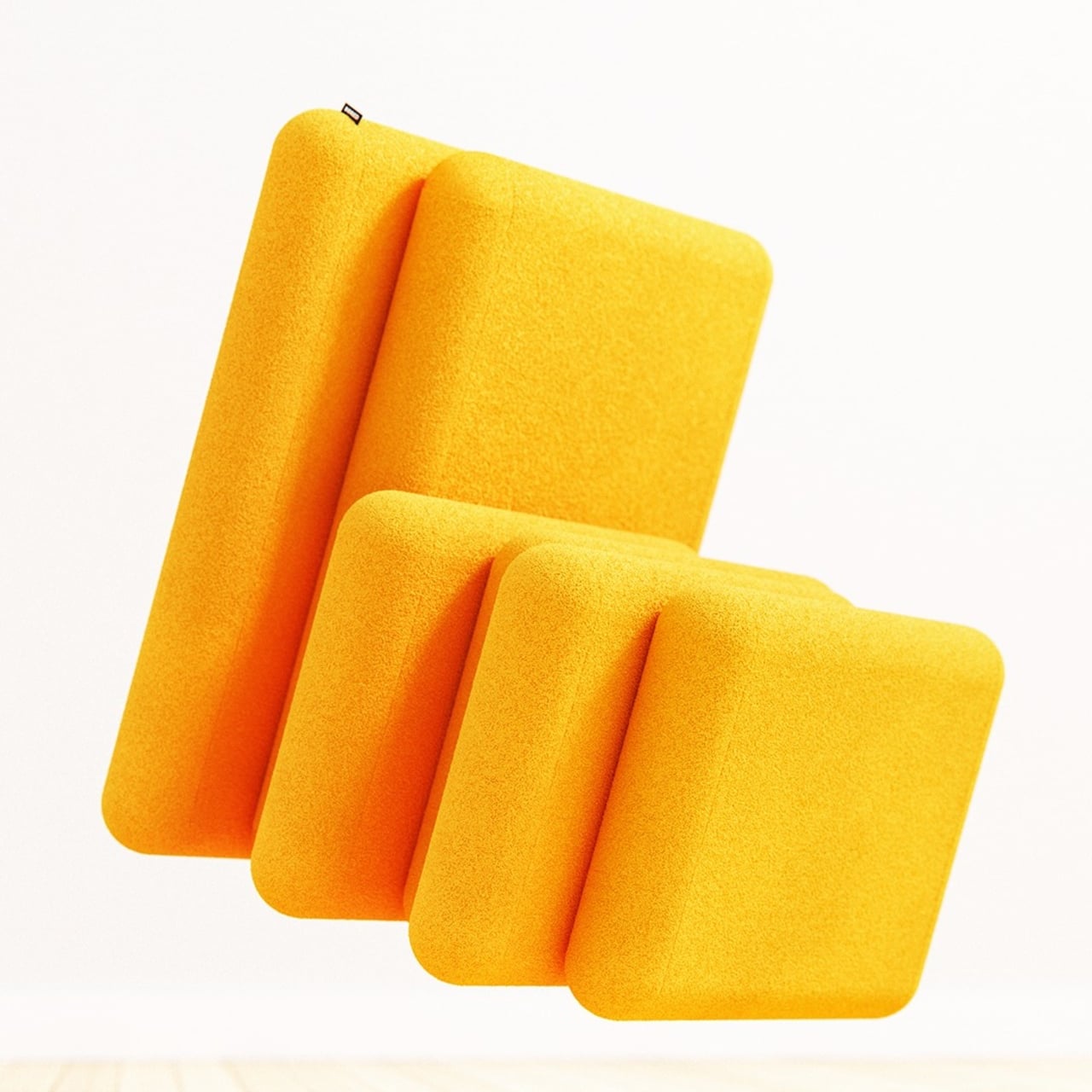
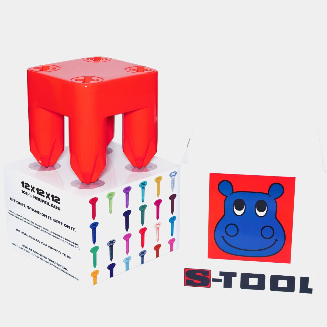
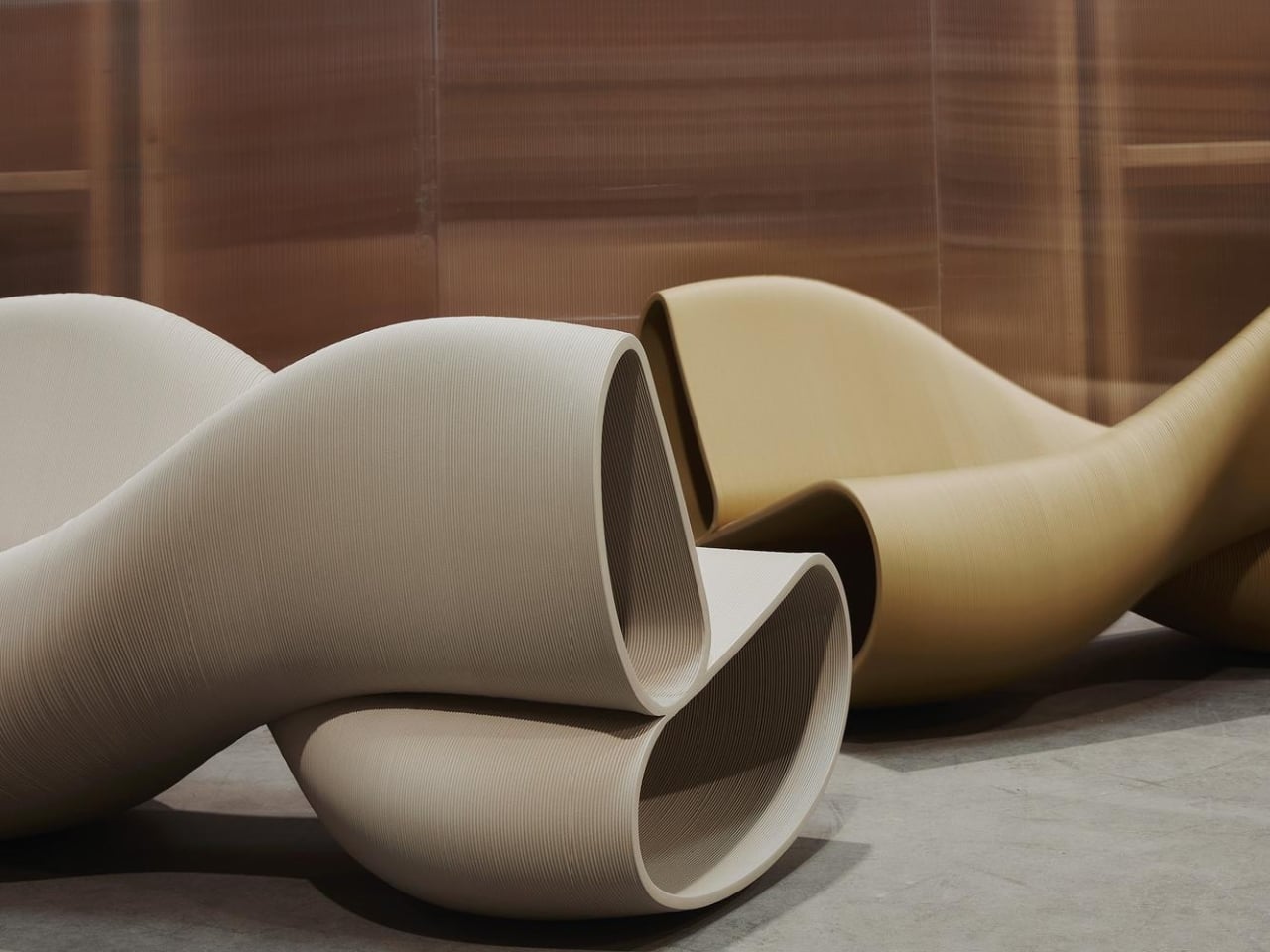
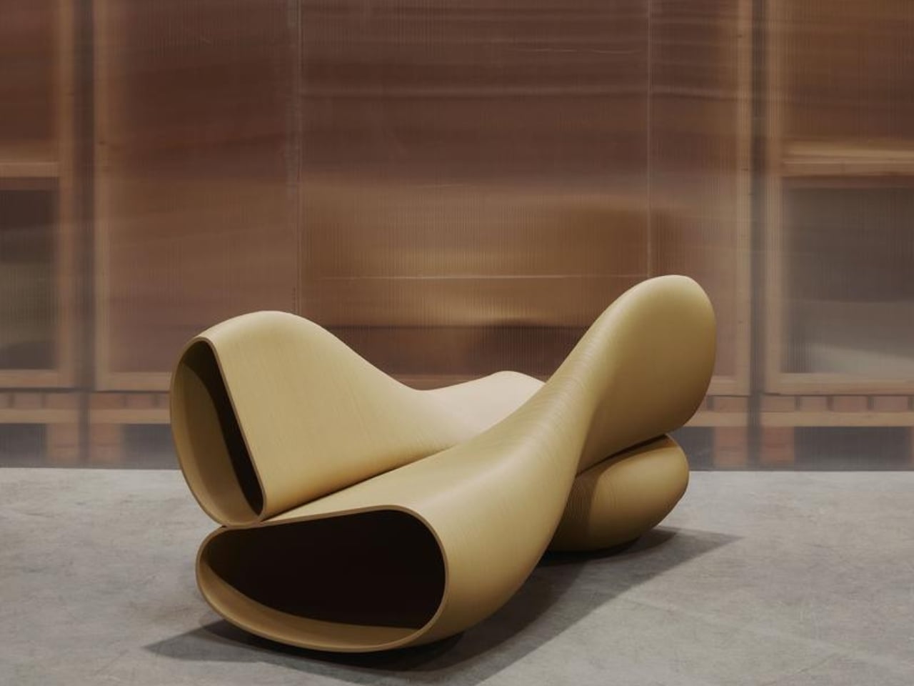
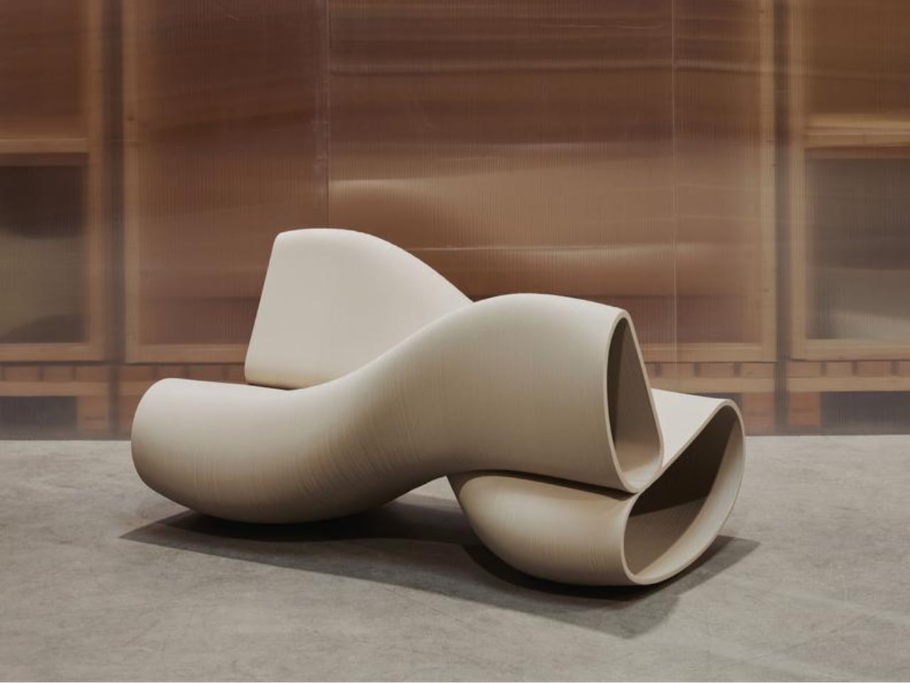
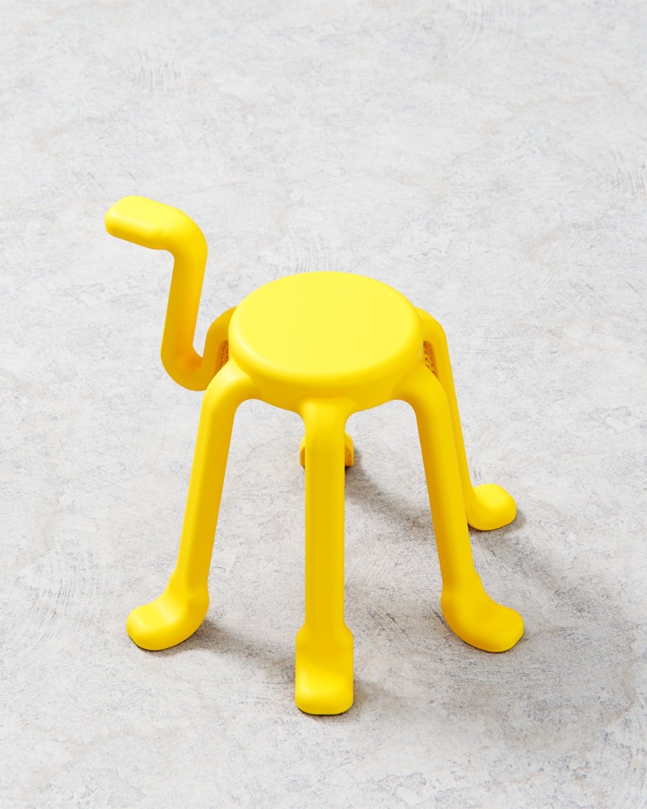
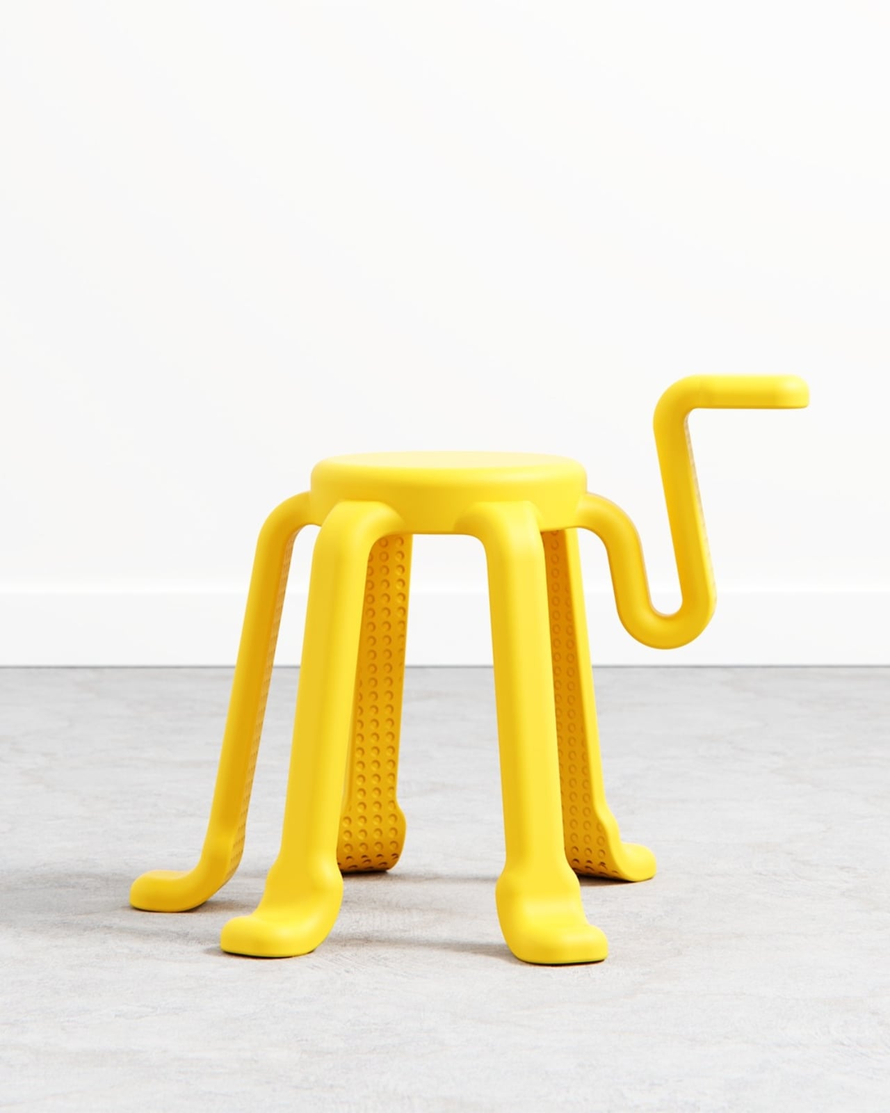
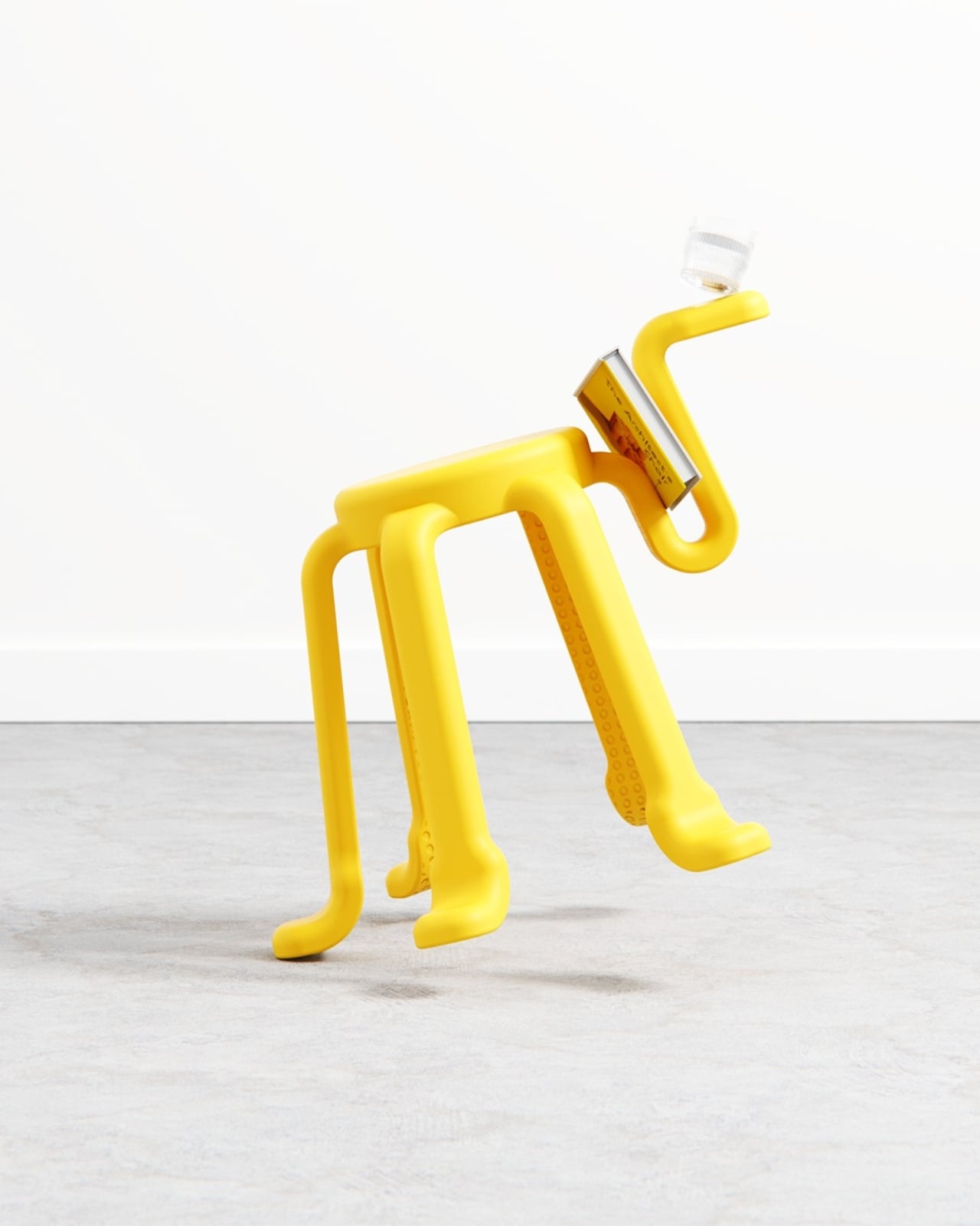
SQOOL is a 2025 personal project by Liam de la Bedoyere of Bored Eye Design, a UK-based independent studio that describes itself as creating work that’s anything but boring. At first glance, the stool reads almost like a creature. Six curved legs splayed outward with little rounded feet, a compact circular seat on top, and that one rogue arm reaching upward and curling into a hook. It looks like a cheerful yellow squid that decided to get into the furniture business, and I mean that entirely as a compliment. The photographs make it look alive. Depending on the angle, it shifts between dog, bug, and some friendly unnamed species you’d encounter in an animated film.
Designer: Liam de la Bedoyere (Bored Eye Design)
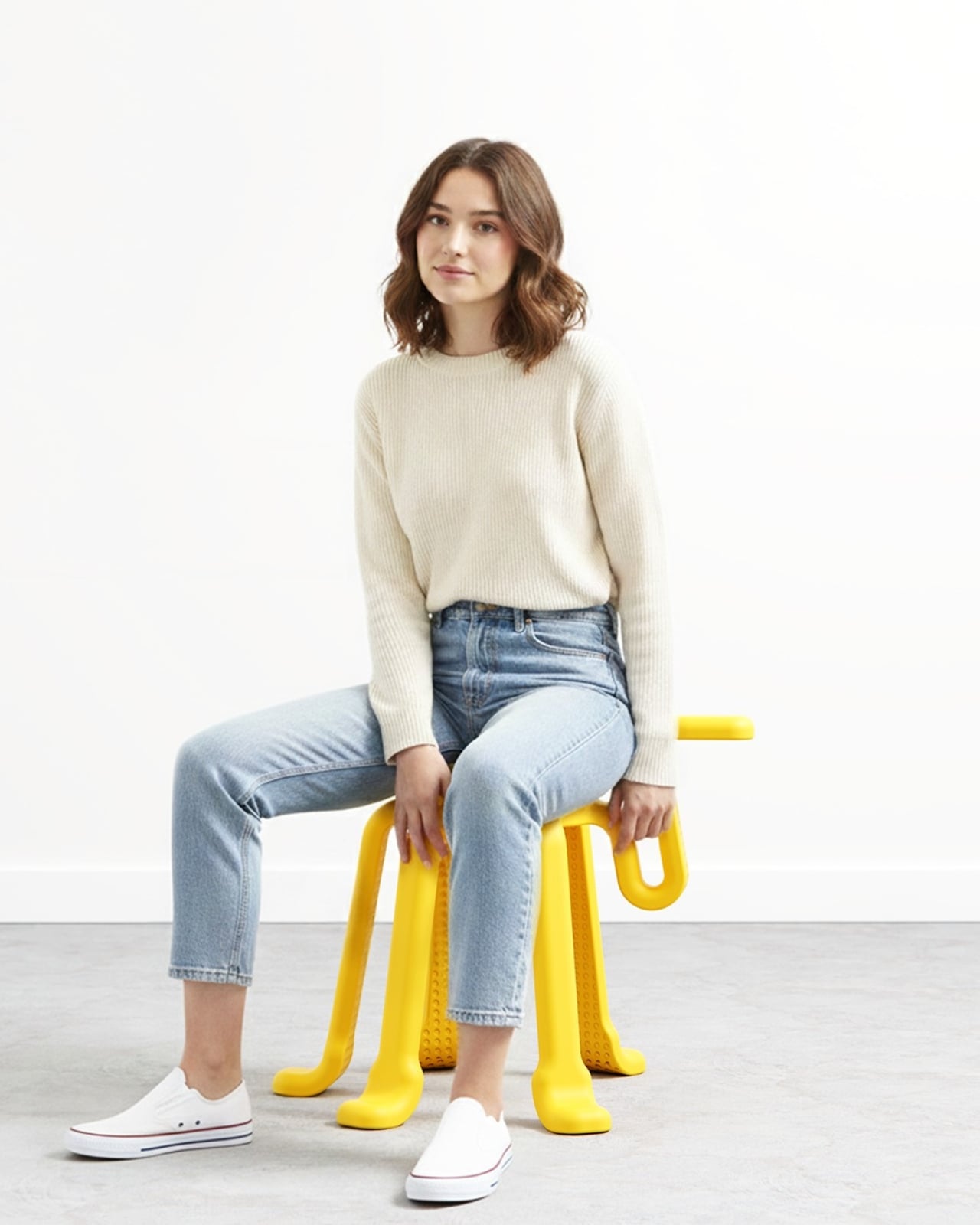
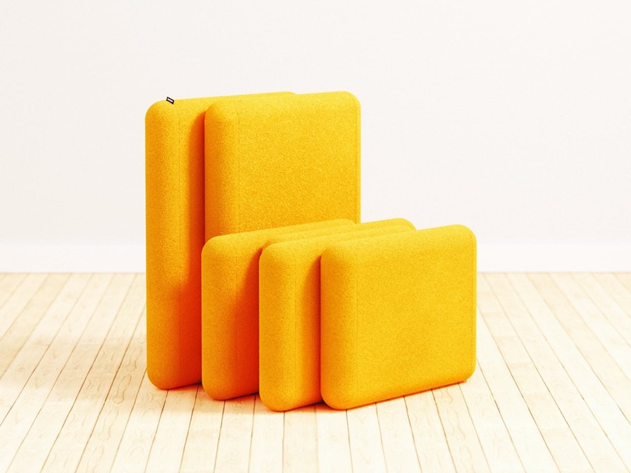
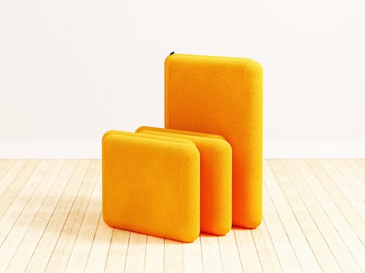
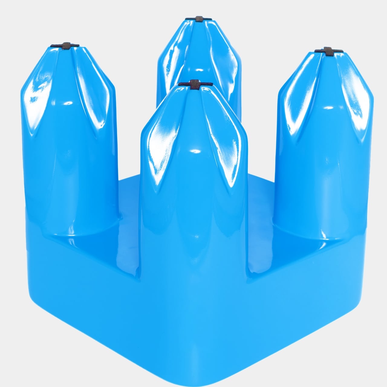
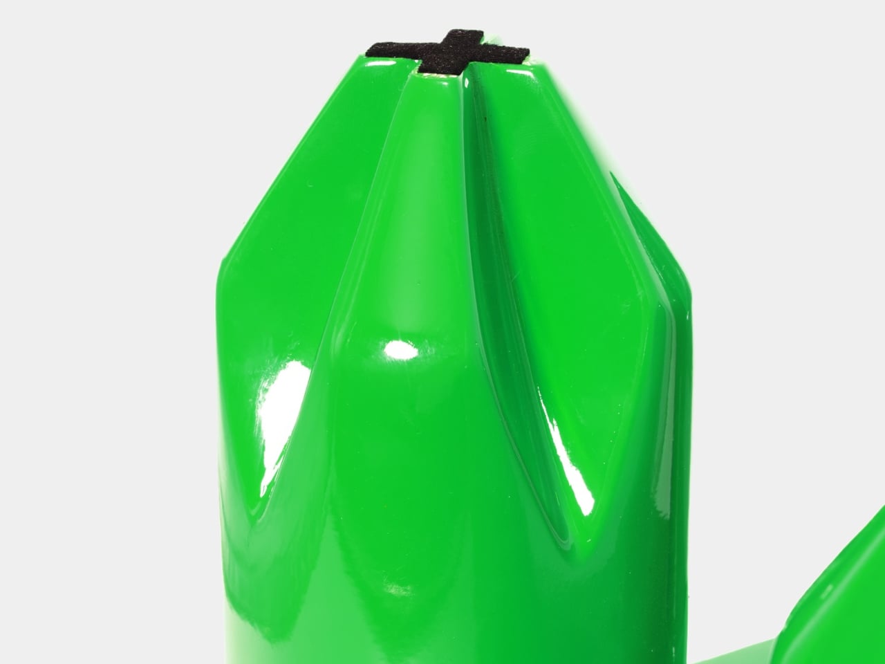
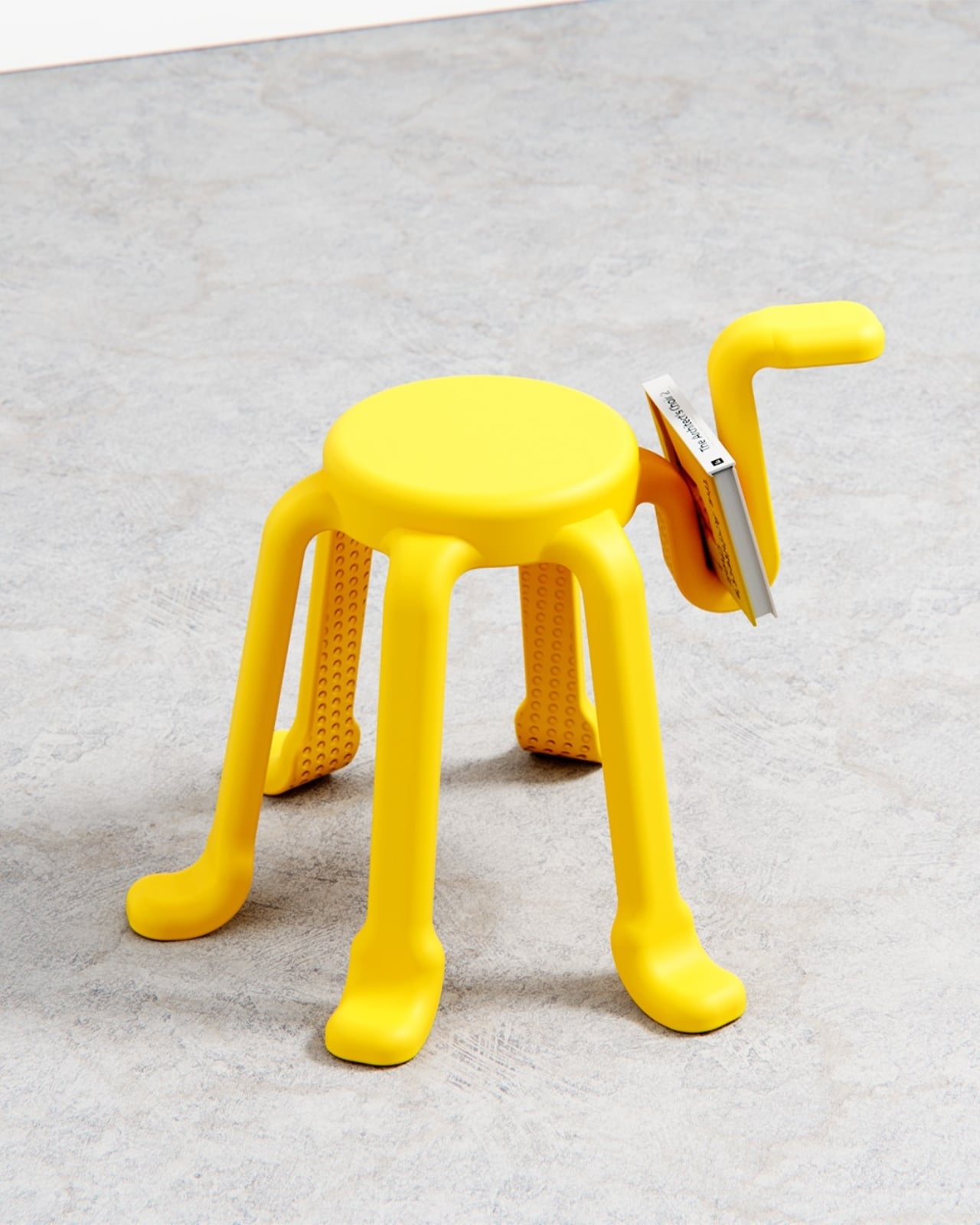
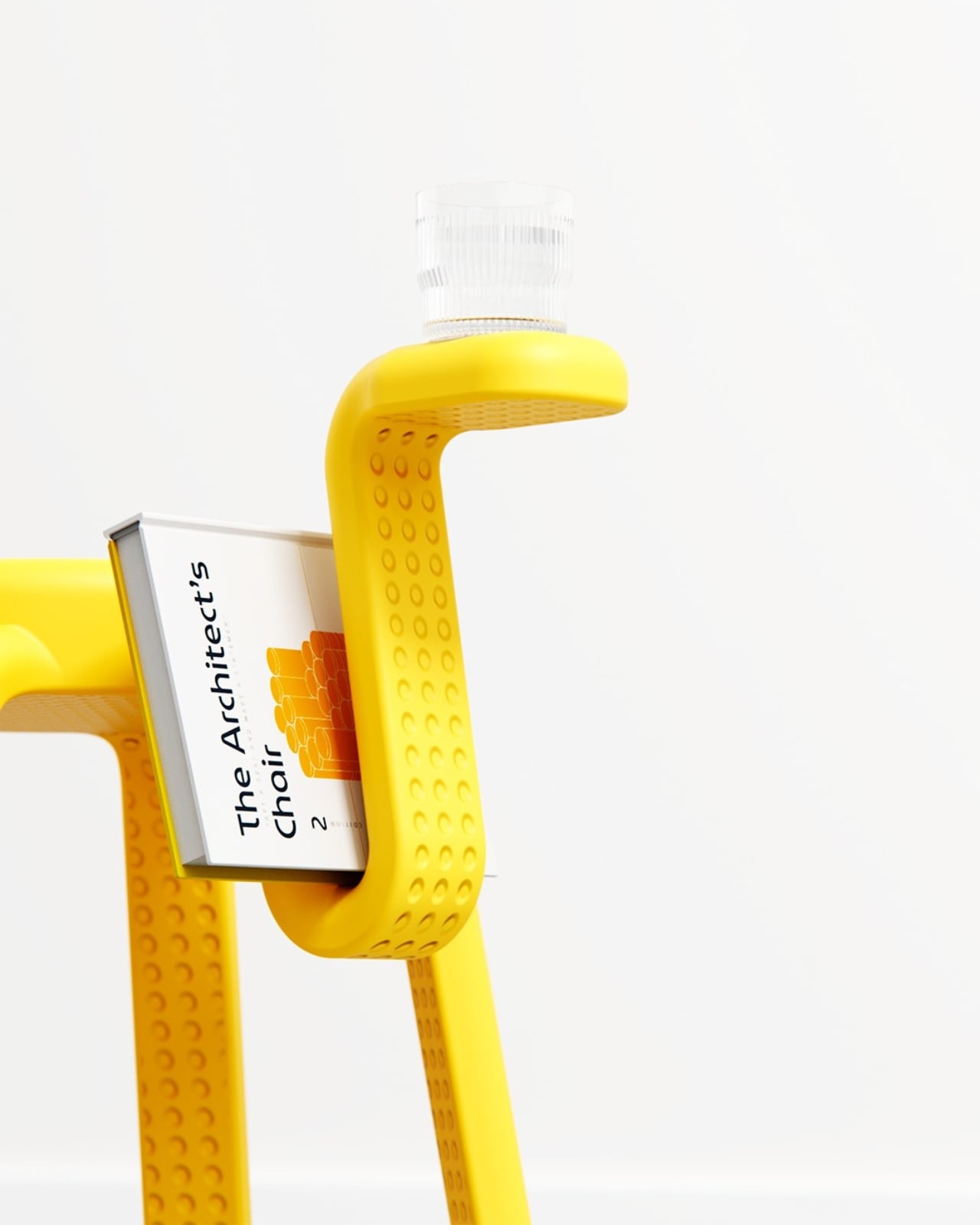
The concept is deceptively simple. Five legs provide complete stability, the same geometric logic you’d get from a traditional four-legged stool, just with an added sense of security and visual rhythm. The sixth leg is the interesting one. Freed from any load-bearing duty, it becomes something else entirely: a handle for carrying the stool, a hook for a bag or jacket, a rest for your coffee cup, a cradle for a book. The images show it doing all of these things casually, as if the stool has always known it could.
What makes SQOOL feel genuinely considered rather than just whimsical is how that extra function was thought through. The sixth arm doesn’t just stick out awkwardly. It curves deliberately, creating a shape that invites the hand to reach for it. People apparently do this instinctively, discovering its utility through touch rather than any printed instruction. That kind of design, where the object teaches you how to use it without saying a word, is harder to pull off than it looks.
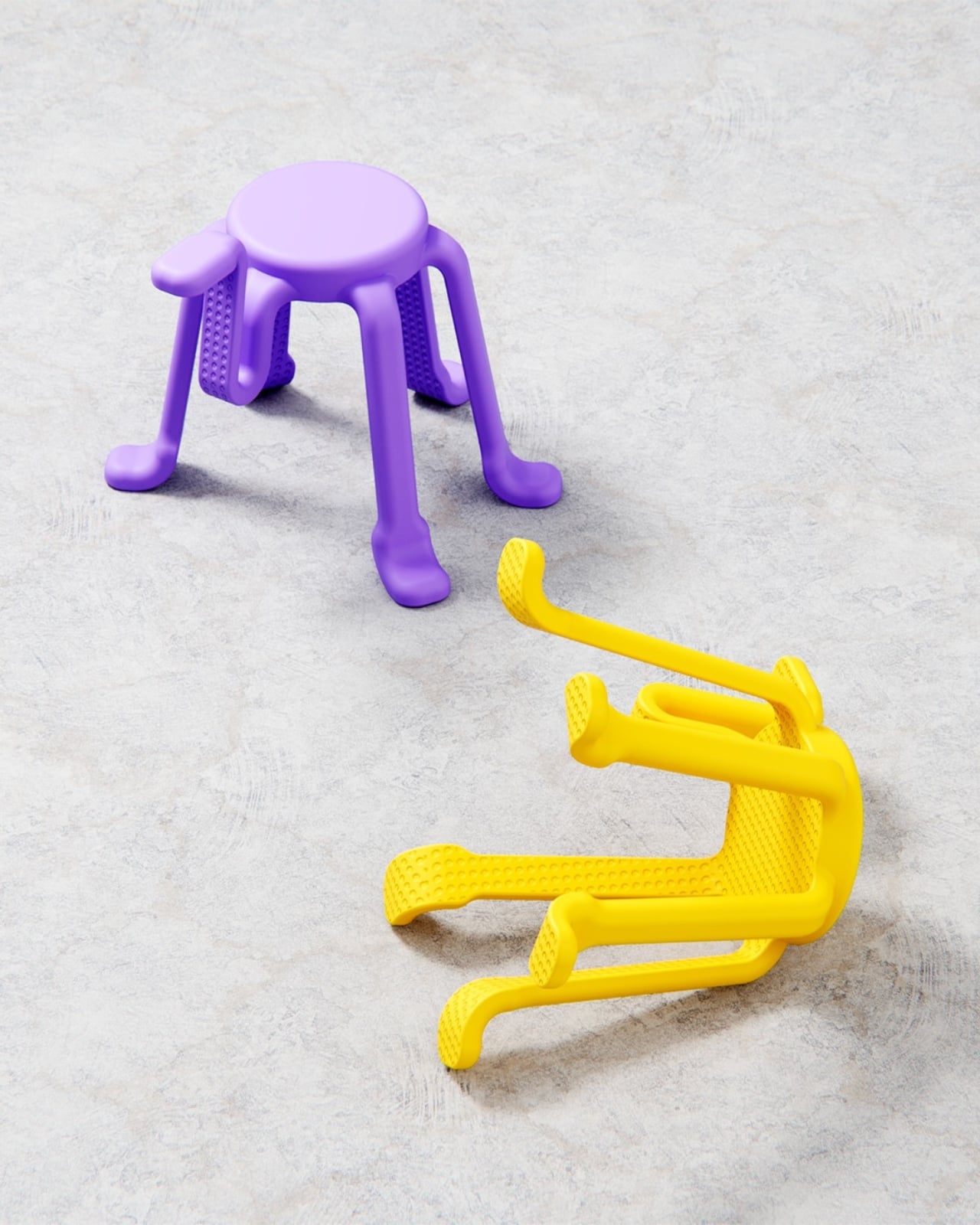
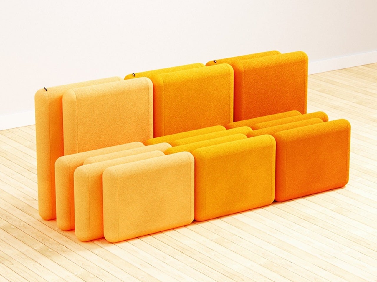
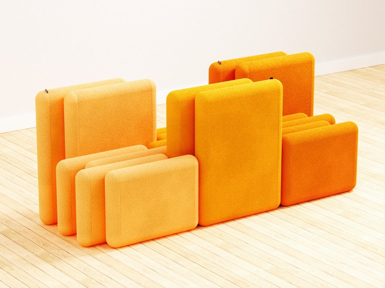
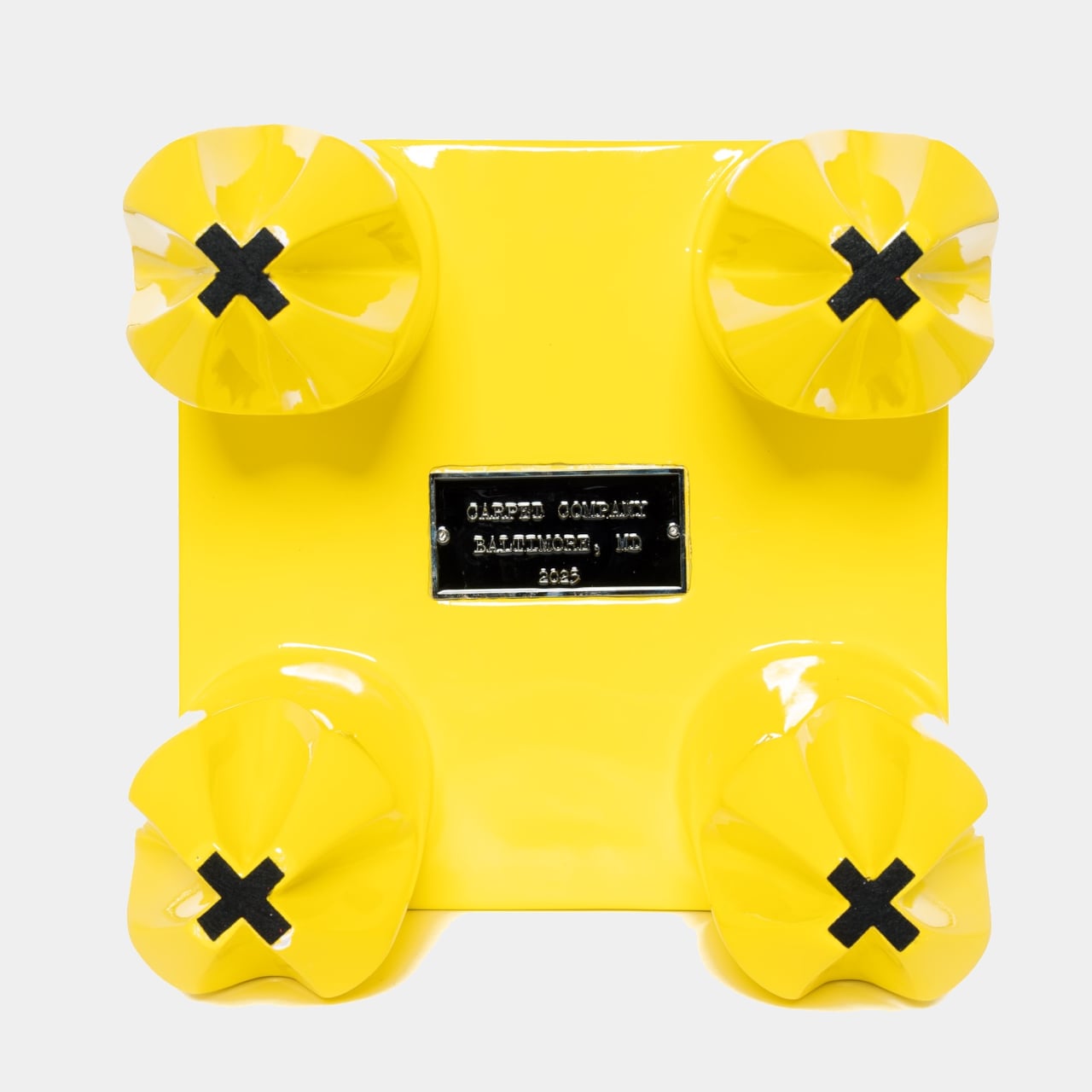
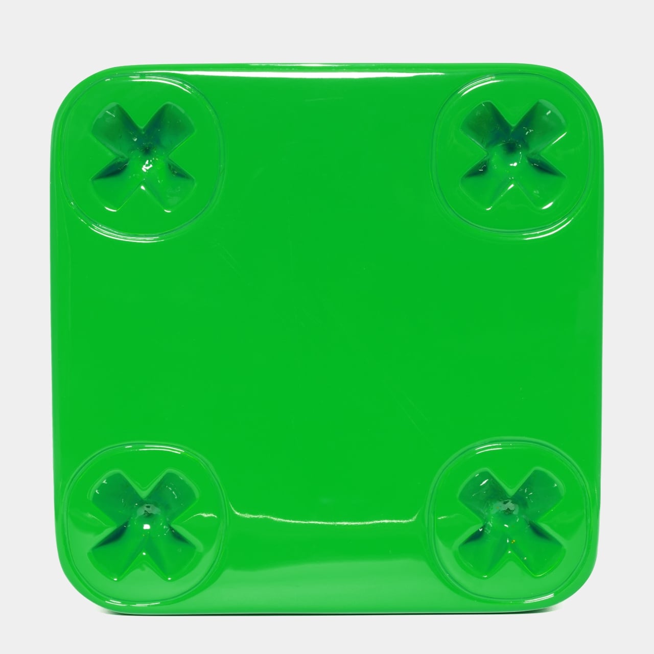
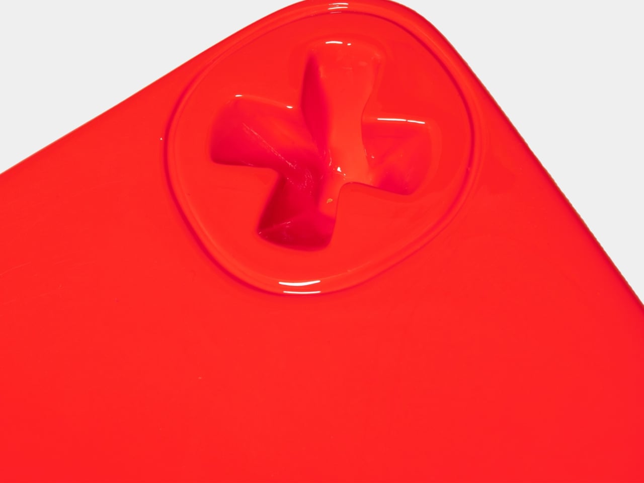
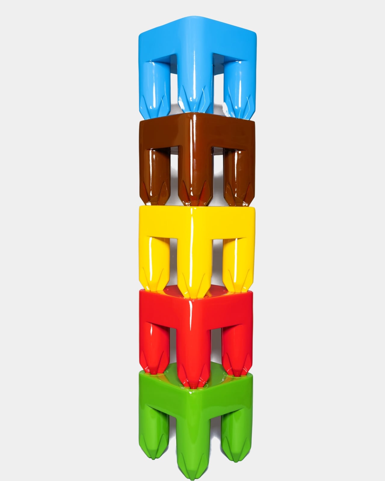
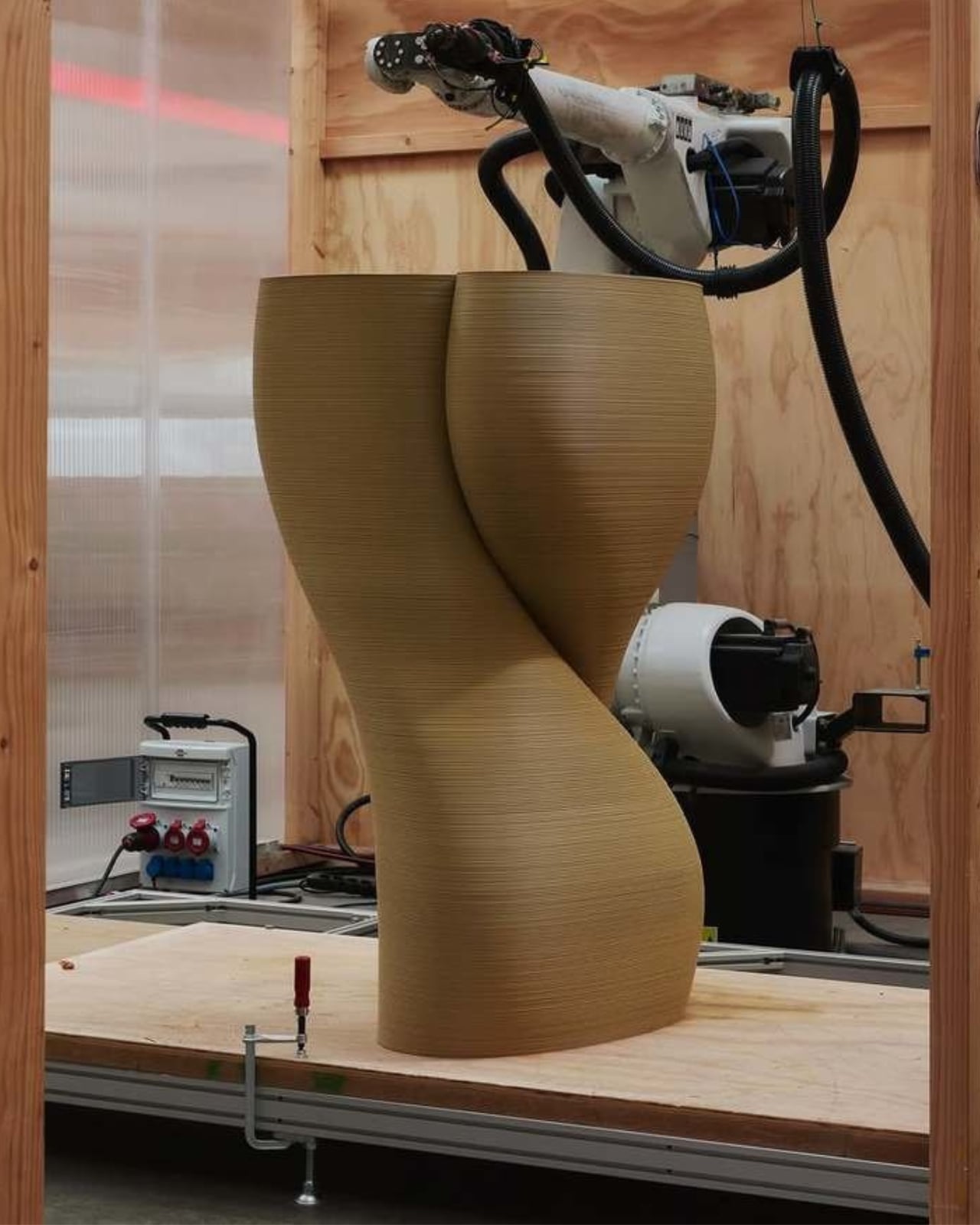
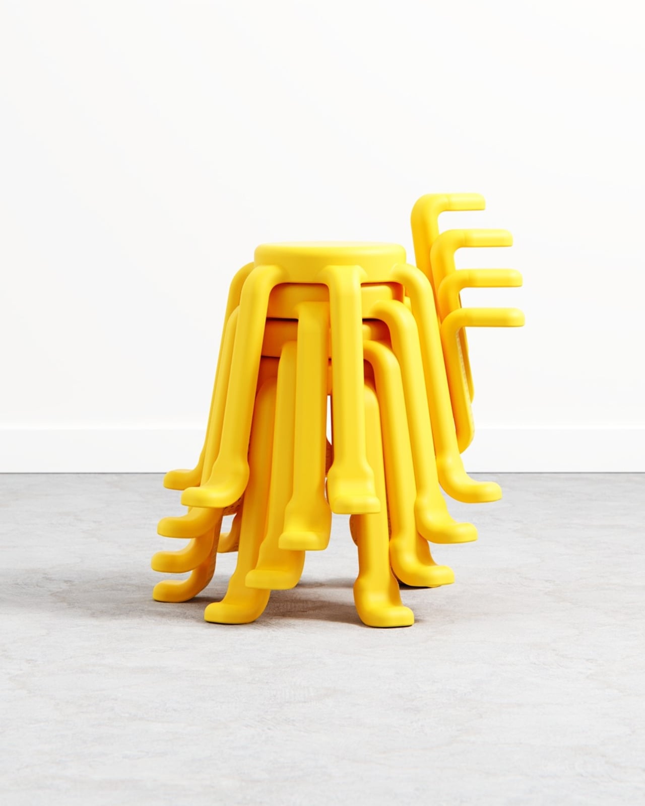
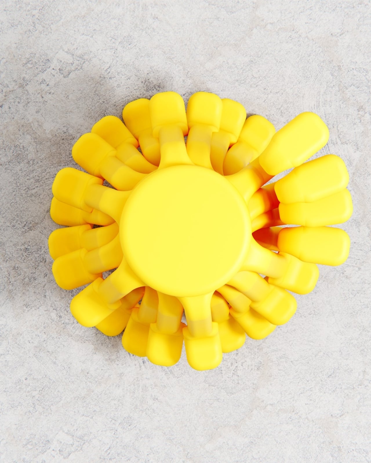
The stacking detail is also worth noting. Getting six legs to nest cleanly on top of each other is a real engineering puzzle, and de la Bedoyere solved it by shaping each leg with enough taper and spacing to allow the stools to slide into each other gracefully. Seen stacked in a column, they look spectacular. Like a sculpture you’d walk past in a gallery and immediately photograph. Which means SQOOL is doing double duty even when no one is sitting on it.
The color choices lean fully into the stool’s playful register. The saturated yellow is hard to miss, and a soft lavender variant appears in some renders, equally confident. These aren’t accent tones chosen to recede politely into a neutral interior. They’re chosen to assert presence. SQOOL isn’t trying to disappear into a corner. It wants to be part of the room, part of the conversation, maybe even part of your grid. That’s not a criticism at all. Personality in furniture is genuinely underrated, and design objects that commit fully to their own character tend to age better than the ones trying to be neutral.
Bored Eye Design’s portfolio shows a consistent interest in objects that are curious and approachable, things that reward a second look and feel good to handle. SQOOL fits neatly into that sensibility. It’s playful without being infantile, practical without being dull, and memorable without leaning on novelty for novelty’s sake. The name alone, a blend of “stool” and something else entirely, already tells you what kind of designer de la Bedoyere is.
The question with any concept project is always whether it would survive production. I think SQOOL could. The logic holds up. The form has already been thought through with stackability in mind, which is usually where playful concepts fall apart. A stool this considered, this expressive, and this genuinely useful deserves more than a render portfolio. It deserves a production run.
The post A Stool With Six Legs Just Made Four Feel Outdated first appeared on Yanko Design.