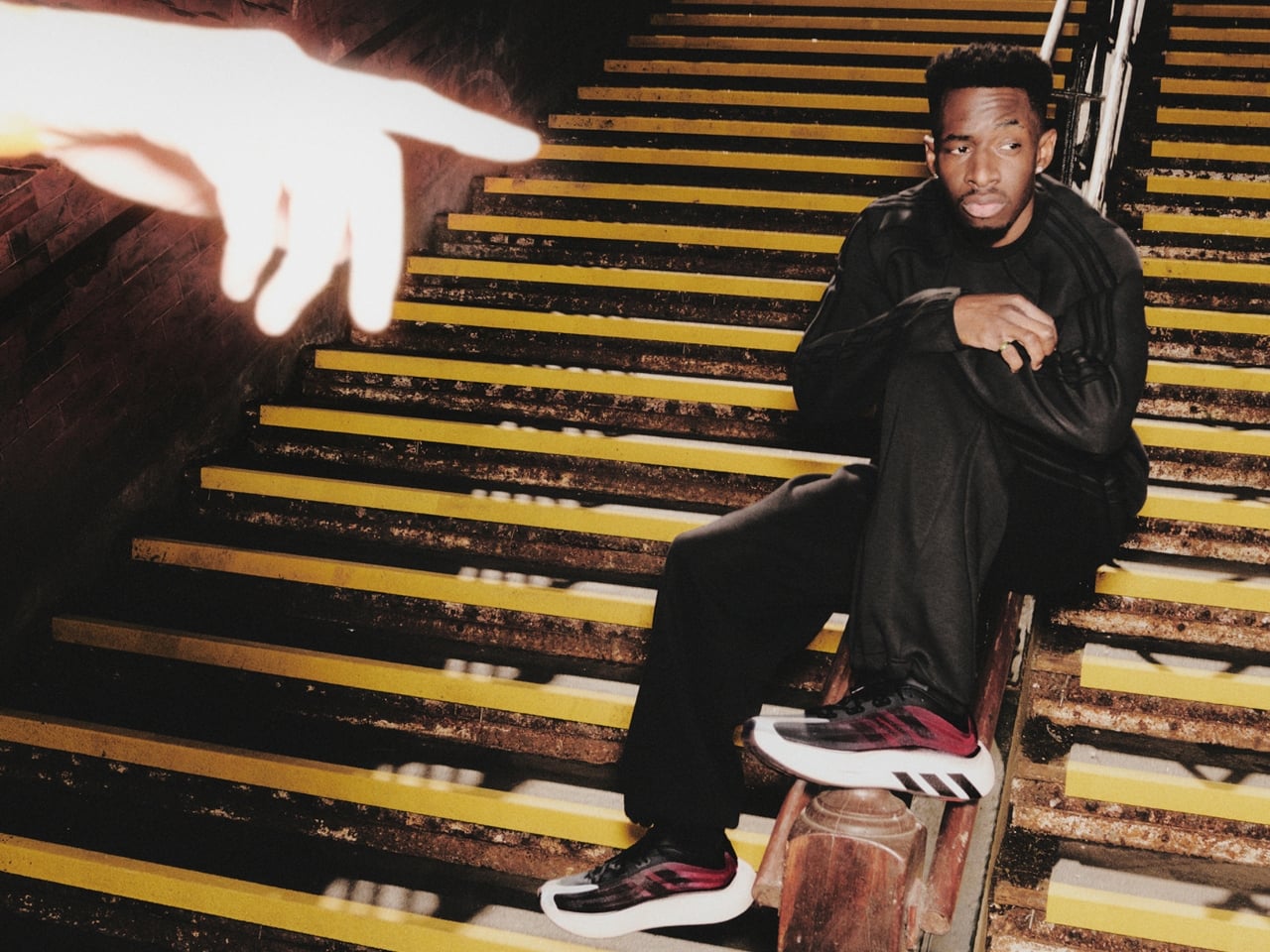
Performance sneakers have a habit of making promises they can’t quite keep outside of the gym. They arrive looking like they were engineered on a space station, and the moment you wear them to brunch, you realize the rocker sole is pushing you forward like you’re perpetually late for a sprint. adidas knows this tension well, which is probably why the Hyperboost Euphoria exists.
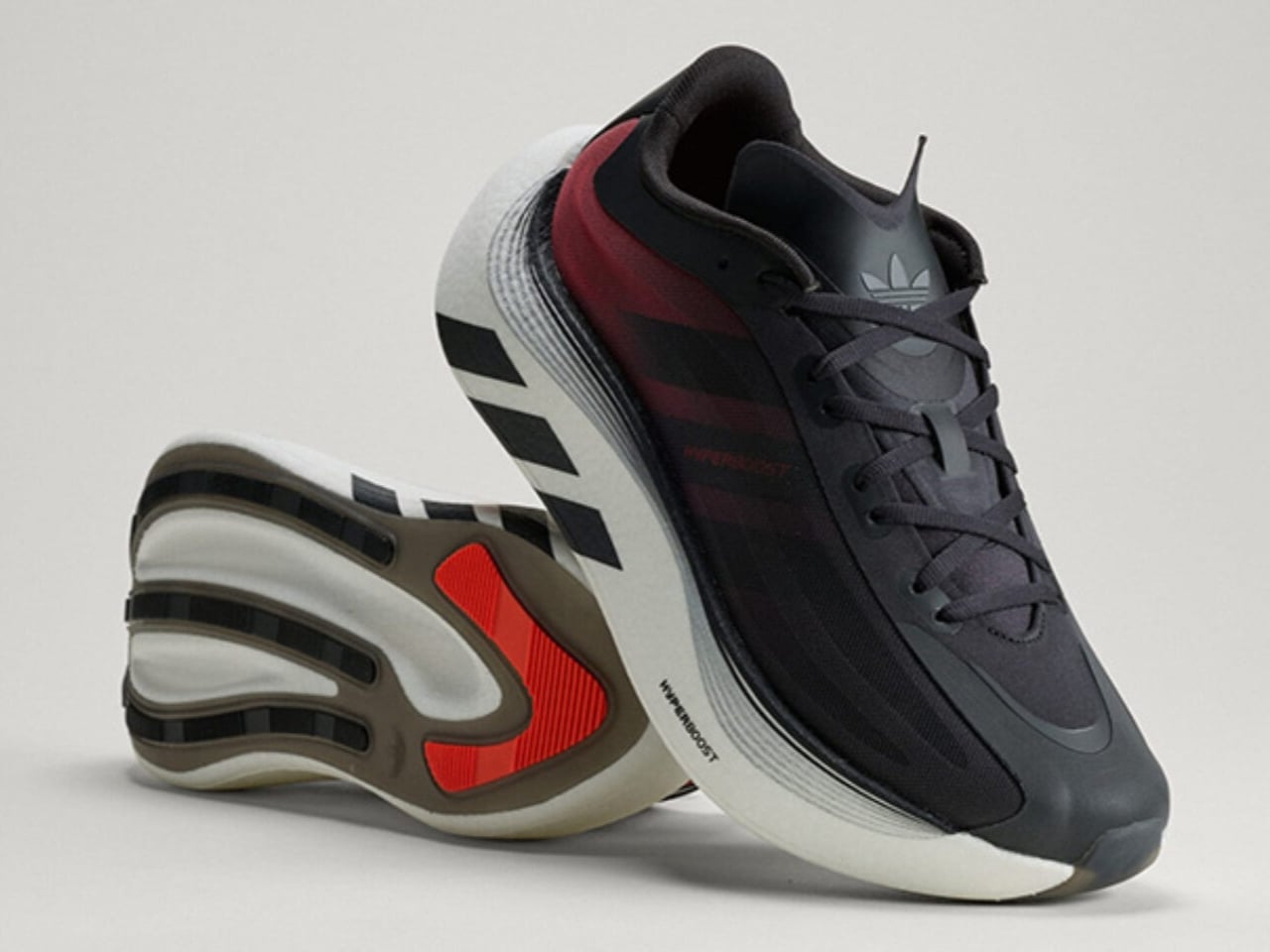
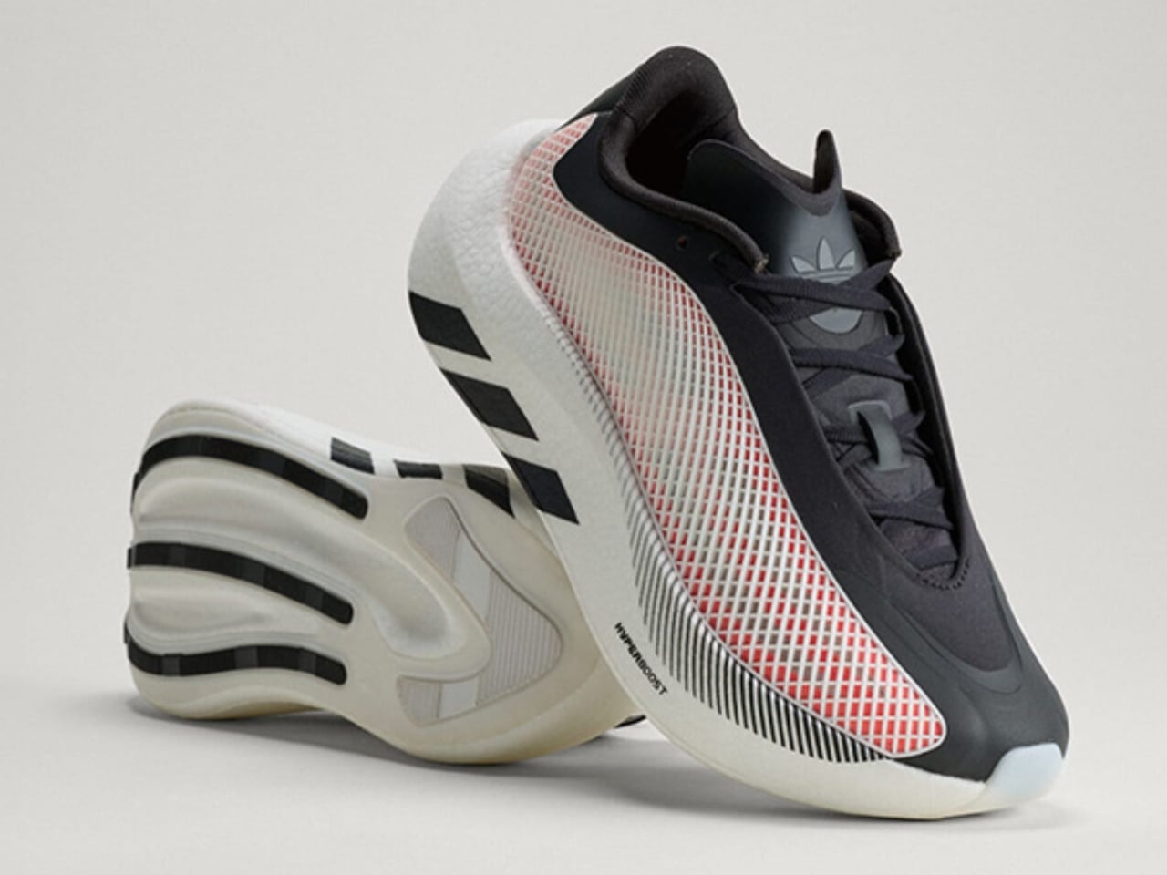
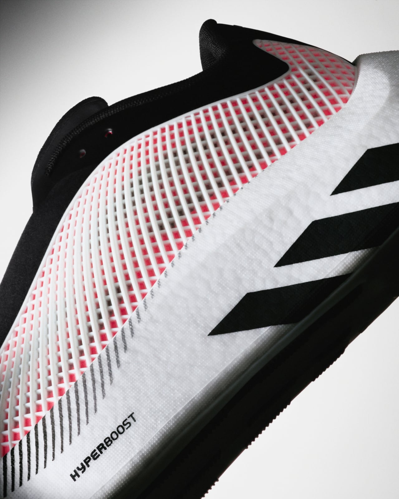
The Euphoria is the lifestyle sibling of the Hyperboost Edge, the performance running shoe adidas dropped in March. Where the Edge was built for the track, the Euphoria is built for the life you actually live, the one that involves a lot of walking, standing, sitting in cafés, and occasionally jogging for a bus. adidas pulled the same Hyperboost cushioning technology, the pebbled supercritical foam that made the Edge genuinely exciting, and reworked everything else around it. The midsole is carved out to save weight. The stance is wider. The heel extends out. The rocker is intentionally dialed back so the shoe doesn’t feel like it’s trying to propel you somewhere you didn’t ask to go. The result is a platform that is stable and grounded in a way that actually makes sense for daily wear.
Designer: adidas
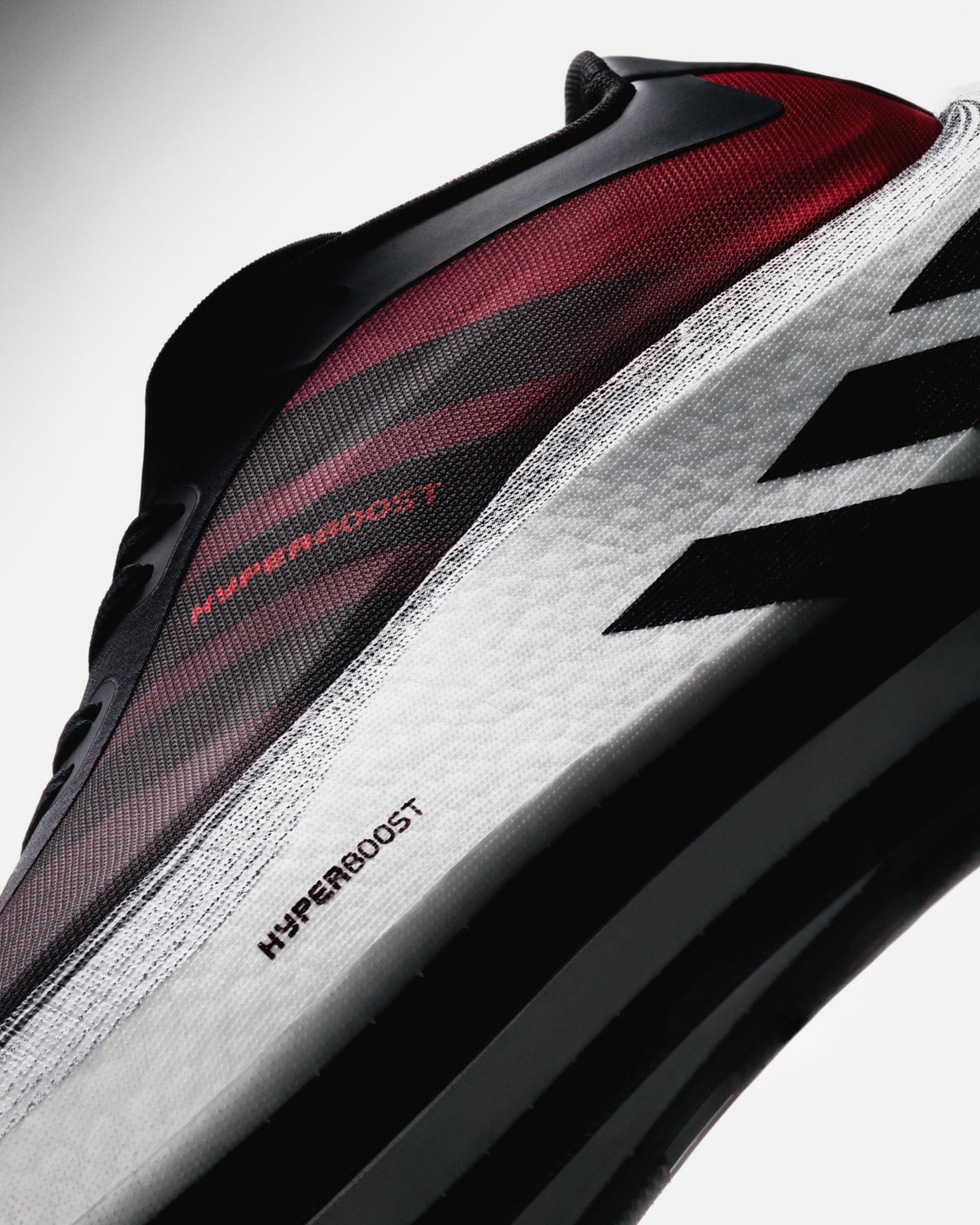
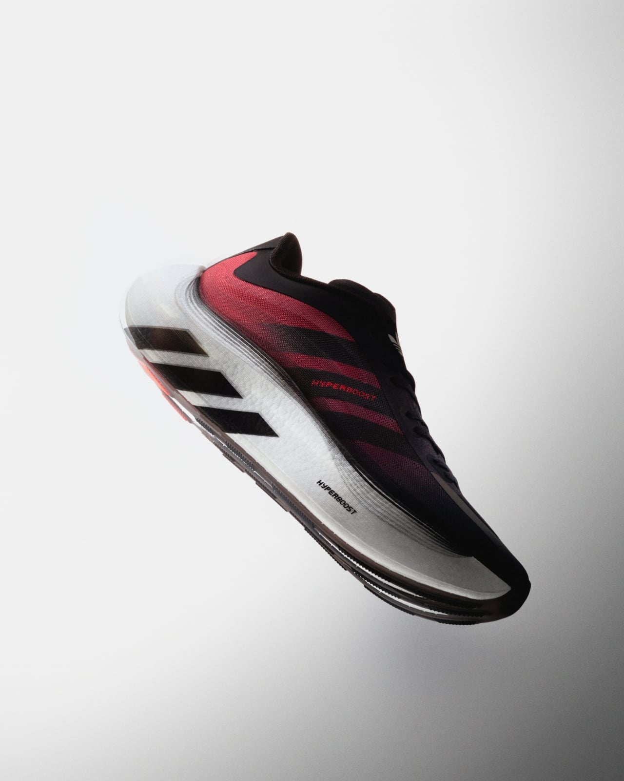
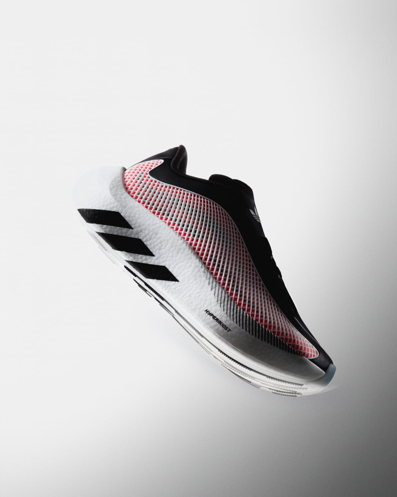
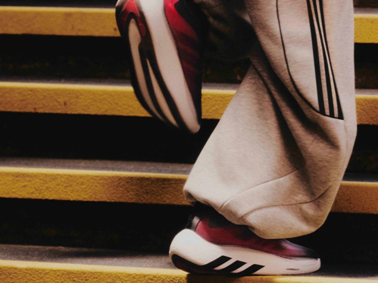
The upper is where things get interesting from a pure design standpoint. A large TPU net structure wraps the sidewalls, giving the silhouette a kind of exoskeleton quality that reads as technical without being loud about it. The semi-transparent nylon material plays against the structured cage nicely, hinting at the construction underneath. adidas also swapped out the mountain logo on the tongue for the Trefoil, a small but deliberate move that signals exactly what this shoe is: an Originals product, not a performance one. It is the kind of detail that only obsessives notice, and yet it matters.
There is an argument to be made that adidas is exceptionally good at this particular move, taking foam technology born in performance and migrating it into lifestyle. The Boost lineage did it. The 4D midsole has done it. The Hyperboost is following that same arc, and it makes sense commercially and creatively. If you develop something genuinely good, you eventually want it to live in more places.
The Euphoria has also already been spotted off the pitch on Jude Bellingham, Lionel Messi, and Pedri during the FIFA World Cup. That kind of high-profile visibility is not accidental, and it reinforces the positioning. adidas is clearly not treating this as a minor side release.
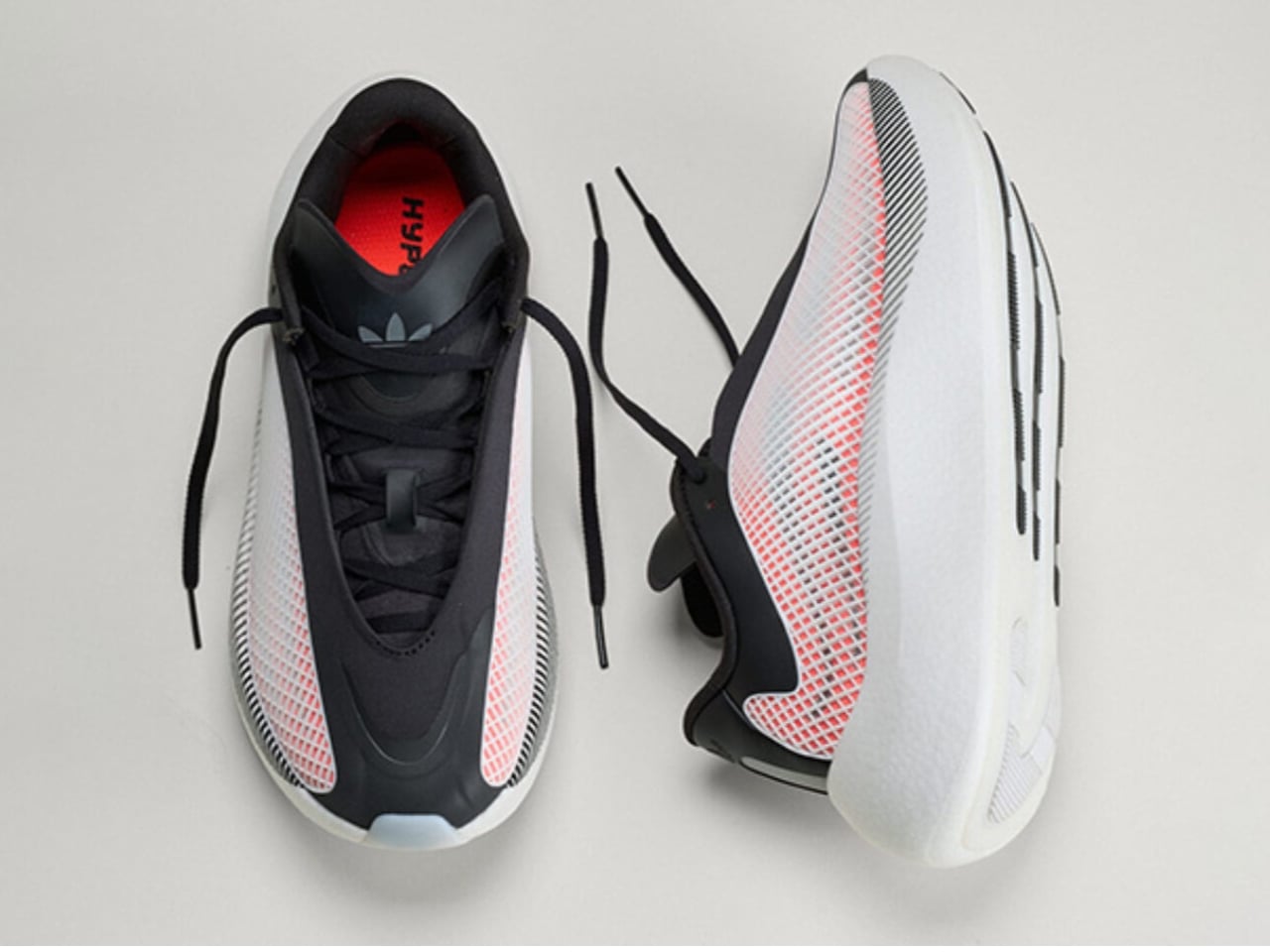
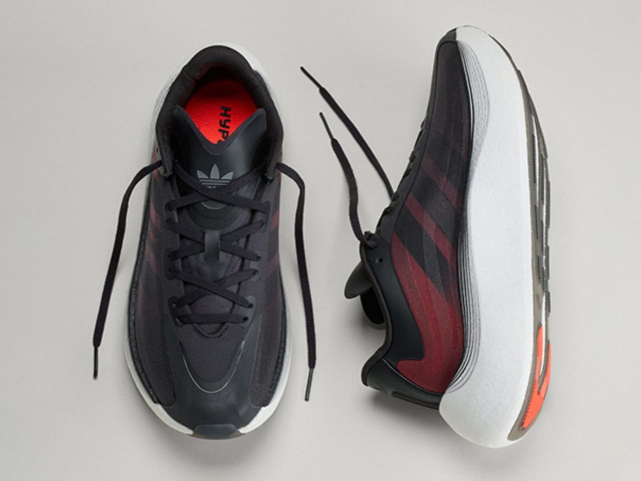
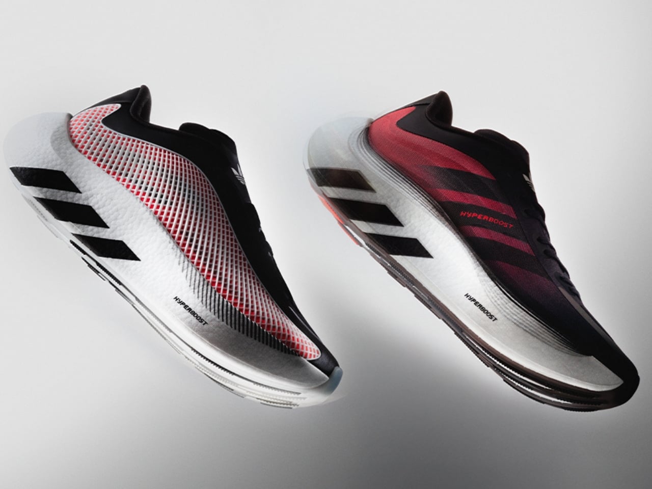
Colorway-wise, the launch lineup covers blue, black, and white, an all-black option, white and black, and a red that carries the same energy as the more expressive iterations. Bold but not chaotic, which tracks with the overall aesthetic of the shoe.
What I keep thinking about is how the sneaker market has recalibrated around comfort in a way that would have seemed overcorrected a decade ago. The chunky foam wave came, peaked, and landed somewhere permanent. Consumers who once wanted flat, minimal silhouettes are now completely comfortable in a stacked platform, and brands like adidas have gotten very good at making that stack feel intentional rather than excessive. The Hyperboost Euphoria does not feel like a compromise between performance and lifestyle. It feels like a shoe that was designed for exactly where it ended up.
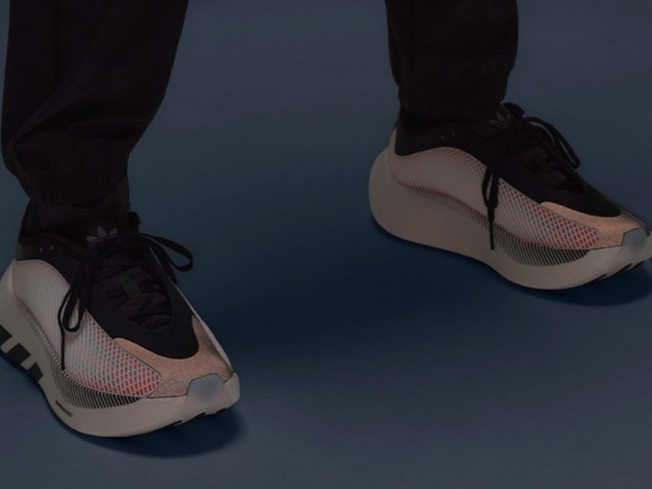
Ilka Liebmann, VP of Design Footwear at adidas Originals, described it best: the shoe was created for those who embrace a sport-inspired lifestyle, people who prioritize spontaneity, comfort, and energy, and let movement lead them. That framing is a little aspirational by nature, but it is also accurate to the product. The Euphoria wears confidently. It does not demand context. You could pair it with technical trousers or track pants or denim and the shoe holds its own across all three.
adidas has made a genuinely considered thing here, and it lands at a moment when the performance-to-lifestyle pipeline feels more refined than ever.
The post adidas Hyperboost Euphoria: The Foam That Outgrew the Track first appeared on Yanko Design.