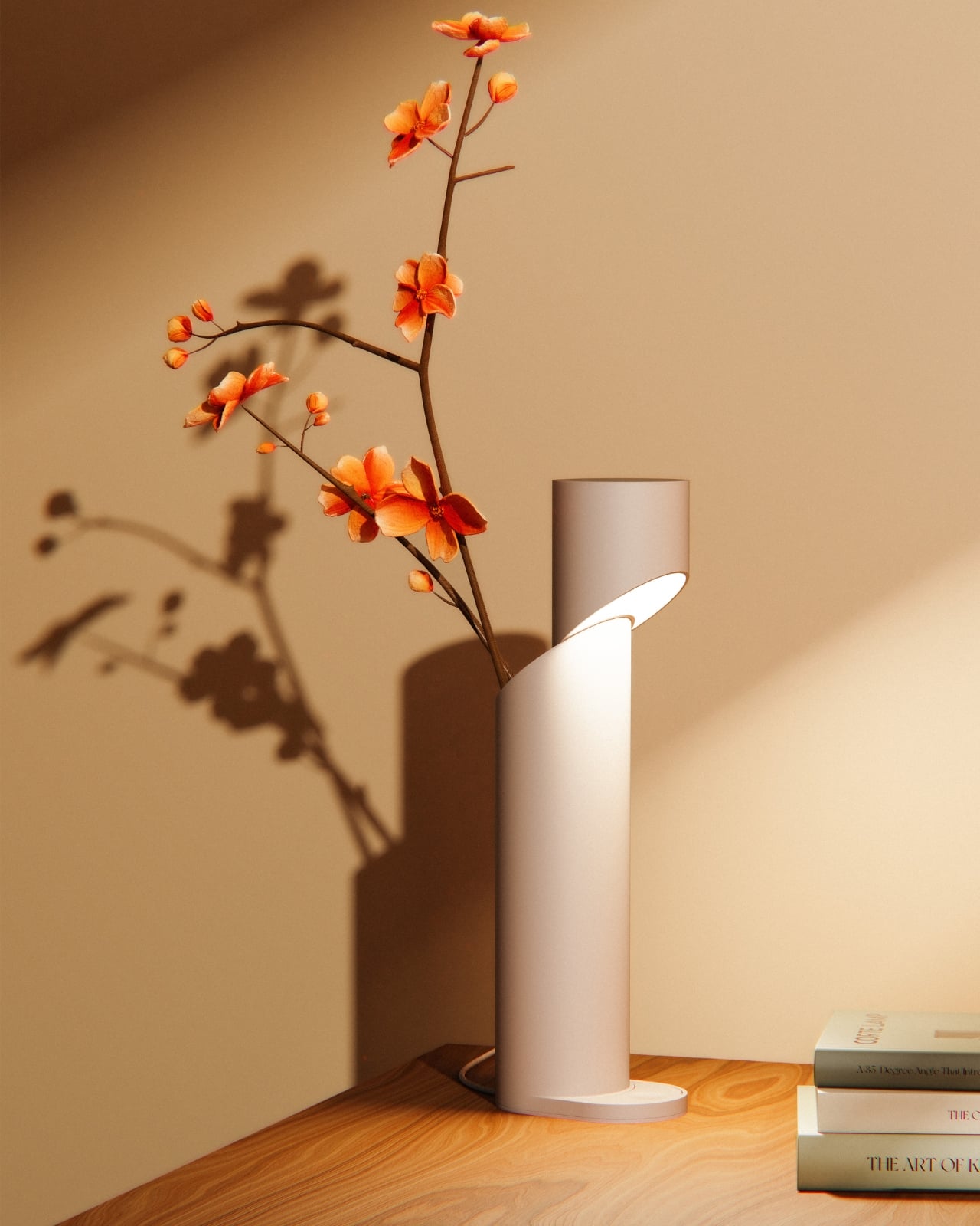
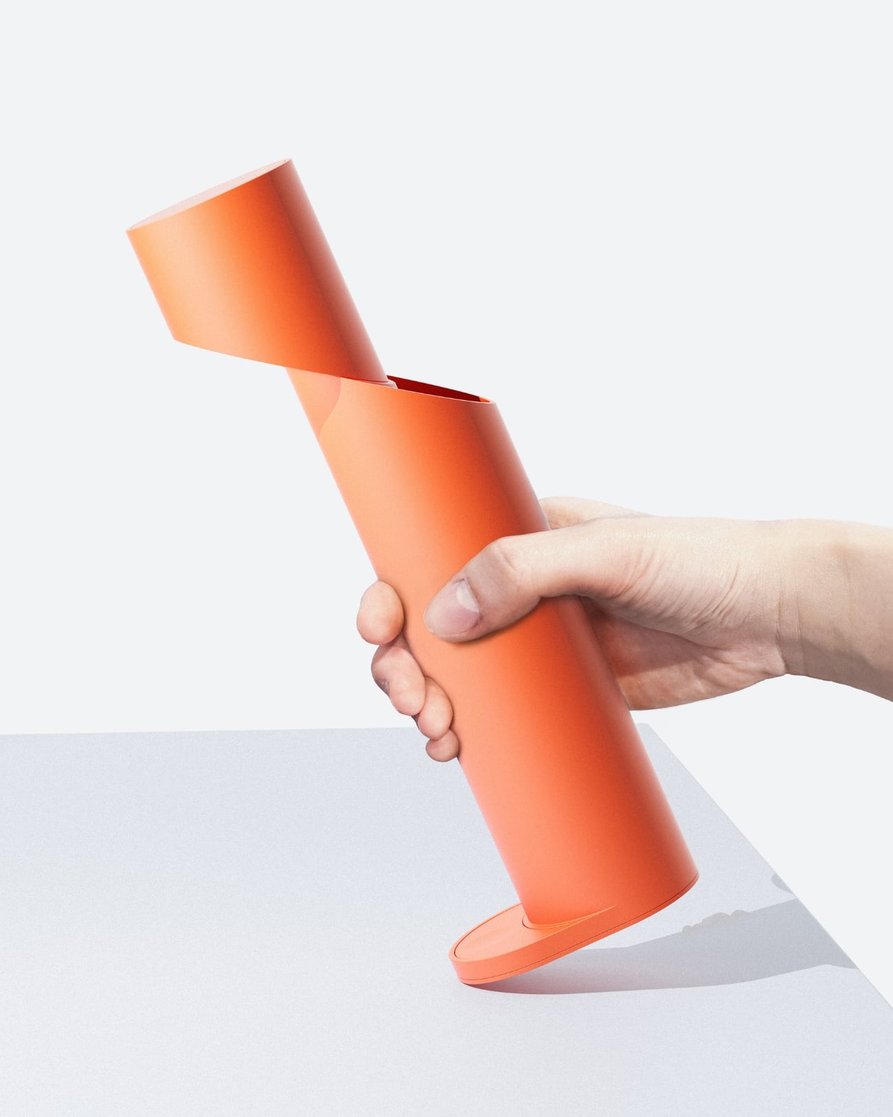
There’s something deeply satisfying about watching a designer take a basic shape and completely reimagine it. That’s exactly what Jisu Park has done with the Corte Lamp, a lighting design that proves sometimes the boldest move is a single, decisive cut.
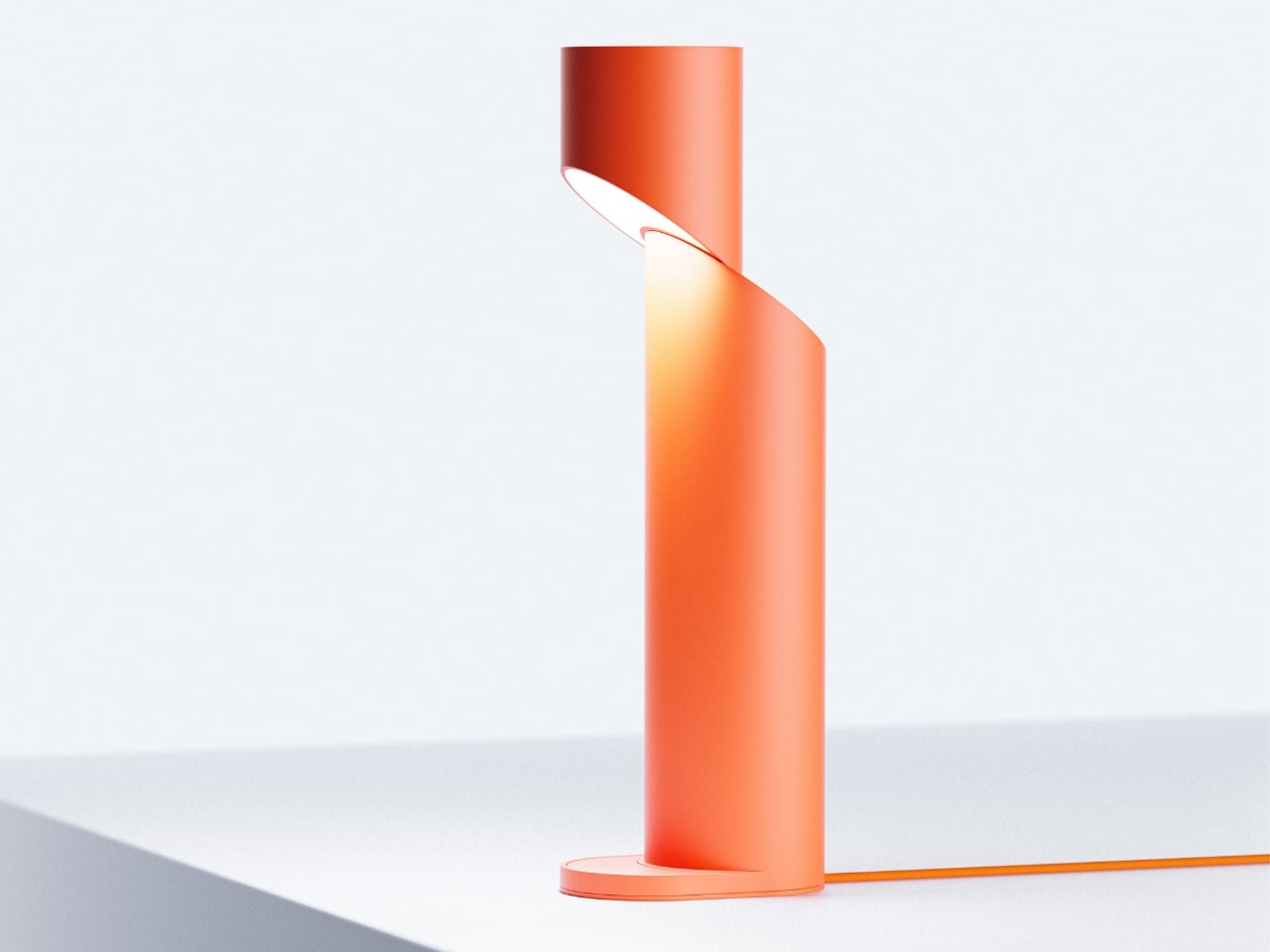
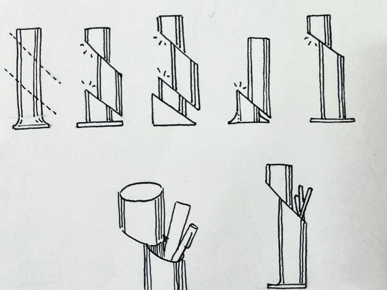
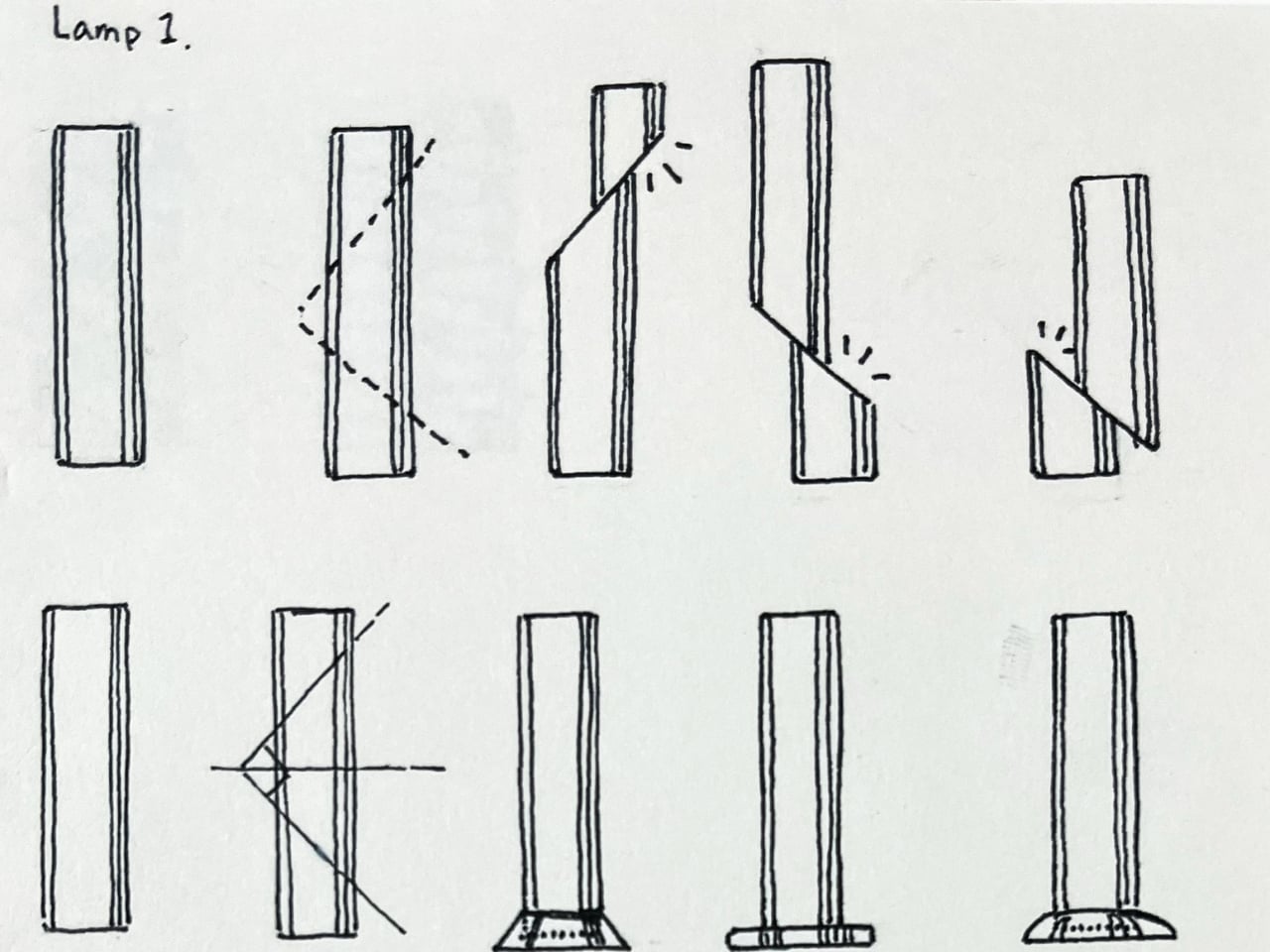
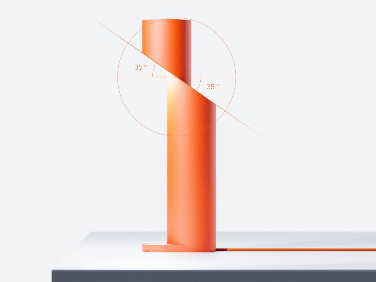
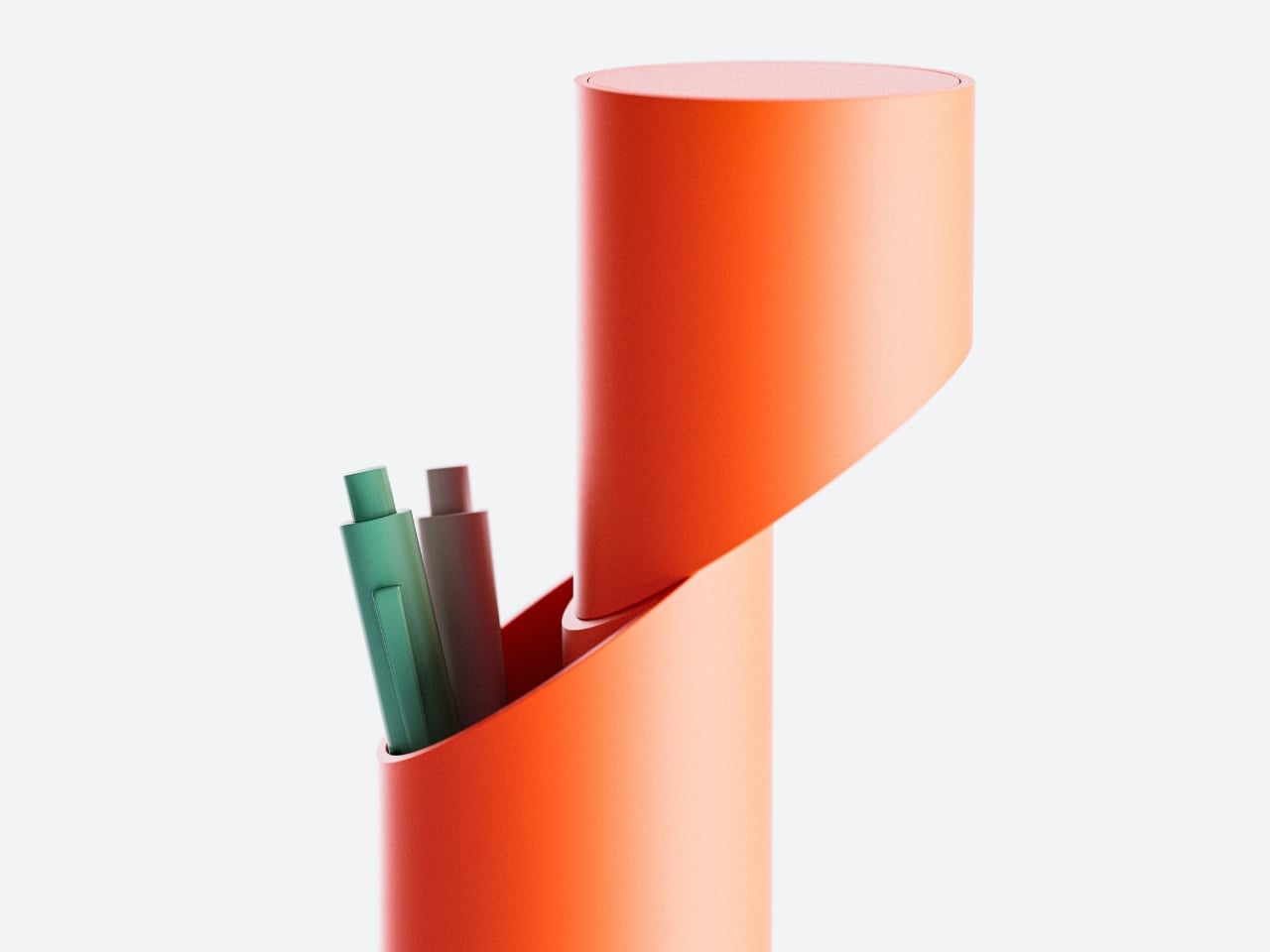
At first glance, the Corte Lamp looks like a straightforward cylindrical floor lamp. Clean lines, matte finish, minimalist aesthetic. But then you notice the slash, a sweeping diagonal incision that slices through the form like someone took a giant blade to it. This isn’t just a decorative flourish. That cut becomes the lamp’s defining feature, transforming a simple tube into something that feels more like a sculptural installation than a functional light source.
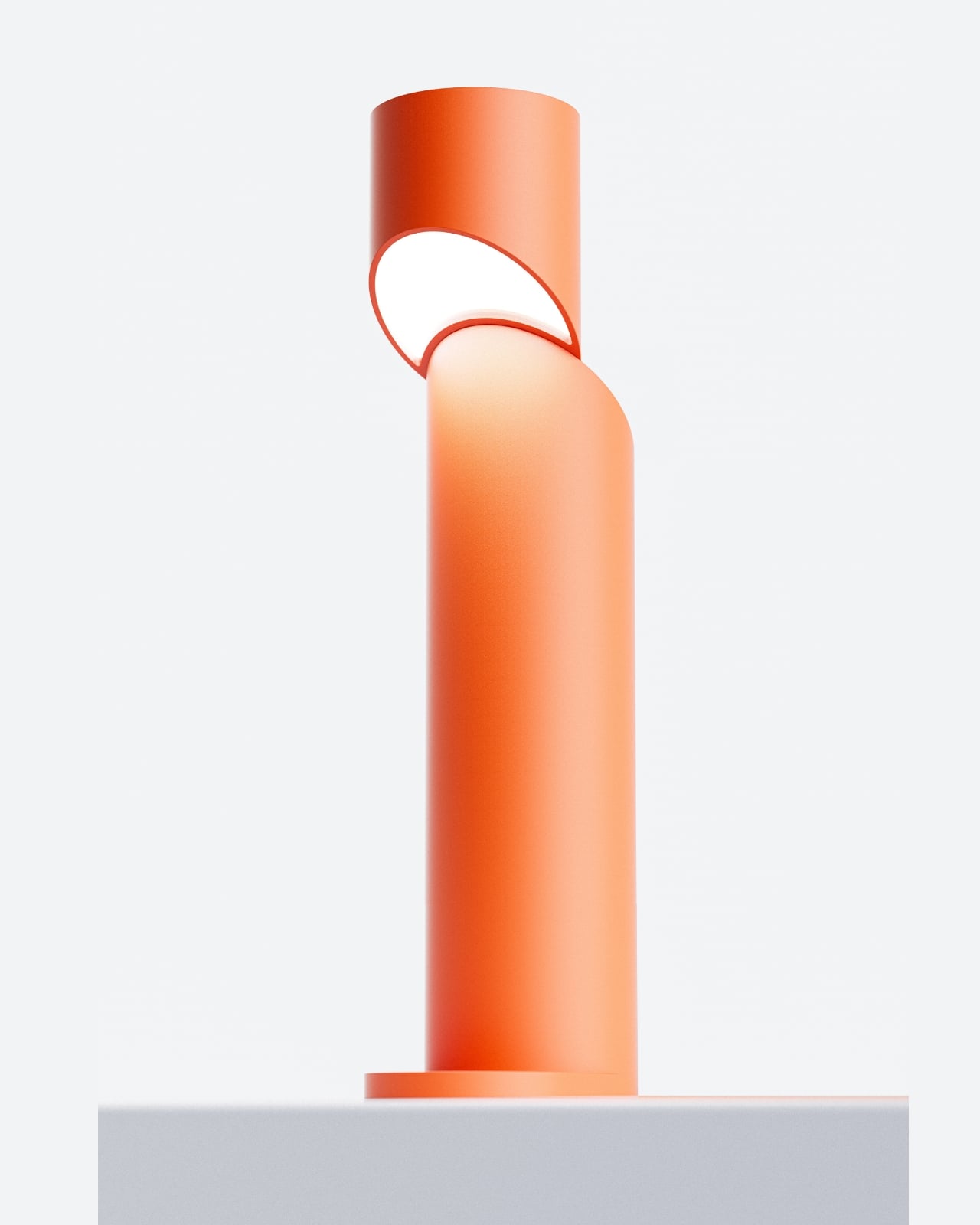
The genius here is in the restraint. Park didn’t overcomplicate things with multiple cutouts or elaborate patterns. Instead, there’s just one bold, confident gesture that creates an elliptical opening through the cylinder. When the lamp is off, you see the architectural drama of negative space. When it’s on, that void becomes a window into warm, glowing light that spills out at unexpected angles.
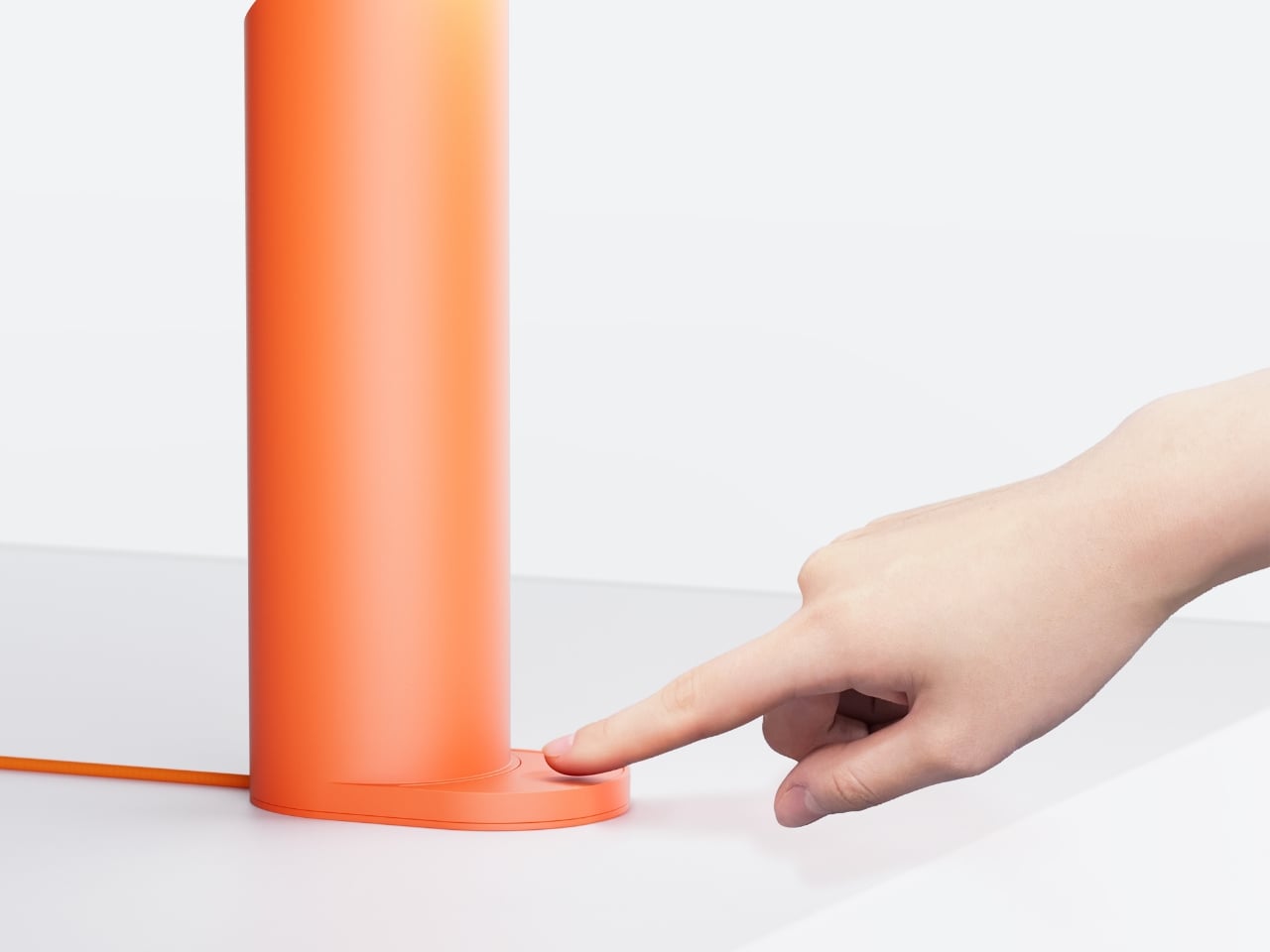
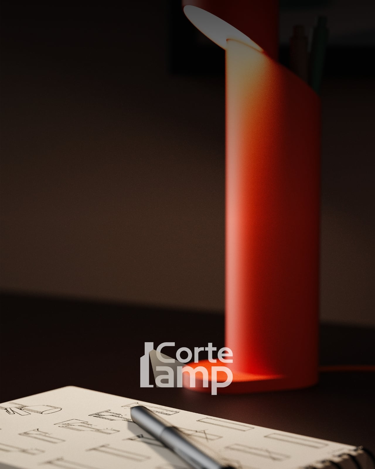
What makes the Corte Lamp particularly clever is how it plays with our expectations of what a lamp should be. We’re used to light coming from the top of a floor lamp, filtered through a shade or diffuser. But this design disrupts that convention. The cut section exposes the light source in the middle of the form, creating multiple lighting effects simultaneously. You get ambient uplight from the top, focused illumination from the opening, and subtle downlight at the base.
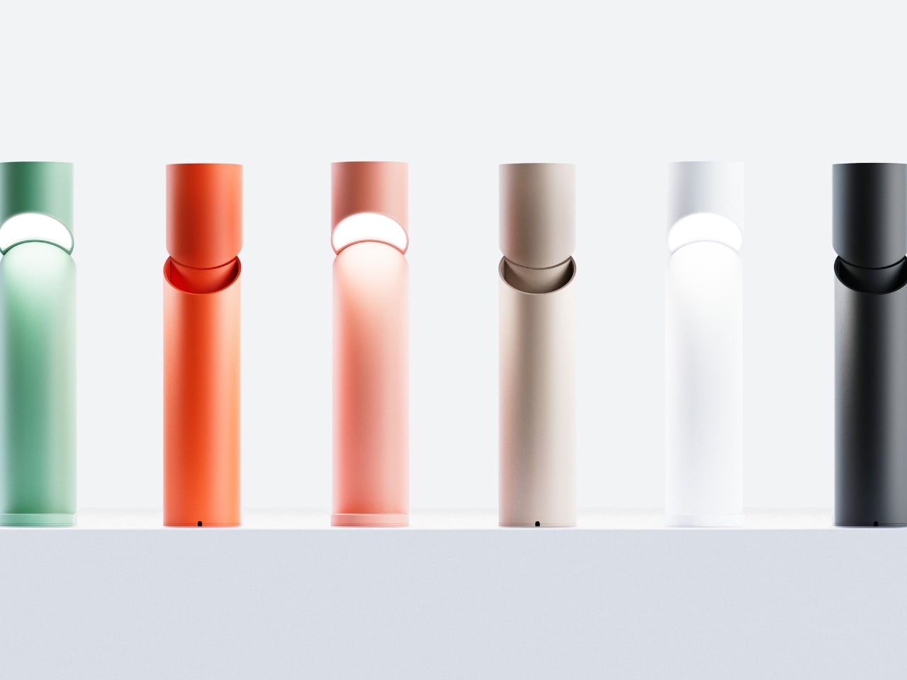
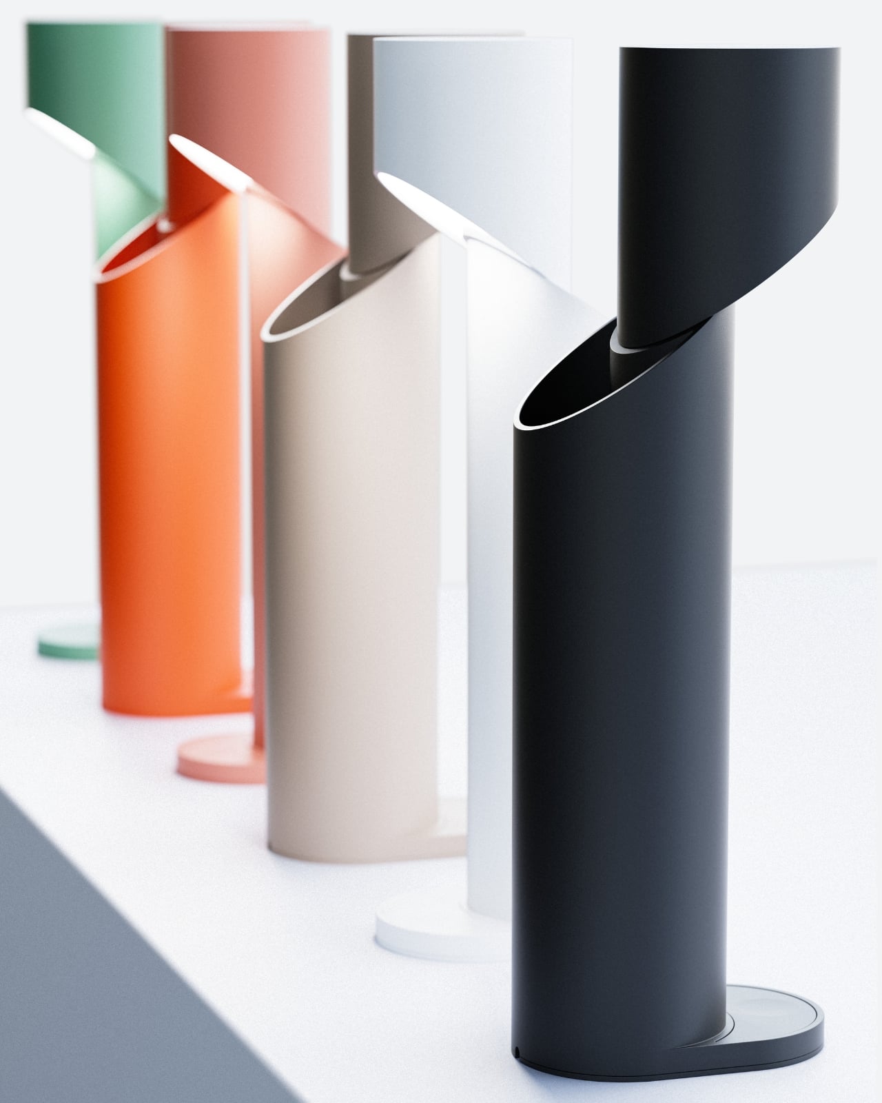
The color palette adds another layer of appeal. While the lamp comes in practical neutrals like black, white, and beige, it’s the pastel options that really shine. That peachy coral tone, in particular, transforms the lamp into something that feels current and Instagram-ready without trying too hard. The mint green offers a retro-futuristic vibe, while the soft pink brings a gentle warmth to any space. These aren’t just lamps. They’re statement pieces that happen to provide light.
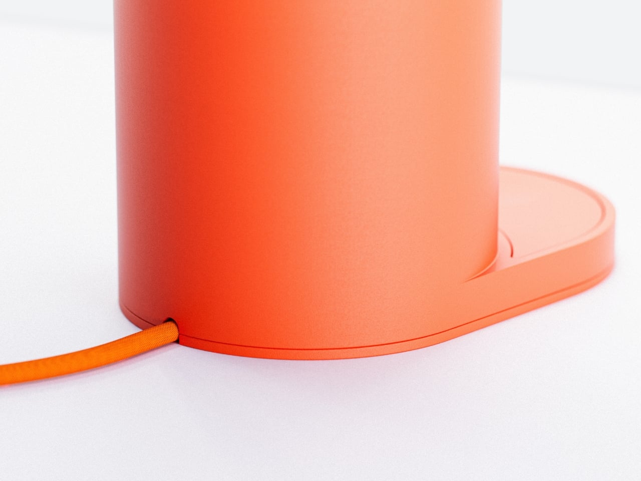
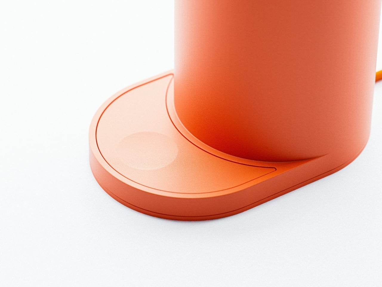
From a technical perspective, the execution looks flawless. The matte finish gives each color depth and sophistication, while the precision of that diagonal cut suggests careful engineering. The edges are clean, the proportions are balanced, and despite its dramatic gesture, the lamp maintains stability with a circular base that echoes the cylindrical form. There’s also something intriguing about how the lamp changes depending on your viewing angle. Walk around it and the elliptical opening shifts in appearance, sometimes looking like a narrow slit, other times revealing the full depth of the cut. This kinetic quality, where the object seems to transform as you move through space, adds an interactive element that static lighting typically lacks.
The Corte Lamp fits into a larger trend we’re seeing in contemporary design where the line between furniture and art continues to blur. Young designers are increasingly rejecting the idea that functional objects need to disappear into the background. Instead, they’re creating pieces that demand attention, spark conversation, and challenge our assumptions about everyday items. Park’s design also reflects a particular aesthetic moment where maximalism isn’t about adding more, but about making more impact with less. One cut. One form. Multiple colors. That’s the entire concept, and it works because it’s executed with conviction and technical skill.
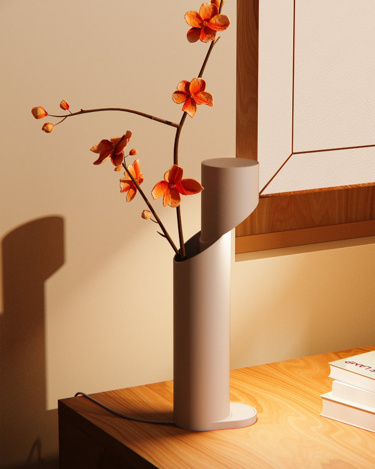
For anyone furnishing a space, the Corte Lamp offers versatility that’s hard to find in statement lighting. It’s bold enough to anchor a minimal room with dramatic flair, but simple enough not to clash with existing decor. It works in a modern apartment, a creative studio, or even a retail space looking for sculptural accents that serve a purpose.
The beauty of designs like this is they remind us that innovation doesn’t always mean reinventing everything from scratch. Sometimes it’s about looking at something familiar, like a cylindrical lamp, and asking what happens if you just take something away. In Park’s case, that subtraction became an addition, creating a lighting design that’s as much about shadow and void as it is about illumination. The Corte Lamp proves that great design can be a single idea executed perfectly.
There’s something deeply satisfying about watching a designer take a basic shape and completely reimagine it. That’s exactly what Jisu Park has done with the Corte Lamp, a lighting design that proves sometimes the boldest move is a single, decisive cut.
At first glance, the Corte Lamp looks like a straightforward cylindrical floor lamp. Clean lines, matte finish, minimalist aesthetic. But then you notice the slash, a sweeping diagonal incision that slices through the form like someone took a giant blade to it. This isn’t just a decorative flourish. That cut becomes the lamp’s defining feature, transforming a simple tube into something that feels more like a sculptural installation than a functional light source.
The genius here is in the restraint. Park didn’t overcomplicate things with multiple cutouts or elaborate patterns. Instead, there’s just one bold, confident gesture that creates an elliptical opening through the cylinder. When the lamp is off, you see the architectural drama of negative space. When it’s on, that void becomes a window into warm, glowing light that spills out at unexpected angles.
What makes the Corte Lamp particularly clever is how it plays with our expectations of what a lamp should be. We’re used to light coming from the top of a floor lamp, filtered through a shade or diffuser. But this design disrupts that convention. The cut section exposes the light source in the middle of the form, creating multiple lighting effects simultaneously. You get ambient uplight from the top, focused illumination from the opening, and subtle downlight at the base.
The color palette adds another layer of appeal. While the lamp comes in practical neutrals like black, white, and beige, it’s the pastel options that really shine. That peachy coral tone, in particular, transforms the lamp into something that feels current and Instagram-ready without trying too hard. The mint green offers a retro-futuristic vibe, while the soft pink brings a gentle warmth to any space. These aren’t just lamps. They’re statement pieces that happen to provide light.
From a technical perspective, the execution looks flawless. The matte finish gives each color depth and sophistication, while the precision of that diagonal cut suggests careful engineering. The edges are clean, the proportions are balanced, and despite its dramatic gesture, the lamp maintains stability with a circular base that echoes the cylindrical form. There’s also something intriguing about how the lamp changes depending on your viewing angle. Walk around it and the elliptical opening shifts in appearance, sometimes looking like a narrow slit, other times revealing the full depth of the cut. This kinetic quality, where the object seems to transform as you move through space, adds an interactive element that static lighting typically lacks.
The Corte Lamp fits into a larger trend we’re seeing in contemporary design where the line between furniture and art continues to blur. Young designers are increasingly rejecting the idea that functional objects need to disappear into the background. Instead, they’re creating pieces that demand attention, spark conversation, and challenge our assumptions about everyday items. Park’s design also reflects a particular aesthetic moment where maximalism isn’t about adding more, but about making more impact with less. One cut. One form. Multiple colors. That’s the entire concept, and it works because it’s executed with conviction and technical skill.
For anyone furnishing a space, the Corte Lamp offers versatility that’s hard to find in statement lighting. It’s bold enough to anchor a minimal room with dramatic flair, but simple enough not to clash with existing decor. It works in a modern apartment, a creative studio, or even a retail space looking for sculptural accents that serve a purpose.
The beauty of designs like this is they remind us that innovation doesn’t always mean reinventing everything from scratch. Sometimes it’s about looking at something familiar, like a cylindrical lamp, and asking what happens if you just take something away. In Park’s case, that subtraction became an addition, creating a lighting design that’s as much about shadow and void as it is about illumination. The Corte Lamp proves that great design can be a single idea executed perfectly.
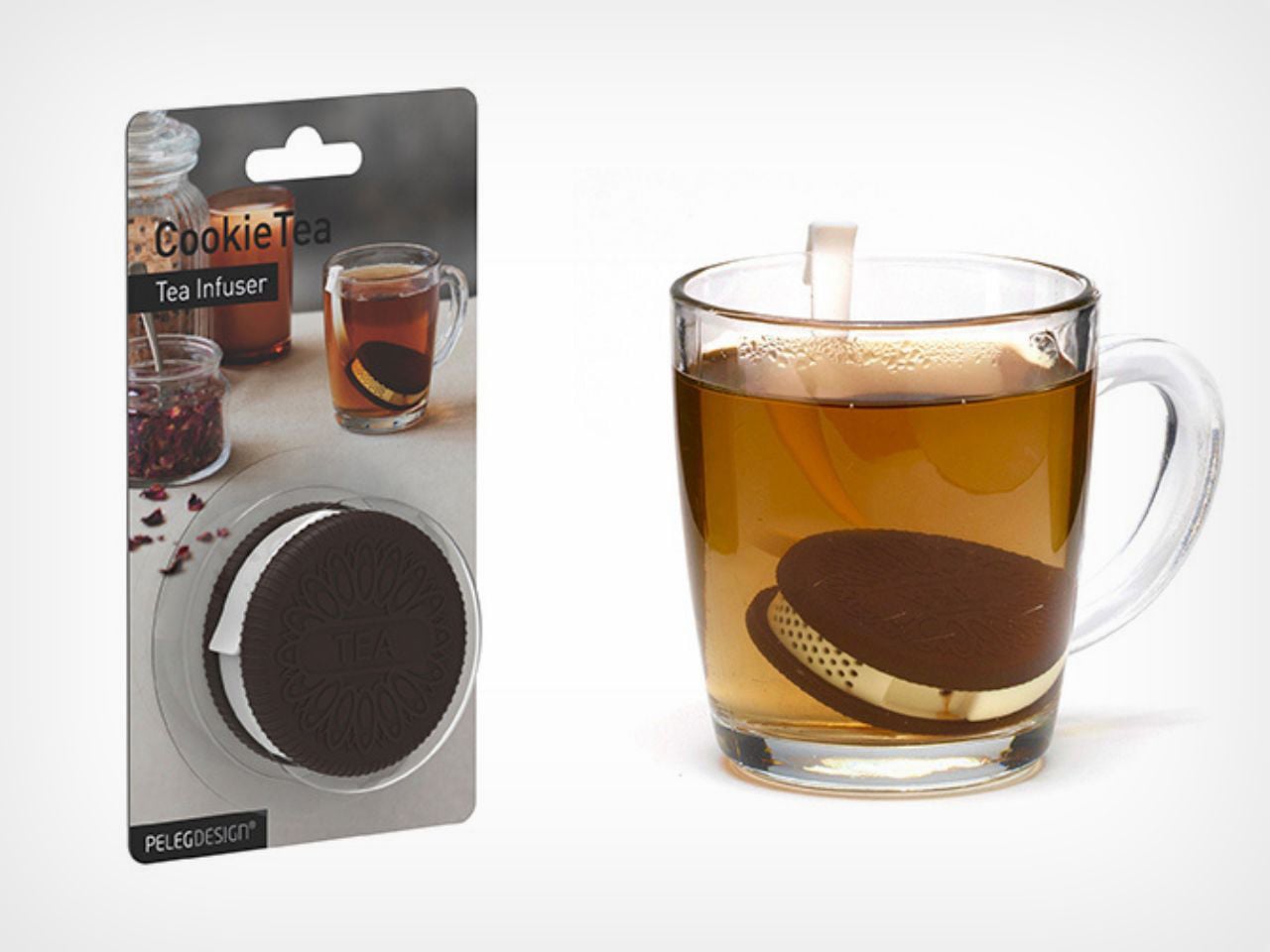
There’s something deeply comforting about a cup of tea, especially when it’s paired with an object that makes you smile before you even take the first sip. CookieTea, a tea infuser designed by Peleg Design, turns a familiar daily ritual into a small, joyful moment. Shaped like a classic sandwich cookie, it brings warmth, humor, and intention to the simple act of brewing tea.
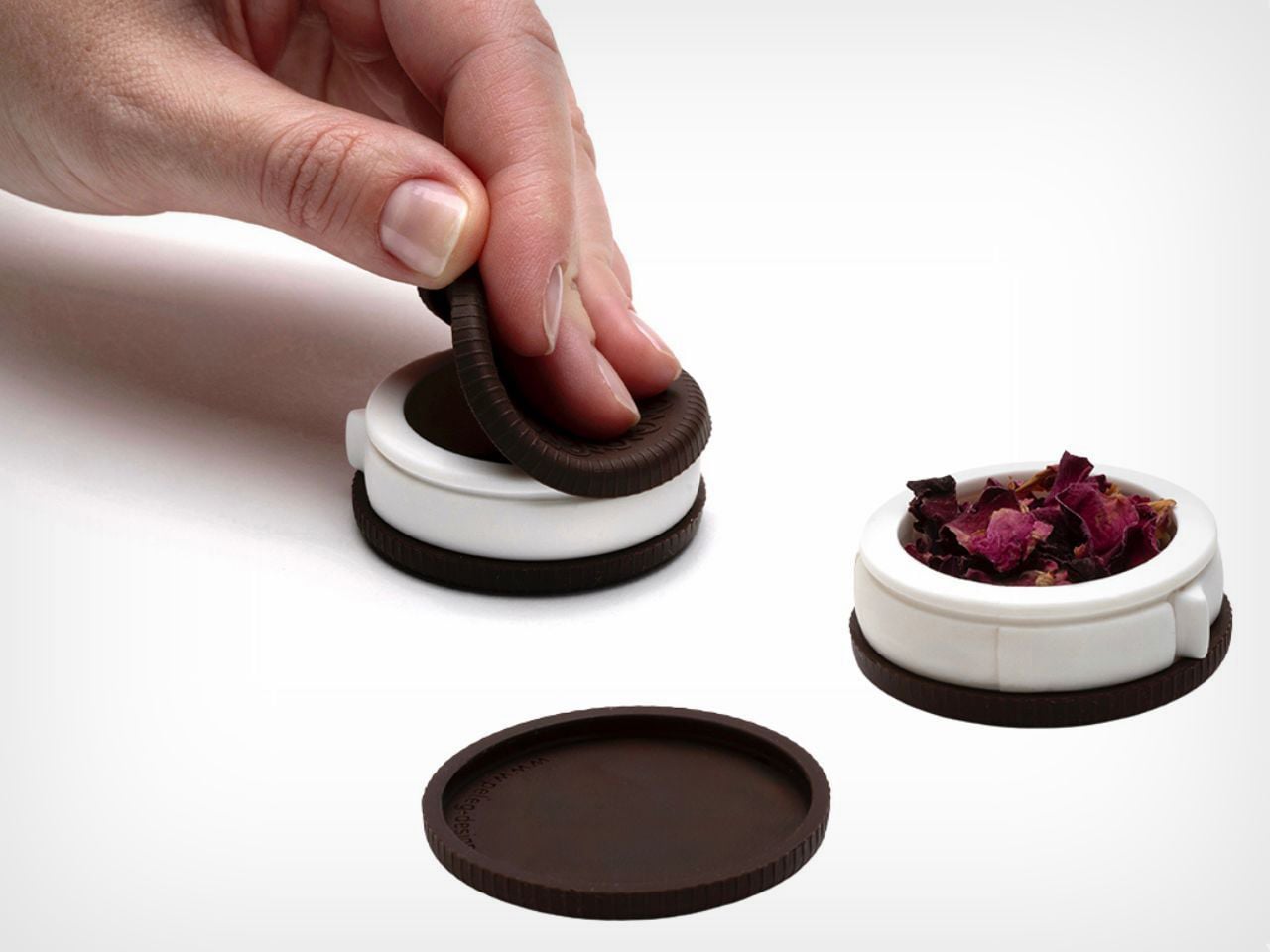
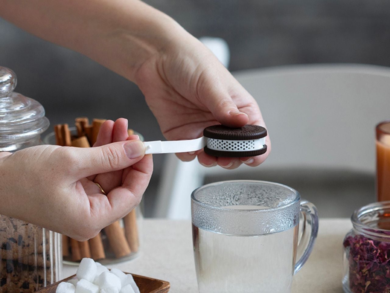
At first glance, CookieTea looks almost edible. The resemblance to a real cookie is so convincing that you might hesitate for a second before dropping it into your cup. That playful confusion is part of its charm. Unlike regular tea bags, which tend to disappear into the mug, this infuser is meant to be seen. When dunked into hot water, it looks deliberate and thoughtfully placed, as if it belongs there by design rather than necessity. The act of steeping suddenly feels visual and expressive, not just functional.
The experience goes beyond appearance. CookieTea is genuinely easy to use, even for someone who does not usually reach for loose-leaf tea. One side of the cookie lifts open effortlessly, creating a small compartment where you can add your preferred tea leaves. Once filled, it seals back securely with a simple press. There is no struggle, no fiddling, and no sense of fragility. The interaction feels natural and intuitive.
The cream layer of the cookie hides one of the smartest details of the design. A peelable strip controls how the tea infuses. When closed, it keeps the interior clean and contained. When opened, tiny perforations allow the flavor and aroma of the tea to mix with the water gently. This thoughtful mechanism ensures that the infuser performs just as well as it looks, balancing cleanliness with proper brewing.
Another small but meaningful detail is the hook-shaped edge built into the peelable strip. This allows CookieTea to rest securely on the rim of the cup, preventing it from sinking to the bottom or floating around while steeping. It also makes removing the infuser effortless once the tea is ready. It solves a common annoyance so quietly that you only realize how useful it is once you experience it.
After brewing, CookieTea continues to add value. Instead of feeling like something to hide away, it fits perfectly on a plate beside your cup. It adds to the overall table setting, enhancing the visual experience rather than disrupting it. Whether used during a quiet afternoon break or while hosting guests, it naturally becomes part of the moment.
CookieTea does not try to redefine tea drinking. It simply makes it more pleasant, more intentional, and more human. It is a reminder that good design lives in the details and that even the smallest everyday rituals deserve objects that spark joy.
Yanko Design’s podcast, Design Mindset, continues to bring compelling conversations with design leaders who are shaping the future of the industry. Powered by KeyShot, the show premieres weekly, offering listeners deep dives into the minds of innovators, strategists, and visionaries. Episode 15 tackles one of the most critical shifts happening in design today: how sustainability has moved from a nice-to-have checkbox to a core measure of design excellence itself.
This week’s guest is Lisa Gralnek, a brand builder with 25 years of experience who currently serves as U.S. Managing Director and Global Head of Sustainability and Impact for iF Design, a respected member of the international design community since 1953 and host of the prestigious iF Design Award. Lisa’s journey spans work with giants like Adidas and the Boston Consulting Group, giving her a unique vantage point on how sustainability has evolved from corporate afterthought to design imperative. In this conversation, she reveals how one of the world’s most prestigious design competitions is fundamentally redefining what “good design” means.
Embedding Sustainability into iF Design’s Evaluation Framework
When asked about the decision to make sustainability one-fifth of the iF Design evaluation framework, Lisa shared her pride in the initiative. iF Design has been operating since 1954 and now spans nine disciplines across 93 categories, from product and packaging to branding communications, UX, UI, service systems, architecture, and interior architecture. The shift was deliberate and structural: iF Design moved from a general “impact” criterion to explicitly isolating environmental and social sustainability as 20% of the score. Commercial impact was repositioned into differentiation, one of their five criteria, allowing them to “really single out the environmental and social ramifications of a design.” This alignment reflects the iF Design Foundation’s core mission to advance design for a better world.
The design thinking process involved convening a Sustainability Working Group of eight experts from around the world who bring deep, often sector-specific sustainability expertise. “We work together to figure out what is the process, what is the questions, what are the certifications and accreditations we’re acknowledging, as well, most importantly, I would say, of supporting the jurors as they go through this process as well,” Lisa explained. The group co-developed processes, discipline-specific optional questions, recognized certifications and accreditations, and on-site juror support aimed at consistency, rigor, and education for both entrants and jurors. This collaborative approach ensures that sustainability evaluation remains both credible and practical across vastly different design categories.
Distinguishing Authentic Impact from Greenwashing
One of the biggest challenges facing any sustainability evaluation is distinguishing genuine innovation from performative claims. Lisa explained how the first year revealed significant gaps: jurors felt skeptical not about sustainability itself but about making accurate judgments with insufficient information. At that first jury, sustainability experts were on the ground for only the second year, and the feedback was clear. Entrants weren’t providing enough detail in the character-limited impact field for jurors to make informed decisions, whether they were discussing environmental impact, social impact, or business impact.
The solution was to embed three optional questions into every discipline, sometimes tailored at the category level, along with a selectable list of objective global, regional, and industry-led certifications. These questions remain optional because iF’s mandate focuses on rewarding good design rather than punishing inadequate submissions. Lisa gave a concrete example of how this helps identify hollow claims: when a television or computer monitor entry discusses sustainable packaging in the sustainability field, it raises red flags because the entry itself is about the product, not the packaging. In packaging specifically, iF piloted requesting a bill of materials (BOM) or digital product passport (DPP) to quickly validate claims about recycled content, compostability, low-impact inks, and water-saving processes. Interestingly, packaging entries dipped this year, raising the question of whether increased scrutiny discouraged greenwashing or simply affected submission rates.
“Fewer, Better” as a Design and Consumption Ethos
Lisa’s philosophy around sustainable design cuts to the heart of overconsumption. She candidly admitted that if she were being a radical sustainabilityist, “none of us needs anything. None of us needs anything anymore.” She recalled an interview on The Economist after the 2008 financial collapse where experts insisted people needed to buy, that society needed to incentivize consumption. But consuming our way out of financial collapse, she argues, represents the capitalistic model and business operating system of the world without necessarily serving the planet or people. Her first jury experience brought this reality into sharp focus: walking into the warehouse where 50% of the 10,000 to 12,000 annual entries are physically displayed, she burst into tears. The sheer volume of stuff human beings create, all in service of capitalism’s engine, became overwhelming when viewed through a sustainability lens.
So what does “fewer, better” actually mean in practice? Lisa explained it operates on two levels: individual conscious consumption choices and organizational design decisions. At the designer and company level, it means thinking through the circular R ladder: what can we refuse, rethink, reduce, reuse, repair, recycle, refurbish, or resale? “Fewer, better is like, I think it’s less extractive and more regenerative,” she explained. This approach shifts the entire paradigm from novelty-driven production cycles to necessity-driven design that prioritizes extending product lifecycles and reducing resource pressure. Even digital alternatives and AI, which some propose as solutions, carry their own massive environmental footprints, making the “fewer, better” ethos essential regardless of the medium.
The Shift from “Nice-to-Have” to Imperative
Lisa has been passionate about sustainability since early in her career, leaving fashion after nine years because she’d lost appreciation for the craft amid the luxury sector’s excesses. She attended graduate school intending to return and work on sustainability in luxury, but graduated into the 2008 financial collapse when sustainability wasn’t even a conversation starter. Her time at Boston Consulting Group revealed the depth of corporate resistance: she vividly remembers asking a snack food company CEO about greening their packaging supply chain at a luncheon and being laughed at by both the CEO and a senior partner. Whether the dismissal stemmed from her being a young woman among older men or the sheer absurdity they perceived in the question, she witnessed this pattern repeatedly across retail, travel and tourism, consumer packaged goods, and fashion. The consistent message: sustainability is awesome, so long as it doesn’t cost margin or sales.
Yet Lisa sees a significant shift happening now, driven primarily by consumers. Awareness of climate change, planetary degradation, and social unfairness has grown dramatically, particularly as social media makes information more accessible regardless of which news sources people consume. Most people globally now recognize there’s a problem and understand that action is needed. There’s also a compelling business case, as demonstrated by Walmart’s LED transition 15 to 18 years ago. Despite enormous upfront costs to change every light bulb in every warehouse and retail store, the head of sustainability reported a payback period of just three and a half weeks in energy savings. “So often you just need to make the change and people are so scared and teams are so siloed and you know people are afraid like you can’t be afraid and the business case is almost oh almost always there to do better,” Lisa observed.
Technology’s Double-Edged Sword: E-Waste and Hope
When asked about sustainable design trends she wished would disappear, Lisa pointed to a concerning paradox: our increasing dependence on technology. E-waste is burying us, with most electronic waste filled with rare earths that are extremely difficult to mine and controlled by very few players. This issue increasingly surfaces in geopolitical conversations and international trade negotiations yet remains underrepresented in sustainability discourse. Lisa referenced a presentation at South by Southwest where visuals showed the number of dump trucks filled with e-waste every hour that the world creates and deposits into landfills. These landfills poison water sources and ground soil, creating massive downstream pollution and health impacts. Everything exciting and technological, while representing the direction the world is heading, simultaneously presents this enormous environmental problem.
Yet within this challenge lies genuine hope. Lisa expressed excitement about the increase in repairability, recyclability, upgradability, and upcyclability in electronics, whether discussing car batteries, e-bike batteries, mobile phones, speakers, or computer interfaces. The momentum isn’t moving fast enough and integration remains incomplete, but the trajectory points toward keeping electronics in use longer and reducing waste. This trend represents designers and companies genuinely rethinking product lifecycles and moving away from planned obsolescence. Lisa’s realistic optimism captures the mindset she sees among sustainability leaders across disciplines: they’re very realistic about where we are and where we’ve been, but they’re willing to fight for transformation in the future. They recognize that future transformation only becomes possible when action starts today, with imperfect solutions, uncomfortable conversations, and puzzle pieces that contribute to a larger systemic change.
Design Mindset, Powered by KeyShot, premieres every week with new conversations exploring the minds shaping the future of design. Listen to the full episode with Lisa Gralnek to hear more insights on sustainability and how it plays a pivotal role in shaping iF Design’s outlook.
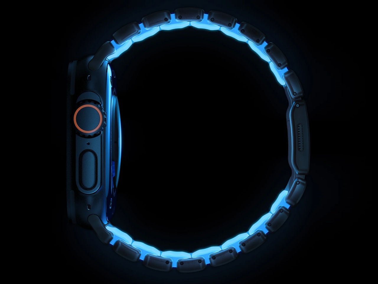
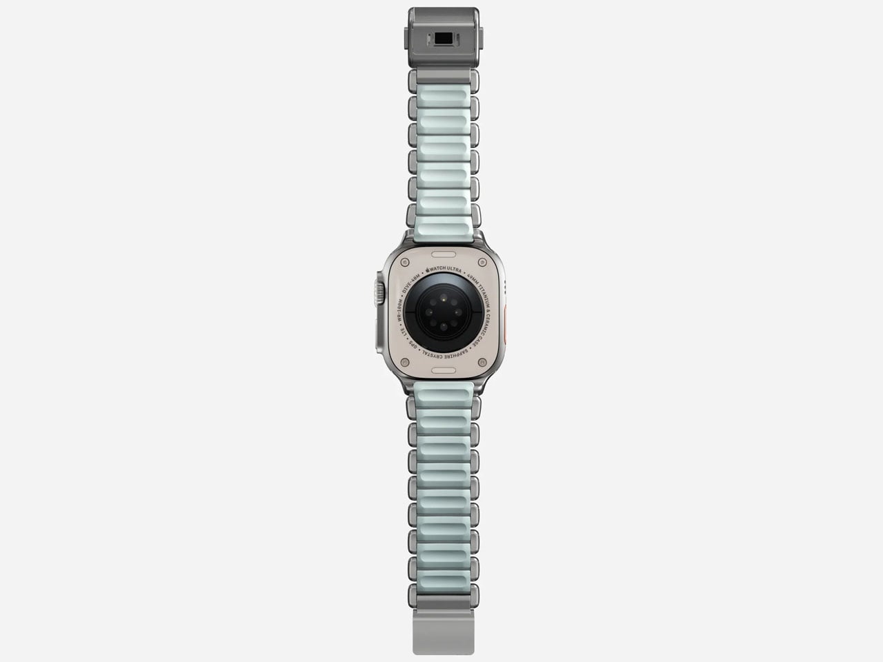
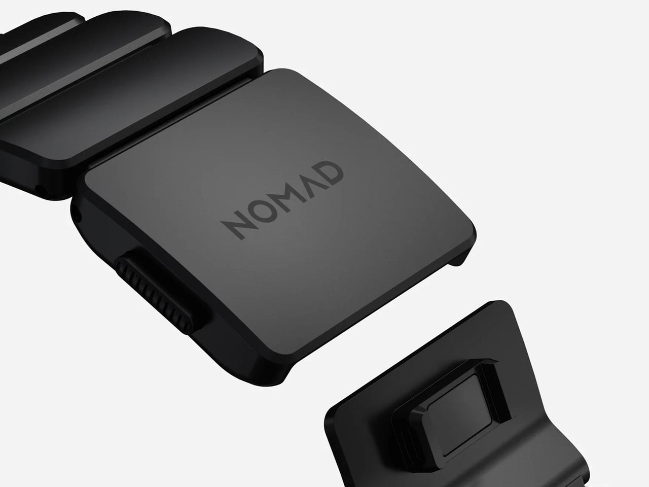
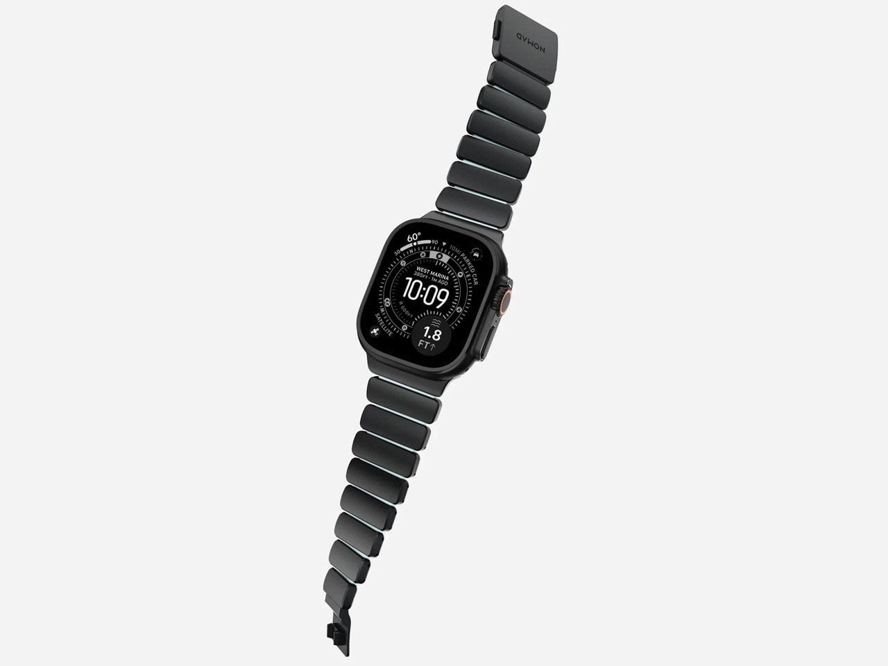
Getting a watch band for your Watch Ultra just got interesting with Nomad’s latest addition to the Stratos Band line-up. After the success with the custom fit band designed for the Ultra in titanium finish and the FKM links, which is more comfortable to wear and touch, this watch band is irresistible. Coming in a fluoroelastomer cast that glows in Tron-like hues, the band demonstrates how “performance and fun can happen at the same time.” Nomad calls it the Icy Blue Glow version, and it’s a limited-run creation that pairs rugged durability with understated style.
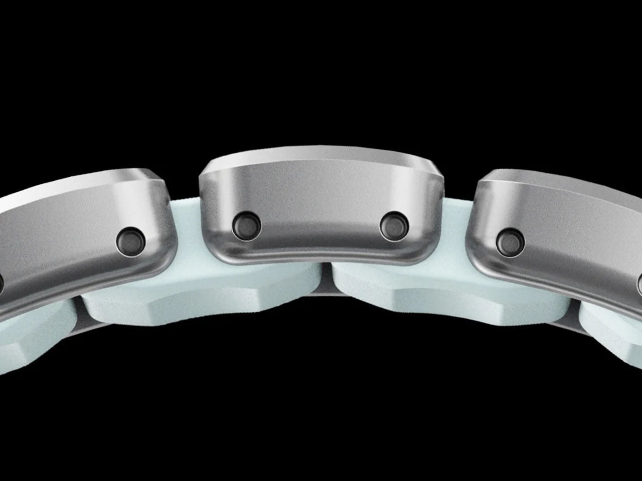
The new Stratos Band blends Grade 4 titanium hardware with compression-molded FKM fluoroelastomer for a hybrid design that balances strength and flexibility. The titanium outer links provide a refined look and robust build, while the FKM interior links contour around the wrist for comfort and movement that traditional metal bands rarely offer. This dual-material approach also introduces subtle ventilation spaces, which help with moisture evaporation and breathability during everyday wear or more intense activity.
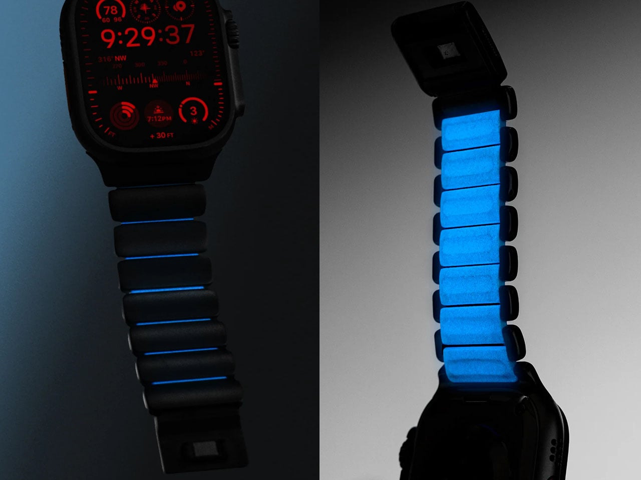
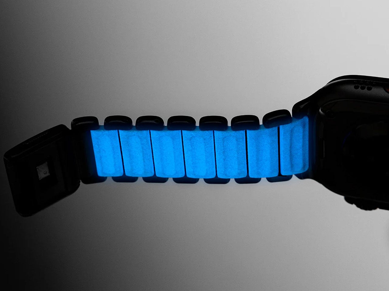
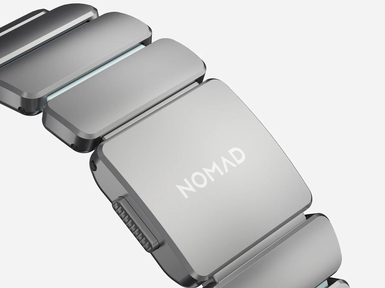
What sets the Icy Blue Glow edition apart is the photoluminescent material infused into the interior FKM links. This compound absorbs light throughout the day and emits a soft blue glow in low-light conditions. The glowing effect is more subdued in typical environments because the material sits beneath the titanium, but it still produces a cool, visual accent in the dark that distinguishes it from more conventional bands. Nomad equips this limited version with a custom magnetic clasp engineered for secure closure and corrosion resistance. The clasp remains fastened through daily movements yet opens easily when the sides of the buckle are squeezed. Users can also fine-tune the band’s fit using the included tool to remove or add links, making customization straightforward.
Though designed from the ground up for Apple Watch Ultra models 1 and higher, the Stratos Band is also compatible with earlier Apple Watch Series 1–11 and SE models, offering versatility across a wide range of devices. The band’s flexible design supports wrist sizes generally between 130 mm and 200 mm, and its construction balances a weight that feels substantial without being cumbersome. The titanium elements are finished with a scratch-resistant DLC coating, adding resilience for adventures and daily use alike.
The fluoroelastomer material itself is antimicrobial and can be cleaned easily with soap and water, supporting hygiene for wear during workouts or outdoor activities. The band’s water-resistant design further reinforces its adaptability to various lifestyles, though it’s recommended to allow the band to dry fully after exposure to moisture. Priced at $189, the Stratos Band Icy Blue Glow edition offers a premium alternative to standard Apple and third-party bands with a playful glow-in-the-dark element.
Marshall plans to add seamless multi-room audio to its Bluetooth speakers via a newly announced music streaming hub called Heddon. The $300 hub makes it possible to connect and synchronize multiple older Marshall speakers together, not unlike Sonos' audio devices.
Rather than use Wi-Fi to get multiple speakers playing the same audio, though, the Marshall Heddon uses Auracast. The hub connects to services like Spotify Connect or Tidal over Wi-Fi, or other devices through Google Cast and AirPlay, and then shares that audio over Auracast to the Marshall Acton III, Stanmore III and Wobrun III speakers. You can control playback over a connected Marshall app and the Heddon also has RCA ports to connect other speakers or a record player to the system.
Because the Heddon requires a Wi-Fi connection, Marshall says it could add features to the system over-time, but even in the short term, the hub should meaningfully extend the life of the company's speakers. Rather than switch to newer models with built-in Wi-Fi, you can just grab a Heddon. Sonos offers similar functionality through its Sonos Port and Sonos Amp accessories, and third-party hubs from companies like WiiM can add even more options. The Marshall Heddon is more streamlined in comparison, but if you're already invested in the company's speakers, or planning to build out your audio system with them, the hub could be a helpful tool to have.
The Marshall Heddon is available to purchase now for $300. Marshall says that customers purchasing an Acton III, Stanmore III or Woburn III can get a Heddon at half price, and the hub is included for free when you buy two or more eligible Marshall home speakers.
This article originally appeared on Engadget at https://www.engadget.com/audio/marshalls-new-heddon-hub-adds-multi-room-audio-to-speakers-with-auracast-210500811.html?src=rss
Apple has been spinning its wheels for many months over its approach to artificial intelligence, but a strategy finally appears to be emerging for the company. Bloomberg's Mark Gurman reported today that Apple's long-awaited Siri overhaul will allegedly involve transforming the voice assistant into an AI chatbot, internally called Campos.
Sources have reportedly told Gurman that Apple chatbot will completely replace the current Siri interface in favor of a more interactive model similar to those used by OpenAI's ChatGPT and Google's Gemini. He also cited sources who claimed that while Apple has been testing a standalone Campos app, the company doesn't plan to release it for customers. Instead, the new chatbot will emphasize deep software integrations when it rolls out, reportedly as part of the iOS 27, iPadOS 27 and macOS 27 wave late next year. However, there will reportedly be a new features for the current iteration Siri coming in the iOS 26.4. Those additions will include the much-delayed updates Apple first promised for the platform back in 2024.
Pivoting to a chatbot gives some additional context to Apple's recent move to collaborate with frequent rival Google; the companies announced earlier in January that Gemini models will be used to power the upcoming versions of Siri. Gemini has become ubiquitous in the Google ecosystem, and it makes sense for Apple to leverage outside help in this segment where it has already been trailing its competitors.
Although Apple may not have a standalone app for its Siri chatbot, the company does appear to be considering new places to host its AI resource. Additional reports today claimed that 2027 could also see the release of a wearable AI pin.
This article originally appeared on Engadget at https://www.engadget.com/ai/apple-is-reportedly-overhauling-siri-to-be-an-ai-chatbot-205303818.html?src=rss
Apple will reportedly try to succeed where Humane failed (miserably). On Wednesday, The Informationreported that the iPhone maker is working on an AI pin. The wearable is said to resemble a slightly thicker AirTag and include multiple cameras, a speaker, microphones, and wireless charging.
The report coincides with another from Bloomberg that claims that Apple will revamp Siri as a ChatGPT-style chatbot. When combined with the recent announcement that Google's Gemini will power Siri AI, it looks like the company is finally making a more defined play for a piece of the generative AI pie. On the other hand, the wearable pin is reportedly only in the very early stages and could still be canceled.
The pin is described as a thin, flat, circular disc with an aluminum and glass exterior. It includes two cameras (standard and wide-angle) for taking photos and videos of the user's surroundings. It also has three microphones. It includes a speaker and a physical button along one edge. It has a magnetic inductive charging interface, similar to the Apple Watch's charging mechanism.
Given the way Apple markets itself as a privacy-focused company, it will be interesting to see how the company pitches the public on what sounds like an incognito recording device. Although on that note, the App Store still hosts the Grok app, which egregiously violates privacy by generating nearly-nude deepfakes of real people — despite Apple's rules explicitly prohibiting such apps.
The Information says Apple could release its AI pin as early as 2027. The company sounds confident in the device's appeal, as it reportedly plans to produce around 20 million units at launch.
This article originally appeared on Engadget at https://www.engadget.com/wearables/apple-is-reportedly-developing-a-wearable-ai-pin-204705065.html?src=rss
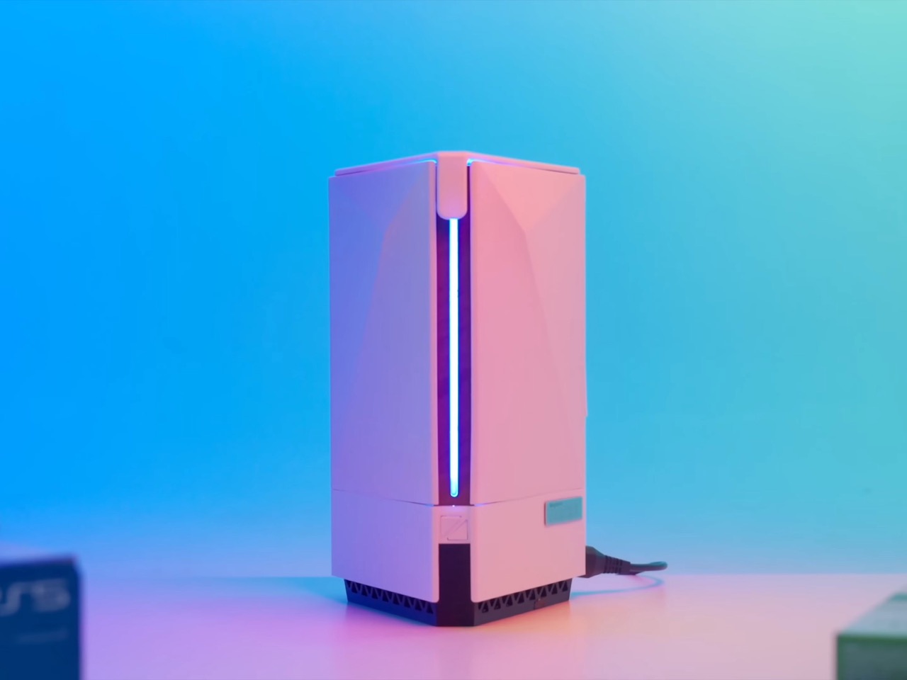
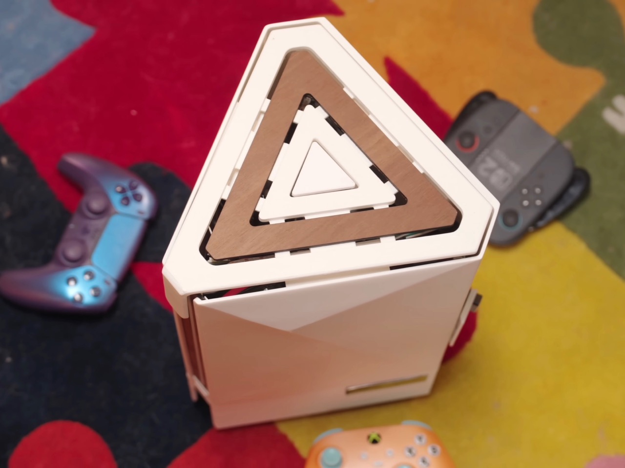
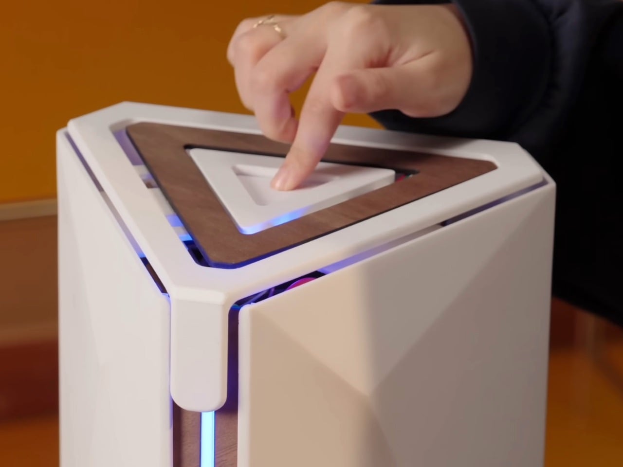
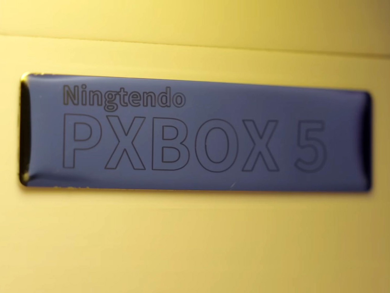
The console wars are dead. And what killed them wasn’t rising RAM prices, GPU scarcity, tariffs, or any sort of monopolistic practices. It was one modder who was tired of the multi-ecosystem approach. Chinese hardware enthusiast 小宁子 XNZ (or XNZ for short) looked at her collection of gaming consoles, realized she was constantly swapping cables and power supplies just to access different game libraries, and decided to do something about it. The result is the Ningtendo PXBOX 5, a custom-built system that combines PlayStation 5, Xbox Series X, and Nintendo Switch 2 hardware into a single triangular chassis that switches between all three platforms with a button press. One console to rule them all…
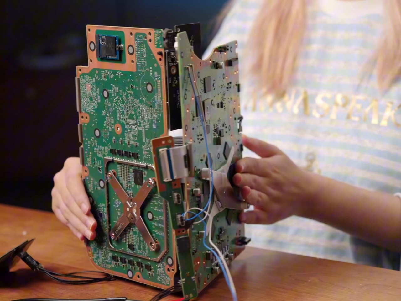
XNZ stripped each console down to its motherboard and mounted them on three sides of a custom aluminum cooling block, inspired by the old trash can Mac Pro design. A single 250-watt power supply feeds everything, while a Phanteks fan at the bottom pushes air through the shared heatsink. Press the button on top and an Arduino board handles the switching logic, cycling through the three systems in about three seconds. A front-mounted LED strip glows blue for PlayStation, green for Xbox, or red for Switch 2, so you always know what’s active. The catch is you need to close your game before switching to avoid overloading the power supply, but that’s a small price to pay for having Sony, Microsoft, and Nintendo living peacefully under one roof. Both the PS5 and Xbox are digital-only versions, so no disc drives made it into the final build.
Designer: 小宁子 XNZ
XNZ pulled inspiration from Apple’s 2013 trash can Mac Pro, which remains one of the most divisive desktop designs Apple ever shipped. That machine had a triangular prism cooling system sitting dead center, with each of its three sides pressed tight against a separate component board. A fan at the top pulled hot air straight up through the whole assembly in one clean thermal column. Apple bet wrong on dual-GPU workstation builds and killed the product line, but the core thermal design was actually brilliant. For this project, it turned out to be the perfect blueprint. Three consoles, three motherboards, three sides of a triangle. The geometry practically solved itself.
Building that triangular heatsink presented a different problem entirely. XNZ needed dense fins capable of dissipating heat from three different APUs, but CNC machining quotes came back at around $700. Metal 3D printing wasn’t much better, and both options involved waiting in manufacturing queues that would kill any chance of rapid iteration. So she went old school. Really old school. We’re talking 1,500 years old.
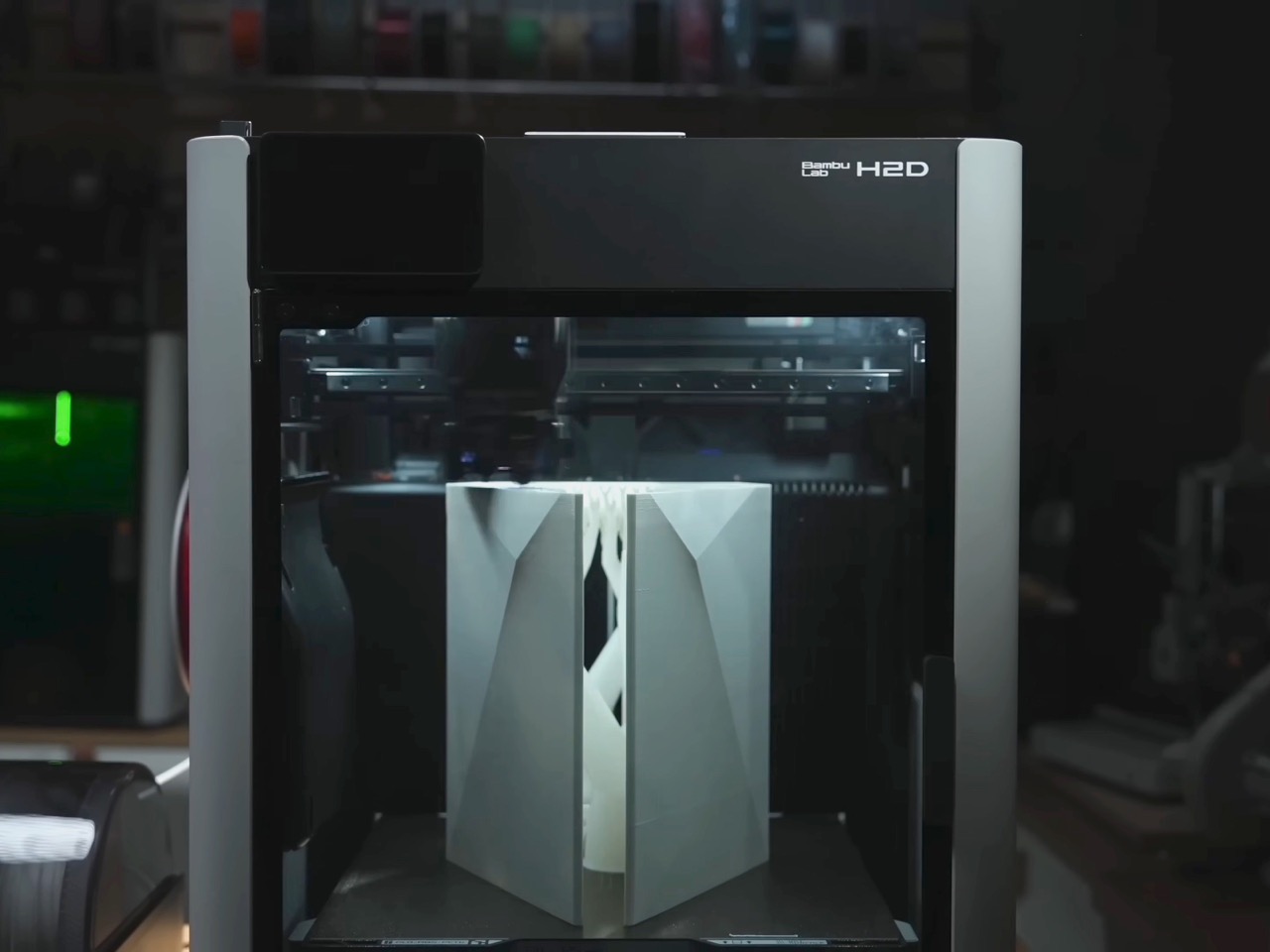
Lost-wax casting has been around since ancient China, traditionally used for intricate bronze artifacts like the Yunwen Bronze Vessel. The principle is simple: carve a detailed model in wax, coat it in clay, melt out the wax, and pour molten metal into the cavity left behind. XNZ modernized the process by replacing wax with PLA filament from her 3D printer. She designed the heatsink in CAD software, printed it with support structures and cooling channels built right in, then encased the whole thing in high-temperature gypsum. The gypsum can withstand 700 degrees Celsius while PLA starts melting at 100 degrees and burns completely by the time you hit 700. Stick it in an electric kiln, run it through four heating stages over 12 hours, and you’re left with a clean ceramic mold ready for aluminum.
The first casting attempt failed halfway through when the molten aluminum cooled too fast and solidified before filling the entire mold. The fins were also too dense, causing the thin gypsum walls between them to crack. XNZ adjusted the fin thickness, changed their orientation to shorten the flow path, and recalibrated both the mold temperature and the aluminum pour temperature. Second attempt came out perfect. The surface captured fine details from the 3D print, including the layer lines from the support structures on the bottom. After sawing off the pouring gate and polishing the contact surfaces, she had a functional aluminum heatsink that cost maybe 50 bucks in materials instead of several hundred in machining fees.
Copper plates bolt onto two sides of the aluminum block where the PS5 and Xbox motherboards make contact. The third side, reserved for the Switch 2, doesn’t get a copper plate because Nintendo’s handheld apparently doesn’t need active cooling when docked. Thermal paste replaces the PS5’s stock liquid metal since the copper and aluminum combo provides enough thermal mass. During testing, the whole system ran Elden Ring for 30 minutes without overheating warnings, topping out at 60 degrees Celsius measured across the heatsink surface. That’s impressive considering you’ve got three separate APUs sharing one cooling solution and one 12-centimeter fan doing all the work.
The Switch 2 integration required a custom dock since the handheld needed to remain removable. XNZ gutted Nintendo’s official dock, pulled out the USB-C daughterboard and relevant electronics, and stuffed everything into a 3D-printed housing that attaches to the cooler’s third face. She wanted a spring-loaded ejection mechanism like a toaster, but metal springs couldn’t provide enough force to overcome USB-C port friction. The solution came from Bambu Lab’s MakerWorld, where she found a parametric spring generator that lets you customize dimensions through simple value inputs. She printed the entire dock assembly using dual-extrude printing with PLA for the rigid case and PETG for the flexible spring components. The two materials bond during printing so the spring stays permanently embedded in the structure but remains fully functional right off the print bed.
Power management turned out simpler than expected. The PS5 pulls 225 watts under full gaming load but drops to 4 watts in standby. The Xbox Series X shows similar behavior. A gallium nitride 250-watt power supply handles both consoles running in parallel as long as you’re only actively gaming on one at a time. The Switch 2 gets its juice through a transformer and USB-C PD trigger that converts the main rail voltage. An Arduino board sits inside the case managing power distribution and HDMI switching, triggered by that single button on top. Press it once and the LED bar changes color while the Arduino routes both power and video output to the next console in the sequence. Takes three seconds to complete the switch, which is faster than most people can close their game and navigate back to the home screen anyway.
The whole thing weighs less than having three separate consoles on your shelf and uses one HDMI cable, one power cord, and zero mental energy deciding which box to turn on. Sure, you lose disc drive functionality since both the PlayStation and Xbox are digital editions. And yes, the 250-watt ceiling means no running multiple games simultaneously or the power supply trips. But XNZ built a working proof of concept that platform exclusivity is a solvable engineering problem, not some immutable law of physics. Sony, Microsoft, and Nintendo have spent decades convincing people their ecosystems need to stay separate. One person with a 3D printer, some molten aluminum, and a weekend said otherwise.
Microsoft has announced that the Xbox app is now available on all Arm-based Windows 11 PCs. The app's release follows an update Microsoft made to its Prism emulator in December 2025, which translates x86 and x64 apps to Arm, and now includes support for AVX and AVX2. Both extensions play a role in making games run efficiently on Windows.
Windows on Arm users will be able to use the Xbox app to purchase, download and stream PC games, and Microsoft says that "more than 85 percent of the Game Pass catalog" now runs on Arm PCs. Unlike Valve's SteamOS, Windows on Arm also supports anti-cheat software like Epic's Easy Anti Cheat, which means you can access a wider library of online multiplayer games in comparison to what you can get on the Steam Deck.
Microsoft has been working on getting Windows running on Arm for years at this point, and the company made a major push with its own Arm-based hardware and the launch of the Copilot+ PC program in 2024. Many Copilot+ PCs use Qualcomm's Snapdragon chips, the latest of which the company announced in September 2025. Up until this point Microsoft's handheld efforts have been focused on PCs running AMD chips, but expanded support for Arm and Qualcomm's own teases certainly makes it seem like an Arm-based Windows 11 handheld could be announced sooner rather than later.
This article originally appeared on Engadget at https://www.engadget.com/gaming/pc/microsoft-ports-the-xbox-app-to-arm-based-windows-pcs-191049475.html?src=rss