A Robot Dog That Wants You to Go Outside? Lassie Might.

Dogs have a way of making you do things you wouldn’t otherwise do. Get out of bed on a rainy morning. Walk around the block just one more time. Stop and talk to the stranger whose dog has already decided you’re friends. That behavioral magic, the way a dog quietly anchors your day to movement and connection, is exactly what a new design concept called Lassie is trying to bottle.

Designed by Jungmin Park, Hyeonji Yang, and Junghyun Kim, and Specif.ic, Lassie is a robot companion framed not as a novelty or a tech flex, but as a genuinely purposeful object. The concept reimagines what a robot dog can be when the goal isn’t to simulate a living animal, but to borrow the social mechanics that make real dogs so quietly good for us. The distinction matters more than it sounds.

Designers: Jungmin Park, Hyeonji Yang, Junghyun Kim, Specif.ic

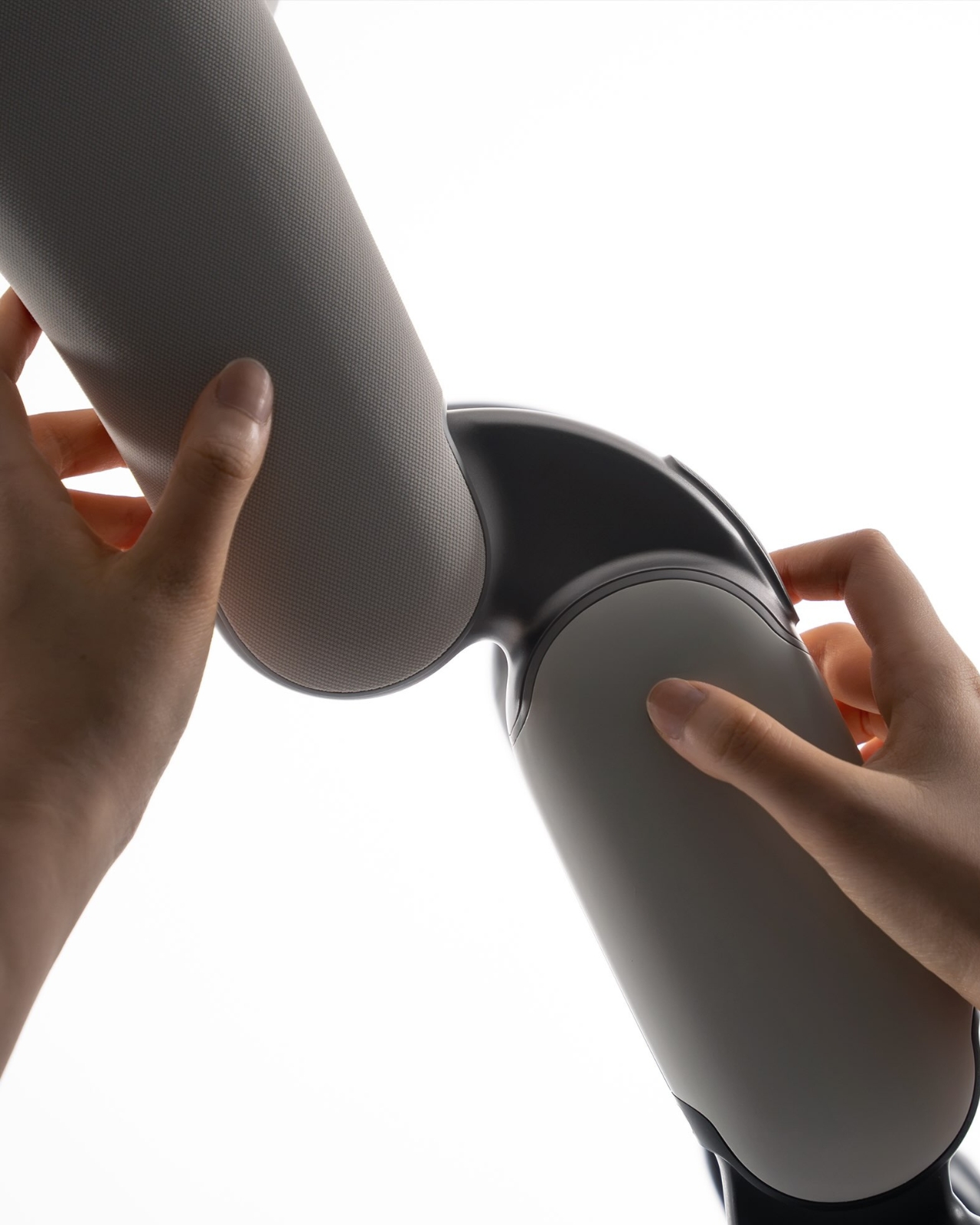
Most robot dogs on the market, from Boston Dynamics’ Spot to Sony’s Aibo, are designed to impress. They’re engineering showcases, objects that perform agility or affection in ways that feel slightly alien even when they work perfectly. Lassie takes a quieter path. Its rounded, fabric-wrapped body is soft and approachable rather than sleek and intimidating, somewhere closer to a plush toy than a machine. That’s a deliberate aesthetic choice, and a smart one. When something looks warm and familiar, people naturally engage with it differently. The texture and softness signal approachability, not capability, and in this case, that’s exactly the point.
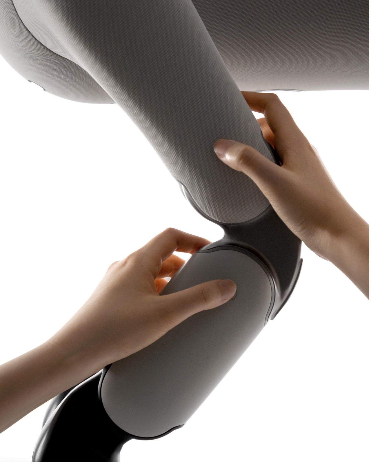
The design features customizable fabric suits and interchangeable leg modules, which means Lassie can adapt to different lifestyles and settings rather than arriving as a fixed, finished product. That modularity feels important. It signals that this isn’t meant to be a passive object you display; it’s meant to evolve with you. Whether that’s a practical consideration or mostly a design language statement at this stage, it still communicates the right values: flexibility, ownership, and personalization.
The core proposition is that Lassie encourages you to go outside, explore your city, and meet people along the way. It leans into the same behavioral nudges that real dogs provide, the social permission to be out in the world, to slow down and notice things, to become approachable to strangers. Dog owners know this phenomenon well. The dog is often less a companion than a social passport.

My instinct says this framing is sharper than most wellness tech promises, because it’s not asking you to track your steps or hit a goal. It’s asking you to have a companion. That’s a meaningfully different pitch, and one that’s considerably harder to ignore, forget, or eventually uninstall. Fitness trackers tell you what you should do. A companion, even a robot one, makes you want to do it.
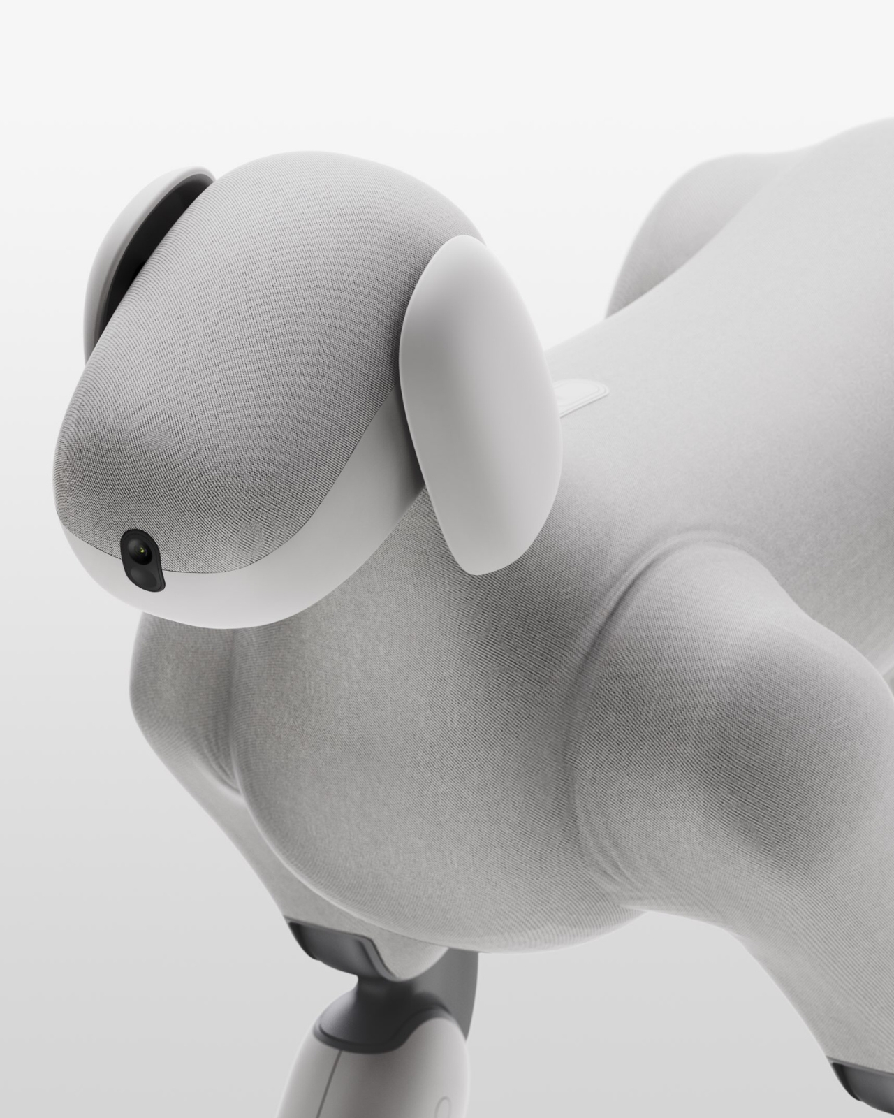
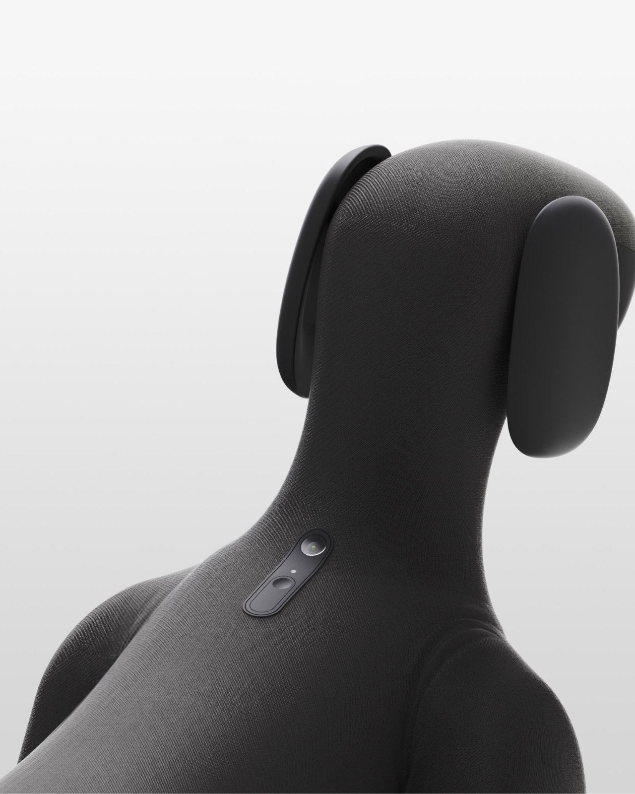
The visual language of Lassie is worth sitting with, too. Rendered in soft sage green, white, grey, and charcoal black, it occupies a quiet space between sculpture and product. The camera lens embedded subtly in the face gives it just enough presence to feel alive without trying too hard to be cute. Compared to most robot dogs, which tend to oscillate between unsettling realism and obvious plasticity, Lassie lands somewhere more restrained and genuinely considered.
The real test, of course, is whether any of this holds up beyond concept renders. Robotics is littered with beautifully designed ideas that quietly disappear before reaching a single living room. But the thinking behind Lassie doesn’t feel like it needs a fully functional robot to prove its point. The question it’s posing, about what we actually want technology to do for our physical and social lives, is exactly the right one to be asking right now.

We keep building tools that make us more comfortable staying still, more insular, more mediated. A robot dog specifically designed to push back against that tendency is, at minimum, asking the correct question. And if it eventually gets made and actually works? That would be genuinely worth the walk.


The post A Robot Dog That Wants You to Go Outside? Lassie Might. first appeared on Yanko Design.

Narwal’s 31,000Pa robot vacuum has a flattened roller mop and a dock that looks like decor

There are two things robot vacuum brands rarely linger on for long, probably because neither one looks especially glamorous in a product keynote. The first is the dirty mop problem, where a machine starts with good intentions and ends up dragging around a damp record of everything it picked up ten minutes earlier. The second is the dock problem, which is easier to ignore in press shots than in real life, especially when that dock has to sit in your bedroom, hallway, or living room looking like a squat little appliance monument. Both of those problems have been present since the earliest robot mop launched, and both have been quietly shuffled behind flashier features ever since. For a category built on convenience, that has always felt like a pretty strange compromise.

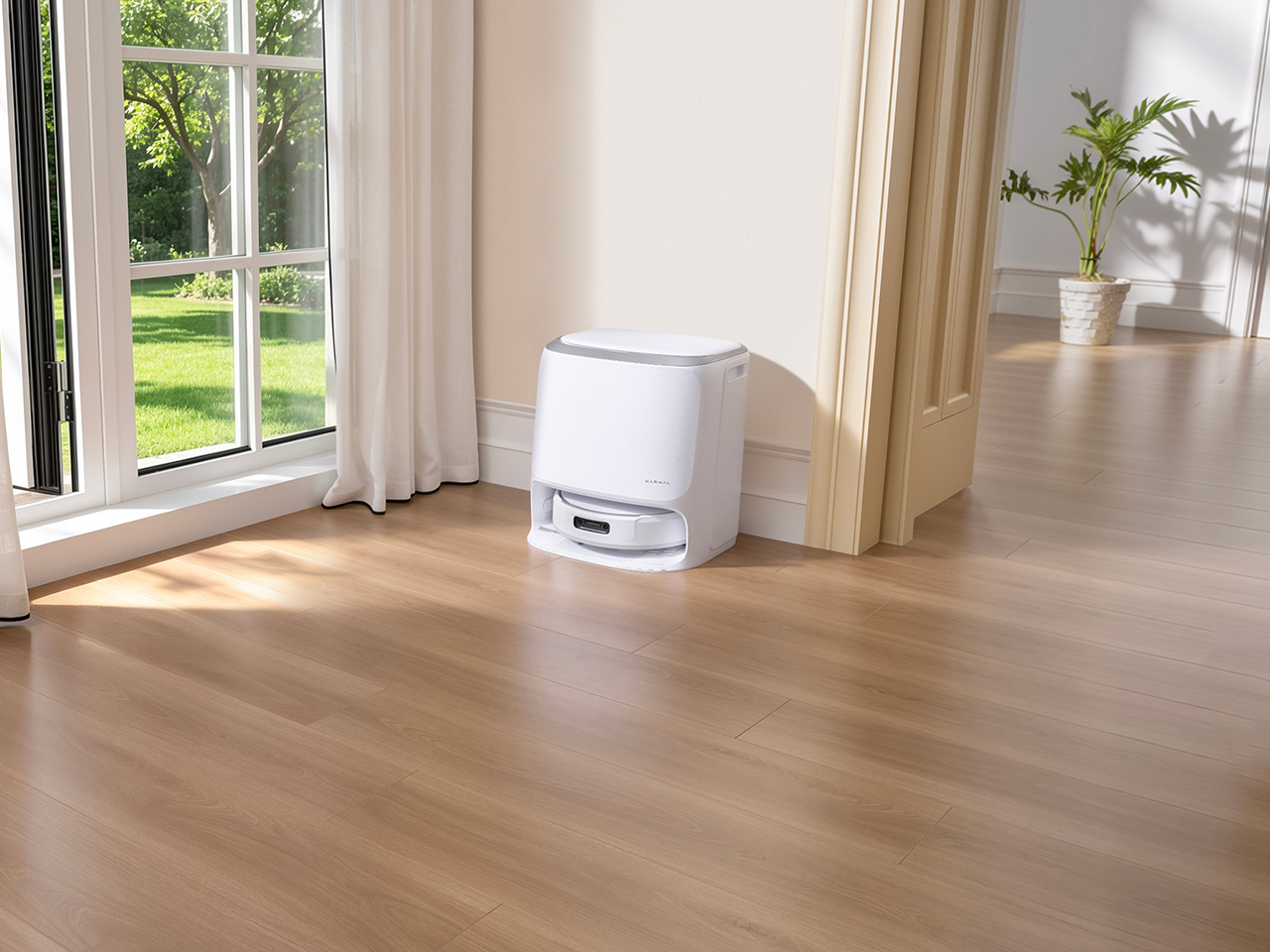
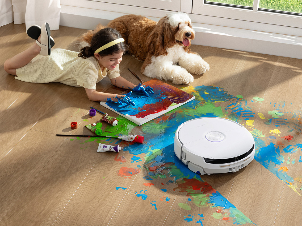
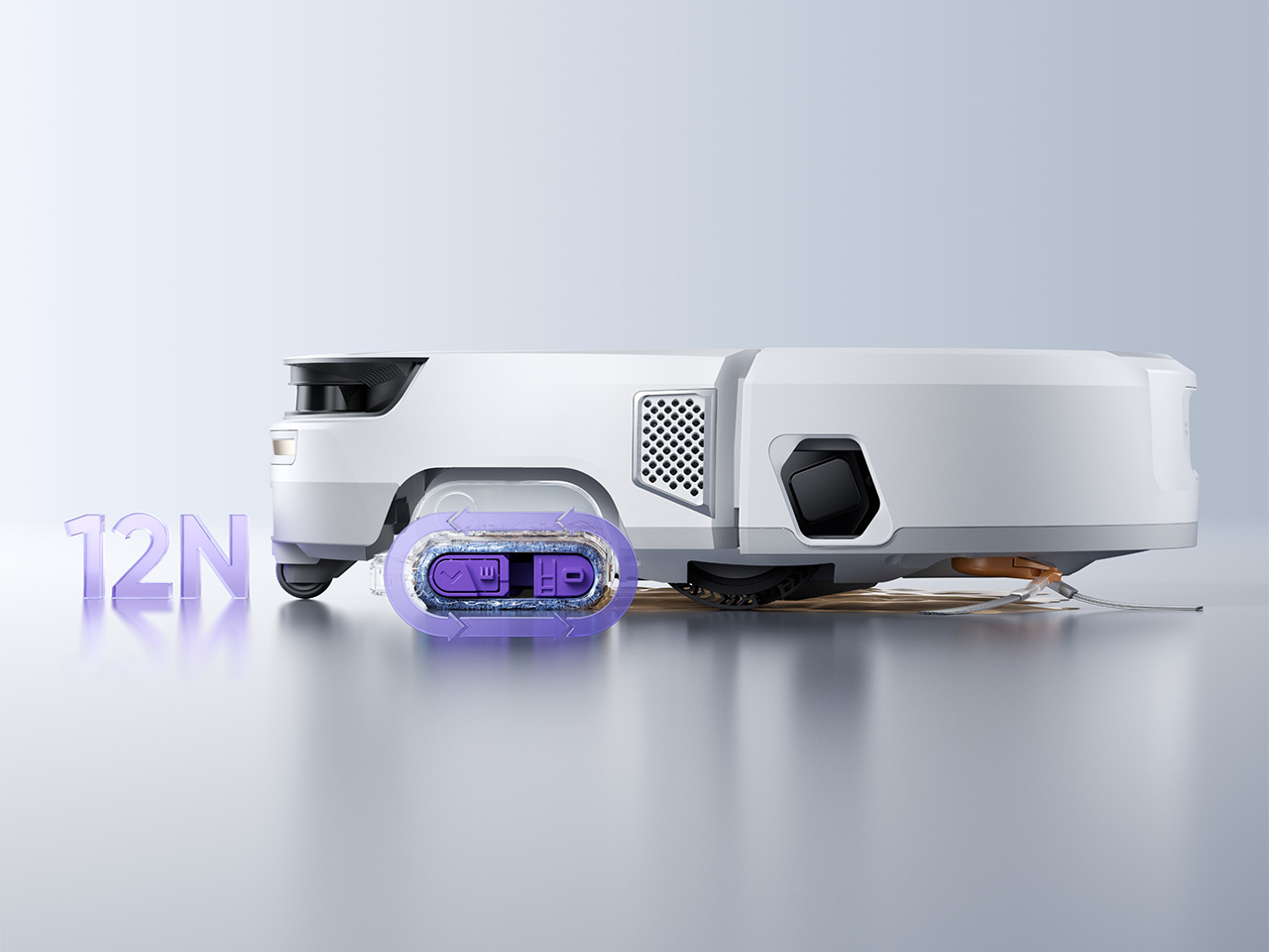
The Narwal Freo 20 is interesting because it goes straight for those two pain points instead of dressing them up as side benefits. Its flattened Track Mop keeps cleaning itself in real time with hot water, pressure, and built-in dirty water extraction, which is a much more convincing pitch than the usual promise of “better mopping” with no explanation attached. Then there is the dock, wrapped in a woven texture that feels more like something designed for a home and less like a machine you are expected to hide behind a plant. That combination gives the Freo 20 a sharper identity than most robot cleaners. It seems tuned to the actual experience of living with one, mess, maintenance, decor, and all.

Designer: Junbin Zhang

Click Here to Buy Now: $849.99 $1,099.99 ($250 off, use coupon code “YANKOF20”). Hurry, deal ends soon! Amazon Link Here.

Sixteen precision nozzles spray 140°F water directly onto the Track Mop mid-operation, while a built-in scraper and high-pressure air pump strip the dirty residue out and route it into a separate tank. The mop itself is shaped differently from a conventional roller: its flattened structure creates a floor contact area up to seven times larger than a standard round roller under the same conditions, which means more even pressure distribution and stronger scrubbing per pass. When the system detects a stubborn stain, the mop rotates against the direction of travel and applies 12N of downward pressure, roughly the equivalent of pressing your palm firmly into the floor. Keeping a flattened roller tensioned, spinning, and self-cleaning all at once required Narwal’s engineers to develop a dual-axis internal structure that coordinates those movements with real precision. Without that mechanical control, the mop would lose consistent floor contact, and the whole self-cleaning loop would fall apart under normal use. First developed and introduced by Narwal last year, the technology was initially reserved for the brand’s flagship models, while both its design and manufacturing process have continued to be refined and improved over the past year. With Freo 20, the Track Mop is now being incorporated into the Freo series, marking a first step toward extending the technology to a broader range of price points.

NarMind Pro handles navigation and behavioral decisions using dual RGB cameras and a recognition library covering over 300 household objects with 99% claimed accuracy. The more interesting part of that system is how contextually it applies the recognition: pet zones trigger a suction boost, baby areas trigger quiet mode, and dirtier sections of floor get a different cleaning strategy rather than the same treatment as a clean stretch of hardwood. The 99% obstacle recognition rate also means better cord and furniture leg avoidance in practice, which matters more in lived-in homes than it ever does in a controlled demo. There is also a live video function built in, letting you check on the house or keep an eye on a pet while the machine works. That last feature earns more goodwill in daily use than most spec-sheet highlights ever do.

At 31,000 Pa, the Freo 20 delivers unusually strong suction for a product at this price tier, and the DualFlow Tangle-Free System handles hair pickup in a way that will matter more to most households than any lab benchmark. EdgeReach Technology extends the side brush or mop during wall-edge passes to improve coverage along baseboards and in corners, where a surprising amount of floor grime tends to accumulate undisturbed. The robot also handles threshold crossing up to 4 cm, covering the minor height differences between floor types that cheaper models tend to stumble on. Narwal claims 99% debris pickup on tile and 99% hair pickup in Super Powerful Mode, both from in-house lab testing. Those numbers come with the standard real-world-may-vary caveat, but the spec sheet is competitive across the board.

Narwal’s fabric-inspired woven-texture dock is described as an industry first in robot vacuum design, and looking at how the rest of the category handles dock aesthetics, that claim is easy to believe. Most docks are designed as if they will live in a utility cupboard, when in practice they spend their lives parked in the middle of a living space next to a couch or a side table. The woven finish gives the Freo 20’s dock a quieter presence, one that sits more naturally beside soft furnishings or wood surfaces than a glossy plastic tower would. Functionally, the dock handles auto-emptying, hot water mop washing, and hot air drying, stretching maintenance intervals to up to 120 days. The design and the function are making the same argument: the best home robot is one you eventually forget about.

The Freo 20 goes on sale August 20 at a launch price of $899.99 along with a free advanced kit, valid through September 3, before settling at its MSRP of $1,099.99. Code YANKOF20 gets you an additional $50 off through August 26 on both Narwal’s site and Amazon.

Click Here to Buy Now: $849.99 $1,099.99 ($250 off, use coupon code “YANKOF20”). Hurry, deal ends soon! Amazon Link Here.

The post Narwal’s 31,000Pa robot vacuum has a flattened roller mop and a dock that looks like decor first appeared on Yanko Design.
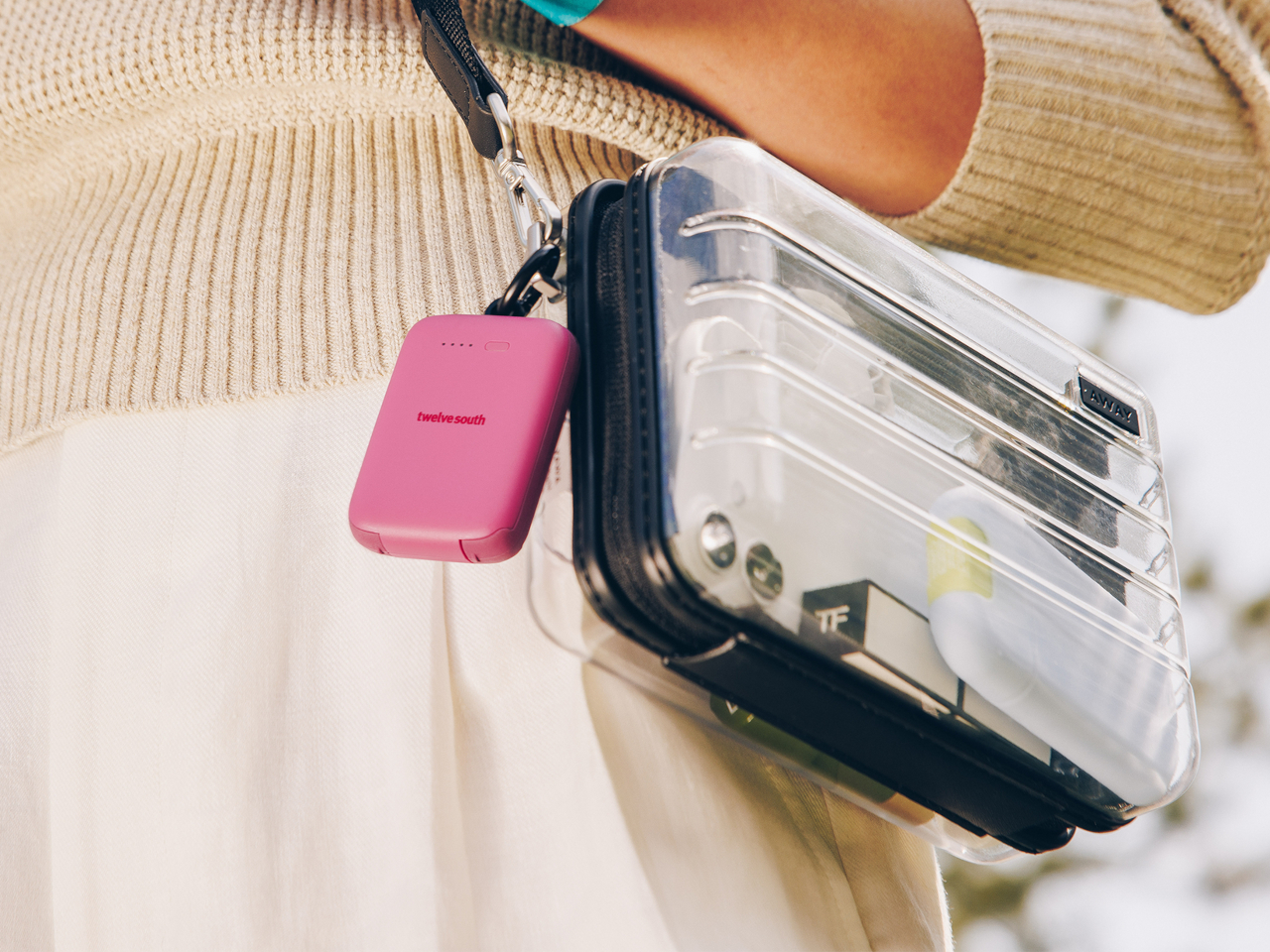
The Power Bank You’ll Actually Have When Your Phone Hits 1 Percent

Most people who carry a power bank don’t have it when they need it. It’s in the other bag, on the counter, or still plugged into the wall. The problem isn’t that people don’t want backup power; it’s that a power bank asks too much of them. It’s a separate object with its own place in a routine that’s already too crowded, and the more something demands to be remembered, the more reliably it gets forgotten.

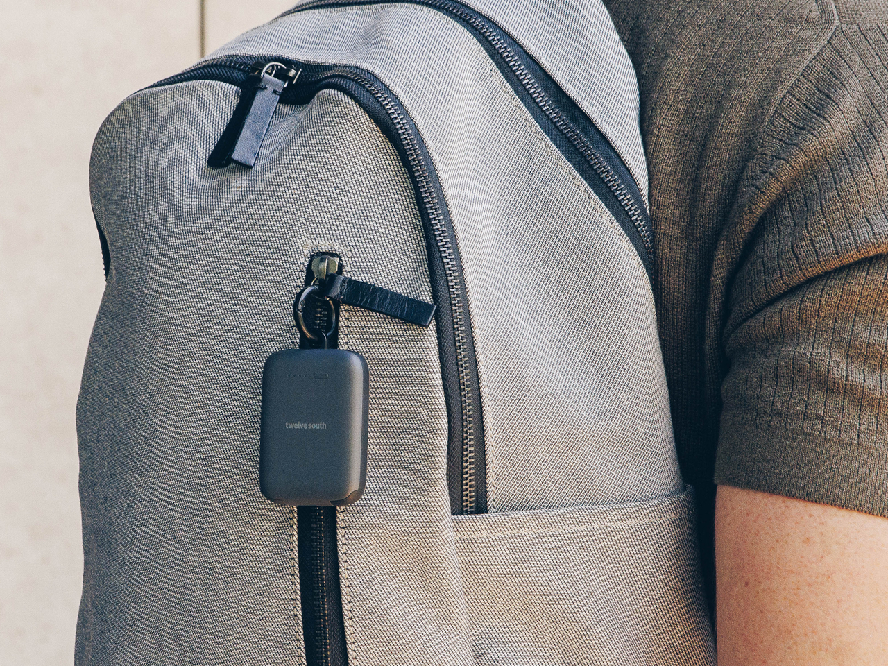
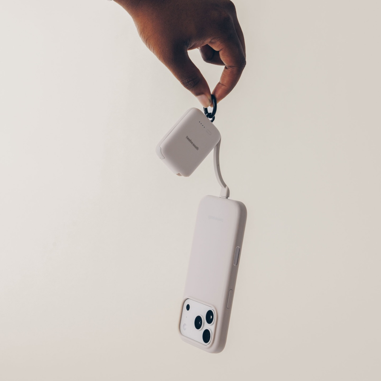
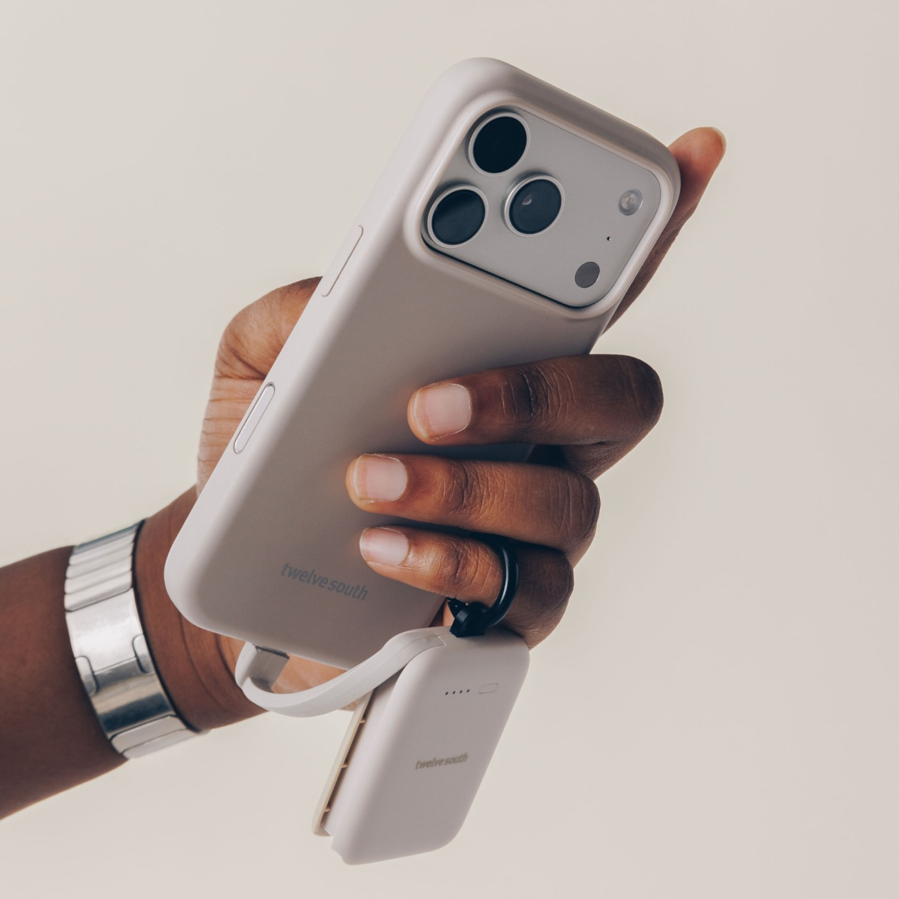
That behavioral friction is the design problem the Twelve South PowerClip is built to solve. Rather than starting with capacity or charging speed, the design starts with a simpler question: what would it take for a person to actually have this on them every day? The answer, apparently, is making it small enough and clipable enough that it attaches to what’s already in your pocket.

Designer: Twelve South

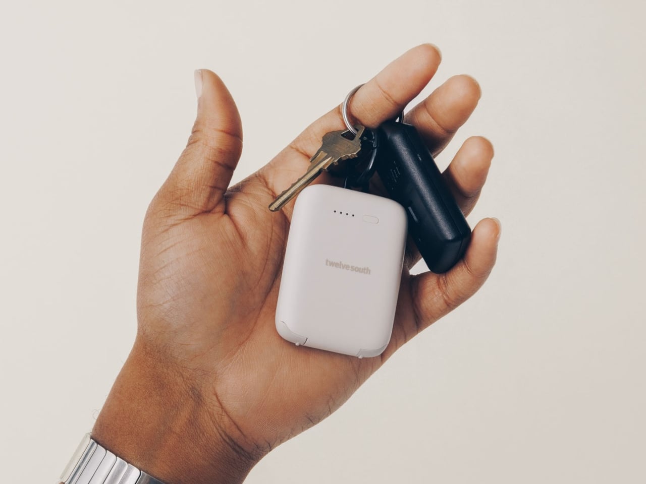
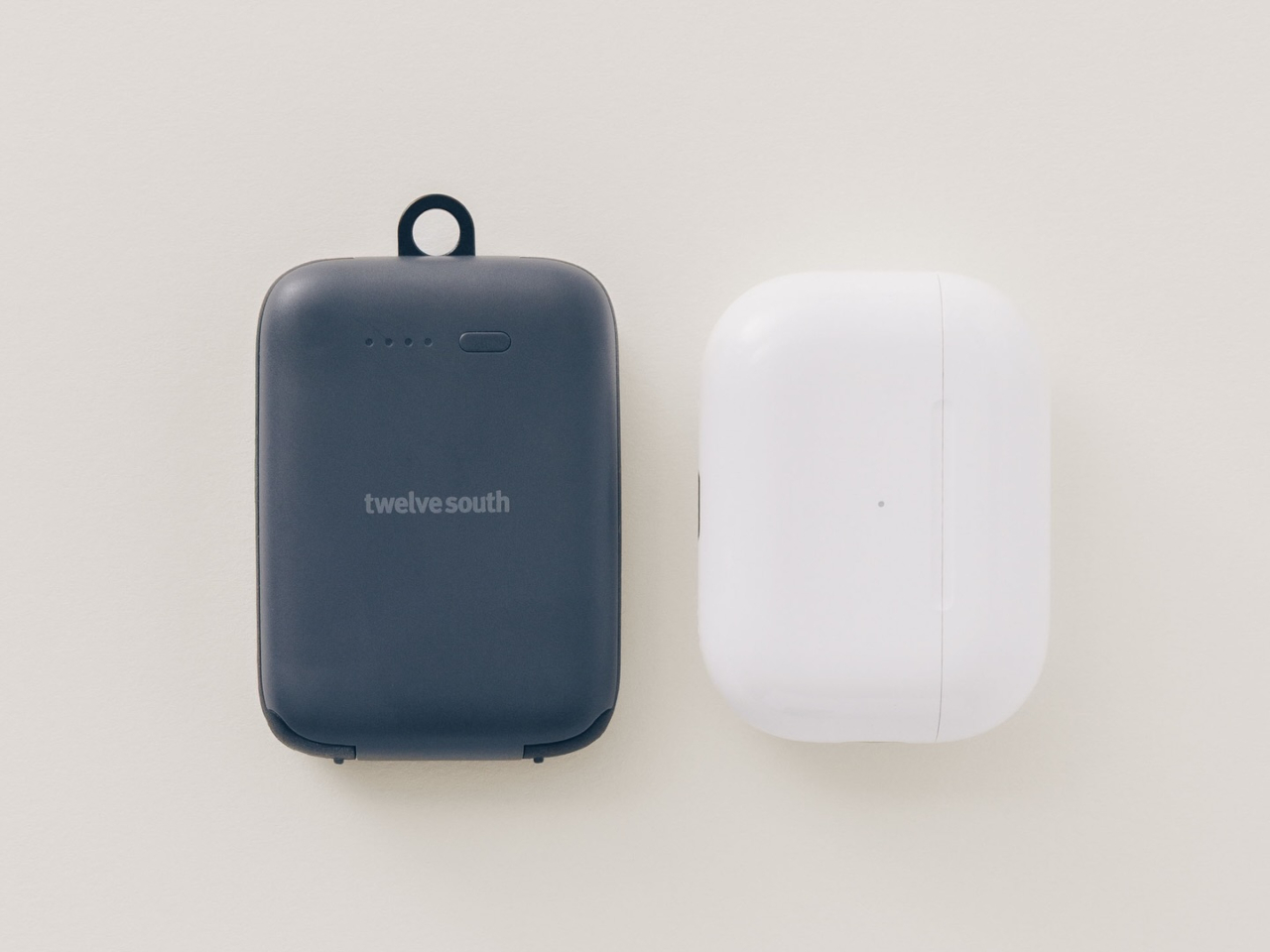
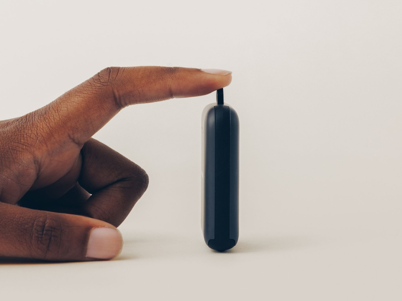
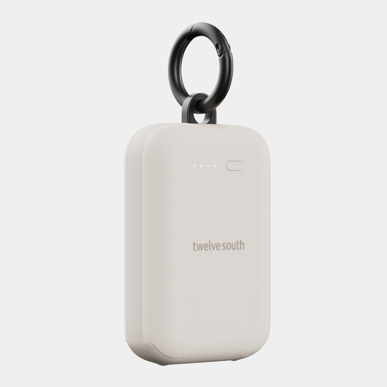
At 45g and roughly the footprint of a dental floss container, the PowerClip is designed to live on a keychain, a bag strap, or a belt loop via a zinc-alloy carabiner. It disappears into daily carry so completely that Twelve South’s own marketing describes the intended experience as: you stop thinking about it entirely, until the moment it saves you. That’s an unusually honest design brief for a consumer product.

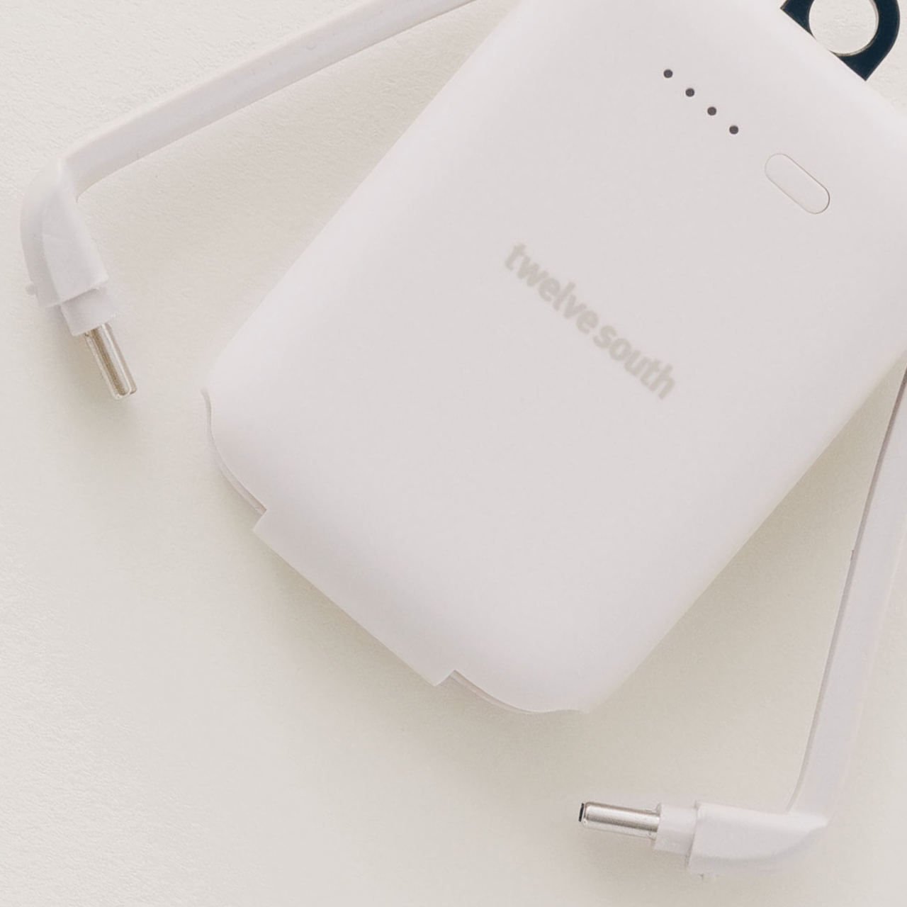
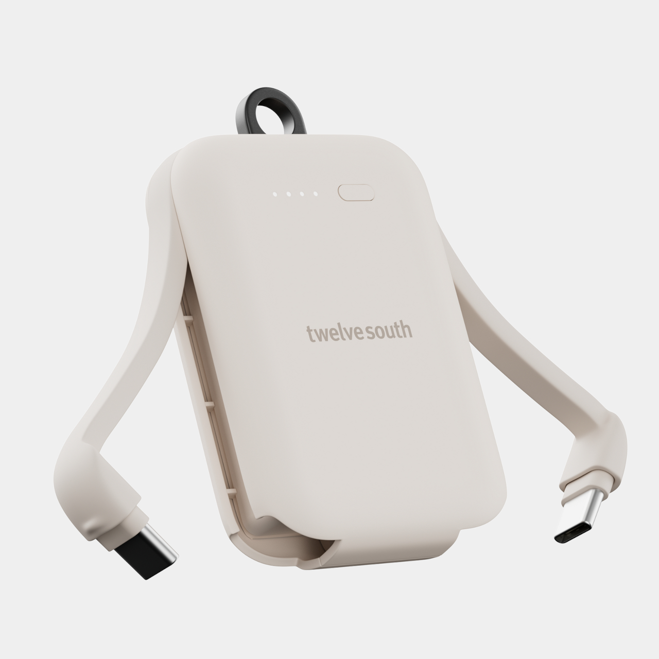
The integration extends to the cables. There’s no cord to pack or lose, because the USB-C cable is built directly into the unit. One side handles both input and output; a second port allows pass-through charging, so you can top up the PowerClip and a device simultaneously without interrupting either. The four LED indicators tell you the battery level at a glance. None of this requires setup, configuration, or carrying a separate adapter.

The 2,000mAh capacity is modest by the spec sheets of larger power banks, and deliberately so. The PowerClip isn’t trying to be a replacement for the bigger unit sitting in your desk drawer; it’s an emergency charge that gets your phone from 1% to enough to get home, make a call, or pull up a boarding pass. That scope defines the form rather than limiting it. Giving it more capacity would make it heavier, bulkier, and harder to justify clipping onto a set of keys.

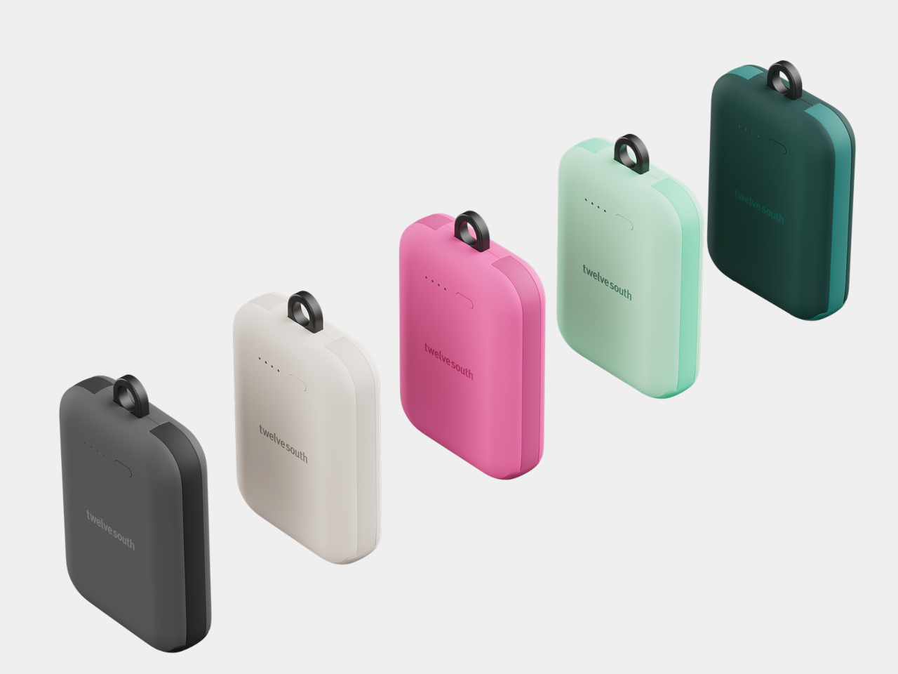
Five matte finishes, including Dune, Slate, Mint, Fuchsia, and Teal, let it function as an accessory rather than a utility. A limited-edition collaboration with Alpaka even produced a coordinated Micro Tote for carrying the PowerClip alongside small everyday essentials, treating the power bank as something worth designing around rather than stashing.

The PowerClip costs $39.99, which sits above the baseline for cheap power banks but below the premium tier of larger, feature-loaded alternatives. That positioning reflects the product’s design logic: it occupies a category that most manufacturers haven’t prioritized, not highest capacity or fastest charging, but highest likelihood of actually being with you when the battery dies. The specific insight here is that a power bank nobody carries isn’t worth much, and that solving the carry problem is a more interesting design challenge than chasing another thousand milliamp-hours.

The post The Power Bank You’ll Actually Have When Your Phone Hits 1 Percent first appeared on Yanko Design.
Leaked Images Show a Lenovo ThinkBook That Rolls Into an Ultrawide

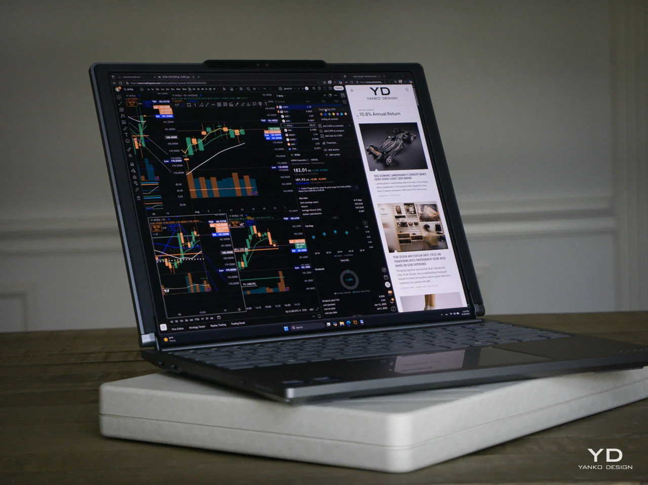
Lenovo’s rollable laptop story has moved remarkably fast for a form factor that seemed purely theoretical only a few years ago. The ThinkBook Plus Gen 6 Rollable, which expanded its screen upward from 14 to 16.7 inches, went from concept to commercial product in under two years. That trajectory has made every subsequent Lenovo rollable leak worth taking seriously, and the latest one is no exception.

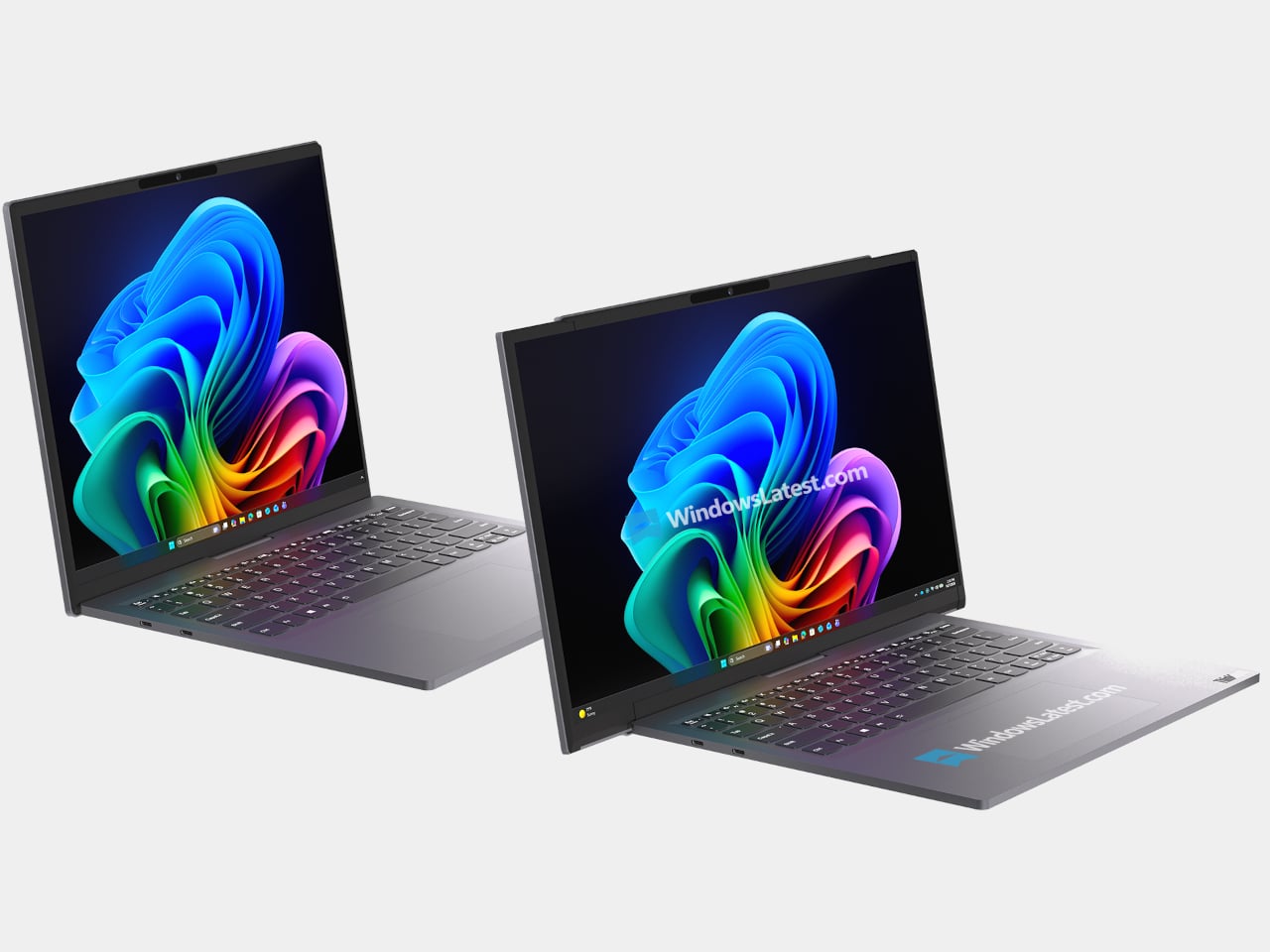
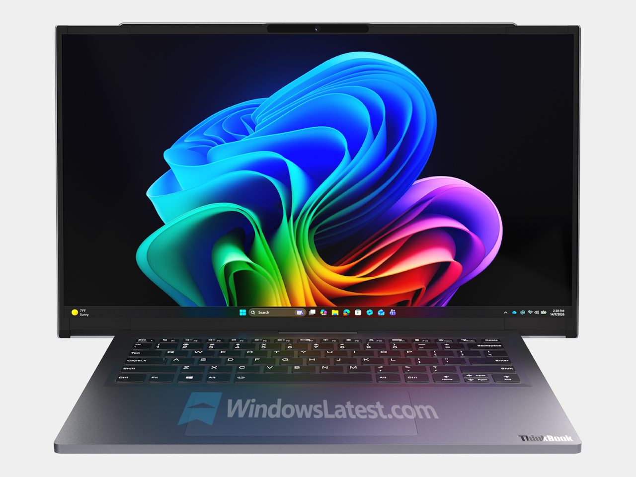
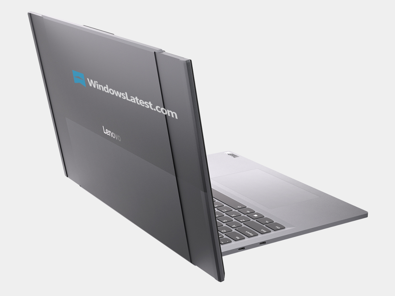
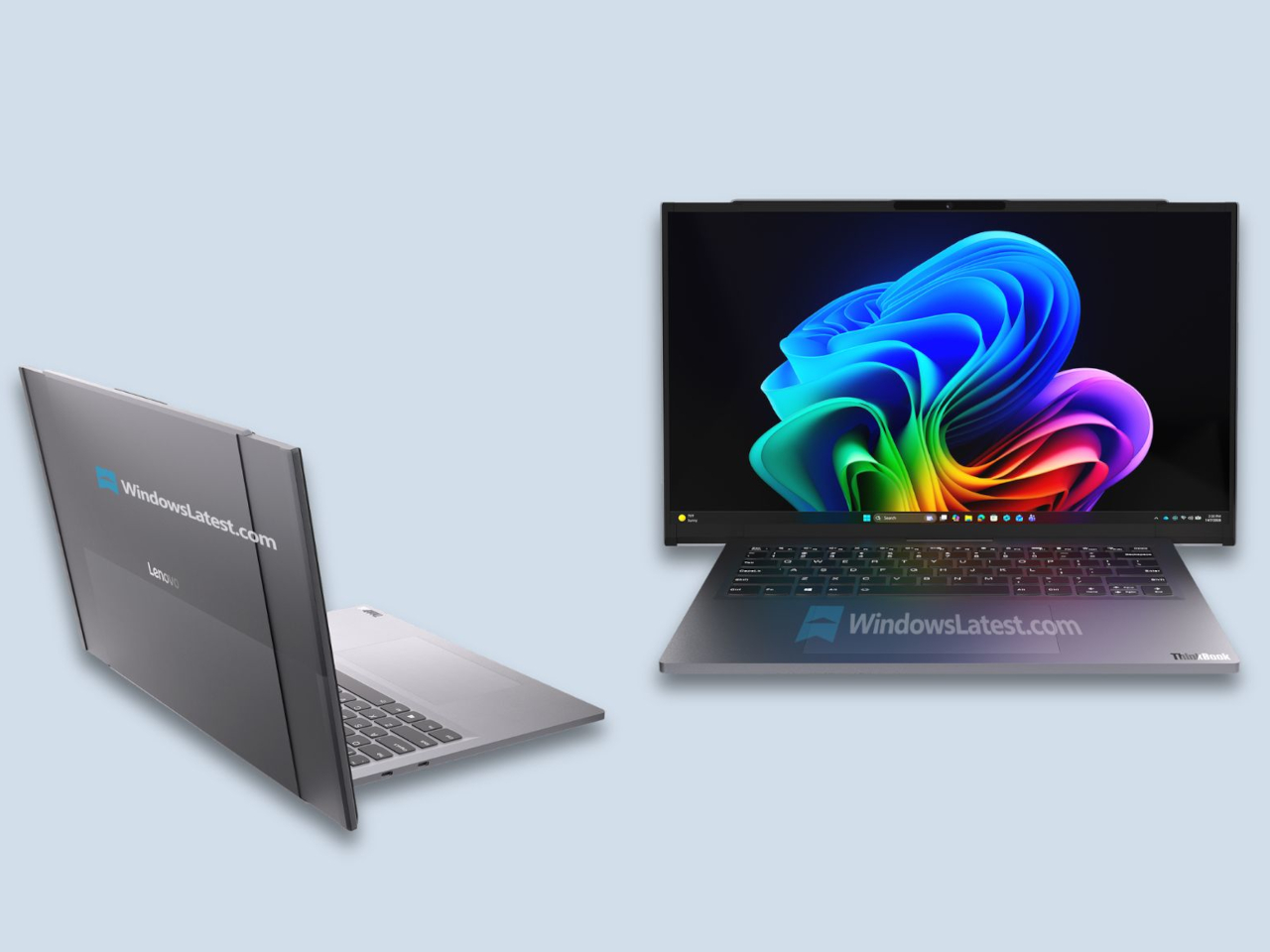
Leaked images surfacing in early August 2026 reveal a pre-production ThinkBook internally codenamed Project Swan. The display doesn’t scroll up this time; it scrolls out sideways. Dual motorized rails extend from both edges of the lid, pulling additional sections of a flexible OLED panel stored in housings along each side. When retracted, the laptop reads as a conventional ThinkBook with a centered webcam and unassuming proportions. When extended, it converts into a portable ultrawide workstation.

Designer: Lenovo (via Windows Latest)

The direction change matters more than it might seem at first. Vertical expansion, as the ThinkBook Plus Gen 6 Rollable demonstrated, is excellent for adding reading room and stacking content, the kind of extra height that benefits documents, code editors, and vertical browsing. Horizontal expansion does something different. It creates an ultrawide display in a laptop chassis, which is the format most useful for multitasking across independent windows, comparing spreadsheets side by side, keeping a reference document open alongside an active workspace, or running a video timeline next to a preview.

ThinkBook Plus Gen 6 Rollable Laptop

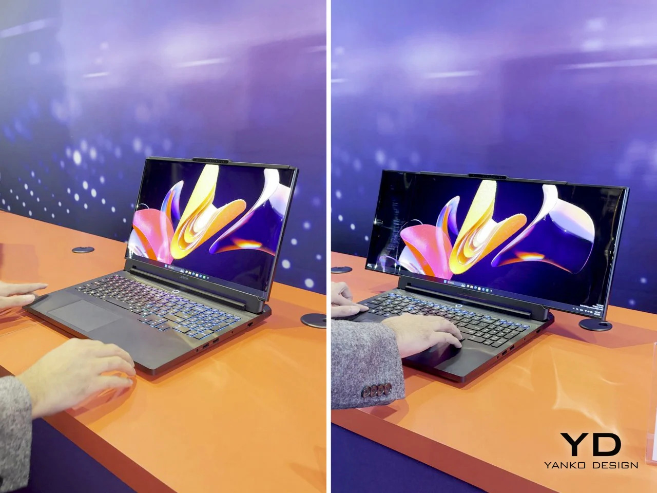
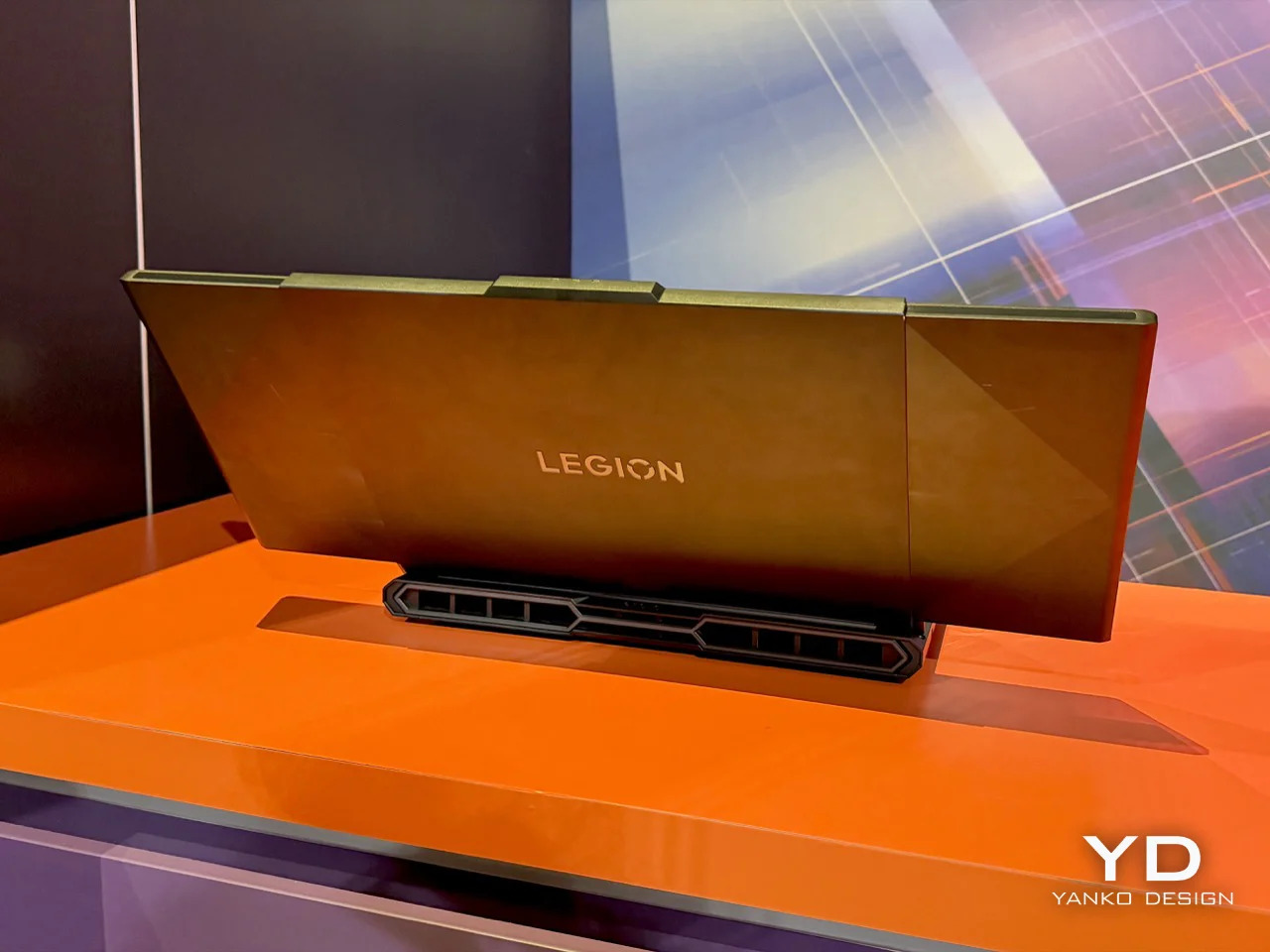
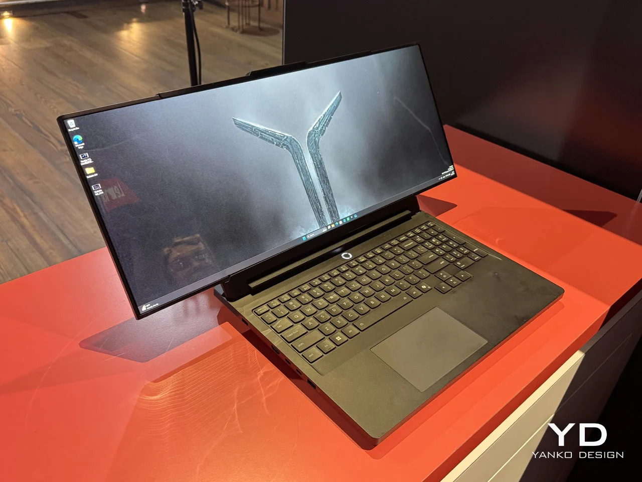
ThinkBook branding places Project Swan in Lenovo’s business productivity line rather than in the gaming-focused Legion family. That distinction carries a few implied differences. The Legion Pro Rollable, which Lenovo showed at CES 2026 and which expands from 16 to 23.8 inches, carries discrete graphics and gaming-grade cooling to match its ambitions. A ThinkBook variant would likely be thinner and lighter, aimed at professionals carrying it between offices rather than tournament players carting it to an esports venue. Whether it includes discrete graphics or relies on integrated silicon remains unknown.

Lenovo Legion Pro Rollable Concept

No confirmed specifications have accompanied the leak. Display dimensions, resolution, the processor platform, battery capacity, and weight are all unverified. What the images do confirm is the dual-rail mechanical architecture and the ThinkBook identity. The chassis rear shows structural cutouts accommodating the motorized sliding mechanism, and the palm rest carries ThinkBook branding clearly enough to leave little doubt about the intended product line.

Timing on an official announcement remains speculation, though the timing and quality of the leaked images suggest the company is close to a formal reveal, probably at IFA next month. The broader question Project Swan raises is whether the ultrawide business laptop has a real market. A portable ultrawide that collapses to conventional dimensions for travel and opens on demand makes a practical argument that doesn’t require much imagination to follow.

The post Leaked Images Show a Lenovo ThinkBook That Rolls Into an Ultrawide first appeared on Yanko Design.
Pro-Ject Just Solved the Two Biggest Problems With Getting Into Vinyl

The entry-level turntable market has a pattern that rarely changes. A manufacturer adds Bluetooth, a built-in preamp, USB output, and auto-stop into one device, prices it somewhere between $100 and $250, and markets it to people who wouldn’t otherwise know what to do with a separate phono stage. The result is usually a table that does many things poorly rather than one thing well, and the vinyl experience that follows tends to confirm whatever doubts that person had about the format.

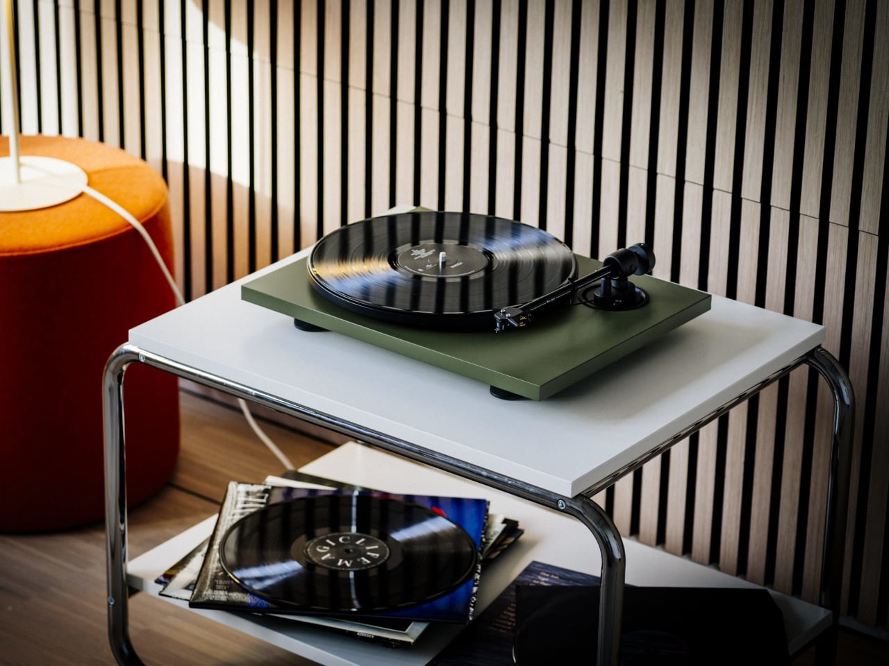
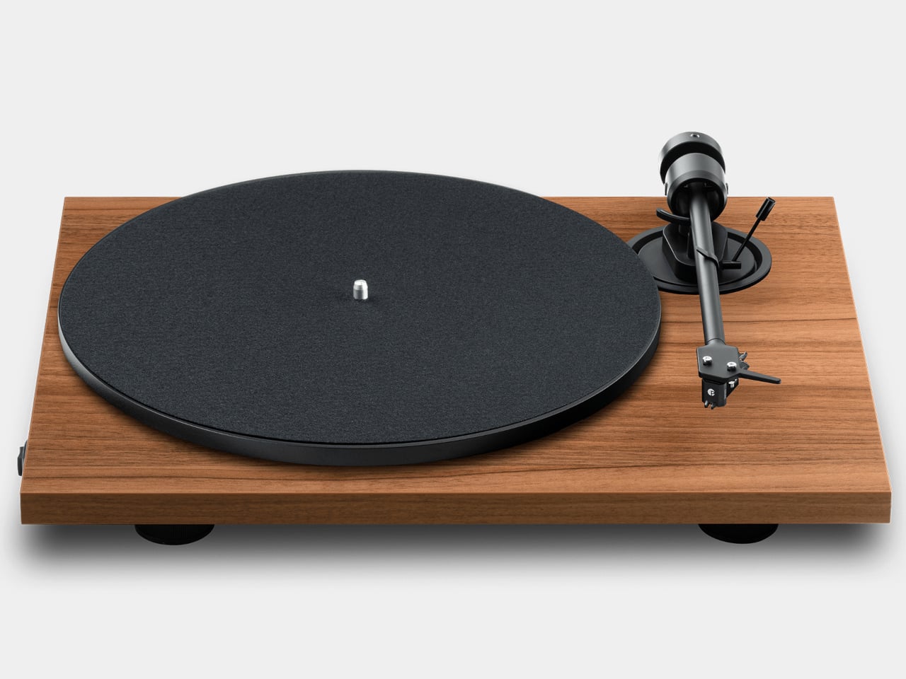
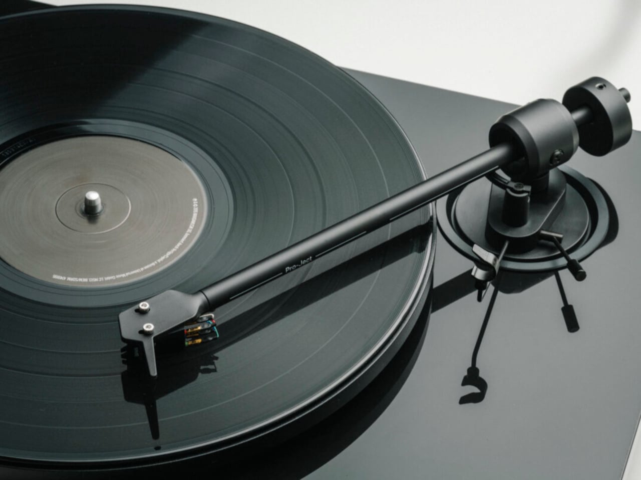
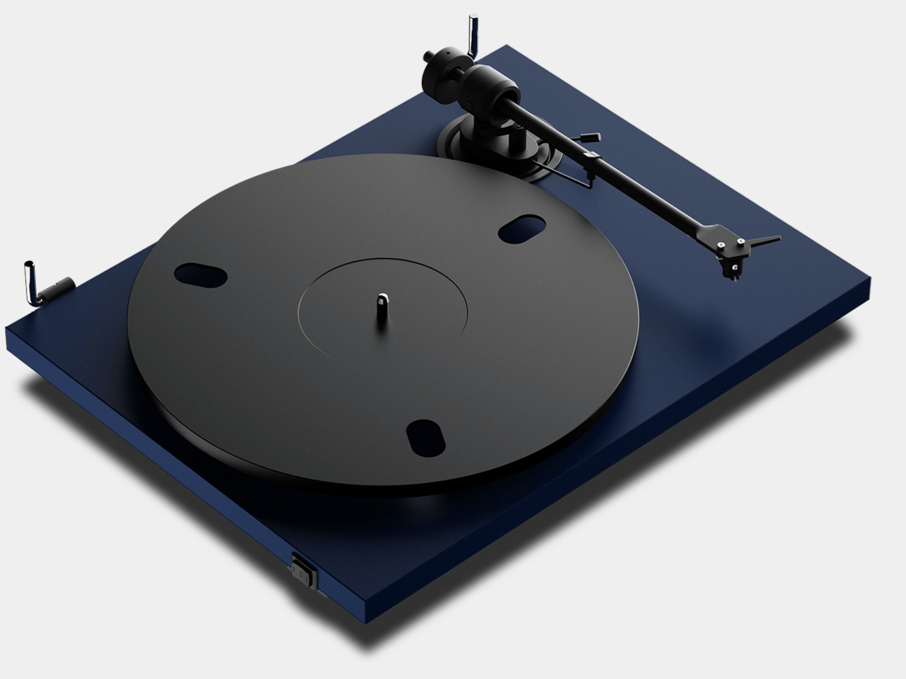
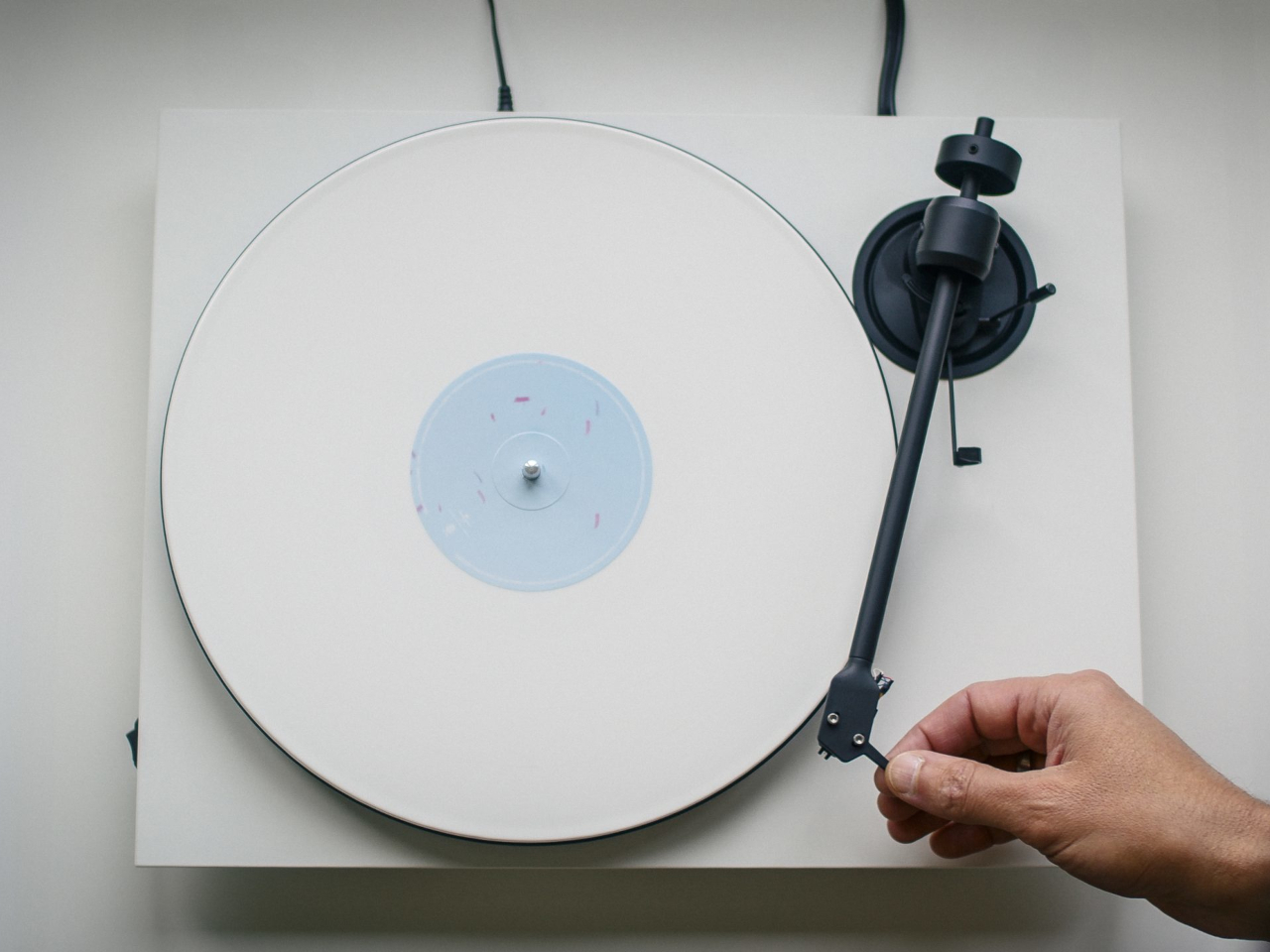
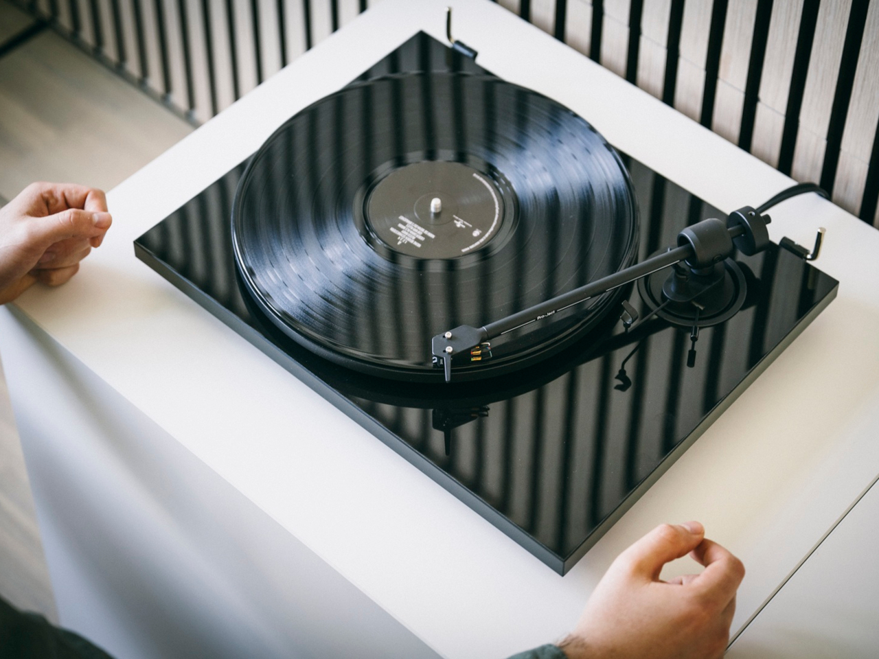
Pro-Ject has spent three decades making a different argument. The E1.2, which launched last year as a stripped-down, fully manual belt-drive turntable with no Bluetooth and no built-in preamp, was that argument restated clearly at a more approachable price. It borrowed the sub-platter design from the company’s Debut line, fitted a 730 g die-cast aluminium platter with a TPE damping ring, and used an 8.6-inch aluminium tonearm with a carbon-reinforced headshell. No extras, no compromises to the core hardware.

Designer: Pro-Ject

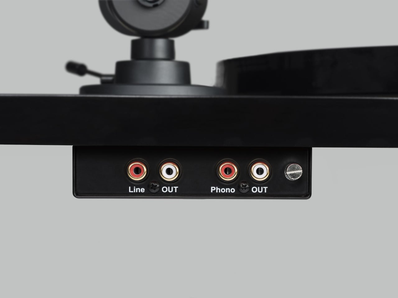
The new E1.2 BT and E1.2 Phono editions extend that platform rather than rethink it. The BT version adds Bluetooth 5.4 with aptX HD and aptX Adaptive codec support, allowing it to stream vinyl wirelessly to speakers, headphones, or compatible amplifiers. The Phono edition, in contrast, adds a built-in phono preamplifier for anyone connecting to an amplifier or active speakers that don’t already include one. The hardware underneath each variant is identical; the choice between them is a question of what your listening setup actually needs.

The Bluetooth functionality is a meaningful step up from the aptX implementations that have become common at this price tier. AptX Adaptive, in particular, transmits at near-lossless quality with variable bitrate, which makes a practical difference when the source material is a well-pressed record played back through a properly aligned cartridge. You’re not losing most of what the stylus picks up before it reaches your ears. For a household where the stereo system is in one room and the better speakers are elsewhere, that matters.

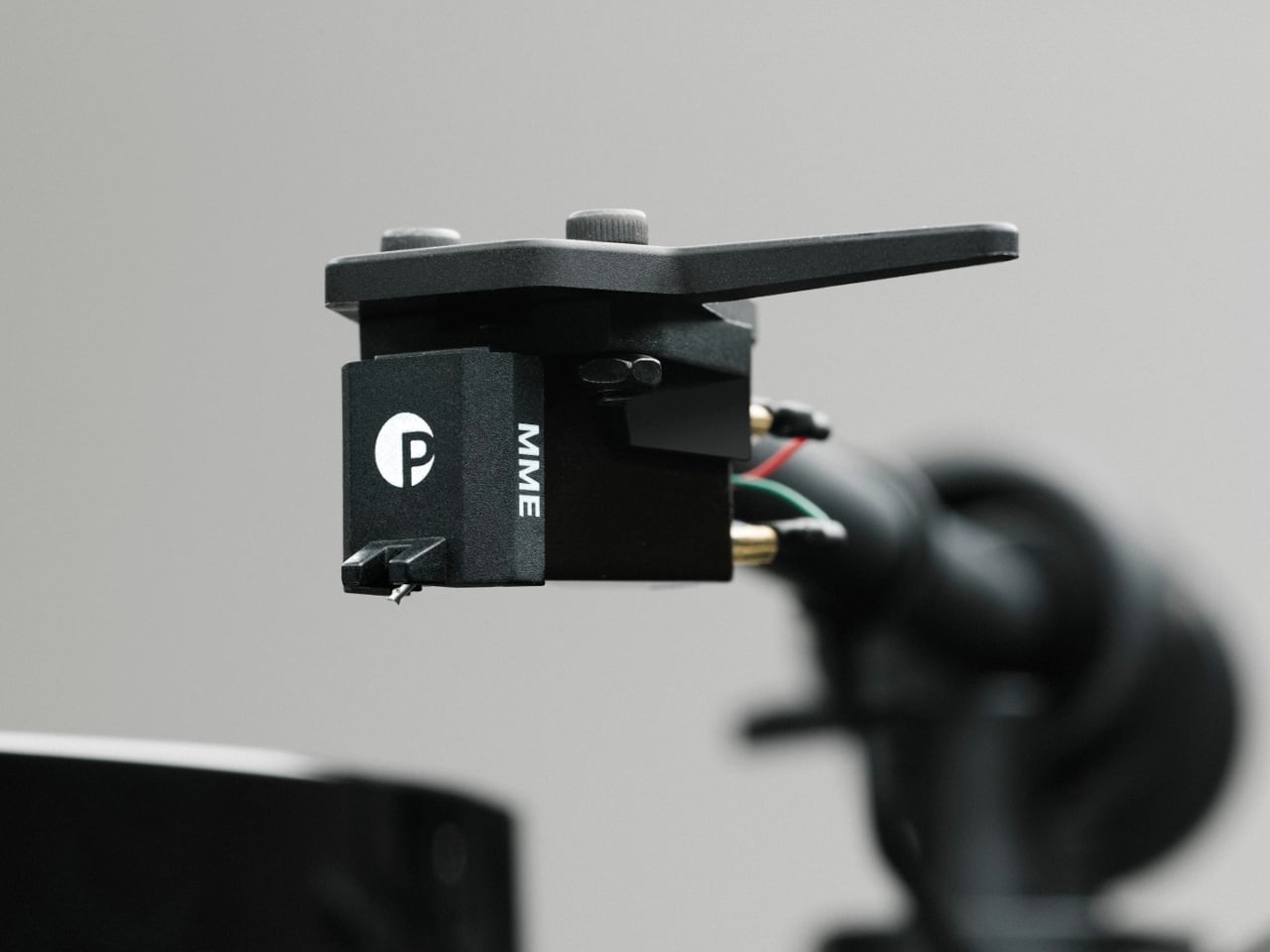
The Phono edition solves the other common access problem. Most modern integrated amplifiers, AV receivers, and streaming systems don’t include a phono stage, and asking a newcomer to source a separate one before they’ve even put their first record on is a reliable way to end the conversation. Having the preamp built in removes that step without downgrading the deck’s core components. The factory-fitted Pro-Ject Pick it MM E cartridge, a moving magnet design with a conical diamond stylus and miniature neodymium magnet, stays the same across all three variants.

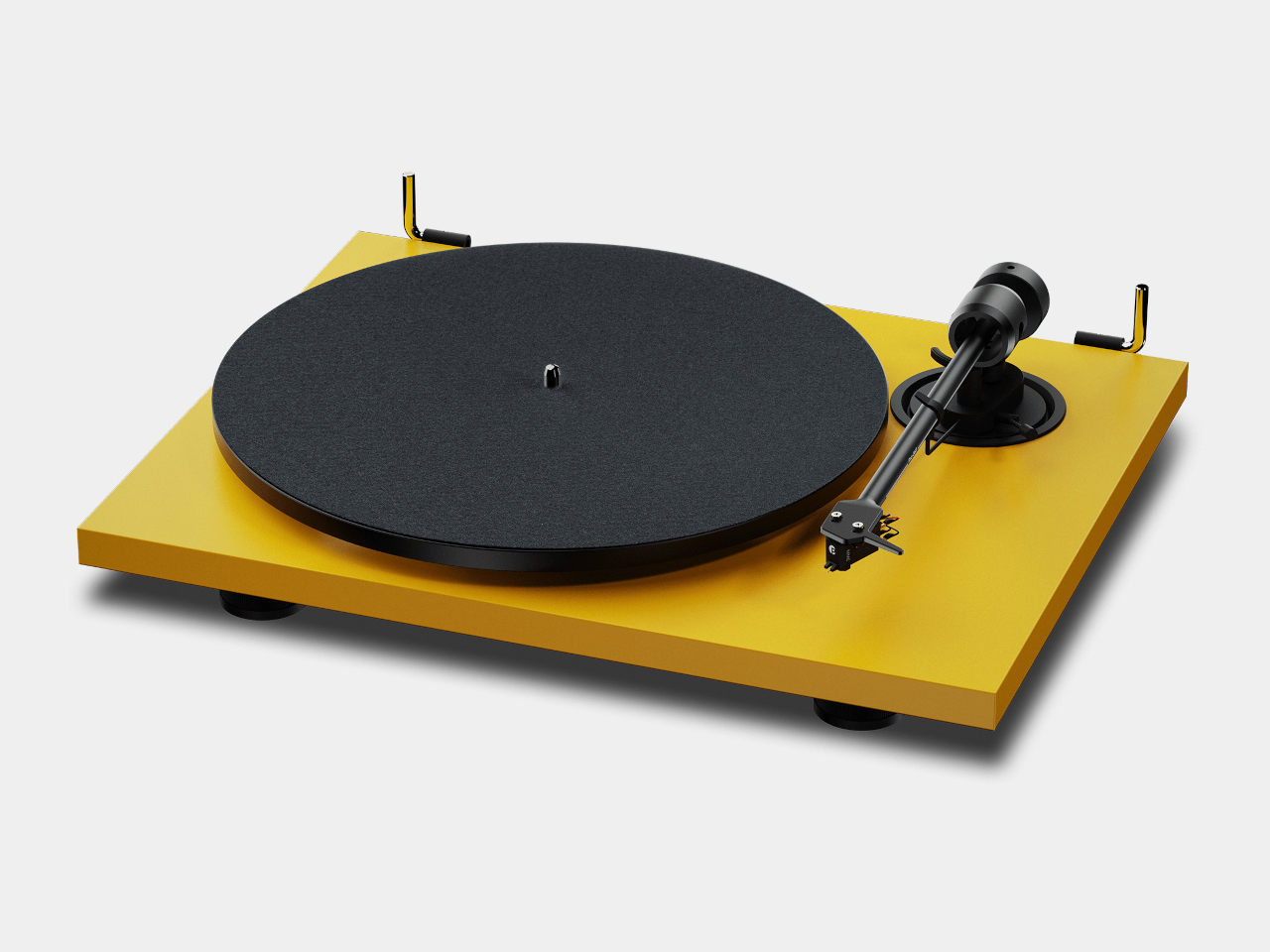
Both new models come in the same finishes as the standard E1.2 and add additional color options. The BT sits at £399 / €399 in High Gloss Black or Walnut, stepping up to £449 / €449 for color finishes including Satin White and Satin Golden Yellow. The Phono edition is priced at £319 / €359. The standard E1.2, still available, remains at £249 / €329 for those who already have a phono stage and don’t need wireless output.

What makes the three-variant strategy work is that it doesn’t try to collapse every possible need into one model. Each one handles a specific friction point between a first-time buyer and their record collection, and none of them compromise the mechanical quality that the E1.2 built its reputation on in the first place. The BT streams well. The Phono connects simply. The standard version gets out of the way and plays records.

The post Pro-Ject Just Solved the Two Biggest Problems With Getting Into Vinyl first appeared on Yanko Design.
Garmin’s Tacx Neo 2T Turns Your Existing Bike Into a Connected Gym, No Extra Setup

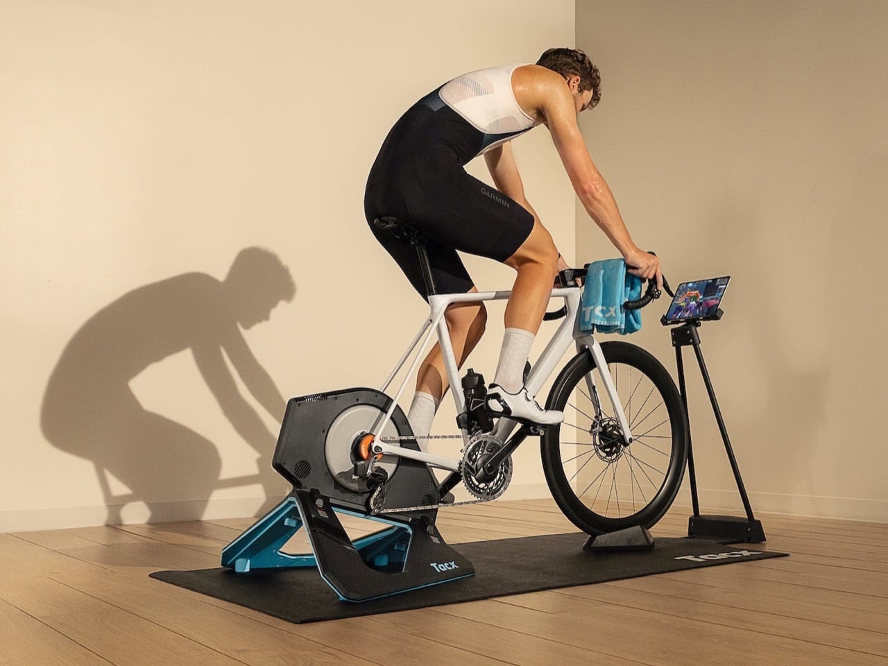
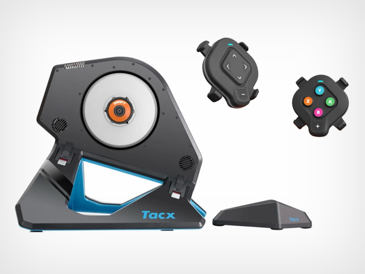
You know that bike sitting in your garage, judged by cobwebs, wondering when you’ll finally take it out again. Garmin just gave it a second career. The Tacx Neo 2T with Zwift Cog and Click, out August 21 for $1,099, clips onto pretty much any bike with 8 to 13 gears and turns it into a full smart trainer, complete with power tracking, cadence data, and a straight line into Zwift and Rouvy. No cassette swap, no calibration ritual, no YouTube tutorial at 11pm trying to figure out why your bike won’t pair.

Basically, Garmin looked at the whole “buy a $2,000 smart bike” trend and said, why not just use the one you already own. You bolt the trainer on, plug in the included remote for virtual shifting, and you’re pedaling through a Zwift climb before your coffee gets cold. It is less a new machine and more a software upgrade for your legs.

Designer: Garmin

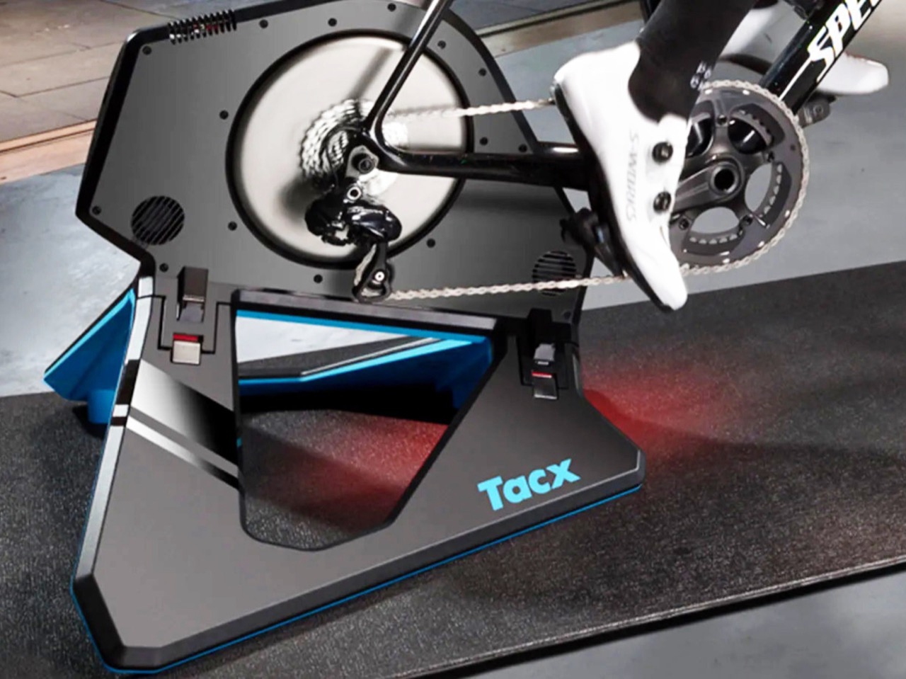
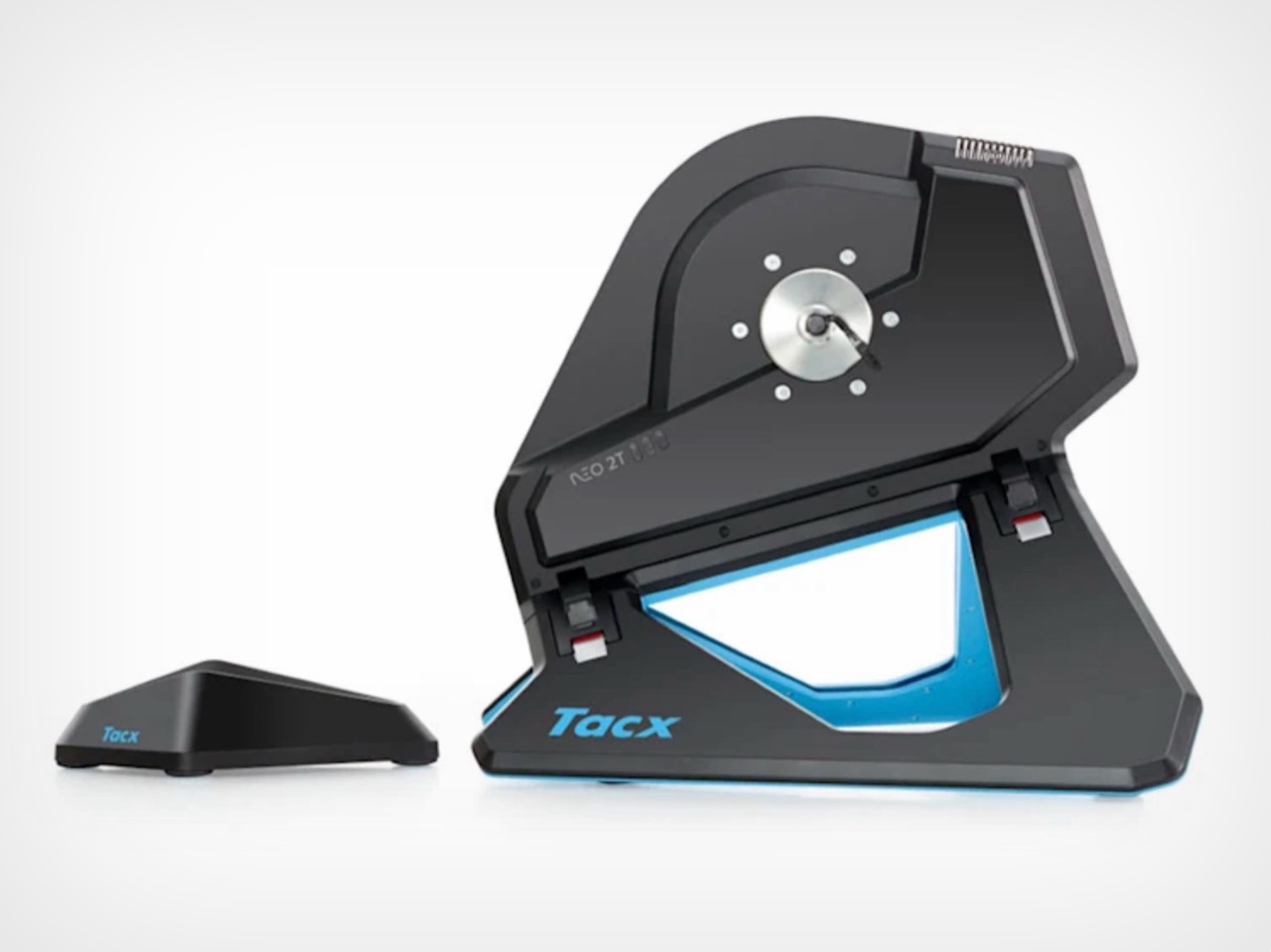
The actual hardware here is not new, and Garmin is not pretending otherwise. The NEO 2T shell, that angular black and blue wedge with the vent slots, has been around since 2019. What changed is what sits inside the flywheel. A bright orange Zwift Cog now stands in for your entire cassette, and it is compatible with almost any 8 to 13 speed bike, no tools required beyond whatever it takes to bolt your bike onto the trainer itself. Pair it with the Zwift Click, a small handlebar remote that handles shifting, steering, and menu navigation, and the whole “getting started” phase collapses into about ten minutes.

What you actually get for your money is the boring but important stuff. Power and cadence accuracy within 1 percent, dynamic resistance that adjusts for weight, speed, and incline, and enough quietness that you will not wake up the rest of the house doing intervals at 6am. Buyers who are new to Zwift also get a free membership offer, though Garmin has not said how long that lasts.

For years, the trend was building bikes that look like sculptures, cabinets that hide a Peloton, frames designed to disappear into a living room. Garmin is taking the opposite route. Instead of hiding the machine, it is shrinking the amount of machine you need in the first place. Your actual bike stays your actual bike. The only thing that changes is what happens once you clip it in.

You do not need a second bike, a dedicated smart frame, or a spare room that quietly becomes “the cycling room.” You need the bike you already own and about ten minutes on a Wednesday afternoon.

The post Garmin’s Tacx Neo 2T Turns Your Existing Bike Into a Connected Gym, No Extra Setup first appeared on Yanko Design.
Xiaomi Built a $29 Speaker That Snaps to Your Phone and Stands It Up

The compact Bluetooth speaker category has been fighting the same battle for years. Every new entry promises to be louder than your phone, smaller than a can of soda, and tough enough to survive a bag. Most deliver on those basics reasonably well, and most of them occupy the same category of objects that you put next to your phone rather than on it. That distinction tends to go unexamined, and it’s the one Xiaomi decided to question with its latest accessory.

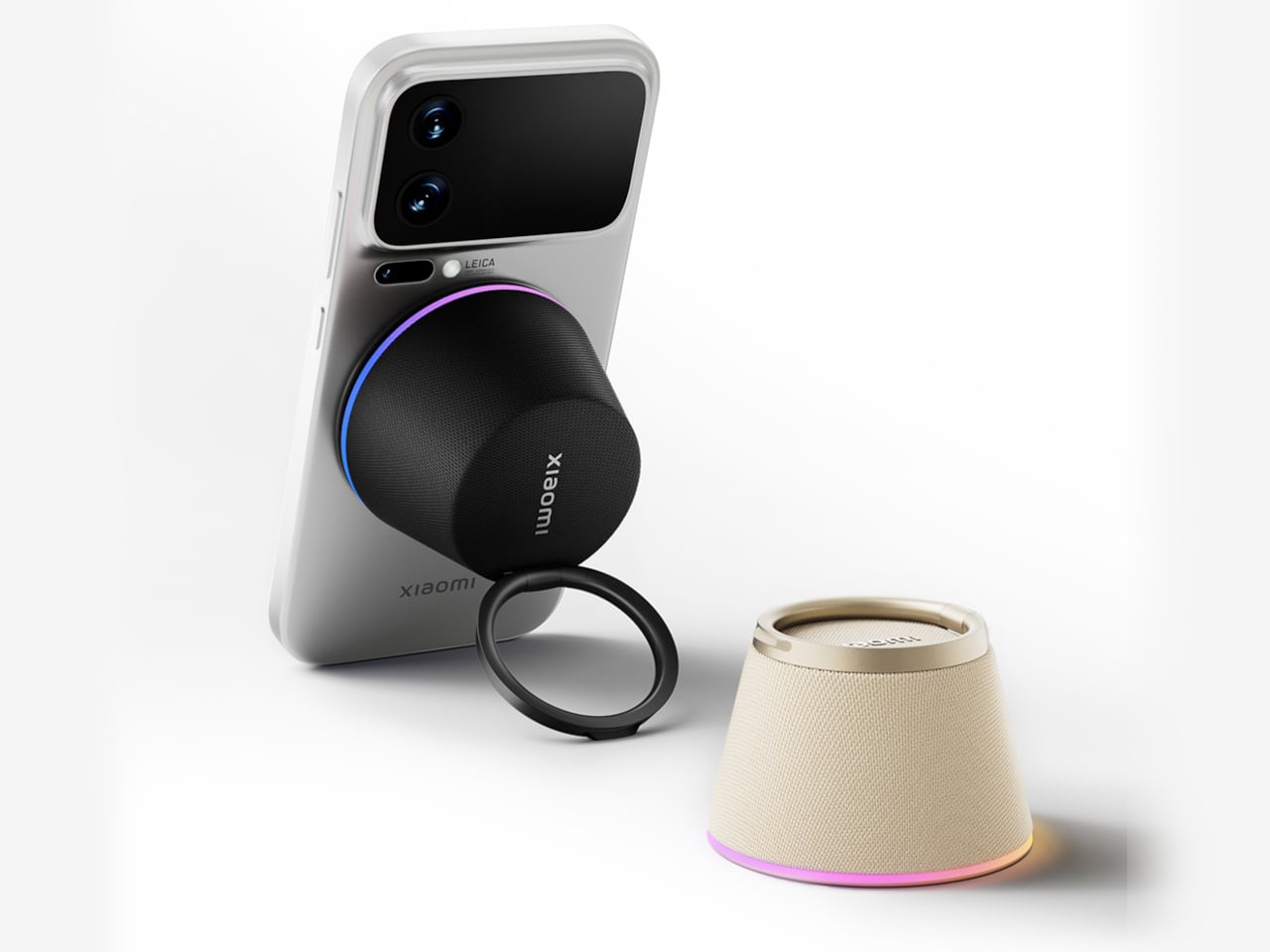
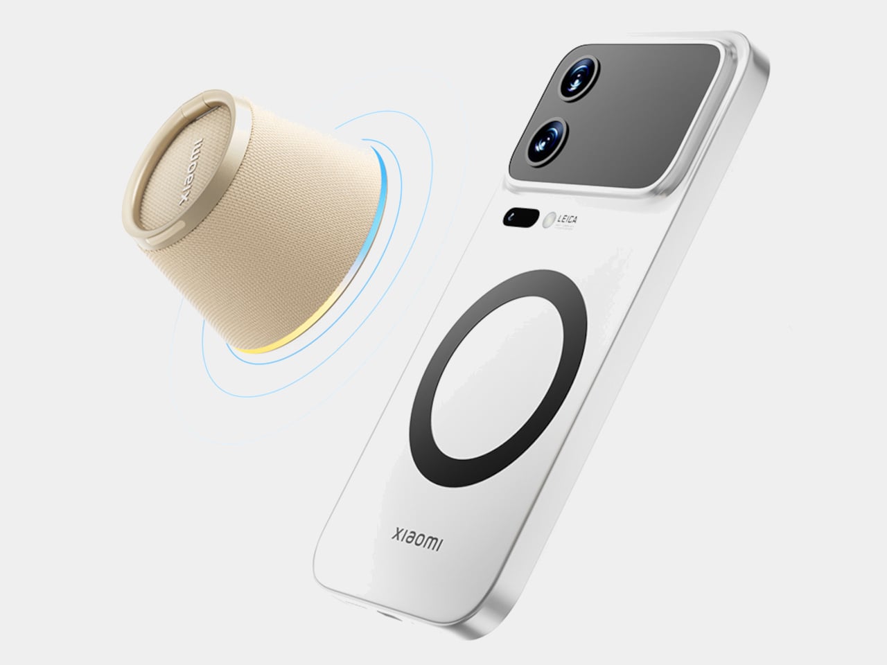
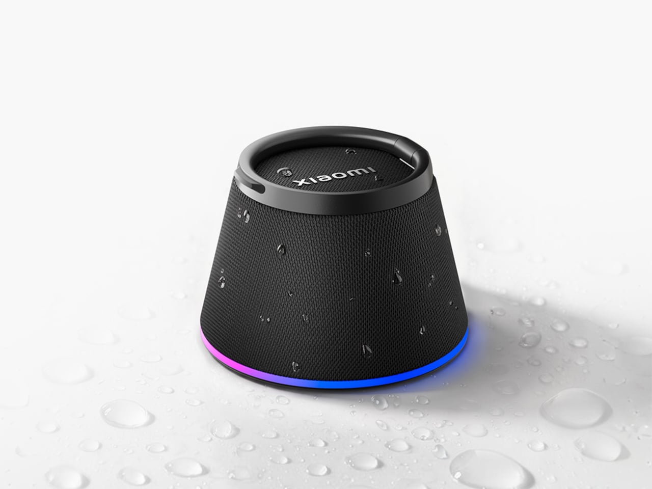
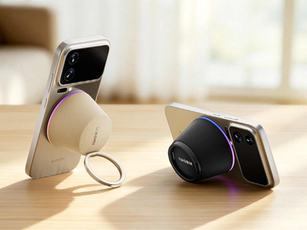
The Xiaomi Bluetooth Speaker Magnetic Edition attaches directly to the back of a smartphone. The connection is magnetic, and a built-in Hall sensor detects the moment it locks on, triggering the speaker to power on automatically. No button to find, no pairing ritual to repeat. You put it against your phone and it starts. Pull it off and it stops. The whole interaction is designed to be immediate enough that the speaker stops feeling like an accessory and starts feeling like part of the phone itself.

Designer: Xiaomi

The stand function is the idea that makes this more than a magnet trick. Rather than simply hanging on the back while the phone lies flat, the speaker’s base props the phone upright at a comfortable viewing angle. That solves two things at once: you get a better listening experience than the phone’s own speaker provides, and you get a hands-free viewing position without hunting for a stand or balancing the phone against something that will slide the moment you look away.

The audio hardware is modest by design. A 1.5-inch full-range driver running at 3W isn’t built for a living room, and the 200Hz to 20kHz frequency response tells you this is tuned for clear, near-field playback rather than bass-heavy output. For someone cooking in the kitchen and wanting to follow a video without holding their phone, or listening at a desk without headphones, that kind of output is exactly right. The speaker isn’t competing with a dedicated tabletop Bluetooth speaker; it’s competing with a phone’s built-in speaker, and that bar it clears comfortably.

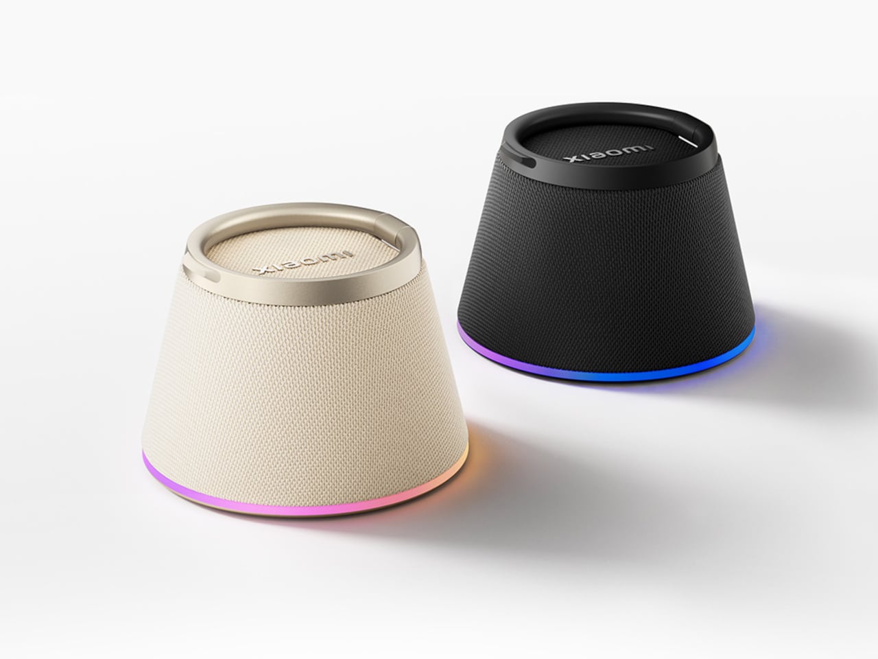
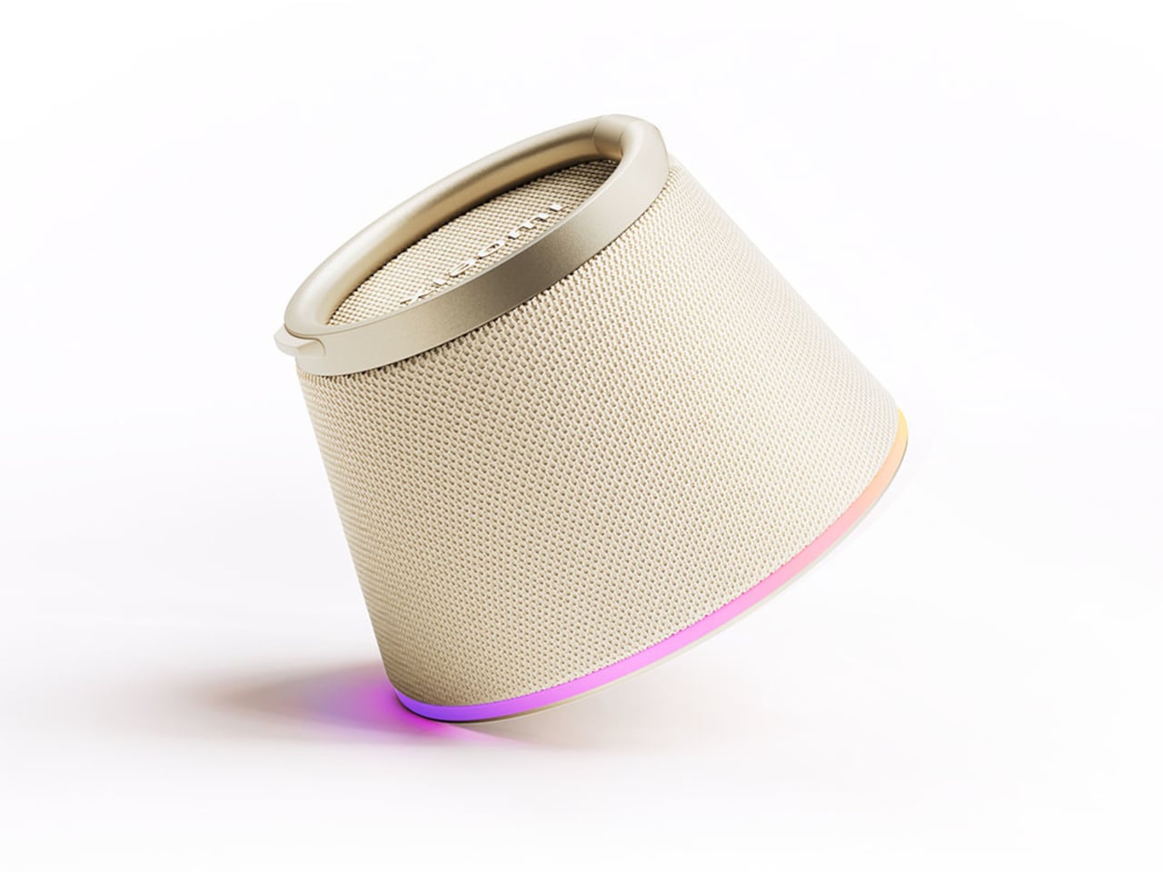
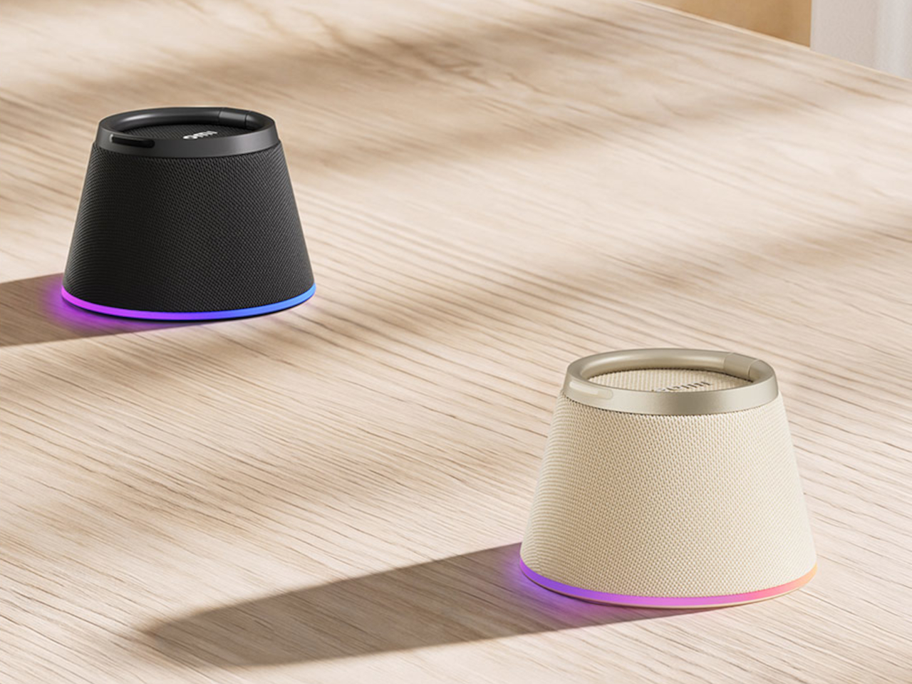
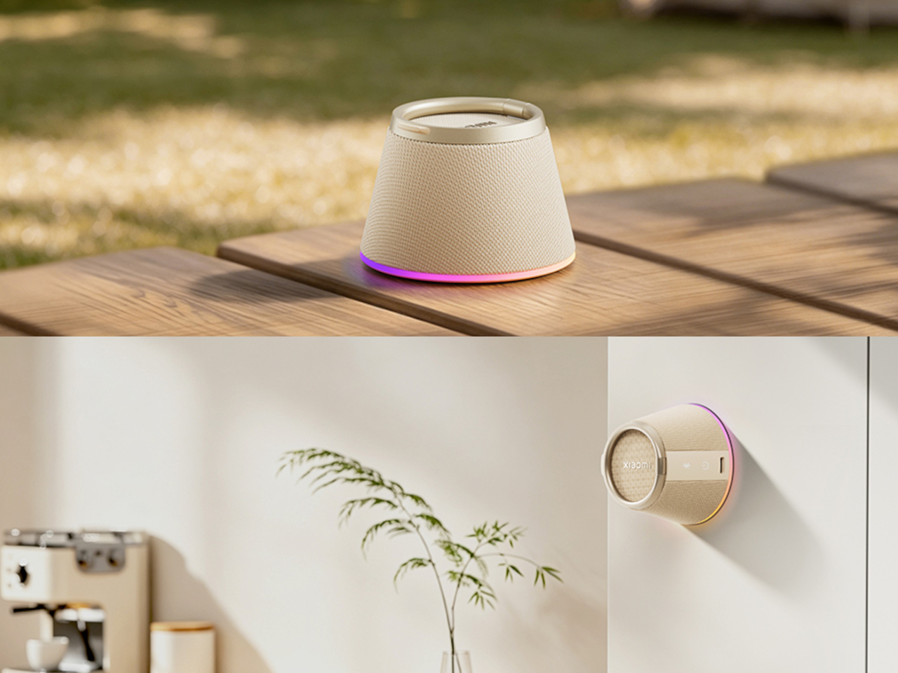
RGB lighting rings the base of the speaker and syncs its colors to the audio playing, adding some visual presence in lower light and keeping the device from reading as purely utilitarian when it’s sitting on a desk as a stand. The 650mAh battery powers the speaker independently from the phone’s own charge. Bluetooth 6.0 handles the wireless connection with AAC and SBC codec support, and the pairing typically carries over automatically each time the speaker is magnetically attached.

Two color options are available, with dark gray confirmed. Priced at 132 yuan during the Xiaomi Youpin launch period, with a suggested retail price of 199 yuan, roughly $29 or €25, it sits in a price range where the two-in-one premise doesn’t need to be flawless to be worth trying. That’s a meaningful advantage for an accessory built around a function that most people are currently meeting with improvised solutions anyway.

Most desk setups already include an accidental phone prop. A charging pad, a book corner, a keyboard edge, something doing the job that wasn’t designed for it. The Xiaomi speaker makes the argument that the prop might as well be a speaker too, and that at this size and price, consolidating both into one small object costs nothing in practicality and improves the experience every time you sit down to watch something, take a call, or simply want your hands back.

The post Xiaomi Built a $29 Speaker That Snaps to Your Phone and Stands It Up first appeared on Yanko Design.
Honor Pad 20 Pro Has a Version That Feels Like Paper, Not Glass

Android tablets have spent years trying to establish themselves as serious productivity tools rather than large phones with expanded app drawers. The gap has closed considerably, especially as the software that matters most, document editors, video conferencing, creative apps, caught up with the hardware. The remaining friction, for many users, tends to be more physical: the glass surface of most tablet displays is smooth and reflective in ways that neither paper nor a dedicated monitor usually is.

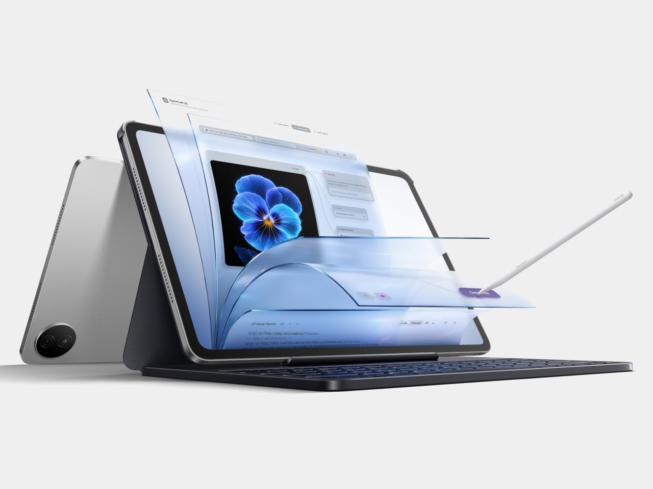
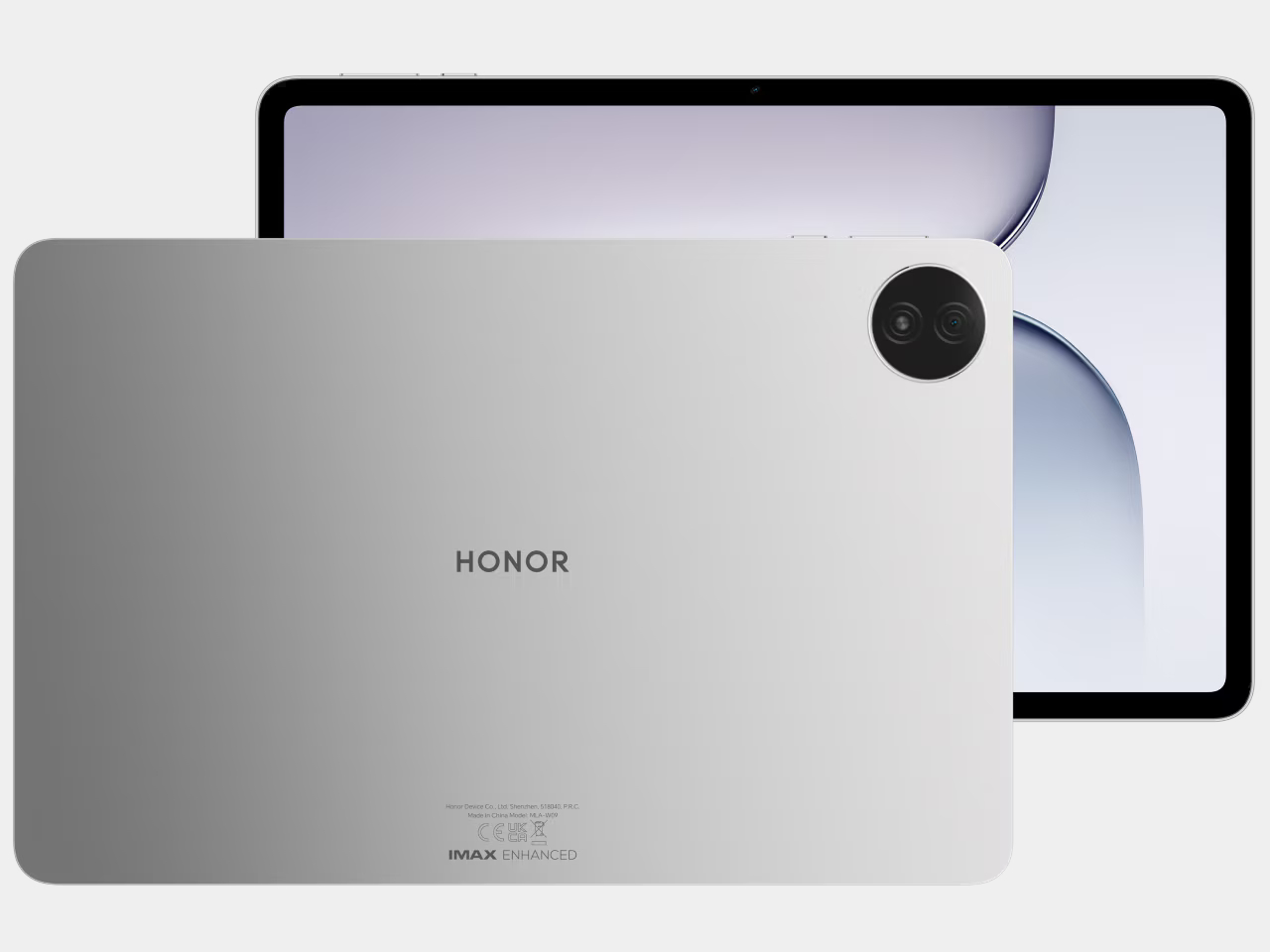
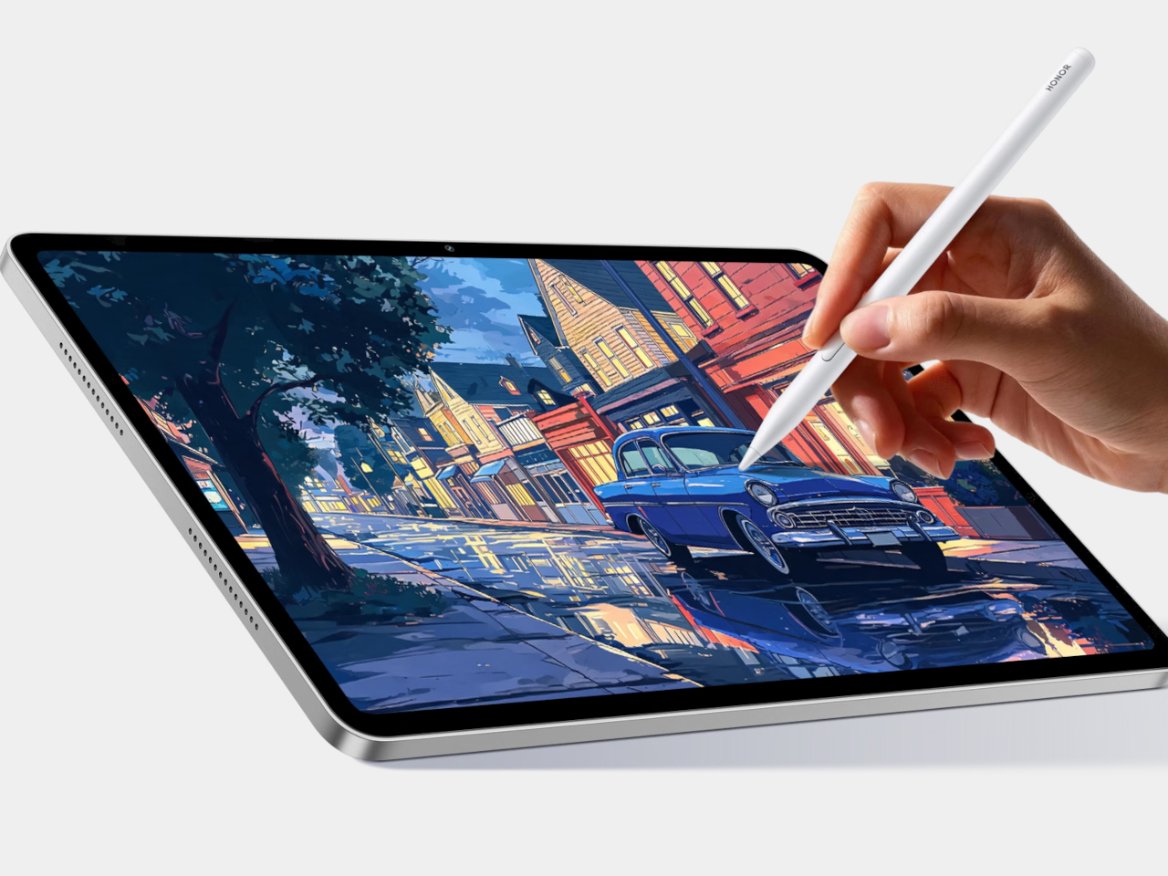
The Honor Pad 20 Pro arrives with that tension already baked into its lineup. The standard version is a straightforward performance upgrade over its predecessor, while the Paperlike Edition adds a micro-textured anti-glare coating to the same display that changes the surface experience entirely. Both tablets run identical hardware, so the choice between them is essentially a question of what you’re actually going to do with the device most of the time.

Designer: Honor

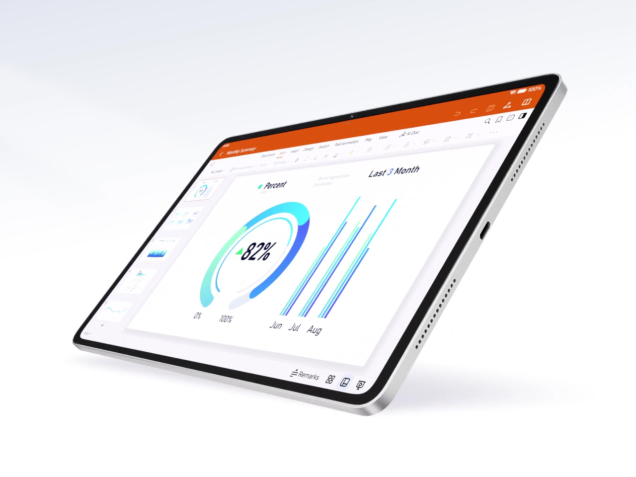
The screen that both variants share is a 12.1-inch IPS LCD panel running at 3,000×1,872 resolution with a 165 Hz refresh rate. IMAX Enhanced certification and DCI-P3 wide color coverage give it enough visual credibility for media consumption, while hardware-level eye-care features, including anti-flicker and low blue light reduction, make longer reading or working sessions more manageable. Peak brightness tops out at 700 nits, adequate for indoor use under most ordinary conditions.

Power comes from the Snapdragon 8s Gen 4, paired with 8GB of RAM and 256GB of storage, which covers the multitasking loads most tablet users will throw at it: running several browser tabs alongside a document editor, switching between a video call and a note-taking app, or handling light creative work. The six-speaker audio system with DTS:X Ultra makes the same device worth watching a film on at the end of the day.

The Paperlike Edition’s micro-textured coating isn’t just an aesthetic choice. Anyone who has tried to sketch or annotate seriously on a glossy glass display has felt the issue: the stylus slides too freely, and the surface reflects ambient light at exactly the wrong moment. The textured finish introduces enough friction to make strokes feel more deliberate and controlled, and reduces reflections in a way that makes extended reading or annotating sessions considerably more comfortable without sacrificing color accuracy.

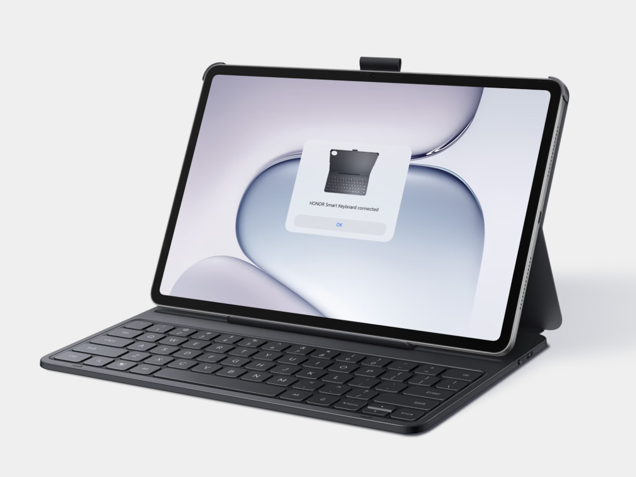
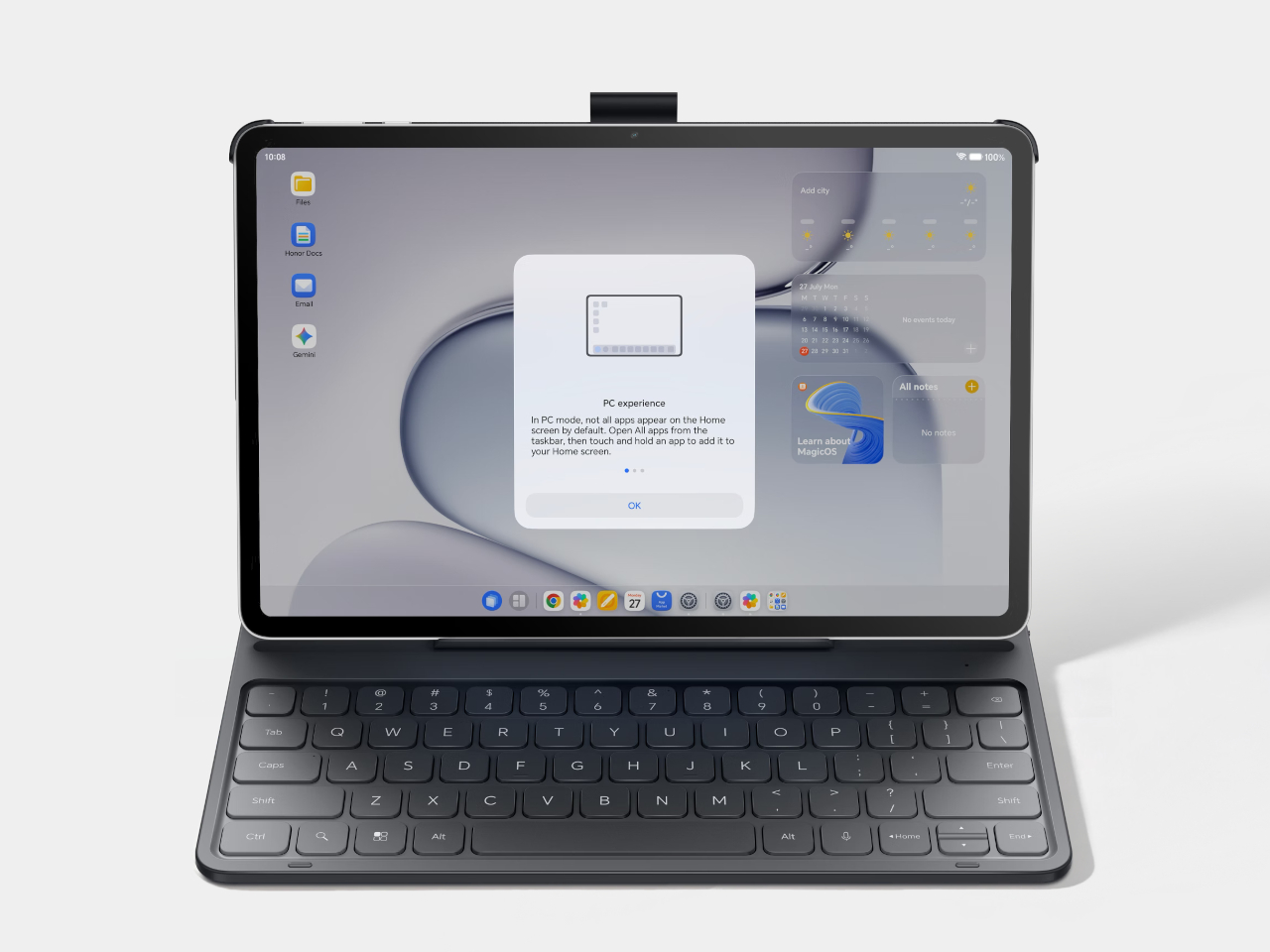
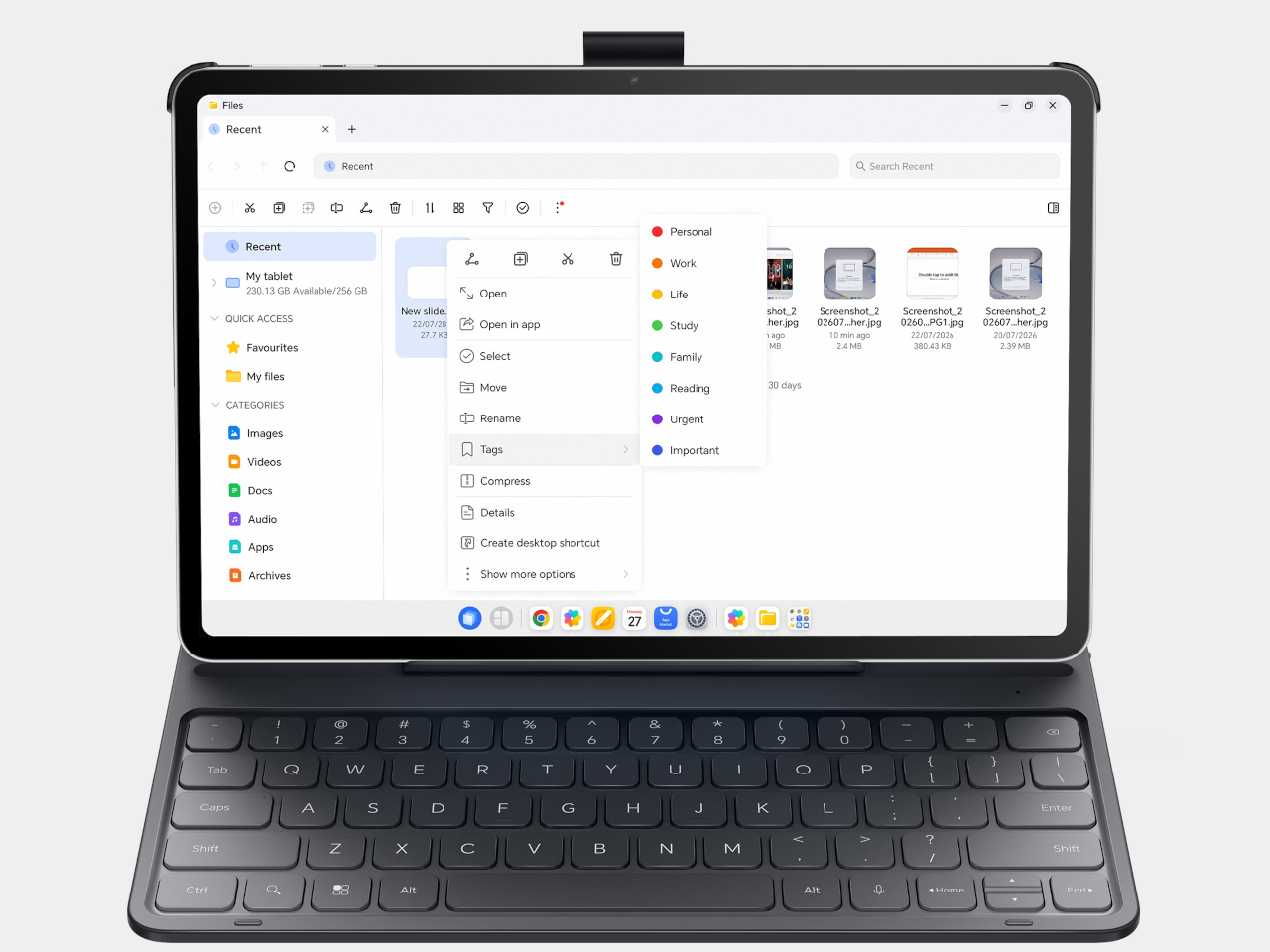
Both variants support the Honor Magic-Pencil 4s stylus and run MagicOS 10.0 on Android 16. The software includes a PC Mode that offers desktop-style window management, letting the device behave more like a laptop when connected to a keyboard. For users who split their time between a tablet and a proper workstation, the cross-device features let the Honor Pad 20 Pro connect to a PC ecosystem without leaving the Android environment.

The 10,100mAh battery with 66W fast charging is the kind of spec that stops most conversation about battery anxiety in tablet form. A full day of heavy use doesn’t reach the kind of drain that makes you start watching the percentage. The metal chassis, at 6.29mm thin and 537g, puts it in a weight class that works for holding in hand, not just setting on a desk.

The post Honor Pad 20 Pro Has a Version That Feels Like Paper, Not Glass first appeared on Yanko Design.
Polaroid Just Made the Pokémon Camera Every Fan Wants

It’s been 30 years since Pokémon invaded our lives and we’ve witnessed a whole generation of trainers trying to catch them all. The beloved franchise has had several exciting tie-ups with various brands in the past months to celebrate this momentous anniversary, and each one has gotten us excited to collect these interesting collaborations. From clothing to gaming gear, it’s been a year of Pokémon everywhere you look.

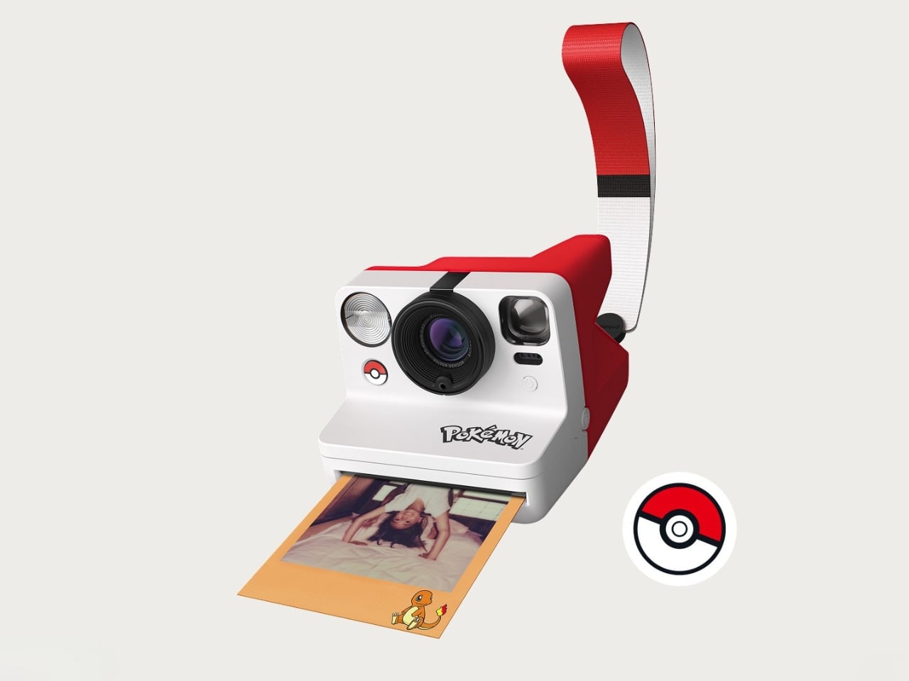
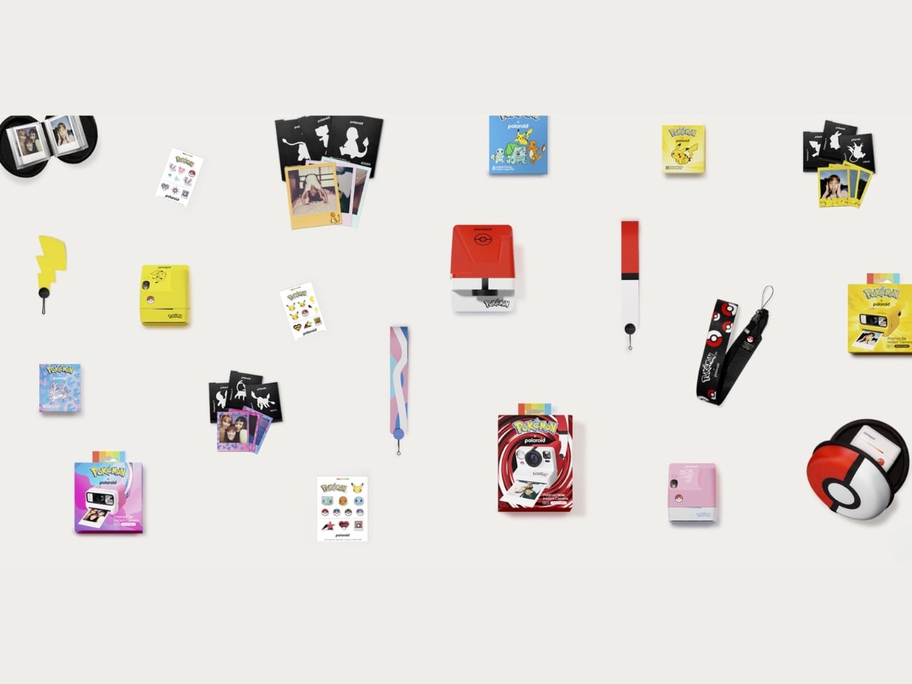
If you’re into the whole analog photography trend, then you’ll be truly excited (like me) about this newest brand partnership. The Polaroid x Pokémon collection is more than just logos and pictures stuck onto cameras. It’s one of their largest collaborative efforts, bringing together the tactile joy of analog instant photography and the beloved Pokémon universe into nine limited-edition pieces that are equal parts functional and collectible.

Designer: Polaroid x Pokémon

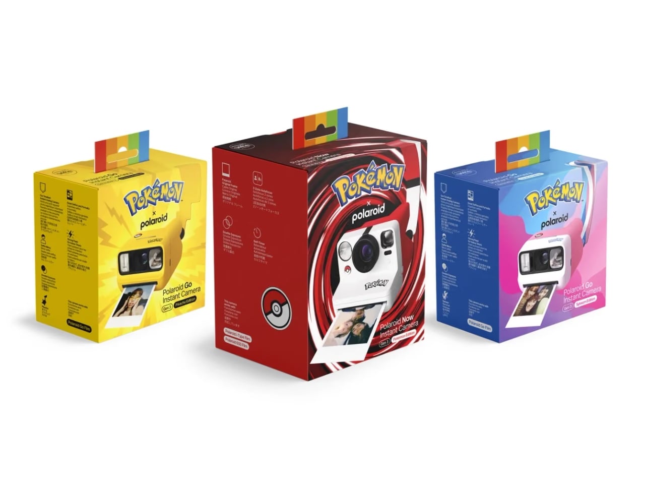
The main characters in this collection are of course the three special-edition Polaroid cameras. The Polaroid Now Generation 3 camera now comes in a Poké Ball version and is the hero piece of this entire collaboration. The camera’s body comes in white with bold red and black accents, just like the iconic instrument you use to capture the creatures. It has a Poké Ball shutter button and Poké Ball patterns across the full camera body, making it your tool to capture moments instead of Pokémon but looking almost exactly the part. Beyond the design, the Polaroid Now Gen 3 also packs a solid technical punch with a two-lens autofocus system that automatically chooses the best lens for each shot, so every memory comes out crisp and beautifully Polaroid-esque.

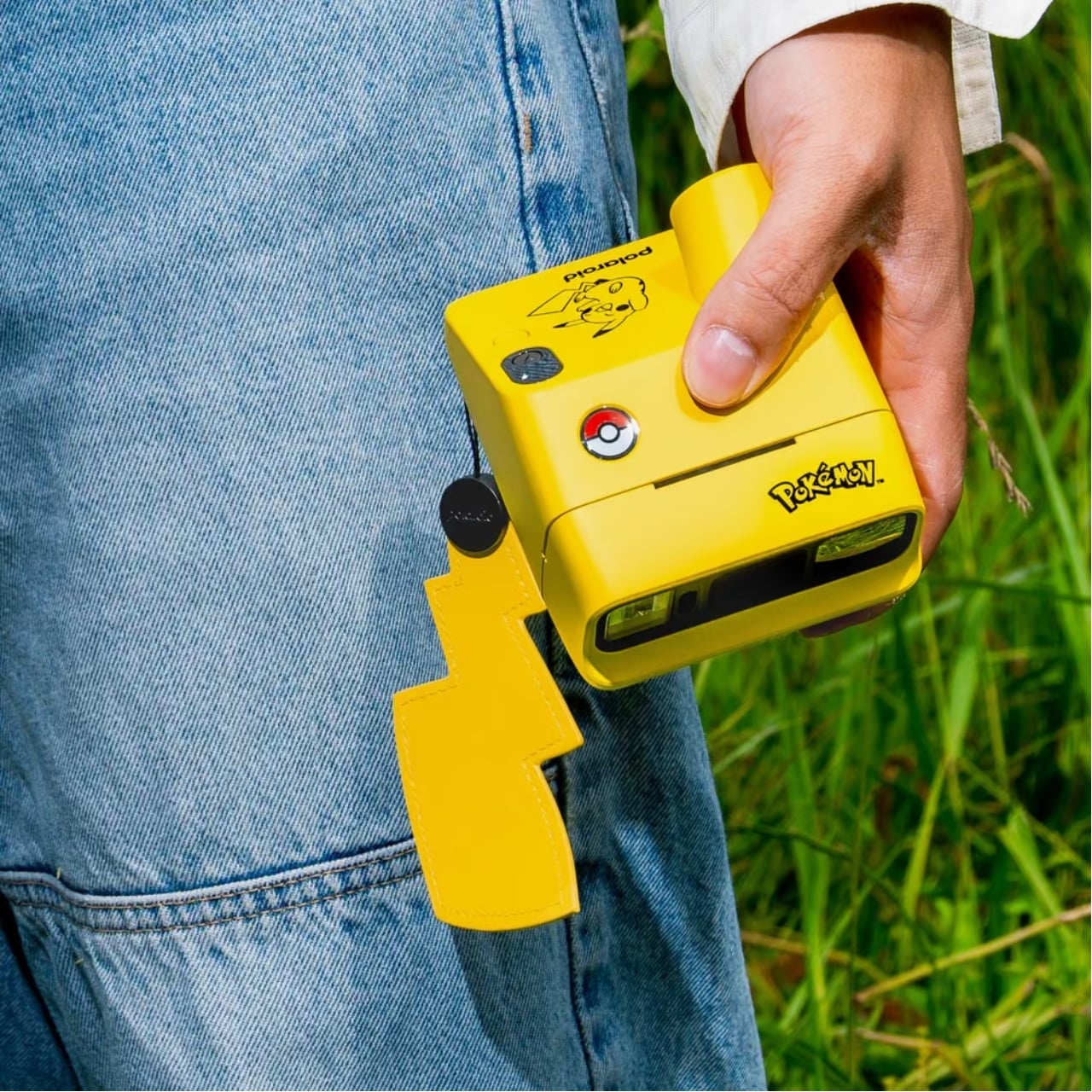
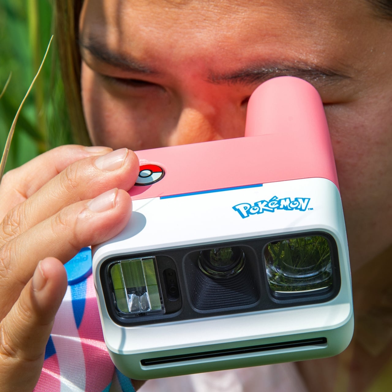
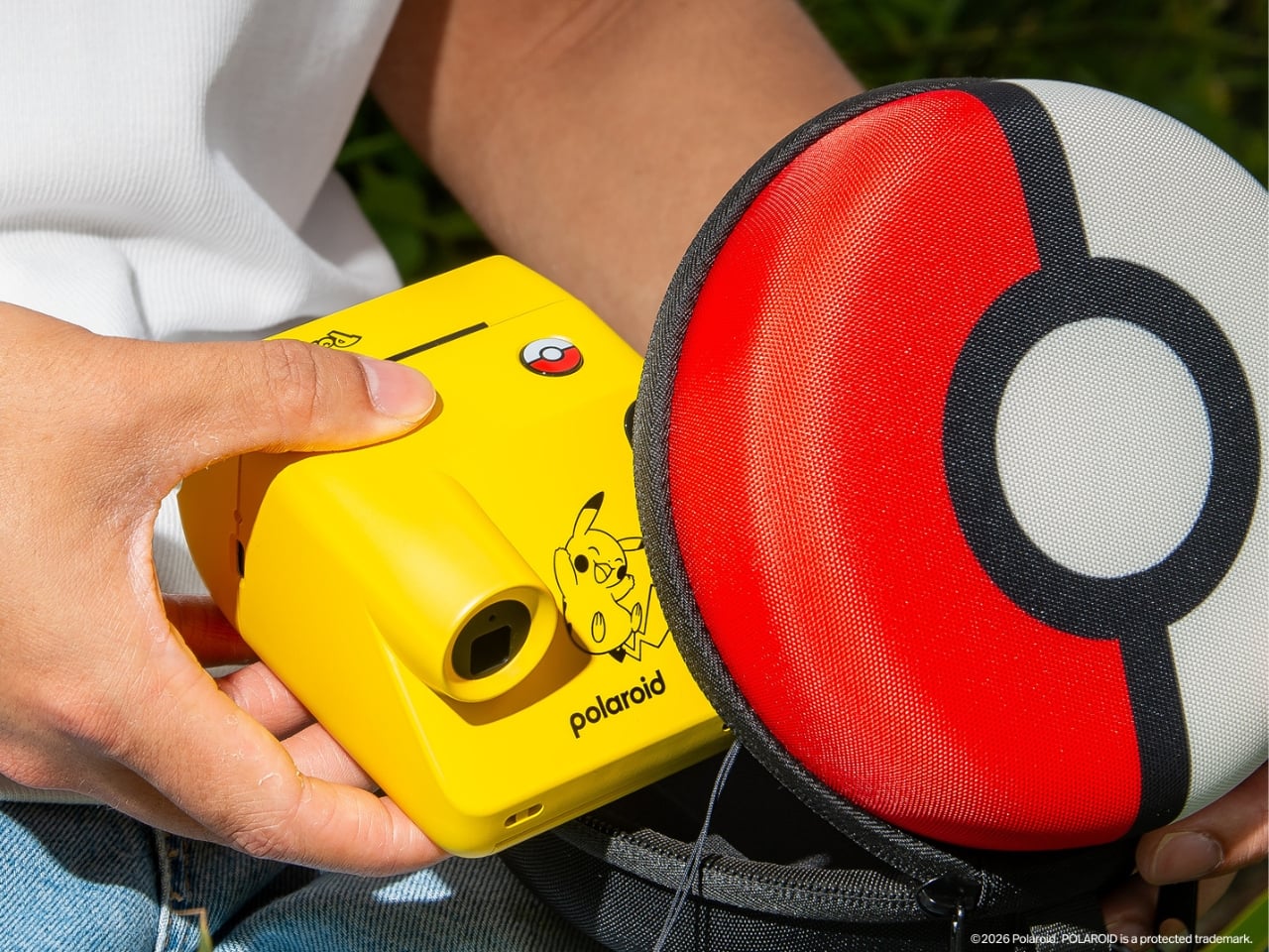
Meanwhile, the smaller but equally famous Polaroid Go cameras have been transformed into two Pokémon-themed devices that go well beyond just having a logo attached to them. You have the Pikachu Edition, which comes in the franchise’s distinct, vibrant yellow, complete with a Poké Ball shutter button and a lightning-bolt tail wrist strap to carry it around. The Sylveon edition, meanwhile, features pink, white, and blue fairy-type colorways, along with Sylveon graphics and a themed wrist strap. Both are built on the Polaroid Go Generation 3 platform, also known as the world’s smallest instant analog camera, making them as pocket-friendly as they are charming.

Aside from the cameras, there are other items in the collection worth getting excited about. There are three exclusive Pokémon-edition film packs, each featuring custom-designed frames and dark slides that make every print feel like a collectible. For the Polaroid Now Gen 3, the i-Type Color Film pack comes with Poké Ball-motif frames. For the Go Gen 3 cameras, you have the Pikachu Edition and Pokémon Edition Go Color Film packs, the latter featuring beloved characters like Eevee and Togepi. These aren’t just rolls of film; they’re tiny pieces of Pokémon art wrapped around every shot you take.

If you want to fully accessorize your Pokémon camera setup, the collection has you covered there, too. There’s the Polaroid Go camera case designed as a round Poké Ball zip case, the Polaroid Go Photo Album styled in the same Poké Ball design for storing your instant prints, and a universal camera strap with a matching Poké Ball pattern. That strap is a particularly thoughtful touch, as it works with both the Polaroid Now Gen 3 and the Go Gen 3, keeping your entire setup looking cohesive no matter which camera you bring out.

The entire nine-piece collection launches globally in limited quantities, so this one is for the early birds. Pre-orders open on August 25, 2026 on polaroid.com and through the Pokémon Center in the U.S., U.K., and Canada, with the full global release dropping on October 5, 2026. Whether you’re a lifelong Pokémon fan, a Polaroid collector, or simply someone who loves a beautifully designed limited-edition drop, this collection is genuinely hard to pass up. After all, why just catch Pokémon when you can capture your best moments with them, too?

The post Polaroid Just Made the Pokémon Camera Every Fan Wants first appeared on Yanko Design.
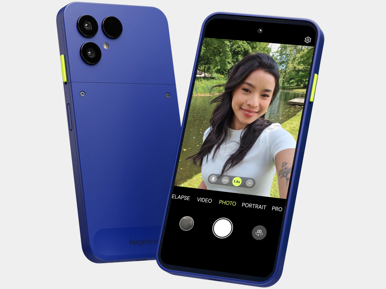
Most Phones Last 3 Years, This $650 Fairphone 6+ Is Built for 8

The smartphone upgrade cycle has been one of the more quietly destructive consumer habits of the past two decades. Most people replace their phone every two or three years, and most of the time the reason has less to do with the device failing than with the manufacturer stopping support for it, making it feel obsolete ahead of its actual lifespan. The waste this generates at the component and material level is substantial, and the industry has largely responded with recycling pledges rather than any structural rethinking.
Fairphone has spent the better part of sixteen years making a structural argument instead. The Fairphone (Gen. 6+) is the latest iteration of that argument, and it arrives with a notable addition to its story: it’s the first Fairphone sold directly in the United States. For a phone built around the idea that longevity and repairability should be standard expectations rather than premium options, reaching the world’s largest smartphone market is a meaningful step.

Designer: Fairphone

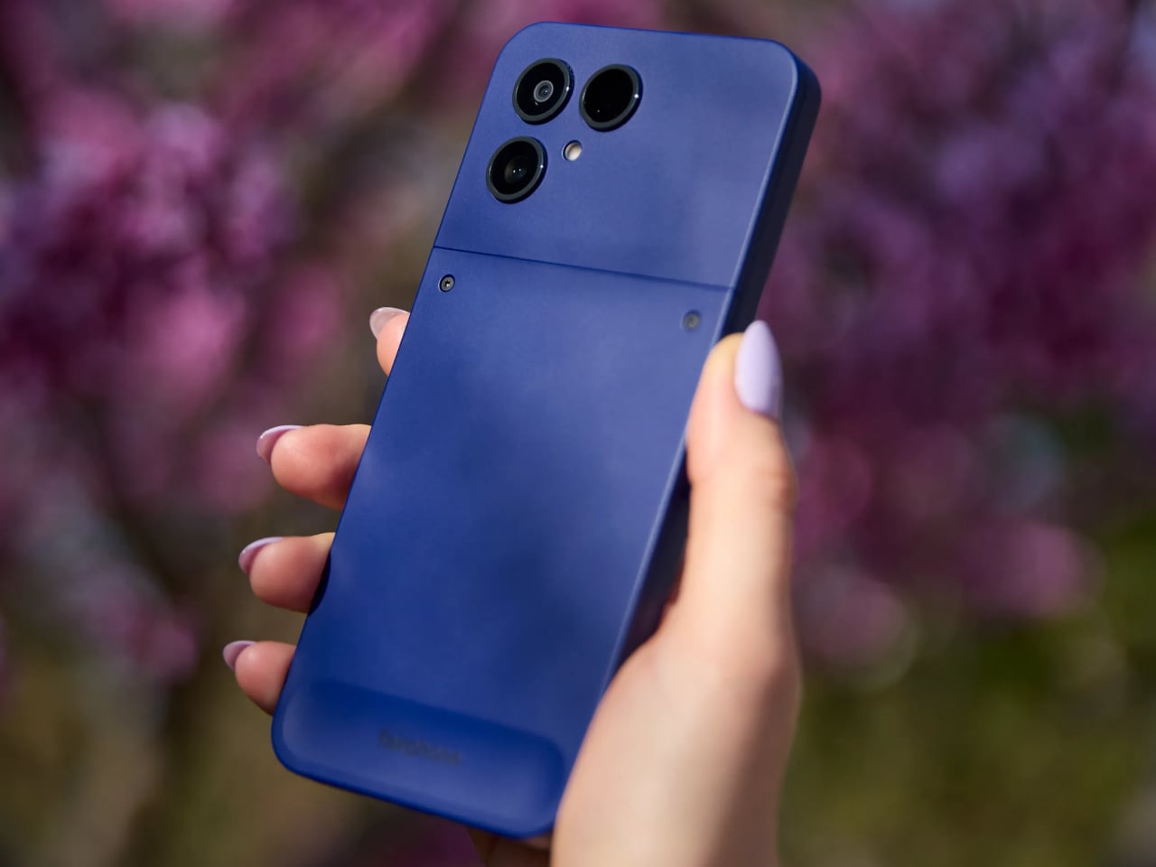
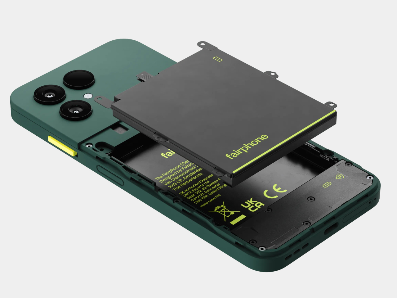
The Gen. 6+ carries twelve user-replaceable parts, from the battery and display to the USB-C port and back cover, most swappable with a single screwdriver in under five minutes. The phone has earned iFixit’s 10/10 repairability score, making it the fifth consecutive Fairphone to do so. Spare parts are guaranteed to be available until 2033, and the five-year warranty covers the device for as long as most people own a phone at all.

That repairability doesn’t come at the cost of ignoring performance. The Gen. 6+ runs on the Snapdragon 7s Gen 4 paired with 12GB of RAM, which is a meaningful step up from the Gen. 6’s Snapdragon 7s Gen 3 and 8GB. The 6.31-inch LTPO AMOLED display runs at an adaptive 10–120 Hz with up to 1,400 nits of peak brightness, and the 4,415mAh removable battery delivers up to two days between charges, with fast charging reaching 50% in 30 minutes.

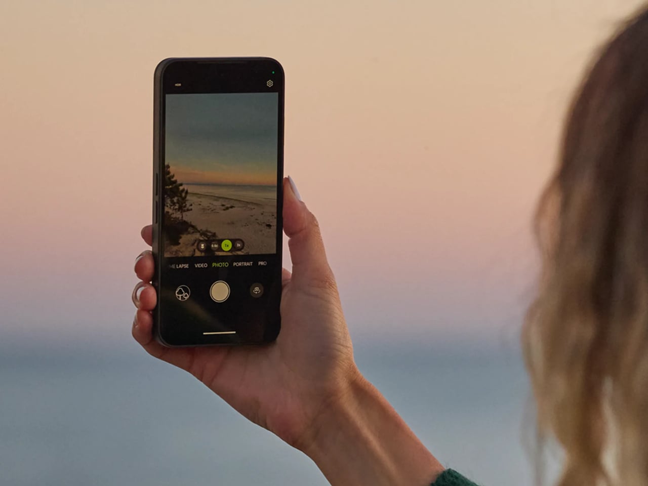
The camera system centers on a 50MP Sony LYTIA sensor with optical image stabilization, supported by a 13MP ultrawide and a 32 MP front-facing camera. It’s a capable setup for the mid-range segment it occupies, handling 4K video at 30 fps and slow-motion recording up to 1080p at 120 fps. What’s worth noting is that the camera module, like everything else in the phone, is replaceable. A damaged lens or degraded sensor doesn’t mean the device is finished.

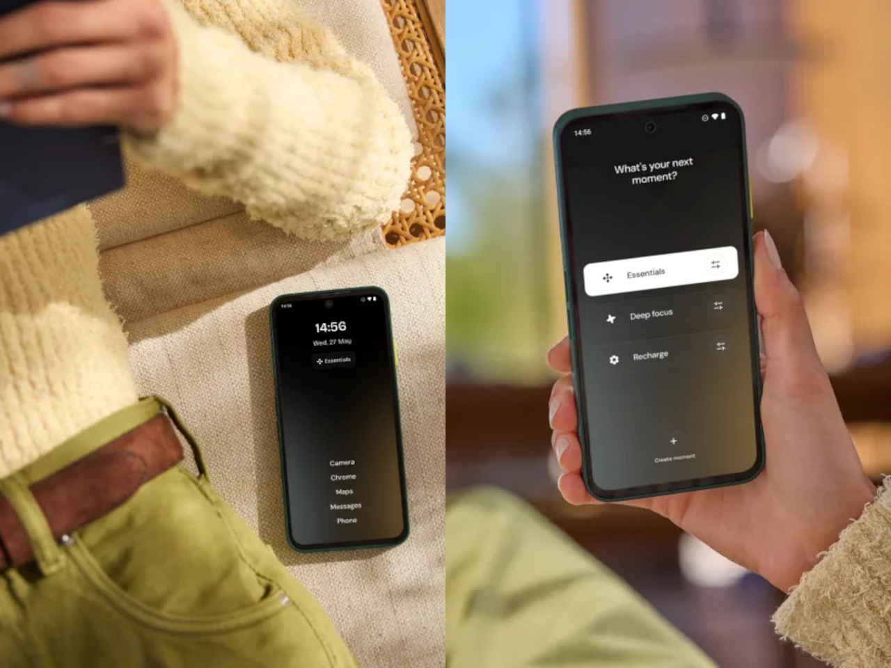
The phone’s physical design includes a dedicated switch, called Fairphone Moments, that toggles between full functionality and a stripped-back mode that limits access to only what you’ve decided matters. It’s a small thing, but it addresses a real pattern: most of us don’t need every app and notification available every hour of the day, and having a physical switch to enforce that boundary is more reliable than navigating a settings menu under pressure.

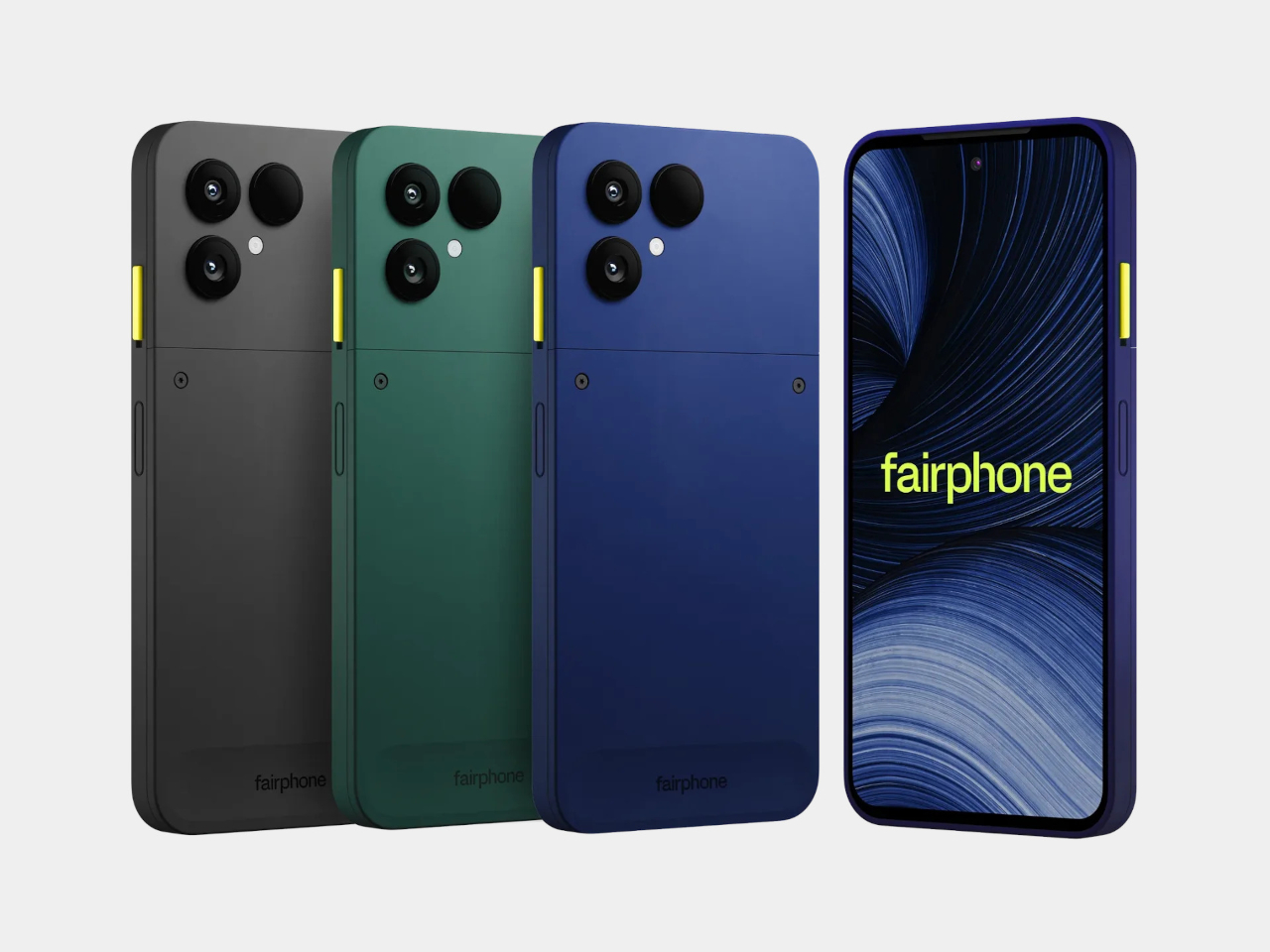
The materials list is as deliberate as everything else. The phone uses 51% fair or recycled materials by weight, including Fairmined gold and tungsten, recycled aluminum, copper, steel, and plastics, along with Fair Cobalt Credits applied to cobalt sourcing. It ships in plastic-free packaging. The Gen. 6+ is available in Cobalt Blue, Forest Green, and Horizon Black, priced at €649 in Europe and $649.99 in the US.

For a device this thoughtfully constrained, the case for it doesn’t rest on outpacing the competition on any single spec. It rests on the idea that a phone lasting seven or eight years has more value, environmental and financial, than one that lasts three, and that keeping it alive should never require shipping it off to a service center.

The post Most Phones Last 3 Years, This $650 Fairphone 6+ Is Built for 8 first appeared on Yanko Design.