Think about the last time you actually used the right half of your keyboard while gaming. Your right hand was on the mouse, your left hand was camped on WASD, and every key to the right of G and T was essentially decorative. The numpad, the arrow keys, the entire right side of your keyboard sat there collecting dust while you were busy fragging opponents or managing cooldowns. Keyboards have been designed for typists since the 1860s, and the gaming world has largely just accepted that and moved on.
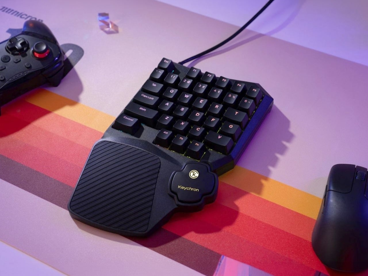
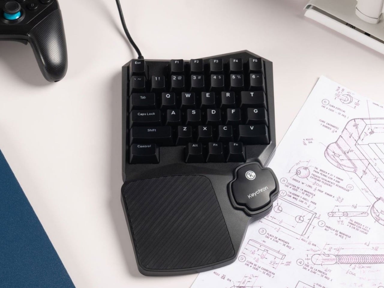
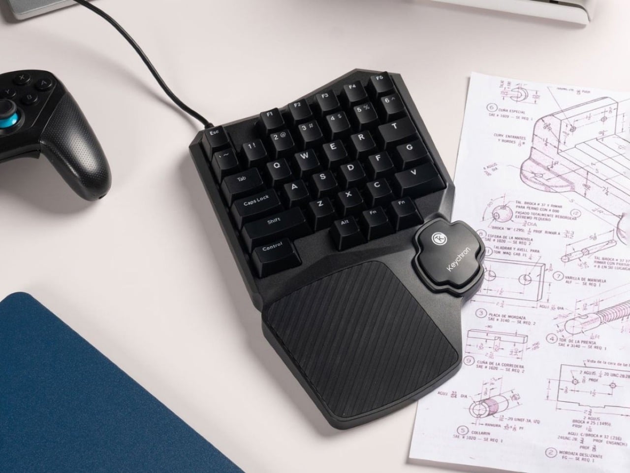
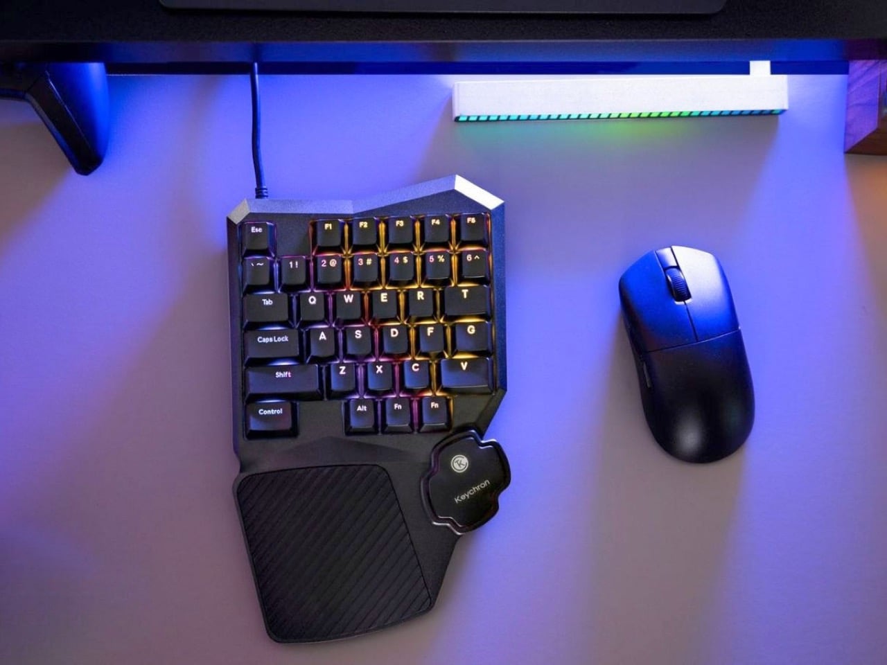
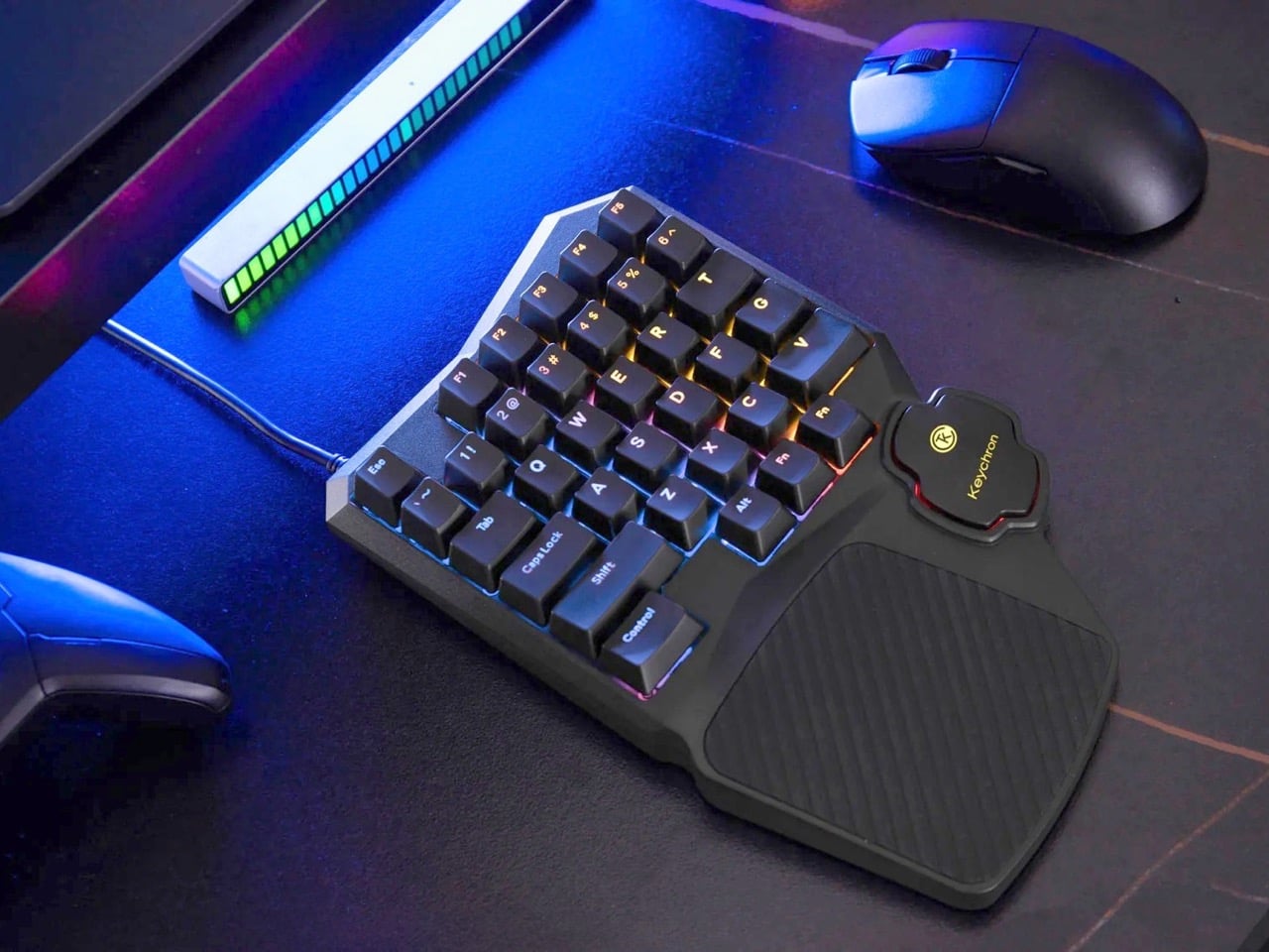
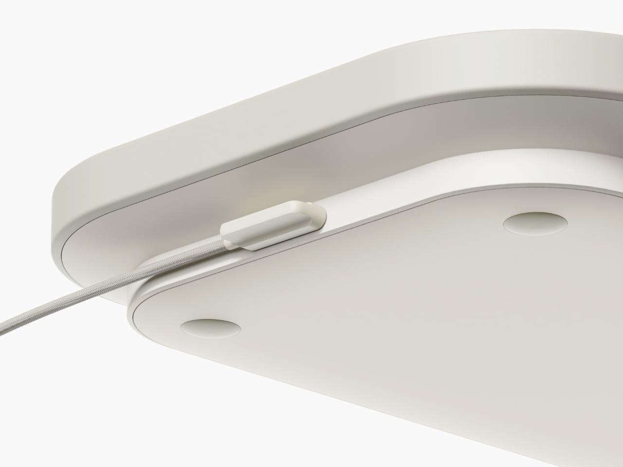
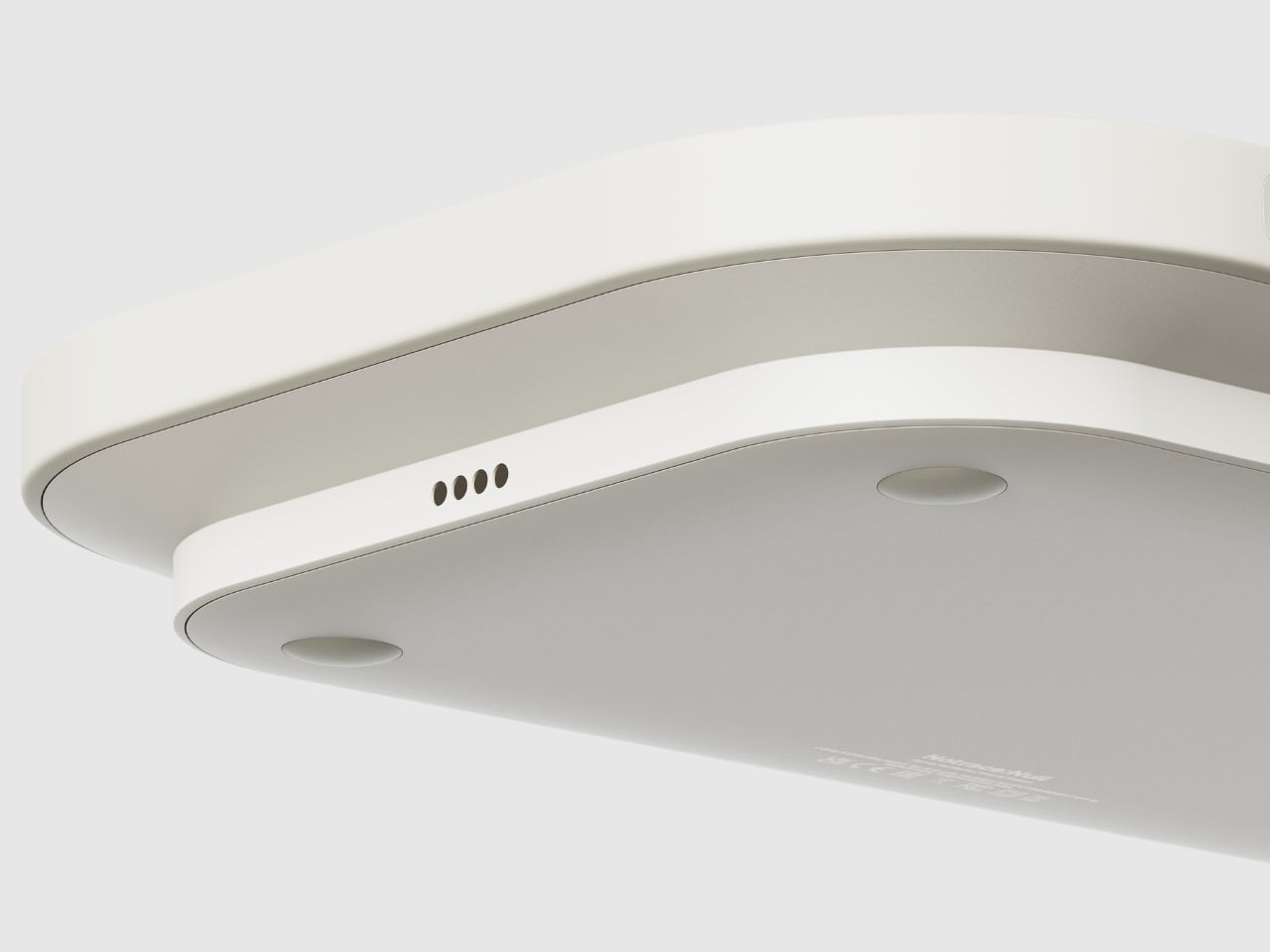
Keychron hasn’t. The C0 HE 8K is a 35-key one-handed gaming keypad that takes the left half of a conventional keyboard, wraps it in an aggressive chassis with a built-in palm rest, and throws Hall Effect magnetic switches and an 8,000 Hz polling rate at it. The result is a peripheral built entirely around how PC gamers actually use their keyboards, rather than how office workers do.
Designer: Keychron
Hall Effect magnetic switches read actuation depth using sensors rather than physical contact between two metal points, which means the switches don’t wear out the same way traditional mechanicals do since there’s no metal-on-metal degradation over time. More practically, you can set exactly how deep each key needs to travel before it registers, right down to fractions of a millimeter, through Keychron’s browser-based Launcher app. Set a shallow actuation for your sprint key, a deeper one for an ability you don’t want to fat-finger, and a rapid trigger profile for keys where you need near-instant re-registration. This level of per-key granularity has historically lived in expensive enthusiast boards, and Keychron is bringing it to a purpose-built gaming pad that fits in half the desk footprint.
At 8,000 Hz, the C0 HE 8K reports its key state to your PC eight times more frequently than the 1,000 Hz ceiling most gaming keyboards hit. You can switch between 1,000, 4,000, and 8,000 Hz in the Launcher app depending on whether you want to conserve USB bandwidth or go full competitive. For most players the difference is nearly imperceptible in casual play, but in titles where frame timing and input consistency matter at the margins, having that headroom available without buying a separate board is a genuinely useful option.
The faceted, angular chassis has beveled edges cutting across the top corners that give the C0 HE 8K a visual identity most gaming peripherals lack entirely. The integrated silicone palm rest flows organically out of the bottom of the unit, wide enough to actually support your wrist rather than just gesture at the concept. North-facing RGB shines through double-shot ABS keycaps in over 22 lighting modes with per-key control, keeping legends readable even in dim setups where the backlighting does most of the work.
Pricing remains under wraps for now. The C0 HE 8K sits in a niche that the Razer Tartarus and Logitech G13 have occupied for years, but neither brought Hall Effect switches or sub-millisecond polling to the category. Keychron has built a reputation on mechanical keyboards that punch above their price point, and if the C0 HE 8K lands anywhere near the $80 to $100 range its feature set suggests, it will be a serious conversation starter for anyone who has ever looked at the right half of their keyboard mid-game and wondered why it exists.
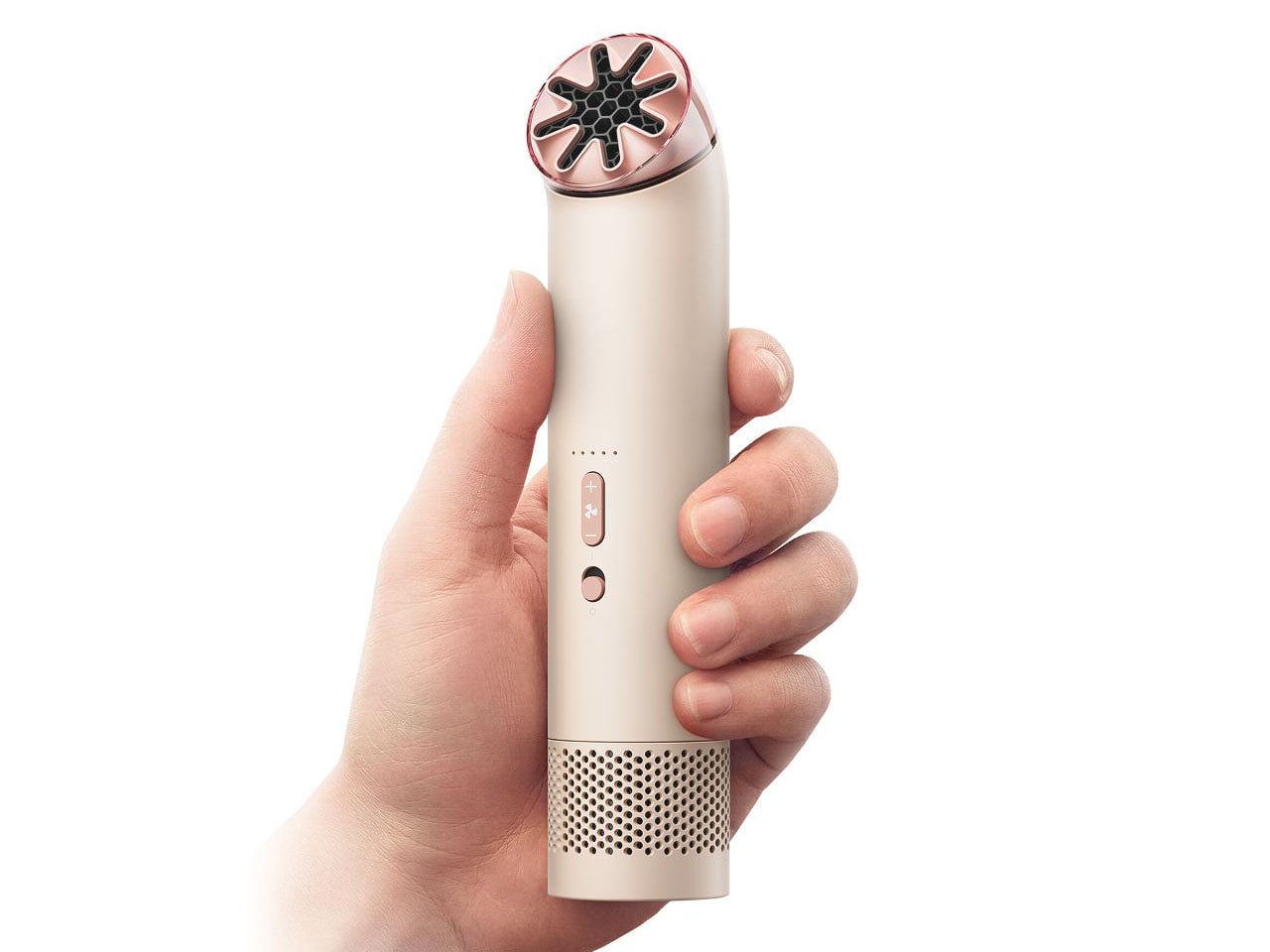
It’s summertime, and the temperatures are soaring, making you sweat and feel uncomfortable. A mini fan can give you some breathing space in the heavy, humid heat. But if you’re looking for something beyond the usual pocket fan, Dyson wants you to indulge in the luxury of a gadget that feels just as premium in the hand as it looks. The company’s latest personal cooling device promises to outclass typical portable fans with engineering inspired by the same airflow technology that powers its iconic bladeless designs.
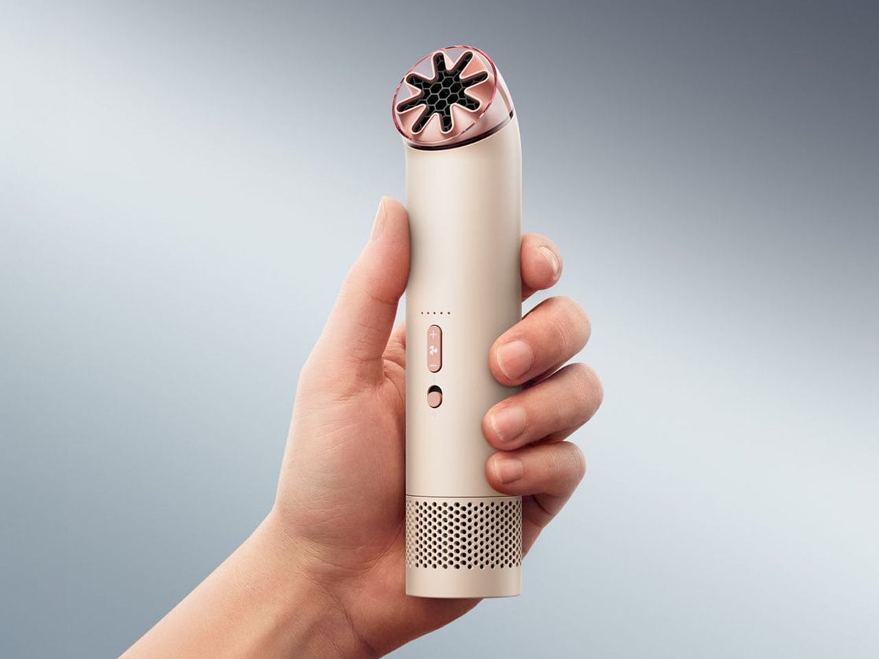
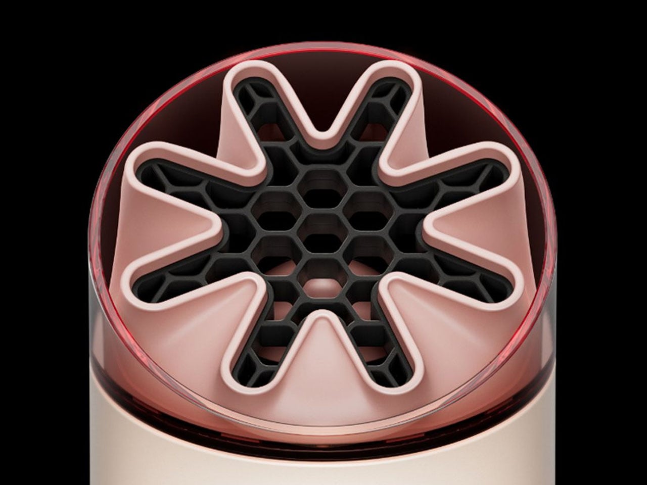
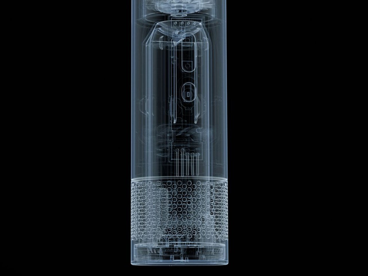
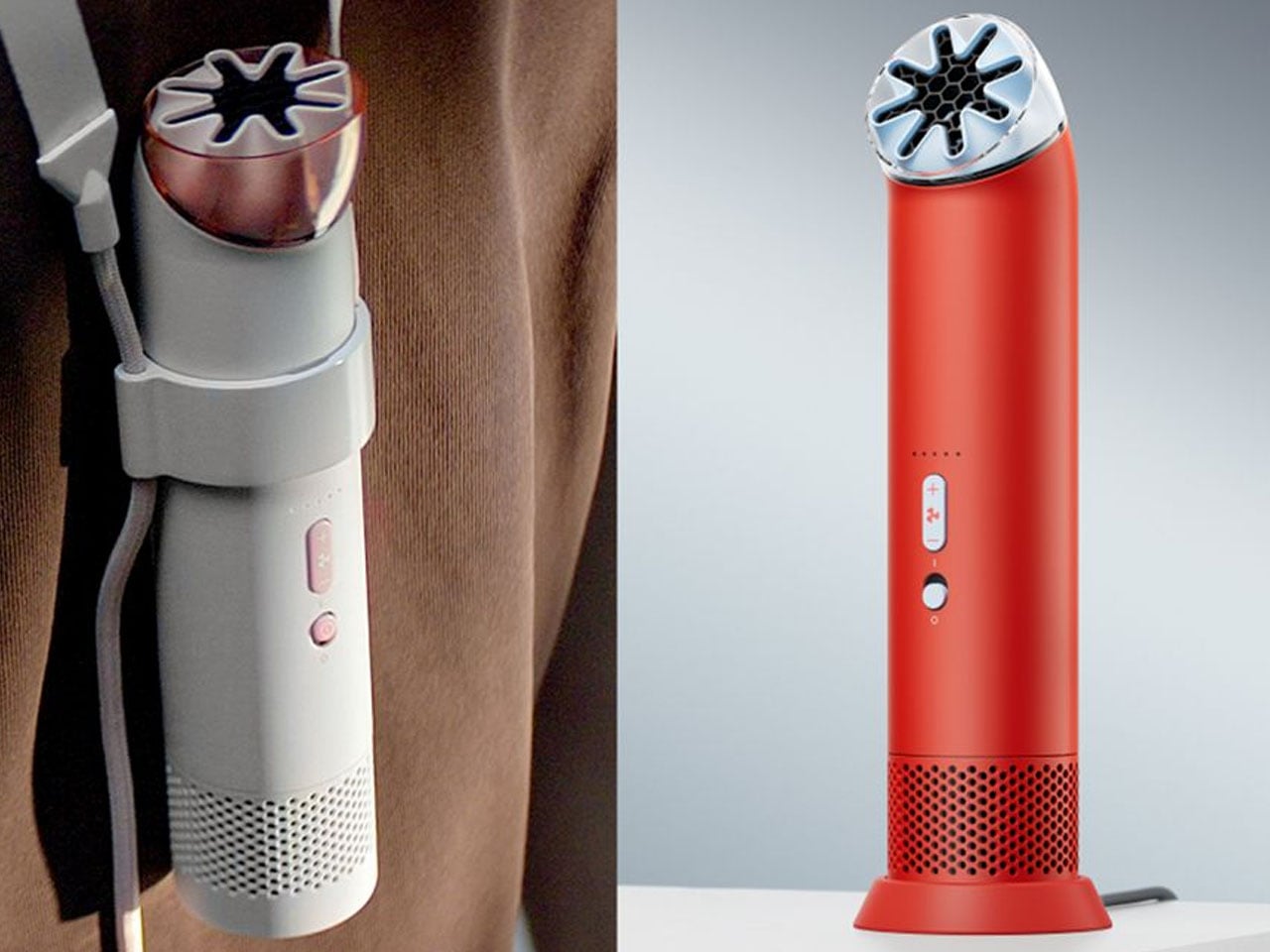
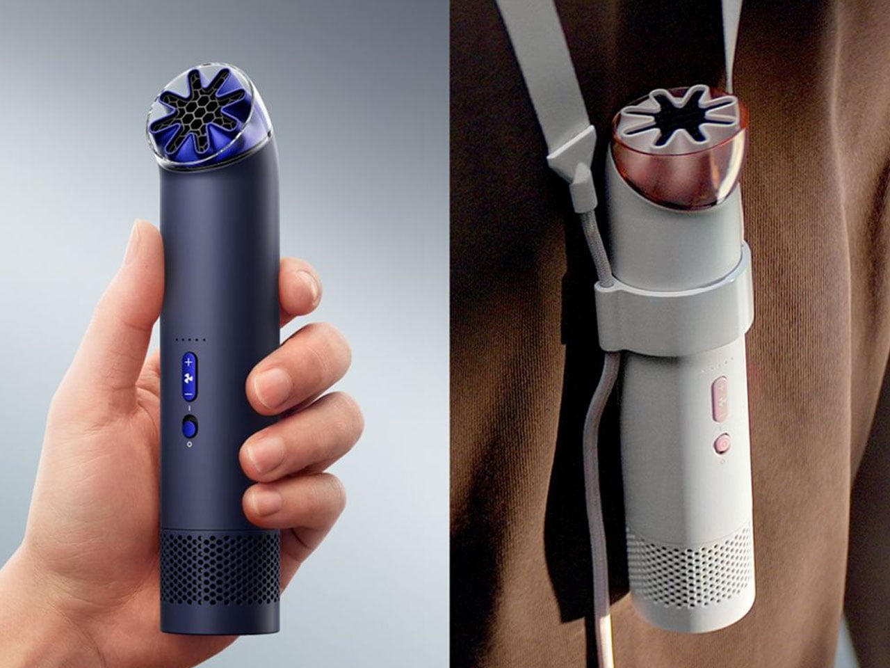
The HushJet Mini Cool is Dyson’s first portable fan designed to be carried or worn around the neck, and it aims to deliver cooling in a way that feels refined rather than noisy or clunky. True to Dyson’s design philosophy, the device hides its working parts inside a smooth cylindrical body. There are no exposed blades, which not only gives the fan a cleaner appearance but also prevents hair or clothing from getting caught while using it close to the face. The nozzle on top is borrowed directly from the HushJet purifier line, and at full scale on those machines it reads as precision engineering. Miniaturized here and perched at the tip of a handheld cylinder, the hexagonal honeycomb iris framed in rose-tinted trim produces a silhouette that has, let’s say, generated a certain kind of attention online. Dyson’s engineers were clearly thinking about airflow geometry. Their industrial designers may have needed one more round of feedback.
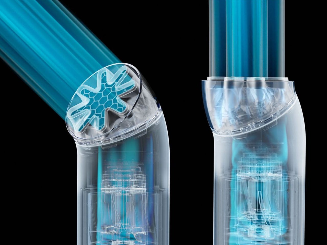
Inside the compact housing is a high-speed brushless DC motor that spins at up to 65,000 RPM. Despite the fan’s small footprint, it produces a focused stream of air that can reach speeds of around 25 meters per second. Dyson pairs this with its custom HushJet nozzle that channels and smooths the airflow, reducing turbulence and minimizing the harsh buzzing sound commonly associated with small handheld fans. The result is a more refined sound profile, operating as quietly as about 52 dBA on lower speeds and rising to roughly 72.5 dBA when pushed to its Boost mode. Impressive numbers, though probably not the first thing people are going to be talking about when they see this thing in someone’s hand.
Cooling performance can be adjusted through five airflow settings, allowing users to move from a gentle breeze to stronger airflow depending on the situation. When the heat becomes unbearable, Boost mode provides a short burst of maximum airflow for quicker relief. The nozzle itself can be rotated to direct the airflow precisely where it’s needed, whether angled upward toward the face or positioned more directly for a stronger cooling effect. Rotating it does change the visual read somewhat, for what that’s worth.
Portability is central to the HushJet Mini Cool’s design. The fan weighs roughly 212 grams and measures about 38 millimeters in diameter, making it easy to carry in a bag or hold comfortably for long periods. Dyson includes a lanyard so it can be worn around the neck for hands-free use while walking outdoors or commuting, which introduces its own set of visual problems that we’ll leave as an exercise for the reader. A charging stand also allows it to double as a compact desk fan, adding versatility when you’re sitting at work or relaxing at home.
The device runs on a 5,000 mAh rechargeable battery that provides up to six hours of use depending on the selected fan speed. Charging is handled through a USB-C port, making it convenient to power up using everyday chargers or portable power banks. Dyson also includes a travel pouch for easier portability, while optional accessories such as a grip clip and universal mount allow the fan to attach to strollers, bags, or other surfaces.
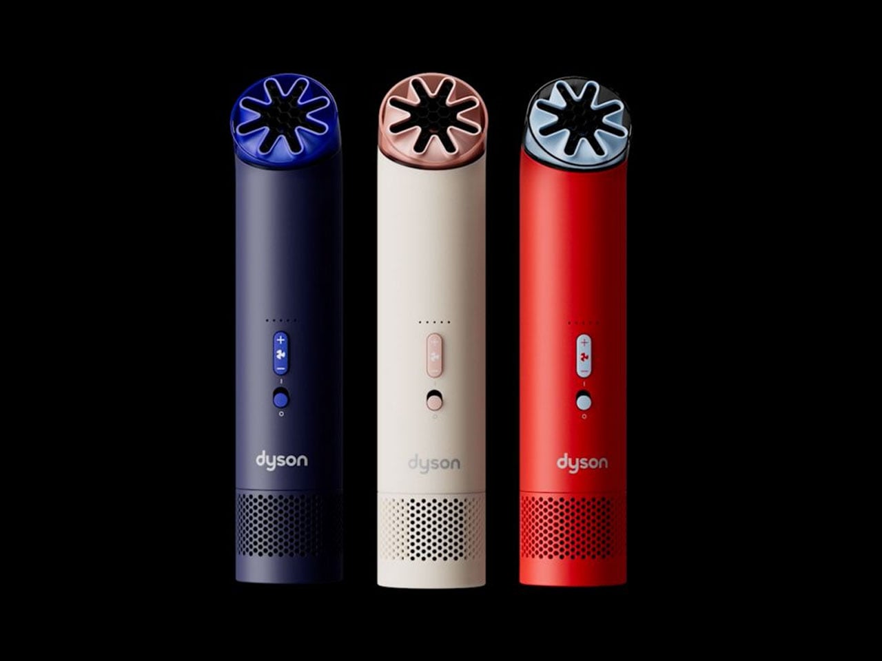
Available in Stone/Blush (blush is a very unfortunate name if you ask me), Carnelian/Sky, and Ink/Cobalt, the HushJet Mini Cool is priced at $99 and available starting today. The engineering is genuinely solid, the noise suppression is real, and the cooling performance punches well above what you’d expect from something this compact. Dyson’s industrial design team clearly did their homework on the airflow side. Whether anyone assigned to the form factor study did the same is a question that the internet has already answered, loudly and with great enthusiasm.
The first thing most people reach for in the morning isn’t a glass of water or a cup of coffee; it’s the phone. From there, it’s a quick trip through news alerts, emails, and a social media feed that didn’t exist last night. Screen fatigue is well-documented at this point, and the solutions that have emerged tend to be more digital tools designed to manage other digital tools.
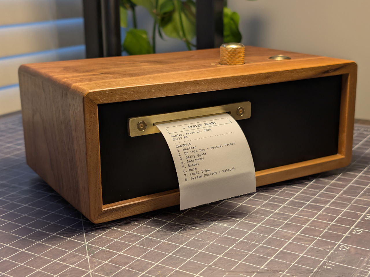
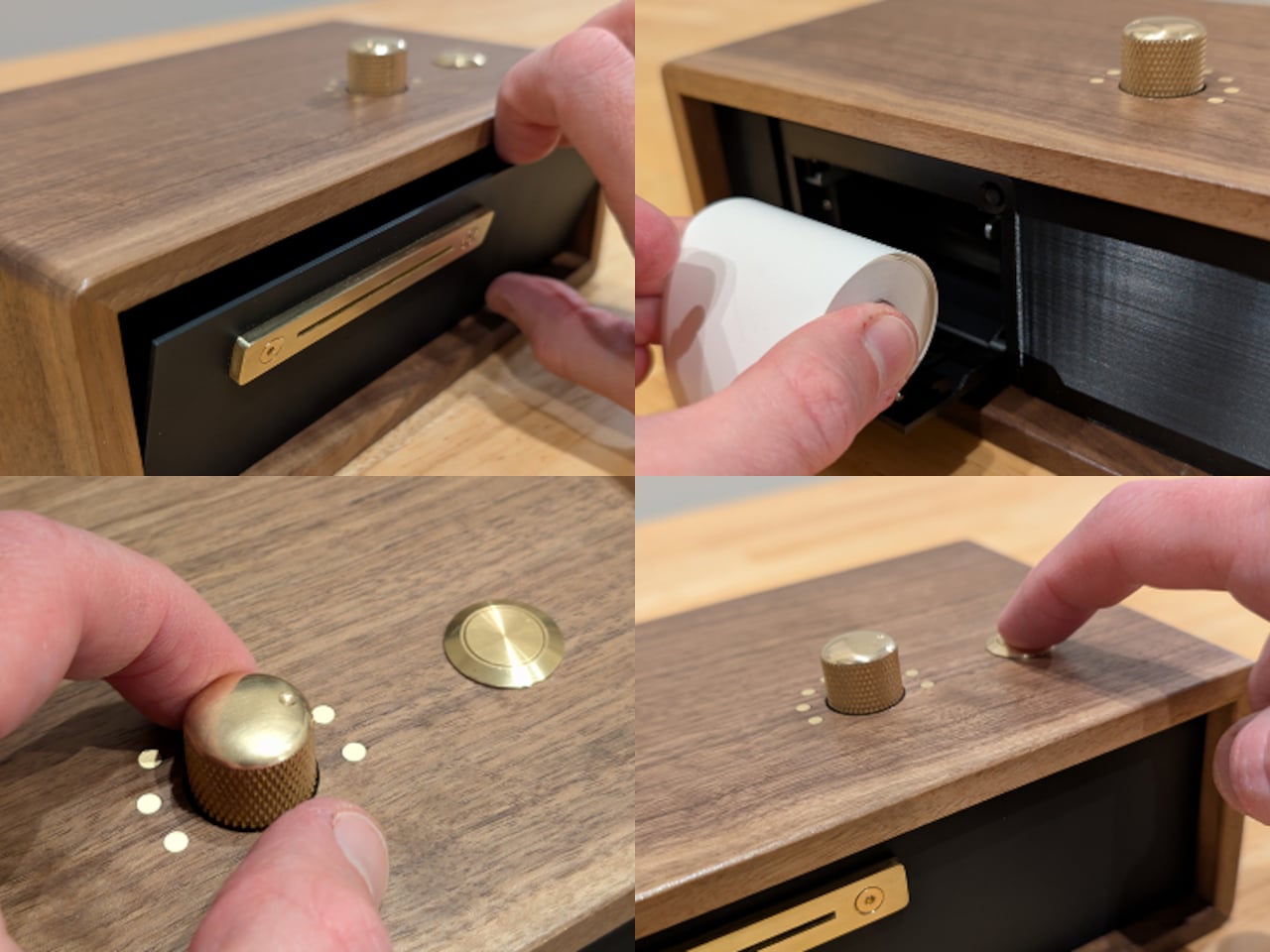
Designer and furniture maker Travis Miller decided to approach the problem differently. His Paper Console PC-1 doesn’t ask you to manage your screen time; it simply offers an alternative that doesn’t involve one. The device is about the size of a toaster and sits on a desk or nightstand, printing your news, weather, puzzles, and other personally selected content on demand, one strip of thermal paper at a time.
The interaction is deliberately simple. A brass rotary dial on the front selects from up to eight customizable channels, and a single button triggers printing. No menus, no tap targets, no notifications pulling your attention away. The channels can be loaded with whatever content matters most to you, from top news headlines and RSS feeds to weather forecasts, email summaries, astronomy updates, and puzzles like Sudoku and mazes.
Each channel can hold multiple modules stacked in whatever order you prefer, so a single press can deliver a full morning digest: weather first, then headlines, then a journal prompt to think about over coffee. Scheduling is built in as well, so the device can print automatically at set times, silently delivering the day’s content without any input. It’s passive in the best sense.
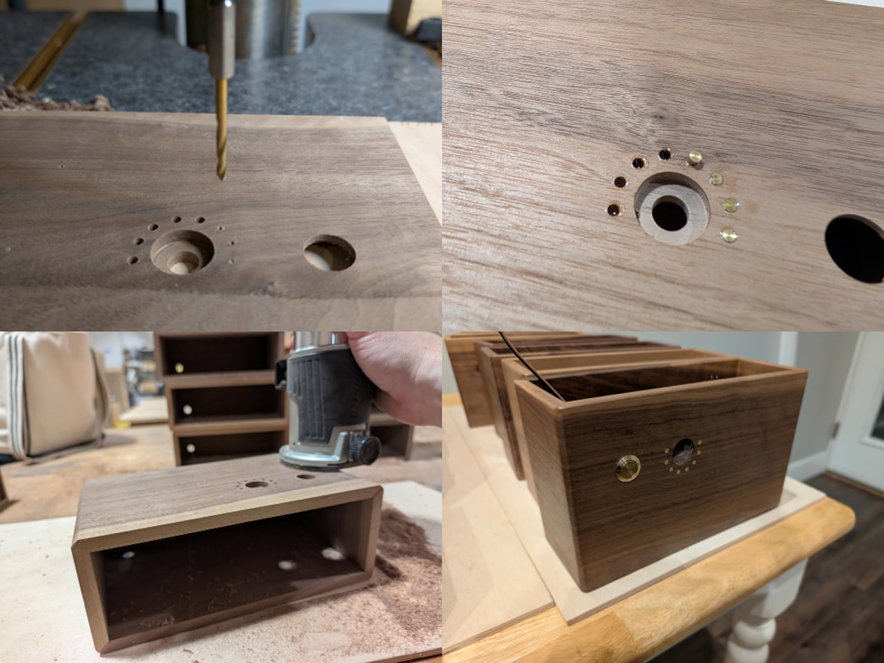
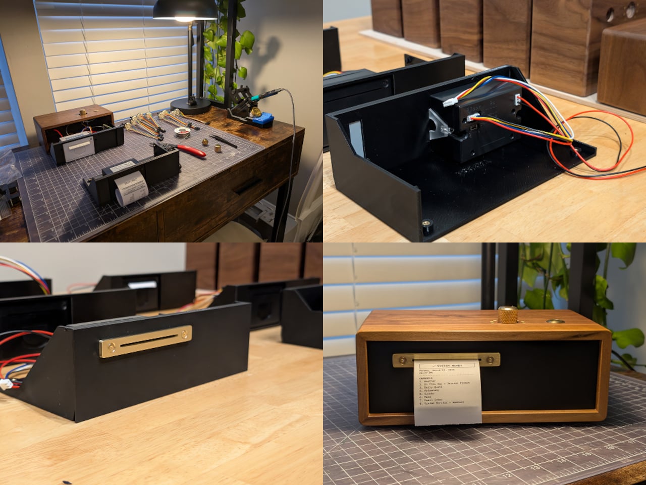
Inside the walnut and brass enclosure is a Raspberry Pi Zero 2 W paired with a 58mm thermal printer. Miller designed and fabricated the case himself, drawing on six years of furniture making, and a 3D-printed internal sled keeps the electronics tidy and mounted. The brass faceplate gives the device the kind of weight and finish that puts it a long way from anything that comes in a retail box.
Miller made only 10 units in this first run, though the full project is open-sourced and documented on GitHub for anyone who wants to build one. That openness suits it well. The PC-1 isn’t a product category or a commercial platform; it’s a personal project that turned out well enough to share. The GitHub documentation is detailed enough to follow and honest about what the build actually involves.
There’s something genuinely refreshing about a device that asks nothing of you except a button press. The Paper Console PC-1 isn’t anti-technology; it’s just more selective about what earns a spot on the desk. Information printed on paper, held in your hand, and torn off when you’re done has a finality that a notification never manages, and for a growing number of people, that difference matters quite a lot.
Gen Z isn’t chasing spec sheets or benchmark scores. They’re chasing objects that fit the way they actually live: portable, intentional, and quietly smart. April 2026 delivered a lineup that genuinely gets that energy. From satellite-connected wearables to battery-free speakers, these ten gadgets are doing something harder than simply being powerful. They’re being useful, and in a market saturated with noise and empty promise, that distinction is becoming genuinely rare.
The gadgets on this list aren’t competing for attention. They’re designed around how people actually behave: working from cafés, traveling between cities, tuning out distractions, or surviving in places where infrastructure doesn’t reach. Some rethink materials, some rethink interfaces, and some rethink habits entirely. What they share is a design sensibility that respects the user’s time and intelligence. That’s the standard Gen Z holds, and this month, these ten deliver.
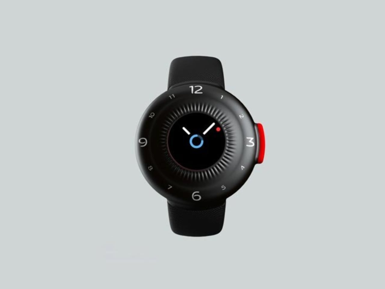
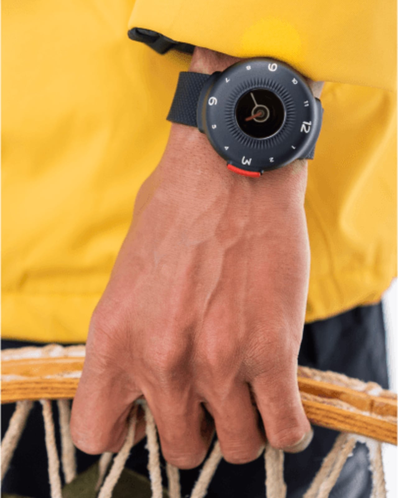
1. O-Boy Satellite Smartwatch
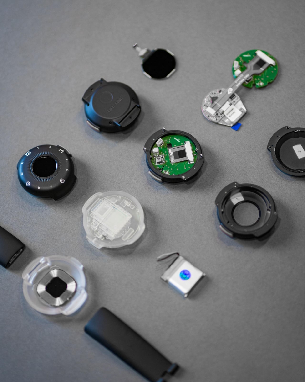
The O-Boy is built for the places where your phone gives up. Brussels-based studio Futurewave designed this satellite-connected smartwatch for emergencies in environments where mobile networks simply don’t exist: open ocean, mountain terrain, remote job sites. No bars, no Wi-Fi, no backup signal required. The watch transmits an emergency alert directly via satellite, making it one of the few wearables that actually keeps its promise when conditions are worst.
What makes the O-Boy genuinely impressive isn’t just the satellite capability; it’s how it was achieved. Futurewave pulled together product designers, electronics engineers, and antenna specialists and rethought the assembly process from the ground up. Getting satellite hardware into a compact, wearable form factor is not a small engineering feat. The result is a device that pushes the category forward rather than iterating on what already exists, and that distinction matters.
What We Like
Satellite communication works completely off the grid
Cross-disciplinary engineering produced a genuinely compact wearable form factor
What We Dislike
Designed primarily for emergencies, limiting everyday lifestyle appeal
Satellite connectivity may come with additional subscription costs
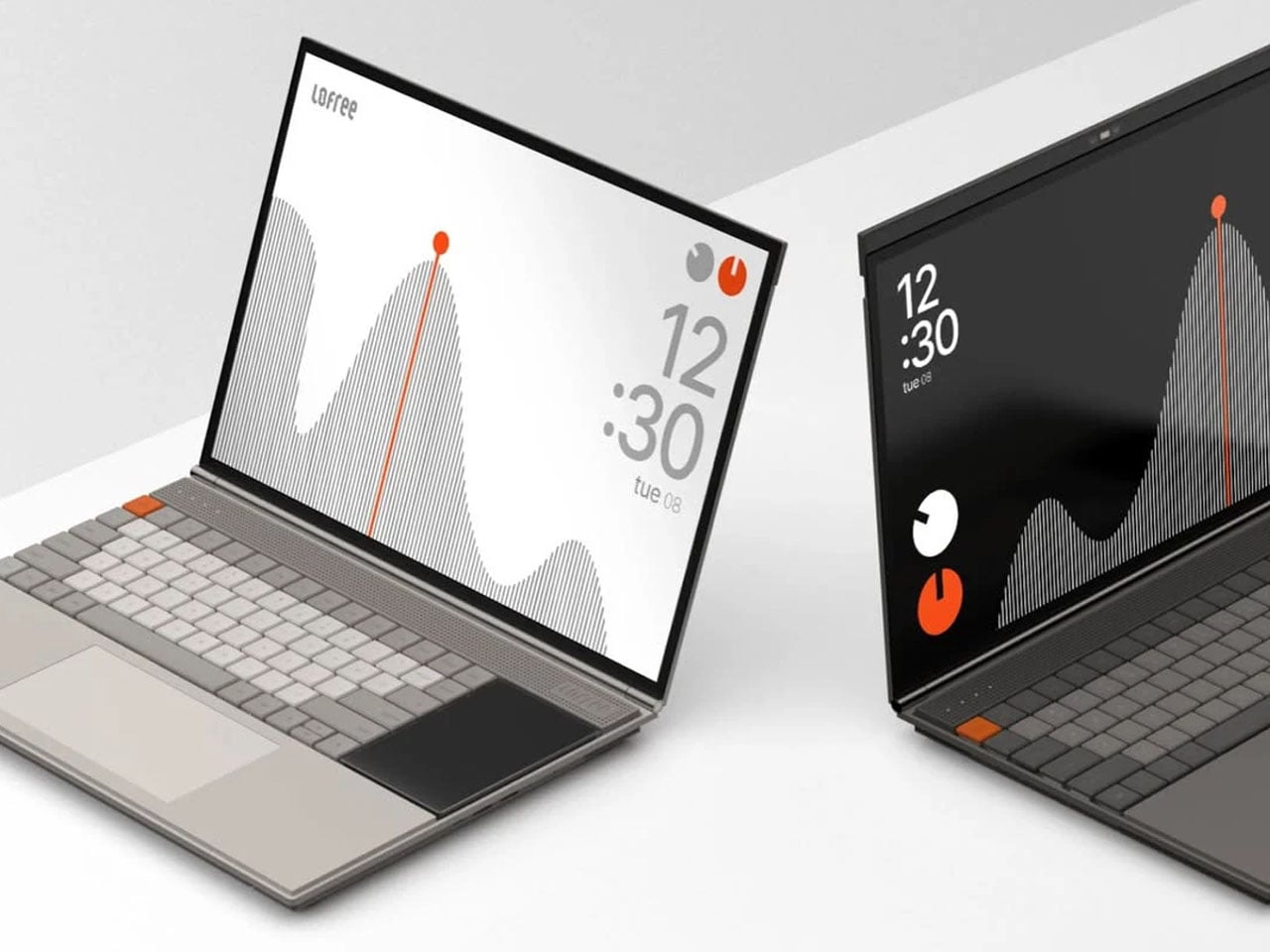
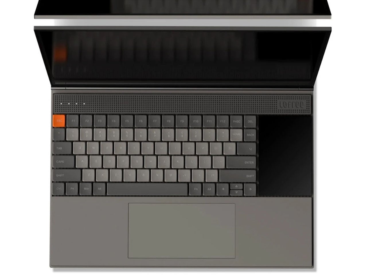
2. Minimal Laptop UI Concept
Inspired by the design philosophy of Teenage Engineering, the Minimal Laptop UI concept imagines what a laptop would look like if hardware and software were built around the same principle: less friction, more focus. The interface relies on strong visual hierarchy, generous spacing, and elements that appear only when necessary. Toolbars, panels, and persistent notifications are stripped away entirely, leaving a workspace that feels calm rather than cluttered.
For a generation that grew up multitasking across four open tabs and a split screen, this concept offers something surprisingly radical: a single surface to think on. Typography is clean and deliberate, icons are reduced to their most recognizable forms, and content stays at the center. It’s not about doing less. It’s about designing a machine that doesn’t compete with the work you’re trying to do on it, and that’s a harder problem than it sounds.
What We Like
Interface is designed around focus rather than feature density
Aesthetic language is distinctive and quietly confident
What We Dislike
Remains a concept with no confirmed production timeline
Minimal UI may not suit users who rely on multi-panel workflows
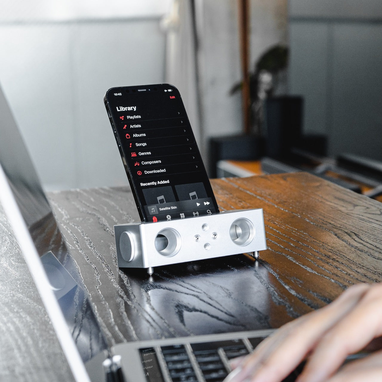
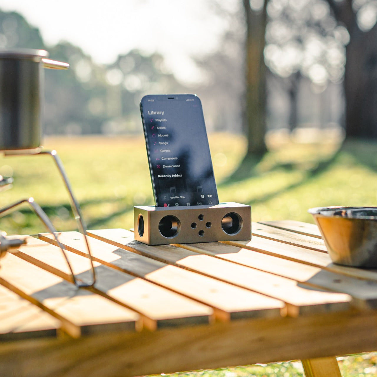
3. Battery-Free Amplifying iSpeakers
No power outlet, no battery, no Bluetooth pairing. Place your phone in the iSpeakers, and the sound amplifies. Built from Duralumin, the aluminum alloy used in aircraft construction, this passive speaker uses the golden ratio in its geometry to enhance resonance naturally. The result is an amplifier that genuinely improves your phone’s audio without asking anything of your power strip or your patience, which is a more elegant solution than most audio hardware manages.
The iSpeakers work anywhere, which makes them useful in a way that over-engineered audio gear often isn’t. A desk speaker that never needs charging is always ready. The aesthetic is understated and precise, the kind of object that improves a space by being in it rather than demanding attention. For anyone tired of hunting for cables and waiting for Bluetooth to pair, this is a refreshingly simple alternative that earns its place on any desk.
Zero power requirement means zero limitations on where it works
Duralumin construction gives it both durability and a premium, clean look
What We Dislike
Audio output depends entirely on the quality of the phone’s built-in speaker
Sound-directing mods are sold separately, adding to the total cost
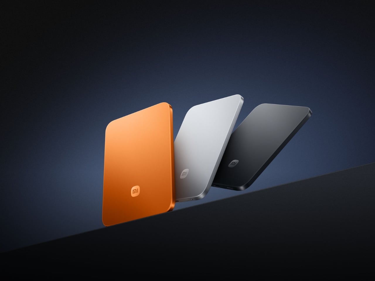
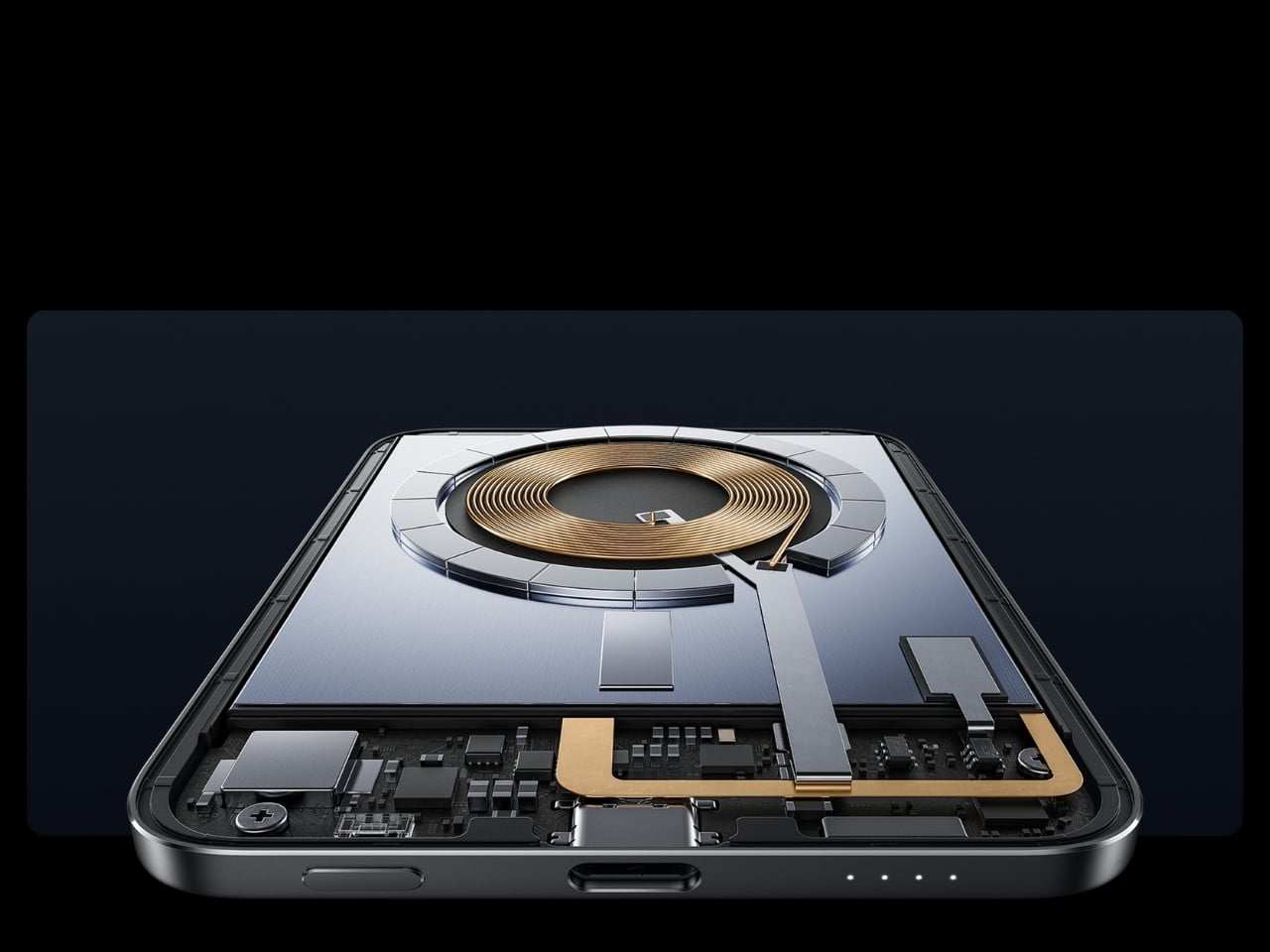
4. Xiaomi UltraThin Magnetic Power Bank 5000 15W
At 6mm thick, the Xiaomi UltraThin Magnetic Power Bank is thinner than any smartphone currently on the market. Using silicon-carbon battery chemistry with 16% silicon content, Xiaomi managed to pack 5,000mAh into something that looks and feels like a metal business card. The aluminum alloy shell has a smooth, understated finish, and a photolithographically etched logo on the back signals a product designed with care rather than simply manufactured to a spec sheet.
Available in Glacier Silver, Graphite Black, and Radiant Orange, this power bank debuted in Japan, expanded across Australia, Singapore, South Korea, and Europe, and made its global appearance at MWC 2026 in Barcelona. European pricing sits around €60, which is reasonable for what it delivers. The phone-facing surface uses fire-resistant fiberglass with an excimer coating for heat management, a detail that matters when you’re charging magnetically and want the hardware to stay cool.
What We Like
Silicon-carbon battery achieves 5,000mAh in a 6mm profile
Premium materials and finish at an accessible price point
What We Dislike
15W wireless charging is modest compared to faster wired alternatives
The ultra-slim design means no additional ports or USB-A pass-through
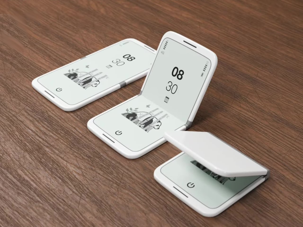
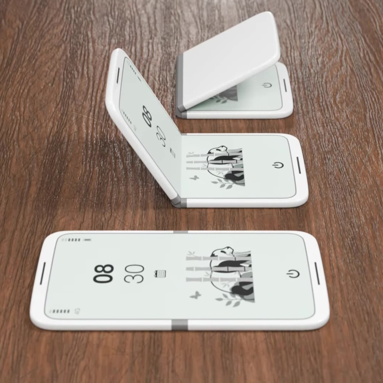
5. tinyBook Flip
The tinyBook Flip is a foldable phone concept built around a 6.1-inch E Ink display. Closed, it collapses into a near-square form with a matte white finish and rounded corners, closer in proportion to a folded notecard than a smartphone. When shut, the screen disappears entirely. No glowing rectangle sitting face-up on the desk, no ambient reminder that there are things to check. Just a small, quiet object doing nothing at all.
That quietness is the design feature. Opening the phone requires a deliberate physical action, and that two-second pause changes the behavioral math around screen time. A reflexive grab becomes a conscious decision. The concept treats this friction as intentional, a design choice rather than an inconvenience. For anyone who has tried every screen time app and still reaches for their phone without thinking, the tinyBook Flip proposes something more honest: a phone that makes you choose to open it.
What We Like
Foldable form adds physical friction that genuinely interrupts mindless scrolling
Matte E Ink display avoids unnecessary glow and is easy on the eyes
What We Dislike
E Ink refresh rates remain too slow for video or fast-moving content
Currently a concept with no confirmed production or pricing information
6. OrigamiSwift Folding Mouse
The OrigamiSwift is a Bluetooth mouse that folds flat for travel and springs back to full size in under 0.5 seconds. Weighing 40 grams, it’s light enough to forget it’s in your bag until you need it. Inspired by origami, the foldable structure doesn’t sacrifice ergonomics for portability. It’s shaped to fit naturally in the hand during long work sessions, whether at a co-working space, a café, or an airport gate somewhere between time zones.
For digital nomads and students tired of trackpads and bulky peripherals, the OrigamiSwift makes a compelling case for carrying a full-sized experience in a pocket-sized package. The slim profile keeps it flat and unobtrusive in any bag, and the Bluetooth connection removes the need for a dongle. It’s the kind of product that solves a problem you’ve quietly accepted as unsolvable, and does it with a detail-first design sensibility that genuinely earns the attention it’s getting.
Folds flat without compromising ergonomic performance when open
The 40-gram weight makes it genuinely unnoticeable in a bag
What We Dislike
No published DPI range or click precision specifications available
May not satisfy users who prefer a heavier, more substantial mouse feel
7. DuRobo Krono
The DuRobo Krono puts a 6.13-inch E Ink Carta 1200 display in a form factor that fits a jacket pocket. At 300 PPI with an 18:9 aspect ratio and a weight of 173 grams, it reads more like a physical book than most dedicated e-readers manage. Eight subtle breathing lights run across the back panel, a quiet visual indicator during focused sessions that adds character without becoming a distraction. The matte finish and geometric build keep it composed in any setting.
The Krono’s standout feature is the smart dial on its left side. Press and hold to record voice notes, and the onboard AI transcribes your words into searchable text, generating summaries of longer recordings automatically. For readers who take notes in the margins or thinkers who process ideas out loud, that combination of reading tool and voice capture is genuinely useful. It positions the Krono somewhere between a dedicated e-reader and a thinking device, which is a more interesting category entirely.
What We Like
AI voice recording and transcription work directly on the device
300 PPI display and pocket-friendly form factor rival premium reading devices
What We Dislike
The 18:9 aspect ratio may feel narrow for reading PDFs or documents
Breathing lights, while subtle, may distract in dark reading environments
8. StillFrame Headphones
StillFrame headphones are built around a quieter philosophy: slow listening, deliberate sound, the kind that rewards attention. The 40mm drivers deliver a wide, open soundstage that turns quiet tracks into something textured and spatial. The form references the geometry of ’80s and ’90s CDs and sits in quiet visual dialogue with the ClearFrame CD Player, a nod to an era when music had physical weight, and the act of listening was its own ritual worth showing up for.
The StillFrame sits between in-ears and over-ears in both feel and philosophy: more open than the former, more relaxed than the latter. Noise-cancelling and transparency mode let you shift between solitude and awareness with a single tap, making them genuinely adaptable across environments. They’re featherlight without feeling hollow, and the overall build is measured and considered. For a generation rediscovering vinyl and physical media, StillFrame offers that same intentional energy in a wireless headphone.
Wide soundstage from 40mm drivers gives music genuine spatial depth
Noise-cancelling and transparency modes make it adaptable across daily environments
What We Dislike
An on-ear fit may cause discomfort during extended listening sessions
Retro aesthetic is distinctive but may not appeal to all personal tastes
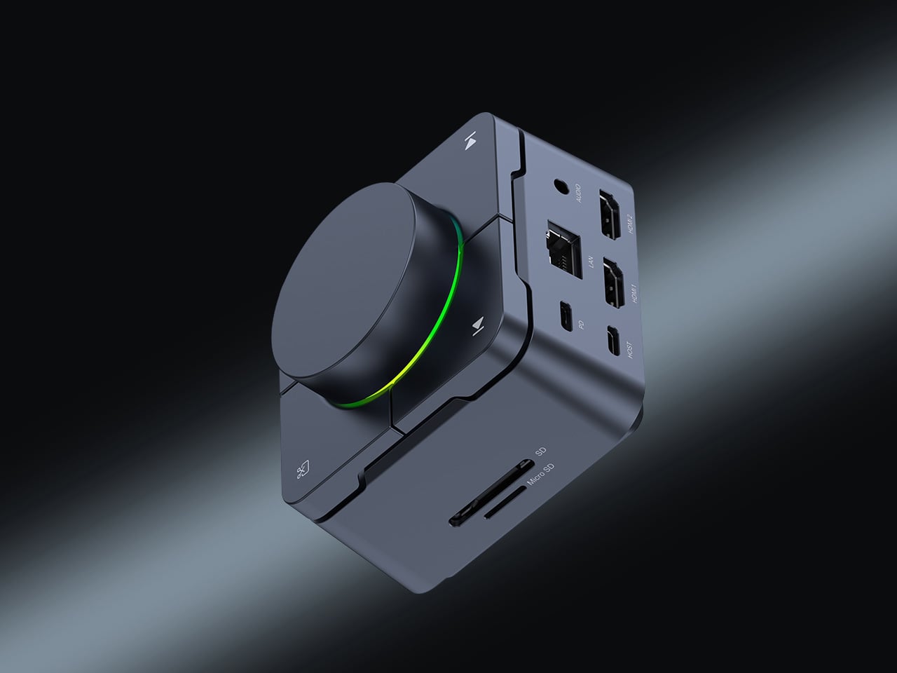
9. HubKey Gen2
The HubKey Gen2 solves the dongle problem that every ultrabook user has quietly accepted as part of working life. Eleven connections are consolidated into a palm-sized cube: dual 4K display support, Ethernet, USB-A and USB-C, and power pass-through included. For anyone working across monitors and peripherals from a laptop with two USB-C ports, this is the kind of product that makes the workspace actually functional without turning the desk into a cable graveyard piled with adapters.
Four programmable keys and a central control knob are what separate the HubKey Gen2 from a standard hub. Muting a microphone, adjusting volume, toggling camera privacy: these are actions that get buried in menus and keyboard shortcuts during live calls. The Gen2 makes them physical, tactile, and immediate. For remote workers, creators, and students who live on video calls, having media controls within arm’s reach rather than three clicks deep is a quality-of-life upgrade that’s hard to give back.
What We Like
Eleven connections in one compact cube eliminate dongle accumulation entirely
Programmable keys and control knob bring commonly buried actions to the surface
What We Dislike
Cables from all eleven ports could still create desk clutter around the hub
Programmable keys may require setup time and dedicated software to configure properly
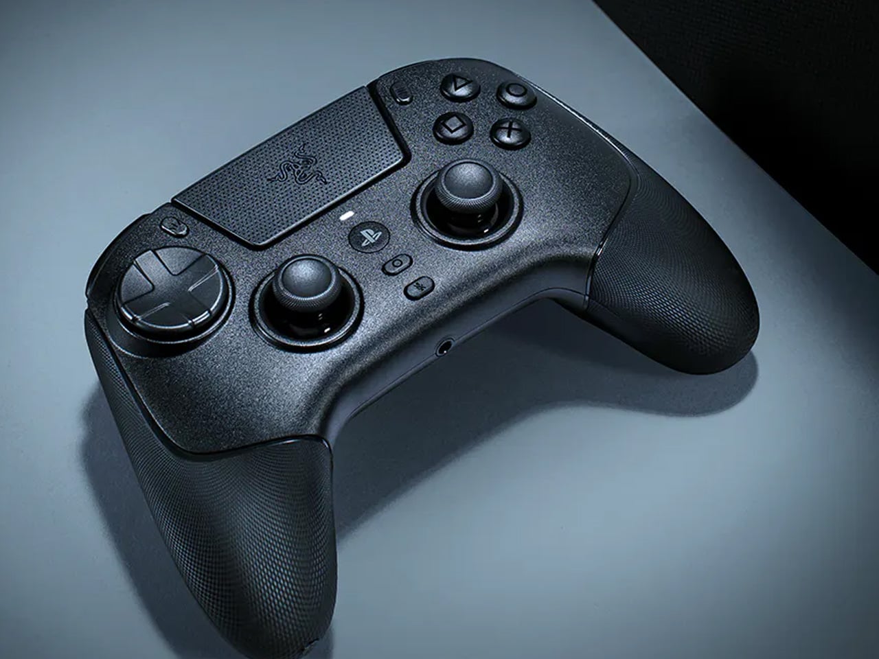
10. Razer Raiju V3 Pro
The Razer Raiju V3 Pro takes the sensor thinking behind high-performance gaming mice and applies it to a PlayStation-compatible controller. Tunnel Magnetoresistance thumbsticks use weak electromagnetic waves to detect movement with higher resolution than standard Hall Effect sensors. Drift is addressed at the hardware level, not patched in software. Hall Effect triggers cover the remaining high-wear inputs. At 258 grams, it sits lighter than the DualSense Edge without feeling insubstantial in the hand.
Six additional inputs are distributed across the frame: four removable back buttons in the rubberized handles and two claw-grip bumpers flanking the triggers, all fully remappable. Razer’s HyperSpeed 2.4GHz wireless reaches a 2,000Hz polling rate on PC. Battery life is rated at 36 hours, nearly triple the DualSense standard. Officially licensed for PlayStation 5, it requires no adapters and connects as a native peripheral. For competitive players who want every hardware advantage in one place, the Raiju V3 Pro sets the current ceiling.
What We Like
TMR thumbsticks offer finer movement resolution with hardware-level drift prevention
36-hour battery life and 2,000Hz polling rate on PC are best-in-class figures
What We Dislike
At 258 grams, it may feel heavy for players accustomed to lighter controllers
Six extra inputs and full remapping may overwhelm casual or new users
The Gadgets That Actually Deserve the Hype
April 2026’s best gadgets share a common thread: they were designed around how people actually behave, not how manufacturers hope they will. Whether it’s a satellite smartwatch that works when nothing else does or a foldable phone that makes you pause before opening it, the most interesting tech this month isn’t louder or flashier. It’s more considered, and that’s a harder thing to consistently get right.
Gen Z has always been quick to call out products that look useful but don’t deliver. This list holds up to that standard. From a power bank thinner than any phone to an AI e-reader that captures your thoughts out loud, these are gadgets that earn their place on a desk or in a bag, and that’s a harder standard to meet than it might seem to anyone designing in this space.
Minimalism in product design has gotten boring. We’re swimming in smooth white rectangles, touch controls that offer zero feedback, and devices designed to vanish. Apple spent two decades training the industry to sand away every visible seam, and now we live in a world where a Bluetooth speaker looks like a cylinder because a cylinder offends nobody. Bang & Olufsen understood early that audio equipment could occupy space like sculpture, could earn its place in a room through presence instead of absence. Teenage Engineering proved that mechanical honesty and playful geometry could coexist with premium materials. Both approaches work because they have a point of view.
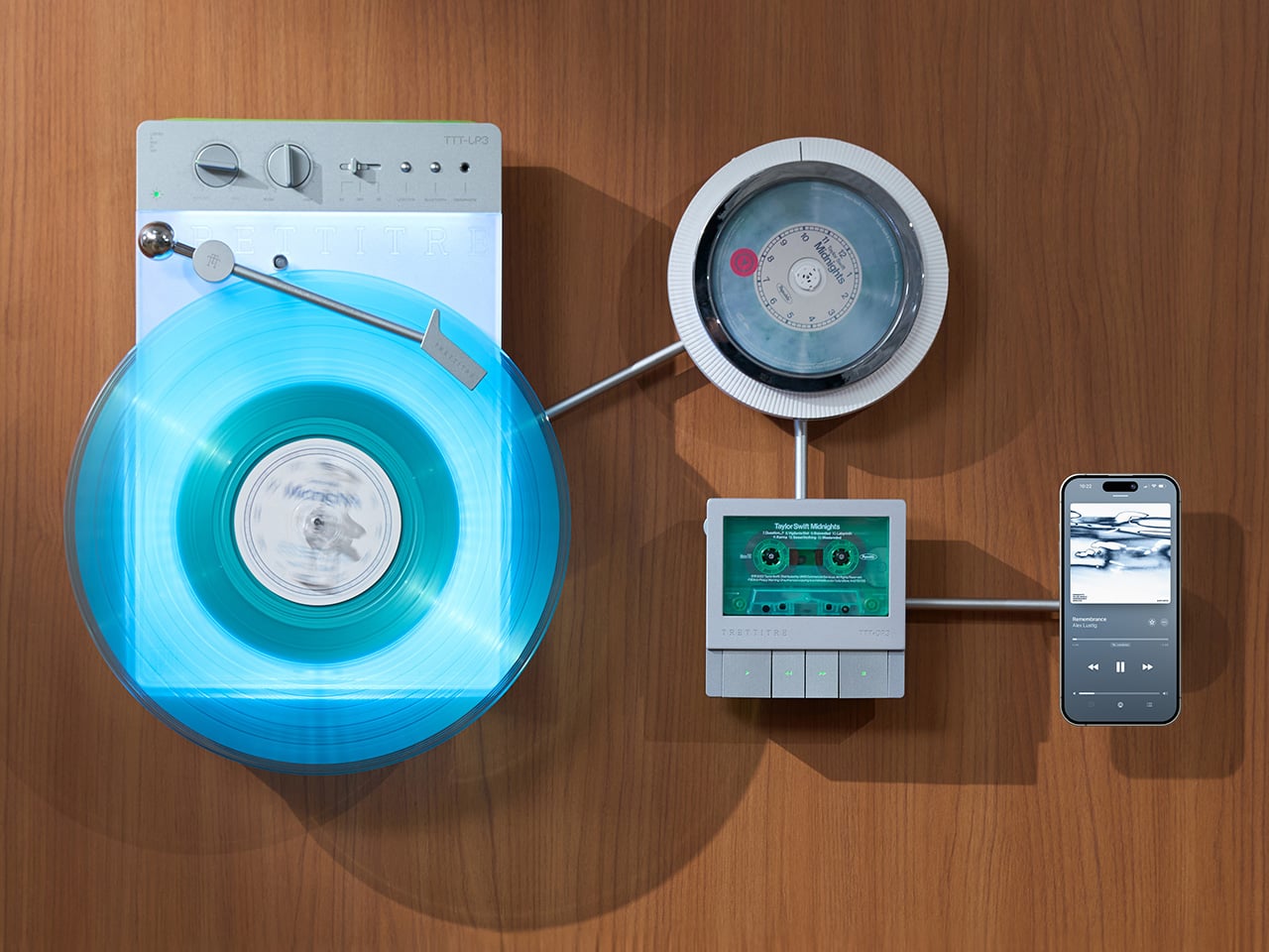
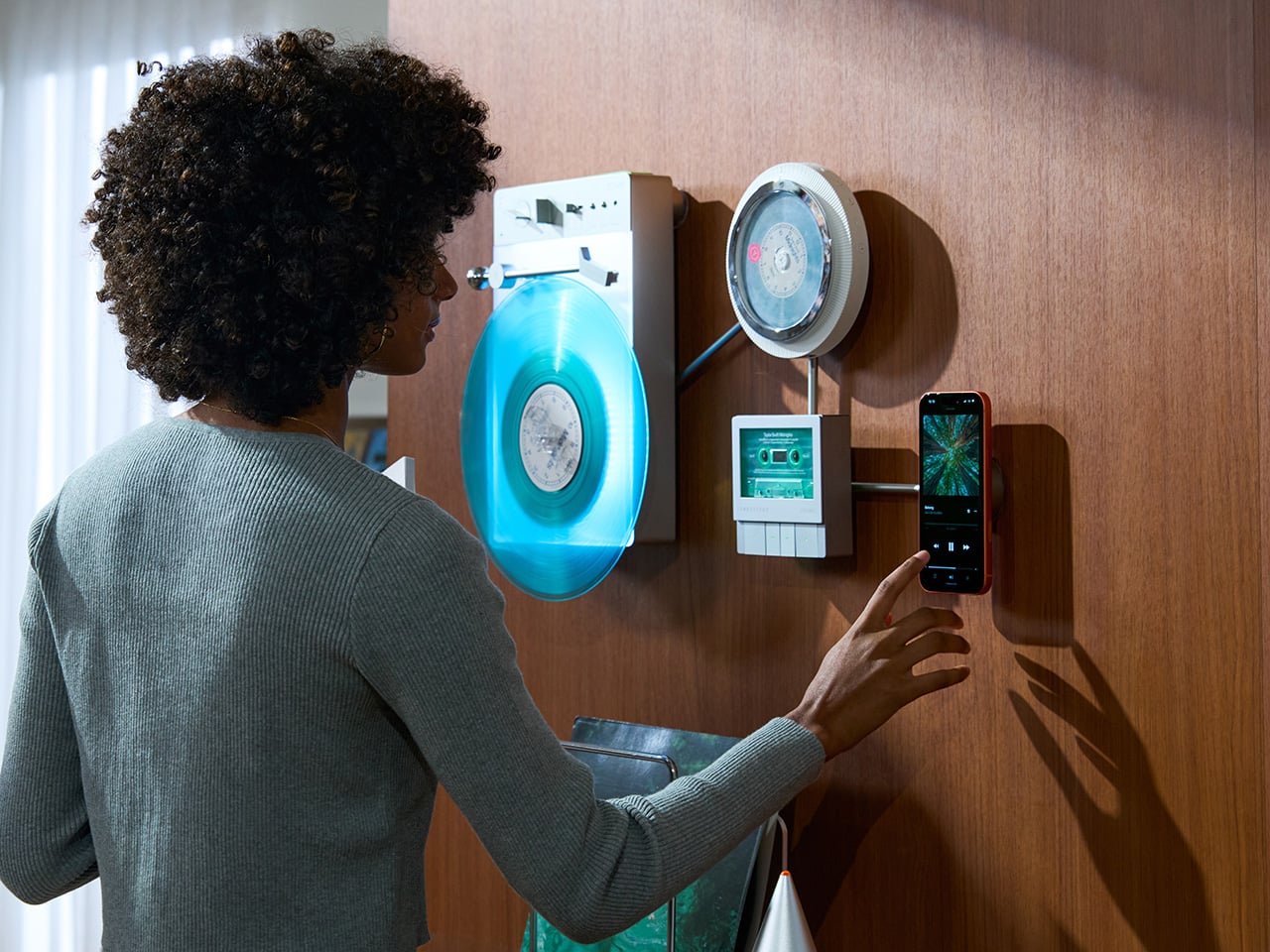
TRETTITRE’s TTT series combines those instincts into something harder to categorize. The TTT-LP3 wireless vinyl player uses CNC-machined aluminum for the main frame and features a diffused lighting panel that spreads light evenly across the surface when music plays. The TTT-DP3 Bluetooth CD player takes inspiration from a UFO-like form with a transparent magnetic cover that rotates open to reveal the spinning disc. The TTT-CP3 cassette player uses a metal housing with sharp geometric lines and mechanical transport keys that deliver clear physical response. All three mount on the TTT-W magnetic modular wall rack, turning physical media playback into a visible, functional part of interior design.
TTT-LP3: A Vinyl Player That Doubles as Ambient Light
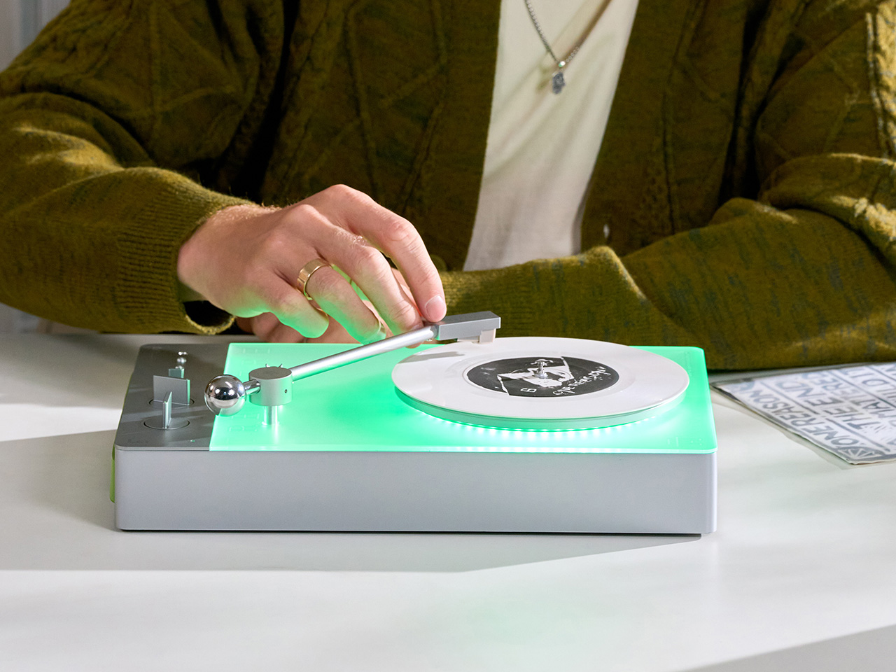
The back of the LP3 includes a hidden mounting structure that allows it to hang directly on a wall. You can mount it vertically so the record becomes part of the visual display, or go for the classic horizontal layout. When you want to move it, you lift the silicone leather handle at the top and take it down. The player detaches easily and gives you the freedom to listen wherever you choose. Traditional turntables usually stay exactly where you put them, limiting your options for when and where you listen. The LP3 works a little differently because of the battery and the wall mount’s wireless charging system, which keeps it powered without a visible cable.
Behind the LP3 sits a diffused lighting panel that spreads light evenly across the surface of the unit. When it’s on, the entire body of the player glows softly, designed to feel closer to ambient lighting than decorative lighting. You can change the lighting effects with the touch of a button. When a record spins, the moving shadows create a quiet visual effect. You can also leave the player mounted on the wall as a soft light source even when no music is playing. That ambient quality pushes the LP3 from well-designed product into something more considered: a slow, breathing light fixture that happens to play records.
The LP3 uses a self-balancing tonearm system that automatically sets the correct pressure when the player powers on. You place the record on the platter and lower the needle, and the system handles the rest. Many turntables require careful calibration before they can be used properly, with tonearm balance, tracking pressure, and counterweight adjustment all part of the process. For experienced collectors that process can be enjoyable, but for beginners it often feels complicated. The LP3 removes that barrier entirely while preserving the tactile experience people enjoy. The player supports both 33 RPM and 45 RPM records, and includes a manual control dial that allows small adjustments to playback speed (roughly ±0.5%), useful for older records that may not spin perfectly at their original speed anymore.
Wireless audio is handled through Qualcomm Bluetooth v5.3 with SBC, aptX, aptX HD, and aptX Adaptive, which allows higher-quality and lower-latency wireless audio than basic Bluetooth streaming. For wired setups, the player also includes a 3.5mm audio output. The built-in battery provides up to 6 hours of vinyl playback or up to 3 hours when used purely as an ambient light source. Full specs: dimensions 342×233×87mm, weight 1430g, Audio-Technica AT3600L moving magnet stereo cartridge, CNC-machined aluminum frame with silicone leather carrying strap. The LP3 arrives in June 2026 for Early Bird backers, May 2026 for Fast Delivery backers.
TTT-DP3: Giving the Compact Disc Its Aura Back
The DP3 keeps the reliability of CDs but gives the player a different visual presence. The design takes inspiration from a UFO-like form with a transparent magnetic cover. When the cover rotates open, the disc is partially visible as it spins, turning something simple into a small visual moment. A CD player shaped like a flying saucer with a rotating transparent lid is an audacious idea, and it works because it doesn’t try to evoke nostalgia. It reframes a CD player as a mechanical object of curiosity, something you watch as much as use.
The control buttons include raised tactile dots combined with a gold-embossed finish, making it easy to identify the buttons by touch alone. You can pause or skip tracks without needing to look down at the player. A small OLED display on the player shows track numbers, playback status, and battery level. The interface is intentionally simple so the information you need is visible immediately. A built-in battery allows the DP3 to run for several hours on its own, so you can move it from room to room, bring it to a small gathering, or take it while traveling. Full specs: Ø170×27mm, 324g, supports CD-DA and HDCD formats, Bluetooth 5.4, SNR >70dB, THD <3%, ABS+PC+Metal construction. The DP3 ships in May 2026.
TTT-CP3: Cassette Hardware for Modern Audio Setups
The CP3 keeps the tactile mechanical elements people associate with tapes while updating the electronics inside. The player uses a metal housing with sharp geometric lines that give it a distinctly industrial appearance. Instead of trying to imitate retro plastic designs, the CP3 leans into a more modern interpretation of cassette hardware. The playback controls use independent mechanical keys similar to piano keys. Each press has a clear physical response. Play, rewind, and stop feel deliberate instead of soft or mushy.
Inside the CP3 sits a Bluetooth module that allows cassette audio to stream wirelessly to speakers or headphones. The player decodes analog audio signals with high precision, helping reduce background noise and preserve more detail from the original recording. The result still sounds like cassette tape, but with greater clarity. Full specs: 122×120×32mm, 360g, supports Type I-IV cassette cartridges, Bluetooth 5.4, SNR ≥55dB, THD <3.5%, Metal+PC+ABS construction. The CP3 ships in May 2026.
When Storage Becomes Part of the Spectacle
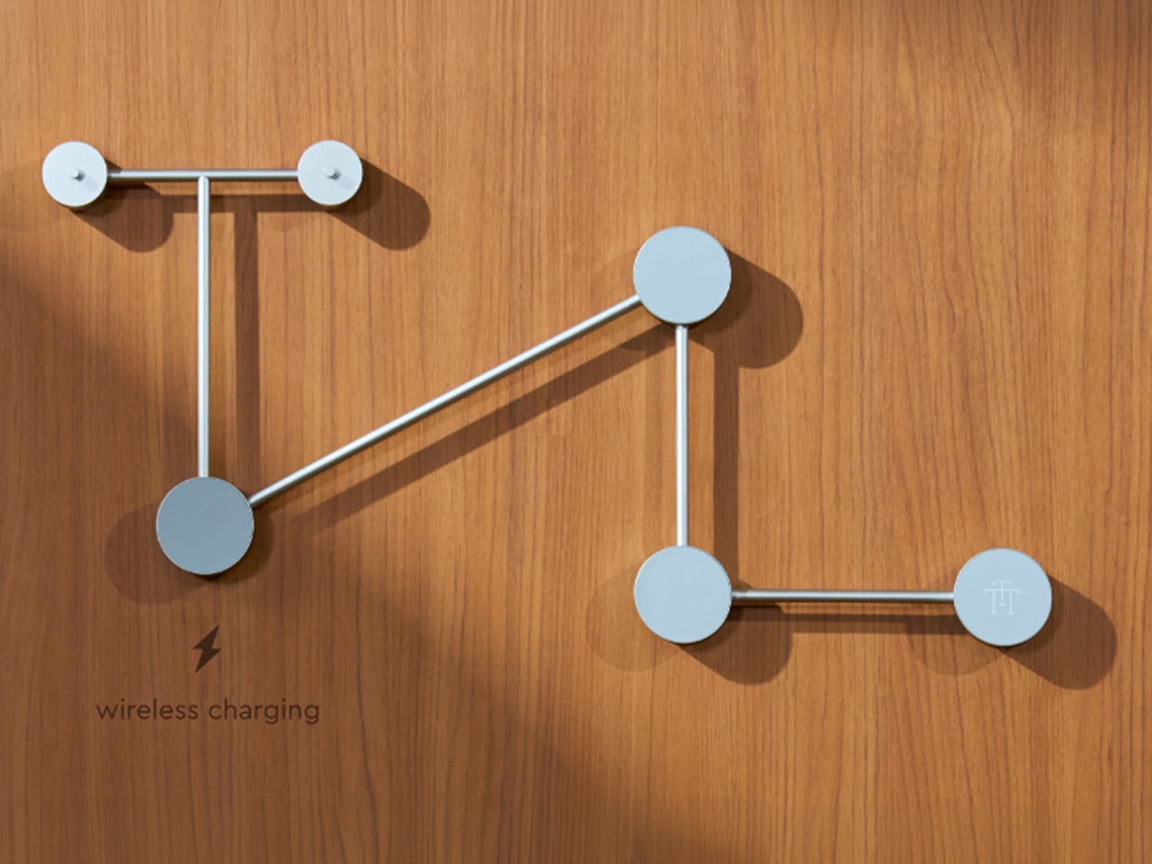
The TTT-W Magnetic Modular Wall Rack uses an all-metal geometric structure that allows multiple TTT players to be arranged into a clean wall display while keeping them organized and ready to use. The rack integrates magnetic alignment and wireless charging for the vinyl player, so the LP3 can stay powered without visible cables while being part of the room’s design. Two configurations are available: a T-shaped rack (263×196×27mm, 300g) and a magnetic modular wall rack (612×302×27mm, 775g, combined style T+3). Both support wireless charging at 5-10W and use USB-C 5V 2A input.
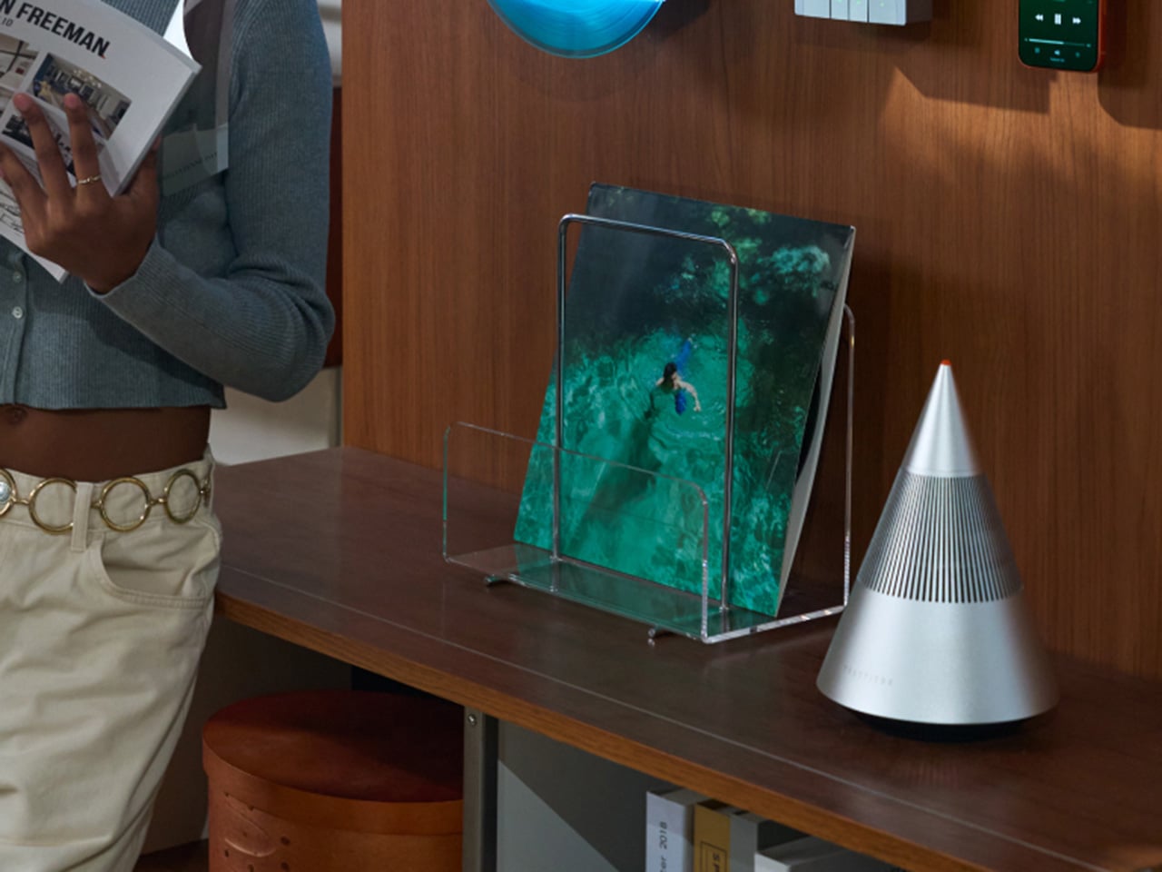
The Supporting Cast, from Sculptural Speakers to Planar IEMs
TRETTITRE offers a range of add-ons designed to complement the TTT system. The TreSound1 Speaker arrives in concrete and wooden editions, delivering 2×30W + 1×60W output power with a 1″ tweeter, 2.75″ mid-range, and 5.25″ subwoofer for 30Hz-25KHz frequency response. The conical speaker features 360° surround sound, Bluetooth 5.2 with Qualcomm aptX HD, and a sculptural form that occupies space like a piece of furniture. The TreSound Mini is a portable Bluetooth speaker with a 5200mAh battery, 30W RMS output, and 360° surround sound. The TTT-E3 in-ear headphones use a 13mm planar magnetic driver with a 4-strand silver-copper hybrid conductor, available in 3.5mm and 4.4mm configurations. An aluminum alloy side table (300×300×750mm, 1.75kg, max load 50kg) rounds out the ecosystem.
What It Costs to Build the Setup, and When It Ships
The TTT-LP3 wireless vinyl player is available at $229 for Early Bird backers (June 2026 delivery), down from a planned $449 MSRP. The TTT-DP3 Bluetooth CD player is priced at $79 standalone ($179 MSRP), while the TTT-CP3 cassette player is also $79 standalone ($199 MSRP). If you’re a bonafide audiophile, a $399 bundle gets you all three devices. Optional add-ons include the TreSound Mini Bluetooth Speaker at $169 ($299 MSRP), TreSound1 Wooden Edition at $449 ($659 MSRP), TreSound1 Concrete Edition at $499 ($799 MSRP), TTT-E3 planar IEMs at $139 ($239 MSRP), and the TTT Side Table at $89 ($199 MSRP). The campaign runs through April 9, 2026, with worldwide delivery beginning May 15, 2026.
Every time you type a prompt into ChatGPT, something happens somewhere far away. Servers spin up. Electricity moves. Carbon gets generated. The whole transaction is so clean and invisible on your end that it might as well not be happening. That’s by design, and it’s worth thinking about. Although with the way we use technology these days, we seldom think about the consequences on our environment.
London-based creative studio Oio wants to change that, starting with a small 3D-printed box and a bright yellow pinwheel. Their project, the Hot Air Factory, is a domestic AI device that processes your questions and requests locally, without connecting to the cloud, and every time it thinks, it physically exhales. Hot air pushes out of the top of the device and spins that cheerful little pinwheel. The harder it thinks, the faster it spins. You’re watching computation happen in real time, which turns out to be a surprisingly powerful thing.
The concept is simple: make the invisible visible. We know AI uses energy. We’ve read the headlines. But knowing abstractly that data centers are energy-hungry is different from watching a pinwheel turn every time you ask your AI assistant to summarize something. One is a statistic. The other is a moment of honest accountability.
What makes the Hot Air Factory smart, beyond its obvious design appeal, is how it translates cost into human-readable terms. It doesn’t give you kilowatt-hours because most people have no idea what that means. Instead, it tells you something like “that prompt cost the equivalent of brewing a cup of tea” or “watching Netflix for five minutes.” Suddenly the math becomes personal. Suddenly you start wondering whether you really needed a 500-word AI response to a question you could have Googled.
Oio co-founder Matteo Loglio describes it as “a small, domestic AI that reveals the hidden energy cost behind every prompt.” The factory also lets you dial up or down the level of intelligence it uses. Want a quick answer? Use a lighter model, spend less energy. Need something more complex? Crank it up, and watch that pinwheel work for it. You can even schedule your heavier prompts for the night shift, when energy is cleaner and the grid is quieter. These are design decisions that carry real ethical weight, and they’re baked in with zero condescension.
The playfulness and the seriousness aren’t in conflict here. They’re exactly the point. The Hot Air Factory is built in a Frutiger Aero visual language, all soft curves and clean optimism, the kind of aesthetic that makes you want to put it on a shelf next to your plants. But underneath that approachable exterior is a genuinely complicated machine running open-source large language models on a local GPU. It looks like something a friendly robot would carry. It functions like a small act of protest.
AI companies have very little incentive to make their energy costs legible to users. Invisibility is convenient. It keeps things frictionless. It keeps you prompting without thinking about the bill. A report from the US Department of Energy projected that by 2028, data centers could account for 12% of total electricity consumed in the US. That’s not a small number, and it keeps growing every time we treat AI like it runs on good intentions and cloud magic.
The Hot Air Factory isn’t saying AI is bad. It isn’t demanding you stop using it. What it’s doing is quieter and more persuasive than that. It’s asking you to look. To see. To feel, just a little, what your digital habits cost in the physical world. That’s the argument made not through a lecture or a campaign, but through a yellow pinwheel spinning in your living room.
Design can do that. Sometimes a small, well-made object says more than a policy paper ever could. The Hot Air Factory is currently looking for collaborators to help bring it to a wider audience, still working its way from experiment to something anyone can own. If the goal is conscious computing, the first step might just be this: a tiny box, a spinning fan, and the quiet discomfort of watching a machine breathe.
The craze for handhelds over the last 24 months has driven a surge in portable gaming consoles. We’ve seen it all, right from retro handheld devices to modern consoles that can handle AAA titles without breaking a sweat. GAMEMT has been in the thick of things with a Android handheld released last month and a unique portable console with a dial knob.
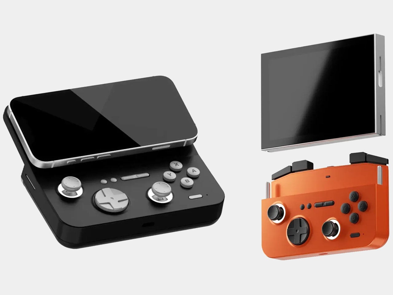
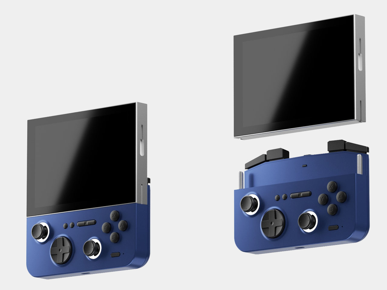
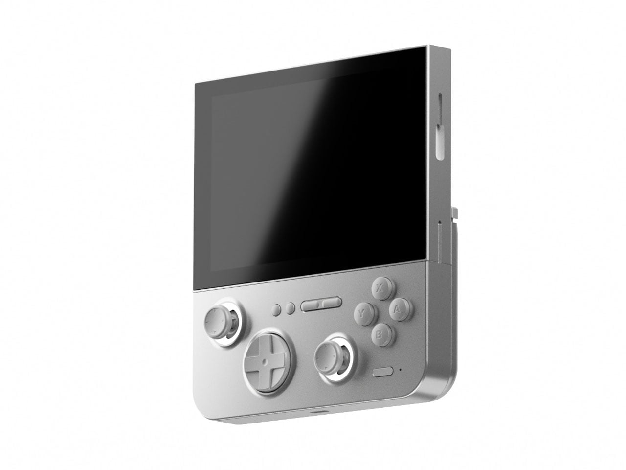
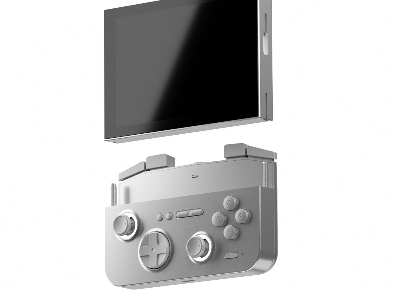
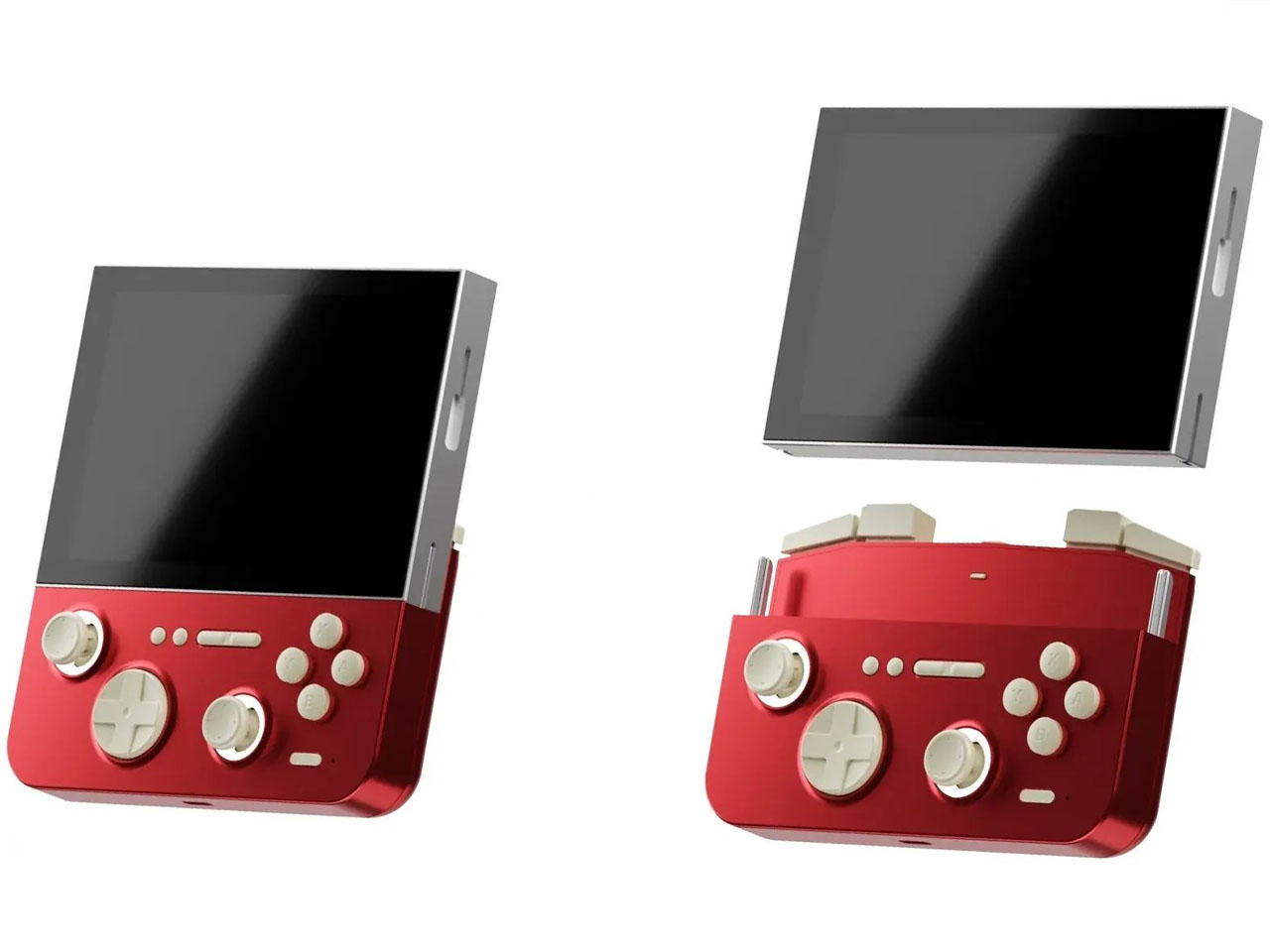
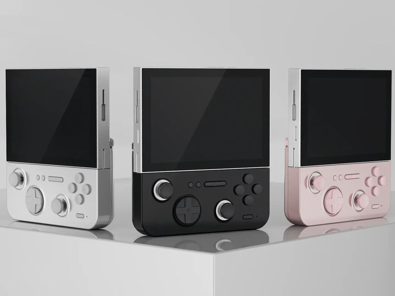
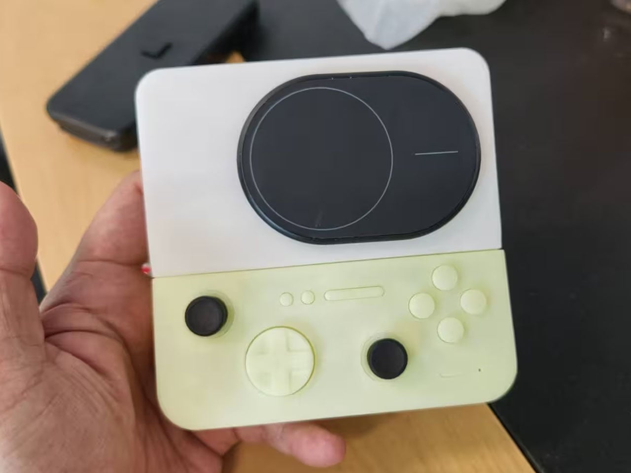
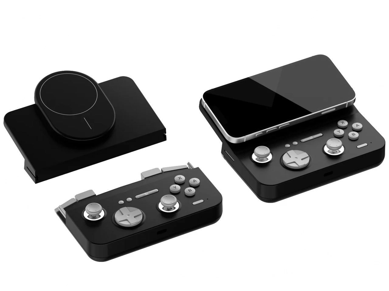
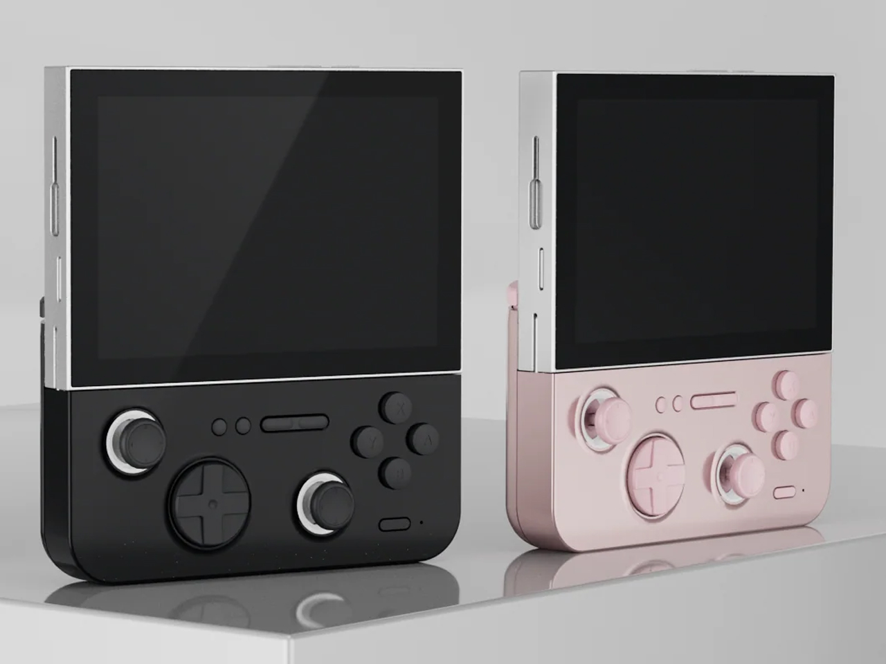
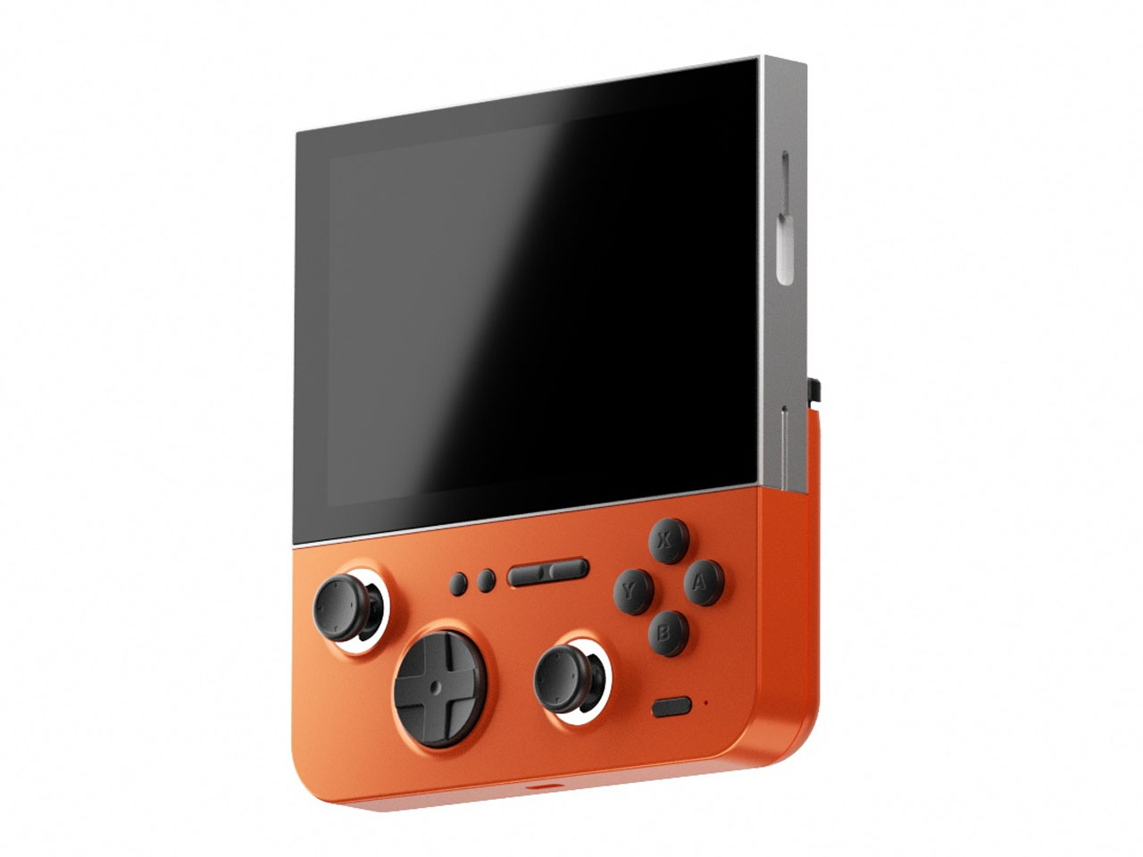
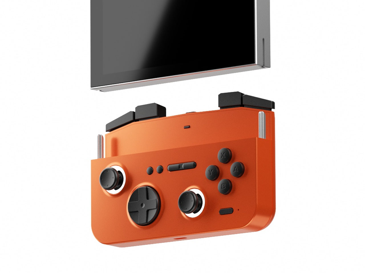
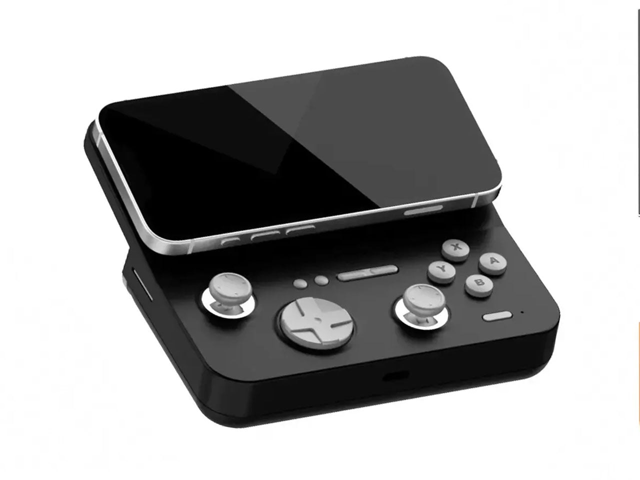
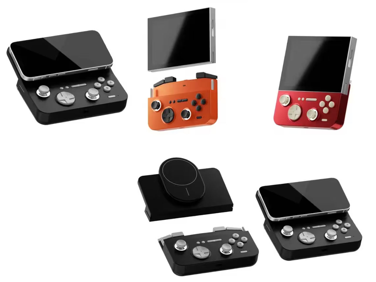
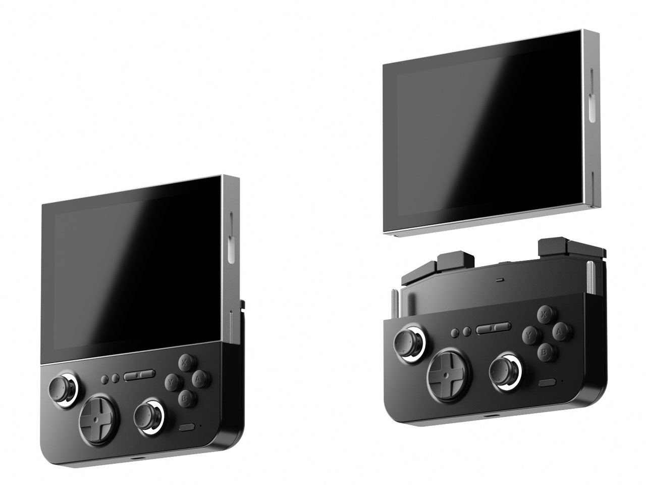
Now the Chinese manufacturer has revealed yet another handheld, which is an eye turner for sure. This is the E5 MODX console based on the original E5 released in 2024. The console has a removable modular display that can be connected to your MagSafe-compatible smartphone. It would be safe to say that the handheld draws inspiration from the MCON controller, but we haven’t seen a detachable-display handheld yet. Now, that’s downright cool.
Designer: GAMEMT
In its native form, the handheld looks and feels just like any other 3:4 display device. However, when you detach the 5.5″ screen (1024 x 768) and connect its controller module magnetically to a mobile phone, it turns into an altogether different beast. The gaming machine comes with the MTK6771 Helio P60 chipset, which is not that highly rated in the tech circles, given its inconsistent performance. Still, it’ll be interesting to see what GAMEMT has managed to achieve with this microchip in terms of hardware and software compatibility in the E5 MODX. The chipset is paired with a 3GB RAM for optimized performance, and 32 GB internal memory is more than enough to store the suite of AA games.
You can expect to emulate PS1 games, or the option to pair with the Dreamcast/N64/PS2 and GameCube emulation. Clearly, you would better explore the retro arcade game library with this one, to be honest. The real magic happens when you connect the device to your flagship smartphone, and the fun of playing AAA games is again real. For now, it is unclear whether the magnetically detachable accessory pairs via Bluetooth or works with the physical connection, and also for low latency.
According to GAMEMT, the first 3D prototype of the E5 Modx is in the works, and there is no word yet on when the handheld will be released. For now, the idea sounds very interesting, given the landscape of handheld consoles that gamers now can choose from.
There’s something about transparent gadgets and audio gear that evokes a sense of retro-futurism. Although we’ve seen a fair share of transparent speakers, this one hits different. Rather than using transparency as a simple aesthetic trick, the design turns the internal structure of the speaker into a visual highlight. The clear enclosure reveals the driver, supporting frame, and internal layout that are usually hidden inside conventional speakers.
This approach transforms the product from a typical audio device into something more expressive, where the engineering becomes part of the visual story. The result feels less like a traditional gadget and more like a piece of functional design that celebrates the mechanics of sound.
The form itself is minimal and geometric, allowing the transparency to remain the focal point. At the center sits the circular driver, clearly visible through the casing and positioned as the focal point of the entire design. Instead of concealing this critical component behind fabric or grills, the speaker proudly displays it. This not only creates a strong visual identity but also highlights the hardware responsible for producing the audio experience.
The internal elements appear carefully arranged to maintain balance and symmetry. With the casing fully transparent, every structural element becomes visible, which places greater importance on thoughtful layout and clean engineering. The frame surrounding the driver provides both support and visual structure, giving the speaker a refined, almost architectural appearance. Observing these internal layers gives users a rare glimpse into how a speaker is physically constructed.
Another benefit of the transparent enclosure is the way it interacts with light. Reflections and shadows passing through the clear surfaces add depth and dimension, making the device visually engaging even when it’s not in use. In modern living spaces where technology often blends with décor, a speaker like this can easily function as both an audio device and a decorative object. Placed on a desk, shelf, or side table, it naturally draws attention without being overly flashy.
Despite its artistic appearance, the concept remains grounded in practicality. Designed as a Bluetooth speaker, it emphasizes wireless connectivity and everyday usability. The simplicity of the overall form suggests that controls and functionality are kept minimal, ensuring the product remains intuitive while preserving the clean aesthetic. To add a bit of flair, the designer imagines the speaker in two sophisticated color options: Dusty Blue and Ocre.
Most of us don’t eat at the dining table anymore. Not really. The pandemic accelerated something that was already quietly happening: meals migrating from the kitchen to the living room, the bedroom, the desk, the floor. We eat while watching something, while scrolling something, while half-working and half-resting. The dining table still exists, sure, but as a concept, it has become more aspirational than actual.
And yet, the tools we use to manage the air around our food haven’t moved with us. Range hoods are bolted to the ceiling above a stove. Portable air purifiers sit in corners, doing their best from across the room. Even the newer tabletop options ask you to position them just right, or carry them separately, adding friction to something that should feel effortless. For a culture that has fully embraced eating anywhere, the air solutions available to us are still very much designed for eating in one place.
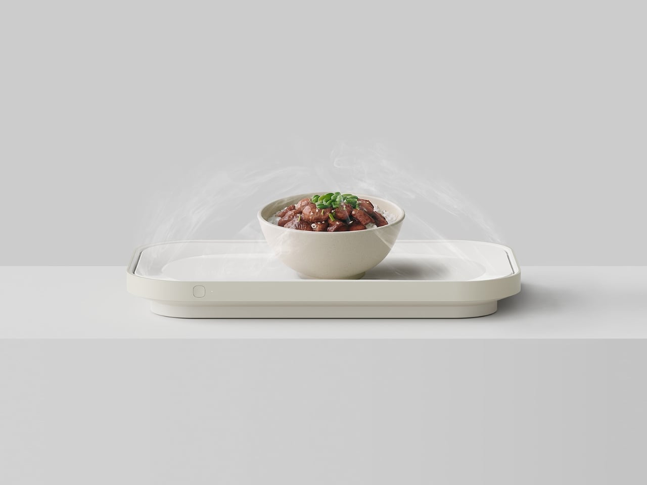
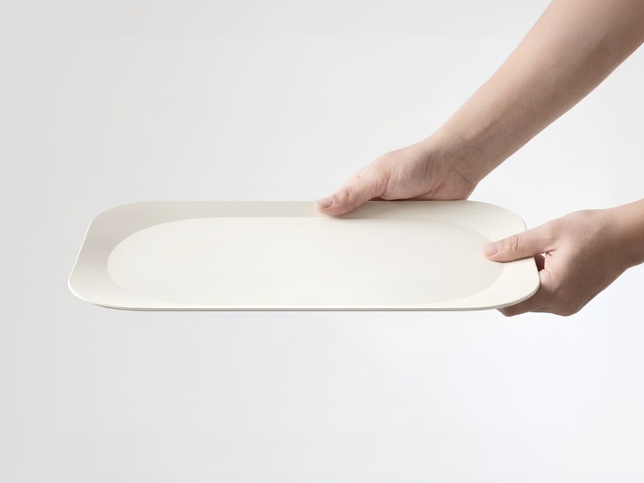
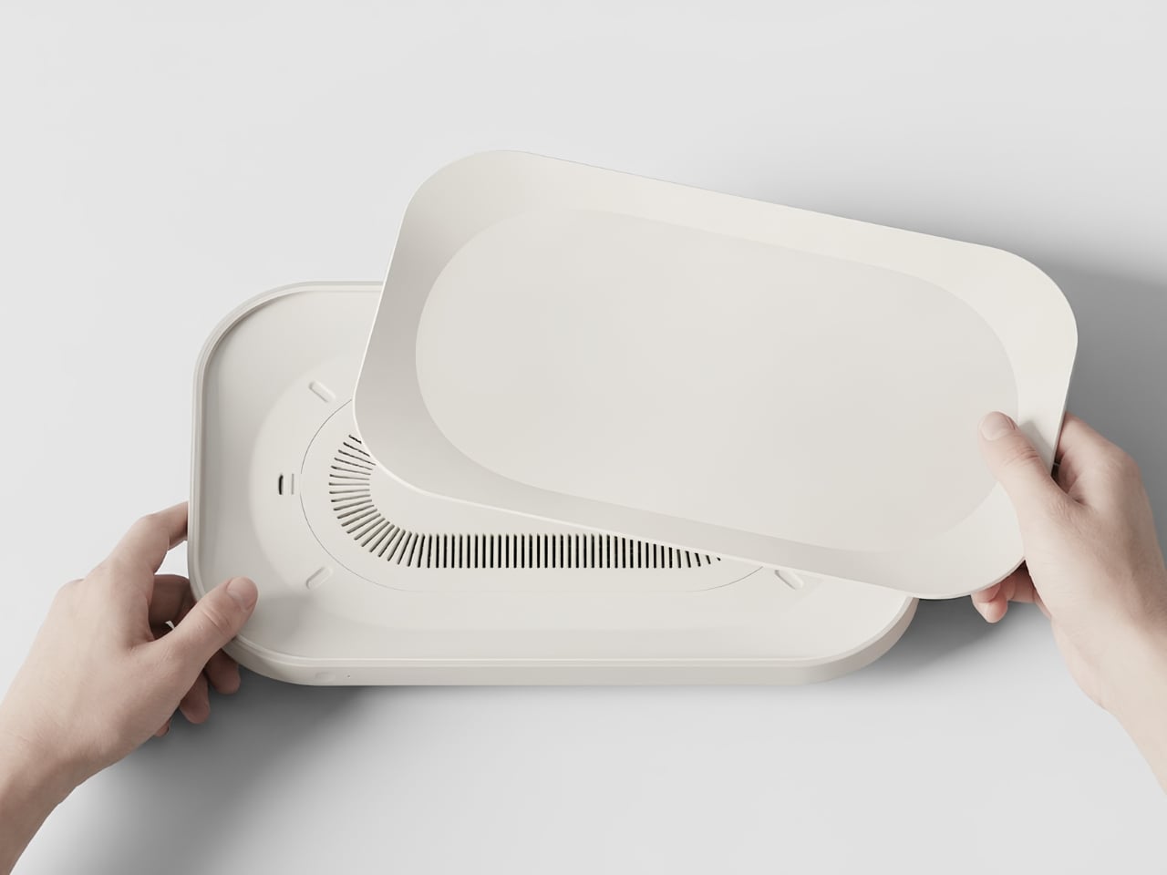
Junho Han’s Notrace:Null addresses this with a level of clarity that makes you wonder why no one thought of it sooner. The concept is simple: instead of building a separate device that you need to carry alongside your food, the air purification system is built directly into the tray. You pick up your food, and the solution comes with it. No extra steps, no reconfiguration, no reminder to bring the device. The tray is the device.
Visually, Notrace:Null makes almost no noise about what it does. The design is quiet and off-white, with a flat surface that opens to reveal an internal filter system underneath. A small button sits flush against the side, the only visible sign that this tray does anything beyond hold a bowl of ramen. The fine venting grid along the underside is equally understated. That restraint feels deliberate, and it is the right call. The best-designed things tend to look like they were always supposed to exist, and Notrace:Null has that quality.
What strikes me about this concept is that it doesn’t try to change behavior. It slots into the routine that already exists. You grab the tray, put your food on it, carry it to wherever you’ve decided to eat tonight, and that’s it. The air filtration happens as a byproduct of your usual movement. Han describes this as “the most natural solution,” and the framing holds up. Good design doesn’t demand that users adapt to it. It adapts to users instead.
The project also makes a quiet cultural observation worth sitting with. The rise of single-person households, convenience foods, and personalized streaming content has fundamentally changed where and how people eat. We don’t just eat in the kitchen anymore. We eat throughout the entire home, and that shift has real consequences for air quality. Food odors that once stayed contained now travel freely. Bedrooms carry the memory of last night’s dinner. Living rooms hold the ghost of lunch. Notrace:Null is designed around this reality rather than around the home we’re told we should have.
It’s still a concept, and that’s worth noting. As a Behance project, Notrace:Null exists in that productive space between idea and product, where the thinking is fully formed but the execution remains hypothetical. The concept feels mature enough to be producible, though. The form factor is practical, the use case is real, and the need is clearly there. If it ever makes it to market, it would fill a gap in the air quality space that nobody has managed to articulate this well before.
Design concepts like this remind me why speculative design matters. Not everything needs to ship immediately to be valuable. Sometimes a well-considered idea just needs to exist, to put the question on the table and make it harder to ignore. Notrace:Null asks a simple question: if how we eat has changed, shouldn’t the tools that support it change too? The answer is obvious. The solution, it turns out, was hiding in a tray.
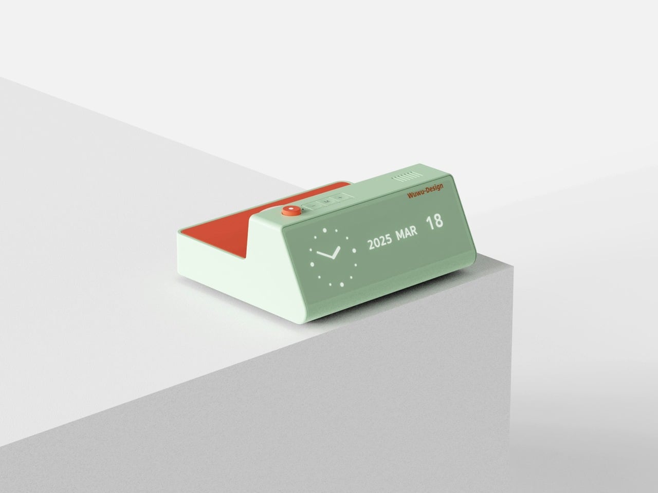
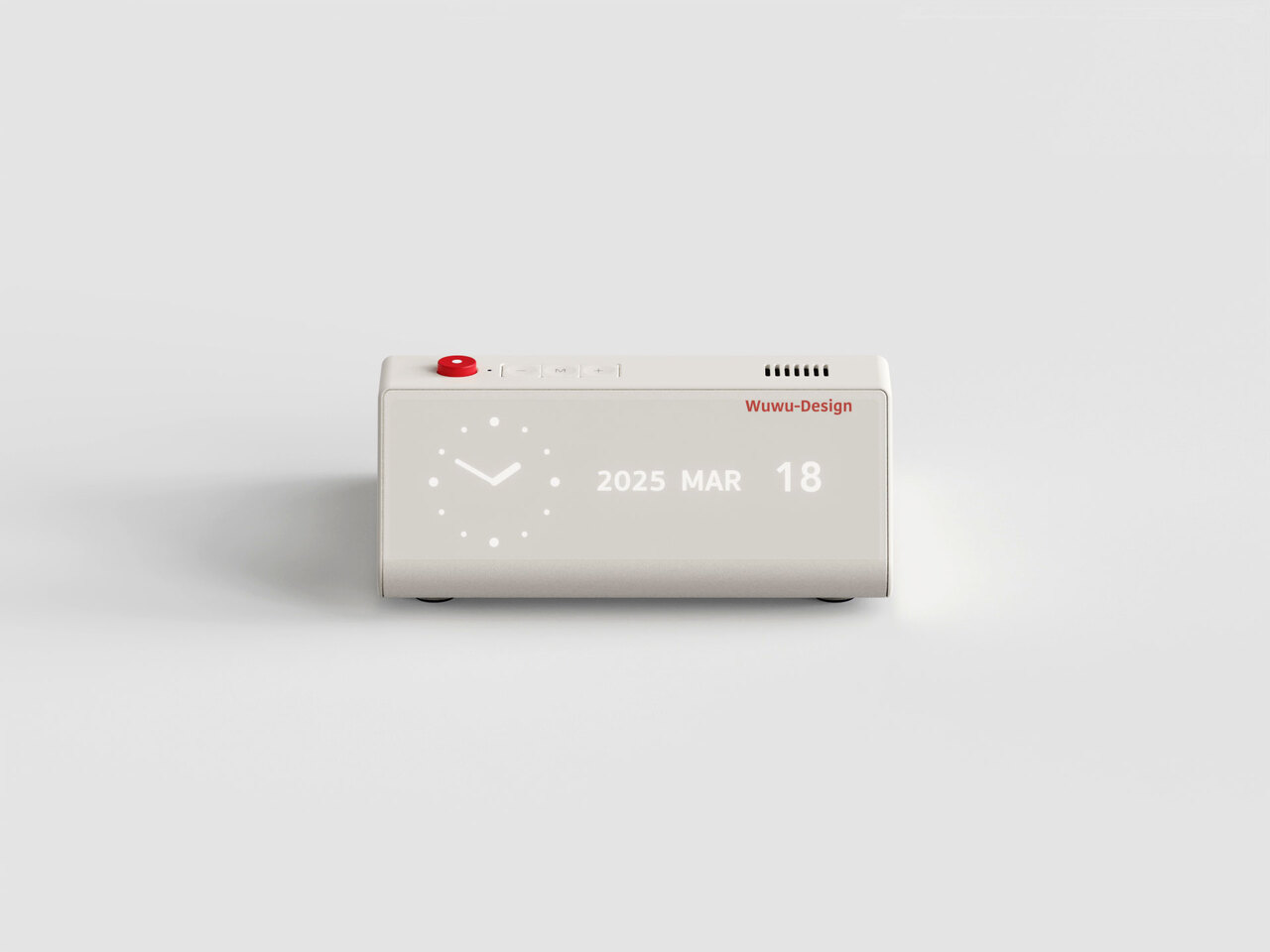
Your desk says a lot about the way you think. The objects you deliberately choose for it, rather than the ones that simply accumulate, reflect your values, your taste, and the kind of environment you want to work in. A great desk clock earns its place twice over: as a functional tool and as something genuinely worth looking at every day. The market is full of forgettable options, but the most interesting clocks right now are rethinking what a clock even needs to be, questioning material, interaction, and presence in equal measure.
Whether you work from a home studio, a shared office, or somewhere between the two, the right clock changes the feeling of an entire space. These five designs prove that telling time is still a conversation worth having, and that choosing a clock carefully is an act worth taking seriously.
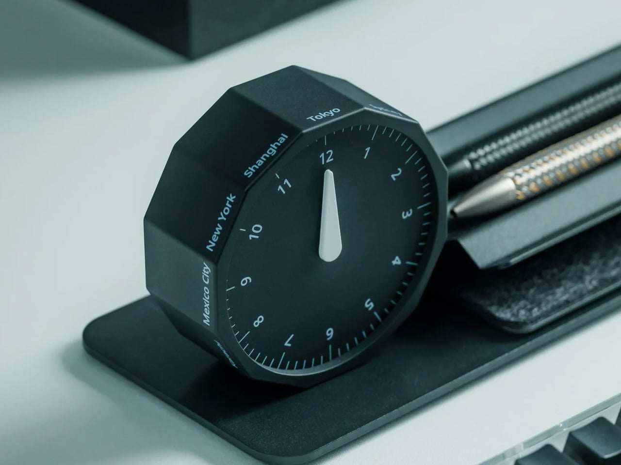
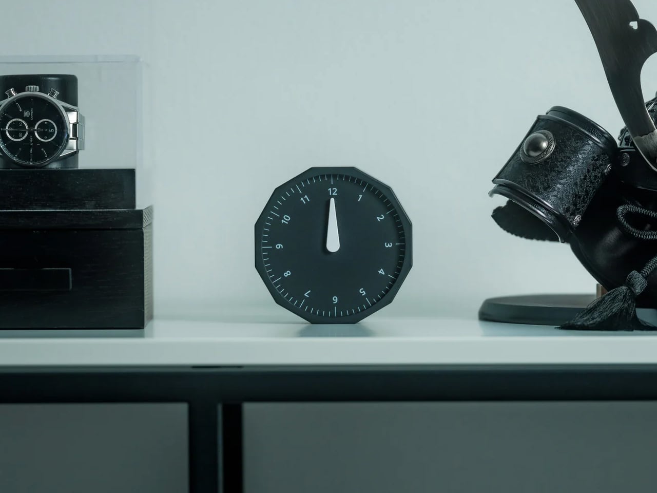
1. Rolling World Clock
For anyone who regularly works across time zones, converting time in your head is a small but persistent irritation. The Rolling World Clock removes that friction with an approach so intuitive it almost feels obvious: a 12-sided form with a major city on each face, from London and Paris to Tokyo, Sydney, and New York, read by a single hand. Roll the clock until your desired city faces upward and the hand tells you exactly where things stand. No screen, no calculation, no second device needed.
What keeps this clock compelling beyond its core function is the physicality of using it. Rolling a 12-sided object to check the time in Cape Town or Karachi is a tactile experience that no phone interface can replicate; it turns a routine check into something deliberate and satisfying. The minimalist form, available in both black and white, sits cleanly on any desk without visual competition, and the single hand keeps everything honest and uncluttered. It is a rare thing: a genuine conversation piece with a practical reason to exist.
The rolling interaction gives checking global time a tactile quality that feels intentional rather than reflexive, adding a small moment of satisfaction to an everyday action.
The minimal form in black or white works across almost any desk aesthetic, functioning equally well as a decorative object and a practical timekeeping tool.
What We Dislike
Only 12 cities are represented, which means time zones outside those locations will still require some mental conversion on your part.
As an analog clock, precision is limited to the nearest quarter-hour, which may not suit those who need exact time readings at a glance.
2. Minimalist Desk Clock
Products that combine two functions usually compromise on both. This desk clock concept draws inspiration from Dieter Rams’ legendary Braun DN40, channeling the same visual restraint while placing a wireless charging pad on the top surface in a way that actually makes sense for daily use. The digital time display sits off to one side of the matte face, balanced by a date readout on the opposite end. Both are embedded flush into the surface, creating a presence that is visible when needed but never demanding your attention when you do not.
The placement of the wireless charger on top is obvious in the best possible way: your phone charges exactly where you can still see it, and the clock keeps doing its job without either function disrupting the other. The asymmetrical display layout reflects genuine compositional thinking, creating deliberate visual balance rather than defaulting to center alignment. For a desk already holding a notebook, a coffee cup, and a tangle of cables, this clock earns its spot by doing double duty without making a scene about it.
What We Like
The wireless charging surface sits intuitively on top, keeping your phone visible and accessible while it charges, without requiring a separate pad taking up additional desk space.
The asymmetrical display arrangement shows real compositional intention, making the object feel considered and specific rather than generically functional.
What We Dislike
This is currently a concept design and is not available to purchase, which limits it to an aspirational reference rather than a practical recommendation right now.
The matte embedded displays may lose legibility in dim environments without a backlight or ambient brightness adjustment, which the concept does not appear to address.
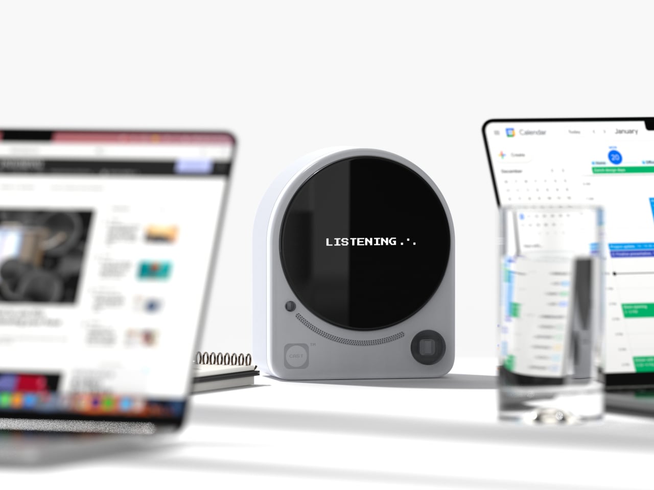
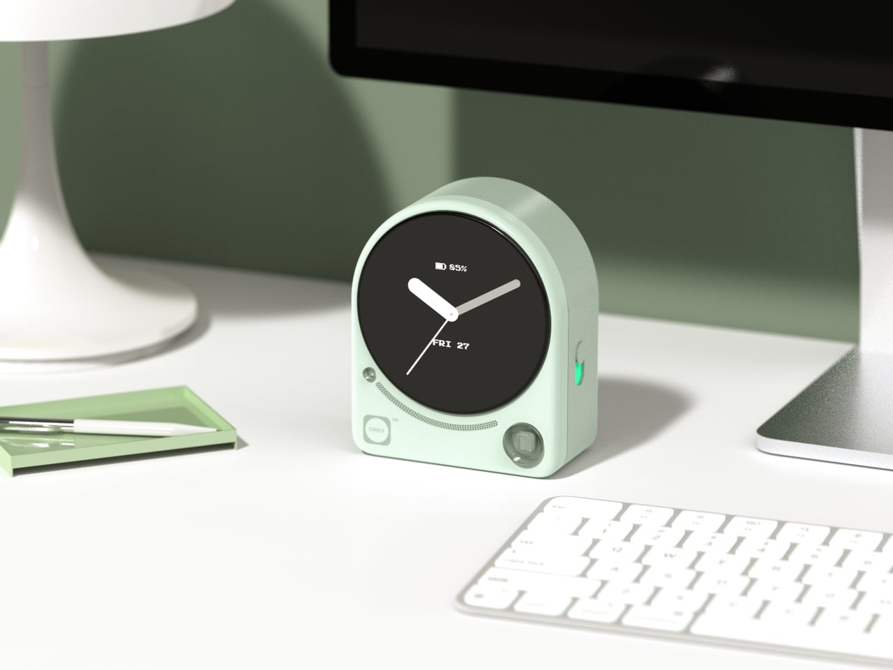
3. CAST
Meetings lose things. Good ideas get spoken into the room and never make it to a document, and most tools designed to fix that problem are more intrusive than the problem itself. CAST, a concept by designer Minseo Lee, takes a different approach entirely. Drawing its form from the Braun BC22, the device arrives as an arch-shaped tabletop companion with a circular display, tactile buttons, and a neutral finish that reads as a clock before it reads as anything else. It sits on the conference table and quietly gets to work.
During a meeting, CAST listens, identifies key points, and generates a concise summary when the session ends. A QR code appears on the display, and participants scan it to access their notes instantly, with no app download or login required. Outside of meetings, it functions as a standard clock, maintaining its understated presence without demanding attention. The dotted graphic details and calm proportions mean it suits an open-plan office as naturally as a private home studio. The best AI tools do not announce themselves; they simply make the room function a little more smoothly, and CAST embodies that idea completely.
What We Like
The QR code summary system is a genuinely clever solution, distributing meeting notes to every participant instantly without requiring anyone to install a specific app or create an account.
The Braun-inspired design ensures CAST reads as a clock first, which meaningfully reduces the psychological discomfort of having a recording device present during a conversation.
What We Dislike
As a concept, CAST is not yet available for purchase, meaning its real-world performance in noisy or complex meeting environments remains completely untested.
The quality of the AI-generated summaries will depend on microphone sensitivity and processing power, which are factors the industrial design itself ultimately cannot control.
4. Wooden Desk Clock
There is something quietly refreshing about a clock that does not try to do anything beyond telling the time beautifully. This wooden desk clock, developed in collaboration with Shapr3D, is exactly that kind of object. CNC-machined from walnut, cherry, or maple, each version uses the natural contrast of warm wood tones and smooth curved surfaces to create something that belongs on a desk the way a well-chosen book or a ceramic cup does. The analog face reads the hour in the most satisfying way possible, without apology.
The clock comprises two parts: a clock head that displays the time and a supportive frame that serves as both a base and a functional handle for adjusting the vertical viewing angle. It is a small detail, but one that shows genuine thought about how the object actually gets used on a real desk by a real person. In an era dominated by aluminum, glass, and screens, a clock machined from actual wood makes a quiet but firm statement about material honesty and the pleasure of things that simply do what they are supposed to do.
What We Like
Three wood type options, walnut, cherry, and maple, give the clock a material warmth and versatility that suits a genuinely wide range of desk setups and personal aesthetics.
The adjustable vertical viewing angle through the supportive frame reflects thoughtful, user-centered design that considers how the object will actually be used day to day.
What We Dislike
Natural wood requires more care than synthetic materials and may be susceptible to scratches or moisture damage over time without proper surface treatment or regular maintenance.
The purely analog format offers no smart features, which will not appeal to anyone who expects additional functionality beyond time-telling from a desk object in this category.
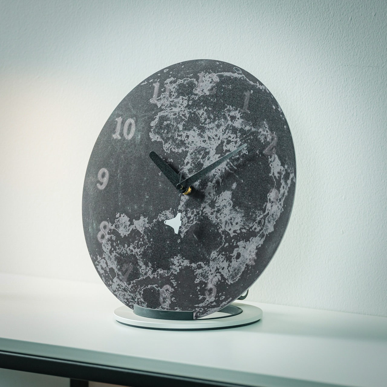
5. Moon Rocket Clock
A note upfront: this is not a typical desk clock. It is larger than everything else on this list, more visually assertive, and designed to occupy space rather than disappear into it. Made from specially polished stainless steel, the Moon Rocket Clock is a circular timepiece where printed numbers appear to float and gradually fade around the edges of the face, echoing the visual rhythm of the moon’s phases. The second hand carries a small rocket ship on its tip, which sounds ornamental until you watch it move and recognize the emotional charge the detail actually carries.
This clock works best where it has room to be itself, on a wide desk, a generous shelf, or a statement surface in a home studio. The polished stainless steel construction is durable and catches light in ways that cheaper materials simply do not, giving it a presence that reads as genuinely considered rather than simply bold. More than any other clock on this list, this one carries emotional meaning: a daily reminder to take your ambitions seriously, framed through the imagery of space travel and lunar exploration. It is bigger than usual, demands more visual real estate than a standard timepiece, and earns every bit of space it claims.
The specially polished stainless steel construction gives the clock a premium material quality that holds up to daily visual scrutiny and looks better the more closely you examine it.
The rocket ship, second-hand, transforms an ordinary glance at the time into a small, recurring moment of inspiration that does not wear out with repetition.
What We Dislike
The larger footprint demands more desk space than a standard clock and may feel visually overwhelming on smaller or more tightly curated setups.
The bold, distinctive aesthetic is strong enough to require a specific kind of environment to land well, meaning it will not suit every desk or room it is placed in.
The Best Desk Objects Ask Nothing Back
A desk clock was never supposed to disappear. It got displaced gradually by phones and computers, and the slow collapse of single-purpose objects into multipurpose screens. But these five designs are a reminder of what that displacement costs. A clock sitting on your desk is a fundamentally different presence than a clock on your phone. It exists only to mark time, without asking you to respond to anything, check a message, or make a decision. That kind of quiet object has a value that is easy to underestimate and harder to replace.
Good design does not need to solve every problem at once. Sometimes it is about doing one thing well and doing it in a way that earns a permanent place in a room. Whether it is a rolling 12-sided clock that translates time zones through touch or a stainless steel moon keeping a rocket on its seconds hand, each of these clocks has earned its spot. The best desk objects are the ones that make you glad they are there each morning, and every single one of these is exactly that kind of thing.