This Coffee Table Turns Into Abstract Sculpture by Loosening 2 Knobs

Furniture has always had a love-hate relationship with art. Some pieces are so carefully considered in form that they become objects of admiration, almost too precious to actually use. Others are purely utilitarian and couldn’t care less about looking good. Few pieces try to genuinely blur that line, but that’s the territory experimental artist and designer Michael Jantzen has been working in for decades.

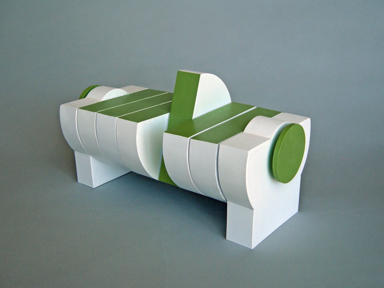
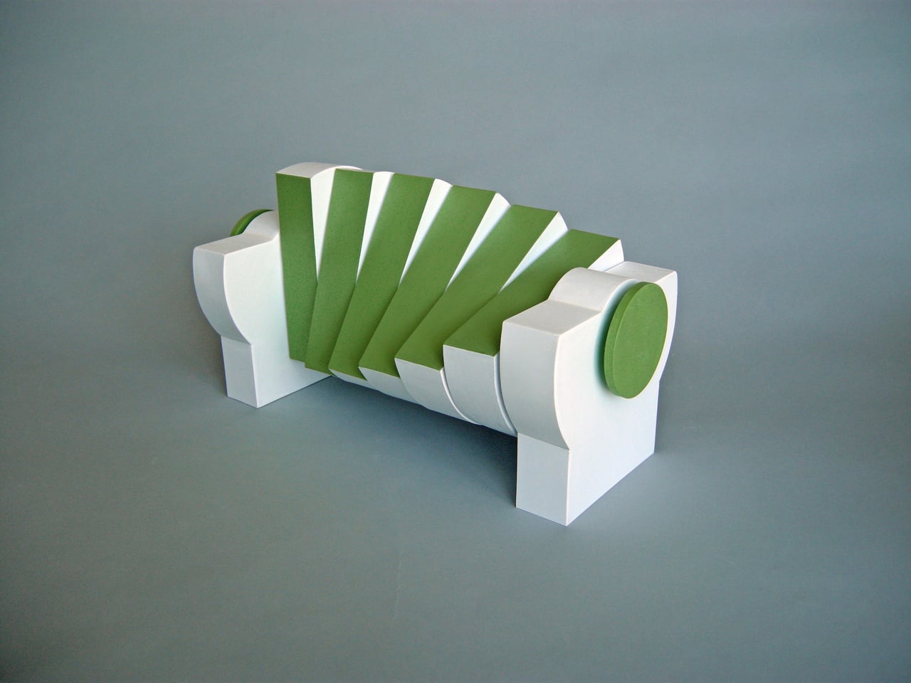
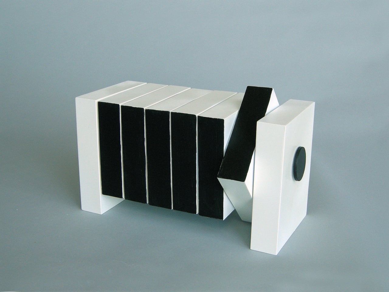
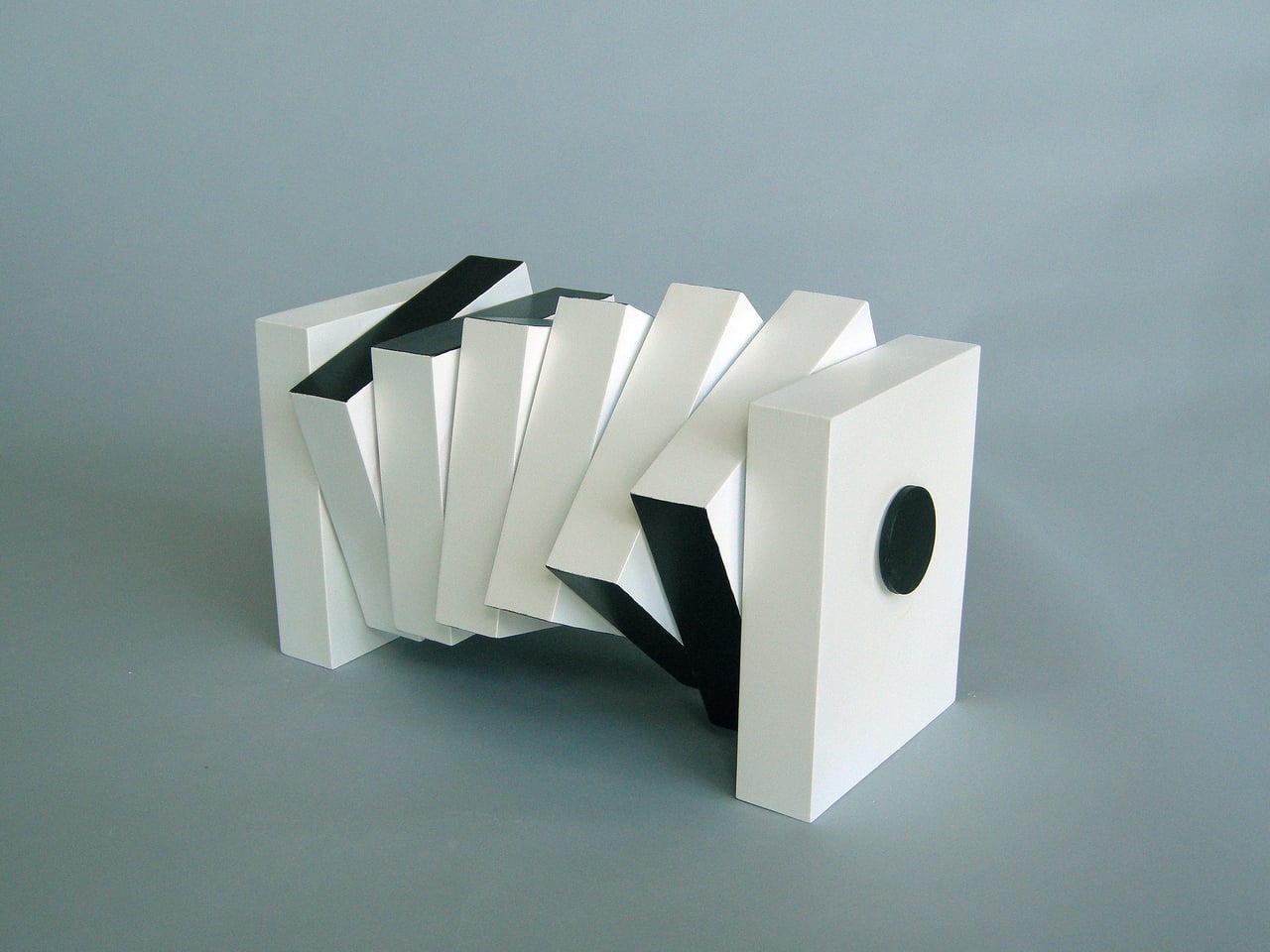
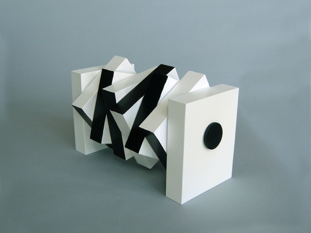
His Interactive Segmented Tables are a compelling example of that approach. These aren’t concepts or prototypes; they’re actual, built furniture that sits in a room and waits for you to decide what they should be. At any given moment, they can work as a proper low table for a drink or a book, and with a few turns of their knobs, transform into something that belongs in a gallery.

Designer: Michael Jantzen
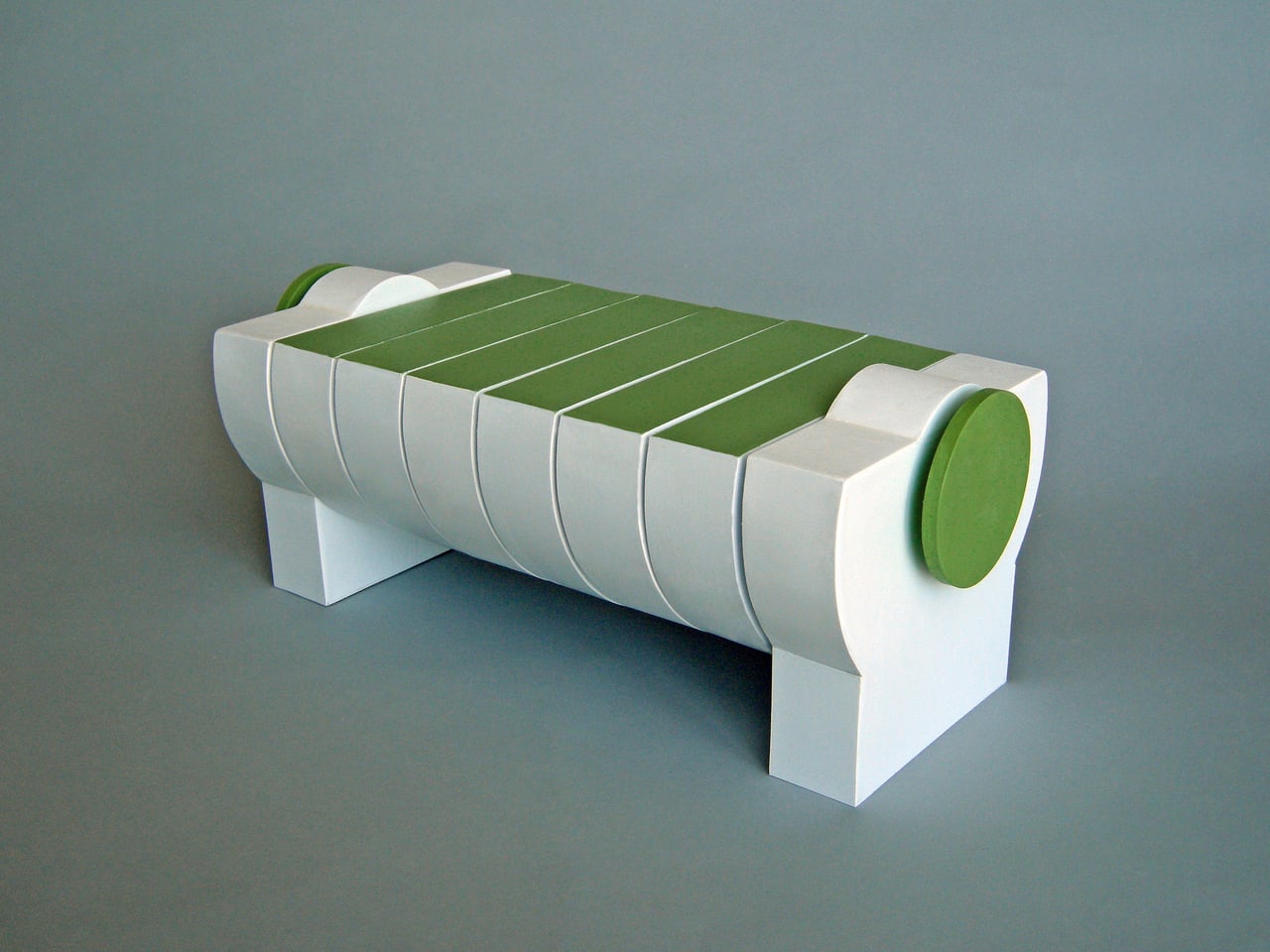
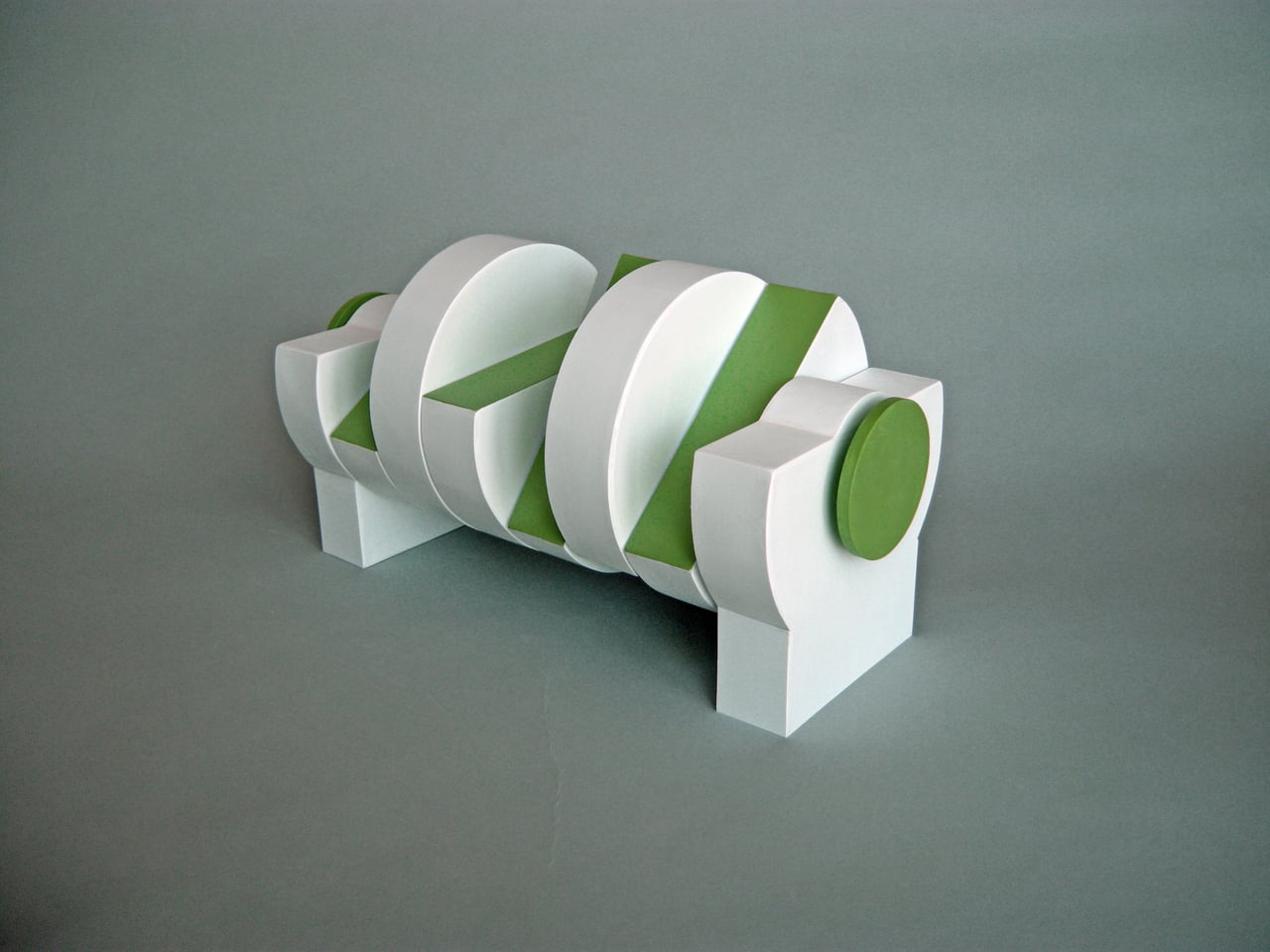
The mechanism behind this is disarmingly simple. Each table is made up of identical segments threaded along a center support rod, held in place by two disc-shaped knobs on either end. Loosen those knobs, and you can rotate each segment independently into any configuration you like. Each segment has at least one flat side, so aligning enough of them with flat faces pointing upward turns the whole thing into a stable surface.
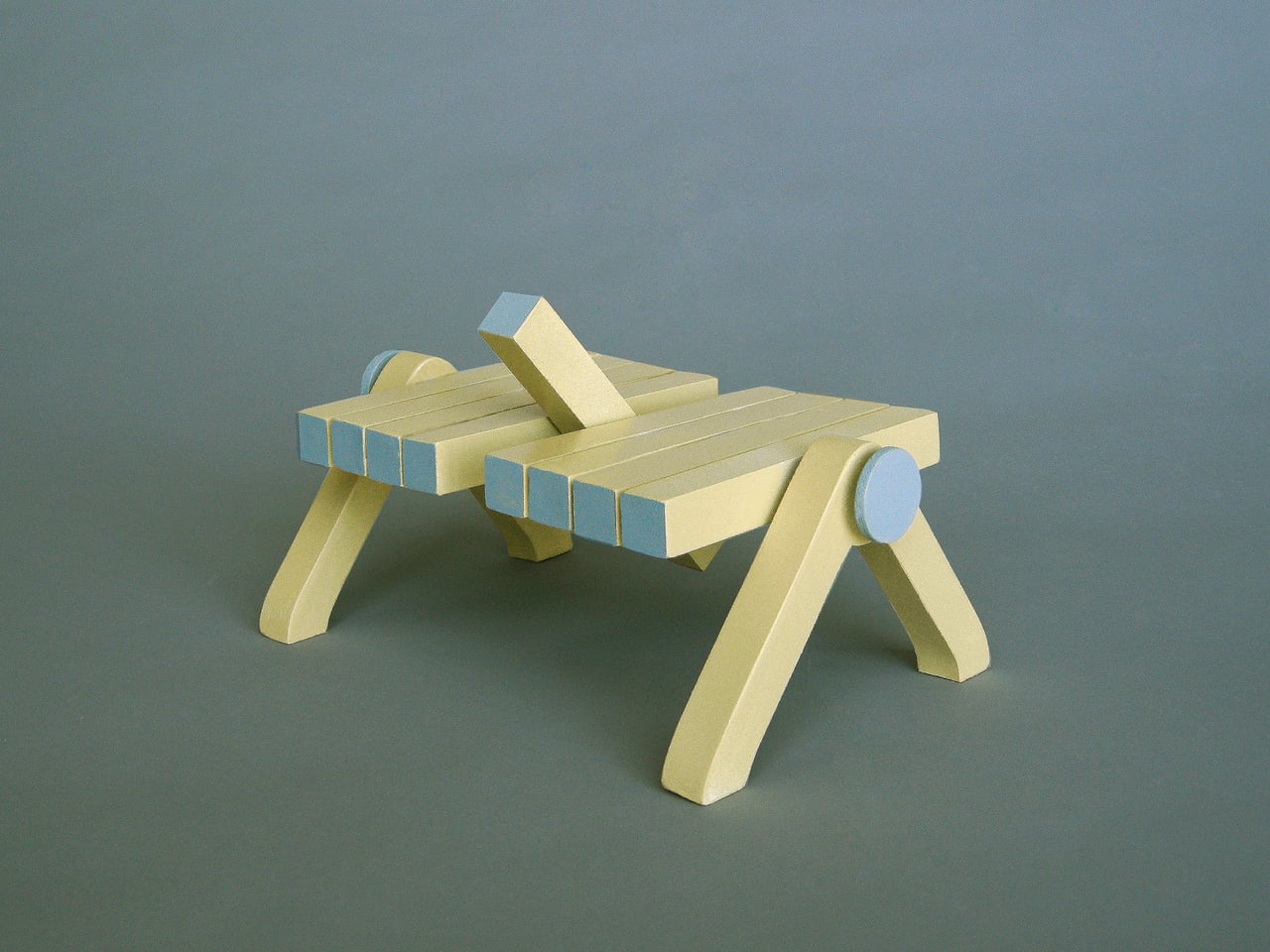
This is where the tables stop being passive objects and start being tools of expression. You might rotate the segments into something visually striking when guests arrive, then pull them flat when you need an actual surface for a lamp or a tray. The piece adapts to the occasion rather than the other way around, which is rarely something a table can honestly claim to do.
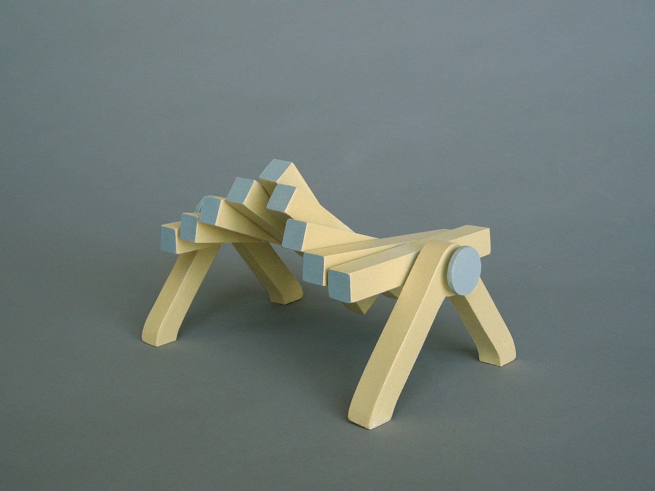
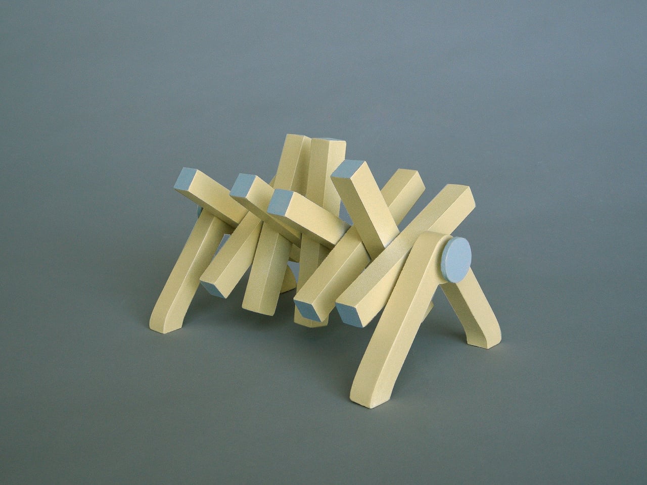
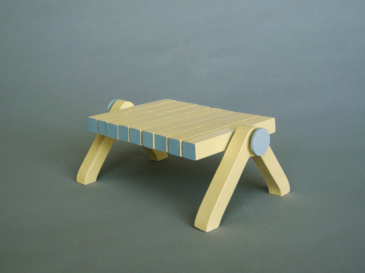
What makes this even more interesting is that the segments are two-toned, so rotating them doesn’t just change the table’s shape; it also shifts its color pattern. A configuration that shows one dominant tone can open up into a mix of both with a single rearrangement. You could work with the same piece for years and never feel like you’ve fully exhausted what it can look like.
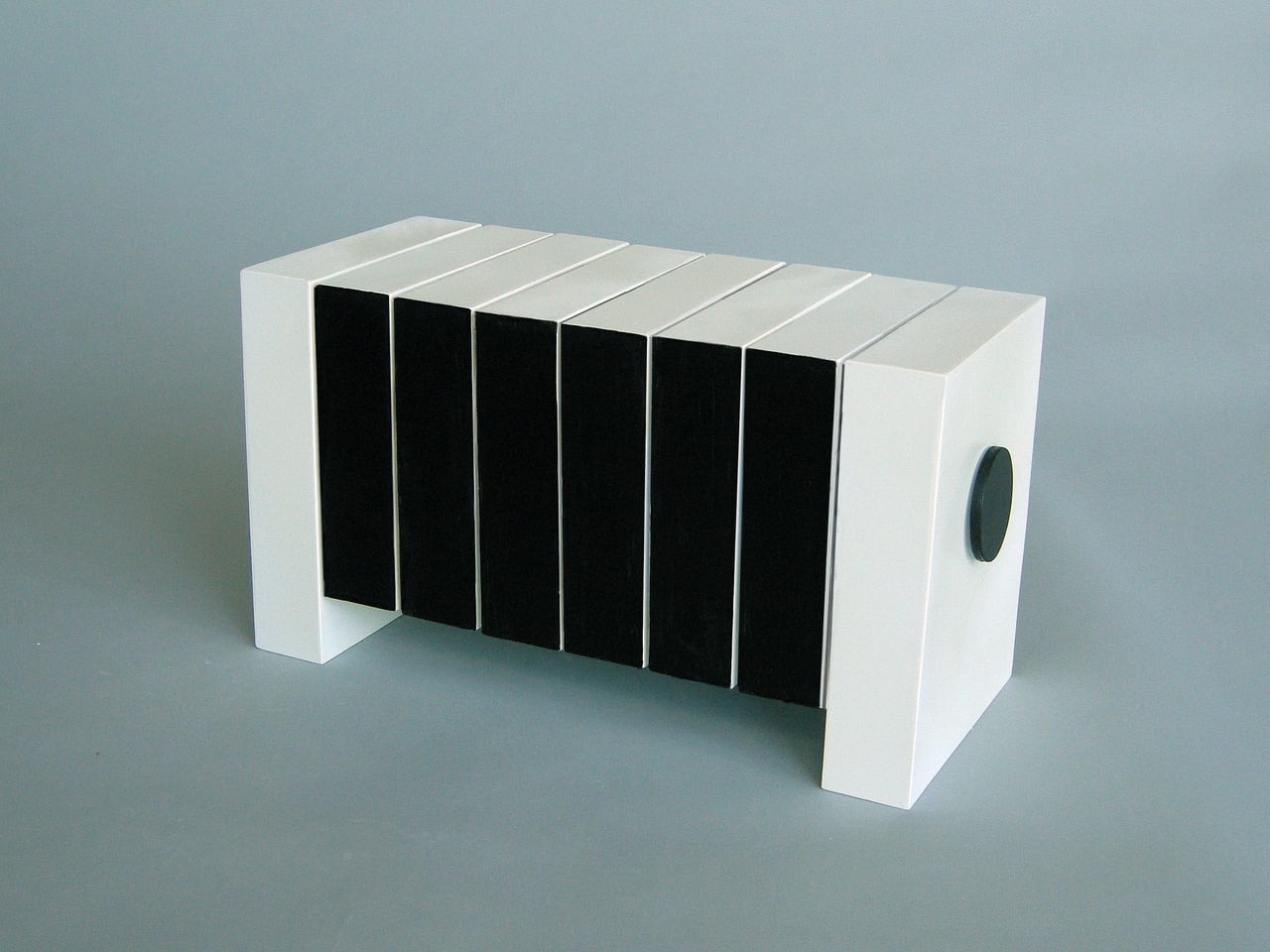
The Interactive Segmented Tables also aren’t locked into a single form factor. Jantzen designed them to be available in many different sizes and table shapes, and they can be made from a range of materials. This means the same essential concept can translate into very different objects, depending on what a space or an owner calls for, without losing what makes them worth owning in the first place.

For anyone tired of furniture that commits too hard to a single personality, these tables offer something different. There’s a quiet pleasure in knowing you can reach down, loosen two knobs, and change what’s sitting in your living room without buying anything new. Few objects manage to be this honest about the fact that taste and function aren’t always fixed, and that’s a more useful quality than it sounds.
The post This Coffee Table Turns Into Abstract Sculpture by Loosening 2 Knobs first appeared on Yanko Design.
The Ghost of Carlo Mollino’s Best Table Has Finally Arrived

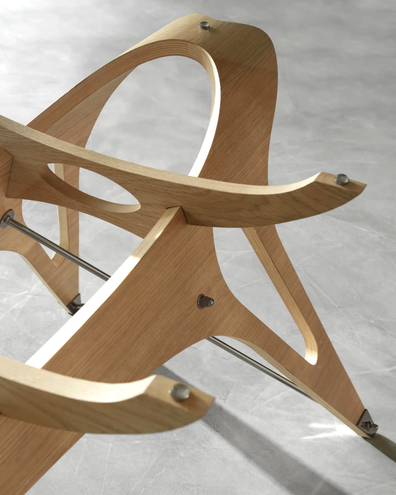
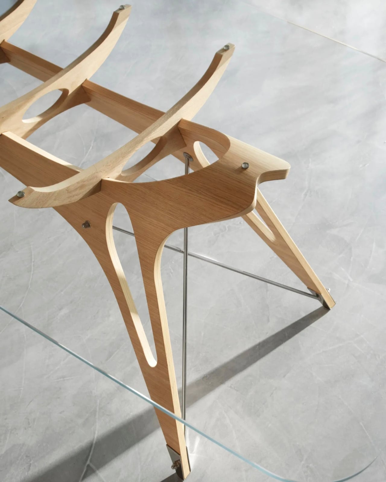
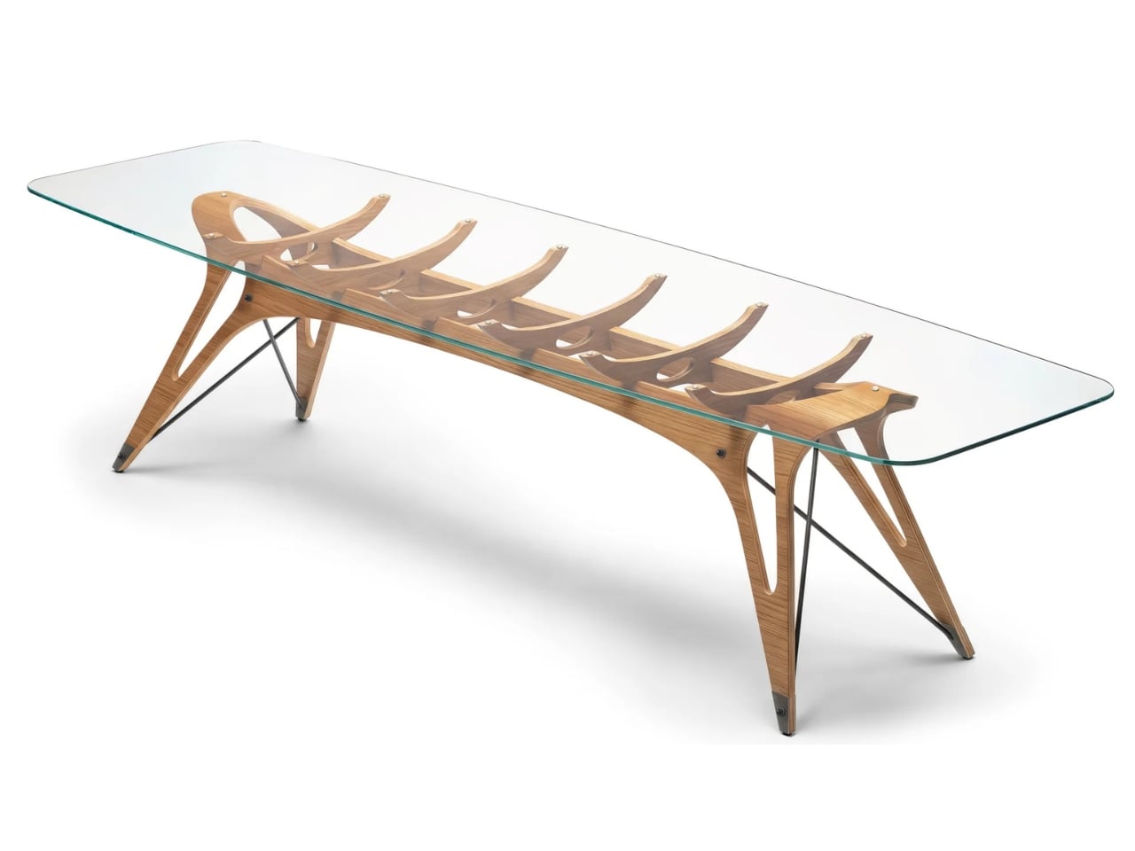
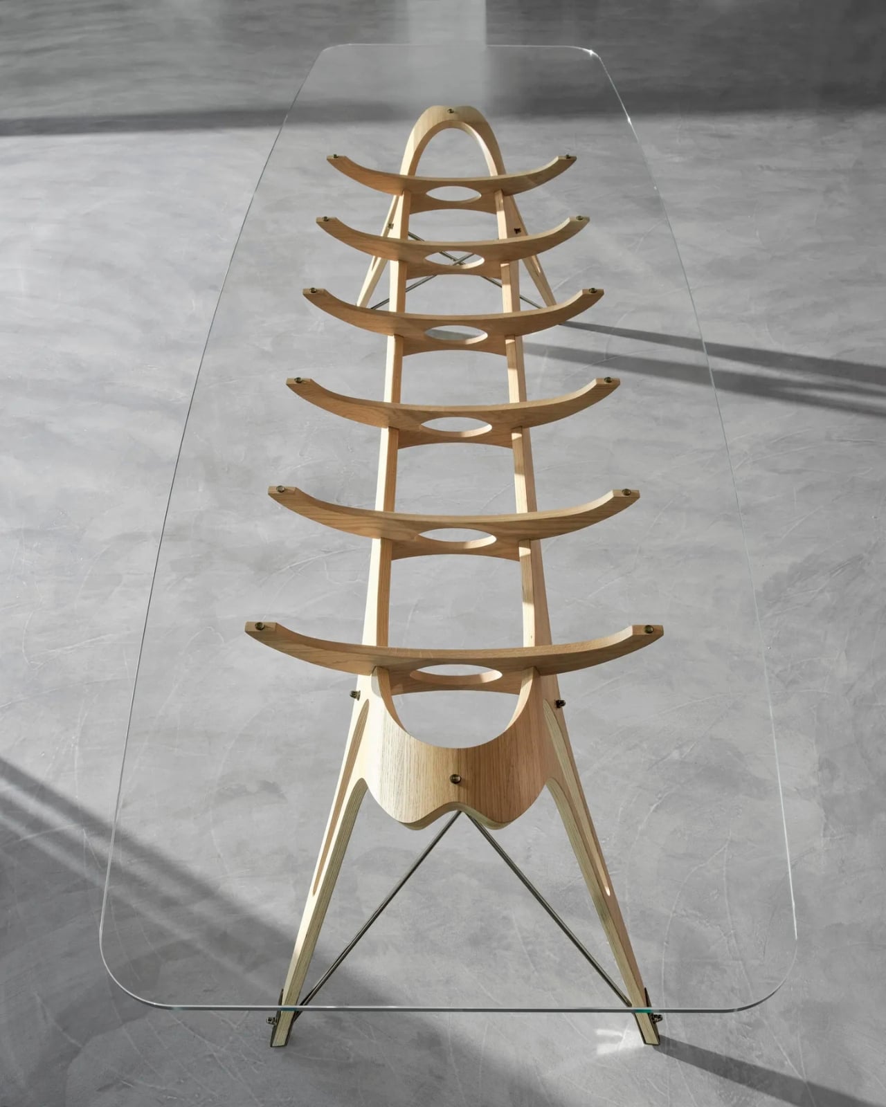
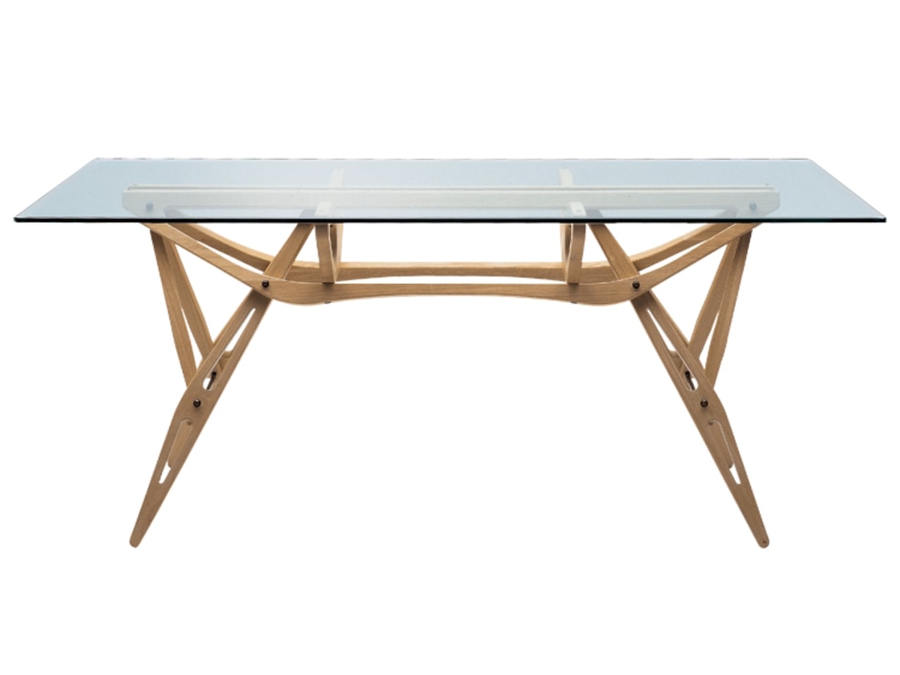
Some designs don’t age. They just wait. The Vertebra table by Carlo Mollino has spent the last 75 years doing exactly that, existing in the margins of design history as a tantalizing “what if.” Created in 1950, the piece was only ever realized in two physical examples, both of which eventually found their way to auction houses where collectors paid serious money to own a slice of Mollino’s particular brand of genius. The rest of us could only stare at photographs.

That changes this week. Italian design house Zanotta has acquired the Carlo Mollino archive from the Italian State through a public tender, securing exclusive rights to produce 30 of his designs. The first piece to come out of that deal is the Vertebra table, which is making its industrial production debut at Milan Design Week 2026. For anyone who follows design even loosely, this is a genuinely exciting moment.

Designer: Zanotta (Carlo Mollino)

If the name Carlo Mollino isn’t immediately familiar, here’s the short version: he was a Turin-born architect, designer, photographer, racing driver, skier, and aviation enthusiast who lived from 1905 to 1973 and made everyone around him look like they weren’t trying hard enough. He synthesized Expressionism, Futurism, Organicism, and Surrealism into a design language that felt simultaneously ancient and far ahead of its time. His furniture didn’t follow trends. It followed the human body.

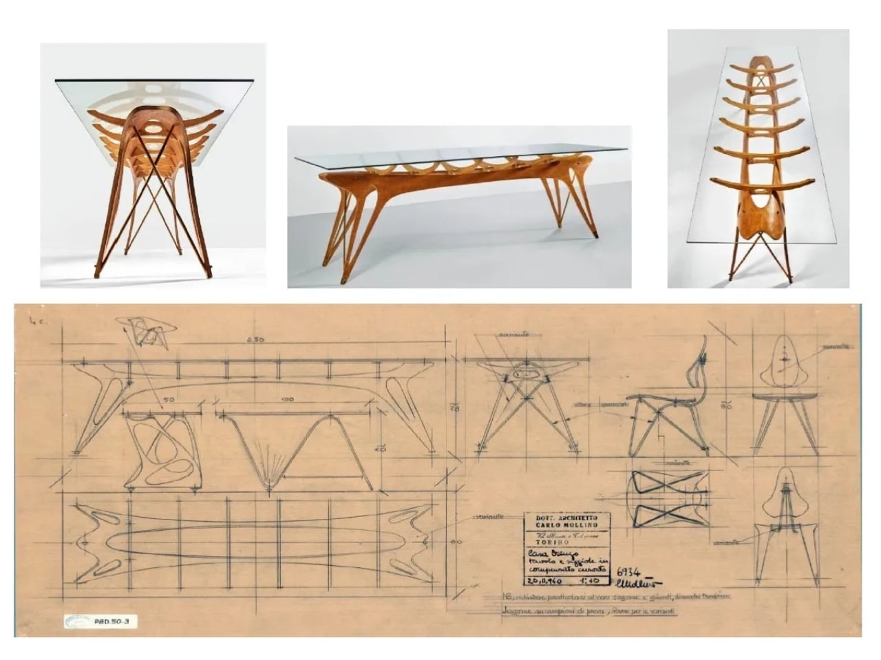
That’s precisely what makes the Vertebra table so arresting. The name isn’t decorative. Mollino perceived furniture not as mere decoration, but as an extension of the body in motion, and the Vertebra’s sinuous, almost skeletal structure makes that philosophy literal. Its base is formed from a single continuous sheet of plywood that curves and flexes in ways that feel less like woodworking and more like anatomy. Look at it long enough and you start to see ribs, joints, a spine caught in mid-motion. It’s the kind of design that makes you forget you’re looking at a table.

The production history adds a certain poetry to the moment. Mollino spent much of his career working with a carpentry workshop in Turin to create pieces in limited runs, often for specific clients. The Vertebra was originally designed for the Lattes publishing house in Turin. That it never made it to industrial production during his lifetime is one of those quiet design world tragedies that don’t get talked about enough. His furniture was always collector territory, commanding extraordinary prices at auction and sitting in the collections of major design museums. Beautiful, but locked away.

What Zanotta is doing here feels like more than just a business move. By going through the Italian State, winning a public tender, and committing to serial production, they’re essentially arguing that Mollino’s work belongs to a wider audience. That’s a stance worth appreciating. Good design shouldn’t only exist in the hands of people who can afford auction house prices, and bringing a piece like the Vertebra into serial production opens up a real conversation about access, legacy, and what it means to steward a designer’s archive responsibly.

The unveiling at Milan Design Week is set within an immersive installation inside the Zanotta flagship store, where curtains fluidly define space and the organic forms of the human body serve as a visual reference. It sounds like exactly the kind of environment that would make Mollino feel at home. He was always staging things, always thinking about how space, form, and the presence of the body existed in relation to each other.

The broader archive Zanotta now holds includes tens of thousands of drawings, sketches, photographs, handwritten notes, and typed documents alongside those 30 production-ready projects. That’s a significant responsibility, and how they steward it over the coming years will say a lot about their real commitment to doing Mollino’s legacy justice. For now, though, the Vertebra is the headline. A table that waited 75 years to be made at scale, by a designer who saw furniture as something alive. It’s the kind of debut that reminds you why design history is worth paying attention to.

The post The Ghost of Carlo Mollino’s Best Table Has Finally Arrived first appeared on Yanko Design.

Raw-Edges Just Designed a Chair That Needs Zero Fasteners

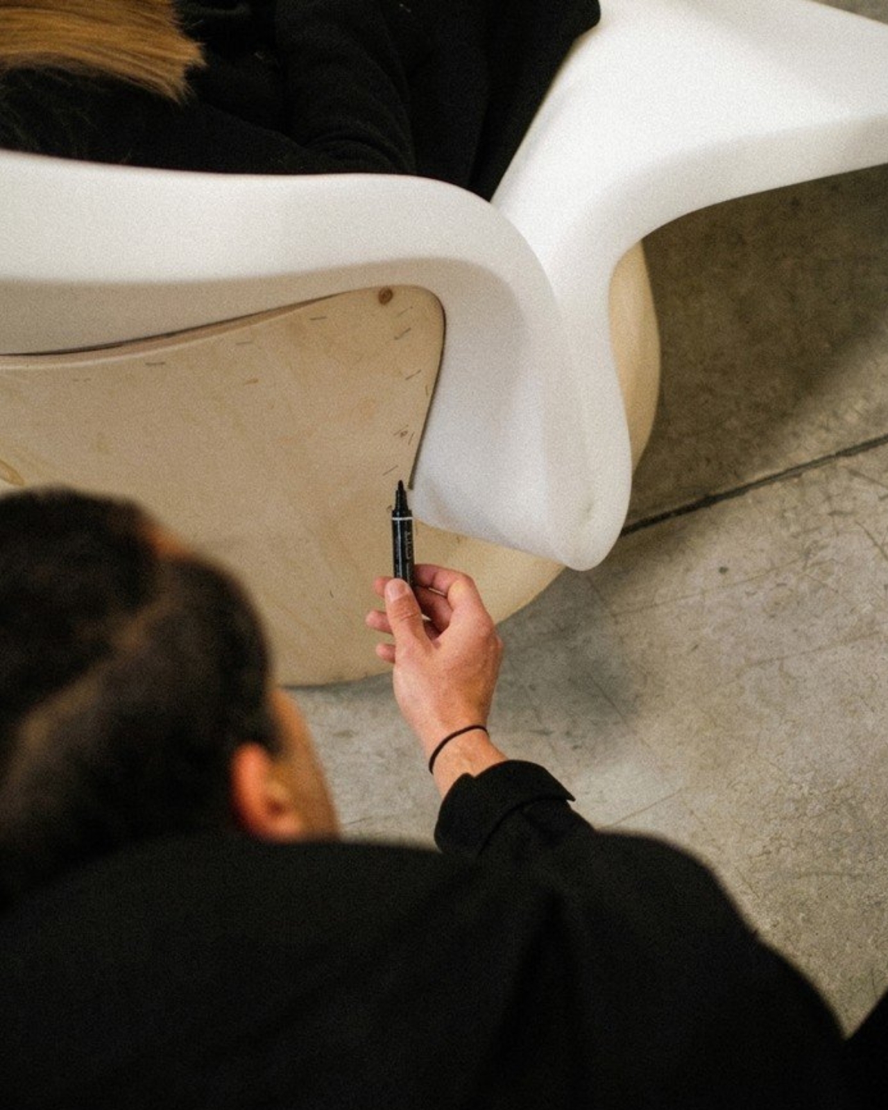
Upholstery has been done the same way for centuries. Foam gets glued, tacked, or stapled onto a frame, and that’s more or less the end of the story. It’s functional, it’s reliable, and it’s almost never questioned. London-based Raw-Edges Design Studio decided it was worth questioning.

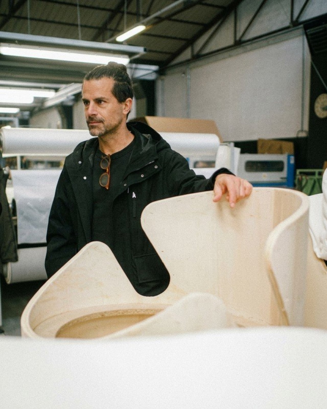
Yael Mer and Shay Alkalay, the duo behind Raw-Edges, have built their entire creative identity around exactly this kind of thinking. Founded in 2007 after the two met at the Royal College of Art, the studio has spent nearly two decades treating everyday objects as unsolved puzzles worth reopening. Their latest experimental chair design is a perfect example of how they operate: take a convention that everyone has accepted without debate, strip it down to first principles, and see if a smarter answer has been sitting there all along. The answer, in this case, is a notch.

Designer: Raw-Edges Design Studio

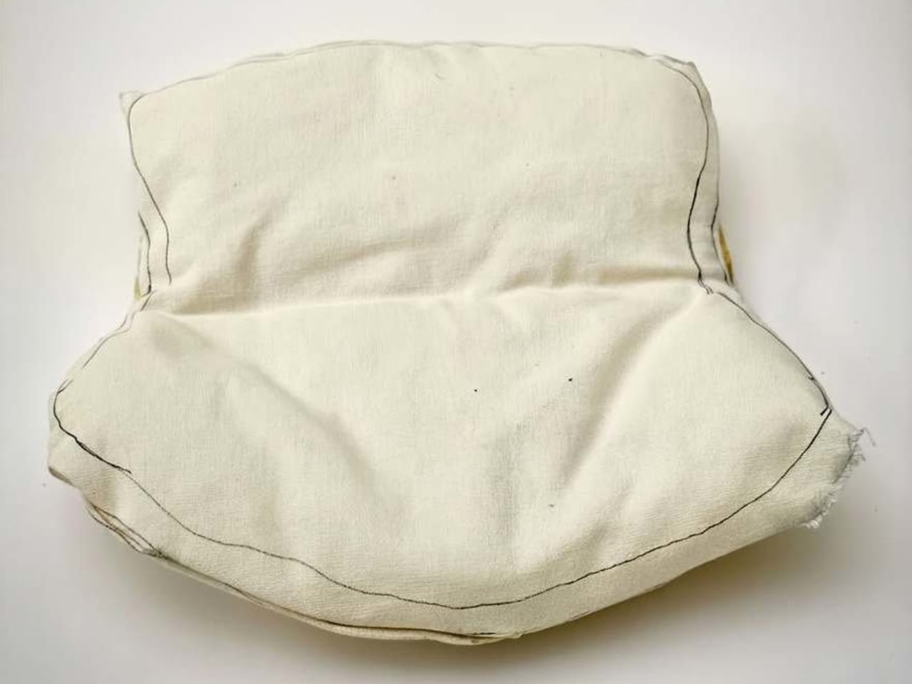
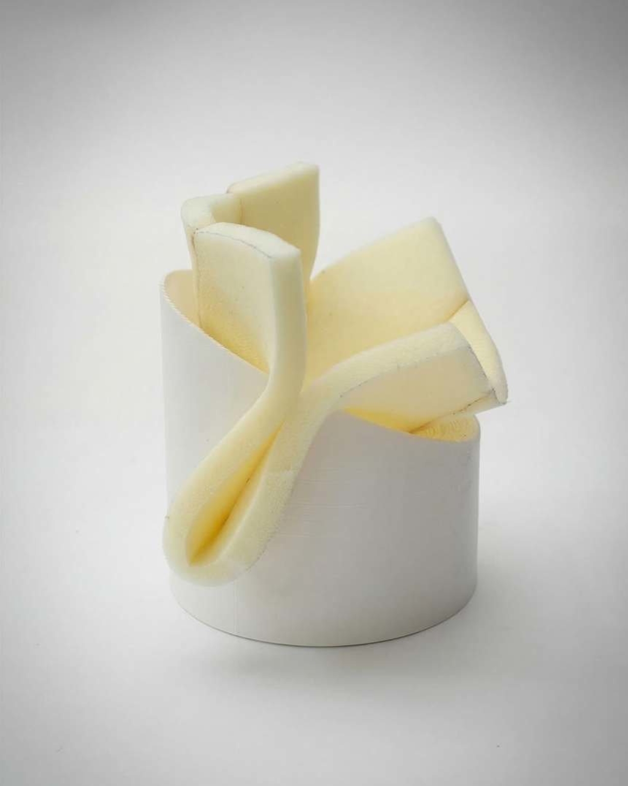
The chair, still unnamed and currently in the design phase, uses no adhesives, no tacks, no staples, none of the usual fasteners that hold most upholstered furniture together. The wooden frame is carved with a deliberate groove, and the upholstered foam cushion is simply wedged into it. Friction does the rest. The whole thing holds together through the logic of fit rather than the intervention of hardware. It sounds almost too simple, and that’s kind of the point.

I keep thinking about why this feels so satisfying to look at, and I think it comes down to the fact that we’ve been conditioned to accept over-engineering as a sign of quality. More parts, more steps, more materials, more adhesives: these feel like indicators of a serious product. Raw-Edges pushes back on that quietly. The notch solution is elegant precisely because it asks less of the chair, not more. It treats the materials as intelligent components that can work together without being forced.

This thinking is very on-brand for Raw-Edges. Their work sits comfortably in the permanent collections of MoMA, the Vitra Design Museum, and The Art Institute of Chicago, and the studio has collaborated with names like Louis Vuitton, Vitra, Stella McCartney, and Moroso. They’ve won the A&W Designers of the Year award, a Wallpaper Design Award, and were named Designers of the Future at Design Miami/Basel. None of that happened by accident. It’s the result of a studio that consistently asks questions other designers tend to skip over.

Their philosophy, as they describe it, begins with humble experimentation and a search for unconventional principles. That’s a gracious way of saying they don’t assume the current answer is the best one. The project is being developed in collaboration with Italian furniture company Bolzan, which strongly suggests this isn’t destined to stay a prototype forever. A saleable product feels like the logical next step, and that’s worth getting excited about.

The implications here also stretch beyond aesthetics. A chair held together by friction rather than glue or staples is, by nature, easier to take apart. The foam can be removed, replaced, or recycled separately from the frame. In a design culture increasingly preoccupied with repairability, longevity, and what happens to products at the end of their lives, this approach carries real practical weight. And it doesn’t feel like a sustainability talking point bolted onto a product after the fact. It feels like an idea that was right from the start.

Furniture design doesn’t often make headlines outside trade publications and design weeks, but this concept deserves a wider audience. Not because it’s flashy, and not because it’s about to show up in every furniture showroom next season, but because it demonstrates that design thinking is still genuinely capable of surprise. Sometimes the most powerful idea is a groove in a piece of wood and the confidence to trust it.

The post Raw-Edges Just Designed a Chair That Needs Zero Fasteners first appeared on Yanko Design.
Issey Miyake’s Most Beautiful Material Was Always the Scrap

If you’ve ever watched the pleating process behind ISSEY MIYAKE’s iconic garments, you already know it’s one of the most satisfying things in fashion. The fabric goes in, it comes out textured and alive, and for decades, that has been the whole story. Satoshi Kondo, one of the design directors at MIYAKE DESIGN STUDIO, chose to flip the script. He looked not at the pleated garment coming off the machine, but at what was left behind: compressed rolls of wafer-thin paper, stacked and destined for the bin.

The result is The Paper Log: Shell and Core, a special exhibition running at the ISSEY MIYAKE Milan store this April, timed to coincide with Milan Design Week 2026. And it’s the kind of project that makes you want to rethink every process you’ve ever considered mundane.

Designer: Satoshi Kondo of MIYAKE DESIGN STUDIO

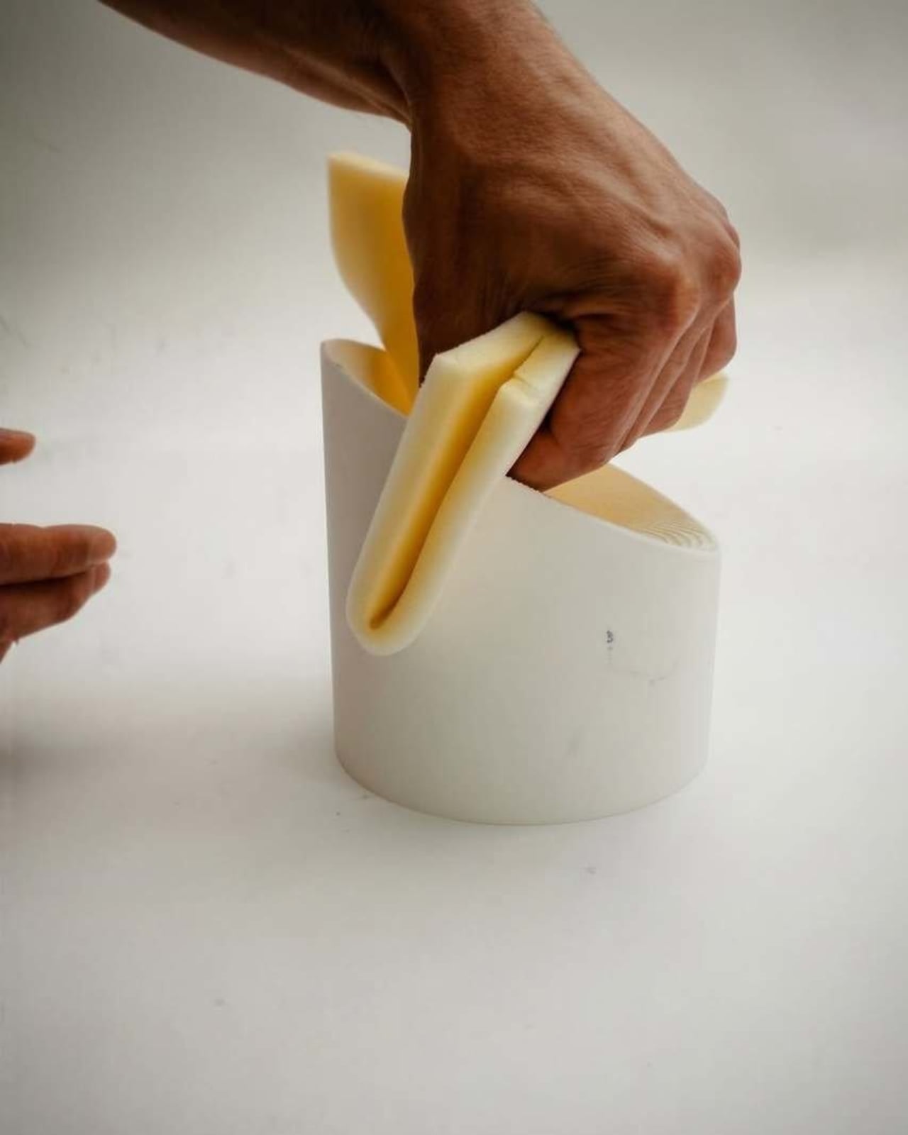
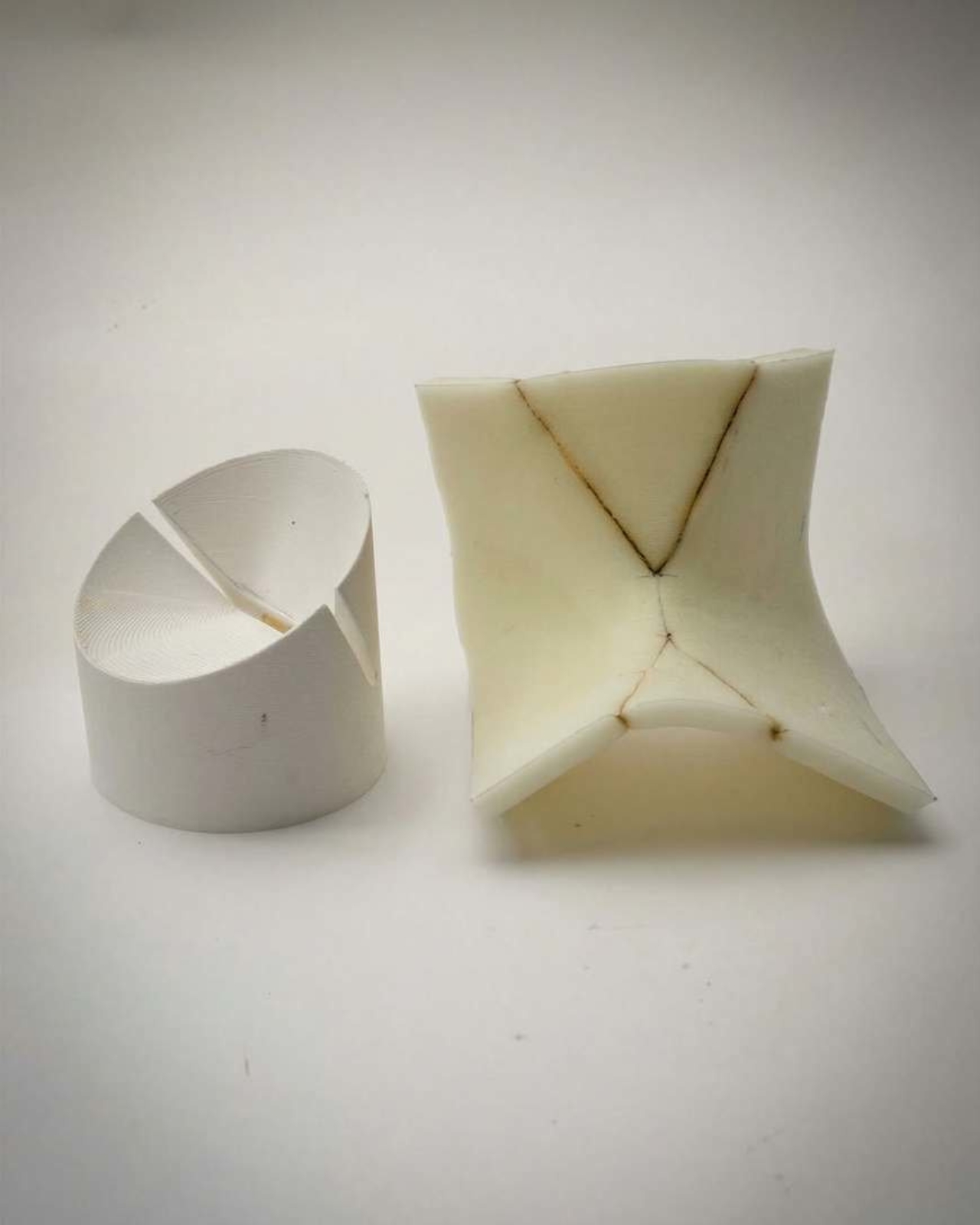
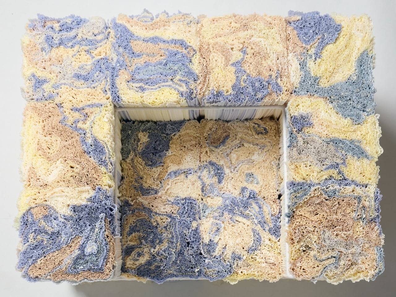
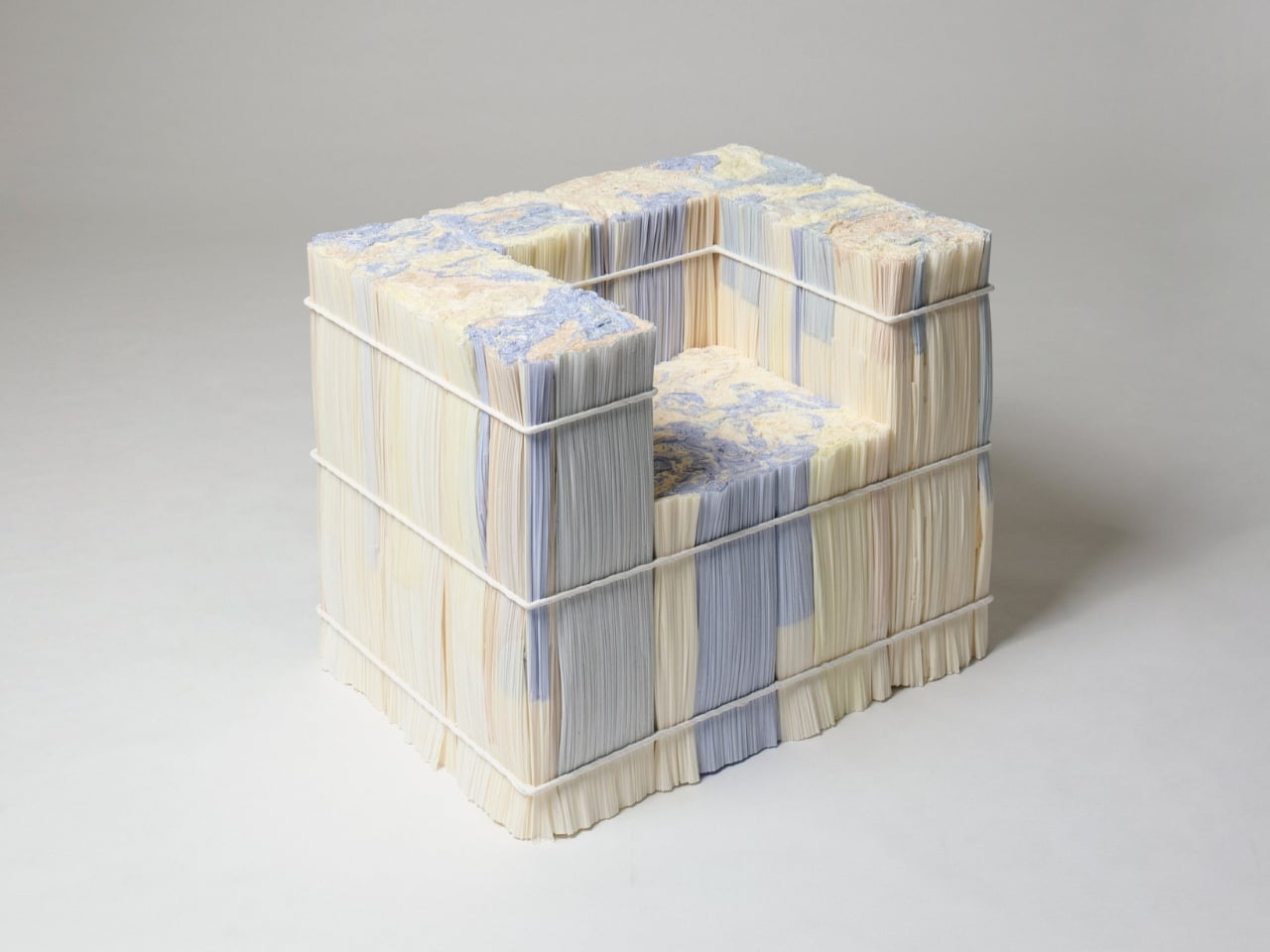
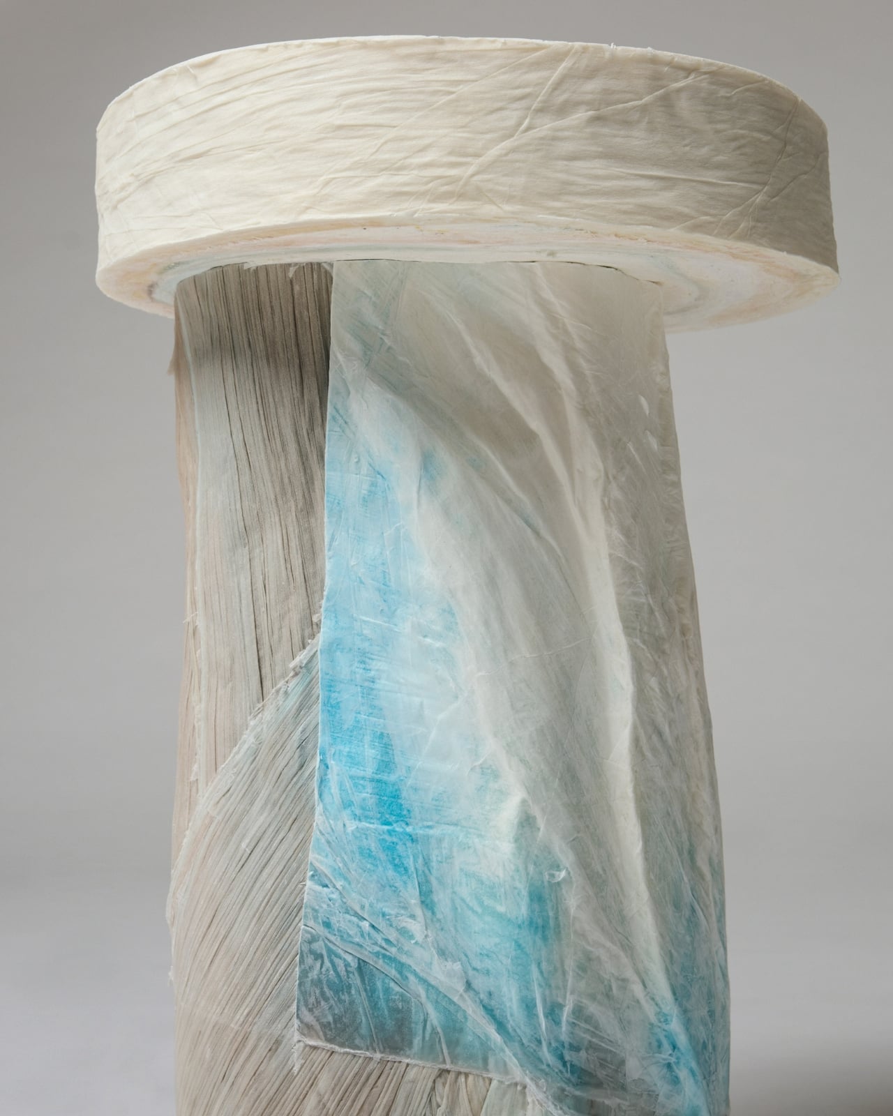
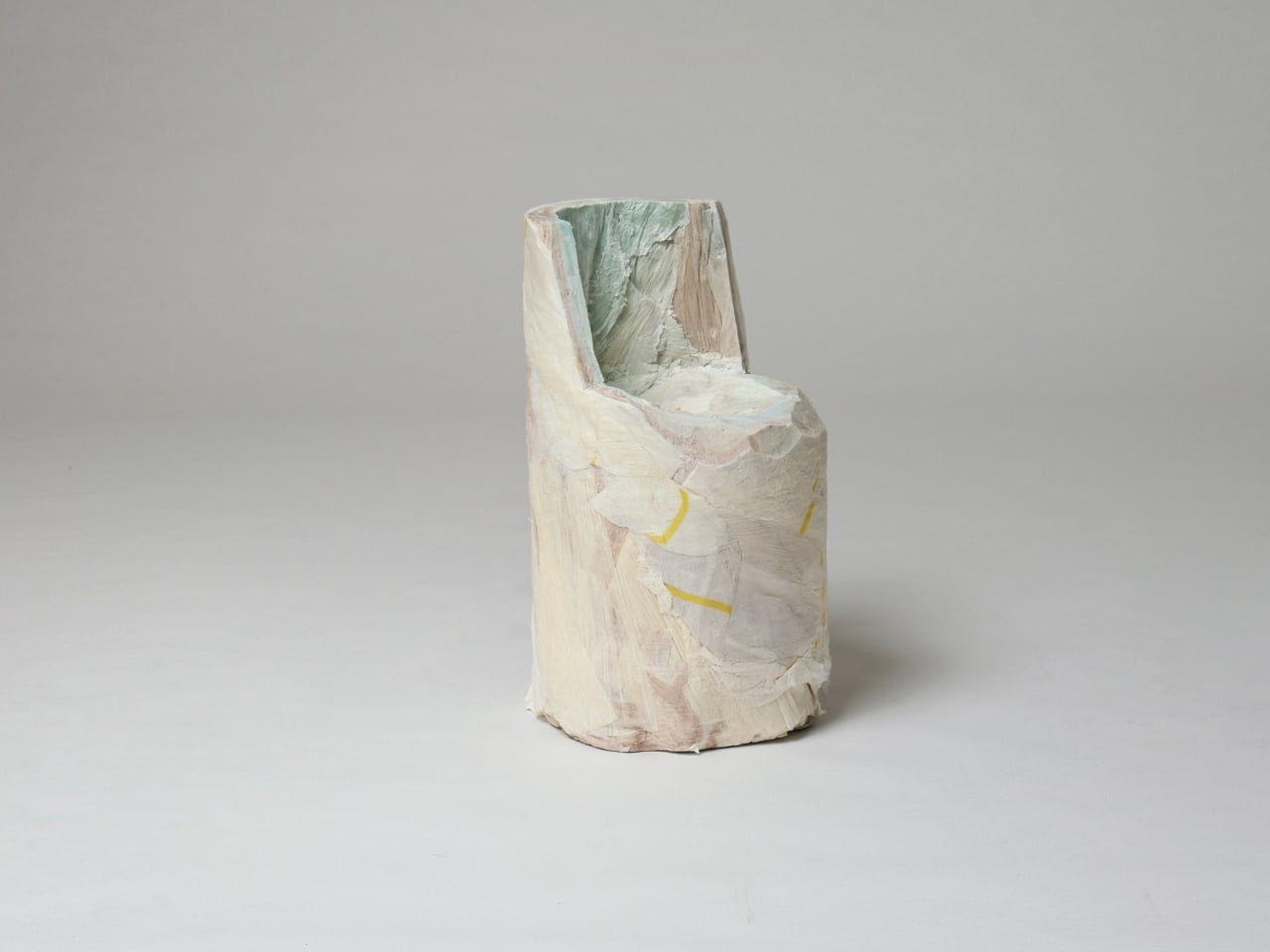
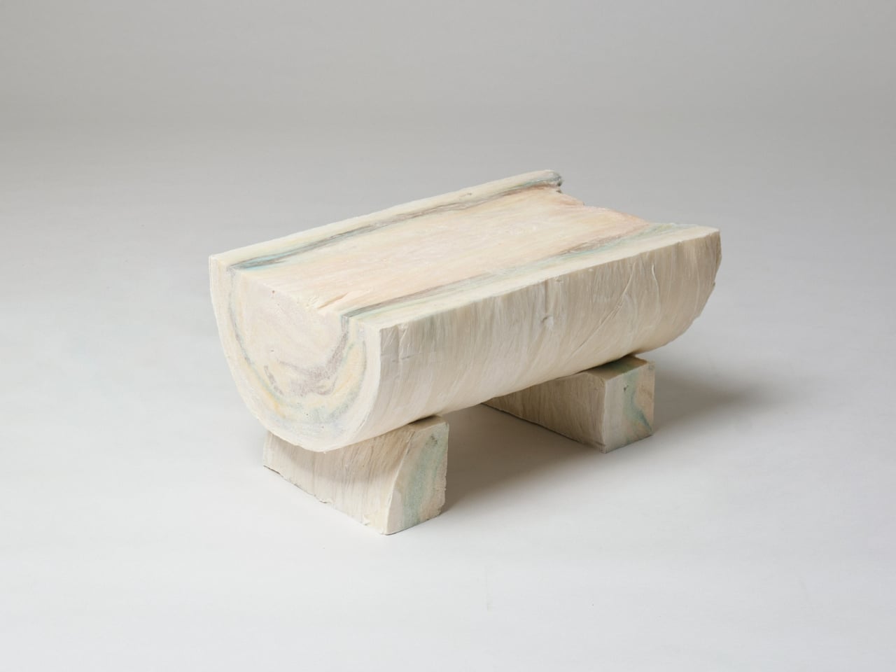
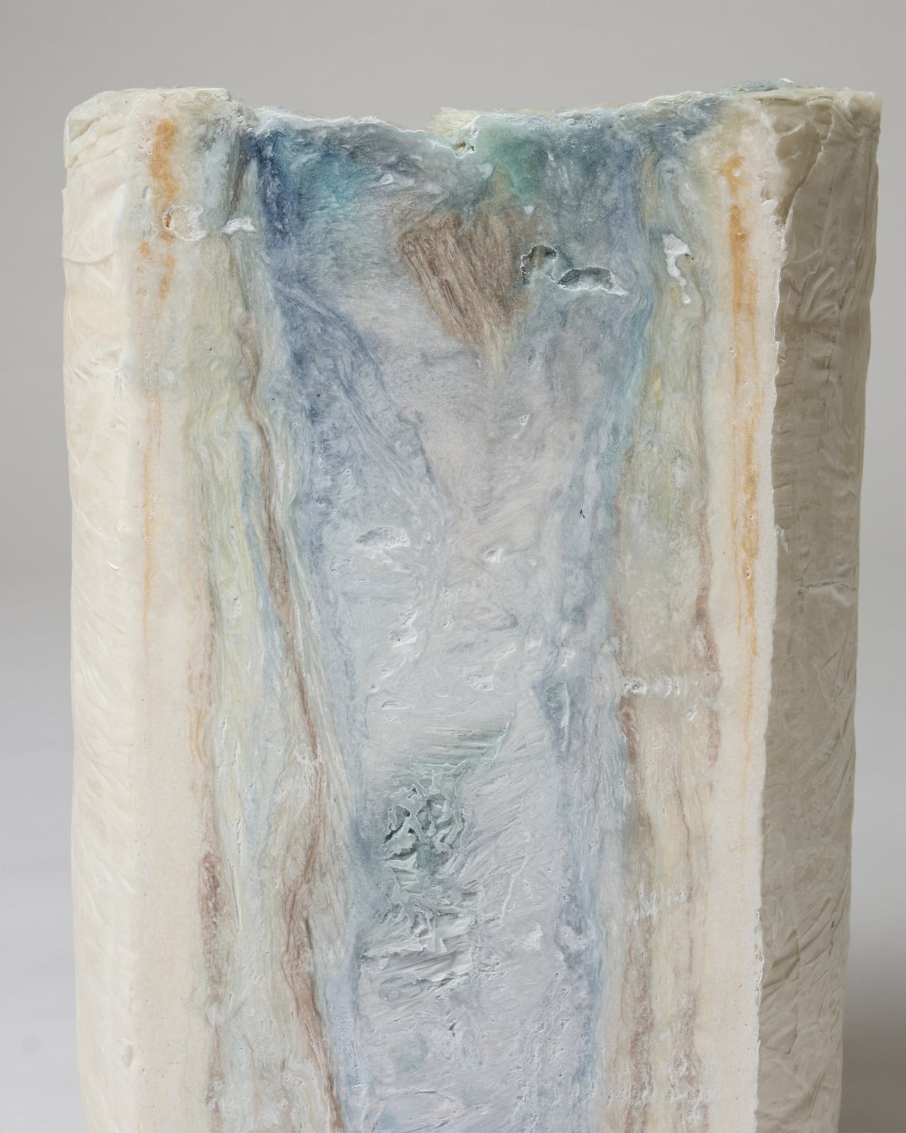
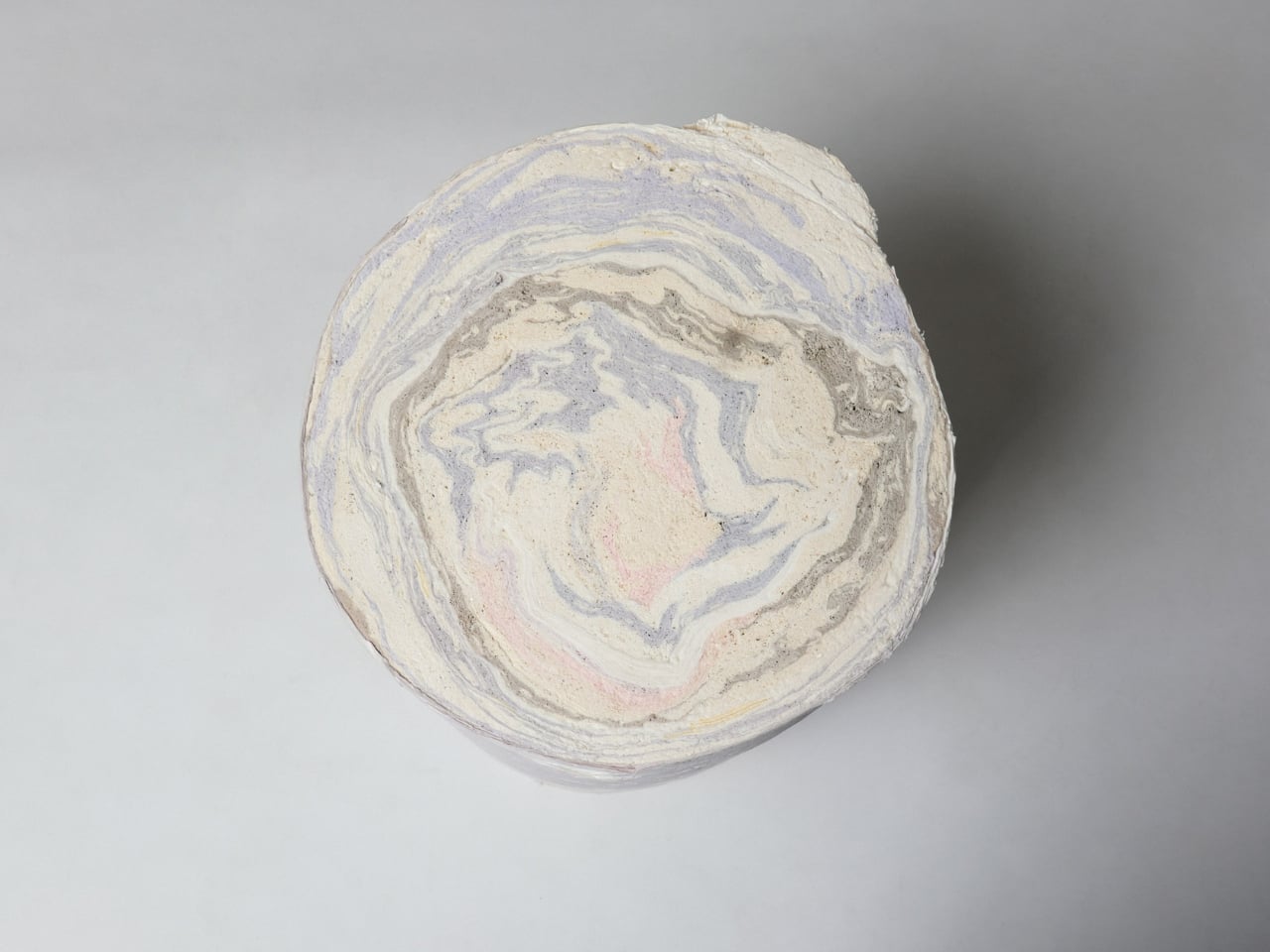
The paper in question is a production byproduct. These thin sheets are used to protect the fabric as it moves through the pleating machine, and when the garments are done, the sheets are rolled up, compressed, and typically moved off-site for recycling or disposal. What Kondo noticed during a visit to the manufacturer, though, was that these rolls look like logs. Not metaphorically, but structurally. Each compressed roll stands 80 cm tall and 40 cm wide, and when you look at the end of one, the layered paper creates a marbled, circular pattern that resembles the growth rings of a tree. Hence the name.

That visual parallel carries real weight. The Paper Log doesn’t just look like a tree trunk; it shares its logic. Growth rings mark time in a living thing, and the layers of the Paper Log carry the memory of every garment made at the house. It’s a surprisingly poetic idea from an industry that usually discards its footnotes.

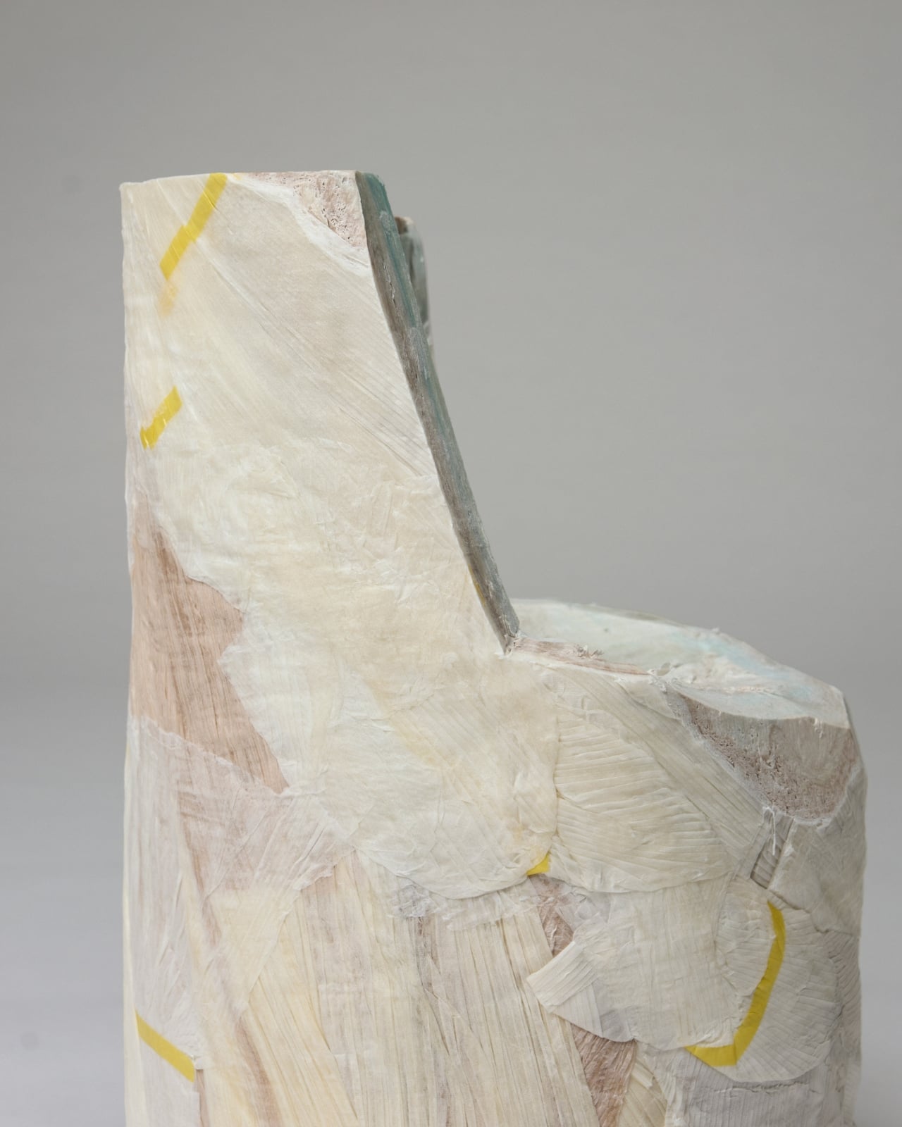
For the exhibition, Kondo brought in Spanish architecture office Ensamble Studio to develop two distinct bodies of work from the same material. The first, Shell, takes the paper log apart and treats it like a sculptural material, creating crisp, delicate objects that feel frozen mid-process. They’re almost ghost-like, holding a shape the way paper holds a crease. The second body of work, Core, goes in the opposite direction. Here the paper is treated as structure, forming actual furniture prototypes including stools, chairs, and tables. Robust and handcrafted, these pieces sit in direct contrast to the fragility of Shell, and that tension is very much the point.

The installation is arranged throughout the store to play Shell and Core against each other, presenting opposing ideas side by side: ephemeral versus concrete, delicate versus robust. I find this curatorial framing genuinely effective. It’s rare to see a single waste material handled in ways that feel this philosophically distinct, and rarer still to see a fashion house direct that kind of rigorous design thinking toward something that would otherwise not exist at all.

What makes The Paper Log worth your attention beyond the visual spectacle is the quiet insistence that process deserves as much consideration as product. Issey Miyake has always been a house obsessed with how things are made. The pleating technology itself is a kind of philosophy, a belief that the mechanics of creation are as meaningful as the finished object. Applying that thinking to the waste materials of that same process feels less like an act of sustainability and more like an act of honesty.

Whether or not furniture made from fashion scraps becomes a commercial category (and it absolutely could), The Paper Log: Shell and Core operates primarily as a provocation. It asks what we overlook when we’re focused on the final product, and suggests that the answer might be the most interesting material in the room. The exhibition runs at the ISSEY MIYAKE Milan store on Via Bagutta 12, from April 21 to May 5, 2026.

The post Issey Miyake’s Most Beautiful Material Was Always the Scrap first appeared on Yanko Design.
Dórica Just Proved Good Design Belongs on Your Kitchen Counter

Most of us have at least one object in our home we’ve never actually looked at. The napkin holder. The fruit basket. The candle holder that’s been sitting on the same shelf for three years. We use these things daily, sometimes multiple times, and yet they exist in this strange invisible space between functional and forgotten. That’s exactly the space that Sebastián Ángeles decided to design for.

Ángeles is the founder and creative director of Dórica, a Mexico City-based contemporary furniture brand that has spent years building a quiet but increasingly well-regarded reputation for pieces that prioritize longevity over trend. Their chairs, benches, and credenzas have found their way into residential, commercial, and hospitality spaces, and the brand has been recognized as one of the most relevant contemporary furniture names coming out of Mexico. But with Prea, released in February 2026 and recently featured by Wallpaper, Ángeles shifted his focus somewhere more intimate: the objects you reach for without thinking.

Designer: Sebastián Ángeles for Dórica

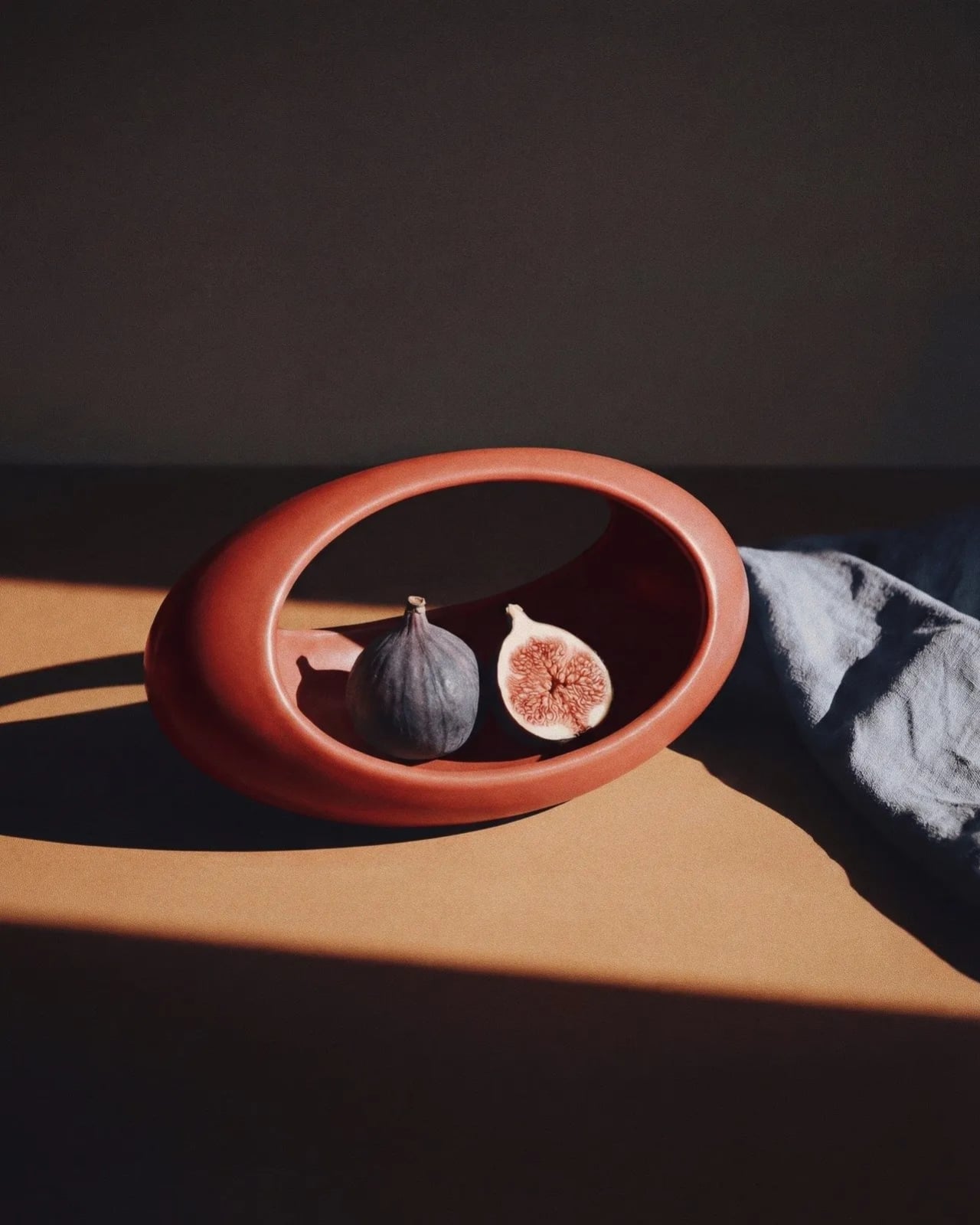
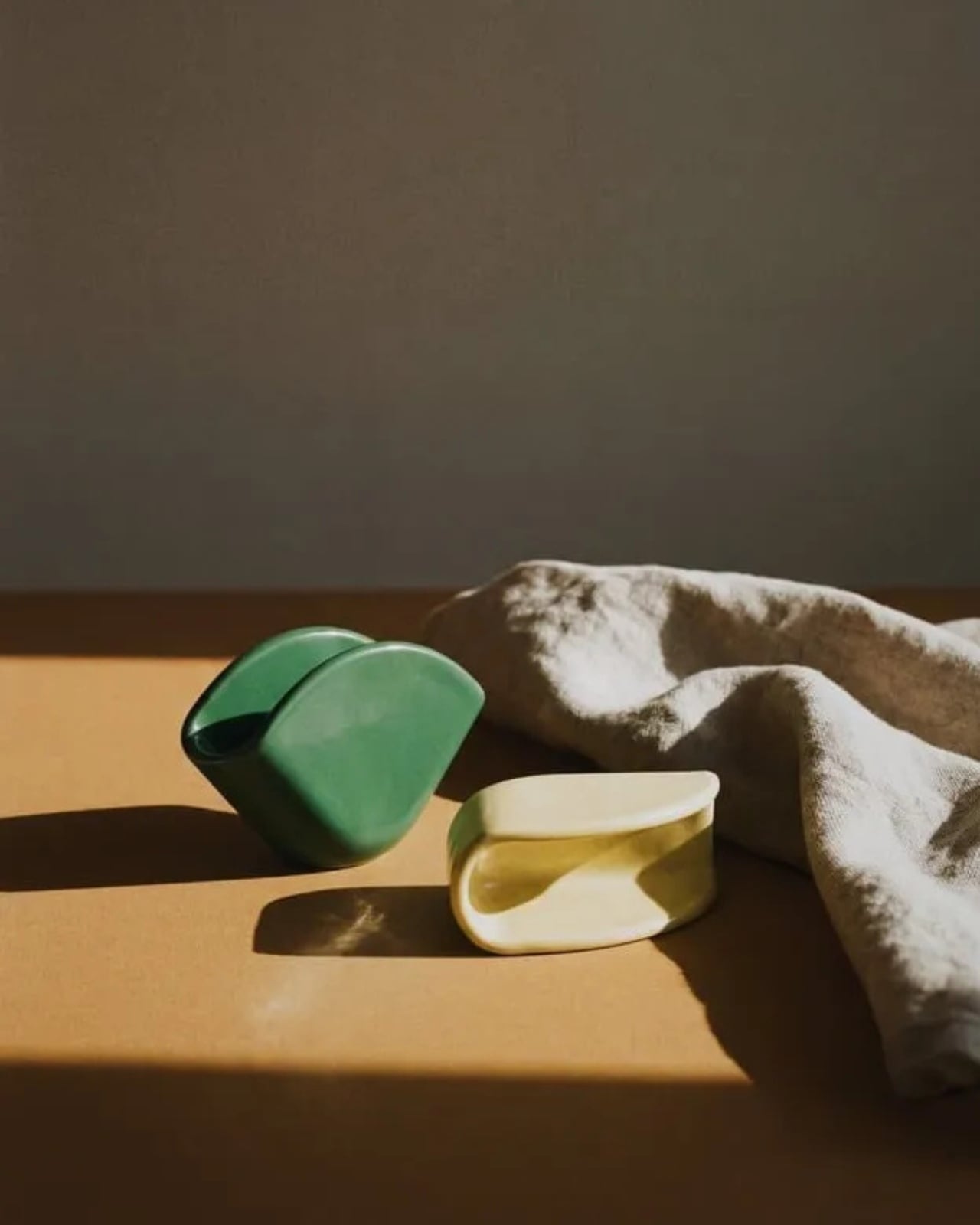
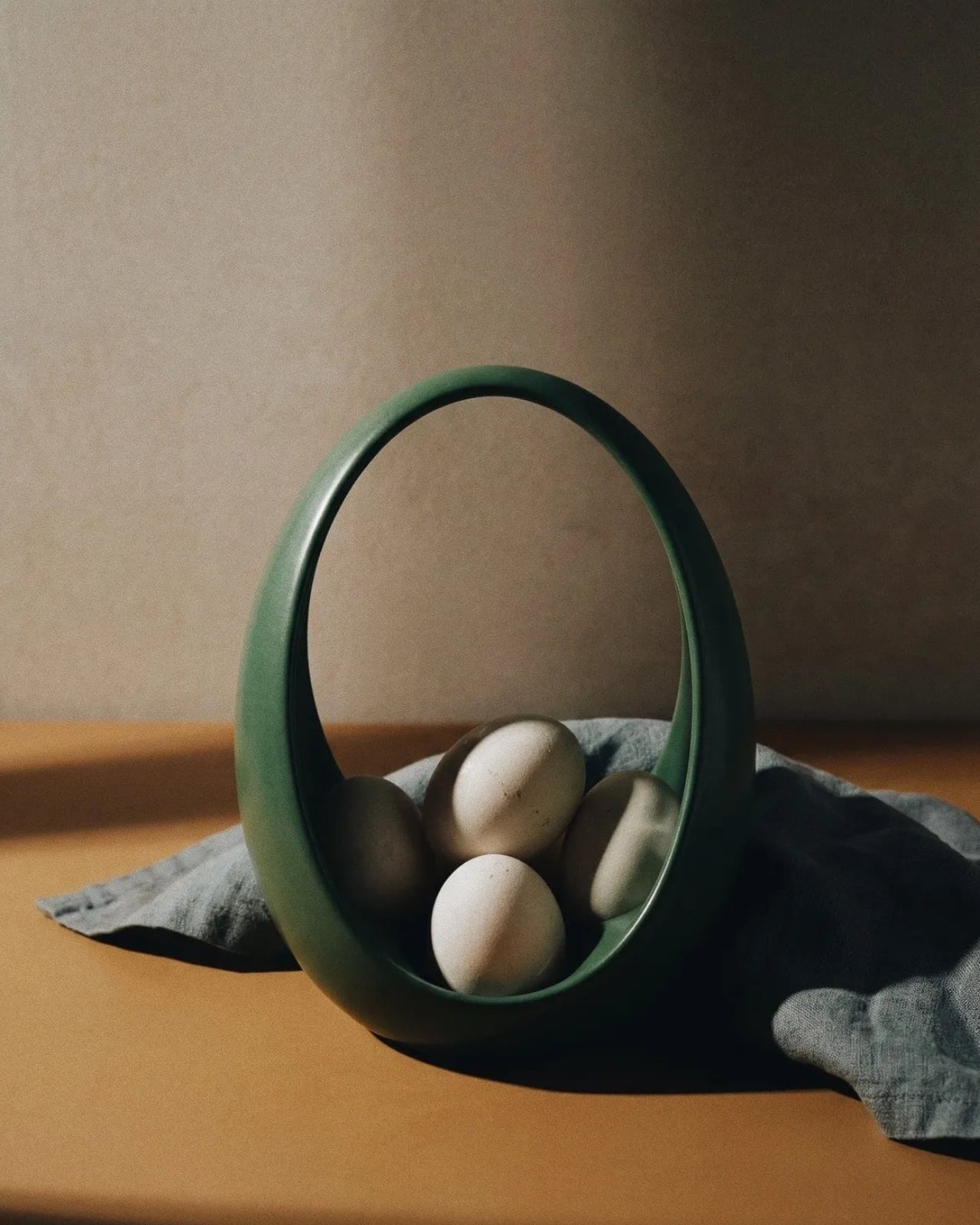
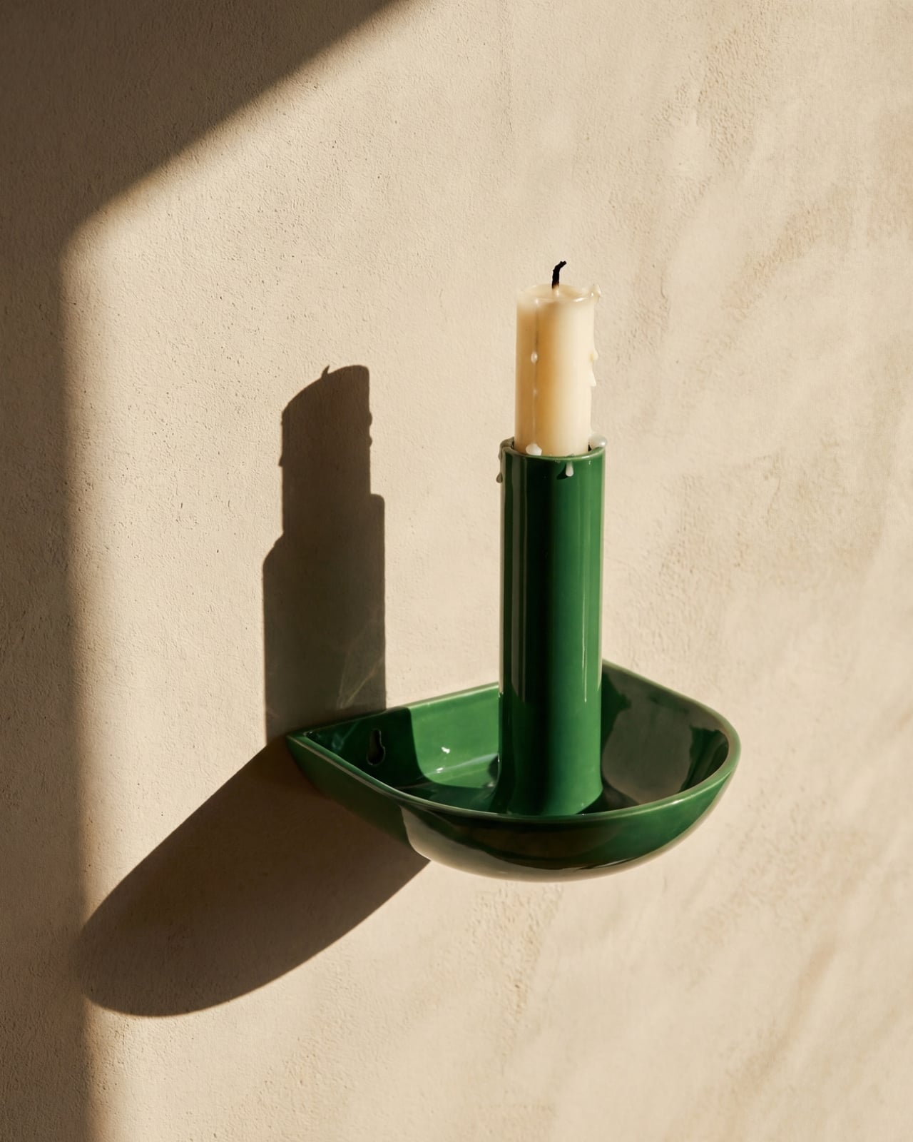
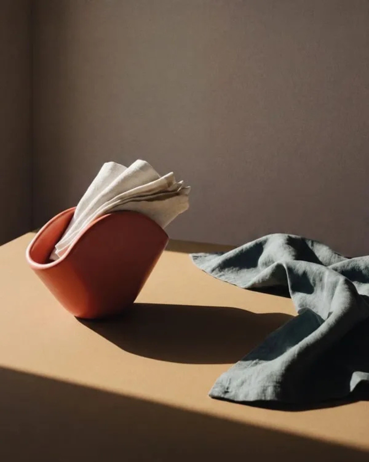
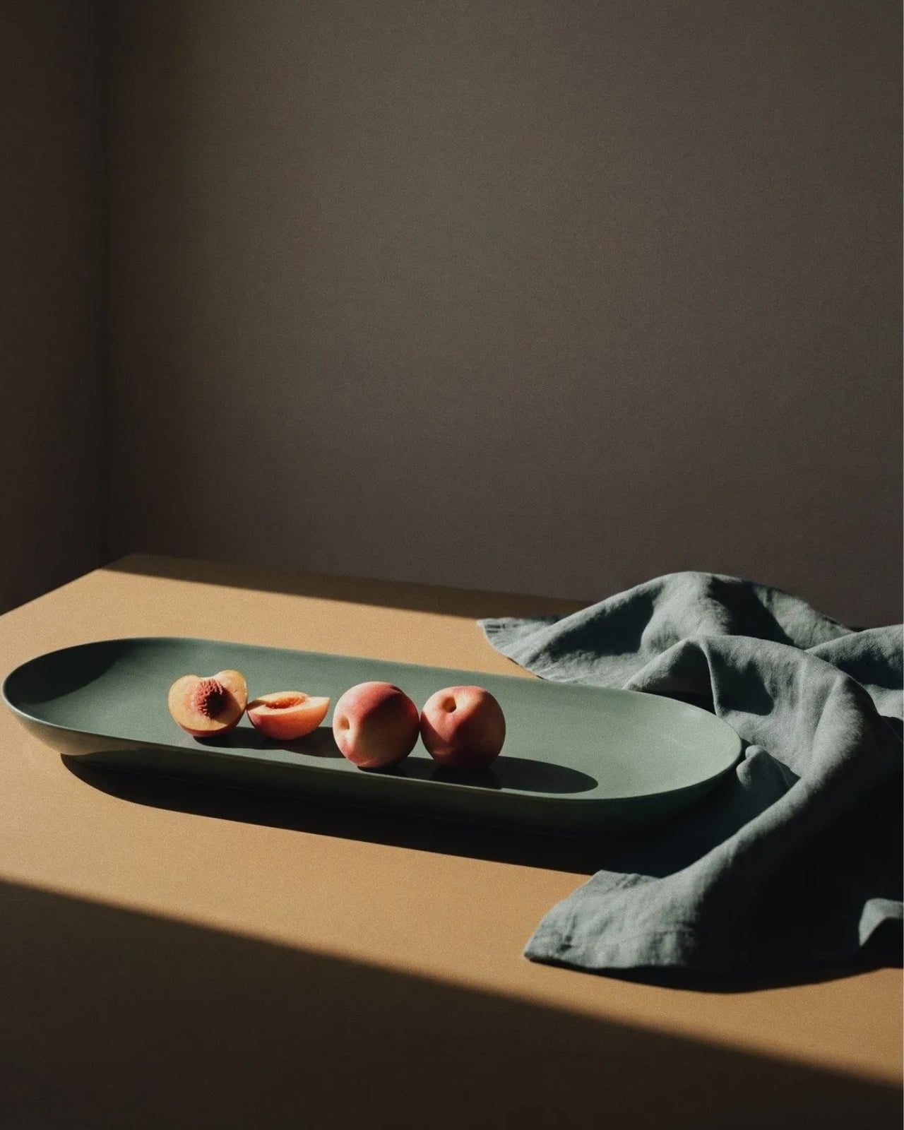
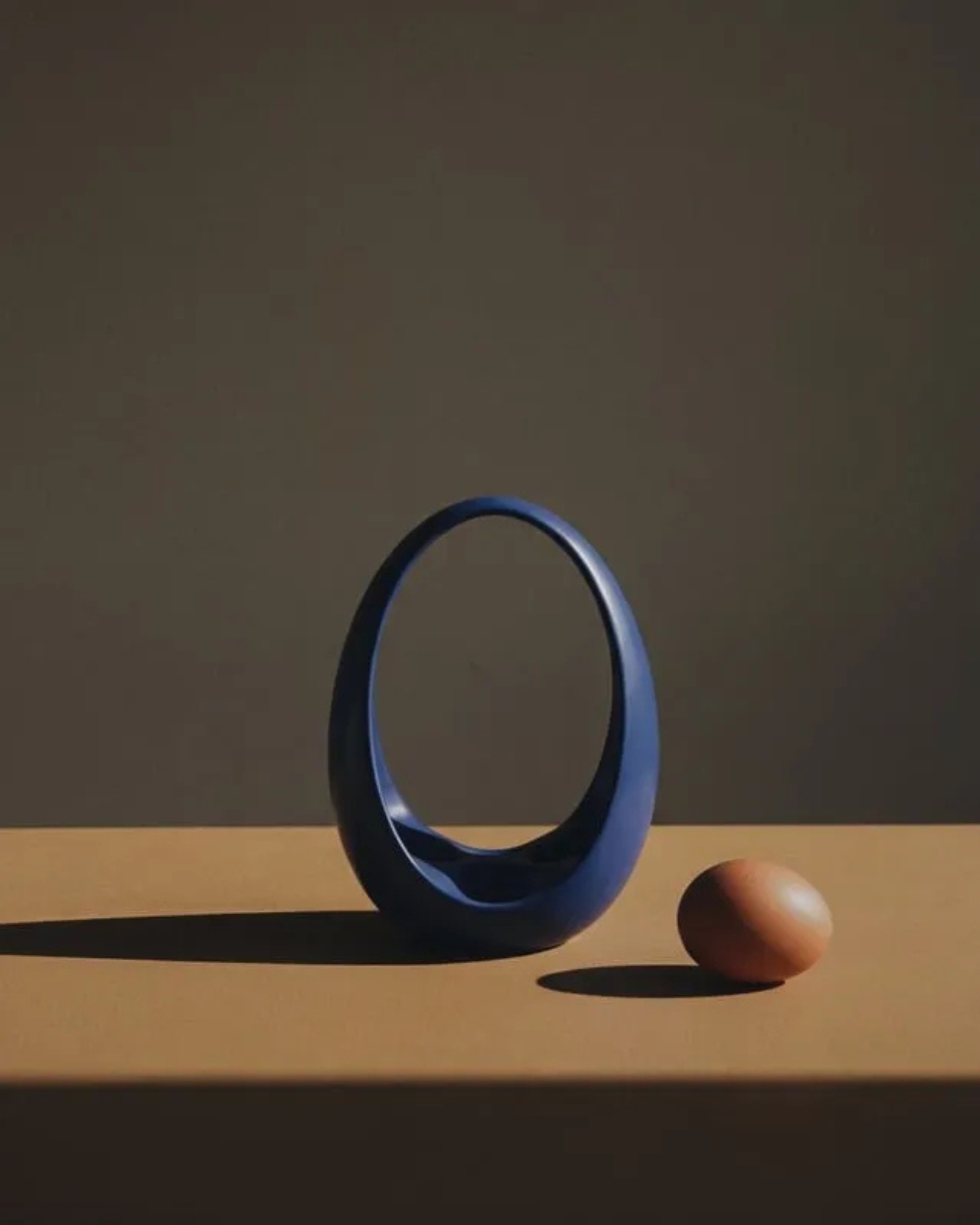
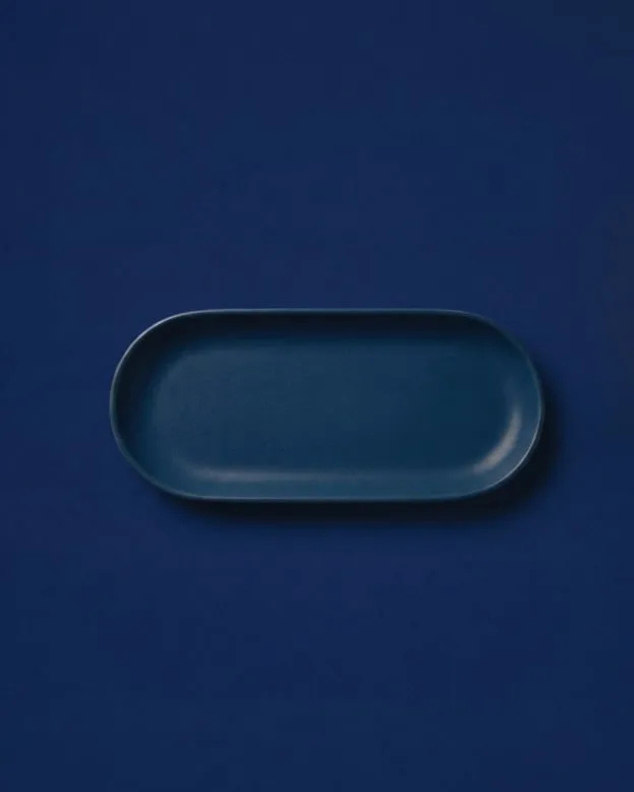
Prea is labeled “Chapter II” in Dórica’s story, and the brand describes it as their first collection of everyday objects. It’s a small but considered group of pieces, including an egg basket, a fruit basket, a candelabra, and a napkin holder, each designed and produced in Mexico with a clear emphasis on wood and ceramic, clean lines, and what the brand calls “material honesty.” The pieces are not elaborate. They don’t announce themselves when you walk into a room. And that restraint is, I think, the entire point.

Wallpaper described Prea as “a study in restraint,” and that feels right. But I’d push it further. Prea is actually a philosophical statement wrapped in a very practical object. The brand’s own language around the collection is striking: “Design here does not decorate. It holds. It supports. It allows the ordinary to be seen.” That’s not the kind of copy you expect from a brand selling a napkin holder. It’s the kind of thought that makes you pause.

We talk constantly in design circles about the gap between high design and everyday life, between the gallery object and the kitchen counter. Dórica seems genuinely uninterested in that gap existing at all. The premise of Prea is that the objects living alongside our daily rituals, the things we touch without registering that we’re touching them, deserve the same level of intentionality that goes into a statement chair or a sculptural lamp. Not to make them more important than they are, but to acknowledge that they already are important. We just stopped noticing.

There’s a Mexican design perspective embedded in this that feels worth acknowledging. The brand has always positioned itself around craftsmanship and longevity rather than novelty, and Prea continues that ethos into a new category. It’s a move that says something about how Ángeles sees the role of design in everyday life: not as a luxury layer applied to living, but as something woven into the texture of it.

I’ll be honest, when I first looked at the collection, my instinct was that it seemed minimal to the point of simplicity. A fruit basket is a fruit basket. But the more I sat with the images and the thinking behind the work, the more that restraint started to feel like confidence. These pieces don’t need to perform. They just need to be present, well-made, and honest. In a market saturated with objects begging for your attention, that’s a harder thing to pull off than it looks.

Prea is also a smart move for Dórica as a brand. Entering the everyday objects category at this level of intention signals a maturity that not every furniture brand is willing to commit to. It’s easier to scale up into bigger, more visible pieces. Scaling down into the egg basket, and making it mean something, takes a different kind of confidence. If you’re the kind of person who has ever picked up a beautifully made object and held it for just a second longer than you needed to, this collection is worth seeking out.

The post Dórica Just Proved Good Design Belongs on Your Kitchen Counter first appeared on Yanko Design.
The ZERO Chair Has No Welds, No Joints, No Apologies

Most chairs are built on compromise. You stack the legs, screw the seat, bolt the back, and somewhere in that assembly, a little bit of the original idea gets lost to the necessity of structure. Davide Bozzo’s ZERO Chair refuses to play that game entirely.

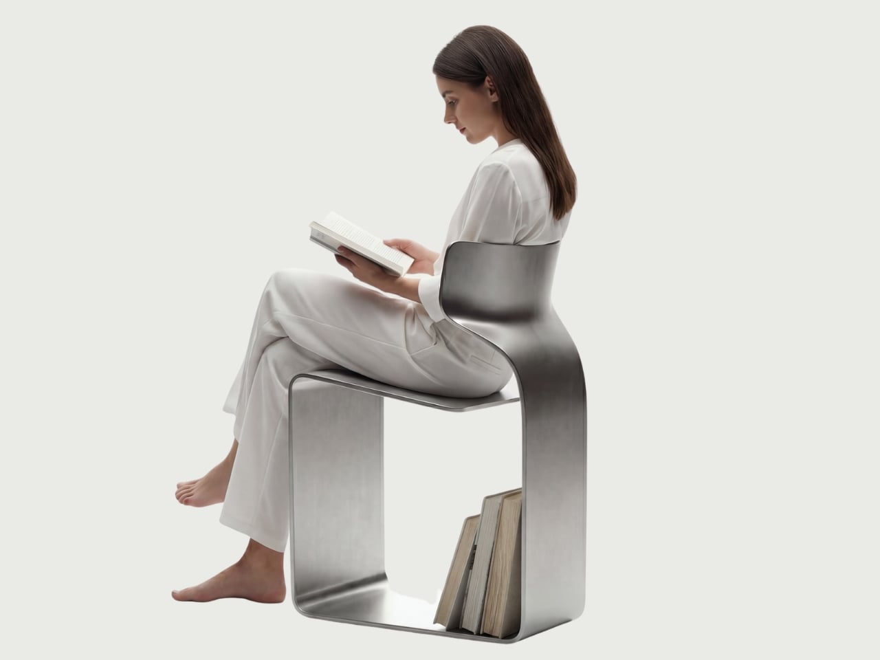
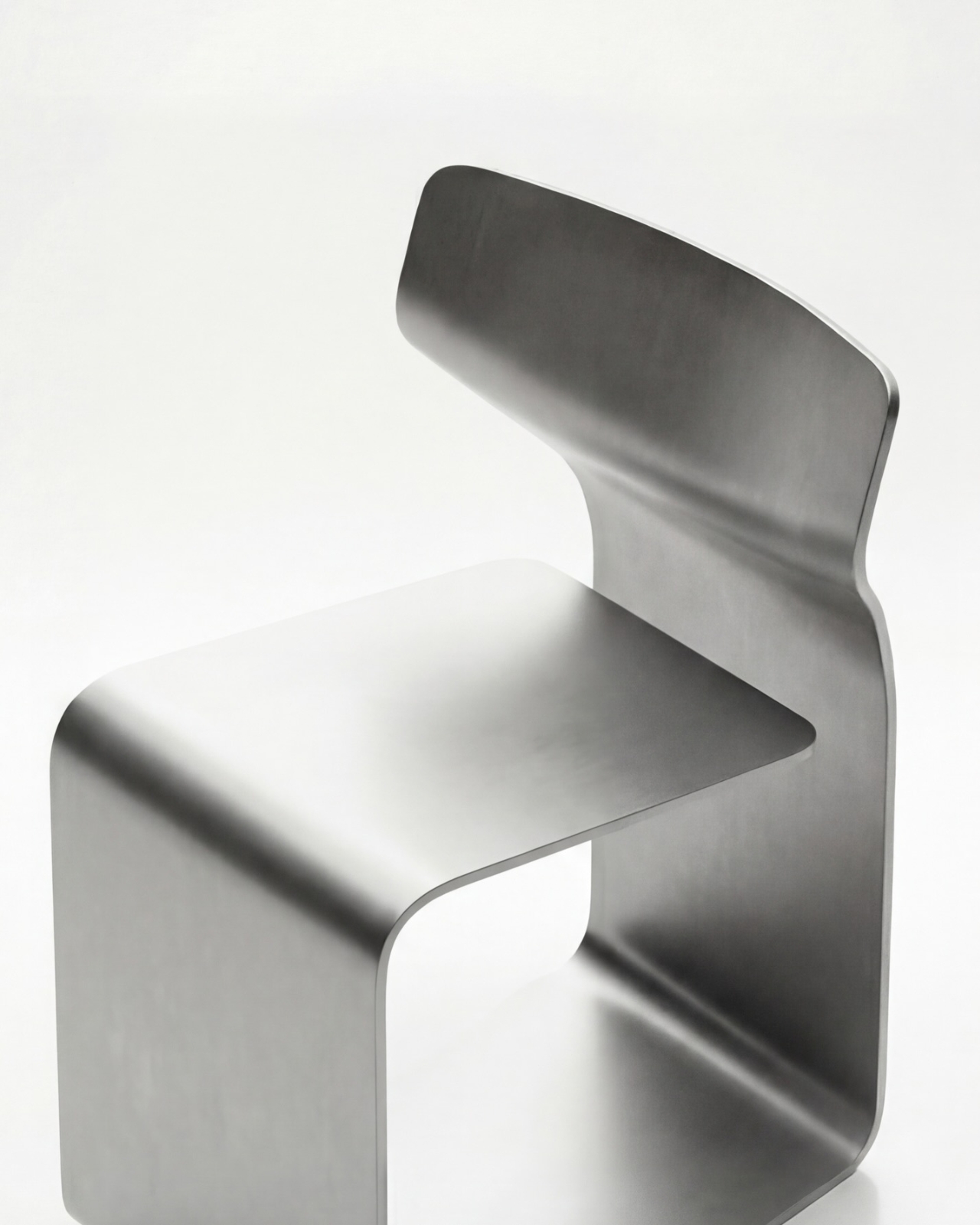
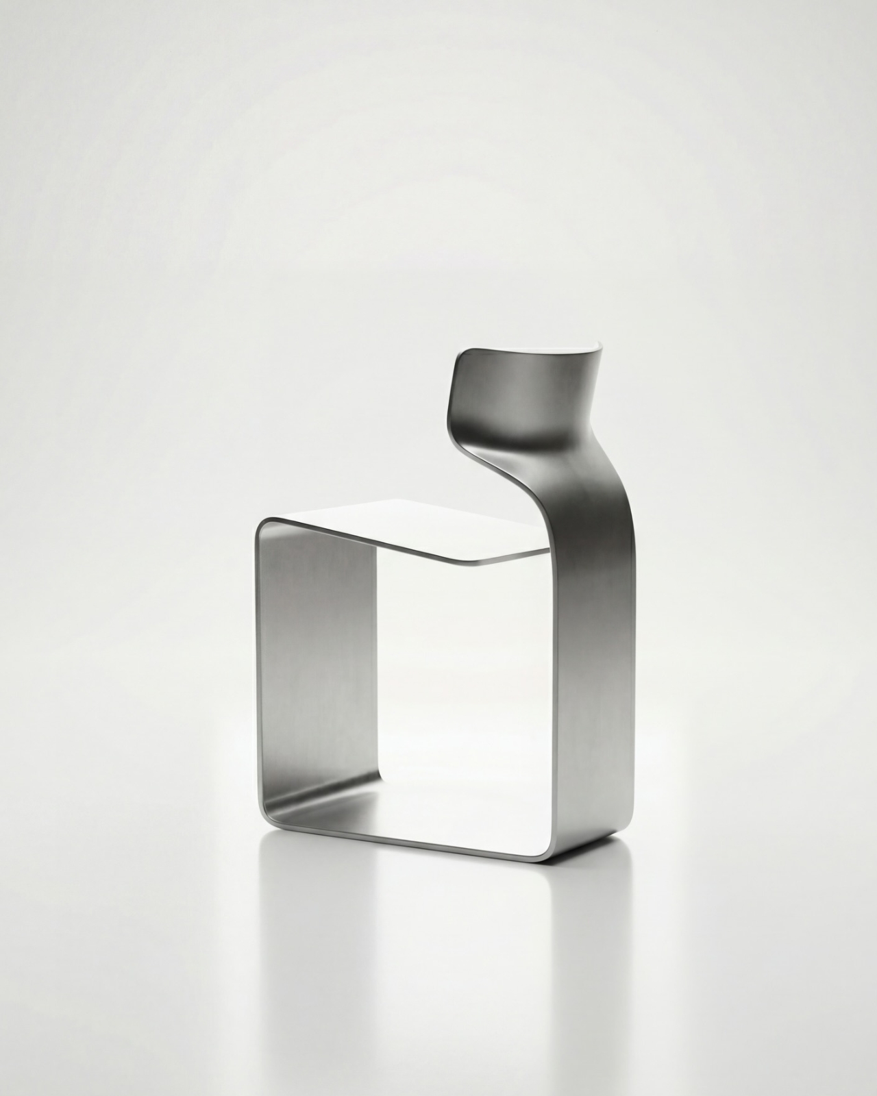
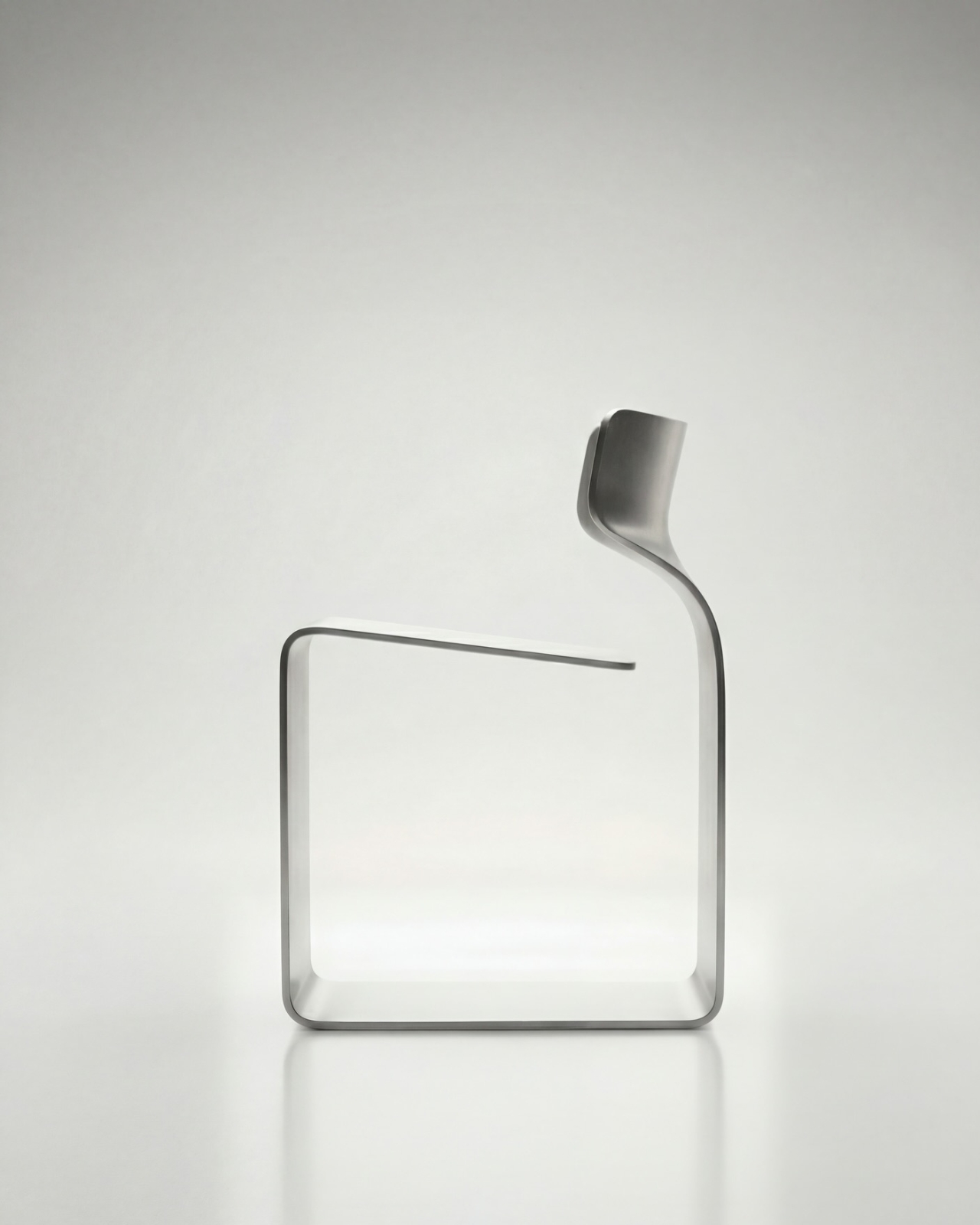
The concept is almost confrontationally simple: one single ribbon of metal, bent and curved into a complete chair. No welds holding two pieces together. No joints disguised under upholstery. No hardware quietly doing the heavy lifting behind the scenes. Just one continuous piece of material pushed into a form that includes the base, the cantilevered seat, and the backrest all at once. The name isn’t branding. It’s a philosophy.

Designer: Davide Bozzo

Looking at the photographs, the first thing I kept circling back to was the sheer audacity of the backrest. It doesn’t connect to the base through hidden brackets or clever joinery. It simply rises from the same ribbon, curving upward and backward in a motion that looks more like a wave caught mid-break than anything you’d typically call furniture. It’s graceful in a way that makes you slightly suspicious of it. How is this thing holding anyone’s weight?

The answer lies in what Bozzo describes as structural tension. Form doesn’t just follow function here. It is the function. The material itself carries the engineering logic. Every curve has a reason, and every bend is calculated to distribute load through the continuity of the form rather than through added components. It’s the same principle behind suspension bridge cables or the way a curved shell is structurally stronger than a flat panel. Applied to a chair, it feels almost radical.

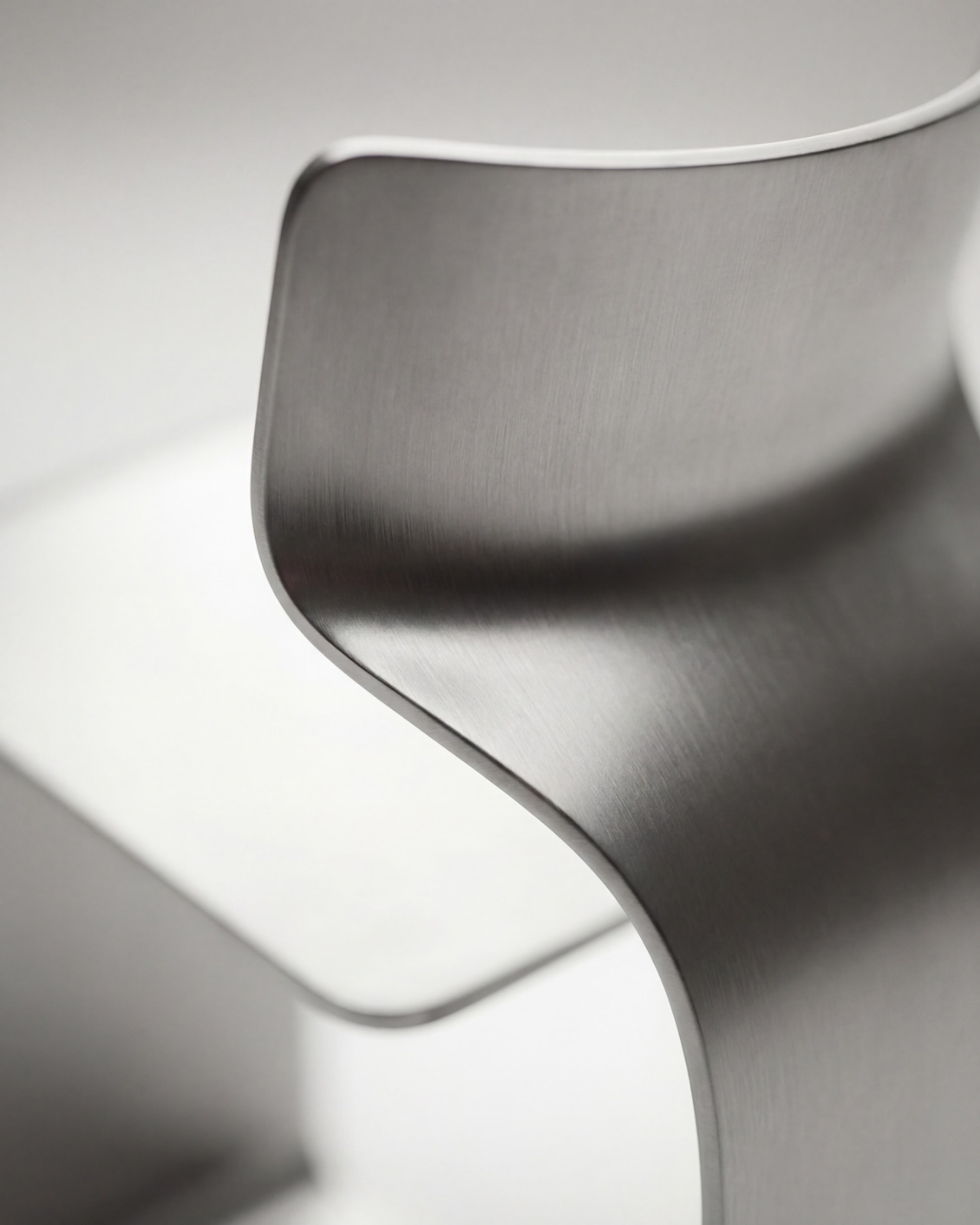
I’ll be honest. My first instinct was skepticism. A single-piece metal chair sounds like one of those design school exercises that makes for great renderings but falls apart under real scrutiny. But looking at the close-up photographs, especially the one capturing the S-curve where the seat meets the backrest, you start to believe it. The brushed metal finish shows actual material depth and actual intentionality in how the surface was treated. This isn’t a concept render floating in a void. It has weight and presence.

That said, I do have questions. Comfort is conspicuously absent from the conversation. Metal, even beautifully formed metal, is hard. The cantilevered seat gives some flexibility, which should help, but a chair without cushioning asks something significant of the person sitting in it. Bozzo’s design makes a statement about material honesty and structural purity, which I respect deeply, but at some point a chair has to be sat in. That’s the tension that makes it interesting rather than just pretty.

The piece also reads as a quiet counterargument to the current era of maximalist furniture. We’ve spent years surrounded by bouclé armchairs, curved velvet sofas, and furniture dressed up in layers of texture and warmth. Bozzo’s chair strips all of that away and asks whether furniture can earn your attention through restraint and engineering alone. My honest opinion? It can. Whether it earns a place in your living room is a different question entirely.

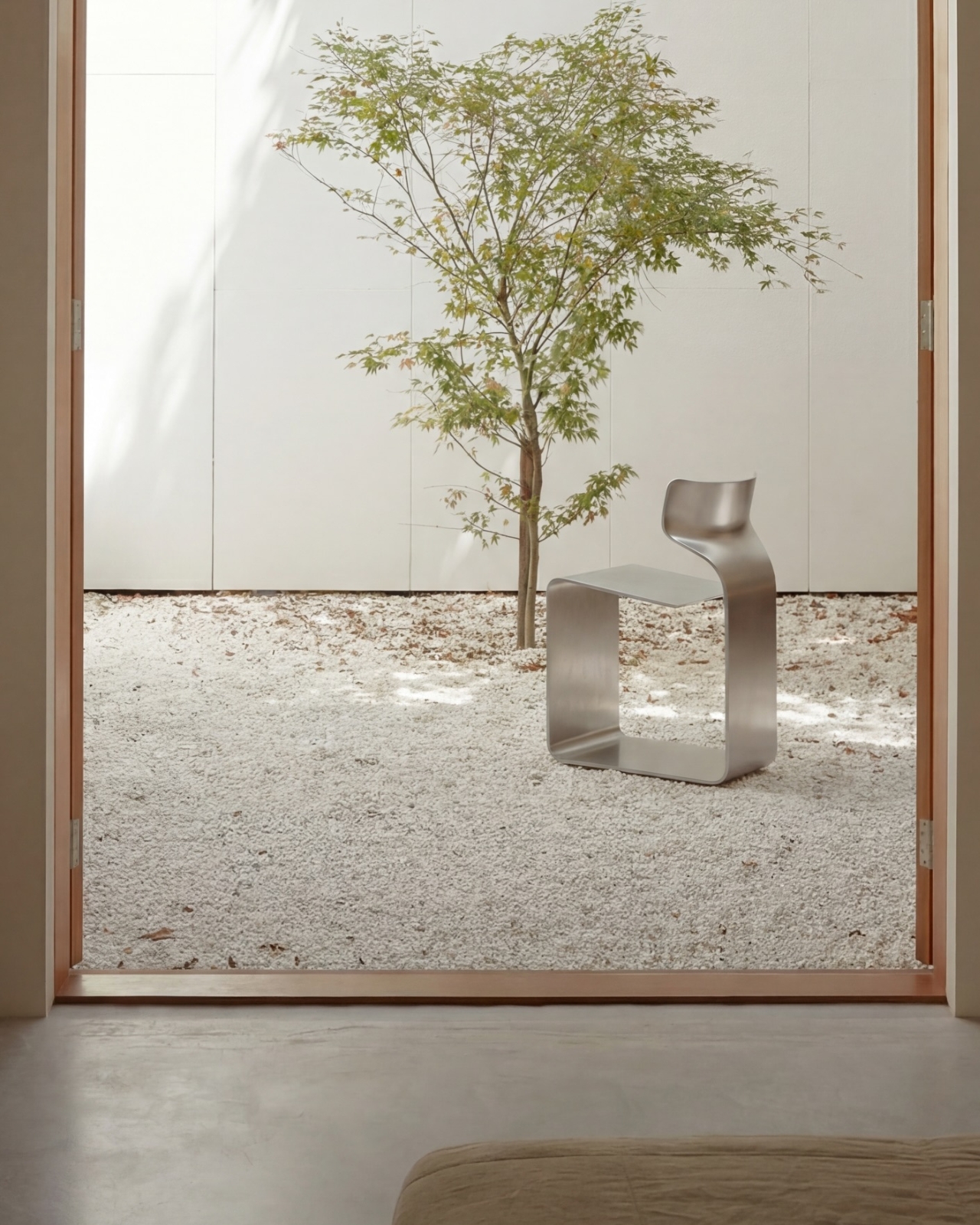
The chair also does something that doesn’t get discussed enough in design coverage: it makes the negative space part of the design. The open rectangle formed by the base creates a void that’s almost as deliberate as the metal itself. In the lifestyle image set against a Japanese garden backdrop, that void frames the gravel and ground beyond it. The chair becomes a viewfinder. That’s not accidental. That’s a designer who understands that what you leave out is just as powerful as what you put in.

Bozzo has been building a reputation for material-forward work. His stainless steel pet bowl Dune explored similar ideas around fluid curves in a single medium, but the ZERO Chair feels like a significant step up in ambition. It’s the kind of piece that stops you mid-scroll, makes you set your phone down, and actually think. That, more than any material specification, is probably the point.

The post The ZERO Chair Has No Welds, No Joints, No Apologies first appeared on Yanko Design.
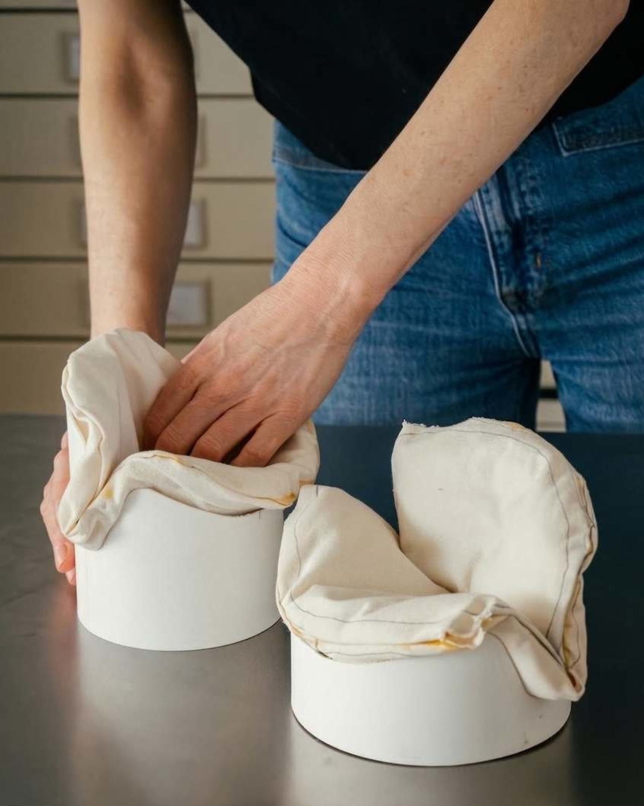
Rimowa Just Made the Classiest Excuse to Never Unpack

Most people treat their Rimowa suitcase like a very expensive houseguest: it arrives looking spectacular, gets shoved in a closet, and stays there until the next trip. Rimowa, apparently, has thoughts about this. And so does Lehni.

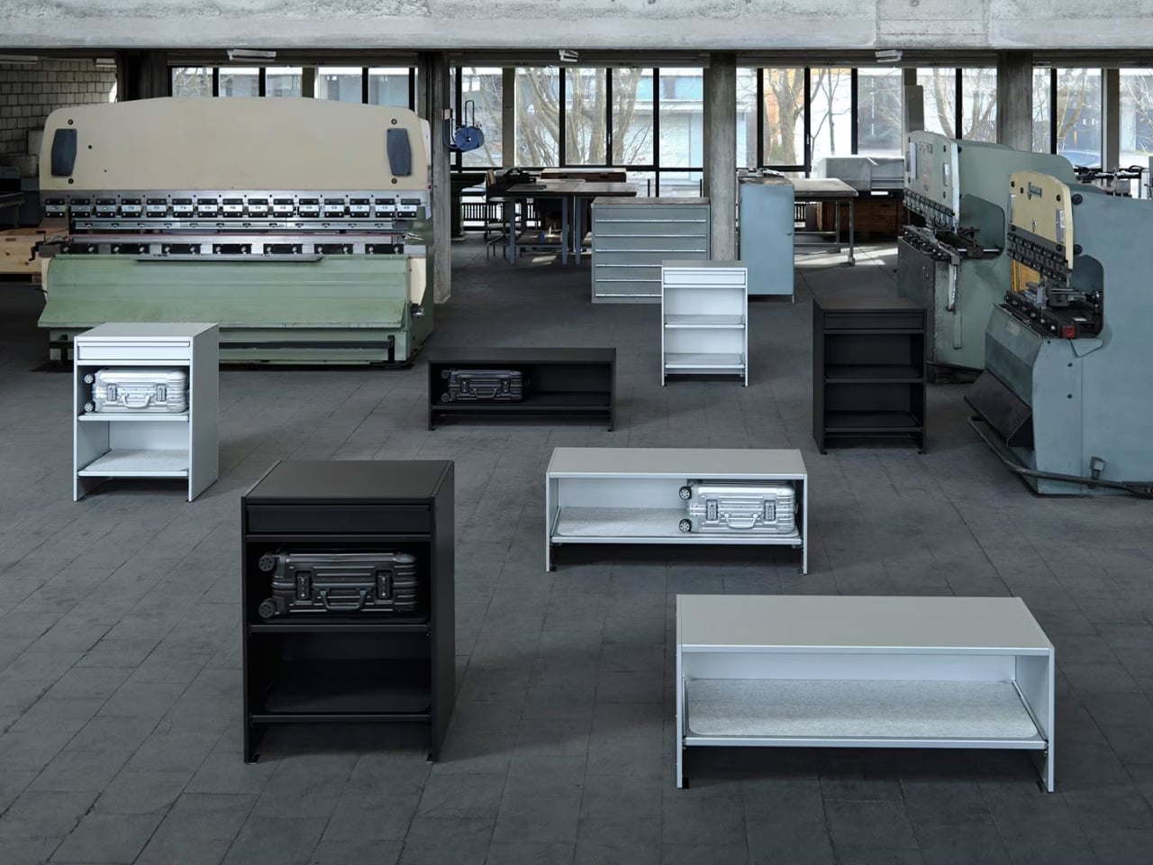
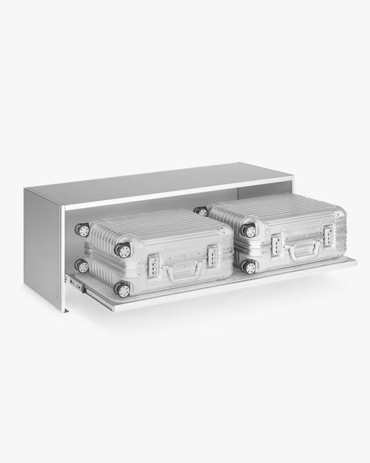
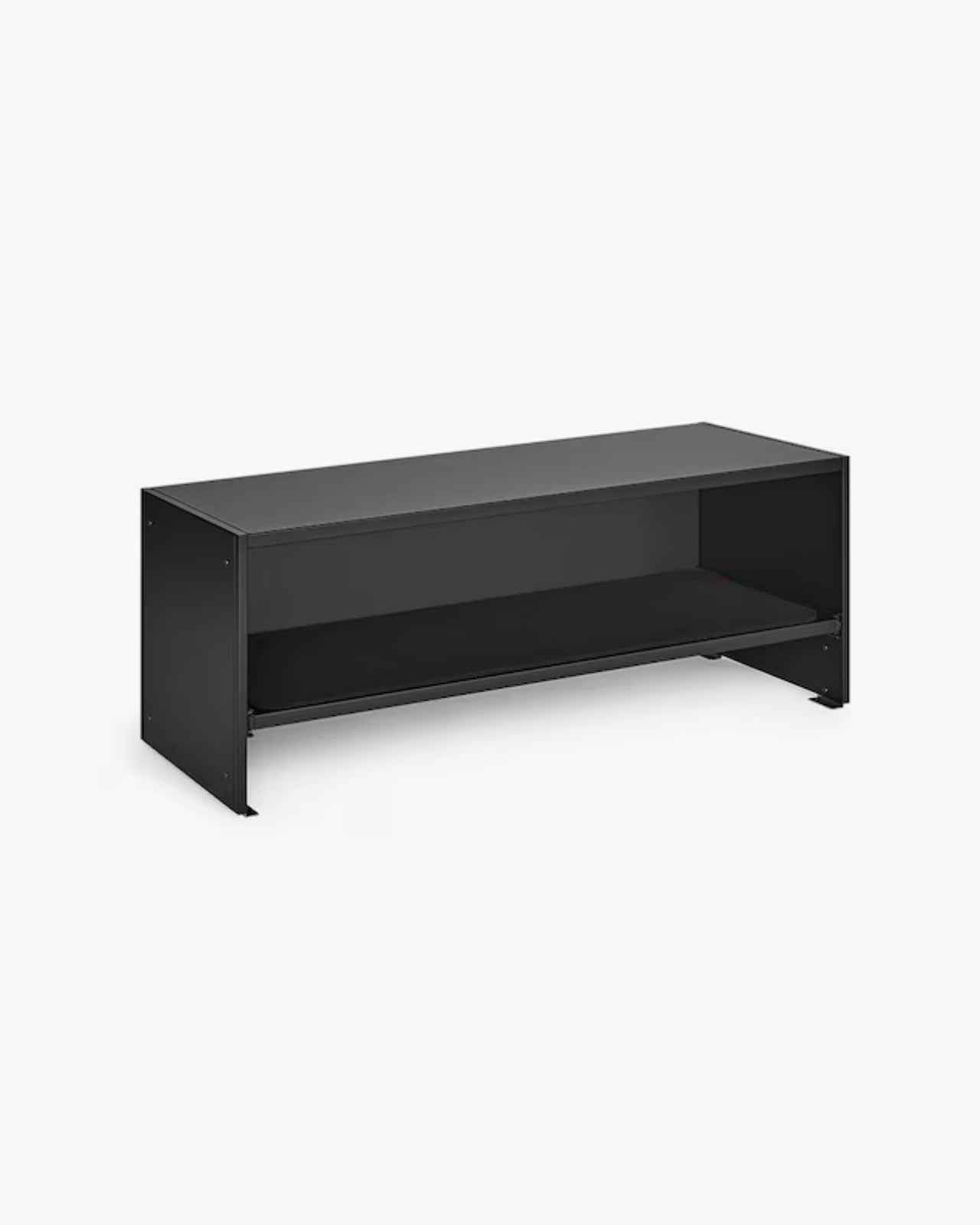
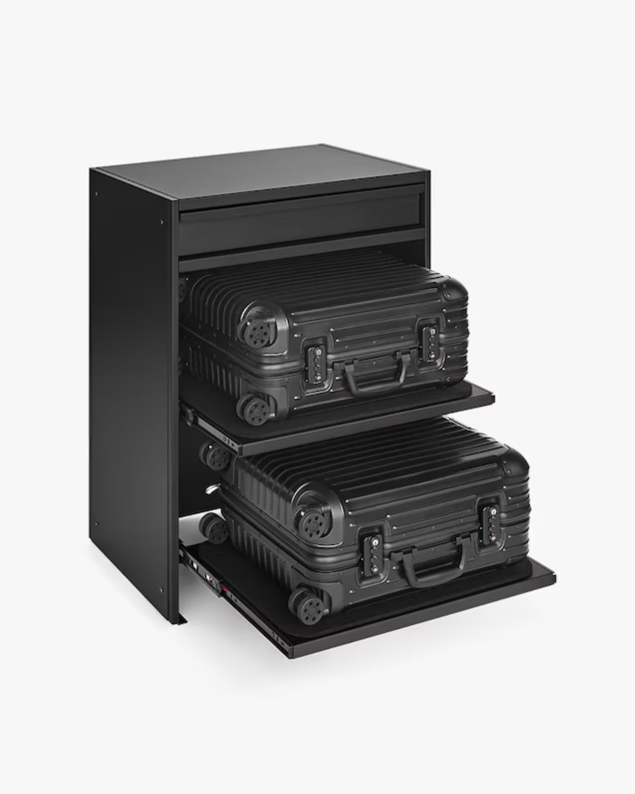
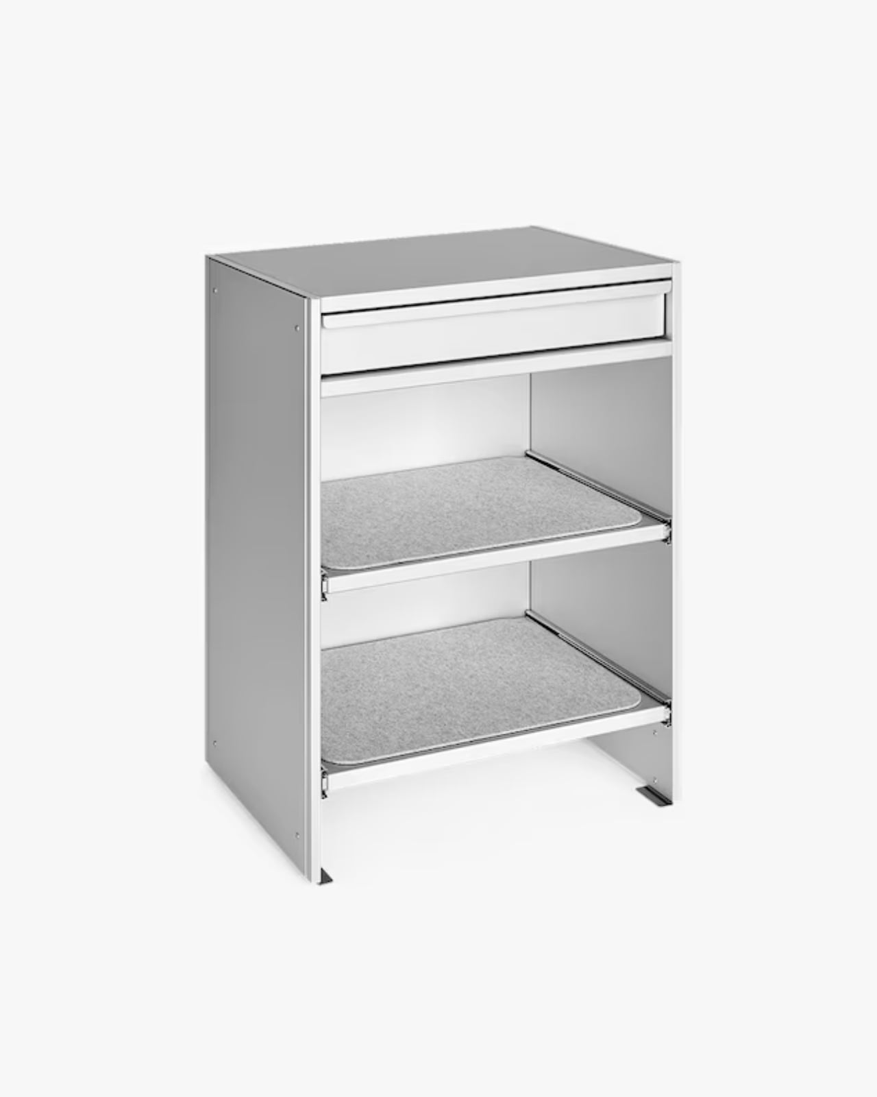
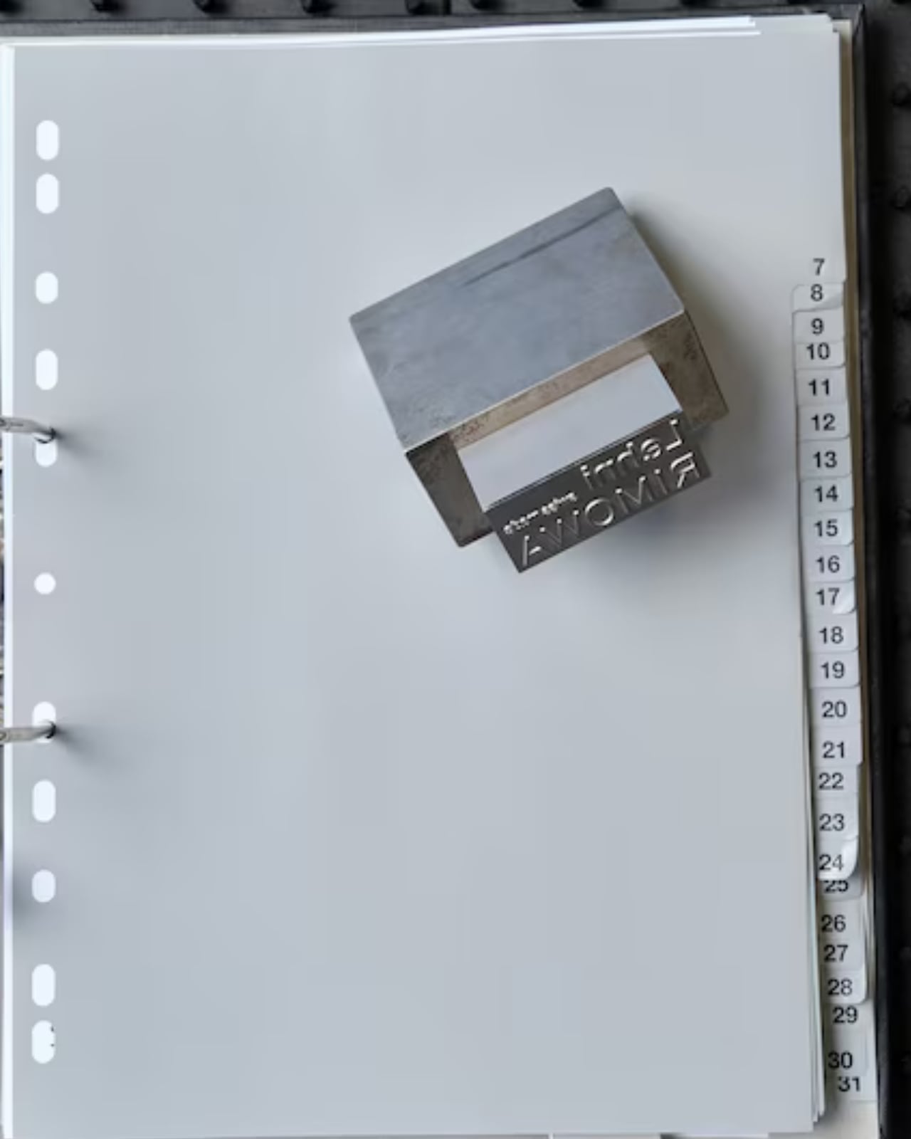
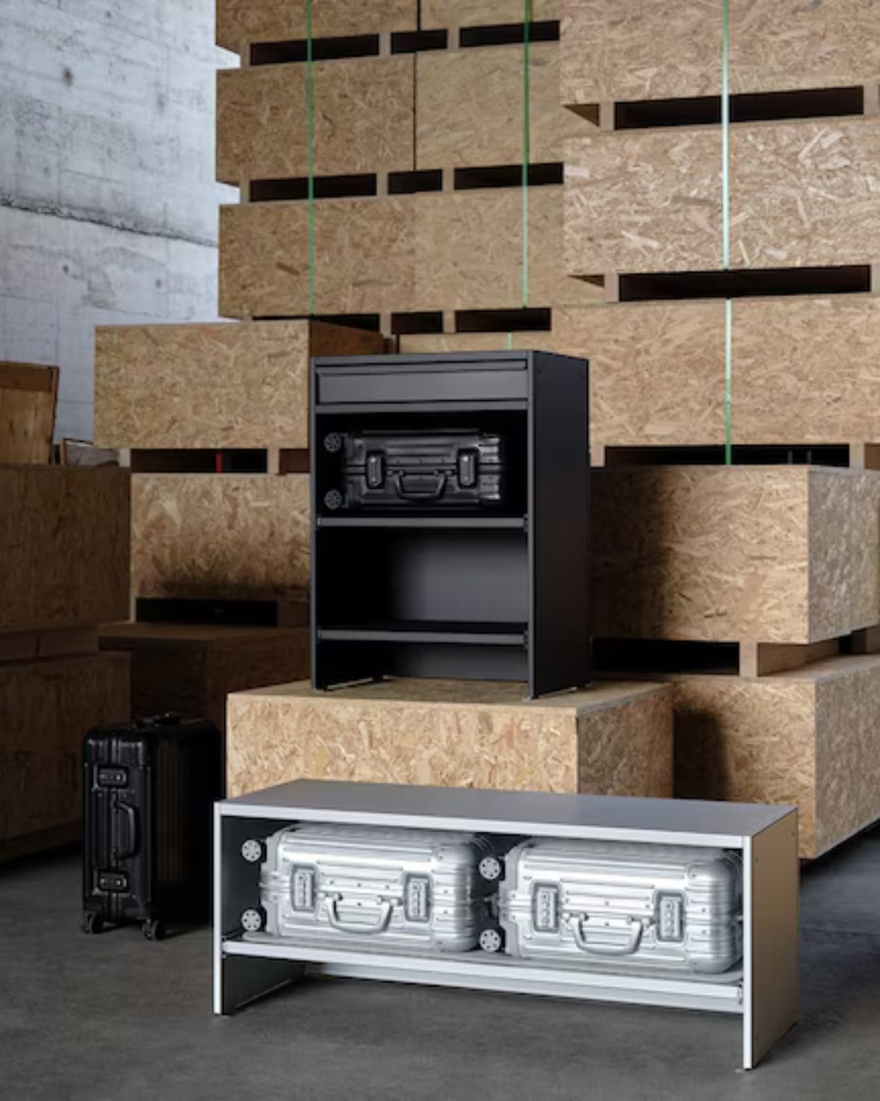
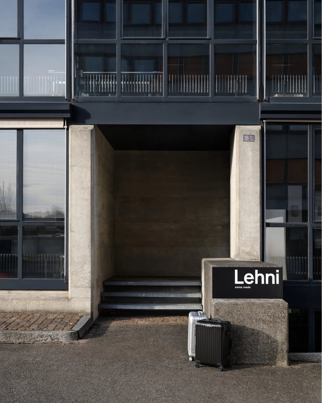
The two brands have just unveiled a limited-edition furniture collaboration at Salone del Mobile 2026 in Milan, and it might be the most quietly audacious thing either brand has done in recent memory. The collection consists of two pieces: a Bench and a Drawer, both crafted in anodized aluminum, both designed to hold cabin-sized Rimowa suitcases inside your home. Not in a storage room. Not under your bed. On display, like they were always meant to be there. Which, if you’ve ever owned a Rimowa, you’d know they kind of were.

Designers: Rimowa x Lehni

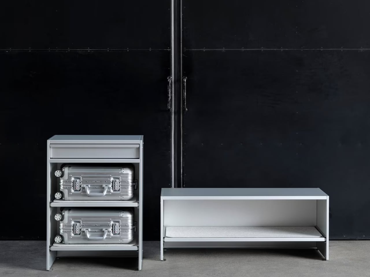
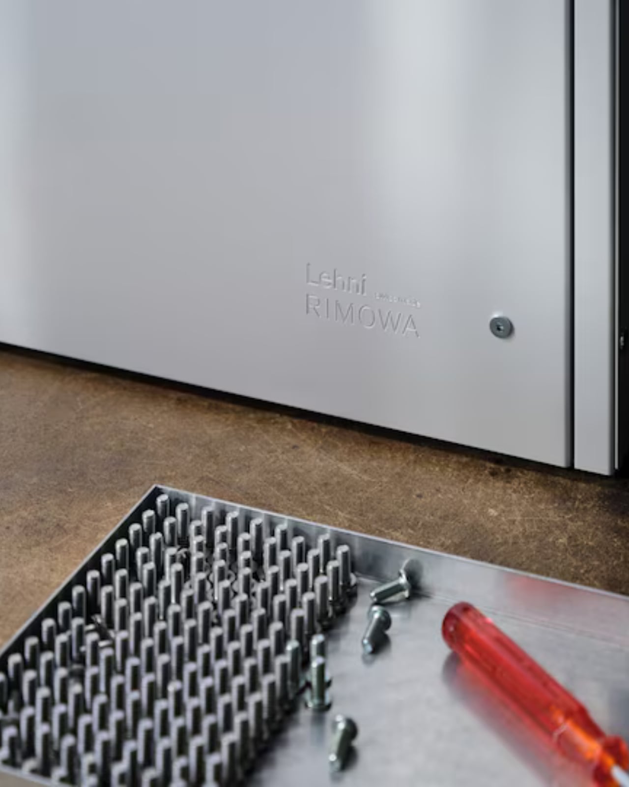
The Bench is an open-shelving unit that holds two cabin-sized suitcases side by side. It is clean, low-slung, and just architectural enough to look at home next to a mid-century credenza or a spare Scandinavian sofa. The Drawer offers a different kind of storage: a sculptural, closed-frame unit with a built-in drawer for smaller items. Both pieces come in silver and black anodized aluminum, and both carry the embossed Grid pattern that echoes the grooved exterior of a classic Rimowa Original. That detail is not accidental. It’s the kind of material continuity that makes a collection feel cohesive rather than like a brand licensing deal gone slightly off the rails.

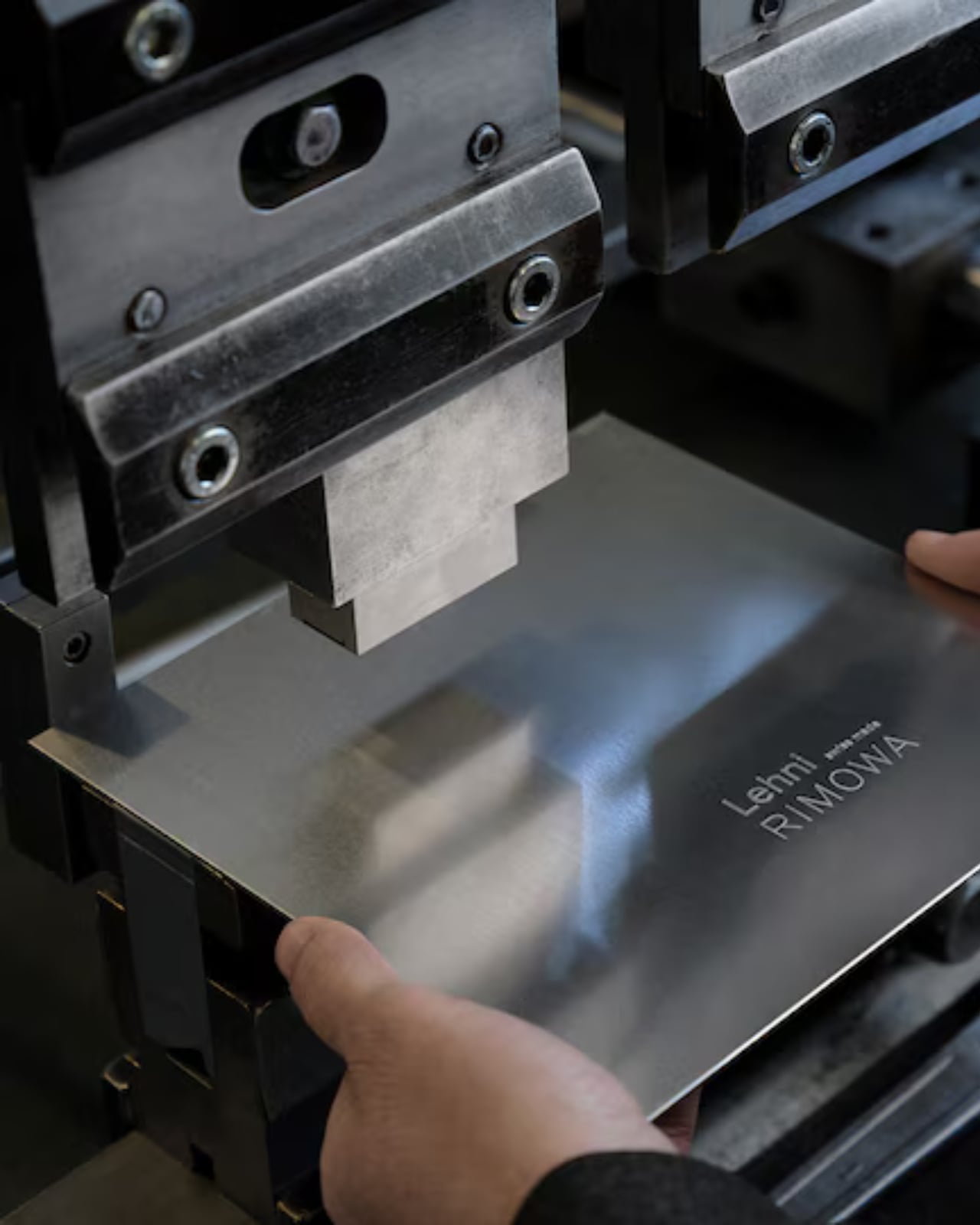
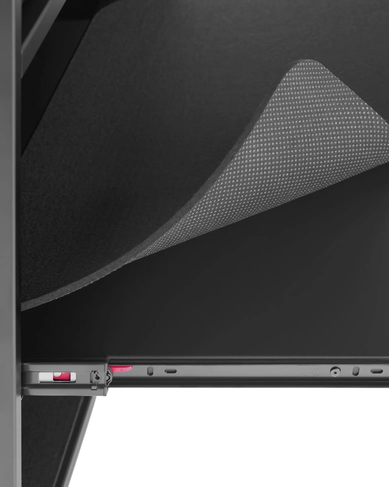
The craft side of this is worth paying attention to. Lehni has been working with aluminum since 1922, when Rudolf Lehni opened a sheet metal workshop in Zürich that quickly became a gathering place for artists and architects. That legacy still shows. Today, the company is run by the fourth generation of the Lehni family out of Dübendorf, and every piece is handmade in their Zurich factory. Each shelf on the Bench, for instance, is lined with a specially developed scratch-resistant felt mat to protect the cases stored on it. You notice that kind of thinking. These are small decisions that add up to something much larger than the sum of their parts.

Rimowa, for its part, has been on a quiet but consistent streak of repositioning itself as something more than a travel brand. The aluminum suitcase has already crossed over into fashion and streetwear culture through collaborations with names like Dior, Supreme, and Porsche. Moving into furniture feels like the next logical step, and frankly, it makes more sense than most luxury crossovers I’ve seen. The material language stays the same. The level of craft stays the same. The only thing that changes is the context, which is exactly what makes this feel like a genuine design idea rather than a marketing exercise.

That said, let’s be real: this is not furniture for everyone. The Bench is priced at $4,275, the collection is limited-edition, and in the US it’s only available in the continental states by contacting Rimowa’s client services directly. There’s no add-to-cart button. That purchasing friction is intentional, and it’s the kind of intentional that has a very specific audience in mind: the person who already owns the suitcase, already loves it, and wants their home to reflect the same aesthetic sensibility. I don’t think that’s a bad audience to build for. Niche, yes. But well-defined.

My honest take is that the Rimowa Lehni collection succeeds because it doesn’t try to explain itself too hard. It doesn’t need to. Two brands that both work in aluminum, both care about precision, and both have long histories with good design sat down and made something that looks exactly like what you’d expect from that pairing. The result is a bench and a drawer that feel less like a product launch and more like an obvious conclusion. Sometimes the best collaborations aren’t the surprising ones. They’re the ones that make you wonder why it took this long.

The post Rimowa Just Made the Classiest Excuse to Never Unpack first appeared on Yanko Design.
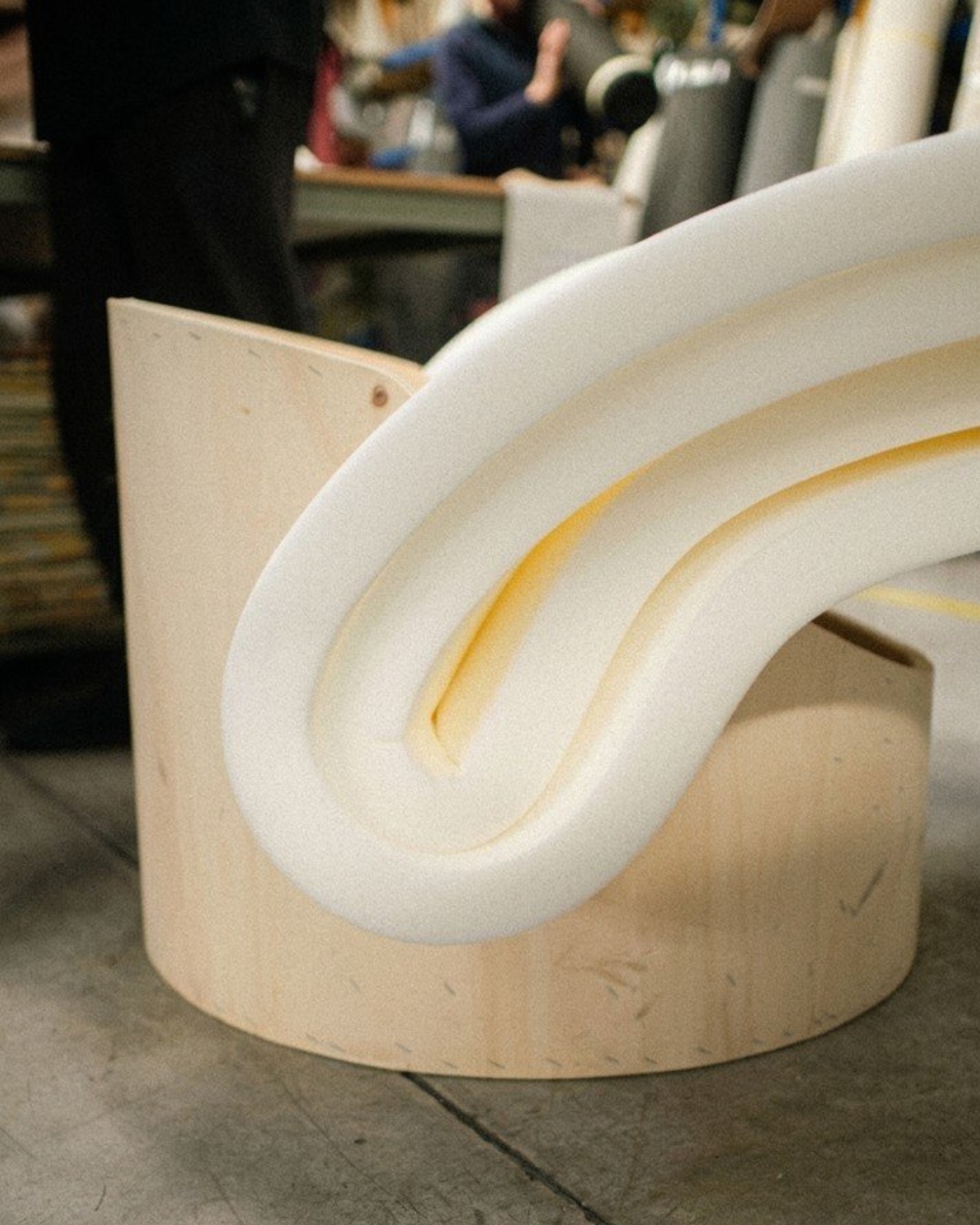
Dozie Kanu Just Turned His Life Story Into Tables for Knoll

A table is just a table until it isn’t. That’s the kind of thinking that gets lost in a lot of design conversations, where we spend so much time talking about materiality and silhouette that we forget to ask what an object is actually carrying. The Dozie Kanu Table Collection for Knoll, debuting at Salone del Mobile 2026, makes that question impossible to ignore.

Kanu is an American artist who grew up in Texas with Nigerian immigrant parents. That detail matters enormously here, because it shaped a perspective that doesn’t fit neatly into any one cultural box. He’s spoken openly about the displacement that came with that upbringing, about not being fully accepted by the Black community, about existing in-between. “Growing up in Texas with Nigerian immigrant parents, I was not fully accepted by the Black community… it created a feeling of displacement. And that feeling is everywhere in my practice.” And that sense of in-between-ness is exactly what makes his design language so compelling to look at.

Designer: Dozie Kanu for Knoll

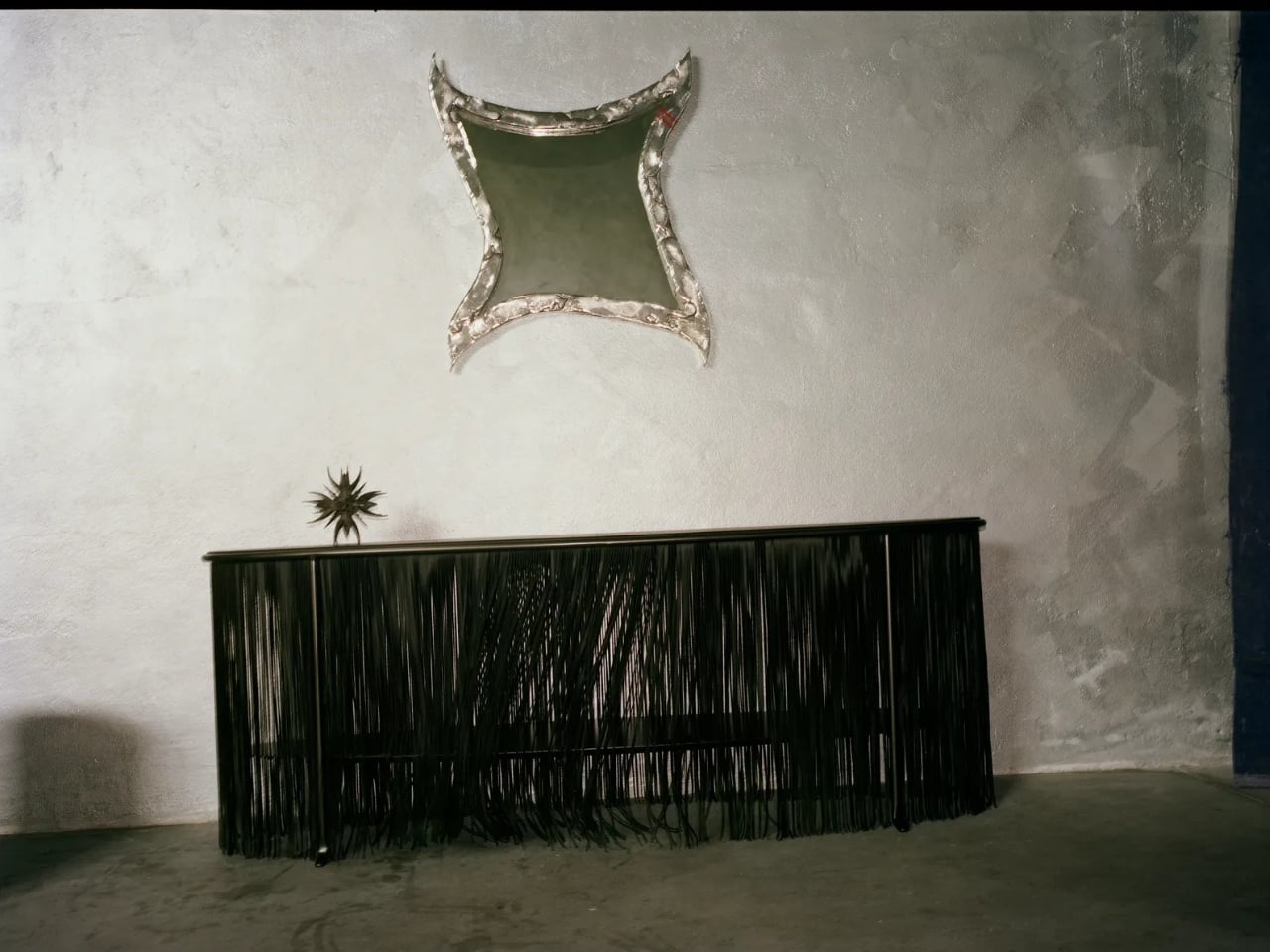
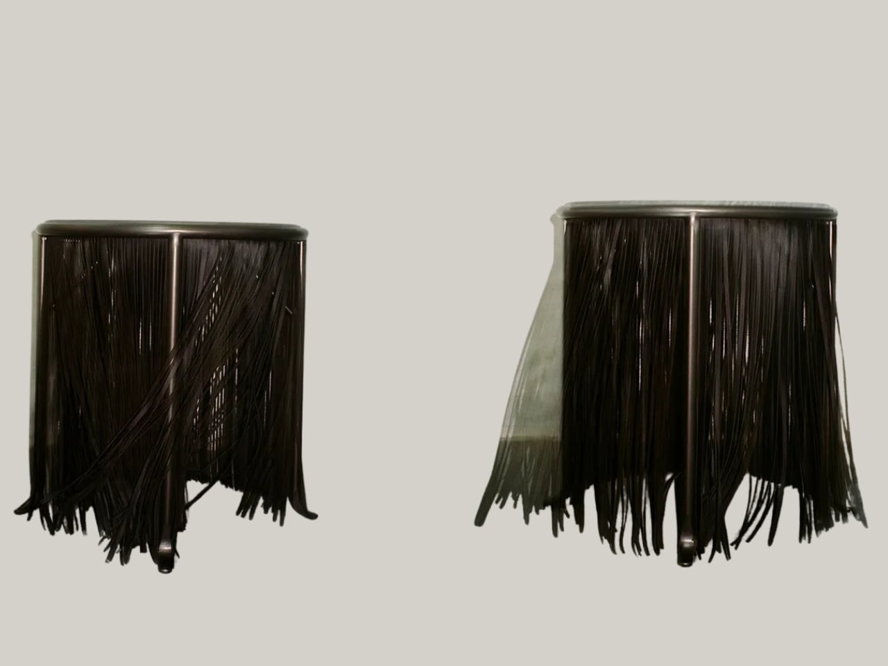
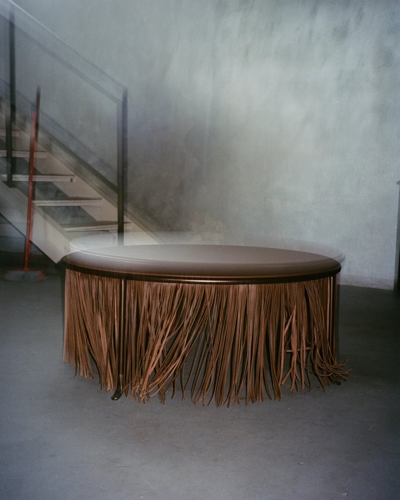
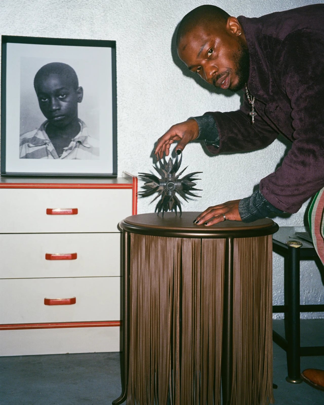
The collection itself is three pieces: a console, a coffee table, and a side table. All three are built with taut leather surfaces and rounded steel rod edges, and all three trail floor-length leather tassels that move with a life of their own. The tassels are the thing that catch your eye first, and they’re meant to. They pull from African drums, from African ceremonial dress, and from the fringed leather jackets of Texas cowboy culture. That last reference might seem like an odd pairing, but that’s kind of the point. Kanu isn’t choosing between his influences. He’s letting them coexist.

Available in two colorways, bronze and a dark grey manganese, the pieces have a quiet formality that makes the tassels even more striking. The restraint of the forms makes the ornamentation feel intentional rather than decorative. You don’t look at these tables and think “maximalism.” You think “precision.” The tassels earn their place because everything else is so considered.

Knoll, for the record, is not a brand that takes collaborations lightly. Their roster has historically included Eero Saarinen and Mies van der Rohe, which means choosing Kanu for this moment says something. It says they’re paying attention to who’s shaping the conversation around contemporary design. Kanu, who has built a practice across sculpture and installation, is exactly the kind of artist who brings a point of view that doesn’t get diluted in the translation to mass production. His own framing of the work says it perfectly: “It’s not screaming ‘identity’ or ‘autobiography.’ But the best thing I can do is make what I know.”

That line is worth sitting with. We’re living through a design moment where cultural narrative has become something of a selling point, and there’s a real risk of it becoming performative. What Kanu is doing feels different. It’s not a press release in object form. It’s more like a very personal shrug that happens to be beautiful. The tassels don’t announce themselves as symbols. They just exist, and they carry the weight of a story without demanding that you read it.

Running alongside the Knoll launch, Kanu also has an installation at ICA Milano in collaboration with the Nicoletta Fiorucci Foundation, featuring a structure built from reinforced cardboard. It’s a reminder that his practice spans a lot of registers, that the tables and the gallery work are part of the same ongoing conversation he’s having with himself. I appreciate that kind of consistency in an artist. You can feel the through-line even when the mediums are completely different.

If I’m being honest about what this collection does to the broader design conversation, I think it’s a useful reminder that furniture doesn’t have to be neutral to be functional. A table can have a perspective. It can come from somewhere very specific without being inaccessible. And when a brand like Knoll gives that kind of work the platform it deserves, the results are worth paying attention to far beyond the walls of Milan Design Week. Dozie Kanu’s tables are at Salone del Mobile 2026. They move when you walk past them. And they’ve got a lot to say.

The post Dozie Kanu Just Turned His Life Story Into Tables for Knoll first appeared on Yanko Design.
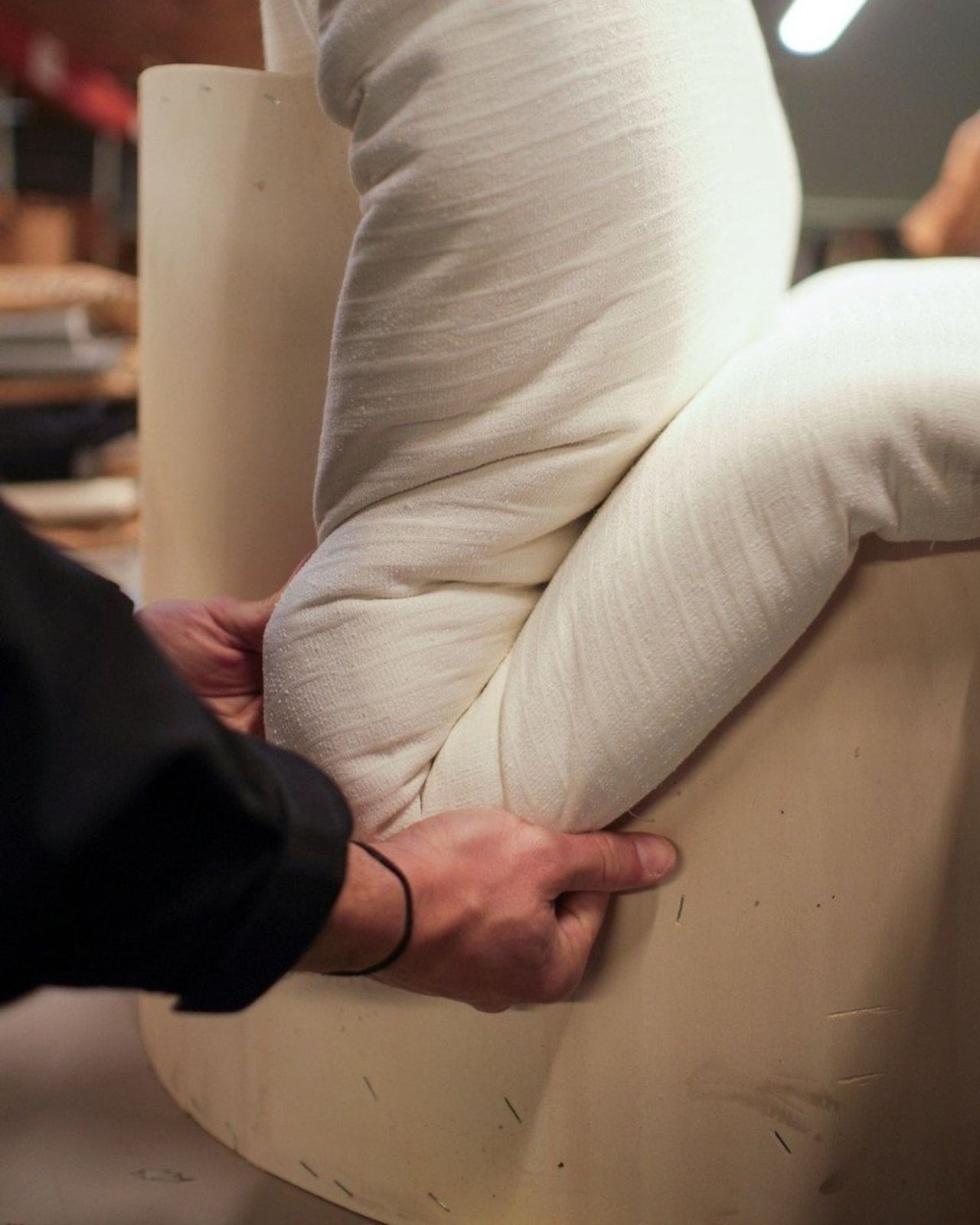
Desire Paths, Plywood, and a Stool That Gets It

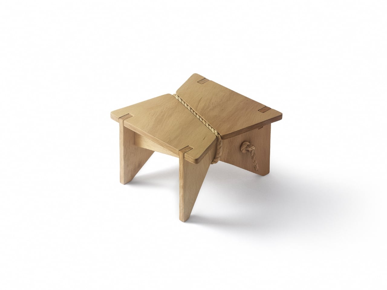
Have you ever noticed the worn-down patches of grass in a park where people have chosen to walk instead of staying on the designated path? That’s a desire path, and urban planners have a complicated relationship with them. Some see them as a nuisance, proof that people refuse to follow the plan. Others see them as data, clear evidence that the original design missed something. Fabrício Reguelin Auler falls firmly in the second camp, and his Shortcut Stool is one of the more thoughtful pieces of furniture I’ve come across in a while.

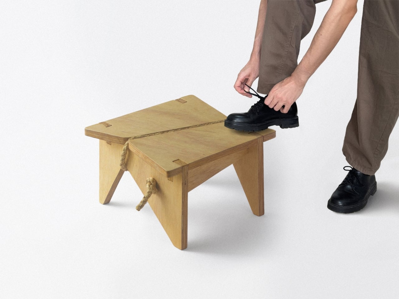
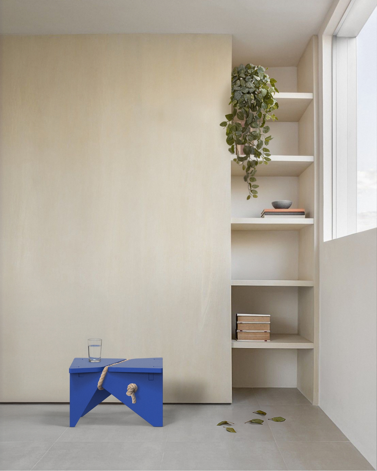
The concept behind the Shortcut Stool (or Atalho Bench, as it’s also known) is deceptively simple: what if furniture was designed around the way people actually use it, rather than the way designers intended? That means acknowledging all the small, unconscious behaviors we exhibit at home. Sitting on the very edge of a stool instead of the center. Resting a bag on it before finding somewhere better. Perching on it for thirty seconds while tying a shoe. Using it as a surface for a glass of water when every other surface is occupied. None of this is “correct” use. And yet, all of it is completely normal.

Designer: Fabrício Reguelin Auler

This is where I think a lot of furniture falls short. Design, especially at the higher end of the market, tends to be prescriptive. There’s an implied right way to use a piece, and deviating from it can feel almost disrespectful. Reguelin Auler flips that thinking entirely. The Shortcut Stool doesn’t pretend that people will interact with it perfectly. It welcomes the imperfection, and that’s genuinely refreshing.

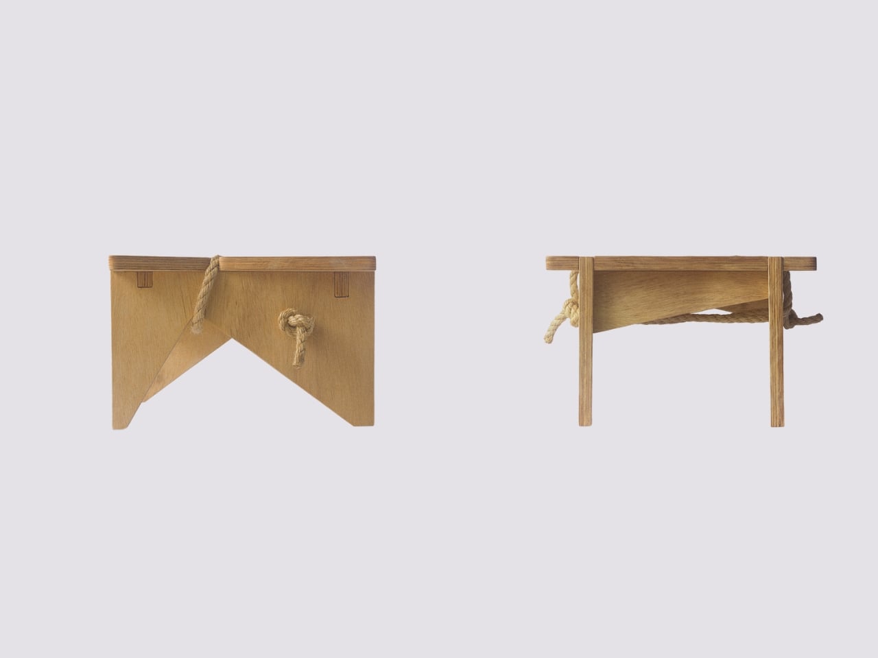
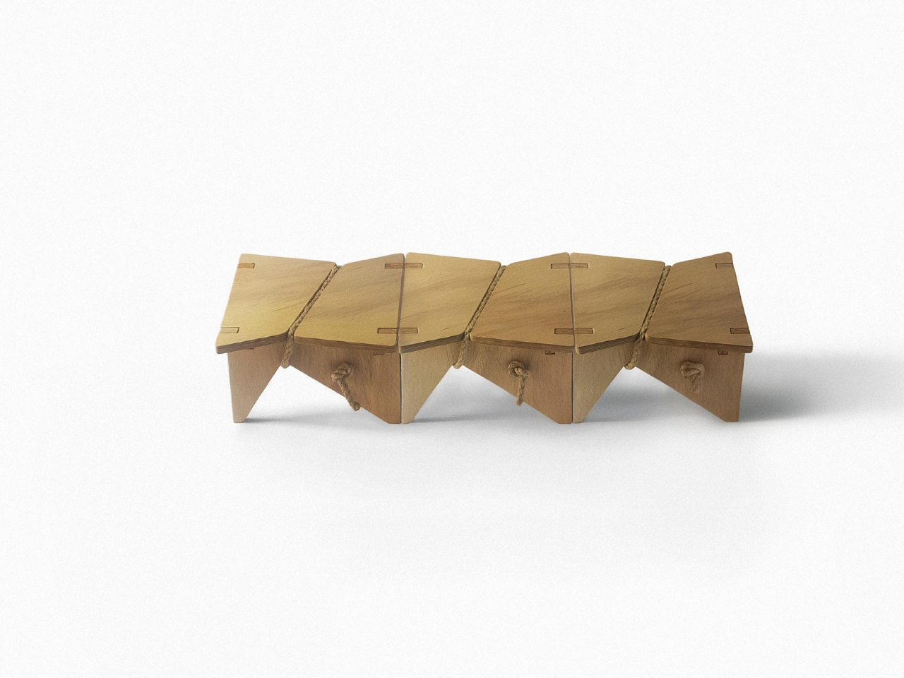
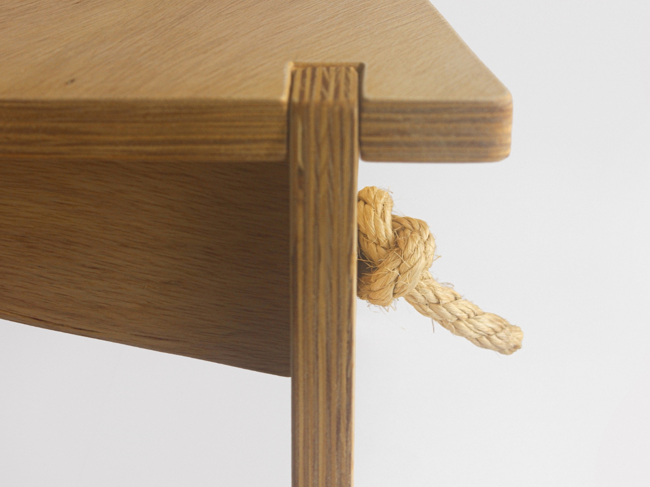
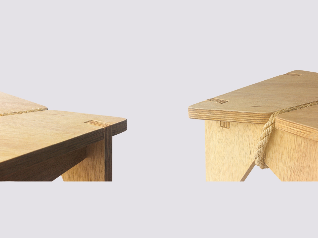
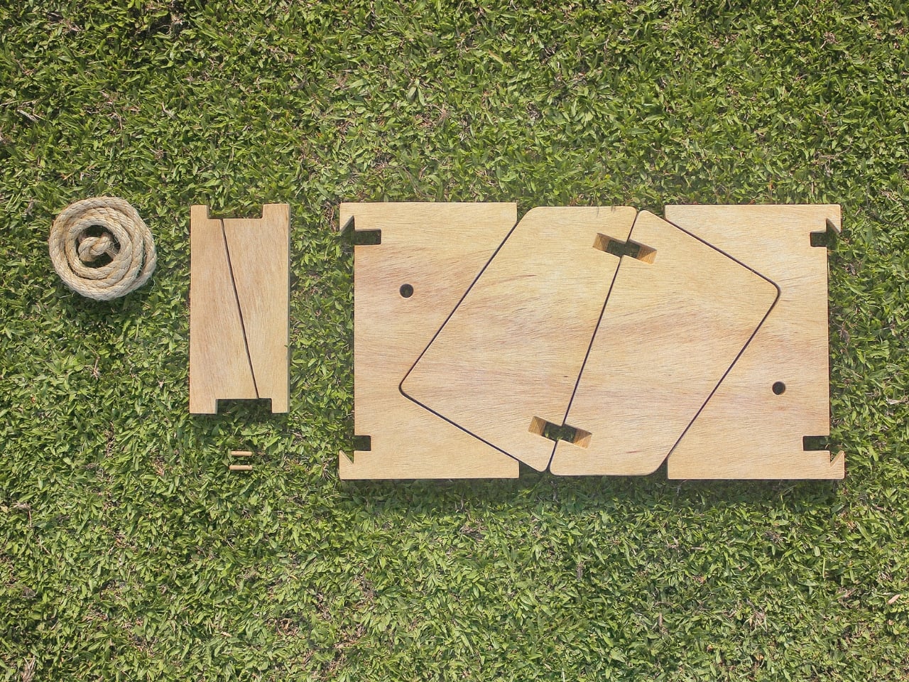
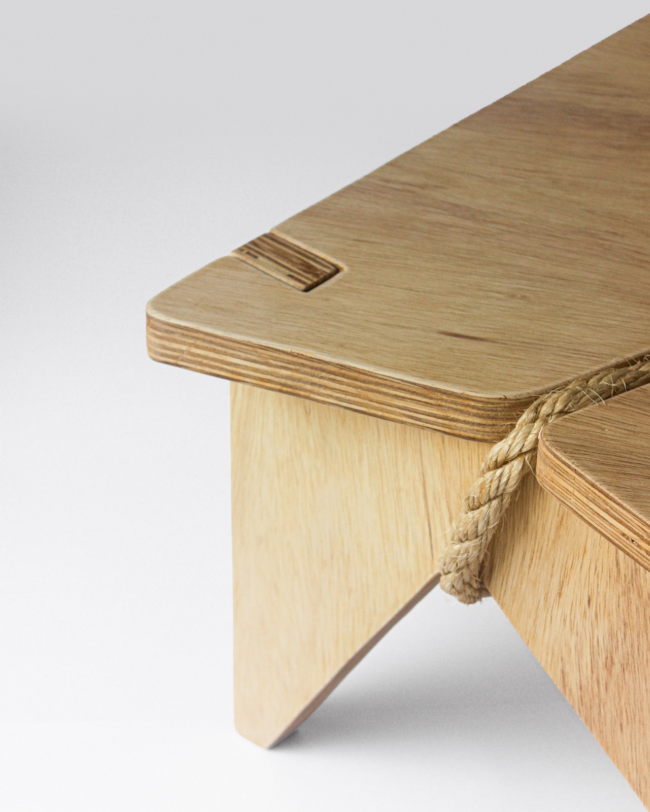
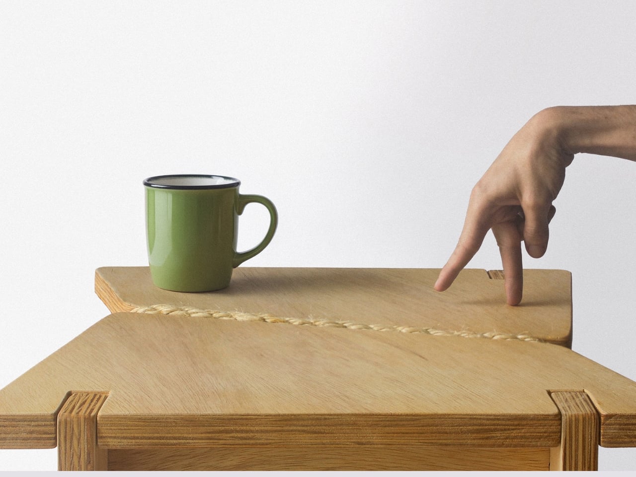
Materially, the piece holds its own. It’s made from marine pine plywood, assembled through a system of interlocking joints that require no screws, bolts, or complicated hardware. What holds it all together is tensioned sisal rope, and this is the detail that makes the whole thing click, visually and structurally. The rope isn’t decorative in the way that so many “natural element” additions can feel forced. It’s actually doing the work, reinforcing the structure while giving the stool a texture that you want to reach out and touch. It makes the design feel honest, which is appropriate given what the piece is trying to say.

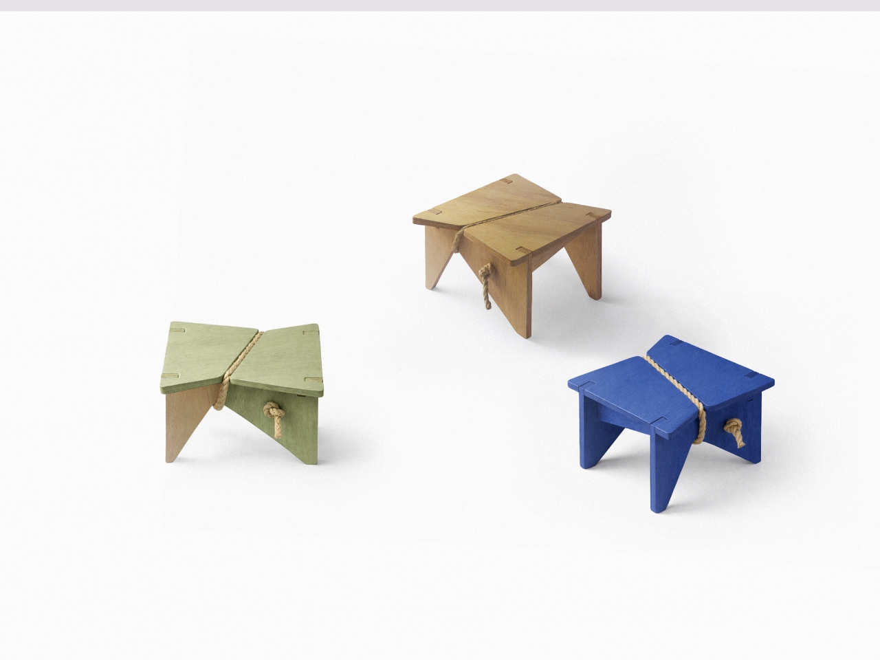
The modular nature of it is worth mentioning too. Single units can be connected to form a longer bench configuration, which means the Shortcut Stool scales with need rather than requiring you to commit to one fixed form. The flat-pack assembly and disassembly is straightforward, making it easy to move, store, or reconfigure. It comes in natural pine as well as painted versions in a deep cobalt blue and a muted sage green, both of which look sharp in context. The blue one especially has a kind of confident visual energy that punches well above the stool’s modest size, which is something I didn’t expect from a plywood bench.

What strikes me most is how the Shortcut Stool manages to make a philosophical argument without being heavy-handed about it. It’s not a design that comes with a manifesto attached. You can simply look at it, use it, and decide it works. But if you sit with the concept for a moment, there’s a bigger idea underneath: that the gap between how objects are designed and how they’re actually lived with is rarely addressed honestly in product design. Most things are built for ideal conditions. This stool was built for real ones.

It also raises a question I keep returning to: how many products in our homes are quietly working against us because they were designed without accounting for how people actually behave in real time? The Shortcut Stool is a small answer to a larger problem, and I appreciate that it arrives without fanfare, just plywood, rope, and a clear point of view. Fabrício Reguelin Auler has made something that earns its place in a home not by demanding attention, but by already understanding you. That’s a rare quality in any object.

The post Desire Paths, Plywood, and a Stool That Gets It first appeared on Yanko Design.
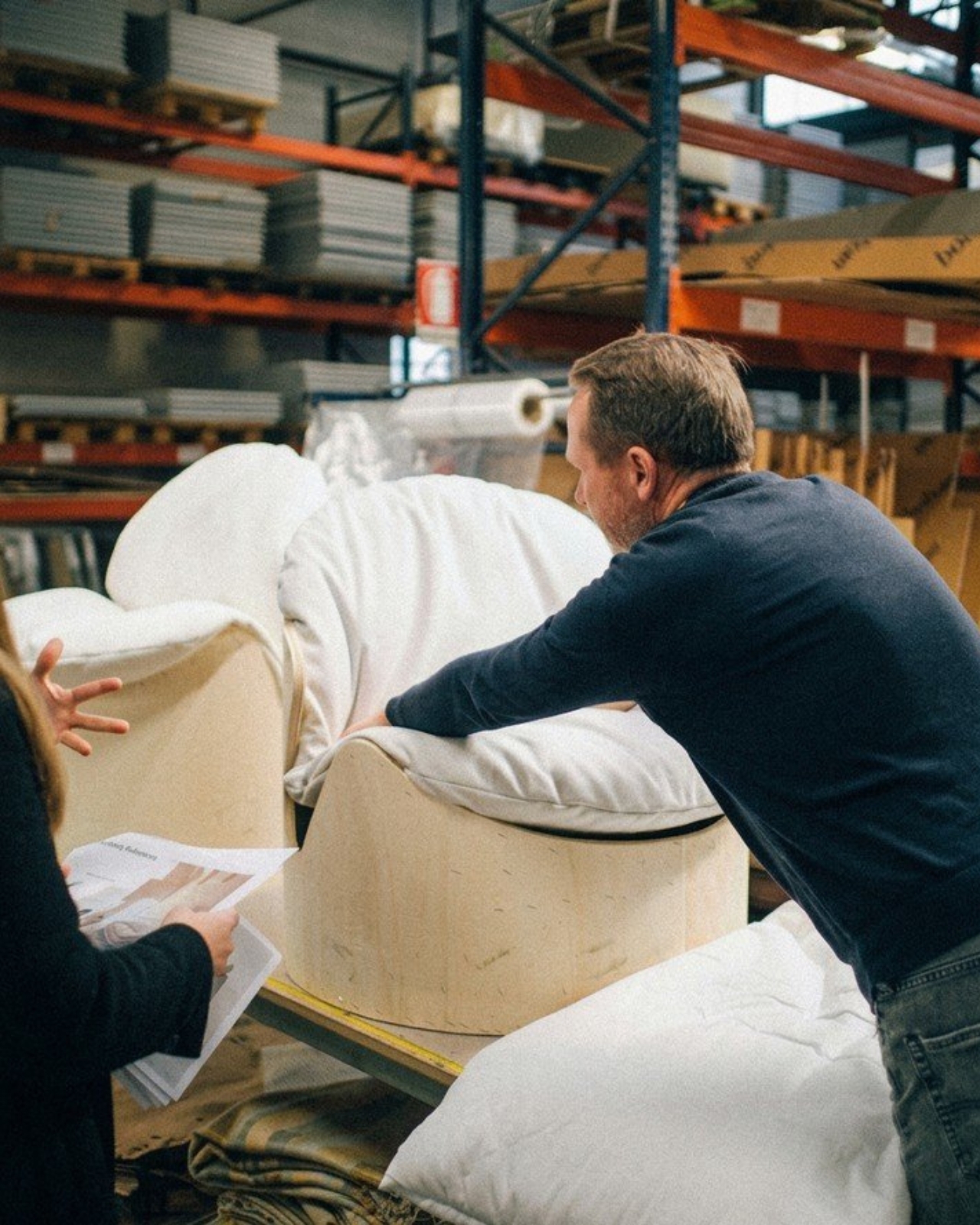
Mililab Made a Dining Table, Got Distracted, and Made a Better Stool

Modern furniture design has been quietly shifting priorities. Smaller homes and more deliberate interiors have created real demand for pieces that do more without taking up more space or sacrificing how they look. Stools and side tables are easy targets for this kind of dual-purpose thinking, but most of them still feel like a workaround, a compromise dressed up as a solution, rather than a genuinely well-considered object.

The Ishi stool from Japanese studio Mililab isn’t that kind of compromise. It came out of a separate project entirely, one that had nothing to do with stools, and it ended up as something that’s equal parts furniture object and quiet design statement. That accidental origin is actually central to understanding why it looks the way it does, and why it works as well as it does.

Designer: Mililab

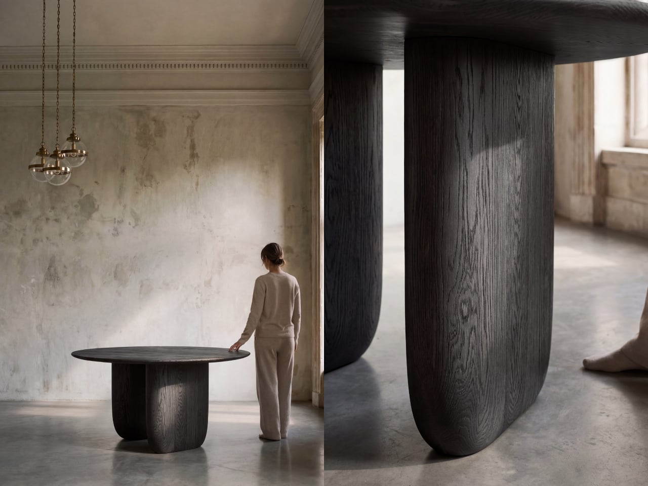
The story starts with the studio’s own Maru dining table. While developing it, founders Livert Lim and Mengfei Wu kept drifting back to the legs, almost despite themselves. Those legs tapered inward along one unbroken curve, giving them a presence that had little to do with the tabletop above. As Mililab described it: “A shape that didn’t need the table above it.” So they separated it and let it stand alone.

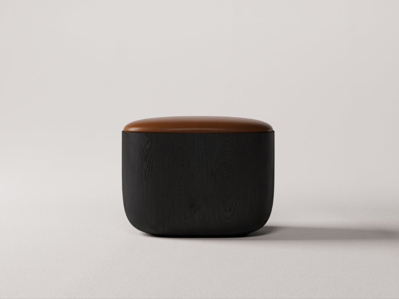
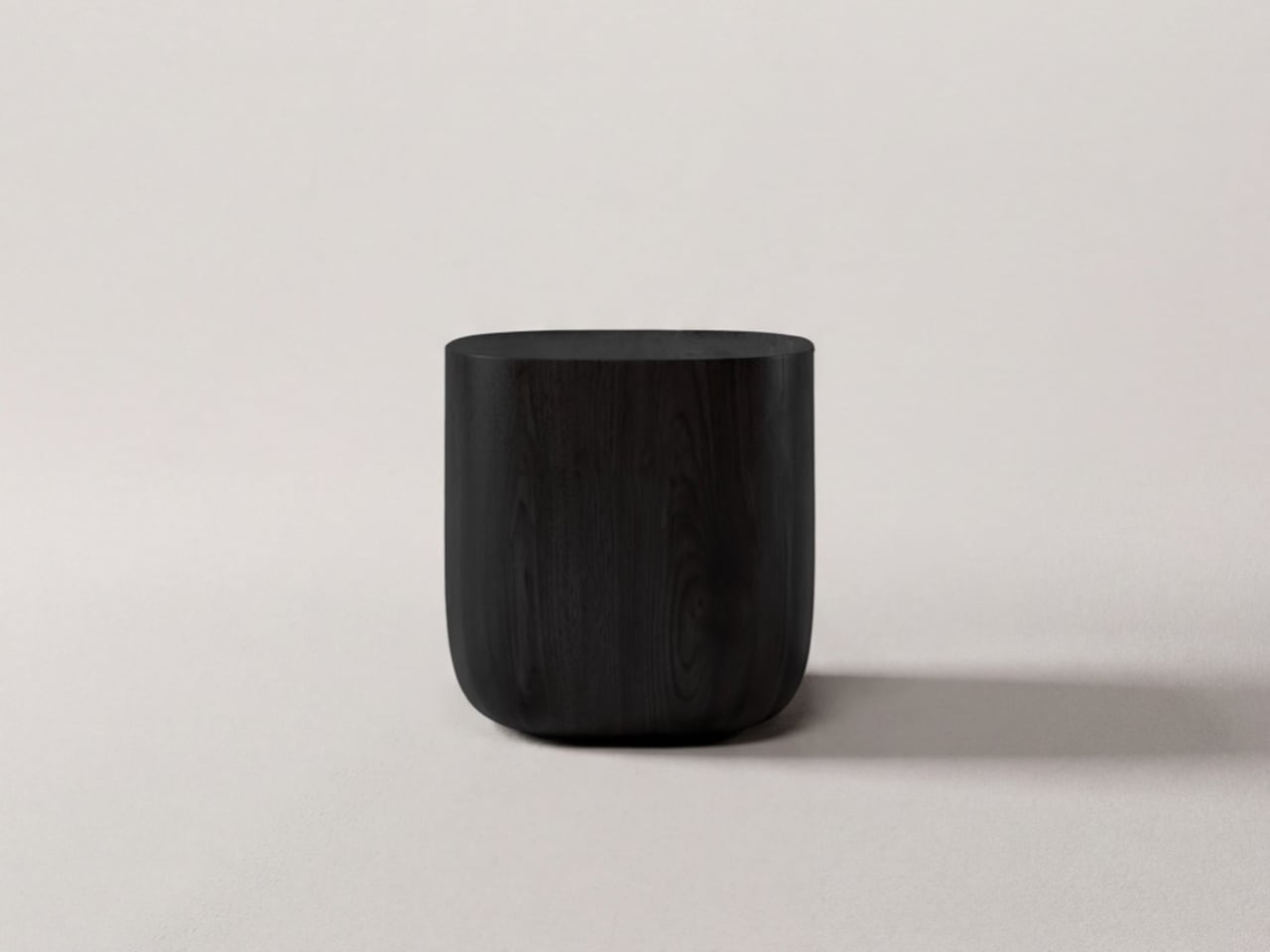
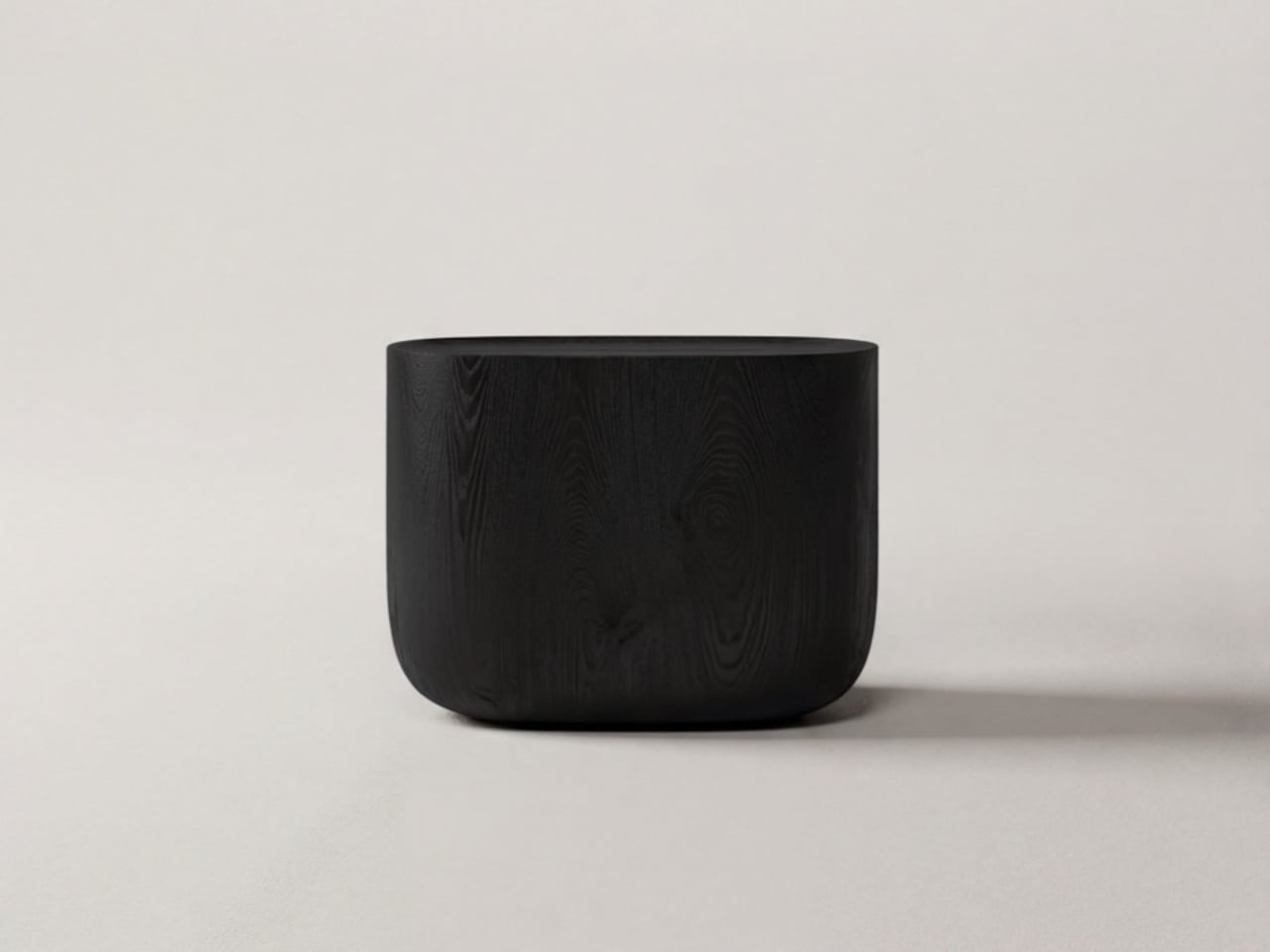
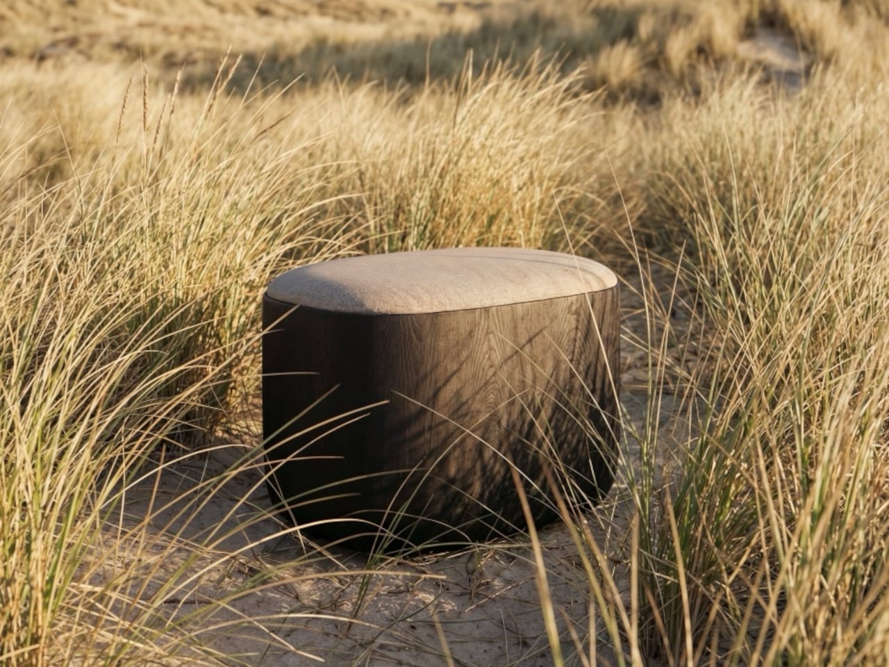
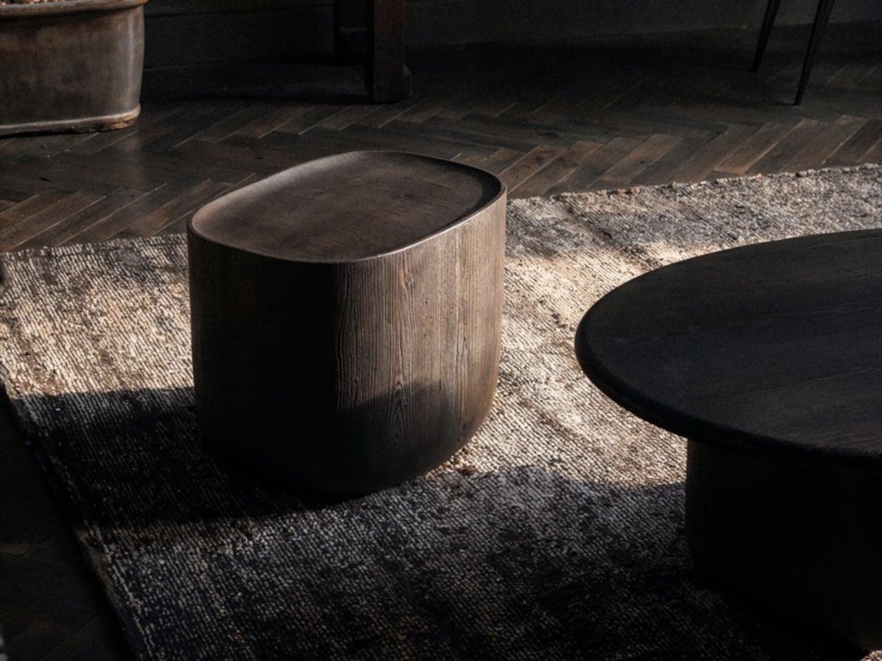
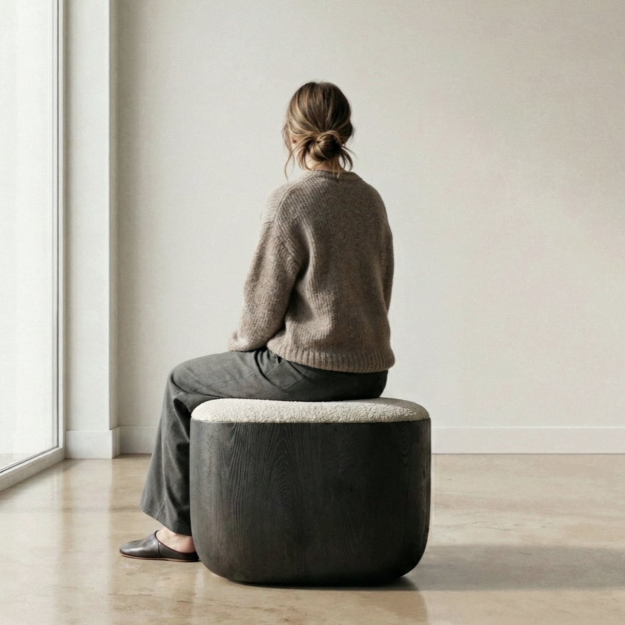
Working with collaborator Djordje Cebic, they developed Ishi into a form that’s both monolithic and unexpectedly soft, something like a river-worn pebble given volume. From across the room, it appears impossibly thin; up close and under your hand, it’s substantial. That tension between visual lightness and physical solidity isn’t accidental. It’s the result of curves computed in Tokyo and then realized by hand in the workshop.

The material process behind that solidity gets genuinely obsessive. The stool is made from North American white oak, selected for grain consistency, kiln-dried, hand-shaped, then kiln-dried again, because the glue introduced during assembly brings moisture back into the wood. Most workshops skip that second drying. Mililab doesn’t. It’s sealed immediately after, locking in a 10% moisture content, the exact point at which white oak is most dimensionally stable.

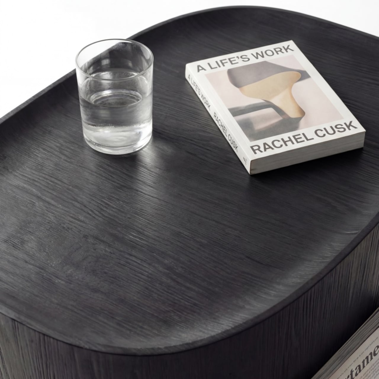
The cushion on top, available in Kvadrat Savanna, Dedar fabric, or Italian leather, looks fully integrated with the oak base. It isn’t, of course, which is the point. Pull it off, flip it over, and the flat underside becomes a surface, turning the stool into a side table. It works just as well beside a sofa at home as it does in a hotel lobby or a studio apartment. At 430mm, the height was chosen deliberately. It’s low enough to pair with a lounge chair, yet also tall enough to sit beside a dining table or vanity desk.

There’s something refreshing about a piece of furniture that arrived this way, not from a brief or a market gap, but from genuine distraction. Lim and Wu were supposed to be designing a dining table and kept staring at the legs instead. It’s not a narrative most furniture studios would lead with, but it does explain why the Ishi stool feels like something they simply couldn’t help making.
The post Mililab Made a Dining Table, Got Distracted, and Made a Better Stool first appeared on Yanko Design.