Small, Aggressive, and Under $80: Meet The Kansept Wasp Button Lock Knife

A wasp’s design is a lesson in efficiency. It combines a potent stinger with a small, agile frame to create a threat that commands respect far beyond its physical size. Koch Tools Design captured this spirit perfectly with the Kansept Wasp, a folder where compact dimensions and aggressive geometry work in concert. The knife’s upswept Harpoon Wharncliffe tip acts as a visual stinger, while the sub-3-inch length ensures it remains a nimble and unobtrusive carry. This folder embodies a philosophy of calculated capability, proving that a small tool can still project a serious and purposeful presence.

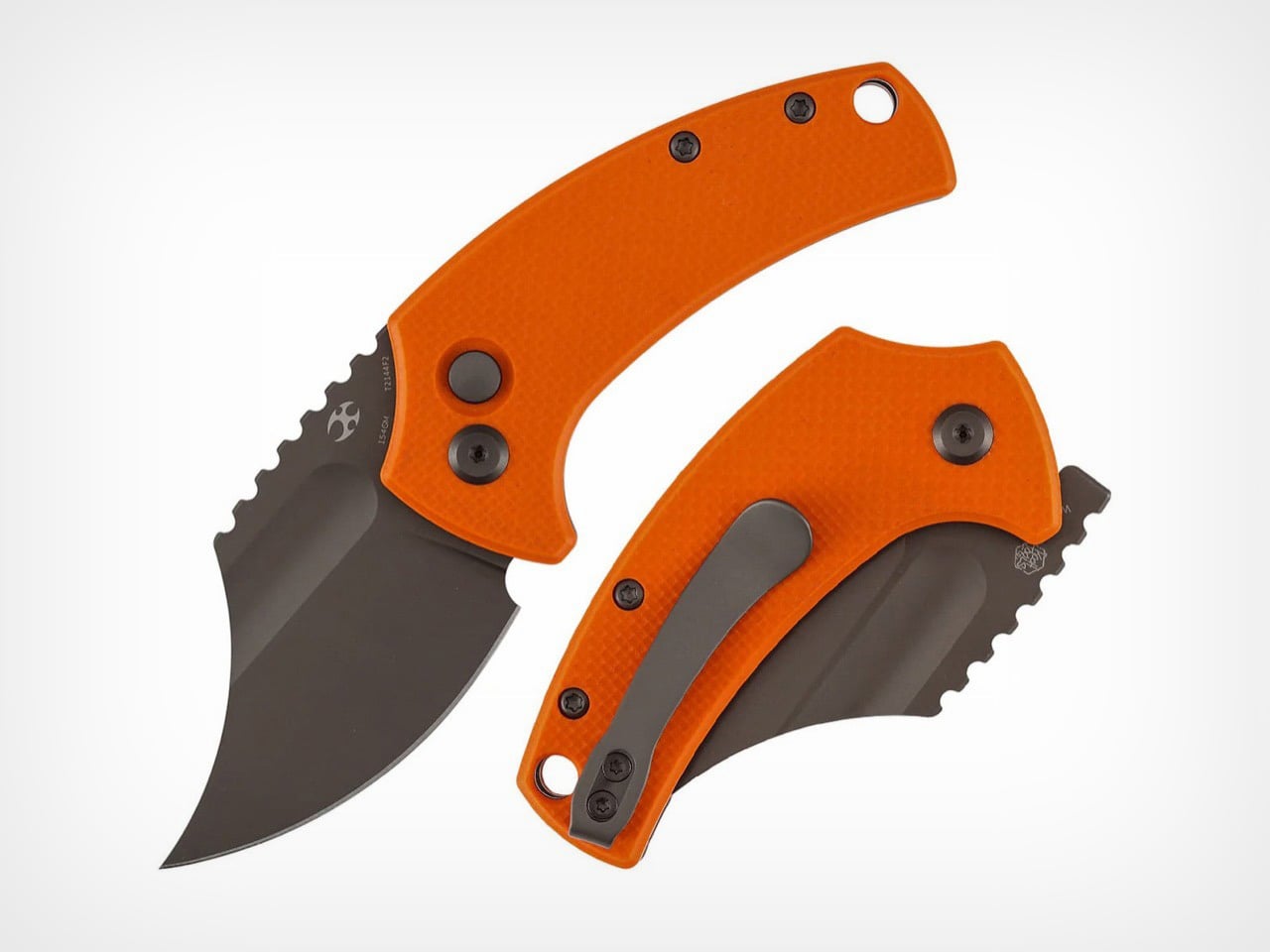
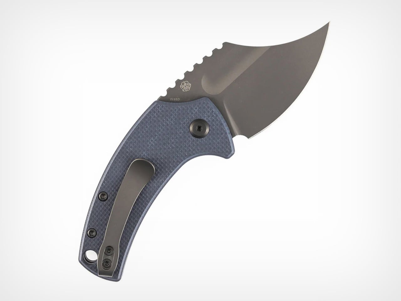
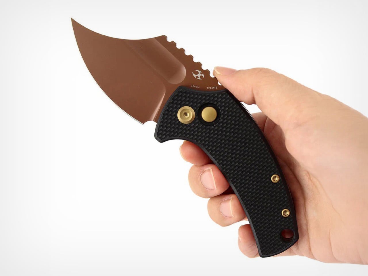
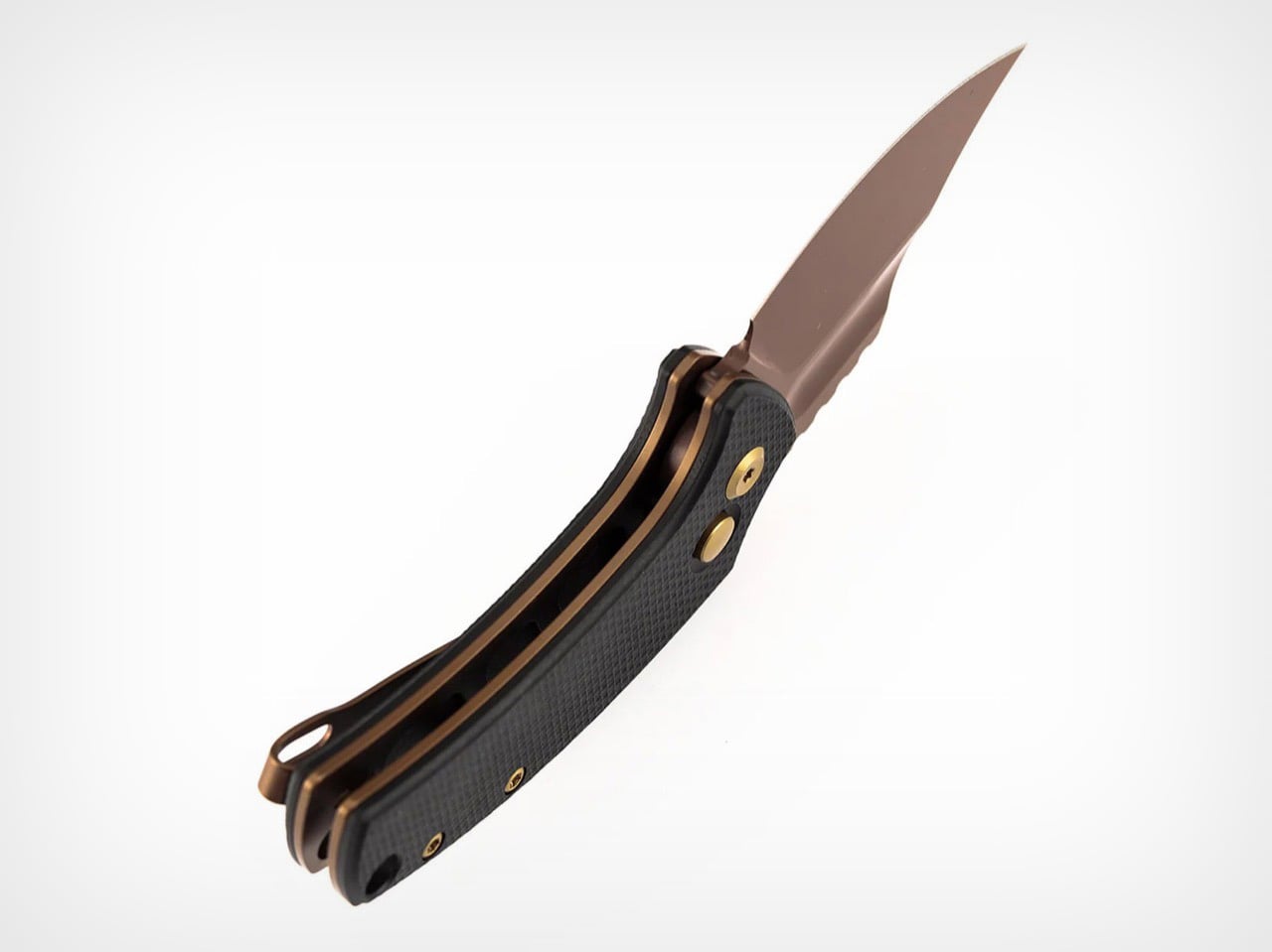
At its core, the Wasp is a button lock folder built from a 2.36-inch 154CM blade and textured G10 handle scales. The Koch Tools collaboration provides the confident stance and deliberate lines, which Kansept executes with a durable gray TiCn blade coating on several models. This finish offers both corrosion resistance and a sharp visual contrast against the vibrant handle options. The button lock itself sits neatly flush with the spine, allowing for a clean profile when closed and delivering a satisfying snap upon deployment. Priced at $75.89, the Wasp targets the intersection where enthusiast-level design becomes accessible to a much broader audience.

Designer: Koch Tools Design

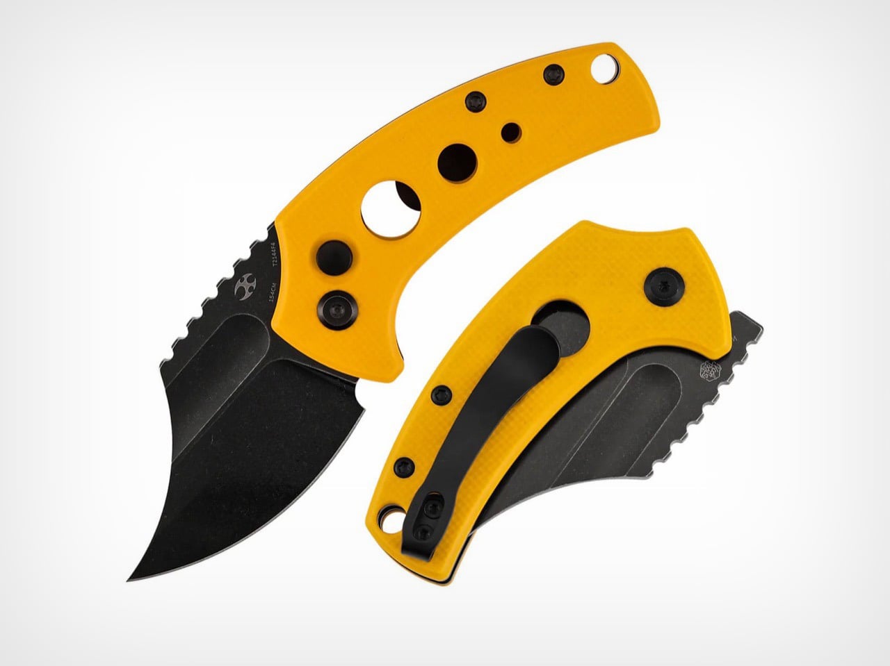
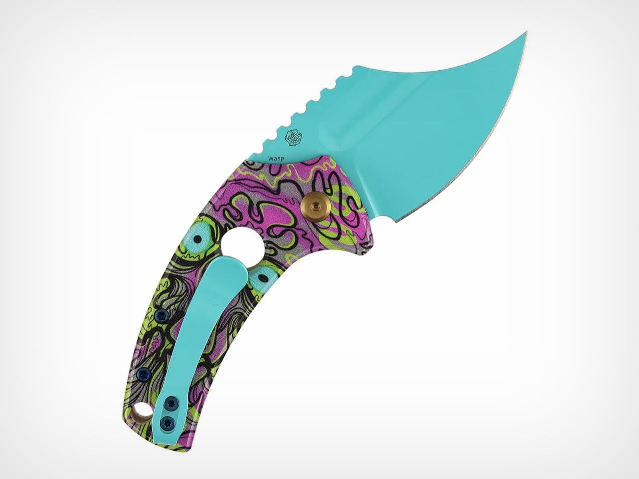
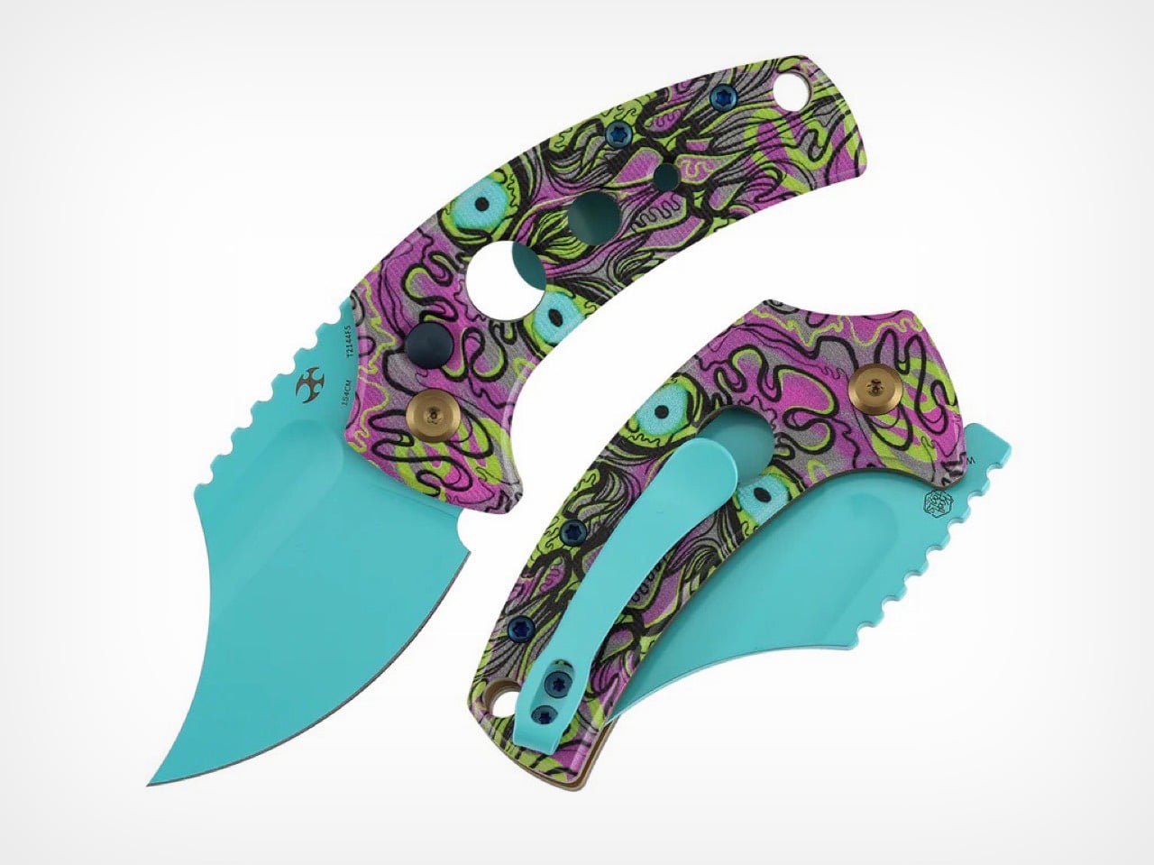
The Harpoon Wharncliffe blade profile delivers exceptional tip control for detail work and piercing tasks. The upswept curve terminates in a fine point that excels at controlled cuts, while the flat cutting edge provides clean slicing performance across its full 2.36-inch length. Aggressive jimping runs along the spine, offering secure thumb purchase during precision work or when applying forward pressure. A tactical swedge grinds down the spine near the tip, reducing drag and sharpening the visual aggression of the blade. The 154CM steel handles daily cutting tasks with reliable edge retention, and the gray TiCn coating hardens the surface against wear while adding a matte finish that reads as tactical rather than decorative.

Button locks remain a standout feature at this price point. Most folders under $80 default to liner locks or frame locks, mechanisms that work fine but lack the tactile satisfaction and mechanical interest of a button system. The Wasp’s button sits recessed into the handle spine, protected from accidental activation while remaining easy to locate by feel. Deployment feels crisp and deliberate, with the blade snapping into lockup with authority. The mechanism adds a layer of fidget-worthiness that liner locks simply can’t match, which matters when a knife spends most of its time sitting in a pocket waiting to be used.

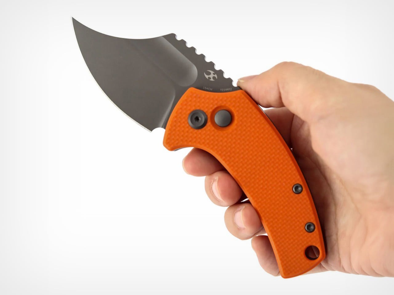
Handle construction splits across multiple G10 variants, each delivering a different personality. The light gray and orange versions feature solid scales with diagonal texturing that provides grip without being abrasive. Yellow and jade colorways introduce skeletonized cutouts that reduce weight and create visual drama through negative space. The handle shape tapers toward the base, aiding retention during use and preventing the knife from feeling blocky despite its compact proportions. Closed length measures just over 3 inches, placing the Wasp comfortably in the keychain-compatible category while still offering enough real estate for a full three-finger grip when deployed.

The Wasp competes directly with knives like the Civivi Elementum and CJRB Feldspar, both of which hover around the same price and size. The button lock and Koch Tools pedigree give it an edge in that comparison, offering mechanical and design credibility that budget folders often lack. For collectors chasing variety, the multiple colorways mean there’s likely a version that fits personal taste without compromising on function.

The post Small, Aggressive, and Under $80: Meet The Kansept Wasp Button Lock Knife first appeared on Yanko Design.

This Red House Buried in a Czech Forest Is the Opposite of Every Forest Home You’ve Ever Seen

Deep in the spruce forests of Jevany, a municipality of barely 800 people in the Czech Republic’s Central Bohemian Region, a flash of cherry red cuts through the trees. This is Villa Jevany, a new residence by local studio Architektura, and it has absolutely no interest in blending in. Where most forest homes default to timber, stone, and muted tones, Architektura went the other way entirely, dressing the structure in saturated red steel and calling it exactly what it is: a deliberate, uncompromising act of contrast.

The site itself set the terms. The plot spans a generous 3,027 square meters on a steep southern slope, inhabited by deer, birds, and mature trees that tower up to ten meters above the building level. Architektura responded by carving the villa into the hillside rather than placing it on top, creating a structure the studio describes as an “organism” embedded in the earth. The red steel skeleton, visible in the sawtooth carport roof from the moment of arrival, signals that this is industrial thinking applied to domestic life, and it doesn’t apologize for it.

Designer: Architektura

The colour choice is rooted in theory as much as instinct. Architektura used green and red as complementary colors, a logic borrowed from the colour wheel and, more pointedly, from abstract art. The irregularly divided glazing across the façade draws a quiet reference to Mondrian, the rhythmic geometry of the windows creating a visual tension against the organic verticality of the trees behind them. From the road, the house reads almost like a painting hung in the forest. From the inside, the forest becomes the painting.

Internally, the layout unfolds across five distinct levels. The entrance opens into a hall with a 3.5-meter ceiling height, where a curved wall guides visitors into the main living space, or what the architects call the “day zone.” Here, industrial red steel windows frame the surrounding green; white walls meet black details; reddish stone counters anchor the kitchen alongside a floating steel fireplace. It’s a space of deliberate contrasts, domestic in function and raw in feeling.

The private quarters, reached through a long corridor lined with minimalist white cabinetry, are stripped of excess. The parents’ suite and children’s rooms are quiet and restrained, a counterpoint to the drama of the exterior. Terraces and balconies extend the living area into the canopy itself, turning the house into what Architektura intended all along: not just a place to live, but a place to look.

The post This Red House Buried in a Czech Forest Is the Opposite of Every Forest Home You’ve Ever Seen first appeared on Yanko Design.

A Coat Rack With 16 Hooks That Disappear When Not in Use

Every entryway tells a story, and most of the time, it’s one you’d rather not have visitors read. A coat draped over another coat. A bag looped onto an already-occupied hook. A scarf hanging off the edge of something that was never meant to hold it. We’ve all been there, and for some reason, we keep buying the same row-of-hooks solution as if more hooks were ever really the answer.

That’s what makes Elif Bulut’s coat rack concept so quietly radical. At first glance, it looks more like a piece of wall art than storage hardware. It’s a square panel with 16 circular elements arranged in a neat 4×4 grid, mounted completely flush against the wall. No hooks jutting out. No protruding arms. Just a flat, calm surface sitting there, completely unassuming, until you actually need it.

Designer: Elif Bulut

The concept is push-to-use. Press one of those circles and it extends outward into a hanging point. Press it again and it retreats back into the panel. Each circle is independently controlled, which means you decide how many hooks you want, where they go, and how many stay dormant on any given day. It’s the kind of interaction that feels satisfying in the same way clicky keyboards or popping bubble wrap does. Tactile, deliberate, and oddly fun.

1

I’ll admit that when I first saw this, my brain went straight to “pop it” fidget toys. And I don’t think that’s an accident. Bulut is working with a visual and tactile language that’s immediately familiar, maybe even nostalgic, and redirecting it toward something genuinely useful. That’s a smart design move. When a product taps into something people already instinctively want to touch, you’ve already won half the usability battle before anyone reads a word of product copy.

The design is grounded in a real observation: people pile coats on top of each other even when there are open hooks nearby. The problem was never really about the number of hooks. It was about how fixed, static structures force you to adapt to them instead of the other way around. A coat rack that responds to you, that only extends what’s needed and retreats the rest, changes that relationship entirely. The wall stays clean. The space stays calm. The hooks are there when you call for them, and invisible when you don’t.

The entryway has been chronically undervalued in home design for a long time. It’s the first thing you see when you come home and the last thing you interact with before you leave. Bulut is clearly thinking about that rhythm. One of the concept renderings even shows a small sticky note pinned to the panel, reading “don’t forget your bottle.” That single detail hits differently than any technical specification could. It grounds the whole concept in the messy, forgetful, real way people actually move through their mornings, and it signals that the designer is paying attention to life, not just surfaces.

What also works is the restraint. Bulut hasn’t tried to make this product do too much. It doesn’t track your habits, connect to an app, or announce itself as a smart home device. It’s just a better, quieter version of something we’ve had for decades. The intelligence is in the form, not the firmware. In a design landscape where everything is trying to become a gadget or justify itself with an AI feature, that choice is worth noticing.

Whether this moves from concept to production is a different conversation, but as a piece of industrial design thinking, it lands. It asks a question that sounds simple but clearly wasn’t: what if your coat rack only took up as much space, visually and physically, as you actually needed it to? The answer turns out to be a flat panel that waits patiently on your wall, ready to show up the moment you press it. That’s not a small idea dressed up in minimal aesthetics. That’s just good design.

The post A Coat Rack With 16 Hooks That Disappear When Not in Use first appeared on Yanko Design.

Meet the World’s First Door Grown From Fungi, Not Cut From Wood

What if the door you walk through every day was grown from fungi? Danish mycelium company Rebound and architecture studio Det Levende Hus have partnered to create what they claim is the world’s first mass-produced interior door with a core cultivated from fungal mycelium. Currently in the prototype phase, the door is part of a broader collection of bio-based interior and sliding doors designed for modern living spaces, and it may quietly redefine what architectural materials can be.

The concept is straightforward but radical. Rebound cultivates the fast-growing root structure of fungi inside a mould, producing a rigid, lightweight panel with natural sound-absorbing qualities. That mycelium core is then enclosed within a timber frame built from reclaimed and surplus wood, including offcuts sourced from Danish flooring manufacturer Dinesen, meaning the door carries minimal material waste from start to finish.

Designer: Rebound & Det Levende Hus

Rebound co-founder Jon Strunge sees this as a direct challenge to the construction industry’s dependence on slow-growing hardwoods. “We wanted to demonstrate how regenerative, high-performance mycelium-based materials open opportunities for new, innovative, and scalable building components,” he said. The growing process takes roughly two weeks and is designed to scale industrially, making these doors a production-ready proposition rather than a one-off experiment.

What makes the design particularly noteworthy is its adaptability. Colour and surface texture can be altered during the growing process itself, removing the need for post-production finishing. The current prototype presents a smooth, silky surface, but the material can shift in tone and can also be finished with a layer of clay for a warmer, earthier aesthetic.

Structural performance was equally prioritised. A bio-based layer incorporated during the growing process stiffens the door and improves fire resistance, a bio-welding method that adds reinforcement without glue or additional manufacturing stages. The door was also designed to comply with current building standards for private homes, particularly around fire and moisture resistance, making it a credible candidate for real construction.

The first real-world application will be at Kaerhytten, a low-impact housing project in Ramloese, Denmark, designed by architect Jens Martin Suzuki-Højrup, scheduled for completion in 2026. The prototype also features a door handle by architect Bjarne Hammer for Danish brand Randi, the Moom handle cast from recycled seashells, adding a tactile detail that mirrors the door’s material ethos. Looking ahead, Rebound and Det Levende Hus are expanding into mycelium-based acoustic wall panels and ceilings. As Suzuki-Højrup put it, “It’s about how natural materials can transform our experience of space, visually, acoustically, even emotionally.”

The post Meet the World’s First Door Grown From Fungi, Not Cut From Wood first appeared on Yanko Design.

PSA: T-Mobile customers have a week to sign up for a free year of MLB.TV

Today marks the start of the 2026 baseball season and in what has sort of become an annual tradition, T-Mobile is once again offering a free subscription to MLB.TV.

In order to take advantage of the deal, T-Mobile customers simply need to log into the T Life app, navigate to the Benefits tab and then hit Redeem after clicking the banner for a free season of MLB.TV. From there, you just need to download the latest version of the MLB app to your mobile device and sign in or create an account. That said, this is a time-limited offer, so if you want the ability to stream regular season baseball for free, you’ll need claim the deal prior to March 31 at 4:59 AM ET. For anyone on a different carrier, this may be enough time to switch providers and still get in on the savings.

Unfortunately, MLB.TV is subject to blackouts and market restrictions, so depending on where you live and where your favorite team is playing that day, you may not be able to catch every game. Sadly, this includes tonight’s 8:05 PM ET matchup between the New York Yankees and the San Francisco Giants, which is streaming exclusively on Netflix. Even so, with a one-year subscription to MLB.TV currently going for $150, this is one of the best perks available from any of the big cellular carriers.

In addition to full season of games, an MLB.TV subscription also includes access to a collection of baseball documentaries, game streams from previous years, World Series films, highlights, news and more. And with over 1.25 million customers having redeemed last year’s offer, this is potentially one of T-Mobile’s biggest offers of the year, with the company claiming to have delivered more than $1 billion in savings since it first started running the promotion 10 years ago in 2016.

This article originally appeared on Engadget at https://www.engadget.com/entertainment/streaming/psa-t-mobile-customers-have-a-week-to-sign-up-for-a-free-year-of-mlbtv-211306444.html?src=rss

Leaked Honor 600 Pro looks a lot like the iPhone 17 Pro, but with a much bigger battery

I have to hand it to Honor, they are consistent. When I wrote about the Magic8 Pro Air and its striking similarity to the iPhone Air, I thought we had seen the peak of their “inspiration.” It turns out that was just the warm-up act. The main event has arrived in the form of the Honor 600 and 600 Pro, and this time they have perfectly mimicked the iPhone 17 Pro. The new renders, courtesy of WinFuture, show a design that lifts every key element from Apple’s latest flagship. The full-width camera bar, the arrangement of the lenses, the flat metal frame, and even the color options are all present and accounted for. It’s a remarkable feat of reverse-engineering that feels both impressive and completely shameless.

What makes this strategy so fascinating is that Honor isn’t just making a cheaper clone. They are using the familiar, market-tested design as a vessel for a totally different philosophy. The Honor 600 is expected to ship with a 200MP camera and a 9,000mAh battery, specs that are practically alien to Apple’s ecosystem. It’s a phone designed to look like an iPhone from a distance but to function like an endurance-focused Android powerhouse up close. Honor is essentially telling the world that you can have Apple’s style without having to accept Apple’s compromises, and that’s a powerful message.

Designer: HONOR

The horizontal camera bar is not just vaguely similar, it’s dimensionally faithful. Both models feature the same raised rectangular module spanning nearly the full width of the device, with lenses, flash, and sensor cutouts arranged in a configuration that directly mirrors Apple’s layout. The standard Honor 600 goes with a dual rear camera setup, with its LED flash and laser autofocus tucked into a separate pill-shaped island below. The Pro model steps it up with a triple-lens arrangement, going all-in on the vertical stack. Even the colorways follow Apple’s playbook closely, with glossy black, metallic gold, and a bright orange finish that lands somewhere between homage and photocopy. Honor’s team clearly studied the iPhone 17 Pro with the intensity of an art student sketching a masterpiece in a museum.

The hardware rumors add even more intrigue to the picture. A 9,000mAh silicon battery in a flagship-tier device is almost unheard of in 2026, delivering the kind of multi-day endurance that the iPhone 17 Pro can only dream about. Both phones also get a 6.57-inch 120Hz OLED display at 1.5K resolution, wireless charging, a 3D ultrasonic in-display fingerprint sensor, and a Snapdragon 8 series chipset. There’s even a dedicated camera button on the side, which is, yes, another very Apple-like touch. Honor is effectively saying: if you love how the iPhone looks but wish it prioritized endurance and camera specs over thinness, we built that phone for you. Whether that resonates with buyers remains to be seen, but the logic behind it is hard to argue with.

The post Leaked Honor 600 Pro looks a lot like the iPhone 17 Pro, but with a much bigger battery first appeared on Yanko Design.

HBO Max’s Harry Potter series premieres this Christmas

HBO released a teaser trailer and premiere date for its take on Harry Potter and the Philosopher's Stone. The show will premiere on the HBO Max streaming network this December 25. It's a rare case where a big-ticket project is coming out earlier than anticipated instead of later; the series wasn't expected to arrive until 2027. 

HBO has already proved its bona fides with lush adaptations of fantastical stories several times over, and this trailer looks like more of the same. The team behind the camera includes notable names who have worked on series such as Succession, Game of Thrones, The Last of Us and Killing Eve. Harry Potter creator J.K. Rowling, who alienated many fans after outing herself as transphobic, is also one of the show's executive producers.

Engadget's Jess Conditt has already written eloquently on the struggle of when and how to engage with the Harry Potter franchise while rejecting Rowling's worldview, although the author’s involvement at the top level may make this adaptation a harder sell to the disillusioned community than, say, the Hogwarts Legacy video game where Rowling was barely involved and the studios took a more proactive approach toward presenting many types of diversity, including gender expression. If you’re hyped for this particular show, seems you'll have a shorter time to wait for it.

This article originally appeared on Engadget at https://www.engadget.com/entertainment/tv-movies/hbo-maxs-harry-potter-series-premieres-this-christmas-202818238.html?src=rss

Webb and Hubble telescopes combine forces for a new view of Saturn

The ESA, NASA and CSA have released new images of Saturn captured by the James Webb and Hubble space telescopes that offer an unprecedented view of the gas giant's atmosphere. Particularly, comparing shots captured with Hubble against an infrared view from Webb highlights details in the composition and movement of Saturn's outer layers.

The Hubble images were captured as part of the Outer Planet Atmosphere Legacy program in August 2024, while the Webb images were shot a few months later. "Both sense sunlight reflected from Saturn’s banded clouds and hazes," NASA says, "but where Hubble reveals subtle color variations across the planet, Webb’s infrared view senses clouds and chemicals at many different depths in the atmosphere, from the deep clouds to the tenuous upper atmosphere."

Hubble has historically been used to track storms on Saturn, and you can see bands of atmospheric clouds in the telescope's new photo. The infrared sensors on the Webb telescope are able to highlight even more detail, like the highly-reflective ice of Saturn's ring, which is practically white in the photo, and grey-green shading on the planet's poles. The different coloring in the Webb photo could be caused by a "a layer of high-altitude aerosols" scattering light across latitudes, or "charged molecules interacting with the planet’s magnetic field" and causing "auroral activity."

The visual information from both telescopes is valuable to scientists and should prove to be more valuable over time. "These 2024 observations, taken 14 weeks apart, show the planet moving from northern summer toward the 2025 equinox," NASA says. "As Saturn transitions into southern spring, and later southern summer in the 2030’s, Hubble and Webb will have progressively better views of that hemisphere."

This article originally appeared on Engadget at https://www.engadget.com/science/space/webb-and-hubble-telescopes-combine-forces-for-a-new-view-of-saturn-202526270.html?src=rss

Formula Pro simulator with ultra-realistic controls emulates F1 racing fun in your living room

In the world of Formula-1 world championships are won by the slender margin of milliseconds that turn into big margins after every passing lap. The level of engineering in the pinnacle of Motorsports is unparalleled, and the drivers competing for the top podium step do every little thing that gives them a strategic advantage over their rivals.

Personal training is a part of the drill to stay in top shape, but the real deal is to polish the skills and gain telemetry data in the racing sims that very closely mimic the nuances of each track on the season calendar. With the hybrid era, the need for simulating the real track conditions has become even more important, given the metamorphosis this sport is undergoing.  A good simulator plays a vital role in giving the F1 and F2 drivers a fair idea of areas to improve, or develop strategic maneuvers that can be finally implemented on the track.

Designer: Cool Performance

With over two decades of motorsport experience and trusted by over 250 professional racers, Cool Performance now brings its most advanced F1 sim racer for professionals and motorsports fans. Current F1 drivers who train their driving skills on the Formula Pro Simulator include Lando Norris, Carlos Sainz, Sebastian Vettel and Alex Albon. Founder Oliver Norris has designed the simulator from the ground up with tons of experience in his own Motorsports journey and his brother Lando’s last couple of successful F1 seasons.

The professional-grade simulator has a precision-designed cockpit and race seat to recreate the realism of FPV in the single-seater racer. To simulate the nuances of a Formula -1 car riding the tarmac, the simulator has a high-torque force feedback steering and a Leo Bodnar SimSteering 2 base. This lets the sim racer feel every little bump of the chicane or the minute grip changes when the car is steered off the racing line. Braking in Formula 1 is way more challenging than your average SUV. That is mimicked by the CP-S hydraulic pedals with an AP Racing master cylinder support, which can simulate 200 kgs of braking force. For that, you’ll require immense strength in your core and lower body.

Every little detail of this F1 simulator is narrowed down to the last millimeter, much like the Formula 1 cars. Right from the highly technical CP-S Formula steering wheel that has virtually everything right at arms distance for the driver, to the CP-S custom hydraulic pedals, nothing gets better than the Cool Performance’s option. Clearly, if you want to feel the realism and the tiny details of Formula 1, this is it. Each one of the Formula Pro F1 simulators is custom-manufactured and tested by Oliver and Adrian Quaife-Hobbs in Kent, United Kingdom.

Eager buyers can opt for a single curved screen setup or a multiscreen array for better realism. If you are a purist, then the UK-based manufacturer can create a bespoke version of the sim to fit your specific needs. The Formula Pro simulator price starts from $40,950 and can go higher depending on the add-ons demanded or the bespoke modifications required.

The post Formula Pro simulator with ultra-realistic controls emulates F1 racing fun in your living room first appeared on Yanko Design.