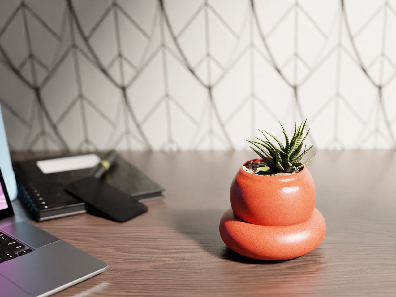
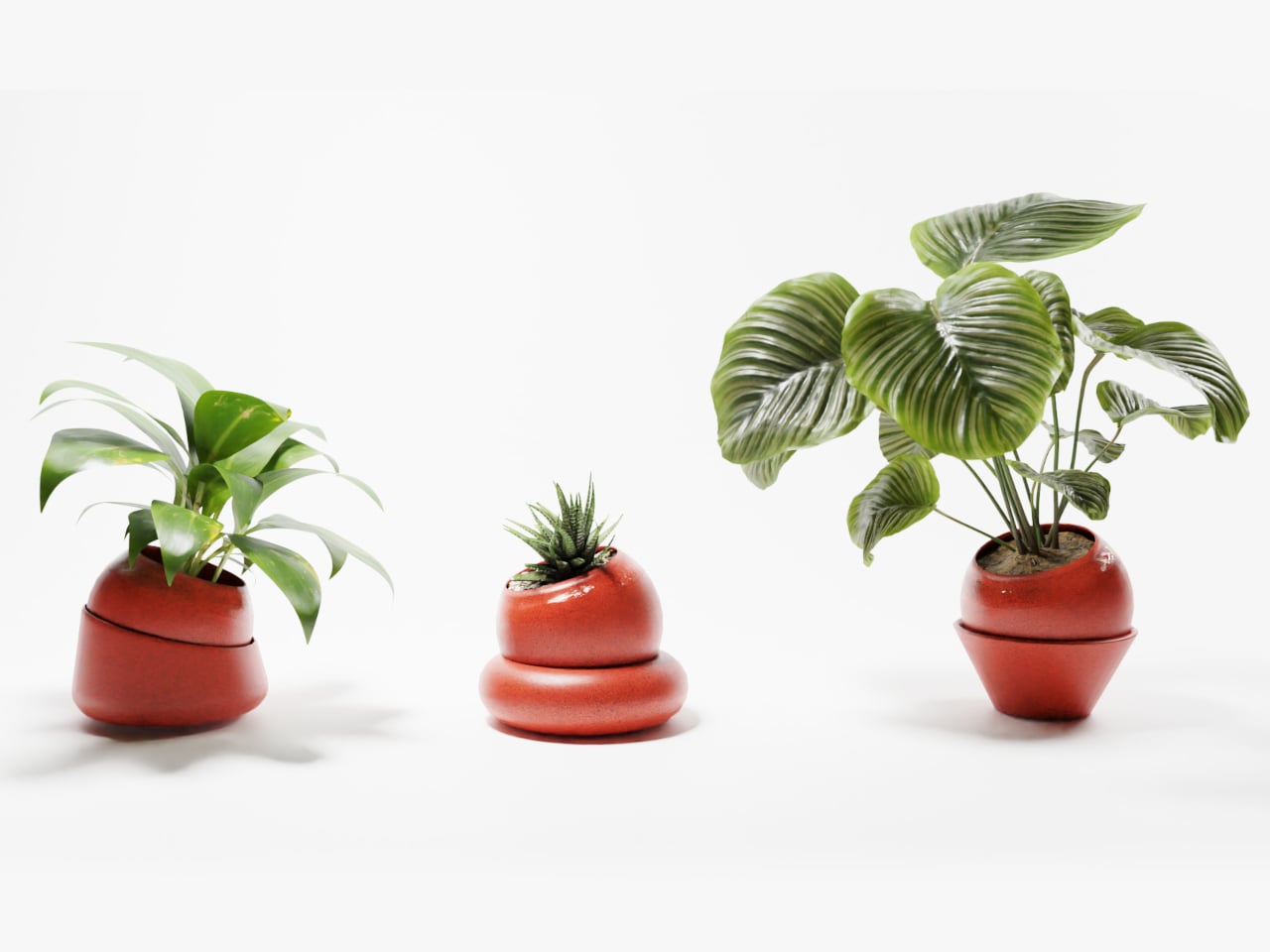
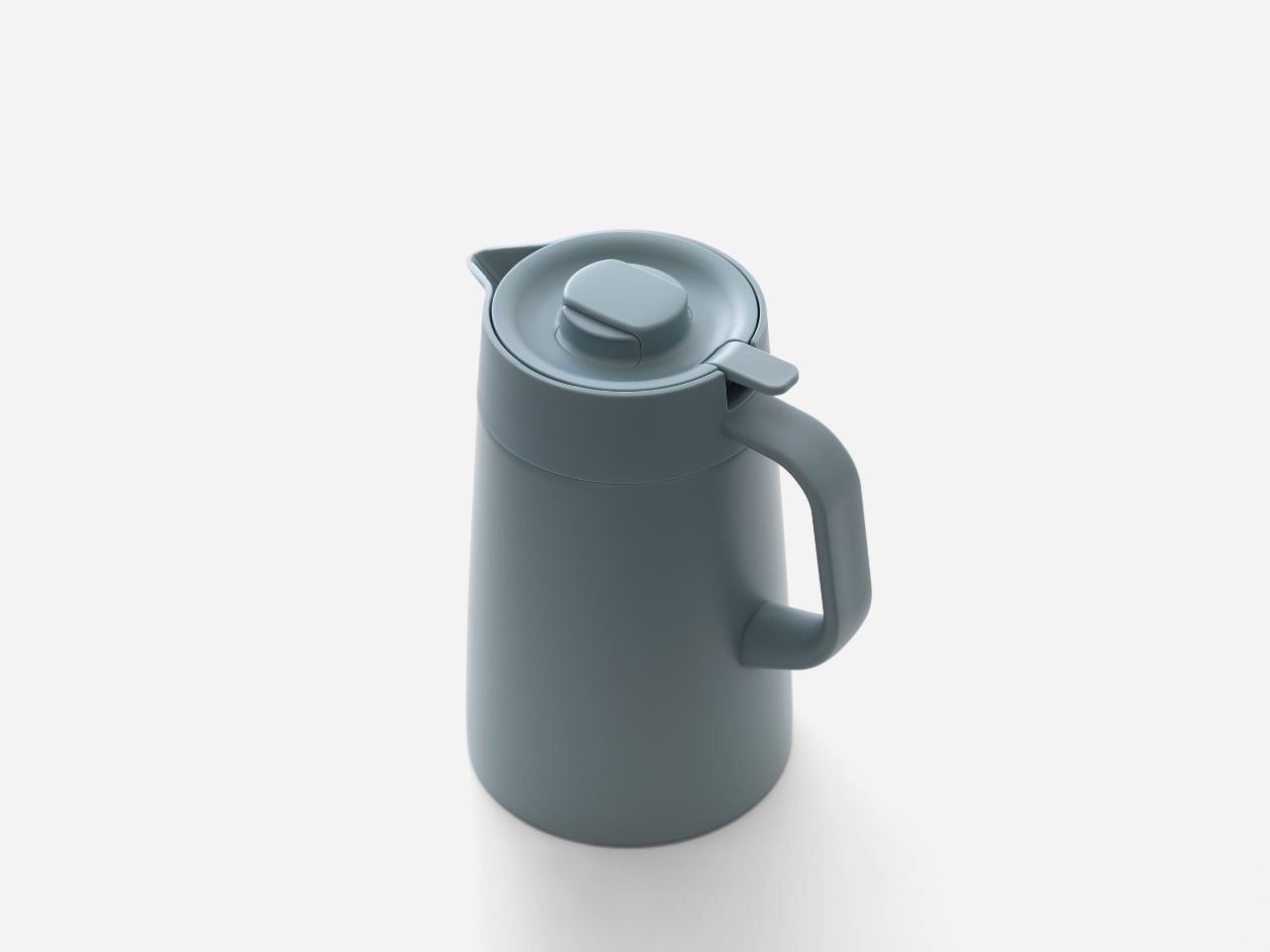
Most desk plants live in simple pots that depend entirely on memory. Watering is irregular, overwatering and underwatering are both common, and busy workdays do not help. Planters are usually treated as decorative containers, not as systems that could manage themselves. Posha is a self-watering desk planter that starts from a different premise, embedding care into the object instead of into the user’s to-do list or relying on guilt when leaves start to droop.
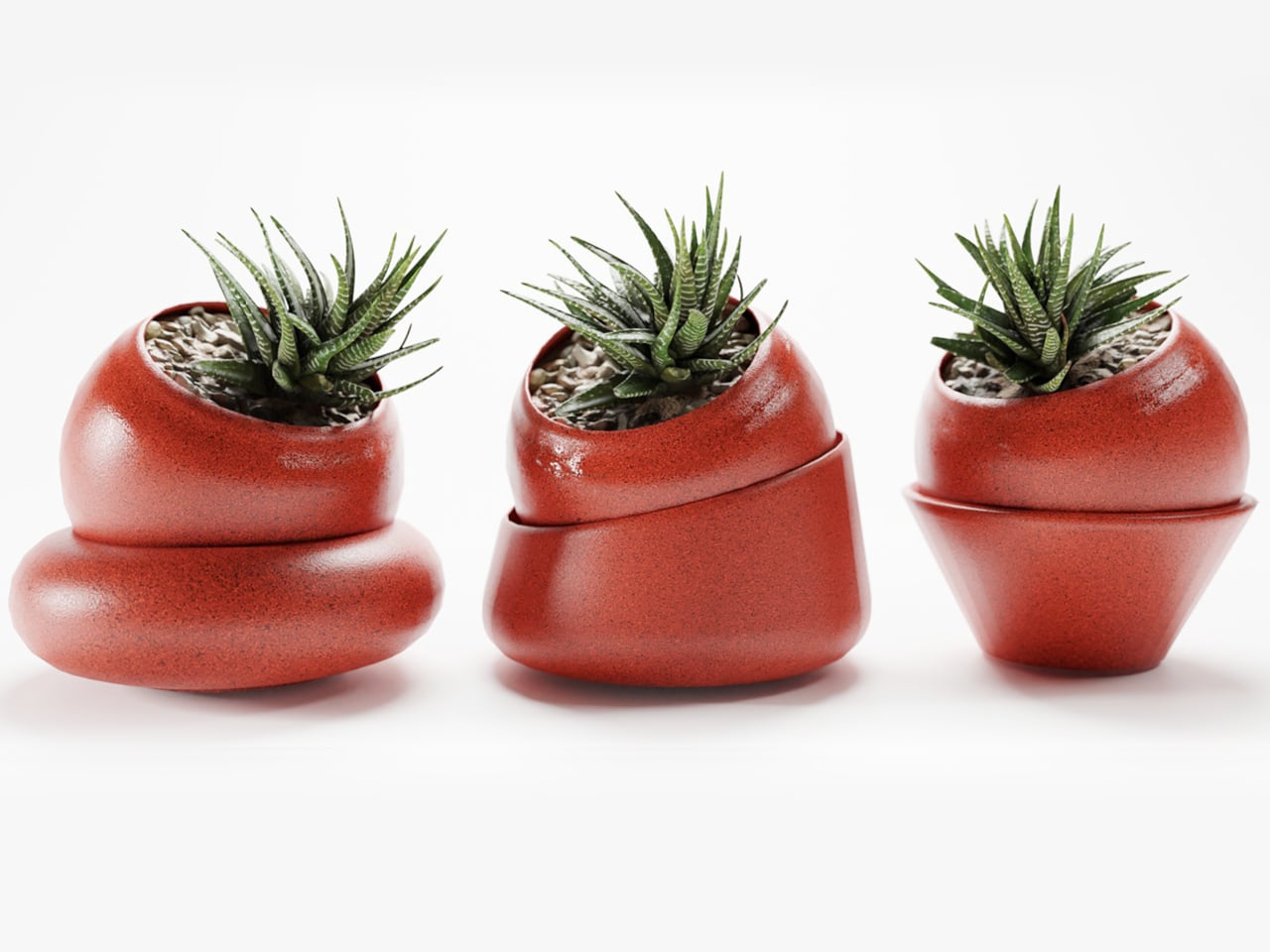
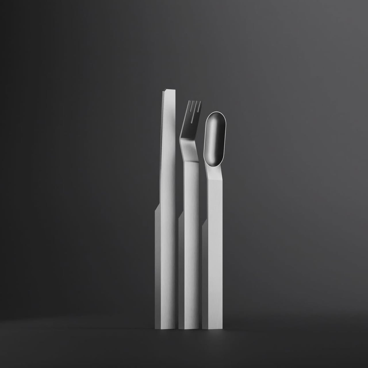
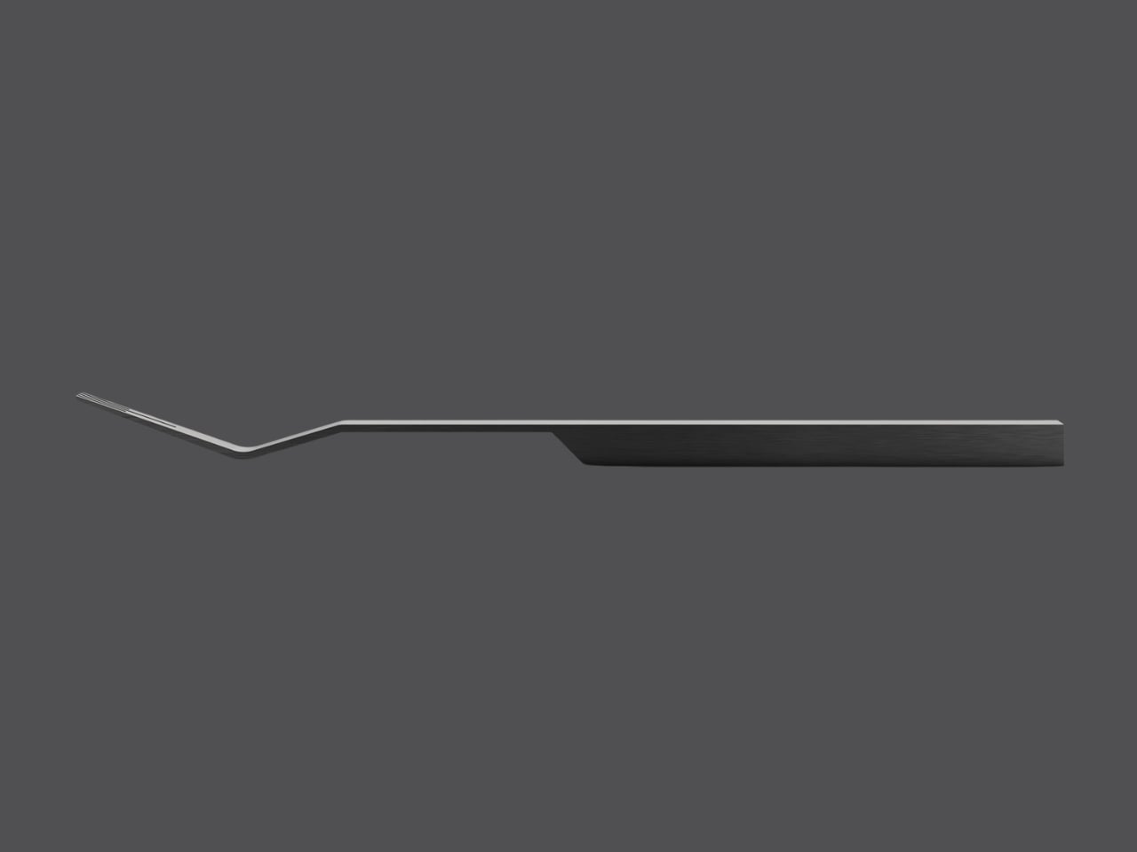
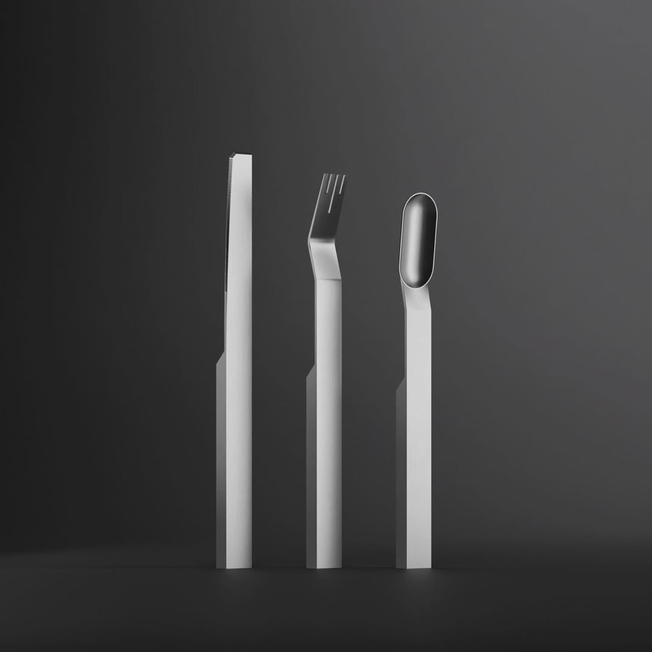
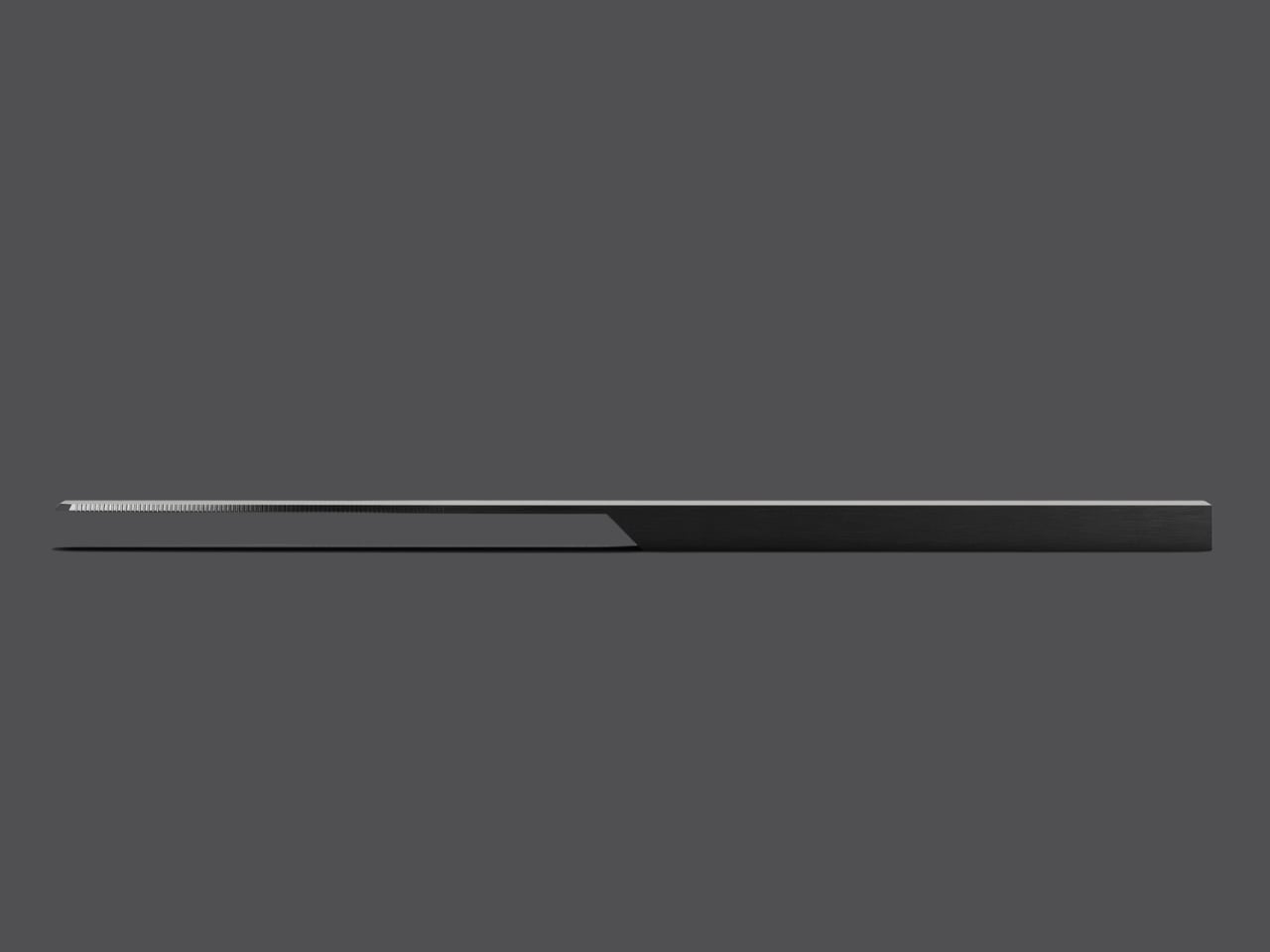
Posha is a compact desk planter built around a passive self-watering system. It separates water storage from the soil zone, with a concealed reservoir at the base and a wick or capillary pathway that draws moisture upward only as the plant needs it. The roots stay hydrated without sitting in water, which reduces overwatering and stretches the time between refills in a way that suits distracted desk life and unpredictable schedules.
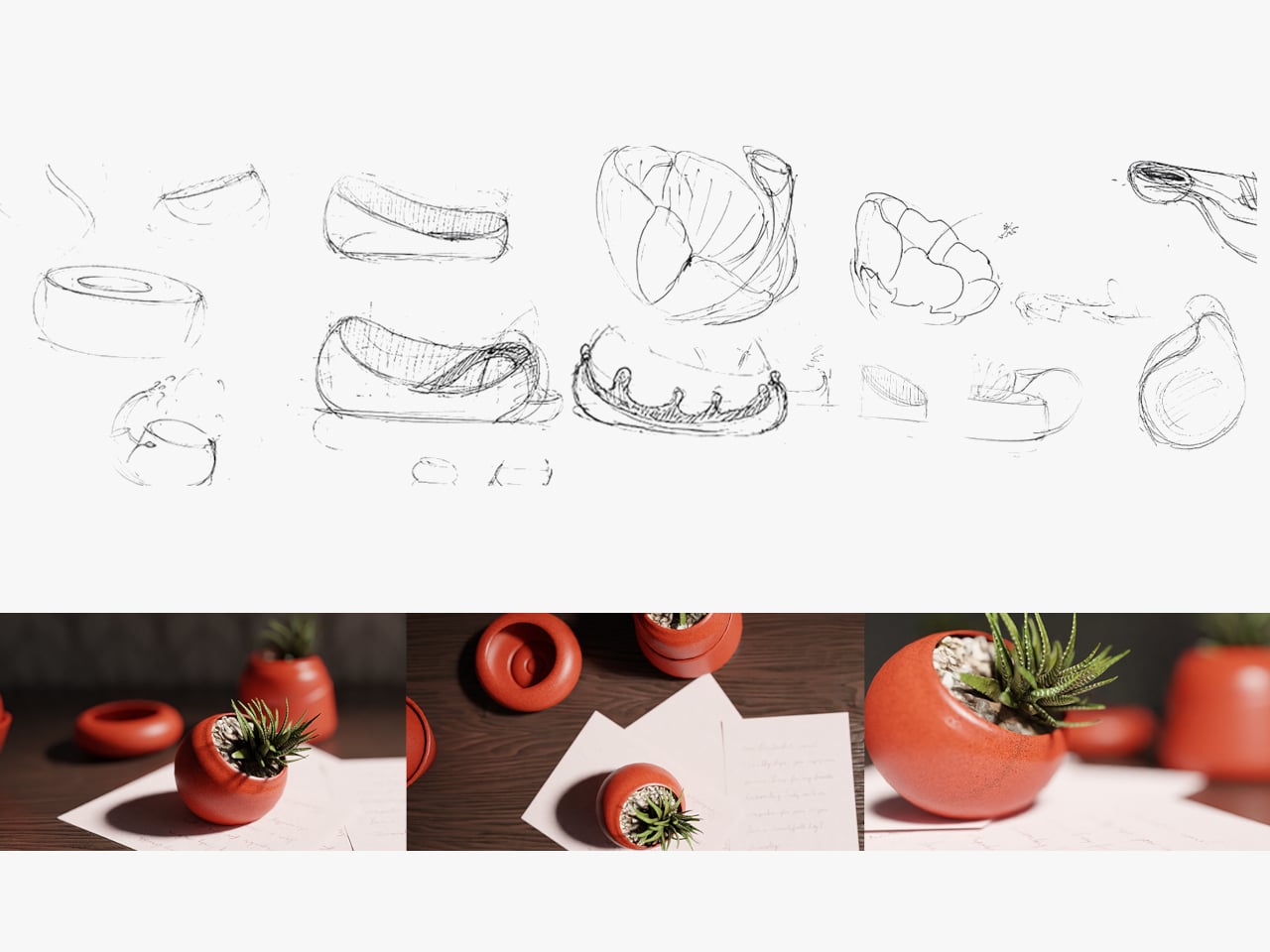
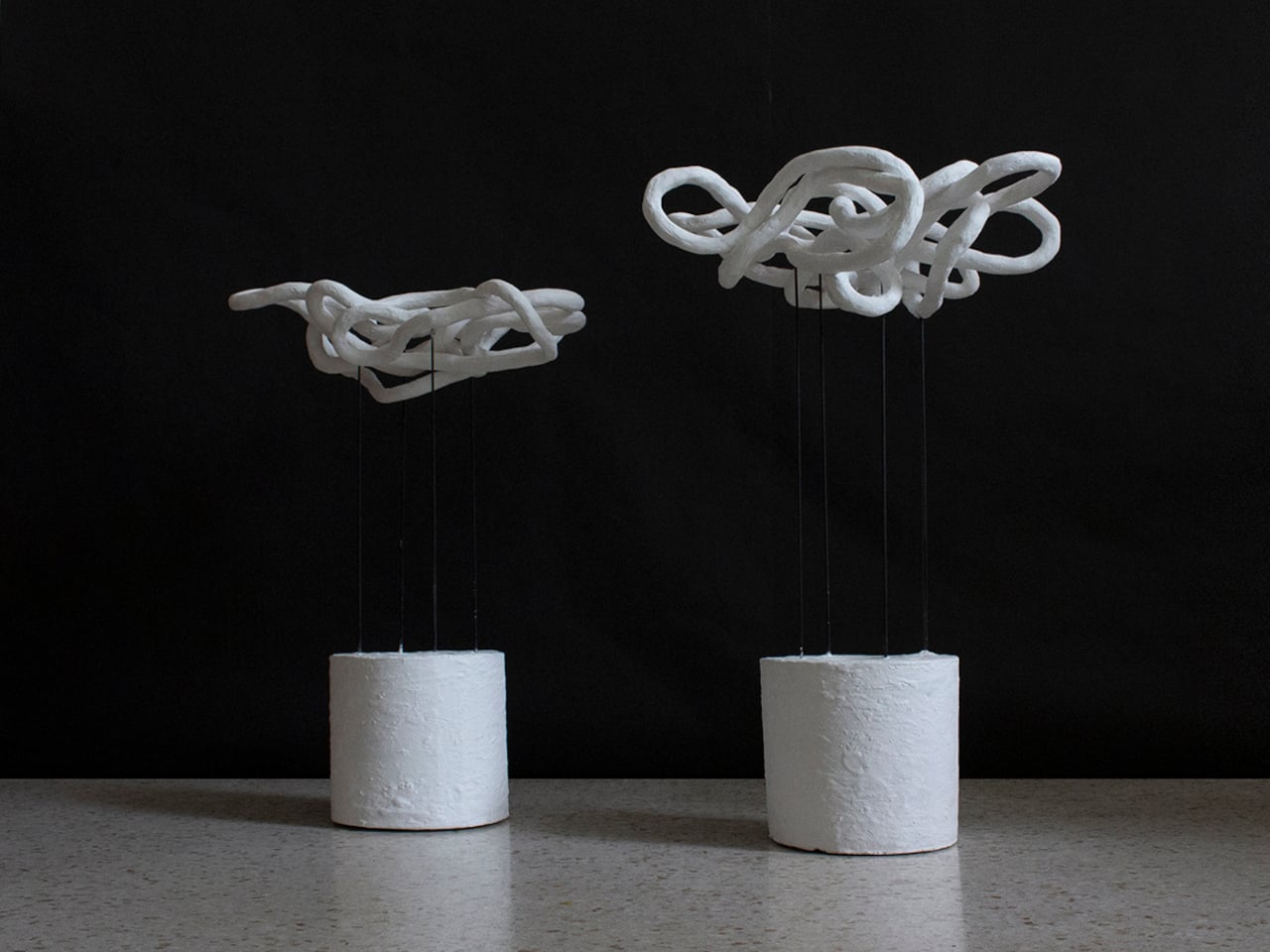
Early explorations focused on proportions and water behaviour, how much water a compact planter should realistically store, how fast it should release moisture, and how to keep the system stable without adding visual clutter. Several internal layouts were tested to balance soil volume, reservoir capacity, and airflow, so the plant remains healthy while the planter stays small and unobtrusive on a work surface next to keyboards and coffee cups.
The form is deliberately minimal, so from the outside it reads as a simple desk object rather than a technical product. The complexity is pushed inward, where the water chamber, soil separator, and wicking element work together as a single system. The geometry avoids sharp transitions so water can distribute evenly, and the top opening is sized for common indoor plants without making planting or pruning awkward when you need to swap species.
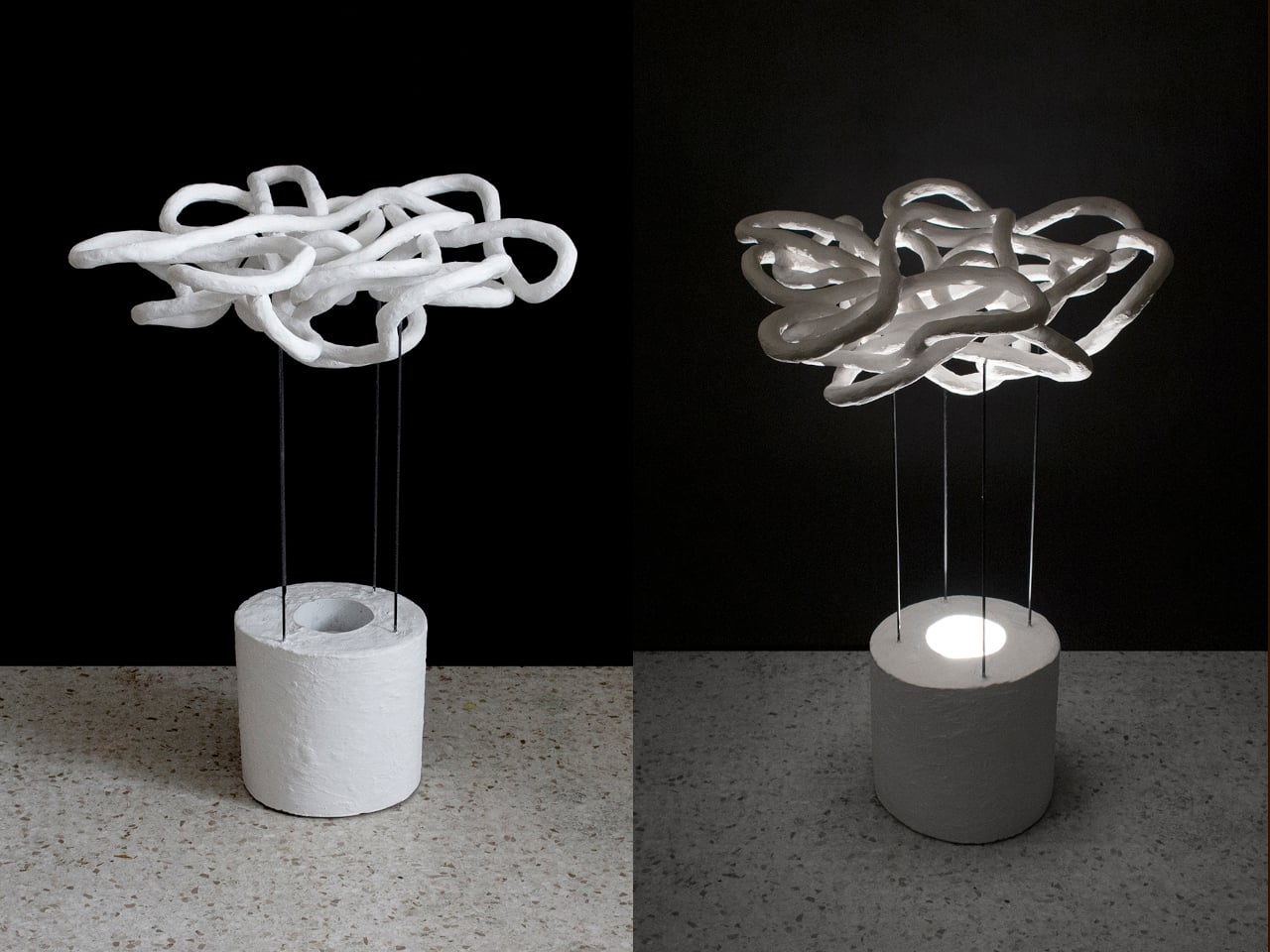
Refilling is straightforward and non-disruptive; the water inlet is integrated into the form so it does not dominate the appearance, and the reservoir can be topped up without removing the plant. The system is designed to be reusable and serviceable, allowing the planter to be cleaned or replanted over time rather than treated as a disposable object that gets tossed when the first plant fails or the season changes.
What defines Posha is not a single interaction but how it behaves over weeks of use. The soil stays consistently moist, the plant experiences less stress, and the user interacts with it less frequently but more intentionally. Plant care shifts from a daily responsibility to an occasional check-in, better suited to desks, studios, and workspaces where attention is already stretched thin, and memory is unreliable at best.
Posha demonstrates how small functional decisions, like separating water and soil and hiding the reservoir, can significantly change user behaviour and plant health. By working quietly in the background and doing one job well, the self-watering desk planter supports healthier plants and a calmer relationship between people and the living things they keep nearby, which is a surprisingly meaningful outcome for such a small piece of desk real estate that could have easily stayed simple and decorative.
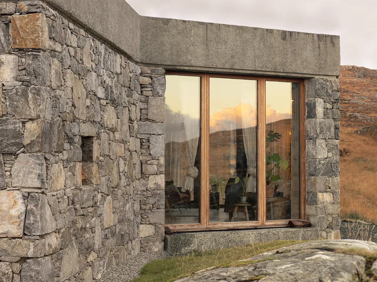
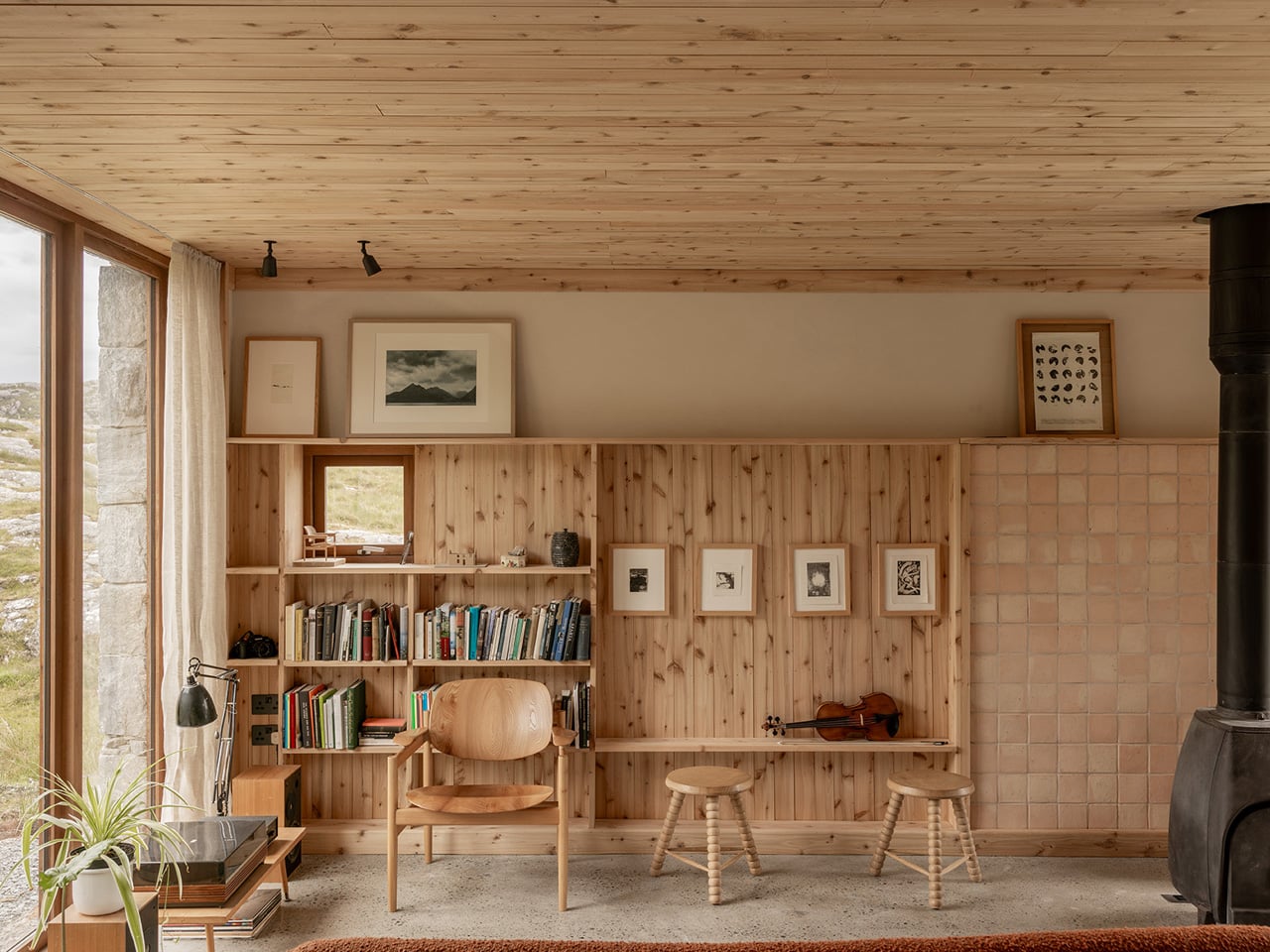
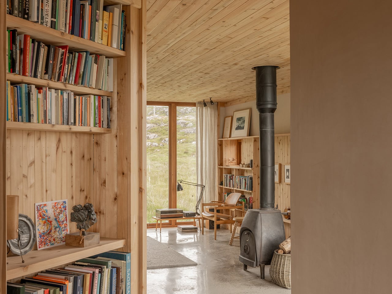
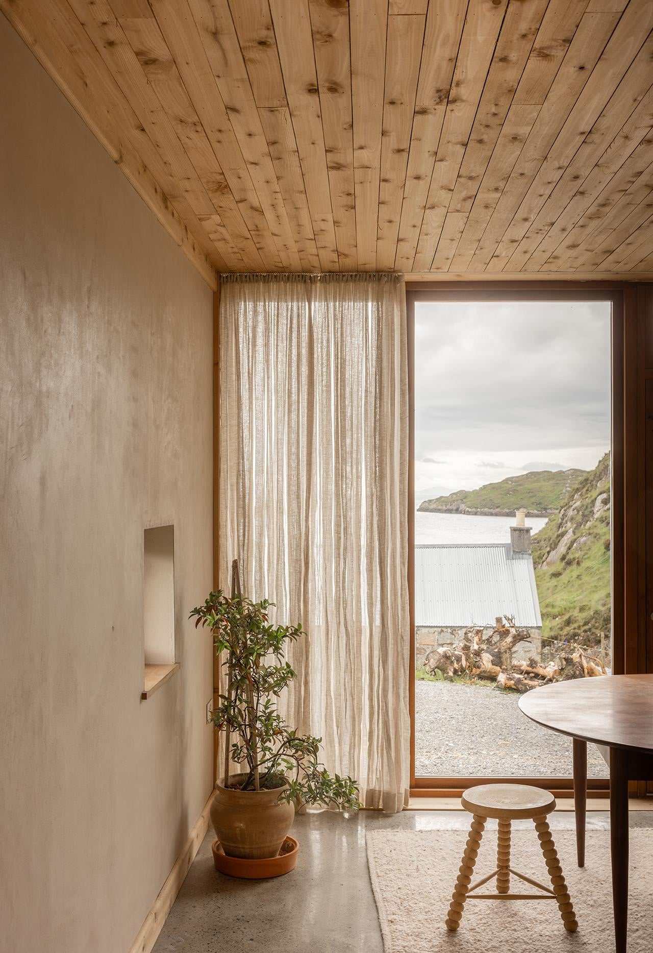
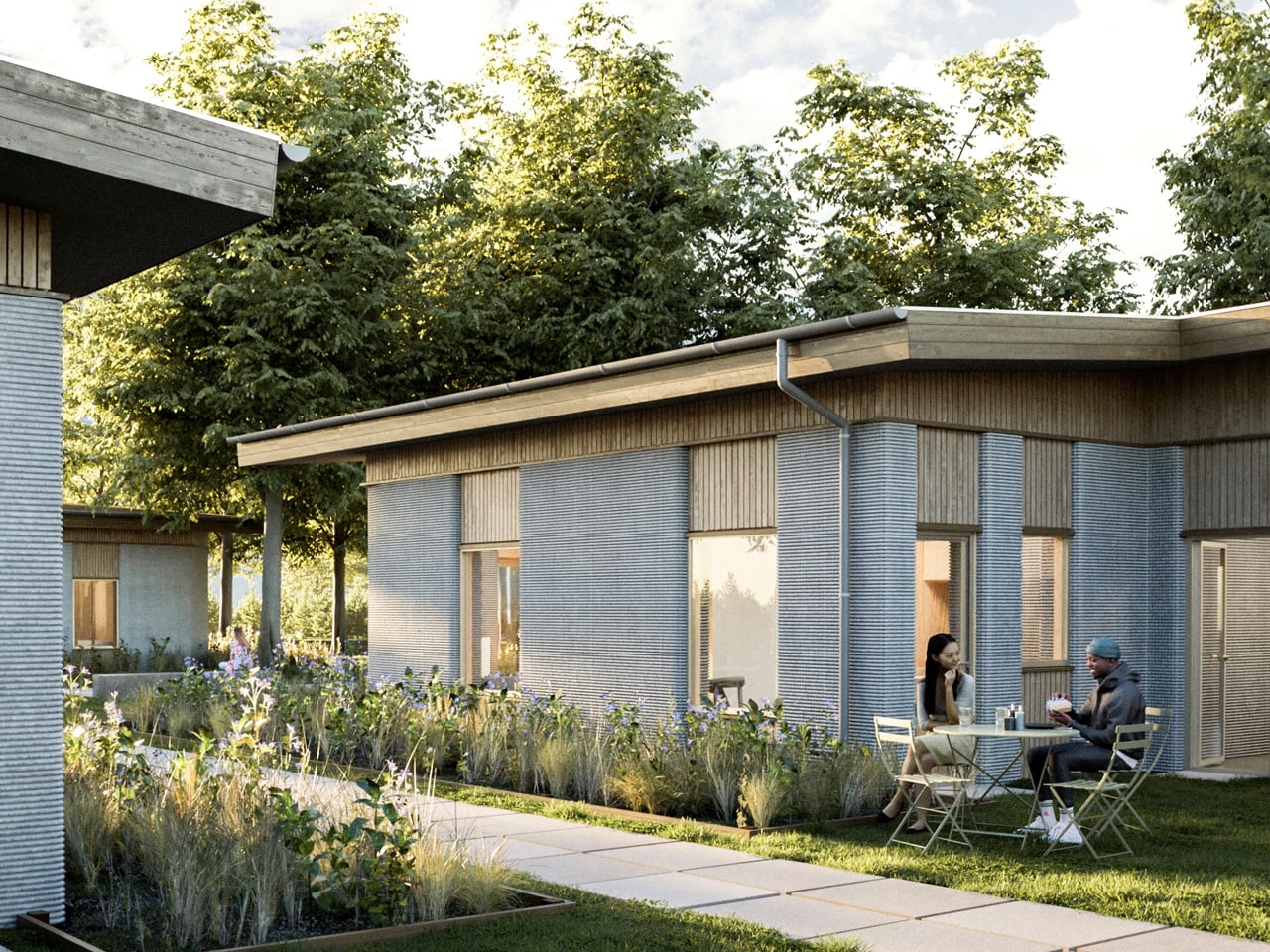
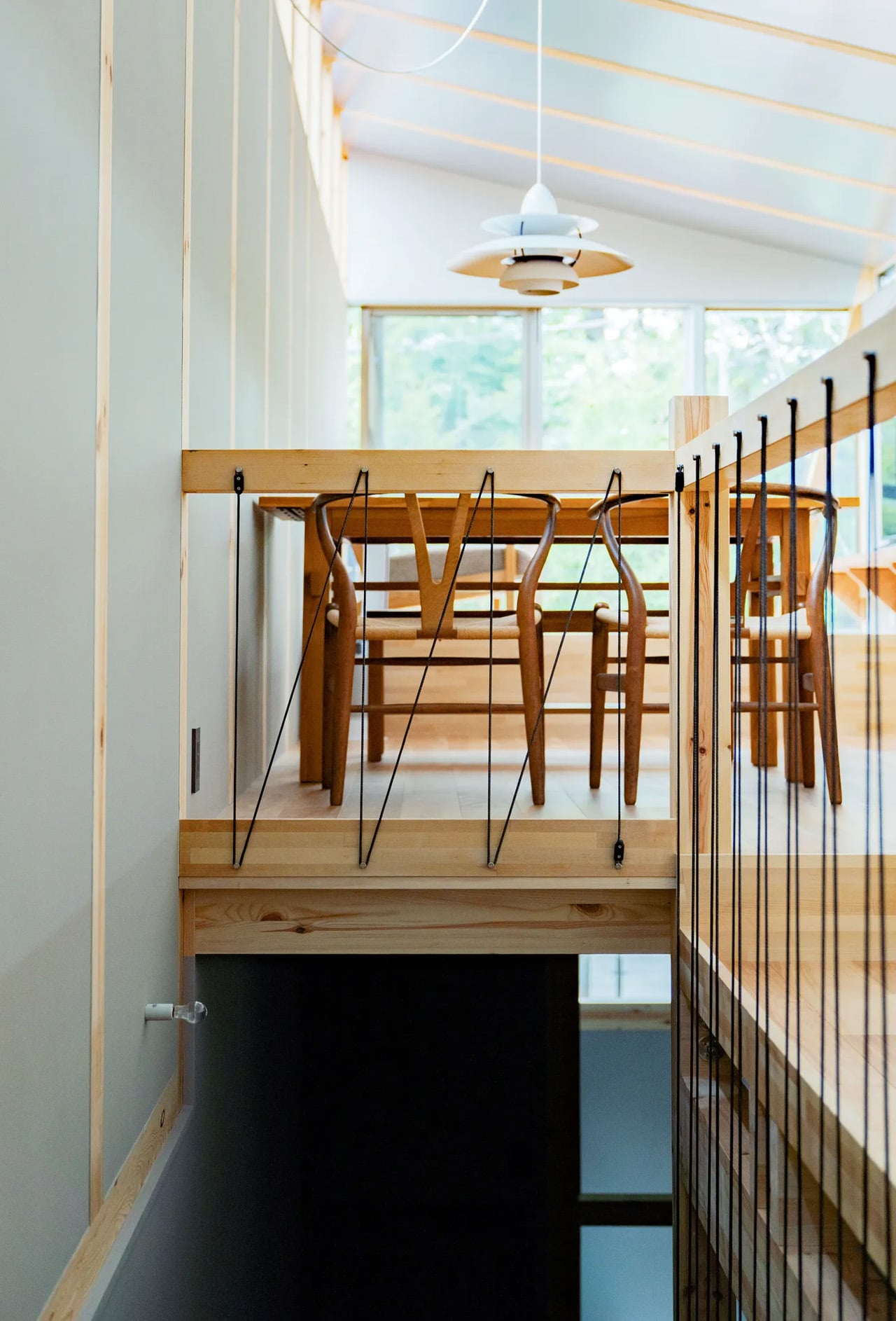
On a rocky outcrop in Scotland’s Outer Hebrides, where Atlantic winds batter the coastline and ancient Lewisian Gneiss stone shapes the landscape, sits Caochan na Creige. This modest one-bedroom home has just been crowned RIBA House of the Year 2025, Britain’s most prestigious residential architecture award. Perched in a sheltered inlet in the Bay of Harris with panoramic views across the Minch to Skye, the house represents a remarkable achievement in contemporary residential design, celebrated for its sensitivity to place, exceptional craftsmanship, and resilience in one of Europe’s most challenging environments.
The name translates as “little quiet one by the rock,” a poetic description developed with landscape architect John Murray, author of ‘Reading The Gaelic Landscape.’ It’s a fitting moniker for a house that seems to grow organically from its surroundings. The house’s irregular, angled plan emerged from a philosophy of “working with the landscape rather than against it.” The foundations carefully avoided areas of incredibly hard rock, allowing the building to settle naturally into its site. This approach created a sculptural form that appears to be part of the landscape itself, with an enigmatic presence that recalls defensive structures and castles while maintaining an intimate scale.
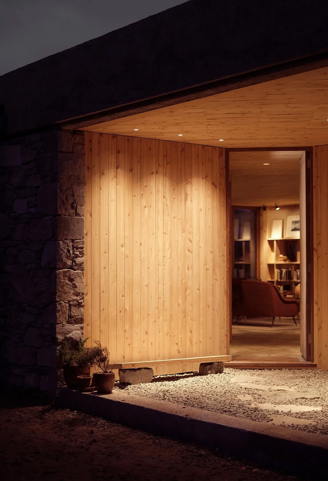
Eilidh Izat and Jack Arundell, co-founders of architectural practice Izat Arundell, designed and built their own home entirely by hand. Working alongside Eilidh’s brother Alasdair Izat, a furniture maker, and their friend Dan Macaulay, a stonemason, they broke ground in January 2022. The build took 18 months, during which the small team battled through nine named storms in one of Europe’s most unforgiving environments. This extraordinary feat of ambition and resilience transformed a tight budget and challenging conditions into opportunities for innovation and craftsmanship.
The sculptural form is clad in the same Lewisian Gneiss rock on which it sits, sourced from a quarry less than five miles away. This ancient stone, billions of years old, gives the house a timeless quality that connects it deeply to its surroundings. A concrete parapet with exposed Lewisian Gneiss aggregate caps the stone walls, creating a contemporary counterpoint to the traditional material. The stone is used full thickness as exterior cladding, demonstrating a commitment to authenticity and durability. Together with hardwood windows, these material choices create a contemporary air to the design while respecting the vernacular traditions of the island.
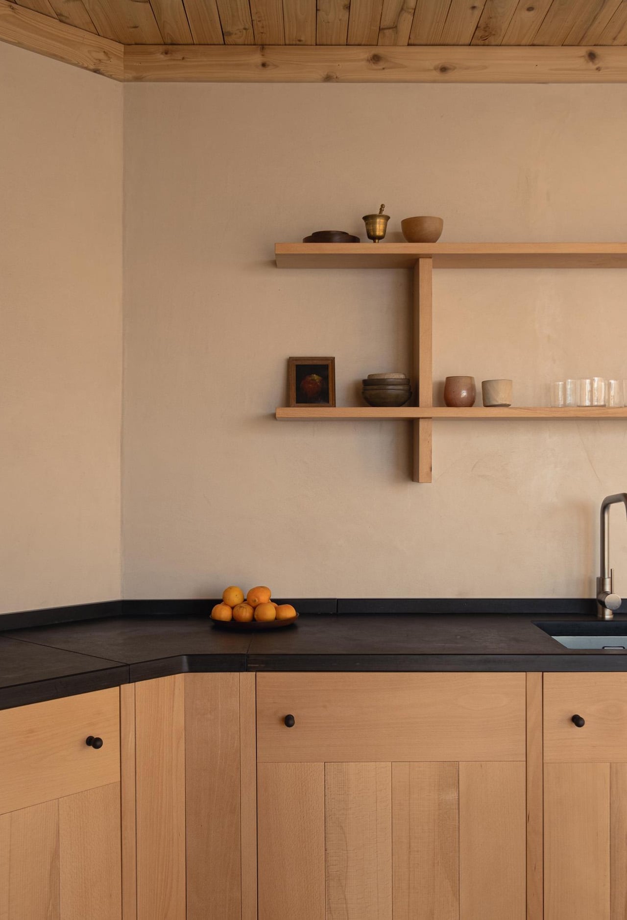
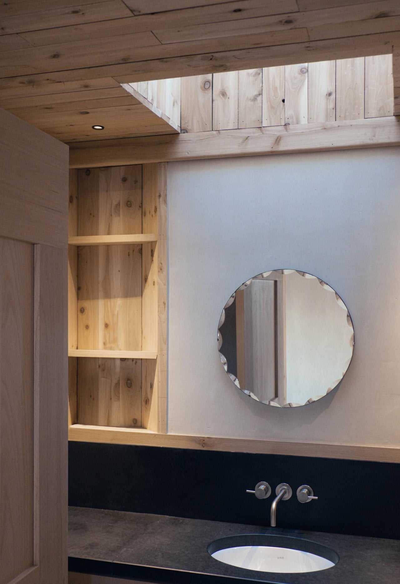
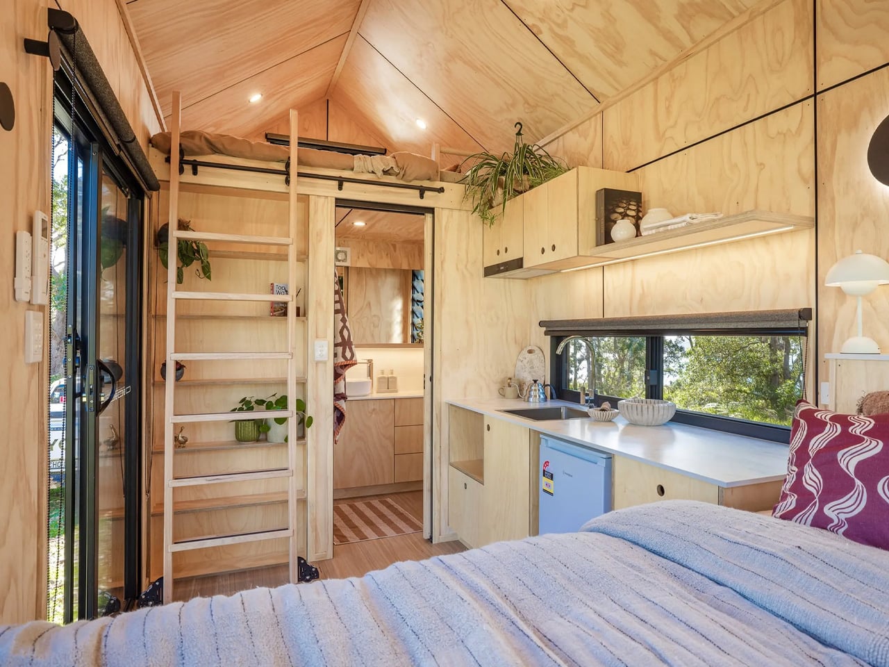
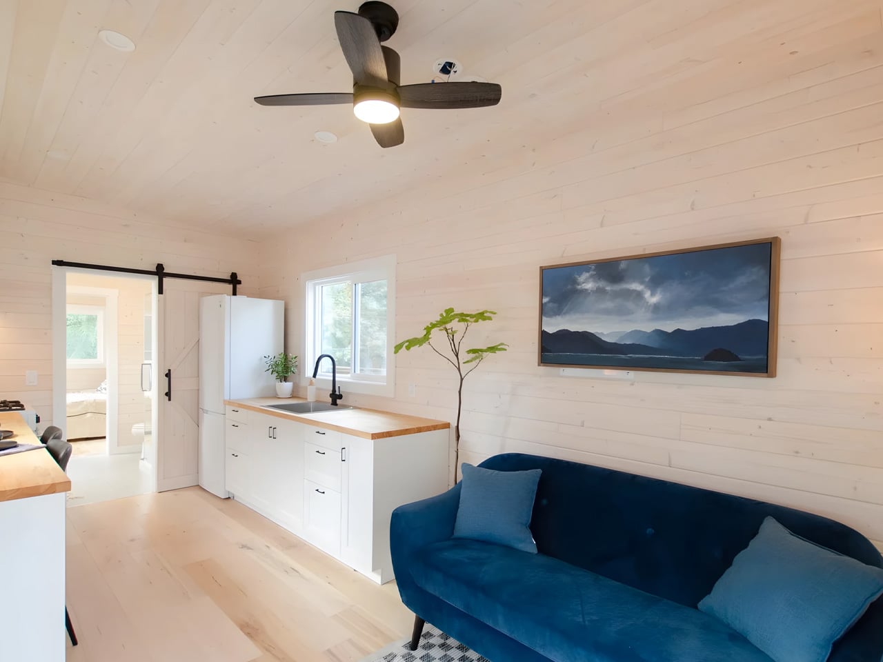
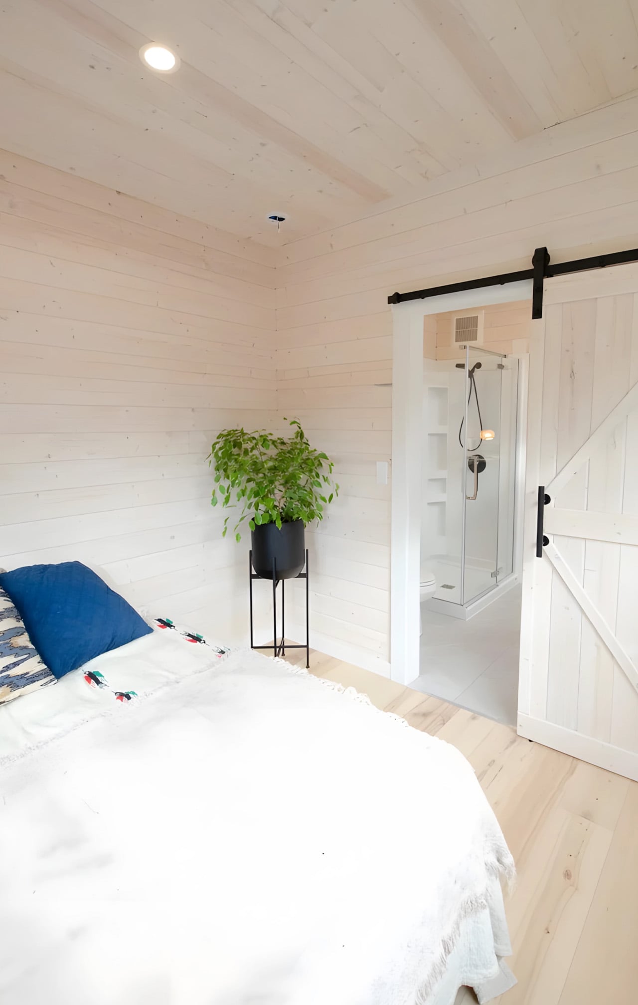
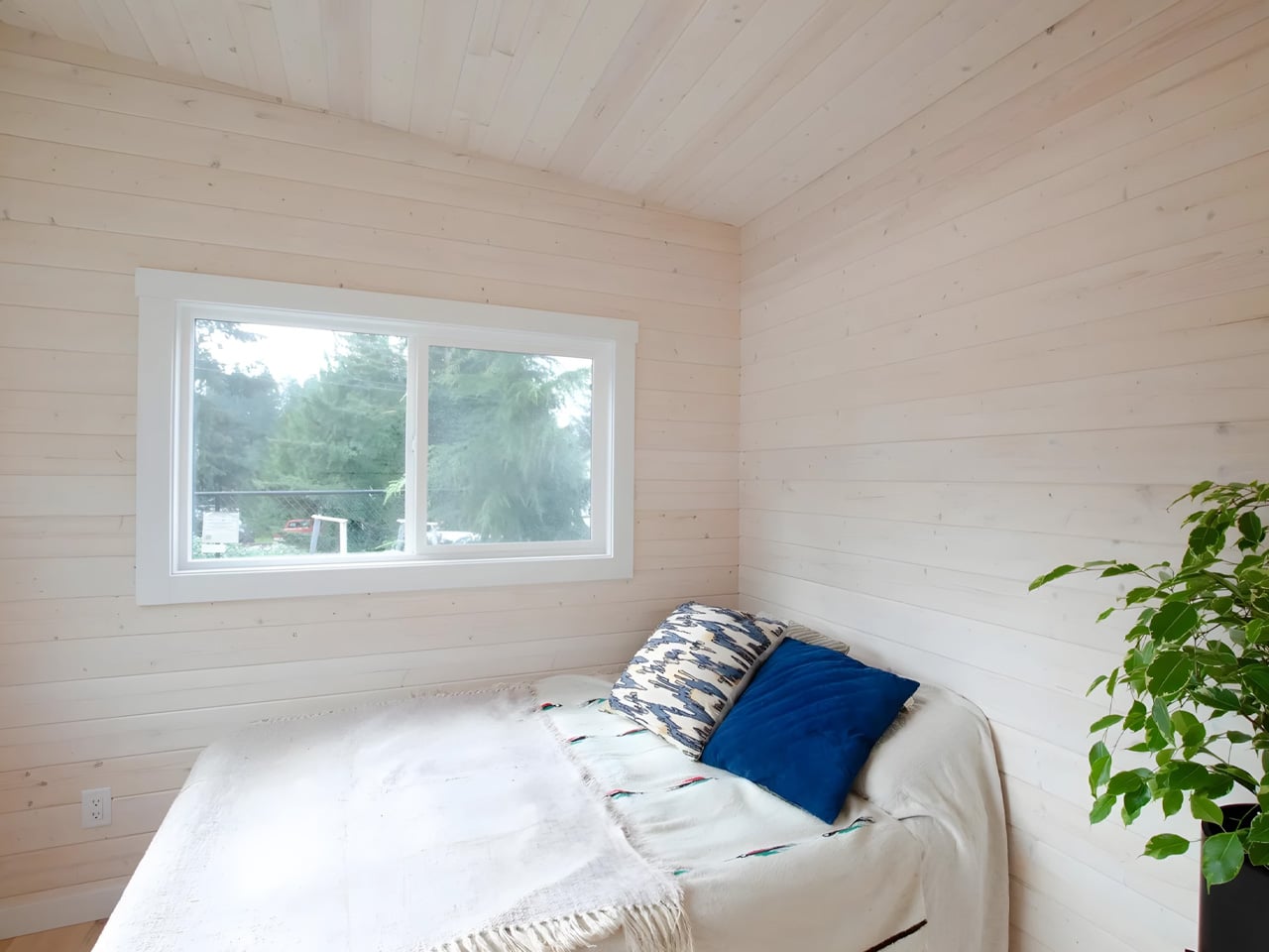
Inside, soft angles weave throughout the home, creating spaces that flow into one another while remaining defined, inspired by the gently shaped blackhouses’ vernacular to the island. An entrance porch, utility area, and skylit bathroom occupy the center of the plan, with a bedroom protruding to the northwest and a living room and kitchen filling the eastern half, maximizing those dramatic sea views. Despite its modest size, the house feels luxurious in its connection to the surrounding landscape, with every spatial decision carefully considered to enhance the experience of living in this remote and spectacular location.
The project represents a growing movement of ultra-contemporary homes in Scotland’s remote landscapes, following RIBA House of the Year 2018 winner Lochside House and the RIAS Andrew Doolan Best Building in Scotland Award winner Cuddymoss. David Kohn, chair of the RIBA House of the Year Award 2025 jury, praised the unanimous decision: “It addressed every issue – challenging climatic conditions, the relationship to vernacular architecture and a tight budget – with a rare mixture of sensitivity and boldness.” Caochan na Creige has also won the Laurence McIntosh Interior Design Award at the 2025 RIAS ceremony and features on the cover of ‘New Scottish Houses: Contemporary Architecture and Living in the Landscape’ by Isabelle Priest. It proves that exceptional architecture doesn’t require vast resources, just vision, determination, and a deep respect for place.
Pantone has taken a surprising turn for 2026, choosing a shade that feels almost weightless, simple at first glance, yet reflective enough to echo every color around it. Cloud Dancer (PANTONE 11-4201), a soft, airy white, emerges as a soothing antidote for a world craving stillness, clarity, and mental reset.
This understated hue speaks to the overstimulation and digital noise of modern life, offering a visual pause amid the chaos. As a trend, Cloud Dancer embodies minimalism with meaning, which is clean, thoughtful, and emotionally grounding. Versatile yet quietly sophisticated, it creates a space for other colors to breathe while making its own serene, modern statement, which is a calm canvas for mindful living. To see how Cloud Dancer’s serene, versatile qualities can transform interiors, here are five key ways to incorporate this calming shade into your home design.
1. Soft-Toned Furniture
Soft-toned furniture in Cloud Dancer, Pantone’s Color of the Year 2026, brings a gentle, modern refinement to any space. Sofas, armchairs, and ottomans in this airy white create a sense of calm while maintaining a contemporary edge. The shade’s soft luminosity helps rooms feel more open, making it ideal for compact spaces or minimalist interiors.
What sets Cloud Dancer apart is its ability to add warmth without heaviness. When applied to upholstered pieces, it softens the architecture of a room and pairs beautifully with natural textures like wood, linen, or stone. The result is a balanced, serene environment that feels both stylish and restorative.
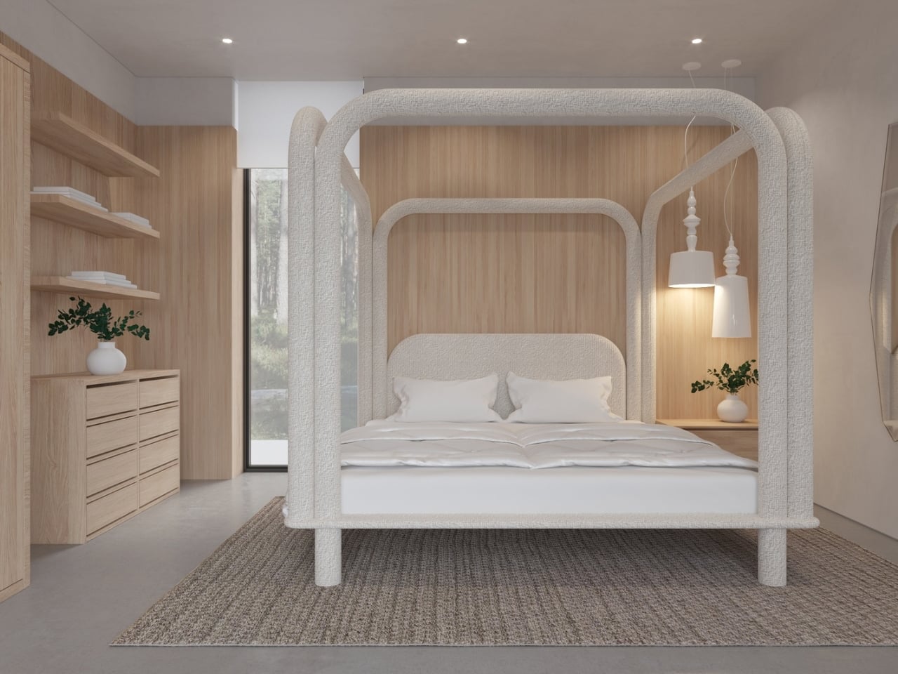
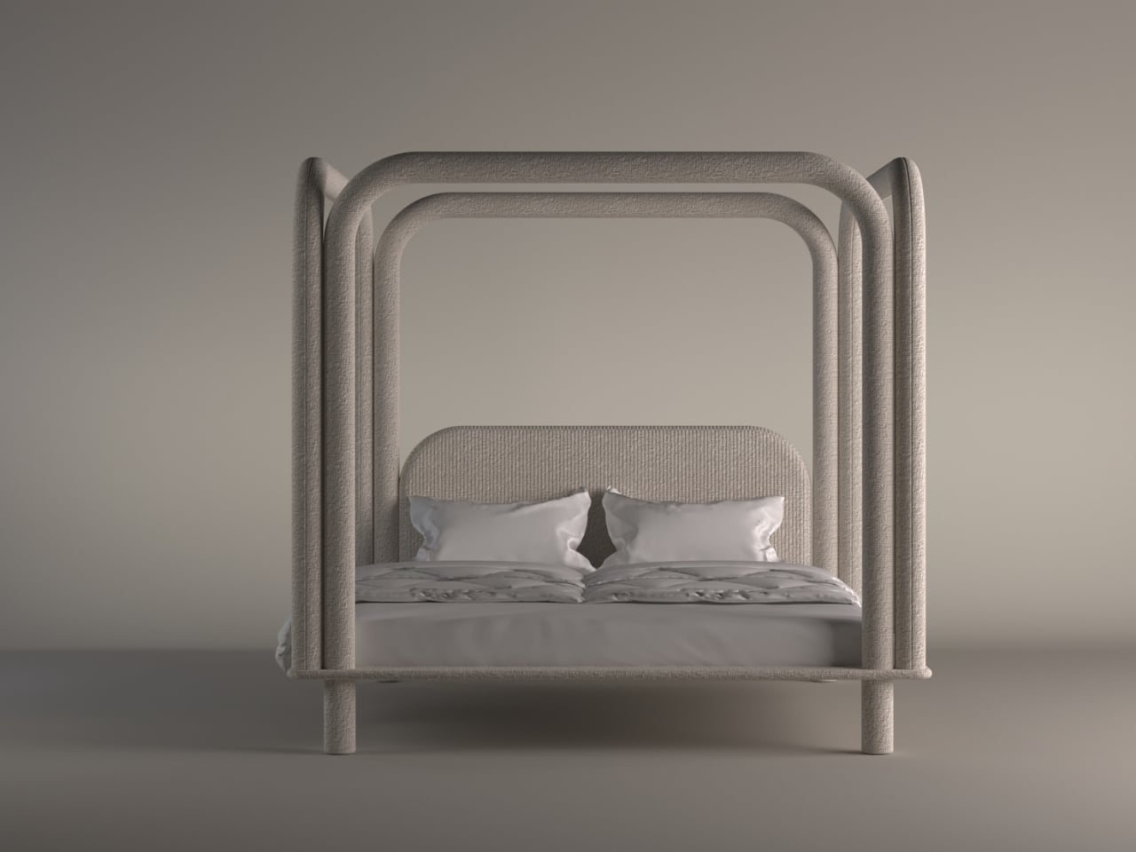
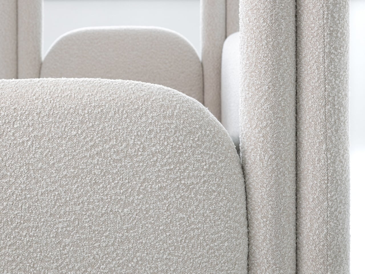
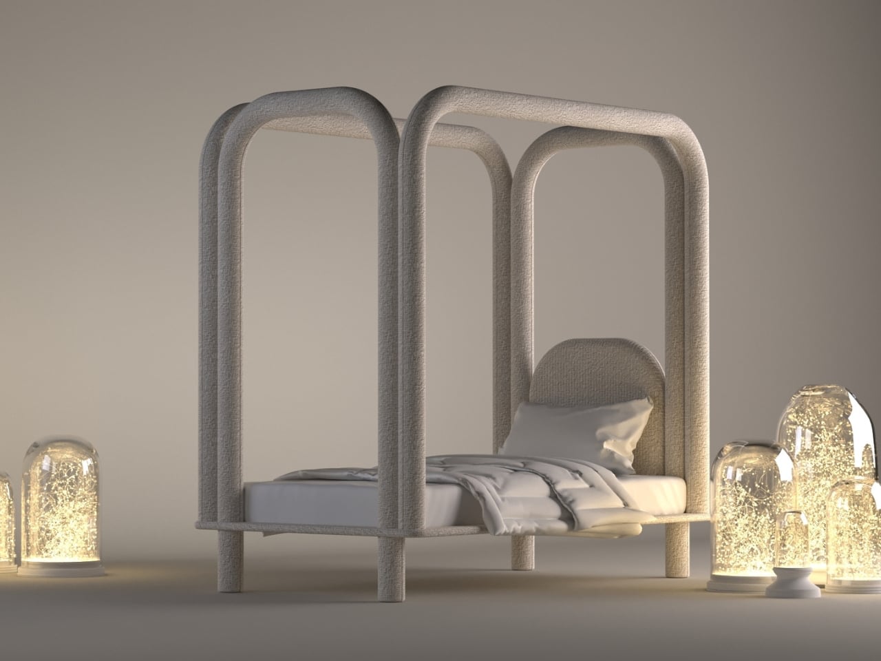
Designers are now treating the bed as a sculptural centerpiece or an element that sets the emotional tone of the entire room. The Roundish Bed captures this shift beautifully. Its creamy palette, rounded silhouette, and sanctuary-like presence reflect the growing preference for softer forms and serene aesthetics. Instead of rigid lines or bulky frames, it introduces a gentle visual language that feels restorative the moment you step into the space.
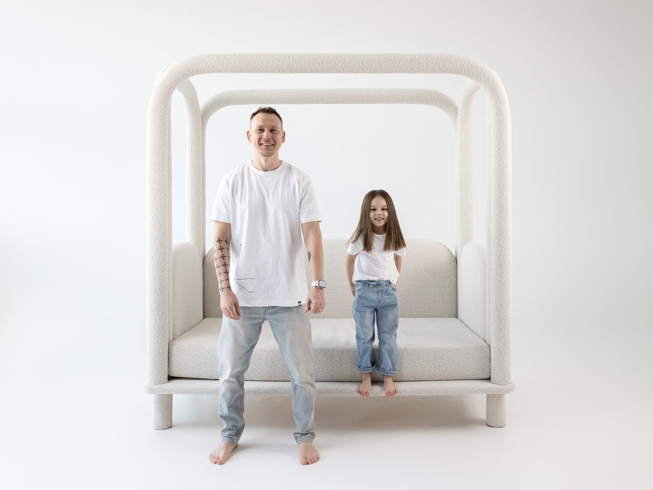
Wrapped in plush foam and tactile textiles, the design creates a cocooning effect that brings quiet sophistication to the bedroom. Every curve is intentional, enhancing both comfort and safety – especially for families. Its popularity even inspired a kids’ version, scaled down yet equally soft and inviting. With its warm geometry and calming simplicity, the Roundish collection shows how gentle neutrals and fluid shapes are reshaping modern living into something more soothing, minimal, and deeply nurturing.
2. Sculptural Lighting
Sculptural lighting becomes even more refined when expressed in Pantone’s Cloud Dancer, which enhances the trend toward quiet, effortless luxury. Whether used on matte ceramic bases or frosted-glass pendants, this shade transforms lighting into a calming focal point. The glow feels diffused and gentle, bringing a sense of balance and serenity to any room.
In contemporary and minimalist interiors, Cloud Dancer allows the form of the fixture to shine without overwhelming the space. Its clean, billowy tone amplifies the artistic quality of sculptural lighting, turning functional pieces into subtle works of design. The result is illumination that feels soothing, modern, and beautifully intentional.
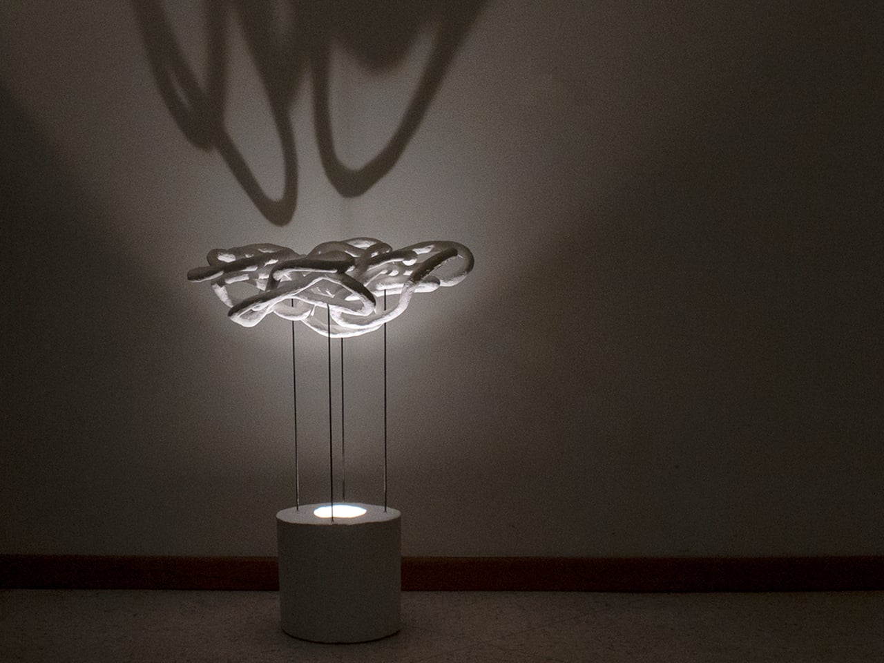
Most lighting fixtures behave predictably, looking the same whether they’re switched on or off. Taeg Nishimoto’s LOOPS lamp breaks that pattern completely. By day, it appears modest and sculptural, but once illuminated, it transforms the room into a canvas of shifting, intricate shadows. Built from simple materials like sisal rope, plaster, concrete, and steel rods, the lamp proves that innovation doesn’t require luxury and is just an intention. Nishimoto forms loose loops from untwisted sisal rope, stabilizes them with fabric hardener, and wraps them in fast-setting plaster, creating surfaces that feel raw, organic, and entirely handmade.
These plastered loops are joined where they naturally touch, forming clusters that resemble natural formations like dunes or coral. Elevated on slim steel rods above a concrete base, hiding the light source, the lamp casts dramatic patterns across walls and ceilings when lit. The effect feels part lighting, part art installation.
3. Decorative Accessories
The color’s soft, airy white finish highlights form over decoration, allowing curves, contours, and textures to take center stage. Whether crafted in matte ceramic, hand-thrown stoneware, or frosted glass, these pieces act as subtle anchors that calm visual pauses within a space filled with color and pattern. Even a single Cloud Dancer vase can add a touch of serene modernity to a console or side table.
In minimalist, contemporary, or Japandi-inspired settings, this gentle hue enhances the sculptural quality of each piece. The neutral tone makes dried florals, branches, and fresh greenery appear more vivid, creating a balanced yet elevated look. These vases don’t just hold arrangements—they shape the atmosphere, reinforcing the 2026 shift toward softer aesthetics, mindful styling, and timeless quiet luxury.
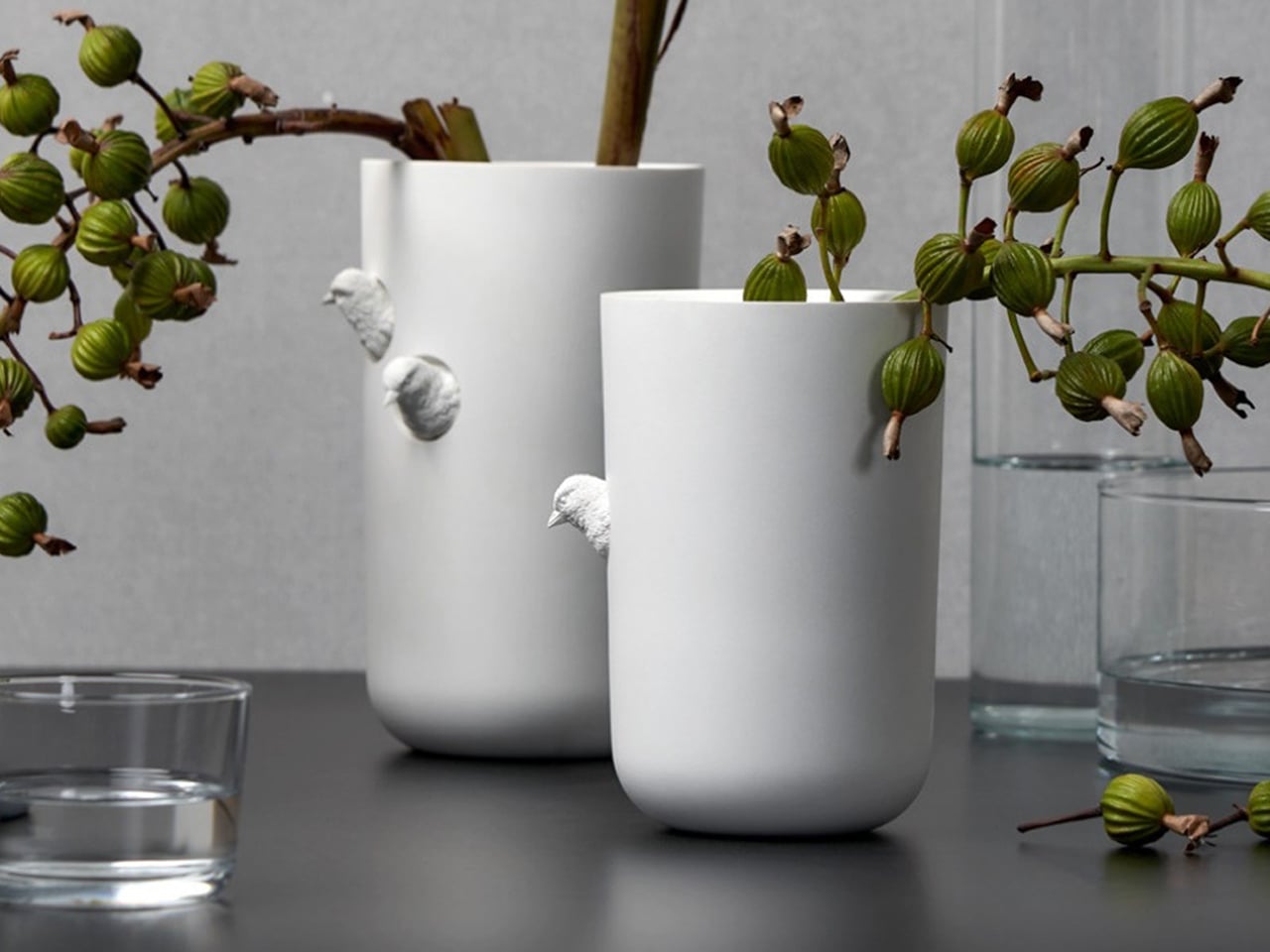
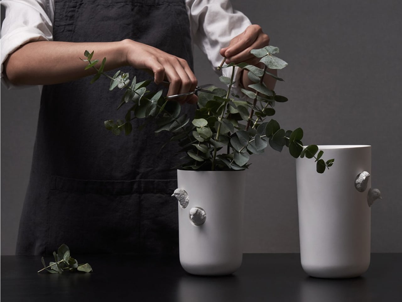
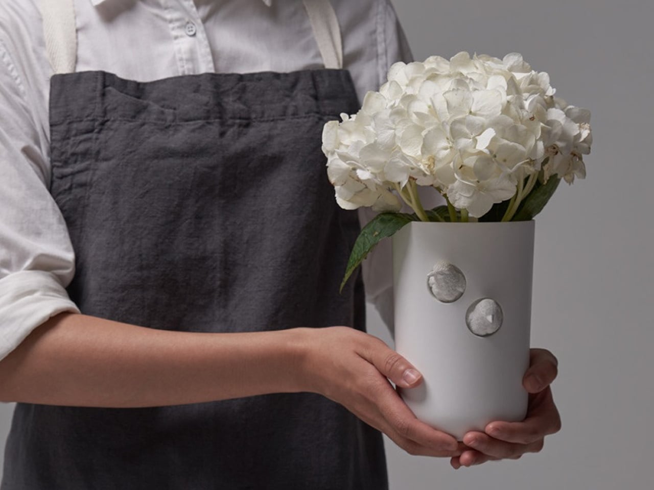
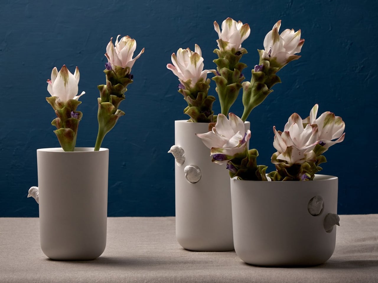
The Sparrow X Vase from Haoshi Design brings an artful twist to a classic silhouette. Its clean, seamless form is gently interrupted by two finely sculpted sparrows that appear to peek out from the vase itself. These curious little birds add a touch of personality and storytelling, turning an otherwise minimalist vessel into a piece that invites a second look.
Their intricate detailing stands in striking contrast to the vase’s smooth, marble-like white surface, highlighting both craftsmanship and restraint. The sparrows not only introduce visual charm but also echo the organic beauty of the blooms placed inside. Together, the form, texture, and sculptural accents create a vase that feels serene, distinctive, and quietly poetic.
4. Bedding, Textiles & Cozy Layers
Soft, white-but-warm bedding instantly transforms a bedroom into a restorative retreat. Linens, duvets, throws, and blankets in gentle, airy tones create a serene foundation, promoting calm and mindful living. Their neutral palette allows the room to feel open and balanced, while adding subtle warmth that makes the space inviting rather than sterile.
When layered thoughtfully, these textiles bring comfort and style. A plush duvet paired with cozy blankets, textured throws, or tactile cushions enhances the sensory experience, making the bed feel luxurious and welcoming. This approach turns everyday bedding into a tool for relaxation, emphasizing softness, simplicity, and a quiet, elevated aesthetic that supports modern mindful living.
With the HILU blanket, getting a good night’s sleep becomes simpler and cooler. This innovative blanket is four times cooler than linen, yet still soft and cozy against your skin. It’s Adaptex CoolWeev fabric, woven from gel‑spun Eco‑cool Polyfibers, pulls warmth away from your body, helping you sleep undisturbed and sweat‑free. Lightweight but sturdy, the blanket works as a duvet, throw, or even a mattress topper—adaptable through all seasons.
Beyond cooling, HILU blankets care for your health and comfort. The fabric is antimicrobial and hypoallergenic, reducing bacteria, odors, and skin irritation. Designed with sustainability in mind, it’s made from OEKO‑TEX-certified recycled materials and built to last.
5. Modern Kitchen Cabinets
Applying this soft, neutral tone to kitchen cabinetry instantly elevates the space, creating a crisp and refined aesthetic. Its clean, airy quality balances beautifully with warm wooden surfaces, adding depth and sophistication without feeling heavy or overpowering. Whether used on upper cabinets, lower drawers, or full pantry units, the tone brings a timeless, minimalist touch to the kitchen.
Pairing these cabinets with brushed metal handles or sculptural hardware enhances the modern feel while maintaining warmth and tactility. The result is a kitchen that feels light, elegant, and carefully curated, or a space that blends functionality with quiet luxury and makes every culinary experience feel thoughtful and stylish.
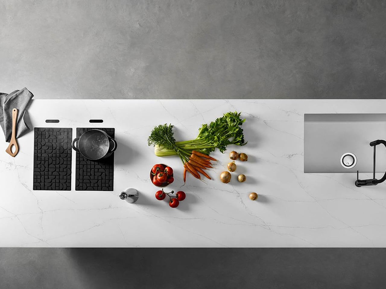
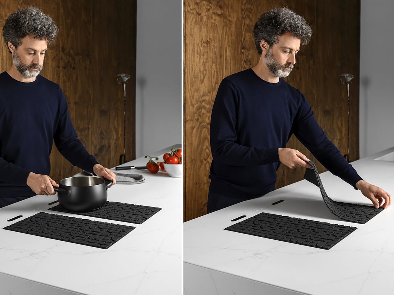
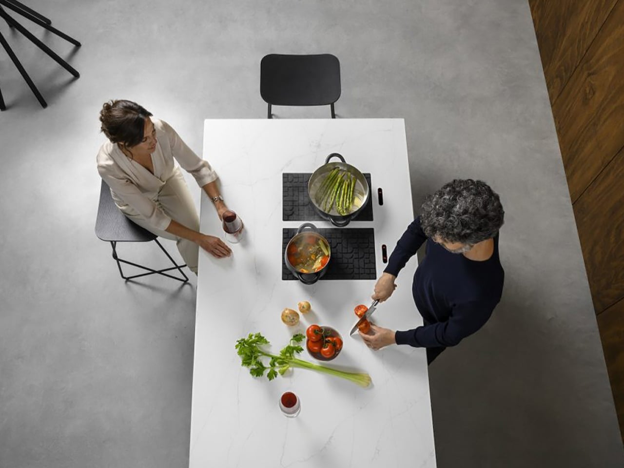
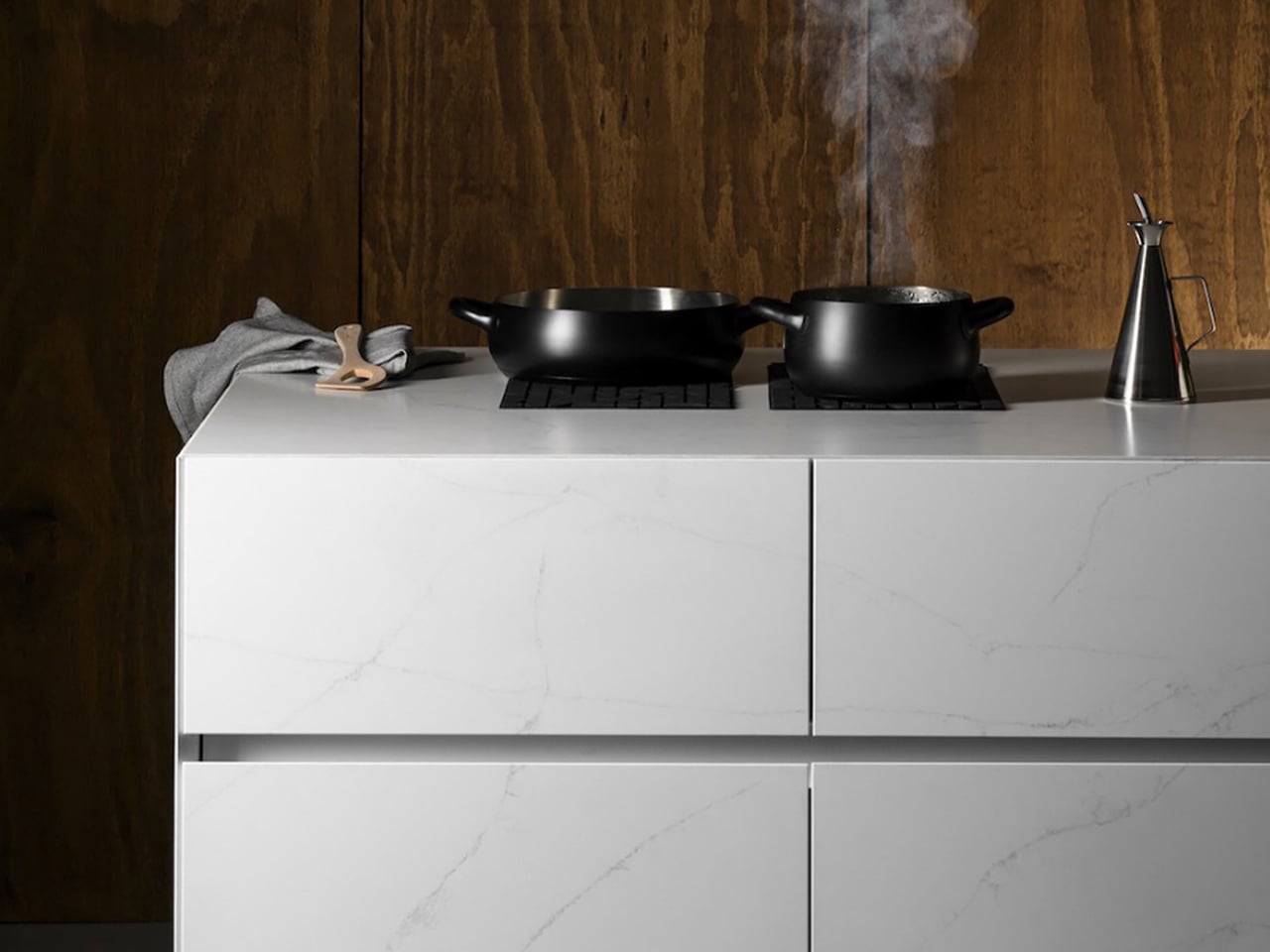
Soft, white tones on kitchen cabinets create a crisp, refined backdrop that instantly brightens the space and highlights the quality of surrounding surfaces. Paired with warm wooden accents or brushed metal hardware, the white cabinetry adds depth and a sense of modern elegance. Complementing this, a high-performance sintered stone countertop in light or neutral shades elevates the kitchen’s aesthetic while offering unmatched durability. The smooth, non-porous surface of Lapitec stone is resistant to stains, chemicals, and heat, making it ideal for both functional and stylish kitchen designs. Its range of finishes allows seamless integration with cabinetry, creating a harmonious, sophisticated environment that feels airy and inviting.
The Lapitec Chef induction system, hidden beneath the countertop, enhances this modern setup. Activated by a silicone mat, it transforms the white countertop into a fully functional cooking surface while keeping the workspace clean and versatile.
As Pantone’s Cloud Dancer ushers in 2026, companies across design, interiors, and lifestyle sectors have a unique opportunity to embrace this soft, airy white as a unifying trend. From furniture and lighting to textiles, vases, and kitchen cabinetry, the shade offers versatility that pairs seamlessly with natural textures, warm metals, and sculptural forms. Brands can experiment with Cloud Dancer in product finishes, packaging, or showroom experiences to convey calm, sophistication, and mindful luxury. Its understated elegance allows other colors, materials, and design elements to shine, making it an ideal foundation for contemporary collections.
By using Cloud Dancer thoughtfully, brands and companies can create products and spaces that resonate with consumers seeking calm, clarity, and modern serenity. This gentle hue supports minimalism with meaning, offering a fresh, timeless canvas that blends aesthetic appeal with emotional well-being, making it a defining trend for 2026 and beyond.
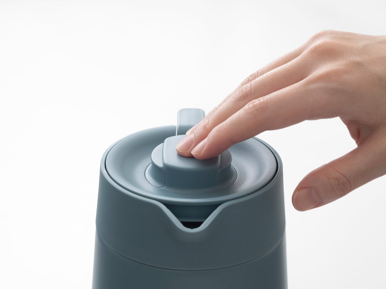
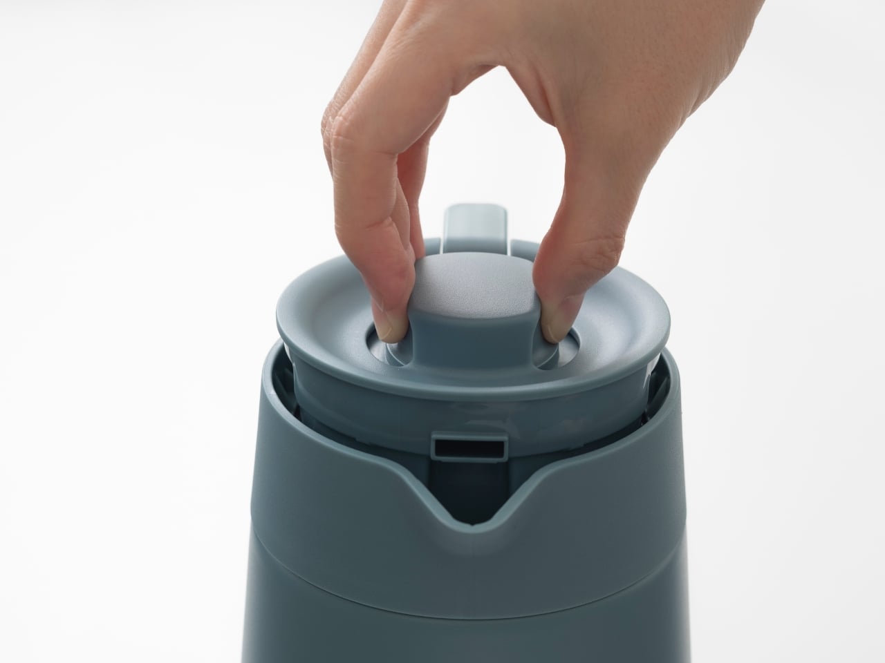
There’s something deeply satisfying about a product that just works. Not in a flashy, look-at-me kind of way, but in that quiet, thoughtful manner where every detail clicks into place. That’s exactly what Doogdesign Inc. has achieved with their Vacuum Insulated Pot PWR, a redesign for Tiger Corporation that recently earned a 2025 Good Design Award.
At first glance, it might seem like just another thermal pot. But here’s where things get interesting. This isn’t a fresh concept pulled from thin air but rather a thoughtful evolution of Tiger’s previous PWO model. The designers at Doogdesign, an Osaka-based studio founded by Kazuya Koike, took on the challenge of addressing real-world frustrations that users had been living with for years.
Think about the last time you struggled with a stubborn lid or fumbled with an awkward lever while trying to pour your second cup of tea. Those little moments of friction add up. The PWR tackles exactly these pain points, transforming daily annoyances into seamless interactions. Through extensive prototyping and adjustments, the team refined the lever and lid mechanism until attachment and detachment could happen with just a light touch. It’s the kind of improvement that sounds simple until you realize how much testing and iteration goes into making something feel effortless.
But functionality alone doesn’t make great design. What sets this pot apart is how it balances practical usability with visual grace. The lid features a smooth, curved form that plays beautifully with light and shadow, evoking the quiet presence of fine tableware. There’s an understated elegance here that doesn’t scream for attention but somehow makes your kitchen counter look a little more put-together.
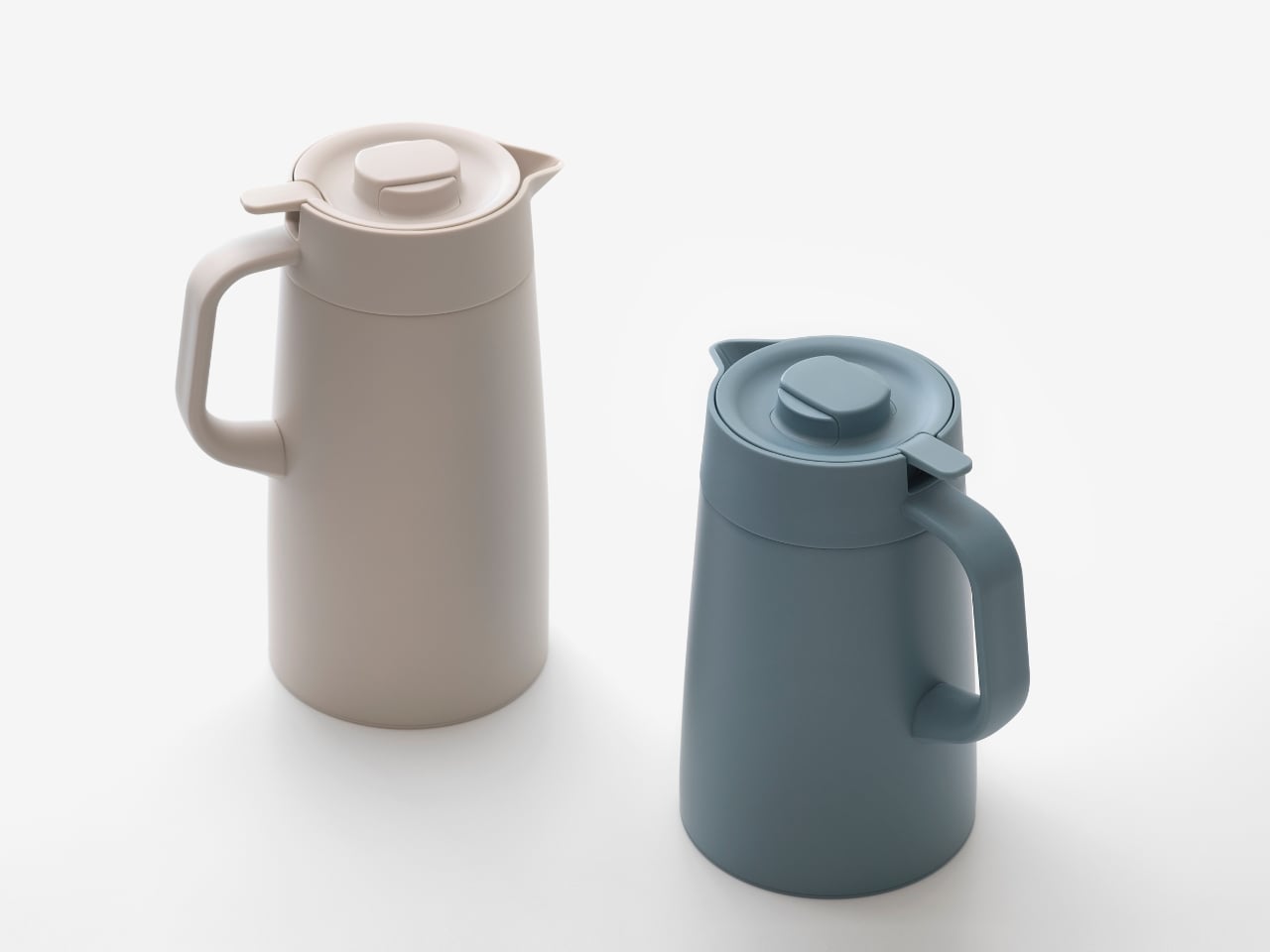
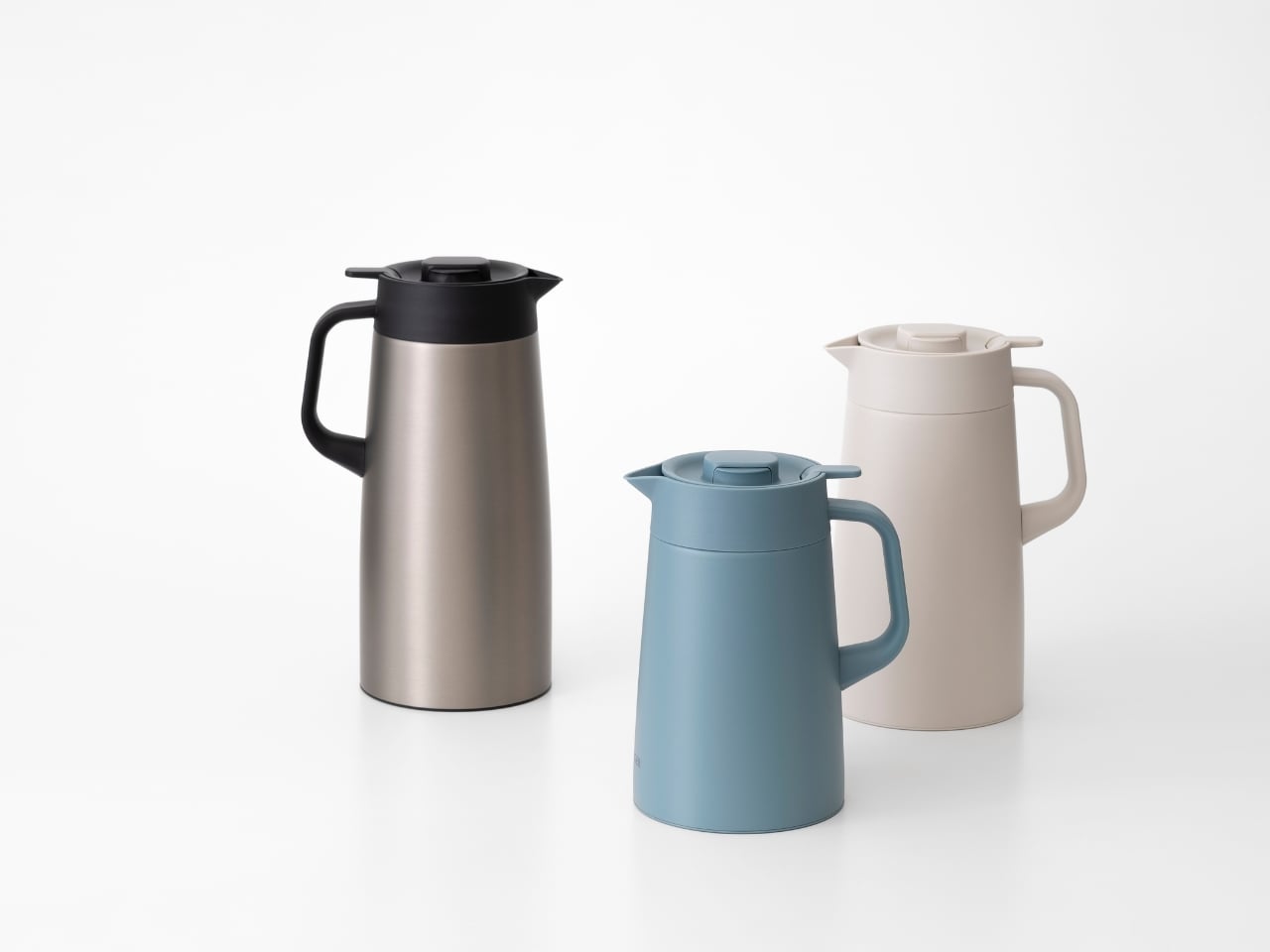
The design philosophy becomes clear when you examine the details. This is about more than just keeping beverages hot (though the vacuum insulation handles that job brilliantly). It’s about creating an object that belongs on your everyday table, something you’re happy to see sitting out rather than hiding away in a cupboard. The stainless steel construction speaks to durability and longevity, while the refined aesthetic ensures it won’t clash with your interior choices, whether you lean minimalist or eclectic.
One of the smartest moves? Offering three size options at 1.2L, 1.6L, and 2.0L. This versatility means whether you’re brewing tea for yourself on a quiet afternoon or hosting a small gathering, there’s a PWR that fits your needs without forcing you to compromise. It’s the kind of practical thinking that shows the designers actually considered how people live, not just how products photograph.
The recognition from the Good Design Award 2025 isn’t just industry back-patting. These accolades matter because they signal that experts in the field recognize when someone has genuinely moved the needle on product design. In a market flooded with thermal containers that prioritize either pure function or pure aesthetics, finding one that nails both deserves acknowledgment.
What makes this project particularly fascinating from a design perspective is how it demonstrates the value of iteration. Redesigning an existing product requires a different kind of creativity than starting from scratch. You’re working within established constraints, user expectations, and manufacturing realities. Yet Doogdesign managed to identify the friction points and address them without losing what made the original concept valuable in the first place.
If you’re someone who appreciates when form follows function without sacrificing beauty, or if you’ve ever caught yourself thinking “there has to be a better way to do this” while using everyday objects, the Vacuum Insulated Pot PWR is a perfect example of what happens when designers listen. It’s not trying to reinvent hot beverage storage. It’s just making it notably, measurably better, which might be the most refreshing approach of all.
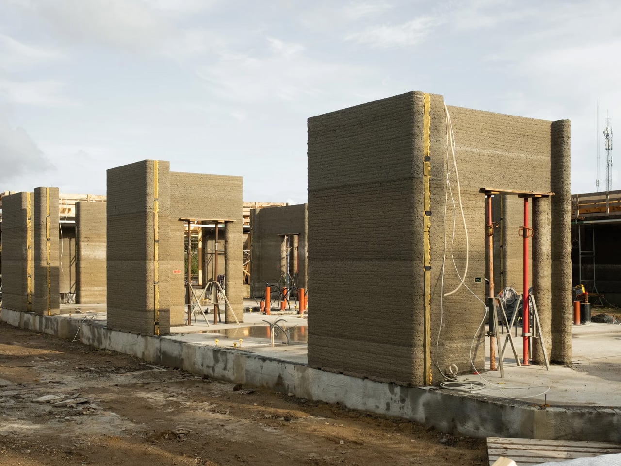
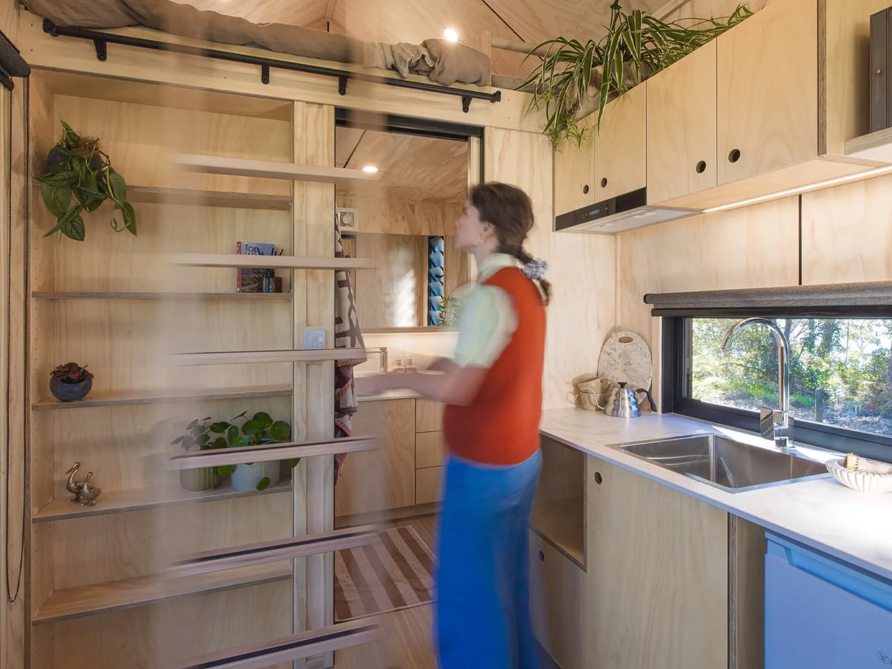
In the small Danish town of Holstebro, something remarkable is unfolding. Skovsporet, which translates to “The Forest Trail,” is rewriting the rules of residential construction as Europe’s largest 3D-printed housing development. Designed by SAGA Space Architects, this 36-apartment student village represents more than technological innovation—it’s a glimpse into how we might build affordable housing in the future. The project’s ambition is matched by its execution, combining cutting-edge construction technology with thoughtful design principles that prioritize both human comfort and environmental stewardship.
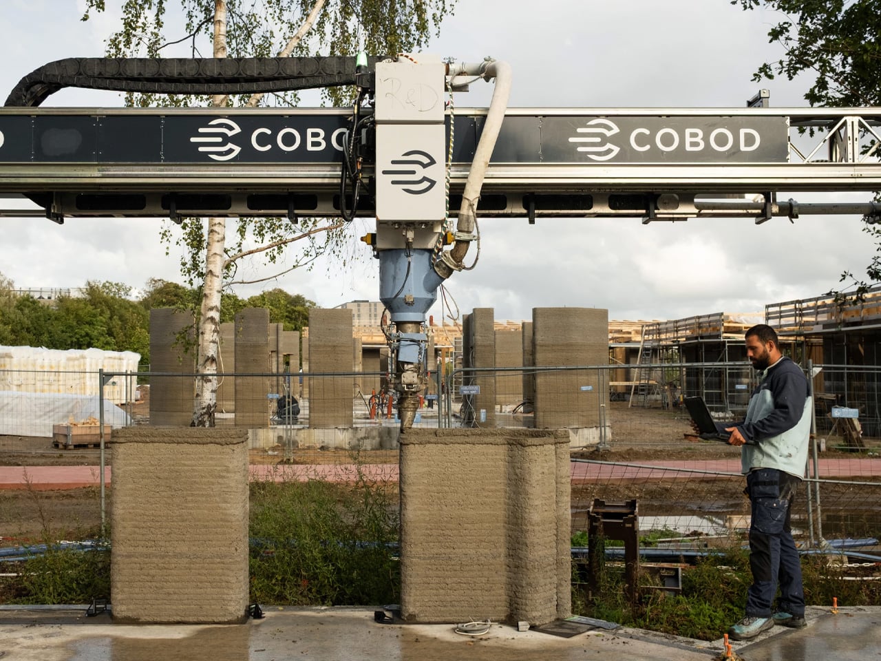
Six buildings, each containing six student apartments, form a connected community near VIA University College’s campus. What makes this development extraordinary isn’t just its scale but the speed at which it’s coming together. The first building took several weeks to print, a timeline that seemed impressive on its own. By the final structure, however, that timeline collapsed to just five days. That’s more than one apartment per day, a pace that would make traditional construction methods seem glacial by comparison. This dramatic improvement demonstrates how 3D printing technology becomes more efficient with each iteration, learning and optimizing as it goes.
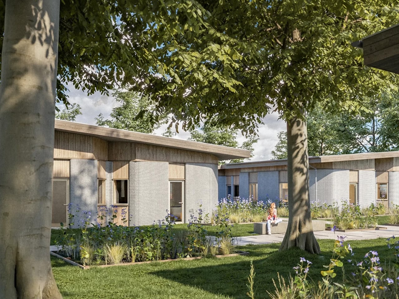
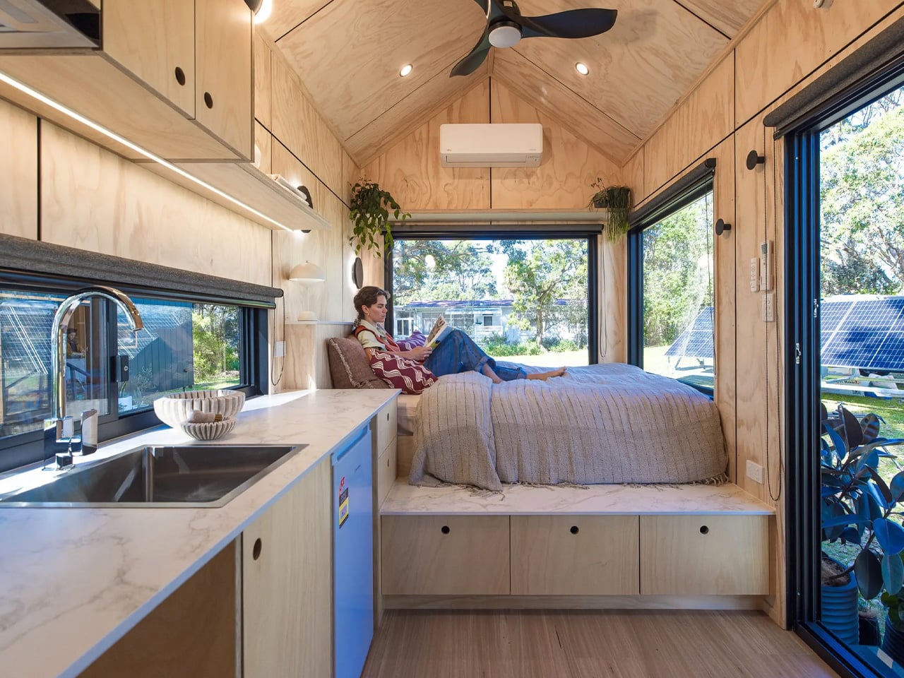
SAGA Space Architects approached this project with a clear vision: create genuine homes, not just proof-of-concept structures. Each apartment spans 39 to 50 square meters and includes everything students need—kitchen, study area, lounge, bathroom, and double bed. Large roof windows punctuate the slanted ceilings, flooding the compact spaces with natural light and creating an atmosphere of openness despite the modest footprint. The architects understood that 3D-printed concrete walls, while structurally impressive, could feel cold and industrial. They deliberately softened this with warm timber finishes and modern glass elements, creating spaces that feel inviting rather than experimental, comfortable rather than clinical.
The printing process itself reveals an elegant efficiency. COBOD’s BOD3 printer, operated by 3DCP Group, deposits concrete with millimeter precision, building walls layer by layer exactly where structural support is needed. This approach dramatically reduces material waste compared to conventional construction, where excess materials often end up in landfills. There’s a philosophy embedded in this method—nothing excess, nothing wasted. The printer creates only what’s necessary, achieving both structural integrity and environmental responsibility through the same process. This waste reduction represents not just cost savings but a fundamental rethinking of how construction materials should be used.
What truly sets Skovsporet apart is its respect for the natural environment. The site was originally wooded, and rather than clear it for easier construction, the team worked around existing trees. Print beds were carefully positioned to preserve 95 percent of the original vegetation, a remarkable achievement that required precise planning and flexibility. Walking through the development, you’ll find century-old trees standing between clusters of apartments, their canopies providing shade and character. The main concrete printing phase wrapped up in November 2025, marking a significant milestone. Roof structures are now being installed while interior work progresses on schedule, with students expected to move into their 3D-printed homes in August 2026.
The implications extend far beyond student housing in a small Danish town. With affordable housing shortages affecting cities across Europe and beyond, Skovsporet offers a compelling alternative to traditional development models. The speed, reduced waste, and scalability of this approach could reshape how we think about residential construction, particularly for social and affordable housing projects where budgets are tight and demand is high. For SAGA Space Architects, Skovsporet represents the successful transition of 3D printing technology from novelty to a viable housing solution. What began as an idea just two years before construction started is now a functioning neighborhood, proving that radical innovation in architecture doesn’t require sacrificing livability, sustainability, or design quality.
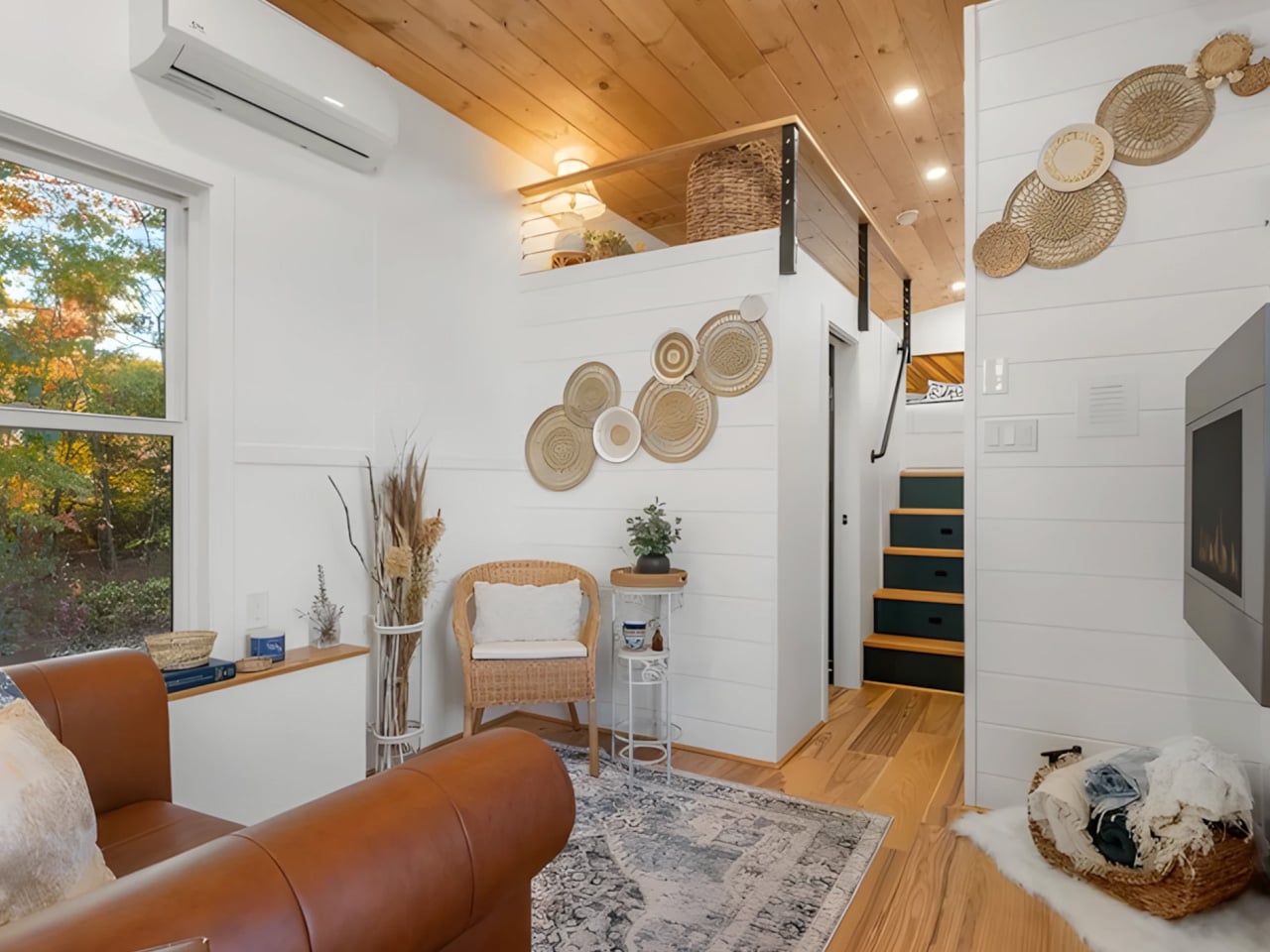
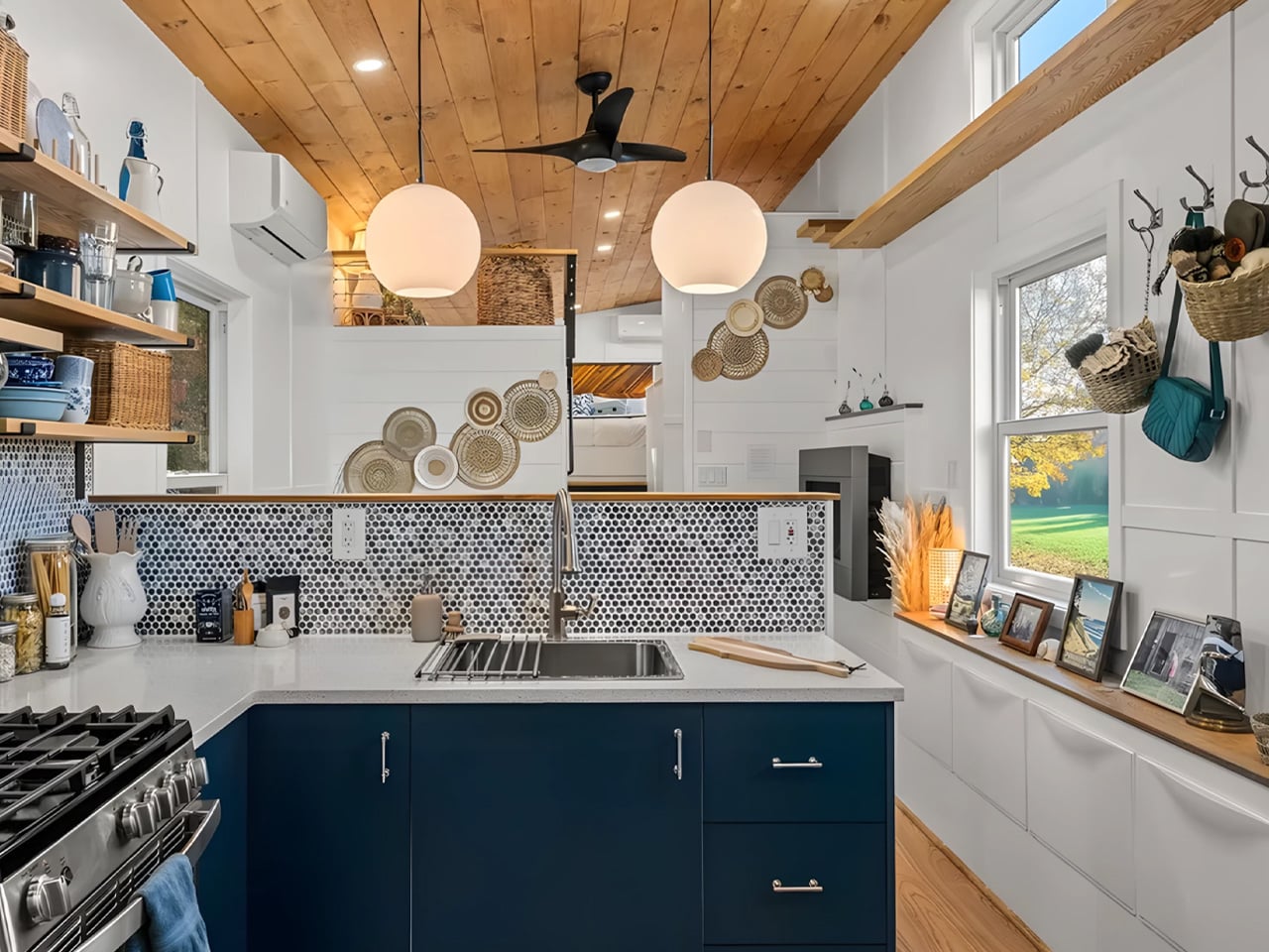
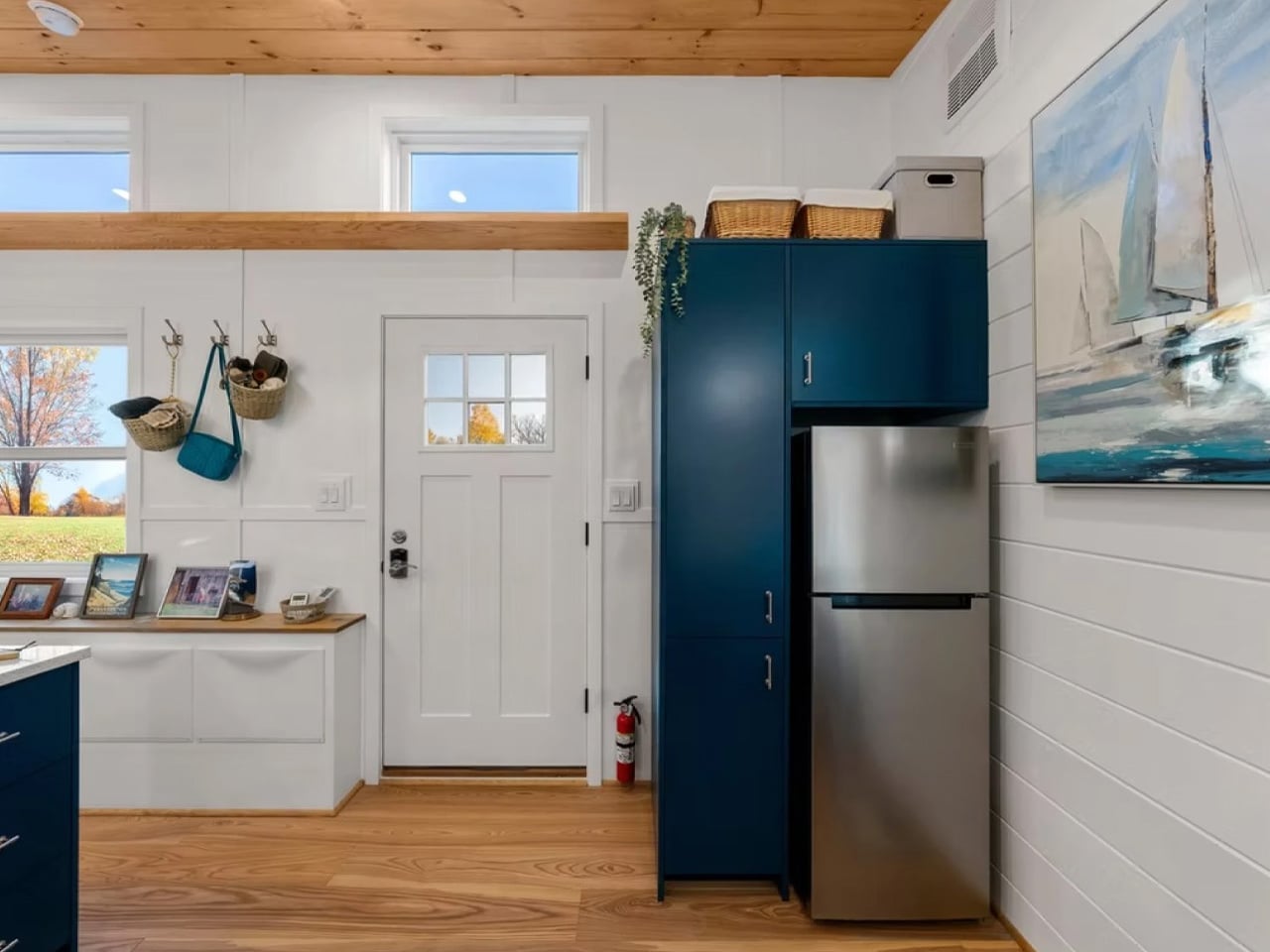
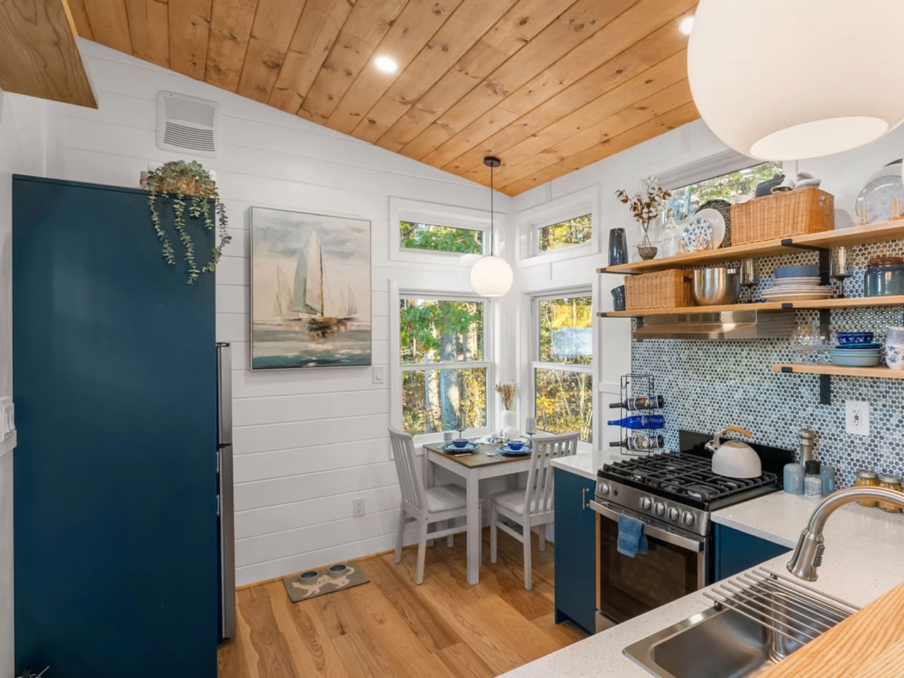
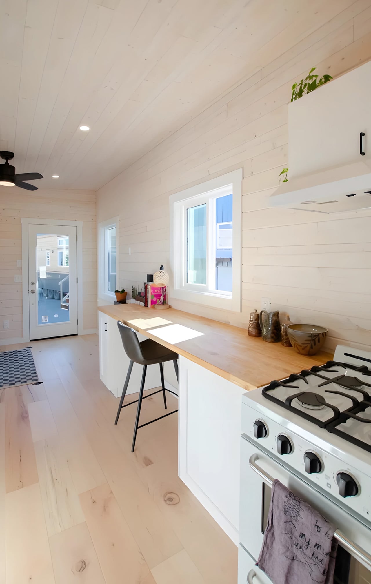
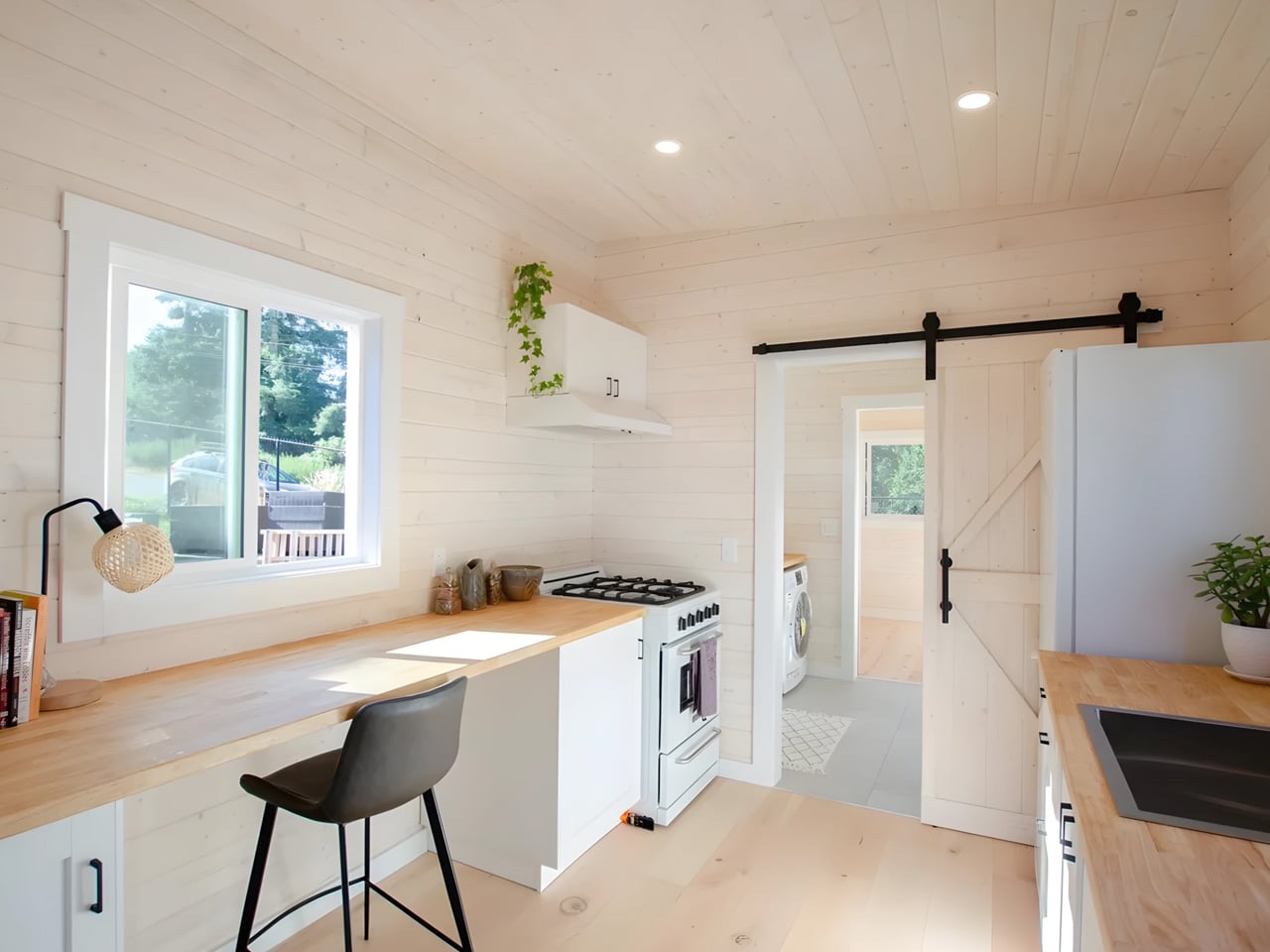
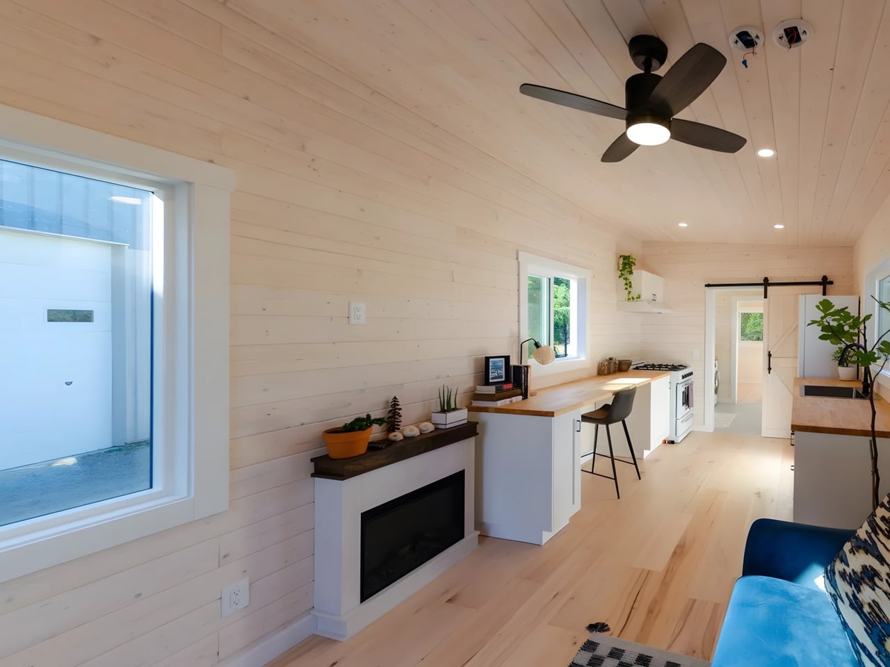
In recent years, designers increasingly recognize that a home’s luxury is not defined by its size but by how space is sequenced, detailed, and experienced. In small residences, limited square footage becomes an opportunity to refine material honesty, elevate craftsmanship, and curate a focused expression of high-end living. This shift frames luxury as a philosophy rooted in intention rather than excess.
Across leading firms, compact design now demands heightened tectonic precision and a commitment to functional return on every design move. These tiny homes often evolve into biophilic sanctuaries, where calibrated light, thoughtful detailing, and tactile finishes transform everyday rituals into meaningful, artful experiences. The result is a refined, immersive environment where efficiency, beauty, and comfort coexist, proving that true luxury lies in the quality of the spatial and sensory experience rather than the scale of the dwelling.
1. Luxury Through Honest Materials
Luxury in tiny homes begins with thoughtful restraint. Instead of using many finishes, the designer selects a tight, high-quality palette where every material feels intentional and lasting. Solid stone, natural wood, and honest metals replace veneers and create a tactile richness that instantly elevates the environment.
Even a single feature adds more depth and beauty than multiple generic surfaces. A calm monochromatic scheme strengthens this effect, letting texture and form speak clearly while reducing visual noise. Precision detailing, flush joins, and concealed hardware create clean lines and a seamless flow, turning compact layouts into serene, beautifully crafted spaces.
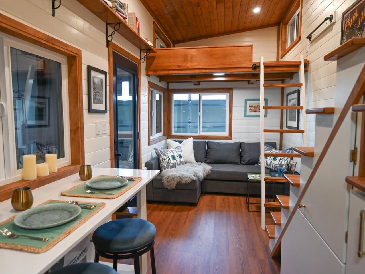
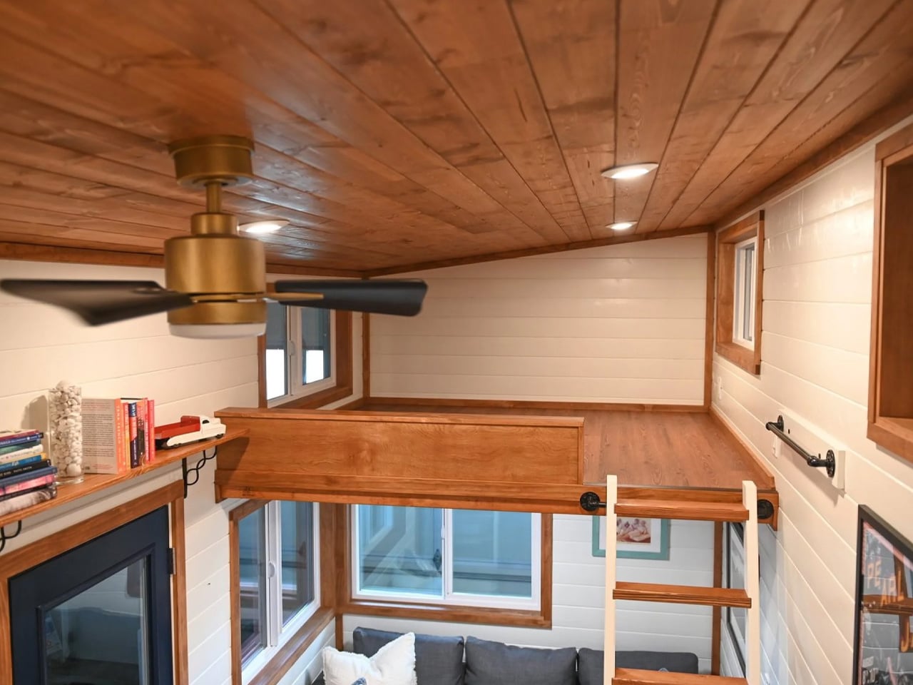
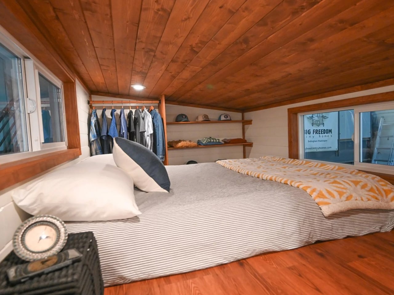
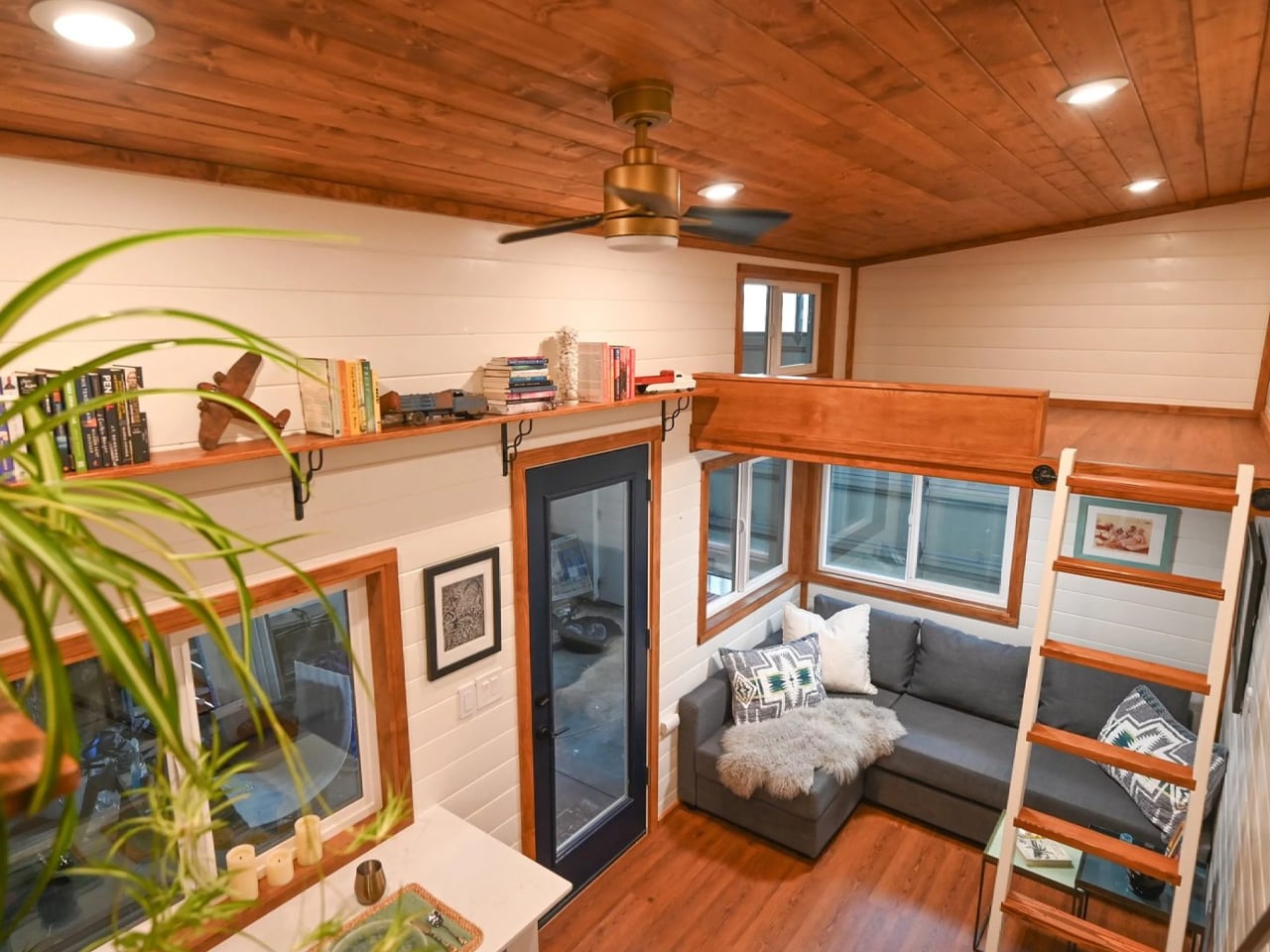
The Beachcomber reimagines tiny home living through its exquisite use of luxury wood finishes, creating a warm, elevated atmosphere within its compact 390-square-foot layout. Crafted by Backcountry Tiny Homes, the 38-by-10-foot structure features rich timber surfaces that define every major space, from the expansive kitchen cabinetry to the full-height king-sized bedroom loft. These natural wood elements pair beautifully with the 13.5-foot ceilings and open-plan design, while strategic window placement enhances the material’s warmth with abundant natural light. The result is a space that feels refined, calming, and far more sophisticated than typical compact dwellings.
Inside, thoughtful detailing ensures the wood tones remain the hero with built-in storage nooks, a dedicated dining area, and a bright living zone, all showcase the craftsmanship and cohesive palette. The Beachcomber proves that luxury is not defined by size but by material quality and design intention, offering a tiny home experience that is both elegant and deeply comfortable.
2. Smart, Hard-Working Design
Small spaces benefit from layouts that move beyond traditional room divisions to create a smooth, intuitive flow. Sliding or pivot doors that disappear into wall pockets allow rooms to shift easily between private and open settings. This flexibility helps living, dining, and cooking areas merge when needed, making the home feel more expansive without compromising comfort or clarity.
Multi-purpose furniture, including storage ottomans or extendable tables, adds function without clutter. Every piece is selected for versatility, ensuring each square foot works efficiently and beautifully.
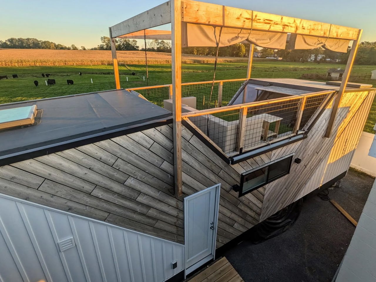
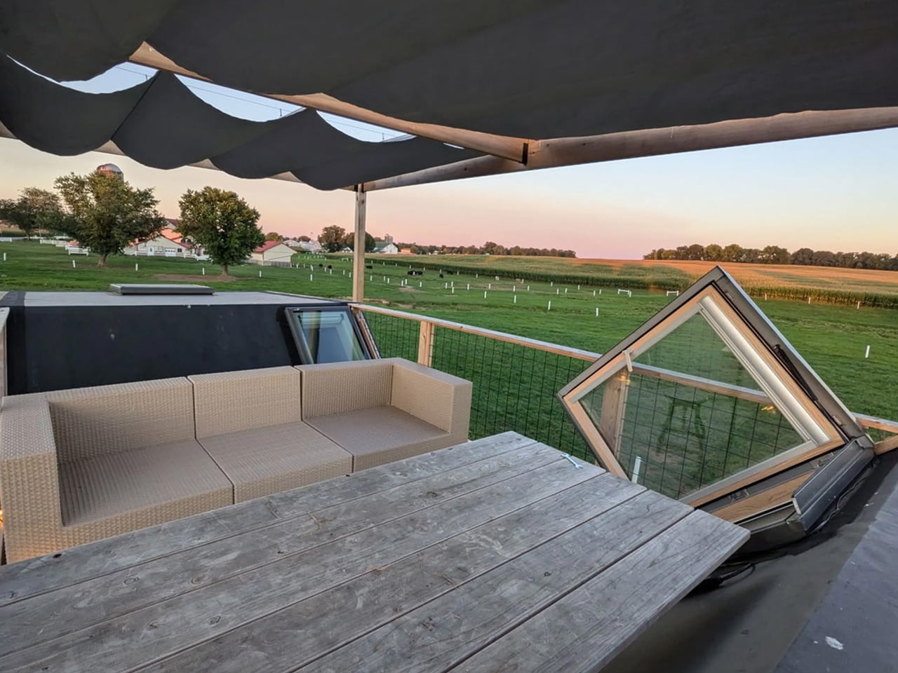
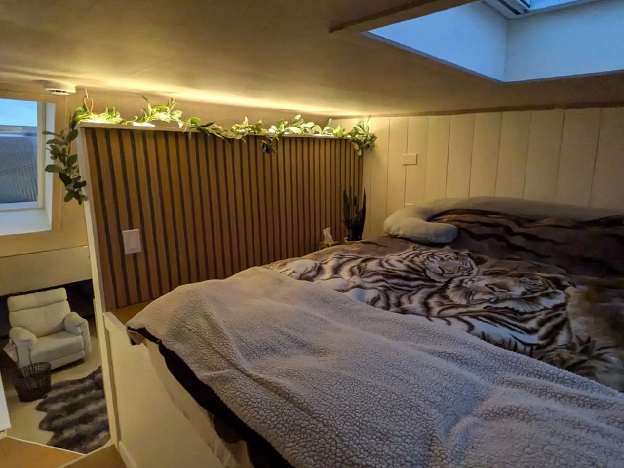
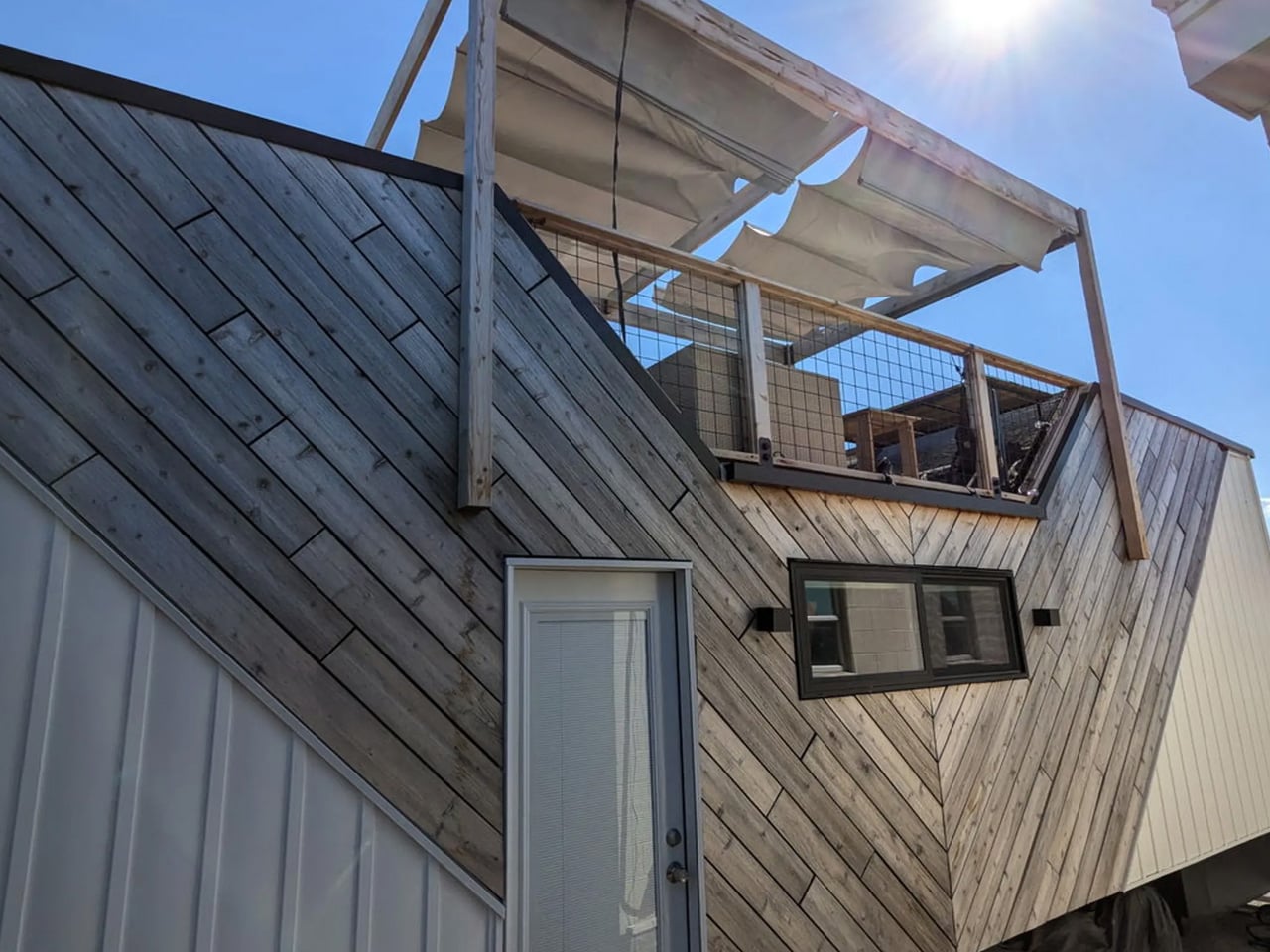
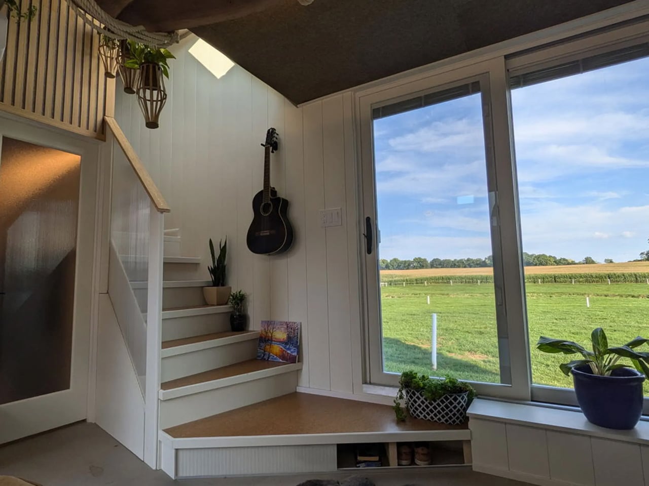
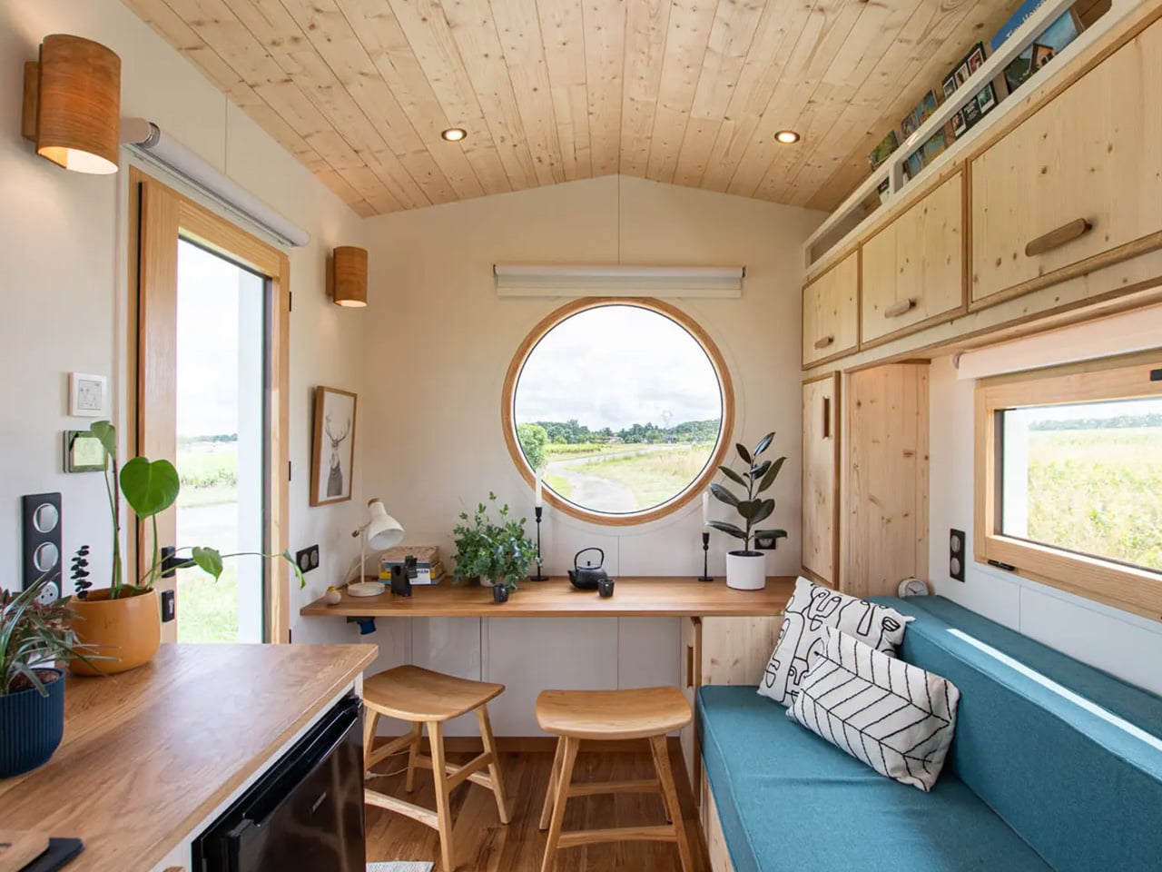
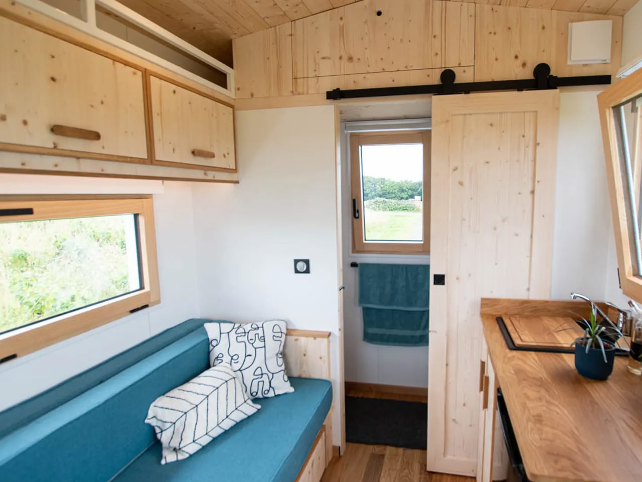
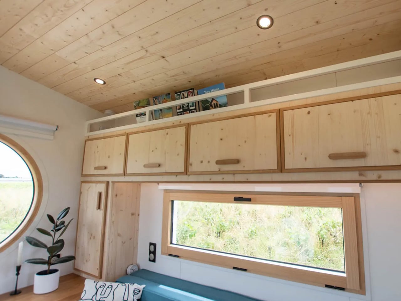
Designed by Modern Shed, this home sits on a triple-axle trailer and measures 34 ft by 10 ft, creating a wider and more open interior. Sliding glass doors open directly into a bright living area featuring built-in seating, clever storage, warm wood accents, and underfloor heating. Breaking from typical layouts, the kitchen is positioned in a loft area reached by a short flight of steps. This elevated space offers generous headroom, modern appliances, a small dining table, and a striking wood-and-cork ceiling.
From the kitchen, storage-integrated steps lead to a rooftop terrace complete with seating and a removable pergola, which is an inviting outdoor retreat ideal for dining or relaxing. The bedroom loft, accessed from the living room, includes a double bed, skylight, and a lowered standing platform for added comfort. The ground-floor bathroom completes the design with a vanity, shower, toilet, washer/dryer, and direct outdoor access.
3. Lighting That Elevates Space
Lighting design is one of the most effective ways to elevate a small room, shaping the atmosphere rather than simply brightening it. A layered approach works best, combining ambient lighting for overall illumination, task lighting for focused activities, and accent lighting to highlight features such as artwork or textured walls.
Warm, dimmable LEDs help set the mood throughout the day, shifting from bright morning clarity to a soft, calming evening glow. Indirect lighting, such as concealed strips in coves, skirting boards, or behind mirrors, reduces glare and washes surfaces gently with light.
The Five Four tiny home by Designer Eco Tiny Homes demonstrates how strategic lighting can transform a compact space into a warm and inviting environment. Measuring just 5.4 meters in length, the home relies on natural light from large windows and a sliding glass door to fill the main living area, creating a bright, airy atmosphere despite its modest size. Thoughtful placement ensures the interior feels open and connected to the outdoors, while the warm tones of the plywood interior are enhanced, adding texture and depth.
The open-plan layout allows light to flow freely across living, dining, and sleeping areas, reducing shadows and enhancing the perception of space. Artificial lighting is equally considered, with task lighting in the kitchen and accent lighting highlighting key features, creating a layered and flexible illumination strategy. Combined with carefully positioned fixtures, the lighting design enhances comfort, usability, and the overall ambiance, making the Five Four feel both functional and welcoming in its compact footprint.
4. Storage as Design
In a tiny home, storage should be treated as an integral part of the architecture rather than a purely functional element. Fully recessed, in-wall systems allow shelves, cabinets, and appliances to be hidden, maintaining clean lines and a sense of spaciousness. Thoughtful placement ensures that essential items are stored efficiently without disrupting the home’s visual flow.
Display niches and integrated vanities further elevate the design. By combining functionality with aesthetics, storage becomes both practical and elegant, reinforcing the home’s refined, minimal, and uncluttered character.
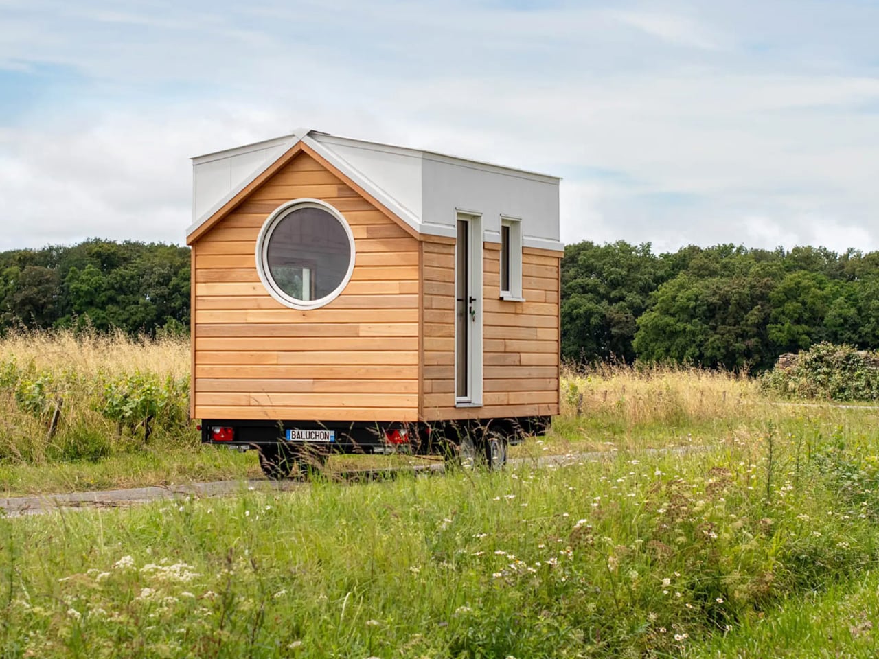
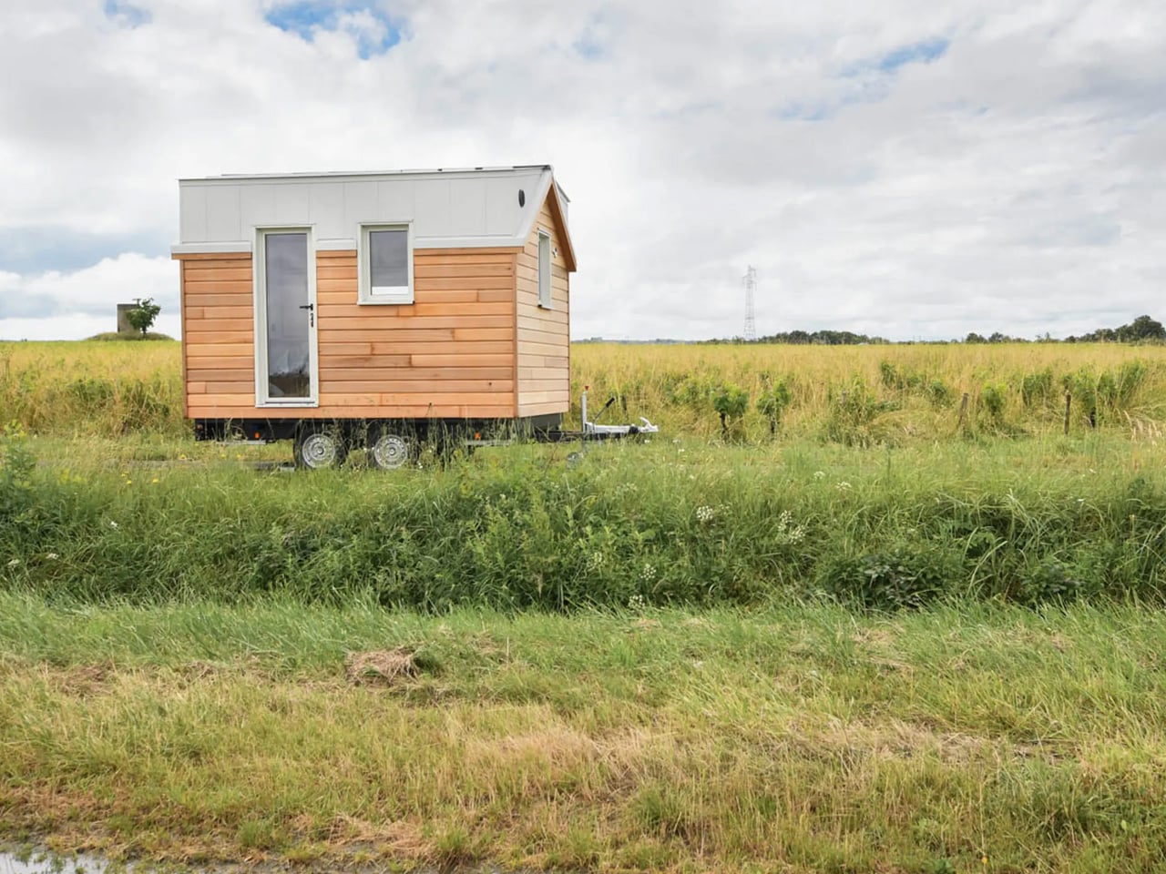
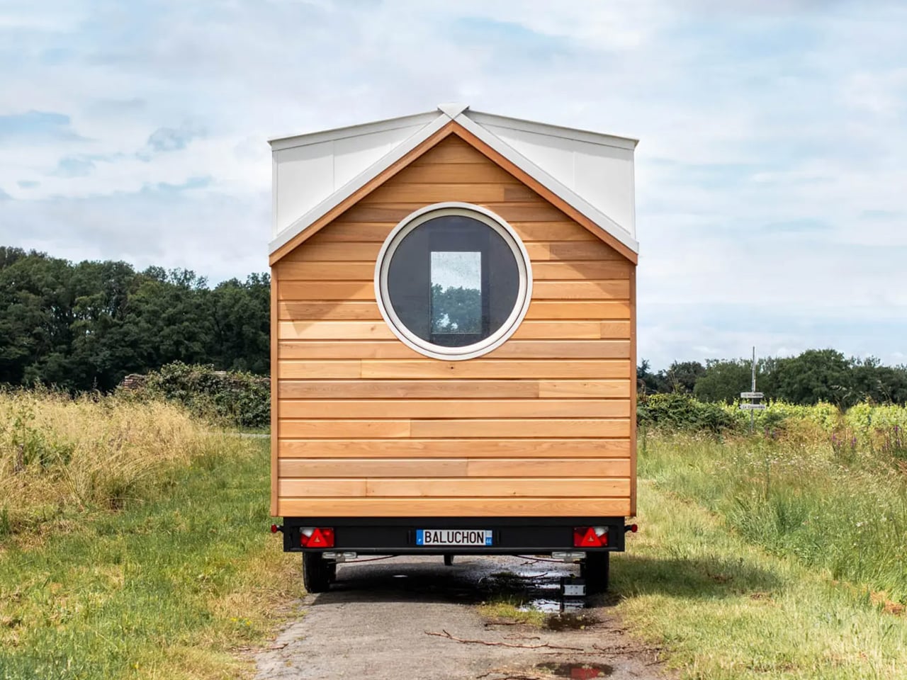
Designed by France’s Baluchon, the Nano Suisse is an impressively compact tiny home that manages to be both practical and functional. Measuring just 3.5 meters in length, it cleverly accommodates two people while including space for a home office. Slightly larger than Baluchon’s original Nano model by just 7.8 inches, it is affectionately called the “big sister” and features a thoughtfully organized interior with a variety of storage solutions. Built on a double-axle trailer, the home is clad in red cedar with aluminum accents, giving it a modern yet warm exterior.
Inside, the home office doubles as a dining area with seating for two, a large porthole-style window, and additional storage. The living area includes a sofa bed with built-in storage, maximizing functionality in the compact space. The kitchen is minimal, featuring a fridge, sink, and portable stove, while the bathroom, accessible via a sliding door, includes a shower, toilet, and a small storage loft above, making efficient use of every inch of the tiny home.
5. Biophilic Design
True luxury bridges the home and its surroundings, creating a biophilic environment that brings the calming benefits of nature into urban living. Every window can act as a framed vista, turning exterior views into living art and visually expanding the home’s boundaries. This deliberate connection to the outdoors enhances both well-being and spatial perception.
Sustainability and cultural context are equally important. High-performance, double- or triple-glazed windows and quality insulation ensure thermal efficiency and reduce the carbon footprint. Thoughtful integration of regional principles, such as the sequencing of private and public zones inspired by Vastu, adds depth and harmony, blending modern design with timeless wisdom for a space that feels both luxurious and contextually grounded.
Big Freedom Tiny Homes continues to redefine compact living with a 30-foot (9.14-meter) tiny house that integrates nature into every aspect of its design. Built on a triple-axle trailer, the home balances mobility with generous, well-planned interiors. Richly stained cedar siding and metal accents create a durable, warm exterior that blends seamlessly with natural surroundings, from forest clearings to lakesides. Large glazed doors and windows connect the interior to the outdoors, filling the living space with daylight and providing constant visual access to the surrounding landscape, enhancing a sense of openness and calm.
Inside, biophilic principles continue through material choices and spatial planning. The living area, kitchen, and lofted bedrooms are oriented to maximize natural light and airflow, while warm wood finishes echo the exterior cedar. Thoughtful window placement frames exterior views like living art, fostering a constant connection with nature. Efficient layouts, built-in storage, and flexible spaces ensure comfort and functionality without compromising the immersive, nature-focused atmosphere that defines this tiny home.
Transforming a tiny home into a luxury space demands precision, thoughtful materiality, and attention to the resident’s experience. Through meticulous detailing, flexible layouts, and poetic lighting, true luxury emerges, not from size but from design depth. The result is an efficient, personalized sanctuary that combines sophistication, comfort, and a profound sense of spatial and sensory richness.
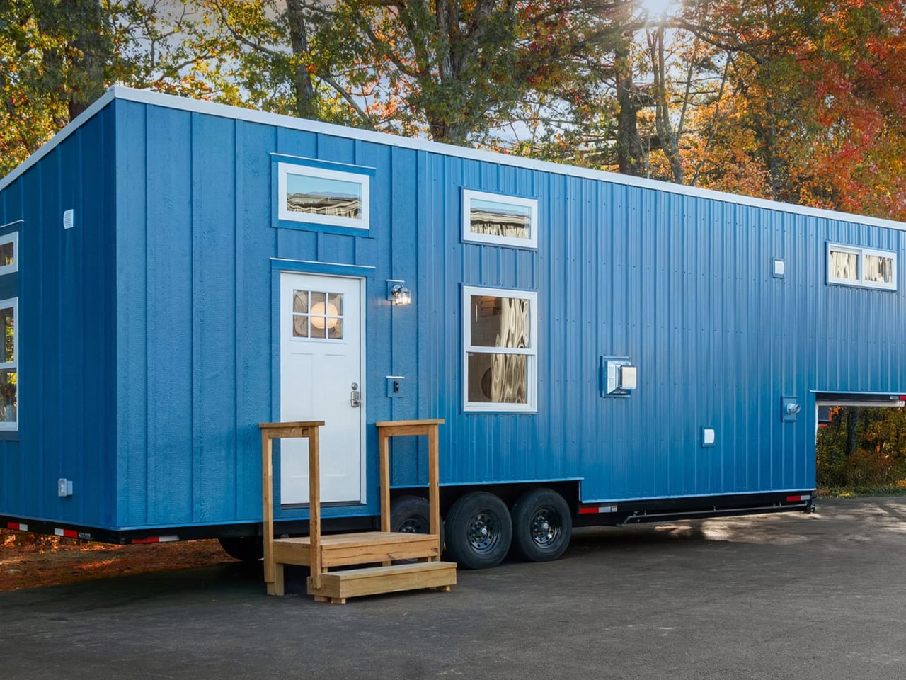
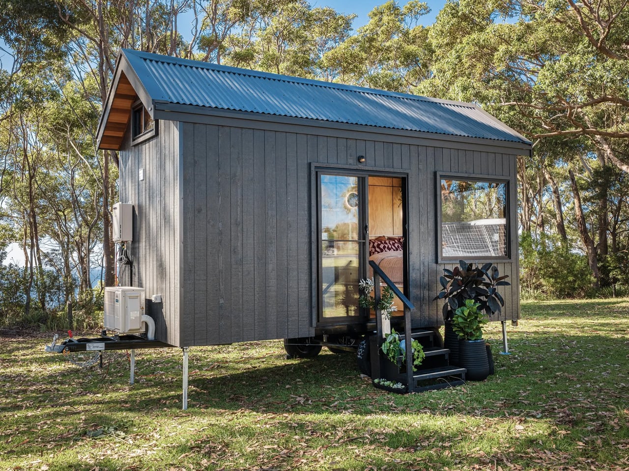
Climbing into a loft bed loses its charm quickly, especially when you’re half-asleep at 2 AM. The Barred Owl by Rewild Homes acknowledges this reality with a rare approach in tiny house design: everything happens on one level. Built by the Nanaimo, Vancouver Island-based company, this 34-foot tiny house abandons vertical gymnastics for the spacious comfort of apartment-style living.
The difference starts with dimensions. While most North American tiny houses measure 8.5 feet wide, the Barred Owl stretches to 10 feet. That extra 1.5 feet might sound modest on paper, but at the tiny house scale, every inch transforms how a space functions. The added width creates genuine breathing room, allowing the interior to feel less like a cleverly arranged puzzle and more like an actual home. Mounted on a triple-axle trailer, the structure maintains mobility while delivering a footprint substantial enough for full-time living.
The layout flows in railroad apartment fashion, with rooms connecting directly to one another. Entry opens into a bright living room finished in whitewashed pine tongue-and-groove. The galley kitchen features butcherblock counters that wrap into an eating bar doubling as a workspace, practical for the growing number of people who work remotely. A full-size refrigerator, four-burner propane cooktop, and oven eliminate the compromises typically associated with tiny house cooking. The dining area seats two comfortably, functioning equally well for meals or as a dedicated home office.
Sliding barn-style doors lead to the walk-through bathroom, a space that defies tiny house stereotypes about cramped facilities. Inside, a large walk-in shower with carefully chosen tile work sits alongside a proper sink and flushing toilet. Storage space and a washer-dryer unit handle practical necessities without feeling shoehorned in. The bathroom connects to the ground-floor bedroom, where ceiling height allows standing upright, a luxury that loft-based tiny houses simply cannot provide.
The Barred Owl targets people seeking permanent downsizing rather than weekend adventures. Its single-story configuration addresses aging-in-place concerns that most tiny houses ignore. Mobility limitations, balance issues, or simply the desire to avoid ladder climbing at night make this design particularly relevant. The apartment-style layout also appeals to those wanting tiny house benefits like lower costs and reduced environmental impact without sacrificing the floor plan logic of traditional homes.
Rewild Homes finishes the exterior with black metal siding accented by cedar, topped with a standing seam metal roof. A built-in overhang shelters the front entrance, fitted with recessed lighting. The home currently sits unused on private property just north of Nanaimo, available for immediate possession at around US$118,000 after the original purchaser’s circumstances changed. For those willing to pare down possessions but unwilling to sacrifice comfort, the Barred Owl demonstrates that tiny living doesn’t require climbing ladders or compromising on essential amenities. It’s a practical answer to whether downsizing can work long-term without feeling like perpetual camping.
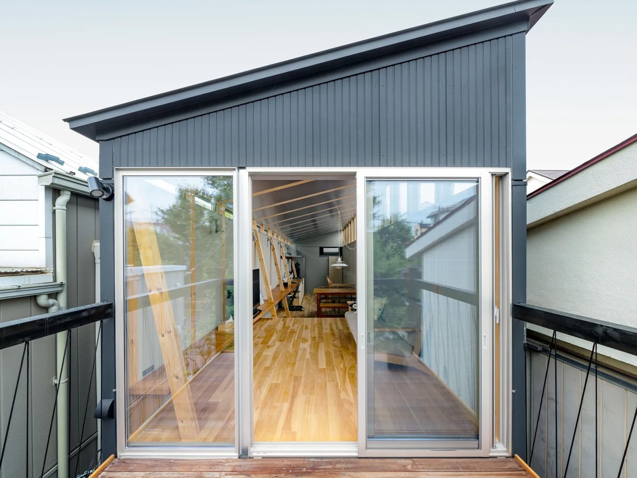
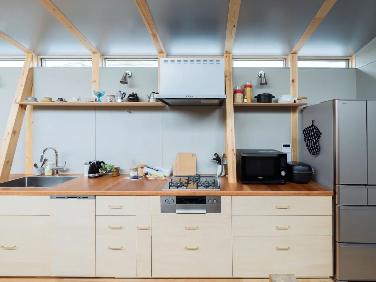
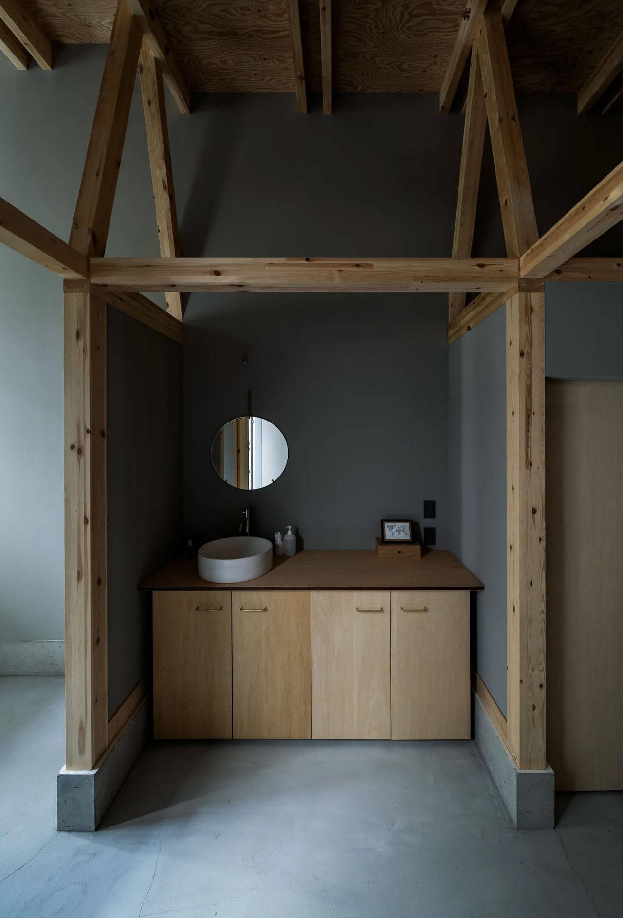
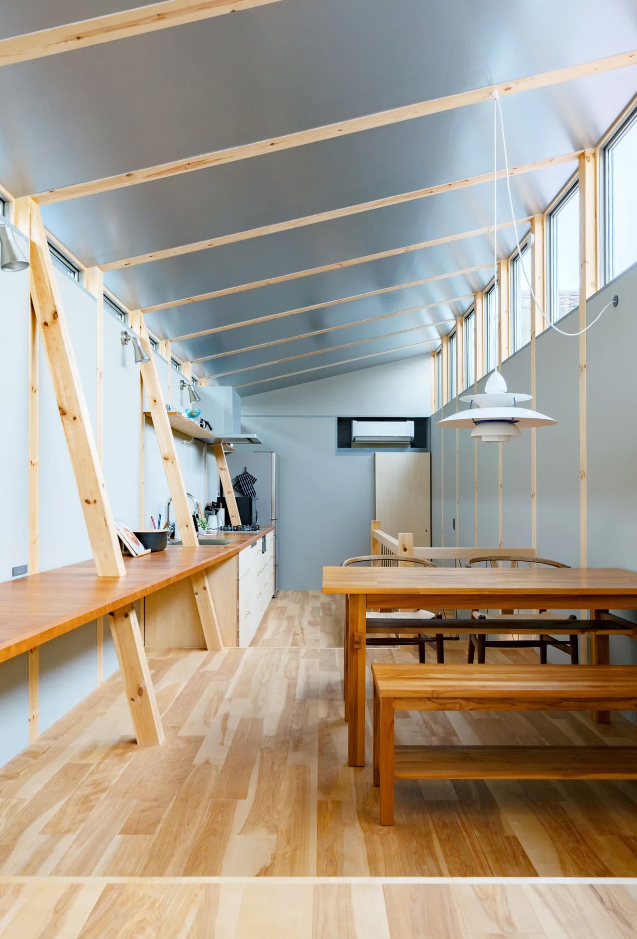
In the quiet residential enclave of Fukasawa, south-west Tokyo, narrow plots and intimate streetscapes create an architectural character that feels worlds away from the metropolitan sprawl surrounding it. This area, bearing the name of renowned designer Naoto Fukasawa, who made it his home, carries a quaint charm reminiscent of older Japanese shopping streets. Within this context, architecture firm MIDW has completed a striking residence that reinterprets traditional building methods for contemporary living.
The house occupies a slender plot measuring just 2.73 metres in width and 13.65 metres in depth. Rather than viewing these proportions as limitations, MIDW embraced them as design opportunities. The structure is defined by six truss-shaped load-bearing walls, their beams spanning gracefully between evenly spaced columns to create a rhythmic structural language that anchors the entire composition.
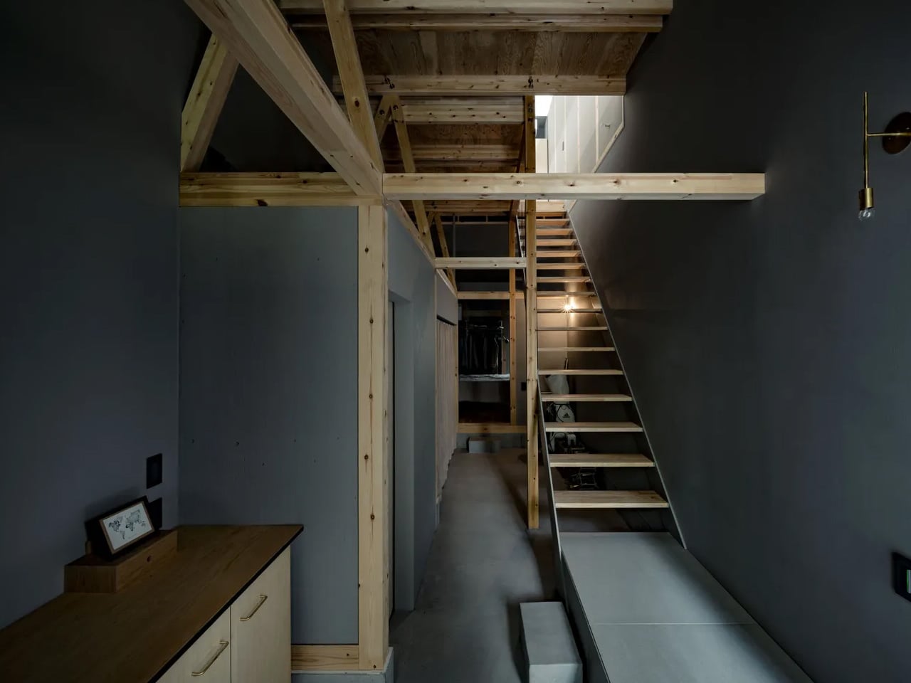
Daisuke Hattori, co-chairman and managing architect of MIDW, explains the conceptual foundation. The firm frequently draws from local construction techniques, particularly the traditional Japanese timber post-and-beam system. This method, built through the assembly of linear wooden members, offers both structural integrity and visual refinement. It remains among Japan’s most enduring building approaches, balancing flexibility with aesthetic clarity. The Fukasawa residence presents a contemporary dialogue with this heritage. The structural framework isn’t hidden behind finishes or treated as mere utility. Instead, it takes centre stage as a defining architectural element, echoing the exposed timber construction found in historic shrines and temples across Japan. This approach transforms structural necessity into spatial poetry.
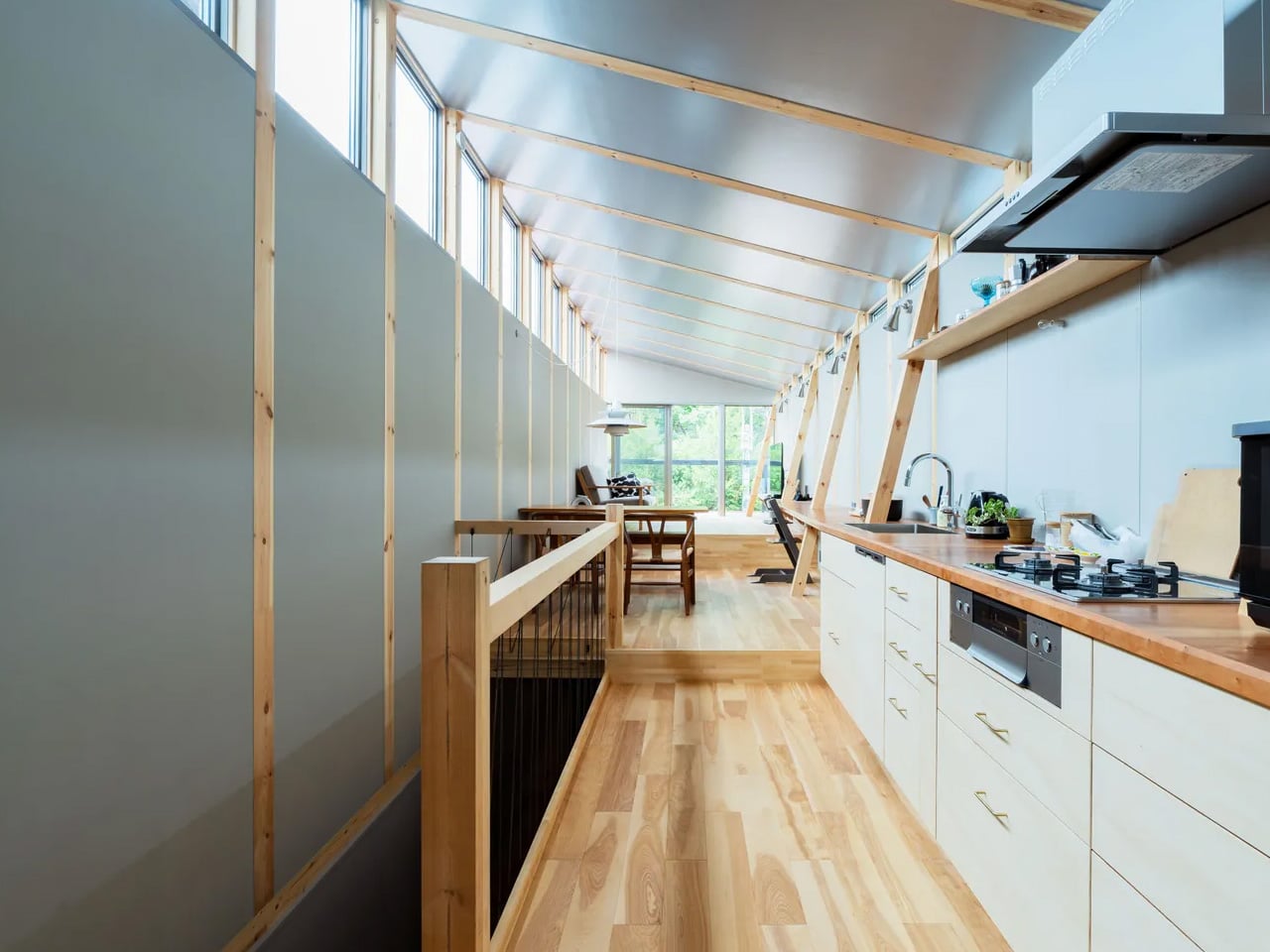
Entering the home, visitors encounter a slightly sunken floor plane that marks the transition from street to sanctuary. From this entry point, a carefully choreographed sequence of spaces begins to reveal itself. Light and shadow play across surfaces as one moves through the narrow depth of the plot. A straight staircase draws the eye upward, leading to the upper level where the spatial experience opens considerably.
The upper floor presents a broad, generous volume animated by the repetitive cadence of exposed timber beams. These structural elements create a calming visual rhythm that organizes the space while celebrating the material honesty of wood construction. The beams don’t merely support; they define the character and atmosphere of the interior.
Working within Tokyo’s dense urban fabric presented challenges beyond just dimensional constraints. Material choices and design gestures required careful consideration. Yet MIDW approached the project not as a problem to solve but as an opportunity to develop universal design principles rooted in specific site conditions. The result is a home that feels both distinctly of its place and timelessly resonant, proving that constraint often breeds the most compelling creativity.
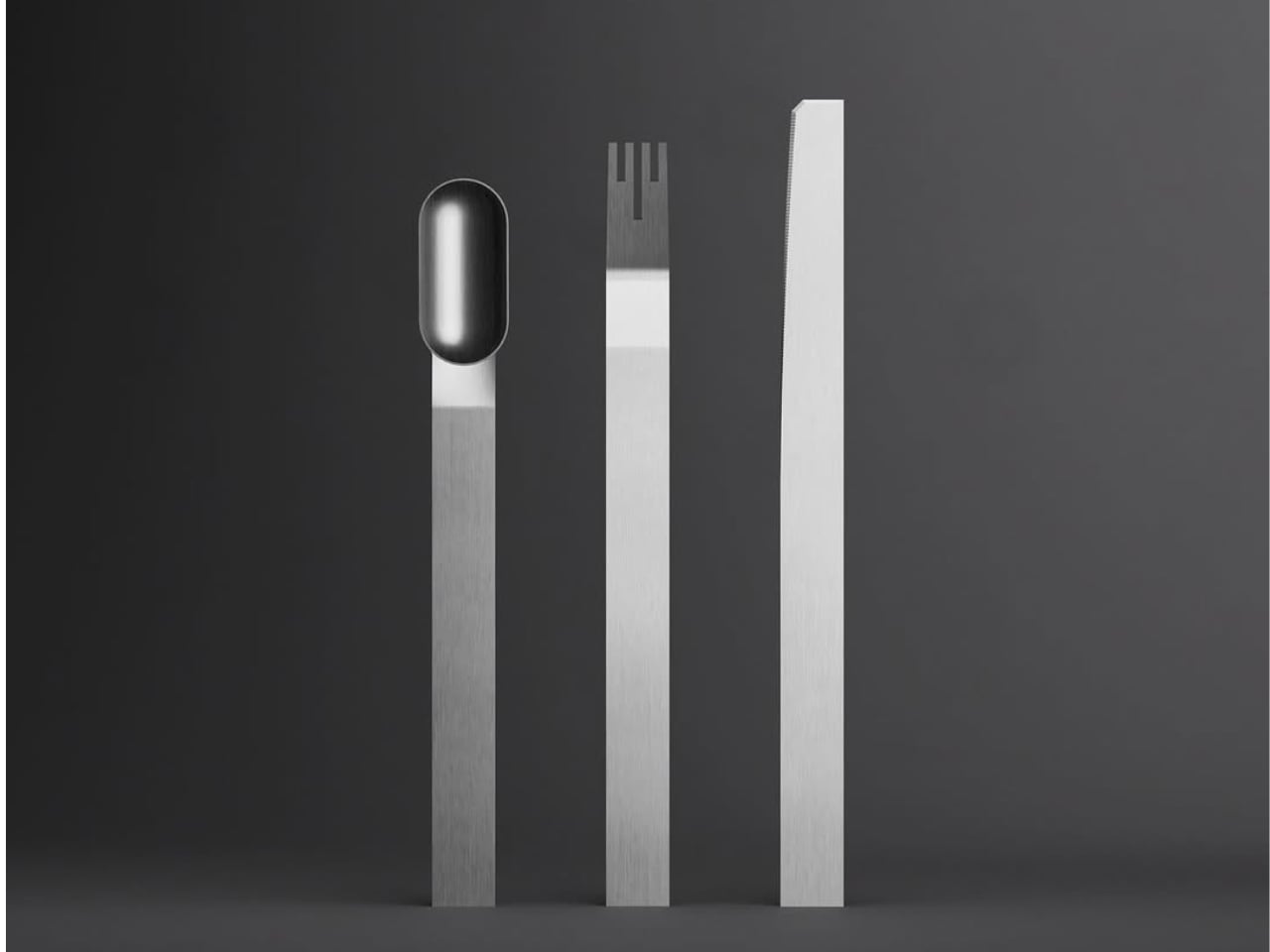
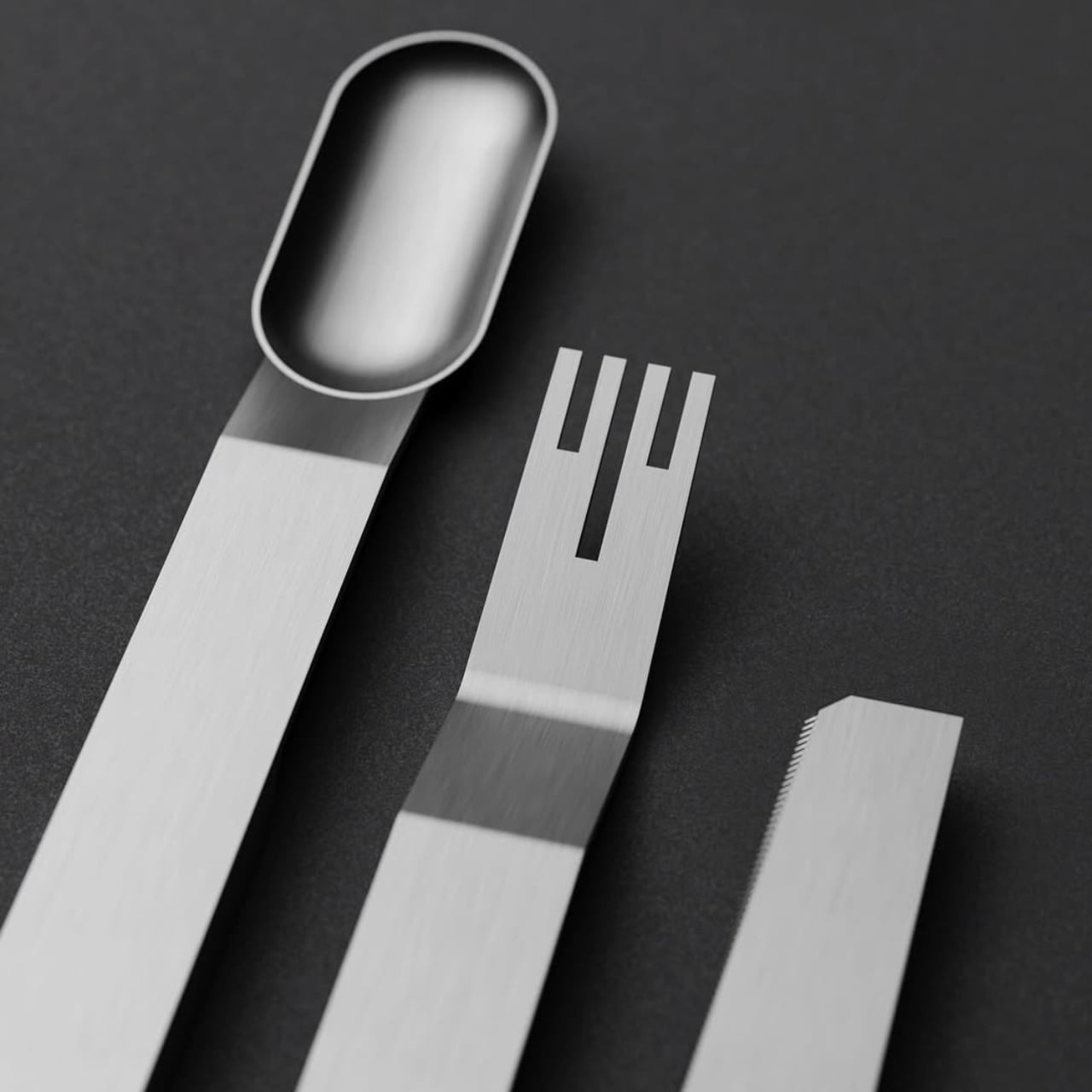
There’s something inherently rebellious about celebrating the process instead of hiding it. But most products are still designed to look effortlessly smooth, polished to perfection, and stripped of any trace of how they came to be. Atelier Andy Carson’s G-Code flatware takes the opposite approach. This cutlery set doesn’t just acknowledge its manufacturing origins, it flaunts them.
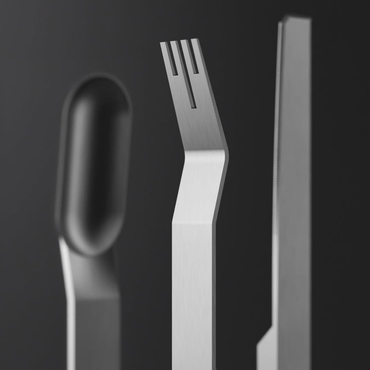
The name itself is a clever nod to the digital backbone of modern production. G-code is the programming language that tells CNC machines exactly where to cut, mill, and carve. It’s the invisible blueprint that translates design into reality, one precise coordinate at a time. By naming this flatware collection after that very code, Australian-based designer Andy Carson and his collaborator Sam Collett are making a bold statement: the machine is not just a tool, it’s part of the story.
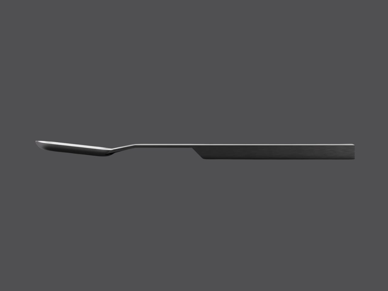
You can see that story in every angle of these pieces. Each implement in the set, a knife, fork, and spoon, is milled from solid stainless steel bar stock. There’s no stamping, no casting, no traditional manufacturing shortcuts that would smooth away the evidence of creation. Instead, what you get are geometric forms with crisp edges, flat planes, and subtle facets that catch the light in unexpected ways.
The aesthetic is unapologetically industrial, yet somehow it doesn’t feel cold or impersonal. The handles are rectangular and minimalist, tapering slightly as they extend toward the functional end. The fork features an intriguing angular bend that adds sculptural interest while maintaining perfect balance. The spoon’s oval head sits atop its geometric handle like a carefully considered punctuation mark. Even the knife, with its serrated edge, feels more like a piece of architecture than a simple eating utensil.
What makes this design particularly smart is how form and function work together so seamlessly. The weighted handles aren’t just about aesthetics or that satisfying heft you feel when you pick one up. They serve a practical purpose, ensuring that the head of each utensil hovers above the table surface when you set it down. It’s a thoughtful touch that addresses hygiene without requiring a separate knife rest or worrying about sauce staining your tablecloth. This approach challenges the conventions of how cutlery is typically made and what it’s supposed to look like. Most flatware relies on stamping or casting to achieve smooth, anonymous forms that disappear into the background of a meal. G-Code does the opposite. It asks to be noticed, to be appreciated not just as a functional object but as a celebration of precision manufacturing.
There’s a broader conversation happening here about honesty in design. In an era when so much of what we consume is mass-produced but styled to look artisanal, G-Code takes the reverse path. It’s a product that embraces its machined origins and turns them into a virtue. The flat surfaces, the geometric precision, the visible traces of the milling process, these aren’t flaws to be hidden. They’re features to be celebrated.
The monochromatic photography that accompanies the project only reinforces this philosophy. Shot against dark gray backgrounds, the flatware pieces stand like monoliths, their shadows as carefully composed as the objects themselves. The lighting emphasizes every edge, every transition from one plane to another, revealing the complexity within apparent simplicity. It’s worth noting that this isn’t just an exercise in theoretical design. These pieces are meant to be used, held, experienced. The matte finish on the stainless steel provides just enough grip without feeling rough. The proportions are calibrated for comfort. The balance point of each piece feels natural in your hand.
In a design landscape often dominated by either hyper-ornamentation or bland minimalism, G-Code carves out its own territory. It proves that celebrating manufacturing processes doesn’t mean sacrificing elegance, and that industrial aesthetics can coexist with everyday functionality. It’s flatware that makes you think about how things are made, why certain choices matter, and what it means when a designer decides to show their work rather than hide it. For anyone who appreciates when form, function, and manufacturing philosophy align perfectly, G-Code is a masterclass in intentional design. It’s proof that sometimes the most interesting stories are told not by what we conceal, but by what we choose to reveal.
For years, the manual coffee grinder was a necessary evil. If you wanted the freshest, best-tasting cup outside of a cafe, you had to accept a bulky plastic device or a fragile piece of glass and wood. These tools often felt clumsy, lacking the refinement and durability that modern consumers have come to expect from their high-use items.
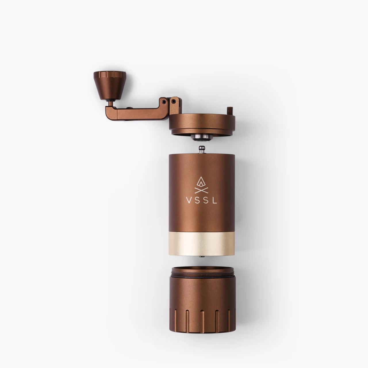
Enter the VSSL Java G25, a manual coffee grinder that doesn’t just promise a better cup; it promises a better, more rugged, and far more stylish experience. It represents a shift in thinking, elevating the grinding process from a tedious chore to an enjoyable, tactile ritual. Truth be told, I still can’t figure out the grind settings on most of the complicated, dials-and-knobs grinders that I see in the market. I probably would love to learn all these things, even if there are supposedly 50 distinct settings. The G25 somehow makes the learning curve feel like part of the adventure, a welcome challenge to master a finely tuned instrument.
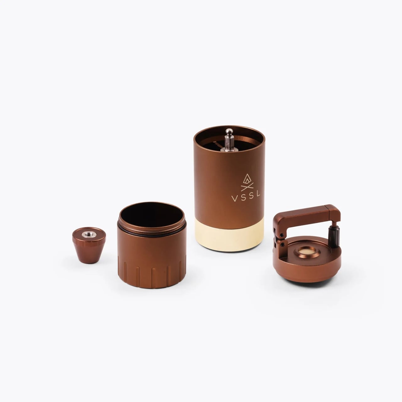
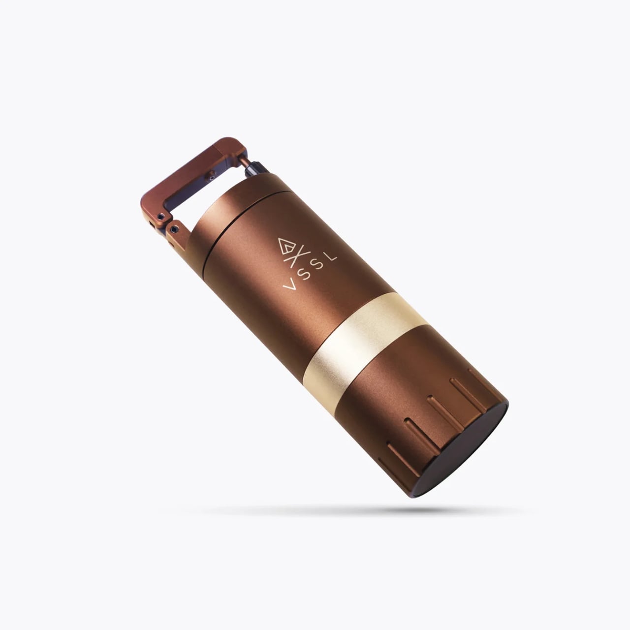
VSSL, a company known for building essential survival and gear kits into handsome, nearly indestructible canisters, has applied that same obsessive engineering mindset to the coffee ritual. Their design philosophy is clear: utility should never compromise aesthetics, and durability is non-negotiable. The result is a device that feels less like a kitchen tool and more like high-end outdoor equipment you’d find clipped to a mountaineer’s pack. Constructed from 6061 machined aircraft grade aluminum and 304 food-grade stainless steel, this grinder is built for abuse, making it equally at home on a clean, granite kitchen countertop or a cold, granite mountain outcrop. Its sleek, black cylindrical form factor is compact, ergonomic, and unapologetically cool, fitting perfectly into the gear aesthetic that dominates modern tech and design circles. It’s a piece of gear you want to show off.
But the G25’s appeal extends far beyond its rugged good looks and durable exterior. Inside that resilient shell lies the heart of a true barista tool, engineered for uncompromising performance. The quest for the perfect grind is a core obsession in the coffee world because flavor extraction is utterly dependent on particle size consistency. VSSL delivered this crucial consistency by incorporating high carbon 420 stainless steel conical burrs stabilized by dual bearings. This is the hardware that ensures the particle size of your coffee grounds is uniform—the single biggest factor in extracting a delicious, balanced flavor without the bitterness of fines or the sourness of boulders. For those of us who appreciate precision engineering, the detail of dual bearings stabilizing the central axle is paramount; it’s the mechanical assurance of quality.
Crucially, the G25 offers 50 distinct grind settings. This level of granular control is usually reserved for professional-grade electric models that take up half your countertop. Having 50 click adjustments means the user can dial in the perfect setting for literally any brewing method. Whether you are aiming for the coarse texture required for a full-immersion French press, the near-powder fine consistency for a demanding espresso shot, the medium grit for a precise pour over, or anything in between, a quick, audible adjustment is all it takes. This expansive range eliminates the guesswork and the frustration of inferior grinders, transforming the often-frustrating manual grind into a satisfyingly accurate and repeatable process.
The features engineered specifically for portability truly elevate this grinder into a must-have piece of everyday tech. The handle, which expands during use to increase leverage and make the grind effortless even for light roasts, quickly retracts and cleverly doubles as a secure, locking carabiner. This isn’t just a convenient detail; it is a profound design choice that signals the product’s dual purpose: serious quality both at home and on the move. The magnetic integration keeps the grinder knob securely attached within the catch when stored, and a quick push-release top cap allows fast access to the 30-gram bean hopper—enough capacity to fuel a substantial morning ritual. Measuring only 6.3 inches long with a neat two-inch diameter, the entire unit is designed to nest seamlessly with popular travel brewing systems like the AeroPress Go.
The VSSL Java G25 is a beautiful merging of two powerful cultural trends: the rising demand for specialty, quality, at-home coffee, and the desire for durable, highly designed, and adventure-ready gear. It speaks directly to the person who refuses to compromise on quality, whether they are settling into their home office for the day or setting out for a weekend in the wild. It’s more than just a grinder; it’s an essential, beautifully executed piece of modern carry that promises a perfect cup, no matter where you are.