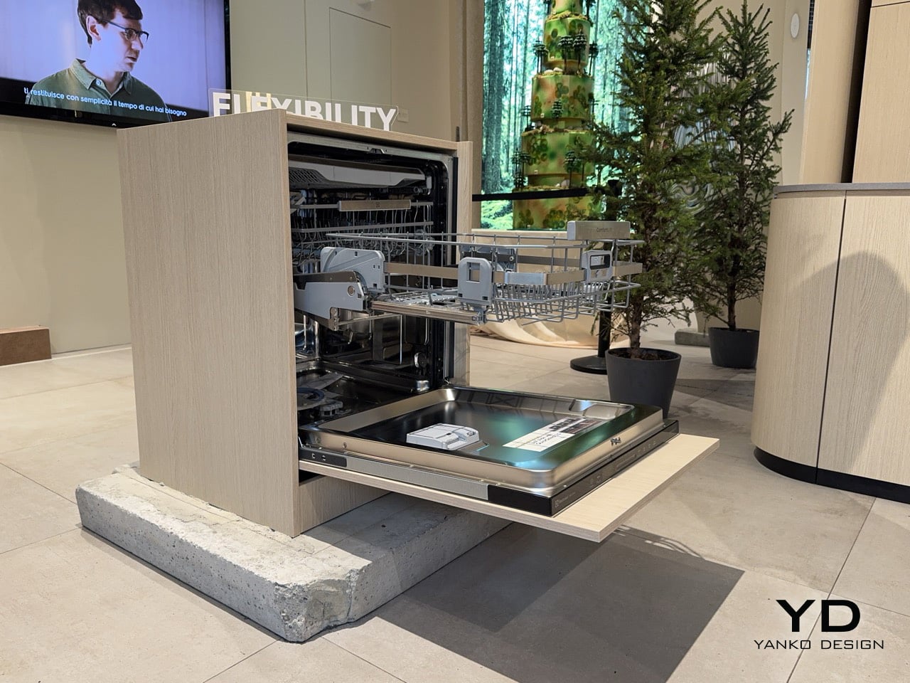
This Electrolux dishwasher lifts its bottom rack so you can load pots without bending down

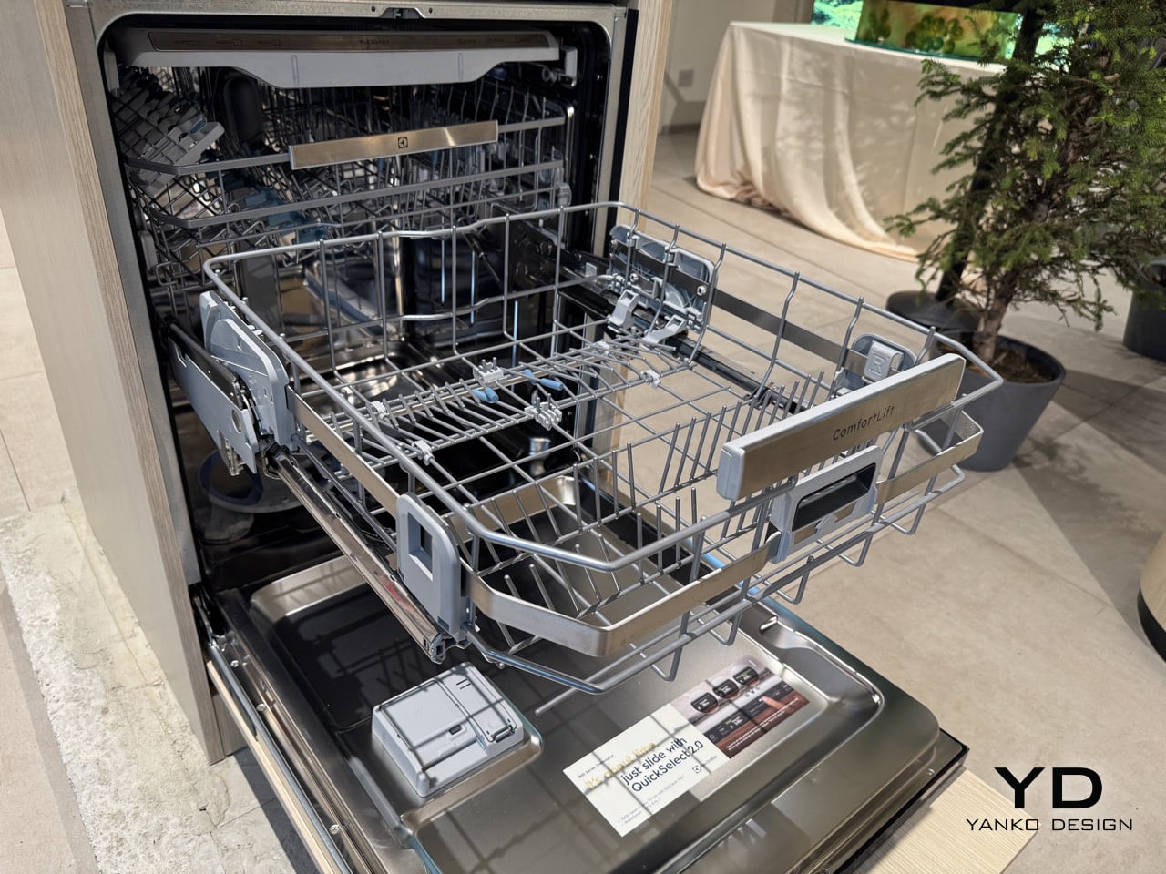
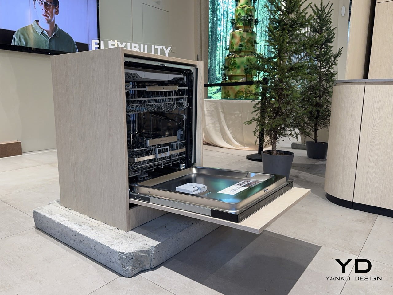
At some point, the bottom rack of a dishwasher stops being a minor inconvenience and starts being a genuine daily difficulty. For older adults and people who simply cannot bend for extended periods, loading the lower basket, which is where the heaviest cookware lives, means repeated stooping, reaching, and straightening back up with full hands. It is the kind of accumulated physical effort that kitchen appliance design has historically ignored entirely. Electrolux brought a direct answer to Milan Design Week: a lower basket that rises 25 centimetres on reinforced hinges at the squeeze of a trigger handle, meeting the user at a comfortable standing height. The feature is called ComfortLift, and it anchors the 800 series dishwasher at the heart of the brand’s Salone showcase.

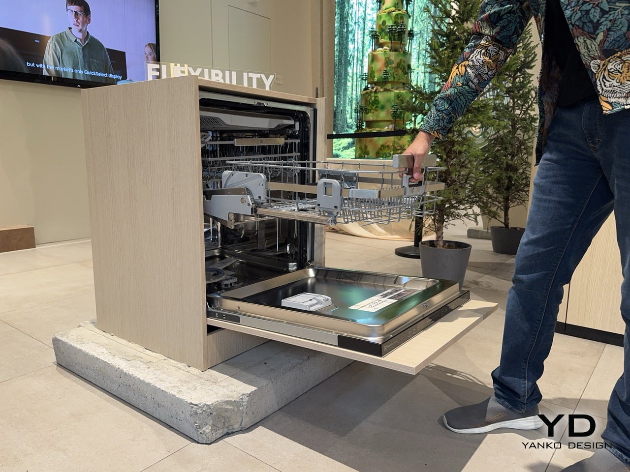
The mechanism raises the lower basket to the upper basket’s level for faster, easier loading and unloading, with reinforced hinges tested to lift a fully loaded lower basket to that same height. The 800 series behind this feature delivers the cleaning power to completely remove baked-on or dried food residues on as little as 8.4 litres of water. At a fair saturated with conceptual objects and material experiments, what Electrolux demonstrated was something considerably more personal: a change to a small, daily physical struggle that millions of people live with quietly. The brand built serious cleaning performance around that ergonomic premise rather than treating accessibility as a secondary concern. Running at 42 dBA, with a noise class rating of B, the machine is also one of the quieter options in its segment.

Designer: Electrolux

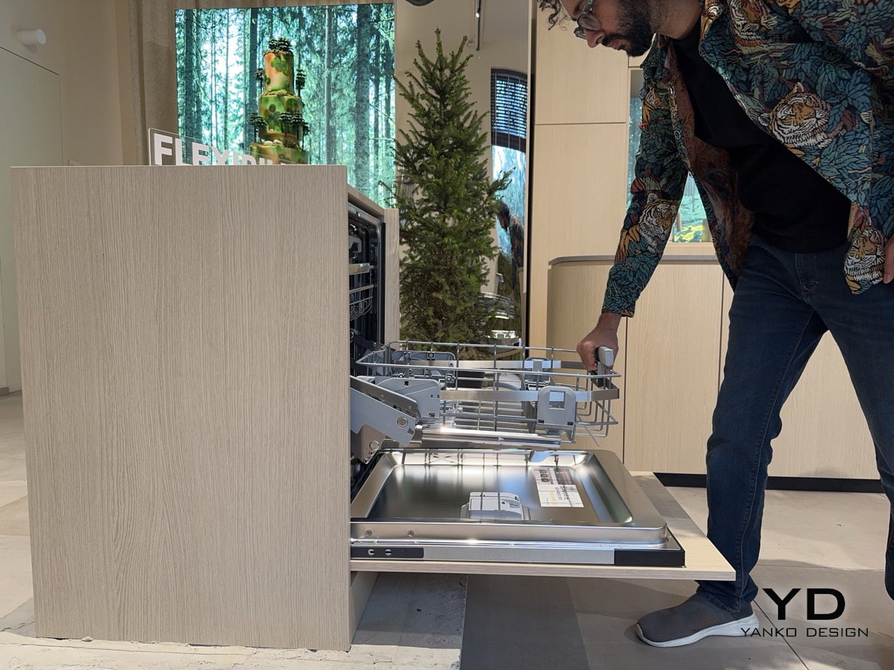
The stainless steel handle integrates a trigger that initiates the lift in a single squeeze, making the operation one-handed and deliberate. Electrolux engineered the ComfortLift basket to carry up to 22 kilograms at the raised height, covering everything from a full load of dinner plates to a cast-iron braising pot. The reinforced hinge mechanism was tested to lift a fully loaded lower basket to the level of the upper basket, so the structural promise holds under real kitchen conditions rather than just showroom demonstrations. Pull the rack out, squeeze, let the basket settle at waist height, and load without contortion. The basket retracts just as smoothly, with none of the mechanical inconsistency that tends to undermine features which perform better on a spec sheet than in a kitchen.
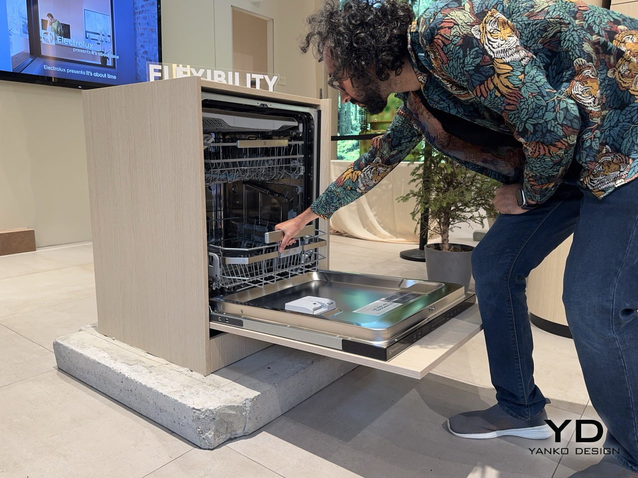
DualZone runs two cleaning zones through the same cycle without changing water or increasing energy use, directing more water pressure at pots and pans in the lower basket while reducing it on delicate items above. A double-rotating spray arm with two nozzle types, one circular and one straight, delivers water simultaneously from multiple angles to break up stubborn residue. Electrolux had this independently tested by a third-party German institute using detergent tablets and a 90-minute cycle on a casserole with lasagna residues, with complete removal as the result. A water sensor detects the level of dirt and adjusts water consumption accordingly, while the AquaControl Waterstop System handles flood protection. Eight wash programmes span the range from a 60-minute express run to AUTOClean, which calibrates the cycle to the load automatically.
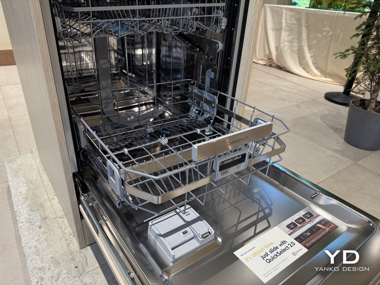
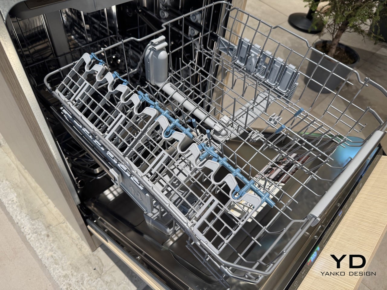
The smooth-gliding FlexiMax Plus upper basket has three folding rows for flexible loading, with anti-slip rubber grips and spikes to secure stemware and glasses and reduce the risk of collisions. The cutlery drawer has a deep middle section for cooking tools and an integrated knife holder, keeping flatware properly separated from the main wash zones. The QuickSelect display shows how energy use changes depending on the cycle length, and a slider lets the user choose the duration and see the energy graph update in real time, turning an invisible efficiency metric into something immediate and interactive. AirDry technology opens the door automatically at the end of the cycle, venting steam and drying dishes passively without a heating element. These details add up to a machine that rewards the kind of cook who treats the kitchen seriously, the same person most likely to own the cast-iron Dutch oven that ComfortLift was built to accommodate.
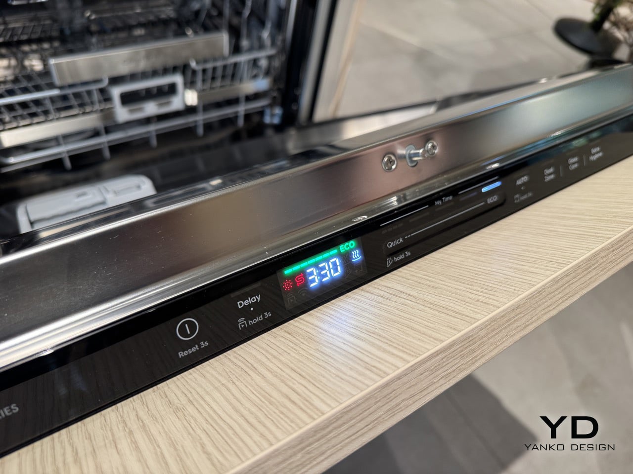
The controls sit on the lip of the door handle, positioned for direct visibility whether the user is standing in front of the machine or reaching across a counter. A sliding interface sets the cycle duration, and that choice governs energy and water consumption simultaneously, with the ECO programme activating at the longest end of the range. Electrolux made a deliberate decision to present time in 30-minute increments rather than the oddly specific figures that populate most dishwasher interfaces, the kind of readout that tells a user a cycle takes 68 or 52 minutes without explaining why. The shortest cycle runs at 30 minutes, while ECO extends to 3 hours and 30 minutes, drawing as little energy and water as the machine can manage across that duration. Rounding to half-hour intervals turns cycle selection from a guessing exercise into something legible, honest, and genuinely quick to act on.
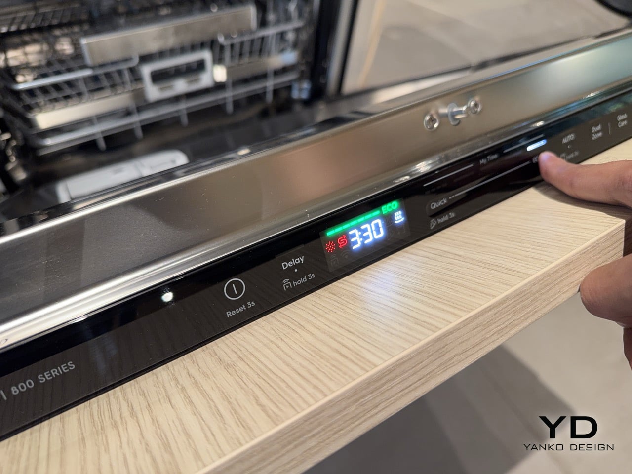
Electrolux’s Design Week showcase, titled “The Swedish Home,” is running at Via Melzo 12 in Milan’s Porta Venezia neighbourhood through April 24th. The live format suits ComfortLift especially well, because no product photograph conveys the mechanism as clearly as watching it move once with a full rack. Across a week dominated by material experiments and future-facing concepts, Via Melzo 12 is presenting something built around a very specific, present-tense problem: that the most physically demanding daily interaction in the kitchen has gone largely unaddressed by appliance design for decades. ComfortLift is Electrolux’s argument that the most consequential design decisions in the home are often the least glamorous ones. It is a strong argument, and a well-engineered one.
The post This Electrolux dishwasher lifts its bottom rack so you can load pots without bending down first appeared on Yanko Design.
These Stickers Turn Crumbling City Walls Into Tiny Living Ecosystems

Cities are built almost exclusively for people. Every surface, every wall, every façade is designed, maintained, and repaired with human use in mind. But cities aren’t just inhabited by humans, and the idea that urban decay, those crumbling plaster patches and cracked brick faces, is purely a problem to be fixed ignores the potential it quietly holds for other species.

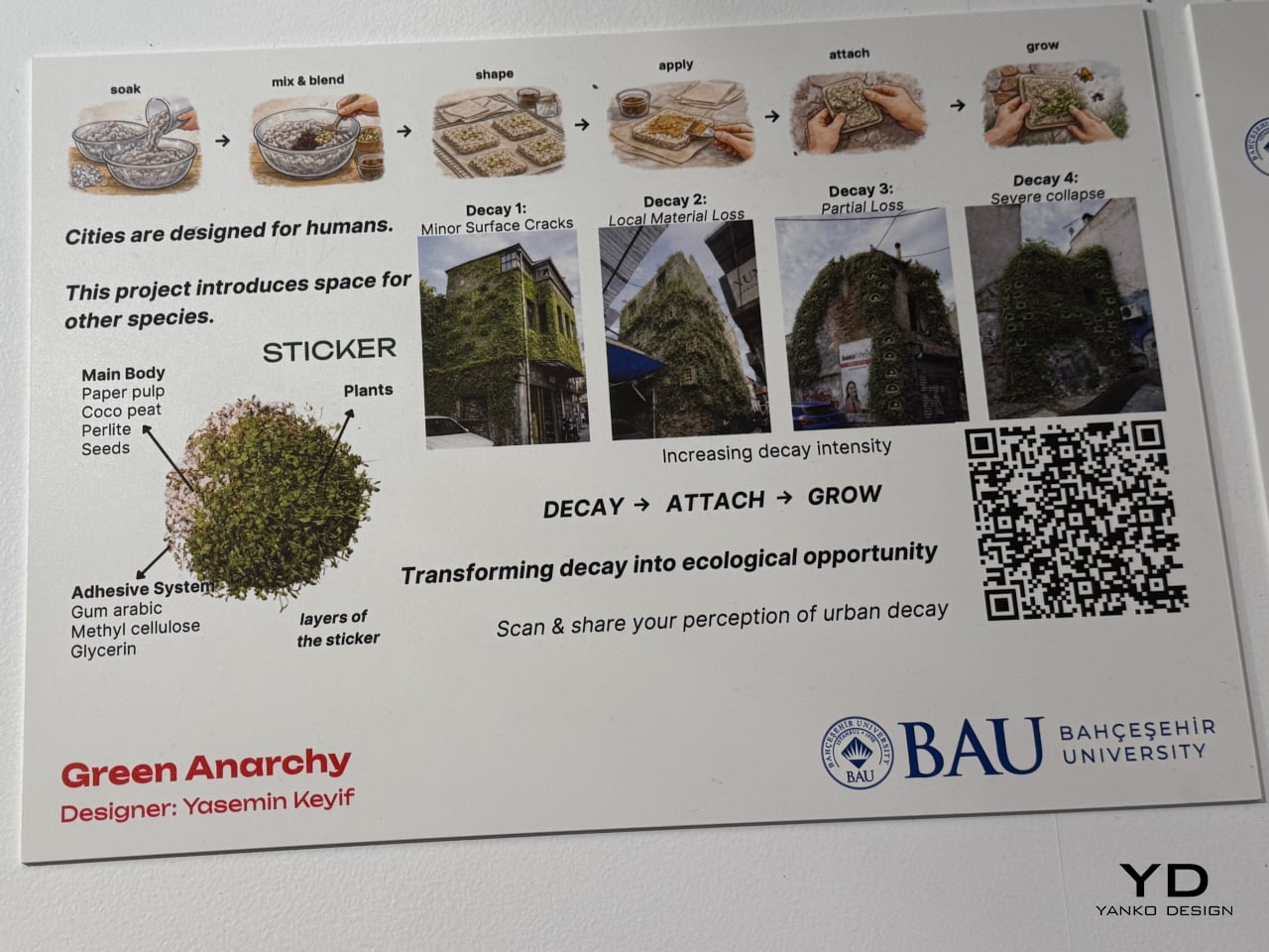
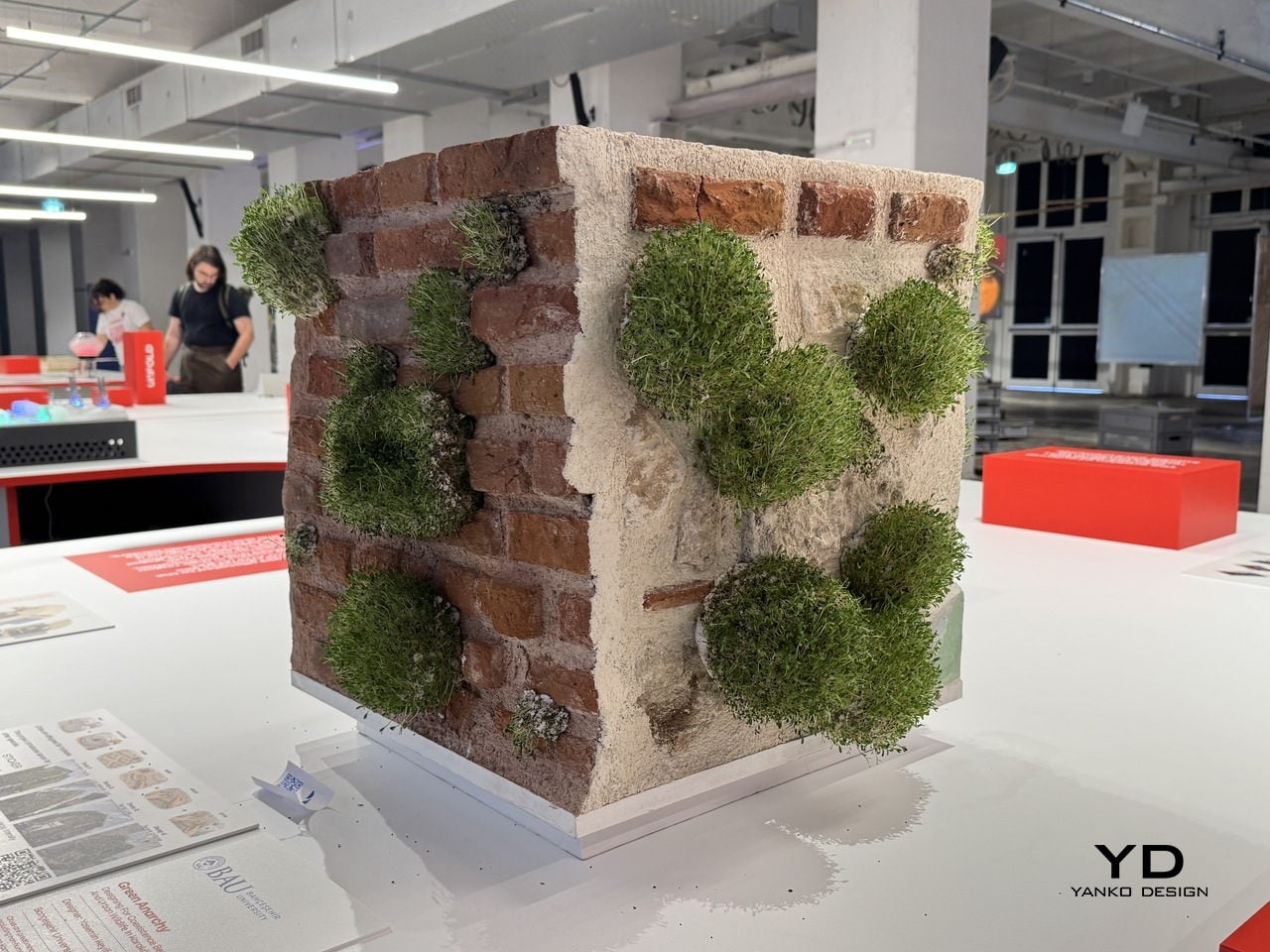
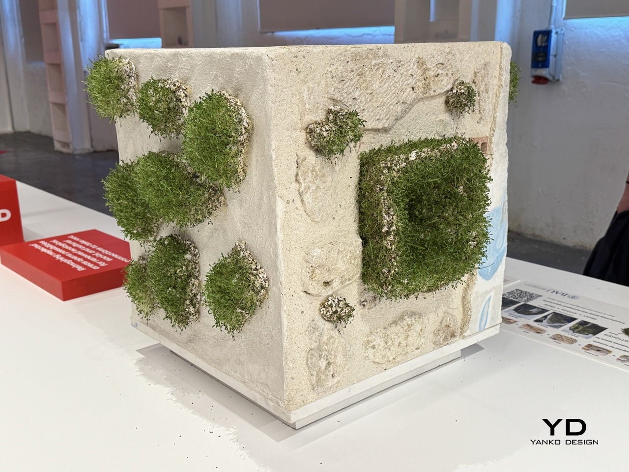
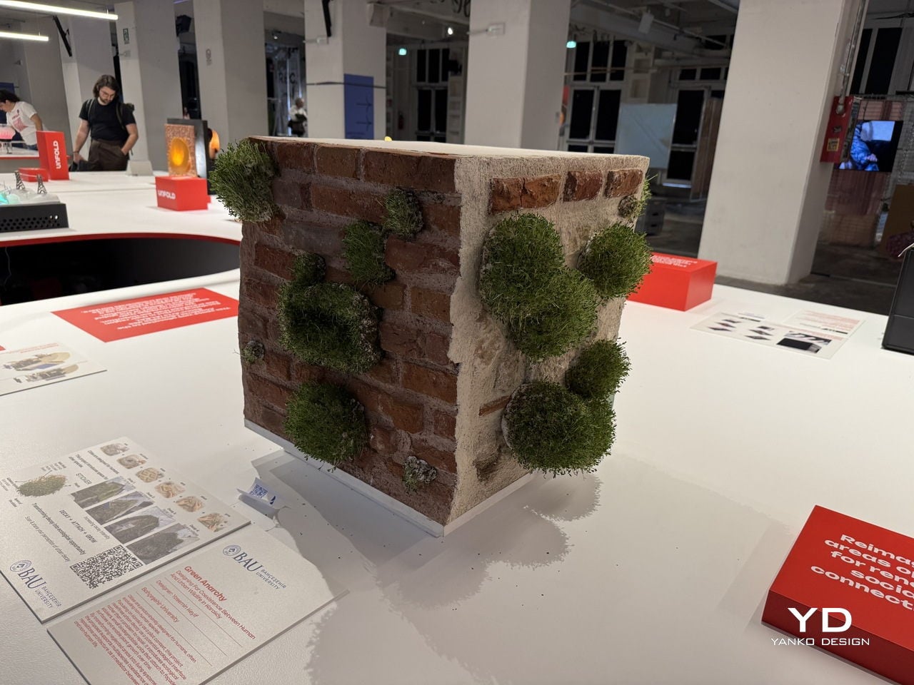
That’s the provocation at the heart of Green Anarchy, a project by Yasemin Keyif of Bahçeşehir University in Istanbul, presented as part of the UNFOLD 2026 exhibition at BASE Milano during Milan Design Week. Rather than treating a cracked or crumbling façade as something to be patched over, Keyif asks what happens when designers choose to work with decay instead of against it.

Designer: Yasemin Keyif (Bahçeşehir University)

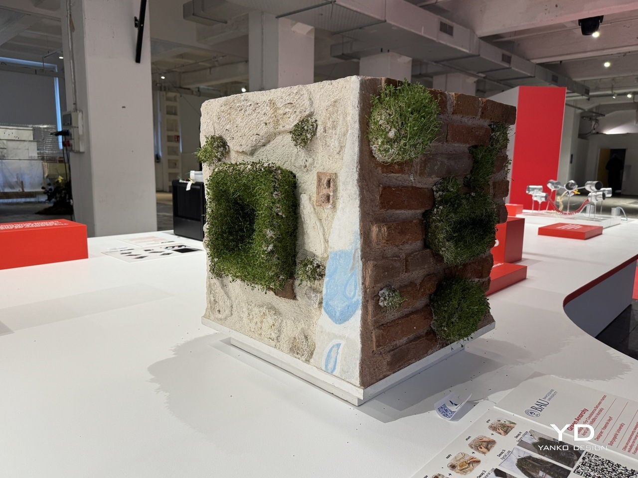
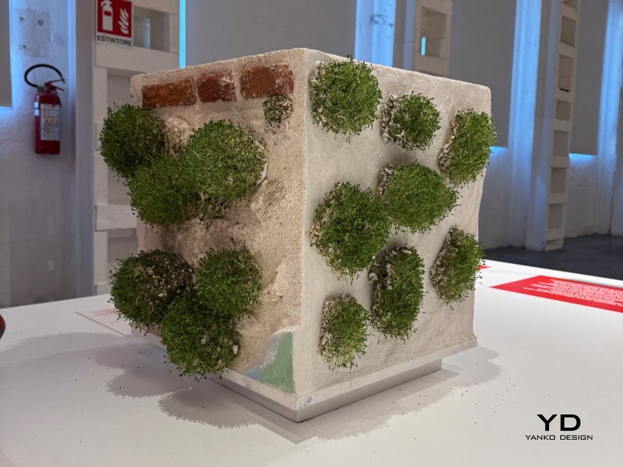
The answer takes the form of a small, biodegradable sticker pressed directly onto damaged building surfaces. Each unit is made from a blend of paper pulp, coco peat, perlite, and seeds in its main body, with an adhesive system of gum arabic, methyl cellulose, and glycerin that lets it bond to roughened or degraded masonry without any synthetic materials.

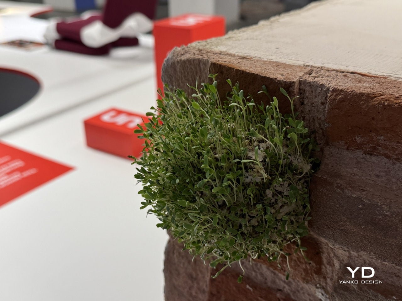
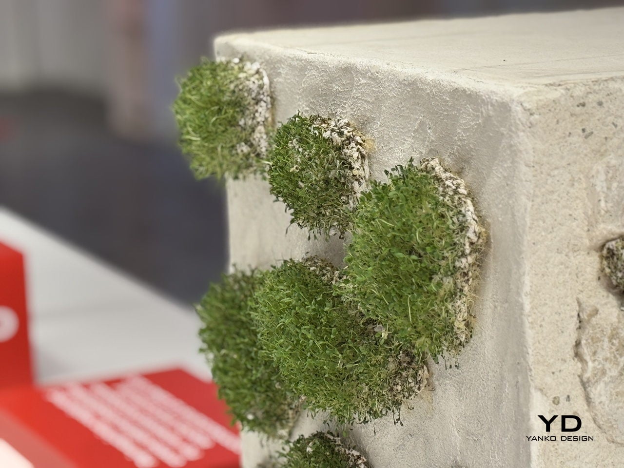
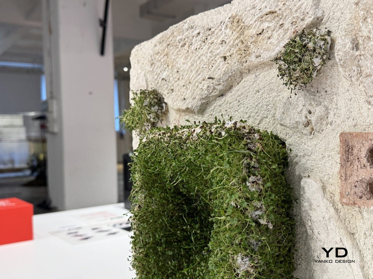
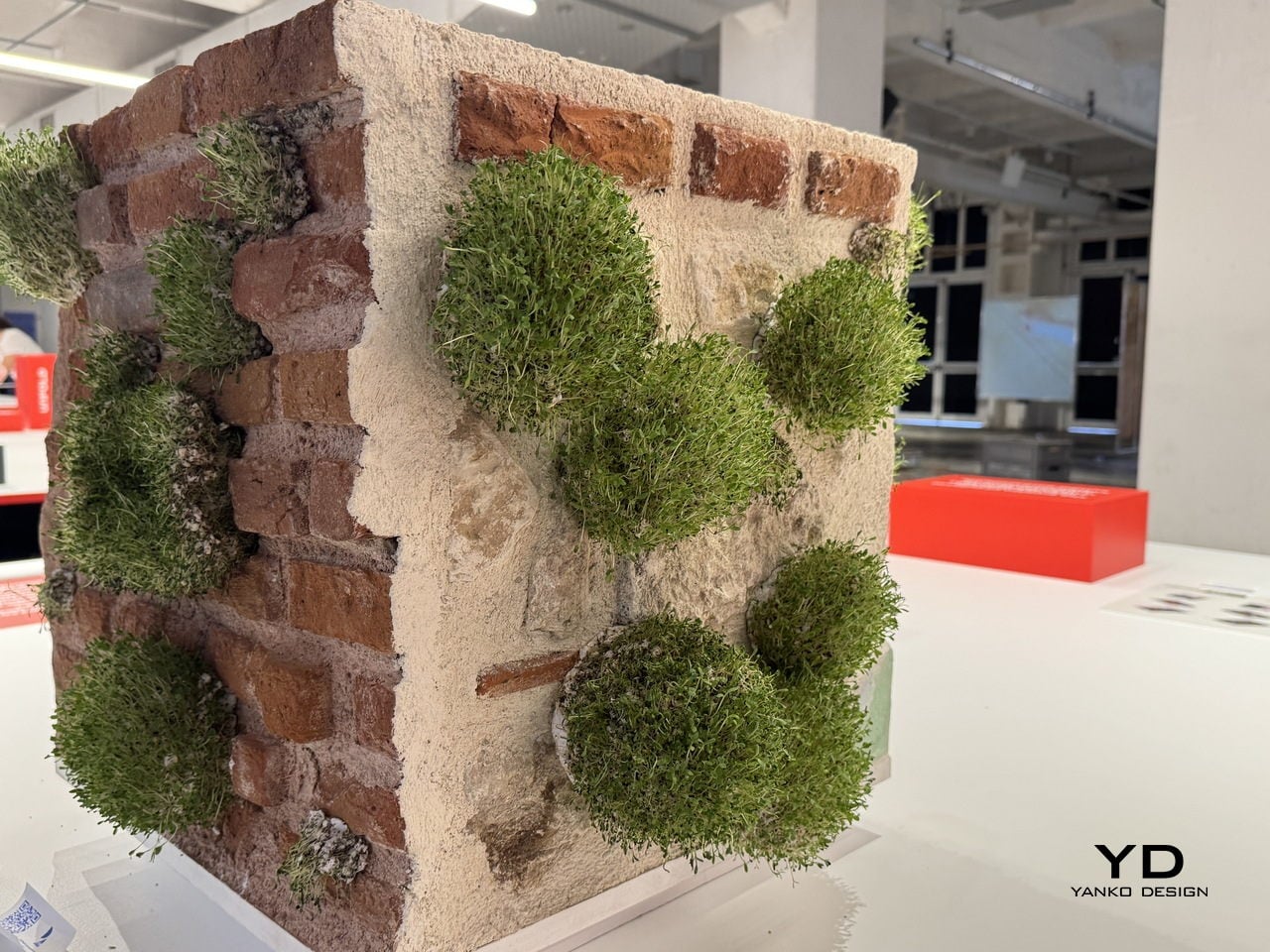
The process is surprisingly simple: the stickers are soaked, mixed, shaped, and applied by hand directly onto the wall. Over time, the seeds embedded in the substrate germinate and take root in the existing cracks and recesses, gradually turning neglected building surfaces into small, self-sustaining ecosystems. The name for this sequence, decay, attach, grow, also doubles as the project’s driving logic.

Keyif developed the concept with Karaköy, a dense historic neighborhood in Istanbul, as the pilot context. The project maps four escalating stages of urban decay, from minor surface cracks to severe structural collapse, and identifies each stage as a viable entry point for the stickers. The greater the damage, the more surface area becomes available for attachment and growth, turning the most deteriorated walls into the most fertile ground.

The deeper idea is a repositioning of architecture itself. Buildings, in this framework, aren’t just infrastructure for human activity but potential interfaces between human and non-human life. Cities already host birds, insects, mosses, and small animals that quietly inhabit the spaces we overlook, and Green Anarchy asks whether design can actively make room for that, rather than continually squeezing it out.

Presented as part of UNFOLD 2026, Domus Academy’s annual international design showcase held under the theme “Engage Friction: Designing Through Conflict,” Green Anarchy fits the brief almost too well. It doesn’t try to resolve the tension between the built city and the natural world so much as give them a way to grow into each other, slowly, without asking anyone’s permission.

The post These Stickers Turn Crumbling City Walls Into Tiny Living Ecosystems first appeared on Yanko Design.
These Sequins Are Made From Industrial Dye Sludge and Still Sparkle

The fashion industry has a water problem that most people never see. Dyeing fabric is one of the most chemically intensive steps in garment production, and the wastewater that comes out of that process carries synthetic dyes, heavy metals, and other pollutants that routinely end up in rivers and soil. By the time a sequined dress reaches a store, the environmental cost of making it sparkle is already long gone and mostly forgotten.

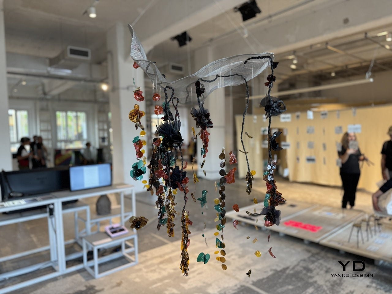
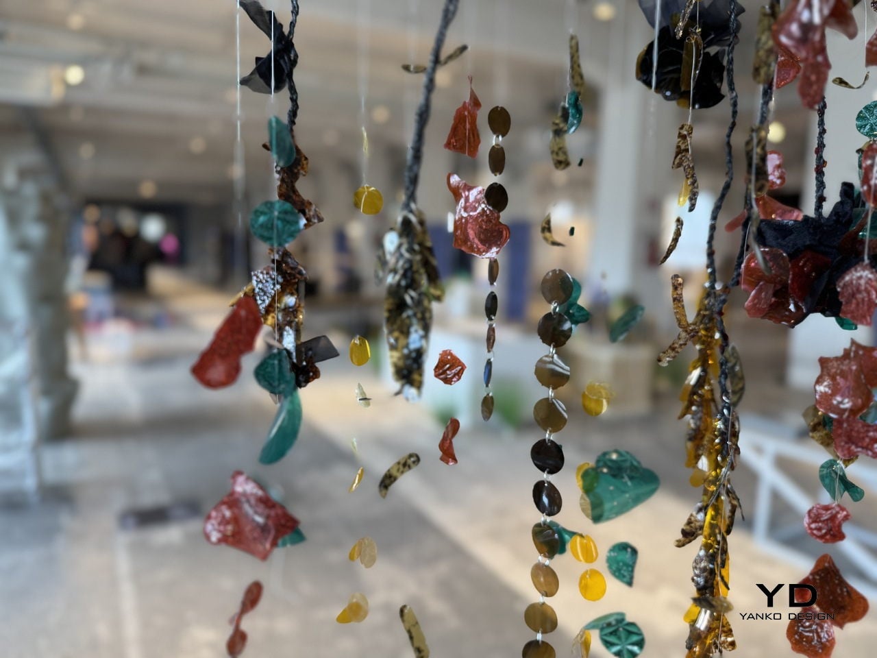
CQ Studio, a London-based regenerative textiles lab, tackled that problem head-on with a material experiment that turns the very wastewater from textile dyeing into the sequins themselves. The result, called Detox Bio-Embellishments, was on show at BASE Milan during Milan Design Week 2026 as part of the studio’s debut exhibition, Transient Gradients.

Designer: Cassie Quinn (CQ Studio)

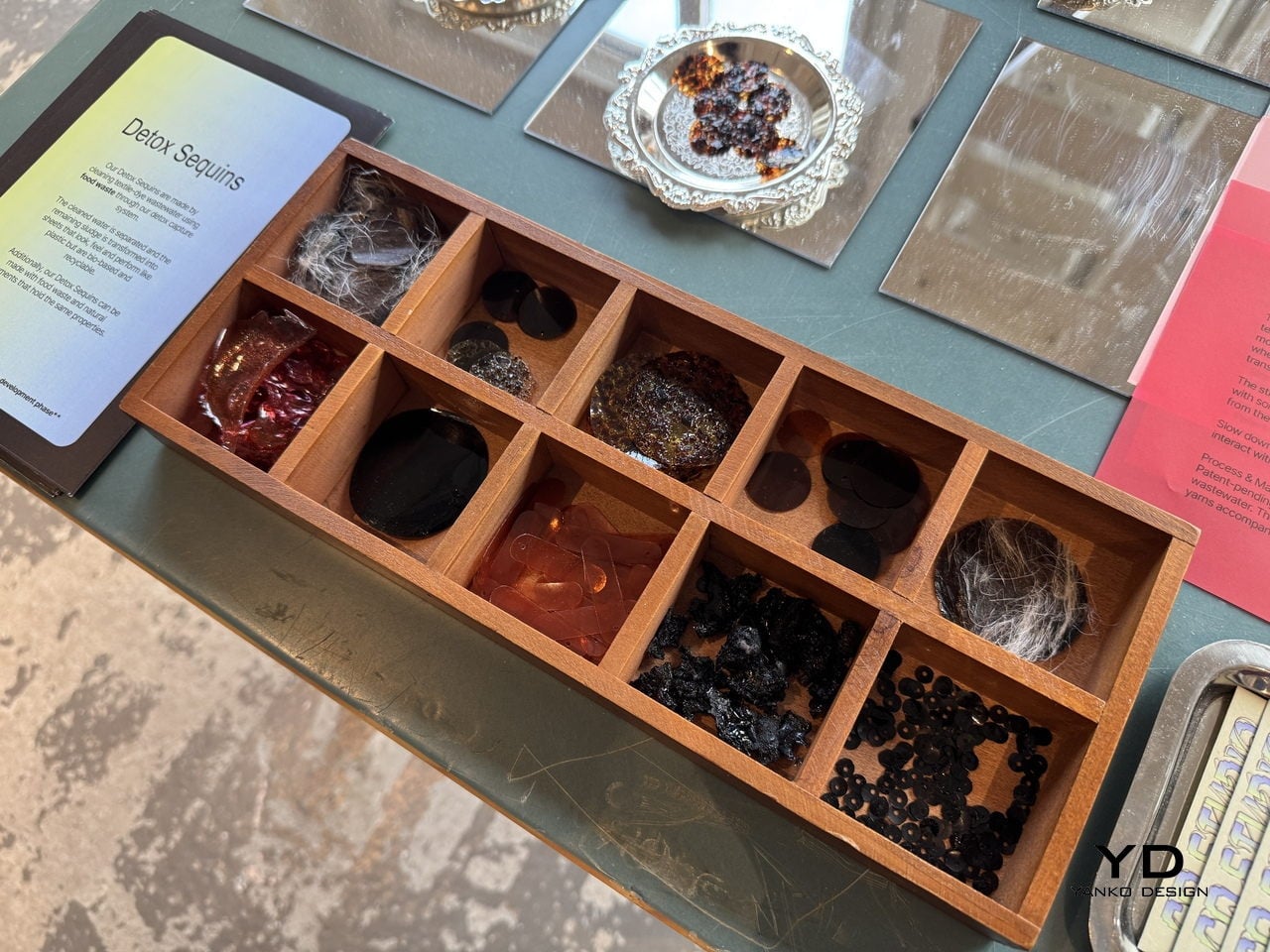
The process starts by running textile-dye wastewater through a detox capture system that uses food waste to pull out the contaminants. Once the water is cleaned and separated, the leftover sludge doesn’t get thrown away. Instead, it’s processed into thin, flexible sheets that look and feel like plastic, but are bio-based, biodegradable, and recyclable. Sequins are then die-cut from those sheets, and whatever scraps remain from the cutting are folded back into the process.

What makes the material particularly clever is how far it extends the concept of nothing wasted. It handles both synthetic-dye and natural-dye wastewater, keeping the synthetic version from ever reaching waterways, while the natural-dye version becomes safe enough to compost into soil. The sheets can also be made using food waste and natural pigments, giving designers a way to produce embellishments in a wide range of colors without any virgin plastic.

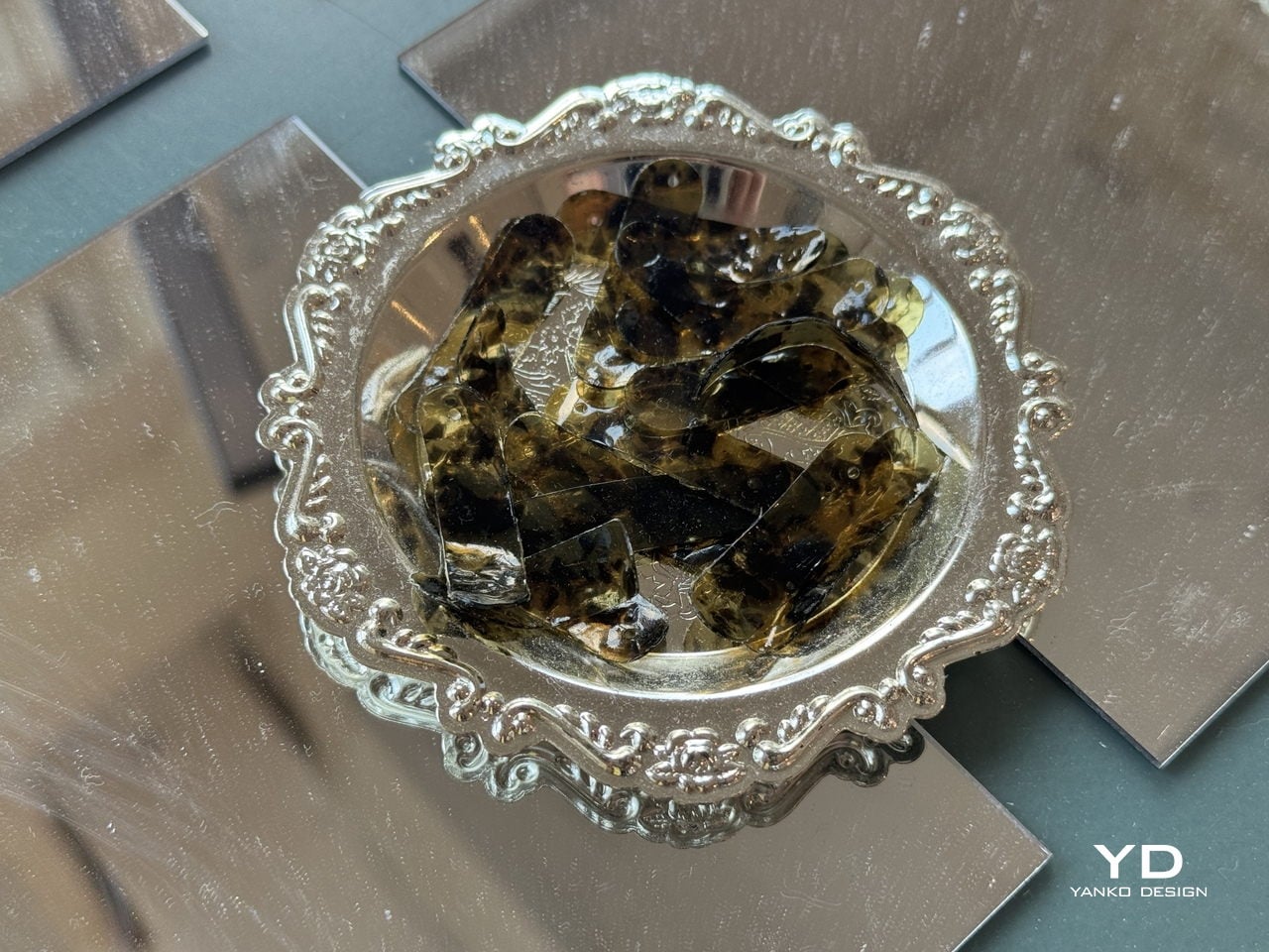
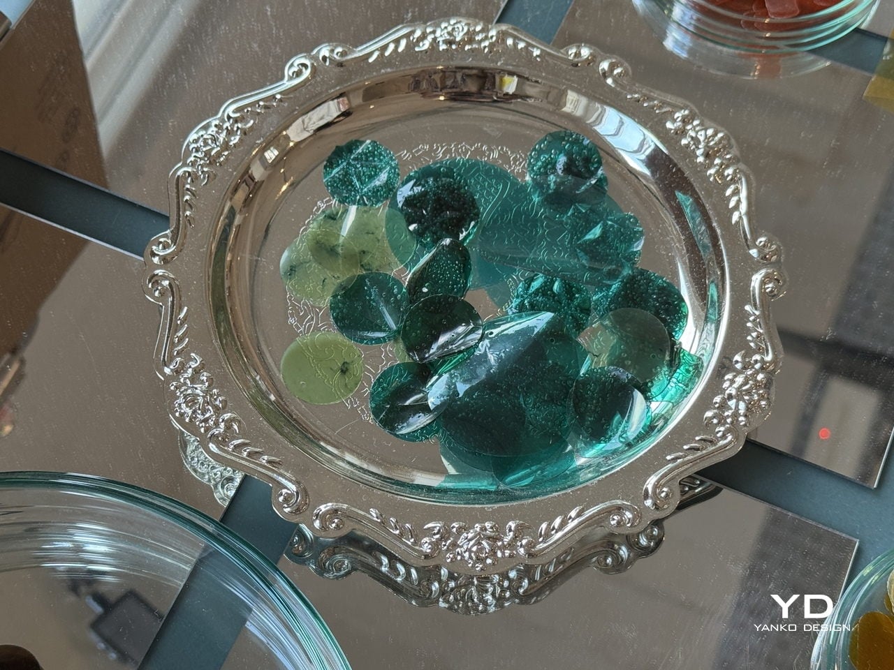
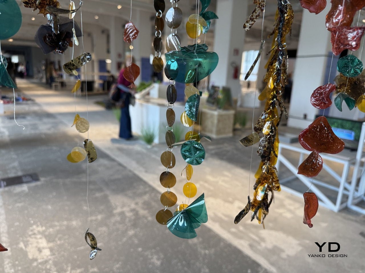
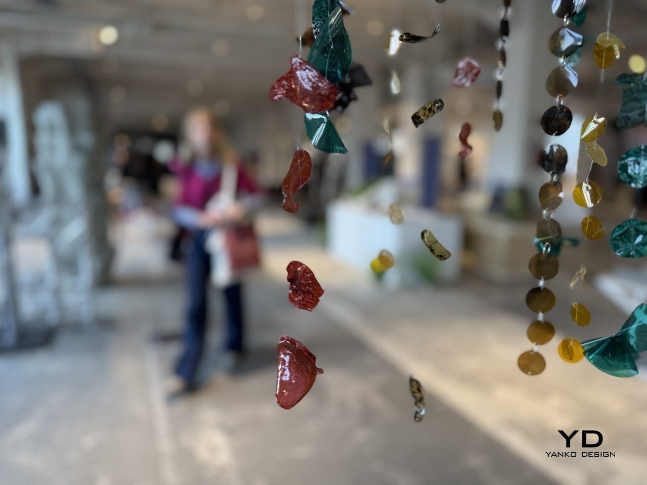
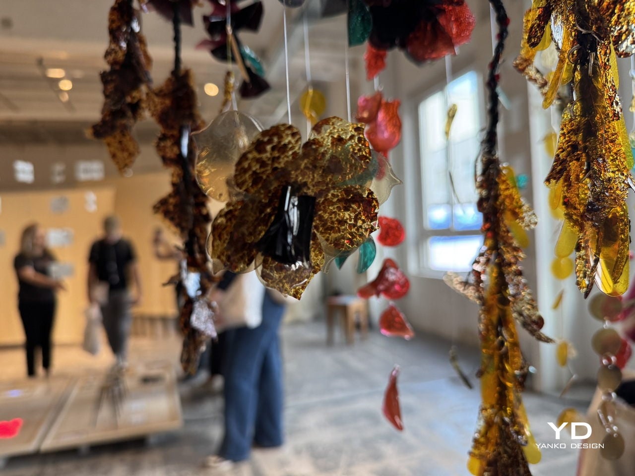
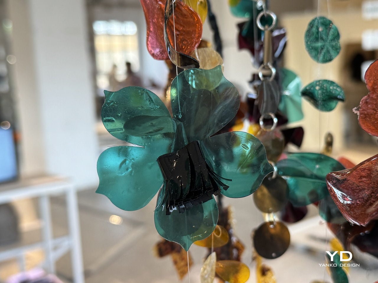
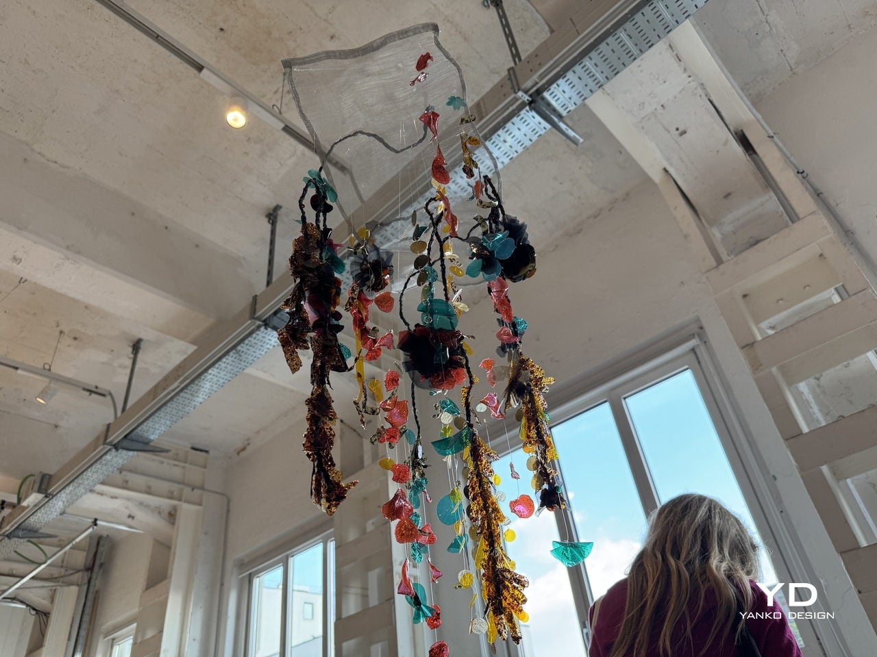
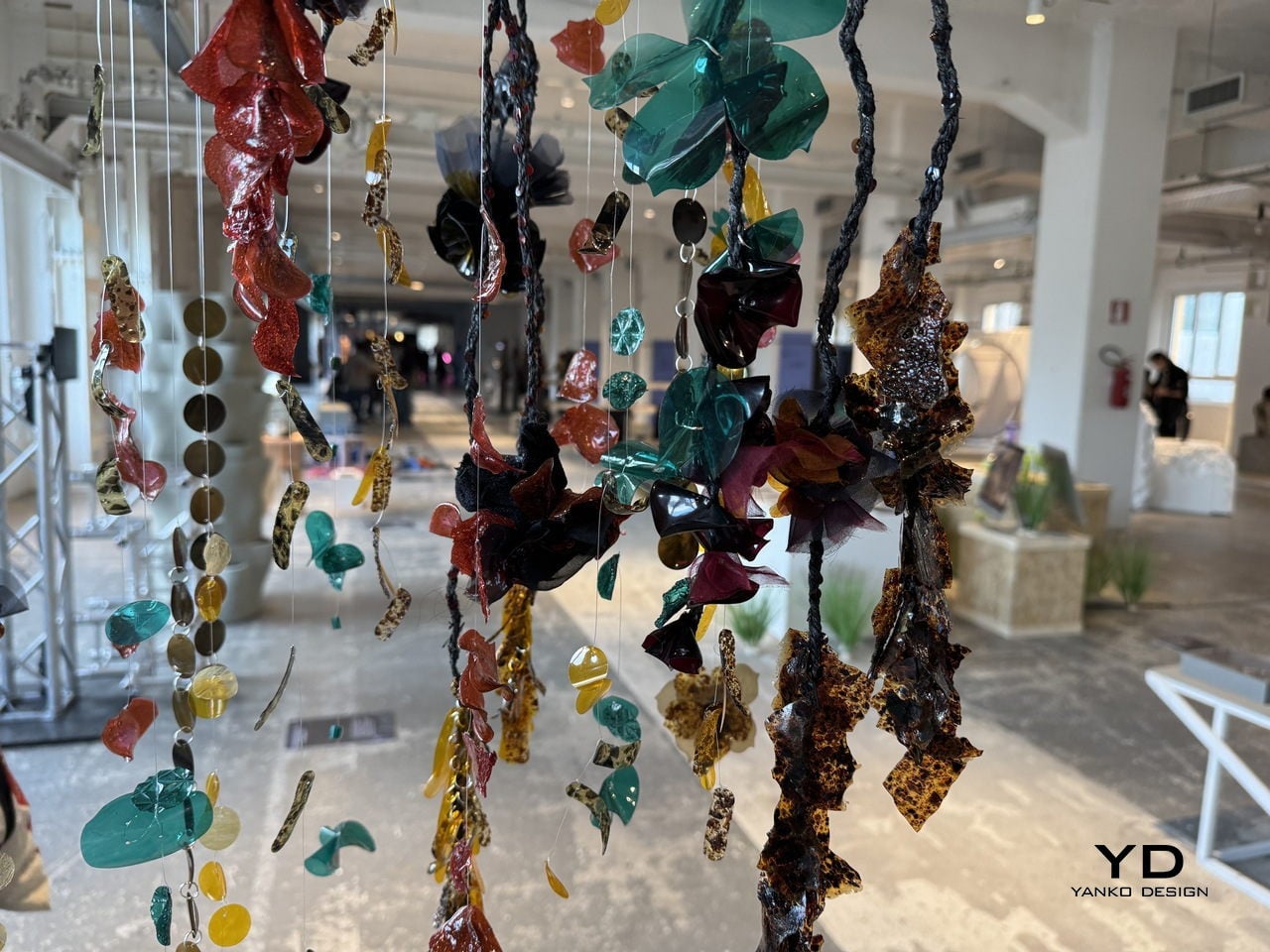
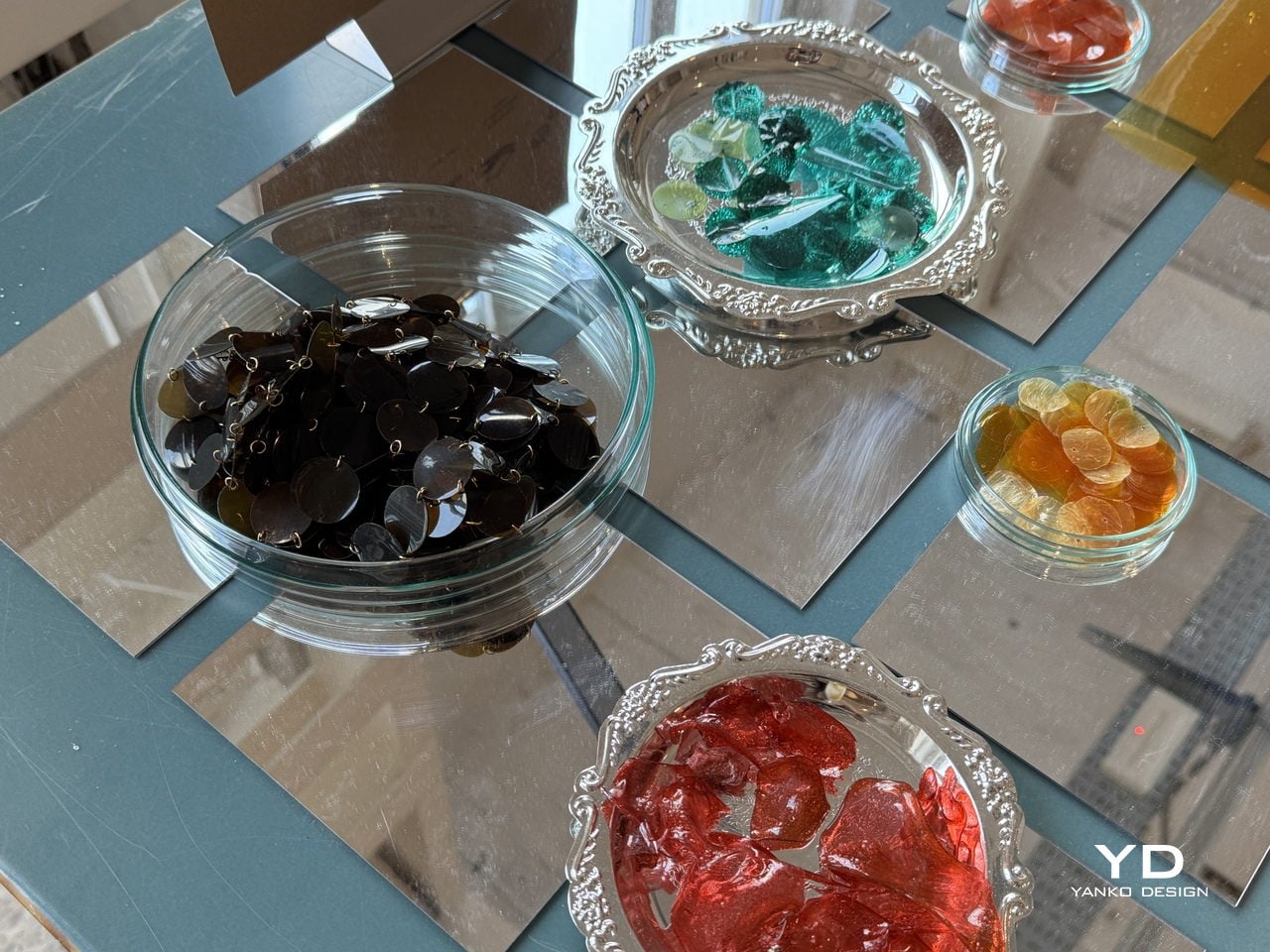
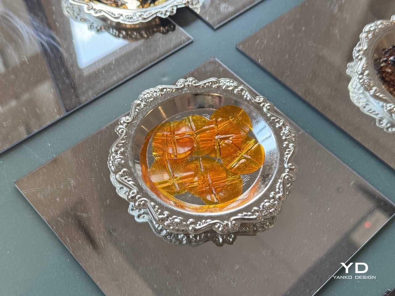
The visual result doesn’t look like a sustainability project at all. The sequins and embellishment pieces come out in deep blacks, jewel-like teals, warm ambers, rich reds, and tortoiseshell-patterned fragments that carry a high-shine finish. Strung onto braided cords and translucent threads for the Milan installation, they hung in dense cascading curtains that looked more like haute couture jewelry than anything born from industrial sludge.

For the fashion industry, where sequins are almost universally made from petroleum-based PET plastic and are notoriously difficult to recycle, having a material that can match the visual appeal of conventional embellishments while being fully bio-based is a genuinely significant step. A garment made with Detox Sequins wouldn’t just sparkle; it would also carry a story worth telling, one that runs from a dyeing vat through a detox system and out the other side as something a designer can actually use.

The post These Sequins Are Made From Industrial Dye Sludge and Still Sparkle first appeared on Yanko Design.
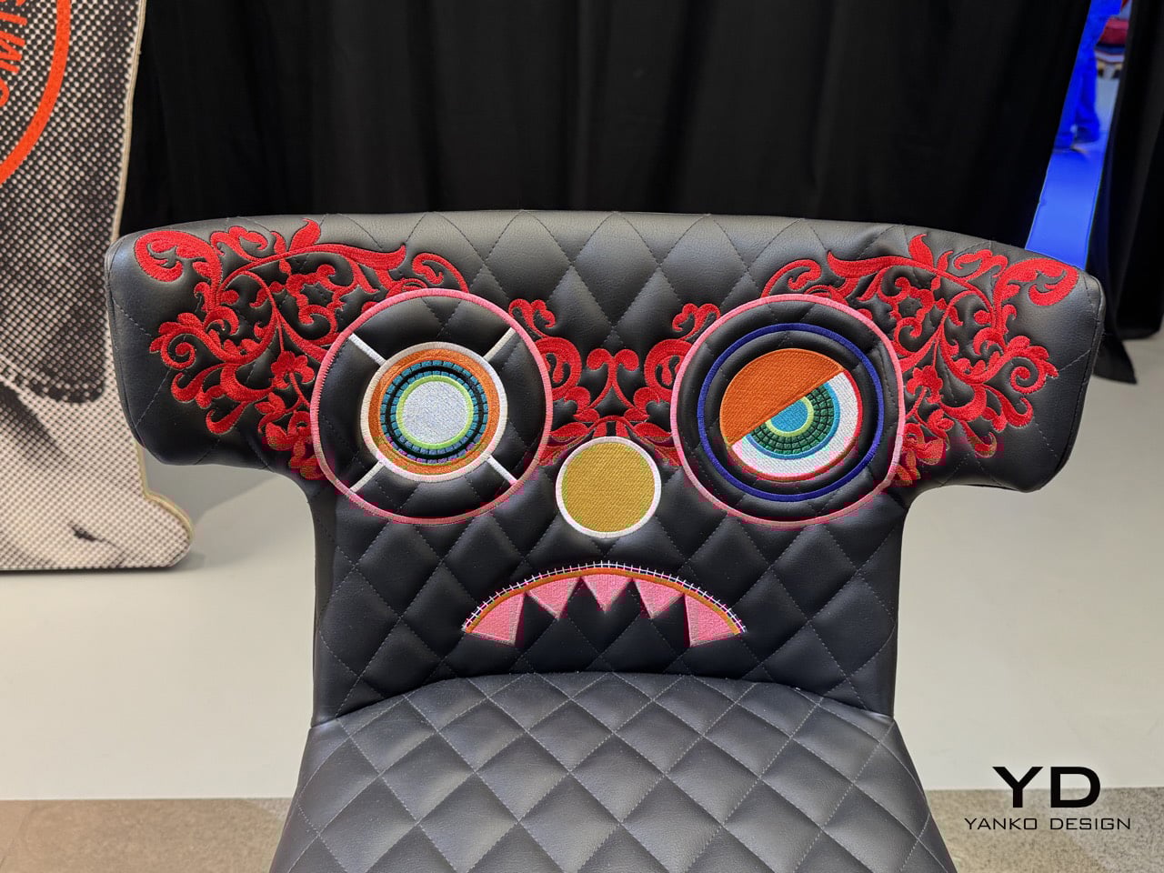
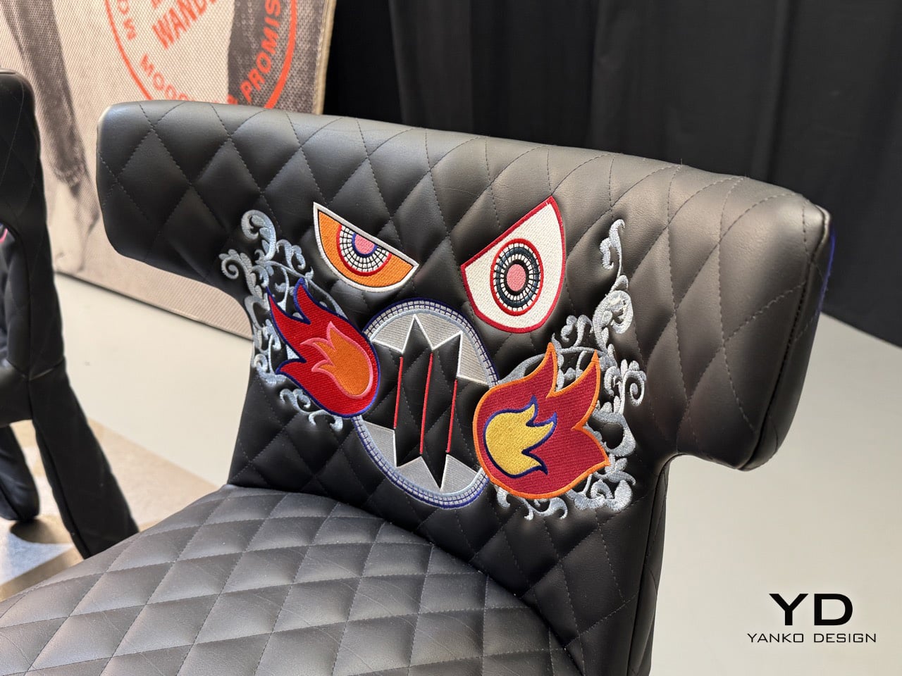
Moooi’s 25th Anniversary Monster Chairs Have Hand-Embroidered Creatures on Every Backrest

When Marcel Wanders designed the Monster Chair in 2014, the “monster” part was mostly conceptual. The piece had presence, sure, with its quilted leather upholstery and angular obsidian-like legs, but the actual aesthetic leaned more toward restrained decadence than outright chaos. It was a chair that suggested mischief without committing to it fully. That restraint just got thrown out the window.

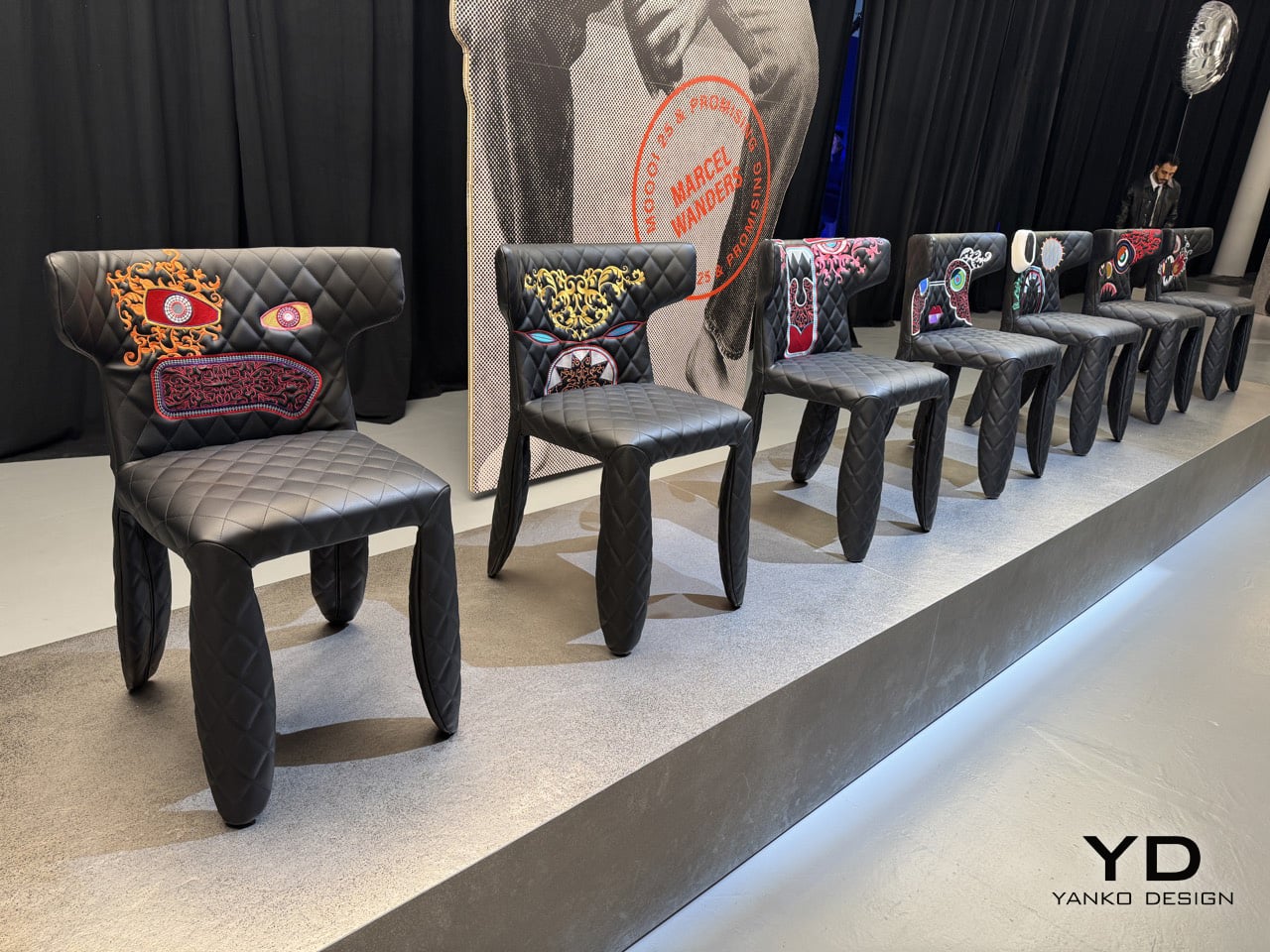
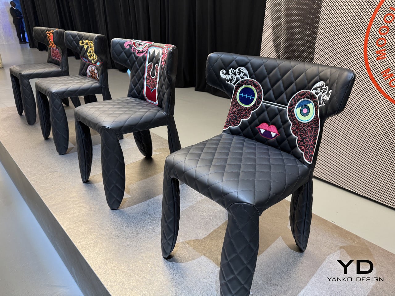
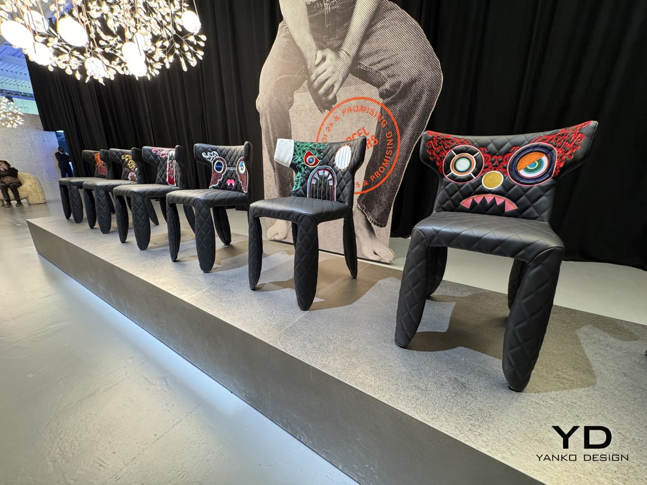
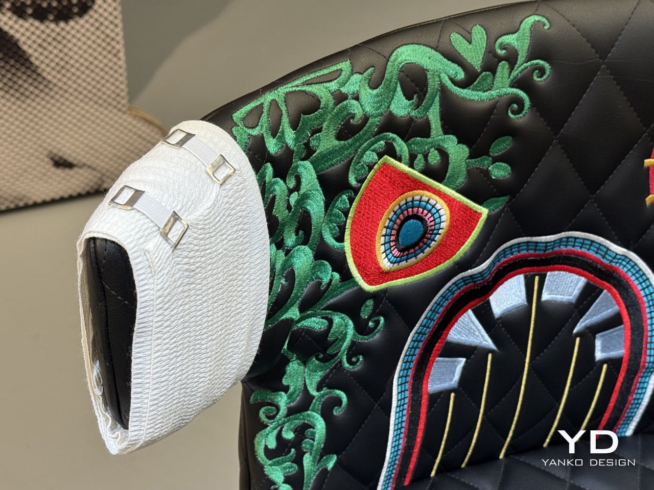
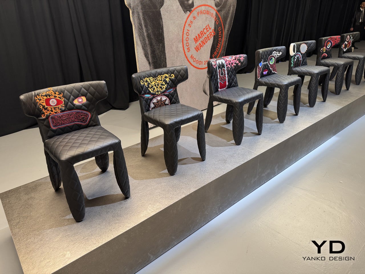
Moooi’s 25th anniversary celebration at Milan Design Week 2026 brought a reimagined Monster Chair collection to Superstudio Events, and this time the monsters are unavoidable. Each chair in the lineup features a hand-embroidered creature sprawling across the backrest, rendered in vivid, layered threadwork. One has concentric-circle eyes in clashing neon tones. Another hides behind ornate red filigree that frames its face like vintage wallpaper turned sentient. There are geometric flames, pink zigzag teeth, emerald scrollwork that could be tentacles or vines depending on your interpretation. The base silhouette stays true to the original, that black quilted leather and sculptural leg structure providing just enough formality to make the embroidered chaos feel intentional rather than random. It’s furniture that demands attention, and after 25 years of pushing boundaries, Moooi clearly has no plans to apologize for that.

Designer: Marcel Wanders for Moooi

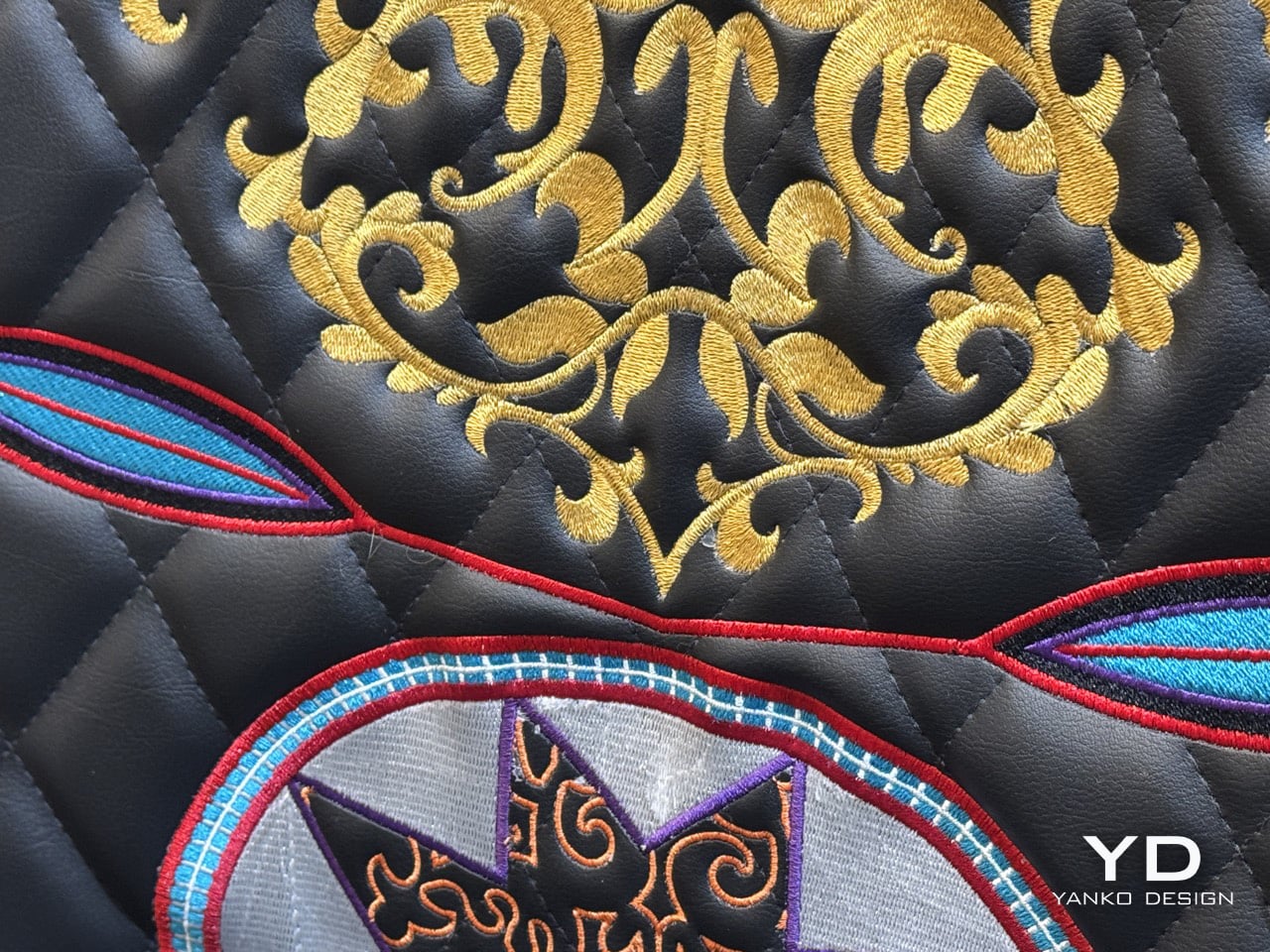
The embroidery work transforms an already iconic chair into a craft-intensive Labubu-esque character. Each monster appears to be unique, with thread layered in ways that create dimensional relief against the quilted leather backdrop. Some faces use densely packed stitching that gives them an almost patch-like quality, while others employ looser, more organic threadwork that lets the black leather show through. The color palettes vary wildly from chair to chair. One goes heavy on emerald green and white, another commits to a red and orange gradient that feels almost pyrographic. The effect is a collection where every piece reads as an individual artwork rather than a production run with minor variations.

The Monster Chair’s original form was already theatrical, with its deep button tufting and geometric legs that look like something between furniture and sculpture. Adding these embroidered creatures could have tipped the whole thing into novelty territory, but the execution is too considered for that. The monsters are bold without being cartoonish, detailed without feeling precious. They occupy that sweet spot where high craft meets playful irreverence, which has been Moooi’s signature move since Marcel Wanders and Casper Vissers founded the brand in 2001.

Each chair has its own persona. Some monsters look menacing, others oddly appealing. The artwork has an almost luchador-ish quality to it, making the chairs look like different wrestlers in their elaborate get-ups. The wrestler comparison fits well, given that every chair’s expression stands out as attention-grabbing. Some monsters look like they’ve won a battle, others look like they’ve got battle scars. One of them even has a gauze bandage wrapped around its ‘ear’, it’s rare to find yourself laughing and sympathizing with a chair, but you end up doing so.

The collection was on display at Superstudio Events during Milan Design Week 2026, part of Moooi’s broader 25th anniversary showcase. If you’re in Milan during the design week, Superstudio is worth the trek. The exhibition space gave these Monster Chairs the gallery treatment they deserve, lined up against black curtains with dramatic lighting that made the embroidered details pop. It’s the kind of installation that reminds you why Milan remains the essential pilgrimage for anyone who takes design seriously.

The post Moooi’s 25th Anniversary Monster Chairs Have Hand-Embroidered Creatures on Every Backrest first appeared on Yanko Design.
IKEA Waited 12 Years to Show This Inflatable Chair at Milan Design Week

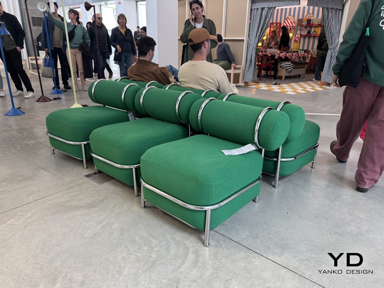
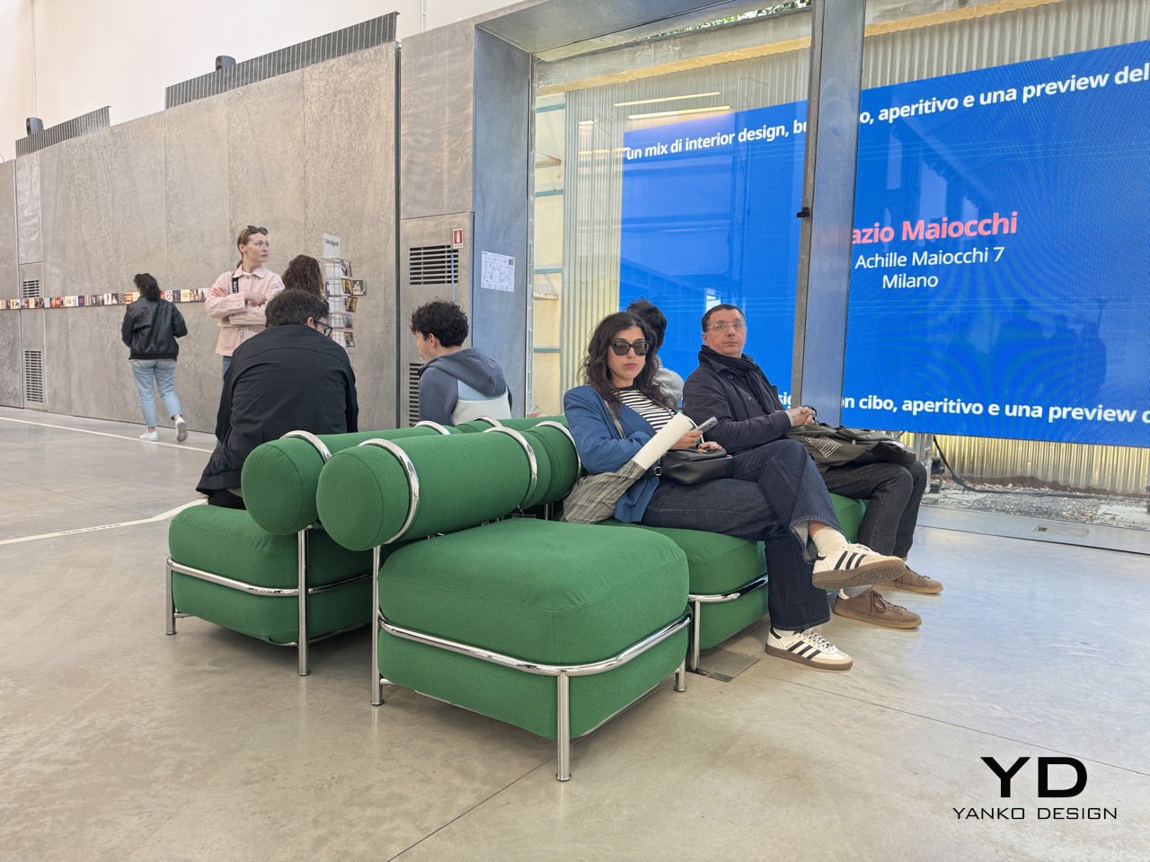
Air has always been free. IKEA designer Mikael Axelsson has been thinking about that fact for over a decade, sitting on an idea he first sketched in 2014 and shelved when no one at the company wanted to revisit inflatable furniture. The concept never disappeared, it just waited. At Milan Design Week 2026, inside the “Food For Thought” exhibition at Spazio Maiocchi, that idea finally got its moment. The PS 2026 Easy Chair arrived alongside a rocking bench and a flexible floor lamp, three pieces offering the first real look at the upcoming tenth IKEA PS collection.

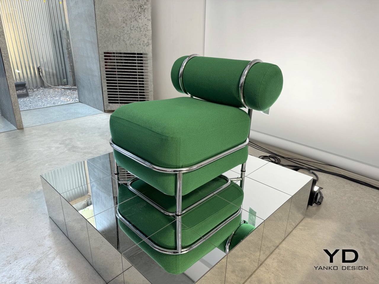
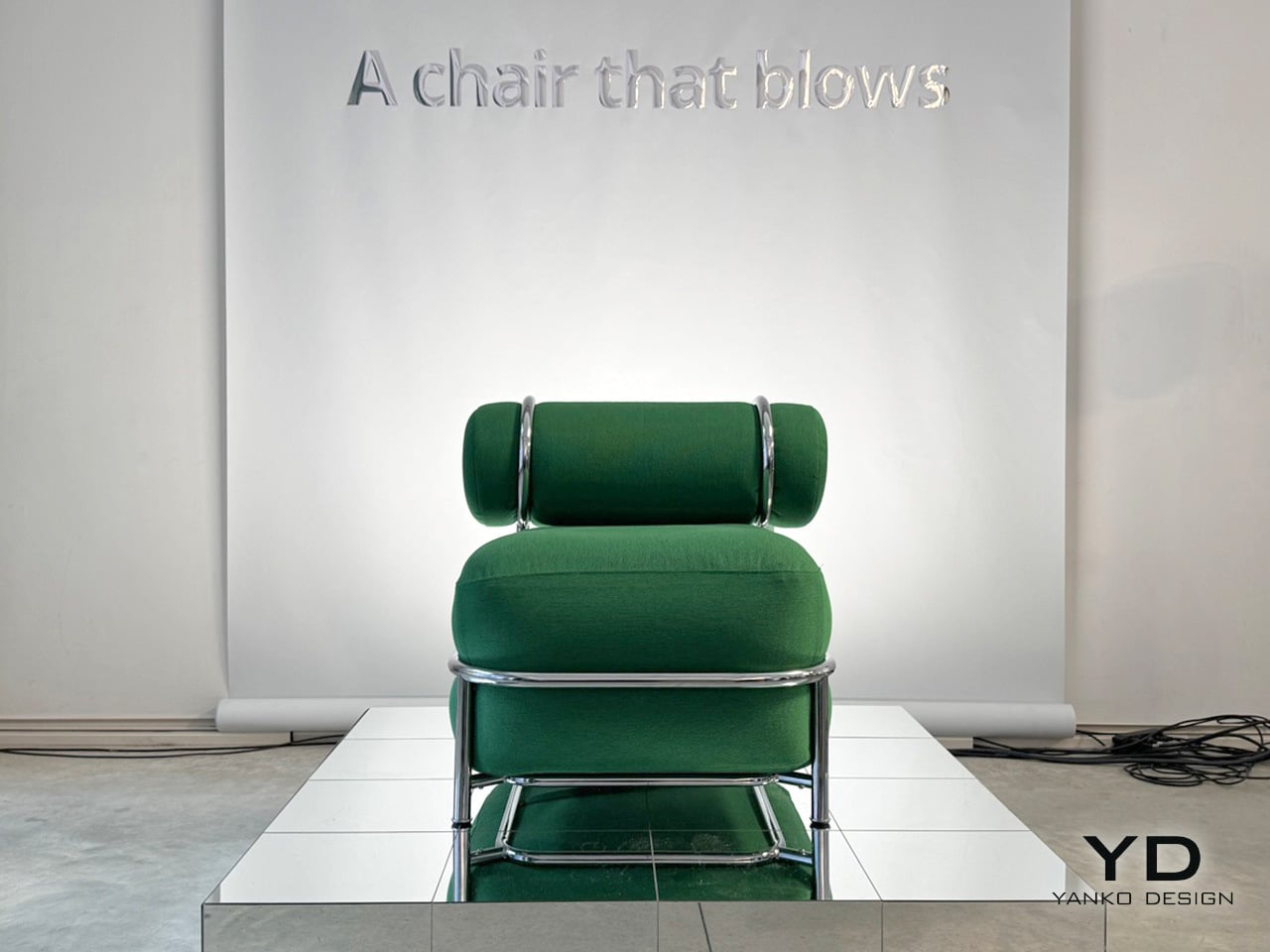
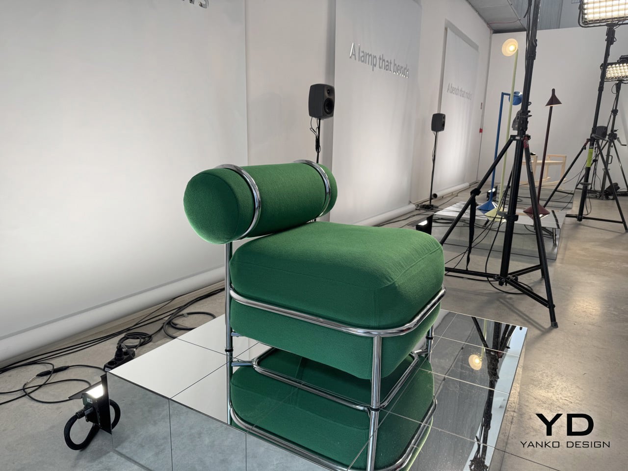
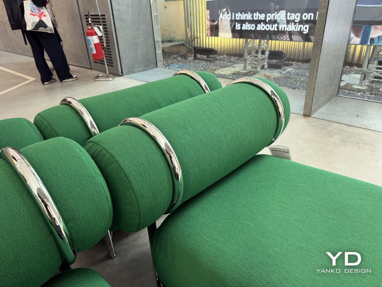
What Axelsson built reads, at first glance, like a fairly conventional lounge chair. Rich green fabric, cylindrical cushions, a compact and settled silhouette. The chrome tubing running around its perimeter is the tell, holding the inflatable volumes in place and giving the chair its shape and its credibility, keeping it far from the transparent, wobbly inflatables of the early 2000s. The separate air chambers between seat and backrest mean the sitting experience feels grounded rather than unpredictable. The lightness only reveals itself when someone actually lifts it.

Designer: Mikael Axelsson for IKEA

Mikael Axelsson is tapping into a design language that’s been trusted for nearly a century. It’s the same basic idea that made Le Corbusier’s Grand Confort a classic back in 1928: a rigid steel cage with soft cushions sitting inside. That frame is what makes the whole thing work. Without it, you’d just have a novelty green cushion that would feel out of place anywhere but a college dorm room. With the frame, the chair feels intentional and composed, and the backrest bolster sits with conviction across the top rail. The fact that it’s full of air is the last thing you notice, which is exactly the point.

The details here are just as smart. The fabric wrap gets rid of that annoying squeak and slide you might remember from old inflatable furniture, making it feel more like an actual upholstered piece. It comes with a manual foot pump instead of an electric one, which not only keeps the price down but also makes you part of the assembly process. It feels right for a chair that’s all about interacting with its materials. The deep green color seen in Milan is the kind of confident tone that can anchor a corner of a room without taking over.


The PS collection has always been IKEA’s design playground, a space for them to experiment since it first launched back in 1995. The rocking bench by Marta Krupinska has these wonderfully exaggerated runners, and Lex Pott’s floor lamp uses a simple diagonal cut so you can aim the light in three different directions. The full collection is set to launch on May 13, 2026. But the easy chair makes the sharpest point of the three. It argues that a chair built mostly on air can absolutely belong at Salone, as long as someone has thought carefully enough about the frame.

If you’re in Milan and want to see it for yourself, the chair is part of IKEA’s ‘Food For Thought’ exhibition. It’s being held at Spazio Maiocchi, located at Via Achille Maiocchi 7. The installation is open to the public and runs from April 21st through the 26th. It’s a great chance to see the chair, the lamp, and the bench in a setting that’s more about experience than just product display.

The post IKEA Waited 12 Years to Show This Inflatable Chair at Milan Design Week first appeared on Yanko Design.
A Copper-Wax Lamp Revives a Slovak Forge and Glows Like Stained Glass

Industrial heritage sites have a way of disappearing quietly. The machinery goes silent, the workers move on, and the buildings either get repurposed or left to rust. What rarely survives is the craft knowledge, the particular way a community understood and worked a material. Slovakia’s copper-processing history is one of those stories, rooted in a small central region that once hummed with the sounds of metalwork and fire.

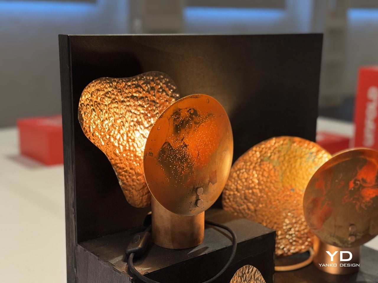
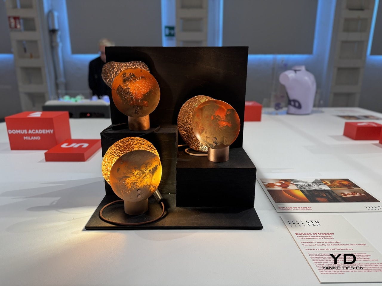
That’s the history Laura Zolnianska, a student at the Slovak University of Technology’s Faculty of Architecture and Design, decided to pull back into the present. Exhibited at BASE Milano as part of the 2026 Fuorisalone UNFOLD showcase, Echoes of Copper is a lamp collection drawing from the copper-processing traditions of Medený Hamor in central Slovakia, combining them with digital fabrication and an entirely experimental material of her own development.

Designer: Laura Zolnianska (Slovak University of Technology, Faculty of Architecture and Design)

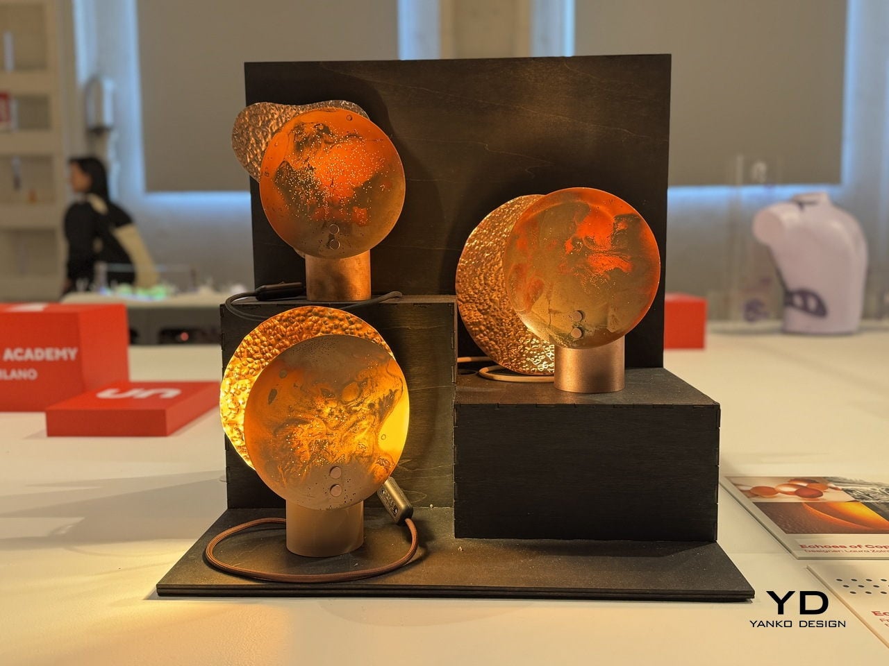
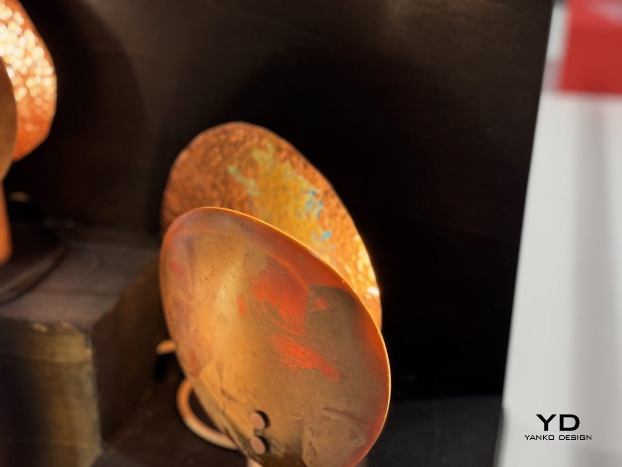
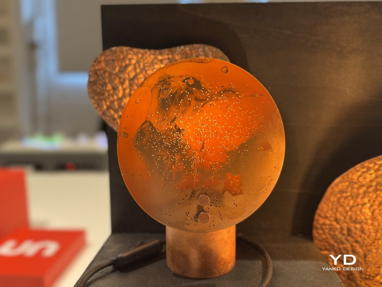
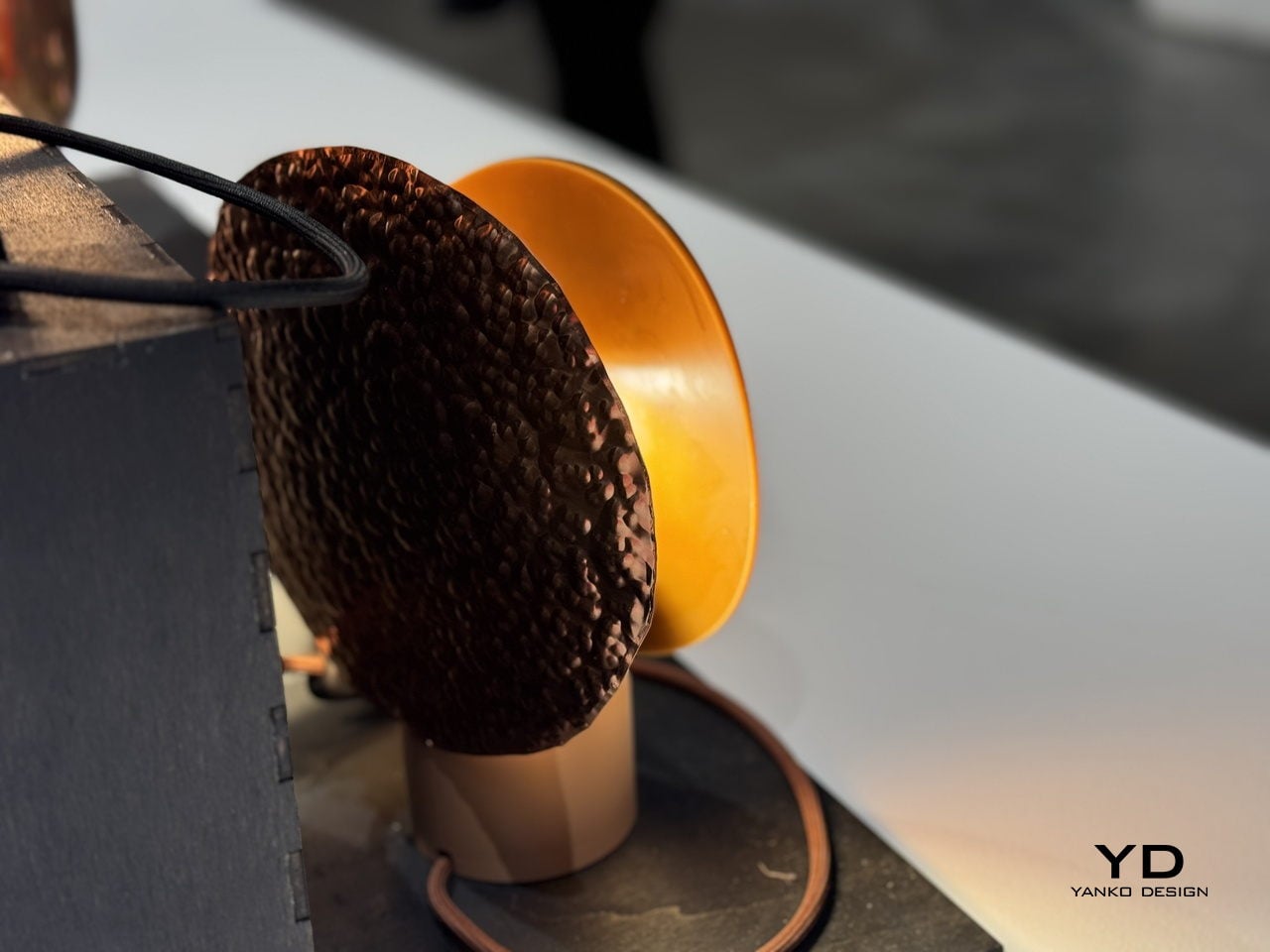
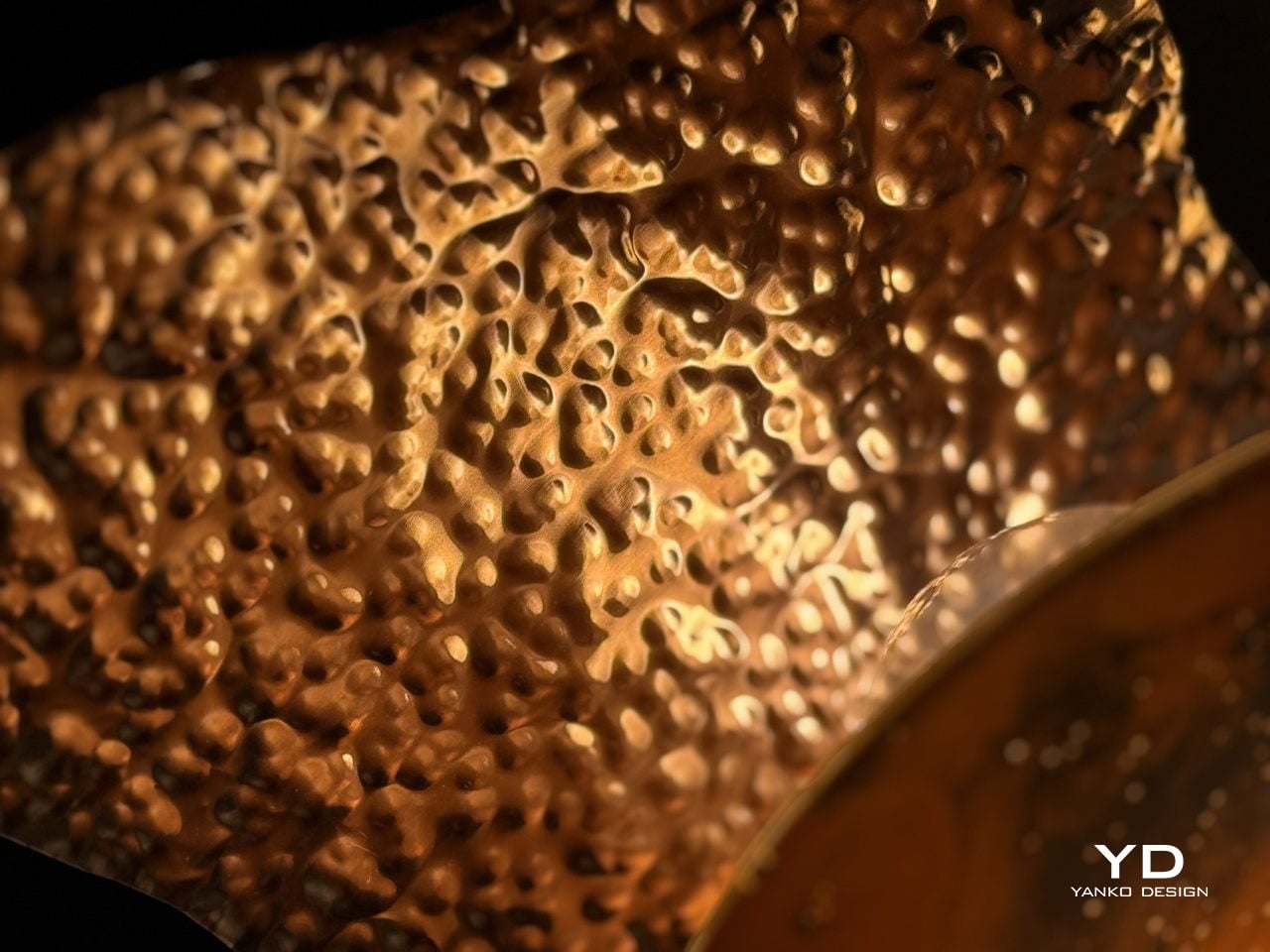
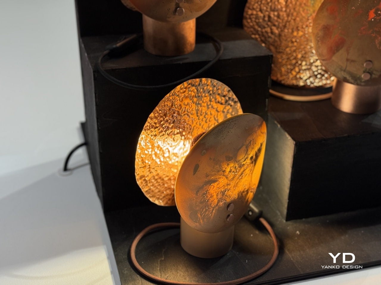
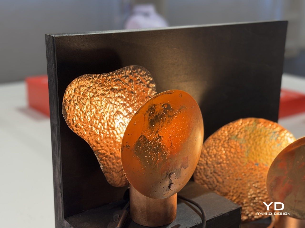
The material is the most interesting part. Zolnianska created a copper-wax composite that forms the shades, a substance that behaves differently every time it’s worked. Some shades come out smooth and disc-like, with swirling oxidation patterns that look almost planetary when lit. Others emerge heavily textured and volcanic, their deeply pitted surfaces catching and scattering light in ways that can’t be planned or predicted. No two pieces are the same.

Each lamp sits on a polished copper cylinder base with a matching copper-toned cord. When lit, the shades glow a deep amber orange, with translucent sections illuminating like stained glass while the denser, hammered areas cast dramatic, irregular shadows. The warmth of the light feels almost geological, as if it’s being filtered through something that took centuries to form rather than a material coaxed into shape in a studio.

The project isn’t purely a lighting exercise, though. Zolnianska designed Echoes of Copper around a workshop model where participants can create their own version of the lamp at the former Medený Hamor site itself. The idea is to bring people back to a place of faded industrial significance and give them a hands-on connection to the craft traditions that once defined their community.

Medený Hamor, which translates roughly to “Copper Hammer,” was a copper-processing site in central Slovakia’s Banská Štiavnica region, an area with a centuries-old metallurgical history. Using that heritage as a creative prompt rather than a museum exhibit is itself a meaningful design decision. Of course, craft doesn’t have to end up behind glass to be preserved; sometimes it ends up glowing amber on someone’s bedside table.

Echoes of Copper was exhibited at BASE Milano during Milan Design Week 2026 as part of UNFOLD, a student showcase bringing together emerging designers from institutions across Europe. It’s the kind of project that deserves more attention than student exhibitions typically get. Zolnianska didn’t just make a lamp; she made an argument that industrial communities don’t have to lose their identity to time.

The post A Copper-Wax Lamp Revives a Slovak Forge and Glows Like Stained Glass first appeared on Yanko Design.
This Chair Looks Normal Until It Needs to Keep You Afloat in a Flood

Flooding has gone from a rare calamity to a recurring reality for millions of households. As climate patterns grow more unpredictable, the spaces people call home have become increasingly vulnerable to forces they were never designed to withstand. Most domestic objects offer no answer to this shift, and furniture has remained stubbornly indifferent to the idea that the room it sits in might one day be underwater.

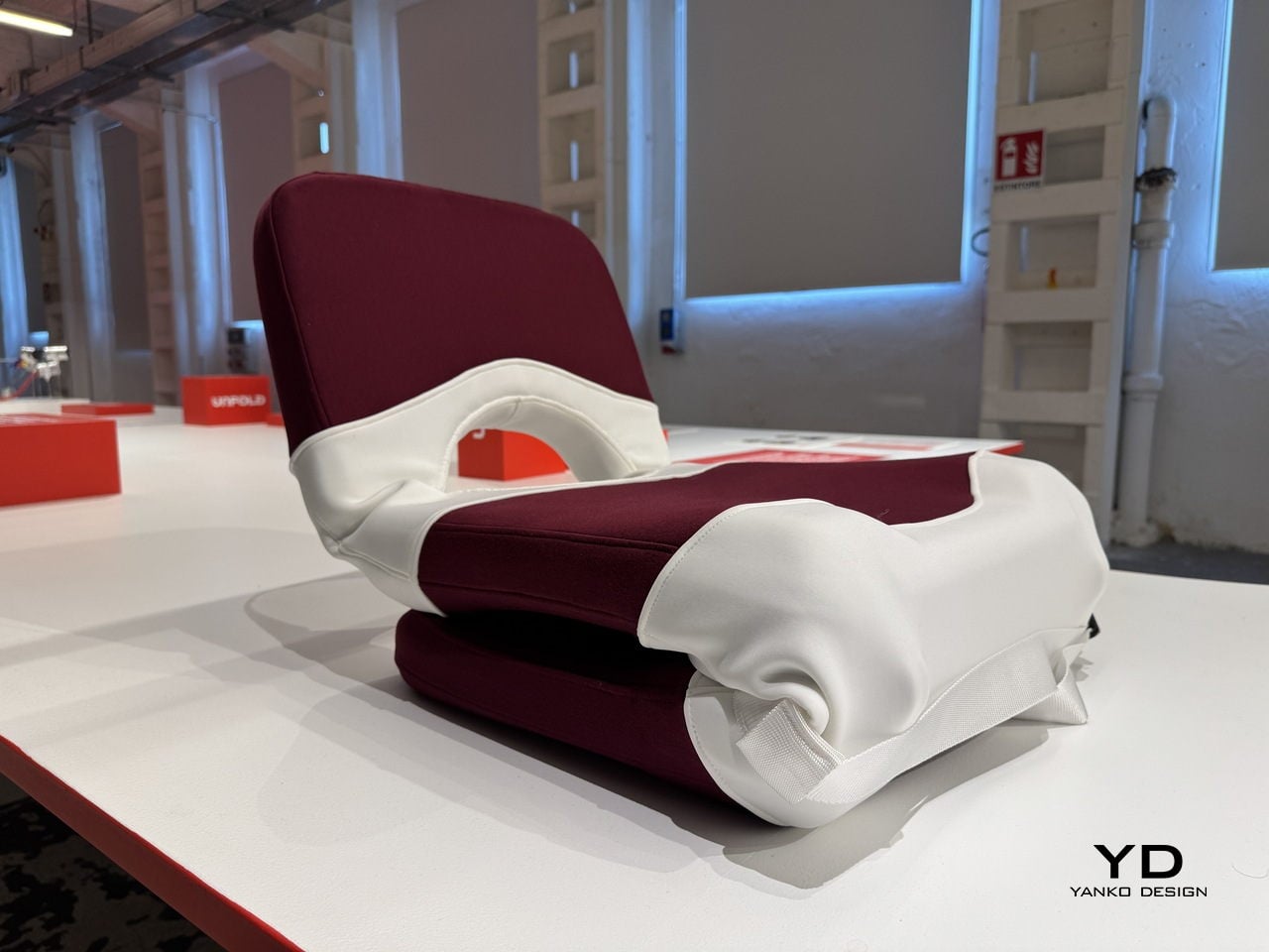
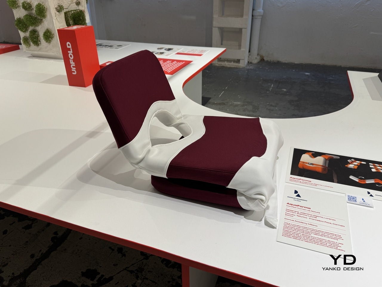
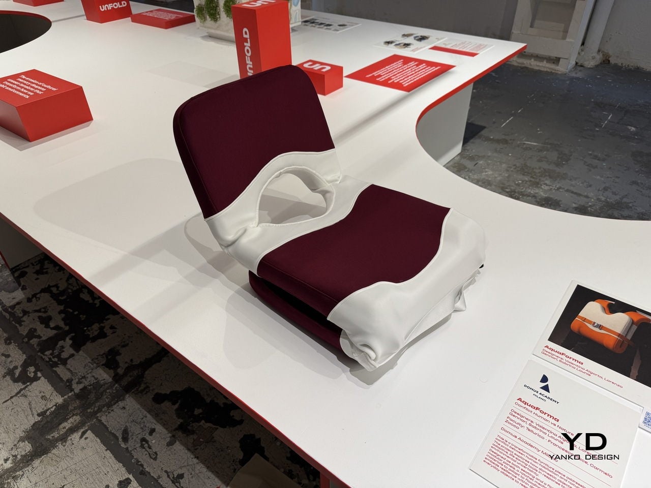
That’s the gap a team of Domus Academy Milano students decided to close. Exhibited at BASE Milano as part of the 2026 Milan Design Week, AquaForma is a transformable furniture piece designed under the theme “Conflict: Human vs Nature.” Created by Valentina Algorta, Lorenzo Gennari, and Sabrina Lounis under faculty guidance, it explores how an everyday domestic object can quietly hold the capacity to save a life.

Designers: Valentina Algorta, Lorenzo Gennari, Sabrina Lounis (Domus Academy Milano)

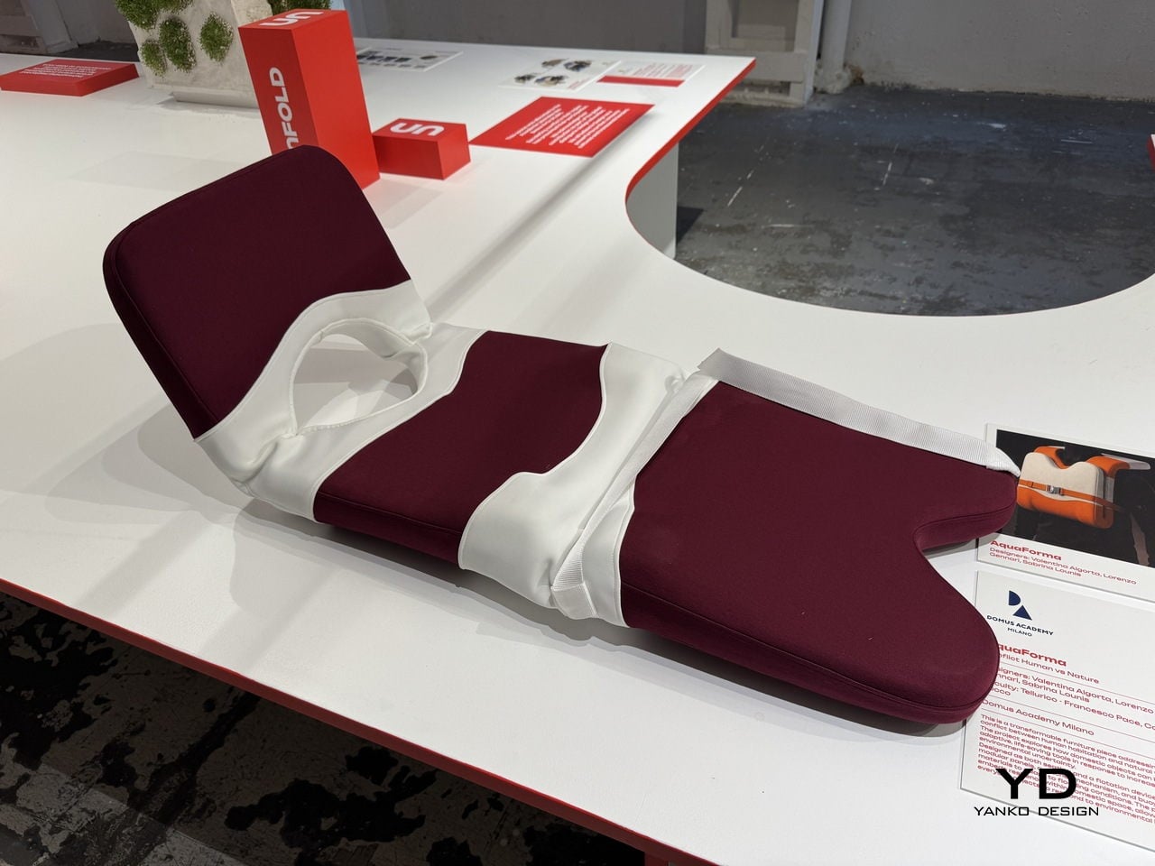
The starting point is a familiar one: a chair. In its default configuration, AquaForma functions as low-profile floor seating with a cushioned backrest and seat upholstered in deep burgundy fabric. A white structural shell wraps around the cushioned elements in flowing, organic curves, giving the piece a sculptural quality that sits comfortably within contemporary furniture design. Nothing about it announces its other purpose.

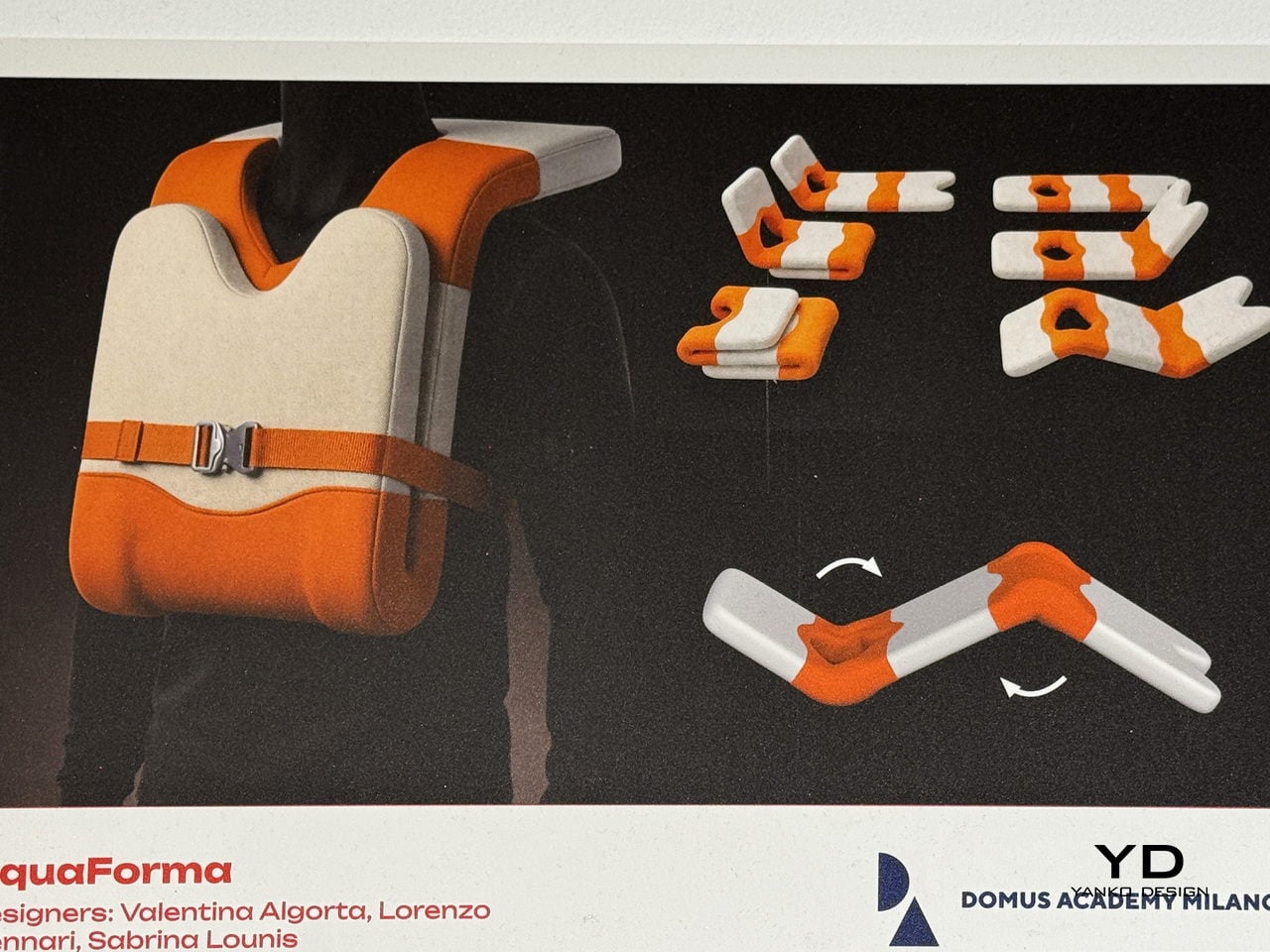
That other purpose becomes clear when flooding hits. The piece uses modular panels, a ratchet buckle mechanism, and buoyant materials that allow it to be reconfigured into a flotation device. The modules interlock and can be reoriented, with individual components separating and reassembling into a completely different arrangement. What sits quietly in a living room can, in theory, keep someone afloat.

The ratchet strap across the midsection does more than hold the piece together; it’s the key mechanism that allows components to be tightened, secured, and adjusted depending on the configuration the piece needs to take. This kind of dual-purpose hardware thinking keeps the design grounded in practicality. There’s no single feature here that’s gratuitous, with everything pulling double duty between the domestic and the emergency.

What makes AquaForma particularly compelling is how invisible its emergency function is in everyday life. You wouldn’t sit on it and think about rising water, and that’s precisely the point. Resilience embedded in ordinary objects doesn’t announce itself until it needs to, and that restraint is what separates a clever concept from a genuinely useful one. The designers didn’t design for a crisis; they designed around it.

AquaForma was shown as part of the UNFOLD exhibition at BASE Milano during Milan Design Week 2026, a student showcase that puts emerging design ideas at the center of one of the world’s most design-saturated weeks. It’s the kind of project that’s easy to underestimate at first glance. A chair that becomes a flotation device sounds like a design school exercise until you remember how often people need exactly that.

The post This Chair Looks Normal Until It Needs to Keep You Afloat in a Flood first appeared on Yanko Design.
Elanco Made Dog-Shaped Furniture Because Your Sofa Has a Flea Problem

Pet ownership and interior design have always had an uneasy relationship. You pick out a sofa carefully, and within months, it’s covered in fur, scratch marks, or the lingering evidence of a bad flea season. Design spaces rarely acknowledge the animal that shares the room, and pet health brands rarely think to communicate through furniture. Most of the time, these two worlds simply don’t talk to each other.

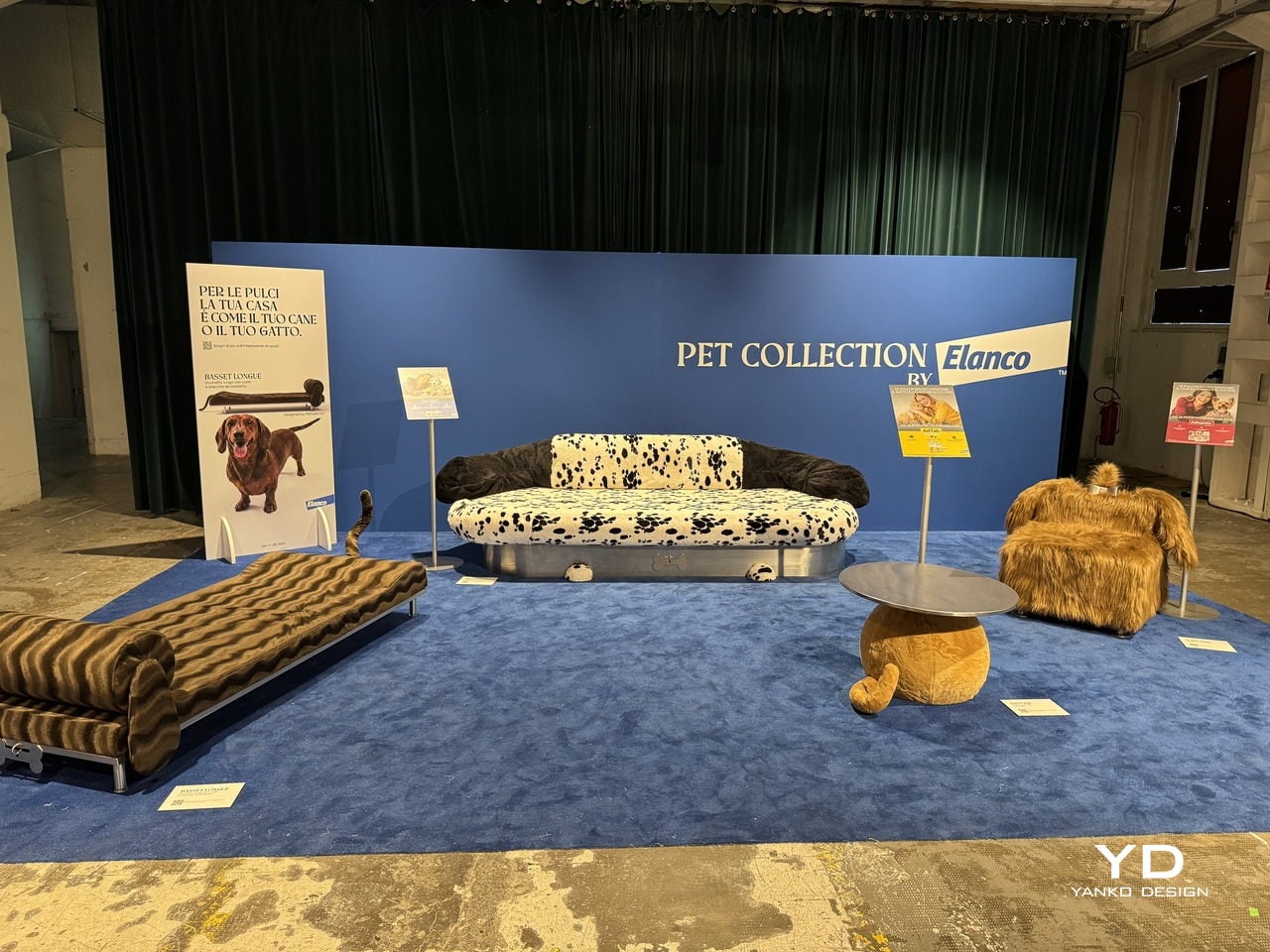
Elanco, a global animal health company, had other ideas. For the 2026 Fuorisalone, it partnered with Milan-based architecture and design studio Parasite 2.0 to bring the Pet Collection to BASE Milano. The result is a limited-edition series of four pet-inspired furniture pieces that are equal parts campaign, design statement, and visual joke, all presented at one of Milan’s most forward-thinking creative venues.

Designers: Elanco, Parasite 2.0

The whole thing starts from a simple but uncomfortable truth. Fleas don’t just live on pets; they infest homes too, spreading through the furniture and floors that pets and people share. Elanco’s point is that your sofa and your dog aren’t as different as you think, at least not from a flea’s perspective. The collection makes that idea impossible to ignore.

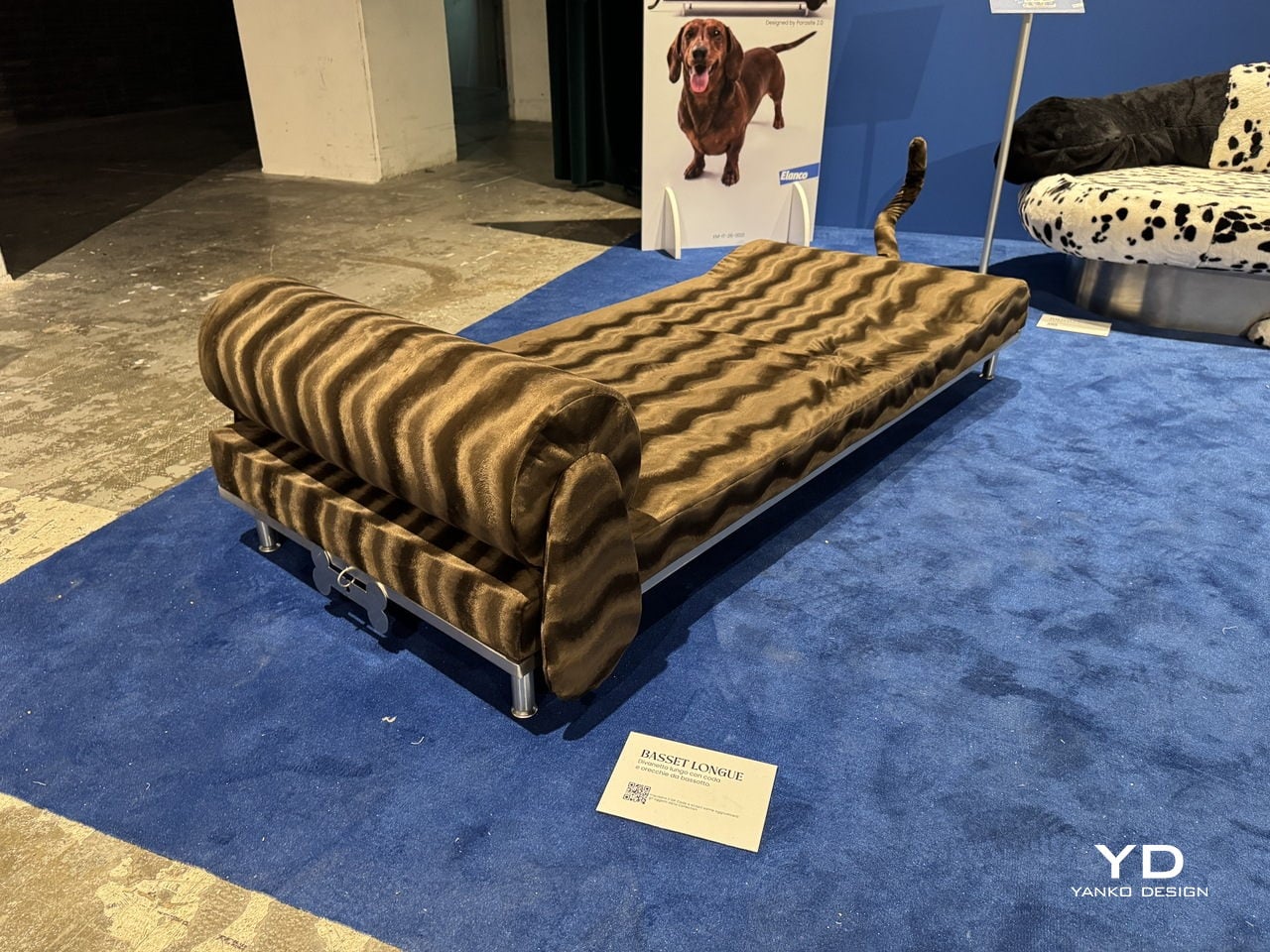
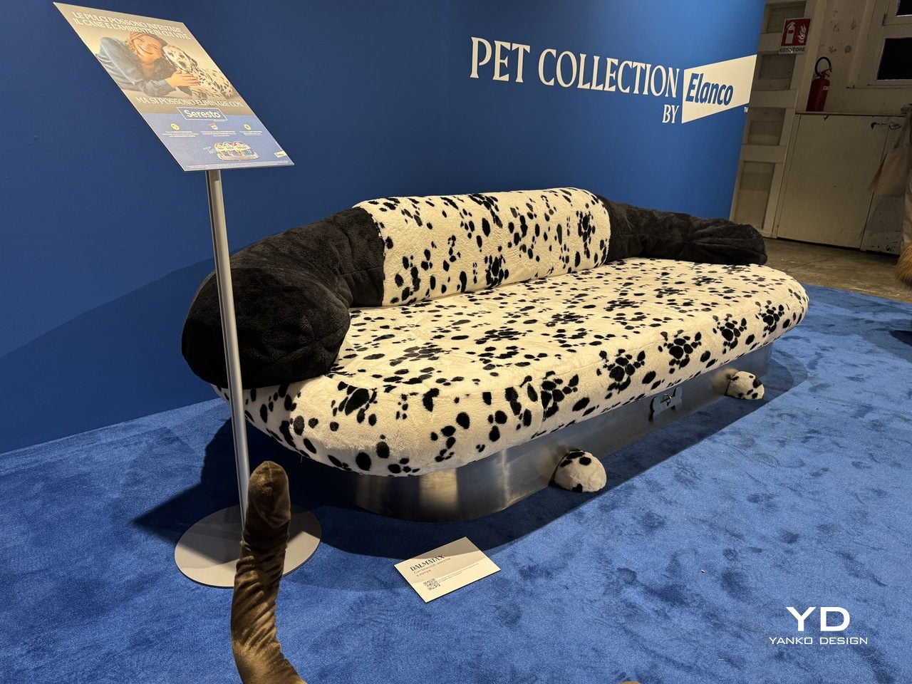
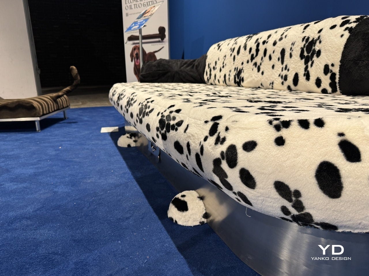
Each piece is a pun on both a breed and a furniture type. The Basset Longue is a chaise longue upholstered in wavy, brown-striped faux fur, shaped after a Basset Hound, and mounted on chrome legs with a tail detail at one end. The Dalmatian is a wide sofa in black-spotted white plush with dark, rounded backrests that look like a dog curled up in place.

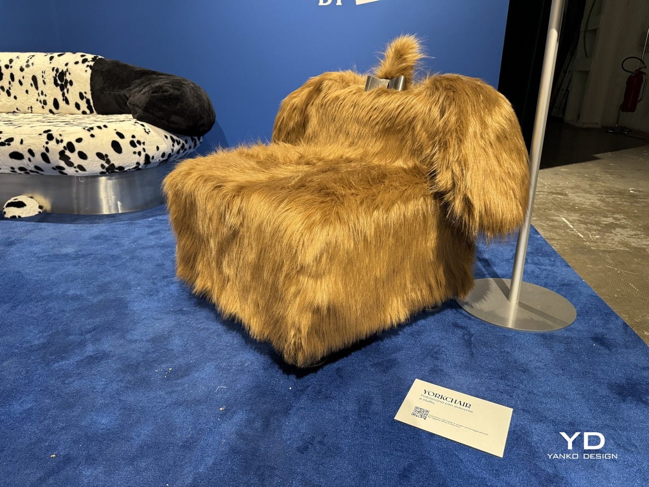
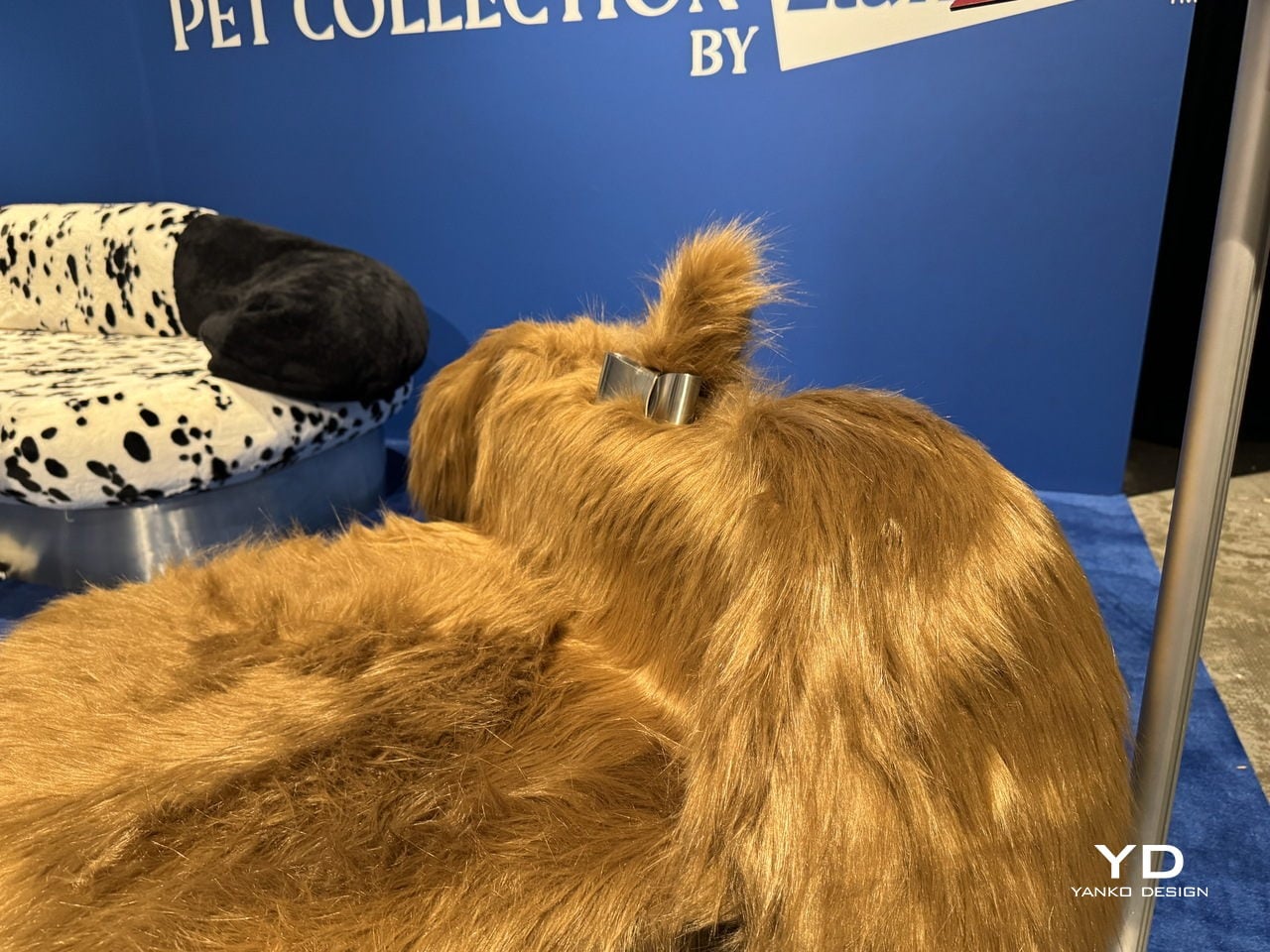
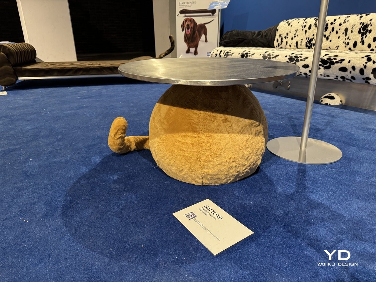
The Yorkchair is a chunky armchair draped entirely in long, golden faux fur with a small chrome detail on the back, very much like a Yorkshire Terrier wearing a collar. Then there’s the Gattond, which departs from the canine theme and becomes a feline-inspired coffee table, its polished metal top sitting on a rounded, fuzzy golden base with a tail sticking out from the side.

The Pet Collection is on view at BASE Milano as part of the 2026 Fuorisalone, and it’s the kind of exhibit that sticks with you long after you’ve left the room. Not because the furniture is particularly comfortable, mind you, but because the message is hard to unsee once you’ve seen it. Your sofa and your dog are, apparently, not so different after all.

The post Elanco Made Dog-Shaped Furniture Because Your Sofa Has a Flea Problem first appeared on Yanko Design.
This Chair at Milan Design Week Looks Like a Forest Grew a Seat

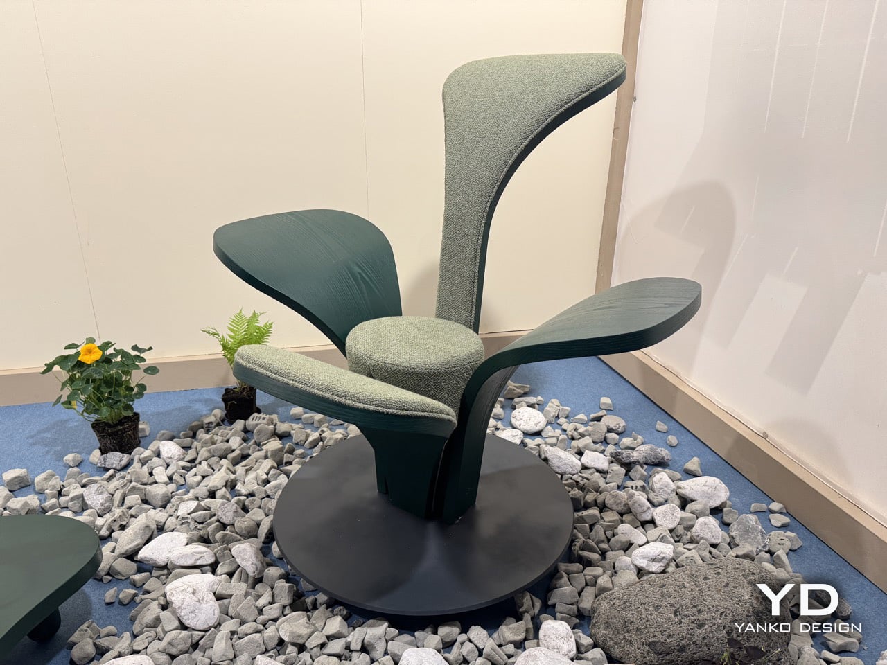
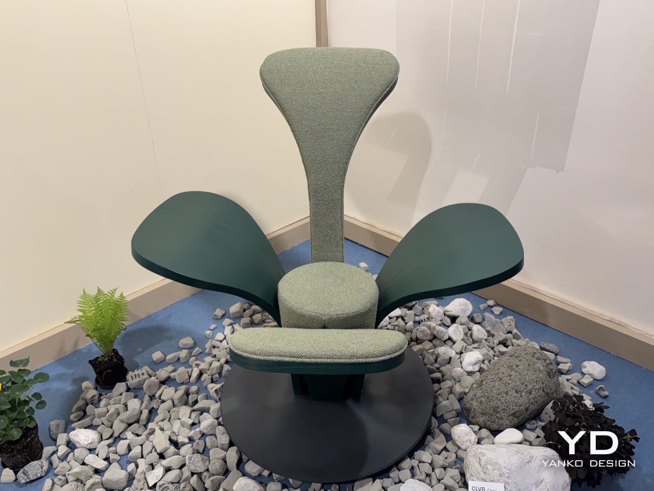
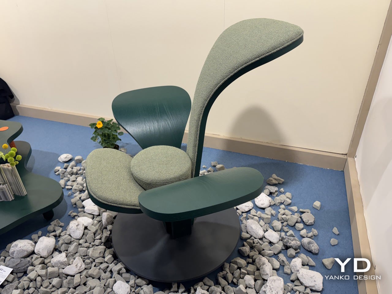
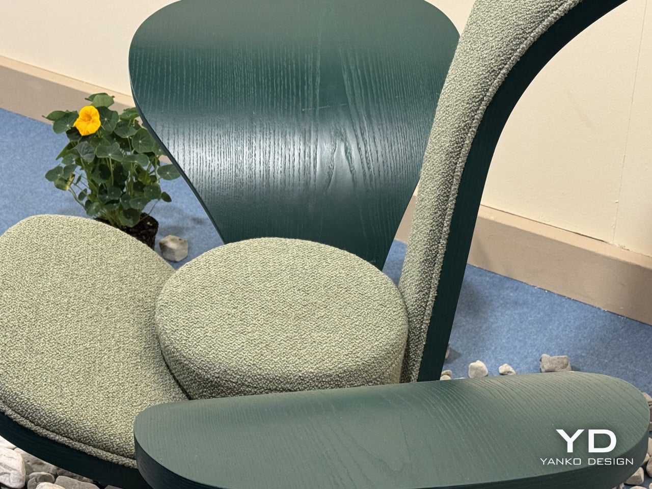
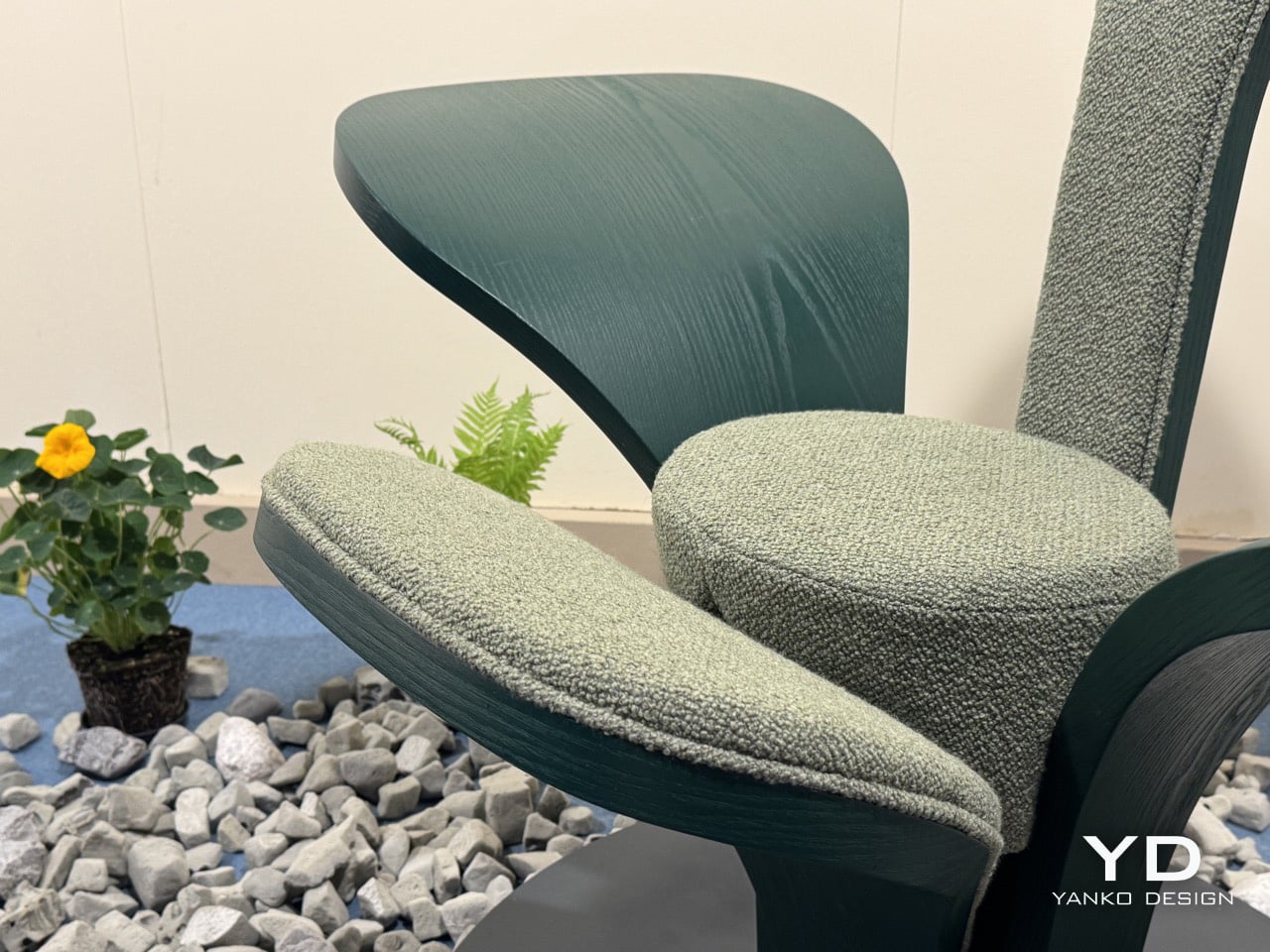
The armchair has been one of the most contested territories in furniture design for over a century, from Alvar Aalto’s bent plywood experiments to Arne Jacobsen’s Swan Chair. Designers keep returning to the seated form as a test of where material technology and formal imagination currently meet. Beltrame Breuil, an architectural practice based in Tarvisio and Vienna, took their turn at Salone Satellite 2026 with a chair that brings alpine botany directly into that conversation. Their furniture brand Picule presented CLVR, a seat assembled from four bent-wood leaf forms rising from a circular steel base, and it is the kind of debut that reminds you why Salone Satellite exists.

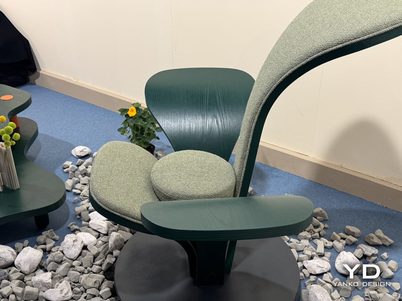
Two of CLVR’s four leaves are upholstered in a mossy, boucle-like forest green textile, covering the tall backrest and the lower front surface where the body settles. The other two are left as bare stained wood, their grain visible under the deep green finish, extending outward from the center like wings. All four share one curvature and one design logic, shaped by bent wood, which is what holds the composition together despite its apparent asymmetry. The design is coherent because its grammar is consistent, even as the function of each leaf changes.

Designer: Beltrame Breuil

The circular steel plate at the base functions as a pedestal, grounding the organic spread of the leaves and lending the piece a measured architectural gravity. At 112 cm tall and 125 cm wide, CLVR reads as a statement lounge object first and a chair second. It has the presence of a small throne, designed to anchor a room rather than disappear into it. The scale is deliberate, positioning the chair as a piece of functional sculpture that occupies its space with confidence.

Picule is Beltrame Breuil’s way of funneling architectural discipline into objects scaled for domestic life. The studio’s Tarvisio base sits in Italy’s northeastern corner, where the Julian Alps press against the Austrian and Slovenian borders. That geography gives CLVR its conceptual grounding; this is a studio that builds in that landscape, not one pulling a leaf motif from a mood board. The alpine forest inspiration feels earned, and it gives the chair a story that goes beyond its form.

The bent-wood forming technique reinforces that connection, requiring an intimacy with the material that keeps the work tethered to craft. The chair’s forest green palette, running across bare wood and woven textile in two calibrated tones, holds the composition together as one chromatic idea rather than a collage of parts. It’s a thoughtful detail that shows how completely the studio considered the object from every angle, ensuring the material and color choices support the core concept.

Beltrame Breuil is presenting the full Picule collection, including the CLVR chair, at Salone Satellite 2026. You can find it in Hall 5 at Stand E10 at Fiera Milano, Rho, through April 26. The photos do a fair job of capturing the silhouette, but the bent-wood grain and the textile’s tactile quality are things that land most clearly when you are standing right in front of it. Go see it before the fair closes.

The post This Chair at Milan Design Week Looks Like a Forest Grew a Seat first appeared on Yanko Design.
This transparent glass foosball table at Milan Design Week looks straight out of a 2000s sci-fi movie

The early 2000s had a very clear idea of the future. Think of films like *Minority Report* with its PreCrime headquarters, all white rooms and glass interfaces where everything looked seamlessly bonded rather than bolted together. Or *I, Robot*, which pushed that look even further with its glossy USR tower and Audi concept car, a world that had erased any sign of how things were actually made. That aesthetic has aged remarkably well, but it’s a territory most game furniture never touches, usually favoring rich materials over making things look like they are barely there. Basaglia + Rota Nodari are the exception, and Ghost, their foosball table for FAS Pendezza, is the proof.

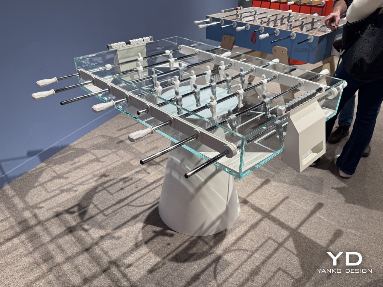
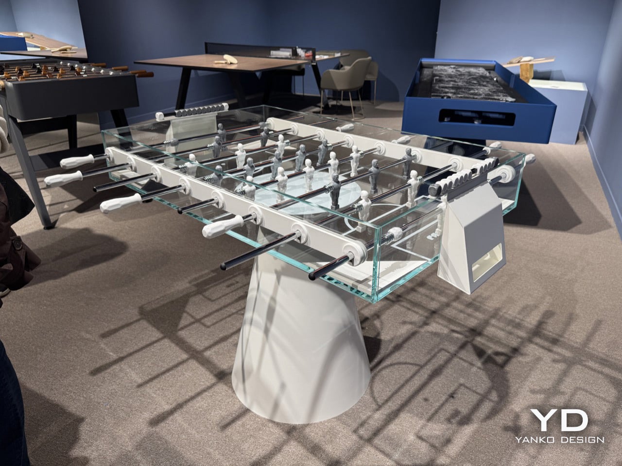
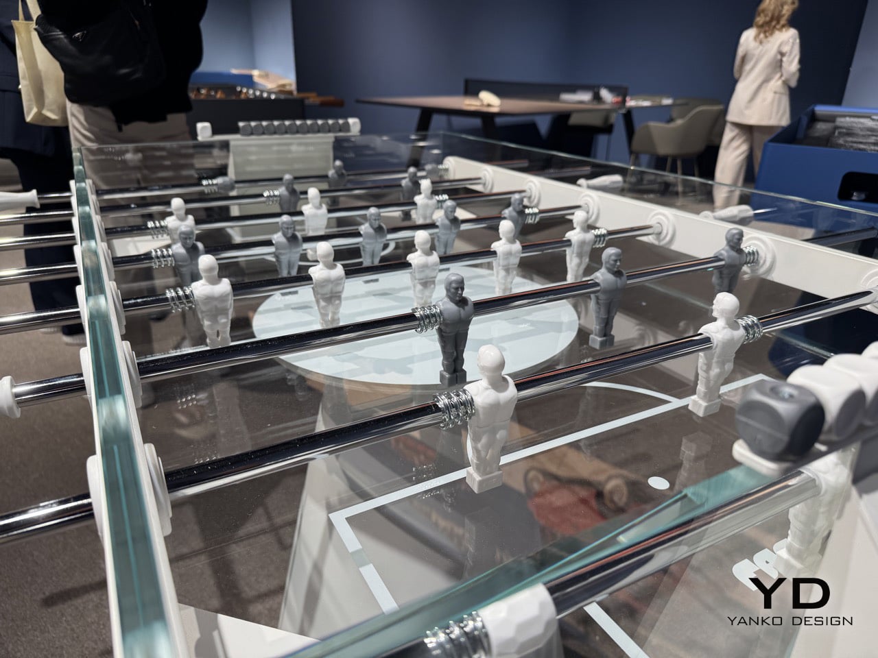
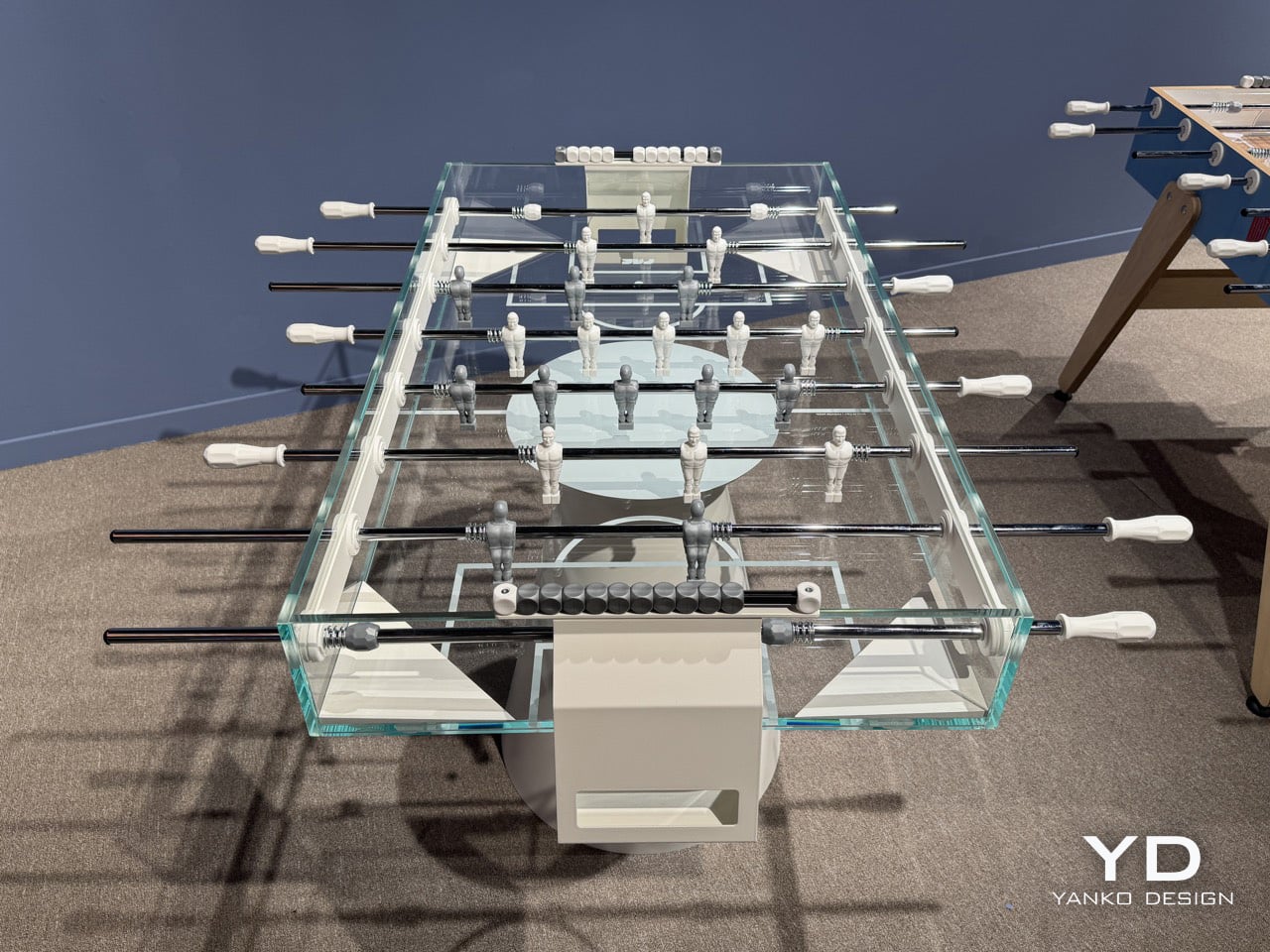
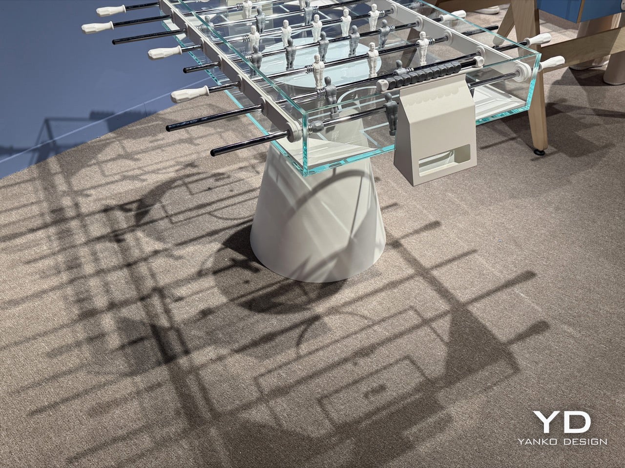
The table itself is built from thick tempered glass, laminated at 12 and 9 mm, with a playing field that’s 114.5 by 70.5 centimeters, and it’s made entirely in Italy. Its body is bonded with a special adhesive, so there are no visible screws or bolts anywhere in the frame. That’s a key decision, because if you saw hardware, the whole ghost-like vibe would fall apart. A clean, conical white metal base holds up the floating glass volume, while chrome rods and two-tone players complete a color scheme that’s intentionally minimal. At 8,900 euros, it’s priced as a piece of design, and it earns it on looks alone before a single ball gets dropped.

Designers: Basaglia + Rota Nodari for FAS Pendezza

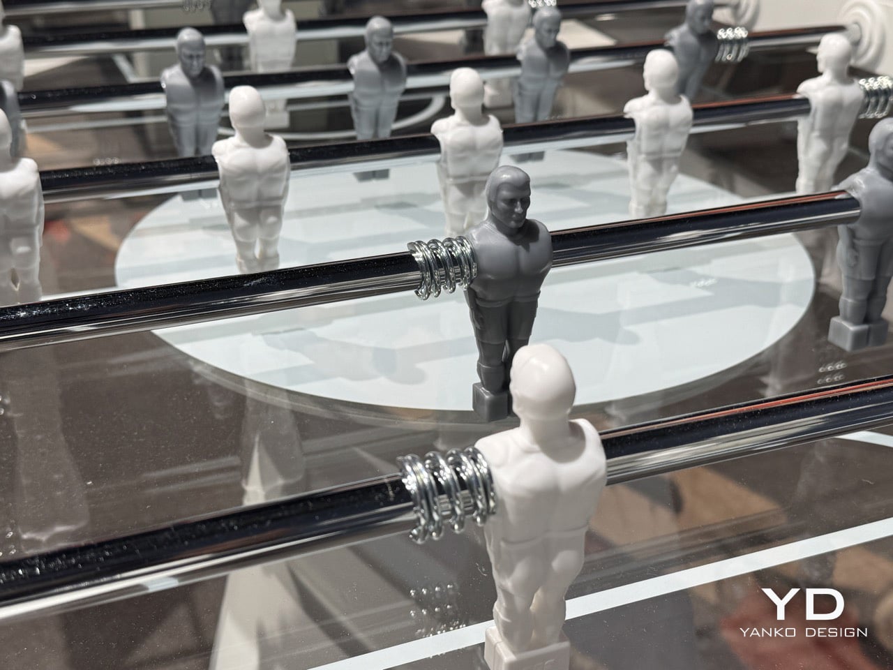
Even the players, made of white and gray resin, look like they belong in this sci-fi world. They’re somewhere between a medical illustration and a concept-car sketch, simplified to the point of anonymity. That’s exactly why they work. If they were in conventional team colors, the table would feel like just another piece of recreational equipment. Instead, these figures feel closer to the NS-5 robots of *I, Robot* than to any real athlete, which helps keep the whole look clean and unified. The chrome coil springs connecting them to the rods are the one little nod to mechanical texture, and they look almost like jewelry against all that glass.

But what really captures you are the detailed shadows the Ghost projects on the floor, if paired with the right lighting. At Salone Satellite, Ghost casts an incredible wireframe shadow on the floor, like it’s drawing a blueprint of itself in real time. Pitch markings are printed beneath the crystal surface, so they appear to float inside the glass instead of sitting on top. From any angle in the FAS Pendezza booth, you can see right through the structure, with the players and chrome rods suspended against the room itself. The name makes perfect sense when you see it in person.
FAS Pendezza is presenting Ghost at Salone Satellite this week as part of Milan Design Week 2026, in a booth where the table’s shadow alone justifies the detour. Seeing it alongside the rest of the brand’s lineup confirms Ghost as a deliberate formal departure rather than FAS Pendezza’s default register. The studio, Basaglia Rota Nodari, launched in 1997 with a stated ambition to build objects that convey emotion beyond their function, and Ghost may be their sharpest expression of that intent to date. For those who have already left Milan, Ghost is available in white and black finishes and retails at €8,900.
The post This transparent glass foosball table at Milan Design Week looks straight out of a 2000s sci-fi movie first appeared on Yanko Design.