This Roof Catches Water from Air: 5 Ancient Designs That Solve Modern Problems

Our homes are more than dwellings as they are living stories. The most comforting ones merge the wisdom of the past with the ease of modern living. Today, we seek spaces that go beyond beauty, like places that carry history, evoke emotion, and offer a true sense of belonging. This blend of timeless heritage and present-day function isn’t just a trend; it is a lasting design philosophy that nurtures both serenity and style.

It’s about slowing down and valuing the origin of what surrounds us—choosing craftsmanship over convenience, meaning over mass production. Let’s explore simple yet powerful ways to bring ancestral warmth into modern homes, where every detail reflects mindfulness and enduring charm.

1. Furniture Collection Inspired by Traditional Motifs

Furniture should do more than occupy space, as it should tell a story and offer enduring comfort. The key lies in blending classic silhouettes with modern practicality, where traditional joinery meets sleek minimalism. This fusion adds depth and authenticity, giving your interiors a grounded charm that mass-produced pieces can’t emulate.

Invest in a few statement pieces made from natural, lasting wood that age beautifully and gain character over time. A handcrafted dining table, for instance, becomes a gathering point and symbol of permanence. Pair such heirloom-quality designs with contemporary fabrics and lighting to create a space that feels both rooted and refreshingly modern.
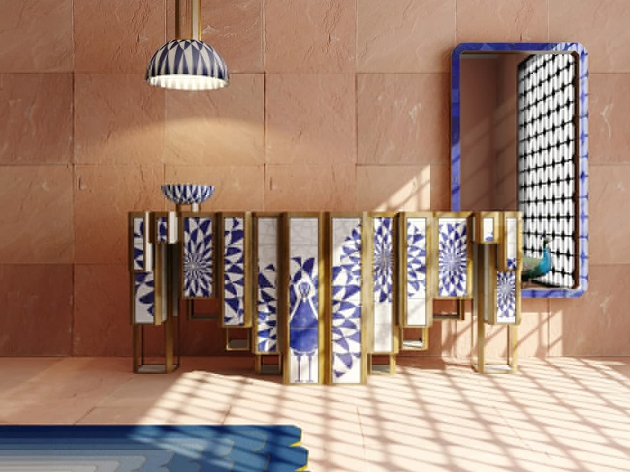
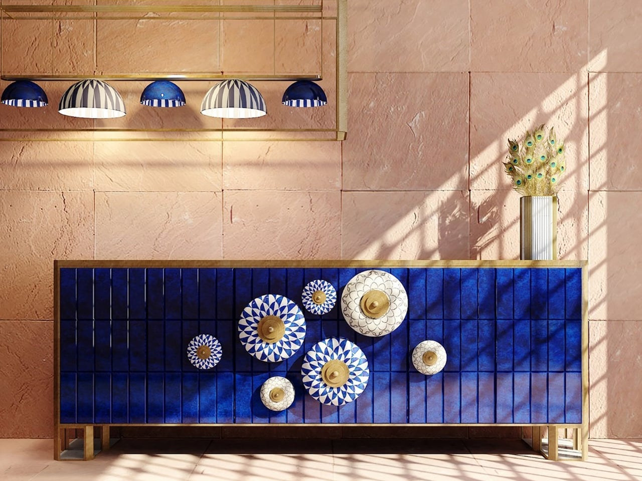
Some furniture pieces transcend mere function to become art. The Jaipur Furniture Collection by Sonal Tuli does just that, blending tradition and modernity in homage to Jaipur, India’s Pink City. Inspired by the city’s architectural motifs and the delicate art of blue pottery, the collection, including the sideboard, chandelier, mirror, and rug, captures Jaipur’s cultural richness. Handcrafted in India, each piece showcases local artisans’ mastery through the use of white marble and lapis lazuli, elevated by intricate stone inlay and overlay techniques that reflect timeless Indian craftsmanship.
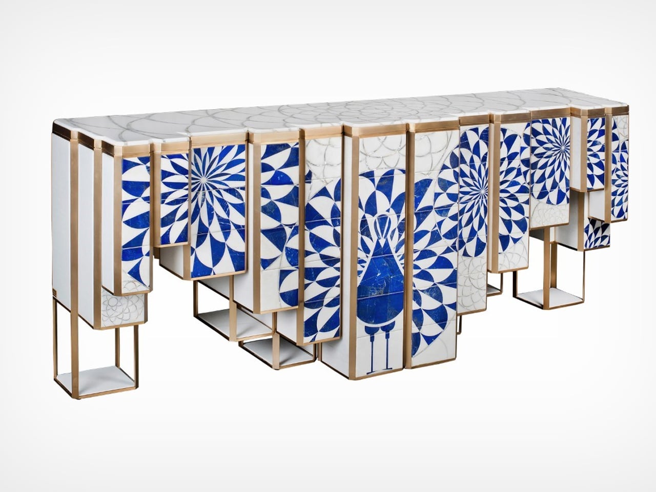
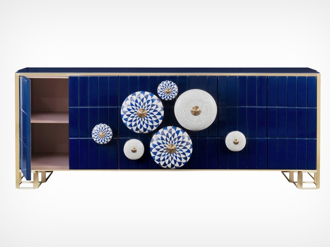
Balancing elegance with purpose, the collection marries beauty and function. The sideboard reveals a soft pink hue when opened, while the chandelier and pendant radiate patterns reminiscent of lapis lazuli. The mirror’s backlit knobs offer modern versatility. Initially imagined with blue pottery tiles, Sonal refined her design using more durable marble and reimagined the console for easier transport.

2. Housing Designing with Local Materials

Building or renovating with local materials is both sustainable and deeply meaningful. Using regional stone, native timber, or local clay ties your home to its natural surroundings, creating harmony between structure and landscape. It’s a conscious way to reduce transport emissions while embracing eco-friendly design that feels authentic to the place.

Beyond sustainability, these materials bring texture, warmth, and a lived-in charm that industrial alternatives can’t match. Think of the cool touch of nearby-quarried stone or the organic grain of native wood, each telling a story of place and time. Such choices infuse your home with heritage, authenticity, and timeless character.


Access to clean water is often taken for granted in developed nations, yet for many communities around the world, it remains a daily struggle that affects both health and survival. This housing design offers a sustainable solution by integrating a water catchment system built with local materials and traditional weaving techniques. Designed for regions like Africa, where water scarcity is severe, the project transforms a basic need into an opportunity for innovation and community empowerment.
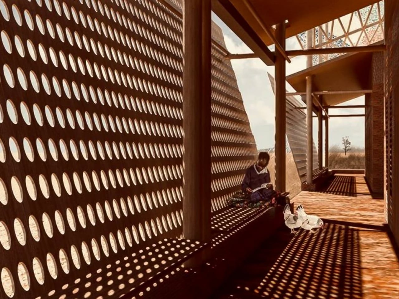
The house’s defining feature is its roof, which is a wooden framework interlaced with woven panels that collect dew and rainwater. This moisture passes through a natural filtration system, producing clean water suitable for drinking, cooking, and bathing. Using only locally available materials, the design not only ensures affordability but also celebrates indigenous craftsmanship. The result is a beautiful, functional, and sustainable home that fosters community involvement and could inspire global solutions for water security.

3. Illuminating Spaces

Lighting has the power to do more than brighten a room, as it can express intention and soul. When crafted with care, each fixture becomes a reflection of mindful design, where the maker’s hand and heart are both visible. Think of hand-blown glass lamps or woven shades that glow softly, celebrating imperfection and the quiet rhythm of creation.

To bring this spiritual warmth home, choose lighting that encourages calm and connection. A sculpted pendant or handcrafted sconce can transform a space into a sanctuary. These human-made details radiate authenticity, reminding you to slow down and let light nurture both mood and spirit.
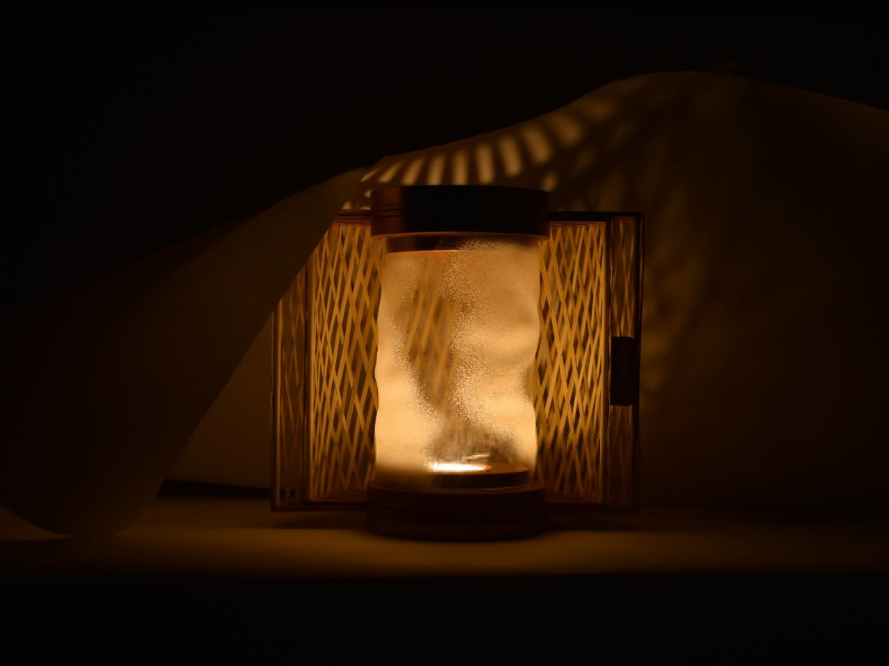
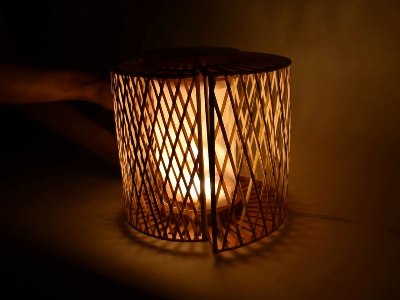
The TRIRIS lamp by Chinmayi Bahl merges spiritual symbolism with modern craftsmanship. It transforms any setting into a sanctuary of calm light and thoughtful design. Inspired by Shiva’s third eye, a symbol of awakening and higher perception, the TRIRIS (Tri-Iris) lamp captures the essence of transformation. Handcrafted from bamboo slivers with copper-finished accents, it exudes warmth, durability, and timeless sophistication.
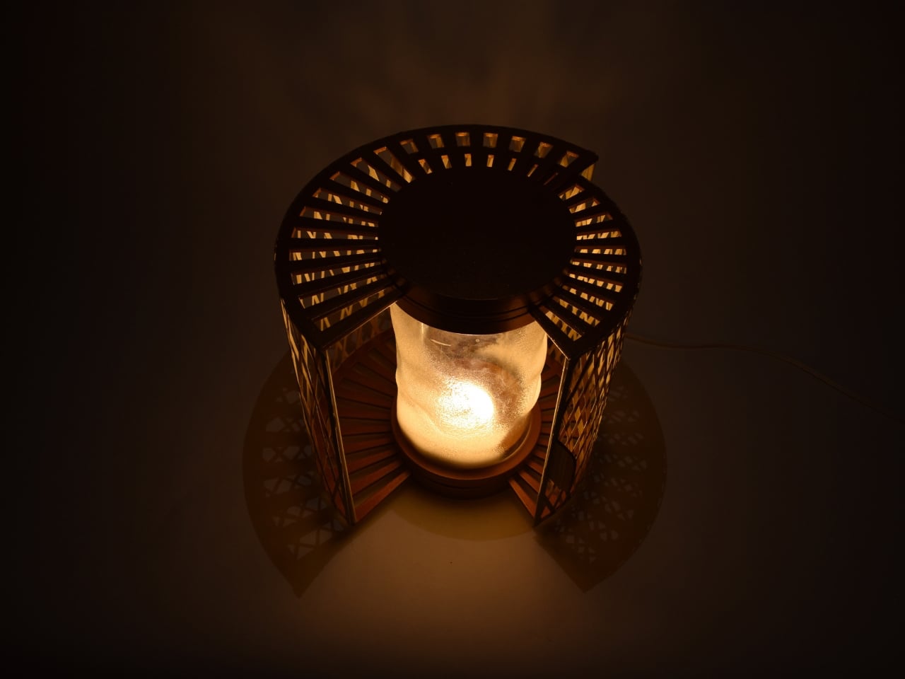
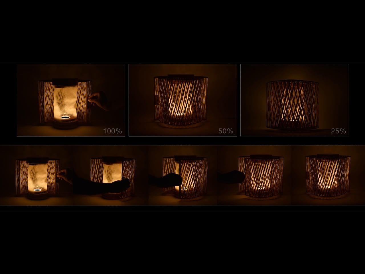
At its heart lies a heat-molded acrylic core shaped like a swirling tornado, symbolizing the power of inner energy. The lamp’s rotatable design allows users to adjust the interplay of light and shadow, turning simple lighting into a meditative act. Each rotation reflects the gradual opening of the inner eye, revealing beauty and balance. The TRIRIS lamp isn’t just a fixture but is a statement of mindful living and artistic expression.

4. The Timeless Appeal of Wooden Tableware

Wooden tableware embodies warmth, simplicity, and a tactile connection to nature. It’s one of the most effortless ways to bring traditional craftsmanship into daily life. Beyond decoration, wooden bowls, platters, and spoons transform everyday meals into moments of mindfulness. Their natural grain and gentle texture invite you to slow down, creating a sensory link to the earth that nurtures well-being.

When choosing pieces, seek clean silhouettes and hand-finished quality that ensure durability and food safety. Think mango wood dipping bowls or acacia salad servers, which work as organic accents that blend sustainability with rustic charm. Replacing ceramics or plastic with wood instantly adds authenticity and quiet elegance to your table.
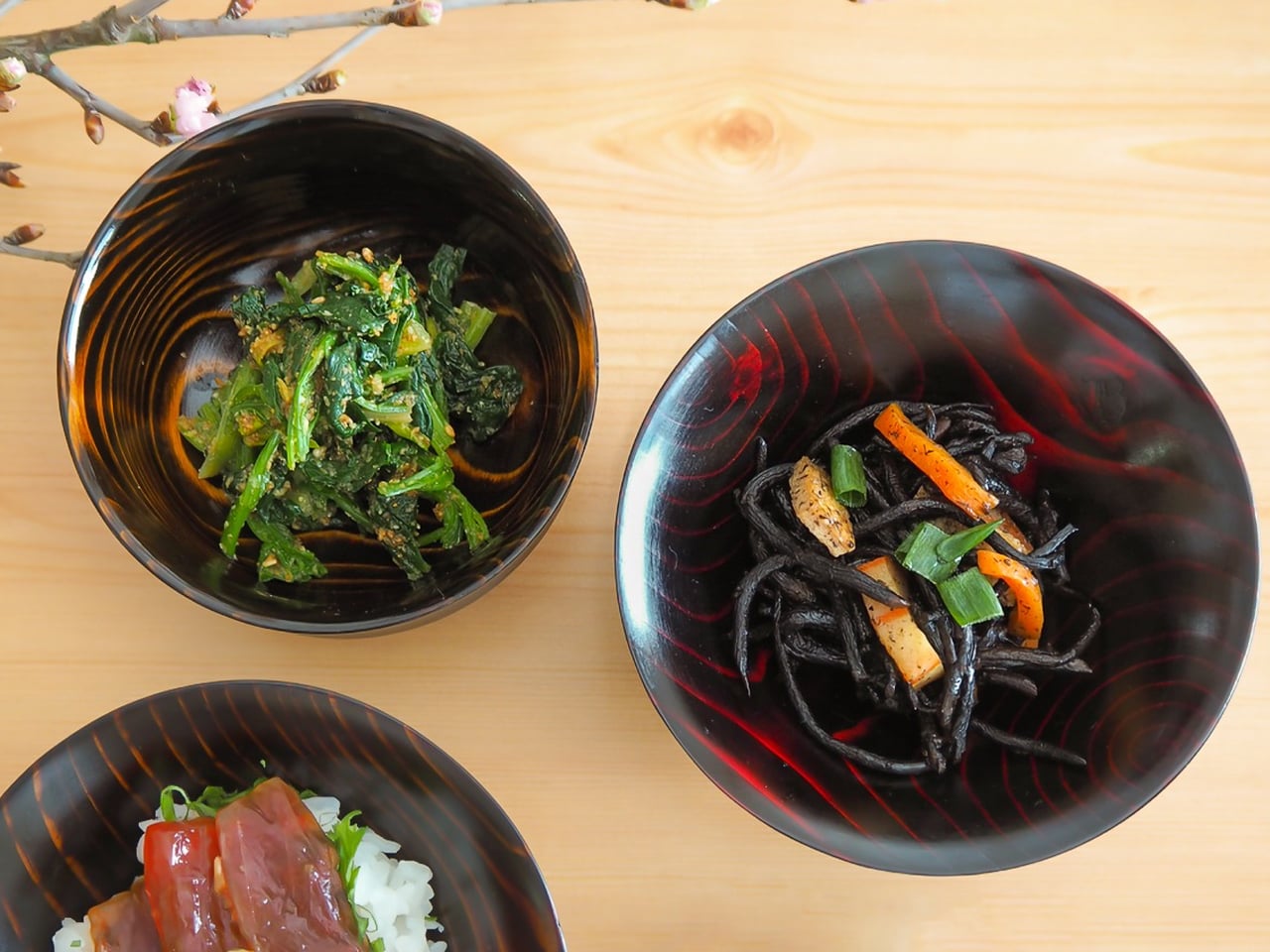
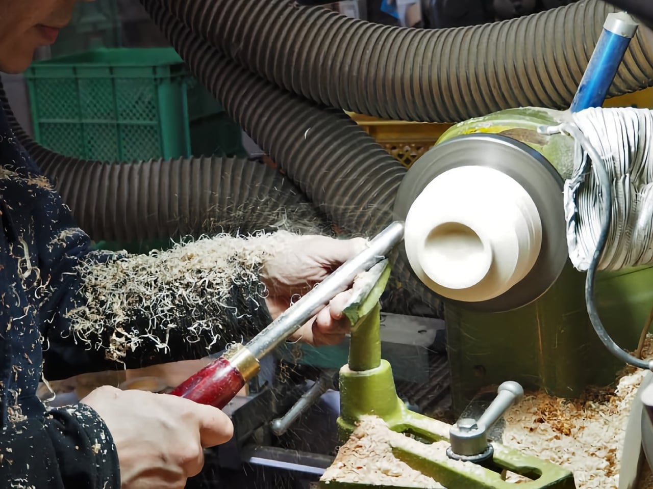
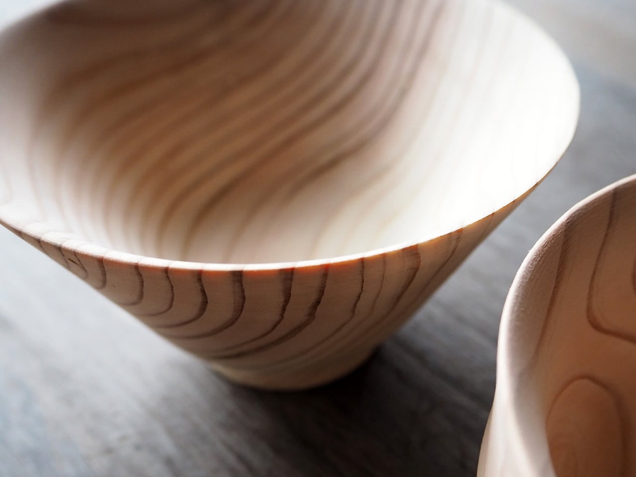
Still used by Buddhist monks today, wood offers a natural warmth and texture that no other material can match. It doesn’t conduct heat like metal, doesn’t shatter like glass or ceramic, and is far safer and more sustainable than plastic. Durable and reusable for decades, wooden utensils represent the perfect balance of practicality and eco-conscious living. For over 68 years, Higashi Shunkei has celebrated this philosophy through handcrafted wooden tableware. Founded in Hida Takayama, Japan, the three-generation company began with chopsticks before expanding into exquisite bowls made from locally sourced cedarwood.
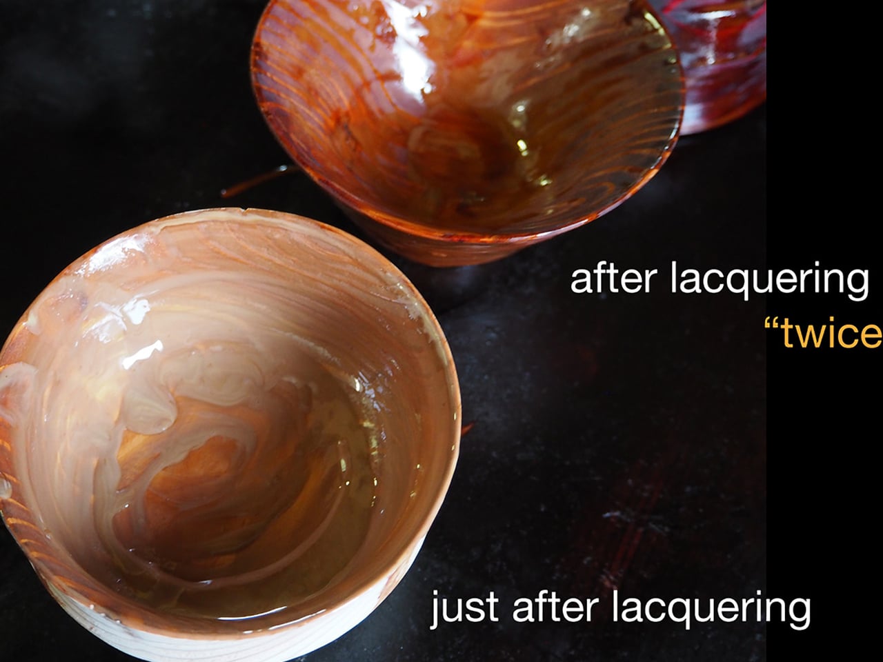

Nestled amid forests covering 92% of Takayama’s land, Higashi Shunkei crafts each Hida-Cedar bowl within its own workshop. The bowls are spun on a wooden lathe and finished using the traditional Suri Urushi lacquering method, which hardens the wood and gives it a glossy, ceramic-like surface. Each bowl’s unique striped pattern becomes richer with time, merging durability, beauty, and timeless craftsmanship.

5. Traditional Aroma Diffusers

An aroma diffuser may seem like a modern essential, yet its purpose is infusing spaces with natural, traditional aromas for healing and comfort—it has ancient roots. From sandalwood to frankincense, these time-honored scents once filled temples and homes, creating a sense of calm and spiritual grounding. Today’s sleek diffusers reinterpret that heritage, blending ancient aromatherapy with contemporary design to nurture both atmosphere and emotion.

For seamless integration, choose diffusers crafted from ceramic, glass, metal, or sustainably sourced wood that harmonize with your decor. Pair them with pure essential oils like traditional sandalwood, soothing lavender, or uplifting bergamot. This mindful ritual not only enriches your senses but also reconnects modern living with the enduring wisdom of aromatic tradition.
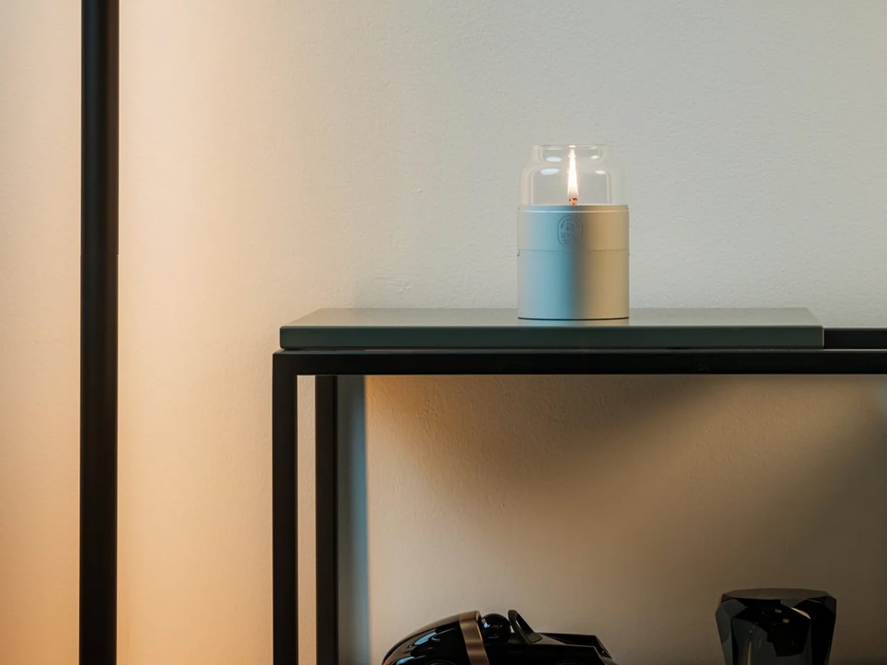
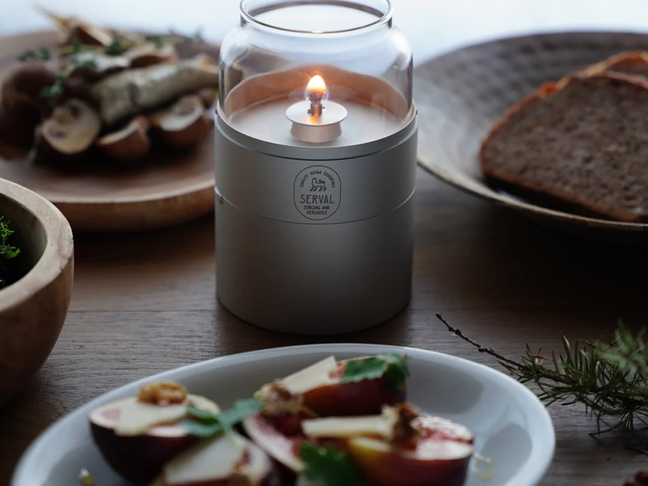
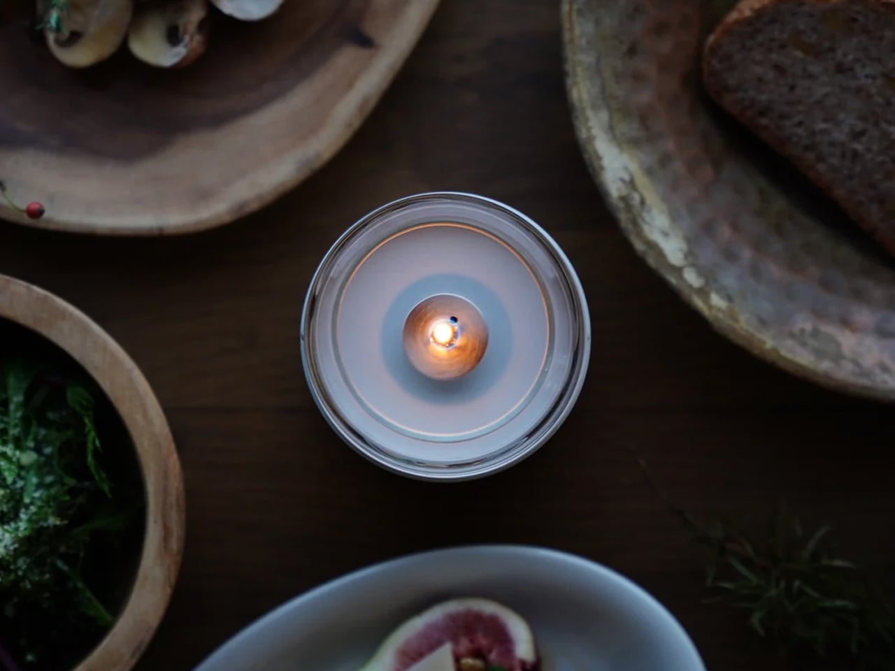
Rooted in the timeless craft traditions of Japan, the Fire Capsule is a testament to what happens when ancient design philosophy meets contemporary vision. Its form is drawn directly from the elegant proportions of traditional Japanese tea canisters, a silhouette that has embodied quiet refinement for centuries, now reimagined through the lens of modern industrial design. Created by Eri Tsunoda of SERVAL, a Kyoto City University of Arts graduate deeply attuned to the balance between heritage and innovation, the lamp honors the Japanese principle of *ma* – the art of meaningful space – by distilling function down to its most beautiful essentials. Premium aluminum and hand-clear glass replace the lacquered wood and ceramic of old, yet the spirit remains unchanged: a vessel that holds light the way tradition holds wisdom, with care, intention, and lasting grace.
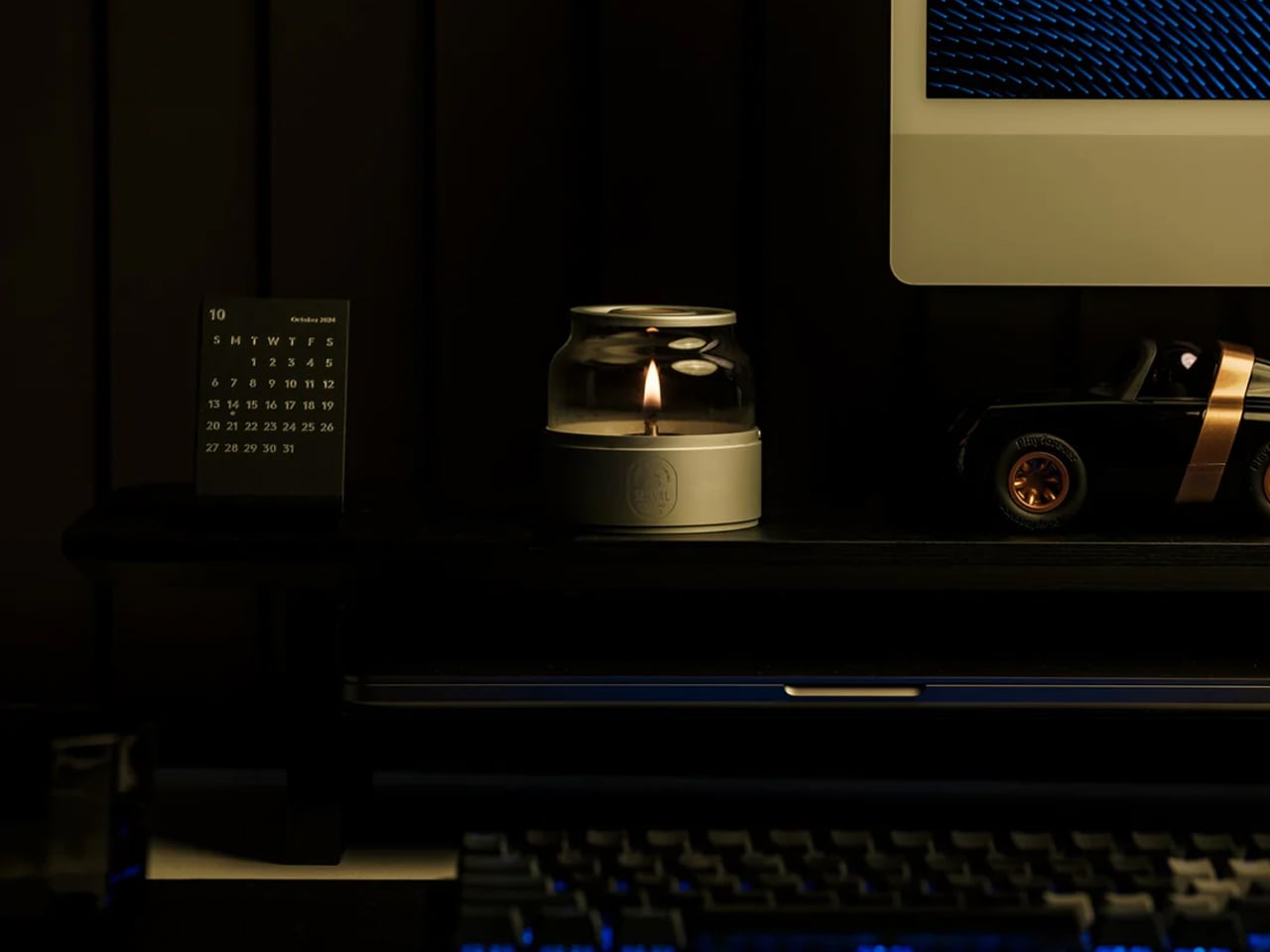
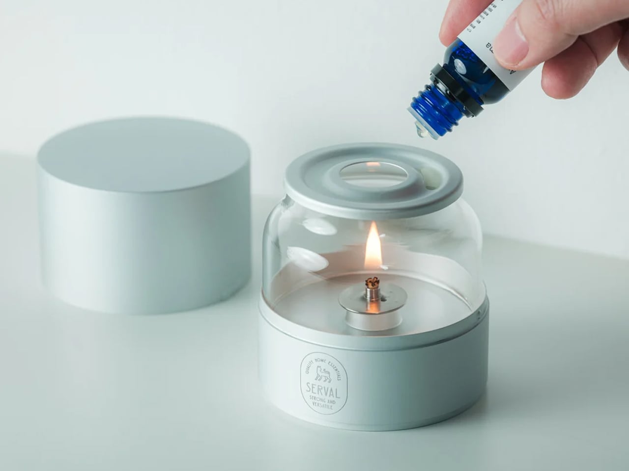
Where the Fire Capsule truly shines is in how it carries that traditional soul into the demands of modern life. The age-old ritual of oil lamp lighting, once the cornerstone of every home and hearth, is here made effortlessly accessible through precision engineering, a dust-sealing lid, a 16-hour burn capacity, and an aroma diffusing plate that transforms illumination into a full sensory experience. Its stackable form, protective drawstring pouch, and featherlight 180-gram build speak the language of contemporary living without ever abandoning their ancestral roots. Whether gracing a minimalist apartment, a candlelit dinner table, or a quiet evening under open skies, the Fire Capsule does not simply decorate a space – it reconnects it to something older, warmer, and deeply human, proving that the most forward-thinking designs are often those that look thoughtfully backward.

Reimagining tradition means thoughtfully adapting its finest elements for modern living. By choosing local materials, mindful craftsmanship, and soulful pieces, you create a home that’s personal, sustainable, and serene. It becomes a space that balances beauty with well-being, offering comfort, authenticity, and a timeless reflection of your story.

The post This Roof Catches Water from Air: 5 Ancient Designs That Solve Modern Problems first appeared on Yanko Design.
bibigo Just Made Chopsticks With Touchscreen Tips for Scroll-Eaters

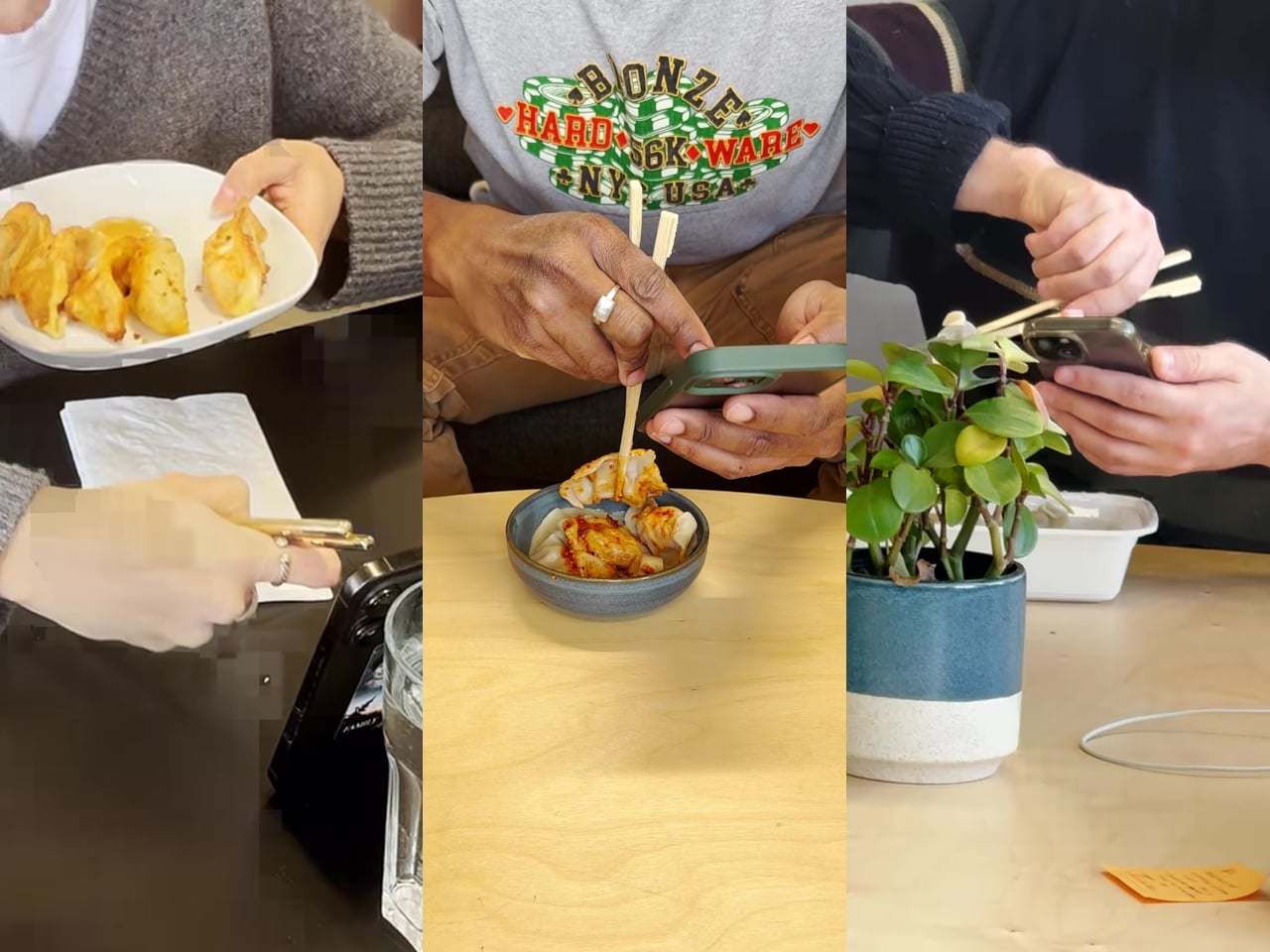
There’s a greasy phone screen somewhere in your immediate past. Maybe it was a dumpling, maybe it was a bowl of noodles, maybe it was something with a suspiciously orange sauce. Either way, you were eating and scrolling at the same time, and the evidence is still on the glass. Nobody’s proud of it, but according to a survey bibigo ran through Angus Reid, 96% of Americans have used their phone while eating, so at least you’re in excellent company.

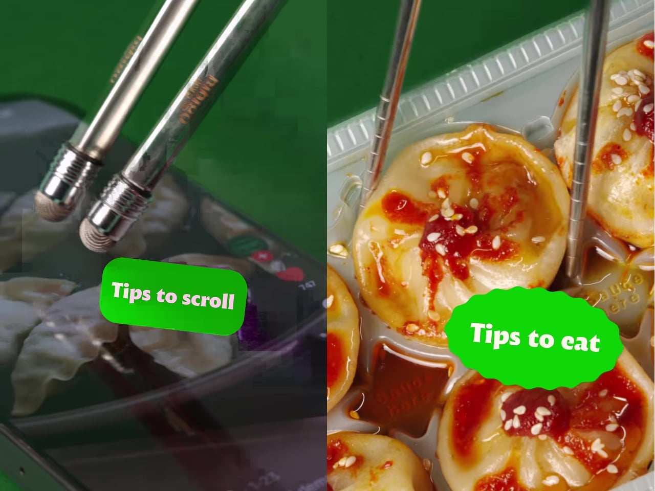
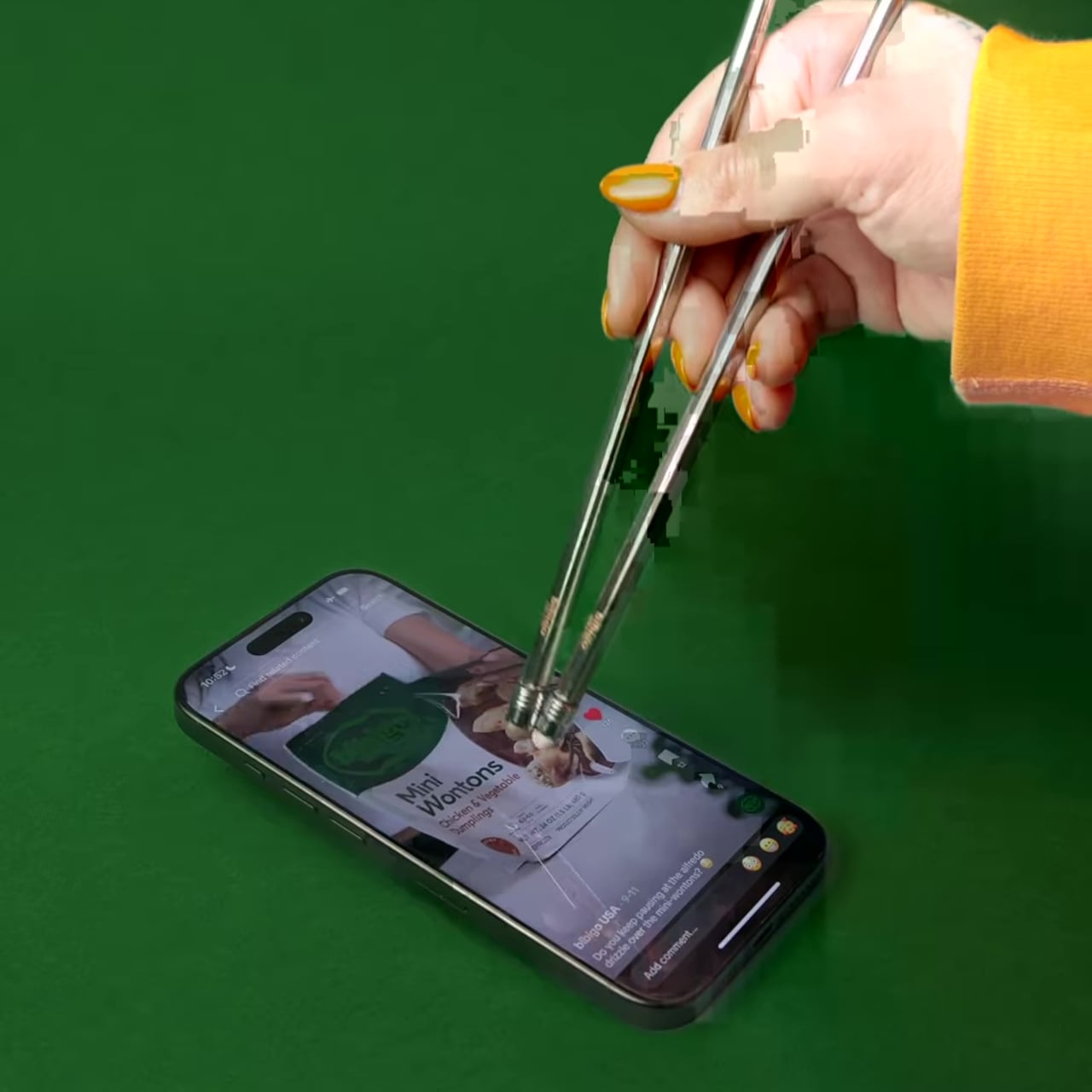
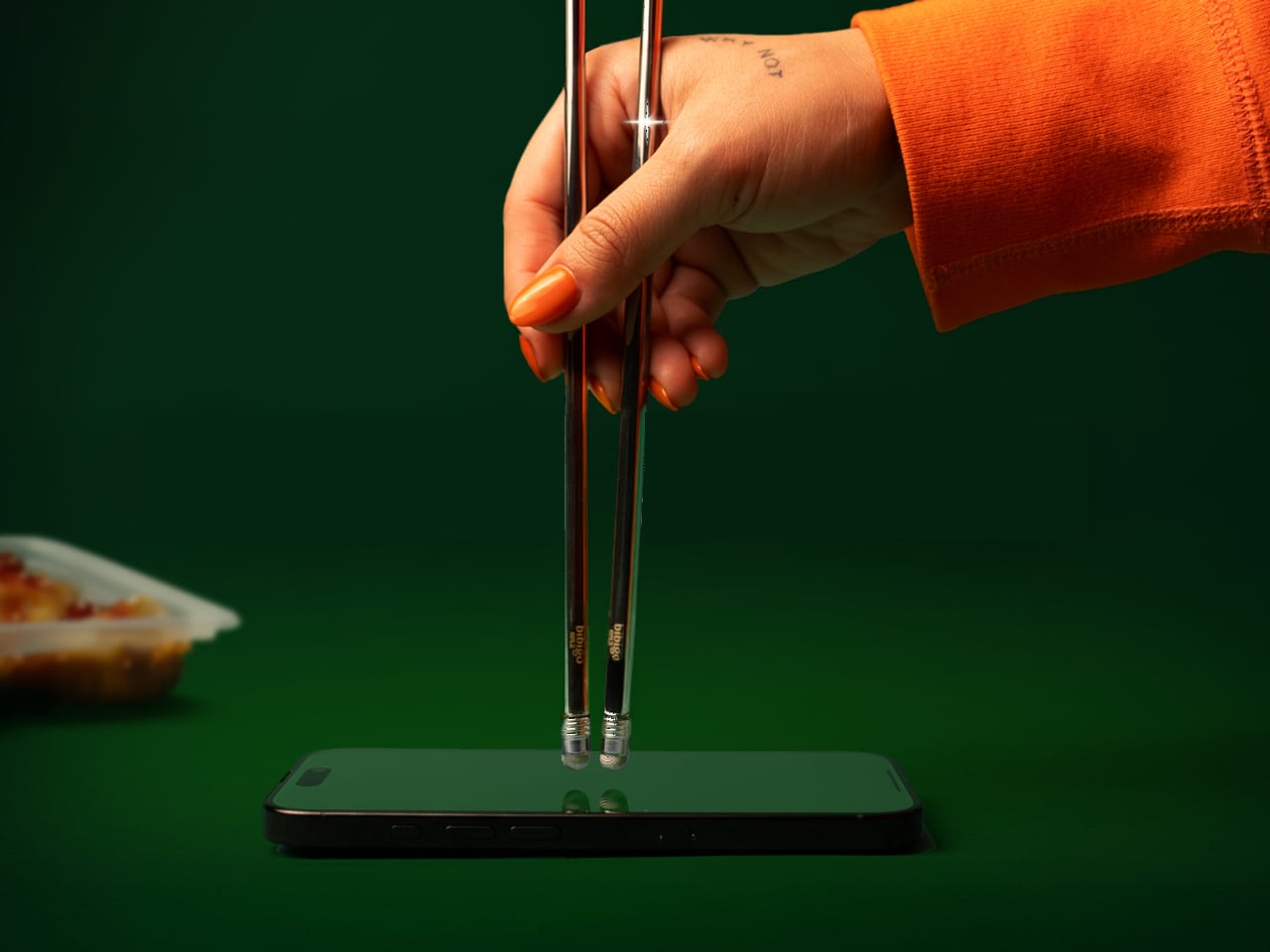
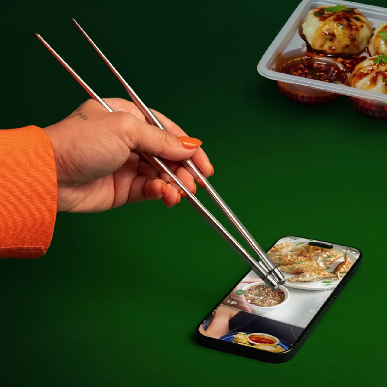
bibigo, the Korean food brand behind what the internet has collectively decided are its favorite dumplings, decided to design for the habit instead of lecturing about it. ScrollSticks are dual-ended chopsticks with touchscreen tips, one end for picking up food and the other for tapping, swiping, and scrolling on a phone. The premise is simple: two dedicated ends for two different jobs, keeping the oil and sauce where they belong.

Designer: bibigo

The research behind the launch is basically a monument to relatable chaos. Beyond the 96% who’ve scrolled while eating, 66% do it often during at least one meal a day. Nearly three in four people report frustrations: 41% are frustrated by getting their hands or phones dirty, 30% struggle to hold a phone comfortably while eating, and 28% can’t keep their screen clean. ScrollSticks are bibigo’s answer to all of the above, which is either very clever or a sign of the times, possibly both.

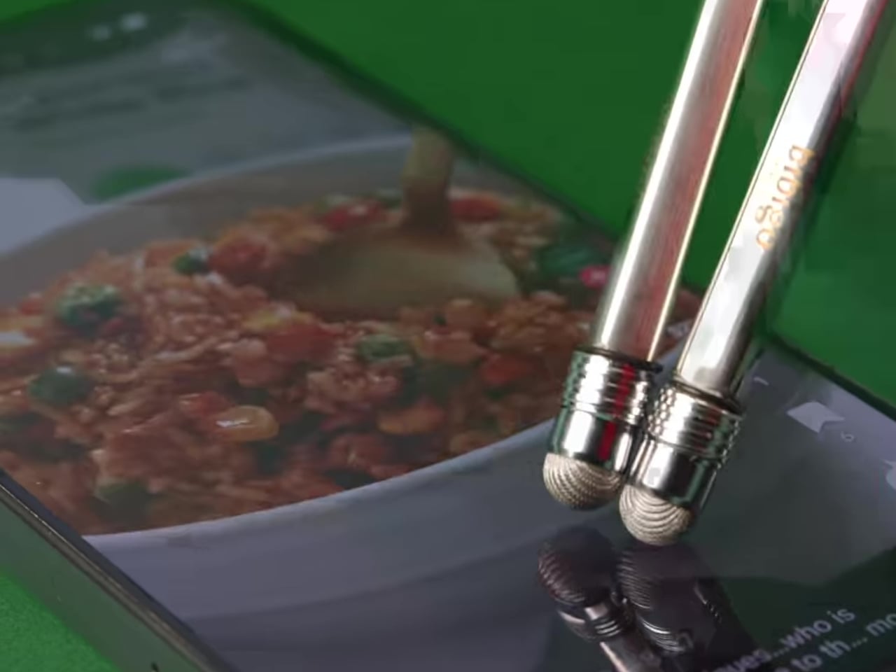
The design logic is straightforward. You eat with the food end, then flip the chopsticks and use the touchscreen-compatible tips to tap and scroll without transferring dumpling residue onto the glass. The tips work with capacitive touchscreens, so it’s not just poking the screen with metal but actually registers as a touch. One tool, two dedicated functions, and your screen stays marginally more dignified.

The cleaning situation is also handled better than you’d expect from what sounds like a novelty item. The touchscreen tips unscrew from the chopsticks, so you can dishwasher or sink-wash the metal body just like any other silverware. That modularity is doing serious practical work here. A touchscreen-tipped chopstick that you can’t properly clean would be a different, worse product.

bibigo frames ScrollSticks as part of its “food-tainment” innovations, which is a word that exists now and apparently describes branded objects that blur eating and entertainment culture. The previous entry in that line was the bibigo Dashboard Kitchen. ScrollSticks are sillier and more useful, which is a hard combination to pull off.

The chopsticks are a limited-edition drop, and the window is short. That’s fitting for something that is partly a product and partly a cultural artifact: a small, polished admission that dinner and doomscrolling are now the same meal, and if the phone is staying at the table, at least the screen deserves better than a dumpling-flavored fingerprint in the corner.

The post bibigo Just Made Chopsticks With Touchscreen Tips for Scroll-Eaters first appeared on Yanko Design.

Wall-Clock inspired by a Pile Of Leaves tells time but also a Nature-inspired Visual Story

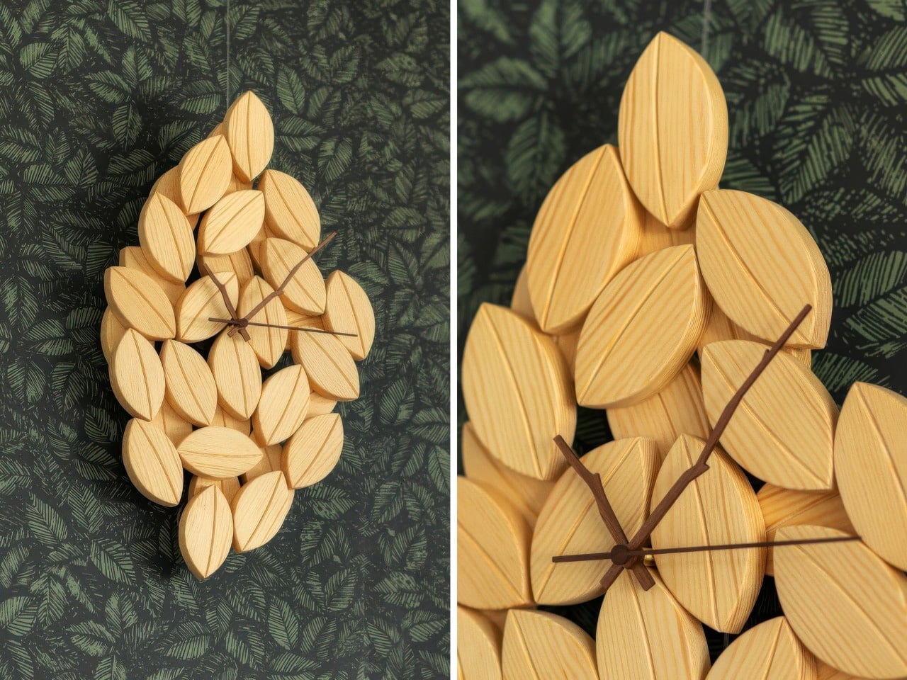
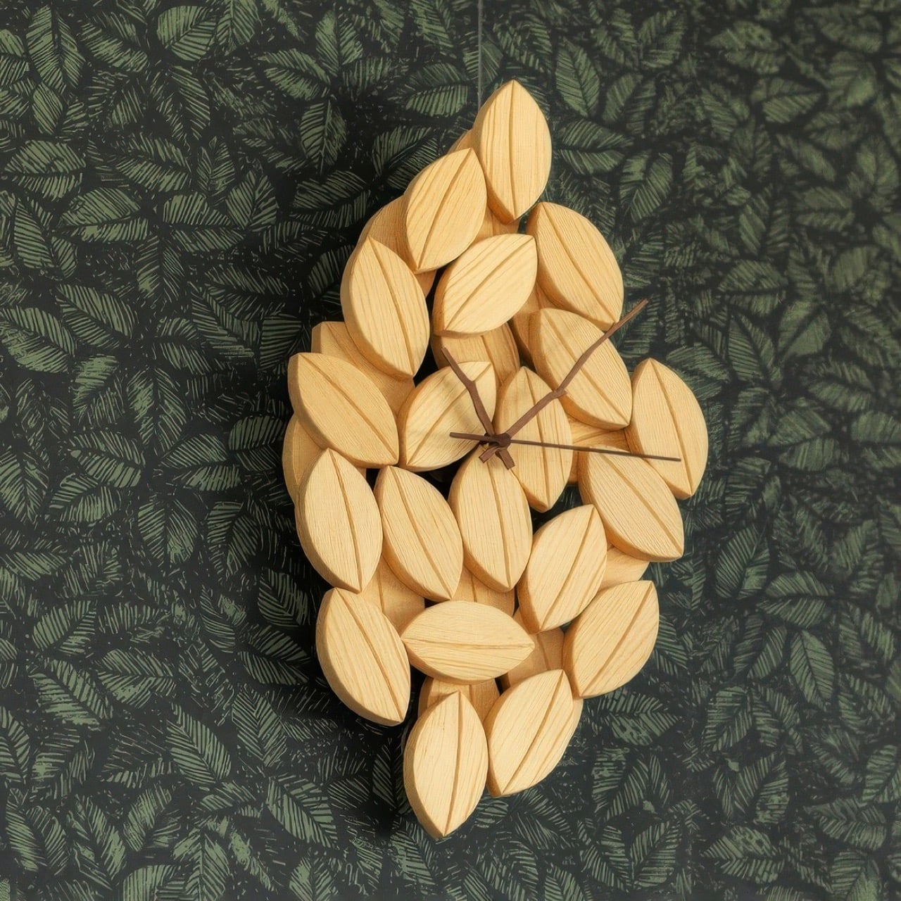
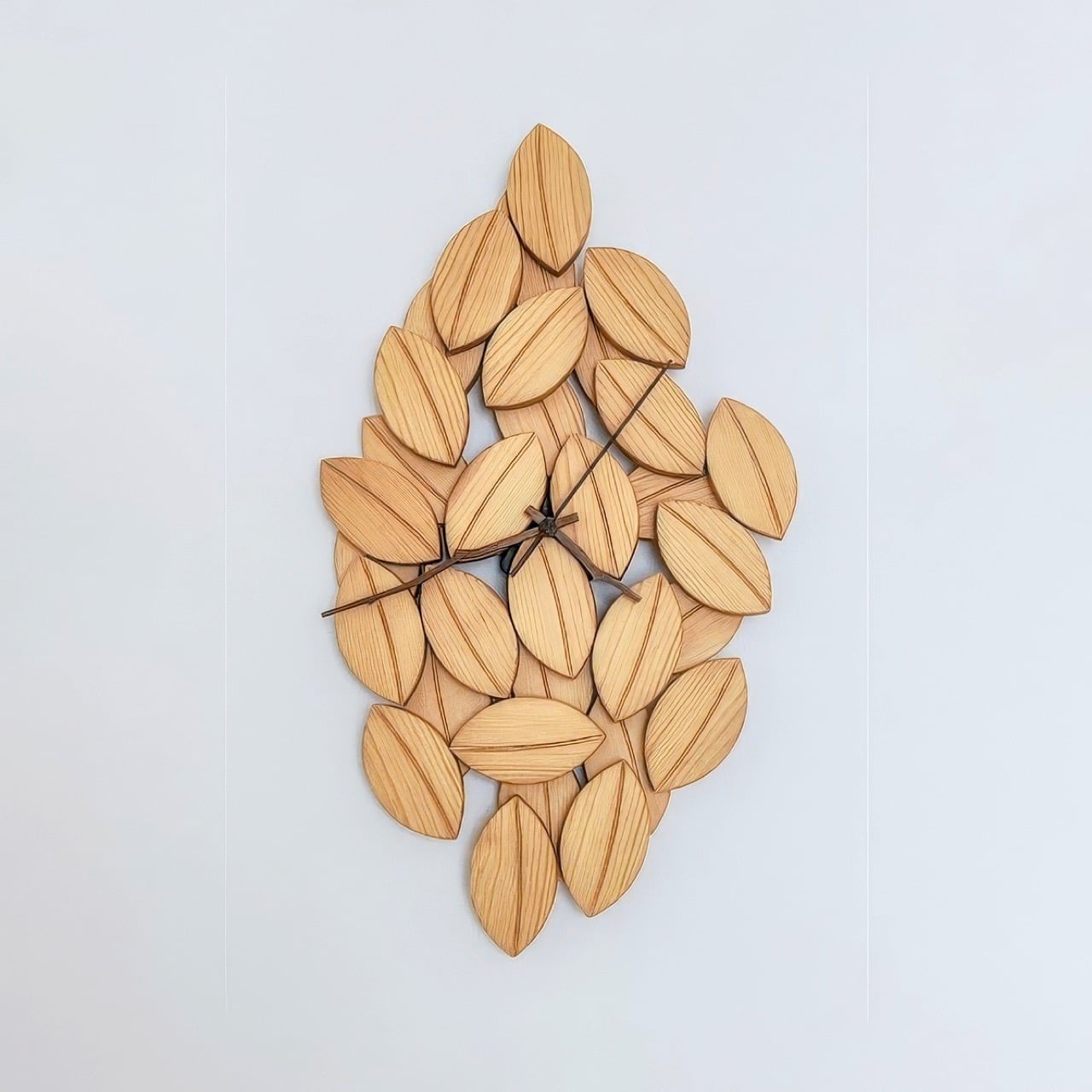
“Foglie” is the Italian word for leaves, and Tobias Sartori makes no effort to obscure the reference. His Foglie Wall Clock is built from dozens of hand-carved pine leaves, each shaped with a carved central ridge that mimics a real leaf’s midrib, arranged into a pointed, flame-like cluster that functions as the clock face. Branch-carved hands in a contrasting darker finish sweep the hours from a movement housed at the center. The result sits between decorative object and wall art, and it does so with enough material confidence to hold that ground convincingly.

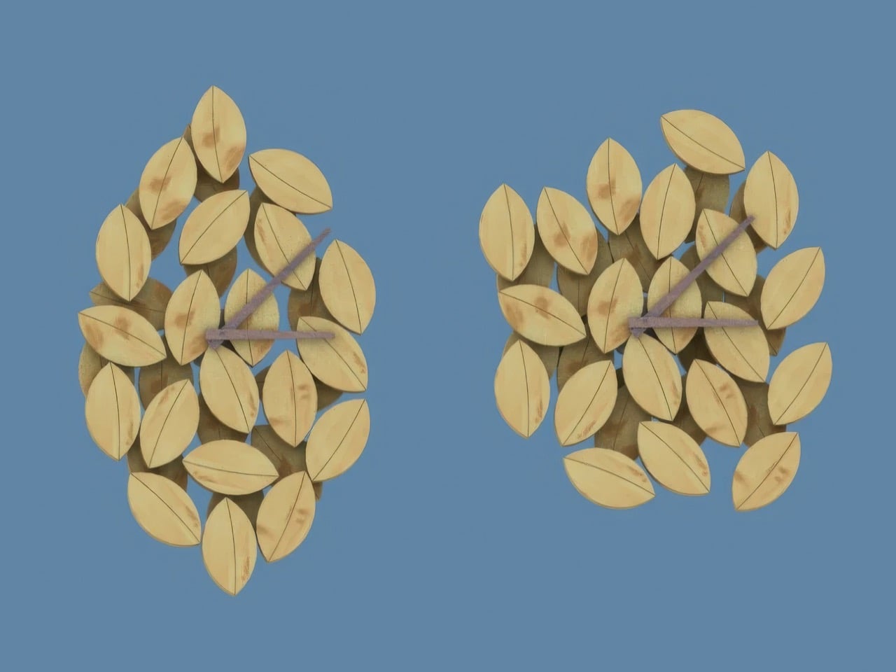
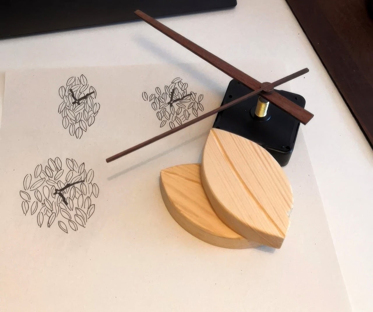
Sartori first worked with leaf forms in a jewelry project, carving wooden pendants for necklaces, and the motif followed him home. A beech hedge outside and a botanical wallpaper inside reinforced the idea, together suggesting that an entire clock could operate in the same visual vocabulary. Several layout sketches followed before two strong candidates emerged. The chosen design is the one where every individual carved leaf echoes the overall silhouette of the piece, creating a quality that feels grown from the inside out.

Designer: Tobias Sartori

The final piece has a remarkable sense of depth and texture, a direct result of its meticulous construction. Because each pine leaf is an individual component, hand-carved and set at a slightly different angle and height, the clock creates a dynamic topography of light and shadow that shifts throughout the day. This layered arrangement gives the object a living quality, changing its character as the sun moves across the room.

The choice of pine, with its warm and expressive grain, gives the clock an approachable, organic feel that invites a closer look. The darker, more delicate hands provide just enough contrast to ensure legibility without overpowering the woodwork. It is a quiet object that reveals its handmade complexity gradually, rewarding careful observation with subtle details that a mass-produced item could never replicate.

Sartori’s process sketches reveal another, more traditional round variant that he ultimately set aside, a decision that proved critical to the design’s integrity. The circular concept, while pleasant, felt more like leaves applied to a conventional clock shape. The final, elongated form, however, feels like a clock that grew directly from the leaves themselves. This distinction is the core of its success. By housing a simple, reliable clock movement within a form that feels completely natural, Sartori allows the artistry of the woodwork to remain the main story. The Foglie clock successfully integrates function into a form that feels elemental and intentional, as if a gust of wind had gathered the leaves on the wall in a moment of perfect, fleeting composition.

The post Wall-Clock inspired by a Pile Of Leaves tells time but also a Nature-inspired Visual Story first appeared on Yanko Design.
Forget Mindfulness Apps, This Desk Top Spins for 2 Minutes Instead

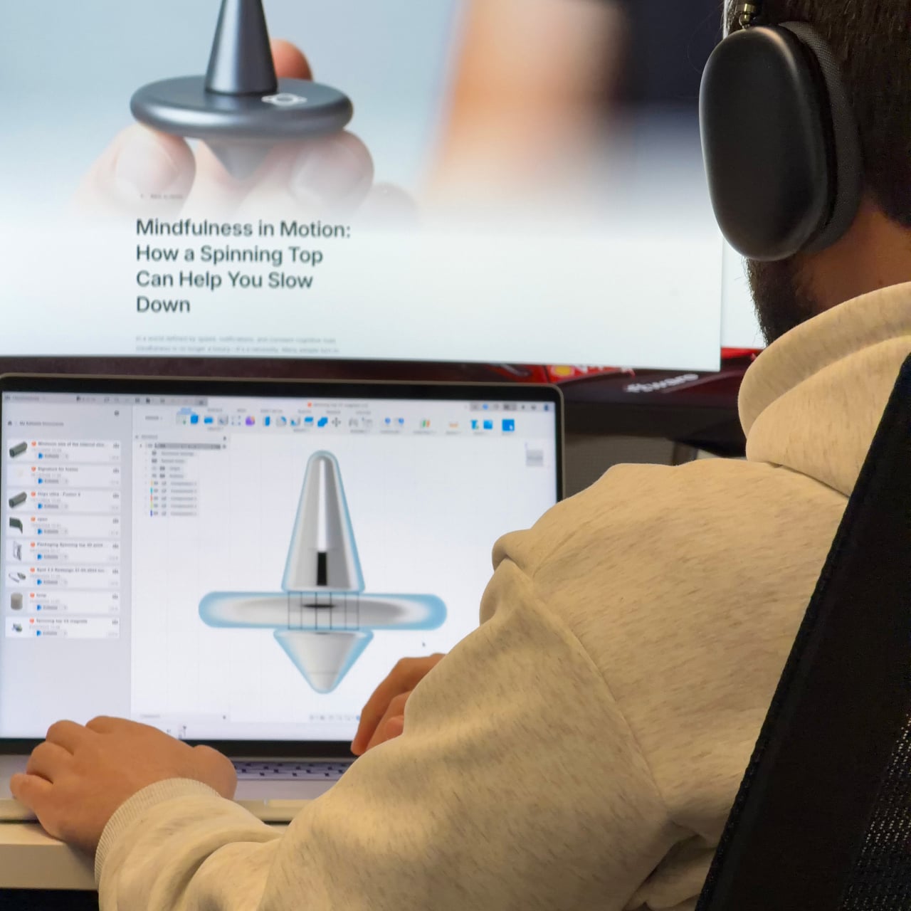
Screens are on all day, and hands tend to find something to do when focus slips. Pen clicking, phone picking, knuckle cracking, the nervous tics of modern desk work. Most “mindfulness” solutions are still apps, which is a bit ironic when the problem is too much screen time. There’s something to be said for a small mechanical object that gives your brain a reset without asking for any attention in return.

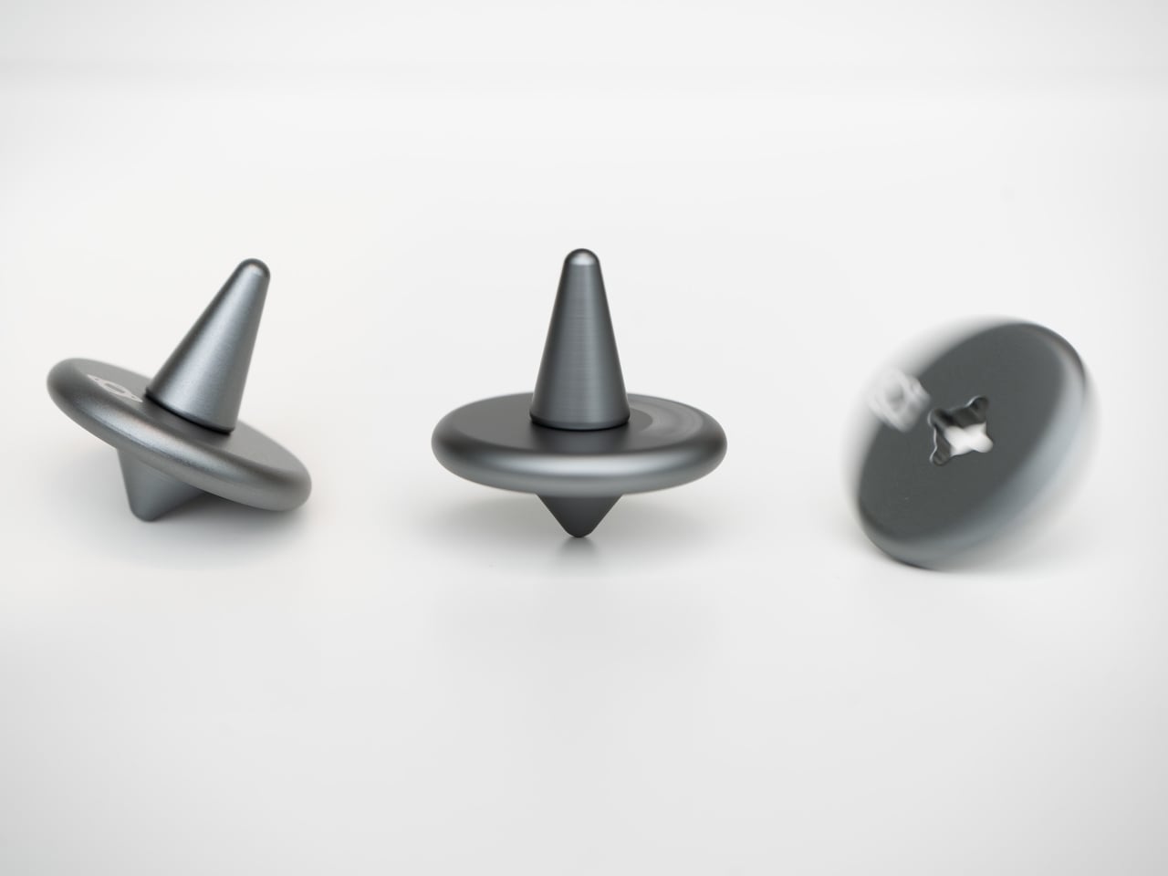
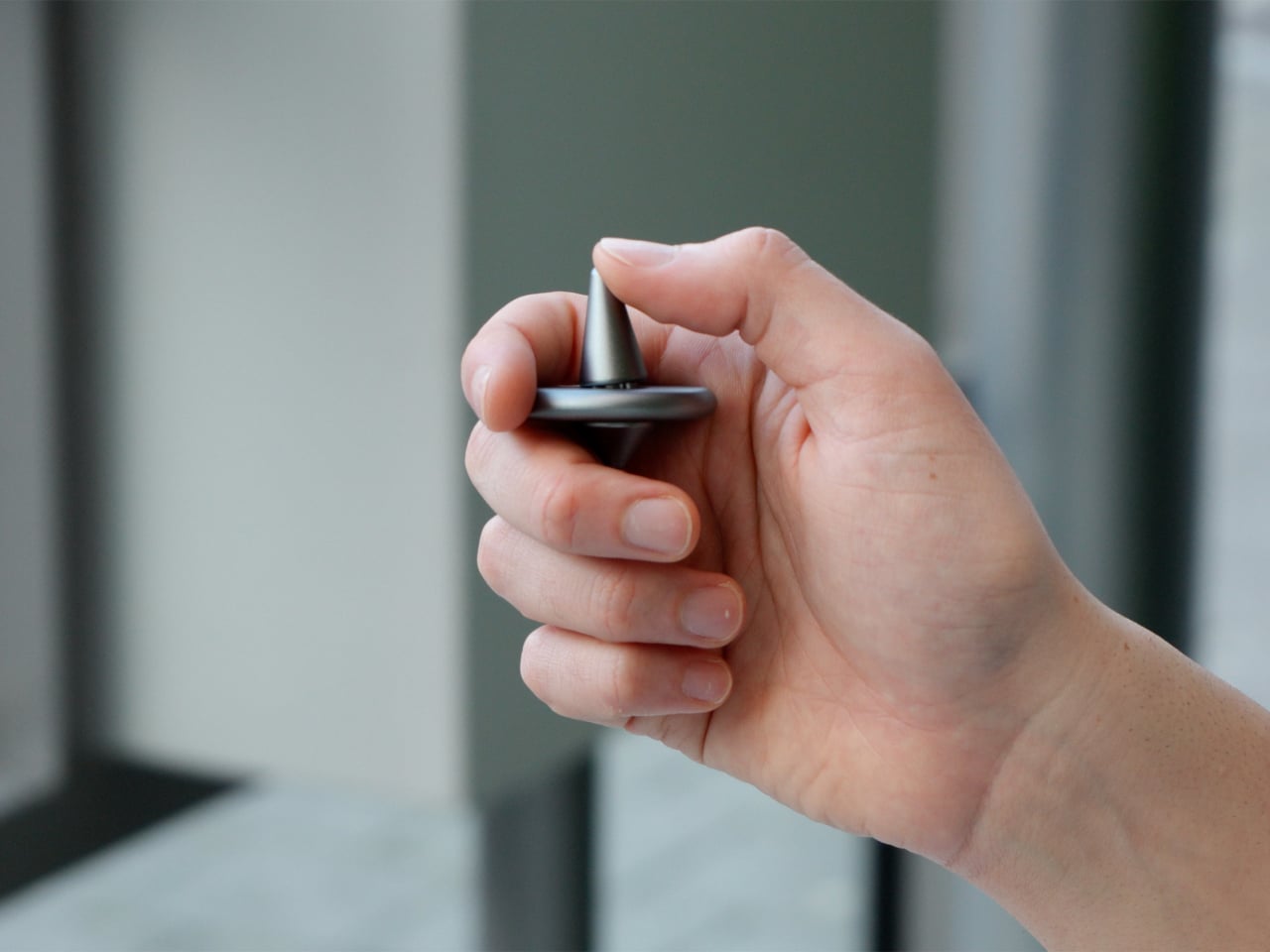
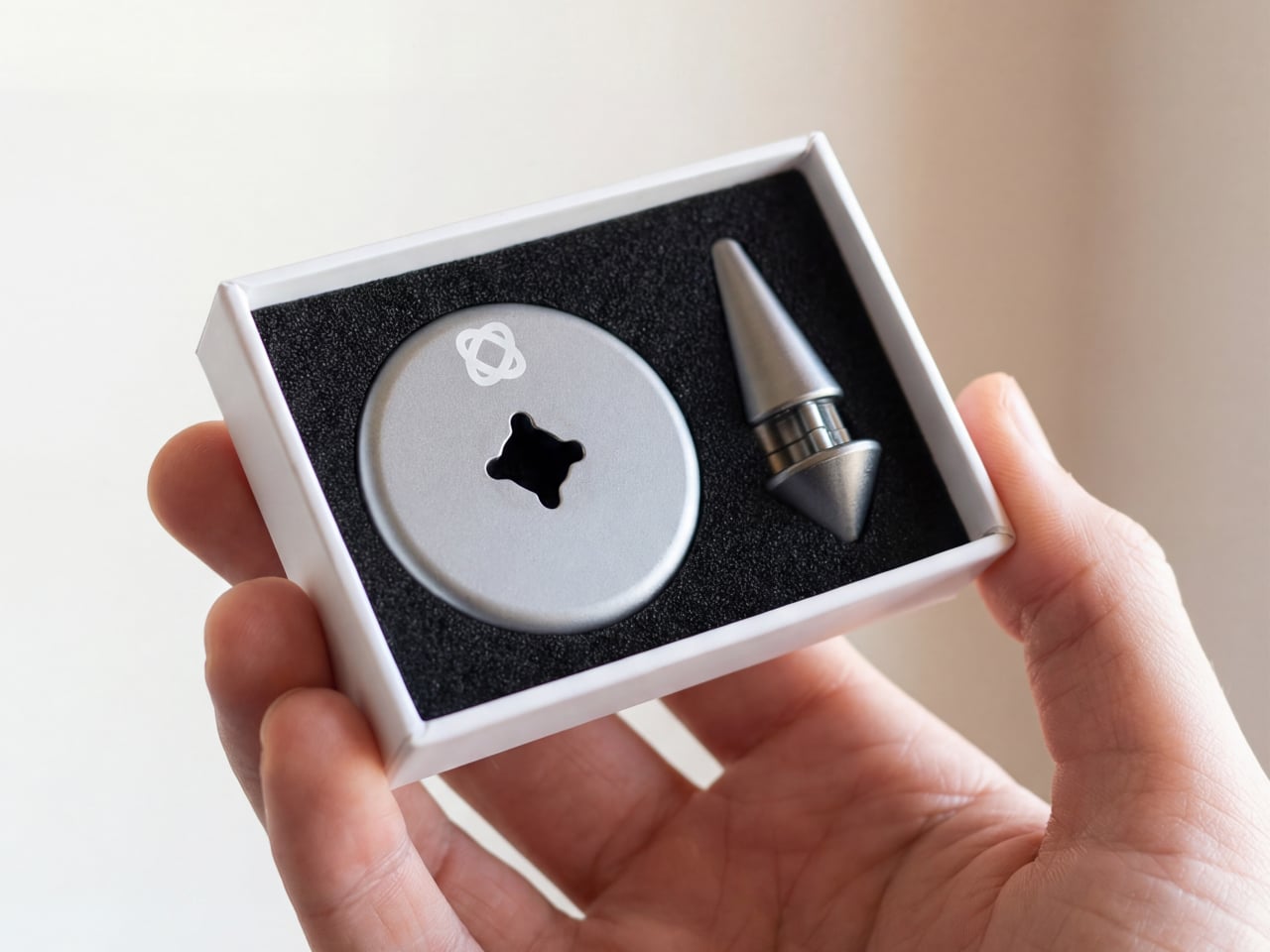
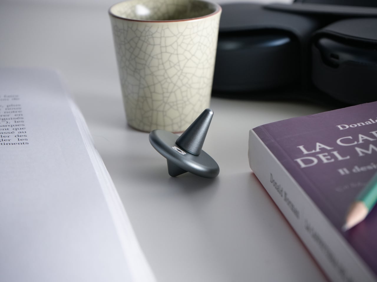
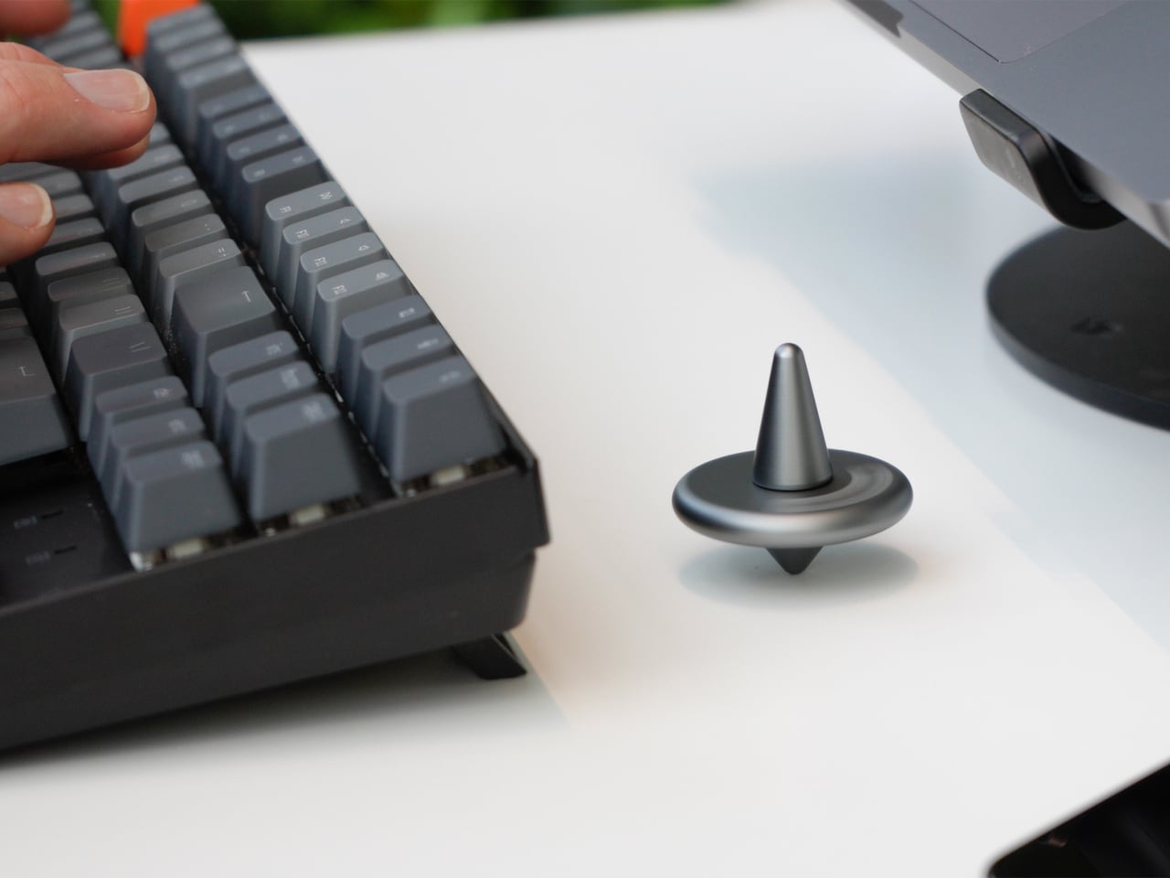
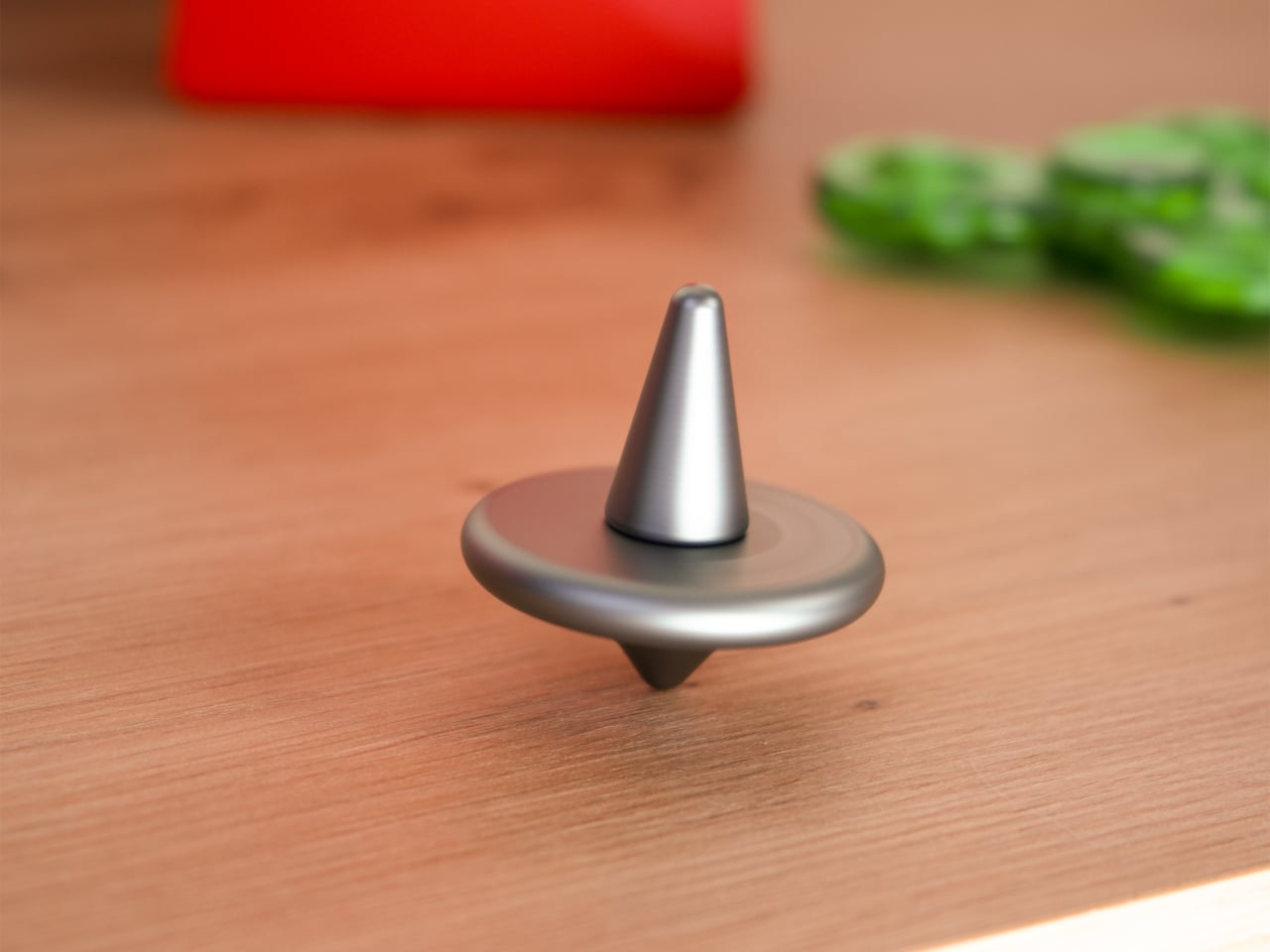
Amsterdam Dynamics’ ST-01 is a modular spinning top and tactile focus object built for desks, hands, and minds that rarely get a break. It’s intentionally simple but not single-purpose, offering multiple mechanical interactions with no correct sequence. You use one when you need it or work through all of them. No app, no setup, no instructions, just the object and whatever your hands feel like doing with it.

Designer: Antonio Lo Presti (Amsterdam Dynamics)

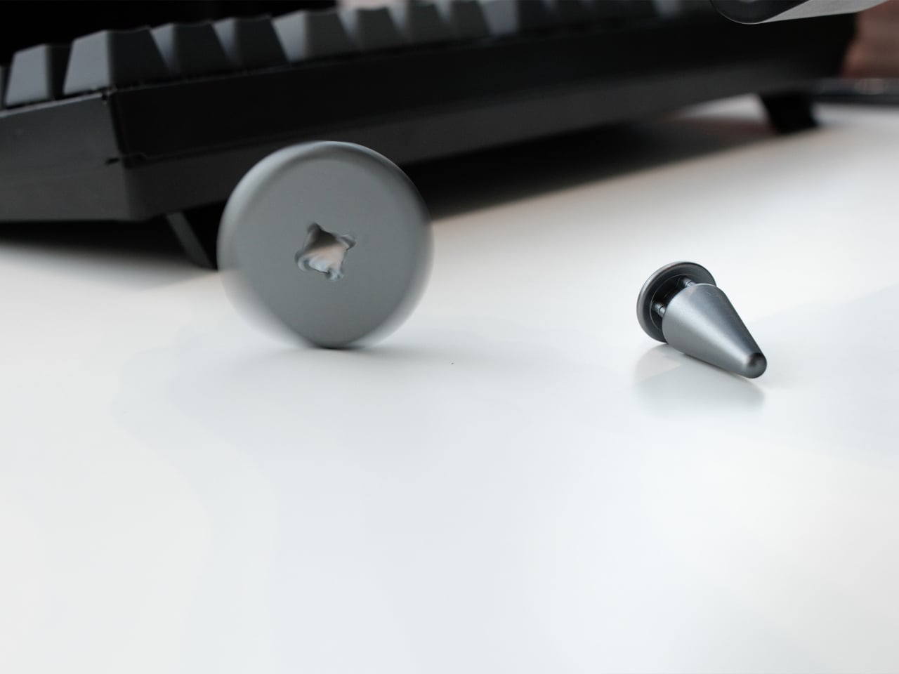
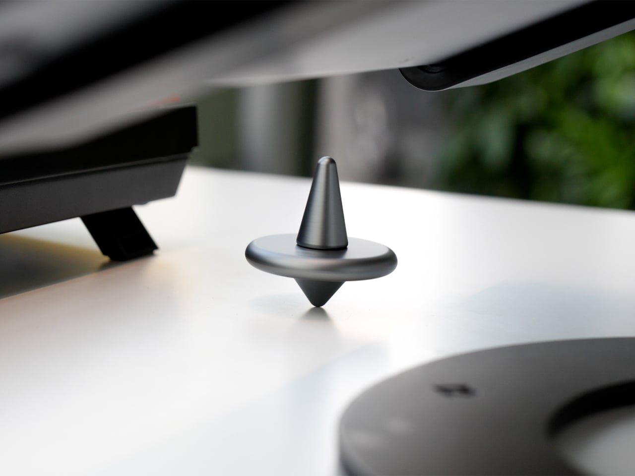
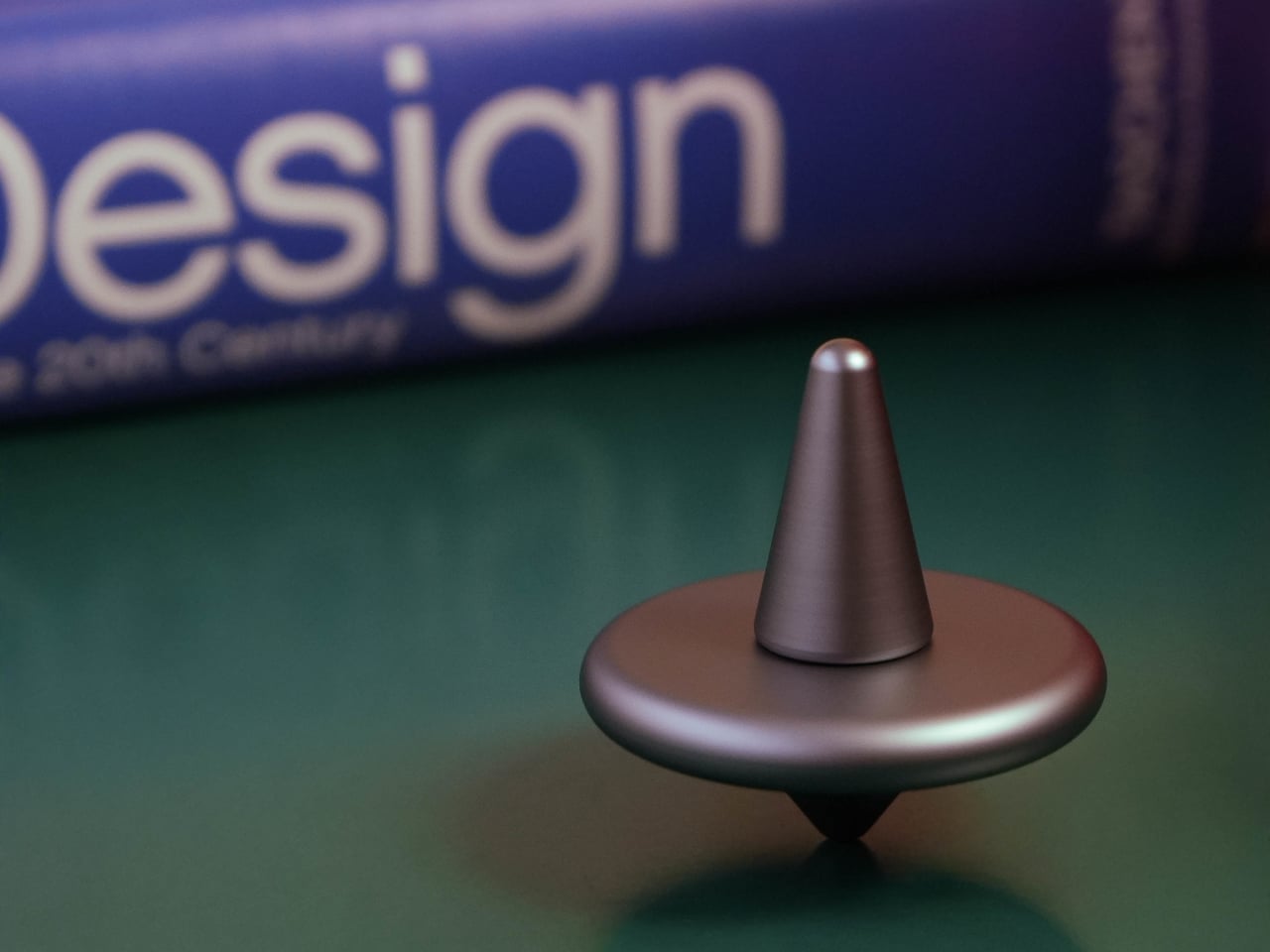
A gentle twist sets ST-01 rotating smoothly, and it’s engineered to keep going for over two minutes. That’s long enough to watch while thinking through a problem, waiting for a file to render, or cooling down after a difficult meeting. It functions as a visual anchor, something calm and physical in a field of notifications and browser tabs that all want something from you.

Pressing the top triggers a satisfying mechanical click with clear tactile feedback, the kind of repeatable, purposeful sensation that replaces the nervous habit of clicking pens or tapping a keyboard. Amsterdam Dynamics calls it “reset focus,” which is accurate if not exactly humble. The middle disc can also be flipped like a coin, adding a small decision-making tool and another texture to the interaction when you need a nudge in either direction.

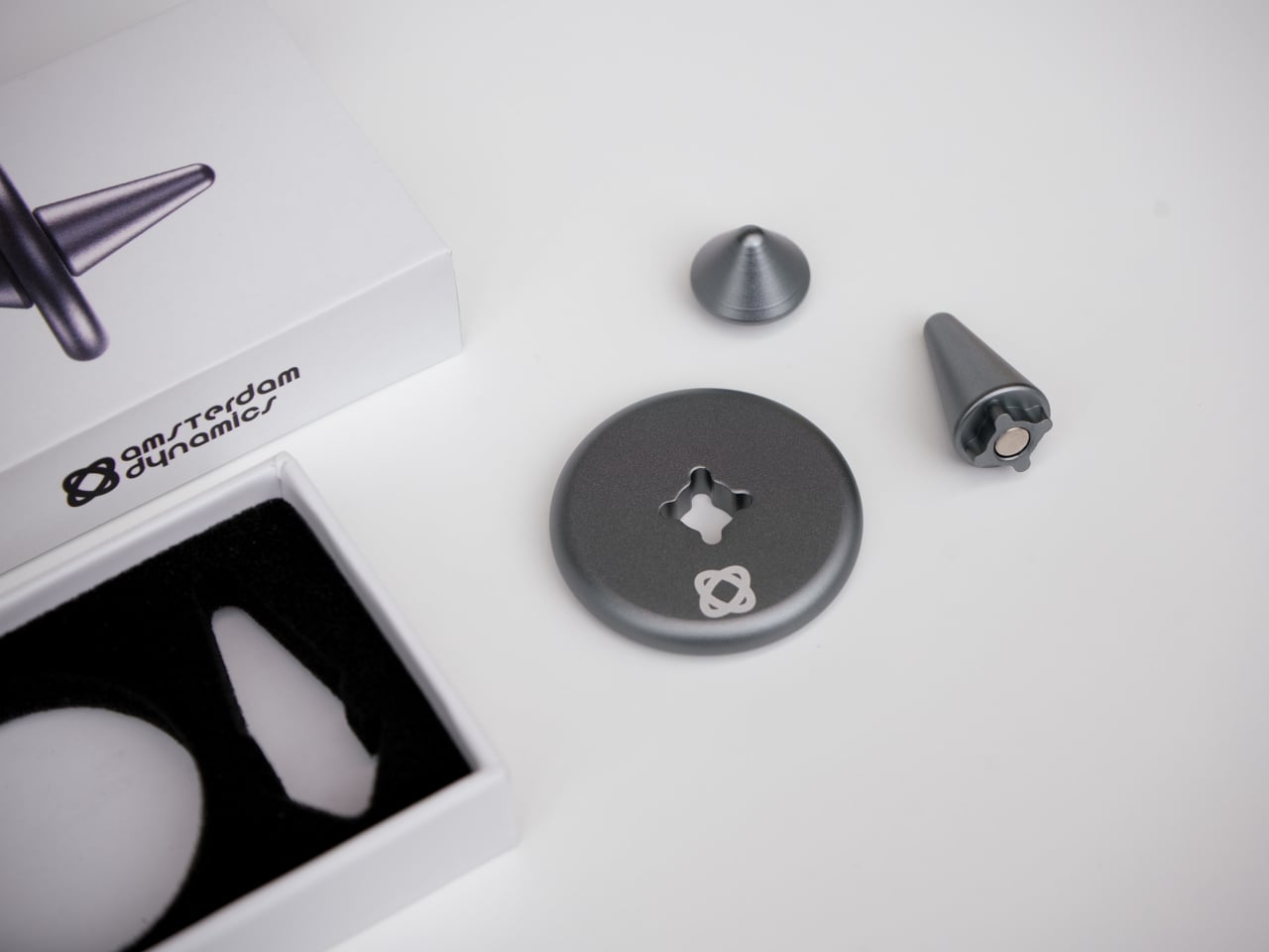
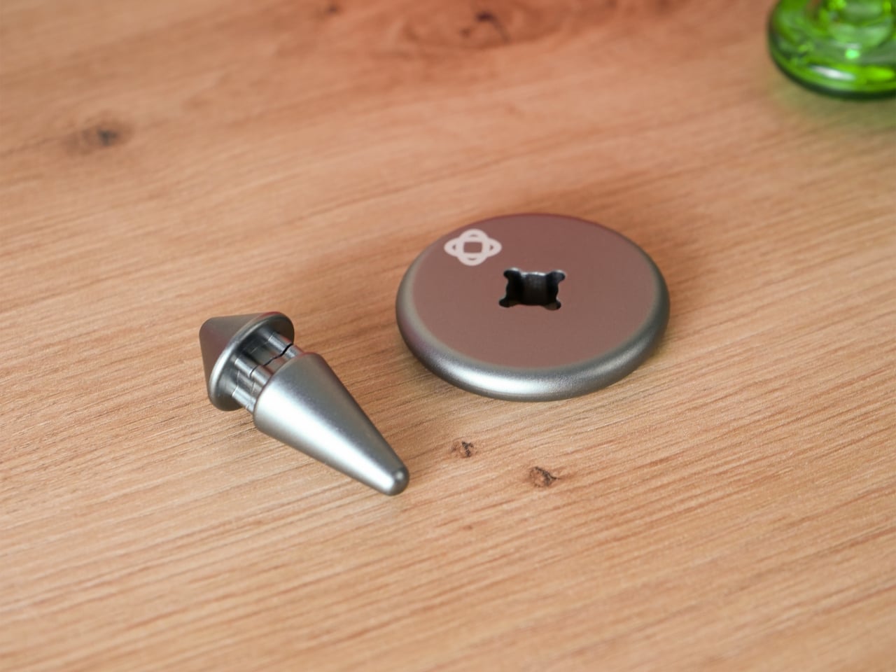
Of course, there’s a modular construction underneath all of that. ST-01 is built from three parts that can be taken apart and snapped back together, held in alignment by two precisely positioned magnets. That magnetic core keeps the structure stable during spinning while making it easy to disassemble by hand. There’s also a built-in magnet that lets it stick to metal surfaces, which is either a neat trick or a genuinely useful parking spot depending on your desk.

CNC-machined, anodized aerospace-grade aluminum means it’s solid in the hand, balanced, and finished in a way you notice the first time you pick it up. Cheap fidget toys flex, squeak, and wear out quickly. ST-01 is designed to stay on the desk for a long time, with Amsterdam Dynamics framing it as “a beautiful object, made to last a lifetime” and something that can eventually be passed on.

That’s an unusual positioning for what is essentially a desk toy, but it fits the overall idea. ST-01 doesn’t ask for a lifestyle change, a daily streak, or a subscription. It just gives your hands a few repeatable interactions and a place to return when the work gets loud, which turns out to be the kind of quiet, mechanical company a desk actually needs.

The post Forget Mindfulness Apps, This Desk Top Spins for 2 Minutes Instead first appeared on Yanko Design.
This Wi-Fi Router Looks Like an Incense Burner and Scents Your Room

Most home routers live behind books or plants, blinking away in corners, only noticed when the connection drops. There’s so much quiet faith placed in that invisible box every time we ask it for directions, answers, or late-night comfort while scrolling. If we already treat Wi-Fi like a kind of everyday oracle, maybe the hardware could look and behave more like an object we actually care about instead of just tolerating it.

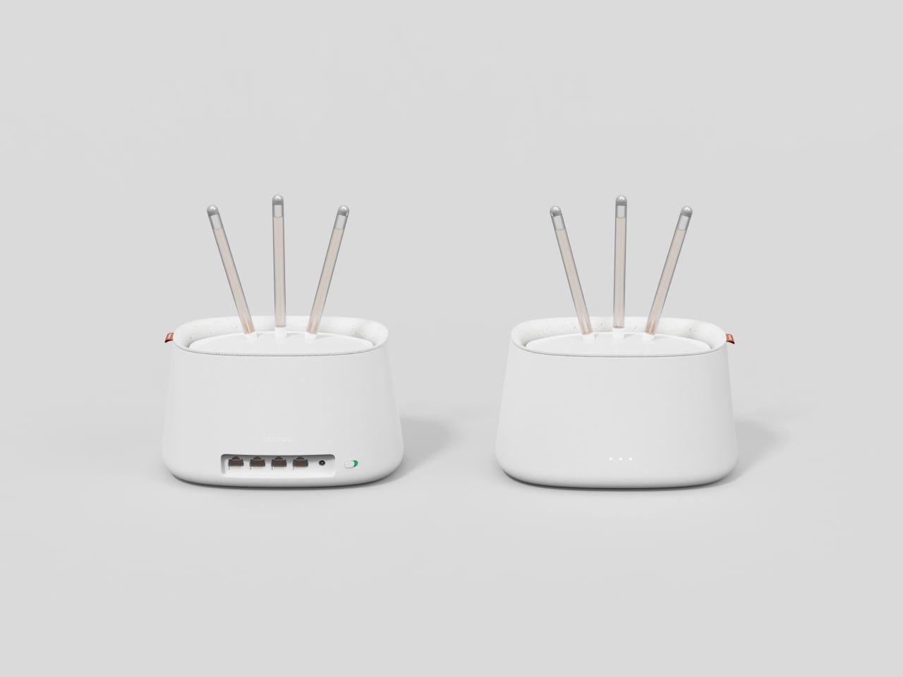
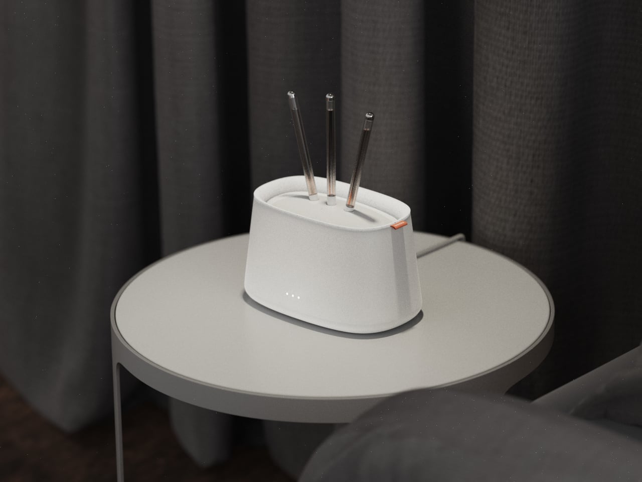
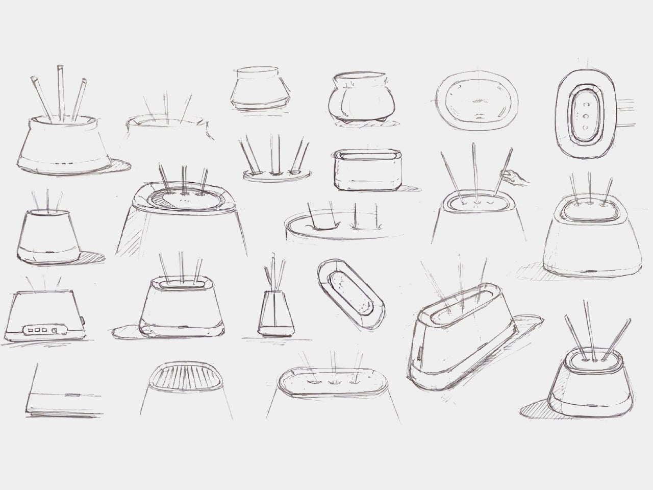
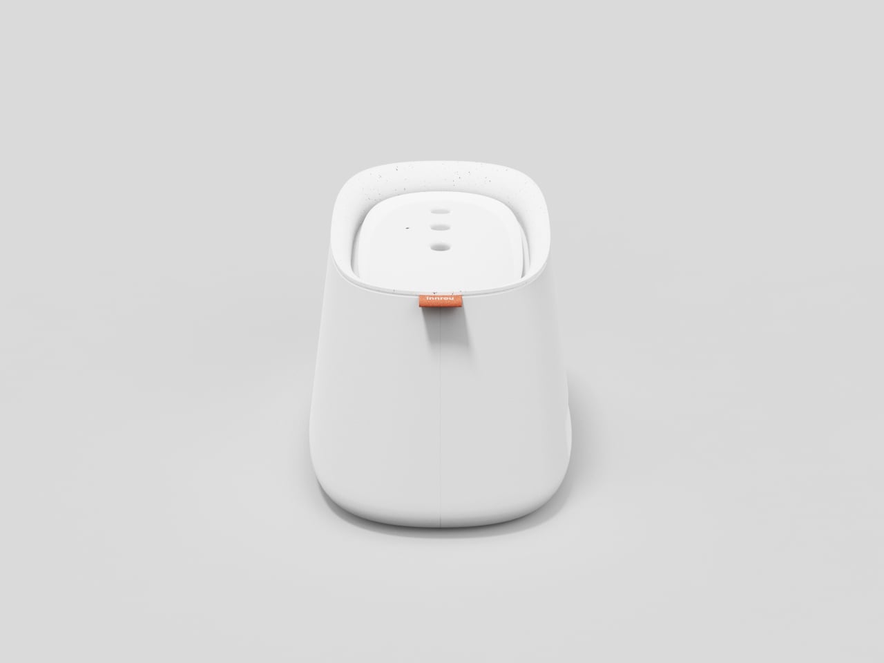
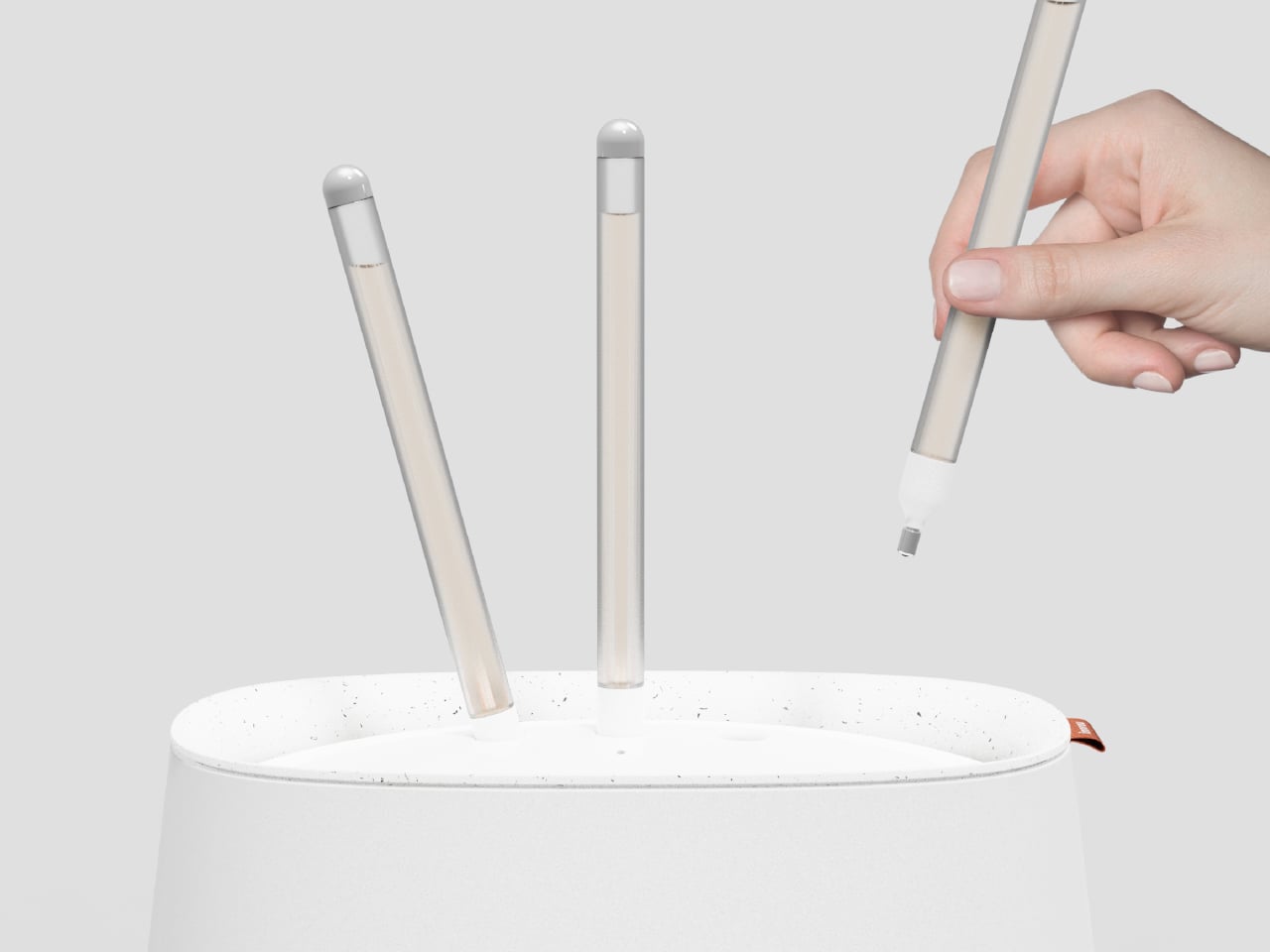
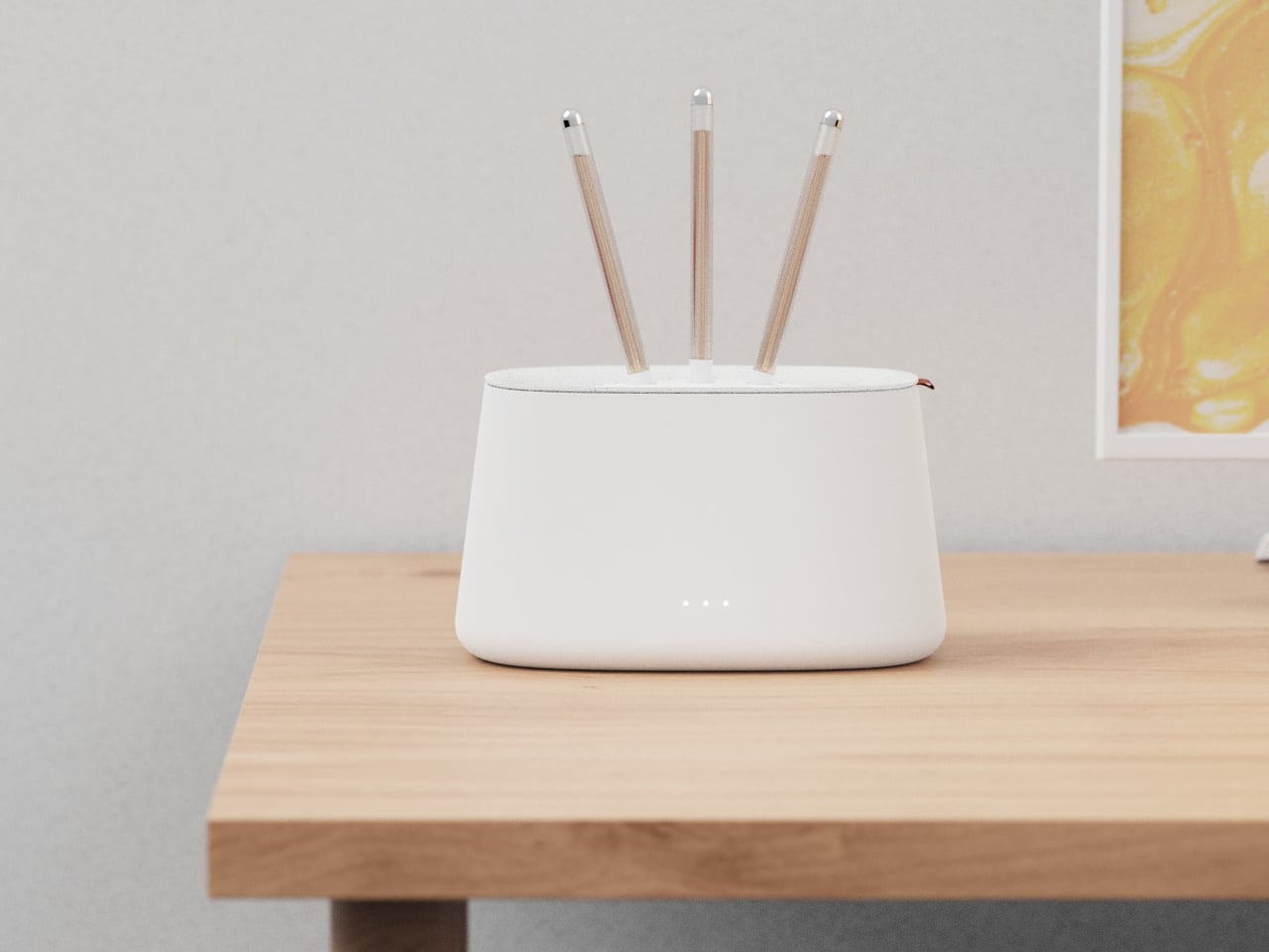
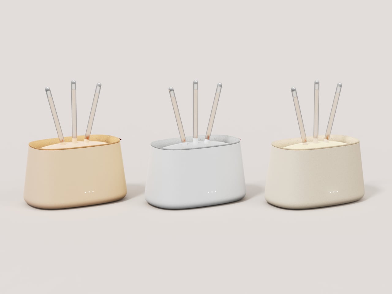
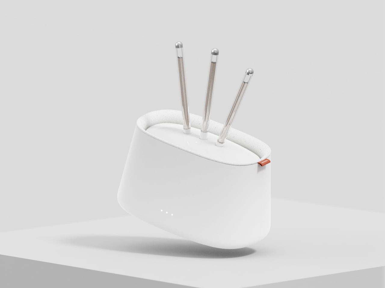
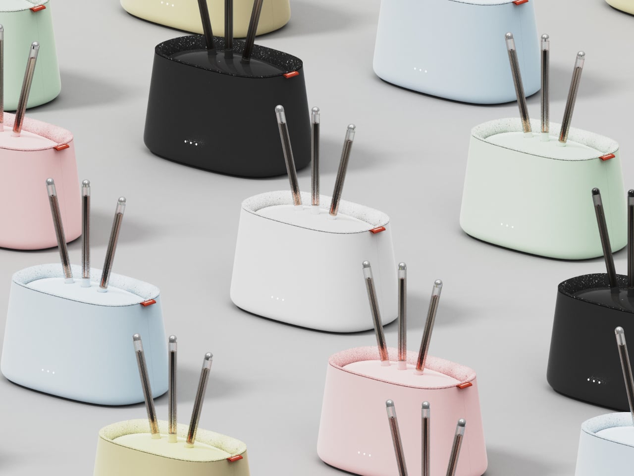
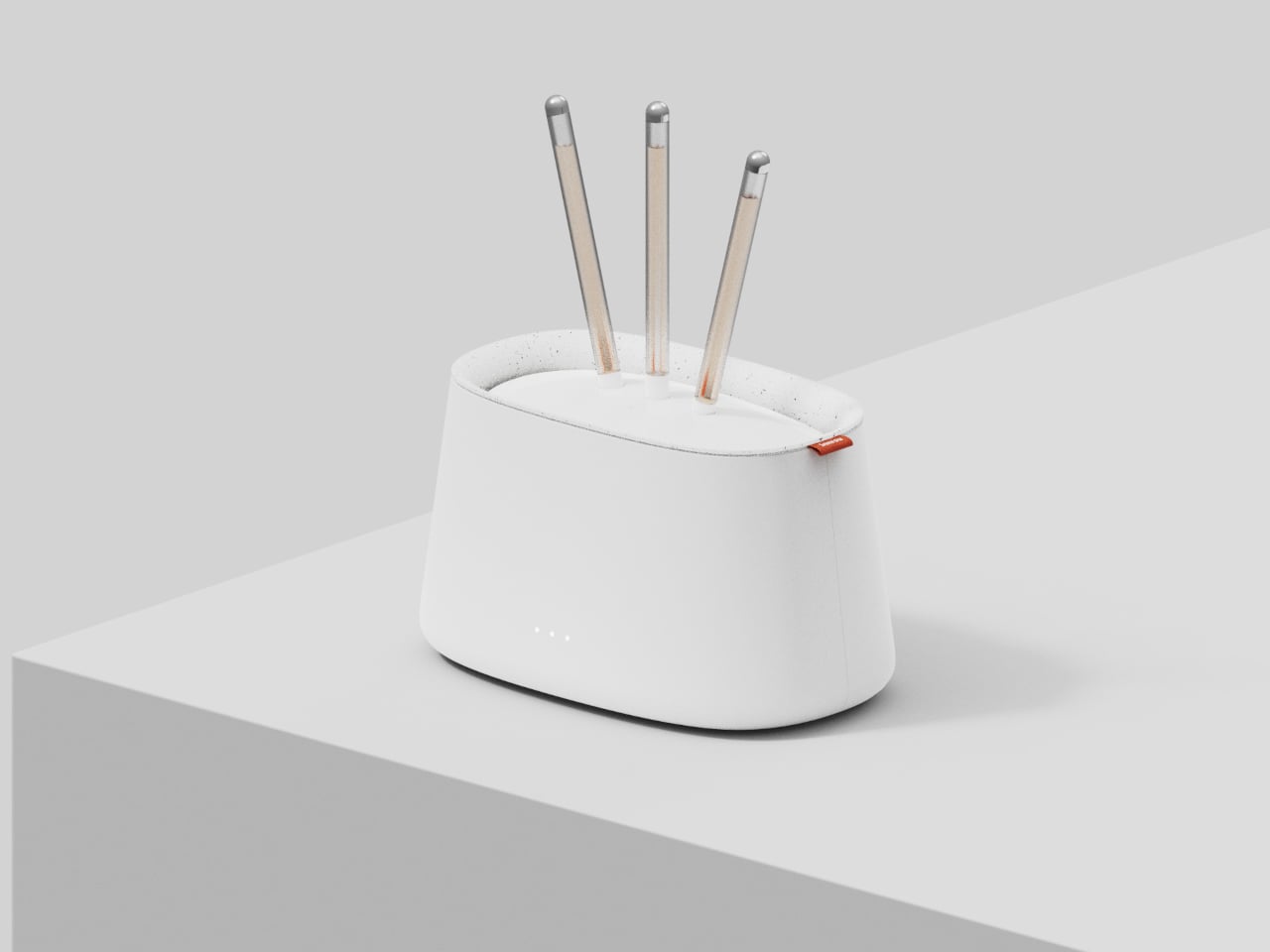
innrou is a Wi-Fi router concept that resembles an incense burner and incorporates fragrance. It’s designed to go beyond spec sheets and become a small storytelling object, imagining the future form of electronic products. The name and form hint at traditional incense rituals, but the function is pure 21st century, keeping your devices online while quietly scenting the room with swappable essential-oil sticks.

Designer: Yuan Chen

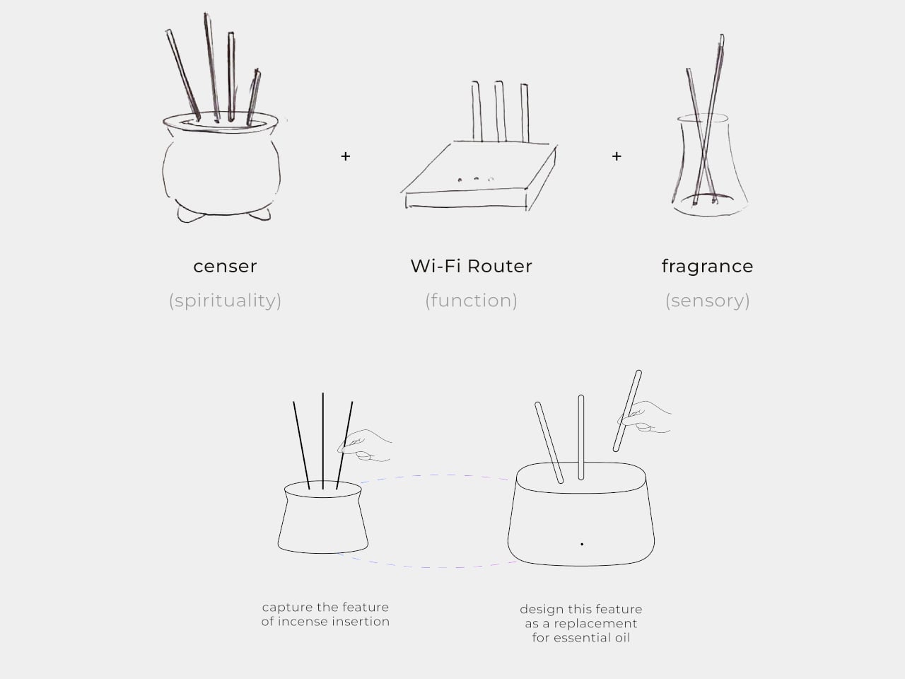
The designer’s starting point is a neat cultural parallel. In traditional Chinese society, people would ask gods for guidance and answers, often by lighting incense at a burner. Today, many of us scroll the internet for the same things, from practical fixes to something closer to spiritual reassurance. innrou deliberately combines those two behaviors, using a router as the carrier for a story about how we now seek help.

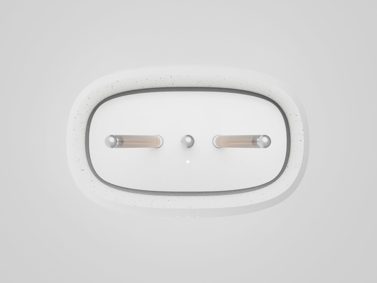
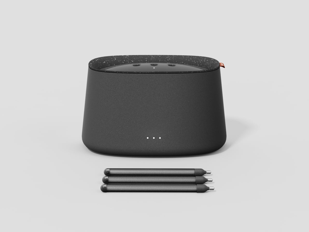
The essential oil system reinterprets incense as modern fragrance sticks. You replace a spent stick by sliding in a new one, the same simple vertical gesture used at a temple. That motion deepens the narrative and adds a bit of playfulness, turning maintenance into a small ritual instead of an annoying chore, while the router quietly keeps doing its job underneath without asking for attention.

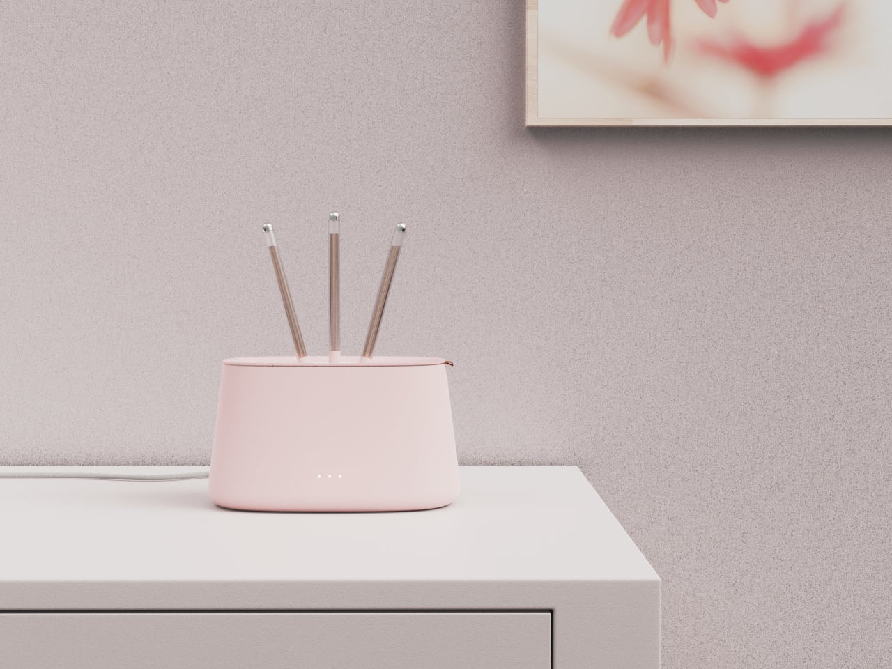
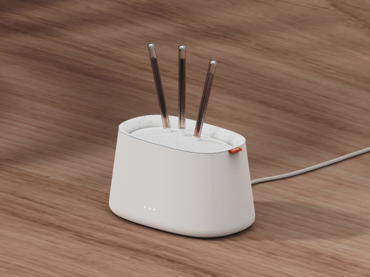
innrou is a small, rounded block that can sit openly on a desk, bedside table, or shelf without screaming “network gear.” The antennas are hidden, the front shows only a few status dots and a subtle logo, and the body comes in soft colors that match interiors. Instead of being something you hide, it becomes part of the atmosphere, both visually and through scent, which is a surprisingly big shift for a product category that usually defaults to black plastic.

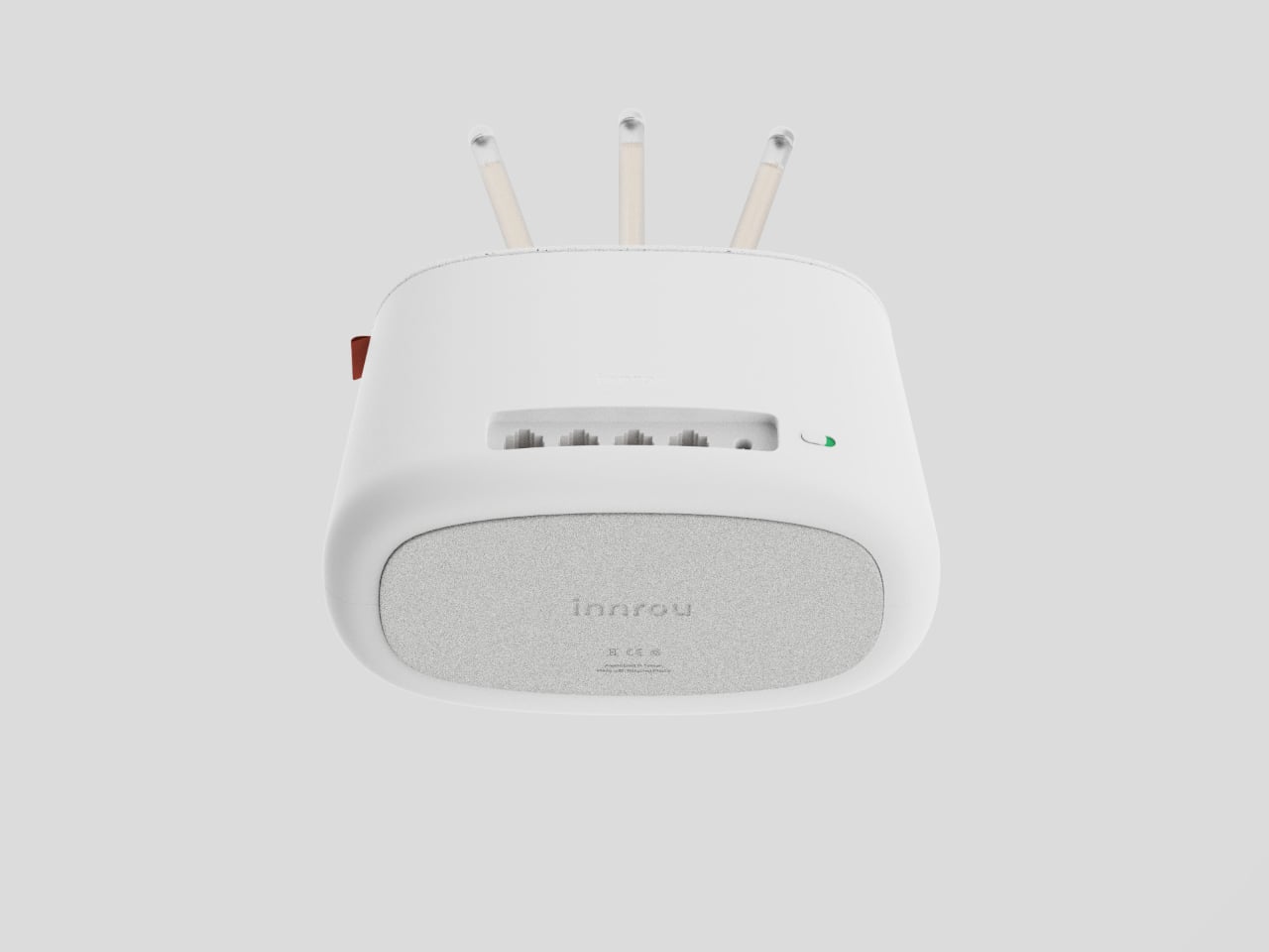
Under the incense metaphor, this is still a proper router. There’s a row of Ethernet ports at the back, a power connection, and internal antennas doing the heavy lifting. The essential oil sticks are designed as replaceable cartridges with their own packaging, so the ecosystem feels thought through. It isn’t about chasing the highest throughput number but about making the necessary hardware less of an eyesore and maybe a bit nicer to live with.

A concept like innrou suggests that if a router can borrow the form and gestures of an incense burner, other invisible boxes could also become objects we actually want in the room, not just tolerate. Blending connectivity with scent and story reframes a forgettable device as a small daily ritual, which feels oddly appropriate when you already treat it like a modern oracle that knows where everything is and when everyone is awake.

The post This Wi-Fi Router Looks Like an Incense Burner and Scents Your Room first appeared on Yanko Design.
This Bedside Lamp Remembers Everything You Forget at 6 AM

We’ve all been there. You’re running late, grab your keys, rush out the door, and three blocks later realize your phone is still sitting on the nightstand. Or maybe you left every light in your apartment blazing because your brain was already at work before your body made it out the door.

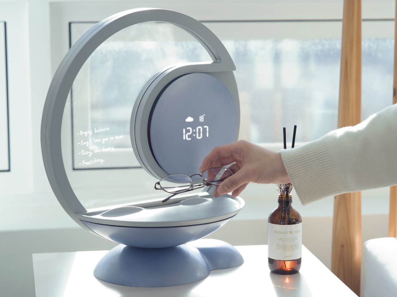
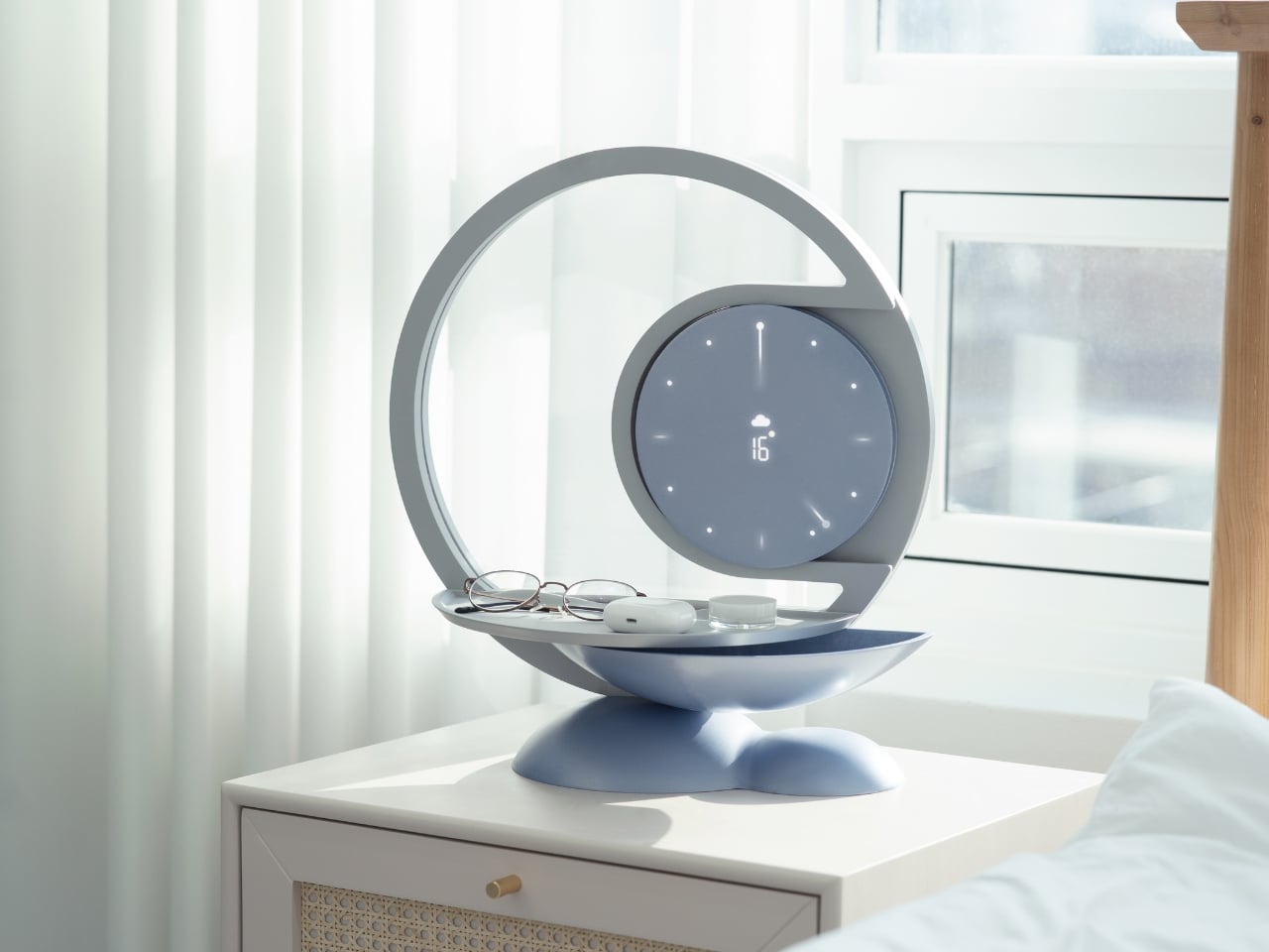
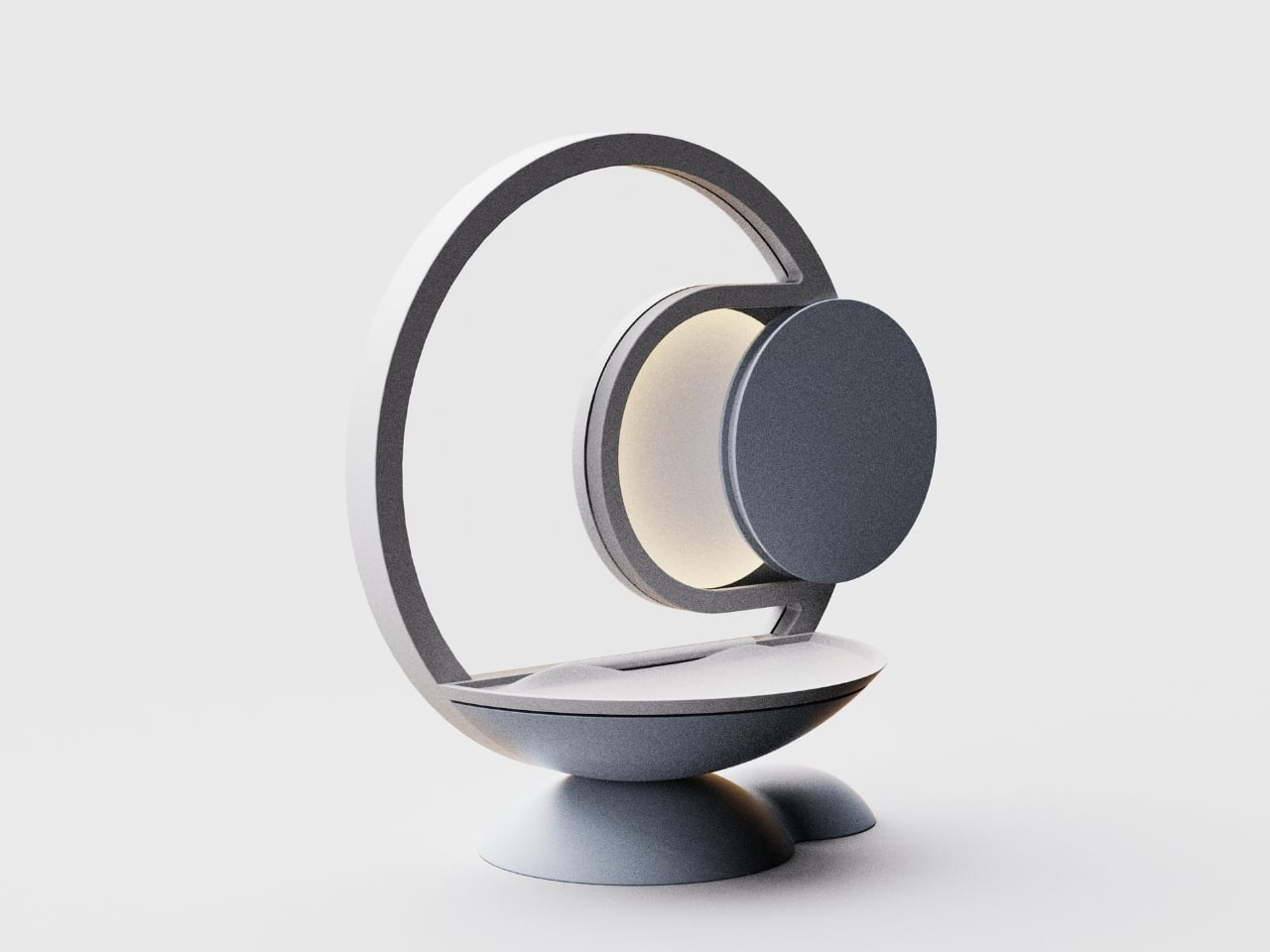
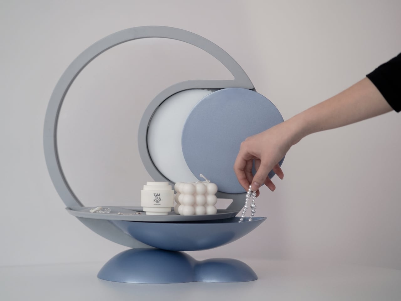
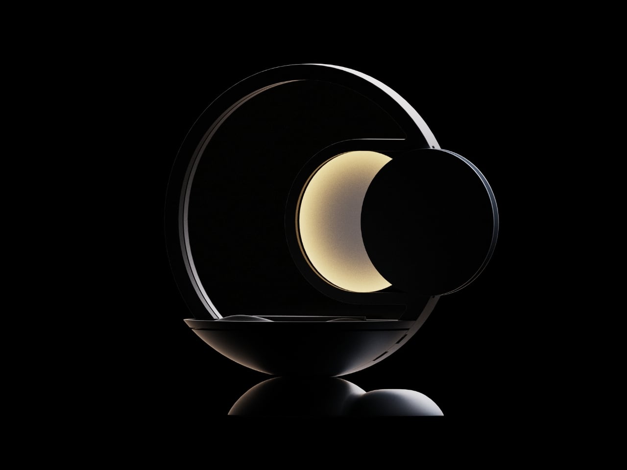
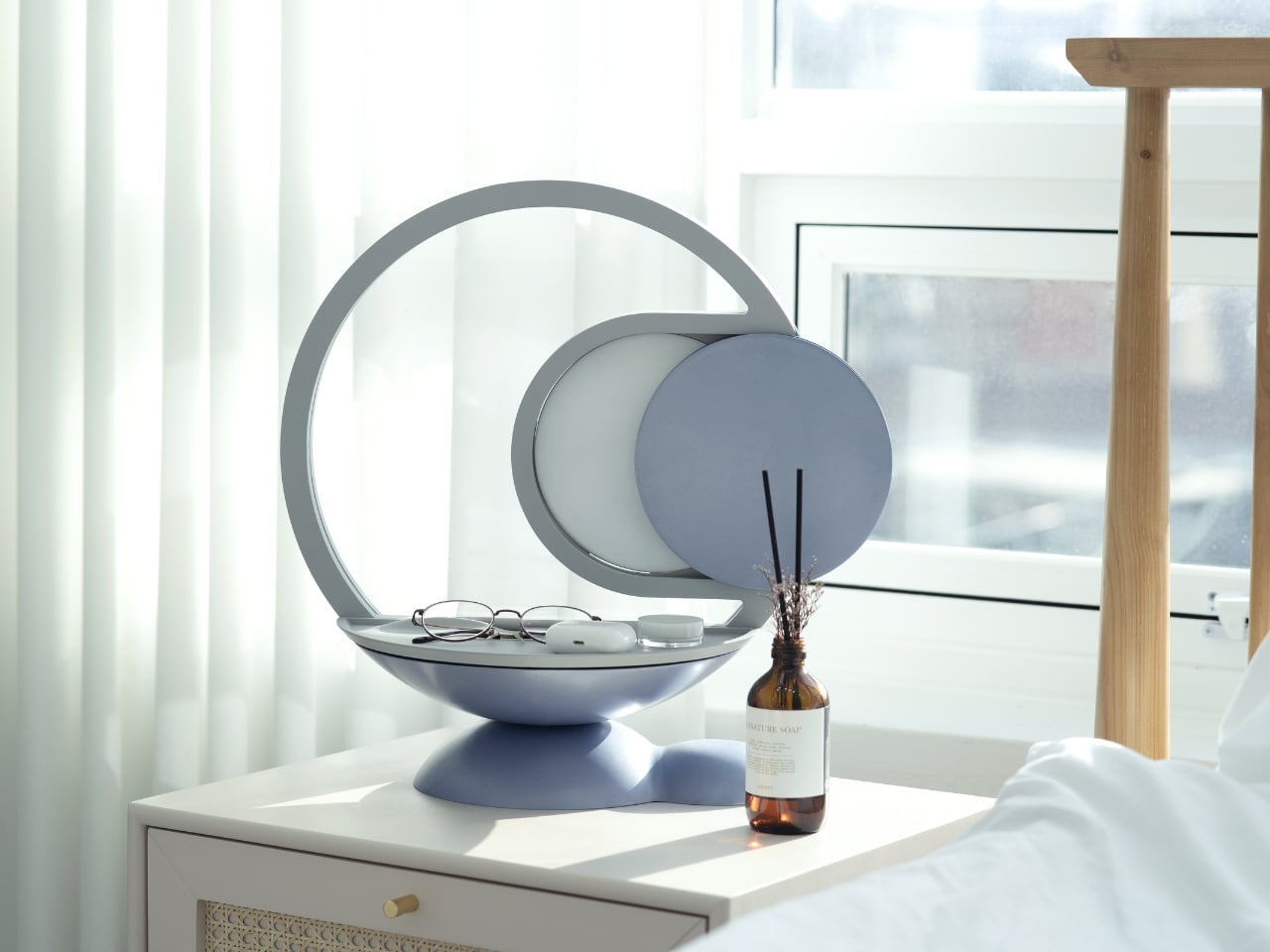
Designer YeEun Kim gets it. Her concept project, Darling, tackles the scattered morning routine with a smart bedside organizer that’s equal parts lamp, tray, and very gentle personal assistant. The design speaks to anyone who’s ever retraced their steps back home, cursing under their breath about that one essential item left behind.

Designer: YeEun Kim

The concept addresses a surprisingly common problem. According to Kim’s research, modern forgetfulness often stems from irregular sleep patterns, excessive screen time, and the kind of stress that comes with overpacked schedules. The typical advice is to take walks, get better sleep, or generally relax more. But if you’re the type of person who needs this advice, you’re probably also the type who doesn’t have time to follow it.

So Darling takes a different approach. Instead of trying to fix your entire lifestyle, it focuses on building small, sustainable habits. The kind that actually stick because they’re simple enough to do even when you’re running on four hours of sleep and too much coffee.

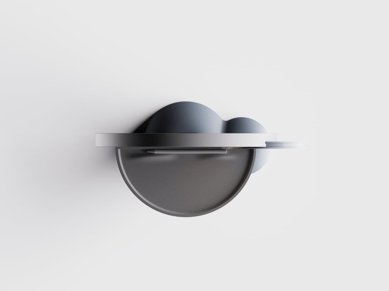
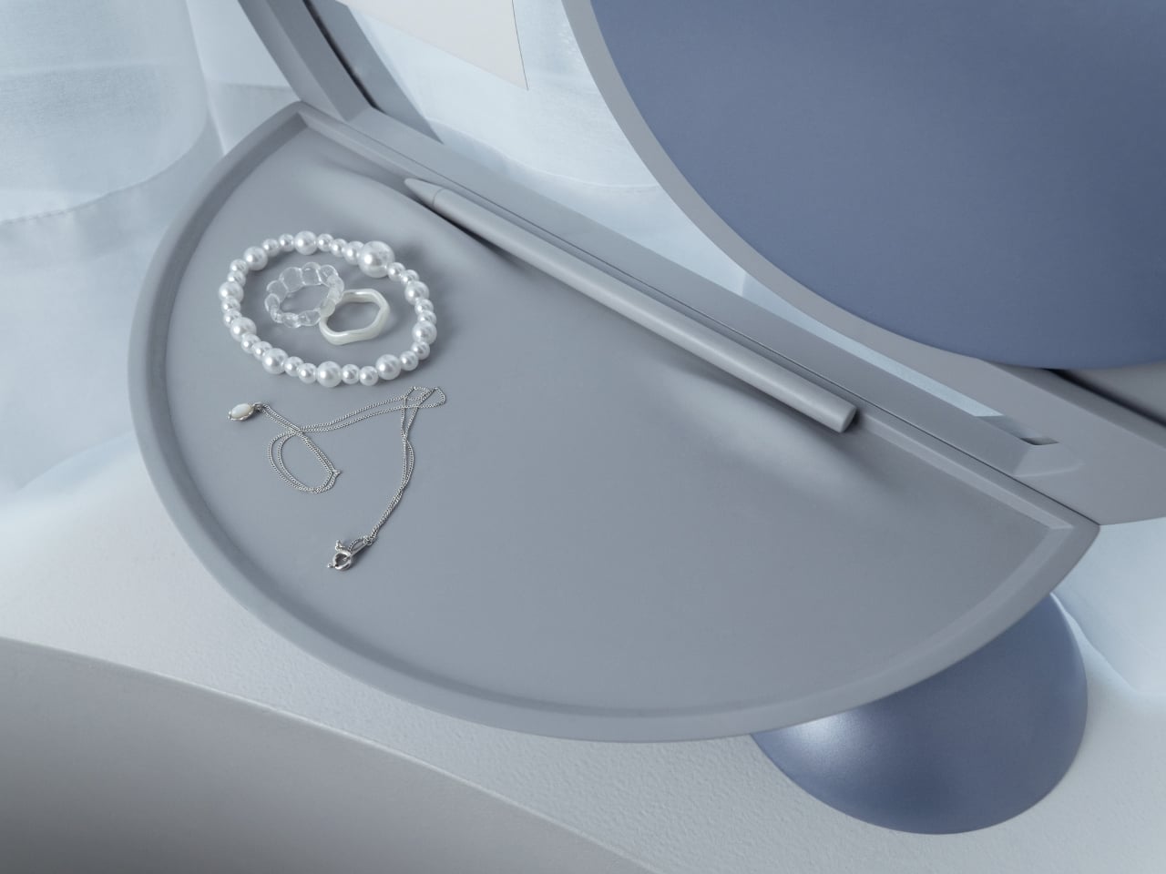
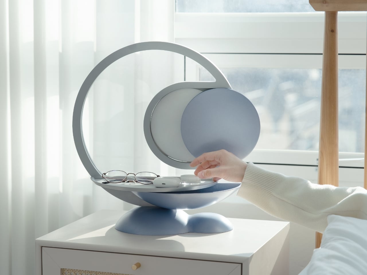
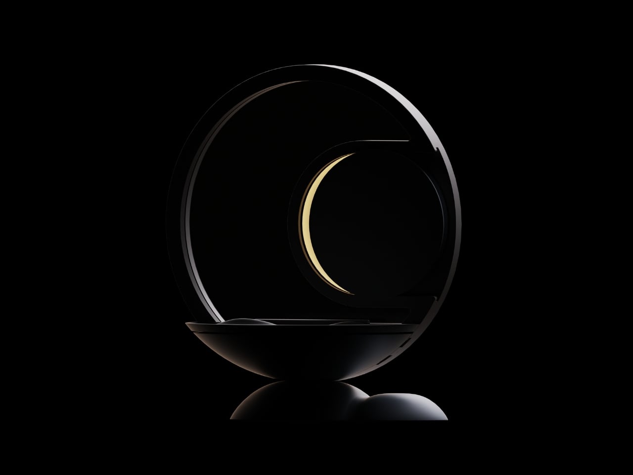
The design itself is remarkably soothing to look at. Kim built the entire aesthetic around soft curves and circular forms, which makes sense for something meant to bookend your day. The last thing you want on your nightstand is aggressive angles and harsh lines staring at you before bed or first thing in the morning. The lamp component arches over a shallow tray, creating this balanced, almost zen-like silhouette that wouldn’t look out of place in a boutique hotel or a carefully curated Instagram feed.

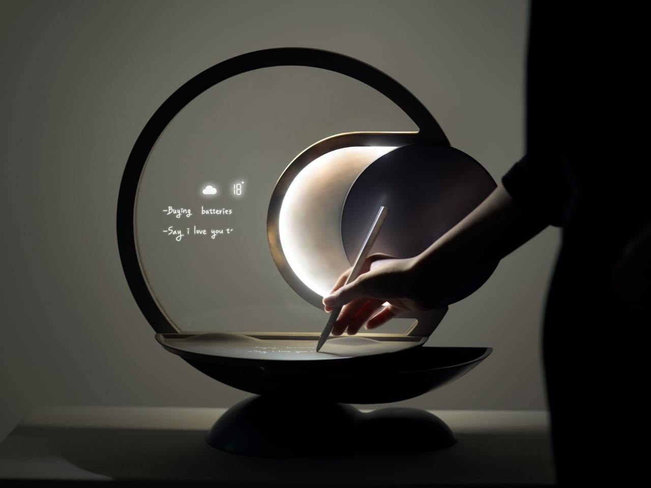
But the real cleverness is in how it works. Darling connects to your schedule and uses light cues to help you remember things. Place your everyday essentials in the tray before bed, and when it’s time to leave in the morning, the device uses flickering lights to remind you to grab what you need. It’s a subtle nudge rather than an alarm or notification, which feels refreshingly analog in our current era of constant pings and alerts.

The psychology behind it is solid too. Memory experts have long advocated for designated spots for frequently used items. When your keys always go in the same place, your brain doesn’t have to work as hard to remember where they are. Darling just makes that designated spot beautiful and adds a gentle technological reminder system to back up your muscle memory.

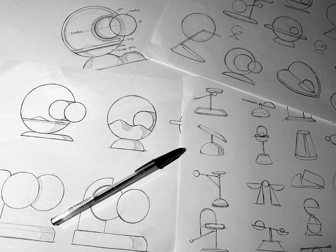
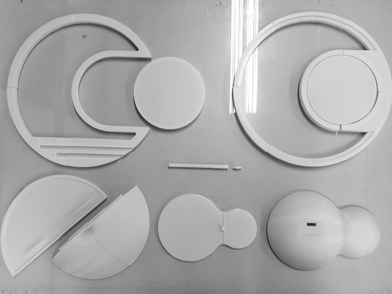
Looking at Kim’s development process, you can see the thoughtfulness that went into refining the concept. The sketches show dozens of iterations, each exploring different configurations of the circular theme. The prototyping photos reveal careful attention to how hands interact with the object, how the tray needs to be positioned, and how the lamp should cast light without being obtrusive.

What makes Darling particularly interesting in the broader design landscape is how it pushes back against the “smarter is better” mentality. We’re surrounded by devices that want to do everything, track everything, and connect to everything. Darling does exactly three things: it holds your stuff, it lights your space, and it reminds you not to forget. That restraint feels almost radical.

The concept also reflects a larger conversation happening in design circles about how technology should integrate into our most personal spaces. Bedrooms have become battlegrounds for sleep trackers, smart speakers, and charging stations for multiple devices. Darling suggests that maybe what we need isn’t more capability but more calm. A piece that helps us be slightly more organized without demanding we learn a new app or wade through settings menus.

Whether Darling makes it from concept to production remains to be seen. But as a design statement, it’s already doing important work. It reminds us that solving everyday problems doesn’t always require complex solutions. Sometimes you just need something beautiful that flickers at the right moment.

The post This Bedside Lamp Remembers Everything You Forget at 6 AM first appeared on Yanko Design.
This Aroma Diffuser Orb Floats Above Its Base and Glows at Your Touch

Most aroma diffusers behave like small plastic towers or pods that sit in a corner, quietly bubbling or misting away. They do their job, but they rarely feel like part of the room’s character, more like humidifiers with better marketing. It’s strange that scent and light are both mood tools, but the hardware behind them often looks forgettable enough to hide behind a plant or book.

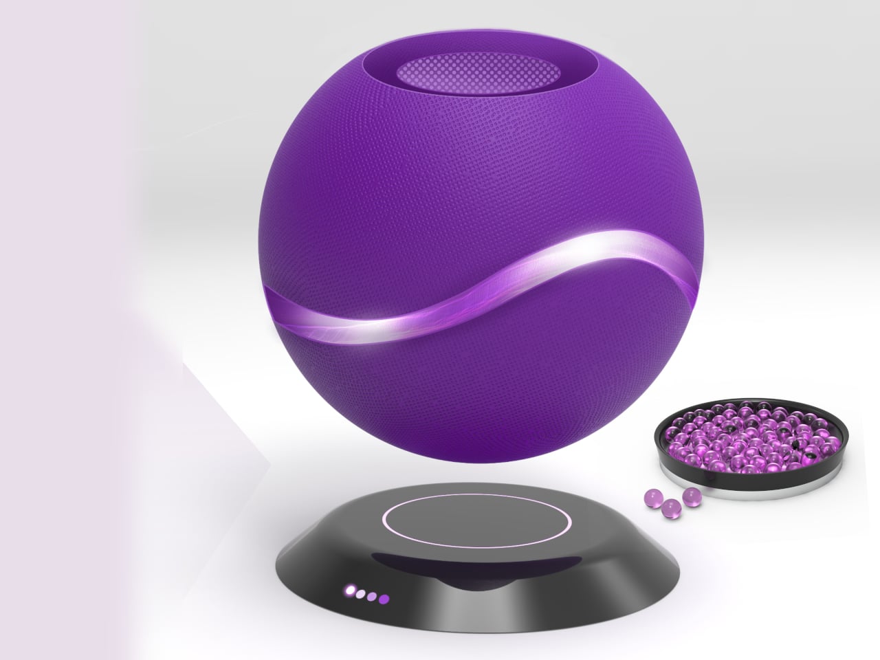
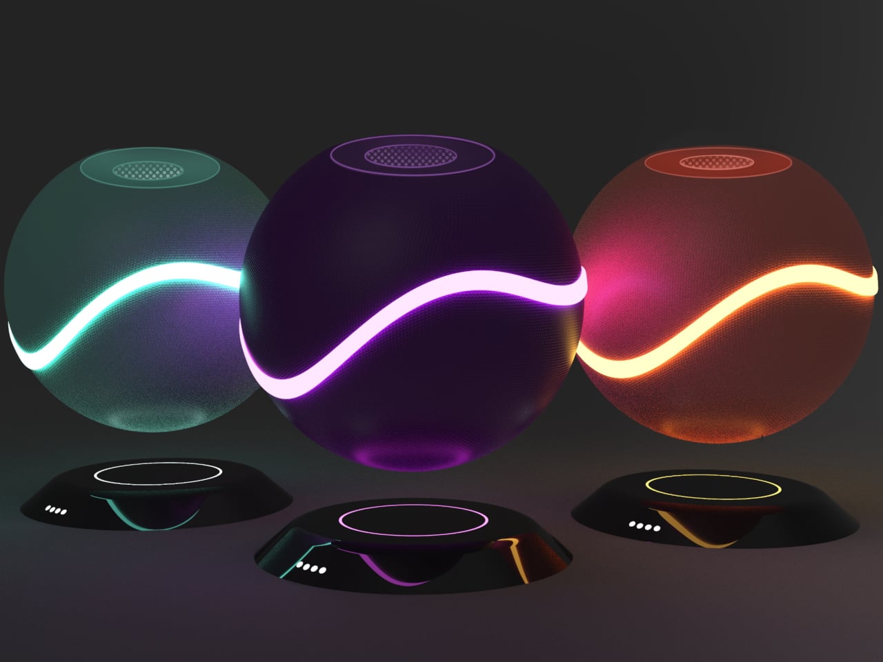
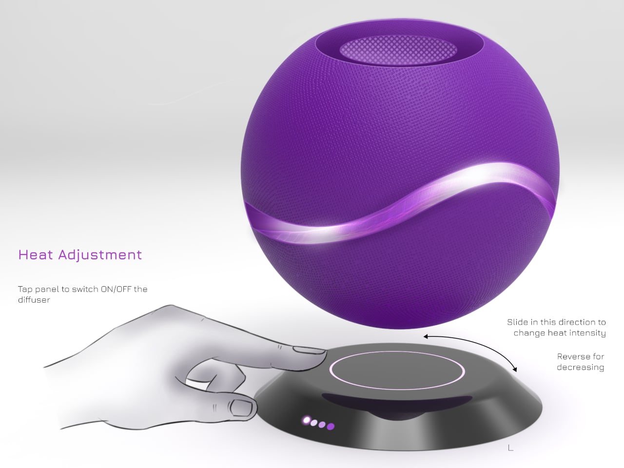
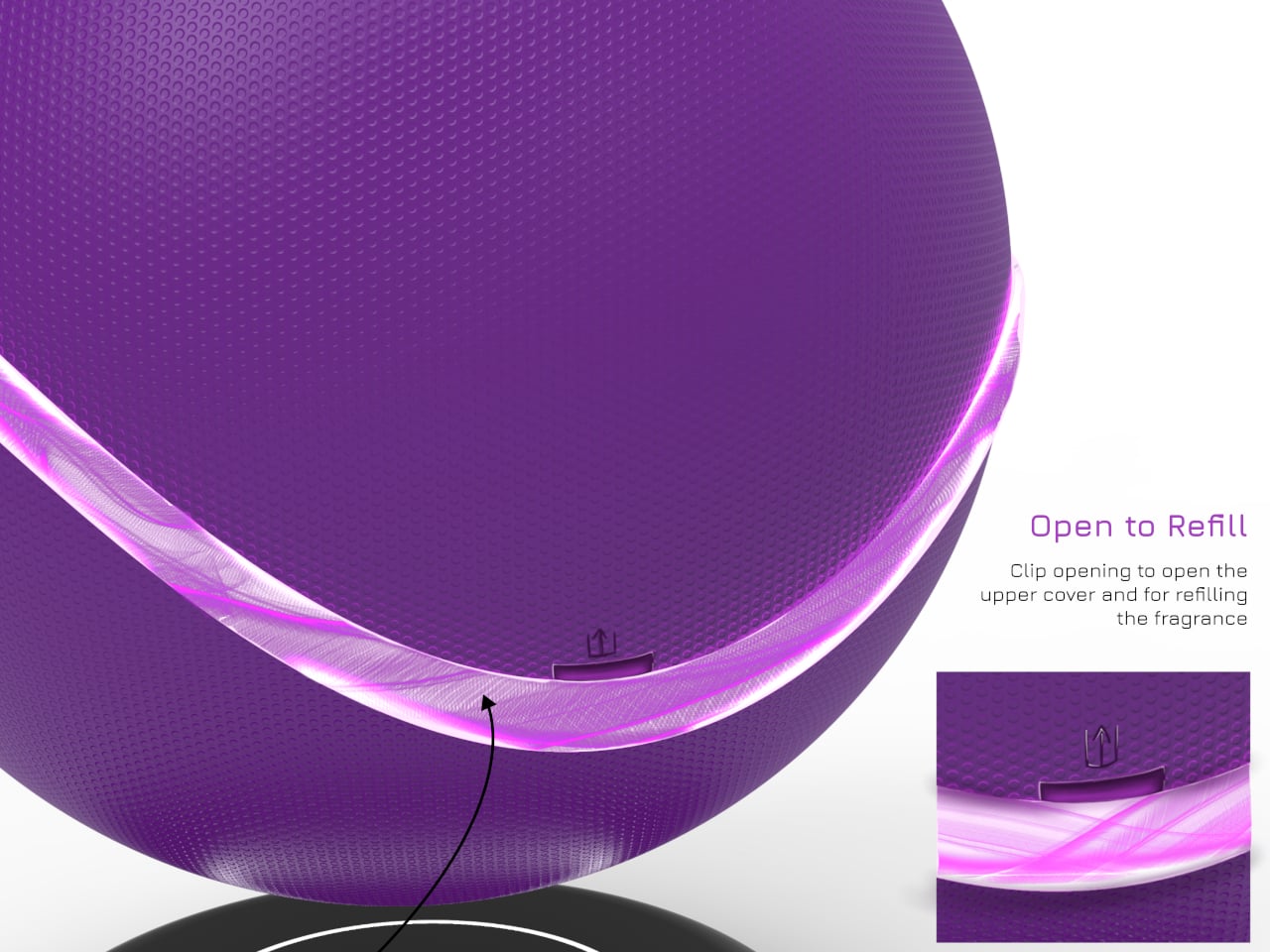
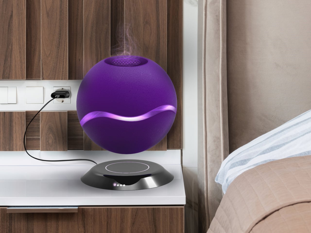
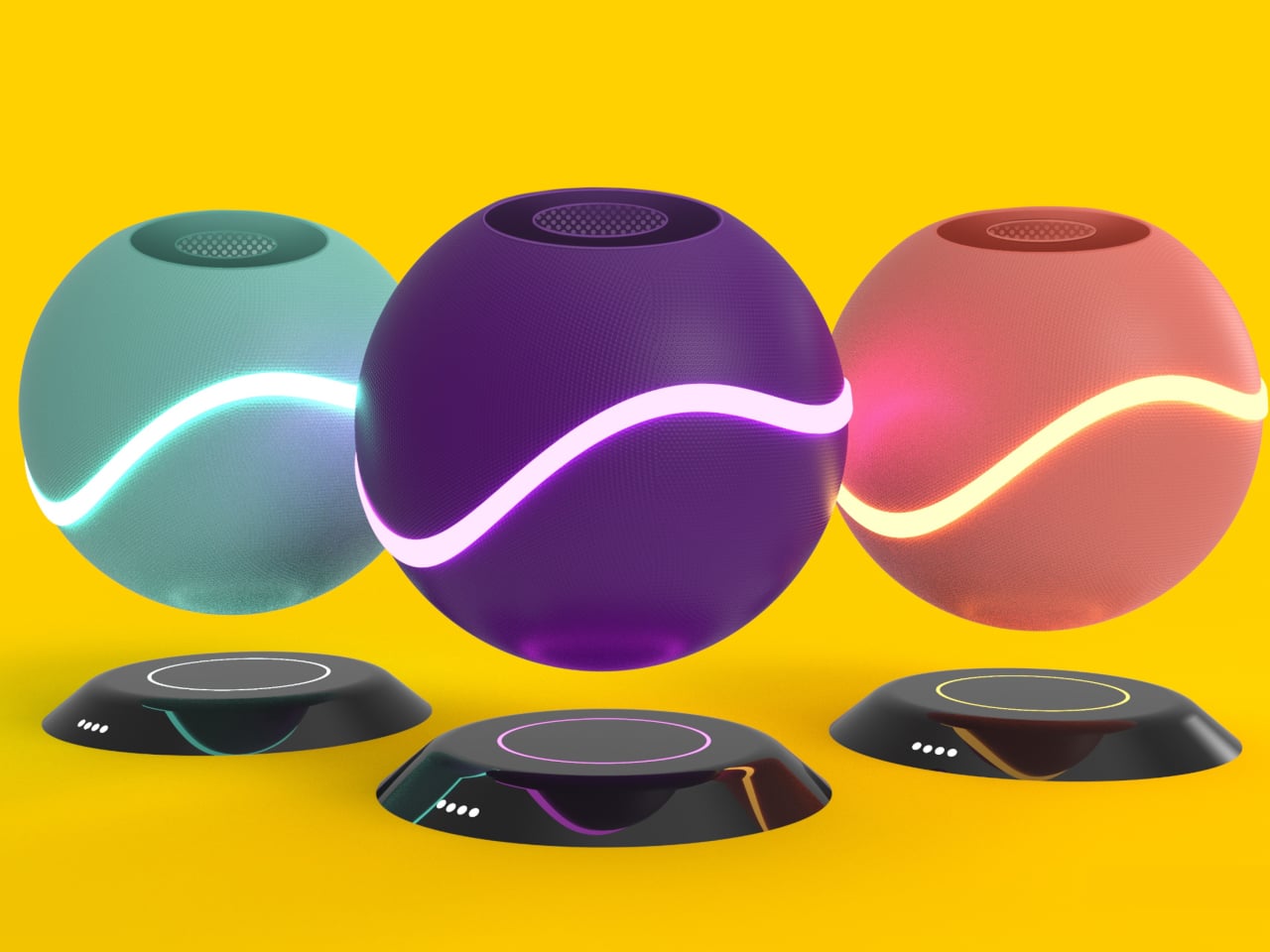
AER OMA is a magnetic levitating aroma diffuser concept that tries to make the act of scenting a room feel more deliberate. It uses a smooth spherical pod that hovers above a base, wrapped in a glowing band of light. The designer calls it a way to enhance room fragrance with a “futuristic feel,” which is rare copy that actually matches what the object looks like it wants to do.

Designer: Vedant Kore

Coming home in the evening, you tap the touch panel on the base to wake the diffuser, and the ring light comes up as the sphere steadies in mid-air. Sliding a finger along the control changes heat and aroma intensity, with the light ring quietly reflecting those changes. It feels less like fiddling with a dial and more like setting a scene before you sit down and let the day catch up.

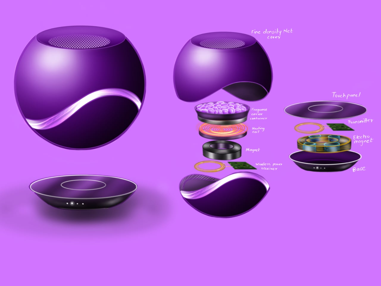
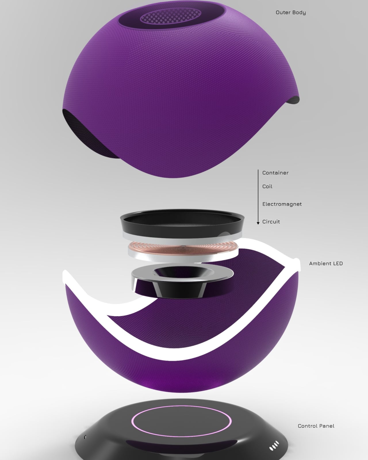
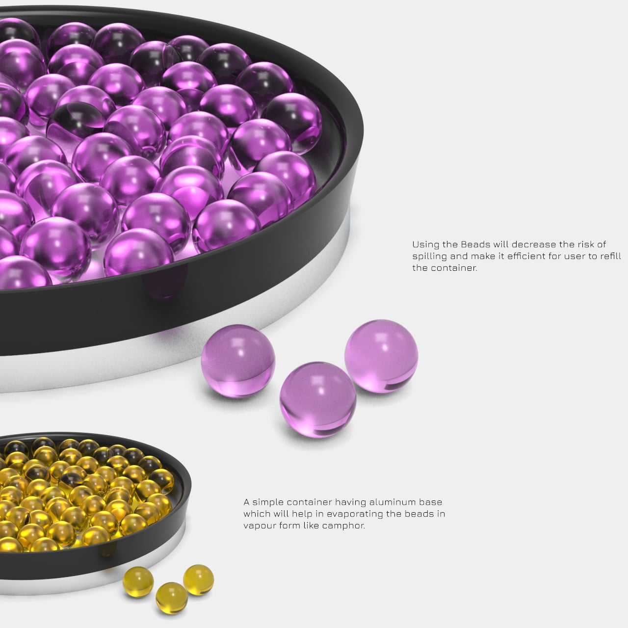
Instead of a water tank and essential oil puddles, AER OMA uses polymer aroma beads held in a small metal and mesh container. Heat from a roughly 12W element releases fragrance without spill risk, and refilling is as simple as swapping beads. You can choose a handful for a light scent or more for a stronger presence, making the ritual more tactile than just dripping liquid into a reservoir.

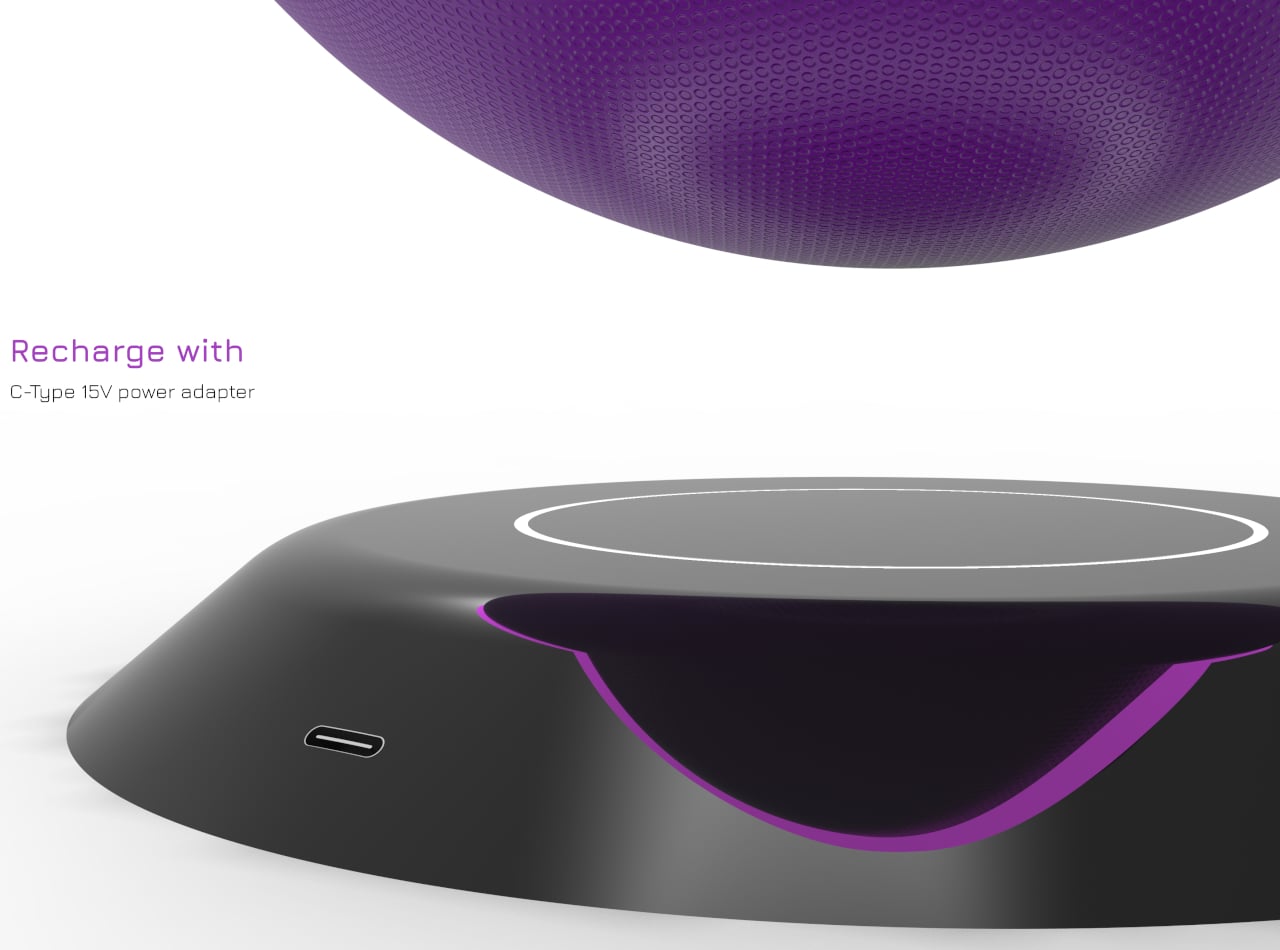
Magnets and coils in the base and sphere handle the hovering act, powered by a 12-15 V USB-C adapter, while ambient LEDs in the base ring and the band around the sphere handle the glow. The floating form and soft light sell the idea that scent is something weightless moving through the room, not just vapor coming out of a nozzle buried in plastic.

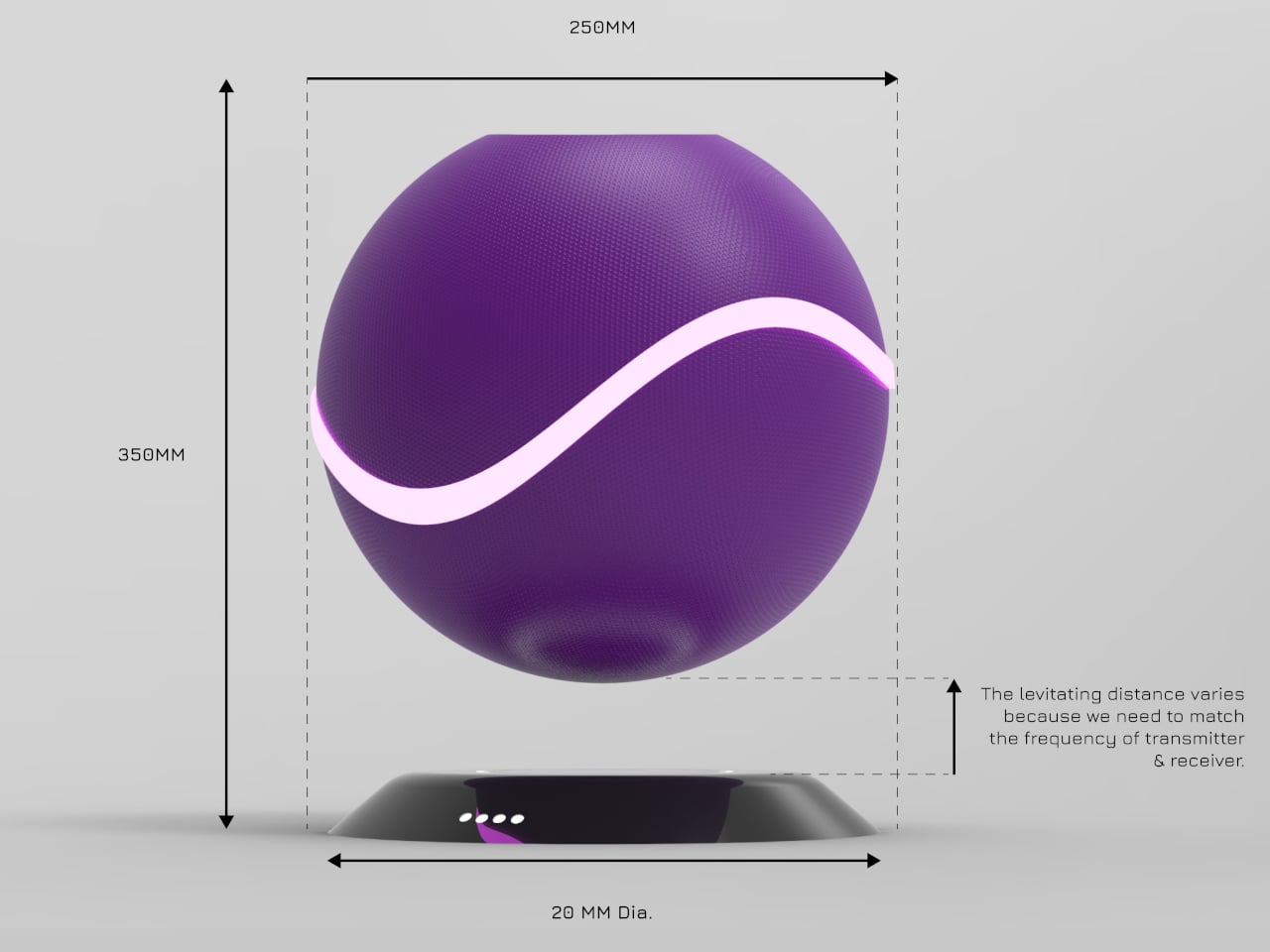
The sphere is about 250mm across, the base around 200mm, with a polypropylene or ABS shell molded into smooth curves. Color options range from deep purple to teal and warm orange, each with matching light accents. It’s big enough to be a focal object on a sideboard or bedside table, but still reads as a single, calm shape rather than tech bristling with vents.

AER OMA treats scent diffusion as a small performance instead of a background process. By floating the diffuser, hiding the mechanics, and giving you a simple touch strip and a bowl of beads to work with, it reframes a functional task as a quiet ritual. It’s a reminder that even making a room smell nice can feel different when the object doing it looks like it belongs in the future instead of the back corner of a shelf.

The post This Aroma Diffuser Orb Floats Above Its Base and Glows at Your Touch first appeared on Yanko Design.
Color One Square Each Week and Watch 80 Years Fill with Your Story

Weeks in a relationship or life blur together. You remember birthdays and trips, but the quiet in‑between time mostly stays invisible. We track deadlines and appointments on digital calendars, but rarely see the whole arc of a shared life at once, the years you’ve already moved through and the ones still sitting empty ahead. There’s something oddly powerful about seeing every week you have, and have had, laid out in one place on a wall.

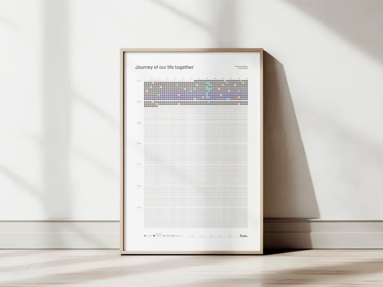
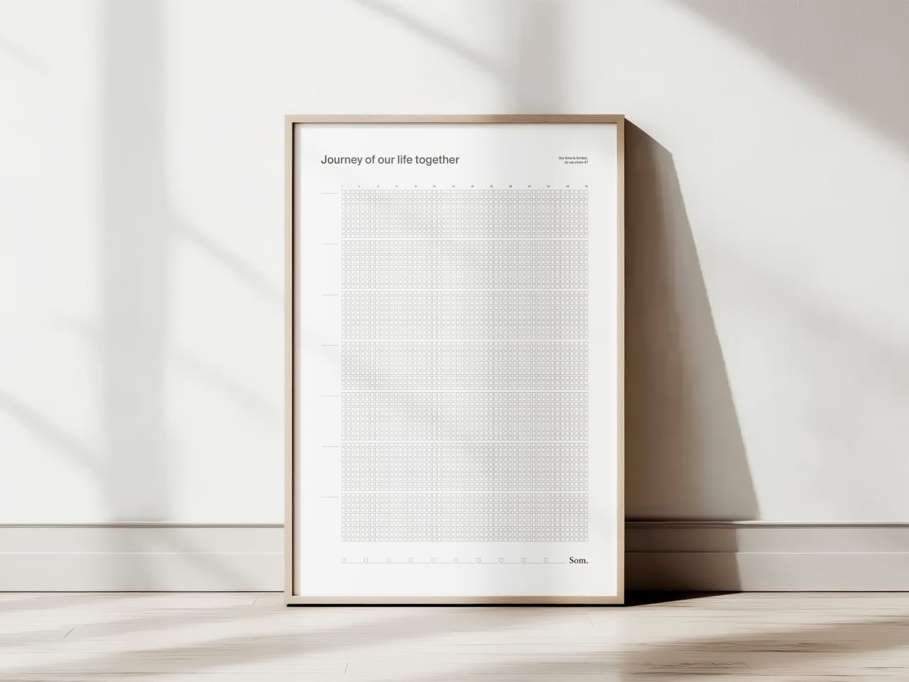
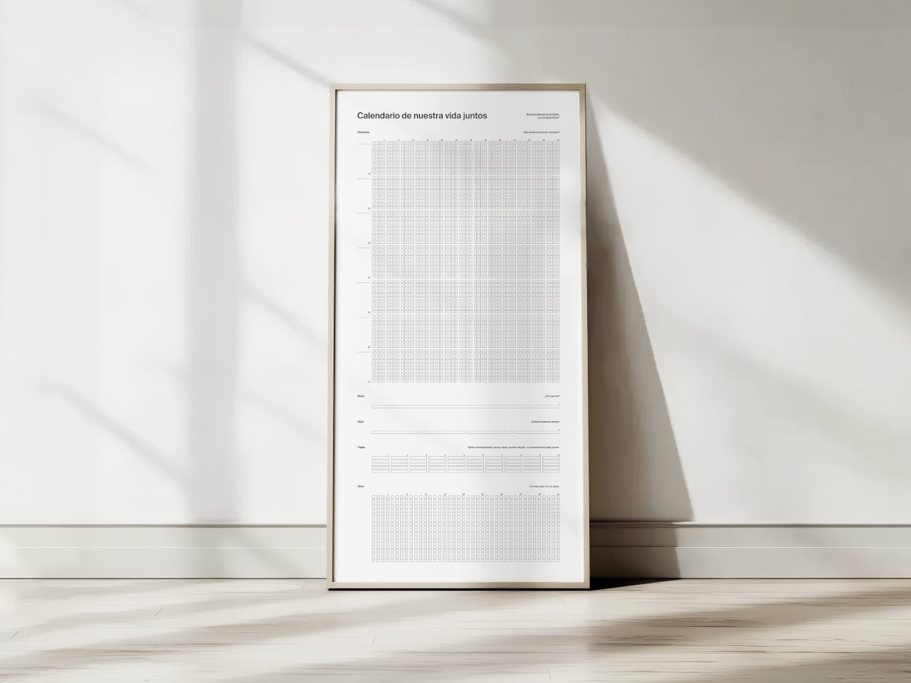
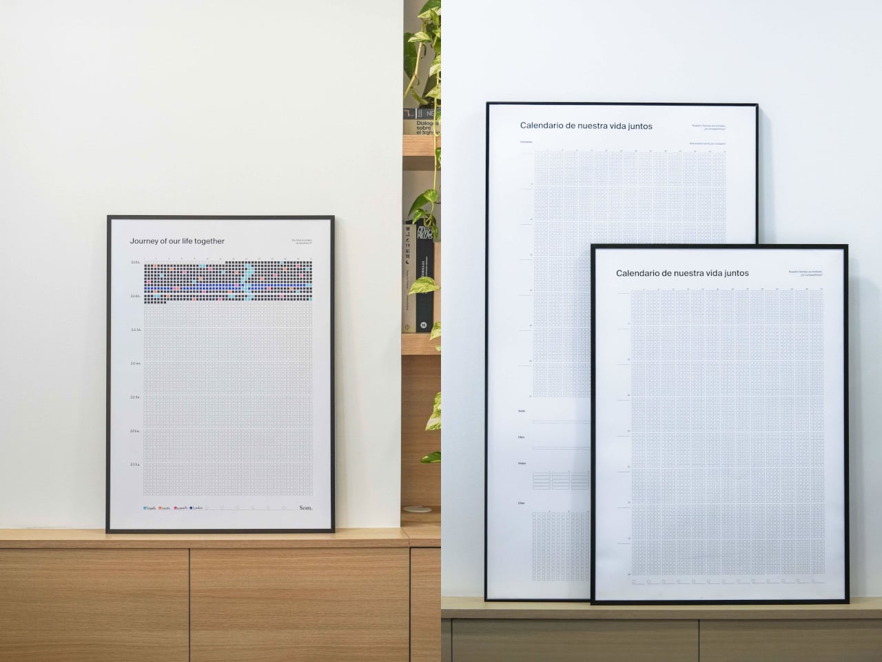
NOS Calendar by Som by Mos is a weekly calendar that celebrates shared life rather than meetings or deadlines. Each square is a week, each row is a year, and each block is a decade, printed on a 50cm x 70cm poster that covers more than 80 years. It’s sold under the tagline “our time is limited, shall we share it?”, which is a very different brief from “get more done” or “optimize your schedule.”

Designer: David Grifols (Som by Mos)

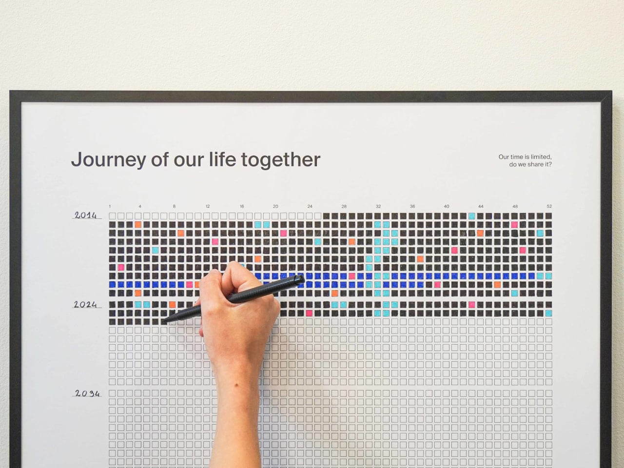
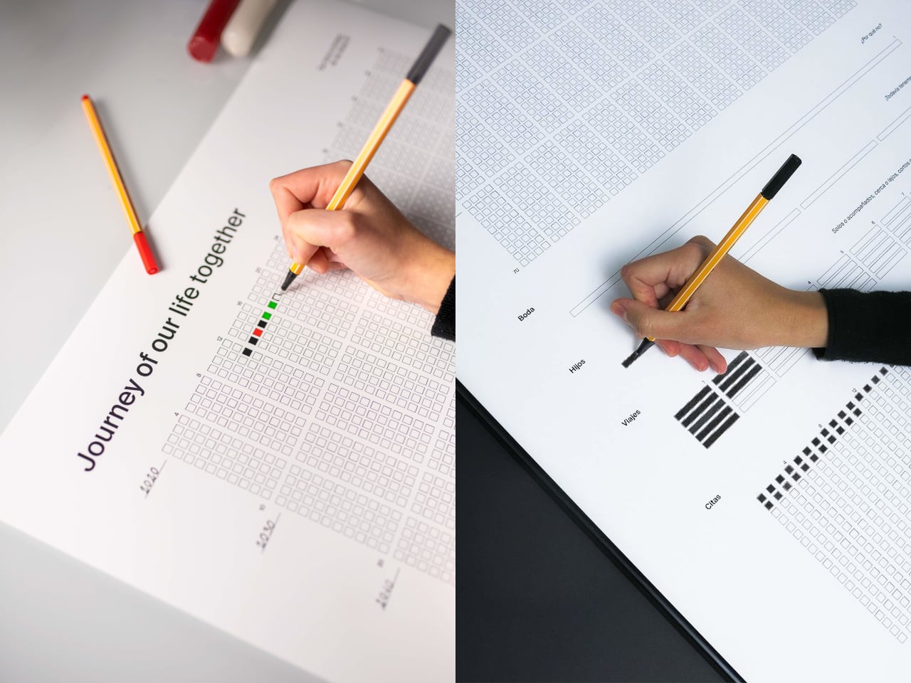
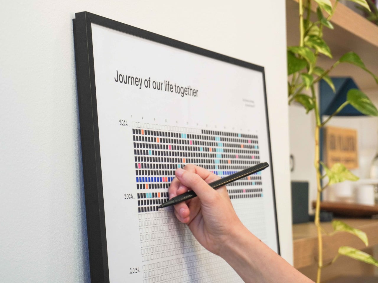
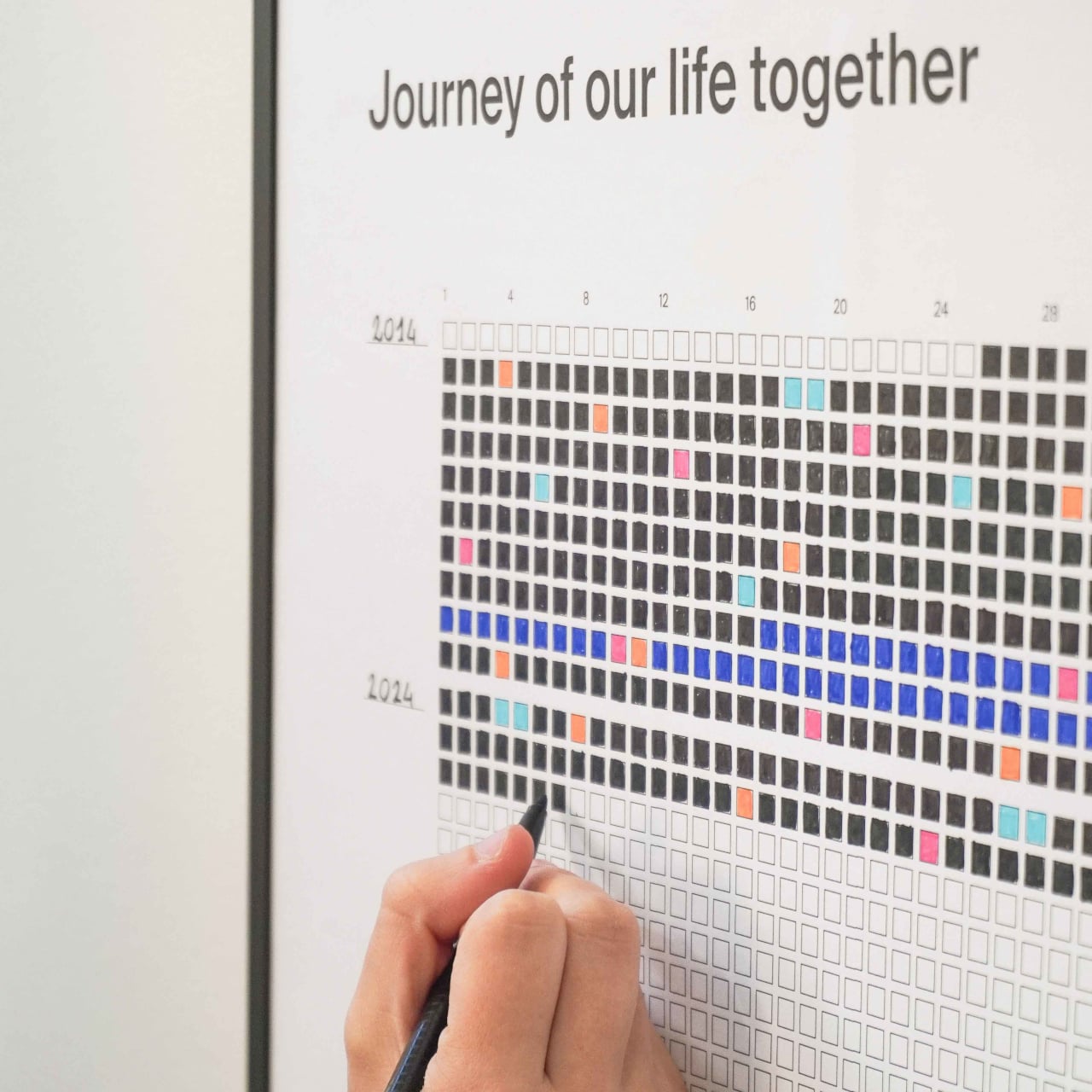
The image of a couple or close friends unrolling a poster, finding the week their story began, and coloring that first square sounds a little romantic. Every week after that, they fill in another box, sometimes with a simple color, sometimes with a shade that matches a key moment like a trip or a move. The act is small, a few seconds with a pen, but it becomes a quiet check‑in on how time is passing together rather than just another task.

The grid works simply enough. You’ve got 52 columns for weeks, rows for years, and decade blocks that make long stretches of time visible. A strip at the bottom acts as a legend, where you assign colors to things that matter: trips, moves, new jobs, losses, whatever you decide. Over time, the poster becomes a code only you understand, a visual index of your shared history that nobody else can read.

1

Seeing 80 years of weeks on a wall changes your sense of scale. The empty squares make future time feel both generous and finite, while the filled ones remind you that a lot has already happened. It’s less about planning the next week and more about noticing that this one exists, that you’re somewhere in the middle of a grid that’ll eventually be full whether you pay attention to it or not.

Of course, the minimalist design matters. The clean grid, the simple headings like “Journey of our life together” in English, Spanish, or Catalan, and the durable paper meant to last decades in a frame all keep it neutral. Your colors and notes do the talking, which makes it easier to hang in a living room without it screaming “productivity chart” at everyone who walks by.

NOS sits somewhere between art, journal, and commitment device. It doesn’t tell you how to spend your weeks; it just refuses to let them stay invisible. The idea of tracking life without another app or notification, just a poster that slowly fills with color as you move through years together, is a surprisingly gentle way to remember that time is limited, and that you chose to share it with someone worth coloring squares for.

The post Color One Square Each Week and Watch 80 Years Fill with Your Story first appeared on Yanko Design.
This Practically Bulletproof Titanium Travel-Case Makes Your ‘Fragile’ Luxury Luggage Look Cheap

Aluminum dents. That is the trade you accept with most “premium” luggage. The grooves look great in the lounge, then a few trips later you are quietly cataloguing every new crease and corner hit. You can baby it, you can wince every time it goes into an overhead bin, but eventually the shell starts to look tired. Premium luggage, economy behavior.

Titanium changes the terms of that deal. AERIONN Forma treats aluminum the way iPhone Pro treats the regular iPhone: same category, different league. Apple moves the Pro models to titanium because it signals intent and performance in one move. Forma does the same. It uses certified Grade 1 titanium for the shell, formed as a single continuous body, so the case flexes under impact and returns to shape instead of locking in dents. It is the “Pro” material choice for people who live in airports and prefer their luggage to age, not degrade.

Designer: AERIONN

Click Here to Buy Now: $499 $1799 (72%). Hurry, only 3/688 left! Raised over $654,000.

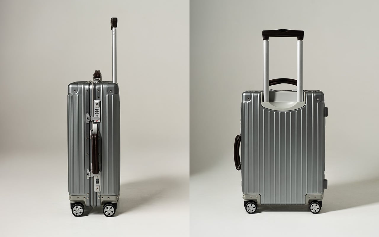
There’s a specific moment frequent travelers recognize. You’ve got lounge access, priority boarding, a seat that actually reclines, and you’re pulling luggage designed to be replaced in a few years. First class isn’t just a ticket, it’s a standard. AERIONN Forma was designed for travelers who understand that distinction. The Milanese design shows restraint where most luggage shows decoration. Clean architectural lines, a matte brushed titanium surface that resists fingerprints and develops subtle patina over time. The kind of wear that looks earned rather than abused. Leather-wrapped handles add warmth without competing for attention. This case looks like it belongs in the first-class cabin, carried by someone who travels often enough to know visible damage shouldn’t be part of the premium experience.

Apple uses aluminum for the standard iPhone. The Pro models get titanium. Same exact decision tree applies here. Titanium signals intent. It’s a more precious material than aluminum, harder to source, more expensive to work with, and significantly more durable under real-world stress. Grade 1 commercially pure titanium meets ASTM B265-15 certification standards, with tensile strength in the 290 to 310 MPa range, significantly higher than aluminum alloys used in luxury luggage. The shell has undergone thousands of repeated drop tests, bending tests, ultrasonic inspection, and dimensional verification. The testing isn’t about proving indestructibility, it’s about ensuring resilience under conditions where aluminum would show permanent damage. Titanium flexes to absorb impact, and only shows signs of wear and tear with rough use. Aluminum dents easy… and it stays dented.

The single continuous shell construction eliminates seams and structural weak points. Despite using industrial-grade material, the case weighs 4kg with weight distributed evenly across the entire structure. Lift it into an overhead bin and the weight doesn’t fight you. Roll it through a terminal and it tracks cleanly without pull or wobble. That movement comes from the AIRMOVE dual spinner wheels, engineered for low drag and quiet operation. No rattle, no vibration, just smooth motion that keeps pace instead of slowing you down. The multi-stage telescopic handle extends smoothly and locks firmly, with leather-wrapped touchpoints that feel substantial. Good luggage disappears during travel, requiring no conscious effort to manage.

Security is handled without zippers, which remain the most common failure point in luggage. A precision TSA latch system sits flush with the titanium shell, allowing inspections without damage while removing fabric, teeth, and stress points entirely. It’s invisible when closed, dependable when needed. Metal latches integrated into aerospace-grade titanium don’t have the failure modes that plague zipper-based systems. The TSA-approved combination lock integrates directly into the shell. No exposed mechanisms, no added bulk, no interruption to the clean form. This approach to security makes the case look refined while actually being more secure than conventional designs.

The matte brushed titanium surface does something interesting over time. It develops a natural patina that reflects use without looking damaged. Fingerprints don’t show. Minor contact marks blend into the finish rather than standing out. After years of travel, the surface tells a story without looking beaten up. This separates objects you keep from objects you replace. Titanium naturally resists corrosion, so the shell maintains structural integrity without protective coatings or finishes that eventually wear through. Temperature extremes don’t compromise strength. A precision-fit silicone seal keeps water out, protecting belongings from rain and splashes during transit. The case is designed to be used repeatedly and to look better for it.

The interior uses a dual-compartment layout that keeps packing organized from departure to arrival. Compression straps on one side secure clothing and minimize wrinkles. A full divider panel on the other side contains shoes, toiletries, and essentials. Integrated pockets hold smaller items so you’re not digging through layers to find what you need. The durable nylon lining wipes clean easily and holds shape after repeated use. Nothing flashy, nothing wasted. Dimensions are 55 x 36 x 23 cm, fitting standard airline carry-on requirements while offering 38L capacity. The layout supports efficient packing and easy access, which matters when you’re moving through multiple cities in compressed timeframes.

For EDC enthusiasts and design-focused travelers, durability is status. Knowing your carry-on can handle abuse that would destroy conventional luggage is the quiet flex. Soft-shell Samsonite is lighter, cheaper, and never dents because it’s designed for economy class standards. It won’t be noticed from ten feet away and it won’t give you the VIP feeling that comes with carrying something genuinely exceptional. Titanium luggage exists in a different category entirely. It’s luggage meant to last decades, not seasons. The buy-once philosophy changes the economics. A $1,500 aluminum case that needs replacement after five years costs more over time than a $1,799 titanium case that lasts twenty years. Longevity becomes luxury when the alternative is planned obsolescence.

AERIONN Forma is currently available with Super Early Bird pricing at $499, Early Bird at $699, and a two-pack bundle at $975. Standard retail pricing is $1,799. Shipping begins July 2026, with fulfillment handled globally. Aluminum carry-ons from established luxury brands typically range from $1,200 to $1,700 depending on size and features. Titanium luggage rarely appears in this segment, and when it does, pricing usually exceeds $2,000. Early pricing positions aerospace-grade materials as accessible for travelers who recognize that upfront cost matters less than total cost of ownership. This case represents a shift in how premium luggage gets engineered and priced.

Click Here to Buy Now: $499 $1799 (72%). Hurry, only 3/688 left! Raised over $654,000.

The post This Practically Bulletproof Titanium Travel-Case Makes Your ‘Fragile’ Luxury Luggage Look Cheap first appeared on Yanko Design.
This Concept Makes Reading a Physical Ritual, Not an App Reminder

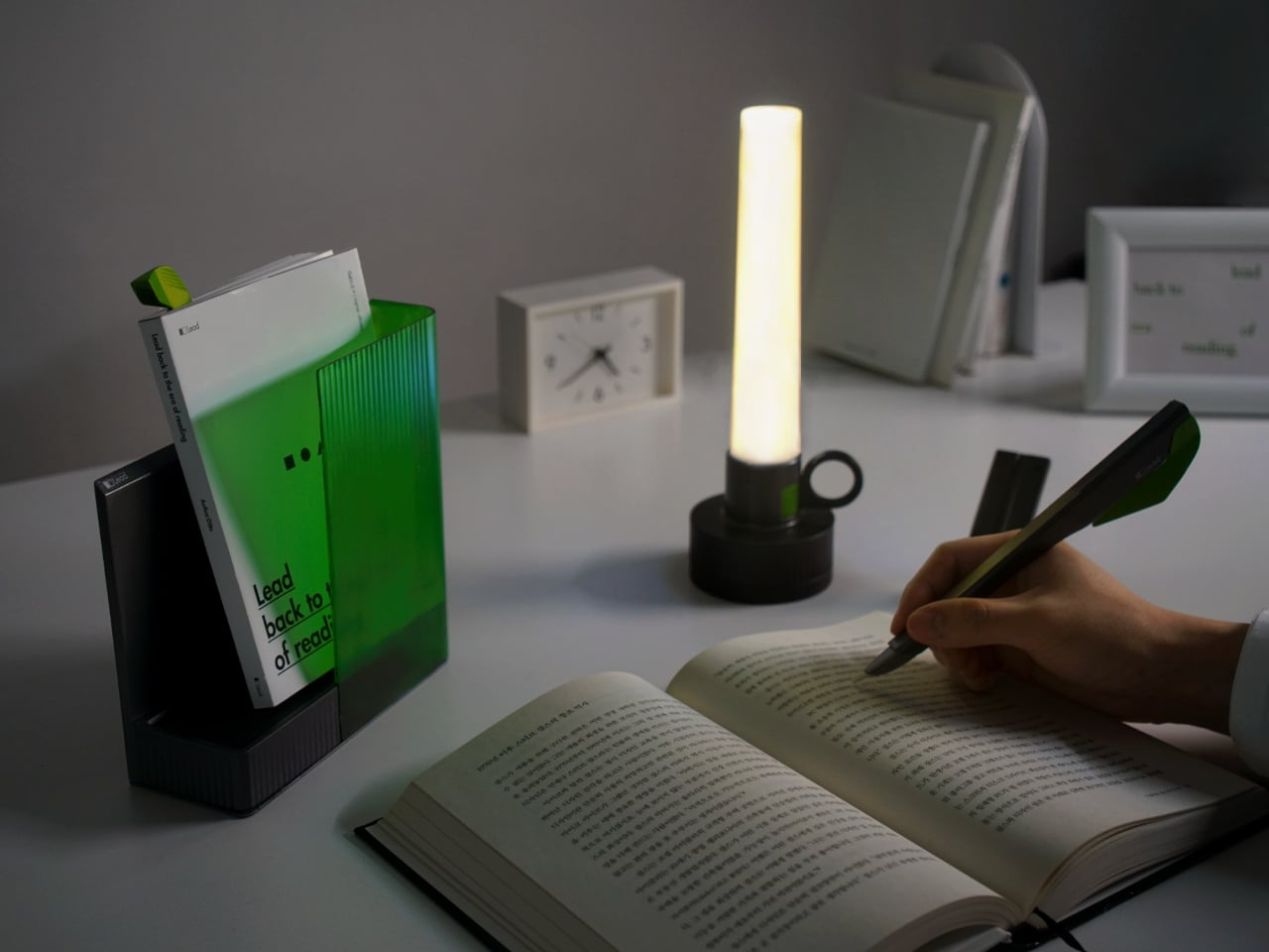
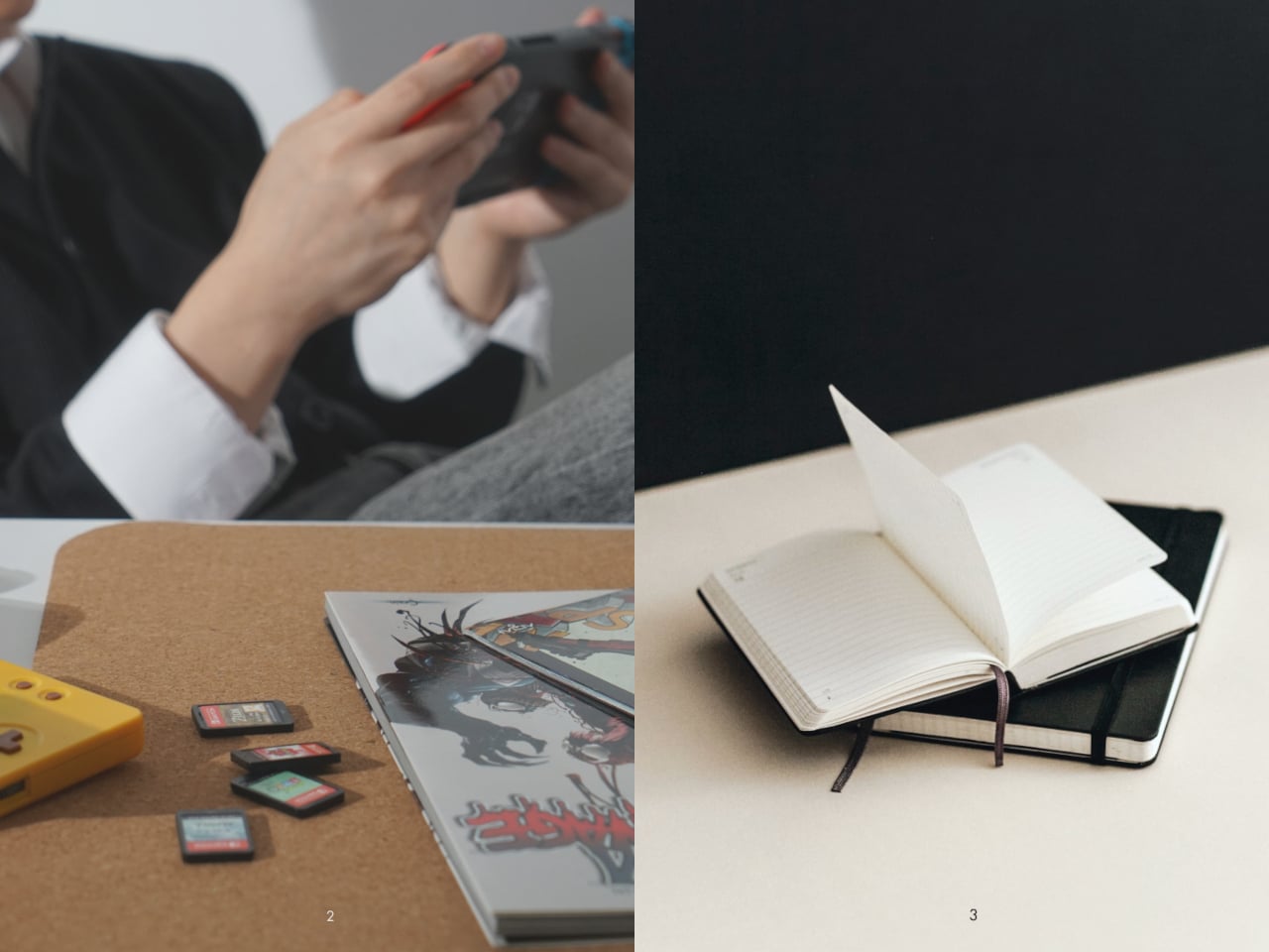
The intention to read a physical book more often usually gets buried under phones, streaming, and vague guilt about never finishing that stack on the nightstand. Reading is not just opening a book; it is a whole arc from deciding to start to actually making it through chapters without drifting away. Lead is a small family of objects designed to sit around a book and quietly support that arc.

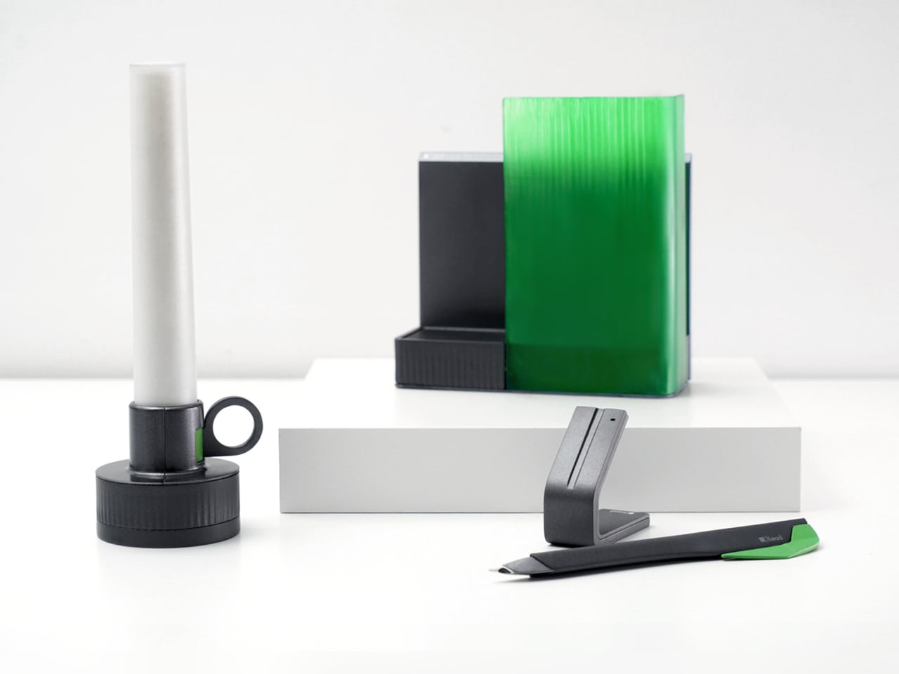
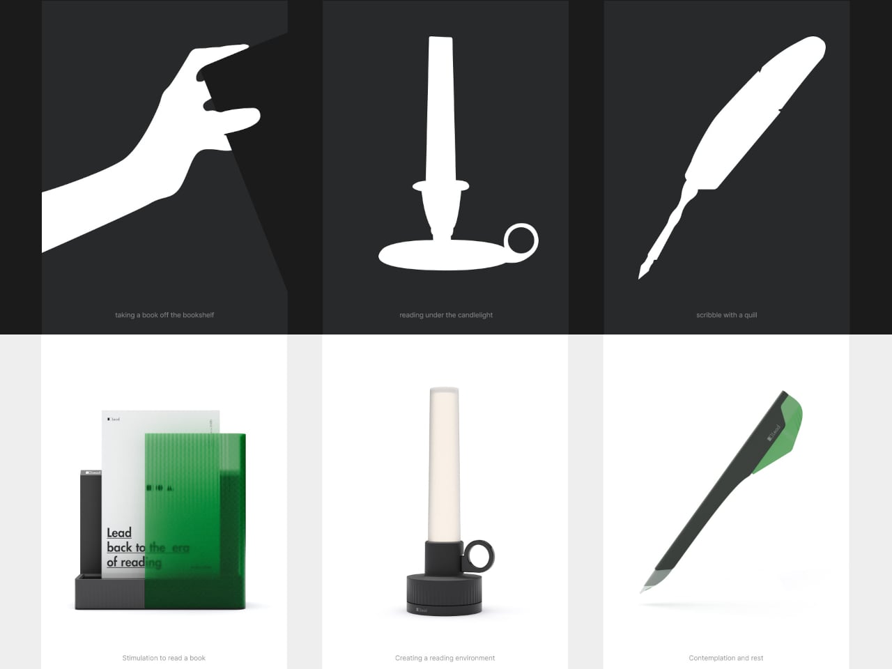
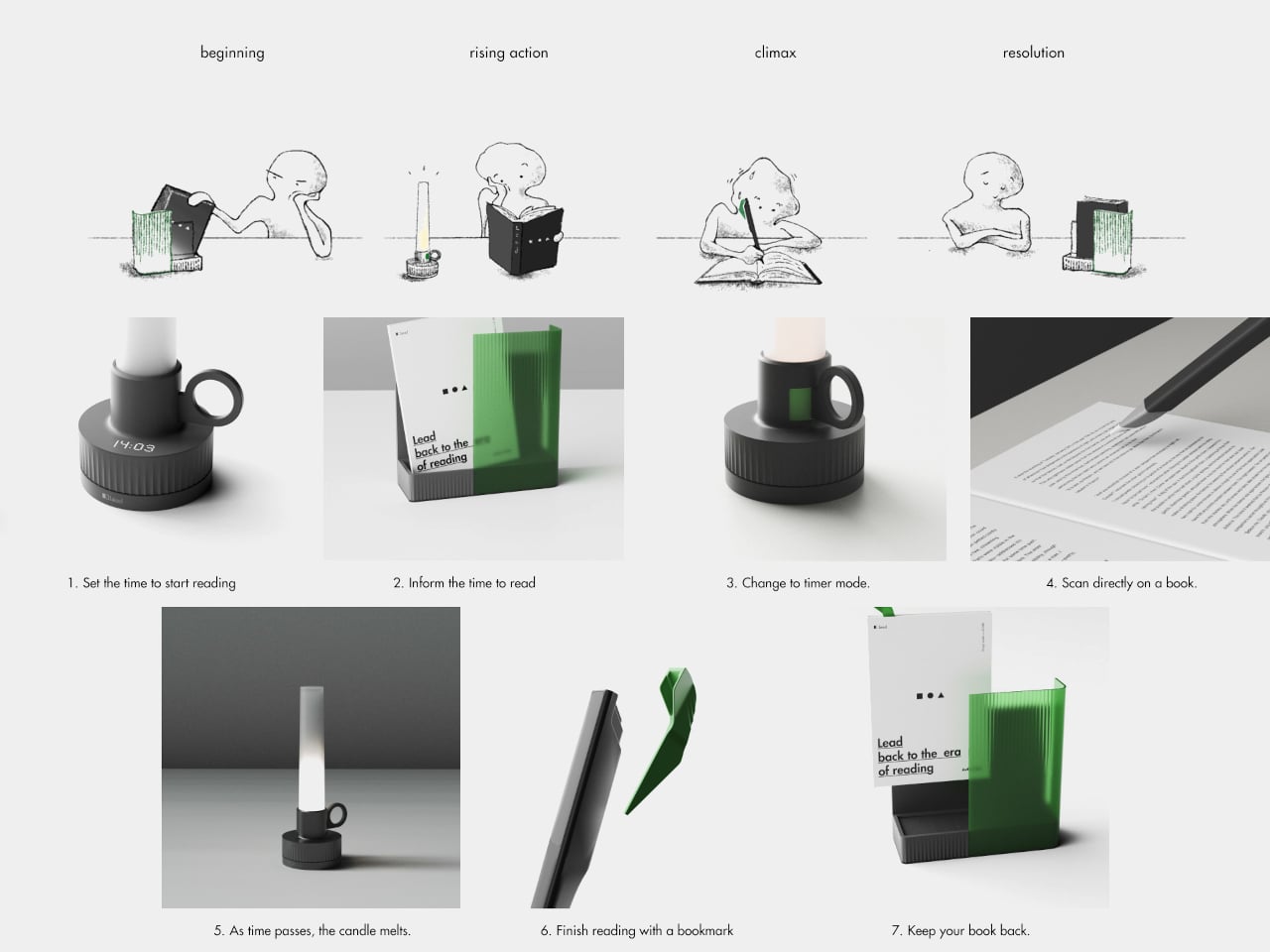
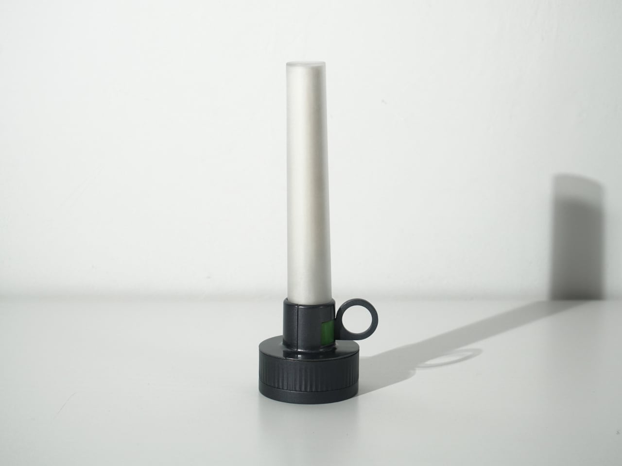
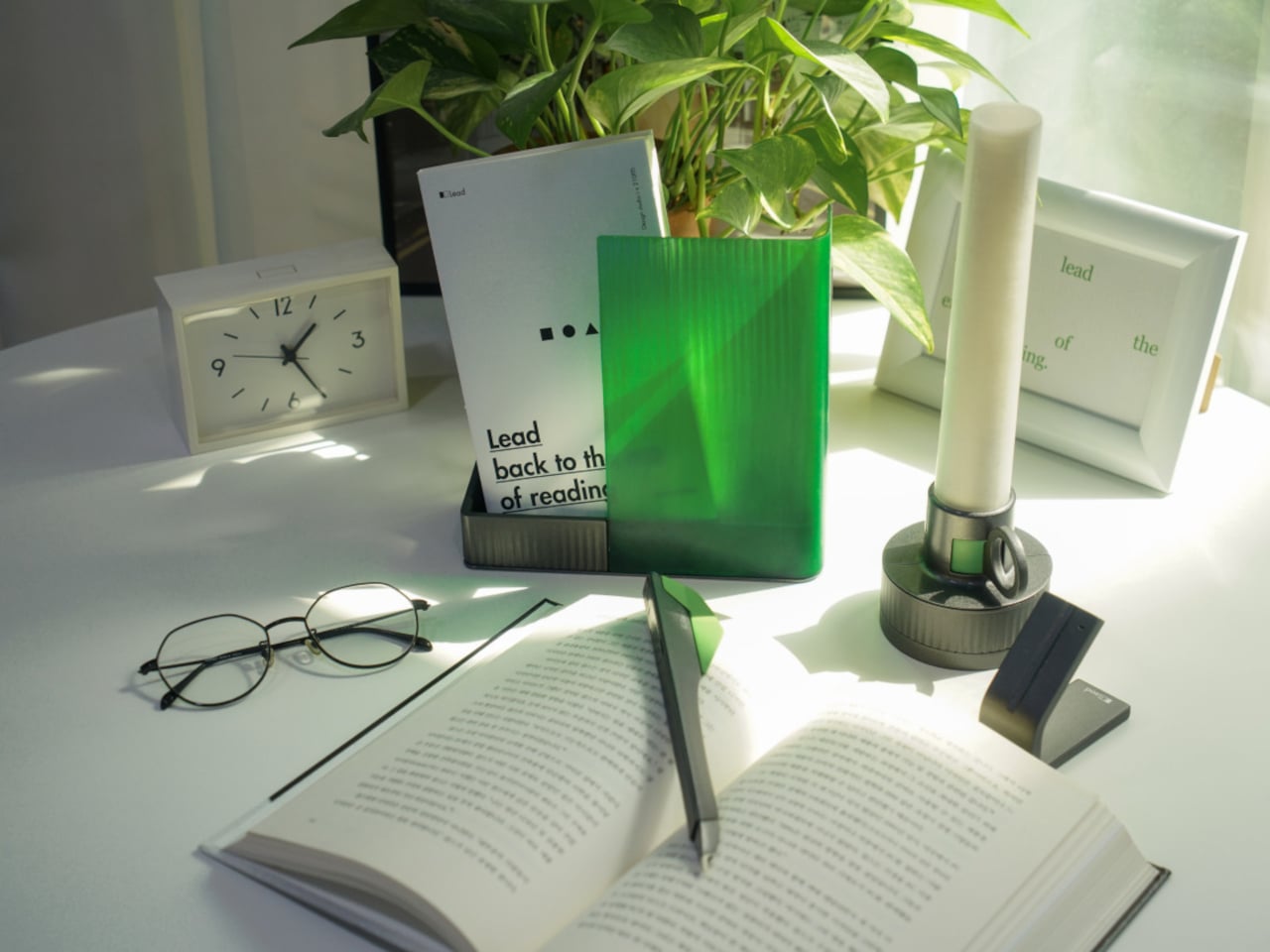
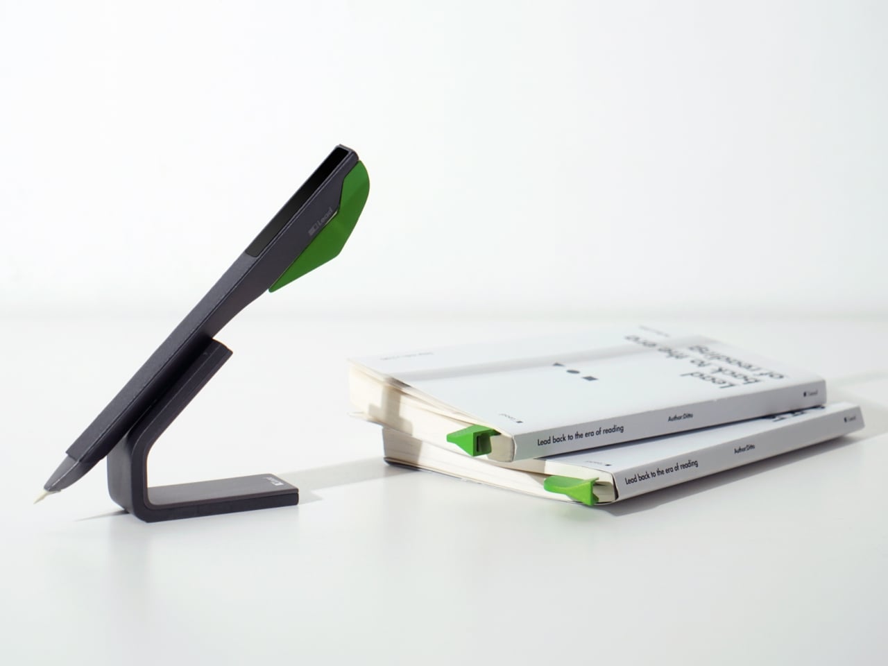
Lead is a design concept that treats reading as a story with a beginning, rising action, climax, and resolution. The name is a contraction of “Let’s read” and the first word of the slogan “lead back to the era of reading,” and the system uses three products, Bookeeper, Candle, and Quill, to give each phase of a reading session its own physical cue instead of relying on app notifications you will probably dismiss.
Designers: Yoo Chaeyeon, Kwon Eui Hwan, Yang Jinoo, Lee Sooyeon, Ha Seongmin

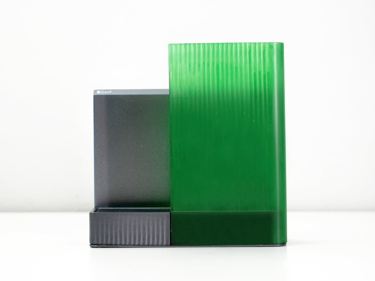
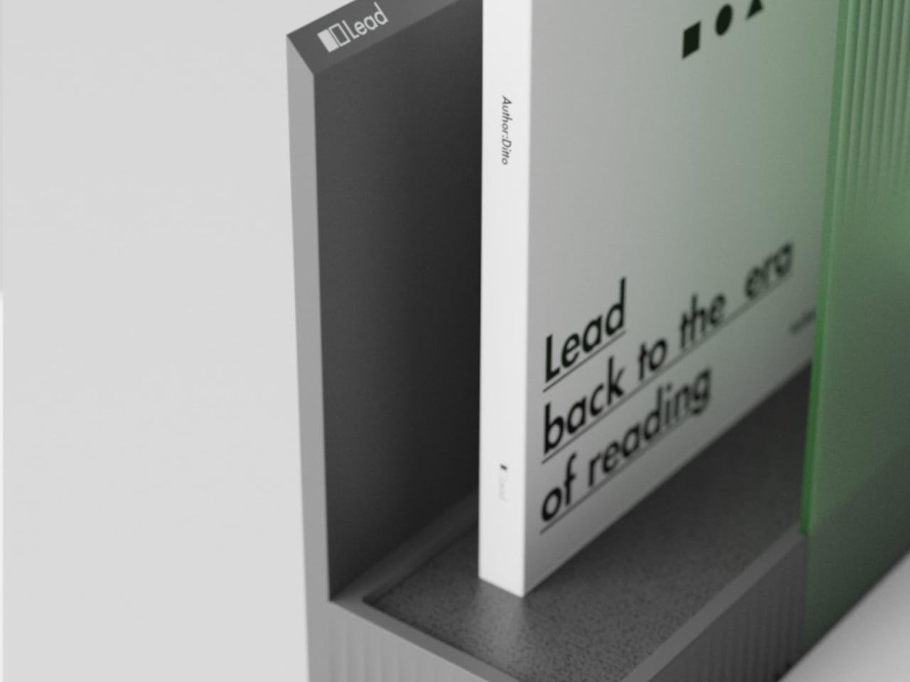
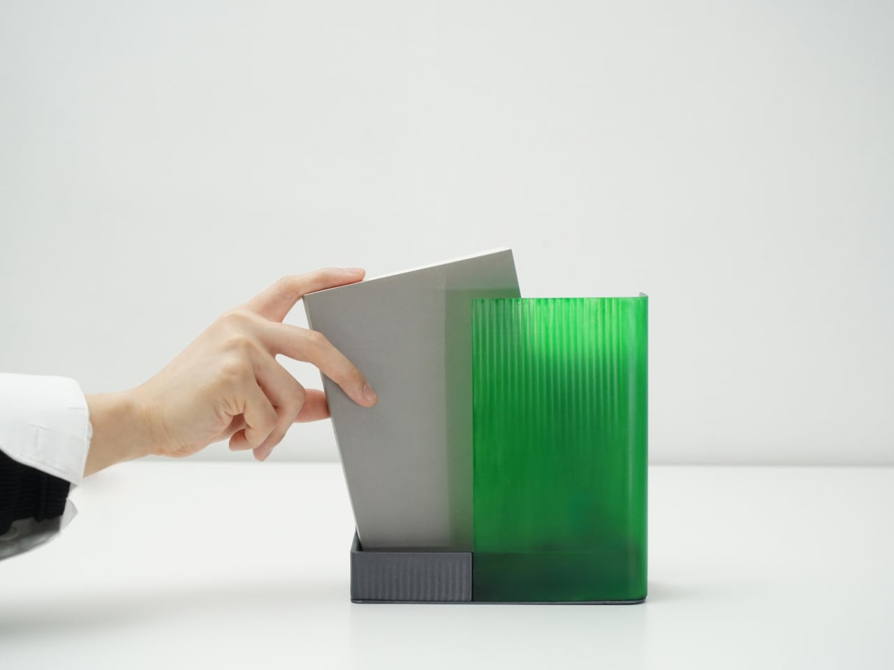
Coming home, you drop your book into Bookeeper, where it sits hidden behind a calm green panel. Earlier, you set a time to read, and as that moment approaches, the base lifts and the book slowly emerges from behind the screen. Instead of a phone notification buzzing and vanishing, the book itself appears, a quiet reminder that this is the slot you promised yourself you would actually use.
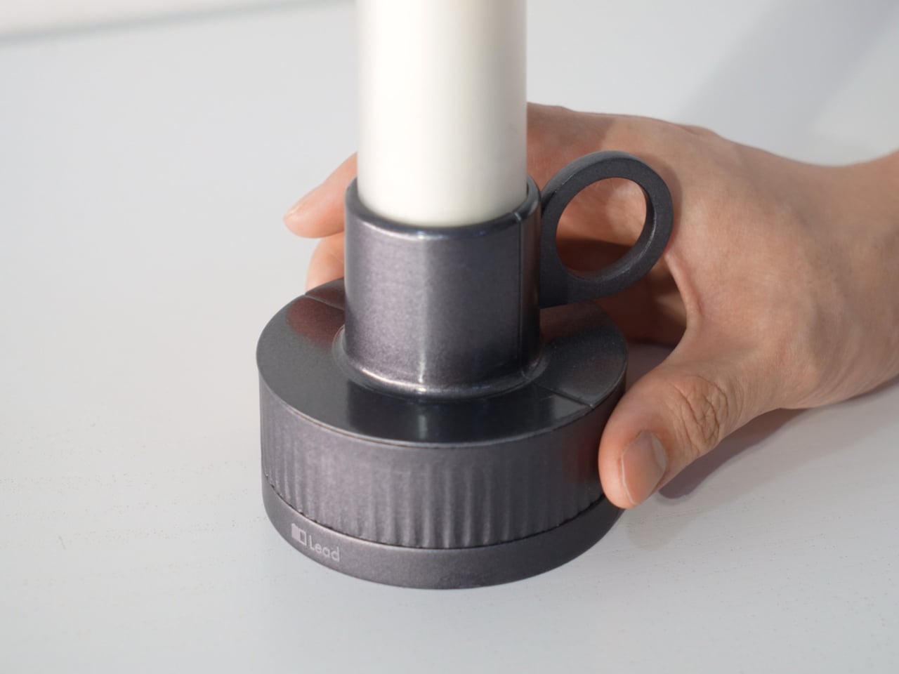
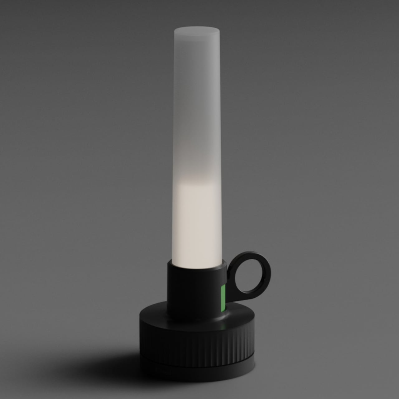
Candle is a slim vertical light that links to Bookeeper by default, then switches into timer mode with a twist of its ring. Before you dive into the pages, you set how long you want to read, and Candle becomes both atmosphere and clock. As you move through chapters, you can sense how your pace matches the time you set, adjusting speed without feeling chased by a digital countdown ticking in the corner.

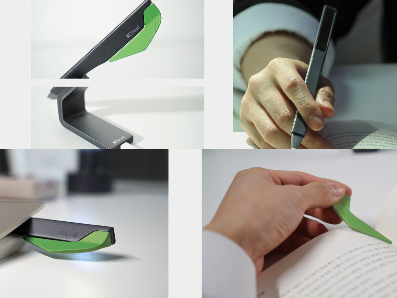
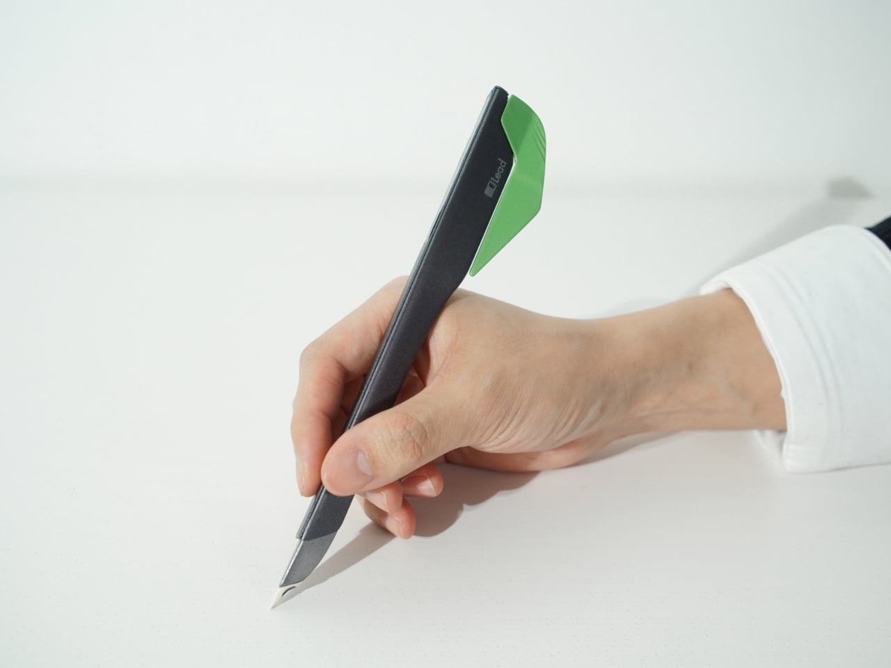
When a line or idea sticks, Quill is a smart pen that lets you write by hand in a notebook or margin, then flip into scan mode to store that text on a device later. It has two main modes, transcription and scan, so you can copy favourite phrases, jot down reflections, and then capture them without breaking the flow. A bookmark element on the back lets Quill rest in the book when you pause.

All three objects share dark bases and a calm, translucent green for the parts that move or light up, so they feel like a family without shouting for attention. The interactions are borrowed from analog reading rituals, taking a book off a shelf, lighting a candle, picking up a pen, but layered with just enough technology to guide habit without dragging you back to a screen.

Lead is less about adding gadgets to the reading table and more about designing a gentle structure around a physical book. Bookeeper brings you back at the right time, Candle holds the space and the clock, and Quill helps you remember why the session mattered. When reading often gets squeezed between notifications and feeds, a trio of objects that simply lead you back to the page feels like a quietly radical idea.

The post This Concept Makes Reading a Physical Ritual, Not an App Reminder first appeared on Yanko Design.