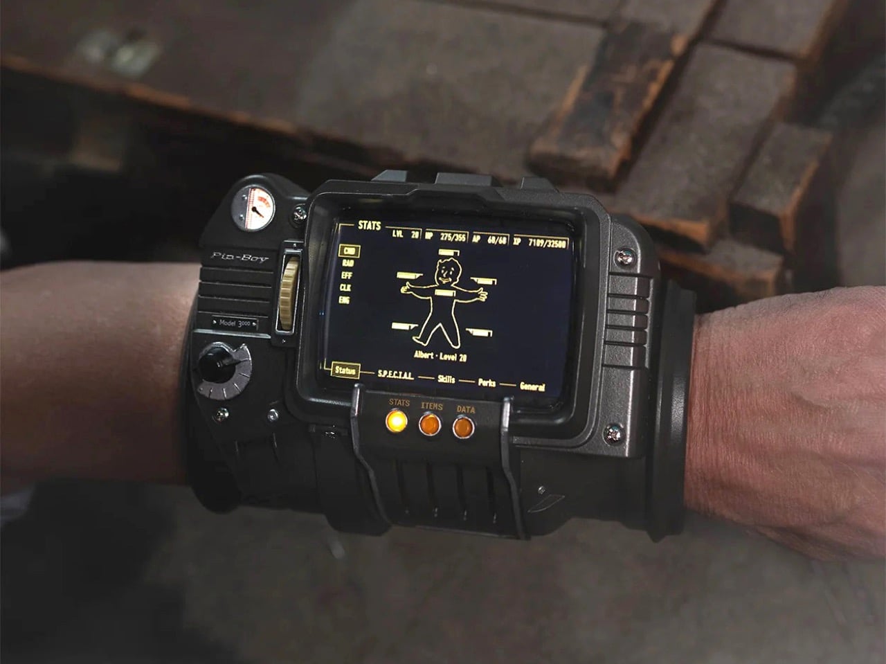
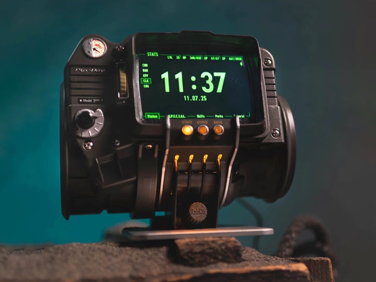
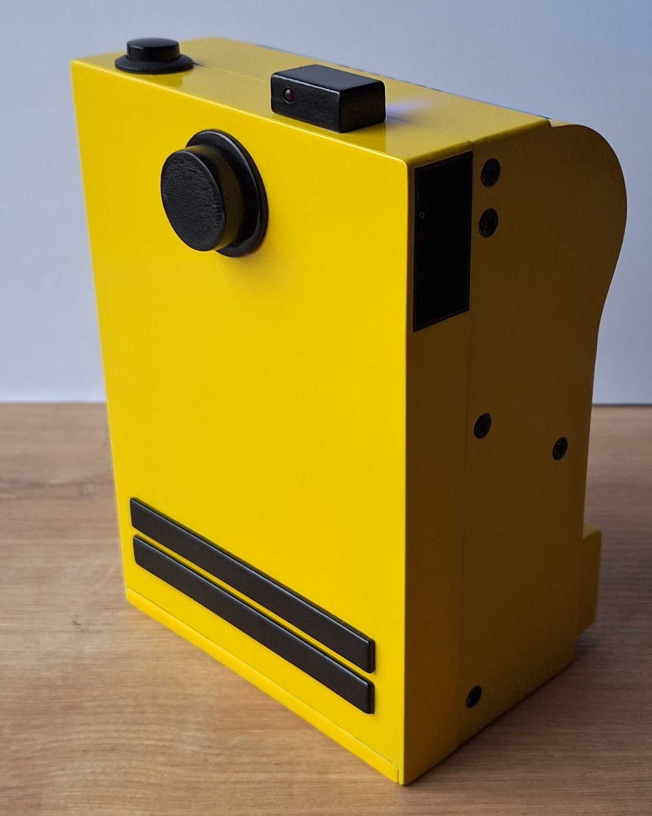
Seventeen years of Fallout fans walking around with a fictional computer strapped to their arm in their heads, and The Wand Company has finally made the thing real. This is the Pip-Boy 3000 replica, built from the original in-game 3D geometry of the wrist-worn personal information processor from Fallout 3 and Fallout: New Vegas, and it is a fully functional, wearable, 724-gram argument that some obsessions are worth indulging. The Wand Company has form here, having already produced the Pip-Boy 3000 Mk V replica based on the Amazon TV series prop, but this is the one Fallout 3 and New Vegas players have actually been waiting for since 2008.
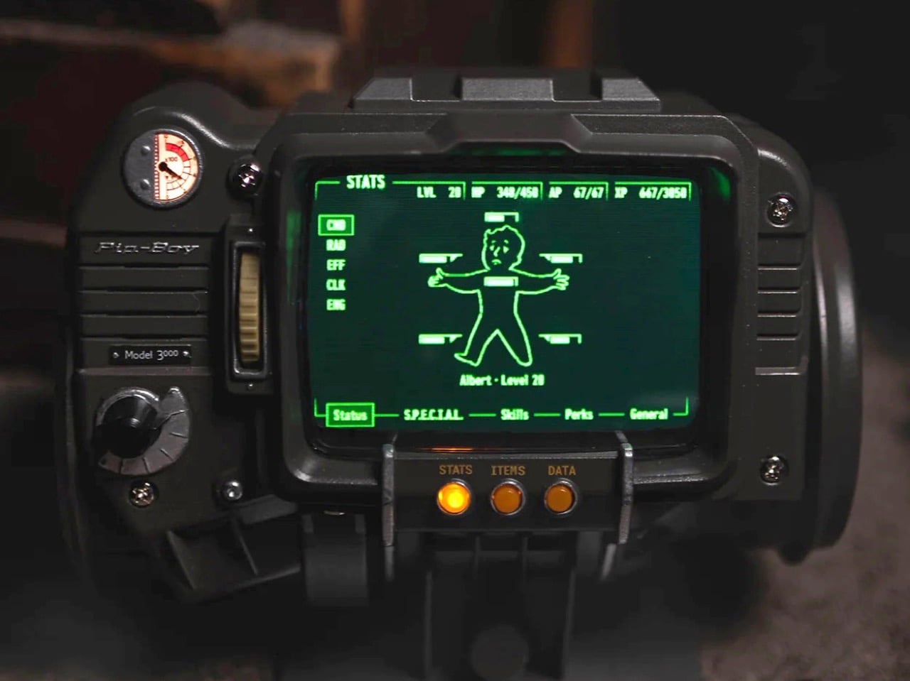
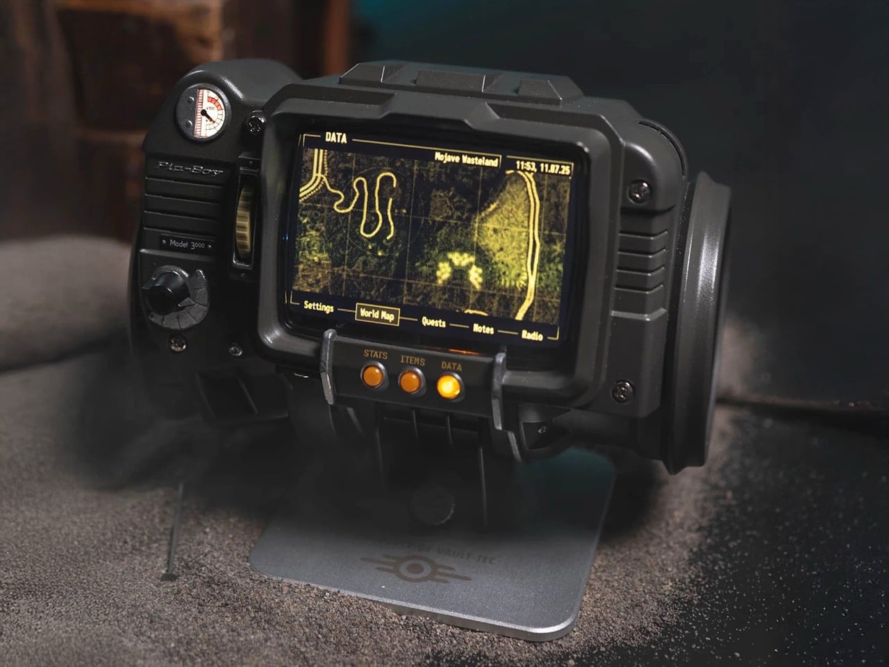
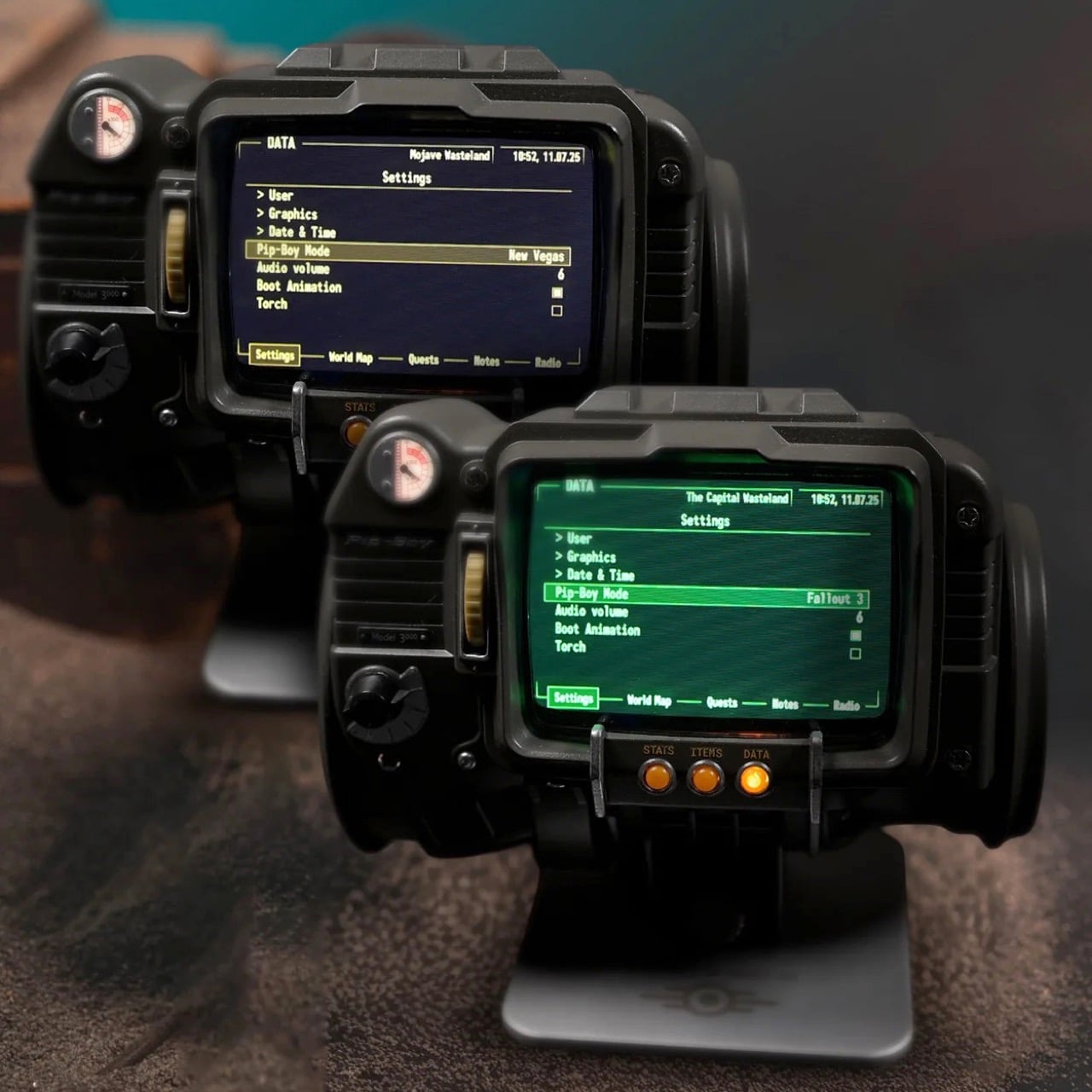
The front casing is die-cast metal, the body is injection-moulded ABS, and the cuff is memory foam with an included spacer bar that adds 22mm of circumference for larger arms. The 4-inch IPS LCD screen displays nearly all of the in-game content from both titles, and you can toggle between the classic green UI from Fallout 3 and the amber one from New Vegas. Hundreds of menus are navigable using the scroll wheels and dials on the body, the screen mimics a vintage CRT display with glitch effects and scanlines baked in, and you can temporarily fix those glitches by smacking the device because there is, naturally, an accelerometer inside. The whole package weighs about as much as a large can of soup, which will become noticeable roughly forty-five minutes into wearing it at a convention.
Designer: The Wand Company
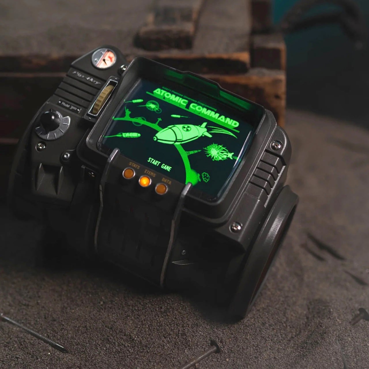
There is also a playable version of Atomic Command, the in-game holotape minigame, marking the first time anyone has defended fictional American landmarks from nuclear missiles on their actual wrist. The flashlight at the rear, headphone jack, and alarm clock mode are all present and accounted for. The radiation detector deserves a special mention: rather than measuring the ionizing kind that would actually matter in a wasteland scenario, it picks up radiation from FM radio broadcasts, displaying readings on the Geiger counter screen with full sound effects. The replica can also function as a working FM radio, which makes it possibly the most elaborately housed FM tuner ever manufactured. This is either a charming bit of in-universe worldbuilding or a tremendous cop-out, depending entirely on how generous you are feeling about the whole thing.
When you are not wearing it, the replica sits on a solid machined aluminum display stand that locks into four slots on the lower front of the device. The stand is also where the alarm clock function comes into its own, with the Pip-Boy propped upright on a desk or nightstand doing its best impression of the world’s most expensive bedside clock. The Wand Company says Bethesda staff saw the prototype and were left speechless, which tracks, because the level of content depth here, over 2,200 menu entries pulled directly from both games, goes considerably further than anyone needed to go for a collectible.
Preorders are live now at the Bethesda Gear Store for $299.99, with shipping expected as early as June 2026. Bethesda is restricting it to one item per order. International buyers can order through the Bethesda Gear Store International. It is rated for ages 14 and up, which seems optimistic.
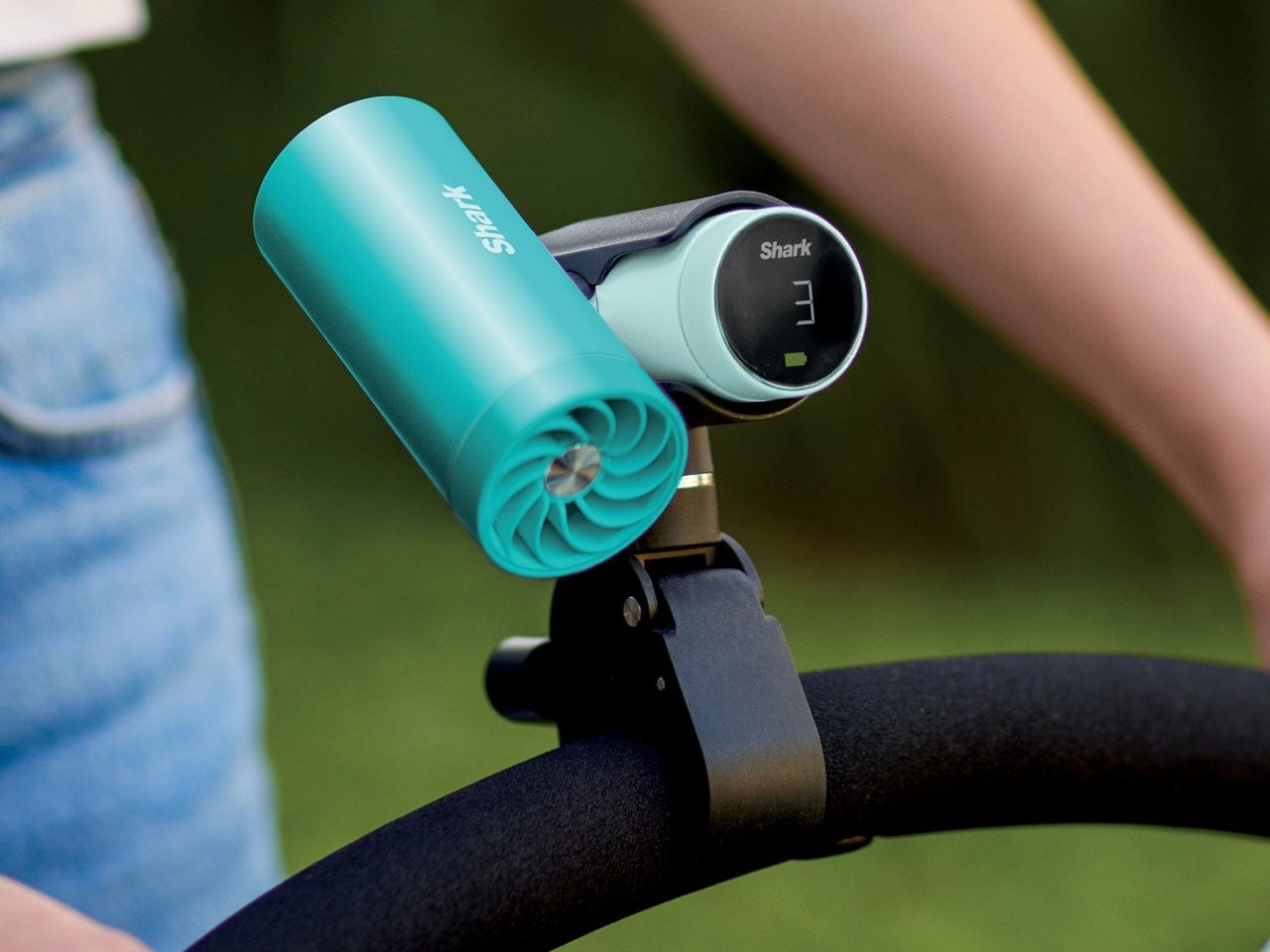
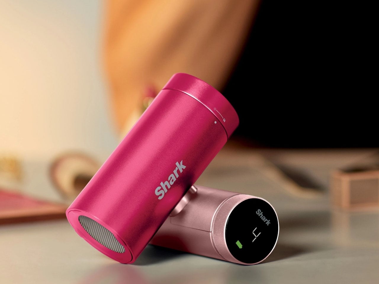
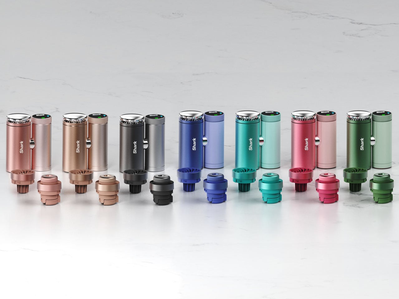
As temperatures continue to rise across many parts of the world, portable cooling devices are becoming increasingly popular for people who want relief while commuting or spending time outdoors. Recognizing this growing demand, SharkNinja has introduced the Shark ChillPill, a compact 3-in-1 personal cooling system designed to provide multiple forms of cooling in a single portable device. Combining a fan, an evaporative mister, and a direct-contact cooling plate, the gadget aims to deliver flexible comfort wherever heat becomes a problem.
The ChillPill is evolutionary when compared to traditional handheld fans that primarily circulate air. SharkNinja has designed the device to actively help cool the body using three complementary technologies. The first is a high-speed bladeless fan capable of accelerating airflow up to 25 feet per second, offering a steady breeze through ten adjustable speed settings. This allows users to tailor the cooling intensity depending on their environment, whether they need a gentle airflow indoors or stronger ventilation outdoors.
Secondly, an evaporative mist system is designed to refresh the skin without leaving it soaked. Unlike conventional spray fans that often create a wet sensation, Shark describes the ChillPill’s mist as a “dry-touch” evaporative effect. The device includes a small water reservoir that can produce mist continuously for about ten minutes per fill, or operate in an interval mode to extend usage. This feature is particularly useful in hot and dry climates where evaporation can significantly enhance cooling efficiency.
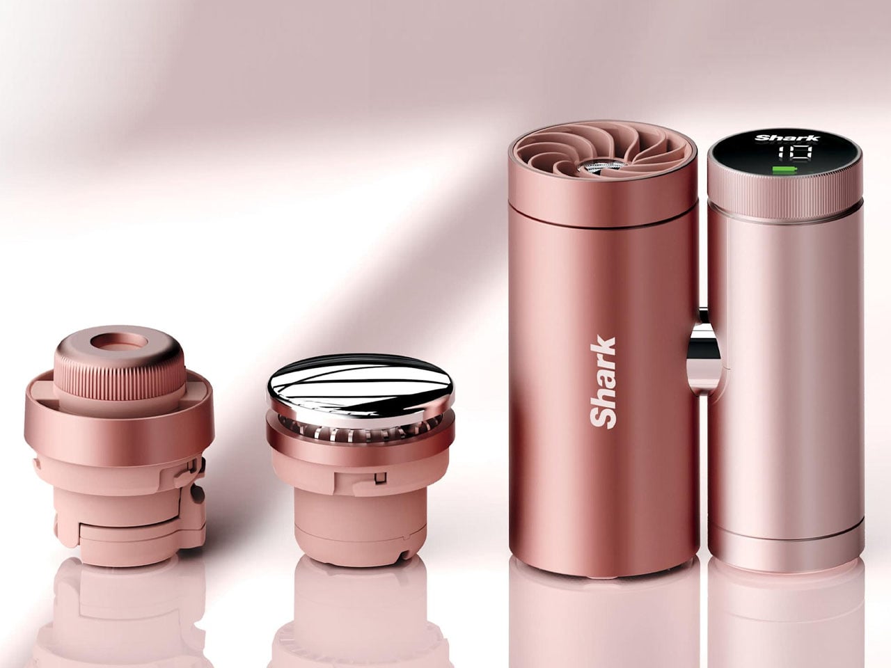
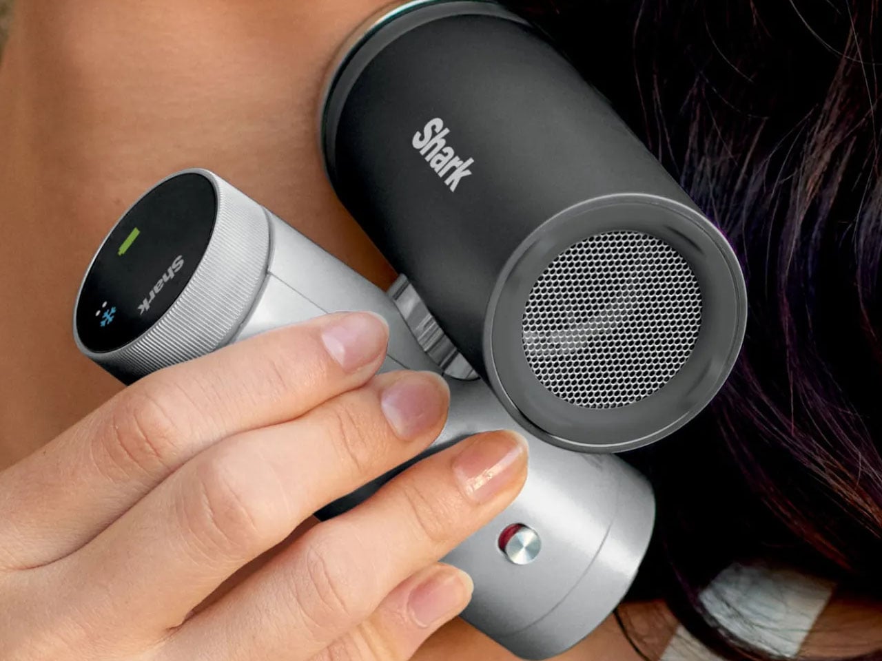
The third element is the InstaChill cooling plate, a cryo-inspired metal surface that provides direct contact cooling when pressed against the skin. According to SharkNinja, the plate can reduce skin temperature by up to 16°F within seconds, delivering an immediate cooling sensation similar to placing an ice pack on the body. This feature is designed for use on pulse points such as the neck or wrist, where cooling can quickly help regulate body temperature during intense heat.
One of the wearable’s key advantages is its versatility. It is designed to be worn, carried, clipped, or placed on a surface depending on the situation. The flexible design allows it to function as a hands-free wearable device or as a small desktop fan when needed. You can easily clip it to bags or prams, mount it on exercise equipment, or position it on a table, making it adaptable to a wide range of everyday scenarios.
Battery is also impressive as on the lowest fan setting, the ChillPill can run for up to 11 hours on a single charge, allowing it to last through long commutes, outdoor events, or extended travel days. When running at maximum airflow, the battery life drops to approximately 90 minutes, reflecting the higher energy demand of the stronger cooling output. Charging is handled via USB-C, with a full recharge taking roughly three and a half hours.
Portability and lifestyle integration are at the forefront as the portable gadget is available in several color options, including Carbon, Dragonfruit, Glacier, Haze, Iced Latte, Matcha, and Rose Gold. Optional accessories such as cross-body straps, wrist straps, clamps for strollers or bikes, and protective cases are available to expand how the device can be used. Priced at around $149.99, the Shark ChillPill is available through Amazon and Shark’s own website and other retailers. While it costs more than standard portable fans, the advantages here are undeniable.
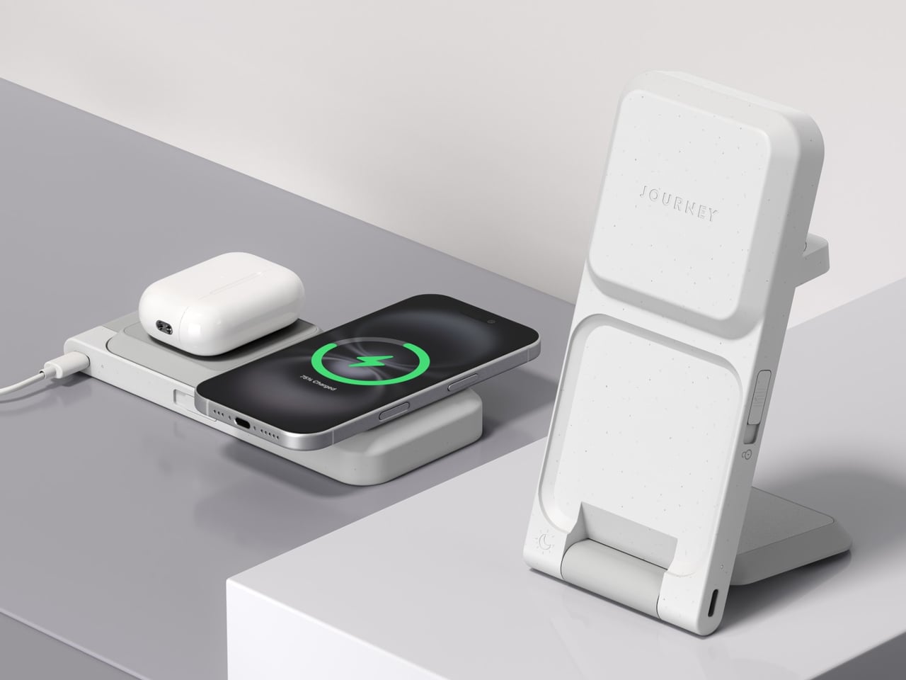
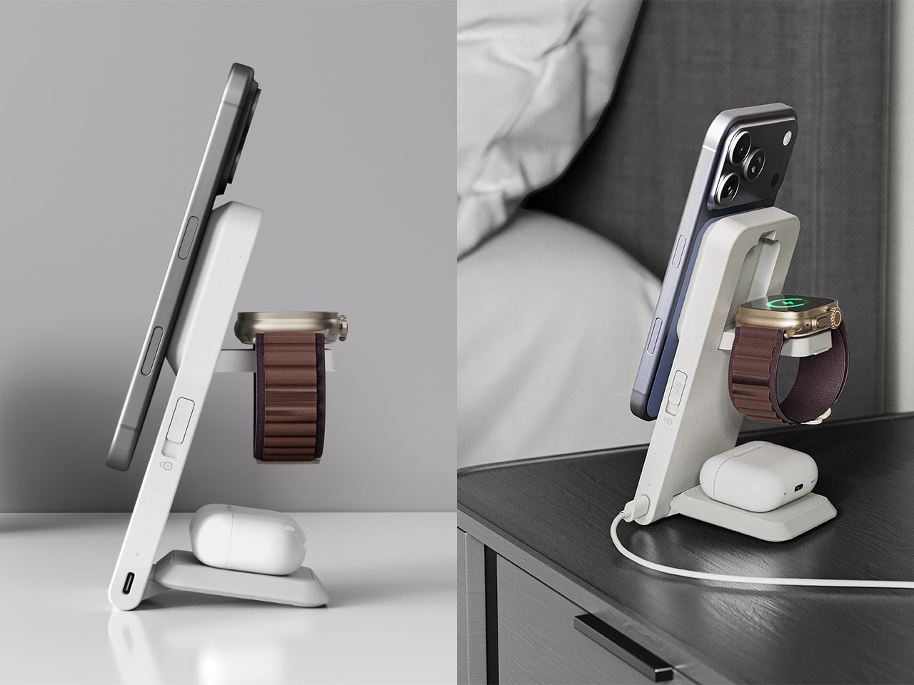
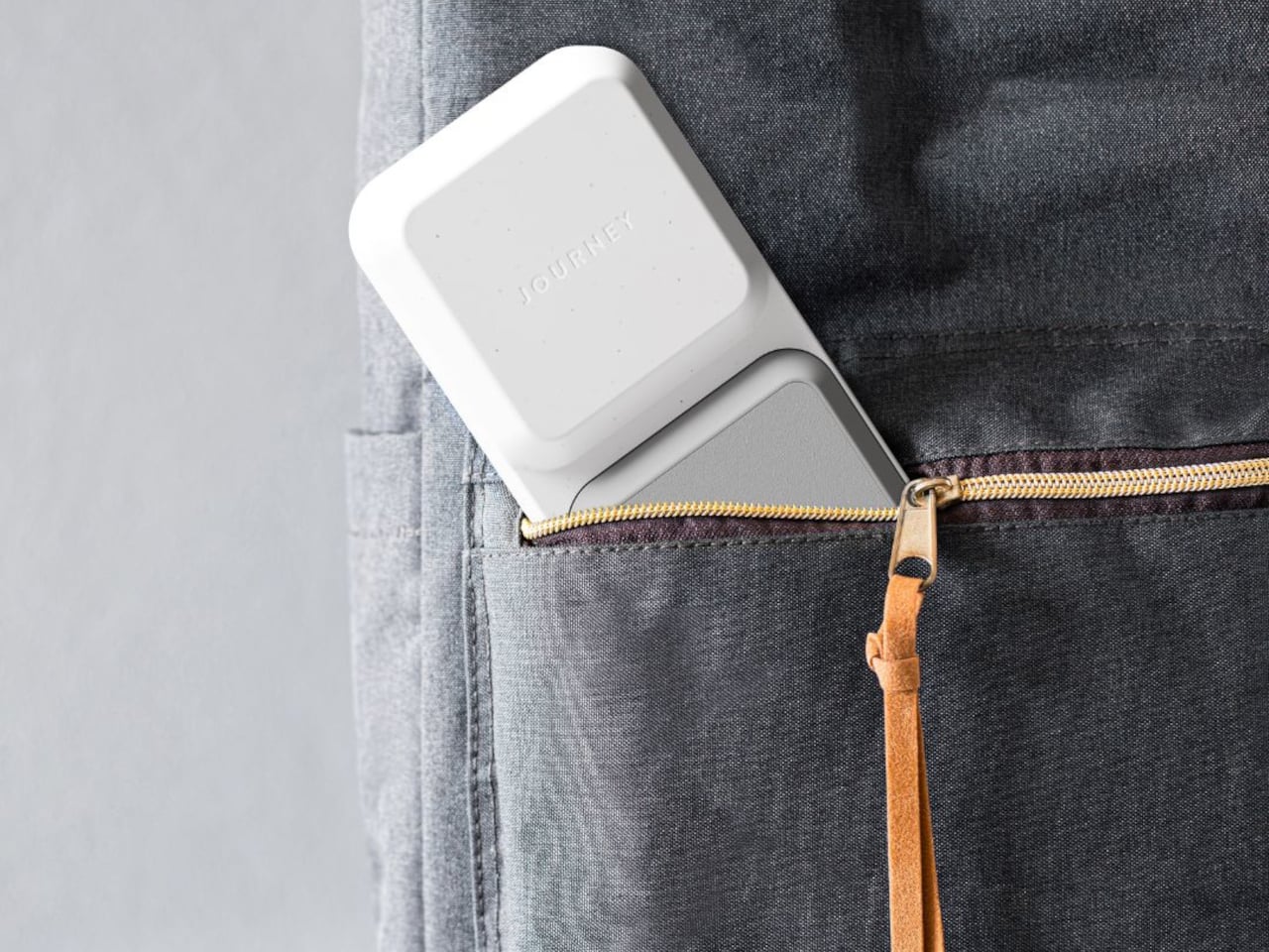
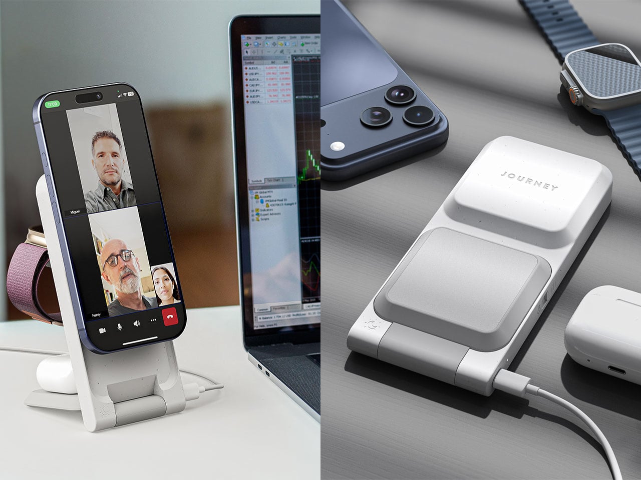
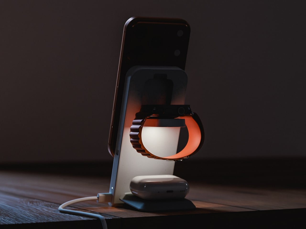
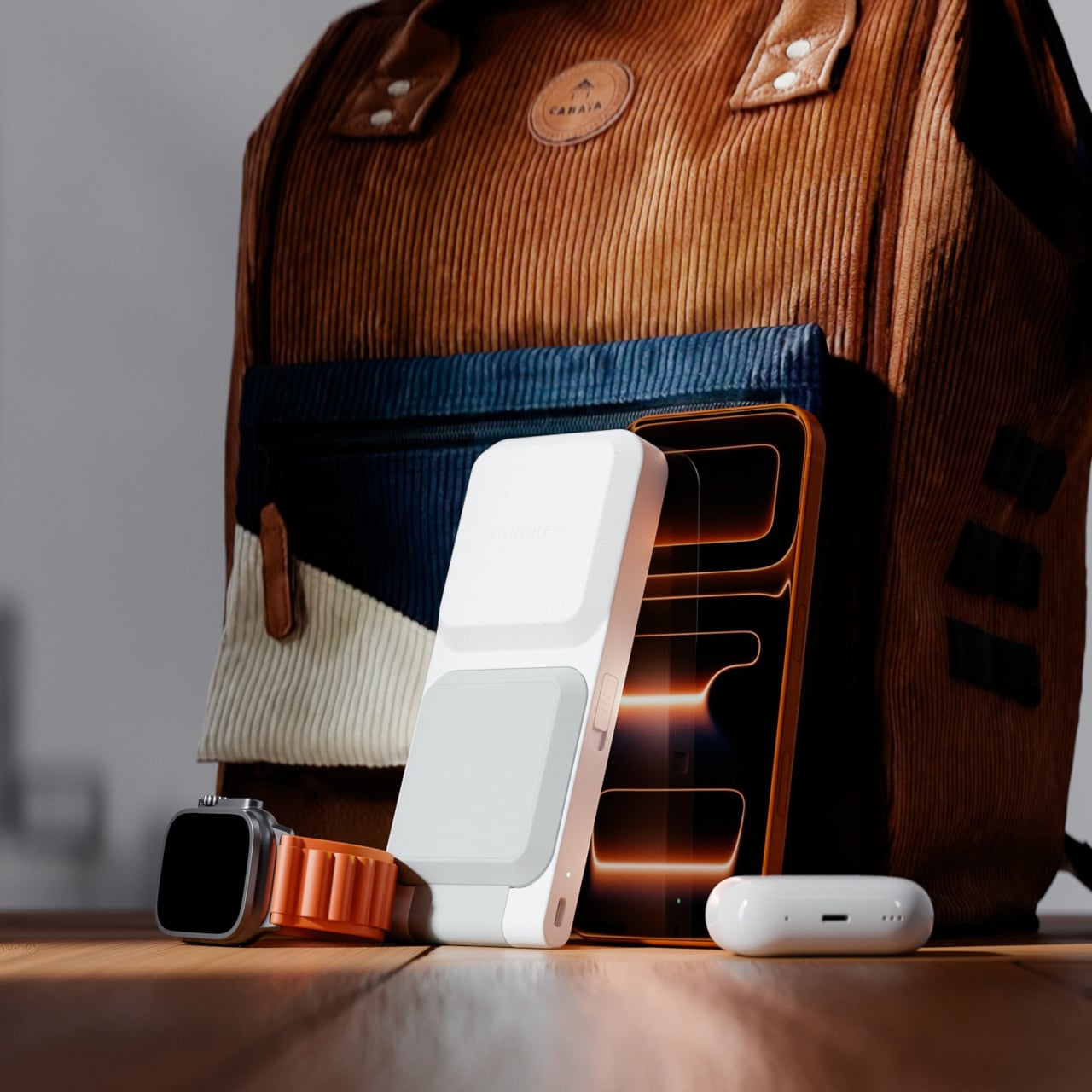
Most people who own an iPhone, an Apple Watch, and AirPods have quietly accepted the nightstand situation: three cables, two adapters, and a general sense that none of this should be as complicated as it is. The chargers come off the desk in different orders every morning, find their way into bags, and somehow never make it back to the same spot twice. Journey’s ARIA 3-in-1 Wireless Charging Station is built as a direct answer to that arithmetic problem.
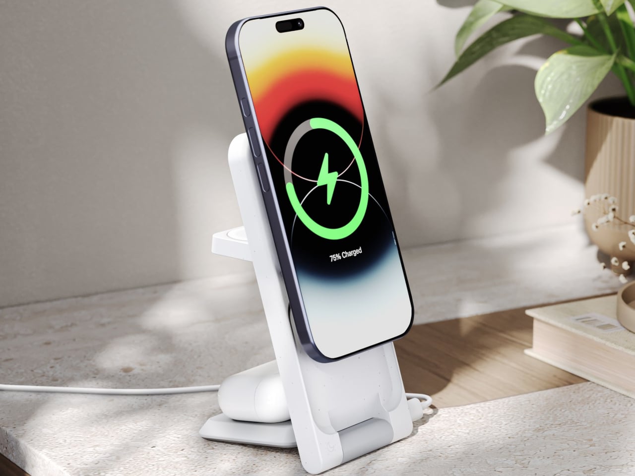
The ARIA is Qi2-certified and Made for Apple, which places it in a fairly short list of chargers cleared to deliver the full 15W to an iPhone 12 or newer. That Qi2 certification also means magnetic alignment is built into the standard, so the phone locks into position rather than needing to be nudged around until the charging indicator finally appears. It is a small difference that makes the whole routine feel more deliberate.
Apple Watch gets fast charging as well, and AirPods charge at up to 5W, all three running simultaneously from a single USB-C cable. That consolidates the whole power situation down to one cord running to one spot on the desk. One honest caveat: a 30W adapter is recommended for full performance but does not ship in the box, something worth factoring into the price tag before deciding how good the value proposition really is.
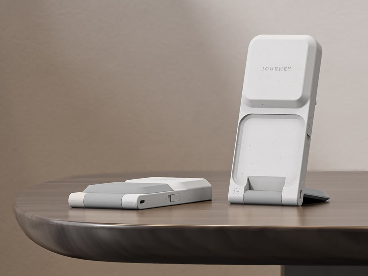
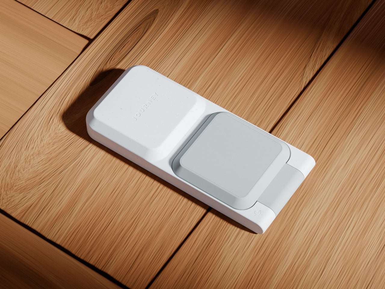
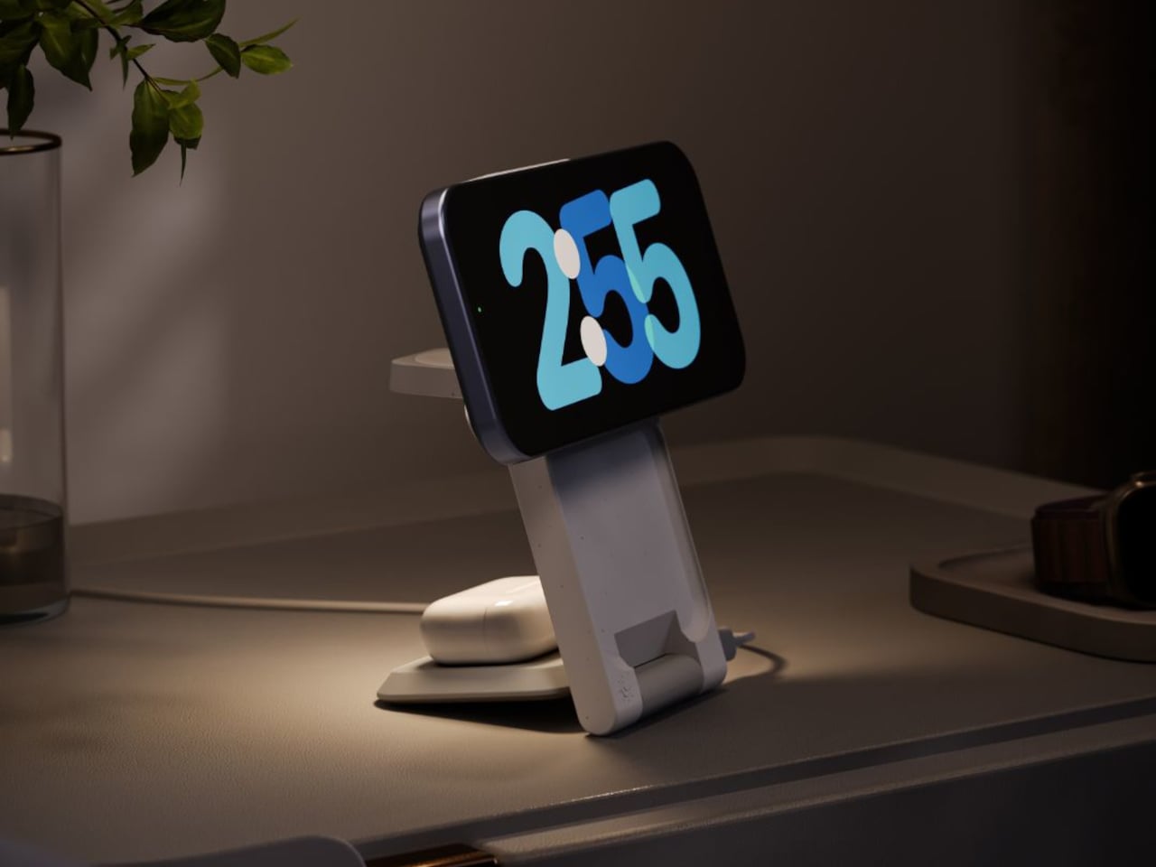
What separates the ARIA from a flat charging pad is a folding mechanism that gives it a second mode entirely. Lay it flat, and it works as a compact 2-in-1 pad, 16 cm long and under 2 cm thick, low-profile enough to disappear into most desk setups without demanding attention. Pop open the phone section, and it props the device up at just over 70 degrees, in either portrait or landscape. The transition takes about two seconds.
That dual-mode flexibility becomes more interesting when packing a bag. At 230g and folded down to 19mm, the ARIA fits into a Dopp kit without the usual negotiation over whether the gadget justifies the real estate. A magnetic alignment ring is included in the box for non-MagSafe phone cases, extending compatibility without requiring a case swap or any real effort.
Qi-enabled Android phones also work in flat mode, though at the reduced speeds their hardware supports rather than the full Qi2 ceiling. The ARIA handles international voltages from 100 to 240V as well, which means it travels without issue as long as you bring your own wall adapter and plug converter for the destination. For a device that sells itself on travel readiness, the missing adapter in the box still stings a little.
There is also a touch-controlled ambient light built into the base. A single tap produces a soft glow that works well at a bedside without flooding a dark room, and it beats reaching for a phone screen at 2 a.m. just to orient yourself. Small features like this tend to matter more in practice than they look on a spec sheet.
Camping gear has always operated on a quiet contradiction: the more you need comfort, the more weight you carry, and the more weight you carry, the less comfortable you become. Spring 2026 has a different answer. A wave of products has arrived that treats outdoor living not as an exercise in deprivation management but as a design problem worth solving properly — with biological modeling, modular cooking systems, and a shelter that erects itself in the time it takes to open a cold drink. These seven gadgets sit at that intersection.
The products on this list share a philosophy more than a category. Each one attacks a specific friction point in the camping experience — bad sleep, messy cooking, cold nights, assembly anxiety — with engineering that owes nothing to the gear conventions that preceded it. Whether you are weekend-tripping in the forest or plotting a longer off-grid stretch, this is what thoughtful outdoor design looks like in 2026.
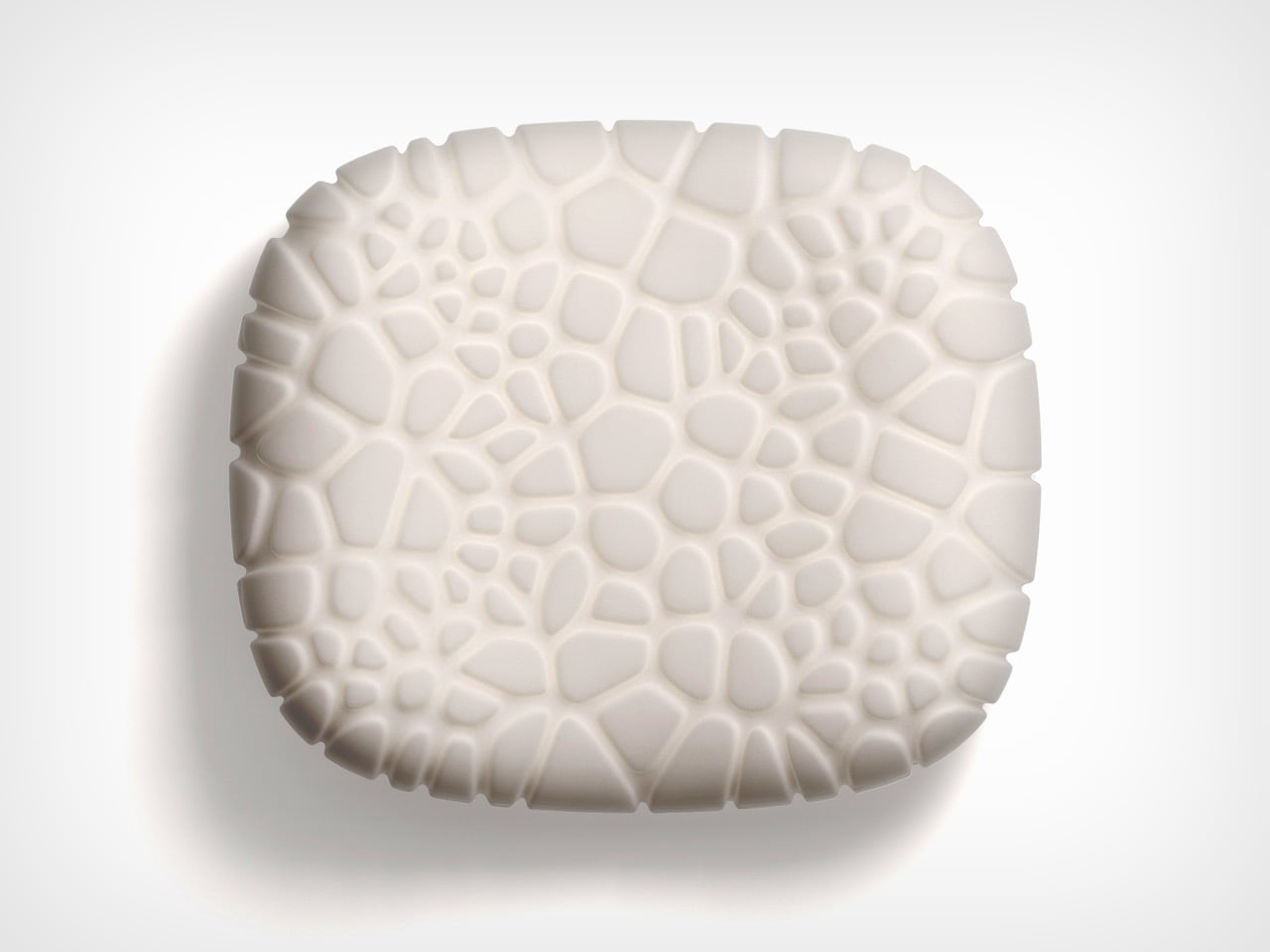
1. Camp Napper
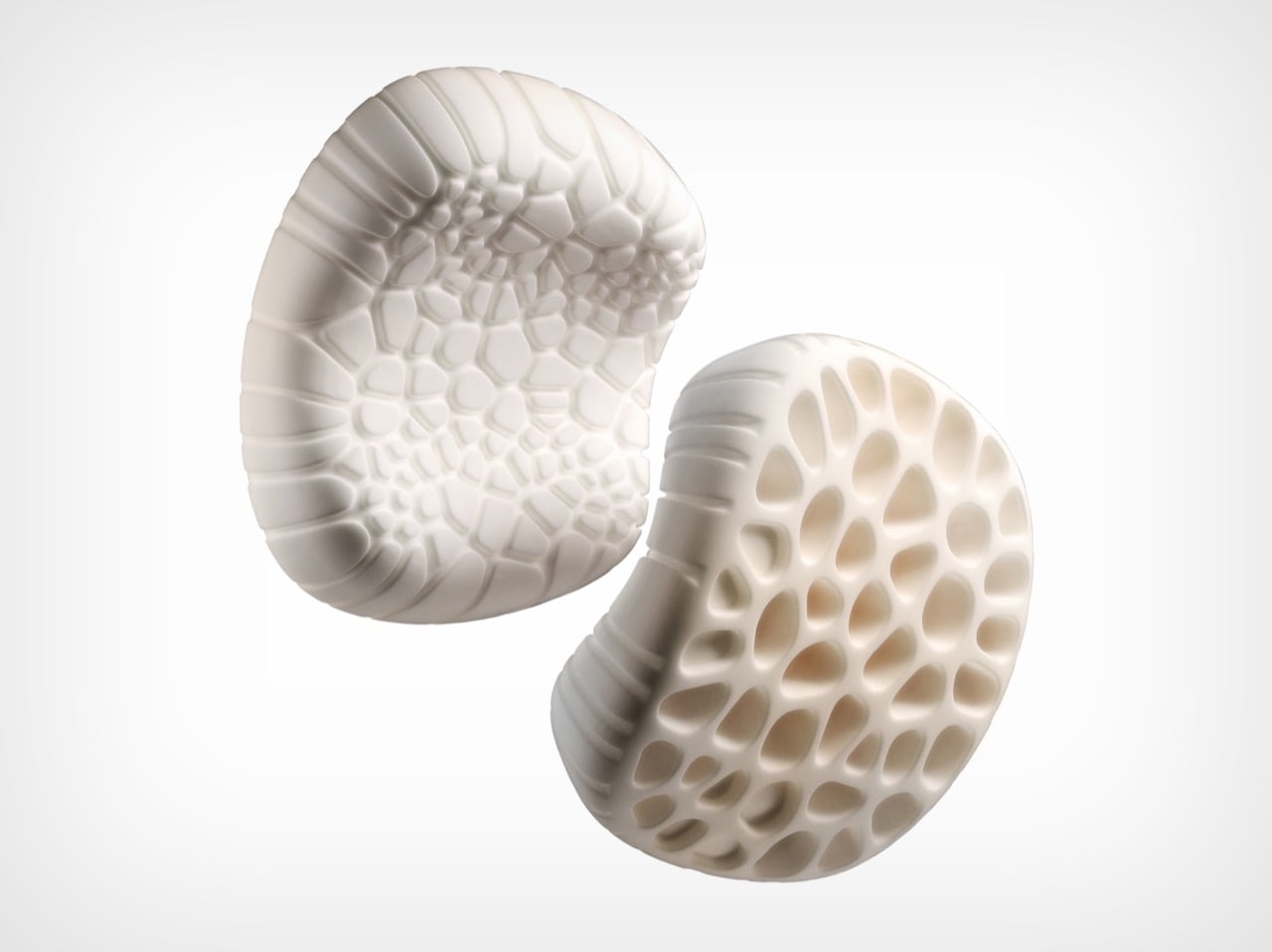
Most camping pillows solve exactly one problem: they pack small. Designer Chen Xu took a different starting point, drawing the Camp Napper‘s form from two biological sources: the surface texture of fungal spores shaped the contact face, and the hollow vascular geometry of plant stems informed the core. Voronoi polygon modelling mapped how pressure from a sleeping head spreads, then engineered protrusions and recesses to respond to that specific data.
The front face has raised cellular structures that increase skin contact area and channel airflow simultaneously. Four tactile zones on the back face offer orientation-dependent customization. The hollow stem-derived core keeps total weight around 400 grams and packs to roughly the volume of a water cup. Memory foam holds the bionic geometry through repeated use, and anti-slip rubber particles on the base keep it stable across sleeping pads and hard floors. Note: the surface patterning is not for the trypophobic.
What we like
Voronoi-mapped surface addresses pressure distribution and airflow through the same structural solution, not two separate ones
Four tactile zones on the back face give orientation-dependent comfort options uncommon in this category
What we dislike
The cellular surface patterning will be a hard stop for anyone with trypophobia
No published compression specification for cold-weather performance, where memory foam typically stiffens
2. The Cube
Tent assembly has not changed meaningfully in decades: poles, sleeves, and a diagram drawn by someone who has never camped. South African brand Alphago chose to treat that process as an engineering failure. The Cube is an inflatable tent with an air tube frame system that inflates via a wireless electric pump. One button press. Four minutes. No poles, no instructions, no arguments about which end faces the wind.
Speed is not the whole story. The Cube is built around comfort, with a stretched silhouette that allows standing height across most of the interior. The WeatherTec system uses welded floors and inverted seams, and both entrances have three independently operable layers: privacy screening, mosquito netting, and weather panels. Some configurations include integrated tables and storage drawers, extending the product into something closer to portable infrastructure than a simple shelter.
What we like
Four-minute wireless inflation eliminates the primary friction point of traditional tent setup
The three-layer entrance system handles every weather condition without reconfiguring the tent
What we dislike
Air tube frames are vulnerable to puncture in ways pole frames are not; field repair requires preparation
Inflatable architecture is larger and heavier than a comparable pole tent at the same floor area
3. All-in-One Grill
Outdoor cooking tends to bifurcate: bring a single-function grill and eat the same three things, or haul a kitchen’s worth of equipment and spend more time on logistics than on the fire. This modular tabletop grill takes a third position. Interchangeable cooking modules cover barbecuing, frying, grilling, steaming, smoking, and stew cooking from a single portable base, with a dedicated upright module for warming bottles — mulled wine included.
The compact footprint sits on any camp table without dominating it, and the modular construction that makes it versatile also simplifies cleaning. When one system handles multiple cooking methods, the question of what to cook becomes a matter of appetite rather than equipment logistics.
Six distinct cooking methods from one portable base, without multiple devices or fuel sources
A dedicated bottle-warming module is a specific, practical detail most outdoor cooking systems overlook
What we dislike
Modular systems accumulate small parts that are easy to misplace; no information on replacement part availability
Tabletop-only design limits cooking capacity for larger groups
4. TMB: The Modular Bottle
Hydration gear has a design problem few products acknowledge: one bottle cannot simultaneously optimize for commuting, exercise, and trail hiking. The TMB Modular Bottle builds adaptation into the object itself. The borosilicate glass interior preserves drink flavor without absorbing taste or odor — a material property that distinguishes it from the steel and plastic alternatives dominating this category. A translucent mid-section gives a constant view of remaining liquid, removing minor but real friction from the outdoor day.
The modular design allows configuration changes based on activity. For camping specifically, the glass interior means whatever you fill it with tastes like itself rather than the container. Easy disassembly for cleaning prevents the stale odor buildup that makes most reusable bottles unpleasant after weeks of real use.
What we like
Borosilicate glass preserves drink flavor without imparting taste or odor, a material advantage over steel or plastic
The translucent mid-section gives a real-time view of the remaining liquid that opaque bottles hide
What we dislike
Glass interiors, even borosilicate, carry more breakage risk than steel alternatives in rough outdoor handling
Modular assembly adds cleaning complexity compared to a single-body bottle
5. Portable Fire Pit Stand
There is an honesty to a fire pit that most portable cooking solutions sidestep. This bonfire stand brings it back without the permanence of a built pit or the flimsiness of a folding ring. The steel plate construction uses sheet metal technology to resist the warping and distortion that heat cycling causes in cheaper materials, and the punched holes and cutouts give it an industrial character while improving airflow around the burn.
Assembly works like a puzzle — metal pieces interlock without tools. Removable trivets open the cooking configuration to grilling, frying, and more. The warp-resistant black steel plate holds its geometry through repeated heating and cooling cycles, a failure mode that undermines most portable fire hardware after a single season.
Warp-resistant steel construction maintains geometry through repeated heat cycling, where most portable fire hardware eventually distorts
Tool-free interlocking assembly means no accessories that can be forgotten at home
What we dislike
Open fire structure requires a flat, stable, fire-safe surface — more site-dependent than enclosed stove alternatives
Black steel requires dry storage and some maintenance to prevent surface rust
6. Hot Pocket
Cold sleeping bag syndrome follows a predictable pattern: zip in, spend the first twenty minutes waiting for body heat to build, arrive at warmth already half-asleep and irritated. The Hot Pocket, created by the Sierra Madre team, breaks that cycle before it starts. It stores and compresses your sleeping bag or quilt during the day, then pre-heats the insulation before you get in — so the first moment of contact is already warm.
The system is wireless and portable, designed for use beyond the campsite: ski slopes, sports sidelines, anywhere pre-warmed insulation matters. The on-demand heating replaces disposable chemical heat packs, which degrade after a single use. Compression and heating are integrated into one object, handling a task the sleeping bag needed done anyway — storage and transport — while adding warmth as a built-in function.
What we like
Pre-heating eliminates the body-heat warm-up window that makes the first stretch in a cold sleeping bag genuinely unpleasant
Integrated compression and heating replace disposable chemical packs with a reusable, on-demand solution
What we dislike
Wireless operation adds battery management to the camping checklist; no published battery life data
Pre-heating duration and heat retention are unspecified, making it difficult to plan around the product’s actual warming window
7. DraftPro Top Can Opener
The DraftPro is not solving a survival problem. It is solving an experience problem. Designed by Japanese designer Shu Kanno, the tool removes the entire top of a can to create a wide-mouth opening that changes how the contents smell, taste, and behave. For beer, full-top removal mimics drinking from a glass, releasing aroma rather than directing it through a small aperture. The smooth-edged finish removes the safety concern that other full-removal openers have historically carried.
The camping application extends beyond drinking. With the top off, you can add ice directly to the can or build a cocktail inside it without a separate vessel. The opener handles domestic and international can sizes, which matters when available canned goods do not match a home market. For a campsite where the evening drink matters as much as the fire, this is the detail that earns its place.
Full top removal creates a draft-style drinking experience with full aroma release — a functional difference from standard can opening
The can-as-vessel approach allows ice-adding and cocktail preparation without additional cups or shakers
What we dislike
Single-function specialization means it earns a spot only if canned beverages are a consistent part of the camping plan
No published durability specification for the cutting mechanism over time
Spring’s best case for smarter camping
What connects these seven products is not a shared price point or aesthetic — it is a shared refusal to accept that outdoor gear has to be difficult, uncomfortable, or boring. The Camp Napper applies biological modeling to a pillow. The Cube eliminates the most frustrating fifteen minutes of any camping trip. The DraftPro turns a can into a proper drinking vessel. Each object is the result of someone looking at a friction point in outdoor life and deciding it deserved a real answer.
Spring camping is the ideal moment to bring these to a campsite. The temperatures invite longer stays, the light cooperates, and the desire to actually be comfortable rather than just surviving outdoors is at its highest. These products meet that desire with design intelligence rather than compromised portability or bulky engineering. Pack accordingly.
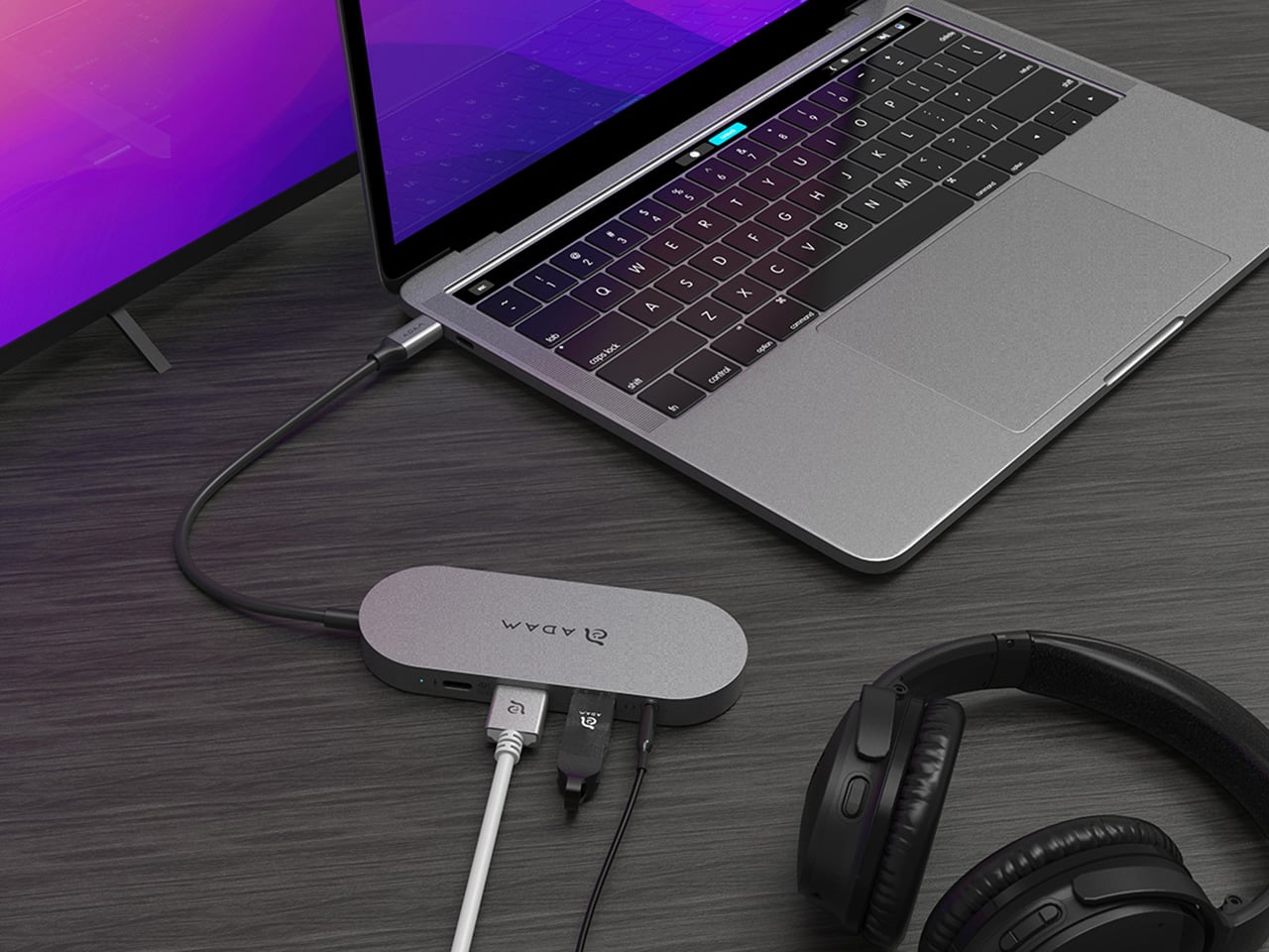
Modern laptops aren’t short on power, but they’re increasingly short on ports. One USB-C port ends up doing everything: charging, video out, storage, and peripherals, while a small pile of adapters accumulates next to the keyboard. The setup works, but it doesn’t look like the clean, minimal desk you were going for, and it means carrying more pieces than you’d like when you’re working somewhere that isn’t home.
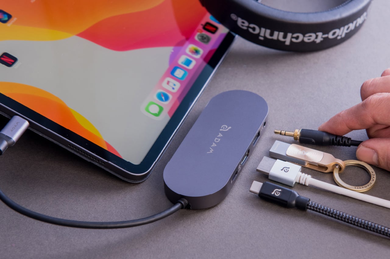
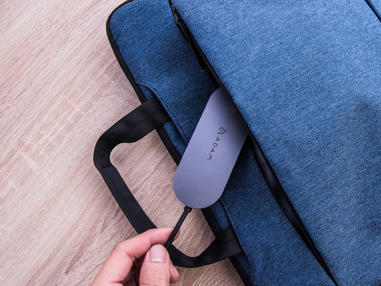
ADAM elements’ Hub S is a USB-C hub with built-in SSD storage, designed around the idea that a hub and an external drive don’t need to be two separate objects. Instead of plugging in one thing for ports and another for files, you plug in one slim aluminum accessory that handles both. It isn’t trying to replace a full docking station, but it’s the right-sized tool for someone who needs the essentials covered without the clutter.
The built-in SSD is available in 240 GB, 480 GB, and 960 GB capacities, so there’s a size for whether you’re keeping a working project library or just enough space for recent shoots and backups. Having storage physically attached to your hub means it’s always there when you need to dump footage, move large project files, or keep a client’s assets close during a session, without remembering to pack a separate drive.
Transfer speeds are rated at up to 520 MB/s read and 456 MB/s write, which makes moving large files feel routine rather than something you schedule around. That kind of speed isn’t just a spec, though. It’s the difference between waiting through a transfer and forgetting it’s happening. For photographers and video editors working on the road, that matters more than it sounds on a product page.
For Mac users, the ADAM elements Hub S is also Apple Time Machine compatible. That means it can act as a rolling backup target every time you plug in, turning a habit that’s easy to forget into something that happens automatically. Backup isn’t exciting, but having it built into the same accessory you’re already using for everything else makes it feel less like a separate job.
The USB-C port on the hub supports PD 3.0 pass-through charging up to 60W, so your laptop doesn’t lose its charge while the hub is handling storage, display, and peripherals. That’s a meaningful consideration when you’re transferring large files and streaming to an external display at the same time, both of which can pull enough power to make a laptop feel like it’s running a sprint.
The HDMI port outputs up to 4K at 30Hz and supports HDCP 2.2, which is the protocol required for streaming 4K HDR content from services like Netflix. A lot of hubs advertise “4K output” but fail on DRM handshakes, so the HDCP 2.2 compliance isn’t a minor footnote. Whether you’re mirroring for a presentation or extending to a monitor for a proper editing session, the connection holds up where it matters.
Rounding out the port selection is a USB-A 3.1 port rated at up to 5 Gbps for peripherals or flash drives, and a 3.5mm headphone jack that supports 48kHz/16-bit audio. Neither is glamorous, but together they cover the inputs that would otherwise require yet another adapter. The aluminum alloy body is designed to sit flush on a desk surface, and the whole thing weighs about 2.5oz, roughly the weight of a single C battery.
The ADAM elements Hub S works best as the kind of accessory you stop thinking about. You plug it in, your files are there, your display is connected, your laptop is charging, and your headphones are plugged in. That’s it. For people who’d rather carry one considered piece of hardware than a small collection of adapters and drives, consolidating all of that into a single slim object that fits in a jacket pocket feels like the more sensible way to work.
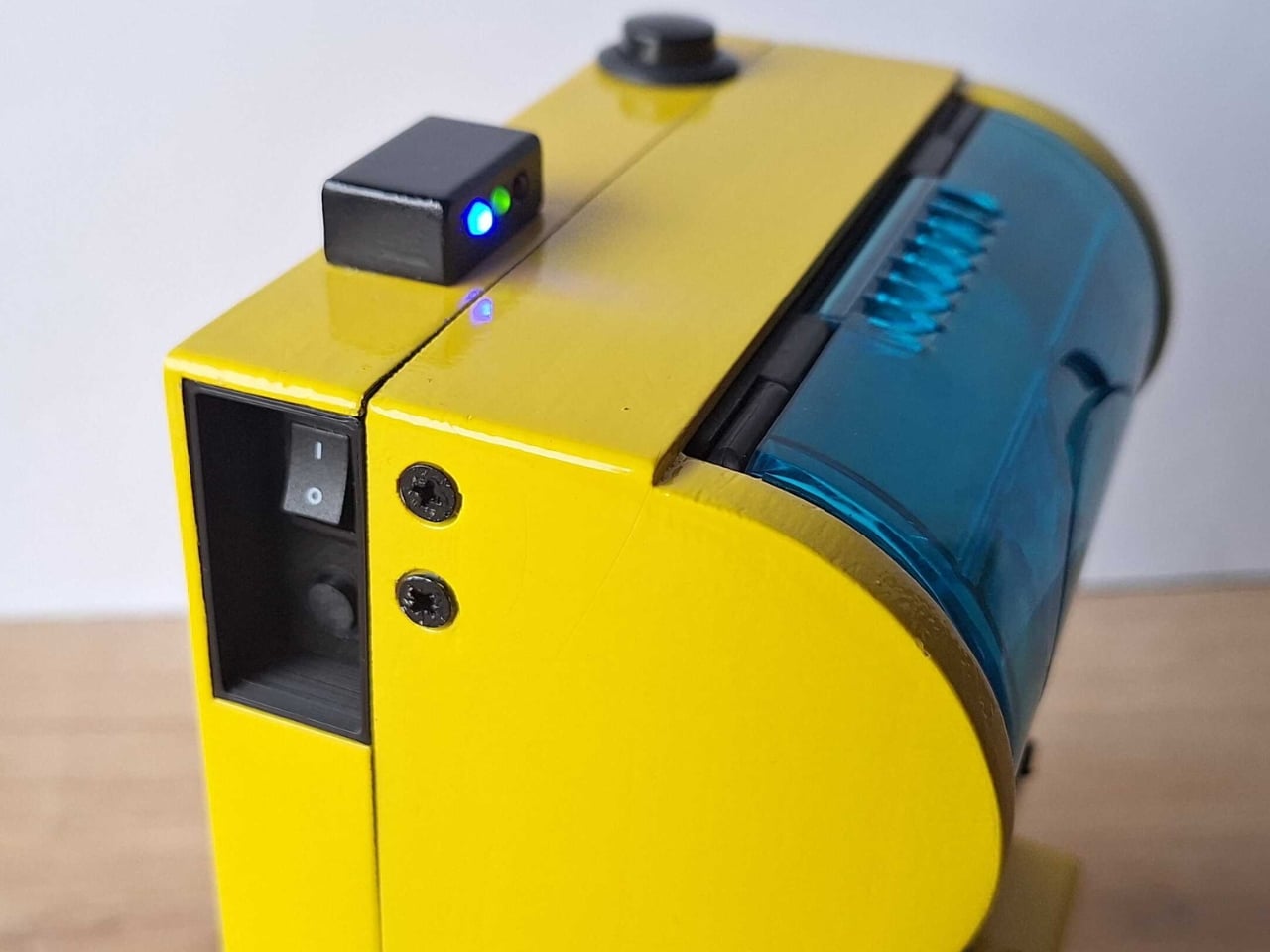
Remember when instant cameras were magic? You pressed a button, a mechanical whir filled the air, and moments later you were shaking a photo like it owed you money. Polaroid made photography feel like alchemy, turning light into physical memory right in your hands.
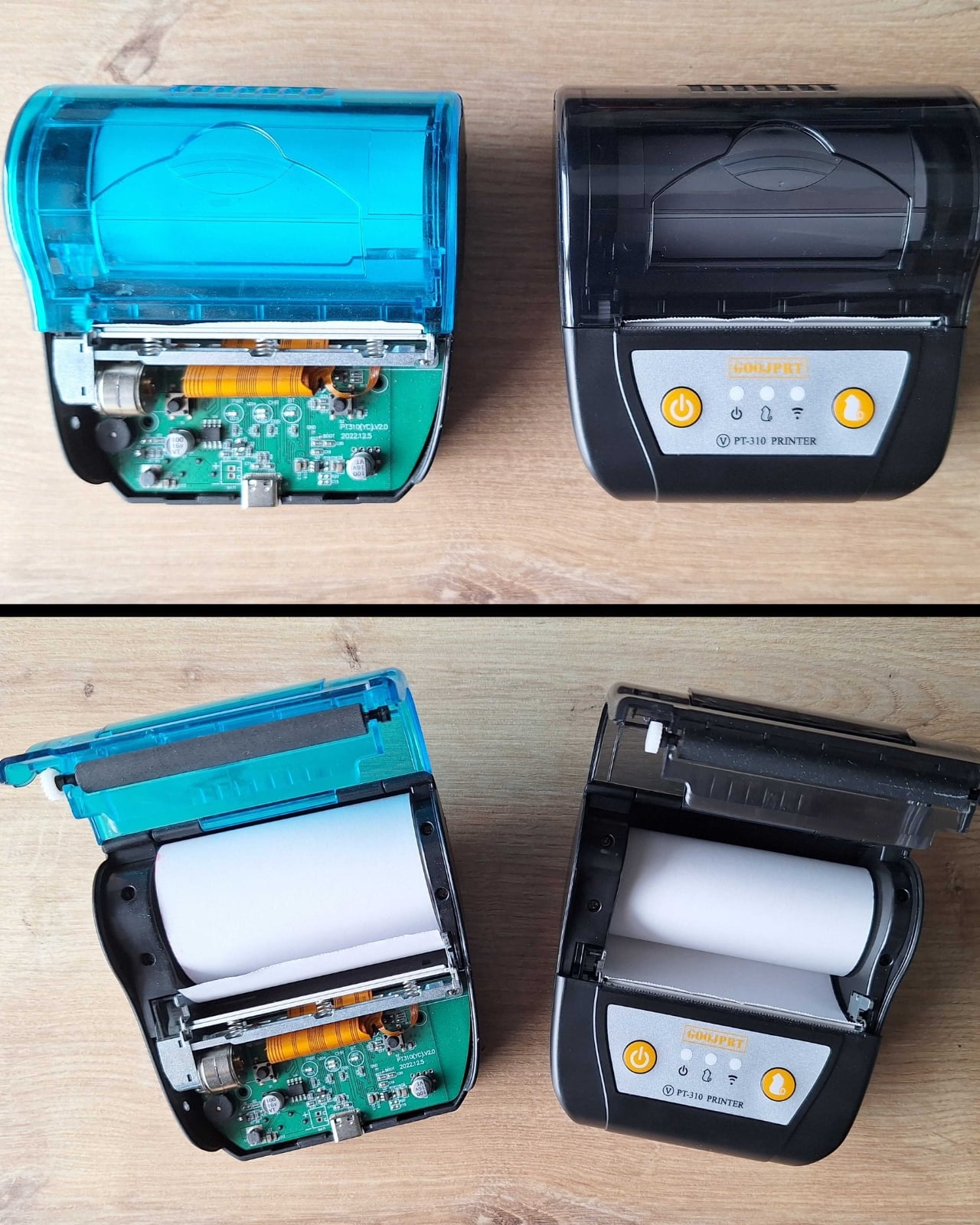
The Poor Man’s Polaroid by Boxart brings that instant gratification back using a thermal printer (the same kind that spits out your CVS receipts) and costs less than a cent per print compared to roughly a euro for each Polaroid picture. The name is a bit tongue-in-cheek since the parts actually cost more than the cheapest Polaroid cameras, but the creator clarifies it’s a “fun DIY project, possibly made by poor hands”.
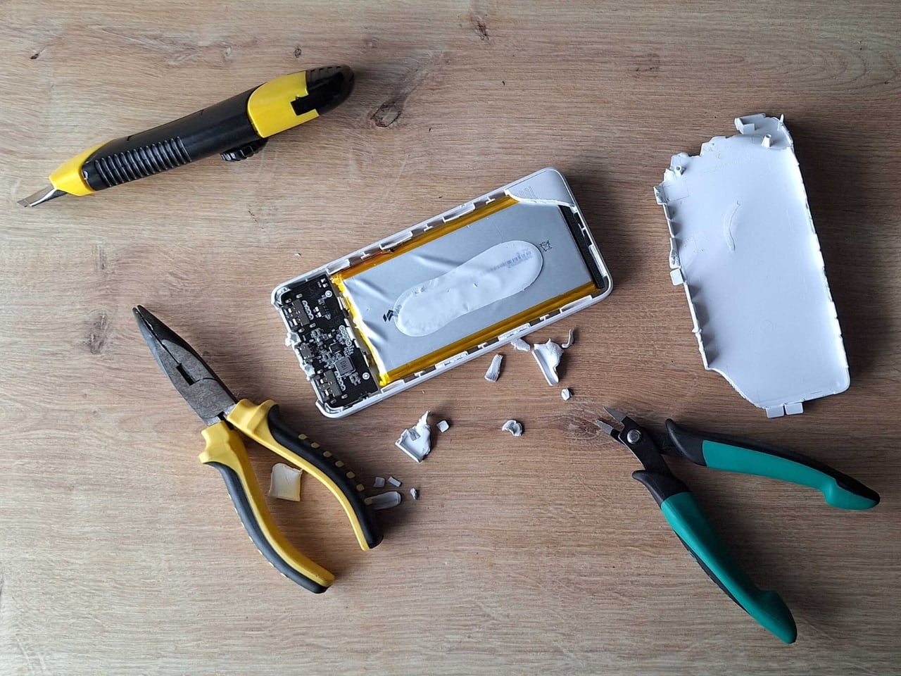
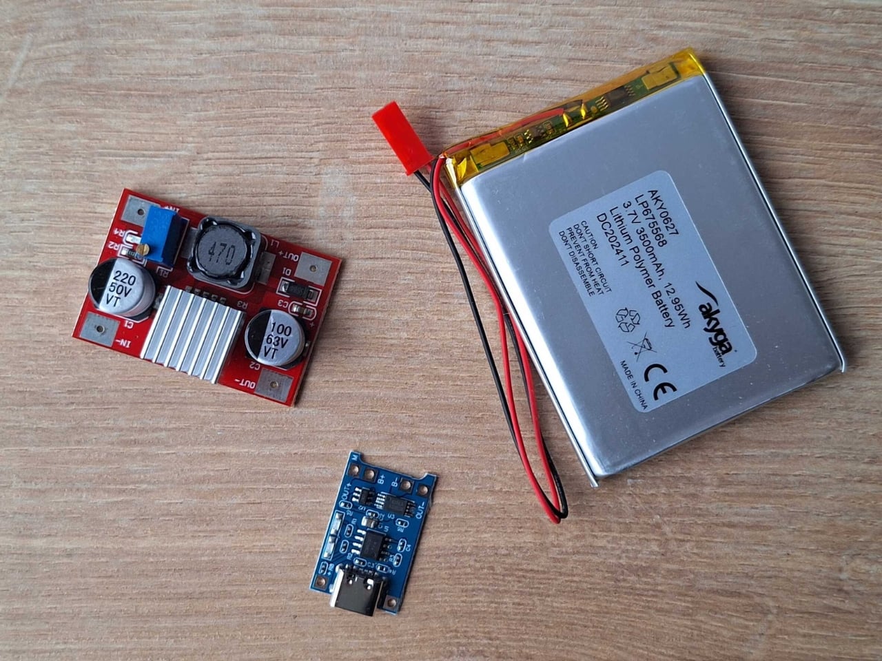
The whole setup is beautifully straightforward. A Raspberry Pi Zero and camera drive a receipt printer, all housed in a 3D-printed case with the guts of a power bank providing juice. Press the button, wait a beat, and out slides your photo on thermal paper. No film cartridges to buy, no wondering if you loaded it correctly, no accidentally exposing your entire pack to light.
Does the image quality match a real Polaroid? Not even close. The photos aren’t the same quality as self-developing film, but they have some charm to them. You get a not-very-good grayscale image on curly paper. But that’s kind of the point. The beauty of instant photography was never really about pristine resolution. It was about immediacy, about physicality, about having something tangible to pin on your wall or slip into someone’s hand.
This project lives in that sweet spot between nostalgia and practicality. Thermal paper might fade over time and the images might look like they came from a 1990s fax machine, but you can shoot hundreds of photos without bankrupting yourself. The economics are almost absurd when you compare it to authentic instant film, which has climbed to luxury pricing in recent years.
I love that this exists because it reminds us that the tools we carry don’t always need to be the most advanced or expensive. Sometimes the joy is in the making itself, in cobbling together a Raspberry Pi, a webcam, and a thermal printer to recreate something that used to cost hundreds of dollars and came from a factory. It’s technology as craft project, gadgetry as personal expression.
The curling thermal paper and grainy output might not win photography awards, but they capture something else: the spirit of experimentation that made instant cameras revolutionary in the first place. Edwin Land didn’t perfect the Polaroid overnight. He iterated, tinkered, and eventually changed how we thought about photography. Boxart’s version might use Python code instead of complex chemistry, but the impulse is the same.
What makes this project particularly appealing is its accessibility. The parts are 3D printed and the code is in Python, meaning anyone with basic maker skills can attempt it. You’re not locked into a proprietary ecosystem or dependent on a company that might discontinue your film stock. You own the entire chain of production, from capture to print.
Sure, you could buy cheap instant print cameras from import sites for less money. But where’s the story in that? Where’s the satisfaction of building something yourself, of understanding exactly how it works, of being able to modify and improve it over time? This isn’t just a camera. It’s a statement about what technology can be when we strip away the branding and the markup and the planned obsolescence.
The Poor Man’s Polaroid won’t replace your smartphone camera or even a proper instant camera if image quality is your priority. But it offers something more valuable: proof that with a little ingenuity and some off-the-shelf components, you can recreate the magic of instant photography on your own terms. And sometimes that curly thermal paper printout means more precisely because you built the machine that made it.
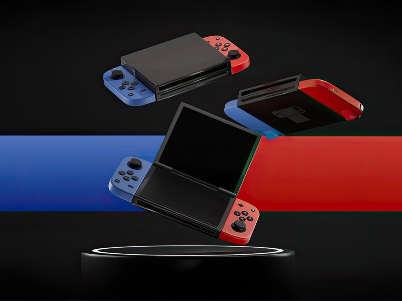
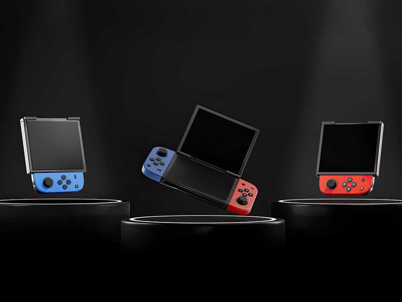
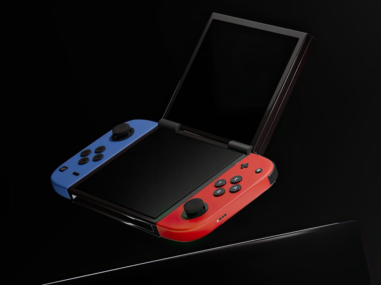
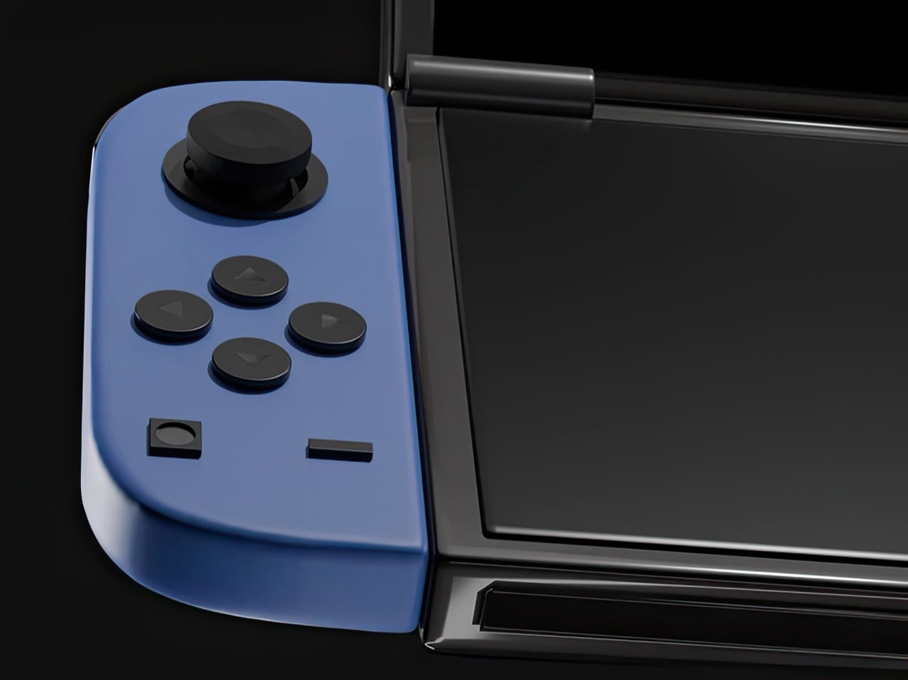
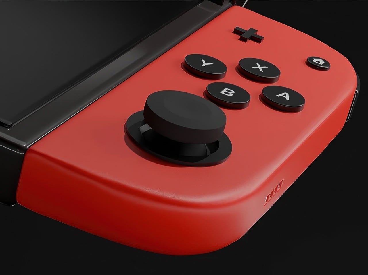
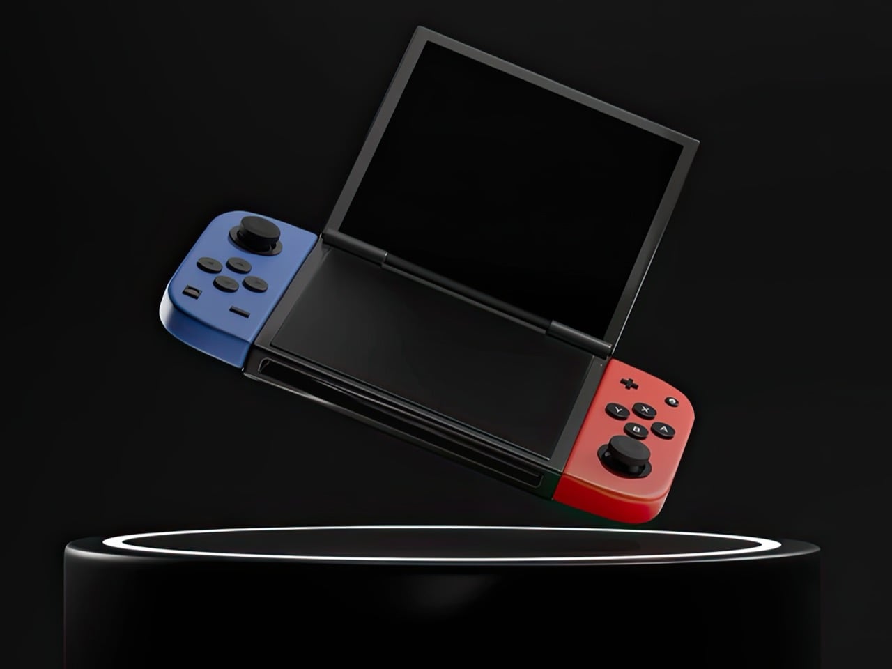
Nintendo had a choice when designing the Switch 2. They could iterate on the formula that made the original a cultural phenomenon, refining the single-screen hybrid into a faster, sharper, better version of itself. Or they could reach back into their own history, pull out the design philosophy that once made the DS family the best-selling handheld hardware line of all time, and merge two eras of thinking into something genuinely new. They picked the first path. Designer Juan Manuel Guerrero just sketched out the second.
The concept arrives as a series of beautifully lit 3D renders: a folding Nintendo Switch with dual screens, a hinge running through the center of the body, and Joy-Cons in the familiar blue-red split attached to either end. The renders carry the finish of product photography, which makes it genuinely easy to forget this never shipped. Closed, it looks like a sleek, pocket-ready device with a tighter footprint than the original Switch. Open, it recalls something older and warmer, the quiet satisfaction of flipping a DS open on a long car ride, except now the screens are large, the controllers are proper, and the whole thing feels built for today. The proportions are deliberate, the design choices are considered, and the whole thing wears its Nintendo identity without apology.
Designer: Juan Manuel Guerrero
The Nintendo DS sat at 154.02 million lifetime units for years, the gold standard for Nintendo hardware, until the Switch finally crept past it in early 2026 with 155.37 million. Two hardware generations, both cultural touchstones, separated by fewer than two million units across a combined history of roughly three decades. The closeness of that race matters. The DS built those numbers on a genuine design idea, a spatial logic where two screens gave developers room for two distinct kinds of information at once, and players responded to that for fifteen years. Guerrero’s concept asks whether the Switch era ever had to leave that behind.
Phantom Hourglass let you draw on the bottom screen to annotate your own maps and solve puzzles, an idea original enough to win awards at the time. Pokemon Diamond and Pearl split the party menu from the battlefield, giving battles a spatial clarity the GBA never had room for. GTA: Chinatown Wars ran the full city map on the lower display and handed the top panel entirely to the action. These were designs built entirely around the format, dependent on the split in a way that made them fall apart on a single screen. That vocabulary has been sitting idle for the better part of a decade.
Samsung’s Galaxy Z Fold 6 runs a 7.6-inch interior display and represents the sixth generation of the company working foldable hardware into something genuinely reliable. Motorola, OnePlus, Google, and Huawei all have competitive entries in the space. Display durability and hinge reliability have been largely solved through successive product generations and real commercial pressure. A dual-screen Switch in 2025 wouldn’t be asking anyone to invent something new; the foldable category has already done the hard engineering work. Guerrero’s concept asks someone to point that already-mature technology at a gaming audience.
The DS touchscreen read as a toy gimmick in 2004. The Wii’s motion controls got laughed at before that console sold 101 million units. The Switch itself looked like a confused category play until it climbed past 155 million units and became Nintendo’s best-selling platform ever. That history of moves that look sideways before they land is the context Guerrero’s concept actually lives in. The foldable technology exists, the Joy-Con design language holds across both halves of the fold, and the IP is coherent. Someone drew it. Now it’s genuinely difficult to look at the Switch 2 without wondering what the other path could have looked like.
At some point in the last couple of years, something quietly shifted in the gaming world. Not in the blockbuster, billion-dollar-franchise sense, but in the more personal, “why am I actually having more fun with this tiny device than my main console” sense. Search interest in retro gaming handhelds jumped 400% year-over-year, hitting 90,500 monthly searches in January 2026 alone. That’s not a blip. That’s people rediscovering something they forgot they wanted, and then telling everyone they know about it.
What’s driving it isn’t hard to understand. Modern gaming has gotten heavy, with big installs, long tutorials, and games that feel like part-time jobs. A retro handheld sidesteps all of that. You pick it up, you’re playing something in thirty seconds, and it fits in your jacket pocket. The designs themselves have become worth caring about, too, from machined aluminum bodies to translucent clamshells to square screens that look like props from a ’90s anime. These aren’t budget toys. Some of them are genuinely beautiful objects that happen to play games. Here are seven that are worth your attention.
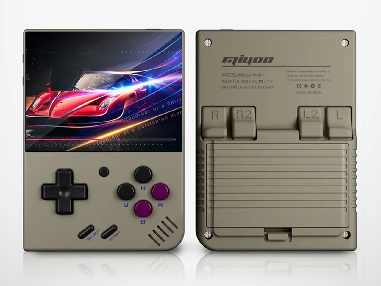
Anbernic RG Cube: The one with the square screen that somehow works
The first thing you notice about the RG Cube is the screen shape, a perfect square, and your brain immediately goes: that can’t be right. Gaming moved to widescreen fifteen years ago. A 1:1 display in 2024 looks like a design mistake, or at best a gimmick. It is neither. The 3.95-inch IPS panel at 720×720 turns out to be native to more retro games than you’d expect, with Game Boy, arcade titles, and Nintendo DS with dual-screen stacking all living here without compromise.
The broader package is hard to argue with. An octa-core Unisoc T820 processor and 8GB of RAM run Android 13, with emulator support up through PS2 and GameCube, though more demanding titles on those systems will push its limits. The asymmetric thumbstick layout borrows from the Steam Deck playbook, and the Saturn-inspired D-pad is precise without drama. At around $170, it comes in Beige White, Radiant Purple, Black, Grey, and the radiant purple has no right looking as good as it does.
What we liked
Square 1:1 screen is genuinely ideal for Game Boy, arcade, and DS emulation
RGB lighting and color options make it a genuinely attractive object
What we disliked
Widescreen games require letterboxing or aspect-ratio compromise
Demanding PS2 and GameCube titles push the processor to its limits
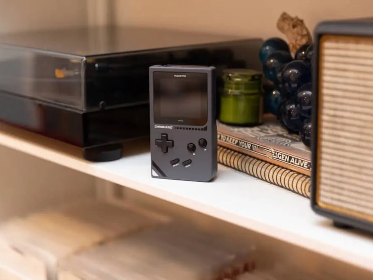
ModRetro Chromatic: The Game Boy Color that Nintendo never made
There’s a version of this product that could have been embarrassing: a magnesium alloy Game Boy Color clone bundled with a new Tetris cartridge, sold at $199. On paper, it sounds like a premium nostalgia trap. In practice, it’s one of the most carefully considered handheld devices released in years. It’s FPGA-based, meaning it reconstructs the Game Boy hardware at the circuit level rather than emulating it in software, which produces zero input latency and a millisecond-accurate match to original hardware behavior.
The physical design earns its price in ways spec sheets can’t capture. The curved battery compartment gives your hands something to grip. A physical volume wheel, a detail so obvious it’s shocking how rarely it appears on modern devices, lets you kill the sound without touching a menu. Colors run from Inferno and Bubblegum to a very wearable Wave blue, with English or Japanese button labeling as an option. It plays physical Game Boy and Game Boy Color cartridges only, which is either a dealbreaker or a feature, depending on how you think about focus.
What we liked
FPGA hardware delivers true zero input lag, not a software approximation
Magnesium alloy shell feels premium and genuinely durable
Comes bundled with a new Tetris cartridge
What we disliked
Plays only Game Boy and Game Boy Color cartridges, no ROMs or other systems
AA battery requirement adds ongoing cost; rechargeable Power Core is sold separately
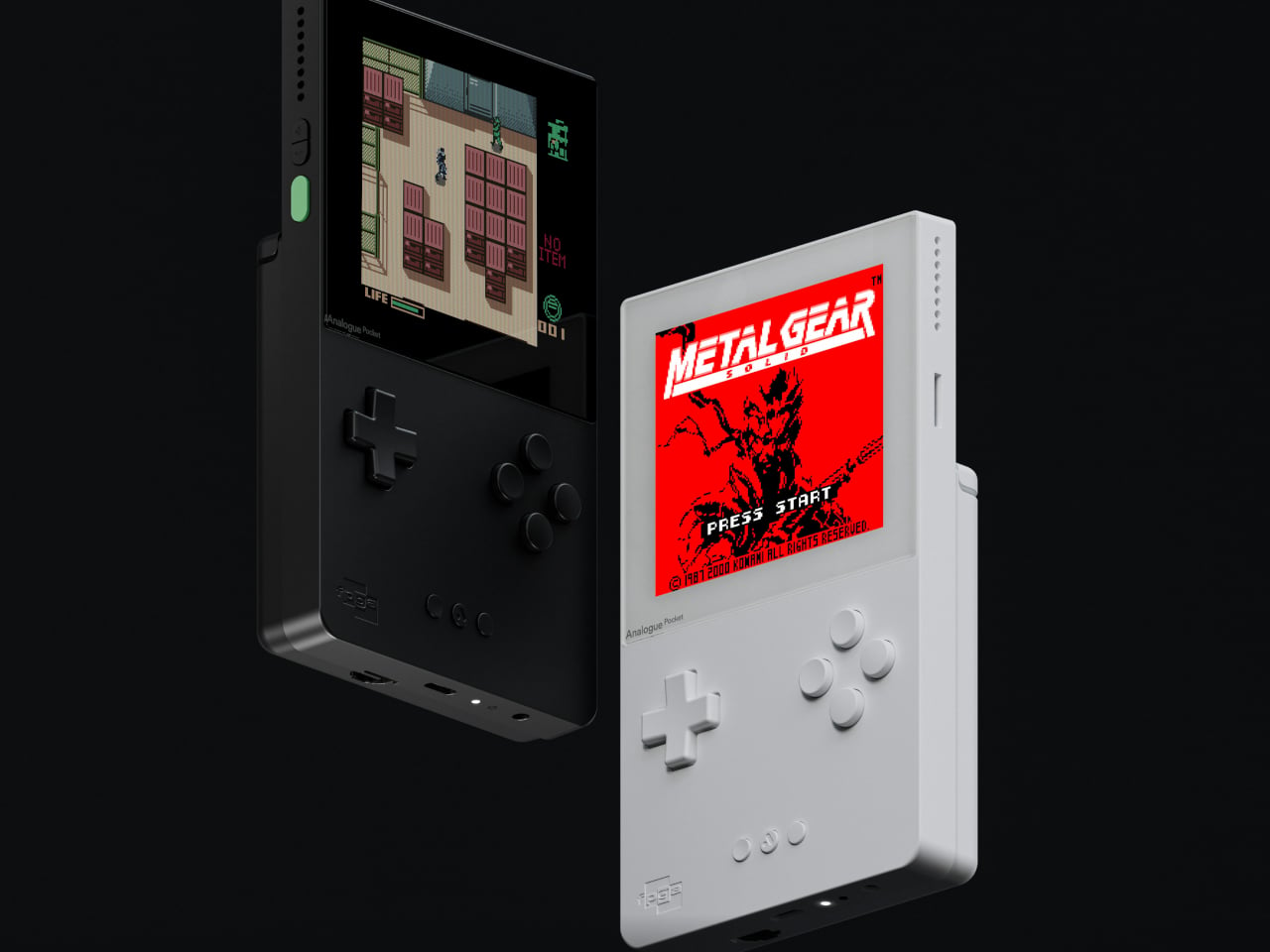
Analogue Pocket: The one photographers keep picking up
The Analogue Pocket is the device that made the retro handheld conversation respectable. It uses an FPGA rather than software emulation and plays Game Boy, Game Boy Color, and GBA cartridges out of the box. Via cartridge adapters, it adds Game Gear, Neo Geo Pocket Color, Atari Lynx, TurboGrafx-16, PC Engine, and SuperGrafx. Via its microSD slot and the OpenFPGA community platform, it loads cores for nearly every retro system that ever existed. The 3.5-inch LCD at 1600×1440 and 615 ppi is, simply, one of the sharpest displays ever put in a handheld.
At $239, it sits at the premium end of this list, and it’s also frequently out of stock. Firmware updates require a microSD card reader, which feels like friction that shouldn’t exist on a $239 device. TV output needs the separately sold $99 Dock. These aren’t dealbreakers so much as signals that Analogue built this for the dedicated enthusiast first. If you want one device to handle everything in your retro library for the next decade, this is probably it.
What we liked
OpenFPGA community support covers an enormous range of retro systems
Plays GBA in addition to GB and GBC, plus many more with adapters
MicroSD slot enables ROM loading
Premium aluminum build with a distinctly modern design language
What we disliked
Frequently out of stock; restocks sell out within minutes
Firmware updates require an external microSD card reader
TV output requires a separately purchased $99 Dock
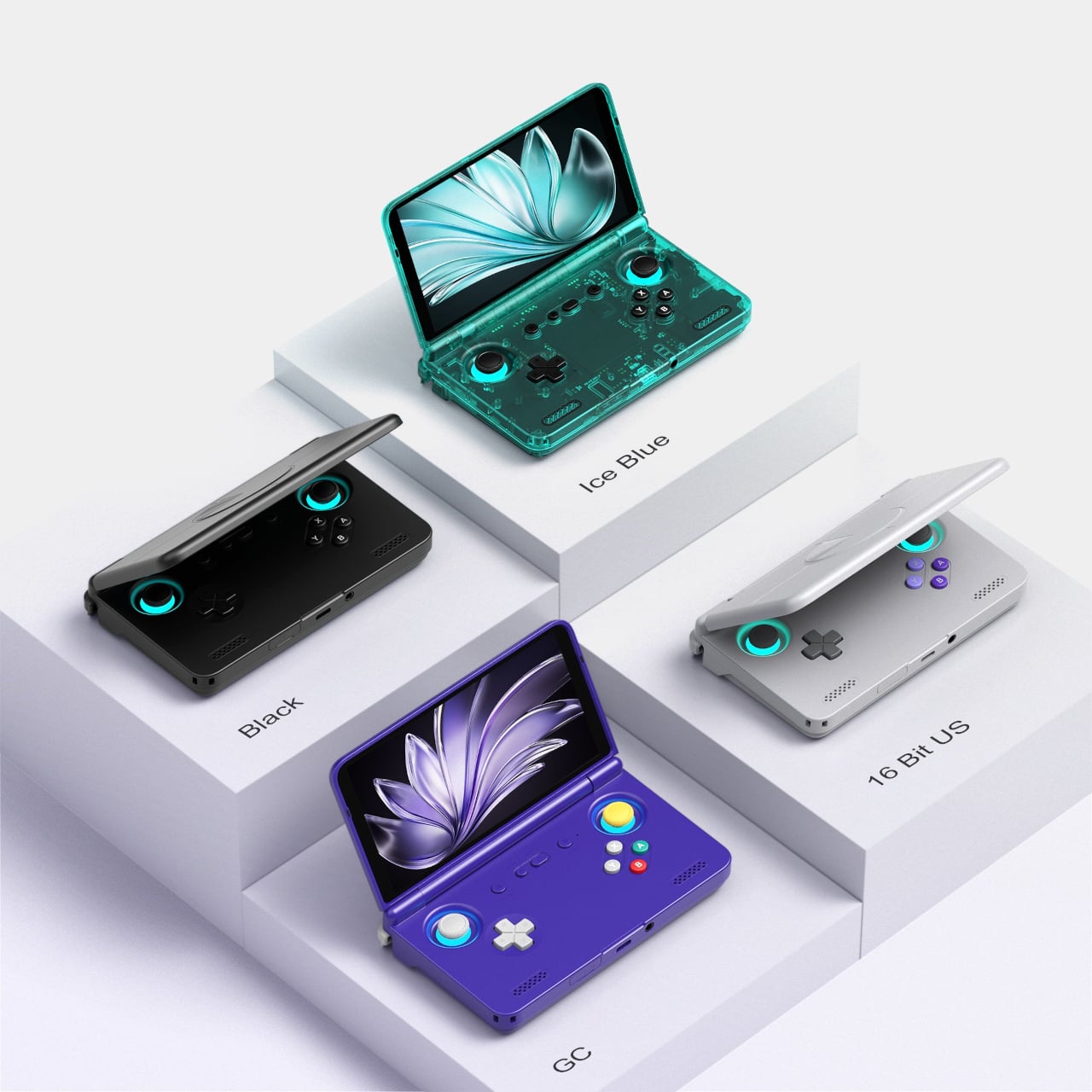
Retroid Pocket Flip 2: The clamshell that brought the GBA SP back with PS2 power
The GBA SP was the handheld that arguably peaked the clamshell form factor: it folded, it protected its own screen, and it had a backlit display before that was standard. The Retroid Pocket Flip 2 arrives in 2025 with that same closing-hinge energy, but with a 5.5-inch 1080p AMOLED screen, a Snapdragon 865 processor, and enough emulation horsepower to run PlayStation 2, GameCube, and Wii. When closed, it has roughly the same desk footprint as a modern smartphone. Closing the lid puts it to sleep; opening it wakes it up.
Color options include a translucent Ice Blue, GameCube Purple, a two-tone 16-bit US, and Black. Retroid clearly understands its audience. The AMOLED panel brings deep blacks and accurate color to games designed for CRTs, and the results are often striking for titles you’ve played a hundred times. At $229 for the Snapdragon variant, there is no meaningful clamshell competitor at this performance level. One persistent note from extended use: the form factor rewards shorter sessions more than marathon ones, which is maybe appropriate for a device meant to live in a bag pocket.
What we liked
5.5-inch AMOLED at 1080p is impressive for the price
Handles PS2, GameCube, Wii, and Dreamcast emulation
Translucent Ice Blue colorway is a design highlight
What we disliked
Thicker than it looks in product photos
Extended sessions can feel less comfortable than flat handhelds
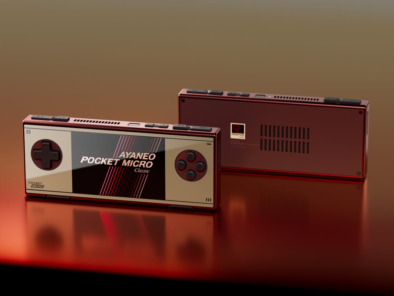
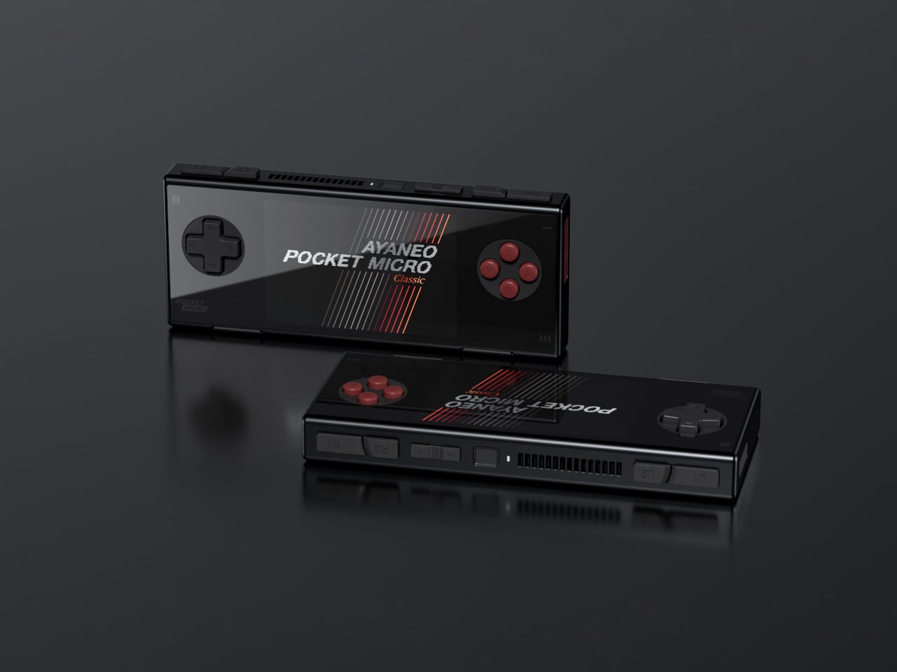
AYANEO Pocket Micro Classic: The one that fits in an actual pocket
The Game Boy Micro launched in 2005 as Nintendo’s most polarizing hardware decision. It was tiny, it was beautiful, it only played GBA games, and it was discontinued within a year. Design historians were kinder to it than the market was. The AYANEO Pocket Micro Classic is clearly in conversation with that history. It removes the analog joysticks, uses a CNC-machined aluminum alloy frame with a seamless all-glass front, and produces something that slides into a front jeans pocket without catching on anything.
The 3.5-inch borderless IPS display at 960×640 in a 3:2 ratio is built for GBA emulation, with 4x pixel-perfect upscaling. Available in Obsidian Black, Charm Red, Vintage Grey, and Gold, each colorway has a different character. The Gold skips “gaming device” and lands somewhere closer to “considered object.” The MediaTek Helio G99 handles everything up through PS1 confidently. If your retro library is 8-bit and 16-bit with a strong GBA presence, the Pocket Micro Classic is probably the most beautiful way to play it.
What we liked
CNC aluminum and all-glass build is genuinely premium for the category
No joysticks make it notably slimmer and more pocketable
Android 13 with Play Store access expands utility beyond emulation
What we disliked
No joysticks limit N64, Dreamcast, and PSP playability
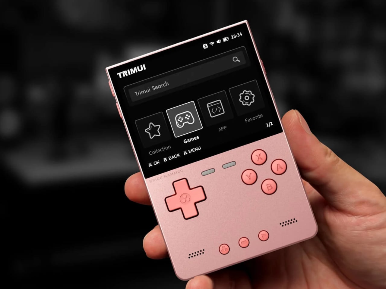
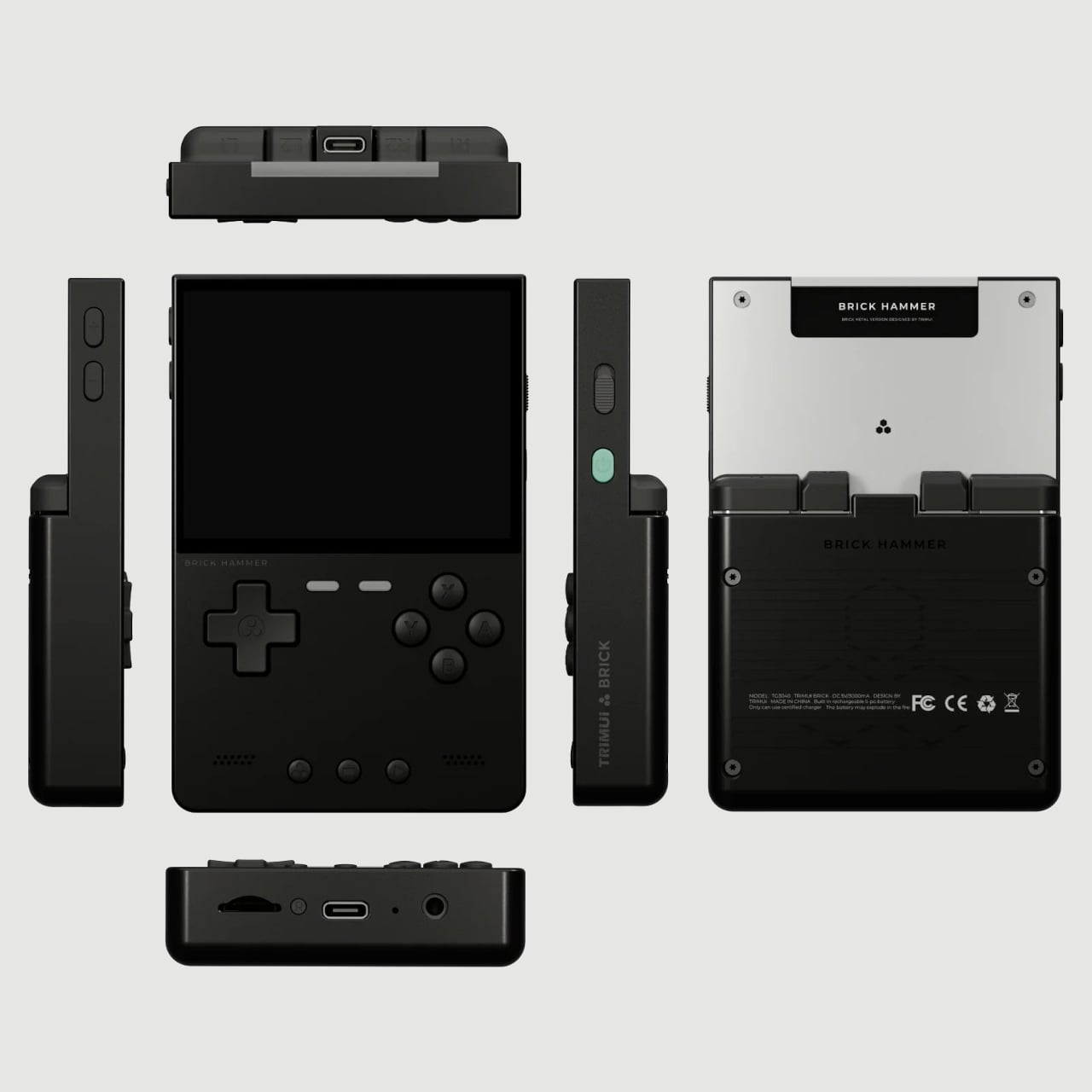
The original TrimUI Brick arrived in 2024 with an unusually sharp 3.2-inch IPS screen at 1024×768, giving it a pixel density of 405 PPI, a number that belongs on a premium smartphone, not a $55 device. The Brick Hammer edition, launched in 2025, replaces the plastic shell with a full CNC-machined aluminum alloy in Gunmetal Gray, Rose Gold, and Fluorescent Green. The metal shell doubles as a heatsink, dropping operating temperatures noticeably. Three interchangeable shoulder button sets ship in the box.
The software runs CrossMix OS on a Linux base: clean, fast, minimal overhead. Load your ROMs, pick a game, and play. Battery life lands around four to six hours. The processor handles Game Boy through PS1 without complaint; N64 gets through most titles; Dreamcast is inconsistent. The CNC backplate can be engraved, which no other device at this price point offers. The Rose Gold aluminum version sitting next to a MacBook on a desk looks less out of place than it has any right to, and that’s a strange and interesting thing to say about a $99 handheld.
What we liked
CNC aluminum Hammer shell runs noticeably cooler than the original plastic
Swappable shoulder buttons and engravable backplate are genuinely rare customization options
Rose Gold and Gunmetal colorways punch well above the budget tier
What we disliked
No analog joysticks, which limits 3D game compatibility
Dreamcast and demanding N64 titles run inconsistently
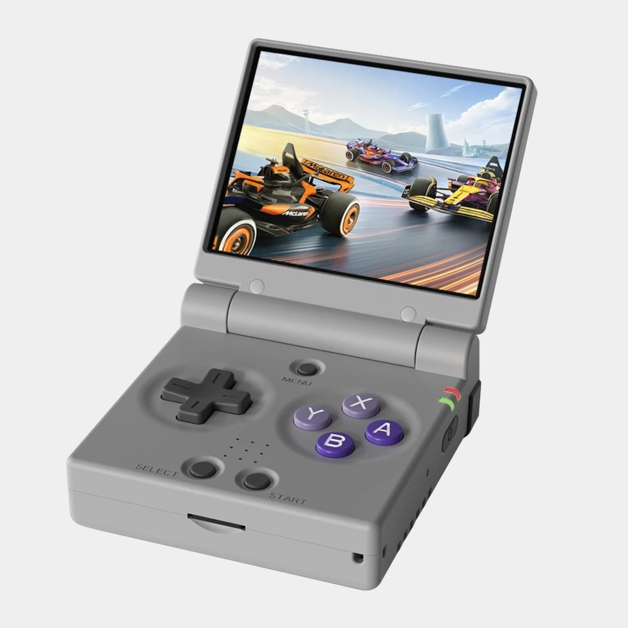
Miyoo Mini Plus (and Mini Flip): The one that started the whole obsession
If there’s a single device responsible for bringing this category to mainstream attention, the Miyoo Mini Plus is probably it. It weighs 200 grams, fits in a jeans pocket, has a 3.5-inch IPS screen at 640×480, and runs OnionOS, a community-built firmware that turns a modest Cortex-A7 processor into a near-perfect front end for everything from the NES to the original PlayStation. The interface is clean, the emulator library covers over a hundred platforms, and save states work the way save states should.
The Miyoo Mini Flip takes the same hardware and wraps it in a GBA SP-style clamshell, adding screen protection and an extra wave of nostalgia. Early production runs had hinge concerns, though those appear to have been addressed in more recent batches. At $69-99, this is the gateway to the category that doesn’t feel like a compromise. The honest question isn’t whether this device is worth the money, since it clearly is. It’s whether starting here will satisfy the itch, or simply make you want to own the other six devices on this list as well.
What we liked
Genuinely pocketable at 200g, fits in a jeans pocket without bulk
Covers NES through PS1 with confident performance
Mini Flip clamshell adds nostalgic GBA SP energy and screen protection
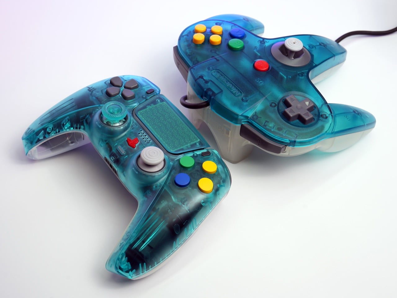
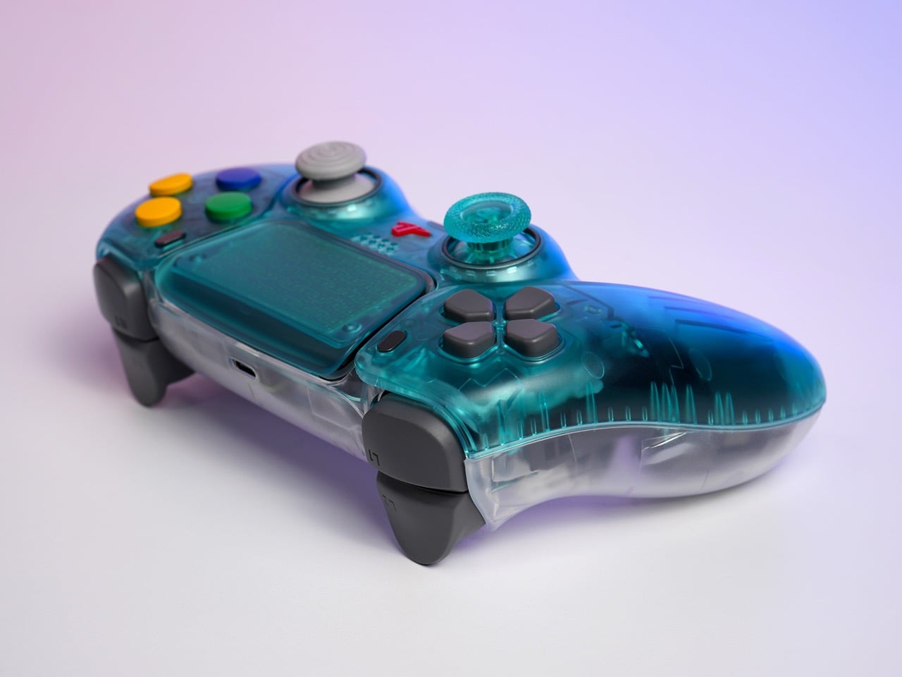
The N64 Funtastic series was Nintendo’s most chaotic design decision, and that’s a compliment. Launched in 1999, the translucent controllers and consoles arrived at the tail end of a broader cultural moment: Apple had just cracked open the iMac G3’s candy-colored shell and shown the world that visible circuitry could be beautiful, and the consumer electronics industry was scrambling to catch up. Nintendo’s version came in six flavors, including Ice Blue, a saturated cyan-teal that looked like it had been poured directly from a Jolly Rancher mold. The controllers were transparent all the way through, which meant you could see every lever, spring, and pivot point in the mechanism. That was the whole point. Showing the guts was the product.
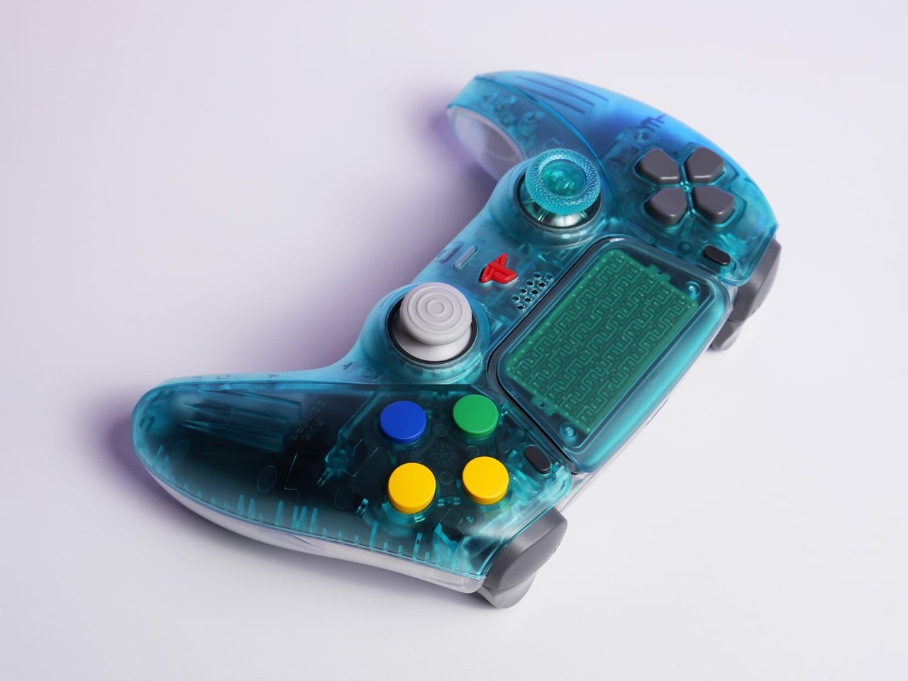
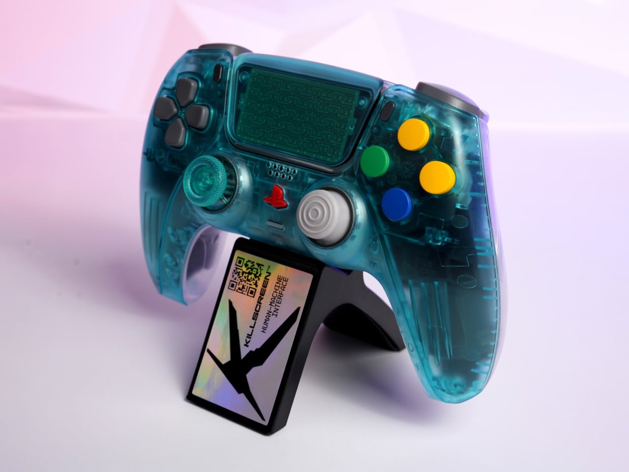
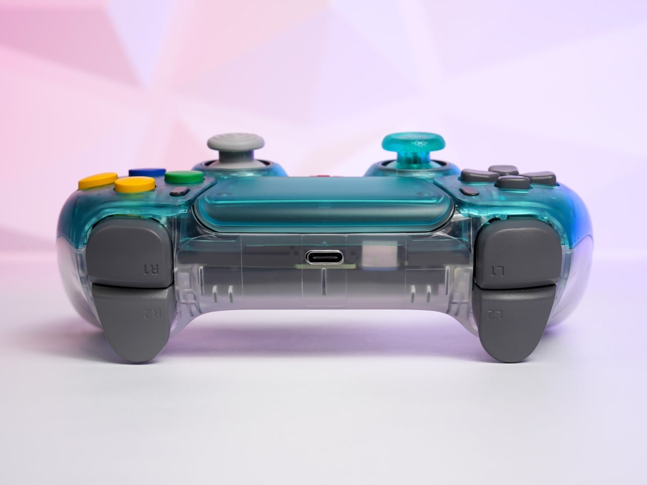
Killscreen, the Florida-based controller studio that has built its entire catalog on surgical retro revisionism, has now transplanted that exact aesthetic onto a PS5 DualSense. The Funtastic Ice Blue/Clear is a limited-edition PS5 controller with an Ice Blue translucent front shell and a crystal-clear back exposing the circuit board, wiring, and battery assembly beneath. It is native PS5 hardware, with wireless connectivity, haptic feedback, and adaptive triggers all intact. The base price is $139, with optional Omron hair triggers, mechanical face buttons, and GuliKit TMR thumbsticks available as upgrades.
Designer: Killscreen
Killscreen co-founder Erik Consorsha is upfront about the fundamental absurdity here: “There’s something slightly wrong about putting a Funtastic-style translucent controller on modern hardware. That’s exactly why we did it.” That instinct for productive wrongness is the throughline in everything Killscreen has released. The CubeSense put GameCube colorways and C-stick nubs on a DualSense. The 1080-R matched, with forensic precision, the exact gray of a factory-sealed 1995 PS1 controller, cracking one open just to get the color right. Each release is a deliberate category violation: taking an aesthetic that belonged to one console, one era, one design culture, and suturing it onto hardware from a completely different lineage. The Funtastic Ice Blue/Clear does the same thing, except the donor and recipient have never shared a design language in their lives.
The original Ice Blue N64 Funtastic controller sits next to the Killscreen version in the press photos, and the color match is uncomfortably close. What the image also captures is 25 years of ergonomic progress in a single frame: the N64’s trident silhouette, one of the most geometrically baffling controllers ever mass-produced, against the DualSense’s precisely contoured twin-grip body. Same shade, completely different idea of what a human hand needs. The face buttons on the Killscreen controller are bright primary yellow, blue, and green, pulled from the N64’s own candy palette rather than PlayStation’s iconic shape symbols, and on a Sony controller body they read as genuinely disorienting in the best possible way.
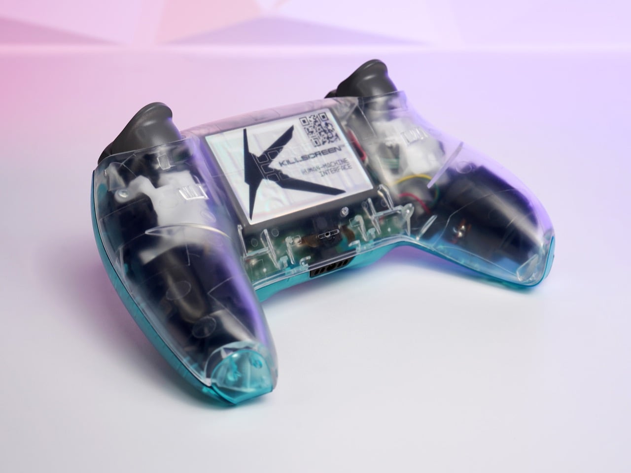
The 1999 Nintendo controllers were a single homogeneous translucent color all the way through: same Ice Blue from the front plate to the grip tips to every molded ridge. Killscreen splits the register three ways: Ice Blue translucent on the front half, crystal-clear on the rear panel, and matte gray on the trigger caps, thumbstick tops, and d-pad. That tripartite material logic is more visually considered than anything Nintendo attempted in 1999. The clear back is where the real design confidence lives: you can see the circuit board, the wiring harness in yellow and red, the USB-C port, and a Killscreen “Human Machine Interface” label on the main board. The internals are the display object.
The upgrade options change the character of the controller considerably. The base $139 configuration retains the stock DualSense trigger mechanism with adaptive resistance. Adding Omron hair triggers for $20 converts those into short-travel tactile clicks at around 2mm of travel, eliminating progressive resistance entirely in favor of on/off precision. Mechanical face buttons at another $20 swap the rubber membrane pads for microswitches, producing crisp tactile feedback more commonly associated with high-end mechanical keyboards. The GuliKit TMR thumbsticks at $39 use tunnel magnetoresistance sensors instead of traditional potentiometers, which means no contact wear and no drift. Fully specced, the controller lands at $208.
Killscreen assembles and tests every unit in-house in Florida, and the run is genuinely limited, consistent with how every prior drop has gone. The Funtastic Ice Blue/Clear is compatible with PS5 and PC. If the CubeSense and 1080-R are any indication, this one will be gone before most people finish debating whether they need it.
Apple has always had this gravitational pull when it comes to design — clean lines, considered materials, and that unmistakable restraint that somehow still feels exciting. It’s the reason a whole ecosystem of third-party accessories exists that speaks the same visual language, sometimes so fluently you’d swear they came out of Cupertino.
The five products on this list sit right in that sweet spot. They’re designed for your Apple devices, they match that premium sensibility, and yet they each bring something Apple itself hasn’t thought of (or wouldn’t dare try). From a keyboard that brings BlackBerry nostalgia to your iPhone to a carabiner that turns your AirTag into a proper adventure companion, these are the accessories that deserve a spot in your setup.
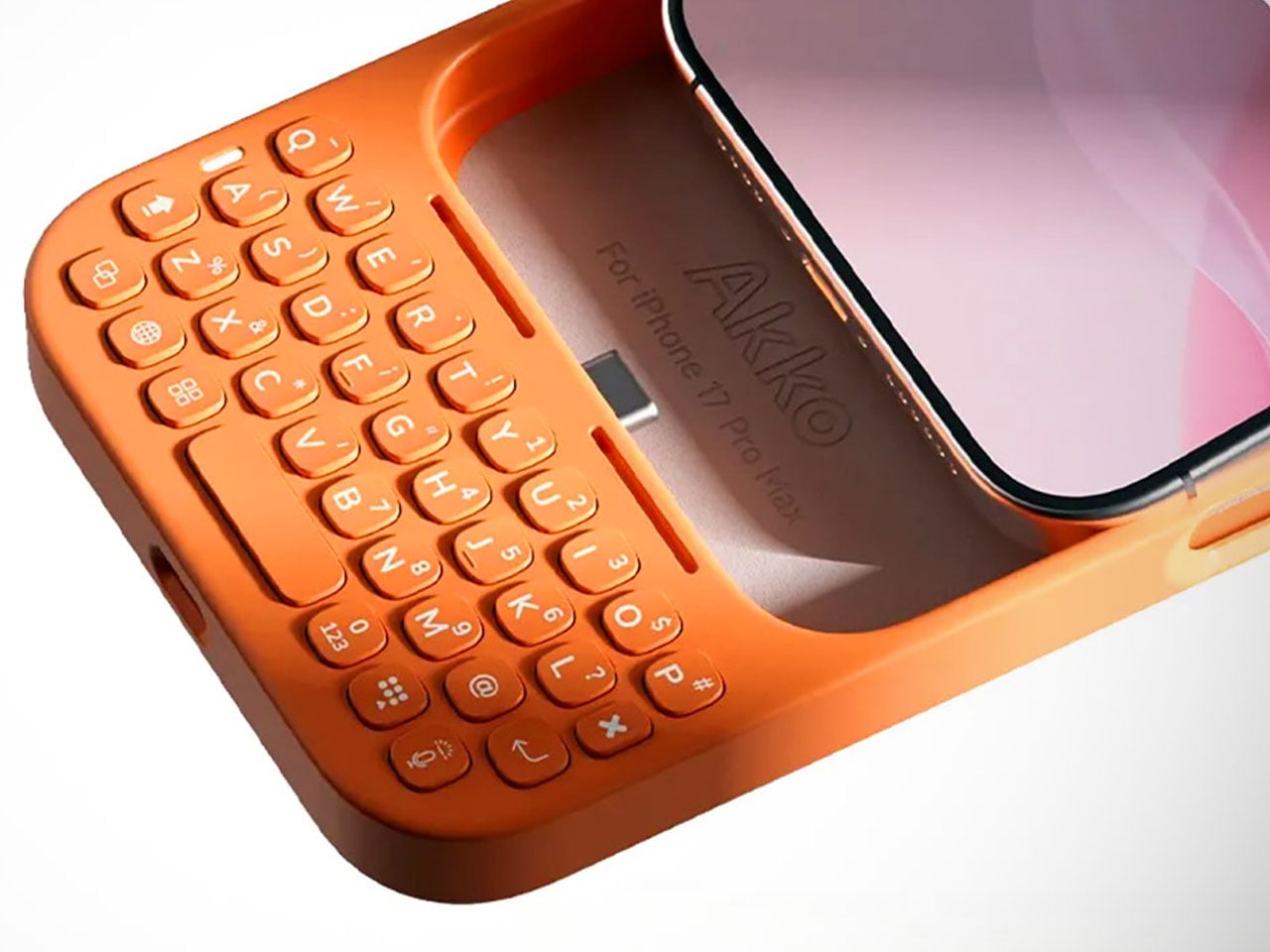
1. Akko MetaKey
There’s something almost rebellious about strapping a physical keyboard to an iPhone in 2026. Akko, a company celebrated in the mechanical keyboard community for its switches and keycap artistry, decided to do exactly that with the MetaKey. It connects to the iPhone 16 Pro Max and 17 Pro Max via USB-C and features a passthrough port, so you can still charge or transfer data without detaching the whole thing. It’s clever, it’s niche, and it’s built with the kind of intentionality that makes you pause and appreciate the craft.
The keyboard layout is compact and BlackBerry-inspired, with backlit keys that work comfortably in low light. What really sets it apart, though, is the thoughtfulness in the details — dedicated shortcuts for Siri, voice dictation, and number input, plus a scroll mode that transforms the top rows into navigation buttons for breezing through long feeds. Akko even includes a tiny nine-gram counterweight that clips behind the keyboard to keep your phone balanced in your hand. It’s the kind of consideration that separates a gimmick from a genuine tool for your Apple device.
What We Like
The USB-C passthrough is a smart move — you never have to choose between typing and charging your iPhone, which makes the MetaKey feel like a seamless extension of the phone rather than an inconvenient add-on.
The scroll mode is a surprisingly intuitive touch. Turning keyboard rows into navigation buttons for scrolling through social feeds or documents on your iPhone shows that Akko was thinking beyond just text input.
What We Dislike
The added length and weight, even with the counterweight, will take some getting used to. It shifts the balance of the phone noticeably, and one-handed use becomes a bit of a juggling act.
Compatibility is limited to just two iPhone models. If you’re on an older device or a non-Pro model, you’re out of luck — and that narrows the audience considerably for something this well-designed.
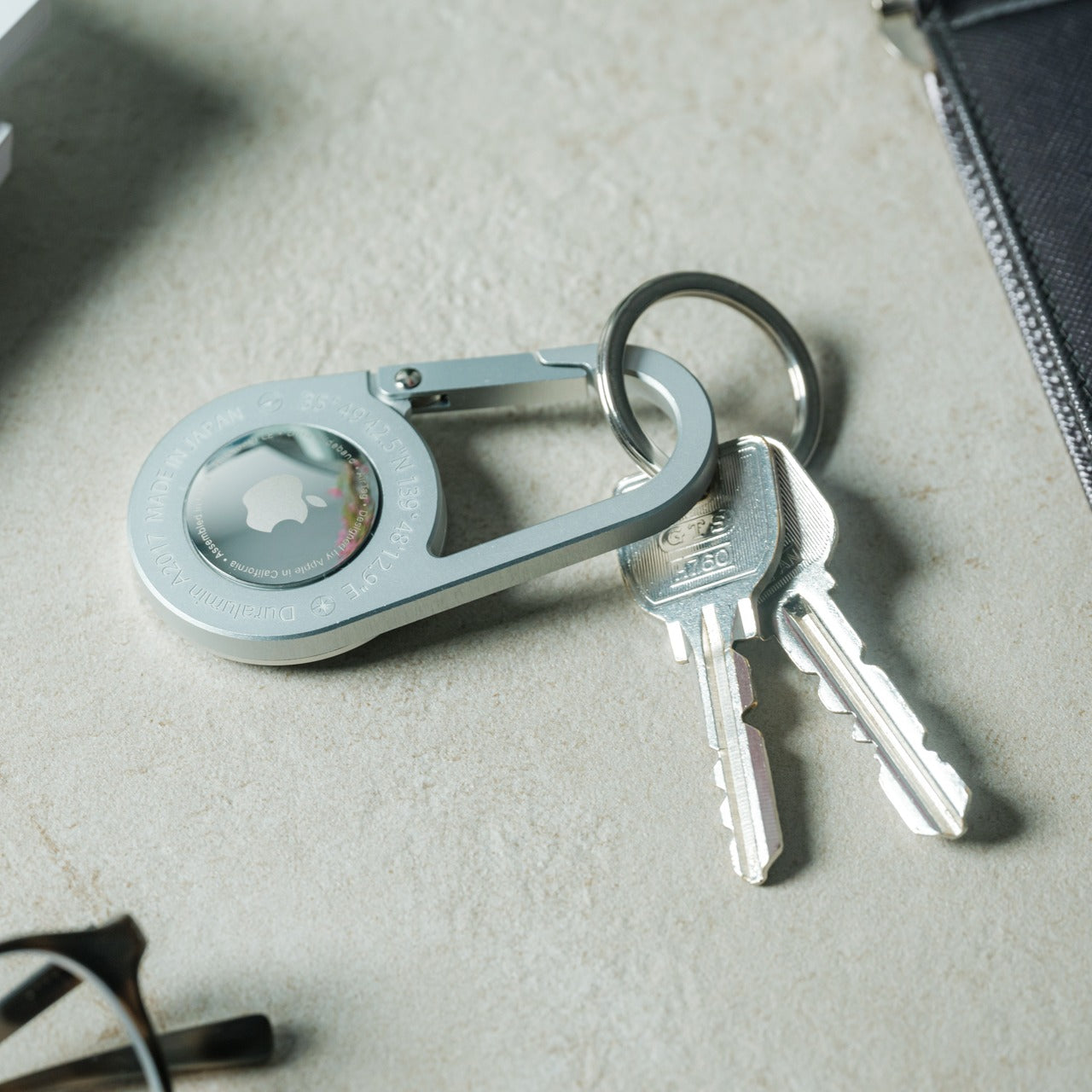
2. AirTag Carabiner
If you’ve ever attached an AirTag to something and felt like the holder was letting down the tracker, this one’s for you. The AirTag Carabiner is made from Duralumin composite alloy — the same material found in aircraft and marine vessels — so it’s as tough as it is minimal. It snaps onto bags, bikes, umbrellas, or whatever else you tend to misplace, and it lets Apple’s Find My network do the rest. There’s a quiet confidence in how understated this thing looks, like it was always supposed to be part of the AirTag’s story.
Each carabiner is individually handcrafted, which gives it a tactile quality that mass-produced holders simply can’t match. It’s also available in untreated brass and stainless steel finishes, so you can match it to your personal style or let it develop a patina over time. For anyone deeply embedded in the Apple ecosystem who uses AirTags on everything from luggage to keys, this is one of those small upgrades that quietly elevates the entire experience.
The Duralumin construction means it’s lightweight yet remarkably strong — suitable for use in water and at high altitudes, which makes it a genuine companion for outdoor adventures, not just a desk accessory for your AirTag.
The handcrafted quality and multiple finish options (brass, stainless steel) add a personal, artisanal dimension that feels right at home next to Apple’s own hardware.
What We Dislike
The AirTag itself isn’t included, which is expected but still worth noting — you’re investing in the holder alone, and the overall cost of the tracker plus carabiner adds up.
For something this minimal, the design language is almost too subtle. If you like your accessories to make a visual statement, this one deliberately doesn’t — it disappears, which is the point, but not everyone wants that.
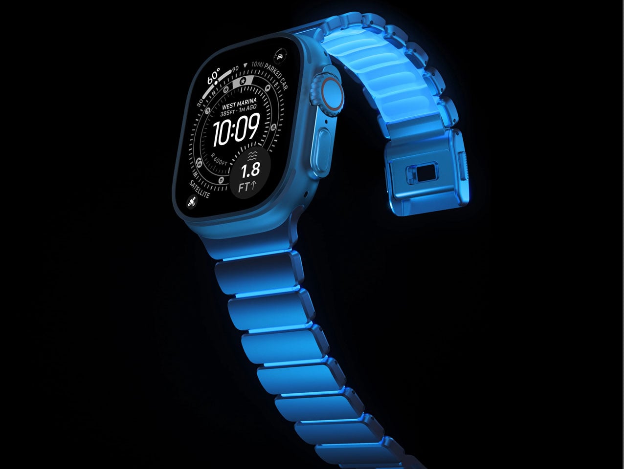
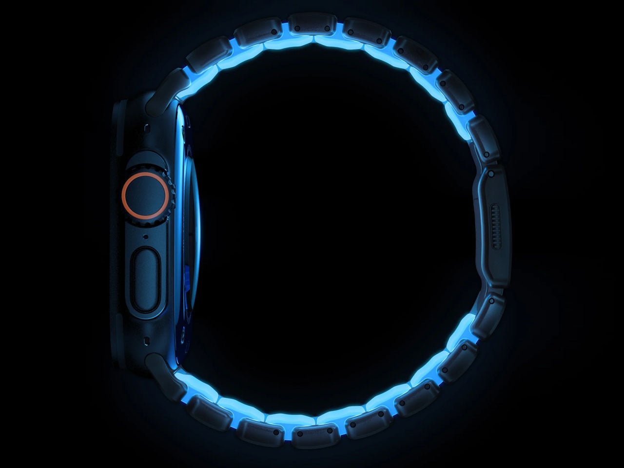
3. Nomad Icy Blue Glow Stratos Band
The Apple Watch Ultra was built for people who push limits, and Nomad’s Stratos Band has always matched that energy. But the Icy Blue Glow edition adds something unexpected — a fluoroelastomer cast that lights up in Tron-like hues after dark. It’s a limited-run release, and it bridges the gap between serious performance gear and something you’d actually want to show off at a dinner table. Nomad describes it as proof that performance and fun can coexist, and honestly, it’s hard to argue.
Underneath the glow, the engineering is just as considered. Grade 4 titanium hardware handles the structural work, while compression-molded FKM fluoroelastomer links sit against the skin for comfort and flexibility. The dual-material design creates natural ventilation spaces between the links, helping with moisture and breathability during workouts or just everyday wear. For Apple Watch Ultra owners who’ve cycled through the usual band options and want something that feels both premium and a little playful, this Stratos edition is a standout.
What We Like
The hybrid construction of titanium and FKM fluoroelastomer strikes a rare balance — you get the refined, metallic look that matches the Apple Watch Ultra’s hardware with the comfort of a sport band, all in one piece.
The glow-in-the-dark feature isn’t just a novelty. It adds genuine visibility during nighttime runs or low-light conditions, making it functional for the adventure crowd the Ultra was designed for.
What We Dislike
It’s a limited-run release, which means if you don’t move quickly, it’s gone. For a band this well-made, it would be nice to see it as a permanent option in Nomad’s lineup for Apple Watch Ultra.
The glow effect relies on light absorption, so its intensity fades over time in darkness. After a few hours, you’re back to a regular (still great-looking) band — manage expectations accordingly.
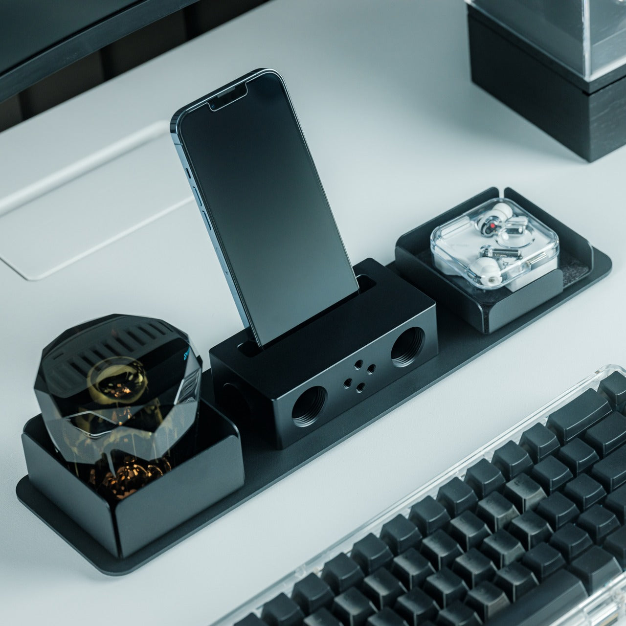
4. Battery-Free Amplifying iSpeakers
There’s an elegance to things that work without electricity. The Battery-Free Amplifying iSpeakers from Yanko Design Select take your smartphone’s built-in speaker and amplify the sound purely through acoustic design — no charging, no Bluetooth pairing, no cables. You simply place your iPhone into the cradle and let the Duralumin metal body do the work, channeling and projecting sound waves across the room. It’s the kind of product that makes you appreciate physics as a design material.
Beyond the clever engineering, the speaker itself is designed using the golden ratio, so its proportions feel inherently pleasing on a desk or shelf. The vibration-resistant Duralumin construction — the same aerospace-grade material — means the body stays stable even when the sound is full. There are also optional add-on modules called +Bloom and +Jet that let you direct the sound in different patterns, which is a nice touch for people who care about how audio fills a space. For your iPhone, it’s a zero-fuss, zero-power way to fill a room with music.
The completely passive, battery-free design is refreshing in a world of chargers and cables. You just drop your iPhone in and go — no setup, no pairing, no power source needed.
The golden ratio proportions and aerospace-grade Duralumin make it as much a desk sculpture as an audio accessory. It genuinely enhances the look of whatever space it sits in alongside your Apple devices.
What We Dislike
Acoustic amplification has its limits. Don’t expect it to compete with a powered Bluetooth speaker — it’s best suited for casual listening and background music with your iPhone, not filling a large room for a gathering.
The +Bloom and +Jet sound-directing modules are sold separately, which means getting the full experience requires additional investment beyond the base speaker.
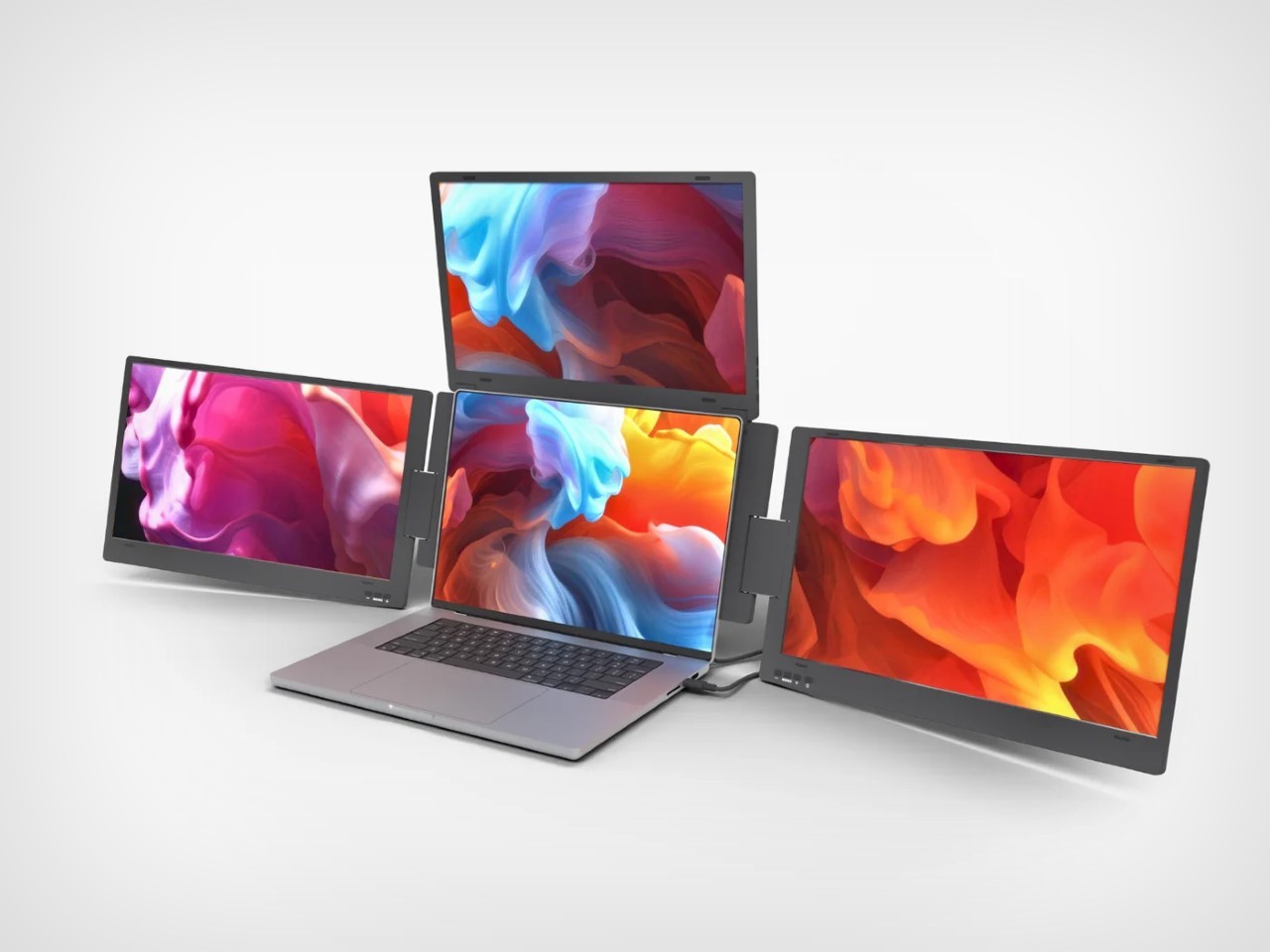
5. Triple Boost 14 Pro
Dual monitors are fine. The Triple Boost 14 Pro thinks bigger. This accessory attaches to your MacBook and unfolds into three additional 14-inch IPS displays — two flanking the sides and one rising from the top — turning your laptop into a four-screen workstation that looks like it belongs in a mission control room. It connects via a single cable, and once you set it up, your MacBook’s workspace expands in a way that fundamentally changes how you multitask.
Each panel delivers 1920×1080 resolution at 60Hz with 300 nits of brightness and a matte finish that tames reflections. These aren’t color-accurate screens for photo editing or design work — they’re built for volume, for keeping your spreadsheets, code editors, Slack channels, browser tabs, and terminal windows all visible simultaneously on your MacBook. It’s a tool for people who work across multiple apps at once and hate the alt-tab dance. For MacBook users who’ve always wished their laptop could do more without being tethered to a desk setup, the Triple Boost 14 Pro is a compelling, portable answer.
What We Like
The sheer screen real estate is transformative for MacBook productivity. Going from one display to four means you can keep everything visible — no more cycling between windows or losing your place in a workflow.
The matte finish on all three panels is a smart, practical choice. It keeps reflections and glare under control, which matters when you’re staring at this much screen area on your MacBook for extended work sessions.
What We Dislike
At 1080p and 60Hz, the panels don’t match the Retina quality of your MacBook’s built-in display. The resolution difference is noticeable when you glance between screens, especially with text rendering.
Portability is relative here. While it technically travels with your MacBook, the bulk and setup process of three additional screens make this more of a semi-permanent desk solution than a true grab-and-go accessory.
Designed Different, But Designed Right
What ties all five of these accessories together isn’t just compatibility with Apple devices — it’s a shared design philosophy. They’re restrained where they need to be, bold where it counts, and built with materials and details that punch well above what you’d expect from third-party products. Each one feels like it belongs in the Apple ecosystem without trying too hard to imitate it, and that’s a difficult line to walk. These are products made by people who clearly care about craft.
If you’re particular about what sits next to your iPhone, MacBook, or Apple Watch, this list is for you. Not every accessory deserves a place in a carefully considered setup, but these five earn it. They solve real problems, they look good doing it, and they bring ideas that Apple hasn’t explored yet. Sometimes the best additions to your ecosystem are the ones that didn’t come from Cupertino at all.