The Macaron Collection That’s Actually Built to Last

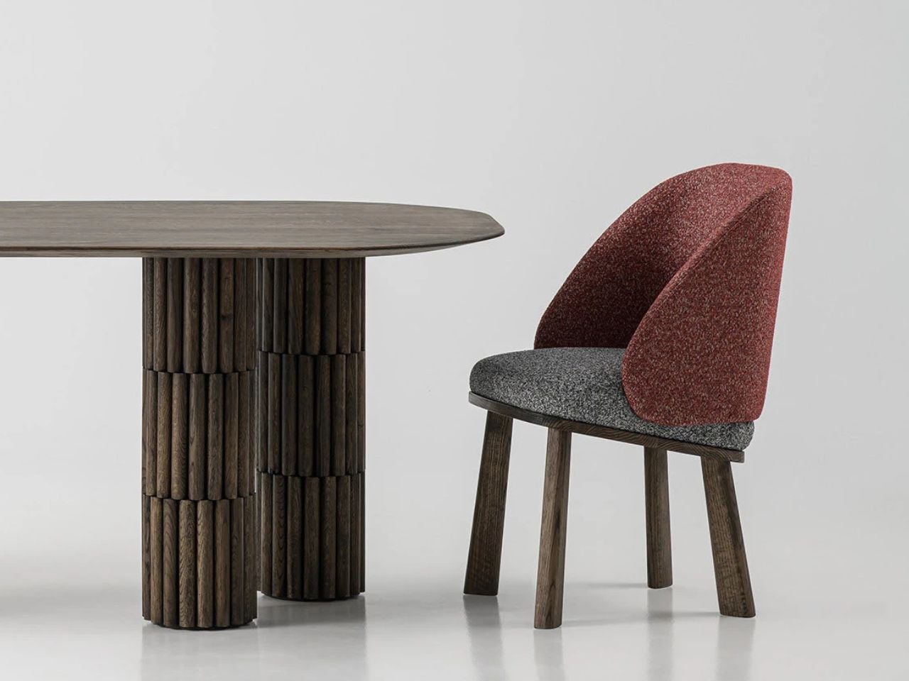
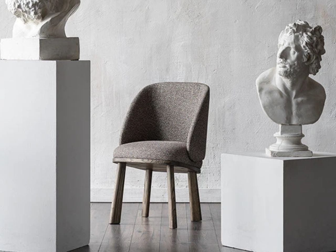
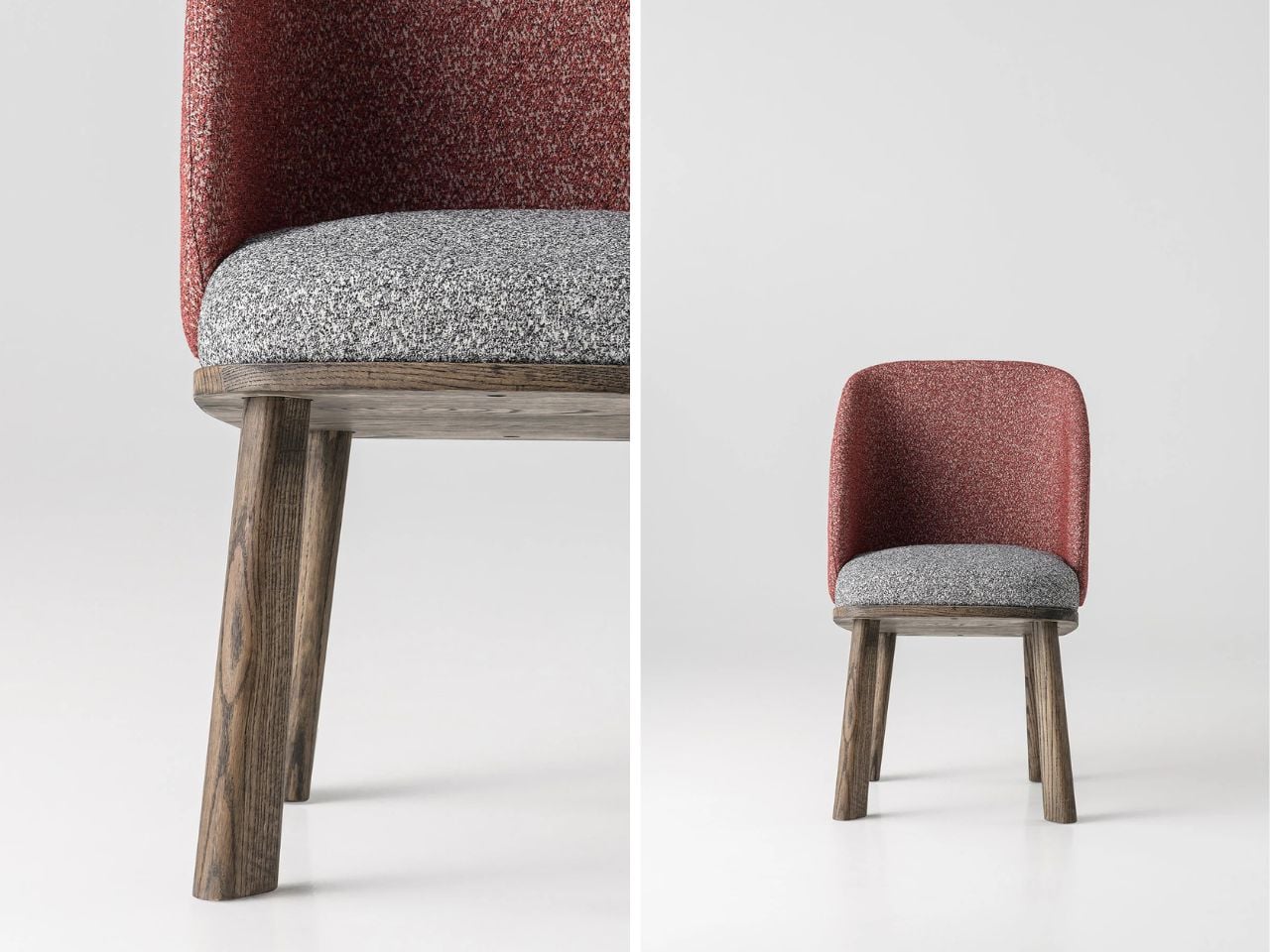
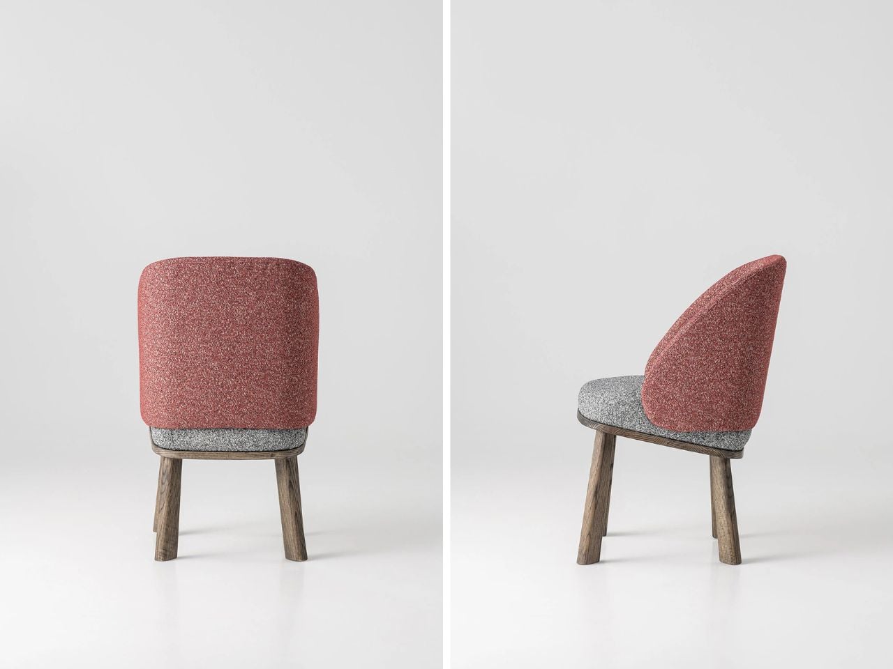
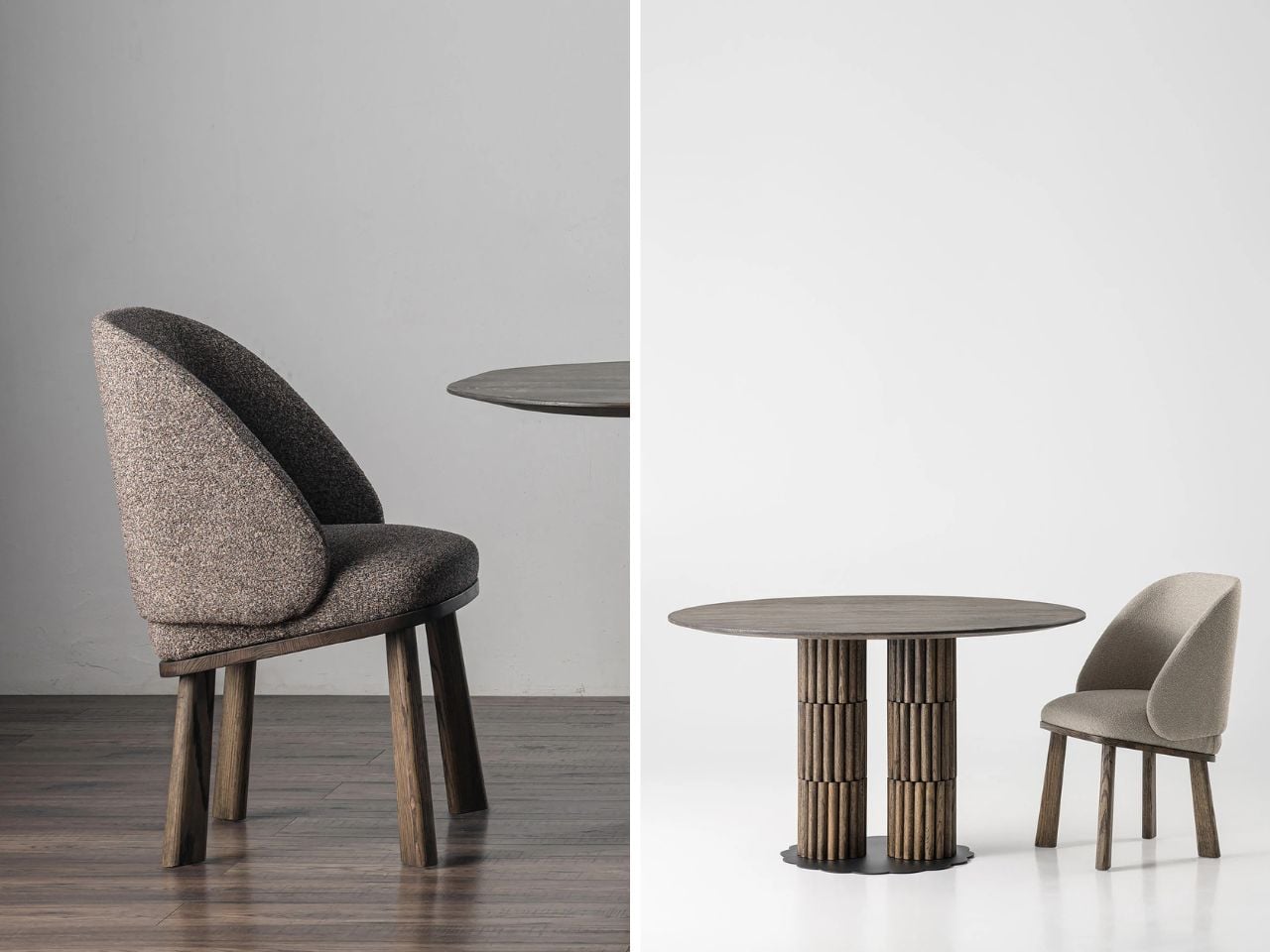
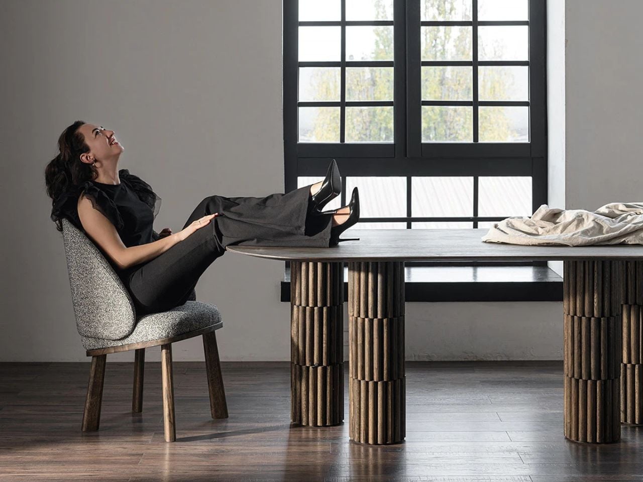
Furniture rarely makes me stop scrolling. Most of what cycles through my feed either looks too clinical to feel livable or too trendy to last past next season. But when I came across Macarons, a modular furniture system by Taiwanese designers HanYi Huang and Fong-Yi Liou, I actually paused. Not because it was trying too hard, but because it wasn’t.

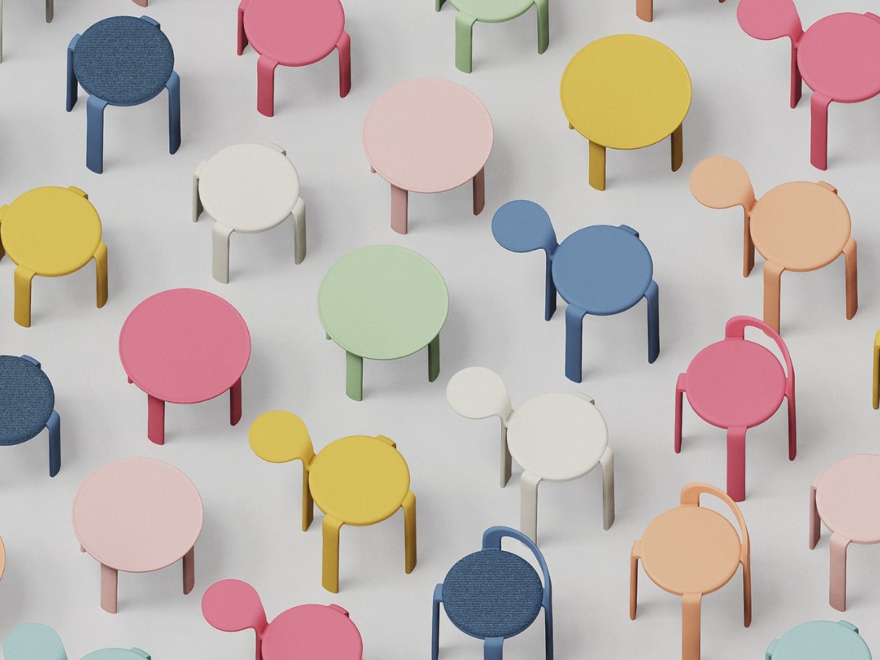
The name gives it away, and that’s the point. Macarons draws its visual language directly from the French confection, right down to the rounded forms, the layered silhouette, and that quietly playful quality that makes you smile before you even understand why. The design came from 03 Design Ltd. in Taiwan and was created for longtime furniture manufacturer Shiang Ye Industrial Co. It picked up a double win at the 2025 European Product Design Award, taking home recognition in both Home Furniture and Eco Design, which tells you this isn’t just a pretty concept piece.

Designers: HanYi Huang
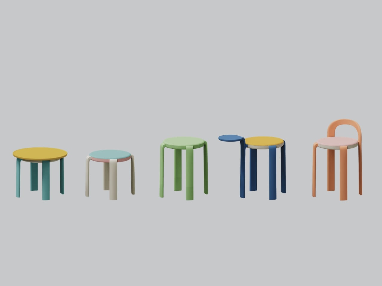
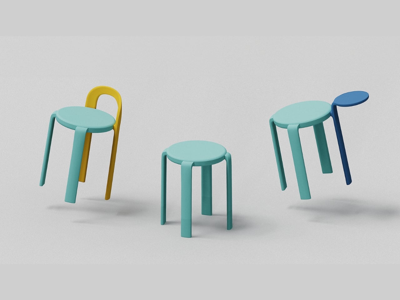
What actually makes Macarons interesting as a furniture system is the modularity. You get a configurable set of stools, chairs, and side tables built around a simple logic: swap the legs, change the seat, add on what you need. The components connect through a rotational seat mechanism that makes assembly genuinely easy and, more importantly, makes repair possible. That second part tends to get glossed over in product launches, but it matters a lot. A piece of furniture you can actually fix is one you’ll keep for a decade. That’s the quiet kind of sustainability nobody puts in the headline.

The structural engineering behind the legs is where things get clever. Huang and Liou designed an off-centered, cloverleaf knot leg structure that improves both strength and comfort simultaneously. That’s a harder problem to solve than it sounds. Most furniture designers pick one or the other and call it a day. The fact that the leg geometry does both while also contributing to the visual identity of the product is the kind of decision that separates designers who think holistically from those who think in silos.
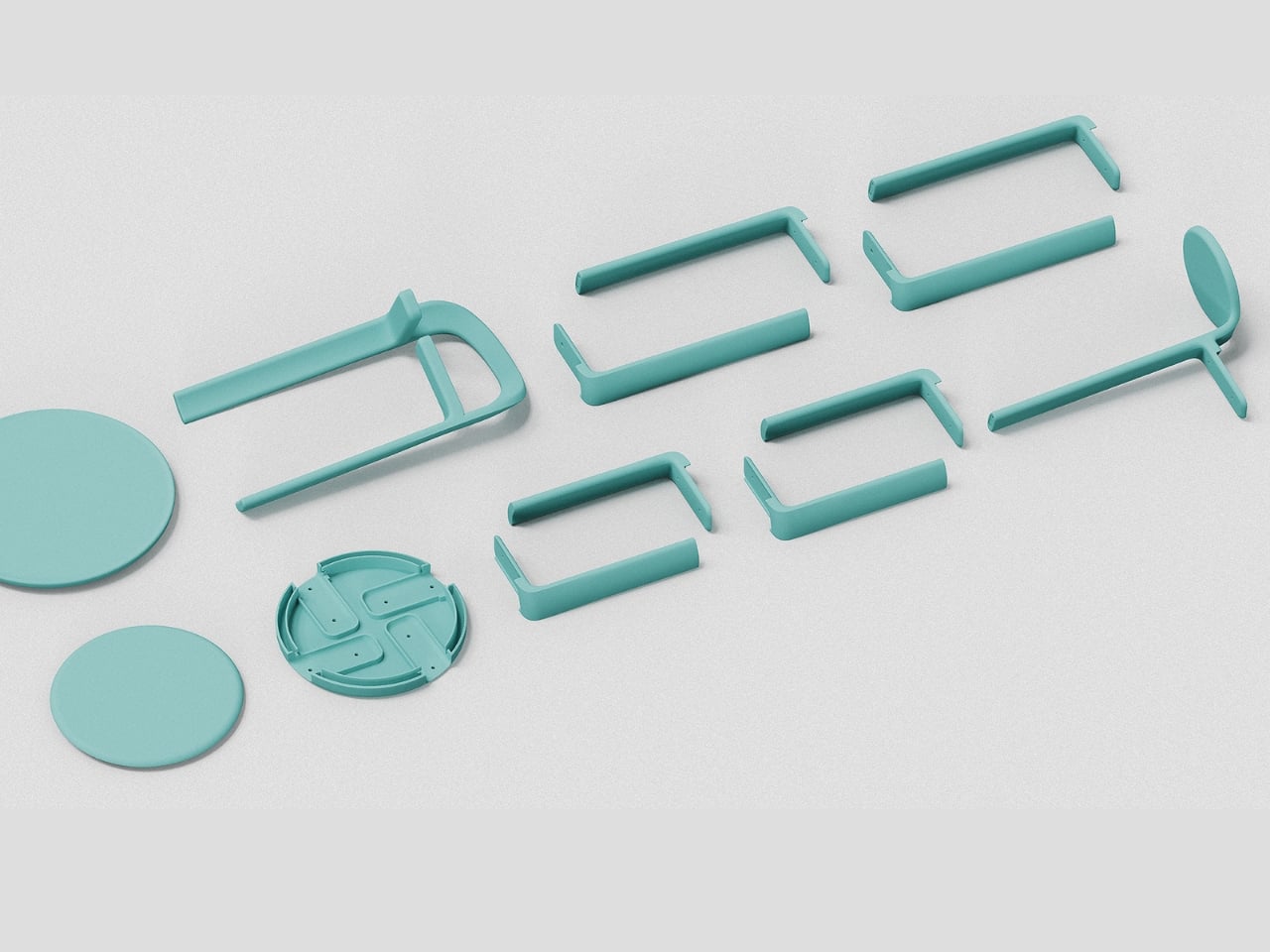
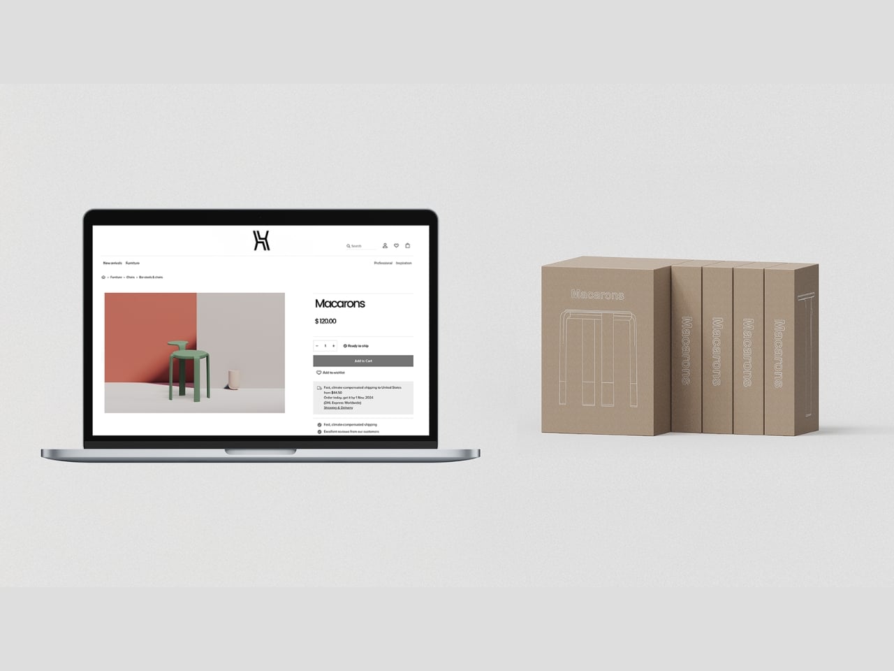
The material choice is equally deliberate. The entire system is made from post-consumer recycled polypropylene, which cuts down on waste and makes the pieces lighter to ship. Shipping weight is one of those sustainability factors that rarely gets talked about in design discourse, but it compounds fast. Lighter furniture means lower emissions per unit moved, and when you’re thinking about a modular system that’s meant to scale, that math matters.
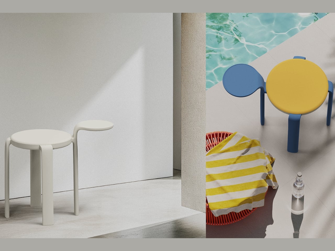
I’ll be upfront about what I find genuinely compelling here: this isn’t sustainability as aesthetic, which is a trend I find exhausting. You know the type, raw edges, reclaimed wood, a beige palette that wants you to feel virtuous for just looking at it. Macarons doesn’t do that. It leans into color, playfulness, and modularity first, and builds the sustainability into the structure and material rather than the surface. That’s the right order of operations.
HanYi Huang brings a sharp design background to this. Her postgraduate work in Italy earned her a Red Dot Design award, and she’s been leading the design team at Shiang Ye as Creative Director, steering a traditional B2B furniture manufacturer toward work that competes internationally. That kind of trajectory, from a classic manufacturing context to award-winning modular systems with a global footprint, is worth paying attention to.
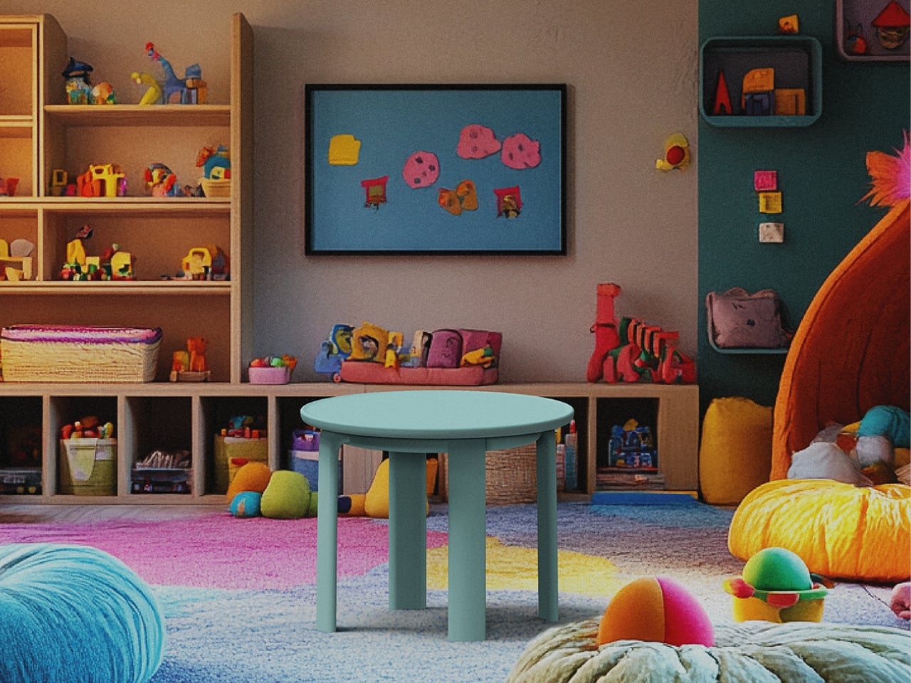
What Macarons ultimately argues is that modular, repairable, and recyclable furniture doesn’t have to feel like a compromise or a lecture. It can feel light, joyful, and considered. It can look like something you’d actually want in your home rather than something you bought to feel better about your carbon footprint. That’s a harder balance to strike than most people realize, and Huang and Liou struck it. Design that makes you feel good and does good at the same time is still the rarest kind. Macarons comes close.
The post The Macaron Collection That’s Actually Built to Last first appeared on Yanko Design.
Fläkt Just Redesigned the Air Purifier as Furniture

If you’ve ever owned an air purifier, you know the drill. You unbox it, it works great, and then you spend the next three years sliding it from corner to corner because no matter where it lands, it looks completely out of place. It hums quietly beside your bookshelf looking vaguely medical. It sits in your bedroom like it belongs in a waiting room. The technology is fine. The design? Almost always an afterthought.

That’s what makes Fläkt, designed by Laura Chaves at the Savannah College of Art and Design and a winner at the 2025 European Product Design Award, feel like such a breath of fresh air (pun very much intended). It approaches air purification not as an appliance problem to solve, but as a living space problem, and that distinction completely changes the result.

Designer: Laura Chaves

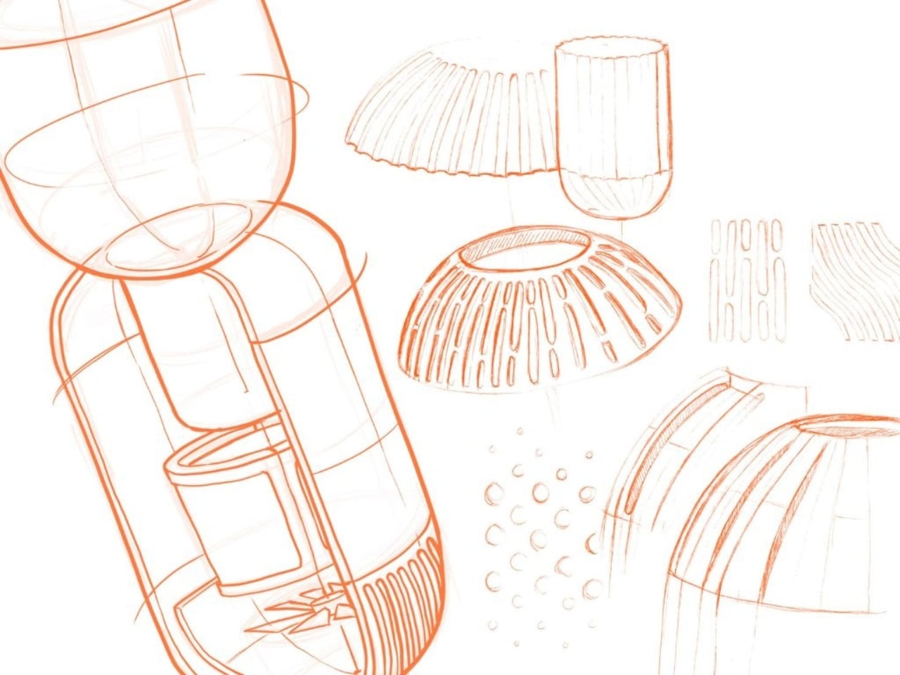
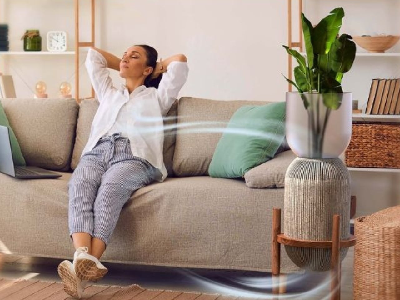
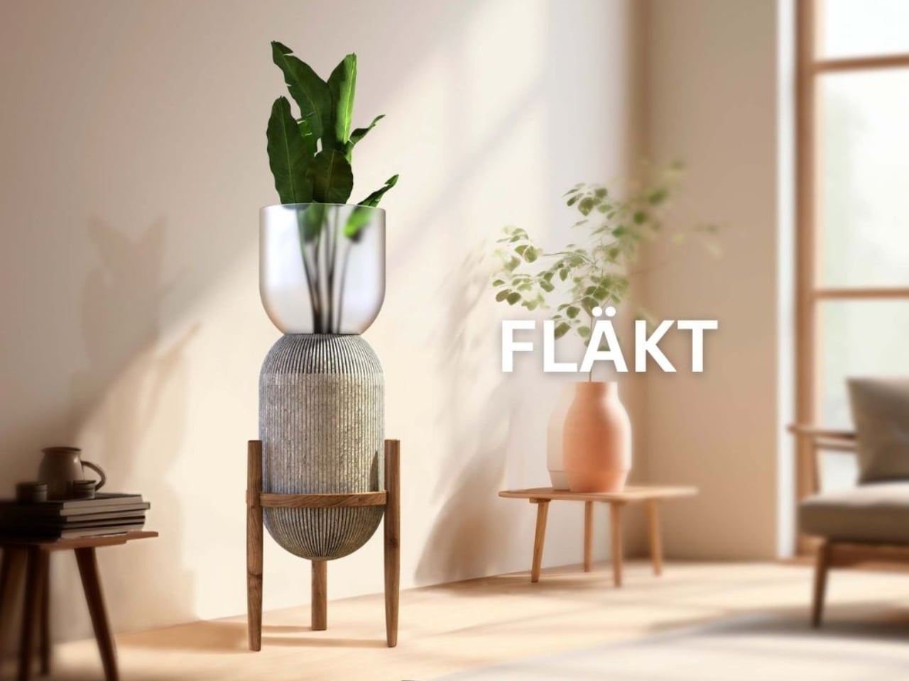
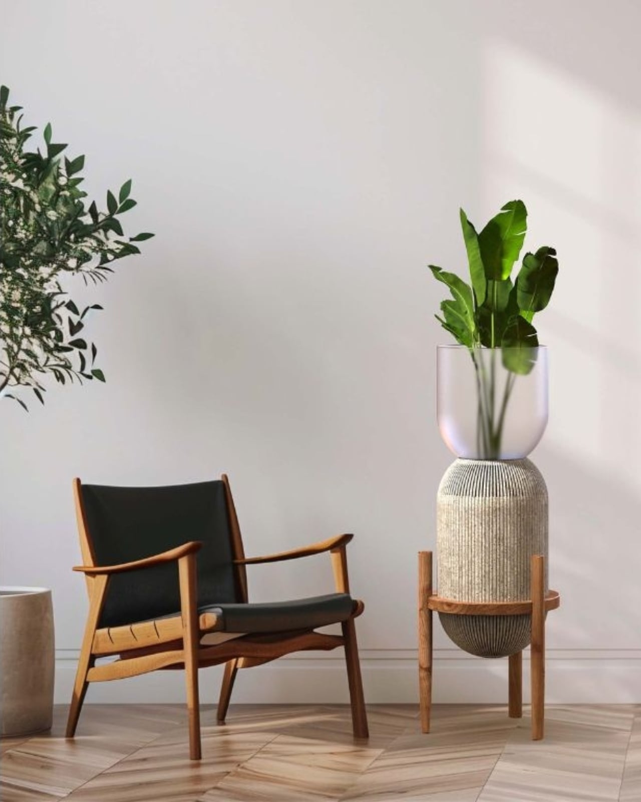
The first thing you notice is that it doesn’t look like an air purifier at all. It looks like a considered piece of furniture. The structure sits on a handmade walnut elevated stand, the kind of thing you’d see cradling a ceramic vessel in a curated Scandinavian living room. The body is encased in geopolymer concrete, a lightweight, sustainable alternative to traditional concrete, which gives it that raw, tactile quality that’s very much at home in contemporary interiors. And perched at the top is a smooth, translucent sandblasted glass vase holding a live air-purifying plant. It’s an elegant full-circle idea: the machine that cleans your air is literally growing something that cleans your air.

That layering of concept and material is the kind of design thinking that deserves real attention. Chaves didn’t just dress up a functional product and call it a day. The form, the materials, and the purpose are all pulling in the same direction, and you can feel that intentionality in every part of the object. Geopolymer concrete instead of plastic. Walnut instead of injection-molded legs. A glass vase that holds a living element rather than a decorative panel that hides the mechanics.

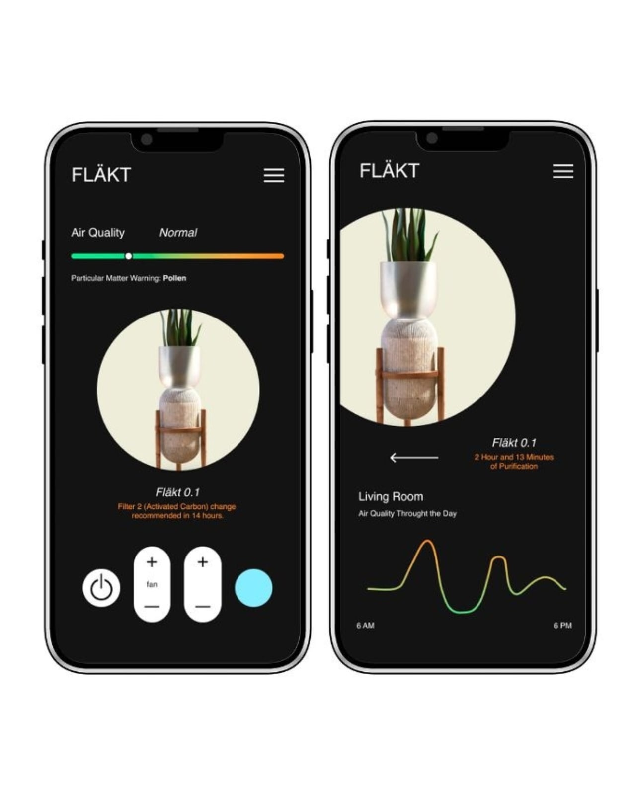
The companion app extends that same level of thoughtfulness into how you actually use it. Fläkt monitors air quality around the clock and activates autonomously when it detects pollutants or particulate matter, whether that’s pollen, dust, or anything else drifting through your space. The app surfaces this data clearly, tracking air quality throughout the day in clean, readable graphs, with timely notifications for filter changes. It’s the kind of transparency that most smart home products promise and rarely deliver with this much clarity. You’re not just handed a number and left to guess what it means. You’re given context, and that matters.

My honest take is that the air purifier category has been coasting on function alone for too long. We accept ugly hardware in our homes because we’ve been told utility and beauty are separate concerns, that you pick one or the other. Fläkt pushes back against that logic, and it does so without feeling precious or trying too hard. The design is grounded and warm, not performative. It belongs in a real room with real furniture and real life happening around it.

The decision to incorporate a live plant isn’t just a styling choice, either. It’s a statement about how design can reconnect us to something organic in spaces increasingly filled with screens and synthetic materials. A quiet confidence runs through that idea, and it makes Fläkt feel less like a tech product and more like a living object.

Whether or not Fläkt makes it to full production, it already does something useful: it raises the bar for what air purifiers are allowed to be. For a design that came out of a student project, that’s not a small thing. It’s the kind of work that tends to show up in mood boards before it shows up in stores, and that’s usually a pretty good sign.

The post Fläkt Just Redesigned the Air Purifier as Furniture first appeared on Yanko Design.

Stop Adjusting Your Office Chair. The LiberNovo Omni Adjusts to You Instead

Spring cleaning has a branding problem. Every year, the ritual circles back to the same tired playbook: declutter the shelves, reorganize the desk, maybe splurge on a new monitor arm. What never makes the list is the thing your body has been arguing with for eight hours a day, five days a week. The chair. It sits there, static and indifferent, while you shift and squirm through another afternoon of accumulated spinal resentment. LiberNovo’s Spring Refresh campaign, running now through April 15 across North America, is built on a premise the rest of the furniture industry still hasn’t internalized: the most important thing in your workspace is the one holding your skeleton together.

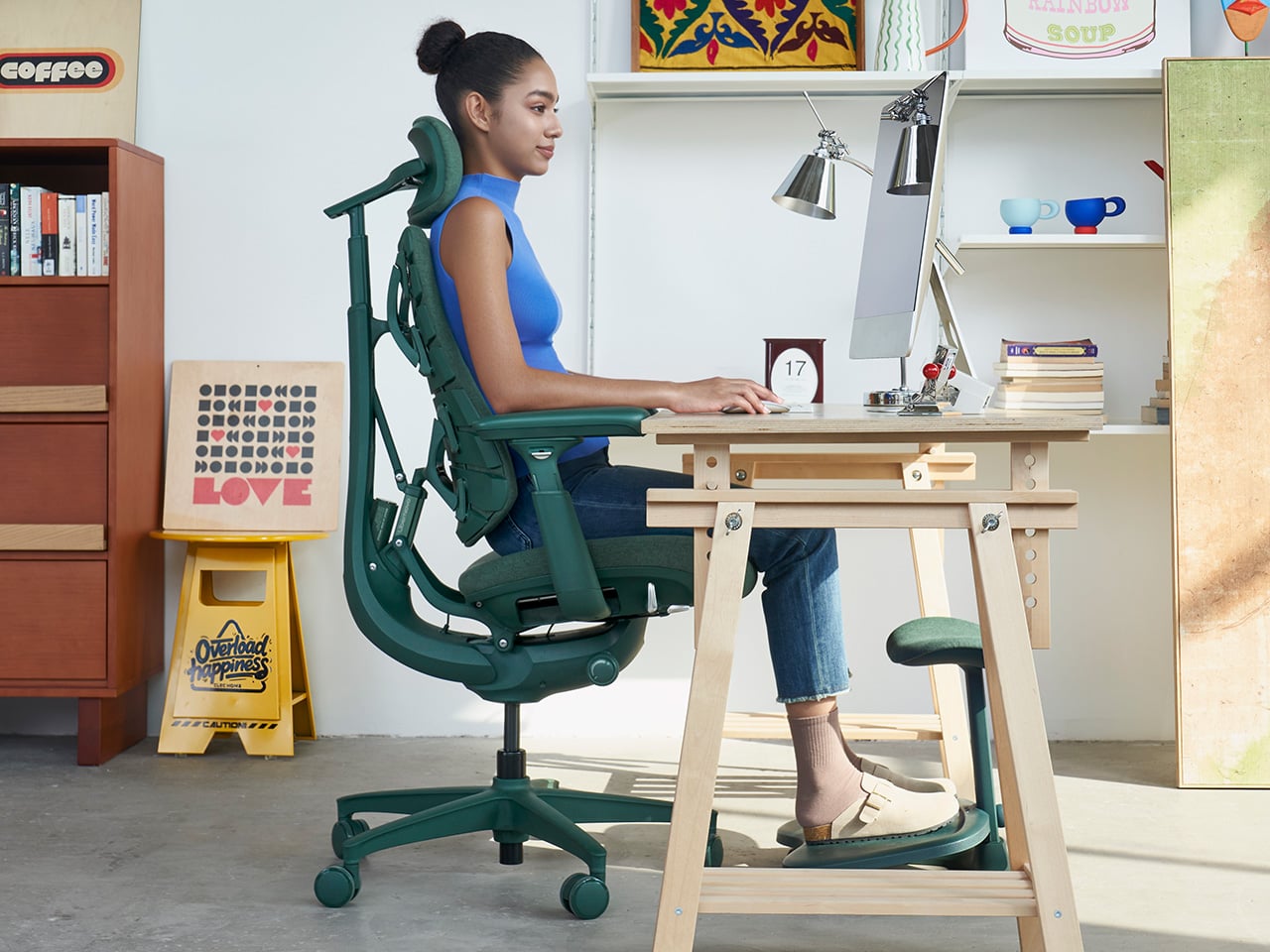
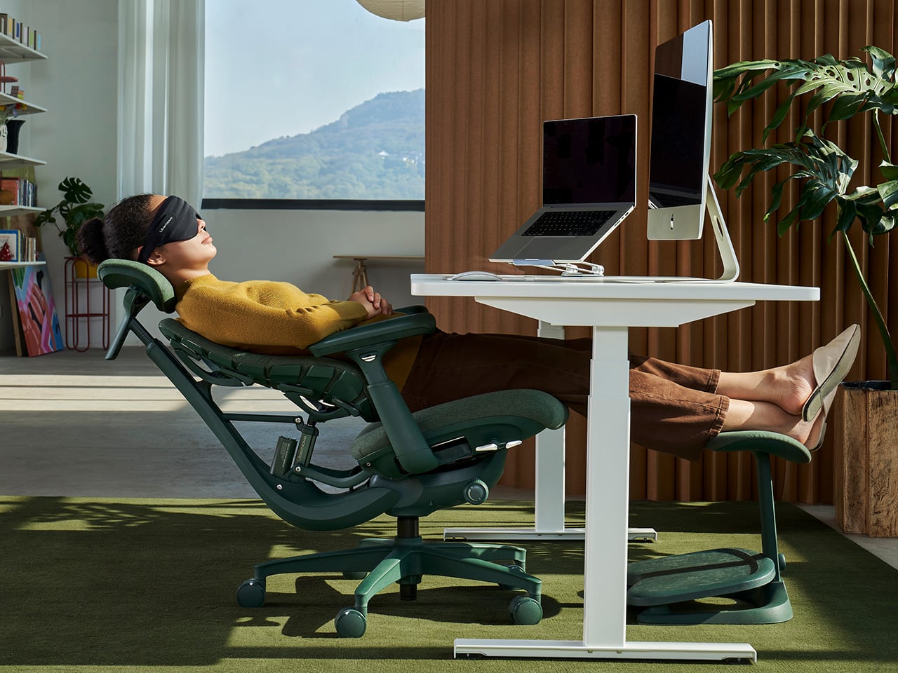
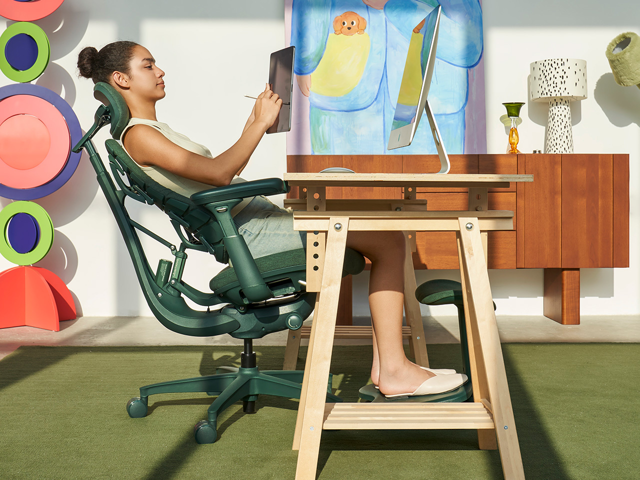
We’ve been fans of the LiberNovo Omni pretty much since day one (and the chair even secured an iF Design Award this year) because it rejected the foundational assumption behind almost every ergonomic seat on the market. Traditional chairs treat sitting as a problem to be solved with the right fixed position. The Omni treats it as a continuous, dynamic event. Its Bionic FlexFit backrest uses 16 spherical joints and eight elastic panels to create a responsive S-curve that maintains full spinal contact as you move, lean, and fidget through your day. Rather than locking you into an ideal posture and hoping for the best, it follows you. LiberNovo calls this “Support by Motion,” and after three rounds of coverage, it remains the most honest description of what the chair actually does.

Designer: LiberNovo

Click Here to Buy Now: $929 $1099 ($170 off). Hurry, deal ends in 48-hours!

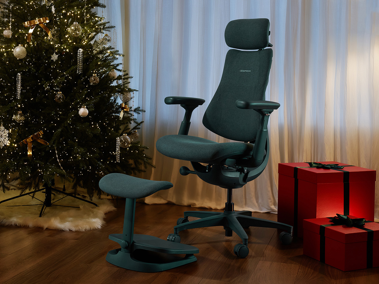
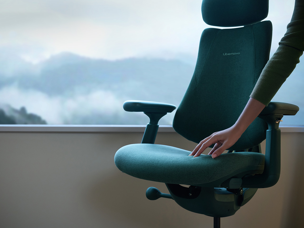
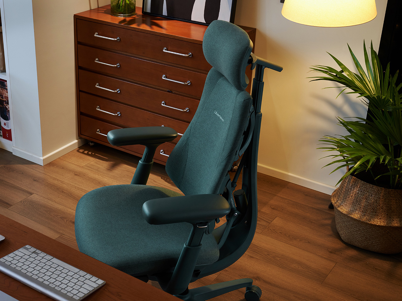
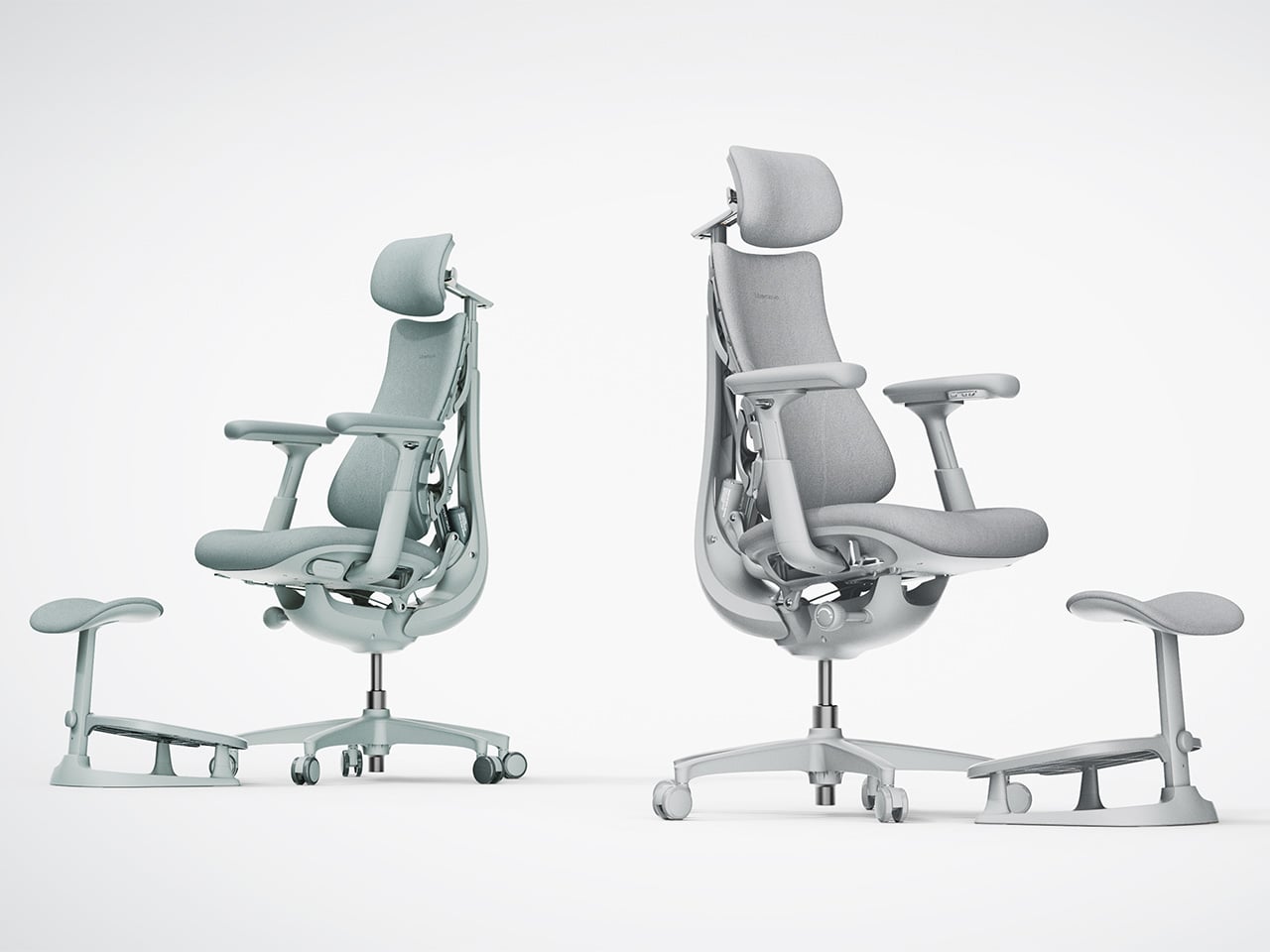
What the Spring Refresh edition brings into focus is the Moss Green colorway, and the design rationale runs deeper than seasonal window dressing. Office furniture has defaulted to clinical grays and matte blacks for decades because they read as serious and professional, but that palette does nothing for the visual fatigue that compounds over a long work session. The Moss Green option is a low-saturation, earth-toned hue informed by biophilic design principles, which connect sustained exposure to natural tones with measurable psychological restoration. The short-pile velvet surface introduced with this variant reinforces that effect tactilely, rated to withstand over 50,000 wear cycles while remaining breathable against skin. It is a quieter, more grounded presence than the existing Midnight Black and Space Grey options, and it suits the growing cohort of professionals who want their workspace to feel less like a server room.

The four recline modes map to distinct cognitive and physiological states that anyone logging long creative or technical sessions will recognize. The 105° Deep Focus position keeps the body alert and slightly forward, suited for concentrated output where posture and attention run in parallel. The 120° Solo Work setting is where most of a professional day actually happens, steady and supported without any sense of being locked in place. At 135°, the chair shifts into active recovery territory, appropriate for long calls or the kind of diffuse thinking that does not look like work but frequently is. The 160° Spine Flow position, combined with the OmniStretch motorized stretch function, delivers a five-minute spinal decompression cycle that reframes the mid-afternoon energy crash as something addressable rather than just inevitable.

The Spring Refresh pricing is tiered across both US and Canadian markets for the duration of the campaign. In the US, the Omni starts at $848, with Spring Refresh bundles discounted up to 30% off. Orders over $800 receive a $15 instant checkout discount, orders above $900 include the Eco Comfort Set comprising a silk eye mask, eco tote bag, and StepSync mat, and orders over $1,000 unlock the Ultimate Perks Pack with a branded cap, sticker set, tote bag, and limited-edition fridge magnet. Canadian pricing starts at CA$1,292, with bundles up to 34% off and parallel tier thresholds at CA$1,200, CA$1,400, and CA$1,500 respectively. The promotion runs through April 15 in both regions.

The broader argument LiberNovo is making this season is worth sitting with. Most workspace upgrades stop at the surface: a new desk pad, better cable management, the kind of organization that photographs well but does not change how your body feels at 4pm. The Omni, particularly in the Moss Green edition, pushes toward a different category of improvement, one that treats the workspace as health infrastructure rather than aesthetic backdrop. That is a less immediately gratifying pitch than a fresh coat of paint on the home office, but for anyone who has spent enough time in a bad chair to understand what a good one actually costs, it is the more compelling one.

Click Here to Buy Now: $929 $1099 ($170 off). Hurry, deal ends in 48-hours!

The post Stop Adjusting Your Office Chair. The LiberNovo Omni Adjusts to You Instead first appeared on Yanko Design.

Low, Linear, and Deeply Considered: The Osolo Long Seating Unit

Most furniture asks you to adapt to it. You locate the armrests, figure out where your back is supposed to land, and quietly accept that the cushions are more decorative than functional. The Osolo Long Seating Unit by Turkish designer Gökçe Nafak doesn’t work that way. It hands you the structure and invites you to decide the rest. That’s not vagueness. It’s a very deliberate design stance, and once you see it, it’s hard to unsee.

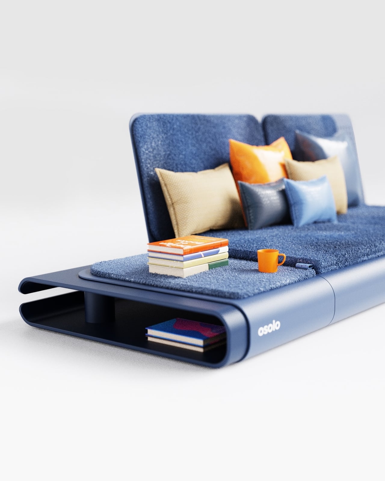
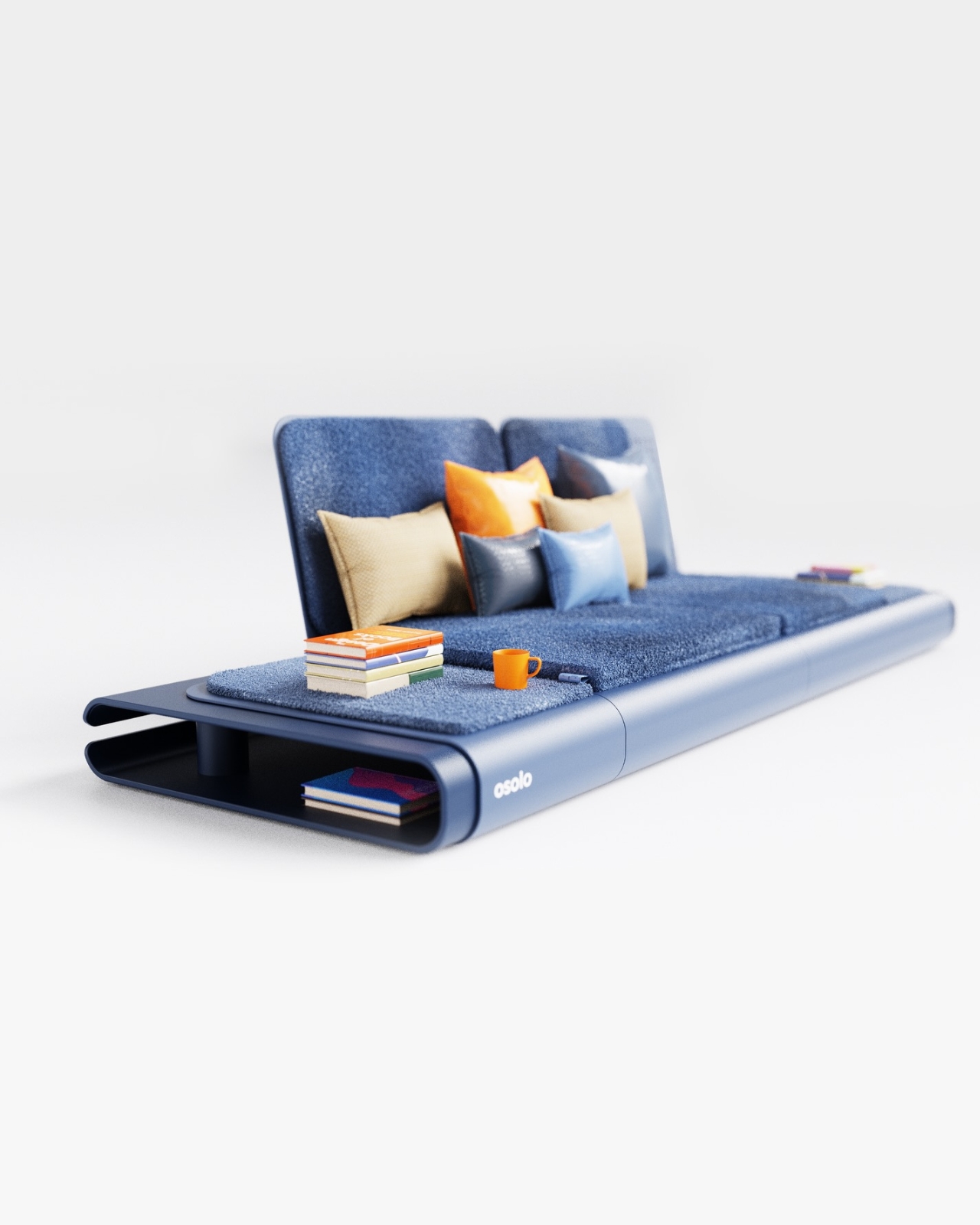
The Osolo Long Seating Unit is part of a broader series that Nafak has been developing, all of which share one defining characteristic: a single-piece folded metal body that functions as both the structural frame and the visual foundation of the entire piece. That single decision is doing enormous work here. The folded metal isn’t just holding the cushions up. It defines the silhouette, creates an open cavity underneath for books, magazines, or small objects, and gives the piece a kind of architectural confidence that most upholstered furniture simply doesn’t have. When you look at it from the side, the curve of metal bending upward from the floor reads more like a building detail than a furniture leg. That’s not a coincidence.

Designer: Gökçe Nafak

The low-to-the-ground profile is where the cultural reference kicks in. The Osolo series draws from the tradition of the sedir, a built-in seating form that was central to the traditional Turkish home. The sedir was placed along the walls of a room, built directly into the architecture, and upholstered with cushions and bolsters. It was low, linear, and multifunctional long before multifunctional furniture became a trend. What’s worth noting is that the sedir was largely displaced during the 19th century as Western furniture styles, including sofas, armchairs, and dining sets, moved into Ottoman homes and reshaped the way interiors were organized and experienced. Nafak seems to be making a quiet argument that something worth having was lost in that exchange. I happen to agree.

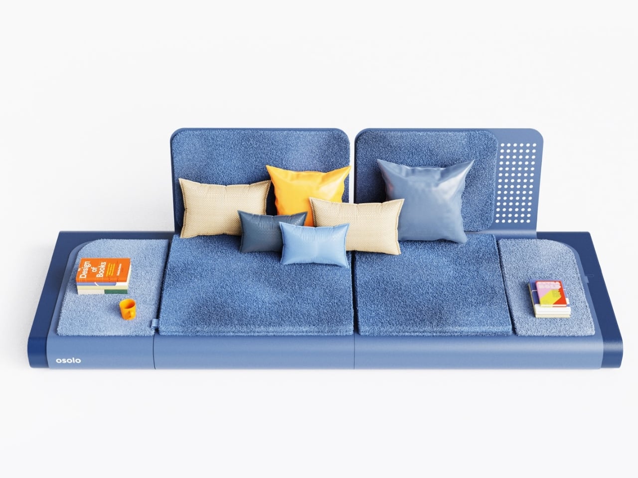
The modular structure of the Osolo unit reinforces that idea of flexibility and communal use that the sedir originally embodied. Independent backrest elements can be positioned wherever they’re needed. Modular cushions tile the platform in varying configurations. You can run a single unit in a compact space or connect multiple modules into one continuous seating arrangement that stretches the full length of a wall. The piece adapts to its context rather than demanding that the room adapt to it, which is exactly what good furniture should do and rarely does.

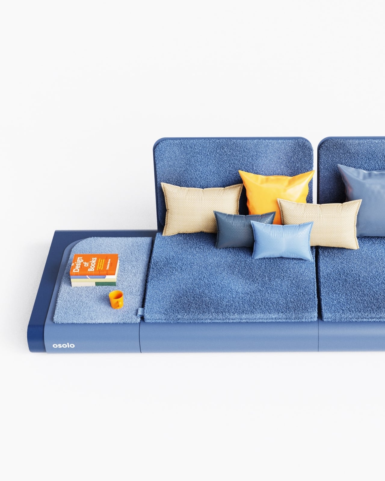
My honest opinion is that the real achievement here is visual restraint. The renderings show a deep blue finish, a sharp choice because it amplifies how clean and resolved the geometry actually is. The folded metal edges are smooth without being fussy. The modular backrests carry just enough surface texture to break up what could have easily tipped into something flat and institutional. The scattered cushions in orange, tan, and silvery blue add warmth without softening the structural clarity underneath them. There’s a stack of books and a coffee mug sitting on the platform, and they look completely at home there. That might be the most honest thing a product render can show you.

What I keep coming back to is how the Osolo Long Seating Unit manages to feel both familiar and entirely new at the same time. Culturally, it connects to a seating tradition that is centuries old. Formally, it looks like something from a studio that hasn’t made peace with anything conventional yet. That combination is genuinely rare. Most furniture that reaches back into cultural history for inspiration ends up producing a romanticized version of the past. The Osolo doesn’t do that. The folded metal body grounds it firmly in contemporary manufacturing and contemporary aesthetics. The inspiration is present, but it isn’t wearing a costume.

Whether the Osolo Long Seating Unit makes it from concept to production is something worth keeping an eye on. Right now it reads as a very confident, very resolved piece of design thinking. Gökçe Nafak is building a coherent design language with this series, and the long seating unit makes a strong case that language has something real to say.

The post Low, Linear, and Deeply Considered: The Osolo Long Seating Unit first appeared on Yanko Design.

This Baby Walker Grows With Your Child for 6 Years in 4 Different Ways

Most baby walkers have a shelf life measured in months. A 7-month-old wobbles through the living room gripping the handle, and by the time that same child turns two, the walker is already in a closet somewhere. The furniture cycle in a home with small children tends to follow that rhythm: buy, use briefly, replace with something else entirely.

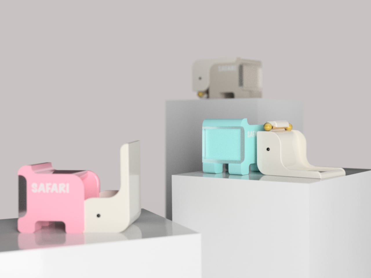
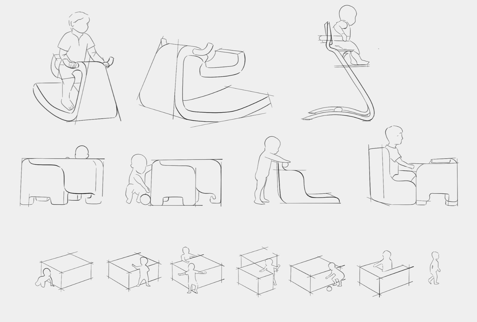
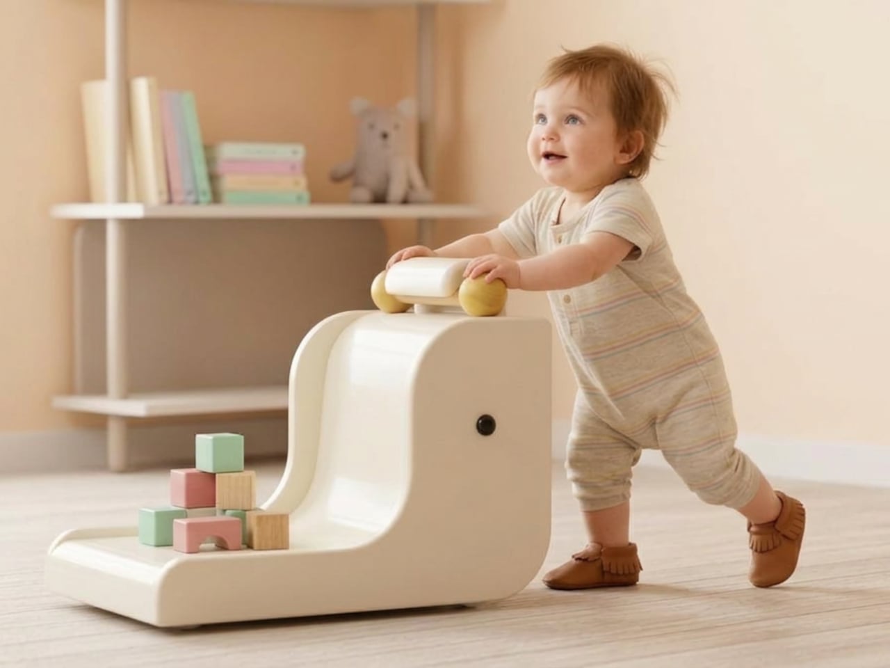
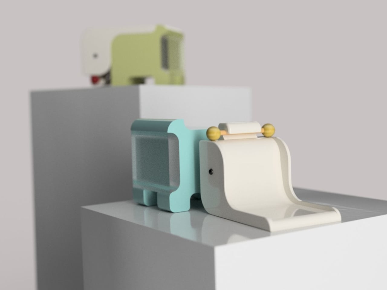
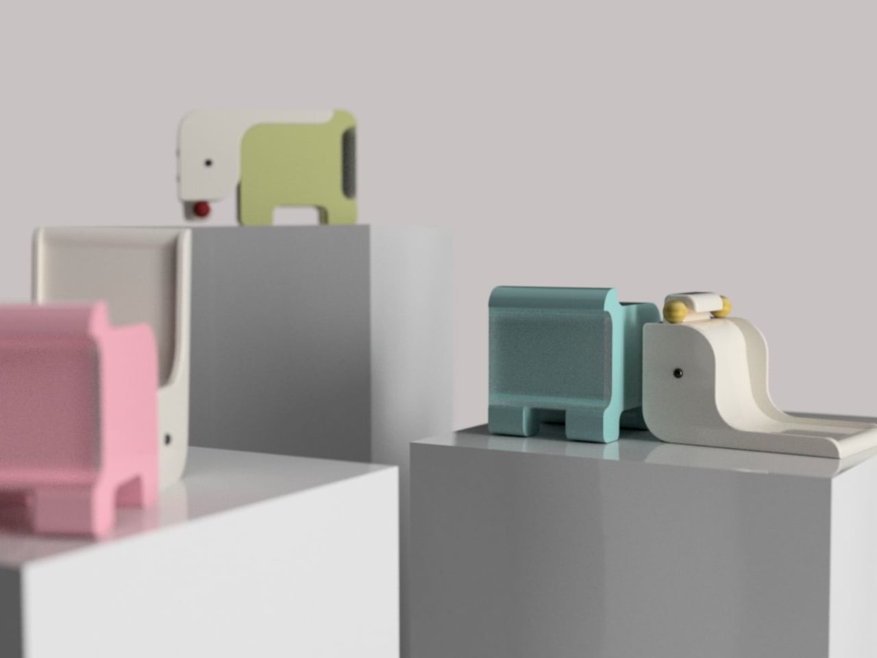
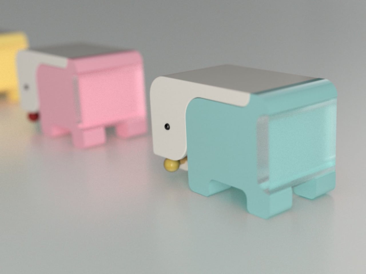
The Safari Multifunctional Kids Furniture concept tries to interrupt that pattern by designing one piece that stays useful across the first six years of a child’s life. The name “Step-N-Play” gives away two of its functions without mentioning the third or fourth. It is, depending on the child’s age and the day’s agenda, a walker, a climbing unit, a play table and chair, and a toy storage solution.

Designer: Bharti Upadhyay

At its earliest stage, the walker is built for children between 6 and 18 months, with a frame measuring approximately 600 x 400 x 500 mm. The structure combines wood, ABS plastic, and soft silicone grips, with a 95-degree backrest angle designed for infants who are not yet seated with full stability. An anti-tip base and anti-pinch safety gaps cover the more obvious hazards of putting a barely mobile child in contact with a moving object.

As the child grows into the 1-to-3 age window, the same structure becomes a climbable stair unit. From ages 2 to 6, it transitions again into a play table and chair. A built-in storage compartment for toys and books operates across all configurations. The manufacturing approach pairs CNC-cut wood with injection-molded ABS plastic, a combination suited to years of contact with small hands and the occasional harder object.

The safari animal inspiration shows up in organic silhouettes and surface language rather than in literal animal sculptures attached to the frame. Smooth curves, generous fillets, and chamfered grooves define the form. The pastel color palette, wooden handles, and textured sensory balls read as a considered aesthetic choice rather than an afterthought, which matters in a living space where parents also have to look at the thing.

Safari is a student concept at this stage, so the harder questions remain open. How the ergonomics hold across such a wide age range, how the mechanical transitions between configurations actually work in practice, and whether a single object can genuinely serve a 7-month-old and a 6-year-old with equal competence rather than adequacy are things a physical prototype would need to answer.

The post This Baby Walker Grows With Your Child for 6 Years in 4 Different Ways first appeared on Yanko Design.

A Chair Shaped by the Soft Curves of a Classic British Scally Cap

In a market full of furniture that competes loudly for attention, the pieces that often stay with us the longest are the ones that begin with a simple idea and a strong story. The Scally Chair is a beautiful example of this kind of design thinking. Its inspiration comes from something very familiar in British culture, the classic men’s scally cap. What is fascinating is how a small everyday object, such as a cap, can inspire the form of a chair and translate into a thoughtful piece of furniture.

The starting point of the design is an image. Instead of beginning with strict structural rules or purely functional decisions, the designer began with the recognizable shape of the scally cap. These caps are known for their soft, rounded crown and their distinct front visor. They have personality and a casual confidence that people instantly recognize. The Scally Chair translates these qualities into furniture in a subtle and elegant way.

Designer: Julia Kononenko

The rounded backrest is the most noticeable expression of this inspiration. It curves around the seat in a gentle way that recalls the soft crown of the cap. The form feels inviting and protective, almost as if the chair quietly embraces the person sitting in it. This small gesture adds a sense of intimacy and comfort while maintaining a clean and confident silhouette.

Another thoughtful detail appears at the front of the seat. The edge is slightly lifted in a gentle curve that echoes the visor of the cap. At first glance, the detail is subtle and easy to miss, but once you notice it the connection becomes clear. Instead of making the design too literal or predictable, this small reference adds character to the chair without overwhelming its form. It also introduces a sense of lightness and movement to the silhouette, making the chair feel more dynamic and visually balanced.

Material plays an important role in the experience of the Scally Chair. The use of wood brings warmth and authenticity to the design. Wood has a timeless quality that connects furniture to craftsmanship and longevity. It adds natural texture and depth to the chair while grounding the form in something familiar and tactile. The presence of wood also allows the chair to age gracefully over time, making it feel like a lasting object rather than a temporary trend.

The muted tones used in the chair are equally important. Instead of relying on bold colors to stand out, the design embraces restraint. These softer tones allow the chair to blend naturally into different environments. In modern and contemporary interiors, this quality becomes incredibly valuable. The chair does not try to dominate the room. Instead, it quietly complements the space around it.

Because of this, the Scally Chair works beautifully in many settings. It can sit comfortably in a minimalist living room, a warm Scandinavian-inspired interior, or even a more contemporary dining space. Its presence feels calm and balanced rather than loud. It supports the atmosphere of the room while still offering a strong sense of design.

What makes the chair particularly interesting is how the story behind it changes the way we experience it. Once you know about the scally cap inspiration, you begin to notice the details more carefully. The curve of the backrest, the slight lift of the seat, and the careful proportions suddenly feel intentional and thoughtful. The experience of the chair becomes more layered.

This is what gives the Scally Chair its quiet strength. It shows how everyday objects can inspire other everyday objects in unexpected ways. A familiar cap becomes the starting point for a piece of furniture that feels both contemporary and timeless. Through subtle form, warm materials, and restrained color, the chair proves that thoughtful design does not need to demand attention. Sometimes the most meaningful designs are the ones that simply fit into our spaces and lives with effortless ease.

The post A Chair Shaped by the Soft Curves of a Classic British Scally Cap first appeared on Yanko Design.

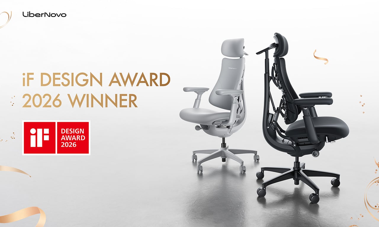
LiberNovo Omni Just Won the iF Design Award 2026 for Wellness Design

Most office chairs operate on a quiet assumption that sitting is something your body should adapt to, not the other way around. You adjust the height, nudge the lumbar support into roughly the right position, and then spend the rest of the day subtly fighting the chair anyway. The ache between your shoulders, the stiffness in your lower back by mid-afternoon, that’s just part of the deal, apparently, and most of us have accepted it without much argument.

LiberNovo decided not to accept it. The result is the Omni, a chair the company calls a Dynamic Ergonomic Chair, and it just picked up the iF DESIGN AWARD 2026 in the Product Design – Beauty/Wellness category. The iF Design Award has been one of the most internationally respected design recognitions since 1954, with this year’s cycle drawing more than 10,000 entries from over 60 countries. That’s a serious field to stand out in

Designer: LiberNovo

Click Here to Buy Now: $929 $1099 (15% off). Hurry, deal ends in 48-hours!

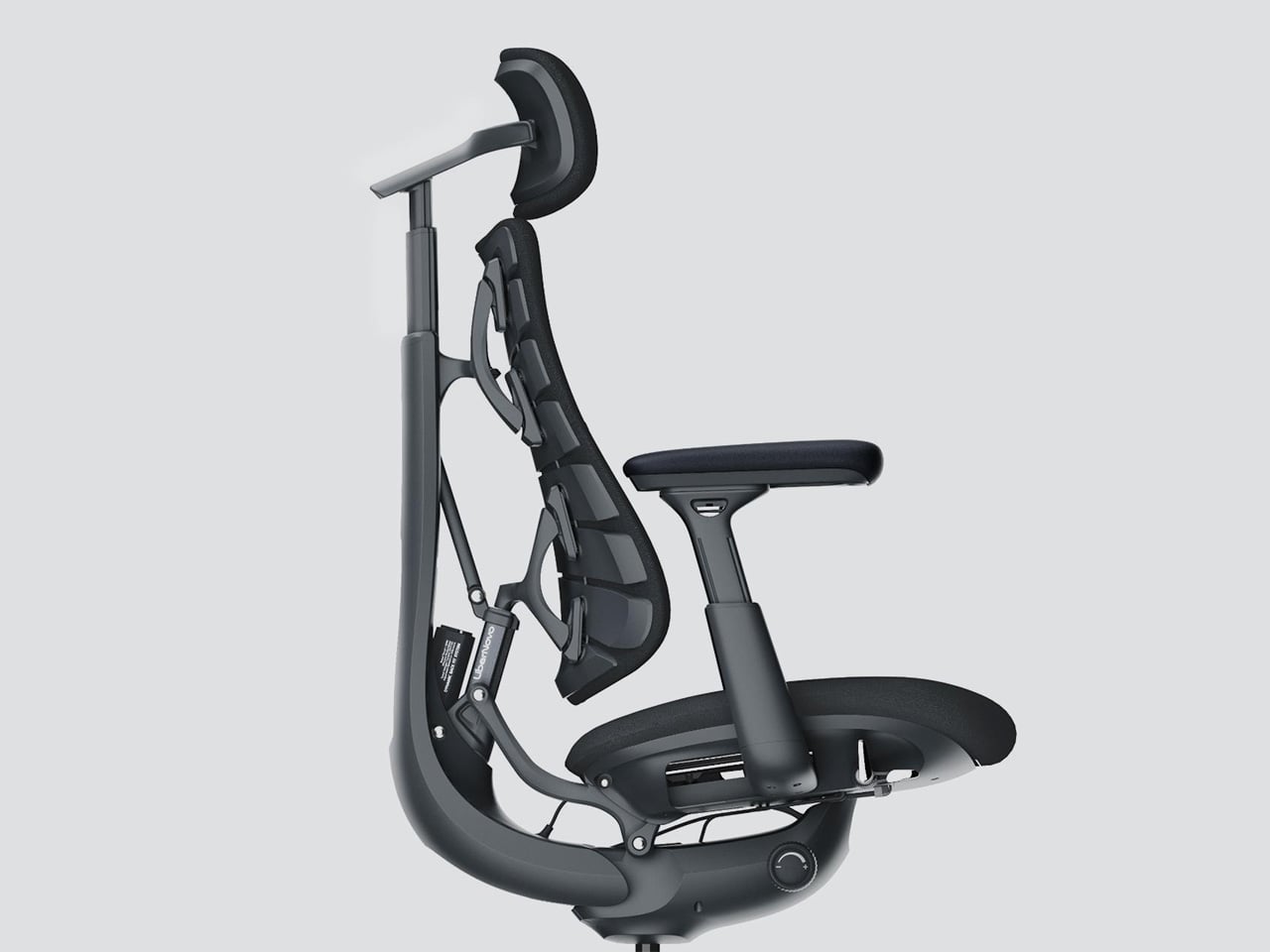
The core idea behind the Omni is that your posture doesn’t stay fixed throughout a workday, so your chair probably shouldn’t either. The Bionic FlexFit Backrest is built around that logic, using 16 spherical pivot points, 8 adaptive flexible panels, and 14 dual-connection points to follow the natural curve of your spine as it shifts. It covers you from the hips up through the shoulders, spreading pressure across the whole back rather than piling it onto one fixed lumbar point.

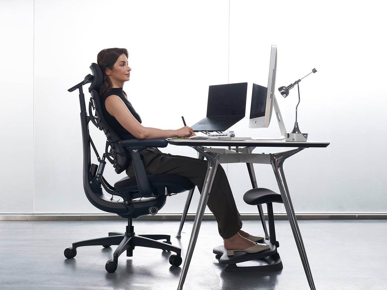
What makes this work in practice is the Dynamic Support system, which adjusts automatically to changes in your posture without you having to reach for anything. Lean forward during a focused stretch of work, sit back when you’re thinking something through, the chair tracks those shifts, and responds in real time. It’s the kind of feature that sounds modest until you realize how much of your day you’ve spent adjusting a chair that couldn’t do this.

Then there’s OmniStretch, which is where the Omni starts to feel like something genuinely different. Sitting for long hours compresses the lower spine gradually, and most chairs just let that happen. OmniStretch is a guided decompression feature that gently stretches the lower spine during the workday, designed to actively relieve pressure rather than simply tolerate it. It’s probably why the iF jury placed the Omni in the Beauty/Wellness category: this chair isn’t just holding you up, it’s doing a bit of recovery work along the way.

The Omni also offers four recline positions running from 105 to 160 degrees. The shallower end is built for focused, upright work, while the deep 160-degree Spine Flow position is designed for full spinal decompression between sessions. The two intermediate angles cover the range in between, which gives the chair a kind of daily rhythm that matches how most people actually move through their hours rather than sitting rigidly in one position all day.

The chair was developed by LiberNovo’s team in Shenzhen alongside industrial design firm Kairos Innovation, also based there. Winning an iF award is meaningful external confirmation that the design thinking behind the Omni translates beyond the product brief. For a chair that started from the premise that desk work doesn’t have to hurt, that’s a pretty good place to land.

Click Here to Buy Now: $929 $1099 (15% off). Hurry, deal ends in 48-hours!

The post LiberNovo Omni Just Won the iF Design Award 2026 for Wellness Design first appeared on Yanko Design.

Bentu Just Built Furniture From Cities That No Longer Exist

Every city has its ghosts. Not the supernatural kind, but the kind embedded in the physical memory of places that no longer exist. Buildings torn down, neighborhoods erased, whole communities swallowed by the machinery of progress, or something far worse. Right now, in more places across the globe than most of us are comfortable counting, cities are not being redeveloped. They are being destroyed. And the rubble left behind, whether from a wrecking ball or a warhead, raises the same uncomfortable question: what do we do with what remains?

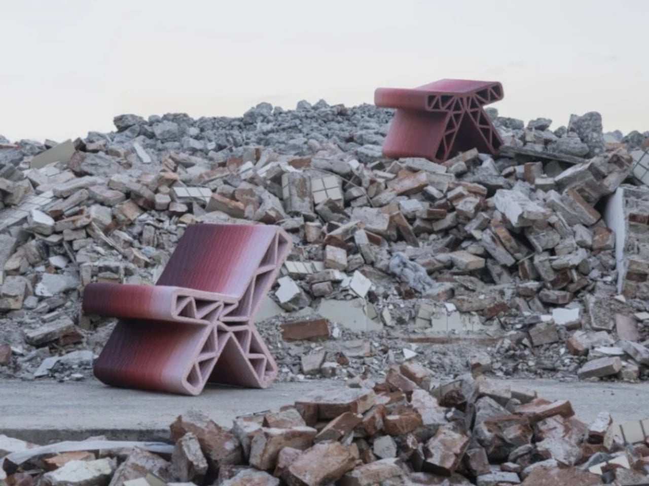
Bentu Design looked at rubble and decided to make furniture. That might sound like an overly romantic read on what is essentially a waste management challenge, but the more you learn about their project “Inorganic Growth: The Regeneration of Urban Village Memory,” the harder it is to dismiss. This is not recycling for recycling’s sake. It is design with a philosophical spine, and right now, that spine feels more relevant than ever.

Designer: Bentu Design

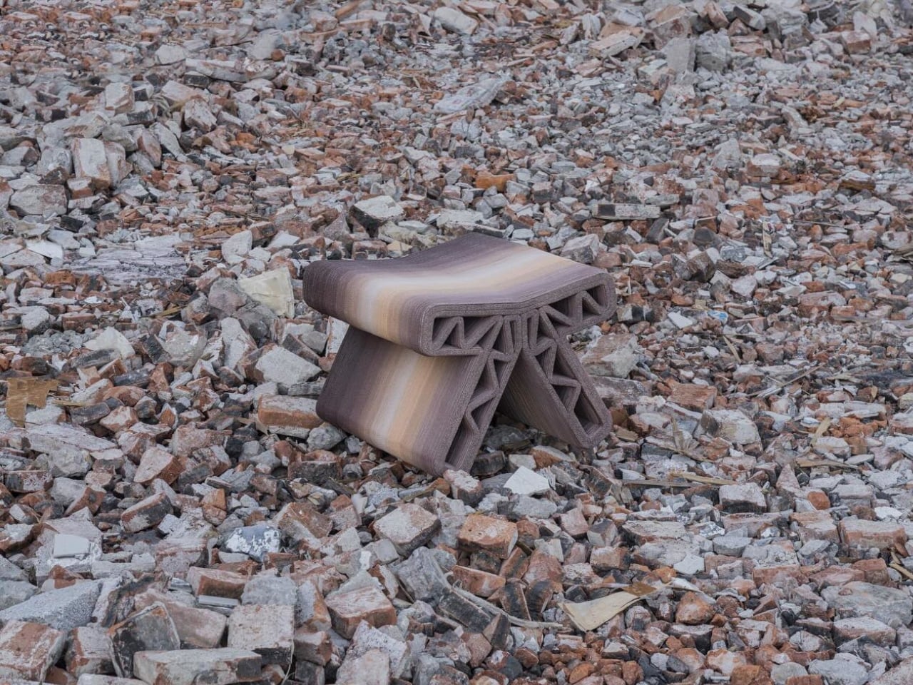
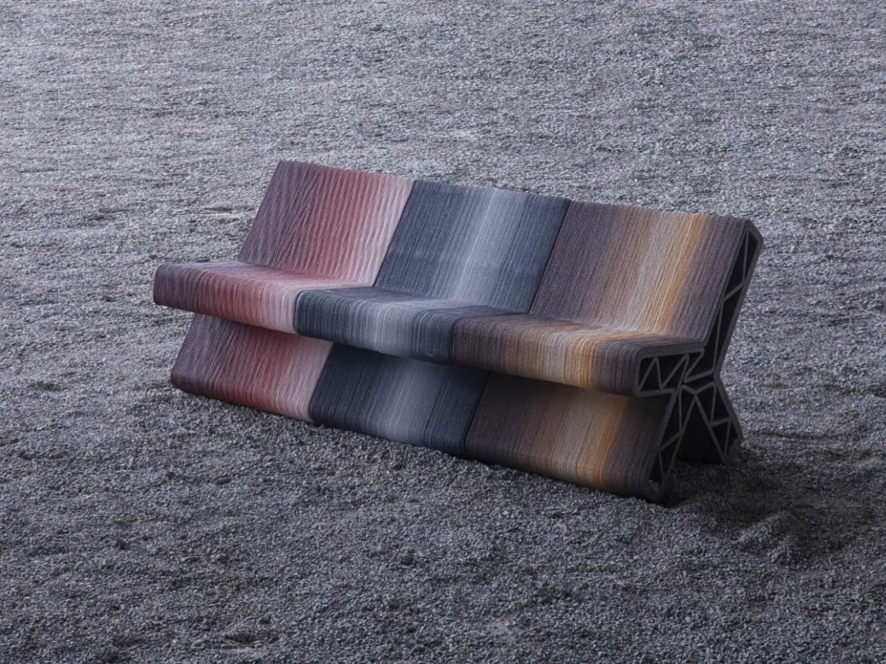
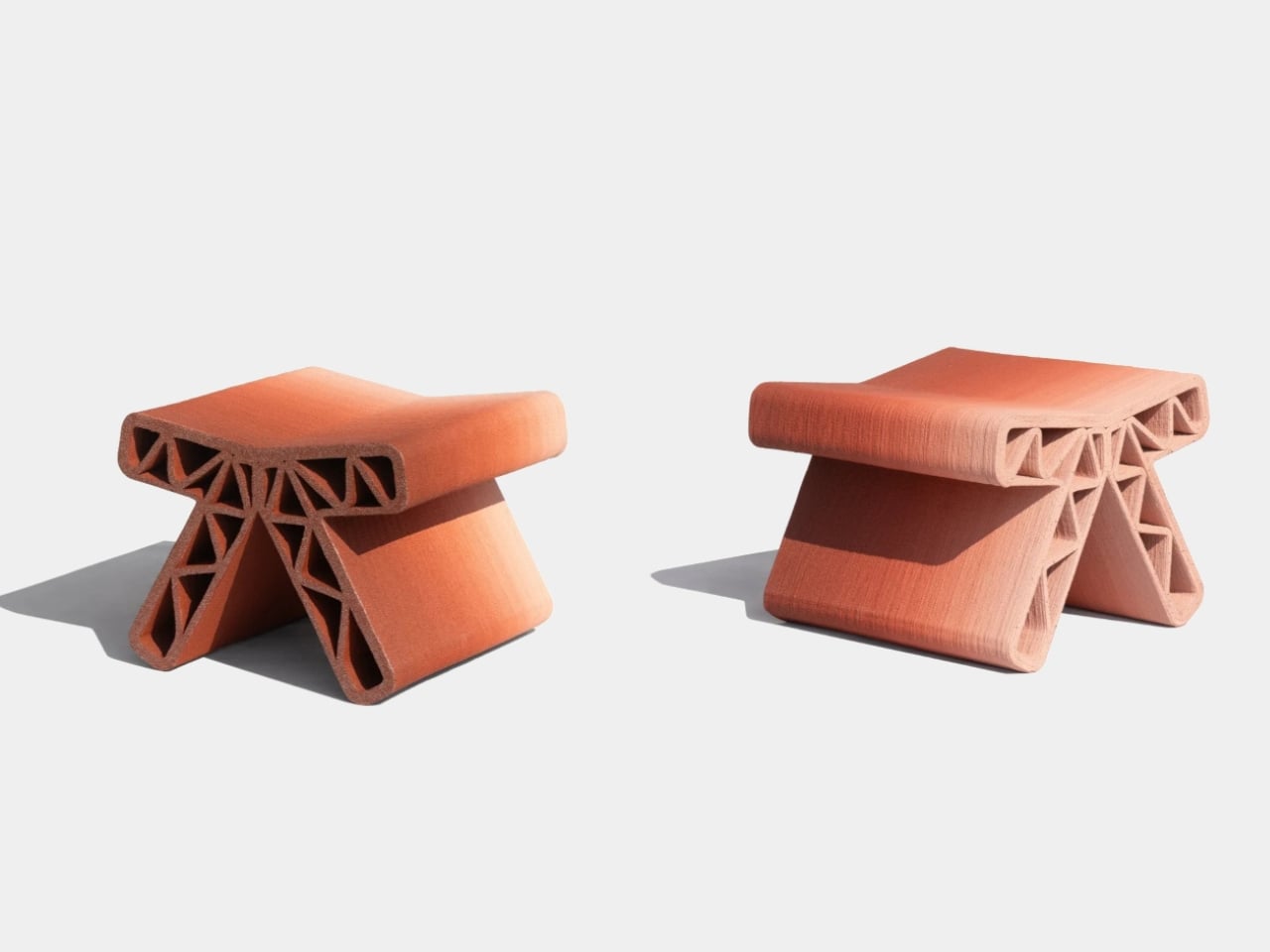
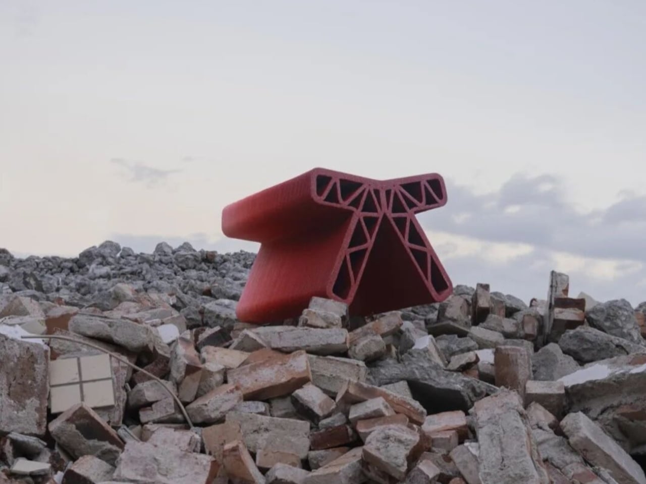
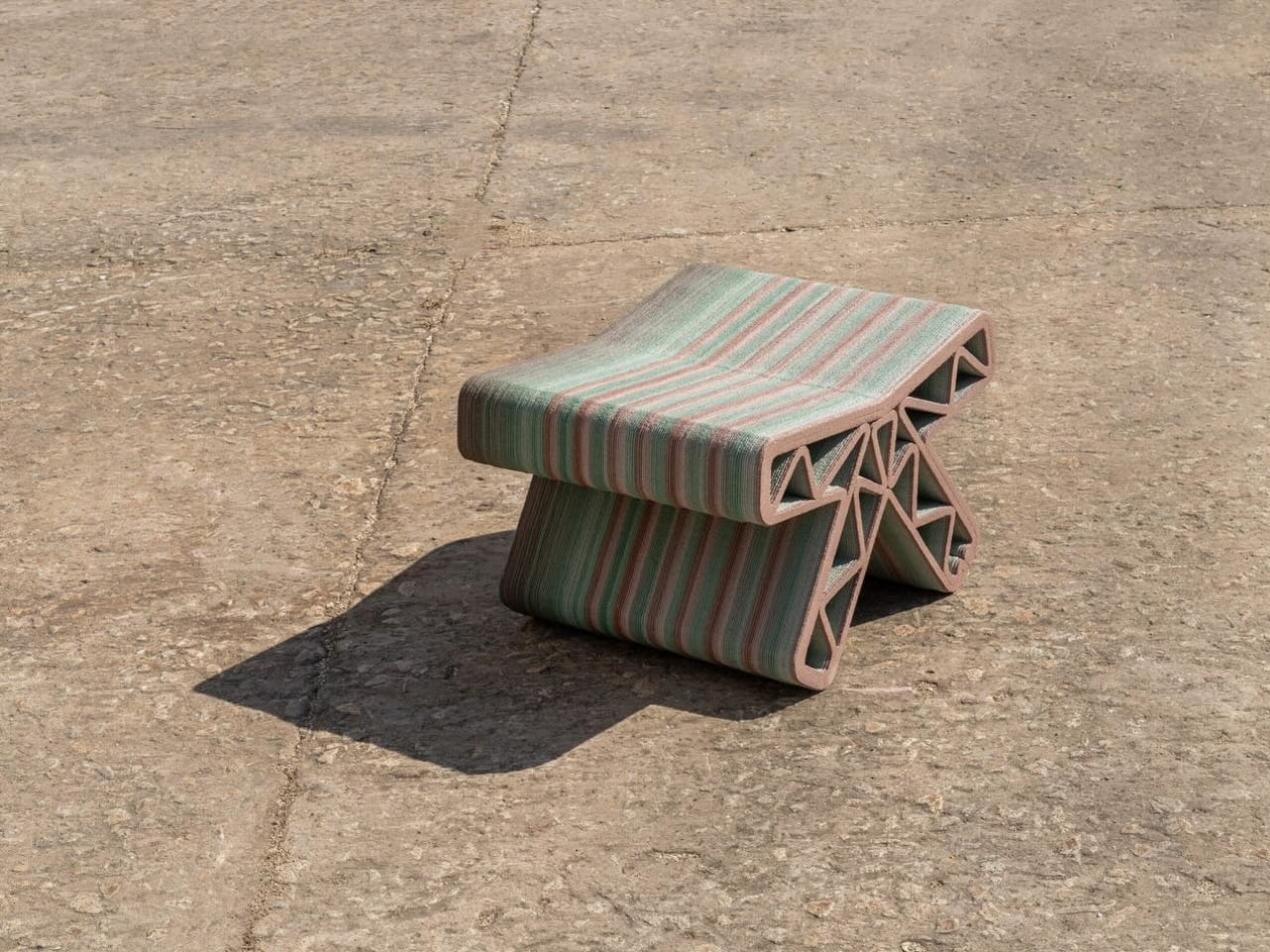
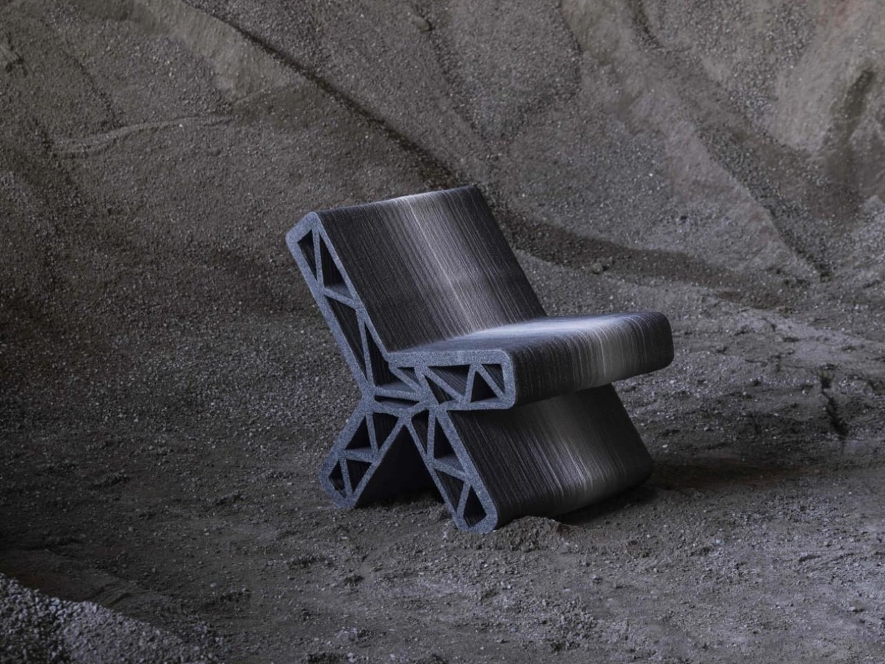
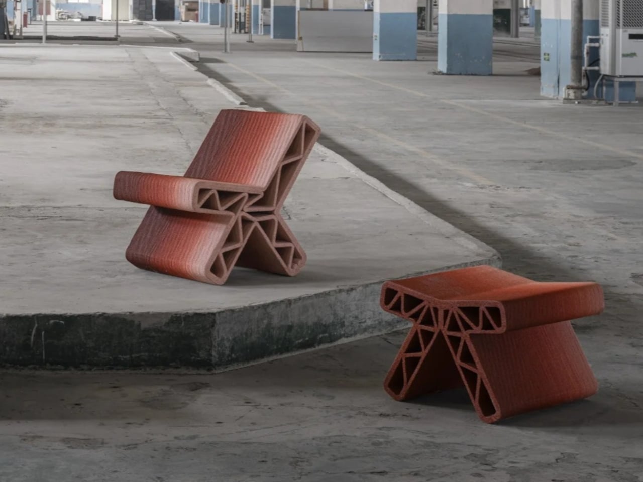
The concept begins with China’s urban village demolitions, where entire communities are cleared to make way for new development. The construction waste left behind, concrete fragments, red brick rubble, mortar dust, all the physical remnants of places that used to be someone’s home, is processed and reactivated into cement-based printable materials. The project achieves an 85% utilization rate of that solid waste. That figure alone is worth pausing on, because most recycled design projects deal in far smaller percentages and still get praised for it. Each piece of furniture is then built up layer by layer through large-scale 3D printing, giving it a textured, almost geological quality.

But the technical achievement is only half the story. Before a village is demolished, the team documents the site photographically. Those images are run through image-processing algorithms to extract the dominant color values of that specific place: the iron-red of old bricks, the cement-gray of crumbling walls, the muted green of weathered surfaces, the faded blue of glazed tiles. Those tones are built into a gradient control system that becomes the visual fingerprint of each piece. Every bench or chair carries not just the material of the place that was, but its palette. A gradient that encodes memory. A piece of public furniture quietly carrying the visual DNA of the neighborhood that once stood there.

Most people walking past it will never know. But the furniture knows. I keep thinking about what this means in the context of the world we are actually living in right now. Mariupol. Gaza. Khartoum. Cities being reduced to the same concrete fragments and red brick rubble that Bentu Design scoops up and turns into something lasting. The scale of destruction happening globally is staggering, and designers are not exempt from sitting with that discomfort and asking what, if anything, we can actually do about it.

We cannot stop wars. We cannot reverse the decisions of governments or the momentum of military campaigns. But Bentu’s work quietly suggests that designers do hold something real: the ability to determine what erasure looks like, and whether it has to be total. There is an argument here that is worth taking seriously. When we choose to carry the material memory of a destroyed place forward rather than simply clearing it away, we are making a statement about whose history counts. That principle scales. It applies to a demolished village in Shenzhen. It applies to a flattened street in Kharkiv.

Design, at its most serious, is always making choices about what to remember and what to let disappear. “Inorganic Growth” chooses remembrance without sentimentality, using technology as the medium and rubble as the message. That feels like the right posture for designers to hold right now: not paralysis, not performance, but a steady insistence on making things that refuse to forget. Some benches just hold your weight. These ones hold an entire neighborhood’s last breath.

The post Bentu Just Built Furniture From Cities That No Longer Exist first appeared on Yanko Design.
A Student Made the Most Honest Chair of the Year

The best furniture tends to ask a quiet question. Not loudly, not with a press release, but through the way it sits in a room and dares you to interact with it differently. Manuela Hirschfeld’s Tilt chair does exactly that, and the fact that it comes from a student project makes it all the more interesting.

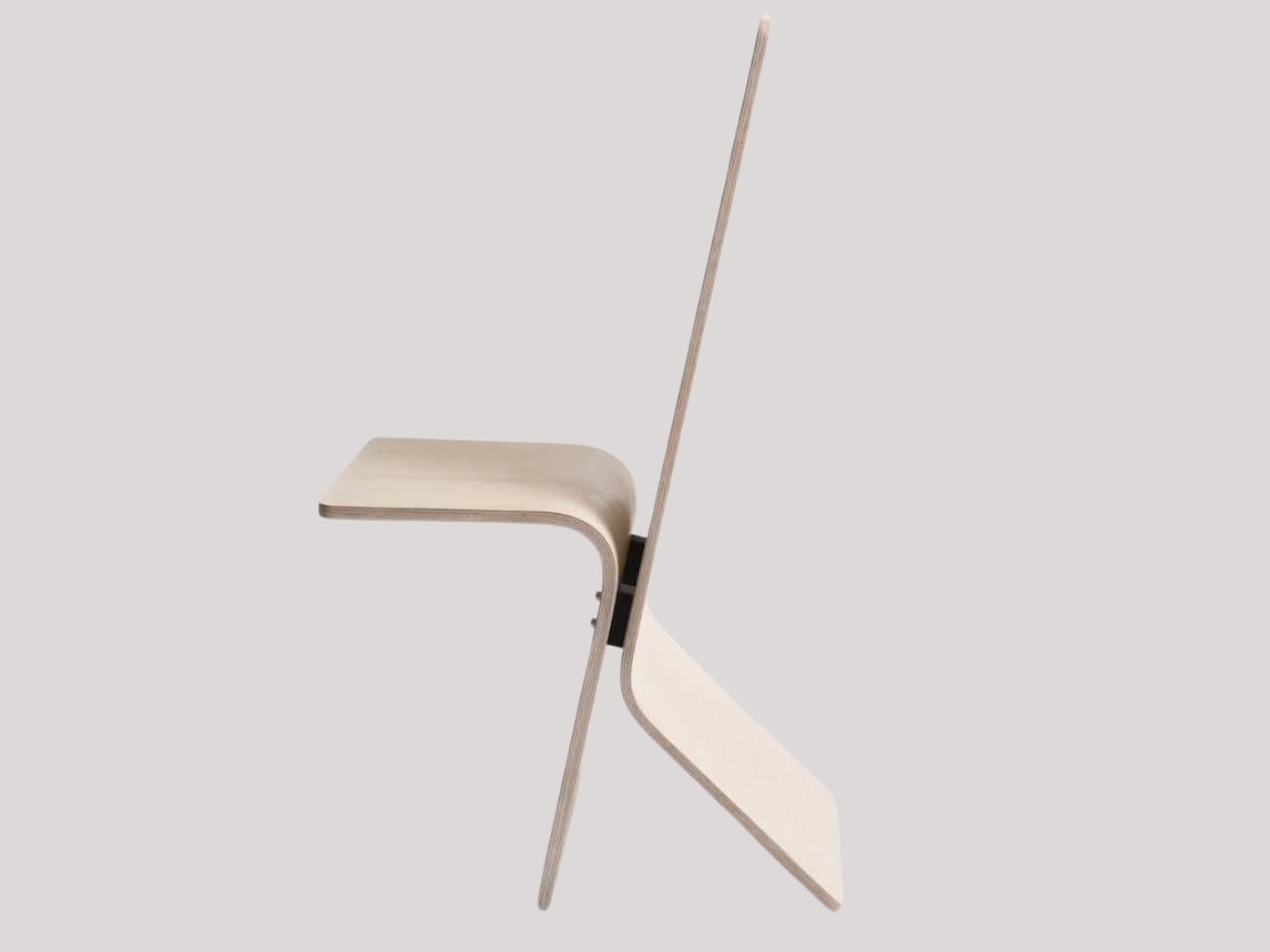
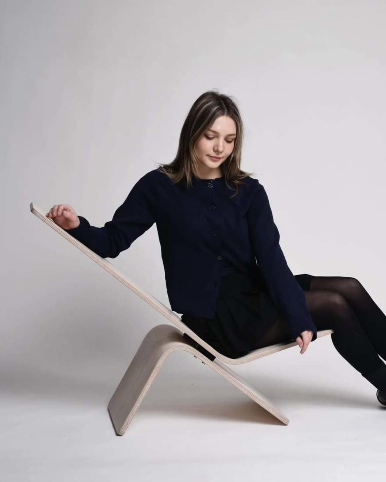
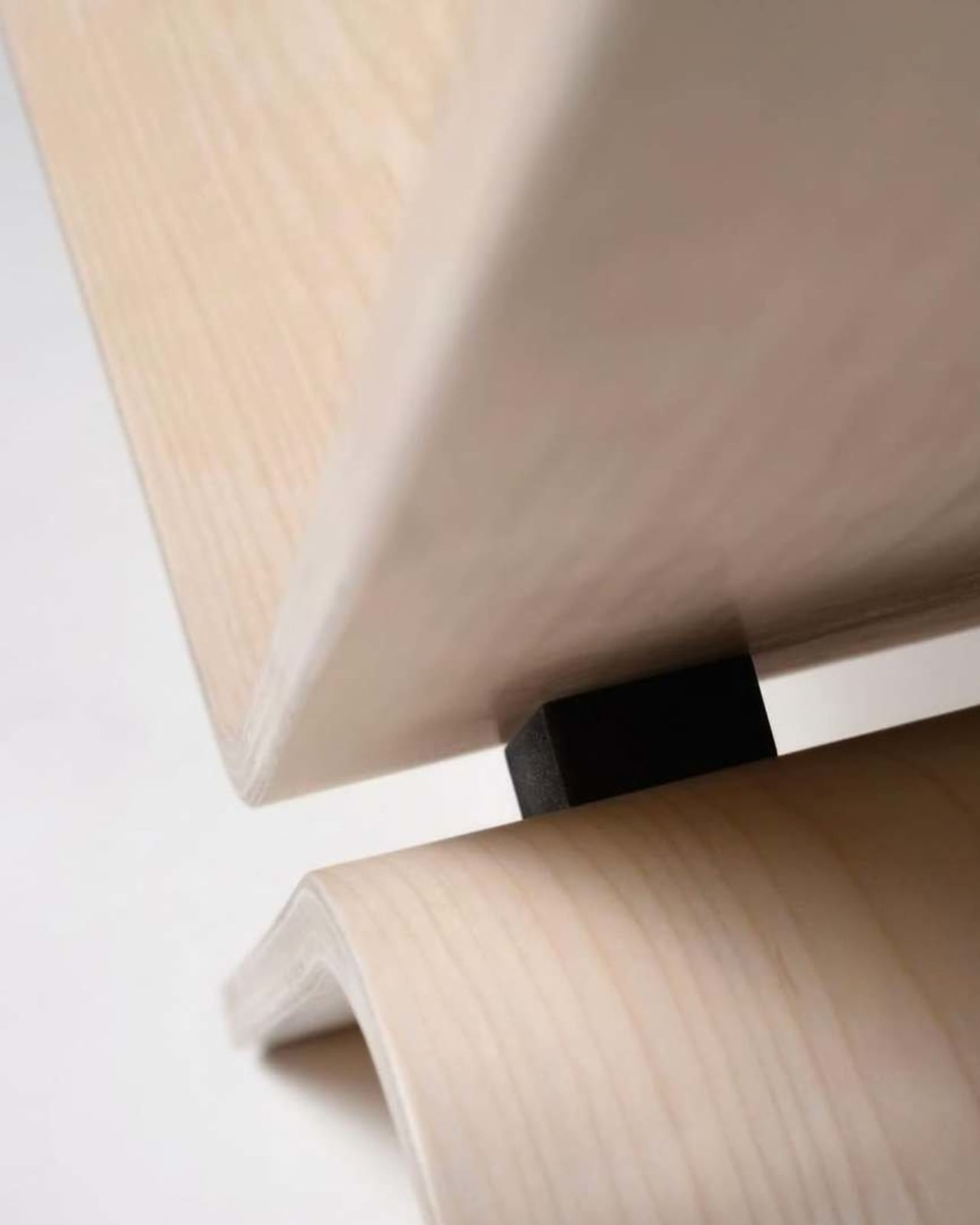
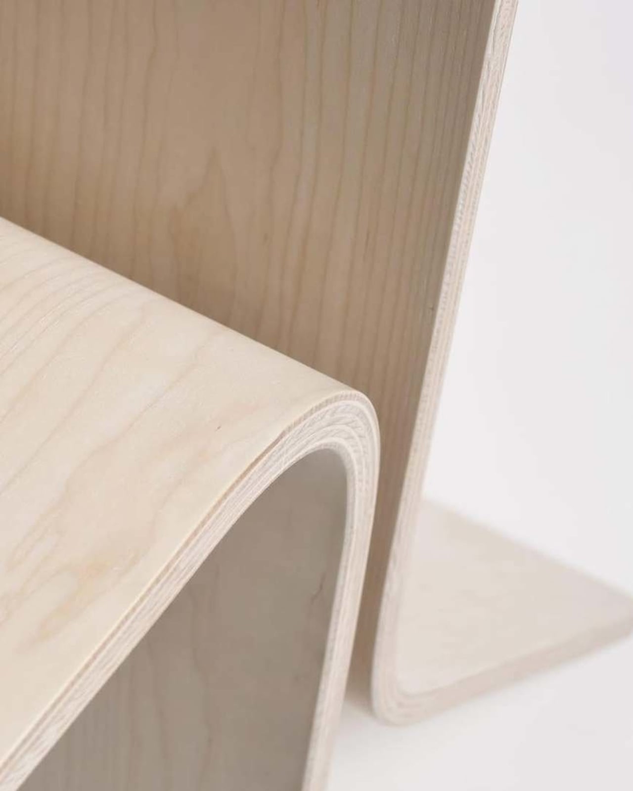
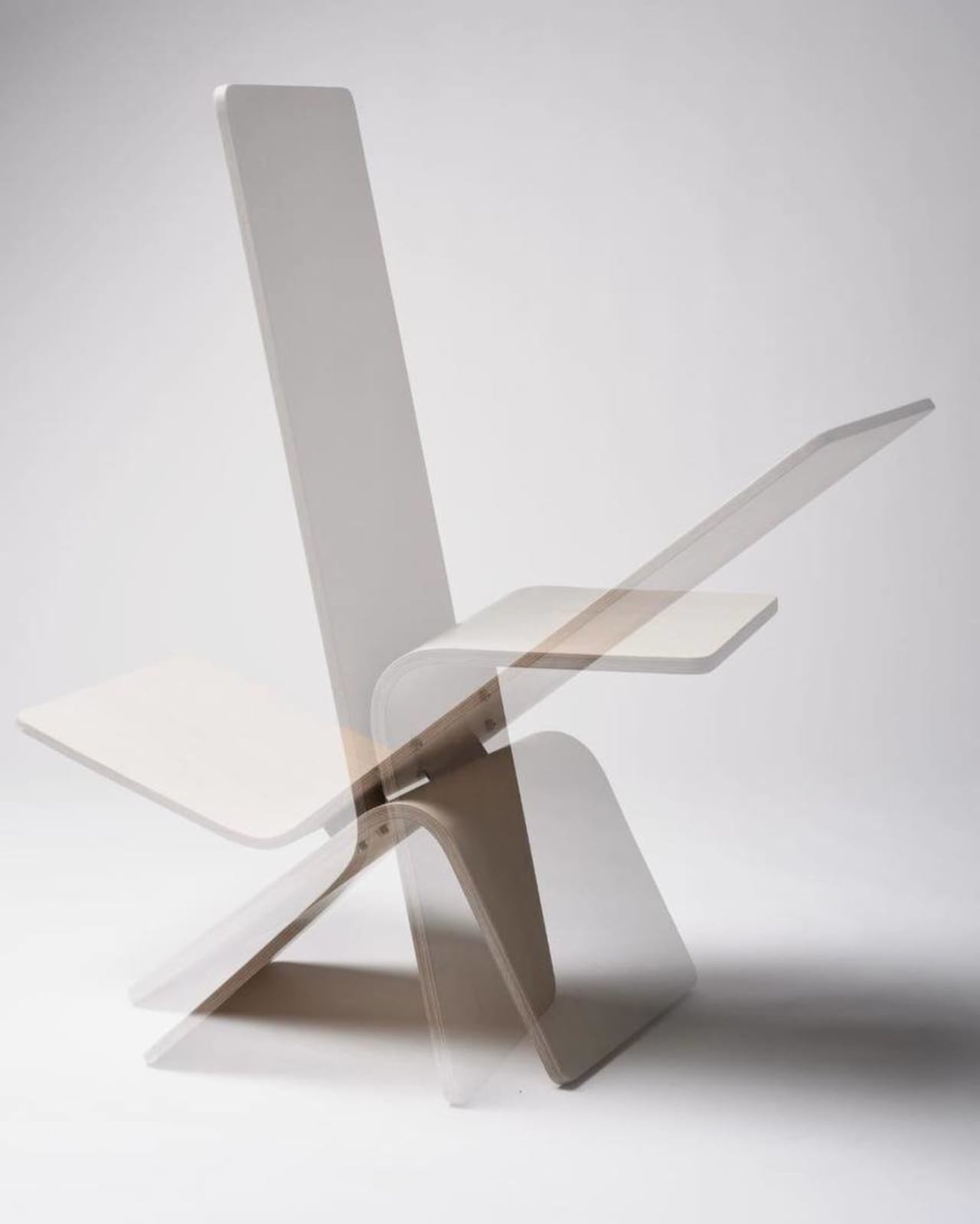
Hirschfeld is an industrial design student at Germany’s Hochschule Pforzheim, and her Tilt chair is exactly what the name suggests. Built from bent plywood with a minimalist silhouette, it’s a chair that shifts between two modes: upright for sitting and reclined for lounging, all with a single gentle forward tilt. No levers, no mechanical parts, no instructions needed. Just physics, balance, and good design doing the heavy lifting.

Designer: Manuela Hirschfeld

The concept is almost disarmingly simple. Hirschfeld describes it this way: “Tilt transforms from a chair to a lounger in seconds with a gentle forward tilt. Intuitive and perfectly balanced. Two moments arise from a single piece of furniture: arriving upright or relaxing and letting go.” That last line is the one that stuck with me. Arriving upright or relaxing and letting go. It reads more like a small philosophy than a product description.

What I find genuinely impressive here is the restraint. A lot of student design work goes big. It reaches for concepts that are hard to produce, materials that don’t yet exist, or ideas that require ten slides of explanation before they make sense. Tilt goes the other direction. It strips everything down to the point where the idea can stand entirely on its own. One material, one gesture, two functions. That’s it.

Bent plywood as a material has a rich history in furniture design. Charles and Ray Eames made it iconic. Alvar Aalto built a whole vocabulary around it. Choosing it for a student project isn’t a lazy shortcut; it’s actually a high bar. The material has been done so well, so many times, that doing something genuinely new with it means you have to think carefully. Hirschfeld has clearly done that thinking, because the Tilt doesn’t feel like it’s borrowing from those references. It feels like it belongs to the same conversation without trying to imitate anyone in it.

The two-position function also taps into something real about how people use furniture. We don’t sit the same way all day. Anyone who works from home, eats at their desk, or uses their living room for everything from Zoom calls to Sunday afternoon napping already knows this. The idea that a single well-designed chair could accommodate those different physical and emotional states is more practical than it first appears. It’s a simple answer to a genuinely complicated question.

What makes this worth paying attention to, beyond the design itself, is that Hirschfeld apparently maintains no online presence. Core77, who featured the project, noted it with a certain curiosity. No portfolio, no Instagram, no LinkedIn footprint to trace. That’s almost radical for a design student right now, when visibility tends to be treated as a prerequisite for being taken seriously. It raises the question of whether the work should be enough on its own. Looking at Tilt, you’d have to say it is.

Student design work often gets dismissed as theoretical, as something that sounds good in a studio critique but would never survive contact with manufacturing, retail, or real life. Tilt doesn’t read that way. It reads as resolved. The kind of thing that could sit in a well-edited apartment or a design-forward hotel room without anyone questioning whether it belongs there. Whether it ever goes into production is anyone’s guess. But that’s almost beside the point. What Hirschfeld has done with Tilt is prove that the clearest ideas are sometimes the hardest to arrive at, and that a chair doesn’t need to reinvent itself to be worth talking about. It just needs to do two things well.

The post A Student Made the Most Honest Chair of the Year first appeared on Yanko Design.
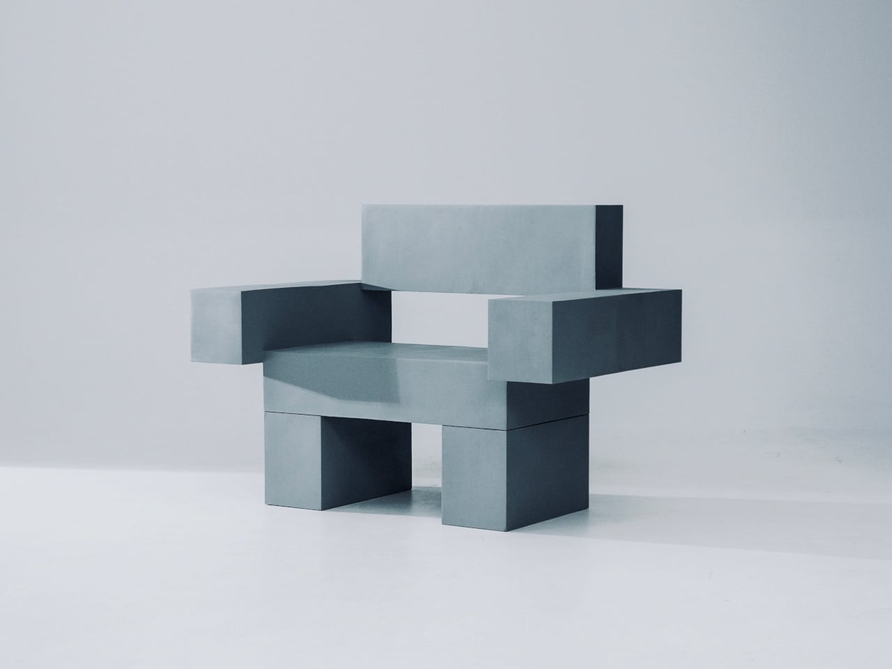
This Brutalist Lounge Chair Is 3D-Printed From Recycled Water Bottles

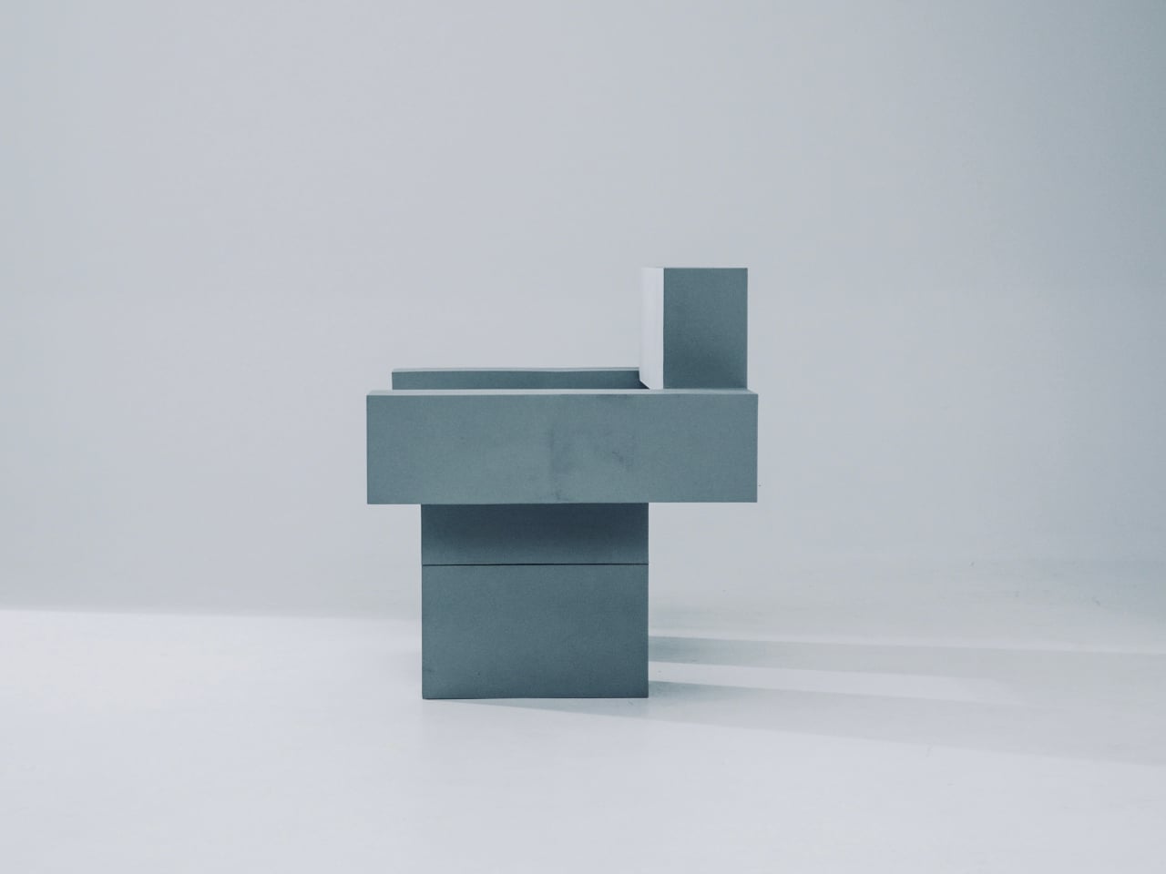
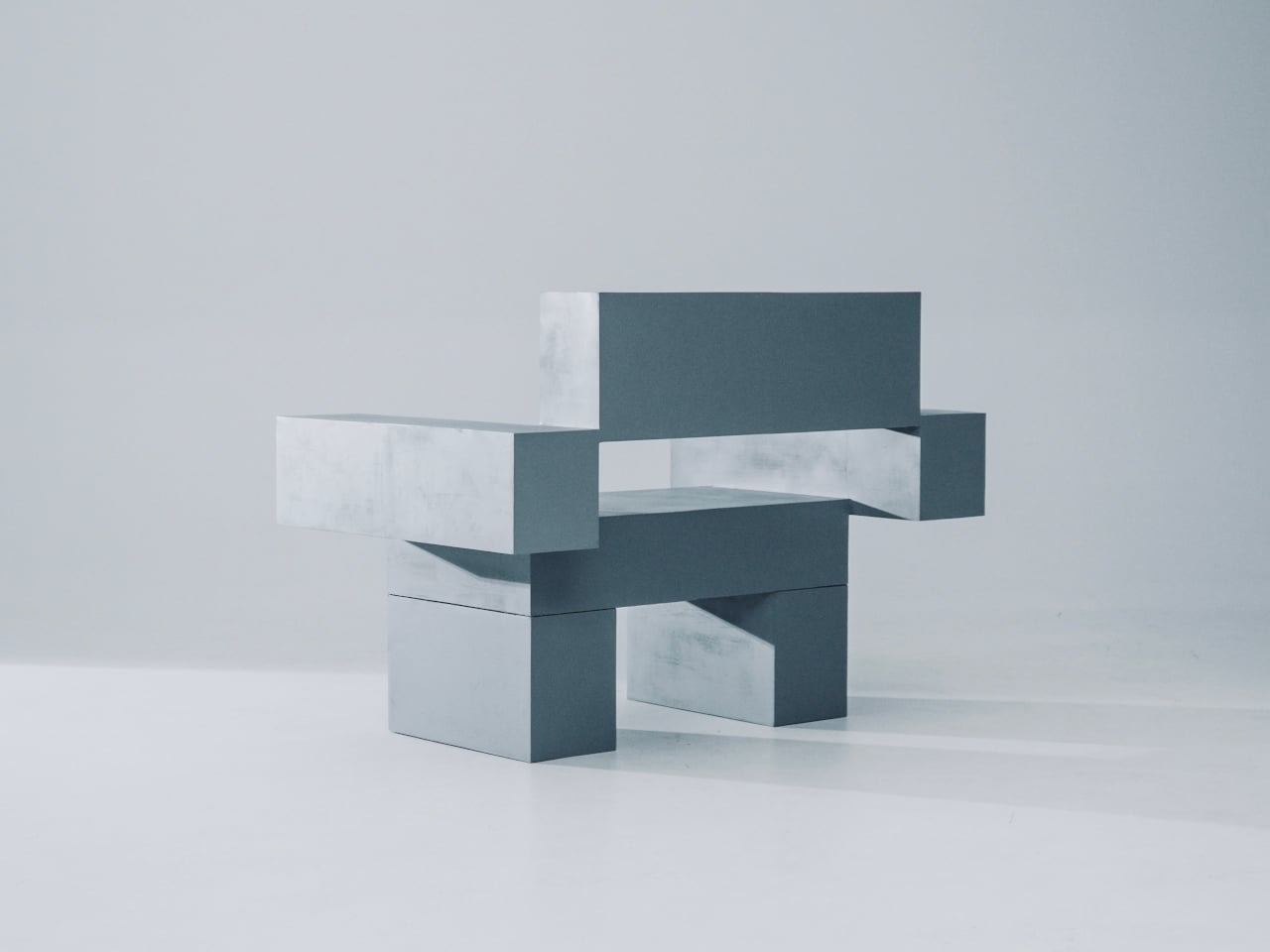
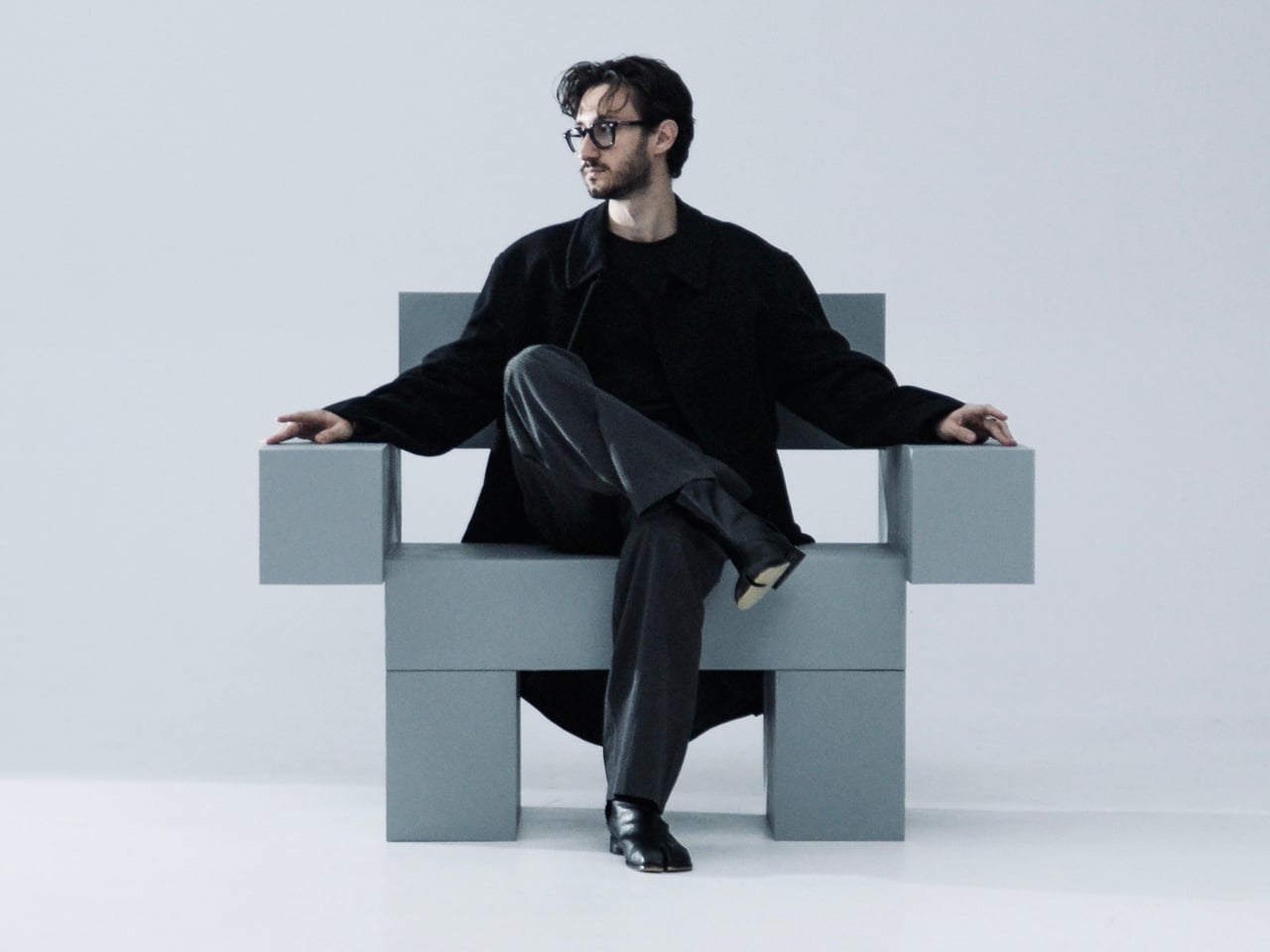
Most furniture sits in a room without saying much. It fills a corner, does its job, and disappears into the background. Nako Baev’s THE OBJECT 01 is not that kind of furniture. The Amsterdam-based designer set out to build a chair that carries the weight of a spatial statement, something that holds its ground without decoration or apology, and in that specific ambition, the object largely delivers.

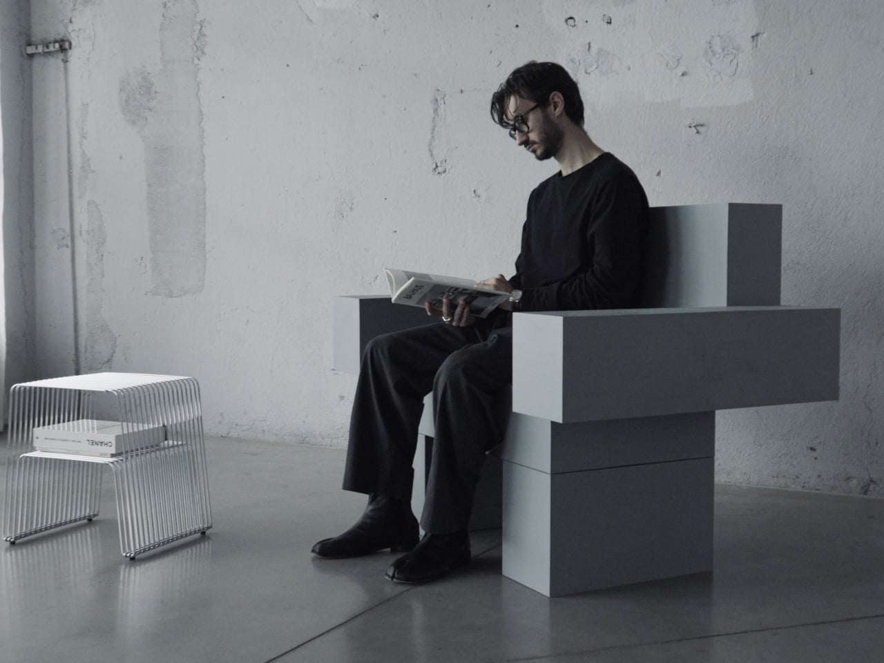
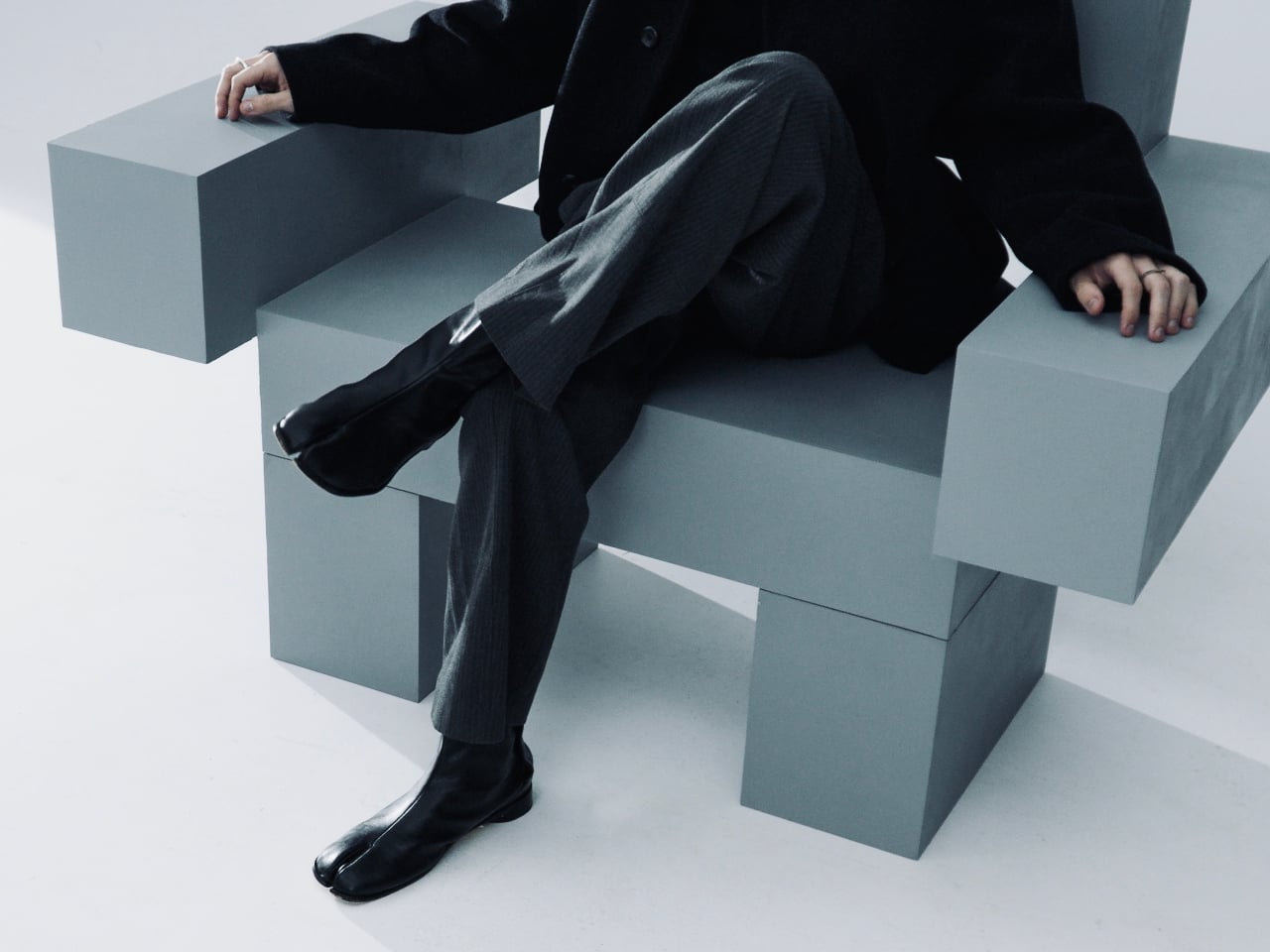
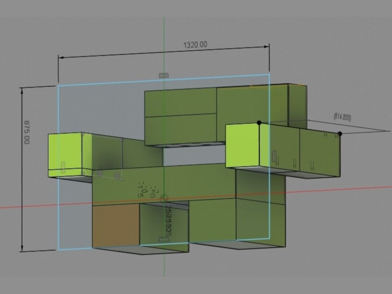
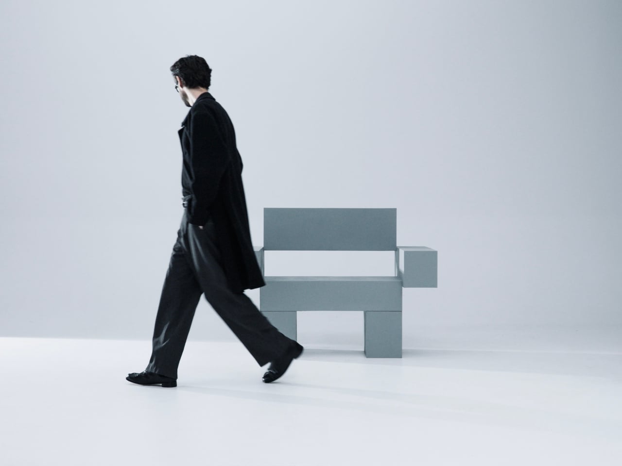
THE OBJECT 01 is a 3D-printed lounge chair built from recycled PETG, a plastic more commonly found in water bottles than in furniture workshops. At 20kg, it is lighter than its blocky, slab-heavy proportions suggest, though not exactly something you would reposition on a whim. Its dimensions push it closer in scale to a small architectural fragment than to a typical chair, which is likely the whole point.

Designer: Nako Baev

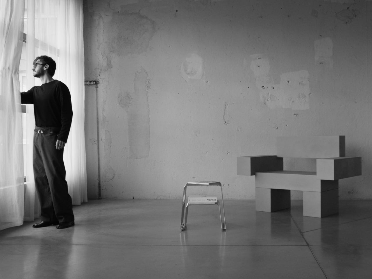
The construction follows a modular panel system, where each 3D-printed block fits into a sequence designed to cut material waste and keep the overall mass structurally lean. Finished in a cold grey Baev calls “Kyoto Fog,” the chair reads somewhere between concrete and matte stone. In a sparse studio or raw loft, it anchors the space with quiet authority. In a more conventional living room, it would likely dominate in ways not every household would welcome.
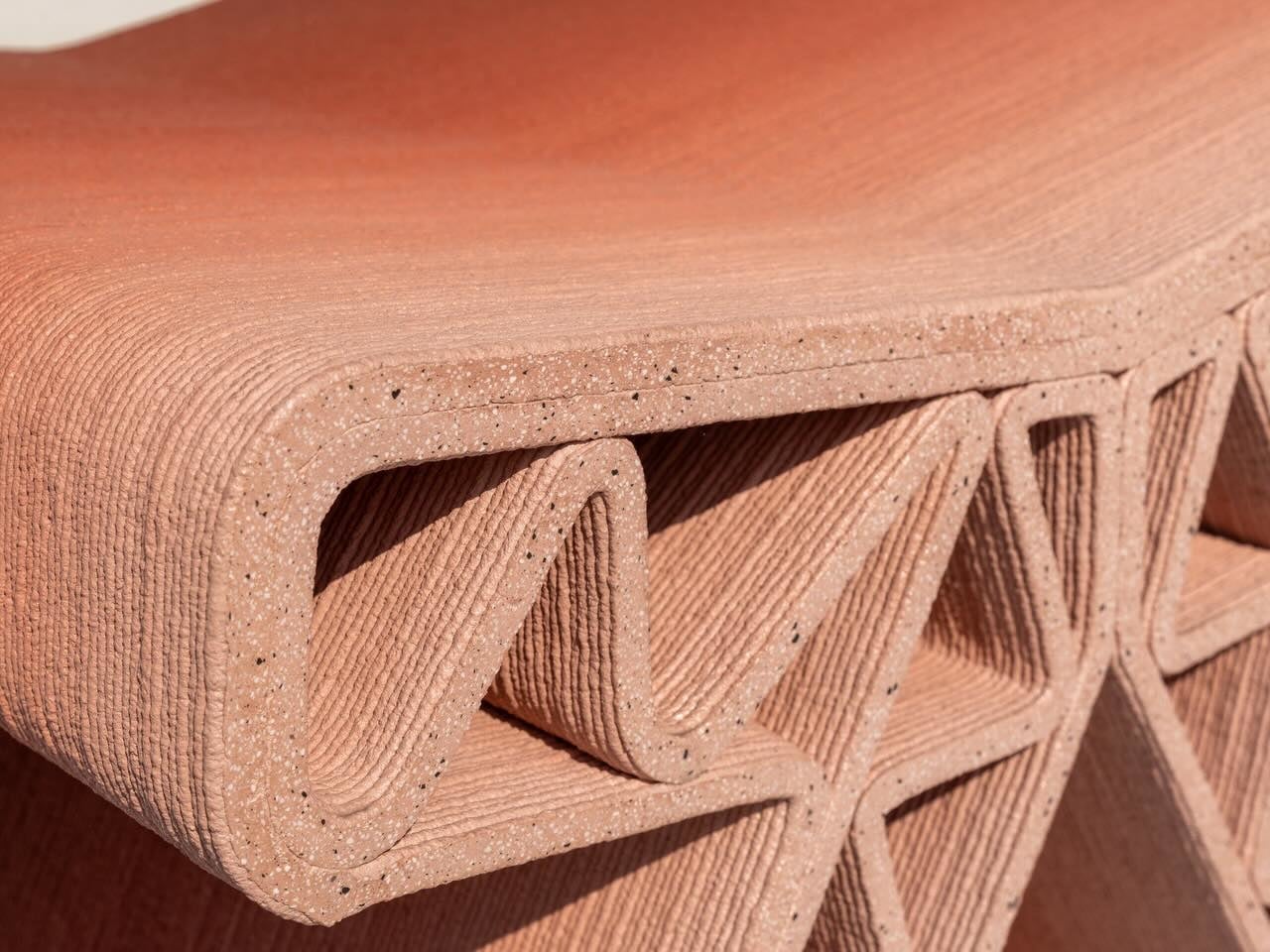
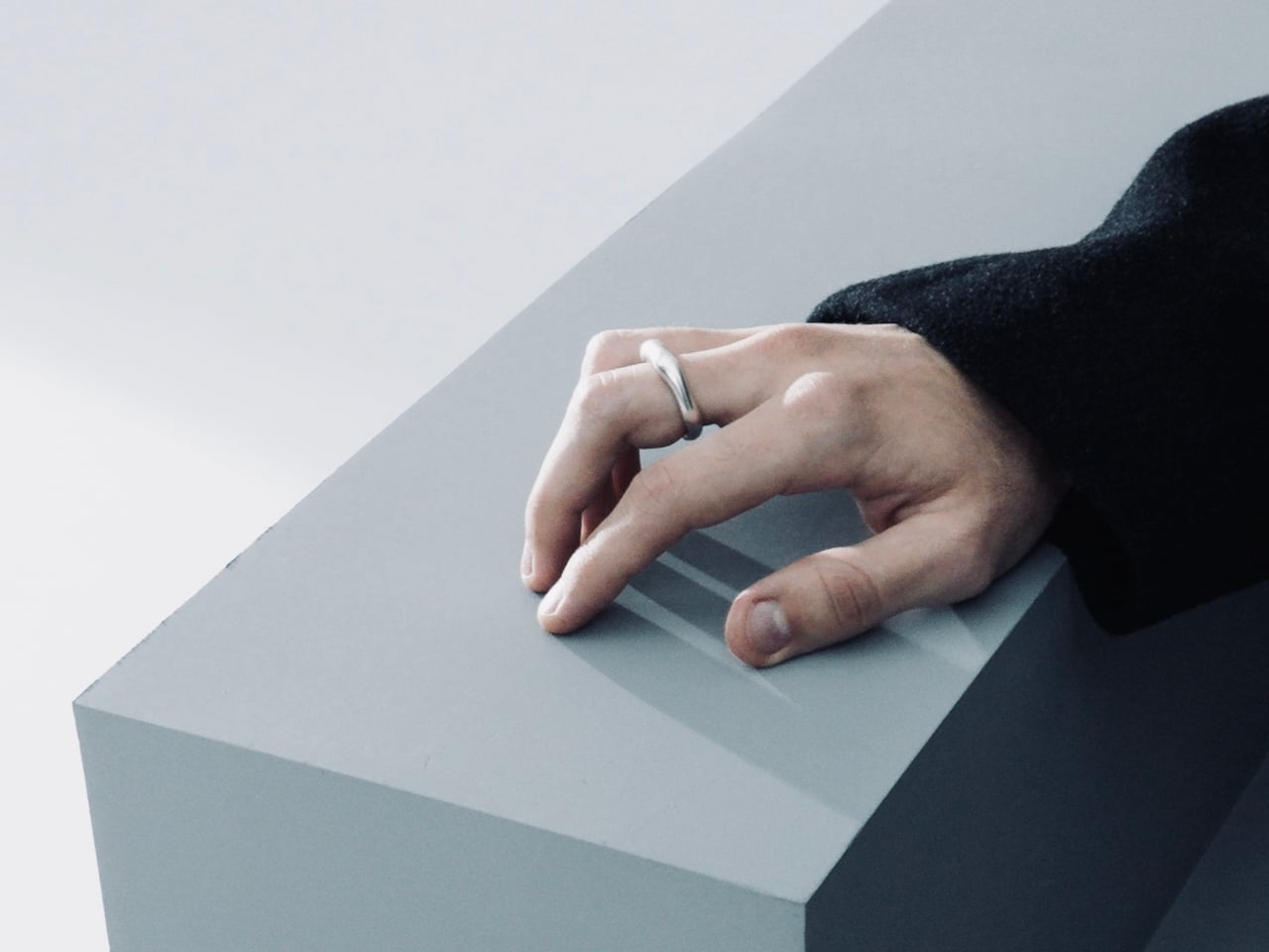
What makes THE OBJECT 01 genuinely worth attention is how honestly it exposes its own making. The layer-by-layer texture from the printing process is not hidden or smoothed away; it stays visible across the surface, turning the manufacturing method into part of the visual language. That kind of material honesty is far more common in ceramics or cast concrete than in plastic furniture, and it gives the piece a tactile quality that polished renders simply do not convey.

Baev describes the design as sitting between furniture and sculpture, drawing on minimalist brutalism and a quieter Japanese restraint in equal measure. The emotional reference points are more unusual: the designer cites the atmosphere of Silent Hill and Half-Life, those game environments built from silence and abandoned space, as part of what shaped the object’s mood.

The workflow involved AI assistance across early form studies, structural testing, and design refinement, reducing development time considerably. That footnote is becoming standard across the industry, and it doesn’t add or subtract much here. This process might even become the key to sustainable furniture design, as it can help optimize 3D printing, increase efficiency, and reduce waste in the long run.

The post This Brutalist Lounge Chair Is 3D-Printed From Recycled Water Bottles first appeared on Yanko Design.