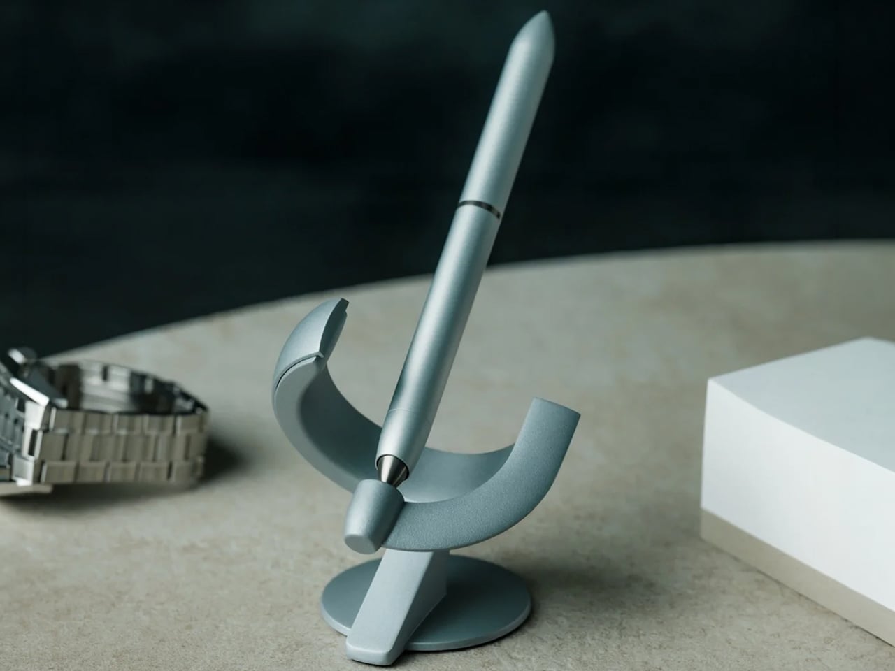
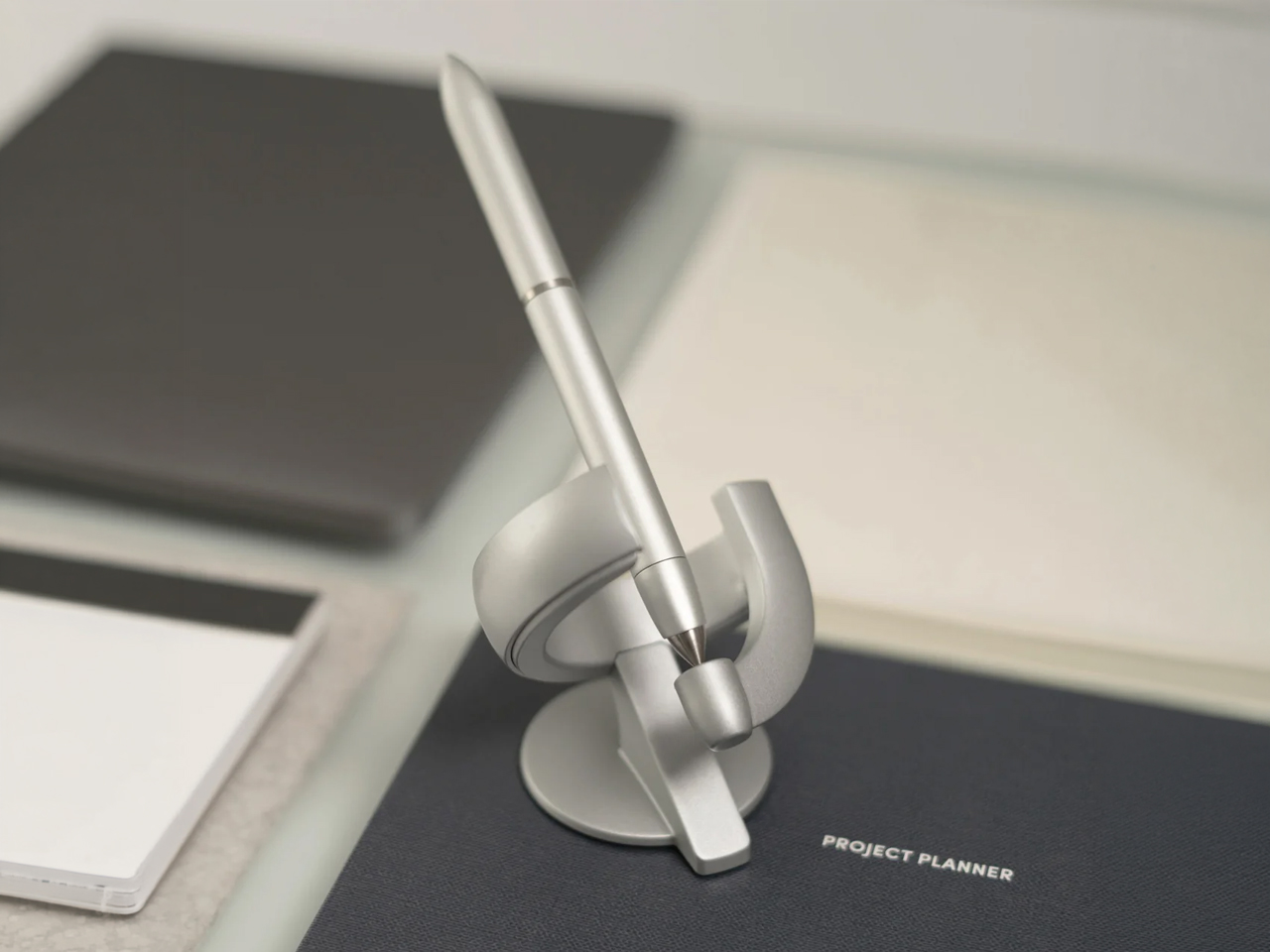
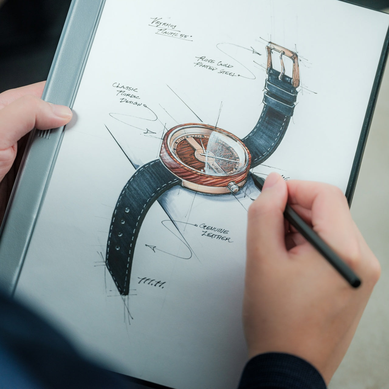
Most pens are designed to disappear into the background of your workday. You toss them in a drawer, lose them in a bag, borrow one from a colleague, and replace them without thinking too hard about it. The Levitating Pen 3.0 operates from an entirely different premise. It hovers an inch above its base at a 60-degree angle, bobbing gently in place, spinning for up to 30 seconds when you twist it – as if the act of writing deserved a little more theater than we’ve allowed it.
That sounds like novelty until you spend a moment with the idea. Then it becomes clear that the point is not just that it floats, but that it changes the ritual around one of the oldest tools on your desk. A pen is still one of the few objects you reach for when a thought feels too quick, too rough, or too personal for a keyboard. When the act of picking it up becomes intentional rather than automatic, the writing changes a little too.
We have optimized so much of work life for speed that wonder now feels almost unprofessional, as if delight has to justify itself through productivity before it earns a place on a desk. The Levitating Pen 3.0 makes a quiet argument against that. It suggests that not every useful object needs to look anonymous, and that a tool can still do its job while reminding you that imagination has practical value too.
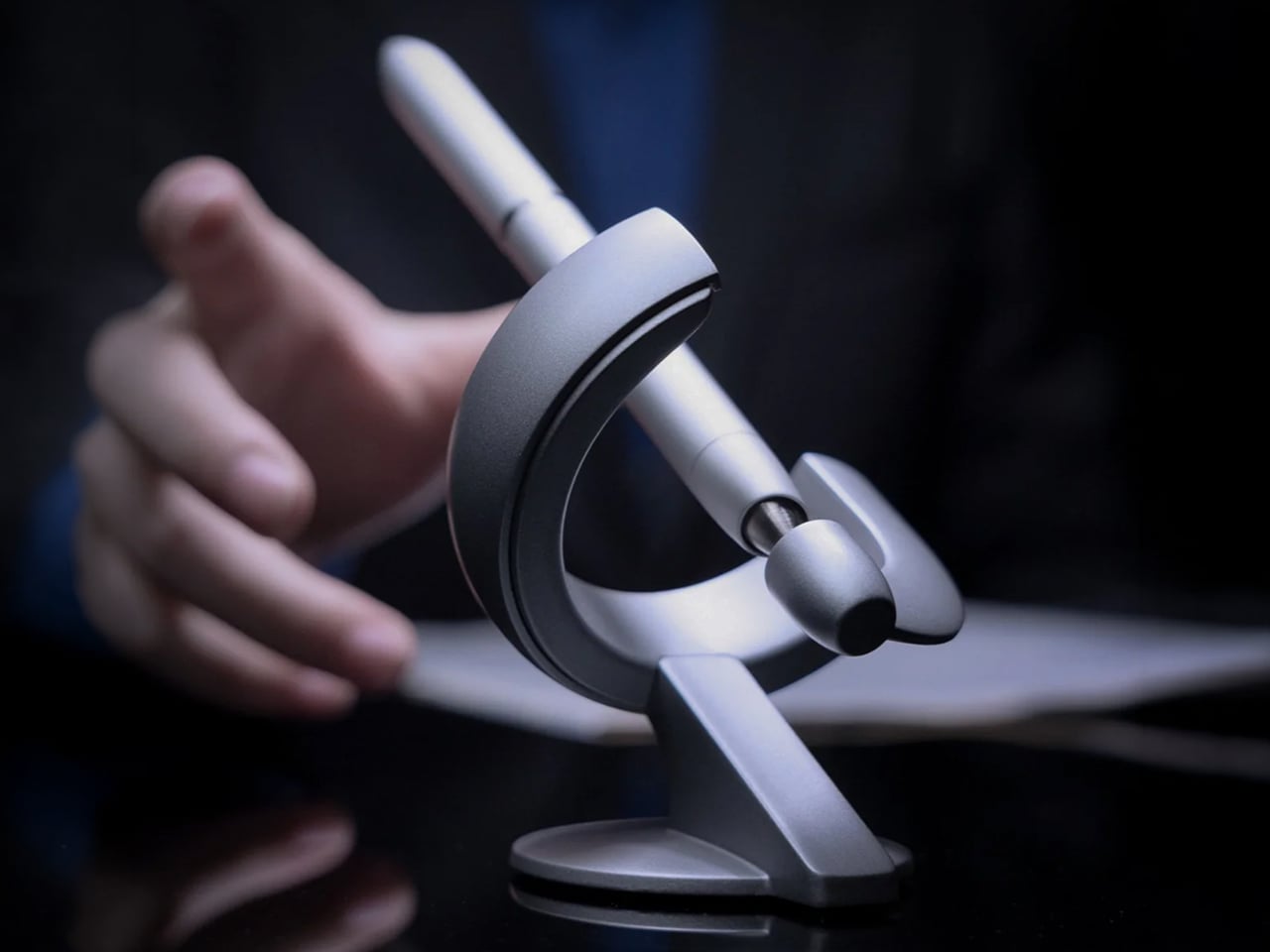
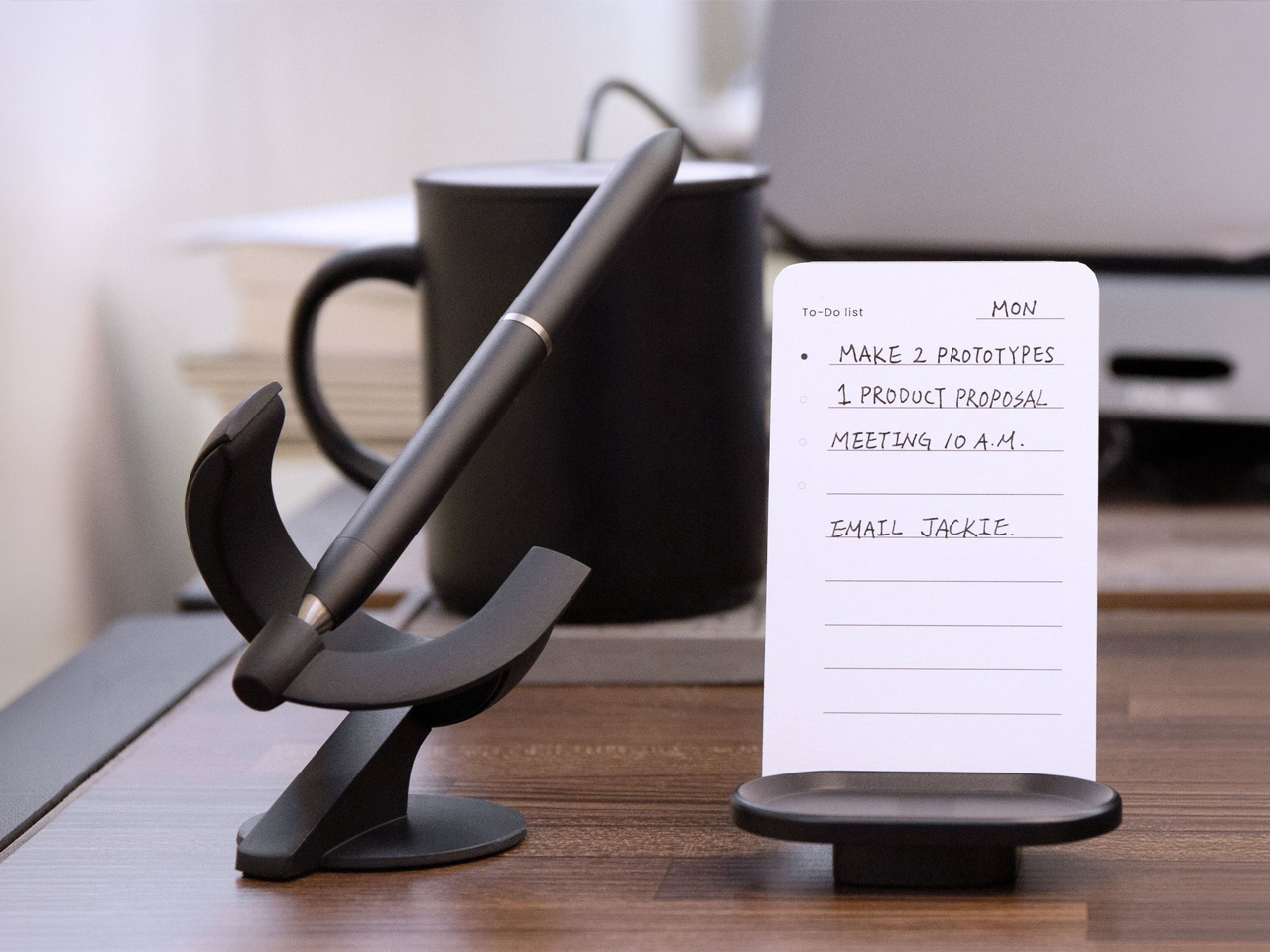
Picture it at 8:30 in the morning, before your inbox has fully ruined the day. Your notebook is open, coffee is still hot, and the pen is hovering in that slightly unreal way that makes your workspace feel less like a holding area for tasks and more like a place where ideas might actually happen. You reach for it, feel the small satisfying release of the magnetic hold, jot something down, and return it to the pedestal. Then it settles back into that floating posture again. You are not just putting a pen down. You are returning an object to its stage.
It Started at Earth’s Axial Tilt. Now It’s This.
The original Levitating Pen was angled at 23.5 degrees – a deliberate nod to Earth’s axial tilt, the angle at which our planet leans through space. It was a quiet piece of philosophy built into a physical object. The 2.0 refined the writing experience. The 3.0, now angled at a more commanding 60 degrees, is where the design reaches full architectural confidence. The stand evolved from a base to a stage. The visual language moved from clever to commanding.
That kind of refinement matters because novelty has a short shelf life. Either an object matures into something with conviction, or it remains trapped as a trick. Three iterations over several years is how you tell the difference.
Aerospace Aluminum, Titanium, and One Very Deliberate Trick
The pen is built from aircraft-grade aluminum, titanium, and brass — each material earning its place. The aluminum keeps it light. The titanium gives the body a satisfying density. The brass houses the magnetic architecture that makes the whole illusion work.
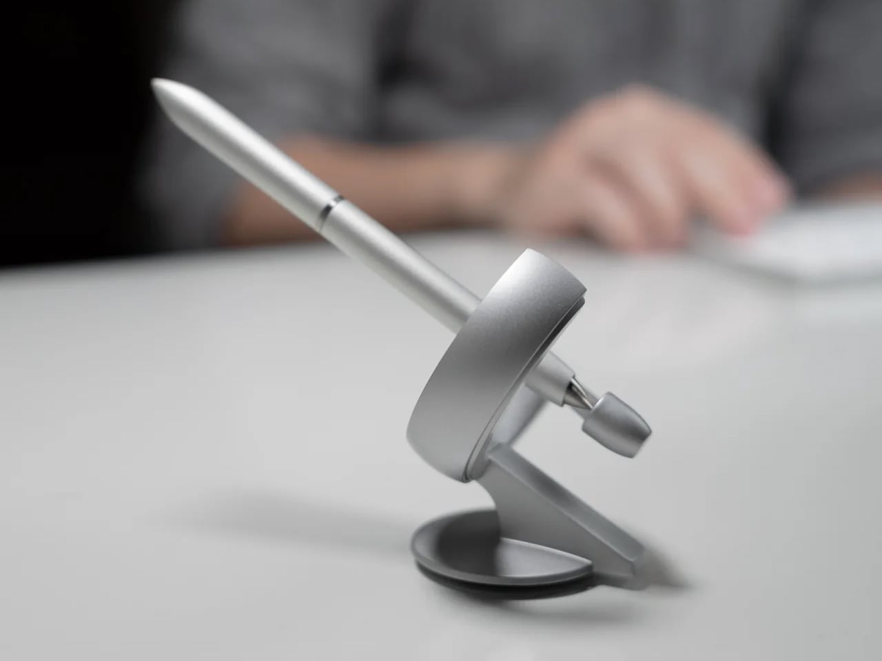
The floating effect suspends the pen one inch above the pedestal at 60 degrees, as if frozen mid-motion. Disturb the air around it and it bobs gently in place. That small movement is what gives it life – hypnotic enough to interrupt a thought spiral and reset your attention without ever tipping into gimmick.
The revised pedestal is taller than previous versions, giving the levitation more visual breathing room. The pen’s long, seamless silhouette cuts a sharper line in space than a conventional writing instrument ever could. It resembles a small spacecraft – a comparison that would sound ridiculous if the object did not actually deserve it.
And it still writes. Rollerball with a Schmidt cartridge, fountain pen with a fine 0.5mm nib, or a 2-in-1 that lets you swap between both. The writing experience is precise, not performative. The floating posture gets your attention. The ink earns it.
Why $129 Is Actually the Honest Price
A well-made metal pen already pushes into premium territory on its own. Add a thoughtfully designed stand and you are not far from this number – except most pen-and-stand combinations do not share a visual language, a magnetic levitation system, or the kind of presence that changes how a desk feels when you walk past it.
What you are paying $129 for, with the Levitating Pen 3.0, is the convergence of writing instrument, kinetic object, and desk sculpture into a single resolved piece. For someone who wants their workspace to say something more specific than “functional,” that distinction matters. This is for the founder who still sketches ideas by hand. The architect who cares how an object rests when it is not being used. The designer who believes tools shape attention. If that sounds specific, it is. The specificity is the point.
We spend so much of our lives surrounded by objects that do their jobs and disappear. The Levitating Pen 3.0 does something rarer. It performs its function while changing the atmosphere around it. A good pen records ideas. This one makes room for them.
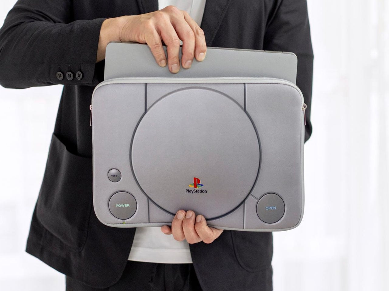
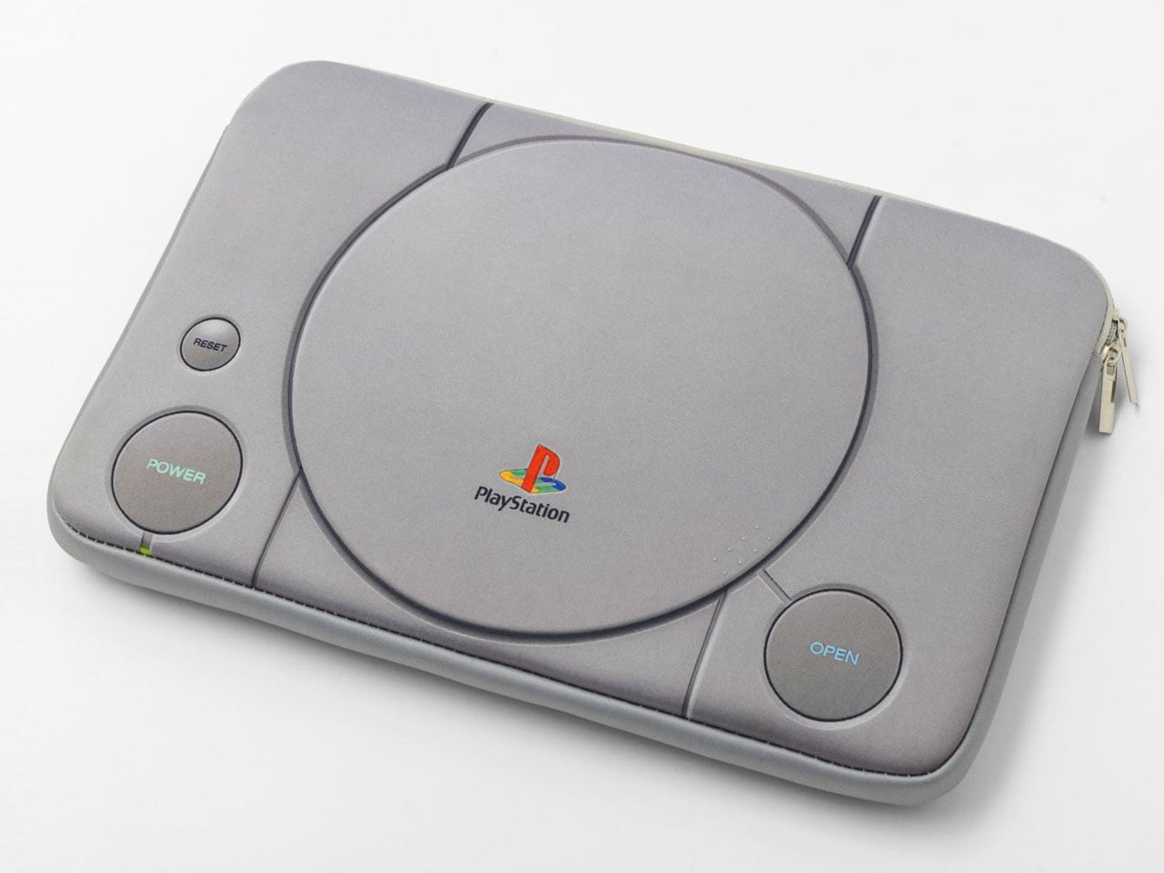
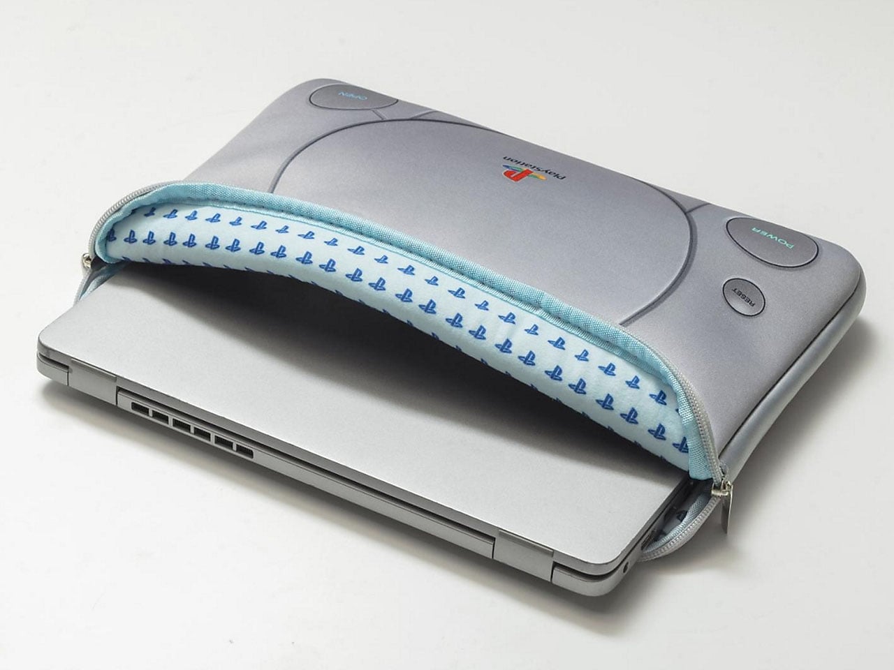
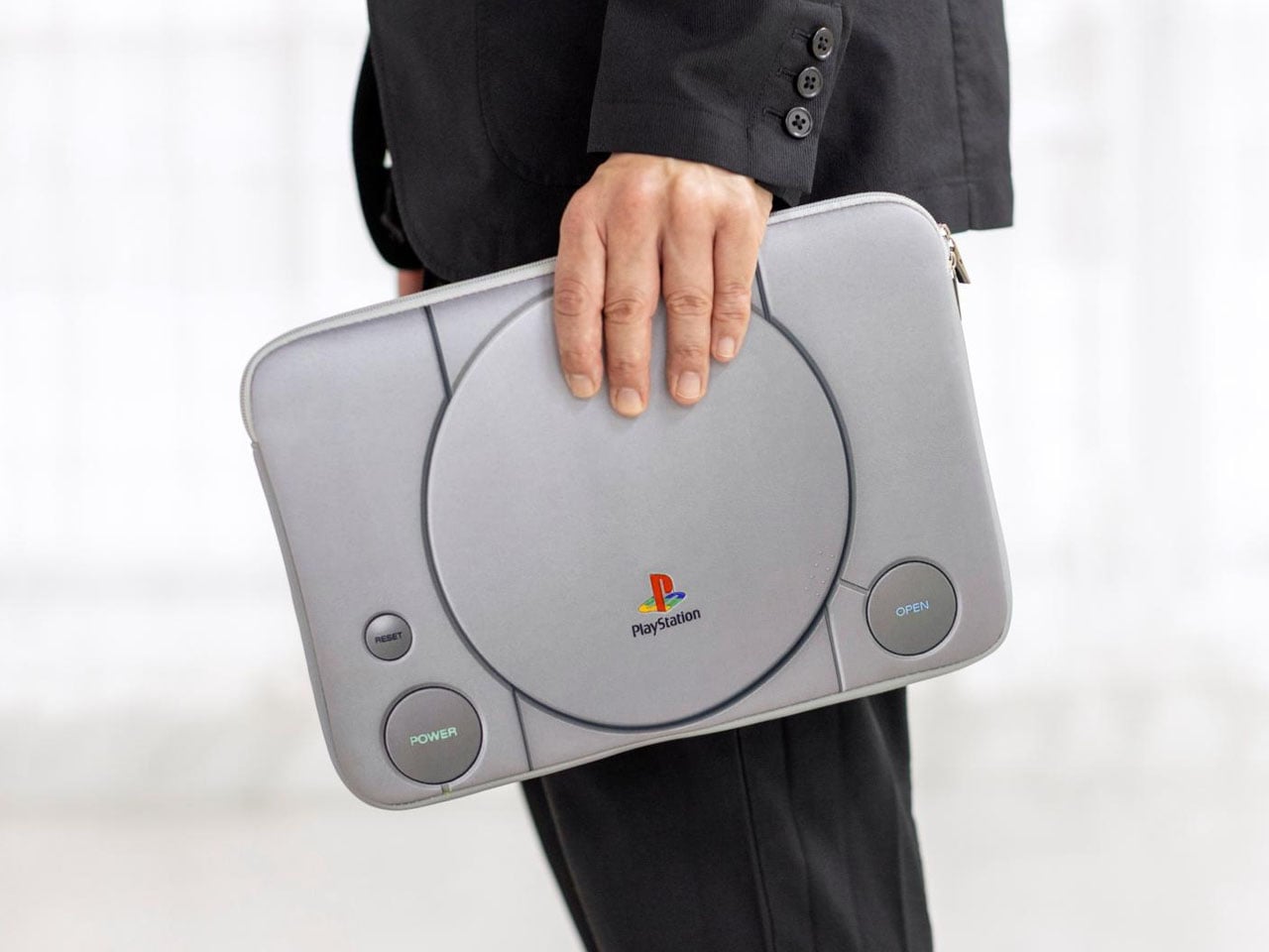
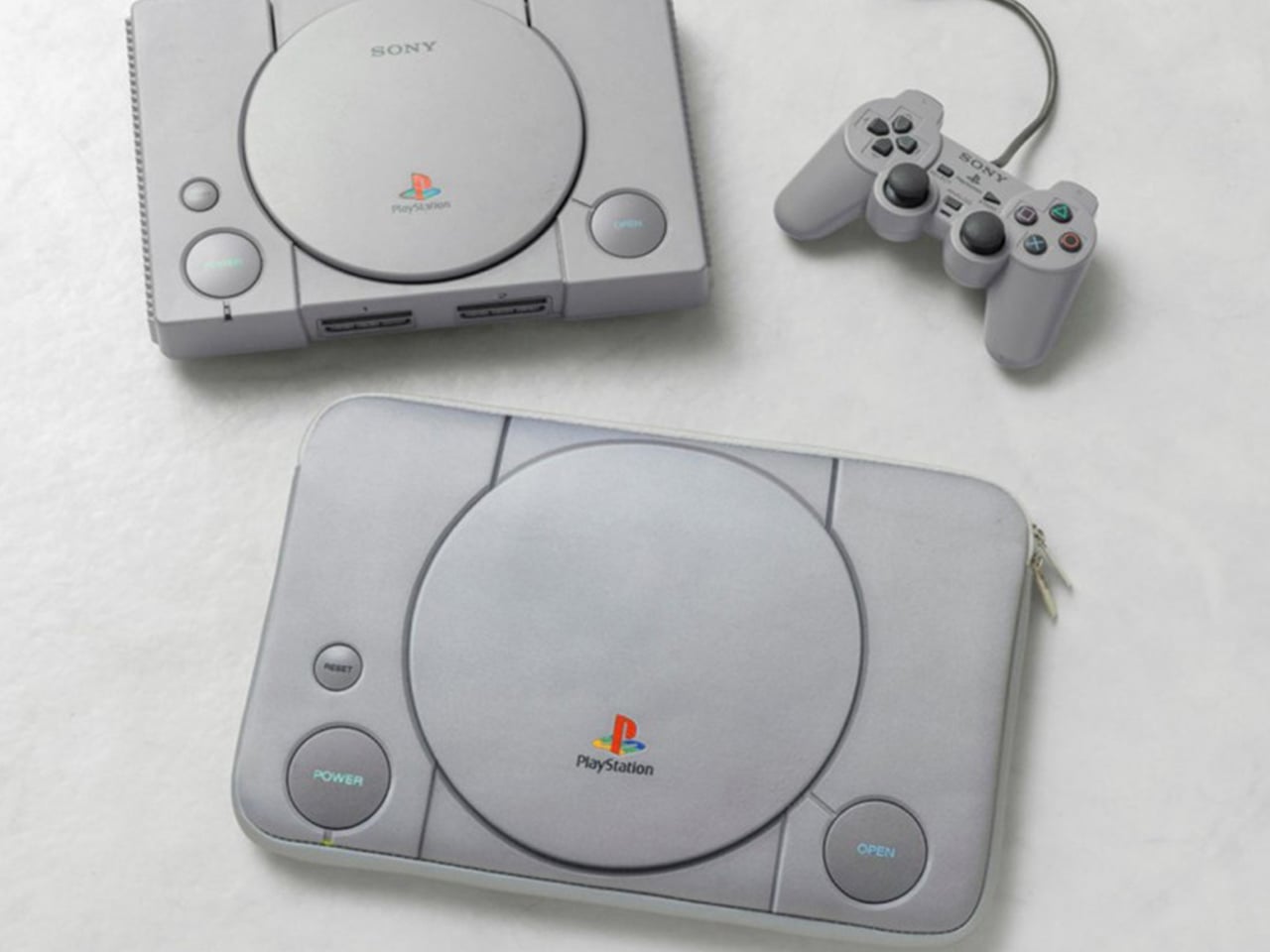
For many gamers, the original PlayStation was more than just a gaming console, as it was an introduction to an entirely new era of entertainment. More than three decades after Sony’s landmark system changed the industry, its unmistakable design continues to inspire products that tap into nostalgia while serving modern needs. The latest example comes from Japanese publisher Takarajimasha, which has unveiled a PlayStation-themed Multi Cushion Case BOOK that transforms the iconic first-generation console into a practical carrying solution for today’s digital essentials.
Designed to closely replicate the appearance of the original PlayStation, the cushion case faithfully recreates the console’s signature gray finish and recognizable button layout. From a distance, it looks remarkably similar to the hardware that debuted in the mid-1990s, making it an instant conversation piece for longtime fans. Rather than functioning as a collectible display item alone, however, the accessory has been designed with everyday usability in mind.
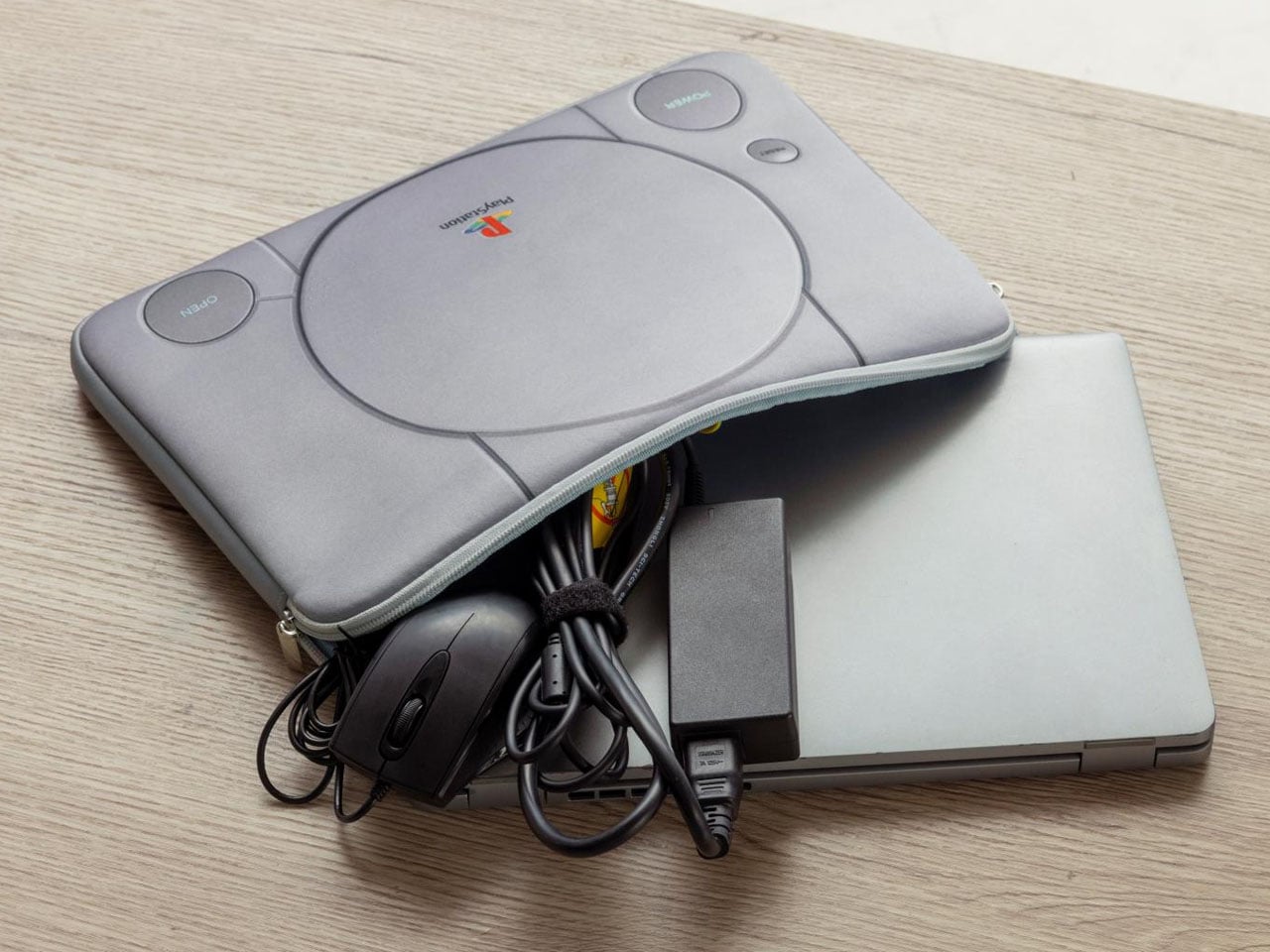
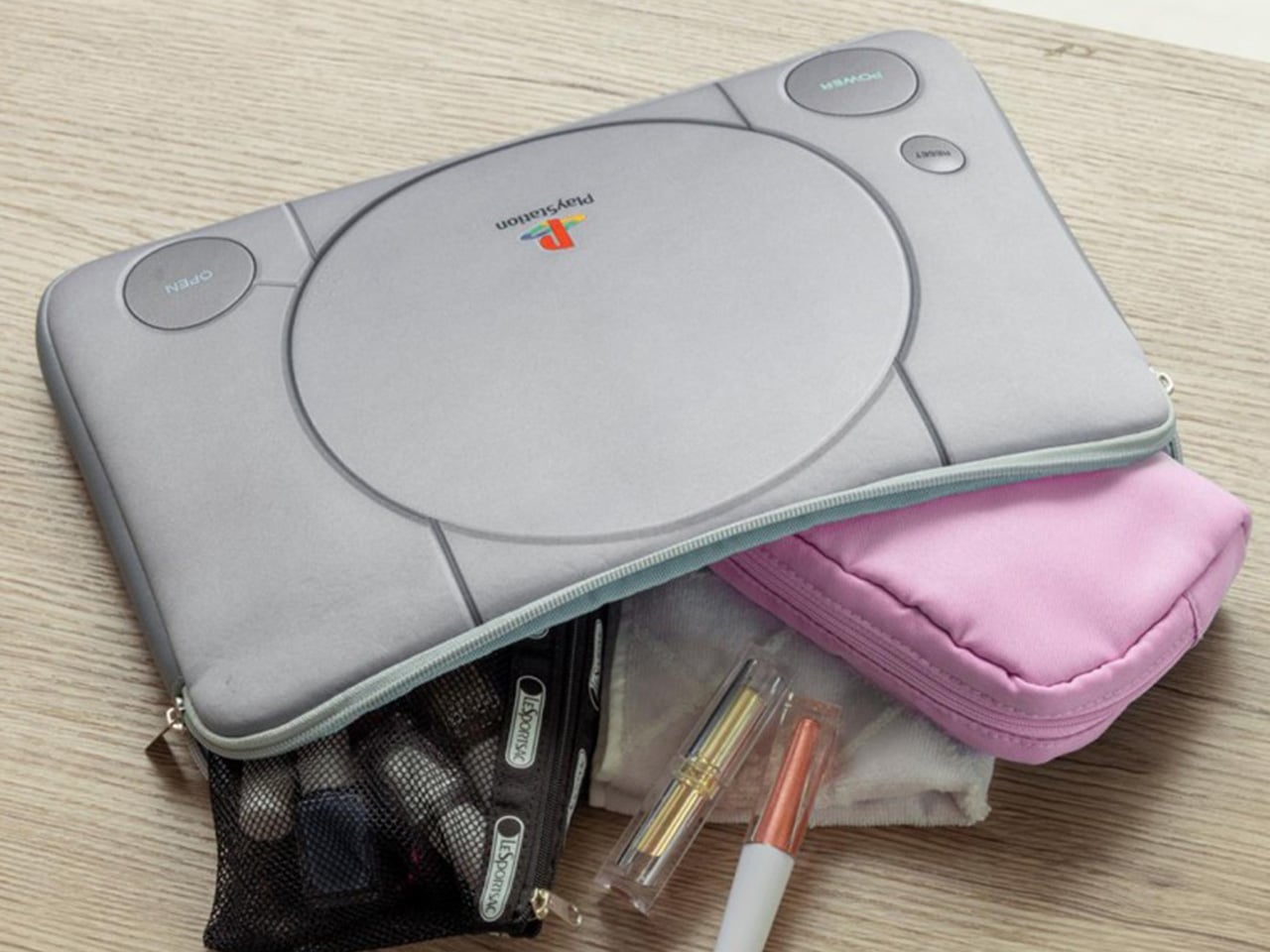
The slim protective case measures approximately 23 x 33 x 2 cm and is sized to accommodate modern devices such as laptops and tablets. Its cushioned construction helps protect electronics during transport, while the compact profile prevents unnecessary bulk inside a backpack or messenger bag. Cables, chargers, documents, and other daily essentials can also be stored alongside devices, turning the nostalgic shell into a practical workspace companion. The combination of retro styling and contemporary utility makes this utilitarian accessory appealing even to those who may not actively collect gaming memorabilia.
Takarajimasha’s release follows a growing trend of lifestyle products inspired by classic gaming hardware. As gaming culture becomes increasingly mainstream, companies are finding new ways to celebrate iconic consoles beyond traditional merchandise. Instead of creating another figurine or decorative collectible, the publisher has chosen an item that integrates seamlessly into daily life, allowing users to carry a piece of gaming history wherever they go.
The timing is particularly fitting. Interest in PlayStation nostalgia remains strong as Sony continues to celebrate the legacy of the original system and its influence on modern gaming culture. Products inspired by the first PlayStation often resonate with a generation that grew up with the console while also attracting younger enthusiasts who appreciate its enduring industrial design. The machine’s circular disc lid, geometric button arrangement, and understated gray color palette have become instantly recognizable design cues that continue to age surprisingly well.
Launched in Japan for 3,630 Yen (approximately $23), the PlayStation Multi Cushion Case BOOK blends collectible appeal with practical functionality. It captures the essence of a beloved console without simply replicating it as a static display piece.
Handheld fans have been a summer staple for years, but the basic formula hasn’t changed much. You press a button, blades spin, and air moves. That works fine when it’s mildly warm, but as summers grow hotter and more people spend time outdoors, a fan that simply redistributes hot air starts to feel less like relief and more like a polite gesture against a much bigger problem. And yet for years, that has remained the only option most people know and reach for.
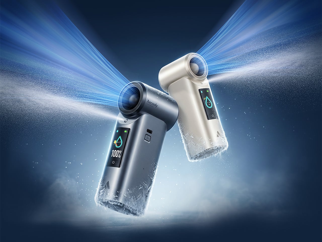
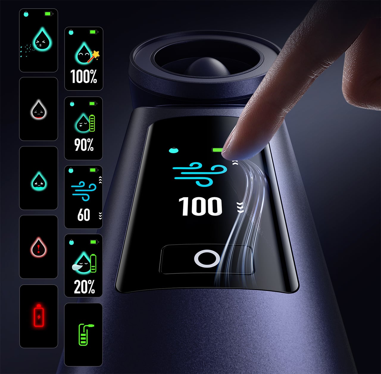
That’s the gap Aecooly is trying to close with the Cold Air Ultra, the brand’s flagship personal cooling device. Rather than simply moving warm air from one side of your face to the other, Aecooly built it around an active cooling system that delivers genuinely cooled airflow, thanks to ultra-fine mist particles that accelerate evaporation to actively draw heat away from the skin. If you’ve ever thought there has to be a fan that actually cools the air, this is that device.
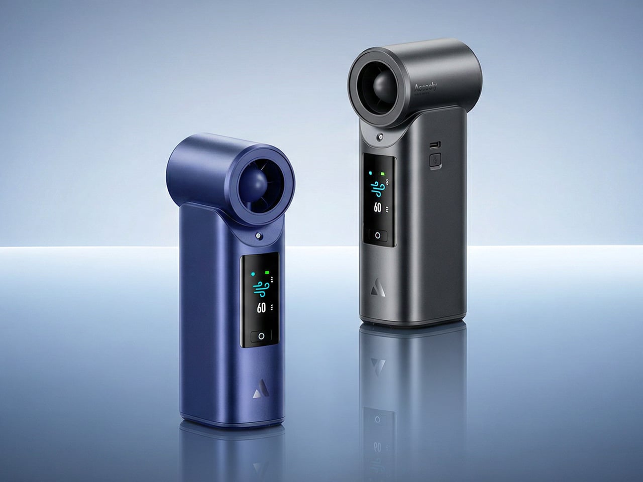
It’s worth noting how the Cold Air Ultra looks, because the design says a lot about what it’s trying to be. The body is compact and upright, with a cylindrical air outlet with a straight, high-pressure duct design, giving it a shape closer to a precision tool than a seasonal gadget and ensuring that the powerful airflow reaches you with zero efficiency loss. Unlike the plastic housing common to most portable fans, the Cold Air Ultra comes in a lightweight body with a premium metallic-inspired finish that’s more resistant to scratches and daily wear, better in hand, and can passively conduct heat away from the motor during extended use.
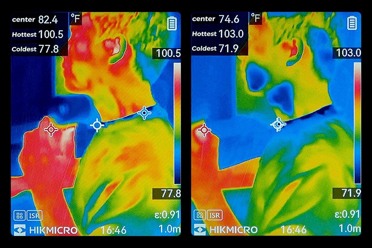
The cooling technology is where the Cold Air Ultra stands apart. An 70,000 RPM brushless motor drives high-speed air that “breaks through” the sticky sweat layer so the mist can evaporate and pull heat away instantly. It’s this dual action of the wind clearing the path for the mist that makes it possible to reduce skin temperature by up to 18°F (10°C) in just 10 seconds, a noticeably different experience from what you’d get with a standard fan.
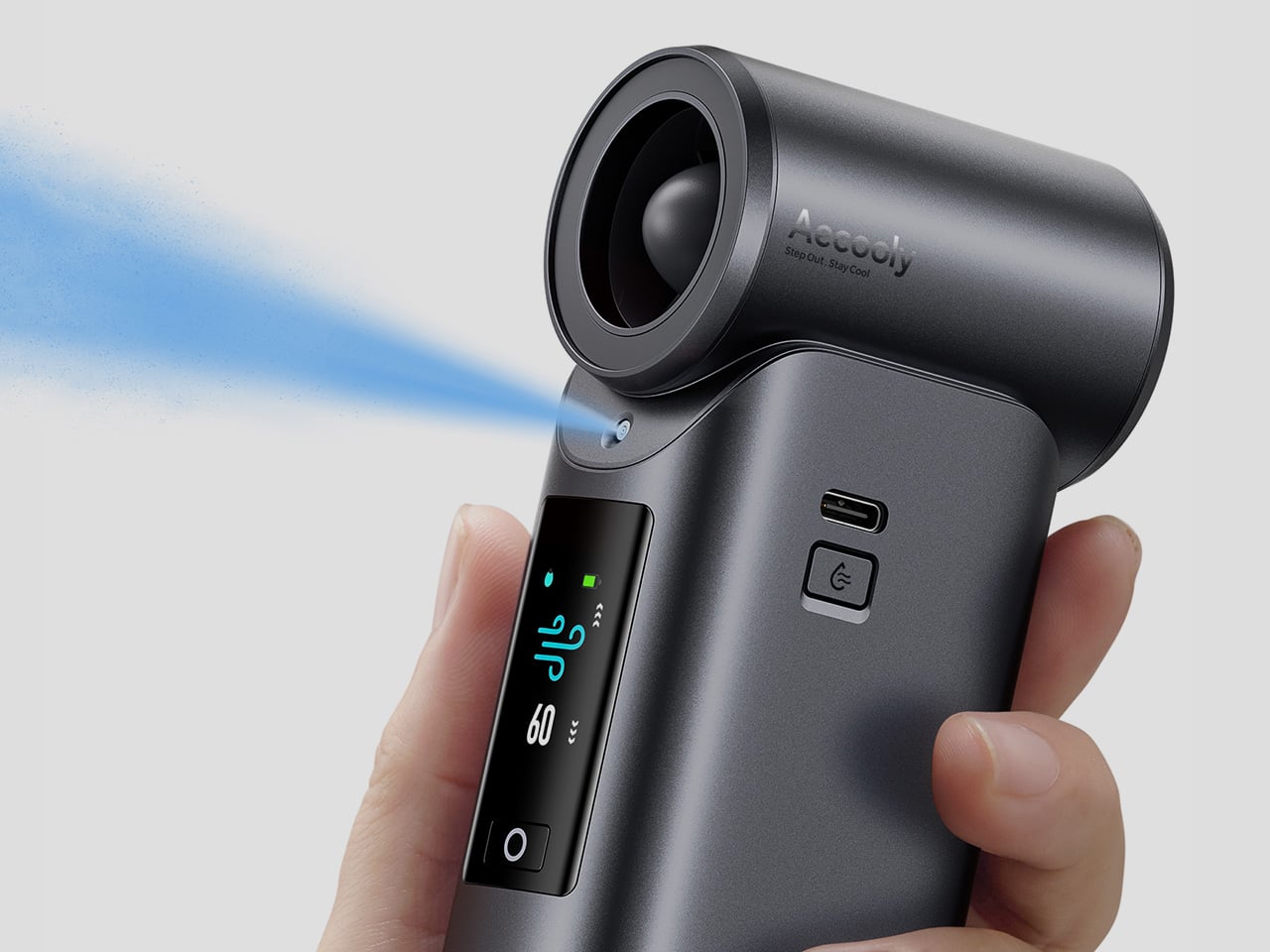
What makes the airflow cold rather than simply wet comes down to how the system atomizes water. Rather than using a vibrating membrane to break liquid into droplets, the approach used in most portable evaporative devices, the Cold Air Ultra uses pneumatic atomization: a high-pressure pump forces compressed air through a precision copper nozzle, shearing water into ~20 μm micro-particles at speed. The compression process itself lowers the air temperature before it exits the device, so that what reaches your skin is genuinely cooled airflow, not ambient air with moisture added. The water and air channels are sealed in a patented airtight structure that optimizes flow efficiency and prevents leakage, a design detail that also keeps the electronics fully separated from the water circuit.
Control is handled through what Aecooly calls the “Little Droplet,” a full-color touchscreen built into the front of the body. This enables fast, intuitive, and precise control, allowing users to swipe through the 100-level settings instantly, which is a much more modern and responsive way to manage airflow compared to traditional fans. And with dynamic icons that display battery level, water level, and mist status in real time, you’re never left guessing what’s left.
Picture stopping mid-hike to cool down, or waiting on a sweltering subway platform with no breeze in sight. A standard fan doesn’t do much in either of those moments beyond moving hot air around. The Cold Air Ultra is built for situations like these, where getting your skin temperature down quickly during a break or a commute actually makes a noticeable difference to how you feel.
Battery life isn’t a compromise here either. The Cold Air Ultra packs a 7,000 mAh cell for up to 10 hours, charges via USB-C in about 2.5 hours, and doubles as a 20W power bank with Quick Charge and Power Delivery support. The magnetic accessory system includes a pointed nozzle and a round nozzle for directing airflow, plus a brush head, each of which can snap on and off without tools. The included lanyard enables hands-free carry, so the device stays accessible during commutes or outdoor use without needing to be held.
Aecooly says the Cold Air system has received the Red Dot Design Award 2026, a recognition that speaks to its functional engineering as much as its considered form. It’s available in a black and a blue finish, and retails for $79.99. For a device that covers personal cooling, emergency power, and outdoor utility in a single package, the price puts it squarely in premium handheld territory.
The standard Aecooly Cold Air at $31.99$39.99 (20% off, use coupon code “YANKO2026”) brings the same active cooling concept in a simpler package, with a 4,500 mAh battery and five speed settings. It’s a solid introduction to the concept, but the Cold Air Ultra’s touchscreen, 7,000 mAh battery, 20W power bank output, and magnetic tool system make $79.99 feel less like a premium and more like the smarter spend.
3D printing is redefining the language of future technology and design. Tech peripherals are evolving from standardized, mass-market products into sculpted forms. This transformation signals a tectonic shift – where precision fabrication meets individuality, and performance aligns seamlessly with form.
For designers and conscious consumers alike, 3D printing enables precise ergonomics, material efficiency, and expressive geometry to coexist seamlessly. The result goes beyond customization, fostering a new ecosystem of tools that respect sensory feedback and minimize waste. It transforms everyday technology into a refined, human-centered design experience across industries ranging from consumer electronics and gaming to wearable tech and medical innovation.
1. Computer Peripheral Tectonics
The workstation now operates as a micro-architectural environment where precision, materiality, and human anatomy converge. Through 3D printing, the computer peripheral is redefined from a standardized accessory into a deliberately engineered component. Mice, keyboards, and input tools become tectonic objects that are formed with structural clarity and material authenticity, responding directly to natural hand geometry and movement patterns rather than generic manufacturing molds.
This transformation delivers tangible ergonomic advantages by minimizing repetitive strain through proportionate scaling and calibrated spatial alignment. As design thinking evolves, customized printed interfaces are recognized for enhancing workflow efficiency and sensory engagement. Tactile feedback becomes integrated into the rhythm of work, elevating everyday digital interaction into a more intuitive, refined, and human-centered experience.
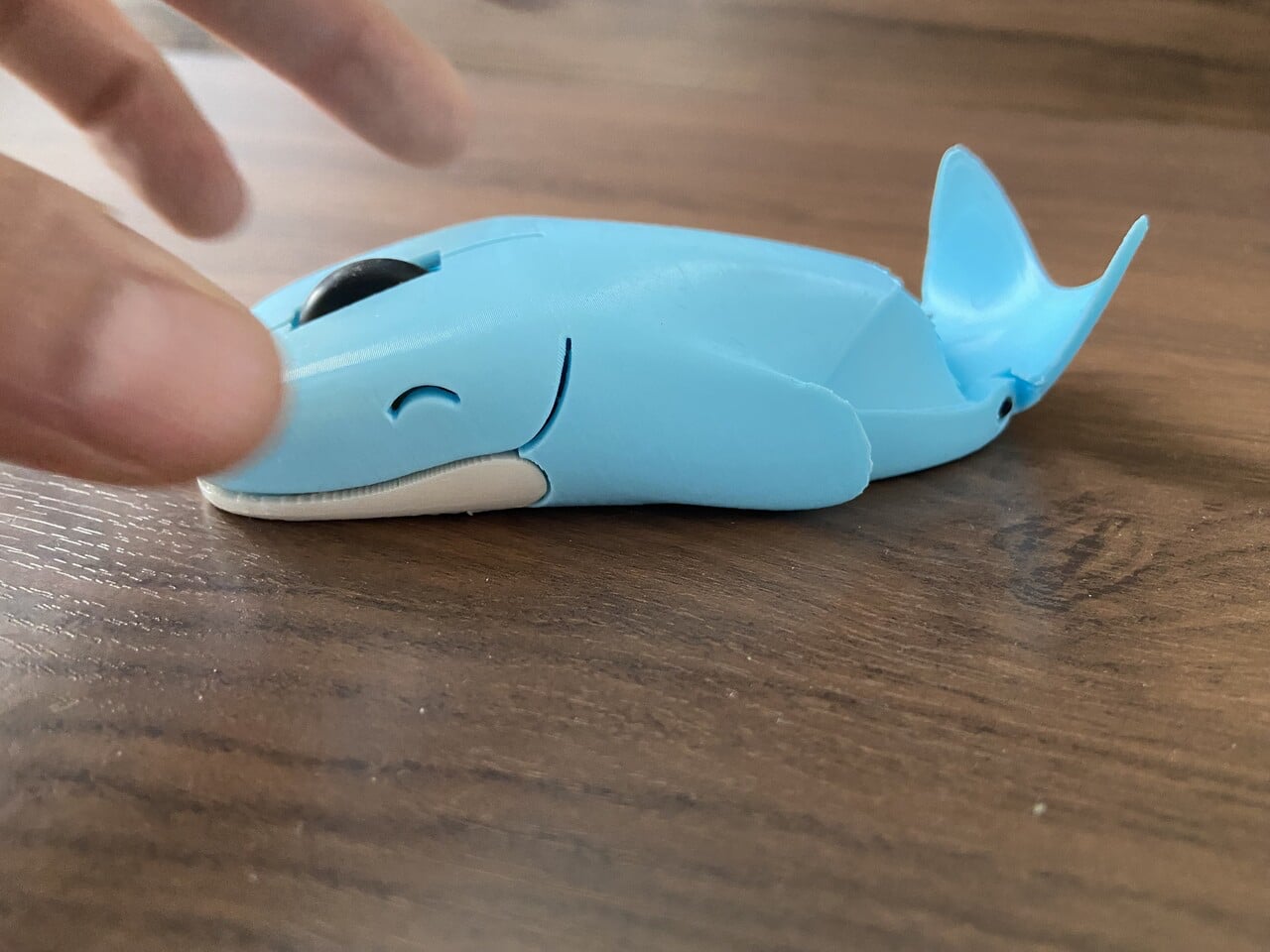
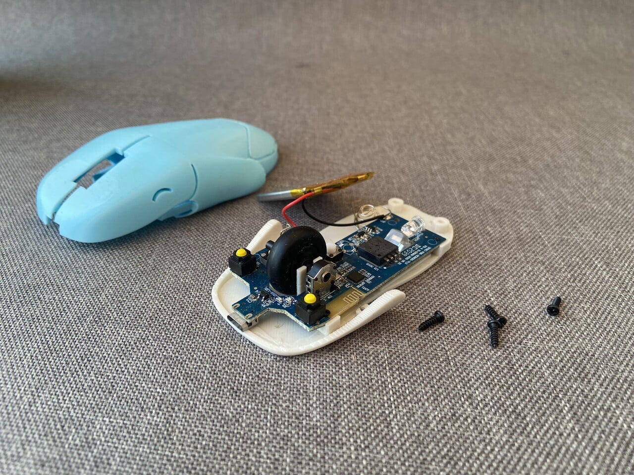
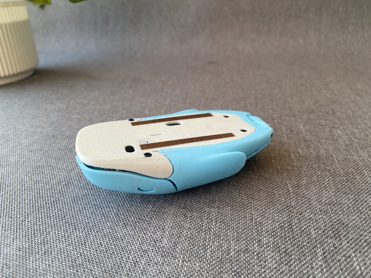
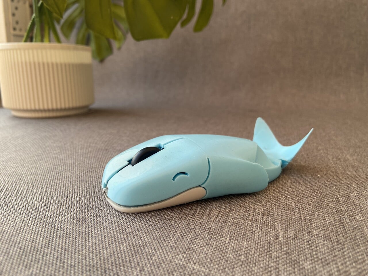
This mouse – Whaley is not just a character but a fully realized product shaped through iteration and hands-on experimentation. What began as a simple whale sketch evolved into a compact wireless mouse designed to balance personality with practicality. The form is sculpted to sit naturally under your palm, with the whale’s rounded back supporting the hand instead of mimicking a generic plastic shell. Its head integrates the left and right click buttons, while the scroll wheel is positioned like a subtle blowhole, blending function seamlessly into form.
The body went through multiple 3D-printed prototypes, refining the curve of the spine, the flexibility of the click panels, and the fit around the internal components. Electronics from a standard wireless mouse were carefully transplanted into a custom shell, ensuring reliable tracking and smooth scrolling.
2. Sculpted Gaming Interfaces
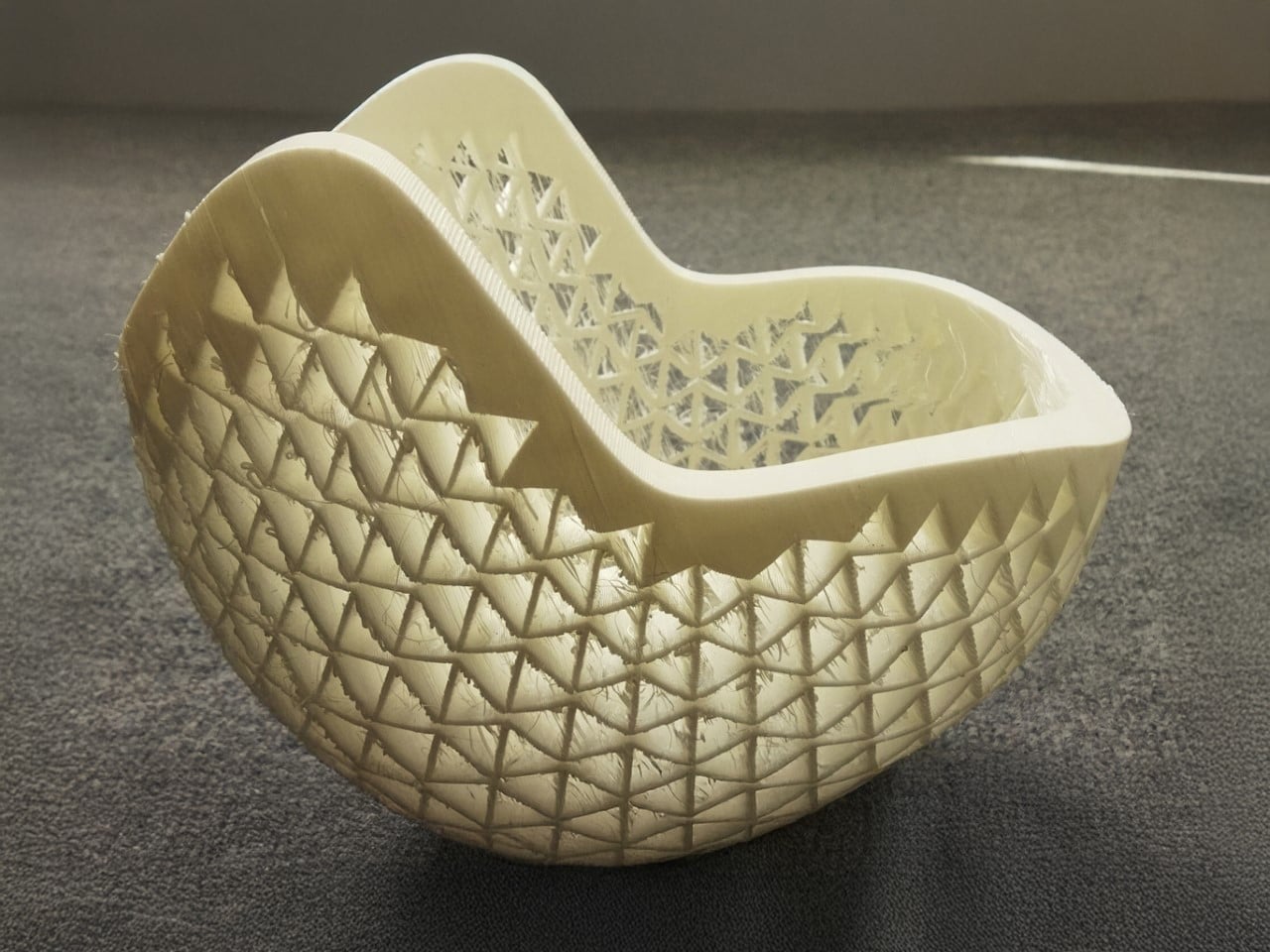
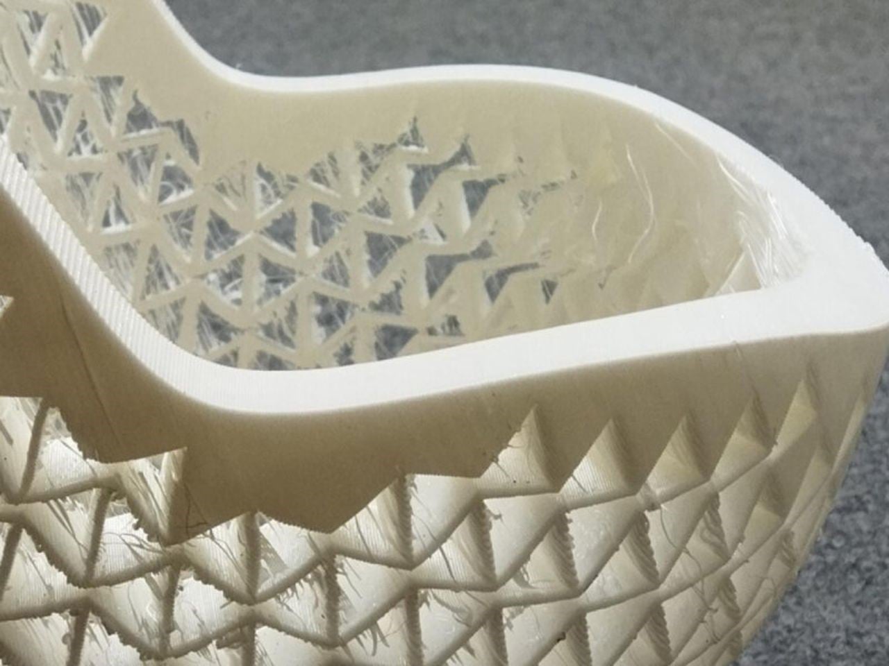
In the gaming sphere, 3D printing unlocks sculptural freedom that reshapes standard controllers into precision-engineered ergonomic forms. Instead of uniform plastic casings, high-performance shells are built with intricate lattice geometries that reduce weight while maintaining structural rigidity. This layered construction improves airflow, supports thermal regulation during extended sessions, and enhances overall durability.
Beyond function, the aesthetic impact is equally transformative. Integrated LEDs diffused through translucent printed lattices create atmospheric depth and spatial glow. The controller becomes immersive architecture in hand and less of a mechanical device and more a responsive extension of the player’s digital identity, blending sensory engagement with advanced fabrication technology.
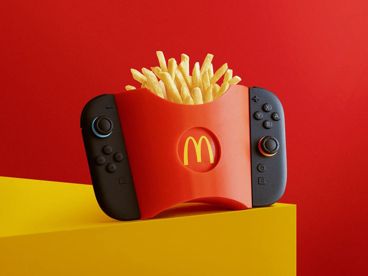
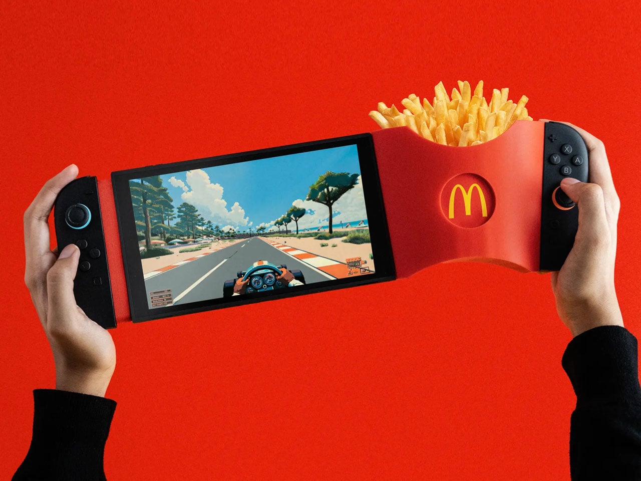
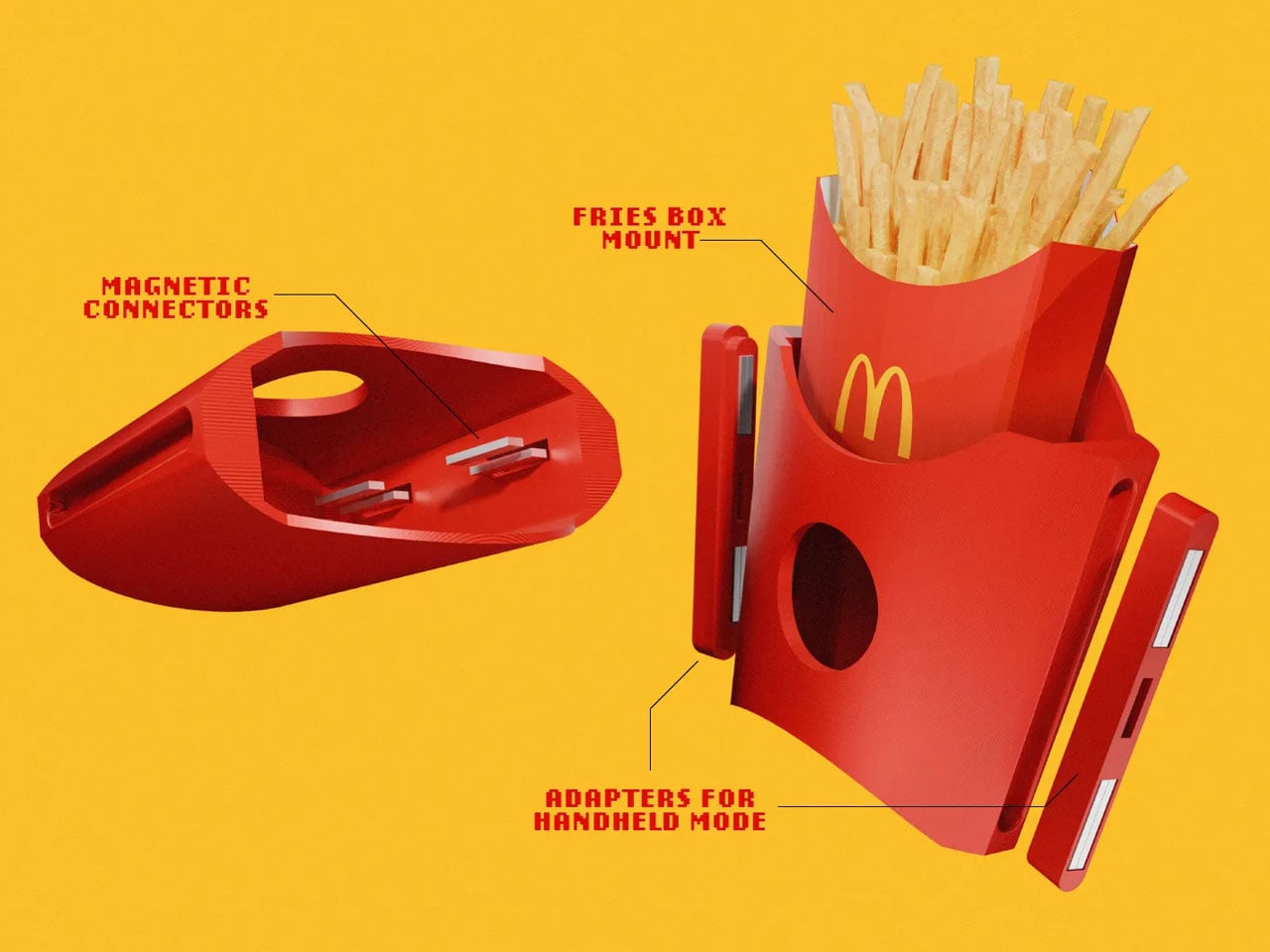
GamiFries is a purpose-built 3D-printed accessory designed exclusively for the Nintendo Switch 2. It functions as a clip-on fries holder that attaches directly to the console using its built-in magnetic system, locking into place with a clean, secure snap. The structure is engineered to remain stable in both handheld and docked modes, ensuring it does not interfere with gameplay, button access, or screen visibility. Its lightweight printed body keeps the added load manageable while maintaining balance during extended play sessions.
The container replicates the familiar silhouette and ridged texture of a classic McDonald’s fries pack, but its proportions are optimized to sit flush against the console. Fasteners and adapters are integrated into the design for a firm hold, and minor magnetic polarity issues can be corrected through simple recalibration.
3. High Performance Audio Form
3D printing has transformed high-fidelity audio by enabling complex internal geometries that traditional milling or casting cannot achieve. Speakers can now be fabricated with non-parallel internal walls and intricate chamber structures that reduce standing waves and distortion. This precision engineering refines acoustic clarity, allowing subtle tonal details and dynamic range to emerge with greater authenticity. The enclosure becomes a structurally intentional form where material integrity and acoustic science operate in alignment.
Beyond performance, these printed speakers contribute to a curated sensory environment. Their sculptural exteriors reflect the logic of their internal acoustic architecture, creating harmony between sound, space, and visual form—an immersive experience where engineering meets poetic design.
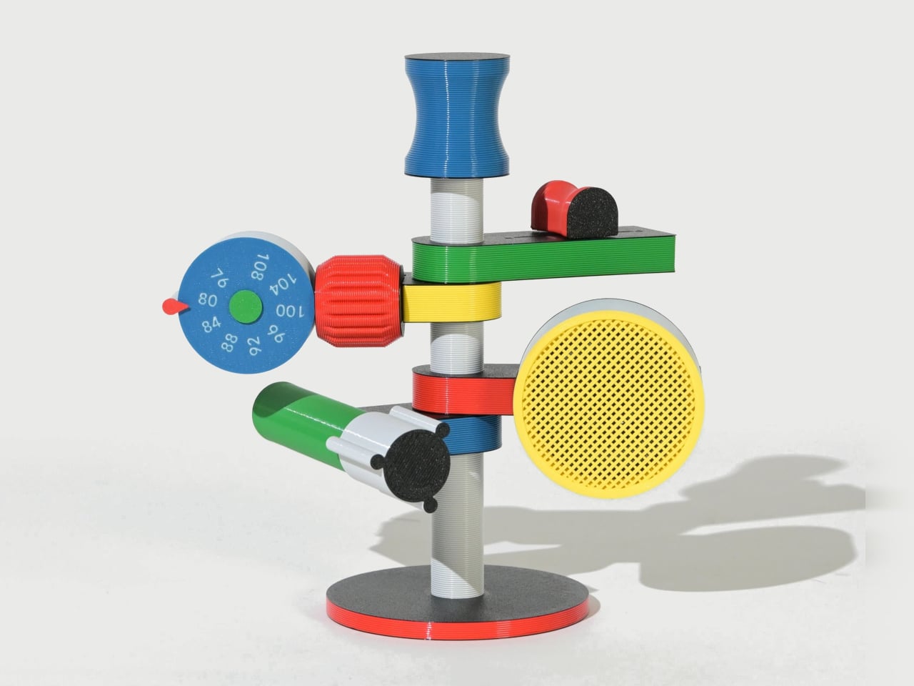
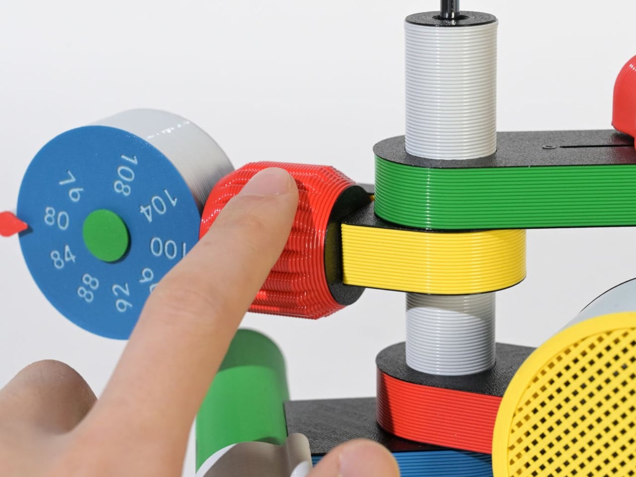
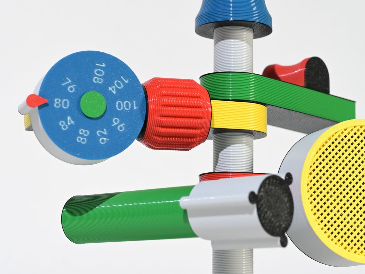
The Anomalo FM Radio by SHINKOGEISHA is designed as a functional object that challenges conventional radio aesthetics. Instead of a compact rectangular body, it features a vertical antenna that acts as the structural spine. From this central axis, multiple colorful limbs extend outward, each assigned a specific function. The form is intentionally exposed, turning mechanical and electronic components into visible design elements rather than concealing them within a casing.
Each protruding branch operates as part of a three-dimensional control system. A roulette-style dial enables station tuning, a cylindrical red knob adjusts volume, and a bold yellow speaker projects sound. Another module houses the batteries, while visible wiring connects the components, reinforcing the radio’s engineered transparency. Manufactured using digital fabrication techniques and PLA material, the device prioritizes structural experimentation and modular assembly.
4. Wearable Organic Interface
Wearable technology represents the most intimate intersection between body and device, and 3D printing refines that relationship with anatomical precision. Through detailed body scanning, smart glasses, health monitors, and adaptive bands are fabricated to align perfectly with individual contours. This tailored construction enhances long-term comfort, reduces material waste, and streamlines production. Instead of standardized sizing, the device responds directly to human geometry, delivering structural clarity and material efficiency in equal measure.
Experientially, these wearables are designed to feel almost imperceptible. Their lightweight calibration and ergonomic balance allow them to integrate naturally into daily movement. Personalization also improves sensor stability and data accuracy, elevating performance outcomes. The result is technology that moves beyond utility, becoming a refined extension of the body rather than an external attachment.
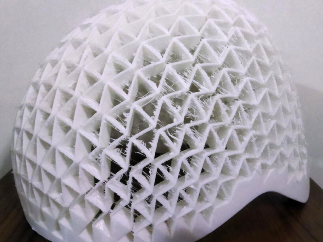
Researchers at the Universities of Gothenburg and Isfahan have developed a revolutionary 3D-printed helmet built with auxetic metastructures that react dynamically to collisions. Unlike traditional foam liners that simply compress, these geometric patterns pull inward on impact, dispersing energy more efficiently. The protective layer is made from a hyperelastic polymer that stretches and returns to its original form, allowing the helmet to maintain performance even after repeated impacts. Standardized crash tests showed significantly improved protection compared to conventional foam designs.
Beyond performance, customization sets this innovation apart. Traditional helmets come in fixed sizes and often fail to match individual head shapes perfectly, reducing both comfort and safety. With 3D printing, the auxetic liner can be tailored precisely to the rider, creating a snug, gap-free fit. Although currently more expensive, advancing technology is expected to lower production costs. This breakthrough could soon redefine not only cycling helmets but protective gear across multiple industries.
5. Personalized Medical Engineering
In the medical field, 3D printing enables the creation of patient-specific devices that traditional manufacturing cannot achieve. Custom orthotics, prosthetic limbs, and surgical guides are fabricated based on detailed anatomical scans, ensuring exact alignment with the patient’s body. This precision reduces discomfort, improves functionality, and accelerates recovery. Instead of standardized solutions, each piece is engineered as a structurally intentional form that responds directly to individual physiology.
Beyond fit, the technology enhances clinical performance. Lightweight lattice structures improve breathability and reduce material use, while rapid prototyping shortens production timelines. The outcome is a highly responsive healthcare ecosystem where design intelligence, structural clarity, and human well-being converge in measurable and transformative ways.
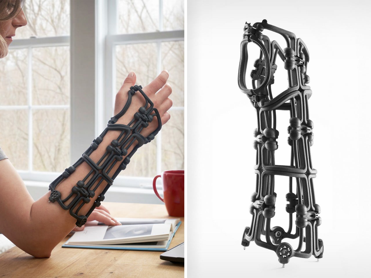
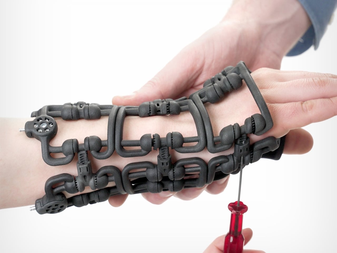
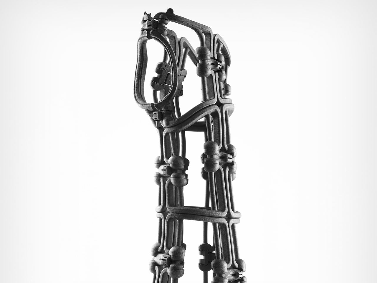
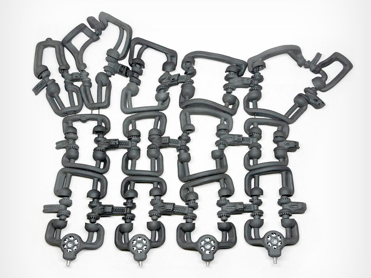
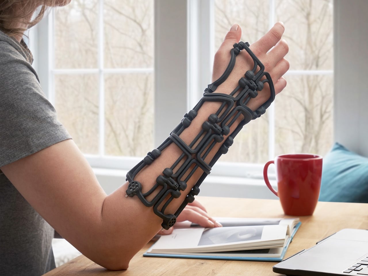
Bracesys by the Osteoid Design Team rethinks fracture immobilization as a precision-engineered, adjustable system rather than a static cast. Instead of plaster or rigid prefab braces, it uses a lightweight segmented framework weighing just 150 grams. The structure folds flat into an envelope for storage, then expands into a rigid wrist support comparable to traditional casting. Articulating connectors and calibrated tension dials allow clinicians to shape the brace directly on the patient’s limb, adjusting fit instantly and refining compression as swelling reduces during recovery.
Kevlar cables run through the frame and tighten through integrated dials, distributing force evenly across the structure for controlled stabilization. The body is produced using SLS and MJF 3D printing in medical-grade Nylon 12, reinforced with CNC-machined aluminum and stainless steel at high-stress points. Data from over 600 CT scans informed four optimized sizes that cover most wrist anatomies while maintaining semi-custom adaptability. Spring-loaded quick-release pins simplify adjustments, and individual components can be replaced when needed. Reusable, recyclable, and mechanically precise, Bracesys shifts immobilization from fixed fabrication to real-time clinical customization.
3D printing is steadily transforming the way products are imagined and made. Across industries, it enables smarter structures, efficient material use, and greater design freedom. By allowing form and function to evolve together, this technology supports more adaptable, thoughtful solutions. The future of design is becoming more responsive, refined, and human-centered through additive manufacturing.
The wall charger is one of the most present objects in any home and one of the least considered. It sits on bedside tables, desk corners, and coffee tables for most of the day, then gets used for a few minutes and goes right back to being an uninvited presence. Nobody picks a charger because it belongs in their space. They pick it because it was cheap, available, and functional.
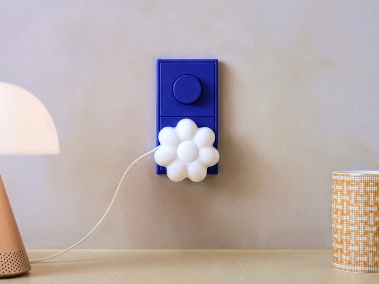
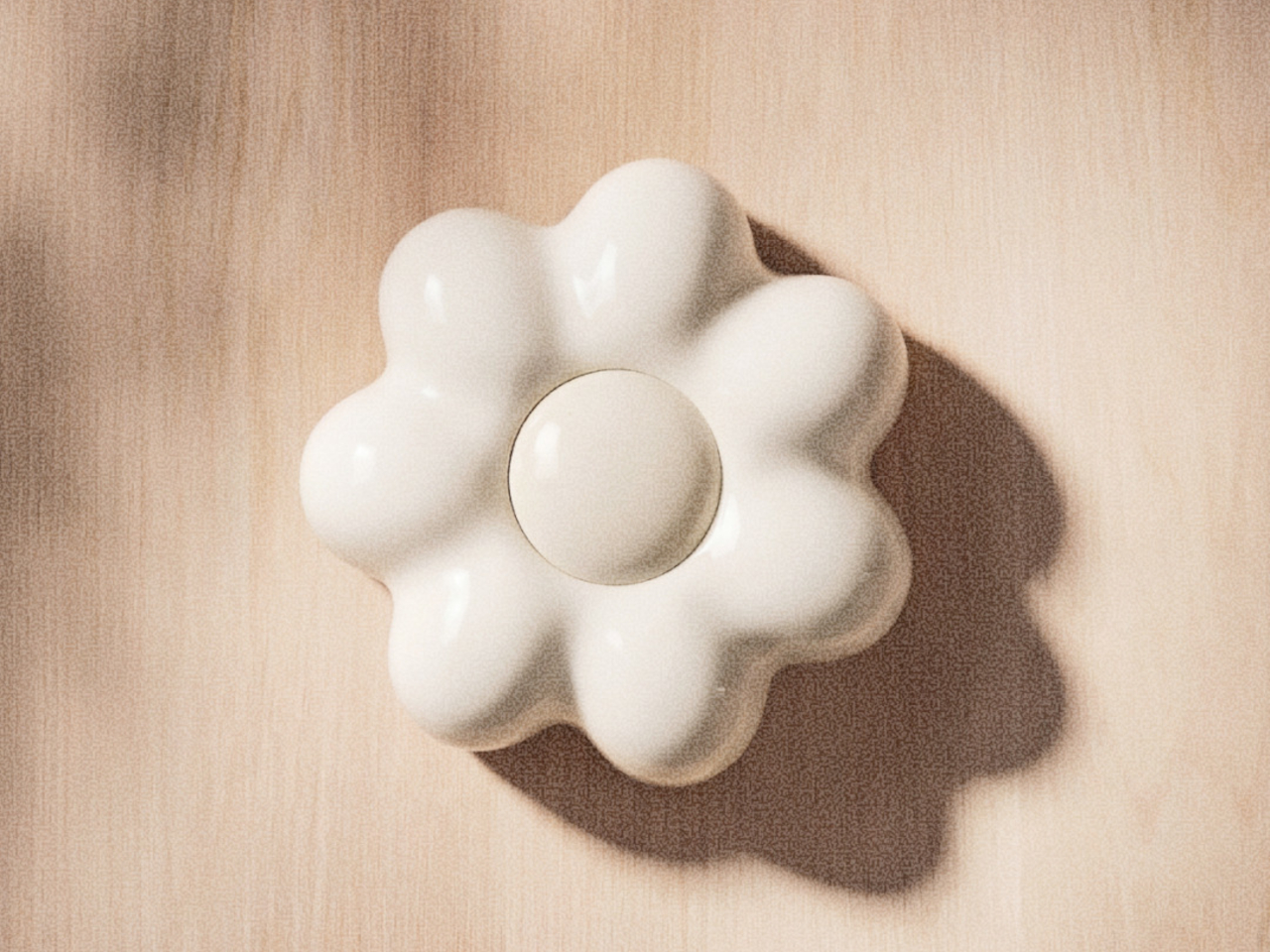
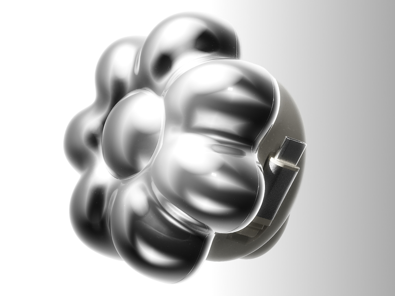
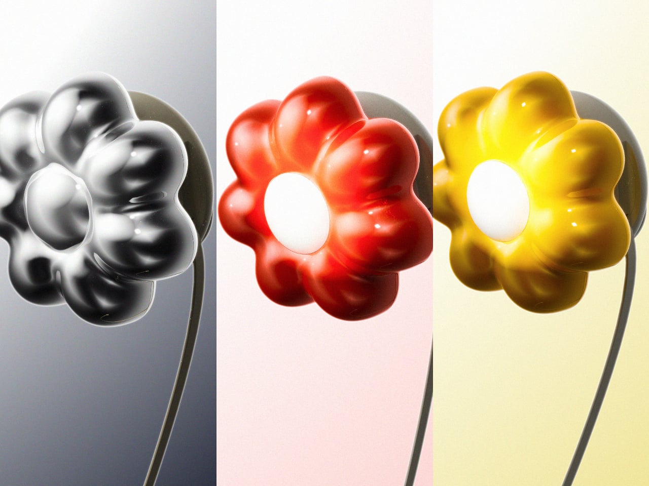
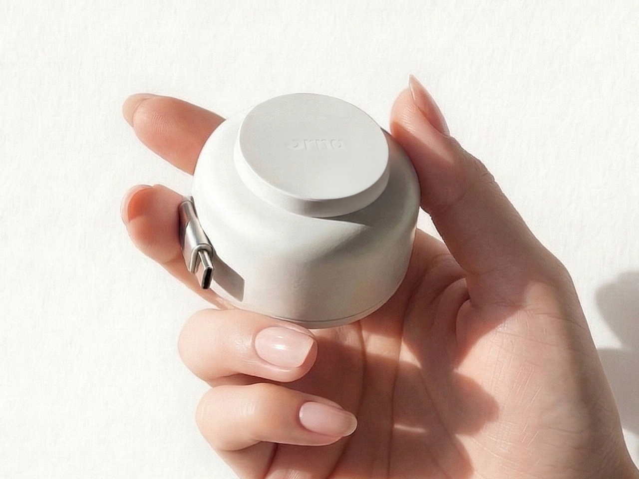
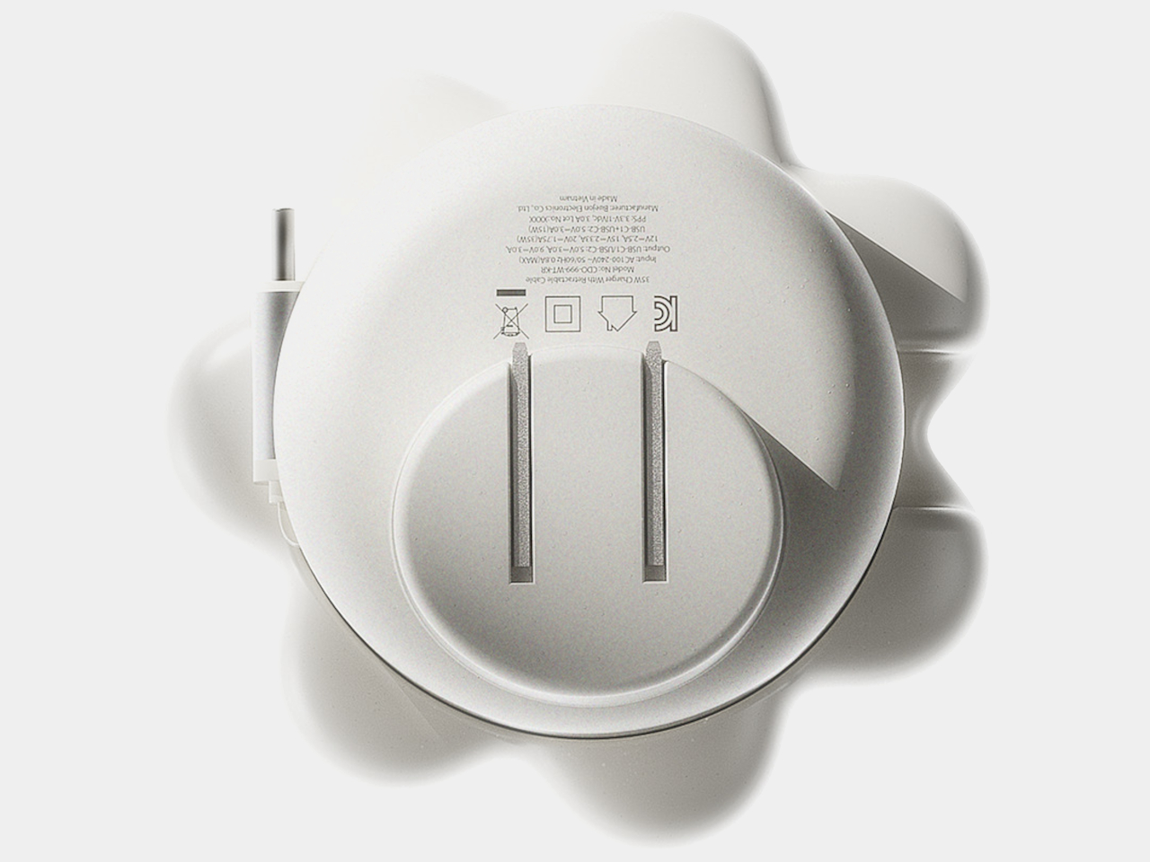
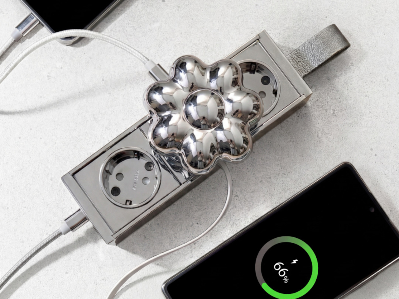
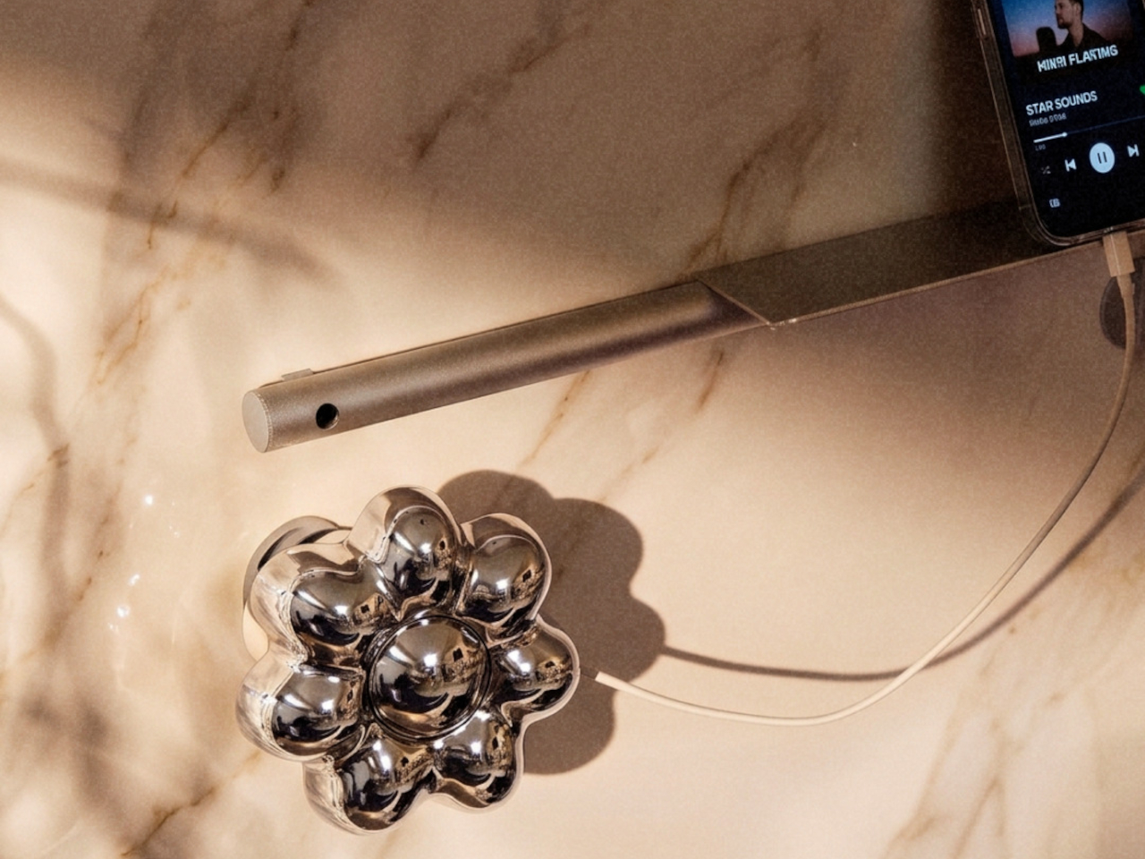
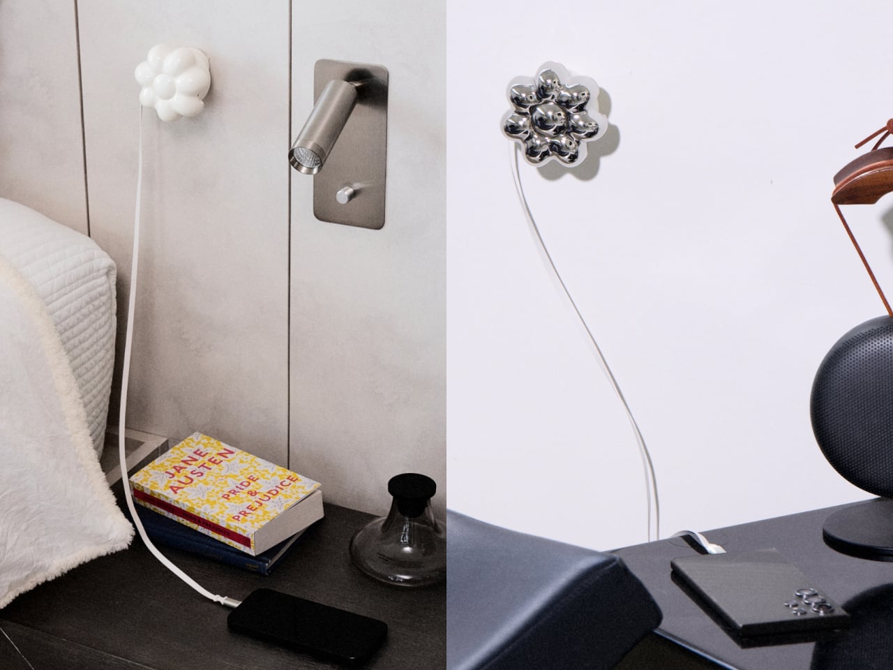
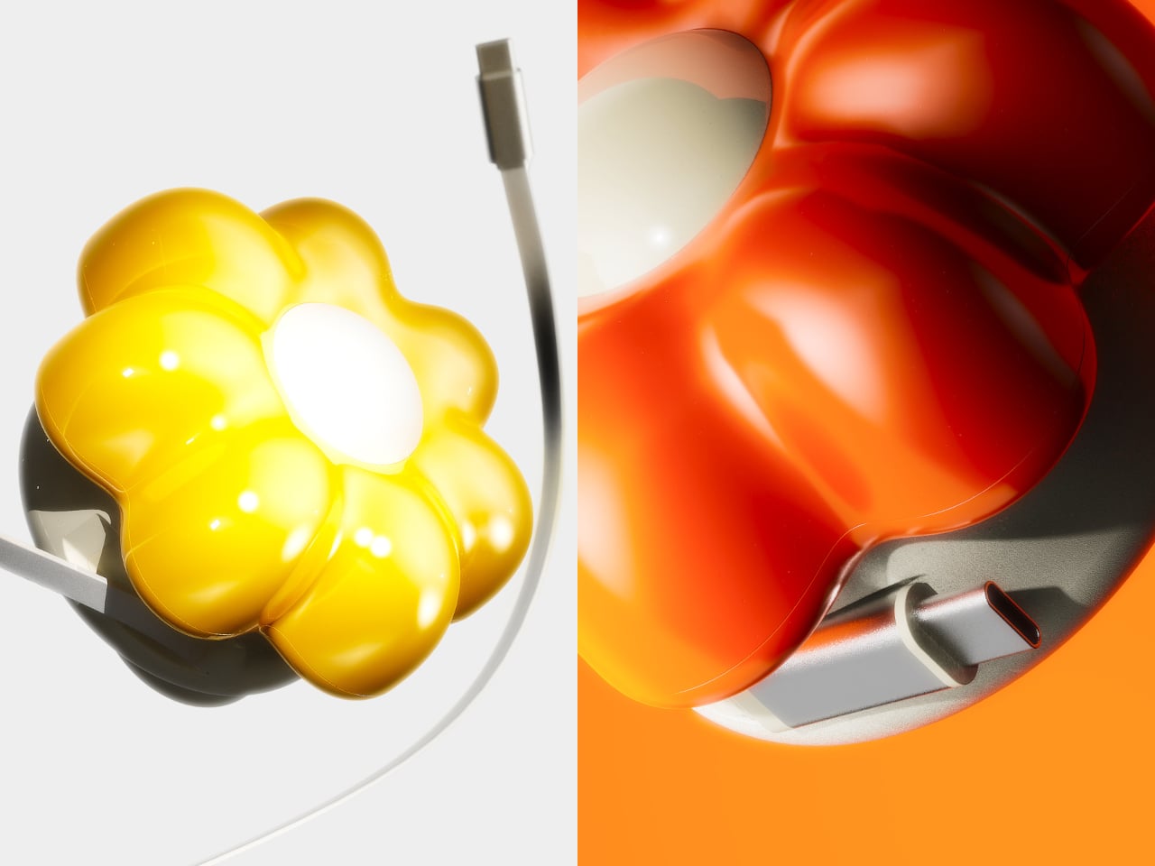
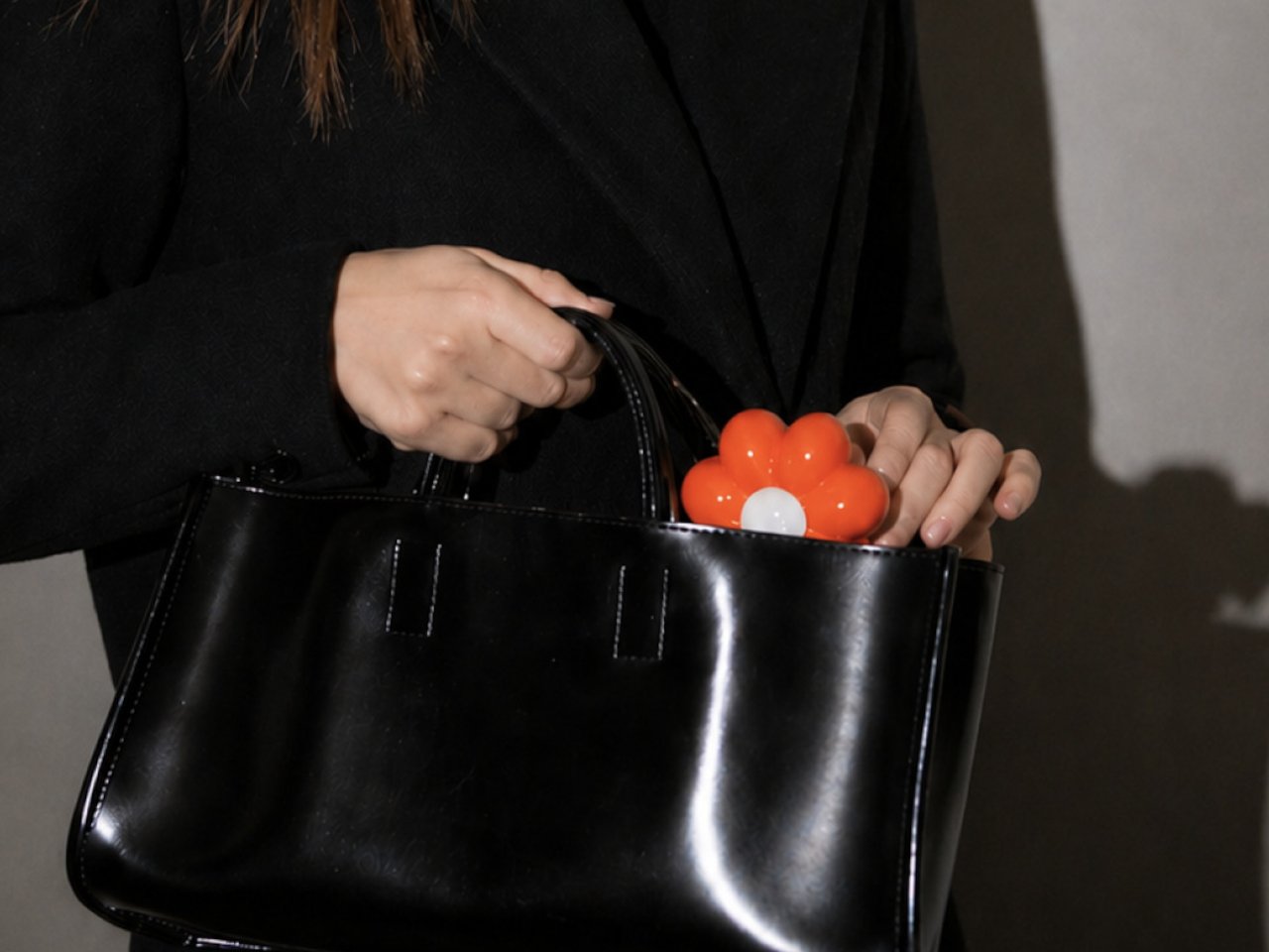
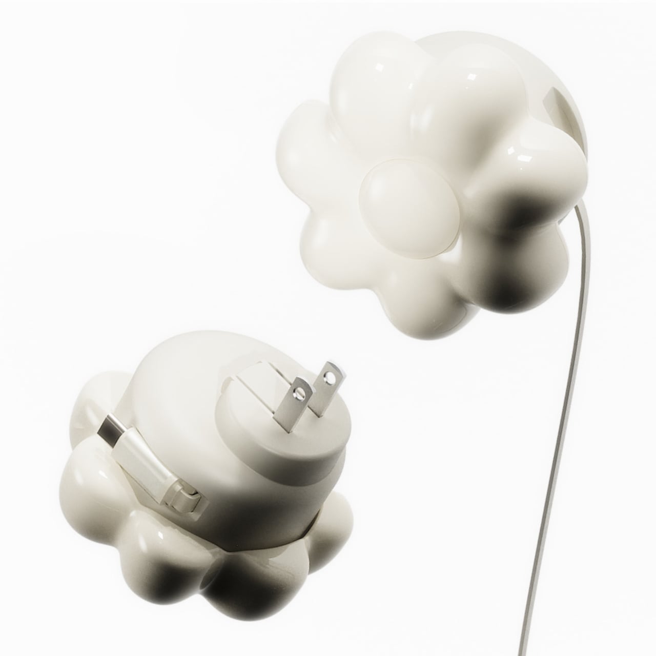
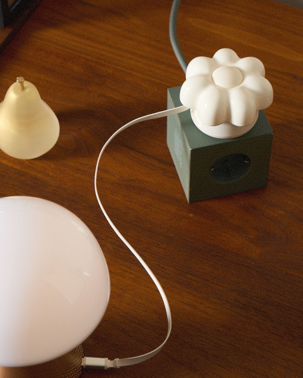
ORNA’s Objet Charger proposes a different starting point. It’s a 35W USB-C wall charger that treats the design of the object as seriously as the technology inside it. The key is a modular floral cover with a high-gloss, pop-art silhouette that attaches magnetically to the charger body and turns an overlooked utility item into a sculptural presence on any wall.
Designers: Kangnim Park, Jaehwa Lee, Jinsu & Jiwoong Studio for ORNA
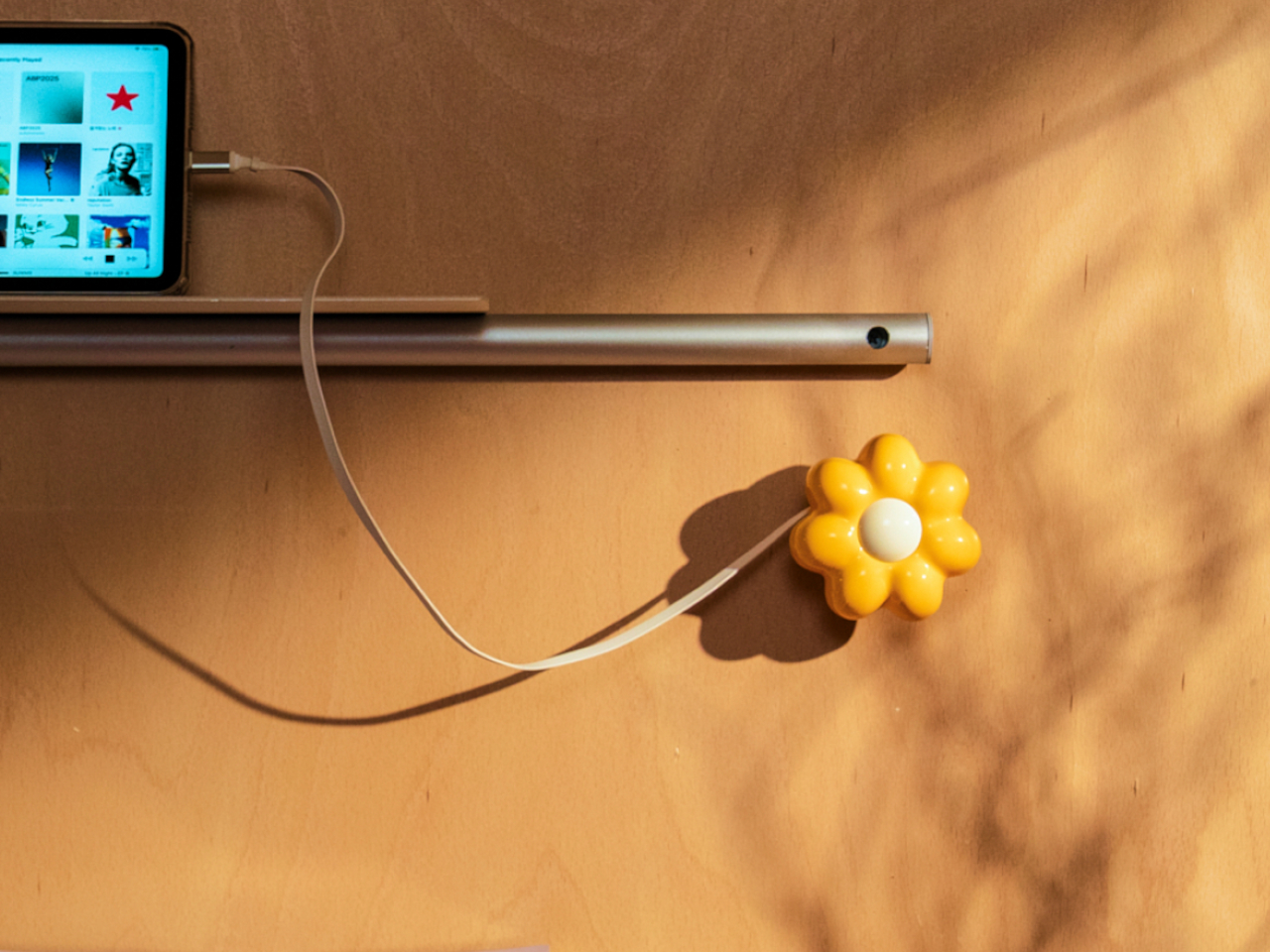
The cover is the part that gets swapped out to suit personal taste. Four versions are available: Daisy White, Sunflower Yellow, Marigold Orange, and Chrome Silver, each finished in a high-gloss surface that reads differently by room. The magnetic connection makes switching instant, which is part of what makes the concept work. Changing the personality of the object doesn’t require a new charger, just a different flower.
Underneath the sculptural exterior is a charger built for serious daily use. A one-meter USB-C cable is integrated into the body and retracts cleanly, so there’s no loose cord when the charger isn’t in use. A secondary USB-C port on the base handles a second device simultaneously, with the total output shared at 15W when both are active. Single-device charging peaks at 35W with full fast-charge protocol support.
The base of the charger was designed with the proportions of a traditional Korean Moon Jar in mind, a ceramic form known for the quiet completeness of its rounded body and the restraint of its surface. That design context matters more than it might sound. The charger is meant to occupy the wall the same way a carefully selected object occupies a shelf, present, purposeful, and unhurried.
Flower Objet covers are sold separately from the charger base, starting at $49 for the Daisy White and Sunflower Yellow finishes and $99 for the Chrome Silver variant. The modular logic means the same base stays in place for years while the floral cover changes with the seasons, the room, or simply a shift in taste. The foldable plug keeps the package compact enough to carry between rooms or pack into a bag without a trailing cable. It’s a long-term object, not a disposable tool.
ORNA frames the proportion of the charger’s daily existence as roughly 23 hours of visual presence for every one hour of active use. That framing captures why most chargers feel like failures: they’re designed entirely for the one hour and ignored for the 23. The Objet Charger is built for both, which is the kind of quiet attention most objects in our homes never receive.
The phone is always the easy answer. Timer goes off — reach for it. Stuck on a thought — reach for it. Five minutes later, you’ve watched three videos and forgotten what you were working on. The real cost of deep work isn’t effort; it’s attention. And attention is exactly what these five desk objects are designed to protect, each one quietly replacing a digital habit with something more physical and deliberate.
None of these are apps or subscription tools. They’re objects — things you touch, twist, write on, and look at from across the room. Some are already on shelves. Others are still concepts. All of them point in the same direction: toward a desk that improves your focus so your phone can do less. Here are five designs worth making room for.
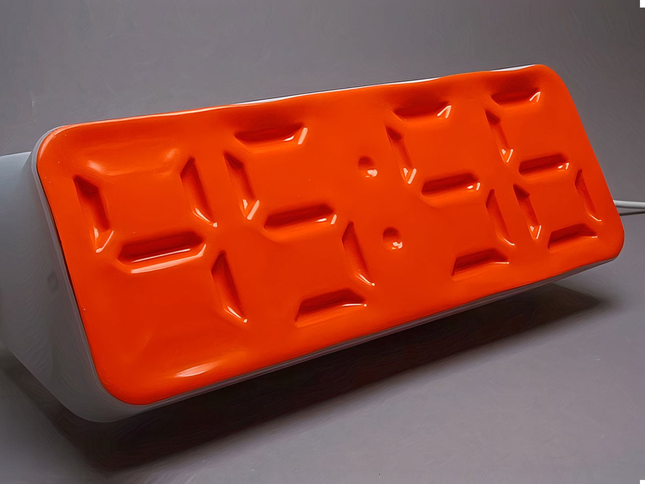
1. Air Powered Segment Clock
Time-checking is one of the most common reasons people pick up their phones — and one of the quickest ways to lose focus. The Air Powered Segment Clock answers that with something genuinely unlike anything else on a desk: a four-digit display that uses no LEDs at all. Instead, vacuum pressure pulls sections of a flexible silicone membrane inward to form each digit, the way a pneumatic system flexes a muscle. It’s mechanical, quiet, and mesmerizing to watch change.
What makes the engineering remarkable is that each segment behaves like a memory cell — holding its shape after pressure is removed, only resetting when the next command arrives. The architecture mirrors how RAM functions. The clock is DIY-built from 3D-printed parts, a small vacuum pump, solenoid valves, and an Arduino, and it includes a stopwatch mode. It lives on your desk to tell you the time, and that’s it — there’s nothing else it can tempt you with.
What we like:
The pneumatic segments hold each digit without continuous power, making it a genuinely low-energy timekeeping system
Watching the silicone membrane shift and settle is a micro-moment of calm between tasks
What we dislike:
As a DIY build, it requires significant technical skill to replicate — this isn’t something you can simply order
The vacuum pump and solenoid system adds mechanical complexity that may require periodic maintenance
2. OrigamiSwift Mouse
A mouse might seem like an unlikely candidate for this list, but the Origami Swift earns its place by making your physical workspace feel intentional. Designed by Horace Lam and inspired by the art of origami, it folds completely flat — just 4.5mm thin and 40 grams — and snaps into full mouse form in under half a second. That small ritual of unfolding and clicking into position is a quiet but real signal to your brain that work is starting now.
Bluetooth 5.2 keeps connectivity fast and reliable, with a wireless range of up to 32.8 feet in open areas, and the USB-C rechargeable battery lasts up to three months on a single charge. Soft-click buttons and a smooth glide keep sessions quiet and distraction-free. Compatible with Mac, Windows, and Android, it performs like a full-sized mouse when open and disappears into a bag without drama when the day is done.
The fold-to-activate gesture creates a physical transition into work mode that a trackpad or standard mouse doesn’t offer
At 40 grams with a three-month battery life, it’s both genuinely portable and technically capable
What we dislike:
The folded form factor requires adjustment for users accustomed to traditional palm-grip mice
Soft-click buttons may feel less satisfying for those who prefer strong tactile feedback
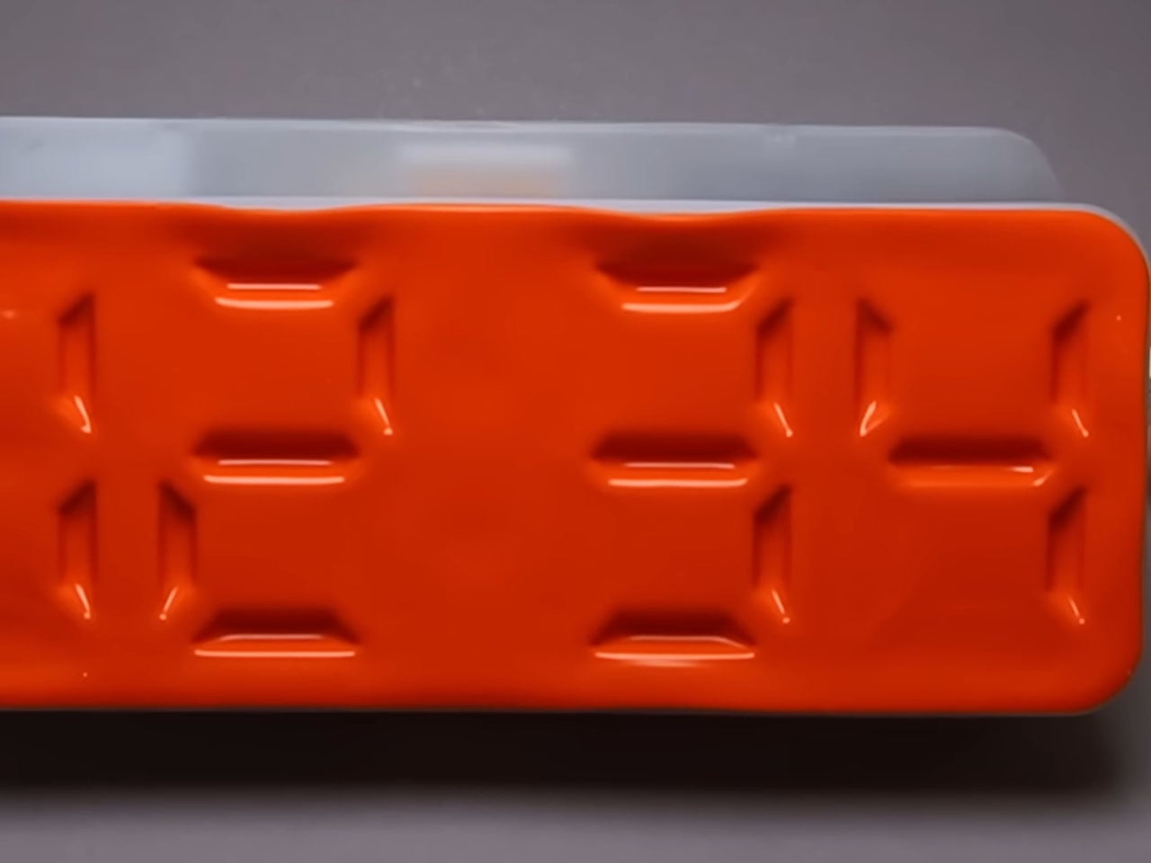
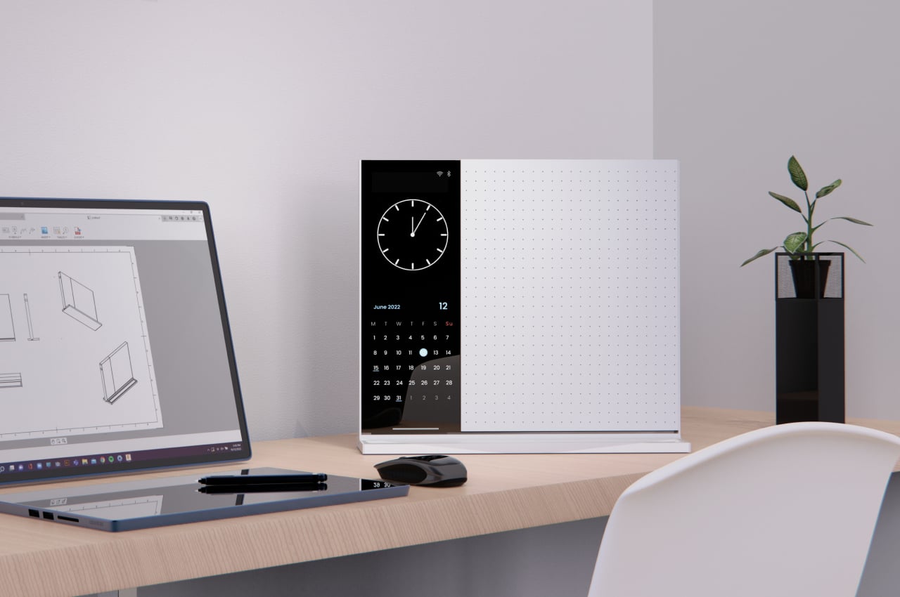
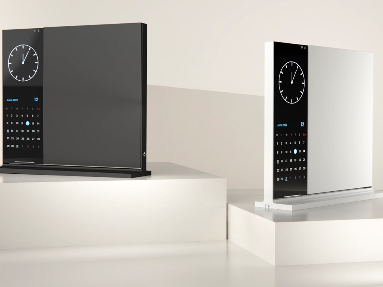
3. Note
The Note is deceptively simple: a desk object that bridges analog note-taking with just enough digital utility to make it genuinely useful. The device pairs a whiteboard surface for jotting ideas with a small built-in display on the left side that shows the time, date, and music controls. Rather than asking you to open an app or unlock a screen, Note keeps that essential information directly in your peripheral vision, fixed and passive.
The design addresses something real: the modern digital workstation is so fully loaded that reaching for anything — a timestamp, a song, a quick note — means crossing through a notification minefield. Note keeps those basic needs on the desk and offline. Sketch an idea on the whiteboard, check the time from the side display, and keep moving. It doesn’t replace your technology. It quarantines the parts of it that constantly pull your attention away from the work directly in front of you.
What we like:
Combining a whiteboard surface with a peripheral display eliminates two of the most common reasons for picking up a phone
The minimal form factor stays present without demanding attention
What we dislike:
Note remains a concept with no confirmed production timeline or retail availability
The side display’s feature range is limited compared to a full smart display, which may frustrate users who want more
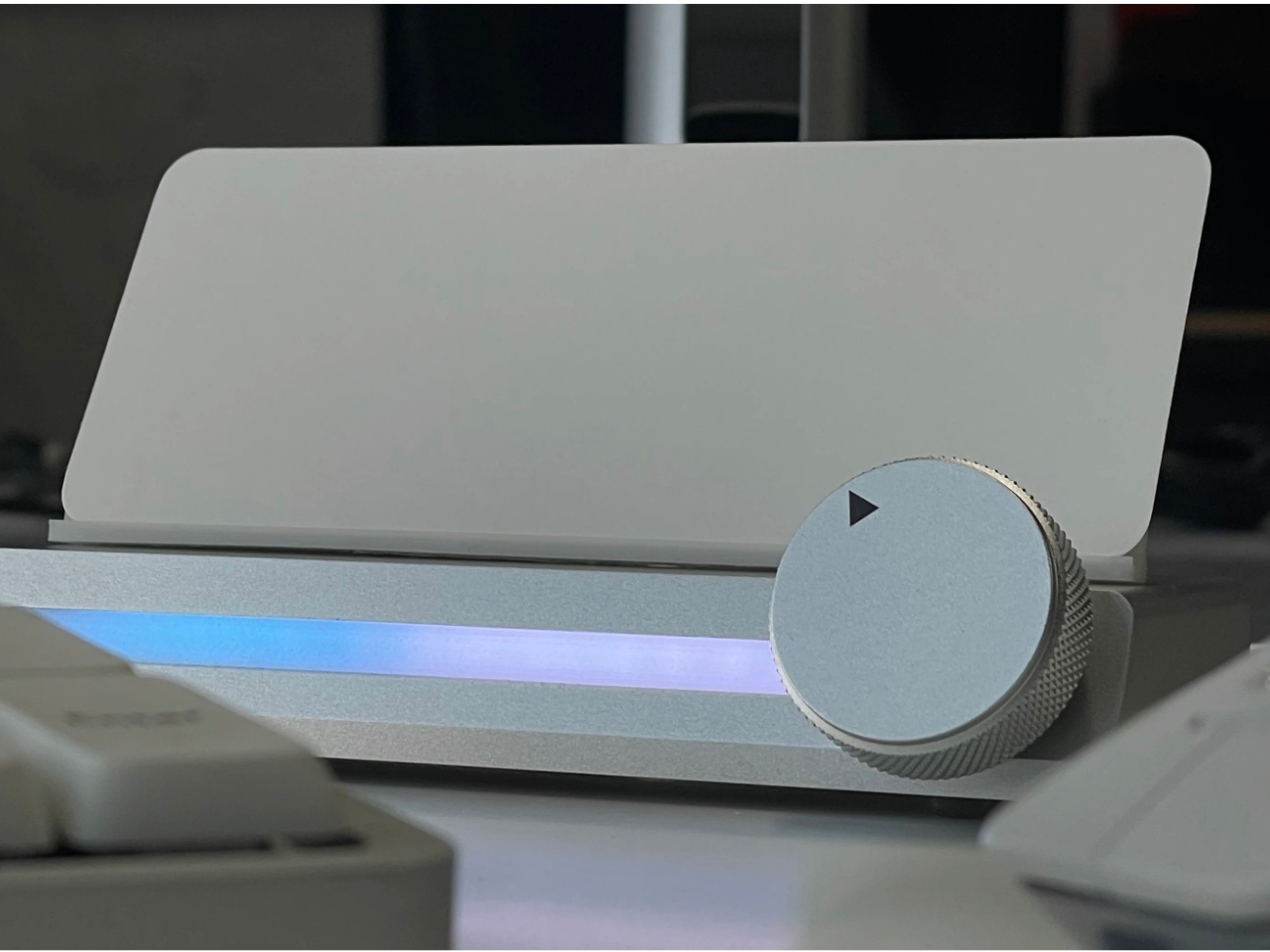
4. Immerge Desk Timer
There’s a reason so many people use the Pomodoro method but can’t stick to it: phone timers live on the same device that breaks focus. The Immerge Desk Timer by Adam Cole Edwards is a concept for a CNC-machined aluminum timer with an anodized finish, designed to sit on your desk as a physical commitment to a work block. A smooth-rotating wheel sets the desired interval. There’s no screen, no app, and no chance of a notification bleeding through from something else.
A built-in note card slot on the front holds a small index card — space to write the day’s top priority, a single task, or a short reflection. That combination of timer and intention-setting turns the Immerge into something more considered than a countdown. The design language is deliberately understated, built to complement any desk without demanding to be noticed. It’s still a concept, but the idea it represents — analog focus as a deliberate cultural choice — feels overdue.
What we like:
The integrated note card slot pairs time management with written intention, reinforcing focus before a session even begins
CNC-machined aluminum with an anodized finish places it firmly in premium desk object territory
What we dislike:
The Immerge remains a concept with no confirmed production timeline or pricing
A purely analog timer offers no connectivity for users who track productivity data or want to log sessions
5. MagBoard Clipboard
Paper has a focus advantage that screens don’t: it notifies you of nothing. The MagBoard Clipboard leans into that advantage while solving the one real problem with loose paper — keeping it together. A Magnet x Lever mechanism secures up to 30 sheets without a traditional spring clip, and releasing or adding pages takes nothing more than a light press on the edge. It’s made in Japan, and the material quality reflects that without needing to announce it.
The hardcover design means you can write on it standing up, on a couch, or anywhere a thought shows up. The surface is water-resistant and easy to clean. Available in A4 and A5 sizes, it accepts any paper you choose — blank, grid, dotted, printed, perforated, or mixed. There’s no prescribed format and no app syncing required. You write what you think, in whatever order makes sense, and reorganize whenever the work demands it.
The Magnet x Lever system secures any combination of paper types without marking or damaging sheets
Water-resistant hardcover construction makes it practical well beyond a standard desk setup
What we dislike:
The 30-sheet capacity may feel limiting for users who work through large volumes of material in a single session
Unlike digital tools, there’s no built-in way to search, tag, or retrieve older pages
The Best Tools Are the Ones That Stay Out of the Way
The phone isn’t going anywhere, and none of these objects pretend otherwise. What they offer is friction — the deliberate, productive kind. A clock that reads time through air pressure. A timer shaped from aluminum. A clipboard that holds whatever paper you choose. Each one introduces a small ritual into the day, and rituals are how deep work actually gets done. The setup matters more than most people give it credit for.
Good desk design is quiet. It works without asking to be noticed and keeps your attention where it belongs. These five objects don’t promise a productivity revolution — they just remove one more reason to reach for your phone. Sometimes that’s enough to finish the thing you’ve been putting off. Not because you became more disciplined overnight, but because nothing interrupted you long enough to break the thread.
Battery life has always been the quiet asterisk on handheld gaming. The Nintendo Switch 2’s internal battery offers roughly two to six and a half hours, depending on what’s running, which is plenty for a short commute but not enough for a long flight or an afternoon away from an outlet. Most players either play conservatively or keep a cable nearby. Neither approach is especially graceful.
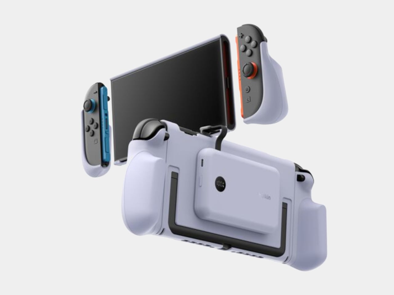
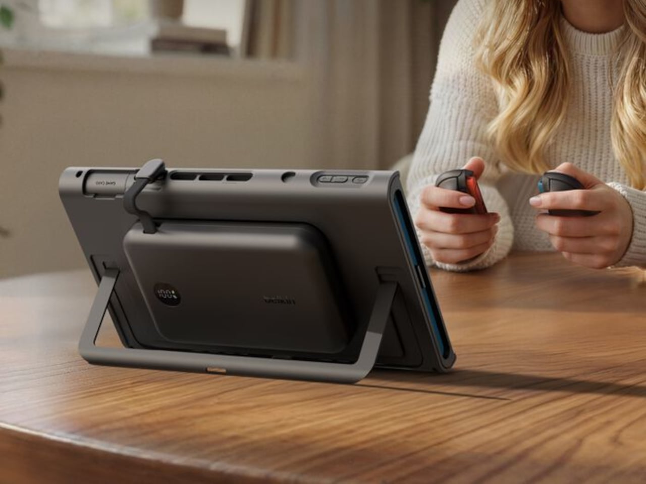
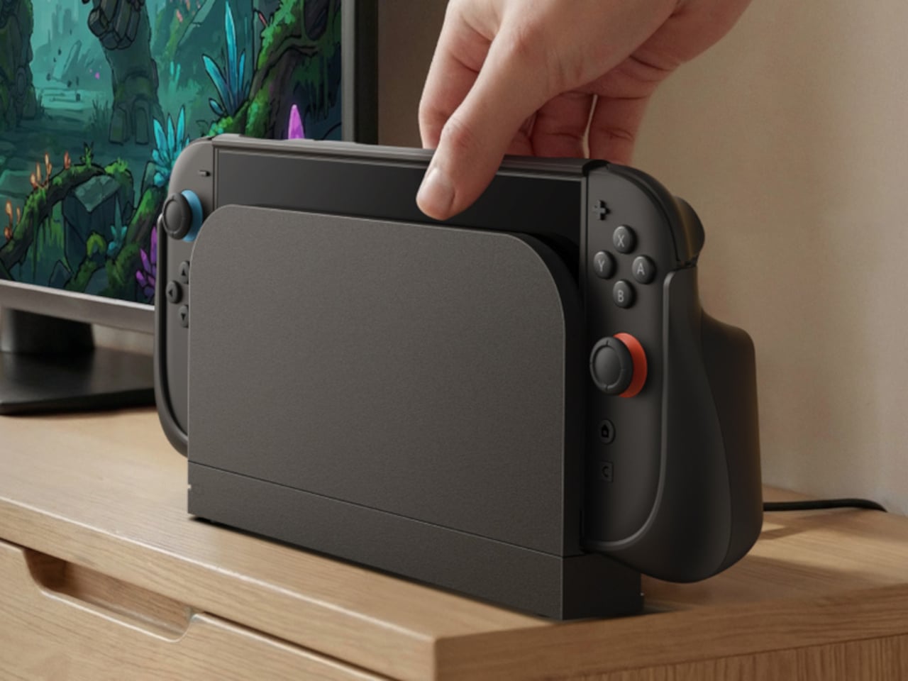
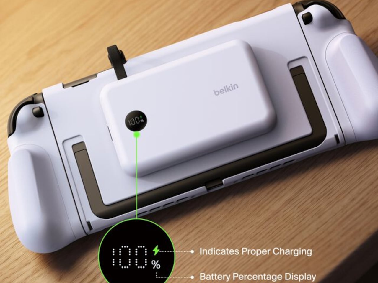
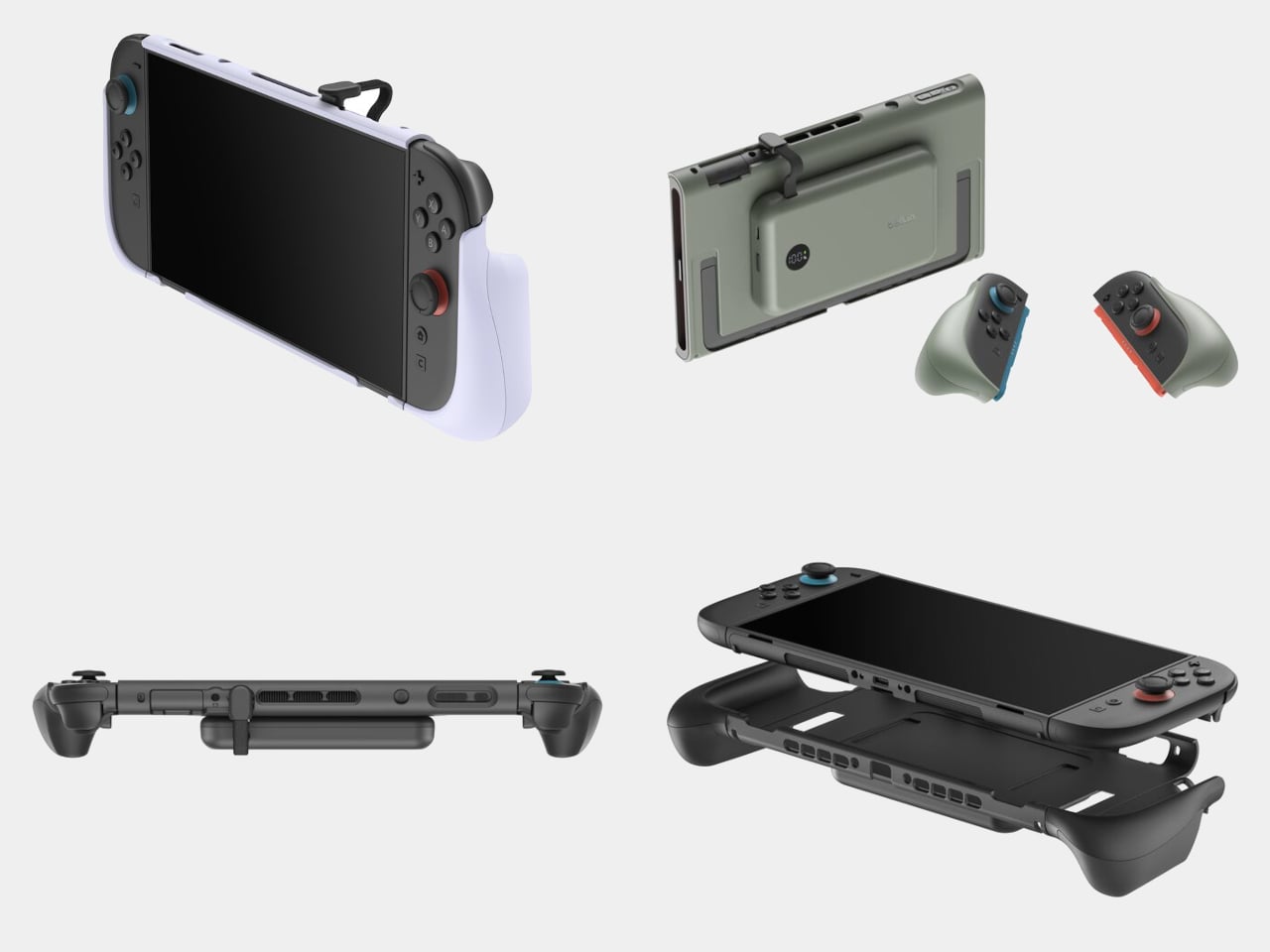
Belkin’s Charging Grip for the Nintendo Switch 2 takes a different approach to the problem. Rather than asking you to stop and plug in, the grip attaches a 10,000 mAh magnetic power bank directly to the back of the console, turning the Switch 2 into a more capable device without fundamentally changing how it feels to use. The power bank snaps on magnetically and charges through a built-in USB-C cable at up to 30W, delivering up to 1.5 times the console’s original battery capacity.
What makes the design considered is what it doesn’t break. Joy-Cons still detach from the console normally without removing the grip first. The Switch 2’s built-in kickstand still deploys. The console still docks without modification. Each compatibility point matters for anyone moving fluidly between handheld play on a train, tabletop gaming across a table, and television sessions on the couch.
The ergonomic side adds something beyond the battery. Handheld gaming on the Switch 2 in its stock form is functional but not generous in how it fills the hands, particularly over long sessions. The Charging Grip’s non-slip handles extend the form to something closer to a conventional controller, distributing the weight more evenly and making sustained play noticeably more comfortable. The ergonomic benefit is there regardless of how much charge the power bank has left.
An LED display on the grip shows the remaining power bank charge, so there’s no guesswork about whether it’s worth detaching before a trip. The power bank itself detaches magnetically when you’d rather not carry the extra weight, which keeps the grip useful on lighter travel days too. Available in Black and Olive, both colorways match the restrained aesthetic of the Switch 2 rather than drawing attention to the accessory.
Belkin made the grip from recycled plastic and ships it in 100% plastic-free packaging, a material decision that adds environmental consideration without affecting physical quality. The 10,000 mAh power bank also works as a standalone unit, giving the grip an afterlife if the console ever changes or needs replacing. It’s one of the quieter but more thoughtful spec decisions in the package.
The Charging Grip for Nintendo Switch 2 is priced at $99.99 and is available directly from Belkin in two colors. For a device whose most consistent criticism is how quickly its battery disappears under demanding games, an accessory that meaningfully extends that runtime while improving ergonomics makes a straightforward case for most people who use their Switch 2 regularly outside the house.
The home office has become the most personal room in the house — and somehow still the hardest room to shop for. He already has the monitor arm, the mechanical keyboard, the cable organizer that never actually organized anything. The things worth giving now aren’t upgrades to what he owns. They’re objects that introduce something genuinely new to how a desk feels, functions, and performs — gifts that earn a permanent spot rather than a polite shelf appearance.
The best home office gifts of 2026 share one quality: they’re genuinely hard to explain without handling them. A pen that never needs ink. A lamp that works anywhere without a single cord. A speaker bar that makes RGB feel like a design choice rather than a gamer’s checkbox. These aren’t novelties with a short shelf life. They’re tools and objects with real staying power — the kind of things you’d buy for yourself if someone hadn’t already beaten you to it.
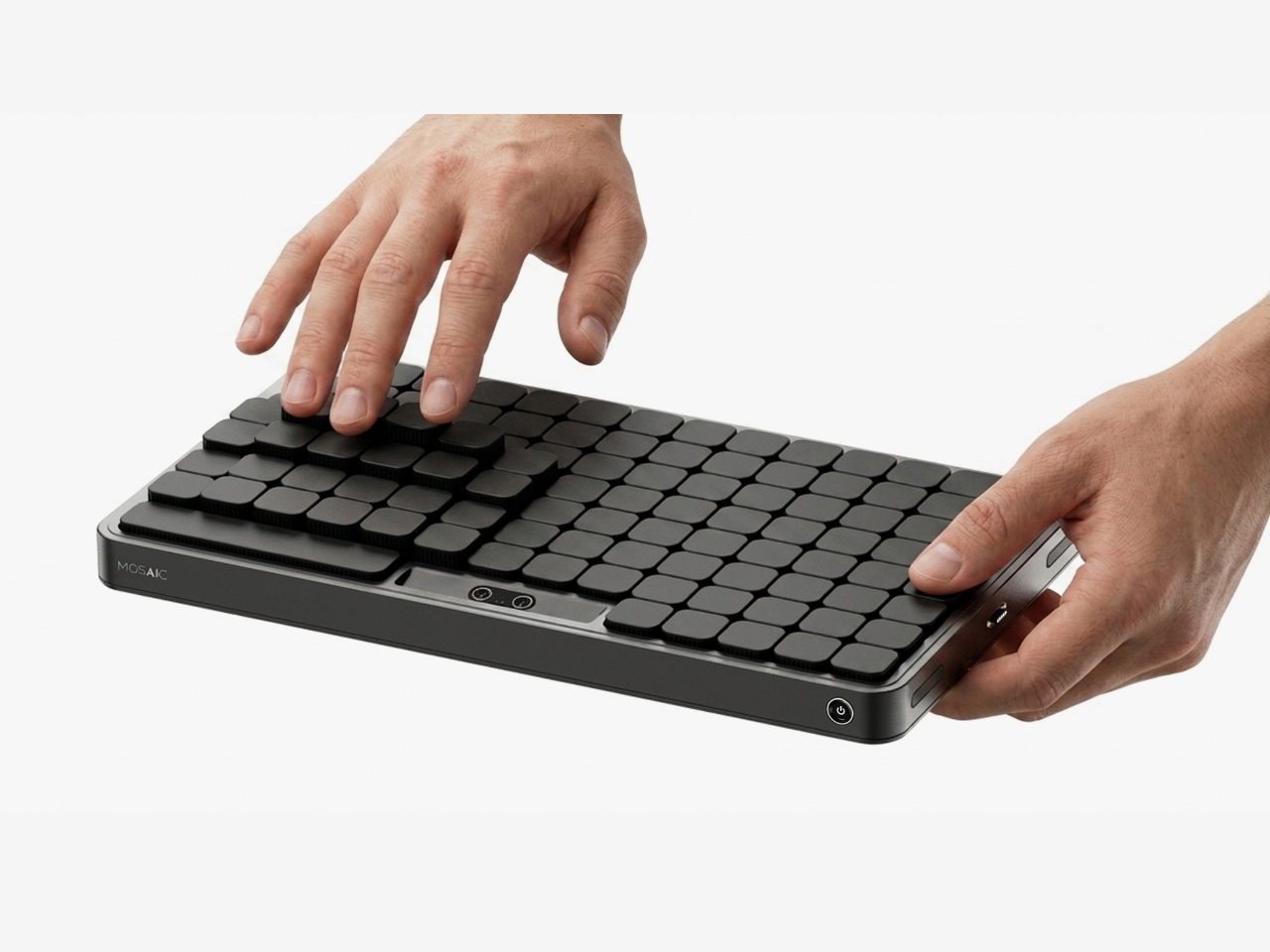
1. Mosaic
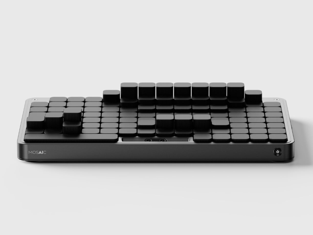
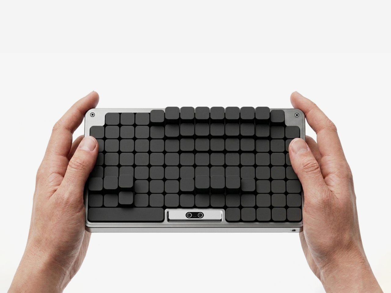
The most striking thing about the Mosaic isn’t what it does — it’s what it undoes. Most desk organizers arrive with a fixed grid of compartments and expect you to adapt, which is exactly why most of them end up abandoned in a drawer within weeks. The Mosaic flips the dynamic entirely, using AI to learn how objects get arranged and rearranged on a real desk over time, then reshaping its modular surface to match those habits rather than a designer’s assumptions about them.
What that looks like in practice is a tray that never quite looks finished — and that’s entirely the point. As a setup evolves, it moves with you, accommodating a new phone dock here, a relocated notebook there, without requiring a full reset. The dark modular surface carries a kind of purposeful architecture that reads as considered rather than cluttered. For anyone who has bought a beautiful organizer only to abandon it two weeks later, the Mosaic is the version that actually earns its permanent place.
What We Like
Learns and adapts to actual desk behavior instead of imposing a fixed layout
Modular surface reads as architectural on the desk — purposeful rather than busy
What We Dislike
AI calibration takes time before it fully understands desk patterns and adjusts accordingly
Darker aesthetic may not suit lighter or more minimal setups
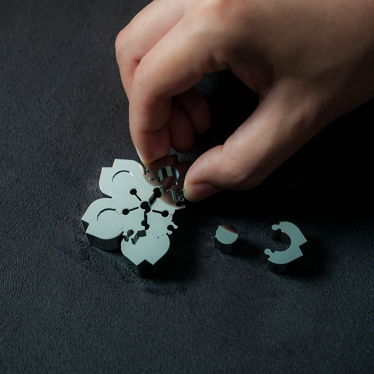
2. Precision Sakura Metal Puzzle
The Precision Sakura Metal Puzzle is the kind of object that earns its spot on a desk by doing almost nothing visible — until you pick it up. Machined to a 0.004mm tolerance, it captures the shape of Japan’s most iconic flower in a set of pieces so similar to each other that distinguishing them becomes its own discipline. No solution is included. The intent was never to finish it quickly. The intent is to spend sustained, satisfying time with something that genuinely demands your attention.
For the person who says he has everything, this is a rare thing: an object that introduces something entirely new to the desk. It works as a precision puzzle and a sculptural display piece simultaneously, the polished metal finish clean enough to hold its own against far more expensive objects. Even unsolved, it belongs on the desk. When you finally do close it, the satisfaction is the kind no app or productivity widget has ever come close to delivering.
0.004mm machining tolerance makes every piece feel intentional and genuinely premium
Functions as desk sculpture whether actively mid-solve or sitting completed
What We Dislike
No solution included — a real test of patience for anyone expecting a guided experience
Small scale means pieces are easy to lose on a desk that isn’t kept clear
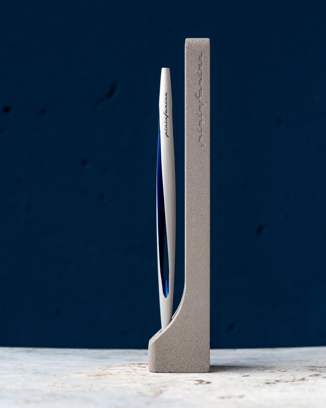
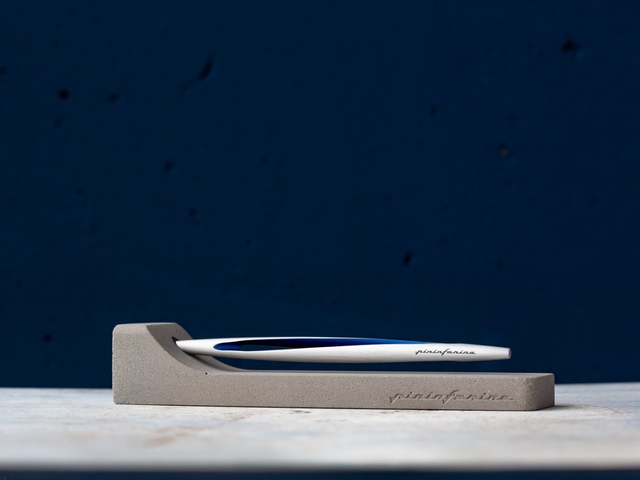
3. Pininfarina Aero Ethergraf
Pininfarina’s name lives in the curves of Ferraris and Maseratis, but the Aero Ethergraf makes a more interesting argument — that restraint is the harder design problem. Made from aerospace-grade aluminum, it weighs 17 grams and measures 160mm, numbers that don’t fully prepare you for how it sits in the hand. The tip is Ethergraf, a patented metal alloy that writes through oxidation, leaving a permanent mark on paper without a single drop of ink. No cartridges. No refills. No maintenance, ever.
It ships paired with a raw concrete stand — a deliberate material contrast that, on a desk, reads as sculpture rather than office supply. Handcrafted in Italy and rooted in a technique older than the modern ballpoint, the Aero makes every other writing instrument on the desk feel temporary by comparison. For a man who already has everything, it’s a quiet, permanent counterargument. Because nothing else quite like it exists on any desk, anywhere.
What We Like
Ethergraf tip writes indefinitely through oxidation — zero maintenance, zero refills, ever
Concrete stand creates genuine material tension that turns the pen into desk sculpture
What We Dislike
Performs best on dedicated paper — not every standard notebook will reveal the tip’s quality clearly
Concrete stand adds bulk that may feel heavy in a stripped-back minimal setup
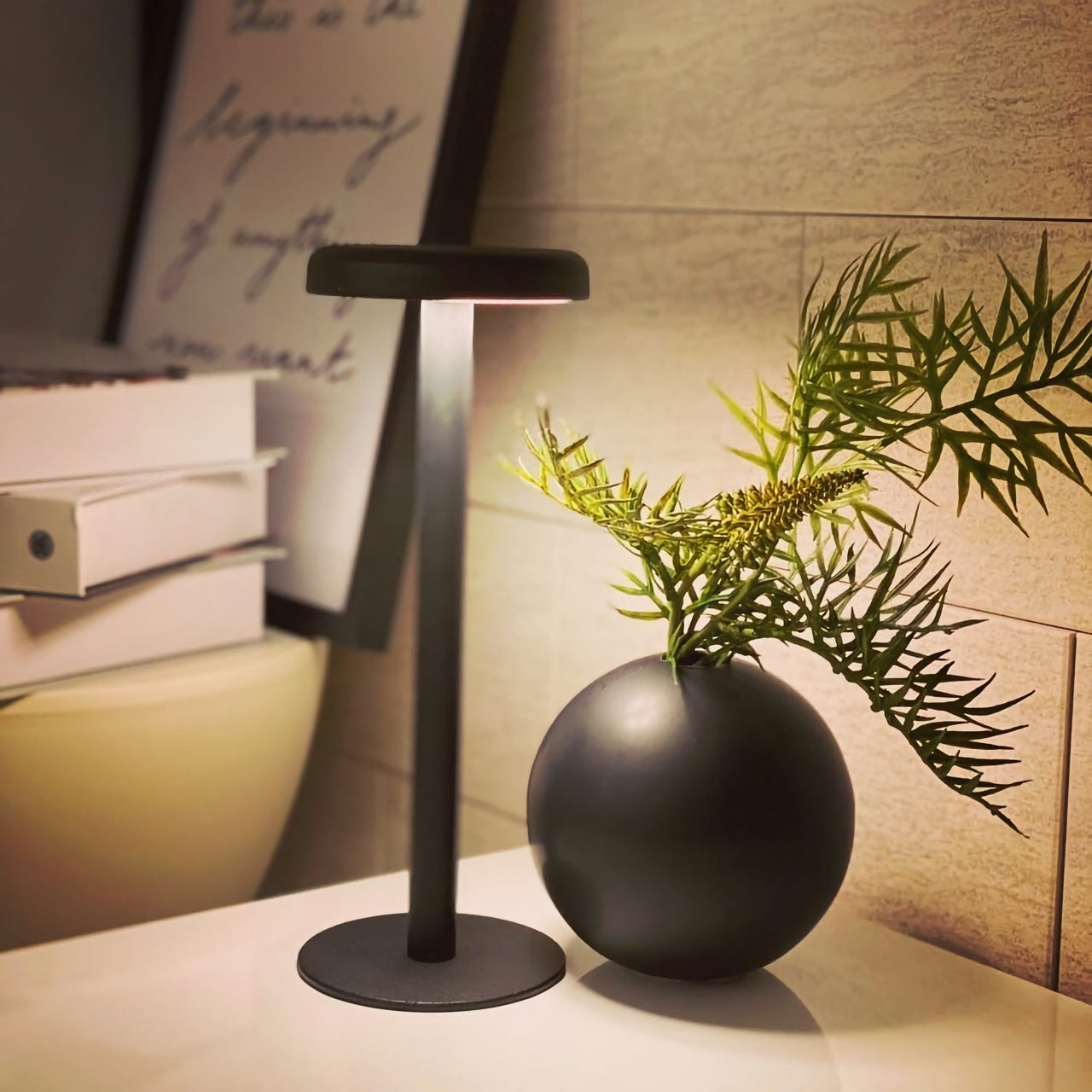
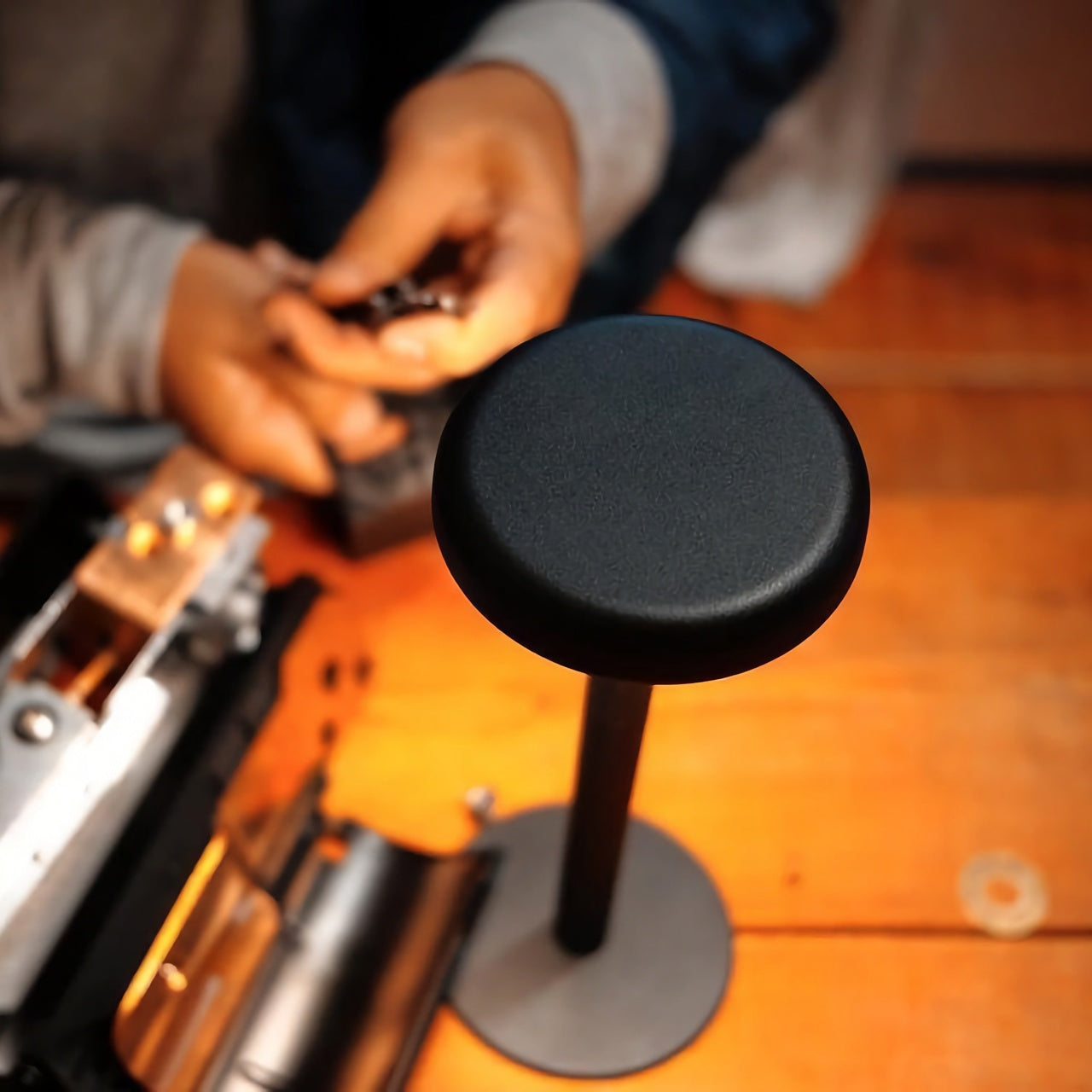
4. Anywhere-Use Lamp
The Anywhere-Use Lamp starts from one honest premise: good light shouldn’t be tethered to a wall. Running on four AA batteries, it removes every cord and cable from the equation, making it as functional in a hotel room, on a bookshelf, or in an outdoor corner as it is on a permanent desk. Six high color rendering LEDs produce warm, soft output that settles naturally into a space without announcing itself as the room’s loudest design decision. The result is light that feels like it always belonged where you put it.
Available in black, white, and an Industrial edition with a scratch-detailed metal base that treats surface wear as character rather than damage, it holds across every desk aesthetic without effort. Pressing any edge of the cap cycles through four brightness levels with a haptic click that makes even that small interaction feel considered. Modular construction means it breaks down flat for a bag. At $149, the Anywhere-Use Lamp is one of the most versatile objects on this list — earning its price through location freedom alone, before you’ve even switched it on.
AA battery power removes all cord dependency and gives it genuine, unconditional location freedom
Industrial edition’s scratch-detailed base treats material wear as intentional character, not a flaw
What We Dislike
AA batteries mean ongoing replacement costs compared to a rechargeable alternative
Four brightness levels may feel limited for those who prefer more granular control over output
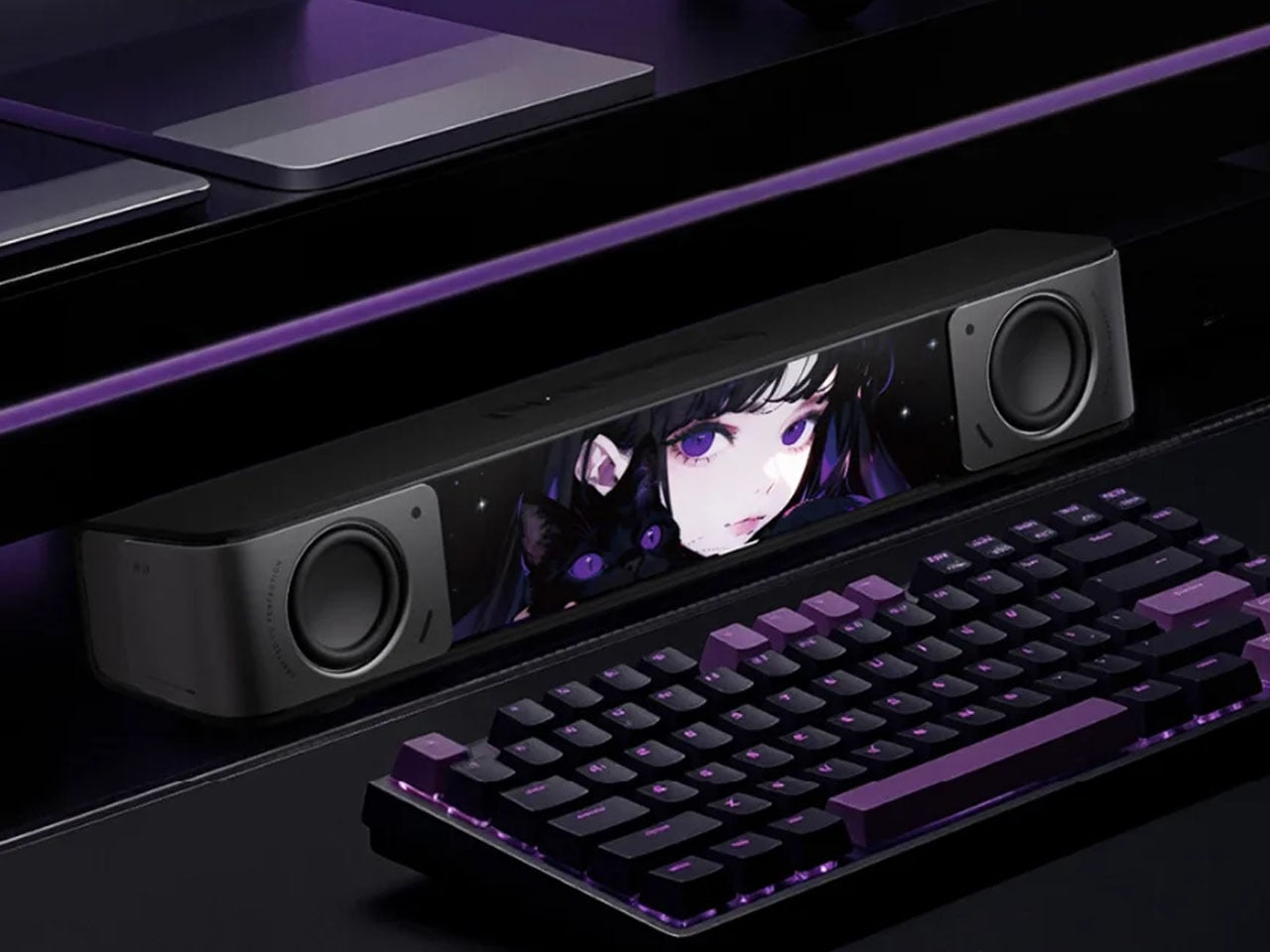
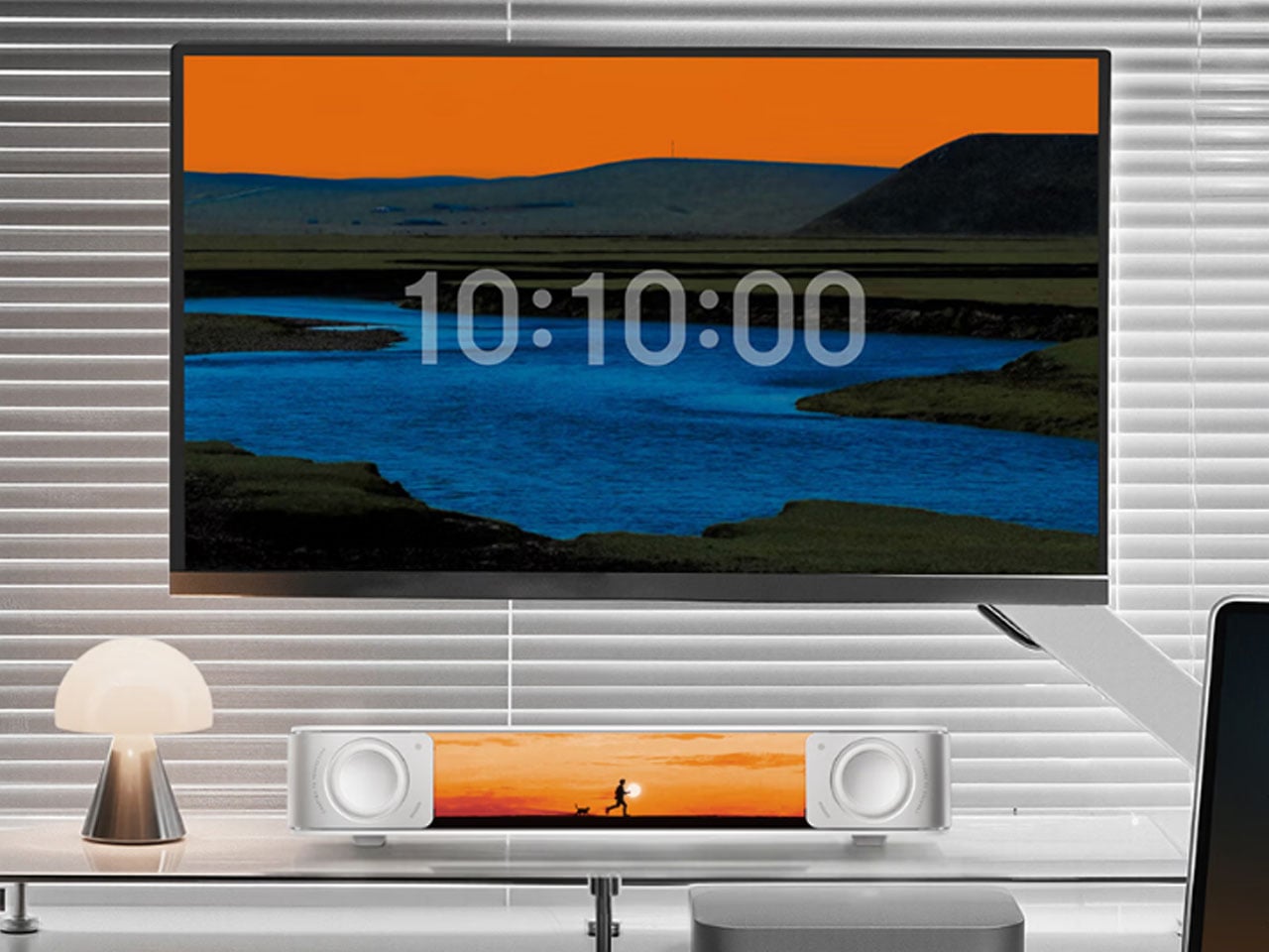
5. Edifier Melo Bar
The Edifier Melo Bar does the thing most desk speaker bars never quite pull off — it makes RGB feel like a design decision rather than a hardware checkbox. Three distinct audio modes handle music, gaming, and movie listening, each tuned differently and each backed by near-field sound clear enough to remind you how much you’ve been tolerating laptop audio. The interchangeable front panels are the detail that separates it from every other bar on the market, letting the object adapt to the desk instead of demanding the desk adapt around it.
The light output is deliberately understated for something that supports 16.8 million colors and 15 carefully tuned lighting themes. It frames a setup rather than overwhelming one — adding ambient depth without demanding that the desk revolve around it. For a home office that already has the monitor, the keyboard, and the cable routing handled, this is the piece that completes the sensory experience rather than complicating it. Sound and light are treated as a single designed object. That’s harder to achieve than it sounds, and the Melo Bar gets it consistently right.
What We Like
Interchangeable front panels let the speaker blend into or intentionally accent any desk aesthetic
Three dedicated audio modes handle every use case without asking for a compromise
What We Dislike
RGB-heavy profile may feel redundant on setups that already favor a completely dark aesthetic
Near-field performance is strongest close to the desk — less effective across a larger open room
The Right Desk Tells You Something About the Person Behind It
Each of these five objects earns its place for reasons that go further than specs. The Mosaic learns. The Sakura puzzle challenges. The Aero Ethergraf lasts forever. The Anywhere-Use Lamp untethers. The Melo Bar performs and illuminates. None of them exist because a spec sheet demanded them — they exist because someone asked what a desk should actually feel like and then had the discipline to build the answer without compromise.
The man who says he has everything doesn’t need another gadget. He needs the object he didn’t know was missing — and all five of these are exactly that. Each carries intention, permanence, and the kind of quiet confidence that makes a desk feel genuinely complete rather than just assembled. Buy one, and it earns its keep. Buy all five, and you’ve given someone the most considered setup they’ve ever worked from.
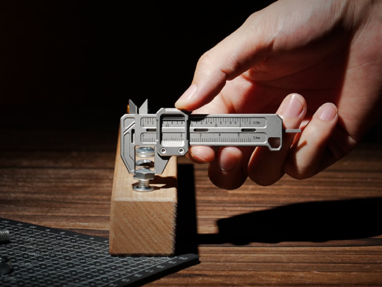
The EDC community is particular about what earns a place in their pockets. Titanium hardware, precision multitools, and machined accessories all go through plenty of scrutiny before they make the cut. Yet for all that attention to detail, accurate measurement is still largely a workshop activity. A full-size caliper stays on the bench. A rough estimate fills the gap. Something between the two has been missing.
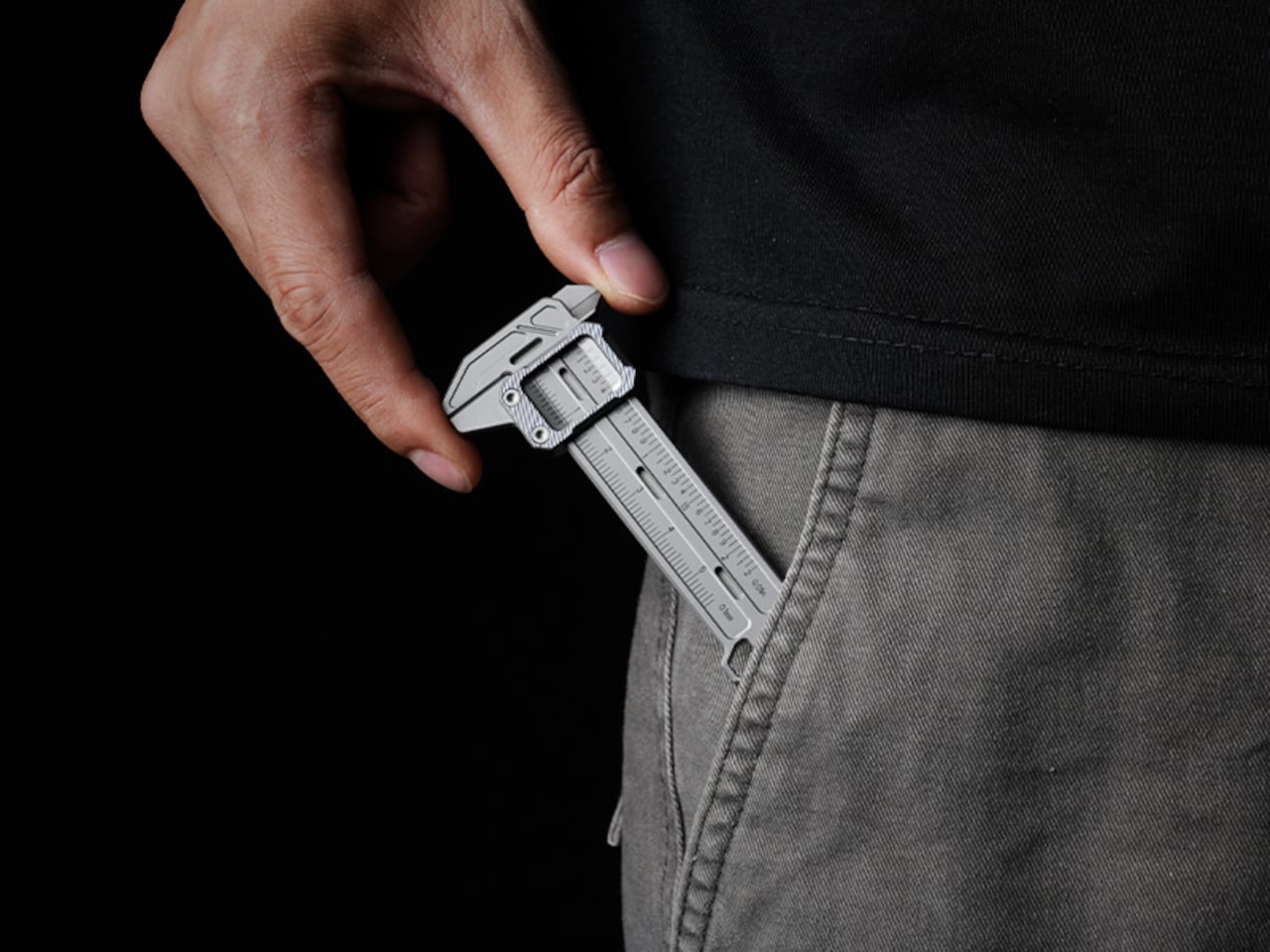
TiCal Pro 2.0 is designed to fill that gap and makes a bold case for being the first pocket caliper you’d actually trust for real measurement work. It’s not trying to replace the full-size tool on your workbench, but to bring genuine vernier precision down to something that clips to your keychain, hangs from a cord, or disappears into your pocket.
What sets it apart from the usual pocket-tool crowd is a deliberate narrowness of purpose. There’s no bottle opener, no ruler on the back, and no attempt to make it busier than it needs to be. TiCal Pro 2.0 does one thing: it measures. Outer diameters, inner diameters, and depth, with jaws and a depth rod machined as integral parts of a single titanium frame.
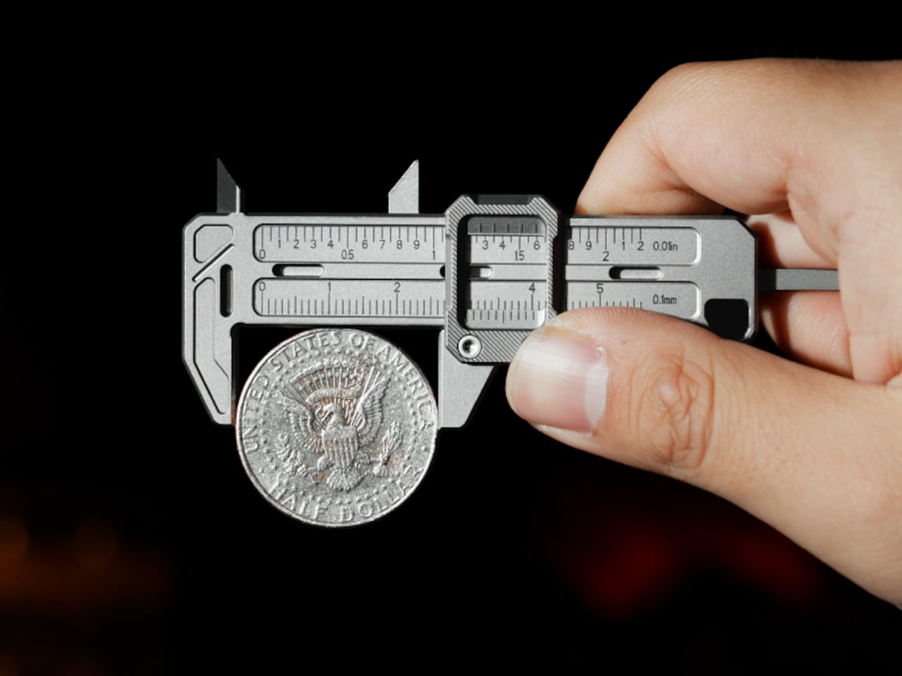
One of the more practical details is the dual-scale vernier system. Makers who move between metric drawings and imperial hardware know the frustration of converting on the fly. TiCal Pro 2.0 carries both inch and millimeter scales simultaneously, synchronized so that a single glance gives you both readings at once. There’s no mental math involved and far less room for the errors that unit conversion can invite.
With a resolution down to 0.01-inch for imperial measurements and 0.1mm for metric ones, it’s built for the kind of small-dimension work that usually gets left to guesswork outside the workshop. The scales themselves are laser-engraved deeply enough to resist daily wear, which matters a lot for something that lives in your pocket. Shallow printed markings fade quickly; these stay sharp and legible through regular carry.
Precision tools have a tactile dimension that often gets overlooked. TiCal Pro 2.0 addresses this with a self-lubricating POM ball rail system that delivers a silk-smooth slide with no oil and no grinding. The damping is also adjustable with a standard T5H driver, letting you set the slide resistance to your preference so the jaw stays exactly where you put it, no locking screw needed.
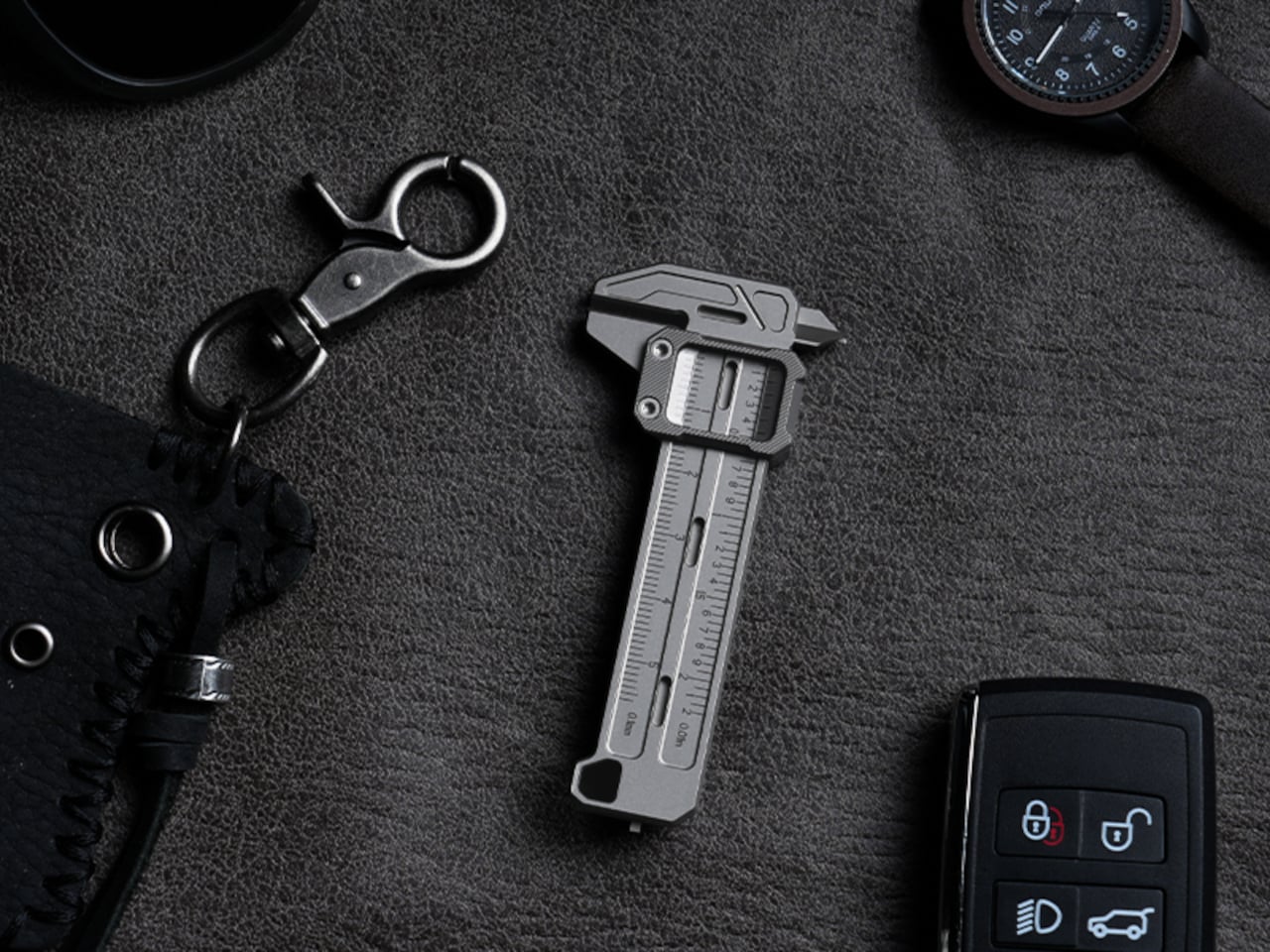
The choice of Grade 5 titanium for the body is practical rather than decorative. It offers the strength of steel at half the weight and is corrosion-proof, shrugging off sweat, rain, and shop fluids without complaint. For a tool meant to stay on your person at all times, that kind of durability makes a genuine difference in how willing you’ll actually be to carry it.
Think about the moments when a precise measurement would’ve been useful. A screw that looks like the right size but isn’t. A 3D-printed part that fits almost perfectly but not quite. A watch lug you’re trying to match without guessing. A keyboard stabilizer that needs a bit of finessing. These are the moments where a quick estimate wins by default simply because the right tool isn’t close enough.
At 3.37 inches long and weighing only 37.6g (1.33 oz), it’s compact enough to clip to a keychain or hang as a pendant, always within reach but never in the way. Four integrated tritium slots add a subtle glow for low-light situations, and the tool is available in either Sandblast Titanium or PVD Black, two very different expressions of the same object.
None of that changes the fact that a full-size caliper will always offer more range and a longer measurement stroke. But TiCal Pro 2.0 isn’t competing with the bench tool; it’s filling the space where that tool never goes. Precision doesn’t always happen in a workshop, and this small titanium instrument quietly makes the case that it doesn’t have to.