The footwear industry runs on glue. Something like 30 billion pairs of shoes get manufactured globally each year, and nearly all of them rely on industrial adhesives to bond uppers to soles. Those adhesives contain solvents that create toxic fumes in factories, complicate recycling at end of life, and introduce a whole class of chemicals that workers and the environment would be better off without. It’s a manufacturing reality so fundamental that most people never think about it, which makes it a perfect target for redesign if you can figure out the engineering.
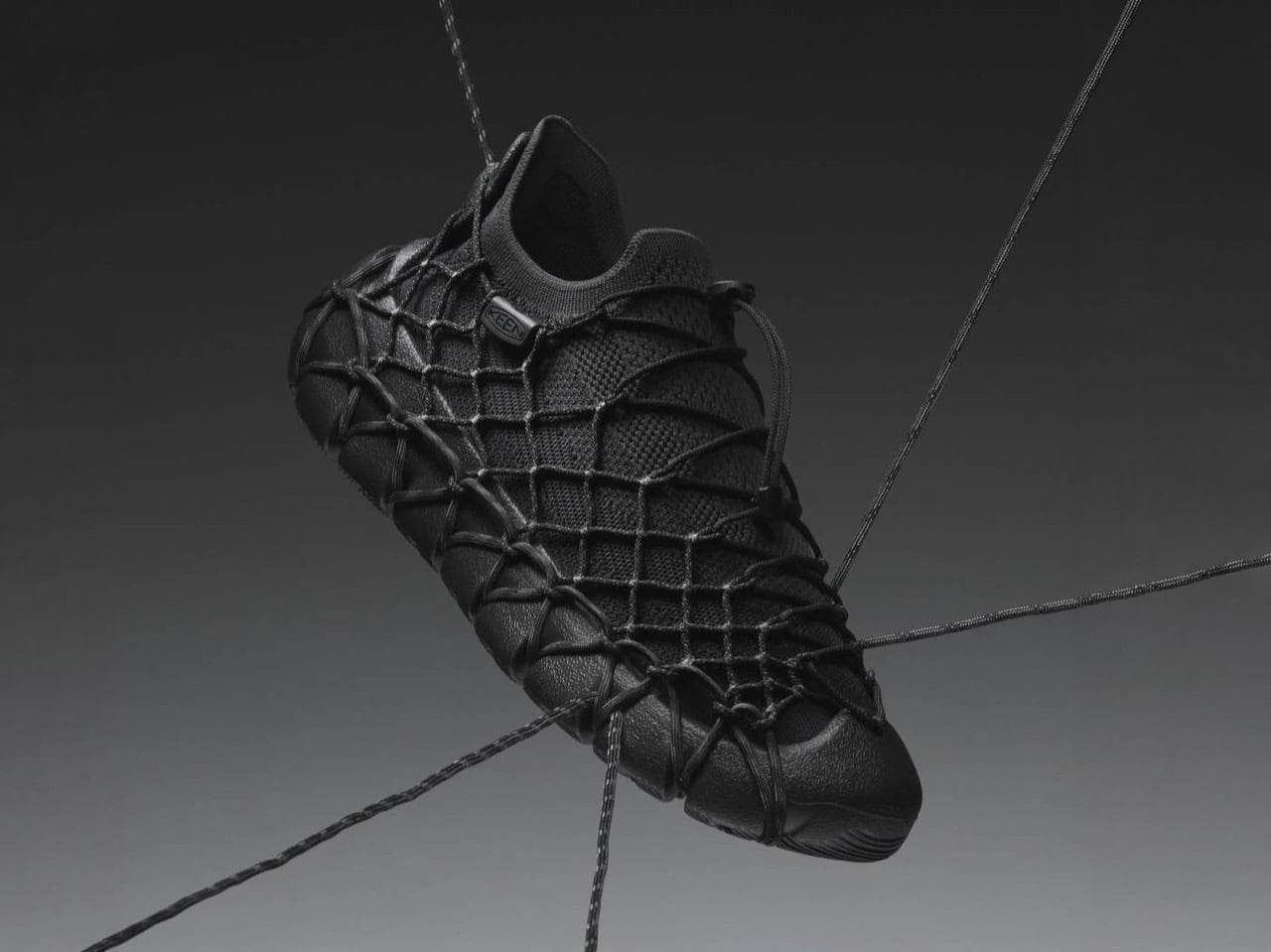
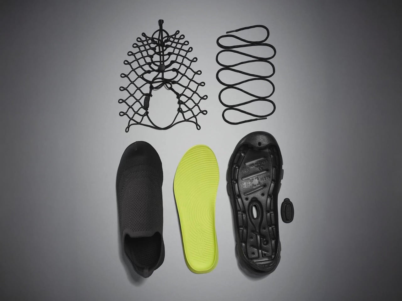
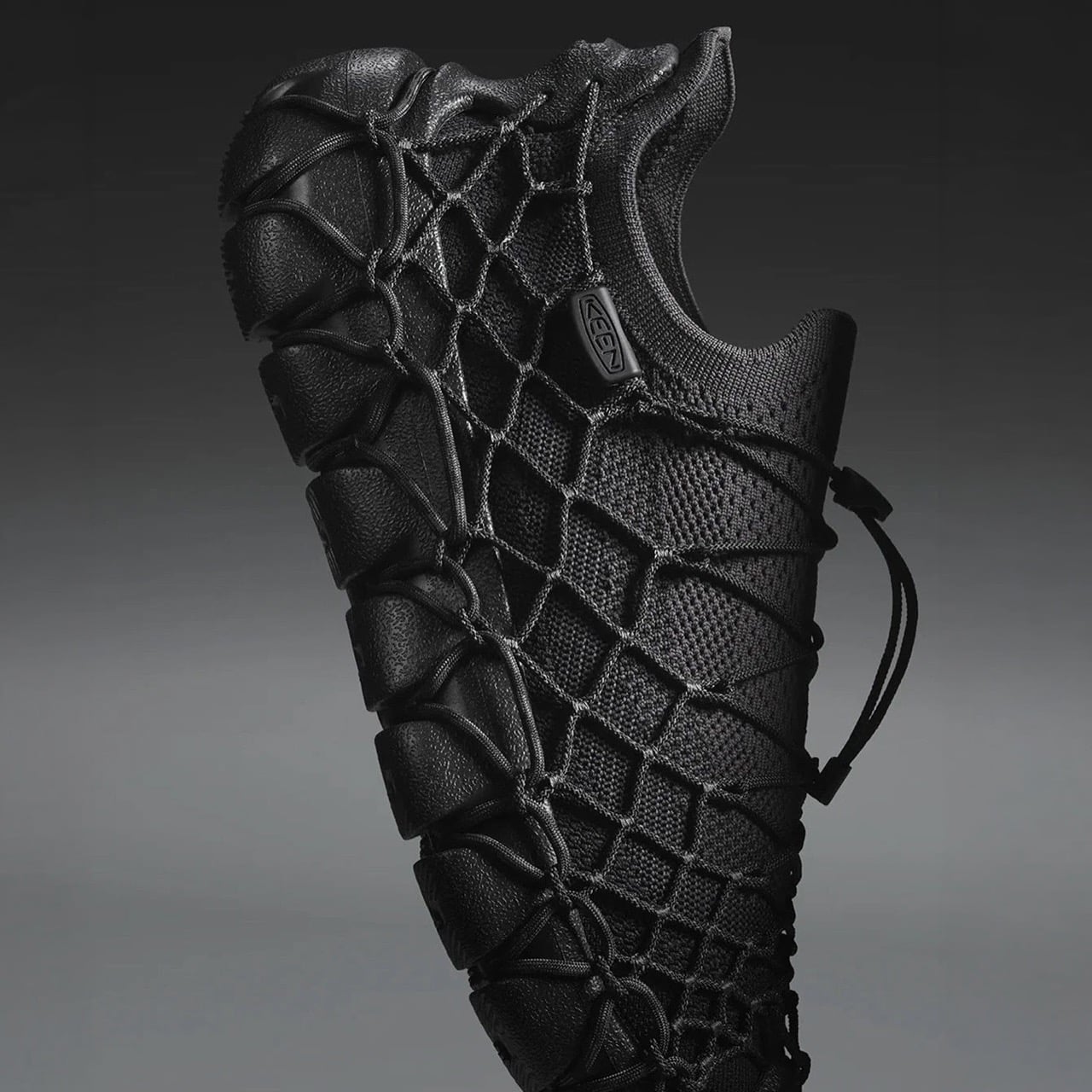
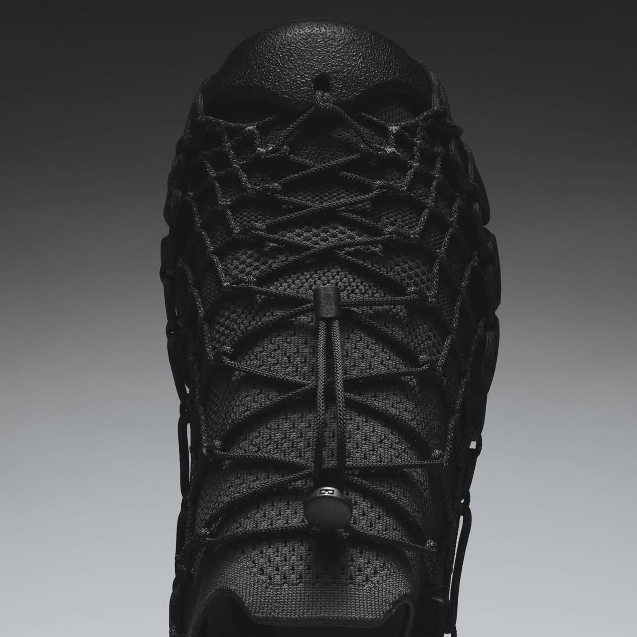
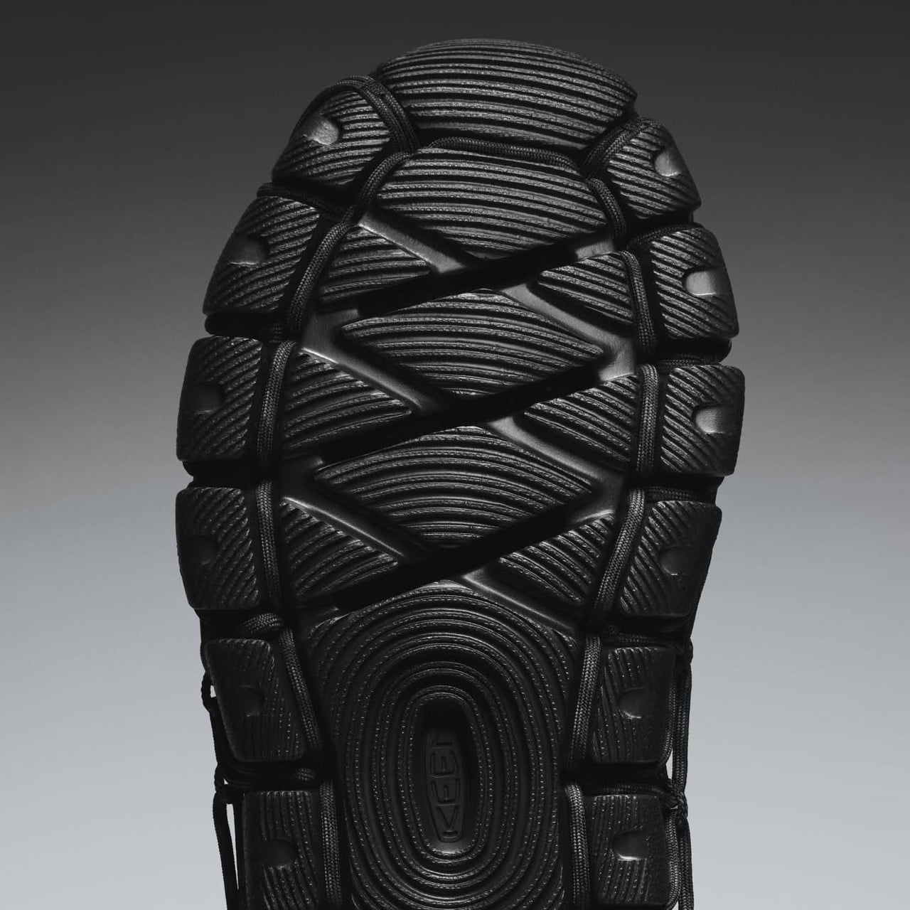
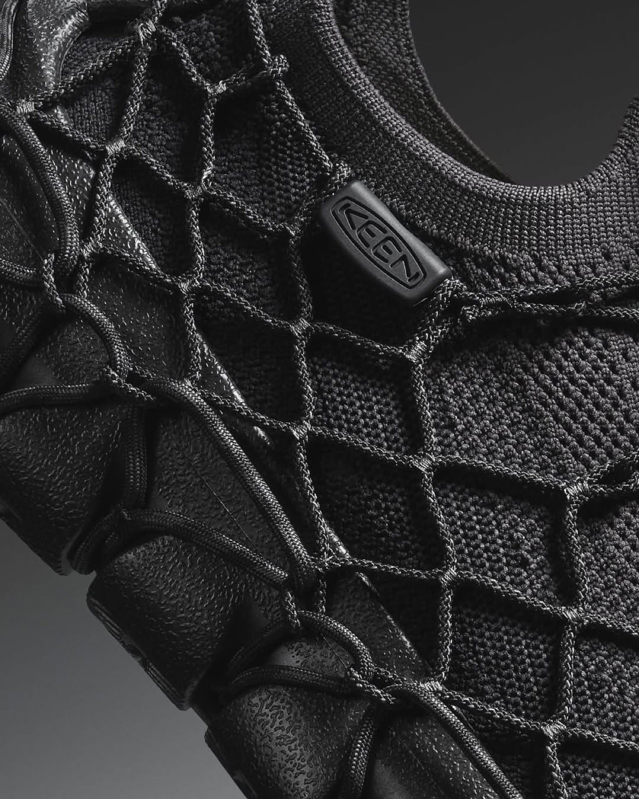
Keen just launched the Uneek 360, and the Portland-based brand is calling it their first solvent-free shoe. The design breaks down into four separate pieces: a knit upper made from recycled plastic bottles, an external cord cage that wraps around the structure, a drop-in footbed, and a hybrid rubber-foam outsole. Nothing is glued. The cords loop through the sole unit and lock with a toggle, creating a mechanical connection where adhesive would normally live. It’s a modular build that extends Keen’s decade-long Detox the Planet initiative from chemistry into construction itself, and it arrives with a $190 price tag and enough design confidence to make you wonder why this approach took so long to reach production.
Designer: Keen Footwear
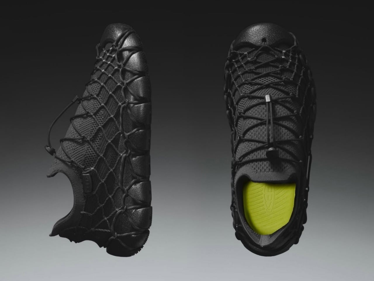
The cord cage is downright clever. Keen has been refining cord-based construction since the original Uneek sandal launched back in 2014, a polarizing design that used two interwoven cords as the entire upper. That silhouette took three years to develop and became a cult favorite despite looking like something between a huarache and a fishing net. The 360 repurposes that cord expertise into structural engineering rather than aesthetics. The articulated cording moves on multiple axes, which means it adapts to foot shape dynamically while maintaining enough tension to hold the four components together under walking loads. Pull the locking toggle and the whole assembly comes apart in seconds, with each material cleanly separated for recycling.
This fits into Keen’s broader chemistry work, which has been unusually transparent for a footwear brand. Since starting their Detox the Planet program in 2014, they’ve invested over 11,000 hours and $1.2 million eliminating toxic chemical classes from their supply chain. They went fully PFAS-free in 2018, removing those forever chemicals from over 100 different shoe components, then open-sourced the process so competitors could follow the same path. Five of six targeted chemical classes are gone. Solvents, the ones embedded in adhesives, are the final holdout. The Uneek 360 represents a different approach to that problem: instead of reformulating the glue, eliminate the need for it entirely.
The modular construction creates some really smart end-of-life options. Most shoes become landfill material because you can’t separate bonded composites without industrial shredding, and even then the mixed materials have limited recycling value. A shoe you can disassemble by hand into distinct material streams (knit fabric, rubber, foam, synthetic cord) actually stands a chance of getting processed properly. Whether that happens depends on infrastructure and consumer behavior, but at least the design removes a fundamental barrier.
Keen launched the Uneek 360 in Black/Magnet and Vapor/Star White colorways, with men’s and women’s sizing available through their site and select retailers. At $190, it sits at the premium end of the casual sneaker market, which reflects both the recycled materials and the engineering required to make cord-based mechanical locking work at production scale. It’s proof that footwear assembly without solvents is manufacturable, not just a concept sketch, which matters if the industry is serious about moving beyond adhesive dependency.
The post Keen’s Zero-Glue Shoe Uses A Cord-Cage To Hold Itself Together, And Can Be Repaired By Swapping Parts first appeared on Yanko Design.


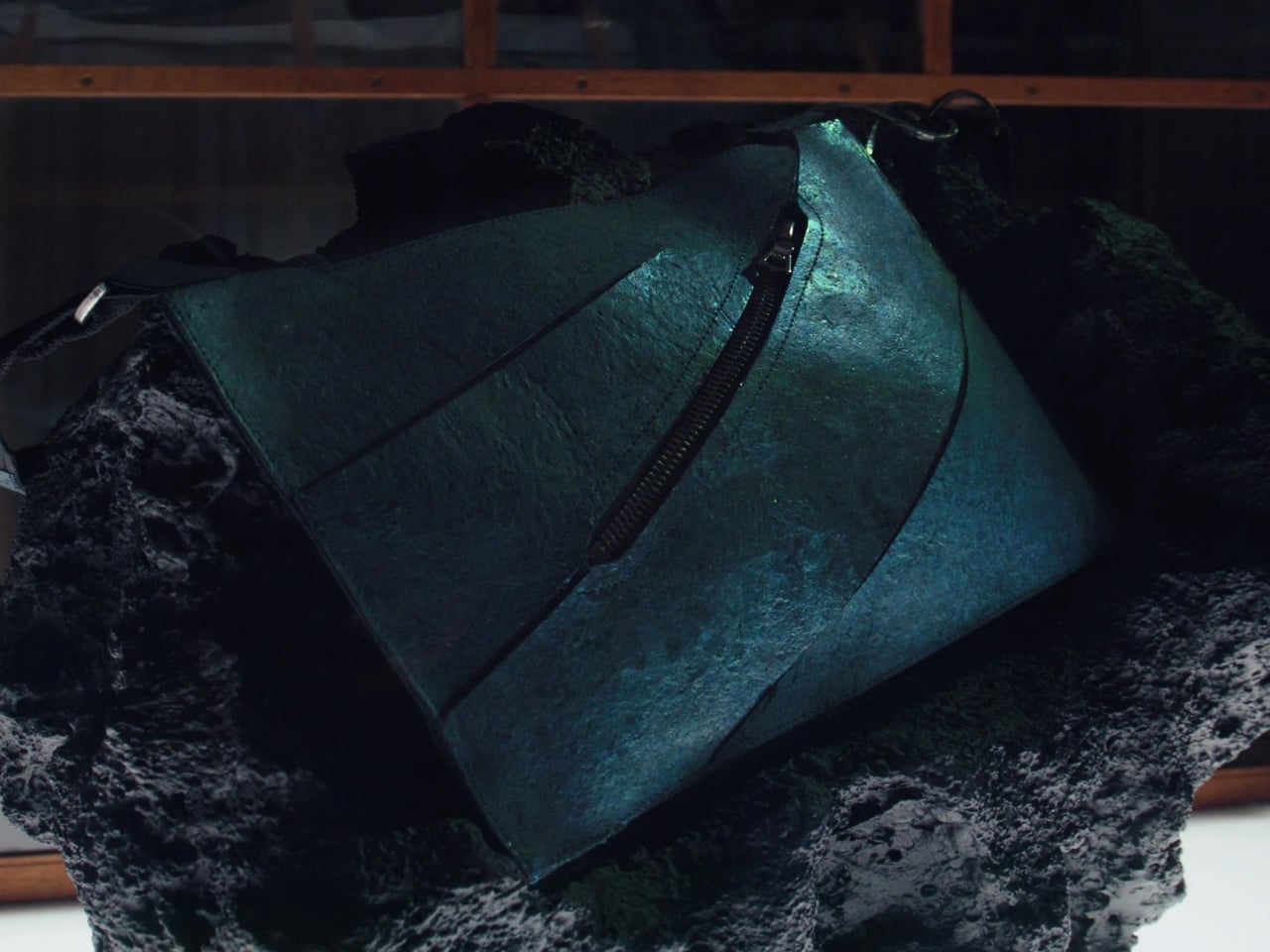
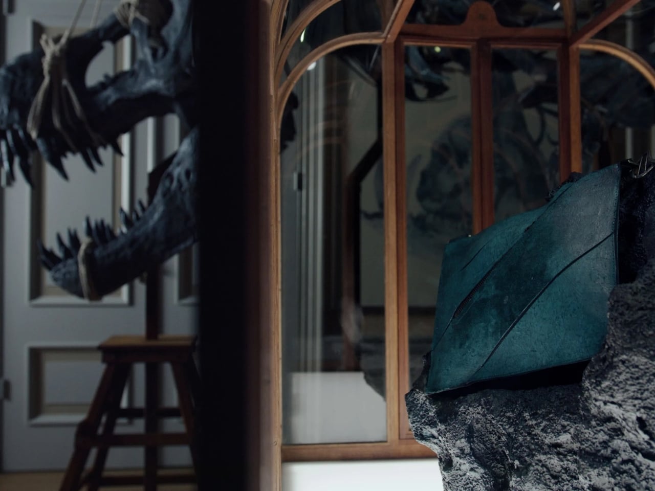
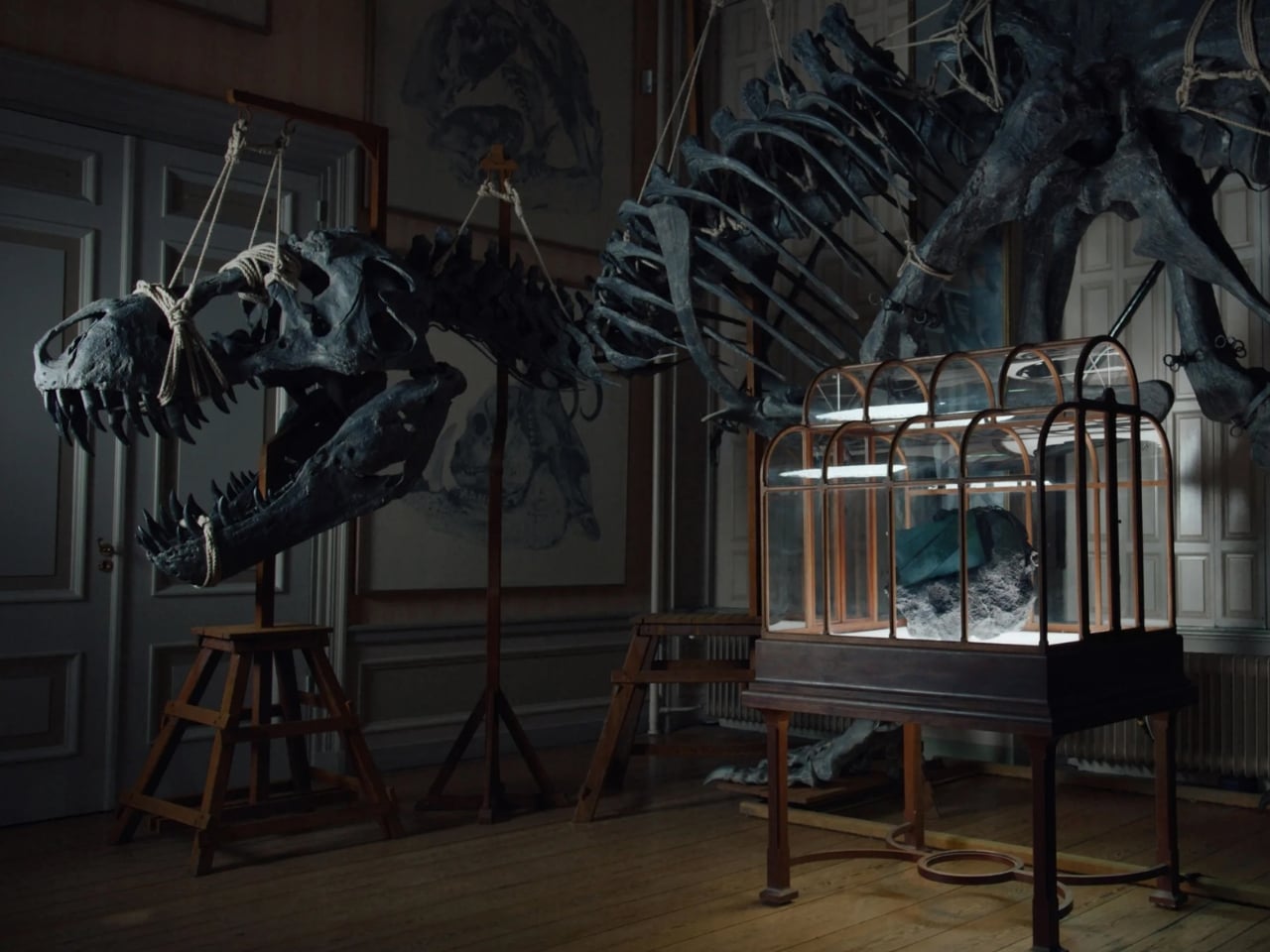
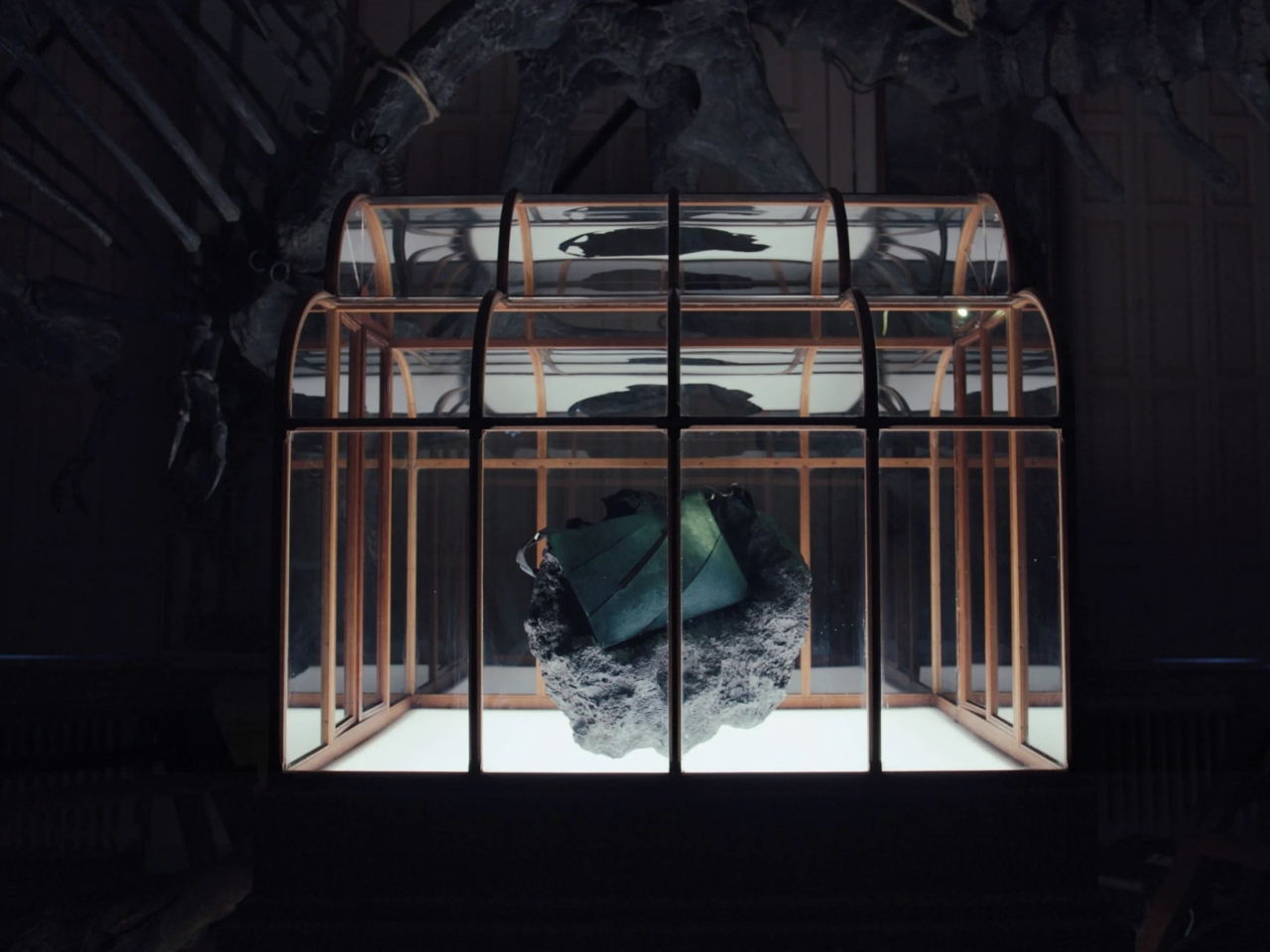
 Handbag. And obviously, this time around, no actual animals were harmed in making this one-of-a-kind luxury handbag.