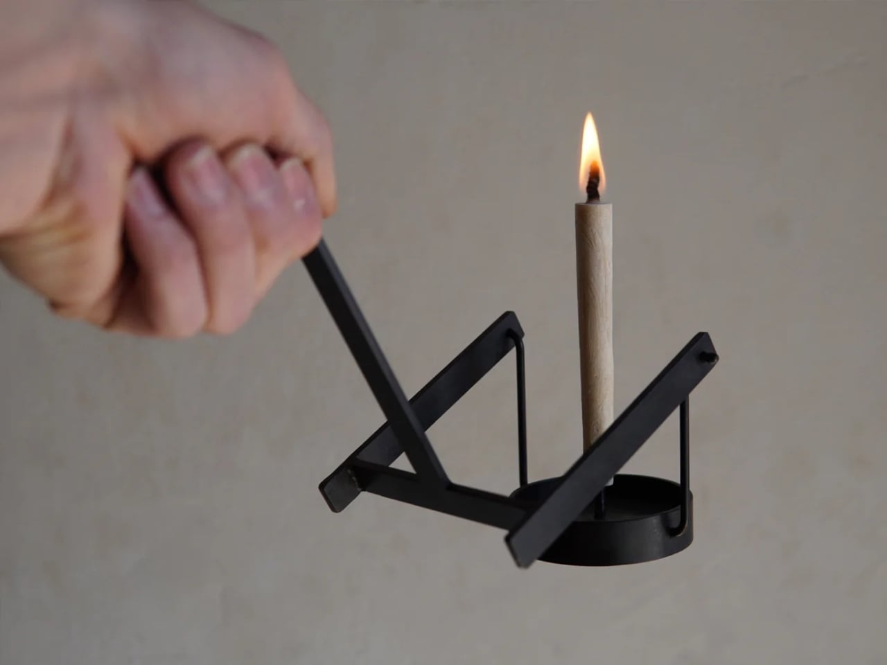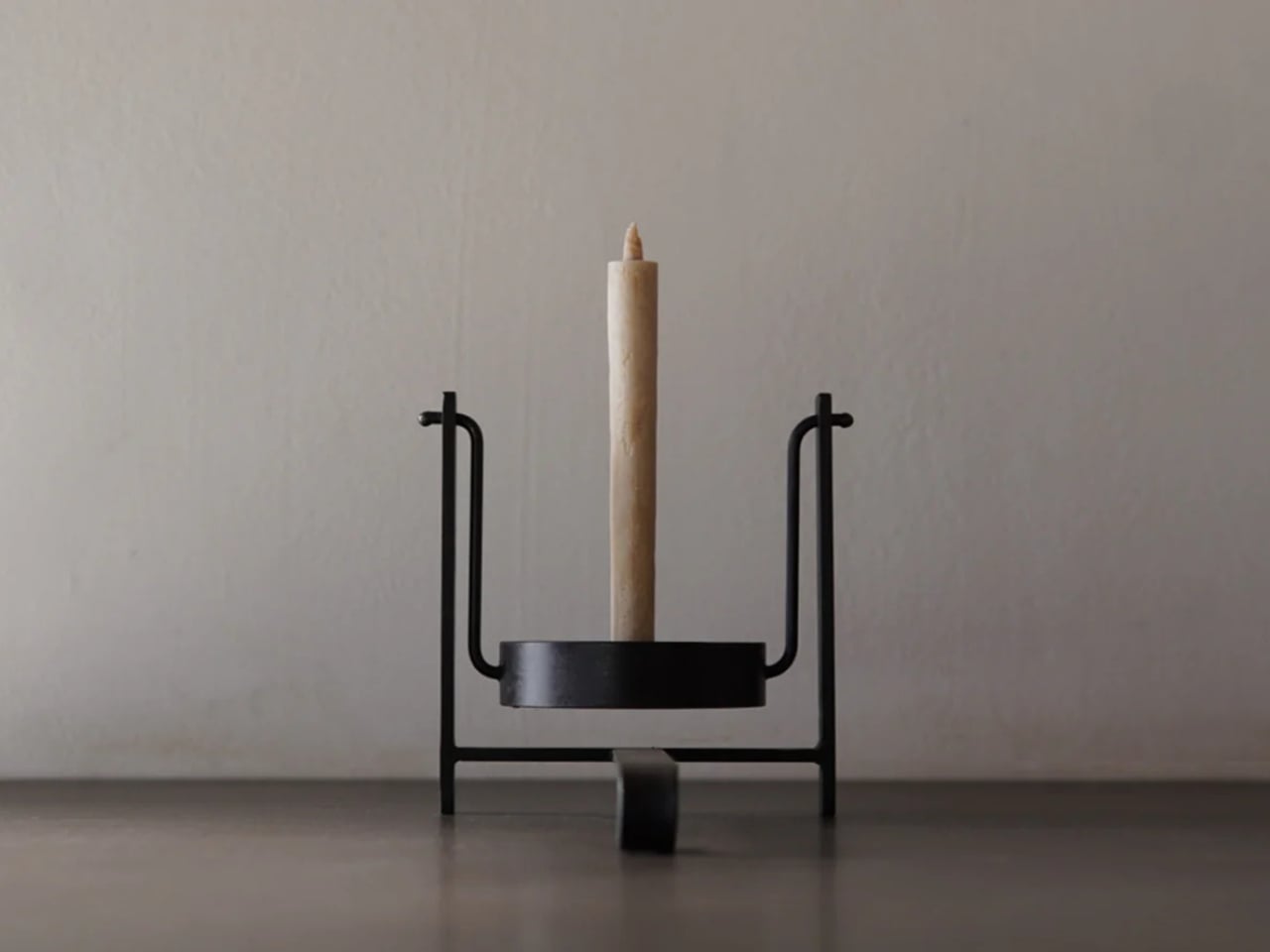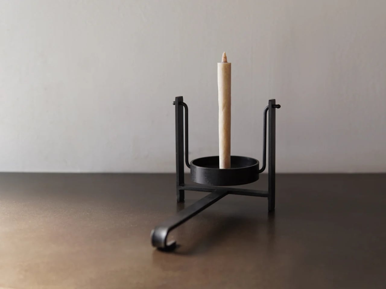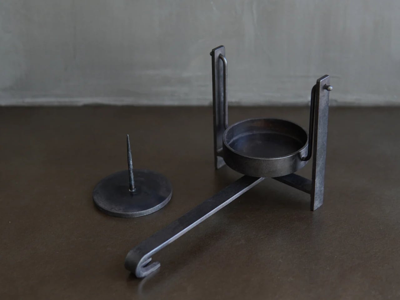
This Coat Rack Vanishes Into Your Wall When You Don’t Need It

Coat racks are designed to be covered. Designers refine sculptural hooks and stands that look great in catalogs, but the moment you hang coats and bags, they disappear under fabric. No matter how interesting the form, the object gets visually erased by its own function. Most designs pretend this is not happening, even though vanishing under outerwear is basically written into the job description from the start.

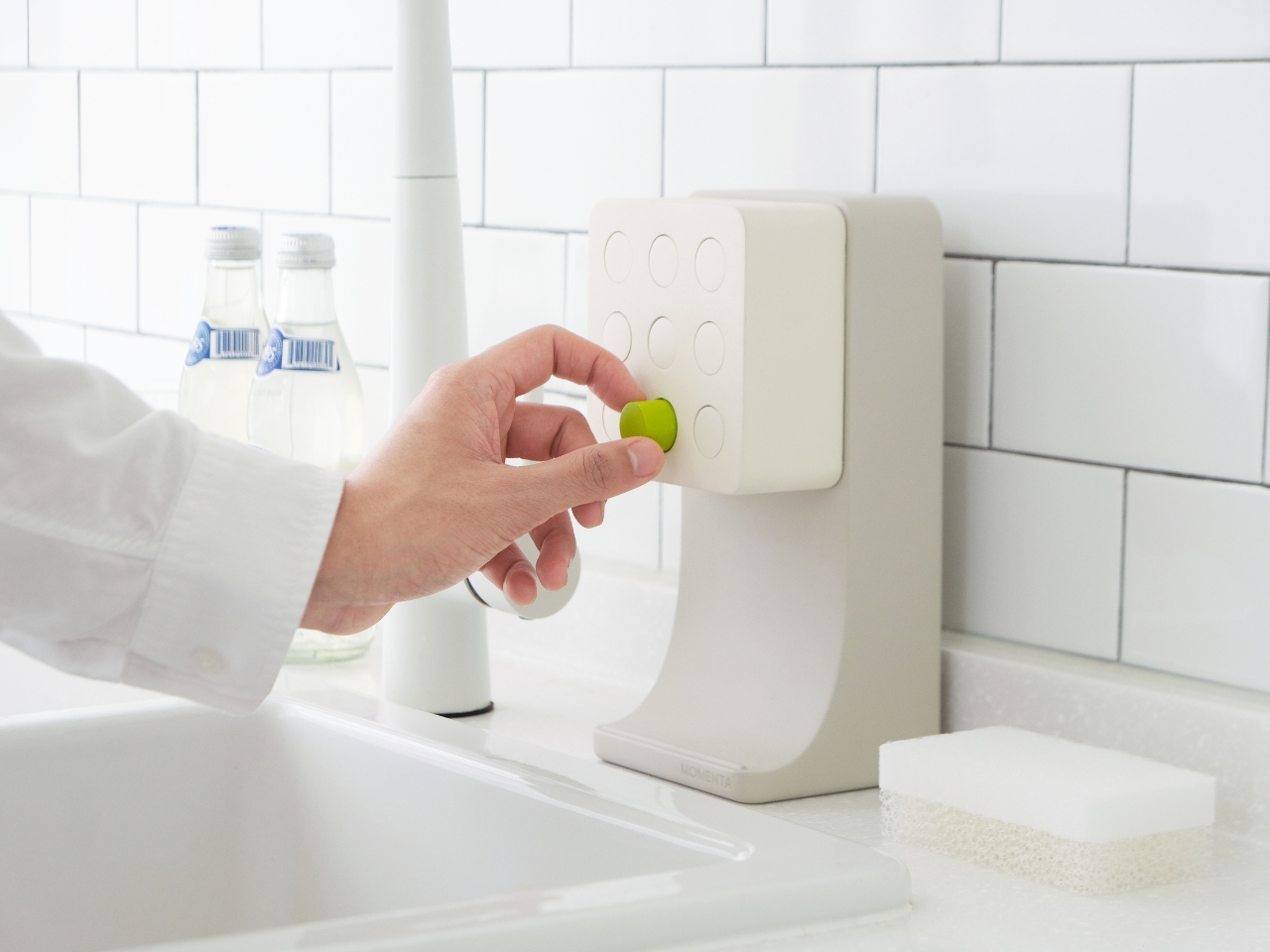
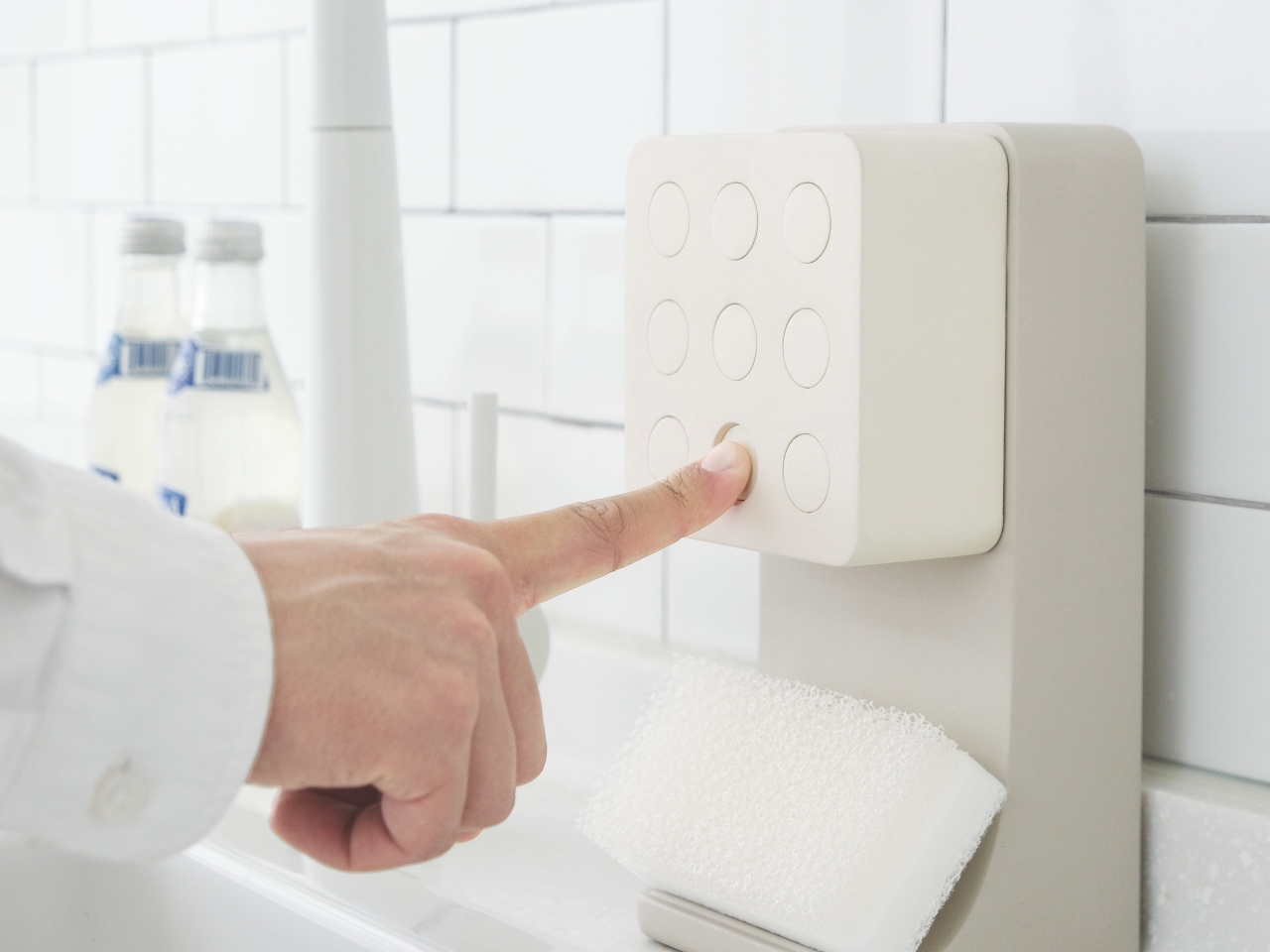
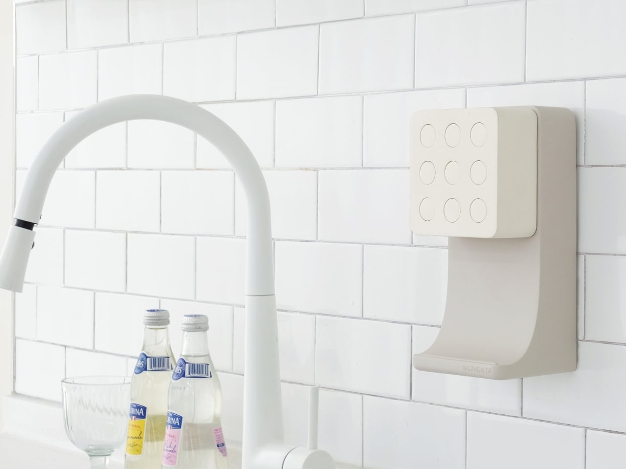
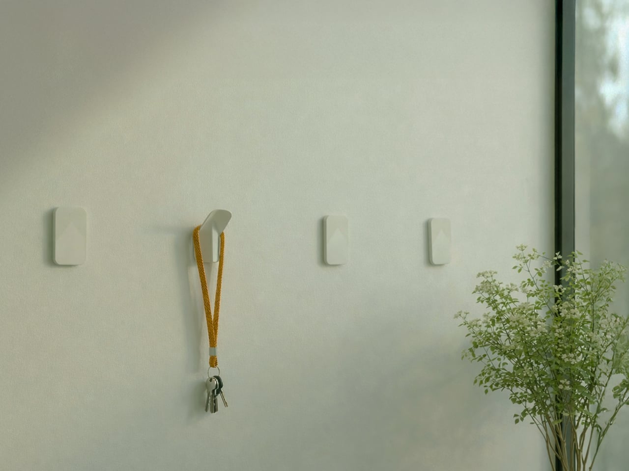
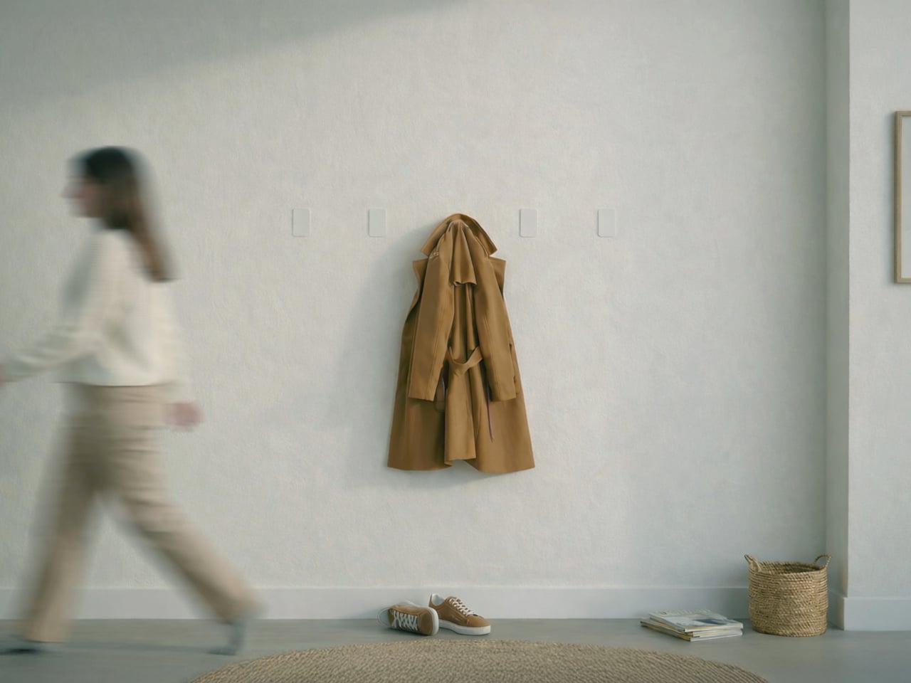
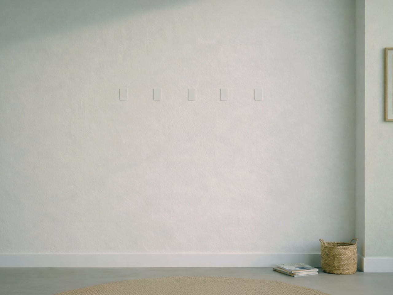
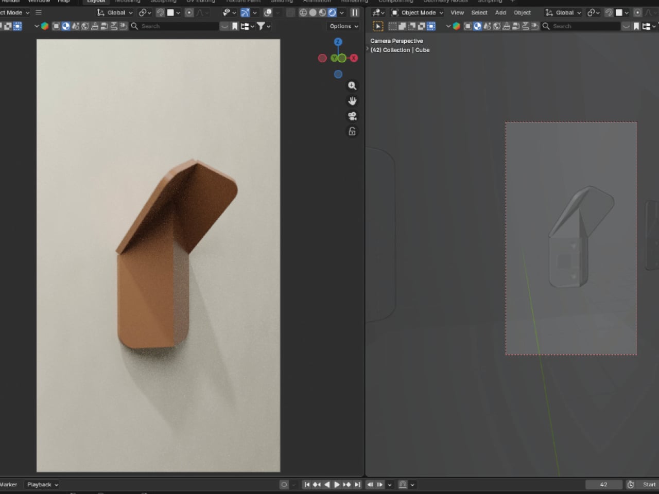
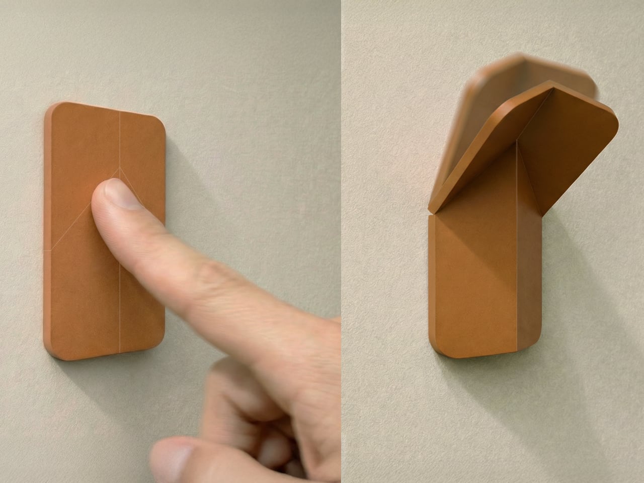
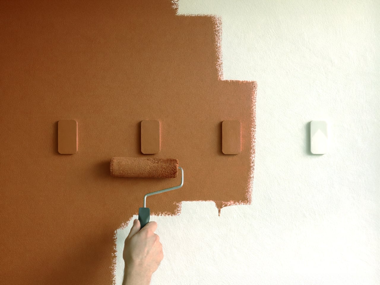
VELTO accepts that contradiction instead of fighting it. The wall-mounted coat rack stays completely flat when not in use and only reveals itself when needed. The philosophy revolves around the idea that design does not always need to shout to be valuable, and sometimes disappearing is actually the point. When closed, it sits flush against the wall like a small tile and can be painted the same color to blend entirely.

Designer: Brent De Meulenaere

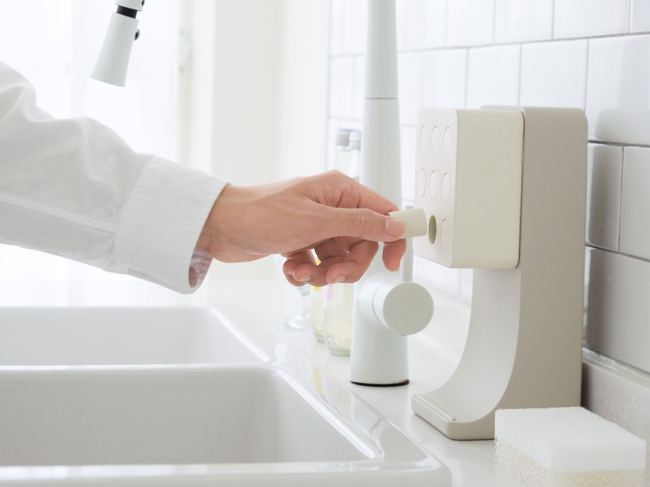
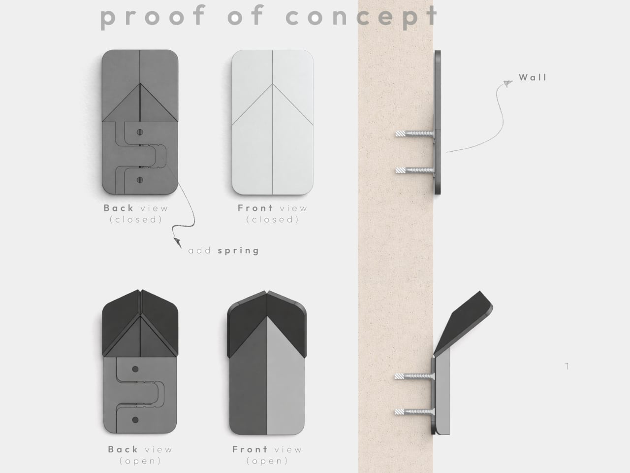
The transformation happens with a single push. A spring-assisted mechanism lets the flat panel unfold into a hook that holds coats, bags, or scarves without extra effort. The movement is inspired by origami, turning a flat surface into a functional volume through precise folds. The interaction becomes a small, deliberate gesture every time you come home or leave, pressing the panel and watching it quietly fold out to catch your jacket.

The object starts from a single flat shape laser-cut from polypropylene, which flexes repeatedly without breaking, and can be painted in any color. That flat-pack logic keeps production efficient and reduces waste. You can paint VELTO to disappear into the wall or let it stand out as a subtle accent, depending on whether you want it to blend or quietly announce itself in the entryway.

In narrow hallways or compact entryways, every protruding object becomes something you bump into or work around. Traditional coat racks and hooks always occupy space, even when empty, creating visual clutter on days when you are not using them. VELTO stays flat until pressed, so walls remain clean most of the time. When guests arrive or winter coats come out, hooks appear on demand, then fold back once everything is put away.

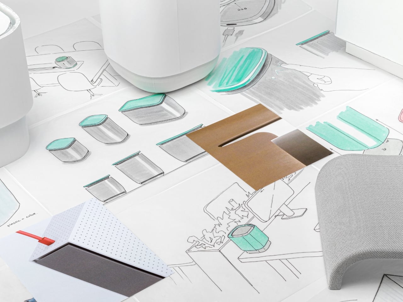
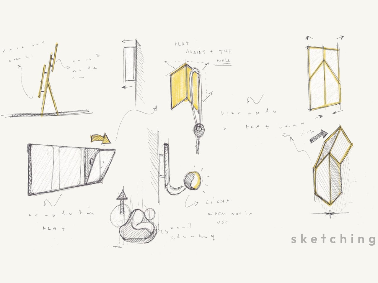
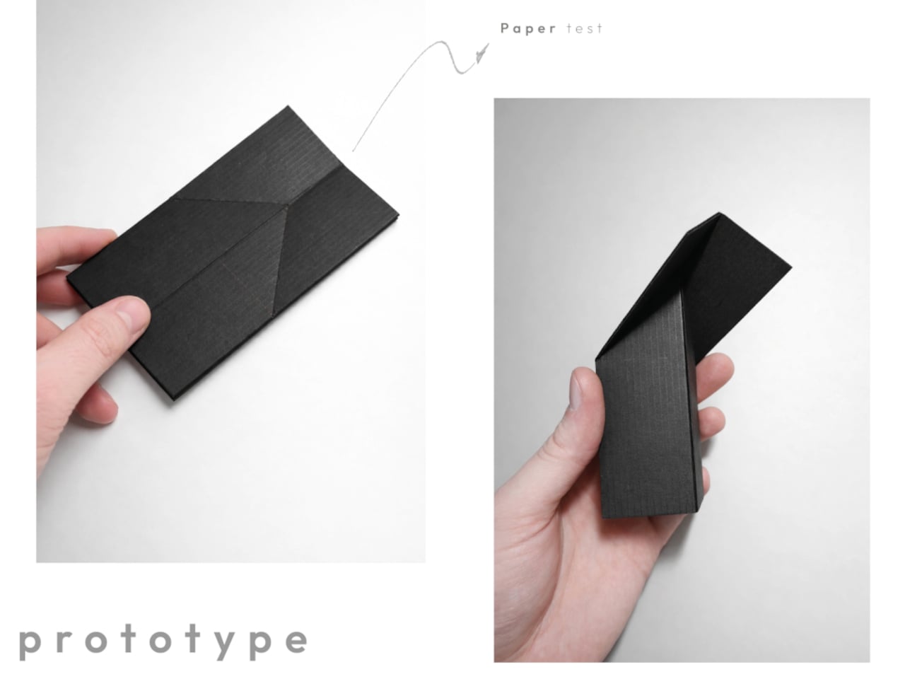
The project grew from sketches about movement and hinges rather than styling, followed by paper models and prototypes testing folding angles, opening force, and stability. Only after the mechanism felt right did the designer refine proportions and edges. That process shows in the final concept, where the memorable part is not a decorative detail but the calm, almost self-explanatory way the object transforms when you actually need it.

VELTO treats absence as a feature instead of a problem. Rather than trying to dominate a room, it tries to coexist quietly with walls and daily routines, only stepping forward when you need a place to hang something. In a world full of products competing for attention, a coat rack designed to be covered and happy to disappear feels like a surprisingly refreshing stance.

The post This Coat Rack Vanishes Into Your Wall When You Don’t Need It first appeared on Yanko Design.

5 Smart Lighting Trends That Just Made Traditional Fixtures Look Outdated

Lighting Design in 2026 has shifted from a background utility to an emotional design language, influencing how spaces are experienced while shaping atmosphere, flow, and everyday comfort. Today, light works quietly in the background, adapting to your routines, responding to natural rhythms, and enhancing your experience of home.

Rather than acting as a static fixture, lighting now plays an active role in creating atmosphere. Soft transitions, layered illumination, and nature-inspired tones help interiors feel calmer, warmer, and more connected to the outside world. Whether you are unwinding after a long day or starting your morning, let’s decode how 2026’s lighting trends support the emotional flow of your space, making the home feel less like a structure and more like a living, responsive environment.

1. Invisible Smart Lighting

In 2026, the most advanced lighting systems are designed to blend effortlessly into your space. Powered by Ambient Intelligence, they use sensors and AI to adjust brightness and tone based on occupancy, daylight levels, and your daily routines. Instead of relying on switches, light flows naturally from one area to another, subtly guiding movement and defining zones without drawing attention to the technology behind it.

This approach focuses on supporting your body’s natural rhythms. Predictive dimming and gentle colour shifts mirror the changing quality of daylight, helping you feel more alert during the day and relaxed in the evening. By working in sync with your internal clock, lighting becomes an invisible wellness tool that improves comfort, focus, and overall quality of living.
This AI-assisted ceiling light illuminates the lives of the elderly while monitoring their safety

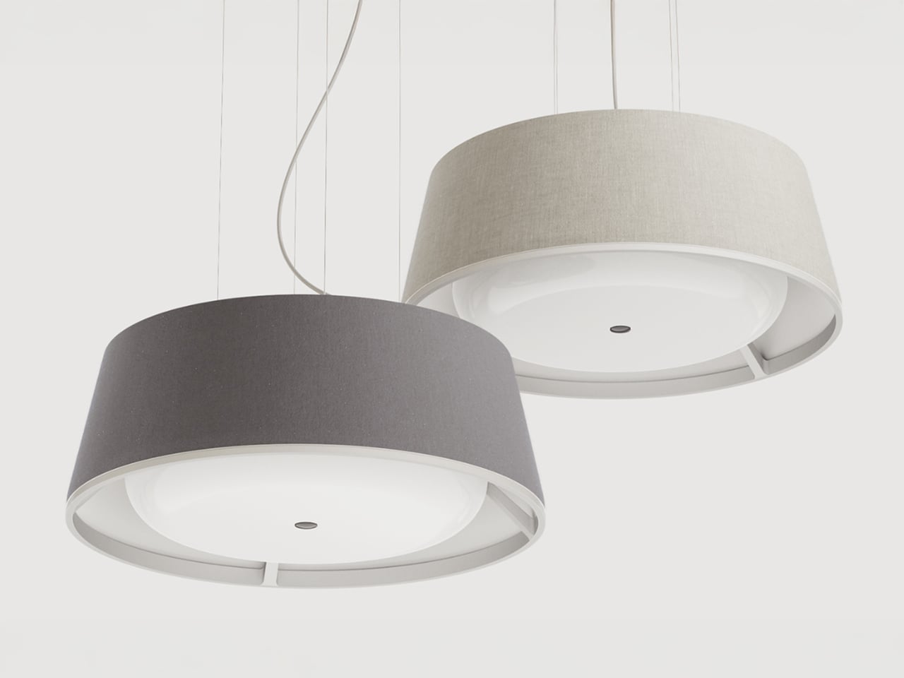
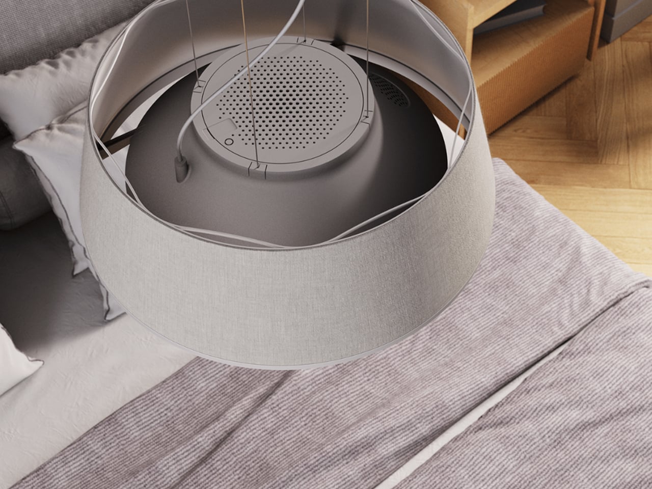
AI-enabled lighting systems for elderly care combine illumination with continuous health and safety monitoring. Integrated sensors and computer vision allow the lamp to detect falls, unusual movement patterns, and prolonged inactivity, while also tracking indicators such as respiration and coughing. Advanced algorithms analyse behaviour over time to predict potential risks before accidents occur. When an incident is detected, the system automatically alerts designated caregivers or emergency contacts, enabling faster response and reducing the severity of injury through timely intervention.
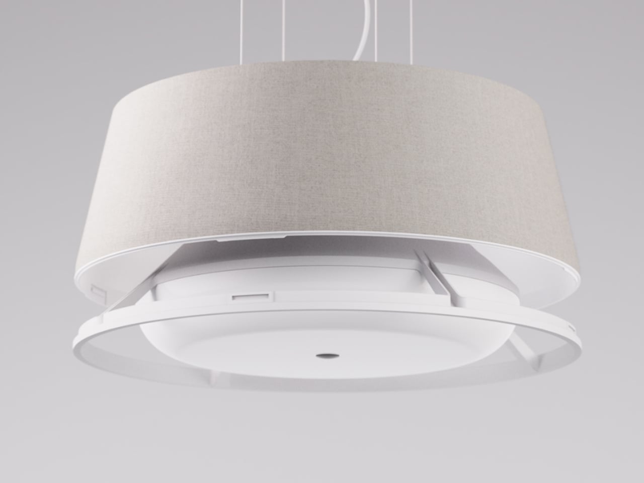
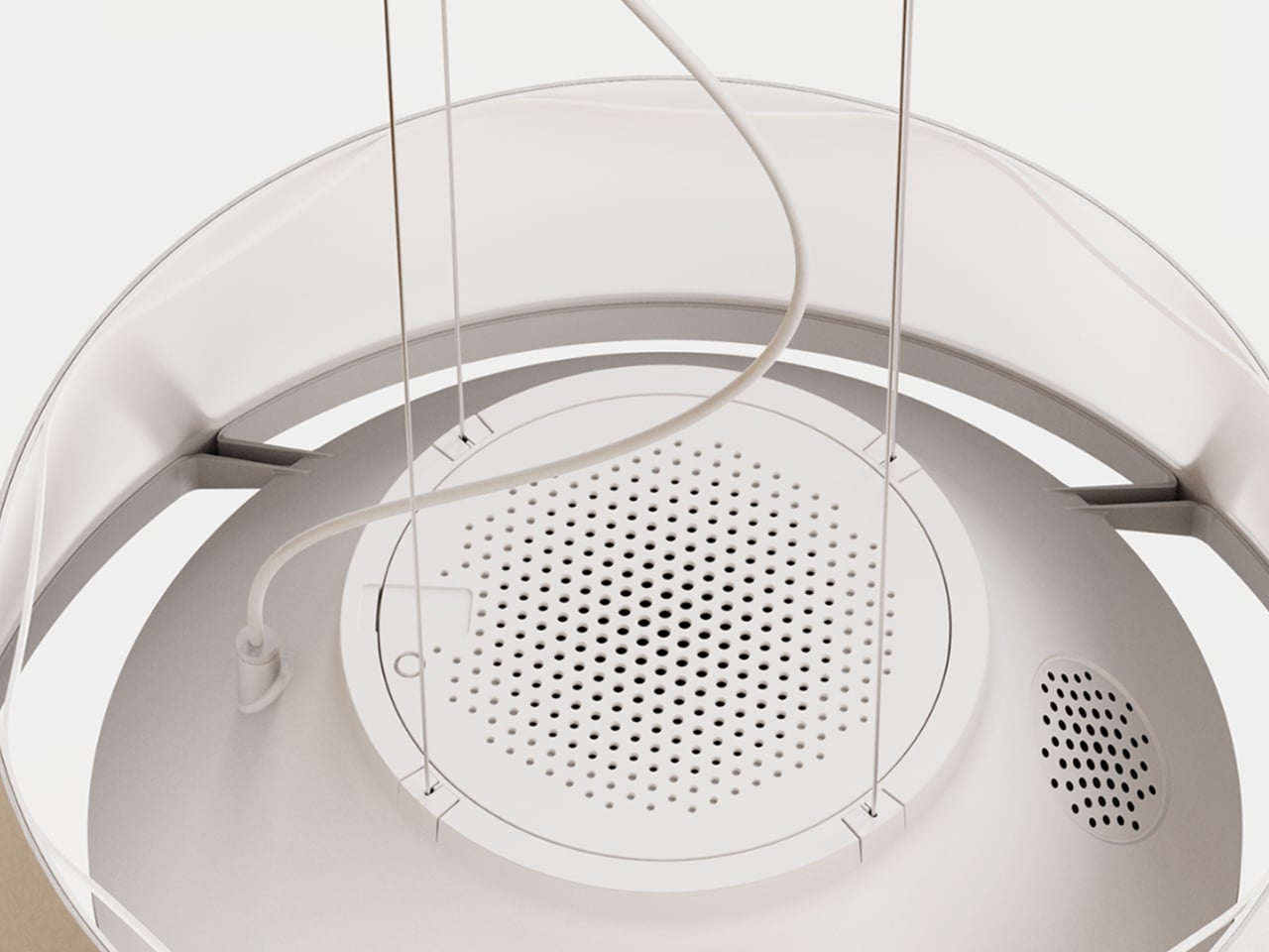
Designed to function as a standard household lamp, this technology integrates seamlessly into residential interiors without appearing medical or intrusive. The familiar form factor encourages acceptance while delivering round-the-clock support through a single device. With low heat emission, energy-efficient LEDs, and autonomous operation, AI lighting solutions provide a scalable approach to assisted living. By combining safety, monitoring, and illumination in one product, these systems offer a practical way to support independent ageing while maintaining comfort, privacy, and dignity.

2. Sculptural Light Forms

Lighting fixtures are increasingly treated as architectural features rather than background utilities. Instead of relying on scattered recessed ceiling lights, spaces now favour bold, sculptural pieces that visually anchor the room. These luminaires are appreciated for their authentic materials, including hand-blown recycled glass, alabaster, and bio-based composites, which add depth and softness while creating a gentle, diffused glow.

Beyond function, such fixtures shape how you perceive space. A large pendant naturally draws the eye, balancing volume and form while adding a sense of rhythm to the interior. Light becomes a focal point that connects design with atmosphere, creating rooms that feel considered, expressive, and emotionally engaging.
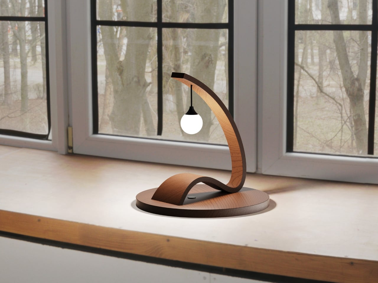
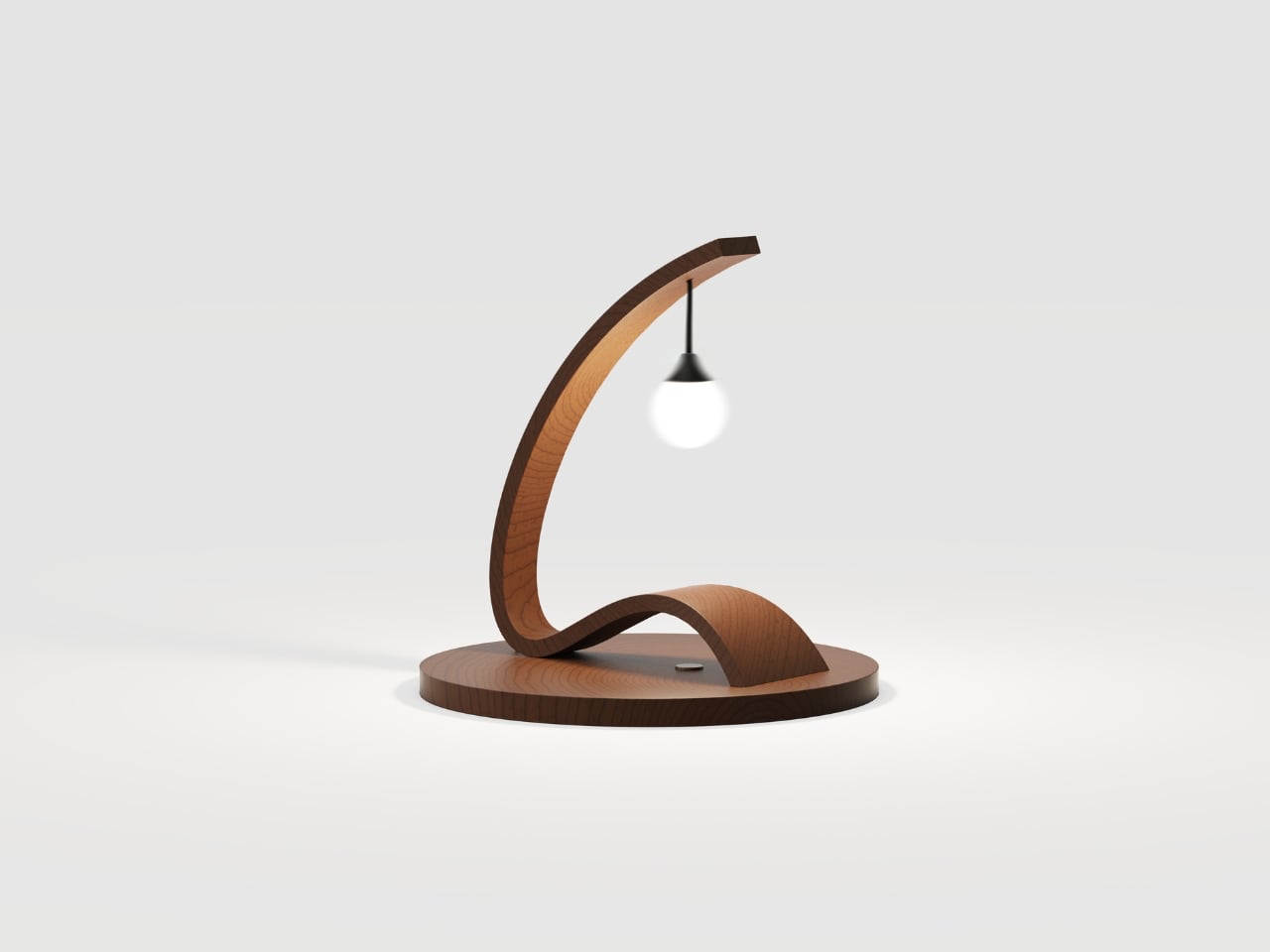
The Arc Lamp by designer Divyansh Tripathi is defined by a single bent wooden arm that curves gracefully to support a suspended light source, creating a strong sculptural identity. The continuous arc forms a balanced structure that distributes weight evenly while guiding the eye from base to bulb. This fluid geometry gives the lamp a sense of motion, turning a functional object into a visual centrepiece suitable for display as much as daily use. The suspended bulb is positioned to provide soft ambient illumination while reducing direct glare.
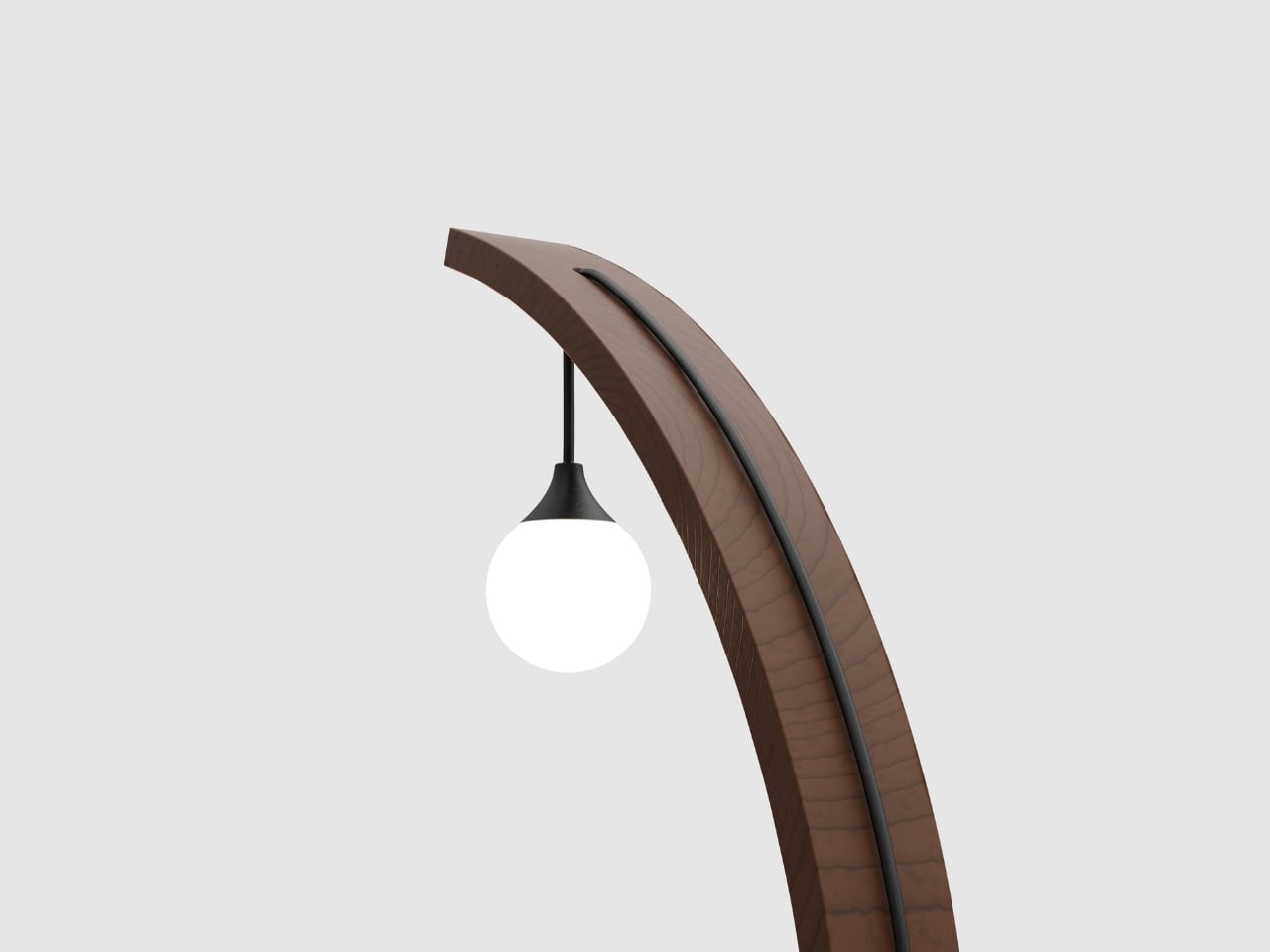
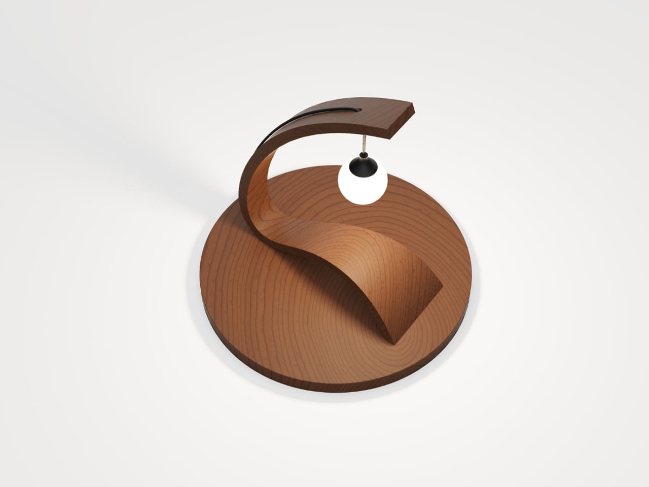
Material choice is central to the lamp’s character and performance. Bent timber introduces warmth, tactile depth, and visible grain patterns that make each piece visually distinct. Finished with protective natural coatings, the wood maintains its organic appearance while ensuring durability. Paired with a low-profile LED bulb, the lamp delivers even, diffused light that enhances surrounding textures without overpowering the space. Its minimal structure allows it to integrate across interior styles, functioning as a lighting solution and a collectible design object.

3. Honest Sustainable Materials

Lighting design now places strong emphasis on the full life cycle of a fixture, not just its appearance. You see a growing focus on low-impact production, modular construction, and upgradable LED components that extend usability rather than encouraging replacement. Materials such as repurposed mycelium, salt crystals, and recycled composites are no longer experimental choices but trusted options for those who value responsible design.

This shift brings both ethical and practical benefits. Durable construction and adaptable technology mean fixtures last longer and age more gracefully. When materials are chosen for integrity and longevity, lighting becomes more than décor as it becomes a lasting design investment, valued for craftsmanship and environmental responsibility rather than short-term trend appeal.
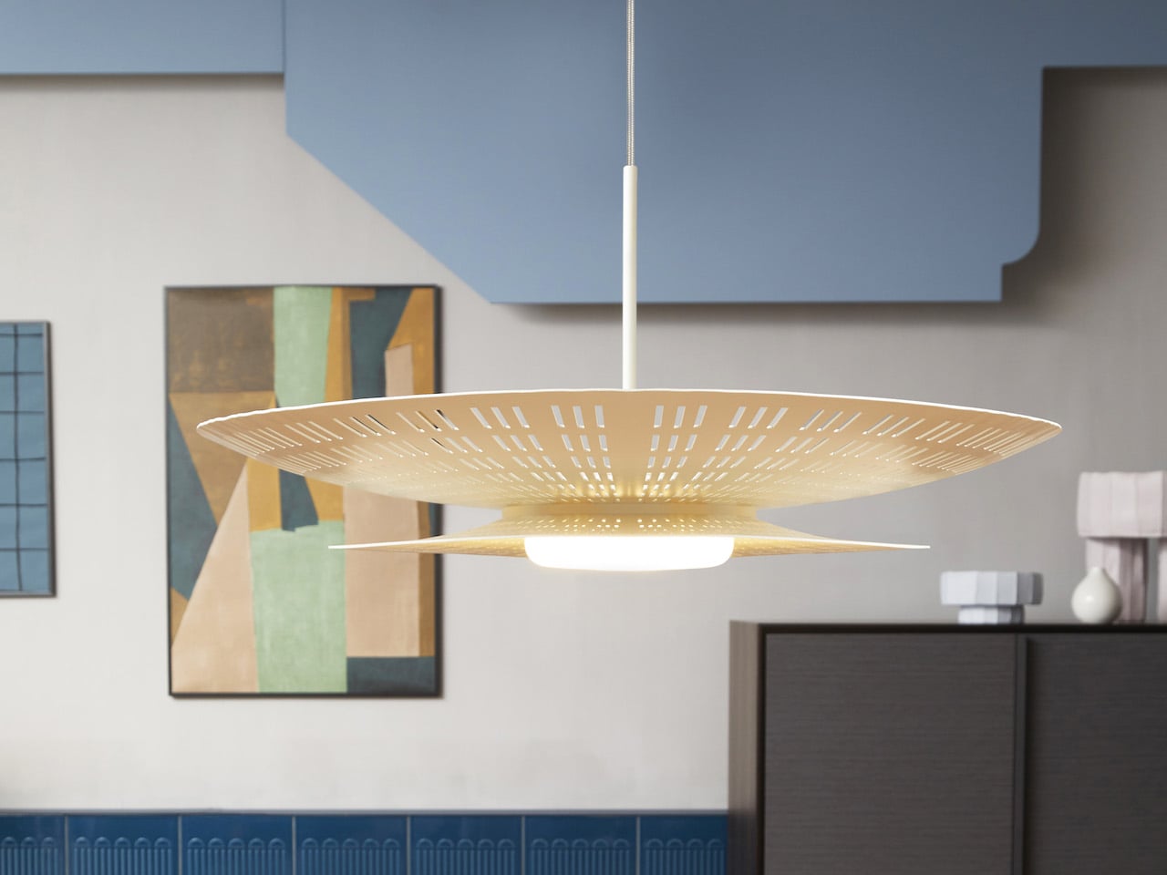
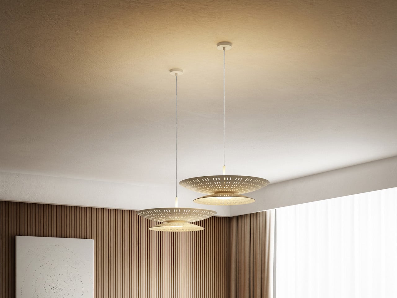
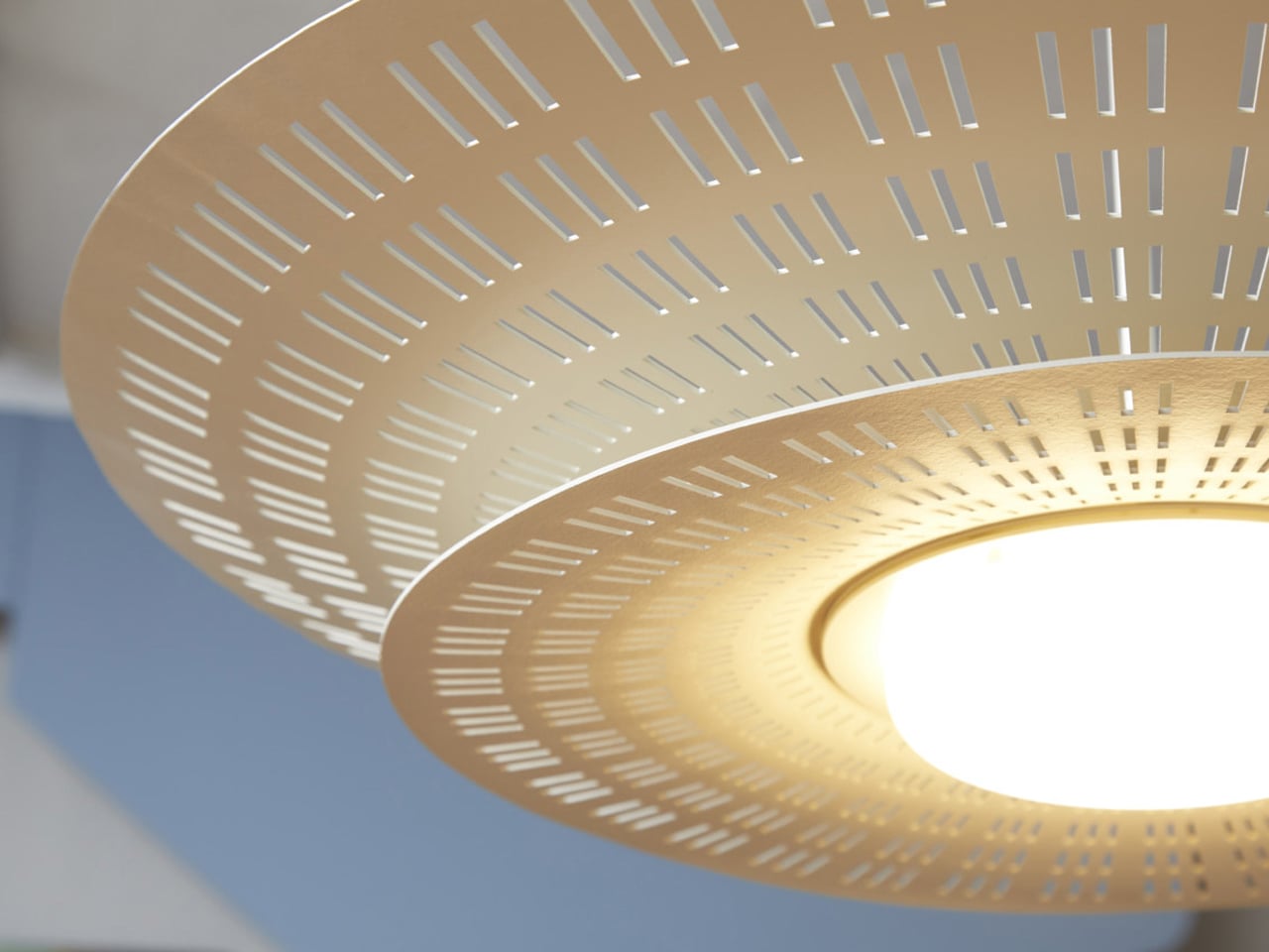
The Air suspension light by Contardi Lighting, designed in collaboration with Adam Tihany, is engineered to deliver soft, evenly distributed ambient illumination. Its dual-shade construction houses upper and lower LED light sources that spread light both upward and downward, improving overall spatial brightness while avoiding direct glare. Laser-cut detailing on the shades allows controlled light diffusion, creating subtle shadow patterns that add visual depth without reducing functional output. This configuration supports balanced lighting suitable for dining areas, lounges, and hospitality interiors.
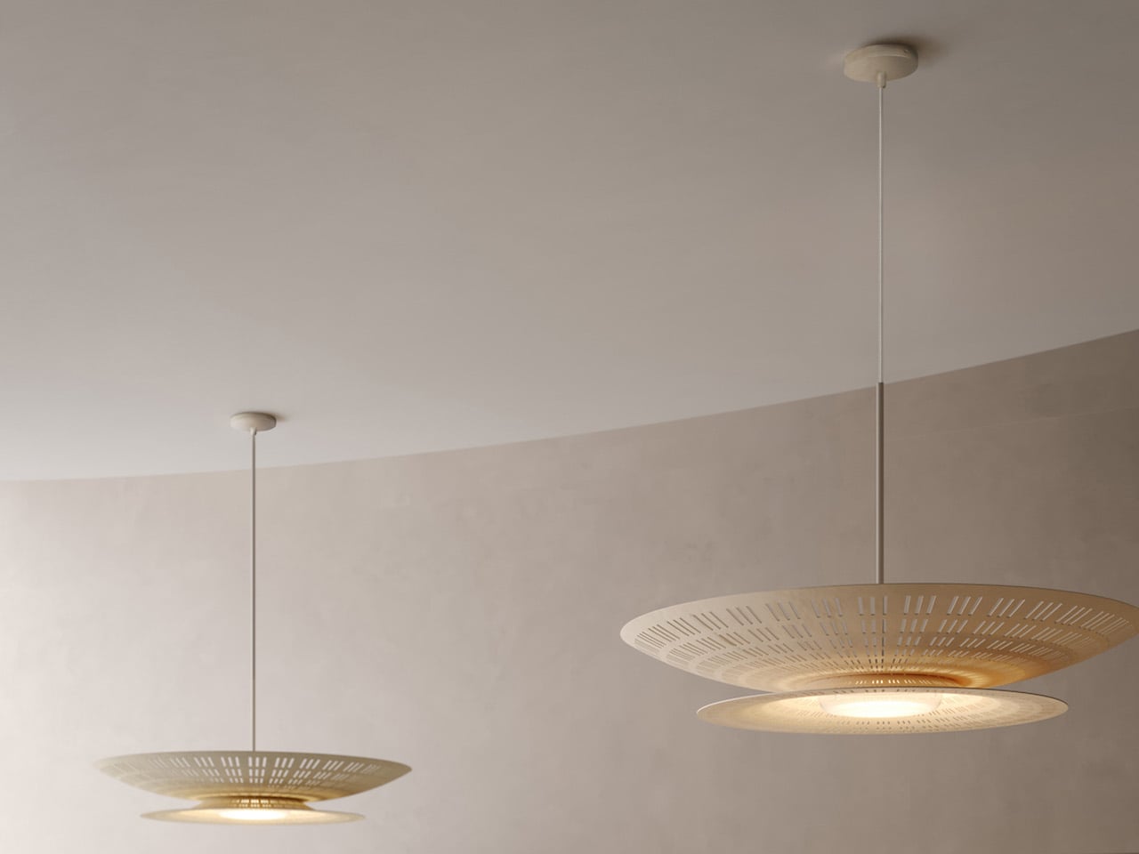
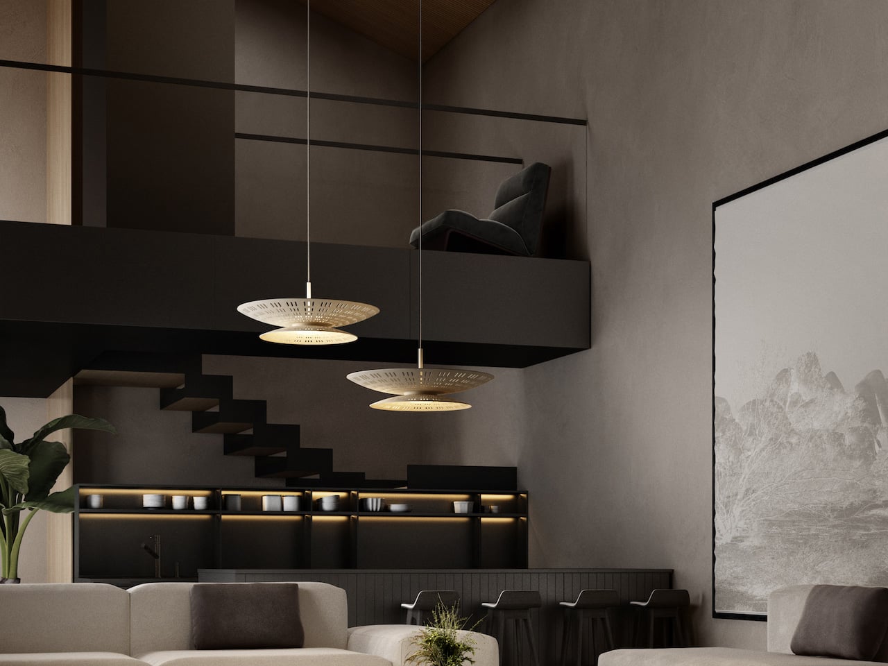
Lighting efficiency is supported by the use of high-performance LED modules that maintain consistent colour temperature and stable light intensity over time. The shade material is designed to transmit and reflect light effectively, ensuring minimal loss while preserving a warm tonal quality. The integrated structure reduces the need for additional ambient fixtures, making the lamp suitable as a primary light source in medium-sized spaces.

4. Power of Shadow

Good lighting design recognises that darkness plays just as important a role as illumination. Instead of flooding every corner with brightness, subtractive lighting uses restraint to highlight key architectural features while allowing other areas to remain calm and visually quiet. This balance of light and shadow adds depth, especially in double-height or open-plan spaces, where contrast helps define structure and scale.

Techniques such as narrow-beam spotlights and subtle floor-level washes guide movement and create visual pauses. As you move through the home, light reveals selected moments rather than everything at once. The result feels intentional and layered, turning everyday interiors into curated, gallery-like environments instead of uniformly lit, commercial-looking spaces.
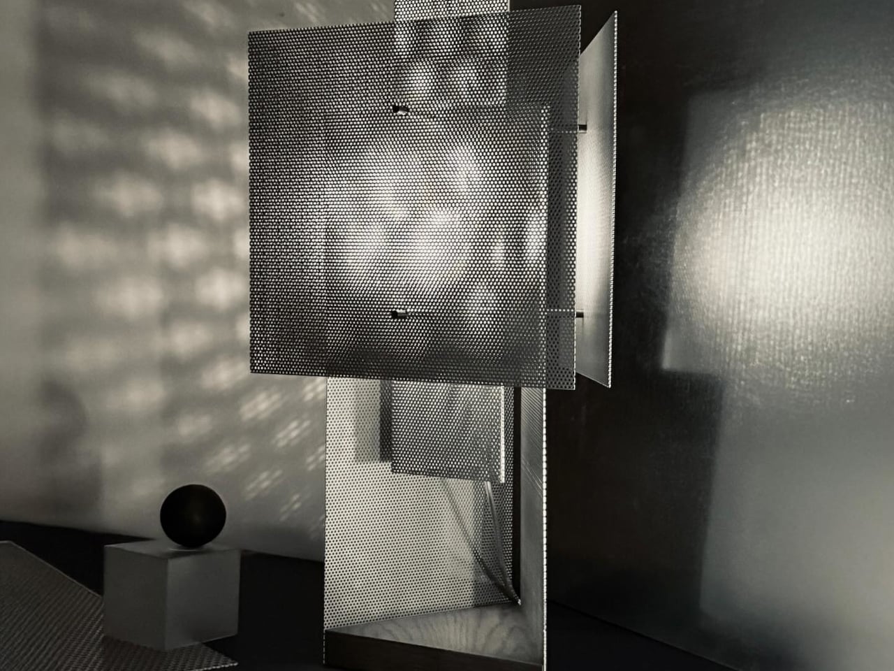
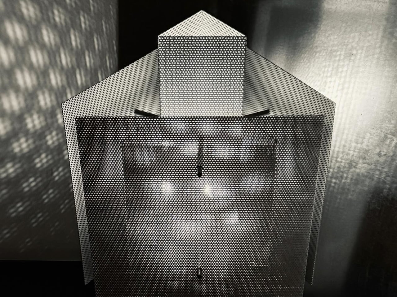
The Foreshadow Table Lamp is designed to transform direct illumination into patterned ambient light. Its perforated metal shade filters the light source into multiple fine beams, projecting structured shadows across nearby surfaces. This controlled diffusion adds visual depth while maintaining functional brightness for side tables, consoles, and accent lighting applications. The lighting effect varies depending on placement, surface finishes, and surrounding geometry, allowing the lamp to interact with its environment rather than delivering flat, uniform output.
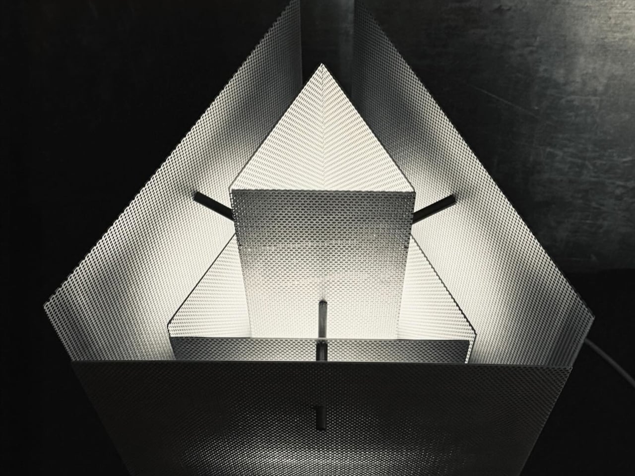
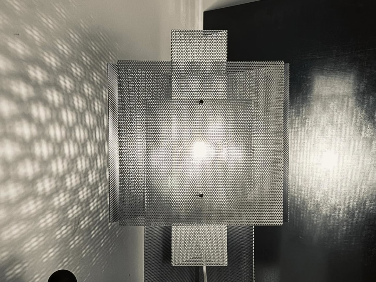
Construction focuses on durability and tactile quality. The metal shade features precision-punched perforations that regulate light distribution while maintaining structural rigidity. The matte finish reduces surface glare and complements both contemporary and transitional interiors. When switched off, the lamp retains a clean, sculptural profile, functioning as a decorative object even without illumination. Designed to operate as a lighting fixture and an ambient feature, the Foreshadow Table Lamp provides atmospheric enhancement while remaining practical for everyday use.

5. Colour and Comfort

Modern lighting is closely linked to energy efficiency and indoor comfort. Advanced LED systems release very little heat, helping reduce strain on cooling and ventilation systems while keeping rooms comfortable throughout the day. This makes lighting an active part of managing how a space performs, not just how it looks.

At the same time, colour temperature is used to influence how warm or cool a room feels. You can shift from soft, golden tones during colder months to cooler, moonlit hues in warmer seasons, subtly shaping your emotional and physical response to the space. By adjusting light colour, interiors feel more adaptable, balanced, and supportive of everyday well-being.
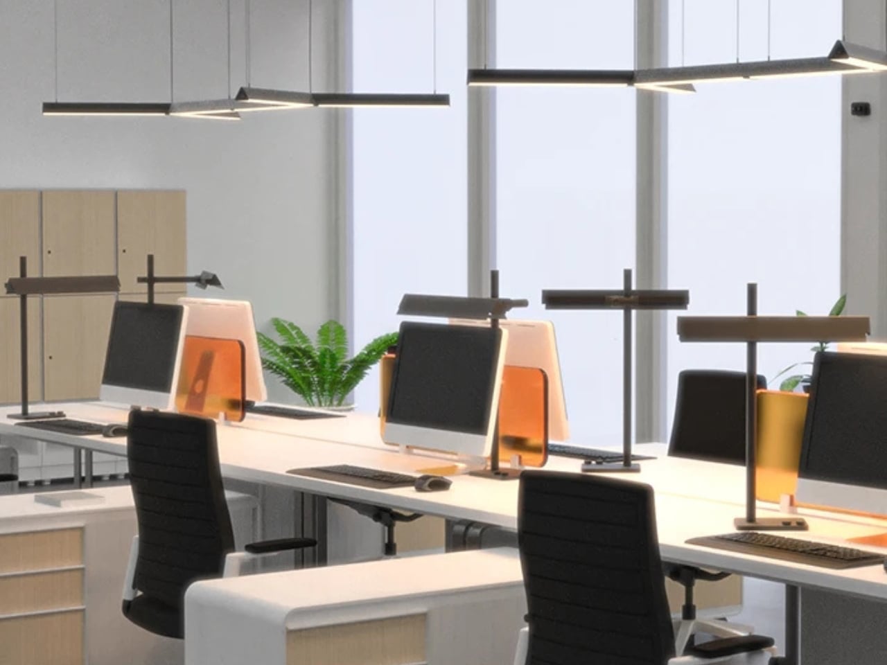
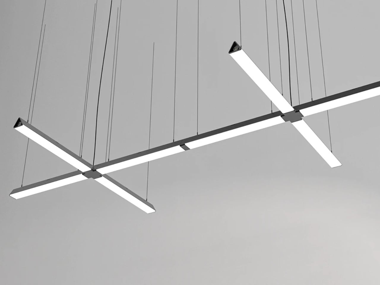
The Wipro EcoLumi Flex is a modular lighting concept designed to function as a table lamp and a suspended ceiling fixture. Its adjustable structure allows users to modify height and angle through a simple twist mechanism, ensuring precise light placement for different tasks. A slidable shade enables directional control and glare reduction, improving visual comfort during focused work. Multiple units can be connected using integrated joints and connectors, allowing customised lighting layouts for desks, workstations, or collaborative spaces.
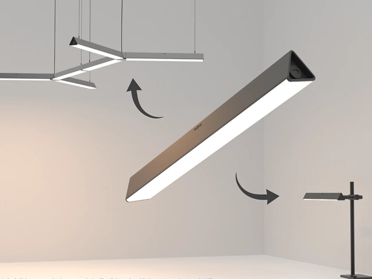
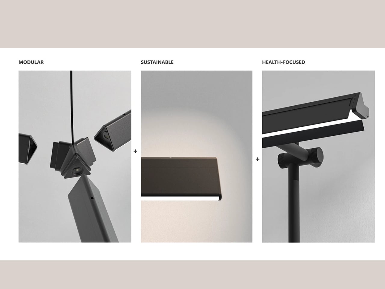
Lighting performance is enhanced through built-in circadian modes that automatically adjust brightness and colour temperature throughout the day. Warm tones support relaxed morning and evening use, while cooler light promotes alertness and productivity during peak work hours. The modular construction supports part replacement and future upgrades, reducing material waste and extending product lifespan.

Lighting is evolving into a true architectural philosophy in 2026, where atmosphere takes precedence over mere fixtures. Intelligent systems, sculptural forms, and sustainable materials work together to create spaces that are visually compelling.

The post 5 Smart Lighting Trends That Just Made Traditional Fixtures Look Outdated first appeared on Yanko Design.
This $350 Dyson Air Purifier Borrowed Tech From Jet Engines

There’s something oddly satisfying about watching a company completely reinvent its own playbook. Dyson has built its reputation on that bladeless Air Multiplier technology, the kind of innovation that made you stop and think, “Wait, how does that even work?” But with the HushJet Compact Purifier, the brand is taking a totally different approach, drawing inspiration from an unexpected source: jet engines.

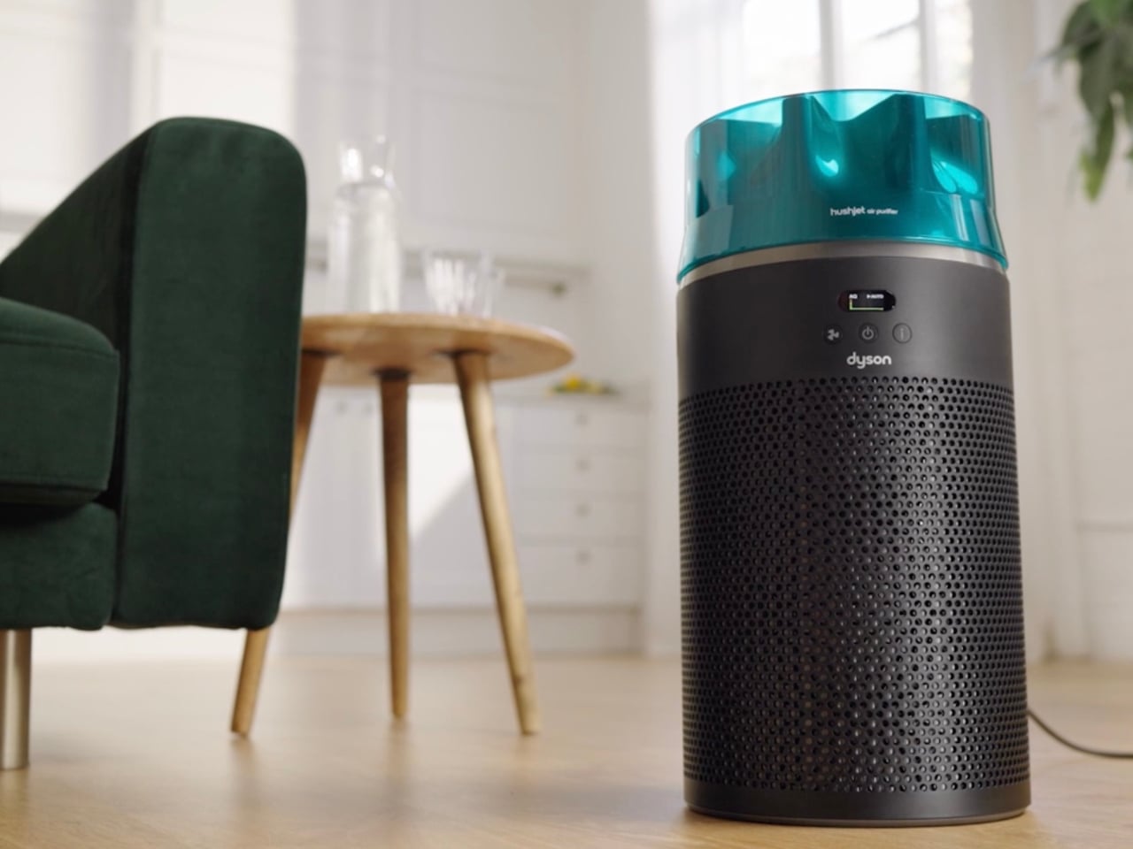
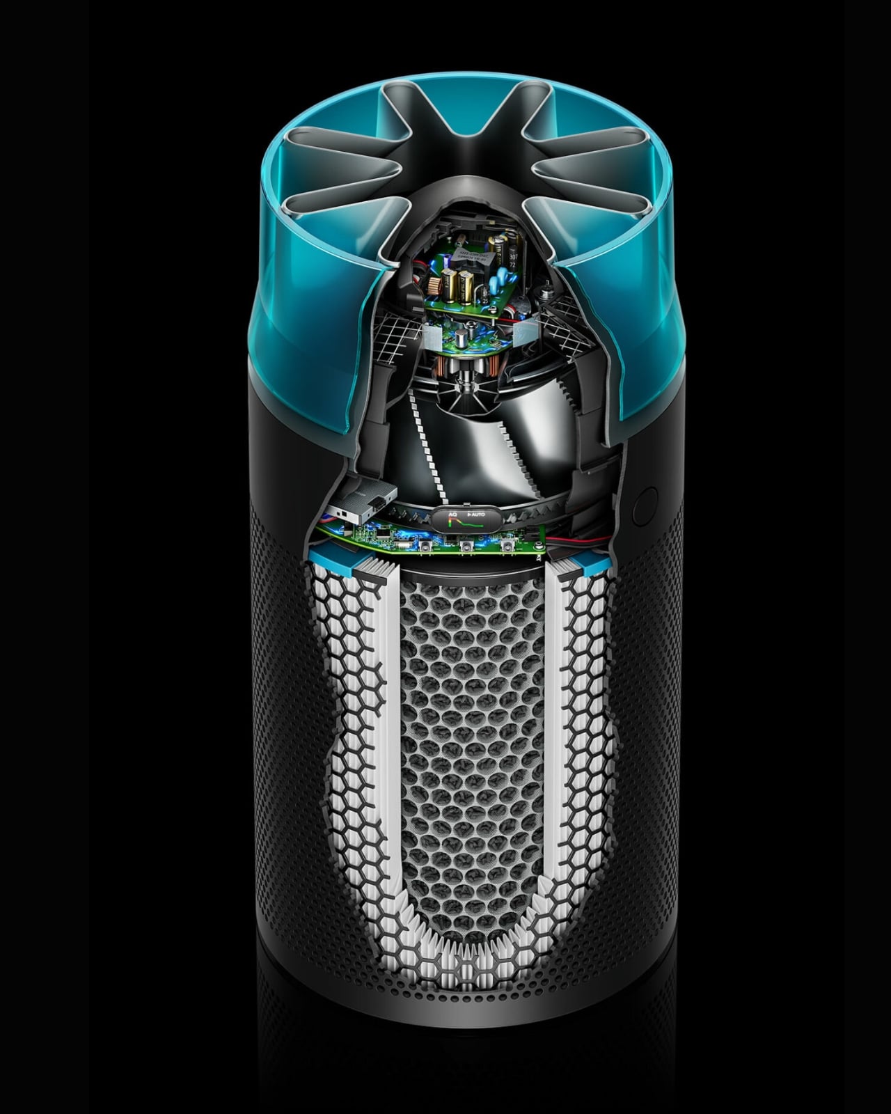
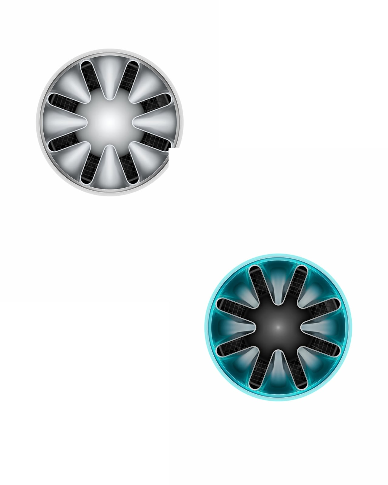
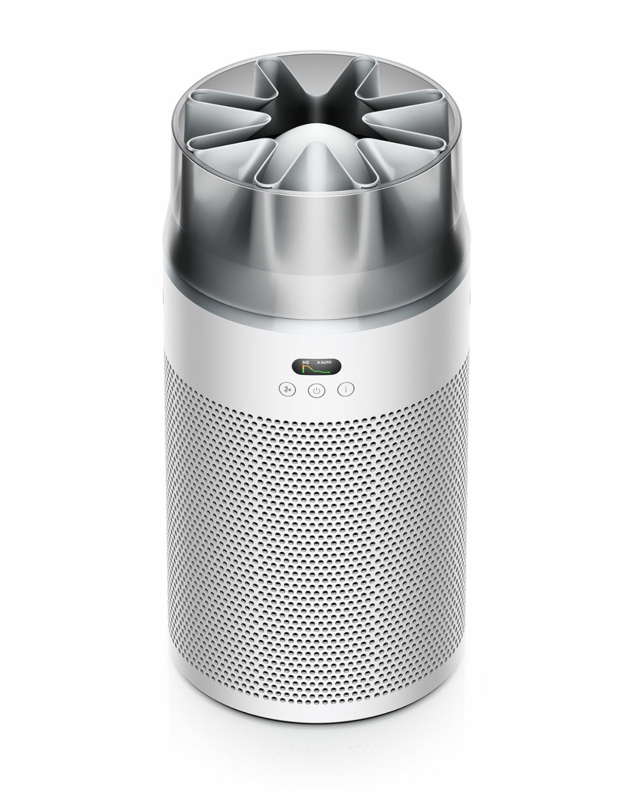
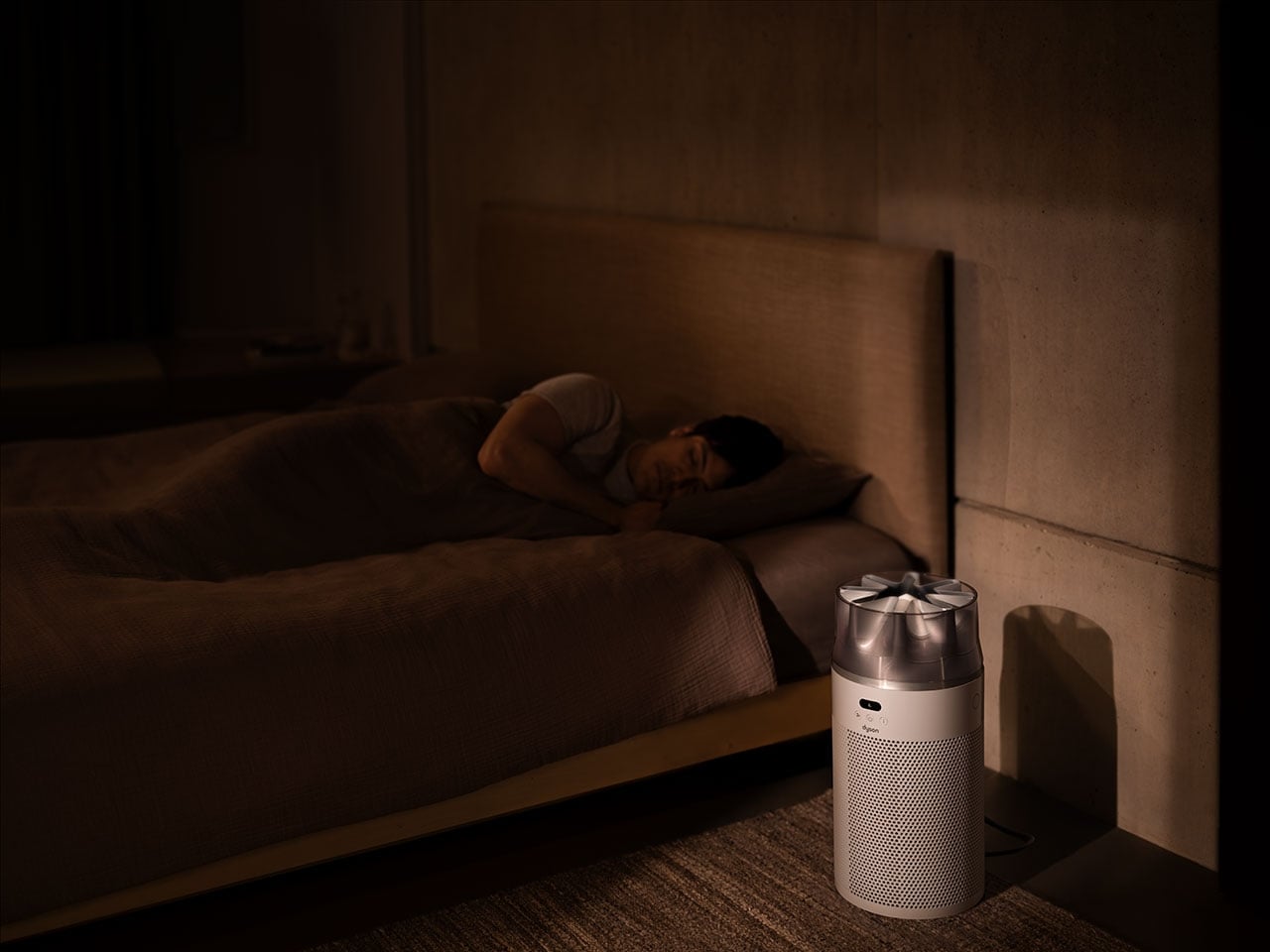
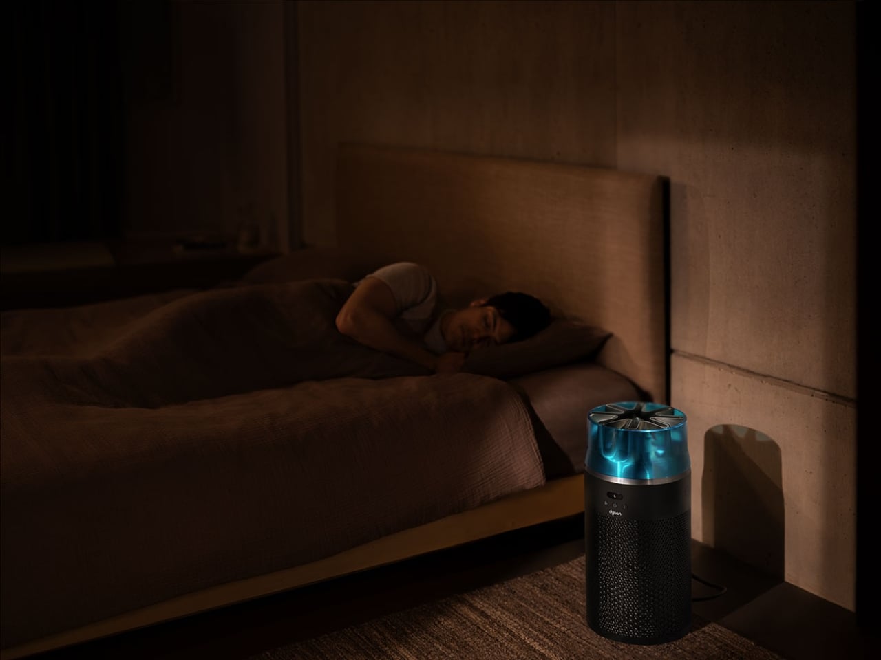
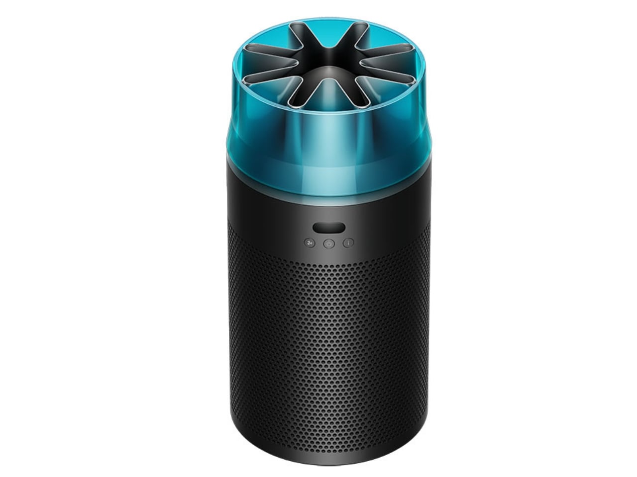
This little machine marks a departure from what we’ve come to expect from Dyson’s air purifiers. Instead of that signature circular opening, you get a star-shaped nozzle that looks like it belongs in an aerospace engineering lab. It’s not just for show, though. That unique design channels high-velocity airflow while keeping things whisper-quiet, hitting just 24 decibels in night mode. For context, that’s quieter than your average library and about the same volume as someone whispering sweet nothings into your ear.

Designer: Dyson

The HushJet measures 18.5 inches tall and just over 9 inches in diameter, weighing in at a manageable 7 pounds. It’s genuinely compact, the kind of appliance that can slip into a corner of your bedroom or perch on a kitchen counter without demanding attention. But don’t let the small footprint fool you. This purifier can handle rooms up to 203 square feet, making it perfectly suited for bedrooms, home offices, or cozy apartments.

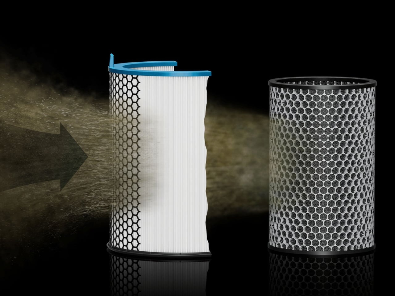
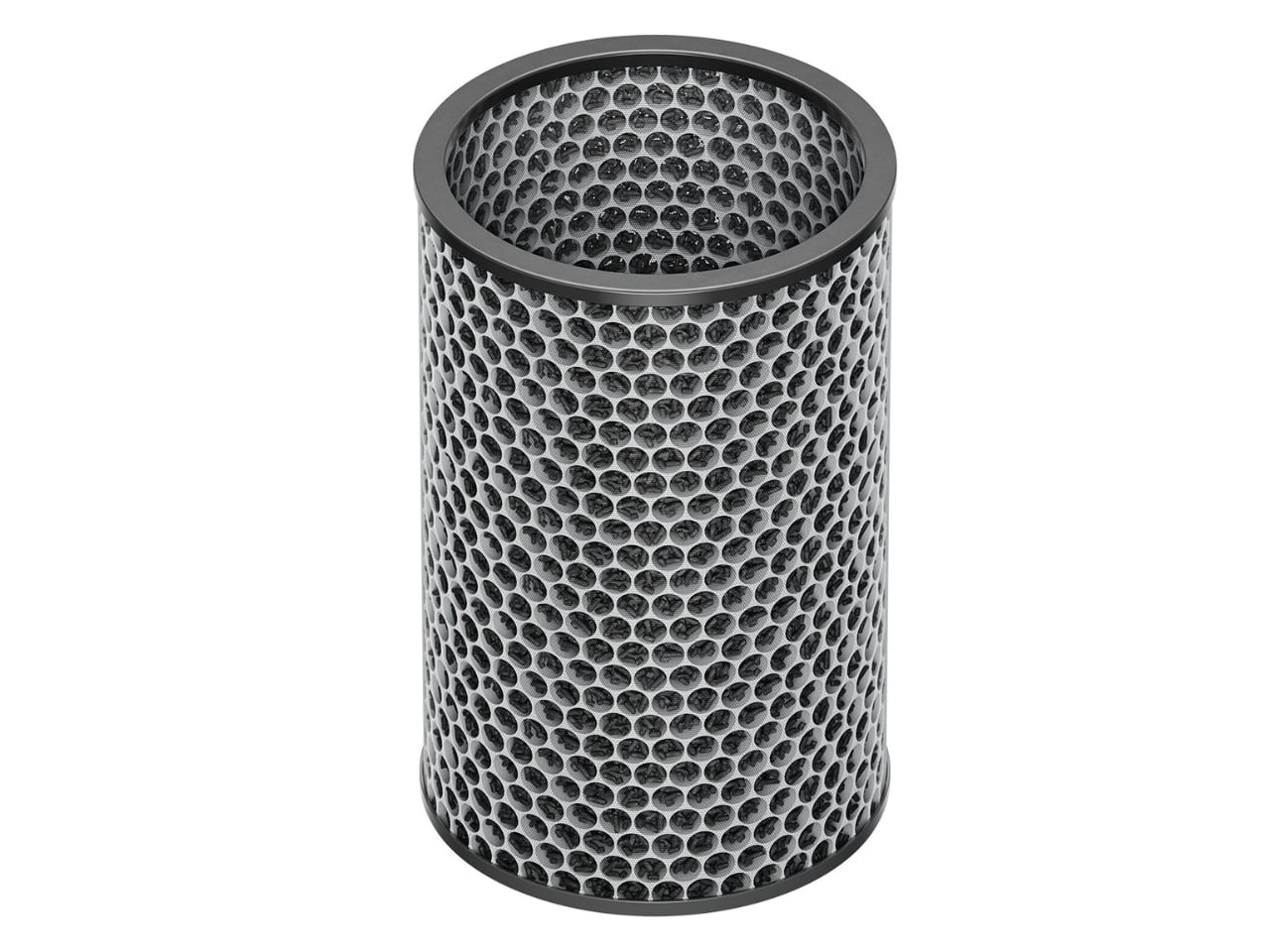
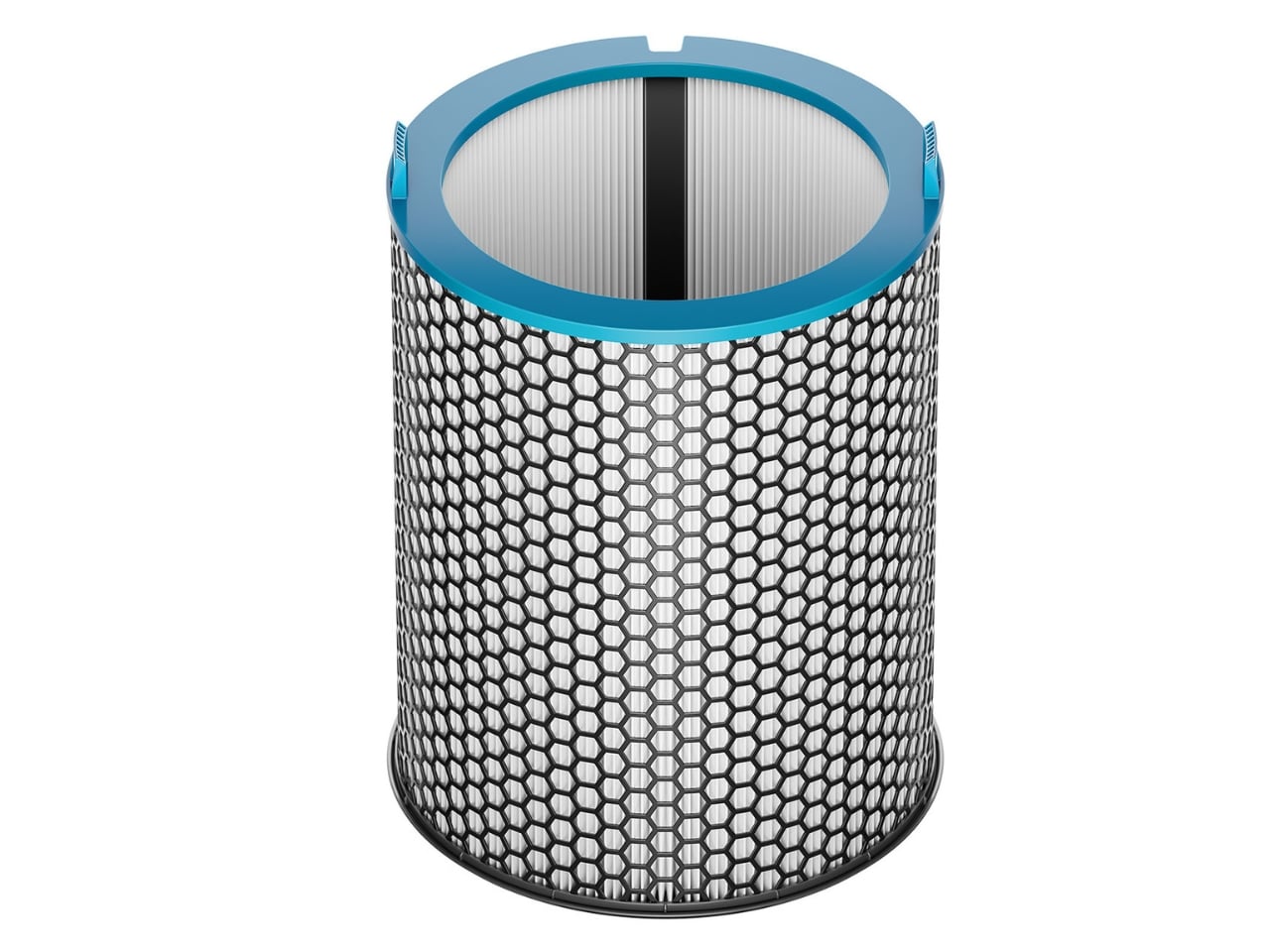
What really sets the HushJet apart is its new filtration system. The electrostatic filter captures 99.97% of particles as small as 0.3 microns, including the usual suspects like pollen, dust, and pet dander. If you’ve got pets at home, this matters more than you might think. Those microscopic skin cells and protein particles from Fluffy’s grooming sessions become airborne allergens, and the HushJet’s activated carbon layer tackles both the dander and the inevitable pet odors.

Here’s where things get interesting from a sustainability standpoint. The electrostatic filter lasts up to five years, which is five times longer than previous Dyson filters. That means fewer replacements, less waste, and one less thing to remember on your shopping list. The filter uses less material while being more energy efficient, a win across the board for anyone trying to lighten their environmental footprint.

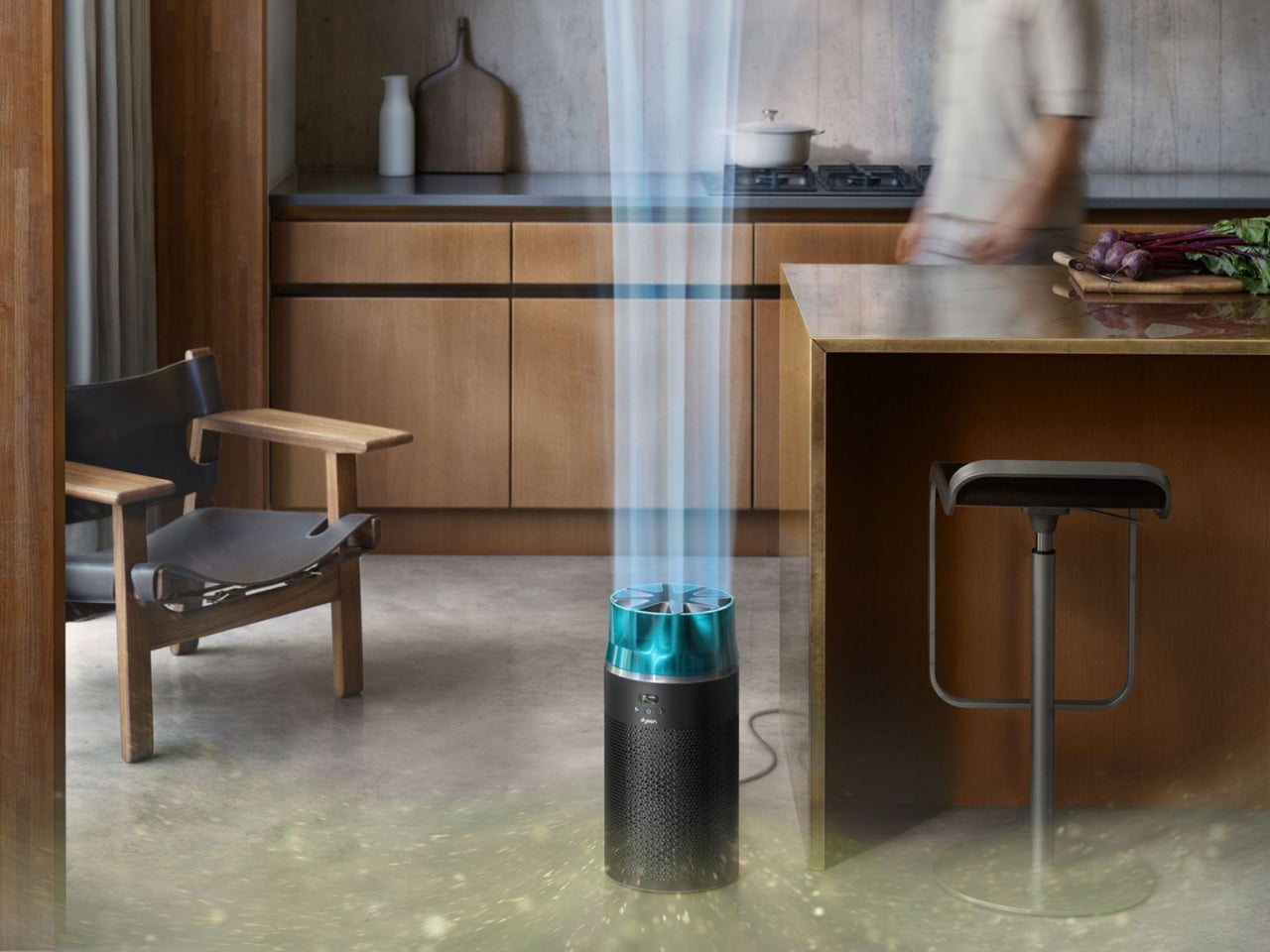
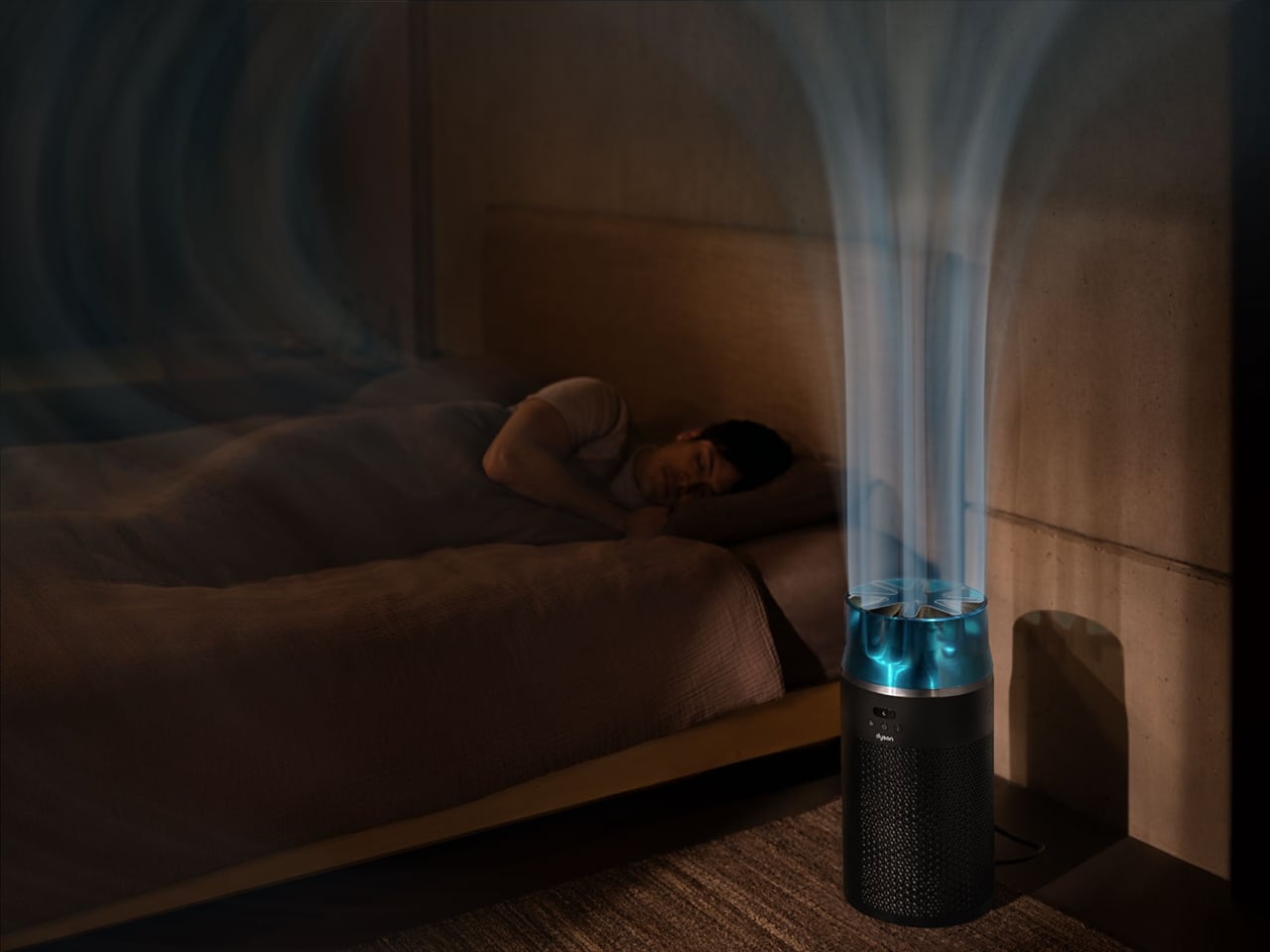
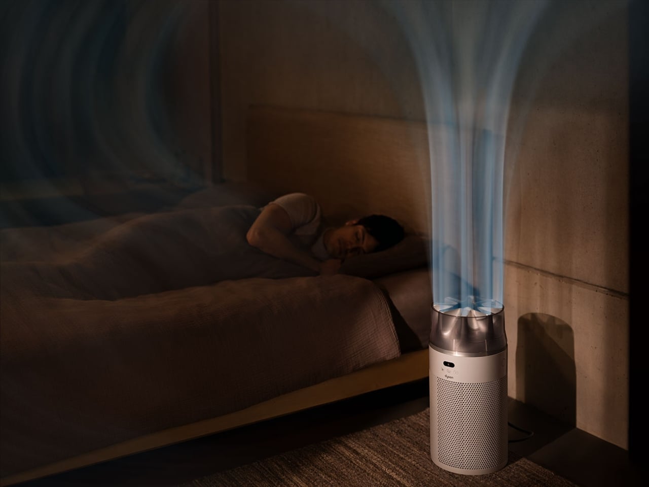
The technology powering this thing is genuinely clever. Dyson’s engineers borrowed aerodynamic principles from jet engines to create that focused stream of purified air. The star-shaped nozzle reduces turbulence and attenuates sound waves from the high-speed compressor, which is how they achieved that library-quiet operation. The whole system is fully sealed, meaning the nasty stuff it captures stays trapped inside rather than escaping back into your breathing space.

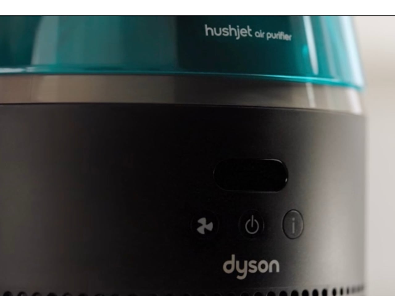
Smart features come standard. The built-in sensors monitor air quality in real time, automatically adjusting performance based on what’s floating around your room. You can also control everything through the MyDyson app, tweaking settings from your phone or setting schedules so the purifier runs only when you need it. That auto mode is particularly useful for energy efficiency, since the machine only kicks into gear when pollution levels actually warrant it.

The HushJet comes in two color options: Black/Teal and White/Silver. Both have that sleek, minimalist aesthetic Dyson is known for, the kind of design that doesn’t scream “appliance” but instead quietly complements your space. At $349.99, it sits at the higher end of the compact purifier market, though the combination of performance, filter longevity, and that jet-engine-inspired engineering might justify the price tag for air quality enthusiasts.

For anyone dealing with allergies, the HushJet makes a solid case for itself. By pulling pollen, dust, and other allergens out of circulation, it can help reduce those annoying symptoms like sniffles, scratchy throats, and itchy eyes that tend to worsen at night. Better air quality translates to better sleep, which is something most of us could use more of.

What Dyson has done here is take everything they learned from years of air purification technology and compress it into a surprisingly powerful package. The jet engine inspiration isn’t just a marketing gimmick. It’s a fundamental rethinking of how to move air efficiently and quietly in a small space. Whether you’re sensitive to noise, short on square footage, or just appreciate clever engineering, the HushJet Compact Purifier delivers on its promise to be small but mighty.

The post This $350 Dyson Air Purifier Borrowed Tech From Jet Engines first appeared on Yanko Design.
5 Interior Design Trends That Just Made Minimalism Obsolete in 2026

Architects today see the home as more than just a place to live. It is now understood as a space that affects how people think, feel, and live each day. By 2026, the field has clearly moved away from cold, uniform minimalism. Instead, design choices such as color, shape, and proportion are made with clear intent, helping to create spaces that support everyday life.

Many leading firms now describe the human-centered home as a biophilic cocoon. This means using honest materials along with natural light, balanced proportions, and thoughtful forms. Let’s decode how the goal is to create homes that do not just look well-designed but feel comfortable and meaningful, supporting emotional well-being rather than focusing only on appearance.

1. Bold Color Authority

In 2026, color is no longer decorative; it is treated as a structural design tool. Designers are increasingly using deep, confident shades such as rich pinks and earthy ochres to give spaces character and visual weight. These strong palettes help anchor interiors, making homes feel intentional, expressive, and memorable rather than neutral or generic.

Such colors also offer clear psychological value. They create a sense of stability, warmth, and emotional comfort, adding long-term value to a space. When applied to key architectural elements—like columns, niches, or feature walls—bold colors guide movement and define zones within the home, bringing clarity and purpose to the overall spatial experience.

The Landr dining and conference table is engineered with a singular focus on strength, stability, and visual clarity. Designed to eliminate wobble, it offers a firm, unmoving surface suited for everyday use as well as more demanding tasks. Its modular construction is precise and robust, ensuring easy assembly without compromising structural integrity. The steel frame and intelligently engineered leg geometry distribute weight evenly, allowing the table to remain steady under pressure while maintaining a clean, confident presence in any setting.

What sets Landr apart visually is its bold use of bright, contemporary color finishes applied through durable powder coating. These vivid tones enhance the table’s architectural form while adding energy and character to interiors that favor modern expression. Paired with tabletop options in ceramic, wood, or glass, the bright steel frame becomes a statement feature rather than a background element. Functional, expressive, and long-lasting, the Landr table balances performance with color-forward design.

2. Softened Minimal Geometry

Design has clearly shifted away from dramatic, exaggerated curves toward calm and disciplined forms. Instead of flamboyant sculptural shapes, architects now employ gentle arcs and controlled radii to soften the rigid edges of contemporary construction. Curved thresholds, joinery, and soffits introduce refinement while maintaining visual restraint.

At the center of this 2026 approach is improved spatial flow and comfort. Features such as double-height glazing framed by softly curved soffits guide the eye smoothly through the interior. This reduces the visual tension of strict rectilinear layouts, enhances the movement of diffused light, and creates spaces that feel balanced, composed, and naturally welcoming.

Whispers of the Wildwood is a contemporary wicker collection by Hyderabad-based design studio The Wicker Story, led by designer Priyanka Narula. Rooted in traditional Indian weaving techniques, the collection reinterprets wicker through a modern, sculptural lens. Drawing inspiration from natural landscapes such as forest canopies, flowing paths, and organic growth patterns, the pieces move beyond conventional furniture typologies to become refined design objects that balance function with artistic expression.

The collection is defined by fluid forms, intricate textures, and a restrained material palette that allows the natural warmth of wicker to take center stage. Designs such as the Pagdandi wall unit exemplify this approach, translating the irregular rhythm of nature into woven structures with visual lightness and depth. Research-driven and craft-focused, Whispers of the Wildwood demonstrates how traditional materials can evolve into sophisticated, contemporary forms while retaining their tactile and cultural authenticity.

3. Human-Centered Spatial Core

Spatial planning is being redefined to place human experience above rigid, formal layouts. At the center of this approach is performance-driven comfort. Successful floor plans now prioritize acoustic privacy and thermal efficiency, recognizing that true luxury lies in how well a space responds to the human body.

Homes are designed to adapt to daily rhythms, offering quiet, comfort, and environmental balance rather than relying solely on visual order.

The planning strategy showed in this Warehouse Space transforms a conventional 2,500-square-foot warehouse into a carefully choreographed spatial sequence. Rather than relying on fixed walls, the layout is organized through visual cues, circulation paths, and deliberate zoning. Each area unfolds gradually, encouraging movement and discovery while maintaining spatial continuity. Color transitions, curved architectural elements, and material changes are used as planning tools to define functions without fragmenting the open volume.

This approach allows the space to function as a cohesive whole while accommodating varied uses. Active zones are positioned to feel dynamic and engaging, while quieter areas are subtly set apart through restrained finishes and controlled visual breaks. Repeating motifs and aligned sightlines guide users intuitively, reinforcing orientation and flow. The planning balances structure with flexibility, ensuring clarity without rigidity. Through thoughtful sequencing and layered spatial relationships, the design demonstrates how strategic planning can redefine an industrial shell into an immersive, purpose-driven environment.

4. Raw Material Honesty

Design is witnessing a clear return to materials that express their true nature, moving away from artificial and imitation finishes. Elements such as hand-worked metal, lime-wash plaster, and natural stone are valued for the stories they carry and the sensory richness they offer. These materials bring depth, texture, and authenticity to interior spaces.

This approach also supports sustainability and longevity. Using materials in their natural or minimally processed state reduces manufacturing impact and improves durability over time. The tactile experience such as the feel of a raw timber handrail, adds a layer of quiet luxury, reflecting a growing preference for honest, lasting materials over polished superficiality.

Stone coffee tables are often conceived as heavy, monolithic objects defined by mass rather than refinement. The Coffee Table and Side Table by Tom Black adopt a more considered approach, treating Italian travertine as a material to be carved, balanced, and visually lightened. A single curved gesture defines both pieces, creating an impression of elevation, while a contrasting brushed metal inlay introduces intentional voids within the stone. This dialogue between solid and negative space reframes stone as something sculptural rather than purely structural.

The Coffee Table features a softly curved underside that lifts the form from the floor, paired with a recessed metal-lined trough on the surface that mirrors this curvature. The Side Table translates the same language into a more vertical composition, combining a curved travertine element with a rectilinear base. Together, the two pieces function as architectural furniture, unified by material, proportion, and a restrained yet expressive formal clarity.

5. Built – Landscape Dialogue

Design is increasingly dissolving the boundary between inside and outside. Architects are creating transitional spaces such as semi-covered verandas, internal courtyards, glass walls and shaded thresholds that allow the landscape to flow into the heart of the home. These zones soften the built form and create a natural connection with light, air, and greenery.

Beyond aesthetics, design now focuses on lived experience—how materials, light, and climate affect comfort and emotion. The emphasis has shifted from glossy surfaces to meaningful, biophilic spaces that reduce environmental impact while supporting mental, emotional, and spiritual well-being.

Waterbridge House is conceived as a seamless extension of its natural setting, balancing architectural clarity with a strong indoor–outdoor connection. Set among the pine trees of Pebble Beach, the glass-dominated structure appears to hover above the landscape, defined by clean lines and a restrained material palette. Influenced by Japandi principles, the design blends Japanese serenity with Scandinavian simplicity, resulting in spaces that feel calm, light-filled, and closely attuned to their surroundings.

A defining planning element is the glass corridor that bridges a reflective pool, acting as both an entry sequence and a spatial pause. This transparent link connects two distinct wings: one dedicated to open-plan living and social interaction, the other organized around privacy with bedrooms and quiet retreats. Expansive glazing, sliding walls, and layered decks dissolve boundaries between interior and exterior, allowing light, water, and forest views to shape everyday experience.

Interior design now reflects a deeper focus on authenticity and human connection. Through confident color, softened geometry, and people-first planning, spaces move beyond decoration toward meaning. The true measure of architecture lies in its ability to create calm, light-filled sanctuaries that support emotional well-being while remaining visually refined and environmentally responsible.

The post 5 Interior Design Trends That Just Made Minimalism Obsolete in 2026 first appeared on Yanko Design.
Louis Vuitton’s Beijing Flagship Turns Retail Into a Vertical, Immersive Journey

Retail and hospitality design is one of those rare territories where architecture gets to perform on multiple levels at once. It is not just about function or spectacle, but about storytelling, how materials, light, circulation, and atmosphere come together to momentarily detach visitors from the outside world and immerse them in a carefully choreographed experience. The newly opened Maison Louis Vuitton Sanlitun in Beijing is a compelling example of this ambition realized at an urban scale.

Designed by Jun Aoki for Louis Vuitton, the flagship is located in Beijing’s energetic Sanlitun district. The building brings together retail, hospitality, and exhibition spaces within a single vertically organized envelope, offering an experience that unfolds floor by floor rather than spreading outward. In doing so, it rethinks what a luxury flagship can be in one of the city’s most intense commercial neighborhoods.

Designer: Jun Aoki & Associates

The project continues Jun Aoki’s long-standing collaboration with the House, following earlier Louis Vuitton buildings in Tokyo and Osaka. In Beijing, however, his approach feels particularly attuned to context. Rather than competing with Sanlitun’s visual noise, the building introduces a sense of material depth and calibrated transparency. The architecture does not shout; it subtly absorbs and refracts the city around it.

The most striking element is the facade. Drawing inspiration from Taihu stones, scholars’ rocks historically associated with classical Chinese gardens, Aoki translates their eroded, organic character into an outer skin of hand-curved glass panels. Each panel is individually shaped, creating irregular contours and a layered surface that reads differently as daylight shifts. The glass possesses translucent and dichroic qualities, producing chromatic changes that respond to sun angle, weather, and movement. From close range, the facade feels tactile and sculptural; from across the block, reflections stretch and compress, giving the building a constantly changing presence.

Behind this expressive outer layer sits a secondary envelope that handles thermal performance and weather protection. This dual-skin strategy allows the facade to operate simultaneously as cultural reference, environmental filter, and urban interface, an architectural device that balances symbolism with performance.

Inside, visitors enter directly into a central atrium that rises through three levels and organizes the Women’s collections. Daylight filters through the glass facade into this vertical void, animating floors, balustrades, and circulation cores. Retail programs are distributed across four levels, housing Women’s and Men’s Leather Goods, Ready-To-Wear, Shoes, Jewelry, Accessories, Perfumes, and Beauty. Movement remains clear and legible, with escalators and stairs positioned to preserve long sightlines through the atrium and back toward the city. More private client lounges are tucked into quieter zones, defined through subtle shifts in material and lighting rather than overt separation.

A distinct tonal shift occurs on the third floor, where the Louis Vuitton Home collection is presented. Furniture, textiles, and tableware by designers such as Patricia Urquiola and Cristian Mohaded are displayed in rooms scaled closer to domestic interiors, with softer finishes and calmer light, allowing the objects to breathe.

At the top, Le Café Louis Vuitton crowns the building, the brand’s first café in Beijing. Arrival begins with a mirrored vestibule that multiplies reflections before opening into a flowing dining space. The bar references the proportions and layered construction of Louis Vuitton trunks, while a terrace runs along the facade, partially screened by the glass skin and offering views across Sanlitun and the surrounding city.

By combining retail and hospitality within a single architectural envelope, Maison Louis Vuitton Sanlitun demonstrates how experiential design can transcend shopping alone. Through material storytelling, spatial sequencing, and a sensitive response to context, the building creates an immersive world, one that briefly pulls visitors away from Beijing’s relentless pace and invites them into a more deliberate, crafted experience.

The post Louis Vuitton’s Beijing Flagship Turns Retail Into a Vertical, Immersive Journey first appeared on Yanko Design.
Balmuda Just Made the Humidifier You’ll Actually Display

Let’s be honest: most humidifiers are not so visually pleasant. They’re the appliances we hide in corners, tuck behind furniture, or banish to the bedroom where guests won’t see them. But what if a humidifier was so stunning you’d actually want to show it off? Enter the Balmuda Rain, a Japanese design marvel that’s making us completely rethink what a functional appliance can look like.

The moment you see the Balmuda Rain, you know something’s different. Standing at just over 14 inches tall with a perfectly square footprint, this humidifier looks more like a sculptural vase than a household appliance. And that’s entirely intentional. The Japanese design company Balmuda has built its reputation on transforming everyday objects into things of beauty, and with the Rain, they’ve truly outdone themselves.

Designer: Balmuda

But here’s where it gets really interesting. Most humidifiers make you wrestle with a detachable tank, carrying it back and forth to the sink, water dripping everywhere. The Rain throws that entire concept out the window. Instead, it features a revolutionary tankless design. You simply pour water directly into the top, like you’re filling a vase with fresh flowers. It’s such an elegant solution that you’ll wonder why no one thought of it sooner. The 5-liter capacity means you’re not constantly refilling it, and a subtle LED display lets you know when it’s running low.

Now, before you think this is all style and no substance, let me tell you about what’s happening inside this beauty. The Rain isn’t just humidifying your air; it’s actually purifying it too. A multi-layer filtration system works quietly in the background, with an enzyme pre-filter that captures dust and viruses, plus a silver ion cartridge for antibacterial protection. It uses natural evaporation technology rather than ultrasonic misting, which means no white dust settling on your furniture and a much more energy-efficient operation.

The performance is genuinely impressive. With five adjustable levels, the Rain can push out up to 600 ml of moisture per hour, easily handling rooms up to 28 square meters. There’s an automatic mode that maintains ideal humidity levels between 40 and 60 percent, which is exactly where you want to be for healthy skin and respiratory comfort. In testing, it took just 30 minutes to bring a dry 40-square-meter room from 35% to a comfortable 50% humidity.

The interface is beautifully simple. A circular control ring lets you adjust settings, and you can customize everything from display brightness to speaker volume. There’s even a child safety lock for households with curious little ones. The display automatically dims when you’re not using it, so it won’t light up your bedroom at night. Maintenance is surprisingly easy too. The main filter gets cleaned with warm water and household items like citric acid and baking soda. The enzyme pre-filter just needs a quick vacuum, and the silver ion cartridge rinses under running water. No complicated procedures or expensive replacement parts to track down.

Here’s the thing about the Balmuda Rain: it represents a shift in how we think about the objects in our homes. We’re moving past the era of purely utilitarian appliances that we tolerate because we need them. Instead, we’re seeing a new generation of products that refuse to compromise, offering both exceptional functionality and genuine aesthetic value. Yes, the Rain comes with a premium price tag. But for design enthusiasts, tech lovers, and anyone who believes their space should reflect their taste, it’s an investment in daily delight. This is an object you’ll use every winter and still appreciate five years from now. It won’t feel dated or look tired because good design is timeless. The Balmuda Rain proves that we don’t have to choose between form and function. We can have both, elegantly integrated into one beautiful package. And honestly? That’s exactly what our homes deserve.

The post Balmuda Just Made the Humidifier You’ll Actually Display first appeared on Yanko Design.
5 Home Gym Products That Actually Replace Your Gym Membership

When life moves fast, carving out time for your health often feels impossible. Most of us have faced the struggle racing through traffic to reach a crowded gym, only to see motivation fade. However, wellness does not have to be another task as it can become part of your home. Imagine a space crafted just for you where there is no commute, no distractions, no waiting.

Your home can transform into a personal sanctuary where movement and self-care are effortless. Creating a home gym is not just about equipment but about embracing a lifestyle that prioritizes convenience, consistency, and self-empowerment. Here is how investing in a home gym makes health an integral and non-negotiable part of your day.

1. Convenience at Home

Adding a home gym turns it into the most convenient workout space imaginable. No more rushed mornings trying to fit in exercise before work, and no more long commutes to crowded gyms. Now, your fitness journey can start the moment you step out of bed, making consistency effortless and freeing you from daily scheduling stress.

With this level of accessibility, sticking to your routine becomes natural,nwhether it’s a quick 15-minute stretch or a full-strength session. This freedom transforms exercise from an obligation into a choice, fostering a more positive and motivating connection to fitness.

Leg day has a notorious reputation, the workout everyone loves to hate. The thought of squats, presses, and calf raises can make anyone hesitate before starting. The RitFit Gazelle Pro 3-In-1 Leg Press and Hack Squat Machine changes that. Its compact, smart design turns leg day into a manageable, even motivating challenge. With a high-tensile steel frame, adjustable diamond-plated footplate, and thick anti-slip cushions, it balances performance with comfort, helping you push through lower-body workouts without unnecessary strain.

The 3-in-1 functionality seamlessly blends leg presses, hack squats, and calf raises, with quick pin adjustments for smooth transitions. Thoughtful features like contoured shoulder rests, stable handrails, and a 2,000-pound weight capacity prioritize safety and support. Durable, versatile, and efficient, the Gazelle Pro adapts to every fitness level. While leg day may never be your favorite, this machine makes it far less intimidating, empowering you to train effectively and confidently in the comfort of your own home.

2. Tailored for Personal Needs

One of the greatest perks of a home gym is the freedom to design it entirely around your needs. Unlike a commercial gym with standard equipment and preset classes, your space can reflect your unique fitness goals. Whether you love yoga, weightlifting, or high-intensity interval training, you can select the tools and setups that truly support your routine.

This customization goes beyond equipment as it extends to the entire atmosphere. Want to play your favorite podcast? Prefer soft lighting for a focused yoga session? You control it all, creating a space that motivates, inspires, and makes every workout feel personal and empowering.

Home gyms have always offered convenience and privacy, but often lacked guidance and motivation. The AEKE K1 Smart Home Gym changes that by bringing artificial intelligence into your workouts. With motion tracking, personalized plans, and real-time feedback, it acts like a virtual personal trainer, ensuring every rep is effective and safe. The AI tracks 17 key points on your body, provides adjustments on form, and adapts workouts as you progress. With over 280 movements and 140+ classes, it covers strength training, cardio, Pilates, yoga, and more, making home workouts diverse and engaging.

The system’s attachments use electromagnetic resistance to simulate up to 220 lbs, while Smart Grips and Spotter Mode enhance safety and efficiency. A 43-inch 4K touchscreen delivers immersive guidance, while motion-sensing games and multi-user options add fun for family or friends. Compact, award-winning, and subscription-free, the AEKE K1 blends advanced technology with user-friendly design, making high-quality, personalized workouts accessible to everyone at home.

3. Allows Privacy and Comfort

For many, exercising in public can feel intimidating. Being around others, facing constant comparison, and lacking personal space often discourages people from even starting their fitness journey. A home gym solves this by providing a private, safe, and judgment-free environment where you can focus solely on yourself.

This privacy creates the perfect space to concentrate on form, track progress, and try new exercises without distraction. You can explore different workouts, push your limits, and experiment freely. Feeling comfortable and confident in your own space can unlock your potential and nurture a lasting, positive relationship with fitness.

Boom, designed by Shuxian Hong, brings the boxing experience into your home, combining a punching bag, smart speaker, and interactive illumination. The system creates an immersive, adrenaline-fueled workout without leaving your living space. Boxing is a powerful cardio exercise, supporting heart health, weight management, and overall fitness. Hong discovered that even those who own home boxing bags rarely use them, as the gym environment provides the excitement and energy often missing at home. Boom solves this by making workouts fun, engaging, and interactive.

Measuring 68 inches and filled with high-density foam, Boom features an LED-illuminated bag, electronic pressure sensor, and weighted base with suction cups for stability. The Smart Coach app creates personalized routines, tracks progress, and adapts to the user. When not in use, Boom functions as a stylish home speaker, harmoniously blending technology, fitness, and modern design, making exercise both effective and enjoyable.

4. Smart and Sustainable Investment for Your Health

Although the initial cost of a home gym may feel high, it’s a smart long-term investment. Think about the ongoing expenses of monthly gym memberships, commuting costs, and frequent workout gear. Over time, these add up, whereas a home gym is a one-time setup that delivers lasting value and convenience.

Beyond finances, it’s an investment in your physical and mental well-being. By creating a permanent, accessible space for health, you prioritize self-care sustainably. This approach benefits both your body and wallet, making fitness a consistent, enjoyable, and protected part of your life and all from home.

Modern systems combine exercise equipment with motion-tracking cameras that provide real-time feedback on posture, reps, and form to remote trainers. This technology allows users to receive expert coaching in the comfort and safety of their own homes, fueling a surge in virtual trainer memberships while traditional gym attendance declined.

The Tempo Move builds on this concept, offering a compact, stylish home gym that doubles as elegant furniture. Its fabric-clad metal body conceals 16 weight plates, 4 collars, 2 dumbbells, and a heart-rate monitor within a neat cabinet. An iPhone dock and HDMI connection let users stream guided workouts on a TV with real-time coaching. Unlike bulky gym equipment, Tempo Move blends seamlessly into living spaces, providing convenience, functionality, and aesthetic appeal. With its smooth, accessible storage and elegant design, it makes exercising at home simple, stylish, and efficient.

5. Enhances Your Well-being

The advantages of a home gym go beyond physical fitness, positively impacting your overall well-being and household harmony. A dedicated workout space helps reduce stress, improve sleep, and boost daily energy, providing a healthy outlet that supports a balanced, centered lifestyle.

Additionally, it sets a positive example for your family, fostering a culture of health and wellness at home. By creating a space that can be shared, fitness becomes a fun, engaging activity for everyone. Integrating wellness into your home design not only builds a gym but cultivates a vibrant, healthier life for you and your loved ones.

Hi Moon features a sleek, open circular design that complements modern home interiors while keeping fitness equipment unobtrusive. With more people working out at home, free weights and gear often clutter living spaces, piling up in corners or on furniture. Feier Design Studio reimagined the traditional kettlebell with Hi Moon, giving it the appearance of a modern vase or ceramic artwork. It can sit seamlessly on a windowsill, beside a small bouquet, or integrated into a home gym setup without disrupting the décor. Available in muted shades of coral-green, cloud grey, and peach-orange, Hi Moon adapts to a variety of design schemes, making it functional and stylish.

The kettlebell’s circular, open form and gritty texture provide a secure grip and enhanced comfort during exercises. Unlike traditional bulky kettlebells with triangular handles, Hi Moon allows versatile grip positions for different workouts. By combining practicality with an elegant, inconspicuous design, Hi Moon transforms home fitness into a visually pleasing, seamless part of living spaces.

Creating a home gym transforms your lifestyle, blending health, convenience, and personalization. It empowers you to make fitness a seamless, enjoyable part of daily life. By designing a space that is functional and inspiring, you invest in your well-being, turning movement into a habit and supporting your journey toward a healthier, happier, and more intentional life.

The post 5 Home Gym Products That Actually Replace Your Gym Membership first appeared on Yanko Design.
Concrete Furniture Just Got Soft: 5 Designs That Feel Like Art

Brutalism once suggested stark, monumental forms, with raw concrete presented in uncompromising honesty. Today, that legacy is evolving into a softer interior design language: Soft Brutalism. Rather than a contradiction, it becomes a thoughtful fusion where concrete is shaped into gentler, more human-centered forms. This shift responds to a culture saturated with disposable design and offers a return to authenticity, weight, and permanence.

Design studios increasingly agree that real luxury now lies in longevity and the tactile bond between people and material. Soft Brutalism embraces concrete’s structural clarity while softening its presence through refined casting, subtle tones, and smooth contours, transforming a once cold material into a warm, grounding element in contemporary spaces.

1. Texture As Poetic Expression

Soft Brutalism reimagines the concrete surface as a sensory landscape. Instead of the coarse, exposed finishes of classic Brutalism, this approach introduces a gentler, more tactile vocabulary. Ultra-high-performance concrete and advanced admixtures allow surfaces to feel like polished stone or soft, leathered marble, shifting concrete from industrial to intimate.

Subtle natural pigments bring earthy tones that warm the material visually, while delicate pores and faint aggregate patterns preserve its authenticity. This balance of refinement and imperfection creates a presence that feels grounded, crafted, and emotionally resonant – inviting touch and elevating concrete into a poetic element of contemporary design.

The Brute concept reinterprets outdoor furniture through a raw concrete expression of minimalism. Instead of the polished wooden surfaces often associated with minimalist design, these pieces embrace the unrefined character of concrete, inspired by brutalist architecture. The collection includes a chair and a table, each shaped like an enlarged square bracket. The chair features a recessed groove that holds a thick plywood backrest, creating a warm, natural contrast against the cool exposed concrete. Its form remains intentionally austere while highlighting the structural honesty of the material.

The table echoes the chair’s geometry but can be positioned in two orientations. It may be placed horizontally for a sculptural presence or stood upright for a more familiar table profile. Both pieces incorporate openings at their base that allow them to be linked using milled steel rods, creating multiple configurations. This modular system enables varied seating arrangements, giving the Brute furniture set practicality and visual impact within outdoor environments.

2. Sculpted Concrete Forms

Soft Brutalism preserves the inherent weight of concrete while reshaping it into forms that feel gentle and approachable. Instead of sharp right angles, the furniture relies on organic curves and softened edges that create calm, sculptural silhouettes. These substantial pieces ground a space, offering quiet stability while inviting touch and reducing visual intensity.

Drawing inspiration from nature, many forms echo river stones or stacked cairns, strengthening a biophilic connection within interiors. Their smooth, continuous surfaces interact beautifully with light, diffusing shadows and highlights so the material feels alive. This interplay transforms concrete into a warm, human-centred design language.

Ronan Bouroullec’s Ancora tables for Magis reframe concrete with an unexpected sense of refinement. Each piece is defined by a sculptural anchor-shaped base where a curved edge meets a central rib, giving the form both stability and visual lightness. The collection includes rectangular and round dining tables, as well as low and side tables, designed for indoor and outdoor settings. The rectangular model measures 220 × 90 cm, while the round version is 130 cm in diameter, offering two distinct spatial expressions.

Materiality sits at the core of Ancora. The concrete base establishes a quiet architectural presence, while the tabletop options, like tempered glass in clear or smoked finishes, or oak-veneered MDF, allow for different aesthetic directions. With its clean geometry and absence of decorative flourishes, the design relies on proportion, curvature, and structure to express character. Ancora demonstrates how concrete can shift from industrial to poetic when shaped with precision and restraint.

3. Warm Material Contrast

Soft Brutalism balances concrete’s cool, dense character with warm, organic materials, creating both visual and sensory harmony. Instead of relying solely on mass, this approach pairs concrete with richly grained woods, supple leathers, and hand-woven textiles, bringing an inviting counterpoint to the material’s inherent solidity.

Thoughtful placement of wood, cushions, and softer textures ensures that human touchpoints feel warm, ergonomic, and comfortable. This pairing transforms each piece from a purely industrial object into a crafted work of art, highlighting the precision of concrete casting alongside the refined joinery and material richness that elevate its presence in contemporary interiors.

The CONECTO system reconsiders how concrete can function within outdoor furniture by using the material in a modular rather than static way. At first glance, the stool appears as a simple cylindrical form topped with a coloured acrylic surface. In reality, the base consists of two half-cylinders joined along their flat sides, allowing each segment to be repositioned and combined with others. This modular approach enables multiple configurations: a single unit as a compact stool, two halves arranged to support a square top, or extended arrangements that create elongated seating. When three full cylinders are grouped, the system forms a triangular bench suitable for multiple users.

Acrylic plays a functional and visual role, acting as the connector between concrete elements while adding colour and translucency that contrast with the raw, tactile base. The design’s aesthetic merges minimalism with a subtle brutalist influence, resulting in a visually engaging outdoor piece. Developed in high-strength UHPC concrete, the system also incorporates sustainable intent, with future versions planned to integrate recycled materials for enhanced environmental performance.

4. Timeless Design Value

Soft Brutalism positions concrete furniture as a long-term investment rather than a trend-driven purchase. For high-net-worth homeowners, its appeal lies in permanence: pieces built to endure physically and aesthetically. When treated and sealed correctly, concrete becomes exceptionally durable, resisting wear and retaining its visual integrity for decades, making longevity itself a form of luxury.

Choosing locally cast, high-quality concrete also reduces carbon footprint and supports regional craftsmanship. These pieces are conceived as future heirlooms that are robust, architectural, and timeless enough to remain relevant across shifting styles. Their lasting presence offers both emotional and material return on investment.

The MESH seating series explores contrast through form, material, and colour. Each piece pairs a solid tapered concrete base with a lightweight powder-coated metal wireframe, creating a striking balance between heaviness and visual transparency. The concrete element grounds the design with a muted grey tone, while the vivid wireframe seat introduces colour and energy. This interplay gives the seating a sculptural presence suited to outdoor environments, where durability and weather resistance are essential. The combination of industrial materials also lends the pieces a distinctive character that merges playful expression with a subtle nod to brutalist design.

Construction remains deliberately simple. The wireframe upper plugs directly into the concrete base, producing a secure structure that is both functional and visually refined. The open metal pattern casts dynamic shadows that enhance the aesthetic appeal, while the ergonomically shaped seat offers unexpected comfort despite its materials. With its bold silhouette and vibrant finishes, the MESH series stands out as a practical yet artistic outdoor seating solution.

5. Concrete as Spatial Architecture

In Soft Brutalism, furniture functions as micro-architecture, shaping the home’s spatial rhythm rather than merely occupying it. Monolithic pieces like concrete dining tables or consoles become purposeful anchor points, establishing stability and directing how movement and energy flow through the room. Their presence offers both visual weight and emotional grounding.

These elements also echo the architectural philosophy of the space, emphasizing honesty, material integrity, and substance over ornamentation. For those mindful of Vastu principles, the natural weight and earth-derived composition of concrete enhance grounding and positive spatial energy, reinforcing harmony and stability within the home’s overall design.

Designer Neil Aronowitz reimagines concrete through an innovative material called Concrete Canvas – a flexible, waterproof, fabric-and-cement composite developed by the UK company Concrete Canvas. By manipulating this thin, durable “concrete cloth,” he created a furniture series that highlights concrete’s unexpected fluidity. The collection includes the Whorl Console, Whorl Table, and Enso Table, each formed by stretching the concrete cloth over sculptural molds before it cures into a rigid, lightweight shell. Aronowitz developed custom casting and shaping techniques to achieve these complex geometries, using the material’s structural properties to shift concrete from a dense, static medium to one that appears almost weightless.

The Whorl pieces, with their ribbon-like curves, balance function with sculptural presence and feature smooth, pigmented cement surfaces that echo Japanese minimalism. The Enso Table continues this language with a form inspired by the single brushstroke of traditional ink paintings. Wall-mounted and restrained in expression, it complements the collection’s emphasis on fluid lines and quiet, crafted elegance.

Soft Brutalism in concrete furniture represents more than an aesthetic, as it expresses a modern interior philosophy rooted in authenticity and permanence. By softening form and elevating texture, it transforms a primal material into one of warmth, light, and calm. Here, true luxury emerges from integrity and the quiet harmony between nature’s rawness and human craftsmanship.

The post Concrete Furniture Just Got Soft: 5 Designs That Feel Like Art first appeared on Yanko Design.
These Perforated Metal Clocks Turn Timekeeping Into Moving Art

We’ve gotten so used to looking at our phones or even our smartwatches to know what time it is that we forget how beautiful wall clocks can be. In fact, some younger people can’t tell time anymore by looking at analog clocks as they’re so used to digital clocks. So to see clock designs like the MOOV and COO clocks designed by Japanese designer Ryosuke Fukusada brings back those days when we appreciate things like cuckoo clocks and traditional craftsmanship while also bringing something more to the table, or rather, to the wall.

These metal clocks display their moving parts and details through perforated and transparent windows, making these hidden mechanics visible and adding a certain beauty to these timepieces. The bodies of the clocks are made using the traditional metalworking processes in the Niigata region and it involves cutting, bending, welding, and painting. The perforated sheets are produced with punch tools that create clean and consistent holes, ensuring each piece meets exacting standards.

Designer: Ryosuke Fukusada

The MOOV Pendulum Clock uses a perforated design on its metal plate that shows the pendulum swinging through the holes. Just be careful that you don’t get hypnotized as it can have a pretty mesmerizing effect when you stare at the pendulum long enough. There are no numbers but instead the time indicators are colored in places corresponding to their position. This may also be a good tool to teach kids how to actually tell time without the numbers. The genius of this design is how nothing feels placed by chance: the indicators sit exactly where the holes already exist, creating a harmonious visual system.

The COO Cuckoo Clock meanwhile is a metal clock that has a large circular opening where you’ll see the cuckoo appear to indicate what hour it is. This mechanical bird spreads and flaps its wings and sings a melodic version of the classic cuckoo sound. The shape of the clock is actually inspired by the arched windows from ancient times. The front is made of perforated metal and like the MOOV, the indicators are also colored to match the holes. The mixture of industrial materials and antique elements gives it a certain warmth that makes it feel both contemporary and nostalgic at the same time.

Both the MOOV and COO clocks come in four colors: white, off-white, mint blue, and green. These “calm tones” make it easy for the clocks to blend in with any interior. But there’s also a pop of color with the accents on the hands and indicators. The perforated design actually makes them easier to hang since it makes them a bit more lightweight and also different from the usual heavy wooden cases that the usual pendulum and cuckoo clocks use.

What makes these pieces particularly special for collectors is the regional craftsmanship story behind them. Fukusada, who established his studio in Kyoto in 2012 after working with renowned designer Patricia Urquiola in Milan, has a keen eye for bridging Japanese tradition with modern minimalism. His previous work, including the Relief clock, has won prestigious awards like the iF Design Award 2023, making his pieces increasingly sought after in the design world.

These clocks aren’t just functional objects. They’re conversation starters that celebrate the beauty of visible mechanics. In a world where everything is becoming digital and hidden behind sleek screens, there’s something deeply satisfying about watching a pendulum swing or a bird emerge to mark the hour. Whether you’re decorating your first apartment or adding to a curated collection, the MOOV and COO clocks remind us that timekeeping can be an art form worth displaying proudly on our walls.

The post These Perforated Metal Clocks Turn Timekeeping Into Moving Art first appeared on Yanko Design.
5 Ways to Use Cloud Dancer, Pantone’s Calming 2026 Color

Pantone has taken a surprising turn for 2026, choosing a shade that feels almost weightless, simple at first glance, yet reflective enough to echo every color around it. Cloud Dancer (PANTONE 11-4201), a soft, airy white, emerges as a soothing antidote for a world craving stillness, clarity, and mental reset.

This understated hue speaks to the overstimulation and digital noise of modern life, offering a visual pause amid the chaos. As a trend, Cloud Dancer embodies minimalism with meaning, which is clean, thoughtful, and emotionally grounding. Versatile yet quietly sophisticated, it creates a space for other colors to breathe while making its own serene, modern statement, which is a calm canvas for mindful living. To see how Cloud Dancer’s serene, versatile qualities can transform interiors, here are five key ways to incorporate this calming shade into your home design.
1. Soft-Toned Furniture

Soft-toned furniture in Cloud Dancer, Pantone’s Color of the Year 2026, brings a gentle, modern refinement to any space. Sofas, armchairs, and ottomans in this airy white create a sense of calm while maintaining a contemporary edge. The shade’s soft luminosity helps rooms feel more open, making it ideal for compact spaces or minimalist interiors.

What sets Cloud Dancer apart is its ability to add warmth without heaviness. When applied to upholstered pieces, it softens the architecture of a room and pairs beautifully with natural textures like wood, linen, or stone. The result is a balanced, serene environment that feels both stylish and restorative.

Designers are now treating the bed as a sculptural centerpiece or an element that sets the emotional tone of the entire room. The Roundish Bed captures this shift beautifully. Its creamy palette, rounded silhouette, and sanctuary-like presence reflect the growing preference for softer forms and serene aesthetics. Instead of rigid lines or bulky frames, it introduces a gentle visual language that feels restorative the moment you step into the space.

Wrapped in plush foam and tactile textiles, the design creates a cocooning effect that brings quiet sophistication to the bedroom. Every curve is intentional, enhancing both comfort and safety – especially for families. Its popularity even inspired a kids’ version, scaled down yet equally soft and inviting. With its warm geometry and calming simplicity, the Roundish collection shows how gentle neutrals and fluid shapes are reshaping modern living into something more soothing, minimal, and deeply nurturing.

2. Sculptural Lighting

Sculptural lighting becomes even more refined when expressed in Pantone’s Cloud Dancer, which enhances the trend toward quiet, effortless luxury. Whether used on matte ceramic bases or frosted-glass pendants, this shade transforms lighting into a calming focal point. The glow feels diffused and gentle, bringing a sense of balance and serenity to any room.

In contemporary and minimalist interiors, Cloud Dancer allows the form of the fixture to shine without overwhelming the space. Its clean, billowy tone amplifies the artistic quality of sculptural lighting, turning functional pieces into subtle works of design. The result is illumination that feels soothing, modern, and beautifully intentional.
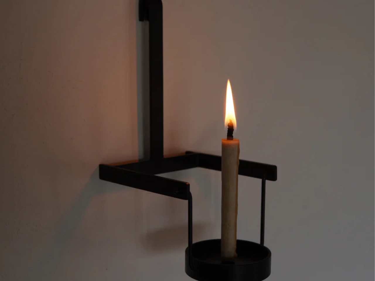
Most lighting fixtures behave predictably, looking the same whether they’re switched on or off. Taeg Nishimoto’s LOOPS lamp breaks that pattern completely. By day, it appears modest and sculptural, but once illuminated, it transforms the room into a canvas of shifting, intricate shadows. Built from simple materials like sisal rope, plaster, concrete, and steel rods, the lamp proves that innovation doesn’t require luxury and is just an intention. Nishimoto forms loose loops from untwisted sisal rope, stabilizes them with fabric hardener, and wraps them in fast-setting plaster, creating surfaces that feel raw, organic, and entirely handmade.
These plastered loops are joined where they naturally touch, forming clusters that resemble natural formations like dunes or coral. Elevated on slim steel rods above a concrete base, hiding the light source, the lamp casts dramatic patterns across walls and ceilings when lit. The effect feels part lighting, part art installation.
3. Decorative Accessories
The color’s soft, airy white finish highlights form over decoration, allowing curves, contours, and textures to take center stage. Whether crafted in matte ceramic, hand-thrown stoneware, or frosted glass, these pieces act as subtle anchors that calm visual pauses within a space filled with color and pattern. Even a single Cloud Dancer vase can add a touch of serene modernity to a console or side table.

In minimalist, contemporary, or Japandi-inspired settings, this gentle hue enhances the sculptural quality of each piece. The neutral tone makes dried florals, branches, and fresh greenery appear more vivid, creating a balanced yet elevated look. These vases don’t just hold arrangements—they shape the atmosphere, reinforcing the 2026 shift toward softer aesthetics, mindful styling, and timeless quiet luxury.

The Sparrow X Vase from Haoshi Design brings an artful twist to a classic silhouette. Its clean, seamless form is gently interrupted by two finely sculpted sparrows that appear to peek out from the vase itself. These curious little birds add a touch of personality and storytelling, turning an otherwise minimalist vessel into a piece that invites a second look.

Their intricate detailing stands in striking contrast to the vase’s smooth, marble-like white surface, highlighting both craftsmanship and restraint. The sparrows not only introduce visual charm but also echo the organic beauty of the blooms placed inside. Together, the form, texture, and sculptural accents create a vase that feels serene, distinctive, and quietly poetic.

4. Bedding, Textiles & Cozy Layers

Soft, white-but-warm bedding instantly transforms a bedroom into a restorative retreat. Linens, duvets, throws, and blankets in gentle, airy tones create a serene foundation, promoting calm and mindful living. Their neutral palette allows the room to feel open and balanced, while adding subtle warmth that makes the space inviting rather than sterile.

When layered thoughtfully, these textiles bring comfort and style. A plush duvet paired with cozy blankets, textured throws, or tactile cushions enhances the sensory experience, making the bed feel luxurious and welcoming. This approach turns everyday bedding into a tool for relaxation, emphasizing softness, simplicity, and a quiet, elevated aesthetic that supports modern mindful living.

With the HILU blanket, getting a good night’s sleep becomes simpler and cooler. This innovative blanket is four times cooler than linen, yet still soft and cozy against your skin. It’s Adaptex CoolWeev fabric, woven from gel‑spun Eco‑cool Polyfibers, pulls warmth away from your body, helping you sleep undisturbed and sweat‑free. Lightweight but sturdy, the blanket works as a duvet, throw, or even a mattress topper—adaptable through all seasons.

Beyond cooling, HILU blankets care for your health and comfort. The fabric is antimicrobial and hypoallergenic, reducing bacteria, odors, and skin irritation. Designed with sustainability in mind, it’s made from OEKO‑TEX-certified recycled materials and built to last.

5. Modern Kitchen Cabinets

Applying this soft, neutral tone to kitchen cabinetry instantly elevates the space, creating a crisp and refined aesthetic. Its clean, airy quality balances beautifully with warm wooden surfaces, adding depth and sophistication without feeling heavy or overpowering. Whether used on upper cabinets, lower drawers, or full pantry units, the tone brings a timeless, minimalist touch to the kitchen.

Pairing these cabinets with brushed metal handles or sculptural hardware enhances the modern feel while maintaining warmth and tactility. The result is a kitchen that feels light, elegant, and carefully curated, or a space that blends functionality with quiet luxury and makes every culinary experience feel thoughtful and stylish.

Soft, white tones on kitchen cabinets create a crisp, refined backdrop that instantly brightens the space and highlights the quality of surrounding surfaces. Paired with warm wooden accents or brushed metal hardware, the white cabinetry adds depth and a sense of modern elegance. Complementing this, a high-performance sintered stone countertop in light or neutral shades elevates the kitchen’s aesthetic while offering unmatched durability. The smooth, non-porous surface of Lapitec stone is resistant to stains, chemicals, and heat, making it ideal for both functional and stylish kitchen designs. Its range of finishes allows seamless integration with cabinetry, creating a harmonious, sophisticated environment that feels airy and inviting.

The Lapitec Chef induction system, hidden beneath the countertop, enhances this modern setup. Activated by a silicone mat, it transforms the white countertop into a fully functional cooking surface while keeping the workspace clean and versatile.

As Pantone’s Cloud Dancer ushers in 2026, companies across design, interiors, and lifestyle sectors have a unique opportunity to embrace this soft, airy white as a unifying trend. From furniture and lighting to textiles, vases, and kitchen cabinetry, the shade offers versatility that pairs seamlessly with natural textures, warm metals, and sculptural forms. Brands can experiment with Cloud Dancer in product finishes, packaging, or showroom experiences to convey calm, sophistication, and mindful luxury. Its understated elegance allows other colors, materials, and design elements to shine, making it an ideal foundation for contemporary collections.

By using Cloud Dancer thoughtfully, brands and companies can create products and spaces that resonate with consumers seeking calm, clarity, and modern serenity. This gentle hue supports minimalism with meaning, offering a fresh, timeless canvas that blends aesthetic appeal with emotional well-being, making it a defining trend for 2026 and beyond.

The post 5 Ways to Use Cloud Dancer, Pantone’s Calming 2026 Color first appeared on Yanko Design.