The best gifts don’t announce themselves. They sit quietly on a desk or a shelf and earn their place over months, long after the novelty of anything else has faded. Japanese design understands this better than almost any other creative tradition. The deliberate object, stripped of everything unnecessary, built to be used every single day without ever wearing out its welcome. These five picks operate on exactly that frequency.
None of these are mainstream. You won’t find them at a department store or wrapped in packaging that tries too hard. What they share is a quiet commitment to material honesty: titanium that carries no taste, porcelain with no visible branding, brass that darkens with use, incense that smells like a forest. Together they cover a full day, from morning coffee through the last drink of the night.
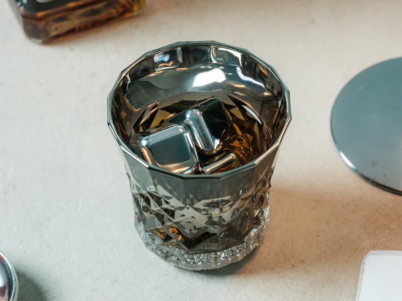
1. Unfiltered Titanium Whisky Glass
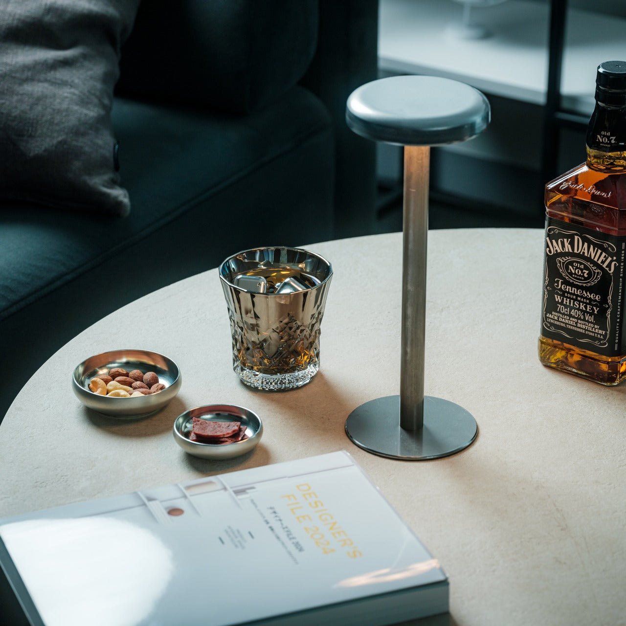

Titanium is one of the few materials that genuinely changes how a drink feels without changing how it tastes. It is completely non-reactive, which means spirits come through clean, with nothing added by the vessel and nothing taken away. The Unfiltered Titanium Whisky Glass takes that material property and builds around it a form that is spare and considered, lighter than glass but with a presence in the hand that reads immediately as deliberate. It is the kind of object that prompts questions before a single word is said about it.
For the person who cares about the quality of a drink as much as the ritual around it, this glass closes a gap that most barware never bothers addressing. Titanium used at this level belongs to aerospace and surgical contexts. Bringing it to a whisky glass is not a novelty decision; it is a statement about what the object is actually for. It performs differently from glass and crystal, and that difference is the point. Some gifts upgrade a shelf. This one upgrades a habit.
What we like
- The non-reactive titanium construction delivers spirits with complete neutrality, letting the whisky speak entirely for itself
- The weight and balance feel engineered rather than decorative, which makes the ritual of pouring a drink feel more considered
What we dislike
- The matte titanium finish shows fingerprints with regular handling and benefits from occasional wiping to stay sharp
- Those accustomed to the visual clarity of crystal may find the opaque surface takes some adjustment
2. Hasami Porcelain Mug in Gloss Gray
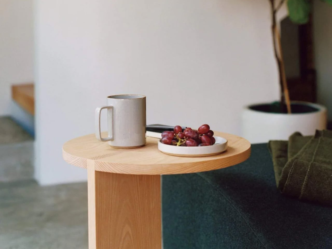
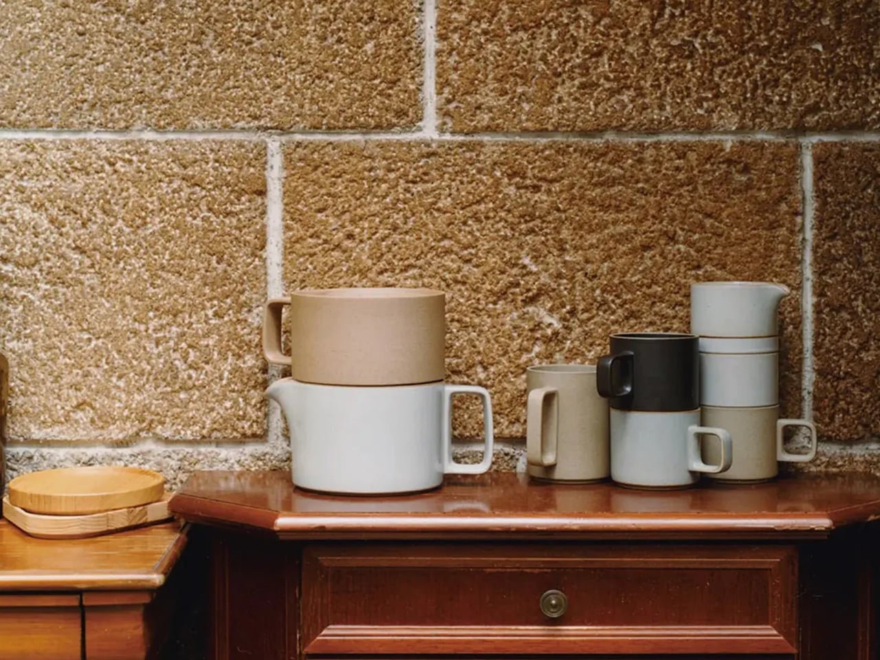
Hasami is a small town in Nagasaki Prefecture that has been producing ceramics for over 400 years. This mug is what happens when that accumulated knowledge meets a genuinely modern brief: a cylindrical body, a handle pulled so close to the barrel it nearly disappears, a high-gloss gray glaze that reads like wet stone. Designed by Takuhiro Shinomoto, it carries no visible logo anywhere on its surface. The message is the object itself, not the brand attached to it.
For the person who takes their morning coffee seriously, this changes the whole ritual. The custom porcelain-and-clay blend gives it an unusual density. It feels more substantial than its size suggests, which matters when you are reaching for the same cup every morning for the next decade. It stacks cleanly with other Hasami pieces, reflecting a deeply Japanese idea that objects should consider their relationship to one another even in storage. Microwave and dishwasher safe, despite looking like it shouldn’t be.
What we like
- The 400 years of ceramic tradition from Hasami produces a density and finish no standard mug can replicate
- The modular stacking system reflects a level of design thinking most tableware never bothers with
What we dislike
- The high-gloss glaze shows water spots between washes and requires more frequent drying to stay looking its best
- The handle sits very close to the body, which may feel narrow for larger hands
3. Traveler’s Company Brass Ballpoint Pen
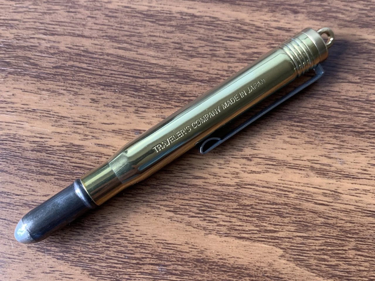
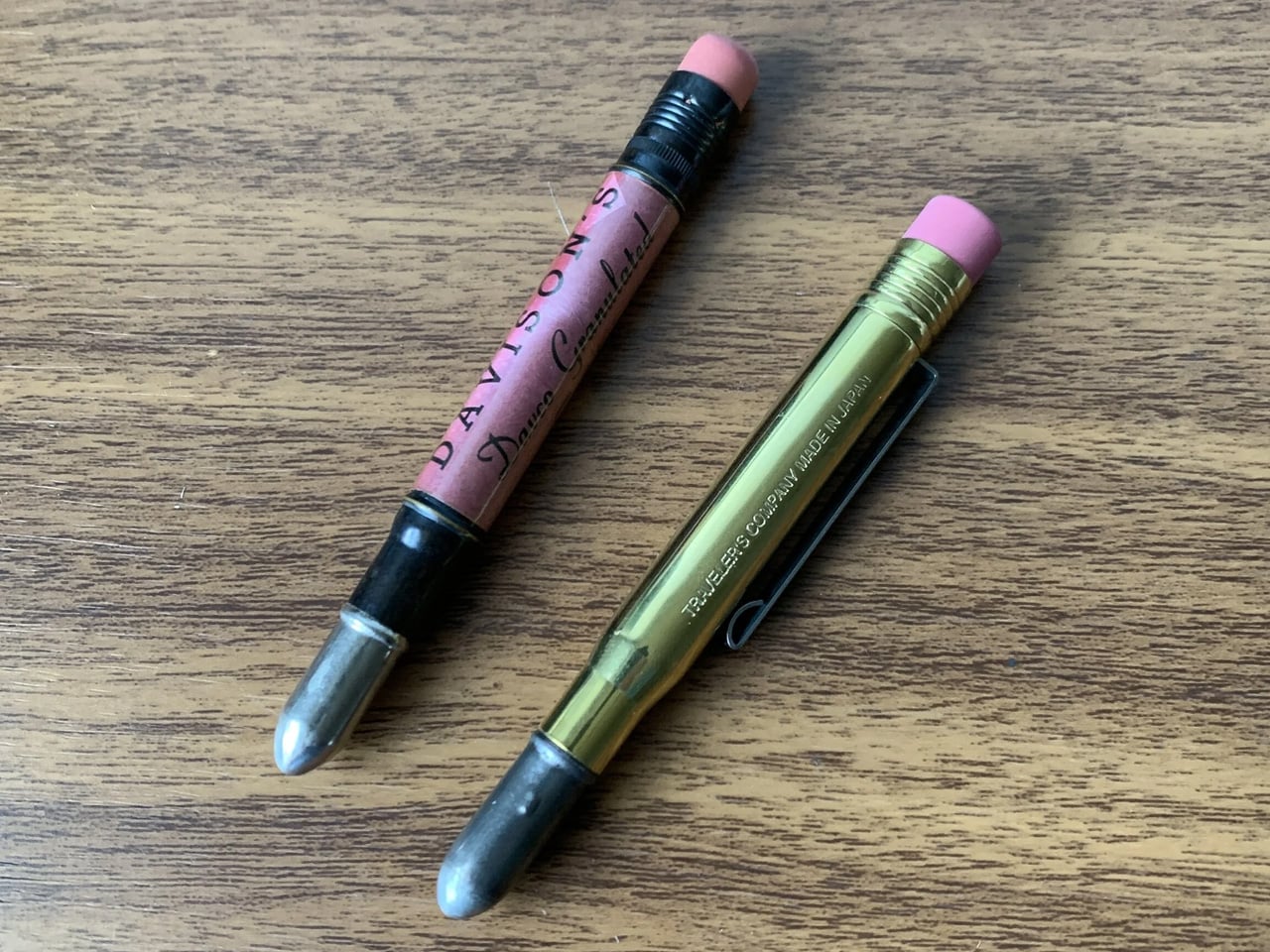
Midori has been making objects for travelers and writers from Tokyo since 1950, and the Traveler’s Company Brass Ballpoint Pen is the purest version of what they do. It is machined from a single piece of solid brass with no coating, no lacquer, and no finish. The moment you pick it up, it feels wrong in the best way: heavier than expected, cooler to the touch, more deliberate than anything that belongs in a cup of pens beside the printer.
What makes this pen genuinely special is what happens over time. Raw brass oxidizes. It darkens in the places you grip it most, lightens where it rests against a pocket, and takes on the character of its owner’s daily routine. Two people who carry this pen for a year will end up with two completely different-looking objects. For someone who writes by hand, or simply wants one pen worth keeping on a desk for the next decade, this is it.
What we like
- The raw brass develops a unique patina over time, making each pen entirely distinct to whoever carries it
- The weight and balance feel more considered than almost anything available at this price point
What we dislike
- The oxidation process requires occasional polishing if a brighter, cleaner finish is preferred
- Replacement ink uses a standard Parker-style refill, which needs to be sourced separately
4. Shoyeido Kyojiman Incense
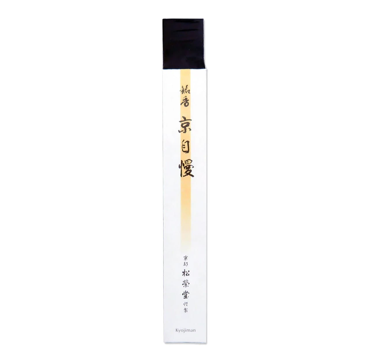
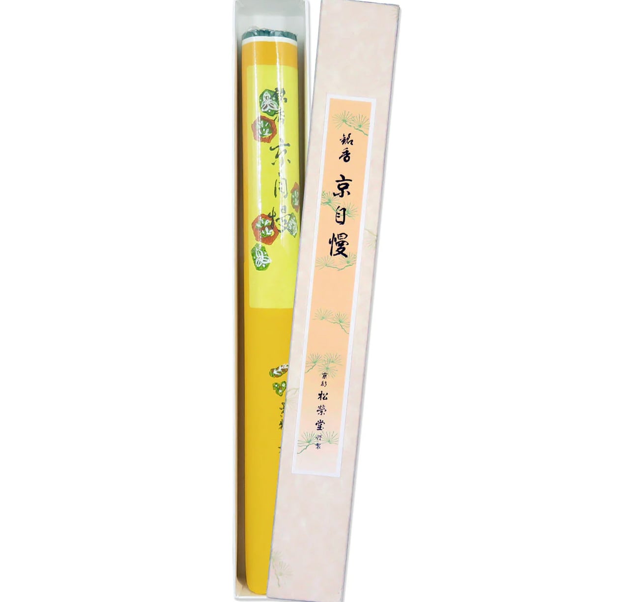
Shoyeido has been making incense in Kyoto since 1705, which means they were perfecting this craft while the city was still the imperial capital. The Kyojiman line, whose name translates roughly as Pride of Kyoto, is their signature daily collection. Each stick combines aloeswood, sandalwood, and medicinal plants, with no synthetic fragrance anywhere in the formula. The packaging is a flat paper box so stripped of decoration it looks like it was designed by an architect rather than a gift company.
Each stick burns for around 25 minutes, which is long enough to mark the transition from work to evening without filling an entire room with scent. The smoke is thin and clean, nothing like the heavy commercial incense found elsewhere. For someone who already has everything and finds most gifts forgettable, this is the one that changes how a room smells on a Tuesday, which is ultimately a more lasting impression than any object sitting on a shelf.
What we like
- Three centuries of craft behind every stick, using only natural aromatic woods and medicinal plants with no synthetic fragrance
- The 25-minute burn time suits an evening ritual precisely, marking a transition without overwhelming the room
What we dislike
- The minimal paper packaging, while visually considered, offers limited protection during shipping
- Aloeswood-forward scents can divide people, with some finding them earthy and others finding them medicinal
5. First Pour Bottle Opener
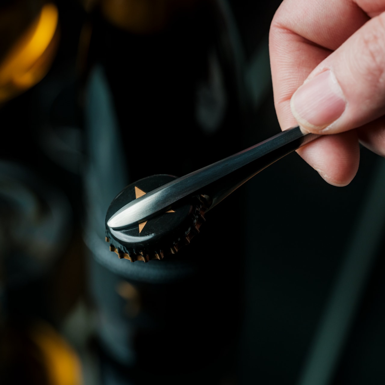

Tsubame-Sanjo is a city in Niigata Prefecture that has produced precision metalwork since the 17th century. Suwada has been operating there since 1926, a hundred years of blade craft that shows in every object they make. The First Pour Bottle Opener is what happens when that lineage is applied to the most overlooked object at any gathering. The silhouette flows rather than angles, with a weight that feels closer to a precision instrument than anything you would find sitting in a kitchen drawer.
In use, it earns its price on the first bottle. The cap comes off cleanly in a single motion, no bending, no tearing, no second attempt. A small embedded magnet catches it the instant it pops free, so it never skitters across the table. For a host who pays attention to the details of an evening, this opener sets the tone before a drink is even poured. It works best when the person receiving it already cares about that kind of thing.
What we like
- The magnetic cap catch is the kind of detail that only reveals itself fully the first time you use it in front of someone
- Suwada’s century of precision metalwork gives the opener a heft and finish that justifies its cost entirely
What we dislike
- At this price point for a bottle opener, it asks the recipient to appreciate the craft sitting behind the cost
- The flowing sculptural form means it does not rest flat on a surface without a dedicated place to live
The Best Gifts Work Inside Daily Life, Not Around It
What connects these five objects isn’t price or category. It’s the logic behind them. Each one was made by someone who thought carefully about a specific action: the glass you drink from when it matters, the cup you reach for first every morning, the pen that earns its weight over years. Japanese design doesn’t decorate the surface of daily life. It works inside it, in the moments most designers stop thinking about.
The best version of this list is also the most personal one. The opener for the host, the pen for the writer, the incense for the one who already has everything and needs something that changes the quality of a room rather than simply adding to it. Any single object here is a considered gift. All five together make an unusually honest statement about what good design actually feels like to live with.
The post 5 Japanese Design Gifts for Him That Feel Like They Were Hand-Carried From Kyoto first appeared on Yanko Design.